15 Secret Earthy Reading Nook Ideas That Turn Any Corner Into a Cozy Escape
The most memorable reading nooks are rarely found in grand libraries or expansive rooms. More often, they emerge quietly from the forgotten corners of a home an unused window recess bathed in afternoon sunlight, an awkward alcove beneath a staircase, or a neglected landing that suddenly reveals unexpected potential. These spaces possess a certain magic precisely because they feel discovered rather than designed, offering a sense of retreat without ever requiring significant square footage.
This is where earthy design comes into its own. Rooted in natural materials, tactile textures, and colours drawn from the landscape, an earthy reading nook does more than provide a comfortable place to sit.
It softens the visual noise of everyday life, creating an environment that feels calm, grounded, and deeply restorative. Like a breath of fresh air after a busy day, natural wood, woven fibres, linen upholstery, and muted earth tones work together to encourage stillness and reflection.
In my own projects, I have often found that the smallest reading corners become the most cherished spaces in a home. There is something inherently comforting about a partially enclosed nook—a place where walls, shelves, or architectural features create a feeling of shelter. It taps into a fundamental human desire for refuge while maintaining a connection to the wider room.
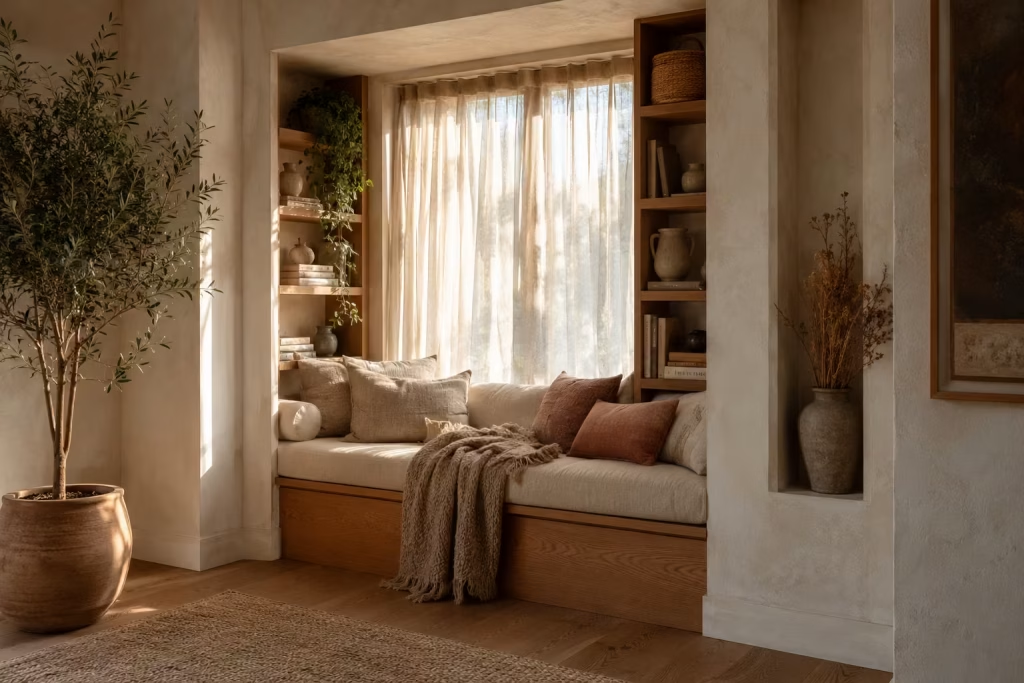
The following earthy reading nook ideas explore how thoughtful materials, spatial planning, and nature-inspired details can transform even the most overlooked corner into a cozy escape that feels timeless, personal, and irresistibly inviting.
Transform a Deep Window Recess Into a Woodland Retreat
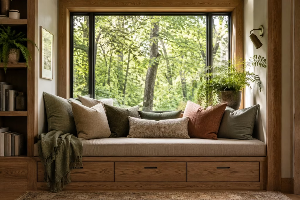
Some of the most inviting reading nooks are hidden in plain sight. A deep window recess, often treated as little more than architectural decoration, can become a sanctuary that feels miles away from the activity unfolding elsewhere in the home. When thoughtfully designed, this type of nook captures natural light, frames outdoor views, and creates a comforting sense of enclosure that encourages you to linger a little longer.
What makes window-based reading corners particularly successful is their connection to nature. Whether overlooking a garden, mature trees, or simply the changing sky, the view becomes part of the experience. It is a reminder that good design is not always about adding more. Sometimes it is about making better use of what is already there.
Layered Linen Cushions Create Lasting Comfort
Comfort is often won or lost through layering. A beautifully crafted seat can still feel uninviting if the cushioning lacks softness and depth. Linen works exceptionally well because it introduces texture without feeling heavy or overly formal.
Instead of relying on perfectly matched cushions, I prefer combining several sizes and tones inspired by nature. Moss green, oatmeal, clay, and muted taupe create a relaxed composition that feels collected over time rather than purchased in a single afternoon. Like the icing on the cake, a lumbar cushion positioned at the centre provides support for longer reading sessions while adding visual interest.
The goal is to create a setting that welcomes you to settle in with a novel for hours rather than simply admire it from across the room.
A Natural Oak Window Seat Adds Warmth and Permanence
The foundation of any successful window nook is the seat itself. Natural oak remains one of my preferred materials because it introduces warmth without dominating the space. Its subtle grain adds character while aging gracefully over the years.
For deep recesses, I often recommend a seat depth between 500mm and 650mm (20 to 26 inches). This provides enough room for comfortable seating while maintaining balanced proportions.
Built-in oak seating also helps the nook feel integrated into the architecture rather than appearing as an afterthought. When the joinery aligns with surrounding trim and millwork, the result feels cohesive and timeless.
Soft Earthy Greens Bring the Outdoors In
Colour has a remarkable influence on how a space feels. Soft earthy greens create a visual bridge between interior and exterior environments, making the transition between the two feel seamless.
Muted sage, eucalyptus, olive, and lichen tones work particularly well because they offer richness without overwhelming the eye. Unlike brighter greens that demand attention, these quieter shades encourage relaxation.
In homes where the window overlooks greenery, incorporating similar tones inside strengthens the connection to the landscape beyond the glass. It is a subtle design move, yet one that often pays dividends in creating a more harmonious atmosphere.
Styling With Potted Ferns Creates Organic Movement
No woodland-inspired retreat feels complete without a touch of living greenery. Ferns are especially effective because of their delicate, layered foliage and naturally relaxed appearance.
Positioning a potted fern beside the window introduces softness around hard architectural lines while creating gentle visual movement. As sunlight shifts throughout the day, shadows cast by the foliage bring additional depth and interest to the nook.
If space permits, grouping plants at varying heights can create a more natural composition. Much like a woodland floor, the arrangement feels richer when it avoids rigid symmetry.
Real-Life Designer Insight
One project that remains particularly memorable involved a family home with a neglected bay window measuring approximately 1.8m (6ft) wide. Despite enjoying some of the best natural light in the property, the area sat largely unused for years.
The homeowners initially viewed the space as too awkward for furniture placement. Instead of forcing freestanding pieces into the recess, I designed a custom oak window seat with integrated drawers concealed beneath the cushion platform.
The storage accommodated blankets, books, and seasonal accessories, while a tailored seat cushion transformed the area into a comfortable destination. We layered soft greens, textured linens, and several potted ferns to reinforce the connection with the garden outside.
Several months after completion, the owners told me the nook had become the most frequently occupied spot in the house. Morning coffee, weekend reading, children’s story time, and even casual conversations naturally gravitated there. What had once been overlooked became the heart of daily life.
That experience reinforced a lesson I have encountered repeatedly throughout my career: the spaces hiding in the wings often become the stars of the show when given thoughtful attention.
Pros
- Maximises existing architectural features.
- Benefits from abundant natural daylight.
- Creates a strong connection to outdoor views.
- Built-in storage can reduce household clutter.
- Adds character and perceived value to the room.
- Works well in both traditional and contemporary homes.
Cons
- Custom joinery may increase project costs.
- Direct sunlight can cause fabrics to fade over time.
- Older windows may require insulation upgrades for year-round comfort.
- Limited privacy if the window faces neighbouring properties.
- Deep recesses sometimes require bespoke cushions and furnishings.
Create a Hidden Reading Corner Beneath a Staircase
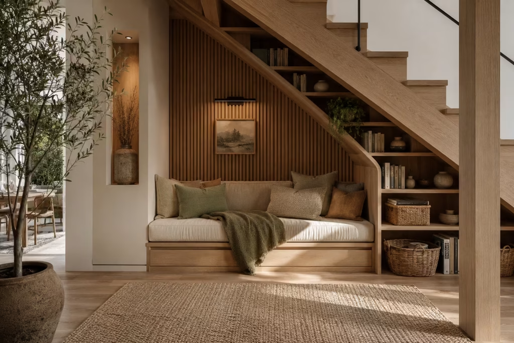
Every home has spaces that quietly fade into the background. Beneath the staircase is often one of them. It becomes a temporary storage zone, a place where miscellaneous items gather dust, or simply an area ignored because its shape feels awkward to furnish. Yet beneath those angled ceilings and unusual proportions lies an opportunity waiting to be uncovered.
There is something undeniably appealing about a reading corner tucked beneath a staircase. Unlike seating positioned in the middle of a room, these nooks naturally create a sense of refuge. The sloping ceiling overhead introduces a cocoon-like quality that makes the space feel protected and intimate. It is the design equivalent of finding a hidden path through a forest, unexpected yet deeply rewarding once discovered.
What makes staircase reading nooks particularly successful is their ability to transform forgotten square footage into something meaningful. Instead of allowing valuable space to sit idle, the area becomes a destination dedicated to relaxation, reflection, and uninterrupted reading.
Making Use of Dead Space
In residential design, some of the most effective improvements come not from adding space but from reimagining what already exists. Areas beneath staircases are a perfect example.
I have worked on numerous homes where homeowners initially believed they lacked room for a dedicated reading retreat. Once we examined the staircase footprint, however, an entirely different story emerged. What appeared unusable on paper often revealed enough space for comfortable seating, integrated storage, and even decorative lighting.
A nook positioned beneath stairs carries an inherent sense of discovery. Because it is partially concealed from the main living area, it feels separate from daily distractions. This subtle separation encourages focus and relaxation in a way that open seating arrangements often struggle to achieve.
Even compact stair voids can accommodate a comfortable setup when carefully planned. Sometimes the smallest opportunities yield the biggest rewards.
Timber Cladding Adds Warmth and Character
The architectural structure beneath a staircase can occasionally feel harsh due to sharp angles and exposed surfaces. Timber cladding softens those edges while introducing natural warmth and texture.
Oak, ash, walnut, and smoked timber finishes each bring their own personality, but all share an ability to make a space feel more welcoming. Rather than leaving plasterboard surfaces flat and featureless, timber creates depth and visual interest that evolves throughout the day as light changes.
One approach I frequently recommend is extending vertical timber battens across the back wall of the nook. The repetition of natural grain creates rhythm while visually elongating the space. This simple intervention can make even modest corners feel more intentional and refined.
Timber also helps absorb some sound reflections, creating a quieter atmosphere that supports reading and relaxation. While often overlooked, acoustic comfort plays a significant role in how restful a space ultimately feels.
Built-In Bookshelves Turn the Nook Into a Destination
A reading corner becomes infinitely more useful when books are kept within arm’s reach. Built-in shelving transforms the area from a simple seat into a fully functioning retreat.
Unlike freestanding bookcases, integrated shelving can follow the unique geometry of the staircase, making use of every available centimetre. Shelves can gradually decrease in height to mirror the stair angle, creating a custom appearance that feels architecturally connected.
In one project, we incorporated shelving around the seating area, wrapping books along two walls. The result resembled a miniature library hidden inside the home. Guests often gravitated toward the space out of curiosity alone.
Beyond storage, books themselves contribute to the atmosphere. Their varied colours, textures, and worn spines add richness that no decorative accessory can fully replicate. They tell stories before a single page is opened.
For households with extensive collections, allocating at least 250mm to 300mm (10 to 12 inches) shelf depth provides flexibility for different book sizes.
Warm Wall Sconces Create Evening Ambience
Natural light is not always available beneath staircases, making lighting design especially important.
A common mistake is relying solely on overhead fixtures. While functional, ceiling lights often produce flat illumination that strips away atmosphere. Reading spaces benefit from layered lighting that feels softer and more inviting.
Wall sconces positioned at seated eye level create a pool of focused light without overwhelming the space. The glow feels gentle and comforting, particularly during evening hours when the rest of the home begins to wind down.
I often favour fixtures with linen shades, alabaster details, or aged brass finishes because they diffuse light beautifully while complementing earthy material palettes.
The difference can be night and day. Without proper lighting, the nook may feel forgotten. With thoughtful illumination, it becomes a destination that calls your name at the end of a busy day.
Ideal Measurements for Comfort
Successful staircase reading corners depend on proportion as much as aesthetics.
For comfortable seating, I generally recommend a minimum nook depth of:
900mm to 1200mm (3 to 4 feet)
This provides sufficient room for a cushioned bench, occasional chair, or compact daybed without feeling cramped.
Additional guidelines include:
- Seat depth: 500mm to 650mm (20 to 26 inches)
- Seat height: 430mm to 480mm (17 to 19 inches)
- Bookshelf depth: 250mm to 300mm (10 to 12 inches)
- Reading light placement: Approximately 900mm to 1200mm (3 to 4 feet) above seat level
These dimensions help create a space that feels comfortable for extended use rather than merely functional.
Why These Hidden Spaces Feel So Special
Part of the appeal lies in psychology. Humans naturally seek environments that offer both shelter and outlook. Researchers often describe this as the balance between refuge and prospect.
A staircase nook satisfies both instincts remarkably well. The surrounding structure creates a feeling of protection, while the open side maintains a connection to the wider room. This balance makes the area feel secure without becoming isolated.
It explains why people often gravitate toward window seats, corner banquettes, and alcove seating. There is a quiet comfort in spaces that gently embrace rather than expose.
Pros
- Makes productive use of otherwise wasted floor area.
- Creates a naturally intimate and sheltered environment.
- Can incorporate substantial book storage.
- Adds architectural character to the home.
- Ideal for smaller properties where dedicated reading rooms are not possible.
- Encourages quiet moments away from household activity.
- Often increases the functionality of underutilised spaces.
Cons
- Limited ceiling height may restrict design options.
- Custom joinery can increase installation costs.
- Natural daylight may be limited.
- Irregular shapes often require bespoke furniture solutions.
- Ventilation can sometimes be weaker than in more open areas.
- Existing stair structures may limit modifications.
Build an Earth-Toned Alcove With Limewash Walls
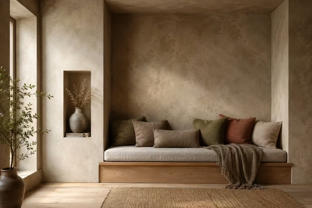
Not every reading nook relies on built-in furniture, expansive windows, or architectural quirks. Sometimes the most transformative element is the atmosphere itself. An alcove, even a relatively simple one, can become a deeply inviting retreat when colour, texture, and light are carefully considered. This is where limewash walls excel.
Unlike conventional painted surfaces that often appear uniform and predictable, limewash possesses a quiet complexity. It shifts throughout the day, responding to changing light conditions with subtle tonal variations that bring walls to life. The result is a space that feels layered, organic, and rich with character.
A well-designed reading alcove should never feel like an isolated corner furnished as an afterthought. It should feel like a destination woven into the architecture of the home, creating a mood that encourages slowing down, settling in, and escaping into the pages of a favourite book.
Clay-Inspired Colours Create a Grounded Atmosphere
Colour influences emotion more than many people realise. Certain shades stimulate energy and attention, while others encourage calm reflection. Reading spaces benefit enormously from colours that feel rooted in nature because they create a sense of stability and comfort.
Clay-inspired tones are particularly effective. Soft terracotta, warm mushroom, weathered sandstone, muted taupe, dusty ochre, and sun-baked earth colours introduce warmth without overwhelming the senses.
In one project, I specified a muted clay finish for a narrow alcove that previously felt cold and disconnected from the surrounding room. The transformation was remarkable. What had once been an overlooked niche suddenly became one of the most inviting areas in the house. The colour wrapped the space in warmth, almost like a favourite wool blanket on a chilly evening.
Earth-derived hues also possess remarkable longevity. Unlike trend-driven colours that often feel dated within a few years, natural tones tend to age gracefully because they echo landscapes humans have connected with for centuries.
Textured Finishes Bring Walls to Life
Many interiors suffer from an excess of perfectly smooth surfaces. While sleek finishes certainly have their place, reading spaces often benefit from greater tactile richness. Limewash introduces subtle texture that creates visual interest without requiring decorative clutter. The finish contains gentle movement and variation, giving walls a handcrafted quality that feels authentic rather than manufactured.
As readers spend extended periods in a nook, they absorb more than just furniture and accessories. The surfaces surrounding them contribute significantly to the overall experience. Walls finished with texture engage the eye in a quiet, almost subconscious way.
Think of it as the difference between listening to a solo instrument and hearing a full orchestra. Both may be beautiful, but one offers considerably more depth and nuance. The beauty of limewash lies in its imperfections. Slight tonal shifts, soft clouding effects, and natural variation create a finish that feels lived-in from the moment it is applied.
Natural Light Interaction Creates Ever-Changing Beauty
One of the most fascinating qualities of limewash is its relationship with natural light. Unlike standard paint, which often reflects light evenly, limewash reacts dynamically throughout the day. Morning sunlight may reveal delicate tonal variations that seem almost invisible at noon. As evening approaches, the walls develop greater richness and depth, creating an atmosphere that feels increasingly intimate.
I often describe limewash as a finish that rewards observation. The more time you spend in the space, the more details emerge.
This quality is particularly valuable in reading alcoves because it prevents the environment from feeling static. Even when nothing physically changes, shifting daylight continually reshapes the mood.
Positioning a reading chair where light grazes the wall rather than striking it directly can amplify this effect. The resulting shadows and highlights create a gentle sense of movement that feels natural and calming.
In many ways, the walls become part of the experience rather than merely serving as a backdrop.
Creating Visual Depth Without Adding Clutter
Many homeowners attempt to make reading corners feel cozy by introducing additional accessories, decorative objects, and layered styling. While these elements can certainly contribute to warmth, they are not always necessary. True depth often comes from surfaces rather than possessions.
Limewash excels because it creates dimension without increasing visual clutter. The finish itself provides complexity, allowing furniture and accessories to remain restrained.
This approach is particularly beneficial in smaller homes where overcrowding can quickly become an issue. Instead of filling every available surface, the walls carry part of the visual responsibility.
I frequently advise clients to think of texture as a form of decoration. When walls already possess character, there is less pressure to continuously add more objects in pursuit of interest. The result feels calmer, more sophisticated, and often far more timeless.
Designer Perspective: Why Limewash Often Feels More Authentic Than Flat Paint
Over the years, I have specified countless paint finishes across a wide range of projects. While traditional paints remain practical and versatile, limewash consistently creates a different emotional response. The reason is rooted in authenticity.
Flat paint tends to present colour as a single, uniform layer. It performs a function, but it rarely tells a story. Limewash, by contrast, possesses depth, variation, and a sense of craftsmanship that feels connected to historic building traditions. Many of the world’s most beautiful interiors share one common trait. Their surfaces are not perfect.
Historic villas, rural farmhouses, Mediterranean retreats, and centuries-old townhouses often feature walls that reveal texture, patina, and subtle irregularity. These characteristics create warmth because they feel human. Limewash captures some of that spirit. It introduces a sense of age and permanence without appearing artificially distressed.
In one residential project, we replaced crisp painted walls with a soft limestone-toned limewash throughout a reading alcove. The furniture remained unchanged. The layout stayed exactly the same. Yet the room felt entirely different. Clients frequently commented that the space suddenly felt settled, as though it had always belonged there. That is the quiet power of material authenticity. It changes not only how a room looks but how it feels.
Pros
- Creates rich visual texture without relying on excess decoration.
- Develops beautiful tonal variation throughout the day.
- Complements earthy, organic, and nature-inspired interiors.
- Adds character and depth to even the simplest alcove.
- Pairs exceptionally well with timber, linen, stone, and natural fibres.
- Produces a softer and more atmospheric appearance than conventional paint.
- Helps small reading spaces feel more immersive and layered.
Cons
- Professional application is often recommended for the best results.
- Surface preparation is crucial for a consistent finish.
- Repairs can be more noticeable than with standard paint.
- Colour variation may not appeal to those seeking perfectly uniform walls.
- Application costs are generally higher than conventional paint systems.
- Some formulations require periodic maintenance depending on environmental conditions.
You May also Like: 25 Japanese Reading Nook Secrets for a Perfectly Calm Home
Layer a Reading Nook With Stone, Timber and Linen
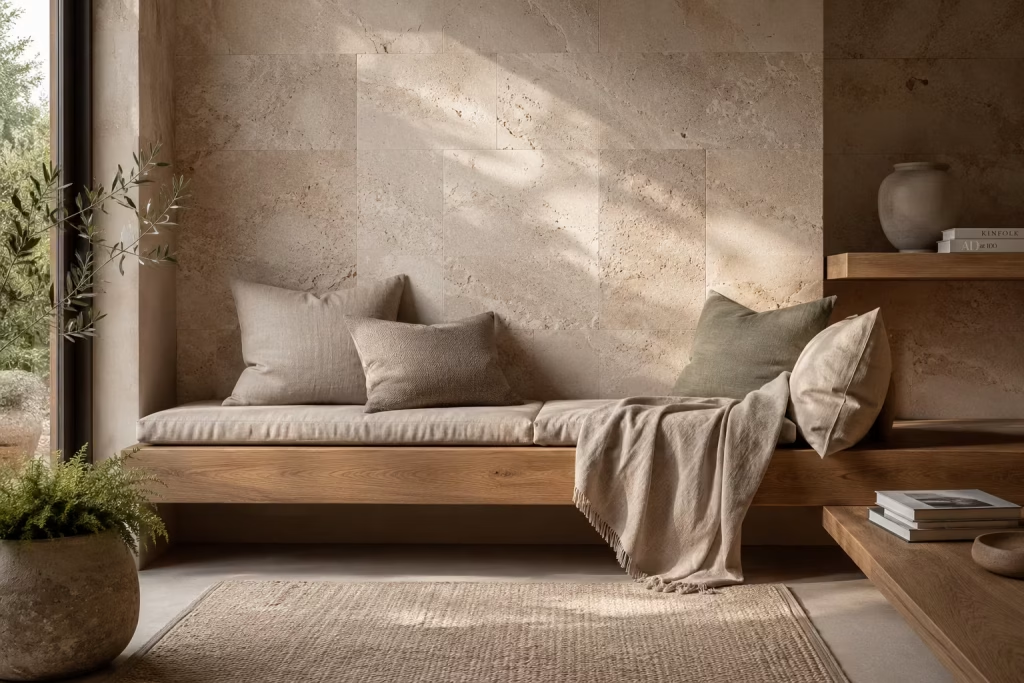
There are reading nooks that rely on colour for impact, and then there are those that quietly lean on materials to do the heavy lifting. This approach feels far more enduring. When stone, timber, and linen are brought together with intention, the result is a space that feels grounded, tactile, and almost instinctively calming, as if it has always belonged exactly where it is.
What makes this combination so effective is the way each material plays a different role. Stone introduces permanence. Timber brings warmth. Linen softens everything it touches. When balanced correctly, they create a composition that feels effortless yet deeply considered, like a well-rehearsed conversation where every voice has its moment without overpowering the others.
A reading nook built on this principle does not need to shout for attention. It works quietly in the background, settling into the home with a sense of ease that grows more appealing over time.
Material Balance That Feels Naturally Composed
Achieving harmony between stone, timber, and linen is less about strict rules and more about understanding weight, tone, and texture.
Stone often acts as the anchor. Whether it appears as a hearth backdrop, a small plinth table, or a textured wall finish, it introduces a sense of grounding that feels almost architectural in its presence. It carries a quiet authority, the kind that does not need to be dressed up to make an impression.
Timber softens that strength. Light oak or aged walnut introduces warmth that prevents the space from feeling too rigid. I often describe timber as the bridge between structure and comfort. It takes the edge off harder materials while adding a natural rhythm through grain and variation.
Linen completes the trio with ease. It does not compete. Instead, it settles into the space like a gentle pause in conversation. Slightly rumpled cushions, loosely draped throws, and softly upholstered seating introduce a sense of lived-in comfort that avoids feeling overly staged.
When these three materials are balanced well, the nook feels composed without ever appearing overly designed. It is a bit like a perfectly seasoned dish where no single ingredient dominates, yet everything works together in harmony.
Organic Modern Styling That Feels Effortless
Organic modern design is not about perfection. It is about restraint, warmth, and a deep respect for material honesty. In reading nooks, this style works particularly well because it encourages comfort without clutter.
Instead of filling the space with decorative layers, the focus shifts toward form and substance. A timber bench with visible grain, a stone ledge with natural variation, or a linen cushion that folds softly over the edge of a seat all contribute to the atmosphere without overwhelming it.
I have found that the most successful organic modern reading corners often feel slightly unpolished in the best possible way. Nothing is overly symmetrical or rigid. Instead, there is a gentle looseness to the composition that makes the space feel approachable, almost as if it has evolved rather than been assembled.
The beauty of this approach lies in its longevity. Trends come and go, but natural materials rarely lose their appeal. They age gracefully, picking up character over time, much like a well-worn leather armchair that only improves with use.
Texture Over Colour Creates Lasting Depth
While colour can certainly shape mood, texture is what gives a space its depth and emotional weight. In reading nooks built around stone, timber, and linen, texture becomes the defining feature.
Stone introduces roughness and variation that catches light in subtle ways. Timber offers directional grain that guides the eye without forcing attention. Linen softens everything with its natural weave, creating a tactile counterpoint to the more structured materials.
Together, they form a layered sensory experience that feels almost architectural in nature. It is not something that immediately announces itself. Instead, it reveals itself slowly, the longer you spend within the space.
In practice, I often encourage restraint when adding colour to such schemes. Earthy neutrals, muted tones, and natural palettes tend to work best because they allow the materials to take centre stage. When colour steps back, texture steps forward, and the space gains a quiet richness that feels far more enduring.
A well-designed reading nook should feel like a place where your senses can exhale. Texture achieves that in a way colour alone rarely can.
Pros
- Creates a timeless and highly durable design language that does not rely on trends.
- Enhances sensory comfort through varied natural textures.
- Works seamlessly in both contemporary and traditional homes.
- Develops character over time as materials age and patinate.
- Encourages a calm, grounded atmosphere ideal for long reading sessions.
- Reduces the need for excessive decorative styling.
- Pairs well with a wide range of architectural settings and lighting conditions.
Cons
- Higher-quality natural materials can increase initial project costs.
- Requires thoughtful balance to avoid feeling overly rustic or heavy.
- Stone elements may feel cold if not paired with sufficient soft furnishings.
- Linen fabrics need regular maintenance to retain a fresh appearance.
- Poor lighting can flatten the texture-driven design approach.
- Without careful planning, materials may compete rather than complement each other.
Turn an Unused Bedroom Corner Into a Summer Reading Sanctuary
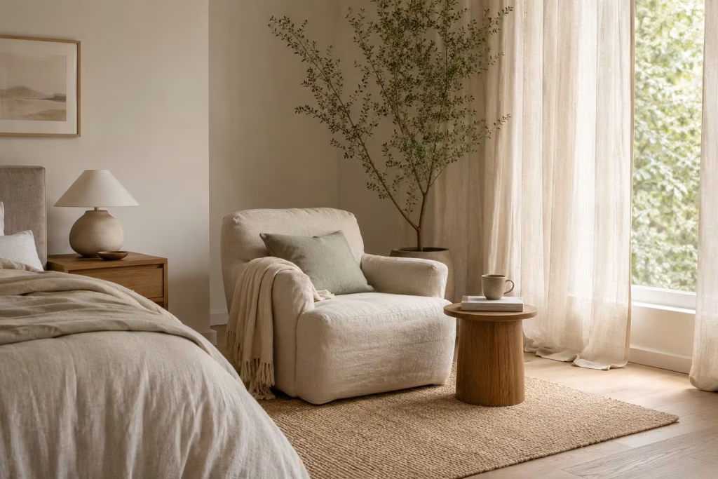
Every bedroom has that one corner that quietly goes unnoticed, sitting in the background like a forgotten note in an otherwise well-composed room. It might be squeezed between a wardrobe and a window, or left empty after furniture was rearranged over time. Yet with a careful eye, this overlooked pocket of space can be transformed into a summer reading sanctuary that feels light, breathable, and effortlessly inviting.
Unlike heavier winter-inspired nooks that lean into deep tones and dense textures, a summer reading corner thrives on restraint. It embraces openness, filtered daylight, and materials that feel easy against the skin. The aim is not to create a dramatic statement, but rather a place where time slows down, almost without you noticing.
Light-Filtering Curtains That Soften the Entire Atmosphere
Light is the quiet architect of any reading space. In a summer setting, it should feel diffused rather than direct, softened rather than harsh. This is where light-filtering curtains become invaluable.
Sheer linen or cotton voile works particularly well because it allows daylight to pass through while gently taming its intensity. The effect is subtle but transformative. Sunlight no longer feels like a spotlight. Instead, it drifts through the room like a soft breeze, settling into corners and wrapping surfaces in a delicate glow.
In one bedroom project I worked on, replacing heavy blackout drapes with layered sheer panels immediately changed the character of the space. What once felt enclosed and slightly static began to breathe again. The reading corner, previously ignored, suddenly felt alive from morning until late afternoon.
There is a quiet magic in this kind of light control. It does not demand attention, yet it completely reshapes how a room is experienced.
Relaxed Linen Upholstery That Invites You to Stay Awhile
Summer interiors rely heavily on materials that feel easy and unforced. Linen, in particular, brings a sense of relaxed elegance that works beautifully in reading corners.
Unlike structured upholstery that can feel formal or rigid, linen carries a natural softness. It creases gently, drapes loosely, and responds to the body in a way that feels forgiving rather than strict. This makes it ideal for long reading sessions where comfort is non-negotiable.
I often recommend choosing upholstery in undyed or lightly tinted tones such as oat, sun-washed beige, soft clay, or pale stone. These shades sit comfortably within a summer palette without overwhelming the eye.
There is also something reassuring about linen’s imperfection. Slight wrinkles and natural variation give the space a sense of ease, as if it has already been lived in rather than staged for appearance alone. It is the design equivalent of rolling up your sleeves and settling into a good book without fuss or ceremony.
A Summer-Inspired Colour Palette That Keeps the Space Light
Colour plays a defining role in how a reading nook feels, particularly in warmer months. A summer-inspired palette should never feel heavy-handed. Instead, it should echo natural elements found outdoors during longer, brighter days.
Soft whites, muted sands, pale sage, faded terracotta, and sun-bleached neutrals work particularly well because they reflect rather than absorb light. These tones help maintain a sense of airiness even in smaller rooms.
I often describe this kind of palette as “quiet colour.” It does not compete for attention. Instead, it sits gently in the background, allowing texture, light, and form to take the lead.
In practice, even subtle shifts in tone can change the atmosphere entirely. A reading chair in warm beige placed against a soft green wall can feel like an entirely different environment compared to the same chair set against stark white. It is all about creating harmony rather than contrast for its own sake.
Airy Layouts That Prevent the Space From Feeling Crowded
One of the most common mistakes in bedroom reading corners is overfilling the space. When furniture is pushed too close together, the sense of ease disappears, and what should feel like a retreat begins to feel constrained. An airy layout is essential. It allows the eye to rest and gives the body room to relax without visual pressure.
In smaller bedrooms, I often work with just three core elements: a seating piece, a soft side table, and a single light source. Anything beyond that tends to dilute the purpose of the nook.
Spacing is equally important. Even a modest gap of 600mm to 800mm (24 to 31 inches) between the reading chair and surrounding furniture can dramatically improve how open the space feels. The goal is not to fill every corner, but to let the corner breathe.
Real Project Experience: When Moving a Dresser Changed Everything
One of the most revealing bedroom transformations I worked on involved a space that initially felt too tight for any kind of dedicated reading area. The room was well-furnished, but poorly balanced. A large dresser had been placed directly opposite the bed, unintentionally dominating the available floor space.
By simply relocating the dresser to an adjoining wall, a previously unusable corner near the window suddenly opened up. It was a small adjustment, but the impact was immediate.
We introduced a low-profile linen armchair, a slim oak side table, and a soft wool rug to anchor the zone. Nothing extravagant, nothing overdesigned. Yet the corner quickly became the homeowner’s preferred place to unwind at the end of the day.
What stood out most was not the furniture itself, but how the space felt afterwards. It carried a sense of ease, almost like a room within a room had quietly revealed itself. Sometimes, it is not about adding more. It is about stepping back and letting the space speak for itself.
Pros
- Makes effective use of overlooked bedroom space.
- Enhances natural daylight experience during the day.
- Creates a calm, restorative environment for reading and relaxation.
- Works well in both compact and larger bedrooms.
- Encourages a lighter, more breathable seasonal interior feel.
- Requires minimal structural changes in most cases.
- Can be achieved through simple furniture repositioning and styling.
Cons
- Limited privacy in shared bedroom environments.
- Exposure to strong sunlight may require fabric protection.
- Space can feel underwhelming if not styled with restraint.
- Requires careful layout planning to avoid clutter.
- May compete with existing bedroom functions if not balanced properly.
- Seasonal styling adjustments may be needed to maintain comfort year-round.
Design a Forest-Inspired Reading Nook With Layered Greenery
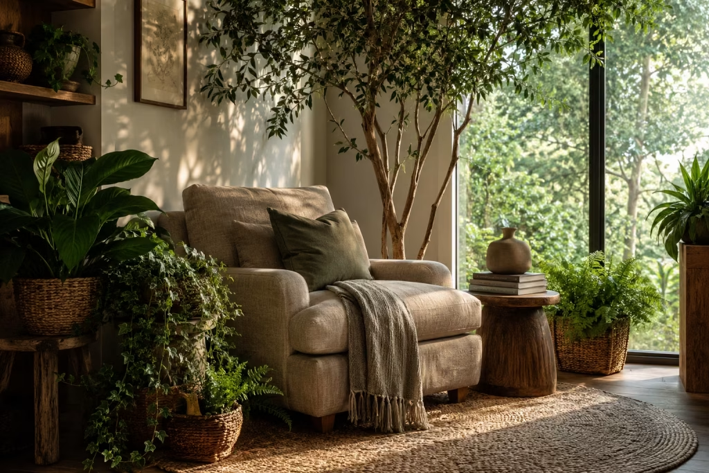
Some reading nooks provide comfort through furniture. Others rely on colour or architectural features. A forest-inspired reading nook achieves something altogether different. It creates an atmosphere. The moment you step into the space, the pace of the day begins to loosen its grip. The noise of daily routines fades into the background, replaced by a feeling that is both grounding and restorative.
There is a reason people instinctively seek out parks, gardens, and woodland trails when life becomes overwhelming. Nature has a remarkable ability to settle the mind. Bringing elements of that experience indoors allows a reading corner to become more than simply a place to sit with a book. It becomes a retreat that nurtures focus, relaxation, and wellbeing throughout the year.
The key is not filling the area with as many plants as possible. Instead, the goal is to recreate the layered richness found in natural landscapes, where every element contributes to a balanced and immersive environment.
Indoor Trees Create a Strong Connection to Nature
If there is one feature that instantly elevates a forest-inspired reading nook, it is an indoor tree. Unlike smaller houseplants that occupy surfaces, trees introduce vertical presence. They naturally draw the eye upward and create a sense of scale that makes the nook feel connected to something larger than itself.
In residential projects, I often use species such as olive trees, ficus varieties, or tall kentia palms because they provide structure without overwhelming the space. Their organic silhouettes soften hard architectural lines while introducing a sense of movement and life.
For reading corners measuring approximately 1.8m x 1.8m (6ft x 6ft) or larger, a tree between 1.5m and 2.1m tall (5ft to 7ft) often creates the strongest visual impact.
What makes indoor trees particularly effective is their ability to change the atmosphere without requiring extensive decoration. A single tree positioned thoughtfully beside a reading chair can transform an ordinary corner into a destination that feels remarkably serene.
Layering Plant Heights Creates Depth and Realism
One common mistake people make when incorporating greenery is placing plants at the same level. While this may seem organised, it rarely feels natural.
Nature itself offers a valuable lesson. Forests are successful because they contain layers. Tall trees form the canopy. Medium shrubs fill the middle ground. Smaller plants occupy the forest floor.
The same principle works beautifully indoors. I often recommend combining three height categories:
- Tall elements such as indoor trees or large leafy plants.
- Mid-level plants placed on stools, stands, or side tables.
- Lower greenery positioned directly on the floor or within baskets.
This layered arrangement creates visual depth and keeps the eye moving naturally throughout the space.
In one project, a reading corner initially contained several attractive plants, yet the composition felt flat. By redistributing them across varying heights, the entire area gained dimension and richness. It suddenly felt more immersive, as though the greenery was wrapping gently around the seating area rather than simply decorating it.
Like pieces of a puzzle falling into place, every layer contributes to the overall experience.
Natural Baskets Add Texture and Warmth
Plant containers often receive less attention than the greenery itself, but they play a significant role in shaping the overall aesthetic.
Plastic pots, particularly those with glossy finishes, can disrupt the organic atmosphere that a forest-inspired nook seeks to achieve. Natural baskets, on the other hand, reinforce the connection to earthy materials.
Woven seagrass, rattan, water hyacinth, and jute containers introduce texture while complementing timber furniture, linen fabrics, and natural flooring.
Beyond aesthetics, baskets help soften the visual weight of larger plants. Their woven surfaces create a more relaxed appearance, making the nook feel approachable rather than overly polished.
I frequently encourage clients to think of baskets as part of the material palette rather than merely functional accessories. Much like a textured rug or handcrafted ceramic piece, they contribute to the layered character that makes a reading corner feel complete.
Light Positioning Shapes the Entire Experience
Even the healthiest collection of plants cannot compensate for poor lighting. Light influences not only plant growth but also the emotional atmosphere of the reading nook itself. Positioning the space near a window allows greenery to thrive while ensuring the seating area benefits from natural illumination during reading hours.
Ideally, the reading chair should sit adjacent to the light source rather than directly in front of it. This arrangement reduces glare while allowing daylight to wash gently across pages and surrounding foliage.
In east-facing rooms, morning sunlight creates a calm and energising environment that pairs beautifully with early reading sessions. South-facing spaces often provide the longest exposure to daylight, while west-facing locations can produce warm, golden light during the afternoon and evening.
Where natural light is limited, strategically placed floor lamps with warm colour temperatures help maintain the atmosphere after sunset.
One of my favourite effects occurs when sunlight filters through leaves, casting soft shadows onto nearby walls and textiles. These shifting patterns introduce a quiet sense of movement that makes the space feel alive throughout the day.
Why Forest-Inspired Spaces Feel So Restorative
There is a deeper reason why greenery has such a profound impact on reading environments. Humans have spent the majority of their history surrounded by natural landscapes. Although modern life increasingly unfolds indoors, our psychological response to nature remains remarkably strong.
Plants soften visual boundaries. They introduce organic forms into spaces dominated by straight lines and manufactured materials. Their presence encourages slower observation, something that aligns perfectly with the experience of reading.
In many homes, the reading nook becomes a place where people disconnect from screens, notifications, and constant demands. Layered greenery supports this transition, creating an environment that feels calmer and more reflective.
It is not merely decoration. It is environmental design that supports mental restoration.
Pros
- Strengthens the connection between interior spaces and nature.
- Creates a calming atmosphere that encourages relaxation and focus.
- Improves visual softness within modern interiors.
- Works effectively in both large and compact homes.
- Introduces natural texture and depth without excessive decoration.
- Can improve perceived wellbeing and comfort.
- Creates an immersive reading environment that evolves over time as plants mature.
Cons
- Living plants require ongoing care and maintenance.
- Some species may struggle in rooms with limited natural light.
- Larger plants can occupy valuable floor space.
- Watering routines must be managed carefully to avoid damage to nearby furnishings.
- Certain varieties may not be suitable for households with pets.
- Plant replacement costs can accumulate over time if conditions are unsuitable.
Create a Cozy Reading Escape Around a Fireplace
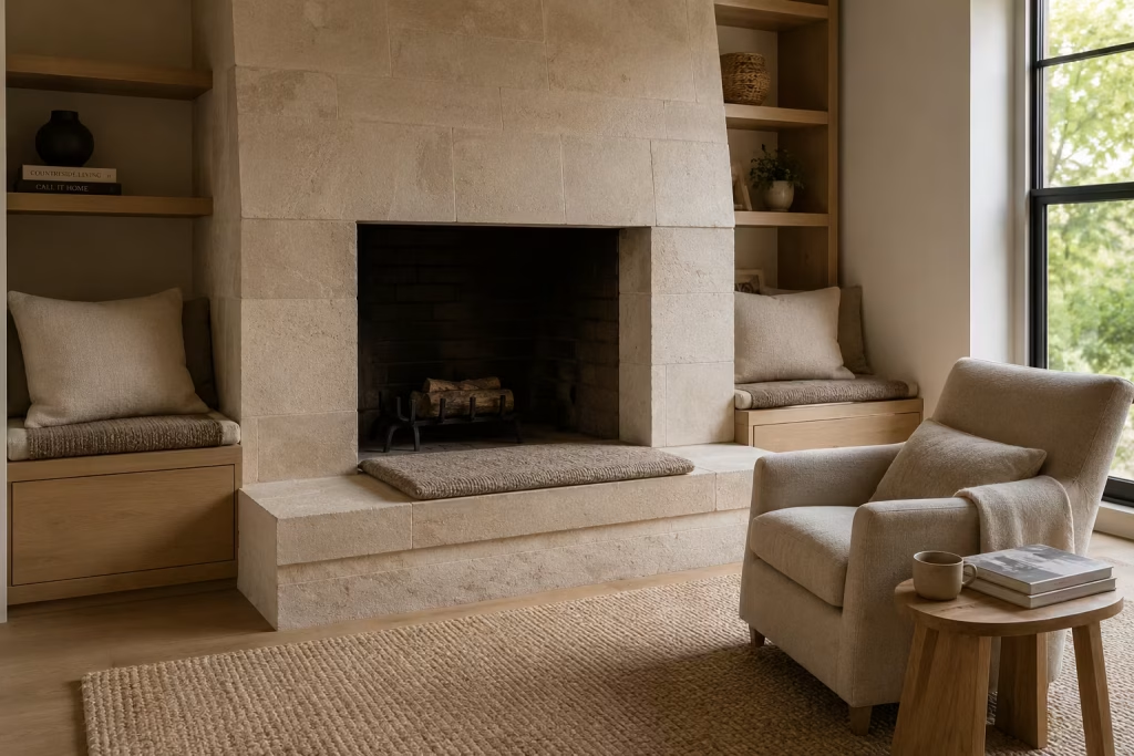
Few places in a home possess the same magnetic pull as a fireplace. Long before televisions became the focal point of living spaces, families naturally gathered around the hearth. Conversations unfolded there, stories were shared there, and quiet moments of reflection found their place there. Even today, a fireplace carries an emotional weight that few architectural features can match.
When designing reading nooks, I often find that the fireplace offers a ready-made foundation. It already provides warmth, visual interest, and a natural sense of gathering. The challenge is not creating atmosphere from scratch but enhancing what already exists.
A thoughtfully designed reading retreat around a fireplace feels like a refuge from the outside world. On cold evenings, it becomes a sanctuary where the flicker of flames replaces the glare of screens. During warmer months, even an inactive hearth continues to serve as an architectural anchor that brings character and depth to the room.
The beauty of fireplace reading spaces lies in their timeless appeal. Trends may come and go, but the simple pleasure of sitting beside a fire with a good book remains one of life’s enduring comforts.
Hearth Seating Creates a Natural Gathering Spot
The hearth itself often holds untapped potential. While many homeowners view it solely as a functional extension of the fireplace, it can become one of the most inviting seating areas in the home.
A generously proportioned hearth, particularly one measuring 450mm to 600mm deep (18 to 24 inches), can accommodate cushions and upholstered seat pads that transform it into an informal reading perch.
In period properties, I frequently preserve existing stone or brick hearths and soften them with tailored cushions in natural fabrics. This approach respects the architecture while making the area significantly more comfortable for everyday use.
For larger fireplaces, built-in benches positioned on either side of the hearth create a balanced composition while increasing seating capacity. These additions often become favourite spots for reading, morning coffee, or quiet conversation.
One homeowner described their hearth seating as “the place where everyone eventually ends up.” That observation captures the essence of successful fireplace-centred design. People are naturally drawn to warmth, both physical and emotional.
Seasonal Styling Keeps the Nook Feeling Fresh Year-Round
One of the advantages of fireplace reading corners is their ability to evolve with the seasons. During autumn and winter, the space can embrace heavier textures and richer materials. Wool throws, chunky knit blankets, velvet cushions, and warm timber accents reinforce the cozy atmosphere while complementing the glow of the fire.
Spring introduces an opportunity for lighter layers. Linen textiles, woven baskets, and fresh greenery refresh the space without requiring significant changes.
In summer, when the fireplace may not be in use, styling shifts toward openness. Decorative branches, oversized lanterns, ceramic vessels, or simple arrangements of seasonal foliage can fill the firebox and maintain visual interest.
I often remind clients that the best interiors adapt rather than remain frozen in time. Like changing chapters in a favourite novel, seasonal adjustments keep the reading nook feeling relevant and engaging throughout the year.
Natural Stone Features Add Authentic Character
Few materials complement a reading retreat as beautifully as natural stone. Stone carries a sense of permanence that instantly grounds a space. Whether it appears as a full fireplace surround, a rustic chimney breast, or a simple hearth slab, it introduces texture and depth that manufactured finishes often struggle to replicate.
Limestone, travertine, sandstone, and slate each bring their own character. Limestone offers softness and elegance. Travertine introduces subtle movement and warmth. Slate creates drama through its layered texture. Sandstone provides an earthy quality that feels particularly suited to nature-inspired interiors.
In one renovation project, we removed a dated tiled fireplace surround and replaced it with honed limestone. The transformation extended far beyond aesthetics. The entire room felt calmer, more substantial, and significantly more welcoming.
Natural stone also ages beautifully. Minor marks, subtle patina, and variations in tone contribute to its character over time. Rather than deteriorating, it often becomes more appealing with age.
This quality aligns perfectly with reading spaces, which tend to benefit from authenticity rather than perfection.
Soft Ambient Lighting Extends the Experience Beyond Daylight
A fireplace provides a beautiful source of illumination, but it should never be the only light source in a reading nook. Once the sun sets, layered lighting becomes essential. The goal is to create enough brightness for reading while preserving the intimate atmosphere that makes the space special.
Wall sconces positioned near seating areas work exceptionally well because they provide focused illumination without overwhelming the room. Floor lamps with linen shades introduce additional warmth while maintaining visual softness.
I typically recommend warm white lighting between 2700K and 3000K, which complements both natural materials and firelight. One technique I frequently use involves combining three light layers:
- Ambient lighting to establish overall comfort.
- Task lighting for reading.
- Accent lighting to highlight architectural features.
This combination prevents harsh contrasts while creating a rich and welcoming atmosphere. Much like a good supporting cast strengthens the lead actor, thoughtful lighting enhances the fireplace without competing for attention.
Why Fireplace Reading Nooks Feel So Comforting
The appeal of fireplace-centred reading spaces extends beyond aesthetics. There is a psychological component at work. Humans are naturally drawn to environments that provide warmth, shelter, and a sense of security. Fireplaces satisfy all three conditions simultaneously.
The flickering movement of flames introduces gentle visual stimulation without becoming distracting. The warmth encourages physical relaxation. The architectural enclosure often created around fireplaces adds a feeling of refuge that supports concentration and rest.
In a world increasingly dominated by constant notifications and digital interruptions, these qualities have become more valuable than ever.
A fireplace reading nook creates an opportunity to slow down, disconnect, and enjoy a simpler rhythm for a while.
Pros
- Creates a naturally cozy and inviting atmosphere.
- Provides a strong architectural focal point.
- Works beautifully in both traditional and contemporary interiors.
- Enhances comfort during colder months.
- Supports layered, seasonal styling throughout the year.
- Natural stone and fireplace features add long-term value and character.
- Encourages relaxation, reading, and meaningful downtime.
Cons
- Fireplace renovations can involve significant investment.
- Existing hearths may require modifications for comfortable seating.
- Wood-burning fireplaces require ongoing maintenance and cleaning.
- Heat exposure may affect nearby fabrics and decorative items.
- Layout options are often influenced by the fireplace location.
- Some modern homes may lack a suitable fireplace feature altogether.
You May also Like: 25 Creative Ways to Transform Your Spanish Reading Nook This Weekend
Convert an Awkward Landing Into a Reading Hideaway
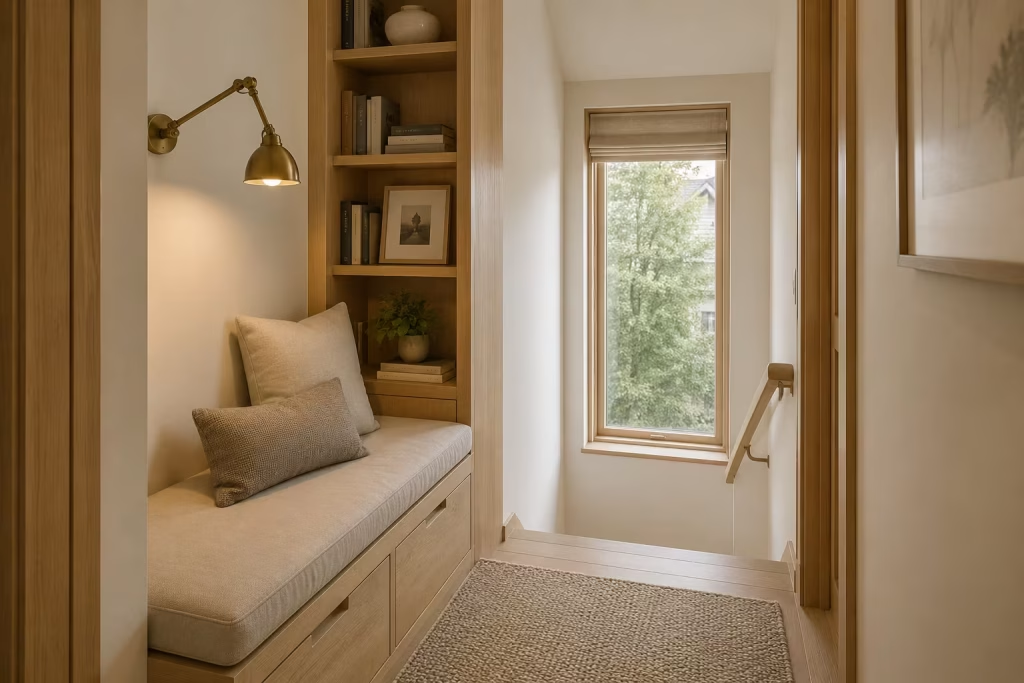
Landings rarely receive much attention during the design process. They are often viewed as transitional spaces whose sole purpose is moving people from one room to another. Yet some of the most charming reading nooks I have designed began in places that homeowners initially dismissed altogether.
An awkward landing sits in a unique position within a home. It is neither fully public nor completely private. It occupies a middle ground that naturally lends itself to quiet activities. With thoughtful planning, what once felt like leftover space can evolve into a peaceful retreat that feels tucked away from the rhythm of daily life.
There is also something undeniably appealing about discovering a reading corner where you least expect it. Like finding a hidden room in an old house or stumbling upon a secluded garden path, these spaces carry a sense of surprise that makes them all the more memorable. The secret lies in seeing possibility where others see limitations.
Small-Space Opportunities Often Hold the Greatest Potential
Large rooms tend to dominate design conversations, yet smaller spaces frequently offer opportunities that larger areas cannot.
Landings often possess qualities that naturally support reading. They tend to be quieter than family rooms, less formal than living areas, and more secluded than kitchens or open-plan spaces. This separation creates an environment where focus comes more easily.
I have worked with numerous homeowners who assumed they lacked space for a dedicated reading nook. Once we evaluated underused landings, however, the picture changed completely.
One particularly narrow landing measured just over 1.3m wide (4.3ft). At first glance it seemed too constrained for anything beyond circulation. By incorporating a slim bench, a reading light, and integrated shelving, the space became one of the most beloved features in the home.
What makes these projects rewarding is that they often feel like found treasure. Instead of undertaking major renovations, the design simply unlocks potential that was already there waiting to be discovered.
Built-In Benches Make Every Centimetre Work Harder
Furniture selection becomes especially important when working with compact footprints.
Freestanding seating can quickly overwhelm a landing, consuming valuable circulation space and making the area feel cluttered. Built-in benches offer a far more efficient solution because they integrate directly into the architecture.
A custom bench can be designed to follow the dimensions of the landing precisely, eliminating wasted space while creating a clean, cohesive appearance.
For optimal comfort, I typically recommend:
- Seat height: 430mm to 480mm (17 to 19 inches)
- Seat depth: 500mm to 650mm (20 to 26 inches)
- Back support where possible for longer reading sessions
Storage compartments concealed beneath the seat add another layer of functionality. Blankets, books, and seasonal accessories can be tucked neatly out of sight, helping the nook remain organised and visually calm.
The beauty of built-in seating is that it often feels as though it has always belonged there. Rather than appearing as furniture placed within a landing, it becomes part of the home’s architecture itself.
Book Storage Solutions That Keep the Nook Functional
A reading hideaway is only as useful as its accessibility. If books are stored in another room, the experience becomes less convenient and often less inviting. Even compact landings can accommodate surprisingly effective storage solutions.
Vertical shelving is particularly valuable because it takes advantage of wall height without consuming precious floor area. Narrow shelves positioned beside seating create an intimate library feel while keeping favourite titles within easy reach.
In homes where floor space is especially limited, recessed shelving can be incorporated between wall studs to create storage that sits flush with the surrounding wall surface.
I often encourage homeowners to display books alongside a few meaningful objects rather than filling every shelf completely. A small ceramic vessel, a framed photograph, or a handcrafted object can provide visual breathing room and prevent the storage from feeling overcrowded.
As the saying goes, less is often more. Strategic curation frequently creates a stronger impact than abundance.
Lighting Considerations Can Make or Break the Space
Lighting has the power to determine whether a reading nook feels welcoming or forgotten. Many landings suffer from insufficient illumination because they were never intended as destination spaces. A central ceiling fixture may provide enough light for circulation, but rarely enough for comfortable reading. Layered lighting creates a far better experience.
Wall-mounted reading lights work exceptionally well because they free up valuable surface space while directing illumination precisely where it is needed. Adjustable sconces provide flexibility for different reading positions and times of day.
If the landing benefits from a nearby window, positioning the seating to capture natural daylight can significantly enhance the experience. Morning light often feels crisp and energising, while afternoon light introduces warmth and softness.
I have seen modest reading corners transformed entirely through improved lighting. The furniture remained unchanged, the layout stayed exactly the same, yet the atmosphere became dramatically more inviting.
Good lighting is often the unsung hero of successful interior design. It works quietly behind the scenes, but its influence is impossible to ignore.
Minimum Measurements for a Comfortable Landing Nook
One reason many homeowners overlook landings is the assumption that they are too small to accommodate meaningful furniture. In reality, even modest dimensions can support a highly functional reading retreat.
A practical minimum footprint is:
1.2m x 1.2m (4ft x 4ft)
Within this area, it is often possible to incorporate:
- A built-in bench or compact reading chair
- Small-scale book storage
- Task lighting
- Soft furnishings for comfort
For greater flexibility, larger landings naturally provide more opportunities, but this minimum size demonstrates that even compact spaces can serve a valuable purpose. The key is thoughtful planning rather than square footage alone.
Why Hidden Reading Spots Feel So Special
There is a psychological appeal to tucked-away spaces that goes beyond aesthetics. Humans are naturally drawn to environments that provide a balance between privacy and connection. A landing reading nook offers both. It remains connected to the home while feeling slightly removed from its busiest areas.
This subtle separation creates a sense of retreat without complete isolation. It allows readers to enjoy quiet moments while remaining aware of the life unfolding elsewhere.
Many of my clients describe these spaces as their escape hatch during busy days. A few pages of a book, a cup of tea, and fifteen uninterrupted minutes can feel remarkably restorative. Sometimes the greatest luxury is not additional space. It is having a place where you can simply be left alone with your thoughts.
Pros
- Makes productive use of otherwise overlooked areas.
- Requires minimal additional square footage.
- Creates a dedicated retreat within the existing home layout.
- Built-in solutions maximise functionality.
- Encourages reading and relaxation away from high-traffic rooms.
- Can increase the perceived usefulness of circulation spaces.
- Often requires less investment than creating an entirely new room.
Cons
- Limited dimensions may restrict furniture choices.
- Ceiling height and stair configurations can create design challenges.
- Privacy levels vary depending on the home’s layout.
- Custom joinery may increase project costs.
- Natural light availability differs significantly between properties.
- Careful planning is required to maintain safe circulation pathways.
Embrace Organic Modern Style With Sculptural Furniture
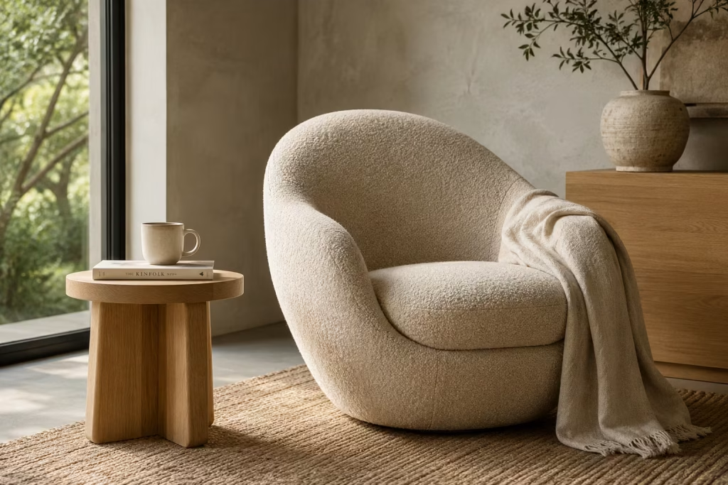
Not every reading nook needs built-in joinery, architectural alcoves, or custom millwork to feel exceptional. Sometimes a single furniture piece can completely transform how a corner is experienced. This is where organic modern design reveals its strength.
At its core, organic modern style is about balancing simplicity with warmth. It combines clean contemporary forms with materials that feel natural, tactile, and inviting. The result is a space that feels refined without becoming sterile, comfortable without appearing cluttered.
For reading nooks, this philosophy works particularly well because reading itself is a deeply personal experience. The environment should support focus and comfort while maintaining a visual calmness that allows the mind to wander through the pages of a book rather than becoming distracted by the room itself.
One lesson I have learned repeatedly through residential projects is that people rarely remember a reading nook because it was perfectly styled. They remember it because it felt good to sit in. Sculptural furniture helps achieve exactly that by blending visual appeal with genuine comfort.
Curved Lounge Chairs Create a Sense of Refuge
Straight lines serve an important purpose in architecture, but reading spaces often benefit from softer forms.
Curved lounge chairs possess an inviting quality that feels instinctive. Their rounded silhouettes seem to welcome rather than simply accommodate. In many ways, they echo forms found in nature, from smooth river stones shaped over centuries to gently weathered hills rolling across a landscape.
This connection is not accidental. Human beings generally respond positively to organic shapes because they feel less rigid and less confrontational than sharp angles.
For reading corners, chairs with rounded backs and supportive arms often create the most comfortable experience. They encourage relaxed posture while visually softening the surrounding space.
I typically recommend chairs measuring approximately:
- Width: 800mm to 1000mm (31 to 39 inches)
- Depth: 850mm to 1000mm (33 to 39 inches)
- Seat height: 430mm to 460mm (17 to 18 inches)
These dimensions provide generous comfort without overwhelming the room.
In one project, replacing a traditional angular armchair with a curved lounge chair completely changed the atmosphere of the nook. The room instantly felt more welcoming. Visitors naturally gravitated toward the chair, almost as if it had become a silent invitation to pause and stay awhile.
Natural Fabrics Bring Comfort Beyond Appearance
A beautiful chair can lose much of its appeal if the upholstery feels cold, synthetic, or uncomfortable.
Natural fabrics introduce a level of tactile comfort that significantly enhances the reading experience. Linen, cotton, wool blends, and bouclé each offer their own qualities while maintaining a connection to organic materials.
Linen provides a relaxed elegance that feels particularly suited to nature-inspired interiors. Wool introduces warmth and durability. Bouclé adds texture and visual depth through its looped surface.
What makes these fabrics especially valuable is how they age. Rather than deteriorating rapidly, quality natural textiles often develop character over time. They become softer, more familiar, and increasingly integrated into daily life.
I often tell clients that a reading chair should feel as comfortable on a Sunday morning as it does after several years of use. Choosing materials that mature gracefully helps ensure that outcome.
Comfort is not simply about cushioning. It is also about how a fabric feels against the skin during long reading sessions.
Earth-Inspired Colour Palettes Feel Timeless Rather Than Trendy
Colour trends move at remarkable speed. What feels fresh today may feel dated surprisingly quickly. Reading nooks benefit from a different approach.
Earth-inspired palettes draw their strength from nature rather than fashion. Warm sand, soft mushroom, weathered clay, olive green, muted terracotta, stone grey, and rich taupe continue to resonate because they reflect colours people encounter in natural environments.
These shades create a sense of stability that supports relaxation.
In reading spaces, I often avoid highly saturated colours because they can compete with the calming atmosphere the nook is intended to provide. Instead, subtle tonal variation creates richness without overwhelming the senses.
One particularly successful project centred around a palette inspired by coastal dunes. Layers of warm beige, pale stone, and muted olive created a setting that felt calm in every season. Years later, the space remains as appealing as the day it was completed.
That is the advantage of drawing inspiration from landscapes rather than passing trends. Nature rarely goes out of style.
Creating Visual Softness Through Form and Material
One of the defining characteristics of organic modern design is visual softness.
This quality extends beyond furniture shape. It emerges from the relationship between materials, textures, colours, and proportions.
A reading nook filled with sharp edges, glossy finishes, and high-contrast surfaces can feel visually demanding. By comparison, softer forms encourage the eye to move more gently through the space.
Curved furniture contributes significantly to this effect, but so do other design elements.
Rounded side tables, woven rugs, textured fabrics, handmade ceramics, and softly draped throws all help create a more welcoming environment.
I frequently notice that the most relaxing reading corners are not necessarily the most elaborate. Rather, they are the ones where every element feels considered and harmonious.
Visual softness creates emotional softness.
When the environment feels calm, the mind often follows.
Why Sculptural Furniture Can Transform an Entire Room
Many homeowners assume they need a large budget or extensive renovation to create a memorable reading nook. In reality, furniture selection often has a greater impact than structural changes.
A sculptural chair acts as both functional seating and visual anchor. It establishes the character of the space while providing practical comfort.
Unlike decorative accessories that may come and go, a well-chosen lounge chair becomes part of daily life. It is where morning coffee is enjoyed, favourite novels are revisited, and quiet moments are reclaimed from busy schedules.
The best pieces do not simply occupy a room. They shape how the room is experienced.
When selecting furniture, I encourage homeowners to think beyond appearance alone. Consider how the piece feels, how it supports the body, and how it contributes to the overall atmosphere.
A beautiful reading nook should look inviting from across the room. More importantly, it should feel even better once you sit down.
Pros
- Creates strong visual impact without major renovation work.
- Supports both comfort and aesthetics simultaneously.
- Works effectively in modern, transitional, and nature-inspired interiors.
- Organic forms soften architectural rigidity.
- Natural materials add warmth and tactile richness.
- Earth-toned palettes remain relevant for years.
- Can transform underutilised corners into meaningful destinations.
Cons
- High-quality sculptural furniture often carries a premium price.
- Larger lounge chairs may require generous floor space.
- Some statement pieces prioritise appearance over ergonomic comfort.
- Natural fabrics may require additional maintenance compared to synthetic alternatives.
- Curved furniture can be more challenging to pair with existing furnishings.
- Poor-quality reproductions often lack the comfort and craftsmanship of original designs.
Frame a Reading Nook With Floor-to-Ceiling Shelving
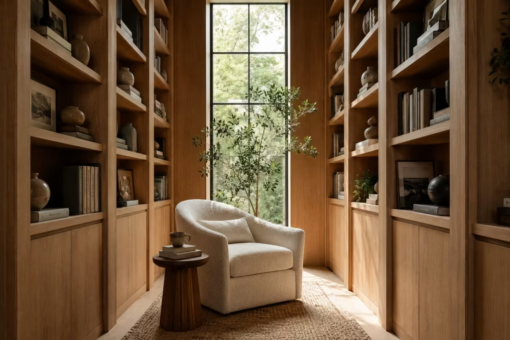
Some reading nooks feel temporary, as though they could disappear with the next furniture rearrangement. Others possess a sense of permanence that makes them feel woven into the architecture of the home itself. Floor-to-ceiling shelving belongs firmly in the latter category.
There is a reason libraries have captivated readers for centuries. The experience extends far beyond the books. It is the feeling of being surrounded by stories, knowledge, and discovery. Floor-to-ceiling shelving recreates a portion of that atmosphere on a residential scale, transforming a simple corner into a destination that feels purposeful, immersive, and deeply personal.
What makes this approach particularly compelling is its ability to combine practicality with emotional appeal. Every shelf contributes function, yet together they create an environment that encourages curiosity and contemplation. The books become part of the architecture, while the architecture enhances the experience of reading.
In many homes, this type of nook evolves into far more than a place for books. It becomes a retreat where people think, learn, reflect, and occasionally lose track of time in the best possible way.
Architectural Impact That Transforms the Entire Room
Furniture can improve a space, but architectural features have the power to redefine it.
Floor-to-ceiling shelving immediately changes how a room is perceived because it introduces strong vertical lines that draw the eye upward. This visual movement creates a sense of height and presence, making even modest rooms feel more substantial.
One reason custom shelving feels so effective is that it turns an ordinary wall into a focal point. Rather than fading into the background, the wall becomes an active participant in the room’s design story.
In homes with ceiling heights of 2.4m to 3m (8ft to 10ft), full-height shelving can dramatically enhance visual proportions. The result often feels more sophisticated because the eye naturally registers the vertical scale.
I have seen relatively small reading corners gain a remarkable sense of importance simply through the addition of well-designed shelving. What was once a forgotten corner suddenly carried the presence of a dedicated reading room.
That is the beauty of architectural interventions. They alter not only appearance but perception.
Storage Integration Creates Order Without Sacrificing Beauty
A successful reading nook should support daily life rather than complicate it. One of the greatest advantages of floor-to-ceiling shelving is its ability to accommodate far more than books alone. Decorative objects, personal collections, storage baskets, framed photographs, and treasured keepsakes can all be integrated thoughtfully into the design.
The most effective shelving systems strike a balance between display and concealment.
Open shelves showcase books and meaningful objects, while closed cabinetry positioned below seating level provides a place for less attractive necessities. Extra blankets, charging cables, seasonal accessories, and household items can remain accessible without contributing visual clutter.
I often recommend dedicating approximately:
- 70% of shelving to books
- 20% to decorative elements
- 10% to open breathing space
This ratio prevents the installation from feeling overcrowded while maintaining visual interest. Storage should not merely solve practical problems. At its best, it also enhances the atmosphere of the room.
Display Styling That Feels Collected Rather Than Decorated
One of the easiest ways to undermine beautiful shelving is by treating every shelf as an opportunity to fill space. The most compelling displays rarely look perfectly arranged. Instead, they feel collected gradually over time.
Books naturally provide texture, colour variation, and personality. Rather than organising everything with military precision, consider mixing vertical and horizontal stacks to create a more relaxed rhythm.
Adding a few carefully selected objects introduces contrast and character. Handcrafted ceramics, small sculptures, framed photographs, natural stone pieces, and collected travel mementos can all contribute meaningfully when used sparingly.
A principle I frequently apply is the idea of visual pauses. Just as punctuation improves readability within a sentence, empty space improves readability within shelving. Not every section needs to be filled.
Those moments of openness allow surrounding objects to breathe, giving the overall composition a calmer and more refined appearance. Like a well-edited book, what is omitted can be just as important as what remains.
Creating Enclosure Without Making the Space Feel Closed In
One of the most remarkable qualities of floor-to-ceiling shelving is its ability to create a sense of enclosure. Humans are naturally drawn to spaces that offer a balance between shelter and openness. Reading nooks framed by bookshelves satisfy this instinct beautifully.
The shelving creates visual boundaries that help define the space, making it feel distinct from the rest of the room. At the same time, the open nature of the shelves prevents the area from feeling boxed in or isolated. This subtle enclosure contributes significantly to comfort.
I often compare it to sitting beneath the canopy of mature trees. There is a reassuring sense of protection, yet you never feel confined.
For maximum effect, a reading seat positioned between two shelving units often works exceptionally well. The books create a gentle embrace around the seating area, reinforcing the feeling of retreat without sacrificing openness. Even in open-plan homes, this strategy can establish a meaningful sense of separation.
Designer Insight: Why Library-Style Shelving Instantly Elevates a Reading Experience
Throughout my career, I have observed a consistent pattern. Rooms surrounded by books simply feel different.
Part of this comes from the visual richness books provide. Their varied colours, textures, and sizes create depth that manufactured décor struggles to replicate. Yet there is also a psychological component.
Books signal intention. A room filled with books suggests curiosity, reflection, and personal growth. It communicates that the space is meant to be used rather than merely admired.
One project stands out particularly clearly. The homeowners initially planned a simple reading chair beside a blank wall. While perfectly functional, the arrangement felt incomplete.
By introducing floor-to-ceiling shelving around the seating area, the atmosphere changed dramatically. The room no longer felt like it contained a reading nook. Instead, it felt like a reading destination.
Visitors immediately noticed the transformation. More importantly, the homeowners themselves began using the space far more frequently.
That experience reinforced something I have witnessed repeatedly over the years. People are naturally drawn to environments that celebrate books. The shelves become more than storage. They become part of the experience itself.
Practical Dimensions for Comfortable Shelving
To maximise functionality, I typically recommend the following measurements:
- Standard shelf depth: 250mm to 300mm (10 to 12 inches)
- Shelf spacing for most books: 250mm to 350mm (10 to 14 inches)
- Comfortable reading chair clearance: Minimum 900mm (3ft)
- Reading nook width between shelves: 1.2m to 1.8m (4ft to 6ft)
These proportions provide sufficient storage while maintaining comfort and accessibility.
Pros
- Creates a highly immersive reading environment.
- Maximises vertical storage capacity.
- Adds architectural character and visual impact.
- Helps organise books and personal collections efficiently.
- Creates natural spatial definition within larger rooms.
- Encourages more frequent reading and use of the space.
- Increases the perceived sophistication and functionality of the interior.
Cons
- Custom shelving installations can require significant investment.
- Large collections may require ongoing organisation.
- Open shelving tends to collect dust over time.
- Poor styling can make the space feel cluttered.
- Full-height installations may require ladders or access tools for upper shelves.
- Structural considerations may be necessary for very large book collections.
You May also Like: 15 Dreamy Farmhouse Reading Corner Ideas for the Ultimate Cozy Escape
Introduce Warm Terracotta Tones for Instant Depth
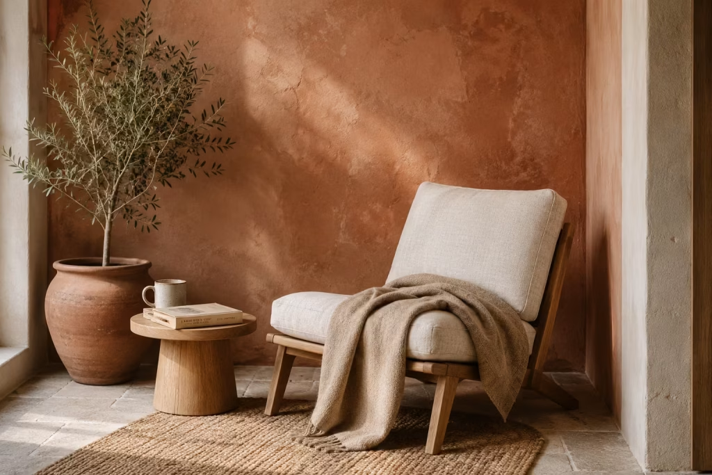
Few colours possess the enduring appeal of terracotta. Long before it became a favourite among contemporary designers, this earthy hue was shaping homes across Mediterranean villages, desert retreats, and countryside farmhouses. Drawn directly from clay-rich landscapes and sun-baked earth, terracotta carries an authenticity that feels difficult to replicate with trend-driven colour schemes.
In a reading nook, terracotta does something remarkable. It adds warmth without feeling overwhelming, depth without creating heaviness, and character without demanding constant attention. It sits comfortably between neutral and colour, making it one of the most versatile tools available when designing spaces intended for rest and reflection.
Unlike brighter shades that can quickly dominate a room, terracotta settles into the background while quietly enriching the atmosphere. It is the difference between a room that simply looks attractive and one that feels genuinely comforting the moment you enter.
When used thoughtfully, terracotta transforms an ordinary reading corner into a retreat that feels rooted, welcoming, and deeply connected to nature.
Earth-Inspired Colour Psychology Creates a Sense of Comfort
The colours surrounding us influence how we feel far more than most people realise. While cool tones often promote freshness and clarity, warmer earth-derived shades tend to evoke feelings of security, relaxation, and emotional comfort.
Terracotta succeeds because it draws from familiar natural references. It echoes clay soil, weathered canyon walls, handmade pottery, and landscapes shaped by years of sun and wind. These associations create an environment that feels instinctively reassuring. In reading spaces, this matters enormously.
A successful reading nook should help the mind shift gears. It should encourage a transition away from busy schedules, digital distractions, and endless notifications. Warm terracotta tones support that process by creating an atmosphere that feels settled and calm rather than stimulating.
I have often noticed that clients gravitate naturally toward spaces featuring earthy colours. They may not always understand why, but they frequently describe them using words such as comfortable, welcoming, grounded, and peaceful. That reaction is no coincidence.
Humans have spent thousands of years surrounded by natural landscapes. Colours that echo those environments continue to resonate on a deeply subconscious level.
Layering Warm Neutrals Creates Richness Without Clutter
One of the most common mistakes people make when decorating reading nooks is assuming comfort comes from adding more. More accessories. More colours. More decorative objects. In reality, depth often comes from subtle variation rather than abundance.
Terracotta works particularly well when layered alongside other warm neutrals. Instead of treating it as a standalone statement colour, consider it part of a broader palette that includes soft beige, warm taupe, creamy limestone, mushroom tones, weathered sand, and muted caramel. This approach creates visual richness while maintaining harmony.
For example, a reading chair upholstered in natural linen may sit against a terracotta wall, accompanied by a wool throw in oatmeal tones and a rug featuring gentle variations of clay and stone. None of these elements compete for attention, yet together they create a composition that feels far more layered than a simple monochromatic scheme.
Like ingredients in a slow-cooked meal, each component contributes something valuable. The overall result feels richer because of the combination rather than any individual element.
This layered approach also ages exceptionally well. Because the palette is rooted in natural references, it avoids the risk of feeling tied to a specific design trend.
Pairing Terracotta With Natural Wood Creates Lasting Warmth
Terracotta becomes even more effective when combined with timber. The relationship between these materials feels remarkably natural because both originate from the earth. Together, they create a visual partnership that is warm, inviting, and deeply timeless.
Lighter woods such as oak introduce freshness and brightness that prevent terracotta from feeling too heavy. Richer woods like walnut contribute depth and sophistication, creating a moodier and more intimate atmosphere.
In one residential project, we transformed a neglected reading corner using little more than terracotta paint, an oak lounge chair, and a simple timber side table. The investment was modest, yet the impact was substantial. What had previously felt like unused floor space suddenly became one of the most inviting areas in the home. The lesson was clear. Materials often matter more than decoration.
When natural wood and terracotta work together, they create a foundation that feels authentic and enduring. Decorative accessories become secondary because the materials themselves provide much of the visual interest.
Why Terracotta Works in Both Modern and Traditional Homes
Few colours move effortlessly between design styles. Terracotta is one of the exceptions. In contemporary interiors, it softens minimal spaces that might otherwise feel stark or impersonal. Within traditional homes, it complements architectural details while reinforcing a sense of warmth and heritage.
This versatility makes it particularly useful for reading nooks because these spaces often need to blend with surrounding rooms rather than feel disconnected from them. Whether paired with organic modern furniture, rustic timber beams, classic mouldings, or contemporary lighting, terracotta adapts gracefully without losing its character.
That flexibility explains why designers continue returning to it year after year. Some colours arrive with great fanfare and disappear just as quickly. Terracotta quietly remains.
Pros
- Creates warmth and depth without overwhelming the space.
- Encourages relaxation and emotional comfort.
- Complements a wide variety of natural materials.
- Works beautifully in both modern and traditional interiors.
- Ages gracefully and resists short-lived design trends.
- Enhances the cozy atmosphere of reading nooks.
- Pairs effortlessly with linen, wool, stone, and timber.
Cons
- Darker terracotta shades may make very small spaces feel enclosed if overused.
- Poor lighting can sometimes exaggerate orange undertones.
- Requires careful balancing with lighter elements to maintain visual freshness.
- Highly saturated versions may feel overpowering in compact reading areas.
- Some colour variations can appear different depending on changing daylight conditions.
You May also Like: 25 Cozy Reading Nooks That Make Quiet Moments Feel Special
Design a Reading Nook Around Oversized Textures
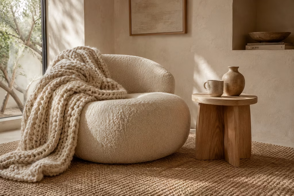
A truly inviting reading nook is not defined by square footage, expensive furniture, or elaborate styling. More often, its success comes down to something far simpler: how it feels. The most memorable reading spaces engage more than the eye. They appeal to the senses, creating an environment that feels comforting from the moment you settle into a chair and open a book.
This is where oversized textures come into their own. In many contemporary homes, surfaces can feel overly smooth and visually flat. Painted walls, streamlined furniture, and polished finishes often create a clean aesthetic, but they can sometimes leave a room feeling emotionally distant. Oversized textures introduce the missing ingredient. They add warmth, depth, and a sense of tactile richness that encourages people to slow down and stay awhile.
Think of the difference between walking across a stone pavement barefoot and stepping onto a thick woven rug. Both serve a purpose, yet one immediately creates a stronger sense of comfort. Reading nooks benefit enormously from this principle because reading itself is a sensory experience. The environment should feel every bit as engaging as the story unfolding on the page.
When layered thoughtfully, oversized textures transform an ordinary corner into a retreat that feels comforting, lived-in, and irresistibly inviting.
Chunky Knit Throws Create Instant Warmth and Relaxation
Few accessories communicate comfort as effectively as a chunky knit throw. Their appeal goes beyond appearance. The exaggerated weave introduces visual weight that instantly makes a space feel more welcoming. Draped casually across a reading chair or folded at the end of a built-in bench, a chunky knit throw signals relaxation before anyone even sits down.
I often view throws as one of the simplest ways to soften a reading nook. Unlike decorative objects that sit untouched, they invite interaction. They encourage readers to curl up, settle in, and become fully immersed in the experience.
Natural materials such as wool, cotton blends, and alpaca fibres work particularly well because they provide warmth without appearing overly formal. Their tactile quality adds a layer of comfort that photographs rarely capture.
In one project, a reading nook initially felt visually complete but emotionally flat. The furniture was attractive, the lighting was excellent, and the layout worked beautifully. Yet something was missing. Introducing a generously sized wool throw immediately changed the atmosphere. The space suddenly felt more approachable and significantly more lived-in. Sometimes the smallest additions have the biggest impact.
Bouclé Seating Adds Depth Through Softness
The rise of bouclé furniture is not merely a passing trend. Its popularity stems from a genuine ability to make interiors feel more welcoming.
Bouclé fabric is characterised by its looped texture, which creates a soft, cloud-like surface that feels as appealing as it looks. In reading nooks, this quality becomes particularly valuable because seating comfort directly influences how long the space is used. A reading chair should invite extended use rather than simply provide a place to perch. Bouclé achieves this beautifully.
Its texture catches light in subtle ways, creating visual movement even within neutral colour palettes. This makes it possible to build interest without relying on bold colours or excessive decoration. For reading corners, I often favour curved bouclé chairs measuring approximately:
- Width: 850mm to 1000mm (33 to 39 inches)
- Depth: 850mm to 950mm (33 to 37 inches)
- Seat height: 430mm to 460mm (17 to 18 inches)
These proportions provide generous comfort while maintaining visual balance. The combination of soft texture and rounded forms creates a seating experience that feels remarkably inviting, almost like being wrapped in a gentle embrace.
Woven Rugs Anchor the Space and Add Layered Character
Every successful reading nook benefits from a sense of grounding. A woven rug often provides exactly that. Without a rug, furniture can feel disconnected from its surroundings, almost as if it is floating within the room. A textured rug establishes visual boundaries while introducing another layer of tactile richness.
Natural fibre rugs crafted from jute, wool, sisal, or seagrass work particularly well within earthy reading nooks because they reinforce the connection to organic materials.
The beauty of woven rugs lies in their subtle complexity. Their patterns are rarely loud or attention-seeking. Instead, they reveal themselves gradually through texture, weave, and variation.
I frequently encourage homeowners to select rugs larger than they initially expect. A common mistake is choosing a rug that is too small, which can make a reading nook feel disconnected from the rest of the room. For a single reading chair and side table arrangement, a rug measuring at least:
- 1.5m x 2.4m (5ft x 8ft)
usually provides better visual balance than smaller alternatives. A generously sized rug acts as the foundation beneath every other design element, helping the nook feel complete and intentional.
Handmade Ceramics Bring Authenticity and Soul
Reading nooks often benefit from decorative elements, but not all accessories contribute equally. Handmade ceramics introduce something that mass-produced décor rarely achieves: individuality.
Every handcrafted vessel carries subtle imperfections. Slight variations in glaze, texture, and form create a sense of authenticity that feels deeply human. These irregularities are not flaws. They are part of the charm.
Placed on a side table, bookshelf, or window ledge, ceramics add quiet character without overwhelming the space. Their earthy surfaces pair naturally with timber, linen, wool, and other tactile materials commonly found within reading nooks.
I often use ceramics as visual punctuation marks within a design. They provide moments of interest that enrich the composition without distracting from its overall calmness.
A reading nook should never feel like a showroom. Handmade objects help prevent that by introducing warmth, personality, and a sense of story.
Why Texture Often Matters More Than Colour
Many homeowners focus heavily on colour when creating cozy spaces. While colour certainly influences mood, texture often has a more profound impact on how a room feels.
A neutral reading nook layered with wool, bouclé, woven fibres, and handcrafted materials will generally feel far richer than a colourful room lacking tactile variation. Texture creates depth without demanding attention.
It allows a space to feel inviting even when the colour palette remains restrained. This is one reason many luxury interiors rely heavily on materiality rather than bold decorative statements. The eye may notice colour first, but it is texture that often encourages people to stay.
Like a favourite novel that reveals greater complexity with every reading, richly layered textures continue to reward attention over time.
Pros
- Creates immediate warmth and visual comfort.
- Enhances the sensory experience of reading spaces.
- Works beautifully with neutral and earthy colour palettes.
- Adds depth without requiring excessive decoration.
- Helps reading nooks feel more inviting and lived-in.
- Supports a timeless, layered design aesthetic.
- Introduces comfort that can be felt as well as seen.
Cons
- Heavily textured materials may require more frequent cleaning.
- Some fabrics can attract dust and pet hair.
- Oversized textures may feel overwhelming in extremely small spaces if overused.
- High-quality natural materials often carry a higher upfront cost.
- Layering too many textures without balance can create visual clutter.
- Certain woven materials may require periodic maintenance to retain their appearance.
You May also Like: 25 Fall Reading Nook Ideas: Create the Perfect Cozy Autumn Reading Space
Create a Sun-Drenched Reading Corner With Natural Light
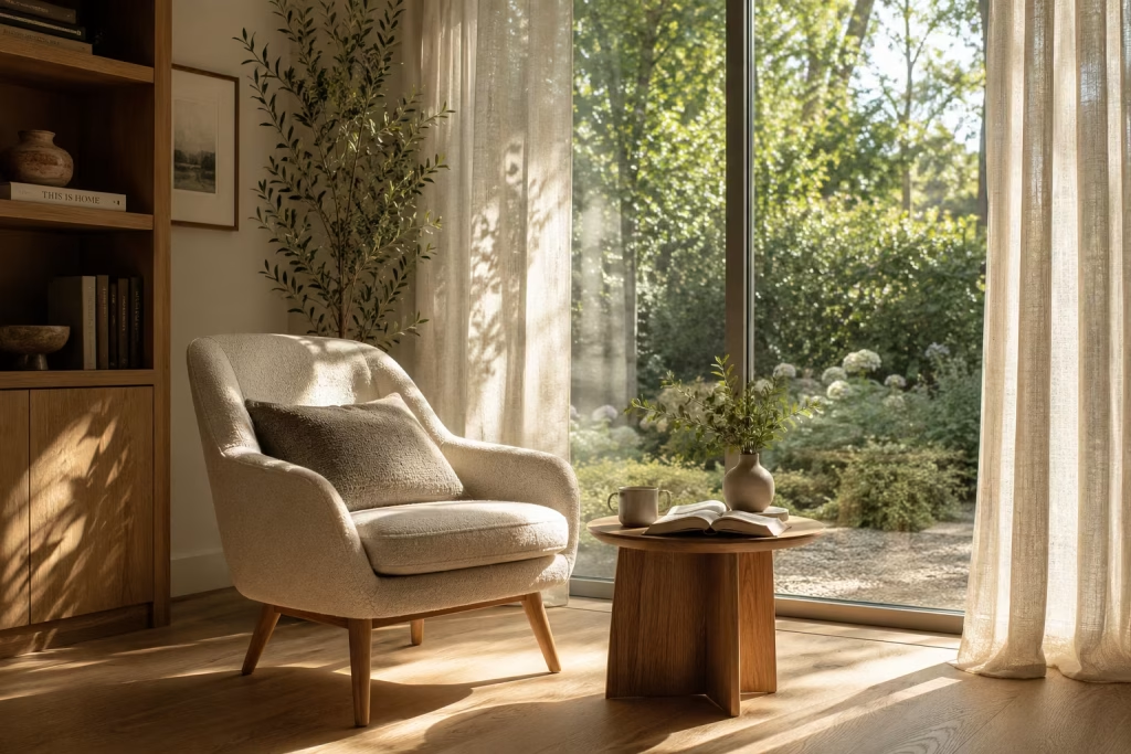
Few design elements have a greater impact on a reading nook than natural light. Furniture can provide comfort, colours can shape mood, and textures can add warmth, but light is what ultimately brings a space to life. It changes how materials appear, influences energy levels, and quietly shapes the atmosphere from sunrise until dusk.
The most captivating reading corners are often positioned where daylight becomes part of the experience itself. A beam of morning sunshine stretching across a floor, the gentle glow of afternoon light filtering through linen curtains, or the golden warmth that settles into a room before sunset can transform an ordinary reading session into something far more memorable.
In many of my projects, I have found that homeowners initially focus on furniture selection when creating a reading nook. Yet once the space is complete, they frequently comment on something else entirely. They talk about the light. They mention how it changes throughout the day, how it makes the room feel different from season to season, and how it influences their desire to spend time there.
That observation is no coincidence. Light is often the invisible ingredient that separates a pleasant reading nook from one that becomes genuinely cherished.
Morning Versus Afternoon Light Creates Different Experiences
Not all natural light feels the same. Understanding how sunlight behaves throughout the day can help transform a reading corner from merely functional into deeply enjoyable.
Morning light tends to feel crisp, energising, and refreshing. East-facing windows receive the first rays of the day, creating an atmosphere that feels optimistic and invigorating. For early risers who enjoy reading with a cup of coffee before the day begins, this orientation can be particularly rewarding.
There is a quiet clarity to morning light. It sharpens textures, brightens colours, and introduces a sense of freshness that can make even a simple reading nook feel uplifting.
Afternoon light tells a different story. West-facing rooms often receive warmer, softer illumination that gradually becomes richer as the day progresses. The light feels more relaxed and reflective, making it ideal for unwinding after work or enjoying a leisurely weekend read.
South-facing spaces generally provide the most consistent daylight throughout the day, while north-facing rooms benefit from softer, more even illumination that minimises glare.
Each orientation offers distinct advantages. The best choice depends not only on the architecture of the home but also on how the space will be used.
Seating Placement Determines Comfort More Than Most People Realise
Even the most beautiful window cannot compensate for poor furniture positioning. One of the most common mistakes I encounter is placing a reading chair directly in front of a window. While this may seem logical, it often creates excessive glare and uncomfortable contrasts between bright outdoor views and interior surfaces.
A more effective approach is positioning seating adjacent to the light source. Placing a chair at roughly a 45-degree angle to the window allows daylight to illuminate reading material without creating harsh reflections. This arrangement also provides visual access to outdoor views while maintaining comfort.
For reading corners near large windows, I generally recommend allowing at least:
- 600mm to 900mm (24 to 35 inches) between seating and glazing
- 450mm to 600mm (18 to 24 inches) for a side table
- 750mm to 900mm (30 to 35 inches) circulation space around the chair
These dimensions create a layout that feels spacious and functional without sacrificing intimacy.
In one residential project, simply rotating a lounge chair away from direct sunlight dramatically improved the reading experience. The furniture remained unchanged, yet the space became significantly more comfortable and inviting. Sometimes small adjustments yield surprisingly large rewards.
Seasonal Considerations Influence How the Nook Functions
A reading corner should not only perform well on sunny spring afternoons. It should remain enjoyable throughout the year. Seasonal changes affect daylight intensity, sun angles, and room temperatures. A corner that feels perfect in winter may become uncomfortably bright during summer if these factors are not considered.
During colder months, sunlight often sits lower in the sky, allowing it to penetrate deeper into rooms. This can create beautifully illuminated reading spaces that feel warm and welcoming.
Summer introduces different challenges. Strong sunlight may produce excessive heat or glare, particularly in south-facing and west-facing locations. This is why flexibility matters. I often recommend incorporating movable furnishings, lightweight throws, and adjustable window treatments that allow the nook to adapt as conditions change.
One lesson I have learned repeatedly is that successful reading spaces evolve with the seasons rather than fighting against them. When a nook works harmoniously with changing daylight, it remains comfortable and appealing all year long.
Window Treatments Shape the Quality of Light
Natural light is wonderful, but uncontrolled light can quickly become problematic. Window treatments act as the filter through which daylight enters the room, influencing both comfort and atmosphere. Sheer linen curtains are among my favourite solutions for reading corners because they soften incoming light while preserving a connection to the outdoors. Their gentle diffusion creates a calm, inviting glow that feels particularly suited to relaxation.
Roman blinds offer another practical option, providing greater control over brightness levels while maintaining a tailored appearance. For spaces exposed to intense afternoon sun, layered treatments often work best. Combining sheer curtains with blackout or lined drapery creates flexibility that allows the nook to respond to different conditions throughout the day.
The goal is not to block daylight but to refine it. Like a photographer carefully adjusting a lens, thoughtful window treatments help shape light into something more beautiful and usable.
Real-Life Observation: How Light Changes the Mood of a Reading Nook Throughout the Day
One of the most fascinating aspects of reading nook design is observing how a space evolves over time. I remember a project where we created a reading corner beside a large garden-facing window. The furniture palette remained constant throughout the day, yet the room seemed to develop entirely different personalities as the hours passed.
In the morning, the nook felt bright, energising, and filled with possibility. Sunlight illuminated the pages of a book while casting delicate shadows from nearby plants onto the wall.
By mid-afternoon, the atmosphere softened. The room felt calmer, quieter, and more contemplative. Textures became more pronounced as angled sunlight highlighted the weave of linen upholstery and the grain of oak furniture.
As evening approached, the golden light transformed the entire corner. Warm tones emerged within fabrics that had appeared neutral earlier in the day. The space felt intimate and deeply comforting.
Nothing physical had changed. The furniture remained exactly where it was. The décor stayed the same. Yet the mood shifted dramatically.
That experience reinforced something I often tell clients: when natural light is treated as a design feature rather than an afterthought, the room gains a quality that no furniture purchase can replicate.
Why Natural Light Makes Reading Spaces Feel More Inviting
Humans are naturally drawn to daylight. It supports wellbeing, improves mood, and helps create a stronger connection to the outside world. In reading nooks, natural light contributes something beyond practicality. It introduces movement, variation, and life.
Unlike artificial lighting, which tends to remain constant, daylight evolves continuously. Shadows shift. Colours change. Textures reveal themselves differently from one hour to the next. This subtle evolution keeps the space engaging.
Much like a compelling book that reveals new layers with every chapter, a reading nook enriched by natural light offers something slightly different each time you return.
Pros
- Enhances mood and overall wellbeing.
- Improves reading comfort during daylight hours.
- Highlights natural materials and textures beautifully.
- Creates a stronger connection to outdoor views.
- Reduces reliance on artificial lighting during the day.
- Adds visual movement and interest as light changes.
- Helps even modest reading corners feel more vibrant and inviting.
Cons
- Direct sunlight may cause glare on reading materials.
- Prolonged exposure can contribute to fabric fading.
- Summer heat gain may require additional shading solutions.
- Light quality varies depending on room orientation.
- Seasonal daylight fluctuations affect usability.
- Poorly positioned seating can reduce comfort despite abundant light.
Add Vintage Character Through Collected Pieces
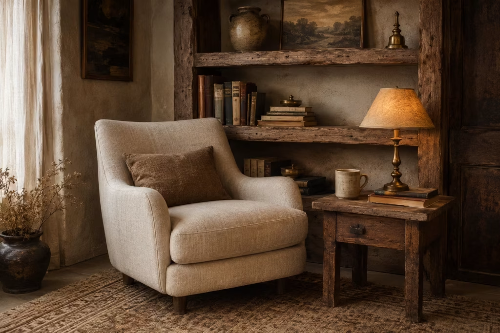
The most memorable reading nooks rarely feel as though they were purchased in a single afternoon. They possess layers. They tell stories. They contain objects that appear to have arrived over time rather than all at once. This is where vintage and collected pieces become invaluable.
A reading nook should feel personal. It should reflect experiences, memories, and interests rather than simply showcasing the latest design trends. Vintage furnishings help achieve this because they introduce something modern pieces often struggle to replicate: a sense of history.
Scratches on aged timber, softened edges on an antique table, or the gentle patina of a brass lamp all contribute character that cannot be manufactured overnight. These details create visual depth, but more importantly, they create emotional depth.
In many homes, reading corners serve as places for reflection. They are spaces where people slow down, disconnect from the constant noise of daily life, and spend time with their thoughts. Vintage elements complement this purpose beautifully because they encourage a slower, more thoughtful approach to design itself.
The goal is not to recreate a museum or period interior. Instead, it is about introducing carefully chosen pieces that make the space feel collected, authentic, and uniquely yours.
Antique Side Tables Bring Function and Storytelling Together
Every reading nook benefits from a practical surface. A place to rest a cup of tea, stack favourite books, or hold reading glasses is essential. Yet an antique side table can provide much more than functionality.
Unlike mass-produced furniture, older pieces often display craftsmanship and detailing that immediately capture attention. Turned legs, hand-carved details, dovetail joints, and beautifully aged finishes bring richness to even the simplest reading corner.
One of the reasons I frequently incorporate antique side tables into reading nooks is their ability to break up the predictability of modern interiors. In rooms dominated by contemporary furniture, an older piece introduces contrast and visual interest without feeling forced.
I once sourced a small oak side table for a client that had originally been part of a country farmhouse. The table itself was modest in size, measuring approximately 500mm wide by 500mm deep (20 x 20 inches), yet it became one of the most commented-on features in the room.
Guests were naturally drawn to it. Not because it was expensive, but because it carried a sense of history. Objects with stories often resonate more deeply than objects with perfect finishes.
Vintage Lighting Creates Atmosphere That Modern Fixtures Often Miss
Lighting is one of the most influential components of any reading nook, yet it is often treated purely as a practical necessity. Vintage lighting introduces something far richer.
An aged brass floor lamp, a ceramic table lamp with a hand-thrown base, or a beautifully restored wall sconce can instantly transform the mood of a reading corner. These fixtures contribute personality even when switched off.
One reason vintage lighting feels so appealing is that many older designs prioritised warmth and ambience. They were created to produce a softer glow rather than the intense brightness often associated with contemporary lighting.
For reading spaces, I typically recommend warm white bulbs between 2700K and 3000K. Combined with vintage fixtures, this creates illumination that feels comfortable and inviting rather than clinical.
There is also an emotional quality to vintage lighting. Much like candlelight softens a room during dinner, older fixtures often introduce a gentler atmosphere that encourages relaxation and focus. A reading nook should not feel like a workspace. It should feel like an invitation to linger.
Aged Timber Accents Add Authentic Warmth
Timber is one of the most versatile materials in interior design, but aged timber possesses a unique depth that newer finishes often lack.
Over time, wood develops subtle variations in tone, texture, and patina that tell the story of its use. These imperfections are precisely what make it beautiful. A weathered timber stool, reclaimed shelf, antique bench, or vintage bookcase can add remarkable character to a reading nook without overwhelming the space.
I often favour reclaimed oak, elm, pine, and walnut because they display natural ageing particularly well. Their surfaces reveal grain patterns, marks, and colour shifts that create visual interest from every angle.
In one renovation project, we incorporated a reclaimed oak shelf above a reading bench. Compared to the pristine cabinetry nearby, the aged timber introduced a layer of authenticity that immediately made the nook feel more established.
It is a reminder that perfection is not always the goal. Sometimes a little wear and tear is exactly what gives a space its soul.
Layering Old With New Creates Balance
One of the biggest misconceptions surrounding vintage interiors is the belief that every element must be old.
In reality, the most successful reading nooks often blend contemporary and vintage pieces together. This balance prevents the space from feeling overly themed while allowing each element to shine.
A modern bouclé chair paired with an antique side table. A sleek floor lamp positioned beside a reclaimed timber shelf. Crisp linen upholstery combined with aged brass accents. These combinations create tension in the best possible way.
The contrast between old and new introduces visual complexity that keeps the eye engaged. It also allows homeowners to enjoy the comfort and practicality of modern furnishings while benefiting from the character of vintage pieces.
I often compare this approach to a great conversation between generations. Each perspective brings something valuable, and together they create something richer than either could achieve alone. The reading nook feels layered rather than decorated. Collected rather than curated. Lived-in rather than staged.
Why Vintage Pieces Make Reading Nooks Feel More Personal
One of the greatest challenges in contemporary design is avoiding spaces that feel generic. Beautiful furniture alone cannot solve this problem.
What gives a reading nook personality are the elements that reflect individual interests and experiences. Vintage pieces naturally support this because they are often discovered rather than simply purchased.
Perhaps it is a lamp found at an antique market. A side table inherited from a grandparent. A timber stool picked up during travels. These objects carry memories alongside their practical purpose.
When incorporated thoughtfully, they help create a reading corner that feels deeply personal. Readers often form emotional connections with books because each story becomes linked to a specific moment in life. Vintage furnishings operate in a surprisingly similar way.
They remind us where we have been while creating a setting for where we are now.
Pros
- Introduces unique character and individuality.
- Creates a more personal and layered interior.
- Adds visual depth through patina and aged materials.
- Encourages sustainable design by reusing existing furniture.
- Blends beautifully with contemporary furnishings.
- Often provides craftsmanship not commonly found in mass-produced pieces.
- Helps reading nooks feel established and authentic.
Cons
- Sourcing quality vintage items can require time and patience.
- Some pieces may need restoration or maintenance.
- Antique furnishings can vary in comfort and practicality.
- Certain items may command premium prices due to rarity.
- Mixing styles requires careful balance to avoid visual confusion.
- Availability often depends on location and local markets.
Design a Dedicated Earthy Reading Room Within a Larger Space
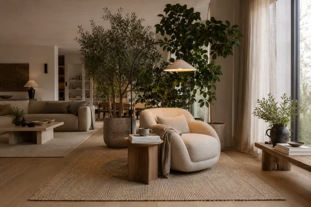
There comes a point in many homes where a reading nook is no longer enough. Not because it lacks charm, but because the household rhythm demands something more defined. When reading becomes a daily ritual rather than an occasional escape, it deserves its own spatial identity.
A dedicated earthy reading zone within a larger room achieves exactly that. It does not rely on walls or doors. Instead, it uses proportion, materiality, and subtle spatial cues to carve out a sanctuary that feels distinct, yet still connected to the surrounding environment.
What makes this approach so effective is its quiet confidence. It does not interrupt the architecture of the home. It simply settles into it, like a well-placed pause in a long sentence.
When designed with intention, even an open-plan living space can contain a corner that feels like a completely different world. One where the pace slows, the noise softens, and the simple act of reading becomes easier to sink into.
Zoning Techniques Create Psychological Separation Without Walls
Zoning is less about physical barriers and more about perception. The goal is to signal to the mind that this area serves a different purpose from the rest of the room.
One of the most effective techniques is directional furniture placement. Positioning a reading chair slightly away from the main flow of movement naturally creates a sense of retreat. When the seat is angled toward a window or focal point rather than the centre of the room, it begins to feel intentionally separate.
Another powerful tool is lighting differentiation. A reading zone that uses softer, warmer lighting than the surrounding space immediately establishes contrast. The eye recognises the shift in atmosphere even without clear boundaries.
In larger projects, I often introduce subtle architectural cues such as lowered pendant lights, partial wall shelving, or changes in ceiling detail. These elements do not divide the room but gently guide its use.
The most successful zoning strategies are almost invisible. They work in the background, shaping behaviour without announcing themselves.
Area Rugs Anchor the Reading Space With Quiet Authority
If zoning defines the idea of space, rugs define its physical presence. An area rug acts as a visual anchor, gathering furniture into a single composition. Without it, a reading chair and side table can feel disconnected from the surrounding environment, as though they are temporarily placed rather than intentionally positioned.
For earthy reading zones, natural fibre rugs work particularly well. Wool, jute, and sisal introduce texture while reinforcing the organic material palette that supports a calm reading atmosphere. Size is crucial here.
A common mistake is choosing a rug that is too small, which causes the seating arrangement to feel isolated in a fragmented way. Instead, the rug should extend beyond the seating area to create a clear boundary. For a dedicated reading zone, I typically recommend:
- Minimum rug size: 2m x 2m (6.5ft x 6.5ft)
- Ideal rug size for full reading corner: 2.4m x 2.4m (8ft x 8ft)
These proportions allow the furniture to sit comfortably within the defined area without feeling cramped. When done correctly, the rug becomes a quiet stage on which the reading experience unfolds.
Furniture Placement Shapes Flow and Focus
Furniture placement in an open reading zone is a balancing act between openness and intimacy.
The reading chair should never feel lost in the room, nor should it feel obstructive. It needs to sit in a position that feels intentional, almost as if it has always belonged there.
I often recommend creating a triangular relationship between three key elements: the reading chair, a side table, and a light source. This simple geometry naturally stabilises the space and improves usability.
Spacing also matters more than most people realise. Even small adjustments can dramatically change how the area feels:
- 600mm to 900mm (24 to 35 inches) between chair and adjacent furniture creates comfort without crowding
- 900mm (3ft) clearance behind seating maintains circulation flow
- 300mm to 450mm (12 to 18 inches) between chair and side table ensures practical reach
One project stands out clearly. A large open-plan living room felt visually chaotic despite having well-chosen furniture. The reading chair was repositioned slightly away from the sofa grouping, rotated toward a window, and paired with a grounded rug. The change required no new furniture, yet the entire space gained clarity and purpose. Placement is rarely about adding more. It is about listening to how the room wants to function.
Visual Boundaries Create Calm Without Restriction
Unlike traditional rooms, open reading zones rely on suggestion rather than enclosure. Visual boundaries help the eye understand where the reading space begins and ends. These boundaries do not need to be solid. In fact, the most effective ones are often the most subtle.
A tall floor lamp placed behind the chair, a shelving unit positioned at the edge of the zone, or even a shift in material texture can all signal separation without closing the space off.
Plants can also play a powerful role here. A cluster of tall greenery beside a reading chair creates a gentle screen that feels organic rather than architectural.
The aim is not to build walls, but to create a feeling of arrival. When someone steps into the reading zone, there should be a noticeable shift in atmosphere, even if the architecture remains open. This sense of quiet distinction is what transforms a corner into a destination.
Measurements That Define a Comfortable Reading Zone
Space planning plays a decisive role in how successful a reading area becomes. While flexibility is always important, there are practical dimensions that consistently support comfort and usability. For a dedicated earthy reading zone, I typically recommend a minimum footprint of:
2.4m x 2.4m (8ft x 8ft)
Within this area, it is possible to comfortably accommodate:
- A full reading chair or compact lounge chair
- A side table or small stackable surface
- A floor or wall-mounted light source
- Soft rug anchoring the entire zone
Smaller configurations can still work, but this dimension allows the space to breathe properly without feeling compressed. The key principle is simple: if the body feels restricted, the mind follows.
Pros
- Clearly defines a reading space within open-plan layouts.
- Requires no structural walls or permanent partitions.
- Enhances flow and organisation in larger rooms.
- Creates a strong sense of purpose and focus.
- Easily adaptable with seasonal or stylistic changes.
- Works with both modern and traditional interiors.
- Allows flexible integration into multifunctional spaces.
Cons
- Requires careful planning to avoid visual clutter.
- May feel less private than fully enclosed rooms.
- Furniture placement must be precise to maintain balance.
- Poor zoning can make the space feel fragmented.
- Lighting differences must be managed thoughtfully.
- Large open areas may dilute the sense of intimacy if not well defined.
Why Earthy Reading Nooks Feel So Instantly Comforting
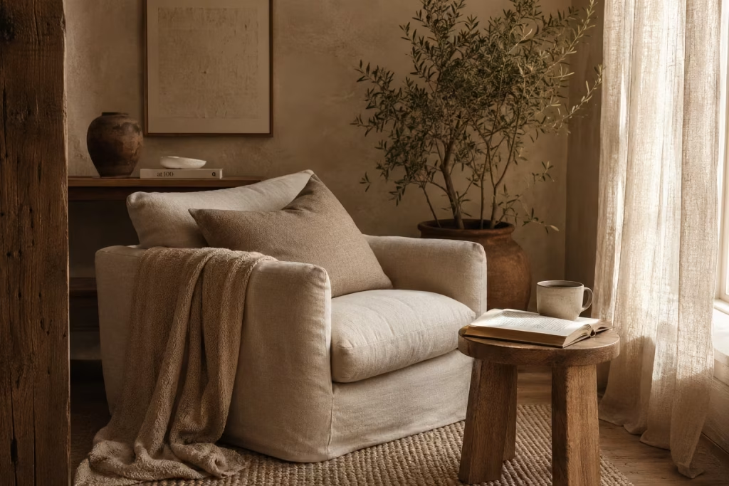
Some spaces do not need to be explained. You step into them, and something in the body quietly settles. Earthy reading nooks belong to that category. They are not loud, not performative, and not trying to impress. Yet they hold a kind of quiet authority that makes people instinctively slow down, breathe deeper, and stay a little longer than intended.
The comfort comes from more than styling choices. It is rooted in how humans respond to material, light, enclosure, and nature itself. When these elements align, even the smallest corner can feel like a retreat that has always belonged there.
The Psychology of Natural Materials
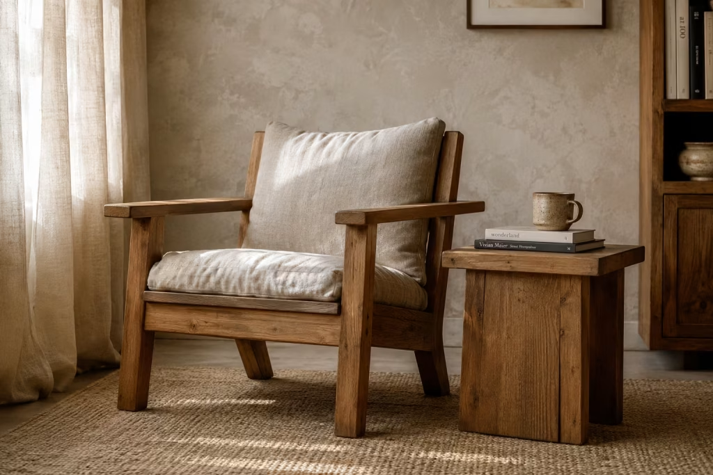
There is a reason natural materials never truly fall out of design relevance. Wood, stone, linen, wool, and clay-based finishes carry an immediate emotional familiarity. They are visually complex without being visually noisy, which allows the eye to relax rather than constantly process information.
Wood grain and visual warmth
Wood is particularly powerful in reading environments because of its inherent softness in appearance. The grain introduces movement without chaos, almost like a slow visual rhythm that calms rather than competes with attention. Whether it is a pale oak shelf or a deeper walnut side table, timber brings an understated warmth that makes a space feel lived-in rather than staged.
I have seen reading corners completely shift in mood with nothing more than the introduction of timber elements. A space that once felt flat begins to feel grounded, almost as if it has found its centre of gravity.
Organic textures versus hard surfaces
Hard, reflective surfaces tend to create visual tension. Glass, high-gloss finishes, and polished stone can look striking, but they often keep the eye moving without pause. Organic textures work differently. Linen, woven fibres, untreated wood, and textured plaster absorb light in a softer way, allowing the space to feel calmer and more forgiving.
It is the difference between a room that demands attention and one that quietly earns it.
Why imperfections create comfort
Perfection can feel distant. Slight irregularities in handmade ceramics, uneven timber grain, or softly worn upholstery introduce a human quality that makes a space easier to connect with. These imperfections act like visual reassurance, reminding us that comfort does not need to be flawless to feel complete.
Creating Refuge Within Open-Plan Homes
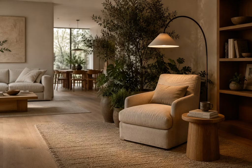
Open-plan living has changed how homes function, but it has also removed many of the smaller psychological refuges people once relied on. Without enclosed rooms, the mind can struggle to find moments of separation, even in otherwise beautiful interiors.
Reading nooks reintroduce that missing layer of privacy without physically closing a space off.
The human need for sheltered spaces
There is an instinctive comfort in partial enclosure. Not full isolation, but enough definition to feel protected from constant movement and noise. This is why people gravitate toward corners, alcoves, and window seats. These areas offer a sense of safety without disconnecting completely from the surrounding environment.
A well-designed reading nook taps into this instinct. It becomes a soft boundary within a larger room, offering emotional shelter in the middle of openness.
How reading nooks provide visual separation
Even without walls, a reading corner can feel distinct through careful composition. A change in flooring texture, a grounded area rug, a shift in lighting tone, or a thoughtfully placed armchair angled away from the main circulation path all signal a subtle transition.
The eye reads these cues instantly. Before the mind even registers it, the body understands that this is a different kind of space. One where pace slows down, and focus naturally returns.
Biophilic Design and Everyday Wellbeing
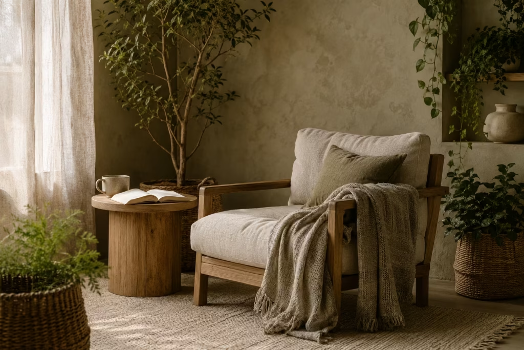
Earthy reading nooks are closely aligned with biophilic design principles, which focus on strengthening the connection between indoor environments and the natural world. This is not simply a stylistic preference. It is a response to how humans are biologically wired.
Nature-inspired interiors
When natural references are introduced into a reading space, whether through materials, colour palettes, or greenery, the environment begins to feel less constructed and more organic. Earth tones, soft greens, and natural textures mirror outdoor landscapes in a subtle way, creating familiarity that the brain recognises without conscious effort.
This is why even a small plant or a linen cushion can change the emotional tone of a corner. It is not decoration alone, it is environmental alignment.
Reduced visual stress
Modern interiors often contain a high level of visual stimulation. Screens, reflective surfaces, and bold contrasts can keep the mind in a constant state of alertness. Earthy reading nooks counter this effect by reducing visual noise.
Muted colours, soft transitions, and layered textures allow the eyes to rest. Over time, this reduces cognitive load, making it easier to focus on reading without distraction. It is a subtle shift, but one that significantly improves the quality of time spent in the space.
Connection between greenery and relaxation
Plants play a particularly important role in this ecosystem. Their presence introduces gentle movement, natural variation, and a sense of life that static objects cannot replicate. Even the smallest reading nook benefits from this effect.
There is something deeply grounding about sitting beside greenery while reading. It creates a quiet reminder of the natural world beyond the walls, softening the boundary between indoors and outdoors.
Essential Design Elements Every Earthy Reading Nook Needs
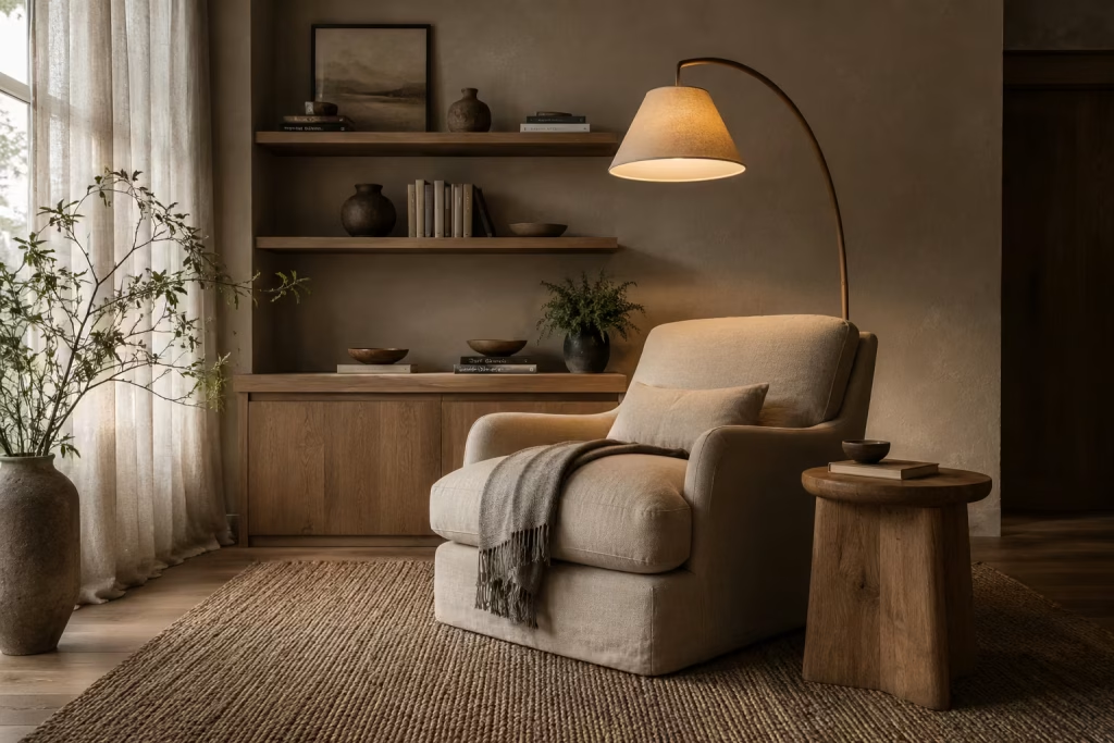
An earthy reading nook is rarely defined by a single statement piece. Its strength lies in how quietly everything works together. When seating, lighting, materials, textures, and storage are considered as one connected system rather than isolated choices, the result is a space that feels instinctively right. Nothing shouts for attention, yet everything contributes to a sense of ease that is hard to ignore.
These are the elements that consistently separate a forgettable corner from one that becomes a daily retreat.
Comfortable Seating That Supports Long Reading Sessions
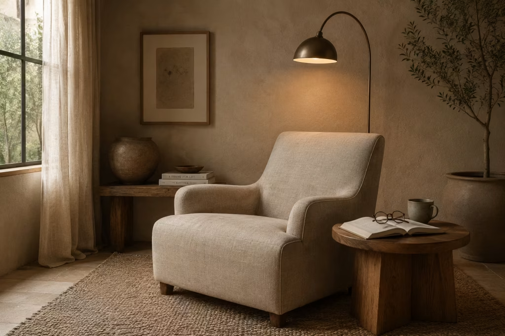
If there is one non negotiable in any reading nook, it is seating that genuinely supports extended use. A chair may look beautiful, but if the body cannot relax into it for more than a few minutes, the space loses its purpose.
In practice, the most successful reading chairs tend to balance structure with softness. A gently reclined back, supportive armrests, and a seat depth that allows natural posture all matter more than decorative styling. Dimensions typically fall within 850mm to 1000mm in width and around 430mm to 460mm in seat height, offering enough room to settle without feeling oversized for the corner.
I often describe good seating as something that “disappears under you in the right way.” You stop noticing it because it is doing its job so well. That is the quiet benchmark of comfort.
Layered Lighting for Day and Evening Use
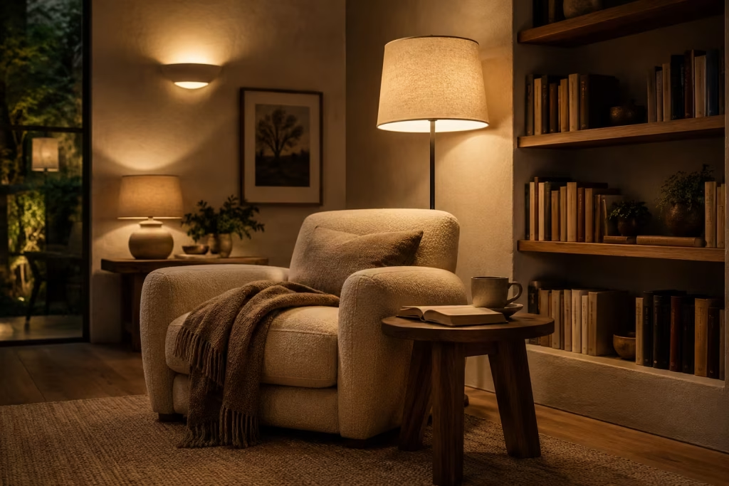
Lighting is what gives a reading nook its rhythm throughout the day. Without it, even the most beautifully designed corner can feel incomplete once natural daylight fades.
Layered lighting works best because it adapts rather than dictates. A combination of ambient light, task lighting, and soft accent illumination ensures the space remains usable from morning through to late evening.
A floor lamp placed beside the chair, a warm-toned wall sconce, or a discreet table lamp on a side surface can each serve a different purpose. The key is not brightness alone, but softness and control. Warm white temperatures between 2700K and 3000K tend to create the most relaxed reading environment.
When done well, lighting feels almost invisible. It does not announce itself, yet it quietly shapes every moment spent in the space.
Natural Materials That Age Beautifully
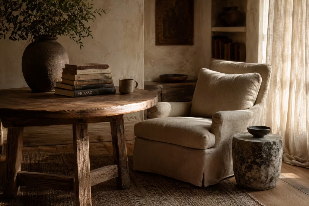
There is a certain honesty in materials that improve with age. Timber that develops patina, leather that softens over time, linen that becomes more relaxed with use. These surfaces do not resist life, they absorb it.
In reading nooks, this quality is especially valuable because it reinforces the idea of long-term comfort rather than short-term styling. A reclaimed oak table, a wool-upholstered chair, or a stone accent surface brings a sense of permanence that synthetic finishes rarely achieve.
The charm lies in evolution. Instead of looking the same year after year, the space subtly changes, like a well-read book whose pages carry quiet traces of use. That sense of lived experience is what gives earthy interiors their depth.
Textures That Create Warmth Without Clutter
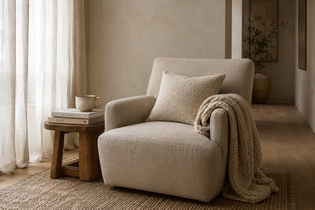
Texture is often the difference between a room that feels flat and one that feels inviting. The goal is not excess, but layering that feels intentional and restrained.
A woven rug underfoot, a chunky knit throw draped over a chair, or a bouclé cushion placed for comfort all introduce tactile variation without overwhelming the eye. These elements soften hard edges and create a sense of warmth that colour alone cannot achieve.
What matters most is balance. Too many competing textures can quickly tip into visual noise. But when carefully edited, they work like quiet background music, subtle yet essential to the overall atmosphere.
In well-designed reading nooks, texture is never loud. It simply makes the space feel easier to inhabit.
Storage Solutions That Feel Integrated
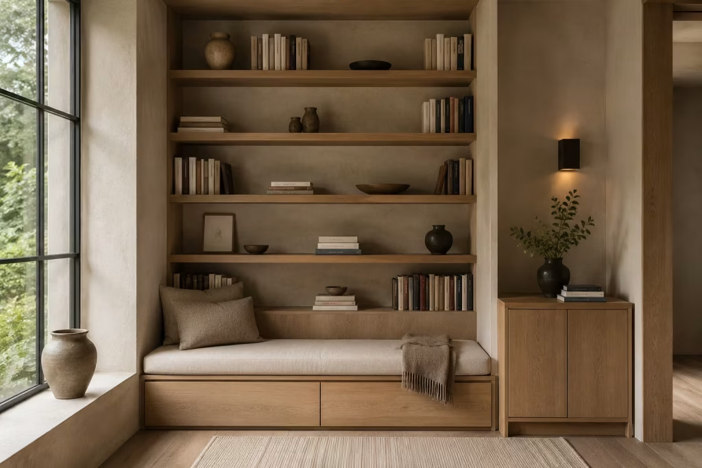
Storage is often overlooked in reading corners, yet it plays a crucial role in maintaining calm. A cluttered nook quickly loses its sense of retreat, no matter how well it is furnished.
Integrated storage solves this problem by blending function into the design rather than adding it on top. Built-in shelving, slim side cabinets, or seating with concealed compartments allow books and essentials to remain close without disrupting visual flow.
The most effective storage does not draw attention to itself. It sits quietly in the background, supporting the space without becoming the focus.
There is a simple principle I often return to in design work: if storage feels like part of the architecture, the room will always feel more restful.
Common Mistakes That Prevent Reading Nooks From Feeling Cozy
A reading nook can be beautifully styled and still miss the mark. That is the frustrating part. On paper, everything looks right. There is a chair, a lamp, a cushion, perhaps even a stack of books and a tasteful throw. Yet the space still does not invite you to stay. It feels composed, but not comforting. Polished, but not personal. That usually means one or two quiet mistakes have slipped in and undermined the whole effect.
The best reading corners do more than look attractive in photographs. They support the body, settle the mind, and create a mood that makes time feel a little softer around the edges. Cozy design is not about adding more for the sake of it. It is about making the space feel easy to inhabit, easy to return to, and easy to linger in once you arrive.
Prioritising Aesthetics Over Comfort
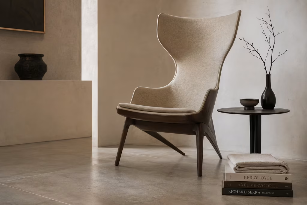
This is one of the most common traps, and it catches people more often than they realise. A reading nook can look exquisite on a mood board yet fail completely in daily use if comfort has been treated as an afterthought.
A chair with the right silhouette but poor support may look refined for a moment, but after twenty minutes the charm begins to wear thin. The same applies to deep cushions that look luxurious but offer little structure, or narrow seats that photograph well but never quite allow the body to settle. In design terms, beauty should never be floating on top of function. It needs to grow out of it.
A truly cozy reading nook is the kind of place where you stop fidgeting. Your shoulders drop. Your breathing slows. You forget about the chair because it is doing its job quietly in the background. That is the sweet spot. The form can still be elegant, but it must also be humane. A reading space should never be all icing and no cake.
Insufficient Lighting
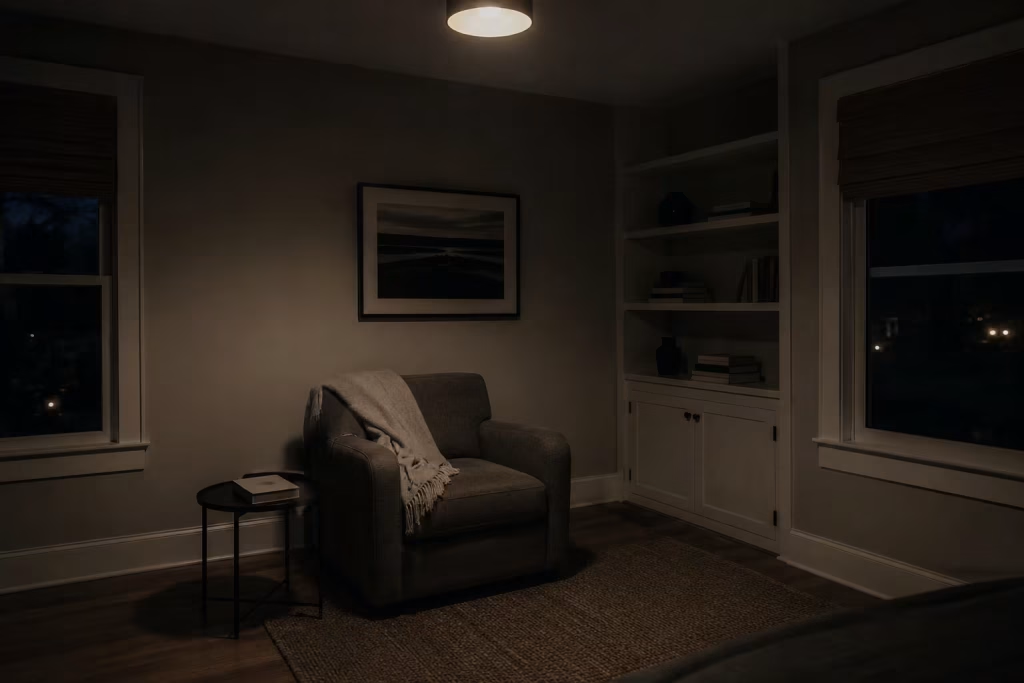
A dim corner might feel intimate at first glance, but if it is not properly lit, it quickly becomes uncomfortable rather than cozy. Poor lighting is one of those issues that sneaks up on a space. The room may look fine in daylight, then after sunset it loses all sense of warmth and becomes awkward to use.
Reading requires focused light, but that does not mean harsh brightness. The goal is layered illumination that supports the eyes without flattening the atmosphere. A single overhead fixture usually falls short because it throws light too evenly and too coldly across the room. What a reading nook needs is a more thoughtful approach, one that combines a warm task lamp, subtle ambient light, and perhaps a low glow from a wall sconce or nearby table lamp.
The difference is night and day. A well-lit nook feels inviting from dusk onward, while a poorly lit one tends to be abandoned the moment natural light fades. Light shapes mood just as much as materials do, and in a small retreat like this, it carries a lot of weight.
Ignoring Scale
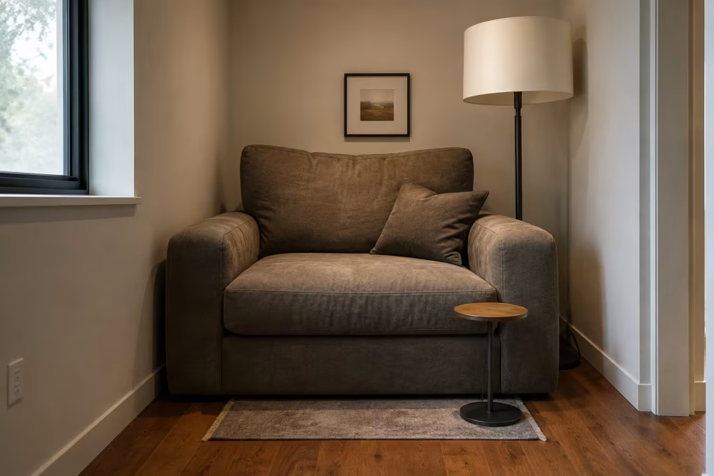
Scale can make or break a cozy corner. Too often, people choose furniture and accessories that are either too large for the space or too small to give it any presence. Both mistakes disrupt the atmosphere.
An oversized chair in a tight nook can feel like a bull in a china shop, crowding the area and making it harder to relax. On the other hand, furniture that is too petite can leave the space feeling underfed and awkward, as if it has not quite been finished. Cozy design depends on proportion. Everything needs to speak the same visual language.
This applies to side tables, rugs, cushions, and even lamps. A rug that is too small can make the nook feel disconnected. A lamp with a tall, rigid profile can overpower a delicate chair. A tiny cushion on a broad seat can make the entire composition look off balance.
Good scale creates ease. When the proportions are right, the space feels settled from the outset, as though every piece was always meant to be there.
Too Many Decorative Accessories
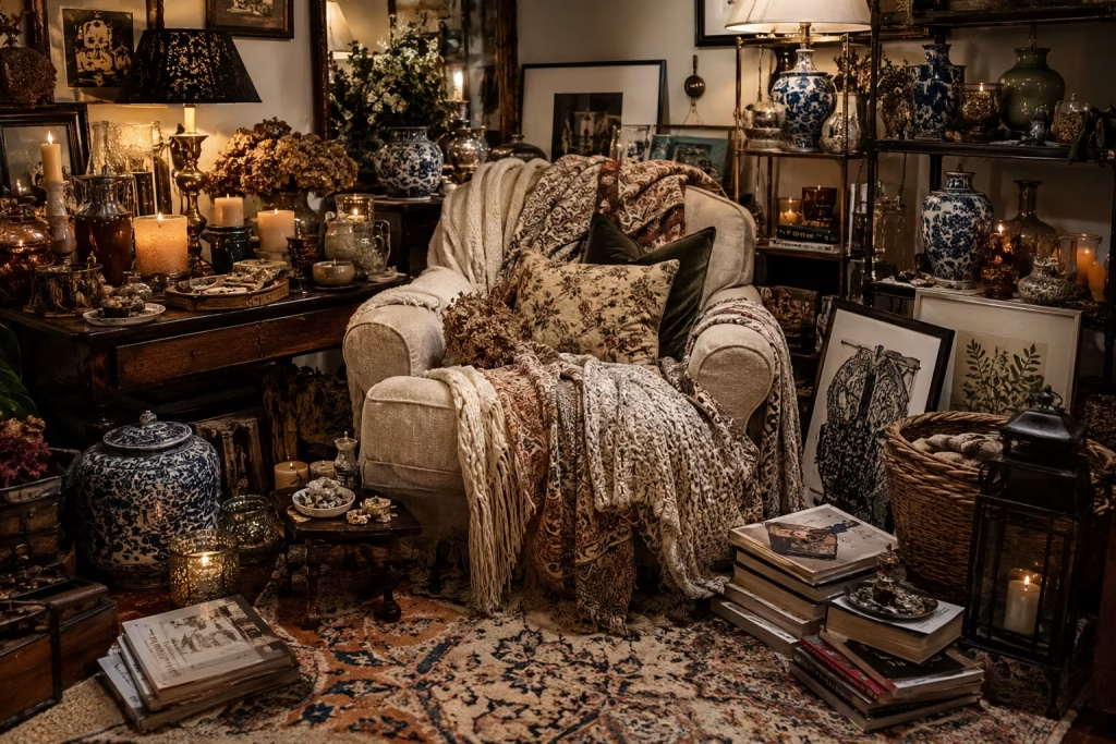
There is a fine line between layered and cluttered, and many reading nooks cross it without meaning to. In an effort to create personality, people often pile in too many decorative objects. Throws, candles, vases, framed prints, baskets, books, trays, and ornaments all start competing for space. Instead of feeling cozy, the nook begins to feel busy.
The irony is that comfort thrives on breathing room. A reading retreat should have enough visual quiet for the mind to relax. When every surface is crowded, the eye never gets a chance to rest. The result is more noise, not more warmth.
This is where restraint pays dividends. A few carefully chosen pieces carry far more impact than a scattered collection of decorative extras. One well-placed lamp, a tactile cushion, a small stack of favourite books, and perhaps a ceramic vessel or woven basket can create a complete atmosphere without overworking the space.
As the old saying goes, less is often more. In a reading nook, that truth is hard to improve on.
Lack of Acoustic Comfort
Cozy is not only about how a space looks. It is also about how it sounds. A nook that echoes, carries noise, or feels acoustically harsh will never fully deliver the calm it promises.
Hard surfaces reflect sound, which can make even a beautiful room feel restless. If a reading corner sits within an open-plan layout, beside a hallway, or near a television area, the lack of acoustic softness becomes even more noticeable. Background noise pulls attention away from the book and keeps the mind slightly on edge.
The fix is usually straightforward but often overlooked. Soft furnishings, fabric window treatments, rugs, upholstered seating, and textured materials all help absorb sound and create a quieter atmosphere. Even a few carefully chosen elements can make a noticeable difference.
When acoustic comfort is right, the nook feels protected. The room has a hushed quality, like it is holding its breath just enough to let you concentrate. That is when reading becomes immersive rather than interrupted.
Poor Furniture Placement

Even the right furniture can fail if it is put in the wrong place. Placement shapes the entire experience of a nook, yet it is often treated as an afterthought.
A chair pushed against a wall without consideration for light, view, or circulation can feel stranded. A reading seat placed in the middle of foot traffic will always be working against the flow of the room. If the nook is too exposed, it loses that sense of refuge. If it is too tucked away without proper access, it begins to feel neglected.
The most successful furniture placement creates a natural pause in the room. The chair should feel as though it belongs in a quiet pocket, with enough space around it to breathe and enough orientation to support reading. Ideally, there is a soft relationship between the seat, the light source, and any nearby table or storage.
I often think of it this way. Good placement does not just fill a corner. It gives that corner a reason to exist. Without that clarity, even a well-styled nook can feel like it is merely passing through.
How Designers Make Small Reading Nooks Feel Larger and More Luxurious
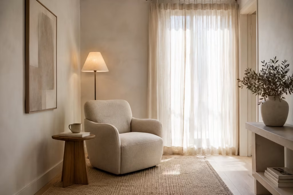
Small reading nooks are often misunderstood. Many assume that limited square footage automatically limits comfort or visual impact. In reality, some of the most memorable reading corners are the smallest ones, precisely because they rely on discipline rather than abundance. Good design does not try to stretch space artificially. It works with proportion, light, and perception to make a compact area feel generous, calm, and quietly elevated.
Luxury in these spaces is not about excess. It is about clarity. When every element has a reason to exist, the space stops feeling tight and starts feeling intentional.
Using Vertical Space
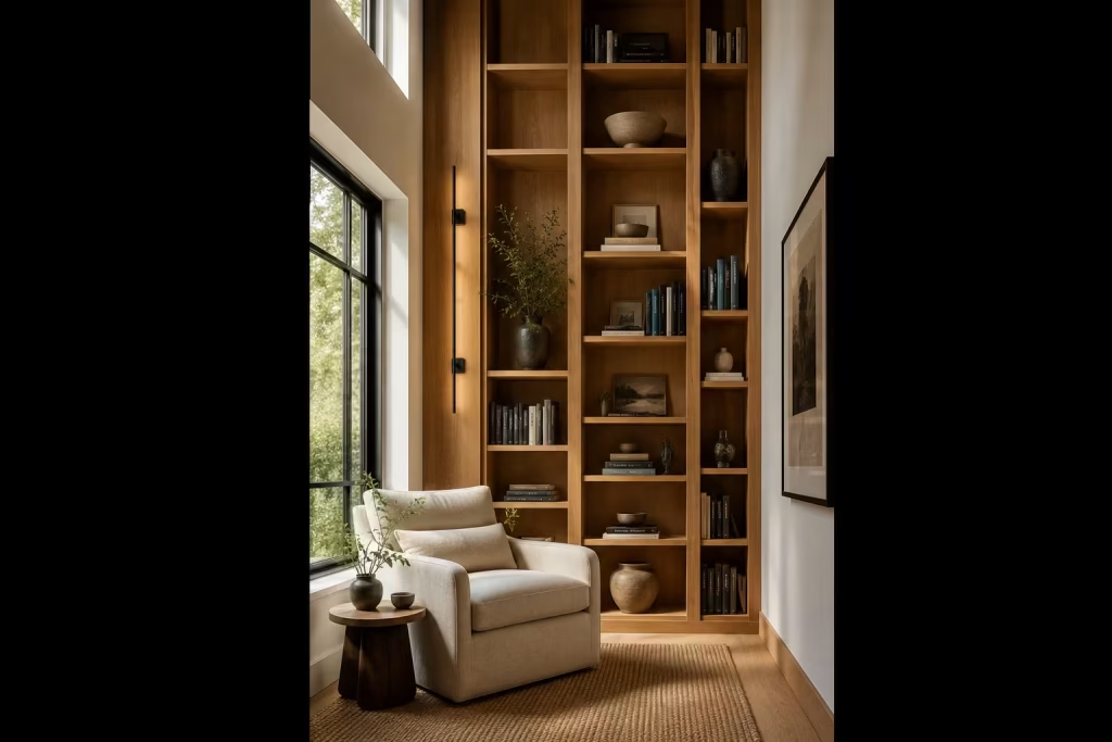
When floor area is limited, the only direction left to expand is upward. Vertical space is often underused, yet it holds enormous potential for transforming how a nook feels.
Tall shelving, wall-mounted lighting, or slim vertical paneling draws the eye upward, creating an immediate sense of height. This shift in visual direction changes perception. Even a modest corner can begin to feel architecturally significant when the gaze is guided vertically rather than horizontally.
In practice, I often use floor-to-ceiling shelving or elongated wall features to elongate proportions. It creates a rhythm that feels almost architectural, like the space has been given a stronger backbone.
The trick is not to overload the walls, but to let height do the quiet work. When used well, vertical design makes a small nook feel less like a corner and more like a defined destination.
Creating Visual Boundaries
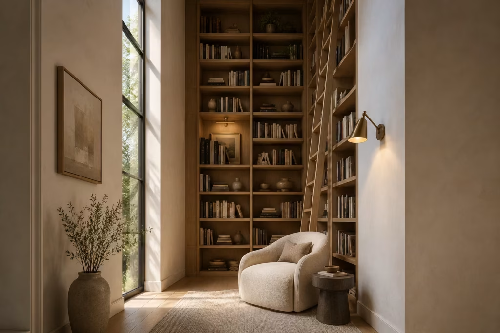
Luxury is often defined by how clearly a space is articulated. Without boundaries, even a beautifully furnished nook can feel like it is floating without purpose.
Visual boundaries do not require walls. They can be created through rugs, lighting changes, furniture orientation, or material contrast. A reading chair placed on a distinct rug immediately signals a shift in function. A pendant light lowered slightly over the seating area subtly frames the zone. Even a change in texture from the surrounding floor can establish definition.
These cues work because the human eye is highly sensitive to spatial grouping. The moment the brain recognises a “zone,” the space begins to feel more structured and intentional.
I often think of boundaries as soft punctuation marks in a room. They do not interrupt flow, but they clarify meaning. And in small spaces, that clarity is everything.
Layering Rather Than Filling
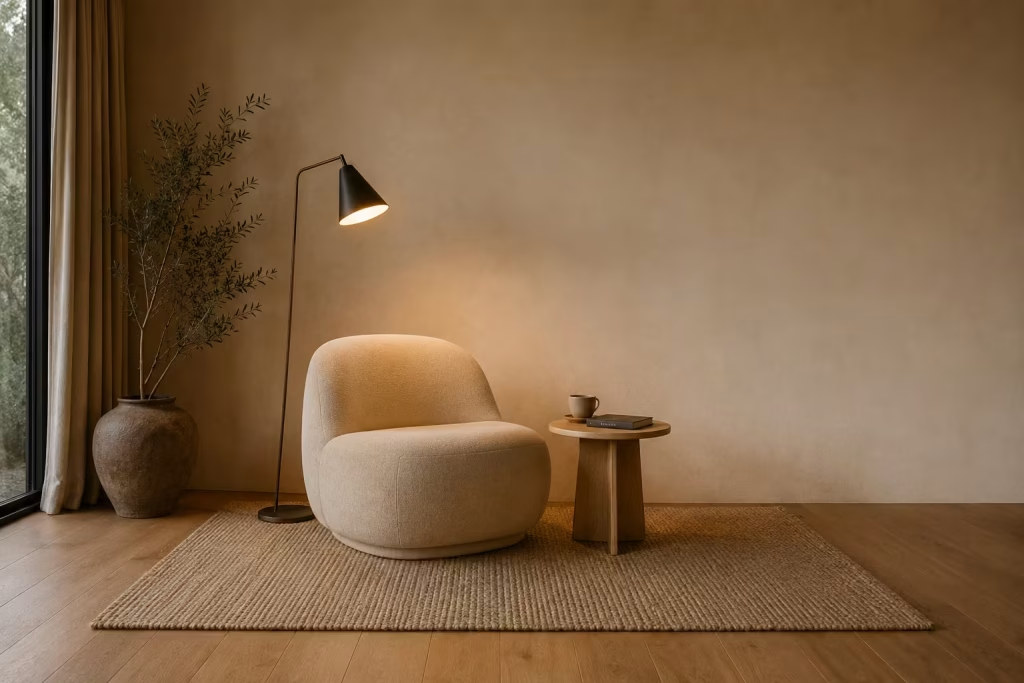
One of the quickest ways to shrink a reading nook visually is to overfill it. When every surface is occupied, the space loses rhythm and begins to feel compressed. Designers avoid this by layering instead of adding.
Layering is about depth, not quantity. It might involve a chair, a throw, a rug, and a lamp working together in a controlled composition, rather than a scattering of unrelated accessories. Each layer adds a different quality: softness, warmth, structure, or contrast.
The key difference is restraint. A layered space feels curated, not crowded. There is enough detail to keep the eye engaged, but also enough emptiness for the mind to rest.
In well-composed reading corners, negative space is just as important as filled space. It allows materials to breathe and prevents the design from collapsing under its own weight.
Choosing Fewer, Better Pieces
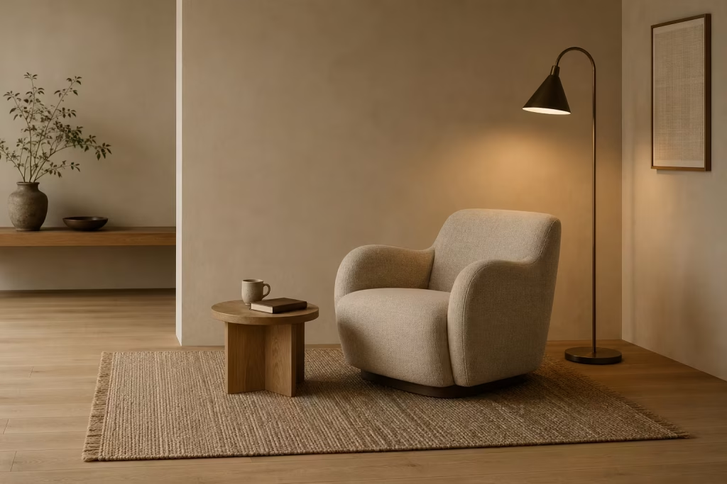
If there is one principle that consistently elevates small reading nooks, it is this: fewer, better things always win.
In compact spaces, every object carries more visual weight. A chair is not just seating, it becomes the focal point. A lamp is not just functional, it becomes part of the atmosphere. A side table is not just practical, it helps define proportion.
This is why quality matters so much more than quantity. A well-proportioned armchair with thoughtful detailing will do more for a space than several smaller pieces competing for attention.
I often advise focusing on pieces that combine function with character. A sculptural chair, a tactile rug, or a handcrafted table can each anchor the space without needing additional support.
When everything in the nook earns its place, the result feels calm, confident, and quietly luxurious. Nothing is fighting for attention, yet nothing feels missing.
Working With Natural Light
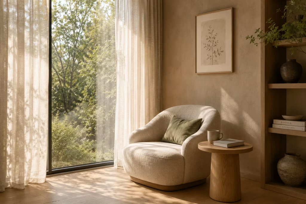
Natural light is one of the most powerful tools for expanding the perception of space. It softens edges, opens up surfaces, and introduces movement that artificial lighting cannot fully replicate.
A small reading nook placed near a window can feel significantly larger simply because daylight removes visual heaviness. Shadows soften, colours shift gently throughout the day, and textures become more dynamic.
The positioning of seating is critical here. A chair angled slightly toward the light source allows illumination to wrap around the space rather than hitting it directly. This creates a more balanced and comfortable atmosphere.
Window treatments also play a subtle but important role. Sheer fabrics or lightly textured curtains diffuse light rather than block it, maintaining brightness while reducing glare. The result is a space that feels open but still intimate.
There is a quiet magic in how natural light changes perception. A nook that feels compact in the evening can feel surprisingly expansive in the morning. It is a reminder that space is not always about dimensions. Sometimes, it is about how light moves through it.
Conclusion The Best Reading Nooks Feel Discovered Rather Than Designed
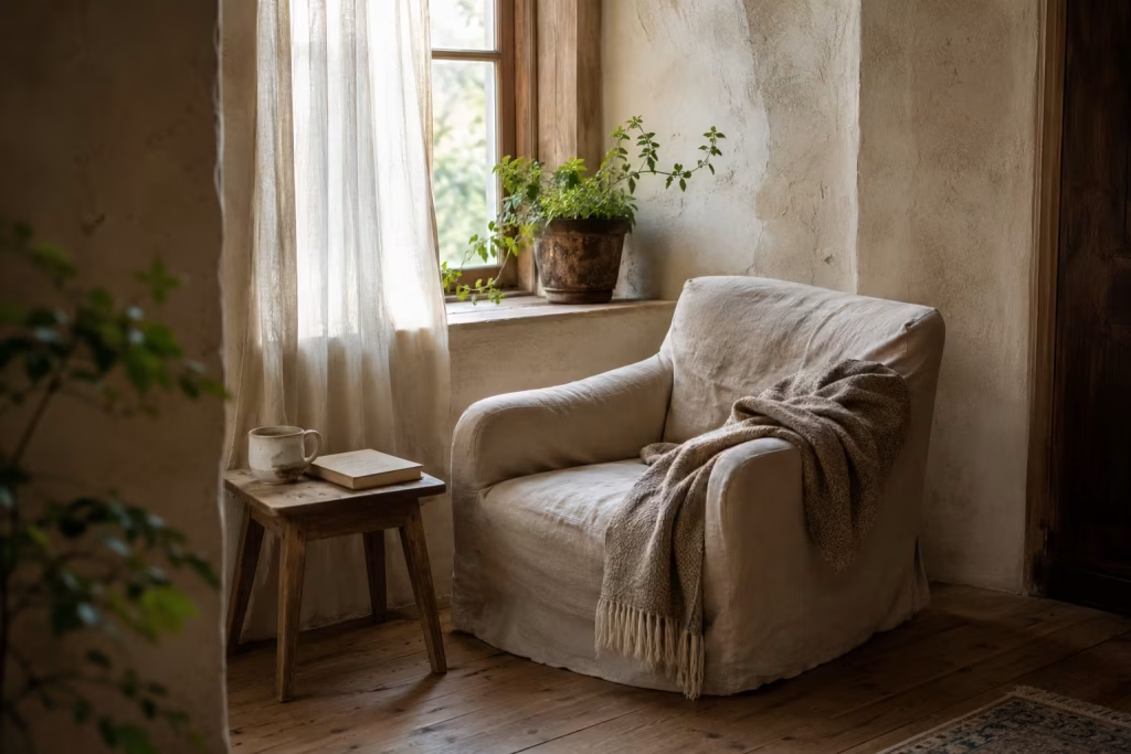
The most compelling reading nooks rarely arrive with visual fanfare. They do not announce themselves, nor do they rely on dramatic gestures to be noticed. Instead, they tend to feel as though they were always there, quietly waiting to be found, like a familiar passage in a well-loved book that somehow reveals more meaning each time you return to it.
What sets these spaces apart is not complexity, but sensitivity. Natural materials that soften with time, lighting that shifts gently through the day, and tactile layers that invite touch all work together to create something far more enduring than decoration alone. When these elements are handled with restraint, a corner stops behaving like leftover space and begins to feel intentional, almost inevitable in its presence.
There is also something deeply grounding about how these nooks connect to the natural world. Earthy tones, woven textures, timber surfaces, and subtle greenery bring a sense of continuity between indoors and outdoors. The result is not a styled vignette, but a lived-in retreat that feels emotionally balanced and quietly restorative.
Often, the most successful reading corners are not the ones that were meticulously planned from the outset. They are the ones that evolved, that responded to light, movement, and daily rhythm, until they settled into something that simply felt right.
In many homes, these spaces emerge from what was once overlooked. A forgotten alcove, an awkward landing, a quiet window recess that never quite had a purpose. With the right approach, these areas begin to shift in meaning. They stop being background space and start becoming part of the home’s emotional core.
Perhaps that is the real essence of good design. Not the act of filling space, but the ability to recognise potential within it. To see not emptiness, but possibility.
When you begin to look at your home through that lens, something subtle changes. Corners that once felt insignificant start to feel like invitations. Spaces you walked past without thought begin to suggest new possibilities. And somewhere within that shift, a reading nook is waiting to take shape, quietly becoming the place you will naturally return to, again and again, without ever needing to be told why.
Frequently Asked Questions while designing a Earthy Reading Nook
What makes a reading nook feel truly cozy?
A cozy reading nook is less about decoration and more about how the space behaves. It feels inviting when the seating supports long use, the lighting is soft but functional, and the materials feel natural to the touch. Earthy elements such as timber, linen, wool, and stone help reduce visual tension, creating a calmer environment where the mind can slow down without effort.
How much space do I need for a reading nook?
A functional reading nook can work in surprisingly small footprints. A minimum comfortable zone is around 1.2m × 1.2m (4ft × 4ft), although a more generous setup of 2.4m × 2.4m (8ft × 8ft) allows for better movement, side tables, and layered lighting. What matters most is proportion rather than size. Even compact corners can feel generous when furniture is scaled correctly.
Where is the best place in a home to create a reading nook?
The most successful reading nooks are often found in overlooked areas such as window recesses, quiet corners of living rooms, under stair spaces, or unused landings. Locations near natural light tend to feel the most inviting, especially when paired with soft window treatments that reduce glare while preserving brightness.
What type of chair is best for a reading nook?
A good reading chair should balance comfort with support. Deep seating, a gently reclined back, and armrests that allow relaxed posture all contribute to longer reading sessions. Materials like bouclé, linen, or soft leather work particularly well because they add tactile comfort while still feeling visually refined.
How do I make a small reading nook look bigger?
Designers often use vertical space, light colours, and minimal but intentional furniture to visually expand small nooks. Positioning a mirror nearby, using tall shelving, and allowing natural light to flow freely can all enhance the sense of openness. Keeping accessories minimal also prevents the space from feeling visually crowded.
What lighting works best for reading nooks?
Layered lighting is the most effective approach. A combination of ambient light, a focused task lamp, and soft accent lighting creates flexibility throughout the day. Warm white bulbs between 2700K and 3000K are ideal because they reduce eye strain while maintaining a calm atmosphere suitable for long reading sessions.
How do earthy design elements improve a reading space?
Earthy materials and tones help reduce visual noise and create a stronger connection to nature. Timber, stone, clay-based colours, and natural textiles soften the environment and make it feel more grounded. This reduces mental fatigue and supports a slower, more immersive reading experience.
Can I create a reading nook in an open-plan living space?
Yes, open-plan spaces are ideal for reading zones when they are visually defined. Rugs, lighting changes, furniture placement, and subtle zoning techniques can create a distinct area without the need for walls. The goal is to create a psychological shift that signals relaxation and focus within a shared space.
What are the most common mistakes to avoid?
The most common mistakes include prioritising aesthetics over comfort, using poor lighting, overcrowding the space with accessories, and ignoring scale. Another frequent issue is incorrect furniture placement, which can disrupt flow and reduce the sense of retreat. A successful reading nook feels balanced, not overdesigned.
Do reading nooks need to match the rest of the home?
They do not need to match exactly, but they should feel connected. A reading nook works best when it complements the wider interior palette while still offering subtle contrast. This distinction helps it feel like a defined escape without disrupting the overall flow of the home.