25 Kitchen Colour Ideas That Transform Your Space Instantly
Choosing the right kitchen colour is one of the most impactful decisions you can make during a renovation. Colour sets the mood of the space, influences how light moves around the room, and can dramatically change how large or small a kitchen feels.
I have seen dark tones make a generous kitchen feel intimate and cosy, while the right pale shade can visually open up a compact layout and make it feel brighter and more inviting.
That said, many homeowners struggle at this stage. Some feel drawn to bold colours but worry they will date quickly or feel overwhelming over time. Others default to safe neutrals, only to fear the result may look flat or uninspired.
Finding the balance between personality and longevity is often the biggest challenge. Light levels, cabinet style, worktops, and even how the kitchen connects to surrounding rooms all play a role in how a colour will perform in real life.
This guide brings together 25 carefully selected kitchen colour ideas that I regularly recommend across a wide range of homes and renovation styles. You will find everything from classic whites and timeless neutrals to richer, moodier tones and modern colour pairings.
Whether you are planning a full kitchen remodel or simply refreshing cabinetry and walls, these ideas are designed to help you choose a colour scheme that feels confident, cohesive, and built to last.
25 Kitchen Colour Ideas to Elevate Any Kitchen Design
Kitchen colour has the power to completely redefine how a space looks, feels, and functions on a daily basis. From bright, light-enhancing shades to deeper tones that add depth and character, the right palette can elevate both style and practicality.
These 25 kitchen colour ideas are curated to suit a wide range of layouts, lighting conditions, and design preferences, offering inspiration that feels both current and enduring before we explore each option in detail.
Classic White Kitchen
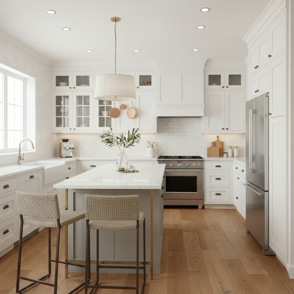
A classic white kitchen remains one of the most reliable choices because it performs well in almost every setting. White reflects both natural and artificial light, helping kitchens feel brighter, cleaner, and more open. This is especially valuable in smaller layouts or rooms with limited windows, where darker colours can feel restrictive. I often recommend white when a homeowner wants to maximise light without altering the footprint of the space.
Another reason white works so well is its flexibility with finishes and materials. It pairs effortlessly with natural wood, marble, quartz, stainless steel, brass, or matte black hardware, allowing you to update accents over time without changing cabinetry. This adaptability makes white kitchens easier to refresh and less likely to feel dated.
From a practical standpoint, white also supports long-term resale value. While it does require thoughtful material selection to avoid a sterile look, layering textures such as shaker doors, veined stone, or warm lighting prevents it from feeling flat. When designed properly, a white kitchen feels timeless rather than plain.
You May also Like: 25 White Kitchen Designs That Blend Style and Function
Warm Greige
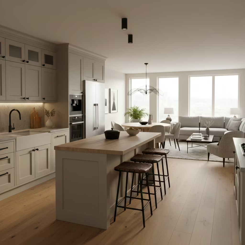
Warm greige offers the perfect middle ground for homeowners who find grey too cool and beige too traditional. By blending soft grey with warm beige undertones, greige creates a balanced, modern neutral that feels inviting without overpowering the space. I frequently use greige in kitchens where clients want something subtle but more distinctive than white.
This colour works particularly well in open-plan homes, as it transitions smoothly between kitchen, dining, and living areas. It adapts to both warm and cool lighting, which helps maintain consistency throughout the day. Under natural light, greige feels soft and warm, while in evening light it retains depth rather than washing out.
Greige also pairs beautifully with a wide range of finishes, including wood cabinetry, stone worktops, brushed brass, and black fixtures. It allows other design elements to stand out without competing for attention. For homeowners seeking longevity, greige offers a calm, contemporary look that ages gracefully and remains easy to style over time.
Soft Sage Green
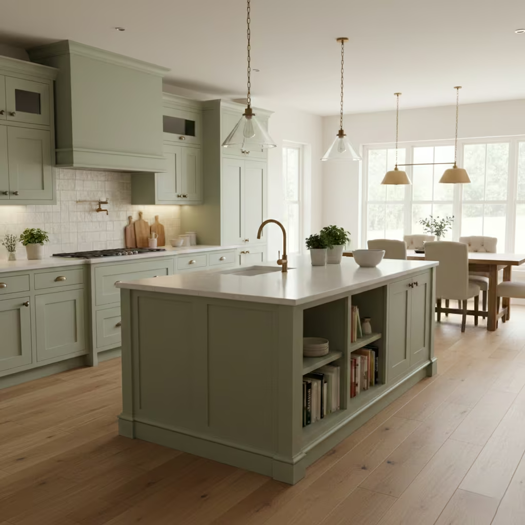
Soft sage green is a colour I often recommend for homeowners who want calm character without committing to bold colour. Inspired by nature, sage introduces warmth and softness while maintaining a relaxed, neutral quality. It works particularly well in kitchens with good natural light, where the green undertones feel fresh rather than heavy.
This shade creates a soothing environment, making it ideal for kitchens that function as everyday gathering spaces. Unlike stronger greens, sage does not dominate the room. Instead, it adds gentle depth that complements natural materials such as wood, stone, and ceramic. I often pair it with light worktops and warm metal finishes to enhance its organic feel.
Sage green is also versatile across styles. It suits modern kitchens with clean lines just as well as traditional or farmhouse designs. When used on cabinetry or islands, it provides subtle contrast without overpowering surrounding spaces. For homeowners looking for a timeless yet distinctive colour, soft sage green offers a refined, long-lasting solution.
You May also Like: 25 Open Kitchen Living Rooms ideas That Feel Stylish, Spacious, and Effortlessly Connected
Navy Blue Cabinets
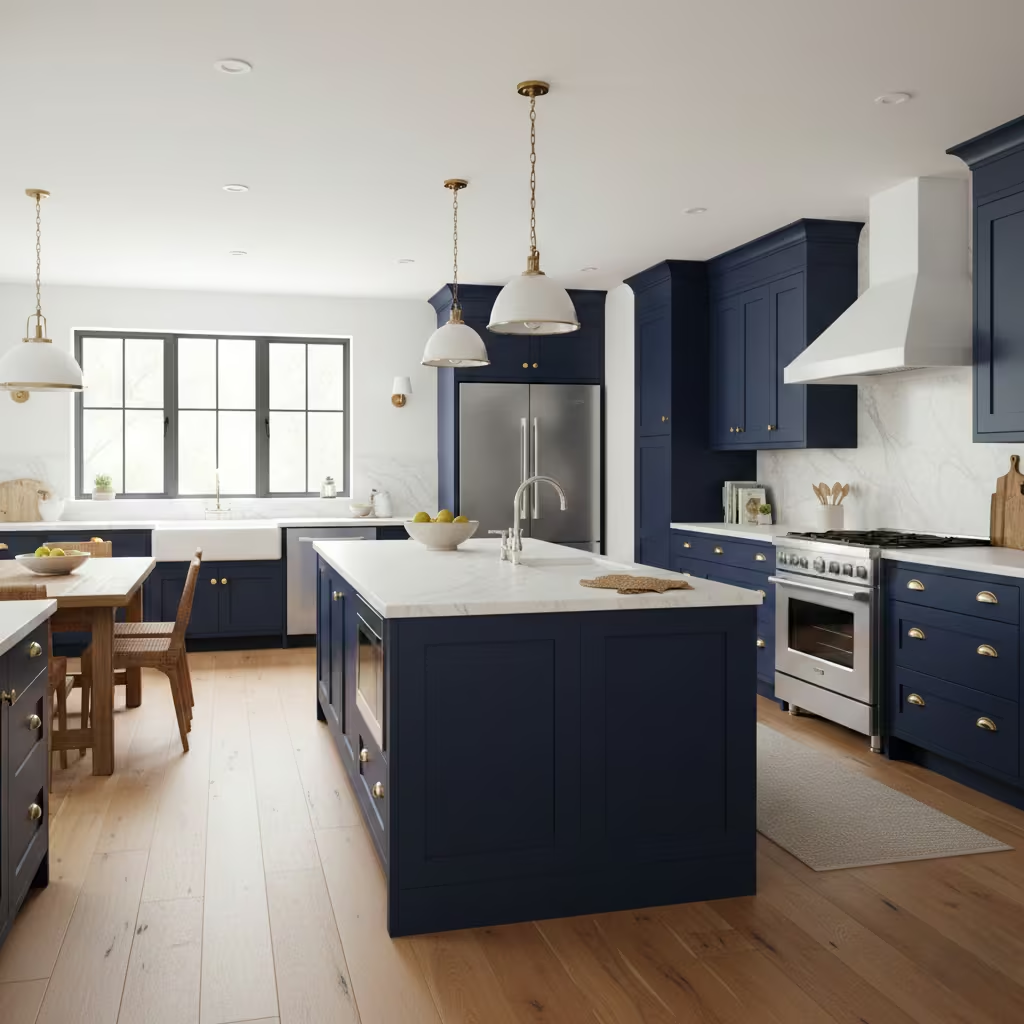
Navy blue cabinets offer a bold yet enduring alternative to lighter kitchen colours, providing depth without feeling overly dramatic. I often recommend navy when homeowners want a strong visual anchor that still feels timeless. Unlike trend-led blues, navy has enough richness to age well and remain relevant across different design styles.
This colour works exceptionally well with metallic finishes. Brass hardware adds warmth and contrast, creating a refined, classic look, while chrome or polished nickel delivers a cleaner, more contemporary feel. Navy also pairs beautifully with marble, quartz, and light stone worktops, helping balance its depth and prevent the kitchen from feeling too dark.
Lighting plays a critical role in making navy cabinets successful. Adequate natural light or layered artificial lighting ensures the colour feels rich rather than heavy. Used thoughtfully, navy cabinets bring confidence, elegance, and long-term appeal, making them a strong choice for both modern and traditional kitchens.
Charcoal Grey
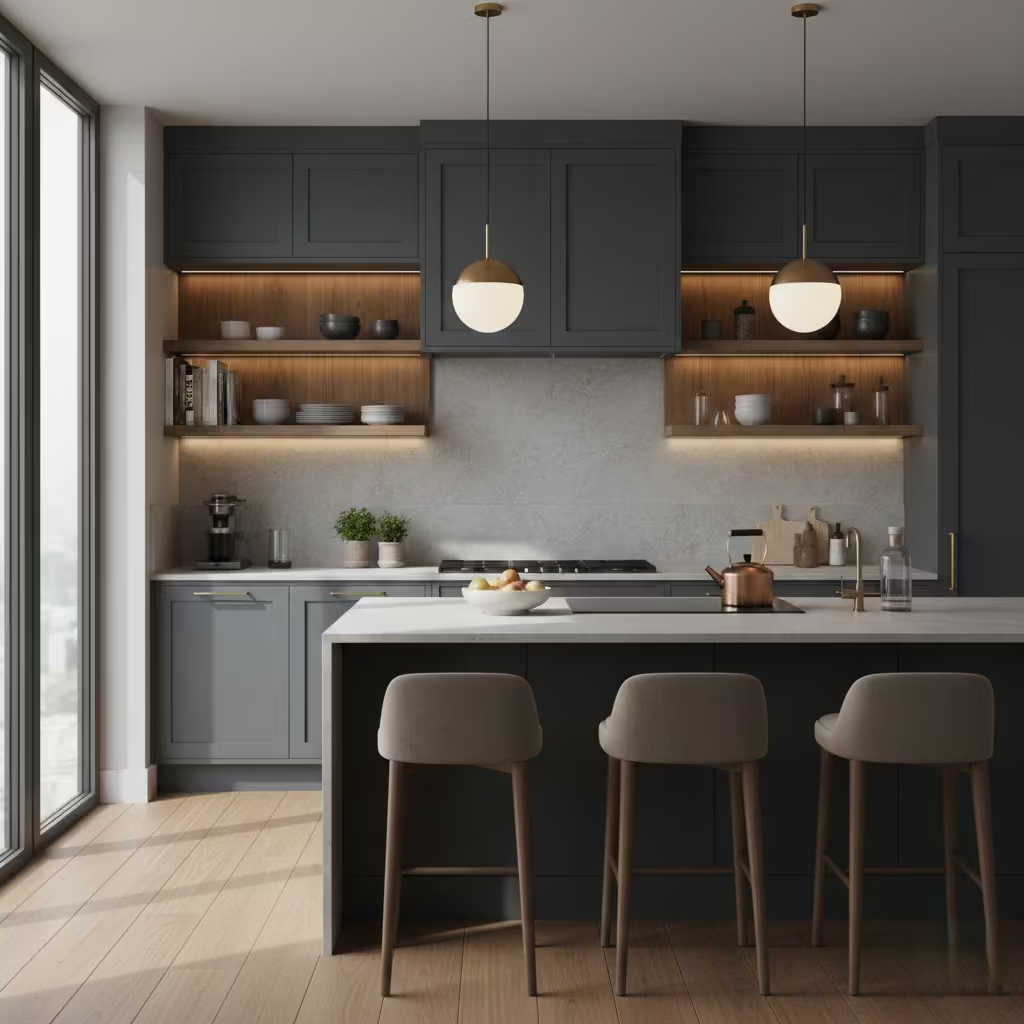
Charcoal grey is a sophisticated alternative to black, offering depth and drama without the harsh contrast that black can introduce. I often use charcoal in kitchens where homeowners want a moody, refined look but still want the space to feel welcoming and balanced. Its slightly softer tone allows it to absorb light more gently, reducing the risk of the room feeling closed in.
This colour works particularly well in contemporary kitchens with clean lines and minimal detailing, but it also adapts beautifully to transitional spaces. Charcoal pairs well with light worktops, warm wood accents, and brushed metal finishes, which help soften the overall look and add visual interest.
From a practical standpoint, charcoal grey is more forgiving than pure black when it comes to fingerprints, dust, and daily wear. It offers a polished, architectural feel while remaining livable. For homeowners seeking drama with restraint, charcoal grey provides a refined, long-lasting solution.
Creamy Off-White
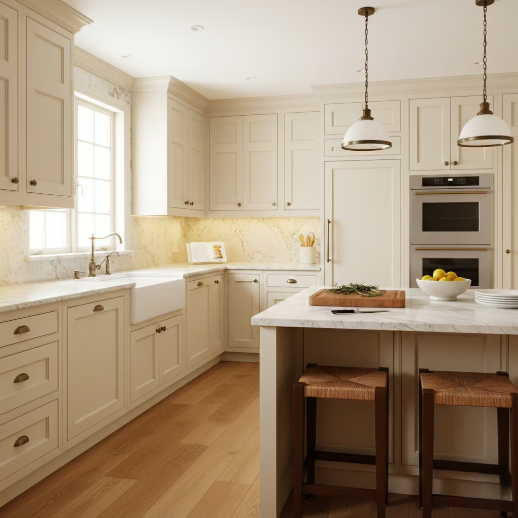
Creamy off-white is an excellent choice for those who love the brightness of white but want a softer, more traditional feel. Unlike stark white, off-white contains warm undertones that create a welcoming atmosphere and reduce the risk of the kitchen feeling cold or clinical. I frequently recommend this shade for period homes or kitchens with classic detailing.
This colour works beautifully with natural materials such as wood floors, stone worktops, and aged brass or bronze hardware. It enhances architectural features like shaker cabinets, decorative mouldings, and framed doors without overpowering them. Creamy off-white also performs well under varied lighting, maintaining warmth throughout the day.
From a longevity perspective, off-white is easier to live with than pure white, as it disguises minor marks and wear more effectively. It delivers a timeless, elegant look that suits traditional kitchens while still feeling fresh and adaptable for modern living.
Two-Tone White and Wood
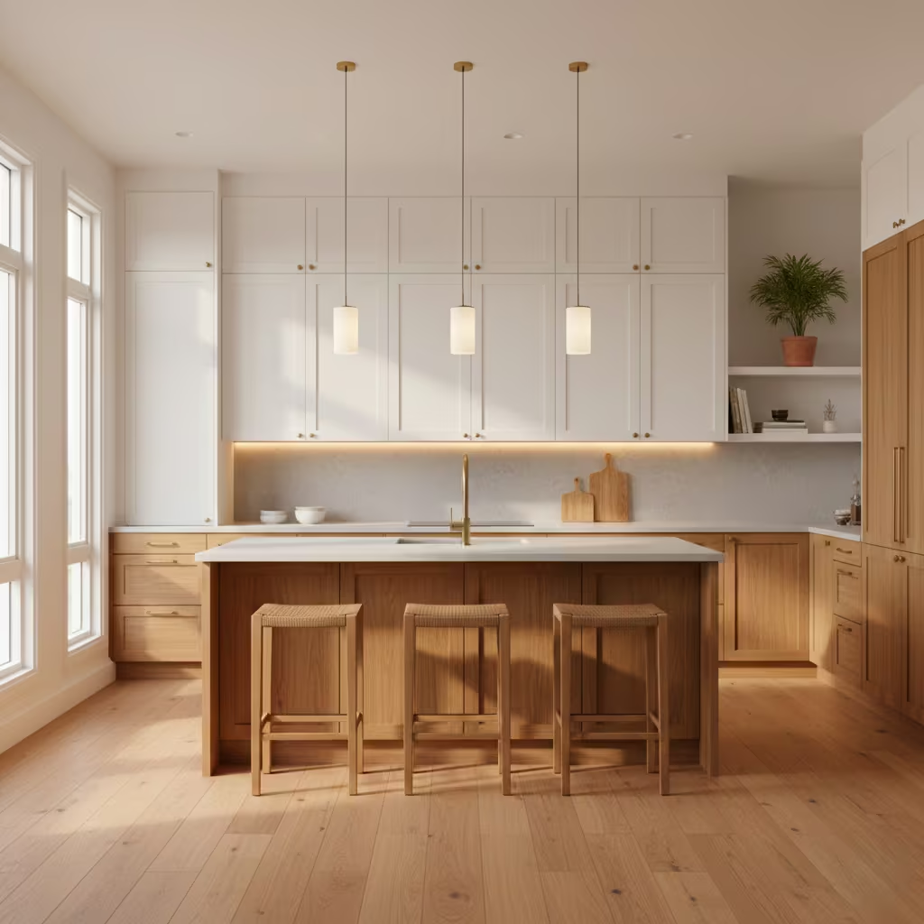
A two-tone white and wood kitchen combines brightness with natural warmth, creating a space that feels balanced and visually engaging. I often recommend this approach when homeowners want the freshness of white without the risk of the kitchen feeling flat or overly minimal. White cabinetry reflects light and keeps the space open, while wood introduces texture, contrast, and a sense of craftsmanship.
This combination works particularly well when white is used on upper cabinets and wood on lower units or islands, grounding the space visually. The choice of wood tone matters. Lighter woods create a Scandinavian feel, while mid-tone or richer woods add warmth and a more traditional edge. Paired with simple hardware and neutral worktops, the look remains timeless rather than trend-led.
Beyond aesthetics, two-tone kitchens are highly practical. They allow flexibility for future updates and suit a wide range of architectural styles. The result is a kitchen that feels welcoming, layered, and built to age gracefully.
Matte Black Kitchen
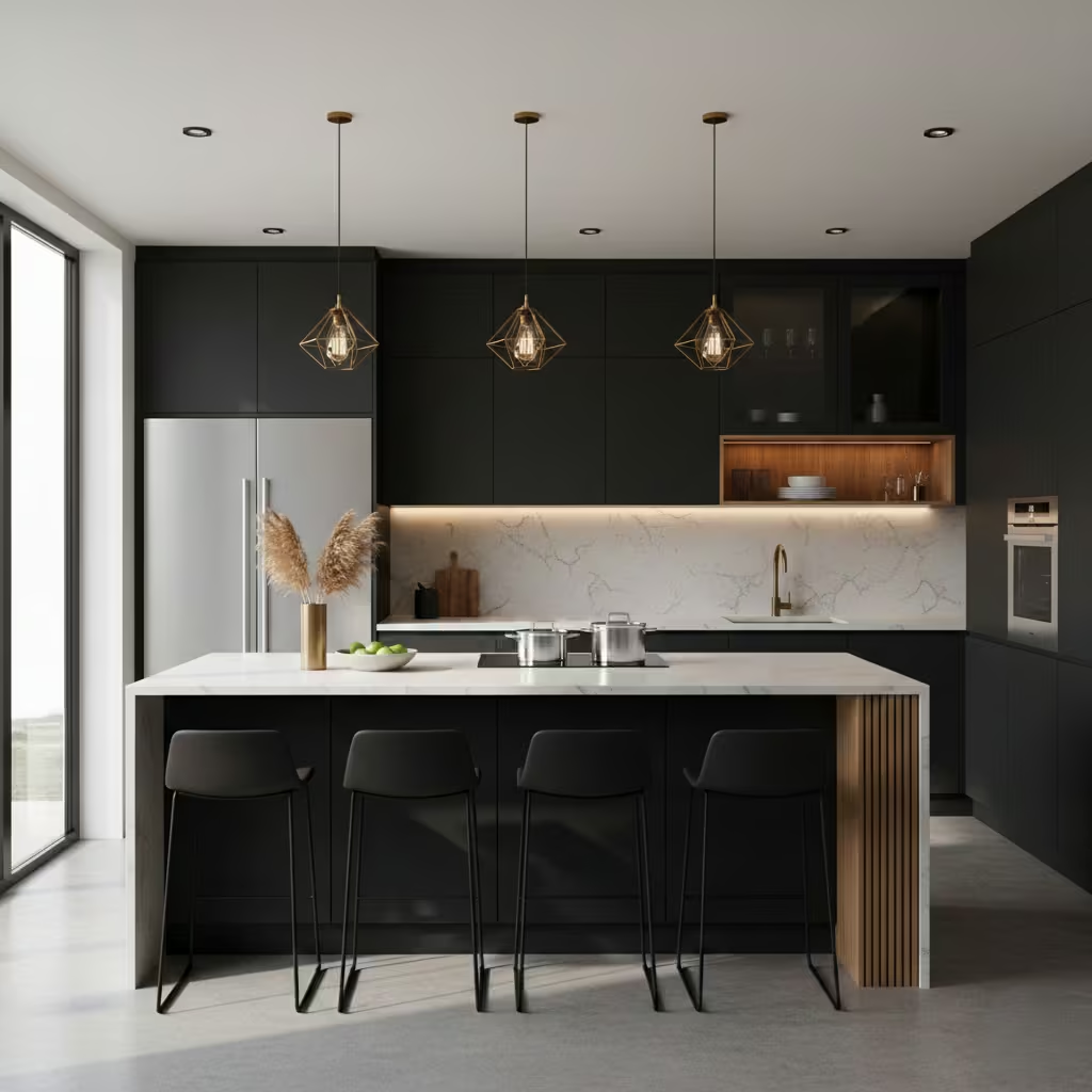
A matte black kitchen delivers drama, confidence, and modern sophistication when executed correctly. Unlike glossy black, matte finishes absorb light, creating a softer, more refined appearance that feels intentional rather than flashy. I typically recommend matte black in kitchens with strong natural light or a well-planned lighting scheme to avoid the space feeling too heavy.
Lighting is essential to success. Layered lighting, including under-cabinet, task, and ambient sources, ensures depth and usability. Matte black pairs well with lighter worktops, wood accents, and metallic finishes such as brass or stainless steel, which provide contrast and prevent the design from feeling one-dimensional.
From a practical perspective, matte finishes are generally better at hiding fingerprints and smudges than high-gloss surfaces. When balanced with texture and light, a matte black kitchen feels bold yet surprisingly livable, offering a modern aesthetic that remains striking without sacrificing comfort.
Muted Olive Green
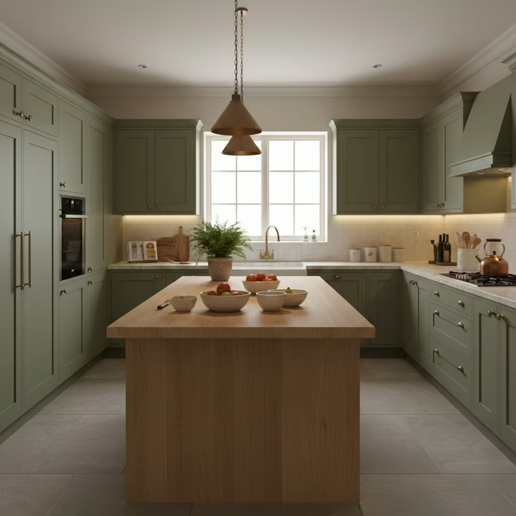
Muted olive green is an earthy, understated colour that brings warmth and calm into the kitchen without overpowering the space. I often use olive tones for homeowners seeking a relaxed, natural aesthetic that feels grounded and timeless. Unlike brighter greens, olive has depth and softness, allowing it to act almost like a neutral.
This colour pairs beautifully with natural materials such as wood, stone, and ceramic, reinforcing its organic appeal. It works well in kitchens with moderate to good natural light, where the green undertones feel rich rather than dull. Olive also complements warm metal finishes like aged brass or bronze, adding subtle elegance.
Muted olive green suits both traditional and contemporary kitchens, depending on how it is styled. Used on cabinetry or islands, it creates a soothing backdrop that supports everyday living. For those wanting a distinctive colour that still feels easy to live with, olive green is a reliable and enduring choice.
You May also Like: 21 Earthy Cottage Home Decor Ideas for a Cozy, Soul-Calming Retreat
Dusty Blue
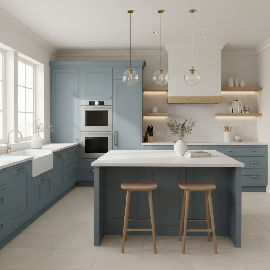
Dusty blue is a soft, muted shade that brings freshness to a kitchen without dominating the space. I often recommend it for homeowners who want colour but feel hesitant about bold or highly saturated tones. Its grey undertone keeps it grounded, allowing it to act as a gentle neutral rather than a statement colour.
This shade works especially well in kitchens with natural light, where it appears airy and calm throughout the day. Dusty blue pairs beautifully with white or light stone worktops, pale wood finishes, and brushed metal hardware. These combinations help maintain balance and prevent the kitchen from feeling too cool.
From a longevity standpoint, dusty blue has more staying power than brighter blues. It feels current yet restrained, making it suitable for both modern and transitional kitchens. When used on cabinetry or islands, it adds subtle character while remaining easy to live with, creating a kitchen that feels calm, cohesive, and welcoming.
Beige with Warm Undertones
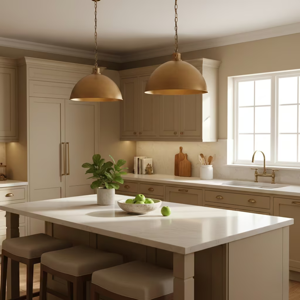
Beige with warm undertones has made a strong comeback as homeowners move away from colder greys in favour of more inviting spaces. I often suggest warm beige for kitchens where comfort and longevity are priorities. Its soft warmth creates a welcoming environment without the heaviness of darker shades.
This colour performs particularly well in kitchens with varied lighting, as warm beige adapts easily throughout the day. It pairs naturally with wood cabinetry, stone worktops, and warm metal finishes such as brass or brushed nickel. Unlike cooler neutrals, it enhances natural textures rather than competing with them.
Warm beige is also highly versatile across design styles. It suits modern kitchens with clean lines just as well as traditional layouts. For homeowners seeking a neutral that feels current yet timeless, beige with warm undertones offers an approachable, balanced foundation that supports long-term design flexibility.
Forest Green
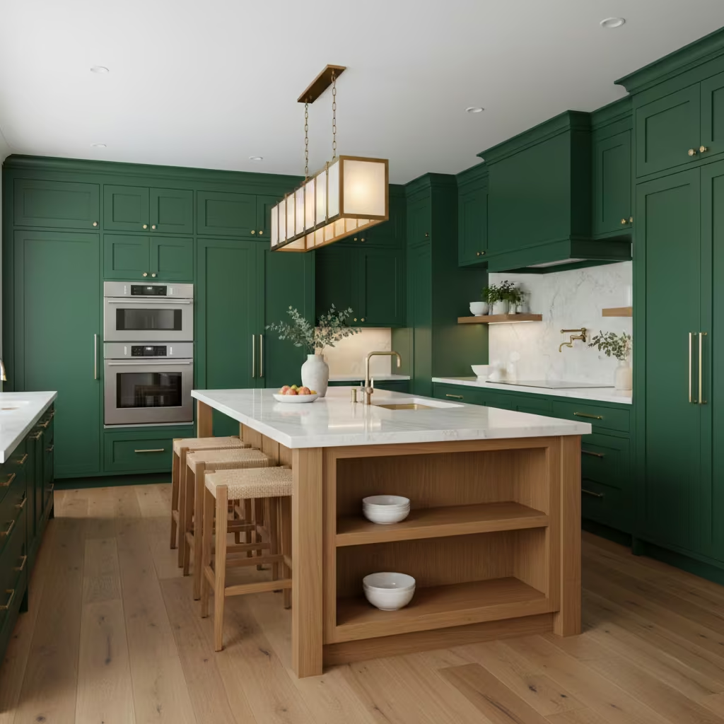
Forest green is a rich, saturated colour that adds depth and luxury to kitchen cabinetry. I recommend it when homeowners want a strong statement that still feels rooted in classic design. Unlike trend-driven greens, forest green has a timeless quality that works across both modern and traditional kitchens.
This shade pairs exceptionally well with light stone worktops, warm wood tones, and metallic finishes such as brass or antique gold. These elements highlight the depth of the green and prevent the kitchen from feeling too dark. Adequate lighting is essential, as forest green absorbs light more than softer colours.
Used on full cabinetry or a feature island, forest green creates a sense of confidence and sophistication. It brings a grounded, architectural feel to the space while remaining elegant and livable. For homeowners looking to introduce colour with impact, forest green offers a refined and enduring option.
Soft Taupe
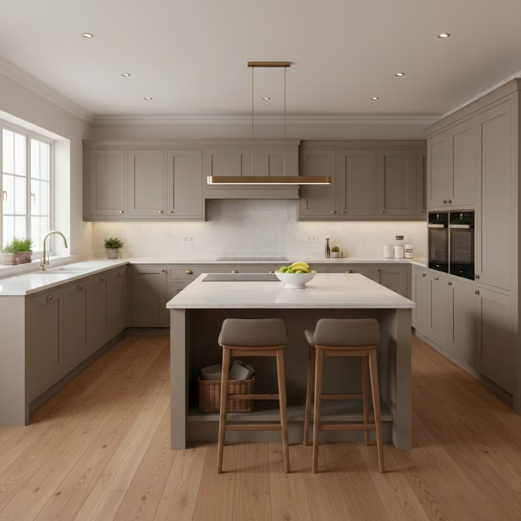
Soft taupe is an elegant neutral that sits comfortably between grey and beige, making it exceptionally versatile in kitchen design. I often recommend taupe when homeowners want a calm, refined backdrop that does not lean too cool or too warm. Its balanced undertone allows it to work seamlessly with a wide range of materials, particularly natural stone surfaces.
Taupe pairs beautifully with marble, quartz, and limestone worktops, enhancing veining and texture rather than competing with them. It also complements both warm and cool metals, from brushed brass to stainless steel. In kitchens with mixed finishes, taupe helps unify the space and create visual harmony.
From a practical standpoint, soft taupe is forgiving in everyday use, disguising marks and wear better than lighter shades. It suits modern, transitional, and classic kitchens alike. For homeowners seeking understated sophistication and longevity, soft taupe offers a polished foundation that supports layered, well-balanced design choices.
You May also Like: 25 Dark Cottagecore Kitchen Ideas That Feel Warm, Rich, and Full of Character
Terracotta Accents
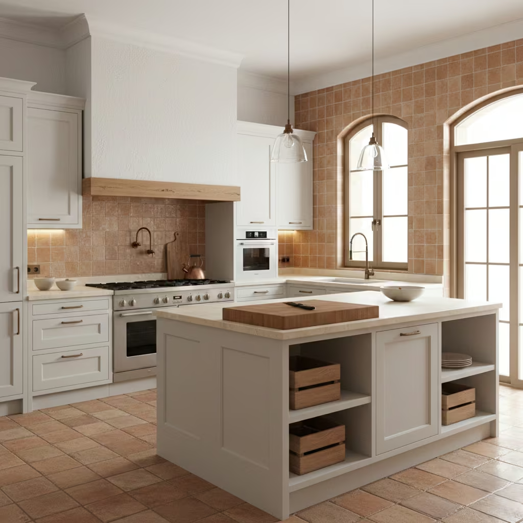
Terracotta accents introduce warmth, character, and a sense of handcrafted charm into the kitchen. Inspired by Mediterranean and earthy design traditions, this colour brings personality without overwhelming the space when used thoughtfully. I often suggest terracotta as an accent rather than a dominant colour, allowing it to enhance rather than dominate.
Terracotta works particularly well in backsplashes, floor tiles, feature walls, or accessories. It pairs naturally with white cabinetry, wood tones, and natural stone, creating a warm and grounded aesthetic. In kitchens with ample natural light, terracotta adds depth and richness that feels relaxed and inviting.
The key to using terracotta successfully is balance. When combined with neutral cabinetry and simple finishes, it feels timeless rather than trendy. For homeowners wanting subtle colour with warmth and individuality, terracotta accents provide a distinctive yet livable way to add personality to the kitchen.
Light Grey and White
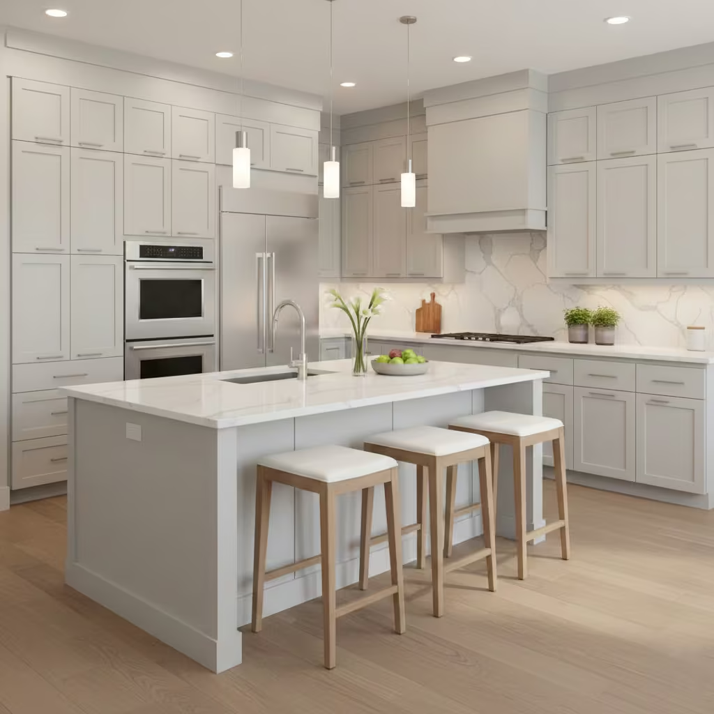
Light grey and white is a clean, contemporary colour combination that remains highly popular for good reason. I often recommend this pairing to homeowners who want a modern look that still feels safe and resale-friendly. White keeps the kitchen bright and open, while light grey introduces contrast and definition without adding heaviness.
This combination works well in both small and large kitchens, adapting easily to different layouts. Light grey cabinetry or islands pair seamlessly with white walls or worktops, creating visual interest while maintaining a neutral palette. It also complements stainless steel appliances and a wide range of flooring options.
From a practical perspective, light grey is more forgiving than pure white, helping conceal daily wear while still feeling fresh. The overall result is a balanced, versatile kitchen design that appeals to a broad audience and holds its value over time.
Warm Wood Tones
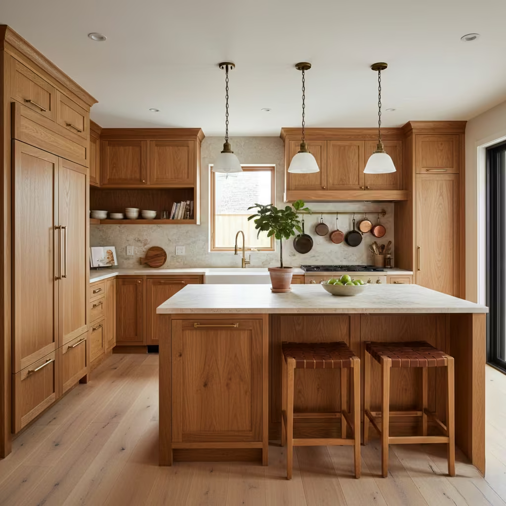
Warm wood tones create kitchens that feel inviting, grounded, and timeless. I often recommend using natural wood as the primary palette for homeowners who want a sense of warmth and texture without relying heavily on colour. From oak and walnut to cherry or maple, each wood type brings its own character, grain, and depth, allowing the kitchen to feel both personal and enduring.
Using wood on cabinetry, islands, or even open shelving introduces a tactile quality that pairs beautifully with stone, quartz, or ceramic countertops. Warm wood also complements neutral walls, metallic hardware, and natural textiles, creating a cohesive, layered look. The tone of the wood can subtly influence the mood: lighter woods brighten the space, while richer, deeper woods add drama and sophistication.
Wood kitchens are versatile across styles, from modern Scandinavian to rustic farmhouse. Beyond aesthetics, natural wood ages gracefully, developing character over time. For homeowners seeking a welcoming, authentic feel, warm wood tones deliver long-term appeal and adaptability in a wide range of kitchen designs.
You May also Like: Cozy Fall Kitchen Decor Ideas And the One Detail That Changes Everything
Pale Yellow
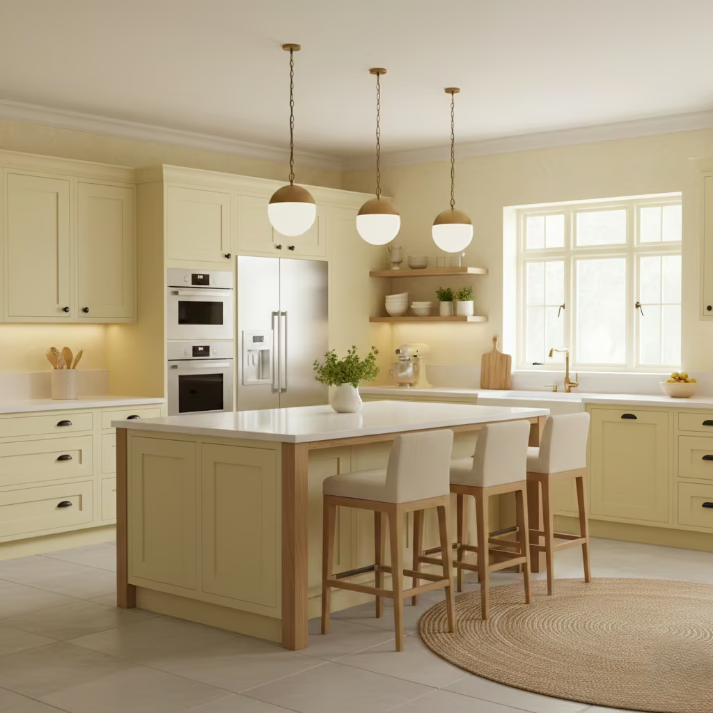
Pale yellow is an understated, cheerful colour that brings light and energy to the kitchen without overwhelming the space. I often suggest pale yellow for homeowners who want subtle colour that lifts the room while remaining versatile. Its soft warmth pairs well with white, cream, and light wood finishes, enhancing brightness and creating a welcoming atmosphere.
This shade works especially well in kitchens that receive moderate natural light. It adds a sense of freshness and optimism, making everyday cooking and dining more enjoyable. Pale yellow is also adaptable to different design styles, from classic and cottage-inspired kitchens to more modern spaces that benefit from a gentle accent.
Used on cabinetry, walls, or open shelving, pale yellow provides visual interest while maintaining a neutral balance. It harmonises with brass, chrome, or black fixtures, creating layered contrast. For homeowners looking for a timeless yet approachable colour, pale yellow offers a soft, elegant solution that endures through changing trends.
Moody Brown
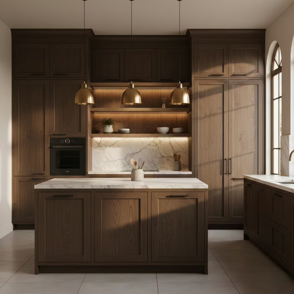
Moody brown is an unexpected, grounding colour that adds sophistication and depth to a kitchen. Unlike typical neutrals, brown introduces warmth while maintaining a modern, architectural feel. I often recommend this shade to homeowners seeking drama and substance without turning to black or dark grey.
This colour works particularly well on cabinetry, islands, or feature walls, where it provides a rich backdrop for lighter countertops, metallic hardware, or natural wood accents. In kitchens with ample natural light, moody brown maintains depth without feeling heavy, while in cozier spaces it creates a cocoon-like, inviting atmosphere.
Moody brown also pairs effortlessly with stone, marble, or concrete surfaces, enhancing texture and contrast. For those seeking a long-term, sophisticated option that stands apart from standard neutrals, brown offers versatility and elegance. Its ability to bridge traditional and contemporary styles makes it a distinctive yet practical choice for homeowners who want a kitchen with personality.
You May also Like: 24 Dark Apartments Ideas to Brighten and Transform Your Space
Blue-Grey Blend
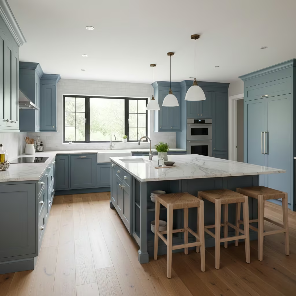
A blue-grey blend strikes the ideal balance between cool and warm tones, offering a subtle, sophisticated palette that works in nearly any kitchen. I often recommend this colour for homeowners who want a modern feel without the starkness of pure grey or the boldness of blue. Its muted undertones make it adaptable to varying light conditions, appearing warmer in sunlight and cooler under artificial lighting.
Blue-grey pairs beautifully with natural materials such as stone, quartz, and wood, creating a layered, harmonious look. It also complements metallic accents, including brushed nickel, stainless steel, or aged brass, adding depth and elegance to cabinetry or islands. This versatility allows homeowners to experiment with textures and finishes without clashing with the base colour.
From a long-term perspective, blue-grey is remarkably forgiving and timeless. It conceals fingerprints and minor wear better than pure whites or darker shades, making it practical for daily living. The result is a calm, balanced kitchen that feels fresh yet grounded, suitable for contemporary or transitional designs.
Soft Blush Pink
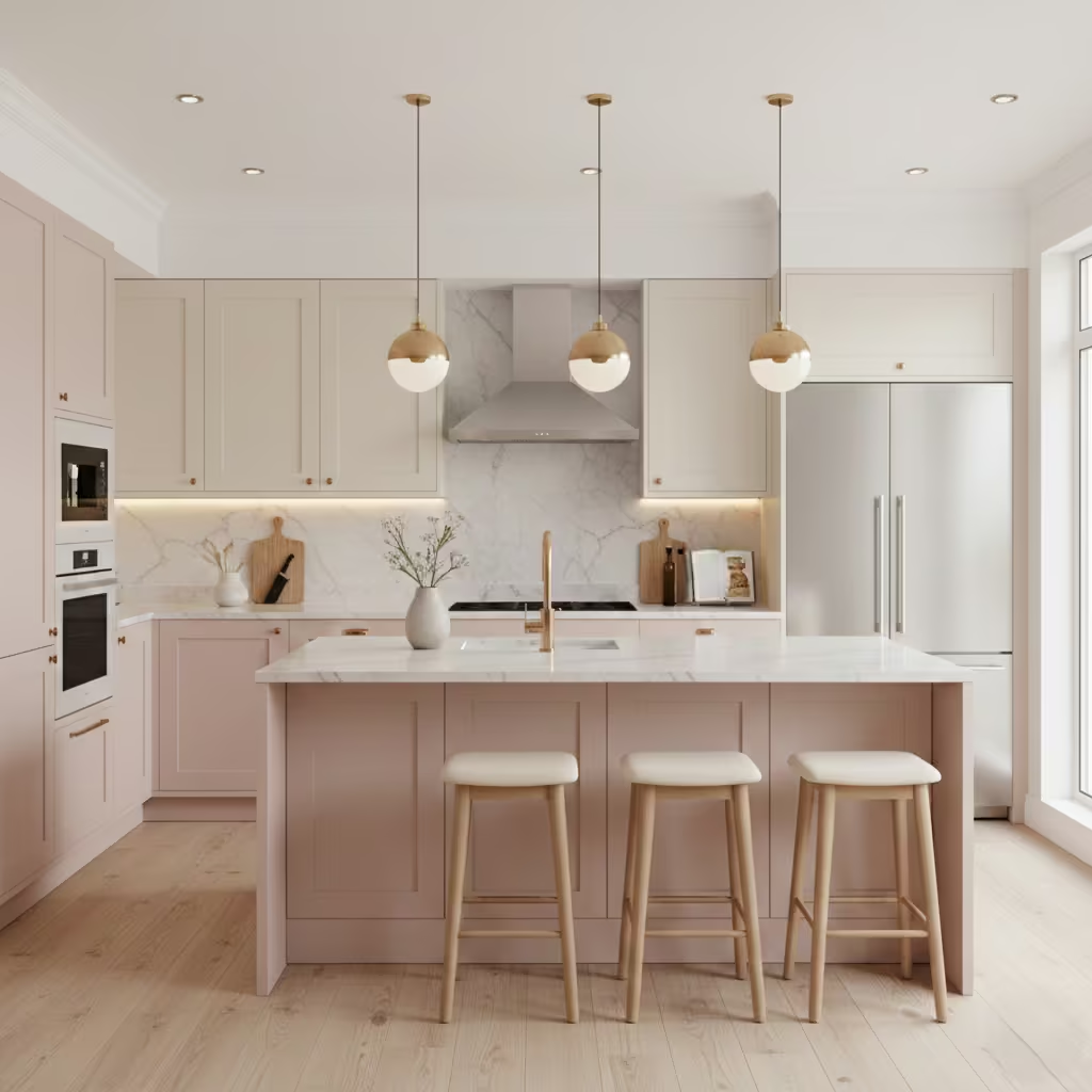
Soft blush pink is a modern, refined colour that surprisingly works in a variety of kitchen styles. I often recommend blush pink for homeowners who want to introduce subtle personality without overwhelming the space. Its muted tone allows it to function almost like a neutral while adding warmth and sophistication.
Blush pink pairs exceptionally well with white or cream cabinetry, light wood finishes, and metallic accents such as brass, rose gold, or chrome. It also harmonises with marble or quartz worktops, providing a gentle contrast that feels considered and elegant. The colour is particularly effective on islands, lower cabinets, or feature walls, where it adds interest without dominating the room.
From a practical standpoint, soft blush pink is timeless when paired with neutral or natural elements. It creates a welcoming and distinctive environment while remaining versatile enough to adapt as styles and tastes evolve. For homeowners seeking a subtle, contemporary twist, blush pink offers elegance, warmth, and long-term livability.
Deep Teal
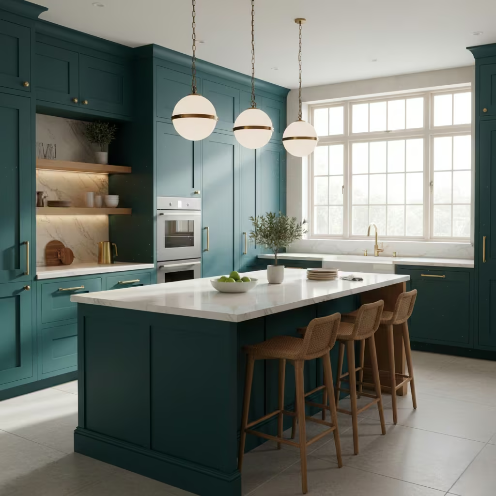
Deep teal is a bold, luxurious colour that brings depth and character to larger kitchens. I often recommend teal when homeowners want a statement without resorting to black or navy. Its richness adds drama, while the blue-green undertone ensures it feels sophisticated rather than overpowering.
This shade works particularly well on feature cabinetry, islands, or accent walls. It pairs beautifully with light stone or marble worktops, warm wood tones, and metallic finishes like brass or gold, which enhance the richness of the colour. Adequate lighting is essential, as deep teal absorbs light; layered natural and artificial lighting ensures the kitchen feels inviting rather than closed in.
Deep teal is versatile across both modern and traditional designs. It creates a focal point while allowing other elements, such as countertops, flooring, and hardware, to shine. For homeowners looking to make a confident design statement, deep teal delivers a refined, long-lasting option that balances boldness with timeless appeal.
Classic Black and White
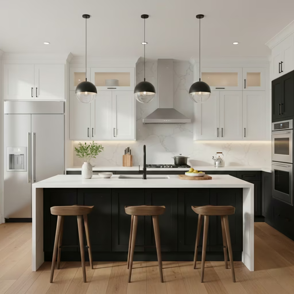
A classic black and white kitchen offers a timeless, high-contrast aesthetic that remains popular across decades. I often recommend this combination to homeowners seeking drama and sophistication while maintaining versatility. Black cabinetry or islands paired with white walls, worktops, or upper cabinets creates a balanced visual anchor that feels both modern and classic.
This colour pairing works well with a variety of materials, including marble, quartz, stainless steel, and wood accents. Black handles or fixtures can tie the design together, while white elements enhance brightness and prevent the space from feeling heavy. Lighting is essential, as the contrast can appear stark in dim conditions; layered lighting ensures warmth and usability.
Black and white kitchens are also resale-friendly, appealing to a broad audience. The combination allows flexibility for adding accent colours through accessories, backsplashes, or feature walls. For homeowners who want a striking yet enduring kitchen, black and white offers elegance, balance, and long-term adaptability.
You May also Like: 25 French Country Kitchen Ideas for Renovators Who Want Something That Actually Lasts
Mushroom Grey
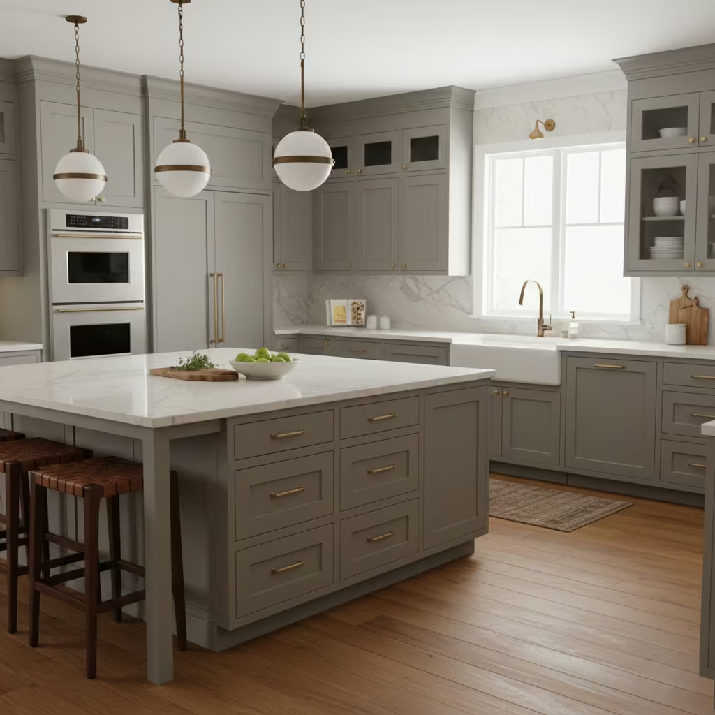
Mushroom grey is a soft, earth-based neutral that brings depth and understated warmth to kitchens. I often recommend this shade for homeowners who want a versatile colour that acts almost like a neutral while adding subtle personality. Its brownish-grey undertones create a grounded, sophisticated backdrop that complements a variety of materials and finishes.
This colour pairs beautifully with wood cabinetry, stone or quartz worktops, and warm metal accents such as bronze or brass. Mushroom grey also adapts well to different lighting, maintaining warmth in softer light and neutrality in brighter conditions. It works for modern, transitional, and traditional kitchens, making it a highly flexible choice.
From a practical standpoint, mushroom grey is forgiving in everyday use, hiding minor marks and wear better than lighter neutrals. The overall effect is a kitchen that feels balanced, refined, and welcoming. For homeowners seeking subtle elegance without relying on stark whites or bold colours, mushroom grey delivers a timeless and practical solution.
Coastal Blue and White
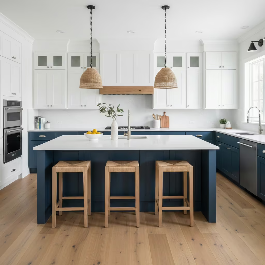
Coastal blue and white evokes freshness, airiness, and a relaxed, inviting atmosphere. I often suggest this palette to homeowners who want a kitchen that feels light and vibrant without being overly bold. The soft blue adds personality while maintaining a clean and approachable aesthetic, while white keeps the space bright and spacious.
This combination pairs exceptionally well with natural textures such as wood flooring, stone countertops, and rattan or wicker accents. Brass, chrome, or brushed nickel fixtures add warmth and contrast, while light cabinetry and white walls amplify the airy, coastal vibe. Coastal blue works well for islands, cabinetry, or even backsplash accents, creating focal points that draw the eye without overpowering the design.
From a practical perspective, this palette remains timeless and versatile. It works across traditional, farmhouse, and modern coastal styles. For homeowners looking to evoke a fresh, serene environment, blue and white kitchens deliver a relaxed yet polished design that stands the test of time.
Neutral Base with Colourful Island
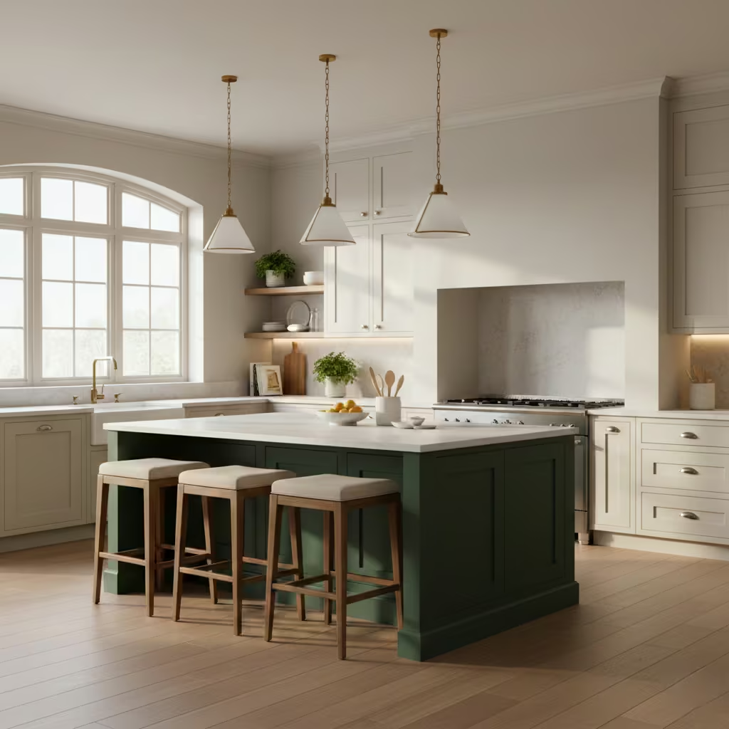
A neutral base with a colourful island is a strategic way to introduce personality without overwhelming the space. I often recommend this approach for homeowners who want flexibility: the neutral palette ensures long-term adaptability, while the coloured island acts as a focal point and statement feature.
The base palette can be soft white, beige, grey, or taupe, paired with natural stone or quartz worktops. The island can be painted in richer or bolder colours such as navy, forest green, or deep teal, creating contrast and visual interest. Metallic hardware, wood accents, and complementary lighting further enhance the effect.
This design strategy works particularly well in open-plan kitchens, where the island becomes a central feature connecting the space. It also allows homeowners to experiment with trends without committing fully. For those seeking a safe, practical foundation with a touch of individuality, a neutral base with a colourful island provides balance, style, and long-lasting appeal.
Final thoughts about colours In Kitchen
Choosing the right kitchen colour is about more than picking what looks good on a paint swatch. Light levels, kitchen layout, and how you use the space daily all influence how a colour will perform in real life. A shade that works beautifully in a small, sunlit kitchen may feel heavy in a darker, larger room, while bold colours can energise an open-plan layout without overwhelming it.
I always encourage homeowners to test samples in their actual kitchen, observing how the colour changes throughout the day under different lighting conditions. Thinking long-term is equally important selecting shades that remain versatile and timeless will save you from frequent updates and ensure the space continues to feel fresh.
These 25 curated kitchen colour ideas offer a trusted starting point, blending classic, contemporary, and statement options. Whether refreshing cabinetry or planning a full remodel, this guide helps homeowners make informed, confident, and lasting design decisions.
Frequently asked question About Creative colours in Kitchen
Can I use bold or unconventional colours in a small kitchen?
Yes. The key is balance. Bold colours like deep teal, navy, or forest green can work in small kitchens if used strategically such as on cabinetry, islands, or feature walls while keeping other elements light and neutral to prevent the space from feeling cramped. Adequate lighting is also essential.
How do I choose creative colours that won’t date quickly?
Opt for shades with muted undertones or those that complement natural materials. Colours like dusty blue, soft sage green, or muted olive are versatile and timeless, allowing you to pair them with changing accents over time without feeling outdated.
Can I mix multiple creative colours in one kitchen?
Yes, but it works best when you use a neutral base. For example, a neutral palette on walls and upper cabinets with a bold island or colourful lower cabinets creates a focal point without overwhelming the space.
How do lighting conditions affect creative kitchen colours?
Lighting dramatically impacts how colours appear. Natural light can make colours appear brighter, while artificial or limited lighting can make them look darker. Always test paint samples in your kitchen at different times of day before committing.
Are creative colours resale-friendly?
When used thoughtfully, yes. Muted or earthy creative tones paired with neutral bases are widely appealing. Bold colours as accents rather than full-room statements are more likely to retain value while allowing personality to shine.
What finishes work best with creative colours?
Matte or satin finishes often look sophisticated and hide wear, while semi-gloss can enhance durability and make colours appear more vibrant. Pairing with natural wood, stone, or metallic accents can further elevate the palette.