25 Dark Cottagecore Kitchen Ideas That Feel Warm, Rich, and Full of Character
There is something quietly compelling about a kitchen that does not rush to greet you. A dark cottagecore kitchen draws you in slowly, like a room that has been lived in for generations rather than assembled overnight. The light settles differently here. It softens at the edges, lingers on surfaces, and reveals texture in layers rather than all at once. That shift alone changes how the space is experienced, turning an everyday kitchen into something far more atmospheric.
In my own projects, I have found that darker palettes, when handled with restraint, do not weigh a room down. Quite the opposite. They anchor it. Deep greens, soot-toned blues, and aged browns create a backdrop that allows materials to speak in a quieter, more deliberate voice. Timber looks richer, stone feels more grounded, and metals develop a kind of quiet glow rather than a glare. It is the difference between a room that shouts for attention and one that earns it over time.
What makes dark cottagecore kitchens particularly effective is their reliance on texture and patina rather than colour alone. A painted cabinet, slightly worn at the edges, tells a different story than a pristine flat panel. A worktop with subtle marks and tonal shifts feels settled, as though it belongs there. These are not flaws to be corrected but details that give the room its sense of history. In design terms, it is less about perfection and more about character, with all its gentle inconsistencies.
There is also a psychological comfort at play. Darker spaces tend to feel more enclosed, more intimate, almost like being wrapped in the room itself. In open-plan homes, where kitchens can sometimes feel exposed or overly functional, this sense of enclosure becomes a strength. It creates a place where people naturally gather, where conversation lingers, and where the kitchen feels less like a workspace and more like the heart of the home, beating steadily in the background.
That said, the most successful examples never tip into heaviness. They are carefully balanced, often without drawing attention to the fact. A pale stone surface here, a linen curtain catching the light there, or even a slightly reflective glaze on handmade tiles can lift the entire scheme. It is a subtle interplay, one that works behind the scenes, but it makes all the difference between a room that feels cocooning and one that feels closed in.
Another point worth making, drawn from experience, is that the best dark cottagecore kitchens are never overly styled. They do not rely on obvious motifs or decorative clichés. Instead, they feel assembled over time, piece by piece, with each element earning its place. A well-used chopping board leaning casually against the wall, a row of mismatched ceramic jars, a pendant light that feels slightly too large yet somehow exactly right. These are the details that give the room its soul, not as a concept but as something tangible.
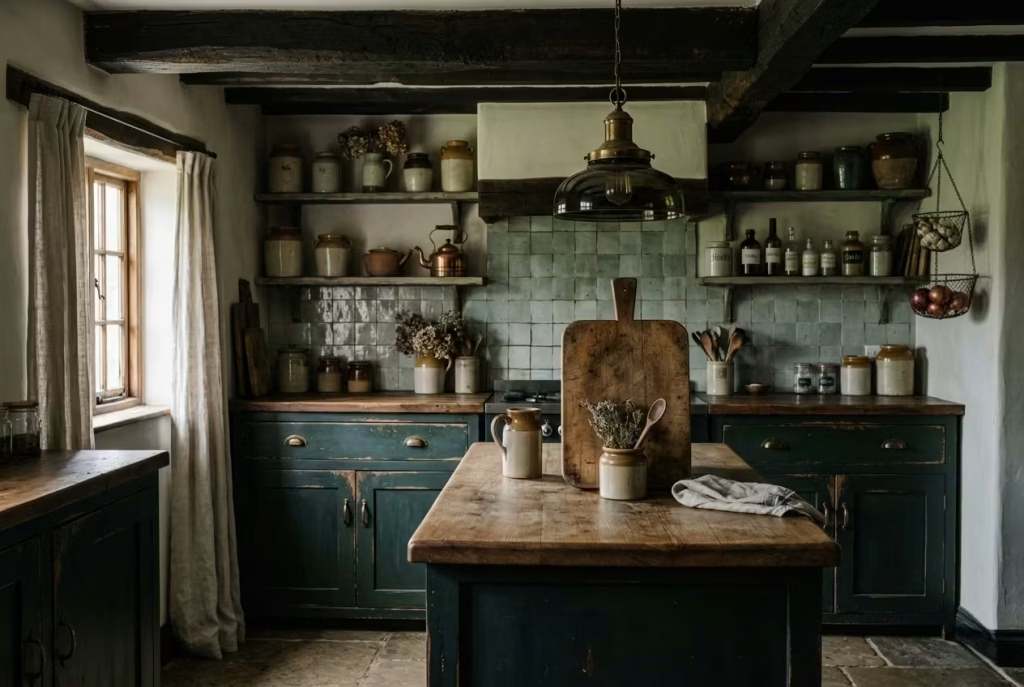
It is easy, of course, to get carried away. Dark palettes can tempt you into layering too much, too quickly, until the room feels crowded rather than considered. In practice, the discipline lies in knowing when to stop. As the saying goes, less is more, but only when what remains is doing the heavy lifting. A single well-chosen material, allowed to breathe, often has more impact than a collection of competing elements.
Ultimately, a dark cottagecore kitchen is not about recreating a look. It is about shaping an atmosphere that feels settled, grounded, and quietly personal. When done well, it does not announce itself as a design style. It simply feels right, like a space that has always been there, waiting to be used, and, more importantly, to be lived in.
What Gives Dark Cottagecore Its Charm
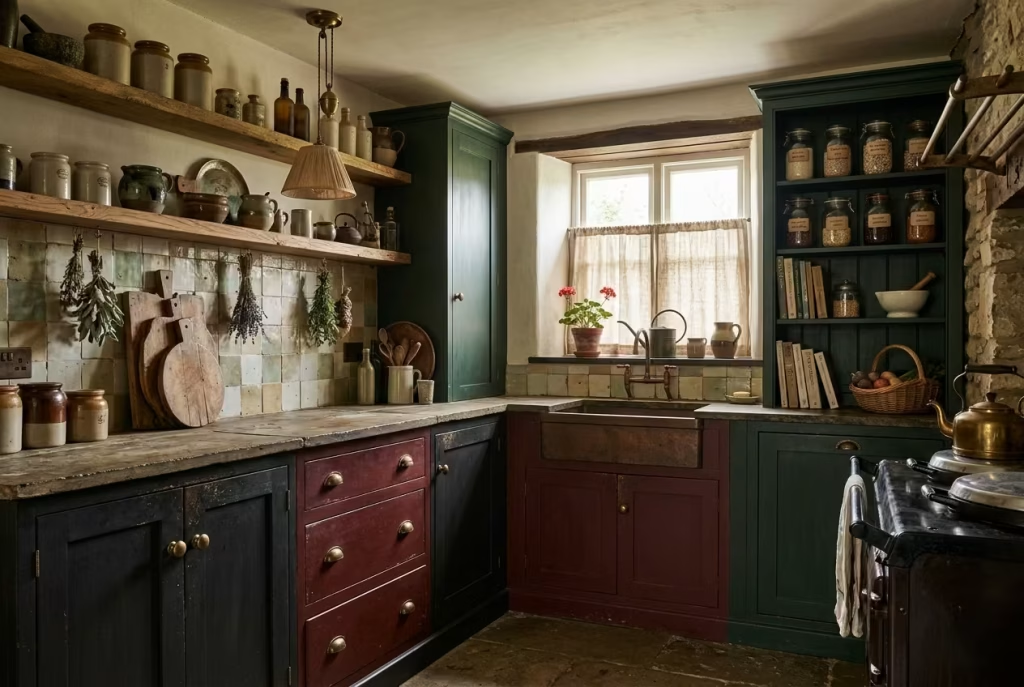
Before you begin choosing cabinets or tiles, it is worth understanding the underlying language of a dark cottagecore kitchen. This is not a style built on surface-level decoration or quick visual wins. It is slower, more deliberate. Every decision, from colour to material, works together to create a room that feels grounded, almost as if it has settled into place over time rather than being newly installed.
A Palette That Holds the Room Together
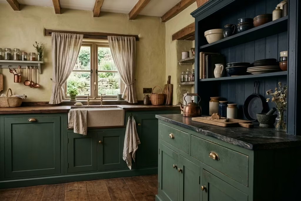
The foundation sits in the colour palette, and this is where many kitchens either find their footing or lose it entirely. Deep greens, charcoal greys, oxblood reds, earthy browns, and inky blues are not chosen for drama alone. They act as a visual anchor, pulling the room together and giving it weight. Think of these colours as the backbone rather than the embellishment.
In one project I worked on, we used a muted forest green across the lower cabinetry, paired with a near-black blue on a freestanding dresser. On paper, it sounded heavy, but in reality, the tones softened each other. The room felt cocooning, not cramped. That is often the turning point. When the palette is handled well, darker shades do not close a space in. They hold it, like a well-tailored coat that fits just right.
There is also a practical edge to these tones. They tend to age gracefully. Minor scuffs, daily wear, the inevitable knocks of a working kitchen all blend into the finish rather than standing out like a sore thumb. It is a forgiving approach, one that suits real homes rather than staged ones.
Materials That Speak Quietly but Carry Weight
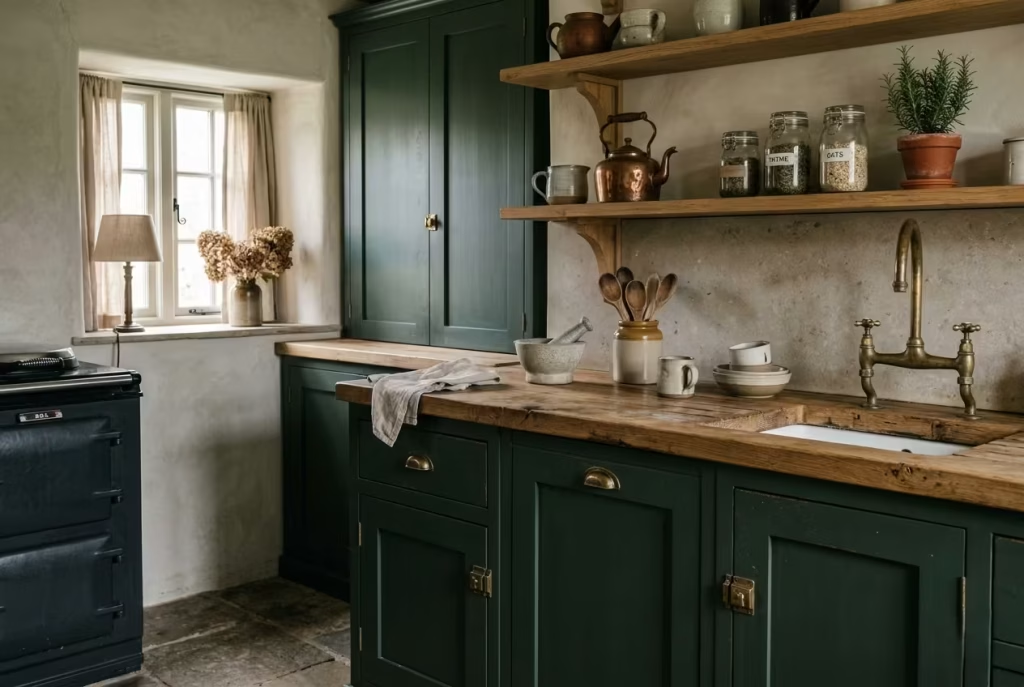
If colour sets the mood, materials give it credibility. Dark cottagecore kitchens lean heavily on natural finishes, but not in a polished, showroom sense. Timber should feel tactile, with visible grain and slight variation. Stone should carry subtle imperfections. Metals, especially aged brass, should develop character rather than resist it.
I often advise clients to think of materials as storytellers. A solid oak worktop, for instance, will shift in tone over time, picking up marks and changes that reflect how the kitchen is used. A honed stone surface, slightly matte under the light, brings a sense of permanence. These are not pristine finishes that stay frozen in time. They evolve, and that evolution is part of the appeal.
Measurements and proportions quietly reinforce this. A standard worktop depth of around 600 mm or 24 inches feels familiar, but when paired with thicker timber, say 40 mm or 1.5 inches, it adds visual weight without overwhelming the space. It is a small adjustment, but one that makes the room feel more substantial, more rooted.
The Beauty of Soft Imperfection
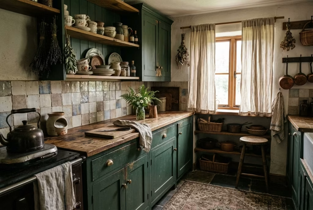
Perfection, in this context, is often the quickest way to undermine the entire scheme. Dark cottagecore thrives on what might be called “soft imperfection.” Slightly uneven finishes, handmade tiles with tonal variation, cabinetry that is not overly crisp at the edges. These details stop the room from feeling sterile.
There is an old saying that a home should look like it has been collected, not completed, and that rings especially true here. A shelf lined with mismatched ceramics, a well-worn chopping board left within reach, a linen curtain that falls a little imperfectly. These are not styling tricks. They are signs of a space that is used, and more importantly, enjoyed.
From a practical standpoint, this approach also takes the pressure off. You are not chasing a flawless finish that needs constant upkeep. Instead, the room is allowed to breathe, to change, to gather its own sense of history as time goes on.
Why Contrast Is the Quiet Hero
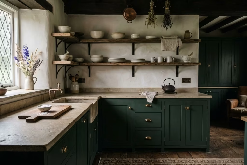
It might seem counterintuitive, but the success of a dark kitchen often hinges on what is not dark. Contrast, handled carefully, is what keeps the space from tipping into monotony.
This does not mean introducing stark white elements that break the mood. It is more nuanced than that. A lighter stone worktop, a softly limewashed wall, or even open shelving that reveals lighter ceramics can act as visual relief. These moments give the eye somewhere to rest, preventing the room from feeling too uniform.
In one kitchen renovation, we introduced a run of open shelves in place of upper cabinets, finished in a slightly lighter timber than the worktop below. The difference was subtle, but it lifted the entire elevation. Without it, the wall would have felt dense. With it, the space felt layered, almost as if it had been built up gradually over years.
Real-Life Insight: Where Balance Makes or Breaks the Room
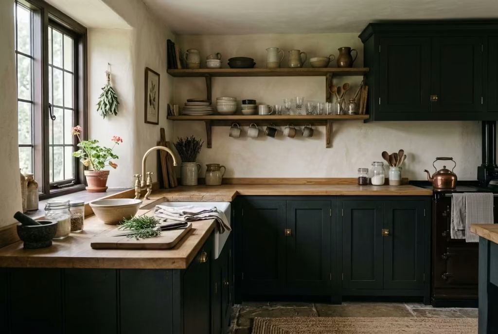
From experience, this is where many dark cottagecore kitchens either succeed or fall flat. Without at least one surface offering visual relief, the room can start to feel heavy, even oppressive. It is a fine line, and one that is easy to overlook when you are drawn to the richness of darker tones.
A limewashed wall, for example, can introduce texture and light without disrupting the palette. Open shelving breaks up solid runs of cabinetry, adding both function and visual breathing space. A lighter worktop, whether timber or stone, creates contrast at eye level, where it matters most.
The key is not to scatter these elements randomly but to place them with intent. Think of them as pauses within the design, moments where the room exhales. Without those pauses, everything becomes a single note, and even the most beautiful materials can start to feel overwhelming.
In the end, the charm of a dark cottagecore kitchen lies in this balance. It is a careful interplay between depth and lightness, structure and softness, intention and ease. When it comes together, it does not just look good. It feels right, in a way that is difficult to pin down but impossible to ignore.
Cabinetry Ideas That Create the Mood
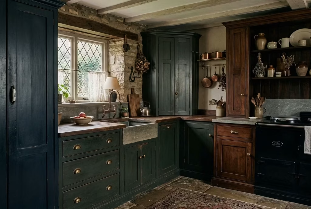
Cabinetry, more than any other element, sets the emotional tone of a dark cottagecore kitchen. It is the backdrop you live with every day, the surface that quietly frames everything else. Get it right, and the room feels settled, almost instinctively so. Get it wrong, and no amount of styling will quite bring it back. In darker schemes especially, cabinetry is not just storage. It is atmosphere, carrying the weight of the design while allowing the rest of the space to unfold around it.
Deep Painted Cabinets in Moss, Forest, or Blackened Olive
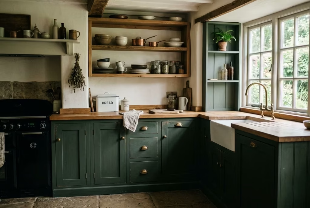
There is a reason these shades keep finding their way into the most memorable kitchens. Moss, forest, and blackened olive sit comfortably between green and neutral, which makes them remarkably adaptable. They do not shout for attention, yet they hold the room together with quiet authority. It is that balance, understated but deeply atmospheric, that gives them their staying power.
In practice, I tend to treat these tones as the foundation rather than a feature. A run of base cabinets in a softened forest green, finished in a low-sheen eggshell, can anchor the entire space without feeling overbearing. The key is in the nuance. A flat, overly saturated green will feel heavy-handed, while a slightly muddied, greyed-back version reads as mature and lived-in. It is the difference between something that feels applied and something that feels as though it has always belonged.
Blackened olive, in particular, has a way of shifting with the light, almost like it has a mind of its own. In the morning, it can lean greener, catching the natural light with a quiet softness. By evening, it deepens into something moodier, more enveloping. That kind of tonal movement adds depth without requiring additional colours, which, in a smaller kitchen, can make all the difference.
From a practical standpoint, these shades are surprisingly forgiving. Everyday wear, fingerprints, the occasional knock from a pan or stool, all tend to blend into the surface rather than stand out. In one of my recent projects, a family kitchen with heavy daily use, we specified a dark olive on the lower cabinets precisely for this reason. Months in, the cabinetry still looked composed, not pristine, but comfortably worn, like a well-loved piece of furniture that only improves with age.
Proportion plays its part here as well. Standard cabinet depths, around 600 mm or 24 inches, can feel visually heavier in darker colours, so I often balance that by keeping upper cabinetry lighter or, in some cases, removing it altogether in favour of open shelving. It is a subtle adjustment, but one that stops the room from feeling top-heavy, especially in kitchens with lower ceiling heights.
There is also a material dialogue to consider. These greens pair effortlessly with natural timber, particularly oak or walnut, where the warmth of the wood softens the depth of the paint. Add aged brass hardware, and the whole composition begins to feel layered rather than styled, as though it has come together over time rather than in a single installation.
Of course, there is a line to tread. Lean too far into darkness without contrast, and the cabinetry can start to dominate the room. That is where a lighter worktop, perhaps a honed stone or a softly grained timber, earns its place. It breaks the visual weight just enough, allowing the cabinetry to remain the anchor without becoming the whole story.
At its best, deep painted cabinetry in these tones does not feel like a design decision at all. It feels inevitable, as though the kitchen could not have been any other way. And that, more often than not, is the mark of a scheme that will stand the test of time.
Shaker Cabinetry with Softened Edges and Simple Detailing
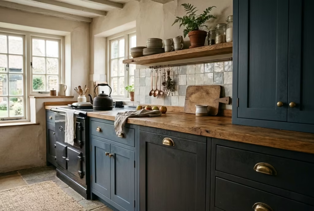
Shaker cabinetry has a way of slipping into a space and making itself at home without any fuss. It is quietly confident, built on proportion rather than ornament, and that restraint is precisely what allows it to carry darker palettes so well. In a cottagecore setting, though, the difference lies in the refinement. It is not the crisp, factory-sharp Shaker you often see, but a gentler version, with edges eased back and detailing that feels worn in rather than freshly cut.
Those softened edges do more than just alter appearance. They change how the cabinetry catches the light. A hard, square profile tends to create sharper shadows, which in a dark kitchen can feel a touch severe. By easing the corners, even by a few millimetres, the light rolls more smoothly across the surface, giving the cabinets a quieter presence. It is a subtle move, but one that takes the scheme from rigid to relaxed, almost without you noticing.
In one of my projects, we specified Shaker doors with a slightly narrower frame, around 60 mm or 2.3 inches, paired with a recessed panel that sat just a fraction deeper than standard. On paper, it was a minor adjustment. In reality, it added just enough shadow line to give depth, without tipping into fussiness. The cabinetry felt balanced, not too plain, not overly detailed. That middle ground is often where the magic happens.
The beauty of simple detailing is that it leaves room for materials to do the talking. Painted in a deep tone, whether that is a smoky blue or a softened charcoal, the Shaker profile becomes a quiet canvas. Add a tactile handle, perhaps aged brass or a darkened iron, and the composition starts to build character in layers. It is not about piling on features. It is about letting each element pull its weight, steady and assured.
There is also a practical advantage that tends to go unnoticed. Simpler profiles are easier to maintain. Dust does not gather in elaborate mouldings, and everyday cleaning becomes more straightforward. In a working kitchen, that matters. You want cabinetry that looks good not just on day one, but on an ordinary Tuesday evening, when the room is in full use and far from staged.
Proportion, again, plays a quiet but important role. Standard cabinet heights, typically around 720 mm or 28 inches for base units, can feel visually heavier in darker finishes. Softened Shaker fronts help counterbalance that, breaking up the surface just enough to keep the eye moving. In smaller kitchens, I often reduce the visual density further by spacing cabinets with open sections or integrating a dresser-style unit, so the room does not feel boxed in.
There is a certain honesty to this approach. Nothing feels overworked or overly precious. It is cabinetry that does its job, day in and day out, while quietly shaping the atmosphere of the room. Like a good foundation, it does not demand attention, but without it, everything else would feel slightly off.
At its best, softened Shaker cabinetry becomes the kind of detail you stop noticing, not because it lacks presence, but because it feels so right. And in design, that sense of inevitability, as if things could not have been arranged any other way, is often what separates a good kitchen from one that truly endures.
Two-Tone Cabinetry Using Dark Lowers and Muted Upper Sections
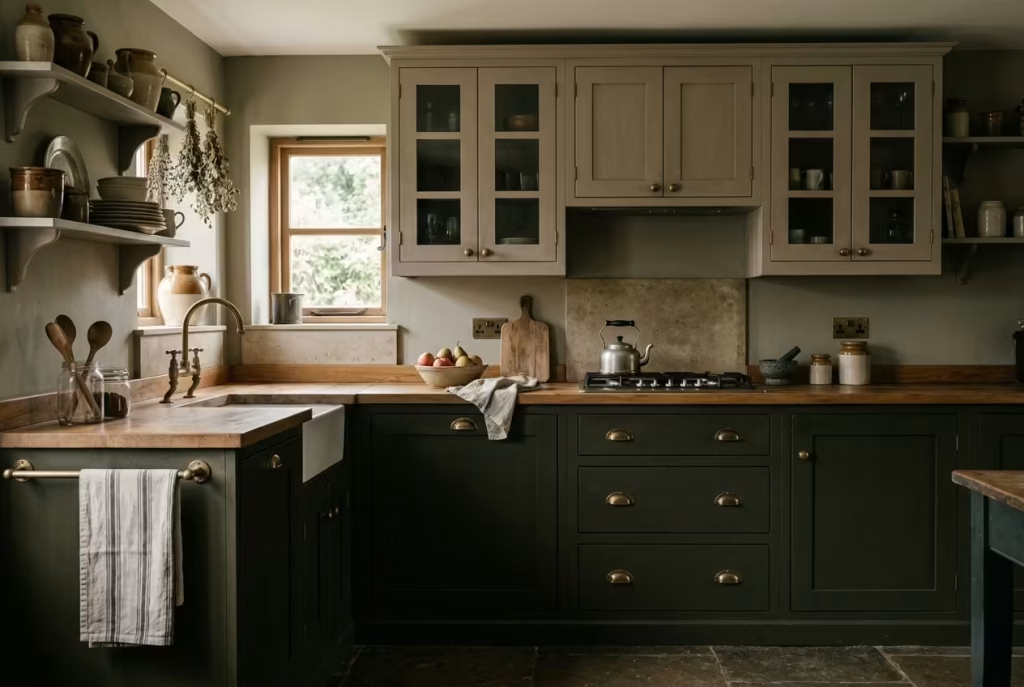
There is a quiet logic to placing weight where it belongs. Darker cabinetry at the base grounds the room, while softer, muted tones above allow it to breathe. It is a compositional trick as old as time, but in a dark cottagecore kitchen, it feels less like a rule and more like instinct, as though the space has found its natural balance without trying too hard.
I often lean on this approach in kitchens that risk feeling visually dense. A run of deep-toned base cabinets, perhaps in a blackened olive or a smoked blue, gives the room its anchor. Above, instead of continuing that depth, I shift to something lighter but still restrained. Think chalky taupe, softened stone, or a pale, greyed green. Not bright, not stark, just enough of a lift to stop the eye from settling too heavily at mid-height.
In one project, we paired a near-charcoal base with upper cabinets in a muted clay tone, finished in a soft matte. The contrast was gentle, almost whispered rather than declared, but it changed the entire feel of the kitchen. The lowers held the room together, while the uppers receded slightly, allowing light to move more freely across the space. It is a bit like loosening your collar at the end of a long day, subtle, but you feel the difference straight away.
From a spatial point of view, this strategy is particularly effective in kitchens with standard ceiling heights, around 2.4 metres or 8 feet. Dark cabinetry carried all the way up can compress the room, making it feel lower than it is. By keeping the upper sections lighter, you draw the eye upward without adding visual strain. The ceiling feels higher, the walls less imposing. It is a small shift with a disproportionate payoff.
There is also a practical rhythm to consider. Lower cabinets tend to take the brunt of daily use, scuffs from shoes, knocks from chairs, the general wear and tear of a busy kitchen. Darker finishes handle this gracefully, absorbing marks rather than advertising them. Upper cabinets, being less exposed, can afford to be lighter without becoming a maintenance burden. It is a case of form following function, quietly and effectively.
The success of a two-tone scheme, however, hinges on restraint. Too much contrast, and the cabinetry starts to feel segmented, almost like two different kitchens stitched together. The tones need to speak the same language, even if they are not saying the same thing. A shared undertone, whether warm or cool, helps tie everything together so the transition feels seamless rather than abrupt.
Materials can reinforce this connection. A continuous worktop, running through both sections, acts as a visual bridge. So does consistent hardware. Using the same aged brass handles across both tones, for instance, threads a line through the design, keeping it cohesive even as the colours shift.
At its best, two-tone cabinetry does not read as a design feature at all. It simply feels right, like the room has been allowed to settle into its natural proportions. The darker base holds steady, the lighter upper lifts gently, and somewhere in between, the kitchen finds its balance, unforced and quietly resolved.
You May also Like: 24 Dark Apartments Ideas to Brighten and Transform Your Space
Glass-Front Cabinets for a Slightly Lighter, Heirloom Feel
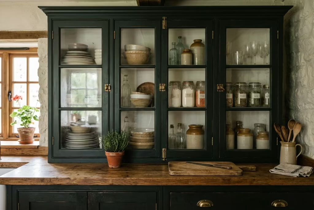
Glass-front cabinets have a way of softening a dark kitchen without diluting its character. They break the solidity of painted fronts, introducing a quiet transparency that feels both practical and nostalgic. In a cottagecore setting, this detail often reads as inherited rather than installed, as though the kitchen has gathered pieces over time instead of arriving fully formed.
What makes them particularly effective is the way they handle light. Even in a darker scheme, glass reflects and diffuses whatever natural or artificial light is available, easing the visual weight of upper cabinetry. It is a subtle lift, but one that keeps the room from feeling closed in. In smaller kitchens especially, where every surface counts, this can be the difference between a space that feels intimate and one that feels boxed in.
I tend to use glass-front cabinets selectively rather than across the entire run. A pair flanking a window, or a central section above a worktop, is often enough. Too many, and the effect starts to feel busy, almost like a display rather than a working kitchen. As the saying goes, you can have too much of a good thing, and here, restraint is what keeps the look grounded.
The choice of glass itself carries weight. Clear glass offers a more traditional, open feel, but it does require a certain level of order behind the doors. For clients who prefer a softer, more forgiving look, I often suggest lightly seeded or reeded glass. These finishes blur the contents just enough, hinting at what sits behind without putting everything on show. It is a practical compromise, one that keeps the aesthetic intact without demanding constant tidiness.
Inside, the opportunity is not just for storage but for quiet storytelling. Stacked ceramics, well-used bowls, a collection of jars or glassware, these become part of the room’s texture. In one project, we used glass-front cabinets to house a mix of everyday crockery and a few older pieces the client had inherited. The result felt layered, personal, and far removed from anything overly styled. It is these small, lived-in details that give the kitchen its sense of continuity.
From a proportion standpoint, standard upper cabinet depths, around 300 mm or 12 inches, work well with glass fronts, but I often reduce that slightly where possible. Bringing the cabinet depth down to around 250 mm or 10 inches lightens the visual mass, allowing the glass to feel more delicate and less dominant. Paired with slimmer frames, this creates a more refined elevation, particularly in tighter spaces.
There is also a material dialogue to consider. Painted frames in a deep tone, combined with the reflective quality of glass, create a gentle contrast within a single unit. Add aged brass hinges or handles, and the effect leans further into that heirloom quality, as though the cabinets have been part of the home for years rather than newly fitted.
Of course, there are trade-offs. Glass-front cabinets ask for a degree of curation. What sits behind them becomes part of the visual field, so clutter can quickly undermine the intended effect. But approached with a light hand, this becomes less of a chore and more of an opportunity to edit, to keep only what feels useful or meaningful within easy reach.
At their best, glass-front cabinets do not just lighten the room visually. They introduce a sense of depth and narrative, turning everyday storage into something quietly expressive. It is a small gesture, almost an aside, but one that lingers, adding a layer of character that feels both effortless and enduring.
Freestanding-Style Fitted Cabinetry for a More Collected Look
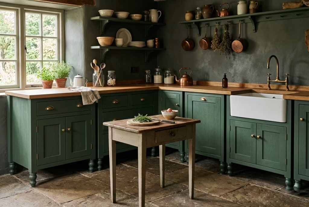
There is a certain ease that comes with a kitchen that does not feel locked into place. Freestanding-style fitted cabinetry sits somewhere between built-in precision and furniture-like freedom, and that in-between quality is exactly what gives it its charm. It suggests a room that has grown over time, piece by piece, rather than one installed in a single sweep.
Visually, the difference is subtle but telling. Instead of continuous plinths running wall to wall, cabinets are often set on legs or broken into individual units, each with a slight pause between them. That breathing space, however small, changes the rhythm of the room. It allows the eye to move, to settle, to take in each element on its own terms. In darker kitchens, where surfaces can otherwise feel uninterrupted and dense, this approach brings a sense of lightness without sacrificing depth.
I recall a project where we replaced a full run of base cabinets with a series of freestanding-style units, each around 800 to 1000 mm wide (31 to 39 inches), separated by narrow gaps and anchored with a central farmhouse table. The cabinetry was painted in a deep, muted green, but because it was visually broken up, the room felt far less imposing. It had that collected, almost accidental quality, as though the pieces had been gathered over years rather than designed in one go.
Construction-wise, these units are still fitted, fixed securely to walls for stability, but detailed to resemble standalone furniture. Legs are often slightly tapered or turned, lifting the cabinetry off the floor by 100 to 150 mm (4 to 6 inches). That shadow line beneath does more work than you might expect. It creates depth, softens the base of the cabinets, and, practically speaking, makes cleaning a touch easier in some cases, though it does require a bit more attention than a sealed plinth.
The material choices tend to lean into this furniture-like quality. Painted timber fronts, slightly textured finishes, and visible grain all contribute to the effect. Hardware becomes more expressive here. Cup handles, small knobs, or even simple latches can add a layer of character that feels considered but not overdone. It is a balancing act, one foot in tradition, the other in everyday practicality.
There is also a shift in how the kitchen is used. Freestanding-style layouts often encourage a more relaxed flow. Without long, uninterrupted runs, the space feels less rigid, more adaptable. A dresser might sit slightly apart from the main cabinetry, or a small prep table might take the place of a fixed island. It is a layout that invites movement, where nothing feels too precious to touch or use.
Of course, this approach is not without its nuances. Storage can be slightly less efficient compared to fully integrated systems, and careful planning is needed to ensure that essential functions are still met. Clearances remain important. Maintaining at least 900 mm or 36 inches between units ensures the kitchen remains comfortable to navigate, even with a more broken-up layout.
But what you gain in return is a kitchen that feels far more personal. It avoids that “all-in-one” look that can sometimes feel a bit too polished, a bit too resolved. Instead, it leans into imperfection, into variation, into the idea that a home is always evolving.
At its best, freestanding-style fitted cabinetry does not try to impress at first glance. It grows on you. The more time you spend in the space, the more it reveals itself, quietly, without fuss. And before long, it feels less like a designed kitchen and more like a room that has simply found its own way.
Materials That Make the Scheme Feel Authentic
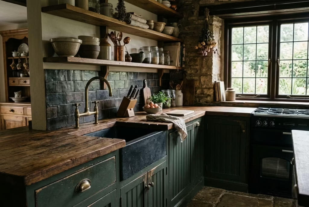
If colour sets the mood, materials are what make you believe it. In a dark cottagecore kitchen, authenticity does not come from chasing a look, but from choosing finishes that age, respond, and quietly tell their story over time. These are the elements you touch every day, the surfaces that gather marks and memories, and, more often than not, they are what separate a kitchen that feels styled from one that feels truly lived in.
Butcher Block or Oak Worktops for Warmth
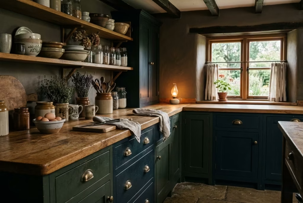
There is a certain honesty to timber worktops that is difficult to replicate with anything else. Butcher block or solid oak carries a warmth that does not just sit on the surface but seems to settle into the room, softening darker cabinetry and taking the edge off deeper tones. In a scheme that leans moody, this is often the element that keeps everything from feeling a touch too serious, like opening a window in a room that has grown a little too still.
What makes timber particularly compelling is the way it responds to use. Unlike polished stone or engineered surfaces that aim to resist change, oak worktops embrace it. Over time, they deepen in colour, pick up subtle marks, and develop a patina that feels earned rather than applied. It is the kind of surface that looks better a year in than it did on day one, which, in my experience, is always a good sign. You are not walking on eggshells, trying to preserve perfection. You are allowing the kitchen to live a little.
From a design perspective, oak pairs exceptionally well with darker palettes. Against moss greens, charcoal, or inky blues, it reads as a natural counterbalance, lifting the composition without breaking it. The grain introduces movement, a quiet rhythm that stops large surfaces from feeling flat. In one project, we ran a continuous oak worktop across a stretch of deep green cabinetry, keeping the thickness at around 40 mm or 1.5 inches. That extra depth gave the edge a presence, almost like a piece of furniture, while the warmth of the timber softened the overall look.
There is also a practical layer to consider. Standard worktop depths, around 600 mm or 24 inches, remain consistent, but with timber, the detailing at the edges becomes more expressive. A slightly rounded or eased edge, rather than a sharp square cut, not only feels better to the touch but also aligns with the softer language of cottagecore design. It is a small detail, but one that speaks volumes when you are using the space day in, day out.
Of course, timber does ask for a bit of care. It is not a set-it-and-forget-it material. Regular oiling helps maintain its resilience, protecting against moisture and everyday wear. Spills should be wiped rather than left to linger, and direct heat is best avoided. But these are not burdens so much as habits, the kind that become second nature over time. In return, you get a surface that feels alive, one that evolves alongside the kitchen itself.
There is also something quietly grounding about working on timber. It softens sound, warms the touch, and, in a space that often carries the hum of daily life, brings a sense of calm. In a dark cottagecore kitchen, where depth and mood take centre stage, that warmth becomes the thread that ties everything together, steady and reassuring.
At its best, a butcher block or oak worktop does not try to compete with the rest of the scheme. It complements it, anchors it, and, over time, becomes part of the story. Not pristine, not perfect, but all the better for it.
Honed Stone or Soapstone for a More Timeworn Finish
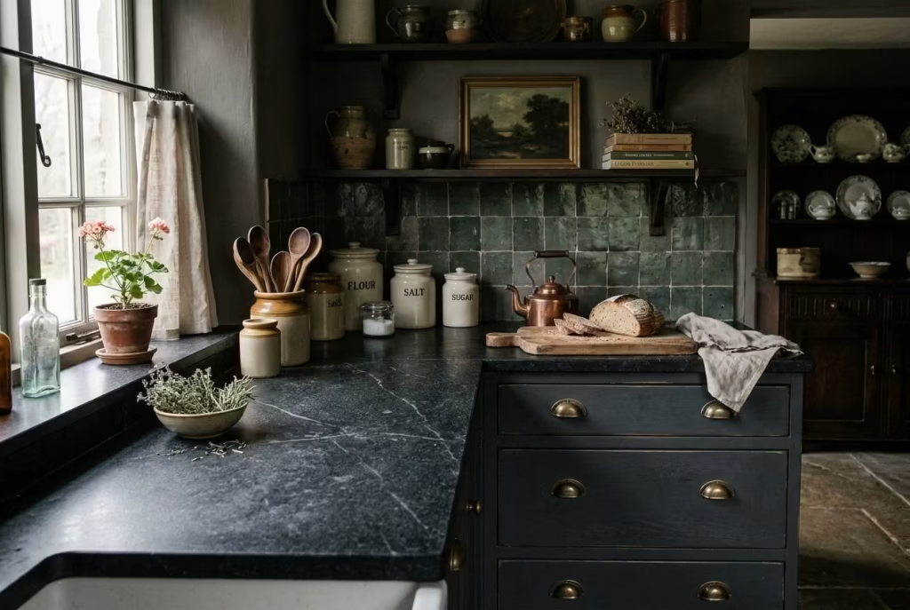
Honed stone or soapstone carries a subtle, understated elegance that feels both grounded and timeless. Unlike polished surfaces, which shine and demand attention, a honed finish absorbs light softly, allowing texture and depth to emerge gradually. In a dark cottagecore kitchen, this quality is invaluable: it gives worktops a sense of history, as if they have been quietly accumulating marks and memories over decades rather than appearing freshly installed.
Soapstone, in particular, has a tactile richness that invites touch. Its surface develops a gentle patina over time fingerprints, knife marks, and the occasional splash of water all blend into the stone’s character, adding narrative rather than detracting from it. I often describe it as a surface that tells its own story, where the marks of daily life are not imperfections but proof of use, grounding the room in reality while retaining its sophistication.
Honed granite or marble can achieve a similar effect, especially when edges are eased or slightly chamfered. A matte finish prevents glare, which is essential in darker kitchens where reflections can disrupt the mood. In one of my recent renovations, we paired charcoal lower cabinetry with honed black granite worktops. The result was quietly dramatic: the cabinetry sank into the background, while the worktops provided subtle contrast and a timeworn texture that felt deliberate rather than styled.
Practicality also plays a part. While honed stone is softer than polished varieties, it is forgiving in everyday use. Spills do not immediately stain if attended to promptly, and small scratches can be buffed out or absorbed into the natural character of the stone. In soapstone, which is slightly softer than granite, you even have the option to lightly sand marks, allowing the surface to evolve along with the life of the kitchen. It is maintenance with agency: you decide whether to let the surface speak or smooth it back into form.
From a spatial perspective, these materials provide visual weight without heaviness. A standard worktop depth of 600 mm or 24 inches paired with the matte, textured finish of honed stone gives the kitchen substance while maintaining a sense of airiness. Subtle veining in the stone can guide the eye along horizontal planes, breaking up larger expanses and preventing the space from feeling monolithic.
The beauty of honed stone and soapstone lies in their quiet duality. They are resilient yet receptive, understated yet full of nuance. They connect the practical with the poetic: a surface that can endure daily life while adding a layer of visual storytelling. In a dark cottagecore kitchen, that duality is what makes the space feel authentic, layered, and undeniably lived-in.
At its best, a honed stone or soapstone worktop does not demand attention. Instead, it encourages presence: a surface that quietly grows with the home, gathering character and memory, making every meal, prep, or conversation feel rooted in a space that has lived and breathed long before and will continue to do so long after.
Handmade Tiles with Slight Variation in Glaze
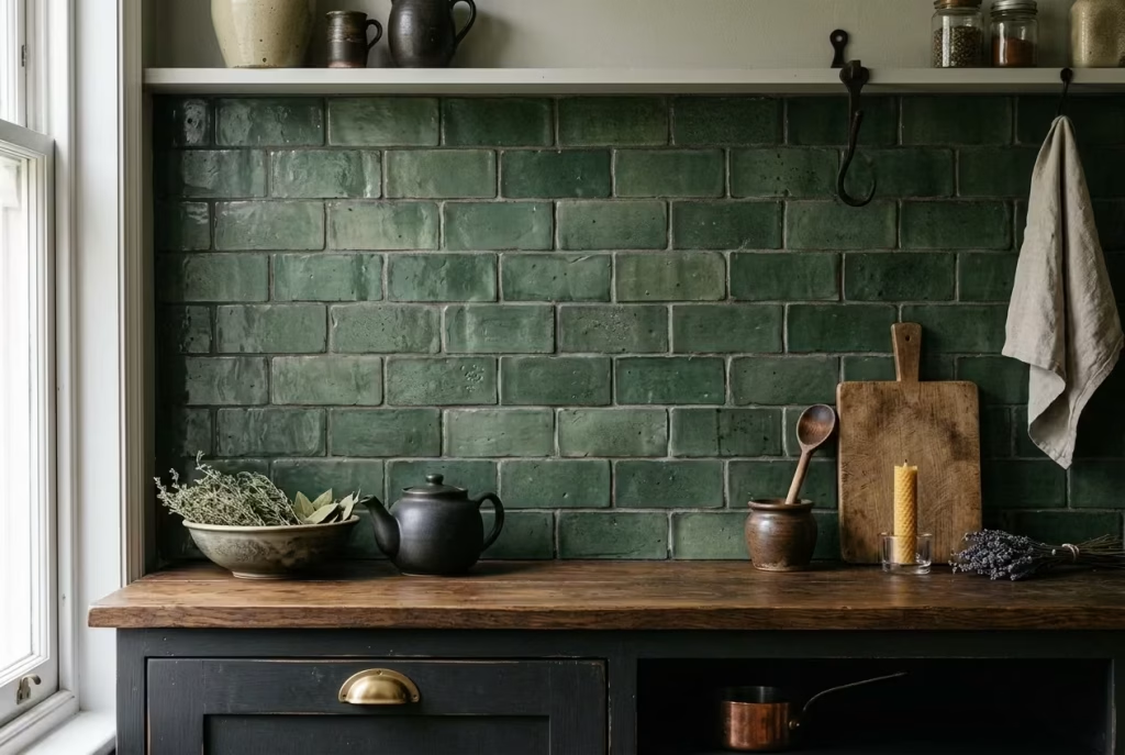
Handmade tiles bring a sense of imperfection that is deliberate yet unforced a nuance that speaks volumes in a dark cottagecore kitchen. Unlike uniform, factory-made alternatives, each tile carries its own subtle identity: a slightly deeper hue here, a soft ripple there, a tiny irregularity that makes the eye linger. These variations are not flaws but evidence of human touch, lending a kitchen a texture and authenticity that no mass-produced surface can replicate.
I often specify handmade tiles for splashbacks or small accent walls because they provide both visual and tactile interest. A dark kitchen can risk feeling monolithic if all surfaces are uniform; the gentle shifts in glaze and form introduce rhythm, almost like a whispered counterpoint in the room’s overall composition. In one of my projects, we used a muted forest green tile with slight tonal variation, each tile around 75 x 150 mm (3 x 6 inches), arranged in a classic brick bond. The subtle differences caught the light at different angles, creating movement across the backsplash and preventing the cabinetry from feeling too heavy.
Beyond aesthetics, these tiles have practical merit. The slightly irregular surface naturally disguises smudges or water marks, which is ideal in a kitchen that is used daily. It allows the space to feel lived-in without appearing neglected. And because no two tiles are identical, repairs or replacements over time are less jarring new tiles blend more organically into the existing pattern.
There is also a tactile satisfaction in working with handmade ceramics. Running your hand along a gently undulating surface, feeling the glaze’s slight variations, connects you to the craft in a way that flat, perfect tiles never can. It is the sort of detail that rewards observation, quietly reinforcing the kitchen’s narrative of care, craft, and accumulated layers.
When choosing color and finish, I favor tones that complement the cabinetry while retaining a degree of warmth smoky blues, soft charcoal, earthy greens, or oxblood reds. Slightly matte finishes tend to integrate best in darker schemes, avoiding unwanted glare and maintaining a calm, enveloping mood. I often recommend keeping grout tones close to the darker shades of the tiles themselves to reinforce a seamless, collected effect, rather than introducing stark contrast that pulls the eye too sharply.
At its best, handmade tiles do more than cover a wall they set a rhythm. They encourage pause and attention, inviting you to notice the subtle dance of colour and form. In a dark cottagecore kitchen, this quiet layering of texture and tone creates a space that feels cultivated over time rather than styled all at once. It is this sense of careful accumulation, of design meeting lived experience, that makes the room feel truly authentic, warm, and undeniably human.
You May also Like: 25 Black Kitchen Cabinet Design Ideas That Transform Your Kitchen
Unlacquered Brass or Antique-Style Hardware
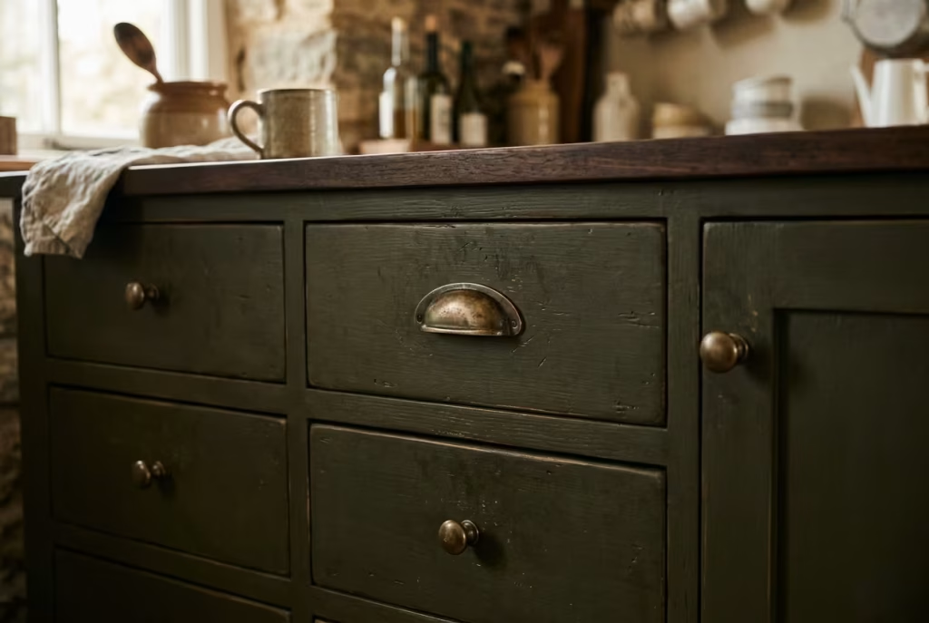
Hardware may seem like a small detail, but in a dark cottagecore kitchen, it is the punctuation that gives the room personality and grounding. Unlacquered brass or antique-style handles, knobs, and pulls introduce a whisper of warmth and history, a touch that catches the light just enough to add depth without overwhelming the composition. They are the accents that make cabinetry feel collected, as though it has grown into the home rather than being installed overnight.
The beauty of unlacquered brass lies in its natural evolution. Unlike polished or coated finishes, it responds to the environment, developing a patina over time that is quietly expressive. A handle touched daily by hands absorbs oils and light wear, shifting in hue and tone, lending the kitchen a sense of narrative. In one project, I specified unlacquered cup handles on deep olive lower cabinets. Within months, the hardware had started to mellow in colour, each piece subtly unique. It added a layer of texture and warmth that a new, shiny finish could never replicate.
Antique-style hardware, whether in iron, bronze, or aged brass, performs a similar function but leans more into storytelling. A simple latch or a delicately shaped knob evokes heritage, memory, and craftsmanship. It is especially effective when paired with freestanding-style or Shaker cabinetry, where the furniture-like quality of the units harmonises with hardware that feels like it has always belonged.
There are also practical benefits. The slightly textured, aged surface of these metals is forgiving of fingerprints and minor scratches, which is invaluable in a working kitchen. Unlike bright, polished hardware that demands constant polishing, these finishes embrace use, absorbing marks into their character rather than highlighting them.
Scale and proportion matter. Handles should feel substantial enough against deeper-toned cabinetry to register visually without appearing oversized. Cup pulls, around 96 mm or 3.75 inches in width, work beautifully on standard drawers, while smaller knobs, roughly 30–35 mm, maintain subtlety on cabinet doors. These dimensions allow hardware to punctuate the design without dominating it, giving the kitchen a sense of cohesion and quiet refinement.
At its best, unlacquered brass or antique-style hardware does not shout; it converses. It forms part of the subtle choreography of a kitchen’s materials, responding to timber, paint, and stone in ways that feel intuitive and considered. Over time, it tells a story of use, care, and life lived in the space a detail that is as practical as it is poetic, quietly elevating the kitchen from a room to a home.
Tongue-and-Groove Panelling or Beadboard for Texture
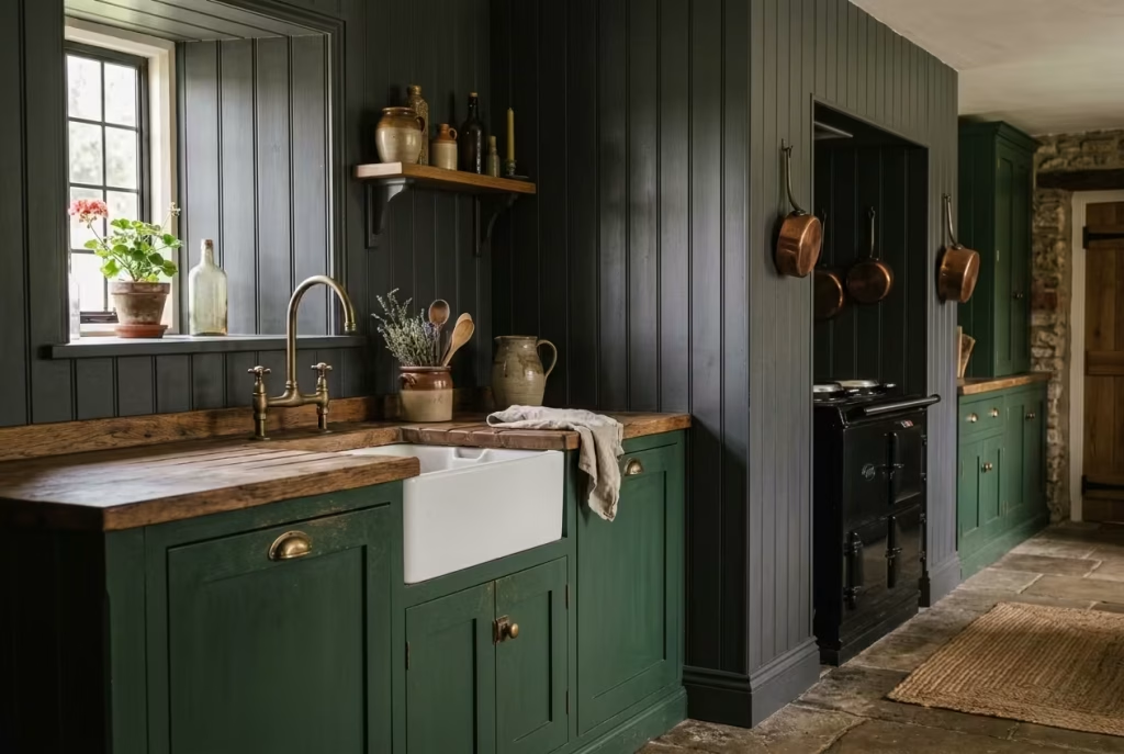
Tongue-and-groove panelling and beadboard offer a quiet sophistication that can transform walls from mere boundaries into tactile, visual narratives. In a dark cottagecore kitchen, these details add depth without shouting, creating a rhythm that carries the eye and softens heavier colours. They are the subtle punctuation marks in a room, suggesting care and craft while keeping the space approachable and lived-in.
The beauty lies in texture. Vertical or horizontal grooves catch the light in unpredictable ways, shifting throughout the day as natural illumination moves across the room. This movement prevents the walls from feeling static or oppressive, which can be a risk in darker palettes. In a recent project, we installed tongue-and-groove panelling painted in a muted charcoal, running from floor to dado height (around 900 mm or 36 inches) and topping with a soft matte finish. The result was a layered backdrop that anchored the cabinetry without competing for attention, subtly guiding the eye upwards and adding height to the space.
Beadboard works particularly well for a cottagecore aesthetic because it has a familiar, almost domestic charm. Its slightly understated pattern introduces warmth and tactility, reminding the occupants that a kitchen is not just functional, but also a space to inhabit, touch, and interact with. In one kitchen, we combined beadboard backsplashes with deep forest-green cabinetry. The contrast between the smooth painted timber and the grooves created a quiet interplay of shadow and light, giving a sense of dimension that made the room feel both intimate and expansive at once.
Practically, panelling can also protect walls in high-use areas, especially around prep zones and sinks. Choosing a durable paint finish, such as matte or eggshell, ensures the surface remains easy to wipe down without sacrificing character. Tongue-and-groove panels, being slightly thicker, can also accommodate minor irregularities in wall surfaces, masking imperfections while maintaining a handcrafted feel.
Scale matters here too. Narrow boards, around 76 mm or 3 inches wide, provide subtle texture and a delicate rhythm; wider boards, 150 mm or 6 inches, introduce a bolder statement. Placement should respond to the cabinetry and ceiling height too low or too high, and the effect can feel disjointed. The goal is a balance that feels organic, as if the panelling has always been part of the room’s evolution rather than added as an afterthought.
At its finest, tongue-and-groove or beadboard does more than decorate. It adds personality and tactility, grounding darker tones while allowing other materials stone, timber, and brass to breathe. It is a reminder that in design, texture often carries as much weight as colour or form, quietly shaping the atmosphere and inviting the space to feel both timeless and thoroughly human.
Lighting That Keeps the Room from Feeling Flat
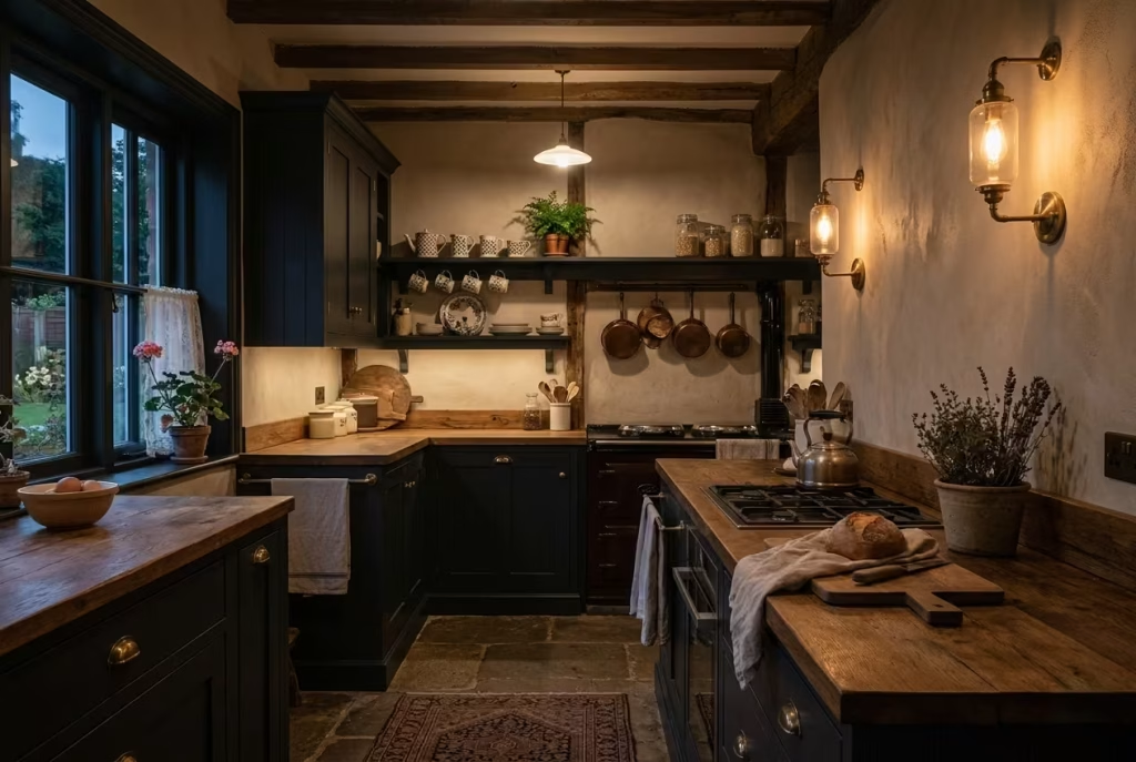
Lighting is the quiet safeguard in a dark kitchen. It is what stops the room from sinking into shadow and gives the deeper tones room to breathe, so every surface still feels layered, warm, and alive. In a cottagecore scheme especially, good lighting is less about brightness for its own sake and more about creating depth, softness, and a gentle kind of drama that makes the room feel inviting rather than heavy.
Warm Pendant Lights Over a Central Island or Table
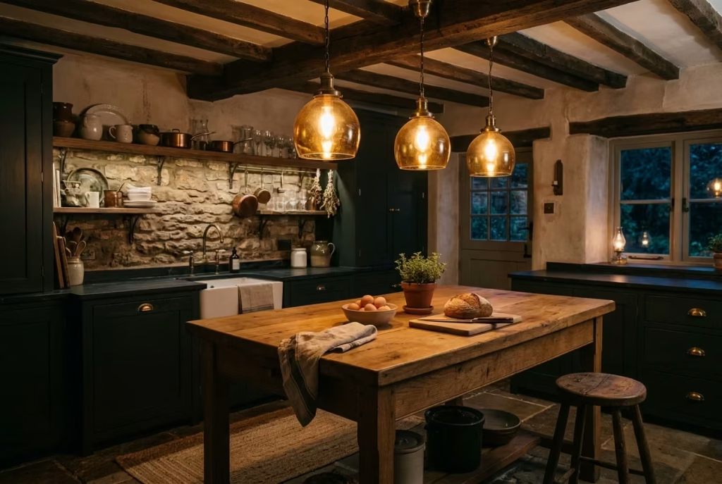
Warm pendant lights are the unsung heroes of a dark cottagecore kitchen, casting pools of light that draw you in and create zones of intimacy. Suspended over a central island or dining table, they do more than illuminate they choreograph the way you move and linger in the space, guiding attention without ever demanding it. In a room with deep cabinetry and moody palettes, they become the golden thread that ties the design together.
I always recommend pendants with warm-toned bulbs, around 2700K to 3000K, as cooler whites can make darker shades feel sterile or harsh. The light should skim surfaces rather than flood them, highlighting the texture of timber, stone, and glazed tiles. In one project, we installed three hand-blown amber glass pendants above an oak-topped island. The soft glow bounced off the surface, deepening the warmth of the cabinetry while also giving the stone backsplash a gentle shimmer. The effect was intimate yet practical a room that felt alive in both function and atmosphere.
The choice of fixture is equally important. Brass, aged iron, or matte black finishes harmonize with darker tones and natural materials, adding subtle personality without competing for attention. The scale of the pendants should correspond with the island or table: roughly one-third the width of the surface works as a rule of thumb. Too small, and they appear lost; too large, and they dominate, pulling focus away from the layered textures around them.
Height and spacing are practical yet aesthetic considerations. I usually hang pendants 650–750 mm (26–30 inches) above an island countertop, enough to illuminate prep surfaces without obstructing sightlines. If there are multiple pendants, spacing them evenly around 600 mm (24 inches) apart creates rhythm while maintaining a sense of balance.
Beyond utility, warm pendants contribute to mood. They encourage conversation, slow movement, and make the kitchen feel lived-in rather than overly curated. In darker schemes, this kind of lighting prevents surfaces from blending into shadows, helping to define cabinetry, worktops, and textured walls without sacrificing atmosphere.
At their best, pendants are a marriage of form and function: a light that works, a statement that whispers, and a glow that makes the room feel simultaneously grounded, intimate, and effortlessly timeless.
You May also Like: 15 Boho Mid-Century Modern Kitchen Ideas That Blend Warmth, Style, and Personality
Wall Sconces for a Softer, Layered Glow
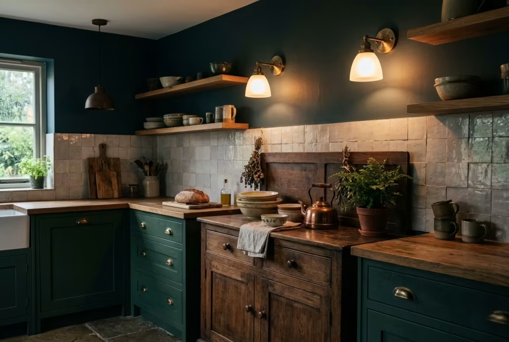
Wall sconces are the secret ingredient in a dark cottagecore kitchen, adding layers of light that make the room feel alive without ever overpowering it. While overhead lighting sets the stage, sconces provide nuance pools of glow that catch textures, highlight cabinetry detail, and gently illuminate corners that would otherwise vanish into shadow. They create depth, guiding the eye and softening the heaviness of darker palettes in a way that feels instinctive rather than staged.
I often specify sconces on either side of a window, above open shelving, or flanking a freestanding dresser. In a recent renovation, a pair of aged brass sconces with softly frosted glass shades flanked a dark green pantry cupboard. The light skimmed the cabinetry’s surface, bringing out subtle brushstrokes in the painted finish and casting delicate shadows on the tongue-and-groove paneling behind. The result was a tactile richness that made the room feel layered and deliberately lived-in, not just styled for show.
Placement and scale are critical. Sconces should sit at roughly 1500–1600 mm (59–63 inches) from the floor for a natural eye line, and proportionate to the wall or feature they highlight. Too small, and they feel incidental; too large, and they compete with the overall scheme. The goal is always subtlety a light that complements the space rather than shouting over it.
Warm bulbs, again in the 2700–3000K range, are essential. Cooler tones can flatten textures and make dark surfaces appear dull or unwelcoming. Dimmable options are particularly effective, allowing the homeowner to shift the mood from practical task-lighting to softer, ambient evening glow, reinforcing that lived-in, cosy atmosphere that is at the heart of the cottagecore aesthetic.
Material and finish choices matter too. Brushed or unlacquered brass, aged iron, or matte black anchors the fixture within the kitchen’s palette, harmonizing with cabinetry hardware, pendant details, and even natural timber surfaces. The interplay between these elements the warm gleam of brass catching against deep paintwork or timber grain adds a subtle, storytelling quality to the space.
At its best, wall sconces do not just illuminate; they invite presence. They encourage you to slow down, notice the textures, and appreciate the way light interacts with surface, material, and shadow. In a dark cottagecore kitchen, they transform corners and walls into intimate, visual pauses, making the room feel both expansive and enveloping a space that whispers of time, care, and quiet sophistication.
Under-Cabinet Lighting to Prevent Shadowy Prep Areas
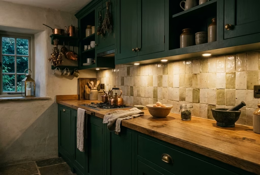
Under-cabinet lighting is the practical backbone in a dark cottagecore kitchen, quietly ensuring that function keeps pace with form. While moody palettes and deep cabinetry create atmosphere, they can also swallow light where it is needed most on worktops where chopping, mixing, and plating take place. Under-cabinet fixtures provide a focused, even illumination that prevents these prep areas from becoming shadowed or oppressive, all without compromising the room’s enveloping warmth.
In my experience, LED strips or slimline puck lights work best for this purpose. Placed about 150–200 mm (6–8 inches) back from the cabinet front edge, they cast light directly onto the surface without creating harsh glare or washing out textures. In one renovation, we installed warm 3000K LEDs beneath deep forest-green cabinets. The lighting highlighted the tactile qualities of the oak worktops while maintaining the intimate, enveloping mood of the space. Shadows were softened, surfaces gleamed subtly, and the kitchen felt alive without the need for harsh overhead light.
The design of under-cabinet lighting is about discretion as much as function. Recessed channels, concealed fixtures, or integrated aluminum profiles allow the light source to vanish from view, leaving only the effect: a quiet wash of illumination that accentuates texture, colour, and form. This subtlety ensures that the lighting contributes to the overall narrative of the kitchen rather than announcing itself as an afterthought.
Practical spacing matters too. Lights should run continuously along prep surfaces, avoiding gaps that could interrupt the rhythm of illumination. For a standard countertop depth of 600 mm (24 inches), a continuous linear fixture or regularly spaced pucks every 30–40 cm (12–16 inches) strikes the right balance between brightness and even distribution. Dimmable options are again invaluable, allowing for task-level light during cooking and a softer glow when the kitchen is simply in use for conversation or serving.
Beyond utility, under-cabinet lighting is a subtle way to highlight design details. It accentuates the joinery of Shaker cabinets, the gentle variations in handmade tiles, and the depth of textured stone worktops. By doing so, it ensures that every element contributes to the kitchen’s layered, soulful character without losing clarity in shadowed recesses.
At its finest, under-cabinet lighting is invisible yet indispensable. It prevents frustration in daily use, enhances materiality, and adds a quiet sophistication that keeps a dark kitchen feeling considered, functional, and utterly alive. It is the unseen thread that allows atmosphere and practicality to coexist, letting the mood of the room flourish without compromise.
Candlestick-Style Lamps or Decorative Table Lighting on Dressers or Sideboards
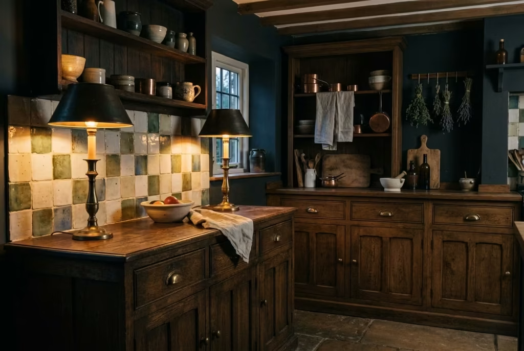
Candlestick-style lamps and decorative table lighting are the finishing touches that transform a dark cottagecore kitchen from merely functional to richly atmospheric. Unlike overhead or task lighting, these fixtures operate in the realm of nuance they cast a gentle, flickering glow that highlights surfaces, objects, and textures without flattening them. On a dresser, sideboard, or open shelving unit, they create intimate pockets of light that invite the eye to wander and linger, rewarding attention to detail and adding a layer of collected charm.
I have often used small candlestick lamps with brass or iron bases in kitchens with deep cabinetry, pairing them with soft, warm-toned bulbs around 2700K. The effect is reminiscent of heritage kitchens lit by candlelight, lending a sense of continuity and age to modern spaces. In one project, a pair of antique-inspired lamps flanked a dark oak sideboard. The interplay of light and shadow accentuated the texture of handmade tiles on the backsplash and the patina of unlacquered brass handles, while the surrounding space felt simultaneously intimate and open.
Placement is key. These lamps work best on surfaces where they can punctuate the room’s rhythm without crowding the workspace. They should sit at roughly eye level when standing or slightly below for surfaces you approach frequently. A small grouping of decorative lights or a pair of symmetrical candlestick lamps can create balance, drawing attention to objects such as vintage ceramics, glassware, or heirloom wooden boards, and reinforcing the kitchen’s narrative of layered history.
Scale and proportion are equally important. The base should feel substantial enough to anchor the light, but not so large that it dominates the dresser or tabletop. Shade or bulb selection should emphasize diffusion rather than harsh illumination, preserving the gentle, enveloping atmosphere that defines a dark cottagecore space. I often favor frosted glass or linen shades for a soft spill of light, highlighting textures and surfaces without creating stark contrasts.
Beyond aesthetics, these lights encourage interaction and presence. They invite the inhabitants to slow down, notice small details, and appreciate the tactile qualities of the kitchen’s materials from timber grain to tile variation. They also function as mood modulators: during evening gatherings, dimmed candlestick lamps can create a warm, welcoming glow, transforming the kitchen from a workspace into a place for conversation, reflection, or lingering over a cup of tea.
At its most effective, candlestick-style or decorative table lighting is not decoration for decoration’s sake. It is storytelling through illumination, accentuating the kitchen’s textures, forms, and patina while softening shadows and animating surfaces. In a dark cottagecore scheme, these lights are the quiet ambassadors of warmth, intimacy, and subtle drama a reminder that in design, the smallest sources of light often have the largest emotional impact.
You May also Like: 25 Kitchen Colour Ideas That Transform Your Space Instantly
Decorative Touches That Feel Collected, Not Staged
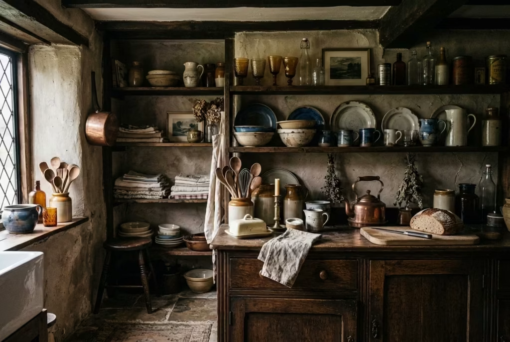
In a dark cottagecore kitchen, it’s the little details that give the room soul. Decorative touches should whisper stories rather than shout, suggesting a life lived rather than a showroom meticulously arranged. When objects feel collected over time heirloom ceramics, aged glassware, or handmade utensils they create layers of intimacy and authenticity that no perfectly coordinated set can replicate.
Open Shelves Styled with Crockery, Glassware, and Jars
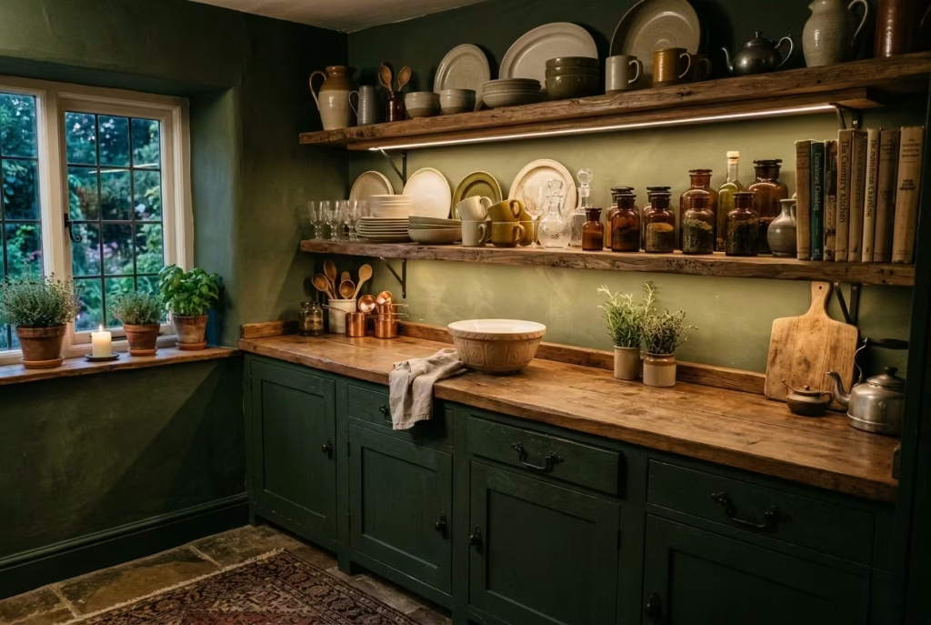
Open shelving in a dark cottagecore kitchen is more than a practical storage solution; it is a canvas for storytelling. When styled thoughtfully, shelves become a display of collected objects, blending function and personality without tipping into the realm of staging. Crockery with soft imperfections, hand-blown glassware, and jars filled with pantry staples add layers of texture and colour that subtly animate the kitchen. Each piece contributes to a rhythm of observation, inviting the eye to pause, linger, and discover small details over time.
I often advise clients to mix objects by material, height, and function. In one project, we combined muted stoneware plates, aged amber jars, and clear glass bottles with slightly irregular forms. The variation in height and finish created a visual cadence that prevented the dark cabinetry and walls from feeling monolithic. Arranged in small clusters rather than rigid rows, the shelves exuded a sense of accidental beauty, as if the objects had accumulated naturally rather than being curated in a single afternoon.
Practicality is key: leave enough breathing room between items for ease of access, and consider grouping by colour or material to maintain cohesion. A few vintage cookbooks, a wooden mortar and pestle, or a small ceramic jug can break up repetition, adding narrative and authenticity. Lighting also enhances these displays subtle under-shelf LED strips or nearby wall sconces catch the textures of glass and glaze, highlighting depth and shadow in a way that makes the space feel dynamic.
Open shelves do more than decorate; they act as a living archive of your kitchen life. They invite everyday interaction while quietly showcasing craft and character. When styled with intention but left slightly imperfect, they transform a utilitarian wall into a space that feels lived-in, layered, and endlessly inspiring a true hallmark of the dark cottagecore aesthetic.
Vintage Prints, Botanical Studies, or Small Framed Artworks
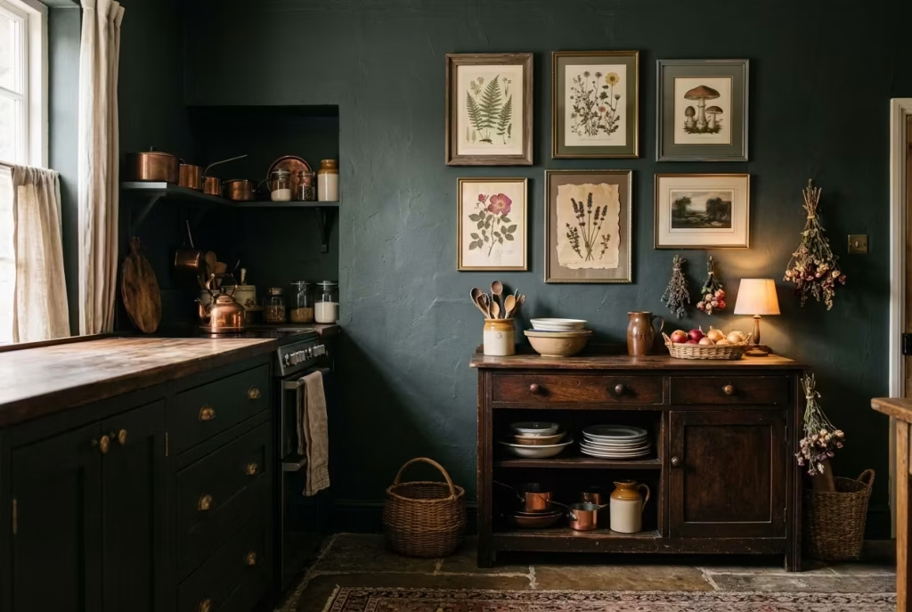
Art in a dark cottagecore kitchen is the quiet storyteller, the layer that turns walls into memory and atmosphere rather than blank surfaces. Vintage prints, botanical studies, or small framed artworks bring history, personality, and texture to a space that might otherwise feel heavy or static. Each piece serves as a pause for the eye, a subtle invitation to linger and reflect on the tactile richness and nuanced palette of the kitchen.
I often suggest framing botanical studies or small etchings in aged wood or muted metal frames, which complement the deep cabinetry and natural materials of the room. In one project, we created a gallery of six small prints ranging from pressed herbs to old botanical engravings above a freestanding dresser. The frames were slightly mismatched in size and patina, yet the collective arrangement felt coherent, as if the objects had been gathered over years rather than purchased in one go. The interplay between the dark wall behind and the softer tones of the prints created depth, breathing life into what might have been an otherwise shadowed corner.
Practical placement matters. Art should sit at roughly eye level for standing viewers around 1500 mm (59 inches) from the floor to invite natural interaction without forcing the gaze. Consider clusters rather than a single statement piece; small groupings encourage the eye to wander across textures, subjects, and frames, reinforcing the layered, collected feel at the heart of cottagecore.
The emotional resonance of these artworks cannot be overstated. They create a sense of continuity, connecting natural materials, cabinetry tones, and decorative objects into a cohesive narrative. Botanical studies echo the green and earthy hues of cabinetry and worktops, while vintage prints add patina and visual punctuation, complementing handcrafted tiles, timber, and brass accents.
Ultimately, the charm lies in subtlety. Art in this context is never about filling empty walls or following trends; it is about quiet accumulation, deliberate imperfection, and a conversation between surfaces and stories. When executed thoughtfully, these small artworks elevate a dark kitchen into a space that feels both intimate and curated, a room that whispers of history, craft, and a life well-lived.
Lace or Linen Curtains for Softness
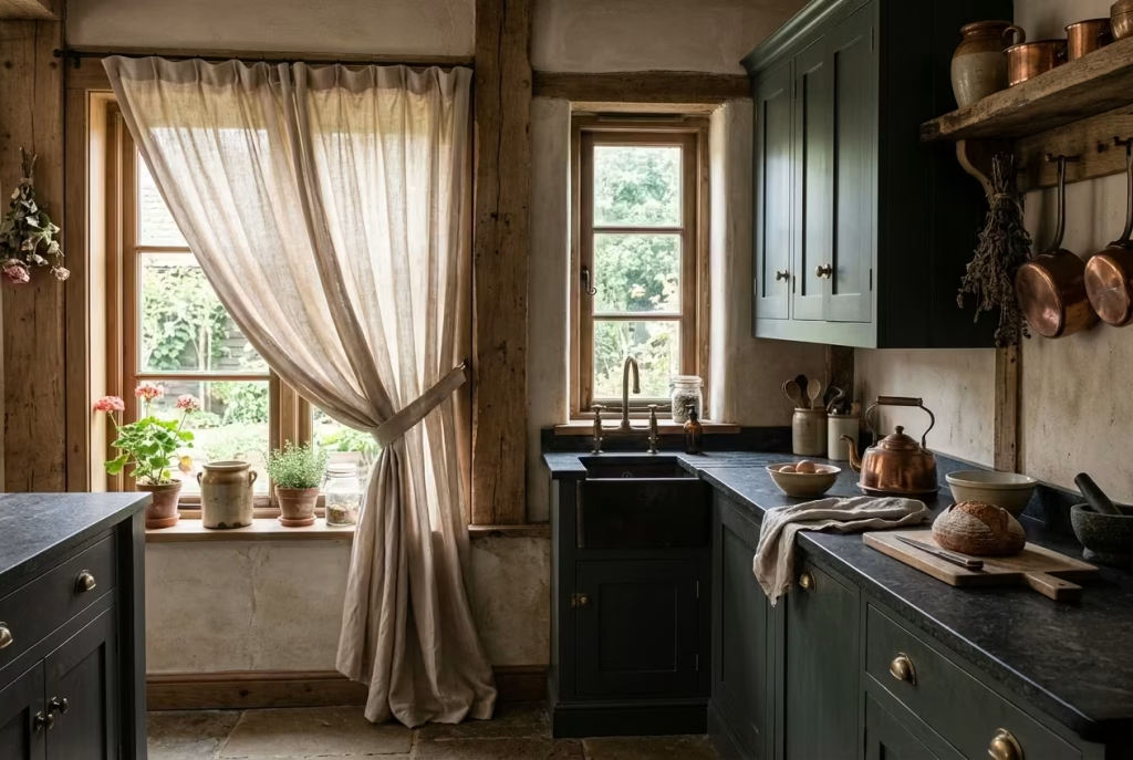
Lace or linen curtains have a way of taking the hard edge off a kitchen without dulling its character. In a dark cottagecore scheme, where cabinetry, worktops, and walls often lean rich and grounded, soft window treatments act like a gentle exhale. They filter the light rather than blocking it, giving the room that elusive softness that makes it feel settled, inviting, and lived in. It is a small gesture, but it can change the whole tune of the room.
Linen, in particular, has an easy elegance that never tries too hard. Its natural slub and slight irregularity suit cottagecore beautifully because the fabric already carries a sense of texture and ease. It does not need to be perfectly pressed or overly tailored. In fact, a little looseness is often what makes it work. When linen hangs with a relaxed drape, it brings movement to a space full of heavier materials, almost like a breeze moving through a room that might otherwise feel too still. That contrast is worth its weight in gold.
Lace has a different quality. It leans more delicate, more nostalgic, and can be especially effective in kitchens where you want to suggest heritage without slipping into costume. Used sparingly, it can soften a window frame and introduce a subtle pattern that catches the light in an almost whisper-like way. I tend to favour lace in smaller windows or upper panes, where it can offer privacy while still letting the room breathe. In the right setting, it feels like a nod to older interiors, but without the cobwebby heaviness that can sometimes come with overly fussy dressing.
From a practical point of view, curtain length and fullness matter more than most people realise. A kitchen curtain that ends just above the sill can look neat and unfussy, but a longer drop, especially one that falls to the floor or just kisses it, tends to feel more grounded and considered. For a standard window, I usually recommend allowing enough fabric for a gentle gather rather than a tight, skimpy fit. As a rough guide, curtain panels should be around one and a half to two times the width of the window to give that soft, layered look rather than something pulled too thin. That extra fabric gives the room richness without making it feel overdone.
Colour choice should stay within the same quiet register as the rest of the scheme. Cream, flax, oat, soft stone, and weathered white all sit comfortably alongside dark greens, browns, and charcoal tones. These shades do not fight for attention. They simply catch the light and make the room feel a little more forgiving. In one kitchen I worked on, we used unlined linen curtains in a pale sand tone beside blackened olive cabinetry. The result was not dramatic in a loud sense, but it had depth. The fabric softened the window wall just enough to keep the kitchen from feeling too severe, and that, in the end, is where the magic lies.
There is also a sound quality to fabric that people often overlook. Curtains absorb a little of the harshness in a room, softening echoes and making the space feel more intimate. In a kitchen with stone floors, painted cabinetry, and hard worktops, that matters. It takes the room down a notch, in the best possible way. You may not notice it immediately, but you feel it. The room settles around you rather than bouncing everything back.
What gives lace and linen their strength is not just their softness, but their restraint. They never overwhelm the architecture. They sit quietly at the window, framing the view, filtering the daylight, and adding a touch of romance without becoming precious. That balance is the whole point. A dark cottagecore kitchen should feel layered and practical, but never stiff. Soft curtains help it land in that sweet spot, where comfort and character go hand in hand.
You May also Like: 25 Dark Cottagecore Bedroom Concepts: How to Master the Moody Aesthetic
Pot Racks, Hanging Herbs, and Well-Used Kitchen Tools
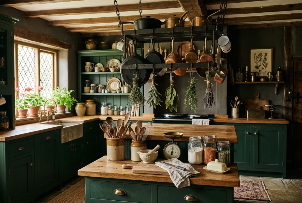
In a dark cottagecore kitchen, function becomes decoration, and a thoughtfully curated collection of kitchen tools tells a story of life lived in the room. Pot racks overhead, bundles of drying herbs, and well-used utensils don’t just occupy space they add texture, rhythm, and a sense of authenticity that no staged display could replicate. They are the heartbeat of the kitchen, reminding us that this is a space meant to be worked in, touched, and inhabited.
I have often used wrought iron or aged brass pot racks suspended above islands or prep areas, layering them with cast iron skillets, copper saucepans, and enamelware mugs. The warmth of metals against dark cabinetry and stone worktops creates a visual dialogue between material, colour, and patina. Hanging herbs thyme, sage, or bay tied in small bunches add a whisper of scent and movement, softening the heavier lines of cabinetry and worktops. These natural touches echo the palette and textures already present in the room, reinforcing a sense of cohesion that feels entirely unforced.
Placement and proportion are key. Pots and pans should hang at a reachable height roughly 1800–1900 mm (70–75 inches) from the floor so they remain practical without overcrowding sightlines. Herbs should be grouped sparingly to avoid visual clutter, and smaller tools like wooden spoons, whisks, or ladles can be displayed on hooks or in ceramic crocks, integrating seamlessly into the overall aesthetic. This layering of utility and display ensures that the kitchen never feels too “perfect” or artificial; instead, it radiates warmth, activity, and human presence.
There is also a tactile and auditory charm in these touches. The slight clink of copper pans, the rustle of dried herbs, and the natural grain of wooden utensils create a multisensory experience that enriches the kitchen beyond visual appeal. In a project with deep forest-green cabinetry and oak countertops, the addition of a hanging pot rack and herb bundles brought the kitchen to life. The room felt lived-in, approachable, and intimate, yet still refined like a space that had grown over time, quietly collecting stories and objects along the way.
Ultimately, pot racks, hanging herbs, and well-used tools are not merely decorative they are narrative. They anchor the kitchen in practicality, history, and tactile reality, reinforcing the cottagecore ethos of collected charm, layered textures, and soulful detail. When executed with balance, they transform a dark kitchen from a static design into a lived, breathing space that invites engagement, evokes comfort, and celebrates the art of everyday cooking.
Ceramic Crocks, Old Wooden Boards, and Enamelware
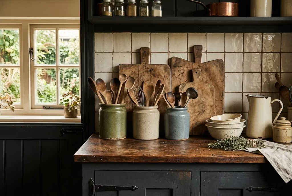
In a dark cottagecore kitchen, ceramics, wooden boards, and enamelware are more than mere utensils they are storytellers, bearing the marks of daily life while adding texture, warmth, and a sense of continuity to the space. Ceramic crocks filled with utensils, vintage wooden boards propped casually against a backsplash, and enamelware bowls or jugs act as both practical tools and tactile décor, bridging function and visual interest in a way that feels effortless rather than curated.
I often encourage layering these objects to create subtle rhythm and visual weight. For example, a trio of glazed ceramic crocks in muted stone or earthy tones can hold frequently used wooden spoons, whisks, or ladles. Nearby, an old chopping board with knife marks and a naturally weathered patina can lean against a tiled splashback, its rough-hewn character echoing the warmth of timber worktops and deep cabinetry. Enamelware whether a cream jug with chipped edges or a small mixing bowl introduces reflective surfaces that catch light and soften the intensity of darker walls and cupboards. Together, they create a vignette that feels as though the room has grown organically over time.
Scale, texture, and placement are key. Crops should be proportionate to the countertop large enough to hold utensils comfortably, but not so large as to dominate the workspace. Boards of varying sizes add layered visual interest, and enamel pieces, particularly if slightly imperfect, add a sense of patina and history that reinforces the kitchen’s collected, lived-in feel. In a project with deep charcoal cabinetry, adding a grouping of wooden boards and off-white enamel jugs created a contrast that broke up the darkness without introducing brightness that would feel artificial.
Practicality merges seamlessly with design. These objects are easy to reach, making daily cooking more tactile and satisfying while also contributing to the overall aesthetic. They whisper of rituals, meals prepared with care, and the subtle imperfection that makes a home feel human. Each scratch, chip, or glaze variation becomes a layer of storytelling, turning ordinary kitchen tools into elements that enrich the narrative of the space.
At its best, this approach achieves a delicate balance: the kitchen is simultaneously functional, tactile, and visually poetic. Ceramic crocks, old wooden boards, and enamelware act as anchors of authenticity, drawing the eye, softening shadows, and reinforcing the subtle, layered warmth that defines a dark cottagecore kitchen. They remind us that in a room this intimate, beauty is found in use, texture, and a quiet accumulation of objects that feel like part of a life well-lived.
Layout Details That Support Real Living
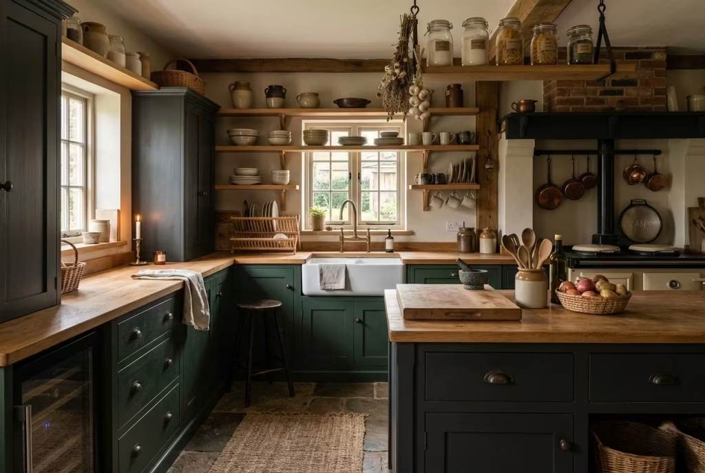
A dark cottagecore kitchen may look enchanting, but it only works when the layout supports how a household actually functions. Thoughtful planning ensures that beauty does not come at the expense of usability. In kitchens that are deeply hued and richly textured, circulation, storage, and work zones must be carefully considered so that the space feels effortless, practical, and genuinely lived-in, rather than just visually striking.
A Farmhouse Table Used as an Island Alternative
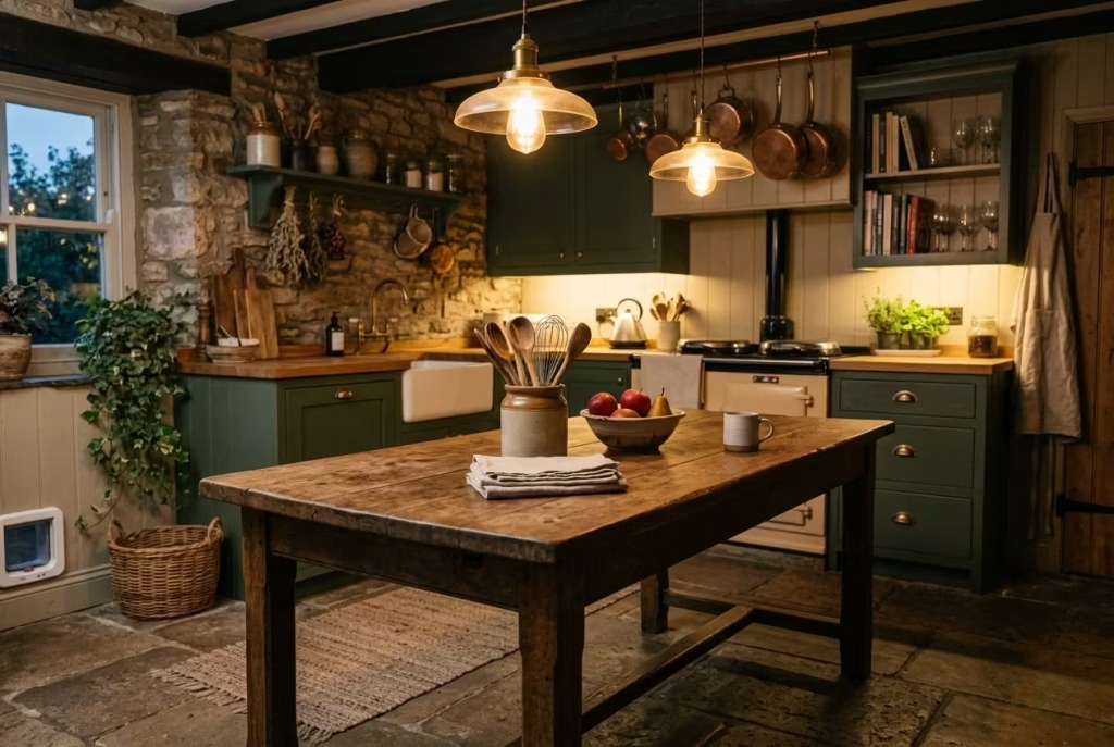
In a dark cottagecore kitchen, a farmhouse table can serve as both a functional centerpiece and a statement of lived-in charm. Unlike a standard fitted island, a sturdy, well-worn table introduces flexibility: it can act as a prep surface, an informal dining spot, or even a display for decorative objects and kitchen tools. Its tactile presence grounds the room, softening the weight of deep cabinetry while offering an approachable, human scale that invites interaction.
I’ve often recommended this approach for kitchens where fitted islands might feel too rigid or overwhelm a compact footprint. A solid oak or reclaimed pine table, ideally measuring around 1800 mm by 900 mm (6 by 3 feet), provides ample prep space without dominating the circulation flow. The height can be standard counter height or slightly lower to accommodate casual seating with stools, giving it a versatility that rigid islands rarely offer. In one project, placing a farmhouse table in the center of a charcoal and moss-toned kitchen allowed for a dynamic workspace that could pivot from cooking to dining in moments, all while echoing the room’s layered textures and natural materials.
Visual weight and materiality are key. A table with a worn patina, subtle dents, or visible grain feels authentic; it complements handmade tiles, timber worktops, and soft metals without competing for attention. Styling is minimal yet considered a ceramic crock with wooden utensils, a small stack of linen napkins, or a few bowls of seasonal fruit can provide interest without making the space feel staged.
Functionally, this solution encourages natural movement and conversation. Unlike an enclosed island, the farmhouse table allows multiple people to work side by side without disrupting workflow. It supports informal dining, quick breakfast routines, or even impromptu homework sessions, turning the kitchen into a true hub of daily life rather than a decorative stage.
Ultimately, the farmhouse table as an island alternative embodies the dark cottagecore ethos: layered, tactile, and practical, yet full of personality. It proves that in kitchens built for living, design choices must do double duty supporting both daily ritual and aesthetic storytelling so that the room feels alive, welcoming, and endlessly adaptable.
A Dresser or Plate Rack for Extra Storage and Display
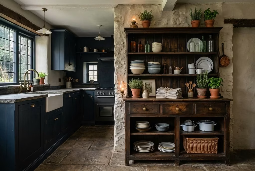
A dresser or plate rack brings a sense of collected charm to a dark cottagecore kitchen, blending practicality with visual storytelling. Beyond serving as additional storage for crockery, glassware, and everyday tools, these pieces act as display surfaces that reinforce the room’s layered, lived-in quality. Unlike fully fitted cabinets that can feel austere, a freestanding dresser or open plate rack introduces variation in scale, texture, and material, creating pockets of interest that catch the eye and invite interaction.
From a functional standpoint, these units must respect circulation and workflow. Ideally, maintain at least 900 mm (36 inches) of clear space around them, ensuring that drawers and doors open freely and that the kitchen never feels cramped. In kitchens where an island dominates, positioning a dresser or plate rack against a free wall allows the work triangle to remain fluid, while still offering accessible storage. In smaller kitchens, I often suggest a moveable table or trolley as a hybrid solution; it can act as extra prep space, display area, or serving station, giving the flexibility that fixed furniture cannot.
Material and finish matter as much as placement. A dark-stained oak dresser with brass handles, or a painted plate rack in a muted green or charcoal, complements cabinetry and worktops while introducing warmth and texture. Styling should be considered but effortless: a few ceramic bowls stacked, a scattering of wooden boards, or vintage glass bottles brings an organic, collected feel without looking staged. Layering items of varying height and texture ensures that the dresser or rack integrates seamlessly with the room’s rhythm and depth, making the space feel curated over time rather than designed in a single afternoon.
Practically, these pieces encourage active engagement. Pulling out a plate, placing a chopping board, or reaching for utensils becomes a tactile, almost ritualistic interaction, reinforcing the kitchen’s role as a lived-in hub. In one project with a deep inky blue kitchen, a reclaimed pine dresser positioned against a side wall not only provided extra storage but became a focal point for layered styling: a row of enamelware, small potted herbs, and a stack of linen napkins brought texture, warmth, and narrative to the space, softening the bold cabinetry and stone surfaces.
Ultimately, a dresser or plate rack balances utility with aesthetic storytelling. It preserves the dark cottagecore ethos layered, tactile, and approachable while anchoring the kitchen in real-life functionality, making the room feel both beautiful and utterly practical for daily living.
You May also Like: 25 Organic Kitchen Design Ideas for a Natural Home
Built-In Bench Seating to Soften the Plan
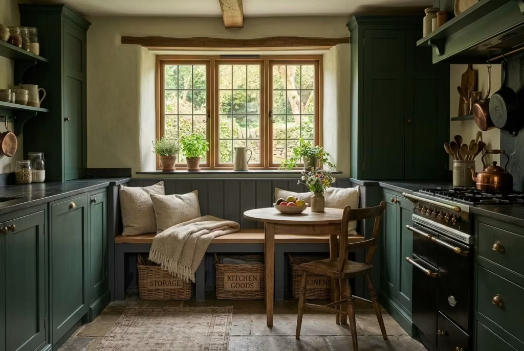
Built-in bench seating in a dark cottagecore kitchen does more than provide a place to perch it introduces a sense of intimacy, rhythm, and human scale to a room that might otherwise feel heavy with cabinetry and stone surfaces. A well-designed bench creates a cozy nook, encourages social interaction, and softens rigid circulation patterns, transforming the kitchen from purely functional into a space that welcomes lingering, conversation, and shared meals.
From a practical standpoint, circulation is key. Aim for at least 900 mm (36 inches) of clear space around the bench and adjacent islands or worktops to maintain free movement. A bench works best tucked against a wall or beneath a window, with cushions or fabric throws adding texture and comfort without obstructing access. In smaller kitchens, I often recommend pairing a built-in bench with a moveable table rather than a fixed island, giving flexibility to rearrange seating for prep, casual dining, or entertaining without feeling cramped.
Material choices can elevate both function and style. A timber bench preferably oak, walnut, or a reclaimed board harmonizes with butcher block or stone countertops, while soft upholstery or linen cushions inject tactile warmth. A painted finish in a muted green, charcoal, or deep olive can visually integrate the bench with cabinetry, making it feel like a natural extension rather than an afterthought. In one project, a charcoal-painted bench with a gently worn oak seat and linen cushions beneath a deep forest-green window revealed how seating could anchor the room, breaking up heavier elements and creating a relaxed rhythm that encouraged family interaction and casual entertaining.
Practical styling also matters. Small baskets tucked beneath the bench can store linens or board games, while a few decorative cushions or a folded throw can soften the look while remaining functional. This layering adds depth and narrative, making the bench feel as though it has been part of the kitchen’s story for years rather than installed for show.
Ultimately, built-in bench seating does more than soften the plan it humanizes it. It allows a dark, heavily toned kitchen to breathe, encourages daily life to unfold naturally, and reinforces the cottagecore ethos of a home that is as beautiful as it is lived-in. By combining thoughtful placement, materials, and styling, the bench becomes both a practical anchor and an invitation to dwell, converse, and enjoy the tactile, layered warmth of the space.
A Pantry Door or Larder Cupboard Painted to Match the Cabinetry
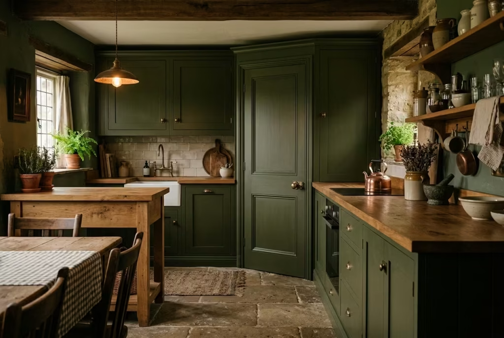
In a dark cottagecore kitchen, continuity is key, and one of the simplest ways to achieve it is by painting pantry doors or larder cupboards in the same tone as the surrounding cabinetry. This creates a seamless, almost secretive quality to the storage, allowing the eye to travel uninterrupted across walls of cabinetry while keeping functional elements integrated into the design rather than visually jarring. The trick is subtlety: a door should blend enough to feel part of the ensemble, yet still retain enough detail be it a panel, beadboard, or brass hardware to signal its purpose and add texture.
Functionally, a painted pantry door offers the best of both worlds. It maintains the cohesive aesthetic of the kitchen while concealing bulk storage, helping a dark-toned room avoid becoming heavy or claustrophobic. In practice, I recommend using the same paint type, sheen, and finish as the cabinetry for a unified look. For instance, a satin-finish deep olive larder door paired with matching moss-green cabinets creates a sense of calm, enveloping the space in richness without overwhelming the senses.
Practical placement matters as well. Ensure that the pantry door swings or slides freely without intruding into prep areas. Maintaining at least 900 mm (36 inches) of clear circulation space around the door ensures smooth movement and usability, particularly in kitchens with islands or freestanding tables. In smaller kitchens, a sliding larder door painted to match the cabinets can be a game-changer it hides storage without compromising room flow, offering both function and visual cohesion.
Styling touches reinforce the cottagecore ethos. Pair the pantry with subtle hardware antique brass knobs, worn iron pulls, or unlacquered hinges to complement the cabinetry and tie in with the surrounding materials like timber worktops or stone surfaces. Over time, a lightly worn finish or patina can enhance the sense of history, making the pantry feel like a collected piece rather than a newly installed feature.
Ultimately, painting a pantry door or larder cupboard to match cabinetry is a deceptively simple move that carries substantial impact. It balances utility with aesthetic storytelling, allows darker kitchens to breathe visually, and reinforces the layered, intentional charm that defines the cottagecore kitchen. By blending functionality, material harmony, and subtle detailing, this small design choice ensures the room feels cohesive, elegant, and entirely lived-in.
A Window-Led Layout That Places the Sink Where Natural Light Is Strongest
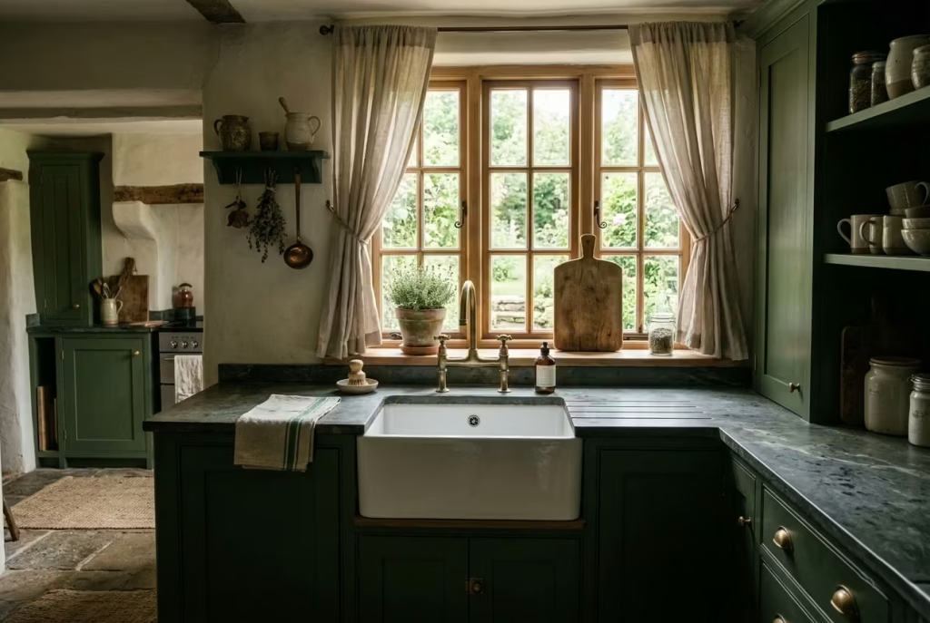
In a dark cottagecore kitchen, light is not just a practical necessity it is a storytelling device. Positioning the sink beneath a window ensures that the busiest prep and cleanup zone is bathed in natural light, softening deep cabinetry and shadowed corners while highlighting textures, colours, and the subtle patina of materials. It transforms a routine task into a more pleasurable, almost meditative experience, where the interplay of daylight, reflections, and tactile surfaces brings the kitchen quietly to life.
From a functional standpoint, a window-led sink layout offers multiple benefits. It enhances visibility when washing produce or prepping ingredients, reducing eye strain and making the kitchen more user-friendly. In one of my projects with moss-green cabinets and soapstone countertops, placing the sink under a south-facing window created an ever-changing backdrop of light that subtly shifted across the stone’s honed surface throughout the day. This not only accentuated the depth of the materials but also introduced a sense of dynamism into an otherwise heavy palette.
Practical spacing should not be overlooked. Maintain enough clearance at least 900 mm (36 inches) in front of the sink for comfortable movement, particularly when paired with nearby islands or freestanding tables. The layout should allow for seamless workflow between prep, cook, and cleanup zones. In tighter kitchens, I often recommend combining the window-led sink with open shelving or a plate rack on either side; this maximises storage while ensuring the space feels open and visually light, counterbalancing the depth of darker cabinetry.
Material choices further reinforce the effect. A hammered copper or brushed brass faucet, paired with a white or pale stone basin, introduces subtle contrast and reflective surfaces that catch the light. Surrounding details such as a soft linen curtain, a small potted herb on the sill, or a gently worn wooden board enhance texture, bringing the space to life without appearing staged. Even in a palette dominated by inky blues or deep charcoals, these small reflective and tactile elements prevent the room from feeling static, creating a sense of rhythm and layered intimacy.
Ultimately, aligning the sink with the strongest natural light embodies the principle that a kitchen should serve both daily life and aesthetic sensibility. It balances practicality with design, allowing dark tones to remain enveloping rather than oppressive, and encourages the kitchen to feel inhabited, warm, and engaging. This simple yet deliberate placement transforms the heart of the home into a space that not only functions efficiently but also resonates emotionally with those who dwell within it.
The Finishing Idea That Pulls It All Together
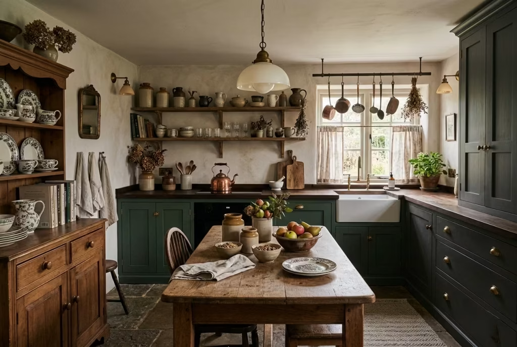
Every dark cottagecore kitchen reaches its full potential when a final, unifying touch ties the layers of texture, colour, and material into a cohesive whole. This is the moment where design stops feeling like a collection of individual choices and starts telling a story a room that is simultaneously lived-in, considered, and quietly dramatic, leaving a lasting impression long after the cooking is done.
Add One Focal Point With Real Presence
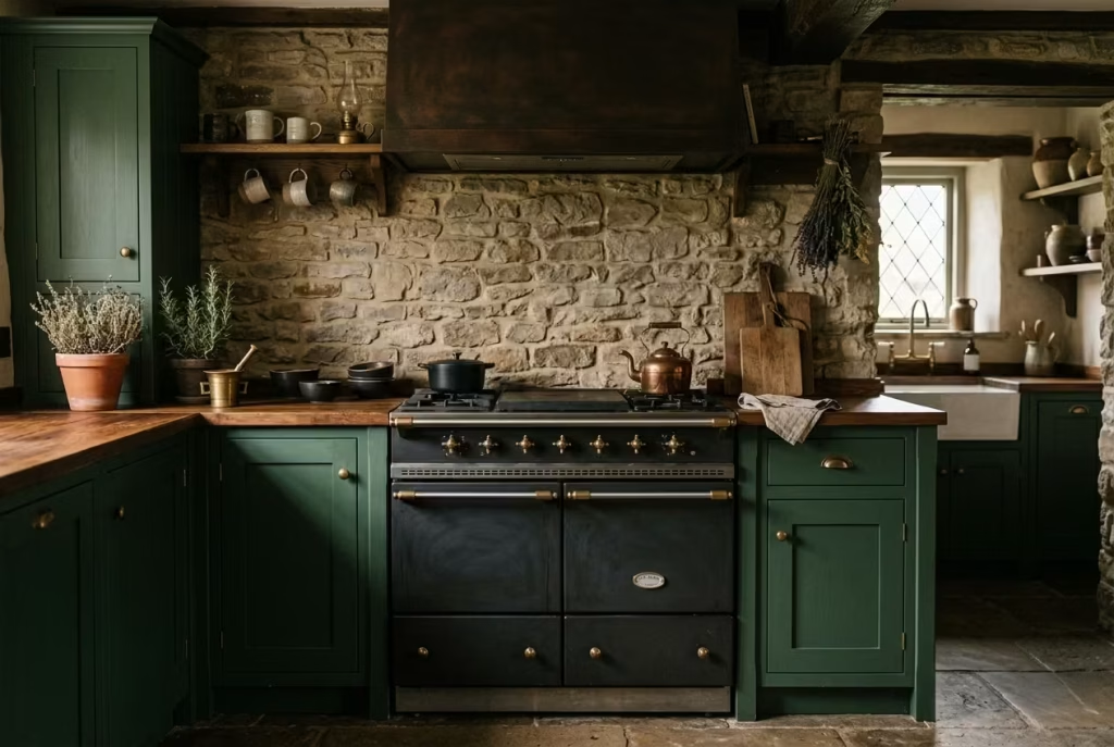
Every good kitchen needs one moment that quietly holds the room together, and in a dark cottagecore scheme, that focal point should feel rooted, not decorative for decoration’s sake. An antique-style range, a salvaged dresser, or a painted pantry wall can each serve that role beautifully, because each one brings a sense of weight, memory, and purpose. It is the kind of feature that does not just sit there looking handsome. It anchors the whole composition, giving the eye somewhere to land and the room a point of gravity, which is often what separates a pretty kitchen from one that feels complete.
An antique-style range works especially well when you want the kitchen to feel lived in and quietly authoritative. It has a natural presence, almost like the old family silver of the room, understated but impossible to ignore. Set against deep cabinetry and timber surfaces, it becomes the beating heart of the kitchen. I have always found that a range with a traditional silhouette, whether in muted black, aged cream, or a softened heritage green, can carry a scheme without ever stealing the show. It is a workhorse, yes, but it also brings a certain old-world gravitas that makes the whole room feel more resolved.
A salvaged dresser offers a different kind of strength. It introduces furniture-like character, the sort of detail that makes a kitchen feel collected over time rather than installed in one sweeping gesture. Its slightly uneven proportions, worn edges, and visible history can be worth their weight in gold in a space that might otherwise feel too polished. Used well, a dresser becomes more than storage. It becomes a place to layer crockery, glassware, and everyday objects in a way that feels easy, not staged. In a dark kitchen, that contrast between utility and personality can be the secret sauce.
A painted pantry wall is perhaps the most subtle of the three, but no less effective. When treated as a focal point, rather than a background surface, it can shift the entire mood of the room. A deeper tone, a slightly different finish, or a more tactile treatment such as panelled paintwork or beadboard can give the pantry wall its own identity while still keeping it in step with the rest of the kitchen. It is a quiet move, but it can work wonders. In tighter kitchens especially, this is often the smartest card to play, because it adds distinction without eating into precious floor space.
The real skill lies in knowing when to stop. A focal point should feel like the natural star of the show, not one voice in a room full of them. Once you introduce a strong feature, the rest of the kitchen needs to fall into line with a lighter hand. That might mean keeping nearby surfaces calmer, trimming back ornament, or allowing the materials around it to do their work in a more restrained way. As the saying goes, less is more, and nowhere is that truer than here. One well-chosen focal point, given room to breathe, often says more than a dozen competing ideas ever could.
At its best, this final layer brings the kitchen home. It gives the room a point of conviction, the thing that makes people pause when they walk in. Not because it is loud, but because it feels inevitable, as though the space was always waiting for that one last piece to fall into place.
You May also Like: 25 Stylish Neutral Kitchen Ideas That Add a Unique Designer Touch
Final Thoughts: Finding Balance in a Dark Cottagecore Kitchen
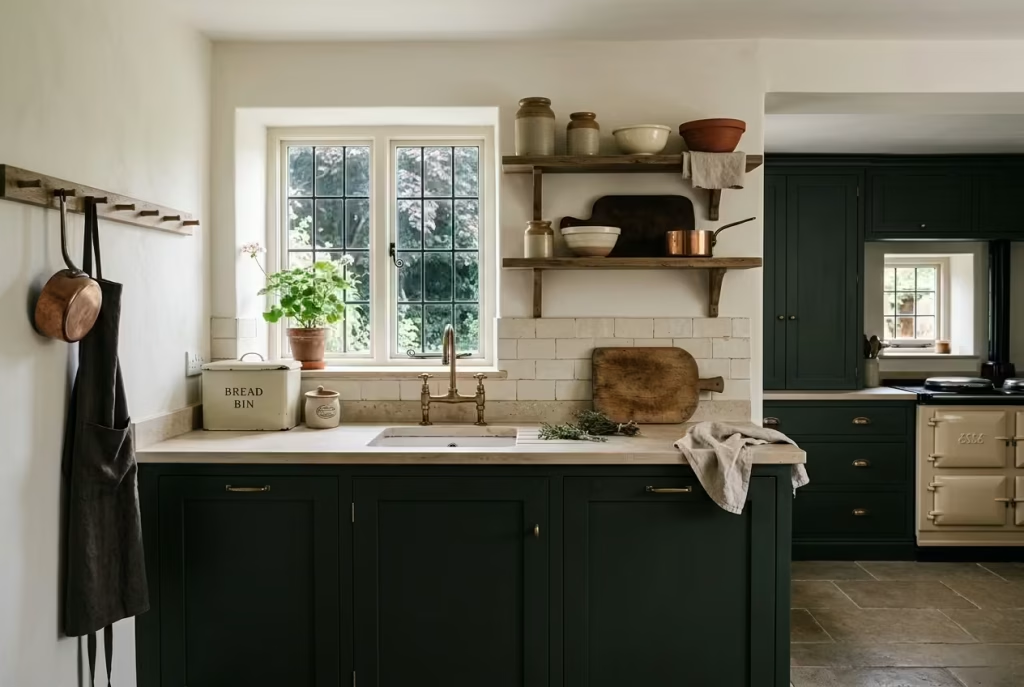
A dark cottagecore kitchen achieves its magic not by layering gloom upon gloom, nor by saturating every surface with heavy tones, but by carefully balancing depth, texture, and warmth. It is a style that thrives on restraint as much as richness where every timber board, hand-glazed tile, and softly patinated metal has a purpose and a story. The goal is a room that feels lived in from the very first day, where the surfaces invite touch, the layout supports daily life, and the interplay of light and shadow reveals nuance rather than fatigue.
Balance is the true secret. Deep cabinetry pairs with lighter worktops or open shelving to lift the space; tactile materials counter formal lines to invite comfort; and a single well-chosen focal point guides the eye, giving the room a rhythm without overwhelming it. In my own projects, kitchens with this careful interplay always feel more like homes rather than showrooms. They have a quiet authority, a sense of history, and a tactile intimacy that encourages people to linger whether chopping vegetables, setting a table, or simply pouring a cup of tea.
Ultimately, good design is about knowing where to stop. That restraint allows the kitchen to breathe, letting textures, tones, and objects converse naturally. In a dark cottagecore scheme, it is this pause the space between elements, the relief in circulation, the hint of lighter material amidst shadow that turns depth into warmth and heaviness into harmony. A kitchen done well in this style is a space that lives with you, evolves gracefully, and offers an enduring sense of calm, character, and quiet beauty. It proves that the art of design is less about filling every corner and more about giving the room room to exhale.
Frequently asked Questions about Dark Cottagecore Kitchen Ideas That Feel Warm, Rich, and Full of Character
Will a dark cottagecore kitchen make my space feel smaller?
Not necessarily. A dark kitchen only feels small when the palette is handled without balance. The trick is to give the room a few places to breathe, such as lighter worktops, open shelving, glazed cabinet sections, or softly reflective finishes. In practice, darker tones can actually make a kitchen feel more settled and intimate, rather than cramped, because they visually pull the walls in and create a stronger sense of enclosure. In a larger open-plan room, that can be a blessing. In a smaller kitchen, it simply means being careful with contrast, lighting, and proportion so the space keeps its lift.
What colours work best for a dark cottagecore kitchen?
The most successful shades tend to feel earthy, softened, and slightly weathered rather than stark or overly saturated. Deep moss, forest green, blackened olive, charcoal, oxblood, inky blue, and warm brown all sit comfortably within the style. These colours work because they have depth without shouting for attention. They also pair beautifully with timber, brass, stone, and handmade ceramics, which is really where the cottagecore character comes alive. If the colour feels too flat or too glossy, it can lose that layered, timeworn quality that gives the scheme its soul.
How do I keep a dark kitchen from feeling gloomy?
This is where the art lies. A dark kitchen becomes gloomy when everything is treated with the same heavy hand. You need contrast, but it should be gentle, not jarring. Think honed stone instead of high-gloss surfaces, warm light instead of cold white glare, linen curtains instead of hard blinds, and timber details that soften the room like a well-placed pause in conversation. Good lighting is absolutely crucial here. Layered pendants, sconces, and task lighting will keep the space from sinking into shadow. A dark cottagecore kitchen should feel cocooning, not cave-like, and that difference comes down to restraint and balance.
What materials make a dark cottagecore kitchen feel authentic?
Authenticity comes from materials that age gracefully and carry a sense of touch. Butcher block, oak, honed stone, soapstone, handmade tiles, aged brass, and tongue-and-groove panelling all bring that layered, lived-in quality. These are not finishes that look better only when they are untouched. They gain character with use, which is exactly the point. A timber worktop develops patina, brass softens over time, and handmade tiles introduce tiny variations that stop the room from feeling too perfect. That sense of imperfection is not a flaw. It is the magic ingredient.
Can dark cottagecore work in a modern home?
Yes, and often very successfully. The style does not have to feel pastiche or overly nostalgic. In a modern home, dark cottagecore works best when you let the architecture stay clean while layering in warmth through materials and detailing. A simple Shaker cabinet, a modern range, or a pared-back dresser can sit comfortably alongside traditional touches like linen, ceramics, and antique-style hardware. The result is a room that feels grounded and inviting, but still fresh. In other words, it does not need to look like a period set. It just needs to feel as though it has character, purpose, and a bit of old soul.
What lighting works best in this style?
Warm, layered lighting is the backbone of the whole scheme. Pendant lights over a table or island create a focal point, wall sconces add softness, and under-cabinet lighting keeps prep areas practical. A dark kitchen needs different kinds of light doing different jobs, otherwise the room can flatten out and lose its dimension. Warm bulbs around 2700K to 3000K usually work well because they flatter deeper tones and create a softer glow. Candlestick lamps or table lights can also add a lovely finishing touch, especially in the evening, when the whole room should feel like it has settled into itself.
How much decorative styling is too much?
Quite a lot of cottagecore kitchens fall into the trap of overstyling, and that is where the room starts to feel stage-managed rather than lived in. The best approach is to treat decoration as part of the room’s rhythm, not its entire performance. A few well-chosen objects go further than a crowded display. One crock of wooden spoons, a couple of old boards, a stack of ceramics, or a small framed print can carry more weight than a shelf full of themed accessories. The phrase “less is more” earns its keep here, but only if the pieces you leave behind are meaningful, useful, or beautifully made.
What is the one thing that makes a dark cottagecore kitchen feel complete?
Usually, it is one focal point with real presence. That might be an antique-style range, a salvaged dresser, a painted pantry wall, or a beautifully proportioned table. This is the element that gives the room a centre of gravity, something the eye naturally settles on. Without that anchor, even a well-designed kitchen can feel a little unmoored. With it, the whole space starts to make sense. It is a bit like the final chord in a song, the thing that tells you the piece is finished and no longer needs another note.
Is dark cottagecore practical for everyday family life?
Very much so, provided the layout is thought through properly. This style is not just about mood, it is about making a kitchen that works hard without losing its charm. Clear circulation space, sensible storage, durable materials, and good task lighting all matter just as much as the visual details. A dark cottagecore kitchen can be one of the most forgiving styles for real family life because the patina, texture, and depth of finish tend to age more gracefully than overly sleek or delicate schemes. It is the kind of design that can take a bit of wear and still look the part.
What is the biggest mistake to avoid?
The biggest mistake is trying too hard. Dark cottagecore works when it feels accumulated, not assembled. If every surface is overloaded, every shelf is packed, and every finish is fighting for attention, the room loses its grace. The style needs room to breathe. A careful hand, a steady eye, and a willingness to stop before the scheme becomes overcooked will always serve you better than adding one more decorative layer. The strongest kitchens in this style do not feel forced. They feel inevitable, as though they have grown into themselves over time.