25 Dark Cottagecore Bedroom Concepts: How to Master the Moody Aesthetic
There is a familiar iteration of cottagecore Bedroom that has become almost shorthand for rural nostalgia: sun-bleached linens, sheer drapery, and wildflowers arranged with a studied nonchalance. It is a light, weightless aesthetic, yet in practice, it can occasionally feel too ethereal lacking the structural “gravity” required to make a room feel truly permanent.
The darker expression of this style offers a necessary counterweight. It retains the inherent romance of the countryside but anchors it in something more visceral. Here, colors possess a certain “heaviness,” materials carry an audible history, and the atmosphere shifts from being merely decorative to entirely immersive. By trading lightness for character built through patina, shadow, and a curated restraint the result is not a room that feels “closed in,” but one that feels profoundly composed and enduring.
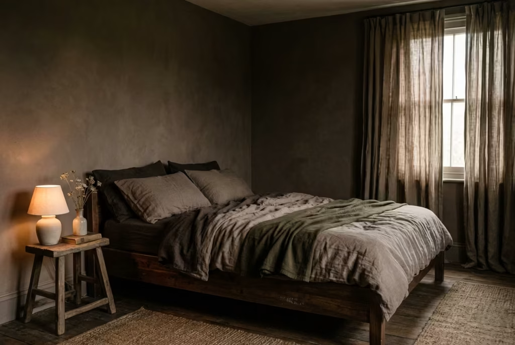
The Philosophy of Anchored Depth
Successfully executing this aesthetic requires a fundamental shift in design logic:
It is not about making a room dark; it is about allowing depth to settle into it.
This distinction is the hallmark of professional residential design. Darkness, when applied without intention, can flatten the architectural details of a room. Depth, however, is architectural. It is achieved through the interplay of light absorption and material texture—where a matte wall meets the low-sheen grain of oak or the soft “bite” of heavy linen. When these elements align, the room doesn’t shrink; it becomes protective.
The Designer’s Perspective: A Study in 11 m²
I recently oversaw a bedroom project that served as a litmus test for this theory. The space was modest roughly 11 m² (118 sq ft) and the client was understandably apprehensive about deviating from a “safe” palette of pale neutrals. Despite ample natural light, the room felt untethered; the furniture seemed to “hover” against the white walls without any visual connection.
We made the deliberate choice to envelop the walls in a muted, soil-toned brown a shade with enough pigment to drink in the light. We paired this with aged timber accents and drapery with a significant “drop” and weight.
The transformation was immediate. Rather than the walls closing in, the room finally “settled.” The edges of the space softened, and the light entering from the window was no longer a harsh glare but a focused, intentional glow. The client’s feedback was telling: they described the room as “quieter.” In the world of high-end residential design, that quietness is the ultimate indicator of a successful spatial strategy.
This is the true soul of dark cottagecore. It is romance, recalibrated spoken not in a shout, but in a lower, more assured voice.
Decoding the Language of Dark Cottagecore
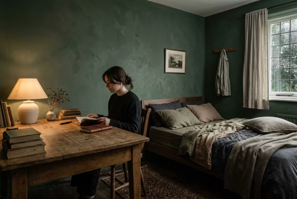
Before a single swatch of fabric is selected or a gallon of paint is opened, one must recognize that Dark Cottagecore is less a look and more a structural dialogue. It is a specific way of reading the architecture of a room. This aesthetic is not driven by the superficial addition of décor, but by the sophisticated negotiation between visual weight, tactile texture, and light.
When you begin to view a space through this lens observing how a heavy velvet drape anchors a window or how a hand-hewn beam absorbs the evening gloom the design stops being a trend you apply. Instead, it becomes an intuitive process. The room begins to assemble itself, guided by an instinctive understanding of how materials should coexist to create a sense of permanence and peace.
The Pillars of the Moody Cottagecore Aesthetic
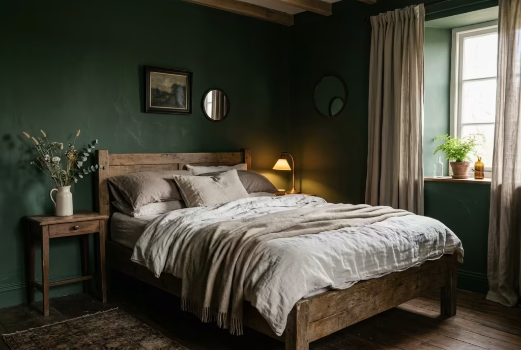
At its core, this aesthetic reconciles two seemingly opposing forces: the whimsical charm of the cottage and the structural weight of a darker palette. This is not a collision of styles but a sophisticated dialogue where softness and depth collaborate, each element tempering the other to create a space that feels both intimate and substantial.
The Interplay of Softness and Depth
The success of this look hinges on a “slow-burn” contrast. Familiar, tactile materials washed linens, faded cottons, and antique florals provide a sense of historical ease. When these are placed against a backdrop of forest green, charcoal, or soil-toned brown, their textures are amplified.
I witnessed this during a renovation of a 13 m² (140 sq ft) bedroom. The original pale-on-pale scheme felt untethered. By introducing a deep, pigmented wall finish and dark timber furniture, the existing linen bedding gained immediate “presence.” The fabric no longer felt merely light; it felt intentional, as the darker surroundings gave the highlights something to push against.
- Pros: Cultivates visual richness, highlights material quality, and fosters a grounded atmosphere.
- Cons: Demands precise tonal calibration; risks feeling “flat” without enough contrast or “heavy” if depth is unchecked.
Imperfection as a Structural Asset
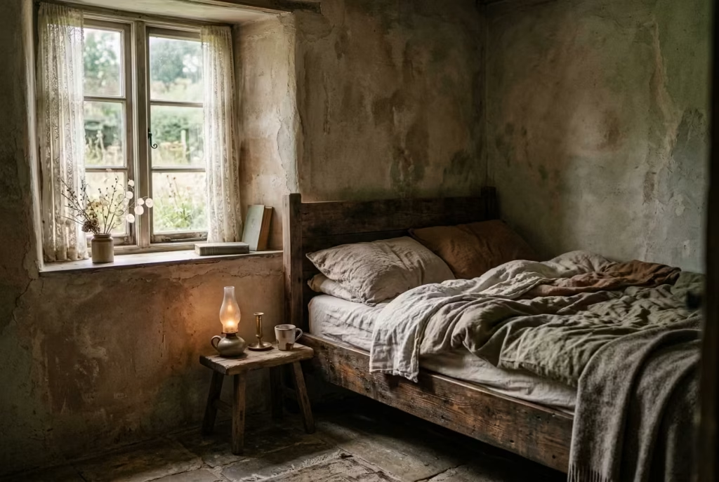
If contrast provides the framework, imperfection provides the soul. Moody cottagecore rejects the sterile precision of modern finishes, instead favoring surfaces that age with dignity. Plaster with visible movement, timber that proudly displays its grain, and textiles that crease naturally are the elements that prevent a dark room from feeling stagnant.
In one project, we utilized a lime-wash finish specifically for its inherent tonal inconsistencies. While a standard flat paint would have looked monolithic, the lime-wash reacted to the shifting daylight, creating a surface that felt almost organic. This “wearing in” rather than “wearing out” ensures the space feels lived-in rather than staged.
- Pros: Adds authentic character, builds depth without clutter, and improves aesthetically over time.
- Cons: Can appear unrefined if poorly executed; requires a high degree of design restraint.
Ultimately, this aesthetic is an exercise in intentionality. By balancing contrast with the beauty of the imperfect, you create a room that doesn’t just look balanced—it feels right.
The Specific Efficacy of Bedrooms
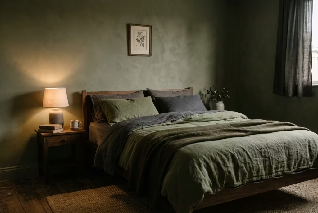
Bedrooms are unique in the domestic landscape; they are not intended to project visual energy or impress visitors. Instead, their success is measured by their ability to “settle”—to offer a stillness that works in harmony with the occupant. While other design philosophies attempt to “lift” a space, Dark Cottagecore allows a room to “land,” providing a grounded sanctuary that supports the transition into rest.
The Psychology of Low Contrast
High-contrast interiors—such as stark white walls paired with black accents—generate visual movement that stimulates the brain. While beneficial in social areas, this “friction” is counterproductive to sleep.
Lowering the contrast by keeping tones within a tight, adjacent range (deep olives meeting muted umbers) allows the eye to slow down. I applied this strategy to a restless, high-contrast bedroom by shifting to a cohesive, tonal palette. The result was a “quieter” space that the client felt was finally “on their side.” When the visual field is calm, the mind naturally follows.
- Pros: Promotes visual serenity, minimizes mental stimulation, and creates a unified atmosphere.
- Cons: Can appear monotonous if tonal shifts are too subtle; requires texture to provide necessary interest.
The Architecture of Enclosure through Light
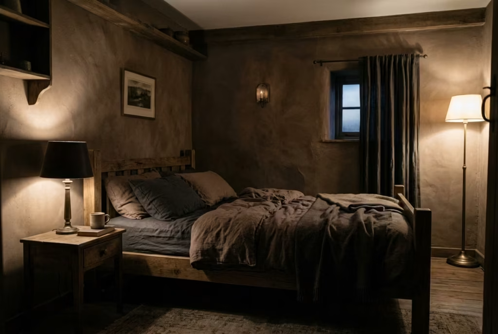
Unfiltered brightness flattens a room, defining every edge with equal intensity. Conversely, reduced brightness allows for “layered” shadows, creating a sense of protective enclosure. This isn’t about creating a dark void, but about managing light so it reveals the room gradually.
In a 12 m² (130 sq ft) project, we eschewed overhead fixtures for low-level, localized sources. The light-absorbent walls ensured that the room didn’t just become dim—it became nuanced. This signaled to the body that the day was tapering off, fulfilling the old design adage of “drawing the curtains on the day” through environment rather than effort.
- Pros: Enhances privacy, facilitates relaxation, and makes lighting feel purposeful.
- Cons: Requires precise placement to ensure adequate task lighting; risks feeling stifling without proper ventilation.
By marrying low contrast with controlled brightness, the bedroom ceases to merely look restful and begins to functionally support rest. This shift is the hallmark of a room that truly works.
The Foundation: Color, Light, and Spatial Balance
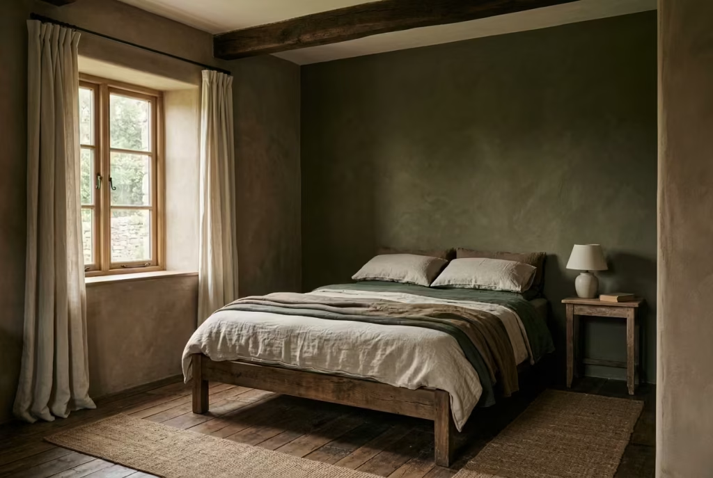
An atmospheric room is, first and foremost, a resolved one. This sense of completion rarely stems from the décor itself; rather, it is born from the architectural “bones”—the way color adheres to surfaces, the path light takes across the floor, and the silent authority of proportion.
When these three pillars are correctly aligned, the desired mood emerges almost effortlessly. However, if this equilibrium is overlooked, even the most exquisite materials will feel untethered. This is the critical juncture where a design either finds its footing or remains in a state of restless incompletion.
Mastering the Dark Palette
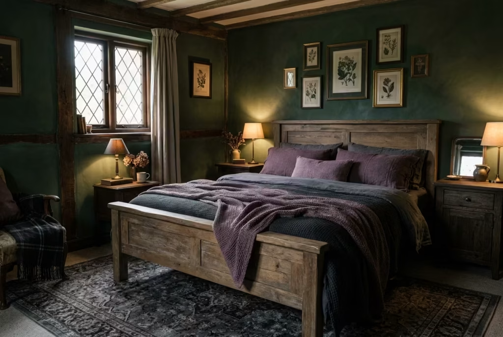
Color is the axis upon which a dark interior either achieves balance or descends into gloom. Achieving the right aesthetic is less about the sheer volume of pigment and more akin to tuning a musical instrument—each tone must exist in precise relation to its neighbor. When successful, the palette doesn’t overwhelm the architecture; it settles into it with a sense of inevitability.
Working with Earth-Bound Tones
The moody cottagecore vocabulary relies on colors with a natural lineage: deep forest greens, aged timber browns, muted aubergines, and soot grays. These are not merely decorative choices; they are grounding forces.
The secret lies in the “layered conversation” between these hues. For instance, a forest green wall requires the warmth of mid-toned woods and the stabilizing influence of gray to avoid feeling cold or isolated. In a 12 m² (130 sq ft) bedroom project, the design only felt “resolved” when we introduced a muted aubergine textile. This subtle addition acted as a bridge, harmonizing the cool green walls with the warm timber furniture.
- Practical Application: In spaces under 14 m² (150 sq ft), limit the palette to three or four closely related shades. Keeping large elements within one or two tonal steps of each other prevents visual fragmentation.
- Pros: Cultivates depth without clutter; highlights material quality; ensures a timeless feel.
- Cons: Risks monotony if tonal shifts are too subtle; demands strict coordination of undertones.
Beyond Flat Black: The Necessity of Tonal Layering
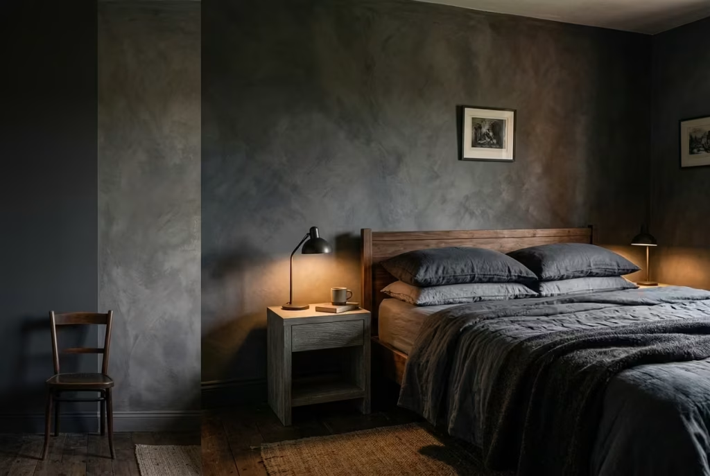
While black promises instant drama, it often functions as a blunt instrument, absorbing light so completely that it flattens the room’s nuances. Tonal layering offers a more sophisticated alternative, building depth through “near-blacks” charcoals, espresso browns, and inky indigos.
I once transitioned a 10 m² (108 sq ft) room from a flat black to a layered soot gray. The shift was subtle but the impact was structural; the walls regained their dimension, corners softened, and the light began to “dance” across surfaces rather than disappearing into a void. Like a well-composed symphony, the beauty lies in the quiet notes—the slight variations in depth that allow the eye to travel across the room without interruption.
- Practical Application: Aim for at least three degrees of depth within a single color family (e.g., a soot wall, a charcoal throw, and mid-gray upholstery) to maintain a dynamic yet cohesive environment.
- Pros: Prevents a static “flat” look; encourages natural light interaction; adds architectural dimension.
- Cons: Requires a more rigorous selection process; mismatched undertones can quickly disrupt the harmony.
Ultimately, choosing a dark palette is an exercise in restraint. When colors shift gently rather than competing for dominance, the room finds a rhythm that feels both grounded and deeply considered.
Measurements and Application Insight
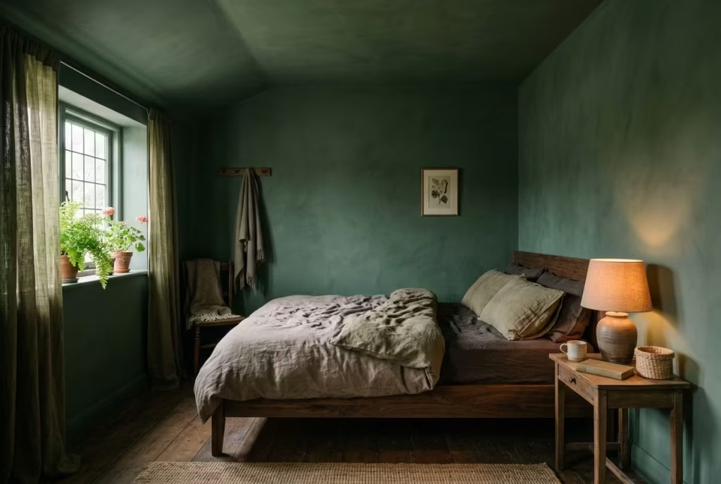
Getting the colour to sit correctly in a room often comes down to proportion rather than preference. It is not just about which shade you choose, but how far you allow it to travel. This is where many dark interiors either come together quietly or feel as though something is slightly off, without anyone quite putting a finger on why.
Full Height Application in Rooms Under 2.7 m or 9 ft
In more compact bedrooms, carrying the colour from floor to ceiling tends to work in your favour. When the walls and ceiling share the same tone, the eye is not interrupted by horizontal breaks. The room reads as one continuous surface, which in turn makes it feel more cohesive and, somewhat counterintuitively, often more spacious.
I applied this approach in a bedroom just under 11 m² or 118 sq ft with a ceiling height of around 2.5 m or 8.2 ft. Instead of stopping the paint at the wall line, we extended a deep, muted green across the ceiling. The immediate effect was a softening of edges. Corners became less pronounced, and the room took on a cocooned quality without feeling boxed in. It felt like the space had exhaled and settled into itself.
There is a simple logic behind this. When contrast is removed at the ceiling line, the boundaries of the room become less defined. It is a bit like walking into a space where the horizon is blurred. You are less aware of where things begin and end, which creates a sense of ease.
Controlled Paint Line in Taller Rooms Around 2.4 m or 8 ft
In taller rooms, the same full height approach can sometimes feel a touch overwhelming. The vertical stretch amplifies the depth of the colour, and without a pause, the room can tip from atmospheric into heavy. This is where introducing a paint line slightly below the ceiling begins to make sense.
Setting the darker tone up to around 2.4 m or 8 ft allows the lower portion of the room to hold that grounded, enveloping quality, while the upper section remains lighter and more open. The transition should never feel abrupt. A softened edge, either through a tonal shift or a subtle blending of finishes, helps the eye move upward without a jolt.
In one project with a ceiling height close to 3 m or 9.8 ft, we used a deep brown up to the 2.4 m mark and finished the upper section in a warmer, lighter tone drawn from the same palette. The effect was surprisingly balanced. The room retained its depth at eye level, where it matters most, while the ceiling felt lifted just enough to prevent any sense of weight pressing down.
It is often said that a room needs somewhere to breathe. In taller spaces, this upper section becomes that breathing room, allowing the darker tones below to feel intentional rather than overpowering.
Pros
- An enveloping quality that supports rest and stillness
- Strong visual cohesion, especially in smaller rooms
- Enhanced interaction between light and surface, creating subtle depth throughout the day
Cons
- Poorly judged proportions can make the room feel heavy or compressed
- Incorrect undertone matching may lead to a dated or overly stylised appearance
- Requires confidence in restraint, as over-layering can quickly undo the balance
When these proportions are handled with care, the room begins to feel anchored without becoming static. It is a bit like getting the proportions right in tailoring. Once the fit is correct, everything else falls into place without needing to try too hard.
You May also Like: 25 Dark Cottagecore Kitchen Ideas That Feel Warm, Rich, and Full of Character
Layering Light Without Breaking Mood
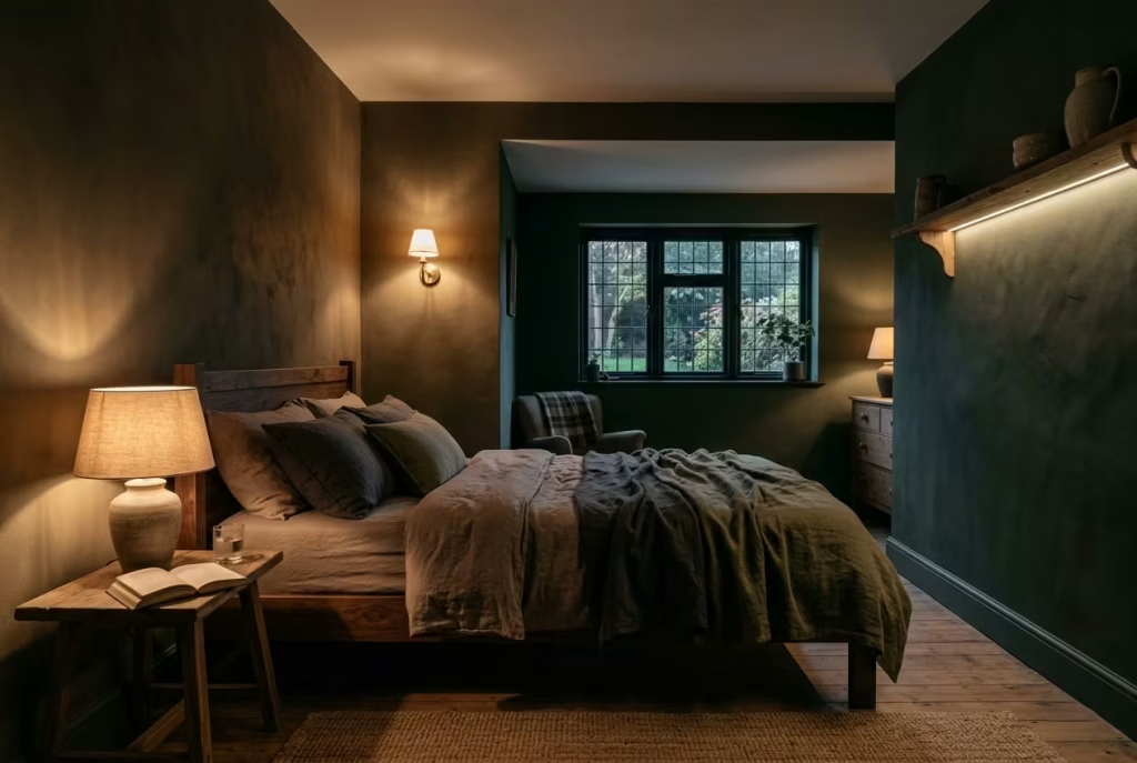
Lighting in a dark cottagecore bedroom is not there to illuminate everything evenly. It is there to shape how the room is experienced. When handled well, light does not flatten the space or compete with the palette. It slips into the background, quietly guiding where the eye rests and where it lets go. The aim is not brightness for its own sake, but balance. Too much light and the atmosphere unravels. Too little and the room begins to feel impractical. Finding that middle ground is where the real craft sits.
Ambient vs Task vs Accent Lighting in Low Light Interiors
A single light source rarely carries a room gracefully. It tends to do one job too loudly while neglecting the rest. Layering light allows each function to be handled with a lighter touch, so nothing feels forced or overexposed.
Ambient lighting forms the base. In darker interiors, this is best kept soft and indirect. Rather than relying on a central ceiling fixture, which often spreads light too evenly, consider diffused sources placed at lower heights. Wall lights with shaded covers or concealed uplighting can create a gentle wash across surfaces, allowing shadows to remain where they belong. The room stays legible, but not fully revealed.
Task lighting serves a more practical role, though it should still feel considered. Bedside lamps, positioned around 50 to 65 cm or 20 to 26 inches above the mattress height, provide enough clarity for reading without spilling unnecessary light across the room. The key is control. Light should gather where it is needed and fall away naturally beyond that point.
Accent lighting is where the atmosphere deepens. A small table lamp near a textured wall, a low light brushing across timber grain, or even a softly lit shelf can introduce pockets of focus. These moments draw the eye in quietly, almost like a whisper rather than a call for attention. They give the room rhythm, preventing it from feeling flat while maintaining its calm.
I often describe this approach as letting the room reveal itself in layers. Nothing appears all at once. Instead, the space unfolds gradually, rewarding a slower pace of attention.
Practical Application Insight:
In bedrooms around 10 to 14 m² or 108 to 150 sq ft, three to five light sources at varying heights tend to create the most balanced result. This avoids both over-lighting and under-lighting, while keeping the composition visually grounded.
Importance of Warm Colour Temperatures 2200K to 2700K
Colour temperature is one of those details that quietly makes or breaks the atmosphere. Cooler light, even when subtle, introduces a clarity that can feel out of step with darker palettes. It sharpens edges and lifts contrast in a way that works against the intended mood.
Warmer temperatures, typically between 2200K and 2700K, behave differently. They soften transitions, allowing colours to deepen and materials to read more naturally. Timber appears richer, fabrics feel denser, and shadows hold their shape without becoming harsh.
There is a familiar saying about lighting setting the tone before anything else has a chance to speak. In darker bedrooms, this rings particularly true. A well-chosen warm light does not just illuminate the room. It becomes part of the palette itself, blending in rather than sitting on top.
I have seen rooms where everything else was thoughtfully executed, yet the lighting temperature pulled the whole scheme off balance. Switching from a cooler 3000K to a warmer 2400K often feels like turning the volume down on the space. The same elements remain, but the way they are perceived changes entirely.
Pros:
Enhances warmth and material depth, supports relaxation, aligns with the natural rhythm of evening light
Cons:
Can reduce perceived brightness if overused, requires careful placement to maintain functionality
Real Project Reflection
I once reworked a bedroom that relied heavily on a central ceiling light. The space itself was well proportioned, around 12 m² or 130 sq ft, but it felt stark the moment the light was switched on. Every surface was evenly lit, leaving nowhere for the eye to rest. It was functional, but it lacked any sense of atmosphere.
We removed the overhead fixture entirely and introduced three low level sources instead. A shaded bedside lamp on each side of the bed and a smaller accent light near a textured wall finish. Each light operated independently, allowing the room to shift depending on how it was used.
The change was immediate, though not in an obvious, theatrical way. The room did not become darker in a limiting sense. It became quieter. Light gathered where it was needed and faded where it was not. Shadows returned, giving the space a sense of depth that had been missing before.
The client described it as feeling “cinematic,” which is often shorthand for a space that has found its balance between light and shadow. In reality, it was simply a matter of letting the lighting work with the room rather than against it.
When light is layered with intention, it stops being a utility and starts becoming part of the design language. It shapes how the room is read, how it feels at different times of day, and ultimately how it supports the way you live within it.
25 Dark Cottagecore Bedroom Concepts
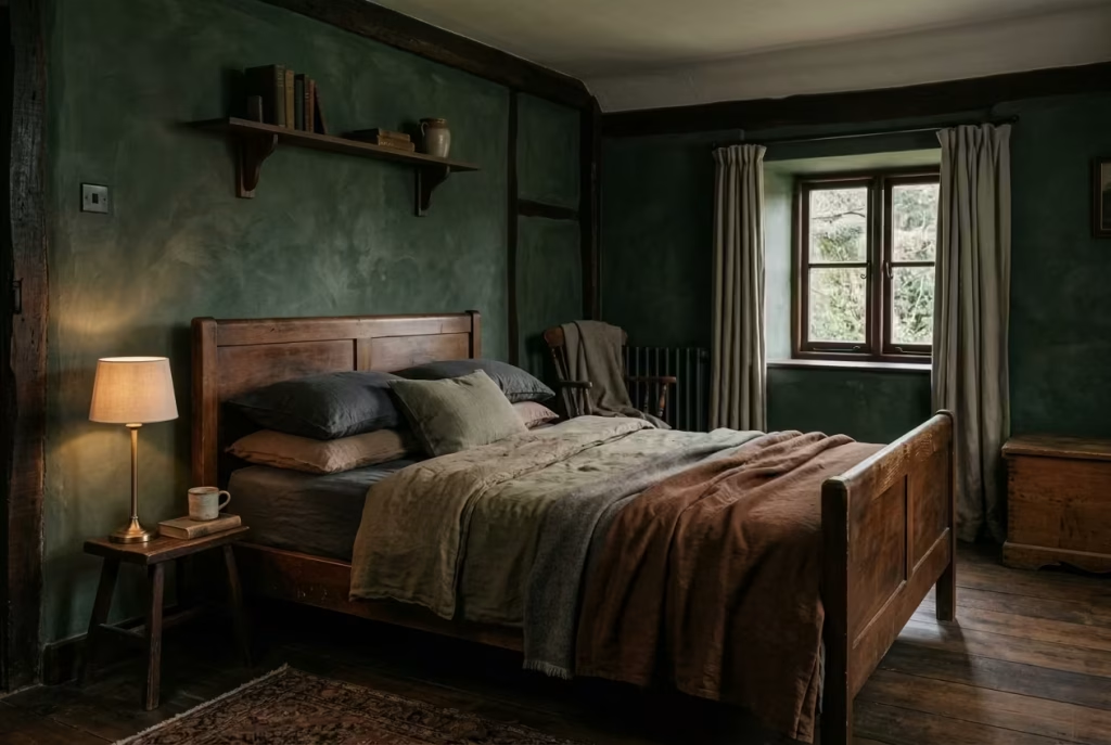
Once the architectural foundation is resolved, the room shifts from a structural volume into a lived-in character. This transition is not achieved through superficial layers of decor, but through intentional design decisions that carry genuine weight.
The concepts that follow are not transient styling tricks; they are methods of sculpting the environment often understated, yet profoundly transformative. Whether prioritizing the tactile bite of a fabric, the precision of a proportion, or a specific material contrast, each approach is unified by a single principle: they are designed for the long-term experience.
These ideas allow the room to “wear in” and settle gradually, ensuring the aesthetic feels like a natural evolution rather than a forced announcement.
Forest Wall Enclosure
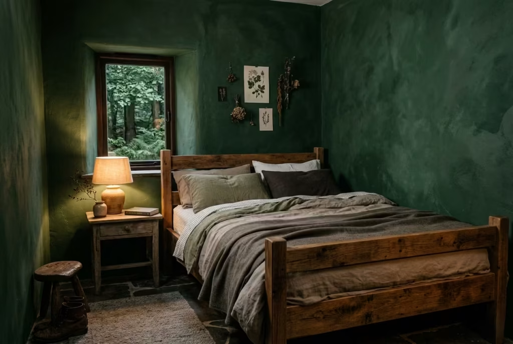
There is something quietly transformative about stepping into a bedroom where the walls feel as though they have been pulled from the edge of a shaded woodland. The forest wall enclosure concept leans into this feeling, using deep green as more than a colour choice. It becomes a spatial decision, one that wraps the room in a sense of stillness that is hard to replicate with lighter palettes.
At its core, this concept pairs deep green walls with raw or lightly finished timber furniture, most often a bed frame that retains visible grain and natural imperfections. The effect is not decorative in the traditional sense. It is immersive. The room begins to feel less like a collection of objects and more like a unified environment, where every element belongs to the same quiet narrative.
In practical terms, this approach works best in rooms measuring around 10 to 14 m² or 108 to 150 sq ft. In spaces of this scale, the green has enough presence to create enclosure without overwhelming the proportions. I have worked on a room of roughly 12 m² where this palette shift completely altered the spatial reading. What had previously felt like a standard box with furniture inside started to feel grounded, almost anchored to itself. The walls stopped acting as boundaries and began behaving more like a soft perimeter.
The timber element plays an equally important role here. Raw or minimally treated wood prevents the green from becoming too flat or overly uniform. Instead of competing, it introduces subtle variation. Knots, grain direction, and tonal inconsistencies all contribute to a sense of authenticity. It is the kind of detail you only really notice when the light changes across the day, and that is exactly where its strength lies.
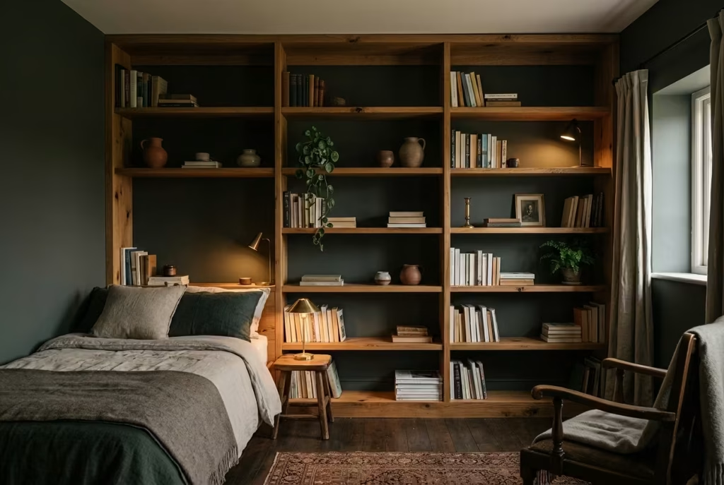
There is a saying that a room should hold you rather than hold attention. This concept embodies that idea. The enclosure is not about closing the space in, but about giving it a sense of quiet containment, like stepping into a well-worn, familiar landscape that asks nothing of you in return.
Pros
Creates strong sense of intimacy and enclosure, enhances connection with natural materials, supports restful atmosphere
Cons
Can feel heavy if lighting is too cool or flat, requires careful balance with texture to avoid monotony
Worn Wood and Charcoal Linen Pairing
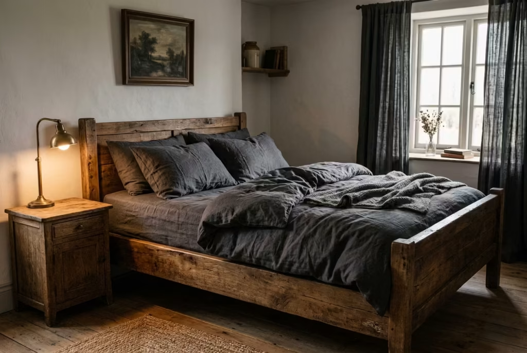
Some combinations work not because they are visually striking, but because they feel instinctively right. Worn wood paired with charcoal linen is one of those quietly assured pairings that does not rely on spectacle. Instead, it builds its strength through contrast in texture rather than contrast in colour, allowing the room to feel layered without becoming visually noisy.
At the heart of this concept is a dialogue between two very different material behaviours. Worn wood carries memory. Its surface is rarely uniform, often marked by softened edges, faded varnish, and grain that refuses to sit perfectly still. Charcoal linen, by contrast, brings a matte softness that absorbs light rather than reflecting it. When placed together, they create a balance that feels almost unforced, as though the room has naturally settled into its own rhythm.
In practical application, this pairing works especially well in bedrooms where the aim is to create calm without sterility. I have used it in a space of around 13 m² or 140 sq ft, where a reclaimed oak bed frame was set against charcoal linen bedding and curtains. The transformation was not loud or immediate in a visual sense, but it was deeply perceptible in atmosphere. The wood introduced warmth and irregularity, while the linen softened the overall composition, preventing the darker tones from feeling too dense.
What makes this combination particularly effective is the way it handles light. Worn wood catches illumination unevenly, creating subtle shifts in tone across its surface. Linen, especially in deeper shades, diffuses light in a way that keeps the room grounded. Together, they avoid the pitfall of flatness that darker interiors can sometimes fall into. Instead of everything blending into a single tone, the eye is gently guided across texture, like reading a familiar page where every line still holds something new.
There is a quiet design principle at work here: contrast does not always need to be loud to be effective. Sometimes it is enough for two materials to behave differently in silence, and the room will do the rest.
Pros
Creates rich tactile depth, prevents dark palettes from feeling flat, introduces warmth without relying on colour variation
Cons
Requires careful selection of wood tone to avoid mismatch, charcoal textiles can appear dull under poor lighting conditions
Botanical Shadows
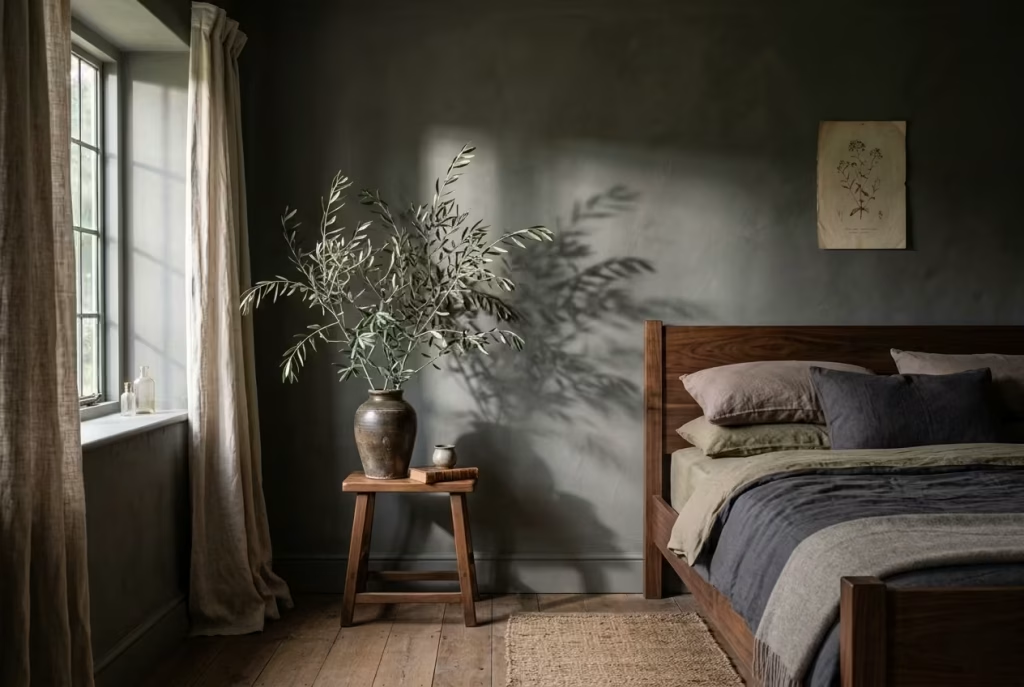
There is a fine line between a room that feels enriched by nature and one that becomes visually cluttered with it. The botanical shadows concept sits firmly on the refined side of that divide. Rather than filling the space with repetitive floral patterns or scattered greenery, it relies on restraint, using fewer but more deliberate botanical elements that carry weight through scale, not quantity.
At its core, this idea replaces busy prints with sparse, oversized foliage that feels almost architectural in presence. Think of a single large branch placed with intention, or a tall, sculptural plant positioned where it can cast elongated shadows across a wall. The emphasis is not on decoration for its own sake, but on the interplay between form, light, and negative space. In darker cottagecore interiors, this becomes particularly powerful, as shadow itself turns into part of the composition rather than something to be avoided.
In practice, I have found this approach works especially well in bedrooms around 11 to 15 m² or 120 to 160 sq ft, where visual clarity is essential. In one project, we removed multiple small decorative plants and replaced them with just two statement botanical pieces, each chosen for their silhouette rather than their colour. One was placed near a low window, where afternoon light would stretch its outline across the wall, and the other was positioned in a corner that had previously felt visually unresolved. The result was striking, not because the room became more filled, but because it became more intentional.
What often surprises clients is how much calmer the space feels when visual noise is reduced. Instead of the eye jumping from one small detail to another, it begins to rest on shape and shadow. There is a kind of quiet rhythm that develops, almost like the room is breathing at a slower pace. This is where the phrase less is more stops feeling like a design cliché and starts becoming a lived experience.
Botanical shadows also introduce a subtle seasonal flexibility. As natural light shifts throughout the day and across seasons, the shadows change character. In the morning, they feel softer and more diffused. By late afternoon, they become elongated and expressive, almost like brushstrokes across the wall. The room never looks exactly the same twice, yet it always feels consistent in mood.
There is an old design truth that the strongest rooms are not the ones filled with objects, but the ones that know when to step back. This concept leans into that idea, allowing nature to be present without being overbearing, and letting shadow do as much of the visual work as the object itself.
Pros
Creates strong visual focus without clutter, enhances natural light interaction, adds seasonal variation to the space
Cons
Requires careful placement to avoid emptiness, oversized foliage may feel disproportionate in very small rooms if not scaled correctly
Low Bed, Heavy Drapery
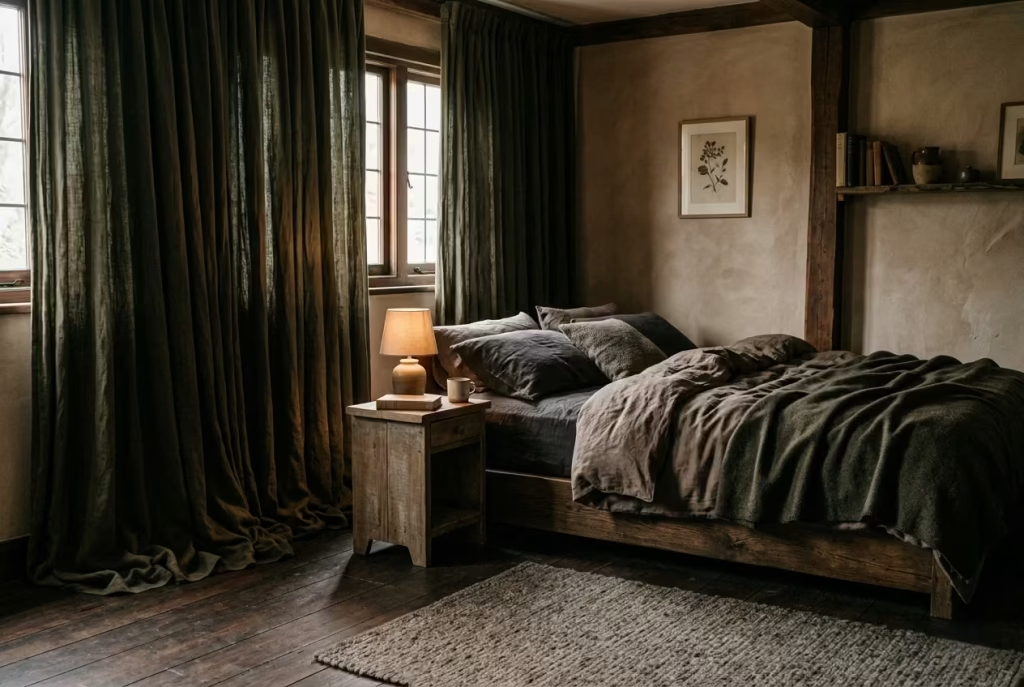
Some design decisions change how a room looks, while others change how it feels underfoot, in posture, and in the way the body instinctively relaxes into the space. A low bed paired with heavy drapery belongs firmly in the second category. It is less about visual styling and more about shifting the room’s emotional gravity, bringing everything closer to the ground in a way that feels deliberate and quietly grounding.
At the centre of this concept is a bed positioned at a lower-than-average height, typically around 30 to 40 cm or 12 to 16 inches from floor to mattress top. This reduced elevation alters perception in a subtle but important way. The room feels less segmented vertically, and more anchored horizontally. When you enter, your eye level naturally aligns closer to the sleeping surface, which immediately softens the hierarchy of the space. Nothing feels elevated or overly presented. Everything sits with intention, but without performance.
Heavy drapery completes this grounding effect. Not in the sense of visual weight alone, but through the way fabric behaves when allowed to fall fully and uninterrupted. Think of linen or cotton blends with enough density to hold shape, often pooling slightly at the floor or falling in clean, uninterrupted folds. When drawn, these curtains do not just block light. They absorb it, muting the transition between interior and exterior so the room feels contained, almost like a self-contained world that has quietly stepped away from the outside pace.
In one project I worked on, a bedroom of approximately 14 m² or 150 sq ft, the original layout felt visually top-heavy. Tall curtains were absent, and the bed sat on a standard frame, which left too much visual lift in the room. Once we lowered the bed height and introduced floor-to-ceiling drapery in a dense, earthy textile, the entire spatial reading shifted. The room stopped feeling like it was reaching upward and instead settled into itself. The change was not dramatic in a loud sense, but it was deeply perceptible. Clients often describe this kind of transformation as “feeling more grounded,” which is exactly the right instinctive language for it.
There is something almost monastic about this pairing when done well. Not in a strict or austere way, but in the sense of reduction and clarity. By lowering the dominant furniture piece and softening the vertical edges of the room, distractions fall away. The space becomes less about visual movement and more about stillness. You are no longer encouraged to scan the room. You are invited to rest within it.
This concept also works quietly with light. Low beds sit closer to natural shadow zones, while heavy drapery filters daylight rather than scattering it. The result is a softer gradient between brightness and dimness, which supports the overall mood of enclosure without making the space feel closed off.
Pros
Creates strong sense of grounding and stability, enhances restfulness, improves spatial intimacy without reducing comfort
Cons
Requires careful proportioning in small rooms, heavy fabrics can overwhelm if lighting is not balanced, may reduce perceived vertical height if overused
Antique Brass Accents in Dark Settings
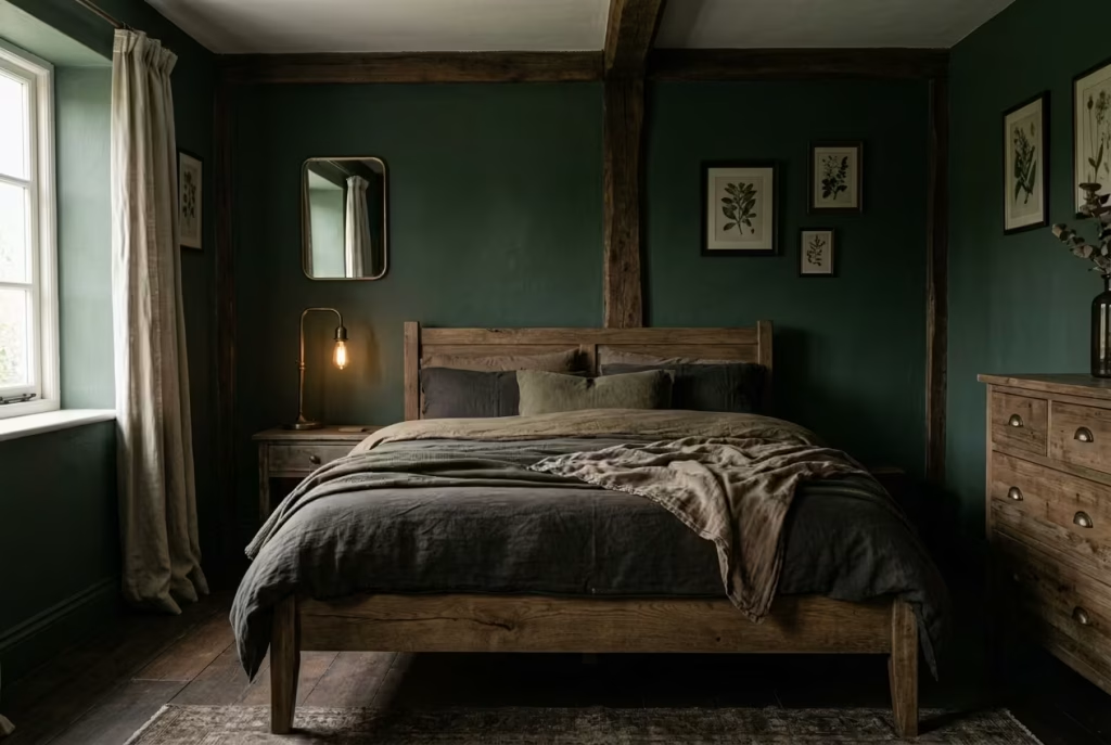
In darker cottagecore bedrooms, metal finishes carry a responsibility that is often underestimated. They are not there to sparkle or draw attention in the conventional sense. Instead, they act as quiet interrupters, breaking up density just enough for the eye to rest without pulling the room out of its mood. Antique brass, when used with restraint, performs this role with a kind of understated confidence that feels almost effortless.
Unlike polished chrome or high-gloss gold, antique brass does not announce itself. Its surface is softened, often slightly uneven, with a patina that suggests time rather than trend. This makes it particularly suited to moody interiors where everything else leans towards matte, organic, and subdued finishes. It introduces a gentle reflectivity, but never enough to tip the balance into glare or visual noise.
The real strength of this material lies in its ability to catch light selectively. A bedside lamp base, a drawer handle, or a picture frame edge in antique brass will not dominate the room, but it will respond to light in a way that feels intentional. When a warm glow passes over it, the metal flickers softly rather than shining outright. It is the design equivalent of a low voice in a quiet room, present but never overpowering.
In a bedroom I worked on measuring around 13 m² or 140 sq ft, the palette was intentionally deep and muted, dominated by forest greens and softened browns. Initially, the space felt cohesive but slightly one-note, as though everything was absorbing light without giving anything back. Introducing antique brass in very controlled doses changed that dynamic completely. A pair of bedside lamps, subtle hardware on a reclaimed wood dresser, and a single framed mirror detail were enough to introduce just the right amount of visual pause. The room did not become brighter, but it became more legible. The eye finally had places to land.
This is where restraint becomes critical. Antique brass works best when it is treated like punctuation rather than a headline. Used too generously, it can easily disrupt the calm, especially in darker schemes where every reflective surface becomes more pronounced. But when applied sparingly, it adds rhythm to the space, almost like a soft cadence that guides movement through the room.
There is an old design principle that every dark interior needs something that gently “catches the light and lets it go.” Antique brass, when chosen with care and placed with intention, does exactly that. It prevents the room from feeling visually sealed off while still respecting its depth and mood.
Pros
Adds subtle warmth and visual relief, enhances depth without breaking cohesion, interacts beautifully with low lighting
Cons
Can appear overly decorative if overused, requires careful pairing with matte materials to avoid imbalance, needs consistent patina tone to maintain harmony
Aged Plaster Walls with Imperfect Finish
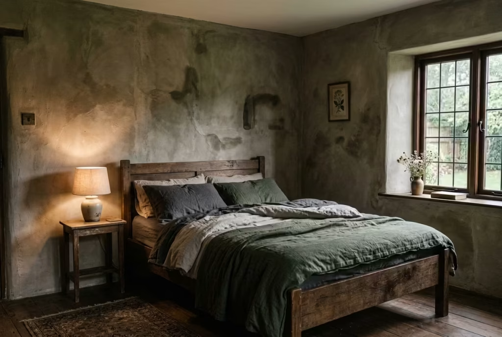
There is a particular kind of quiet confidence that comes from walls that are not trying too hard. Aged plaster finishes sit firmly in that territory, where perfection is no longer the goal and subtle variation becomes the real design language. In dark cottagecore bedrooms, this approach brings depth that no amount of décor layering can truly replicate. It works in the background, almost like a soft undercurrent that holds everything else in place.
Unlike flat painted surfaces, aged plaster introduces movement. Not in an obvious or decorative sense, but through slight tonal shifts, gentle irregularities, and the way light reacts differently across each section of the wall. Some areas absorb light more heavily, while others catch it just enough to create a slow, almost imperceptible rhythm. The result is a surface that never feels static, even when the room itself is still.
In practice, this finish is particularly effective in bedrooms where the goal is atmosphere rather than display. I worked on a space of around 12 m² or 130 sq ft where the brief was to reduce visual noise without stripping away character. Instead of adding artwork or layered décor, we introduced a lime-based plaster finish in a muted earthy tone. The transformation was subtle at first glance, yet the room gained a kind of visual softness that paint alone could not achieve. It felt as though the walls had absorbed time rather than resisting it.
What makes this approach so powerful is its restraint. There is no need to over-style the space when the surfaces themselves carry enough interest. The imperfections, those slight trowel marks, tonal variations, and softened edges, do the heavy lifting. They allow the room to feel lived-in from the outset, as though it has already settled into its own rhythm rather than waiting to be completed.
There is a phrase often used in design circles about letting materials speak for themselves. Aged plaster embodies that idea perfectly. It does not shout for attention, yet it changes the entire reading of the room. When paired with darker palettes, it prevents the space from feeling flat or overly controlled. Instead, it introduces a sense of depth that unfolds gradually, rewarding slower observation rather than immediate impact.
I have often noticed how clients respond to this kind of finish without initially being able to explain why it feels different. It is only when they spend time in the room that the effect becomes clear. The space feels calmer, more grounded, and less dependent on added decoration. It is the kind of background presence that quietly supports everything else without ever stepping into the foreground.
Pros
Creates natural depth without additional styling, enhances light variation across surfaces, adds timeless character that improves with age
Cons
Requires skilled application to avoid uneven patchiness, can be difficult to repair seamlessly, may feel too textured for highly minimal preferences
Layered Vintage Textiles
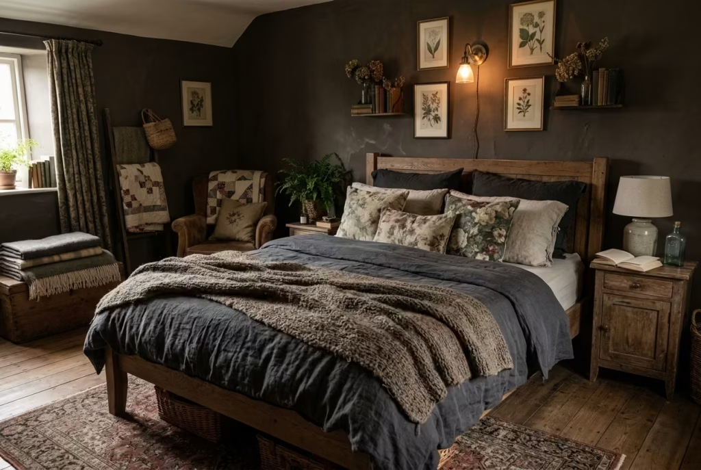
Textiles are often treated as the finishing touch in a bedroom, but in dark cottagecore interiors they carry far more weight than that. They are not simply decorative additions placed at the end of a design process. They are the element that softens structure, tempers depth, and brings a sense of lived continuity to the space. When layered with intention, vintage textiles stop behaving like accessories and start acting like atmosphere.
At the heart of this concept is the interplay between wool throws, washed linen, and faded floral fabrics. Each brings a different emotional temperature to the room. Wool introduces weight and warmth, often with a slightly irregular weave that feels reassuringly grounded. Washed linen sits somewhere between structure and ease, holding shape just enough while still allowing movement. Faded florals, when chosen carefully, avoid looking overly decorative and instead introduce a quiet sense of memory, as though they have softened through years of use rather than being newly placed.
The strength of this layering lies in its refusal to feel coordinated in a rigid sense. Instead, it leans into controlled imperfection. A wool throw draped loosely over a linen duvet, paired with a faded floral cushion slightly off-centre, creates a composition that feels unstudied yet deeply considered. It is the kind of arrangement that looks like it has evolved naturally over time, even when it has been thoughtfully designed.
In one project, a bedroom of approximately 14 m² or 150 sq ft, the initial styling felt too uniform. Everything was matching too closely, and while it appeared tidy, it lacked emotional depth. We introduced a layered textile approach using three key materials: a heavy wool throw in a muted brown tone, washed linen bedding in a softened charcoal shade, and a single set of vintage-inspired floral cushions with desaturated tones. The change was immediate in atmosphere, not because the room became more decorated, but because it became more tactile. The eye was no longer fixed on a single surface. Instead, it moved gently across layers, almost like tracing the contours of a familiar story.
This is where textiles earn their place. They are not static objects. They shift with use, respond to light, and soften over time. A wool throw gathers creases, linen loosens at the edges, and faded florals become more understated as they settle into the room. Far from being a drawback, this gradual transformation is what gives the space its authenticity.
There is an old design saying that a room should feel “gathered rather than arranged.” Layered vintage textiles embody that principle with quiet precision. They prevent dark interiors from feeling too rigid or overly controlled, adding just enough softness to keep the atmosphere approachable without diluting its depth.
Pros
Adds warmth and tactile richness, enhances comfort without structural change, allows seasonal adaptability and easy refresh
Cons
Can feel visually cluttered if over-layered, requires careful tonal coordination to avoid disjointed appearance, natural fabrics may require more maintenance over time
Candlelight-Led Atmosphere (Modern Safe Alternatives)
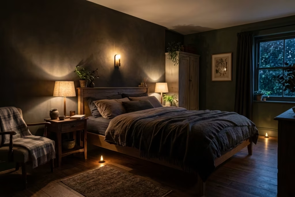
There is a reason candlelight has been associated with intimacy, calm, and quiet reflection for centuries. It does not flood a space, it filters it. It does not reveal everything at once, it lets the room emerge in fragments. In dark cottagecore bedrooms, this quality becomes almost foundational, shaping how the entire atmosphere is perceived. But in modern interiors, where safety and practicality cannot be overlooked, the aim is not to replicate candlelight literally, but to reinterpret its effect with far more control.
The concept here is about LED flicker lighting with warm tones that mimic the irregular softness of flame without introducing risk or inconsistency. When done well, it is surprisingly convincing. The key is not brightness, but behaviour. Real candlelight never sits still. It shifts, wavers, and softens edges. That subtle unpredictability is what makes a room feel alive rather than artificially lit.
In practical terms, this works best when light sources are kept low, both physically and visually. Table lamps with textured shades, concealed LED strips with flicker settings, or small cluster lights placed at varying heights can all contribute to this layered glow. The important detail is avoiding anything that feels too uniform. Even lighting, no matter how warm, tends to flatten the mood. Flicker, even when subtle, reintroduces depth.
I once revisited a bedroom of around 13 m² or 140 sq ft that originally relied on standard warm white bulbs. The palette was strong, the materials well chosen, yet the atmosphere felt slightly static in the evenings. It lacked that gentle unpredictability that makes a room feel like it is settling into night rather than simply switching off. We replaced the lighting scheme with a combination of low-level LED sources set between 2200K and 2400K, each with a soft flicker function. The transformation was not dramatic in a visual sense, but emotionally it changed everything. The room began to feel slower, more considered, almost like it was exhaling at the end of the day.
There is something quietly powerful about this kind of lighting when it is integrated correctly. It creates what I often describe as “soft movement in stillness.” The room does not change shape, but it changes mood continuously. Shadows deepen and recede in a way that feels natural rather than engineered. Corners are never fully exposed, yet nothing feels hidden or unclear.
In dark cottagecore interiors, this approach is particularly effective because it aligns with the overall philosophy of restraint and atmosphere. Instead of relying on brightness to define space, it allows light to behave more like a material in its own right, one that drapes, pools, and disperses rather than simply illuminates.
There is a simple truth that often gets overlooked in lighting design. The goal is not to see everything clearly, but to see enough for the room to feel complete. When flicker lighting is used thoughtfully, it achieves exactly that balance, giving the space a quiet rhythm that feels both grounded and gently atmospheric.
Pros
Creates intimate, atmospheric lighting without safety concerns, enhances mood depth, supports layered evening ambience
Cons
Poor quality LED flicker can feel artificial, overuse may reduce functional clarity, requires careful placement to avoid repetitive lighting patterns
You May also Like: 25 Dark Cottagecore Bathroom Ideas That Feel Moody, Warm, and Beautifully Lived In
Dark Floral Wallpaper as a Single Feature Plane
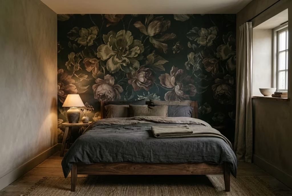
Floral wallpaper has a long history of being associated with softness, familiarity, and traditional comfort. In a dark cottagecore context, however, it takes on a very different role. When the palette deepens and the scale becomes more intentional, florals stop feeling delicate in the conventional sense and start behaving almost like a layered backdrop, rich with depth and quiet complexity. The key is not abundance, but control. One surface, carefully chosen, is often enough to shift the entire reading of a room.
A single feature wall is where this concept finds its strength. By limiting the pattern to one plane, the design avoids overwhelming the space while still allowing the motif to speak. In darker interiors especially, repetition across multiple walls can quickly tip into visual heaviness, making the room feel enclosed rather than atmospheric. One wall, on the other hand, acts more like a framed moment, something the eye can return to without being consumed by it.
The most successful applications tend to use florals that are oversized, slightly faded, or abstracted in tone. Think deep botanicals sitting against a charcoal or forest base, where the pattern is visible but not insistent. It should feel like it belongs to the room rather than sitting on top of it. In one project I worked on, a bedroom of roughly 12 m² or 130 sq ft, we introduced a dark floral feature wall behind the bed. The rest of the room was kept deliberately restrained with muted timber and softened linen. What changed everything was not the wallpaper itself, but how it reframed the space. The bed suddenly felt anchored, almost like it had a quiet stage of its own, while the rest of the room stepped back into support.
There is a fine balance at play here. Too much pattern, and the eye loses its resting point. Too little, and the feature risks feeling disconnected. The strength of this approach lies in its ability to create focus without fragmentation. It gives the room a clear moment of expression, while still allowing the surrounding surfaces to breathe.
Another important consideration is scale. Larger floral motifs tend to work more effectively in darker schemes because they reduce visual noise. Smaller, densely packed patterns can easily become busy under low light conditions, especially in the evening when artificial lighting softens contrast. A well-scaled pattern, however, holds its presence even as light shifts throughout the day, revealing different details without ever becoming overwhelming.
There is a saying in design that restraint often carries more weight than repetition. A single feature wall in dark floral wallpaper embodies that principle with precision. It does not compete with the room. It completes it, quietly and confidently, like a final brushstroke that brings the composition into focus.
Pros
Creates strong visual focal point without overwhelming the space, adds depth and narrative character, enhances headboard or architectural zones
Cons
Can feel visually heavy if used on multiple walls, requires careful pattern scale selection, may lose impact in poorly lit rooms if tones are too dark or flat
Rustic Beam Contrast
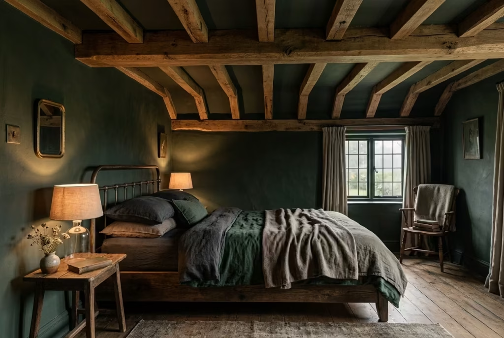
Exposed ceiling beams have a way of changing the entire reading of a bedroom without touching the floor plan or adding a single decorative object. They sit above everything, quietly shaping perception, almost like a frame that defines how the space is understood. In dark cottagecore interiors, this becomes especially powerful when the beams are treated not as a rustic cliché, but as a balancing element that brings structure to depth.
The idea here is contrast, but not in a harsh or confrontational sense. Medium wood tones against darker walls introduce a natural hierarchy that keeps the room from feeling visually compressed. Where deep greens, charcoal greys, or muted browns might absorb light and reduce visual noise, the beams offer a gentle counterpoint. They catch illumination in a softer way, guiding the eye upward without demanding attention. The effect is subtle, yet it changes the entire spatial rhythm.
In practical terms, this approach works best when beams are either original or convincingly aged in appearance. New timber can often feel too clean, too precise, and slightly disconnected from the moody, lived-in character of cottagecore interiors. Medium-toned woods, especially those with visible grain and slight irregularities, tend to sit more comfortably within this aesthetic. They feel like they belong to the structure rather than being added to it later.
I worked on a bedroom project of approximately 15 m² or 160 sq ft where exposed beams were introduced as part of a wider ceiling treatment. The room initially leaned heavily into dark tones, with forest green walls and low lighting. While the palette was strong, the upper portion of the space felt visually heavy. Once the beams were introduced in a warm, medium oak finish, the entire composition shifted. The ceiling stopped feeling like a closing surface and started acting more like a visual bridge between the walls. It created just enough contrast to lift the eye, without disrupting the overall mood.
There is a quiet discipline required here. It is easy to assume that darker interiors benefit from keeping everything uniform, but that often leads to visual fatigue. The introduction of structural contrast, particularly above eye level, prevents the space from collapsing into a single tonal field. Instead, it allows the room to breathe vertically, which is especially important in bedrooms where stillness should feel expansive rather than restrictive.
Beams also carry an architectural honesty that aligns naturally with cottagecore sensibilities. They suggest structure without decoration, function without embellishment. When paired with darker palettes, they do not compete with the mood but refine it, like a well-placed pause in a long sentence that gives everything else more meaning.
There is an old design truth that ceilings are often the most overlooked surface in a room. Yet when they are considered with intention, they can quietly transform how a space feels from the ground up. Rustic beam contrast is a reminder that sometimes the most effective design decisions are not at eye level, but just above it, shaping the experience in ways you only fully appreciate once you are living within the space.
Pros
Adds architectural depth and vertical interest, prevents dark palettes from feeling flat overhead, introduces natural warmth and structural clarity
Cons
Requires suitable ceiling height to avoid compression, poor timber tone selection can clash with darker walls, installation or retrofitting may not be feasible in all homes
Stone or Limewash Texture
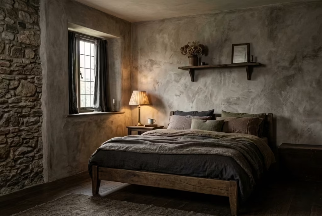
There is a particular honesty that comes with mineral-based finishes. Stone and limewash do not behave like conventional painted surfaces, and that is exactly where their strength lies. Instead of sitting flat and uniform, they respond to their environment, absorbing light in uneven ways and revealing subtle shifts in tone throughout the day. In dark cottagecore bedrooms, this creates a surface that feels alive in a restrained, almost understated manner.
Unlike synthetic finishes that aim for consistency, limewash in particular thrives on variation. Brush marks, tonal clouding, and soft transitions are not imperfections to be corrected but characteristics that give the wall its depth. Stone surfaces, whether natural or rendered, bring a grounded permanence that immediately anchors a room. Together, they introduce a material language that feels closer to landscape than interior styling.
This becomes especially valuable in humid climates, where many conventional finishes struggle over time. Limewash, being breathable, allows moisture to pass through rather than trapping it beneath the surface. This reduces the likelihood of peeling or blistering, which is often a hidden issue in warmer, moisture-heavy environments. In practical terms, it means the wall ages with dignity rather than deterioration, quietly evolving instead of breaking down.
I worked on a bedroom of around 14 m² or 150 sq ft where humidity was a consistent concern. The original painted finish had started to lose integrity at the corners, with slight bubbling that became more noticeable over time. Instead of opting for another standard repaint, we introduced a limewashed finish in a muted earth tone with subtle grey undertones. The change was not just visual, it was environmental in effect. The room immediately felt more balanced, not because it became drier, but because the surface was finally working with its conditions rather than against them.
What makes this approach so compelling is the way it interacts with light. In the morning, limewashed walls tend to feel softer and more diffused, almost like light has been absorbed and gently released back into the room. By evening, especially under warm lighting, the same surfaces gain depth and shadow variation that feels almost sculptural. Stone behaves in a similar way, particularly when left in a natural or lightly honed state, where texture becomes more visible under shifting illumination.
There is a quiet design principle at work here. When a surface does not try to conceal its own nature, it becomes easier for everything around it to settle. Instead of competing for attention, it supports the atmosphere in a more foundational way. This is why stone and limewash often feel less like decorative choices and more like environmental ones.
I often describe this kind of finish as “self-completing.” It does not rely on additional layers of decoration to feel finished. The texture itself carries enough variation and depth that the room begins to feel resolved without excessive styling. In darker cottagecore interiors, where restraint is already a guiding principle, this becomes particularly powerful.
Pros
Highly breathable and well suited to humid environments, adds natural depth without additional décor, develops character over time through subtle wear
Cons
Requires skilled application for best results, colour consistency can be unpredictable, surface may need gentle maintenance depending on exposure conditions
Deep Window Framing
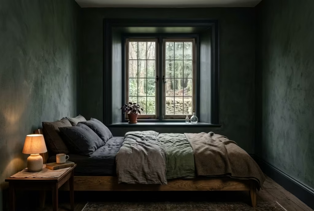
Windows are often treated as simple openings, but in dark cottagecore interiors they become something far more deliberate. They are not just sources of light, but architectural pauses that shape how depth is perceived within a room. Deep window framing works by treating the perimeter of these openings as a design element in their own right, rather than leaving them to quietly disappear into the wall.
The technique relies on painting trims, reveals, and sometimes even internal frames in a darker tone than the surrounding walls. This creates a subtle optical effect where the window appears slightly recessed, almost as if the wall has thickened around it. The result is a gentle illusion of depth that makes the space feel more layered without physically altering its structure.
In practice, this approach works particularly well in bedrooms where natural light plays a key role in setting the mood throughout the day. By darkening the framing, the transition between interior and exterior becomes more gradual. Light no longer spills abruptly into the room. Instead, it is gently contained, almost as if it has to pass through a softened threshold before entering the space. This creates a more controlled, atmospheric reading of daylight, which is essential in moody, cottage-inspired interiors.
I used this technique in a bedroom of approximately 12 m² or 130 sq ft where the original white trims felt slightly disconnected from the deeper wall tones. The contrast was too sharp, almost like the windows had been visually cut out of the room rather than integrated into it. By repainting the trims in a deep, muted charcoal that sat just below the wall colour in tone, the entire composition changed. The windows stopped feeling like interruptions and started behaving like intentional architectural features. The room felt more cohesive, as though everything had been gently pulled into alignment.
There is a quiet psychological shift that happens when window framing is deepened in this way. The eye is no longer drawn outward in a harsh, immediate jump. Instead, it lingers at the edge of the frame before moving through it. This small delay creates a sense of calm, almost like the room is giving you permission to slow down how you perceive it. In darker cottagecore spaces, where atmosphere is everything, that subtle pacing makes a noticeable difference.
It is also worth noting how this technique interacts with changing light conditions. In the morning, when natural light is softer, the darker framing holds the window in place like a quiet outline. In the evening, under artificial lighting, it helps anchor the room, preventing the space from feeling visually diluted as shadows begin to spread. The frame becomes less of a boundary and more of a stabilising element that holds the composition together.
There is an old design idea that says a window should feel like it belongs to the room, not just the wall. Deep window framing achieves exactly that. It integrates the opening into the overall palette, allowing it to participate in the atmosphere rather than sit apart from it. The effect is subtle, but once you notice it, it is difficult to unsee.
Pros
Enhances architectural depth without structural changes, improves cohesion between wall and window elements, subtly controls light transition and visual flow
Cons
Requires precise colour matching to avoid harsh contrast, can feel heavy if wall tones are already very dark, less effective in rooms with limited natural light
Iron Bed Frames with Soft Surroundings
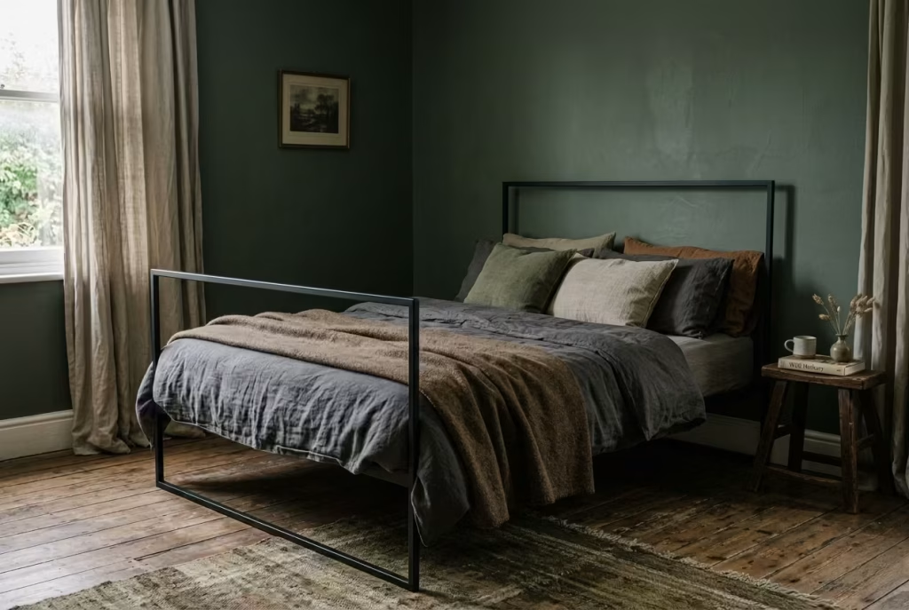
There is a quiet confidence in contrast when it is handled with restraint. An iron bed frame set within a softened, layered bedroom is a perfect example of this principle at work. It introduces structure without aggression, definition without visual noise, and in doing so, it anchors the room in a way that feels both deliberate and understated.
The iron frame itself acts as the architectural spine of the composition. Its thin lines and open structure prevent it from dominating the space, yet it still carries enough presence to define the sleeping zone clearly. Unlike bulkier upholstered beds, it does not absorb attention. Instead, it frames it, almost like a sketch that outlines the intention of the room without overfilling it.
What softens this structure is everything placed around it. In dark cottagecore bedrooms, this usually comes in the form of layered textiles, muted tonal palettes, and materials that lean towards tactility rather than gloss. Washed linen bedding, slightly rumpled wool throws, and faded tonal cushions all work together to reduce the visual sharpness of the iron. The result is a balance that feels considered rather than curated.
I worked on a bedroom of around 13 m² or 140 sq ft where the brief was to introduce more definition without making the space feel rigid. The original setup used a fully upholstered bed, which blended too seamlessly into the surroundings. While comfortable, it lacked any real sense of structure. Replacing it with a matte black iron frame immediately changed the spatial reading. The bed became a clear focal point, yet it did not overpower the room. Once layered with soft, earthy textiles and a deep-toned backdrop, the contrast began to work in harmony rather than opposition.
There is a subtle psychological effect that comes with this pairing. The eye reads the iron frame as stability, while the surrounding softness signals comfort. Together, they create a kind of visual equilibrium that feels reassuring. It is a bit like having a strong outline filled with gentle brushwork. Neither element tries to compete, yet both are essential to the final composition.
In darker interiors especially, this balance becomes even more important. Without structural clarity, deep tones can sometimes blur together, making the room feel visually undefined. The iron frame prevents that from happening. It gives the eye a place to land, a point of reference that holds the composition together when everything else leans into softness and shadow.
There is also a timeless quality to this combination that resists seasonal styling trends. Iron, by its nature, feels enduring. It does not chase visual trends or rely on decorative excess. When paired with soft, changeable layers around it, the room gains flexibility without losing its core identity. You can shift textiles, adjust tones, or evolve accessories, but the structure remains constant, quietly holding the room in place.
It is often said that the strongest interiors are those where contrast feels inevitable rather than imposed. This pairing embodies that idea. The iron frame provides clarity, while the surrounding softness ensures the space never tips into severity. The result is a bedroom that feels grounded, composed, and gently lived in, rather than staged or overly designed.
Pros
Provides strong structural definition without visual heaviness, pairs well with layered textiles, offers long-term versatility across styling changes
Cons
Can feel stark if not softened with textiles, requires careful balance in very small rooms, metal finish choice can affect overall warmth of the space
You May also Like: 25 Modern Victorian Bedroom Ideas That Feel Rich, Elegant, and Effortlessly Livable
Muted Pattern Layering
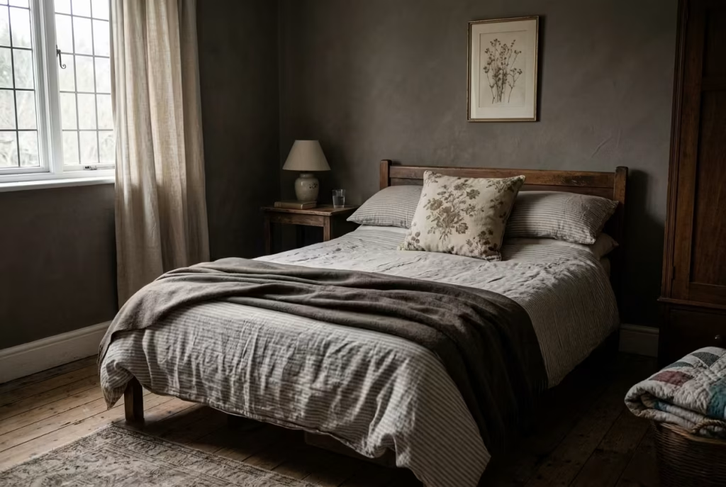
Pattern in dark cottagecore bedrooms is not about making a statement. It is about building quiet continuity across surfaces that might otherwise feel too still or overly uniform. When handled with restraint, layering stripes, florals, and solids in low contrast tones becomes less about visual decoration and more about subtle rhythm, the kind that reveals itself slowly the longer you spend in the space.
The key principle here is control of intensity. Each pattern should feel like it belongs to the same tonal family, even if the motifs differ. Stripes might appear softened through washed linen, florals reduced in saturation as though they have faded over time, and solids used as grounding anchors that prevent the composition from drifting. When these elements are kept close in tone, the eye no longer reads them as competing layers. Instead, they begin to function like variations within the same sentence, each one adding meaning without interrupting the flow.
In practical application, this approach works best when one pattern is allowed to lead while the others support quietly in the background. For example, a softly striped bedding base can sit beneath a faded floral cushion, while a solid throw in a muted earth tone ties everything together. The aim is not to showcase each pattern individually, but to let them dissolve into one another at the edges, almost like watercolour bleeding gently across paper.
I once worked on a bedroom of around 12 m² or 130 sq ft where the initial styling felt visually flat despite having good materials. Everything was solid toned, which created a calm but slightly static atmosphere. By introducing muted pattern layering, starting with a barely visible stripe in the bedding and layering in a subdued floral cushion set, the room gained a new sense of depth. Nothing became louder, yet everything felt more considered. The space started to breathe differently, as though it had been given a subtle undercurrent of movement.
What makes this technique particularly effective in darker interiors is its ability to prevent monotony without increasing contrast. Dark cottagecore relies heavily on tonal depth, but without pattern variation, that depth can sometimes feel uniform. Muted layering interrupts that uniformity just enough to keep the eye engaged, without breaking the overall calm. It is a bit like listening to a familiar melody played in slightly different keys, recognisable, yet never repetitive.
There is also a practical benefit to this approach in lived-in spaces. Because the patterns are restrained and tonal, they age well within the room. A slight shift in lighting or seasonal textiles does not disrupt the composition. Instead, it adds to it, allowing the bedroom to evolve naturally rather than requiring constant restyling.
The real strength of muted pattern layering lies in its discipline. It asks for less obvious design decisions and rewards subtlety over impact. When stripes, florals, and solids are brought together in this way, the room does not feel decorated. It feels composed, as though every surface has found its place without needing to announce itself.
Pros
Adds visual depth without increasing contrast, supports a calm and cohesive atmosphere, allows flexibility in seasonal styling
Cons
Requires careful tonal matching to avoid visual confusion, can feel underwhelming if patterns are too subtle or poorly balanced, needs restraint to prevent over-layering
Dried Florals Over Fresh Arrangements
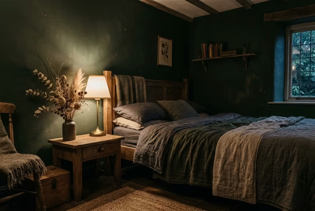
There is a quiet shift that happens when a bedroom stops relying on fresh florals as its primary decorative language and instead moves toward dried arrangements. It is not simply a change in styling preference, but a change in tempo. Fresh flowers often bring immediacy, colour variation, and a sense of seasonality that can feel slightly at odds with the slower, more grounded rhythm of dark cottagecore interiors. Dried florals, by contrast, settle into the space as if they have always belonged there.
At the heart of this concept is longevity and tonal consistency. Dried botanicals hold their shape and colour in a way that avoids constant visual disruption. Rather than introducing new chromatic shifts every few days, they maintain a steady presence, allowing the surrounding palette to breathe without interruption. In darker rooms, where depth and shadow already play a strong role, this consistency becomes particularly valuable. It prevents the eye from being pulled toward fleeting bursts of brightness and instead reinforces the overall mood.
The material character of dried florals also aligns naturally with the cottagecore aesthetic. There is an inherent softness in their faded tones, whether it is muted grasses, desaturated seed heads, or preserved stems that have lost their initial vibrancy in the most elegant way possible. They feel less like decoration and more like remnants of time, gently collected rather than freshly placed. That sense of quiet ageing sits comfortably within interiors that already embrace imperfection and patina.
In one bedroom project of around 12 m² or 130 sq ft, the original styling included fresh seasonal flowers placed on a bedside table. While visually appealing, they created a subtle imbalance. The room’s darker palette, built around deep greens and earthy browns, felt momentarily interrupted by the brightness and variation of fresh blooms. When we replaced them with a simple arrangement of dried eucalyptus and muted pampas grass, the atmosphere shifted immediately. The space felt calmer, more continuous, almost as if the visual noise had been gently lowered.
What makes dried florals particularly effective in this context is their ability to support rather than dominate. They do not compete for attention. Instead, they sit quietly within the composition, often catching light in a softer, more diffused way. In low-lit environments, this becomes especially important. Fresh flowers can sometimes appear too sharp or overly defined under artificial lighting, whereas dried arrangements tend to absorb and soften light, blending more naturally into the surrounding textures.
There is also a practical rhythm that comes with this choice. Fresh arrangements require constant replacement, which can subtly disrupt the sense of stability in a carefully composed bedroom. Dried florals remove that cycle entirely. They remain consistent, allowing the room to maintain its intended mood without ongoing adjustment. It is a small shift, but one that contributes significantly to the feeling of permanence within the space.
There is an old saying that some things are most beautiful when they are no longer at their peak. Dried florals embody that idea with quiet confidence. They carry the memory of something once vibrant, now softened into a more enduring form. In dark cottagecore interiors, that sense of gentle decline is not a loss. It is part of the beauty itself.
Pros
Long-lasting and low maintenance, supports tonal consistency in darker palettes, enhances mood stability without frequent change
Cons
Limited seasonal freshness, can accumulate dust over time if not maintained, may feel too muted if not balanced with subtle variation in texture
You May also Like: 25 Dark Cottagecore Dining Room Ideas That Feel Intimate, Layered, and Lived-In
Shadowed Corners Instead of Fully Lit Rooms
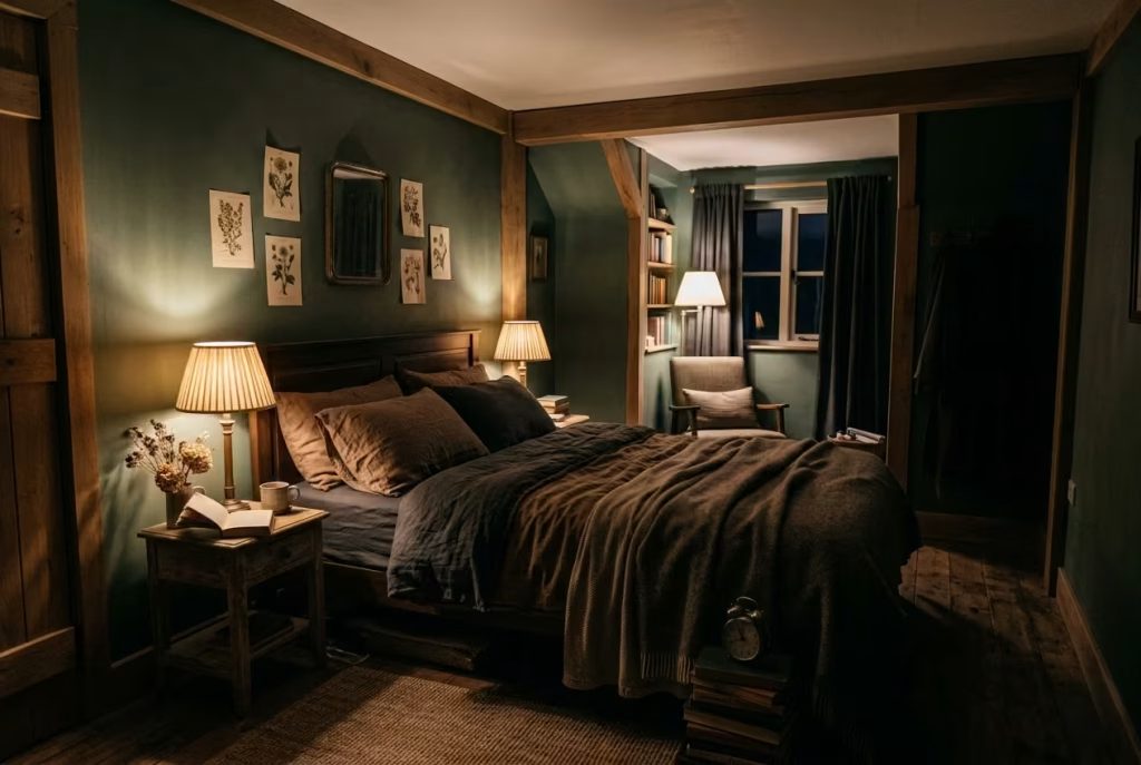
There is a quiet confidence in a room that does not insist on being fully revealed. Shadowed corners, when treated as part of the design rather than an oversight, introduce a sense of depth that evenly lit spaces often struggle to achieve. In dark cottagecore bedrooms, this approach shifts the focus away from total visibility and toward atmosphere, allowing the room to feel more layered, more grounded, and far less performative.
At its core, this concept is about acceptance rather than correction. Instead of trying to eliminate every pocket of darkness, the room allows them to exist, almost like pauses within a visual rhythm. These softened edges give the space room to breathe, preventing it from feeling overexposed or visually exhausted. When everything is evenly lit, the eye has nowhere to rest. When contrast is reintroduced through shadow, the composition gains structure again.
In practical terms, shadowed corners are not about neglecting lighting, but about distributing it with intention. Light is concentrated where it is needed most, while peripheral areas are allowed to recede gently. This creates a natural hierarchy within the room. The bed area, reading zones, or key focal points carry more presence, while secondary spaces slip slightly into the background. The result is a room that feels composed rather than uniformly exposed.
I worked on a bedroom of around 14 m² or 150 sq ft where the initial lighting design aimed for full coverage. Every corner was evenly illuminated, which at first seemed functional, but over time it created a slightly sterile feeling. The space lacked contrast, almost as if it had been flattened. By reworking the lighting scheme and intentionally allowing the far corners to remain softly shadowed, the room regained its depth. The bed area became more defined, while the periphery took on a quieter, almost supportive role. The client described it as the first time the room felt “calm without trying,” which is often the most accurate way to describe this kind of shift.
There is a subtle psychological effect at play here. Human perception naturally reads contrast as depth. Without shadow, everything competes at the same level, which can feel visually fatiguing over time. When corners are allowed to soften into darkness, the eye instinctively understands where to focus and where to let go. It creates a kind of visual pacing, almost like the room is guiding attention rather than demanding it.
This approach also aligns naturally with the broader philosophy of dark cottagecore interiors, where atmosphere is prioritised over exposure. Shadow is not treated as something to be corrected, but as a material in its own right. It shapes edges, defines transitions, and adds emotional weight to otherwise simple forms. In this sense, darkness becomes less of an absence and more of a design tool.
There is an old design truth that says a room does not need to show everything to feel complete. In fact, the most compelling spaces often rely on what is partially hidden rather than fully revealed. Shadowed corners embody this idea with quiet restraint, allowing mystery to coexist with clarity, and stillness to sit comfortably alongside structure.
Pros
Enhances depth and atmosphere, reduces visual fatigue, creates natural focus points within the room
Cons
Requires careful balance to avoid under-lighting, may feel too subdued for users who prefer bright, evenly lit spaces, depends heavily on thoughtful lighting placement
Weathered Furniture Over Polished Pieces
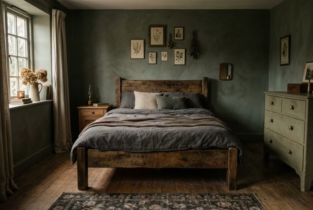
There is a subtle but important shift that happens when furniture stops trying to look new and instead starts to look lived with. In dark cottagecore bedrooms, this distinction is not just aesthetic, it is foundational. Weathered furniture brings a sense of continuity into the room, as though each piece has already earned its place rather than being placed there for effect.
At the heart of this concept is the idea of prioritising patina over perfection. Polished surfaces often reflect too much of the room back at itself, which can make darker interiors feel slightly tense or overly controlled. Weathered finishes behave differently. They absorb light unevenly, soften edges, and introduce micro-variation that keeps the eye engaged without overstimulation. A worn oak bedside table, a slightly faded painted dresser, or a timber bench with softened corners all contribute to this quieter visual language.
In practical application, this approach works particularly well in bedrooms where the palette is already subdued. In a room I worked on measuring around 13 m² or 140 sq ft, the original furniture selection was highly polished and visually crisp. While technically well made, it felt slightly disconnected from the deeper wall tones and softer textiles. Once we introduced weathered timber pieces with visible grain and subtle surface irregularities, the entire composition settled. The room stopped feeling staged and started feeling inhabited.
What makes weathered furniture so effective is its ability to carry visual memory. Small imperfections, softened edges, and faded finishes act like quiet markers of time. They do not distract from the space, but they add depth to it. In darker interiors, where shadow already plays a strong role, these textures become even more important. They prevent surfaces from appearing too flat or overly uniform under low light conditions.
There is also a psychological comfort in objects that feel familiar, even if they are newly placed. Weathered finishes create that sense almost instantly. They suggest continuity, as though the room has been evolving gently over time rather than being assembled all at once. This is particularly valuable in cottagecore-inspired spaces, where atmosphere is built as much through emotion as it is through material choice.
I often describe this approach as letting furniture “settle into itself.” Instead of resisting signs of age, the design allows them to contribute to the overall character of the room. A slightly uneven stain, a softened edge on a drawer handle, or a subtle variation in tone across a tabletop all become part of the visual story. Rather than weakening the design, they strengthen it.
There is an old truth in interior design that perfection can sometimes feel distant. It is the lived-in quality of a space that makes it feel real. Weathered furniture embraces that idea fully, allowing the room to feel grounded, unforced, and quietly confident, as though it has nothing to prove and nowhere else to be.
Pros
Adds depth and authenticity, softens dark palettes naturally, improves visual warmth and emotional comfort
Cons
Can feel inconsistent if finishes are poorly matched, requires careful sourcing to avoid looking artificially distressed, may not suit highly minimal or ultra-modern preferences
You May also Like: 60 Italian Bedroom Design Ideas: Stunning Styles, Colours & Decor Inspiration
Soft Canopy or Fabric Framing
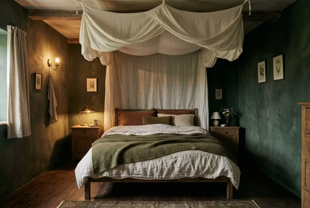
There is something quietly transformative about introducing fabric into the vertical space of a bedroom. It changes not just how the room looks, but how it is experienced at a sensory level. A soft canopy or fabric framing in dark cottagecore interiors is not about ornamentation. It is about creating a gentle boundary within the space, one that feels intimate without becoming restrictive.
At its core, this concept relies on lightweight linen or similarly breathable fabrics that can be suspended or draped to define the sleeping area. Unlike heavy drapery that anchors windows or walls, canopy fabrics behave differently. They move subtly with air currents, soften overhead light, and introduce a sense of enclosure that feels almost atmospheric rather than architectural. The result is a space that feels slightly cocooned, as though the bed has its own quiet micro-environment within the room.
In darker palettes, this becomes especially effective. When walls already carry depth through tones like forest green, soot grey, or muted brown, the addition of soft fabric overhead prevents the space from feeling too visually fixed. It introduces a gentle diffusion effect, breaking up hard lines and allowing light to behave in a more fluid, forgiving way. Even when the canopy is minimal, its presence alters perception, softening the transition between ceiling and bed in a way that feels almost instinctive.
I worked on a bedroom of around 12 m² or 130 sq ft where the client wanted a stronger sense of comfort without adding more furniture. The room already had a well-balanced dark palette, but it felt slightly open at the top, almost as if the vertical space was underutilised. We introduced a simple linen canopy, loosely suspended above the bed and allowed to fall in soft, uneven folds. The change was immediate in atmosphere. The bed no longer felt like it was sitting within the room. It felt gently held by it.
What makes fabric framing so effective is its ability to soften scale without physically reducing it. The ceiling remains unchanged, yet the perception of height shifts slightly, creating a more intimate reading of the space. This is particularly useful in bedrooms with higher ceilings, where maintaining a sense of closeness is often a challenge. The fabric acts almost like a visual filter, lowering the perceived volume of the room without any structural intervention.
There is also a tactile psychology at play. Even when not directly touched, fabric introduces a sense of softness that the mind registers immediately. It signals comfort, enclosure, and rest. In darker cottagecore interiors, where atmosphere is already carefully layered, this additional softness helps bridge the gap between visual depth and physical ease.
The key, however, lies in restraint. A canopy should never feel rigid or overly constructed. The most successful versions appear slightly unplanned, with natural drape and subtle irregularity. It is this looseness that prevents the room from feeling staged. Instead, it reads as something that has settled into place over time, rather than being imposed onto the space.
There is an old design principle that says comfort is often found in the spaces within spaces. Soft canopy framing embodies that idea with quiet clarity. It does not change the architecture of the room, but it changes how the room is emotionally received. It creates a softened threshold around the bed, turning it into a place that feels gently separated from the rest of the world without ever fully closing it off.
Pros
Creates intimate enclosure without structural changes, softens vertical scale, enhances atmospheric depth and comfort
Cons
Can feel visually heavy if fabric is too dense, requires careful placement to avoid cluttered ceiling lines, may reduce perceived airiness in very small rooms if overused
Earth-Toned Layered Rugs
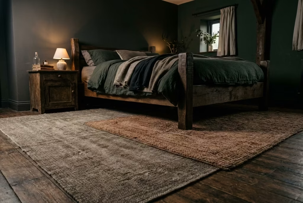
Flooring is often where a bedroom quietly reveals its true character. In dark cottagecore interiors, earth-toned layered rugs become more than a surface treatment. They act as a grounding device, both visually and physically, pulling the room together at its most literal foundation. When handled with restraint and intention, layering rugs can soften acoustics, deepen atmosphere, and introduce a sense of lived-in comfort that feels entirely unforced.
At the heart of this concept is tonal layering across natural, muted shades. Think clay, sand, faded umber, soft charcoal, and weathered taupe, all sitting within the same restrained palette family. Rather than relying on bold contrast, the effect is achieved through subtle variation in tone and texture. One rug might carry a tighter weave, another a looser, more tactile surface, and together they create a quiet dialogue underfoot. The eye does not jump between them. Instead, it reads them as a single, cohesive foundation with gentle internal movement.
In practical terms, the most effective combinations usually stay within a combined thickness of around 10 to 20 mm. This keeps the layering visually present without becoming physically disruptive. Too much height difference between rugs can create awkward transitions or uneven footing, which breaks the sense of ease that this aesthetic depends on. When the layering is controlled, however, the result is subtle but deeply effective. It feels like the room has been gently softened at its base, almost as if it is resting on something more forgiving.
I worked on a bedroom of approximately 14 m² or 150 sq ft where the flooring initially felt slightly bare despite a well-executed wall palette. The surfaces above were rich and atmospheric, but the floor did not carry the same weight. Introducing a layered rug system changed the entire grounding of the space. A larger base rug in a muted stone tone was placed first, followed by a smaller, more textured piece in a faded clay hue. The overlap was intentional but minimal. The room immediately felt more anchored, as though the furniture had finally settled into its correct position.
What makes this approach particularly effective in darker interiors is its ability to absorb and diffuse sound as well as light. Hard flooring can sometimes exaggerate echo, especially in minimally furnished rooms. Layered rugs help soften that effect, allowing footsteps and movement to feel quieter and more contained. This contributes to the overall sense of calm that defines dark cottagecore spaces, where silence is often part of the design language rather than an absence of it.
There is also a tactile quality that should not be overlooked. Earth-toned rugs introduce warmth at ground level, which becomes especially important in rooms dominated by deeper wall colours. Without this grounding, darker palettes can sometimes feel as though they are floating slightly above the floor plane. The rugs counterbalance that effect, drawing everything back down into a more stable visual field.
In many ways, this concept follows a simple but often overlooked design truth. A room is only as grounded as its foundation allows it to be. When rugs are layered thoughtfully, they do more than decorate the floor. They hold the space together quietly, like the final stitch that keeps a well-made garment from unraveling.
Pros
Adds warmth and grounding at floor level, improves acoustics and comfort, enhances tonal depth without visual clutter
Cons
Can feel uneven if thickness is not balanced, requires careful colour coordination to avoid disjointed appearance, may trap dust if not maintained regularly
Minimal Artwork, Maximum Presence
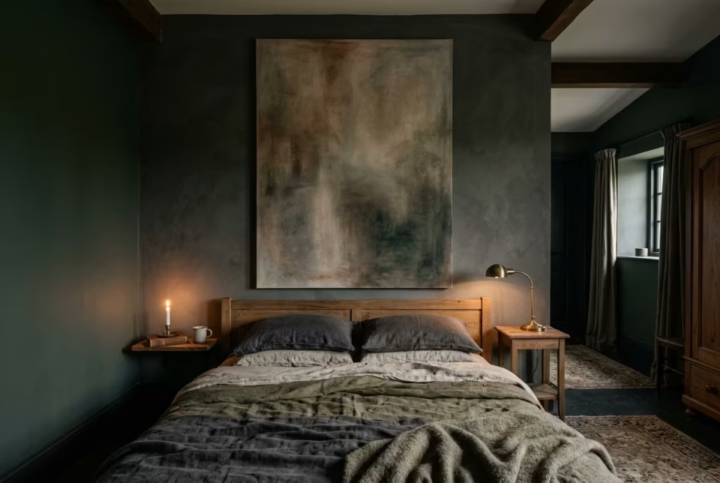
In dark cottagecore bedrooms, artwork is not about filling empty walls or creating visual noise. It is about restraint, timing, and knowing exactly when a single image is enough. Where many interiors lean into gallery walls as a way of adding personality, this approach takes a quieter path. It trusts one oversized piece to do the heavy lifting, allowing it to breathe, settle, and define the emotional tone of the room without distraction.
At the core of this concept is scale. One large artwork, positioned with intention, carries far more presence than a collection of smaller frames competing for attention. It introduces focus, almost like a pause in a conversation that allows everything else in the room to make sense. In darker interiors especially, where walls already carry depth and tonal weight, too many visual interruptions can quickly dilute the atmosphere. A single piece, however, works with that depth rather than against it.
The choice of artwork matters less in terms of subject matter and more in terms of tonal behaviour. Soft abstraction, muted landscapes, or monochromatic compositions tend to sit most comfortably within this aesthetic. The goal is not to dominate the wall but to extend the mood already present in the room. When placed correctly, the artwork does not feel added. It feels integrated, as though the space was always waiting for it.
In one project I worked on, a bedroom of around 13 m² or 140 sq ft, the original design included a scattered arrangement of small framed prints above the bed. Individually they were considered, but together they created a sense of visual fragmentation. The wall never quite settled. We replaced the entire arrangement with a single oversized canvas in a muted, earth-toned composition. The shift was immediate. The room gained clarity. The bed area felt anchored, and the surrounding elements began to relate to a central point rather than drifting independently.
There is a subtle psychological effect at play when a room is given one dominant visual focus. The eye is no longer constantly scanning for detail. Instead, it rests. This creates a sense of calm hierarchy, where everything in the room understands its position relative to that central piece. It is a bit like having a quiet focal point in a well-paced sentence, something that holds meaning without overwhelming the rest.
Placement is equally important. Hanging a large artwork slightly lower than traditional gallery height, often just above the headboard line or at a comfortable eye level when seated, helps it feel more connected to the lived experience of the room. When positioned too high, it can lose intimacy and start to feel detached. When placed with care, it becomes part of the room’s emotional core.
There is also a practical advantage to this approach. One large piece reduces visual fragmentation, making it easier to maintain cohesion across changing textiles, lighting, or seasonal adjustments. The room can evolve around it without losing its identity, which is particularly valuable in darker cottagecore spaces where atmosphere is carefully layered rather than frequently replaced.
There is an old design idea that says silence is often more powerful than repetition. In visual terms, this translates to allowing space for a single strong statement rather than multiple competing ones. Minimal artwork, when done well, does exactly that. It holds attention without demanding it, and in doing so, gives the entire room a sense of quiet authority.
Pros
Creates strong focal point without visual clutter, enhances room cohesion, supports calm and balanced composition
Cons
Requires careful scale selection to avoid overpowering the space, less flexible for frequent styling changes, may feel too minimal if surrounding elements lack depth
Seasonal Adaptation for Summer
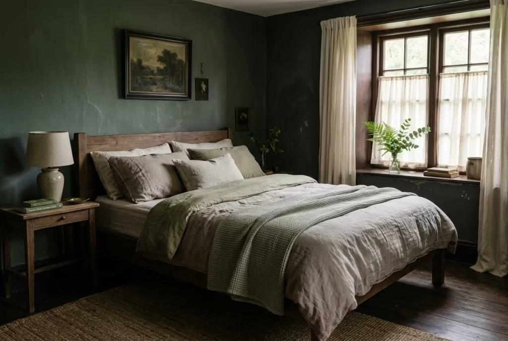
One of the most common misconceptions about dark cottagecore interiors is that they belong exclusively to colder months, as though depth and warmth must inevitably feel heavy when temperatures rise. In reality, a well-composed dark bedroom does not need to be abandoned in summer. It simply needs to shift its rhythm. The palette remains, but the materials begin to breathe differently, allowing the space to feel lighter in temperament without losing its grounded identity.
At the heart of this seasonal adjustment is material choice, not colour replacement. The darker foundation of the room stays intact, but it is softened through breathable textures that respond better to heat and natural airflow. Lightweight linen replaces heavier weaves, loose cottons take precedence over dense upholstery, and layered textiles are pared back just enough to allow air and light to circulate more freely. The room does not become brighter. It becomes more open in its behaviour.
In practical terms, this often means rethinking how surfaces interact with the body and the climate. A bedroom of around 14 m² or 150 sq ft that feels perfectly cocooned in winter can begin to feel slightly enclosed in peak summer if textures are not adjusted. I worked on a space where we retained the same deep forest and charcoal palette but swapped heavy wool throws for washed linen, and replaced thick drapery with lighter, semi-sheer fabric that still held tone but allowed movement. The transformation was subtle yet significant. The room kept its depth, but it no longer felt like it was holding onto the season too tightly.
There is a quiet elegance in this kind of restraint. Instead of stripping back the entire design, only the weight of the materials is adjusted. The darker tones remain as the emotional anchor of the room, but they are no longer visually dense. Linen, in particular, plays a crucial role here. Its slightly irregular weave and natural breathability allow it to sit comfortably within darker palettes without feeling visually heavy. It softens edges rather than sharpening them, which is exactly what is needed when the climate becomes more demanding.
Light also behaves differently in summer, and this should be considered as part of the overall adjustment. Longer daylight hours mean that natural light spends more time interacting with surfaces. In darker cottagecore interiors, this can either enhance the atmosphere or flatten it, depending on how materials are handled. Breathable textures help mediate this effect, allowing light to pass through rather than bounce harshly off surfaces. The result is a room that feels calmer, even under stronger sunlight.
There is an important design truth at play here. A well-designed dark interior is not static. It adapts quietly with the seasons, not by changing its identity, but by adjusting its weight. This is what keeps it from feeling outdated or rigid over time. It remains consistent in tone, yet flexible in experience.
Dark does not need to feel heavy in summer. It simply needs to breathe differently, like a room that understands when to hold still and when to let go. When this balance is achieved, the space does not lose its mood. It refines it, allowing the same palette to feel equally at home in both still winter evenings and bright summer mornings.
Pros
Maintains design continuity across seasons, improves comfort during warmer months, enhances airflow and tactile lightness without altering core palette
Cons
Requires seasonal textile rotation, lighter fabrics may reduce visual density if overused, needs careful balancing to avoid losing atmospheric depth
Ink-Stained Indigo Layers for Subtle Depth
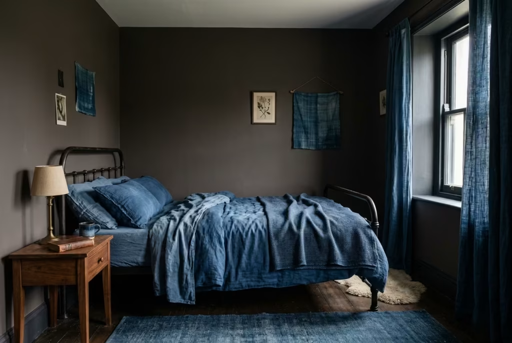
There is a particular kind of quiet intensity that indigo brings into a bedroom, one that sits between darkness and colour rather than committing fully to either. In dark cottagecore interiors, this makes it a powerful material choice when handled with restraint. It does not behave like black, which can sometimes absorb too much light and flatten a space. Instead, indigo holds light in suspension, softening it just enough to create depth without visual heaviness.
The idea is not to flood the room with colour, but to introduce it in controlled layers through bedding, curtains, or upholstered headboards. When used across these key surfaces, indigo begins to act less like a decorative choice and more like a tonal framework that gently shapes how the room is perceived. It adds presence without shouting for attention, which is often where more dramatic palettes tend to go wrong in compact or low-light bedrooms.
This approach becomes particularly effective in north-facing rooms, where natural light is limited and tends to be cooler throughout the day. In spaces of around 10 to 14 m² (approximately 108 to 150 sq ft), I have often found that pure black schemes can feel overly compressed, especially during winter months when daylight hours drop to around 8 to 9 hours in many regions. Indigo, by comparison, retains depth but introduces a subtle blue undertone that prevents the room from feeling visually sealed off. It allows the space to remain atmospheric without becoming oppressive.
When paired with softened oak or walnut, indigo takes on an entirely different quality. The warmth of timber offsets its cooler base, creating a balance that feels intentional rather than decorative. The grain of the wood becomes more visible against the depth of the fabric, and the overall composition starts to feel layered rather than flat. It is this interplay that stops the palette from slipping into monotony.
In one renovation project, I worked on a compact bedroom of roughly 11 m² (118 sq ft) that originally relied on a high-contrast monochrome scheme. While visually striking, it lacked softness and felt slightly rigid in everyday use. We replaced the harsh black-and-white contrast with layered indigo linen across the bedding and window treatments, while introducing walnut-toned side tables and a low headboard frame. The transformation was not about making the room darker. It was about changing how the darkness behaved.
What stood out most was how the edges of the room began to feel less defined in a harsh way and more gently dissolved. The space did not expand physically, but it expanded perceptually. The eye moved through it more slowly, almost without resistance. It became a room that felt composed rather than constructed, which is a subtle but important distinction in small-scale interiors.
From a practical standpoint, indigo also performs well over time. High-quality linen and cotton blends in this tone tend to age gracefully, with slight fading that enhances rather than diminishes the material’s character. Unlike more saturated colours that can quickly feel dated or overpowering, indigo settles into the space and becomes part of its long-term identity.
Pros
- Adds visual depth without overwhelming compact spaces
- Creates a refined, layered atmosphere rather than a thematic or trend-driven look
- Works well in low-light conditions by softening contrast instead of increasing it
Cons
- Can feel overly cool if not balanced with warmer materials such as oak, walnut, or aged brass
- Requires careful lighting selection, ideally warm white (around 2200K to 2700K), to avoid flattening the tone
- Poor-quality fabrics may lose depth quickly and appear dull over time
Rooted Canopy Beds with Fabric Soft Architecture
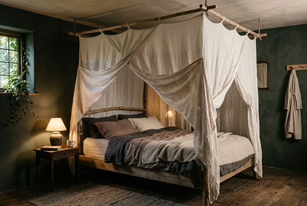
A canopy bed, when handled with restraint, stops being a decorative gesture and becomes something far more architectural in intent. In dark cottagecore bedrooms especially, it operates less like ornamentation and more like a spatial organiser, quietly defining where the sleeping zone begins and ends without relying on solid construction. The effect is subtle but profound, almost like drawing an invisible boundary that still allows the room to breathe.
The foundation of this approach lies in proportion and restraint. A bed width of around 150 to 180 cm (5 to 6 ft) provides a stable visual base, particularly in medium-sized bedrooms where balance matters more than scale. The canopy structure itself should extend approximately 40 to 60 cm (16 to 24 in) beyond the bed frame edges. This slight overhang is critical. It creates a soft perimeter that feels intentional rather than tight, allowing fabric to fall naturally without visually crowding the sleeping area.
The choice of material is where the entire concept either succeeds or collapses. Linen and washed cotton are preferred not for aesthetic trend reasons, but for how they behave in air and light. Linen, with its uneven weave, catches light in a diffused way that prevents harsh shadow lines. Washed cotton introduces a slightly more structured softness, holding form without feeling rigid. Both materials allow movement, which is essential in preventing the canopy from feeling static or overly staged.
The goal here is not to create a decorative frame around the bed. It is to define space without closing it off. In practice, this means avoiding heavy drapery, overly dense fabrics, or overly taut installations. The canopy should feel like it is settling rather than being forced into position. When done correctly, it introduces a sense of enclosure that is psychological rather than physical, which is exactly what makes it so effective in darker, more atmospheric interiors.
In one project I worked on, a bedroom of approximately 14 m² or 150 sq ft, the canopy was introduced after the initial layout felt slightly unresolved at night. The room had strong tonal depth through deep green walls and muted timber flooring, but the sleeping area lacked definition once artificial lighting came in. By introducing a lightweight linen canopy extending roughly 50 cm (20 in) beyond a 160 cm (5.2 ft) bed frame, the entire spatial reading changed. The bed no longer felt like it was simply placed in the room. It felt held within it.
What stood out most was how the canopy softened the transition between ceiling and furniture. Instead of hard vertical drop-offs, the fabric created a gradual visual descent. This is particularly important in darker cottagecore spaces where shadow already plays a dominant role. The canopy does not fight the shadow. It filters it, breaking its density into something more breathable.
There is also a functional advantage that often gets overlooked. Fabric canopies improve acoustic softness in a noticeable but subtle way. In rooms with minimal soft furnishings, sound can often feel slightly sharp or reflective. Even a lightweight linen canopy can reduce this effect by diffusing sound waves rather than allowing them to bounce directly off hard surfaces. In small to medium bedrooms, typically under 16 m² (170 sq ft), this can make the space feel noticeably calmer, especially at night.
The real strength of this concept lies in how little it tries to do visually. It does not rely on complexity or excess. Instead, it introduces a soft architectural layer that quietly adjusts how the room is experienced. That is why it works so well in cottagecore interiors, where atmosphere is built through accumulation rather than declaration.
Pros
- Introduces spatial intimacy without reducing perceived room size
- Enhances acoustic softness, especially in smaller bedrooms under 16 m² (170 sq ft)
- Creates gentle spatial definition without requiring structural changes
- Works well with low lighting by diffusing shadow rather than intensifying it
Cons
- Poor fabric selection, especially heavy or synthetic materials, can feel visually bulky and restrictive
- Requires careful installation to avoid uneven drape or awkward tension points
- May feel excessive in very small rooms under 10 m² (108 sq ft) if not proportioned correctly
Hearth-Inspired Focal Wall with Tactile Depth
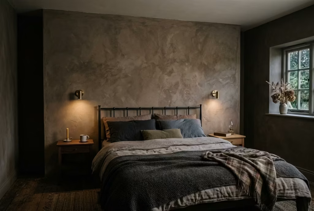
There is a reason traditional hearths have always acted as the emotional anchor of a home. Long before open-plan layouts and minimalist interiors, people naturally gathered around a single grounding point. In dark cottagecore bedrooms, recreating that sense of quiet gravitational pull does not require an actual fireplace. It requires a wall that behaves like one, visually and emotionally.
A hearth-inspired focal wall is less about decoration and more about anchoring presence. It draws the room inward, giving the eye a place to settle without overwhelming the surrounding space. In darker interiors, where atmosphere is already layered through shadow and tone, this becomes especially powerful. The goal is not to introduce more visual noise, but to establish a point of calm intensity.
Materials That Carry Weight Without Heaviness
The success of this concept depends almost entirely on material choice. Limewash plaster, reclaimed brick, and deep-toned clay paint all share one essential quality. They do not sit flat on the surface. They carry depth within themselves.
Limewash plaster works particularly well because of its soft, mineral variation. It absorbs light unevenly, creating subtle tonal shifts that mimic the quiet irregularity of aged surfaces. Reclaimed brick introduces a more grounded texture, often with slight imperfections that prevent the wall from feeling overly constructed. Clay-based paints, especially in muted earth tones, sit somewhere between the two, offering depth without excessive texture.
In practical application, this works best on a full wall span of approximately 2.4 to 4 metres (8 to 13 ft), depending on room proportions. In smaller bedrooms around 11 to 14 m² (118 to 150 sq ft), a narrower focal wall closer to 2.4 to 3 m (8 to 10 ft) tends to maintain balance. In larger rooms, extending closer to 4 m (13 ft) allows the surface to feel intentional rather than isolated.
The key is scale consistency. Too small, and the wall feels like a feature panel. Too large without tonal restraint, and it risks dominating the entire composition.
Emotional Gravity Through Surface Depth
What makes this approach so effective is not just material texture, but emotional direction. A hearth-inspired wall creates a subtle inward pull. It tells the room where to settle.
In darker cottagecore bedrooms, this is particularly valuable because the palette already leans into depth and enclosure. Without a focal anchor, that depth can sometimes feel evenly distributed, which reduces visual hierarchy. The hearth wall introduces structure without adding clutter. It becomes the quiet centre of gravity around which everything else is organised.
Real Project Reflection
I once worked on a bedroom of around 13 m² (140 sq ft) that initially had a flat, neutral painted wall as its main backdrop. The room was well furnished, with layered textiles and a strong tonal palette, yet something about it felt emotionally unanchored. There was no clear point of rest for the eye.
We replaced that single wall with a muted clay finish in a desaturated earth tone, slightly deeper than the surrounding palette but not dramatically darker. No furniture was moved. No lighting was adjusted. Yet the effect was immediate.
The room gained what I can only describe as a centre of gravity. The bed felt more grounded. The surrounding elements stopped competing for attention and began to orbit that focal surface instead. It did not make the room darker. It made it feel more composed, almost like the space had finally found its balance.
This is often how the most effective design shifts happen. Not through addition, but through recalibration.
Why This Works in Practice
A hearth-inspired focal wall works because it introduces hierarchy without decoration overload. It gives the room a point of emotional clarity, which is especially important in darker interiors where multiple tones and textures are already in play.
It also performs well over time. Unlike heavily styled feature walls that can quickly feel visually loud, material-led finishes such as limewash or clay paint age gracefully. They develop subtle variation, which reinforces the sense of permanence rather than diminishing it.
Pros
- Creates immediate architectural grounding and visual hierarchy
- Establishes emotional focus without relying on furniture or decorative clutter
- Works well with natural, ageing materials that improve over time
- Enhances spatial coherence in both small and medium bedrooms
Cons
- Requires restraint in surrounding décor to avoid visual competition
- Poor colour depth selection can either flatten the effect or make it overly dominant
- Needs careful proportioning to room size to avoid imbalance
Material Intelligence What Actually Holds the Room Together
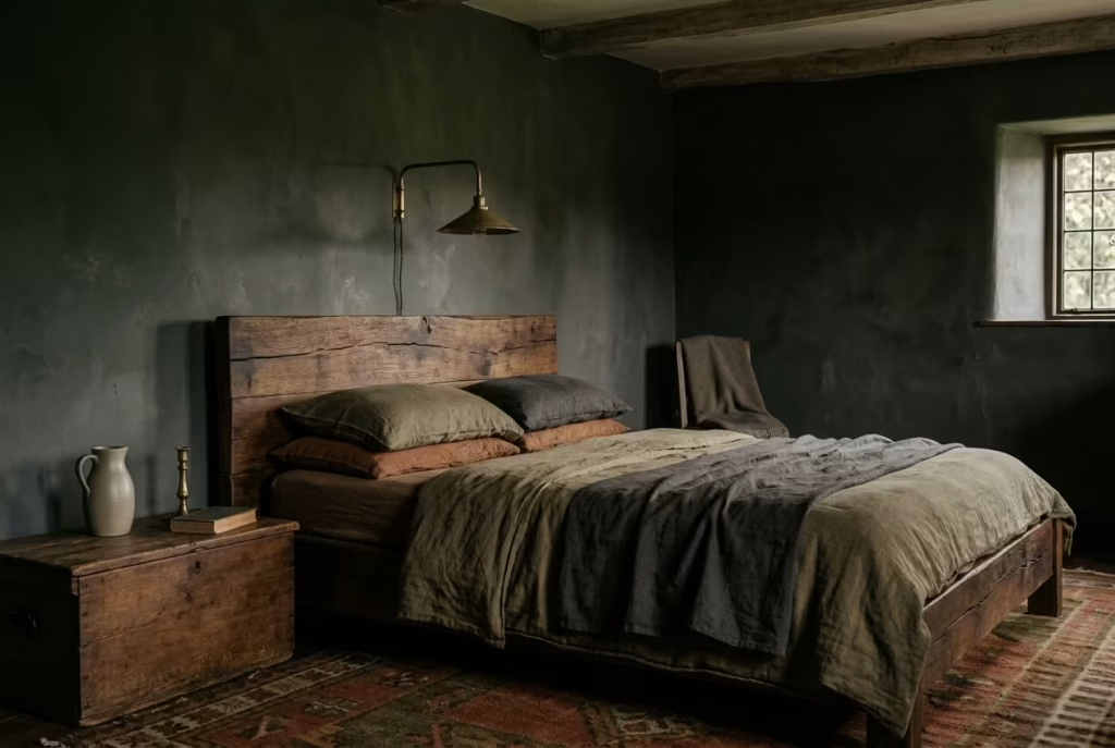
There is a point in every well-resolved bedroom where aesthetics stop being the driving force and materials quietly take over the conversation. In dark cottagecore interiors, this shift is even more pronounced. Colour sets the mood, lighting guides perception, but it is material intelligence that ultimately decides whether the room feels grounded or slightly adrift. When materials are chosen with awareness of how they behave in low light, over time, and under seasonal change, the space begins to hold itself together with far less effort.
This section is less about styling and more about understanding behaviour. How fabrics absorb shadow, how timber reacts to warmth, how metals soften with age. These are not surface decisions. They are the underlying structure of atmosphere.
Linen vs Cotton vs Wool Behaviour in Low Light
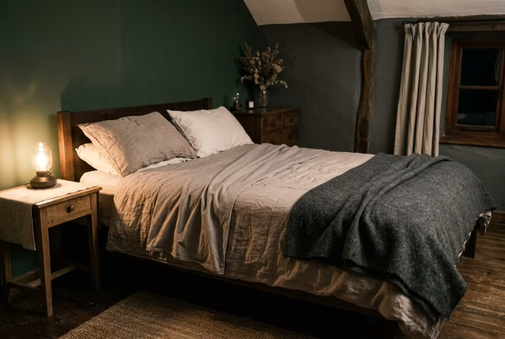
In darker interiors, fabric is never just fabric. It becomes a light modifier, a softness filter, and often the difference between a room feeling atmospheric or accidentally flat.
Linen behaves like a quiet mediator. It does not reflect light aggressively, nor does it absorb it completely. Instead, it diffuses it in a way that feels slightly irregular, almost as if the surface is gently breathing. This is why linen works so well in cottagecore bedrooms. It allows shadow to exist without making the room feel closed in. Over time, it softens further, gaining that lived-in ease that makes a space feel naturally settled rather than styled.
Cotton, depending on weave density, sits somewhere between clarity and softness. A tightly woven cotton can feel crisp and structured under light, which is useful when you need definition. However, in low light conditions, it can sometimes appear slightly flat if overused. It works best as a supporting layer rather than the dominant textile, especially when paired with more textural materials.
Wool, on the other hand, brings weight in both visual and tactile terms. It absorbs light more deeply, which can be incredibly effective in dark palettes where warmth is needed at surface level. But it needs balance. Too much wool in a small or poorly lit room can tip the atmosphere from cocooned to heavy. Used sparingly, it becomes the grounding element that holds the softer layers in place.
The real craft lies in combining these behaviours rather than relying on a single fabric type. A linen base, cotton accents, and a restrained use of wool often create the most natural rhythm.
Timber Tones: Avoiding Orange and Yellow Undertones
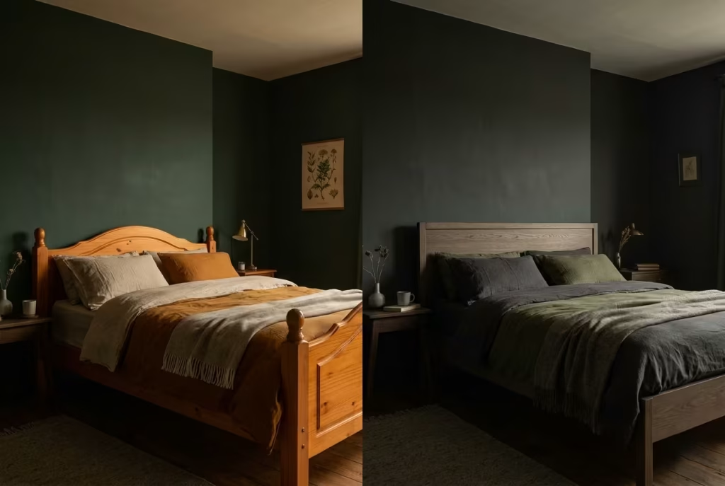
Timber is often where dark cottagecore interiors quietly succeed or fall apart. It is not just about whether wood is present, but what kind of warmth it introduces into the space.
Orange and yellow undertones tend to push interiors into a more traditional or slightly dated reading, especially when paired with deep wall colours. In low light, these tones can become visually louder than intended, breaking the subtlety that darker palettes rely on. What might feel rich in daylight can quickly feel overpowering in the evening.
Instead, more grounded timber tones tend to sit better. Think smoked oak, aged walnut, or woods with muted brown and grey undertones. These finishes do not compete with shadow. They sit within it. They allow the room to feel cohesive rather than segmented by colour temperature.
In one project I worked on, a bedroom initially used a honey-toned pine bed frame. In daylight it felt warm and approachable, but at night it became visually dominant, almost pulling attention away from everything else in the room. Once replaced with a darker, neutral-toned oak, the entire palette settled. Nothing else changed, yet the room felt immediately more composed, as if it had finally found its correct tonal balance.
Timber, when chosen well, should feel like part of the architecture rather than an added layer. It should support the room quietly, not announce itself.
Metal Finishes That Age Well
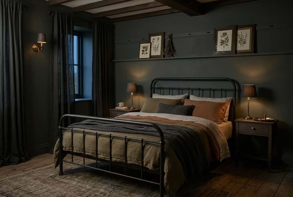
Metals in dark cottagecore bedrooms are not there for shine. They are there for restraint, patina, and controlled reflection. The way a metal ages often matters more than how it looks on day one.
Brushed and antique finishes tend to perform far better than high-polish alternatives in this context. Polished metals reflect too much of the surrounding environment, which can disrupt the calm, especially in low light where reflections become more noticeable and less forgiving. They introduce visual noise where the room is trying to stay quiet.
Antique brass, aged bronze, and softened iron work differently. They absorb some light, reflect only selectively, and gradually develop a patina that feels consistent with the rest of the room’s ageing process. Instead of standing apart, they integrate into the material story of the space.
In a bedroom context, these metals work best when used sparingly and consistently. Repeating the same finish across small touchpoints like handles, lamp bases, and frame details creates cohesion without excess. It is less about decoration and more about rhythm, a quiet thread that runs through the room without ever drawing attention to itself.
The key consideration is long-term behaviour. A good metal finish should not fight time. It should soften with it, becoming more aligned with the textures and tones around it rather than increasingly detached.
Common Mistakes That Undermine the Mood
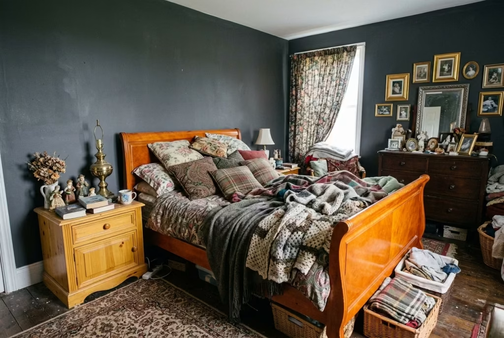
Dark cottagecore interiors are often misunderstood as simply “going darker” or layering in rustic references until the room feels moody enough. In reality, the aesthetic lives or dies in the balance between depth, texture, light behaviour, and restraint. When that balance slips, the room does not feel atmospheric. It feels flat, heavy, or unintentionally staged. These are the small missteps that quietly undo all the good intent.
Over-darkening Without Texture
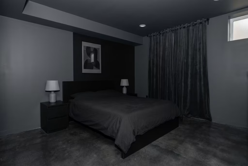
One of the most frequent pitfalls is assuming that mood is created purely through darker colours. It is not. Without texture, dark tones quickly lose their richness and start to collapse visually. What should feel layered and immersive instead becomes a single heavy plane that absorbs light without giving anything back.
In practice, this often happens when walls, bedding, flooring, and furniture all sit in similar deep tones but lack variation in surface quality. No grain, no weave, no subtle irregularity. The eye has nowhere to travel, and the space begins to feel visually sealed off rather than cocooned.
A better approach is to think in terms of depth within darkness. Matte plaster against soft linen, worn timber beside smooth stone, or gently textured fabrics layered over quieter bases. These shifts do not need to be loud. They just need to exist. Without them, even the most carefully chosen palette can feel like it has been flattened into a single note.
Using Cool Lighting Temperatures
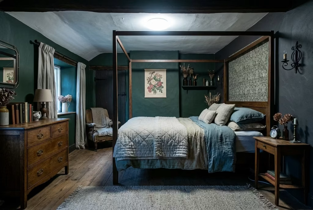
Lighting is where many dark interiors quietly lose their atmosphere. Cool white lighting, often introduced for clarity or practicality, can completely undo the intended mood of a room. Instead of softness and depth, it creates sharpness and separation, pulling every surface into a harsher focus.
In darker cottagecore spaces, this is particularly disruptive. The aesthetic relies on warmth, shadow, and gradual transitions between light and dark. Cool lighting interrupts that rhythm. It flattens textures, exaggerates contrast, and often gives even the most carefully designed room a slightly clinical edge.
Warm temperatures in the range of 2200K to 2700K tend to behave far more naturally in these environments. They allow materials to soften rather than harden under illumination. Wood feels richer, textiles feel more forgiving, and shadow retains its depth instead of turning grey and lifeless.
It is not about making the room dim. It is about letting light behave like part of the material language rather than something imposed on top of it.
Overcrowding with Decorative Objects
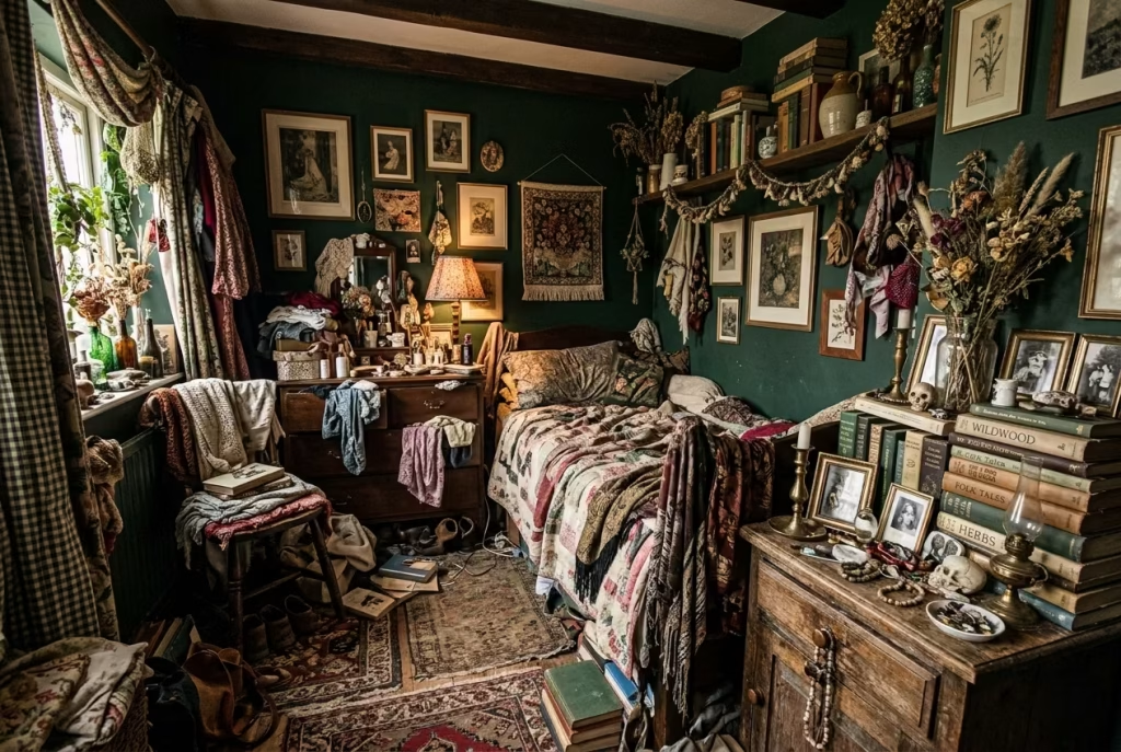
There is a fine line between lived-in character and visual clutter, and in dark cottagecore interiors that line is easy to cross without realising it. Because the palette is already rich and layered, there is often a temptation to add more objects to enhance the story. In reality, this can quickly lead to the opposite effect.
When too many decorative items are introduced, especially in a darker setting, the eye loses its resting points. Surfaces begin to compete rather than complement each other, and the room starts to feel more like a collection of objects than a cohesive environment.
The strongest spaces often rely on edited restraint. A few well-chosen pieces carry far more weight than an abundance of smaller details. It is the difference between a room that feels composed and one that feels continuously busy, even when nothing is happening in it.
In one project I revisited, reducing bedside styling from eight objects to just three completely changed the atmosphere. Nothing else was altered, yet the room suddenly felt calmer, as though it had finally been allowed to breathe properly.
Ignoring Airflow and Seasonal Comfort
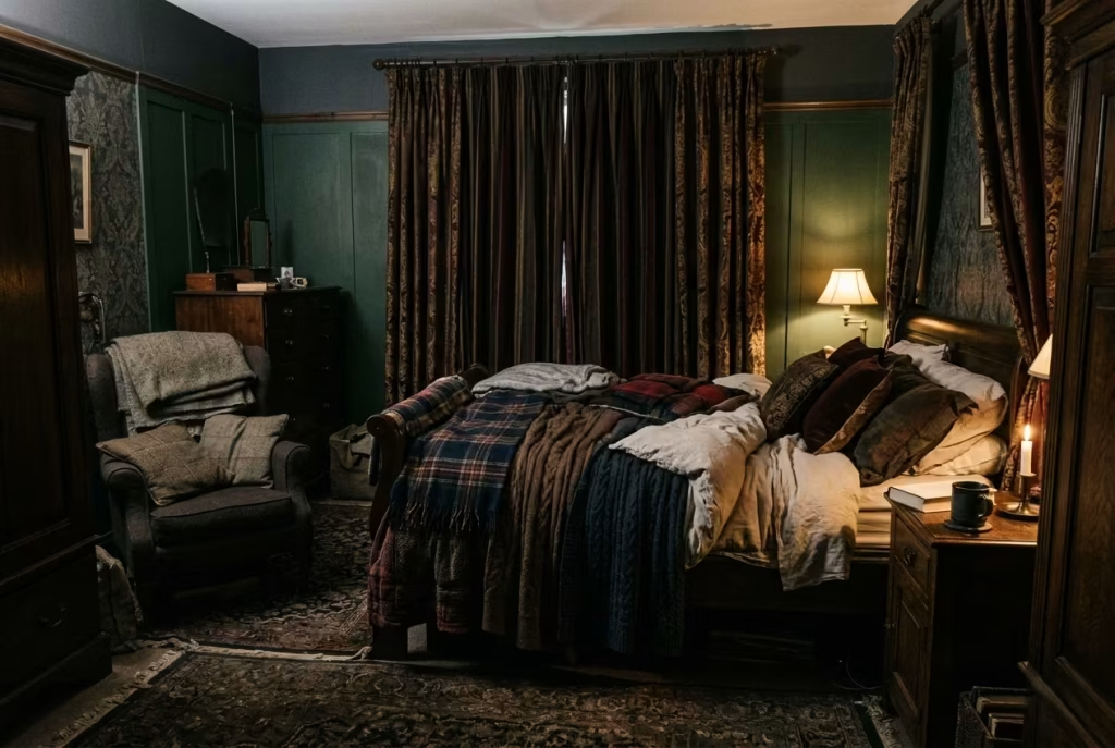
A less visible but equally important mistake is overlooking how the room performs physically over time. Dark cottagecore interiors can easily become visually rich but environmentally static if airflow and seasonal adaptation are not considered.
Heavy fabrics, dense layering, and enclosed layouts may feel appropriate in colder months, but without adjustment they can quickly make a room feel stagnant in warmer seasons. This is where atmosphere starts to work against comfort.
Good design in this context is not only about how a room looks, but how it behaves. Breathable materials, adjustable layers, and an awareness of circulation all contribute to whether a space feels genuinely livable or just visually successful.
A room that cannot adapt loses its longevity. It may photograph well, but it will not sustain comfort. The most successful dark cottagecore interiors are the ones that quietly shift with the seasons, allowing linen to replace wool, light to replace density, and openness to return when needed.
How the Space Evolves Over Time
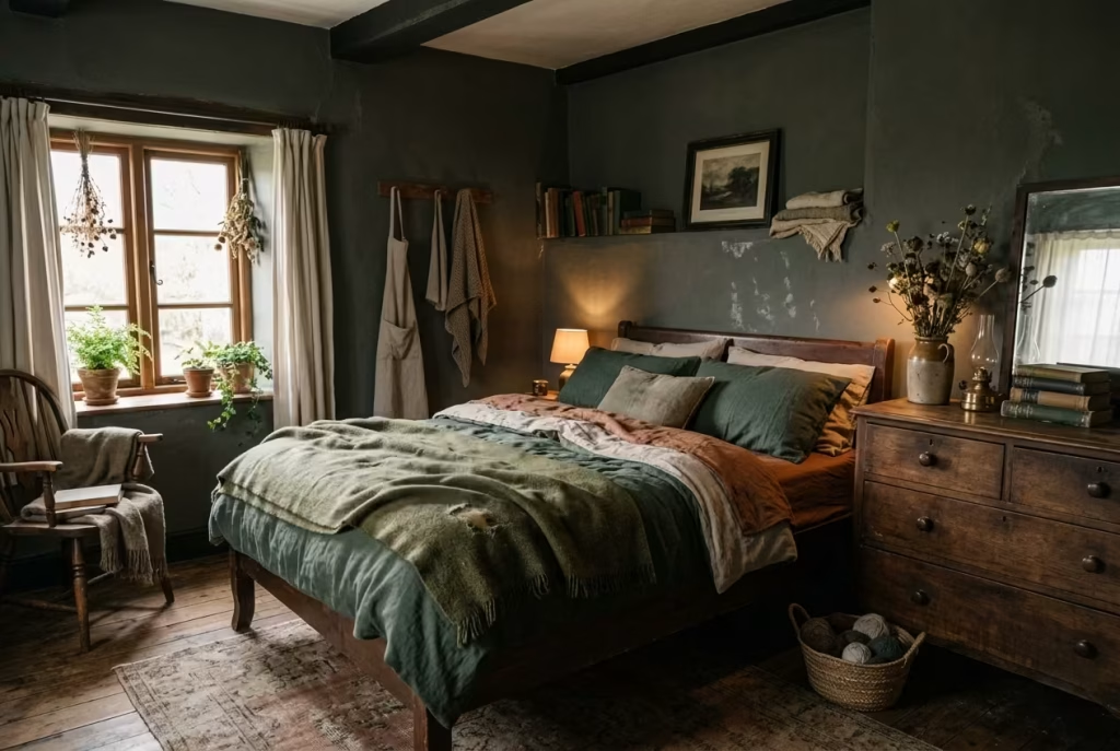
Dark cottagecore bedrooms are often misunderstood as fixed compositions, something you “complete” and then preserve. In reality, the most successful versions of this aesthetic are never truly finished. They are lived in, softened, and gradually reshaped by time itself. What begins as a carefully composed interior slowly turns into something richer, more grounded, and far more personal. It is less about finality and more about ongoing quiet transformation.
Dark Interiors Improving with Wear
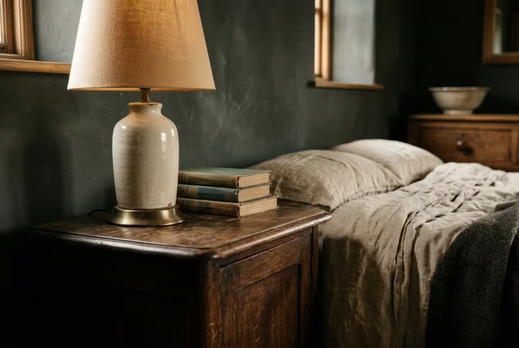
Unlike lighter, more clinical interiors that can start to show imperfections as flaws, darker cottagecore spaces often benefit from subtle wear. The surface irregularities that develop over time do not read as damage. They read as character.
A slightly softened edge on a wooden table, a faint variation in a painted wall, or a gentle dulling of previously uniform surfaces all begin to add depth rather than subtract from it. Darker palettes have a way of absorbing these changes gracefully. Instead of drawing attention to wear, they integrate it, allowing the room to feel increasingly natural and unforced.
In practice, this means the space becomes less about maintaining perfection and more about allowing gentle evolution. The longer you live in it, the more coherent it feels, almost as if the room is quietly learning how to hold itself together through use.
Fabrics Softening, Tones Deepening
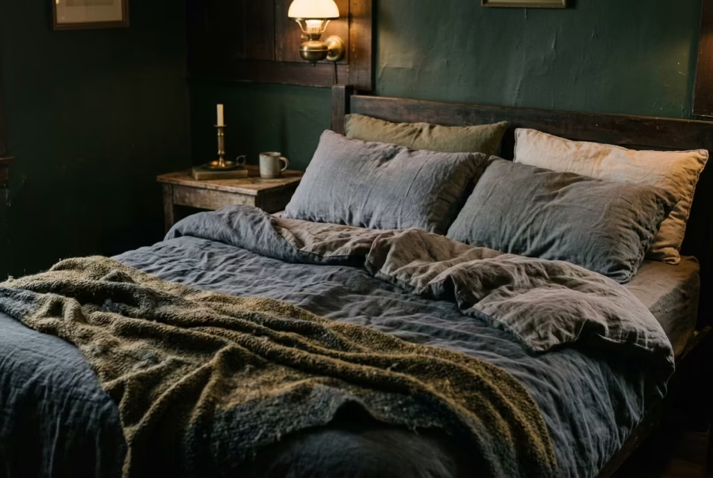
Textiles play one of the most visible roles in this gradual transformation. Linen, cotton, and wool do not remain static once introduced into a lived environment. They respond to movement, light exposure, and repeated use in subtle but meaningful ways.
Linen, for example, becomes softer and more fluid over time, losing its initial crispness and settling into a more relaxed drape. Wool throws develop a slightly worn surface that feels warmer and more inviting with each season. Even cotton, when used thoughtfully, begins to lose its sharpness and take on a more subdued presence within the room.
At the same time, the surrounding tones of the room begin to feel deeper. This is not because the paint literally changes, but because the accumulation of softened materials alters how the eye perceives contrast. Shadows feel richer, surfaces feel more cohesive, and the overall palette starts to read as more unified.
I have seen this happen in bedrooms where nothing was changed intentionally for months, yet the atmosphere became noticeably more grounded. It was not redesign. It was slow refinement through living.
Why This Style Benefits from Living in It, Not Finishing It
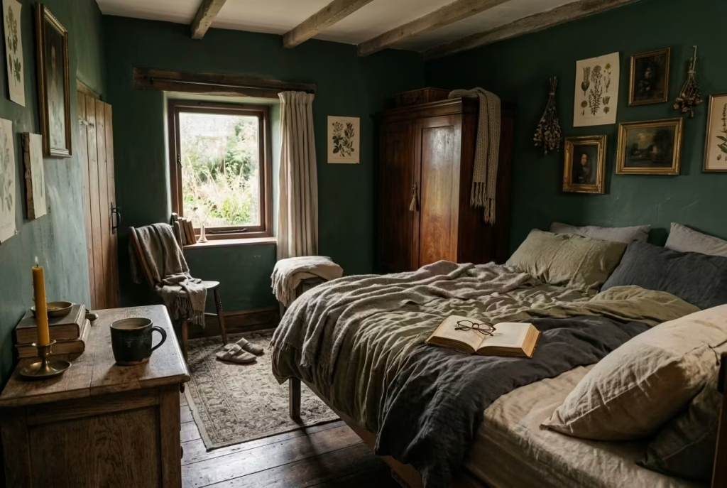
Perhaps the most important truth about dark cottagecore interiors is that they resist the idea of being “finished” in the traditional sense. The more you try to lock them into a perfect state, the more rigid they tend to feel. Their strength lies in their ability to evolve quietly alongside the people who inhabit them.
A room like this gains its depth through use. Light shifts across familiar surfaces day after day. Fabrics settle into natural rhythms. Objects find their places not through styling decisions, but through repeated interaction. Over time, the space becomes less about design intent and more about lived reality.
There is a quiet reassurance in that process. Nothing feels overly fixed, yet nothing feels unfinished. The room holds a kind of relaxed coherence, as if it understands it is allowed to change slowly without losing its identity.
This is where the aesthetic truly comes into its own. It does not demand constant updates or visual correction. Instead, it rewards patience. The longer you live with it, the more complete it becomes, not because more is added, but because everything starts to settle into place.
Styling vs Living Bridging the Gap
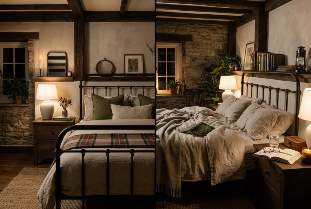
There is a point where many dark cottagecore bedrooms quietly fall apart, not because the design is wrong, but because the space has been styled more for appearance than for life. The difference is subtle at first glance, yet once you start living in the room, it becomes impossible to ignore. A bedroom can look beautifully composed in photographs and still feel slightly impractical day to day. Bridging that gap is where real design maturity begins.
At its core, this section is about understanding how a room behaves once it stops being a composition and starts being a routine. Styling is static. Living is dynamic. And the challenge is making sure one does not undermine the other.
The Difference Between Staged Cottagecore and Functional Bedrooms
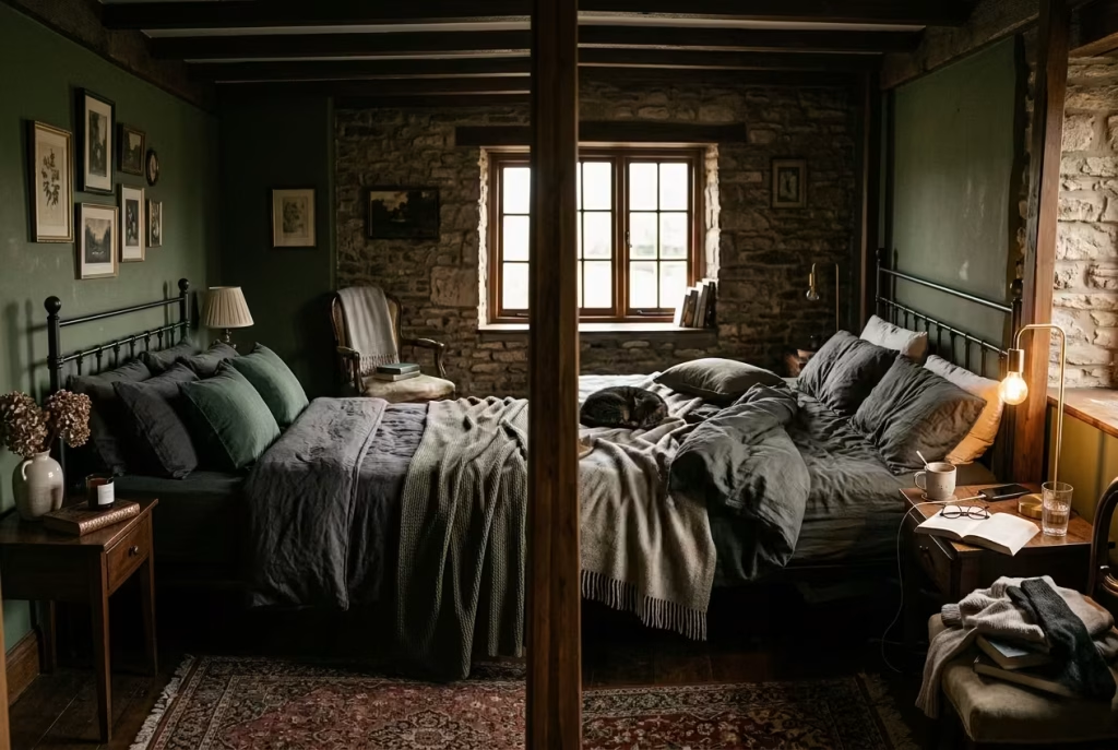
Staged cottagecore interiors often lean heavily into visual storytelling. Every object has a purpose within the frame. A carefully draped throw, a perfectly positioned stack of books, a dried floral arrangement placed just so. It all reads beautifully, but it is often not designed for repeated interaction.
In a lived-in bedroom, however, those same elements need to withstand daily rhythms. A bed is not always perfectly made. Surfaces collect real objects, not just styled ones. Lighting is adjusted based on mood, not just aesthetics. This is where the gap begins to show.
In practical terms, I have seen bedrooms of around 12 to 15 m², roughly 130 to 160 sq ft, lose their intended atmosphere simply because they were too fragile in their styling. One project I worked on had a beautifully arranged reading chair that looked perfect in photos but was constantly used as temporary storage in real life. Within weeks, the visual balance of the room was compromised, not due to poor design, but due to lack of functional resilience.
A functional cottagecore bedroom understands that life will interrupt composition. It anticipates it. It builds in flexibility so that the room still holds its mood even when it is being actively used, not just observed.
Storage Integration Without Breaking Aesthetic
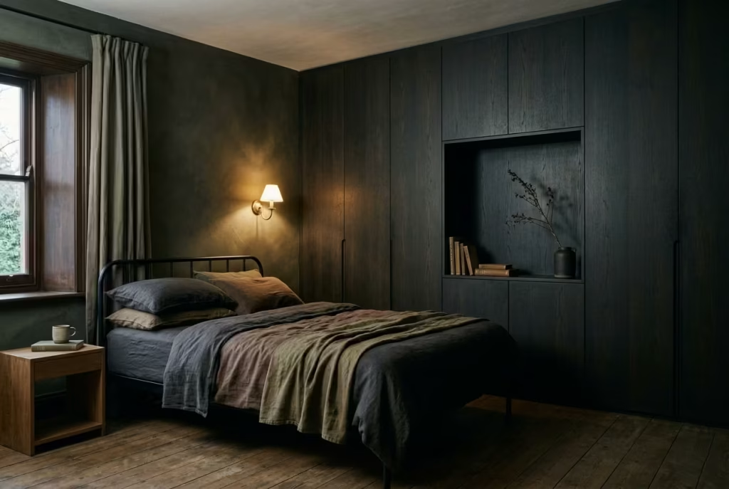
Storage is often where the tension between styling and living becomes most visible. Too much open storage introduces visual clutter. Too much concealed storage can feel sterile or overly rigid. The goal is not elimination, but integration.
In darker cottagecore interiors, storage works best when it disappears into the material language of the room. Built-in wardrobes in muted timber tones, under-bed drawers finished in matching textures, or linen-covered storage baskets all help maintain continuity without disrupting atmosphere.
A practical benchmark that works well in real homes is this: around 30 to 40 percent of visible surfaces should remain visually calm at any given time. In a 14 m² bedroom, for example, limiting exposed storage to one primary zone, such as a single shelving wall or a discreet wardrobe section, helps maintain balance. Anything beyond that tends to fragment the mood.
I worked on a space where open shelving originally occupied two full walls in a small 13 m² room. While it looked styled and intentional, daily use quickly turned it into visual overload. After reducing it to one integrated shelving unit of approximately 1.8 metres wide and introducing concealed storage elsewhere, the room immediately regained its calm. Nothing about the aesthetic changed, yet everything about the experience improved.
The key is to design storage as part of the architecture, not as an afterthought placed inside it.
Conclusion Letting the Room Settle Into Itself
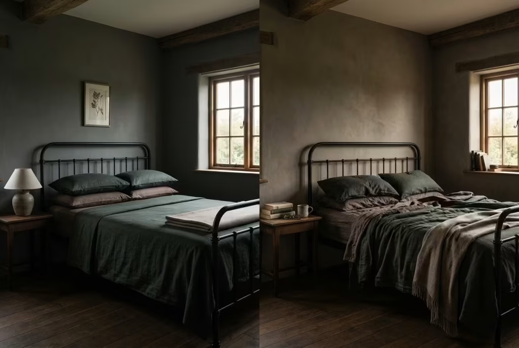
Dark cottagecore is not a style that arrives fully formed the moment the last piece is placed. It behaves more like a slow unfolding, where the real character of the room only begins to appear once life starts moving through it. What looks complete on day one is often just the beginning of the conversation. The deeper atmosphere, the quieter cohesion, and the emotional weight of the space all develop gradually, almost without asking for attention.
There is a tendency in interior design to chase immediacy, to expect a room to feel “finished” the moment it is styled. But darker, more layered interiors resist that expectation. They soften over time, not through dramatic change but through repetition, use, and subtle environmental shifts. Fabrics relax into their natural drape. Materials lose their initial sharpness and begin to harmonise with each other. Light starts to behave differently as it moves through familiar surfaces day after day. Nothing is static, yet nothing feels forced either.
In practice, the most successful rooms in this aesthetic are the ones that are allowed to breathe beyond their first impression. They are not over-managed or constantly corrected. Instead, they are given the space to settle, to gather small traces of life, and to let those traces become part of the design language itself. That is where the real depth appears, not in the initial styling, but in the accumulation of quiet, lived moments.
The most compelling rooms are not the ones that reveal everything at once, but the ones that unfold slowly, almost reluctantly, over time.
Frequently Asked Questions About Dark Cottagecore Bedroom Renovation
Will a dark cottagecore bedroom feel too small or enclosed?
Not if depth is handled correctly. The issue is rarely the darkness itself, but the lack of variation within it. When texture, tonal layering, and light distribution are introduced thoughtfully, darker palettes can actually make a room feel more expansive. Shadow creates depth, and depth creates perceived space. Flat, uniform surfaces are what tend to compress a room, not colour alone.
What colours work best for this style?
The most effective palettes sit within muted, nature-based tones. Deep greens, charcoal greys, softened browns, and earthy umbers tend to perform well because they absorb light in a controlled way. The key is avoiding overly saturated or overly cool tones, which can feel harsh in low light. Subtle undertones matter more than bold colour statements.
How do I stop the room from feeling too dark at night?
Lighting strategy is critical. Instead of relying on a single overhead source, layer low-level lighting with warm temperatures between 2200K and 2700K. Table lamps, wall lights, and concealed sources create a more balanced atmosphere. The goal is not brightness, but controlled illumination that allows shadow to exist without losing clarity.
Is this style suitable for warm or humid climates?
Yes, but material selection becomes essential. Breathable finishes like limewash and natural fabrics such as linen help regulate moisture and airflow. Heavy layering should be adjusted seasonally. The palette can remain dark, but the weight of materials should shift to maintain comfort.
Can I achieve this look without renovating the entire room?
To a degree, yes. While architectural elements enhance the effect, much of the atmosphere comes from materials and layering. Textiles, lighting, and surface finishes can significantly shift the mood without structural changes. However, cohesion is key. Isolated updates without considering the overall palette and texture balance can feel disconnected.
What type of furniture works best?
Furniture should feel grounded and slightly aged rather than polished or overly refined. Medium to dark timber tones with muted undertones work well, along with iron or matte metal accents. The goal is to avoid anything that reflects too much light or feels visually sharp. Pieces should integrate into the room, not stand apart from it.
How much decoration is too much?
Less than you might think. Dark cottagecore interiors rely on restraint. A few well-chosen objects carry more weight than multiple decorative layers. When surfaces become overcrowded, the room loses its ability to breathe. Negative space is not emptiness, it is what allows everything else to settle.
Do I need vintage or antique pieces?
Not necessarily, but they help. The key is not age, but character. New items can work if they avoid overly perfect finishes. Slight irregularities, matte surfaces, and natural materials tend to blend more convincingly. The aim is to create a sense of continuity rather than contrast between old and new.
How does this style evolve over time?
It improves with use. Fabrics soften, finishes develop patina, and the room becomes more cohesive as materials settle. Unlike highly polished interiors, minor wear enhances rather than detracts from the aesthetic. The space becomes less about styling and more about lived experience.
What is the biggest mistake to avoid?
Trying to force the mood too quickly. Over-darkening without texture, over-styling with objects, or using the wrong lighting can flatten the entire space. This style depends on balance and patience. It is not about achieving a finished look immediately, but allowing the room to develop gradually.
Can this style work in small bedrooms
Yes, often very well. Smaller rooms benefit from the cocooning effect when handled correctly. The key is vertical balance, controlled lighting, and avoiding visual clutter. A well-composed small dark bedroom can feel more intentional and calming than a larger, poorly resolved one.
Is it high maintenance to maintain this look
Not in the traditional sense. It requires less constant updating than trend-driven interiors. However, it does benefit from thoughtful upkeep. Natural materials may need occasional care, and textiles may be rotated seasonally. The effort is more about maintenance of comfort than visual perfection.
How do I balance aesthetics with daily use?
Design for interaction, not just appearance. Ensure storage is integrated, surfaces are usable, and materials can withstand regular use. A room that only works visually will quickly lose its balance once lived in. The strongest spaces anticipate everyday behaviour and adapt to it.
Does this style work with modern homes?
Yes, if handled with restraint. The key is to translate the principles rather than replicate traditional forms. Texture, tone, and material honesty can sit comfortably within modern architecture when applied thoughtfully. It is less about the building type and more about how the interior behaves.
When does the room feel “finished”?
It rarely does in a fixed sense. The most successful dark cottagecore bedrooms reach a point where they feel settled rather than complete. That distinction matters. A settled room continues to evolve without losing coherence, while a “finished” room often feels static.