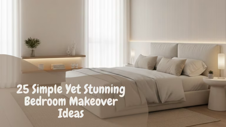


25 Dark Cottagecore Dining Room Ideas That Feel Intimate, Layered, and Lived-In
Dark cottagecore, when reduced to imagery alone, can easily be mistaken for a passing aesthetic. A palette of deep greens, weathered woods, and soft candlelight, arranged just so. But in practice, in real homes with real routines, it behaves very differently. It becomes less about how a room looks and far more about how it holds you. It slows things down, softens the edges of the day, and quietly reshapes the way a space is used.
I have seen this shift happen more than once. A dining room that once felt like a corridor between kitchen and living space, used only when necessary, begins to draw people in once the tone deepens. Not dramatically, not overnight, but gradually, almost under the radar. Meals stretch a little longer. Chairs are pulled out more often. The room starts earning its keep, not through function alone, but through presence.
That is really the point of a slow-living dining space. It is not about stripping things back to some idealised simplicity, nor about staging a lifestyle that feels out of reach. It is about creating a setting where time is allowed to linger. Where a morning coffee does not feel rushed, and an evening meal does not feel like a task to complete. The dining room, in this sense, becomes less of a utility and more of a pause. A place that invites you to stay, even when there is no real reason to.
Darkness plays a surprisingly important role in this. When handled without hesitation, it introduces depth in a way lighter schemes rarely manage. Walls begin to recede, not disappear, and the room gains a sense of quiet enclosure. It feels held together, almost protective. There is a kind of visual hush that settles in, the sort that makes everything placed within it feel more intentional.
But this is where it can go wrong if approached too quickly. Darkness without texture falls flat. Darkness without contrast feels heavy. The trick, if there is one, lies in layering. Aged timber that carries its grain openly, not polished to perfection but worn just enough to tell a story. Muted palettes that sit comfortably with one another, avoiding sharp contrast in favour of tonal depth. Fabrics that invite touch, linen that creases, wool that softens the acoustics, surfaces that feel as good as they look.
Lighting, too, shifts its role. It stops trying to fill the room and instead begins to shape it. Low-hung pendants that gather attention around the table. Lamps that create pockets of warmth rather than uniform brightness. Candlelight, flickering slightly, catching on edges and imperfections, reminding you that not everything needs to be precise to feel right.
When all of these elements begin to align, something changes. The dining room no longer feels like a backdrop to daily life. It becomes part of the rhythm of it. A place that holds memory without trying too hard, where every mark, every shift in light, adds another layer rather than detracting from it.
And that, in the end, is what dark cottagecore does best. It does not chase attention. It earns attachment, slowly and quietly, until the room feels less like something designed and more like something discovered, as if it had always been there, waiting to be lived in.
Understanding the Dark Cottagecore Dining Room
Before getting carried away with finishes, furniture, or lighting, it is worth pausing to understand what actually defines a dark cottagecore dining room in lived terms. Not in photographs, not in staged settings, but in the way it performs day after day, through changing light, shifting seasons, and the quiet wear that comes with use.
At its core, this approach is about compression and release. The room draws inward visually, creating a sense of enclosure, yet within that enclosure, it opens up in a more subtle way. Surfaces begin to reveal themselves slowly. Grain, texture, shadow lines, all becoming more pronounced the longer you sit with them. It is not a space that gives everything away at once. It rewards attention.
I often describe it to clients as a room that “settles into itself.” That settling is not accidental. It comes from a careful balance between depth and restraint. Go too dark without variation, and the room feels heavy, almost airless. Introduce too many contrasting elements, and the calm dissolves into noise. The sweet spot sits somewhere in between, where tones are layered rather than opposed, and materials speak quietly but with conviction.
There is also a shift in how the room is used. In brighter dining spaces, particularly open-plan ones, the table can feel transient, almost like a stopping point. In a darker cottagecore setting, the table becomes an anchor. It holds the room together. People tend to gravitate toward it, not just for meals but for everything that spills around them, conversations that run long, work that stretches into the evening, moments that were never planned but somehow feel necessary.
From a spatial perspective, proportions matter more than most realise. Darker palettes tend to visually reduce volume, which can be an advantage when handled well. A room measuring around 3 by 4 metres (10 by 13 feet), for instance, can feel more composed in a deeper tone than in a pale one, provided there is enough variation in texture and light. It is a bit like turning down the noise in a busy room. Suddenly, everything becomes clearer.
Materials do much of the heavy lifting here. Timber, particularly when left with a natural or lightly treated finish, introduces warmth that offsets the depth of the walls. Metals, when allowed to patinate rather than shine, add a quiet contrast. Fabrics soften edges, both visually and acoustically, preventing the room from feeling too hard or too controlled. Each element plays its part, not loudly, but with purpose.
Lighting, perhaps more than anything else, defines how the room is experienced. In darker interiors, it is not about achieving uniform brightness. It is about creating hierarchy. Where does the eye go first? Where does the light fall away? A pendant over the table, hung just low enough to feel intimate, begins to establish that structure. From there, secondary sources, sconces, lamps, even candlelight, build layers that can be adjusted depending on time and use.
What becomes clear, once all of this starts to come together, is that a dark cottagecore dining room is not trying to impress at a glance. It is playing a longer game. It draws people in slowly, holds them a little longer than expected, and leaves a lasting impression not because it shouts, but because it feels resolved.
And that sense of resolution, of a room that knows exactly what it is without over-explaining itself, is what sets it apart. It is not about chasing a look. It is about creating a space that, over time, feels inevitable.
Why Darkness Works in Dining Spaces
There is a quiet psychology at play in darker dining rooms, one that most people recognise instinctively but rarely articulate. Lower light levels tend to put the mind at ease. The visual noise drops. Edges soften. The room stops competing for attention and begins, almost without asking, to hold it. It is the difference between sitting under a bright ceiling light and settling into a corner lit by a single lamp. One keeps you alert, the other lets you exhale.
I have noticed, time and again, that when the light is subdued, people lean in rather than pull away. Conversations stretch. Meals slow down. The room begins to feel less like a checkpoint in the day and more like a pause within it. It is not dramatic. It happens quietly, almost as if the space is setting the pace without making a fuss about it.
There is also something deeply practical about this. In a well-lit, high-contrast room, every surface demands attention. Marks, clutter, even small imperfections tend to stand out. In a darker setting, those same elements recede slightly. Not hidden, but softened. The room becomes more forgiving, more liveable. It allows real life to unfold without feeling constantly on display.
That said, darkness is not a blunt tool. Used carelessly, it can feel heavy, even oppressive. The key lies in how it is handled. Depth needs variation. A wall that absorbs light should sit against a table that reflects it gently. A shadowed corner should be balanced by a pool of warmth somewhere else. It is a bit like seasoning a dish. Too much in one direction, and the balance is lost. Get it right, and everything else begins to sing.
What often surprises clients is how different a dark dining room feels at night compared to during the day. There is usually hesitation at the start, a concern that the space might feel closed in or overly somber. I have heard it more times than I can count. And yet, almost without exception, that concern dissolves the first evening the room is properly used.
I remember one particular project, a dining room just over 3 by 3.5 metres (10 by 11.5 feet), where we opted for a deep, earthy brown on the walls paired with a low-hung pendant and a couple of wall sconces. During the day, the room felt calm but unassuming. Nothing shouted for attention. But at night, once the overhead light was dimmed and the sconces came into play, the entire atmosphere shifted. The table became the focal point, the walls receded, and the space felt, in the best possible way, wrapped around the people in it.
The client, who had been the most hesitant about going dark, described it a few weeks later as “the only room in the house where time seems to slow down.” That is not something you can manufacture with decoration alone. It comes from a considered use of light and tone, working together rather than competing.
There is an old saying about letting a room breathe, but in darker dining spaces, it is less about breath and more about rhythm. Light and shadow, surface and texture, all moving in quiet balance. When that balance is struck, the room does not just look different. It feels different. And once you experience that shift, it is hard to go back to anything that feels brighter but somehow flatter, louder but less alive.
The Balance Between Rustic and Refined
It is surprisingly easy to tip a cottagecore dining room too far in either direction. Lean too heavily into the rustic, and the space risks feeling staged, almost like a film set dressed for effect. Push too far toward refinement, and the character begins to slip away, leaving something that feels polished but oddly hollow. The real work, the part that separates a room that feels lived-in from one that feels assembled, sits in the tension between the two.
Rustic elements carry weight. A solid timber table with visible knots and grain, chairs that do not quite match but sit comfortably together, surfaces that show a bit of wear rather than hiding it. These details bring honesty into the room. They remind you that the space is meant to be used, not preserved. But left unchecked, they can start to feel heavy-handed, as if the room is trying too hard to tell a story.
That is where refinement steps in, not to polish everything to a shine, but to edit, to hold things back just enough. It might be in the proportion of a pendant light, slightly more considered than expected. Or in the choice of fabric, a linen that drapes cleanly rather than one that feels overly decorative. Even something as simple as spacing can shift the tone. Leaving a wall partially bare, allowing a surface to breathe, can do more for the room than filling it ever could.
I often tell clients that authenticity is rarely about adding more. It is about knowing when to stop. There is a quiet discipline to it, a willingness to leave things unresolved, at least for a while. A dining room that feels collected over time will always have a stronger presence than one that arrives fully formed. It is the difference between something that has been lived with and something that has been arranged.
Avoiding a themed or theatrical outcome comes down to this idea of restraint. When every element points in the same direction, when every piece insists on being noticed, the room loses its depth. It becomes predictable. A little contrast, handled carefully, keeps things grounded. A slightly more tailored chair alongside a rougher table. A clean-lined light fitting above a surface that shows its age. These small shifts prevent the space from feeling one-note.
There is also a practical side to this balance that often gets overlooked. Rooms that lean too far into a single aesthetic tend to date quickly. They can feel complete at first, but over time, they leave little room for change. By keeping the palette and material choices flexible, by allowing for variation rather than strict adherence, the dining room remains adaptable. It can absorb new pieces, shift with the seasons, and evolve alongside the people using it.
I recall a project where the initial instinct was to fully commit to a rustic look, reclaimed wood on every surface, heavily distressed finishes, layered decor throughout. We stepped back, stripped it down, and reintroduced elements more selectively. A single, well-proportioned oak table. A darker wall tone to ground the space. Lighting that felt deliberate rather than decorative. The result was quieter, but far more convincing. It felt as though the room had found its footing, rather than trying to prove a point.
In the end, the balance between rustic and refined is not something you measure precisely. It is something you feel. A slight adjustment here, a decision to hold back there. When it works, the room does not draw attention to any one element. Instead, it reads as a whole, layered, composed, and just a little bit undone, in a way that feels entirely natural.
You May also Like: 21 Minimalist Living Room Ideas That Make Your Home Feel Calm and Chic
25 Dark Cottagecore Dining Room Ideas
Before moving through individual ideas, it is worth setting a different pace. This is not a checklist to be copied line by line, nor a catalogue of trends to pick from at random. In practice, rooms rarely come together that way. They evolve in layers, with one decision quietly influencing the next, sometimes in ways that only become clear much later. What follows, then, is less about isolated features and more about ways of thinking through a space.
Some ideas lean into material weight, others into light, proportion, or atmosphere. You might find yourself drawn to one detail and indifferent to another, and that is exactly as it should be. The goal is not to replicate, but to recognise what resonates and translate it, piece by piece, into something that fits your own room.
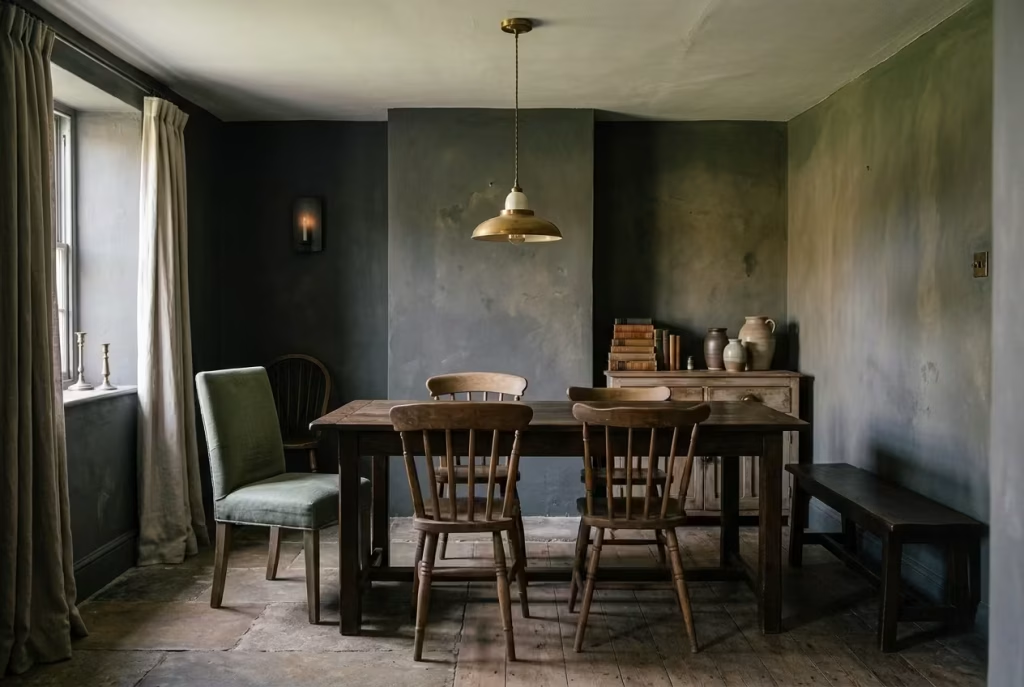
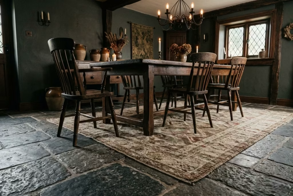
Deep Forest Green Walls with Aged Oak Table
There is a particular kind of quiet confidence in a deep forest green wall, the sort that does not ask for attention yet holds it all the same. Unlike lighter paints that bounce light back into the room, these darker, earth-rooted tones tend to absorb it, softening glare and pulling the space inward. The effect is subtle but unmistakable. Edges blur slightly, corners recede, and the room begins to feel more grounded, as though it has found its centre of gravity.
In spatial terms, this approach works best when the room has enough volume to carry the depth without feeling pinched. I usually find that anything around 3 by 4 metres (10 by 13 feet) or larger allows the colour to breathe properly. Ceiling height matters too. At around 2.6 to 2.8 metres (8.5 to 9.2 feet), the darker walls feel enveloping rather than oppressive, particularly when paired with a ceiling that is either slightly lighter or finished in a soft matte to avoid harsh contrast.
The table, in this setting, does more than serve a function. It becomes the counterweight. An aged oak piece, ideally in the range of 180 to 220 cm (6 to 7.2 feet) long and about 90 cm (35 inches) wide, introduces warmth that stops the palette from tipping too far into shadow. Oak has a way of catching what little light there is and holding onto it, not reflectively, but with a kind of quiet glow. The grain, visible and unapologetic, adds movement across the surface, breaking up what could otherwise feel like a heavy composition.
I worked on a project where the client initially leaned toward a cooler, darker grey for the walls, thinking it would feel more modern. We tested it, and on paper, it worked. In reality, the room felt flat, almost airless by late afternoon. Once we shifted to a deeper green with brown undertones, the difference was immediate. The space did not become brighter, but it became richer. The oak table, which had felt slightly adrift before, suddenly anchored the room. It was as if the two elements had been waiting for each other to make sense.
Lighting plays a supporting role here, but an important one. A pendant dropped to around 70 cm (27 inches) above the table helps to gather light where it is needed most, allowing the walls to fall away into a softer background. Too much overhead brightness, and the effect unravels. Too little, and the room risks feeling underlit. It is a balancing act, one that becomes easier once you see how the materials respond to light rather than just how they look in isolation.
What makes this combination endure is not just its appearance, but how it behaves over time. The green deepens slightly in different light conditions, the oak gathers marks and patina, and the room begins to carry a sense of continuity. It does not feel like a scheme that has been applied. It feels, gradually and without fanfare, like something that belongs.
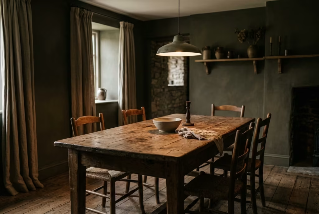
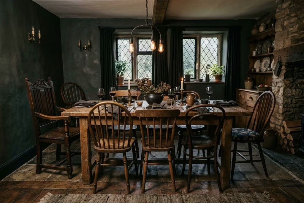
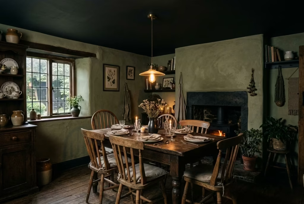
Low-Hanging Pendant Lighting Over a Heavy Farm Table
If the dining table is the heart of the room, then the light above it is what gives that heart its rhythm. A low-hanging pendant, positioned with intent rather than habit, has a way of drawing everything into focus. It does not flood the space. It gathers it. The table, the chairs, the people sitting around it, all fall into a quiet orbit beneath that pool of light.
The height is where this either works beautifully or misses the mark entirely. Set the pendant too high, and it drifts, visually disconnected, leaving the table exposed and slightly adrift. Bring it down to around 65 to 75 cm (25 to 30 inches) above the tabletop, and the dynamic shifts. The light begins to feel anchored, almost tactile, as though it belongs to the table rather than hovering above it. You notice it less as a fixture and more as an atmosphere.
This becomes particularly effective when paired with a heavy farm table, something substantial, often around 200 cm (6.5 feet) or longer, with enough presence to hold its ground. The weight of the table and the lowered light create a kind of visual compression, not in a restrictive sense, but in a way that makes the space feel intentional. It is a bit like pulling a chair closer to a fire. The room narrows in the right places, and everything starts to feel more connected.
In one project, a long, reclaimed timber table sat in a room that, on paper, had generous proportions, just over 3.5 by 4.5 metres (11.5 by 15 feet). Yet something felt off. The original lighting had been installed at a standard height, closer to ceiling level, and the result was oddly detached. The table looked isolated, almost like it was waiting for something to complete it. Lowering the pendant by just under 30 cm (12 inches) changed the entire reading of the room. Suddenly, the table had presence. The light defined it, contained it, made it feel purposeful.
There is also a practical layer to consider. Lower lighting naturally reduces glare, especially in darker interiors where contrast is already controlled. It directs illumination where it is needed, onto the table surface, while allowing the surrounding walls to recede gently. This is where intimacy begins to take shape. Faces are lit softly, details emerge slowly, and the room stops feeling like a stage and starts behaving like a setting.
The choice of shade matters too, though often in quieter ways. Opaque or semi-opaque materials, metals, ceramics, or even darker glass, tend to focus light downward, reinforcing that sense of enclosure. A wider shade, around 35 to 50 cm (14 to 20 inches) in diameter, works well over most dining tables, providing enough spread without losing intensity. In longer tables, a pair of pendants, spaced evenly, can maintain balance without overcrowding the ceiling.
What becomes clear, once lived with, is how much this single adjustment can influence behaviour. People lean in a little more. The edges of the room fade just enough to feel distant. Conversations settle into a slower cadence, not forced, just naturally unfolding. It is a small shift, on paper at least, but one that quietly reshapes how the room is experienced.
And that, in many ways, is the essence of it. The pendant does not demand attention. It simply holds the space together, steady and unassuming, allowing everything beneath it to feel just a little more considered, a little more at ease.
Exposed Beams Against Charcoal Plaster Walls
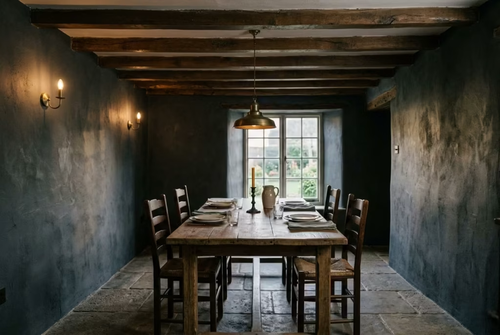
There is something inherently grounding about exposed beams. They speak the language of structure, of weight carried and time held, often without drawing overt attention to themselves. Set against charcoal plaster walls, however, they begin to take on a different role. The contrast sharpens, not in a harsh or graphic way, but in a manner that feels quietly deliberate. The beams read more clearly, their lines more defined, while the walls behind them soften, almost receding into a textured backdrop.
This interplay, structure against softness, is where the room finds its rhythm. The beams provide order, a sense of direction across the ceiling plane, while the plaster introduces a more nuanced, almost tactile depth. It is not a flat charcoal you are working with here. The surface, when handled properly, carries slight variations, catching light unevenly, allowing shadows to sit gently rather than fall abruptly. It is the kind of detail you do not notice at first glance, but once seen, it becomes difficult to ignore.
Ceiling height plays a critical role in making this combination feel balanced rather than compressed. Anything above 2.6 metres (8.5 feet) gives the beams enough breathing room to read as architectural features rather than overhead clutter. At around 2.7 to 3 metres (8.8 to 9.8 feet), the effect becomes particularly convincing. The beams can sit comfortably within the space, and the darker wall tone does not feel like it is closing in from all sides.
I worked on a renovation where the existing beams were initially seen as a problem, something to be boxed in or painted over to “clean up” the ceiling. The room itself measured just under 3 by 4 metres (10 by 13 feet), with a ceiling height of roughly 2.7 metres (8.8 feet). Instead of hiding the beams, we leaned into them. The walls were finished in a charcoal lime plaster, slightly uneven in texture, and the beams were left in a deep, natural timber tone, cleaned but not overworked.
The transformation was not immediate in the sense of a dramatic reveal. It unfolded slowly, almost like the room was finding its footing. During the day, the plaster absorbed light in a way that made the space feel calm, not dull. In the evening, under softer lighting, the beams began to stand out more, their lines catching just enough illumination to guide the eye across the room. The ceiling, which had once felt like a flat plane, now carried depth and movement.
There is also a practical dimension to this pairing. Charcoal plaster tends to be forgiving. Minor imperfections, small shifts in the surface, even the natural ageing of the material, all contribute to its character rather than detract from it. The beams, similarly, benefit from a finish that allows for variation. A fully sealed, high-gloss timber would feel out of place here. A matte or lightly oiled finish, by contrast, lets the wood breathe, visually and materially.
What makes this approach particularly enduring is how it holds together under different conditions. Morning light, often cooler and more directional, grazes the plaster, picking up its texture. Evening light, warmer and more contained, highlights the beams, giving them a quiet prominence. The room shifts, but it does not lose its coherence.
It is, in many ways, a lesson in contrast handled with restraint. Nothing is overly sharp, nothing overly soft. The elements sit alongside each other, each doing its job, each allowing the other to be seen more clearly. And in that balance, the room gains a sense of depth that feels both intentional and, at the same time, entirely at ease.
Antique Display Cabinets with Imperfect Glass
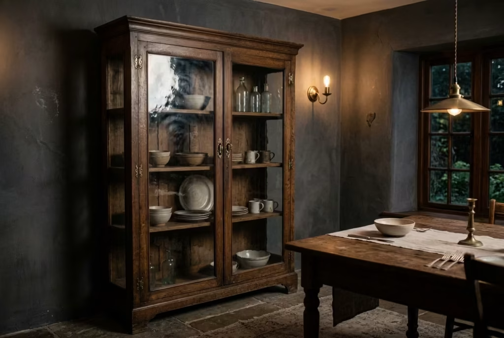
There is a particular charm in imperfection that modern interiors often try too hard to erase. Antique display cabinets with slightly distorted glass sit right at the centre of that idea, quietly resisting the obsession with visual perfection. The glass may ripple just enough to soften reflections, or carry faint irregularities that blur what sits behind it. Instead of feeling like a flaw, it becomes part of the atmosphere, introducing a softness that sharp, factory-clear glazing rarely achieves.
In a dark cottagecore dining room, this subtle distortion does something quite important. It takes the edge off precision. Light passing through imperfect glass does not behave predictably, it bends slightly, diffuses gently, and in doing so, it creates a sense of depth that feels more lived-in than designed. Ceramics inside no longer appear as static objects on display. They shift slightly depending on angle and light, almost as if the cabinet itself is breathing with the room.
From a spatial point of view, these cabinets tend to work best when they are given enough visual room to be read properly. In tighter dining rooms, say around 3 by 3.5 metres (10 by 11.5 feet), one well-placed cabinet against a darker wall can be enough. Larger rooms can carry a pair, but only if there is clear separation between them. Overcrowding here is where the effect gets lost, and what should feel poetic starts to feel cluttered.
I remember a project where a client had inherited an old oak cabinet with original glass panels that were, by modern standards, far from perfect. The initial reaction was hesitation. There was a strong instinct to replace the glass entirely, to “clean it up” so it matched the rest of the newly designed space. On paper, that made sense. In reality, it would have stripped the piece of everything that made it interesting.
We placed it temporarily in the dining room, which had just been finished in a deep, muted brown with soft plaster texture. The room itself was about 3.2 by 4.2 metres (10.5 by 13.8 feet), with lighting kept intentionally low and layered. The moment natural light hit the cabinet, something shifted. The slight warping in the glass caught the surroundings in a softened reflection, almost like looking at the room through memory rather than direct sight.
Over time, the cabinet stopped being questioned and started being appreciated. Not because it matched perfectly, but because it didn’t. It became one of those pieces that anchors a space without demanding attention, the kind you notice more in passing than in passing judgement.
There is also a practical benefit that often goes unspoken. Imperfect glass is far more forgiving in everyday life. Fingerprints, smudges, and the general wear that comes with use do not stand out in the same way they would on ultra-clear surfaces. In homes where dining rooms are genuinely used rather than staged, that kind of tolerance matters more than most people initially expect.
Stylistically, these cabinets also help bridge rustic and refined elements within the room. The aged timber frame carries warmth and weight, while the softened glass prevents the piece from feeling too heavy or overly traditional. It sits comfortably alongside darker walls, textured fabrics, and low lighting, not competing with them, but quietly participating in the overall rhythm of the space.
What begins as “imperfection,” once understood in context, turns out to be something closer to character. And in a dining room that leans into mood, texture, and slow living, character is not just desirable, it is what gives the space its lasting sense of authenticity.
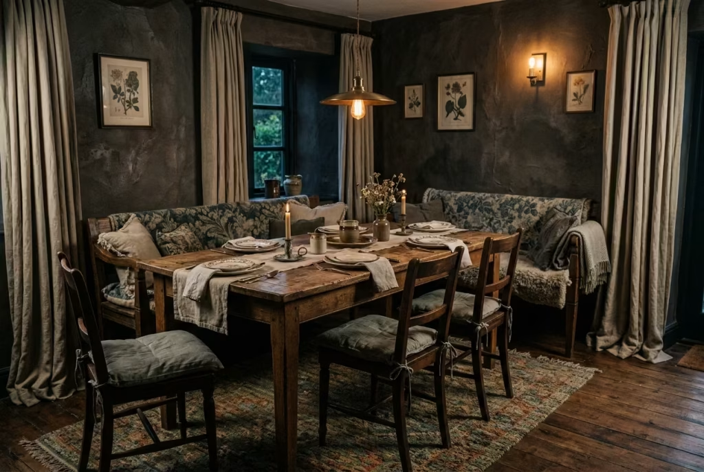
Layered Textiles in Muted Florals and Wools
Hard surfaces have a way of exposing themselves quickly in dining spaces. Timber tables, stone flooring, plaster walls, all of them bring structure and character, but without textile intervention, they can also tip the room into something acoustically sharp, almost echoey in a way that feels slightly uninviting. Layered textiles step in here not as decoration, but as a kind of quiet corrective, softening both sound and atmosphere until the room feels more settled, more forgiving to inhabit.
Muted florals and natural wool blends work particularly well in a dark cottagecore setting because they do not fight for attention. Instead, they sit into the palette, almost as if they belong to it by default. A cushion in a faded botanical print, for instance, does not read as pattern first, but as texture from a distance. Wools, especially those with a slightly uneven weave or brushed finish, introduce a tactile depth that hard materials simply cannot replicate. Together, they begin to “cushion the room,” both visually and physically, like soft pauses between stronger architectural elements.
From a practical standpoint, this layering is most effective when it is distributed rather than concentrated. A dining bench with a 45 to 50 cm (18 to 20 inch) deep cushion, paired with a couple of loose seat pads on chairs, already begins to shift the acoustic behaviour of the space. Add heavier linen curtains, ideally full-length and around 240 cm (94 inches) or more in drop, and the room starts to lose that faint echo that often goes unnoticed until it is gone. The result is not silence, but softness in how sound travels and settles.
I once worked on a dining room where the architecture was beautiful in its simplicity, but slightly unforgiving. The space measured roughly 3.4 by 4.5 metres (11 by 14.8 feet), with polished timber flooring and bare plaster walls finished in a deep, earthy tone. Visually, it was strong. Acoustically, it felt a little too honest, every chair movement, every piece of cutlery, carried further than it should have. The room had presence, but not ease.
We introduced layered textiles gradually. First, a large wool rug measuring around 240 by 300 cm (8 by 10 feet), placed just under the table edges so chairs still moved freely. Then softened linen seat pads in muted, almost weathered tones, followed by heavier curtains that pooled slightly on the floor, breaking up the vertical lines of the room. Nothing was overly styled. Each addition felt small on its own, but together they changed the way the space behaved.
The transformation was not just visual. It was sensory. Conversations became less punctuated by sharp echoes. The room felt less like a container and more like a setting. Even temperature perception shifted slightly, as textiles tend to do, making the space feel warmer without any actual change in heating. It is one of those subtle adjustments that clients rarely notice in isolation, but would immediately miss if removed.
There is also something important about the way muted florals operate in these schemes. Unlike bold patterns that demand visual hierarchy, these softer motifs behave more like background memory. They suggest rather than declare. In darker rooms especially, where light is already doing much of the atmospheric work, this restraint is essential. It keeps the composition layered without becoming visually noisy.
What ultimately makes textiles so effective in a dark cottagecore dining room is their ability to introduce softness without weakening structure. They do not replace the weight of timber or stone, they sit alongside it, tempering it just enough so the room feels complete rather than stark. It is a bit like turning down the volume on a loud environment without changing the conversation itself. Everything remains, just easier to live with, easier to stay in, and far more inviting to return to.
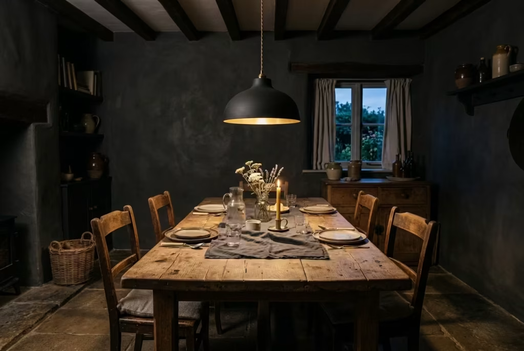
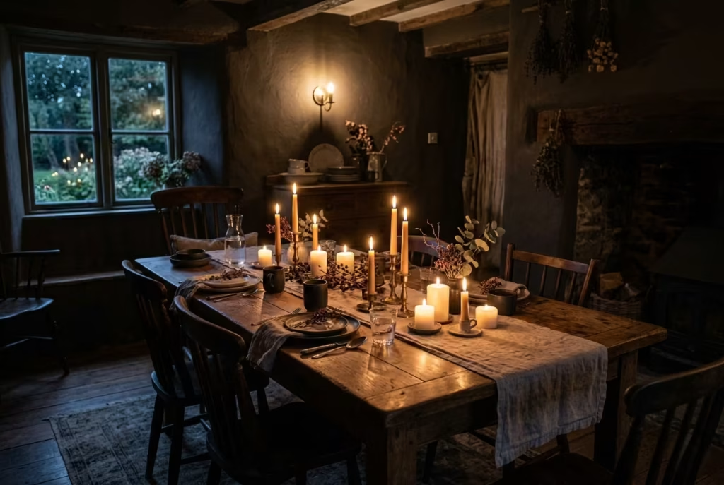
Candlelight as a Primary Evening Light Source
Candlelight, when it is used properly in a dark cottagecore dining room, stops being decoration almost immediately. It shifts into something far more functional, almost architectural in the way it defines space. Electric lighting sets the baseline, but candlelight refines it. It is the difference between simply seeing the room and actually feeling it settle around you as the evening unfolds.
There is a reason people instinctively slow down in candlelit spaces. The light is uneven in the most natural way, never static, always slightly in motion. It softens hard edges, particularly in darker interiors where shadows already play a stronger role. On a timber table measuring around 180 to 220 cm (6 to 7.2 feet), a few well-placed candles can completely change the reading of the surface. Grain becomes more pronounced. Imperfections feel intentional. Even simple objects begin to take on a quieter sense of importance.
In practical terms, the key is restraint and placement rather than abundance. A cluster of candles in groups of three or five tends to feel more grounded than symmetrical rows. Heights can vary, but not aggressively. A mix of low votives around 8 to 12 cm (3 to 5 inches) alongside slightly taller taper candles creates just enough variation for the light to move naturally across the table. What you want to avoid is uniformity, because uniform light flattens the very depth you are trying to build.
I worked on a dining space where the brief was intentionally low-tech in the evenings. The room itself was around 3 by 4 metres (10 by 13 feet), finished in a deep, muted plaster tone with aged oak furniture and layered textiles. We installed discreet wall sconces for general evening use, but the client was encouraged to rely heavily on candlelight during dinners. At first, there was hesitation. The concern was predictable, that it might feel impractical or insufficient.
That perception changed quickly once the room was lived in. The candles were placed along the centre of a 200 cm (6.5 foot) table, with a few additional points of light near the sideboard, positioned safely away from fabric and wall finishes. Nothing was overdone. The effect, however, was immediate. The room felt less like it was being lit and more like it was glowing from within, softly contained, almost self-sustaining.
Safety, of course, cannot be an afterthought in this kind of setup. Real-world use demands a level of discipline that aesthetic inspiration often ignores. Candles need stable bases, ideally weighted holders that reduce the risk of movement. Distance from curtains, shelving, or any low-hanging fabric is not negotiable. In homes where dining rooms are actively used rather than staged, placement becomes part of the design language, not an afterthought hidden behind it.
What often gets overlooked is how forgiving candlelight is when it comes to imperfections in the room. Slightly uneven plaster, a table with visible wear, or mismatched ceramics all sit more comfortably under its glow. It does not demand perfection from its surroundings. If anything, it relaxes them. That is part of its quiet strength. It lets the room be what it is, rather than what it is expected to be.
There is also a behavioural shift that happens almost without notice. People tend to lean in closer, speak a little more slowly, and linger longer than they intended. The room subtly removes urgency from the equation. It is not dramatic or theatrical. It is simply easier to stay.
In the end, candlelight works not because it is nostalgic, but because it is human-scaled. It belongs at the table, not above it. It gathers rather than floods. And in a dark cottagecore dining room, where mood and material already do much of the heavy lifting, it becomes the final layer that ties everything together, quietly, almost imperceptibly, but absolutely decisively.
You May also Like: 20 Italian Fireplace Ideas That Bring Timeless European Warmth to Your Home
Dark Panelled Walls with Patinated Brass Accents
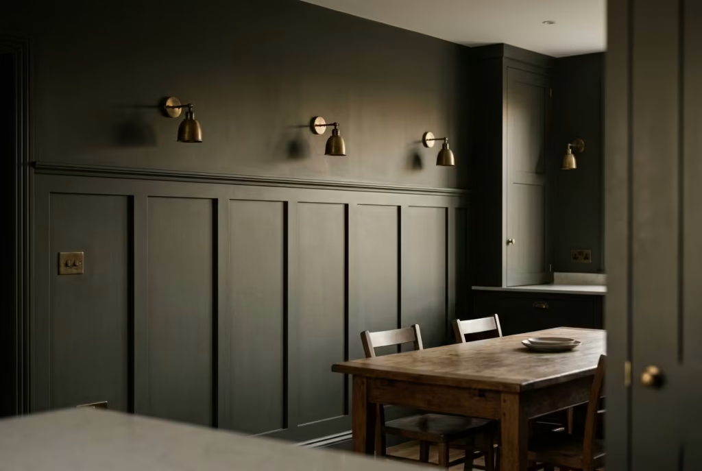
There is a certain architectural confidence that comes with panelling, especially in darker dining rooms where structure is doing as much visual work as colour. When walls are divided into measured segments, the room stops feeling like a continuous surface and starts behaving more like a composed frame. Nothing is louder, nothing is shouting for attention, yet everything feels more intentional, as if the space has quietly decided where it stands.
In practice, panel heights between 900 and 1200 mm (35 to 47 inches) tend to strike the most natural balance. Lower than that, and the effect can feel overly decorative, almost like a gesture without grounding. Higher, and the room risks tipping into heaviness, particularly when paired with deep, moody tones. At this mid-level height, however, the panelling creates a visual anchor that sits comfortably within eye line, subtly guiding how the room is read without interrupting its flow.
Dark paint within these panels plays an important role in how the structure is perceived. Rather than reflecting light back into the room, it absorbs it in a controlled way, allowing the geometry of the panelling to take precedence over surface glare. The result is a wall that feels dimensional rather than flat, especially when light shifts throughout the day. Morning light skims gently across the surface, revealing detail, while evening light softens everything into a more uniform, atmospheric tone.
Patinated brass, when introduced into this setting, does not behave like a bright accent. It behaves more like a quiet counterpoint. There is a warmth in aged brass that polished finishes rarely achieve, a softened glow that feels earned rather than applied. Handles, light switches, wall sconces, even small decorative fittings begin to carry this muted warmth, catching light just enough to break up the depth of the surrounding palette.
I worked on a dining room where this combination became the turning point in the entire scheme. The space itself was modest, just under 3.2 by 4 metres (10.5 by 13 feet), with relatively low natural light. Initially, the walls were left plain, finished in a deep matte tone, but something felt unresolved. The room had colour, yet it lacked structure. Once we introduced panelling at around 1000 mm (39 inches) and layered in aged brass details, the space immediately gained clarity. It was not brighter, but it was more legible, more composed.
What stood out most was how the brass aged within the room over time. Rather than remaining static, it began to soften further, picking up subtle variations in tone depending on how the light fell across it. This gradual change gave the room a sense of quiet evolution, as if it was settling into itself rather than staying frozen in its original state.
There is also a practical advantage here that often gets overlooked. Panelling naturally protects lower wall areas from scuffs and daily wear, which is particularly useful in dining rooms where chairs, movement, and occasional knocks are part of everyday life. Instead of showing damage, the structure absorbs it, and over time, any minor marks simply add to the layered character of the space rather than detracting from it.
The combination of dark panelling and patinated brass works because it is fundamentally about balance. One provides order and containment, the other introduces warmth and variation. Neither dominates, yet together they establish a rhythm that feels both grounded and quietly expressive. It is the kind of pairing that does not rely on trends or statements. It simply holds its place, steadily, as the room around it continues to evolve.
Rustic Stone Flooring Paired with Soft Rugs
Stone flooring has a way of anchoring a dining room with quiet authority. It is honest, unpretentious, and materially confident, but it also carries a natural coolness that can feel a little too stark if left entirely on its own. In darker cottagecore interiors, where atmosphere is built through layers rather than decoration alone, that coolness is not something to avoid, but something to balance. This is where soft rugs step in, not as an afterthought, but as a necessary counterweight.
The contrast between the two materials is what gives the room its depth. Stone, particularly in finishes like limestone, slate, or tumbled travertine, holds onto light in a very controlled way. It does not glow, it settles. Underfoot, it feels grounded, almost immovable, which is exactly what a dining space often needs at its core. But without interruption, that same consistency can become visually and physically cold, especially in rooms that lean into darker wall tones and reduced lighting.
A well-placed rug, sized correctly and chosen with restraint, shifts that dynamic entirely. In a dining room measuring around 3.5 by 4.5 metres (11.5 by 15 feet), a rug in the region of 240 by 300 cm (8 by 10 feet) tends to work best, allowing chairs to move freely without catching on the edges. The material choice matters just as much as the dimensions. Wool, particularly in low-sheen or handwoven finishes, introduces softness without losing structure. It sits under the table rather than competing with it, quietly absorbing sound and softening the visual weight of the stone beneath.
I remember a project where the flooring had already been set in a pale, honed limestone that felt beautiful but slightly uncompromising in tone. The room itself was around 3.2 by 4 metres (10.5 by 13 feet), with deep green walls and aged timber furniture already in place. On paper, everything worked. In reality, the space felt just a touch too crisp, almost as if it had been carefully arranged but not fully lived in. The missing layer was not more furniture or colour, but softness underfoot.
Once a muted, handwoven wool rug was introduced beneath the dining table, everything shifted in a way that was subtle but unmistakable. The acoustics softened first, then the visual balance followed. Chairs no longer echoed slightly against the stone when moved. The room began to feel less like a surface composition and more like a lived environment, something that had settled into its own rhythm.
There is also a sensory element that often goes unnoticed until it is experienced. Walking barefoot across a cool stone floor has a certain clarity to it, but pairing it with a soft rug introduces variation in texture that changes how the room is perceived at a bodily level. That shift, from hard to soft underfoot, creates a kind of quiet punctuation in the space. It breaks continuity just enough to keep the room from feeling monotonous.
The success of this pairing lies in restraint. Overly patterned rugs or highly saturated colours tend to interrupt the balance rather than support it. In darker cottagecore settings, muted tones, weathered neutrals, or faded botanical references tend to sit more naturally. They do not announce themselves. They simply belong.
What makes stone and textile such a compelling combination is the way they hold opposing qualities without conflict. One brings permanence, the other brings comfort. One grounds the room, the other softens its edges. When brought together thoughtfully, they create a dining environment that feels both structured and inviting, like a space that understands how to be lived in without ever needing to explain itself.
Mismatched Vintage Dining Chairs
There is a quiet trap many dining rooms fall into without even realising it: the pursuit of perfect uniformity. A matching set of chairs feels safe, controlled, and visually tidy, yet in practice it can strip a room of its personality almost entirely. Everything aligns a little too neatly, as if the space has been staged rather than assembled over time. And once that happens, the dining area begins to lose that subtle sense of discovery that gives cottagecore interiors their charm in the first place.
Mismatched vintage chairs, when chosen with intent rather than randomness, work in the opposite direction. They introduce rhythm instead of repetition. One chair might have a slightly higher back, another a softer seat, another a more timeworn frame where the wood has begun to darken at the edges. Individually, they feel distinct. Together, they create a composition that feels collected, not manufactured. It is a bit like a conversation where each voice has its own tone, yet somehow the dialogue still flows.
The key, of course, is not chaos. Cohesion is still essential, just expressed differently. Rather than matching form, you match tone. That might mean sticking within a consistent wood family, or keeping all finishes within a similar depth range, such as dark oak, walnut, or softened ebony stains. Even when silhouettes differ, this shared material language holds the arrangement together. It is this underlying thread that prevents the mix from feeling accidental.
In a dining room measuring around 3 by 4 metres (10 by 13 feet), I often find that a combination of four to six chairs works best when mixing styles. Too few, and the variation feels underdeveloped. Too many, and the eye starts to lose its anchor point. A long table, say around 200 to 220 cm (6.5 to 7.2 feet), provides enough surface length to let differences breathe without overwhelming the space.
I once worked on a project where the client initially resisted this idea entirely. They had already sourced a full matching set of chairs, solid oak, uniform finish, identical in every detail. On paper, it looked “correct.” But once placed in a dark cottagecore dining room with layered textures, deep green walls, and low lighting, the effect felt surprisingly flat. The furniture sat politely, but the room had no rhythm.
We introduced a gradual shift instead of a full replacement. Two chairs were swapped for slightly more sculptural vintage pieces with woven seats, another pair softened with more weathered timber tones. Nothing was overly styled or deliberately eccentric. The goal was subtle variation, not contrast for its own sake. Within a few days of living with it, the room changed character. It stopped feeling like a showroom and started behaving like a space that had evolved over time.
There is also a practical advantage to this approach that becomes clearer with use. Vintage chairs, by nature, come with different histories of wear. Some are firmer, some softer, some more forgiving to sit in for long dinners. That variation, rather than being a flaw, actually mirrors how people use a dining room in real life. Not everyone sits the same way, or for the same length of time, and the furniture quietly begins to reflect that diversity of use.
What ties everything together is tone, not sameness. When the palette is grounded in similar wood depths, when finishes are restrained, and when the overall silhouette of the room maintains balance, the mix begins to feel intentional rather than improvised. It is this sense of controlled looseness that gives the space its character.
In the end, mismatched vintage chairs do not create disorder. They create memory in advance. A feeling that the room has already lived a little, even if it has only just been finished.
Built-In Window Seating with Deep Cushions
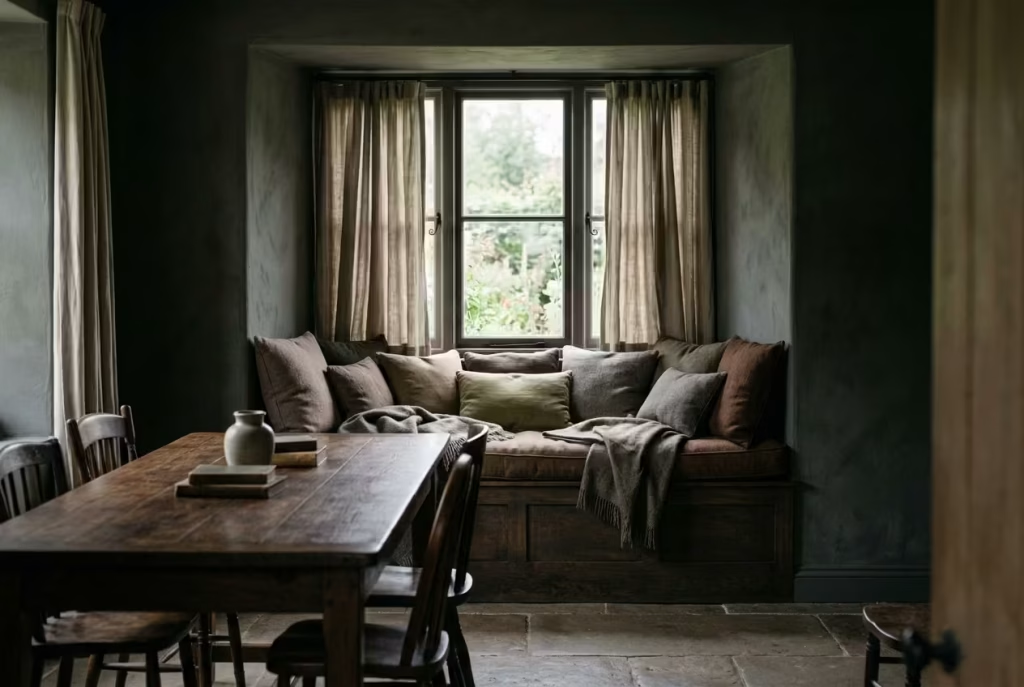
There is a particular kind of architectural intelligence in turning a window edge into something you can actually live with, rather than simply pass by. Built-in seating does exactly that. It takes what is often wasted perimeter space and quietly transforms it into one of the most psychologically useful corners of a dining room. In a dark cottagecore setting, where mood and stillness carry as much weight as function, this becomes less of an add-on and more of a stabilising gesture within the room.
A well-proportioned window seat typically sits within a depth of 45 to 55 cm (18 to 22 inches). Any shallower, and it begins to feel more like a ledge than a place to settle. Any deeper, and it loses that natural sense of posture, where you can sit comfortably without feeling swallowed by the architecture. That balance matters more than people expect. It is the difference between a space that is occasionally used and one that quietly becomes part of daily rhythm.
The placement against a window is where the real value emerges. Even in darker interiors, natural light still plays a crucial role during the day, and a built-in seat catches that light in a way that feels soft rather than exposed. Surrounded by deeper wall tones and grounded furniture, the window area becomes a kind of visual pause. Not a focal point in the traditional sense, but a resting point for the eye, a place where the room briefly loosens its density.
I worked on a dining room project where the layout had a slightly awkward recess along one wall, roughly 1.8 metres (6 feet) wide, sitting beneath a medium-sized window. At first, it felt like a leftover space, the kind of architectural by-product that tends to get filled with a plant or left empty altogether. Instead, we turned it into a built-in seat with a timber base, finished in a softened, dark-stained oak to match the dining table across the room.
Once upholstered cushions were added, around 50 cm (20 inches) deep with a layered wool and linen mix, the entire dynamic of the room shifted. It stopped feeling like a gap in the layout and started behaving like an intentional pause within it. People naturally gravitated toward it, not because it demanded attention, but because it offered ease.
There is also something quietly powerful about how these seating areas age over time. Unlike formal dining chairs, a built-in window seat collects use in a slower, more informal way. Cushions soften slightly, fabrics develop a lived texture, and the timber beneath gains a subtle patina from proximity to light and touch. It becomes one of those elements that does not try to stay perfect, and as a result, feels more authentic with every passing year.
From a design perspective, the surrounding details matter just as much as the seat itself. Heavy curtains, ideally in natural fibres like linen or wool blends, can frame the window without overwhelming it. In darker schemes, muted tones work best, allowing the seat to remain visually connected to the rest of the room rather than floating as a separate feature. Even the transition from floor to seat should feel seamless, almost as if it was always part of the architecture rather than added later.
What makes this idea so enduring is its versatility in use. It is not just a place to sit during meals. It becomes a quiet reading corner in the late afternoon, a resting point while cooking nearby, or simply a space to sit with a cup of tea while the room carries on around you. It earns its place not through visual impact alone, but through repeated, effortless use.
In the end, a built-in window seat works because it understands something fundamental about living spaces. The most valuable corners are not always the most visible ones. Sometimes, they are the ones that feel slightly tucked away, softly lit, and just comfortable enough to linger in a little longer than planned.
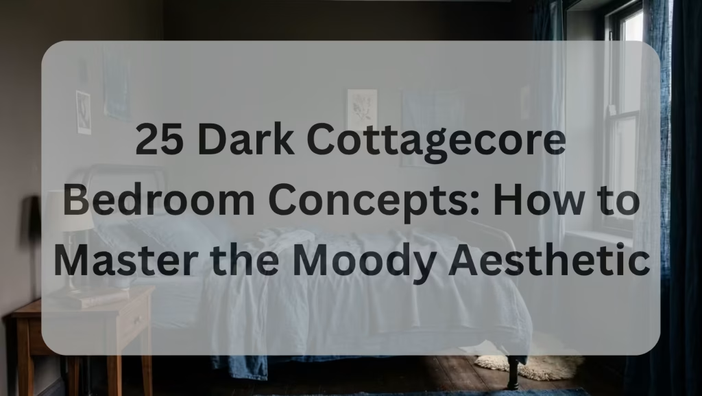
You May also Like: 25 Dark Cottagecore Bedroom Concepts: How to Master the Moody Aesthetic
Moody Wallpaper with Botanical Motifs
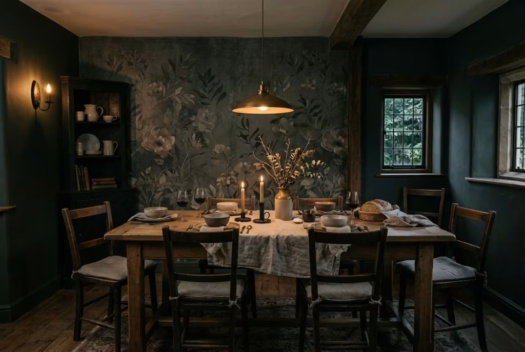
There is a fine line between pattern that enriches a space and pattern that overwhelms it, and moody botanical wallpaper sits right on that edge. In a dark cottagecore dining room, where atmosphere is already doing a significant amount of the visual work, wallpaper becomes less about decoration and more about calibration. It can either deepen the room’s narrative or, if overused, flatten it into something overly busy and visually restless.
Botanical motifs in darker palettes have a particular advantage. They echo the natural references already present in cottagecore interiors, yet they do so in a way that feels more grounded and less literal. Leaves, branches, and faded floral forms emerge from the background rather than sitting on top of it. Under low lighting, especially in the evening, these patterns begin to soften further, almost like they are partially remembered rather than fully seen. That subtle ambiguity is where the magic sits.
The decision between a feature wall and a full wrap is where the spatial reading of the room truly changes. A single feature wall, often placed behind the dining table or along the most visually dominant surface, allows the pattern to act as an anchor without overwhelming the room. In a dining space measuring around 3 by 4 metres (10 by 13 feet), this approach tends to maintain balance, particularly when paired with darker painted walls on the remaining surfaces. It gives the eye somewhere to land, without forcing it to stay there.
A full wrap, on the other hand, creates a more immersive experience. When used in slightly larger rooms, typically 3.5 by 4.5 metres (11.5 by 15 feet) or above, it can produce a sense of enclosure that feels almost enveloping. The key here is restraint in the pattern itself. The tones must remain muted, the contrast softened, otherwise the room risks tipping into visual noise. In well-executed examples, the effect is less “wallpapered room” and more “space wrapped in atmosphere.”
I recall a project where the dining room originally felt slightly unresolved, despite having strong architectural bones. The space was roughly 3.2 by 4.2 metres (10.5 by 13.8 feet), with deep timber flooring and a heavy oak table already in place. We introduced a botanical wallpaper in a subdued charcoal-green palette, initially only on the wall behind the dining table. The transformation was immediate, but not in a loud way. The room did not suddenly change character; it simply felt more grounded, as though the backdrop had finally caught up with the furniture.
Later, we extended the wallpaper to a second wall after seeing how it interacted with candlelight in the evenings. The effect became more immersive, but still controlled. Rather than competing with the furniture, the pattern began to sit behind it, like a soft visual hum that supported everything else in the room.
What often surprises clients is how wallpaper behaves differently under varying light conditions. During the day, botanical motifs are more readable, their structure clearer and more defined. At night, under layered lighting or candlelight, they dissolve slightly into the background. This dual behaviour gives the room a sense of movement without anything physically changing. It is one of those rare design elements that works harder as the light fades.
There is also a psychological layer at play. Natural motifs, even when stylised, tend to reduce visual tension in a room. They introduce familiarity without predictability, which is particularly valuable in darker interiors where solid colour alone can sometimes feel too heavy. The presence of organic forms softens that intensity, allowing the room to feel more approachable, more forgiving.
The real craft lies in restraint. Too much contrast in the pattern, and the room begins to fragment visually. Too little, and the wallpaper loses its purpose entirely. The most successful schemes are often those where the pattern is felt before it is fully noticed, where it contributes to mood without demanding interpretation.
In the end, moody botanical wallpaper works best when it behaves like a backdrop rather than a statement. It should feel as though it has always been there, quietly shaping the atmosphere, rather than arriving as a deliberate design decision. That is when it stops being wallpaper and starts becoming part of the room’s memory.
Open Shelving with Ceramics and Earthenware
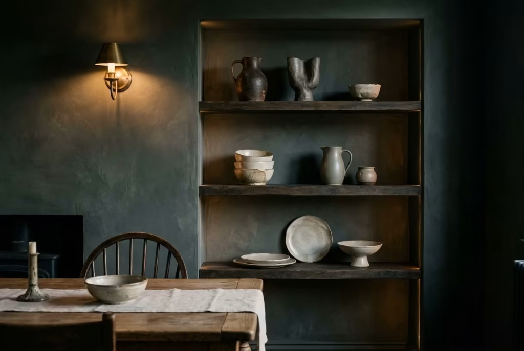
Open shelving, when handled well, has a way of turning everyday objects into part of the room’s composition rather than hiding them away behind closed doors. In a dark cottagecore dining room, this becomes particularly powerful because the surrounding palette already leans into depth and shadow. What sits on the shelves is not competing for attention in a bright, neutral field. Instead, it is emerging gently from a darker backdrop, which means every decision carries more weight than it initially appears.
Ceramics and earthenware are ideal companions for this kind of setting because they are inherently imperfect in a way that feels honest. Slight variations in glaze, subtle asymmetry in form, and the soft, tactile presence of fired clay all sit comfortably within a space that values texture over polish. When placed against darker timber or painted shelving, these objects begin to read almost like quiet still lives, especially when lit softly from above or the side.
The real challenge with open shelving is not what to include, but what to leave out. Styling restraint is not about minimalism for its own sake, but about allowing each object to breathe. A shelf crowded with ceramics quickly loses its rhythm. The eye has nowhere to settle, and what should feel curated begins to feel accidental. On the other hand, too little can make the space feel unfinished, as though something is missing rather than intentionally quiet.
In practice, I often find that grouping items in uneven clusters works far better than symmetrical arrangements. A stack of three bowls beside a single sculptural jug, with a small gap of negative space between them, creates a natural pause. That pause is what allows the objects to be read properly. Shelf lengths of around 90 to 120 cm (35 to 47 inches) tend to offer enough room for this kind of controlled irregularity without tipping into clutter.
I worked on a dining room where the client had inherited a large collection of handmade ceramics from family over the years. The instinct was to display everything at once, which initially led to a very crowded shelving concept. On paper, it felt personal and meaningful, but once placed on open shelves, the volume of objects overwhelmed the room’s darker, more grounded palette. The shelves began to dominate the wall rather than contribute to it.
We stepped back and edited the display quite significantly. Only a select number of pieces were chosen for rotation, while the rest were stored and periodically brought into view depending on season or use. The effect was immediate. The shelves stopped feeling like storage and started behaving like a carefully composed backdrop to the dining space. The ceramics that remained had room to be seen, not just noticed.
Lighting plays an understated but crucial role here. Open shelving in darker interiors benefits from soft, directional light rather than broad illumination. A subtle wall sconce or under-shelf lighting, kept warm in tone, around 2200K to 2700K, helps define edges without flattening the forms. Shadows become part of the display, not something to eliminate.
Material contrast is equally important. Earthenware with matte finishes sits beautifully against aged timber or painted shelving, particularly when the surrounding walls are in deeper tones like forest green, charcoal, or muted brown. The contrast is not loud, but it is enough to create separation, allowing each piece to be read individually while still belonging to the same visual language.
What makes open shelving effective in a dark cottagecore dining room is its ability to evolve. Unlike fixed cabinetry, it invites change. Pieces can be rotated, repositioned, or even removed entirely without disrupting the structure of the room. Over time, this creates a living display, one that reflects use, memory, and season rather than static perfection.
In the end, restraint is what gives open shelving its strength. It is not about showcasing everything available, but about choosing what deserves to be seen right now, in this moment, within this particular room. When that balance is struck, the shelving stops feeling like storage and starts feeling like part of the architecture itself, quietly shaping the rhythm of the space without ever overpowering it.
Dark Ceiling Treatments for Full Immersion
A dark ceiling is one of those design decisions that people tend to hesitate over far longer than necessary. It feels counterintuitive at first, almost as if lowering the tonal value overhead might somehow press the room down. Yet, when handled with intention, it does the opposite. It removes visual distraction, pulls the eye back into the space, and creates a sense of enclosure that feels deliberate rather than restrictive. The room stops behaving like a box with a lid and starts feeling more like a contained atmosphere.
The question of when to go fully dark overhead is less about strict rules and more about reading the room’s proportions and light behaviour. In dining spaces with sufficient ceiling height, typically anything above 2.6 to 2.8 metres (8.5 to 9.2 feet), a dark ceiling can sit comfortably without creating a sense of compression. In fact, it often enhances intimacy rather than diminishing it. The key lies in how the walls, flooring, and lighting are orchestrated beneath it. If those layers carry enough variation in texture and tone, the ceiling becomes part of a cohesive envelope rather than an oppressive surface.
In smaller rooms, or spaces with limited natural light, the decision requires more care. A full-depth dark ceiling can still work, but only when balanced with lighter or texturally varied vertical surfaces. Without that counterweight, the room can begin to feel visually dense. I often find that the success of a dark ceiling is not dictated by colour alone, but by how much the eye is given permission to rest elsewhere within the room.
What makes this approach particularly compelling in a cottagecore dining setting is the way it shifts perception of scale. Contrary to instinct, a darker ceiling can actually make a room feel more expansive horizontally. By reducing contrast at the upper boundary, the walls begin to take precedence, drawing attention outward rather than upward. The result is a space that feels more grounded, almost anchored to its own perimeter.
I recall a dining room project where the ceiling height sat at around 2.7 metres (8.8 feet), with a fairly compact footprint of approximately 3 by 3.8 metres (10 by 12.5 feet). Initially, the ceiling was left white, as is common in many renovations, with the intention of keeping the space feeling open. However, something about the room always felt slightly disconnected, as though the upper plane was floating independently from the rest of the design. It lacked cohesion.
We eventually shifted to a deep, muted charcoal on the ceiling, with a very soft matte finish that absorbed light rather than reflecting it. The transformation was subtle but decisive. The room did not feel smaller, as feared. Instead, it felt more unified. The walls, finished in a deep earthy green, began to read more clearly as vertical boundaries rather than separate elements, and the furniture gained a stronger sense of grounding within the space.
Lighting becomes especially critical in this context. With a darker ceiling, overhead fixtures should not compete with the surface but rather emerge from it. Low-hung pendants or discreet recessed lighting, combined with warmer temperature bulbs in the range of 2200K to 2700K, help maintain softness. The goal is not to illuminate the ceiling, but to allow it to recede gently while the activity of the room takes place below it.
There is also an emotional dimension to this choice that often goes unnoticed until the room is lived in. A darker ceiling creates a sense of containment that feels strangely comforting, particularly in evening use. It frames the dining experience in a way that feels intentional, almost like stepping into a quieter version of the home. Conversations tend to feel more focused, the atmosphere slightly slower, and the overall experience more immersive.
What begins as a hesitant decision, often rooted in concern about space or light, tends to evolve into one of the most defining features of the room. Not because it demands attention, but because it removes distraction. And in doing so, it allows everything else in the dining space, the materials, the lighting, the gatherings themselves, to take centre stage with a quiet kind of confidence.
You May also Like: 25 Blue Living Room Decor Ideas That Balance Calm, Character, and Longevity
Fireplace or Stove as a Focal Point
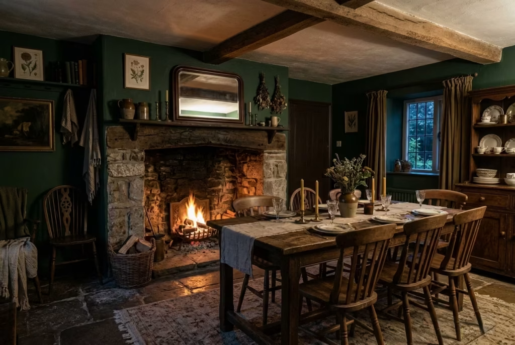
A fireplace or stove has a way of shifting a dining room’s emotional gravity without needing to announce itself. It is not simply a heat source or architectural feature. In a dark cottagecore setting, it becomes the point around which everything else quietly resolves. The room stops feeling like a flat arrangement of furniture and starts behaving like a lived environment with a natural centre of warmth and attention.
When a fireplace is introduced into a dining space, particularly one finished in deeper tones, it alters how people orient themselves within the room. Chairs subtly face toward it, conversations naturally drift closer, and even during quieter moments, the eye returns to that soft flicker or steady glow. It is less about spectacle and more about reassurance. A kind of visual anchor that feels instinctively human, almost like a gathering instinct we do not need to be taught.
From a spatial perspective, the positioning matters more than most realise. In rooms around 3 by 4 metres (10 by 13 feet), a centrally placed fireplace on the main wall tends to work best, allowing the dining table to sit either parallel or slightly offset without breaking circulation. In larger rooms, closer to 4 by 5 metres (13 by 16.5 feet), a stove in a corner or slightly recessed alcove can create a more intimate zoning effect, gently dividing the dining area without the need for partitions or structural interruption.
The materiality of the surround also plays a quiet but important role. In darker cottagecore interiors, fireplaces framed in aged stone, darkened brick, or softened plaster tend to sit more comfortably than overly polished finishes. They feel as though they belong to the room rather than having been inserted into it. Even small irregularities in texture help reinforce that sense of permanence, as if the fireplace has been there long enough to accumulate its own history.
I worked on a dining room where the introduction of a simple wood-burning stove completely changed how the space was used. The room itself was roughly 3.2 by 4.2 metres (10.5 by 13.8 feet), initially designed as a standard dining area with a central oak table and layered lighting. On paper, it functioned well enough, but in practice it was underused outside of formal meals.
Once the stove was installed along the longest wall, everything shifted. The dining table, previously treated as a static piece, began to feel more like a gathering point. Evening meals stretched longer, often drifting into conversation that had nothing to do with food. On colder days, the room was used far more frequently, not just for dining but for reading, working, or simply sitting nearby with a drink, drawn in by the steady presence of heat and light.
There is also a subtle psychological effect that becomes more apparent over time. A fireplace or stove introduces a sense of rhythm to the room. It is not constant in the way electric lighting is. It changes with use, with fuel, with time. That variability gives the space a kind of living quality, where atmosphere is not fixed but gently evolving throughout the day.
What often surprises clients is how quickly the fireplace becomes the default gathering point, even in a room designed primarily for dining. It does not compete with the table so much as quietly reframe it. The dining experience becomes less about sitting at a designated spot and more about being within a shared zone of warmth and presence.
In the end, the fireplace or stove does not just add heat to a dark cottagecore dining room. It adds orientation. It gives the room a centre of gravity that feels instinctive, almost ancestral, and once it is there, the way the space is used rarely returns to how it was before.
Heavy Linen Curtains in Muted Tones
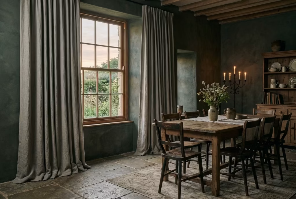
Curtains are often treated as an afterthought in dining rooms, a finishing layer added almost out of habit once everything else is in place. In a dark cottagecore setting, that approach falls short. Heavy linen curtains, particularly in muted tones, do far more than frame a window. They soften the entire geometry of the room, turning hard architectural edges into something more forgiving, more atmospheric, and far more lived-in.
There is a particular quality to heavy linen that lighter fabrics rarely achieve. It drapes with intention, not stiffness, and carries just enough weight to settle naturally without feeling rigid. When used in full-length drops, typically extending from ceiling to floor at around 240 to 270 cm (94 to 106 inches), the effect is quietly transformative. Even the act of pooling slightly on the floor, just a few extra centimetres of fabric resting loosely, introduces a sense of ease that makes the room feel less staged and more composed over time.
Muted tones are essential here. Deep stone, weathered olive, softened charcoal, or warm flax-based neutrals tend to sit most comfortably within the darker cottagecore palette. These colours do not compete with the walls or furniture. Instead, they absorb and return light in a softened way, especially during late afternoon or evening hours when natural light becomes more directional and gentle. The curtains begin to behave almost like a filter, not blocking the outside world entirely, but tempering it as it enters.
From a spatial point of view, curtains also play a structural role that is often underestimated. In rooms around 3 by 4 metres (10 by 13 feet), floor-to-ceiling drapery can visually extend height, drawing the eye upward even when darker ceiling treatments are used. In wider dining spaces, say closer to 4 by 5 metres (13 by 16.5 feet), they help break up long wall runs, introducing vertical softness that balances heavier horizontal elements like tables, sideboards, or panelling.
I remember a project where the dining room initially felt slightly rigid despite strong material choices. The space measured roughly 3.3 by 4.1 metres (10.8 by 13.5 feet), with deep-toned walls, oak furniture, and layered lighting already in place. Everything was technically correct, but the edges of the room still felt a little too sharp, almost as if the architecture was holding itself too tightly.
We introduced heavy linen curtains in a muted, clay-grey tone, hung from a concealed ceiling track to avoid visual interruption. The change was not immediate in a dramatic sense, but it was noticeable in how the room began to behave. Light softened as it passed through the fabric. Corners felt less abrupt. Even when drawn open, the curtains still framed the space with a kind of quiet presence, as if the room had gained a softer perimeter.
There is also a practical rhythm that develops with use. Linen responds to daily living in a way that feels honest rather than fragile. It creases, it shifts slightly, it gathers light differently depending on the time of day. Over time, these small changes add character rather than diminishing the fabric’s role. It becomes part of the room’s evolving surface language, not something that needs to be constantly corrected or reset.
One of the understated strengths of heavy curtains in darker interiors is their ability to control acoustics without drawing attention to themselves. Dining rooms, particularly those with stone or timber flooring, can sometimes carry sound a little too clearly. Linen helps to absorb that sharpness, reducing echo and making conversation feel more contained and comfortable. It is not a technical intervention that announces itself, but its absence would be immediately noticeable.
What makes this approach so effective is its subtlety. The curtains do not try to dominate the room or act as a feature in their own right. Instead, they operate at the edges, softening transitions, easing boundaries, and quietly reinforcing the mood established by the rest of the space. In a dark cottagecore dining room, where atmosphere is built through accumulation rather than statement, that kind of quiet support is exactly what allows everything else to feel complete.
Layered Lighting: Wall Sconces + Table Lamps
Lighting, in a dark cottagecore dining room, rarely succeeds when it is treated as a single act. One overhead source, no matter how well chosen, tends to flatten the room’s atmosphere, pulling everything into the same level of brightness and stripping away the very depth that darker interiors rely on. Layered lighting, by contrast, works more like a quiet choreography, where different sources take turns shaping the space rather than competing for dominance.
Wall sconces and table lamps sit at the heart of this approach because they introduce variation in both height and intensity. A sconce, typically positioned around 150 to 170 cm (59 to 67 inches) from the floor, begins to wash light across vertical surfaces, allowing walls to carry subtle gradients of illumination. A table lamp, sitting lower at roughly 60 to 70 cm (24 to 28 inches) above its surface, pulls that light back down into a more intimate plane. Between the two, the room starts to develop what I often describe as “pockets of presence,” areas where light gathers just enough to define use without exposing everything at once.
What makes this especially effective in darker dining rooms is the way it restores hierarchy to the space. Not everything is equally lit, and that imbalance is precisely what gives the room its character. The dining table may hold the strongest pool of light, but the surrounding walls remain gently active, never fully dark, never fully bright. The eye begins to move between these zones naturally, rather than locking onto a single fixed source.
I worked on a dining room where the initial lighting scheme relied solely on a central pendant. On paper, it was sufficient. In reality, the room felt slightly one-dimensional, especially in the evenings. The space measured around 3.2 by 4.3 metres (10.5 by 14 feet), with deep-toned walls and a heavy oak table already grounding the composition. Yet everything outside the immediate table area disappeared into uniform shadow, leaving the edges of the room underdeveloped.
We introduced two wall sconces on opposing walls and a low, ceramic table lamp on a nearby sideboard. Nothing overly decorative, nothing visually loud. The shift was immediate but subtle in its expression. The room did not become brighter in a traditional sense. Instead, it became layered. Light now existed in zones, each one serving a different emotional register. The sconces softened the vertical planes, while the table lamp created a quieter, secondary focal point that drew people slightly away from the table without disconnecting them from it.
There is also something deeply human about this kind of lighting arrangement. It mirrors how people naturally use a space over time. Conversations drift between the table and the edges of the room. Someone might stand near a sideboard, another might lean back into a softer pool of light, yet the sense of connection remains intact. The room no longer behaves like a single stage but more like a series of connected moments, each with its own tone.
From a practical standpoint, layering also introduces flexibility that a single-source system cannot match. A dining room used during the day for work or informal activity benefits from brighter sconce light, while evening meals rely more heavily on lower, warmer table-level illumination. Adjusting between these states does not require redesign, only variation in use. It is a system that adapts rather than dictates.
What often gets overlooked is how much softness sconces add to darker interiors. When placed correctly, they reduce the visual weight of large wall surfaces, breaking them into more readable sections. In rooms with panelling or textured plaster, this effect becomes even more pronounced, as light begins to skim rather than flood, revealing detail gradually rather than all at once.
In the end, layered lighting is not about complexity for its own sake. It is about giving the room different ways to feel at different times. A single-source scheme tells the space what to be. A layered one allows it to change its tone quietly throughout the day. And in a dark cottagecore dining room, where mood is everything and stillness carries its own kind of presence, that flexibility is what makes the atmosphere feel genuinely alive.
Aged Wood Sideboards with Visible Grain
A sideboard in a dark cottagecore dining room is rarely just storage. When it is chosen with intention, particularly in aged timber with a visible, unapologetic grain, it becomes part of the room’s emotional architecture. It carries weight without demanding attention, and it grounds the space in a way that feels quietly inevitable, as though it has always belonged there, even if it has only just been placed.
There is something inherently grounding about wood that has not been overly refined. Visible grain, small tonal shifts, and the subtle irregularities that come with age or careful distressing all contribute to a surface that feels alive rather than static. In darker interiors, where walls and ceilings often absorb light, this texture becomes even more important. It catches illumination in fragments, breaking up what could otherwise feel like a continuous field of shadow.
From a practical standpoint, sideboards in dining rooms typically sit between 80 and 100 cm (31 to 39 inches) in height and around 140 to 200 cm (55 to 78 inches) in length, depending on wall proportions. These dimensions allow them to sit comfortably beneath artwork or shelving without overwhelming the vertical balance of the room. But beyond size, it is the material presence that defines their success. A well-proportioned piece in the wrong finish can feel invisible. A slightly imperfect one in the right timber can quietly anchor the entire space.
I remember a dining room where the sideboard became the turning point of the scheme. The room itself was approximately 3.3 by 4.4 metres (10.8 by 14.5 feet), finished in a deep, muted plaster tone with layered lighting and a heavy oak table already in place. Despite strong foundations, one wall felt unresolved, almost as if it was waiting for something to complete its narrative.
We introduced a reclaimed oak sideboard with pronounced grain and subtle variations in tone across its surface. It was not polished to uniformity. Instead, it carried the kind of gentle inconsistency that only comes with age or careful salvage. The effect was immediate, though not loud. The wall no longer felt empty; it felt inhabited.
What stood out most over time was how the surface responded to light. During the day, natural light revealed the complexity of the grain, small knots and shifts in tone that gave the piece a sense of depth. In the evening, under layered lighting, it softened into something more atmospheric, almost absorbing the surrounding tones while still maintaining its presence. It never disappeared into the background, but it also never dominated it.
There is also a functional honesty to a sideboard that often gets overlooked in more design-led conversations. It is not purely decorative, nor is it purely utilitarian. It sits in between, storing the objects that define how a dining room is actually used, tableware, linens, everyday essentials, while simultaneously contributing to the visual language of the space. When chosen well, it removes the need for additional storage pieces that might otherwise clutter the room.
Stylistically, aged wood works particularly well when it is allowed to remain slightly imperfect. Overly refined finishes tend to flatten the material, stripping away the subtle variation that gives it character. In contrast, lightly oiled or matte finishes allow the grain to remain visible, almost tactile in appearance, especially when paired with darker wall tones or textured plaster surfaces.
What makes these pieces so effective in a cottagecore dining setting is their ability to hold both memory and function in the same form. They do not try to stand apart from the room. Instead, they settle into it, quietly supporting the atmosphere without ever interrupting it. Over time, as they gather small marks of use, they begin to feel less like furniture and more like part of the room’s ongoing story, steady, grounded, and quietly indispensable.
Dark Painted Floors with Subtle Wear
There is a particular honesty in a floor that does not try too hard to remain perfect. Dark painted flooring, especially when finished in muted, grounded tones, already sets a strong atmospheric base in a cottagecore dining room. But it is the subtle wear, the soft fading at edges, the gentle softening of high-traffic paths, that turns it from a design decision into something that feels genuinely lived in rather than newly applied.
A floor, more than any other surface in the room, carries the rhythm of daily life. Chairs scrape, footsteps repeat familiar paths, and over time, even the most carefully finished surface begins to shift slightly. In darker schemes, this evolution is not something to hide. It becomes part of the room’s character, almost like a quiet record of how the space is actually used rather than how it was first presented.
From a tonal perspective, dark painted floors work best when they sit just a shade deeper than the surrounding furniture palette, rather than matching it exactly. In dining rooms around 3 by 4 metres (10 by 13 feet), this contrast helps define the ground plane without visually shrinking the space. Finishes in softened charcoal, deep brown-black, or muted graphite tend to perform well, particularly when applied in matte or low-sheen finishes that avoid unwanted reflection.
I once worked on a dining room where the floor had been newly painted in a deep, almost ink-like tone. Initially, it felt too controlled, almost cautious in its perfection. The room itself, measuring roughly 3.2 by 4.3 metres (10.5 by 14 feet), already carried strong elements, aged oak furniture, layered textiles, and dark plaster walls, but the floor felt slightly disconnected, as if it had not yet learned how to belong.
Over time, and quite naturally through use, subtle wear began to appear along the most travelled paths, particularly between the kitchen threshold and the dining table. At first glance, these changes might have been seen as imperfections. In reality, they softened the entire composition. The floor stopped reading as a flat, uniform surface and started behaving more like a lived layer within the room’s story.
That is where the idea of “credible wear” becomes important. In interior spaces like this, perfection often feels temporary. A surface that looks untouched can sometimes create a sense of distance, as though the room is not yet ready to be fully used. Slight distressing, whether naturally occurring or carefully introduced, bridges that gap. It signals that the room is not a showroom, but a working part of the home, something that accepts use rather than resisting it.
There is also a practical advantage to darker floors with softened wear patterns. Minor marks, dust, and everyday traces of activity tend to blend into the surface rather than stand out sharply. This makes the space feel more forgiving over time, particularly in dining areas where movement is constant and furniture is regularly adjusted. Instead of requiring constant correction, the floor develops a patina that works with the rest of the interior rather than against it.
Light plays a subtle but important role in how this ageing process is perceived. In the morning, when light is cooler and more directional, the texture of wear becomes more visible, revealing the movement patterns across the room. In the evening, under warmer, lower lighting, those same variations soften, blending back into the overall tone of the floor. This shifting behaviour gives the space a quiet sense of movement without anything physically changing.
What makes dark painted floors so compelling in a cottagecore dining setting is their willingness to evolve. They do not remain fixed in their initial condition. Instead, they adapt, slowly and almost imperceptibly, to the life unfolding above them. And in doing so, they reinforce one of the core ideas behind the entire aesthetic: that beauty is not found in permanence alone, but in the way a space learns to carry time.
Seasonal Styling with Natural Elements
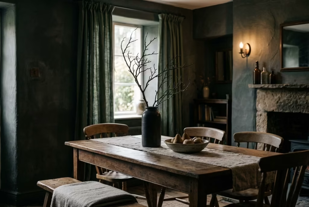
A dark cottagecore dining room has a distinct advantage when it comes to seasonal styling: it does not need much to feel alive. The deeper palette already carries weight and atmosphere, which means even the simplest natural additions, a branch with bare winter structure, a handful of dried florals, or a bowl of late-summer produce, can shift the mood of the entire space without ever feeling forced or overly staged.
What makes natural elements so effective in this setting is their impermanence. They do not try to hold the room in a fixed state. Instead, they move with it, subtly reflecting the time of year without overwhelming the underlying design language. In darker interiors, where materials like aged timber, stone, and muted plaster already dominate, these organic touches act as quiet interruptions, breaking up density just enough to keep the space feeling responsive rather than static.
Branches, in particular, bring a sculptural quality that is often underestimated. A single, well-placed branch in a tall vessel around 40 to 60 cm (16 to 24 inches) high can introduce vertical rhythm without adding visual clutter. In rooms with ceiling heights around 2.6 to 2.8 metres (8.5 to 9.2 feet), this upward gesture helps balance heavier horizontal elements like tables and sideboards. The key is restraint. It is never about filling a corner, but about suggesting movement within it.
Dried florals operate differently. They soften the room rather than structure it. Arrangements of muted hydrangea, seed heads, or faded grasses sit beautifully against darker backdrops because they already carry a subdued palette. Their tones feel earned rather than applied, almost like they have been naturally weathered into the room over time. Placed on a dining table, sideboard, or open shelf, they introduce a sense of quiet continuity, as though the space is gently extending itself into the season rather than reacting to it.
Seasonal produce adds yet another layer, one that feels more grounded and lived-in. A bowl of pears in late autumn, deep red apples, or even simple citrus in winter introduces colour that is temporary by nature. These are not decorative objects in the traditional sense, but they behave like them in context. On a 180 to 200 cm (6 to 6.5 feet) dining table, a low wooden or ceramic bowl can sit comfortably at the centre without disrupting circulation, allowing the food itself to become part of the visual rhythm of the room.
I worked on a dining space where seasonal styling became the most powerful design tool, despite initially being considered a secondary detail. The room, approximately 3.3 by 4.2 metres (10.8 by 13.8 feet), was already well-resolved in terms of materials, dark green walls, oak furniture, layered lighting, and softened textiles. Yet it felt slightly static, as though it had settled too early into its final form.
Rather than introducing additional permanent objects, we encouraged a rotational approach using natural elements tied to the seasons. In spring, simple flowering branches were placed in tall ceramic vessels. In summer, the table carried bowls of fresh fruit and loosely arranged meadow-cut stems. By autumn, the palette deepened into dried botanicals and textured seed pods. Winter brought bare branches and evergreen cuttings, arranged sparingly but with intention.
What changed over time was not the structure of the room, but its sense of continuity. It began to feel less like a completed design and more like a living environment that responded gently to time passing. The same furniture, the same lighting, even the same layout, felt subtly different depending on what natural elements were present.
There is also a psychological ease that comes with this kind of styling. Unlike permanent décor choices, seasonal elements do not create pressure to remain consistent. They are allowed to fade, be replaced, or simply be removed entirely without disrupting the integrity of the space. This makes the room feel lighter in its expectations, more forgiving in its composition.
What ties everything together is restraint. Seasonal styling in a dark cottagecore dining room is not about abundance or constant change. It is about small, deliberate gestures that acknowledge time without trying to control it. When handled with care, these natural elements do not sit on top of the design. They move through it, quietly reinforcing the idea that the room is not fixed, but gently unfolding, season after season.
Narrow Dining Spaces with Linear Layouts
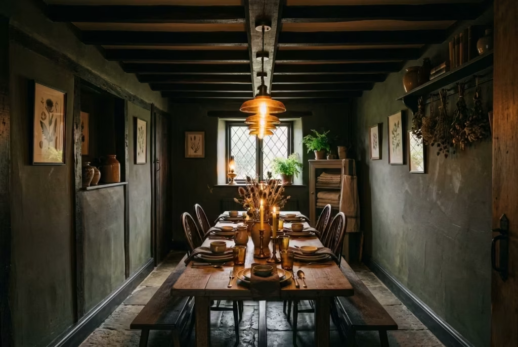
Narrow dining rooms often get treated like a design compromise, as if their proportions are something to be worked around rather than worked with. In reality, they can be some of the most atmospheric spaces in a home when approached with clarity. The linear nature of the layout, long walls, controlled circulation, and a clear directional flow, creates a natural rhythm that suits the quiet, grounded mood of a dark cottagecore interior far more than people initially expect.
The key lies in respecting the geometry rather than fighting it. A linear dining arrangement works best when movement is preserved along at least one uninterrupted side of the table. In rooms that are roughly 2.4 to 3 metres wide (8 to 10 feet), this becomes essential. The table itself should remain proportionate to the space, typically around 75 to 90 cm (30 to 35 inches) in width. Any wider, and the room begins to feel compressed; any narrower, and it loses its sense of presence as a dining surface.
What makes these spaces particularly interesting is how they guide behaviour almost instinctively. Unlike wider rooms, where movement can feel dispersed, narrow layouts encourage a clear, linear flow. You enter, you move along the table, and you settle into position without hesitation. It creates a subtle sense of order that, when combined with darker tones and layered materials, feels quietly intentional rather than restrictive.
I once worked on a dining space that was long and relatively tight, measuring approximately 2.6 by 5.2 metres (8.5 by 17 feet). At first glance, it felt like a challenge, a room that risked becoming more corridor than destination. The initial instinct was to break it up visually with partitions or excessive zoning. Instead, we leaned into its linearity and allowed the dining table to become the central spine of the space.
The table itself was a long, aged oak piece at around 240 cm (8 feet) in length, placed centrally with just enough clearance on either side for movement, roughly 80 cm (31 inches) per side. This spacing was critical. It allowed chairs to be pulled out comfortably without interrupting circulation, while still maintaining a sense of enclosure that made the room feel intimate rather than open-ended.
Lighting played a decisive role in reinforcing the layout. Rather than scattering multiple competing sources, we introduced a linear arrangement of low-hung pendants following the length of the table. This created a visual thread that guided the eye along the room’s axis, subtly emphasising its proportions rather than trying to disguise them. In darker interiors, this kind of directional lighting becomes almost architectural in its effect, quietly reinforcing structure without adding physical barriers.
From a material perspective, darker walls in narrow rooms can either compress or contain the space, depending on how they are handled. When paired with lighter or textured flooring, the walls begin to recede slightly, allowing the floor plane to carry more visual weight. This balance prevents the room from feeling tunnel-like while still preserving its intimacy. In this particular project, we used a muted, earthy plaster finish that absorbed light softly, avoiding any harsh reflection along the length of the space.
One of the most important lessons in working with narrow dining layouts is understanding that flow is not just about movement, but about perception. If the eye can travel comfortably from one end of the room to the other without interruption, the space will feel larger than its actual dimensions suggest. Clutter, oversized furniture, or inconsistent visual breaks tend to disrupt this experience, making the room feel shorter and more confined than it is.
There is also a quiet advantage to this type of layout that becomes more apparent over time. Narrow dining spaces naturally encourage focus. Conversations tend to stay anchored along the table, the sense of gathering feels more unified, and there is less visual distraction pulling attention outward. In a dark cottagecore setting, where atmosphere is already prioritised over excess, this creates a dining experience that feels almost cinematic in its simplicity.
In the end, linear layouts are not a limitation to be solved. They are a structure to be understood. When handled with restraint and a clear sense of proportion, they become some of the most compelling dining environments to live in, spaces where every element, from table width to lighting direction, works together to maintain flow, rhythm, and a quiet sense of intentional order.
Oversized Artwork in Muted Tones
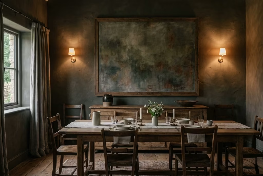
Oversized artwork has a very specific kind of authority in a dark cottagecore dining room. It does not compete with the architecture, nor does it try to fill every visual gap with noise. Instead, it anchors the wall in a single, controlled gesture, allowing the surrounding materials, timber, plaster, stone, to breathe around it. When handled with restraint and tonal discipline, it becomes less of a decorative addition and more of a stabilising force within the room’s composition.
Muted tones are what allow scale to work in your favour rather than against it. Deep umbers, softened greys, desaturated greens, and weathered neutrals tend to sit most comfortably in these interiors. They do not jump forward aggressively. Instead, they settle into the wall surface, almost as if the artwork has been absorbed into the architecture itself. In darker rooms, this effect becomes even more pronounced, as shadow and tone begin to merge at the edges.
The real power of oversized artwork lies in its ability to simplify a wall that might otherwise feel fragmented. In dining rooms with sideboards, shelving, or layered lighting, there is always a risk of visual competition. A single large piece, typically ranging between 100 to 150 cm (39 to 59 inches) in width depending on wall proportion, cuts through that complexity. It creates a focal point that feels deliberate rather than decorative, something the eye can return to without distraction.
I worked on a dining room where the walls were already rich in texture, deep plaster tones, aged timber furniture, and layered lighting that created a strong atmospheric base. Yet one of the longer walls felt slightly unresolved, as though it was carrying too many small visual ideas without a clear anchor. Initially, the instinct was to add shelving or a gallery arrangement. On paper, that felt balanced. In reality, it would have only increased visual fragmentation.
Instead, we introduced a single oversized abstract piece in muted earth tones, measuring roughly 140 cm by 100 cm (55 by 39 inches). The artwork was not loud. In fact, from a distance, it almost blended into the wall, revealing itself gradually as you moved closer. That subtlety was intentional. It allowed the piece to hold presence without demanding attention.
What changed was the wall’s sense of cohesion. Suddenly, everything else in the room had a reference point. The dining table, sideboard, and lighting no longer felt like independent elements. They began to relate to that single visual anchor, almost as if the room had quietly decided where its centre of gravity should sit.
There is also a psychological benefit to this approach that often becomes more apparent over time. Oversized artwork reduces visual decision fatigue. Instead of scanning multiple smaller pieces, the eye settles into one composition, allowing the rest of the room to feel calmer and more organised, even if it contains a variety of textures and materials. In darker interiors, where depth and shadow already play a strong role, this sense of visual rest becomes especially valuable.
Placement is just as important as scale. In most dining rooms, artwork works best when centred approximately 15 to 25 cm (6 to 10 inches) above a sideboard or aligned with the central axis of a dining table. This creates a relationship between furniture and wall that feels intentional rather than accidental. When hung too high, the connection is lost. When too low, the composition can feel compressed.
The most successful oversized pieces in these interiors are rarely about literal storytelling. Instead, they rely on abstraction, texture, or softened forms that leave room for interpretation. This ambiguity allows the artwork to age with the room, rather than locking it into a fixed narrative. As lighting shifts throughout the day, the piece behaves differently, sometimes receding into the background, sometimes becoming quietly dominant.
In the end, oversized artwork in muted tones works because it understands restraint. It does not try to fill the wall with information. It simplifies it. And in doing so, it allows the rest of the dining room, the materials, the lighting, the lived-in atmosphere, to take on greater clarity. It is not decoration for its own sake. It is structure, distilled into a single, confident gesture that holds the room together without ever raising its voice.
Mixed Metal Finishes That Feel Collected
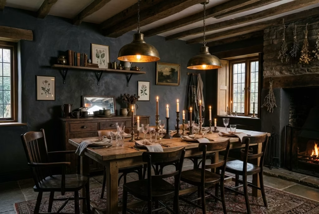
There is a subtle kind of confidence in a room that does not rely on everything matching too neatly. Mixed metal finishes, when handled with restraint, bring exactly that sense of ease into a dark cottagecore dining room. They introduce variation without chaos, like objects gathered over time rather than selected in one decisive moment. And in interiors that already lean on depth, texture, and mood, that “collected over years” feeling often matters more than visual uniformity ever could.
Overly coordinated metal schemes tend to flatten character. When every handle, fixture, and fitting shares the same finish, the eye stops reading detail and starts reading repetition. In darker dining rooms, where light is already subdued and surfaces are rich in tone, this repetition can feel particularly static. The room begins to behave like a catalogue image rather than a lived environment. Mixing metals gently disrupts that predictability, allowing small variations to catch light differently as you move through the space.
The key is not contrast for its own sake, but controlled variation. Think aged brass sitting alongside soft blackened iron, or muted bronze working quietly with brushed nickel. Each finish carries its own way of reflecting light. Some absorb it almost entirely, others soften it into a warm glow. When these behaviours are layered thoughtfully, the room gains depth without ever feeling visually noisy.
In practical terms, I often recommend limiting the palette to two or three metal families within a single dining space. More than that, and the composition can begin to lose its thread. In a room measuring around 3.2 by 4.4 metres (10.5 by 14.5 feet), for example, you might have aged brass used on lighting and cabinet hardware, blackened steel in structural elements like pendant frames or chair details, and perhaps a quieter bronze tone in smaller decorative accents. The variation should feel intentional but never over-explained.
I worked on a dining room where the original specification leaned heavily toward a single finish throughout, brushed brass on everything from lighting to door handles and shelving details. On paper, it looked cohesive. In reality, it felt slightly rigid, almost as if every element had been chosen from the same moment in time without any sense of evolution. The room was visually correct but emotionally flat.
Rather than replacing everything, we introduced a more nuanced layering of finishes over time. The lighting remained in aged brass, but we shifted the sideboard hardware to a darker, oil-rubbed bronze, and introduced a few blackened iron details in shelving brackets and table accents. Nothing was dramatically changed, yet the effect was surprisingly immediate. The room began to feel less “installed” and more “accumulated.”
What made this approach successful was the way each metal began to respond differently to light. In the evenings, the brass elements caught a soft glow from candlelight and sconces, while the darker iron receded into shadow, providing structure without visual interruption. During the day, natural light revealed subtle differences in texture rather than colour alone, giving the room a more layered reading as you moved through it.
There is also a psychological ease that comes with this kind of variation. Perfect uniformity can sometimes feel slightly sterile, even in well-designed spaces. Mixed metals, when balanced carefully, introduce just enough irregularity to make the room feel human. It suggests decisions made over time, not all at once, which aligns naturally with the cottagecore sensibility of lived-in warmth and gentle imperfection.
The success of this approach often comes down to restraint in placement rather than restraint in choice. Metals should not be scattered randomly across the room, but instead tied to functional or architectural anchors. Lighting, cabinetry, table accents, and hardware each become opportunities for variation, while still belonging to a unified visual rhythm.
In the end, mixed metal finishes work because they resist the idea of perfection without slipping into disorder. They allow the room to feel assembled rather than manufactured, layered rather than programmed. And in a dark cottagecore dining space, where atmosphere is built slowly through texture, tone, and time, that sense of quiet accumulation is often what gives the room its most enduring character.
You May also Like: 25 Dark Cottagecore Living Room Ideas That Feel Moody and Magical
Ceiling Hooks or Rails for Hanging Decor
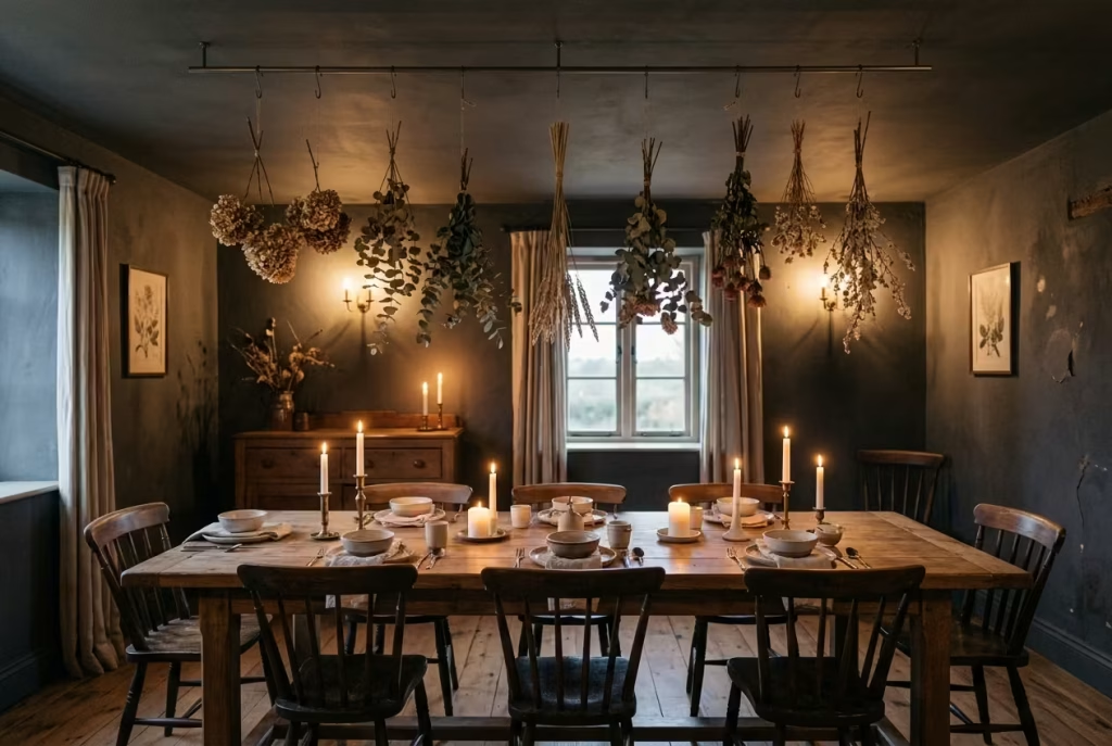
Ceiling hooks and discreet rails sit in that interesting space between architecture and styling. They are not the kind of detail that announces itself at first glance, yet once they are in place, they quietly expand what a dining room can do. In a dark cottagecore setting, where atmosphere is built through layers rather than surface decoration alone, they introduce a subtle vertical dimension that feels both functional and unexpectedly poetic.
There is something almost old-world about hanging elements from above. It shifts the eye away from the usual horizontal reading of a room and introduces a softer sense of movement overhead. When used thoughtfully, ceiling hooks can support dried botanicals, seasonal branches, lightweight ceramics, or even fabric drapes that change with the time of year. Nothing heavy, nothing forced, just gentle additions that allow the room to breathe differently without altering its core structure.
From a spatial perspective, placement is everything. In dining rooms with ceiling heights around 2.6 to 2.8 metres (8.5 to 9.2 feet), hooks or rails should remain subtle and controlled, positioned so that hanging elements sit comfortably above head height, typically leaving at least 45 to 60 cm (18 to 24 inches) of clearance above the table surface. This ensures movement is never interrupted and the space retains its usability, even as it becomes more atmospheric.
Rails, particularly slim-profile ones that can be integrated into beams or ceiling junctions, offer more flexibility than individual hooks. They allow elements to be shifted, rotated, or completely removed depending on season or occasion. In practice, this makes the system less about fixed decoration and more about an evolving framework, something that adapts rather than dictates.
I worked on a dining room where a simple overhead rail completely changed how the space was perceived. The room itself was around 3.3 by 4.2 metres (10.8 by 13.8 feet), with a dark, muted plaster ceiling and aged timber flooring. Initially, the ceiling felt slightly passive, a flat surface that was visually correct but underused. By introducing a discreet blackened steel rail running parallel to the dining table, we created a subtle structure that immediately activated the upper plane of the room.
Over time, the rail was used in different ways. In spring, it held lightly tied branches that cast soft, shifting shadows across the table. In autumn, dried grasses and seed pods were suspended in small clusters, adding texture without clutter. During winter, it was left almost bare, with only a few simple elements occasionally introduced for gatherings. The key was not permanence, but rhythm.
What became most interesting was how the eye began to travel vertically in a room that previously felt entirely horizontal. The dining table remained the anchor, but the ceiling started to participate in the composition. It was no longer just a boundary. It became an active layer, quietly contributing to the overall atmosphere.
There is also a functional logic that often gets overlooked. Ceiling hooks and rails allow for decoration without consuming surface space. In smaller dining rooms, where tables and sideboards already carry significant visual weight, this is particularly valuable. Instead of adding objects to already occupied surfaces, you are working with unused architectural volume.
Lighting interacts with these suspended elements in a very subtle but important way. Even minimal movement in hanging materials creates gentle shifts in shadow across walls and tabletops. It is not dramatic or theatrical. It is more like a quiet undercurrent, something you feel more than consciously notice. In darker interiors, where shadow is already part of the design language, this layered movement feels entirely natural.
The most successful use of ceiling hooks or rails is always restrained. It is not about filling the air with objects, but about introducing the possibility of change. A room that can shift slightly with the seasons, or even with a single gathering, feels more alive than one that remains fixed in a single decorative state.
In the end, these details work because they extend the room beyond its usual boundaries. They remind you that a dining space is not just something you move through at eye level. It is a volume, a full three-dimensional experience, and when you allow the ceiling to participate, even quietly, the entire room begins to feel more complete, more responsive, and far more considered.
Softly Worn Leather Seating
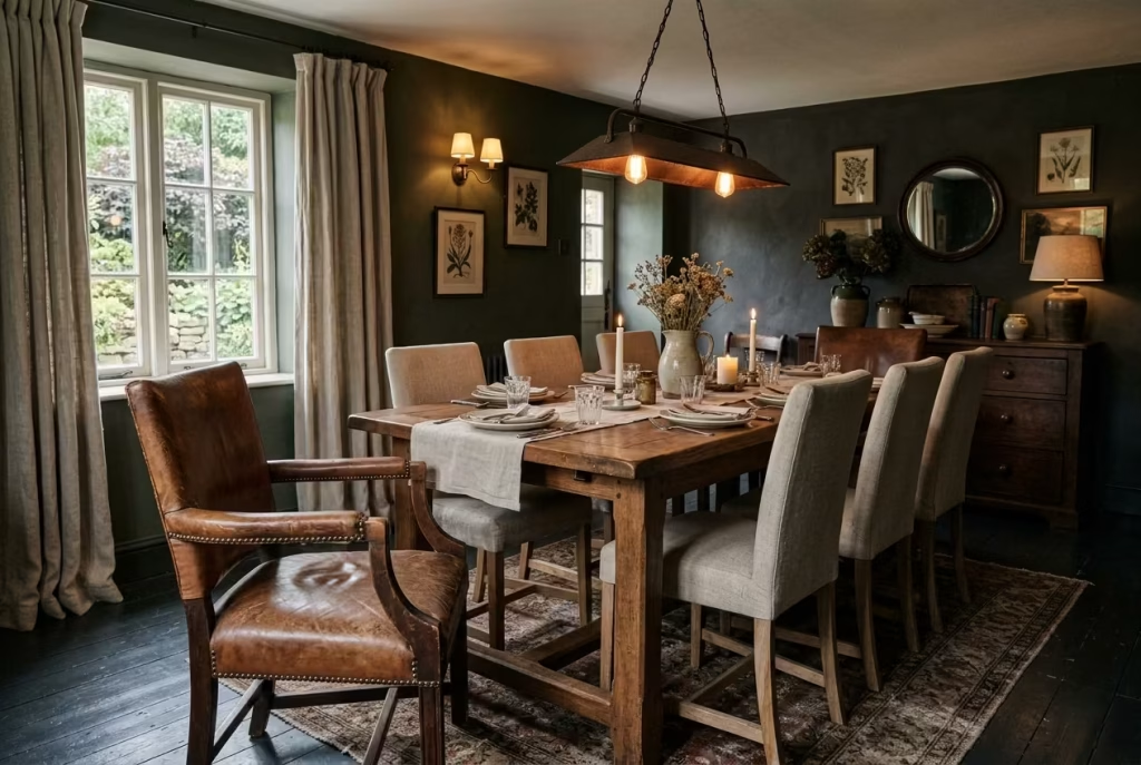
There is a particular honesty to leather that has softened over time, the kind that cannot be manufactured convincingly in a single moment. In a dark cottagecore dining room, softly worn leather seating introduces a sense of depth that feels earned rather than applied, as if the room has been quietly accumulating character long before you ever stepped into it. It is not about luxury in the polished sense, but about endurance, about surfaces that have learned how to live with people rather than resist them.
New leather can sometimes feel a little too precise in these interiors, especially when everything else leans into texture, variation, and muted imperfection. It reflects light too cleanly, sits too firmly in its own presence, and can momentarily interrupt the softer rhythm of timber, plaster, and textile. Worn leather, by contrast, absorbs that environment. It dulls reflections just enough, develops subtle tonal shifts, and begins to sit more comfortably alongside aged oak tables and darker wall finishes.
From a spatial standpoint, leather seating works particularly well when used selectively rather than uniformly. In dining rooms around 3 by 4 metres (10 by 13 feet), a pair of leather armchairs at the heads of a table, or a small upholstered bench along one side, can be enough to introduce contrast without overwhelming the composition. The key is not saturation, but punctuation. One or two considered pieces carry far more weight than an entire set.
I worked on a dining space where the initial brief called for a fully matched fabric seating arrangement. On paper, it felt safe and cohesive. The room itself, roughly 3.2 by 4.3 metres (10.5 by 14 feet), had strong architectural bones, deep plaster walls, aged timber flooring, and layered lighting already doing a lot of atmospheric work. But once the fabric seating was installed, everything felt slightly too uniform, almost softened to the point of losing definition.
We introduced two vintage leather chairs with a naturally aged finish, placed at either end of a 2.2 metre (7.2 foot) oak table. The effect was immediate but not loud. The leather did not dominate the room; it grounded it. It added just enough contrast in texture and tone to break the visual softness without disrupting the overall mood.
What became most interesting over time was how the leather continued to evolve within the space. Unlike fabrics that remain relatively static, worn leather responds to use, light, and temperature in a more visible way. It develops deeper creases, softer edges, and subtle shifts in colour where hands and bodies naturally interact with it. These changes do not diminish its value; they deepen it.
There is also a tactile quality that plays a quiet but important role in how the room is experienced. Leather seating carries a sense of weight and presence that complements darker interiors particularly well. It does not disappear into the background, nor does it try to dominate. Instead, it holds its position with a calm kind of confidence, like an object that understands its place in the room.
In practical terms, leather also offers a level of resilience that suits dining environments. It handles everyday use with ease, and rather than showing wear as damage, it tends to absorb it into its surface narrative. Small marks, slight tonal variations, and softened edges become part of its identity rather than flaws to be corrected. In a lived-in dining room, that kind of acceptance matters more than most realise.
The real strength of softly worn leather lies in its ability to bridge different material languages within the space. It sits comfortably between hard surfaces like timber and stone, and softer layers like textiles and linen. In doing so, it acts almost like a mediator, quietly connecting elements that might otherwise feel slightly disconnected.
In the end, leather seating works not because it is perfect, but because it is willing to change. It carries memory in its surface, adapts to use without resistance, and settles into the room with a kind of understated permanence. In a dark cottagecore dining space, where atmosphere is built through time, texture, and restraint, that sense of slow transformation is exactly what gives it lasting presence.
A Dining Room That Evolves Over Time
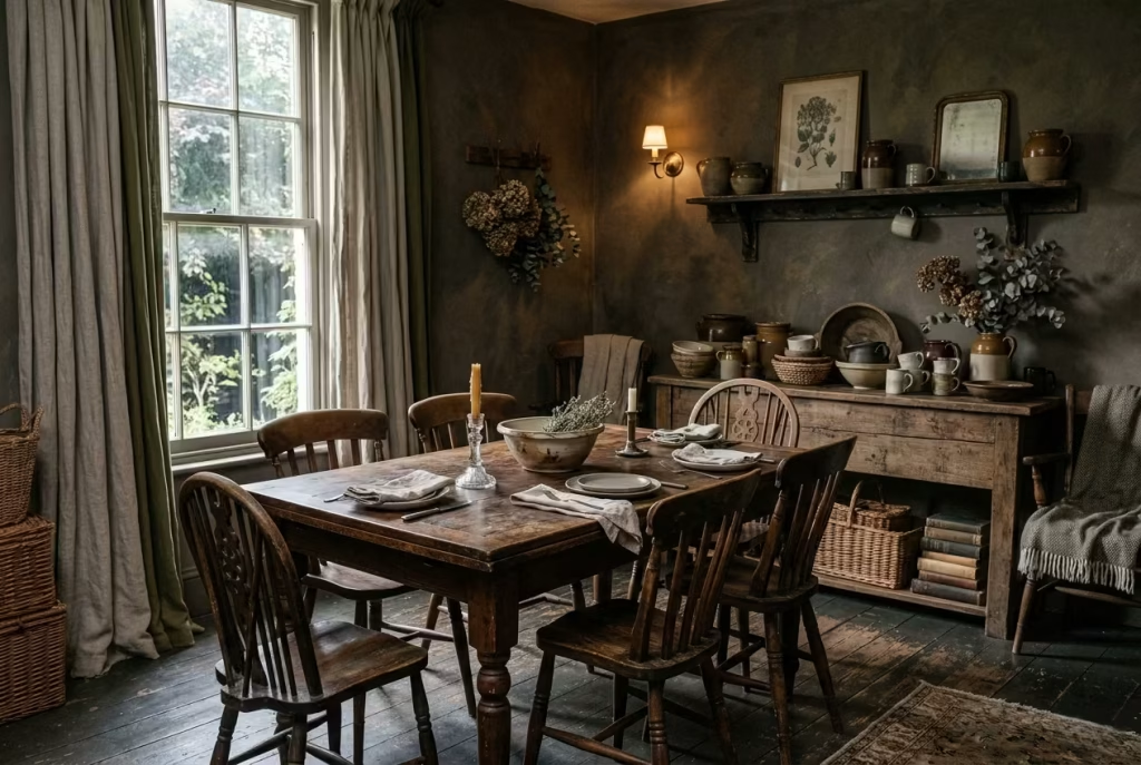
A dining room that feels truly complete is rarely one that was finished in a single decisive moment. In fact, the most compelling spaces tend to carry a quiet sense of incompleteness, not as a flaw, but as an openness to change. In a dark cottagecore context, this idea becomes even more meaningful, because the entire aesthetic is rooted in texture, memory, and the slow accumulation of atmosphere rather than instant perfection.
There is a tendency in interior design to treat completion as the end goal, as if a room should arrive fully formed and remain untouched thereafter. But in practice, the most lived-in dining rooms are the ones that are allowed to breathe over time. Furniture shifts slightly, surfaces age, objects come and go, and seasonal changes subtly rewrite the mood of the space without dismantling its core identity. The room becomes less of a finished product and more of an evolving composition.
This kind of evolution is not about constant reinvention. It is about allowing small, almost imperceptible changes to layer themselves naturally. A ceramic bowl introduced months after the initial design, a chair repositioned because it simply works better that way, a sideboard that slowly gathers objects with use rather than intention. These moments, when allowed to accumulate, create a sense of depth that cannot be achieved through a single styling exercise.
I worked on a dining room that initially felt very resolved. The proportions were strong, the materials were carefully selected, and the lighting scheme was well layered. On paper, it was complete. The space measured around 3.4 by 4.5 metres (11 by 14.8 feet), with dark plaster walls, an aged oak table, and a mix of textured seating already in place. Yet something about it felt slightly static, as though it had reached its final form too quickly.
Rather than introducing more elements, we stepped back and allowed the room to settle into itself. Over the following months, small adjustments began to naturally occur. A pair of vintage chairs replaced a more uniform set. A sideboard accumulated layered objects that were not originally styled together but began to form their own quiet rhythm. Lighting was adjusted slightly to respond to how the room was actually being used rather than how it was initially planned.
What emerged over time was not a redesigned space, but a deepened one. The room began to feel as though it had its own memory, its own internal logic. Visitors who had seen it at the beginning of the project often remarked that it felt more “complete” later on, even though fewer deliberate design decisions had been made in the interim.
There is something important in accepting that a dining room, especially one built around mood and material richness, benefits from a degree of looseness. When everything is fixed too early, the space risks losing its capacity to adapt. But when it is allowed to evolve gradually, it begins to reflect the life that actually happens within it, not just the intention behind it.
From a practical standpoint, this approach also reduces the pressure to get everything right at once. Instead of forcing final decisions on every object, surface, and finish, it allows for observation. How does the room behave in winter light versus summer light? Where do people naturally gather? Which surfaces age well, and which feel out of place over time? These observations become part of the design process itself.
In darker cottagecore interiors, this sense of evolution is particularly powerful because the palette and materials are already designed to age gracefully. Timber deepens, textiles soften, metals patinate, and plaster develops subtle variation. Nothing remains static, and nothing should. The room is not resisting time; it is cooperating with it.
In the end, a dining room that evolves over time is not unfinished. It is simply honest about the fact that living spaces are never truly complete. They are shaped slowly, through use, adjustment, and memory. And when you allow that process to unfold without forcing it into finality, the room stops feeling designed and starts feeling inhabited, which is where its real character quietly reveals itself.
Practical Design Considerations
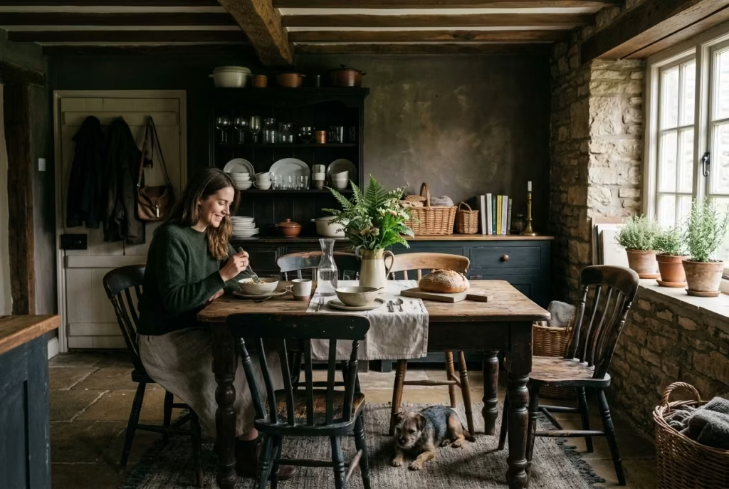
Before moving into the finer details of material choices and spatial composition, it is worth grounding the discussion in how these rooms actually function day to day. A dark cottagecore dining space only succeeds when its atmosphere is supported by practical decisions that hold up under real use, not just visual intention. What follows is less about rules and more about the design judgments that quietly determine whether the room feels effortless to live in or subtly resistant over time.
Lighting Strategy in Dark Interiors
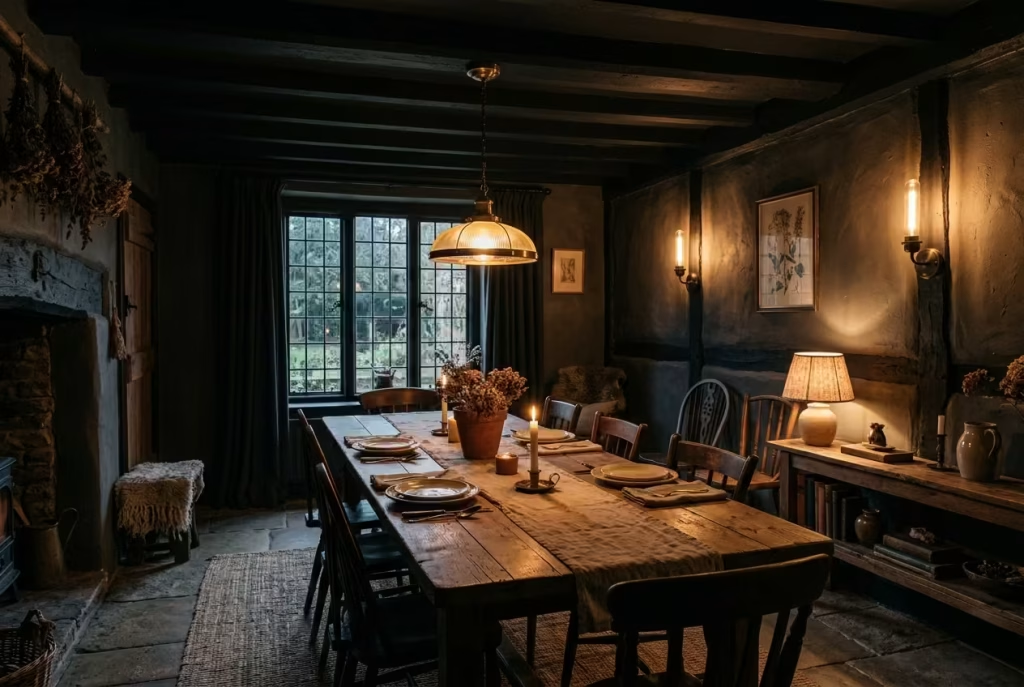
Lighting in a dark cottagecore dining room is never just about visibility. It is about control, restraint, and the ability to shape mood without flattening depth. The most successful schemes are built on layering rather than reliance on a single dominant source. Overhead lighting provides structure, wall sconces introduce softness at eye level, and table-based or low-positioned lamps bring intimacy back into the space. Each layer carries its own responsibility, and when they work in tandem, the room begins to feel less like a lit object and more like a living atmosphere that shifts gently throughout the day.
Colour temperature is where many interiors quietly fall apart. Anything too cool introduces a clinical edge that sits uncomfortably against aged timber, muted plaster, and darker tonal palettes. Warmer temperatures, typically in the range of 2200K to 2700K, allow materials to behave more naturally, softening edges and encouraging shadow to do its work properly. It is in this balance between light and shadow that depth is actually created, not in brightness alone but in how light is allowed to fall away.
Placement, meanwhile, determines whether the room feels composed or chaotic. Light should not be evenly distributed like a blanket. Instead, it should gather in intentional pockets, over the dining table, along a textured wall, near a sideboard, leaving other areas to recede. That contrast is what gives a darker interior its rhythm. A well-lit dark room is never fully lit; it is selectively revealed.
In real homes, I have often seen the same mistake repeat itself. Homeowners invest in beautiful statement pendants, only to realise later that the space feels flat in the evenings. One client, in a dining room roughly 3.2 by 4.4 metres (10.5 by 14.5 feet), relied entirely on a central fixture that looked impressive during the day but created a single, harsh pool of light at night. Everything outside that radius disappeared. Once we introduced wall sconces and a low sideboard lamp, the room finally began to breathe. It stopped behaving like a stage and started feeling like a place.
Material Selection That Ages Well
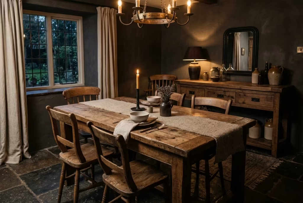
Material choice in a dark cottagecore dining room is less about immediate impact and more about long-term behaviour. Some surfaces improve with time, developing character as they respond to use, light, and atmosphere. Others degrade in a way that feels visually distracting rather than enriching. Understanding that difference is what separates a room that matures gracefully from one that constantly needs correction.
Timber is often the anchor material in these spaces, and for good reason. Aged oak, walnut, and even slightly rustic pine deepen over time, both in tone and texture. Small marks, softened edges, and subtle shifts in colour do not diminish the material; they add to its narrative. The same applies to certain metals, particularly aged brass, bronze, and blackened steel, which develop a patina that feels less like wear and more like evolution.
Textiles behave differently but just as importantly. Natural fibres like linen and wool soften with use, losing their initial stiffness and settling into a more relaxed drape. They absorb the atmosphere of the room in a way synthetic materials rarely manage. In darker interiors, this softness is essential because it prevents the space from feeling overly rigid or visually heavy.
Not everything improves with time, however. Highly polished laminates, overly glossy finishes, and synthetic materials that resist ageing often become visually inconsistent within these environments. They tend to sit outside the material language of the room, catching light too aggressively or maintaining an artificial uniformity that feels disconnected from the surrounding textures. In contrast, materials that accept change tend to integrate more fully into the space as it evolves.
Avoiding Common Pitfalls
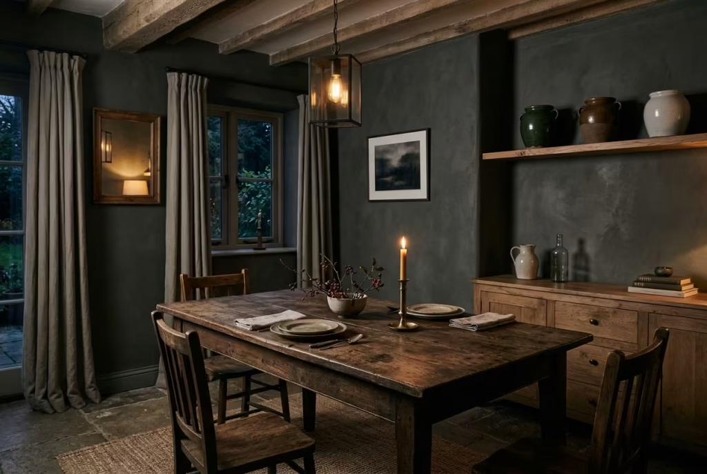
One of the most frequent missteps in darker interiors is over-darkening without counterbalance. There is a fine line between atmospheric depth and visual compression. When every surface leans too heavily into darkness without variation in tone, texture, or light interaction, the room begins to lose readability. Instead of feeling intimate, it can feel enclosed in a way that lacks breathability.
The solution is not to avoid dark tones, but to introduce contrast through material behaviour rather than brightness alone. A matte plaster wall next to a softly reflective timber surface, or a deep-toned fabric softened by candlelight, creates variation without breaking the mood. It is this subtle interplay that keeps the room grounded but not overwhelming.
Another common issue is over-styling, where every surface is treated as an opportunity for display. In theory, this can feel rich and layered, but in practice it often leads to visual fatigue. A dining room, especially one designed around slow living, needs space to rest. Not every shelf needs to be filled, not every surface needs to be curated. Negative space is not emptiness; it is pause.
I have seen rooms where restraint was the missing ingredient more than any additional object or finish. One particular space, around 3 by 3.8 metres (10 by 12.5 feet), had all the right materials but felt strangely restless because every surface was occupied. Once we removed a portion of the decorative layering and allowed certain areas to remain intentionally quiet, the entire room settled. It was not a reduction in design, but a correction in rhythm.
Ultimately, the most successful dark cottagecore dining rooms are not the ones that try to do the most, but the ones that understand when to stop. They balance depth with clarity, richness with restraint, and detail with breathing room. When those tensions are held correctly, the space stops feeling composed and starts feeling inevitable, as if it could not have been arranged any other way.
Real-World Application Insight
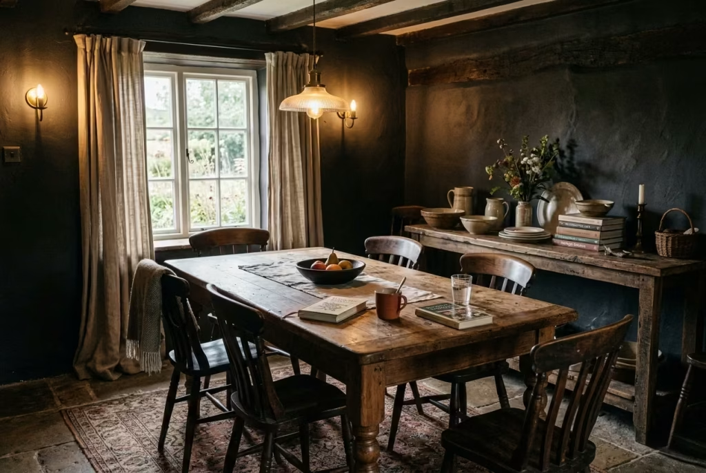
Before translating these ideas into real homes, it is important to step away from purely aesthetic interpretation and consider how these spaces actually behave once they are lived in. A dark cottagecore dining room is not a static composition; it is a working environment shaped by movement, light changes, maintenance habits, and everyday routines. The following insights are drawn from that lived reality, where design decisions are tested not in theory, but in use, wear, and time.
What Clients Often Get Wrong at First
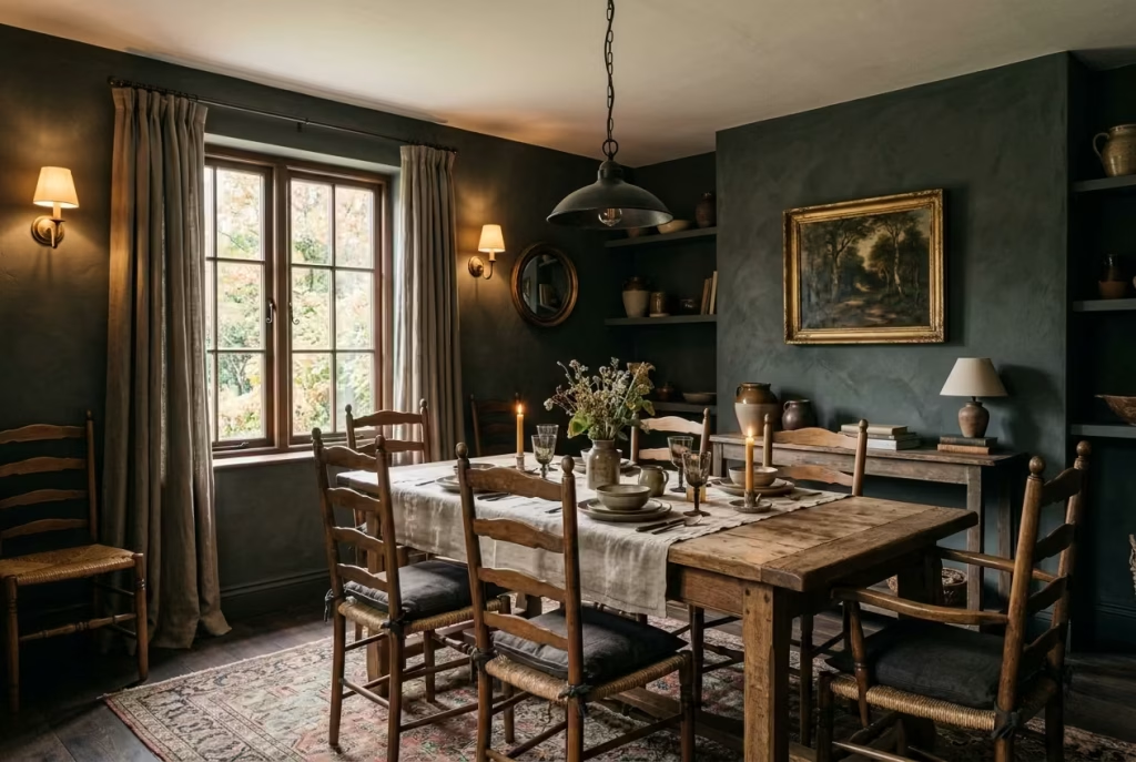
In practice, most hesitation around dark cottagecore dining rooms does not come from the design itself, but from assumptions formed long before the space is ever built. The first and most persistent fear is darkness itself. Clients often imagine a room that feels closed in or visually heavy, when in reality, well-composed dark interiors behave quite differently. They absorb light rather than rejecting it, which allows texture, material variation, and subtle tonal shifts to become far more visible than in lighter schemes. What initially feels risky on a sample board often reads as calm and enveloping once installed at scale.
Another common misstep is over-reliance on trends. There is a tendency to borrow isolated ideas, such as a single statement wall colour or a decorative motif, without understanding the broader system that gives it context. In darker dining rooms, this approach rarely holds. A single trend-led element can feel disconnected if it is not supported by appropriate lighting, material weight, and spatial balance. The result is often a room that looks styled in fragments rather than composed as a whole.
Lighting is perhaps the most underestimated factor at the outset. Many clients assume one strong central fixture will be sufficient, only to realise later that it flattens the entire space. In darker interiors, light is not about volume but distribution. Without layering, sconces, table-level light, and soft ambient sources, the room loses depth and becomes visually one-dimensional. I have seen otherwise well-finished dining spaces fall short simply because the lighting strategy was treated as an accessory rather than a structural component of the design.
How These Rooms Actually Live Day to Day
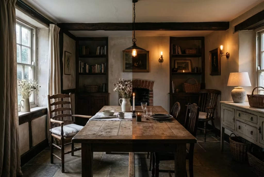
The real character of a dark cottagecore dining room only becomes clear once it is lived in across different times of day. In the morning, these spaces tend to feel quieter and more architectural. Natural light is cooler and more directional, which reveals texture in plaster, timber grain, and stone flooring with surprising clarity. The room feels grounded, almost restorative, as if it is gently resetting itself before activity begins.
By evening, the atmosphere shifts entirely. As artificial lighting and candlelight take over, the same surfaces behave differently. Shadows deepen, edges soften, and materials that felt structured in daylight begin to feel more immersive. The dining table becomes the central focus, not through brightness alone, but through contrast with the surrounding dimness. This transition is where the design either succeeds or fails. When properly layered, the room feels intimate without being isolated.
Maintenance and wear patterns also play a more honest role than many anticipate. These interiors do not rely on perfection to maintain their appeal. Instead, they tend to improve with gentle use. Timber surfaces develop a softer patina, textiles relax into their environment, and metals subtly age, picking up variations in tone. Even floors, particularly dark painted or natural finishes, begin to show pathways of movement that quietly map how the room is used over time.
Cleaning habits become more intuitive in these spaces as well. Because the material palette is intentionally forgiving, small imperfections do not dominate visually. Instead, they blend into the broader tonal landscape of the room. This creates a more relaxed relationship with upkeep, where the space is maintained rather than constantly corrected.
In real terms, what often surprises clients is not how dramatic the transformation is at the beginning, but how stable the room feels after months of use. It does not demand constant adjustment. It settles, slowly and naturally, into a version of itself that reflects daily life rather than resisting it.
Final Thoughts: A Room That Feels Like It Has Always Been There
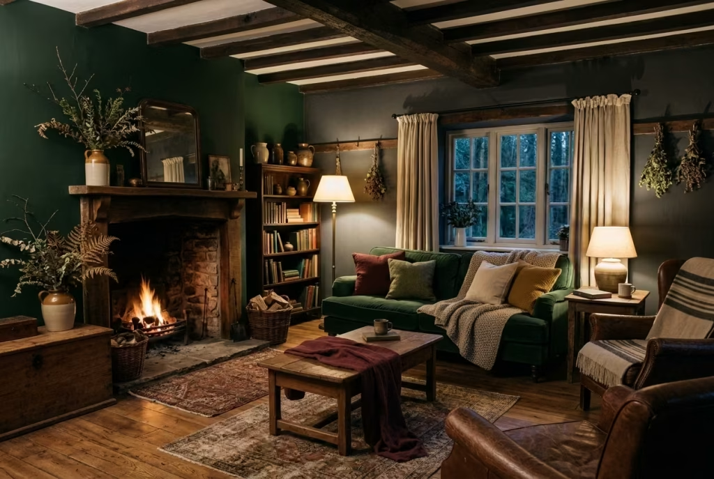
The most successful dark cottagecore dining rooms rarely announce themselves as “finished.” Instead, they carry a quieter authority, the kind that settles into a home so naturally that it feels as though it was never newly designed at all, only discovered. There is no sharp moment of completion, no visual flourish that signals arrival. Just a gradual sense that everything belongs exactly where it is meant to be.
Timelessness in these spaces is not achieved through perfection, nor through adherence to a passing aesthetic. It emerges from restraint, from allowing materials to speak in their own language, and from resisting the urge to resolve every corner too quickly. When darkness is balanced with texture, when light is layered rather than imposed, and when objects are given room to breathe, the room begins to develop its own internal logic. It stops relying on explanation and starts relying on feeling.
Layering is what gives the space its depth, but it is patience that allows that layering to mature. A dining table acquires character not on the day it is placed, but after countless small moments of use. A wall sconce becomes part of the architecture only after it has been lived with through changing seasons. Even the quiet imperfections, softened edges, subtle wear, slight tonal shifts, begin to contribute to a sense of continuity that cannot be designed in a single gesture.
There is something almost understatedly powerful about a room that does not try too hard to prove itself. It does not chase attention. It earns familiarity. Over time, the eye stops analysing it and simply inhabits it. That is when a space moves beyond decoration and becomes atmosphere, no longer observed as an arrangement of objects, but experienced as part of daily life.
I have often found that the most enduring interiors are not the ones that feel complete at first glance, but the ones that continue to reveal themselves slowly. A corner that becomes more useful than expected. A surface that softens into memory. A light that falls differently in winter than it does in summer. These are not dramatic changes, but they are the ones that matter most.
In the end, a dining room like this is not defined by a single decision, but by a series of quiet, considered ones that accumulate over time. It is less about design as an event and more about design as a process of listening, adjusting, and allowing. And when that process is handled with enough care, the result is a space that does not feel newly created at all, but simply present, as if it has always been there, waiting to be lived in.
Frequently Asked Questions about Dark Cottagecore Dining Rooms
What defines a dark cottagecore dining room?
A dark cottagecore dining room is defined less by a fixed palette and more by its emotional and material language. It typically combines muted, deeper tones such as forest green, charcoal, and earthy browns with natural materials like aged timber, stone, linen, and worn metals. The aesthetic leans into atmosphere rather than brightness, prioritising depth, texture, and a sense of quiet permanence over visual clarity or minimalism.
Will a dark dining room make the space feel smaller?
Not necessarily. When handled correctly, darker tones can actually enhance spatial perception rather than diminish it. The key lies in balance, layered lighting, reflective restraint, and tonal variation within materials. I have worked on rooms where deep wall colours actually made boundaries feel softer, allowing the space to feel more immersive rather than confined. Poor lighting or lack of contrast is usually the real issue, not the darkness itself.
What lighting works best in a dark cottagecore dining room?
Layered lighting is essential. A single overhead fixture is rarely enough. Instead, combine a central pendant for structure, wall sconces for ambient softness, and table or sideboard lamps for intimacy. Warm colour temperatures around 2200K to 2700K help preserve the mood, while dimmable sources allow the room to shift naturally between daytime function and evening atmosphere.
Which materials age well in this style?
Natural materials with inherent variation tend to improve over time. Aged oak, walnut, unpolished stone, linen, wool, and patinated metals like brass or bronze develop character as they are used. These surfaces respond to light and handling in a way that feels organic. In contrast, overly glossy synthetics or highly uniform finishes often struggle to integrate into the evolving nature of the space.
How do you avoid making the room feel too dark or heavy?
The balance comes from contrast and texture rather than brightness alone. A room can remain dark in tone while still feeling open if there is variation in surface reflection, material weight, and lighting distribution. Introducing softer textiles, varied finishes, and controlled lighting zones prevents the space from becoming visually flat or overly dense.
Is this style practical for everyday dining spaces?
Yes, when designed with intention. Dark cottagecore dining rooms are often more forgiving than they appear. Worn surfaces tend to hide everyday use well, and natural materials age gracefully rather than deteriorating visually. The practicality comes from accepting evolution rather than resisting it, allowing the space to absorb the rhythm of daily life.
How do you keep the style from feeling overly themed?
Restraint is crucial. The most successful rooms avoid literal interpretation and instead focus on atmosphere. Rather than filling the space with decorative references, it is better to rely on material honesty, subtle layering, and functional objects that also carry visual weight. When every element serves both purpose and mood, the room feels authentic rather than staged.
Can small dining rooms work with this approach?
Yes, often exceptionally well. Smaller spaces benefit from the intimacy that darker palettes create. The key is proportion control, careful lighting placement, and avoiding overcrowding. In compact rooms, every object carries more visual weight, so editing becomes more important than addition. When done correctly, small dark dining rooms can feel particularly immersive and characterful.