

17 Warm & Cozy Boho Fall Bedroom Ideas for a Perfect Autumn Vibe
The late-October light does something no lightbulb ever quite manages. It comes in low and amber through a linen curtain around four in the afternoon, catches the weave of a knit throw, and turns an ordinary bedroom into something that feels lived-in rather than styled.
I remember standing in a client’s bedroom in Portland a few autumns back, watching that exact light move across a terracotta wall we’d painted only weeks earlier, and thinking: this is the whole point of a boho fall bedroom. Not the props. Not the pampas grass in the corner. The way warmth pools in a room once the right materials are in place to catch it.
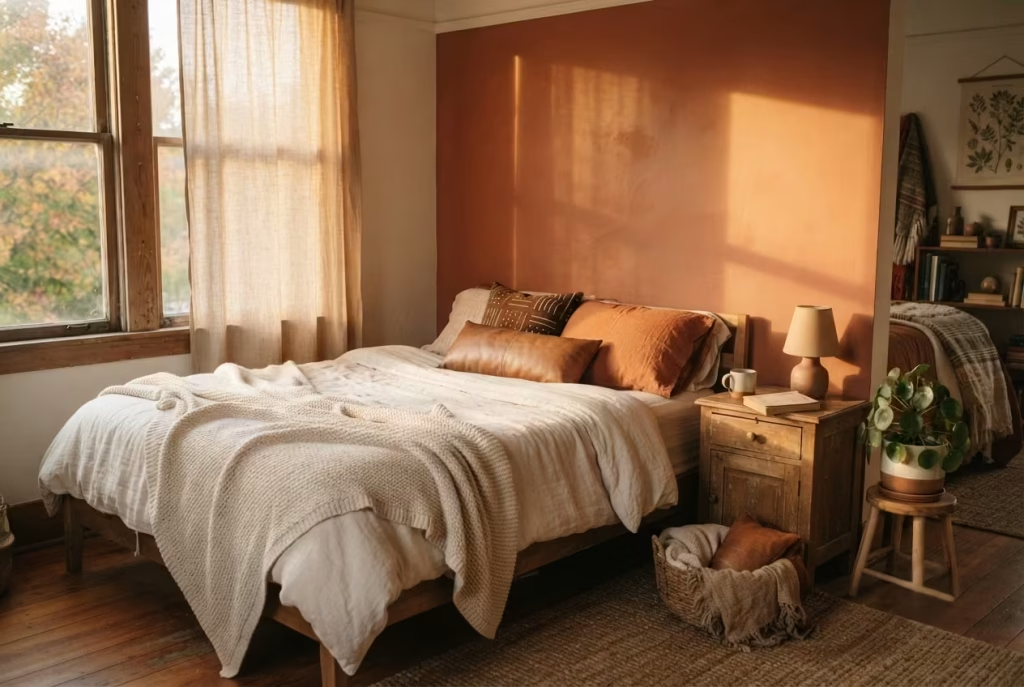
Most boho fall bedroom roundups read like a scavenger hunt: fetch this rug, hang that macrame, done. What follows isn’t that. It’s seventeen ideas pulled from actual rooms, actual clients, and a fair share of trial and error on my own bedroom walls, organized so you can tell at a glance which ones ask for a weekend and which ones ask for a bit more nerve. Some will suit a full autumn bedroom decor overhaul. Others earn their keep with one afternoon and a single well-chosen piece.
A Terracotta Accent Wall That Earns Its Warmth
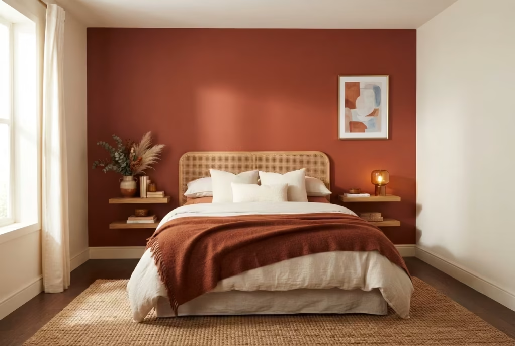
Terracotta is one of those colors people assume they understand because they’ve seen it on a hundred Pinterest boards, and then they get the swatch home and it fights with everything in the room. There’s a reason for that. Most terracotta paints lean one of two ways at the undertone level, either toward a dusty, clay-adjacent pink or toward a deeper, brick-like orange with a whisper of brown underneath it.
Pick the wrong lean for your room’s existing wood tones and light exposure, and the wall will read chalky in one and muddy in the other. I learned this the hard way on a client project in a north-facing bedroom in Chicago, where a pink-leaning terracotta went flat and almost dusty rose by midday. We repainted with a brick-leaning shade instead, and the room finally had the glow everyone had been picturing.
Here’s the part most guides skip entirely: terracotta doesn’t hold still throughout the day, and that’s exactly why it belongs in a fall bedroom rather than a summer one. In the morning, with cooler, bluer daylight coming through the window, terracotta tends to settle into a quieter, almost rust-brown mood, grounded and a little serious. By late afternoon, when the light itself turns warm and low, that same wall wakes up.
It flushes toward a richer orange-red, sometimes verging on amber where direct sun hits it. If your bedroom windows face east, expect the wall to feel more subdued most of the day, with a short golden window near sunset. West-facing rooms get the opposite: a slow build toward drama as the afternoon wears on. Neither is wrong. It’s just worth knowing which one you’re signing up for before you commit a full wall to it.
On coverage, don’t eyeball this and hope for the best. A single gallon of standard interior paint covers roughly 350 to 400 square feet with one coat, but terracotta shades, especially the deeper, more saturated ones, are notorious for needing two coats to look properly even and rich rather than streaky or translucent in patches.
For a typical accent wall measuring around 10 feet wide by 8 feet tall, that’s 80 square feet, which sounds like it should sip paint rather than drink it. In practice, budget for a full gallon plus a bit of a buffer for touch-ups, corners, and the inevitable second coat. Skimping here is the single most common reason accent walls look underwhelming instead of intentional.
And then there’s the rule that separates a room that feels curated from one that feels like a color experiment gone sideways: one wall, not four. Terracotta is a bold, warm, saturated color, and boldness needs negative space to actually register as bold. Wrap an entire bedroom in it and the eye stops noticing the color at all, the way a strong perfume fades into the background after ten minutes of wear.
Keep it to the wall behind the headboard, let the other three stay in a soft neutral, cream, warm white, or a pale greige, and suddenly that one wall becomes the anchor the whole room orbits around. It’s the difference between a color that does the heavy lifting and a color that simply exists.
Mustard as a Supporting Color, Not a Statement
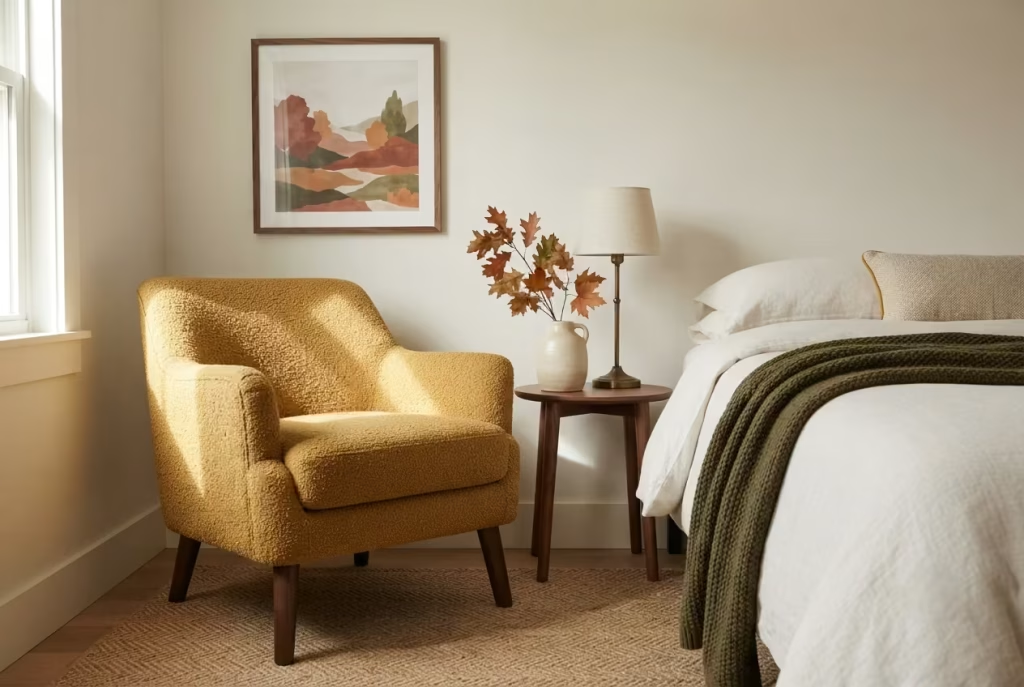
Mustard has an image problem, and it’s not really the color’s fault so much as how people tend to use it. Paint a whole wall in mustard, or worse, commit an entire duvet cover to it, and the room can slide uncomfortably close to nursery territory rather than the moody, autumnal richness people are actually after. There’s a fine line between “warm and inviting” and “cheerful toddler bedroom,” and mustard walks it more precariously than almost any other fall shade. The color itself isn’t the problem. The dosage is.
Where mustard genuinely shines is in small, deliberate doses, the kind that let it flirt with the rest of the room instead of dominating the conversation. A single upholstered armchair tucked into a corner, a folded throw draped at the foot of the bed, or piping along the edge of a lumbar pillow gives mustard just enough real estate to register as a color decision rather than a color commitment.
I worked on a bedroom refresh a couple of autumns ago where the client desperately wanted mustard somewhere in the room but was, understandably, gun-shy after seeing it overwhelm a friend’s living room. We landed on a mustard bouclé accent chair against otherwise neutral walls and warm wood tones, and it became the piece everyone commented on, precisely because it had room to breathe instead of fighting for attention against four matching walls.
As a rough working ratio, mustard should occupy somewhere in the neighborhood of five to ten percent of a room’s total visual surface area, meaning what your eye actually takes in when it scans the space rather than the literal square footage. That’s roughly one substantial piece, a chair, an ottoman, a set of curtains, plus a few smaller accents scattered around it, like a throw pillow or a ceramic vase.
Push past that fifteen percent mark and the room starts to tip. It stops being a bedroom with a thoughtful mustard accent and starts becoming, well, a mustard bedroom, full stop, with everything else reduced to background noise. The goal isn’t to banish the color. It’s to let it do a supporting role well rather than miscast it as the lead.
This is also where mustard’s real strength as a fall color comes into its own. Paired against deeper, cooler tones like forest green or navy, or warmed up further with terracotta and rust, mustard acts almost like a highlight color would in a painting, a small, bright note that pulls the whole palette together without ever needing to shout. Used sparingly, it reads as confident and considered. Used generously, it reads as a decision you might second-guess by December.
The Macrame Wall Hanging as a Headboard Substitute
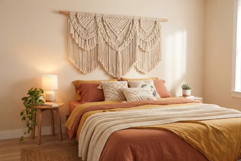
There’s a particular kind of relief that comes with realizing you don’t need to buy a headboard at all. Anyone who has priced out a solid wood or upholstered headboard for a queen or king bed knows the sticker shock involved, often several hundred dollars for something that, structurally speaking, does almost nothing except lean against a wall and look nice. A generously sized macrame wall hanging can do the same visual job for a fraction of the cost, and in a boho fall bedroom, it often does it better, since the texture and knotwork bring a handmade, storytelling quality that a factory-upholstered panel simply can’t replicate.
Getting the sizing right is where most people trip up, either buying something so small it looks lost and apologetic on the wall, or so oversized it swallows the room whole. A good rule of thumb: the hanging should measure roughly 1.2 to 1.5 times the width of the bed itself.
For a standard queen mattress at 60 inches wide, that puts you somewhere between 72 and 90 inches across, wide enough to feel intentional and substantial without dwarfing the furniture beneath it. King beds, running 76 inches wide, push that range up to 90 to 114 inches, which usually means either an extra-large single piece or, as I’ve done on a couple of client projects, layering two smaller hangings side by side to fake the scale of one grand one.
Height placement matters just as much, and this is the detail that separates a hanging that looks styled from one that looks like an afterthought. Measure up from the top of the mattress, not the floor and not the headboard height of a neighboring piece of furniture, and aim to leave somewhere between six and ten inches of clearance between the pillows and the bottom fringe of the hanging. Too little clearance and the piece looks cramped, almost as if it’s trying to climb into bed with you.
Too much and it floats awkwardly, disconnected from the furniture it’s meant to be anchoring. The top of the hanging typically lands somewhere between 12 and 18 inches above where the headboard would have sat, which for most standard bed heights puts the highest point of the piece around 6 to 6.5 feet off the floor, comfortably within reach of most ceiling heights without crowding crown molding or sloped ceilings.
Weight and anchoring deserve real attention here too, particularly for anyone renting, where drilling a permanent hole into drywall isn’t exactly an option you want to explain to a landlord later. Most substantial macrame hangings, especially ones made with thicker cotton rope or incorporating a heavy wooden dowel, weigh more than people expect, often two to five pounds once fully assembled.
A single adhesive picture hook rated for lighter loads will let you down eventually, sometimes literally, in the middle of the night. Look instead for adhesive hooks specifically rated for the weight of your piece, ideally with a few pounds of buffer built in, or use a tension rod wedged discreetly between two furniture pieces or a closet frame if drilling is completely off the table.
For anyone with permission to make small holes, a single well-placed picture hook rated for 20 to 30 pounds will hold a macrame hanging with room to spare, and the small nail hole is far easier to patch at move-out than the alternative of explaining a wobbly, half-fallen wall hanging to your next houseguest.
Layered Rugs for Sound and Texture, Not Just Looks
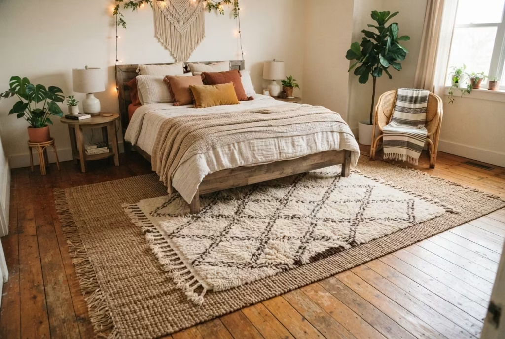
Most people think about rugs purely in terms of what they look like underfoot, and they miss the quieter benefit entirely: a boho bedroom, stuffed as it tends to be with hard surfaces like wood floors, glass-topped nightstands, and bare plaster walls, can get surprisingly loud in ways you don’t notice until you fix it. Footsteps echo.
Voices carry a bit too sharply off a hardwood floor. Layer two rugs of different textures on top of each other, and you’re not just building visual depth, you’re actually dampening sound in a way that makes the room feel calmer the moment you walk into it. I noticed this firsthand in my own bedroom after adding a second rug purely for style reasons, and within a week I realized the room had gone noticeably quieter, almost cushioned, in a way I hadn’t consciously planned for but was thrilled about once I clocked it.
The trick to layering rugs so it reads as a deliberate choice rather than a leftover from a move, where you just never got around to picking one and ended up with two, comes down to proportion. Start with a larger, flatter base rug, something like a jute or flatweave piece, sized to sit beneath at least the front two-thirds of the bed and extend out roughly 18 to 24 inches on each side.
On top of that, place a smaller, plusher rug, ideally with a noticeably different texture, shag, Persian-style knot, or a Moroccan Beni Ourain wool piece, sized at roughly 40 to 60 percent of the base rug’s footprint. A common working size pairing is an 8 by 10 foot flatweave underneath a 4 by 6 foot plush layer positioned slightly off-center toward the foot of the bed, which creates an asymmetry that reads as curated rather than accidental. Center the smaller rug dead in the middle of the larger one and it can start to look like a target, oddly formal for a style that’s supposed to feel loose and gathered over time.
Pile height contrast is doing more of the visual work here than most people realize. A low, tight-woven base rug paired with a high-pile, almost sheepskin-adjacent top layer creates a tactile hierarchy your feet notice before your eyes even catch up, and that sensory layering is genuinely part of what makes a boho fall bedroom feel inviting rather than simply decorated.
Skip the contrast and stack two similar pile heights together, and the layering effect falls flat, reading more like an unfortunate rug-buying mistake than an intentional design move. Get the heights, and the proportions, right, and you’ve built something that quiets the room acoustically while giving your feet a genuinely different sensation depending on exactly where they land each morning, which is the kind of detail that never shows up in a photo but absolutely shows up in how a room feels to actually live in.
A Rattan Headboard That Grounds the Room
Rattan carries almost no physical weight, you could lift most woven headboards with one hand, yet on a wall it reads as one of the heaviest, most grounding pieces a boho bedroom can own. That gap between how light something actually is and how substantial it looks is exactly why rattan works so well as an anchor. In a room stacked with knit throws, patterned pillows, and a macrame hanging or two, all that visual noise needs something sturdy to rally around, and a woven rattan headboard, with its dense, repetitive pattern and warm, sun-baked color, gives the eye a place to land before it starts wandering across everything else in the room.
I fitted a client’s guest bedroom with an open-weave rattan headboard a few years back, replacing a plain upholstered one that had honestly disappeared into the wall behind it. The difference was almost comic. Suddenly the busy floral pillows and the layered rugs had a quiet, textured backdrop instead of competing with a flat fabric panel, and the whole room felt considered rather than crowded. That’s the sleight of hand rattan pulls off: it’s decorative enough to hold its own, but neutral enough in color to let everything around it shine.
Quick specs and care reference:
| Detail | Guidance |
| Typical weight (queen size) | 15 to 30 lbs, depending on frame density |
| Visual weight | Reads as a bold, substantial anchor piece despite low physical weight |
| Best headboard height | 42 to 48 inches above mattress top for a proportional, grounded look |
| Ideal humidity range | 40 to 60 percent relative humidity |
| Direct sun exposure | Keep away from windows with prolonged direct afternoon sun |
| Cleaning frequency | Light dusting weekly, deeper clean every 2 to 3 months |
A few care notes worth knowing before you commit:
- Humidity is rattan’s real weak spot. Too dry, and the natural fibers can turn brittle and start to crack along the woven joints, something I learned the hard way with a piece kept too close to a radiator one winter. Too humid, and you risk warping or, worse, mold creeping into the tighter weave sections where air doesn’t circulate well.
- A humidifier earns its keep in dry winter months. Running one nearby during heating season keeps the fibers flexible and prevents that telltale creaking sound rattan makes when it’s drying out unevenly.
- Dust with a soft brush attachment, not a damp cloth first. Wipe a dusty rattan headboard down wet and you’re just pushing grime deeper into the weave. Vacuum or brush it out first, then follow with a barely damp cloth if needed.
- Avoid direct, prolonged sun exposure. Rattan fades unevenly rather than gracefully, so a headboard positioned under a sunny window for years can end up noticeably lighter on one side than the other, a detail that’s hard to unsee once you notice it.
- Tighten as needed. Woven joints can loosen slightly over years of use. A quick check every year or two, gently pressing on any looser sections, catches small issues before they become a structural headache.
Get the humidity and sun exposure right, and a rattan headboard will hold its warmth and texture for well over a decade, aging the way good boho pieces are supposed to, with character rather than decay.
You May also Like: 21 Minecraft Bedroom Ideas to Build the Ultimate Gamer Room
The Boho Accent Wall Beyond Paint
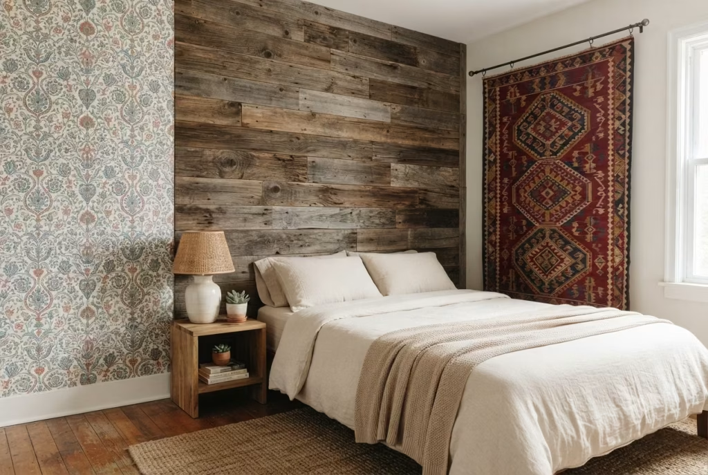
Paint gets all the attention when people talk about accent walls, but it’s really just the entry-level option, the one with the lowest cost and the lowest commitment. Once you start looking past a can of terracotta or clay, three genuinely different approaches open up, each with its own price tag, its own installation headache, and its own payoff. Knowing which one suits your patience level, and your landlord’s rules, matters more than knowing which one looks best in a photo.
Wallpaper sits in the middle of the pack, both in cost and effort. A quality botanical or Moroccan-print wallpaper typically runs $40 to $100 per roll, and a standard accent wall behind a queen bed needs somewhere between three and five rolls depending on pattern repeat and wall dimensions, putting most projects in the $150 to $500 range before adhesive and tools. Peel-and-stick versions have gotten remarkably good in the last few years, which is a genuine gift to renters who want texture and pattern without the plaster damage that traditional paste-and-hang wallpaper leaves behind at move-out.
The catch is patience. Hanging wallpaper straight, especially with a busy pattern that needs to match seam to seam, is a two-person job that rewards slow, careful work and punishes rushing. I’ve seen more than one DIY wallpaper attempt go sideways because someone tried to power through it solo on a Sunday afternoon with no second pair of hands to hold the top edge steady.
Textile-hung walls, meanwhile, are the wildcard of the three, cheap enough to feel almost like cheating and dramatic enough to completely transform a room’s mood. Hanging a large vintage kilim, a length of block-printed cotton, or even a soft, oversized tapestry directly on the wall behind the bed costs whatever the textile itself costs, often less than a single roll of premium wallpaper, and requires nothing more than a curtain rod, a few strong hooks, or a discreet row of nails along the top edge.
There’s no paste, no drying time, no commitment beyond a few small holes that patch up in seconds. The trade-off is that textiles need a bit more room to breathe visually. A textile wall competing against a heavily patterned duvet and a stack of mismatched pillows tends to blur into busy noise rather than standing out as its own moment, so this approach works best when the rest of the room’s textiles calm down a notch to let the wall hanging do the talking.
Reclaimed wood is the heavyweight of the group, both financially and physically. Salvaged shiplap or barn wood paneling runs anywhere from $8 to $20 per square foot installed, which for a typical 80-square-foot accent wall lands somewhere between $640 and $1,600, before factoring in whether the wood needs sealing, sanding down splinters, or treatment against pests that sometimes hitch a ride in old reclaimed lumber.
This is a genuine renovation, not a weekend refresh, and it usually isn’t reversible without professional help, making it a poor fit for rentals and a serious commitment even in owned homes. What you get in return, though, is a wall with real depth and history built into the grain itself, the kind of texture that no paint color or printed wallpaper pattern can fully imitate, since every knot and weathered edge is doing something a factory print simply can’t replicate.
A quick side-by-side, since the right choice really does come down to your specific situation:
| Approach | Typical cost (accent wall) | Commitment level | Best for |
| Wallpaper (peel-and-stick) | $150–$500 | Low to moderate | Renters wanting pattern without damage |
| Textile-hung wall | $50–$400 | Very low | Anyone wanting instant, reversible drama |
| Reclaimed wood paneling | $640–$1,600 | High, often permanent | Owned homes wanting real texture and history |
None of these three is objectively better than the others, and that’s really the point. A renter chasing a boho accent wall on a tight timeline and an even tighter security deposit is playing a completely different game than a homeowner planning a five-year-and-beyond bedroom overhaul, and the honest answer to “which one should I pick” almost always comes down to how long you plan on living with the walls you’re about to change.
Cottagecore-Boho Crossover Bedding
Ask ten people to define cottagecore and boho separately, and you’ll get ten confident, slightly different answers, which tells you something important before we even get into bedding: these two aesthetics have blurry, overlapping edges rather than hard boundaries, and that blur is exactly where the interesting decorating decisions live. Both styles share a soft spot for imperfection, for things that look handmade, worn in, or passed down rather than shrink-wrapped off a factory line. Where they part ways, and part ways sharply, is in how loud they’re willing to get.
Cottagecore, at its core, is restrained. Think faded florals, muted sage and butter-yellow tones, a kind of quiet, storybook nostalgia that never raises its voice. Boho, particularly the fall version of it, tends to run warmer and bolder, comfortable with saturation, comfortable with a rust-orange duvet sitting next to a deep forest-green throw without apologizing for it.
Put a full cottagecore bedding set, all soft pastels and delicate sprigged florals, into a room that’s otherwise dripping in saturated terracotta and mustard, and the bed can end up looking like it wandered in from a completely different house.
Where the two genuinely overlap, and can be blended with confidence:
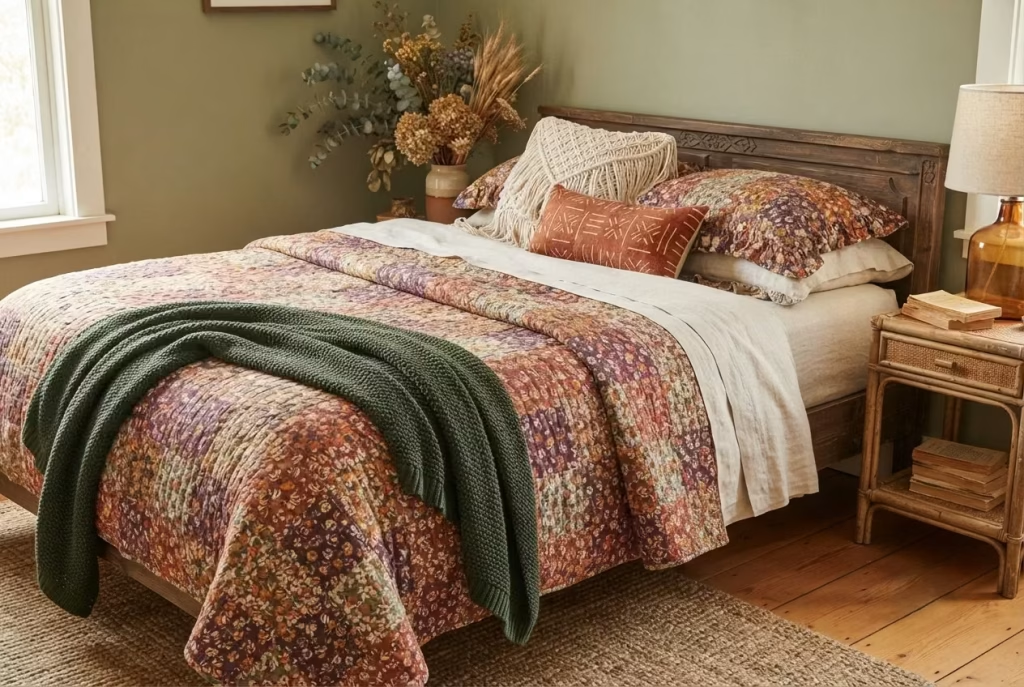
- Vintage or vintage-style quilts. A hand-stitched or quilted patchwork cover, especially one with visible wear, faded patches, or an irregular stitch pattern, reads as authentically both styles at once. This is one of the few pieces that can sit at the exact center of the venn diagram without compromise.
- Floral prints, chosen carefully. Not every floral works. Small-scale, densely packed florals in warm, autumnal colorways, rust, deep plum, ochre, split the difference nicely, carrying cottagecore’s romantic sensibility while staying saturated enough to hold its own against boho’s bolder palette.
- Imperfection as a design principle. Both styles genuinely prize the handmade over the machine-perfect. A slightly uneven hem, a hand-embroidered edge, a naturally dyed fabric with visible variation from panel to panel, these details work in either aesthetic and act as a kind of bridge between them.
- Natural, breathable fabrics. Linen, washed cotton, and raw silk all sit comfortably in both worlds, since neither style has much patience for anything that reads synthetic or overly polished.
Where they clash, and where a nuanced eye needs to step in:
| Element | Cottagecore instinct | Boho fall instinct | The friction point |
| Color saturation | Pale, washed-out, pastel | Rich, warm, deeply saturated | A pastel floral duvet can look faded or out of place against saturated boho accents |
| Pattern scale | Small, delicate, ditsy prints | Bold, often oversized or geometric prints | Tiny prints can disappear against boho’s larger-scale textiles and rugs |
| Overall mood | Sweet, gentle, storybook | Earthy, worldly, well-traveled | A too-sweet bedding choice can undercut the grounded warmth boho fall relies on |
| Metal and hardware accents | Brass, delicate, cottage-style | Chunky, wood, natural fiber | Delicate cottagecore hardware can look flimsy next to boho’s heavier natural materials |
I ran into this exact tension while restyling a client’s bedroom that she wanted to feel like both, cozy and floral in a cottagecore sense, but warm and grounded in a boho fall sense. Her instinct was to buy a full pastel floral bedding set, and on its own, in a showroom photo, it looked lovely. In her actual room, next to a rattan headboard and a rust-colored throw, it went almost gray, drained of any warmth by comparison.
We swapped the bedding for a deep rust and cream floral quilt instead, same romantic, slightly imperfect quilted texture she loved, but recalibrated into a colorway that could actually hold a conversation with the rest of the room instead of getting talked over by it.
The lesson that stuck with me from that project, and one worth carrying into your own bedding decisions, is that cottagecore and boho don’t need to be diluted to coexist. They need to be color-matched. Keep the softness, the imperfection, and the handmade quality that both styles love, but let the palette lean toward boho fall’s warmth rather than cottagecore’s pastel restraint, and the two aesthetics stop competing and start genuinely working together, each pulling its weight instead of one quietly fading into the background.
Dried Botanicals Instead of Fresh-Cut Seasonal Flowers
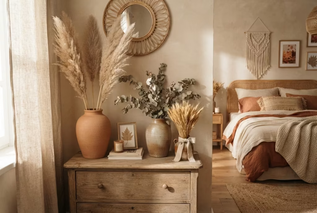
Fresh flowers are lovely for about a week, and then they’re a slightly sad, wilting reminder sitting on your dresser that you forgot to change the water again. Dried botanicals sidestep that whole cycle entirely, and in a boho fall bedroom, they’re not just a practical swap, they’re arguably the more authentic choice. Pampas grass, dried eucalyptus, and bundled wheat stalks were staples of bohemian styling long before dried flowers became a Pinterest trend, prized precisely because they age gracefully instead of dying visibly, softening in color over months rather than collapsing in days.
Each of the three earns its place for a slightly different reason, and knowing the distinction helps you pick the right one rather than defaulting to whichever looks best on a shelf at the store.
A quick guide to the three staples, and where each one actually shines:
| Botanical | Character it brings | Best vessel type | Realistic lifespan |
| Pampas grass | Soft, feathery, dramatic volume | Tall floor vase, 20 to 30 inches | 2 to 5 years before fading significantly |
| Dried eucalyptus | Structured, subtly fragrant, muted sage-green | Medium ceramic or glass vase, 8 to 14 inches | 6 months to 1 year before brittleness sets in |
| Wheat stalks | Rustic, golden, distinctly autumnal | Short, wide-mouthed vessel or bundled and tied | 1 to 2 years with minimal handling |
Vessel proportion is where most people undersell these botanicals without realizing it. A single stem of pampas grass shoved into a narrow bud vase looks a bit lost, almost apologetic, whereas the same stem in a generously sized floor vase, one roughly a third the height of the stems themselves, suddenly reads as intentional and full.
As a working rule of thumb, the vessel should be tall enough to support at least one-third of the total stem height once trimmed, so a bundle of pampas grass standing 5 feet tall wants a vase in the 20-inch range, not a delicate 8-inch ceramic pot that looks like it’s straining under the weight of something far too big for it. Eucalyptus, being naturally shorter and denser, is more forgiving here and works well in mid-sized vessels sitting anywhere from 8 to 14 inches tall, giving it room to fan out without toppling.
A few care and longevity notes worth knowing before you commit shelf space to these:
- Dust is the real enemy, not time. Dried botanicals don’t wilt or rot the way fresh flowers do, but they do collect a fine layer of dust over the months, especially pampas grass with its feathery, static-prone plumes. A gentle shake outdoors every four to six weeks, or a quick pass with a hair dryer on the cool, low setting, keeps them looking fresh far longer than most people expect.
- Direct sunlight fades color faster than you’d think. Wheat stalks and eucalyptus both hold their warm, golden and sage tones best when kept out of harsh, direct afternoon sun. A spot near a window that gets filtered morning light will preserve color for closer to that upper one to two year range, whereas a south-facing sill in full sun can bleach the same stems noticeably within just a few months.
- Handle sparingly once dried. Eucalyptus in particular turns brittle as it ages, and stems that were once flexible enough to bend gently into a vase can start snapping if repositioned too often. Style it once, place it thoughtfully, and resist the urge to keep rearranging it every time you tidy the room.
- Pampas grass sheds, and that’s normal, not a defect. A few loose plume fibers drifting onto the dresser or floor beneath a pampas arrangement is completely expected, especially in the first few weeks after purchase. A quick vacuum nearby handles it, and the shedding does slow considerably once the initial looser fibers have naturally worked their way free.
Swap out fresh flowers for this trio and you’re not settling for a lower-maintenance substitute so much as leaning into a genuinely more fitting choice for the season. Fresh blooms belong to spring’s fleeting, delicate energy. Dried botanicals, with their muted, sun-worn color and their willingness to stick around through the entire autumn without asking anything of you beyond an occasional dust-off, belong to fall in a way that feels earned rather than convenient.
Warm-Toned Layered Lighting
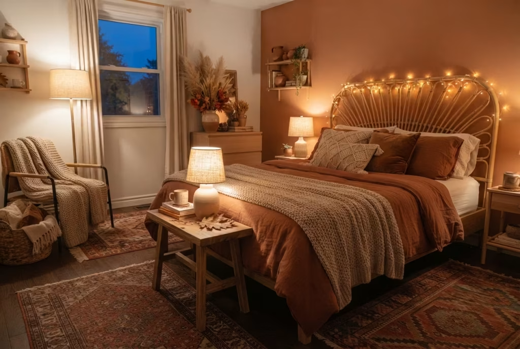
Nothing sabotages a boho fall bedroom faster than a single harsh overhead light doing all the work. It’s the equivalent of trying to set a cozy autumn mood with a fluorescent office fixture, and yet it’s still the default setup in most bedrooms, one ceiling fixture, flipped on or off, asked to carry the entire emotional weight of the room. Layered lighting fixes this, and it’s genuinely one of the cheapest, highest-impact changes on this entire list, often costing less than a single throw pillow while doing far more to shift a room’s mood.
Kelvin temperature is where this starts, and it’s worth actually understanding rather than guessing at bulb aisle labels. Standard daylight bulbs sit around 5000 to 6500 Kelvin, crisp and blue-toned, the kind of light that suits a kitchen or a home office but reads as clinical and cold in a bedroom meant to feel like a retreat.
For a genuinely warm, autumnal glow, aim for bulbs in the 2000 to 2700 Kelvin range, the same warm amber territory as candlelight and the low late-afternoon sun we opened this whole piece talking about. That narrow band makes an outsized difference. A room lit at 2700K versus 5000K can feel like two entirely different spaces, even with identical furniture and decor.
The three-source rule, and why it actually matters:
A single light source, no matter how warm its Kelvin rating, still casts flat, one-directional light that leaves half the room in shadow and the other half overexposed. Real coziness comes from layering, ideally at least three distinct sources working together at different heights and intensities.
- Ambient light — a dimmable overhead fixture or a warm-toned floor lamp providing the room’s base level of illumination, ideally on a dimmer switch so it can scale down for evenings.
- Task or reading light — a bedside table lamp positioned at roughly shoulder height when seated in bed, warm-toned and shaded rather than exposed bulb, giving focused light without flooding the whole room.
- Accent or mood light — string lights, a small lantern, or a low-wattage decorative fixture tucked somewhere unexpected, a bookshelf corner, draped along a headboard, adding a soft glow that has nothing to do with function and everything to do with atmosphere.
A quick reference for getting the Kelvin and wattage right, source by source:
| Light source | Ideal Kelvin range | Suggested wattage (or LED equivalent) | Role in the room |
| Overhead ambient | 2200–2700K | 40–60W equivalent, dimmable | Base-level room illumination |
| Bedside table lamp | 2200–2700K | 25–40W equivalent | Reading and close-range task light |
| String lights / lantern | 2000–2400K | Low, often under 10W total | Mood and texture, not function |
| Floor lamp (if used) | 2200–2700K | 40–60W equivalent | Fills shadowed corners the overhead misses |
I worked on a bedroom a couple of years back that had, on paper, every ingredient of a great boho fall room: rust-toned bedding, a rattan headboard, layered rugs, the whole set. And yet something about it felt flat, almost showroom-ish, every time I walked in during the evening. It took me an embarrassingly long moment to realize the culprit was sitting right above everyone’s head the entire time. A single 5000K overhead fixture, technically bright and functional, was washing every warm material in the room out with cold, clinical light, undercutting hours of careful color and texture work in one stroke.
We swapped that single bulb for a 2700K warm LED, added a small rattan-shaded table lamp on the nightstand, and tucked a short string of warm fairy lights along the top of the rattan headboard. The transformation wasn’t subtle. Photos from before and after look almost like two different rooms, and more importantly, the client mentioned that the room finally felt like somewhere she wanted to linger in the evening rather than just pass through on the way to sleep.
That’s really the tell that separates good lighting from great lighting in a space like this. Good lighting lets you see. Great lighting makes you want to stay a while longer, and in a boho fall bedroom, built around the entire idea of coziness and slowing down, that lingering quality isn’t a nice bonus. It’s the whole assignment.
A Knit Throw with Actual Weight
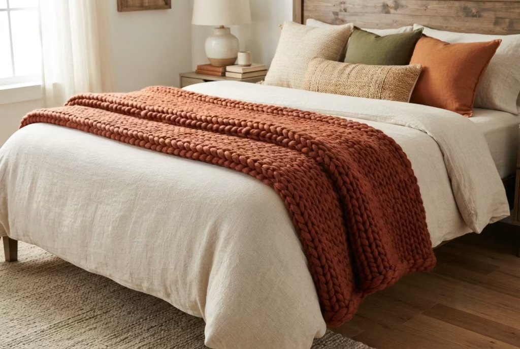
There’s a particular kind of disappointment that comes with buying a throw blanket online, unfolding it at home, and discovering it has all the substance of a bath towel. It photographs fine, folded neatly over a footboard in a product shot, but drape it across a real bed and it goes limp, thin, almost apologetic, doing nothing to suggest warmth even though “cozy” was probably the exact word in the product description. A throw that fails the weight test fails visually before it ever fails physically, and in a boho fall bedroom, that’s a problem worth actually solving with some intention.
Yarn weight is the technical detail hiding behind most of this, and it’s worth knowing the vocabulary even if you never plan to knit anything yourself. Yarn is categorized on a numbered scale, and the throws that actually deliver on that chunky, sink-your-hands-into-it feeling are almost always made from bulky or super bulky yarn, sitting at a five or six on the standard weight scale, rather than the lighter worsted or DK weights that dominate the budget end of most home goods aisles.
A quick reference for spotting real chunky-knit quality before you buy:
| Yarn weight category | Typical feel | Best use in a boho fall bedroom |
| Worsted (medium, category 4) | Moderate thickness, drapes softly | Fine as a lightweight layering piece, not a statement throw |
| Bulky (category 5) | Noticeably thick, visible stitch definition | Ideal for a true statement throw with real presence |
| Super bulky (category 6) | Very thick, often chunky-knit or arm-knit look | Best for a single hero throw, too heavy for layering with others |
| Jumbo (category 7) | Extremely thick, dramatic stitches | Striking as a standalone accent, rarely practical for everyday warmth use |
Beyond the yarn category itself, a few physical clues tell you almost instantly whether a throw has real weight behind it or is coasting on marketing language alone.
- Pick it up one-handed. A genuinely substantial chunky throw has noticeable heft, somewhere in the 3 to 6 pound range for a standard 50 by 60 inch size. Anything that feels feather-light in your hand will look feather-light on the bed too.
- Check the stitch definition. Bulky and super bulky knits have large, clearly visible loops you can slide a couple of fingers into. If the stitches are tight and barely visible, you’re likely looking at a thinner yarn weight dressed up with a chunky-looking photo.
- Look at how it holds a fold. Thin throws collapse flat the moment you fold them, losing all shape. A properly weighted chunky knit holds a soft, structured fold on its own, almost like it has a bit of built-in memory.
Draping technique, and the measurement that actually matters:
Where a throw sits on the bed matters just as much as what it’s made of, and this is a detail most people eyeball rather than actually measure, which is exactly why so many throws end up looking randomly tossed rather than styled.
The classic, editorial fold, draped diagonally across the foot of the bed rather than laid flat, should hang with roughly a 12 to 16 inch drop below the footboard or mattress edge, enough to read as intentional and generous without pooling awkwardly on the floor. For beds without a footboard, measure that same 12 to 16 inches down from where the mattress edge meets the frame.
The fold itself matters too. A tri-fold, where the throw is folded lengthwise into thirds and then draped at a slight diagonal angle rather than perfectly parallel to the footboard, creates a relaxed, lived-in look that a flat, perfectly squared fold simply can’t match. That small diagonal tilt, just a few degrees off perfectly straight, is doing more visual work than people give it credit for, since it signals “someone actually uses this room” rather than “this was staged five minutes before a photo was taken.”
I’ve swapped out more than a few disappointing throws on client beds over the years, always for the same reason. The original piece looked fine in isolation but simply couldn’t hold its own once real bedding, real pillows, and real texture were layered around it. A properly weighted chunky knit doesn’t just sit on the bed, it anchors the foot of it, giving the whole composition somewhere solid to end visually, the same way a good closing paragraph gives an article somewhere solid to land.
You May also Like: 25 Christmas Room Decor Ideas That Bring Comfort, Charm, and Holiday Cheer
Vintage or Vintage-Style Furniture as an Anchor Piece
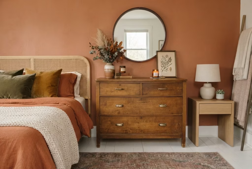
Matching furniture sets have a strange way of making a room feel less personal, not more, as if the bedroom belongs to a catalog rather than to the person actually sleeping in it. One well-chosen vintage piece does the opposite job entirely. It gives a room a backstory, a sense that someone made a decision rather than simply checked a box on an order form, and in a boho fall bedroom, that single point of character can carry more weight than half a dozen matching accessories combined.
The key word here is one. Not a full vintage bedroom suite, not a matched nightstand pair hunted down over months to be identical, just a single anchor piece, a dresser, a bentwood chair, a carved side table, something with enough presence and enough history in its finish to hold its own against everything newer around it. Overdo it with too many vintage pieces competing for attention, and the room starts to feel like an antique shop rather than a bedroom. Underdo it with none at all, and you lose the grounding, lived-in quality that makes a space feel collected rather than purchased in one afternoon.
Where to actually find a piece worth building a room around:
- Estate sales, hands down, tend to yield the best pieces at the fairest prices, since most buyers there are shopping for specific categories, dishware, jewelry, tools, rather than furniture, leaving solid wood dressers and chairs criminally underpriced. I found a walnut dresser at an estate sale outside Nashville a few years back, tucked in a back bedroom nobody seemed to be paying attention to, priced at forty dollars simply because the drawer pulls were mismatched and slightly tarnished. New pulls cost about fifteen dollars and twenty minutes of work. That dresser is now the anchor of a client’s boho fall bedroom, and it draws more compliments than pieces that cost ten times as much.
- Flea markets reward patience and a willingness to show up early, before the good pieces get picked over. Prices run higher than estate sales on average, since sellers there are pricing to sell rather than clearing out a household, but the sheer volume of options makes them worth the trip, especially for smaller pieces like a carved side table or a woven-seat chair.
- Facebook Marketplace and local buy-nothing groups have quietly become one of the best sources for solid vintage furniture, particularly from people simply trying to offload pieces during a move rather than trying to maximize resale value. Search terms like “solid wood dresser” or “mid-century chair” rather than the word “vintage” itself, since sellers who don’t know what they have often list it under plain, unglamorous descriptions, which usually means a better price for you.
Why mixing eras reads as intentional rather than accidental, if you get the ratio right:
| Approach | How it reads | Realistic outcome |
| One vintage piece, rest modern or new | Curated, collected over time | The intended effect, feels personal without looking staged |
| Two to three vintage pieces, mixed eras | Eclectic, well-traveled | Works if a color or material thread ties them together |
| Fully vintage furnished room | Antique shop, museum-like | Loses the lived-in, current-day comfort a bedroom needs |
| No vintage pieces at all | Polished but generic | Misses the character that makes boho fall feel authentic |
The trick to making a single vintage piece look like a decision rather than a mismatch sitting awkwardly among newer furniture comes down to a shared thread, usually color or material, running between the old piece and everything new around it.
A vintage walnut dresser sits comfortably next to a modern rattan headboard because both share warm, natural wood tones, even though they’re separated by decades in manufacture. Swap that same dresser next to a cool-toned, glossy white modern nightstand, and suddenly the two pieces look like they wandered in from entirely different houses rather than the same considered room.
I’ve learned, project after project, that clients often hesitate to commit to a vintage piece because it doesn’t match anything else they own, and that hesitation is exactly backwards. Vintage furniture was never meant to match. It was meant to anchor, to give a room something solid and storied to build around, and a boho fall bedroom, built on the whole premise of gathered, well-loved objects rather than matched sets, is precisely the kind of room where that mismatch becomes the entire point rather than a flaw to correct.
Window Treatments That Borrow Height
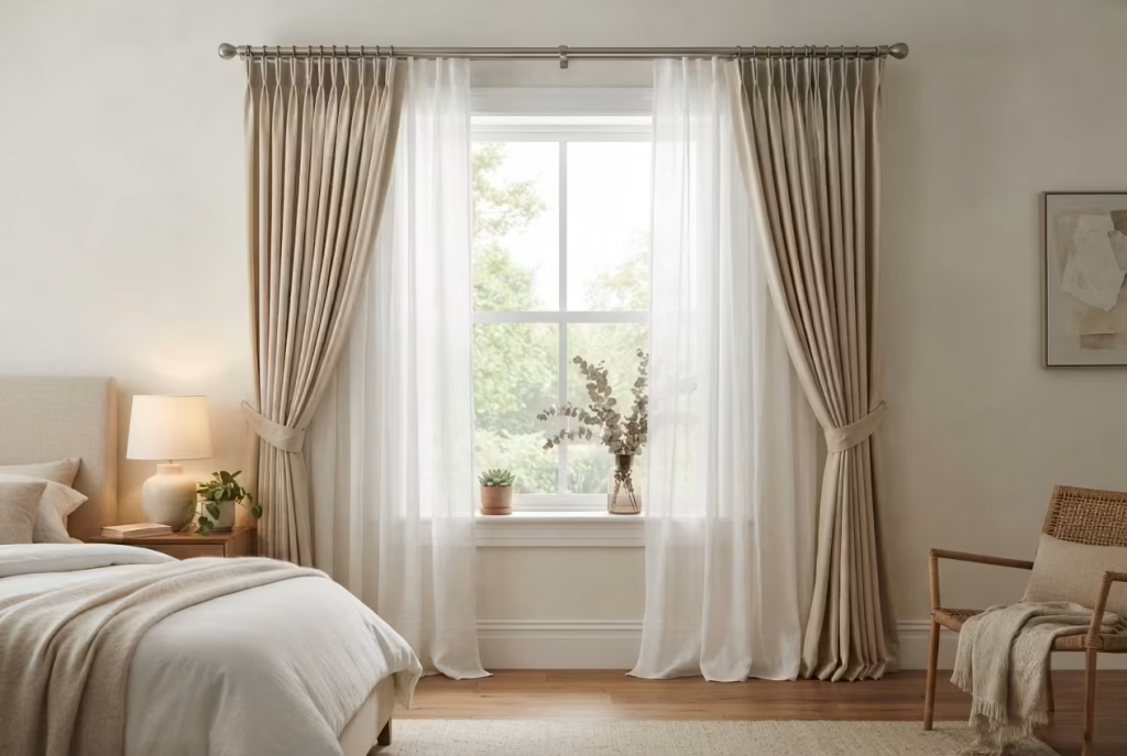
Most bedrooms lose a good chunk of their potential drama at the window, simply because the curtain rod gets mounted right where the trim ends rather than where the ceiling actually begins. It’s a small placement decision that quietly caps how tall and generous a room can ever feel, and it’s also one of the easiest, cheapest fixes on this entire list, requiring nothing more than a longer curtain rod, a slightly higher hole in the wall, and a bit of nerve to trust that it’ll look intentional rather than odd.
The technique itself has a name among designers, mounting high and wide, and the math behind it is straightforward once you know the target numbers. Rather than hanging the rod flush against the top of the window frame, mount it somewhere between four and six inches above the frame, or, for a truly dramatic effect in rooms with the ceiling height to spare, as close to the ceiling itself as your crown molding or trim allows, sometimes leaving just two to three inches of clearance.
That extra vertical space between the window frame and the rod tricks the eye into reading the entire wall as taller than it actually is, since the curtain fabric now draws a line from near the ceiling all the way to the floor rather than stopping short partway up the wall.
Rod placement, measured out clearly:
| Ceiling height | Recommended rod placement above window frame | Effect achieved |
| Standard 8 foot ceiling | 4 to 6 inches above frame | Noticeably taller-feeling room without overdoing it |
| 9 foot ceiling or higher | 6 to 10 inches above frame, or near-ceiling mount | Dramatic, elongated wall effect |
| Sloped or low ceiling under 8 feet | 3 to 4 inches above frame, avoid full ceiling mount | Modest height gain without crowding the slope |
Width matters just as much as height, and it’s the part people forget most often. Extend the rod eight to twelve inches beyond each side of the window frame, rather than mounting it flush with the frame’s edges. This lets the curtains hang fully open on either side without covering any actual glass, which both maximizes natural light during the day and makes the window itself look wider and more generous than its literal dimensions.
On fabric weight, since gauzy sheers alone aren’t quite the fall answer:
Sheer linen curtains do beautiful, soft work catching that late-afternoon light we talked about earlier, but hung completely alone in a fall bedroom, they can leave the window feeling a touch bare once evening sets in and the room needs to feel closed in and cozy rather than airy and exposed. The fix, one I’ve used on nearly every fall-themed bedroom I’ve styled, is layering two different weights rather than committing to just one.
- A sheer linen or gauze layer, hung closest to the glass. This handles daytime softness, filtering light without blocking it entirely, and it’s the layer doing the visual work we described in the terracotta section earlier, catching and warming that low afternoon sun.
- A heavier, textured outer layer, hung on the same rod or a second rod just in front. Look for a substantial cotton, a soft wool blend, or a chunky-woven natural fiber curtain in a warm, autumnal tone, rust, deep olive, or a warm cream. This layer can be drawn closed in the evening for both warmth and a sense of enclosure, genuinely useful as outdoor temperatures drop and a room needs to hold its heat a bit better.
A double rod setup, one mounted slightly in front of the other, handles this layering cleanly without the two fabrics tangling together every time you open or close them. Most hardware stores carry double curtain rod brackets specifically designed for this, and the cost difference over a single rod is usually just a few dollars, a small price for a window that can shift from soft and glowing during the day to warm and cocooned come evening.
Get the height, the width, and the fabric layering right together, and a window that once felt like an afterthought becomes one of the room’s most quietly powerful features, doing double duty as both a light source and a mood-setting tool, all without a single piece of furniture or wall decor added to the room.
A Reading Nook Carved from a Bedroom Corner
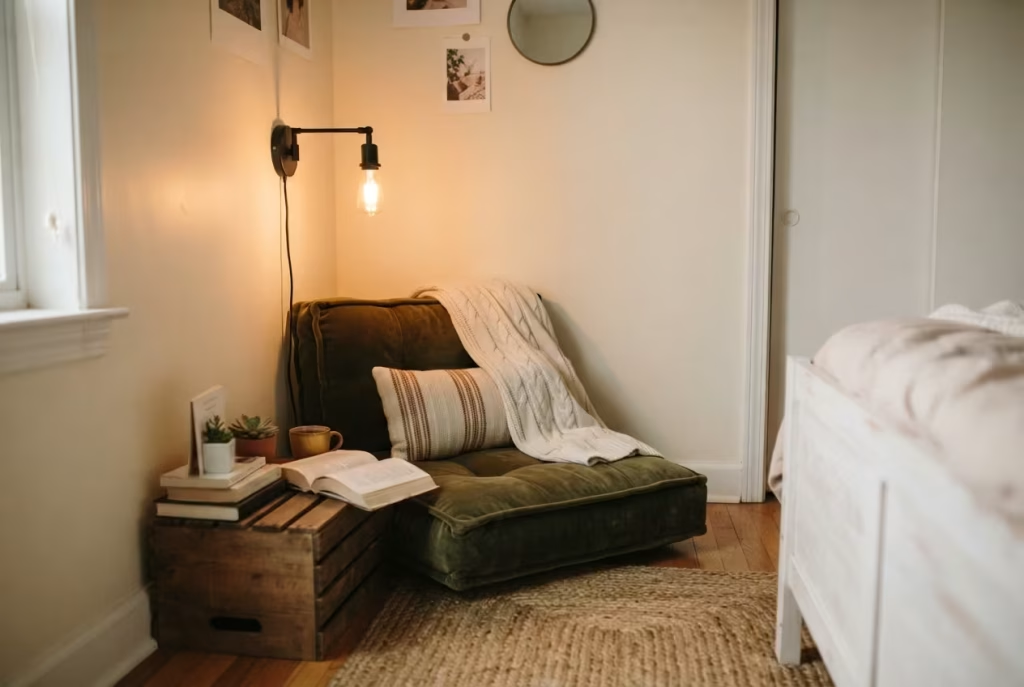
Every bedroom has one, a corner that’s technically empty but functionally useless, too small for a dresser, too awkward for anything the furniture catalog seems to design for. Rather than leaving that corner to collect a laundry pile or an ever-growing stack of things you’ll deal with later, it’s often just barely big enough to become one of the most-used spots in the entire room, a small reading nook that turns dead space into a genuine reason to linger.
The spatial minimum here is smaller than most people assume, which is exactly why this idea works in almost any bedroom, not just the spacious ones. A functional nook needs roughly 9 to 16 square feet of clear floor space, a corner measuring something like 3 by 3 feet at the tightest end, up to 4 by 4 feet if you want enough room to stretch your legs out fully.
That’s genuinely modest, often smaller than the footprint of a single dresser, and it’s the kind of space that already exists, unused, in a surprising number of bedrooms once you actually go looking with a tape measure instead of just eyeballing it.
Floor cushion or chair, and how to actually decide between them:
This is the fork in the road every nook project runs into, and the right answer depends less on personal taste and more on the honest math of your available space and how you actually like to sit.
| Factor | Floor cushions win when… | A chair wins when… |
| Available space | Corner is under 3.5 feet in either direction | Corner has at least 3.5 to 4 feet of clearance |
| Budget | Tight, since a good floor cushion runs $40 to $100 | More flexible, since a proper armchair runs $200 to $600+ |
| Flexibility needed | You want to reconfigure the space often or store it away | The nook is a permanent, dedicated fixture |
| Comfort for longer reading sessions | You’re comfortable cross-legged or with back support against a wall | You want back and arm support built in |
| Overall aesthetic | Leans more casual, grounded, floor-level boho | Leans slightly more polished, still boho but a touch more furnished |
For genuinely tight corners, a well-stuffed floor cushion paired with a smaller bolster pillow for lower back support does real work, especially against a wall where the plaster itself becomes a makeshift backrest.
I’ve set up more than one client’s nook this exact way in a starter apartment bedroom where a proper armchair simply wasn’t going to fit without blocking the closet door, and the floor cushion setup, dressed with a couple of throw pillows in the room’s palette, ended up looking every bit as intentional as a chair would have, just at a fraction of the footprint and cost.
Pairing the lighting, since a nook without proper light just becomes a spot you avoid after sunset:
A reading nook lives or dies by its lighting, and this is where it connects directly back to the layered lighting approach covered earlier in this list. The nook needs its own dedicated task light, separate from the room’s general ambient lighting, positioned specifically to fall over the shoulder onto a page or a screen without glaring directly into your eyes.
- A slim floor lamp with an adjustable arm or shade angle, positioned just behind and slightly to the side of where your shoulder would sit while reading, works well for chair setups and taller floor cushion arrangements alike.
- A wall-mounted sconce with a swing arm, if drilling is an option, frees up floor space entirely and can be angled precisely where the light is actually needed, a genuinely elegant solution for smaller nooks where a floor lamp would eat into already-limited square footage.
- Warm Kelvin temperature, 2200 to 2700K, exactly matching the range established earlier for the rest of the room, since a nook lit in cool, clinical light will feel disconnected from the warmth everywhere else, like a dentist’s waiting room accidentally dropped into an otherwise cozy bedroom.
Get the lighting paired correctly with a comfortable seat, and that once-dead corner stops being a spot you walk past and starts being a spot you actively choose, the difference between a bedroom that’s simply decorated and one that genuinely earns its keep, square foot for square foot, in how it actually gets used.
Ceramic and Clay Accessories for Tactile Contrast
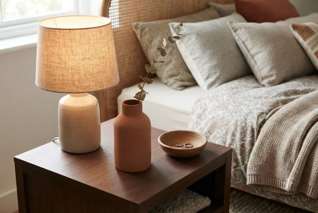
A bedroom stacked with knit throws, macrame, and patterned pillows can, without meaning to, start to feel like one continuous texture rather than a room with actual variety in it. Everything soft, everything woven, everything begging to be touched the same way.
That’s exactly where ceramic and clay accessories quietly earn their keep, not by adding more pattern or more color, but by adding something the rest of the room is missing entirely, a cool, matte, solid surface that gives the eye, and the hand, a break from all that softness.
Matte clay in particular does something glossy ceramic can’t quite manage. A high-shine glazed vase reflects light and draws attention to itself, which is fine in small doses but competes for attention in a room already busy with pattern.
A matte, unglazed or lightly glazed clay piece, by contrast, absorbs light rather than bouncing it back, giving the eye somewhere quiet to rest between all the visual noise of a patterned duvet and a layered rug. It’s the design equivalent of a pause in conversation, not empty, just necessary, letting everything said before it actually land.
Where matte clay balances busy or glossy elements in the room:
| Nearby element | What it brings | What matte clay adds in response |
| Patterned throw pillows | Visual busyness, high pattern density | A calm, solid surface with zero competing pattern |
| Glossy ceramic lamp base | Shine, reflectivity | A grounding, matte counterpoint nearby to balance the shine |
| Chunky knit throw | Soft, fuzzy texture | A hard, smooth-to-the-touch contrast that makes the knit read even cozier by comparison |
| Woven rattan headboard | Warm, organic, repetitive texture | A simple, uncluttered form that doesn’t compete with the weave’s complexity |
I put together a bedside table vignette for a client a while back that’s stuck with me as a genuinely useful template, simple enough to recreate in almost any bedroom without much trial and error. On one nightstand, we grouped three pieces, a mid-height matte terracotta vase, unadorned, holding a single dried eucalyptus stem, a small, squat clay bowl for rings and loose change, and a taller ceramic table lamp with a warm linen shade.
Nothing in that trio matched exactly, no shared pattern, no identical finish, but everything shared the same warm, earthy color family and the same commitment to simple, honest form over decoration. It photographed beautifully, but more importantly, it looked just as good in person on a random Tuesday, unstyled and slightly rearranged from actual daily use, which is really the test that matters most.
A few practical notes for building your own version of that vignette:
- Vary the height, not just the shape. A composition where every piece sits at the same height reads flat. Aim for a short piece, a medium piece, and one taller anchor, like the lamp in the example above, so the eye has somewhere to travel across the grouping.
- Odd numbers, almost always. Three pieces grouped together reads as considered. Two can look accidental, and four often starts to feel cluttered on a standard nightstand, which rarely has more than about two square feet of usable surface to work with.
- Let one piece actually do something. A bowl that holds keys, a vase that holds a single stem, a dish that catches a phone at night, purely decorative clay accessories are fine, but ones with a small daily function tend to earn a permanent spot rather than eventually getting shuffled into a drawer.
- Keep the color family tight. Terracotta, warm cream, soft sage, and muted rust all sit comfortably together on a nightstand without needing to match exactly, since it’s the shared warmth doing the unifying work, not identical shades.
Get this balance right, matte against shine, solid against pattern, and a bedside table stops being just a functional surface for a lamp and a phone charger. It becomes a small, considered moment in the room, proof that the same attention paid to the big-ticket items, the headboard, the rug, the accent wall, was also paid to the details most guests will never consciously notice but will absolutely feel.
You May also Like: California Coastal Interior Design: The Complete Guide to Getting the Look Right
A Moody, Saturated Color Drench for the Brave
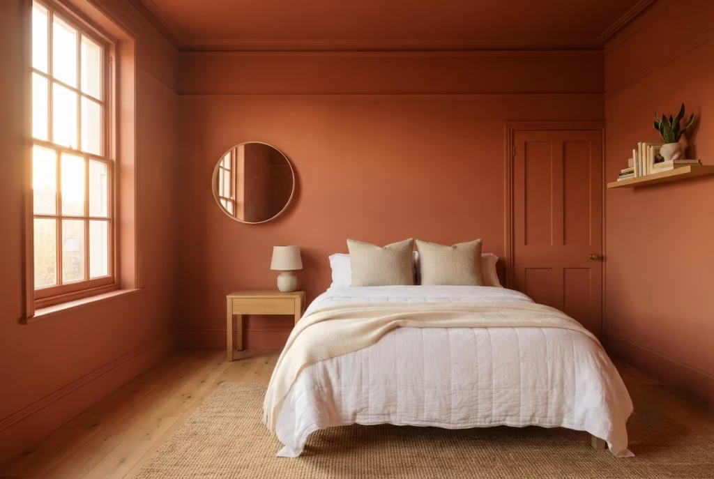
Every idea on this list so far has been about restraint in some form, one wall, one vintage piece, one throw with enough weight to matter. Color drenching throws that whole playbook out the window, and it isn’t for everyone, which is precisely why it earns the word “brave” in its own heading rather than something safer.
Drenching means committing walls, trim, ceiling, and sometimes even the door, to a single saturated color, no breaks, no contrast trim to give the eye a rest. It’s the decorating equivalent of jumping into cold water rather than easing in an inch at a time, and the payoff, when it works, is a room that feels enveloping in a way no accent wall ever quite manages.
Who this genuinely suits, and who should think twice:
| Suits this approach well | Should probably skip or scale down |
| Rooms with strong natural light, at least one large window | North-facing rooms with limited daylight already |
| Homeowners planning to stay put for several years | Renters, or anyone likely to move within a year or two |
| People who already gravitate toward bold, saturated color choices | Anyone still nervous about committing to a single accent wall |
| Bedrooms used primarily for sleeping and relaxing, not working | Multi-purpose rooms also used as a home office needing energy and focus |
The ceiling height caveat, and why it matters more than people expect:
Drenching a room in deep color, terracotta, deep olive, a moody burnt umber, tends to make the walls feel like they’re closing in slightly, an effect that’s genuinely cozy in a room with generous ceiling height and can tip into claustrophobic in one that’s already tight.
As a working guideline, drenching reads best in rooms with at least 9 foot ceilings, where the extra vertical space gives the saturated color room to feel enveloping rather than oppressive. In a standard 8 foot ceiling room, it can still work, but it helps considerably to keep the ceiling itself a shade or two lighter than the walls rather than matching them exactly, a small compromise that keeps the room from feeling like the lid is pressing down.
For anyone working with a genuinely low ceiling, under 8 feet, drenching is one of the few ideas on this entire list I’d actively caution against attempting in full. A single deep accent wall, paired with a lighter ceiling and trim, delivers a good portion of the mood without the risk of the room feeling cramped rather than cocooned.
A real client-room result, since this is exactly the kind of idea that benefits from seeing it actually play out:
I talked a client into drenching her bedroom two autumns ago, walls, trim, and ceiling all in the same deep, burnt-clay terracotta, in a room with 9.5 foot ceilings and a single large west-facing window. She was nervous going in, understandably, since committing an entire room to one saturated color is a genuine leap of faith before you’ve lived with it.
The result, once the last coat dried and the furniture went back in, surprised even me a little. In daylight, the room glowed rather than felt heavy, the west-facing window flooding that late-afternoon light we’ve talked about throughout this whole piece across every surface at once rather than just one wall. In the evening, with the layered warm lighting we covered earlier switched on, the room felt genuinely cocooning, less like a bedroom and more like being wrapped in something.
A few practical notes if you decide to take the leap yourself:
- Use the same paint sheen throughout, ideally a matte or eggshell finish. Mixing a glossy trim against matte walls in a drenched room breaks the seamless effect that makes drenching work in the first place, reintroducing exactly the visual break the technique is designed to eliminate.
- Budget for more paint than a standard accent wall project. A full room, walls, trim, and ceiling, easily needs three to four gallons for a typical bedroom, plus a bit extra for the inevitable second coat on ceiling areas, which tend to need it more than walls do.
- Test the color in the actual room before committing fully. Paint a large sample swatch, at least 2 by 2 feet, in more than one spot, since a color that reads beautifully near the window can shift noticeably in a shadowed corner across the room.
- Keep furniture and textiles a touch lighter than the walls. A fully drenched room with equally dark furniture on top can tip past cozy into genuinely dim. Let at least the bedding or one major textile piece stay lighter to give the eye somewhere to land.
Color drenching isn’t a technique that suits every reader on this list, and that’s exactly as it should be. But for the right room, the right ceiling height, and the right kind of homeowner willing to commit fully rather than hedge with a single accent wall, it delivers a depth of mood that no amount of careful accessorizing can fully replicate on its own.
Global-Pattern Pillow Mixing Without Chaos
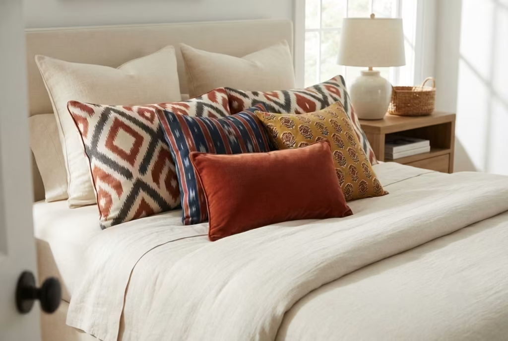
Mixing patterned pillows is one of those design moves that looks effortless in a finished room and feels like a minefield the moment you actually try it yourself. Buy five pillows you individually love, a Moroccan diamond print, an Indian block print, an ikat stripe, a suzani floral, and a plain velvet, and there’s a real chance they’ll fight each other on the bed rather than read as a considered, well-traveled collection. The difference between chaos and confidence almost never comes down to taste. It comes down to two things most people never think to check before checking out, scale and color thread.
Scale variation is the rule that does the heaviest lifting:
Patterns come in roughly three visual scales, and a pillow arrangement needs representation from more than one to avoid looking either monotonous or overwhelming.
| Pattern scale | What it looks like | Role on the bed |
| Large scale | Bold, oversized motifs, big diamonds, large florals, wide stripes | One or two pieces, positioned as the visual anchor |
| Medium scale | Recognizable but smaller repeats, block prints, medium ikat | The connective tissue, bridging large and small patterns |
| Small scale or solid | Tight, dense prints or plain texture, like velvet or linen | The visual rest, giving the eye somewhere calm to land |
A common mistake is grabbing five pillows all sitting at roughly the same medium scale. Individually striking, together they blur into a kind of visual static, no clear focal point, nothing for the eye to settle on first. Introduce one large-scale piece, a couple of medium prints, and one solid or small-scale texture, and suddenly there’s a hierarchy the eye can actually follow, landing first on the bold piece, then wandering through the mediums, then resting on the solid.
The shared color thread, and why it matters more than matching patterns ever could:
This is the detail that lets genuinely different patterns, a global block print next to a geometric ikat next to a solid velvet, sit together without looking randomly assembled. The patterns don’t need to match. They need to share at least one common color running through every single piece, even if that color shows up as the dominant shade in one pillow and just a thin accent thread in another.
I worked with a client who owned, individually, four beautiful pillows that looked like they’d been pulled from four completely different homes once placed together, a rust suzani, a navy ikat, a mustard block print, and a cream boucle. The fix wasn’t buying anything new.
It was simply identifying that rust showed up faintly in the ikat’s border and again as a thin stripe in the mustard block print, and building the rest of the arrangement around that shared rust thread with one additional solid rust lumbar pillow. Four pillows that once looked randomly gathered suddenly read as a deliberate, curated collection, because the eye had a color to trace across every single piece.
Pillow count guidance, relative to bed size, since too many or too few both undercut the effect:
- Queen bed (60 inches wide): Five to six pillows total works well, typically two standard sleeping pillows at the back, two Euro shams behind them, and one or two decorative accent or lumbar pillows in front.
- King bed (76 inches wide): Six to seven pillows, following the same layering logic but with slightly larger or an extra accent piece to fill the additional width without looking sparse.
- Full or smaller beds (under 54 inches): Four pillows tends to be the ceiling before the arrangement starts crowding a smaller mattress, typically two sleeping pillows plus one or two accents.
As a rough visual check once everything’s arranged, step back to the doorway and look at the bed as a whole. If any single pillow seems to be doing its own thing entirely, unrelated in scale or color to everything around it, that’s usually the piece worth swapping out or relocating to a chair elsewhere in the room.
Global pattern mixing, done well, should look like it happened gradually over years of collecting rather than in one single shopping trip, and a shared color thread running quietly beneath a mix of scales is exactly what pulls off that particular sleight of hand.
You May also Like: 25 Black Bedroom Ideas That Feel Bold, Cozy, and Timeless
A Single Statement Vintage Rug as the Room’s Anchor
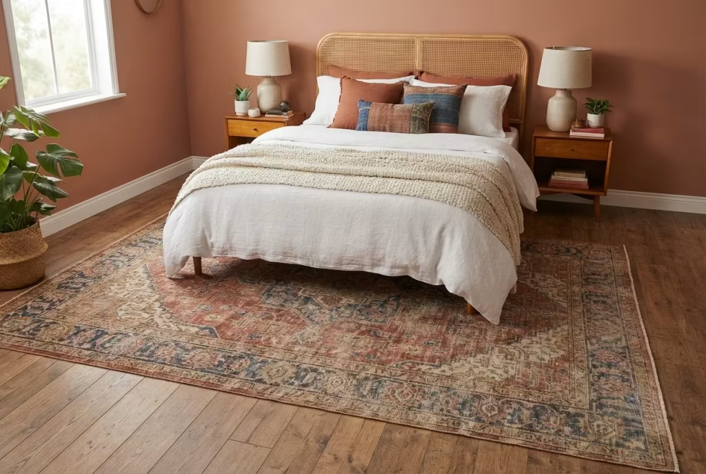
There’s a moment in almost every bedroom project where a client, having carefully assembled matching lamps, matching pillow covers, and a matching throw, still says the room feels like it’s missing something, and nine times out of ten, that missing something turns out to be a rug with actual character. A single worn, faded, slightly imperfect vintage rug can do more to ground a room than five perfectly coordinated new accessories combined, because it brings something none of them can fake, real history worn into the fibers over years or decades of actual use.
Sizing the rug correctly relative to the bed footprint, since this is where most rug purchases go wrong:
Rugs bought too small are the single most common styling mistake in bedrooms, full stop. A rug that only peeks out from under the very center of the bed, floating in a sea of bare floor on either side, looks like an afterthought rather than an anchor, no matter how beautiful the pattern itself might be.
| Bed size | Minimum rug size | Ideal rug size | Placement guidance |
| Full or queen (54–60 inches wide) | 8 by 10 feet | 9 by 12 feet | Rug extends 24–30 inches beyond each side of the bed |
| King (76 inches wide) | 9 by 12 feet | 10 by 14 feet | Rug extends 20–24 inches beyond each side of the bed |
| Small or full bed in a compact room | Runner rugs on either side, 2 by 6 feet each | Paired runners plus a small accent rug at the foot | Runners flank the bed rather than sitting fully beneath it |
The general rule worth committing to memory: at least two-thirds of the rug should extend beyond the sides and foot of the bed, so that when you step out of bed in the morning, your feet land on rug rather than cold, bare floor. Anything smaller and the rug starts to look like it was chosen for the bed rather than for the room.
Why one worn, imperfect vintage rug outperforms five matching new accessories:
A brand-new rug, however well-made, arrives with a kind of visual sameness across its entire surface, uniform color, uniform pile, uniform pattern crispness. A genuine vintage rug, especially an older Persian, Turkish, or Moroccan piece, carries variation baked into its very fibers, slightly faded patches where sun once hit it in a previous home, a subtly uneven weave from hand-knotting, a color palette that’s mellowed and softened over years rather than staying artificially saturated. That variation does something no matching accessory set ever can. It gives the room a sense of accumulated time, of having been lived in and loved rather than assembled in a single weekend from a catalog.
I’ve watched this play out on more than one project where a client arrived with a full cart of matching new decor, coordinated pillow covers, a matching throw, a set of ceramic vases in the same glaze, and the room still read as flat and slightly impersonal once everything was in place.
Swap in a single worn vintage rug beneath that exact same collection of matching accessories, and the whole room suddenly clicks into place, because the rug is doing something the matching pieces structurally cannot, introducing genuine, unrepeatable imperfection into a composition that was otherwise too uniform to feel authentically boho.
A real sourcing and cost note, since vintage rugs have a wide and sometimes intimidating price range:
- Estate sales and auction houses remain the most reliable source for genuinely old, hand-knotted rugs at reasonable prices, often running $200 to $600 for a solid 8 by 10 piece with real age and character, compared to $800 or more for a comparable new rug of similar size and quality.
- Online vintage rug marketplaces have made sourcing dramatically easier over the past several years, though shipping costs and the inability to see a rug in person before buying are real trade-offs worth factoring into the total cost.
- Overdyed and vintage-inspired new rugs offer a middle path for anyone nervous about buying genuinely old, sometimes fragile textiles, running $300 to $700 typically, and delivering a good portion of that worn, faded look through intentional distressing rather than actual decades of use.
- Budget for a rug pad separately, roughly $30 to $80 depending on size, since an older rug in particular benefits from the extra cushioning and floor protection a quality pad provides, both for comfort underfoot and for preserving whatever life is left in older, more delicate fibers.
Get the sizing right and choose a piece with genuine character over one chosen purely to match, and a single rug becomes the quiet, unifying force that ties together everything else on this list, the terracotta wall, the rattan headboard, the layered pillows, giving them all a shared floor to stand on, literally and otherwise.
Common Mistakes to Avoid in a Boho Fall Bedroom
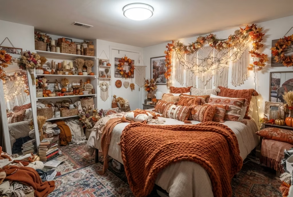
Every idea covered so far is about what to add. This section is about what quietly undoes all of it, the small missteps that turn a genuinely well-intentioned boho fall bedroom into something that reads as try-hard, cluttered, or oddly cold despite every warm color choice on the walls.
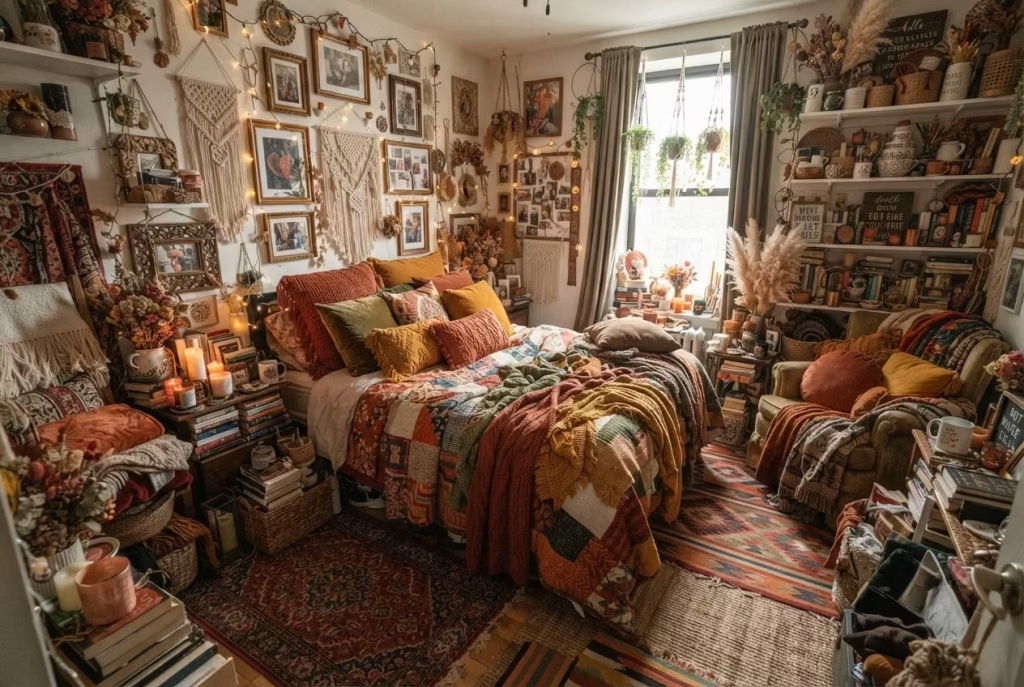
Mistaking quantity for coziness. The instinct to keep adding, another pillow, another throw, another dried arrangement, is understandable given how layered boho decor is supposed to look, but there’s a real ceiling past which more stops helping. A room with twelve mismatched pillows and three competing rugs doesn’t read as gathered over time. It reads as unedited. The fix isn’t fewer objects necessarily, it’s fewer competing focal points, letting one or two pieces per zone actually earn their spot.
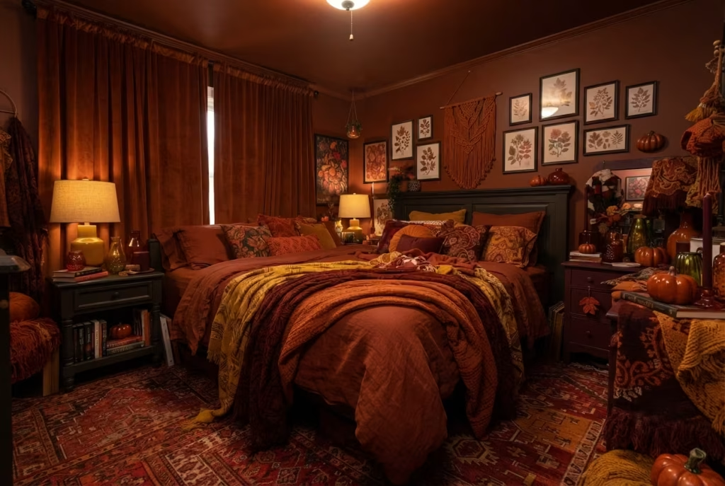
Skipping the neutral base entirely. Saturated color is the whole appeal of a fall palette, but a room with zero neutral ground, no cream, no warm white, no bare wood, has nowhere for the eye to rest. Even the boldest color-drenched room in this list kept its ceiling a shade lighter for exactly this reason. Neutral space isn’t the absence of style, it’s what makes the saturated pieces around it actually register as intentional rather than exhausting.
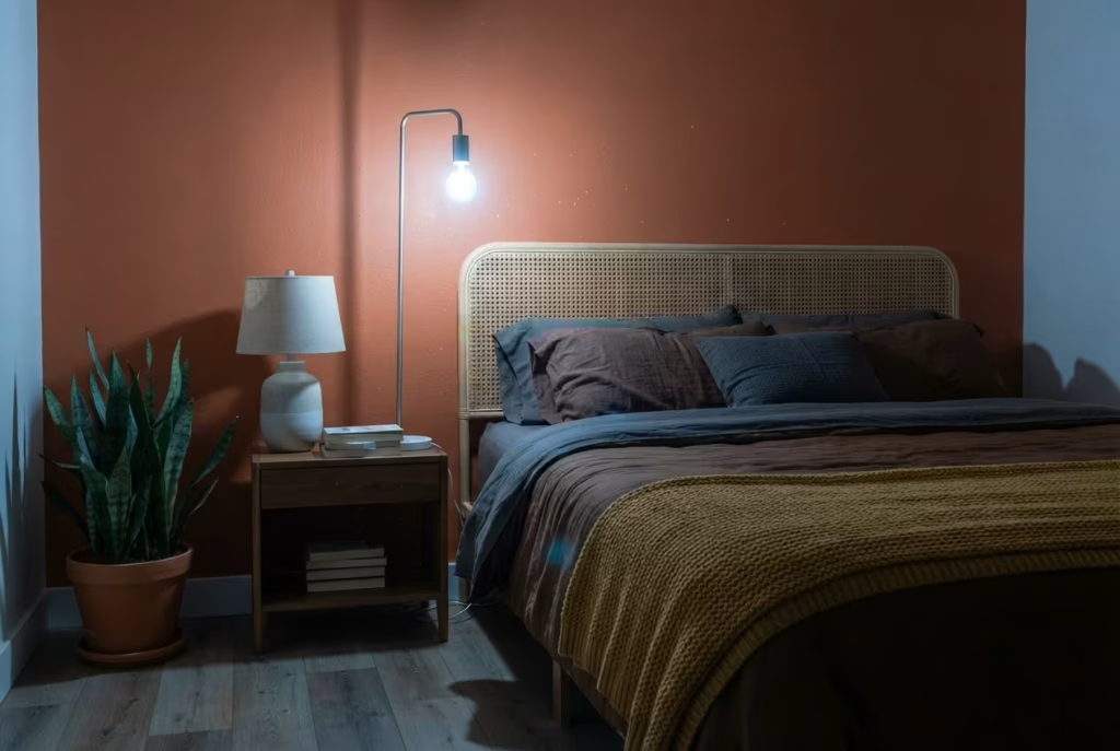
Choosing cold-toned lighting and expecting warm colors to compensate. This mistake undoes more rooms than almost any other on this list. A terracotta wall, a rattan headboard, and a mustard throw all lose their warmth under a 5000K bulb, no matter how carefully everything else was chosen. Color and light aren’t separate decisions. They’re the same decision, made twice.
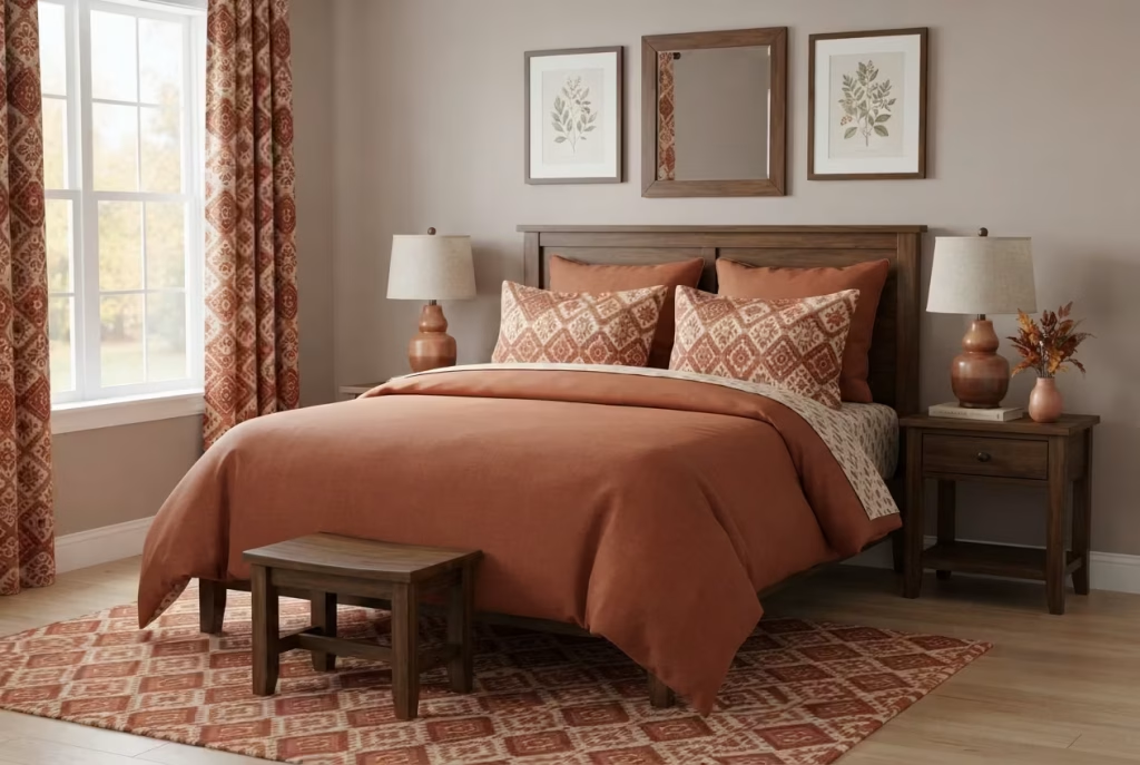
Buying matched sets instead of building a collection. A matching bedding, curtain, and pillow set from a single retailer photographs consistently, but it also tends to flatten a room into something that looks purchased rather than curated. The vintage rug and vintage furniture ideas covered earlier exist specifically to counter this, one imperfect, mismatched piece does more for authenticity than an entire coordinated set.
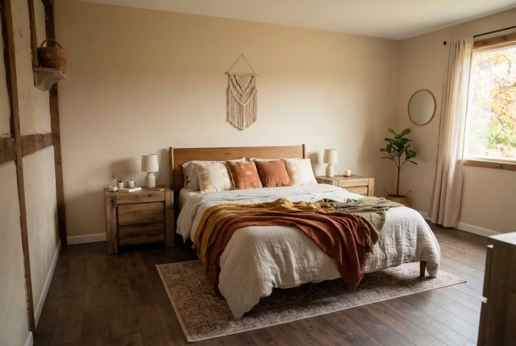
Ignoring proportion for the sake of a trend. An undersized rug floating under just the center of the bed, a macrame hanging too small for the wall behind it, a pillow arrangement with no scale variation, these aren’t style failures, they’re measurement failures. Nearly every idea in this guide came with a specific sizing rule for exactly this reason. Boho looks effortless. Getting the proportions right rarely is.

Forgetting that fall decor needs to function through winter too. A room styled purely around October’s aesthetic can start to feel dated by December once the pampas grass has faded and the candles have burned down. Building around durable materials, rattan, wool, ceramic, rather than purely seasonal props keeps the room feeling intentional well past the first few weeks of autumn.
Most of these mistakes share a common root: reaching for more before getting the fundamentals right. A single well-placed anchor piece, correctly sized and warmly lit, will always outperform a room full of trend-chasing additions competing for the same attention.
You May also Like: 15 Beach Cottage Design Ideas for a Relaxing Coastal Home
How This List Differs by Room Size
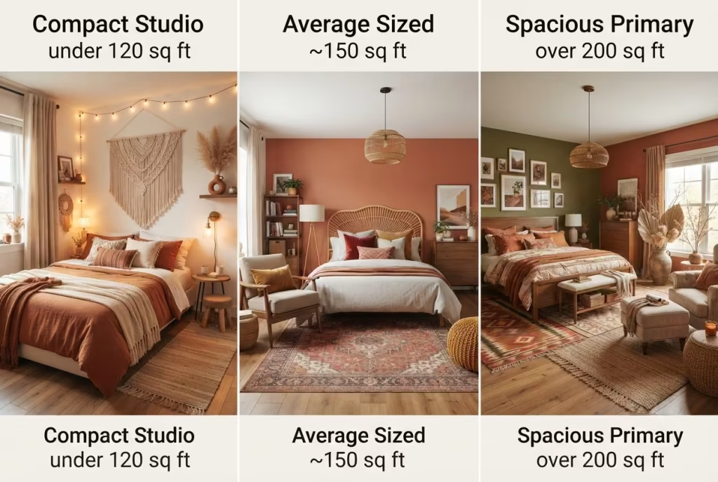
Not every idea on this list carries the same weight in every bedroom, and pretending otherwise is how people end up cramming a full color drench into a 10 by 10 studio and wondering why it feels like the walls moved in overnight. Square footage genuinely changes which ideas do the heaviest lifting and which ones need to sit this round out entirely, so it’s worth taking stock of your own room before you start checking things off the list.
A quick reference for which ideas earn their keep depending on your room’s actual footprint:
| Room type | Ideas that shine here | Ideas to approach with caution |
| Studio or small bedroom (under 120 sq ft) | Ceiling-mounted curtains, single macrame hanging, layered lighting, dried botanicals in a compact vessel, paired runner rugs | Full color drenching, oversized vintage furniture, floor cushion nooks that eat up walking space |
| Average bedroom (120–200 sq ft) | Rattan headboard, statement rug, reading nook in a spare corner, terracotta accent wall, global-pattern pillow mixing | Reclaimed wood paneling on more than one wall, multiple vintage anchor pieces competing for space |
| Large primary bedroom (200+ sq ft) | Color drenching, dedicated reading nook with a proper chair, layered rugs, two or more vintage pieces mixed thoughtfully | Under-scaled decor that gets visually swallowed, a single small rug, one modest lamp with no supporting light sources |
A smaller room genuinely benefits from ideas that borrow height or add texture without demanding floor space, which is exactly why the ceiling-mounted curtain technique and a single well-chosen macrame hanging tend to outperform anything bulky in a studio setup. Square footage is precious in a compact bedroom, and every idea that asks for it, a reading nook, a second vintage furniture piece, a sprawling layered rug setup, needs to justify taking that space away from something else the room might need more.
A larger primary bedroom flips that calculation almost entirely. Here, the real risk isn’t overcrowding, it’s under-committing. A single small rug or one modest lamp can genuinely disappear in a room with 200 or more square feet to fill, reading as sparse rather than intentionally minimal. This is where the bolder ideas on this list, color drenching, mixing multiple vintage pieces, building out a proper reading nook with a full chair rather than a floor cushion, finally have enough room to breathe and actually register at the scale they’re designed for.
The average bedroom, sitting comfortably in the middle, has the most flexibility of the three, which is honestly both a blessing and a minor curse. With enough space to support a genuine anchor piece but not so much that ideas get lost, this is where most of the seventeen ideas on this list were originally tested and refined, which is exactly why they scale down for smaller rooms and up for larger ones without losing what makes them work in the first place.
Whatever size room you’re working with, the underlying principle from every idea on this list holds steady: let the space itself, not the trend, decide how much you commit to at once.
Choosing Which Ideas Actually Suit Your Room
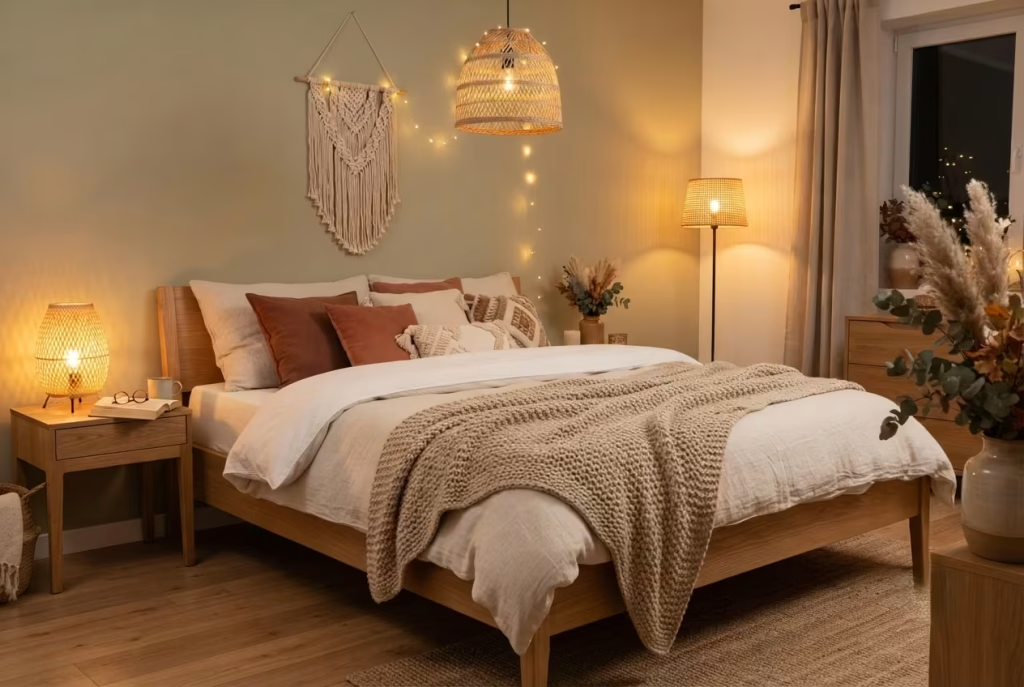
Seventeen ideas is a lot to take in at once, and the honest truth is you don’t need more than a handful to transform a room. If budget is tight, start with warm-toned layered lighting, a knit throw with real weight, and dried botanicals. All three cost under a hundred dollars combined and deliver an outsized shift in mood by evening’s end.
Some ideas ask more of you before you commit. A drenched ceiling, reclaimed wood paneling, or anything requiring drilling deserves a second thought if you’re renting or planning to move within a year. Weigh the commitment against how long you’ll actually live with the result.
Certain pairings genuinely amplify each other. A rattan headboard and a macrame hanging share enough textural warmth to coexist without crowding one another, while a fully drenched wall competing against a heavily patterned pillow mix can tip a room from moody into muddled. Choose one loud gesture per room, then let everything else support it.
A cozy boho bedroom rarely comes from doing everything at once. It comes from choosing two or three ideas that genuinely suit your space, your budget, and your patience, then living with them before adding more. If you want the full framework behind these choices, the color logic, the layering order, the lighting math, that’s exactly what the complete autumn boho bedroom decor guide walks through in detail. This list was always meant to be the spark. The system is what turns it into a room you don’t want to leave.
FAQs (Frequently asked question about Warm & Cozy Boho Fall Bedroom)
How many boho fall ideas should I combine in one bedroom?
Two to three is the sweet spot for most rooms. Pick one anchor idea, like a rattan headboard or a statement rug, then layer in a couple of smaller supporting touches such as lighting and textiles. Piling on more than five or six at once tends to blur into clutter rather than read as curated.
What’s the easiest idea on this list to try first on a budget?
Warm-toned layered lighting. Swapping a single cold-Kelvin bulb for a warm 2700K one, plus adding a small lamp or string lights, costs under thirty dollars and changes a room’s mood more than almost anything else on this list.
Can boho fall decor work in a small bedroom?
Yes, and often more easily than in a large one. Lean on ideas that borrow height or add texture without eating floor space, ceiling-mounted curtains, a single macrame hanging, layered pillows, rather than bulkier commitments like color drenching or oversized vintage furniture.
Do I need to buy everything new to get this look?
No, and honestly the room usually looks better if you don’t. A single vintage or thrifted piece, a dresser, a rug, a side table, tends to do more for authenticity than an entire room of new purchases, since that one imperfect item gives everything else something real to gather around.
Is boho fall decor expensive to pull off?
Not necessarily. The highest-impact, lowest-cost changes on this list, lighting, a knit throw, dried botanicals, cost well under two hundred dollars combined. The pricier ideas, like reclaimed wood paneling or a full color drench, are optional upgrades, not requirements for the look to work.