15 Victorian Mudroom Design Secrets for a Timeless, Elegant Entryway
Victorian homes have always understood the importance of a first impression. Long before open-plan living became the norm, these houses were designed with carefully considered transitions, spaces that gently guided people from the outside world into the warmth and order of the home. The mudroom, though often overlooked in modern renovations, remains one of the most revealing of these spaces. It quietly communicates how a home functions, how it welcomes guests, and how it balances beauty with everyday practicality.
What makes a Victorian mudroom particularly compelling today is its ability to combine elegance with purpose. In an age when entrances are expected to manage everything from muddy boots and wet umbrellas to school bags and deliveries, the mudroom has become far more than a simple storage zone. Yet the most successful designs resist the temptation to prioritise utility alone. Instead, they draw on the craftsmanship, proportions, and architectural character that define Victorian interiors, creating spaces that feel organised without appearing clinical and decorative without becoming overwhelming.
The secret lies in restraint. Original details such as panelled joinery, heritage flooring, and traditional hardware provide a sense of permanence, while thoughtful storage keeps daily clutter carefully out of sight. The result is an entryway that feels composed rather than busy, practical rather than purely ornamental.
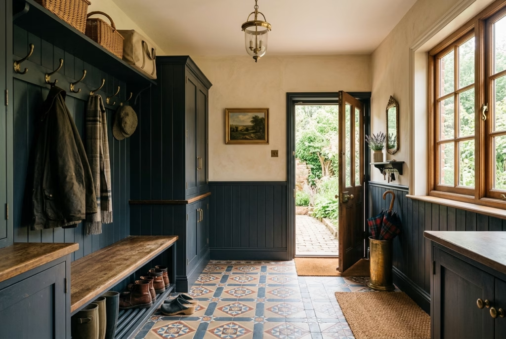
A well-designed Victorian mudroom does more than hold coats and shoes. It establishes the rhythm of the home from the moment the door opens, creating an atmosphere of order, comfort, and quiet sophistication. In many ways, it is not simply a functional space at all. It is the first chapter of the home’s story, setting the tone for everything that follows.
Build the Room Around Function, Not Decoration
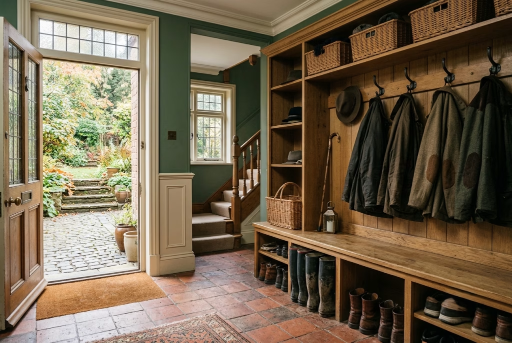
The most elegant Victorian mudrooms are rarely defined by decorative details alone. While heritage mouldings, period-inspired colours, and antique hardware contribute to their charm, their lasting success comes from something far more fundamental: functionality. Victorian homes were designed with a strong sense of order, where each space served a clear purpose within the daily rhythm of the household.
A mudroom should continue that tradition, acting as a seamless transition between outdoors and indoors rather than a showcase for decorative features. Before selecting paint colours, flooring, or architectural details, it is worth considering how the space will actually be used on a busy day. Where will coats be hung? Where will wet boots dry?
How will people move through the room without creating congestion? When circulation, storage, and everyday practicality are resolved first, the decorative layer feels effortless and authentic. The result is an entryway that not only looks timeless but also performs beautifully year after year, maintaining the sense of calm, order, and understated elegance that Victorian interiors are known for.
Start with Circulation
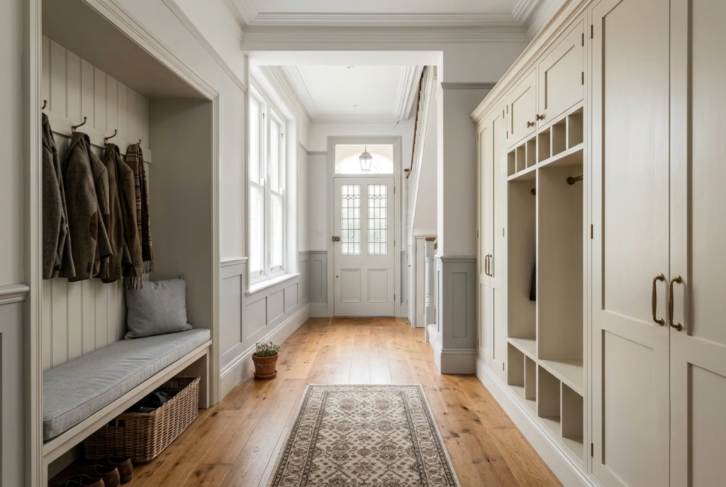
A beautifully detailed Victorian mudroom can quickly lose its appeal if moving through it feels awkward. Before considering panelled cabinetry, heritage colours, or decorative lighting, focus on circulation. The most successful entryways are those that allow everyday routines to unfold naturally, without bottlenecks, obstacles, or constant adjustments. After all, a mudroom is often at its busiest during the least glamorous moments of the day: children arriving home from school, guests stepping in from the rain, or family members juggling shopping bags, coats, and muddy footwear all at once.
In many of the period homes I have worked on, circulation problems rarely stem from a lack of space. More often, they arise from poor planning. A narrow room packed with oversized storage can feel far more restrictive than a smaller space designed with movement in mind. As the saying goes, you cannot see the wood for the trees when every available inch is filled with cabinetry.
As a practical guideline, aim for a minimum circulation width of 900 mm (35 inches) between opposing walls, cabinetry, or furniture. Where space allows, increasing this dimension to 1,200 mm (47 inches) creates a noticeably more comfortable passage, particularly in family homes where several people may use the room simultaneously. This additional width prevents the space from feeling pinched and allows movement to flow naturally.
Bench design deserves equal consideration. A seating depth of 450 to 500 mm (18 to 20 inches) generally provides enough room to sit comfortably while removing footwear without projecting too far into the room. Benches that exceed this depth can dominate smaller mudrooms, reducing valuable floor space and disrupting visual balance.
Storage zones require breathing room as well. Allow at least 750 mm (30 inches) of clear floor area in front of lockers, cupboards, or hanging rails. This ensures doors can open fully and users can access belongings without feeling cramped. In larger mudrooms, increasing this clearance to around 900 mm (35 inches) often improves usability significantly.
What separates a good mudroom from a great one is not necessarily the finish selection or decorative detailing. It is the ease with which daily routines take place. When movement feels intuitive, storage is accessible, and nothing interrupts the natural flow of the room, the entire space begins to feel calmer. It becomes one of those quietly efficient interiors that works hard behind the scenes, keeping the household running smoothly while maintaining the composed elegance that defines the best Victorian homes.
Conceal the Visual Noise
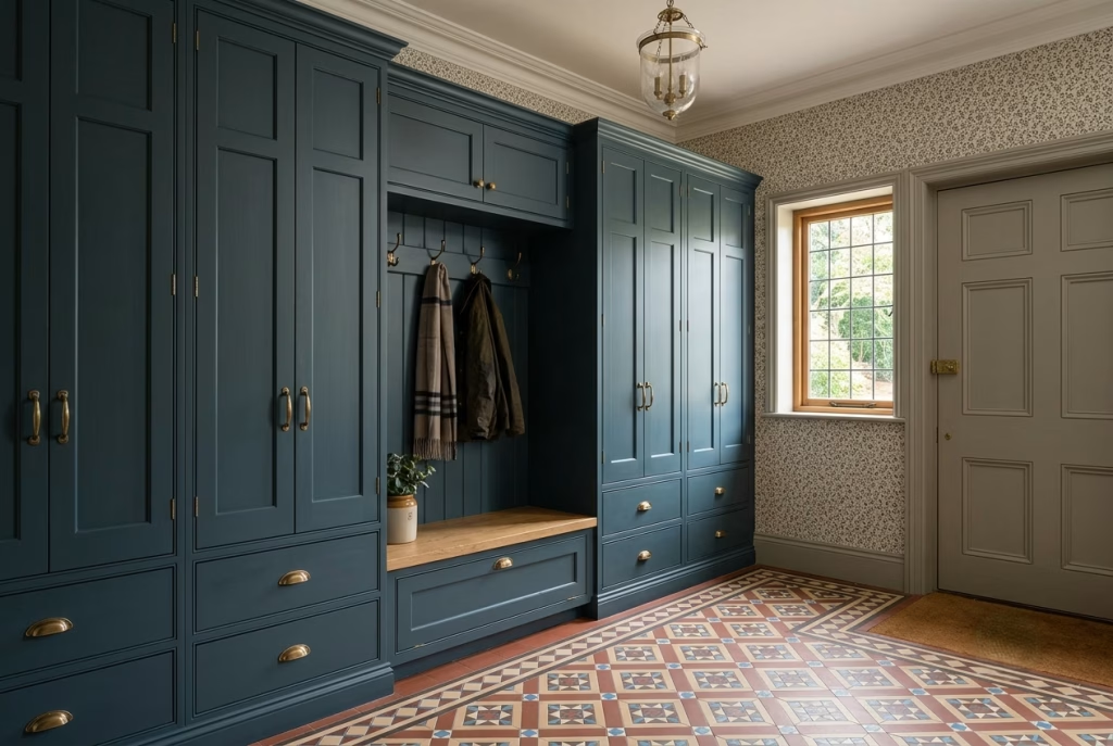
One of the reasons Victorian interiors continue to feel so refined is their remarkable sense of order. Rooms were designed to present a composed face to the world, with practical necessities carefully integrated rather than left on display. A mudroom should follow the same principle. No matter how beautiful the flooring, joinery, or paintwork may be, an entryway crowded with shoes, backpacks, umbrellas, pet accessories, and seasonal outerwear can quickly feel chaotic. The eye has nowhere to rest, and the room begins to feel smaller than it really is.
Visual noise is often underestimated in residential design. In reality, clutter affects how a space is experienced every single day. Research into environmental psychology consistently suggests that highly cluttered environments can contribute to feelings of stress and mental fatigue. By contrast, spaces with clear visual organisation tend to feel calmer and more welcoming. The mudroom, sitting at the threshold between outside demands and domestic comfort, is particularly sensitive to this balance.
The most successful Victorian-inspired storage solutions conceal everyday items behind thoughtfully designed joinery. Full-height cabinets, painted in heritage colours or soft neutrals, create a sense of architectural permanence while keeping less attractive necessities out of sight. In many period homes, I prefer cabinetry extending close to the ceiling, often reaching 2.1 to 2.4 metres (7 to 8 feet) where proportions allow. This approach not only increases storage capacity but also strengthens the room’s vertical emphasis, a characteristic frequently found in Victorian architecture.
Open storage has its place, but it benefits from careful restraint. A row of well-positioned brass hooks may comfortably accommodate coats used daily, while everything else remains concealed behind panelled doors. When every item is visible, the room can quickly resemble a railway station cloakroom rather than an elegant domestic entrance.
Particularly effective storage features include:
- Closed cupboards for seasonal coats and bulky outerwear
- Deep drawers for gloves, scarves, and smaller accessories
- Pull-out boot trays that contain moisture and dirt
- Dedicated compartments for bags and school equipment
- Hidden charging stations for phones and electronic devices
One strategy I often recommend is creating designated storage zones for each household member. Even in relatively compact mudrooms, allocating approximately 450 to 600 mm (18 to 24 inches) of hanging space per person can dramatically improve organisation. It is a simple adjustment that prevents belongings from migrating across the room like unwanted house guests who have overstayed their welcome.
There is also an aesthetic advantage to concealed storage that extends beyond practicality. When surfaces remain clear and visual distractions are minimised, architectural details become far more noticeable. The craftsmanship of panelled joinery, the richness of a heritage paint colour, or the texture of a stone floor can finally take centre stage. Instead of competing with clutter, these elements contribute to a room that feels measured, elegant, and quietly luxurious.
In many ways, good mudroom storage is not about hiding possessions. It is about protecting the atmosphere of the home itself. By giving everyday objects a proper place, the room maintains a sense of calm that greets residents and visitors alike from the moment they step through the door.
Use Built-In Joinery to Define the Architecture
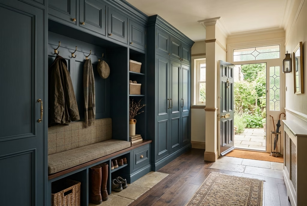
The finest Victorian mudrooms rarely feel furnished in the conventional sense. Instead, they appear carefully composed, with storage, seating, and architectural detailing working together as though they have always been part of the home. This is where built-in joinery excels. Rather than introducing freestanding units that can feel disconnected from their surroundings, fitted cabinetry becomes part of the room’s framework, strengthening both functionality and visual coherence.
In period properties especially, built-ins help reinforce the architectural language already present. Panelled cupboard doors, integrated benches, moulded plinths, and carefully proportioned cornices create a sense of permanence that loose furniture often struggles to achieve. The goal is not to make the joinery stand out, but to make it feel inevitable, as though the room would be incomplete without it.
One of the most common mistakes I encounter is treating storage as an afterthought. A collection of hooks, baskets, and standalone cabinets may solve immediate practical needs, but it often creates a fragmented appearance. By contrast, well-designed joinery brings order to the space, allowing multiple functions to sit comfortably within a single architectural composition. Seating, coat storage, shoe organisation, and concealed cupboards can all coexist behind a unified design language.
The benefits become particularly noticeable in challenging spaces. Victorian homes often contain side entrances, rear halls, and narrow service corridors that were never intended to function as modern mudrooms. Left untouched, these areas can feel awkward and underutilised. Yet with thoughtful joinery, they can become some of the hardest-working rooms in the house.
I worked on a late Victorian terrace where the rear entrance measured just under 1.8 metres (6 feet) wide and felt little more than a passageway connecting the kitchen to the garden. Coats accumulated on random hooks, footwear gathered in untidy piles, and the room always appeared busy regardless of how often it was tidied. Instead of forcing bulky furniture into the space, we installed bespoke cabinetry only 350 mm to 400 mm (14 to 16 inches) deep along one wall, paired with a built-in bench measuring 450 mm (18 inches) deep. By integrating every storage requirement into a single joinery composition, the room immediately felt larger, calmer, and significantly more functional.
This approach works because fitted joinery eliminates visual interruptions. The eye reads the storage wall as part of the architecture itself rather than a collection of separate pieces competing for attention. In smaller mudrooms, this distinction can dramatically alter how spacious the room feels.
Particularly effective architectural joinery features include:
- Full-height panelled lockers that visually extend ceiling height
- Integrated benches positioned between storage bays
- Concealed shoe drawers beneath seating
- Cabinet fronts aligned with existing mouldings and trim details
- Storage niches designed around the proportions of the room
Scale is equally important. In many Victorian homes, ceilings range from 2.7 to 3.3 metres (9 to 11 feet) high. Joinery that stops awkwardly midway up the wall can leave the room feeling unresolved. Extending cabinetry closer to ceiling level often creates a stronger architectural presence while providing valuable storage for seasonal items used less frequently.
The true strength of built-in joinery lies in its ability to transform problem spaces into purposeful ones. A narrow boot room becomes organised. An awkward side entrance gains structure. A cluttered rear hall develops a sense of calm. When designed thoughtfully and detailed with respect for the home’s original character, fitted joinery does far more than provide storage. It becomes part of the architecture itself, quietly shaping the way the room looks, feels, and functions every day.
Let Period Character Guide the Material Palette
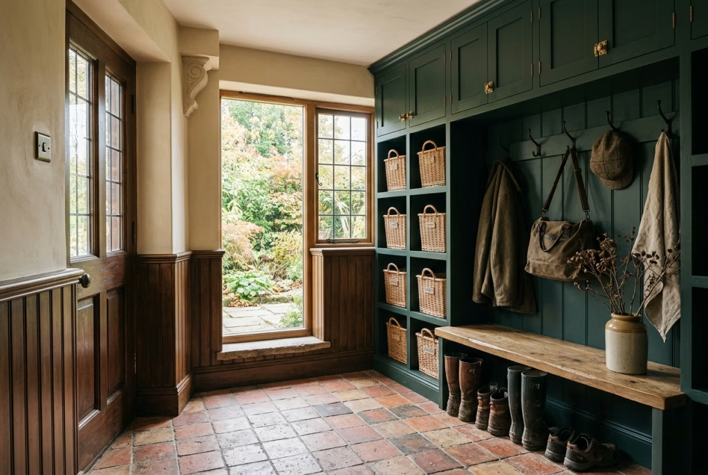
The materials chosen for a Victorian mudroom play a significant role in determining whether the space feels authentic or simply styled to look old. While modern products offer impressive durability, the most successful designs take their cues from the home’s architectural heritage, using materials that feel rooted in the building’s history while still supporting contemporary living.
Natural textures, honest finishes, and carefully considered surfaces create a sense of permanence that never goes out of fashion. When the material palette is guided by period character rather than passing trends, the mudroom gains a quiet confidence, one that feels both elegant and entirely at home within a Victorian setting.
Use Tongue-and-Groove or Panelled Joinery with Restraint
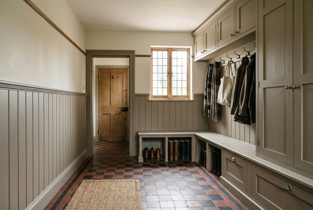
Victorian interiors are often celebrated for their craftsmanship, but one of the reasons the finest examples continue to feel relevant is that their detailing was rarely excessive. Architectural features were used to create rhythm, proportion, and visual structure rather than simply decoration for decoration’s sake. The same principle applies in a mudroom. Tongue-and-groove panelling and panelled joinery can introduce warmth, depth, and heritage character, yet their greatest strength lies in knowing when to stop.
It is easy to assume that adding more period details will automatically make a space feel more authentic. In practice, the opposite is often true. When every surface is covered in mouldings, panels, and trim, the room can begin to feel heavy-handed, almost as though it is trying too hard to prove its Victorian credentials. A well-designed mudroom should tip its hat to the past without turning into a stage set.
Tongue-and-groove boarding works particularly well on lower wall sections, where it provides both visual interest and practical protection against scuffs, damp coats, and everyday wear. In busy family homes, I often recommend installing panelling to a height of approximately 900 to 1,200 mm (35 to 47 inches). This creates a durable surface in high-contact areas while maintaining a balanced wall composition above. The result feels grounded and architectural rather than overly decorative.
Panelled cabinetry offers a similar advantage. Simple shaker-style or Victorian-inspired recessed panels can transform ordinary storage into something far more integrated and sophisticated. Rather than standing out as individual cupboards, the joinery becomes part of the room’s architectural framework. It is a subtle distinction, yet one that often separates timeless interiors from trend-led designs that date quickly.
In one period renovation project, the homeowners initially considered elaborate raised panels throughout the mudroom. After reviewing the space, we simplified the design considerably, opting for understated recessed panels combined with a muted heritage paint finish. The difference was striking. Instead of competing for attention, the joinery allowed the original architraves, floor tiles, and natural light to take centre stage. Sometimes less really is more, and nowhere is that truer than in a room designed to manage daily clutter.
For a balanced Victorian-inspired mudroom, consider:
- Tongue-and-groove panelling on lower wall sections only
- Recessed panel cabinet fronts with clean proportions
- Consistent panel sizing across storage units
- Simple moulding profiles that complement existing trim
- Painted finishes that highlight craftsmanship rather than ornament
Scale also matters enormously. Wide panels can make compact rooms feel broader and calmer, while excessively narrow divisions may introduce unnecessary visual busyness. As a general guide, panel widths between 300 and 600 mm (12 and 24 inches) tend to work comfortably in most residential mudrooms, though proportions should always respond to the room itself.
The beauty of restrained joinery lies in its ability to age gracefully. Trends come and go, but thoughtful architectural detailing remains. When panelling is used with a light touch and guided by proportion rather than excess, it creates a mudroom that feels elegant, enduring, and entirely at ease within the fabric of a Victorian home. Like a well-tailored jacket, it never needs to shout to make an impression.
Choose Flooring That Can Take Weather, Grit, and Repeated Cleaning
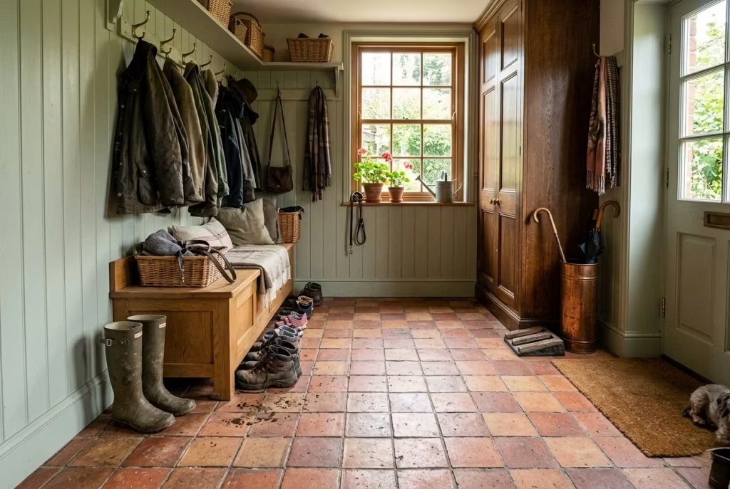
A Victorian mudroom may be admired for its elegant joinery and carefully considered colour palette, but the flooring is often the element doing the heaviest lifting. Every muddy boot, rain-soaked umbrella, pet paw, shopping trolley wheel, and winter coat eventually leaves its mark here. Choosing the wrong surface can quickly turn a beautiful entryway into a maintenance headache, while the right material will continue to look better with age, quietly absorbing the demands of everyday life.
One lesson I have learned through years of residential renovation work is that mudroom flooring should always be selected for performance first and appearance second. Fortunately, many of the materials most suited to hard-working entryways also happen to complement Victorian architecture exceptionally well. The sweet spot lies where practicality and character meet.
Victorian homes traditionally favoured robust natural materials capable of enduring decades of use. That philosophy remains just as relevant today. A mudroom floor should not leave homeowners worrying about every muddy footprint or wet dog passing through the door. Instead, it should provide confidence, allowing daily life to unfold naturally without constantly reaching for a mop.
Before choosing a material, consider:
- How much outdoor traffic enters the home daily
- Whether children or pets regularly use the entrance
- The local climate and seasonal weather conditions
- The amount of maintenance you are realistically willing to undertake
- How the flooring connects visually to adjoining spaces
The following comparison highlights some of the most practical flooring options for a Victorian-inspired mudroom.
| Material | Look | Durability | Maintenance | Best For |
|---|---|---|---|---|
| Quarry Tile | Authentic, heritage-led | High | Low to moderate | Period homes, heavy footfall |
| Porcelain Tile | Practical, versatile | Very high | Low | Family homes, wet conditions |
| Slate | Natural, grounded | High | Moderate | Rustic Victorian schemes |
| Painted Timber | Soft, traditional | Moderate | Higher | Dry, low-traffic entrances |
Quarry Tile
Quarry tiles remain one of the most authentic choices for Victorian homes. Their rich earthy tones and slightly irregular character feel perfectly suited to heritage architecture. They also wear remarkably well, often developing a gentle patina that enhances rather than diminishes their appeal.
In older properties where original quarry tiles survive, I almost always encourage preservation whenever possible. Even after a century of use, many continue to outperform modern alternatives. Their forgiving nature means dirt and minor wear blend naturally into the surface rather than standing out.
Pros
- Historically appropriate
- Excellent durability
- Ages beautifully
- Naturally disguises dirt
Cons
- Can feel cold underfoot
- Some varieties require sealing
- Limited colour palette
Porcelain Tile
For homeowners seeking maximum practicality, porcelain is often the safest bet. Modern manufacturing techniques can convincingly replicate stone, terracotta, and even aged Victorian surfaces while delivering exceptional resistance to moisture and staining.
I frequently specify porcelain in family mudrooms where weather exposure is constant. It is one of those materials that simply gets on with the job, day after day, without demanding much attention.
Pros
- Highly resistant to water and scratches
- Easy to clean
- Available in numerous heritage-inspired finishes
- Suitable for underfloor heating
Cons
- Premium options can be expensive
- Poor-quality products may appear artificial
Slate
Slate brings depth, texture, and a slightly rugged elegance that suits country Victorian properties particularly well. Its naturally varied surface introduces visual richness while remaining durable enough for heavy daily use.
A well-selected slate floor can feel as though it has been part of the house for generations, especially when paired with painted joinery and traditional brass hardware. It is a material with genuine character, one that reveals new details as light shifts throughout the day.
Pros
- Distinctive natural texture
- Excellent longevity
- Strong visual connection to traditional architecture
- Hides dirt effectively
Cons
- Requires periodic sealing
- Surface texture may trap dust in some finishes
Painted Timber
Painted timber offers undeniable warmth and softness. In the right setting, it can make a mudroom feel less utilitarian and more connected to the rest of the house. However, it is best reserved for entrances that experience lighter traffic and less direct exposure to moisture.
While beautiful, timber requires a little more care. It is a material that rewards attention, much like a cherished antique piece that improves with thoughtful stewardship.
Pros
- Warm and inviting appearance
- Comfortable underfoot
- Complements traditional Victorian interiors beautifully
Cons
- Vulnerable to moisture damage
- Requires periodic repainting
- Less suitable for heavy outdoor use
Ultimately, the best Victorian mudroom floors are those that embrace real life rather than fight against it. A floor that constantly demands protection soon becomes a burden. By selecting a surface capable of handling weather, grit, and years of foot traffic with grace, you create a room that remains both practical and elegant. Like the foundations beneath a house, good flooring often goes unnoticed when it works well, yet its contribution to the comfort and longevity of the space is impossible to overstate.
Keep Wall Finishes Durable and Breathable
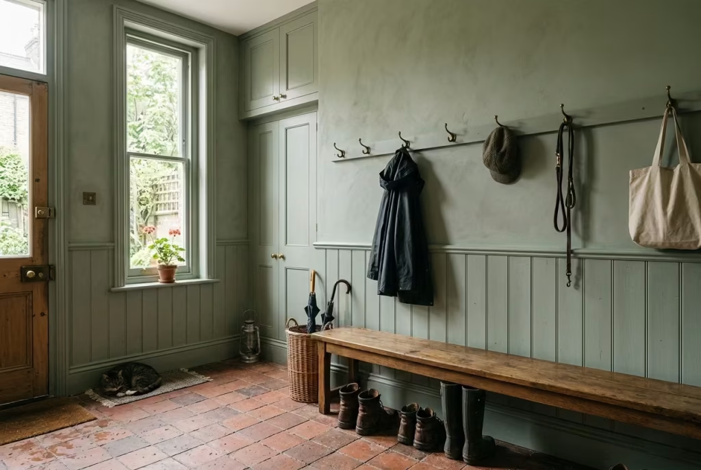
Wall finishes rarely receive the same attention as flooring or cabinetry, yet in a Victorian mudroom they play a surprisingly important role. These surfaces absorb the realities of everyday life, from damp coats brushing against corners to muddy hands, umbrellas, pet leads, and the occasional scuff from boots being kicked off in a hurry. A finish that looks beautiful on day one but struggles under daily wear can quickly become a source of frustration. The most successful mudrooms strike a careful balance between visual softness and practical resilience.
Victorian interiors traditionally favoured materials that could age gracefully while allowing older buildings to breathe. This remains particularly relevant in period properties, where moisture movement within walls is often part of the building’s natural behaviour. Trapping moisture behind impermeable finishes can sometimes create problems that only become apparent months or years later. Choosing breathable paints and finishes helps support the long-term health of the building while maintaining the character that makes these homes so appealing.
Many homeowners are drawn to deep matte paints because of their rich, velvety appearance. There is no denying their visual appeal. Matte surfaces absorb light beautifully, softening shadows and giving heritage colours a depth that feels both sophisticated and inviting. In a formal drawing room or bedroom, this can be a wonderful choice. A mudroom, however, operates under a different set of rules.
The challenge with delicate flat finishes is that they often reveal every mark. Scuffs, fingerprints, water splashes, and general wear can become difficult to remove without affecting the paint surface itself. What initially appears elegant may soon become a constant battle to maintain. It is a classic case of judging a book by its cover, where appearance alone does not tell the full story.
For this reason, I often specify modern durable paints with a low-sheen or eggshell finish in hardworking entry spaces. These products retain much of the softness associated with traditional paints while offering significantly better washability. Advances in paint technology mean many durable formulations now look far more refined than older high-sheen alternatives, avoiding the overly reflective appearance that can feel out of place in a Victorian setting.
When selecting wall finishes, consider:
- Breathable formulations for older period properties
- Washable paint systems suitable for high-contact areas
- Low-sheen or eggshell finishes that balance durability and appearance
- Heritage-inspired colours that complement natural light levels
- Protective panelling or wainscoting in particularly busy zones
In one Victorian renovation project, the homeowners initially selected a premium ultra-matte paint for the entire mudroom. Within weeks, areas around coat hooks and seating zones began showing visible wear. Rather than repainting repeatedly, we switched to a durable low-sheen finish in the same colour. The room retained its elegant appearance while becoming far easier to maintain. Sometimes the smartest design decisions are the ones that quietly simplify everyday life.
The amount of natural light entering the space should also influence finish selection. Darker mudrooms often benefit from subtle light-reflective qualities found in low-sheen paints, helping walls feel less flat and enclosed. In brighter entrances, these finishes catch changing daylight beautifully, revealing texture and depth without becoming glossy.
Practical Designer’s Note:
In a working mudroom, a durable low-sheen wall paint will often outperform a delicate flat finish. While ultra-matte paints can look stunning initially, lower-sheen formulations generally offer superior wipeability, better resistance to marks, and longer-lasting performance in spaces exposed to constant use. The difference may seem small when choosing paint samples, but over several years of daily living, it can prove worth its weight in gold.
Ultimately, wall finishes should support the way a room functions rather than create additional maintenance demands. When chosen thoughtfully, they become a quiet backdrop for daily life, protecting the space while allowing its architectural character, materials, and craftsmanship to take centre stage.
Make the Room Feel Elegant Through Light and Proportion
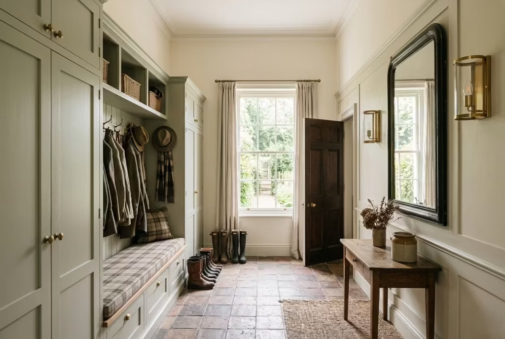
Elegance in a Victorian mudroom is rarely created by decoration alone. More often, it emerges from the subtle interplay between light, scale, and balance.
Even the most carefully chosen materials can feel underwhelming if a room is poorly lit or awkwardly proportioned. Thoughtful lighting softens shadows and highlights architectural details, while well-judged proportions ensure the space feels comfortable rather than crowded.
Together, these elements create a mudroom that feels welcoming from the moment you step inside, proving that true sophistication often lies in the details that are felt before they are consciously noticed.
Layer Lighting Rather Than Relying on One Central Fixture
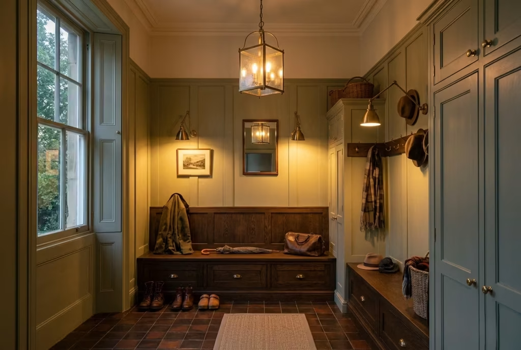
Lighting has the power to make or break a mudroom, regardless of how beautiful the architecture or materials may be. Yet it is often treated as an afterthought, with a single ceiling fixture expected to illuminate the entire space. In reality, Victorian mudrooms benefit enormously from layered lighting, where multiple sources work together to support both practical tasks and atmosphere. The difference is immediately noticeable. A room that once felt flat and utilitarian suddenly gains depth, warmth, and a sense of welcome that lingers long after the front door closes.
One central fixture can certainly provide general illumination, but it rarely addresses how people actually use the room. A mudroom is a space of constant activity. Shoes are removed, coats are hung, bags are collected, and outdoor gear is organised, often during early mornings or dark winter evenings. Good lighting should support these routines effortlessly rather than leaving corners in shadow.
A layered approach typically begins with ambient lighting. This is the primary source of illumination, usually provided by a ceiling-mounted pendant, lantern, or flush fitting. In Victorian-inspired spaces, fixtures with traditional detailing often feel most at home, particularly when scaled appropriately to the room. The goal is not to flood the space with harsh brightness but to create an even and comfortable foundation.
From there, task lighting can be introduced where it is needed most. Wall lights positioned above or beside bench seating areas are particularly effective. They not only provide practical illumination for putting on footwear but also draw attention to architectural features and joinery details. In narrower mudrooms, these fixtures can create a gentle rhythm along the wall, adding visual interest without cluttering the space.
For everyday comfort, I generally recommend bulbs in the 2700K to 3000K range. This warm white light feels inviting and flattering, complementing traditional materials such as painted timber, brass hardware, and natural stone. Cooler temperatures can sometimes make heritage interiors feel sterile or disconnected from their character, particularly during the evening when warmth becomes essential to the atmosphere.
A well-planned Victorian mudroom often includes:
- Overhead lighting for general visibility and cleaning tasks
- Wall lights positioned above benches or storage areas
- Accent lighting to highlight architectural features
- Warm white bulbs between 2700K and 3000K
- Consistent colour temperature across all fixtures
I remember working on a Victorian family home where the mudroom contained only a single pendant suspended from a high ceiling. Despite generous dimensions and attractive finishes, the room always felt slightly gloomy. By adding two wall sconces above the built-in bench and replacing the cool white bulb with a warmer 3000K option, the entire atmosphere changed. The joinery gained depth, the colours appeared richer, and the room felt noticeably more welcoming. It was a reminder that lighting often punches above its weight in interior design.
Placement matters just as much as fixture selection. Wall lights are typically most comfortable when mounted approximately 1.6 to 1.8 metres (5.2 to 6 feet) above floor level, depending on ceiling height and fixture scale. This positioning provides useful illumination without causing glare when seated nearby.
The most memorable Victorian mudrooms understand that lighting serves both practical and emotional purposes. It helps residents find a dropped glove on a dark winter morning, but it also creates a sense of arrival at the end of a long day. When multiple layers work together harmoniously, the room feels balanced, welcoming, and quietly elegant, much like the finest period interiors themselves.
Use Mirrors and Glazing to Borrow Light
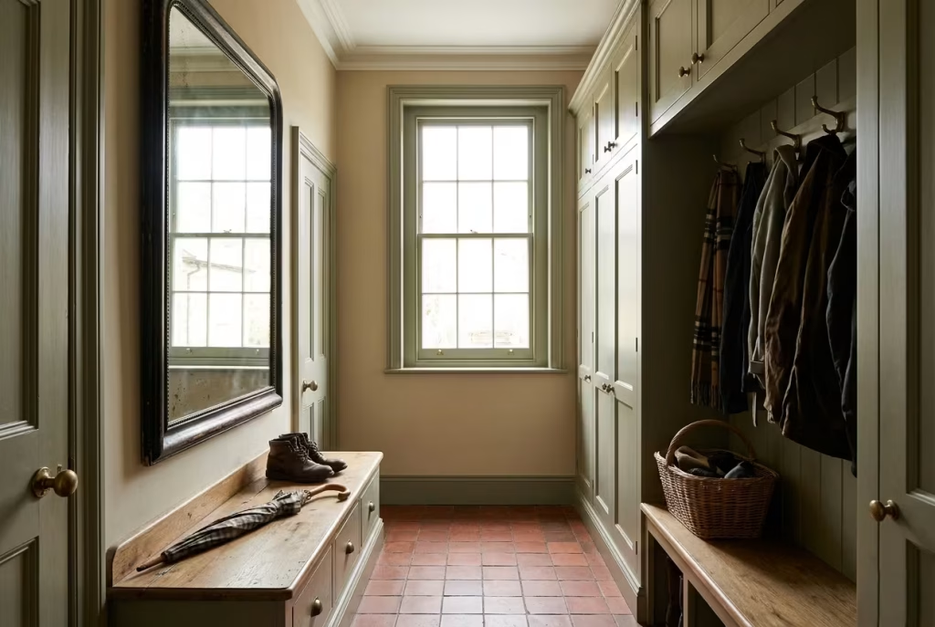
Not every Victorian mudroom is blessed with generous windows or abundant sunshine. Many occupy side entrances, rear corridors, or former service areas where natural light is limited from the outset. North-facing entrances can feel particularly challenging, often receiving cooler and softer daylight throughout much of the year. Fortunately, increasing brightness is not always a matter of adding more windows. Some of the most effective improvements come from learning how to borrow and redistribute the light that already exists.
Mirrors have long been used in interior design for this very purpose, but their impact extends far beyond simple reflection. A carefully positioned mirror can amplify daylight, visually expand tight dimensions, and introduce a sense of depth that makes even compact mudrooms feel more generous. In many respects, it acts as a second window, drawing light deeper into the room and softening areas that might otherwise feel enclosed.
Placement is everything. A mirror positioned opposite a window often delivers the greatest benefit because it reflects incoming daylight directly back into the space. In narrower entrances, installing a substantial mirror above a built-in bench can prevent the room from feeling like a corridor. Rather than confronting a solid wall, the eye encounters reflected light and visual depth, creating a far more welcoming experience.
As a practical guideline, mirrors measuring approximately 700 to 1,000 mm (28 to 40 inches) wide often provide enough visual presence to make a meaningful difference without overwhelming the room. In taller Victorian spaces with ceiling heights exceeding 2.7 metres (9 feet), vertically oriented mirrors can further emphasise the architecture while enhancing the perception of height.
Glazing can be equally transformative. Internal glazed doors, partially glazed entrance doors, and decorative glass panels allow daylight to travel between spaces that would otherwise remain isolated from natural illumination. It is a simple concept, yet one capable of changing the entire character of an entrance.
I once worked on a Victorian townhouse where the rear mudroom felt permanently disconnected from the rest of the house. Despite attractive finishes and carefully designed storage, the room remained noticeably dim throughout the day. Rather than altering the exterior structure, we replaced a solid kitchen door with a glazed panelled version featuring traditional detailing. The result was remarkable. Daylight flowed into the mudroom from adjacent rooms, instantly making the space feel brighter, larger, and more integrated with the home as a whole.
Particularly effective strategies include:
- Positioning mirrors opposite or adjacent to windows
- Using antique-style mirrors that complement Victorian architecture
- Installing glazed internal doors to share daylight between rooms
- Incorporating decorative glass panels above doors where appropriate
- Selecting lightly reflective finishes that enhance available light
There is also an emotional quality to borrowed light that should not be overlooked. Dark entryways can sometimes feel disconnected from the life of the home, whereas brighter spaces encourage a stronger sense of welcome and openness. The effect may be subtle, but it influences how people experience the room on a daily basis.
Importantly, this approach respects the character of period homes. Rather than forcing dramatic alterations or introducing features that feel out of place, mirrors and glazing work with the existing architecture, making the most of what is already there. It is a classic example of working smarter rather than harder.
The most successful Victorian mudrooms understand that light is one of the most valuable materials available. When thoughtfully reflected, redirected, and shared throughout the space, even a modest entrance can feel airy, balanced, and inviting. Sometimes a room does not need more square footage to feel larger. It simply needs light given a chance to travel a little further.
Keep Furnishings Proportionate
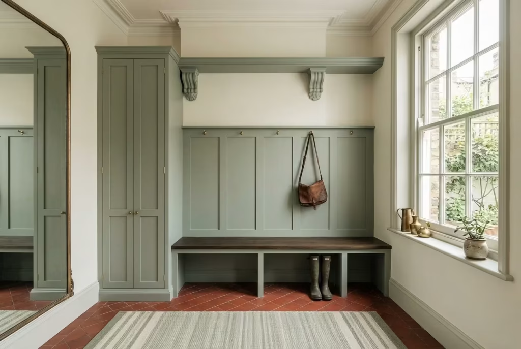
One of the most overlooked design principles in a Victorian mudroom is proportion. Homeowners often focus on finding more storage, more seating, or more decorative features, only to discover that the room feels increasingly cramped despite gaining additional functionality. In reality, the most inviting mudrooms rarely contain the most furniture. Their success comes from careful editing and thoughtful scale. Every element earns its place, creating a room that feels comfortable to move through and pleasant to spend time in.
There is an old saying in design that a room should not feel full, it should feel complete. The distinction may seem subtle, but it changes everything. When furnishings are appropriately sized, the room breathes more easily. Architectural details remain visible, circulation feels effortless, and the eye can travel naturally through the space rather than stopping abruptly at every oversized object.
Consider Bench Scale Relative to Wall Length
Built-in seating often serves as the visual anchor of a mudroom, but its dimensions should respond to the room rather than dominate it. A bench that stretches wall to wall may initially appear practical, yet it can sometimes make a modest entrance feel rigid and overdesigned.
In many Victorian mudrooms, I find that benches occupying roughly 60 to 80 percent of the available wall length tend to feel more balanced. Leaving some negative space around the joinery allows architectural features, wall finishes, and lighting to remain part of the composition. This small adjustment can make the room feel noticeably lighter and more sophisticated.
For example:
- A 2.4 metre (8 foot) wall may comfortably accommodate a bench between 1.5 and 1.9 metres (5 to 6.2 feet) long.
- Compact entrances often benefit from shorter seating paired with integrated storage above.
- Larger rooms can support longer benches without compromising visual balance.
The goal is to avoid creating a piece that overwhelms the architecture. Good design knows when to fill a space and when to leave well enough alone.
Avoid Oversized Storage Units in Compact Rooms
Storage is essential, but bigger is not always better. One of the fastest ways to make a mudroom feel smaller is to install cabinetry that projects too far into the room. Deep cupboards may seem attractive on paper, yet they often reduce circulation and create an uncomfortable sense of confinement.
In narrower entrances, cabinetry depths of approximately 300 to 450 mm (12 to 18 inches) are often sufficient for coats, footwear, and everyday essentials. Beyond this range, storage can begin encroaching on valuable floor space.
I once consulted on a Victorian cottage where the owners had installed large freestanding wardrobes intended to solve their storage problems. Instead, the room felt crowded and awkward. Replacing them with shallower fitted cabinetry immediately improved circulation and allowed more natural light to travel through the space. The storage capacity remained surprisingly similar, proving that thoughtful planning often delivers better results than simply increasing size.
When evaluating storage, ask:
- Does it obstruct movement?
- Does it block natural light?
- Does it conceal architectural features?
- Is every inch genuinely needed?
If the answer to any of these questions raises concern, it may be time to rethink the scale.
Use Vertical Lines to Enhance Perceived Height
Victorian homes are often blessed with generous ceiling heights, and a well-designed mudroom should take advantage of this architectural asset. Vertical emphasis naturally draws the eye upward, helping the room feel taller and more elegant.
Tall cabinetry can be particularly effective when designed carefully. Rather than introducing multiple low-level units that fragment the room visually, a single full-height storage wall often creates a cleaner and more cohesive appearance. The eye follows uninterrupted vertical lines, reinforcing the room’s proportions and strengthening its architectural character.
Useful strategies include:
- Full-height lockers reaching close to ceiling level
- Vertically panelled joinery
- Tall mirrors that emphasise height
- Narrow wall sconces that draw the eye upward
- Hook rails positioned above eye level where appropriate
In rooms with ceiling heights between 2.7 and 3 metres (9 and 10 feet), these techniques can subtly amplify the sense of grandeur that Victorian architecture is known for.
Perhaps the greatest advantage of proportionate furnishings is that they make a room feel larger without adding a single square foot. The space remains practical, but it never feels burdened by its contents. Every bench, cabinet, and storage compartment sits comfortably within the architecture, creating a sense of order that feels both natural and enduring.
The finest Victorian mudrooms understand a simple truth: elegance is rarely about adding more. More often, it comes from knowing exactly how much is enough.
Add Victorian Detail Without Overloading the Space
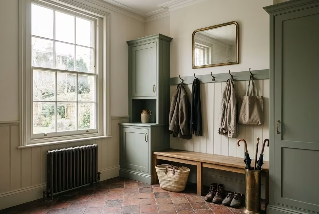
Victorian design is often associated with rich architectural detail, but the most successful mudrooms understand the value of restraint. A handful of well-chosen period elements can create far more impact than a room filled with competing features. Panelled joinery, heritage colours, traditional hardware, and carefully considered mouldings should work together to support the architecture rather than dominate it.
When details are layered thoughtfully and given room to breathe, the space feels authentic, elegant, and timeless. Like a well-composed piece of music, it is often the pauses between the notes that make the greatest impression.
Work with Restrained Colour, Not Costume
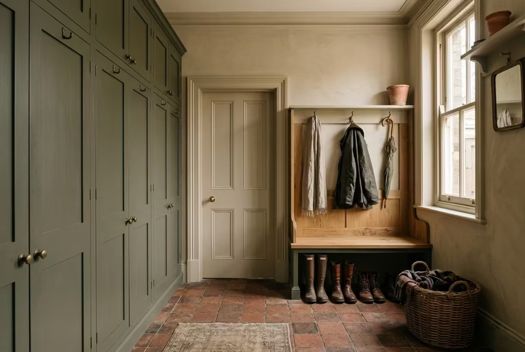
One of the easiest ways to undermine a Victorian mudroom is to mistake historical character for theatrical styling. Period homes possess a richness and depth that developed naturally over time through architecture, craftsmanship, and material choices. They do not rely on dramatic colours or exaggerated decorative gestures to establish their identity. When designing a mudroom inspired by Victorian principles, colour should feel rooted in the building rather than imposed upon it.
The most successful schemes draw inspiration from the muted, complex tones found in nature. Deep olive greens, chalky whites, weathered stone shades, smoky blue-greys, and inky heritage hues all carry a sense of quiet confidence. These colours do not clamour for attention. Instead, they create a backdrop that allows architectural details, joinery, and natural textures to shine. In design, there is a fine line between creating atmosphere and laying it on too thick. The latter often dates surprisingly quickly.
A restrained palette also performs exceptionally well in a hardworking mudroom. Unlike bright trend-driven colours that can dominate a compact space, heritage tones tend to absorb wear more gracefully. Scuffs, marks, and daily use become less visually intrusive, allowing the room to maintain its composure between cleanings.
I often encourage homeowners to view colour through the lens of light rather than paint charts alone. A deep olive green, for example, can feel wonderfully rich and cocooning in a sunlit entrance, yet become unexpectedly heavy in a narrow north-facing corridor. Similarly, a soft chalk white may appear understated in bright daylight while helping a darker mudroom feel considerably more open and welcoming.
Particularly effective Victorian-inspired colours include:
- Deep olive green for joinery and storage cabinetry
- Muted blue-grey for walls in naturally lit entrances
- Warm stone tones that complement natural flooring materials
- Soft chalk white for smaller spaces needing brightness
- Ink-inspired charcoal accents on doors or hardware
- Earthy taupe shades that connect beautifully with timber finishes
One project that remains memorable involved a Victorian townhouse where the owners initially planned to use a highly saturated jewel-tone palette throughout the mudroom. While striking on sample boards, the colours overwhelmed the relatively modest space once applied. We shifted instead to a softer olive-grey paired with aged brass fittings and painted panelling. The transformation was immediate. The room felt calmer, more sophisticated, and far more aligned with the home’s architectural character. Sometimes the strongest design statement is the one that whispers rather than shouts.
Colour relationships matter just as much as the individual shades themselves. Victorian-inspired interiors often benefit from tonal layering, where walls, cabinetry, trim, and architectural details sit within the same family of colours but vary subtly in depth. This approach creates richness without visual clutter and allows the eye to move comfortably around the room.
Another advantage of restrained colours is longevity. Trends have a habit of coming and going at breakneck speed, but nuanced heritage tones tend to remain relevant year after year. They form a dependable foundation that can evolve through accessories, textiles, and seasonal styling without requiring major redecoration.
Ultimately, colour should support the architecture, not compete with it. When carefully chosen and thoughtfully balanced, a restrained palette gives a Victorian mudroom an effortless sense of authenticity. The room feels collected rather than curated, elegant rather than extravagant, and all the more convincing because it never tries too hard.
You May also Like: 25 Moody Dark Green Mudroom Ideas for a Stylish, Cozy Entryway
Introduce Traditional Hardware with Discipline
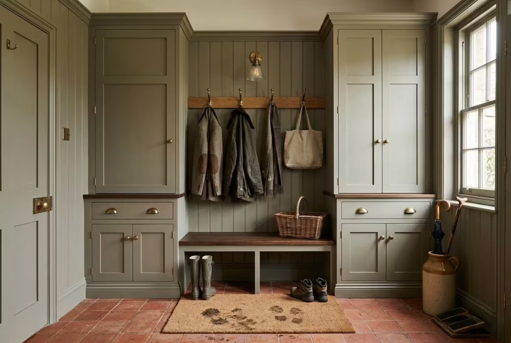
Hardware may occupy only a small portion of a mudroom, yet it often has an outsized influence on how the entire space is perceived. Handles, hooks, hinges, latches, and coat pegs are touched every day, making them some of the most frequently used design elements in the room. In Victorian-inspired interiors, these details provide an opportunity to reinforce character and craftsmanship. However, their success depends less on how decorative they are and more on how consistently they are applied.
A common mistake is treating hardware as a collection of individual purchases rather than part of a larger design language. Brass handles from one style, black iron hooks from another, polished chrome hinges, and bronze light fittings may all look attractive on their own. Together, they can pull the room in too many directions at once. It becomes a case of too many cooks in the kitchen, where competing finishes create visual confusion instead of cohesion.
Victorian interiors traditionally embraced a sense of continuity. Materials were repeated thoughtfully throughout a room, creating a feeling of harmony and permanence. The same principle remains valuable today. Selecting one primary metal finish and carrying it consistently across the space often produces a far more refined result than mixing several finishes simply for variety.
Among the most suitable choices for a Victorian mudroom are:
- Unlacquered or aged brass for warmth and traditional elegance
- Blackened iron for a slightly more robust, utilitarian character
- Aged bronze for depth and understated richness
- Antique pewter for softer, heritage-inspired schemes
Each finish creates a different atmosphere, but the key is commitment. Once a dominant metal is selected, repeating it across cabinet handles, hooks, door furniture, and accessory details helps establish a strong visual thread throughout the room.
I often advise homeowners to think of hardware as jewellery for the architecture. A beautifully tailored outfit rarely benefits from every accessory being worn at once, and interiors are no different. The finest details enhance what is already there rather than competing for attention.
Scale deserves careful consideration as well. Oversized hardware can feel disproportionate in compact mudrooms, while undersized pieces may appear insignificant against substantial Victorian joinery. For most cabinetry, handles between 100 and 180 mm (4 and 7 inches) in length tend to provide a comfortable balance, although dimensions should always respond to the size of the doors and drawers they serve.
In one Victorian renovation project, the mudroom originally featured four separate metal finishes spread across storage units, lighting, and door furniture. Individually, none of them were problematic. Collectively, they created a subtle sense of disorder that was difficult to identify at first glance. By simplifying the scheme and introducing aged brass consistently throughout the space, the room immediately felt more settled and cohesive. Nothing else changed, yet the overall impression improved dramatically.
Traditional hardware should also feel substantial in the hand. Lightweight fittings often lack the tactile quality that gives period-inspired spaces their sense of authenticity. Solid brass, cast iron, and bronze pieces develop character over time, acquiring small marks and patina that tell the story of daily use. Unlike trend-driven finishes that can feel dated within a few years, these materials tend to age with grace.
When selecting hardware, focus on:
- Consistency across all visible fittings
- Materials that develop attractive patina over time
- Proportions suited to the joinery scale
- Comfortable everyday usability
- Finishes that complement surrounding materials and colours
The beauty of disciplined hardware selection is that it rarely draws attention to itself. Instead, it quietly strengthens every other element in the room. Cabinetry feels more convincing, colours appear richer, and architectural details gain clarity. It is a subtle layer of design, but one that often separates a mudroom that merely looks attractive from one that feels thoughtfully composed.
In the end, traditional hardware works best when it serves the architecture rather than steals the spotlight. A consistent and carefully considered approach creates a sense of order that visitors may not consciously notice, yet they will certainly feel. That quiet coherence is often the hallmark of truly timeless design.
You May also Like: 20 Cozy Modern Farmhouse Entryway Designs for a Welcoming Home
Choose Details That Have Structural Purpose
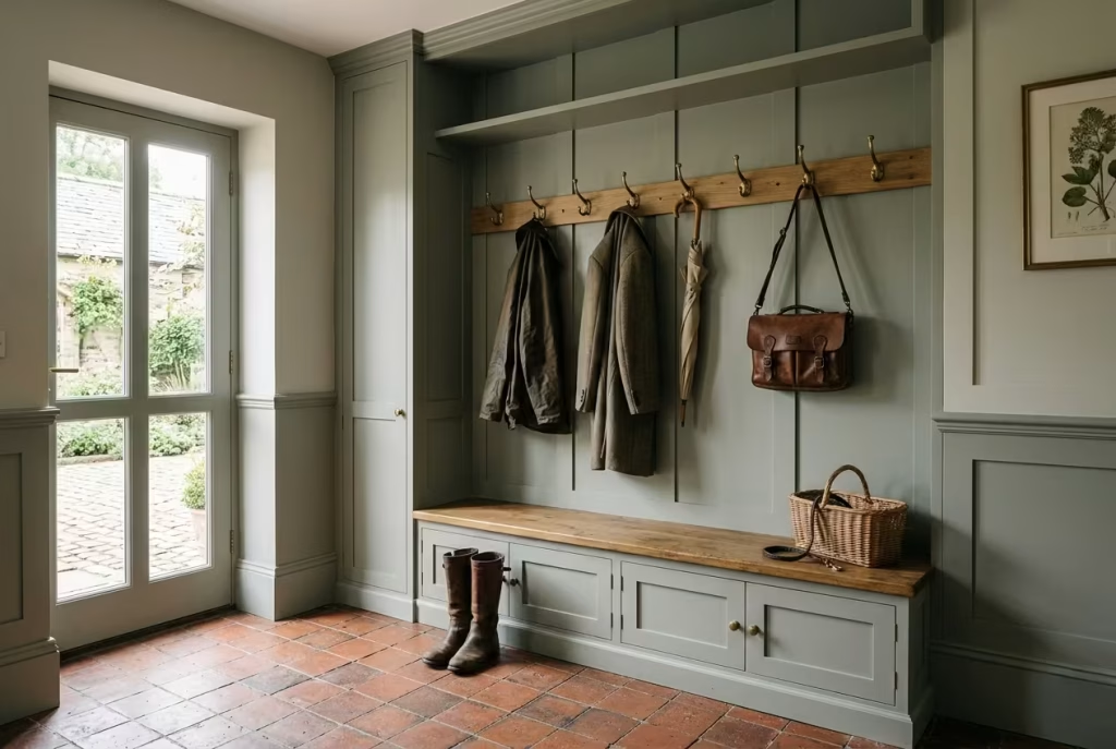
The most convincing Victorian mudrooms share a quality that is often difficult to define at first glance. Nothing feels added simply for decoration. Every moulding, rail, hook, panel, and trim appears to belong exactly where it is. This sense of purpose is one of the reasons period interiors continue to feel timeless. Their details were rarely arbitrary. Instead, they served practical functions while contributing to the room’s overall character.
When designing a mudroom today, it can be tempting to scatter Victorian-inspired features throughout the space in an effort to increase authenticity. Yet piling on decorative elements often has the opposite effect. A room filled with ornate accessories can feel less believable than one with a handful of carefully considered details. The strongest designs understand that architecture should carry the story, while decoration plays a supporting role.
Take skirting boards, for example. In Victorian homes, they were not merely decorative trims. They protected walls from knocks, concealed construction joints, and established visual weight at floor level. A substantial skirting profile, typically ranging between 150 and 300 mm (6 and 12 inches) in height, can anchor a mudroom beautifully while standing up to the inevitable bumps and scuffs of daily use.
Dado rails offer another practical example. Historically, they helped protect walls from damage caused by furniture and everyday activity. In a modern mudroom, they continue to provide visual structure while creating a natural transition between wall finishes, paint colours, or panelling treatments. Their presence feels justified because they contribute both functionally and aesthetically.
Panel divisions should follow the same philosophy. Rather than creating complicated patterns purely for ornament, panels work best when aligned with cabinetry, seating zones, or architectural features already present within the room. This approach creates a sense of order that feels effortless rather than contrived.
Details that often serve both practical and visual purposes include:
- Hook rails that organise outerwear efficiently
- Dado rails that define wall proportions
- Deep skirting boards that protect high-traffic surfaces
- Panelled sections that reinforce architectural rhythm
- Integrated shelving that combines storage with display opportunities
One of the clearest examples of this principle involves coat storage. Many homeowners assume that adding more hooks will automatically improve functionality. In reality, a wall crowded with decorative fittings can quickly become visually chaotic. I often find that a single well-proportioned antique-style hook rail creates a far more convincing result.
During the renovation of a Victorian family home, the clients initially planned to install individual hooks across nearly an entire wall. While practical in theory, the arrangement felt cluttered and disconnected from the room’s architecture. Instead, we introduced one continuous timber hook rail measuring approximately 1.5 metres (5 feet) in length, fitted with evenly spaced aged brass hooks. The difference was remarkable. The rail became part of the room’s architectural framework rather than a collection of accessories attached to the wall. It provided ample storage while maintaining a sense of visual calm.
This is where restraint becomes particularly powerful. A thoughtfully positioned hook rail encourages coats to gather in one organised location, keeps walls looking tidy, and strengthens the overall composition of the room. It proves that functionality and elegance are not opposing ideas but partners working toward the same goal.
There is also a broader lesson here. Victorian interiors rarely relied on quantity to create impact. Instead, they achieved richness through proportion, craftsmanship, and thoughtful placement. Every detail earned its place. The same approach remains valuable today, especially in mudrooms where practical demands are high and space is often limited.
Ultimately, details with structural purpose do more than enhance appearance. They help the room function better, age more gracefully, and feel more authentic. When every element contributes something meaningful, the mudroom gains a quiet confidence that cannot be replicated through decoration alone. Like the strongest foundations beneath a house, these thoughtful details support everything else while rarely demanding attention for themselves.
Design for Daily Life, Not Just the Photograph
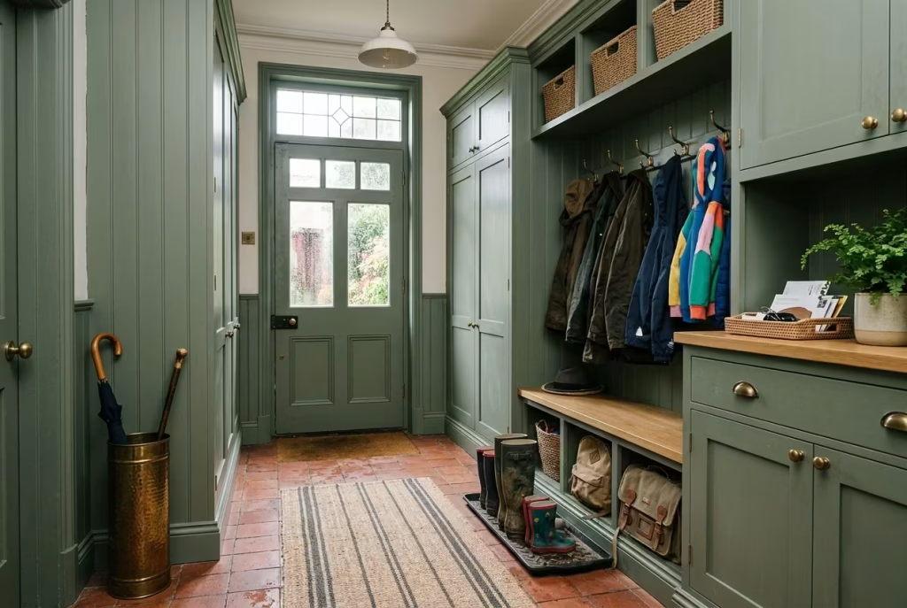
The most successful Victorian mudrooms are not the ones that look perfect for a magazine shoot on a sunny afternoon. They are the ones that continue to function beautifully on rainy mornings, busy school runs, and muddy weekends in the garden. While aesthetics certainly matter, true longevity comes from designing around real habits, real storage needs, and real patterns of movement.
A thoughtfully planned mudroom should feel just as elegant when filled with everyday activity as it does when freshly styled. After all, good design is not measured by how a room looks for a photograph. It is measured by how effortlessly it supports life every day thereafter.
Include a Landing Zone for Bags, Boots, and Keys
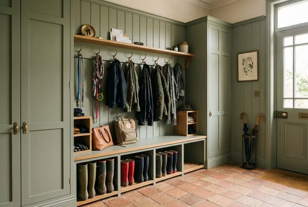
One of the quiet secrets behind an organised Victorian mudroom is the presence of a dedicated landing zone. It may not be the most visually striking feature in the room, yet it often has the greatest influence on how the space functions from day to day. Without a clearly defined place for everyday belongings, items have a habit of wandering. Keys end up on kitchen counters, bags migrate to dining chairs, and shoes seem to multiply across hallways overnight. Before long, clutter begins to spread through the house like ripples on a pond.
A well-designed landing zone acts as a buffer between the outside world and the interior of the home. It gives daily essentials a permanent address, making it easier to maintain order without constantly tidying. This may sound like a small detail, but in practice it can transform how a household operates. The difference between a home that feels calm and one that feels perpetually disorganised often comes down to whether everyday objects have somewhere sensible to go.
The best landing zones are tailored to real routines rather than idealised versions of them. Consider what enters the house most frequently. School bags, handbags, dog leads, umbrellas, shopping totes, sports equipment, and car keys all require storage solutions that are convenient enough to be used consistently. If storage is awkward or difficult to access, even the most disciplined household will eventually abandon it.
In family homes, I often recommend allocating a dedicated section of approximately 600 to 900 mm (24 to 35 inches) in width for each regular user where space allows. This creates a sense of ownership and helps prevent belongings from becoming tangled together. Even in smaller mudrooms, simple divisions within a bench, drawer, or locker system can make daily routines significantly smoother.
Particularly useful landing zone features include:
- Open cubbies for frequently used bags
- Shallow trays for keys and wallets
- Pull-out boot storage beneath seating
- Wall hooks positioned near the entrance door
- Small shelves for sunglasses, post, and daily essentials
- Umbrella stands with moisture-resistant bases
One renovation project comes to mind where the homeowners complained that their entrance hall never stayed tidy despite regular cleaning. The issue was not a lack of storage but a lack of convenient storage. Keys were stored in a drawer across the house, bags had no assigned location, and footwear accumulated near the back door. We introduced a simple built-in landing zone consisting of a bench, several hooks, a small shelf, and a concealed drawer for keys and post. Within weeks, the room felt noticeably calmer. Nothing magical had happened. The household simply had a practical system that worked with their habits rather than against them.
There is also a psychological benefit to a well-planned drop zone. Arriving home becomes a smoother transition. Instead of carrying the mental clutter of unfinished tasks into the rest of the house, everyday belongings are dealt with immediately. The ritual is simple but effective. Coat hung up. Keys stored away. Boots placed neatly below the bench. Small actions, repeated consistently, create an environment that feels more organised without demanding constant effort.
Victorian homes have always valued order and structure, qualities that remain just as relevant today. A thoughtfully designed landing zone supports both. It prevents the mudroom from becoming a dumping ground while preserving the elegance of the surrounding space. More importantly, it makes daily life easier. And when a design feature quietly solves problems without drawing attention to itself, it is often worth its weight in gold.
The finest mudrooms understand that organisation is not about perfection. It is about creating systems that people genuinely use. A dedicated place for bags, boots, and keys may seem modest on paper, but it often becomes the feature homeowners appreciate most long after the renovation is complete.
You May also Like: Why Japanese Entryways are Never Messy: 25 Hidden Design Secrets
Plan for Cleaning from the Beginning
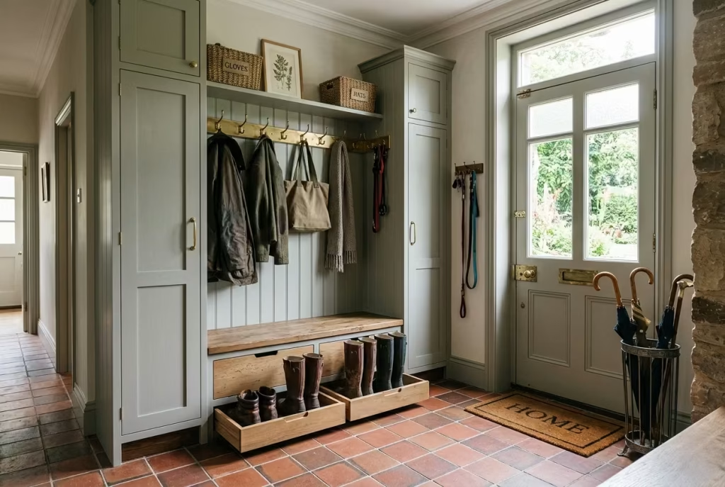
A Victorian mudroom can feature beautifully crafted joinery, carefully selected flooring, and elegant heritage colours, but none of those elements will continue to impress if the space becomes difficult to maintain. One of the most common mistakes homeowners make is designing solely for appearance while overlooking the realities of upkeep. Mudrooms occupy the front line of daily life.
They receive dirt before it reaches the rest of the house, collect moisture during wet weather, and absorb the wear and tear that comes with constant use. For that reason, cleaning should not be treated as an afterthought. It should be woven into the design from the very beginning.
The most successful mudrooms are not necessarily the ones that stay spotless. They are the ones that recover quickly after a busy day. When materials, storage, and detailing are selected with maintenance in mind, tidying becomes less of a chore and more of a simple routine. As the old saying goes, an ounce of prevention is worth a pound of cure.
One feature I regularly incorporate into mudroom designs is a raised plinth beneath built-in cabinetry. Instead of extending joinery directly to the floor, a recessed plinth of approximately 75 to 100 mm (3 to 4 inches) creates a subtle shadow line while making floor cleaning significantly easier. Dirt and dust are less likely to gather around awkward corners, and vacuuming or mopping becomes far more straightforward.
The benefit may seem minor during installation, but over the course of several years it can save countless hours of maintenance. Good design often reveals its value in these quiet, practical moments.
Wall surfaces deserve similar consideration. Areas around coat hooks, umbrella storage, and seating zones are particularly vulnerable to marks and moisture. Wet jackets brushed against painted walls can leave stains, while muddy hands have a habit of finding the nearest surface. Choosing washable finishes in these high-contact areas helps preserve the appearance of the room without requiring constant touch-ups.
Particularly practical options include:
- Durable low-sheen paint finishes
- Timber panelling with wipeable coatings
- Tile or stone splash areas near entrances
- Moisture-resistant wall treatments around boot storage
- Easy-clean painted joinery finishes
Storage design can also have a surprisingly large impact on cleaning requirements. The more objects that accumulate directly on the floor, the harder the room becomes to maintain. Shoes, bags, pet accessories, and seasonal items quickly create obstacles that complicate even the simplest cleaning tasks.
For this reason, I encourage homeowners to prioritise storage solutions that lift belongings off the ground wherever possible. Examples include:
- Wall-mounted hook rails
- Elevated shelving systems
- Integrated boot drawers
- Built-in benches with concealed compartments
- Hanging storage for bags and outerwear
I once worked on a family mudroom where nearly every item lived at floor level. Shoes lined the perimeter, sports equipment occupied corners, and baskets sat directly on the ground. Despite regular cleaning, the room always felt untidy.
By introducing suspended storage and incorporating concealed compartments beneath a built-in bench, we cleared most of the floor area without increasing the room’s footprint. The visual improvement was immediate, but the long-term maintenance benefits proved even more valuable.
Another worthwhile consideration is material transitions. Floors that connect smoothly to adjacent rooms without excessive thresholds or unnecessary level changes are generally easier to clean and less likely to trap dirt. Simplicity often works in your favour when designing a hardworking space.
There is a tendency in interior design to focus on how a room will look on the day it is completed. Yet the true measure of success is how well it performs five or ten years later. A mudroom that requires constant attention can quickly become frustrating, regardless of how attractive it appeared initially. By anticipating maintenance needs early in the design process, you create a space that remains both functional and elegant long after the renovation dust has settled.
Ultimately, a well-designed Victorian mudroom should not feel fragile. It should welcome muddy boots, rainy afternoons, energetic children, and everyday life with confidence. When cleaning has been considered from the outset, the room develops a quiet resilience that allows its beauty to endure through years of use.
Make the Room Feel Connected to the Rest of the House
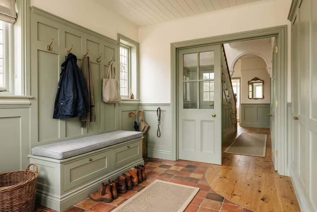
The finest Victorian mudrooms never feel like isolated utility zones tucked away at the edge of the property. Instead, they act as a carefully considered bridge between the exterior world and the interior experience of the home. While practicality remains essential, the space should still feel like part of the overall architectural story. When a mudroom appears disconnected from adjoining rooms, it can create an abrupt transition that weakens the flow of the house. By contrast, a well-integrated entryway feels intentional, allowing movement from one space to the next to unfold naturally and comfortably.
One of the hallmarks of successful Victorian design is continuity. Original homes were often planned with a strong sense of visual rhythm, where materials, proportions, and architectural details repeated throughout the interior. Carrying this approach into a mudroom helps the room feel established rather than improvised, as though it has always belonged to the house.
Repeat Colours and Materials from Adjacent Rooms
A mudroom does not need to mirror neighbouring spaces exactly, but it should maintain a visual conversation with them. Shared materials and related colours help create cohesion while still allowing the room to fulfil its own practical role.
For example, if a hallway features painted timber joinery in a soft stone tone, introducing a deeper variation of the same colour in the mudroom can strengthen continuity without becoming repetitive. Likewise, flooring materials that complement adjoining rooms often produce a more seamless transition than introducing an entirely unrelated finish.
Elements worth repeating include:
- Timber tones used elsewhere in the home
- Heritage paint colours from neighbouring spaces
- Brass or bronze hardware finishes
- Natural stone or tile materials
- Upholstery fabrics and accent colours
I often find that even a small visual connection can make a significant difference. A mudroom does not have to match perfectly. It simply needs to feel like it belongs to the same family of rooms.
Carry Skirting and Architrave Details Through
Architectural trim plays a surprisingly important role in establishing continuity. Victorian homes frequently rely on skirting boards, architraves, and mouldings to create structure and proportion throughout the interior. Interrupting these details at the mudroom threshold can make the room feel detached from the rest of the house.
Where possible, continue existing trim profiles into the mudroom. Matching skirting heights, door surrounds, and moulding details helps maintain a consistent architectural language while reinforcing the home’s period character.
Typical Victorian skirting boards often range from 175 to 300 mm (7 to 12 inches) in height, creating a substantial visual foundation that feels particularly appropriate in heritage properties. Repeating these dimensions within the mudroom helps anchor the space and strengthen its relationship with adjoining rooms.
Particularly effective details include:
- Matching skirting board profiles
- Consistent architrave dimensions
- Similar panel moulding styles
- Repeated cornice or picture rail details
- Coordinated door designs
These elements may not attract immediate attention individually, yet together they create a sense of continuity that people instinctively recognise.
Maintain a Consistent Architectural Language
Perhaps the most important consideration is ensuring that every design decision speaks the same architectural language. If the rest of the home embraces restrained Victorian detailing, introducing ultra-modern cabinetry or industrial-style fixtures within the mudroom can feel jarring. Equally, an overly ornate mudroom may appear disconnected from a house that has been sensitively updated for contemporary living.
Consistency does not require strict historical reproduction. Rather, it involves understanding the character of the home and responding appropriately. The proportions of the joinery, the shape of cabinet doors, the style of lighting, and the choice of materials should all feel related to the broader architectural context.
I remember working on a Victorian semi-detached property where the owners had invested heavily in restoring original features throughout the house. However, the mudroom renovation introduced sleek handleless cabinetry and highly contemporary finishes that felt entirely unrelated to the surrounding architecture. Despite the quality of the workmanship, the room never felt settled. Reworking the design with panelled joinery, traditional hardware, and details borrowed from adjacent rooms transformed the space. Suddenly, the mudroom felt connected rather than separate, as though a missing chapter had finally been returned to the story.
The most memorable Victorian mudrooms understand that transition spaces deserve the same design attention as living rooms, kitchens, and bedrooms. By repeating materials, carrying architectural details through, and maintaining a coherent design language, the entryway becomes more than a practical stopgap. It becomes an integral part of the home’s identity.
When this connection is achieved successfully, the mudroom no longer feels like a place people simply pass through. It becomes the opening scene of the home itself, setting the tone with quiet confidence and ensuring that every room which follows feels part of a thoughtfully composed whole.
Why Victorian Mudrooms Feel So Enduring
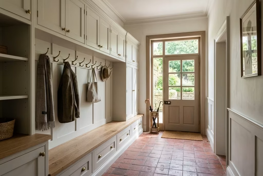
There is a reason Victorian-inspired mudrooms continue to feel relevant in contemporary homes, even as interior trends shift with remarkable speed. Their strength lies not in ornamentation alone, but in a deeper architectural intelligence, one that prioritises proportion, rhythm, and material honesty over surface effect. In transitional spaces such as mudrooms, where function and first impressions intersect, this design language feels particularly appropriate, almost instinctive.
The Visual Language of Victorian Homes
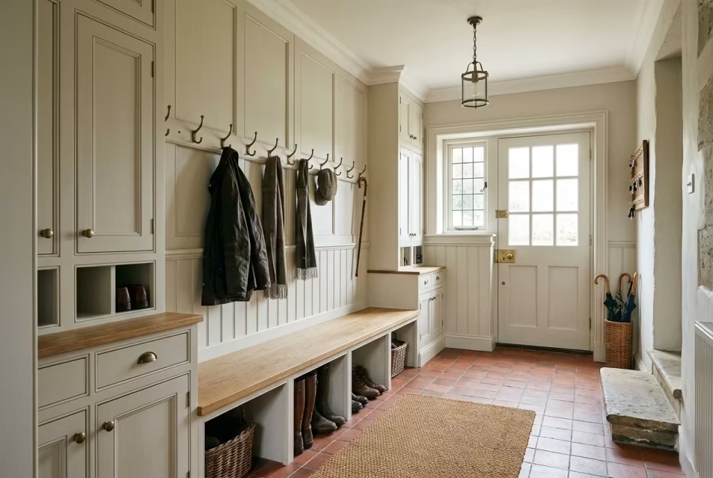
Victorian interiors are defined by a clear visual grammar. Rather than relying on isolated decorative moments, they build atmosphere through repetition, structure, and balance. Cornices align with skirting. Panels echo door proportions. Joinery sits within a predictable rhythm that gives the eye a sense of order as it moves through the space.
In a mudroom, this visual language becomes especially powerful. It transforms what could otherwise feel like a purely functional corridor into a composed architectural moment. Even simple elements, when aligned with Victorian principles, begin to carry weight and intention. The result is a room that feels grounded, as though it belongs to a larger, well-considered whole rather than existing as an afterthought.
How Original Detailing Influences Entryway Design
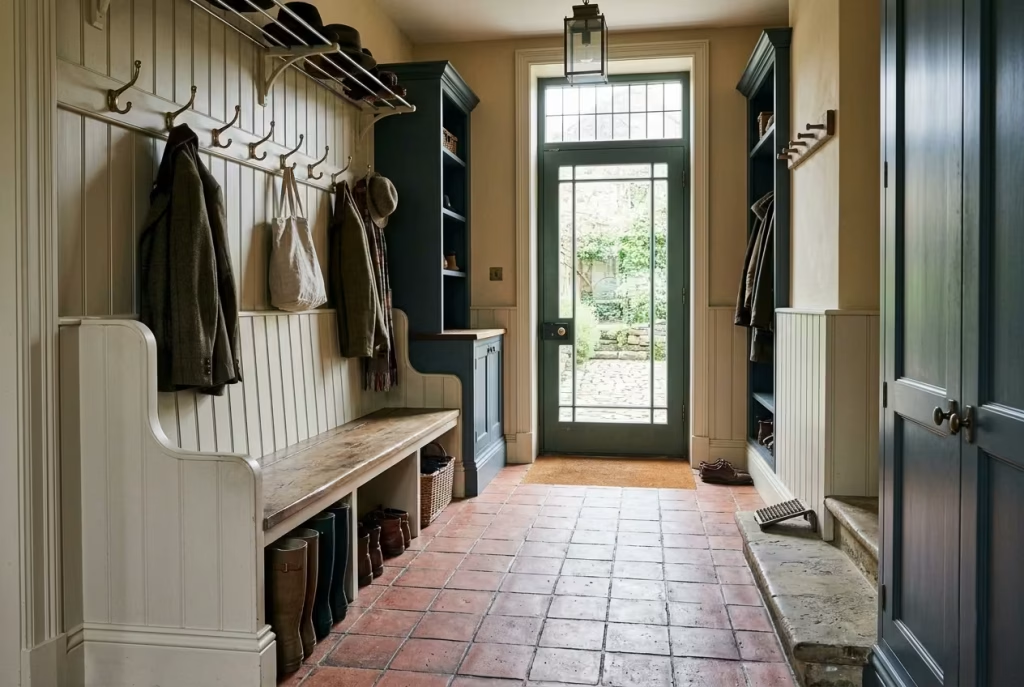
Original Victorian detailing was rarely gratuitous. It often served a dual purpose, protecting surfaces while reinforcing structure and hierarchy within a room. Deep skirting boards guarded walls from daily impact, while panelling introduced durability in high-traffic zones. These features were practical first, decorative second.
This approach translates naturally into modern mudroom design. When detailing is introduced with purpose, it immediately feels more authentic. A well-proportioned skirting board, typically ranging between 175 and 300 mm (7 to 12 inches), does more than frame a wall. It anchors the space visually. Similarly, panelled sections above seating or storage zones are not simply decorative gestures but protective layers that respond to real use.
The key is intention. When every detail has a reason for existing, the room gains a sense of credibility that purely stylistic choices often struggle to achieve.
You May also Like: Best Warm Neutral Paint Colours That Never Feel Flat
Why Symmetry, Panelling, and Crafted Finishes Still Feel Relevant
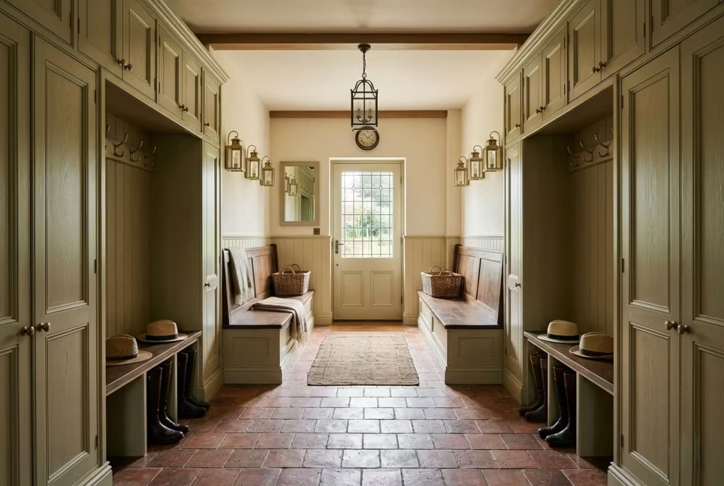
Symmetry has long been a defining principle in Victorian architecture, and its influence remains strong in contemporary interpretation. There is a natural comfort in balanced compositions, where elements are arranged in a way that feels resolved rather than accidental. In a mudroom, symmetry can be expressed through evenly spaced hooks, aligned cabinetry, or mirrored storage zones, creating a sense of calm order at the threshold of the home.
Panelling continues to hold relevance because it introduces structure without overwhelming the space. Whether used in full-height joinery or lower wall applications, it creates visual rhythm that helps organise the room. This sense of repetition is quietly reassuring, particularly in areas that deal with daily transition and movement.
Crafted finishes complete the picture. Materials that show subtle variation, visible grain, or hand-applied texture bring a level of depth that machine-perfect surfaces often lack. These details are not about nostalgia for its own sake. They are about tactility, durability, and the way surfaces age gracefully when they are allowed to develop character over time.
Together, these principles explain why Victorian-inspired mudrooms continue to resonate. They are not simply styled spaces. They are structured environments built on logic, proportion, and enduring craftsmanship. When applied with restraint, they create entryways that feel both practical and composed, quietly proving that good design rarely needs to shout to be understood.
Best Victorian Mudroom Layout Ideas for Different Homes
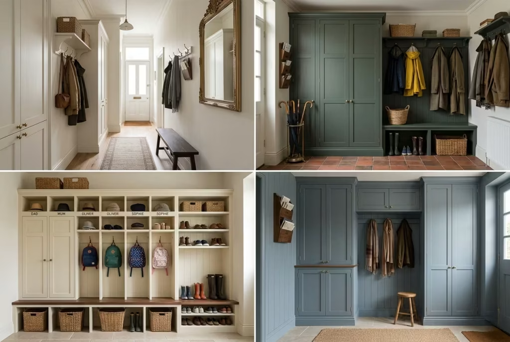
No two Victorian homes present the same spatial challenges. Some offer long, narrow corridors that feel more like passageways than rooms, while others provide generous rear extensions that must work hard to manage family life. The most successful mudroom designs are never one-size-fits-all. They respond to the architecture first, then refine the details around daily routines. Understanding how layout shifts according to property type is where a well-designed entryway truly begins to take shape.
For a Narrow Hallway Mudroom
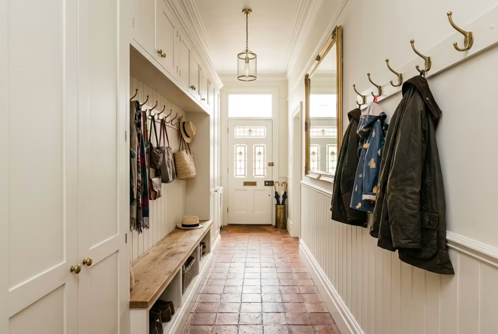
Narrow Victorian hallways can feel unforgiving if handled without care. Every millimetre counts, and heavy cabinetry or deep storage units can quickly tip the balance from elegant to constricted. In these spaces, the guiding principle is visual lightness combined with disciplined functionality.
Shallow joinery is essential. Cabinet depths of around 250 to 350 mm (10 to 14 inches) often provide sufficient storage for everyday coats and accessories without intruding into circulation space. Wall-mounted solutions work particularly well here, lifting storage off the floor and allowing the eye to travel uninterrupted along the length of the hallway.
To avoid the feeling of a tunnel-like space, lighter tones and reflective surfaces can make a meaningful difference. A well-placed mirror, slim-profile hooks, and continuous wall panelling all help maintain rhythm without visual clutter. As a general rule, if something protrudes too far into the walkway, it will eventually feel like an obstacle rather than a feature.
Key considerations include:
- Slimline built-in cabinetry with minimal projection
- Wall-mounted coat rails instead of bulky units
- Integrated bench seating no deeper than 400 mm (16 inches)
- Continuous skirting and trim to maintain flow
- Strategic use of mirrors to expand perceived width
When handled correctly, even the narrowest hallway can feel composed rather than compromised, like a well-tailored corridor that knows exactly how to behave.
For a Rear Entry Boot Room
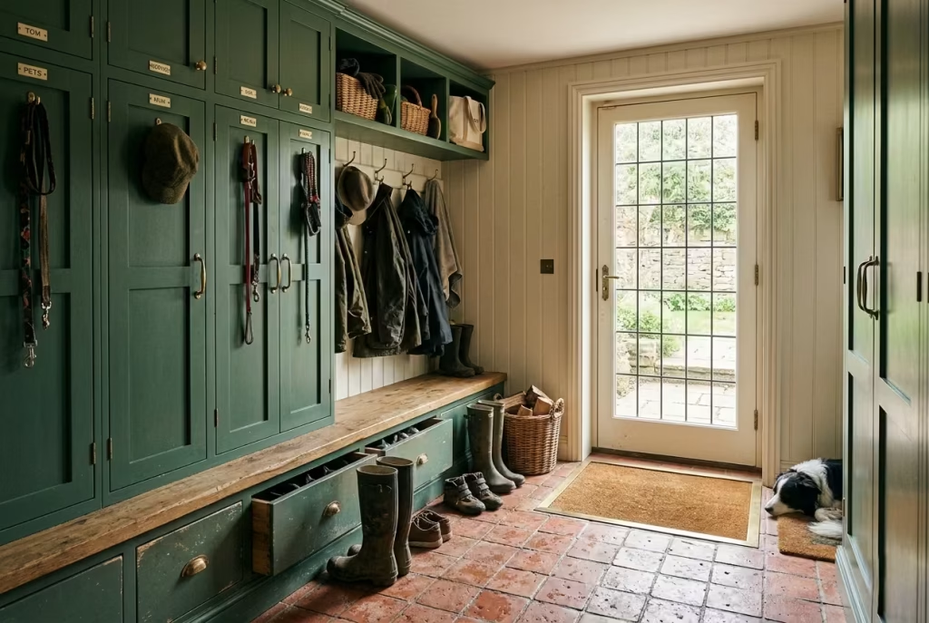
Rear entrances in Victorian homes often carry the full weight of everyday life. They are the threshold where muddy boots, wet coats, garden tools, and outdoor gear converge without ceremony. This is where practicality must lead every design decision, supported by materials that are unapologetically durable.
Hardwearing flooring becomes non-negotiable. Quarry tile or porcelain surfaces are particularly effective here, offering resistance to moisture and grit while maintaining a sense of period authenticity. Unlike more delicate finishes, these materials allow the space to absorb heavy use without losing composure.
Full-height storage works best in these environments, especially when designed as part of a continuous joinery wall. Lockers, deep drawers, and concealed compartments help contain the visual chaos that can easily build up in busy households. The aim is not to eliminate activity but to organise it so it never spills into adjoining rooms.
Practical features often include:
- Moisture-resistant flooring with strong slip resistance
- Full-height lockers for coats and outdoor clothing
- Dedicated boot storage with easy-clean interiors
- Integrated drainage or mat wells near the entrance
- Robust wall finishes such as panelling or tile
In many ways, the rear boot room is the workhorse of the Victorian home. It may not always be the most decorative space, but when designed well, it quietly keeps the entire household running smoothly.
For a Family Mudroom
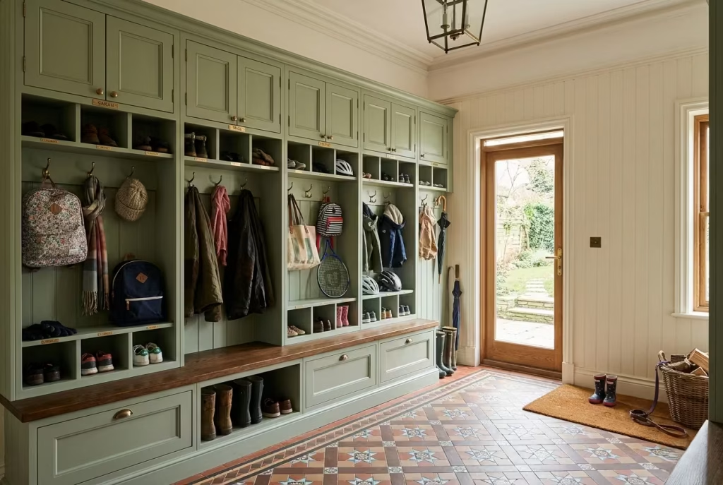
Family mudrooms require a different mindset altogether. Here, flexibility and organisation matter just as much as aesthetics. The space must adapt to shifting routines, from school mornings and sports equipment to shopping trips and seasonal changes. Without clear structure, these rooms can quickly descend into organised chaos.
Segmented storage is particularly effective. Assigning specific zones for each family member prevents overlap and ensures belongings have a defined place. Even in modest spaces, a sense of order can be achieved by dividing cabinetry or bench sections into clearly structured compartments.
Labelling systems, whether subtle or discreet, also help maintain long-term organisation. Not in a clinical sense, but in a way that supports habits over time. When storage is intuitive, the room requires far less effort to keep tidy.
Key design strategies include:
- Individual storage zones for each household member
- Durable, wipeable surfaces for high-traffic contact areas
- Bench seating with hidden storage beneath
- Hooks positioned at varying heights for adults and children
- Easy-clean flooring with forgiving texture
In these spaces, design must behave like a silent assistant, anticipating needs rather than creating friction.
For a Period Cottage or Terrace
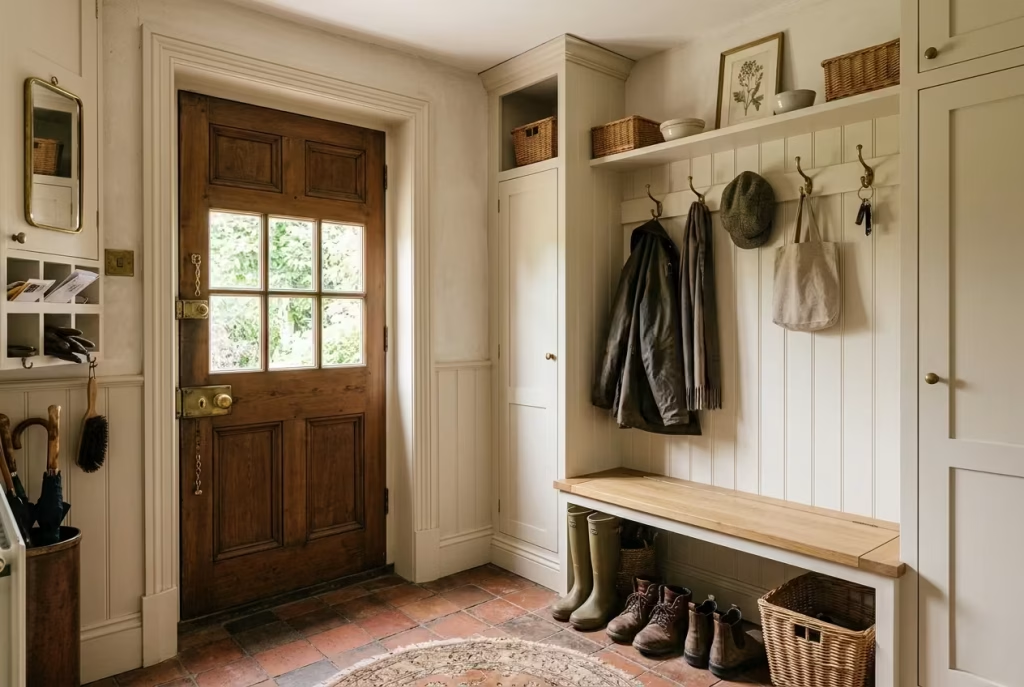
Smaller Victorian cottages and terraces demand a more restrained approach. Space is often limited, ceiling heights can vary, and original proportions should always be respected rather than overridden. Overly bulky cabinetry or excessive detailing can easily overwhelm these interiors, making them feel heavier than they are.
Restraint is the guiding principle here. Every element must justify its presence, both visually and functionally. Slimline joinery, carefully proportioned panels, and light-touch detailing help preserve the character of the home while improving usability.
In many cases, the most successful interventions are the simplest ones. A well-positioned bench, a modest run of cabinetry, and a few thoughtfully placed hooks can often achieve more than a heavily built-out system.
Considerations for compact period homes include:
- Shallow cabinetry that respects narrow room widths
- Light-toned finishes to enhance natural brightness
- Simplified panel detailing to avoid visual heaviness
- Multi-functional furniture where space is limited
- Careful alignment with existing architectural features
In these homes, less truly becomes more. A mudroom should feel like it belongs to the house, not like it has been inserted into it. When proportion and restraint are respected, even the smallest Victorian entrance can carry a quiet sense of dignity, proving that good design is never about size, but about balance and intention.
The Best Colours for a Victorian Mudroom
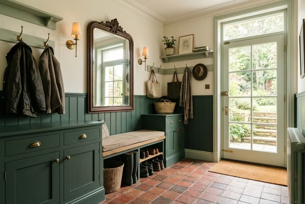
Colour in a Victorian mudroom is never just decoration. It is atmosphere, proportion, and practicality working in quiet alignment. The most successful schemes feel lived-in rather than styled, as though they have evolved naturally with the house over time. Instead of chasing contrast for its own sake, Victorian-inspired palettes tend to rely on depth, restraint, and tonal layering, creating spaces that feel grounded even on the busiest of days.
Soft sage is often a natural starting point. It carries a muted botanical quality that feels calm without becoming overly decorative. In well-lit entrances, it shifts gently throughout the day, sometimes appearing cooler in the morning and warmer in the evening, giving the space a subtle sense of movement without distraction.
Warm stone tones sit comfortably alongside it. These shades work particularly well in mudrooms that connect to older masonry or timber structures, echoing the natural materials already present in Victorian architecture. They create a sense of continuity, like the room has always belonged exactly where it is.
Deep heritage green introduces a more traditional note, often used on cabinetry or lower wall panelling. It has a reassuring weight to it, particularly in larger mudrooms where a sense of grounding is needed. When paired with brass or aged bronze hardware, it can feel both refined and quietly authoritative.
Dusty blue-grey offers a softer alternative, especially suited to spaces that need a touch of calm without becoming overly warm. It works particularly well in north-facing rooms where natural light is cooler, helping balance the overall atmosphere without flattening it.
Ink black accents should be used sparingly but with intention. On door furniture, hooks, or slim framing details, they introduce definition and clarity. Like punctuation in a sentence, they help structure the visual language of the room without overwhelming it.
Off-white with a warm undertone remains one of the most versatile choices. Pure white can feel stark in period homes, but softened versions bring lightness without stripping away character. In smaller or enclosed mudrooms, these tones can make the space feel noticeably more open, particularly when paired with reflective materials such as mirrors or glazed panels.
There is also a practical dimension to colour selection that is often overlooked. Deeper tones such as heritage greens, stone greys, and muted blues are remarkably forgiving in high-traffic spaces. Scuffs, marks, and everyday wear tend to blend into the surface rather than stand out, allowing the room to maintain its composure with less effort. In contrast, lighter colours, while visually expansive, reveal imperfections more easily but reward careful lighting and proportion by making narrow or enclosed entrances feel less compressed.
A balanced Victorian palette often works best when these qualities are combined rather than isolated. Darker shades on lower cabinetry can ground the space, while lighter tones above lift the eye and maintain a sense of openness. This layered approach prevents the room from feeling flat, instead giving it depth and rhythm.
Ultimately, the best colour schemes for a Victorian mudroom are not about chasing perfection. They are about creating a backdrop that quietly supports daily life, softens the edges of routine, and allows the architecture itself to take centre stage. When colour is handled with restraint and intention, even the most practical entrance can feel unexpectedly elegant, like a room that understands its role without ever needing to announce it.
You May also Like: 25 outdoor entryways to transform your outdoor arrival into a composed, lasting first impression
Victorian Mudroom Materials That Age Well
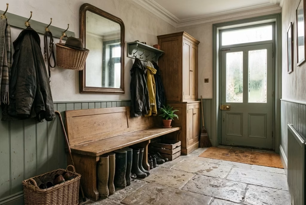
A well-designed Victorian mudroom is not defined by how pristine it looks on day one, but by how gracefully it evolves over time. The best materials do not resist use; they absorb it, soften it, and often improve because of it. In spaces that are constantly exposed to moisture, grit, temperature shifts, and heavy footfall, longevity is not a luxury but a design requirement. What follows are materials that consistently prove their worth in real homes, where beauty is measured in endurance as much as appearance.
Quarry Tile
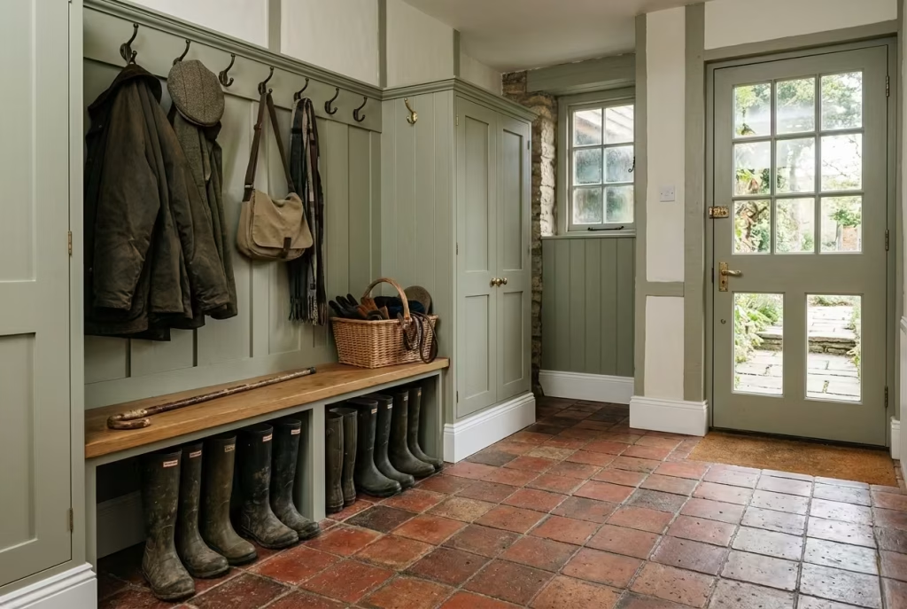
Quarry tile remains one of the most reliable choices for period-inspired mudrooms. It has a grounded, architectural quality that feels entirely at home in Victorian properties, particularly where original floors once existed. From a durability standpoint, it is exceptionally robust, handling heavy traffic without losing structural integrity. Maintenance is relatively straightforward, although periodic sealing helps preserve its surface in wetter environments. Tactilely, it feels firm and honest underfoot, developing a subtle patina over time that adds character rather than detracts from it.
Porcelain with a Handmade Look
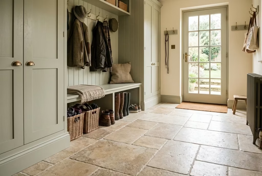
Porcelain that mimics handmade or natural stone finishes offers a more controlled alternative while retaining visual warmth. It is highly resistant to stains, moisture, and scratching, making it particularly suitable for busy family entrances. Maintenance is minimal, often limited to routine cleaning. What makes this material compelling is its ability to combine technical performance with a slightly irregular surface quality, avoiding the overly polished appearance that can feel out of place in Victorian schemes.
Oak or Painted Timber Joinery
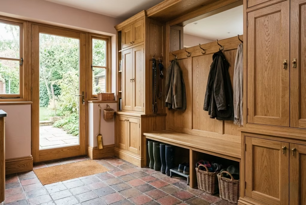
Timber remains central to Victorian design language. Oak brings natural grain, warmth, and longevity when properly treated, while painted timber allows for tonal flexibility within a restrained palette. Both options perform well when used in cabinetry, benches, and panelled storage systems. Oak develops character with age, gradually deepening in tone, while painted finishes require occasional touch-ups in high-contact areas but reward careful maintenance with enduring elegance. The tactile quality of timber, especially when hand-finished, introduces a softness that balances harder flooring materials.
Stone-Look Worktops or Bench Tops
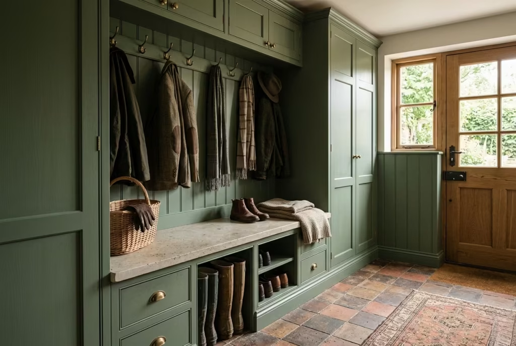
Stone-look surfaces provide durability without the weight or cost of natural stone in some cases. They are particularly effective for bench seating areas or drop zones where daily use is constant. From a maintenance perspective, they are generally low-effort, resisting stains and moisture with ease. Their value lies in visual continuity, echoing the natural materials often found in Victorian architecture while offering a practical surface for everyday life.
Oil-Rubbed Brass or Aged Iron Hardware
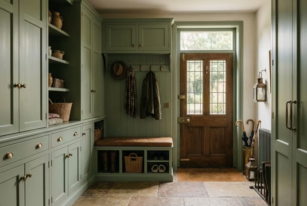
Hardware is often where a room either settles into harmony or begins to feel fragmented. Oil-rubbed brass and aged iron both develop patina over time, which is part of their appeal. Rather than remaining static, they respond to touch and use, subtly changing in appearance as the years pass. Maintenance is minimal, but consistency is key. When used across hooks, handles, and fittings, these finishes create a cohesive visual thread that strengthens the overall composition of the space.
Wool, Coir, or Flatweave Runners
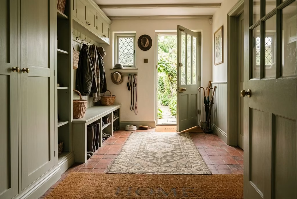
Soft flooring elements play a quieter but equally important role in a Victorian mudroom. Wool runners offer comfort and warmth, particularly in colder climates, while coir mats excel at trapping dirt at the threshold. Flatweave runners strike a balance between practicality and visual refinement, often used in longer corridors or transitional spaces. Maintenance varies depending on material, but all benefit from regular cleaning to preserve their texture and performance. Tactilely, these materials soften the harder architectural elements of the room, creating a more welcoming and layered experience.
When combined thoughtfully, these materials form a cohesive system rather than a collection of individual choices. Each one contributes something different: resilience, warmth, texture, or structure. The result is a mudroom that does not simply withstand daily life but becomes richer because of it, aging in a way that feels intentional rather than accidental.
Common Mistakes to Avoid while designing a Victorian Mudroom

Even the most thoughtfully planned Victorian mudrooms can lose their sense of refinement when a few fundamental principles are overlooked. These spaces sit at the intersection of beauty and heavy daily use, which means small design missteps quickly become visible in everyday life. The difference between a room that feels quietly composed and one that feels slightly chaotic often comes down to restraint, proportion, and an honest understanding of how the space will be used over time.
You May also Like: 15 Spanish Revival Mudrooms That Perfectly Blend Beauty and Practicality
Over-decorating Until the Space Loses Clarity
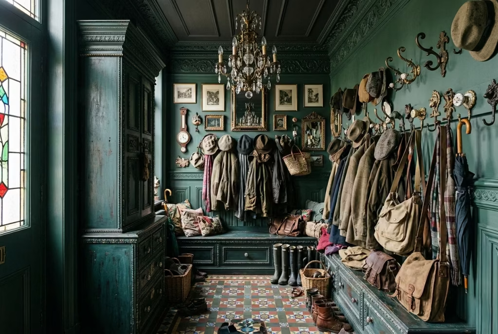
One of the most common pitfalls is the temptation to over-style a mudroom in pursuit of character. Layering too many Victorian-inspired details, decorative hooks, patterned tiles, ornate lighting, and heavily profiled joinery can create visual noise rather than atmosphere. Instead of feeling refined, the room begins to compete with itself.
The strongest interiors often rely on a simple hierarchy: architecture first, detail second. When every surface tries to speak at once, nothing stands out. A more disciplined approach allows craftsmanship and proportion to carry the character naturally, like a well-composed sentence that does not need excessive punctuation to make its point.
Using Too Many Finishes in One Small Space
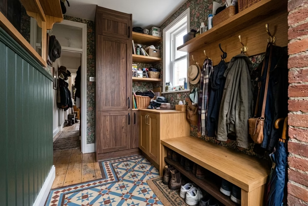
Material variety can add richness, but in compact mudrooms it can quickly tip into fragmentation. Mixing multiple woods, several metal tones, and contrasting flooring textures often results in a space that feels visually unsettled. Instead of harmony, the eye experiences constant interruption.
A more successful approach is to limit the palette and repeat materials with intention. One timber tone, one primary metal finish, and one dominant flooring material are often enough. This creates continuity, allowing the space to feel more considered and architecturally coherent rather than pieced together over time.
Forgetting Ventilation and Wet-Weather Storage
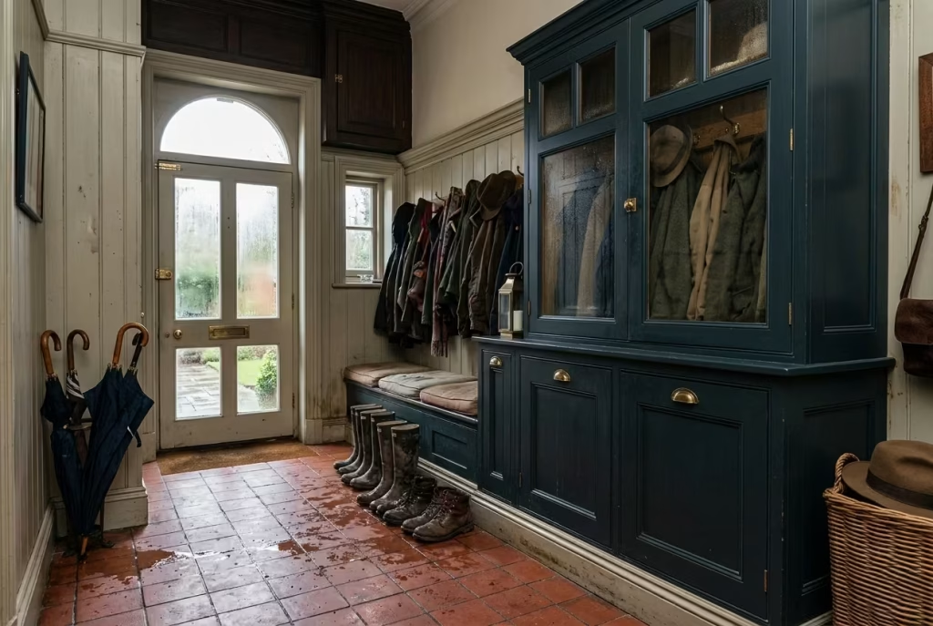
A mudroom that does not manage moisture effectively will struggle regardless of how well it is designed visually. Wet coats, damp boots, and umbrellas introduce a level of humidity that needs to be considered from the outset. Without adequate ventilation, even the most beautiful finishes can begin to deteriorate prematurely.
Practical solutions such as discreet trickle vents, open sections within cabinetry, or breathable storage zones can make a significant difference. In real homes, this is often the detail that separates a room that simply looks good from one that continues to perform well through every season. As the saying goes, what you do not see often matters just as much as what you do.
Choosing Beautiful but Impractical Flooring
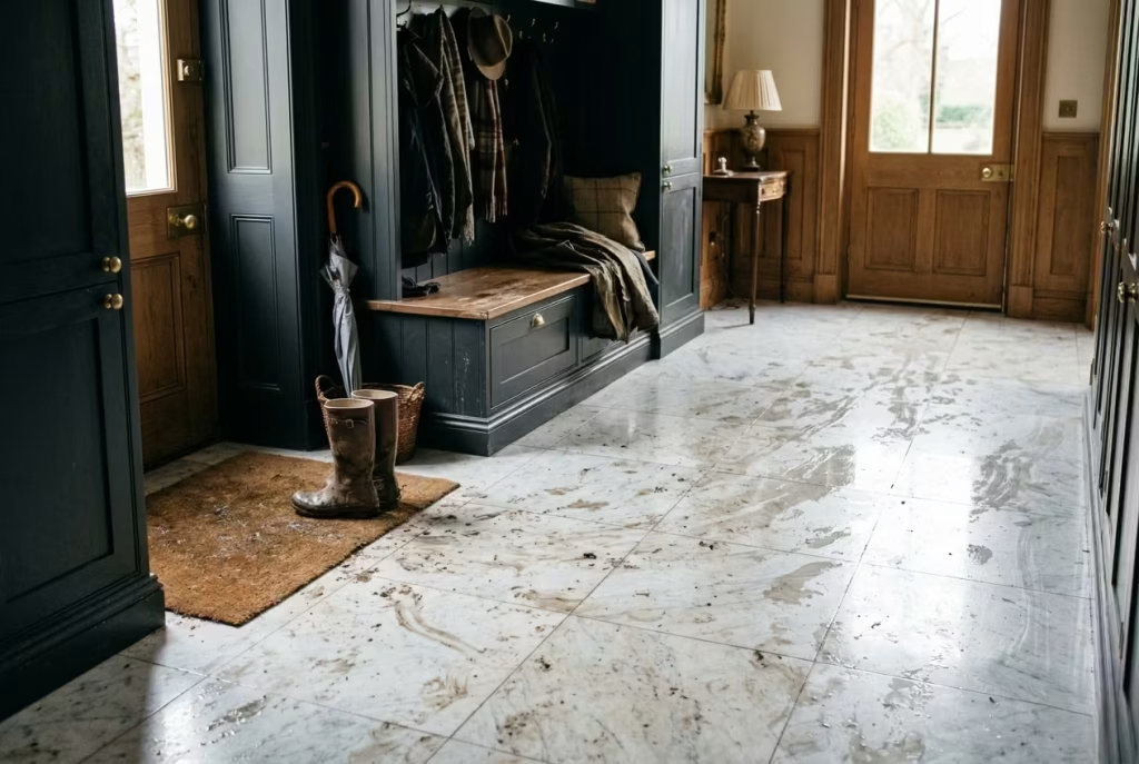
Flooring decisions can make or break a mudroom. It is easy to be drawn to visually appealing materials that appear refined in isolation but struggle under real conditions. Polished surfaces that mark easily, delicate natural stones without proper sealing, or soft finishes unsuited to heavy traffic can quickly become a source of frustration.
A successful Victorian mudroom floor should feel unbothered by life. It should tolerate grit, moisture, and constant movement without demanding constant attention in return. If a material requires too much care just to maintain its appearance, it is often working against the purpose of the room.
Making Storage Too Shallow or Too High to Use Comfortably
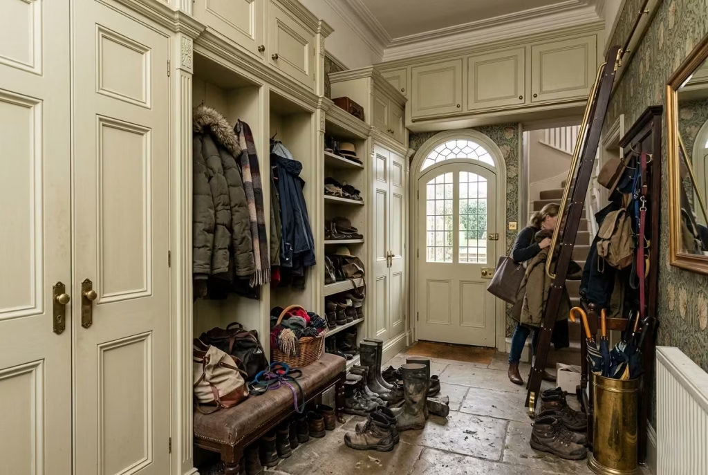
Storage that looks good on paper but fails in daily use is another frequent issue. Shallow cupboards may not accommodate everyday items properly, while overly high shelving often becomes impractical and underused. When storage is difficult to access, it naturally stops being used altogether.
A more thoughtful approach considers reach, ergonomics, and routine. Frequently used items should sit within easy arm’s reach, while seasonal or occasional storage can be placed higher or deeper within the system. In well-designed mudrooms, usability always takes precedence over symmetry.
In the end, most mistakes in Victorian mudrooms stem from prioritising appearance over lived experience. When design decisions are grounded in how the space will actually function, the room becomes easier to maintain, more pleasant to use, and far more resilient over time. It is this balance, rather than perfection, that ultimately defines a successful entryway.
You May also Like: 25 Entryway Renovation Ideas That Transform Your Home from the Moment You Walk In
A Practical Designer’s Note about Victorian Mudroom Design
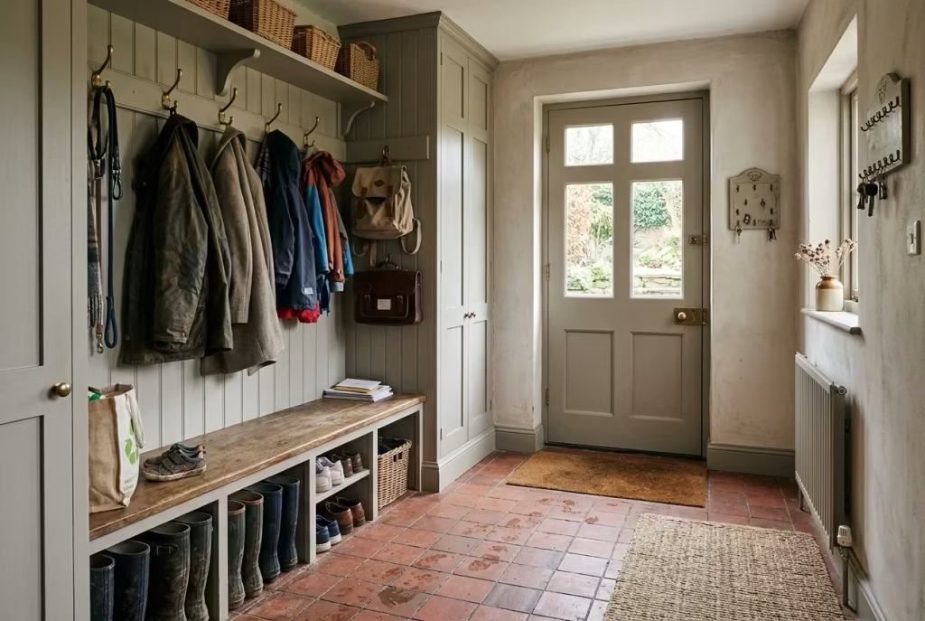
In practice, the most successful Victorian mudrooms are rarely the ones that draw attention to themselves. They do not announce their design choices or compete for visual dominance within the home. Instead, they remain quietly efficient, absorbing the messiness of daily life without losing their composure. A well-considered mudroom is, in many ways, a background performer, steady, reliable, and entirely unflustered even when the household is at its busiest.
What I have learned over the years is that these spaces are at their best when they are designed with restraint and intention. Good proportion ensures nothing feels out of scale. Durable materials allow the room to withstand constant use without falling into disrepair. Disciplined detailing, where every hook, panel, and surface has a clear purpose, prevents visual confusion from creeping in over time.
Trends will always come and go, sometimes with great speed and enthusiasm, but they rarely hold up under the pressure of everyday living. By contrast, a well-judged Victorian mudroom, grounded in practical decisions rather than decorative impulse, tends to age with remarkable grace. It becomes one of those quietly dependable spaces that continues to work in the background, year after year, without needing constant adjustment or reinvention.
If there is one principle worth carrying forward, it is this: the best design is often the least noticeable when it is doing its job properly. When a mudroom feels calm under pressure, handles the chaos of daily routines with ease, and still looks composed at the end of a long day, that is when you know it has been designed well. Not for the photograph, but for the life that unfolds within it.
Final Thoughts: A Victorian Mudroom Should Feel Composed, Not Overworked
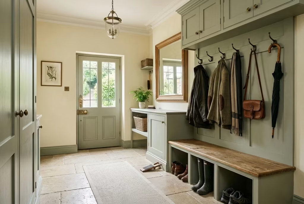
A Victorian mudroom, at its best, is never a performance of style but a quiet expression of order, proportion, and lived-in intelligence. It sits at the threshold of the home, absorbing the realities of daily life while still holding onto a sense of architectural dignity. What gives these spaces their enduring appeal is not decorative excess, but the way heritage character is balanced with practical clarity, allowing function and atmosphere to coexist without tension.
Timelessness in these rooms is rarely achieved through bold gestures. It comes instead from restraint, from knowing when to stop, and from allowing materials, light, and structure to do the heavier lifting. When storage is measured, when circulation is considered, and when detailing is disciplined, the room begins to settle into itself. Nothing feels forced, nothing feels temporary, and everything appears to belong exactly where it is.
The most successful designs also recognise that a mudroom is not an isolated space. It is part of the home’s rhythm, shaping the transition between outside and inside, between chaos and calm. When it is thoughtfully composed, it makes daily life noticeably easier. Coats have a place, shoes disappear from circulation paths, and the arrival home feels less like a collision of objects and more like a gentle pause in the day.
Ultimately, a well-designed Victorian mudroom should feel composed rather than overworked. It should carry the character of the period without becoming theatrical, support modern routines without losing elegance, and remain quietly resilient no matter how busy life becomes. When these elements align, the result is not just an entryway, but a space that sets the tone for the entire home with understated confidence and enduring grace.
Frequently Asked Questions about Victorian Mudroom Design Secrets
What defines a Victorian-style mudroom?
A Victorian-style mudroom is defined less by decoration and more by architectural discipline. It typically combines panelled joinery, structured proportions, and durable natural materials with a clear sense of hierarchy. The emphasis is on order at the threshold, where storage, seating, and circulation are integrated into a cohesive design rather than treated as separate elements.
What is the most practical flooring for a Victorian mudroom?
Quarry tile and porcelain with a handmade or stone-effect finish are the most practical options. Quarry tile offers authentic period character and excellent durability, while porcelain provides higher resistance to moisture and staining with minimal maintenance. In both cases, the key advantage is resilience under constant foot traffic, wet weather, and grit brought in from outdoors.
How do I keep a Victorian mudroom from feeling too dark?
Balance is achieved through layered lighting, reflective surfaces, and considered colour selection. Warm whites, dusty neutrals, or muted heritage tones can prevent the space from feeling heavy. Introducing mirrors or glazed panels helps borrow natural light, especially in narrow or north-facing entrances, improving overall brightness without altering the architecture.
How much storage does a family mudroom actually need?
A functional family mudroom should allow for individual storage zones wherever possible. As a general guide, allocating around 450 to 600 mm (18 to 24 inches) of hanging or locker space per person helps maintain order. Additional deep storage for seasonal items, sports equipment, and footwear ensures the space does not become overloaded during busy periods.
What is the biggest mistake people make in mudroom design?
The most common mistake is prioritising appearance over usability. This often leads to overly decorative spaces, insufficient circulation, or storage that is either too shallow or awkward to access. A successful mudroom always begins with function, ensuring daily routines feel effortless before any stylistic decisions are made.
Can modern materials work in a Victorian-inspired mudroom?
Yes, modern materials can work very effectively when chosen carefully. Porcelain tiles, engineered stone, and advanced durable paints often outperform traditional materials in terms of maintenance and longevity. The key is selecting finishes that echo the tone, texture, and restraint of Victorian design rather than introducing overly contemporary contrasts that disrupt cohesion.
How do I make a small Victorian mudroom feel larger?
Proportion and visual continuity are essential. Shallow cabinetry, consistent wall colours, integrated storage, and the use of mirrors can all help expand perceived space. Keeping furnishings proportionate and avoiding excessive detailing prevents the room from feeling crowded, allowing the architecture to feel more open and breathable.
Should a Victorian mudroom match the rest of the house exactly?
It does not need to match perfectly, but it should feel connected. Repeating key elements such as skirting profiles, hardware finishes, or colour families helps maintain continuity. The goal is to create a transition space that belongs to the same architectural story, rather than a disconnected functional add-on.