Best Warm Neutral Paint Colours That Never Feel Flat
There is a particular kind of disappointment that only reveals itself after the paint has dried. On paper, the choice felt sensible. A warm beige, a soft off-white, something that promised to sit quietly in the background and “work with everything.” Yet once it settles across four walls, the room feels oddly hollow, as if the life has been quietly drained out of it. What was meant to feel calm ends up feeling cautious, and not in a good way.
I see this time and again in real homes. Clients arrive with sample cards filled with agreeable neutrals, each one chosen to avoid risk. Individually, they look perfectly acceptable. Together, they tell a different story. The room begins to feel like it is walking on eggshells, reluctant to commit, hesitant to hold attention. It is a classic case of playing it safe and still missing the mark.
The issue is not neutrality itself. Warm neutrals, when handled with intent, can carry a room effortlessly from morning light to evening glow, shifting gently in tone without ever losing their presence. The problem lies in how they are chosen. Too often, colour is selected in isolation, stripped of context, without considering the quiet forces that shape how it will actually live in the space. Light direction, flooring undertones, ceiling height, even the texture of a sofa fabric all play their part. Ignore these, and even the most promising shade can fall flat on its face.
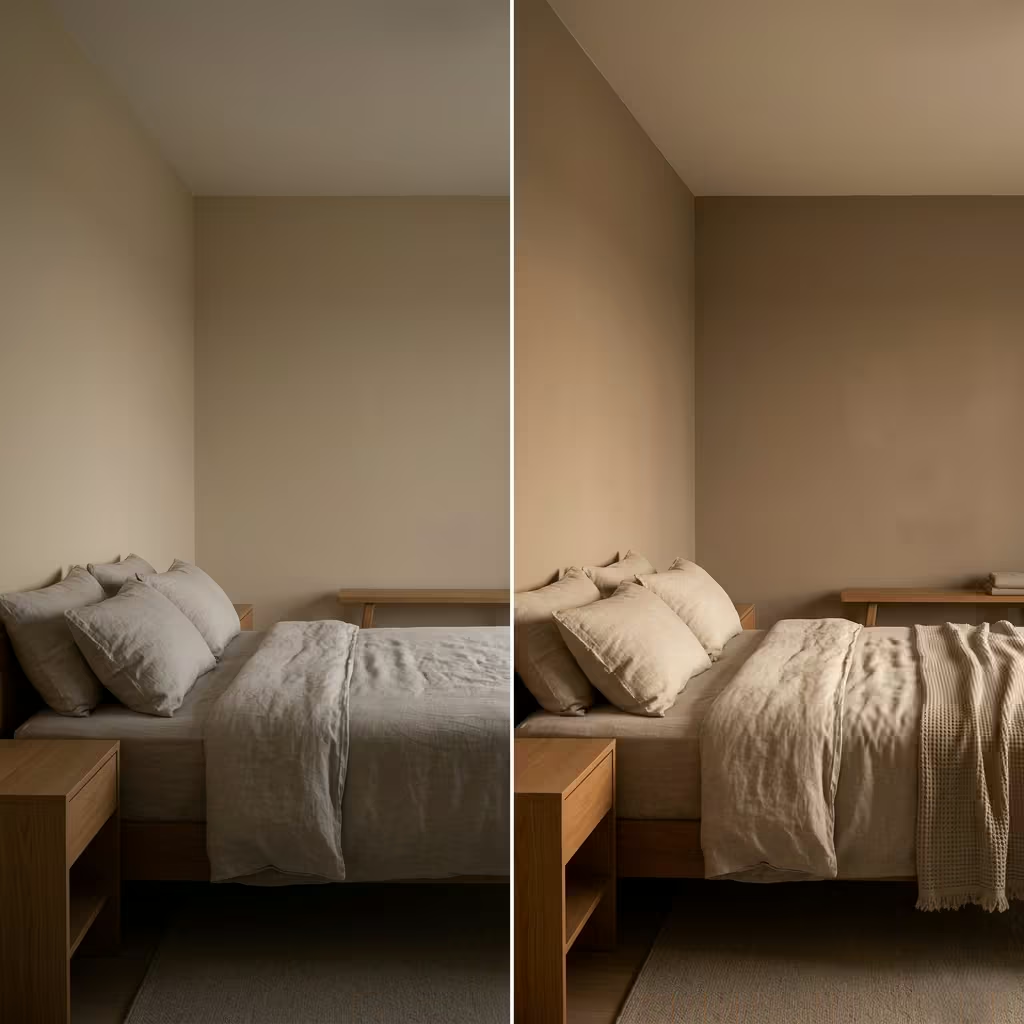
There is also a tendency to confuse softness with weakness. A neutral does not need to shout to be felt, but it does need substance. Without that underlying depth, it becomes little more than a placeholder, something that fills the walls but never quite settles into them. In a recent bedroom project, for instance, a standard warm beige initially looked like a safe bet. Once applied across walls measuring roughly 3 metres by 4 metres, under soft evening lighting, it lost all character. The space felt suspended, neither warm nor cool, just… there. We replaced it with a muted clay-based neutral, and almost overnight the room found its footing. The difference was not dramatic at first glance, but it lingered in the atmosphere, the kind of change you feel before you fully notice.
That is the quiet truth about neutral interiors. They are not simple, even if they appear so. In fact, they demand a sharper eye than bolder colours. Every undertone matters. Every shift in light reveals something new. When done well, they do not hit you all at once. They unfold gradually, like a conversation that deepens over time rather than one that tries too hard at the start.
If a room feels flat despite good intentions, it is rarely because neutral was the wrong choice. More often, it is because the colour was asked to do too much on its own, without the support of material, contrast, and context. A single shade, no matter how carefully chosen, cannot carry an entire space. It needs something to lean against, something to sharpen it, something to soften it. Without that, the result is predictable, and predictability is the quickest way for a room to lose its grip.
The goal, then, is not to avoid neutral tones, but to approach them with a bit more conviction. To look beyond the surface and consider how they will behave, not just how they appear in a sample. Because when a warm neutral is chosen with clarity, it does not fade into the background. It holds the room together, quietly but confidently, like a thread that runs through everything without ever needing to be seen.
What Defines a Warm Neutral in Real Interior Contexts
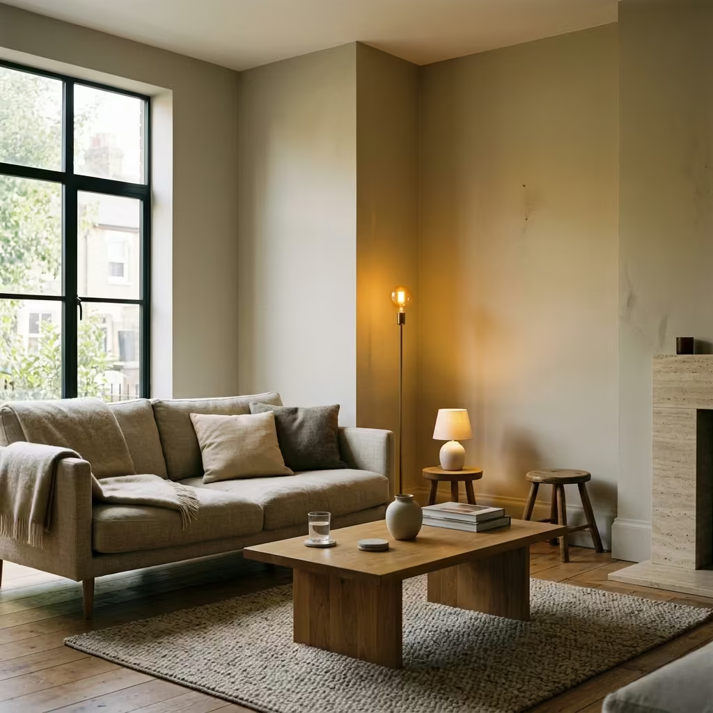
Before getting into undertones, finishes, and placement, it is worth pausing to understand what a warm neutral actually means once it leaves the sample card and enters a lived-in space. In theory, it sounds straightforward. In practice, it is anything but. A colour that reads warm under showroom lighting can feel unexpectedly dull on a full wall, while another that seems understated in isolation can come alive when paired with timber, fabric, and shifting daylight.
I have learned, often the hard way, that a warm neutral is not defined by the label on the tin, but by how it behaves in context. It is less about the colour itself and more about the company it keeps, the light it receives, and the surfaces it touches. Get that balance right, and the room settles into something effortless. Get it wrong, and even the safest choice can feel like it missed the memo.
Undertones Explained Without the Guesswork
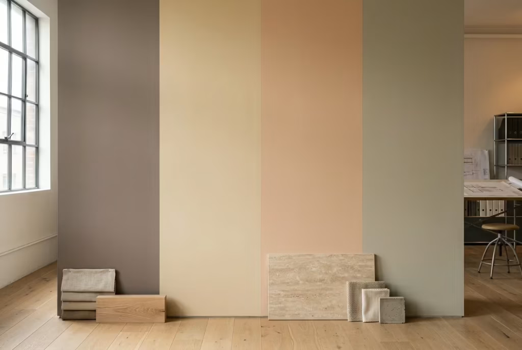
If warm neutrals had a hidden language, undertones would be it. They sit just beneath the surface, easy to overlook yet impossible to ignore once the paint is on the wall. This is where most decisions quietly go off track. A colour might look like a soft beige at first glance, but beneath that calm exterior sits a bias, sometimes red, sometimes yellow, sometimes something more elusive like a muted green. That subtle bias is what determines whether a room feels settled and cohesive or slightly off, like a note that does not quite ring true.
Red, Yellow, Peach, and Muted Green Bases
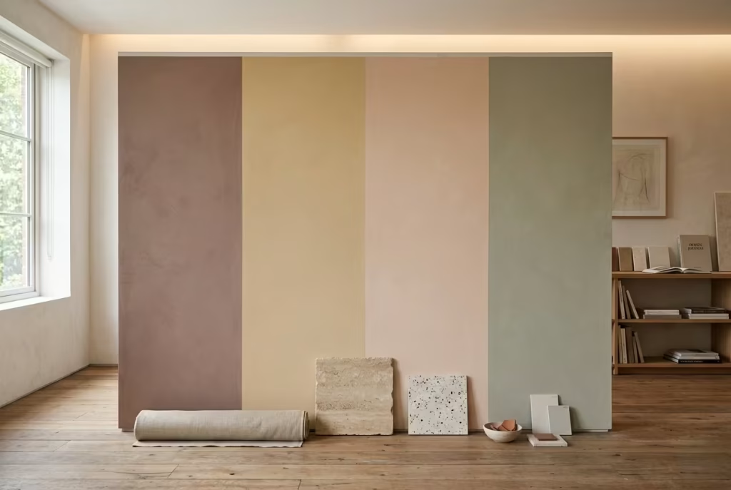
Each undertone carries its own character, and understanding them is half the battle won.
Red-based neutrals tend to feel grounded and cocooning. They carry a quiet warmth that works beautifully in bedrooms or evening spaces, especially where light softens towards dusk. I have used red-based taupes in rooms with 2.7 metre ceilings (9 ft) where the aim was to create intimacy without making the space feel enclosed. The result often feels reassuring, like the room has found its centre of gravity.
Yellow-based neutrals are lighter on their feet. They reflect more light, making them ideal for spaces that need a lift, such as smaller living rooms or north-facing kitchens. That said, they can be a double-edged sword. Under strong artificial lighting, particularly anything above 3000K, they may tip into a slightly sallow tone. It is a fine line, and one worth watching closely.
Peach-based neutrals are often the unsung heroes. They bring a softness that reads almost like natural skin tones, which is why they flatter interiors so well. In one project, a muted peach neutral in a west-facing bedroom managed to hold warmth from late afternoon into evening without ever becoming heavy. It did not shout for attention, but it stayed with you, which is often the mark of a well-judged choice.
Muted green undertones are where things get interesting. They are subtle, sometimes barely perceptible, yet they can completely change the mood of a space. These tones work exceptionally well alongside natural materials like oak, linen, and stone. However, if paired with cooler greys or stark whites, they can feel slightly murky, as if the colour is second-guessing itself.
Why Two Similar Swatches Behave Completely Differently
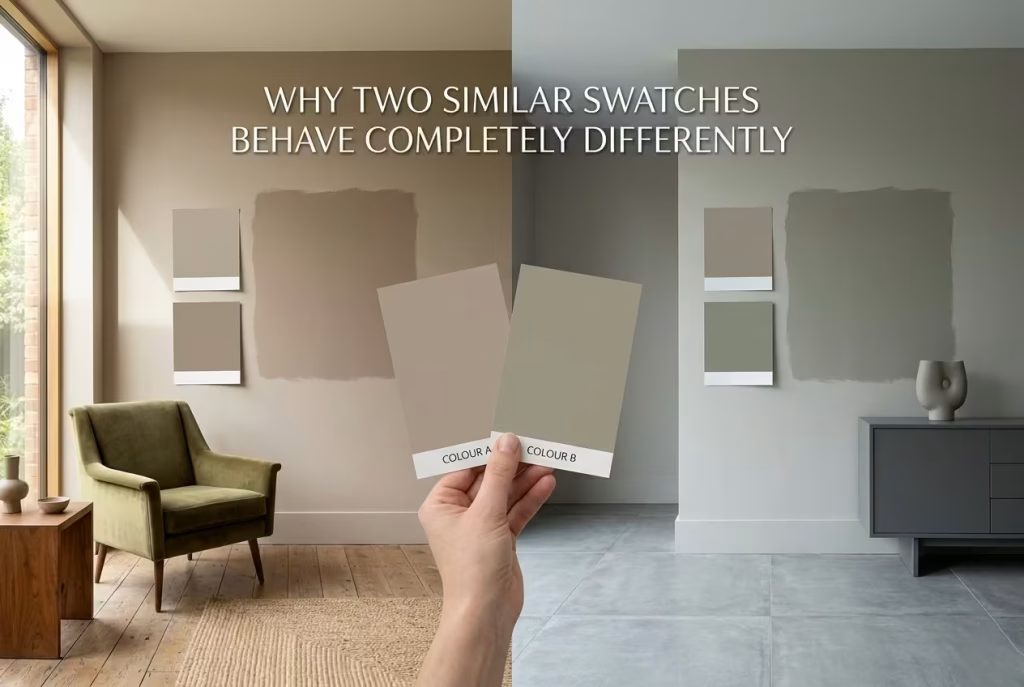
This is where many people find themselves scratching their heads. Two swatches, placed side by side, appear nearly identical. Yet once applied, one feels calm and layered, while the other falls flat, like a story that never quite gets going.
The difference lies in three quiet influences.
First, surrounding materials. A neutral placed next to warm oak flooring will read very differently from the same shade against cool-toned tiles. The undertone either harmonises or clashes, and the effect is immediate, even if you cannot quite put your finger on why.
Second, light direction and intensity. A colour in a north-facing room may lean cooler and more subdued, while the same paint in a south-facing space opens up and reveals its warmth. I have seen a soft taupe feel beautifully balanced in one room and unexpectedly grey in another, simply because the light told a different story.
Third, scale. A small paint card is forgiving. A full wall, especially one measuring 3 to 4 metres wide (10 to 13 ft), is far less so. What looked like a gentle warmth in your hand can expand into something either richer or flatter once it has room to breathe. It is a bit like hearing a voice in a quiet room versus through a loudspeaker. The nuances either deepen or get lost.
The lesson here is simple, though not always easy to follow. Never trust a neutral at face value. It is not what it shows you upfront that matters, but what it reveals over time, in shifting light, against real materials, across real surfaces. When you begin to read undertones this way, the guesswork starts to fall away, and decisions become far more deliberate, almost second nature.
The Difference Between Warm, Cool, and True Neutral
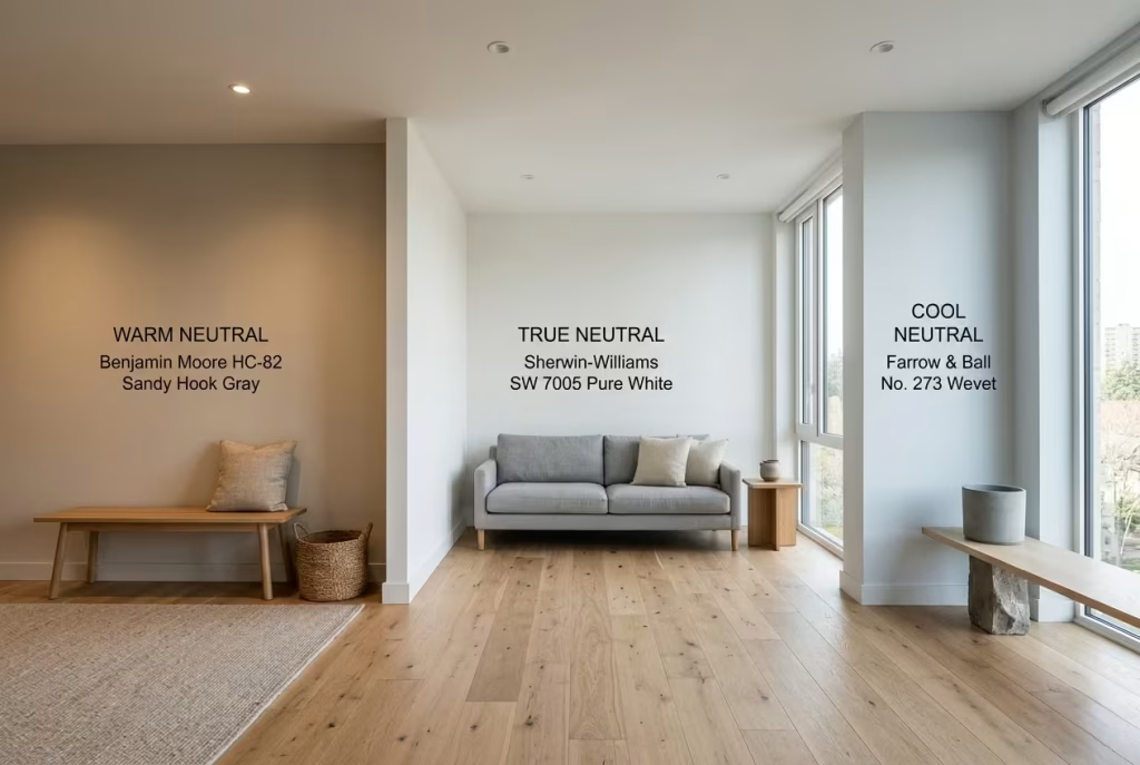
At first glance, the distinction seems clear. Warm neutrals lean inviting, cool neutrals feel crisp, and true neutrals sit somewhere in the middle. In reality, the lines blur the moment colour meets architecture. What looks balanced on a sample card can take on a completely different personality once it settles across a wall, catching light, brushing up against timber, reflecting fabric tones. It is a bit like judging a fabric swatch in a showroom versus seeing it draped across a full sofa. Context changes everything, often quietly but decisively.
Why “True Neutral” Rarely Exists in Practice
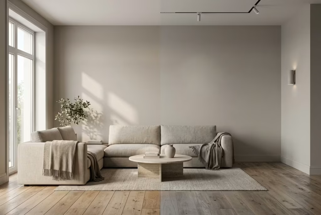
The idea of a perfectly balanced neutral is appealing. No warmth, no coolness, just a clean middle ground that works with everything. In practice, that kind of neutrality is more myth than reality. Every paint carries a bias, even if it is subtle. It might lean slightly yellow, hint towards red, or carry a trace of grey or green that only reveals itself when the light shifts.
I have yet to see a paint that remains completely neutral throughout the day. In a living room I worked on recently, what was marketed as a “perfect neutral” behaved one way in the morning and another by late afternoon. Early light gave it a gentle warmth. By evening, under artificial lighting, it leaned cooler, almost hesitant. It did not fail as a colour, but it proved a point. Neutrality is never fixed. It is always in conversation with its surroundings.
This is why chasing a true neutral can feel like trying to pin down something that keeps moving. Instead of asking whether a colour is neutral, it is far more useful to ask which direction it leans and how that lean will interact with the room.
How Paint Shifts Depending on Surrounding Materials
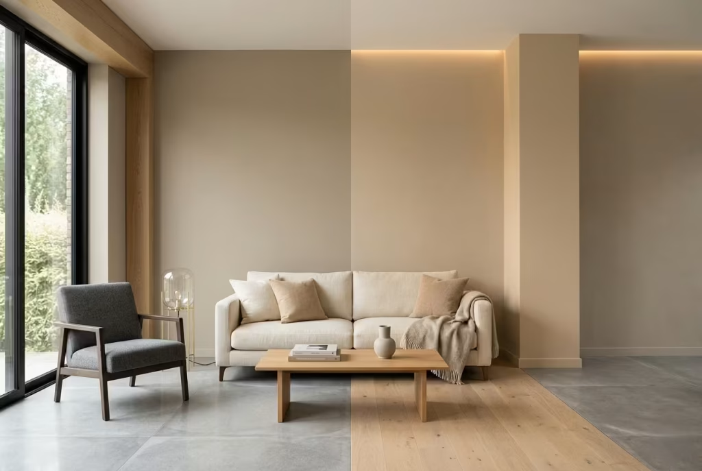
Paint does not exist in isolation. It borrows from everything around it, sometimes subtly, sometimes quite dramatically. Flooring, joinery, upholstery, even artwork can nudge a colour one way or another, changing its temperature and depth without altering the paint itself.
Take a warm neutral wall paired with light oak flooring. The shared warmth tends to amplify, creating a cohesive and settled atmosphere. The room feels pulled together, as if each element is speaking the same language. Now place that same wall colour next to cool grey tiles, and the story changes. The neutral may begin to look warmer than intended, sometimes even slightly peach or yellow, simply because the contrast has sharpened its undertone.
Fabric plays its part too. A linen sofa with a soft, creamy base can lift a wall colour, making it feel lighter and more breathable. Introduce a cooler-toned upholstery, and suddenly the wall may appear deeper or more muted, as if it has taken a step back. It is a quiet shift, but one that shapes the entire mood of the space.
I often think of it as a balancing act. The paint sets the tone, but the materials decide how that tone is heard. In one project, a neutral that felt perfectly judged on its own became unexpectedly flat once paired with high-gloss cabinetry and polished stone. The surfaces reflected light differently, stripping away the softness the colour relied on. We adjusted the surrounding materials rather than the paint, introducing more texture through timber and matte finishes. The colour came back to life without changing a single drop.
The takeaway is simple, though it takes practice to fully trust it. A neutral is never just a colour on a wall. It is part of a wider composition. Ignore the surrounding elements, and the result can feel disjointed. Consider them together, and the room begins to settle, not loudly, but with a quiet confidence that holds its own over time.
Why Beige Isn’t the Enemy, But Misuse Is
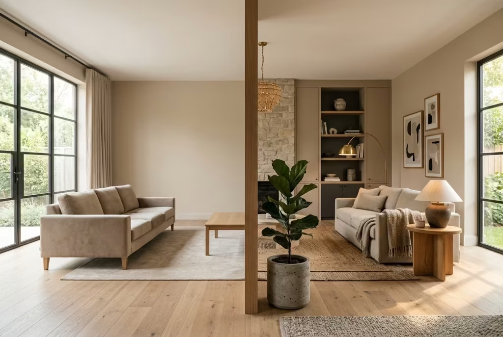
Beige has taken its fair share of blame over the years, often dismissed as dull, dated, or lacking imagination. In truth, beige is rarely the problem. It is one of the most versatile tools in a designer’s palette when used with intent. The real issue lies in how it is applied. When treated as a default rather than a decision, beige can feel like it is simply filling space rather than shaping it. It becomes background noise, present but forgettable, like a room that never quite finds its voice.
The Overuse of Flat, Single-Tone Beige
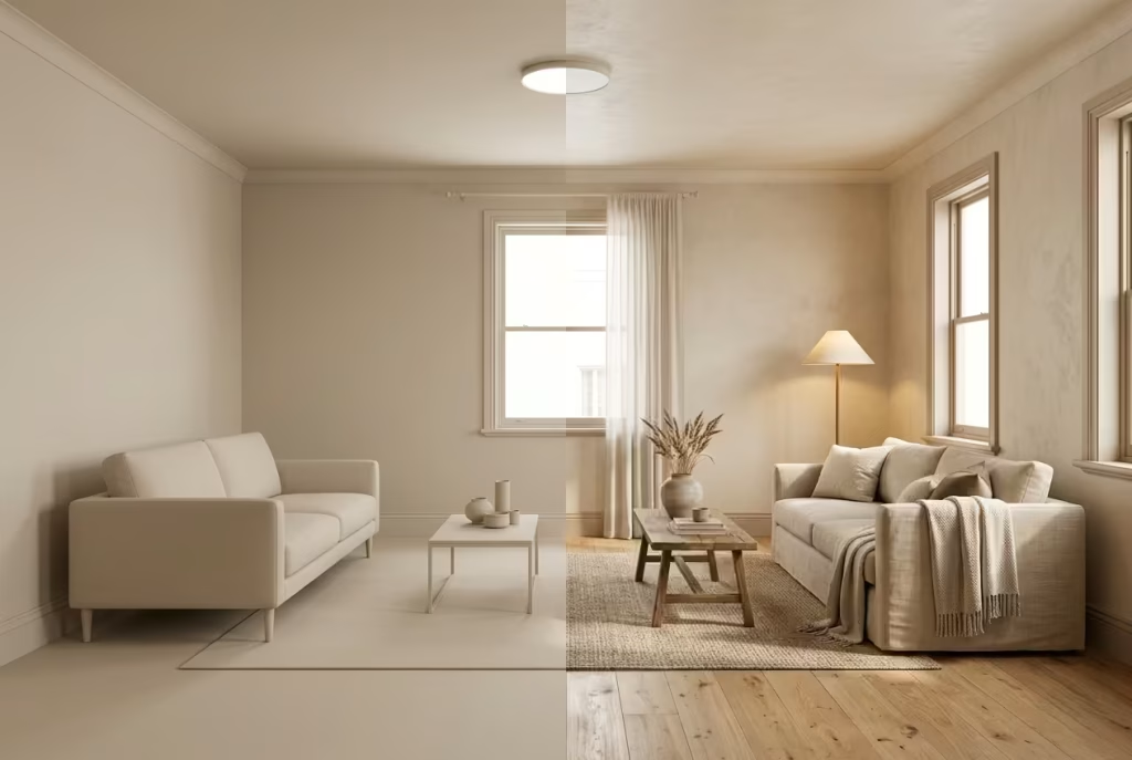
The quickest way for beige to lose its footing is through overuse in a single, unbroken tone. Walls, ceilings, trim, and sometimes even furnishings all falling into the same narrow colour range can drain a room of depth. Without contrast or variation, the space begins to feel one-dimensional, as if everything has been smoothed over to the point where nothing stands out.
I have walked into rooms where beige covers every surface, from floor to ceiling heights of around 2.4 to 2.7 metres (8 to 9 ft), and the effect is immediate. The eye has nowhere to land. There is no hierarchy, no rhythm, no pause. It is a bit like listening to music played on a single note. Technically consistent, but emotionally flat.
The intention is often to create calm, but calm without variation can tip into lifelessness. Beige needs tension, subtle shifts in tone, material, or finish that allow it to breathe. Even a slight contrast, a skirting board just 10 to 15 percent deeper in tone, or a ceiling that lifts a fraction lighter, can introduce enough movement to change the entire reading of the room.
When Beige Becomes Architectural Rather Than Decorative
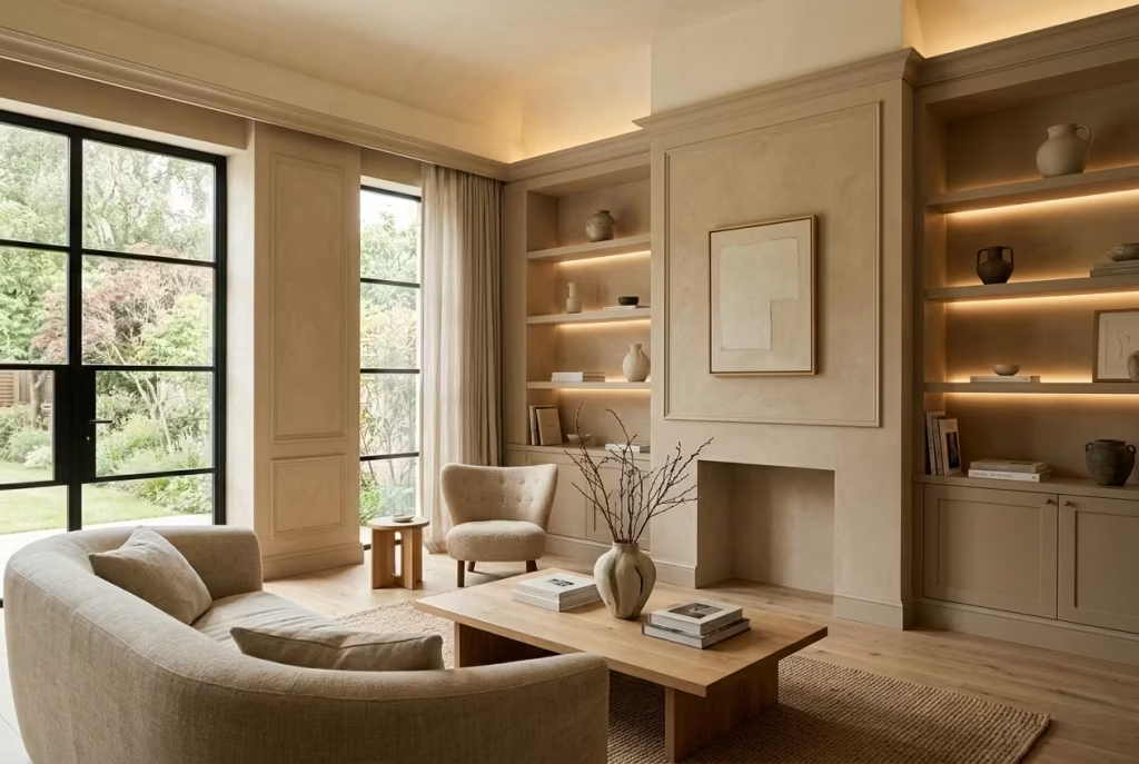
Beige begins to reveal its strength when it is used not as decoration, but as part of the architecture of the space. Instead of sitting on the surface, it works with the proportions, the light, and the materials to define how the room is experienced.
In one project, a soft beige was applied across walls in a living space measuring roughly 4 metres by 5 metres (13 by 16 ft), but the key was how it was handled. The walls carried a warm, slightly clay-based beige, while the joinery shifted deeper into a taupe, and the ceiling lifted into a lighter, almost creamy tone. The colour was not doing all the work on its own. It was part of a layered system that gave the room structure and depth.
This is where beige moves from safe to considered. It begins to frame the space rather than fade into it. Architectural details such as alcoves, panel moulding, or built-in shelving can be emphasised through tonal variation, allowing the colour to guide the eye rather than disappear from it.
Material choice plays a decisive role here. Pair beige with natural oak, linen upholstery, or matte plaster finishes, and it settles comfortably, almost instinctively. Introduce overly glossy surfaces or stark contrasts, and it can lose that quiet confidence, feeling slightly out of place, like it is trying to keep up rather than leading the conversation.
When beige is used with clarity, it does not feel like a compromise. It feels intentional, measured, and quietly assured. It is not about adding more colour, but about using what is already there with a sharper eye. Once that shift happens, beige stops being the easy option and becomes the right one.
Why Warm Neutrals Go Flat (And How to Prevent It)
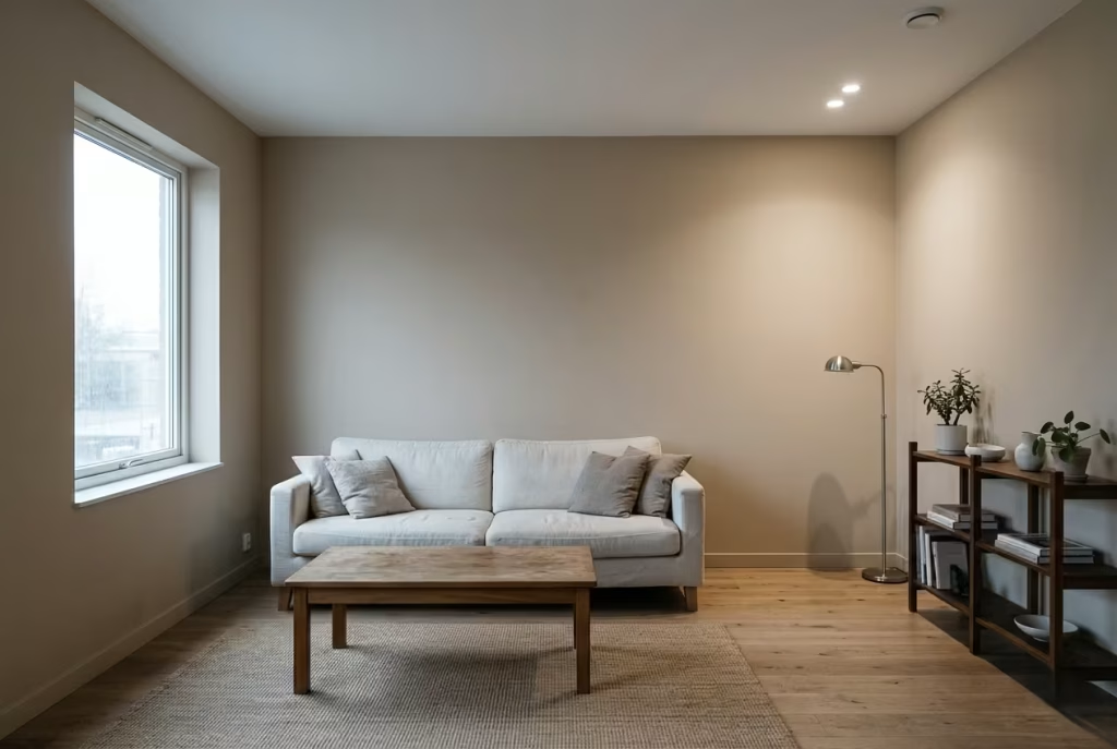
Warm neutrals rarely fail because of the colour itself, they fail because of everything surrounding it. What begins as a carefully chosen, seemingly foolproof shade can quietly lose its depth once it meets real-world conditions like inconsistent lighting, mismatched materials, or overly uniform finishes.
I have seen rooms where the paint looked beautifully balanced on day one, only to feel increasingly lifeless as furniture was added and natural light shifted through the seasons. It is a subtle unraveling rather than a dramatic mistake.
Understanding why this happens is the turning point, because once you recognise the forces that flatten a neutral, you can begin to design against them rather than be surprised by them.
The Lighting Variable Most People Ignore
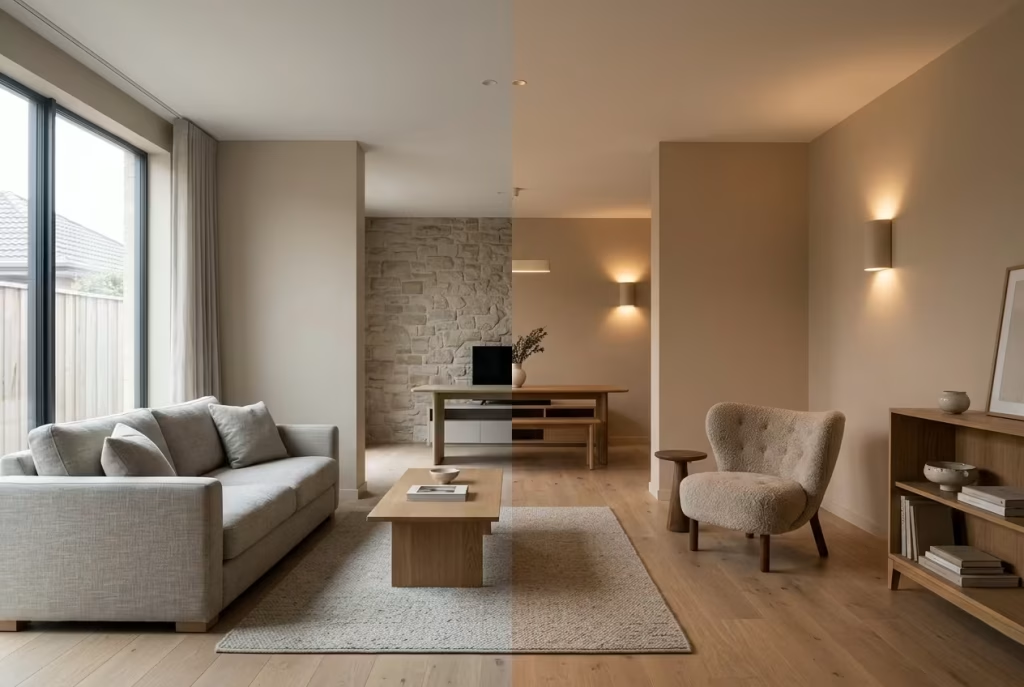
Lighting is the silent architect of every interior. You can choose the most carefully balanced warm neutral, but if the light is wrong, the colour will not behave as intended. It either loses its depth, shifts temperature unexpectedly, or simply flattens out like a washed canvas. I have often seen beautifully specified paint completely change character once the lighting plan is switched on, as if the room has quietly rewritten its own script overnight. This is why light is never an afterthought, it is the condition that decides whether a colour lives or fades.
North vs South-Facing Rooms
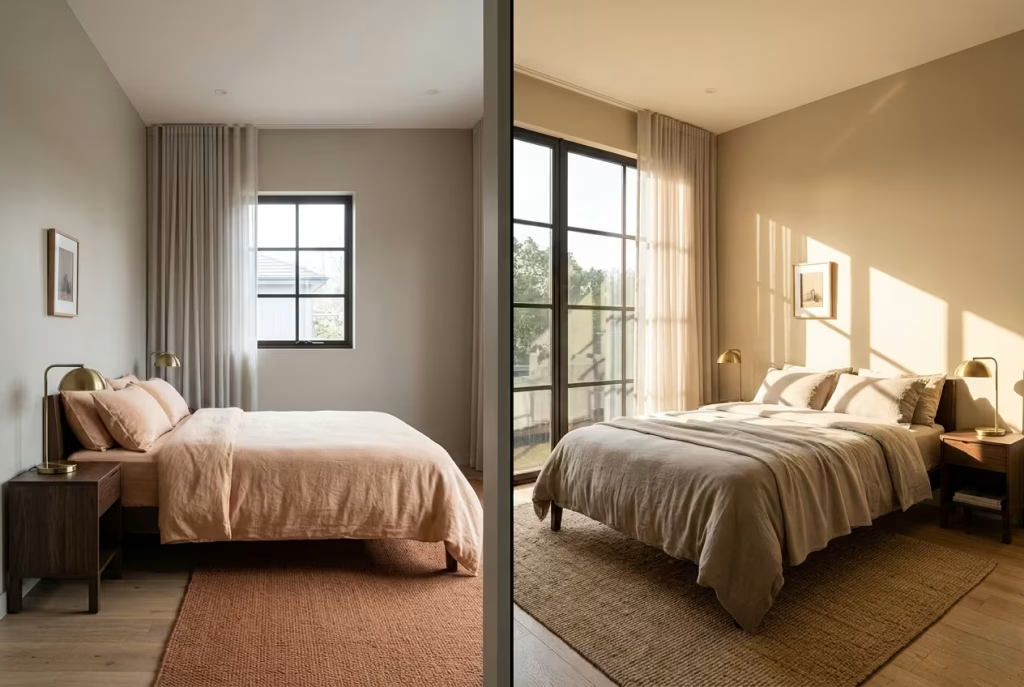
The direction a room faces sets the entire emotional tone of a warm neutral, often in ways that are easy to underestimate until you experience it in real time.
North-facing rooms tend to receive cooler, more diffused light throughout the day. This kind of light has a way of muting warmth, almost as if it gently pulls the colour backwards. A soft beige that looked inviting in the tin can suddenly feel restrained or slightly grey once applied across the wall. I have worked on bedrooms around 3 metres by 4 metres (10 by 13 ft) where this effect was immediately noticeable. The warmth simply did not carry itself without help. In these spaces, warmer undertones like peach, clay, or soft yellow often become essential rather than optional, acting like a quiet counterbalance to the coolness of the light.
South-facing rooms, on the other hand, are generous with warmth. They receive stronger, more direct sunlight for much of the day, which can amplify undertones quickly. A neutral that feels perfectly balanced in a sample can suddenly lean overly golden or slightly washed out when the afternoon sun floods the space. It is a bit like turning up the volume on a song that was already playing softly, everything becomes more pronounced, whether you want it to or not. In these rooms, slightly muted neutrals with a hint of taupe or greige often perform better, as they can hold their composure without becoming overly warm.
Artificial Lighting Temperatures and Their Hidden Impact
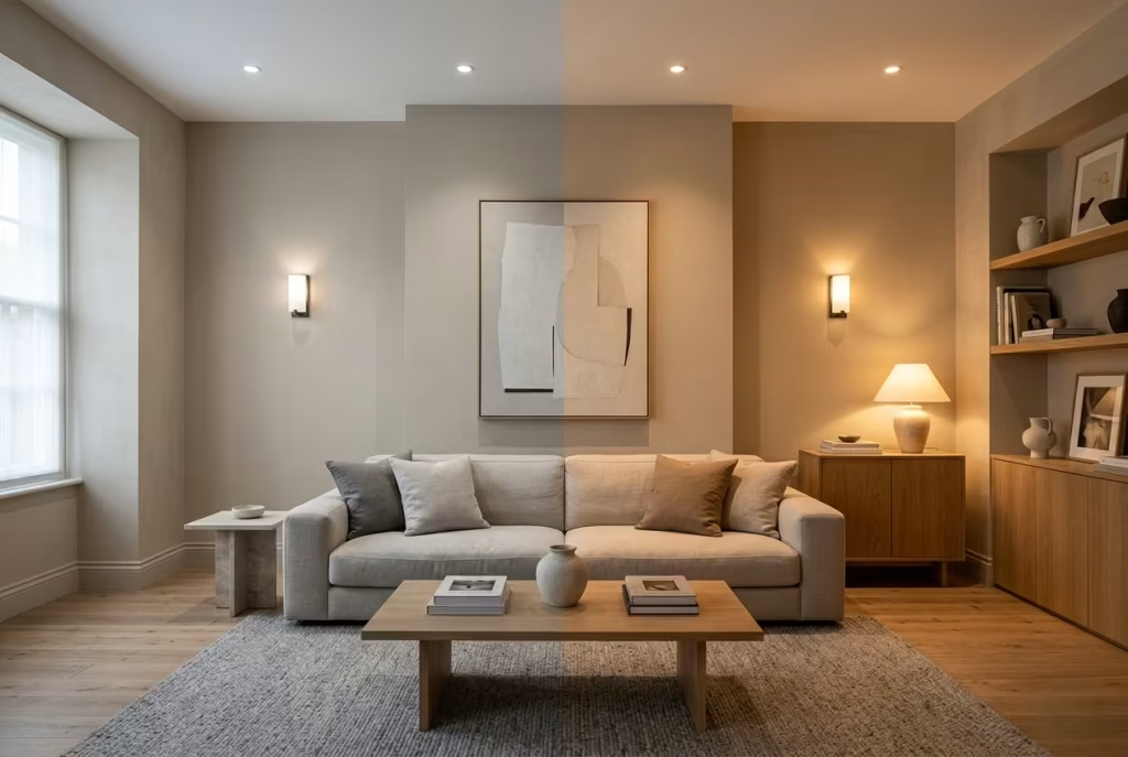
Once the sun goes down, artificial lighting takes over the conversation, and this is where many warm neutrals quietly lose their structure. The temperature of your bulbs, measured in Kelvin, has a far greater influence than most people realise.
Cooler lighting, typically anything above 3500K, can strip warmth out of a colour almost instantly. A soft neutral that felt rich during the day may start to appear flatter, slightly clinical, or even a touch grey under this kind of light. It creates a disconnect between day and night, where the room feels like it is wearing two different identities depending on the hour.
Warmer lighting, usually in the 2700K to 3000K range, tends to support warm neutrals far more naturally. It softens edges, restores depth, and allows undertones to breathe. I have seen living rooms transform simply by changing bulb temperature, without a single alteration to paint or furniture. The space felt less like it had been redesigned and more like it had finally relaxed into itself.
Layering also matters. A single overhead light can flatten even the best-chosen neutral, while a combination of table lamps, wall lights, and shaded fixtures creates variation in tone and shadow. This gentle play of light prevents the colour from feeling static, giving it a sense of movement throughout the evening.
The real lesson here is simple but often overlooked. Paint does not exist on its own. It is always reacting, always responding. When lighting is ignored, even the most carefully selected warm neutral can feel like it has lost its rhythm. But when light is considered with the same care as colour, the entire room begins to feel more composed, more intentional, and far more alive.
You May also Like: 20 Cozy Modern Farmhouse Entryway Designs for a Welcoming Home
Surface Reflectivity and Paint Finish
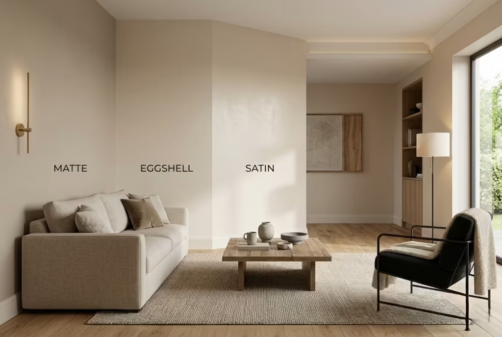
Paint colour is only half the story. The other half is how that colour behaves once it hits a surface, because finish determines how light is absorbed, softened, or bounced back into the room. I often find that people obsess over undertones, which is understandable, but overlook finish entirely, as if it is a secondary detail. In reality, sheen level can quietly make or break a warm neutral, tipping it from softly atmospheric to unexpectedly flat without the colour itself being at fault.
Matte vs Eggshell vs Satin in Neutral Palettes
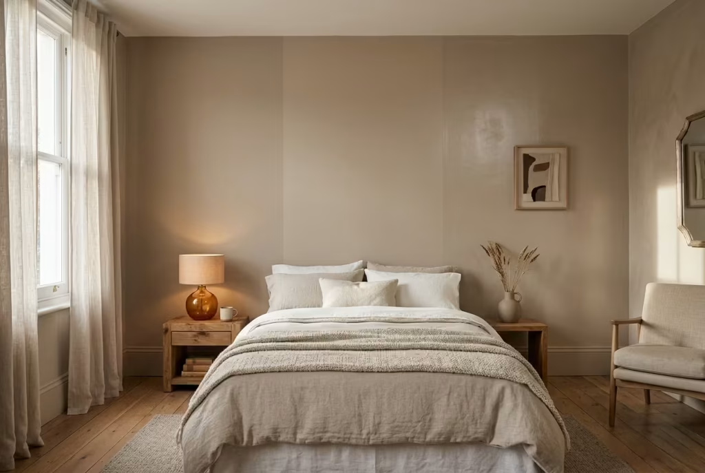
Each finish carries its own personality, and in warm neutral interiors, that personality becomes even more pronounced.
Matte finishes are often chosen for their soft, almost powdery appearance. They absorb light rather than reflect it, which can create a beautifully calm and uninterrupted surface. In the right setting, such as a bedroom with layered textiles and controlled lighting, matte can feel incredibly refined. I have used it in spaces with ceilings around 2.7 metres (9 ft) where the goal was to create a cocoon-like atmosphere, and it delivered exactly that, almost like the walls were gently exhaling. However, matte relies heavily on surrounding texture and light to avoid feeling too still.
Eggshell finishes sit in a very comfortable middle ground. They introduce a subtle sheen that gently lifts the surface without drawing attention to itself. In real residential projects, I tend to lean towards eggshell for living areas because it holds up better under changing daylight conditions. A warm neutral in eggshell finish tends to feel more resilient, as if it is quietly adjusting itself throughout the day rather than staying fixed in one mood.
Satin finishes bring a more noticeable level of reflectivity. Used thoughtfully, they can add depth and dimension, especially in spaces where natural light is limited. However, they need to be handled with care. On large wall surfaces, satin can sometimes exaggerate imperfections or create uneven light patches, particularly in rooms where the walls are not perfectly flat. That said, in transitional spaces like hallways or kitchens, satin can help a warm neutral feel more alive, catching light in a way that subtly guides the eye through the space.
Why Overly Matte Walls Can Absorb Too Much Life
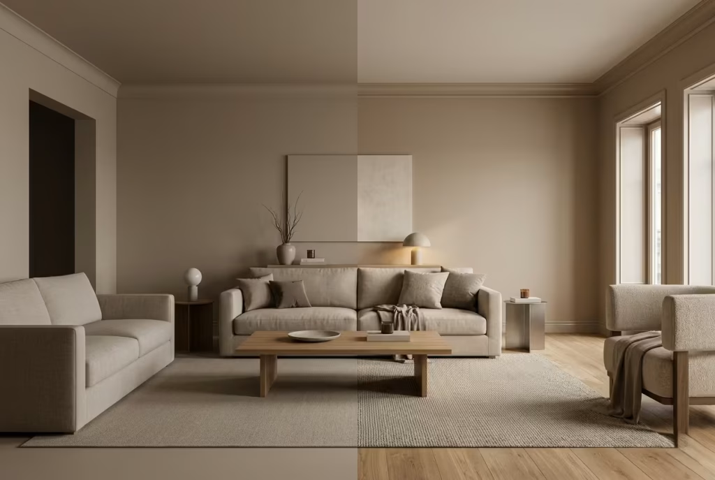
There is a fine line between calm and lifeless, and overly matte surfaces can cross it without warning. While matte finishes are often praised for their softness, they can also absorb both light and energy from a room if not balanced with texture and contrast.
I have seen this happen in open-plan living spaces where a warm neutral was paired with a full matte finish across all walls. At first, it looked elegant, almost gallery-like. But as furniture was added and daylight shifted, the room began to feel strangely muted, as if everything had been gently dimmed. The walls were no longer supporting the space, they were swallowing it.
The issue is not the finish itself, but the lack of counterbalance. Matte surfaces need something to push against them, whether that is natural timber, textured fabrics, or directional lighting. Without that interplay, the room risks losing its dimensionality, like a conversation spoken in a whisper that never quite builds momentum.
In more successful applications, matte works best when it is part of a layered system. For example, pairing matte walls with slightly more reflective trim, or introducing tactile materials like linen, wool, or brushed metal, allows the eye to move through the space rather than settling in one place. It creates rhythm, which is what stops a neutral palette from feeling static.
The key takeaway is simple, though often overlooked. Finish is not just a technical choice, it is a design decision that shapes how a colour breathes. When handled with intent, even a soft matte neutral can feel rich and atmospheric. When left unchecked, it can quietly drain the life out of a room, one surface at a time.
The Missing Layer Problem
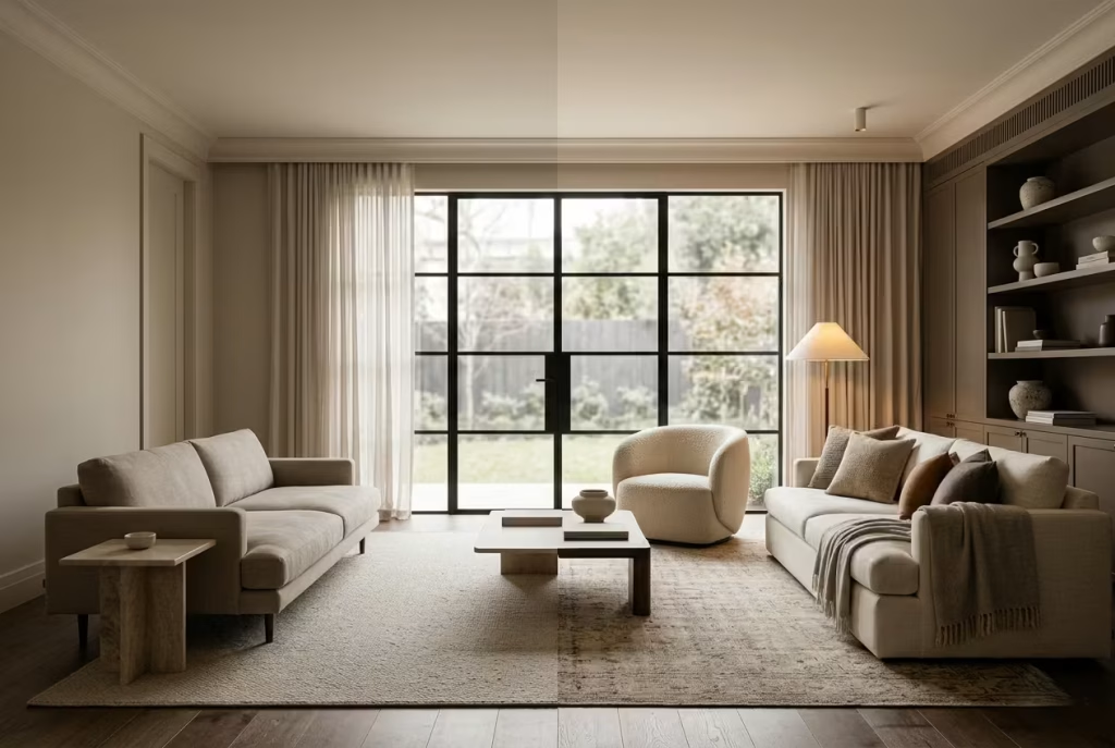
One of the most common reasons warm neutrals fall flat has very little to do with the paint itself and everything to do with what is missing around it. When a room is built on a single tonal register, where walls, floors, and furniture all sit within the same quiet band of colour, the result can feel strangely weightless. At first glance it may appear cohesive, even polished, but over time it starts to lose its rhythm. The space feels like it is holding its breath, waiting for something to happen that never quite arrives.
When Walls, Floors, and Furniture Sit in the Same Tonal Range
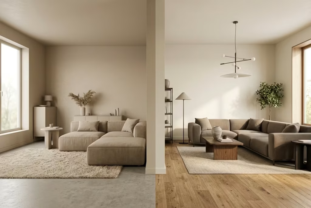
This is where interiors often drift off course without anyone noticing straight away. A soft beige wall paired with a similarly muted carpet, combined with a neutral sofa and pale wood furniture, sounds safe in theory. In reality, it can create a kind of visual fog where nothing truly anchors the eye.
I have walked into living rooms where every element sat within a narrow spectrum of warmth, around the same beige-to-sand family, and the effect was immediate. The room felt pleasant but strangely undefined, like a sentence without punctuation. In one project with a space measuring roughly 4 metres by 4.5 metres (13 by 15 ft), the lack of tonal separation meant the architecture itself began to disappear. Corners softened unintentionally, edges blurred, and even natural light struggled to find a surface to land on.
The issue is not the use of neutrals, but the absence of hierarchy. When everything speaks in the same volume, nothing leads the conversation. The eye has no natural stopping point, no contrast to rest on, and the space begins to feel visually tired even when it is freshly designed.
How Contrast Creates Movement

Contrast is what gives a neutral interior its pulse. It does not need to be bold or dramatic, but it must exist in some form, otherwise the room risks becoming static. Think of contrast as the quiet tension that keeps a space alive, the difference between stillness and subtle motion.
This can be achieved in many ways. A slightly deeper tone on the skirting compared to the walls, a darker timber floor beneath soft plaster-coloured walls, or even a shift in texture between upholstery and surrounding surfaces. Each variation introduces a gentle change in rhythm, allowing the eye to move rather than settle too quickly.
I often describe it to clients as giving the room “breathing points.” In a recent bedroom scheme, we worked with a warm off-white wall but introduced contrast through a deeper taupe headboard wall and natural oak flooring. The difference was not loud, but it changed everything. The room suddenly felt composed, as if it had gained structure without losing softness.
Without contrast, even the most carefully chosen warm neutral can feel like it is running in place. With it, the same colour begins to stretch, shift, and respond to its surroundings. It becomes less about individual surfaces and more about how those surfaces speak to one another.
The real lesson here is simple but often overlooked. A well-designed neutral interior is never about sameness. It is about balance, variation, and the quiet interplay between tones. When that missing layer is introduced, even subtly, the entire room starts to move again, not loudly, but with a calm, assured presence that feels instinctively right.
You May also Like: 25 outdoor entryways to transform your outdoor arrival into a composed, lasting first impression
The Best Warm Neutral Paint Colour Families That Always Hold Depth
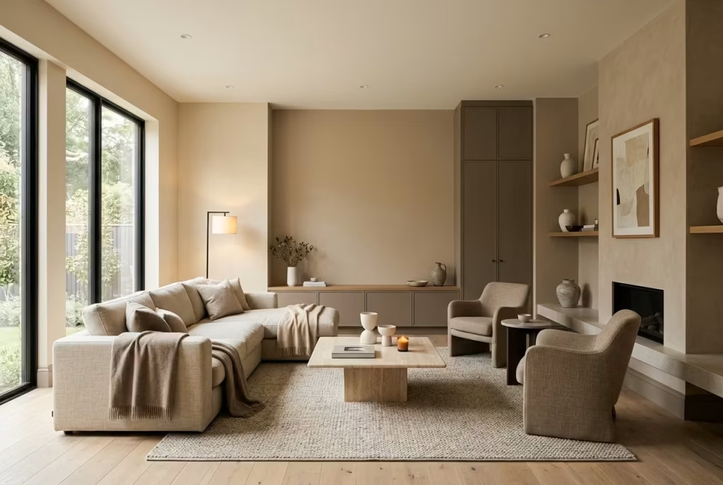
When you step back from individual paint names and start looking at warm neutrals as families rather than isolated choices, something important becomes clear. Depth is rarely accidental. It is built through consistent undertones, controlled saturation, and how a colour behaves across different conditions rather than how it looks in a single moment.
I often find that the most successful interiors are not defined by one perfect shade, but by a carefully chosen group of neutrals that work together like a quiet system. Once you start thinking in families rather than single swatches, decisions become clearer, and the risk of flat, lifeless walls drops dramatically.
Soft Clay and Earth-Based Neutrals
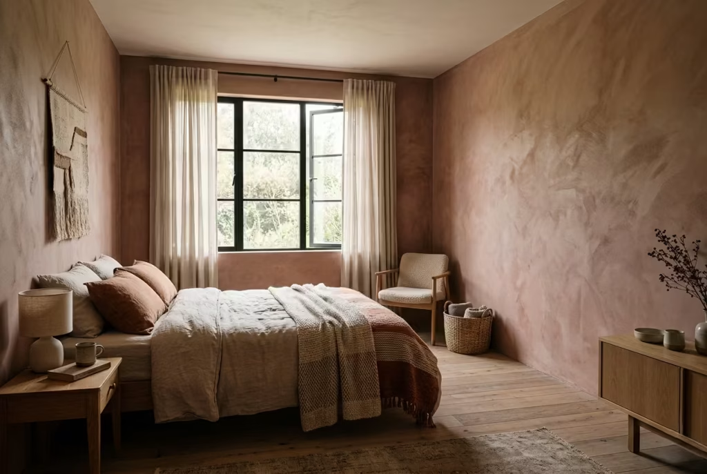
There is something quietly grounding about clay and earth-based neutrals that feels almost instinctive. They do not try to impress in the first glance, yet they have a way of settling into a space as if they were always meant to be there. Unlike cooler greys or overly clean off-whites, these tones carry a sense of origin, like they have been pulled straight from natural landscapes rather than manufactured on a colour chart. In real interiors, this translates into rooms that feel lived-in from day one, not staged or overly composed.
These colours work particularly well in spaces where emotional warmth is just as important as visual balance. Bedrooms, relaxed living areas, and even quiet reading corners tend to benefit most. I have used soft clay tones in rooms around 3 metres by 4 metres (10 by 13 ft) where the intention was to soften architectural rigidity without losing clarity. Once applied, the walls did not dominate the space, but they did not fade into the background either. They sat somewhere in between, quietly anchoring everything around them.
What makes earth-based neutrals so effective is their subtle complexity. They are rarely just one note. A good clay tone often carries a blend of red, brown, and muted peach undertones, which shift gently depending on light and surrounding materials. In morning light, they can feel soft and breathable. By evening, especially under warmer lighting around 2700K to 3000K, they deepen slightly, taking on a cocooning quality without becoming heavy. It is this quiet adaptability that gives them their lasting appeal.
Pairing is where these tones truly come alive. Natural oak, linen, wool, and textured plaster all seem to speak the same language as clay-based neutrals. Together, they create a layered effect that feels effortless, almost as if the room has evolved over time rather than been designed in one sitting. I have often noticed that even simple furnishings gain more presence when set against these tones, as if the background is doing the quiet work of elevating everything in front of it.
However, they are not without their challenges. In spaces with very low natural light, especially north-facing rooms, clay tones can sometimes lean heavier than intended. If the undertone is too strong or the lighting too cool, the space can feel slightly enclosed, like the walls are inching closer than they should. This is where balance becomes essential. Introducing lighter textiles, reflective accents, or layered lighting can prevent the room from tipping into visual weightiness.
The real strength of soft clay and earth-based neutrals lies in their honesty. They do not pretend to be something they are not. They carry warmth, depth, and a quiet confidence that does not need embellishment. When used with intention, they do not simply colour a room, they give it presence, the kind that lingers long after you have left it.
Pros
- Rich, grounded atmosphere that adds instant depth to a room without relying on bold colour
- Ages beautifully over time, often looking more refined as natural patina, light shifts, and layered styling develop
- Works exceptionally well with natural materials like oak, linen, wool, and stone, creating a cohesive, lived-in harmony
- Provides a strong emotional warmth that feels stable and reassuring, especially in bedrooms and quiet living spaces
Cons
- Can feel heavy or overly dense in compact rooms with low ceilings, particularly below 2.4 m (8 ft)
- May appear muted or slightly dull in poorly lit spaces, especially north-facing rooms without supporting artificial lighting
- Requires careful balancing with lighter tones or textured finishes to avoid visual monotony
- Can lose clarity if paired with similarly heavy materials or overly dark furnishings without contrast
Ideal for Bedrooms and Quiet Living Spaces
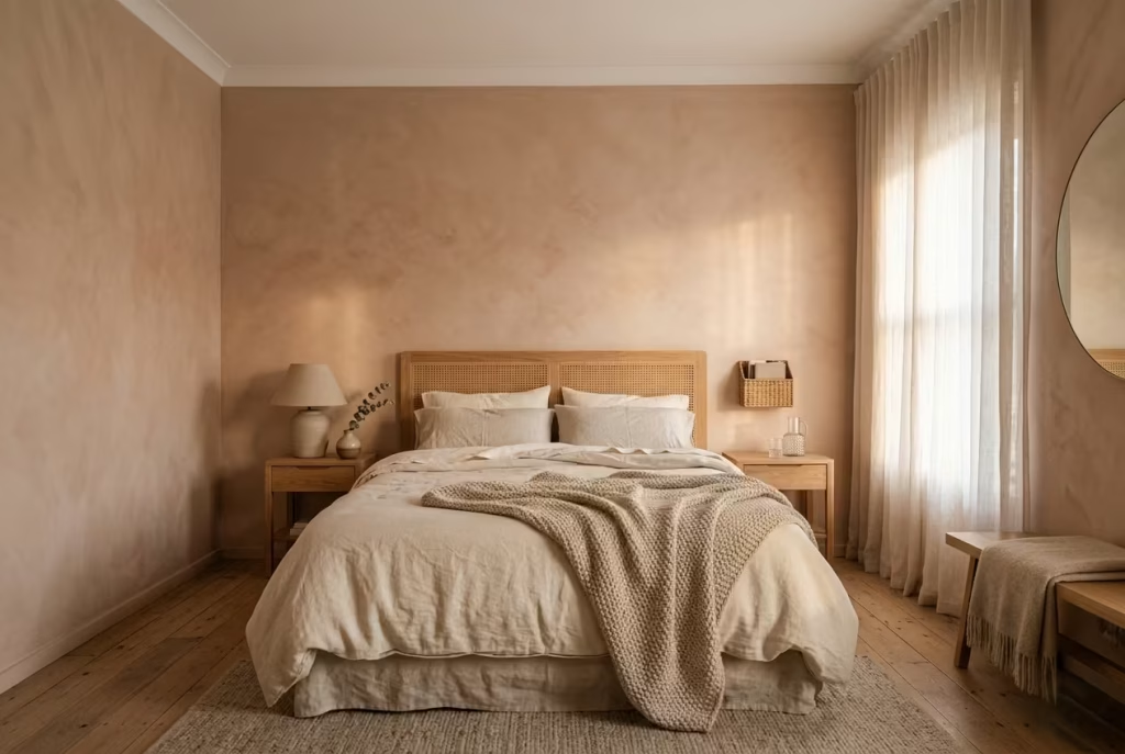
Soft clay and earth-based neutrals find their most natural rhythm in spaces where the pace of life slows down. Bedrooms, quiet sitting rooms, and reading corners benefit from their understated warmth because these tones do not compete for attention, they gently hold it. In a bedroom setting, especially one designed for rest and recovery, these colours create a sense of enclosure that feels reassuring rather than restrictive. It is the kind of atmosphere where the mind unwinds without realising it, as if the room itself is quietly lowering the volume of the day.
I have used these tones in bedrooms where the goal was to soften morning light rather than amplify it. In one project, a softly layered clay neutral helped balance a room that received strong east-facing light, measuring around 3.2 metres by 4 metres (10.5 by 13 ft). Instead of feeling harsh at sunrise, the space held a gentle warmth, almost like light passing through linen. That subtle shift made the room feel more forgiving, more human in its response to changing hours.
Quiet living spaces benefit in a similar way. These tones encourage stillness without feeling stagnant. They are particularly effective in areas where conversation, reading, or reflection takes priority over visual stimulation. The colour becomes a backdrop that supports rather than distracts, like a well-tuned instrument that never tries to outplay the melody.
Works Best with Textured Finishes (Limewash, Plaster)
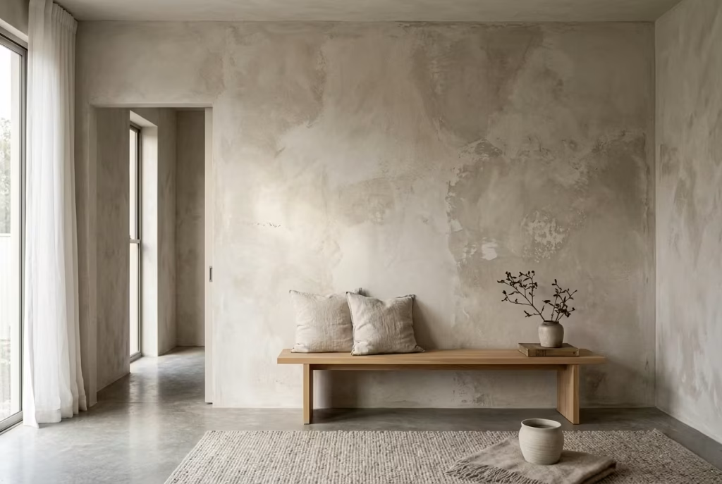
Where soft clay and earth-based neutrals truly come into their own is in how they interact with texture. On flat, uniform surfaces, they can feel pleasant but slightly restrained. Introduce texture, however, and they begin to breathe. Limewash, Venetian plaster, and subtly imperfect matte finishes allow these colours to shift throughout the day, catching light in uneven, almost organic ways that mimic natural surfaces.
Limewash, in particular, enhances the depth of these tones by breaking up light rather than reflecting it directly. The result is a surface that feels alive, almost weathered by time, even when newly applied. In one living room project with walls finished in a soft plaster effect, the clay-based neutral changed character depending on the angle of light. At times it felt smooth and grounded, at others slightly mottled and atmospheric, like stone softened by years of touch.
Plaster finishes add another layer of richness. Their subtle irregularities prevent the colour from feeling static, which is often the risk with warm neutrals. Instead of sitting flat against the wall, the colour becomes part of the surface itself. It is a bit like the difference between a printed image and a hand-painted canvas. One is fixed, the other evolves as you move through the room.
This combination of tone and texture is what prevents earth-based neutrals from feeling one-dimensional. Without it, they can risk slipping into simplicity without depth. With it, they gain presence, movement, and a quiet kind of sophistication that reveals itself gradually rather than all at once.
Measurement Guidance: Best in Rooms with Ceiling Heights Above 2.6m (8.5 ft)
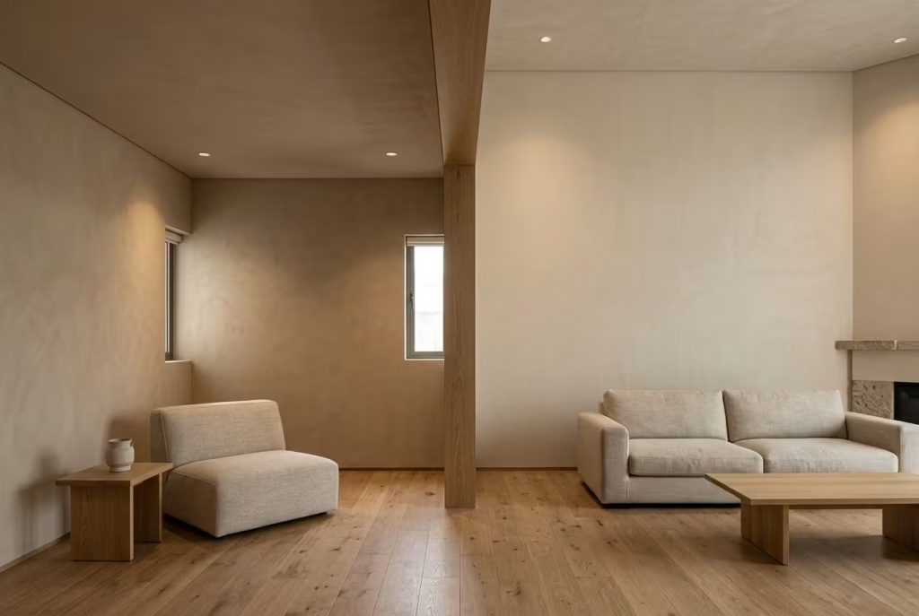
Proportion plays a surprisingly important role in how soft clay and earth-based neutrals perform. These tones carry a natural visual weight, which means they respond best in spaces where they are given enough vertical breathing room. Rooms with ceiling heights above 2.6 metres (8.5 ft) tend to accommodate them more comfortably, allowing the colour to settle without feeling compressed.
In lower ceiling spaces, especially those around 2.3 to 2.4 metres (7.5 to 8 ft), these shades can still work, but they require more careful balancing. Without sufficient height, the warmth of the colour can feel slightly denser, almost as if it is gently pressing downwards. This is not a flaw in the colour itself, but a question of proportion and visual distribution.
When used in taller rooms, however, something shifts. The colour gains room to breathe, rising and falling with the architecture rather than sitting heavily within it. In a living space with a ceiling height of approximately 2.7 metres (9 ft), a clay-based neutral can feel expansive yet grounded at the same time, like the room has found its natural centre of gravity.
This is where design judgment becomes essential. The same shade that feels intimate in a compact room can feel beautifully balanced in a taller one, simply because the architecture allows it to express itself fully. It is a reminder that paint is never just paint. It is a spatial tool, and like any tool, it performs best when used in the right conditions, with a clear understanding of scale, proportion, and intent.
You May also Like: Dark Minimalist Interior Design: Moody, Uncluttered Spaces That Feel Like an Exhale
Warm Off-Whites That Feel Soft, Not Stark
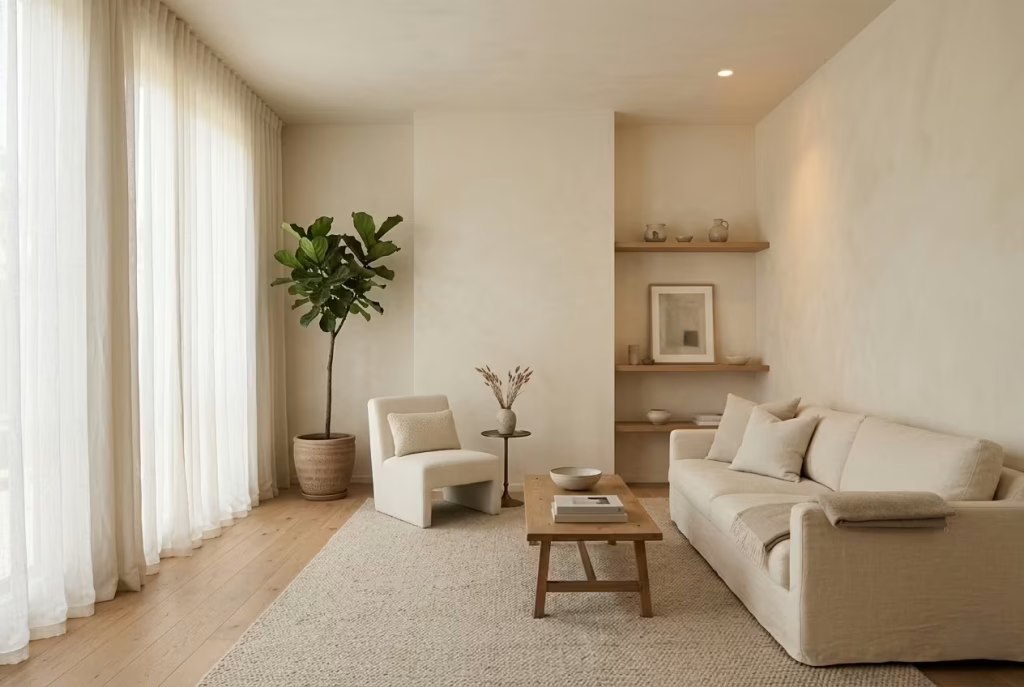
Warm off-whites sit in that delicate middle ground where simplicity meets restraint, and when handled well, they can completely transform the emotional reading of a space. They are often misunderstood as “safe white,” but in reality they are far more nuanced. A good warm off-white is never purely white at all. It carries a faint trace of cream, a whisper of yellow, sometimes even a soft mineral undertone that only reveals itself when light begins to shift across the room. This is what stops them from feeling clinical and allows them to settle into a space with quiet confidence rather than visual sharpness.
In practice, these tones are often the backbone of calm interiors. They work particularly well in spaces that need light without harshness, such as living rooms, kitchens, and smaller bedrooms where natural light is limited. I have used warm off-whites in rooms measuring around 3 metres by 3.5 metres (10 by 11.5 ft) where the goal was to lift the space without washing it out. The result was not a stark brightness, but a soft diffusion of light, almost like sunlight passing through sheer fabric. The walls did not demand attention, yet they subtly shaped the entire atmosphere.
What makes these shades so effective is their ability to support everything around them. Unlike cooler whites that can feel detached or overly crisp, warm off-whites tend to absorb and reflect light in a gentler rhythm. They sit comfortably alongside natural materials, softening the edges of timber, stone, and textiles without competing with them. In one project, pairing a warm off-white wall with light oak flooring and linen upholstery created a layered softness that felt effortless, almost as if the room had been gently tuned rather than decorated.
However, balance is everything. Without contrast, warm off-whites can drift into a slightly flat or creamy uniformity, especially in large, open spaces. This is where subtle layering becomes essential. A slightly deeper trim colour, a textured fabric, or even a tonal shift in furniture can prevent the space from feeling one-note. It is a bit like seasoning in cooking, barely noticeable on its own, but essential for depth.
Lighting also plays a decisive role. Under warmer lighting in the range of 2700K to 3000K, these off-whites tend to glow softly, enhancing their natural warmth. Under cooler lighting, they can lose some of their gentle character and begin to feel more sterile than intended. This is why the same colour can feel inviting in one home and slightly detached in another, even when everything else appears similar.
When used with intention, warm off-whites become more than just a backdrop. They act as a quiet stabiliser in the room, allowing other design elements to breathe while maintaining a sense of cohesion. They do not shout for attention, nor do they fade into nothingness. Instead, they hold the space together with a kind of understated ease, the sort that feels effortless only because it has been carefully considered.
You May also Like: 25 Revitalizing Scandinavian Mudroom Ideas for a Cozy, Minimalist Entryway
Subtle Cream, Almond, and Butter Undertones
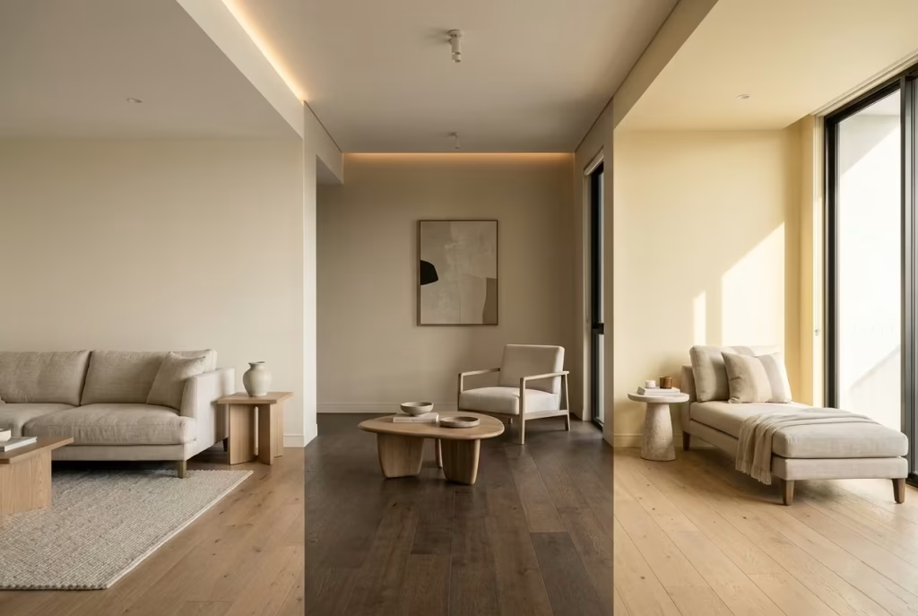
Warm off-whites are rarely just “white with warmth added.” The difference lies in the quiet undertone beneath the surface, and once you start noticing it, you begin to see how dramatically it shapes the entire atmosphere of a room. Cream, almond, and butter tones each carry their own temperament, almost like variations of the same language spoken with a different accent. On a paint chart they can feel interchangeable, yet in real interiors they behave in distinctly different ways, especially once light, texture, and surrounding materials enter the equation.
Cream undertones tend to feel the most classic and forgiving. They soften architectural edges and bring a gentle warmth that never feels forced. In a living space around 3.5 metres by 4.5 metres (11.5 by 15 ft), a cream-based off-white can take the edge off sharp daylight, especially in the late morning when sunlight tends to be more direct. It has a way of settling into the background without disappearing, like a quiet foundation that allows everything else to stand a little taller.
Almond undertones lean slightly more grounded. They introduce a faint earthy quality that makes a space feel composed and steady. In rooms where natural materials are already present, such as oak flooring or linen upholstery, almond tones create a sense of continuity that feels almost unspoken. I have seen them work particularly well in transitional spaces like hallways, where the goal is not to impress but to guide movement with ease. They carry just enough warmth to prevent sterility, yet remain light enough to avoid heaviness.
Butter undertones, on the other hand, bring a more expressive softness. They respond beautifully to natural light, especially in south-facing rooms where sunlight can sometimes feel too strong. Rather than reflecting light harshly, butter-toned off-whites diffuse it, almost like a gentle filter that smooths everything it touches. However, they need careful handling. In poorly lit spaces or under cool artificial lighting, they can lean slightly yellow if not balanced with texture and contrast.
Where They Outperform Pure White
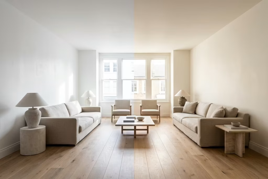
Pure white often looks appealing in theory because of its clarity and crispness, but in lived-in interiors, it can sometimes feel a little too uncompromising. It reflects everything without discrimination, which means imperfections in light, shadow, and material become more visible. Warm off-whites, by contrast, introduce a softness that pure white simply cannot replicate.
One of their greatest strengths is how they interact with natural light. Where pure white can feel stark or even clinical under strong daylight, cream, almond, and butter tones absorb just enough of that brightness to create a more comfortable visual balance. The room still feels light, but not harsh, like sunlight passing through a lightly woven curtain rather than bouncing off a blank surface.
They also outperform pure white when it comes to material pairing. Against timber, stone, or textured fabrics, warm off-whites create cohesion rather than contrast. A pure white wall next to oak flooring can sometimes feel disconnected, almost like two elements speaking different languages. Warm off-whites bridge that gap, allowing materials to blend more naturally without losing their individual character.
In real projects, I have often found that spaces using warm off-whites feel more settled over time. They do not demand constant adjustment or rebalancing through décor. Instead, they quietly support whatever evolves within the room, whether that is seasonal textiles, changing artwork, or shifting light throughout the year. It is this adaptability that makes them feel less like a background choice and more like a long-term design decision.
When handled well, these tones do not try to replace pure white. They refine it. They take its brightness and soften its edges, turning what could feel sharp and sterile into something that feels lived-in, layered, and far more forgiving to everyday life.
Application Insight: How Warm Off-Whites Perform in Real Interiors
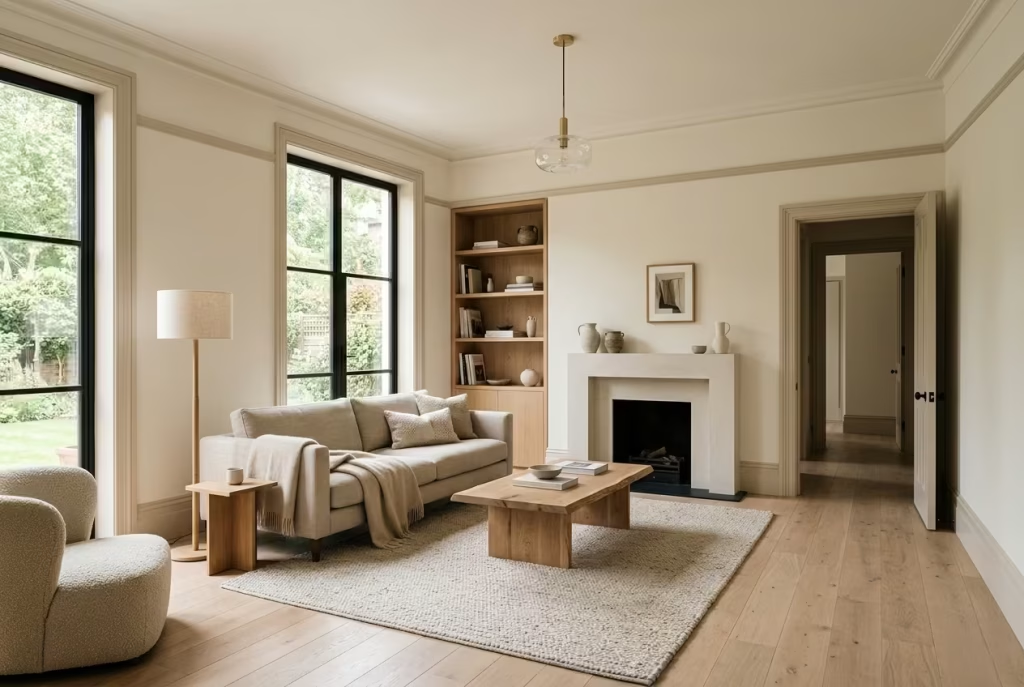
Warm off-whites are at their most convincing when they are not left to carry the room alone. They respond far better in a layered setting where subtle contrast defines structure. One of the most effective approaches I have used in practice is pairing walls in a soft cream or almond tone with trims that are roughly 10–20% deeper in colour value. This small shift might sound almost negligible on paper, but in real spaces it creates just enough visual tension to sharpen edges without breaking the softness.
In a room with ceiling heights around 2.6 to 2.8 metres (8.5 to 9 ft), this layering prevents the architecture from dissolving into a single flat plane. The slightly deeper trim quietly frames the walls, almost like a pencil line defining a sketch. It gives the eye something to register without disrupting the calm atmosphere. I have found this particularly effective in living rooms where the goal is to maintain openness while still allowing the space to feel intentionally composed rather than unfinished.
Another advantage of this layered approach is how it interacts with daylight. As natural light shifts throughout the day, the tonal difference between wall and trim becomes more or less pronounced, which introduces a gentle rhythm into the room. Nothing feels static. Instead, the space seems to adjust itself subtly, like it is breathing with the light.
Pros
- Expands space visually, especially in smaller or moderately sized rooms, by reflecting light in a soft, diffused manner
- Reflects light gently without creating harsh glare, maintaining a calm and comfortable atmosphere throughout the day
- Creates a versatile base that works effortlessly with natural materials such as oak, linen, and stone
- Supports long-term styling changes, allowing furniture and décor to evolve without requiring repainting
Cons
- Can appear slightly dull or underwhelming when paired with overly cold materials such as grey laminates or high-gloss finishes
- May lose definition in poorly layered interiors where trim, wall, and ceiling tones are too close in value
- Requires careful lighting consideration, as cooler artificial light can flatten its natural warmth
- Can feel overly safe or lacking in character if not balanced with texture or subtle tonal contrast
You May also Like: 25 Outdoor Kitchen and Bar Ideas That Elevate Backyard Entertaining: Inspiring, Practical Designs to Transform Your Garden
Taupe, Mushroom, and Putty Tones
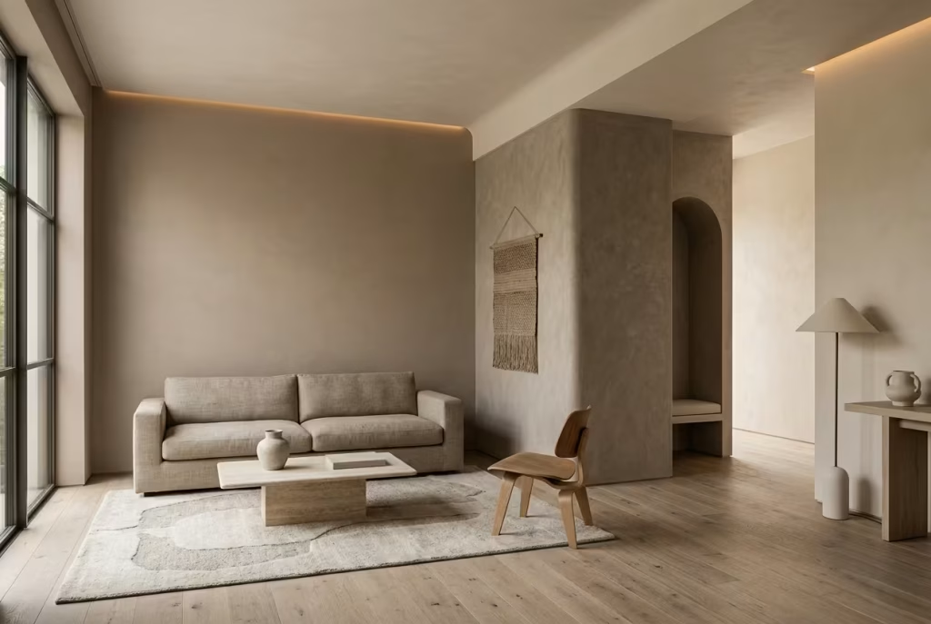
Taupe, mushroom, and putty sit in that quietly intelligent part of the neutral spectrum where nothing feels obvious at first glance, yet everything feels intentional once it settles into a space. These are not colours that announce themselves.
Instead, they work in the background, shaping atmosphere with a kind of understated precision that only becomes clear when you live with them. I often describe them as the “thinking neutrals” because they rely less on instant impact and more on how they evolve with light, material, and proportion over time.
In real interiors, these tones tend to excel in spaces that demand calm structure rather than decorative warmth. Hallways, living rooms, and open-plan transitions benefit most, especially where the architecture itself needs softening without being blurred.
In a recent project involving a narrow circulation space of around 1.2 metres by 6 metres (4 by 20 ft), a mushroom-toned neutral transformed what could have felt like a tight passage into something far more composed. Instead of compressing the space, it gently stretched it, like a quiet visual pause between rooms.
What makes taupe particularly effective is its balance between warm and cool undertones. It never fully commits to one side, which gives it a chameleon-like quality. In morning light it can lean slightly warmer, almost like soft stone warmed by sun. By evening, under artificial lighting, it can shift into something more muted and grounded.
This adaptability is what allows it to sit comfortably in a wide range of interiors without feeling out of place. However, it does require careful pairing. Without enough texture or tonal variation, taupe can drift into a slightly flat or dusty reading, especially in spaces with limited natural light.
Mushroom tones bring a different kind of softness. They carry a faint earthiness that feels almost organic, like the colour of weathered stone or aged plaster. In larger living spaces, particularly those around 4 metres by 5 metres (13 by 16 ft), mushroom tones can help reduce visual noise while still maintaining depth.
They do not brighten a room in the traditional sense, but they refine it, smoothing transitions between materials and softening architectural edges. The effect is subtle, but it accumulates over time, like a room slowly finding its rhythm.
Putty tones sit slightly lighter in the family, offering a more breathable interpretation of these earthy neutrals. They are particularly useful in rooms that need lift without losing grounding. In south-facing spaces, putty can temper strong daylight, preventing it from feeling too sharp, while still preserving a sense of openness. However, in low-light conditions, they can sometimes feel a touch underpowered unless supported by layered lighting and contrasting textures.
Across all three tones, the key strength lies in restraint. They do not rely on contrast or brightness to create interest. Instead, they build depth through subtle shifts in undertone and material interaction. When paired with natural oak, linen upholstery, limewashed walls, or matte stone finishes, they begin to reveal their full character. It is a slow reveal, almost like a room that only fully introduces itself once you have spent time within it.
Used well, taupe, mushroom, and putty do not just colour a space. They organise it. They create a sense of calm continuity that feels almost architectural in nature, holding everything together without ever demanding attention.
The Bridge Between Warm and Cool Palettes
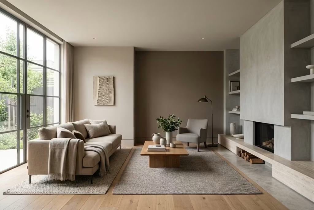
Taupe, mushroom, and putty tones sit in that rare middle ground where warm and cool palettes quietly meet without conflict. They do not push a room in one direction, which is precisely why they feel so dependable in real interiors. Instead, they absorb influences from both sides, softening warmth where it becomes too heavy and easing coolness where it feels too sharp. It is a bit like having a well-balanced mediator in a conversation where neither side needs to dominate.
In practice, this balancing act becomes most visible when these tones are placed alongside contrasting materials. Against warm oak, they prevent the palette from becoming overly golden or rustic. Against cooler stone or grey finishes, they introduce just enough warmth to stop the space from feeling clinical. I have often used them as a stabilising layer in projects where clients were unsure whether they wanted a warm or cool direction. Rather than forcing a decision, these tones allow both to coexist without tension, like two notes resolving into a calm chord.
Their real strength lies in restraint. They do not try to define the mood of the room on their own, yet they subtly correct imbalance wherever it appears. In shifting daylight, they behave almost like a visual buffer, adjusting gently as the environment changes. This adaptability is what makes them feel quietly intelligent, almost architectural in the way they respond rather than react.
Ideal for Transitional Spaces and Hallways
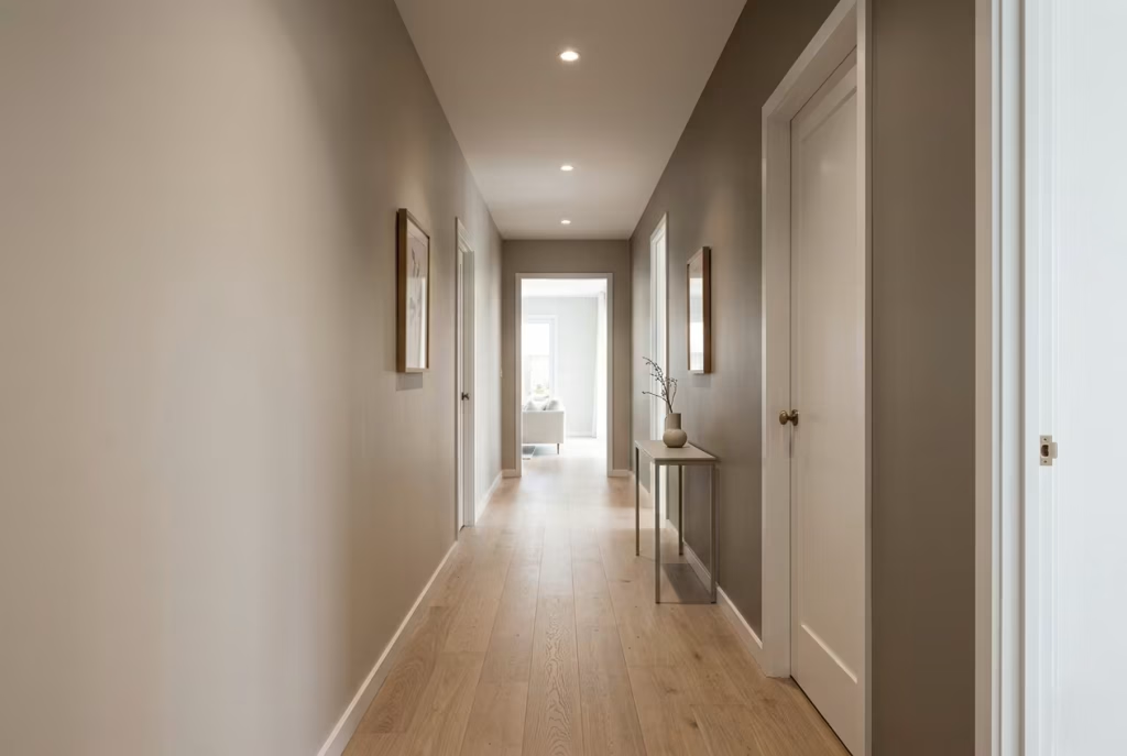
Hallways, landings, and transitional spaces are often overlooked, yet they carry enormous influence over how a home feels as a whole. These are the areas that connect one atmosphere to another, and without careful handling, they can feel abrupt or disconnected. This is where taupe, mushroom, and putty tones truly excel. They act like a soft visual thread, guiding movement through the home without drawing attention to themselves.
In narrower corridors, particularly those around 1 to 1.5 metres wide (3 to 5 ft), these tones help reduce the tunnel effect that stronger colours can create. Instead of compressing the space, they introduce a gentle softness that allows the eye to move forward without resistance. I have seen a mushroom-toned hallway transform from feeling purely functional to unexpectedly composed, simply because the colour removed harsh visual stops along the way.
Transitional spaces also benefit from the way these tones handle changing light conditions. Hallways rarely receive consistent natural light, often relying heavily on artificial sources. In such conditions, more saturated or highly warm colours can feel uneven or overly dominant. Taupe and putty tones, however, remain steady. They hold their character without shifting too dramatically, which helps maintain continuity as you move from room to room.
There is also a subtle psychological effect at play. Because these colours do not demand attention, they create a sense of calm transition. You are not visually “reset” every time you pass through a space; instead, the experience feels continuous, like the home is unfolding gradually rather than in separate, disconnected chapters.
When used with intention, these tones turn transitional areas from forgotten corridors into quiet connectors. They do not announce themselves, but they ensure everything else flows more naturally. And in many ways, that quiet consistency is what gives a home its sense of cohesion, the kind you feel more than you notice.
Real Use Case: Narrow Hallway (1m–1.2m / 3.2–4 ft Width) Softened with Mushroom Tones
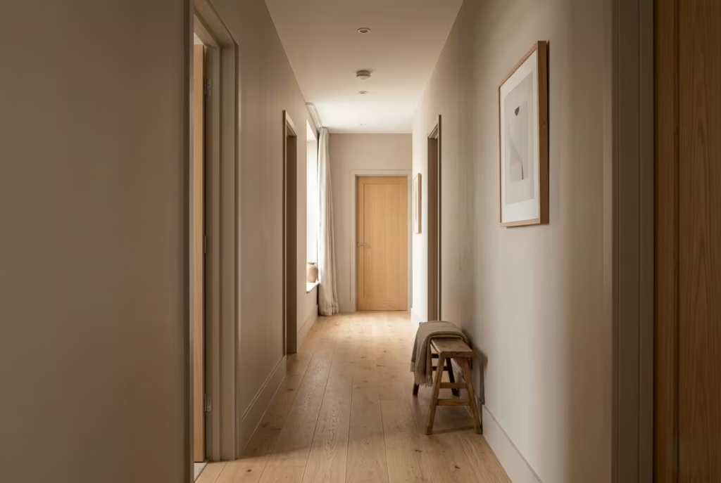
Narrow hallways are often where design intentions either quietly succeed or unravel without much warning. They are unforgiving spaces, not because they are difficult in size alone, but because they leave very little room for visual error. In one recent residential project, a hallway measuring roughly 1 metre to 1.2 metres wide (3.2 to 4 ft) felt tight, slightly echoing, and overly functional. The brief was simple in theory but delicate in execution: soften the passage without making it feel narrower or dim.
We introduced a mushroom-toned neutral as the primary surface colour, and the change was immediate in character rather than scale. The tone did not physically widen the corridor, of course, but it changed how the boundaries were perceived. Instead of sharp visual edges, the walls felt more forgiving, almost as if the space had been gently “rounded off” in perception. Under natural light, the colour sat somewhere between warm stone and muted taupe, giving the hallway a grounded but breathable quality.
What made this application successful was not the colour alone, but how it responded to the lack of natural light. Hallways like this often rely heavily on artificial lighting, which can easily exaggerate shadows and make narrow proportions feel more compressed. Mushroom tones, when carefully balanced, help absorb some of that harshness, softening transitions between light and shadow so the space feels more continuous as you move through it.
The result was not dramatic in a showy sense, but it was deeply perceptible in everyday use. The hallway no longer felt like a corridor to pass through quickly, but rather a quiet connector that gently guided movement from one space to another. That subtle shift in experience is often where good design quietly proves its worth.
Pros
- Highly versatile and adaptable across both modern and traditional interiors without feeling stylistically locked in
- Creates a balanced foundation that works well with a wide range of materials such as timber, stone, and painted finishes
- Offers a subtle depth that prevents transitional spaces from feeling flat or visually disconnected
- Maintains a calm, consistent presence across changing daylight conditions, especially in circulation areas
Cons
- Can be easily misjudged under artificial lighting, where undertones may shift and appear either cooler or slightly dull
- Requires careful pairing with lighting temperature and surrounding materials to avoid a muted or “dusty” appearance
- May lose definition in spaces lacking texture or tonal variation, leading to a flatter visual reading than intended
- Not always effective if used without contrast in very dim or windowless corridors, where depth can be reduced further
Sand, Linen, and Mineral Neutrals
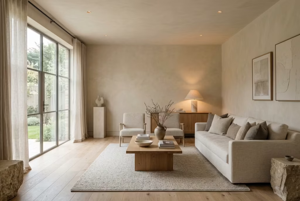
Sand, linen, and mineral-inspired neutrals sit in a quietly refined corner of the palette where colour feels almost secondary to atmosphere. These are tones that do not try to dominate a space, yet they shape it with remarkable consistency when used with intention. They echo natural environments in a restrained way, not through obvious reference, but through softened complexity that feels familiar even when you cannot quite name why. In real interiors, they often become the unifying layer that holds more expressive materials together, like a calm backdrop that allows everything else to breathe without friction.
Inspired by Natural Landscapes
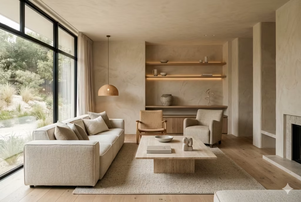
There is a reason these neutrals feel instinctively balanced. They are drawn from environments where light, material, and time have already done the design work. Sand tones recall the quiet variation of dunes, where no surface is entirely uniform and yet nothing feels visually chaotic. Linen-inspired shades carry the softness of natural fibres, slightly irregular, slightly lived-in, which prevents them from ever feeling overly manufactured. Mineral neutrals, on the other hand, lean into stone, chalk, and weathered surfaces, offering a grounded presence that feels inherently stable.
In practice, these colours work exceptionally well in spaces that aim for calm continuity rather than strong contrast. I have used sand-toned neutrals in living rooms measuring around 4 metres by 5 metres (13 by 16 ft) where the intention was to create cohesion between oak flooring, plaster walls, and soft upholstery. Instead of competing with these materials, the colour tied them together, like a quiet thread running through the entire composition.
What makes this family particularly effective is how they respond to changing light. In morning light, they feel soft and airy, almost weightless. By late afternoon, they begin to deepen slightly, taking on a more grounded character without losing clarity. It is this subtle shift that gives them longevity, allowing a room to feel alive rather than static as the day unfolds.
Subtle Texture Even in Flat Paint
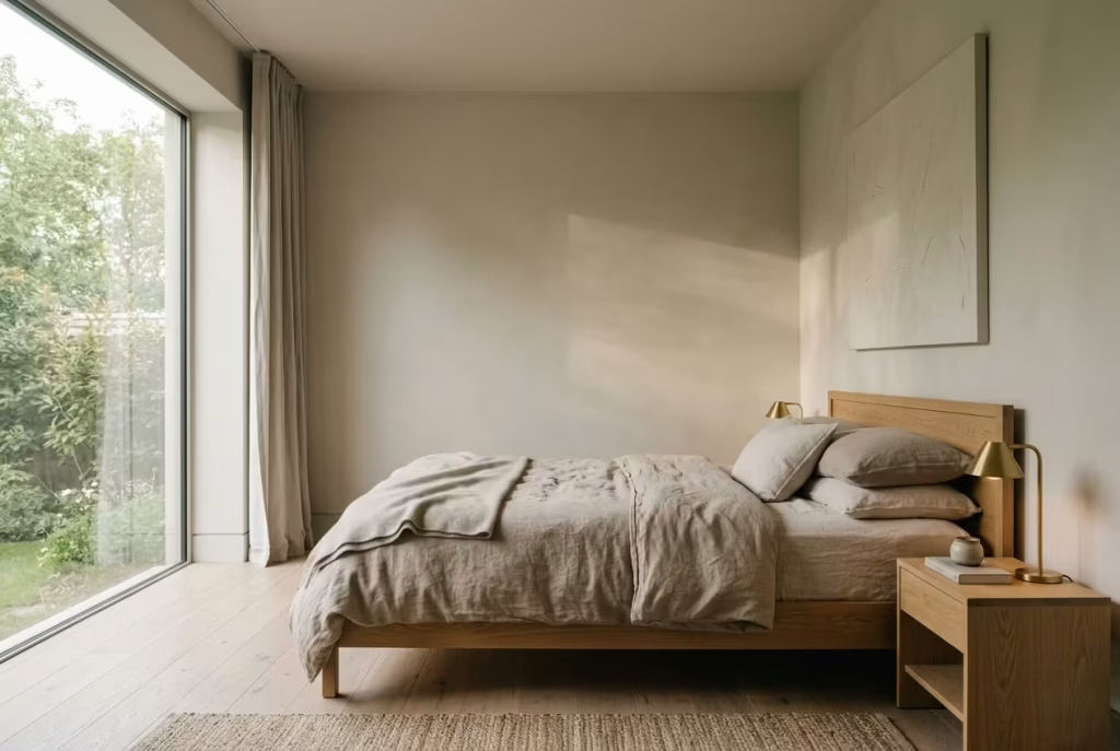
One of the most overlooked qualities of sand, linen, and mineral neutrals is their ability to suggest texture even when applied in a completely flat finish. Unlike more uniform whites or heavily pigmented tones, these colours carry internal variation, small shifts in warmth and softness that create the illusion of depth even on smooth walls.
In real residential settings, this becomes especially noticeable when light begins to graze across the surface. A flat mineral neutral wall can suddenly appear almost tactile, as if it has a soft, chalky finish, even when no physical texture has been applied. I have seen this effect work particularly well in bedrooms and quiet sitting rooms where the goal is to avoid visual noise while still maintaining richness.
That said, the success of this subtle texture depends heavily on context. When paired with natural materials like limewashed wood, woven textiles, or matte stone, these neutrals gain even more dimension. The room starts to feel layered without appearing busy, like each surface is contributing to a quiet, collective rhythm rather than standing alone.
However, in overly synthetic environments, the effect can weaken. High-gloss finishes, cool artificial lighting, or heavily processed materials can flatten these nuances, stripping away the gentle variation that gives the palette its character. This is why material selection is just as important as the paint itself.
When handled well, even a flat application of these neutrals does not feel flat at all. It feels composed, textural in spirit rather than surface, and quietly confident in the way it holds a space together without demanding attention.
You May also Like: 15 Pink English Country Bedroom Ideas That Make Any Room Glow
Best Pairings: Oak Flooring, Linen Upholstery, Stone Accents
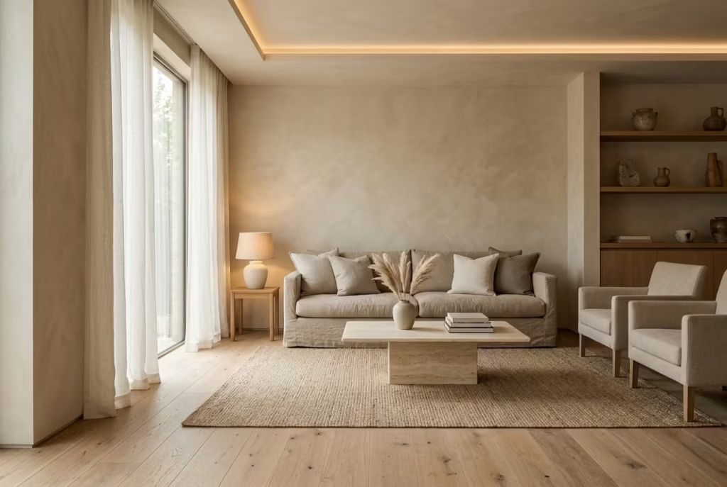
Sand, linen, and mineral neutrals rarely reach their full potential on their own. They are at their best when they are part of a wider material conversation, where each surface supports the next without trying to outshine it. When paired thoughtfully, these tones begin to feel layered and intentional, almost as if the room has been shaped over time rather than assembled in one go.
Oak flooring is one of the most reliable companions for this palette. Its natural warmth, especially in mid-tones, sits comfortably alongside sand and mineral hues without creating visual tension. In spaces around 4 metres by 5 metres (13 by 16 ft), I have found that oak flooring helps anchor lighter neutral walls, preventing them from feeling too weightless. The grain of the wood introduces a subtle rhythm underfoot, which keeps the room from feeling overly smooth or uniform. It is a pairing that rarely misses the mark, provided the oak is not overly orange or heavily lacquered.
Linen upholstery brings a different kind of depth. It softens the overall composition, adding a tactile quality that stops the room from feeling too polished. Linen has a natural irregularity to it, a slight variation in weave and tone that complements mineral-based neutrals beautifully. In living rooms or bedrooms, introducing linen through sofas, curtains, or bedding can make a noticeable difference. The space begins to feel more relaxed, less staged, like it has settled into itself rather than being carefully arranged.
Stone accents, whether in the form of a coffee table, countertop, or decorative element, introduce a grounding contrast that completes the palette. Materials like limestone, travertine, or softly honed marble echo the mineral quality of these neutrals, reinforcing the connection to natural surfaces. In one project, adding a simple stone console in a hallway measuring 1.2 metres wide (4 ft) brought a quiet solidity to the space. The walls alone felt light and airy, but the stone added just enough weight to balance the composition.
What makes these pairings work so well is their shared language. None of them feel overly processed or artificially perfect. They carry slight imperfections, tonal variations, and a sense of material honesty that allows the paint colour to sit comfortably among them. When these elements come together, the result is not dramatic in an obvious way, but it is deeply satisfying. The room feels cohesive, grounded, and quietly refined, like everything is exactly where it should be without needing to prove it.
Warm Greige (Used With Precision)
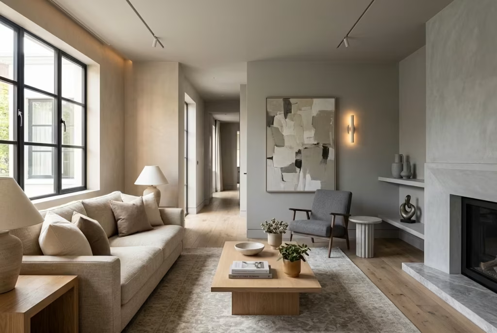
Greige has become something of a default in modern interiors, often chosen as a middle-ground solution when neither warm beige nor cool grey feels quite right. On paper, it sounds like the best of both worlds. In practice, it can be a slippery slope. Used well, warm greige brings balance, subtlety, and flexibility. Used carelessly, it can feel indecisive, like a colour that never quite makes up its mind. The difference lies in precision, in knowing exactly which side of the spectrum it leans toward and how that lean interacts with the room.
Why Most Greige Fails

Most greige fails not because it is inherently flawed, but because it is chosen without a clear understanding of its undertone bias. Too often, it is treated as a neutral safety net, something that will quietly “work with everything.” In reality, greige is far more sensitive than that. It reacts quickly to light, materials, and surrounding colours, sometimes in ways that catch people off guard.
I have seen living rooms where a seemingly balanced greige turned unexpectedly cold once paired with grey flooring and cooler lighting. The warmth that looked promising on the sample card simply disappeared, leaving behind a flat, slightly lifeless surface. It is a bit like setting the stage for a warm conversation and ending up with a room that feels politely distant instead.
Another common issue is over-reliance on greige across every surface. Walls, cabinetry, upholstery, all sitting within the same muted grey-beige spectrum can create a fog-like effect where nothing stands out and nothing recedes. The room feels cohesive at first glance, but spend a little time in it and the lack of contrast begins to show. It is pleasant, but forgettable.
You May also Like: 16 Beautiful Lake House Bathroom Ideas to Create a Cozy Retreat
Identifying Warmth-Dominant Greige vs Grey-Dominant
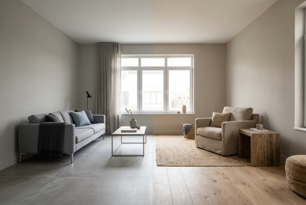
The key to using greige successfully lies in recognising which direction it leans, and this is where a trained eye makes all the difference.
Warmth-dominant greige carries a subtle beige or taupe base. It feels softer, more accommodating, and tends to sit comfortably alongside natural materials like oak, linen, and stone. In a room measuring around 3.5 metres by 4.5 metres (11.5 by 15 ft), a warmth-led greige can act as a stabilising layer, tying together different elements without pulling the space into a cold or overly muted direction. It holds warmth quietly, without tipping into obvious beige.
Grey-dominant greige, on the other hand, leans more heavily into its cooler side. It can appear refined at first, especially in well-lit showrooms, but in real homes it often risks losing warmth altogether. In spaces with limited natural light, this type of greige can feel slightly withdrawn, almost as if the colour is stepping back rather than engaging with the room.
A simple way to test this is by placing the swatch next to warm materials such as oak flooring or a cream fabric. If the colour begins to look noticeably cooler in comparison, it is likely grey-dominant. If it holds its warmth without clashing, you are working with a more balanced, usable greige.
You May also Like: 15 Victorian Mudroom Design Secrets for a Timeless, Elegant Entryway
Warning: LED Lighting Below 3000K Can Flatten Greige Dramatically
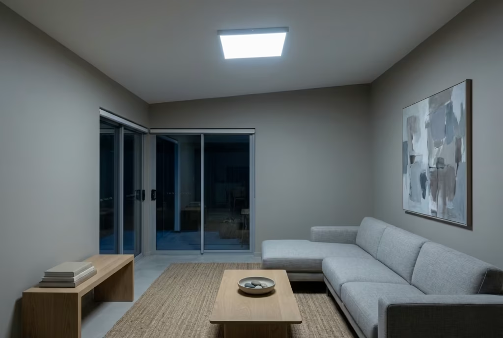
Lighting is where greige often shows its true colours, and not always in a good way. Under artificial lighting, particularly LED bulbs below 3000K, greige can lose its delicate balance surprisingly quickly. The warmth fades, the grey becomes more pronounced, and the colour that once felt nuanced can turn flat, almost chalky.
I have encountered this in open-plan living spaces where the daytime atmosphere felt perfectly balanced, but by evening the walls appeared dull and slightly lifeless. The culprit was not the paint itself, but the lighting temperature. Once the bulbs were adjusted to a warmer range around 2700K to 3000K, the depth returned, and the colour regained its intended character.
Another factor to consider is layering. A single overhead light tends to flatten greige further, while a combination of wall lights, floor lamps, and shaded fixtures introduces variation in how light interacts with the surface. This variation is what allows greige to reveal its subtle undertones rather than collapsing into a single flat note.
The lesson here is simple, though often overlooked. Greige is not a one-size-fits-all solution. It requires attention, testing, and a willingness to adjust surrounding elements. When used with precision, it can feel balanced and quietly sophisticated. When used without it, it can just as easily fade into the background, like a colour that never quite found its place.
How to Layer Warm Neutrals So They Feel Rich, Not Repetitive
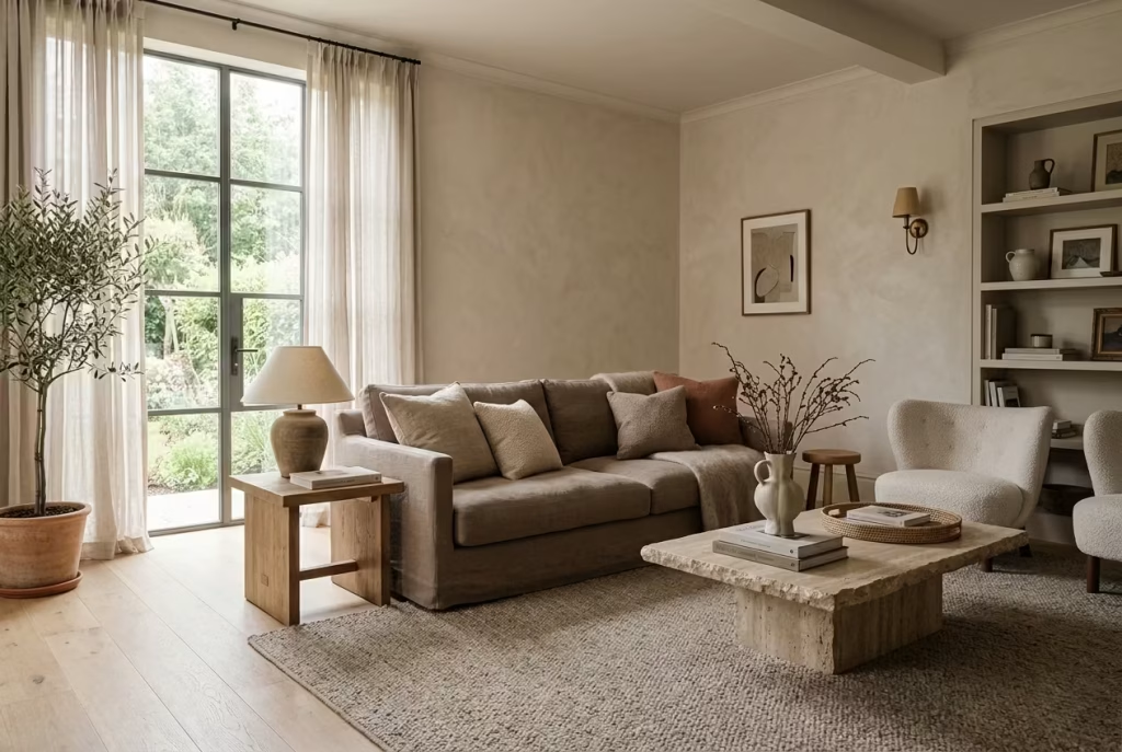
Warm neutrals rarely fail because of the colour itself. They fall short when everything sits at the same level, like a room speaking in a single tone without pause or emphasis. True depth comes from layering, not adding more colours, but allowing each element to play a slightly different role within the same restrained palette. When handled with care, a neutral room does not feel plain. It feels composed, almost like it has been quietly edited rather than decorated.
The Three-Layer Framework (Colour, Contrast, Material)
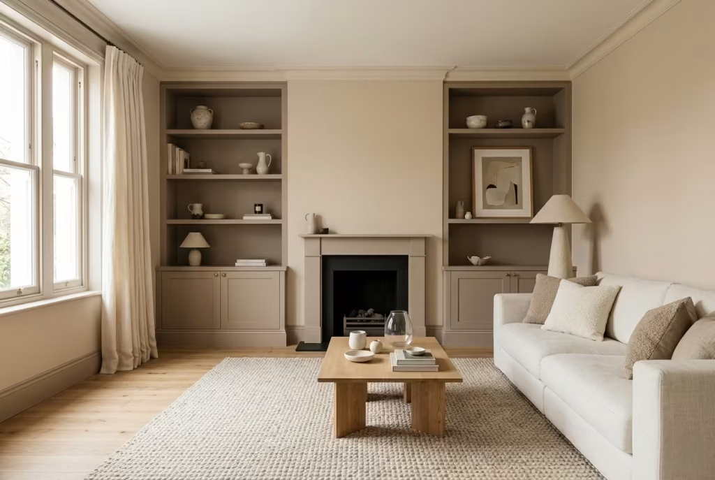
A well-layered neutral interior tends to follow a structure, even if it is not immediately obvious. I often return to a three-layer framework because it brings clarity without overcomplicating decisions.
Base Layer: Walls
The walls set the emotional tone of the room. This is where the primary colour lives, and it needs enough depth to hold the space without overwhelming it. A soft almond or sand-toned neutral works well here, especially in rooms around 3 to 4 metres wide (10 to 13 ft) where the walls are the dominant visual surface.
What matters is not just the colour itself, but how it behaves across the entire room. A well-chosen base layer should feel consistent in shifting light, never turning flat or overly reactive. It should act like a steady backdrop, something that quietly supports everything placed in front of it.
Secondary Layer: Joinery and Architectural Features
This is where contrast begins to take shape, but in a controlled, almost restrained way. Joinery, skirting, doors, and built-in elements should sit slightly deeper or more defined than the walls, usually within a 10 to 20 percent tonal shift.
In practical terms, this might mean a soft taupe against an almond wall or a deeper putty tone framing lighter surfaces. The goal is not to create sharp contrast, but to introduce structure. Without this layer, the room can feel blurred at the edges, like a photograph slightly out of focus.
I have found that when this layer is handled well, the architecture starts to read more clearly. Corners feel intentional, openings feel framed, and the space gains a sense of quiet order.
Tertiary Layer: Furnishings and Textiles
This is where the room begins to feel lived-in rather than staged. Upholstery, rugs, curtains, and accessories bring in softness, variation, and texture. They should sit both within and slightly outside the core palette, adding subtle shifts that prevent repetition.
Warm ivory fabrics, textured linens, or even slightly deeper woven tones can create that gentle contrast without disrupting the calm. In a living room setting, this layer often carries the most tactile interest. It is where the eye lingers, even if only subconsciously.
What matters here is balance. Too much similarity, and the room feels flat. Too much variation, and the calm is lost. The sweet spot sits somewhere in between, where everything relates but nothing feels identical.
Tonal Variation Without Visual Noise
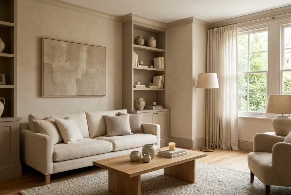
One of the biggest misconceptions about neutral interiors is that variety requires contrast. In reality, depth can be achieved within a very narrow palette, provided the differences are intentional.
Keeping tones within the same family, for example soft beige, taupe, and warm ivory, allows the room to feel cohesive while still introducing variation. It is a bit like layering fabrics of the same colour but in different textures. The effect is subtle, but it builds over time, creating richness without overwhelming the eye.
In practice, this might mean walls in a soft mineral neutral, joinery in a slightly deeper shade, and upholstery that lifts the palette just enough to prevent it from sinking. The shifts are small, often barely noticeable in isolation, yet together they create a sense of movement.
The danger lies in pushing too far. Introduce a tone that sits outside the palette, perhaps something too cool or too saturated, and the balance can unravel quickly. The room loses its quiet rhythm and begins to feel disjointed, as if one element has stepped out of line.
The key is restraint. Let the differences be felt rather than seen immediately. When done well, the room reveals its layers slowly, like a composition that becomes more interesting the longer you sit with it.
You May also Like: 25 Eye-Catching Bathroom Floor Tile Ideas for a Luxurious Look
Real Project Breakdown
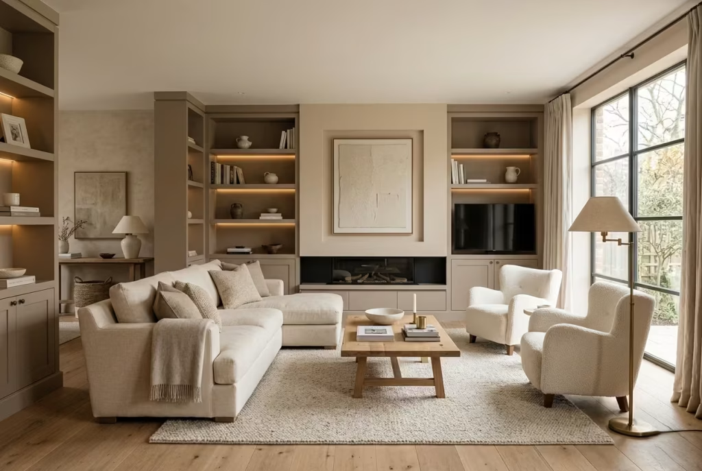
To illustrate how this layering works in practice, I often refer back to a living space I designed where the goal was to create warmth without visual clutter.
- Wall Colour: A soft almond neutral formed the base, applied across walls measuring roughly 4 metres by 5 metres (13 by 16 ft). It carried a gentle warmth that responded well to both daylight and evening lighting, never feeling too bright or too muted.
- Joinery: Built-in shelving and skirting were finished in a deeper taupe, sitting just enough apart from the walls to define the architecture. This subtle shift created structure without introducing harsh contrast.
- Upholstery: Seating was layered in warm ivory and soft linen textures. The fabrics introduced lightness and tactile variation, preventing the palette from feeling heavy or overly controlled.
The result was a space that felt layered but calm. Nothing stood out aggressively, yet nothing faded into the background either. The room held its own, quietly and consistently, whether in full daylight or under softer evening light.
What made this work was not any single element, but the relationship between them. Each layer supported the next, creating a sense of depth that felt natural rather than constructed. It is this kind of balance that turns a neutral scheme from predictable into something far more enduring, a space that feels considered, comfortable, and quietly complete.
The Role of Materials in Enhancing Warm Neutrals
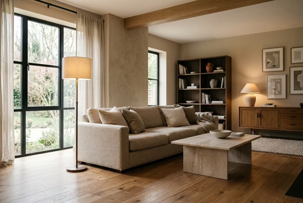
Warm neutrals rarely succeed on colour alone. What gives them depth, presence, and longevity is the company they keep. Materials shape how a colour is perceived, how it reflects light, and how it feels over time. I often say that paint sets the tone, but materials decide whether that tone has substance or falls flat. Get the material palette right, and even the simplest neutral begins to feel layered and intentional. Get it wrong, and the same colour can feel hollow, no matter how carefully it was chosen.
Materials That Amplify Warmth
Some materials instinctively work with warm neutrals rather than against them. They carry their own subtle variation and warmth, which helps the overall scheme feel cohesive and grounded.
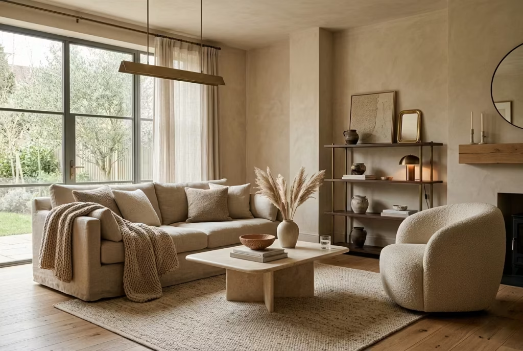
Natural Woods (Oak, Walnut)
Natural timber is often the backbone of a successful neutral interior. Oak, particularly in mid-tones, has a gentle warmth that complements sand, clay, and almond-based walls without overpowering them. Walnut brings a deeper, more anchored quality, useful in larger rooms around 4 to 5 metres (13 to 16 ft) where lighter tones alone might feel too weightless.
What makes wood so effective is its grain. That natural variation introduces movement underfoot or across joinery, preventing the space from feeling too smooth or overly controlled. In one living room project, introducing oak flooring transformed a soft neutral scheme from feeling slightly flat to quietly dynamic, simply because the surface began to carry its own rhythm.
Linen, Wool, Boucle
Textiles are where warmth becomes tangible. Linen brings a relaxed softness, slightly irregular and breathable, which stops a room from feeling overly polished. Wool adds depth and insulation, both visually and physically, making it ideal for rugs or throws in seating areas. Boucle, with its looped texture, introduces a subtle complexity that catches light in small, varied ways.
These fabrics work particularly well in seating arrangements within rooms around 3.5 by 4.5 metres (11.5 by 15 ft), where the eye naturally settles. They create layers that you feel as much as you see, like a quiet invitation to stay rather than just pass through.
Aged Metals (Brass, Bronze)
Metals often get overlooked in neutral schemes, yet they play a crucial role in adding warmth and contrast. Aged brass or bronze introduces a gentle sheen without the harshness of polished finishes. They reflect light softly, adding highlights that shift throughout the day.
In practice, even small touches such as a brass wall light or bronze hardware can lift a neutral palette, preventing it from feeling too muted. The key is restraint. These materials should punctuate the space rather than dominate it, like a well-placed accent that catches the eye without stealing the scene.
Materials That Flatten a Space
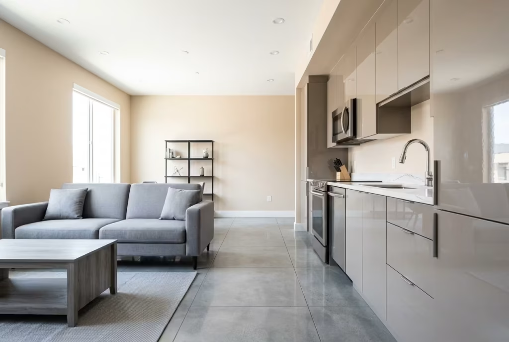
Just as some materials enhance warmth, others quietly work against it. They may seem appealing in isolation, but within a neutral scheme they can strip away depth and variation.
Glossy Finishes
High-gloss surfaces reflect light too directly, often creating sharp highlights that disrupt the softness of warm neutrals. Instead of diffusing light, they bounce it back in a way that can feel slightly clinical. In spaces where walls are meant to feel calm and grounded, glossy cabinetry or polished surfaces can introduce a visual disconnect.
I have seen kitchens where a warm neutral wall felt perfectly balanced, yet the addition of glossy cabinetry made the entire space feel harder, almost as if the warmth had been diluted.
Blue-Toned Greys
Cool greys with a blue undertone can clash subtly but noticeably with warm neutrals. The contrast is not always immediate, but over time it creates a sense of imbalance, like two elements pulling in opposite directions. The warmth of the walls begins to feel exaggerated, sometimes even slightly off in tone.
This is particularly noticeable in spaces where flooring or large furniture pieces carry that cooler bias. The result is not dramatic, but it unsettles the overall composition in a way that is difficult to correct without rebalancing the palette.
Synthetic Textures Lacking Variation
Materials that are overly uniform, such as certain laminates or flat synthetic fabrics, tend to absorb the life out of a neutral scheme. Without variation in texture or tone, they create surfaces that feel static, almost lifeless.
In one project, replacing a synthetic sofa fabric with a natural linen blend made an immediate difference. The colour remained similar, but the room gained depth simply because the material introduced subtle variation. It is a small shift, but one that changes how the entire space is perceived.
You May also Like: The Ultimate Ranch Kitchen Guide: 15 Design Tips for a Cozy Country Home You’ll Never Want to Leave
Texture as a Substitute for Colour Contrast
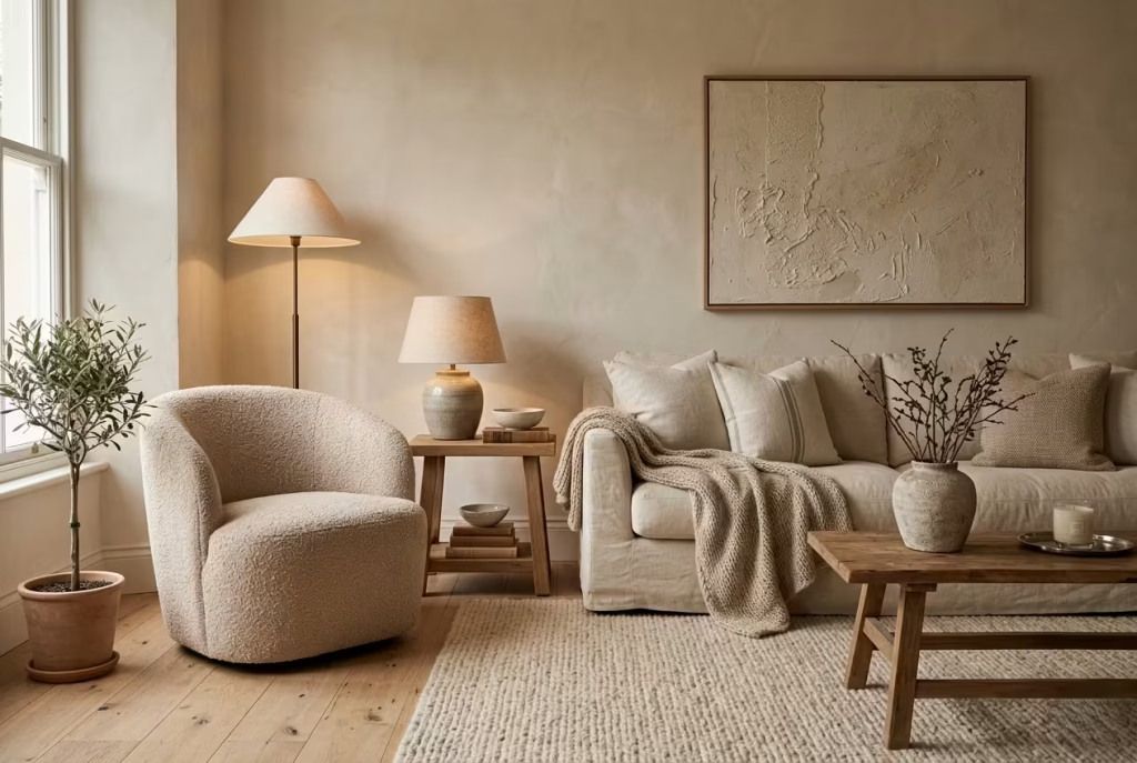
In a neutral interior, where colour contrast is intentionally restrained, texture becomes the primary tool for creating depth. It steps in where bold colour differences would normally do the work, allowing the space to feel layered without becoming visually busy.
This is where materials begin to overlap in importance. A matte plaster wall, a woven rug, a linen sofa, and a timber floor each contribute their own surface quality. Individually, they may seem understated. Together, they create a composition that feels rich and considered.
I often think of texture as the quiet storyteller of a room. It does not demand attention, yet it holds it over time. In a bedroom with walls around 3 metres wide (10 ft), introducing textured bedding and a softly woven rug can prevent the space from feeling flat, even if the colour palette remains tightly controlled.
The key is variation without chaos. Smooth against rough, soft against structured, matte against slightly reflective. These small contrasts create movement, allowing the eye to travel across the room without interruption.
When texture is handled well, colour no longer needs to do all the work. The room gains depth through surface, light, and material interaction, resulting in an interior that feels complete without ever feeling overdone.
Lighting Strategy for Warm Neutral Interiors
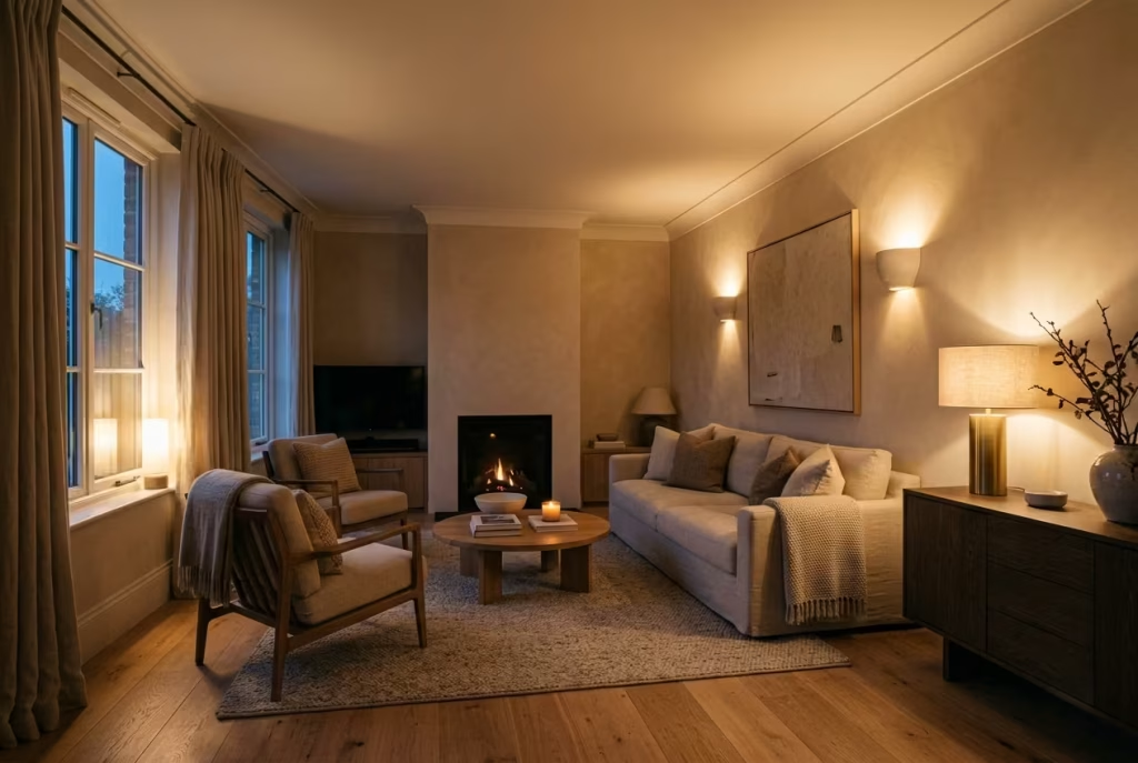
Lighting is often the final piece of the puzzle, yet it has the power to rewrite everything that came before it. A carefully layered neutral scheme can feel rich and composed in daylight, only to fall flat the moment artificial lighting takes over. I have seen rooms shift from inviting to lifeless simply because the light was working against the palette rather than with it. When handled well, lighting does not just illuminate a space, it gives it depth, rhythm, and a sense of presence that holds from morning through evening.
Understanding Kelvin Temperatures
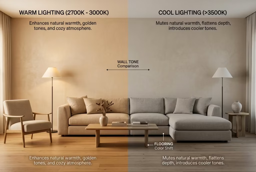
The temperature of light, measured in Kelvin, quietly dictates how warm neutrals will read once the sun goes down. It is one of those details that often slips under the radar, yet it can make or break the entire atmosphere.
The range between 2700K and 3000K tends to be the most reliable for warm neutral interiors. Within this bracket, light feels soft and slightly golden, allowing undertones in paint to remain visible rather than being washed out. A soft almond wall, for example, will hold its warmth and depth under this lighting, instead of drifting into something dull or grey.
Move outside this range, and the behaviour changes quickly. Cooler lighting, especially anything above 3500K, can strip warmth from the walls, leaving the space feeling flatter and more clinical. What once felt layered and inviting during the day can suddenly feel like it has lost its footing in the evening.
In practice, I always treat lighting temperature as part of the colour selection process rather than an afterthought. Testing paint without considering the evening light is a bit like judging a room with only half the story in front of you. The true character of a neutral only reveals itself when both daylight and artificial light have had their say.
You May also Like: 16 Sage Green Bathroom Ideas for a Serene and Stylish Space You’ll Love
Layered Lighting Approach
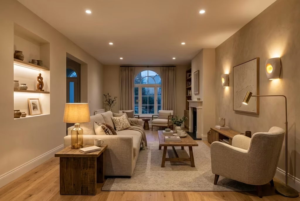
Relying on a single overhead light is one of the quickest ways to flatten a neutral interior. It creates a uniform wash of light that removes shadow and variation, leaving the room feeling one-dimensional. A layered lighting approach, by contrast, introduces depth by allowing light to fall differently across surfaces.
Ambient lighting forms the base layer. This is usually ceiling-mounted or recessed lighting that provides overall illumination. It should feel soft and even, never harsh or overly bright. In rooms around 3 to 4 metres (10 to 13 ft) in width, evenly spaced downlights or a diffused ceiling fixture can create a balanced starting point.
Task lighting adds focus where it is needed. Table lamps, reading lights, or under-cabinet lighting introduce smaller pockets of illumination that break up the uniformity. These moments of light create contrast, allowing certain areas to feel more intimate while others remain gently lit.
Accent lighting is where the room begins to gain character. Wall lights, picture lights, or softly lit alcoves highlight texture and material, drawing attention to surfaces that might otherwise go unnoticed. In neutral interiors, this is particularly important because it brings out subtle variations in tone and finish.
When these layers work together, the room starts to feel dynamic rather than static. Light shifts across surfaces, creating gentle shadows and highlights that keep the space visually engaging, even within a restrained palette.
Real Application: How Lighting Transformed a Neutral Bedroom from Dull to Dimensional
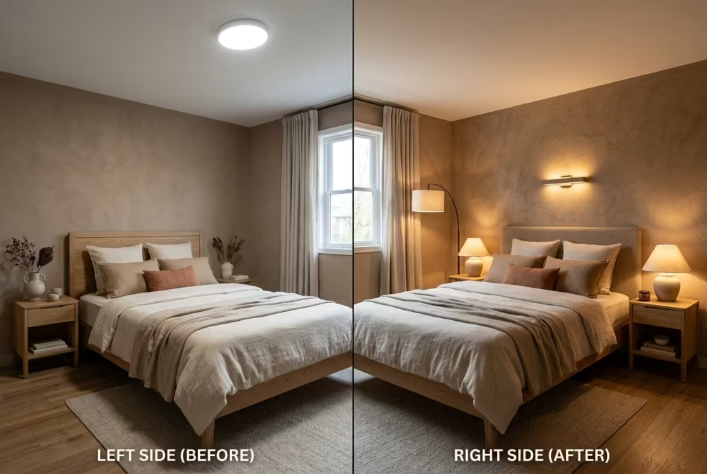
In one bedroom project measuring approximately 3.5 metres by 4 metres (11.5 by 13 ft), the initial scheme felt surprisingly flat despite a carefully chosen warm neutral palette. The walls were finished in a soft clay-based tone, paired with linen bedding and natural wood accents. On paper, everything aligned. In reality, the space lacked depth, particularly in the evening.
The issue became clear once the lighting was assessed. A single overhead fixture was casting a uniform light across the room, flattening both colour and texture. The walls lost their subtle variation, and the entire space felt slightly muted, almost as if it had been dimmed from within.
We introduced a layered approach. Soft bedside lamps with warm bulbs around 2700K created pools of light that softened the edges of the room. A wall light above the headboard highlighted the texture of the plaster finish, bringing back the depth that had been lost. A discreet floor lamp in the corner added a third layer, gently lifting the darker areas without overpowering the space.
The transformation was not immediate in a dramatic sense, but it was unmistakable. The room gained dimension, the walls began to shift subtly in tone, and the materials started to reveal their texture. What once felt flat now felt composed, almost as if the room had finally found its balance.
This is the quiet power of lighting in neutral interiors. It does not change the palette, but it changes how that palette is experienced. When done well, it allows the room to unfold gradually, revealing depth and warmth in a way that feels natural rather than forced.
Room-by-Room Application of Warm Neutrals
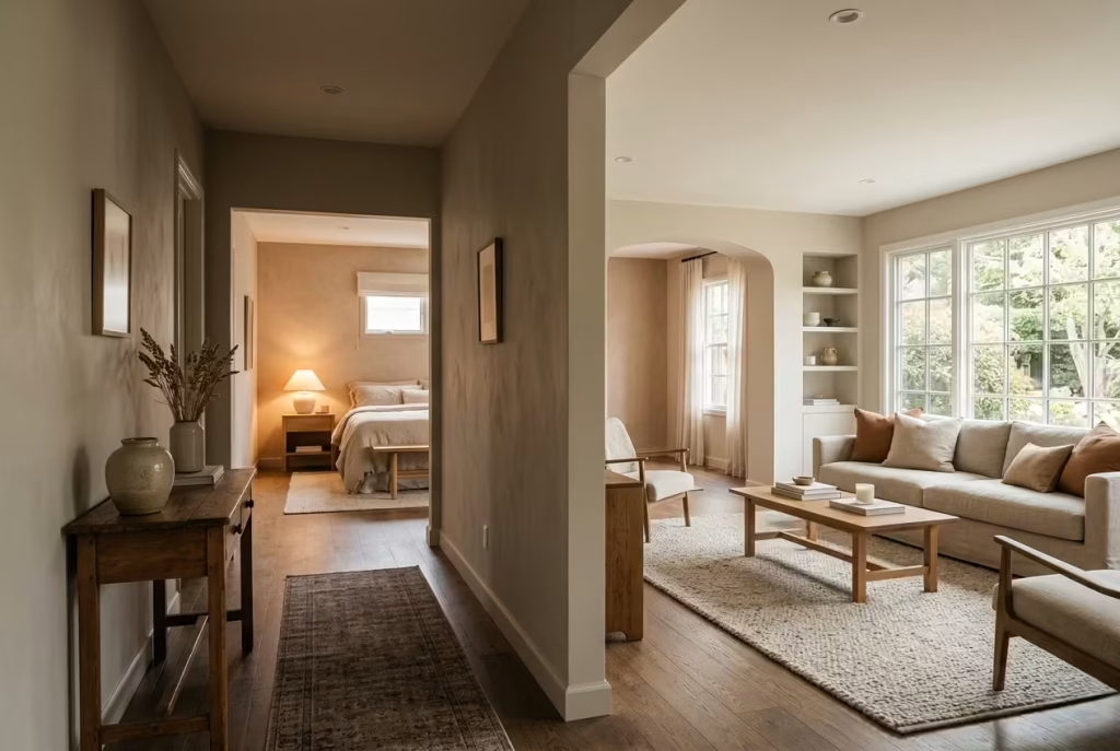
Warm neutrals do not behave the same way in every room. The way they settle, shift, and respond depends heavily on function, light, and how the space is used throughout the day. A tone that feels calm and enveloping in a bedroom might feel underpowered in a kitchen, while a shade that works beautifully in a living room can feel too heavy in a narrow hallway. This is where design moves beyond colour selection and into spatial judgment.
Approaching warm neutrals room by room allows for subtle adjustments that keep the overall palette cohesive while ensuring each space performs as it should. It is less about changing colours dramatically and more about fine-tuning tone, contrast, and material response so the home feels connected without becoming repetitive.
Living Rooms That Feel Inviting, Not Washed Out
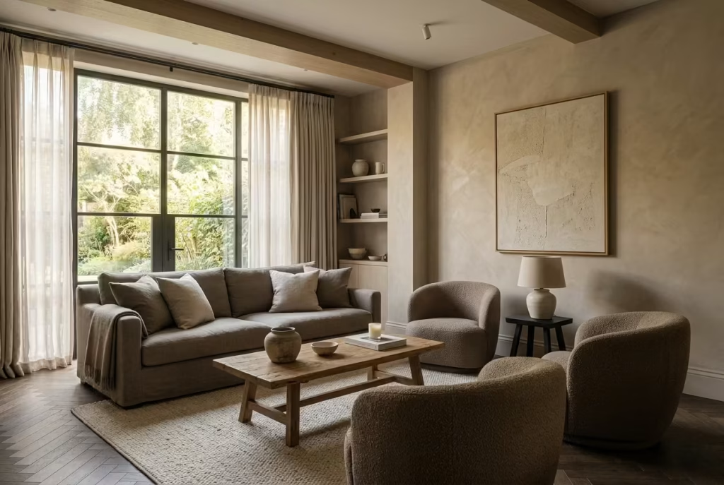
A living room is where a neutral palette is truly tested. It is not a static space. It shifts from morning light to evening gatherings, from quiet afternoons to busy social moments. When warm neutrals are handled without enough depth, the room can begin to feel washed out, as if everything has been gently faded rather than thoughtfully composed. The challenge is not to add more colour, but to give the existing palette enough structure to hold its own across changing conditions.
Best Tones for Social Spaces
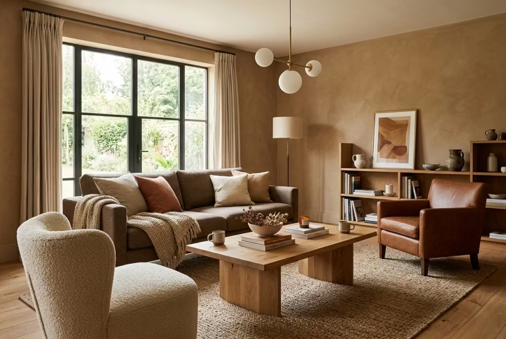
In social areas, warm neutrals need a little more backbone. Soft off-whites alone often feel too light once furniture, shadows, and movement enter the space. Instead, I tend to work with mid-tones such as soft clay, sand, warm taupe, or depth-driven greige that leans clearly toward warmth.
These tones carry just enough weight to anchor the room while still reflecting light in a controlled way. In a living room measuring around 4 metres by 5 metres (13 by 16 ft), a mid-tone neutral can prevent the space from feeling overly bright during the day and overly dull in the evening. It creates a steady visual base that adapts rather than reacts.
There is also a psychological layer to this. Slightly deeper neutrals tend to feel more welcoming in social settings. They create a sense of enclosure without closing the room in, almost like the space is gently gathering people together rather than dispersing them. It is the difference between a room that feels open and one that feels inviting. The shift is subtle, but it changes how people experience the space.
Pairing is where these tones come into their own. A warm neutral wall supported by deeper upholstery and lighter textiles creates a quiet hierarchy that keeps the eye moving. Without that variation, the room risks feeling like it is treading water, pleasant but lacking direction.
Ideal Proportions and Wall Heights (2.4m–3m / 8–10 ft)
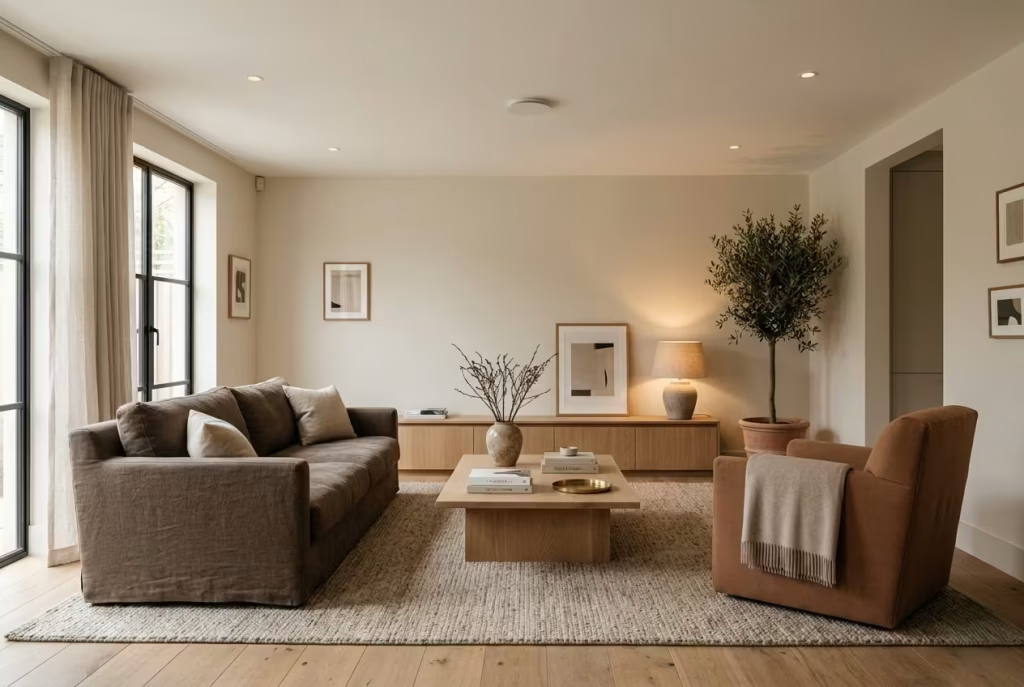
Proportion plays a far greater role in living rooms than most people expect. Ceiling height, in particular, changes how a warm neutral is perceived.
In rooms with standard ceiling heights around 2.4 metres (8 ft), lighter warm neutrals tend to perform better as a base, but they need careful grounding. Without contrast, the space can feel slightly compressed, as if the walls are closing in. Introducing a deeper tone through furniture, rugs, or even a feature wall can help stabilise the composition, giving the room a clearer sense of structure.
As ceiling heights increase toward 2.7 to 3 metres (9 to 10 ft), the dynamic shifts. These taller proportions allow for richer neutrals to come into play without overwhelming the space. A soft clay or taupe can rise comfortably within the room, creating a sense of vertical balance rather than weight. The walls feel present, but not imposing, like they are holding the space rather than pressing down on it.
I have seen this difference play out clearly in two otherwise similar living rooms. In the lower-ceiling space, a lighter almond tone worked best, supported by deeper furnishings. In the taller room, a more grounded sand tone created a stronger, more composed atmosphere without sacrificing openness. Same palette family, different expression, entirely guided by proportion.
The key is reading the room rather than forcing a colour into it. When tone and proportion align, the space feels effortless. When they do not, even the most carefully chosen neutral can feel slightly out of place, like it never quite settled into its surroundings.
A well-balanced living room does not rely on bold contrasts or statement colours to feel complete. It relies on subtle decisions that build over time. The right tone, the right proportion, and the right layering can turn a neutral palette from something that fades into the background into something that quietly holds attention, long after the first impression has passed.
Summer Bedrooms That Feel Light Yet Grounded
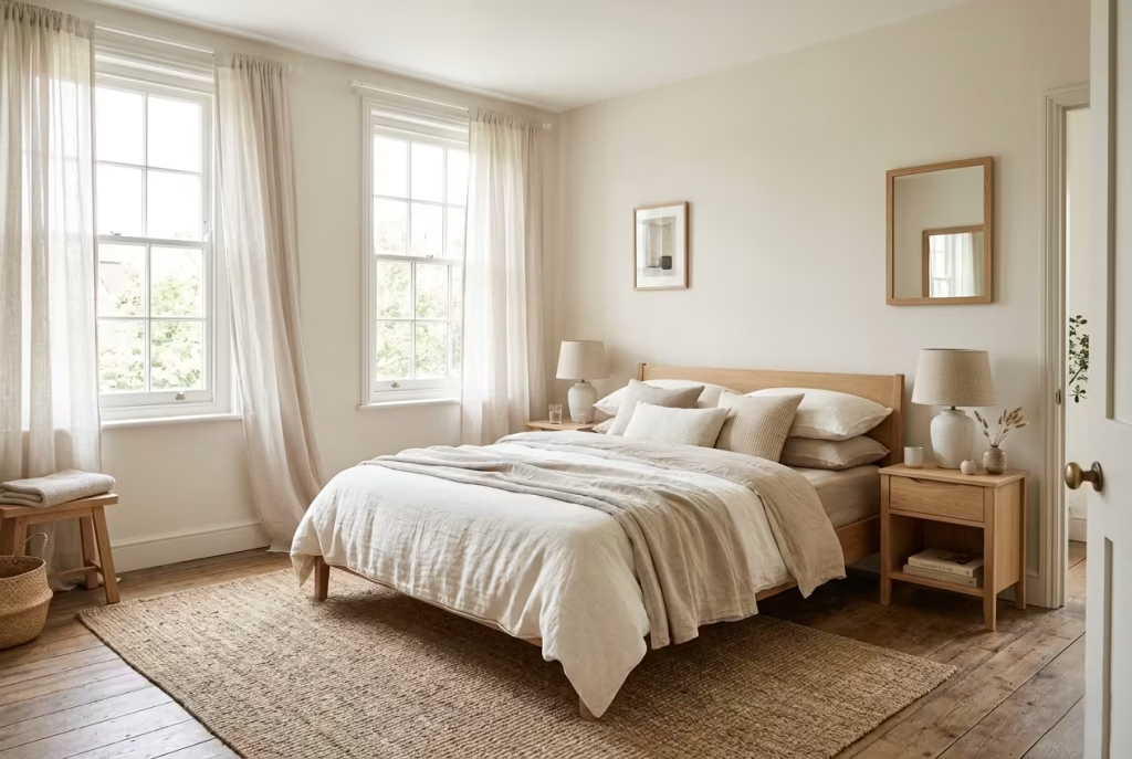
Designing a summer bedroom with warm neutrals is a balancing act that sits somewhere between airiness and restraint. Go too light, and the room risks feeling washed out, almost transient. Go too warm or too deep, and it can lose that breezy, seasonal ease that summer calls for. The goal is to create a space that feels open and breathable during the day, yet still grounded enough to feel restful as the light softens into evening.
Breathable Neutrals with Warmth
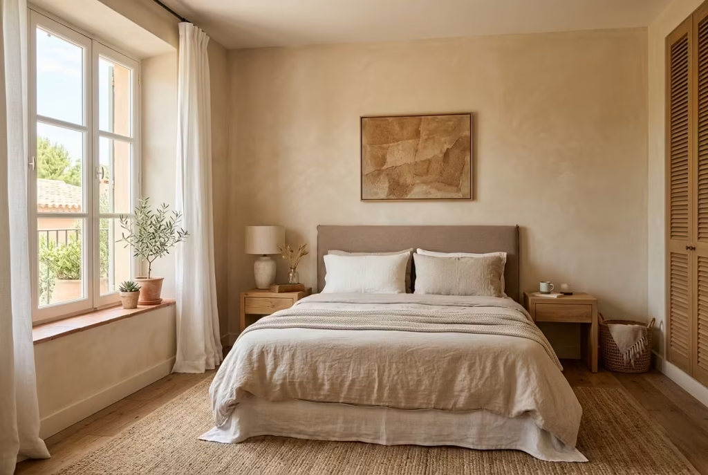
The most effective summer palettes tend to sit in the lighter end of the warm neutral spectrum, but with just enough depth to avoid feeling insubstantial. Think soft almond, pale sand, warm ivory, or lightly muted linen tones. These shades allow natural light to move freely across the room while still carrying a quiet warmth that prevents the space from feeling stark.
In bedrooms around 3 metres by 4 metres (10 by 13 ft), I often lean towards these lighter neutrals on the walls, particularly when the room receives good daylight. They act almost like a soft filter, diffusing brightness rather than reflecting it harshly. The effect is subtle but important. The room feels luminous without becoming glaring, calm without becoming flat.
What makes these tones particularly suited to summer is their ability to adapt. In strong daylight, they feel fresh and open. As the day shifts, they begin to take on a slightly warmer, more cocooning quality, ensuring the room never feels too cold or impersonal. It is a quiet transition, almost like the space adjusting its tone as the hours pass.
However, even in a light palette, grounding is essential. Without it, the room can feel like it is floating, visually pleasant but lacking presence. This is where slightly deeper accents, perhaps through a headboard, bedside furniture, or a woven rug, help anchor the scheme without disrupting its softness.
Pairing with Sheer Fabrics for Seasonal Adaptability
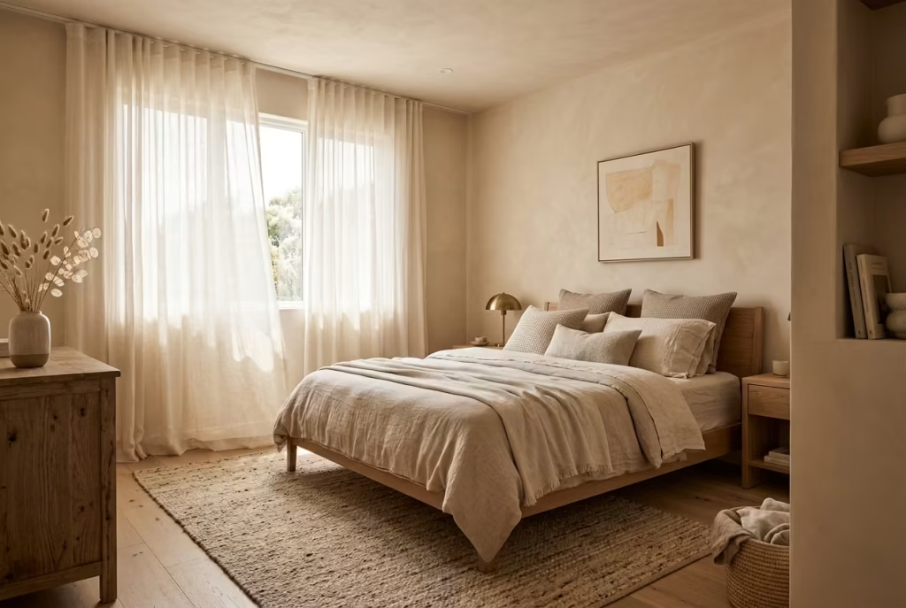
Sheer fabrics are one of the most effective tools for shaping a summer bedroom without altering the core palette. They introduce movement, softness, and a level of light control that feels almost effortless.
In practice, sheer curtains in linen or lightweight cotton can transform how light enters the room. Instead of direct sunlight hitting surfaces, the light is filtered, softened, and spread more evenly. This creates a gentle glow that enhances warm neutrals, allowing their undertones to emerge without becoming overpowering. In rooms with windows spanning around 1.5 to 2 metres wide (5 to 6.5 ft), this effect can completely change the atmosphere, turning sharp daylight into something far more comfortable and inviting.
There is also a tactile quality to sheers that complements neutral palettes beautifully. As they move with air circulation, they introduce a sense of life into the space, a quiet rhythm that prevents the room from feeling static. It is a small detail, but one that adds depth without adding visual weight.
From a practical standpoint, layering sheer curtains with heavier drapery allows the room to shift with the seasons. In summer, the sheers take the lead, keeping the space light and breathable. As temperatures drop, heavier fabrics can be introduced without needing to rethink the entire colour scheme. It is a flexible approach that supports long-term living rather than a single seasonal moment.
A well-designed summer bedroom does not rely on brightness alone. It is about balance, allowing light to enter, softness to build, and warmth to remain present without becoming dominant. When these elements come together, the space feels easy to live in, calm in its presence, and quietly attuned to the rhythm of the season.
Kitchens That Balance Warmth and Practicality
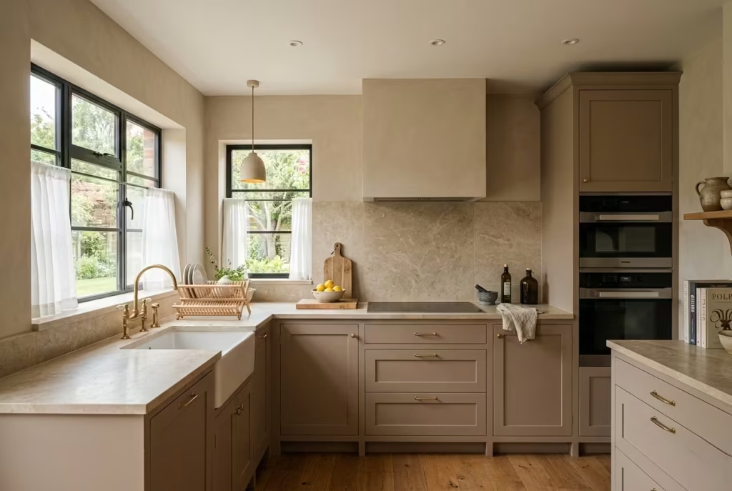
A kitchen is where warm neutrals are tested under pressure. Unlike living rooms or bedrooms, this space is constantly exposed to heat, moisture, grease, and changing light throughout the day. A colour that feels calm and balanced on a swatch can behave very differently once it is surrounded by appliances, worktops, and reflective surfaces. The challenge is to create warmth without sacrificing clarity, and atmosphere without compromising practicality. When it works, the kitchen feels effortless, as if the design decisions are quietly doing their job in the background while life carries on in the foreground.
Cabinet vs Wall Colour Relationships
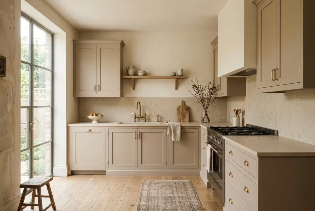
The relationship between cabinetry and wall colour is where most kitchen schemes either come together or quietly fall apart. In warm neutral kitchens, the goal is not to match everything, but to create a gentle hierarchy so the space feels structured rather than flat.
I often approach this by allowing walls to sit in a lighter warm neutral, such as soft ivory, warm off-white, or a muted almond tone, while cabinetry takes on a slightly deeper expression of the same family. For example, a soft sand wall paired with deeper taupe or putty cabinetry creates a subtle shift that defines the architecture without introducing visual noise.
In a kitchen measuring around 3.5 metres by 4 metres (11.5 by 13 ft), this distinction becomes especially important. Without it, the room can feel like one continuous surface, which may sound cohesive but often reads as visually underwhelming in practice. The eye needs points of pause, small transitions that help it understand structure.
Worktops and splashbacks also play a supporting role here. Natural stone or stone-effect surfaces often act as the bridge between cabinetry and walls, softening transitions while adding a layer of material depth. When handled well, the entire composition feels connected but not monotonous, like each element is part of the same conversation but speaking at slightly different volumes.
Durability Considerations
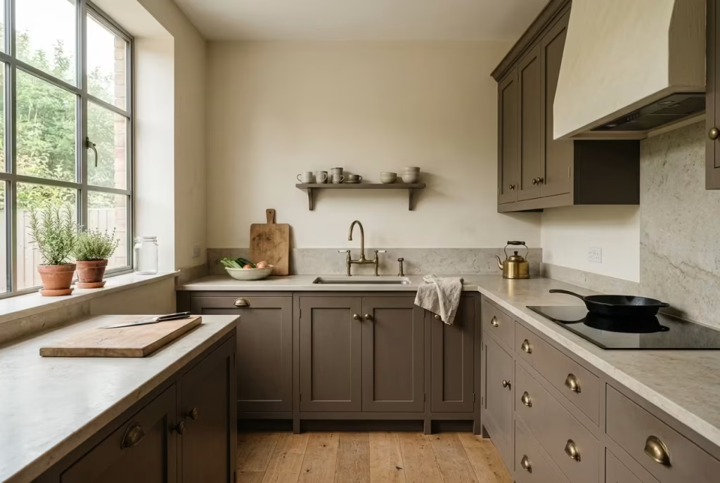
Warm neutrals in kitchens must do more than look good on day one. They need to withstand constant use, cleaning, and exposure to heat and moisture without losing their character. This is where finish, material choice, and practicality become just as important as colour selection.
Matte or satin finishes tend to work best for cabinetry in warm neutral kitchens. They soften reflections and help maintain a calm, cohesive look even in bright daylight. However, durability is key. In high-traffic kitchens, especially around cooking zones, surfaces should be chosen not just for tone but for resistance to staining and wear.
Walls, on the other hand, benefit from washable finishes that retain their warmth even after repeated cleaning. In real-world use, kitchens are rarely pristine environments, so a finish that can hold its colour without becoming patchy or uneven over time is essential.
There is also the question of how materials age. Some warm neutrals improve over time as they develop a gentle patina, particularly when paired with natural materials like oak or stone. Others can begin to feel tired if the finish is too synthetic or uniform. I have seen kitchens where a carefully chosen colour still felt wrong after a few years simply because the surface quality did not evolve with the space.
Ultimately, durability in a warm neutral kitchen is not just about resisting damage. It is about maintaining visual integrity over time. A well-chosen palette should feel just as considered five years in as it did on installation day, quietly holding its place even as the kitchen becomes more lived-in, more used, and more real.
Hallways and Transitional Spaces
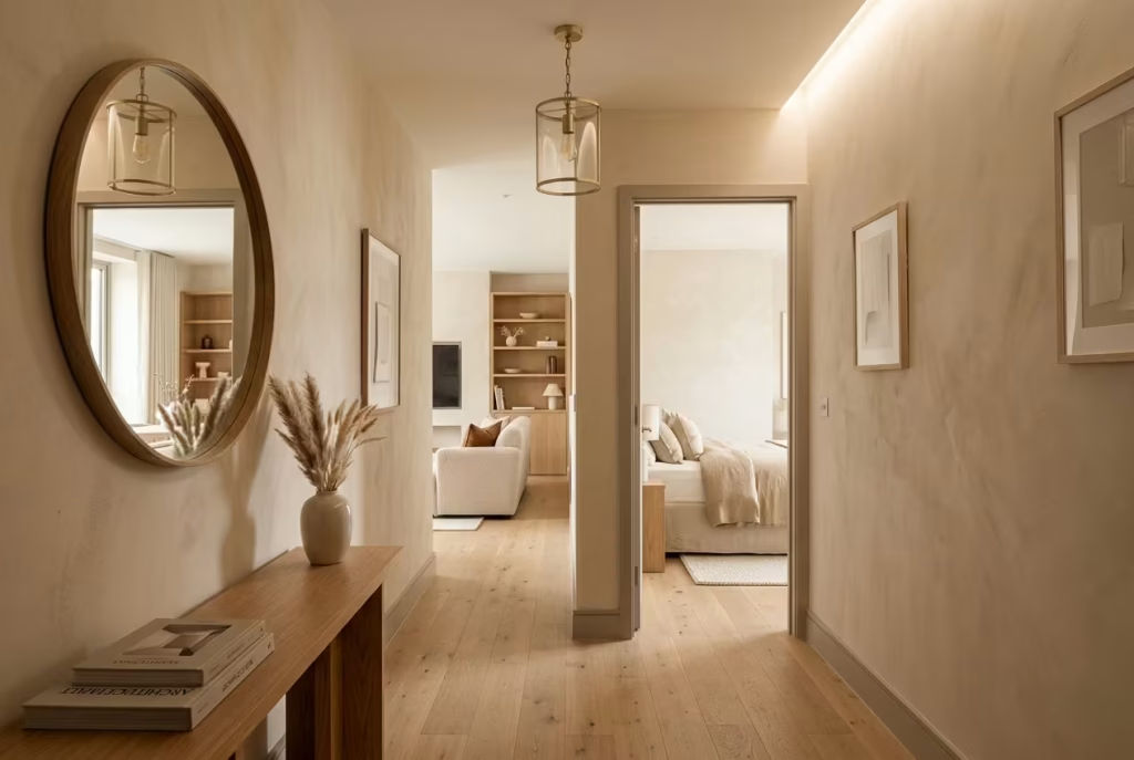
Hallways and transitional areas are often the quiet backbone of a home, yet they are frequently treated as afterthoughts. These are the spaces that connect one atmosphere to another, and when they are poorly considered, the shift between rooms can feel abrupt, almost like stepping through disconnected chapters. Warm neutrals, when used with intention, have the ability to smooth these transitions so the home feels cohesive rather than fragmented. It is less about decoration and more about continuity, like stitching together the rhythm of daily movement.
Using Mid-Tone Neutrals to Avoid Stark Transitions
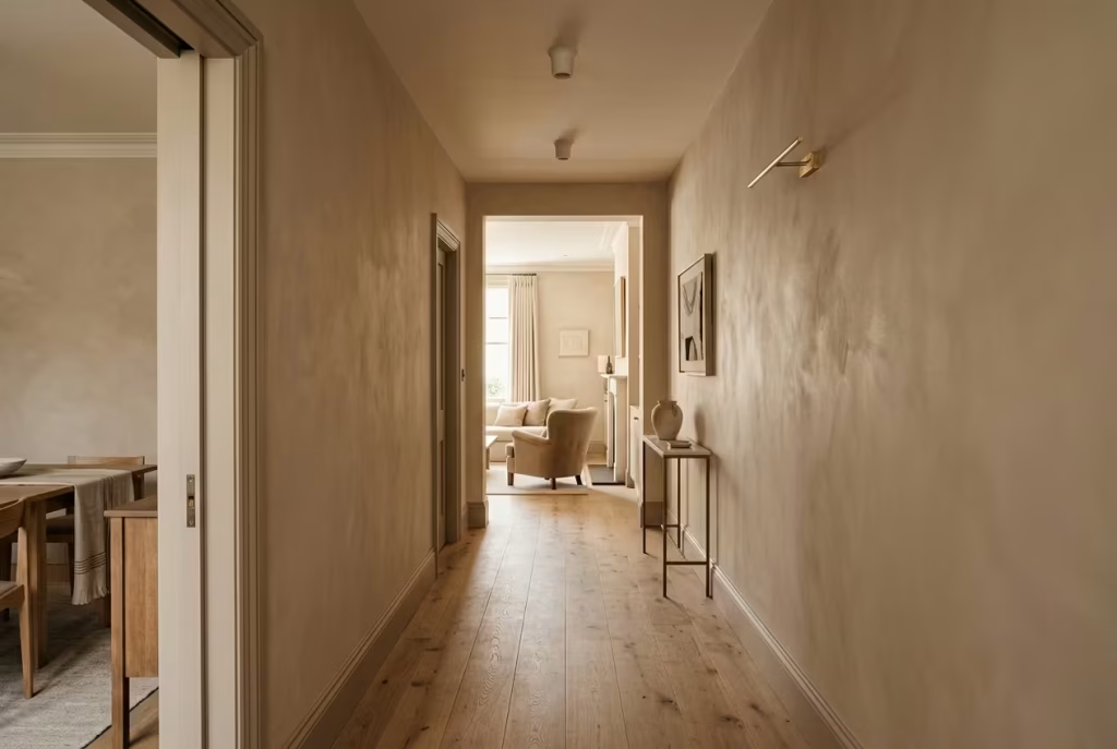
Mid-tone warm neutrals are particularly effective in hallways because they sit in a balanced position between light and depth. They are neither too bright nor too heavy, which allows them to absorb the changing character of adjacent rooms without clashing.
In narrow corridors around 1 to 1.2 metres wide (3.2 to 4 ft), very light walls can sometimes feel stark, almost clinical, especially when natural light is limited. On the other hand, overly deep tones can make the space feel compressed, as if the walls are closing in. Mid-tone options such as soft taupe, muted sand, or gentle mushroom tones strike a more forgiving balance.
I have seen this play out in real projects where a hallway initially painted in a pale neutral felt disconnected from adjoining rooms finished in warmer palettes. Once shifted to a mid-tone base, the transition became far more fluid. Instead of jumping visually from one environment to another, the movement felt gradual, almost like the spaces were speaking the same language but at different volumes.
Another advantage of mid-tones is how they respond to artificial lighting. Hallways often rely heavily on ceiling fixtures or wall sconces, and mid-tone neutrals tend to hold their character better under these conditions. They do not wash out easily, nor do they become overly heavy, which keeps the space feeling consistent throughout the day.
Enhancing Flow Between Rooms
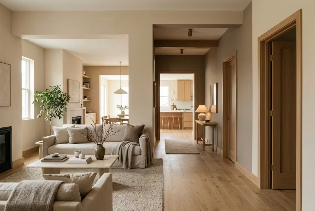
Flow in a home is rarely about grand gestures. It is built through subtle consistency, particularly in transitional spaces where one room hands over to the next. Warm neutrals play a crucial role here because they allow visual continuity without forcing uniformity.
One effective approach is to carry a related tonal family through multiple spaces while adjusting depth slightly as you move through the home. For example, a soft almond in a living room might transition into a slightly deeper taupe in the hallway, and then soften again into a lighter ivory in the next room. These shifts are gentle enough to feel connected but varied enough to give each space its own identity.
In homes where this is done well, the experience of moving through the space feels almost effortless. You are not jolted from one mood to another. Instead, there is a quiet sense of progression, like walking through a series of softly connected scenes rather than separate, isolated rooms.
Material continuity also plays a supporting role. When flooring, trims, or door finishes are consistent or closely related, warm neutrals in hallways help reinforce that sense of flow. Even small details, such as a repeated wood tone or consistent metal finish, can strengthen the overall coherence of the interior.
Ultimately, hallways should not feel like empty connectors. When treated with the same care as primary living spaces, they become part of the narrative of the home. Warm neutrals, particularly in mid-tones, allow this narrative to unfold smoothly, ensuring that every step from one room to the next feels intentional, calm, and quietly resolved.
Common Mistakes That Undermine Warm Neutral Schemes
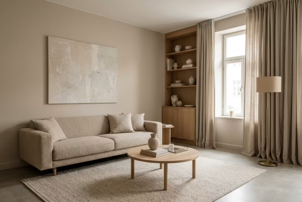
Warm neutral interiors rarely fail because the palette is wrong. More often, they fall short because the decisions around them are made in the wrong order or without enough attention to context. On a swatch, everything can look harmonious. In a real home, with shifting light, layered materials, and daily use, those same choices can quietly unravel. The difference between a space that feels rich and one that feels flat often comes down to a handful of overlooked missteps.
Choosing Paint Before Materials
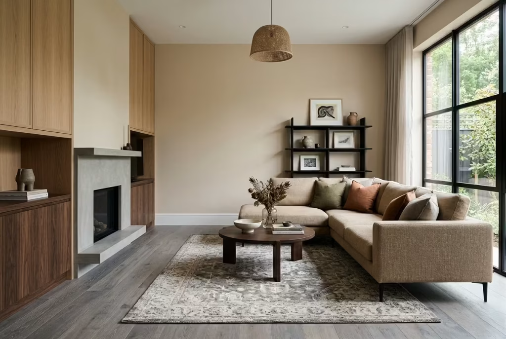
One of the most common missteps is selecting paint too early, before flooring, cabinetry, and textiles have been properly defined. It feels logical to start with colour, but in practice it often leads to a room that is trying to adapt to decisions that were never considered alongside it.
Warm neutrals are especially sensitive to surrounding materials. A soft almond wall, for example, can feel entirely different next to oak flooring compared to cooler engineered timber. In a room around 4 metres by 5 metres (13 by 16 ft), I have seen beautifully chosen paint lose its depth simply because the flooring introduced an unexpected undertone that shifted the entire balance.
When paint is chosen first, it becomes the reference point everything else must follow. This can force compromises in material selection, resulting in a space that feels slightly disjointed, even if each individual element looks good on its own. The more effective approach is to treat paint as part of a wider material conversation rather than the starting point of it.
Ignoring Undertones in Flooring
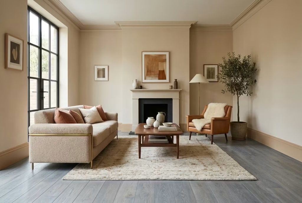
Flooring is one of the most influential surfaces in any interior, yet its undertone is often underestimated. It sits across the largest visual plane in many rooms, which means even subtle colour shifts can have a strong impact on how walls are perceived.
Warm neutrals rely heavily on harmony between wall and floor. If the flooring carries a strong yellow, red, or grey bias that does not align with the wall colour, the entire scheme can feel slightly off, even if it is difficult to immediately identify why. It is a bit like two instruments playing in tune individually, but not quite together.
I have seen this particularly in spaces where warm greige walls were paired with cooler, grey-washed wood flooring. On paper, both were neutral. In reality, the room felt divided, as if the lower and upper halves were speaking different visual languages.
The solution is not uniformity, but awareness. Flooring should be tested alongside paint samples under real lighting conditions, not just in isolation. When undertones are aligned, even loosely, the room gains a sense of quiet cohesion that feels effortless rather than forced.
Overusing One Shade Across All Surfaces
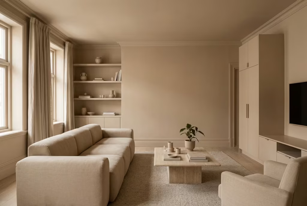
There is a certain appeal to using a single neutral across walls, trims, and even furniture. It feels safe, cohesive, and easy to control. However, when everything sits in the same tonal value, the result can quickly become flat.
Without variation, the eye has nowhere to rest and nowhere to travel. Walls blend into joinery, joinery blends into furniture, and the entire space begins to lose its structure. What was intended to feel calm instead starts to feel visually muted, almost as if the room has been gently drained of contrast.
In practice, I have found that even subtle shifts make a significant difference. A wall in soft sand paired with slightly deeper taupe joinery and a lighter textile layer creates just enough separation to give the space rhythm. It does not need bold contrast, only variation within the same family.
When one shade dominates too heavily, the room stops evolving with light. It remains static throughout the day, which can make even well-designed interiors feel surprisingly lifeless over time.
Relying on Showroom Lighting Conditions
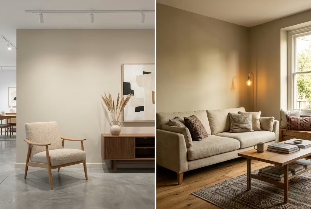
Showroom lighting is one of the most deceptive factors in interior decision-making. Colours that appear warm, balanced, and perfectly refined under controlled lighting often behave very differently in real homes.
Most showrooms use carefully calibrated lighting designed to flatter finishes and minimise imperfections. Once those same colours are placed in environments with mixed natural light, shadows, and changing daylight temperatures, their behaviour can shift dramatically.
A warm neutral that looked soft and creamy in a showroom may appear dull or overly yellow in a north-facing room. Similarly, a balanced greige might suddenly lean too cool once exposed to evening artificial lighting. The issue is not the paint itself, but the absence of real-world context during selection.
I always recommend testing samples directly on walls and observing them across different times of day. Morning light, midday brightness, and evening artificial lighting each reveal a different side of the same colour. Without this step, decisions are made on a single moment rather than the full life of the space.
When warm neutral schemes fail, it is rarely due to a lack of good choices. It is usually the result of decisions made without enough context, layering, or testing. Once those elements are addressed, even the simplest palette begins to feel more intentional, more grounded, and far more enduring over time.
How to Choose the Right Warm Neutral (A Practical Framework)
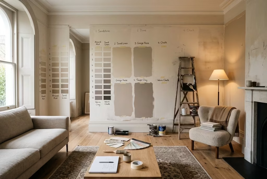
Choosing a warm neutral is rarely a moment of instant clarity. More often, it is a process of observation, adjustment, and comparison that unfolds over time. On a small swatch, almost every neutral looks promising. It is only when it is placed in the real environment, under shifting light and alongside fixed materials, that its true character reveals itself. A practical framework removes guesswork and replaces it with structured observation, allowing the colour to prove itself rather than simply impress at first glance.
The 48-Hour Testing Rule
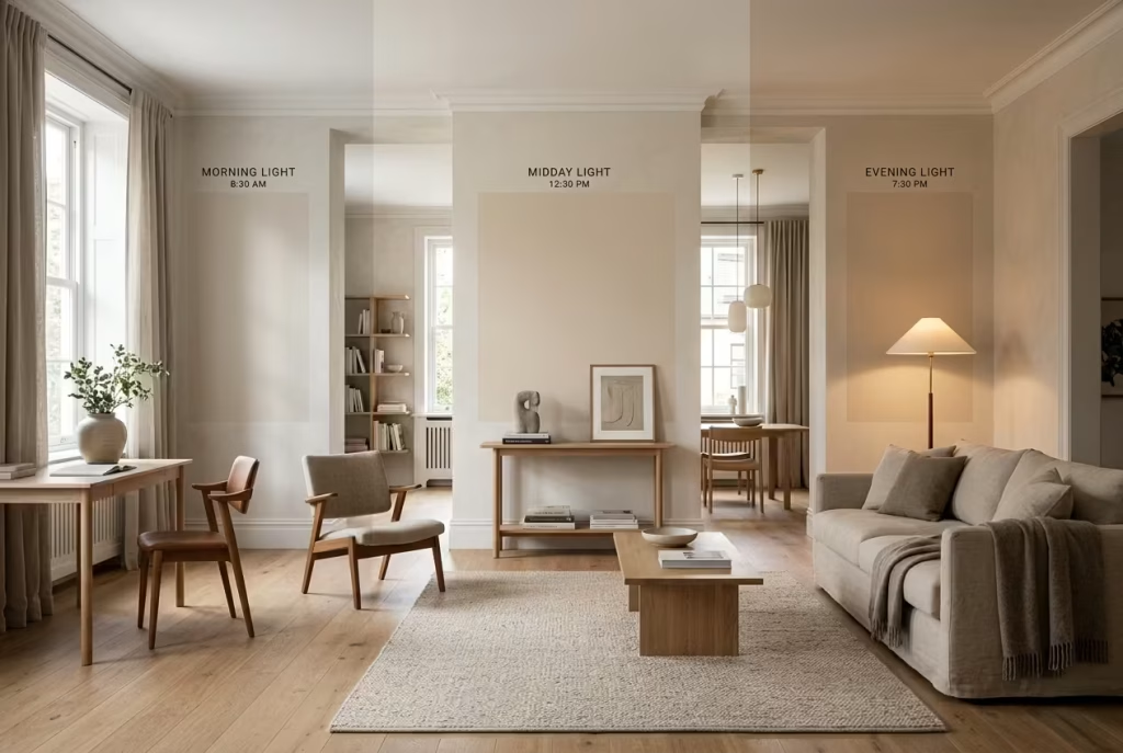
One of the most reliable ways to understand a warm neutral is to live with it briefly before committing. The 48-hour testing rule is not about speed, but about exposure to variation. A colour needs to be seen in different moods of the day before it can be judged accurately.
In the morning, natural light tends to be clearer and slightly cooler, which can make warm neutrals appear more restrained than expected. By midday, the same colour may feel more balanced and true to intent. As evening approaches and artificial lighting takes over, undertones begin to shift again, sometimes becoming warmer, sometimes flattening slightly depending on the bulb temperature.
I have seen clients initially dismiss a shade in the morning, only to find it felt entirely different by evening once the room had softened under warmer lighting. This is why a single snapshot in time is never enough. The full cycle of light reveals the rhythm of the colour, almost like hearing a piece of music in different acoustics.
The key is patience. Let the sample sit on the wall, observe it without interference, and allow it to respond to the natural rhythm of the space. Only then does the decision become grounded in reality rather than assumption.
Sample Size That Actually Works
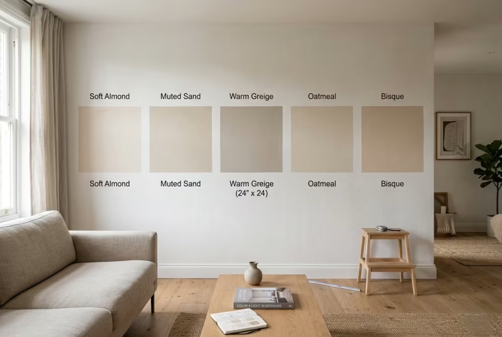
One of the most common mistakes in colour selection is working with samples that are far too small to provide meaningful feedback. A tiny swatch might show the tone, but it does not show behaviour. Warm neutrals, in particular, rely heavily on surrounding light and adjacency, which cannot be properly judged on a narrow strip of paper.
For a realistic reading, I always recommend a minimum sample size of 600mm x 600mm (24″ x 24″). At this scale, the colour begins to behave like a surface rather than a sample. You start to see how it interacts with shadow, how it responds to daylight shifts, and how its undertones develop across a larger field of view.
In rooms around 3.5 to 4.5 metres wide (11 to 15 ft), this difference becomes especially noticeable. A small sample may appear clean and balanced, but a larger patch can reveal subtle undertone shifts that were previously invisible. It is often these shifts that determine whether a colour feels stable or slightly unpredictable once fully applied.
Painting large test panels also allows you to evaluate edges, transitions, and how the colour sits against trims or adjacent materials. It is a far more honest way of assessing a neutral, because it removes the illusion of isolation and places the colour into a more realistic context.
Comparing Against Fixed Elements
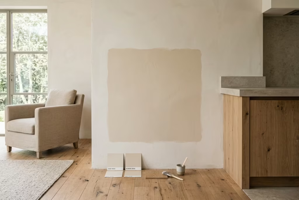
Perhaps the most critical step in selecting a warm neutral is understanding how it behaves alongside the elements that will not change. Flooring, countertops, cabinetry, and upholstery all form the permanent framework of a room. The paint must work in conversation with them, not independently of them.
Flooring is usually the most influential starting point. Its undertone sets a baseline that everything else responds to. A warm oak floor, for example, will naturally push a neutral wall in one direction, while cooler stone or engineered grey wood will push it in another. Without testing these relationships together, the final result can feel slightly disconnected, even if each individual choice is sound.
Countertops and cabinetry add another layer of complexity, especially in kitchens and open-plan spaces. These surfaces often sit at eye level and therefore have a strong visual presence. A warm neutral that looks perfect in isolation can shift unexpectedly when placed next to veined stone or high-contrast finishes.
Upholstery completes the picture. Sofas, curtains, and rugs introduce soft volume and texture, which can either reinforce or dilute the warmth of a wall colour. In one project I worked on, a carefully chosen sand-toned wall felt slightly off until a warmer linen upholstery was introduced. Once aligned, the entire scheme settled into place, almost as if it had been waiting for that final piece.
The principle here is simple but often overlooked. A warm neutral is never just a wall colour. It is part of a system. When tested against fixed elements, it either holds its position or reveals its limitations. That moment of comparison is where confident decisions are made, not in isolation, but in context where the room truly lives.
Expert Insights: What I’ve Learned From Real Projects
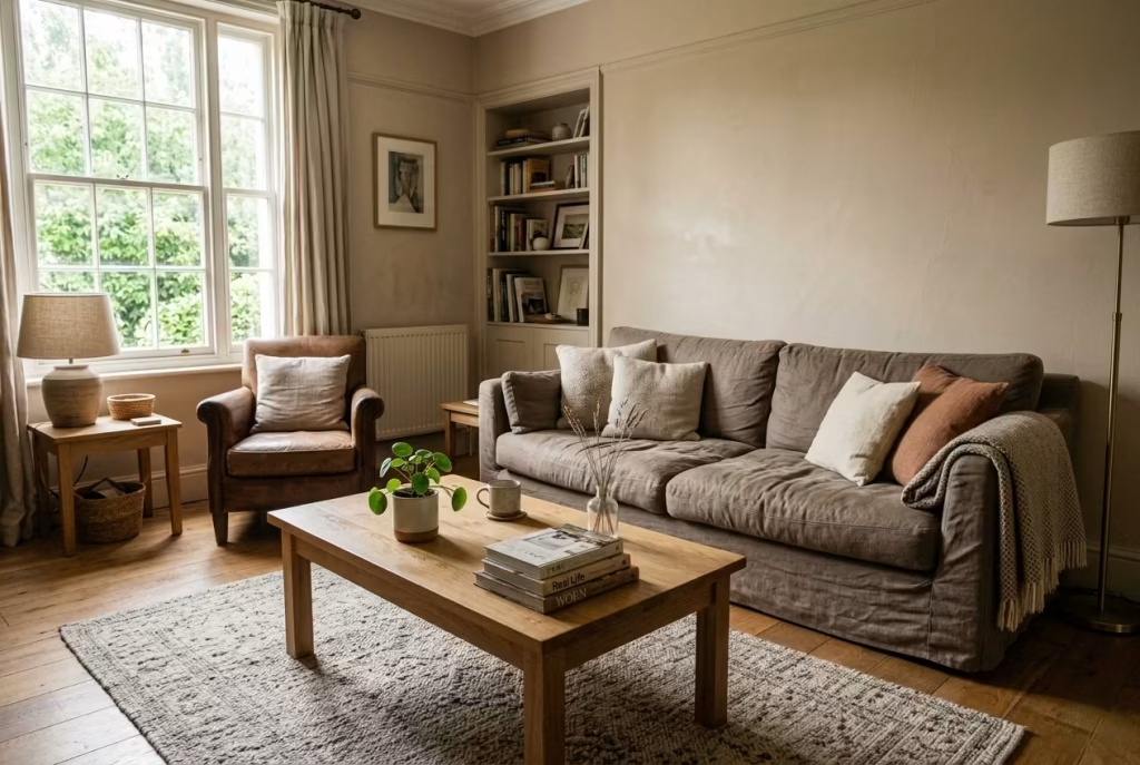
Warm neutral interiors reveal their true character only after they have been lived in. On paper, they often feel like the safest option, calm, inoffensive, easy to live with. In reality, they demand more thought than most people expect. Over the years, working on residential projects across living rooms, bedrooms, and transitional spaces, I have noticed clear patterns in what works, what fails quietly over time, and what clients often wish they had approached differently. These are not abstract theories, but lessons shaped by real rooms, real light, and real daily use.
Why clients often regret “playing it safe”
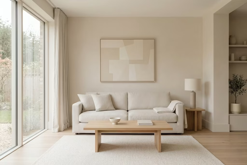
One of the most consistent reflections I hear after a project settles is a quiet sense of missed opportunity. Clients who initially chose the most “neutral neutral” option, usually a very pale beige or grey leaning off-white, often return later feeling that the space lacks personality or depth.
The intention is understandable. Playing it safe feels reassuring during decision-making, especially when the space is large or highly visible. However, what reads as safe on a sample can translate into something surprisingly underwhelming once applied across full walls, especially in rooms around 4 metres by 5 metres (13 by 16 ft) or larger.
The issue is rarely the colour itself, but the absence of character within the palette. When everything is softened to the point of neutrality, the room loses contrast, and with it, emotional presence. It becomes visually correct but quietly forgettable, like a sentence that is grammatically perfect but says very little.
In contrast, slightly more considered warm neutrals, those with a defined undertone or subtle depth, tend to age far better. They give the room a sense of identity without overwhelming it. Over time, clients often realise that restraint does not have to mean neutrality without expression.
The importance of subtle contrast
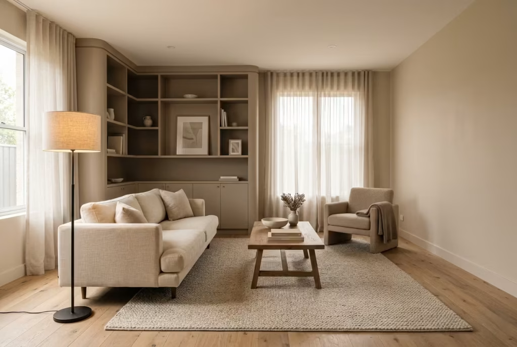
Subtle contrast is one of the most overlooked tools in interior design, yet it is often the difference between a flat space and one that feels layered and intentional. Warm neutral interiors rely heavily on this principle because colour variation is intentionally limited.
Contrast does not need to be dramatic. In fact, the most successful schemes often operate within a very narrow tonal range. A wall in soft almond, a slightly deeper taupe joinery detail, and a lighter linen textile can create a quiet hierarchy that keeps the eye engaged without introducing visual noise.
I have seen living rooms where everything sat within the same value range, and despite being well-furnished, the space felt strangely static. Once a deeper tone was introduced through upholstery or a single architectural feature, the entire composition shifted. It was not a dramatic change, but the room suddenly had rhythm.
Think of it less like contrast in the traditional sense, and more like variation in volume within the same piece of music. Without it, everything blends into a single tone. With it, the space begins to breathe.
How neutral palettes evolve over time
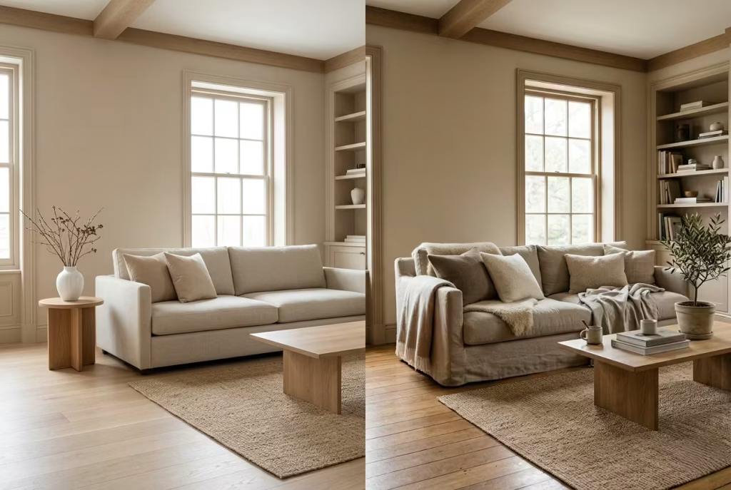
One of the most interesting aspects of warm neutrals is how they change as a space is lived in. Unlike more saturated colours, which can dominate a room immediately, neutrals tend to reveal themselves gradually.
In the early stages, a newly decorated room often feels clean and controlled. Everything appears aligned, but slightly static. Over time, as natural materials soften, textiles settle, and light interacts differently with surfaces, the palette begins to shift in character.
For example, linen upholstery develops a softer drape, timber gains a deeper patina, and even painted surfaces begin to feel less “fresh” and more integrated. In homes where warm neutrals are used thoughtfully, this evolution is not a deterioration but an enrichment. The space starts to feel more natural, almost as if it has found its own rhythm.
I have revisited projects months after completion and noticed how the same neutral scheme felt more complete simply because it had been lived in. The colour had not changed, but the context around it had matured. That is the quiet strength of a well-judged neutral foundation. It does not fight time, it works with it.
Designing for how a space feels at different hours, not just how it looks
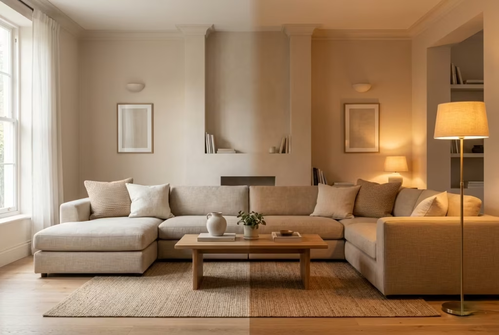
Perhaps the most important lesson I have learned is that interiors are never experienced in a single moment. They are lived across a full cycle of light, from early morning brightness to late evening warmth. A colour that feels perfect at noon may behave very differently at dusk.
Warm neutrals are particularly sensitive to this shift. In daylight, they can feel airy and balanced. Under artificial lighting, especially in the range of 2700K to 3000K, they tend to become warmer and more enveloping. In cooler lighting conditions, they can flatten or lose depth if not carefully supported by texture and material variation.
I often encourage clients to think beyond “how does this look” and instead ask “how does this feel at 8am, at 4pm, at 9pm.” A bedroom, for example, should feel calm in bright morning light but still cocooning in the evening. A living room should feel open during the day but softly grounded at night when lighting becomes more layered.
This is where lighting, materiality, and paint selection must work together rather than independently. A neutral scheme that only works in one lighting condition is not truly resolved. The strongest interiors are those that hold their character consistently, while still allowing subtle shifts as the day unfolds.
What becomes clear across all these experiences is that warm neutrals are never passive. They are responsive, sensitive, and deeply dependent on context. When treated with precision and layered intention, they create interiors that feel calm without being empty, refined without being rigid, and timeless without feeling static.
Final Thoughts: Why the Best Neutrals Are Never Obvious
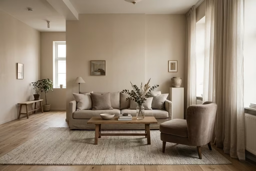
Warm neutral interiors often get mistaken for simplicity at first glance. People tend to assume that because the palette is restrained, the outcome must be straightforward. In reality, the most successful neutral spaces are rarely simple in execution. They are built on quiet decisions, layered judgments, and an understanding of how colour behaves across light, material, and time. The result is not immediate impact, but gradual revelation. It is the kind of design that does not announce itself, yet stays with you long after you leave the room.
Frequently asked questions about Warm Neutral Paint Colours
Are warm neutrals still a long-term design choice?
Yes, and this is one of their strongest advantages. Warm neutrals are not tied to design trends, which allows them to remain relevant over time.
However, their longevity depends on execution. A poorly layered neutral scheme can feel dated or dull surprisingly quickly, while a well-balanced one continues to feel refined as materials age and develop character.
In many of the projects I revisit, warm neutrals tend to improve with time rather than deteriorate, provided the initial layering and undertone selection were handled correctly.
How do I stop warm neutrals from looking flat?
Flatness usually comes from a lack of layering rather than the colour itself. When walls, flooring, furniture, and textiles sit too close in tone and texture, the eye has nowhere to travel.
To avoid this, introduce controlled variation. This could be a slightly deeper tone in joinery, a textured rug, or materials that respond differently to light. Even subtle shifts can create enough movement to keep the space visually alive.
Lighting is equally important. Warm lighting in the range of 2700K to 3000K tends to preserve depth and prevent neutrals from feeling washed out.
Can warm neutrals work in modern interiors as well as traditional ones?
Absolutely. Warm neutrals are one of the few palettes that translate seamlessly across design styles.
In modern interiors, they tend to create softness and prevent minimalist spaces from feeling cold or overly clinical. In traditional settings, they reinforce warmth and material richness, especially when paired with timber, stone, and layered textiles.
The key difference is not the colour itself, but how it is supported by materials and lighting. The same warm neutral can feel architectural in one setting and highly tactile in another.
Why do warm neutrals sometimes look different on the wall than on the sample?
This is almost always due to scale and lighting interaction. A small sample cannot replicate how a colour behaves across an entire wall surface, especially under changing light conditions.
On a swatch, you are seeing the colour in isolation. On a wall, you are seeing it influenced by surrounding materials, shadows, reflections, and artificial lighting. This is why a neutral can feel perfect at first, then shift noticeably once applied.
I often advise clients to apply a larger sample, ideally around 600mm x 600mm (24″ x 24″), to get a more realistic sense of how the colour will behave in the room.
Do warm neutrals work in small rooms?
Yes, but with careful control. In smaller spaces around 2.5 by 3 metres (8 by 10 ft), lighter warm neutrals tend to perform best, particularly soft ivory, pale almond, or gentle sand tones.
These shades help maintain brightness without introducing the starkness of pure white. However, the risk in small rooms is uniformity. If everything is too light and too similar, the space can feel visually flat.
Introducing subtle variation through texture, slightly deeper trims, or natural materials like wood can prevent the room from feeling one-dimensional while still keeping it open and airy.
What is the biggest mistake people make with warm neutrals?
The most common mistake is underestimating undertones and lighting interaction. Many people choose a colour based on how it looks in isolation, often in a showroom or on a small swatch, without considering how it will behave in their actual environment.
In real homes, especially those with mixed lighting conditions, this can lead to walls that feel flat, overly warm, or slightly disconnected from flooring and furniture. I have seen otherwise well-designed spaces lose their cohesion simply because the paint was not tested alongside key materials.
Warm neutrals demand context. Without it, even the best colour can feel slightly out of place.
How do I know if a warm neutral will suit my space?
The suitability of a warm neutral is never just about the colour itself. It is about how that colour responds to your room’s light, proportions, and fixed materials.
In rooms around 3.5 to 4.5 metres (11 to 15 ft), I always recommend testing the colour on a large sample area and observing it across different times of day. Morning light can make a tone feel cooler and more restrained, while evening light can intensify warmth significantly.
A warm neutral works well when it feels stable across these shifts. If it swings too far in either direction, becoming overly yellow or unexpectedly grey, it is usually a sign that the undertone is not aligned with the space.