Living Room Furniture Essentials: Designing for Comfort, Character, and Everyday Living
There is a quiet misconception I encounter time and again, often in homes that look impeccable at first glance. The assumption is that a Living Room Furniture becomes successful the moment it is filled with the “right” pieces. A well-shaped sofa, a neatly centred coffee table, a pair of armchairs placed with symmetry. On paper, everything seems in order. And yet, when you spend time in the room, something feels off. It doesn’t quite settle. It doesn’t invite you in. It simply exists. That is where the idea of essentials needs reframing.
A living room is not defined by how much it holds, but by how well it works. Not in photographs, but in the quiet rhythm of daily life, where furniture is used without thought and movement flows without friction. The real measure of success is not whether a space looks complete, but whether it feels instinctive to live in. The kind of room where you sit down without adjusting cushions, where a table is exactly where your hand expects it to be, where nothing asks for your attention yet everything supports you.
I’ve seen this play out more times than I can count. One project in particular stays with me. The room had all the right ingredients, at least visually. A sculptural sofa, beautifully upholstered. Statement chairs, carefully chosen.
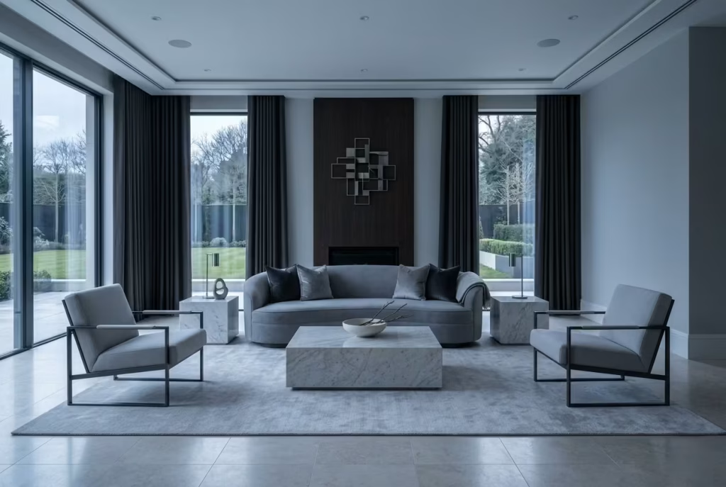
A marble coffee table that, on its own, was undeniably elegant. But the moment the family began using the space, the cracks appeared. The seating felt too far apart for conversation, the table slightly out of reach, the layout more concerned with symmetry than with comfort. It was a room designed to be seen, not lived in. Within weeks, cushions were shifted, chairs pulled closer, and the carefully composed layout began to unravel at the seams.
That experience reinforced something I now treat as non-negotiable. Furniture is not a collection of objects. It is a system, one that either supports the way you live or quietly works against it. And when that system is misaligned, even the most beautiful pieces struggle to carry the weight.
What I focus on now, from the very first conversation, is not what the room will look like, but how it will behave. Where people naturally gather, how they move through the space, where light falls at different times of day, how the room shifts from morning stillness to evening use. These are the details that rarely make it into mood boards, yet they are the ones that define whether a room holds together over time.
This is where design begins to feel less like decoration and more like decision-making. Not the kind driven by trends or impulse, but the kind shaped by observation, experience, and a clear understanding of use. Choosing a sofa is no longer about style alone, but about depth, proportion, and placement in relation to everything else.
A coffee table is not selected for its finish, but for how naturally it fits into the rhythm of the room. Even something as simple as a side table becomes a question of reach, scale, and balance.
When these decisions are made with intent, the room begins to take on a different quality. It stops trying so hard to impress and instead starts to work quietly in the background, supporting daily life without ever getting in the way. That, in my experience, is where real comfort lives. Not in excess, but in clarity.
So rather than approaching this as a checklist of items to include, it helps to think of it as a process of refinement. What does the room truly need to function well? What earns its place, and what simply adds noise? Because when you strip it back to essentials, in the truest sense of the word, you’re not left with less. You’re left with a room that finally makes sense.
The Anchor Piece: Choosing a Sofa That Sets the Room’s Direction
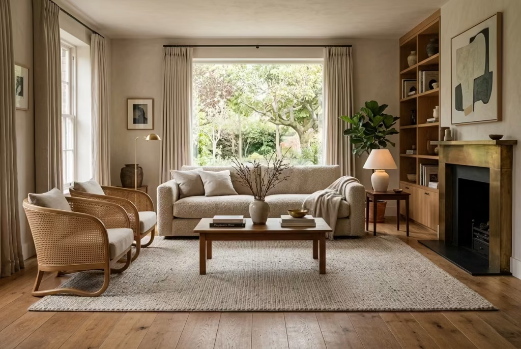
There’s a moment in almost every project where the room begins to reveal itself, and more often than not, it happens the instant the right sofa is introduced. Not because it is the largest piece, but because it quietly takes the lead, setting the tone, defining the rhythm, and, in many ways, calling the shots for everything that follows. Get it right, and the rest of the room tends to fall into place, almost as if it had been waiting for that decision to be made. Get it wrong, and you end up chasing balance, adjusting everything around it, never quite landing where you intended.
Why the Sofa Is More Than Just Seating
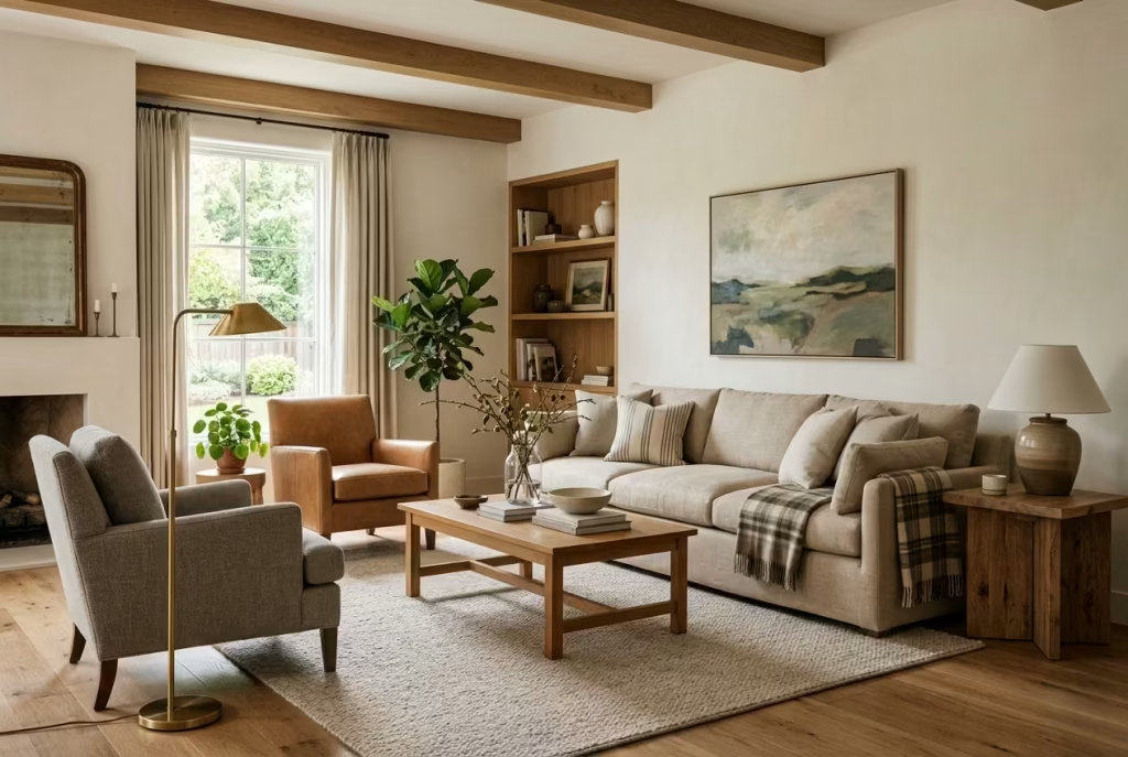
A sofa does far more than provide a place to sit. It acts as the spatial anchor, the piece that grounds the room both visually and physically. Think of it as the point around which everything else orbits, with chairs, tables, and lighting taking their cues from its position, scale, and presence.
In practice, this means the sofa often dictates the layout before anything else is considered. Its orientation establishes sightlines, its depth influences circulation, and its proportions set the visual weight of the entire space. A poorly placed or poorly chosen sofa can leave a room feeling unsettled, like a conversation that never quite finds its rhythm. On the other hand, a well-considered piece brings an immediate sense of order, almost like the room has exhaled and settled into itself.
I often describe it to clients as the difference between a room that feels “arranged” and one that feels “resolved.” The sofa is usually where that distinction begins.
You May also Like: 20 Italian Fireplace Ideas That Bring Timeless European Warmth to Your Home
Scale vs. Proportion: Avoiding the Extremes
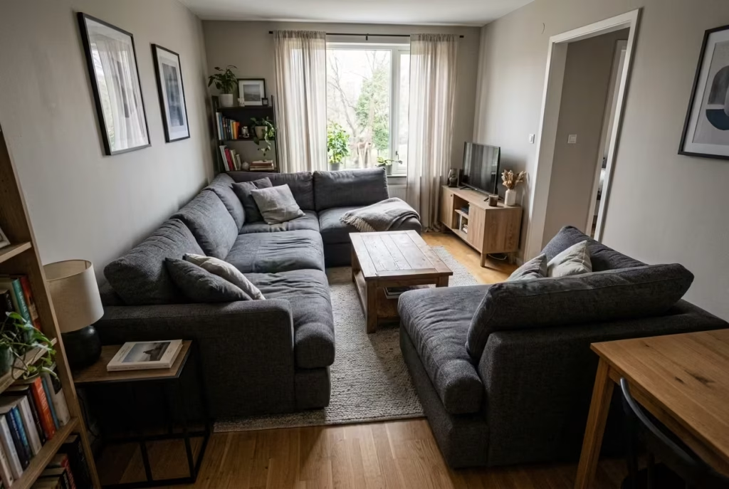
One of the most common missteps I see is confusing size with suitability. Bigger isn’t always better, and smaller rarely means more refined. What matters is proportion, how the sofa relates not only to the room, but to everything within it.
In a compact space, an oversized sofa can dominate to the point where circulation becomes an afterthought, forcing you to navigate around it rather than through the room naturally. It’s the kind of decision that looks generous in isolation but quickly becomes cumbersome in daily use. Conversely, a sofa that’s too slight, often chosen in an attempt to keep things feeling light, can leave the room feeling underpowered, as though it lacks a centre of gravity.
I tend to assess this in layers. Ceiling height, wall length, window placement, all of these elements influence what the sofa should be. In rooms with higher ceilings, for instance, a low-profile sofa can feel disconnected unless it is balanced with other substantial elements. In tighter rooms, a slightly raised leg detail can create just enough visual lift to prevent the piece from feeling heavy.
It’s a balancing act, one that rarely announces itself loudly, but when it’s right, you feel it immediately.
Material Considerations: More Than Just Aesthetic
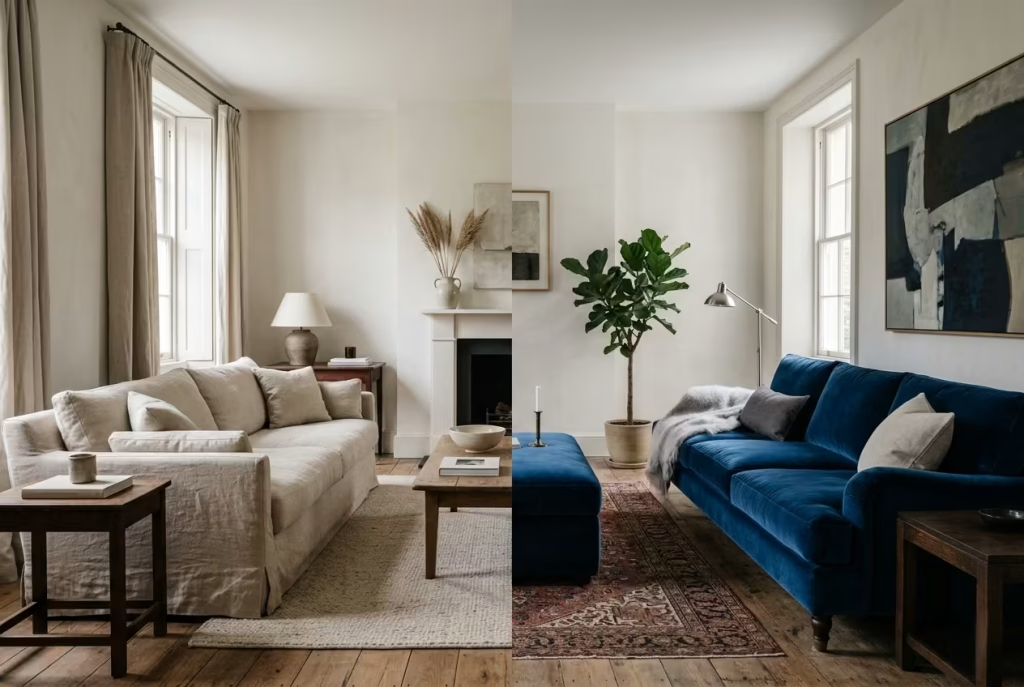
Fabric choice is often approached as a purely visual decision, but in reality, it carries both practical and atmospheric weight. The material you choose will influence not just how the sofa looks, but how it wears, how it feels, and how it ages over time.
Linen, for example, has a relaxed, breathable quality that works beautifully in spaces aiming for a softer, more informal tone. It creases, it softens, it tells a story as it ages, which, in the right setting, adds to its charm. Velvet, by contrast, brings depth and a certain richness, catching light in a way that adds dimension, though it requires a bit more care to maintain its finish.
Then there are performance fabrics, which I find increasingly relevant, particularly in homes where the living room is used daily rather than occasionally. They offer durability without sacrificing texture, making them a practical choice for families or high-traffic areas. That said, they can sometimes lack the tactile warmth of natural fibres, so it becomes a question of balance.
In one project, I specified a linen blend for a formal sitting room, knowing it would be used sparingly. In another, a family home with young children, we opted for a high-performance fabric with a subtle weave. Both worked, not because one was inherently better, but because each responded to how the room was actually lived in.
Cushion Depth and Seat Height: Where Comfort Is Won or Lost

Comfort is often spoken about in vague terms, but in reality, it comes down to very specific dimensions. Cushion depth and seat height, in particular, play a decisive role in how a sofa feels the moment you sit down.
A deeper seat, typically in the range of 55–65 cm (22–26 inches), encourages a more relaxed posture, ideal for lounging, reading, or long evenings spent unwinding. It’s the kind of comfort you sink into, where the sofa feels generous and accommodating. However, for some, particularly in more formal settings, this depth can feel too laid-back, making it harder to sit upright comfortably.
Seat height, usually between 40–45 cm (16–18 inches), determines how easily you move in and out of the sofa. Too low, and it can feel like you’re dropping into the seat, which may look contemporary but isn’t always practical. Too high, and it loses that sense of ease, feeling more upright than inviting.
I often test this instinctively during installations, sitting, adjusting, observing how the body responds without overthinking it. If you find yourself shifting, correcting your posture, or reaching for cushions to compensate, it’s usually a sign that something isn’t quite right.
Real-Life Insight: When Visual Lightness Falls Short
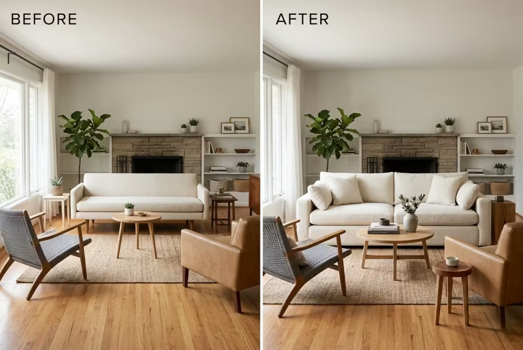
One project, in particular, reshaped how I approach sofas in transitional spaces. The client was drawn to a visually light piece, slim arms, raised legs, a profile that looked elegant and unobtrusive. And to be fair, in photographs, it worked beautifully. The room felt open, almost effortless.
But once the space began to be used, the limitations became clear. The sofa lacked depth, both physically and visually. It didn’t invite you to sit for long, and more importantly, it didn’t anchor the room. Everything around it felt slightly adrift, as though the space was waiting for something more substantial to arrive.
We replaced it with a deeper, more grounded piece, one with a fuller profile and a stronger presence. The transformation was immediate. The room gained weight, not heaviness, but a sense of purpose. Seating arrangements began to make sense, the layout felt intentional, and the space finally held together.
It was a reminder that what works in an image doesn’t always translate into lived experience. A sofa has to do more than look good, it has to carry the room.
Practical Notes
- Ideal seat depth: 55–65 cm (22–26 inches)
- Typical seat height: 40–45 cm (16–18 inches)
- Standard sofa length: 180–240 cm (71–95 inches)
- Allow at least 40–50 cm (16–20 inches) clearance in front for comfortable movement
These are not rigid rules, but reliable starting points, the kind that help you avoid costly misjudgements.
Pros and Cons
Pros
- Establishes the layout with clarity and confidence
- Sets the tone for material and colour direction
- Provides the primary layer of comfort and usability
Cons
- Difficult and costly to replace once installed
- A poor choice can disrupt both function and visual balance
- Requires careful consideration of proportion, not just style
The Supporting Cast: Armchairs That Introduce Balance and Movement
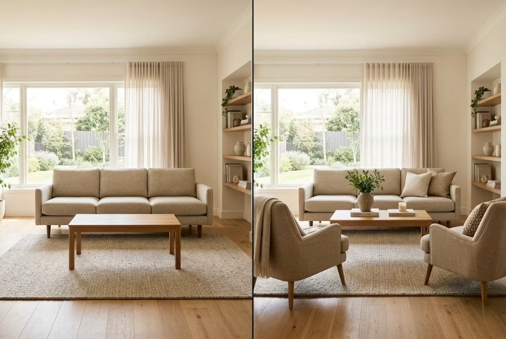
If the sofa carries the weight of the room, armchairs are what give it rhythm. They are the pieces that stop a layout from feeling static, introducing a sense of movement, of conversation, of life unfolding rather than being carefully arranged. And yet, more often than not, they are treated as an afterthought, chosen late in the process, placed wherever there’s space left, expected to simply “fill the gap.” That approach rarely holds up.
Armchairs, when considered properly, do something far more nuanced. They soften the dominance of the sofa, they redirect attention, and, perhaps most importantly, they shape how people interact within the room. A living space that relies solely on linear seating tends to feel formal, even slightly rigid. Add a pair of well-positioned chairs, angled just enough to invite engagement, and suddenly the room loosens up. It begins to feel lived in, not staged.
Why Armchairs Should Never Feel Like Afterthoughts
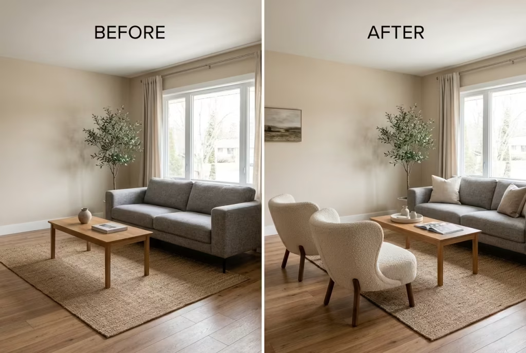
There’s a tendency to think of armchairs as optional extras, the pieces you add once the “main” furniture is in place. But in practice, they often determine whether a room feels balanced or lopsided, whether it encourages gathering or quietly discourages it.
I approach armchairs as counterpoints rather than companions. They don’t need to match the sofa, and in most cases, they shouldn’t. Their role is to introduce contrast, sometimes subtle, sometimes more pronounced, that keeps the room from slipping into predictability. Without them, a space can feel one-dimensional, like a sentence that never quite varies its tone.
In one project, the client initially resisted adding chairs, worried they would overcrowd the room. But once we introduced a pair, positioned slightly off-axis rather than directly facing the sofa, the entire dynamic shifted. The room stopped feeling like a waiting area and started to feel like a place where conversations could unfold naturally.
Creating Conversation Zones, Not Just Seating Arrangements
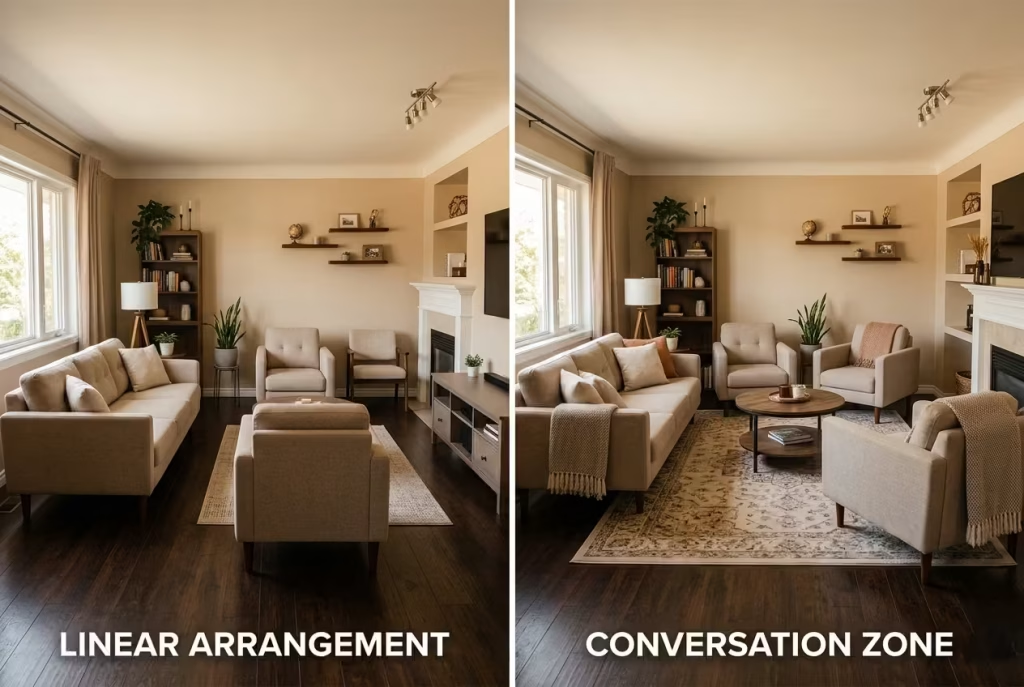
One of the most overlooked aspects of living room design is how furniture influences interaction. A row of seating, however comfortable, often creates distance rather than connection. People end up speaking across the room rather than within it, which subtly changes how the space is used. Armchairs, placed with intention, help close that gap.
I tend to think in terms of “conversation zones,” small clusters where seating faces inward rather than outward, where the distance between people feels natural rather than forced. This doesn’t require a large room. Even in more compact spaces, a single well-positioned chair can soften the linearity of a sofa and create a more inclusive arrangement.
It’s a small shift, almost imperceptible at first, but one that changes how the room is experienced. Instead of everything pointing in one direction, often toward a screen, the space begins to support multiple ways of sitting, talking, and simply being.
Mixing Forms: Structured vs. Relaxed Silhouettes
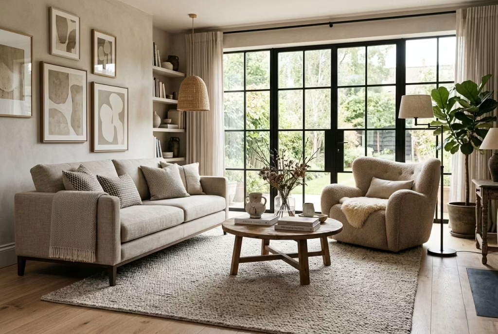
This is where things become more interesting, and, if handled well, more layered.Pairing a structured sofa with equally rigid chairs can make a room feel overly composed, as though every piece is trying a little too hard to align. On the other hand, combining different silhouettes, say, a tailored sofa with a softer, more relaxed armchair, introduces a sense of ease. It suggests that the room has evolved over time rather than being assembled in one go.
I often lean into this contrast deliberately. A chair with a more sculptural form, perhaps with curved arms or a distinct frame, can offset the straight lines of a sofa. Alternatively, a relaxed, upholstered chair can soften a more architectural seating piece, bringing warmth where it might otherwise feel restrained.
The key is not to force contrast, but to allow it to emerge naturally. When done well, it feels uncontrived, almost as if the pieces found their way together on their own.
Real-Life Insight: Breaking the Grip of Symmetry
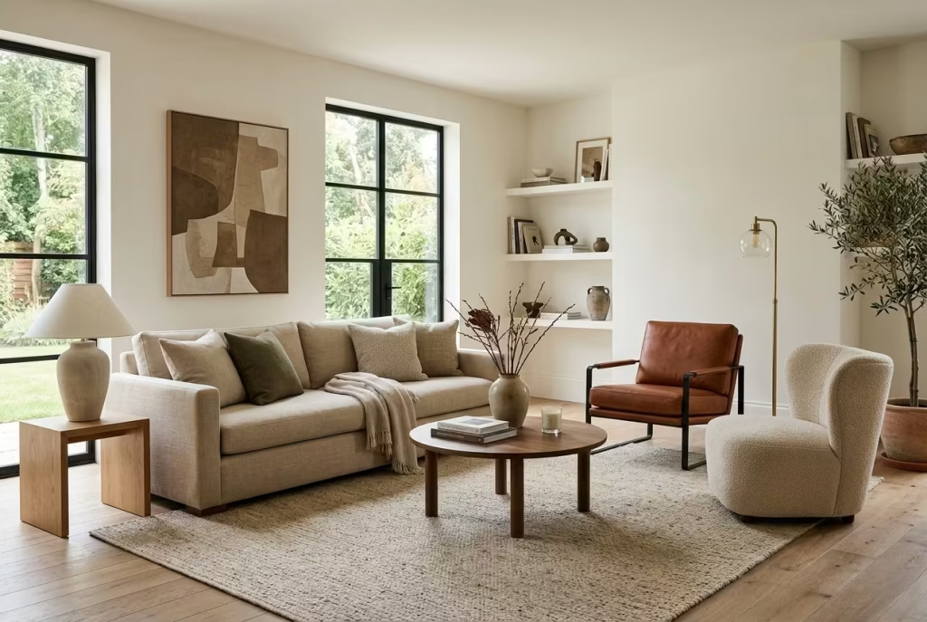
I’ve lost count of how many times I’ve been asked to create perfectly symmetrical arrangements, two identical chairs, placed evenly on either side, mirroring one another down to the smallest detail. And while symmetry has its place, it can sometimes make a room feel overly controlled, like everything has been pinned down.
More often than not, I introduce a slight disruption. A chair with a different leg detail, a contrasting fabric, or even a subtly varied scale. Nothing dramatic, just enough to break the rhythm and keep the eye moving.
In one living room, we paired a structured linen sofa with a single leather armchair and a lighter upholstered piece. On paper, it shouldn’t have worked. But in reality, it created a sense of balance that felt far more natural than a matched set ever could. The room felt collected, not composed, and that distinction made all the difference.
Measurements That Support Movement, Not Restrict It
For all the emphasis on aesthetics, comfort ultimately depends on how easily you can move through the space. Armchairs, if placed without consideration, can quickly become obstacles rather than assets.
As a general guide, I allow 75–90 cm (30–35 inches) between seating pieces. This provides enough room for circulation without creating unnecessary distance. It’s the kind of spacing that feels intuitive, where you can move without thinking, without adjusting your path or sidestepping furniture.
In tighter layouts, I sometimes reduce this slightly, but never to the point where movement feels constrained. A room should accommodate you, not the other way around.
Pros and Cons
Pros
- Introduces flexibility, allowing the layout to adapt to different uses
- Adds visual layering, breaking up uniformity and enhancing depth
- Encourages more natural interaction, supporting conversation and comfort
Cons
- Poor placement can disrupt circulation and create awkward gaps
- Overuse can lead to visual clutter, particularly in smaller rooms
- Mismatched proportions can make the layout feel unresolved
The Coffee Table: Where Function Meets Composition
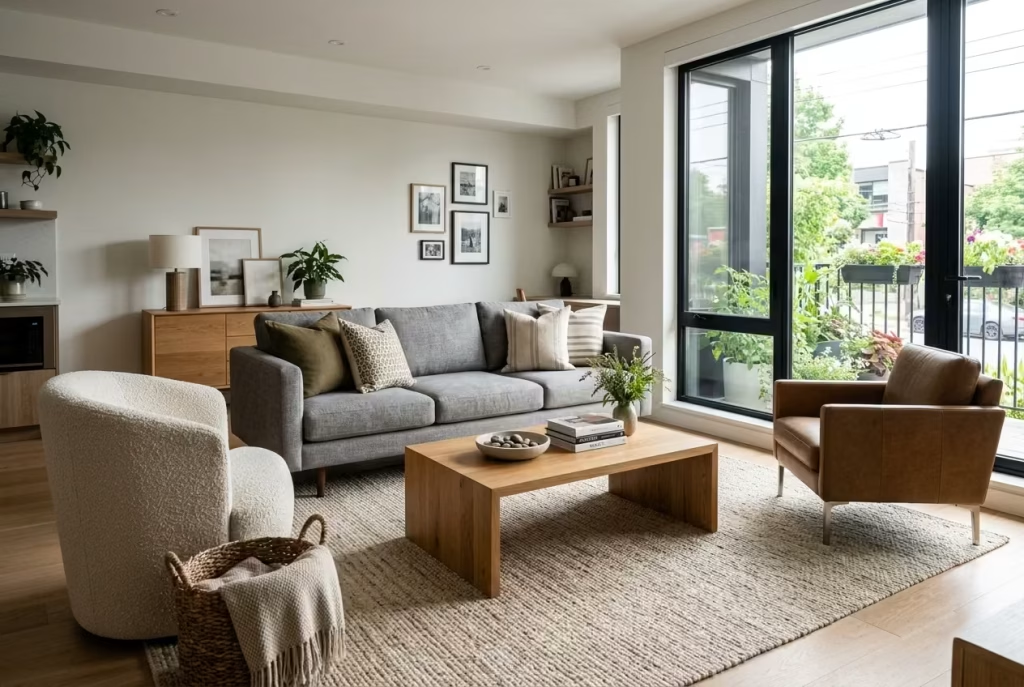
There is a tendency to treat the coffee table as the finishing touch, the piece that arrives once everything else has been decided. In reality, it sits at the very centre of the room’s daily life, quietly carrying more responsibility than it’s often given credit for. It’s where routines land, where objects gather, where moments pause, sometimes briefly, sometimes for hours. If the sofa sets the direction, the coffee table is where that direction is tested, day in, day out.
Get it right, and it becomes second nature, always where you need it, never in the way. Get it wrong, and it quickly turns into an obstacle, either too far to reach comfortably or too dominant to ignore. It’s a fine line, one that hinges on function just as much as form.
A Working Surface, Not Just a Styling Platform
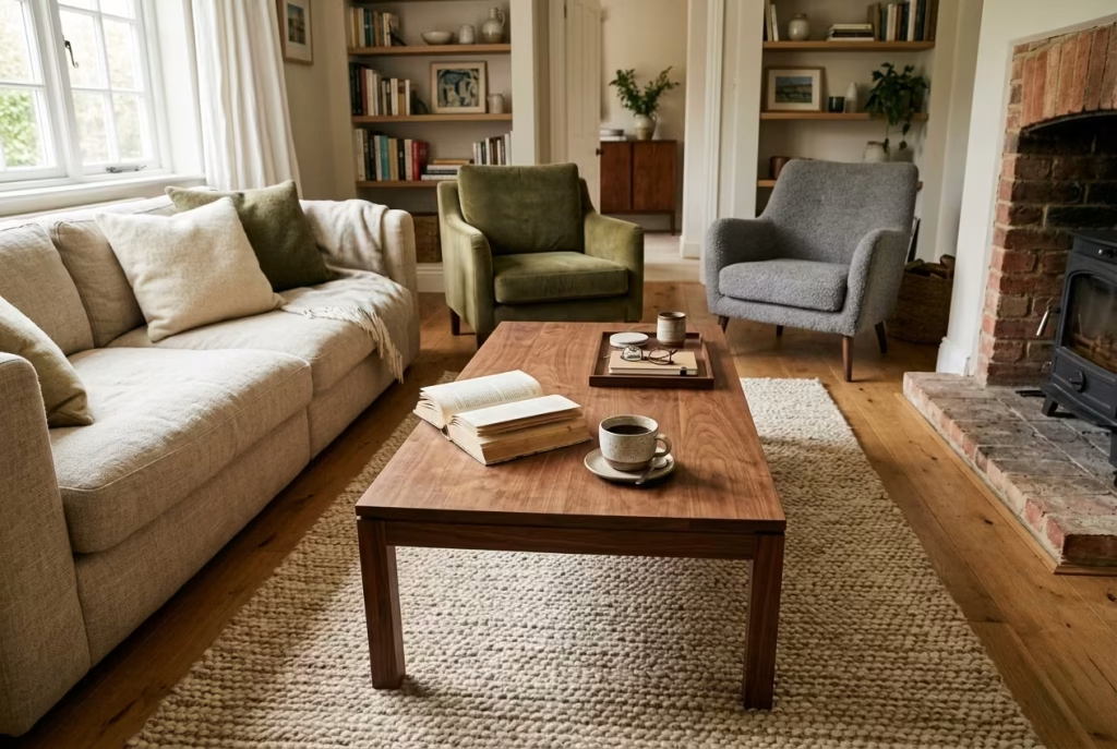
It’s easy to fall into the trap of seeing the coffee table as a stage for styling, neatly stacked books, a sculptural object, perhaps a tray arranged just so. While those elements have their place, they should never come at the expense of usability. A coffee table that looks composed but fails in daily use is, quite simply, missing the point.
In practice, this piece needs to earn its keep. It should accommodate the small, unplanned moments that define how a living room is actually used, a cup placed down without hesitation, a book left open, a laptop set down at the end of the day. These are the quiet tests that reveal whether the table is truly working or merely performing.
I often find that the most successful coffee tables are the ones that don’t draw attention to themselves. They sit comfortably within reach, their presence felt more through use than through appearance. It’s a subtle shift, but an important one, moving from something that is looked at to something that is lived with.
“Design is not just what it looks like and feels like. Design is how it works.”
Steve Jobs
That principle, although often applied to product design, holds just as true here. The coffee table is, at its core, a functional object. Its beauty lies in how seamlessly it integrates into the rhythm of the room.
You May also Like: 25 Modern Spanish Colonial Living Room Ideas That Feel Timeless and Lived-In
Shape Selection: Responding to the Room, Not Fighting It
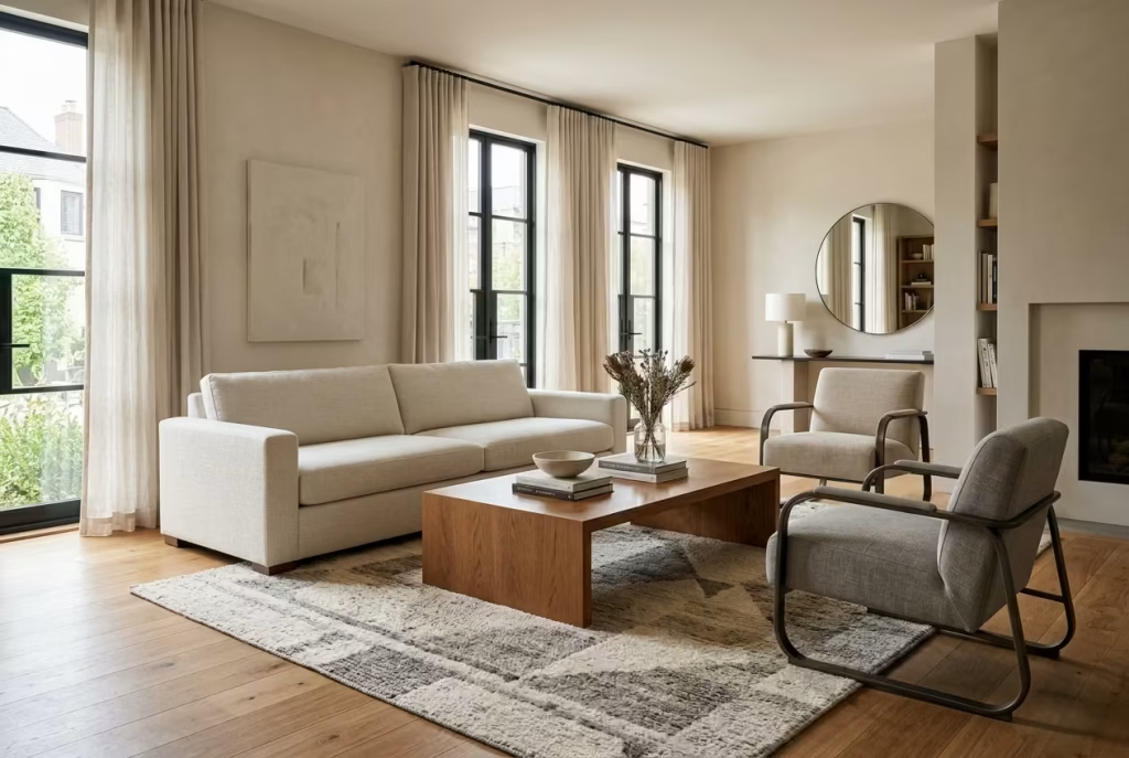
Shape is rarely just an aesthetic decision. It’s a response to the geometry of the space, the arrangement of seating, and the way people move through the room.
In more linear layouts, a rectangular or oval table tends to echo the proportions of the sofa, reinforcing a sense of order. In tighter or more compact spaces, round or softly curved forms can ease circulation, removing sharp corners and allowing movement to flow more naturally. It’s a small adjustment, but one that can make the difference between a room that feels fluid and one that feels slightly obstructed.
I tend to approach this intuitively, looking at how the room is already behaving. Where are the natural pathways? Where does the eye travel? The table should sit within that logic, not disrupt it. A mismatched shape can feel like a piece that has been dropped in rather than integrated, subtly unsettling the composition.
Material Layering: Adding Depth Without Noise
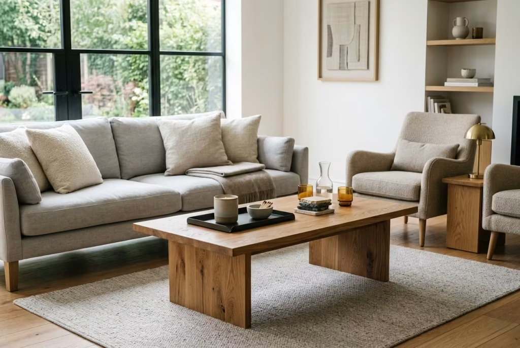
Material choice is where the coffee table begins to contribute to the broader narrative of the room. Timber, stone, metal, each brings its own weight, texture, and presence. The key is not to introduce materials for the sake of variety, but to create a sense of layering that feels intentional.
Timber, with its warmth and grain, often softens more structured spaces, adding a tactile quality that makes the room feel approachable. Stone, whether marble or a more understated composite, introduces a sense of permanence and quiet luxury, though it can feel heavy if not balanced with lighter elements. Metal, used sparingly, adds contrast and definition, catching light in a way that can sharpen an otherwise muted palette.
What matters most is how these materials relate to what’s already in the room. A timber table that echoes the tone of the flooring, or a metal detail that subtly repeats in lighting or hardware, begins to tie the space together. It’s less about matching and more about creating a quiet conversation between elements.
Real-Life Insight: Adapting to How the Room Is Used
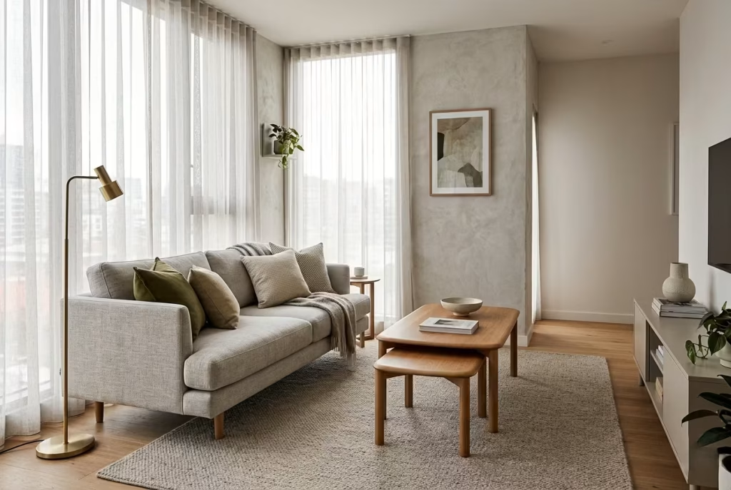
In tighter living rooms, where every centimetre counts, I’ve found myself moving away from the idea of a single, fixed coffee table. Instead, I often introduce nested or modular pieces, tables that can shift, separate, and adapt depending on the moment.
One project, in particular, stands out. The room was compact, with limited space between the sofa and the opposite wall. A standard table would have worked visually, but in practice, it would have restricted movement. We opted instead for a pair of smaller, nested tables. On a quiet evening, they sat together, functioning as one. When the room filled with people, they could be moved apart, offering flexibility without compromising the layout.
It’s a solution that doesn’t immediately announce itself, but once in place, it changes how the room behaves. The furniture begins to respond to the people in it, rather than the other way around.
Measurements That Support Comfort and Ease
Dimensions here are less about rules and more about ensuring the table feels naturally integrated into the seating arrangement.
- Height: 40–45 cm (16–18 inches)
Ideally aligned with, or slightly lower than, the seat height of the sofa to maintain visual continuity and ease of use - Clearance from seating: 40–50 cm (16–20 inches)
Close enough to reach comfortably, yet far enough to allow unobstructed movement
These measurements, when respected, create a sense of effortlessness. You shouldn’t have to lean awkwardly or stretch to use the table. It should simply be there, exactly where you expect it.
Pros and Cons
Pros
- Grounds the seating arrangement, bringing clarity to the layout
- Acts as both a functional surface and a compositional centrepiece
- Offers an opportunity to introduce material contrast and texture
Cons
- Incorrect scale can throw off the entire room, either dominating or disappearing
- Poor placement disrupts circulation and daily use
- Overly decorative choices can prioritise appearance over practicality
Storage That Doesn’t Feel Like Storage: Media Units and Built-Ins
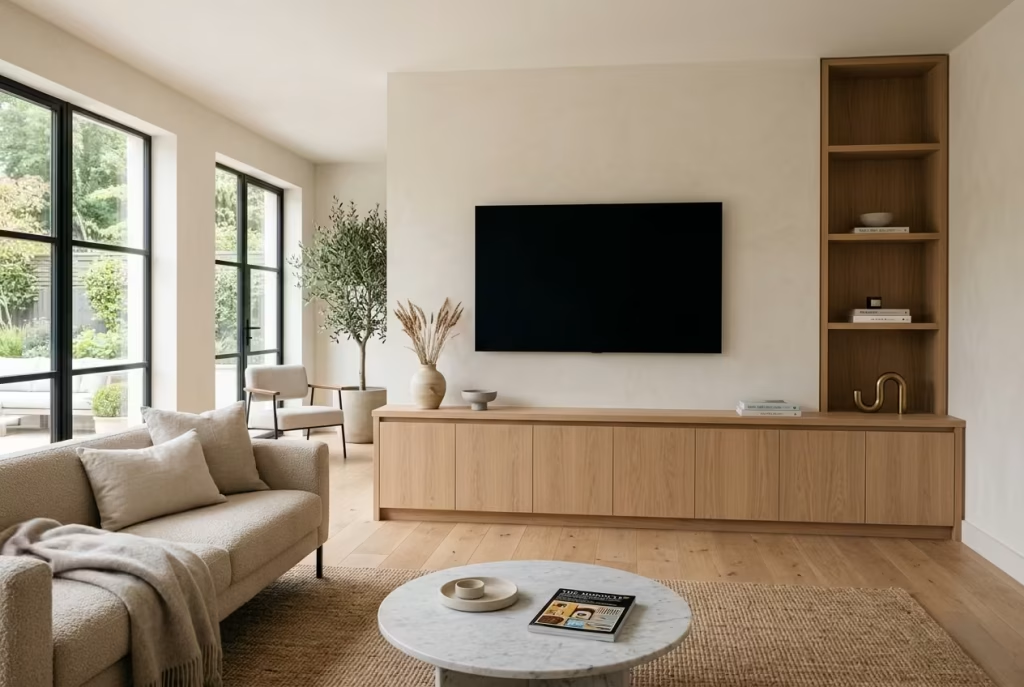
There’s a point in every living room where practicality threatens to take over. Cables, devices, remotes, routers, all the necessary clutter that quietly accumulates, often faster than anticipated. Left unresolved, it begins to chip away at the room’s clarity, introducing visual noise that no amount of styling can truly disguise. This is where storage, handled well, steps in not as an afterthought, but as a design tool in its own right.
The aim is not simply to hide things away, but to do so in a way that feels integrated, almost inevitable. When storage is resolved properly, you don’t notice it. You notice instead the calm it creates, the sense that everything has its place, even if you can’t quite see where that place is.
Concealed Storage vs. Open Display: Finding the Balance
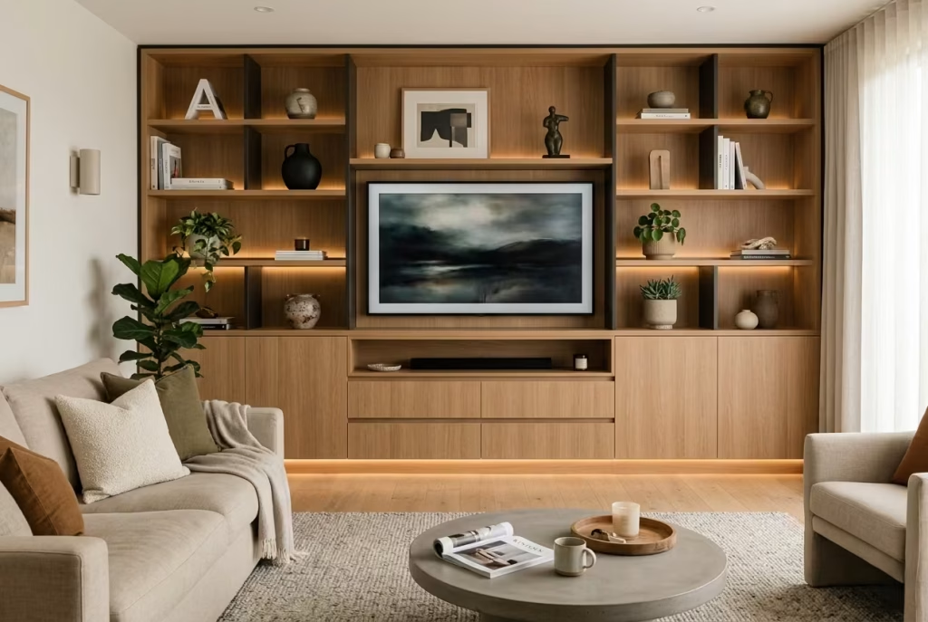
It’s tempting to lean entirely in one direction, either hiding everything behind closed doors or displaying objects openly in an attempt to add personality. In practice, the most successful rooms sit somewhere in between, striking a balance that feels curated rather than controlled.
Concealed storage does the heavy lifting. It absorbs the everyday items, the things that are used often but don’t need to be seen. This keeps the visual field clear, allowing the room to breathe. Open display, on the other hand, introduces moments of character, carefully selected objects, books, or pieces that carry meaning, arranged with restraint.
The key is editing. Too much open display, and the unit starts to feel cluttered, like it’s trying to tell too many stories at once. Too much concealment, and the room risks feeling impersonal, as though everything has been tidied away to the point of anonymity.
I often approach this as a layered composition. Closed cabinetry at the base, where functionality takes precedence, and lighter, more open elements above, where expression can emerge. It’s a quiet hierarchy, but one that keeps the balance intact.
You May also Like: 25 Sage Green Living Room Ideas: Timeless Designs for a Calm and Stylish Space
Integrating Technology Without Letting It Take Over
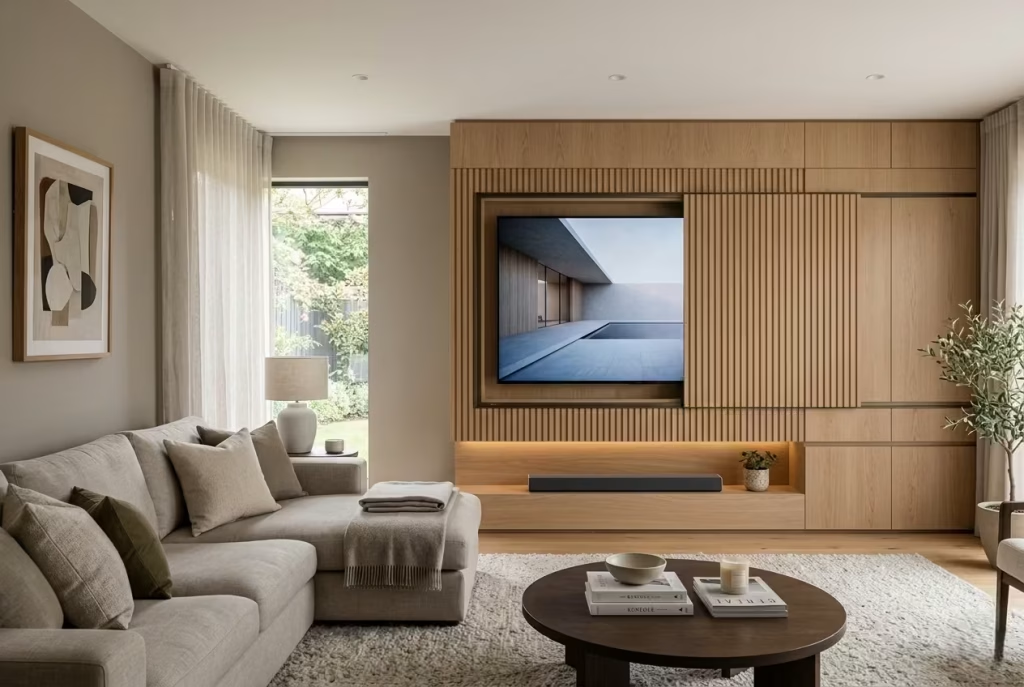
Technology is, in many ways, the elephant in the room. Necessary, unavoidable, yet rarely something you want to centre the design around. Screens, in particular, have a tendency to dominate if left unchecked, pulling focus and flattening the atmosphere.
The challenge is not to eliminate technology, but to integrate it in a way that feels considered. This often means thinking beyond the screen itself. Cable management, ventilation, access points, these are the details that determine whether a media unit feels resolved or improvised.
I tend to recess televisions slightly or frame them within joinery, allowing them to sit more comfortably within the overall composition. In some cases, I’ve incorporated sliding panels or subtle fluted fronts that can partially conceal the screen when not in use. It’s not about hiding it completely, but about softening its presence, allowing the room to shift focus when needed.
When done well, technology becomes part of the background, present but not overpowering, like a guest who knows when to step back.
“Simplicity is about subtracting the obvious and adding the meaningful.”
John Maeda
That idea sits at the heart of good storage design. Remove what distracts, and what remains begins to matter more.
Material Continuity: Blurring the Line Between Furniture and Architecture
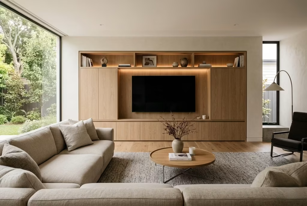
This is where media units begin to move beyond furniture and into something more architectural.
Rather than introducing a standalone piece, I often look to extend the language of the room itself. Materials that echo the wall finish, tones that align with flooring, details that feel as though they belong to the structure rather than sitting against it. The result is a unit that doesn’t read as an addition, but as part of the room’s fabric.
In contemporary spaces especially, this approach creates a sense of calm continuity. A wall-finished unit, perhaps in a soft matte tone or a subtle timber veneer, allows the eye to move uninterrupted. There’s no visual break, no moment where the furniture announces itself. It simply exists within the architecture, doing its job quietly.
I’ve found that this restraint often elevates the entire space. Instead of competing elements, you get a cohesive backdrop, one that supports everything else without drawing attention away from it.
Real-Life Insight: Designing Storage as Architecture
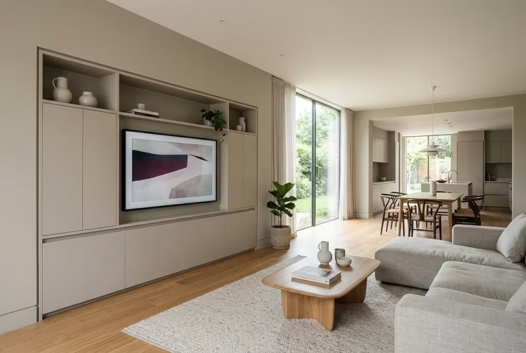
In many of my recent projects, particularly in open-plan living areas, I’ve moved away from the idea of the media unit as a separate entity. Instead, I design it as an extension of the wall itself, integrated, continuous, and intentionally understated.
One project comes to mind, a contemporary apartment where the living room opened directly into the dining space. Introducing a freestanding unit would have broken the visual flow, creating an unnecessary interruption. Instead, we developed a full-width built-in, finished in the same tone as the surrounding walls, with handleless cabinetry and recessed detailing.
The effect was subtle but transformative. The storage disappeared into the background, yet everything functioned seamlessly. Cables were hidden, devices neatly housed, and the television sat comfortably within the composition rather than dominating it. The room felt calmer, more resolved, as though the noise had been dialled down.
It’s a reminder that sometimes the best design decisions are the ones that don’t immediately announce themselves, but make the space feel right in a way that’s hard to articulate.
Measurements That Support Function Without Excess
While built-ins offer flexibility, certain dimensions tend to work reliably across most living rooms:
- Typical height: 45–60 cm (18–24 inches)
Low enough to maintain sightlines, high enough to provide practical storage - Depth: 40–50 cm (16–20 inches)
Sufficient for media equipment without projecting too far into the room
These proportions help keep the unit grounded without becoming intrusive. It sits comfortably within the space, supporting function while maintaining visual balance.
Pros and Cons
Pros
- Reduces visual clutter, creating a calmer, more cohesive environment
- Integrates storage and technology seamlessly into the design
- Enhances the architectural quality of the room when executed well
Cons
- Custom-built solutions can significantly increase cost
- Requires careful planning early in the design process
- Less flexibility compared to freestanding furniture if needs chang
Side Tables: The Quiet Workhorses of the Room
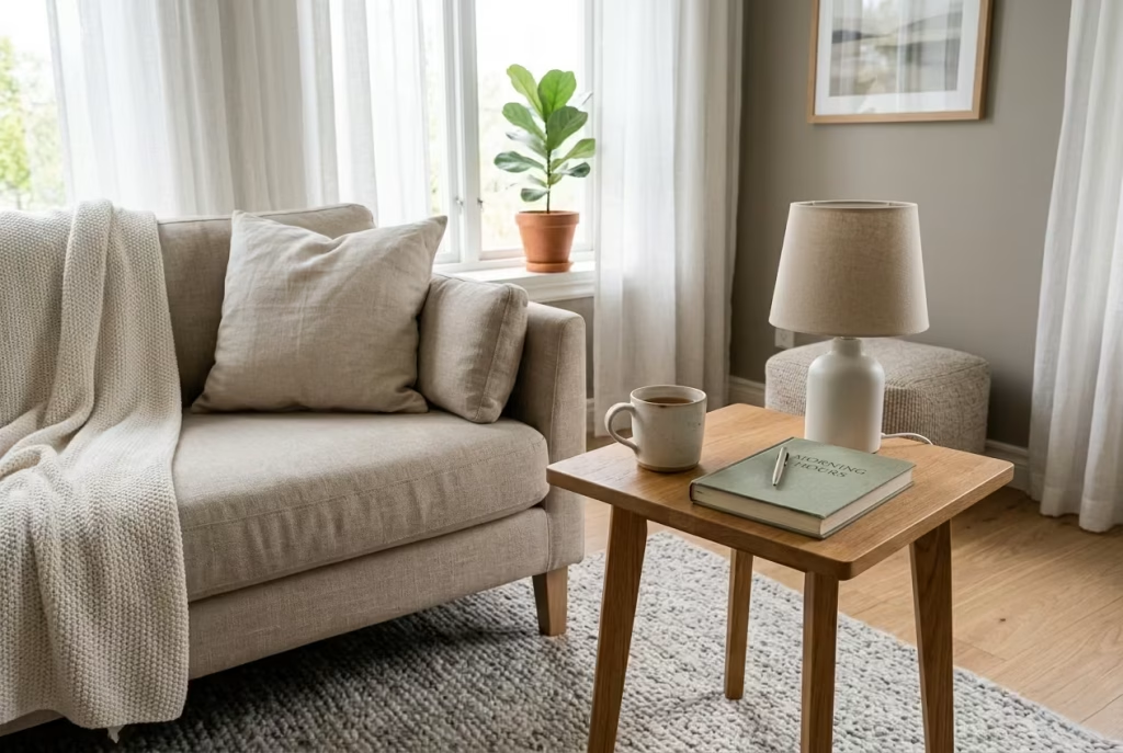
Side tables rarely take centre stage, and perhaps that’s precisely why they matter so much. They sit at the edges, almost unnoticed, yet they carry a disproportionate amount of responsibility when it comes to how a living room actually functions. Remove them, and the room begins to feel slightly inconvenient, as though something essential has gone missing. Introduce them thoughtfully, and suddenly everything feels within reach, balanced, and quietly resolved.
They are, in many ways, the unsung heroes, the pieces that don’t ask for attention but earn their place through use, moment by moment, without ever making a fuss.
Often Overlooked, Yet Critical for Usability
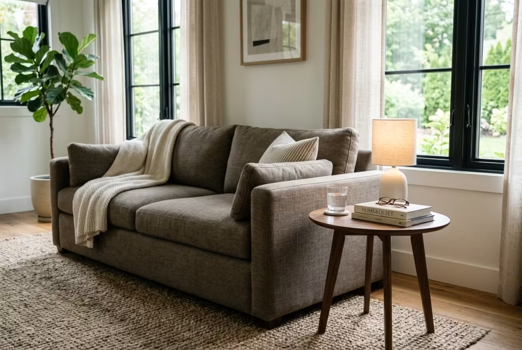
It’s surprisingly common to see living rooms where side tables have been either skipped entirely or added as an afterthought, squeezed into whatever space remains once the larger pieces are in place. The result is almost always the same. People begin to improvise. Drinks are placed on the floor, books pile up on the coffee table, and the room, however well designed visually, starts to feel slightly impractical.
A side table, positioned correctly, eliminates that friction. It becomes the natural resting place for the everyday, a glass of water, a book, a lamp, all within easy reach, without disrupting the flow of the room. It’s a small intervention, but one that makes the difference between a space that looks complete and one that actually works.
I tend to think of side tables as extensions of the seating itself. They should feel like they belong to the chair or sofa they accompany, not like separate pieces that happen to sit nearby. When that relationship is right, the room begins to function almost intuitively, with no need to adjust or rethink how you use it.
Layering Heights and Materials: Creating Subtle Depth
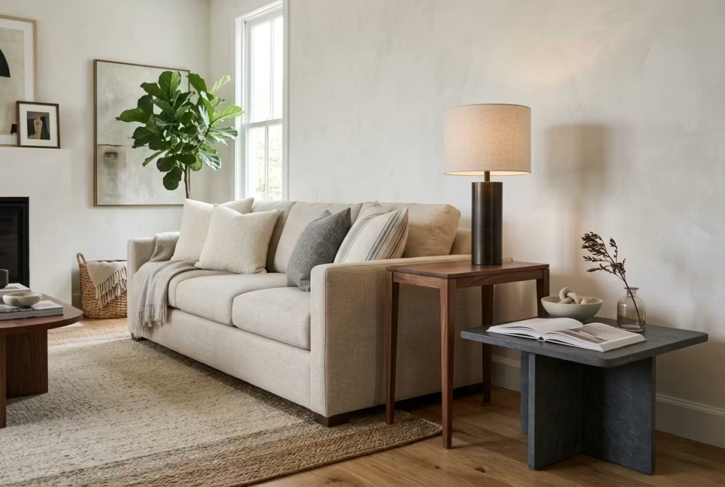
This is where side tables quietly contribute to the visual richness of a room. Matching tables, identical in height, material, and form, can sometimes feel a little too predictable, as though the room is playing it safe. By contrast, introducing variation, a slightly taller table next to a lower one, a mix of timber and metal, perhaps a stone top alongside a softer finish, creates a layered effect that feels more considered.
The aim is not contrast for the sake of it, but a gentle shift in tone and proportion that keeps the eye moving. A taller, more slender table can sit comfortably beside a sofa, holding a lamp at the right height, while a lower, broader piece near an armchair might serve as a more casual surface.
These differences, subtle as they may seem, prevent the room from feeling flat. They add dimension without introducing noise, the kind of detail that you don’t immediately notice but would miss if it weren’t there.
Placement That Supports Natural Movement
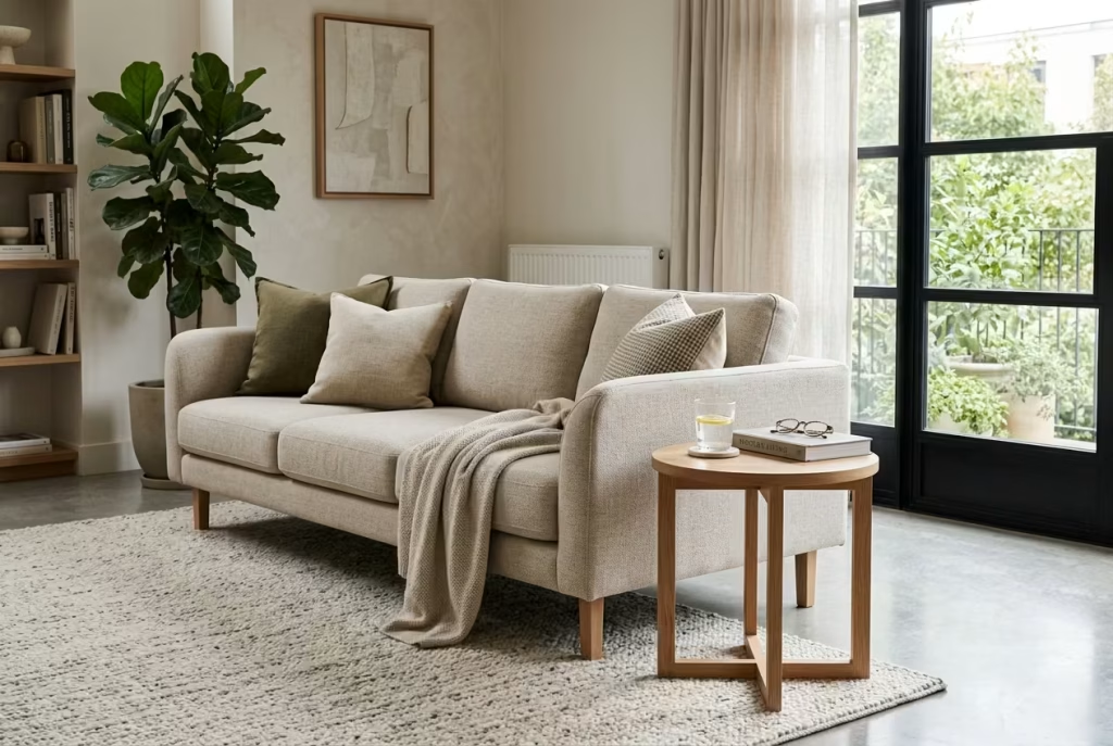
Placement is where side tables either prove their worth or quietly fall short. A table that is slightly too far away forces you to reach, breaking the ease of the space. One that is too close can feel intrusive, interrupting movement and making the seating feel cramped. The balance lies in positioning the table so that it sits comfortably within arm’s reach, without encroaching on circulation.
I often place side tables just overlapping the edge of a sofa or chair, close enough to feel integrated, but not so close that they restrict how you sit or move. It’s a small adjustment, almost instinctive, but one that has a noticeable impact on comfort.
There’s also a broader consideration here, how these pieces fit into the room’s overall flow. In tighter spaces, a bulky side table can quickly become an obstacle, disrupting pathways and making the room feel more confined than it actually is. In these cases, I lean towards lighter, more open designs, pieces that provide function without adding visual weight.
Real-Life Insight: Where Layout Meets Everyday Use
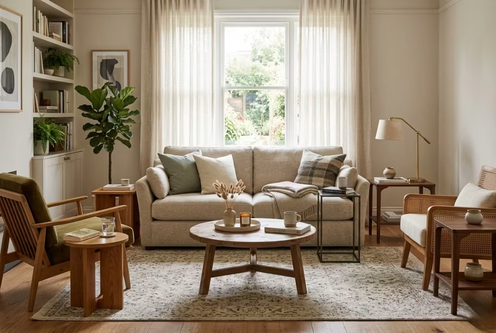
I often say, only half in jest, that if someone has to reach awkwardly for a drink, the layout has already failed. It’s a small detail, but one that reveals a lot about how well a room has been considered.
In one project, the initial layout looked perfectly balanced on paper. The sofa was centred, the chairs positioned symmetrically, the coffee table neatly aligned. But once we began using the space, it became clear that something was missing. There was nowhere convenient to place anything unless you leaned forward or shifted position.
We introduced a series of side tables, varied in height and material, positioned carefully beside each seating point. The change was immediate. The room felt more accommodating, more intuitive. People could sit, relax, and interact with the space without thinking about it.
It’s often these quieter adjustments that make the most significant difference, not the headline pieces, but the ones that support everything else.
Pros and Cons
Pros
- Instantly improves functionality, making the room easier to live in
- Adds subtle visual layering through variation in height and material
- Supports a more intuitive, comfortable seating arrangement
Cons
- Easy to overcrowd the space, particularly in smaller rooms
- Poorly chosen sizes can disrupt balance rather than enhance it
- Overly decorative designs can prioritise appearance over usability
Rugs: Defining Zones and Softening the Architecture
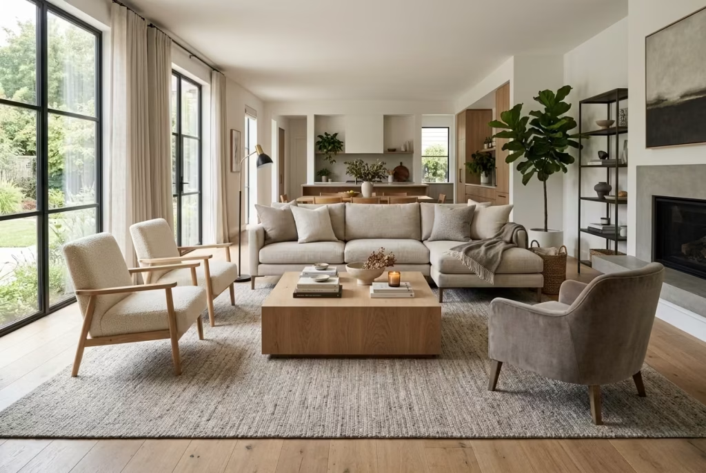
A rug does something few other elements can achieve so quietly yet so decisively. It doesn’t just sit beneath the furniture; it binds it, softens it, and, when chosen well, brings a sense of cohesion that can’t be replicated through furniture alone. Without it, even a carefully arranged room can feel slightly adrift, as though the pieces are hovering rather than belonging.
I often think of a rug as the layer that pulls everything into conversation, the element that turns a collection of objects into a unified space. It works underfoot, out of direct focus, yet its impact is immediate the moment you step into the room.
The Rug as a Spatial Organiser
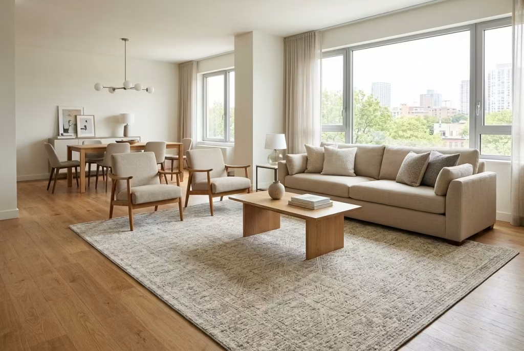
In open or loosely arranged living rooms, a rug becomes the quiet organiser, defining where one zone begins and another ends without the need for walls or partitions. It creates a boundary that feels natural rather than imposed, allowing the seating area to read as a distinct, intentional space.
This is particularly important in open-plan settings, where furniture alone can struggle to establish clear zones. A well-sized rug anchors the seating arrangement, giving it a sense of place within the larger room. Without it, the layout can feel scattered, like a conversation that never quite gathers momentum.
I often use rugs to “draw the outline” of a space, setting the stage before any furniture is even placed. Once that boundary is established, everything else begins to fall into alignment, almost as if the room has found its footing.
You May also Like: 25 Dark Cottagecore Living Room Ideas That Feel Moody and Magical
Correct Sizing: Avoiding the Floating Island Effect
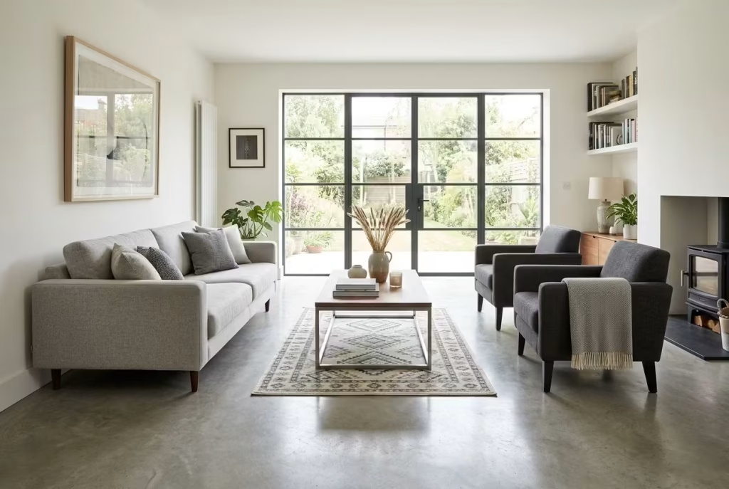
If there’s one mistake I see more than any other, it’s choosing a rug that’s too small. It’s usually done with the best intentions, to save space, to reduce cost, or simply out of uncertainty, but the result is almost always the same. The furniture ends up sitting around the rug rather than on it, creating what I often refer to as the “floating island” effect.
Visually, it breaks the connection between pieces. The sofa, chairs, and table no longer feel like part of the same composition. Instead, they hover independently, each one slightly disconnected from the next. The room loses its sense of unity, and no amount of styling can fully resolve it.
I rarely go small. A rug that extends beneath all primary seating, at least the front legs of sofas and chairs, if not the entire footprint, instantly changes how the room reads. It grounds everything, bringing the layout together in a way that feels deliberate rather than tentative.
It’s one of those decisions that might feel bold at first, but once in place, it becomes clear that it was never really optional.
Texture vs. Pattern: Subtlety Over Statement
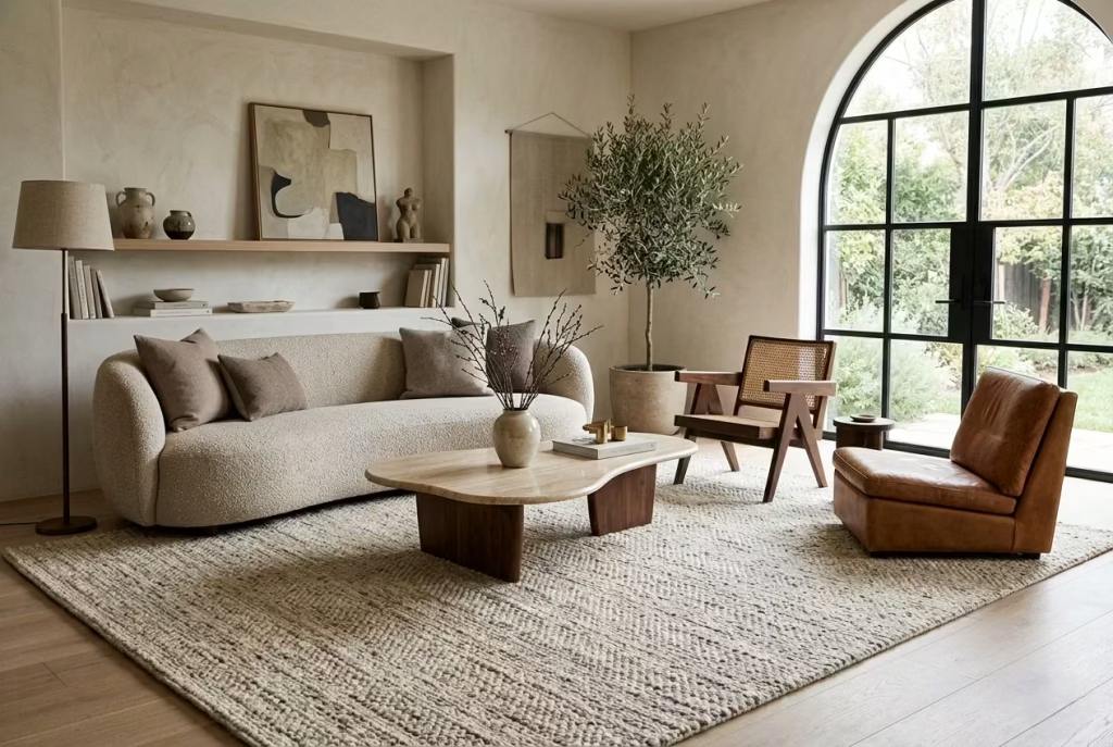
Choosing between texture and pattern is less about preference and more about understanding what the room needs.
In spaces where the furniture already carries strong forms or varied materials, I often lean towards textured rugs, pieces that add depth without competing for attention. A wool weave, a subtle loop, or a tonal variation can introduce warmth and tactility while allowing the rest of the room to breathe.
Patterned rugs, on the other hand, can act as a focal point, bringing energy and character into more restrained interiors. But they require a careful hand. Too bold, and they risk overwhelming the space. Too intricate, and they can become visually busy, especially when layered with other elements.
The key is balance. A rug should support the room, not dominate it. It should feel like it belongs, like it has always been part of the space, rather than something that was added to make a statement.
Real-Life Insight: Why I Rarely Go Small
I’ve had countless conversations with clients about rug size, and it’s often where hesitation creeps in. Larger rugs can feel like a commitment, both visually and financially. But time and again, I’ve seen how transformative that decision can be.
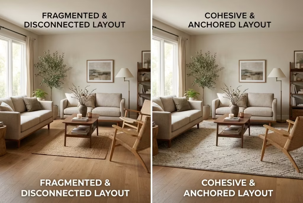
In one project, we initially placed a smaller rug beneath the coffee table, leaving the surrounding seating untouched. On its own, it looked fine, neatly contained, proportionate to the table. But the room felt fragmented. The seating lacked connection, and the space didn’t quite settle.
We replaced it with a larger rug, one that extended beneath the entire seating arrangement. The difference was immediate. The room felt anchored, cohesive, as though everything had finally clicked into place. The furniture no longer floated; it belonged.
It’s a reminder that sometimes the instinct to hold back can work against you. A rug, when properly sized, doesn’t overwhelm a room. It completes it.
Measurements That Create Balance
While every space has its nuances, certain dimensions tend to work consistently well:
- Typical living room rug: 240 x 300 cm (8 x 10 ft) or larger
- In more generous spaces, scaling up to 300 x 400 cm (10 x 13 ft) or beyond often provides a better sense of proportion
- Aim for at least the front legs of all primary seating to sit on the rug
These guidelines help ensure the rug integrates with the furniture rather than sitting apart from it.
Pros and Cons
Pros
- Grounds the entire seating arrangement, creating a unified composition
- Softens the architectural edges of the room, adding warmth and comfort
- Defines zones clearly, particularly in open-plan layouts
Cons
- Undersized rugs weaken the layout, making the room feel disconnected
- Larger rugs can be a higher investment
- Incorrect material choice may affect durability in high-traffic areas
A rug, when chosen with care, doesn’t just decorate the floor. It shapes the room, quietly pulling everything together, softening what might otherwise feel rigid, and creating a foundation that allows the rest of the design to settle naturally. It’s the layer that often goes unnoticed, yet without it, the room rarely feels complete.
Lighting as Furniture: Floor and Table Lamps That Shape Atmosphere
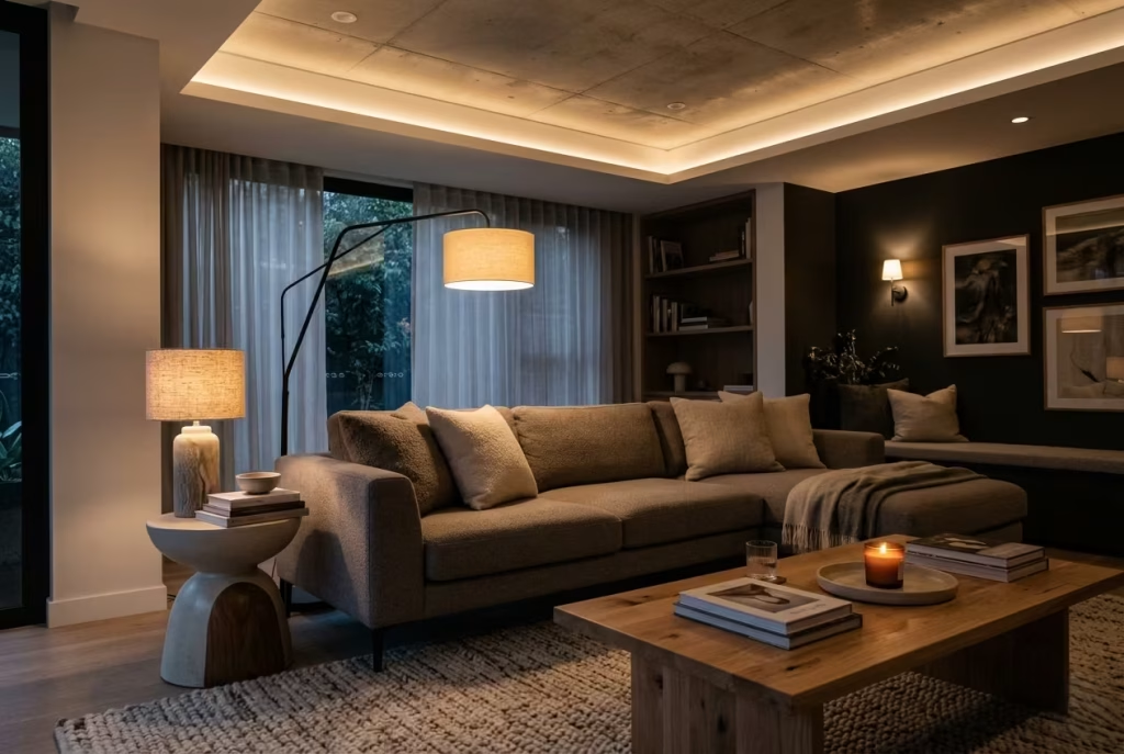
Lighting is one of those elements that can quietly make or break a room, yet it’s often treated as an afterthought. Too many rely solely on ceiling fixtures, leaving the room flat and one-dimensional. In reality, well-considered lighting behaves like furniture: it occupies space, shapes experience, and guides how we inhabit the room. It’s both functional and atmospheric, commanding attention without demanding it.
When done right, lighting becomes a companion to the furniture, accentuating textures, highlighting forms, and orchestrating mood from morning to night. The difference between a room that feels alive and one that feels sterile is often measured in lumens rather than sofa depth.
Lighting as a Layered Composition
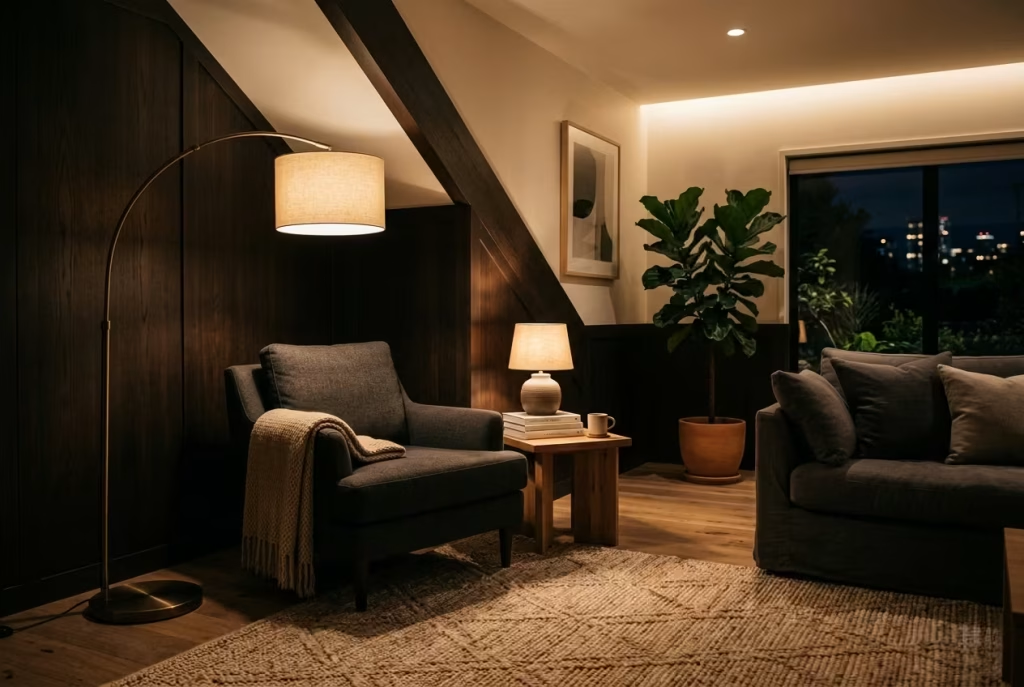
I never rely on a single light source. Layering is key: overhead lights provide general illumination, but floor and table lamps create depth, shadow, and intimacy. Each layer interacts with the others, producing a sense of scale and spatial rhythm. Think of it as composing a room in light rather than in furniture alone.
Floor lamps often anchor corners, drawing attention to underutilised spaces while softening hard architectural angles. Table lamps punctuate side tables, consoles, or media units, offering pockets of light that invite reading, reflection, or conversation. A single well-placed lamp can elevate a dark corner into a moment of visual interest, turning a functional element into a design statement.
Floor Lamps to Anchor Corners
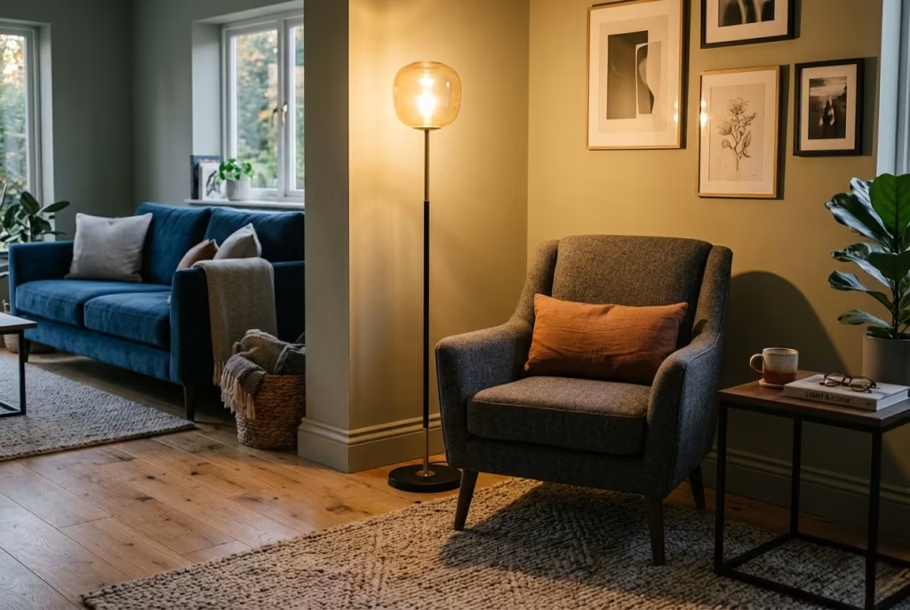
Corners are often neglected in living room planning, becoming voids that make the room feel incomplete. Floor lamps provide presence, creating vertical interest and subtly guiding the eye.
I frequently use taller, sculptural floor lamps with slender profiles to fill corners without feeling heavy. Their placement is deliberate: slightly behind seating, so they wash the room with light without impeding movement, while also balancing the visual weight of the sofa or armchair opposite.
It’s remarkable how a corner, once overlooked, can suddenly contribute to the room’s rhythm, giving the space a sense of stability and intention.
Table Lamps to Create Intimacy
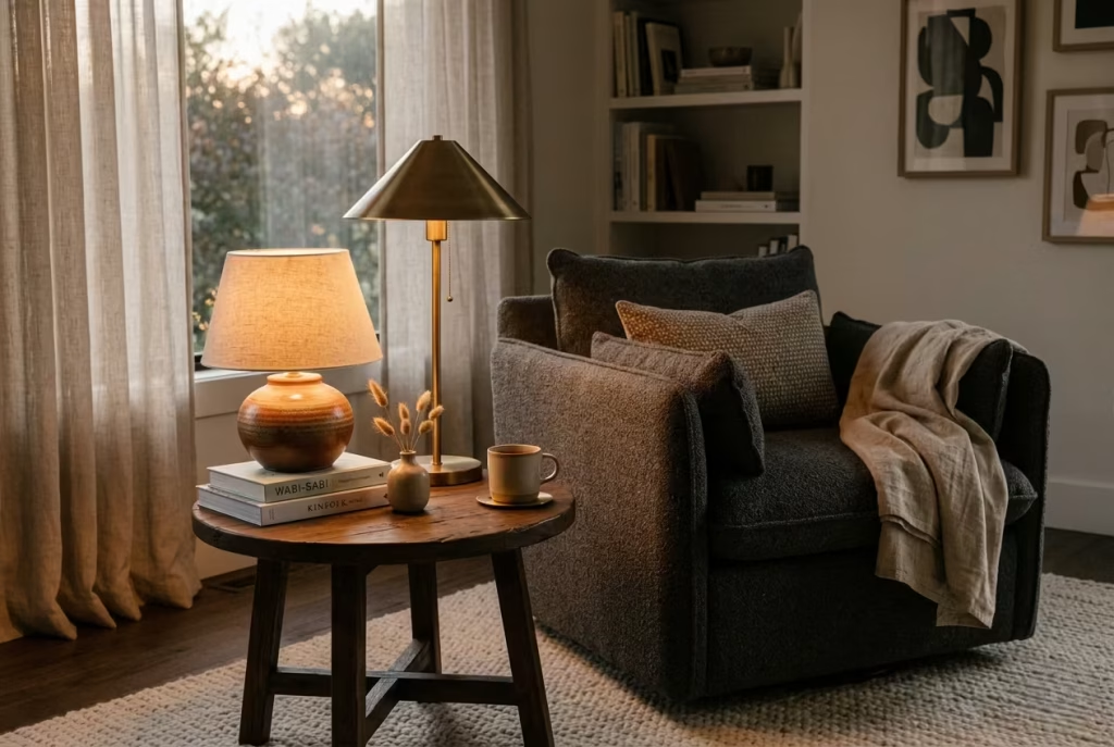
Table lamps offer a different kind of magic. Positioned beside seating or on consoles, they create small zones of intimacy, softly defining areas where people gather or pause. Unlike overhead lights, they invite closer interaction, encouraging eye contact and warmth, subtly lowering the room’s scale and making it feel approachable.
I often recommend pairing lamps with different heights and finishes to create depth and layering. A low, rounded ceramic lamp paired with a taller metal piece, for example, adds visual interest while keeping the light sources functional. It’s a quiet interplay that feels natural, like a conversation happening just at the edge of awareness.
Real-Life Insight: Atmosphere Over Function
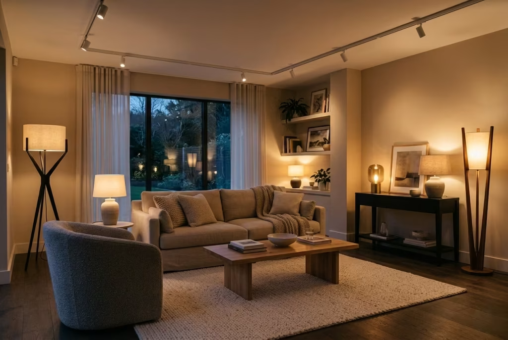
In the evening, lighting often does more for a room than any piece of furniture. I’ve seen beautifully furnished living rooms fall flat once the sun sets because the lighting plan was an afterthought. A well-chosen lamp arrangement, however, can transform the same room instantly, introducing warmth, shadows, and focal points that make the space feel alive.
In one project, the client had invested heavily in furniture and accessories, yet the living room felt cold and disconnected at night. By introducing layered lighting two floor lamps in corners, three table lamps on consoles, and dimmable overhead fixtures the room suddenly took on a softer, more inviting character. Every seating area became functional, every surface highlighted, and the space felt coherent. The furniture alone hadn’t done this; the light did.
“The best rooms have something to say about the people who live in them.”
David Hicks
Lighting, in this sense, becomes part of the narrative, reflecting personality, supporting function, and shaping mood simultaneously.
Placement and Practical Notes
- Floor lamps: Place near corners or behind seating for vertical presence and balanced light distribution.
- Table lamps: Situate on side tables, consoles, or media units to create pockets of intimacy.
- Layering: Combine warm-toned lamps with overhead lighting to avoid harsh contrasts and maintain atmosphere.
- Height: Floor lamps typically 140–170 cm (55–67 inches), table lamps 50–70 cm (20–28 inches), proportionate to furniture.
Correct placement ensures light falls naturally without glare or disruption, guiding movement and perception subtly yet effectively.
Pros and Cons
Pros
- Transforms mood instantly, creating warmth and character
- Enhances depth, scale, and architectural interest
- Defines functional zones and seating areas
Cons
- Poor placement can create glare, shadows, or imbalance
- Overly decorative lamps can compete with furniture
- Single-layer lighting flattens the room and reduces flexibility
Lighting, when treated as part of the furniture ensemble rather than a mere utility, becomes a sculptural, atmospheric instrument. It doesn’t just illuminate; it choreographs the space, influencing how you move, gather, and feel within it. Like any good design choice, the best lighting supports life in the room quietly, almost imperceptibly, while leaving a lasting impression on those who inhabit it.
You May also Like: 15 Gray and Green Living Room Ideas: How to Pair Gray and Green for a Stylish Space
Material Cohesion: Making Different Pieces Feel Intentional
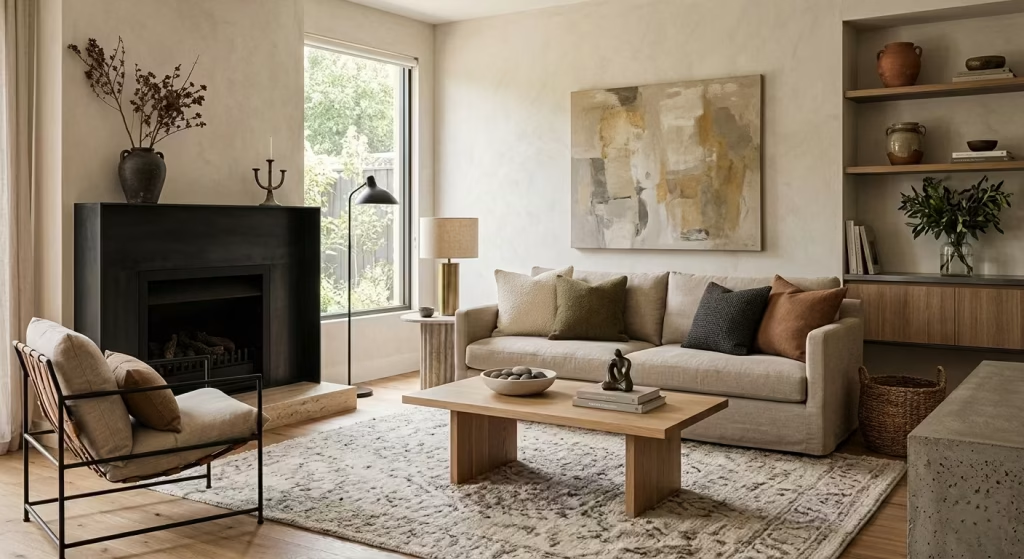
A living room is only as convincing as the quiet conversation its materials have with one another. Furniture, finishes, and accessories that exist in isolation can make a space feel disjointed, as though it were assembled from a catalogue rather than curated with intent. Conversely, when materials echo one another subtly across the room, the space begins to breathe, every piece seemingly chosen with purpose, every surface telling part of the same story.
Material cohesion is about rhythm and restraint. It’s not about uniformity or matching everything like a showroom display; it’s about creating a visual dialogue that feels effortless yet deliberate. A room without this sense often looks busy, no matter how expensive the pieces or how stylish the layout.
Limiting the Material Palette for Cohesion
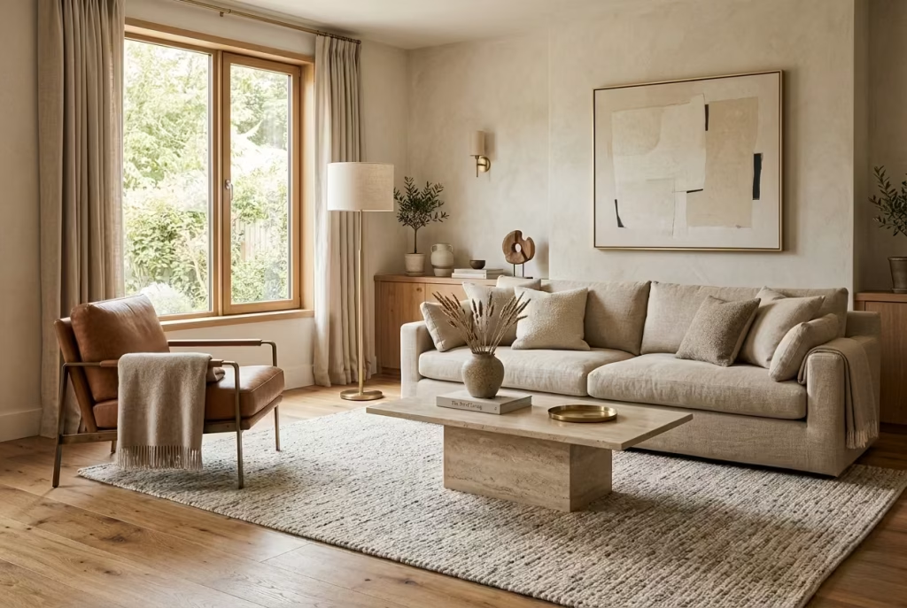
One of the most effective strategies I employ is to limit the material palette from the outset. Too many contrasting woods, metals, or fabrics can create a sense of visual noise, even if individually each piece is beautiful. By selecting a restrained palette say, a warm oak, brushed brass, and natural linen the room gains a common thread that carries through every element.
The key is moderation, not restriction. You can still introduce contrast, but it should feel like a whisper rather than a shout. A leather chair against a soft wool rug, or a stone coffee table beside a timber console, introduces texture and interest without fragmenting the composition.
I often start by choosing one primary material that dominates the largest surfaces the floor, sofa frame, or cabinetry and then introduce secondary materials that repeat in smaller doses, subtly connecting furniture, lighting, and accessories across the room. It’s a principle that ensures cohesion without sacrificing character.
Repeating Tones Subtly Across the Room
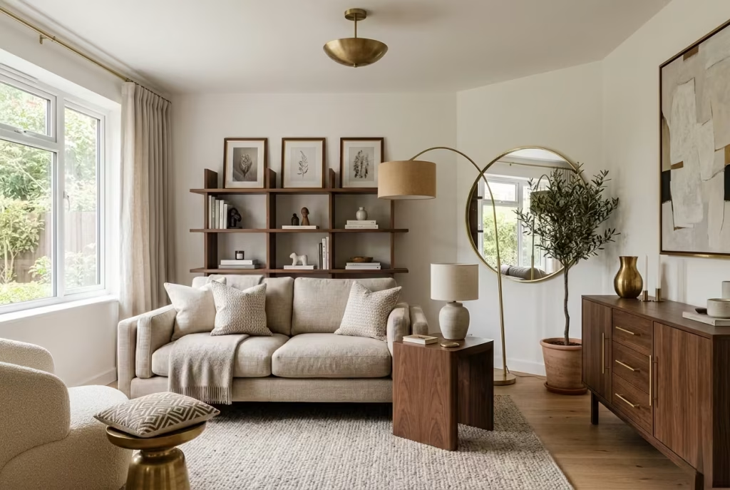
Repetition is another quiet but powerful tool. Timber tones, metals, or textiles that appear in more than one place create rhythm. For instance, a walnut side table beside a sofa can mirror the tone of the shelving or picture frames, creating a sense of continuity. Brass finishes on lighting, mirrors, or handles repeated in different corners bind elements together visually, reinforcing a layered but coherent narrative.
The effect is almost subliminal. Visitors may not consciously notice the repetition, but they feel it the room feels settled, resolved, and intentional rather than a loose collection of objects. It’s akin to a refrain in music: subtle, recurring, and harmonising everything around it.
Avoiding the “Catalogue Look”
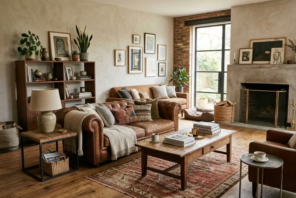
There is a danger in trying too hard to coordinate. Rooms that look as though every piece was selected from a single retailer risk feeling staged, impersonal, and predictable. This is the infamous “catalogue look,” where the space has no lived-in personality and no sense of human scale.
Material cohesion doesn’t mean copying every finish or texture. Instead, it’s about linking elements through tone, proportion, and tactility. Timber may vary in grain, metal may shift in patina, and fabrics can differ in weave as long as they resonate with each other, the space feels unified without being formulaic. It’s the difference between a room that whispers and one that shouts its intentions.
Real-Life Insight: The Power of Echoed Materials
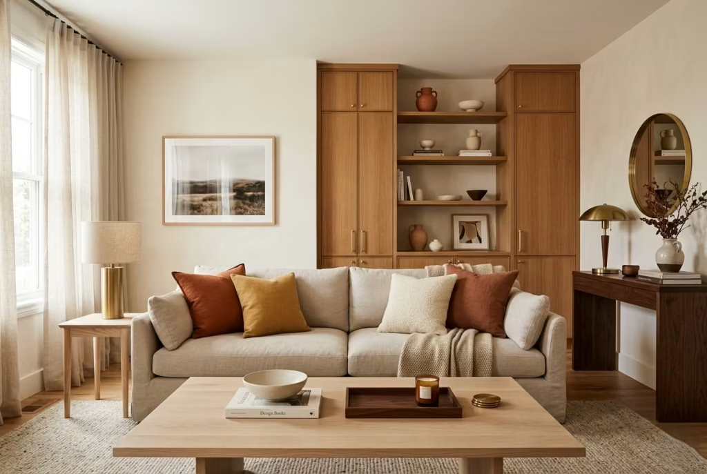
In one project, a client had a mix of furniture collected over time: a pale oak coffee table, a darker walnut console, and a few side tables in ash. On their own, each piece was perfectly nice, but together they created a dissonant impression.
By introducing a warm-toned timber veneer in the cabinetry, selecting cushions and throws that pulled together the different wood shades, and repeating brass hardware across lamps and handles, the room suddenly clicked. Timber tones spoke quietly across pieces, metals glimmered in unexpected corners, and the result was a space that felt considered rather than assembled.
It’s a subtle effect, but one that defines the difference between a room that feels curated and one that simply exists.
Pros
- Creates a sense of calm, intentional design
- Helps disparate furniture and accessories feel connected
- Allows layering and contrast without visual chaos
Cons
- Requires careful planning; missteps can feel jarring
- Overly tight palettes can risk monotony if textures aren’t varied
- Subtlety may be overlooked by clients seeking immediate impact
Material cohesion is the secret thread that ties a room together. When timber, metal, and fabric are allowed to converse in quiet harmony, the space achieves a sense of balance that resonates without needing to announce itself. It’s the layer that turns a collection of pieces into a home that feels lived-in, refined, and most importantly, intentional.
Layout Logic: How Furniture Placement Defines Experience
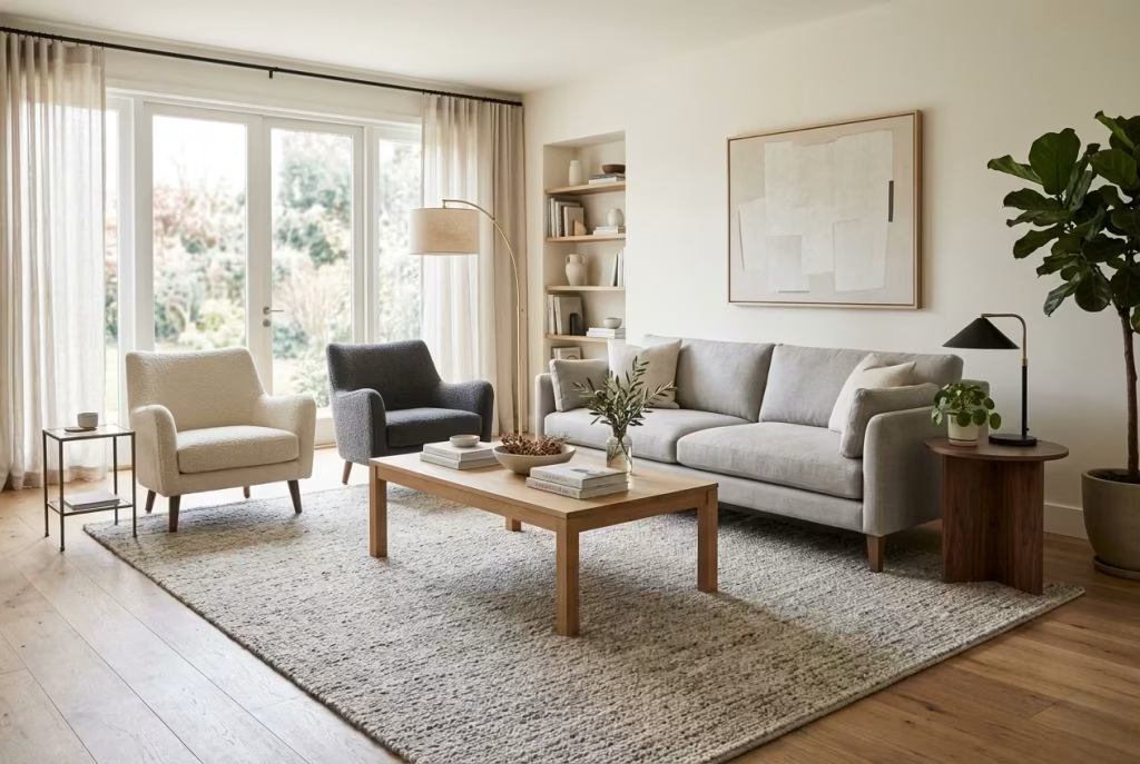
If furniture is the body of a living room, layout is its skeleton. It is the unseen structure that determines whether the room feels effortless or awkward, open or cramped, settled or perpetually in motion. You can have the finest sofa, the most beautifully finished table, and the most carefully chosen rug, but if the placement is off, the room never quite finds its stride. It will look composed for a moment, then begin to feel strangely resistant, as though the space is quietly working against itself.
Good layout is rarely dramatic. It does not call attention to itself. Instead, it creates a sense of ease that people feel before they can explain it. You walk through the room without pausing, you sit without adjusting your body into compromise, and everything seems to land exactly where it should. That is the real measure of success. Not how stylish the plan looks on paper, but how naturally it supports daily life once the room is in use.
Circulation Paths as a Priority
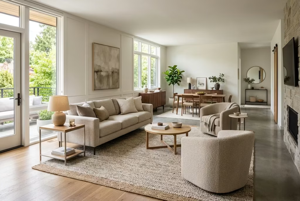
One of the first things I look at in any living room is movement. Where do people enter? Where do they pass through? Where do they naturally slow down or stop? These circulation paths matter more than many people realise, because they define the room’s internal logic. If movement is blocked, compressed, or forced into awkward turns, the whole space begins to feel clumsy, no matter how attractive the furniture may be.
I tend to think of circulation as the quiet current running through the room. Furniture should guide that current, not interrupt it. A sofa placed too close to a doorway can make a room feel defensive. A coffee table set too large can force people to edge around it rather than move with ease. Even a beautifully styled chair can become a nuisance if it sits in the wrong line of travel. It is all part of the same equation.
In practical terms, allowing generous and sensible clearance around major pieces is what keeps a room feeling composed. You want the movement to feel intuitive, almost second nature, rather than choreographed. When that happens, the room stops feeling like an obstacle course and starts feeling like a place that understands how people actually live.
Avoiding Wall-Hugging Layouts
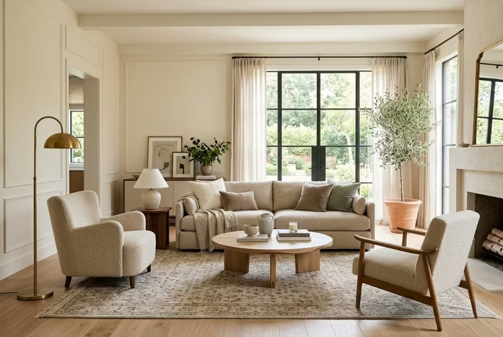
There is a persistent habit in many homes of pushing furniture hard against the walls, as though the only way to make a room feel bigger is to leave the centre empty. On the surface, it seems logical. In reality, it often has the opposite effect. A wall-hugging layout can make a room feel oddly flat, because the furniture no longer participates in shaping the space. Instead, it just sits at the perimeter, leaving the middle to do all the heavy lifting.
Pulling furniture inwards, even slightly, changes the entire atmosphere. It creates definition. It gives the room a centre of gravity. Suddenly the seating feels intentional, the layout begins to breathe, and the empty space around it stops feeling like leftover space and starts feeling like part of the composition.
I often remind clients that a room does not need to be packed edge to edge to feel full. Quite the opposite. A little breathing room around the furniture can make the space feel more generous, not less. It is a subtle shift, but it has a strong effect. The room gains softness, and the eye begins to rest rather than race around the edges.
Creating Zones Within Open-Plan Spaces
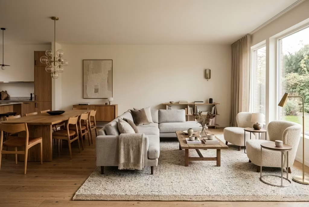
Open-plan living has its advantages, but without careful layout, it can quickly become a case of too many cooks and not enough structure. When one room has to perform several functions, seating, dining, relaxing, entertaining, the furniture must do more than simply look good. It has to carve out distinct zones that support different uses while still maintaining a sense of flow.
This is where layout becomes especially important. A sofa can define the edge of a living area without needing a wall. A rug can ground a seating cluster and distinguish it from a nearby dining zone. A pair of armchairs can shift the emphasis from passive viewing to conversation. All of these decisions work together to create order within openness, which is what makes the space feel considered rather than sprawling.
I often use furniture placement to create quiet boundaries. Not hard divisions, but gentle cues that tell the room how to behave. This might mean turning a sofa slightly to signal a change in function, or using the back of a piece to separate one area from another without interrupting sightlines. Done well, this keeps the room connected while still giving each zone its own identity. It is a bit of a balancing act, but when the rhythm is right, the room feels beautifully resolved.
Real-Life Insight: A Small Shift That Changed Everything
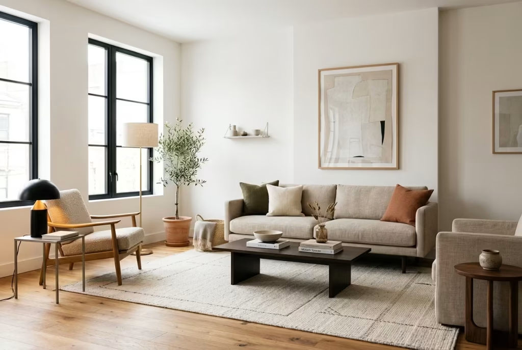
I often pull furniture away from the walls, even by just 10 to 15 cm, which is roughly 4 to 6 inches. On paper, it sounds minor, almost negligible. In practice, it can transform the way a room feels. That small gap allows air and light to move differently. It makes the furniture feel placed rather than pressed. It gives the room a sense of depth that is easy to miss until it is gone.
I remember one living room where the sofa had originally been pushed tightly against the wall to “save space.” The room looked efficient, but it felt stiff and slightly boxed in. Once we drew the sofa forward just enough to create a breathing line behind it, the atmosphere shifted immediately. The room felt less forced, more fluid, and somehow more expensive, though nothing about the furniture itself had changed. That is the thing about layout. It often works quietly in the background, but its effects are anything but small.
Why Layout Logic Matters So Much
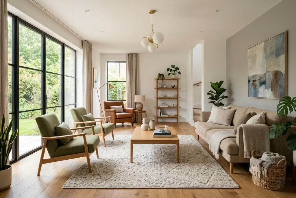
Layout is the difference between a room that simply holds furniture and a room that supports life. It governs comfort, movement, sightlines, and atmosphere all at once. When it is handled well, the room feels instinctive. People know where to sit, how to move, and where to gather without being told. When it is handled badly, even the best pieces begin to feel out of step, like musicians playing slightly off tempo.
That is why I always treat layout as a design decision, not a final tidy-up. It is the framework everything else depends on. Get that right, and the rest of the room has a far better chance of falling into place. Get it wrong, and you end up wrestling the space instead of living in it.
What Most People Get Wrong About Living Room Furniture
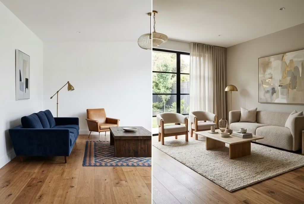
The hardest part of furnishing a living room is not finding pieces you like. It is resisting the urge to choose everything too quickly, too heavily, or too independently, without first understanding how the room actually behaves. That is where so many schemes come unstuck. The room may be full, even expensive-looking, yet still feel unsettled, because the furniture has been selected in isolation rather than as part of a larger composition. In other words, the pieces may look good on their own, but they do not yet know how to speak to one another.
Oversizing Everything in Pursuit of Comfort
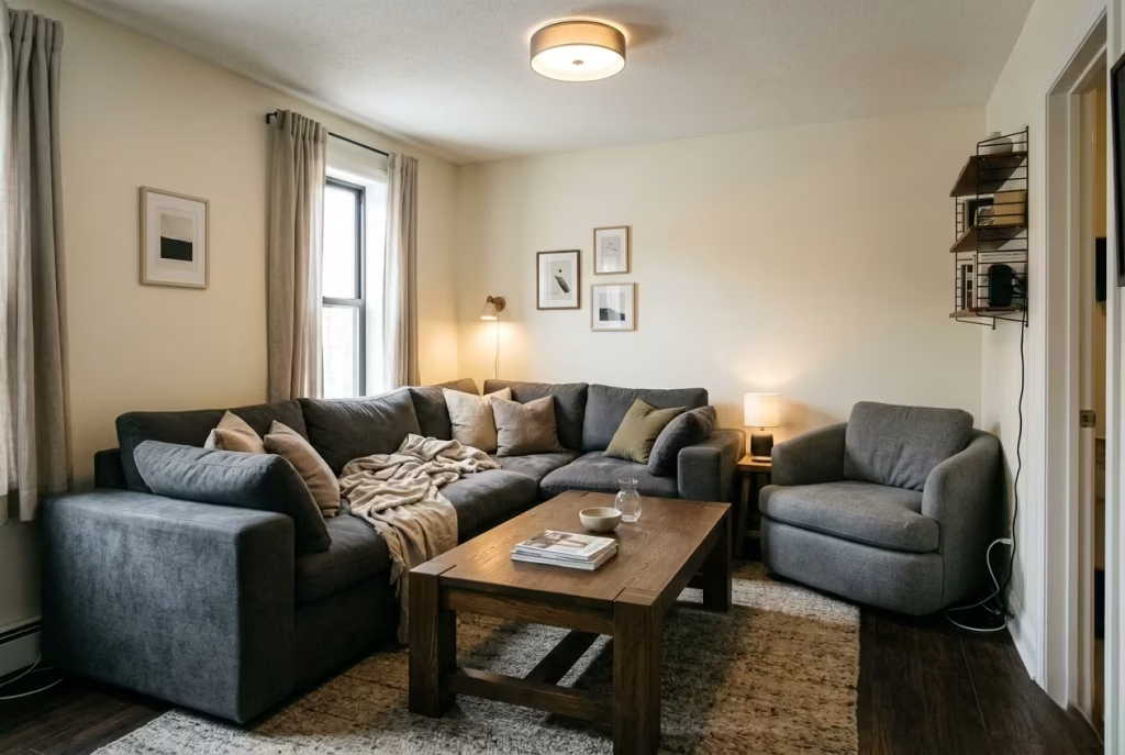
There is a widespread belief that comfort automatically means bigger, deeper, bulkier. A generously sized sofa, a large armchair, a substantial coffee table. On the surface, that sounds reassuring. In practice, oversizing can quickly tip a room out of balance, especially when the space itself does not have the volume to support it.
A sofa that is too deep can swallow the room whole, leaving circulation squeezed and the rest of the furniture fighting for attention. A coffee table that is too broad can dominate the centre of the layout like an overconfident guest who never quite leaves. Even something as simple as an oversized armchair can throw off the visual rhythm if it is heavier than the architecture around it.
Real comfort comes from proportion, not excess. The room should feel generous, but never bloated. The best schemes have breathing room built into them, which is why I often prefer furniture that looks considered rather than overblown. It leaves space for movement, for light, for the eye to rest. And that is where comfort quietly takes root.
Ignoring Proportion Relative to Ceiling Height
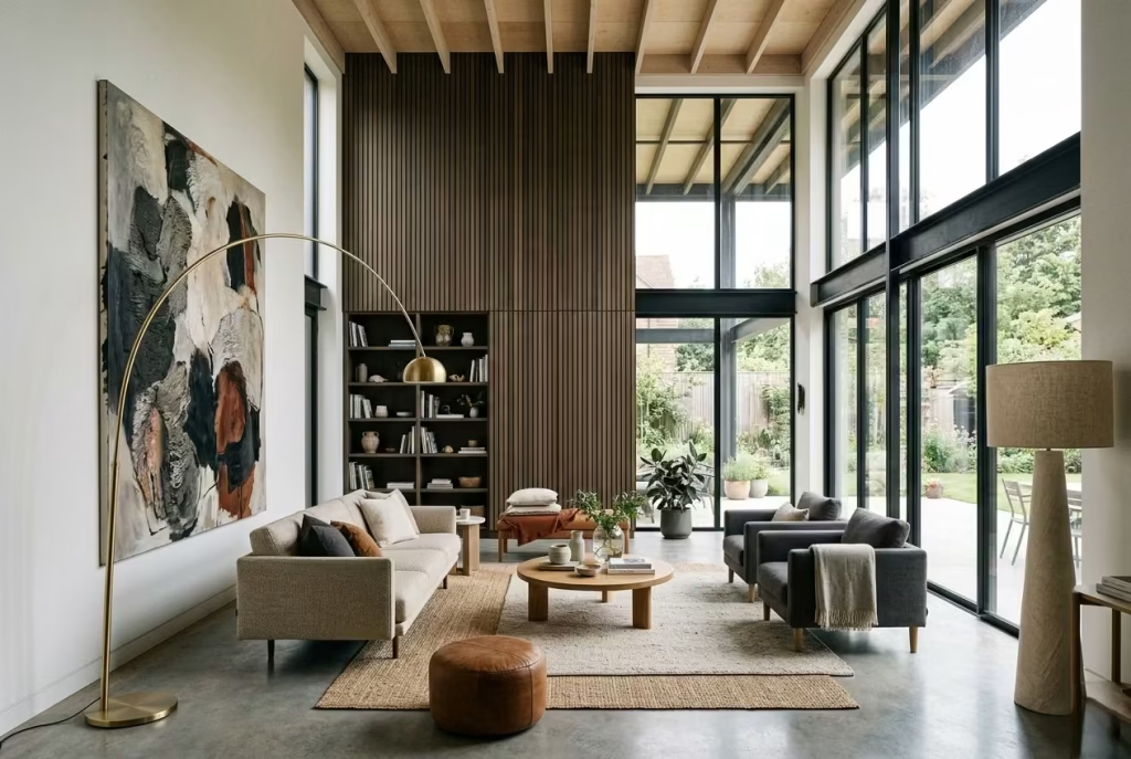
A living room is not judged by floor area alone. Ceiling height changes everything. It alters the way furniture reads, how much visual weight the room can carry, and whether pieces feel grounded or adrift.
In rooms with high ceilings, low-profile furniture can sometimes look underfed unless it is balanced by other elements with enough presence, such as tall lamps, substantial artwork, or built-in joinery. In lower rooms, by contrast, pieces with too much vertical mass can make the space feel compressed, almost as if the ceiling is coming down a little too close for comfort.
This is where proportion becomes the quiet hero of good design. A room with strong architectural height can hold more sculptural or expansive furniture, while a more compact room often benefits from lighter forms, slimmer legs, and lower sightlines. It is a subtle calculation, but one that shapes how the room feels the moment you walk in. Get it wrong, and the room feels slightly off, even if you cannot immediately say why. Get it right, and everything settles into place with a kind of easy confidence.
Treating Pieces as Standalone Items Rather Than a System
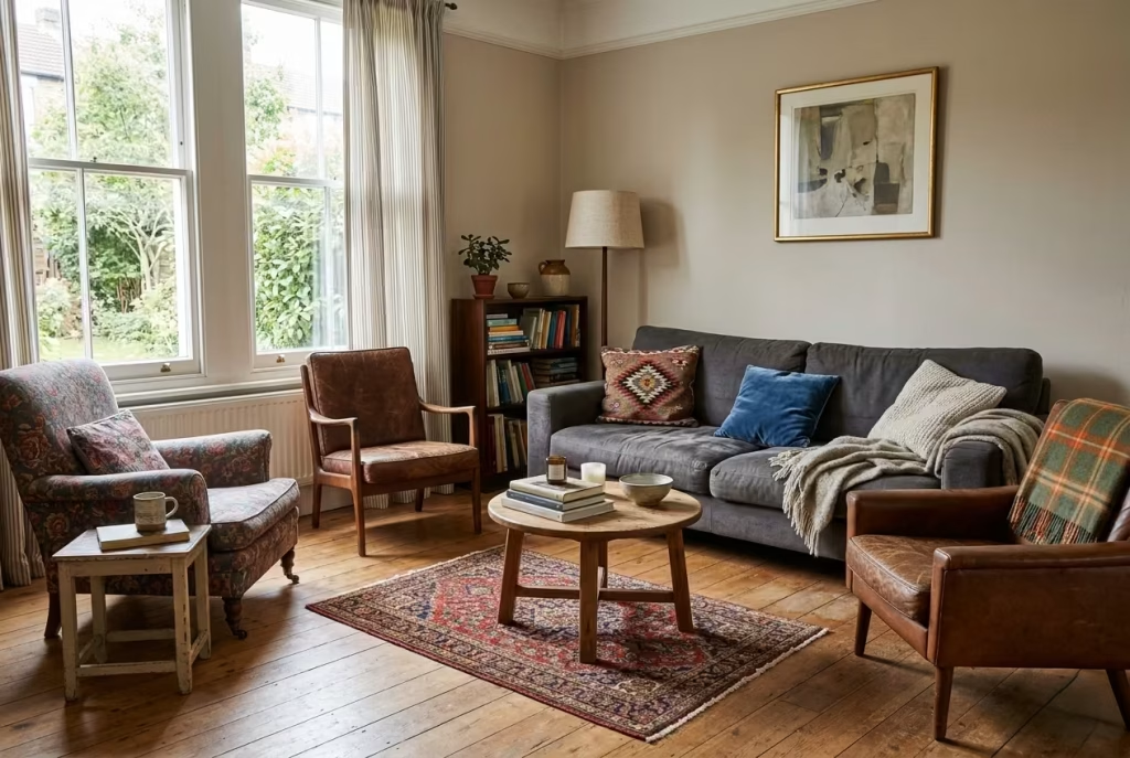
This is one of the most common missteps, and one of the easiest to make. A sofa is chosen because it is comfortable. A chair because it is stylish. A rug because it looks warm underfoot. A table because it fits the remaining gap. Individually, each decision may make sense. Together, they can still fail to form a room.
Furniture does not succeed by accident. It succeeds when each piece relates to the others in scale, tone, texture, and function. A living room works best when the seating, tables, rug, and lighting all contribute to the same underlying logic. That does not mean everything must match. Far from it. In fact, rooms often become more compelling when there is some tension between forms. But that tension must be intentional, not accidental.
I often think of furniture as a cast rather than a collection. Each piece has a role to play, and the room only feels convincing when the roles are clear. The sofa might anchor, the armchairs might relax or sharpen the composition, the side tables might ease movement, and the rug might unify the whole thing. When that hierarchy is missing, the room loses momentum. It feels assembled in fragments rather than resolved as a whole.
You May also Like: Transform Your Space with These 25 Desert Living Room Inspirations
Buying Too Quickly Without Understanding How the Room Will Be Used
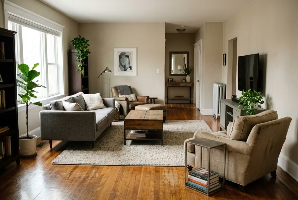
This is where good intentions so often go off the rails. People buy in a hurry because they are excited, or because the room feels empty, or because they want it finished before they have fully lived in it. But a living room designed in haste is usually a room that reveals its flaws later, once real life begins to take over.
A home used for quiet evenings has different needs from one that hosts family gatherings every weekend. A room used for reading, working, and listening to music may call for different seating and lighting than one that centres around a television. If the way the room is used is not understood first, the furniture can never truly support it. It is like building the stage before knowing the script.
I always encourage a pause before buying the key pieces. Watch how the room is used at different times of day. Notice where people naturally sit, where traffic flows, where clutter accumulates, where the light falls. That information is worth more than any showroom display. It tells you what the room is asking for, and once you know that, the furniture starts to feel less like a guess and more like a well-judged response.
Why These Mistakes Matter So Much
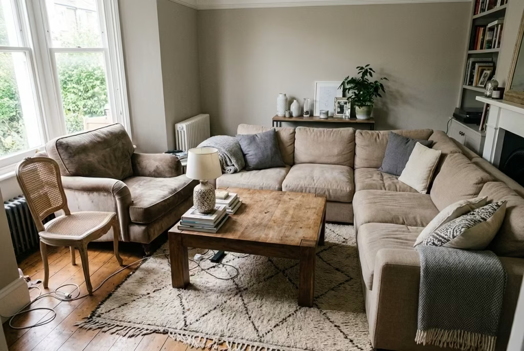
What ties all of these mistakes together is a tendency to think of furniture as isolated objects rather than part of a living system. But a living room is only ever as good as the relationships between its parts. Comfort without proportion becomes clumsy. Style without function becomes hollow. Buying quickly without thinking through use often leads to regret, and regret is expensive in both money and energy.
The strongest rooms are rarely the most crowded or the most obviously styled. They are the ones where every piece earns its place, where scale is calibrated, where movement feels natural, and where the room has been shaped around actual life rather than a fleeting idea of what should belong there.
That is the difference between a room that merely looks furnished and one that truly feels lived in.
Understanding Lifestyle First: Designing Around How the Room Is Actually Used
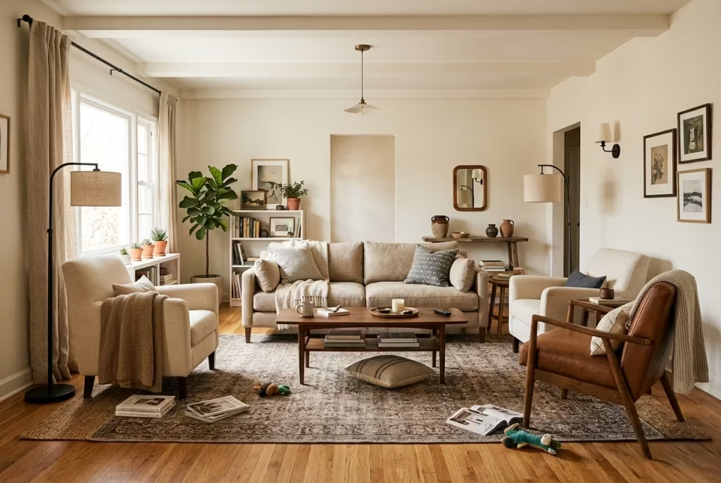
The most successful living rooms are rarely the ones that look the most polished on day one. They are the ones that have been designed with a clear understanding of how life actually unfolds inside them. That sounds obvious, but in practice it is where many schemes go off the rails. People often begin with style, colour, or a reference image, and only later ask how the room will truly function. By then, the foundations can already be slightly off. A room may look the part, yet still feel awkward to sit in, difficult to move through, or oddly unsuited to the people using it every day.
This is why lifestyle has to come first. Before a sofa is chosen, before a rug is sized, before a chair is placed to balance the composition, the room needs to be understood as a lived-in environment rather than a static picture. Who uses it, when they use it, how long they stay there, what they do while they are there, these questions matter more than most people realise. A living room is not simply a display of taste. It is a working interior, and like any well-considered space, it has to serve the rhythm of the people inside it.
Family Living vs. Formal Entertaining
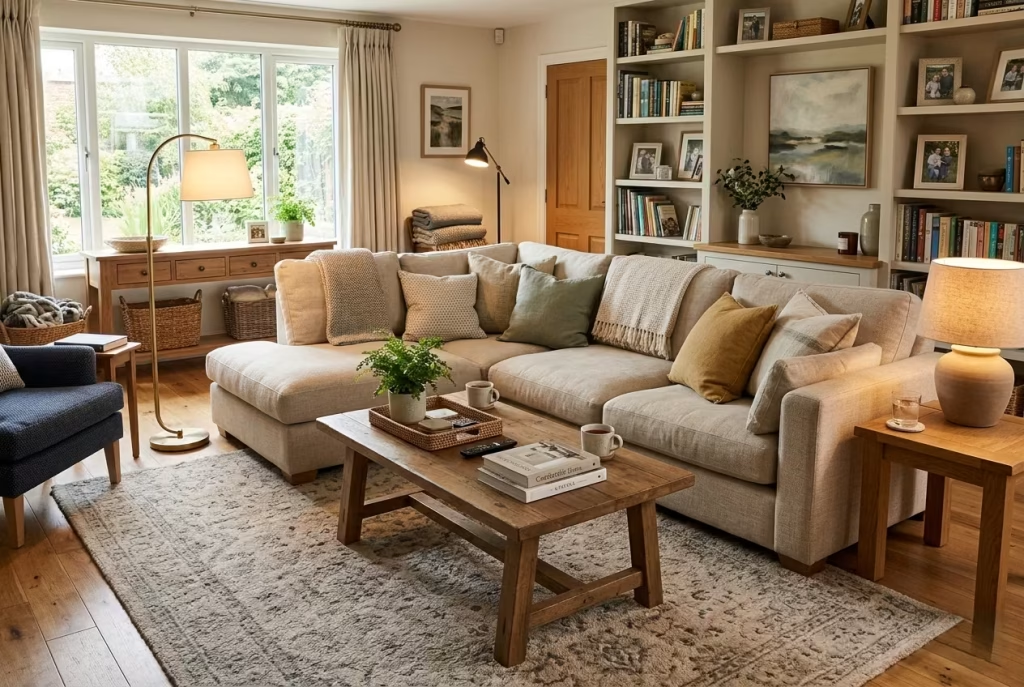
One of the first distinctions I make is whether the room is intended primarily for family life, occasional entertaining, or some careful blend of the two. These are not interchangeable conditions, and the furniture should never pretend they are.
A family living room tends to need resilience above all else. It has to absorb movement, clutter, conversation, and the everyday churn of real life without falling apart at the seams. In these rooms, I tend to prioritise durable upholstery, forgiving finishes, generous seating depth, and layouts that allow people to settle in without feeling too precious about the space. The best family rooms have a kind of relaxed confidence. They are comfortable without becoming lazy, practical without looking blunt.
A formal entertaining room, by contrast, asks for a slightly different mood. It may need to feel more composed, more tailored, more controlled in its arrangement. Seating can be more selective. The composition can breathe a little more. Materials may be chosen for refinement and texture rather than sheer durability. Even so, formal should never mean fragile. A room that is too delicate to use properly is a poor investment, however elegant it appears.
The real challenge, of course, is when a room has to do both. That is where thoughtful layering becomes essential. You might introduce a sofa with clean lines and robust upholstery, then soften it with more tactile cushions, a substantial rug, and a pair of chairs that can shift between daily use and guests. In those rooms, flexibility is the quiet hero. The layout has to hold together under pressure and still feel graceful when company arrives.
Multi-Functional Spaces in Modern Homes
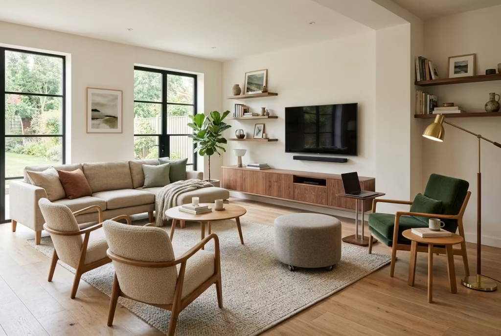
Modern homes rarely grant the luxury of single-purpose rooms. The living room often has to absorb more than one role, sometimes several. It may be a place to unwind, work, play, read, host, and screen television, all within the same footprint. That does not mean the room should feel overloaded. It means the design has to be smarter, more disciplined, and a little more strategic behind the scenes.
This is where zoning becomes invaluable. A seating area can be distinct without being closed off. A reading corner can coexist with a media wall. A secondary chair can create a quiet retreat without breaking the logic of the room. The trick is to let each function have enough definition to work properly, while still preserving the visual calm that keeps the whole interior from feeling chopped up.
I often look for ways to make multifunctionality feel almost invisible. A side table that doubles as a surface for reading or laptop use. A storage unit that absorbs games, chargers, and remote controls without announcing itself. A bench or ottoman that can be moved depending on the occasion. These kinds of pieces do not shout about their purpose, but they earn their place through adaptability. That is the kind of design that keeps a room useful without making it feel like a compromise.
The best multi-functional rooms feel like they have anticipated everyday life instead of reacting to it. There is room for change, room for mess, room for quiet, room for company. Nothing has been overcommitted. Nothing feels trapped in a single role. That flexibility is what gives the room longevity.
Pet-Friendly and Child-Conscious Furniture Decisions
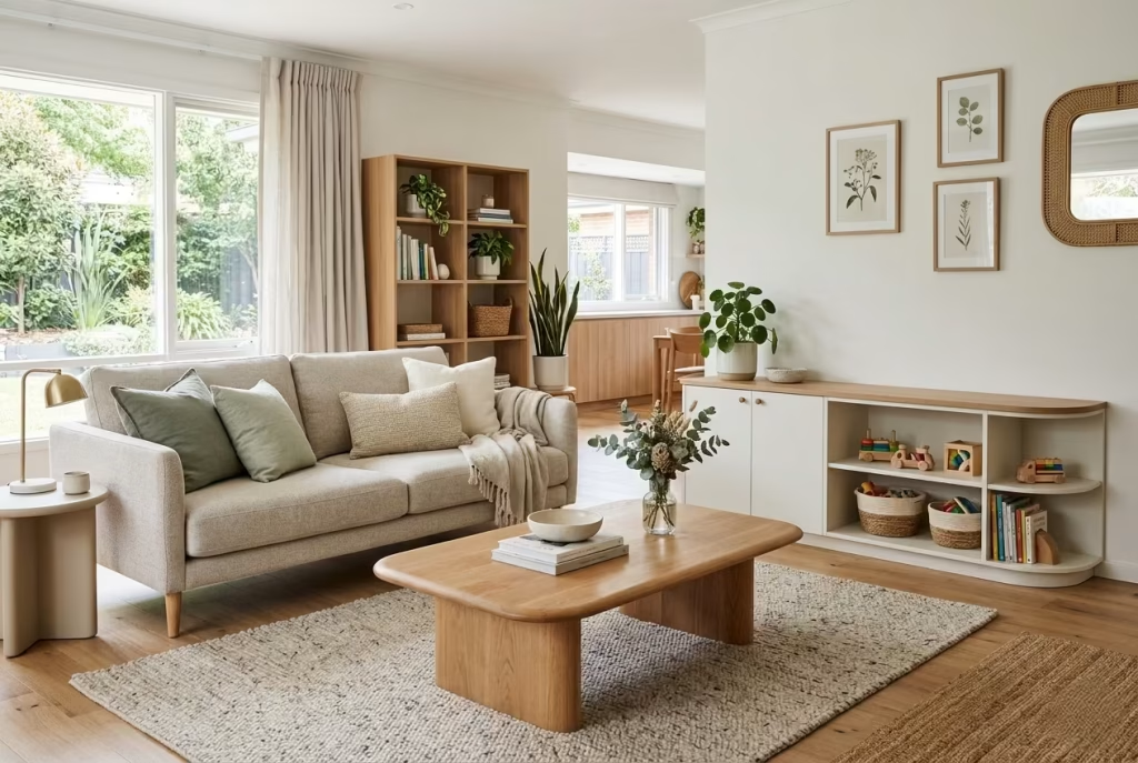
When children or pets are part of the household, the room has to work even harder. That does not mean sacrificing style or settling for purely practical solutions. It means making choices that can withstand use without becoming visually coarse. The goal is not to design for perfection, but to design for resilience with grace.
For families with children, I often steer towards rounded edges, durable upholstery, and finishes that can handle the occasional spill, scuff, or sticky hand. Sofas with removable covers can be a blessing. So can coffee tables that are substantial enough to anchor the room but not so fragile that they become untouchable. Storage becomes even more important in these settings, because a calm room is often just a well-organised room in disguise. If toys, books, and everyday objects have nowhere to go, the whole space starts to fray at the edges.
With pets, the question is slightly different, though equally important. Fabrics need to resist snagging and staining. Surfaces should not show every mark. Furniture legs need to be stable and easy to clean around. Low-maintenance materials are often worth their weight in gold here, especially in homes where the living room is truly part of the animal’s territory, not just a space they pass through politely. It is no use designing a beautiful room that cannot survive a paw, a tail, or the occasional enthusiastic leap onto the sofa.
Even so, pet-friendly and child-conscious design does not have to look bland or compromised. Quite the opposite. Some of the most elegant rooms I have seen are the ones where practicality has been handled so well that it simply disappears into the background. The upholstery looks refined, the proportions feel thoughtful, and nothing appears overdesigned in the hope of staying intact. That is the sweet spot, where the room feels calm, capable, and quietly hard-wearing.
Designing for the Life You Actually Live
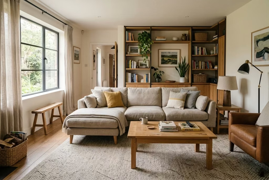
The deeper principle here is simple. A living room should be designed around the life that actually happens in it, not the life we imagine in the abstract. That distinction changes everything. It affects the size of the sofa, the placement of seating, the choice of finishes, the amount of storage, and even the degree of formality in the room’s overall tone.
When lifestyle leads the process, the room tends to age better too. It is less likely to feel outdated because it was never chasing a passing idea of perfection in the first place. It was built around use, and use has a way of revealing what really matters. A room that supports the habits of the people in it will always feel more convincing than one that simply performs well in a photograph.
That, in the end, is the point. The best living rooms are not just attractive. They are accommodating, responsive, and calm under pressure. They know what they are for. And once that is understood, every design decision has a far better chance of landing where it should.
The Role of Negative Space: Why Not Filling the Room Is a Design Decision
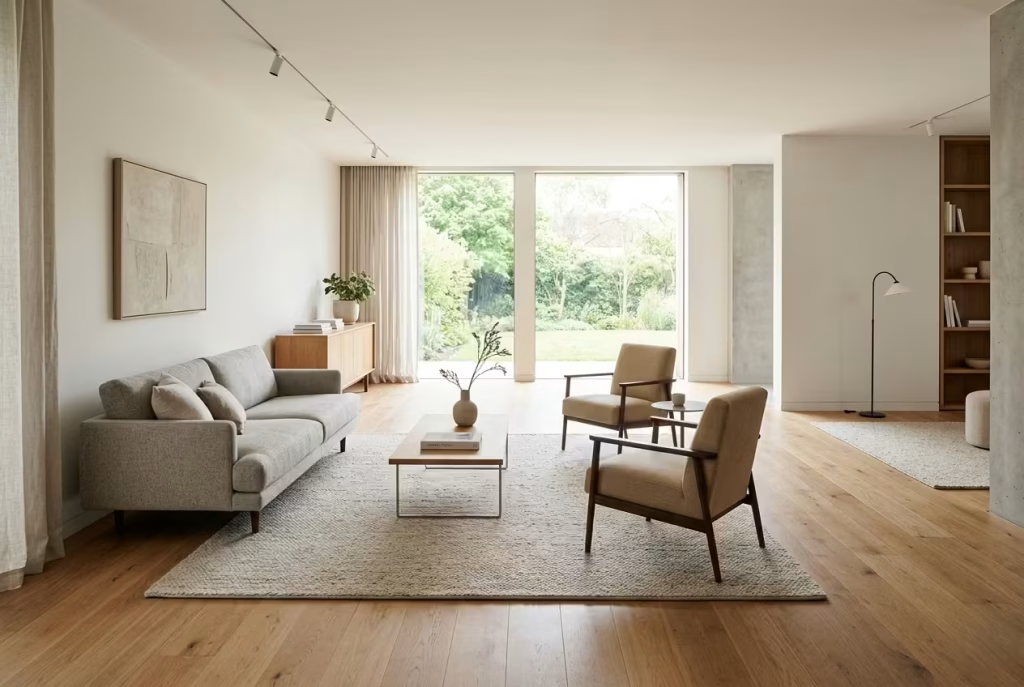
In living room design, empty space is far from wasted. Negative space those areas intentionally left free of furniture or objects is one of the most powerful tools in a designer’s arsenal. It is the quiet punctuation that allows the room to breathe, the subtle pause that makes every carefully chosen piece feel deliberate rather than crowded. Yet so often, people instinctively fill every corner, pushing for “more” in the belief that fullness equals comfort or style. In reality, it is often the opposite.
Visual Breathing Room
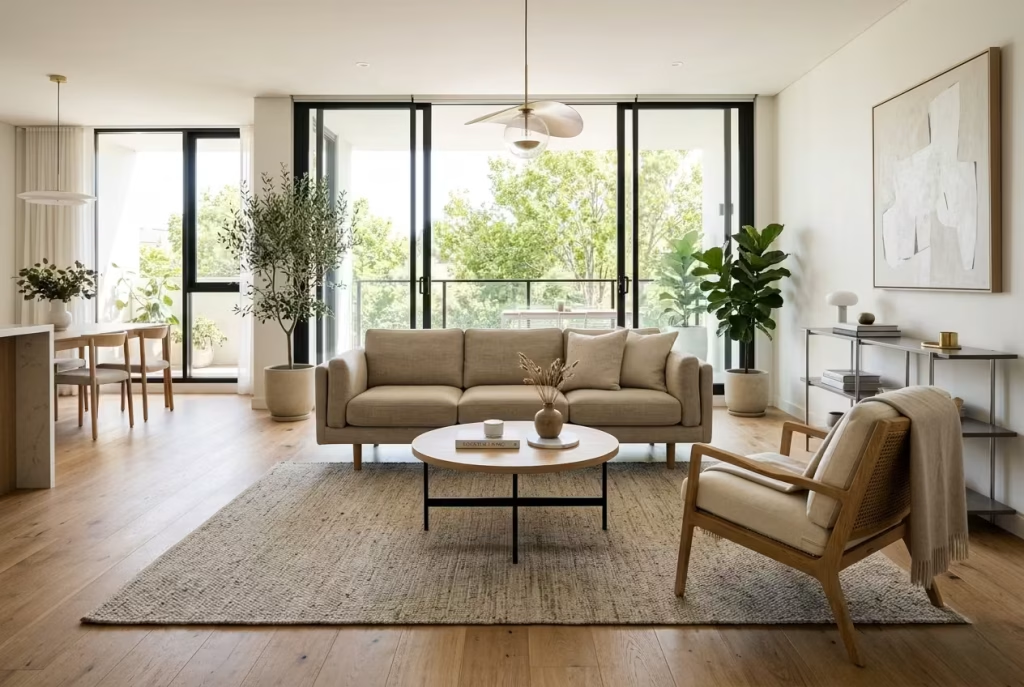
A room that is overstuffed with furniture can feel claustrophobic, no matter how high-end the pieces or expensive the finishes. Visual breathing room allows the eye to rest and creates a sense of calm, proportion, and hierarchy. When you step into a space with negative space thoughtfully incorporated, the furnishings themselves feel more intentional they are given room to exist, to anchor, to perform their roles without competing for attention.
I often advise clients to look at the gaps as carefully as the objects. That small stretch between a sofa and a coffee table, or the space behind a low armchair, is not “empty”; it is functional, relational, and aesthetic at once. It shapes circulation, sightlines, and overall rhythm. A room with measured negative space rarely feels chaotic, even when it contains multiple zones or diverse furniture types.
Editing Furniture Selections
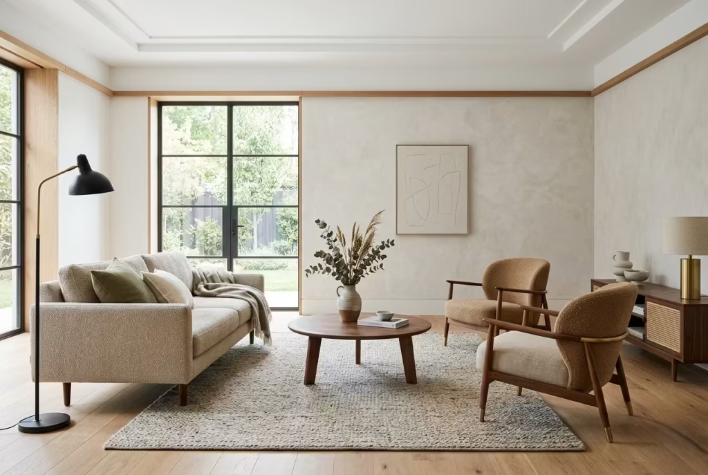
Negative space forces discipline in furniture selection. Each piece must earn its place, not merely fill a void. This is why I advocate pausing before adding another chair, table, or accent. Ask: does this contribute materially to comfort, circulation, or cohesion? If it does not, the room often benefits from leaving it out.
In one project, a client initially wanted a cluster of four armchairs around the coffee table, which looked charming on paper. Once we removed one, the room immediately gained rhythm. Circulation improved, the seating felt more intimate, and the remaining pieces appeared more significant almost sculptural. Editing, guided by negative space, transforms rooms from busy to considered.
Avoiding Over-Specification
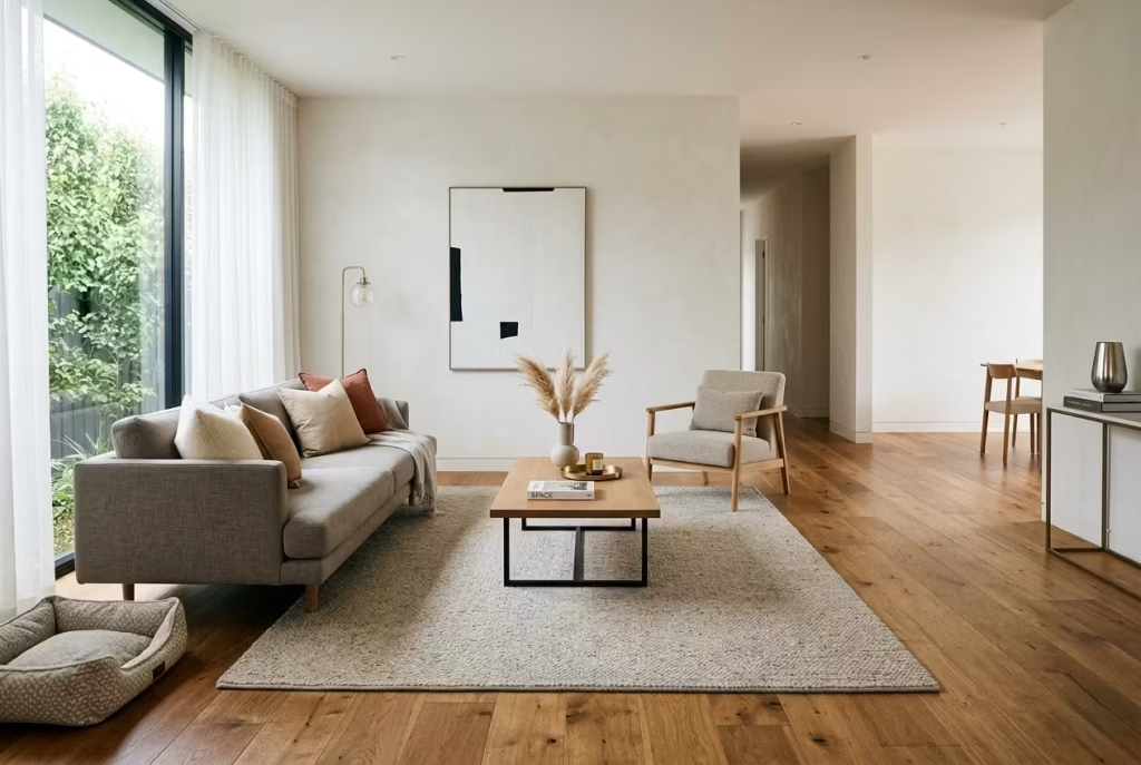
Over-specification the urge to prescribe every inch of a room with furniture or ornamentation can kill a design’s flexibility. Life rarely unfolds precisely as imagined: children may need extra floor space, pets might occupy zones unexpectedly, or guests could shift the intended seating patterns. By leaving negative space, you allow the room to adapt without losing compositional integrity.
Think of negative space as a safety net. It cushions the room, absorbs use, and ensures the design doesn’t feel brittle. It is a subtle kind of luxury, one that only reveals itself once you live in the space, when the room feels calm, spacious, and perfectly balanced without appearing calculated.
In short, what you choose not to place in a room is just as critical as what you do. Negative space is never wasted it is a deliberate, considered choice that elevates the room from merely furnished to gracefully resolved.
If you like, I can continue by expanding the next supporting section, “Mixing Textures and Materials: How to Add Depth Without Clutter,” in the same premium editorial style. This will maintain the same narrative flow, real-life insight, and actionable design wisdom. Do you want me to proceed with that?
The Psychology of Comfort: Why Some Rooms Feel Instantly Right
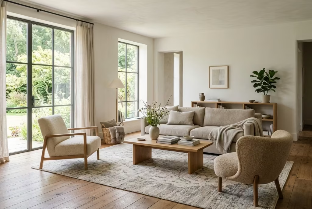
Comfort in a living room is often mistaken for softness alone. People assume that if a sofa is deep enough, the cushions generous enough, and the palette calm enough, the room will naturally feel inviting. In practice, comfort is far more nuanced. It is a composite of proportion, posture, visual balance, and emotional ease. The rooms that feel instantly right are rarely the loudest or the most heavily dressed. They are the ones that understand the body first, and the eye second.
There is a reason some spaces make you exhale the moment you enter them. They are not forcing the issue. The scale feels human, the layout feels intuitive, and nothing is asking too much of you. That kind of comfort is subtle, but it is not accidental.
Human Scale and Ergonomics
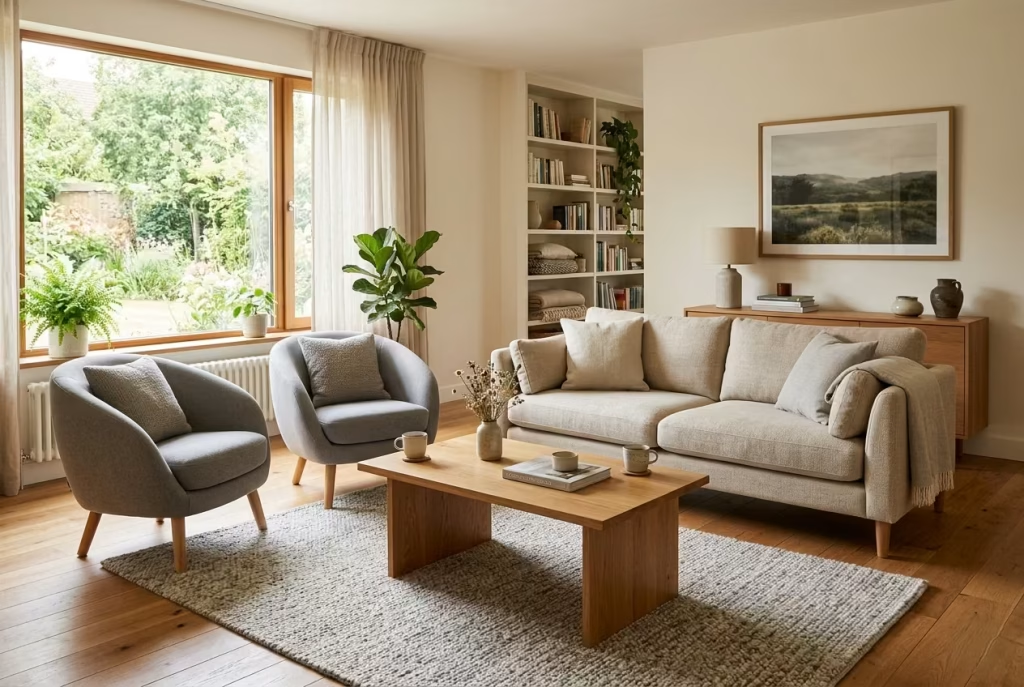
At the heart of comfort is human scale. A room may look elegant in isolation, yet still feel remote if the furniture is too large, too low, too deep, or too formally arranged for the way people actually use it. Ergonomics is not only about physical ease, although that matters greatly. It is also about how naturally the body understands the space.
I often think of this in terms of posture and reach. Can you sit without fidgeting? Can you place a drink without stretching? Can you lean back without feeling swallowed by the sofa or perched awkwardly on the edge of a seat? These small physical questions shape the larger emotional experience of the room. When the body is comfortable, the mind follows.
This is why furniture that is technically stylish can still fall flat in daily use. A chair may look sculptural, but if the arm height is wrong or the seat is too firm for long conversation, it becomes a piece you admire rather than one you live with. The best rooms have furniture that respects the body quietly, without turning comfort into a grand gesture. Everything feels within reach, at the right height, in the right proportion. Nothing is out to trip you up.
In my experience, when a room feels “easy” the moment you step into it, human scale is almost always part of the story. The pieces are not competing with the person in the room. They are working with them.
Visual Warmth vs. Minimalism
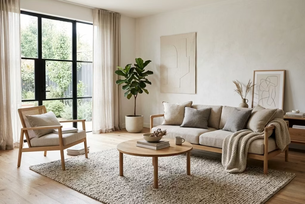
This is where many living rooms become uncertain. Minimalism is often treated as a shorthand for sophistication, while warmth is sometimes mistaken for excess. But these are not opposites. A room can be pared back and still feel generous. It can be quiet and still feel alive. The real question is not how much is in the room, but how much emotional temperature it carries.
A visually warm room has a kind of magnetic pull. It softens hard edges, layers texture, and creates an atmosphere that feels lived in rather than staged. That does not mean filling every surface. It means choosing materials and tones that absorb and reflect light in a way that feels inviting. Timber, woven textiles, upholstered surfaces, muted colour shifts, all of these contribute to a sense of ease. They give the room a little soul, if you like.
Minimalism, at its best, is not cold or sparse. It is disciplined. It knows what to leave out. But when minimalism becomes too severe, the room can start to feel emotionally distant, as though it is waiting to be occupied but not yet ready to receive anyone. That is the point where warmth has to be reintroduced, often through tactility, scale, or a more generous use of soft furnishings.
I often find that the most successful rooms sit somewhere between restraint and warmth. There is enough editing to keep the space clear, but enough material richness to keep it human. That balance is the sweet spot. The room feels composed, but not aloof. Calm, but not clinical. It does not show off, and that is exactly why it works.
You May also Like: 21 Minimalist Living Room Ideas That Make Your Home Feel Calm and Chic
Emotional Response to Layout
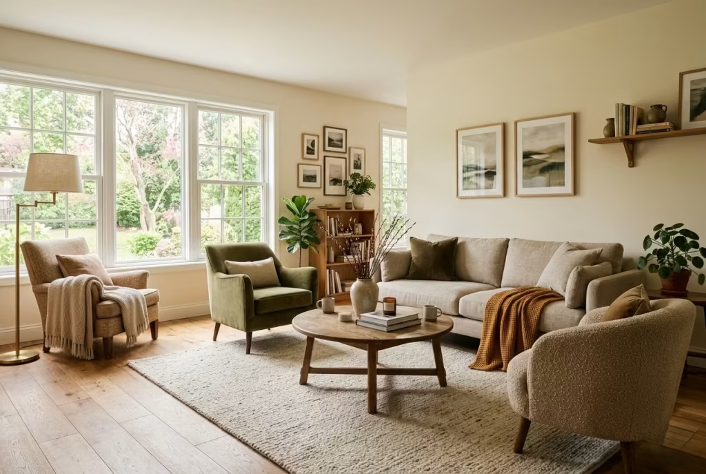
Layout affects more than circulation. It affects mood. A room can be technically correct and still feel emotionally flat if the furniture is arranged without thought to how people will actually experience the space. The emotional response to layout is immediate, even when it is subtle. We sense openness, enclosure, tension, or ease long before we consciously analyse why.
One of the strongest signals in this regard is whether a layout encourages connection or creates distance. If seating is too far apart, conversation becomes strained. If it is too close, the room can feel crowded and restless. If everything points rigidly in one direction, often toward a television, the room may function, but it loses a certain softness. It begins to feel organised around a device rather than around people.
I have seen rooms transform simply by changing the orientation of a chair or bringing a sofa forward a little. Suddenly, the space feels more grounded, more welcoming, more settled. It is remarkable how often emotional comfort comes down to spatial confidence. When a layout gives people permission to gather naturally, without negotiation or awkwardness, the room immediately feels more generous.
There is also a quieter emotional layer to consider: whether the room feels safe, private, open, or enclosed in the right measure. A sofa placed with its back to the room can create a sense of shelter. A rug that gathers the seating together can make the space feel protective. A corner chair with a lamp beside it can create a small retreat within the larger room. These gestures may seem modest, but they shape how a person feels inside the space, and that feeling is often what lingers.
Why Some Rooms Feel Instantly Right
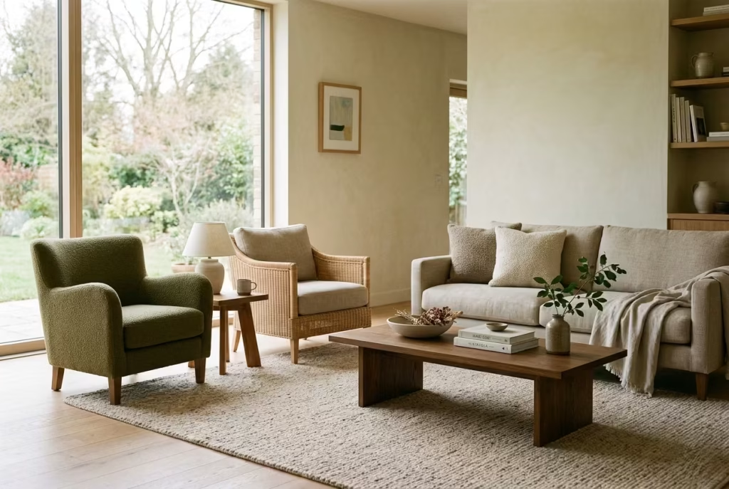
The rooms that feel instantly right tend to get three things in balance at once. The scale feels human. The materials feel emotionally legible. The layout feels calm rather than overdetermined. Nothing is over-explained. Nothing is trying too hard. The room seems to know what it is for.
That ease is powerful because it removes resistance. You do not have to interpret the room before using it. You can simply enter, sit, and settle. It feels like the room has already anticipated your presence. That, to me, is one of the clearest signs of good design.
In the end, comfort is not a decorative layer added after the fact. It is the result of a hundred decisions that align around how people live, move, and feel. When those decisions are handled with care, the room has a kind of quiet authority. It does not demand attention, yet it holds you in place. And that, more than anything, is why some rooms feel right from the very first moment.
Common Buying Mistakes That Undermine Good Design
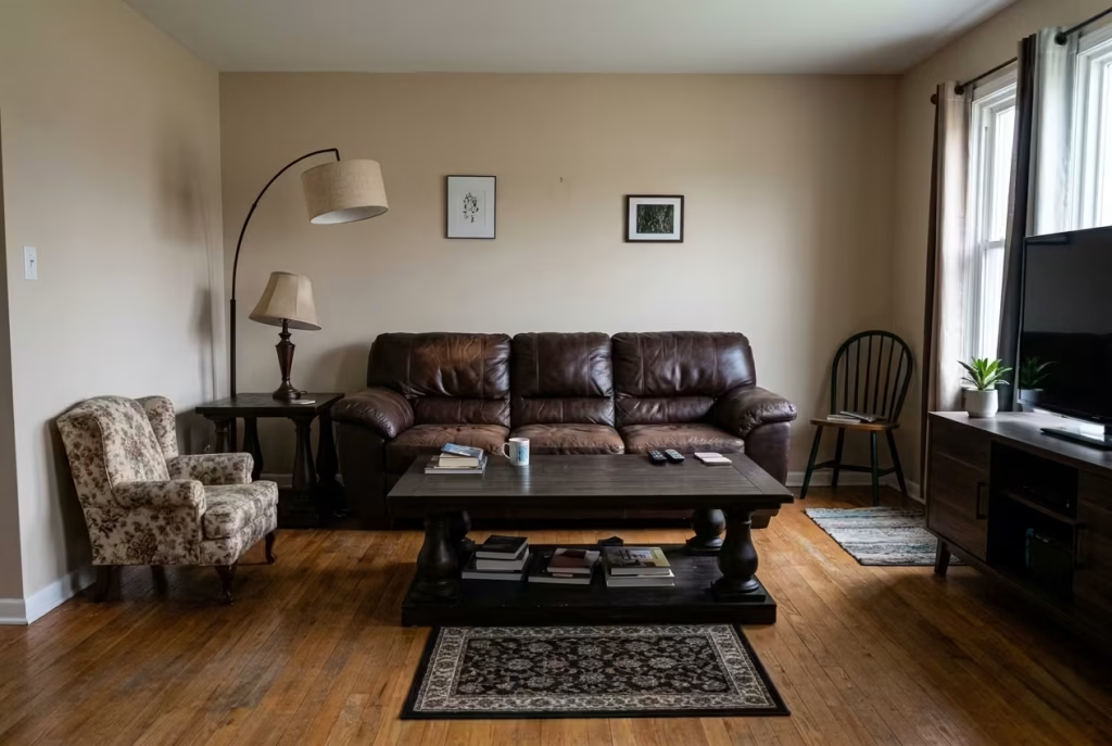
The most expensive mistakes in a living room are not always the most obvious ones. More often, they are the choices made too quickly, too separately, or too emotionally, before the room’s real needs have been properly understood. That is where so many otherwise promising schemes begin to wobble. The pieces may be beautiful in isolation, but the room itself ends up paying the price.
Good design is rarely derailed by lack of taste. It is more often undermined by impatience, optimism, and the assumption that furniture will somehow sort itself out once it is in place. In reality, it rarely does. A room needs a clear point of view, and every purchase either strengthens that point of view or quietly weakens it.
Buying Everything at Once
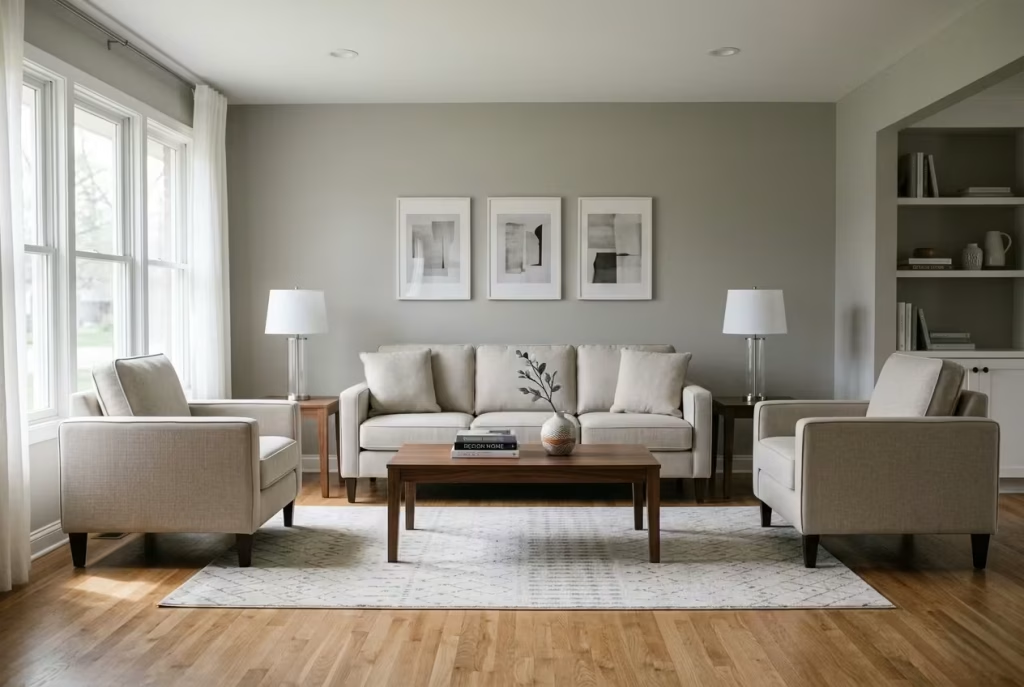
There is a strong temptation, especially when a room is bare, to complete the whole scheme in one sweep. Sofa, chairs, table, rug, lamps, all selected in one energetic burst. On the surface, that feels efficient. It can even feel exciting, like getting the hard part out of the way. But design made in a single rush often lacks the calm judgement that comes from living with the space first.
The problem is not that coordinated buying is wrong. The problem is that it can flatten a room before it has had the chance to develop any character of its own. When everything arrives at once, the result can feel a little too neat, a little too certain, as though the room has been stitched together from one idea rather than allowed to evolve. That is when it starts to feel more like a showroom than a home.
I have found that the strongest rooms usually come together in layers. The main anchor pieces are chosen with care, then the room is lived with for a while. Light shifts. Habits emerge. The spaces that need support become obvious. Only then do the supporting pieces make proper sense. It is a slower approach, yes, but it saves you from buying things you later have to work around. And that is money down the drain.
Choosing Aesthetics Over Comfort
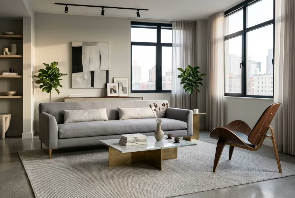
This is one of the oldest traps in the book. A piece looks elegant in the showroom, photographs beautifully, and seems to promise a certain lifestyle. Then it arrives home and reveals its true nature. The sofa is too shallow to relax into. The chair looks sculptural but feels unforgiving. The coffee table has the right finish but the wrong height, so it never quite serves its purpose. At that point, the glamour wears off quickly.
A room that is beautiful but uncomfortable tends to age badly in emotional terms, if not physical ones. People stop using it fully. They sit elsewhere. They avoid certain pieces. They begin to tolerate the space instead of enjoying it. That is a sign the design has gone off course. Comfort is not a luxury add-on. It is part of the room’s integrity.
The most convincing living rooms are the ones where style and comfort work in tandem. The sofa is elegant but genuinely usable. The chair has presence but also supports the body well. The room feels composed, but not precious. That balance is what gives the space staying power, because a beautiful room that nobody wants to sit in is, frankly, a missed opportunity.
Ignoring Long-Term Wear
A new piece often looks immaculate, and that can be deceptive. What matters more is how it behaves after months and years of use, when life begins to leave its marks. This is where many decisions reveal their weakness. A fabric that looked refined may pill quickly. A light finish may show every scuff. A delicate surface may not stand up to the reality of daily living. In short, what seems sharp on delivery day can become a bit of a liability once the room is properly in service.
Good design always accounts for time. Not just the first impression, but the long haul. Will the upholstery soften in a pleasing way, or collapse into tiredness? Will the timber gain character, or just look scratched? Will the finish tolerate children, pets, guests, spills, feet up on the sofa, or the thousand small events that make up real domestic life? These are not pessimistic questions. They are practical ones, and they separate sound investment from false economy.
I tend to think of longevity as part of the design language. Some materials age with grace, developing a patina that adds richness. Others simply deteriorate. Knowing the difference makes all the difference. There is no point in choosing something exquisite if it cannot survive the rhythm of the home it is meant to serve.
Misjudging Scale in Showrooms vs. Real Homes
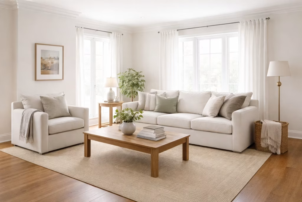
This is a mistake that catches people out more often than they expect. A piece in a large showroom can look perfectly proportioned, even modest. Then it arrives in a real room and suddenly feels enormous, or strangely slight, because the context has changed completely. Showrooms are designed to flatter furniture. Homes are not. That gap is where so many scale errors creep in.
What looks balanced in a high-ceilinged display space can overwhelm a more intimate living room. A sofa that seemed elegant under warehouse lighting may dwarf a modest wall once it is placed against it. A coffee table that appeared substantial enough in the shop can feel absurdly small once it sits between a full-size sofa and armchair. Scale is all about relationships, and those relationships only reveal themselves properly in the actual room.
This is why I am always cautious about judging furniture in isolation. It has to be imagined against the real architecture, the actual circulation, the true ceiling height, the amount of daylight, and the other pieces already in play. Without that context, the eye can be led astray rather easily. It is a bit like trying to judge a painting without seeing the wall it will hang on.
Why These Mistakes Keep Repeating
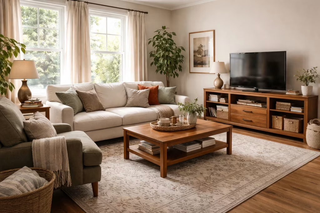
The reason these errors are so common is simple enough. People often shop for the room they want to have, not the room they actually live in. They buy with aspiration in mind, which is understandable, but aspiration alone can leave you with a room that looks the part and fails the brief. Design is not about filling the space with good intentions. It is about making choices that hold together under daily pressure.
When purchases are made too quickly, too aesthetically, or too independently, the room loses its backbone. It begins to feel slightly patchworked, slightly overreached, never quite settled. But when buying decisions are grounded in comfort, scale, durability, and the actual pattern of use, the room gains confidence. It stops trying to impress and starts doing its job properly.
That is the heart of good living room design. Not chasing the biggest or the prettiest option, but choosing pieces that will still make sense when the novelty has worn off and real life has moved in.
Conclusion: Designing a Room That Holds Up Over Time
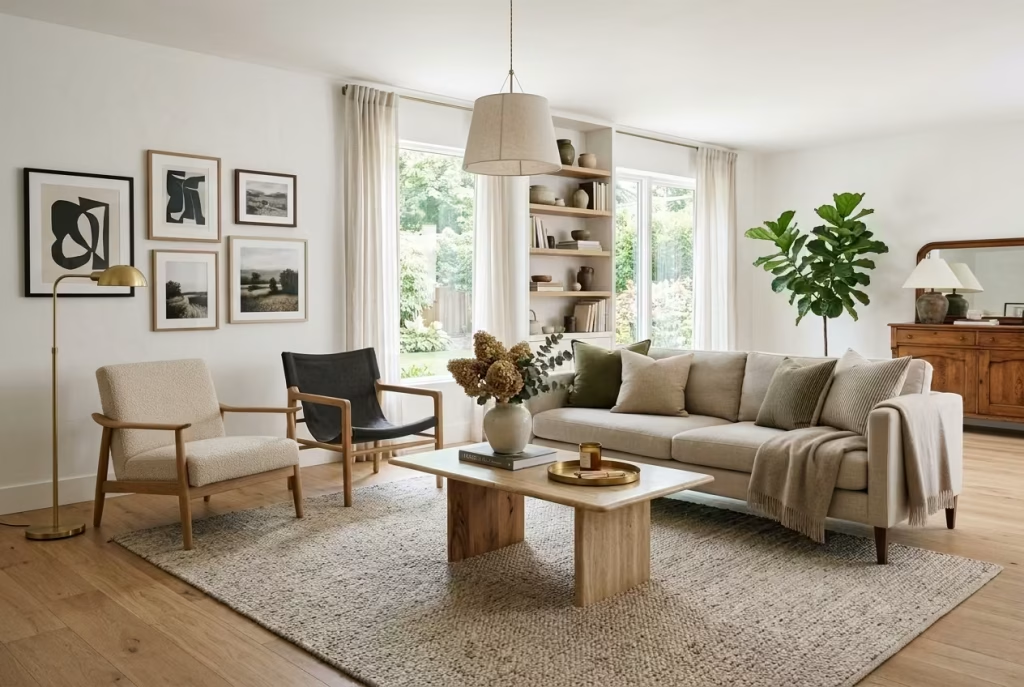
A well-designed living room is rarely the one with the most furniture, the boldest statement piece, or the most carefully styled surface. More often, it is the room where every choice has been edited with a clear eye, where nothing feels forced, and where the whole composition has been allowed to breathe. That is the real art of it. Not filling every corner, but knowing what to leave out so the room can do its work properly.
The temptation, especially when a room is still coming together, is to keep adding. Another chair, another table, another lamp, another object that seems to promise completion. But more is not the same as better, and in living room design that difference matters enormously. A room can look full and still feel unresolved. It can be beautifully furnished and still fail to support daily life. The strongest spaces are not built on quantity, but on judgement. They feel measured, deliberate, and quietly assured.
That is why every piece has to earn its place. Not just visually, but functionally. A sofa should support the way people actually sit. A rug should anchor the room rather than merely decorate it. A table should sit where it can be used without effort. Lighting should shape the atmosphere, not merely fill a ceiling with brightness. When each element is chosen with that level of care, the room begins to work as a whole rather than as a series of isolated decisions. It settles. It makes sense. Nothing is shouting for attention, yet nothing feels missing.
In my experience, the rooms that endure are the ones that feel almost effortless to live in. They do not ask people to adjust themselves constantly to suit the furniture. Instead, they support movement naturally, making circulation feel fluid, seating feel intuitive, and gathering feel easy. That ease is not accidental. It comes from proportion, restraint, material understanding, and a willingness to prioritise how a room functions over how quickly it can be finished.
I have seen too many living rooms lose their balance because the focus stayed on appearance alone. By contrast, the rooms that remain satisfying year after year are usually the ones where the design logic is so quietly sound that you barely notice it. Nothing gets in your way. Nothing feels overworked. Everything has been placed with enough thought to disappear into daily life, which is often the clearest sign that the design is doing exactly what it should.
In the end, a living room should feel like it has been lived with, not merely looked at. It should support conversation, comfort, stillness, movement, and the ordinary rhythm of home without ever becoming a burden. That is what gives it staying power. Not excess, not novelty, but a quiet confidence that holds up beautifully over time.
Frequently Asked Questions About Choosing Living Room Furniture
How do I know which piece to buy first?
In most living rooms, I start with the sofa. It sets the scale, establishes the room’s visual weight, and usually determines how everything else will sit around it. Once the sofa is right, the rest of the scheme tends to fall into place with far less friction. If you choose other pieces first, you can end up trying to force the layout later, which is often where things begin to feel a little off.
What size sofa works best for a standard living room?
There is no single answer, because proportion matters more than a fixed number. That said, a sofa between 180–240 cm (71–95 inches) often works well in many homes. The key is to leave enough breathing room around it so the room can move. A sofa should feel grounded, not overpowering, and it should never make circulation feel like a compromise.
Should all my furniture match?
No. In fact, a room often feels more interesting when the pieces do not match perfectly. What matters is cohesion, not uniformity. Repeating certain tones, materials, or shapes across the room will tie everything together far more elegantly than buying a set that looks like it came straight from the same page of a catalogue. A little tension, handled well, keeps a room from feeling flat.
How do I make a small living room feel bigger?
By resisting the urge to fill every inch. Small rooms usually benefit from lighter visual weight, fewer but better-chosen pieces, and furniture that allows light and movement to flow. A sofa with raised legs, a properly scaled rug, and side tables that do their job without crowding the layout can make a room feel more generous than oversized furniture ever will. Negative space is doing far more work than most people realise.
What is the biggest mistake people make with living room furniture?
They buy pieces in isolation. A sofa, a chair, a table, a lamp, each selected because it looks good on its own, without considering how they relate to one another. A living room only works when the pieces function as a system. If the proportions, heights, finishes, and placement do not speak to each other, the room will always feel slightly unresolved, no matter how expensive the furniture may be.
How important is comfort compared with style?
They should never be treated as separate priorities. A beautiful sofa that is unpleasant to sit on is a poor long-term choice, just as a comfortable piece that ignores proportion can throw the whole room out of balance. The strongest rooms are the ones where comfort and style support each other quietly. When that happens, the room feels easy to live in, which is ultimately the whole point.
How much space should I leave between furniture pieces?
For most seating arrangements, I allow 75–90 cm (30–35 inches) between pieces where circulation is needed. Around a coffee table, 40–50 cm (16–20 inches) from seating is usually a sensible guide. These measurements are not rigid rules, but they are reliable starting points that help the room feel comfortable rather than cramped.
Do I need a rug under all my furniture?
Not always, but a rug should usually connect the main seating pieces in some way. If it is too small, the room can feel fragmented, as though the furniture is floating independently. A properly scaled rug helps define the zone and gives the whole arrangement a sense of belonging. In most living rooms, that is worth prioritising.
How do I choose furniture that will last?
Look beyond the showroom finish and think about how the piece will age in your home. Durable upholstery, well-made frames, sensible proportions, and materials that tolerate daily use are all worth the investment. Furniture should not just look good the day it arrives. It should still make sense after the room has been lived in for years.
What should I avoid if I want my living room to feel calm and well-designed?
Avoid overfilling the room, overmatching every piece, and buying too quickly. A calm living room usually comes from restraint, proportion, and a clear sense of purpose. Every item should earn its place. When you remove the unnecessary, the room tends to feel more settled, more spacious, and far more refined.