25 Creative Ways to Transform Your Spanish Reading Nook This Weekend
There is something quietly magnetic about a Spanish reading nook when it is done well. Not dramatic in the obvious sense, nor overloaded with decorative gestures, but warm in a slower, more atmospheric way. The kind of space where late afternoon light drifts softly across textured plaster walls, where worn timber carries years of character, and where even a simple linen cushion seems to invite you to stay a little longer. These corners rarely shout for attention. Instead, they settle into the rhythm of a home almost unnoticed, until one day they become the place everyone instinctively gravitates toward.
What makes this style especially compelling is how attainable it can be without sacrificing sophistication. A thoughtful weekend transformation does not need to involve structural renovations or an entirely new room. In many homes, I have found that the most convincing Spanish-inspired nooks emerge from spaces that were previously overlooked altogether, an underused bedroom corner, a recessed alcove beside a window, or even a quiet landing softened with layered textiles and warmer lighting. With the right balance of material, proportion, and restraint, even compact areas can begin to feel deeply transportive.
The secret, more often than not, lies in precision disguised as ease. The best Spanish interiors appear effortless, yet every element is quietly working in harmony. The texture of limewashed walls against aged wood, the softened glow of brass lighting after sunset, the weight of a woven throw draped casually across a chair, these details shape atmosphere in ways that feel natural rather than staged. It is less about filling a nook with decor and more about creating a corner that feels settled, grounded, and genuinely lived in.
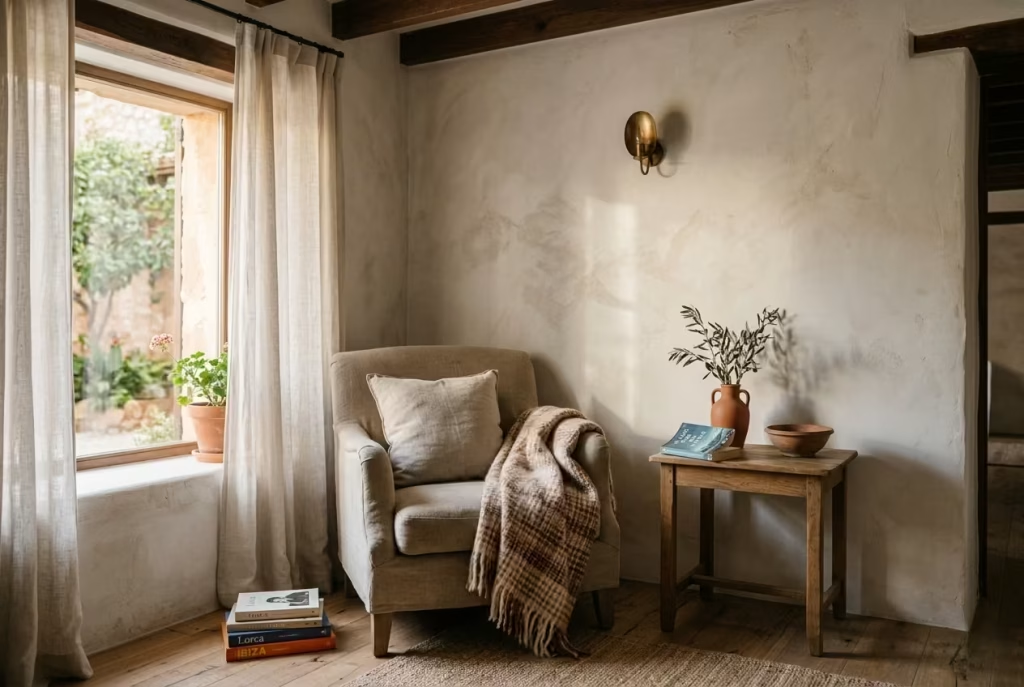
Whether you are working with a narrow apartment corner or a generous arched alcove, the ideas ahead are designed to help transform ordinary space into something far more intimate, layered, and emotionally restorative by the end of the weekend.
25 Creative Ways to Transform Your Spanish Reading Nook This Weekend
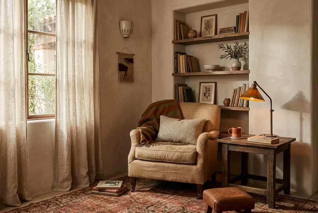
A Spanish reading nook rarely depends on one dramatic gesture to feel beautiful. More often, its charm is built slowly through details that work together almost invisibly. The warmth of sun-washed tones. The softness of aged textures. The way a linen curtain diffuses afternoon light across a plastered wall. None of these elements shout for attention individually, yet together they create a corner that feels deeply grounding, the kind of space people instinctively gravitate toward at the end of a long day.
What makes these weekend transformations so satisfying is that they are often less about buying more and more about refining what is already there. A better furniture placement can completely shift the energy of a cramped corner. A warmer lamp bulb can soften an otherwise cold room almost overnight. Even replacing sharp synthetic textures with woven or natural materials can make a nook feel calmer, richer, and far more lived in. Sometimes the smallest adjustments end up moving the needle the furthest, which, quite frankly, is where the real design magic tends to happen.
Over the years, I have noticed that the most successful Spanish-inspired reading spaces all share one thing in common. They never feel overly engineered. There is always a touch of ease to them, as though the room settled into itself naturally over time. That relaxed quality is not accidental, though. Behind every inviting nook is a careful balance of proportion, light, material, and restraint working quietly in the background.
The ideas below are designed to help you create that atmosphere without turning the process into a full-scale renovation. Some changes are visual, some practical, and others emotional in the way they shape the mood of the room. Whether you are working with a compact bedroom corner, an unused alcove, or a sunlit landing that feels like it is crying out for purpose, these transformations can help turn even the most overlooked area into a reading nook with genuine soul and staying power.
Ground the nook with terracotta tones
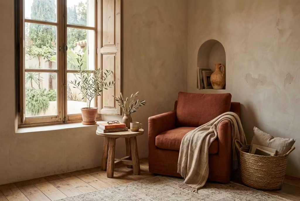
A Spanish reading nook rarely begins with furniture. It starts much earlier than that, in the quiet decision of colour. Terracotta, clay, and sun-baked neutrals sit at the heart of this language, not as decoration, but as atmosphere builders that subtly shift how a space feels the moment you enter it.
When I have worked on compact residential corners, especially in homes that feel visually cold or slightly unresolved, these earthy tones have consistently acted like a grounding force. Terracotta in particular carries a natural warmth that does not shout for attention. Instead, it settles into a room like settled dust after movement, softening everything around it without overpowering the composition.
In north-facing rooms, where daylight often arrives filtered and slightly cool, these colours become even more important. Pale interiors can sometimes feel flat or emotionally distant, especially during winter months when natural light loses its strength. Introducing terracotta through walls, upholstery, or even a single accent piece creates an immediate counterbalance. The room begins to feel less clinical and more inhabited, almost as if it has been lived in for years rather than days.
I have often seen this effect work beautifully in reading nooks tucked beside windows or recessed walls. A soft clay-toned backdrop, for example, can turn what was once a forgotten corner into something quietly magnetic.
The light shifts across the surface differently throughout the day, catching warmer undertones in the morning and deepening into richer, more grounded hues by late afternoon. It is this subtle variation that gives the nook its sense of depth.
There is also a psychological layer at play here. Earth-derived colours have a way of slowing the eye down. In a world where most interiors lean toward crisp whites and sharp contrasts, terracotta introduces a gentler rhythm. It does not compete with the surrounding space; it absorbs it, like a well-worn linen shirt that becomes better with time rather than louder with use.
A practical observation from real projects is that even small applications can shift the entire perception of the nook. A 60 to 90 cm (24 to 36 in) wall section painted in a muted clay tone, or a single upholstered chair in a burnt terracotta fabric, is often enough to reset the mood of the space. There is no need to overextend the palette. In fact, restraint here is what keeps the look elevated rather than thematic.
What makes this approach so effective is its quiet confidence. It does not rely on ornament or complexity. Instead, it works like a steady hand in the background, holding everything together while allowing texture, light, and form to do the rest of the talking.
Add a plaster-like wall finish
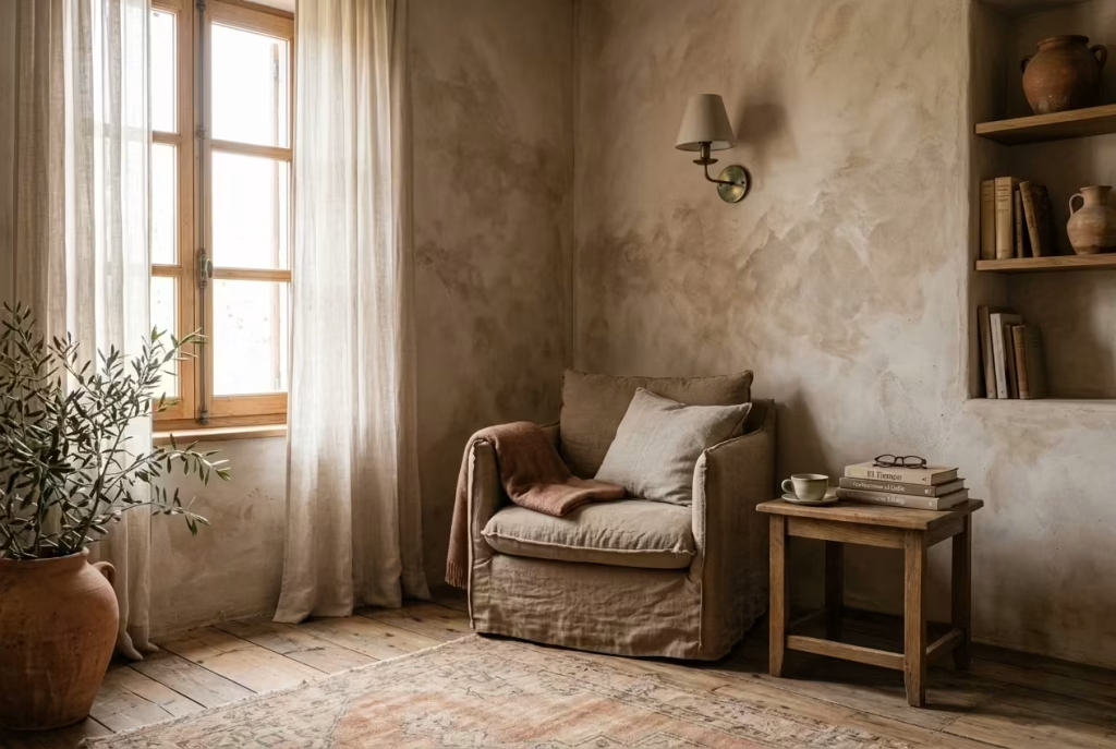
A Spanish reading nook begins to feel truly atmospheric when the walls stop behaving like passive backdrops and start acting as quiet participants in the space. This is where plaster-like finishes come into their own, bringing a sense of age, softness, and architectural honesty that painted drywall alone rarely achieves.
Limewash, mineral paints, and softly textured matte finishes all share one essential quality, they allow a surface to breathe visually rather than sit flat and unresponsive.
In real residential projects, I have often found that this single intervention can shift the entire emotional register of a corner. A nook that once felt like an afterthought suddenly begins to feel intentional, almost as if it has always belonged to the home.
Limewash in particular behaves beautifully under natural light. It does not reflect it aggressively. Instead, it absorbs and releases it in uneven, cloud-like variations, which gives the surface a subtle depth that changes throughout the day.
Morning light tends to reveal a softer, chalky presence, while late afternoon sun brings out warmer undertones that feel almost sun-bleached and timeworn. This quiet transformation is what makes plaster-like finishes so compelling. They are never static. They shift gently with the environment, which keeps the reading nook visually alive even when nothing in the room has moved.
From a design perspective, this kind of finish also introduces a layer of architectural credibility. It suggests permanence without feeling heavy-handed. A reading nook framed in limewash or textured mineral paint begins to feel less like a styled corner and more like a carved-out moment within the structure of the home. That distinction matters, because it is what separates a decorative arrangement from a space that feels genuinely embedded in the architecture.
There is also a tactile logic to it. Even when you do not physically touch the walls, your eye reads the surface as something soft and slightly irregular.
This reduces visual tension, which is especially important in small or enclosed reading areas where overstimulation can easily creep in. Instead of sharp reflections or uniform colour fields, you get gentle shifts, softened edges, and a sense of visual breathing room.
In practice, I have seen even modest applications make a noticeable difference. A 2.4 m by 2.7 m (8 ft by 9 ft) nook, when treated with a muted limewash finish, can feel almost double in depth simply because the walls stop behaving like hard boundaries. They begin to dissolve slightly into the light, which creates that coveted feeling of enclosure without confinement.
What makes this approach particularly powerful is its restraint. There is no need for decorative excess or layered ornamentation. The finish itself carries the character. It is one of those rare design decisions where doing less actually gives you more, allowing the space to settle into itself rather than being pushed into performance.
Introduce an arched detail
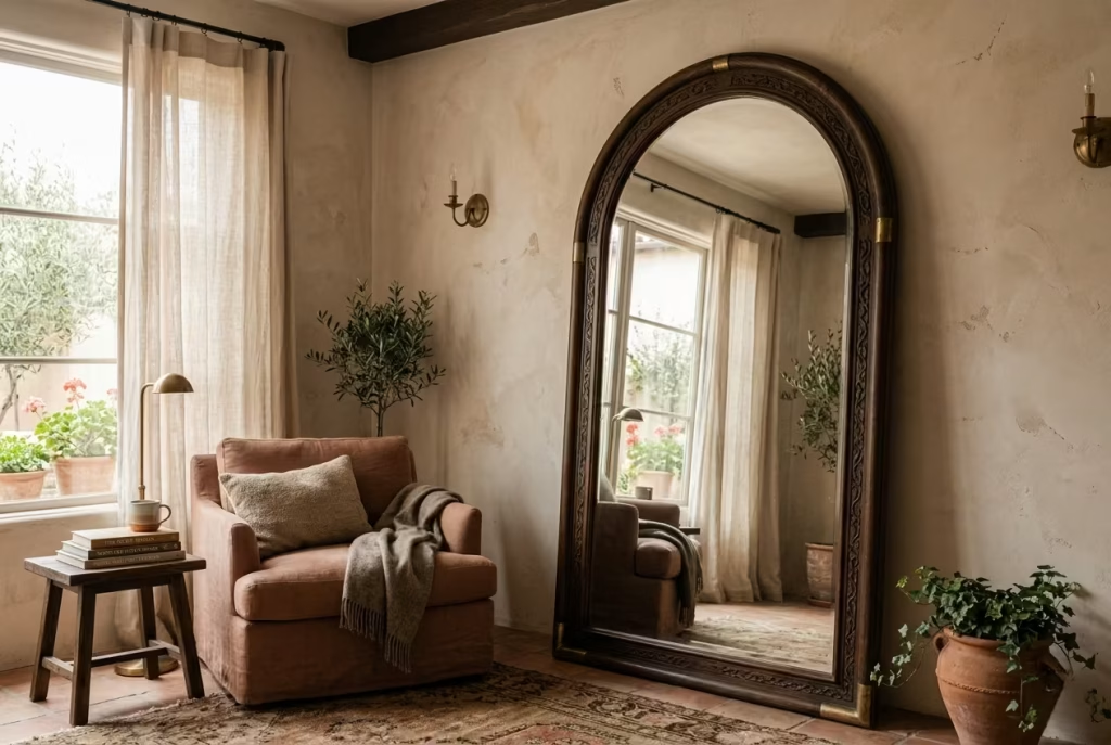
Arched forms carry a quiet architectural confidence that instantly softens a space without needing explanation. In Spanish-inspired interiors, the curve is never just decorative, it is structural poetry. It breaks the dominance of rigid geometry and introduces a visual rhythm that feels more natural, more human, almost like the way light falls across old masonry at different times of the day. In a reading nook, this single shift can completely recalibrate the mood of the corner.
When I have introduced arched elements into residential projects, even in the most contemporary homes, the effect has been surprisingly immediate. A space that felt boxy or overly functional begins to loosen up visually, as if it has exhaled after being held in tension for too long. It is not about nostalgia alone, it is about balance. Straight lines organise a room, but curves allow it to breathe.
An arched mirror is often the simplest way to achieve this transformation. Positioned above a compact console or leaning subtly against a wall, it reframes the nook without demanding structural changes. The reflection it creates is softer as well, because the curve gently distorts edges in a way that feels more forgiving to the eye. In smaller corners, typically around 90 to 120 cm (35 to 47 in) wide, this can make the space feel visually expanded without altering its footprint.
Built-in arches, such as a shallow niche or recessed shelving, take this a step further. They introduce depth and shadow play that flat surfaces cannot replicate. I have seen even a modest 20 to 25 cm (8 to 10 in) deep niche completely shift how a reading corner is perceived. Suddenly, it is no longer just a wall with furniture against it. It becomes an architectural moment, something that feels intentionally carved rather than simply placed.
Even curved bookcase fronts, though more subtle, carry the same effect. They soften the visual weight of storage, preventing it from overwhelming the calm of the nook. Instead of sharp vertical interruptions, the eye moves in a gentle arc, almost like following the bend of a slow river rather than navigating a rigid grid. That sense of flow is what keeps the space from feeling static or overly designed.
There is also an emotional dimension to curvature that should not be overlooked. People tend to respond instinctively to softened edges. It creates a sense of ease, a lowering of visual tension that makes sitting in the space feel more natural. In reading nooks especially, where the goal is to slow down and disengage from the pace of the day, this matters more than it might initially seem.
What I have consistently observed is that you do not need multiple arched elements to achieve the effect. In fact, one well-placed curve often carries more impact than several competing ones. It is a case of less being more, where the restraint allows the detail to stand out rather than dissolve into repetition.
Handled thoughtfully, an arched detail does not announce itself loudly. It settles into the composition, almost like it was always meant to be there. And once it is in place, the entire nook feels less rigid, more forgiving, and quietly elevated in a way that is difficult to achieve through straight-lined design alone.
Layer woven textures
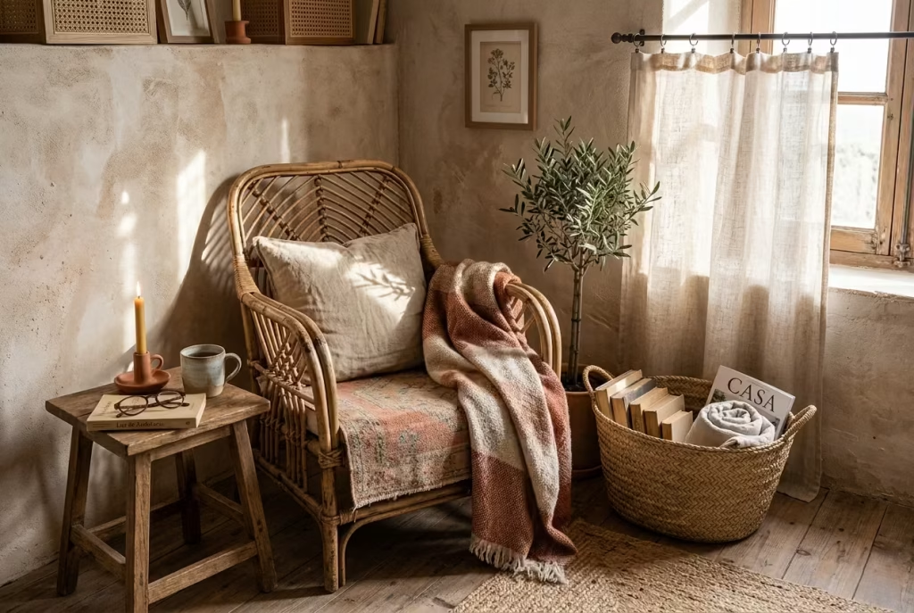
A Spanish reading nook begins to feel truly grounded when it stops relying solely on colour and form, and starts speaking through touch. This is where woven textures quietly take centre stage. Rattan, cane, rush, and handwoven baskets introduce a kind of visual looseness that hard materials simply cannot replicate. They bring warmth not through dominance, but through subtle irregularity, the kind that feels collected rather than manufactured.
In practice, I have often seen woven elements act as the “soft interrupter” in otherwise structured interiors. A space with plastered walls, clean-lined seating, and architectural lighting can sometimes drift toward feeling too composed, almost like everything has been placed with surgical precision. The introduction of woven texture gently breaks that tension, like loosening the collar after a long day, allowing the room to breathe more naturally.
Rattan, in particular, works beautifully in reading nooks because of how it interacts with light. It never behaves like a flat surface. Instead, it filters illumination through its weave, casting delicate, shifting shadows that move across nearby walls and floors.
In a corner measuring roughly 1.5 m by 1.8 m (5 ft by 6 ft), even a single rattan chair can transform the entire light dynamic of the space, making it feel warmer and more lived-in without adding visual clutter.
Cane detailing, often used in chair backs or cabinet fronts, adds another layer of refinement. It introduces structure within softness, a balance that prevents the nook from slipping into rustic excess. I have found that cane works especially well when paired with smoother materials like limewashed walls or linen upholstery, because the contrast keeps the composition visually interesting without becoming noisy.
Rush seating and woven baskets, meanwhile, bring a more grounded, almost utilitarian honesty to the space. They are not trying to impress. Instead, they simply exist with quiet confidence. A handwoven basket placed beside a reading chair, for instance, can hold books, throws, or magazines while doubling as a tactile object that anchors the corner visually. These are the kinds of details that often go unnoticed individually, but together they create a sense of depth that feels carefully accumulated over time.
There is also a psychological effect that woven textures introduce. Unlike smooth, uniform surfaces, they engage the eye in a slower way. The irregularities in the weave encourage a kind of visual wandering, which naturally supports the purpose of a reading nook. It is easier to settle into a space that does not feel overly controlled or rigid. Instead, it invites you in, almost like it is quietly saying, “stay a little longer.”
What makes this approach particularly effective is restraint in placement. You do not need an abundance of woven elements for the effect to work. In fact, one or two well-chosen pieces often carry more weight than a heavily styled arrangement.
A rattan chair paired with a single woven basket, for example, can be more impactful than filling the space with multiple textures competing for attention.
When handled with care, woven materials act like the soft thread that ties the entire Spanish reading nook together. They do not dominate the narrative, but they enrich it, giving the space that slightly imperfect, beautifully human quality that makes it feel both designed and deeply lived in at the same time.
Use a low, sink-in chair
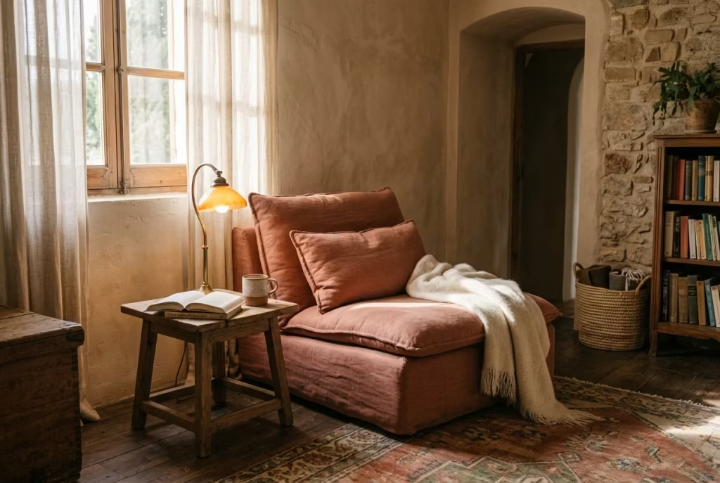
A Spanish reading nook only truly comes alive when the seating feels like an invitation rather than a statement. This is where the idea of a low, sink-in chair becomes essential. It is not about posture or formality, it is about surrendering, just enough, to allow the body to slow down and the mind to follow. A reading corner should never feel like a place you “use” in a rigid sense. It should feel like a place you fall into, almost without thinking.
In many residential projects I have worked on, seating is often the moment where a space either softens or stiffens. A chair that is too upright or visually heavy can unintentionally introduce tension into the nook, even if everything else has been thoughtfully designed.
On the other hand, a low-profile chair with a relaxed seat depth of around 55 to 65 cm (22 to 26 in) immediately changes the spatial language. It lowers the visual horizon line, which makes the entire corner feel more grounded and less performative.
The magic of a sink-in chair lies in how it reshapes proportion. When you sit lower, the surrounding architecture feels slightly taller, almost more generous. This subtle shift can make even compact spaces feel more expansive.
In a nook roughly 1.2 m by 1.5 m (4 ft by 5 ft), that change in seating height alone can completely alter how the space is perceived, turning it from a tight corner into a comfortable pause point within the home.
Material choice plays a quiet but crucial role here. Upholstered chairs in washed linen, soft boucle, or aged cotton blends tend to work particularly well in Spanish-inspired settings. These fabrics do not hold sharp lines; instead, they give way slightly under pressure, which reinforces the sense of ease. Over time, they also develop a lived-in softness that only improves with use, much like a well-worn book that becomes more personal with each reading.
There is also a visual rhythm to consider. A low chair naturally reduces the visual weight of furniture within the nook. It allows surrounding elements, such as plastered walls, woven textures, or arched details, to take on more presence without competing for attention.
The result is a composition that feels balanced rather than crowded, where nothing is fighting for dominance and everything settles into place with quiet confidence.
From experience, I have noticed that people instinctively gravitate toward these kinds of chairs when they are placed correctly. There is something almost intuitive about them.
You do not need to instruct anyone to sit and stay a while; the form itself does the inviting. It is a bit like the difference between a formal dining chair and a well-cushioned armchair in a corner you always end up returning to.
What often gets overlooked is how much influence seating has on behaviour. A rigid chair encourages brief use, while a sink-in chair encourages lingering. And in a reading nook, lingering is exactly the point. It is where time begins to loosen its grip a little, where a few pages quietly turn into an hour without anyone really noticing.
When chosen with care, a low, relaxed chair becomes more than just furniture. It becomes the emotional anchor of the nook, the piece that quietly sets the tone for everything else around it.
Bring in a warm-toned throw
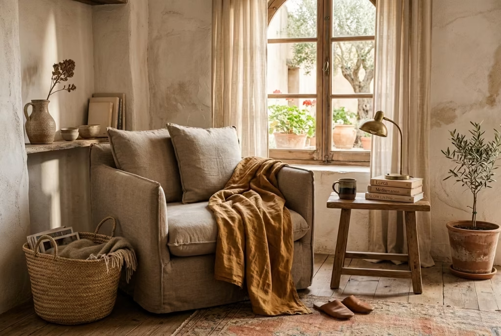
A Spanish reading nook rarely feels complete without a soft layer that casually drapes itself into the composition, almost as if it has always belonged there. A warm-toned throw plays exactly this role. It is not simply an accessory, it is the final brushstroke that shifts the nook from styled to lived-in, from visually pleasing to emotionally grounding.
In real-world residential styling, I have often treated throws as the element that quietly “loosens” a space. Even when everything else is perfectly arranged, walls finished, seating placed, lighting balanced, a nook can still feel slightly too controlled. The introduction of a well-chosen throw changes that immediately. It softens edges, breaks visual rigidity, and introduces a sense of ease that feels almost instinctive.
Material choice is where the nuance really lies. Wool brings weight and structure, cotton introduces breathability and casual softness, while linen carries that beautifully imperfect drape that feels slightly rumpled in the most intentional way.
In Spanish-inspired interiors, linen in particular tends to feel right at home, as if it belongs to sun-warmed afternoons and open windows rather than carefully staged environments.
Colour, however, is where the emotional temperature of the nook truly shifts. Ochre, sand, rust, and faded red work exceptionally well because they echo natural landscapes rather than manufactured palettes.
These tones do not sit on the surface of a room; they sink into it. An ochre throw, for example, can subtly echo terracotta walls, while a faded rust tone can bring depth to neutral upholstery without overwhelming it. Sand tones, on the other hand, act like a visual pause, softening transitions between stronger materials and colours.
In practice, I have found that even a single throw, loosely folded over the arm of a chair or casually draped across the seat, can change how a reading nook is perceived. In a space as small as 1.5 m by 1.5 m (5 ft by 5 ft), this one detail often becomes the difference between a corner that feels styled and one that feels genuinely inhabited. It introduces a sense of continuity, as if someone has just stepped away for a moment and will return shortly.
There is also something quietly human about a throw that is not perfectly arranged. A slight crease, a softened fold, a natural slump over the edge of a chair, these are the details that make a space feel real.
Over-styling, on the other hand, can strip a nook of its warmth, leaving it visually correct but emotionally distant. The charm lies in that subtle imperfection, the kind that feels unplanned but entirely right.
What makes this detail so powerful is its flexibility. A throw can shift with the seasons, layered more heavily in cooler months or lightened during warmer ones, without ever disrupting the overall language of the space. It becomes a quiet constant, a familiar thread running through the nook as everything else gently evolves around it.
Handled well, a warm-toned throw does not announce itself loudly. Instead, it settles into the scene with understated confidence, like the final note in a piece of music that lingers just long enough to be felt rather than simply heard.
Install a small wall shelf for books and objects
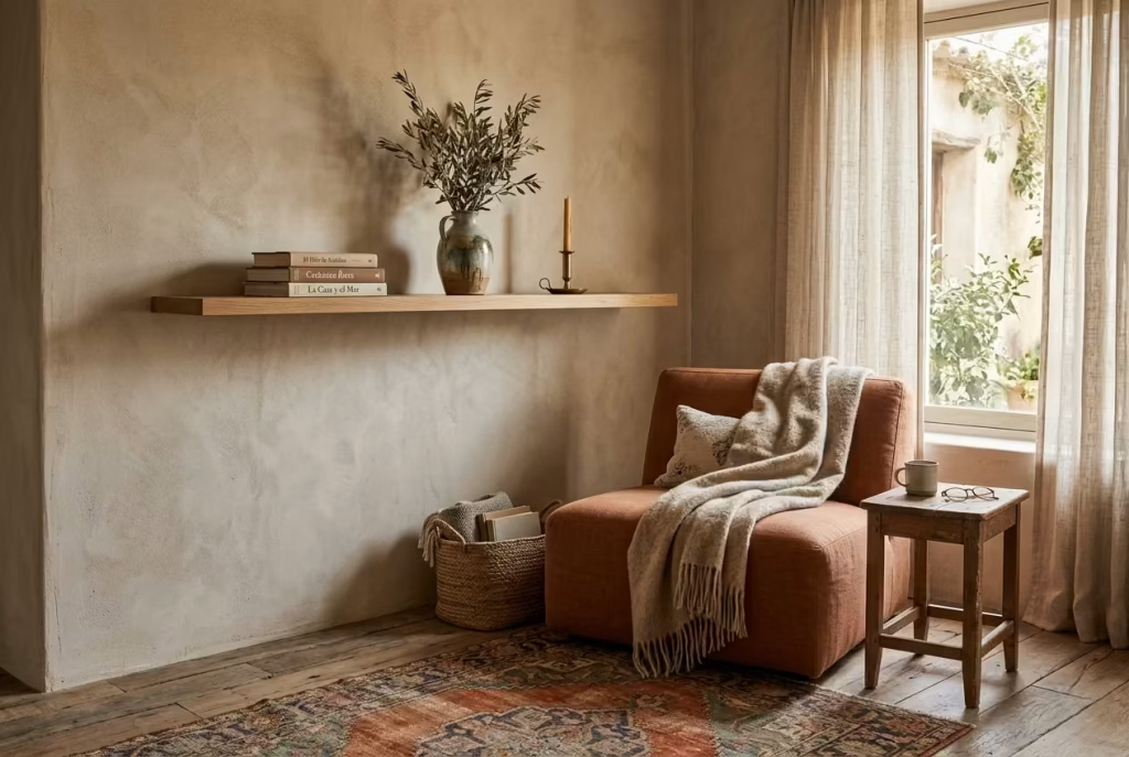
A reading nook becomes far more convincing when it has a place to hold the life that gathers around it. A small wall shelf does exactly that. It gives the corner a sense of purpose without asking for much in return, and that balance is what makes it so useful.
In a Spanish-inspired space, where warmth and restraint tend to work hand in hand, a narrow shelf can act like a quiet stage for books, ceramics, and a few well-chosen objects that lend the nook its character.
What makes this detail so effective is its ability to tidy the composition without sterilising it. A shelf placed at eye level, or just below, draws the gaze upward in a measured way and prevents the corner from feeling visually bottom-heavy.
In practical terms, it creates a point of calm ordering. Books no longer end up stacked on the floor, a candle or ceramic cup has somewhere to land, and the nook begins to feel intentionally edited rather than improvised at the eleventh hour.
In real homes, I have often found that narrow shelves work best when they are treated as a supporting act rather than the main performance. The temptation is to load them up with every attractive object available, but that is where the whole thing can go off the rails.
A shelf that is overfilled loses its poise. It starts to feel like a storage ledge rather than a refined design moment. Leaving breathing room around each item is what allows the composition to settle. The eye needs space to move, just as the body needs space to rest.
The ideal shelf depth for a reading nook is often around 12 to 20 cm (5 to 8 in), depending on what it is meant to hold. That range is usually enough for paperbacks, a small lamp, or a handful of objects without making the wall feel heavy. In narrower alcoves, this slim proportion matters enormously because it keeps the shelf from projecting too far into the room. It should support the nook, not bully it.
Material choice can make the difference between something purely functional and something quietly beautiful. A shelf in natural oak, limewashed timber, walnut, or even plaster-finished MDF can sit comfortably within a Spanish reading nook because each brings a slightly different mood. Timber feels warmer and more grounded.
A painted shelf in the same tonal family as the wall can recede gracefully, which is useful when you want the objects on it to do the talking. Either way, the aim is the same: let the shelf feel like it belongs to the architecture, not like it was bolted on as an afterthought.
Styling the shelf is where the nook begins to feel personal. A small stack of books, a handmade vessel, a framed photograph, or a compact piece of pottery is often enough. One object with a story behind it can carry more presence than a crowded row of decorative pieces. That is the real secret here. The shelf should read like a collected thought, not a display cabinet. A little restraint goes a long way.
I have also found that shelves in reading nooks work especially well when they echo other details in the room. If there is a rattan chair nearby, a wooden shelf can repeat that natural note. If the walls are limewashed, a matte shelf finish will sit quietly within the scheme. These small links create continuity, which is what stops the nook from feeling pieced together in a hurry.
Handled with care, a small wall shelf becomes more than a practical addition. It becomes part of the room’s rhythm, holding the everyday objects that make the nook feel lived in, while preserving the calm that a reading space depends on.
You May also Like: 25 Farmhouse Garden Ideas That Feel Timeless, Practical, and Full of Charm
Add a patterned cushion or two
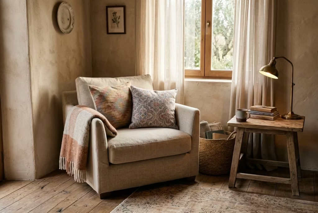
A Spanish reading nook often finds its personality in the smallest gestures, and cushions are one of those deceptively simple elements that can quietly shift the entire mood of the space. They are not there to dominate or compete for attention, but to introduce rhythm, softness, and a sense of cultural memory that feels gently embedded rather than overtly declared.
When I approach styling in real residential projects, cushions are usually the final layer, almost like the punctuation at the end of a well-structured sentence. The nook might already have its chair, lighting, and material palette in place, but without that subtle layering of textile pattern, it can sometimes feel visually incomplete, as if the story has been told but not fully spoken.
The key here is restraint, almost to the point of understatement. Spanish-leaning motifs, whether geometric, handwoven, or inspired by traditional tile patterns, work best when they are allowed to whisper rather than announce themselves.
One patterned cushion can be more powerful than several competing designs. Add a second only if the first feels balanced within the composition. Anything beyond that, and the space risks slipping into thematic territory, which tends to dilute the quiet sophistication that makes Spanish-inspired interiors so enduring.
In terms of scale, cushions in the range of 45 x 45 cm (18 x 18 in) or slightly elongated 50 x 30 cm (20 x 12 in) tend to work best in reading nooks. They sit comfortably within low, sink-in seating without overwhelming it.
The goal is not to build volume for the sake of it, but to create subtle variation in texture and tone that invites touch. A slightly faded woven pattern, a muted stripe, or a softened ikat-inspired design can introduce just enough visual interest without disturbing the calm.
Colour plays a supporting but important role here. Earthy reds, muted indigos, sand-washed neutrals, and softened ochres tend to integrate more naturally into a Spanish-inspired palette.
These tones do not feel newly introduced; they feel as though they have always been part of the space, gradually absorbed over time. That sense of familiarity is what keeps the nook from feeling overly styled.
There is also a psychological dimension to patterned textiles that should not be overlooked. Our eyes naturally seek variation, especially in spaces designed for rest and reading. A carefully chosen cushion pattern gives the eye a place to land and wander at the same time, much like a quiet conversation that does not demand full attention but still holds your interest. It is a subtle form of engagement that supports the purpose of the nook rather than distracting from it.
In practice, I have often found that a single patterned cushion placed slightly off-centre can feel more intentional than a perfectly symmetrical arrangement. It introduces a sense of ease, as if the space has evolved naturally rather than being staged. This slight imperfection, when handled well, becomes the very thing that makes the nook feel human.
Ultimately, cushions in a Spanish reading nook should feel like they belong to a larger narrative that has been unfolding over time. They are not the headline, but the quiet supporting voice in the background, adding warmth, depth, and a touch of character that lingers long after you have left the room.
Use antique or aged brass lighting
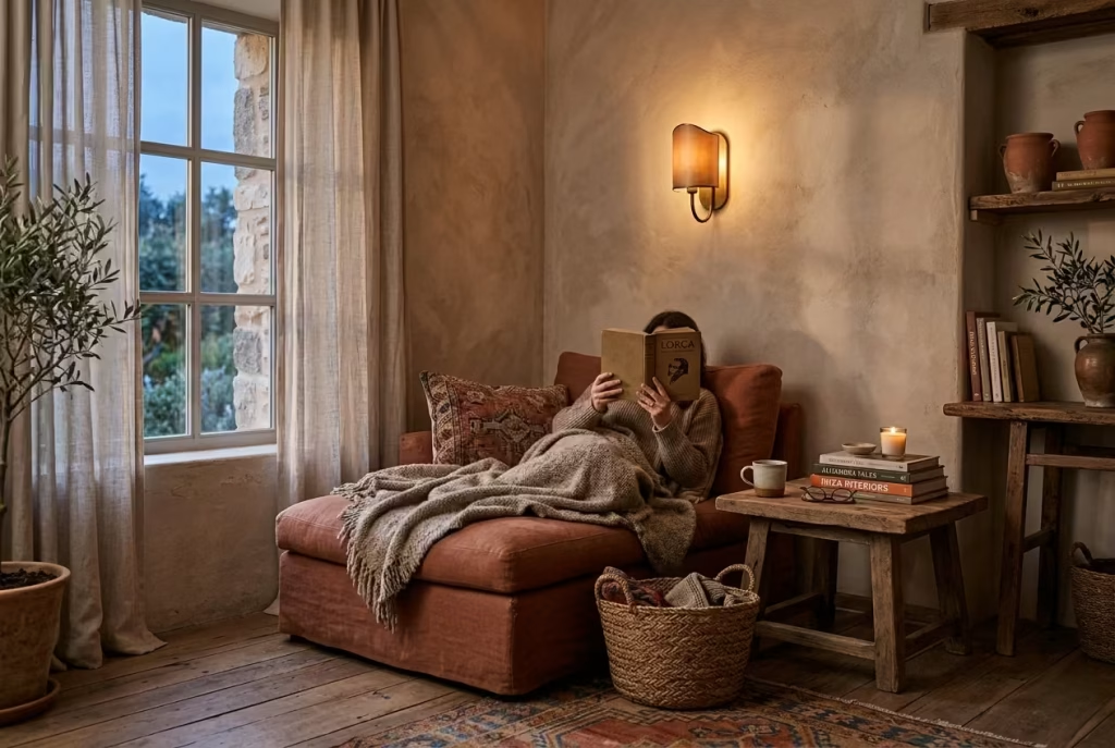
Lighting in a Spanish reading nook is rarely just a functional afterthought. It is the quiet mood-setter, the element that determines whether the space feels flat or deeply atmospheric once the sun begins to fade.
Antique or aged brass lighting, in particular, carries a sense of permanence that newer finishes often struggle to replicate. It does not try to look perfect or polished. Instead, it leans into patina, softness, and time-worn character, which is exactly what gives a reading corner its emotional depth.
In real projects, I have consistently seen how aged brass behaves almost like a warm filter for the entire nook. When placed correctly, it does not simply illuminate a space; it wraps it in a gentle glow that feels slightly golden at the edges.
This is especially effective in Spanish-inspired interiors where terracotta, limewash, and natural timber already create a warm foundation. Brass simply extends that warmth rather than competing with it.
A wall-mounted brass reading light, positioned around 110 to 130 cm (43 to 51 in) from the floor depending on seating height, can transform how the nook is experienced after dusk. It brings the light closer to the body, creating intimacy rather than flooding the space.
This is important because reading nooks are not meant to feel like workspaces. They should feel contained, almost cocooned, where light behaves like a companion rather than an overhead obligation.
The beauty of aged brass lies in its imperfection. Unlike chrome or polished steel, it does not reflect harshly or demand visual attention. Instead, it absorbs and diffuses light in a softer manner, especially when paired with warm-toned bulbs in the range of 2200K to 2700K. This combination produces a glow that feels almost candlelit, which aligns naturally with the slower rhythm of reading and unwinding.
There is also a strong material dialogue that happens here. Brass against limewash creates a quiet contrast between smooth patina and textured surface. Against terracotta, it feels sun-warmed and grounded.
Against timber, it introduces a subtle lift, almost like a gentle highlight within an otherwise earthy composition. These relationships are what make the nook feel layered rather than one-dimensional.
From experience, one of the most effective lighting approaches is to avoid overcomplication. A single well-placed brass sconce or adjustable reading lamp often delivers more impact than multiple light sources competing for attention.
The goal is not brightness in excess, but controlled intimacy. A reading nook should never feel overexposed. It should feel like a space that gently reveals itself as the light settles in.
There is also a psychological comfort that aged metals tend to bring. Brass, especially when it carries a soft patina, feels familiar even when newly installed. It has a sense of history embedded in its surface, which subtly reassures the eye. In spaces designed for reflection and reading, this matters more than it might initially seem.
Handled thoughtfully, aged brass lighting does not announce itself loudly. It simply settles into the composition, like the final piece that was always meant to be there. And once switched on, it transforms the nook from a daytime corner into an evening retreat, where time feels slower, softer, and just a little more generous.
You May also Like: 25 Timeless Spanish Kitchen Ideas That Capture the Beauty of Spain
Create a layered lighting scheme
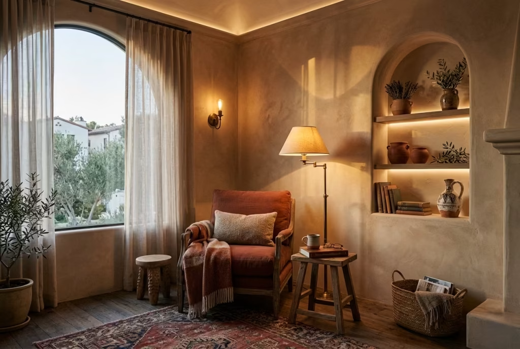
A Spanish reading nook only reveals its full character when light is treated as something layered rather than single-source. It is rarely just about brightness. It is about depth, rhythm, and the way illumination settles into different surfaces throughout the day.
A well-composed lighting scheme gives the nook two lives: one in daylight, where it feels open and grounded, and another after dark, where it becomes intimate, almost hushed, like a private retreat tucked away from the rest of the home.
In practice, I have often seen lighting become the element that quietly makes or breaks a reading corner. Even the most carefully selected furniture and materials can feel underwhelming if the light is flat or one-dimensional.
On the other hand, when ambient, task, and accent lighting are thoughtfully combined, the space begins to shift in tone as naturally as the sun moving across a wall.
Ambient light is the foundation. It is the soft overall glow that prevents the nook from feeling isolated or visually heavy. In Spanish-inspired interiors,
this often comes from warm ceiling fixtures or indirect wall washing that allows textures like limewash or plaster to come alive without harsh contrast. The aim here is not intensity, but gentle presence, something that holds the space together without dominating it.
Task lighting is where function quietly steps in. A well-positioned reading lamp, ideally adjustable, ensures the nook actually works as a place to read comfortably without straining the eyes. Placement is everything.
In most residential setups, I have found that positioning the light slightly behind and above shoulder level creates the most natural reading experience, avoiding glare while keeping the page softly illuminated. This is the kind of detail that seems minor on paper, but makes a noticeable difference in daily use.
Accent lighting is where atmosphere begins to take shape. It might be a small wall sconce highlighting a textured plaster surface, or a soft glow catching the edge of a woven basket or arched niche.
These subtle touches do not carry functional weight, yet they add emotional texture. They guide the eye gently through the space, like quiet pauses in a well-written sentence.
What makes a layered scheme so effective is its adaptability. A nook should never feel locked into a single mood. During the day, natural light should be allowed to lead, shifting across terracotta tones, timber grains, and woven textures. As evening arrives, artificial lighting takes over, but in a controlled and gradual way, almost like the room is slowly exhaling into a calmer state.
I have also noticed that layered lighting helps smaller spaces feel more dimensional. In a nook measuring roughly 1.2 m by 1.8 m (4 ft by 6 ft), for example, the interplay between light sources can create a sense of depth that flat lighting completely erases. Shadows become part of the design rather than something to eliminate, and surfaces begin to feel more sculpted and architectural.
The real strength of this approach lies in its restraint. It is not about flooding a corner with light, but about letting different sources take turns in shaping the mood. When done well, the reading nook does not feel artificially lit at all. It feels naturally alive, responding to time, atmosphere, and use with quiet intelligence, as if the space understands exactly how it is meant to be lived in.
Place the nook near natural light

A Spanish reading nook reaches its full potential when it is allowed to sit in conversation with natural light rather than compete against it. There is something inherently grounding about positioning a quiet corner beside a window, a French door, or even a modest glazed opening. It anchors the space in the rhythm of the day, letting light become an active participant in how the nook feels, changes, and settles over time.
In real residential work, I have often found that the most successful reading corners are not the ones that rely heavily on styling, but the ones that are simply placed correctly in relation to daylight.
A well-positioned nook does half the design work for you. Morning light tends to bring clarity and softness, while late afternoon light adds a richer, more golden tone that naturally enhances Spanish-inspired materials like terracotta, timber, and limewash. It is this slow evolution of light that gives the space its emotional depth.
When a reading nook is placed within roughly 60 to 120 cm (2 to 4 ft) of a window, the effect becomes especially noticeable. The proximity allows daylight to wash across textures without overwhelming them.
Plaster walls begin to show subtle variations, woven surfaces pick up delicate shadows, and even simple linen upholstery takes on a more dynamic presence. Nothing feels static. Everything gently shifts, as if the space is breathing in real time.
French doors or larger glazed openings take this effect even further. They blur the boundary between interior and exterior, which is particularly powerful in Spanish-inspired schemes where connection to natural elements is central to the design language.
A reading nook placed beside such openings often feels less like a contained corner and more like an extension of the landscape beyond it. Even when the doors are closed, the visual link remains intact, keeping the space from feeling isolated or closed in.
There is also a practical advantage that comes with natural light placement. It reduces the need for artificial lighting during the day, which allows the material palette to be seen in its most honest form.
Colours are truest under daylight, textures are more legible, and spatial proportions feel more accurate. In my experience, this is when clients often begin to understand how important light really is, not as an accessory, but as a shaping force.
What makes this approach particularly effective is how it enhances emotional connection. A reading nook that is close to natural light feels more alive, more integrated into the daily rhythm of the home. You are not stepping into a separate, disconnected zone.
You are simply pausing within a space that already belongs to the flow of the house. That subtle continuity is what makes people return to it again and again without consciously thinking about why.
Handled well, natural light does not just illuminate the nook. It defines it. It brings softness where needed, contrast where appropriate, and above all, a sense of ease that no artificial system can fully replicate.
Soften the floor with a vintage-style rug
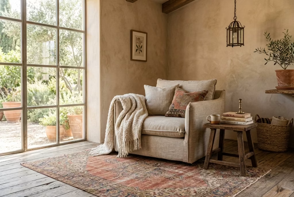
A Spanish reading nook only truly settles into place when the floor beneath it stops feeling like an afterthought and starts acting as a foundation for atmosphere. This is where a vintage-style rug becomes quietly transformative. It does not demand attention, yet it anchors the entire composition with a sense of warmth, memory, and quiet definition that hard flooring alone rarely achieves.
In many residential projects, I have seen how a rug can instantly clarify intent in a space. Without it, a reading nook can sometimes feel like furniture placed in a corner rather than a designed moment within the home. Add a rug, and suddenly the boundaries shift. The nook begins to read as a zone in its own right, gently carved out from the surrounding room without needing walls or partitions.
Muted red, faded blue, and neutral wool tones work particularly well within a Spanish-inspired palette. These colours carry a sense of time-worn elegance, as if they have softened through years of sunlight, footsteps, and daily use.
A muted red rug, for instance, can subtly echo terracotta walls or clay accents, while faded blue introduces a cooler counterpoint that prevents the warmth from becoming visually heavy. Neutral wool, on the other hand, acts like a quiet stabiliser, allowing surrounding textures to take precedence without interference.
The size of the rug is just as important as its colour. In a compact nook measuring around 1.5 m by 1.8 m (5 ft by 6 ft), a rug that extends slightly beyond the seating area helps ground the arrangement and prevents it from feeling visually clipped.
It is less about precision fitting and more about creating a sense of generosity underfoot. The moment your feet land on something soft and considered, the entire experience of the nook changes.
There is also a subtle psychological shift that happens when a rug is introduced. Hard floors, particularly wood or stone, tend to reflect sound and create a sharper acoustic environment. A rug softens that echo, absorbing noise in a way that makes the space feel more intimate and contained. This quieting effect is often overlooked, yet it plays a significant role in how comfortable a reading nook feels over time.
From a design perspective, vintage-style rugs carry an additional advantage. Their slightly faded patterns and softened edges introduce a sense of history, even when newly placed.
They do not feel overly polished or brand new, which is important in Spanish-inspired interiors where patina and imperfection are part of the visual language. A rug that looks like it has been gently lived with rather than freshly laid often integrates more naturally into the space.
I have also found that rugs help balance the visual weight of surrounding materials. When paired with plastered walls, timber furniture, and woven textures, they act as a grounding layer that holds everything together.
Without them, the nook can sometimes feel as though it is floating within the room, disconnected from its base. With them, it feels settled, almost like it has taken root.
Handled thoughtfully, a vintage-style rug does not simply sit under the reading nook. It defines it, softens it, and quietly completes it, ensuring that the space feels intentional, cohesive, and deeply comfortable, rather than casually assembled.
Add a small side table in wood or stone
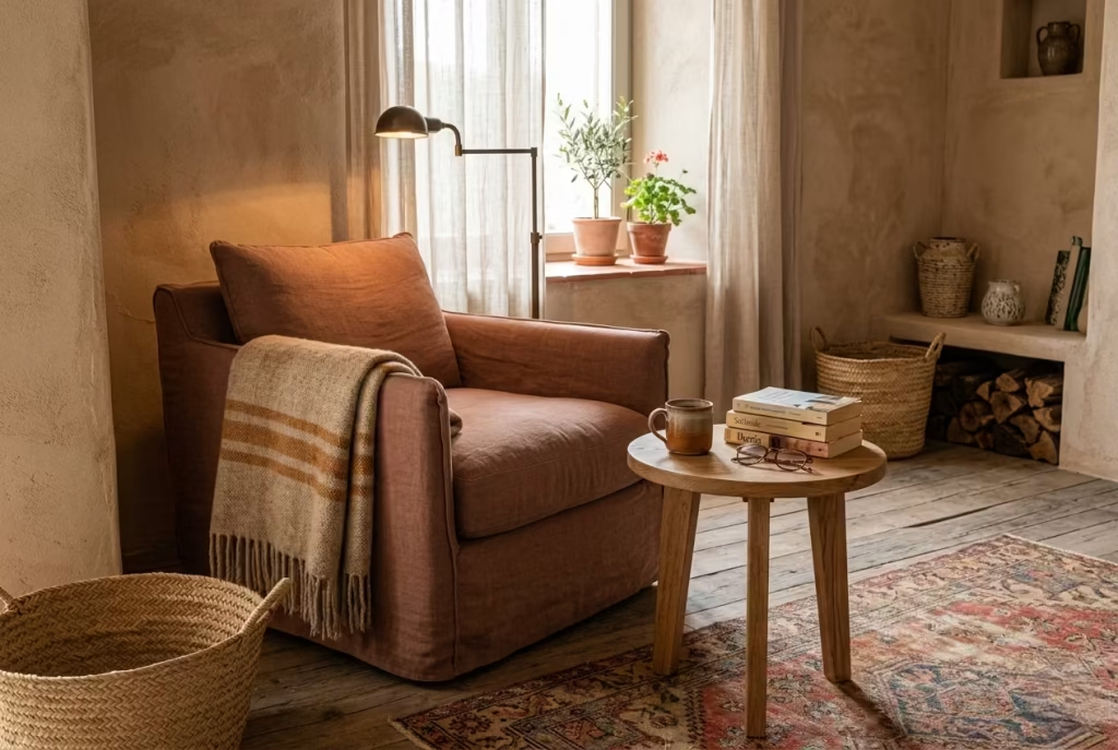
A Spanish reading nook begins to feel truly usable when beauty and function meet somewhere quietly in the middle. A small side table is often the unsung piece that makes this balance possible.
It does not compete with the chair, the lighting, or the wall finish. Instead, it quietly supports the rhythm of the space, holding the everyday objects that naturally gather around a moment of reading, a cup of tea, a pair of glasses, or a book that is half-open and waiting to be returned to.
In real residential work, I have often noticed that without a side table, even the most beautifully styled nook can feel slightly incomplete in practice. It looks resolved, yet behaves awkwardly once in use.
People end up placing books on the floor or balancing drinks on armrests, and the sense of ease quietly disappears. Introduce a well-proportioned table, and suddenly the nook begins to function as it was meant to, without effort or interruption.
The scale is crucial here. A compact surface, typically around 30 to 45 cm (12 to 18 in) in diameter or width, is usually enough to support daily use without visually overwhelming the seating area.
In tighter corners, especially those measuring around 1.2 m by 1.5 m (4 ft by 5 ft), anything larger can start to feel intrusive, as if the table is crowding the conversation between chair, light, and surrounding textures. The aim is always lightness in footprint, even when the material feels substantial.
Wood and stone are particularly aligned with Spanish-inspired interiors because they carry an honesty that feels grounded rather than decorative. Oak brings a soft, familiar warmth, walnut introduces a deeper, more grounded tone, while travertine and limestone add a quiet architectural weight that feels almost timeless. These materials do not try to imitate anything else. They simply exist in their natural state, which is precisely what allows them to settle so comfortably into a reading nook.
I have seen oak side tables work beautifully in softer, more relaxed schemes where warmth is the priority, while stone tables tend to shine in spaces where texture and contrast are more pronounced.
A limestone table placed against a limewashed wall, for example, creates a subtle dialogue between two mineral surfaces, each slightly different in tone but deeply connected in material origin. It is this kind of understated relationship that gives a nook its depth.
There is also a quiet behavioural benefit that comes with having a dedicated surface. When everything has its place, the act of reading becomes more seamless. You are not searching for where to put things or adjusting your posture to accommodate awkward surfaces. Instead, the space begins to anticipate your needs almost instinctively. That sense of ease is what transforms a corner from visually appealing into genuinely functional.
From a styling perspective, the side table should never feel overworked. A single ceramic cup, a small stack of books, or a softly glowing candle is often more than enough. The table is not a stage for display. It is a resting point, a pause within the composition, where objects sit quietly rather than compete for attention.
Handled with restraint, a small side table becomes more than a practical addition. It becomes part of the nook’s quiet rhythm, supporting daily use while reinforcing the calm, considered atmosphere that defines Spanish-inspired reading spaces at their best.
Use a bench seat in a recessed area
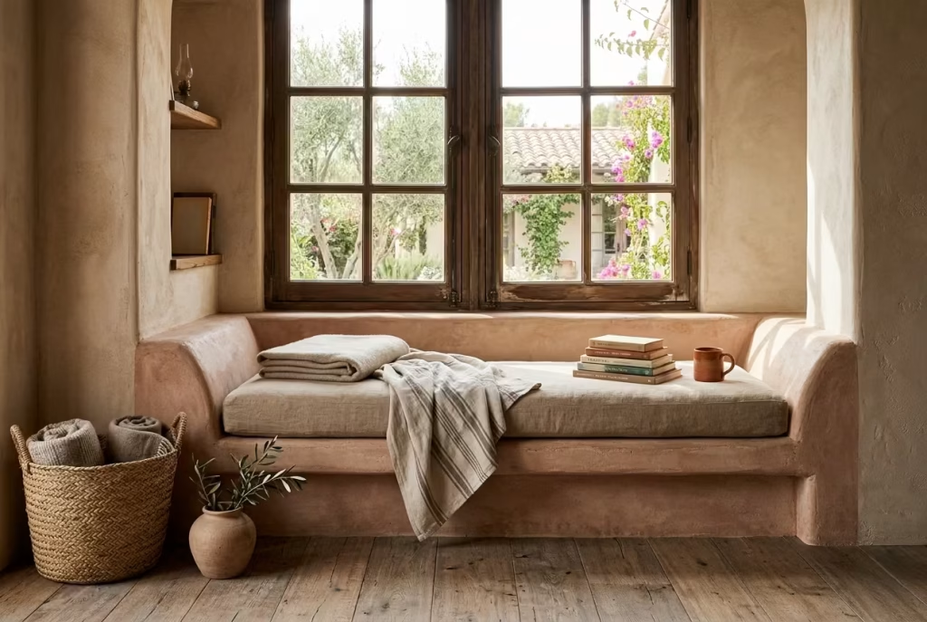
A Spanish reading nook reaches a different level of permanence when seating becomes part of the architecture rather than something placed within it. A built-in bench seat, especially within a recessed wall or under a window, carries that sense of quiet intention that freestanding furniture often struggles to achieve. It feels as though the space was always waiting to be used in this way, rather than recently adjusted to accommodate it.
In practice, I have found that recessed seating tends to change how people interact with a corner almost immediately. There is a subtle psychological shift that happens when a seat is integrated into the structure itself. It removes hesitation.
You do not “choose” to sit there in the same way you might with a chair. You naturally settle into it, as if the architecture has already made the decision for you. That sense of ease is exactly what a reading nook should deliver.
Window alcoves are particularly well suited to this approach. When a bench is placed beneath a glazed opening, it benefits from direct and indirect light throughout the day, which brings constant variation to the space.
Morning light tends to feel crisp and clear, gently outlining the form of the seat, while later in the day, softer tones begin to wrap around the surfaces, creating a more introspective atmosphere. It becomes less of a static seat and more of a changing experience tied to the rhythm of natural light.
From a design standpoint, proportion is where everything quietly comes together. A seat depth of around 45 to 50 cm (18 to 20 in) is generally the sweet spot for comfort in reading-focused spaces.
It allows enough room to sit back slightly without losing posture, while still keeping the body engaged with the space rather than sinking too deeply into it. When paired with a backrest height of around 35 to 45 cm (14 to 18 in), the result is a balanced support system that feels relaxed without becoming overly lounge-like.
Built-in benches also offer a valuable opportunity to integrate storage in a way that feels seamless. In many residential projects, I have seen hinged seating or concealed drawers beneath the bench used to store books, throws, or seasonal textiles.
When done correctly, this kind of integration keeps the nook visually clean while still supporting everyday practicality. It is one of those details that quietly improves the functionality of the space without drawing attention to itself.
Material selection plays a defining role here as well. A plastered or limewashed base keeps the bench visually cohesive with Spanish-inspired walls, while timber cladding introduces warmth and tactility that softens the architectural lines. In some cases, a combination of both works best, a solid base with a wooden top, creating a subtle contrast that feels grounded rather than decorative.
I have often noticed that recessed benches also influence how long people stay in a space. There is something inherently calming about being partially enclosed by architecture, almost like the walls are gently holding you in place without feeling restrictive. This sense of enclosure, when balanced correctly with light and proportion, encourages longer reading sessions without conscious effort.
Handled with care, a built-in bench seat does more than provide somewhere to sit. It becomes part of the building itself, quietly anchoring the reading nook into the structure of the home and giving it that rare feeling of being both designed and inevitable at the same time.
You May also Like: 25 Stunning Mountain Bedroom Design Ideas That Feel Like a Luxury Escape
Display books in a calm, edited way
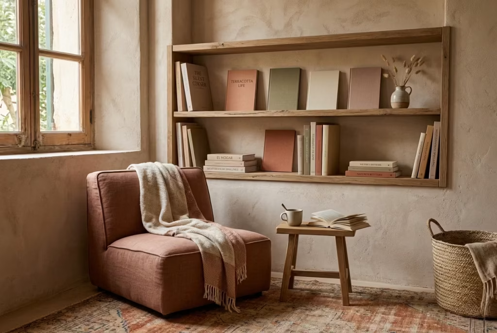
A Spanish reading nook feels most convincing when the books within it are treated as part of the atmosphere rather than as visual clutter. Books should never overwhelm the space or turn it into a storage corner in disguise.
Instead, they should sit quietly within the composition, almost like well-chosen guests at a table who know when to speak and when to stay silent. That sense of restraint is what keeps the nook feeling composed, intentional, and emotionally easy to inhabit.
In real residential projects, I have often noticed that the moment books are overstacked or scattered without consideration, the entire reading nook begins to lose its rhythm. What was meant to feel calm starts to feel visually busy, and the eye no longer knows where to rest.
On the other hand, a carefully edited selection instantly changes the tone. It introduces clarity, as if the space has taken a deep breath and settled into itself.
Editing here does not mean stripping everything away. It means choosing with intention, allowing only what supports the mood of the nook to remain visible. A small cluster of well-loved books, perhaps arranged vertically with a few laid horizontally to break monotony, often feels far more compelling than a densely packed shelf.
The goal is not abundance, but balance, where each object has room to be seen and appreciated without competing for attention.
In practical terms, leaving negative space is just as important as what you choose to display. When shelves are not fully occupied, the surrounding materials begin to speak more clearly. Limewashed walls feel softer, timber shelves feel more grounded, and even small decorative objects gain presence simply because they are not surrounded by visual noise. This breathing room is what allows a reading nook to feel elevated rather than improvised.
I have also found that grouping books by tone rather than strict categorisation can create a more cohesive visual language. Earth-toned spines, muted covers, and neutral bindings tend to sit more comfortably within Spanish-inspired interiors than highly saturated or glossy designs. It is less about strict order and more about visual harmony, as if the books have been naturally collected over time rather than placed according to a system.
There is also a behavioural benefit to this approach. When books are edited and visible rather than buried in stacks, they become easier to engage with. You are more likely to pick one up, return to it, or rotate it into use. In contrast, overcrowded shelving often leads to visual fatigue, where even the act of choosing feels overwhelming. A calm arrangement quietly removes that friction.
From a design perspective, I often treat books as part of the material palette rather than separate objects. Their colours, textures, and proportions contribute to the overall composition of the nook. When handled this way, they stop feeling like clutter and start feeling like context, reinforcing the character of the space rather than disrupting it.
Ultimately, an edited book display is not about minimalism for its own sake. It is about clarity, rhythm, and allowing the reading nook to breathe. When everything is given just enough space to exist without crowding its neighbour, the entire corner settles into a state of quiet confidence, where nothing feels forced and everything feels exactly as it should be.
You May also Like: 15 Secret Earthy Reading Nook Ideas That Turn Any Corner Into a Cozy Escape
Introduce olive branches or dried botanicals
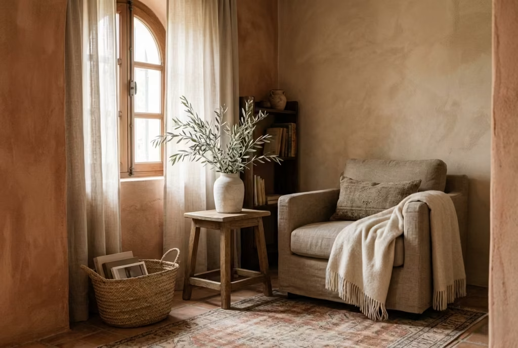
A Spanish reading nook feels most complete when it carries a quiet trace of the natural world, something that softens the architecture and reminds the space it is meant to be lived in, not simply admired.
Olive branches and dried botanicals achieve this with remarkable restraint. They do not behave like decorative flourishes fighting for attention. Instead, they settle into the corner with a kind of effortless ease, as if they were always meant to be there.
In real residential styling work, I have often found that greenery or dried foliage can easily tip a space into visual excess if not handled carefully. The key is not abundance, but selection. One well-placed vessel holding olive branches or eucalyptus can do far more for the atmosphere than a full arrangement ever could. It is one of those rare design gestures where holding back actually creates more presence, not less.
Olive branches in particular carry a distinct Mediterranean character that feels deeply aligned with Spanish-inspired interiors. Their muted green tones, slightly silvery under certain light conditions, sit beautifully against terracotta, limewashed walls, and warm timber.
They do not demand attention in the way flowering plants might. Instead, they offer a steady, grounded calm, almost like a visual exhale within the composition of the nook.
Eucalyptus introduces a slightly cooler note, which can be especially effective in spaces that lean heavily into warm palettes. Its soft, rounded leaves and muted grey-green tones bring balance without interrupting the overall warmth of the scheme. When placed in a simple ceramic or stone vessel, it often feels quietly sculptural, adding height and movement without overwhelming the surface it sits on.
Dried grasses, on the other hand, bring texture and fragility into the space. There is something beautifully unpolished about them. They move slightly with air currents, catch light in unexpected ways, and introduce a sense of impermanence that feels oddly grounding. In a reading nook, this subtle movement can make the space feel more alive, even when nothing else is changing.
I have also noticed that scale plays a crucial role here. A small arrangement, typically no taller than 40 to 60 cm (16 to 24 in), tends to feel most appropriate for a reading corner. Anything larger can begin to dominate the visual field, pulling focus away from the intended calm. The goal is always to support the atmosphere, not to compete with it.
There is also an emotional dimension to using natural or dried botanicals in this way. They introduce a sense of seasonality, even when the rest of the space remains unchanged. Over time, they gently fade, shift, or dry further, which adds a layer of quiet evolution to the nook. It is a subtle reminder that interiors are not static compositions but living environments that respond to time.
Handled with restraint, olive branches and dried botanicals do not act as decoration. They become part of the room’s rhythm, softening edges, grounding materials, and reinforcing that understated Mediterranean character that makes a Spanish reading nook feel so naturally at ease within the home.
Hang one piece of art with warmth and restraint
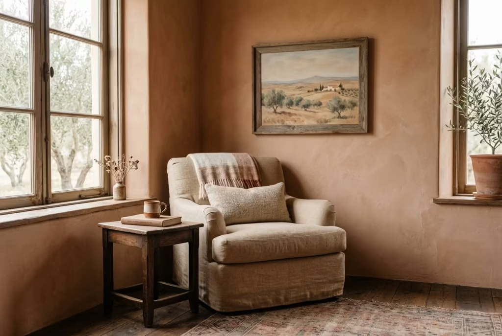
A Spanish reading nook often finds its emotional anchor not in abundance, but in a single, carefully chosen artwork that quietly holds the space together. This is where restraint becomes a design language in itself. One well-placed piece can shape the entire atmosphere of the corner, setting tone, mood, and even pace without ever needing to compete for attention.
In practice, I have seen many reading nooks lose their clarity when walls are treated as galleries rather than intentional compositions. The eye becomes restless, moving from piece to piece without ever settling. By contrast, one strong artwork introduces calm. It gives the space a point of focus, almost like a visual pause that allows everything else in the nook to breathe more freely.
Landscapes work particularly well in Spanish-inspired interiors because they extend the emotional reach of the space. Whether it is a sun-bleached horizon, a soft rural scene, or an abstract interpretation of terrain, these works naturally echo the grounded, earthy palette already present in terracotta, limewash, and timber. They do not feel imposed onto the room. Instead, they feel like an extension of it, as if the interior and the artwork are speaking the same language.
Ceramic-inspired art or works that reference handmade processes also sit beautifully within this context. There is a tactile sensitivity to them, even when viewed at a distance. They reflect the same principles found in the surrounding materials, imperfection, texture, and quiet variation. In a reading nook, where stillness is part of the experience, this kind of visual softness becomes especially important.
Abstract pieces in muted, earthy tones can be equally powerful, particularly when they avoid high contrast or overly sharp compositions. Soft movement, layered colour fields, or slightly weathered textures allow the artwork to sit comfortably within the environment rather than dominate it. The aim is not to create a focal point that interrupts the mood, but one that gently supports it, like a steady rhythm in the background.
Scale, once again, plays a defining role. A single artwork measuring around 60 to 100 cm (24 to 39 in) in height or width is often more effective than multiple smaller pieces scattered across the wall. When art is too fragmented, the visual conversation becomes scattered. When it is unified, it creates presence without noise. In a reading nook, that sense of quiet cohesion is what allows the space to feel complete.
Placement is equally important. Hanging the piece at a slightly lower-than-average eye level, especially in a seated environment, helps integrate it into the lived experience of the nook. It should feel like part of the conversation you are having while reading, not something that sits high above it, disconnected from the physical experience of the space.
There is also a subtle emotional benefit to limiting the number of artworks. One piece, chosen with intention, tends to carry more personal weight. It becomes familiar over time, almost like a companion to the space. You begin to notice its details differently depending on the time of day, the quality of light, or even your own mood. That quiet familiarity is what gives a reading nook its depth.
Handled with care, a single artwork does not simply decorate a Spanish reading nook. It completes it, offering just enough visual storytelling to enrich the atmosphere without ever disturbing its calm, measured rhythm.
Choose textiles with visible weave
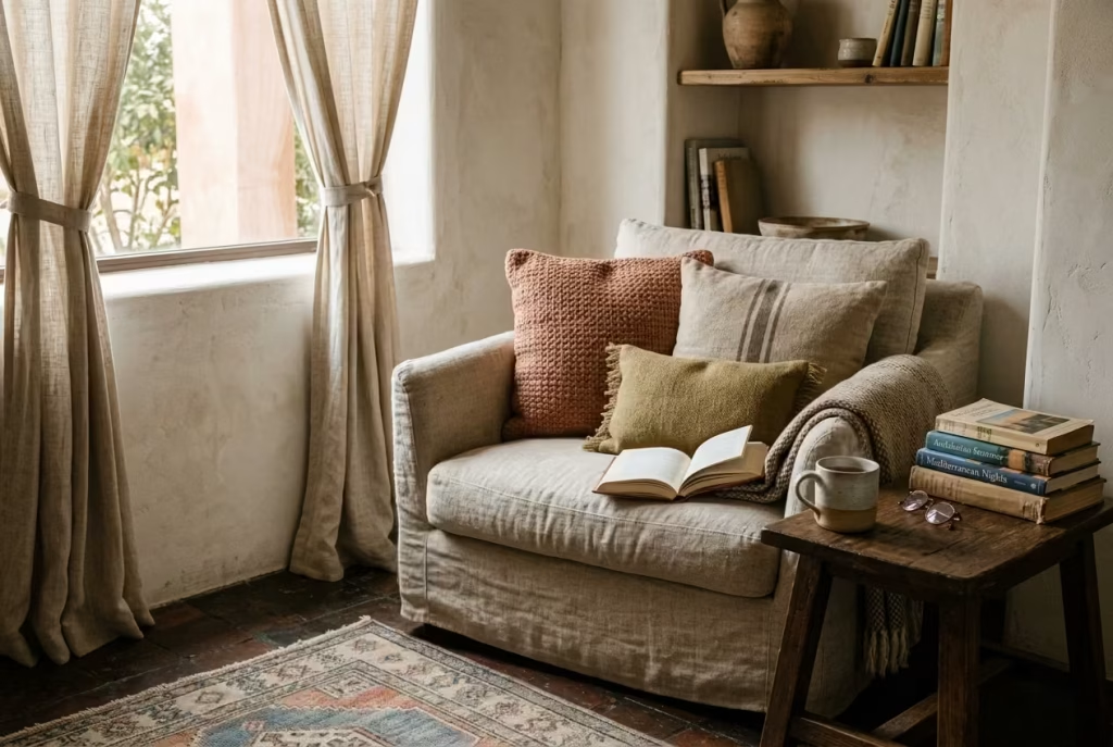
A Spanish reading nook truly comes into its own when the textiles are allowed to show their character rather than hide behind overly refined finishes. There is something quietly compelling about materials where the weave is visible, where the surface tells you how it was made, not just how it looks. Linen curtains, slubby cushion covers, and tactile upholstery all carry this honesty, and it is precisely this quality that gives a reading corner its depth and authenticity.
In real residential projects, I have often found that the moment you introduce highly processed, overly smooth fabrics, the atmosphere begins to feel slightly detached. It becomes visually correct but emotionally flat.
On the other hand, textiles with natural irregularity bring the space back to life. They soften the architecture, absorb light in uneven ways, and introduce a sense of rhythm that feels almost unplanned, yet entirely right once it settles.
Linen, in particular, behaves beautifully in Spanish-inspired interiors. It never sits rigidly in place. It creases, folds, and shifts with use, which gives the reading nook a lived-in quality that feels earned rather than styled.
Linen curtains that move gently with airflow near a window can completely change how the space feels throughout the day. Morning light filters through them with a soft diffusion, while late afternoon light picks up their texture, casting faint shadows that add quiet depth to the walls.
Slubby cushion covers and loosely woven upholstery bring a similar effect at a more intimate level. Their uneven surface catches the eye in subtle ways, encouraging a slower kind of visual engagement.
Instead of scanning a smooth surface, the eye begins to wander across texture, which naturally supports the slower pace of a reading environment. It is a small detail, but it has a noticeable impact on how settled the space feels.
There is also an important longevity aspect to these materials. Textiles with visible weave tend to age with grace rather than deteriorate in appearance. They soften over time, developing a patina that actually enhances their character.
In a reading nook, where use is frequent and relaxed, this kind of ageing is not only acceptable, it is desirable. It reinforces the idea that the space is meant to be lived in, not preserved like a showroom.
I have also noticed that these materials interact particularly well with the other elements typical of Spanish-inspired design. Against limewashed walls, linen feels even more organic. Next to terracotta tones, it adds balance and softness.
When paired with timber or rattan, it helps prevent the composition from feeling too structured or rigid. It acts almost like a mediator between stronger materials, quietly smoothing transitions without drawing attention to itself.
Scale and layering still matter here. A mix of heavier upholstery with lighter curtains or throws creates a sense of depth that feels natural rather than staged. The key is to avoid over-coordination. When every textile matches too precisely, the space can begin to feel overly controlled. A slightly imperfect combination, where tones are related but not identical, tends to feel far more authentic.
Ultimately, textiles with visible weave bring a kind of quiet integrity to a Spanish reading nook. They do not rely on perfection or polish. Instead, they lean into texture, movement, and subtle variation, allowing the space to feel more human, more relaxed, and far more engaging over time.
Add a carved or rustic wooden element
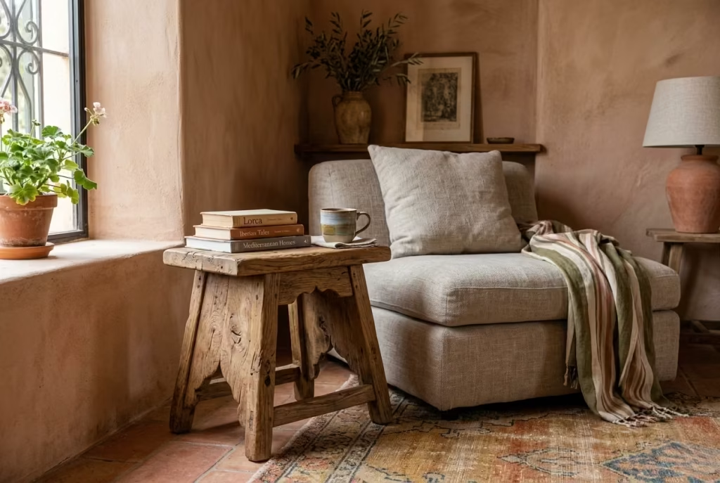
A Spanish reading nook begins to feel truly grounded when raw, honest wood enters the conversation. Carved or rustic wooden elements have a way of anchoring the space that polished finishes simply cannot replicate. They carry weight, not just physically but visually, introducing a sense of permanence that quietly settles the entire composition. This is often the moment where a nook stops feeling “styled” and starts feeling genuinely lived in.
In real residential work, I have found that wood with visible grain acts almost like a stabilising force within softer, more layered interiors. When everything else is leaning into plaster, textiles, and woven surfaces, wood brings structure without stiffness. It is the detail that holds everything together when the eye begins to wander. A carved stool tucked beside a chair, for example, can instantly shift the tone of the corner from decorative to grounded, like an anchor dropped into calm water.
The beauty of rustic wood lies in its imperfection. Knots, grain variation, and slightly uneven finishes are not flaws in this context, they are the very qualities that give the material its emotional depth. In Spanish-inspired interiors, this kind of honesty feels especially important. It mirrors the architectural language of older Mediterranean homes, where materials were used in their most natural state, shaped more by craft than by industrial refinement.
A small wooden stool, often around 35 to 45 cm (14 to 18 in) in height, can serve multiple roles within a reading nook. It might hold a book, a cup of tea, or simply sit as a sculptural pause within the composition. A rustic console, on the other hand, can introduce a horizontal balance to the vertical softness of textiles and wall finishes. Even a simple shelf in reclaimed timber can change the visual weight of the corner, giving it a sense of rootedness that feels quietly powerful.
There is also something deeply sensory about aged wood that contributes to the atmosphere of a reading space. Its surface absorbs light rather than reflecting it, which helps maintain the soft, muted quality that Spanish-inspired interiors rely on. When sunlight moves across a carved surface, it does not bounce sharply; it settles into the grooves and edges, revealing subtle shifts in tone throughout the day. That quiet variation keeps the nook visually alive without disrupting its calm.
From experience, I have also noticed that rustic wood introduces a kind of emotional familiarity. Even in newly designed spaces, it carries a sense of history, as if it has already been part of the home for years. This perception is incredibly valuable in a reading nook, where comfort is not only physical but psychological. You are far more likely to linger in a space that feels established rather than newly assembled.
It is also worth considering restraint in placement. One well-chosen wooden piece often carries more impact than several competing elements. When overused, rustic wood can start to dominate the palette and shift the mood away from subtlety. But when used sparingly, it becomes a quiet focal point, enriching the space without overpowering it.
Handled with care, carved or rustic wood does more than decorate a Spanish reading nook. It grounds it, giving the space a sense of origin and stability, like a quiet reminder that good design does not float above life, it settles firmly within it.
You May also Like: 25 outdoor entryways to transform your outdoor arrival into a composed, lasting first impression
Use a muted blue accent sparingly
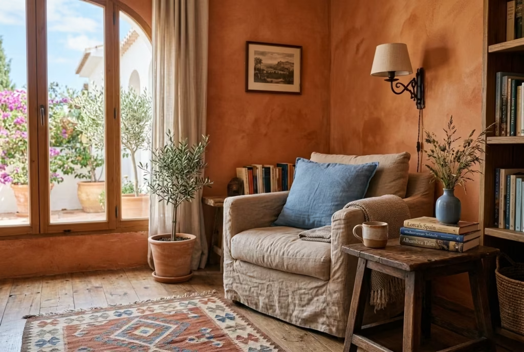
A Spanish reading nook, no matter how warm or grounded its palette may be, benefits from a carefully placed moment of cool contrast. This is where muted blue comes into play, not as a dominant voice, but as a quiet counterpoint that keeps the composition from drifting into visual heaviness. When used with restraint, it feels less like an added colour and more like a pause in the rhythm of warmth, almost like a soft breath between richer tones.
In practice, I have often seen spaces that lean heavily into terracotta, timber, and clay begin to feel slightly saturated over time. They are beautiful, but without balance, warmth can start to feel visually dense.
Introducing a muted Spanish blue, gently desaturated and softened, helps break that intensity without disrupting the overall language of the space. It is a bit like opening a window in a warm room, the atmosphere immediately feels more breathable.
This blue should never lead the palette. It works best when it behaves like a supporting note, quietly echoing rather than speaking loudly. In small doses, it can appear in a ceramic vessel, a single cushion, a woven textile detail, or even a subtle painted edge within shelving. The key is that it should feel discovered rather than declared, as if it naturally belongs rather than being deliberately inserted.
From real residential experience, I have found that muted blue performs particularly well against terracotta-based schemes. The two tones sit on opposite sides of the temperature spectrum, yet when softened correctly, they do not clash. Instead, they create a gentle tension that adds depth.
Terracotta grounds the space with warmth, while blue lifts it slightly, preventing the composition from becoming visually static. It is this quiet dialogue between warm and cool that gives the nook its layered sophistication.
The choice of tone is critical. It should never veer into brightness or saturation. Think faded Mediterranean shutters, sun-washed ceramics, or the softened blues found in aged painted wood along coastal interiors.
These references carry just enough pigment to register, but not enough to dominate. In a reading nook, where calm is the priority, this subtlety is what keeps the space emotionally balanced.
I have also noticed that muted blue works particularly well in areas that receive strong natural light. When sunlight passes over it, the colour does not shout back. Instead, it gently absorbs and diffuses the brightness, adding a soft atmospheric haze that enhances the overall depth of the corner.
In lower light conditions, it retreats slightly, allowing warmer materials to take the lead again. This adaptability makes it an especially intelligent supporting colour within layered interiors.
There is also a psychological dimension at play. Blue, even in its muted form, carries a sense of calm and clarity. In a reading nook, where focus and relaxation are equally important, this subtle influence can help balance the emotional tone of the space. It does not distract, it steadies. It does not demand attention, it refines it.
Handled with care, a muted blue accent becomes less about colour and more about composition. It introduces just enough contrast to keep a Spanish reading nook visually alive, while still allowing warmth, texture, and material honesty to remain at the heart of the design.
Frame the nook with curtains or drapery
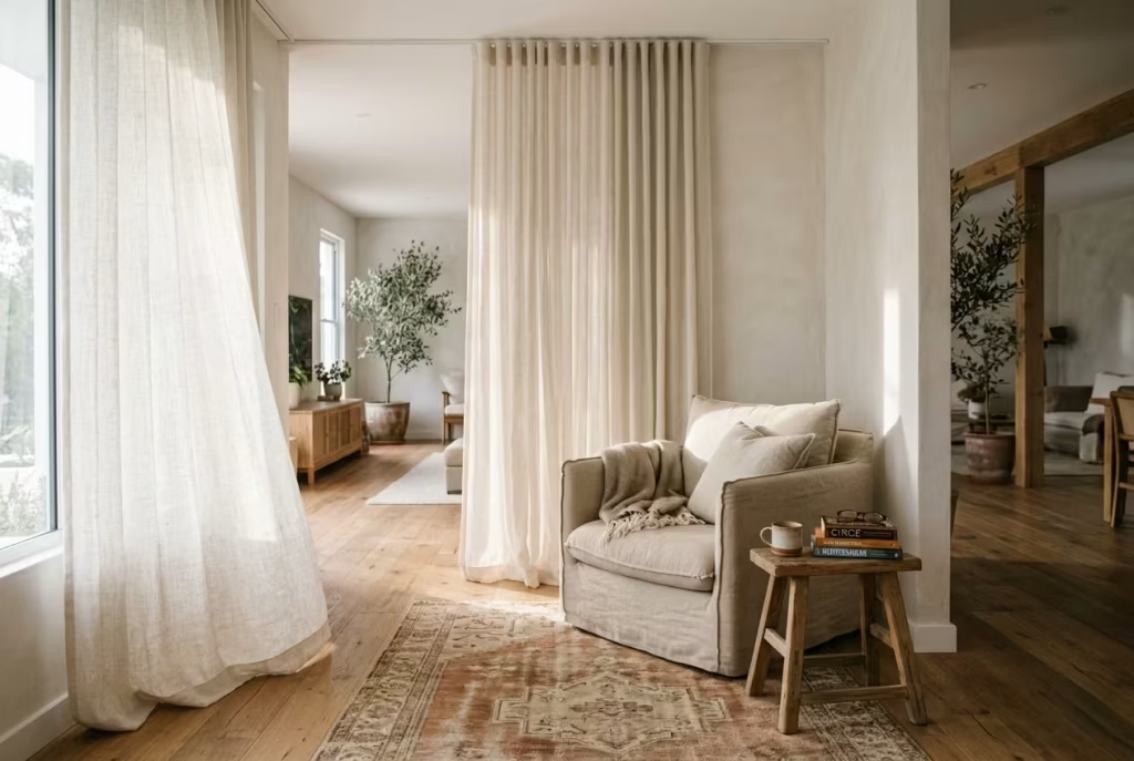
A Spanish reading nook becomes truly immersive when it is given a sense of enclosure that feels soft rather than rigid. Curtains or drapery introduce exactly that kind of spatial definition.
They do not divide a room in a harsh architectural sense, instead they blur boundaries gently, like a whispered separation between everyday movement and quiet retreat. The effect is subtle, but once it is in place, the nook begins to feel noticeably more intimate, almost like a room within a room.
In real residential projects, I have often found that fabric boundaries are one of the most underrated tools in shaping atmosphere. Especially in open-plan living spaces or bedroom corners, where everything can feel visually exposed, drapery acts as a quiet mediator.
It introduces privacy without construction, softness without clutter, and structure without permanence. The moment curtains are introduced, the reading nook stops feeling like a corner and starts feeling like a destination.
The way fabric moves is just as important as how it looks when still. Light linen or loosely woven cotton drapes, for example, respond to air currents in a way that brings gentle life into the space.
Even the smallest movement, a slight shift when someone walks past or a soft ripple from a nearby window, adds a layer of dynamism that keeps the nook from feeling static. It is almost like the space is breathing, quietly adjusting itself throughout the day.
From a design standpoint, framing is where the real transformation happens. Curtains hung from a simple ceiling track or discreet rod can define a reading nook measuring around 1.5 m to 2 m (5 ft to 6.5 ft) wide without requiring any physical partitioning. When drawn, they create a soft boundary that signals separation.
When open, they dissolve into the background, allowing the nook to reintegrate with the larger room. This flexibility is what makes them so effective in contemporary homes where space often needs to serve multiple functions.
Material choice plays a decisive role in maintaining the Spanish-inspired character of the nook. Linen works particularly well due to its natural irregularity and soft drape. It does not fall in rigid lines, instead it settles with a relaxed elegance that complements terracotta tones, plastered walls, and timber accents. In slightly more textural schemes, semi-sheer cotton or slubbed weaves can introduce a layered softness without feeling heavy or overly decorative.
Colour should remain understated. Off-white, sand, muted clay, or faded neutrals tend to work best, allowing the curtains to frame the space rather than dominate it. When kept within a restrained palette, they behave almost like a veil, shaping perception without drawing attention to themselves. In strong natural light, these tones diffuse brightness beautifully, softening the edges of the nook and enhancing its sense of calm enclosure.
There is also an emotional quality to this kind of framing that should not be overlooked. A curtained nook feels more private, almost protective, like a small sanctuary carved out from the busyness of the home.
It encourages longer stays, slower reading, and a deeper sense of detachment from surrounding distractions. That psychological shift is often immediate and surprisingly powerful.
Handled with restraint, curtains do not simply decorate a Spanish reading nook. They define its emotional perimeter, giving it that cocooned quality that turns a simple corner into a deeply personal retreat, where the outside world feels just slightly further away.
Keep one tactile object within reach
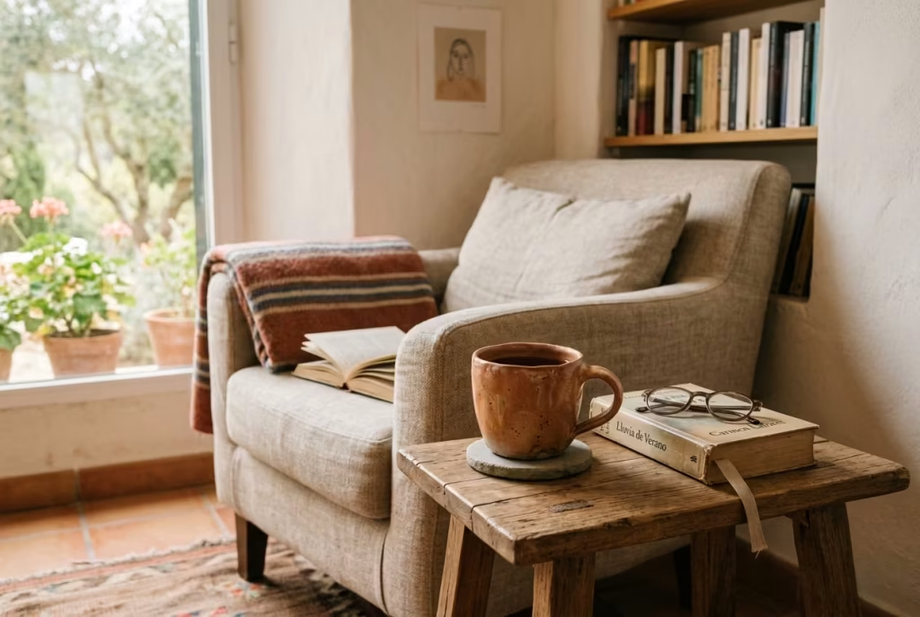
A Spanish reading nook feels most complete when it includes at least one object that invites touch, not just sight. This is where tactile pieces quietly shift the atmosphere. A ceramic cup with a slightly uneven glaze, a cool stone dish with natural imperfections, or a handcrafted bowl shaped by hand rather than machine all carry a kind of grounded presence that cannot be replicated through purely decorative styling. They bring the space down to a human scale, where design is not only observed but quietly experienced.
In real residential projects, I have often noticed that it is these small, almost overlooked objects that end up defining how personal a space feels. A reading nook can be beautifully composed in terms of colour, lighting, and proportion, yet still feel slightly detached if there is nothing within it that acknowledges daily ritual. The moment a tactile object enters the scene, something changes. The space begins to feel inhabited, not staged.
A ceramic cup placed on a side table, for instance, does more than hold a drink. It becomes part of the rhythm of reading. It marks pauses, interruptions, and moments of stillness. The slight irregularity in handmade ceramics, the soft variations in glaze, and the subtle weight of the material all contribute to a sense of quiet authenticity. It is this imperfection that makes it feel so right within a Spanish-inspired setting, where materials are expected to carry history and character rather than perfection.
Stone dishes or small bowls introduce a different kind of presence. They are more grounded, more elemental. Their cool surface contrasts gently with warmer materials like timber, linen, or terracotta, creating a balance that feels instinctively natural. In a nook where softness dominates, this kind of mineral weight helps anchor the composition, preventing it from drifting into visual lightness.
From a spatial perspective, scale and placement matter more than quantity. One object, carefully chosen and placed within easy reach, often has far more impact than several scattered pieces. In a reading nook measuring around 1.5 m by 1.5 m (5 ft by 5 ft), even a single handcrafted object can become a focal point of quiet attention. It does not need to be styled aggressively. In fact, the more naturally it sits within the space, the more convincing it becomes.
There is also a psychological comfort in having something tactile nearby. Reading is a largely visual and mental activity, and introducing an object that can be held, felt, or simply noticed through touch creates a subtle grounding effect. It slows the experience down in a way that feels almost instinctive, like a small anchor in the flow of thought.
I have often seen clients underestimate the emotional role of these objects until they experience them in place. A nook without them can feel visually complete but emotionally neutral. Add one well-chosen piece, and the space begins to feel like it belongs to someone, not just to a design concept. That shift is subtle, but it is also what makes a room feel lived in rather than merely arranged.
Handled with restraint, a tactile object does not act as decoration. It becomes part of the reading ritual itself, quietly reinforcing the sense of presence, stillness, and personal connection that defines a well-composed Spanish reading nook.
Include a scented layer
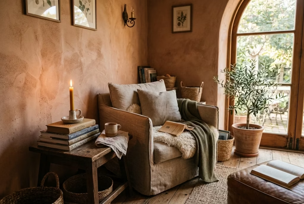
A Spanish reading nook is never fully complete if it only appeals to sight and touch. The final layer, often overlooked but deeply influential, is scent. It is the invisible thread that ties atmosphere together, shaping how a space is remembered long after you have left it.
When handled with restraint, fragrance does not announce itself. It lingers quietly in the background, like a soft echo that gently defines the emotional character of the nook.
In real residential projects, I have consistently seen how scent can shift perception more powerfully than many visual elements. A beautifully designed reading corner can feel visually perfect yet emotionally incomplete if it lacks this sensory depth.
The moment a subtle fragrance is introduced, the space begins to feel more rounded, more intimate, almost as if it has finally found its voice.
Candlelight is often the most natural starting point. Not only does it introduce scent, but it also adds a visual softness that reinforces the calm, cocooned nature of a Spanish-inspired nook.
The flicker of a flame against limewashed walls or timber surfaces creates a gentle movement that artificial lighting cannot replicate. When paired with warm, earthy fragrances, it feels less like decoration and more like atmosphere in motion.
Incense, when used carefully, brings a slightly more meditative quality. It should never be overpowering or constant. Instead, it works best as an occasional gesture, something introduced during moments of reading or quiet reflection. The slow release of smoke adds a visual rhythm to the space, almost like time itself becoming visible for a brief moment before dissolving into the air.
Room fragrances with notes of cedar, fig, or orange peel sit particularly well within Spanish-inspired interiors. Cedar introduces a grounding, slightly dry warmth that complements timber and stone. Fig adds a soft, almost milky sweetness that feels natural rather than synthetic.
Orange peel brings a gentle brightness, a sunlit freshness that lifts heavier materials without disrupting their depth. Each of these scents carries a connection to natural landscapes, which is why they feel so at home in this kind of environment.
What makes scent especially powerful in a reading nook is its subtle influence on behaviour. Unlike visual design, which is consciously observed, fragrance works on a more instinctive level.
It can encourage relaxation, improve focus, and signal the transition from everyday activity into a slower, more reflective state of mind. In that sense, it becomes part of the ritual of reading rather than just the environment around it.
I have often noticed that clients only fully appreciate this layer once it is in place. The room does not look dramatically different, yet it feels entirely changed. There is a softness to the atmosphere that is difficult to explain but immediately noticeable. It is the kind of detail that does not demand attention, yet quietly holds it.
Handled with care, scent becomes the final invisible layer of a Spanish reading nook. It does not compete with materials, lighting, or form. Instead, it completes them, adding a subtle emotional depth that lingers gently in the background, like a well-kept secret woven into the space itself.
You May also Like: 25 Cozy Reading Nooks That Make Quiet Moments Feel Special
Balance old and new pieces
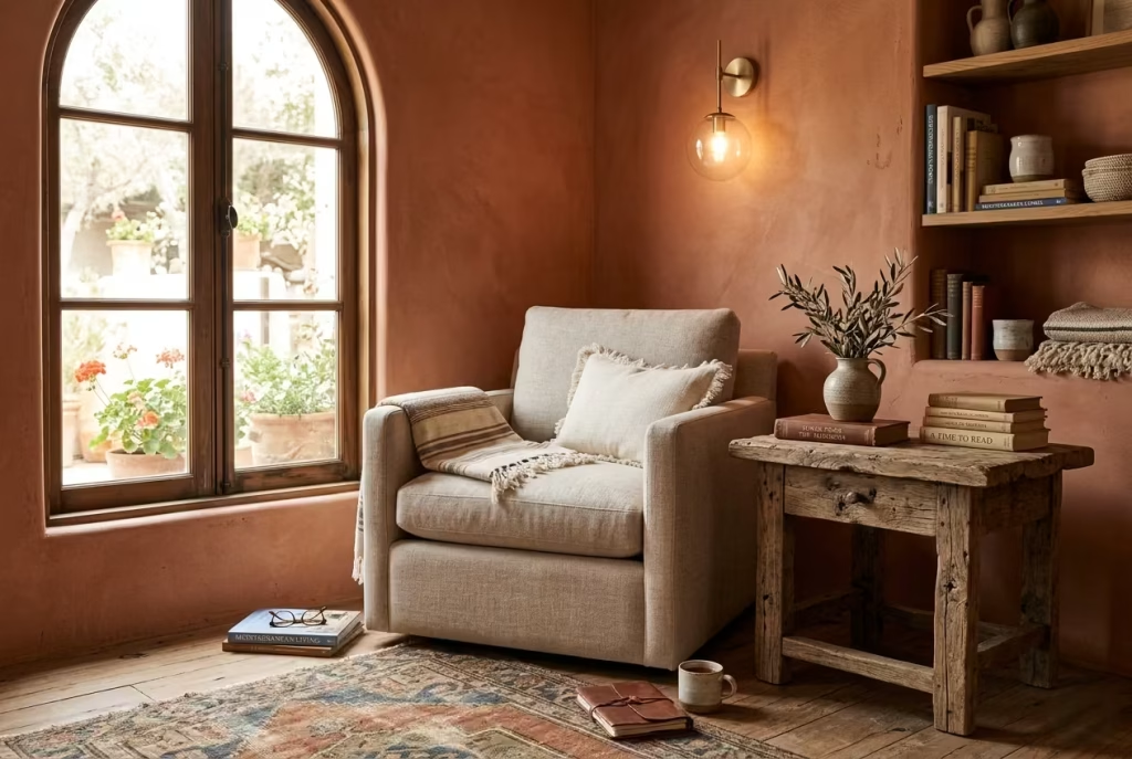
A Spanish reading nook reaches its most believable form when it does not feel like it has been assembled in one sweep of time. The most compelling spaces are rarely the most coordinated ones.
Instead, they are the ones where old and new coexist with a quiet ease, like two different languages learning to speak in the same room without competing for attention. This balance is what gives the nook its depth, its character, and that slightly indefinable sense of having been lived with, rather than newly installed.
In real residential work, I have often found that purely contemporary setups can feel visually sharp but emotionally thin. Everything matches too neatly, too predictably, and the space begins to lose its sense of narrative.
On the other hand, overly antique-heavy interiors can feel weighed down, as if they are stuck in a single moment of history. The real craft lies in the middle ground, where modern comfort meets the quiet authority of aged forms.
A contemporary reading chair, for instance, with clean proportions and supportive ergonomics, can sit beautifully alongside a weathered wooden stool or a vintage side table. The contrast is not a conflict, it is a dialogue.
One brings ease and function, the other brings memory and texture. Together, they create a composition that feels both grounded in the present and gently anchored in the past.
Antique-inspired elements do not need to be dominant to be effective. A single aged brass lamp, a timeworn ceramic vessel, or a slightly imperfect wooden console can carry enough visual weight to shift the mood of the entire nook.
These pieces do not shout for attention. Instead, they sit quietly within the arrangement, offering a sense of continuity that newer objects alone often cannot provide.
Modern elements, meanwhile, keep the space from slipping into nostalgia. A well-shaped contemporary chair, a minimal reading light, or a clean-lined shelf ensures that the nook still feels functional and relevant to everyday life.
This is particularly important in Spanish-inspired interiors, where comfort and usability should never be sacrificed for aesthetic purity. The aim is always ease, not theatricality.
From experience, I have seen that the most successful reading nooks are often the least predictable in their composition. A modern linen chair placed beside a rustic oak table. A contemporary wall light illuminating a plastered niche that feels centuries old. These contrasts, when handled with restraint, do not create tension. They create depth, like layers of time gently overlapping without erasing each other.
There is also a psychological benefit to this balance. Spaces that mix eras tend to feel more personal, almost as if they have been curated over time rather than purchased in one moment. That sense of gradual accumulation is what makes a nook feel authentic. It suggests stories, choices, and lived experience rather than a single design decision frozen in time.
Handled thoughtfully, the interplay between old and new does not become a stylistic exercise. It becomes a quiet form of storytelling, where each piece, regardless of age, contributes to a reading nook that feels collected, grounded, and effortlessly lived in rather than carefully staged.
Edit the space until it feels calm
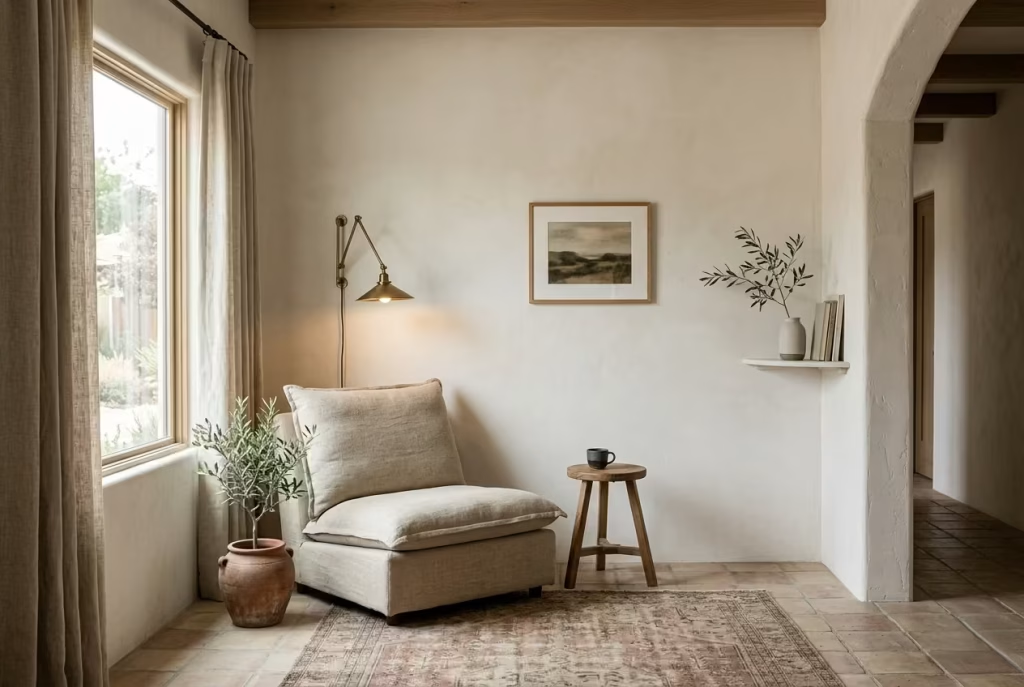
A Spanish reading nook often reaches its highest level of refinement not when something is added, but when everything unnecessary is quietly taken away. Editing is where the space either finds its rhythm or loses it.
It is the final pass, the moment where you step back and allow the room to speak for itself, without interruption, without excess, and without anything competing for attention. In many ways, this is where design becomes restraint, and restraint becomes the real measure of sophistication.
In real residential projects, I have often found that clients initially gravitate toward addition. One more cushion, another decorative object, an extra layer of styling. Yet the most compelling reading nooks almost always arrive after subtraction.
The moment you begin removing what is not essential, the space starts to breathe differently. Corners that once felt visually busy begin to settle, and materials that were previously competing for attention finally have room to express themselves properly.
Editing is not about stripping a space bare. It is about listening to it carefully. A well-composed Spanish reading nook should feel like it has a natural rhythm, where every object earns its place.
If something interrupts that rhythm, even slightly, it becomes part of the visual noise rather than the atmosphere. This is why stepping away and returning with fresh eyes is often more effective than making changes in quick succession. Distance has a way of revealing what truly belongs.
I have noticed that the strongest nooks often rely on a kind of quiet confidence. There is no sense of trying too hard, no visible effort to impress. Instead, there is clarity. A chair placed with intention, a single light source doing its job well, a carefully chosen material palette, and then space around it all, space that is just as important as the objects themselves.
That negative space is not empty. It is doing the heavy lifting in the background, allowing everything else to feel more composed.
In practical terms, editing often means removing visual distractions that break the emotional tone of the nook. This could be an extra decorative object that does not quite belong, a piece of furniture that feels slightly oversized for the corner, or even a colour note that interrupts the warmth of the scheme. When these elements are removed, what remains feels more intentional, almost inevitable, as if the space has finally aligned with itself.
There is also a psychological clarity that comes with restraint. A reading nook is meant to slow the mind down, not stimulate it further. When the visual field is simplified, the mind follows. Focus becomes easier, reading becomes more immersive, and time feels less fragmented. The space begins to support the act of pause rather than compete with it.
From experience, I have seen that the most successful Spanish-inspired reading corners are the ones that resist the urge to over-style. They are not filled to capacity, nor are they visually silent.
They sit somewhere in between, where every object feels considered and every empty space feels intentional. That balance is delicate, but once achieved, it creates a sense of calm that is difficult to replicate through addition alone.
Ultimately, editing is what transforms a well-designed nook into a truly memorable one. It is the final act of discipline that allows the space to settle into itself, where nothing feels forced, everything feels deliberate, and calm is not something added, but something revealed.
Why a Spanish Reading Nook Works So Beautifully in a Home
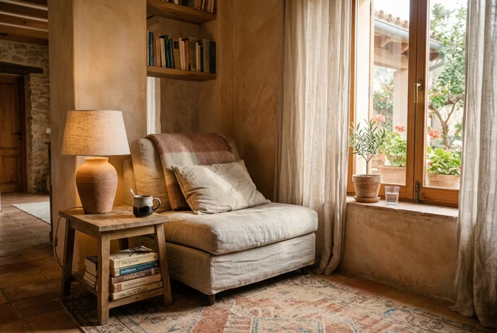
Some spaces in a home earn their importance slowly. A Spanish reading nook tends to be one of them. At first glance, it may appear simple, just a chair tucked beside a window, a textured wall catching the afternoon light, a small stack of books resting beside a clay lamp. Yet over time, these corners become the spaces people drift toward almost instinctively. They hold a different rhythm from the rest of the house. Quieter. Softer around the edges. More grounded.
What makes Spanish-inspired reading nooks so enduring is their ability to feel deeply comforting without becoming overly styled or theatrical. They rely less on decoration for decoration’s sake and more on atmosphere built layer by layer through material, light, warmth, and restraint. There is an honesty to the way these spaces come together, and that honesty is precisely what makes them memorable.
In my own residential projects, I have noticed something interesting time and time again. The reading nook often becomes the emotional anchor of the room, even when it occupies the smallest footprint. People use it differently than they expected. It becomes the morning coffee corner, the late-night retreat, the place where conversations quietly unfold when the rest of the house feels too busy. Once a nook feels emotionally separate from the surrounding space, it starts punching above its weight in a very real way.
The Quiet Strength of Natural Textures
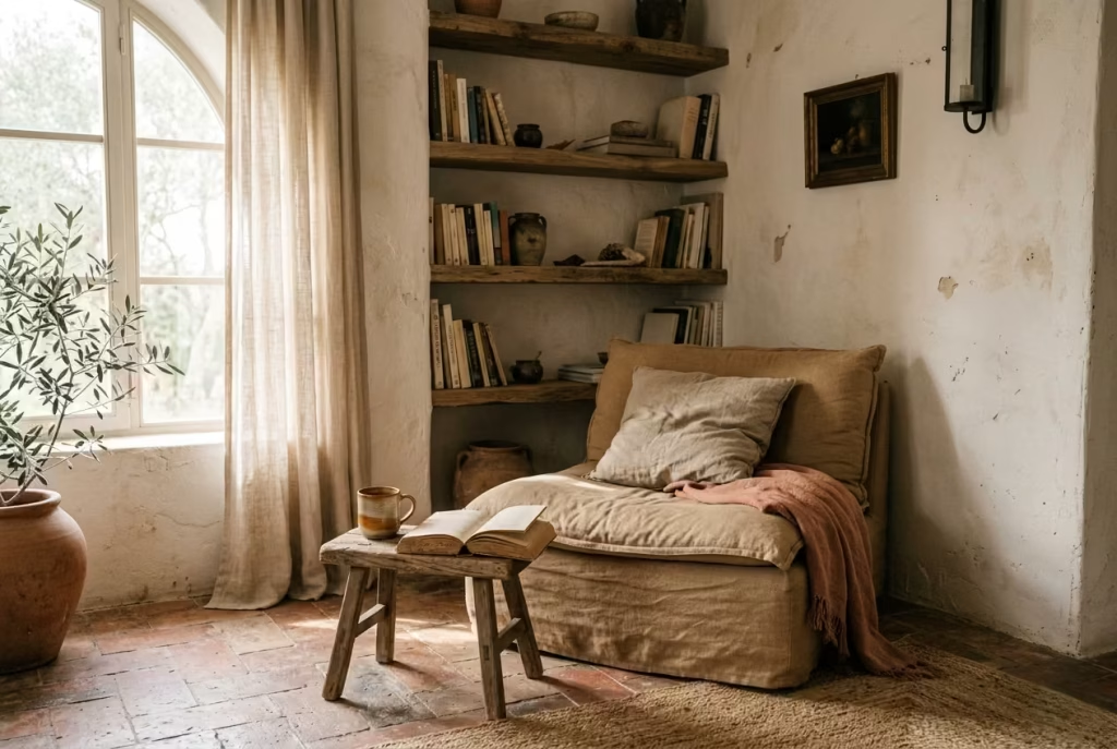
Spanish interiors have always understood that texture carries emotional weight. A room with beautifully layered materials feels alive in a way perfectly smooth surfaces rarely do. That is why Spanish reading nooks lean so heavily into tactile finishes such as limewashed walls, aged timber, woven fibers, soft linen, hand-thrown ceramics, and weathered stone.
These materials do not just decorate the room. They shape how the space feels physically and psychologically. A textured plaster wall catches daylight unevenly, creating movement as the hours pass. A woven chair softens the visual heaviness of darker wood tones. Linen curtains filter sunlight instead of blocking it abruptly, allowing the room to breathe rather than feel sealed shut.
This layered tactility is what stops the nook from feeling flat or sterile. Even in newly renovated homes, introducing imperfect textures can instantly create depth and permanence. I often tell clients that a reading nook should feel as though it settled naturally into the home over time, not as though it arrived in a single afternoon wrapped in showroom packaging.
One project that still stays with me involved a compact alcove measuring roughly 1.2 m x 1.5 m (4 ft x 5 ft). On paper, the footprint looked almost too small to become meaningful. But once we introduced a softly textured mineral paint finish, a low linen chair, and a reclaimed oak shelf positioned slightly off-center, the entire corner shifted emotionally. What had once felt like dead space suddenly became the room people gravitated toward first. Funny enough, it ended up being photographed more than the larger living area beside it.
That is the thing about texture when it is handled well. It works quietly behind the scenes, but it changes everything.
Warm Tones Create Emotional Comfort Without Trying Too Hard
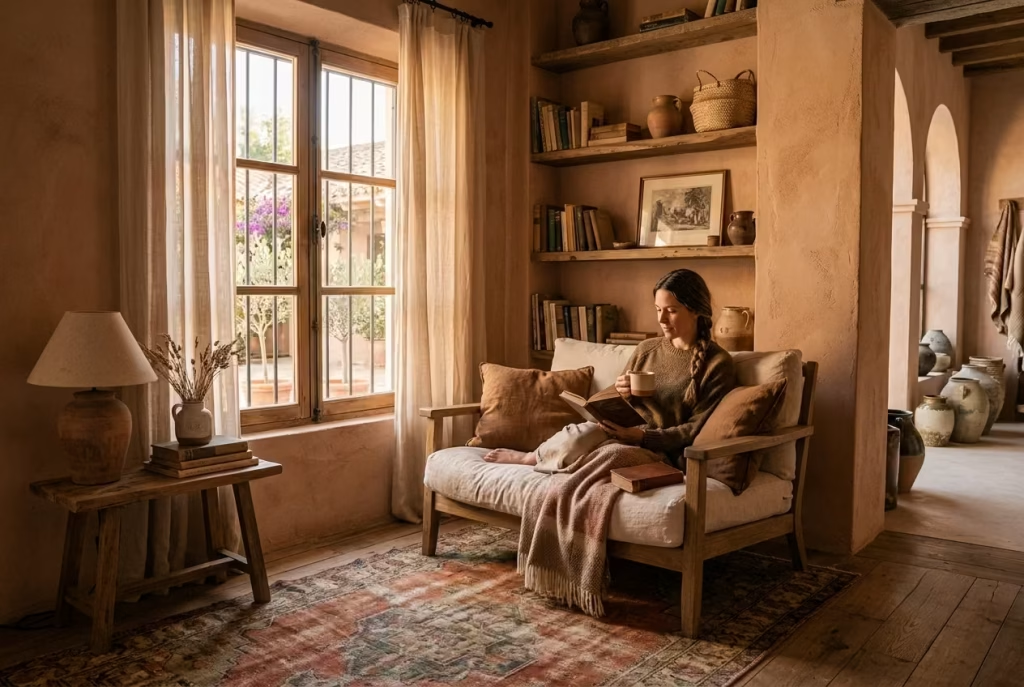
Spanish-inspired spaces understand warmth in a very instinctive way. They do not rely on loud colour or sharp contrast to hold attention. Instead, they build atmosphere through sun-baked tones that feel grounded and familiar. Terracotta, sand, olive, clay, muted rust, tobacco brown, and faded cream all work together to create a palette that settles the eye rather than overstimulating it.
In a reading nook, these tones matter enormously because colour influences whether a space feels restorative or restless. Warm neutrals soften visual noise and encourage the body to slow down. Even on colder days or in homes with limited natural light, these colours create a subtle psychological warmth that makes the nook feel inviting long before someone actually sits down.
I have found that many homeowners underestimate how much emotional comfort comes from tonal consistency. When the walls, textiles, timber, and accessories all sit within the same warm spectrum, the room begins to feel cohesive almost effortlessly. Nothing screams for attention. Everything simply works together in a calm, unforced way.
That restraint is where the magic often lies. Spanish interiors rarely try to reinvent the wheel. They understand that when warmth, texture, and proportion are balanced properly, the atmosphere practically carries itself.
Layered Shadows Make the Space Feel Alive
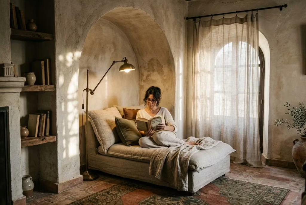
One of the most overlooked aspects of Spanish-inspired design is its relationship with shadow. Not darkness, but shadow in the architectural sense. Soft contrast. Filtered light. Gentle variation throughout the day.
A well-designed reading nook should never feel brightly exposed from every angle. Some degree of visual softness creates intimacy. That might come from linen drapery diffusing sunlight, an arched recess creating depth, or a wall sconce casting a low amber glow across textured plaster in the evening.
Spanish interiors excel at this because they embrace imperfection in lighting rather than fighting it tooth and nail. Instead of trying to flood every corner with brightness, they allow certain areas to remain quieter and moodier. This creates dimension and emotional depth that many modern interiors accidentally flatten out.
In practice, layered shadows can completely transform even a basic nook. I once worked on a bedroom where the reading corner initially felt cold despite having beautiful furniture. The issue was not the seating or styling. It was the lighting. Once we repositioned the chair slightly away from direct overhead light and introduced a smaller aged brass wall lamp with a warmer bulb temperature, the nook immediately felt more intimate and settled. Suddenly, the textures became visible. The walls gained depth. The room exhaled a little.
It is often these subtle shifts that separate a beautiful nook from one that feels genuinely magnetic.
You May also Like: 25 Fall Reading Nook Ideas: Create the Perfect Cozy Autumn Reading Space
Why These Spaces Become the Most Used Corners in the Home
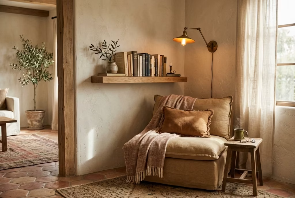
There is a reason people keep returning to these spaces without consciously thinking about it. Spanish reading nooks create emotional separation from the pace of the house. Even when they are positioned within open-plan rooms, they feel psychologically sheltered.
That sense of retreat matters more today than ever. Homes have become multipurpose environments where work, entertainment, family life, and rest constantly overlap. A reading nook introduces a quieter layer within that complexity. It gives the mind somewhere to land.
Interestingly, the most successful nooks are rarely oversized. In fact, smaller reading corners often feel more comforting because enclosure naturally creates intimacy. When proportions are handled properly, even modest dimensions can feel deeply luxurious.
In residential design, I have repeatedly seen small underused corners transformed into spaces that completely alter how clients interact with their homes. A carefully placed chair, a tactile wall finish, softened lighting, and a shelf positioned at the correct height can change not just the appearance of a room, but the way people emotionally experience it day after day.
That is ultimately why Spanish reading nooks work so beautifully. They are not trying to impress from across the room. They are designed to be experienced slowly, almost subconsciously, over time. And once that atmosphere settles in, it tends to stay with people long after they leave the space itself.
What Makes a Spanish Reading Nook Feel Authentic
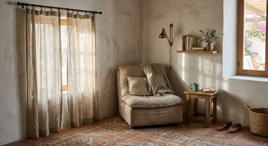
A Spanish reading nook feels authentic not because it follows a strict formula, but because it quietly respects how materials behave over time. There is a certain honesty in these spaces that cannot be faked through styling alone. The most convincing nooks are rarely the most decorated. Instead, they are the ones where texture, proportion, and light have been allowed to settle naturally, without being pushed into perfection. When a space is overworked, it loses its voice. When it is restrained, it begins to speak softly but clearly.
Authenticity here is less about imitation and more about intuition. It comes from choosing materials that age with dignity, colours that do not shout for attention, and compositions that leave room for imperfection. In well-resolved interiors, nothing feels forced into place. Everything feels as though it has arrived gradually, like sediment building up over time rather than being placed all at once.
Material honesty, colour restraint, and warm contrast
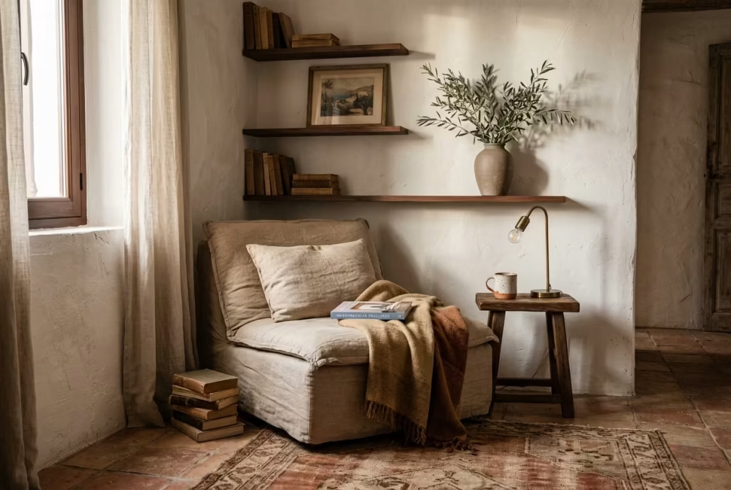
A truly authentic Spanish reading nook begins with material honesty. This means choosing surfaces that do not pretend to be something else. Limewashed walls that show brush variation, timber that carries visible grain, and linen that creases naturally all contribute to a sense of grounded realism. These materials do not hide their nature. They reveal it, and in doing so, they create trust within the space.
Colour restraint is equally important. Spanish-inspired interiors are not defined by excessive saturation but by controlled warmth. Terracotta, muted ochre, sand, and softened clay tones tend to dominate, but they are rarely used in loud contrast. Instead, they sit close to one another, like tones that have grown up in the same landscape. This creates visual continuity, allowing the reading nook to feel calm rather than fragmented.
Warm contrast enters gently rather than dramatically. It might be a slightly darker timber frame against a pale wall, or a deeper rust tone sitting beside softened neutrals. The contrast is never sharp enough to disrupt the mood. Instead, it adds depth, like a quiet undercurrent that prevents the palette from feeling flat. When handled well, this balance gives the nook a lived-in richness without tipping into visual excess.
Why authenticity comes from texture, proportion, and natural ageing
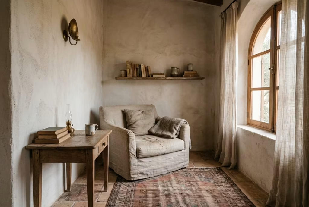
Authenticity in a Spanish reading nook is not achieved through decoration alone. It is embedded in how texture interacts with light, how proportions guide the eye, and how materials respond to time. Texture is particularly powerful because it introduces subtle variation. A slightly uneven plaster surface or a woven textile catches light differently throughout the day, creating movement without actual motion.
Proportion plays a quieter but equally critical role. When furniture feels correctly scaled to the human body and the surrounding space, the nook immediately becomes more believable. A chair that is too large or a shelf that is too dominant can break the sense of ease. When proportions are right, the space feels instinctively comfortable, as if it was always meant to exist in that form.
Natural ageing is what ultimately ties everything together. Wood softens at the edges, fabrics relax, and metals develop patina. These changes are not flaws. They are evidence of life within the space. In well-designed nooks, this ageing process is not resisted but welcomed. It allows the interior to evolve, gaining depth rather than losing quality over time.
Real-life design insight
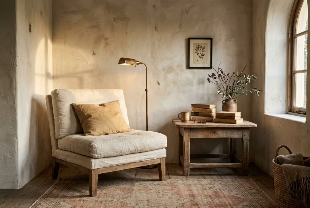
In practice, a Spanish reading nook feels most believable when light is allowed to fall gently across imperfect surfaces. I have often noticed that it is not the most refined elements that create the strongest atmosphere, but the ones that carry subtle irregularity. A slightly textured wall catching late afternoon light, a worn wooden frame softened by years of use, or a simple linen cushion resting without stiffness can achieve more emotional depth than any highly polished statement piece.
These moments matter because they are not performative. They do not ask to be noticed, yet they naturally draw the eye. When light interacts with these surfaces, it reveals variation rather than uniformity, and that variation is what gives the space its quiet authenticity. It is this interplay between light, material, and imperfection that makes a reading nook feel less designed and more discovered.
Over time, the most successful spaces are the ones that feel like they have grown into themselves. Nothing feels newly imposed. Everything feels gently settled, as if the room has understood its own purpose and chosen to remain quietly confident in it.
How to Style a Spanish Reading Nook in One Weekend
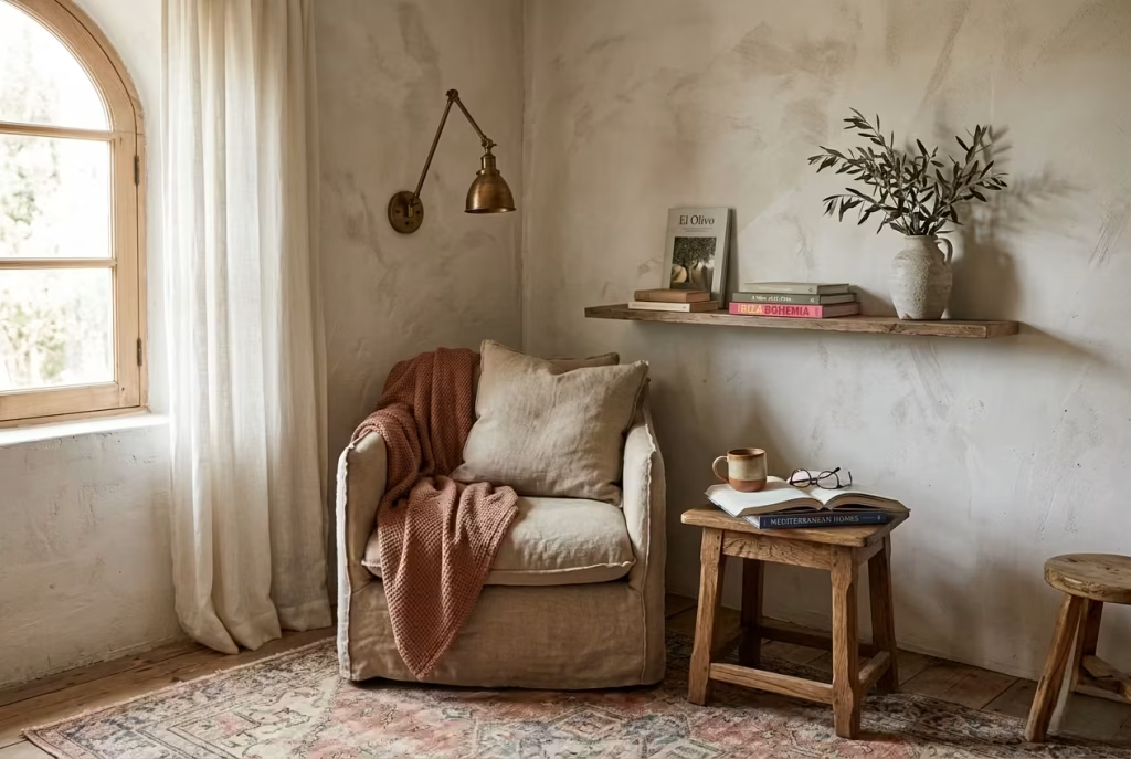
A Spanish reading nook does not need months of renovation to feel considered. When the direction is clear, a weekend is often enough to shift a forgotten corner into something that feels intentional, atmospheric, and quietly grounded. The key is not rushing the process, but allowing each stage of the weekend to carry a different kind of focus. Think of it less as a checklist and more as a rhythm of decisions, where each day builds on the one before it.
In real design work, I have often seen that the most successful transformations happen when clients resist overloading the process. The spaces that feel the most natural at the end of the weekend are usually the ones where restraint guided every step, rather than urgency or excess. It is a case of moving with intention, not speed, and letting the space reveal itself gradually.
Friday evening, clear and assess the corner
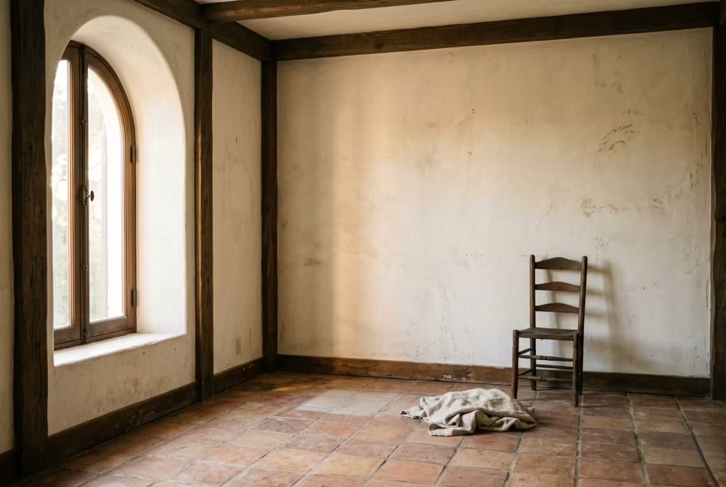
Friday evening is not about styling. It is about honesty. This is the moment where you strip the corner back and look at it without distraction. What remains after clearing the space is often more revealing than expected. You begin to see proportions, light patterns, and architectural limitations that were previously hidden behind clutter or unrelated furniture.
In practice, this stage is less about physical effort and more about observation. Stand back and notice how natural light moves through the area. Pay attention to whether the corner feels heavy, empty, or simply undefined. Many people rush past this step, but it is where the entire direction of the nook is quietly decided.
I often advise treating this moment like a pause rather than a task. You are not trying to fix anything yet. You are simply allowing the space to speak in its raw state. That clarity becomes the foundation for every decision that follows, and without it, even the most beautiful pieces can feel slightly misplaced.
Saturday, handle paint, textiles, and furniture placement
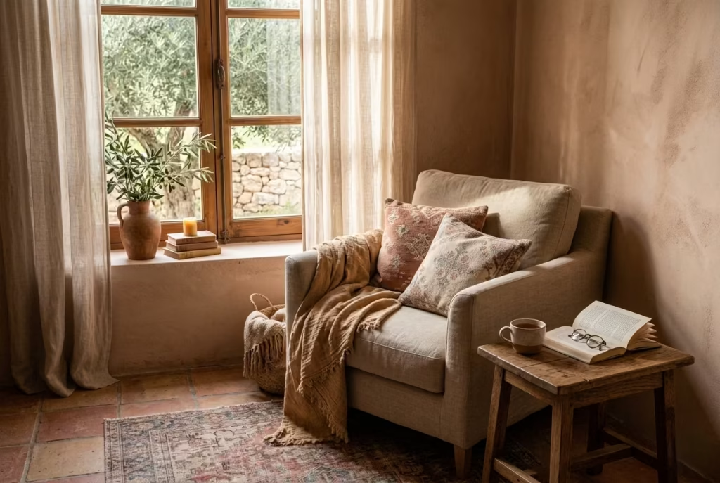
Saturday is where the transformation begins to take shape. This is the day for establishing atmosphere, but still without overcomplication. Paint choices, textile selection, and furniture placement work together here like a quiet conversation, each influencing the other.
If paint is involved, the focus should remain on softness and restraint. Limewashed tones, muted terracotta, or warm neutrals tend to sit comfortably within a Spanish-inspired palette. The goal is not to create contrast for its own sake, but to build a backdrop that feels lived in rather than freshly applied.
Textiles come in next, and this is where the space starts to gain warmth. Linen cushions, lightly textured throws, and woven elements introduce softness that immediately changes how the corner feels. In many projects, I have seen that even a single well-chosen textile can shift the emotional tone of the space more than multiple decorative objects ever could.
Furniture placement is the final step of the day, and it should feel deliberate but not rigid. A chair angled slightly toward natural light, a small table within reach, and enough breathing space around each element are usually enough to establish balance. It is less about filling the corner and more about allowing each piece to settle comfortably into its role.
Sunday, refine lighting, books, art, and smaller accessories
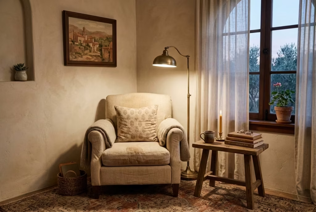
Sunday is where refinement happens, and this is often the most important stage. By now, the structure of the nook exists, but it is still waiting for subtle decisions that bring clarity and depth. Lighting, books, artwork, and small accessories are introduced slowly, almost like finishing touches that complete a sentence rather than start one.
Lighting should feel layered but controlled. A single well-placed reading lamp or soft ambient source is often enough. The aim is not brightness but atmosphere, allowing shadows and highlights to shape the mood as the day moves on.
Books should be edited rather than displayed in excess. A calm selection, arranged with space around them, keeps the nook visually light. Overcrowding at this stage can undo the restraint built over the previous days, so less often feels more convincing.
Artwork and smaller accessories should be treated with similar discipline. One meaningful piece on the wall and one or two tactile objects on surfaces are usually enough to introduce personality without overwhelming the composition. In my experience, the strongest reading nooks often feel slightly under-accessorised at first glance, yet deeply complete once you spend time within them.
By the end of Sunday, the space should not feel newly built. It should feel settled, as if it has quietly adjusted itself into place. That is the real success of a weekend transformation, not dramatic change, but a calm sense of arrival that feels both natural and unforced.
Common Mistakes to Avoid
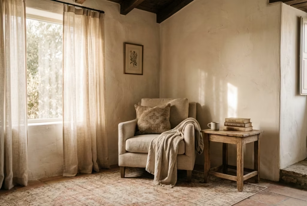
A Spanish reading nook only works when it feels effortless, even though every element behind it is considered. The problem is, many people unintentionally push it in the opposite direction. Instead of calm restraint, the space becomes overworked, over-styled, and visually noisy. In real projects, I have seen this happen more often than not, especially when inspiration is taken too literally rather than interpreted through proportion, light, and material judgement.
The truth is simple. A reading nook is not meant to impress at first glance. It is meant to settle the mind over time. When mistakes creep in, they usually do so quietly, through excess rather than obvious errors. That is why editing and awareness matter just as much as styling choices.
You May also Like: https://letsmakecozy.com/25-japanese-reading-nook-ideas/
Over-theming the space so it feels staged
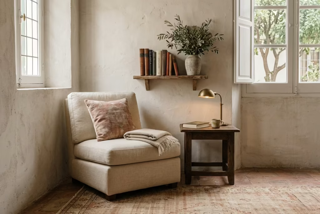
One of the most common pitfalls is leaning too heavily into a theme until the space starts to feel like a set rather than a lived-in corner. A Spanish reading nook should suggest influence, not imitate it piece by piece. The moment every object is chosen to match a single idea too literally, the atmosphere loses its ease.
In practice, I have often seen spaces where arches, terracotta, rustic wood, and patterned textiles are all introduced at once, with no breathing room between them. Instead of feeling layered, the result becomes predictable. It stops feeling discovered and starts feeling assembled.
A stronger approach is subtle reference rather than repetition. One or two well-judged cues are enough. The rest should be guided by balance, not theme. When restraint leads, the space feels natural. When theme leads, it feels rehearsed.
Using too many saturated colours
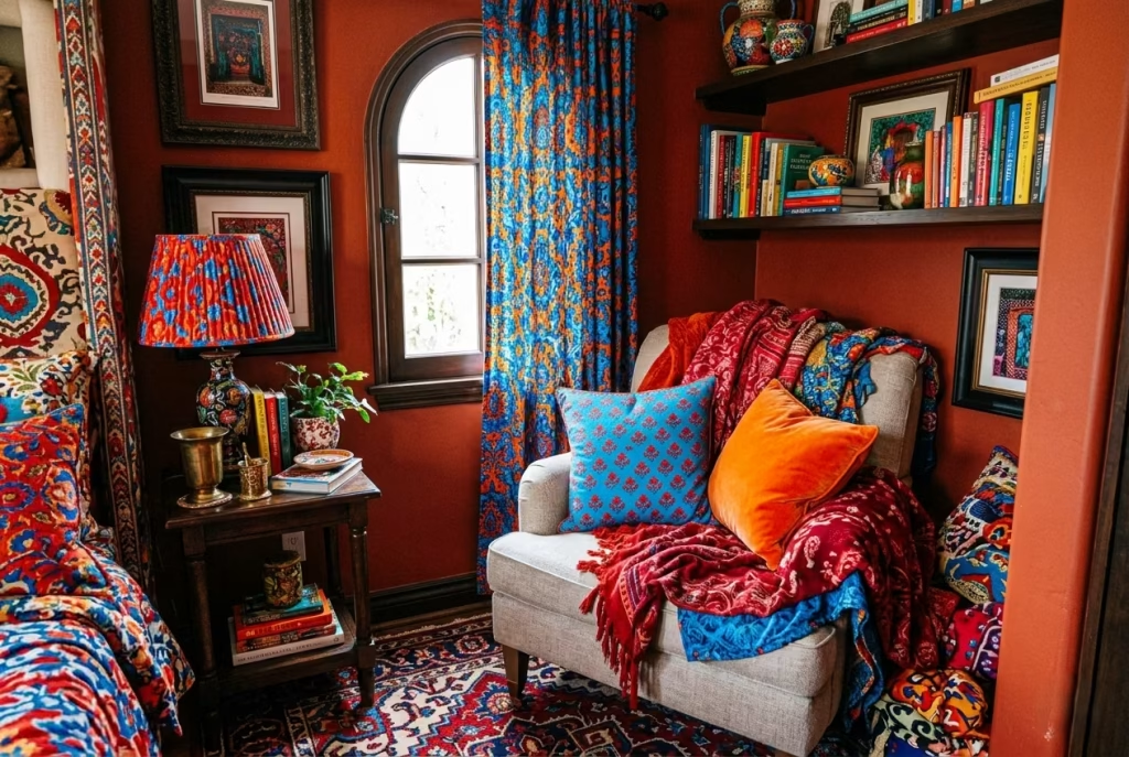
Colour is one of the easiest areas to overreach. Spanish-inspired interiors thrive on warmth, but warmth is not the same as saturation. When too many strong colours enter the space, terracotta, deep reds, bright blues, the nook quickly loses its softness and begins to feel visually heavy.
In real design situations, I have found that saturation often creates fatigue in small reading corners. The eye has nowhere to rest, and what should feel calming starts to feel stimulating in the wrong way. That is exactly the opposite of what a reading nook is meant to do.
Muted tones, softened earth shades, and restrained contrasts allow materials to speak instead of colour dominating. When colour is treated like seasoning rather than the main ingredient, the space naturally feels more balanced and far more enduring.
Choosing furniture that is too rigid or too large
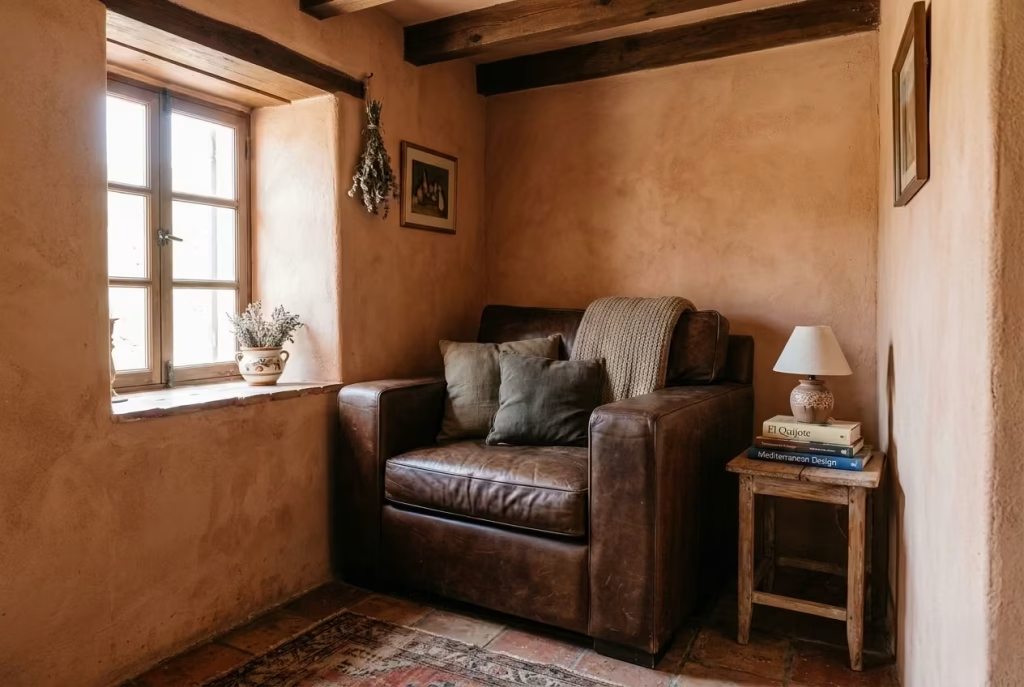
Furniture scale is where many reading nooks quietly fail. A piece that is too large overwhelms the corner, while overly rigid forms disrupt the sense of comfort that the space depends on. A reading nook should invite you in, not hold you at a distance.
I have often seen beautifully designed corners lose their charm simply because the seating dominates the area. Once proportion is off, no amount of styling can fully correct it. The space begins to feel constrained rather than relaxed.
The more successful approach is lightness in visual weight, not necessarily in material. A well-scaled chair with soft lines and appropriate depth, paired with a compact side surface, usually achieves far more balance than anything oversized or overly structured.
Ignoring lighting and relying on decor alone
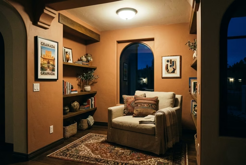
Lighting is often treated as an afterthought, which is a mistake that quietly undermines the entire composition. A reading nook cannot rely on decor alone to create atmosphere. Without considered lighting, even the most carefully chosen materials fall flat.
In real projects, I have seen spaces where beautiful textiles, artwork, and furniture were all present, yet the corner still felt lifeless after sunset. The issue was almost always lighting that was too harsh, too distant, or simply too generic.
A reading nook needs layered light that understands mood. Soft ambient presence, focused reading light, and subtle accents work together to create depth. When lighting is handled properly, the space changes character throughout the day instead of remaining static.
Filling every surface and losing the calm reflective quality of the nook
Perhaps the most damaging mistake is the urge to fill every available surface. It often comes from the belief that more detail equals more beauty, but in reading nook design, the opposite is usually true.
When shelves, tables, and corners are overfilled, the space loses its ability to breathe. The eye becomes restless, moving from object to object without settling. What should feel like a pause in the home turns into visual noise.
I have consistently found that the most successful reading nooks are the most edited. A few carefully chosen objects, surrounded by intentional empty space, allow materials and light to do the real work. That restraint is what preserves the reflective quality of the nook, keeping it calm, grounded, and genuinely inviting over time.
The Best Materials for a Spanish-Inspired Reading Nook
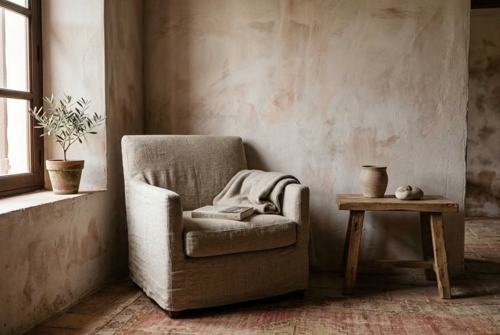
A Spanish-inspired reading nook is ultimately defined by its materials more than anything else. Form, styling, or even furniture selection will only take the space so far. What really gives the nook its depth is how surfaces behave under light, how they age, and how they interact with one another over time. In real residential work, I have found that when the material palette is right, everything else falls into place almost effortlessly, like the space has quietly found its own rhythm.
The goal is not perfection or polish. It is material honesty, soft contrast, and a sense of tactility that makes the nook feel grounded and lived in. Each material below plays a different role, and when balanced correctly, they work together like a well-composed conversation rather than a collection of separate choices.
Limewash or matte mineral paint
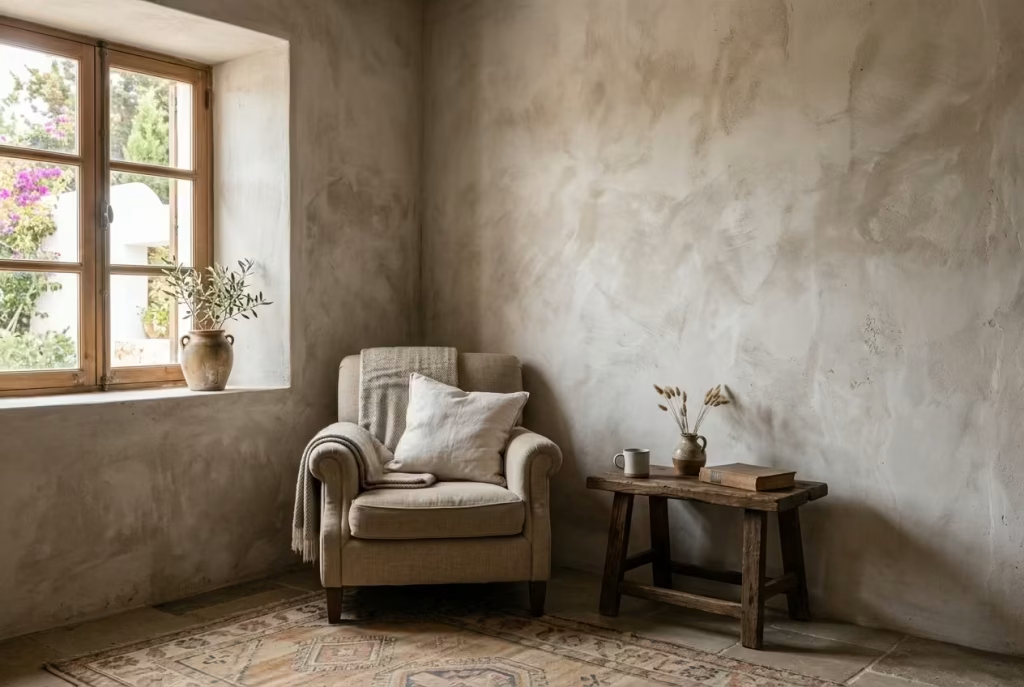
Limewash and matte mineral paints form the atmospheric foundation of a Spanish reading nook. These finishes do not sit flat on the wall. Instead, they absorb and reflect light in uneven, organic ways that immediately add depth and softness to the space.
In practice, I often describe limewash as a “quiet storyteller” on the wall. It does not demand attention, but it changes constantly throughout the day as light moves across it. Morning light feels soft and hazy, while late afternoon brings out subtle tonal shifts that give the surface a lived-in quality.
Pros
- Creates natural variation that prevents walls from feeling flat
- Enhances natural light instead of reflecting it harshly
- Works beautifully with terracotta, timber, and linen textures
Cons
- Requires careful application to avoid patchy finishes
- Can be less durable in high-contact areas
- Limited ability to achieve sharp, uniform colour consistency
Natural oak, walnut, or reclaimed timber
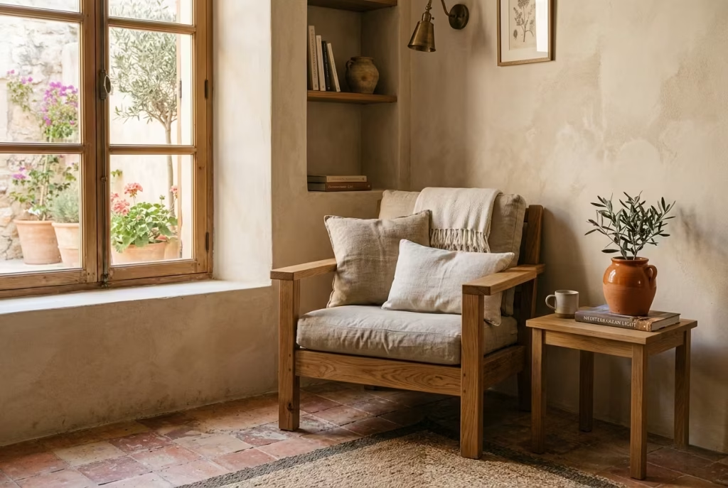
Timber brings structure, warmth, and a sense of permanence to the reading nook. Whether it is oak, walnut, or reclaimed wood, each carries its own character, but all share one essential quality: they age gracefully rather than deteriorate.
In real projects, I have seen how timber quietly anchors softer elements like textiles and plaster. It stops the space from feeling too fragile or overly delicate. Oak tends to feel calm and familiar, walnut introduces depth and richness, while reclaimed timber adds history and texture that feels almost architectural.
Pros
- Adds warmth and grounding to the space
- Develops character over time through natural ageing
- Works across both modern and traditional Spanish-inspired schemes
Cons
- Can darken visually if overused in smaller spaces
- Requires maintenance to preserve finish quality
- Higher-quality timber can increase overall budget
Linen, cotton, wool, and boucle in moderation
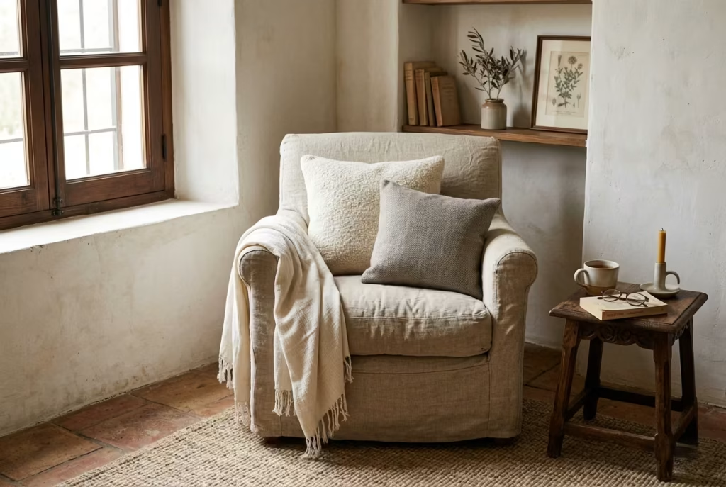
Textiles are where the reading nook becomes emotionally comfortable. Linen, cotton, wool, and boucle all introduce softness, but their real strength lies in restraint. When used carefully, they prevent the space from feeling overly rigid or architectural.
I have often found that linen, in particular, behaves beautifully in Spanish-inspired interiors. It creases naturally, softens edges, and catches light in a way that feels relaxed rather than styled. Boucle and wool introduce a slightly more tactile presence, while cotton keeps the palette grounded and breathable.
Pros
- Adds softness and comfort without visual heaviness
- Introduces texture that responds beautifully to natural light
- Easy to layer without overwhelming the space
Cons
- Can feel visually busy if over-layered
- Light fabrics may stain more easily in high-use areas
- Requires thoughtful coordination to avoid cluttered styling
Terracotta, clay, ceramic, and stone accents
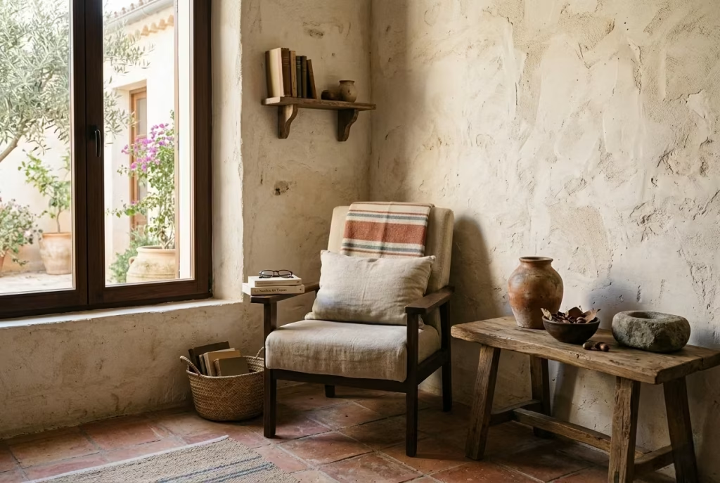
These materials form the earthy backbone of a Spanish-inspired reading nook. Terracotta, clay, ceramic, and stone bring a sense of grounded authenticity that connects the space to natural landscapes and traditional craftsmanship.
In real design settings, I have seen how even a single ceramic vessel or stone object can shift the emotional tone of a nook. Terracotta introduces warmth and sun-baked character, clay adds softness and imperfection, ceramic brings subtle craft detail, and stone introduces weight and stillness.
Pros
- Strong connection to natural, Mediterranean-inspired aesthetics
- Adds tactile and visual grounding to softer materials
- Ages beautifully and gains character over time
Cons
- Can feel visually heavy if overused
- Stone elements may be costly or difficult to reposition
- Requires balance to avoid overpowering lighter textures
Brass, iron, or aged metal for contrast
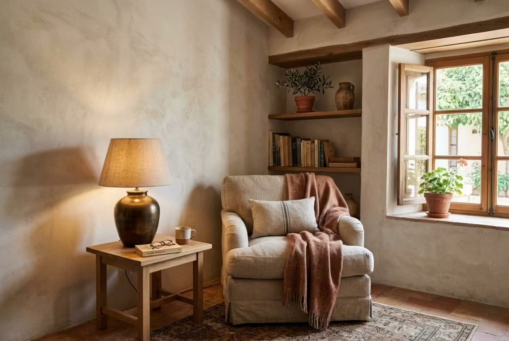
Metal elements should be used sparingly, but when introduced thoughtfully, they provide the final layer of contrast that prevents the space from feeling too soft or one-dimensional. Brass, iron, and aged metals introduce structure, definition, and a subtle sense of refinement.
In practice, I often use brass as a warm accent that ties in beautifully with terracotta and timber, while iron brings a slightly more grounded, architectural edge. Aged finishes are particularly effective because they avoid looking overly polished, instead blending naturally into the material palette.
Pros
- Adds contrast and definition to softer materials
- Introduces subtle structure without overwhelming the space
- Works well as lighting, hardware, or small accents
Cons
- Can feel harsh if over-polished or overused
- Requires careful balancing with warmer textures
- May visually dominate if introduced in large quantities
When all of these materials are balanced correctly, the reading nook stops feeling like a styled corner and starts feeling like a space with depth, history, and quiet intention. It is not about choosing everything at once, but about letting each material earn its place, one thoughtful layer at a time.
Where This Style Works Best in the Home
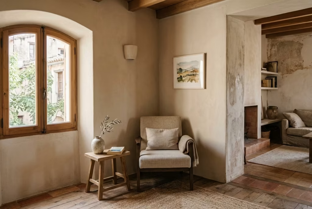
A Spanish-inspired reading nook is not tied to one specific room. Its strength lies in adaptability, in the way it can quietly slip into overlooked corners and transform them into something meaningful without demanding structural change. In real residential design work, I have found that these nooks often succeed most when they are not forced into a space, but when they respond to what is already there, light, architecture, and flow.
The key is not size or luxury, but opportunity. Almost every home has at least one underused corner that can be reinterpreted with the right balance of light, texture, and restraint. What follows are the most effective placements where this style naturally comes to life.
You May also Like: 15 Dreamy Farmhouse Reading Corner Ideas for the Ultimate Cozy Escape
Bedroom corner
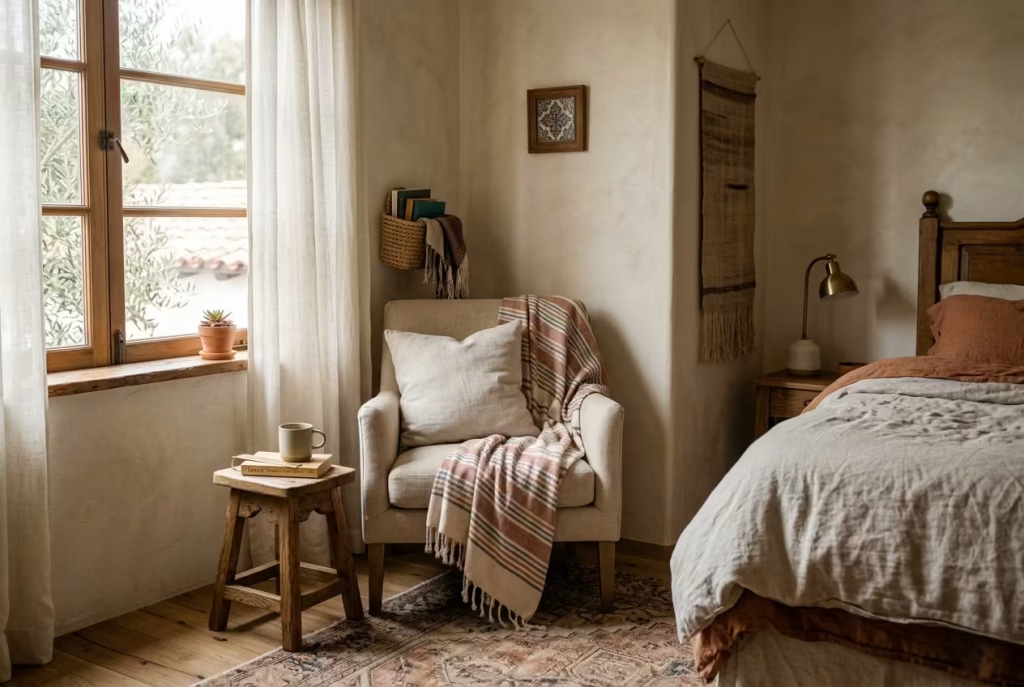
A bedroom corner is one of the most intuitive places for a Spanish reading nook. It benefits from privacy, softness, and a naturally slower rhythm, which aligns perfectly with the purpose of reading as a quiet retreat.
In practice, I often find that bedroom nooks feel most successful when they are slightly removed from the bed itself, rather than competing with it. A chair angled toward natural light, a soft textile underfoot, and a restrained palette can turn even a modest corner into a personal escape.
The advantage here is emotional comfort. The bedroom already carries a sense of rest, so the nook becomes an extension of that mood rather than a separate function.
Pros
- Naturally private and emotionally calm environment
- Easy to layer textiles and soft lighting
- Strong sense of personal retreat
Cons
- Can feel cramped if furniture scale is not controlled
- Risk of blending too closely with sleeping area if not defined
Window alcove
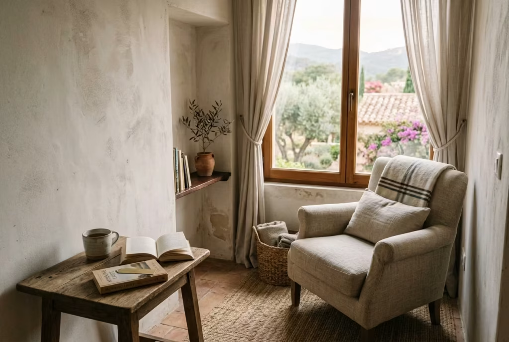
A window alcove is perhaps the most atmospheric setting for a Spanish reading nook. It offers direct access to natural light, which is essential for bringing out the texture of materials like limewash, timber, and linen.
In real projects, I have seen alcoves become the most used reading spots in a home simply because they feel instinctively right. The changing daylight adds movement to the space, shifting its mood from morning clarity to evening warmth.
This type of setting also allows the nook to feel connected to the outside world while still remaining inwardly focused.
Pros
- Excellent natural light throughout the day
- Strong connection between interior and exterior
- Enhances material texture and depth
Cons
- May require careful shading to avoid glare
- Temperature fluctuations near windows can affect comfort
Landing or stair nook
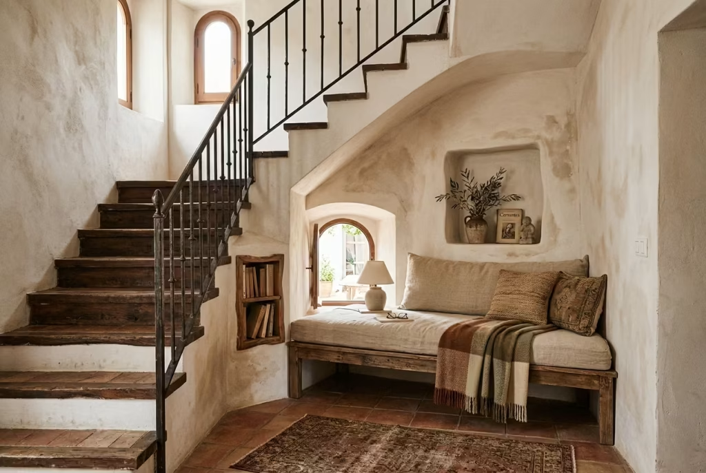
A landing or stair nook is often overlooked, yet it can become one of the most characterful reading corners when handled correctly. These transitional spaces naturally lend themselves to pause and reflection, which makes them ideal for a quiet reading moment.
In practice, I have often transformed awkward stair landings into compact reading zones by using built-in seating or a single well-scaled chair. The key is to respect circulation while gently carving out a moment of stillness.
Pros
- Makes use of otherwise unused transitional space
- Adds personality to circulation areas
- Can feel unexpectedly intimate
Cons
- Limited space requires careful furniture selection
- Must not obstruct movement flow
Living room edge
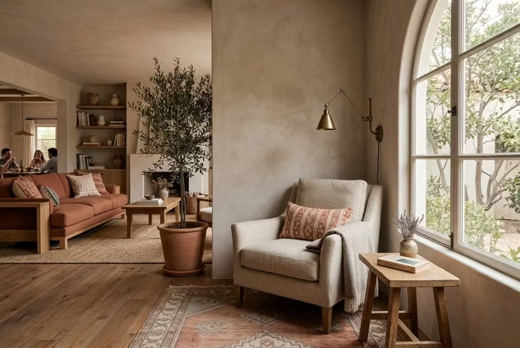
The edge of a living room offers flexibility and visibility. It allows the reading nook to be part of a larger social space while still maintaining its own identity.
I have found that this placement works best when the nook is subtly defined through rugs, lighting, or a change in material rather than physical separation. It should feel like a pause within the room rather than a separate zone.
Pros
- Easy integration into existing layout
- Allows social and quiet use within the same space
- Good visibility for natural light placement
Cons
- Can feel exposed if not visually defined
- Risk of competing with main seating arrangement
Unused recessed wall
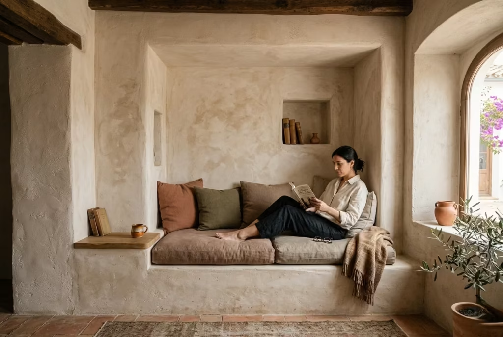
A recessed wall is almost purpose-built for a Spanish reading nook. These architectural pauses already suggest enclosure, which makes them ideal for creating a contained, cocoon-like atmosphere.
In real design scenarios, I often treat recessed walls as opportunities rather than limitations. A built-in bench, soft plaster finish, and carefully controlled lighting can transform what was once dead space into one of the most inviting areas in the home.
Pros
- Naturally defined architectural enclosure
- Strong sense of intimacy and focus
- Ideal for built-in seating solutions
Cons
- Limited flexibility once designed
- Requires careful proportion planning
Guest room reading zone
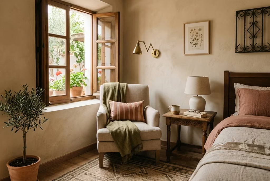
A guest room reading nook adds a layer of hospitality that feels thoughtful without being excessive. It gives the room dual purpose, allowing it to function as both a sleeping space and a quiet retreat.
In practice, I often keep guest room nooks slightly understated, using soft lighting, neutral textiles, and minimal furniture. The goal is not to dominate the room, but to offer an inviting pause that feels intuitive to use.
Pros
- Enhances guest experience and comfort
- Adds multifunctionality to the room
- Easy to style with minimal intervention
Cons
- Must remain understated to avoid visual clutter
- Limited usage may not justify heavy investment
When these placements are understood correctly, a Spanish reading nook stops being a design idea and becomes a spatial strategy. It is not about forcing a corner to behave differently, but about recognising where calm already exists in the home and gently bringing it forward.
Final Thoughts About Spanish Reading Nook
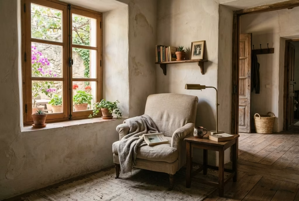
A Spanish reading nook, when considered properly, is never really about the corner itself. It is about what that corner allows you to feel once it has been shaped with restraint, texture, and a quiet understanding of proportion. It becomes less of a styled feature and more of a shift in how a home is experienced, a small pause within the larger rhythm of daily life where everything slows down just enough to feel intentional.
In real residential design work, I have often seen that the most successful spaces are not the ones that announce themselves loudly. They are the ones that settle in quietly, almost unnoticeably at first, and then gradually begin to change how a room is used. A reading nook like this behaves in exactly that way. It does not demand attention. It earns it over time.
There is something deeply effective about treating it as a room within a room. Not in a structural sense, but in an emotional and spatial one. A defined pocket of calm where light, material, and scale are allowed to work together without interruption. It may be small in footprint, often no more than a corner or alcove, yet its impact on the overall feel of a home can be surprisingly significant. It shifts how space is read, how pauses are experienced, and how comfort is understood.
What makes this approach so enduring is its lack of excess. The strongest transformations rarely come from adding more. They come from refining what is already there, until nothing feels out of place. A chair that sits correctly in relation to light, a surface that carries texture without noise, a palette that stays grounded rather than performative. When these elements align, the result feels almost inevitable, as if the space was always meant to resolve itself in that way.
The truth is, a weekend transformation of this kind does not need to be dramatic to be effective. In fact, the quieter it feels, the more successful it usually is. There is a certain confidence in restraint, a sense that nothing has been forced, yet everything has been considered. That is where the emotional value of the space really lives, in its ability to feel both simple and deeply layered at the same time.
A Spanish reading nook, when done well, does not compete with the rest of the home. It softens it. It introduces a moment of pause that you begin to return to without even thinking about it. Over time, it becomes less of a design feature and more of a habit, a place where the day naturally slows down for a while.
And perhaps that is the quiet success of it all. Not a space that impresses at first glance, but one that stays with you long after you have left it.
Frequently asked questions about Designing or renovating A Spanish Reading Nook
What makes a reading nook feel properly Spanish rather than just warm and rustic?
A Spanish reading nook feels authentic when it is guided by restraint, material honesty, and soft architectural character rather than decorative imitation. The difference is subtle but important. Terracotta tones, limewashed walls, timber, linen, and aged metal all contribute, yet they only work when they are not forced into a “theme”.
In real design practice, I have found that authenticity comes from how naturally these materials sit together. If the space feels collected over time rather than assembled in one go, it usually lands in the right place.
What is the best colour palette for a Spanish reading nook?
The most reliable palette sits within warm earth-based tones. Terracotta, muted clay, sand, softened ochre, and faded reds form the foundation, while restrained blues or cooler neutrals can be used sparingly for balance.
What really matters is not individual colours but how they interact under natural light. In successful spaces, the palette feels sun-warmed rather than saturated, almost like it has been softened by time and use.
Can this style work in a small room or awkward corner?
Yes, and often it works even better in smaller or overlooked areas. A Spanish reading nook does not rely on scale. It relies on proportion, light, and intention.
In practice, I have seen compact alcoves, stair landings, and bedroom corners become some of the most atmospheric reading spaces in a home. When the proportions are right and clutter is avoided, even a modest footprint can feel deeply inviting.
Which materials matter most in getting the look right?
The foundation usually comes from a small group of honest, tactile materials. Limewash or matte mineral paint, natural timber such as oak or walnut, linen and wool textiles, ceramic and stone accents, and aged brass or iron details all play a role.
What matters most is how these materials age. In well-designed spaces, surfaces are allowed to develop character over time rather than remain static. That gentle ageing is what gives the nook its depth.
How do you keep the nook from feeling too themed?
The key is subtlety. A Spanish reading nook should suggest influence, not replicate it literally. When too many decorative references are introduced at once, the space begins to feel staged rather than lived in.
In practice, I always recommend focusing on one or two strong gestures, such as a textured wall, a curved detail, or a warm material palette, and allowing everything else to remain quiet in support of those choices.
What kind of seating works best?
Seating should feel relaxed and inviting rather than formal or rigid. A low armchair with a comfortable seat depth or a simple built-in bench often works best.
From experience, the most successful seating choices are those that encourage lingering without effort. If the body naturally settles into the space without adjustment, the design is usually working correctly.
How important is lighting in a Spanish reading nook?
Lighting is one of the most critical elements in the entire composition. It defines mood, usability, and emotional tone more than almost any other feature.
A layered approach tends to work best. Natural daylight for daytime atmosphere, a warm focused light for reading, and a softer ambient glow to maintain depth in the evening. Without this balance, even well-designed spaces can feel flat or incomplete.
What should I avoid if I want the nook to feel calm and refined?
The most common issues come from excess. Over-theming, too many saturated colours, oversized furniture, cluttered surfaces, and overly decorative styling can quickly disrupt the sense of calm.
In real projects, I have found that the strongest reading nooks are almost always edited rather than filled. When the space is allowed to breathe, every material and object feels more intentional, and the overall atmosphere becomes noticeably more restful.