25 Timeless Spanish Kitchen Ideas That Capture the Beauty of Spain
There is something deeply grounding about a well-designed Spanish kitchen. Not in the theatrical sense often seen online, where every surface is drenched in heavy ornament or exaggerated rusticity, but in the quieter, more enduring way these spaces hold warmth, texture, and life together under one roof. The best examples feel collected rather than decorated, shaped slowly over time by natural materials, softened light, and the kind of practical beauty that only improves with age.
In many of the Spanish homes I have studied and worked within, the kitchen rarely behaves like a polished showpiece sealed off from daily living. Instead, it sits at the emotional centre of the house, where terracotta floors carry the marks of years gone by, timber cabinetry gathers depth through use, and stone surfaces wear their imperfections with complete confidence. Nothing feels overly precious, yet everything feels considered. That balance, delicate as it may seem, is precisely what gives Spanish kitchens their remarkable longevity.
What makes the style so compelling today is its refusal to chase perfection. Slightly uneven plaster walls, hand-finished tiles, aged iron fixtures, and sun-washed palettes all contribute to an atmosphere that feels relaxed but deeply intentional.
These are rooms built on restraint and material honesty rather than decorative excess. Even in more contemporary interpretations, the soul of the space remains rooted in tactility, proportion, and warmth. The eye moves naturally from one surface to another without interruption, almost as though the room has settled gently into itself over decades.
Spanish kitchens also translate beautifully into modern homes because they balance practicality with atmosphere, especially when the design draws on natural finishes, grounded proportions, and tactile materials. I have found that even modest renovations begin to feel far more layered and emotionally engaging when these principles are introduced carefully.
A softly textured lime washed wall, a warm oak island with visible grain, or handmade ceramic tiles catching late afternoon light can shift the entire mood of a kitchen without forcing the architecture into something artificial.
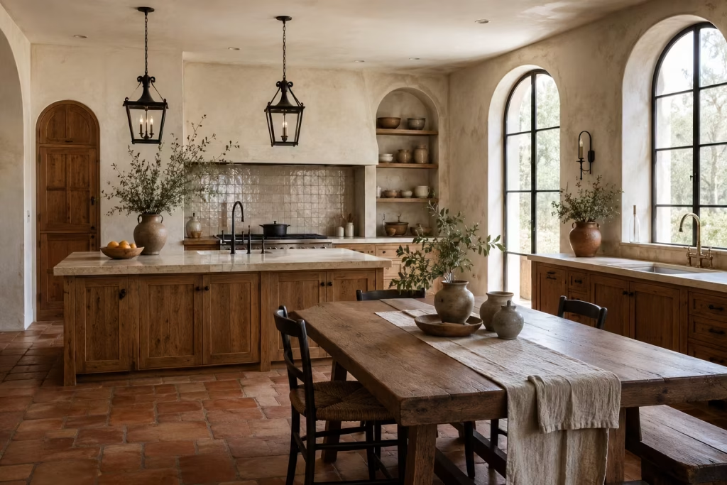
Perhaps that is the real beauty of Spanish-inspired design. It does not rely on grand gestures to leave an impression. Instead, it works quietly in the background, creating kitchens that feel welcoming, settled, and deeply connected to the rhythms of everyday life.
25 Timeless Spanish Kitchen Ideas
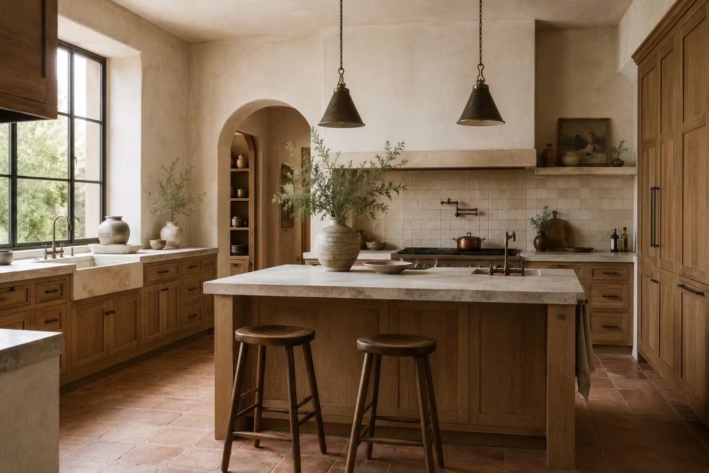
The beauty of a Spanish-inspired kitchen rarely comes from one dramatic feature alone. More often, it reveals itself slowly through the layering of warm materials, softened light, handcrafted surfaces, and thoughtful architectural details that make a space feel welcoming from the moment you step inside.
These kitchens carry a sense of ease that cannot be rushed. Nothing feels overly polished or painfully staged. Instead, the room unfolds naturally, with texture, proportion, and lived-in comfort working together quietly in the background. That balance is precisely what allows Spanish kitchen design to remain timeless while so many trend-driven interiors come and go in the blink of an eye.
The ideas ahead are not about turning your home into a theatrical replica of a Mediterranean villa. They are about borrowing the qualities that make Spanish kitchens feel so enduring in the first place. Some focus on material choices like stone, timber, and handcrafted tile, while others explore layout, lighting, colour, and architectural softness.
Whether you are renovating a countryside property, refreshing a suburban family kitchen, or shaping a contemporary extension that feels warmer and more grounded, these ideas can be adapted thoughtfully to suit real homes and modern lifestyles. Often, it is the quieter decisions, the tactile finishes, the earthy palette, the careful use of contrast, that end up stealing the show long after fleeting trends have lost their sparkle.
Use Warm, Earth Led Colour as the Foundation
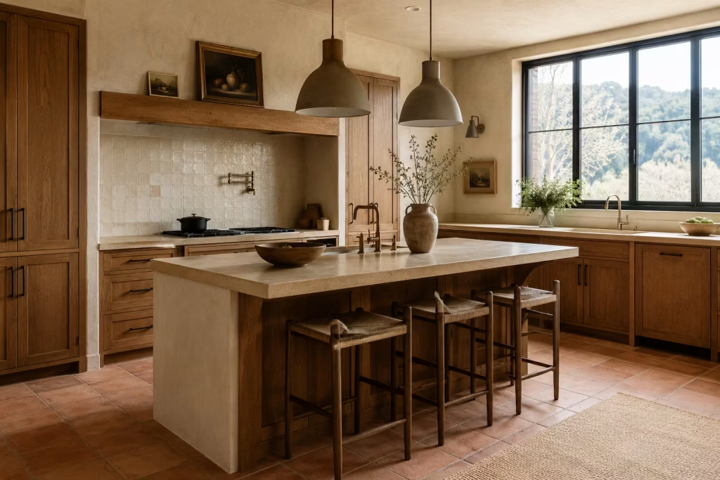
Colour sits at the very heart of Spanish kitchen design, but not in the loud or attention-seeking way many people expect. The most timeless Spanish kitchens rarely depend on dramatic contrast or heavily saturated palettes to make an impression. Instead, they lean into colours pulled gently from the natural world, shades that feel sun-warmed, grounded, and quietly comforting from morning through evening. Terracotta, ochre, clay, sand, olive, cream, and soft white all carry a softness that allows the room to breathe rather than compete for attention.
What makes these tones so effective is the way they interact with natural light throughout the day. A warm clay wall may appear softly golden in the morning, then deepen into a richer earthy tone by late afternoon. Cream cabinetry paired with aged brass or walnut timber feels relaxed rather than stark, especially when sunlight begins to wash across the surfaces. These shifts may seem subtle at first glance, yet they are precisely what give Spanish-inspired kitchens their layered, lived-in atmosphere.
I often encourage homeowners to think of colour in these kitchens less as decoration and more as environmental mood-setting. A softly muted olive island, for example, can anchor an open-plan kitchen beautifully without overpowering adjoining spaces. Likewise, sandy plaster walls paired with terracotta flooring tend to create an enveloping warmth that feels welcoming year-round rather than seasonally trendy. There is a quiet confidence to these combinations. They do not shout for validation. They simply settle into the room naturally, like they were always meant to be there.
One of the biggest mistakes I see in Mediterranean-inspired renovations is pushing the palette too far into high contrast territory. Bright whites against sharp black accents can sometimes strip away the softness that gives Spanish kitchens their soul. The beauty of earth-led colour lies in tonal layering instead. Warm whites beside creamy limestone, muted browns against dusty olive, or pale terracotta balanced with weathered oak all create depth without visual chaos. It becomes a slow burn rather than a flash in the pan.
These colours also tend to age remarkably well in family homes. Unlike highly trend-driven palettes that can begin feeling dated after only a few years, earthy tones develop familiarity and warmth over time. They absorb the rhythms of daily life beautifully, whether paired with handmade ceramics, textured linens, or stone countertops that gather subtle character through use. In many kitchens I have worked on, the spaces that still feel inviting years later are almost always the ones built around restrained, natural colour foundations rather than dramatic statement hues.
There is also a practical side worth considering. Warm earth-led palettes are incredibly forgiving. They soften shadows, disguise minor wear more gracefully, and create a gentler visual transition between surfaces. In compact kitchens especially, this can make the room feel far calmer and more cohesive. Instead of the eye bouncing sharply from one finish to another, everything flows together more naturally, almost as though the kitchen has exhaled and relaxed into itself.
At its best, this palette creates something many modern kitchens struggle to achieve: emotional warmth without clutter. That is no small feat. A kitchen can be minimalist and still feel inviting, but only when the colours carry enough depth and softness to prevent the room from feeling cold as stone. Spanish-inspired palettes understand that balance instinctively, which is precisely why they continue to resonate so strongly today.
Why It Works
Warm, earth-led colours create atmosphere without overwhelming the senses. Because the tones sit close together naturally, the room feels cohesive, grounded, and easy to live with over time. Instead of relying on stark contrast or trend-driven statement colours, the palette introduces depth through subtle tonal variation and texture. This allows materials like plaster, timber, stone, and tile to take centre stage without visual noise fighting for attention.
These colours also respond beautifully to changing daylight, which gives the kitchen a softer and more dynamic character throughout the day. In practical terms, they make the space feel calmer, warmer, and more emotionally inviting, particularly in busy family homes where the kitchen acts as the social heart of daily life.
Best For
This approach works especially well in kitchens that feel visually cold, flat, or overly clinical. Homes with limited architectural character often benefit enormously from earth-led colour because it introduces depth without requiring major structural changes.
It is also ideal for:
- Open-plan kitchens needing warmth and cohesion
- Suburban renovations that feel too stark or generic
- Mediterranean or Spanish-inspired homes wanting authenticity
- Compact kitchens where softer tones help expand the atmosphere visually
- Family kitchens where longevity matters more than short-lived trends
In my experience, homeowners who choose these palettes thoughtfully tend to stay happy with them for far longer than those chasing fashionable colour moments. Earth-led tones have a way of quietly standing their ground while trends come and go around them.
Bring in Handcrafted Tiles with Character
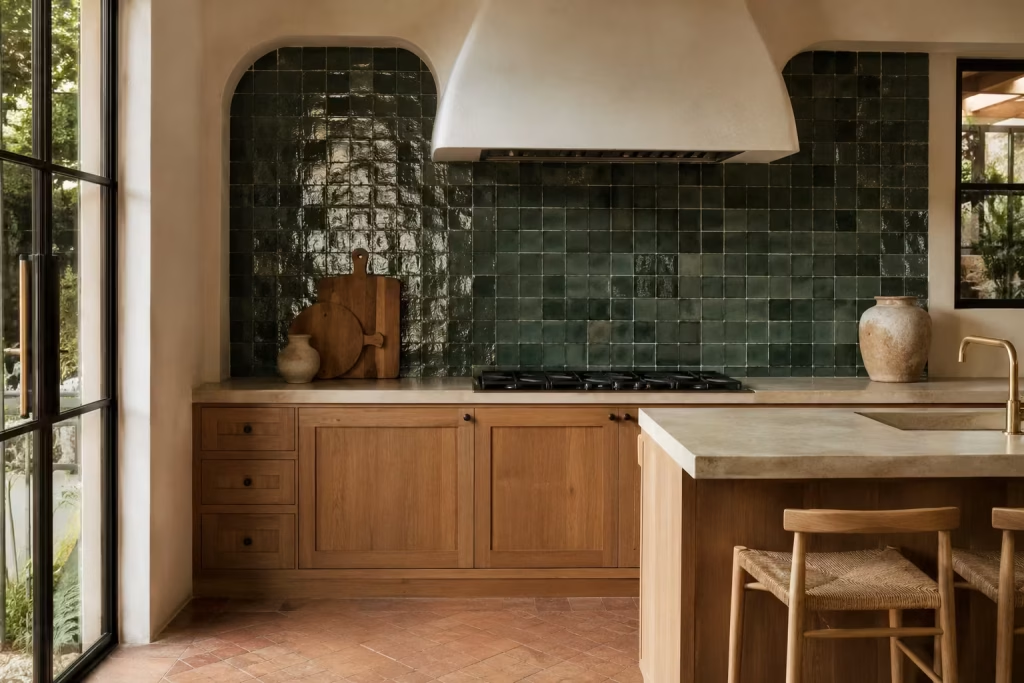
Few elements capture the spirit of a Spanish kitchen quite like handcrafted tile. There is an unmistakable richness to surfaces that carry slight imperfections, tonal variation, and the visible mark of human craftsmanship.
Unlike factory-perfect tiles that can sometimes feel flat as a pancake once installed across large areas, handmade finishes introduce rhythm and visual movement that shifts beautifully as light travels through the room.
Zellige-style tiles, encaustic patterns, and handmade ceramics each bring their own personality to a kitchen, yet all share one important quality: they stop the space from feeling sterile. Even the smallest irregularities in glaze, shape, or edge detail create subtle variation that gives the room soul and visual depth. A splashback lined with softly reflective ceramic tiles can catch morning light in dozens of slightly different ways, turning what might otherwise be a functional surface into something quietly captivating.
I often find that homeowners underestimate just how transformative tile can be in a kitchen renovation. Cabinetry usually dominates the early planning stages, while surfaces like splashbacks become an afterthought.
Yet in practice, handcrafted tile frequently becomes the feature people respond to most emotionally once the project is complete. It acts almost like the connective tissue of the room, tying together stone, timber, plaster, and metal finishes while adding a layer of artistry that feels collected rather than manufactured.
The key, however, lies in knowing where to stop. Spanish-inspired kitchens work best when handcrafted details are allowed breathing space. A run of glossy olive-toned zellige tiles behind open shelving can create a beautiful focal point without overwhelming the architecture.
Likewise, an encaustic tiled niche above a range cooker may add just enough pattern to bring energy into a restrained palette. But when every wall, floor, and surface competes for attention, the room can quickly tip from elegant into visually exhausting. Too much of a good thing really can spoil the broth.
This is especially important in contemporary homes where cleaner lines often dominate the architecture. In these settings, a carefully chosen handmade tile becomes far more impactful when paired with quieter surrounding finishes. I
once worked on a suburban kitchen extension where the entire atmosphere shifted because of one relatively small decision: replacing a flat white splashback with pale sand-coloured handmade ceramic tiles. The cabinetry remained simple, the countertops understated, yet suddenly the room felt layered, expressive, and far more inviting without losing its modern clarity.
Colour choice matters enormously here too. Earthy greens, dusty whites, muted terracotta, smoky blues, and clay-inspired neutrals tend to age far more gracefully than highly saturated tones chasing seasonal trends.
The beauty of handcrafted tile lies in nuance rather than drama. Slight glaze variation, softly uneven surfaces, and imperfect edges already provide plenty of visual interest, so the colour palette rarely needs to work overtime.
Practicality also deserves a seat at the table. Handmade tiles can be wonderfully forgiving in busy kitchens because their variation naturally disguises small splashes, fingerprints, and day-to-day wear more effectively than ultra-flat polished surfaces.
At the same time, some heavily textured tiles may require slightly more attention during cleaning, particularly around cooking zones. It is always worth balancing beauty with functionality depending on how intensively the kitchen will be used.
What makes handcrafted tile so enduring is its ability to feel personal rather than mass-produced. Even in newly renovated spaces, it introduces a sense of individuality that cannot be replicated by machine-perfect finishes alone. The room begins to feel layered and expressive, almost as though pieces have been gathered thoughtfully over time instead of installed in one swift sweep.
Pros
One of the greatest strengths of handcrafted tile is the visual movement it introduces. Because no two pieces are entirely identical, the surface feels dynamic and richly layered without needing excessive colour or ornament. This variation creates a more relaxed and authentic atmosphere compared to perfectly uniform tiling.
Additional advantages include:
- Adds artistry and individuality to the kitchen
- Reflects light beautifully throughout the day
- Pairs exceptionally well with timber, stone, and plaster finishes
- Helps soften modern or newly built spaces
- Creates focal points without requiring large structural changes
- Ages gracefully compared to trend-driven patterned surfaces
Cons
Handcrafted tile can become visually overpowering if used too heavily across multiple surfaces. Patterned encaustic tiles in particular require careful placement, otherwise the kitchen risks feeling cluttered or overly themed.
Other considerations include:
- Slightly higher cost compared to standard ceramic tiles
- Some handmade finishes require more maintenance
- Uneven edges may not suit ultra-minimal interiors
- Highly decorative patterns can date more quickly if overused
- Installation often requires a skilled tiler familiar with handmade products
The strongest Spanish-inspired kitchens tend to use handcrafted tile with intention rather than excess. One beautifully detailed surface usually carries far more impact than a room trying to wear every idea at once.
Choose Plaster-Like Wall Finishes
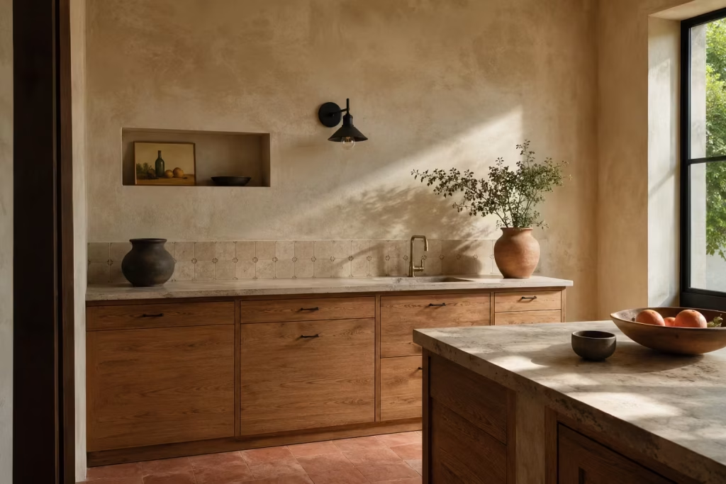
There is a quiet architectural intelligence to plaster-like wall finishes that makes them especially compelling in Spanish-inspired kitchens. Unlike flat painted surfaces, which can sometimes sit a little too neatly against cabinetry and appliances, plaster, limewash, and mineral-based finishes carry a subtle irregularity that softens the entire room without asking for attention.
The result is a backdrop that feels less like a constructed surface and more like something that has evolved gradually, almost as if the building itself has been gently shaped by light and time.
Limewash, in particular, has a way of shifting character throughout the day. Early morning light tends to reveal a chalky softness, while later in the afternoon the same wall can deepen into richer tonal variation, almost like a slow visual breathing pattern across the room.
Tadelakt-inspired finishes take a slightly different approach, offering a smoother, almost stone-polished effect, yet still retaining enough variation to avoid feeling overly mechanical. Soft mineral paints sit somewhere in between, offering a more subtle interpretation for those who want restraint without losing depth.
What makes these finishes so effective in real homes is their ability to calm visual noise. Kitchens, by nature, are busy environments filled with appliances, cabinetry lines, handles, and functional elements competing for attention.
A plaster-like surface acts almost like a visual pause button, allowing the eye to rest between more detailed features such as tilework or timber joinery. It is this sense of rhythm, this push and pull between detail and restraint, that gives Spanish-inspired kitchens their effortless composure.
In practice, I have often found that homeowners are surprised by how much more cohesive a kitchen feels once reflective or overly flat painted surfaces are replaced with something more textural in character. In one renovation project, a relatively standard suburban kitchen was transformed simply by shifting from a bright white emulsion to a warm limewash in a soft clay tone.
No structural changes were made, yet the room suddenly felt more layered, more forgiving, and far less dependent on styling tricks to feel complete. It was a reminder that sometimes the most powerful design decisions are the quietest ones.
These finishes also work exceptionally well alongside other Spanish-inspired materials. When paired with handmade tile, for example, plaster walls provide a steady backdrop that allows variation in glaze and pattern to stand out without competing visually.
Combined with timber cabinetry, they help balance the natural grain and tonal shifts, preventing the room from feeling too heavy or visually dense. Even against stone surfaces, plaster introduces a softness that stops the kitchen from becoming overly rigid or cold in its composition.
There is also a practical rhythm to these finishes that suits everyday living. Minor scuffs, gentle wear, and subtle changes over time tend to blend into the surface rather than sit sharply on top of it. Instead of fighting against the realities of daily use, the material absorbs them in a way that feels forgiving and unforced. This is particularly valuable in kitchens that see constant activity, where perfection is rarely realistic and often not even desirable.
Of course, these finishes are not without their considerations. They require thoughtful application and a degree of acceptance that variation is part of the character rather than a flaw to be corrected. They may not suit those who prefer crisp, highly uniform walls, and in poorly lit spaces, they can sometimes appear flatter if not balanced with appropriate lighting design. But when handled well, they bring a sense of depth that is difficult to replicate through standard paint systems alone.
Pros
Plaster-like finishes introduce a subtle visual complexity that enhances the entire kitchen without dominating it. They help unify different materials, soften transitions between surfaces, and reduce the harshness that can sometimes come from modern kitchen components. Their shifting appearance throughout the day adds a gentle sense of movement, keeping the space visually engaging without becoming distracting.
Additional advantages include:
- Creates a softer architectural backdrop for cabinetry and fittings
- Works beautifully with timber, stone, and handcrafted tile
- Helps reduce visual harshness in kitchens with strong lighting
- Adapts naturally to changing daylight conditions
- Supports a more cohesive overall material palette
- Ages in a way that feels natural rather than deteriorating
Cons
Plaster-like finishes require careful execution and are less forgiving during application compared to standard paint. They can also be more challenging to repair seamlessly if damaged. In very small or poorly lit kitchens, they may need additional lighting support to avoid feeling visually flat. Overuse without contrast can also lead to a monotone effect, where the space lacks focal points or hierarchy.
- Requires skilled application for best results
- Can be difficult to patch invisibly if damaged
- Needs thoughtful lighting to perform well in darker spaces
- May feel too subtle if not balanced with stronger materials
- Less suitable for highly clinical or ultra-minimal design intentions
When used with intention, however, plaster-like finishes become one of the most quietly powerful tools in Spanish-inspired kitchen design, setting the stage for everything else to sit more comfortably within the space.
Ground the Room with Natural Stone
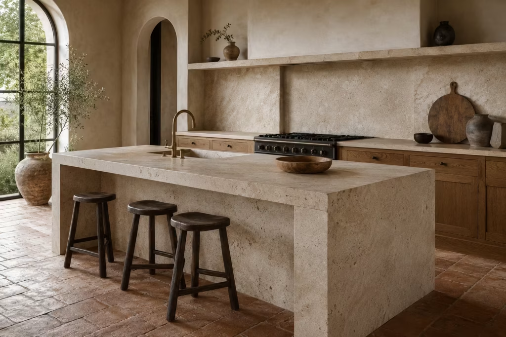
Natural stone has a way of anchoring a kitchen without ever needing to raise its voice. In Spanish-inspired design, it plays the role of quiet authority, sitting beneath the surface visually while holding everything else in balance.
Whether it appears as a substantial countertop, continuous flooring, or a bold backsplash detail, stone introduces a sense of weight and composure that stops the room from feeling overly fragile or decorative.
What makes stone so compelling in this context is its relationship with time and use. Unlike highly polished synthetic surfaces that can feel visually static, stone carries subtle variation from the moment it is installed.
Veining, tonal shifts, and natural irregularities give each slab its own identity, almost like a landscape captured indoors. Over time, it responds to daily life in a way that feels organic rather than accidental. Light scratches, soft patina, and gentle wear patterns do not diminish its presence; they quietly enrich it.
In Spanish kitchens, stone often acts as the visual anchor that allows more expressive elements to breathe. When paired with handmade tile or softly textured walls, it prevents the overall composition from drifting into visual excess.
When combined with timber cabinetry, it introduces contrast without harshness, creating a steady rhythm between soft and solid, warm and cool. It is this balance that gives the kitchen its sense of calm authority, even in busy households where the space is constantly in motion.
I have worked on kitchens where the introduction of stone completely shifted the emotional tone of the room without altering the layout at all. In one renovation, a fairly standard open-plan kitchen felt visually scattered, with multiple finishes competing for attention.
Once a single honed limestone island and matching stone splashback were introduced, everything settled into place. The cabinetry suddenly felt more intentional, the lighting more considered, and even the surrounding furnishings began to sit more comfortably within the space. It was a reminder that sometimes the most effective design decisions are the ones that quietly hold everything together rather than trying to stand out.
Stone also brings a practical clarity that makes it especially valuable in real homes. Kitchens are high-activity environments by nature, and surfaces need to cope with constant use without losing their character.
Stone tends to respond well to this rhythm of everyday living. It handles heat, spills, and frequent contact with a kind of effortless resilience that feels reassuring over time. Instead of becoming tired or visually worn in an undesirable way, it develops subtle variation that reflects how the space is actually used.
There is also a sensory quality to stone that is often overlooked. It carries a natural coolness that balances warmer materials like timber and plaster, preventing the kitchen from feeling overly soft or visually uniform.
This interplay between contrasting surfaces is what gives Spanish-inspired kitchens their depth. Nothing feels one-note. Everything has a role, and stone often acts as the stabilising force that allows the rest of the palette to express itself more freely.
That said, stone is not a one-size-fits-all solution. Its impact depends heavily on selection, finish, and proportion. A highly polished surface can feel too formal in a relaxed kitchen setting, while overly dramatic veining may dominate smaller spaces.
The most successful applications tend to favour softer honed finishes, quieter tonal variations, and thoughtful placement rather than full coverage everywhere. It is about letting stone support the architecture of the kitchen, not overpower it.
Real-life application
In family kitchens, I have seen stone work especially well where the room needs to feel steady and composed under heavy daily use. In one project involving a busy household with young children, a honed limestone worktop and matching splashback created a sense of order that the previous laminate surfaces simply could not achieve.
The kitchen became easier to maintain visually, even when life was in full swing. Spills, fingerprints, and daily wear blended into the surface rather than standing out sharply, which made the entire space feel more forgiving and less demanding to keep “perfect.”
It is in these kinds of real-world scenarios that stone proves its worth most clearly. Not as a showpiece, but as a reliable foundation that allows everything else in the kitchen to function with greater ease and confidence.
Introduce Timber Cabinetry with Visible Grain
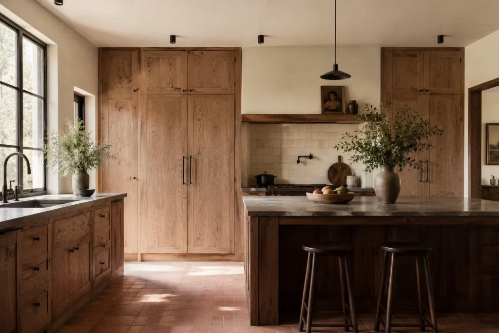
Timber cabinetry brings a sense of honesty into a Spanish-inspired kitchen that few other materials can match. There is something inherently reassuring about wood that has not been overly smoothed or concealed, where the grain is allowed to speak rather than being hidden under layers of heavy finish.
It introduces a quiet rhythm across the room, almost like a visual undercurrent that ties everything together without demanding attention. In many well-resolved kitchens, timber is the element that keeps the entire composition from drifting into something too cold or overly polished.
What makes visible grain so important here is the way it softens architectural structure. Cabinetry, by nature, can feel quite rigid when reduced to flat, uninterrupted planes. Once timber enters the equation, that rigidity loosens slightly.
The surface begins to carry movement, subtle shifts in tone, and natural variation that change how the eye reads the space. Even in a very modern kitchen layout, timber can introduce a sense of ease that feels quietly reassuring, like a familiar rhythm returning to a space that might otherwise feel too engineered.
In Spanish-inspired design, timber rarely behaves as a decorative flourish. Instead, it becomes part of the architecture itself. Full-height cabinetry in oak, walnut, or ash can wrap the room in a continuous visual flow, while a timber island can act as a grounding focal point that invites daily interaction.
Painted timber finishes also work exceptionally well when the underlying grain is still perceptible. This allows colour to sit gently over the material rather than erasing its character entirely, creating a layered effect that feels considered rather than flat.
I have often found in renovation work that timber cabinetry becomes the element homeowners grow most attached to over time. Not because it shouts for attention on day one, but because it settles into daily life so comfortably. In one project, a muted walnut kitchen initially felt understated compared to more decorative material samples in the early stages.
Yet once installed, it quickly became clear that the cabinetry was doing the heavy lifting in the room. It absorbed natural light beautifully, softened the impact of surrounding stone, and gave the entire space a sense of coherence that no single statement feature could have achieved alone.
There is also a practical intelligence to timber that makes it especially suited to real households. It tends to age in a way that feels forgiving rather than unforgiving, which is particularly valuable in kitchens that see constant activity.
Minor knocks and everyday use do not detract from its presence; instead, they contribute to a subtle evolution in character. This makes it far more adaptable to long-term living than many highly polished or synthetic alternatives that can start to feel tired long before their time.
Use oak, walnut, ash, or a painted timber finish that still feels tactile
Each timber brings its own personality into the kitchen, and the choice often shapes the overall mood more than people expect. Oak tends to feel steady and reliable, with a grain pattern that is expressive enough to add interest without overwhelming the eye. Walnut carries a deeper, more grounded presence, often lending itself to spaces that benefit from a richer visual tone.
Ash sits somewhere lighter and more understated, making it particularly useful in kitchens that rely on natural light to carry the atmosphere. Painted timber finishes offer a different kind of flexibility, allowing colour to shift the mood while still preserving the underlying grain so the material never feels completely stripped of its identity.
The key is to avoid over-processing the surface to the point where the timber loses its voice. Once the grain disappears entirely under heavy lacquer or synthetic coating, the material begins to behave more like a flat façade than a living component of the architecture. In Spanish-inspired kitchens, that subtle irregularity is precisely what keeps the space feeling emotionally engaging rather than visually sterile.
Ultimately, timber cabinetry with visible grain works because it bridges structure and softness in a way few materials can. It holds the room together, yet never feels rigid or overbearing. Instead, it slips into the background with quiet confidence, allowing the kitchen to feel composed, approachable, and deeply connected to everyday life without ever trying too hard.
Opt for Arched Details in a Controlled Way
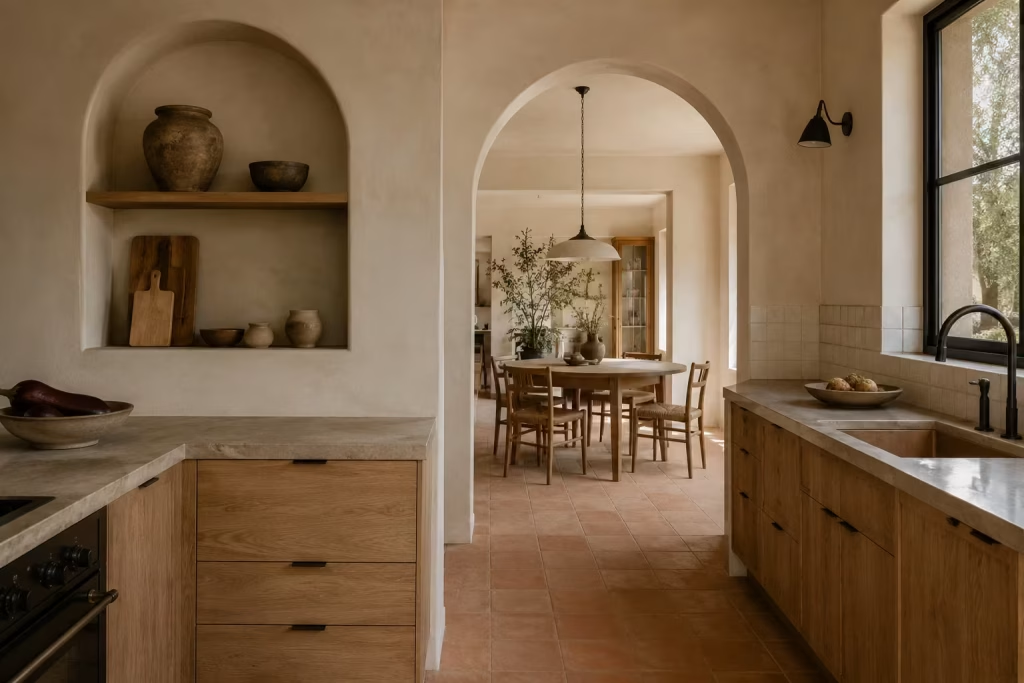
Arches have a way of shifting the entire emotional reading of a kitchen without adding visual clutter. In Spanish-inspired design, they are not used as decorative flourishes for the sake of nostalgia, but as soft architectural interruptions that ease the transition between surfaces, zones, and volumes. When handled with restraint, an arch can change the mood of a room almost instantly, taking what might feel boxy or overly linear and introducing a gentler, more fluid rhythm that the eye naturally follows.
What makes arched forms so effective is their ability to break rigidity without introducing chaos. Kitchens are often built on straight lines, sharp junctions, and functional precision. While that structure is necessary, too much of it can begin to feel unforgiving.
An arched doorway, a curved niche, or a softly rounded range alcove interrupts that strict geometry just enough to create balance. It is a subtle shift, yet one that makes the space feel more composed and less mechanical, almost as if the architecture has been eased into a more human scale.
In practical design work, I have found that arches work best when they are treated as punctuation rather than paragraphs. A single curved opening between kitchen and dining area can be far more impactful than multiple decorative arches scattered throughout the space.
Similarly, a recessed arched niche above a countertop can become a quiet focal point, offering both visual relief and functional storage without overwhelming the overall layout. The goal is not to recreate a historic setting, but to borrow just enough of its language to soften the edges of contemporary living.
There is also a psychological dimension to curved forms that is often underestimated. People tend to respond more comfortably to softer geometry, especially in spaces where they spend significant time.
An arch naturally draws the eye upward and around, guiding movement rather than interrupting it. This creates a sense of ease in circulation, particularly in open-plan kitchens where multiple functions overlap. Instead of feeling segmented or rigid, the space begins to flow in a more intuitive way.
I have seen this play out clearly in renovation projects where even a small curved detail changed how a room was experienced day to day. In one kitchen extension, a simple arched opening connecting the cooking area to a dining zone completely altered the sense of connection between the two spaces.
Before the change, the transition felt abrupt and purely functional. Afterward, it felt like one continuous experience, with just enough separation to define purpose without breaking visual harmony. It was a reminder that sometimes the smallest architectural decisions carry the most lasting influence.
That said, arches need to be used with discipline. Overuse can quickly tip a kitchen into something that feels overly themed or stylistically heavy. When every doorway, cabinet edge, and detail begins to curve, the impact is diluted and the clarity of the design begins to weaken. The strength of an arch lies in its restraint. It should feel intentional, almost like a carefully placed pause in an otherwise structured composition.
Material choice also plays an important role in how arches are perceived. When rendered in plaster or finished in soft mineral paint, they tend to blend seamlessly into the architecture, appearing almost carved rather than applied.
When framed in timber or stone, they take on a slightly more defined presence, which can be useful when you want to highlight a transition or create a subtle focal point. Either approach works, as long as the overall balance of the room remains intact.
Arched doorways, niches, range alcoves, or cabinet details can soften the room
These forms work best when they are integrated thoughtfully into the architectural framework rather than added as surface decoration. An arched doorway between kitchen zones can guide movement with ease, while a recessed niche above a cooking area can introduce quiet visual relief without disrupting functionality.
A curved range alcove, when proportioned correctly, can frame the cooking space almost like a considered backdrop rather than a utilitarian necessity. Even subtle cabinet detailing, such as softened upper corners or gently rounded island ends, can reduce visual sharpness in a way that feels natural and unforced.
The real value of these details lies in how they reshape perception. Instead of encountering a series of rigid edges, the eye begins to move more fluidly through the space. The kitchen feels less like a collection of separate components and more like a continuous experience, shaped with care and attention rather than strict geometry alone.
You May also Like: 25 Spanish Bathroom Design Ideas Full of Color, Texture, and Mediterranean Charm
Use Open Shelving to Lighten the Composition
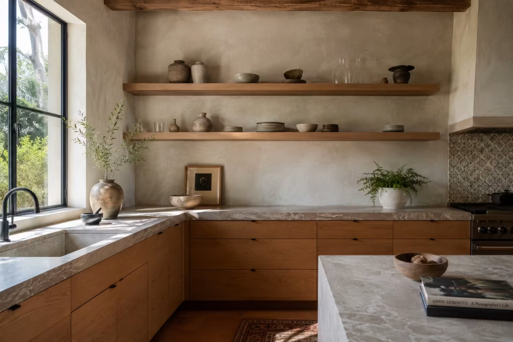
Open shelving can completely shift the emotional reading of a Spanish-inspired kitchen when it is handled with intention rather than excess. Instead of relying solely on closed cabinetry, introducing a few carefully placed open surfaces creates visual breathing space, allowing the eye to move more freely across the room. It is less about display and more about editing, where each object earns its place rather than simply filling a gap.
In practice, open shelving works best when it breaks up long runs of solid cabinetry or softens heavier material combinations such as stone worktops or timber fronts. When everything is enclosed, the kitchen can sometimes feel visually dense, almost like a sealed box.
Open shelves interrupt that density just enough to introduce rhythm, giving the composition a lighter, more relaxed pace. The effect is subtle but noticeable, especially in smaller kitchens or spaces with limited natural light.
There is also a strong functional advantage here. Everyday items become more accessible, and the kitchen begins to operate with a sense of ease rather than constant opening and closing of doors.
When done well, it supports a more intuitive way of living, where frequently used ceramics, glassware, or cooking essentials sit within easy reach, almost as part of the kitchen’s natural flow rather than hidden away behind closed fronts.
However, the success of open shelving depends entirely on discipline. Without careful curation, it can quickly tip from considered to chaotic. This is where many kitchens lose their balance. What begins as a stylish feature can slowly become visual noise if shelves are overcrowded or inconsistently styled. The key is to think in terms of spacing, repetition, and negative space, allowing objects to breathe rather than compete for attention.
In Spanish-inspired design, open shelving often works best when it carries a sense of restraint. A small grouping of ceramic bowls, a stack of neutral plates, a few glass vessels, and perhaps one or two artisanal pieces can be more than enough.
The goal is not to showcase everything you own, but to create moments of calm composition that feel deliberate rather than accidental. When styled with a steady hand, open shelves can feel almost like quiet architectural pauses within the kitchen.
Keep it selective and styled with restraint
This approach is all about editing with confidence. Rather than filling every available surface, choose a limited palette of objects that complement the surrounding materials. Repetition helps here, whether it is similar tones of ceramic, consistent glass forms, or a cohesive mix of natural finishes. Negative space is just as important as the objects themselves, allowing each piece to stand clearly without distraction.
The most successful open shelving arrangements tend to follow a simple principle: less conversation, more clarity. When shelves are thoughtfully composed, they stop feeling like storage and start feeling like part of the architecture itself, quietly supporting the overall atmosphere of the kitchen rather than competing with it.
Pros
Open shelving visually breaks up heavy cabinetry runs, making the kitchen feel more open and less visually compressed. It also improves accessibility, keeping frequently used items within easy reach and supporting a more fluid day-to-day rhythm. When styled well, it introduces moments of character and individuality without requiring major structural changes.
Additional advantages include:
- Creates visual relief in compact or enclosed kitchens
- Encourages more intentional organisation of everyday items
- Adds an informal, approachable layer to the kitchen design
- Works well as a transition between different material zones
- Allows decorative ceramics and glassware to become part of the design narrative
Cons
The main challenge with open shelving lies in maintenance and discipline. Without consistent curation, shelves can quickly become cluttered and visually distracting. Dust accumulation is also a practical consideration, particularly in busy cooking environments. In some layouts, excessive open storage can reduce the sense of cohesion if not balanced carefully with closed cabinetry.
- Requires ongoing styling and organisation
- Can appear cluttered if not carefully edited
- Exposes items to dust and cooking residue
- Less suitable for households that prefer hidden storage
- Needs strong visual consistency to avoid visual noise
When used sparingly and with intention, open shelving becomes less about storage and more about rhythm, offering just enough openness to keep the kitchen feeling balanced, approachable, and visually composed.
Select Iron or Blackened Metal Accents
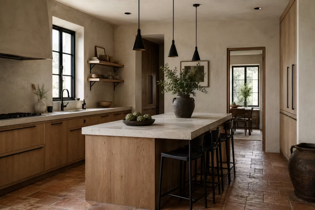
Iron and blackened metal details play a very specific role in Spanish-inspired kitchens. They are not there to dominate the visual story or introduce unnecessary contrast for its own sake. Instead, they act as quiet counterpoints, sharpening softer materials just enough to give the overall composition clarity and definition. Without them, kitchens built around plaster, timber, stone, and ceramic can sometimes drift into something too gentle, lacking the subtle edge that gives structure its presence.
What makes these darker metal finishes so effective is their ability to introduce contrast without shouting for attention. A blackened iron handle on a timber cabinet, for example, feels almost like a finishing line drawn with precision rather than decoration layered on top.
The same applies to slim metal shelving brackets or understated light fittings, where the material quietly frames the surrounding elements instead of competing with them. It is this restraint that allows metal to feel integrated rather than imposed.
In real projects, I often find that metal accents are the detail that brings everything into focus once the larger material choices are in place. A kitchen filled with soft plaster walls and pale stone surfaces can sometimes feel slightly unanchored until a darker note is introduced.
Once aged metal enters the picture, even in small amounts, the eye begins to understand the structure of the room more clearly. It is a bit like adding punctuation to a long sentence; suddenly everything reads with greater clarity and intention.
There is also a practical honesty to iron and blackened finishes that suits everyday kitchens particularly well. These materials tend to respond well to use, developing subtle changes over time that reflect daily life without becoming visually messy.
Unlike overly polished chrome or highly reflective fittings that can show every mark, darker metals absorb activity more gracefully, allowing the kitchen to maintain its composure even under constant use.
When used thoughtfully, these accents can quietly guide the visual rhythm of the space. A row of iron pendant lights above a kitchen island can help define a central gathering point without overpowering the room.
Slim blackened handles on cabinetry can create a subtle thread that ties different zones together. Even something as simple as a metal stool tucked beneath a counter can introduce just enough contrast to prevent the palette from feeling too uniform.
That said, the strength of these materials lies in their moderation. Once they start to appear too frequently, the effect can shift from subtle definition to visual heaviness. Spanish-inspired kitchens rely heavily on balance, and metal accents are most successful when they behave like supporting characters rather than leading roles. They should appear intentionally placed, almost as if they have been quietly edited into the composition rather than layered across every surface.
Use them in handles, lighting, shelving brackets, or stools
The most effective applications of iron or blackened metal tend to be small but strategic. Cabinet handles are often the most natural starting point, offering a simple way to introduce contrast without altering the architecture. Lighting fixtures, particularly pendant designs above islands or dining areas, can help establish rhythm and focus within the space.
Shelving brackets provide another opportunity, especially when open shelving is used, allowing structure and support elements to become part of the visual language rather than something to hide. Even stools or occasional seating pieces in dark metal can act as grounding points, breaking up lighter surfaces and adding subtle structure to the layout.
When combined carefully with softer materials, these accents help prevent the kitchen from feeling overly delicate or one-dimensional. Instead, they introduce a quiet tension between light and dark, soft and defined, which gives the space its depth and character without ever needing to raise its voice.
Incorporate a Statement Range Hood
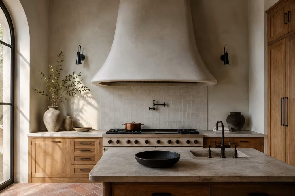
A range hood is often treated as a purely functional necessity, something to quietly handle cooking extraction and then disappear into the background. In Spanish-inspired kitchen design, however, it can take on a far more expressive role when handled with intention.
Rather than being concealed or diluted, it becomes an architectural moment in its own right, anchoring the cooking zone and giving the entire kitchen a clear visual centre of gravity.
What makes a statement hood so powerful is its ability to organise the surrounding composition without adding clutter. Kitchens, by nature, contain multiple competing elements, cabinetry runs, appliances, shelving, and work surfaces all layered into a relatively compact field of view.
A sculptural hood steps into that complexity and creates order, almost like a visual anchor point that everything else quietly orients itself around. When done well, it draws the eye in without feeling forceful, guiding attention in a calm and controlled way.
In Spanish-inspired spaces, these hoods often carry a sense of architectural solidity. Plaster-clad forms, softened curves, or subtly tapered silhouettes tend to work particularly well because they echo the language of walls and structural surfaces rather than sitting apart as isolated objects. This integration is what gives them their strength. Instead of appearing as an appliance, the hood feels embedded within the architecture, as though it has always belonged there.
I have seen this effect transform even relatively modest kitchens. In one renovation project, a fairly simple layout gained an entirely new sense of presence once a plaster-finished, softly curved hood was introduced above the cooking area.
Before that point, the kitchen felt slightly fragmented, with no clear focal point to settle the eye. Afterward, everything shifted into alignment. The cabinetry, the lighting, even the island placement suddenly felt more intentional, as though the room had finally found its centre.
There is also a subtle psychological comfort in having a clearly defined focal point in a kitchen. It gives the space structure, almost like a quiet sense of direction that helps the room feel more composed.
Without it, kitchens can sometimes feel visually scattered, particularly in open-plan settings where multiple functions overlap. A well-designed hood helps resolve that by gently gathering attention and reinforcing the purpose of the cooking zone without overwhelming the rest of the space.
Material choice plays a significant role in how effective this feature becomes. Plaster finishes tend to blend seamlessly into Spanish-inspired interiors, allowing the hood to feel sculptural yet understated.
Stone-clad versions can introduce more weight and definition, particularly in larger kitchens where a stronger visual anchor is needed. Even timber or softly painted finishes can work beautifully when handled with restraint, offering a more subtle interpretation that still carries presence without dominating the room.
That said, the success of a statement hood depends entirely on proportion and restraint. When oversized or overly decorative, it can quickly tip into visual excess, competing with cabinetry or overwhelming the cooking area. The most successful designs tend to sit in a careful middle ground, strong enough to be noticed but quiet enough to remain part of the wider architectural language.
A sculptural hood can act as the visual centre of the kitchen
When treated as an architectural feature rather than a mechanical necessity, the range hood becomes the organising heart of the kitchen. It naturally draws the eye, establishing hierarchy within the space and giving surrounding elements a clear point of reference.
Cabinetry lines, lighting positions, and even island placement often feel more coherent once this central feature is defined. Instead of drifting visually, the kitchen gains a sense of direction, as though all elements are subtly aligned around a single, calm focal point.
The real strength of this approach lies in its simplicity. Rather than adding complexity, the sculptural hood reduces visual uncertainty, allowing the rest of the kitchen to settle more comfortably into place.
Layer in Terracotta Flooring
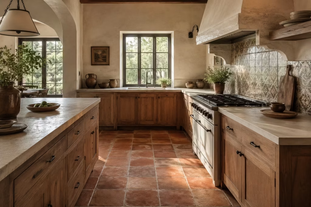
Terracotta flooring has a way of changing the entire emotional tone of a kitchen without needing any additional decorative effort. It sits quietly underfoot, yet its influence is anything but subtle. In Spanish-inspired interiors, it often acts as the foundational layer that ties everything together, allowing cabinetry, plaster, timber, and metal details to feel more coherent within the same visual story. Rather than competing for attention, it sets a steady rhythm that the rest of the room naturally builds upon.
What makes terracotta so compelling is its relationship with light and time. Freshly laid surfaces carry a soft, earthy presence, but as they settle into everyday use, they begin to develop a more nuanced character that reflects movement, activity, and changing daylight.
Morning sun tends to bring out softer golden notes, while evening light deepens the tones into something richer and more grounded. This constant, subtle shift keeps the kitchen feeling alive without relying on decorative change.
In real design work, I have often found that terracotta flooring becomes the element that quietly holds the entire scheme together. In one renovation, a kitchen that initially felt slightly disjointed due to mixed cabinetry finishes and a complex lighting plan began to feel far more cohesive once terracotta tiles were introduced. Suddenly, the space had a clear base to build upon. Everything from the island proportions to the wall finishes felt more intentional, almost as if the room had finally found its footing.
There is also a strong practical advantage to this material in everyday living. Kitchens are high-traffic environments where spills, movement, and constant use are part of daily rhythm. Terracotta handles this reality with a kind of easy acceptance.
Instead of showing every mark in a harsh or unforgiving way, it absorbs the signs of life into its surface in a way that feels natural rather than distracting. This makes it especially suitable for homes where the kitchen is not just for show, but for constant use and gathering.
Pairing is where terracotta truly comes into its own. It works beautifully with soft plaster walls, where the contrast between floor and wall creates a balanced visual dialogue. It also sits comfortably alongside timber cabinetry, reinforcing the organic connection between vertical and horizontal surfaces.
Even when combined with stone countertops or handcrafted tiles, it holds its own without overwhelming the composition, acting as the steady base that allows more expressive elements to sit comfortably above it.
That said, terracotta does require thoughtful consideration in terms of finish and tone. Highly saturated or overly glossy versions can sometimes feel visually heavy, especially in smaller kitchens or spaces with limited natural light.
Softer, muted variations tend to perform better in contemporary homes, offering the same character but with a more controlled presence. In open-plan layouts, consistency in tone becomes especially important to maintain flow between connected spaces.
Terracotta tiles or terracotta-toned porcelain can bring instant Spanish warmth
Whether natural clay or porcelain reinterpretation, terracotta flooring introduces an immediate sense of grounded comfort into a kitchen setting. Natural tiles bring subtle irregularity and variation that enhance authenticity, while porcelain alternatives offer a more uniform finish with greater ease of maintenance. Both approaches can be successful, depending on the demands of the space and the level of upkeep desired.
When used thoughtfully, this flooring choice does more than just complete the room visually. It establishes a calm, unifying base that allows every other design element to feel more intentional and connected.
Use Curved or Rounded Furniture Forms
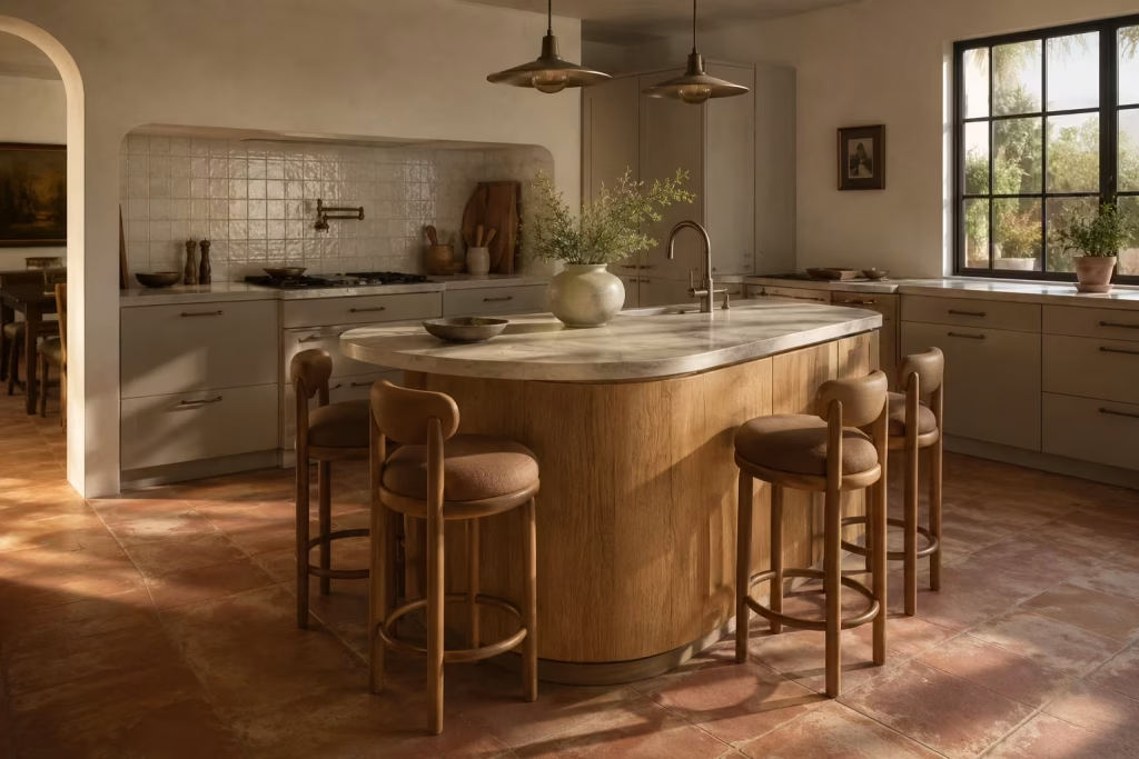
Curved and softened furniture forms introduce a subtle shift in how a Spanish-inspired kitchen is experienced day to day. Where straight lines tend to define structure and discipline, rounded edges ease the visual pressure, allowing the space to feel more approachable and less rigid in its composition. It is a small design decision on paper, yet in practice it changes how movement flows through the room, how people gather, and even how the eye travels across surfaces.
What makes curved forms so effective is their ability to interrupt repetition without creating disruption. Kitchens are often built on grids, cabinetry aligned in strict runs, islands positioned with precise geometry, and appliances embedded in linear sequences.
While that structure is necessary, too much of it can start to feel a bit mechanical. Introducing a curved island edge or a softly rounded countertop end breaks that pattern in a way that feels natural rather than forced, almost like easing a straight path into a gentle bend.
In real residential projects, I have found that curved furniture often becomes the quiet detail people respond to most without immediately realising why. In one kitchen extension, a rectangular island initially felt visually heavy within an otherwise open-plan layout.
Once the corners were softened and one side was gently reprofiled into a curved seating edge, the entire room changed character. Circulation felt smoother, seating became more inviting, and the island stopped reading as a solid block and started feeling like part of the room’s natural flow.
Rounded stools and soft-edged seating also play an important supporting role. They help reduce visual sharpness at eye level, particularly when paired with harder materials like stone countertops or timber cabinetry.
Instead of introducing another strong geometric element, they act as a counterbalance, softening the composition without drawing unnecessary attention. Even something as simple as a rounded backrest or tapered edge can shift the atmosphere in a subtle but meaningful way.
There is also a practical dimension to these forms that often goes unnoticed until the kitchen is in daily use. Sharp corners can sometimes feel unforgiving in busy households, especially where movement is constant and space is shared.
Rounded edges reduce that friction, both visually and physically, making the kitchen feel more forgiving and easier to navigate. It is the kind of detail that quietly improves everyday living without ever announcing itself.
Curved furniture also interacts beautifully with the softer architectural language often found in Spanish-inspired kitchens. When paired with plastered walls, handmade tiles, or timber surfaces, these forms reinforce the sense of continuity within the space.
Rather than breaking the room into rigid sections, they help everything feel more fluid, almost as if the architecture and furniture are speaking the same visual language.
That said, balance remains essential. Overusing curves can dilute their impact, turning what should feel intentional into something overly decorative. The most successful kitchens tend to use curvature sparingly, allowing it to appear at key moments rather than across every surface. A single curved island or a set of softly rounded stools is often more than enough to shift the entire mood of the space.
Curved islands, rounded corners, and soft-edged stools help the room feel more organic
These elements work best when they are introduced as subtle interruptions to otherwise structured layouts. A curved island edge can soften circulation and create a more inviting gathering point, while rounded corners reduce visual harshness in high-contact areas.
Soft-edged stools bring comfort at seating level, ensuring that the kitchen feels approachable from every angle rather than dominated by rigid geometry.
When combined thoughtfully, these forms encourage a more natural flow through the kitchen, where movement feels less restricted and the overall composition feels more cohesive and easy to inhabit.
You May also Like: 25 Modern Spanish Colonial Living Room Ideas That Feel Timeless and Lived-In
Introduce a Farmhouse Style Sink with a Refined Finish
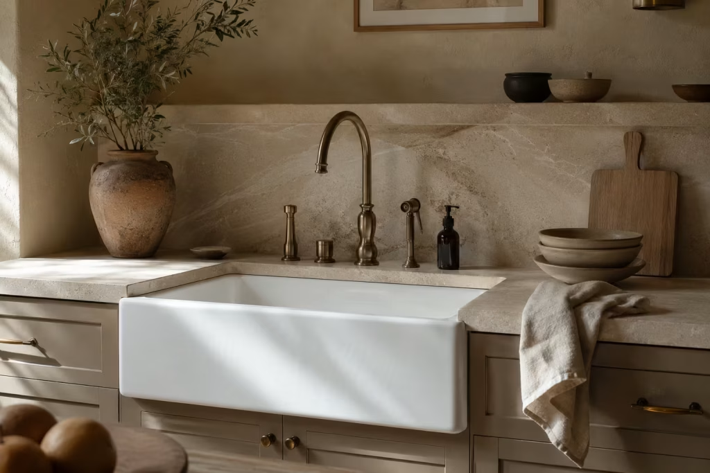
A farmhouse sink carries a certain architectural confidence that few other kitchen elements can match. It sits forward in the composition, slightly unapologetic in its presence, yet when refined correctly, it never tips into rustic cliché.
In Spanish inspired kitchens, this type of sink becomes less about nostalgic reference and more about functional sculpture, a deep, generous basin that quietly supports daily use while reinforcing the kitchen’s visual rhythm.
What makes it so effective is its proportion. The extended apron front naturally draws the eye, anchoring the sink zone in a way that feels intentional rather than incidental. In kitchens where cabinetry runs are often long and uninterrupted, this break in the surface introduces a moment of focus. It is a small architectural pause, but one that helps the entire composition feel more structured and considered.
In practice, I have seen farmhouse sinks completely reshape how a kitchen is used. In one renovation project, a relatively compact kitchen felt slightly constrained around the washing zone. Once a large, apron front sink was introduced, the space immediately became more functional and visually balanced.
The depth of the bowl made everyday tasks easier, while the front-facing profile gave the cabinetry a stronger sense of identity. It was one of those changes that did not require altering the layout, yet made the room feel noticeably more resolved.
The key to integrating this feature successfully lies in refinement. Traditional interpretations can sometimes lean too heavily into rustic styling, which may feel out of place in more contemporary Spanish inspired interiors.
A cleaner ceramic finish, softly squared edges, or a slimline apron profile tends to work far better when aiming for a more composed and updated look. The goal is not to recreate a countryside aesthetic, but to borrow the practicality of the form and elevate it through restraint.
Material choice also plays a defining role. Crisp white ceramic remains a strong option, especially when paired with muted cabinetry and natural stone surfaces. However, stone integrated sinks or subtly coloured enamel variations can offer a more nuanced interpretation, particularly in kitchens where tonal layering is already doing much of the visual work. The surrounding materials should support the sink rather than compete with it, allowing it to sit naturally within the wider composition.
There is also something quietly reassuring about the way a farmhouse sink interacts with daily life. Its depth accommodates real cooking routines without constant splashing or limitation, while its exposed front keeps the washing zone visually accessible and connected to the rest of the kitchen. It does not try to hide its function, yet it does not need to announce it either. That balance between practicality and presence is what gives it enduring appeal.
When integrated with care, this feature becomes more than a utility fixture. It turns into a defining point within the kitchen, shaping both how the space looks and how it is experienced on a daily basis. It holds its position with quiet authority, while still allowing surrounding materials and forms to carry the broader design narrative.
Keep the detail elegant rather than rustic for a more timeless result
The most successful farmhouse sinks in Spanish inspired kitchens avoid heavy rustic styling and instead lean toward cleaner, more restrained finishes. A smooth ceramic surface, simplified apron detailing, and balanced proportions help prevent the feature from feeling overly themed.
When paired with understated cabinetry and carefully chosen materials, the sink reads as part of a cohesive architectural whole rather than a standalone decorative object.
Elegance in this context is achieved through reduction, not addition. By stripping away overly traditional ornamentation, the sink gains a quieter strength that allows it to sit comfortably within both contemporary and classically influenced kitchens, ensuring it remains relevant across changing design directions.
Mix Old World Character with Clean Cabinet Lines
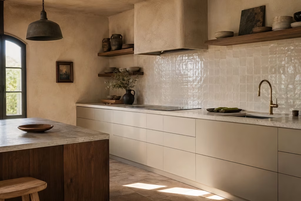
Spanish inspired kitchens become truly compelling when they resist the temptation to commit fully to either tradition or modern minimalism. Instead, the most successful spaces sit somewhere in between, where historical references are gently woven into a framework of disciplined, contemporary joinery. It is this tension, carefully balanced and never overplayed, that gives the kitchen its depth of character without slipping into pastiche.
Old world character often comes through in the supporting layers of the room rather than the cabinetry itself. Think hand finished plaster walls, softly uneven tile surfaces, stone with subtle variation, or timber that carries visible grain and tonal shift.
These elements bring narrative into the space, hinting at craft and history without overwhelming the architectural clarity of the kitchen. When left to exist on their own, however, they can sometimes feel too expressive or visually scattered.
This is where clean cabinet lines play a critical role. Simple joinery, flush fronts, and restrained detailing act almost like a visual anchor, holding everything in place. By keeping cabinetry quiet and well resolved, the surrounding materials are allowed to speak without competition. The result is a kitchen that feels composed rather than busy, where every element has space to breathe and nothing feels overstated.
In real renovation work, I have often found that this balance is what separates a convincing Spanish inspired kitchen from one that feels overly themed. In one project, a period property extension initially leaned heavily into rustic references, with detailed cabinetry and decorative fittings competing for attention.
Once we stripped the joinery back to clean, simple lines and allowed the material palette to do the storytelling, the entire room changed character. The architecture felt more intentional, the materials felt more expressive, and the space suddenly carried a sense of ease that had been missing before.
There is also a practical benefit to this approach that becomes more obvious over time. Clean cabinetry tends to age more gracefully in visual terms because it is not tied to a specific decorative moment.
As surrounding elements evolve, whether through wear, styling changes, or shifting natural light, the cabinetry remains steady, quietly supporting the overall composition rather than dominating it. This makes the kitchen far easier to live with in the long run, especially in busy households where constant change is not realistic.
The success of this pairing lies in restraint. It is not about stripping personality from the kitchen, but about allowing contrast to do the heavy lifting. When old world materials are given space against calm, precise joinery, both sides become more effective. The expressive surfaces feel richer, and the clean lines feel more deliberate, almost as if each has sharpened the other through proximity.
Real-life insight
The strongest rooms often come from this exact tension, where the shell feels historic but the cabinetry remains disciplined and quiet. In these spaces, the architecture carries memory and character, while the joinery provides structure and clarity.
Neither overwhelms the other. Instead, they operate in quiet dialogue, each enhancing the presence of the other in a way that feels effortless rather than forced.
Let Natural Light Do the Heavy Lifting
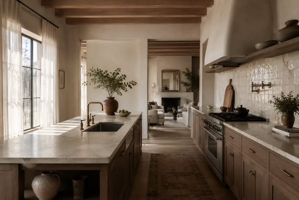
A Spanish inspired kitchen becomes far more convincing when natural light is allowed to shape the atmosphere rather than simply pass through the room. Daylight has a way of revealing the true character of every surface, picking out the grain in timber, softening the edges of plaster, and bringing quiet movement to handmade tile. In that sense, it is not just illumination. It is part of the design language itself, working behind the scenes to make even modest materials feel more expressive and complete.
What makes daylight so valuable in this style is its ability to create depth without adding visual clutter. A room flooded with harsh artificial lighting can flatten even the most carefully chosen finishes, leaving the kitchen feeling a little one note.
By contrast, natural light introduces subtle shifts throughout the day, giving the space a sense of life that cannot be manufactured by fittings alone. Morning light often feels clean and fresh, while later in the day it settles into something softer, almost like the room is exhaling. That changing character is what keeps the kitchen from feeling static.
In practical terms, the most successful Spanish inspired kitchens often treat windows, doors, and openings as part of the material palette rather than afterthoughts. Wide sightlines help the room feel more expansive, allowing light to travel freely and reducing the sense of visual interruption.
Even in smaller kitchens, opening up views where possible can make a remarkable difference. It creates that all-important feeling of air and ease, which is worth its weight in gold when the room is used constantly throughout the day.
I have seen this play out in renovations where the architecture itself was quite ordinary, yet the kitchen felt transformed simply because the daylight had been better understood. In one project, a fairly enclosed cooking space became dramatically more inviting once a pale, sheer window treatment replaced a heavier curtain and a reflective stone backsplash was introduced opposite the main window.
Nothing about the footprint changed, but the room suddenly felt brighter, calmer, and much more connected to the rest of the house. It was a clear reminder that sometimes the real magic lies not in adding more, but in letting more light in.
The phrase “treat daylight as a material in itself” is especially important here. That mindset changes the way decisions are made. Instead of choosing finishes in isolation, you begin to consider how each surface responds to sunlight at different times of day. A cream wall finish might look flat under artificial light but turn beautifully layered in daylight.
A polished surface may bounce brightness around too aggressively, while a honed or softly reflective finish can spread it more gently. Sheer treatments at the window can preserve privacy without stealing brightness, and open sightlines help prevent the room from feeling boxed in or overworked.
Reflective surfaces, however, need to be used with care. In the right measure, they amplify light beautifully. In excess, they can create glare or make the room feel restless. The strongest spaces usually pair natural light with finishes that receive it gracefully rather than bouncing it everywhere at once.
Think softly glazed tile rather than mirrored panels, honed stone rather than high gloss, and pale timber rather than overly reflective lacquer. It is a balancing act, and one that rewards a steady hand.
Treat daylight as a material in itself. Use sheer treatments, open sightlines, and reflective surfaces carefully
This approach helps the kitchen feel composed rather than overdesigned. Sheer treatments keep the light filtered and gentle, which is especially useful in south facing rooms or homes where privacy matters.
Open sightlines allow the eye to travel further, making the kitchen feel less enclosed and more breathable. Carefully placed reflective surfaces, such as a softly glazed backsplash or lightly polished stone, can amplify brightness without tipping into glare.
When handled well, daylight becomes the quiet force that ties the whole room together. It gives shape to the architecture, softens transitions between materials, and makes the kitchen feel more generous in spirit, even before a single accessory is added.
Add a Rustic Timber Table or Breakfast Nook
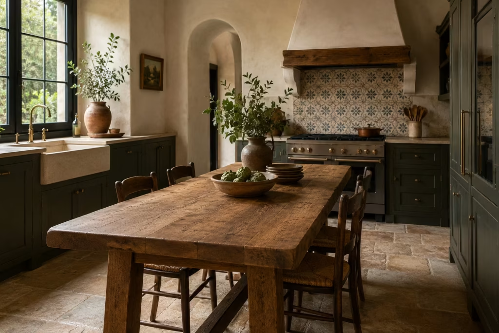
A rustic timber table or a softly formed breakfast nook brings a distinctly human rhythm into a Spanish inspired kitchen, breaking up the functional precision of cabinetry and work zones with something far more relaxed in character.
While kitchens are often designed around efficiency and structure, this kind of central gathering point introduces a pause in the layout, a place where the room loosens its shoulders and shifts from task driven to conversational. It is where the kitchen stops feeling like a workstation and starts behaving like the heart of daily life.
What makes timber so effective in this role is its ability to carry informal presence without needing decoration to justify it. A well chosen table, slightly imperfect in tone or grain, brings an easygoing confidence that polished surfaces rarely achieve.
It does not compete with surrounding materials. Instead, it absorbs them. Stone, plaster, tile, and metal all sit more comfortably once a timber focal point is introduced, almost as if the room has finally found its centre of gravity.
In real residential projects, I have often noticed how quickly people gravitate towards this kind of feature once it is in place. In one kitchen renovation, the layout was highly functional but felt slightly transactional in its flow, everything positioned for efficiency but lacking a natural gathering moment.
The introduction of a solid oak table, positioned near the cooking zone but slightly offset, changed the entire energy of the space. It became the informal meeting point for morning routines, casual meals, and late evening conversations, quietly reshaping how the kitchen was actually used day to day.
There is also a subtle design advantage in how timber tables interact with spatial balance. In kitchens dominated by built in elements, the introduction of freestanding furniture softens the rigidity of fixed lines. It interrupts the predictability of cabinetry runs and brings a sense of ease that feels far less engineered.
Even in smaller kitchens, a compact table or built in nook can create a similar effect, provided it is positioned thoughtfully and does not obstruct circulation. It is less about size and more about intention.
Breakfast nooks, in particular, offer a more integrated version of this idea. When built into alcoves or window bays, they create a semi enclosed environment that feels both part of the kitchen and slightly removed from it.
This subtle separation allows the space to serve multiple functions without feeling cluttered. A bench seat paired with a simple timber table can become a natural extension of the kitchen’s rhythm, especially in homes where space is limited but daily interaction is high.
Material choice again plays a defining role. Oak and walnut tend to perform particularly well, as they carry enough visual variation to feel interesting without overwhelming the surrounding composition.
Reclaimed timber can introduce additional character, though it needs careful balancing to avoid overpowering more refined architectural elements. The goal is always harmony rather than contrast for its own sake.
Bring in a central gathering point that softens the formality of the kitchen
This idea works because it shifts the emotional tone of the space. A timber table or breakfast nook introduces a relaxed focal point that encourages people to linger rather than move quickly through the kitchen.
It gently disrupts overly structured layouts, making the room feel more approachable and less rigid in its function. Instead of every zone being defined by task, this central point creates a space for pause, conversation, and informal use.
When integrated thoughtfully, it becomes the quiet anchor that balances the precision of cabinetry and the discipline of the architectural layout, giving the kitchen a more human and approachable rhythm in everyday life.
You May also Like:
Use Decorative but Functional Lighting
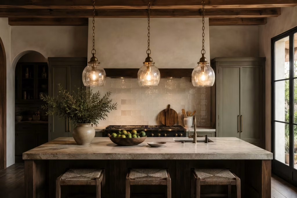
Lighting in a Spanish inspired kitchen is never just about visibility. It plays a far more nuanced role, shaping mood, defining zones, and quietly guiding how the space is experienced from morning through evening.
When handled with intention, lighting becomes one of the most expressive layers in the room, capable of shifting atmosphere without changing a single surface. It is that subtle but powerful influence that makes it essential rather than optional.
What makes decorative yet functional lighting so effective is its dual role. It must perform technically, ensuring work surfaces are properly illuminated, while also contributing to the visual character of the kitchen.
In Spanish inspired interiors, this balance is often achieved through pendant lights that feel crafted rather than mass produced. Aged metal finishes, softly glazed ceramic forms, or handblown glass shades introduce variation and character, breaking away from the uniformity of standard fittings. These pieces do not simply sit in the space. They actively participate in it.
Pendant lighting, in particular, has a natural ability to anchor key areas within the kitchen. Suspended above an island or dining table, it creates a visual pause that helps define the function of that zone.
Without it, larger kitchens can sometimes feel visually unstructured, as if the space is missing focal points to settle the eye. With it, the composition gains rhythm and clarity, almost like punctuation in a well written sentence. The kitchen begins to feel more deliberate, more composed, and far easier to navigate visually.
In real design work, I have often seen how lighting transforms the perception of a space more dramatically than cabinetry or finishes alone. In one project, a relatively restrained kitchen felt slightly flat despite carefully chosen materials.
Once a trio of aged metal pendants was introduced above the island, the entire atmosphere shifted. The light pooled gently across the surface below, reflections softened, and the room suddenly felt more layered and intentional. Nothing structural changed, yet the emotional reading of the space was completely different.
There is also a tactile visual quality to these materials that aligns naturally with Spanish inspired design. Aged metal introduces subtle variation in tone, ceramic shades offer a softer matte presence, and handblown glass brings slight irregularities that catch light in unexpected ways.
These details prevent the lighting from feeling overly uniform or clinical. Instead, each fixture carries its own quiet personality, contributing to the overall composition without dominating it.
Placement is just as important as selection. Lighting that is too high can feel detached from the surfaces it is meant to illuminate, while fixtures positioned too low can overwhelm the space or obstruct sightlines.
The most successful arrangements tend to sit in a carefully considered middle ground, where light feels present but never intrusive. It should guide the eye rather than control it, supporting the architecture rather than competing with it.
Pendant lights in aged metal, ceramic, or handblown glass can anchor the space beautifully
These materials work because they introduce subtle variation and character without overwhelming the kitchen’s overall composition. Aged metal pendants can add definition above islands or dining zones, gently framing key areas.
Ceramic fixtures offer a softer, more understated presence, blending naturally with plastered walls and muted cabinetry. Handblown glass brings a more atmospheric quality, diffusing light in a way that feels gentle and layered rather than harsh or direct.
When used thoughtfully, these lighting choices do more than illuminate a space. They help structure it, highlight focal points, and bring a sense of cohesion that ties the entire kitchen together in a way that feels both functional and visually composed.
Include a Built-In Niche or Display Shelf
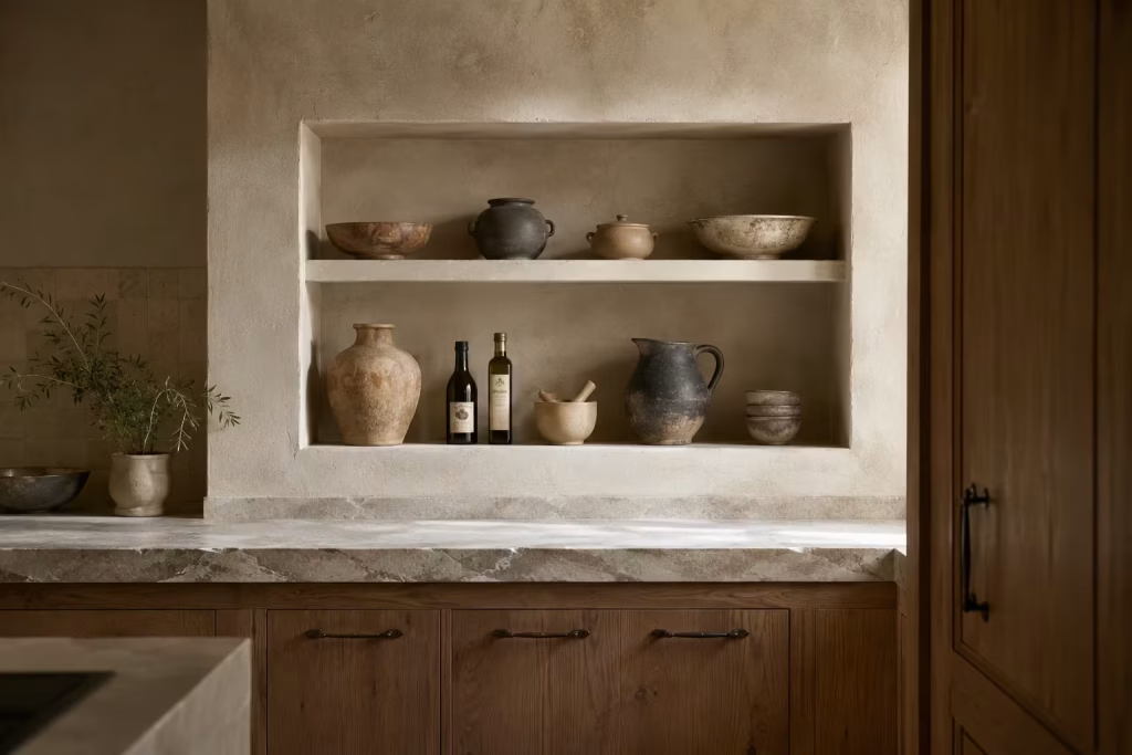
A built-in niche or display shelf can bring a kitchen to life in a way that feels subtle rather than showy, which is exactly why it works so well in Spanish-inspired interiors. It creates a small moment of pause within the architecture, a place where the room can breathe between the bigger surfaces of cabinetry, stone, and tile.
Instead of filling every wall with storage or leaving every surface to do the heavy lifting, a niche introduces rhythm, depth, and a sense of composition that feels quietly confident.
What makes this idea so effective is that it gives everyday objects a proper home rather than treating them like afterthoughts. A row of pottery, a cluster of olive oils, or a few well chosen bowls can become part of the room’s visual story when they are framed correctly.
The niche does not need to be large to make an impact. In fact, the smaller and more deliberate it is, the stronger it often feels. It becomes one of those details that seems almost effortless at first glance, yet has clearly been thought through with care.
In real homes, I have found that built-in display features work best when they feel integrated into the architecture rather than applied like decoration after the fact. A recessed niche above a worktop, for example, can soften a long expanse of wall and prevent the kitchen from feeling too flat or utilitarian.
It is a bit like adding a well placed punctuation mark to a long sentence. Suddenly the whole thing reads with more ease. The eye has somewhere to rest, and the room starts to feel more layered as a result.
This approach also brings a practical benefit that should not be overlooked. Kitchens are highly functional spaces, and when every item is hidden away, the room can sometimes lose a little of its personality. A built-in shelf allows useful objects to remain close at hand while still being presented with intention.
Everyday essentials become part of the design language, which is a far cry from simply cluttering a countertop with random bits and pieces. It is a neat solution, and one that tends to repay the effort many times over.
The most successful niches usually follow the same quiet principle: they are simple, proportioned well, and treated with restraint. Overfilling them defeats the purpose. A niche packed to the rafters can look busy in a heartbeat, while a carefully edited display feels calm and collected.
The objects inside should relate to the wider palette, whether through colour, material, or shape. Ceramic vessels, stoneware bowls, handmade jars, and small glass containers often sit beautifully in this kind of setting because they echo the softer material language of the rest of the kitchen.
There is also something deeply satisfying about a niche that feels almost built into the memory of the room, as though it has always been there. In Spanish-inspired kitchens, that sense of quiet permanence is often what gives the design its emotional weight.
A display shelf can do a lot of heavy lifting without ever shouting for attention. It adds a little depth here, a little softness there, and before long the kitchen feels more complete, more settled, and far more considered.
A niche for pottery, oils, or bowls adds a layered architectural feel
This kind of feature works because it combines utility with visual interest in a way that feels natural rather than staged. Pottery introduces variation in form and finish, oils bring an everyday authenticity, and bowls add a casual rhythm that keeps the shelf from feeling overly precious. Together, they create a small architectural vignette that enriches the wider composition of the kitchen.
When handled with restraint, the niche becomes more than storage. It becomes part of the room’s identity, offering a subtle but memorable detail that helps the kitchen feel thoughtfully composed from every angle.
Keep the Cabinetry Simple and Shaker Inspired or Flush
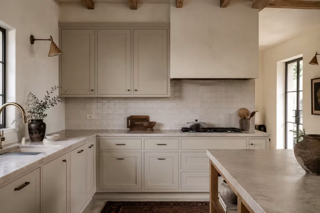
Cabinetry sets the discipline of a kitchen. In Spanish inspired design, its role is not to dominate but to steady everything else around it. When joinery becomes overly ornate or visually loud, it starts competing with the very materials that give this style its character. The strongest kitchens, by contrast, rely on cabinetry that knows when to step back, allowing stone, tile, plaster, and timber to carry the expressive weight of the room.
Shaker inspired and flush cabinetry both offer that restraint in different ways. Shaker doors introduce a subtle frame that gives structure without excess detail, while flush fronts create an uninterrupted surface that feels calm and controlled. Neither approach is about minimalism for its own sake.
It is about creating a quiet backdrop where other materials can do their work without interruption. The result is a kitchen that feels composed rather than busy, where every element has space to be understood properly.
What often gets overlooked is how much cabinetry influences the emotional reading of a room. In practice, I have seen kitchens shift completely in character simply by refining the joinery. One project comes to mind where highly decorative cabinet doors were replaced with simple flush fronts.
The material palette stayed exactly the same, yet the space suddenly felt clearer, more grounded in its purpose, and far easier to live with day to day. It was not a dramatic transformation in physical terms, but it changed how the room behaved.
This kind of simplicity also works because it allows proportion and materiality to take centre stage. Once the visual noise of detailed cabinetry is removed, the eye naturally begins to notice subtler elements, the grain in timber, the variation in stone, the softness of plaster transitions.
The kitchen starts to read as a whole rather than a collection of competing parts. That cohesion is what gives Spanish inspired spaces their quiet authority.
There is also a long term advantage in keeping cabinetry understated. Trends tend to pass quickly when they are tied to highly specific door profiles or decorative detailing. Simple joinery, however, remains adaptable.
It can sit comfortably alongside changing accessories, updated lighting, or evolving surface materials without ever feeling out of place. This makes it a more resilient foundation for kitchens that are expected to serve over many years.
In practical terms, simple cabinetry also makes everyday life easier. Clean lines are easier to maintain visually, fingerprints and minor wear tend to read less harshly, and the overall impression stays calmer even in busy households. When a kitchen is used constantly, that sense of visual order becomes just as important as function.
Ultimately, the goal is not to remove character but to relocate it. Instead of embedding personality into the cabinet doors themselves, you allow it to emerge through materials, light, and layout. The joinery becomes the frame, not the subject, quietly holding everything in place while the rest of the kitchen tells the story.
Spanish style is strongest when the joinery supports the room rather than competing with it
This principle is what separates a convincing Spanish inspired kitchen from one that feels overly styled. When cabinetry steps back, the architecture and materials are free to define the atmosphere.
The room feels more balanced, more coherent, and far more intentional in how it presents itself. Joinery becomes the quiet structure beneath the surface, supporting the design without ever needing to announce its presence.
You May also Like: 25 Creative Ways to Transform Your Spanish Reading Nook This Weekend
Use Pattern Sparingly and Intentionally
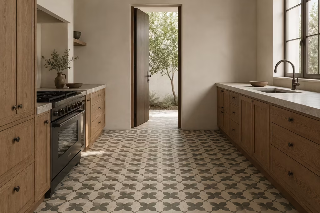
Pattern in a Spanish inspired kitchen works best when it behaves like a carefully placed accent rather than a constant visual soundtrack. It has the power to define character, establish rhythm, and introduce a sense of identity, but only when it is used with a steady hand. The moment pattern starts repeating across too many surfaces, the clarity of the space begins to blur, and what should feel composed can quickly turn into something visually restless.
In well resolved kitchens, pattern is often treated as a single, deliberate intervention. A tiled splashback, a patterned floor, or a restrained border detail is usually more than enough to establish a point of interest.
The surrounding surfaces then take on the responsibility of keeping the room balanced, allowing plain finishes, softer tones, and quieter textures to hold their position without competition. This contrast is what gives the design its strength. Without it, everything starts speaking at the same volume, and nothing stands out clearly.
What makes this approach so effective is the way it controls visual hierarchy. Pattern naturally draws the eye, which means it needs a context that allows it to breathe. In practical design work, I have often seen that the most successful kitchens are not the ones filled with pattern, but the ones where pattern is placed with intent and then left to do its job without interruption.
In one renovation, a simple encaustic tile floor became the only decorative pattern in the entire kitchen. Everything else was deliberately restrained. As a result, the floor did not just sit beneath the space, it defined it. It set the tone for everything above it, from cabinetry alignment to lighting choices.
There is also a psychological effect at play. The human eye is naturally drawn to repetition and contrast, which is why pattern can feel so engaging when used correctly. However, when it is overused, that same quality becomes overwhelming.
Instead of guiding attention, it scatters it. The room begins to feel visually fragmented, and the sense of ease that is so central to Spanish inspired interiors starts to weaken. The goal is always to create rhythm, not noise.
In real homes, pattern also needs to be considered in relation to scale. Larger patterns tend to work better in flooring or wide surfaces where they can be appreciated from a distance, while smaller, more intricate motifs are better suited to contained areas such as splashbacks or framed inserts. Mixing multiple patterns within the same space can be risky unless there is a very clear hierarchy, and even then it requires careful editing to avoid visual conflict.
I have found that the most successful approach is often the simplest one. Choose one moment in the kitchen where pattern will take centre stage, then let everything else step back.
That single decision can carry the entire personality of the room without needing reinforcement elsewhere. It is a bit like letting one strong voice lead a conversation instead of everyone speaking at once.
Pros
Used with intention, pattern introduces identity and rhythm without needing additional decoration. It can anchor a space, define zones, and add visual interest in a way that feels considered rather than excessive. A single patterned element often becomes a focal point that gives the kitchen its character without overwhelming the wider composition.
- Creates a clear focal point within the kitchen
- Adds personality without requiring multiple decorative layers
- Helps define zones such as cooking or dining areas
- Works effectively as a contrast against simpler surfaces
- Can introduce cultural reference in a subtle, controlled way
Cons
When overused, pattern can quickly dilute the calm structure of a kitchen. Competing motifs reduce clarity and make the space feel visually busy. It can also date more quickly if applied too broadly across multiple surfaces, especially when trends shift.
- Too much pattern creates visual overload
- Reduces clarity and spatial hierarchy
- Can clash when multiple motifs are used together
- Risk of feeling dated if applied excessively
- Requires strong restraint to remain effective
When handled with care, pattern becomes a powerful design tool rather than a dominant feature, offering just enough visual interest to enrich the kitchen without disturbing its overall balance.
Add Woven and Natural Accessories
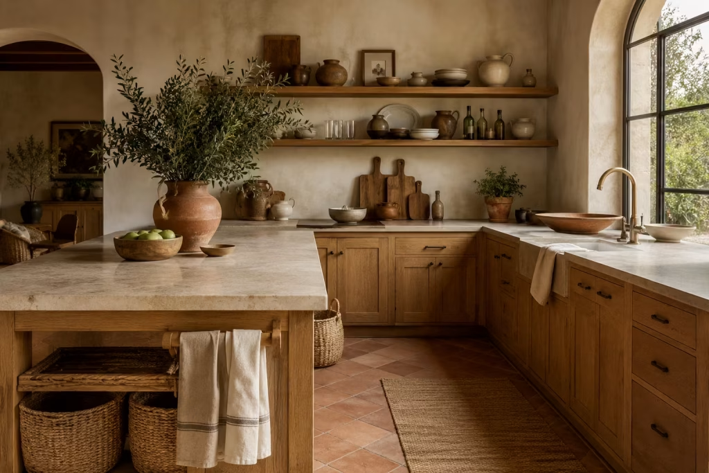
Accessories are often treated as the finishing layer in a kitchen, but in Spanish inspired design they play a more meaningful role than simple decoration. They soften the harder architectural elements, introduce rhythm at a human scale, and help the space feel approachable rather than overly constructed. Without them, even the most carefully designed kitchen can feel a little too resolved, almost like it is waiting for life to happen rather than already part of it.
What makes woven and natural pieces so effective is their contrast against more structured surfaces. Kitchens are full of precise lines, cabinetry grids, stone edges, metal fixtures, and tiled planes all working in harmony.
When baskets, linen textiles, wooden boards, and ceramic vessels are introduced, they interrupt that precision just enough to bring ease into the composition. It is not about filling space, but about loosening it, allowing the eye to move in a more relaxed way.
In real projects, I often find that these elements are what make a kitchen feel complete after the main installation is finished. In one renovation, a beautifully executed Spanish inspired kitchen still felt slightly too controlled once the construction dust had settled.
It was not until a few simple additions were introduced, a set of handwoven baskets for storage, linen tea towels draped casually over hooks, and a cluster of wooden chopping boards leaned against the backsplash, that the space truly came alive. Nothing structural changed, yet the room suddenly felt inhabited rather than staged.
There is also a practical logic behind these materials. Woven baskets offer flexible storage that can shift with daily needs, linen textiles bring softness without visual heaviness, and wooden boards double as both tools and display pieces.
Ceramic vessels, especially those with subtle irregularities, introduce quiet variation on shelves and countertops, preventing surfaces from feeling too uniform. Each item carries a function, but together they also contribute to the overall rhythm of the kitchen.
The key is restraint and placement. These accessories work best when they are not scattered randomly but grouped with intention. A single well placed basket beside an island, a small stack of linen folded near a prep area, or a few ceramic pieces arranged on an open shelf can be more impactful than filling every available surface. It is a bit like seasoning a dish; too little feels incomplete, but too much overwhelms the balance entirely.
In Spanish inspired interiors, this layer often becomes the bridge between architecture and daily life. It takes the precision of materials like stone and timber and gently translates them into something more approachable. The result is a kitchen that feels lived with rather than simply designed, where function and atmosphere sit comfortably side by side.
Use baskets, linen, wooden boards, and ceramic vessels to soften the hard surfaces
These elements work because they introduce contrast without disruption. Baskets bring structure through natural weave and subtle irregularity, linen adds softness in both tone and movement, wooden boards offer visual grounding through grain and form, and ceramic vessels introduce quiet variation in shape and finish. Together, they reduce the visual intensity of harder materials, allowing the kitchen to feel more balanced and visually easy to live with.
Bring in Deep Green or Muted Blue Accents
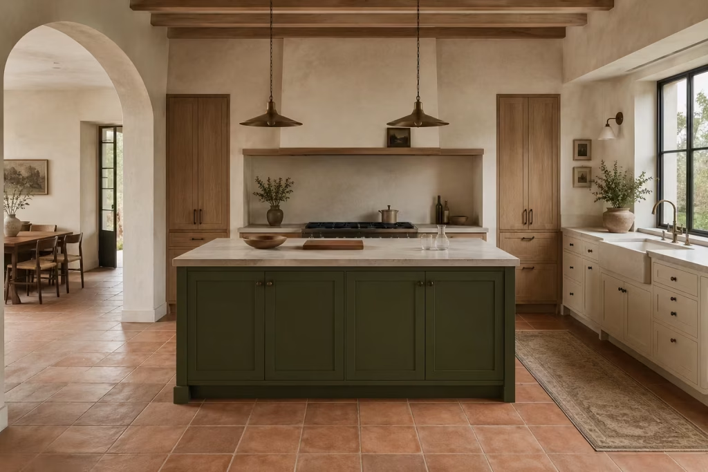
Colour in a Spanish inspired kitchen works best when it behaves like a controlled accent rather than a dominant force. Deep green and muted blue tones are particularly effective because they carry a quiet confidence, echoing natural landscapes and traditional painted surfaces without overwhelming the architectural balance of the room.
These shades do not compete with stone, timber, or plaster. Instead, they sit alongside them, adding depth in a way that feels considered rather than decorative.
What makes these tones so powerful is their ability to introduce visual depth without increasing complexity. A deep olive green cabinet front or a muted indigo island can subtly shift the entire mood of a kitchen, giving it a more layered reading without changing the underlying structure.
They tend to work especially well when surrounded by softer neutrals, where they can hold their position without needing reinforcement from additional colour elsewhere in the space.
In real design work, I have often used these tones as a way of anchoring otherwise neutral schemes. In one renovation, a kitchen composed primarily of pale stone, timber, and plaster felt slightly unresolved until a single deep green island was introduced.
That one decision brought everything into focus. The cabinetry suddenly felt more intentional, the surrounding materials gained contrast, and the room developed a clearer sense of hierarchy without losing its calm character. It was a small intervention with a disproportionate impact.
Muted blue behaves in a similar way, though it often carries a slightly cooler presence. It can reference traditional Spanish painted joinery without feeling overly literal, especially when softened with matte finishes or paired with natural materials.
In kitchens with strong natural light, these tones can shift subtly throughout the day, appearing richer in shadow and softer in brightness, which adds an understated sense of movement to the space.
There is also a practical advantage to using colour in this restrained way. Because the accents are limited to specific elements rather than applied broadly, they are easier to adapt over time. A painted island can be refreshed or adjusted without altering the entire kitchen, which makes this approach more flexible for long term living. It allows personality to be introduced without locking the space into a fixed stylistic moment.
The key is always proportion. These colours work best when they are allowed to punctuate rather than dominate. A single cabinet run, a feature island, or even a small built in unit is often enough to carry the idea. Once repeated too widely, the subtle tension they create begins to fade, and the kitchen can start to feel visually heavy or overly themed.
Use them sparingly to echo Spanish landscapes and traditional painted joinery
When applied with restraint, deep green and muted blue tones can quietly reference the layered landscapes and historic painted finishes associated with Spanish interiors.
They work as accents rather than foundations, reinforcing the wider material palette instead of competing with it. A carefully placed coloured element can guide the eye, establish focus, and add depth to the composition while still allowing stone, timber, and plaster to remain central to the overall design.
This measured use of colour ensures the kitchen retains its balance, where each element feels deliberate and nothing is visually overstated.
Design Around Cooking as a Social Act
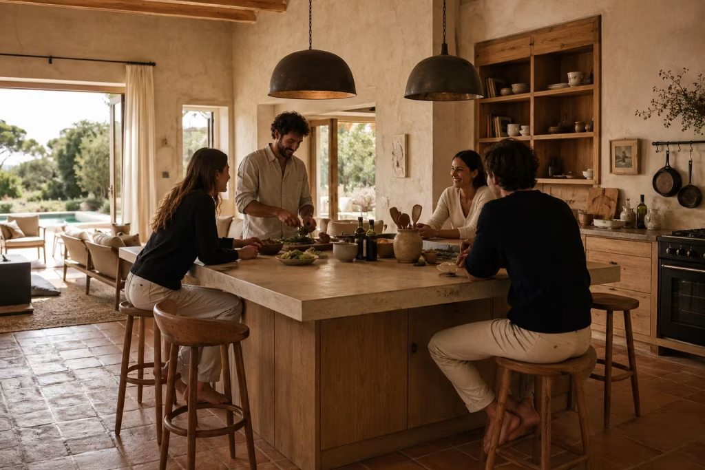
A Spanish inspired kitchen reaches its full potential when it is designed not just for cooking, but for gathering. At its core, this style has always been about shared moments rather than isolated function.
The kitchen becomes less of a work zone and more of a social landscape, where preparing food, talking, and simply being present all overlap in a natural rhythm. When this idea is taken seriously from the beginning of a project, the entire layout starts to shift in a more thoughtful direction.
What makes this approach so effective is that it redefines how space is allocated. Instead of prioritising appliances first and social flow second, the kitchen is shaped around interaction.
The positioning of the island, the proximity of seating, and the clarity of movement paths all begin to serve conversation as much as cooking. It is not about turning the kitchen into a dining room, but about allowing both functions to coexist without friction.
In practical design work, I have often seen how this shift changes the emotional tone of a home. In one project, a kitchen initially planned as a purely functional workspace felt disconnected from the adjoining living area.
Once seating was reintroduced around the island and circulation paths were widened slightly, the room began to behave very differently. People naturally gathered closer to the cooking zone, conversations flowed more easily between spaces, and the kitchen stopped feeling like a place people passed through and started becoming a place they stayed in.
Seating plays a particularly important role in this dynamic. Whether it is counter stools at an island or a small integrated bench near a window, these elements create informal pauses within the layout.
They give people a reason to linger, even when no meal is being prepared. The key is to position them where they feel naturally integrated into movement rather than placed as afterthoughts. When seating aligns with how people actually move through the kitchen, it becomes part of the rhythm rather than an interruption.
Equally important is circulation. A kitchen designed around social use needs to feel easy to navigate, even when multiple people are present. Tight corners, awkward turns, or overly segmented zones can quickly disrupt the sense of ease.
By keeping pathways clear and allowing generous flow around key areas like the island or cooking zone, the space begins to feel more open and accommodating, almost like it is inviting people in rather than controlling how they move.
There is also a subtle psychological layer to this approach. When cooking is framed as a shared activity, the kitchen naturally becomes more relaxed in tone. It is no longer just a place of task completion, but a setting for interaction, conversation, and small everyday rituals.
This shift often influences material choices as well, encouraging softer finishes, more approachable seating, and layouts that support visibility and connection across the room.
The most successful Spanish inspired kitchens tend to treat social interaction as a design principle rather than a lifestyle add on.
Everything from island placement to lighting positions works in service of that idea, creating an environment where cooking and conversation are not separate experiences, but part of the same continuous flow.
Plan for seating, conversation, and easy movement around the room
This principle ensures the kitchen supports real human interaction. Seating is placed where it naturally invites use, conversation is enabled through clear sightlines and proximity, and movement is kept fluid so that multiple people can occupy the space without disruption.
When these three elements work together, the kitchen becomes far more than a functional area. It becomes a shared environment where daily life unfolds with ease and connection.
Include Antique or Heritage Inspired Pieces
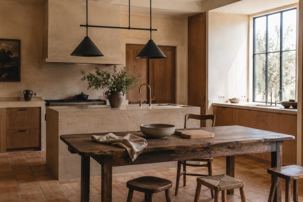
Antique or heritage inspired pieces introduce a layer of narrative into a Spanish inspired kitchen that new materials alone rarely achieve. They carry a sense of history that feels unforced, almost as if the room has been assembled gradually rather than delivered in a single moment.
When placed with intention, these elements shift the emotional reading of the kitchen, adding depth and quiet character without disrupting the overall architectural clarity.
What makes these pieces so effective is their contrast against more contemporary surroundings. In a kitchen defined by clean cabinetry, plastered walls, and precise joinery, a vintage console or reclaimed table immediately stands apart in a subtle but meaningful way.
It does not need to dominate the space to be noticed. Its value lies in its difference, in the way it interrupts uniformity just enough to remind the eye that the room has layers of story within it.
In real design work, I have often used heritage pieces as a way of grounding newly renovated kitchens. In one project, a completely refurbished Spanish inspired space felt slightly too composed once all the finishes were in place. The introduction of a reclaimed timber table and an old wooden stool near the island changed that perception instantly.
The kitchen moved from feeling newly completed to comfortably established, as if it had already begun to accumulate its own history. That subtle shift made the space far more engaging to live in day to day.
There is also an important balance to maintain when introducing antique elements. Too many can quickly tip the kitchen into a themed environment, where the charm of individual pieces becomes diluted by repetition.
The most successful approach is selective placement. One or two well chosen items often carry more presence than a collection of smaller, competing objects. A single vintage console in a niche, for example, can become a quiet focal point without overwhelming the surrounding architecture.
These pieces also work particularly well because they soften the precision of modern construction. New kitchens often carry a sense of exactness in their alignment, proportion, and finish.
While this is desirable, it can sometimes feel slightly detached from everyday life. Heritage items introduce gentle irregularity, whether through worn edges, subtle patina, or variations in tone, which helps the space feel more approachable and less formal.
Functionally, they are just as relevant as they are visually. A reclaimed table can serve as an additional prep surface or informal dining point, while a vintage stool can become a flexible seating option that moves easily between zones.
Even when used primarily for display, these pieces remain rooted in utility, which is part of what makes them so effective in kitchens designed around daily living.
A vintage console, old stool, or reclaimed table can give the kitchen depth
When carefully selected, these items act as anchors within the space. A vintage console introduces structure and character to quieter corners, an old stool adds informal presence at different levels of the kitchen, and a reclaimed table becomes a central point of gathering and activity. Together, they create subtle variation within the overall composition, ensuring the kitchen feels layered and considered rather than overly uniform.
Their strength lies in their ability to bring a sense of narrative into the room without requiring dramatic design intervention. Each piece contributes quietly, but collectively they enrich the kitchen’s identity in a way that feels natural and enduring.
Keep the Palette Cohesive Across Adjoining Spaces
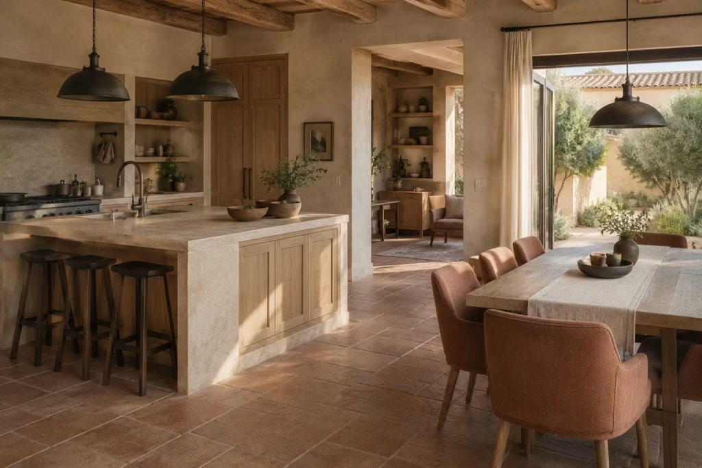
A Spanish inspired kitchen rarely lives in isolation, especially in homes where the kitchen opens into dining or living areas. In those settings, colour has to do more than look attractive in one room.
It has to carry the conversation forward, guiding the eye from one space to the next without creating a visual stumble. When the palette is handled well, the whole home feels more composed, as if each room is speaking the same language with a slightly different accent.
This matters because open-plan living leaves very little room for visual confusion. If the kitchen is filled with heavy terracotta, deep timber, and patterned tile while the adjoining dining area is light, crisp, and cool, the transition can feel awkward and unresolved. The eye catches the shift immediately, and the sense of flow begins to fray at the edges.
A cohesive palette, by contrast, allows the spaces to fold into one another more naturally. It does not mean every room must match exactly. Far from it. It means there should be a clear thread running through the materials and tones so the home feels deliberate rather than pieced together on the fly.
In practice, I find this works best when one or two core tones are repeated across zones in slightly different ways. A clay or sand note in the kitchen might reappear in upholstered dining chairs, a rug, or a wall finish in the nearby living area.
Timber can do a great deal of heavy lifting here too, especially when the same family of wood appears in cabinetry, shelving, and furniture pieces across the open plan layout. These small repetitions create a sense of continuity that feels effortless, yet it is usually the result of careful planning rather than chance.
The key is not sameness, but rhythm. A cohesive palette still allows each space to have its own purpose and mood. The kitchen may feel more robust, with stone, tile, and harder working surfaces leading the way, while the dining area softens slightly through upholstery and looser furniture.
What keeps the whole scheme intact is the repetition of tonal notes, the quiet echo between finishes, and the way the materials seem to belong to the same family. Done well, this approach stops the home from feeling chopped up into separate scenes and instead gives it that seamless, collected quality that makes open-plan living feel so convincing.
I have seen this approach transform homes that initially felt fragmented once walls were opened up. In one renovation, the kitchen had been designed beautifully in isolation, but once the adjoining dining space was completed in a different tonal direction, the whole floor started to feel disjointed.
By softening the contrast and repeating several key finishes across both spaces, the home suddenly settled into itself. The result was not uniform, but cohesive, which is a far more interesting and useful outcome.
This is especially important in open-plan homes where the kitchen connects to dining or living areas
In open-plan homes, colour cannot afford to behave like a solo act. It has to perform across a wider stage, linking the kitchen to nearby spaces in a way that feels fluid and considered. This is where a cohesive palette becomes especially valuable.
It helps the architecture read as one continuous environment, prevents abrupt visual breaks, and gives the entire layout a calmer sense of direction. When the adjoining rooms share tonal references, even if those references are subtle, the home feels more resolved and easier to live in.
That continuity is often what separates a good open-plan scheme from one that feels stitched together at the seams. A carefully repeated palette does not flatten the character of each room. Instead, it allows the spaces to relate to each other in a way that feels natural, giving the home a stronger sense of unity without sacrificing individuality.
Edit Ruthlessly for a Timeless Finish
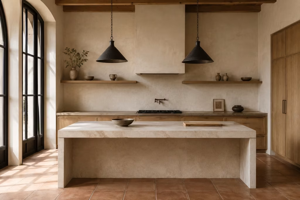
Editing is where a Spanish inspired kitchen either comes together with quiet authority or drifts into visual overload. By the time all the materials are selected and installed, it is easy to assume the work is done.
In reality, the final stage is often less about adding and more about removing, stepping back and asking what truly needs to stay in the frame. This is where the character of the kitchen is refined, sharpened, and ultimately resolved.
What makes this stage so important is that even the most beautiful materials can lose their impact if they are competing for attention. Stone, timber, tile, metal, and plaster each carry their own presence, and when too many secondary elements are introduced on top of them, the composition starts to lose clarity.
The kitchen can begin to feel visually crowded, almost like every surface is trying to speak at once. Editing restores order. It allows the strongest decisions to breathe and the quieter details to settle into the background where they belong.
In real design work, I have often found that the most refined kitchens are not the ones with the most features, but the ones where unnecessary noise has been carefully removed. In one project, a beautifully executed Spanish inspired kitchen initially felt slightly overstated after styling.
There were too many objects on open shelves, too many decorative accessories on counters, and too many competing focal points. Once the space was edited back, removing around a third of the visible elements, the entire room changed character. Suddenly, the architecture felt more confident, the materials more expressive, and the overall atmosphere far more composed.
There is a discipline required here that can feel counterintuitive, especially after the effort of selecting every detail. The instinct is often to showcase everything, but restraint almost always delivers a stronger result.
A kitchen is not a display cabinet. It is a working environment that benefits from clarity and hierarchy. When the eye has space to move without constant interruption, the design reads as more intentional and far more sophisticated.
Editing also plays a crucial role in long term satisfaction. Trends evolve, objects accumulate, and everyday life inevitably introduces visual clutter. A kitchen that has been thoughtfully pared back from the beginning is far easier to maintain over time. It holds its structure even as small changes occur, which is what gives it that enduring sense of control and ease.
The most successful Spanish inspired kitchens often feel almost effortless at first glance, but that ease is usually the result of careful decisions about what not to include. Every object, surface, and detail has earned its place. Nothing feels accidental or excessive. That clarity is what gives the space its lasting appeal.
The final result should feel composed, not over-decorated
A well resolved kitchen does not rely on quantity of detail but on clarity of intention. When the composition is edited properly, each element has space to be understood without competition. The result is a kitchen that feels calm, structured, and visually confident, where nothing is fighting for attention and everything feels naturally in balance.
Real-life insight
In practice, restraint is usually what makes these kitchens feel expensive. The eye needs room to rest. When surfaces are not overcrowded and focal points are clearly defined, the materials themselves become the main event.
That sense of visual breathing space is often what separates a well designed kitchen from one that feels overstimulated, and it is almost always achieved through careful editing rather than additional detail.
Why Spanish Kitchen Design Still Feels So Relevant
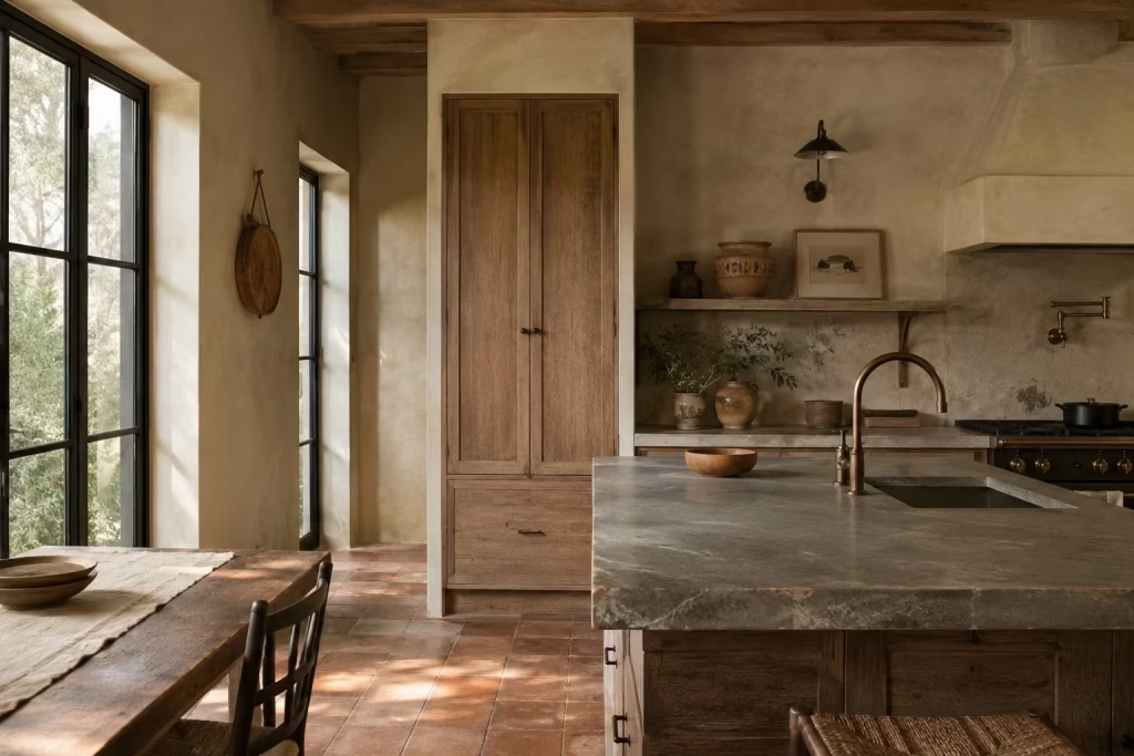
Spanish kitchen design continues to resonate because it offers something many modern interiors struggle to achieve naturally: warmth with permanence. While trends shift endlessly between ultra-minimal restraint and highly stylised statement spaces, Spanish-inspired kitchens remain remarkably steady in their appeal.
They feel human, tactile, and grounded, shaped less by fashion and more by the rhythms of everyday living. There is an ease to these interiors that cannot be manufactured overnight. The layered stone, softly aged timber, imperfect plaster, and sun-washed colours all work together to create rooms that feel lived in from the very beginning, yet never tired.
Part of their lasting relevance also comes from their adaptability. A Spanish kitchen can sit comfortably inside a centuries-old villa just as easily as it can within a contemporary extension or suburban renovation. I have seen even relatively modern homes gain an entirely different sense of depth once warmer materials, handcrafted textures, and more architectural detailing are introduced thoughtfully.
Rather than overwhelming a space with decorative references, the strongest Spanish-inspired kitchens rely on proportion, light, and material authenticity to create atmosphere. That quieter approach is precisely why the style continues to age so gracefully while others quickly lose their shine.
A Style Built on Permanence, Not Trend
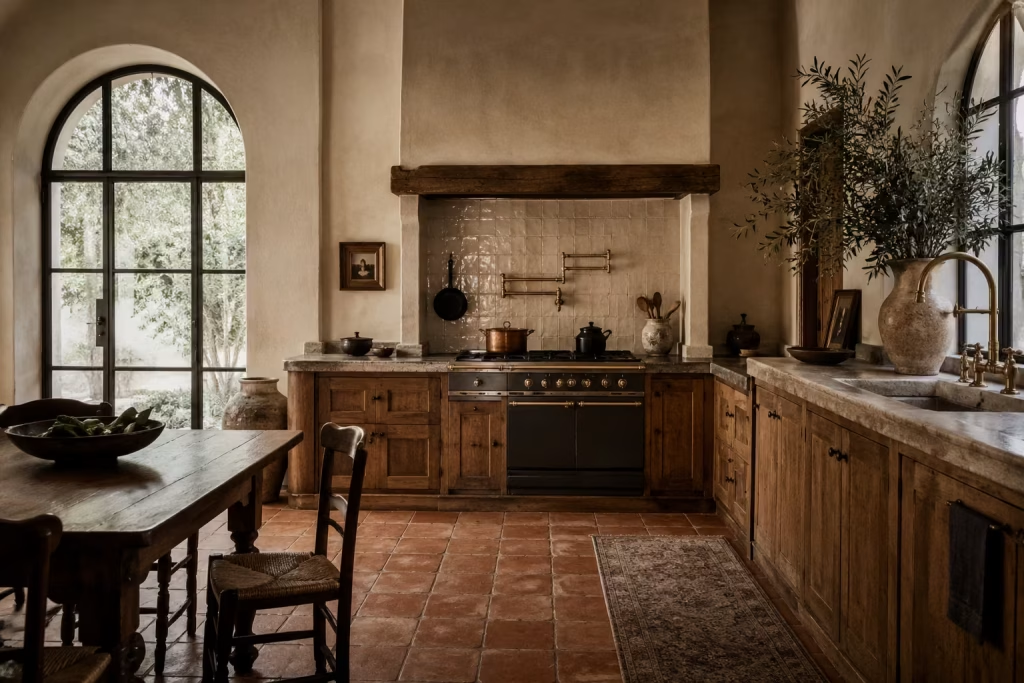
Spanish kitchens have managed to stand the test of time because they were never designed to chase the next shiny thing in the first place. Their beauty comes from a far slower rhythm, one shaped by craftsmanship, climate, and daily life rather than fleeting design movements.
You can walk into a well-composed Spanish kitchen today and still feel the same sense of comfort and quiet confidence that would have existed there decades ago. That kind of longevity does not happen by accident. It grows out of materials and layouts chosen for how they live, not simply how they photograph.
One of the biggest reasons these kitchens endure is their connection to natural ageing. In many contemporary interiors, wear is treated like the enemy. Every scratch feels catastrophic, every mark something to hide. Spanish-inspired kitchens take the opposite approach entirely.
Terracotta softens over time, timber deepens in tone, limewashed walls develop subtle variation, and stone surfaces gather a patina that makes the room feel richer year after year. Instead of falling apart visually, the kitchen settles into itself, almost like a leather armchair becoming more comfortable with age.
I have seen this firsthand in renovation projects where homeowners initially worried about choosing imperfect or tactile finishes. On paper, machine-perfect cabinetry and polished surfaces often seem safer. Yet once the space is lived in, those flawless finishes can start feeling cold or overly rigid.
By contrast, kitchens layered with warm oak, brushed stone, handmade tiles, and textured plaster tend to feel more forgiving and emotionally grounded. They absorb everyday life beautifully, whether it is sunlight shifting across a tiled floor in late afternoon or the small signs of use that naturally appear around a family kitchen.
Another reason Spanish kitchens continue to resonate is their refusal to overcomplicate the visual experience. The strongest examples rarely scream for attention. They whisper instead. The palette stays earthy and restrained, the materials speak for themselves, and the architectural details are introduced with a steady hand rather than a heavy one.
It is a classic case of less being more. A softly curved archway, an aged brass tap catching the light, or a thick stone countertop with visible texture can carry far more emotional weight than a room overloaded with decorative gimmicks.
There is also something deeply reassuring about the proportions often found in Spanish kitchen design. Cabinets tend to feel substantial rather than flimsy. Tables invite people to gather naturally instead of acting as decorative props. Open shelving is usually practical and restrained, not cluttered to the rafters with styled accessories.
These choices create kitchens that feel anchored, almost instinctively comfortable to move through. You are not tiptoeing around a precious showroom. You are inhabiting a room built for real life.
Perhaps that is why Spanish kitchens continue to feel relevant while so many trend-driven interiors burn bright and disappear just as quickly. They are not trying to reinvent the wheel.
They simply understand something many modern spaces forget: people connect most deeply with rooms that feel authentic, tactile, and lived in. And when those qualities are layered carefully together, the result is a kitchen that still feels beautiful long after trends have packed their bags and moved on.
The Role of Texture, Climate, and Craft
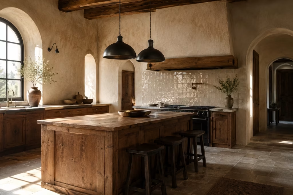
One of the most captivating things about Spanish kitchen design is the way it engages the senses long before you notice any specific decorative detail. These kitchens are rarely dependent on bold colours or elaborate styling to make an impression.
Instead, their atmosphere is built layer by layer through texture, natural light, and materials that feel deeply connected to the surrounding landscape. In many ways, the room tells its story through touch as much as sight.
Climate plays a surprisingly important role in shaping this aesthetic. Traditional Spanish homes were designed to respond to intense sunlight and long, warm seasons, which explains the heavy use of cooling plaster walls, natural stone floors, shaded alcoves, and breathable materials.
Those practical decisions gradually evolved into a visual language that still feels incredibly relevant today. Even in cooler climates or contemporary homes, these same elements bring a sense of softness and ease that many modern kitchens struggle to achieve.
Plaster is one of the clearest examples. A limewashed or softly textured plaster wall carries a depth that flat paint simply cannot imitate. As daylight moves across the surface, subtle tonal shifts appear almost effortlessly, giving the room movement without visual chaos.
I often encourage homeowners to consider textured finishes when a kitchen feels too clinical or overly sharp. It is remarkable how quickly a space starts to relax once hard reflective surfaces are balanced with something more tactile and forgiving. The room begins to breathe a little easier, so to speak.
Tile plays a different but equally important role. Handmade ceramic or zellige-style tiles introduce slight irregularities that make the kitchen feel human rather than factory-produced. No two pieces catch the light in exactly the same way, which creates a layered, almost sun-dappled effect across splashbacks and walls.
In real projects, I have found that even a relatively simple kitchen layout can gain tremendous character once handcrafted tile enters the mix. It acts almost like jewellery for the room, though far more grounded and enduring.
Timber brings another dimension entirely. Spanish-inspired kitchens often rely on wood not for ornament, but for warmth and visual stability. Oak, walnut, chestnut, and reclaimed pine all introduce grain patterns and tonal variation that soften stone and plaster beautifully.
A timber island with visible knots and texture can stop a kitchen from feeling too polished or sterile. It gives the eye somewhere to land comfortably, much like a well-worn farmhouse table that naturally becomes the heart of the home over time.
Stone, meanwhile, carries the quiet weight of permanence. Whether used for countertops, flooring, or architectural details, it anchors the room both visually and emotionally. Natural stone tends to age with grace, developing a lived-in richness rather than deteriorating aesthetically.
I have seen limestone floors in older Mediterranean homes that looked more beautiful after decades of use than many brand-new polished surfaces ever do. There is an old soul quality to stone that cannot be rushed or artificially replicated.
Then there is iron, often used sparingly but strategically. Blackened iron hardware, wrought iron pendants, or aged metal shelving brackets introduce contrast and definition without overpowering the softer materials surrounding them.
These darker accents act almost like punctuation marks within the room, helping to sharpen the composition while still feeling rooted in tradition. Too much metal can make the kitchen feel heavy-handed, but when used with restraint, it adds just enough edge to stop the palette drifting into monotony.
What ties all of these materials together is craftsmanship. Spanish kitchens feel convincing because the finishes rarely appear mass-produced or overly engineered. There is a visible hand behind the work, whether in the imperfect glaze of a tile, the texture of a plastered wall, or the subtle wear across reclaimed timber.
That authenticity is worth its weight in gold in modern interiors, where so many spaces can feel polished to the point of losing their soul.
Ultimately, texture, climate, and craft are not separate ingredients in Spanish kitchen design. They are intertwined threads, woven together quietly but deliberately, creating kitchens that feel warm, grounded, and genuinely alive.
What Makes the Look Adaptable in Real Homes
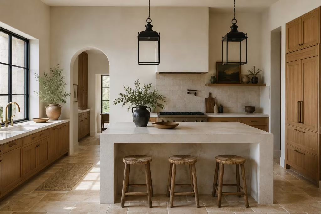
Part of the enduring charm of Spanish-inspired kitchens lies in their remarkable flexibility. Unlike design styles that demand a very specific architectural backdrop to feel convincing, Spanish influences can slip naturally into many different kinds of homes when handled with a careful eye.
A rustic countryside villa may lean into heavier beams, terracotta flooring, and aged plaster walls, while a suburban renovation might interpret the same spirit through warm oak cabinetry, handmade tiles, and softly textured paint finishes. Even contemporary urban kitchen extensions can carry the essence of Spanish design without looking themed or out of place. That adaptability is precisely what keeps the style alive rather than frozen in time.
The secret, more often than not, comes down to restraint. Many homeowners assume creating a Spanish-inspired kitchen means layering arches, patterned tiles, ironwork, rustic furniture, and Mediterranean colours all at once.
In reality, that approach can tip the room into costume territory surprisingly quickly. The most successful spaces tend to tread more lightly. They borrow the mood rather than copying every historical reference detail for detail. It is the difference between creating atmosphere and creating a film set.
In renovation work, I have consistently found that the strongest Spanish-inspired kitchens are rarely literal recreations. They are edited interpretations, where one or two dominant materials quietly carry the mood instead of overwhelming the room with decorative gestures.
A kitchen might rely almost entirely on warm limestone flooring and softly textured plaster walls, allowing everything else to remain restrained and contemporary. Another may use rich walnut cabinetry paired with handcrafted ceramic tiles, while keeping the architecture clean and modern. These more disciplined combinations often feel richer in the long run because the eye has room to settle comfortably.
This approach also makes Spanish-inspired design far more achievable for everyday homeowners. You do not need a centuries-old villa with arched windows and exposed beams to capture the warmth of the style. In fact, some of the most compelling kitchens I have worked on were relatively standard homes transformed through thoughtful material choices and proportion adjustments rather than major structural changes.
A simple galley kitchen, for example, can gain tremendous depth from limewashed walls, aged brass hardware, and a warm terracotta-toned floor tile. Bit by bit, the room begins to feel layered and grounded without losing its practicality.
Urban homes benefit especially well from this more edited interpretation. In compact city spaces, too many rustic details can quickly make the kitchen feel visually cramped or heavy as lead. Instead, subtle references tend to work far better.
A softly curved range hood, a tactile stone countertop, or a run of handmade tiles behind open shelving can introduce just enough Mediterranean warmth while still respecting the cleaner architecture often found in modern apartments or extensions. It becomes a balancing act, where old-world texture meets contemporary simplicity somewhere in the middle.
There is also a deeply practical side to this adaptability that often goes unnoticed. Spanish-inspired kitchens are built around materials that generally wear well and age gracefully, making them suitable for busy family homes as much as design-led projects. Natural stone hides everyday wear more forgivingly than ultra-polished surfaces. Textured plaster walls disguise minor imperfections with far greater ease than flat painted drywall.
Timber cabinetry tends to gain character through use rather than looking tired at the first sign of life happening around it. These qualities make the design not only beautiful but genuinely liveable, which, at the end of the day, is worth its weight in gold.
Perhaps that is why Spanish-inspired kitchens continue to resonate across so many different homes and lifestyles. They are not rigid formulas tied to one architectural period or region. They are emotional spaces shaped by warmth, texture, sunlight, and authenticity. Once you understand that, the style becomes far less about replication and far more about interpretation. And that is where the magic really begins to happen.
The Best Materials for a Timeless Spanish Kitchen
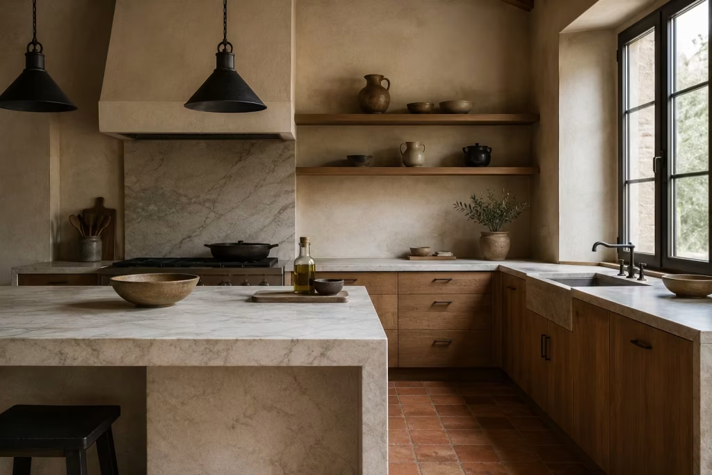
A Spanish inspired kitchen is never really defined by ornament or styling tricks. It is built from materials that carry presence on their own, each one doing a specific job within the overall composition.
When these materials are chosen with care, the kitchen stops relying on decoration and instead gains its character through substance, proportion, and subtle variation. The result is a space that feels composed, considered, and naturally cohesive without needing constant visual support.
Stone
Stone is often the quiet backbone of a Spanish inspired kitchen. It brings a sense of visual stability that anchors everything else around it, whether used for countertops, flooring, or even a full height backsplash in more expressive layouts. What makes it so effective is not just its durability, but the way it sits within the room like a steady reference point.
In practical terms, stone works best in areas that carry the most daily activity. Worktops around the cooking zone, central islands, and sink surrounds are natural placements where its resilience really matters. It handles constant use with a kind of unbothered confidence, which is why it tends to improve rather than deteriorate over time when properly cared for.
From a design perspective, stone also introduces subtle variation that prevents the kitchen from feeling too controlled. The natural veining and tonal shifts break up larger surfaces, giving the eye something to explore without creating distraction. It is this balance between structure and variation that allows the rest of the kitchen to sit comfortably around it.
Timber
Timber brings a quieter, more human dimension into Spanish inspired kitchens. It works especially well in cabinetry, kitchen islands, open shelving, and freestanding furniture pieces where a softer visual rhythm is needed. Unlike highly uniform surfaces, timber carries natural movement through its grain, which introduces subtle variation across even the simplest joinery.
In real projects, timber cabinetry often becomes the element that makes a kitchen feel more approachable once everything is installed. It softens the architectural precision of modern construction and allows the space to feel less rigid. Even in contemporary layouts, timber bridges the gap between structure and everyday living, making the kitchen feel more intuitive to use.
The key lies in restraint and finish. Over processing timber can strip away its character, while allowing the grain to remain visible keeps the material honest. Whether light oak, deeper walnut, or softly painted timber where the grain still shows through, the effect is the same. The kitchen gains depth without needing visual noise.
Handmade tile
Handmade tile introduces something that machine made surfaces rarely achieve on their own, a sense of controlled irregularity. In Spanish inspired kitchens, this is often where personality begins to emerge. Splashbacks, feature walls, alcoves, and even flooring become opportunities to introduce variation that feels intentional rather than decorative.
What makes handmade tile so effective is the way it responds to light. Slight differences in glaze, edge, and surface reflect illumination in uneven but interesting ways. This prevents large tiled areas from feeling static. Instead, the surface shifts subtly throughout the day, adding quiet movement to the kitchen.
From a design standpoint, handmade tile works best when it is given space to breathe. A single strong application often has more impact than spreading it across multiple zones. It becomes a focal moment rather than background texture, which helps maintain clarity in the overall composition.
Plaster and limewash
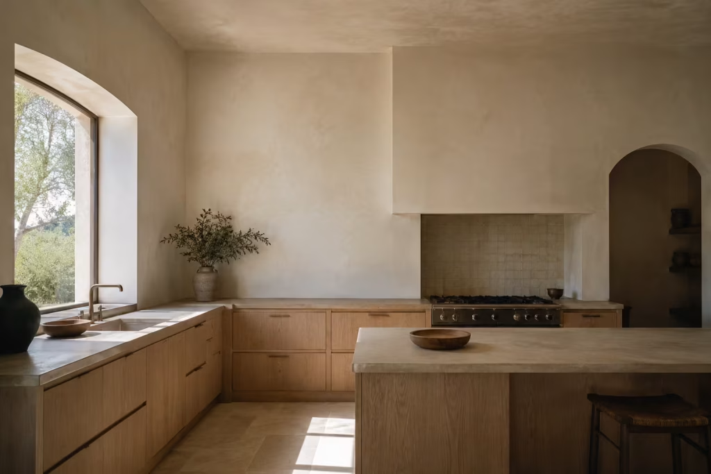
Plaster and limewash finishes introduce a softer architectural reading that sits behind everything else in the kitchen. Unlike flat paint, these finishes carry subtle tonal variation that shifts depending on light and viewing angle. This creates a surface that feels less like a backdrop and more like part of the architecture itself.
In Spanish inspired kitchens, plastered walls often act as a visual pause between stronger material moments such as tile, timber, or stone. They reduce contrast without removing interest, allowing the eye to rest while still maintaining depth. This is particularly important in busy layouts where too many hard edges can make the space feel visually tight.
Limewash adds another layer of complexity by responding to natural light in a very organic way. Morning light might soften it, while evening light deepens its tone, giving the kitchen a subtle sense of movement without any physical change. It is this quiet variability that keeps the space feeling alive without becoming distracting.
Iron and aged metal
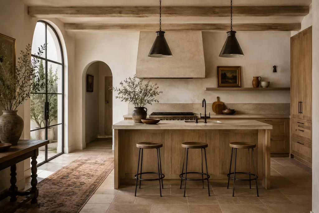
Iron and aged metal details are the finishing notes that bring definition to a Spanish inspired kitchen. Used in small, deliberate amounts, they help sharpen the composition and prevent softer materials from blending into one another. Cabinet handles, lighting fixtures, shelving brackets, and stool frames are the most common applications.
What makes these metals so effective is their contrast against lighter, more forgiving surfaces. Where timber and plaster soften the room, iron introduces clarity and structure. It creates a visual pause that helps the eye understand where one material ends and another begins.
In practice, the most successful kitchens use these metals sparingly. Too much can overpower the composition, but just enough creates balance. A few well placed elements are often all that is needed to bring the entire scheme into focus, like punctuation marks that complete a carefully written sentence.
How to Adapt the Look for Different Types of Homes
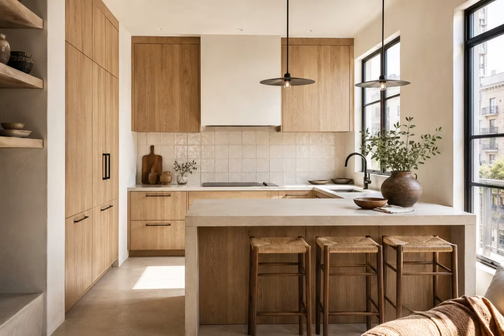
Spanish inspired kitchens are not a fixed formula. They are a design language that shifts depending on the building they sit within. The real skill lies in reading the architecture first, then letting materials, proportion, and detail respond to it rather than forcing a single interpretation into every context. When this approach is taken seriously, the style stops feeling imported and starts feeling naturally embedded in the home.
For period homes
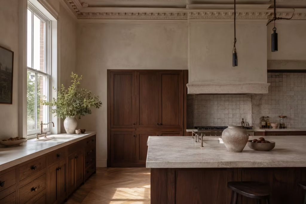
In period properties, the strongest Spanish inspired kitchens are those that work with the building rather than against it. Original features such as cornices, exposed beams, sash windows, or uneven masonry already carry a sense of history, so the kitchen should feel like a continuation of that story rather than a competing chapter.
Proportion becomes especially important here. Older homes often have generous ceiling heights and deeper wall reveals, which can handle more substantial materials without feeling heavy. Stone, timber, and plaster sit comfortably in these settings because the architecture already has enough visual confidence to support them.
Sympathetic materials are key. It is less about imitation and more about alignment. Finishes that feel slightly imperfect in tone or surface tend to sit more naturally within the building’s existing character. In practice, the most successful period kitchen renovations are the ones where new interventions feel quietly integrated, almost as if they have always belonged.
For new-build homes
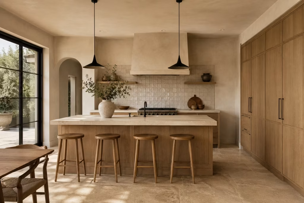
New-build homes often present the opposite challenge. Surfaces are clean, edges are precise, and everything can feel slightly uniform if left unchallenged. This is where Spanish inspired design becomes particularly useful, because it introduces variation and depth into otherwise flat environments.
Texture plays a central role here. Plaster finishes, handmade tiles, and natural stone surfaces help break up the smoothness of new construction. They introduce subtle irregularity that prevents the kitchen from feeling overly manufactured. Without this layer, even expensive finishes can appear one dimensional.
Tonal variation is equally important. Instead of relying on stark contrast, a more layered palette helps the space feel considered. Soft neutrals, muted earth notes, and gentle shifts in shade create a sense of visual movement that makes the kitchen feel more settled over time.
Handcrafted detail also carries significant weight in these settings. Even small elements, such as artisanal tiles or subtly varied cabinetry finishes, can shift the entire perception of the room. They bring a sense of individuality that offsets the uniformity often found in newly built interiors.
For open-plan kitchens
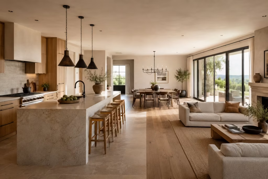
Open-plan layouts require a more disciplined approach because everything is visible at once. The kitchen, dining, and living areas are no longer separate scenes but part of a single continuous composition. This makes zoning and material repetition essential tools.
Zoning should feel intuitive rather than heavily defined. Changes in flooring direction, ceiling treatment, or lighting placement can help signal different functions without physically closing off the space. A kitchen island often becomes the natural divider, anchoring the cooking zone while still allowing connection to the wider room.
Repeated materials are what hold everything together. When timber, stone, or metal finishes reappear across adjoining areas, the eye begins to understand the space as one cohesive environment. It is less about exact matching and more about shared language.
Tonal continuity is what prevents fragmentation. If the kitchen is too visually separate from the dining or living areas, the open-plan concept loses its strength. By maintaining a consistent tonal rhythm, the entire space feels more fluid, almost as if it has been shaped in one continuous design decision rather than several disconnected ones.
For compact kitchens
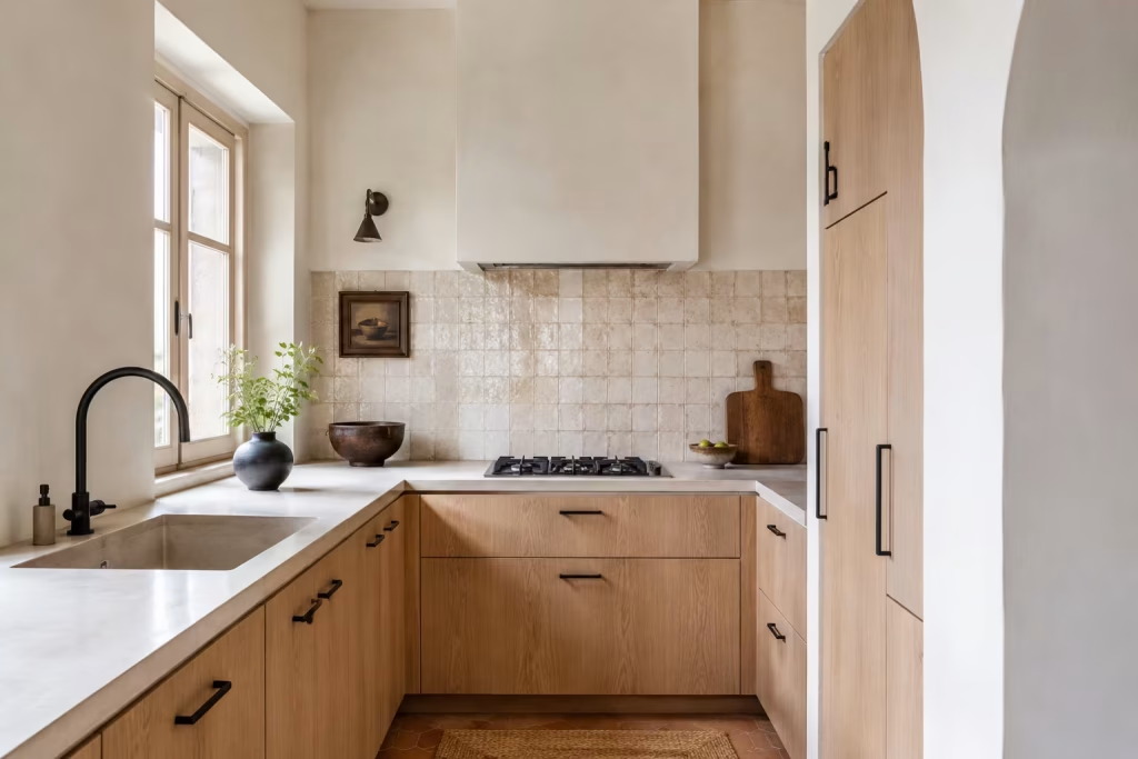
Compact kitchens demand a more selective approach. Every material, finish, and detail has to earn its place because there is no excess space for visual competition. This is where restraint becomes a design advantage rather than a limitation.
Light plays a crucial role in smaller rooms. Pale finishes help reflect natural light more effectively, making the space feel less enclosed. Soft whites, muted creams, and gentle stone tones create a sense of openness without relying on stark minimalism.
Rather than layering multiple strong features, compact kitchens benefit from one or two hero elements. This could be a statement splashback, a distinctive island finish, or a carefully chosen timber cabinetry tone. These focal points carry enough visual interest on their own without overwhelming the room.
The key is clarity. When too many ideas compete in a small space, the kitchen quickly feels cluttered. But when a clear hierarchy is established, even compact layouts can feel composed, functional, and visually calm, with every element working in quiet support of the whole.
Common Mistakes to Avoid
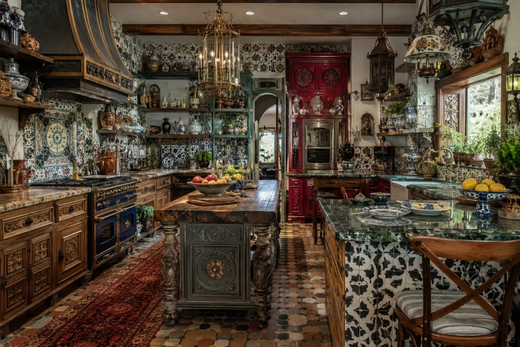
The appeal of a Spanish inspired kitchen lies in its restraint as much as its character. When the balance is right, the room feels effortless, as though every element has found its proper place without forcing the issue.
But when that balance slips, the entire scheme can begin to wobble. The most common missteps usually come from overthinking the look, piling on too many references, or forgetting that a kitchen must still earn its keep in daily life. A well judged design knows where to draw the line, and that is often where the real sophistication begins.
Over-theming the space
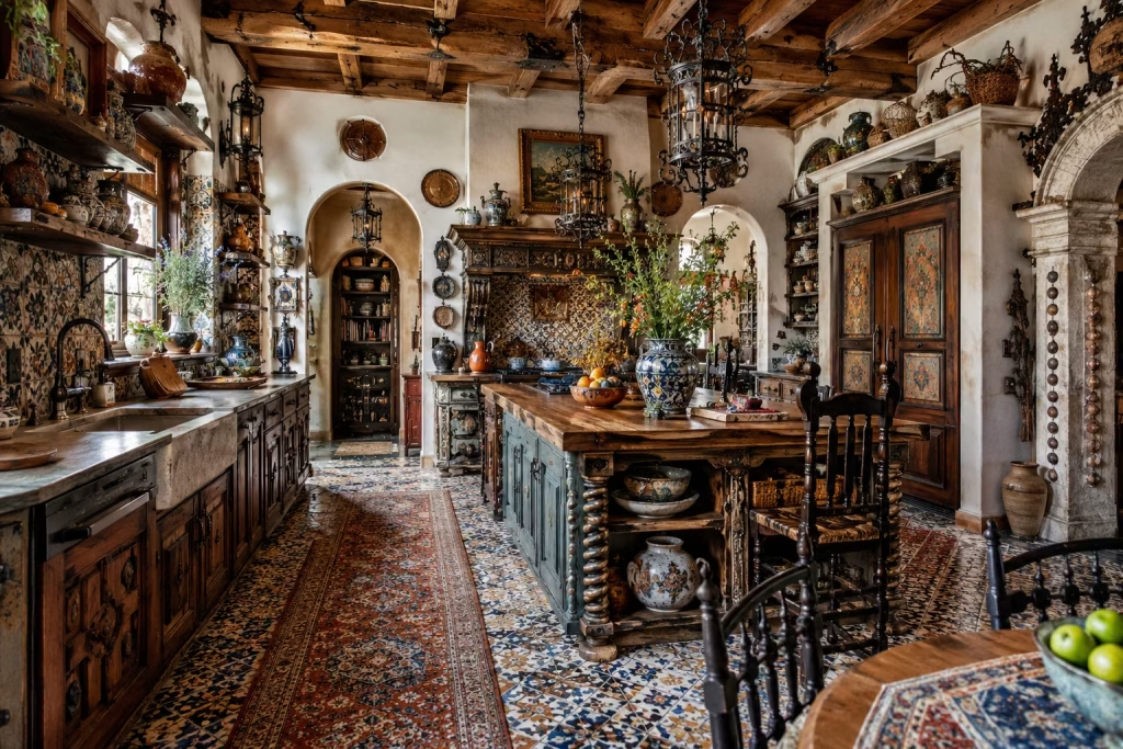
Too many rustic references can make the room feel staged. One of the quickest ways to drain the life from a Spanish inspired kitchen is to lean too hard into the theme.
A few well chosen references can be evocative and convincing, but when arches, terracotta, wrought iron, exposed timber, patterned tile, and antique accessories are all competing for attention, the room starts to feel like it is trying too hard. The charm slips through your fingers. What should feel naturally layered begins to read like a set dressing.
The danger here is not that the individual elements are wrong. It is that they stop speaking to one another in a calm, coherent way. A kitchen does not need to wear every possible Spanish cue at once to feel authentic.
In fact, the most successful spaces often use just one or two strong gestures, then let the architecture and material palette do the rest. That is where the magic really happens. A softly curved niche, a hand finished tile, or a warm timber island can carry far more weight than a room crowded with visual references.
In real homes, over-theming usually shows up when design decisions are made in isolation rather than as part of a wider composition. A rustic light fitting here, a decorative tile there, a heavy beam added for effect, and before long the room has lost its composure. The eye has nowhere to rest. Instead of feeling collected over time, the kitchen feels assembled in a hurry. A lighter hand nearly always produces a more convincing result.
Using too many materials
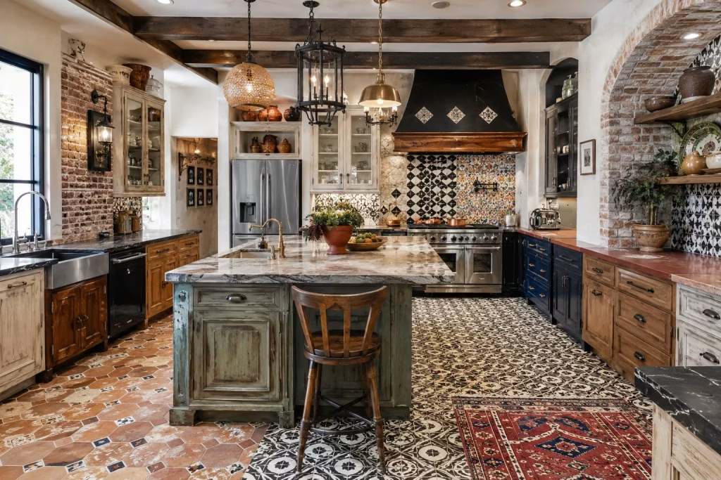
A Spanish-inspired kitchen works best when the material palette is disciplined. Material variety can be a strength, but only when it is handled with care. Spanish inspired kitchens often rely on a rich mix of finishes, stone, timber, tile, plaster, and metal, yet the real skill lies in keeping that mix under control.
When too many materials are introduced without a clear hierarchy, the room begins to fragment. Each surface fights for attention, and the overall effect can feel busy rather than beautifully layered.
A disciplined palette gives the design room to breathe. It allows the strongest materials to carry more presence while quieter elements support them in the background. For example, if stone is doing the visual heavy lifting on the worktops, then the cabinetry and walls should probably step back a little.
If handmade tile is already introducing movement, there may be no need for additional decorative surfaces elsewhere. This is not about playing it safe. It is about making sure every piece knows its role.
I have seen kitchens lose their confidence simply because too many finishes were chasing a moment in the spotlight. The result is often a space that feels fractured, even if each individual choice looks good on its own.
A strong kitchen is not built from a shopping list of attractive materials. It is built from a clear point of view. Once that becomes the guiding principle, the room starts to feel more cohesive and far more expensive in spirit.
Forgetting practicality
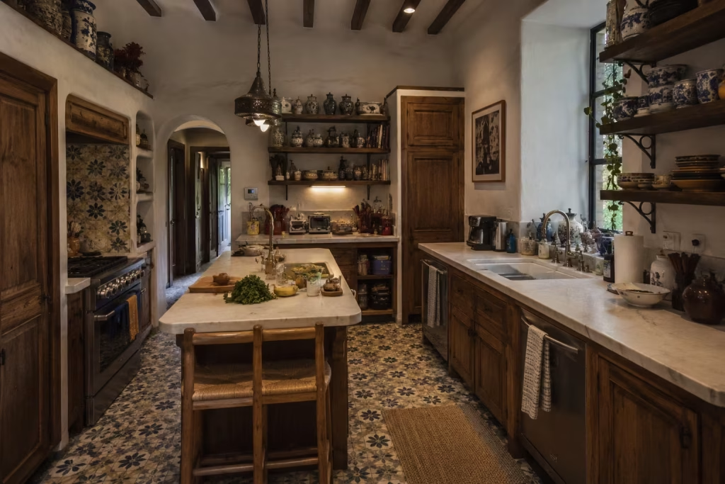
A beautiful kitchen still needs durable surfaces, sensible storage, and good circulation. It is easy to get swept up in the visual side of a kitchen renovation and forget that the room has to work hard every single day.
Spanish inspired design may be rich in atmosphere, but it cannot afford to lose sight of practicality. Durable surfaces, sensible storage, and clear circulation are not background concerns. They are the structure that keeps the whole thing standing.
A kitchen that looks beautiful but cannot cope with daily use will quickly start to feel like a poor investment. Surfaces need to handle heat, spills, and wear. Storage needs to be easy to access without creating friction in the workflow.
Movement around the room needs to feel intuitive, especially in households where more than one person is using the space at once. These details may not be glamorous, but they are the difference between a kitchen that is simply admired and one that is genuinely enjoyed.
In practice, the best Spanish inspired kitchens are the ones where function and atmosphere are woven together from the start. A deep sink placed where it is actually useful, an island with enough clearance to move around comfortably, or concealed storage that keeps the visual field calm can make the room feel far more refined than any decorative flourish. Beauty without ease is a false economy. The real prize is a kitchen that looks composed and works like clockwork behind the scenes.
Ignoring the light in the room
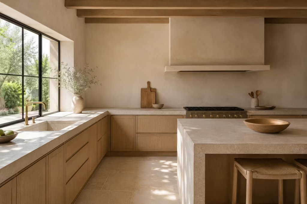
Natural light changes how colour, tile, and texture read. Light is one of the most underestimated parts of kitchen design, yet it can completely change how every finish behaves. A colour that feels soft and inviting in a north facing room may look flat or cold in a darker corner.
A handmade tile that glows beautifully in the afternoon can seem underwhelming under heavy artificial lighting. Even stone and plaster, with all their depth, depend on light to reveal their character fully.
Ignoring the light in the room is like dressing for the wrong weather. The materials may be excellent, but if they are not responding to the conditions of the space, the design will never quite land.
This is why daylight should be treated as part of the material palette rather than something separate from it. It shapes how finishes are read, how shadows fall, and how the room changes from morning to evening.
In real design work, I often find that a kitchen only reveals its true potential once light has been properly considered. A pale limewashed wall can feel flat in one position and beautifully layered in another.
A terracotta floor may look quiet in shade but come alive when the sun shifts across it. The difference can be night and day. That is why glazing, window treatment, reflective surfaces, and layout all need to work in step with the light available.
A kitchen that respects its light source almost always feels more settled. The colour palette makes more sense, the materials sing a little louder, and the room gains a natural ease that cannot be faked. When the light is ignored, even a well designed space can feel slightly off key. When it is understood properly, everything else falls into place with far less effort.
Expert Design Takeaways
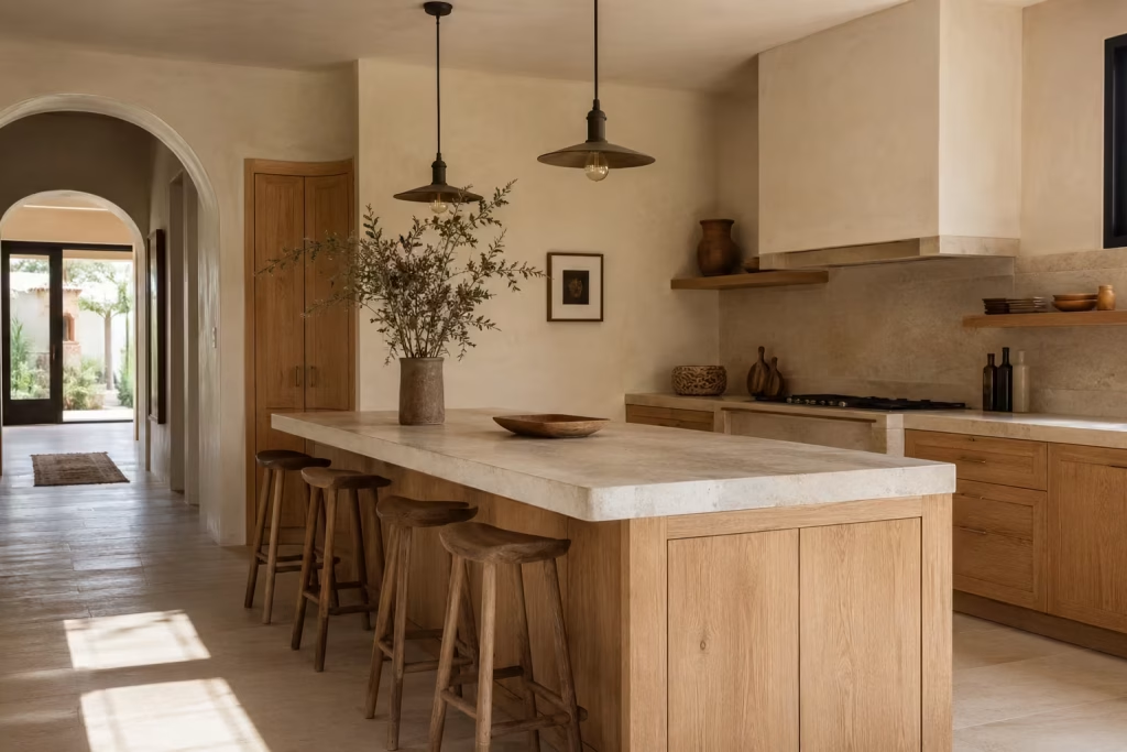
Stepping back from the full composition, what becomes clear is that Spanish inspired kitchen design is not a checklist of visual references. It is a way of thinking about space, where materials, proportion, and light do far more work than decoration ever could. The strongest outcomes are never the most literal ones. They are the most considered. The kind where nothing feels forced, yet everything feels like it belongs exactly where it is.
The most successful Spanish kitchens feel as though they have grown naturally over time, even when they have been newly designed. That sense of ease is not accidental. It comes from restraint, from editing, and from choosing materials that can carry themselves without constant reinforcement. When that principle is understood, the entire design process shifts from decoration to composition.
What I often return to at the end of a project like this is a simple idea. A kitchen does not need to recreate a postcard version of Spain to feel authentic. In fact, that approach usually does the opposite. It flattens the design into a theme rather than allowing it to develop depth. Real authenticity comes from how the space is built, not what it is trying to imitate.
In practice, the kitchens that hold their value over time are the ones that rely on honest finishes. Stone that behaves like stone, timber that shows its grain without apology, plaster that carries subtle variation, and tile that is allowed to be slightly imperfect.
These materials do not need performance. They just need space and clarity. When they are combined with careful planning and a disciplined palette, the result is a kitchen that feels composed rather than constructed.
There is also something important about restraint that often gets overlooked. Leaving space, both visually and physically, allows the eye to settle. It gives each material room to be understood properly. When everything is competing for attention, nothing truly lands. But when the composition is controlled, even quietly so, the kitchen begins to feel more confident in its own presence.
From experience, the kitchens that stay with people are rarely the most complex. They are the ones where every decision feels inevitable in hindsight. Nothing feels added for effect. Everything feels considered, edited, and placed with intention. That is where Spanish inspired design reaches its strongest expression, not in excess, but in clarity.
If there is one principle to carry forward, it is this. Build atmosphere first, then refine detail. Let materials lead the conversation. Allow light to shape the mood. Keep the composition honest and unforced. When those elements come together, the kitchen does not just look complete, it feels settled in a way that is difficult to define but immediately recognisable when you step into it.
Final thought while Designing a Spanish inspired kitchen
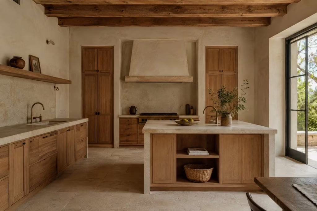
A Spanish inspired kitchen, at its best, is never just a style exercise. It is a careful balance of atmosphere and function, where material choices, light, and proportion come together in a way that feels unforced yet deeply intentional. Throughout this design language, nothing relies on spectacle. Instead, it is the quieter decisions that carry the most weight, shaping a space that feels composed without losing its sense of ease.
What stays with you most is not a single feature, but the overall feeling of the room. The way stone settles into the architecture without drawing attention to itself. The way timber softens the edges of a more structured layout. The way handmade surfaces introduce just enough variation to keep the eye engaged, without ever tipping into disorder. Each element plays its part, yet nothing competes for attention. It is this sense of balance that gives the kitchen its lasting appeal.
There is also something deeply human about this approach. A kitchen built in this way does not feel overly designed or staged. It feels lived with, even when it is newly completed. That impression comes from restraint, from allowing materials to speak in their own voice, and from resisting the urge to over-decorate or over-define every surface. When a space is allowed to breathe, it naturally becomes more inviting.
In many ways, the true strength of Spanish kitchen design lies in its ability to hold two ideas at once. It feels grounded yet expressive, practical yet quietly poetic. It supports the rhythms of everyday life while still offering moments of visual richness that reveal themselves slowly over time. This duality is what makes it so enduring, and why it continues to translate so well into contemporary homes.
Ultimately, the goal is not to recreate a fixed image, but to build a kitchen that feels honest to its materials and generous in its atmosphere. When that balance is achieved, the result is a space that does more than function well. It welcomes, it settles, and it stays with you long after you have left the room.
Frequently Asked Questions About Designing and Renovating a Spanish Inspired Kitchen
What defines a Spanish inspired kitchen in modern homes?
A Spanish inspired kitchen is defined less by decorative motifs and more by material honesty, proportion, and atmosphere. It typically draws on stone, timber, handmade tile, plastered surfaces, and iron detailing, but the key is restraint in how these elements are combined. In modern homes, it works best as an interpretation rather than a literal recreation, allowing contemporary layouts and appliances to sit comfortably within a more character driven material palette.
How do I make a Spanish inspired kitchen feel modern rather than rustic?
The balance comes from pairing traditional materials with clean architectural lines. Simple cabinetry, reduced ornamentation, and disciplined colour choices help prevent the space from feeling themed. When rustic elements are present, they should be edited carefully and contrasted with contemporary joinery or minimal detailing so the kitchen feels composed rather than staged.
What are the most important materials to use?
The core materials are stone for structure and durability, timber for visual softness and everyday usability, handmade tile for variation and character, plaster or limewash for depth on walls, and aged metal for subtle definition. These materials work best when they are not all used in equal intensity, but layered with hierarchy so the strongest elements lead and others support.
Can a Spanish inspired kitchen work in a small space?
Yes, and often very effectively. In smaller kitchens, the key is restraint. Lighter tones, reflective but controlled finishes, and a limited material palette help the space feel more open. Instead of multiple features competing for attention, one or two focal elements, such as a statement splashback or timber cabinetry, can carry the entire design.
Is patterned tile necessary for the look?
Patterned tile is not essential, but it can be powerful when used sparingly. One well chosen application, such as a splashback or floor detail, is usually enough. Overusing pattern can quickly overwhelm the space and dilute the calm structure that defines Spanish inspired design.
How important is lighting in this style of kitchen?
Lighting is critical. Natural light should be prioritised wherever possible, as it changes how materials read throughout the day. Artificial lighting should be layered carefully using pendants, task lighting, and ambient sources. The goal is not brightness alone, but depth and atmosphere that evolve from morning to evening.
Can I mix Spanish inspired design with other styles?
Yes, and this is often where the most interesting results come from. Spanish inspired kitchens blend well with modern minimalism, contemporary rustic, and even industrial influences. The key is to maintain consistency in materials and avoid overloading the space with conflicting references.
What is the biggest mistake people make?
The most common mistake is over-theming the space. When too many rustic or decorative elements are introduced at once, the kitchen can feel staged rather than natural. Another frequent issue is using too many materials without a clear hierarchy, which weakens the overall composition.
How do I keep the design feeling timeless?
Timelessness comes from restraint. Avoid overly trend driven finishes and focus on materials that age well visually. Keep cabinetry simple, let natural variation in materials do the work, and avoid excessive decoration. A well edited kitchen will always outlast a heavily styled one.
Do Spanish inspired kitchens need to look traditional?
Not at all. The style is flexible and can be interpreted in a very contemporary way. What matters is the underlying design logic, material richness, subtle variation, and a calm, composed atmosphere. The final look can be modern, transitional, or classic depending on how those elements are balanced.