
From City to Sand: 25 Easy Ways to Get the Montauk Beach House Look Anywhere
There is a particular ease to a Montauk beach house that, at first glance, feels almost accidental. Rooms appear open, materials feel unforced, and nothing seems overly arranged. Yet when you spend time in these spaces, the logic reveals itself. Every proportion is considered, every material carries weight, and every absence is as intentional as what remains. This is not casual design. It is precision, softened.
What makes Montauk interiors so compelling is their ability to feel relaxed without ever slipping into disorder. The palette rarely shouts, instead settling into a spectrum of sun-faded neutrals, weathered woods, and tactile fabrics that respond to light throughout the day. Furniture sits lower, often deliberately so, allowing ceilings to breathe and views to extend uninterrupted. Circulation is never forced. You move through the space almost instinctively, as if the layout had been resolved long before you arrived.
There is also a careful balance at play, one that I have had to refine repeatedly in my own projects. Raw coastal elements, timber that shows its grain, linen that creases with use, stone that holds subtle irregularities, are never left entirely untouched. They are edited, positioned, and paired with quieter, more refined counterparts. Too much rawness and the space begins to feel unresolved. Too much polish and it loses its connection to place. The success lies somewhere in between, where contrast feels natural rather than staged.
I have found, over years of working on coastal homes, that the most successful interiors never try to look “beachy.” They do not rely on obvious references or decorative cues. Instead, they absorb their surroundings. Light becomes the dominant material. Airflow shapes how rooms are used. Textures echo what exists just beyond the walls. The result is a space that feels grounded and unforced, as though it belongs exactly where it stands, rather than trying to convince you of it.
Understanding the Montauk Aesthetic Before You Begin
Before any furniture is placed or materials are selected, it is worth pausing to understand that the Montauk aesthetic is not a look you apply, but a condition you create. It emerges from a series of controlled decisions, each one quietly shaping how the space feels rather than how it performs visually in isolation. In my experience, the difference between a home that feels authentically coastal and one that reads as styled often comes down to restraint and sequence. Light is considered first, then proportion, then material, and only at the very end does decoration enter the conversation. When this order is reversed, the result tends to feel forced. When it is respected, the space settles into something far more enduring, almost as if it has always belonged to its setting.
Light as the Primary Design Material
Orientation, window treatments, and reflection strategies: In a Montauk beach house, light is not something you decorate around. It is the material that quietly leads every decision, shaping how the room breathes, settles, and evolves throughout the day. I often say to clients that if you get the light right, half the design has already done the heavy lifting. The rest becomes an exercise in refinement rather than correction.
Orientation is where it all begins, often long before finishes are even considered. South and west-facing rooms tend to carry that slow, golden warmth into the evening, the kind that softens edges and makes even the simplest materials feel elevated. North-facing spaces, on the other hand, hold a cooler, more diffused light, which can feel calm but slightly withdrawn if left unchecked. In one coastal project I worked on, the living room faced north, and at first it felt flat, almost hesitant. Instead of forcing warmth through colour, I adjusted the material palette, bringing in limewashed walls and pale oak flooring. The result shifted the light itself, catching and scattering it just enough to create depth without artificial intervention. It is a small move on paper, but one that changes how the room lives day to day.
Window treatments in this context are less about decoration and more about filtration. Heavy curtains tend to interrupt the rhythm of natural light, creating hard stops where there should be continuity. I lean towards sheer linens or loosely woven fabrics, hung full height, often just grazing the floor. The difference is subtle but telling. Light passes through rather than being blocked, diffusing gently across the room instead of landing in harsh patches. In practical terms, I usually recommend curtain drops that sit around 2 to 3 cm above the floor, or roughly 1 inch, to maintain that effortless fall without collecting dust or feeling overly tailored.
Reflection strategies are where the space begins to quietly amplify itself. This is not about mirrors for the sake of brightness, but about understanding how surfaces respond to light. A softly honed stone countertop, a matte plaster wall, or even a slightly brushed timber finish can bounce light in a way that feels natural, almost unnoticeable at first glance. In one bedroom overlooking the coast, I positioned a simple mirror opposite a narrow window, not to double the view, but to catch the morning light and pull it deeper into the room. By mid-morning, the space felt brighter without a single artificial source switched on. It is these small, almost invisible decisions that start to add up.
There is a tendency to treat lighting as something that comes in at the end, a layer to be added once everything else is in place. In reality, it should be the thread that runs through the entire scheme. When light is considered early, allowed to move freely, softened where needed, and reflected with intention, the space begins to feel alive. Not in a dramatic way, but in that quiet, settled manner that keeps you lingering just a little longer than you planned.
Texture Over Colour
Why tactile layering matters more than bold palettes: One of the quiet truths behind the Montauk aesthetic is that colour rarely carries the room on its own. It is texture that does the heavy lifting, building depth, softness, and that lived-in ease people often struggle to define but instantly recognise. Strip the palette back to its essentials and, rather than feeling empty, the space begins to reveal its layers. This is where the design either holds its ground or falls flat.
I have seen many coastal interiors lean too heavily on colour, chasing contrast in the hope of creating interest. The result often feels surface-level, almost like a quick fix that wears thin over time. Texture, on the other hand, works slowly and steadily. It invites you in rather than demanding attention. A linen sofa that creases slightly with use, a handwoven rug that shifts subtly underfoot, timber with a visible grain that catches the light differently at each hour. These are not statement pieces in the traditional sense, yet together they create a room that feels complete without ever trying too hard.
In practical terms, I tend to build a scheme by layering materials that sit close in tone but vary in finish. Think soft off-white upholstery paired with a slightly warmer jute rug, then balanced with pale oak or ash flooring. The difference might seem marginal on paper, but in reality, it creates a richness that colour alone cannot achieve. In one project near the coast, we kept the entire living room within a narrow tonal range, somewhere between warm ivory and sand. What brought it to life was the contrast between a loosely woven throw, a tightly upholstered armchair, and a subtly textured plaster wall. Each surface responded differently to touch and light, creating movement without visual noise.
There is also a practical advantage to this approach, one that often goes unnoticed until you live with it. Textured materials tend to age more gracefully. They absorb wear rather than highlighting it, which means the space evolves without losing its character. A smooth, high-gloss finish will show every mark, every shift in use. A textured surface, slightly irregular, slightly forgiving, tends to settle in, becoming better over time rather than worse. It is, in many ways, a case of playing the long game.
The temptation to introduce bold colour often comes from a desire to make the space feel finished. Yet, more often than not, it is the restraint that gives the room its staying power. By focusing on texture, layering it carefully, adjusting it as the light changes, the space begins to feel grounded. Not static, but quietly dynamic, the kind of environment that reveals itself gradually, holding your attention without ever raising its voice.
The Art of Understyling
Knowing when to stop, a common failure point in coastal homes: If there is one principle that quietly separates a refined Montauk interior from one that feels overworked, it is knowing when to stop. Understyling is not about doing less for the sake of it. It is about recognising the exact moment a space has said enough, then resisting the urge to add one more layer. Easier said than done, especially when everything around us suggests that more detail equals more impact.
In coastal homes, this is where many well-intentioned designs begin to unravel. Pieces are added to “finish” the room, a few extra cushions, another decorative object, perhaps a statement accessory that felt right in isolation. Before long, the space starts to feel crowded, almost like it is trying too hard to tell its story. The irony is that Montauk interiors gain their strength from what is left unsaid. They leave room to breathe, room to pause, room for light and material to take centre stage without competition.
I have worked on projects where the most effective design decision was not what we introduced, but what we quietly removed. In one living room overlooking the water, the initial scheme included layered accessories, stacked books, multiple objects across every surface. Individually, each piece had merit. Together, they diluted the clarity of the space. We stripped it back, keeping only a handful of elements that truly belonged. A single ceramic piece on the coffee table, a loosely folded throw, one artwork that held the wall without dominating it. The shift was immediate. The room felt lighter, calmer, almost as if it had exhaled.
There is a practical framework I often return to, especially when a space starts to feel on the edge of excess. For every surface, ask what purpose it serves and what role each object plays. If two pieces are competing for attention, one usually needs to go. If an item does not contribute to the overall rhythm of the room, it becomes visual noise, however beautiful it might be on its own. It is a process of editing, not decorating, where restraint becomes the defining gesture.
Proportion also plays a quiet but critical role here. Fewer objects demand more considered scale. A slightly larger vase, for instance, can hold its own without needing companions, while smaller items often invite clutter when grouped together. In practical terms, I tend to limit surfaces such as coffee tables or consoles to one or two elements, allowing negative space to do its work. It may feel sparse at first, almost unfinished, but give it time and the balance begins to settle.
Understyling, when done well, has a certain confidence to it. It does not seek validation through abundance. Instead, it trusts the architecture, the materials, and the light to carry the space. The result is not emptiness, but clarity, a room that feels composed, intentional, and quietly complete. The kind of place where nothing is fighting for attention, yet everything feels exactly where it should be.
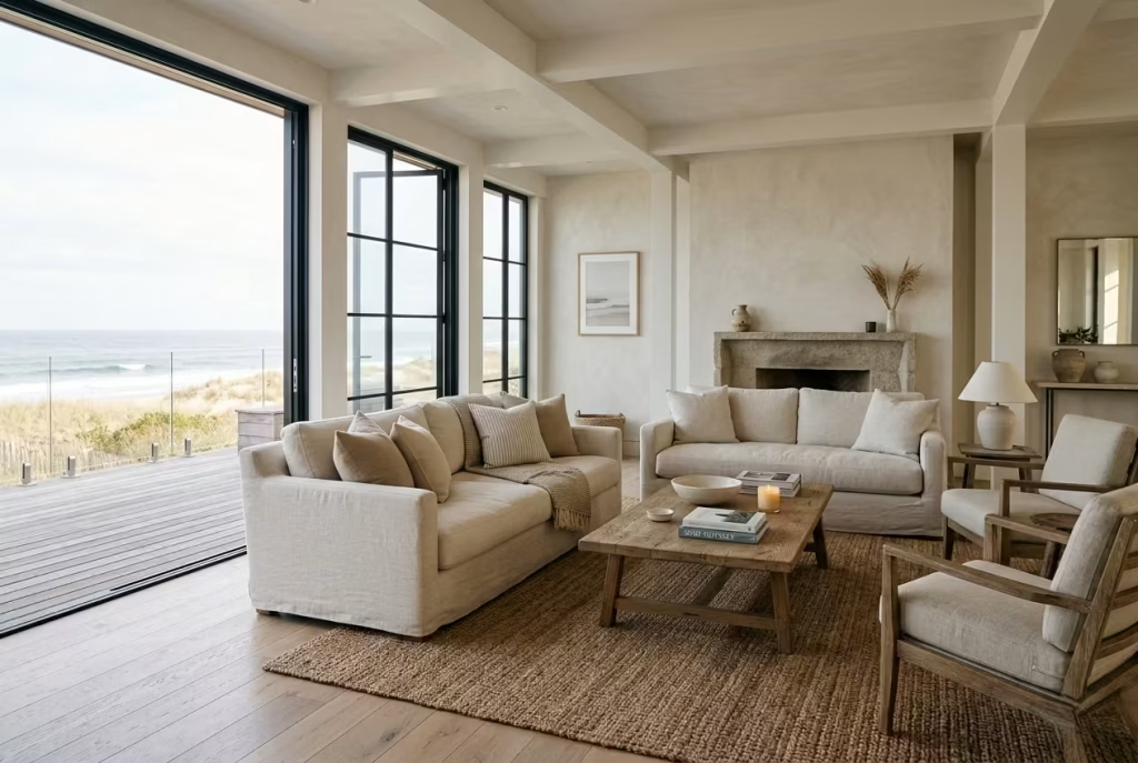
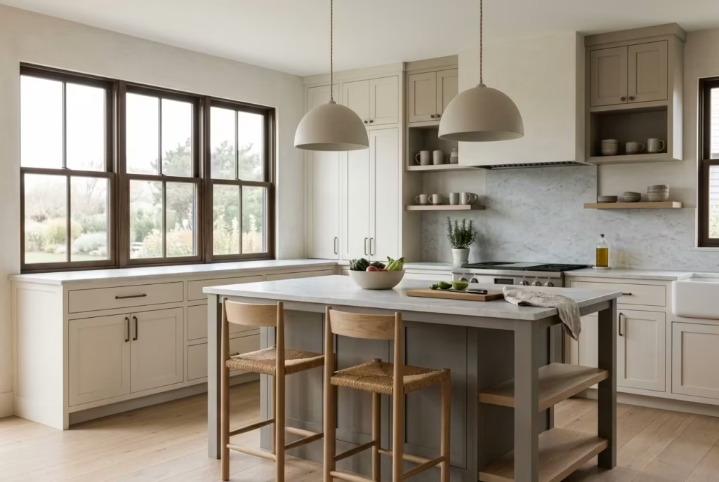
Living Room Where Relaxation Meets Structure
The living room in a Montauk-Inspired Beach house carries a quiet responsibility. It must feel open and unforced, yet still hold its shape, a space that invites you to sink in without losing its composure. This balance, somewhere between ease and intention, is where many designs either settle beautifully or fall apart. In my experience, the most successful living rooms are not built around statement pieces, but around proportion, flow, and how the body naturally occupies the space. Seating sits lower, circulation feels instinctive, and every element, considered in relation to the next, works together to create a room that feels both relaxed and quietly resolved.
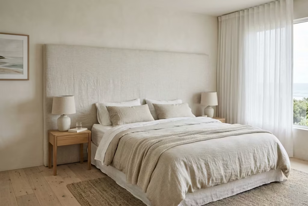
Choose Low-Slung Seating That Grounds the Space
Ideal sofa height: 40 to 45 cm | 16 to 18 inches: Low-slung seating has a way of setting the tone before anything else has a chance to speak. It draws the eye downward, gently anchoring the room, while allowing everything above it to feel lighter, more expansive. In a Montauk-inspired living room, this becomes a quiet advantage. Ceilings appear taller, sightlines stretch further, and the space begins to breathe in a way that taller, more upright furniture often restricts.
I tend to specify sofas within the 40 to 45 cm seat height range, roughly 16 to 18 inches, particularly in coastal settings where ease is part of the brief. The difference might seem subtle on paper, but in practice, it shifts how the room is experienced. You sit slightly closer to the floor, your posture relaxes without effort, and the entire environment feels less formal, more lived-in. In one project near the shoreline, we replaced a standard-height sofa with a lower-profile piece in soft linen. The ceiling height had not changed, yet the room felt instantly more open, almost as if the walls had stepped back a fraction.
There is also a visual rhythm that comes into play. When seating sits lower, it creates space for negative volume above it, allowing artwork, windows, or even a simple stretch of wall to hold more presence. It is a bit like lowering the horizon line in a landscape painting. Suddenly, the sky has room to unfold. In design terms, that “sky” becomes your light, your textures, your architectural details, all given a chance to register without competition.
That said, low-slung seating is not a one-size-fits-all solution. It leans into a more relaxed way of living, which suits informal gatherings, slow mornings, and spaces designed for unwinding. If the room needs to accommodate more formal seating or support those who prefer a higher sitting position, it can feel less practical. I have navigated this by pairing a low sofa with slightly higher occasional chairs, creating a layered seating arrangement that offers both comfort and flexibility without breaking the overall composition.
Pros: Enhances openness, encourages a relaxed posture, strengthens the visual flow of the room
Cons: Less supportive for formal settings, can feel too low for some users if not balanced with other seating options
When used thoughtfully, low-slung seating does more than furnish a room. It quietly recalibrates how the space is perceived, softening its edges and inviting you to settle in, almost without noticing when it happened.
Layer Natural Textiles Instead of Statement Pieces
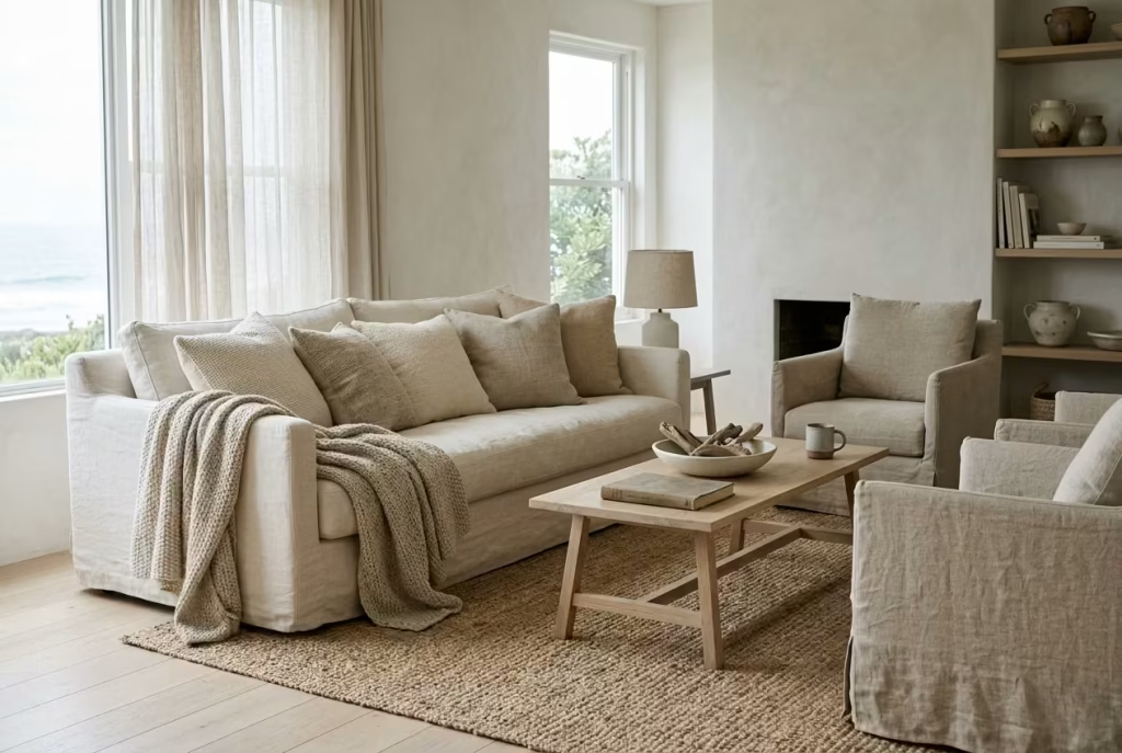
Linen, cotton, and wool blends:Natural textiles are where a Montauk-inspired living room quietly finds its rhythm. Linen brings that unmistakable softened crease, the kind that feels lived-in rather than staged, while cotton adds a grounded familiarity that never tries to compete for attention. Wool blends, particularly in throws and accent layers, introduce a subtle weight that becomes essential during cooler evenings, almost like a gentle counterbalance to the airy nature of coastal light.
In practice, I often build a room starting with linen upholstery, then layer cotton cushions in slightly varied weaves, finishing with a loosely draped wool throw that sits “just so,” never overly arranged. In one coastal project, we used a washed linen sofa paired with cotton scatter cushions in muted ivory and sand tones. Nothing matched perfectly, yet everything belonged. The room felt like it had grown into itself over time, rather than being installed in a single moment. That is the quiet magic of natural textiles, they soften structure without erasing it.
Avoid overly coordinated sets: One of the quickest ways to flatten a coastal interior is through excessive coordination. Matching cushion sets, identical textures, or perfectly aligned colour blocks tend to strip away the nuance that gives a space its character. It becomes visually correct but emotionally static, like a room holding its breath.
I have seen this happen often in otherwise well-designed Beach house, where everything matches a little too neatly. The eye moves across the space without pause, and before long, the room feels predictable. Breaking that pattern is less about randomness and more about controlled variation. A linen cushion paired with a loosely woven cotton piece, or a wool throw placed slightly off-centre, creates a rhythm that feels natural rather than manufactured.
The key is to let textures “argue gently” with each other while still staying within the same tonal family. Think of it as conversation rather than repetition. When done well, the space stops feeling assembled and starts feeling composed, almost like a quiet dialogue between materials that were never meant to match perfectly, only to coexist with ease.
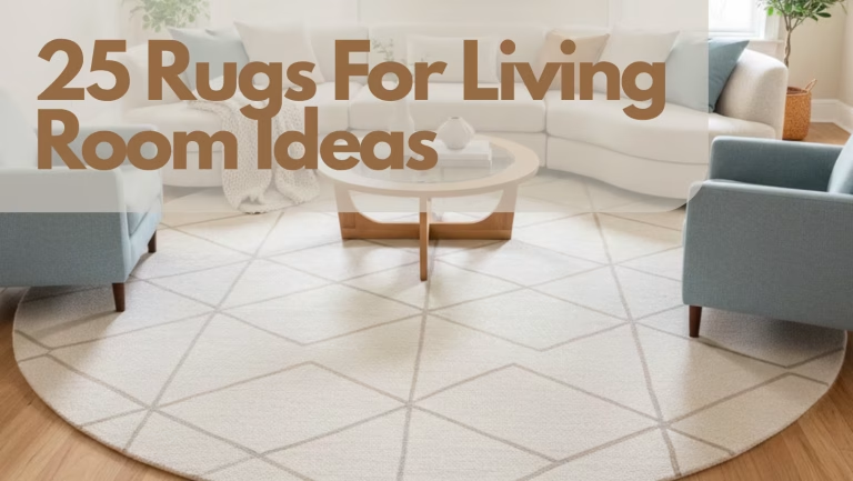
Use Oversized Rugs to Anchor the Room
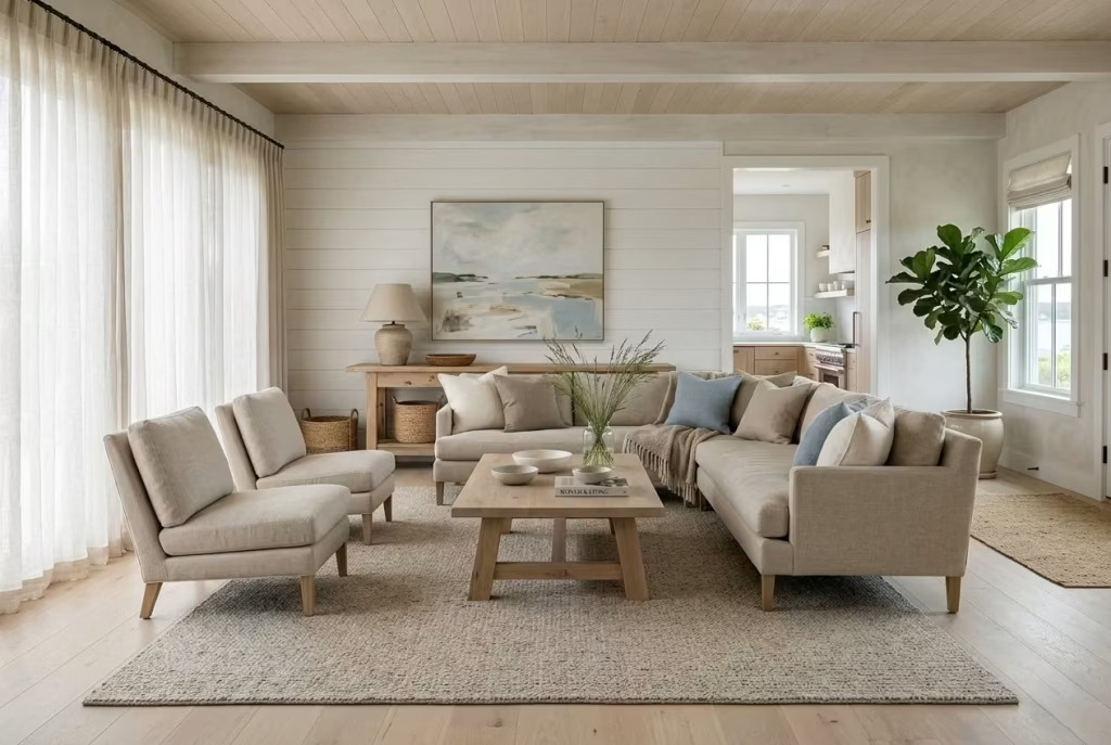
Minimum size: 240 × 300 cm (8 × 10 ft): An oversized rug is one of those quietly transformative decisions that often gets underestimated until it is in place. In Montauk-inspired interiors, scale does the talking, and a rug that is too small can make even a well-designed room feel like it is floating without direction. By contrast, a rug sized at a minimum of 240 × 300 cm, or 8 × 10 ft, acts almost like an architectural foundation. It pulls furniture into a single, grounded composition rather than letting pieces drift apart visually.
In practical terms, I always aim for a rug large enough that at least the front legs of sofas and chairs sit comfortably on it. In one coastal living room I worked on, we replaced a mid-sized rug with a larger wool piece in a softened oat tone. The change was immediate. The seating arrangement stopped feeling fragmented and began to read as one intentional zone. It is a subtle shift, but one that changes the entire spatial logic of the room, almost like tightening the frame around a painting so the subject finally comes into focus.
There is also a psychological effect at play. A generously scaled rug reduces visual noise, especially in open-plan layouts where multiple elements compete for attention. It creates a boundary without walls, a kind of soft perimeter that tells the room where it begins and ends without needing physical separation. When that boundary is missing, furniture can feel like it is “floating in limbo,” disconnected from the architecture it sits within.
Material choice matters just as much as size. I tend to favour natural fibres such as wool or jute blends, depending on the level of softness required. Wool offers warmth and structure, holding its shape under furniture without looking overly rigid, while jute introduces a more relaxed, coastal texture that works particularly well in informal spaces. In both cases, the key is restraint in pattern. A subtle weave or tonal variation is often enough to add depth without disrupting the calm of the room.
Ultimately, an oversized rug does more than define a seating area. It anchors the entire composition, giving the room a sense of weight and intention. Once in place, everything else begins to fall into alignment, almost as if the space has finally found its footing after drifting slightly off course.
Introduce Weathered Wood Elements
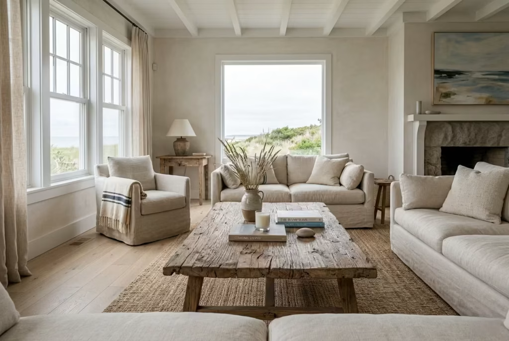
Coffee tables, beams, or shelving: Weathered wood is where a Montauk-inspired interior begins to feel grounded in something real, almost as if it has been shaped by time rather than installed in a single afternoon. There is an honesty to it that polished materials often struggle to replicate. The grain is visible, the imperfections are present, and the surface carries a softened patina that immediately shifts the atmosphere of a room. It is not about rustic charm in a themed sense, but about restraint meeting character in a very deliberate way.
In living rooms, I often introduce weathered wood through coffee tables first, because they sit at the visual centre of the space. A low, wide timber table in reclaimed oak or driftwood finish can quietly set the tone without overwhelming the scheme. I remember one coastal project where the entire room felt slightly too refined, almost hesitant in its expression. The moment we introduced a long, weathered oak table with visible grain and softened edges, the space settled. It was as if the room had finally exhaled after holding itself too tightly for too long.
Beams, when architecturally appropriate, take this idea further. Exposed or lightly treated timber overhead introduces a sense of depth that draws the eye upward without feeling heavy. The key is not to over-darken or over-finish them. When beams are left too polished, they lose that quiet authenticity and start to feel staged. A softer, sun-worn finish works far better, particularly in spaces where natural light already plays a dominant role.
Shelving is another subtle opportunity to bring in weathered wood without overwhelming the composition. Open shelves in lightly aged timber can frame everyday objects in a way that feels unforced. The trick is not to overfill them. A few carefully chosen pieces, spaced with intention, allow the material itself to remain part of the visual narrative rather than disappearing behind clutter.
What makes weathered wood so effective in coastal interiors is its ability to hold contrast without shouting for attention. Against soft linens and pale walls, it introduces just enough grounding to prevent the space from feeling weightless. It is the design equivalent of an anchor dropped gently into sand, holding everything in place while still allowing movement around it.
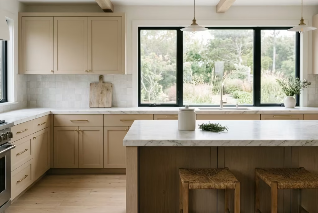
Keep Colour Palette Muted and Sun-Faded
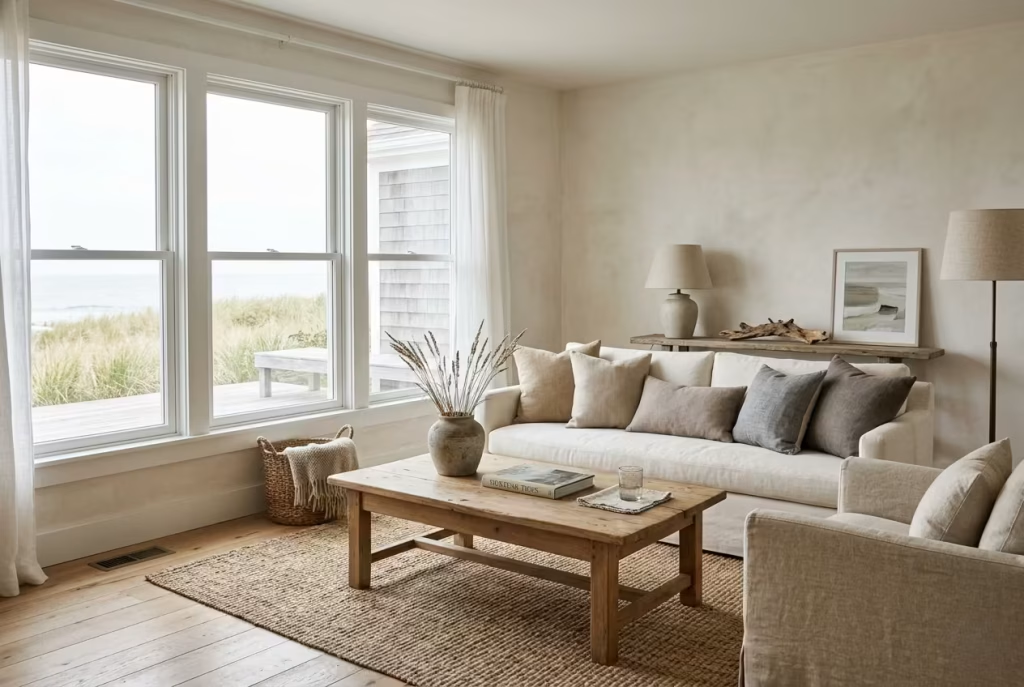
Off-whites, sand, driftwood tones: A Montauk-inspired palette does not rely on bold colour statements. Instead, it leans into tones that feel as though they have already lived a life under coastal light, slightly softened, slightly faded, as if time itself has gently washed over them. Off-whites form the base, not stark or clinical, but warm and slightly textured, carrying the quiet depth of plastered walls that have absorbed years of daylight. Sand tones introduce a grounding softness, reminiscent of dune landscapes that never sit still, while driftwood hues bring in a muted, earthy contrast that keeps the scheme from drifting into sameness.
In practice, I often build colour schemes by thinking less in terms of “matching” and more in terms of atmospheric layering. In one coastal project, we avoided pure white entirely and instead worked with a palette of chalky ivory, pale taupe, and weathered grey-brown. On paper, the difference seemed minimal, but in reality, it transformed how the room responded to light. Morning sun softened into warm haze rather than sharp reflection, and by late afternoon, the space felt almost cinematic, like everything had been gently toned down rather than switched on or off.
Muted palettes also have a way of giving architecture more authority. When colour is restrained, proportion and material take centre stage. A sand-toned wall does not compete with a linen sofa or a timber floor; it quietly supports them, like a well-considered backdrop that knows when to stay silent. This is where many interiors find their balance, when no single element is trying to steal the show.
There is also a practical longevity to sun-faded tones that often gets overlooked. Strong colours can date quickly, especially in coastal environments where natural light is constantly shifting. Muted palettes, on the other hand, age gracefully. They absorb change rather than resisting it. Over time, they develop a patina of their own, becoming richer in character without ever feeling tired or overdone.
The real skill lies in resisting the urge to “correct” the palette with contrast. When everything is slightly softened, slightly desaturated, the eye begins to relax. The space stops feeling composed in a rigid sense and starts to feel lived-in, almost as if it has always existed in that state. And once that balance is achieved, you realise the palette was never about colour at all, but about atmosphere, held quietly together like a well-worn memory that refuses to fade.
Bedroom Softness, Air, and Quiet Luxury
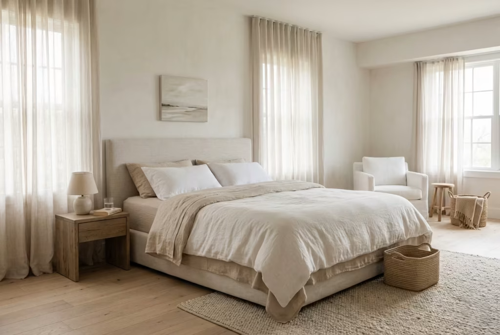
The bedroom in a Montauk-inspired Beach House is where the aesthetic becomes most intimate and, arguably, most demanding. It is no longer just about visual balance but about how a space feels when you are fully at rest, stripped of distraction and excess. In my experience, this is where restraint matters most. The room should never feel over-composed or overly styled; instead, it should settle into a rhythm of softness and air, where materials respond gently to light and nothing interrupts the sense of calm. When done well, the bedroom carries a kind of quiet luxury that does not announce itself, yet stays with you long after you leave it.
Opt for Breathable Bedding Layers
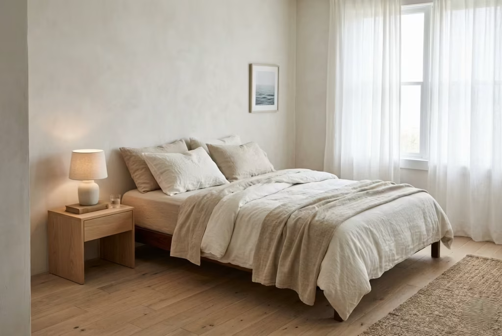
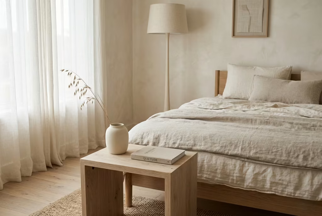
Linen sheets, lightweight duvets: Breathability in bedding is not just a comfort choice, it is a spatial one. In a Montauk-inspired bedroom, the bed is rarely treated as a heavy, overbuilt presence. Instead, it is softened through layers that feel responsive rather than restrictive. Linen sheets sit at the heart of this approach. They carry that slightly crumpled, lived-in texture that never feels over-managed, almost as if the bed has already been used, relaxed into, and accepted as part of daily life rather than staged for appearance.
I often find that linen performs differently depending on how it is layered. A loosely tucked linen sheet paired with a lightweight cotton or down-alternative duvet creates a sense of ease that heavier bedding simply cannot replicate. In one coastal bedroom I worked on, we replaced a thick, overly structured bedding set with softened linen layers in broken white and pale oat tones. The room immediately shifted. It no longer felt “made up” in a formal sense. It felt lived in, but still composed, like a space that understood the difference between effort and ease.
There is also a subtle sensory benefit that tends to reveal itself over time. Breathable layers regulate temperature far more naturally, allowing the body to settle without interruption through the night. It is one of those details that clients rarely notice visually at first, but they always feel it. And once experienced, it is difficult to go back. The bed becomes less of a visual centrepiece and more of a restorative surface, which is exactly where it should be in this kind of interior language.
Ideal bed height: 55–65 cm (22–26 inches): Bed height plays a surprisingly important role in how the entire bedroom is perceived. A range of 55 to 65 cm, roughly 22 to 26 inches, tends to strike the right balance between comfort and visual proportion in coastal interiors. Too low, and the bed can feel too close to the floor, almost visually compressed. Too high, and it starts to dominate the room, disrupting the sense of airiness that defines the Montauk aesthetic.
In practical terms, this height range allows the bed to sit comfortably within the room’s vertical rhythm. It aligns well with bedside tables, typically around 50 to 60 cm, creating a gentle horizontal flow that feels intentional without being rigid. In one project, adjusting the bed height by just a few centimetres changed how the entire wall elevation read. Suddenly, the headboard, lighting, and surrounding space felt aligned, as if everything had quietly found its place.
There is also a psychological ease to a bed that sits at this level. It feels accessible without being low, elevated without feeling formal. You do not climb into it or drop into it; you simply settle, almost instinctively. And in a bedroom designed around softness and air, that sense of ease is what ties everything together.
You May also Like: Mountain Beach House Ideas That Feel Impossible but Work Beautifully
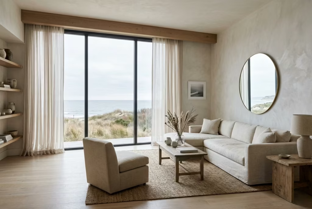
Use Sheer Curtains to Filter Light
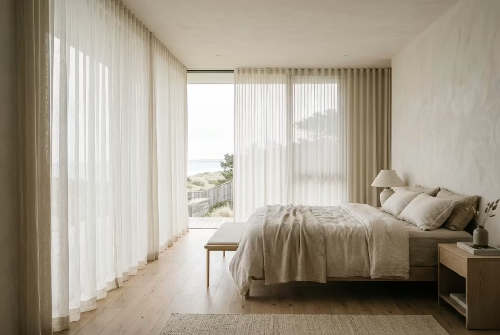
Sheer curtains to filter light: Sheer curtains in a Montauk-inspired bedroom are less about dressing a window and more about shaping the behaviour of light itself. They act as a soft intermediary, turning direct sunlight into something diffused and forgiving, almost like a veil drawn gently across the room. Instead of harsh beams cutting through the space, light arrives in layers, settling rather than striking. This subtle shift is what gives coastal bedrooms their calm, almost weightless atmosphere.
In practice, I often choose sheer linens or finely woven cottons that allow daylight to pass through without losing its warmth. The goal is not to block, but to temper. In one seaside bedroom, we replaced heavy drapes with full-height sheer panels in an off-white tone. The effect was immediate. Morning light no longer arrived in sharp bursts; it filtered in slowly, softening every surface it touched. Even the walls seemed to relax, as if the room had learned to breathe at a slower pace.
There is also a quiet psychological benefit to this kind of light control. Softly filtered daylight removes visual tension from the space. It reduces contrast, smooths edges, and creates a sense of continuity that is difficult to achieve with opaque window treatments. The room begins to feel less segmented by time of day, almost as if morning and afternoon are gently stitched together rather than sharply divided.
Floor-to-ceiling placement to elongate walls: The way curtains are hung is just as important as the fabric itself. Floor-to-ceiling placement is a simple yet powerful technique that subtly alters the perception of scale within a bedroom. By starting the curtain track close to the ceiling line and allowing the fabric to fall uninterrupted to the floor, the walls immediately feel taller, more extended, and far less compressed.
I have found that even modest rooms benefit significantly from this approach. In one compact coastal bedroom, ceiling height was relatively standard, yet once sheer curtains were installed from ceiling to floor, the proportions shifted entirely. The room stopped feeling boxy and began to read vertically, drawing the eye upward in a way that felt natural rather than forced.
There is also a compositional elegance to this method. Curtains become part of the architecture rather than an accessory layered onto it. When they are drawn, they frame the window softly. When open, they disappear into the periphery, leaving only a suggestion of movement and texture. It is a quiet trick of scale and placement, but one that consistently delivers a sense of ease, almost as if the room has been gently stretched into its best possible version of itself.
Limit Furniture to Essentials Only
Bed, side tables, subtle storage: A Montauk-inspired bedroom loses its essence the moment it becomes over-furnished. The philosophy here is simple but not always easy to execute: every piece must earn its place, otherwise it quietly works against the calm you are trying to build. When the room is pared back to its essentials, the architecture and light finally have room to speak without interruption, and the space begins to feel less like a collection of objects and more like a composed environment.
In practice, I usually anchor the room with a well-proportioned bed, then allow only the most necessary supporting elements to enter the conversation. Side tables should feel light in presence, often floating or minimally grounded, typically no more than 45 to 55 cm in height so they sit comfortably in line with the mattress. In one coastal bedroom I worked on, we removed a bulky chest of drawers that had been dominating the wall. Replacing it with two slim timber side tables and a concealed wardrobe system immediately changed the room’s rhythm. It felt as though someone had quietly opened a window inside the space.
Subtle storage is where restraint becomes most valuable. Instead of introducing multiple visible units, I prefer integrated or recessed solutions that disappear into the architecture. This keeps surfaces clear and prevents the room from becoming visually fragmented. When storage is handled properly, you do not notice it at all, and that is exactly the point. The eye is no longer distracted by competing volumes, and the room settles into a more effortless state.
There is also a behavioural shift that comes with minimal furnishing. A stripped-back bedroom encourages slower living. You are less surrounded by “things to manage” and more surrounded by space itself. I have often found that clients begin to treat the room differently once excess furniture is removed, almost as if the space itself is setting the pace rather than the objects within it.
Pros and Cons of an Essential-Only Layout
Pros: Creates visual clarity, enhances spatial flow, and allows natural light and proportions to dominate without competition. It also reduces maintenance and encourages a calmer, more intentional way of living.
Cons: Requires disciplined editing and may feel sparse at first, especially for those accustomed to layered or heavily furnished bedrooms. Storage must be carefully planned to avoid practical limitations.
When done with intention, limiting furniture is not about absence. It is about precision. A room stripped to its essentials does not feel empty, it feels resolved, almost like it has finally stopped trying to prove itself and is quietly comfortable in its own skin.
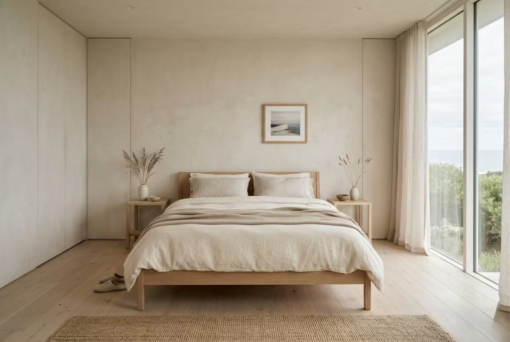
Incorporate Textured Headboards
Upholstered linen or raw wood: A headboard in a Montauk-inspired bedroom is rarely treated as a decorative flourish. It is more of a grounding surface, something that quietly frames the bed without demanding attention. The emphasis is always on texture rather than ornament, on how a material feels visually when softened by light and lived with over time. Upholstered linen and raw wood sit at the heart of this approach, each bringing a different kind of calm to the room.
Linen-upholstered headboards have a way of softening the entire bed composition. The fabric absorbs light rather than reflecting it, creating a gentle backdrop that allows bedding layers to take on more presence without visual noise. I often specify oversized, wall-mounted linen panels in muted tones such as chalk, oat, or faded stone. In one coastal bedroom, we extended a linen headboard across the full width of the wall. It immediately changed the perception of scale, making the room feel wider and more settled, almost like the architecture had been cushioned.
Raw wood, on the other hand, introduces a quieter sense of structure. Not polished or overly refined, but gently worked, with grain still visible and edges slightly softened. It brings a natural honesty to the room that pairs beautifully with the more tactile softness of linen bedding. In practice, I tend to lean towards pale oak or ash finishes, sometimes lightly limewashed, so the material feels weathered rather than newly manufactured. In one project, a simple reclaimed timber headboard became the defining element of the room. Nothing else needed to compete with it. It held its own presence, almost like a piece of architecture rather than furniture.
There is also a subtle spatial benefit to a well-considered headboard. It anchors the bed visually, giving it a sense of place within the room rather than allowing it to float without context. When scaled correctly, typically extending slightly beyond the width of the mattress, it creates a gentle framing effect that brings balance to the wall elevation. Too small, and the bed feels under-supported. Too large or ornate, and it begins to dominate. The sweet spot lies in restraint, where proportion does most of the talking.
Design Insight: Texture as Quiet Structure: What often gets overlooked is how much a textured headboard contributes to the overall acoustic and visual softness of a bedroom. Upholstered surfaces subtly absorb sound, while raw timber breaks up flat wall expanses, preventing the room from feeling sterile. Together, they create a layered backdrop that supports the rest of the design without ever stepping into the spotlight.
When done well, a textured headboard does not announce itself. It simply holds the room together, like a well-worn frame that lets everything else breathe a little easier.
Keep Styling Minimal but Intentional
One or two curated objects per surface: In a Montauk-inspired bedroom, styling is never about filling space for the sake of completion. It is about knowing exactly where to stop, and more importantly, why you stop there. Surfaces should feel composed, not crowded, almost as if each object has been placed with a quiet sense of purpose rather than decorative urgency. The moment a surface starts to accumulate too many voices, the calm begins to fracture, and the room loses that effortless ease it is meant to hold.
In practice, I always approach styling as a process of reduction rather than addition. A bedside table, for example, rarely needs more than one or two considered elements. A ceramic vessel with a soft matte finish paired with a small, well-chosen book is often more than enough. In one coastal bedroom, we removed a collection of decorative items that had slowly built up over time. What remained was a simple glass lamp and a single stone bowl. Strangely enough, the space felt more complete after the removal, not less. It is one of those quiet design truths that reveals itself only when you step back and let the room breathe.
There is a rhythm to restraint that becomes easier to recognise with experience. Each surface should have a clear visual hierarchy, where one object leads and the other supports, never competing for attention. When everything is given equal importance, nothing stands out, and the eye begins to wander without settling. I often remind clients that a surface should feel like a sentence, not a paragraph that never knows when to end.
Material choice also plays a subtle but important role here. Objects with tactile qualities, such as unglazed ceramics, aged glass, or brushed stone, tend to hold presence without needing volume. They feel grounded, almost weighty in a visual sense, even when physically small. In contrast, overly polished or highly decorative pieces can quickly tip the balance into visual clutter, especially in a bedroom where softness is the guiding principle.
Pros and Cons of Minimal Intentional Styling
Pros: Creates clarity, enhances the sense of calm, and allows architectural and material details to take precedence. It also makes daily maintenance easier and keeps the room feeling consistently ordered without effort.
Cons: Requires discipline and careful selection, and may initially feel under-decorated for those accustomed to layered styling. Every object carries more visual responsibility, so choices need to be more considered.
When styling is kept minimal but intentional, the room stops feeling curated in a performative way. Instead, it settles into something far more natural, almost as if each piece has found its place without needing to compete for attention. And in that quiet discipline, the bedroom begins to feel not just designed, but truly lived in, with a sense of ease that lingers long after you leave it.
Kitchen Functional Simplicity with Coastal Ease
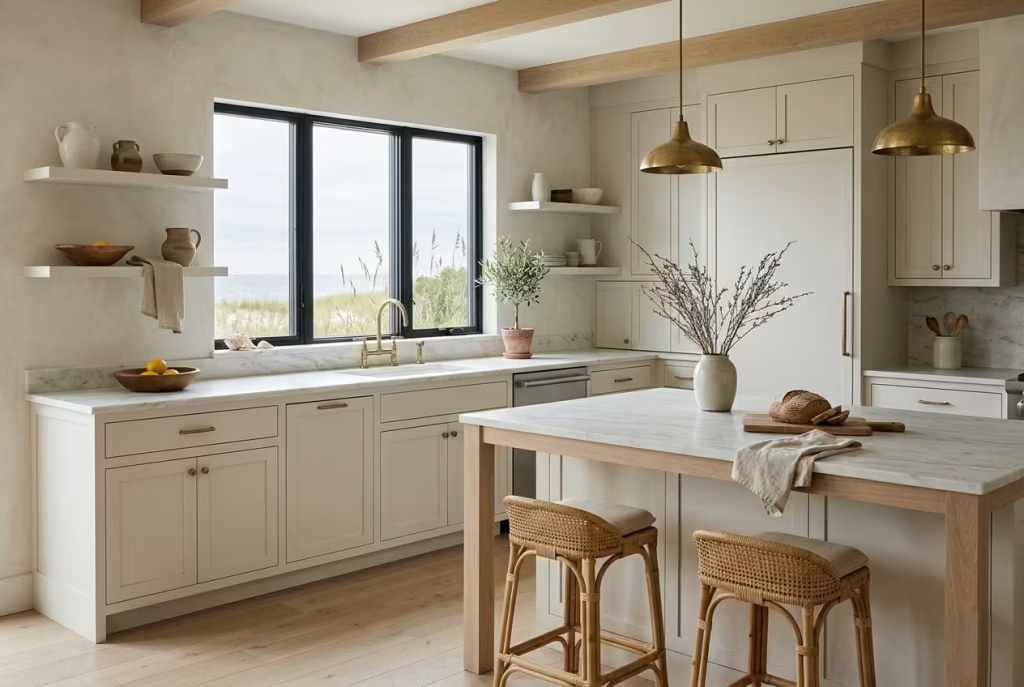
The kitchen in a Montauk-inspired Beach House is where restraint meets everyday function, and the success of the design depends on how quietly these two ideas coexist. It is not a space that relies on visual drama or excessive detailing, but rather on clarity, flow, and materials that can withstand constant use without losing their composure. In practice, the most successful coastal kitchens feel almost effortless at first glance, yet every proportion, surface, and finish has been carefully considered. When done well, the room works like a well-tuned system, where
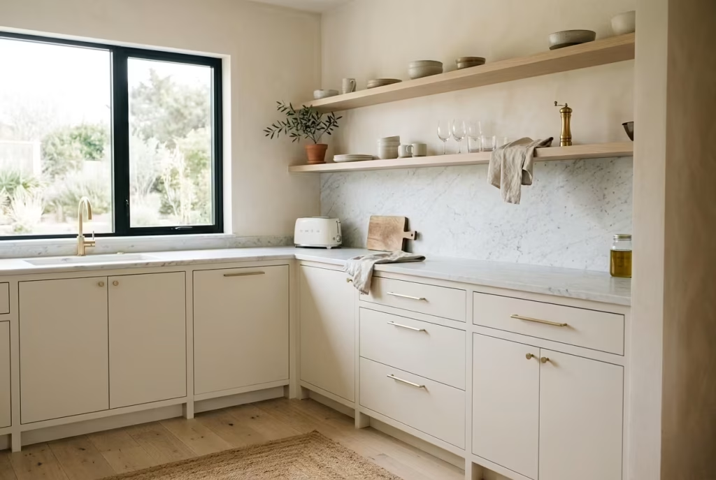
Use Open Shelving Sparingly
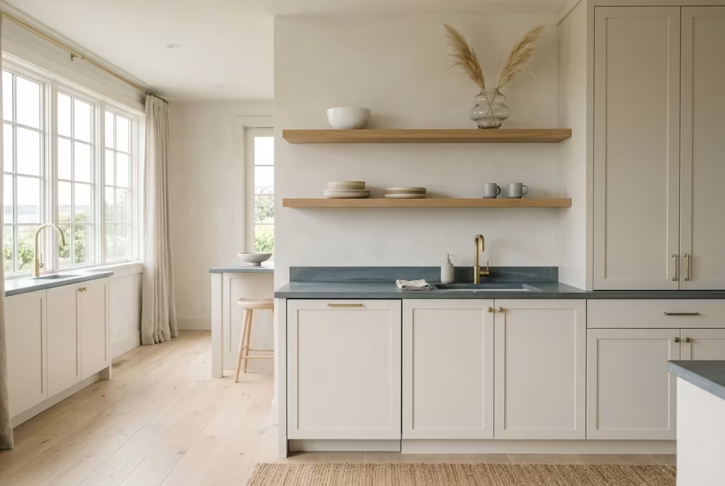
Balance between display and practicality: Open shelving in a Montauk-inspired kitchen is one of those elements that looks effortlessly beautiful when done well, yet can quickly tip into visual clutter if overused. The key is balance, that delicate line between what is on show and what is quietly stored away. In these coastal interiors, shelves are never treated as storage systems in disguise. They are more like carefully edited stages, where only a few well-chosen pieces are allowed to take part in the conversation.
In practice, I tend to introduce open shelving in very controlled moments rather than across entire walls. A short run above a prep counter, or a single recessed section within cabinetry, is often more than enough. In one coastal kitchen I worked on, we replaced upper cabinets with just two floating oak shelves. At first, the space felt almost too open, as if something was missing. But once styled with restraint, a stack of handmade ceramics, a couple of glass vessels, and nothing more, the kitchen began to breathe differently. The architecture suddenly had room to speak without interruption.
The real challenge with open shelving is resisting the urge to treat it like a display cabinet. It is tempting to fill every gap, especially in kitchens where functionality and aesthetics often overlap. But when shelves are overworked, they lose their calm and start to feel like shopfronts rather than lived-in spaces. I often remind clients that negative space is not empty space. It is what allows the eye to rest, and in a kitchen, that pause is just as important as the objects themselves.
From a practical standpoint, open shelving also requires discipline in daily life. Items placed on display must be considered not only for how they look, but for how they are used and maintained. This is where the idea of “edited living” becomes important. Everyday objects can absolutely belong on open shelves, but only if they contribute to the overall rhythm of the space rather than disrupting it. A mismatched collection, no matter how functional, can quickly unravel the visual calm that defines the Montauk aesthetic.
When used sparingly and with intention, open shelving becomes less about storage and more about atmosphere. It frames the kitchen in small, deliberate moments, allowing glimpses of texture and material without overwhelming the composition. And in that restraint, the space gains a kind of quiet confidence, as if it knows it does not need to prove anything beyond what is already there.
Choose Matte Finishes Over Gloss
Matte finishes over gloss: Matte finishes sit at the heart of a Montauk-inspired kitchen because they allow the space to settle rather than shimmer. Gloss, by its nature, reflects everything back at the eye, light, movement, even imperfections, which can quickly create a sense of visual agitation in spaces that are meant to feel calm and grounded. Matte surfaces, on the other hand, absorb light in a softer way, almost like they are quietly taking in the room rather than broadcasting it.
In practical terms, this difference becomes most noticeable on cabinetry, worktops, and even hardware. I often specify matte-painted cabinetry in soft neutrals such as warm white, muted stone, or pale grey-brown, particularly in kitchens where natural light is already strong. In one coastal project, we replaced high-gloss kitchen doors with a matte lacquer finish. The change was immediate and surprisingly subtle at the same time. The reflections disappeared, the surfaces felt calmer, and the entire kitchen began to read as a single, cohesive volume rather than a collection of shiny fragments.
There is also a sensory dimension that tends to go unnoticed until you live with it. Matte finishes feel more grounded to the eye because they do not compete with their surroundings. They sit back, allowing textures like wood grain, stone veining, and linen upholstery to take precedence. It is a bit like turning down background noise in a busy room, suddenly everything else becomes clearer, more defined, and easier to appreciate.
From a maintenance perspective, matte surfaces also tend to age more gracefully in everyday kitchen environments. Fingerprints, smudges, and minor wear are far less pronounced than on glossy finishes, which often highlight every mark like a mirror. This makes matte particularly well suited to Beach Houses where the kitchen is actively used rather than purely observed. It supports the reality of daily life without constantly demanding correction or polishing.
The real strength of matte finishes lies in their ability to create visual continuity. When cabinets, walls, and even certain fixtures share a matte language, the kitchen stops feeling broken into parts and instead reads as one calm, unified space. Nothing shouts, nothing distracts, and the eye is allowed to move through the room without interruption. In the end, it is this lack of noise, visual and otherwise, that gives the Montauk kitchen its quiet, enduring sense of ease.
Integrate Natural Stone Surfaces
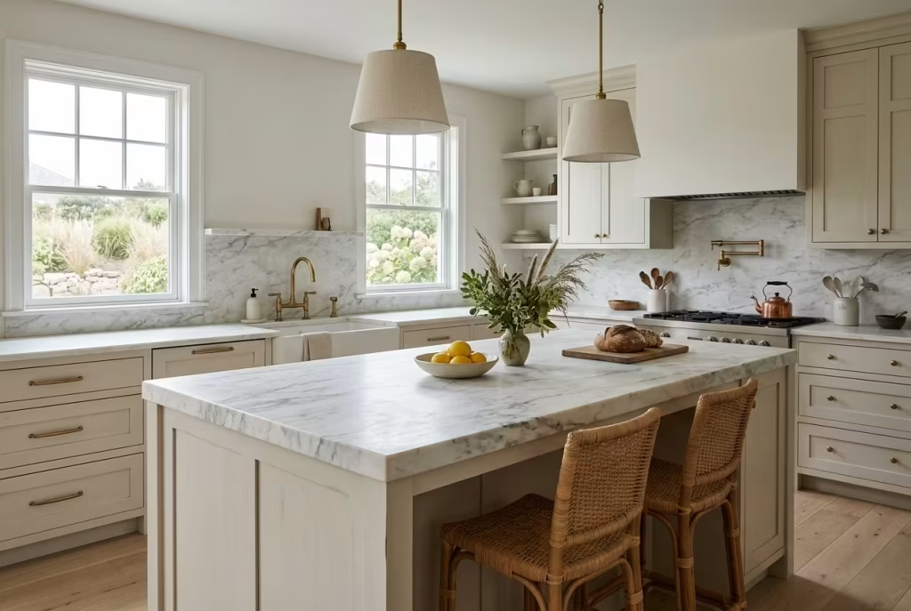
Marble or quartzite countertops: Natural stone surfaces bring a kind of quiet authority to a Montauk-inspired kitchen that manufactured materials rarely achieve. There is an inherent irregularity in marble and quartzite, subtle veining, tonal shifts, and mineral movement, that prevents the space from ever feeling too uniform or overly controlled. It is this natural variation that gives the kitchen depth, almost as if the surface has its own memory built into it.
Marble, with its softer, more expressive veining, introduces a sense of fluidity that works beautifully in kitchens where light is a dominant feature. It catches daylight in a gentle way, never harsh or reflective in excess, but softly responsive as the hours shift. Quartzite, by contrast, tends to offer a more resilient, structured character, with tighter patterns and a slightly more grounded presence. In practice, I often guide clients between the two depending on how the kitchen will actually be used day to day. One coastal project leaned heavily on honed marble for its island surface, and over time it developed a patina that felt almost lived in, like the space had been quietly evolving rather than staying static.
There is also a spatial effect that natural stone brings into a kitchen, one that becomes more noticeable once it is in place. Because the material is visually active but not loud, it anchors the room without overwhelming it. You do not need additional decoration to create interest. The stone itself becomes the focal point, but in a restrained, understated way. It is a bit like having a conversation with someone who does not speak often, but when they do, every word carries weight.
From a practical standpoint, natural stone does require a certain acceptance of imperfection over time. Etching, minor staining, and surface wear are part of its evolving character rather than flaws to be eliminated. I often find that once clients understand this shift in mindset, they begin to appreciate stone in a different way. It is no longer about maintaining a pristine surface, but about allowing the material to develop alongside the life of the Beach House.
The real strength of marble or quartzite lies in their ability to balance refinement with authenticity. They introduce a sense of permanence into the kitchen, almost like a quiet backbone that holds everything else together. When paired with muted cabinetry, matte finishes, and natural light, the result is a space that feels both grounded and elevated at the same time, never trying too hard, yet never fading into the background either.
Keep Hardware Subtle and Aged
Brushed brass or blackened steel: Hardware in a Montauk-inspired kitchen is never meant to be the loudest voice in the room. It is the detail that works quietly in the background, tying materials together without ever asking for attention. When handled well, it is almost invisible at first glance, yet its absence would be immediately felt. This is where brushed brass and blackened steel come into their own, each offering a restrained, time-worn character that aligns perfectly with the coastal aesthetic.
Brushed brass carries a softened warmth that avoids the overly polished, reflective quality often associated with more decorative interiors. It feels aged from the start, as if it has already lived through years of handling and exposure. In practice, I tend to use it sparingly, on cabinet pulls, tapware, or small functional details, rather than allowing it to dominate the scheme. In one coastal kitchen, we introduced brushed brass handles against matte off-white cabinetry. The effect was subtle but transformative. The warmth of the metal gently lifted the entire palette, without ever tipping into contrast for contrast’s sake.
Blackened steel, on the other hand, introduces a quieter, more grounded edge. It has a muted, almost shadow-like quality that sits beautifully against natural stone and timber. Unlike polished chrome or stainless steel, it does not reflect the environment aggressively. Instead, it absorbs light, sitting comfortably within the visual hierarchy of the space. I often describe it as the “unspoken anchor” of a kitchen, present but never intrusive. In one project, blackened steel tapware paired with a limestone countertop created a rhythm that felt both contemporary and deeply restrained, almost like the materials were speaking in low tones rather than competing for attention.
There is also a broader design benefit to keeping hardware subdued and aged. It allows the larger material palette, cabinetry, stone, flooring, to take centre stage without interruption. Hardware should support the design, not interrupt it. When it becomes too polished or visually dominant, it starts to break the calm rhythm that defines coastal interiors.
From a practical perspective, aged finishes also tend to sit more comfortably within everyday use. Minor wear, fingerprints, and natural patina become part of the story rather than something to constantly correct. This makes the kitchen feel more lived in over time, not in a messy sense, but in a way that feels honest and grounded.
Ultimately, subtle, aged hardware works because it never tries to steal the scene. It is the finishing detail that quietly holds everything together, like the final brushstroke that completes a painting without drawing attention to itself.
Maintain Clear Countertops
Real-life insight: visual calm equals perceived cleanliness: Countertops in a Montauk-inspired kitchen carry more influence than they are often given credit for. They are not just work surfaces, they are the visual pause points of the entire room. When they are cluttered, even slightly, the kitchen begins to feel restless, as if it is quietly holding tension. When they are clear, something shifts almost immediately. The space feels calmer, lighter, and more intentional, even if nothing else has changed.
In real terms, I have seen this play out repeatedly on projects. One coastal kitchen we worked on was beautifully finished, but the counters slowly became a resting place for everyday objects, small appliances, utensils, and odds and ends that had no real home. Individually, nothing looked wrong. Together, it created a sense of visual fatigue. It felt like the room was constantly “on,” with no place for the eye to settle. Once we reworked storage and cleared the surfaces back to essentials, the transformation was almost disproportionate to the effort. The kitchen suddenly felt more expensive, more composed, and significantly more spacious, even though no structural changes had been made.
There is a psychological layer to this that often gets overlooked. The human eye reads clarity as order, and order as calm. A clear countertop sends a subtle message that the space is under control, even when life inside it is busy. It is a bit like walking into a well-edited room where nothing feels accidental. You do not need to consciously notice the absence of clutter; you simply feel the difference in atmosphere.
From a practical standpoint, maintaining clear countertops is less about strict minimalism and more about disciplined placement. Everyday essentials can absolutely exist, but they need to be intentional. A single ceramic canister for frequently used tools, a well-placed cutting board leaning discreetly against the backsplash, or a small tray that gathers necessary items into one contained moment. The key is containment, not elimination.
There is also a habit shift that comes with this approach. When surfaces are kept intentionally clear, you naturally become more selective about what enters the space in the first place. It becomes harder for unnecessary items to accumulate, because there is no “default landing spot.” Over time, the kitchen develops a quieter rhythm, where everything has a place, and everything in sight is there for a reason.
Ultimately, clear countertops are not about perfection. They are about reducing visual noise so the architecture, materials, and light can do their work without interruption. And when that balance is achieved, the kitchen stops feeling like a workspace alone and starts feeling like a calm, composed environment that supports daily life rather than competing with it.
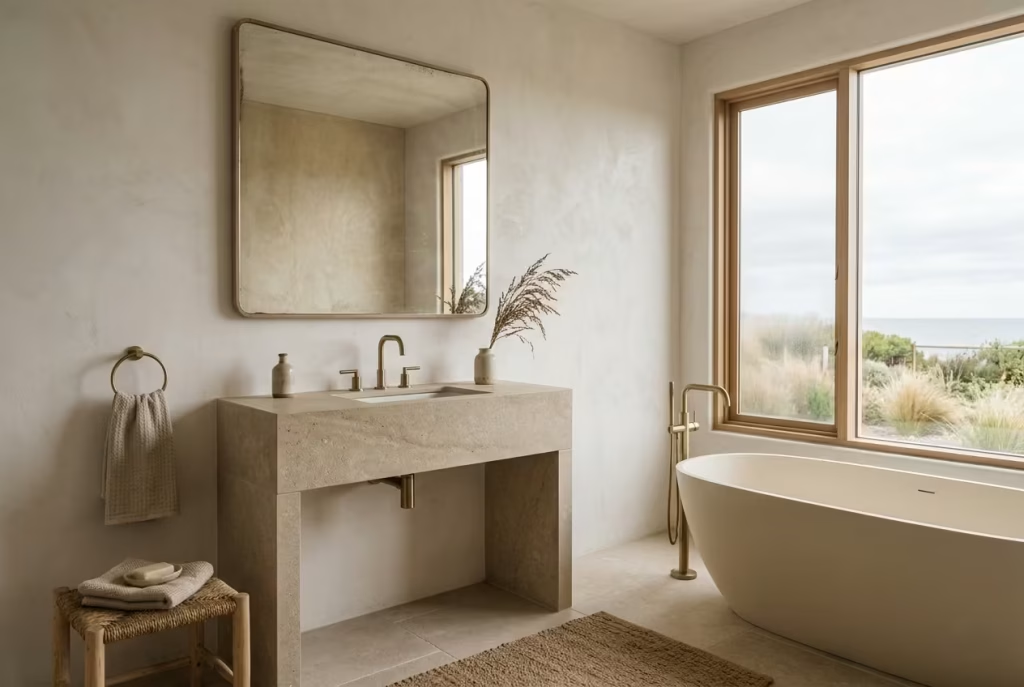
Bathroom Spa-Like Restraint with Coastal References
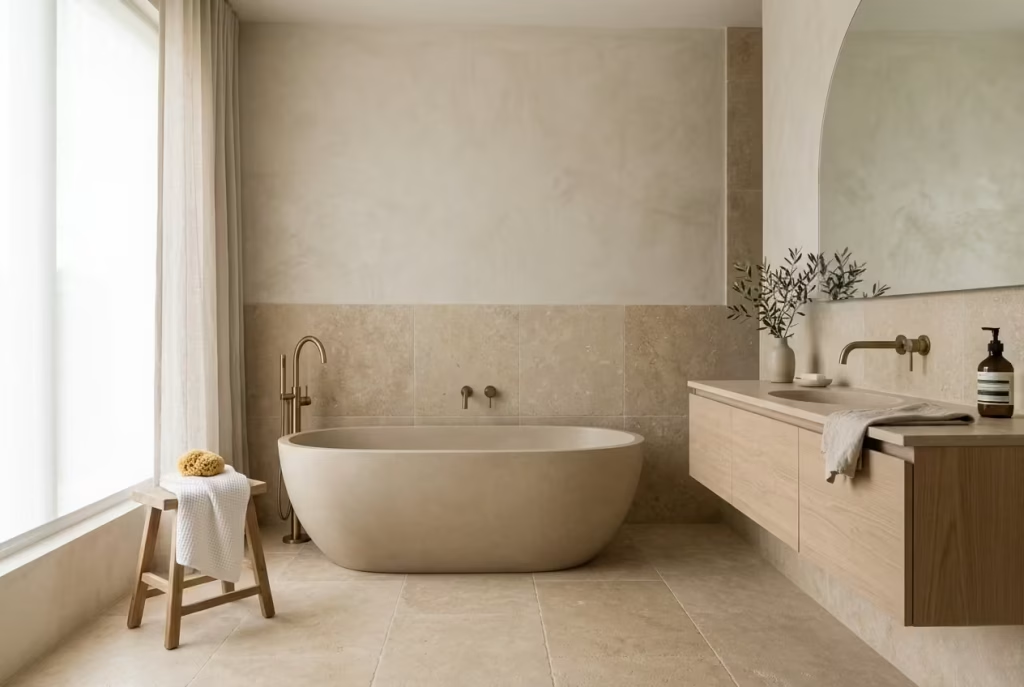
The bathroom in a Montauk-inspired Beach House is where restraint becomes most tangible, almost unavoidable, because the space itself demands clarity. It is not a room for excess or visual layering, but for controlled simplicity where every material, surface, and proportion contributes to a sense of calm continuity. In practice, the most successful coastal bathrooms feel less like functional utilities and more like quiet retreats, where light is softened, textures are subdued, and everything is edited down to its most essential expression.
The goal is never to overwhelm, but to create an environment that feels restorative in the most understated way, like a deep breath that settles rather than rushes.
Use Large Format Tiles for Continuity
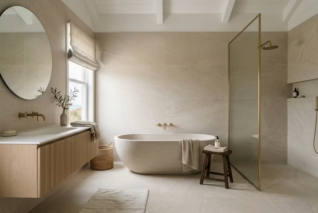
Suggested size: 60 × 60 cm (24 × 24 inches) or larger: Large format tiles are one of those quiet architectural decisions that completely change how a bathroom is read, even before you consciously notice the details. In a Montauk-inspired setting, they are not just a surface choice, they are a strategy for visual continuity. By reducing grout lines and breaking fewer planes, the room immediately feels more expansive, more fluid, and far less segmented. It is the difference between a space that feels pieced together and one that feels carved from a single, coherent idea.
In practical terms, I often lean towards tiles starting at 60 × 60 cm, or 24 × 24 inches, and scale up where the room allows. In one coastal bathroom project, we used oversized porcelain slabs on both the floor and walls, keeping grout lines to an absolute minimum. The effect was subtle but powerful. The room no longer read as separate surfaces meeting at different points. Instead, it felt like one continuous envelope, wrapping the space in a calm, uninterrupted flow. It is a small technical adjustment on paper, but in reality, it changes the entire spatial experience.
There is also a psychological ease that comes with visual continuity. When the eye is not constantly interrupted by gridlines or repetitive breaks, it begins to rest. This is particularly important in bathrooms, where the mind is often shifting between function and relaxation. Large format tiles reduce that visual “chatter,” allowing the space to settle into something closer to a spa-like atmosphere, even in everyday use.
Material choice within this format becomes even more important because the surface itself carries more visual weight. I tend to favour soft stone-look porcelain, honed finishes, or lightly textured surfaces that avoid high reflectivity. When light moves across a large uninterrupted surface, even the slightest variation in tone or texture becomes more noticeable, so restraint in patterning is essential. In one project, a warm limestone-effect tile brought just enough natural variation to feel organic, without disrupting the calm consistency of the room.
From a maintenance perspective, larger tiles also have a practical advantage. Fewer grout lines mean fewer areas for visual interruption over time, which helps the bathroom maintain its clean, composed appearance with less effort. It is one of those details that quietly supports daily living without demanding attention, much like the best design decisions tend to do.
Ultimately, large format tiles work because they remove friction from the way a space is visually processed. The bathroom feels more open, more cohesive, and more grounded, almost as if the boundaries between surfaces have softened. And in that continuity, the room begins to feel less like a collection of finishes and more like a single, calm experience.
Introduce Soft, Diffused Lighting
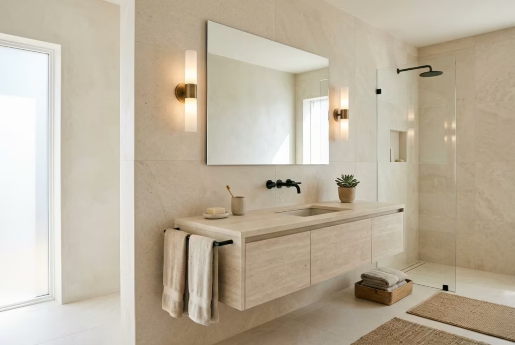
Wall sconces over harsh overhead lighting: Lighting in a Montauk-inspired bathroom is never treated as an afterthought, and it certainly does not rely on a single harsh overhead source to carry the entire space. Overhead lighting tends to flatten everything it touches, exposing every surface too directly, almost like it removes the softness a bathroom should naturally hold. In contrast, soft, diffused lighting, particularly through well-placed wall sconces, creates depth, atmosphere, and a sense of calm that feels far more aligned with a spa-like environment.
In practice, I often prioritise layered wall lighting positioned at eye level or slightly above mirror height. This approach allows light to wash gently across the face and surrounding surfaces rather than striking from above in a way that creates sharp shadows. In one coastal bathroom project, we replaced a central ceiling fixture with two slimline sconces flanking a mirror. The transformation was immediate. The room stopped feeling functional in a rigid sense and began to feel composed, almost like it had softened its posture.
There is also a subtle emotional shift that comes with diffused lighting. Harsh overhead light tends to make a space feel more utilitarian, almost clinical, whereas softened side lighting introduces a sense of calm ritual. It slows the visual pace of the room. You are no longer just “using” the bathroom, you are moving through it with a sense of ease that feels more deliberate, more grounded.
Wall sconces also allow for better control over shadow play, which is particularly important in smaller or more enclosed bathrooms. Instead of casting strong downward shadows that can exaggerate imperfections or make surfaces feel flat, side lighting wraps gently around forms and textures. Stone, tile, and plaster all benefit from this softer illumination, revealing their character without overwhelming them.
From a design standpoint, I tend to favour fixtures with frosted glass, alabaster, or fabric diffusers, materials that naturally soften the intensity of the bulb without losing clarity. Warm temperature lighting is equally important here, as cooler tones can quickly undo the calm atmosphere you are trying to build. In one project, simply shifting from cool white overhead lighting to warm wall sconces changed the entire emotional reading of the bathroom, almost like someone had quietly turned down the volume of the space.
Ultimately, diffused lighting works because it respects the rhythm of the room. It does not dominate or demand attention. Instead, it settles into the background, allowing materials, proportions, and quiet architectural details to take centre stage. And in that softness, the bathroom begins to feel less like a functional stop and more like a space designed for pause, reflection, and ease.
Incorporate Natural Materials Thoughtfully
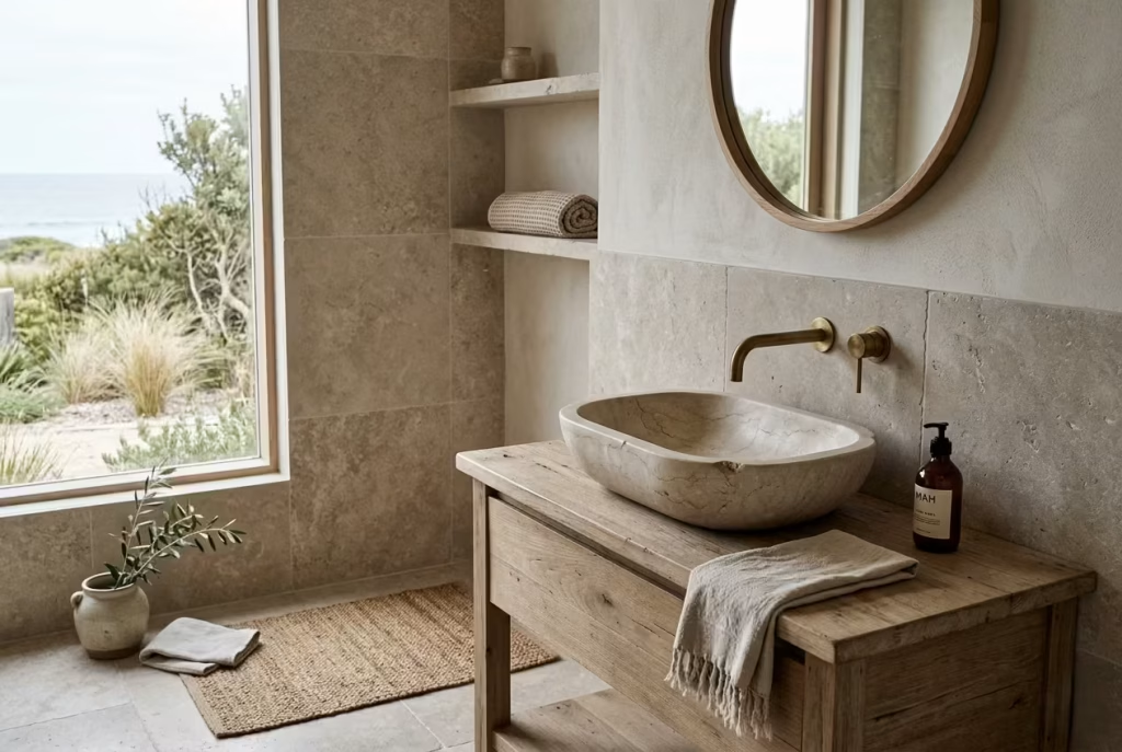
Stone basins: Natural stone basins bring a grounded, almost elemental presence to a Montauk-inspired bathroom. They are not decorative in a superficial sense, but deeply material-driven, carrying weight, texture, and subtle variation that immediately sets the tone for the entire space. Unlike synthetic alternatives, stone does not try to look perfect, and that is precisely where its strength lies. Each basin has its own quiet irregularities, soft veining, and tonal shifts that make it feel as though it belongs to the space rather than being placed into it.
In practice, I often specify honed or lightly textured stone finishes because they absorb light rather than reflect it harshly. In one coastal project, we installed a carved limestone basin that sat on a simple timber vanity. The combination felt almost elemental, like water and stone had always been meant to coexist in that particular way. Over time, the surface developed a subtle patina, and instead of looking worn, it began to feel more rooted, more connected to daily use.
There is also a sensory quality to stone that is difficult to replicate. It stays cool to the touch, feels substantial without being overwhelming, and introduces a sense of permanence that anchors the bathroom. When chosen carefully, it becomes less of a fixture and more of a focal point that quietly defines the entire room.
Timber accents: Timber accents introduce warmth where stone alone might feel too grounded or monolithic. In a coastal bathroom, this balance is essential, almost like a conversation between hard and soft, cool and warm, permanence and tactility. Timber prevents the space from becoming too cold or overly minimal, softening the overall composition without disrupting its restraint.
I tend to introduce timber in controlled, measured ways rather than across large surfaces. Vanity frames, shelving details, mirror surrounds, or subtle trims are often enough to bring warmth into the scheme. In one project, a simple oak vanity with visible grain transformed a stone-heavy bathroom into something far more inviting. The material did not compete with the stone basin; instead, it acted as a quiet counterpoint, softening the overall reading of the space.
There is also a subtle aging process that makes timber particularly valuable in this context. Over time, it develops a patina that reflects use, light exposure, and environmental shifts. Rather than deteriorating, it evolves. This gives the bathroom a sense of life, as if it is slowly settling into itself rather than remaining static.
When stone and timber are combined thoughtfully, the result is a space that feels balanced and deeply considered. Neither material dominates. Instead, they support one another in a quiet equilibrium, creating a bathroom that feels both grounded and warm, refined yet approachable, like a space that understands the value of restraint without ever feeling cold or unfinished.
Keep Colour Palette Neutral and Layered
Avoid stark whites: In a Montauk-inspired bathroom, stark white rarely behaves the way people expect it to. Instead of feeling crisp and clean, it can often read as cold, almost clinical, especially under artificial light or in spaces with limited natural exposure. What should feel like clarity ends up feeling slightly harsh around the edges, as if the room has been stripped of its softness. I have seen this repeatedly in projects where the intention was minimalism, but the execution tipped too far into brightness, leaving the space feeling a touch unforgiving.
In practice, I tend to step away from pure white altogether and replace it with off-whites that carry a hint of warmth, like chalk, ivory, or softened plaster tones. In one coastal bathroom, we initially specified a standard bright white tile, but after testing samples in natural light, it became clear it was overpowering the rest of the scheme. Switching to a warmer white immediately changed the atmosphere. The space stopped feeling like a showroom and started feeling like somewhere you could actually exhale. It is a subtle adjustment, but one that completely alters how the room is experienced.
Lean toward warm tones: Warm neutrals are the quiet backbone of a coastal bathroom palette. They do not announce themselves, yet they hold everything together with a sense of calm continuity. Think sand-inspired tones, muted stone greys, soft taupe, and gentle oat shades that sit comfortably within natural light rather than reacting sharply to it. These colours do not fight for attention; they settle into the architecture, allowing materials like stone, timber, and linen to take precedence.
In real-world application, I often build the palette in layers rather than choosing a single dominant tone. Walls might sit in a warm plaster finish, while flooring leans slightly deeper in a sandy limestone, and textiles introduce a softer, lighter variation of the same family. In one project, this layering created a bathroom that shifted subtly throughout the day. Morning light made it feel airy and open, while evening tones brought a quiet warmth that felt almost cocooning, without ever becoming heavy.
There is also a psychological benefit to working within warm neutrals. They reduce visual contrast, which in turn reduces mental friction. The space feels easier to inhabit, less demanding on the eye, and more forgiving over time. You are not constantly adjusting to sharp shifts in tone or brightness. Instead, the room holds a steady, cohesive mood that supports relaxation without drawing attention to itself.
When handled with care, a layered neutral palette becomes less about colour selection and more about atmosphere. It allows the bathroom to feel grounded, cohesive, and quietly expressive, like a space that has been carefully edited rather than loudly designed.
Prioritise Storage That Disappears
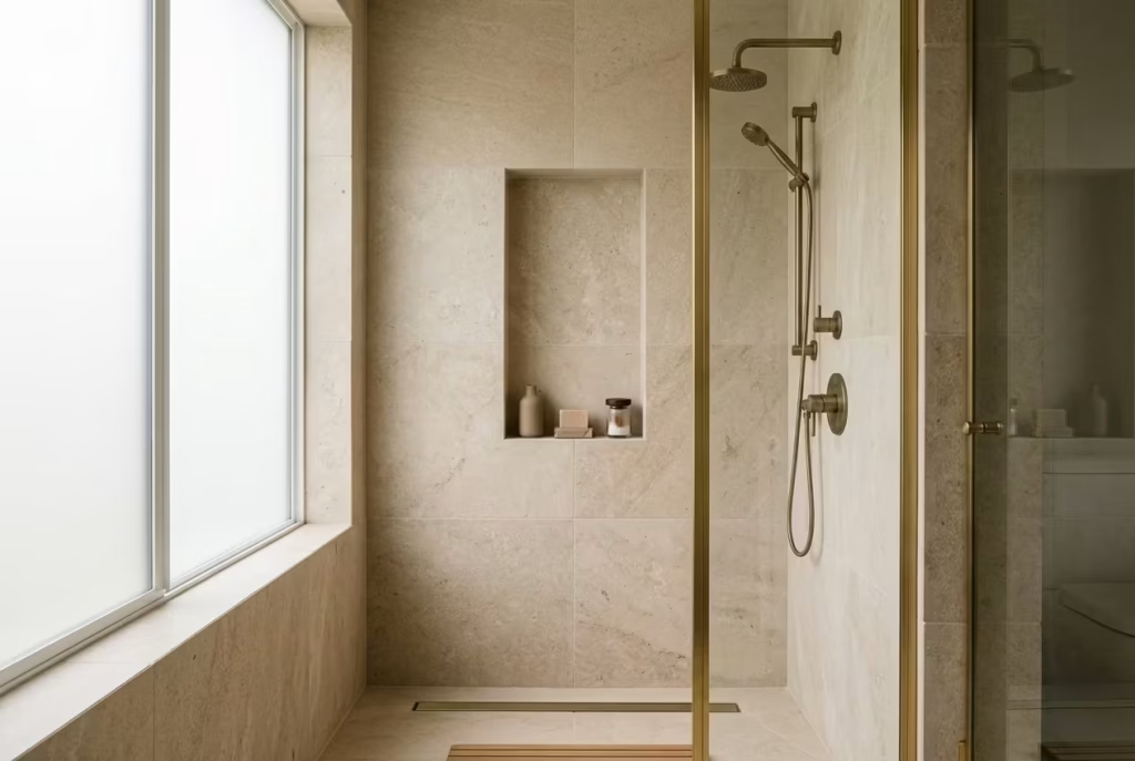
Recessed niches: Recessed niches are one of those quietly intelligent design moves that separate a well-resolved Montauk-inspired bathroom from one that constantly feels slightly interrupted. Instead of introducing bulky storage units that compete for visual attention, niches sit within the architecture itself, almost as if they were always part of the original structure. The result is a space that feels calmer, more continuous, and far less visually fragmented.
In practice, I often place recessed niches within shower walls or above bathtubs, carefully proportioned so they feel intentional rather than improvised. In one coastal bathroom, we integrated a vertical niche in a stone-clad shower wall, lined in the same material for continuity. At first glance, it was barely noticeable, which was exactly the point. Yet functionally, it held everything needed without disrupting the visual rhythm of the space. It is a classic case of design working quietly in the background, like a well-trained assistant you never need to think about.
There is also a subtle benefit in how niches change behaviour within the space. When storage is embedded rather than added, surfaces naturally remain clearer. Bottles, toiletries, and everyday items are no longer scattered across ledges or edges, which reduces visual noise and reinforces that spa-like sense of order. It is one of those small interventions that pays off repeatedly in daily use.
Concealed cabinetry: Concealed cabinetry takes this idea one step further, ensuring that anything not meant to be seen simply disappears into the architecture. In Montauk-style bathrooms, this approach is essential because it preserves the calm, uninterrupted quality that defines the aesthetic. Cabinet doors are often flush, handleless, or integrated so seamlessly that they become part of the wall rather than separate furniture elements.
I tend to favour push-latch systems or recessed finger pulls that avoid visual interruption. In one project, we built full-height concealed storage behind plaster-finished panels that matched the surrounding walls. When closed, the cabinetry vanished entirely, leaving only clean surfaces and uninterrupted lines. It gave the bathroom a sense of clarity that would have been impossible with exposed storage units.
From a practical standpoint, concealed storage also makes daily life feel less cluttered without requiring constant tidying. Everything has a place, but that place is hidden from view. This distinction is important. The space is not empty; it is simply edited. And that editing creates a sense of calm that lingers long after the door has been closed.
When recessed niches and concealed cabinetry work together, the bathroom begins to feel almost effortless. Nothing is competing for attention, nothing is visually fighting for space, and yet everything functions exactly as it should. It is the kind of design discipline that does not announce itself, but quietly shapes how the room is experienced every single day.
Dining Area Casual Elegance Without Formality
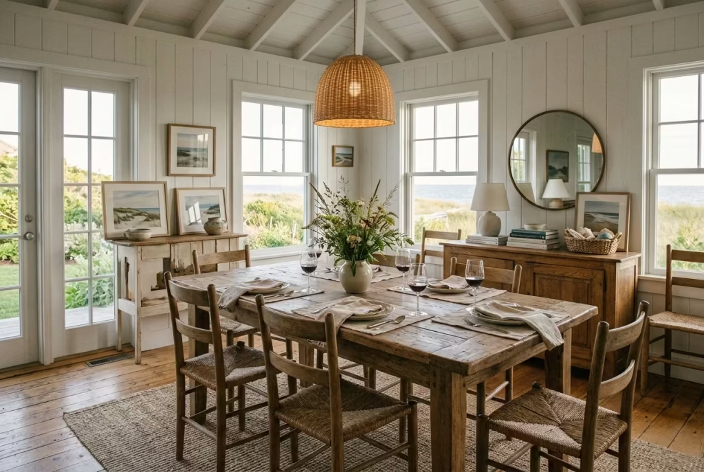
The dining area in a Montauk-inspired home sits in a particularly delicate balance, where structure meets ease without ever tipping into rigidity. It is not intended to feel overly staged or ceremonious, yet it still requires a clear sense of composition so the space does not drift into informality.
In practice, the most successful dining spaces achieve this through restraint in material choices, careful attention to proportion, and a relaxed approach to styling that feels considered but never forced. The result is a setting that encourages gathering in an unhurried way, where the atmosphere feels naturally welcoming rather than formally arranged.
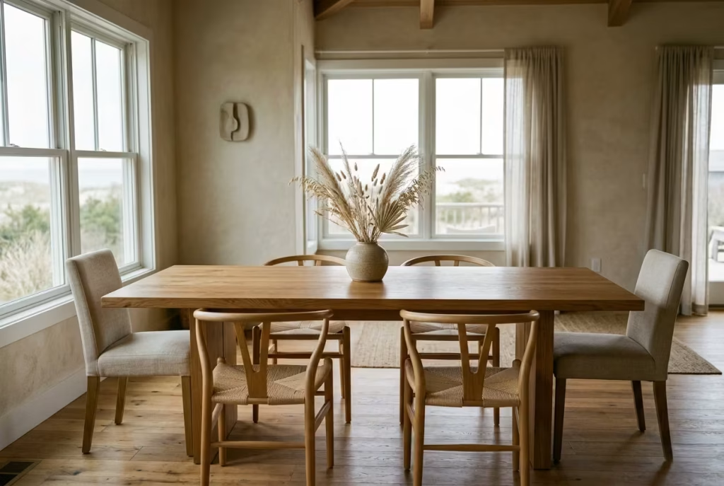
Use Solid Wood Dining Tables
Ideal length: 180–240 cm (6–8 ft): A solid wood dining table within the 180 to 240 cm range, roughly 6 to 8 feet, sits at the heart of a Montauk-inspired dining space with a quiet sense of authority. It is not about filling the room with scale for the sake of impact, but about finding that sweet spot where proportion and usability meet without compromise. Anything smaller can feel visually underpowered, while anything larger risks tipping the space into formality that feels at odds with the relaxed coastal rhythm.
In practice, I often start by mapping the circulation around the table before anything else. A well-proportioned table should allow at least 90 cm of clearance on all sides, roughly 35 inches, so chairs can move freely without the room feeling tight or constrained. In one coastal project, we replaced a compact dining setup with a 210 cm oak table. The shift was immediate. The room stopped feeling like a transitional space and began to hold its own identity, almost as if it had finally found its centre of gravity.
Solid wood plays a crucial role here, not just in terms of durability but in how it anchors the room visually. Unlike veneer or lighter materials, solid timber carries weight, both physically and perceptually. It grounds the dining area, giving it a sense of permanence without ever feeling overly formal. Over time, it develops a patina that reflects daily use, subtle marks, softened edges, and a lived-in character that only adds to its appeal.
There is also a behavioural shift that comes with a well-sized wooden table. It naturally encourages gathering without forcing it. Conversations stretch out more comfortably, meals feel less hurried, and the table becomes less of a designated “dining object” and more of a shared surface for everyday life. I have often noticed in completed projects that clients gravitate towards these tables even when they are not formally dining, almost as if the piece has quietly become the most grounded point in the home.
From a design perspective, solid wood also introduces balance within the broader Montauk palette. Against muted walls, natural textiles, and soft lighting, it provides just enough contrast to keep the room from feeling overly uniform. Yet it never overwhelms the scheme. Instead, it sits comfortably within it, like a steady anchor in a calm tide, holding everything together without ever drawing unnecessary attention to itself.
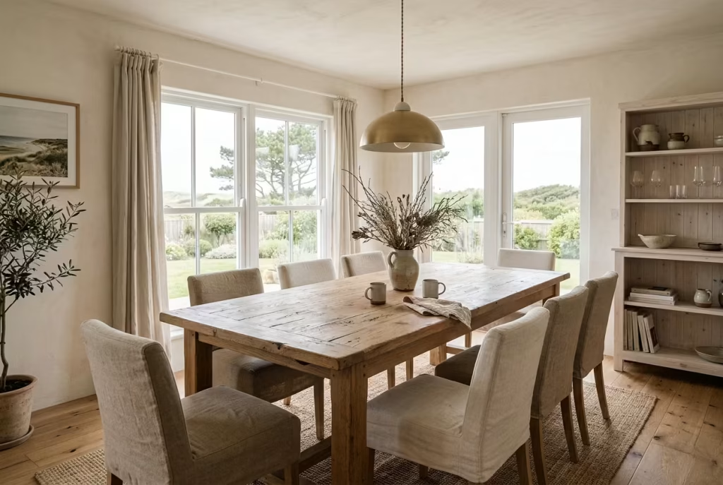
Mix Seating Styles for a Relaxed Look
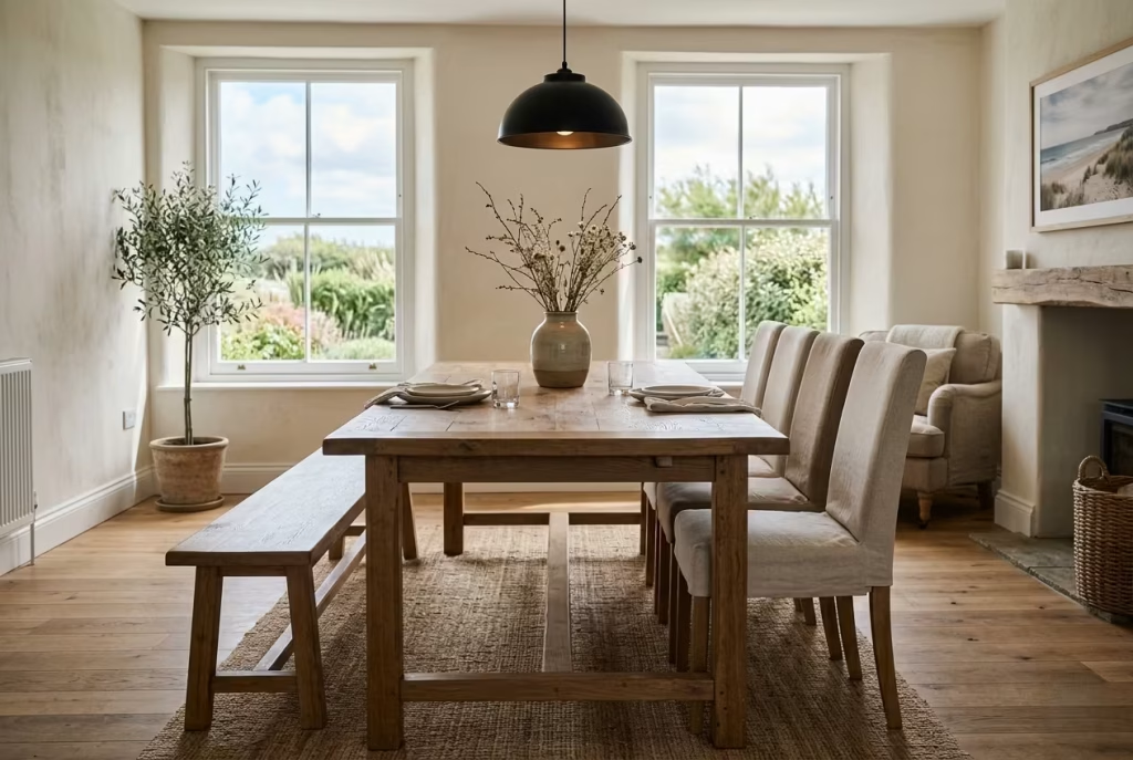
Bench + chairs combination: Mixing seating styles in a Montauk-inspired dining area is one of those understated design moves that quietly shifts the entire tone of the room. Instead of a rigid, overly coordinated setup where every chair mirrors the next, introducing a bench alongside individual chairs creates a sense of ease that feels more lived-in and less staged. It is the kind of arrangement that encourages people to sit how they naturally want to sit, rather than how the furniture dictates.
In practical terms, I often use a solid wood bench along one side of the table and pair it with softly upholstered or timber-framed chairs on the opposite side. In one coastal project, this combination transformed what was initially a very formal dining layout into something far more approachable. The bench, slightly more informal in posture, softened the overall geometry of the room, while the chairs maintained just enough structure to keep the composition balanced. It felt less like a showroom setup and more like a space where long, unhurried conversations could naturally unfold.
There is also a spatial advantage that comes with this approach. A bench, particularly when pushed neatly under the table, frees up circulation space and reduces visual clutter around the dining perimeter. This is especially useful in narrower rooms where too many individual chairs can make the space feel tight or overly segmented. I have found that even a slight reduction in visual repetition helps the eye move more freely around the room, which in turn makes the space feel larger than it actually is.
From a design perspective, the contrast between a continuous bench and individual chairs introduces a subtle rhythm into the room. It breaks monotony without creating chaos. The key is to maintain a shared material or tonal language so the mix feels intentional rather than accidental. For example, pairing a natural oak bench with linen-upholstered chairs in a similar muted palette keeps the composition grounded while still allowing variation in form.
There is also something inherently social about this combination. A bench naturally invites closeness, while chairs offer individual comfort, and together they create a dynamic that feels both relaxed and accommodating. In real-world use, I often notice that guests instinctively choose where to sit based on comfort and mood, rather than hierarchy or formality. That small shift alone changes the energy of the dining experience, making it feel less like an arrangement and more like a gathering that has evolved on its own terms.
Keep Table Styling Minimal
One central arrangement only: Table styling in a Montauk-inspired dining space works best when it resists the urge to over-explain itself. The moment multiple decorative clusters appear, the surface begins to lose its calm, and what should feel like an open, welcoming plane turns into a competing series of distractions. In contrast, a single, well-considered central arrangement allows the table to breathe, almost like it has finally found its composure after everything unnecessary has been gently removed.
In practice, I often approach this with a simple rule of restraint. One focal arrangement placed at the centre, nothing more. It might be a low ceramic vessel with seasonal branches, a simple glass bowl, or a sculptural object with quiet presence. In one coastal dining project, we replaced a layered tablescape of candles, linens, and decorative objects with a single hand-thrown vase holding dried coastal grasses. The effect was immediate. The table stopped feeling styled and started feeling intentional, almost like it had stepped back into itself.
There is a subtle spatial benefit to this approach that is often underestimated. A clear table surface extends the perceived space of the room, allowing the eye to move uninterrupted across the dining area. When multiple arrangements are introduced, the surface becomes visually fragmented, which can make even generous tables feel smaller and more confined. By contrast, a single central point creates clarity, giving the table a sense of order without stiffness.
From a sensory perspective, minimal styling also changes how the table is experienced during use. Meals feel less interrupted by decorative clutter, and the surface becomes more adaptable to daily life. You are not constantly shifting objects out of the way or navigating around visual obstacles. Instead, the table remains functional at its core, with styling that quietly steps back when needed.
There is also an emotional quality to this restraint. A single arrangement carries more weight precisely because it is not competing with anything else. It becomes a quiet focal point, something the eye returns to naturally without effort. In many ways, it is the design equivalent of knowing when to pause in a conversation, allowing silence to do some of the work. And in that silence, the dining space gains a kind of understated elegance that lingers far longer than any heavily styled surface ever could.
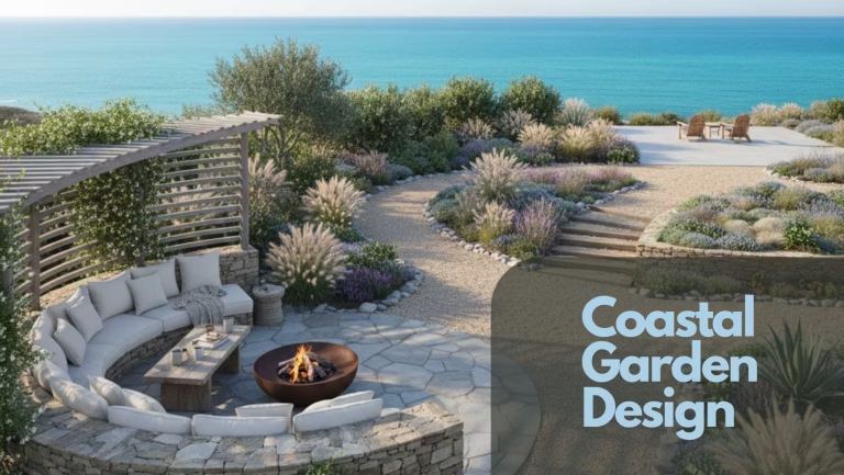
Outdoor Spaces Extending the Interior Mood
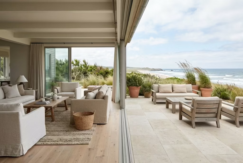
Outdoor areas in a Montauk-inspired home are not treated as separate entities, but as a natural continuation of the interior language, where boundaries dissolve and the design narrative simply carries on without interruption. In practice, the most successful transitions happen when materials, tones, and proportions remain consistent enough to feel connected, yet relaxed enough to respond to open air and shifting light.
The goal is not to replicate the indoors outside, but to let both environments speak the same quiet design language, so the experience feels fluid, unforced, and effortlessly cohesive.
Blur Indoor and Outdoor Boundaries
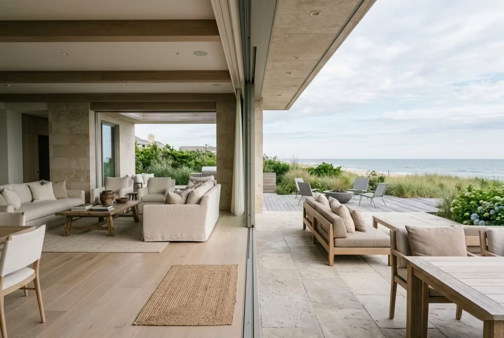
Consistent materials: Blurring the line between indoor and outdoor living is less about architectural theatrics and more about quiet continuity. In Montauk-inspired homes, the transition works best when materials are allowed to carry their language beyond the threshold, almost as if the interior has gently stepped outside without changing its identity. When flooring, timber tones, or stone finishes echo each other across both zones, the boundary stops feeling like a hard break and starts reading as a soft shift in atmosphere.
In practice, I often extend internal materials outward in a restrained way, not by duplicating everything, but by echoing key elements. For example, a limestone floor inside the kitchen might transition into a more weather-resistant version on an adjacent terrace. Similarly, timber used in interior detailing can be mirrored in outdoor furniture or decking, allowing the eye to travel between spaces without interruption. In one coastal project, we carried a pale oak tone from the kitchen cabinetry into the outdoor dining pergola through seating and structural accents. The result was not a copied design, but a shared visual language that made the entire home feel cohesive.
There is also a subtle psychological effect at play. When materials feel continuous, the mind stops registering “inside” and “outside” as separate experiences. Instead, it reads the home as one extended environment. This is where the Montauk aesthetic becomes particularly powerful, because it relies on ease rather than contrast, flow rather than separation.
Consistent colour palette: Colour plays an equally important role in dissolving boundaries between interior and exterior spaces. A tightly controlled palette, grounded in muted neutrals, allows both environments to feel like part of the same composition. When tones shift too dramatically between inside and outside, the transition becomes abrupt, almost like stepping between two unrelated settings. When they remain aligned, the experience feels continuous, almost effortless.
I tend to work within a restrained spectrum of off-whites, sand tones, softened greys, and driftwood-inspired hues that respond well to both natural light and open-air conditions. In one project, the interior living space used a warm chalky white paired with pale stone accents. That same tonal family was extended outdoors through plastered seating walls and neutral-toned cushions. The space did not feel duplicated, but rather extended, as if the Beach house had gently unfolded into the landscape.
There is also a practical benefit to this consistency. Outdoor spaces are constantly exposed to shifting light, which can exaggerate colour differences if the palette is too varied. A unified tonal range helps the entire composition remain stable throughout the day, whether under bright midday sun or softer evening light. It keeps the visual experience grounded, preventing any part of the design from feeling disconnected or overly dominant.
When materials and colour are handled with restraint and continuity, the distinction between inside and outside begins to fade. What remains is a single, fluid living experience, where movement feels natural, transitions feel unforced, and the entire home reads as one cohesive, quietly evolving space.
Choose Durable, Weathered Furniture
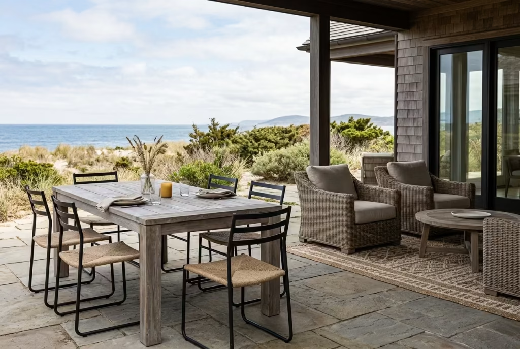
Teak, rattan, or powder-coated metals: Outdoor furniture in a Montauk-inspired setting is never about fleeting aesthetics. It is about pieces that can stand their ground through shifting seasons, changing light, and everyday use, while still holding onto a quiet sense of character. Teak, rattan, and powder-coated metals each bring a different kind of resilience, not just in durability but in how they age, soften, and settle into their environment over time.
Teak, with its natural oils and dense grain, has a way of ageing gracefully rather than deteriorating. Left untreated, it develops a soft silvery patina that feels entirely at home in coastal settings, almost as if it has been shaped by salt air and sun rather than manufactured indoors. In one project overlooking an open terrace, we used teak dining furniture that initially appeared warm and golden. Over the course of a single season, it began to mellow into a muted, weathered tone that blended seamlessly with the surrounding landscape. It did not lose its identity, it simply evolved into something more grounded.
Rattan introduces a lighter, more textural quality, particularly useful in seating where visual softness is just as important as comfort. It has that woven, slightly imperfect structure that immediately relaxes a space, almost like it signals informality without saying a word. I often use rattan in shaded outdoor lounges or covered terraces where it can sit comfortably without being overexposed to harsh weather. In one coastal garden, a simple rattan seating arrangement became the most used area of the entire space, not because it was the most luxurious, but because it felt easy to inhabit, almost second nature.
Powder-coated metals, on the other hand, bring a more architectural clarity to outdoor furniture. Their strength lies in their restraint. The finish is matte, grounded, and resistant to visual distraction, which makes it ideal for frames, legs, and structural elements. In practice, I often use dark or muted tones such as charcoal or softened black to keep the visual weight low while maintaining durability. In one installation, powder-coated steel dining chairs paired with a teak table created a balance that felt both structured and relaxed, like two different materials speaking the same understated language.
There is also a broader design principle at play here. Outdoor furniture should never feel like it is fighting its environment. The most successful pieces are those that quietly accept exposure, developing character over time rather than resisting it. Weathered finishes, softened edges, and natural ageing processes all contribute to a sense of authenticity that cannot be replicated through purely aesthetic means.
When teak, rattan, and powder-coated metals are chosen thoughtfully, the outdoor space begins to feel less like an extension and more like a natural continuation of the home. Everything sits with ease, nothing feels overly polished, and the entire setting develops that lived-in, coastal confidence that defines the Montauk approach so effortlessly.
Common Mistakes That Disrupt the Montauk Look
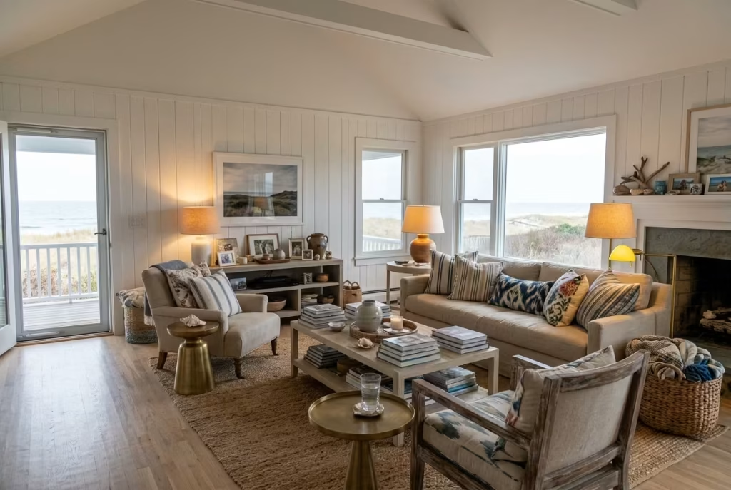
Even the most well-intentioned coastal interiors can lose their clarity if a few key principles are misread. The Montauk aesthetic is not fragile, but it is sensitive to overstatement, where small missteps can quietly accumulate and dilute the entire atmosphere. In practice, I have seen that it is rarely one big error that disrupts the look, but rather a series of subtle decisions that slowly push the space away from restraint and towards noise. Understanding where these moments typically occur is often what separates a convincing coastal interior from one that feels slightly off-key.
Overusing nautical themes
There is a fine line between coastal influence and literal interpretation, and once that line is crossed, the space begins to feel like it is telling a story too loudly. Anchors, ropes, striped motifs, and overt maritime references tend to strip away the quiet sophistication that defines Montauk interiors, replacing it with something far more staged and predictable.
In real projects, I have often found that the moment nautical elements are introduced too heavily, the room loses its sense of authenticity. It starts to feel like a set rather than a lived-in environment. The stronger approach is to allow the coastal reference to exist through materiality and tone rather than symbols. Think weathered timber, softened neutrals, and natural light rather than literal decor cues. When the theme becomes too obvious, it is often a sign that the design has drifted away from restraint.
Excessive décor layering
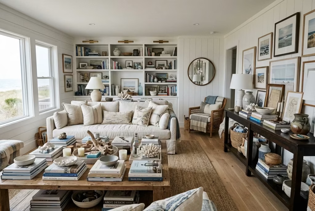
Layering is essential in interior design, but when taken too far, it can quickly tip into visual congestion. Surfaces begin to feel crowded, and the eye loses its resting points. What should feel calm and composed starts to feel busy, almost as if every object is competing for attention.
I have seen beautifully designed homes lose their impact simply because too many decorative elements were introduced without pause. A console table with too many objects, a coffee table that no longer has negative space, or shelves filled beyond necessity all contribute to a sense of visual fatigue. The solution is not to remove character, but to edit with intention. When you allow certain surfaces to breathe, the remaining pieces naturally gain more presence, almost like they have finally been given room to speak.
Ignoring proportion and scale
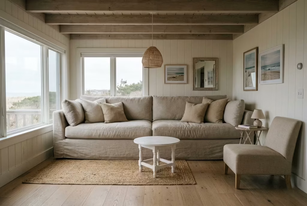
Proportion is one of the most quietly powerful elements in achieving a Montauk-inspired interior, yet it is often overlooked in favour of colour or styling. When scale is incorrect, even the most beautiful pieces begin to feel out of place, like they are slightly resisting the space rather than belonging to it.
In practice, I have walked into rooms where furniture was individually well chosen, but collectively felt unsettled simply because the proportions were off. A sofa that sits too high, a rug that is too small, or lighting that is undersized for the room can all create subtle dissonance. Once corrected, the entire space often falls into alignment almost immediately, as if the room has finally exhaled after holding itself too tightly. Good proportion is rarely noticed directly, but its absence is always felt.
Using overly polished or synthetic materials
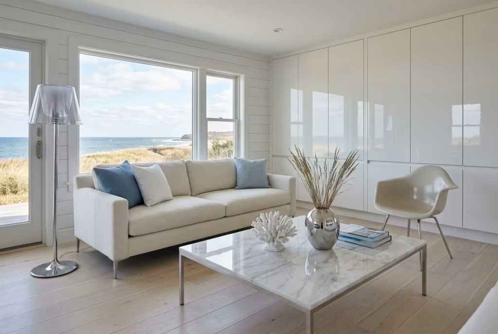
One of the quickest ways to weaken a Montauk-inspired scheme is through materials that feel too perfect, too glossy, or too synthetic. Highly reflective surfaces and artificial finishes tend to sit at odds with the natural, softened language that defines coastal interiors. Instead of blending into the environment, they stand apart from it, breaking the visual rhythm of the space.
In real-world applications, I often find that overly polished materials create a kind of visual tension, especially in spaces that rely heavily on natural light. The reflections become too sharp, the surfaces too assertive, and the overall atmosphere loses its ease. By contrast, matte finishes, natural textures, and subtly aged materials allow the space to settle more comfortably. They age gracefully, absorb light more softly, and integrate far better with the surrounding palette.
When these common mistakes are avoided, the Montauk aesthetic becomes far more cohesive. The space stops trying to impress and starts to simply exist, quietly composed, well-balanced, and grounded in a sense of effortless restraint that holds its appeal over time.
Material Palette Guide for Cohesive Design
Linen, oak, jute, stone, limewash
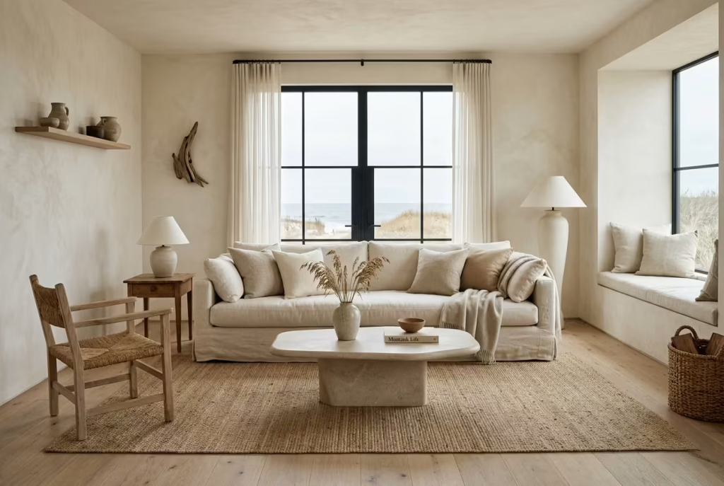
A cohesive Montauk-inspired interior is never built on colour alone. It is shaped through materials that share a similar emotional register, even if their functions differ. Linen, oak, jute, stone, and limewash sit comfortably within this language because they all carry a sense of restraint, tactility, and quiet imperfection that feels rooted rather than manufactured.
Linen brings softness that responds to movement and light, never holding a rigid form, always slightly relaxed, almost as if it has already settled into the rhythm of the home. Oak introduces structure and warmth, grounding the scheme with a natural grain that feels steady without becoming heavy. Jute adds a more tactile, earthy layer underfoot, subtly breaking uniformity while keeping the palette cohesive. Stone carries permanence, a kind of visual weight that anchors key areas without overpowering them. Limewash, with its soft, chalky finish, dissolves light rather than reflecting it, creating walls that feel alive in their subtle variation.
In practice, I often treat these materials as a conversation rather than a checklist. In one coastal project, oak flooring, limewashed walls, and linen upholstery were introduced together, not as isolated choices but as interconnected layers. The result was a space that felt naturally unified, almost as if every material had grown out of the same environment rather than being selected separately.
How materials age over time and influence atmosphere
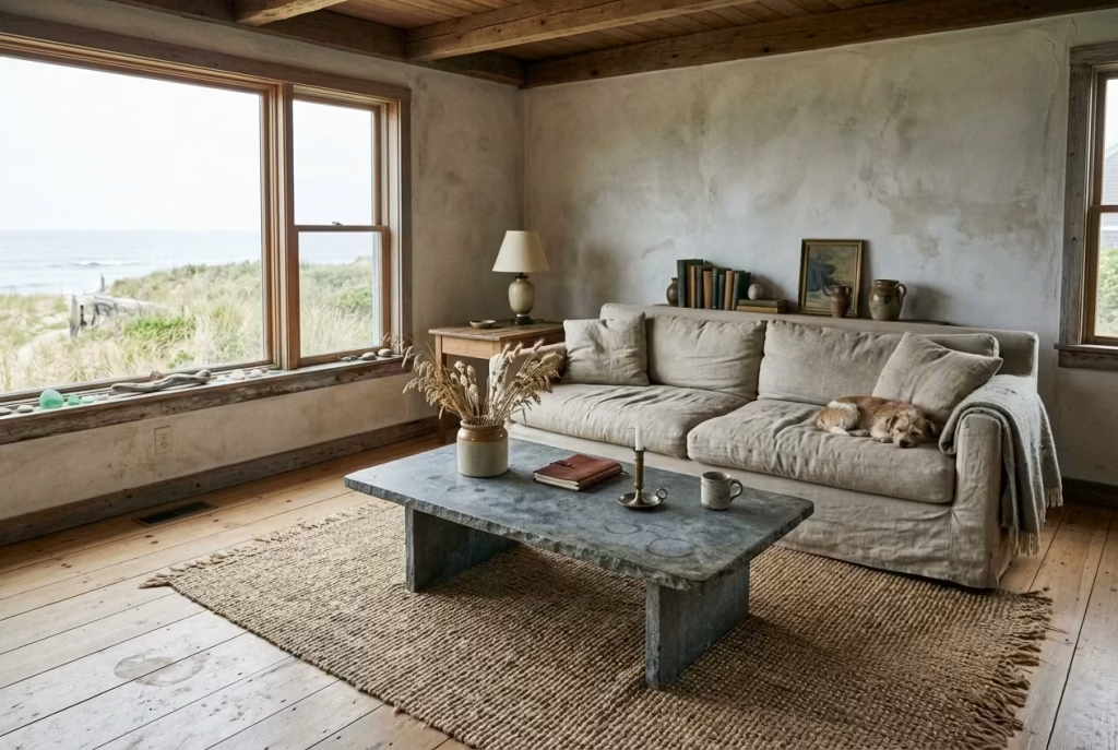
One of the most compelling aspects of this material palette is not how it looks on day one, but how it evolves over time. In Montauk-style interiors, ageing is not something to be corrected or hidden. It is part of the design narrative, almost like the home is quietly writing its own history through wear, light exposure, and daily use.
Linen softens further with each wash, becoming more fluid and less structured, which only enhances its relaxed character. Oak develops a deeper tone and a more pronounced grain, subtly shifting from fresh and light to something richer and more grounded. Jute naturally loosens and softens underfoot, creating a lived-in texture that reinforces comfort. Stone, depending on its finish, begins to show gentle patina, soft etching, and tonal variation that add depth rather than detract from it. Limewash, perhaps most interestingly, changes with light and humidity, creating a surface that never feels entirely static, always slightly shifting in mood throughout the day.
I have seen this evolution transform spaces in unexpected ways. In one long-term coastal project, a kitchen that initially felt almost too restrained developed an entirely different character after two years. The oak darkened slightly near high-use areas, the stone softened at the edges, and the linen textiles lost their initial crispness. Rather than feeling worn, the space felt more complete, as if time had done what styling alone never could.
This is where the true strength of the Montauk material palette lies. It is not frozen in a finished state. It is designed to evolve, to absorb life quietly, and to become more atmospheric the longer it is lived in. When materials are chosen with this mindset, the home stops feeling newly made and starts feeling meaningfully settled, like it has always belonged exactly where it is.
Lighting Strategy The Invisible Layer That Defines the Space
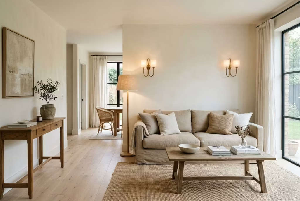
Lighting in a Montauk-inspired home is rarely the first thing people notice, yet it is almost always what they feel most. It operates quietly in the background, shaping mood, depth, and atmosphere without ever demanding attention. In practice, I often think of lighting as the final architectural layer, the element that either pulls a space together or subtly unravels it if handled without care. When it is done well, everything else falls into place with a sense of ease that feels almost effortless.
Layered lighting approach
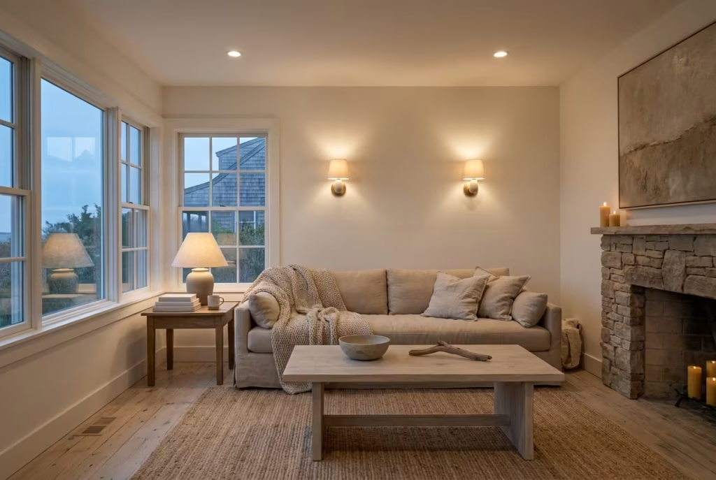
A layered lighting approach is what gives a space its depth and quiet sophistication. Instead of relying on a single overhead source, the room is built through multiple levels of light that work together, ambient, task, and accent, each playing its part without overpowering the others. This creates a rhythm in the space that feels natural, almost like light is moving gently through different moods as the day unfolds.
In real-world application, I rarely treat lighting as a fixed solution. In one coastal living space, for example, we combined soft recessed ceiling lights with low-level wall sconces and subtle table lamps placed in corners that needed warmth. During the day, the space felt open and airy, but as evening settled in, the layered lighting created a softer, more intimate atmosphere. Nothing felt harsh or overly staged. Instead, the room shifted naturally, like it was responding to the rhythm of daily life.
The key is balance. Each layer should support the next, not compete with it. Ambient lighting provides the base, task lighting adds function where needed, and accent lighting introduces quiet moments of emphasis. When these layers are thoughtfully composed, the space feels complete without ever feeling overlit.
Avoiding overly bright, cool-toned bulbs
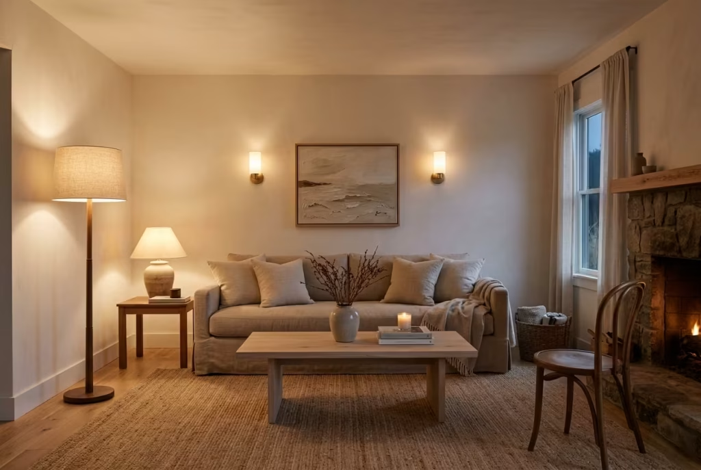
One of the most common missteps in interior lighting is the use of overly bright or cool-toned bulbs, which can quickly strip a space of its warmth and character. In a Montauk-inspired interior, where softness and material depth are essential, harsh lighting tends to flatten everything it touches. Stone loses its texture, wood appears colder than it is, and even textiles begin to feel less inviting.
I often guide clients toward warmer colour temperatures, typically in the range of soft white rather than crisp daylight tones. In one project, simply replacing cool white bulbs with warmer alternatives completely shifted the atmosphere of the home. The same furniture, the same materials, the same layout suddenly felt more cohesive and far more comfortable to inhabit. It was a clear reminder that lighting does not just illuminate a space, it defines how that space is emotionally read.
There is also a subtle psychological effect at play. Warmer light tends to slow the perceived pace of a room, making it feel more relaxed and grounded. Cooler light, on the other hand, often introduces a sense of alertness that works well in task-driven environments but feels out of place in spaces designed for rest and ease. In a coastal setting especially, where natural light already plays a dominant role, artificial lighting should complement rather than compete.
When lighting is treated as an invisible layer rather than a decorative feature, the entire space begins to shift. Shadows soften, materials gain depth, and the room takes on a quiet cohesion that is difficult to achieve through furnishings alone. It is one of those design elements that, when handled correctly, no one consciously notices, yet everyone instinctively responds to.
Final Thoughts: Why Montauk Style Is About Restraint, Not Replication
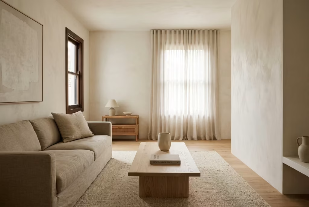
Montauk-inspired interiors are often misunderstood as a checklist of coastal cues, but in practice they are far more nuanced than that. The essence of this style is not about recreating a seaside narrative through objects or themes, but about understanding when to step back and allow space, material, and light to do the talking. It is a discipline of editing rather than accumulation, where clarity is achieved not by adding more, but by quietly removing what does not belong. In many ways, it is less about design in the conventional sense and more about cultivating restraint until the space begins to feel naturally resolved.
The idea that authenticity comes from editing, not adding
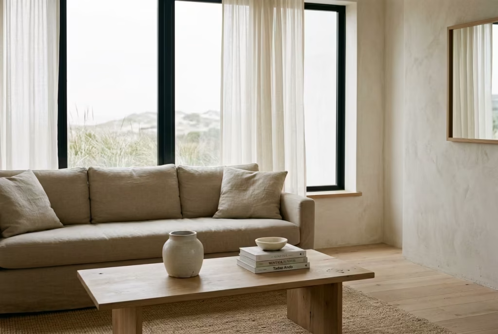
Authenticity in Montauk-style interiors is rarely the result of layering more elements into a room. Instead, it comes from a careful process of reduction, where every decision is weighed against its necessity within the broader composition. When a space feels authentic, it is often because nothing unnecessary is competing for attention. The materials feel honest, the proportions feel considered, and the atmosphere feels unforced, almost as if it has arrived there on its own.
In practice, I have found that the strongest coastal interiors are not the most decorated, but the most edited. A room with fewer, more meaningful elements will almost always feel more grounded than one filled with well-intentioned but excessive detail. It is a bit like sharpening a pencil until the line becomes precise; clarity emerges through refinement, not addition. When restraint is applied consistently, the space begins to develop a quiet confidence, where nothing feels over-explained or overstated.
Real-life reflection: The most successful homes I’ve worked on felt unfinished in the best way, as if they could evolve without losing their essence
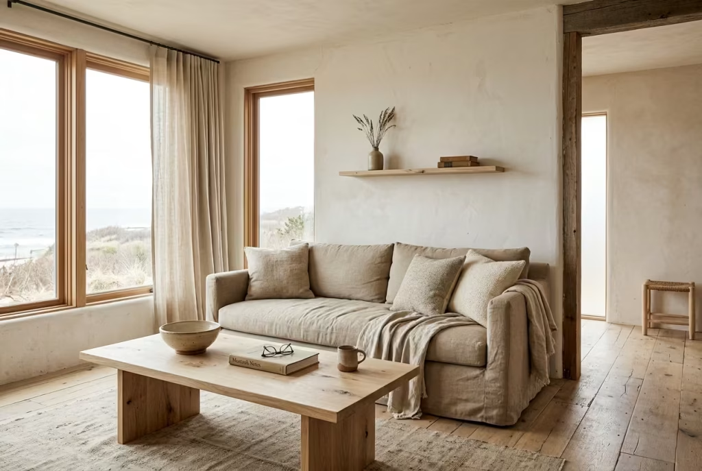
Some of the most successful homes I have worked on never felt completely finished in the traditional sense, and that is precisely what made them work so well. They held a sense of openness, almost as if they were still in conversation with the people living in them. Nothing felt locked into permanence, yet nothing felt unresolved either. There was a balance between structure and flexibility that allowed the spaces to breathe over time.
I remember one coastal project where we stepped back from over-styling the final layers. Instead of filling every surface or completing every corner with decorative certainty, we allowed certain areas to remain intentionally quiet. At first glance, it might have appeared slightly sparse, but over time it revealed its strength. The homeowners naturally introduced their own objects, adjusted layouts, and allowed the space to evolve organically without ever compromising its core identity.
This sense of “controlled incompleteness” is often where Montauk-inspired design finds its most enduring quality. It resists the pressure to feel overly resolved from day one and instead accepts that homes are living environments, shaped gradually by use, light, and time. When a space is built on this foundation, it does not age out of relevance. It matures, quietly and consistently, without losing its essence along the way.
Frequently asked question About Designing a Beach house
What defines the Montauk interior style?
Montauk style is defined by restraint, natural materials, and a relaxed coastal sensibility. It avoids overly themed or decorative gestures and instead focuses on light, texture, and proportion. In practice, it feels lived-in rather than staged, with spaces that prioritise calm over visual excess.
Can Montauk style work in homes far from the coast?
Yes, and this is where the style is often misunderstood. It is not dependent on geography but on principles. I’ve applied the same approach in urban apartments and countryside homes by focusing on muted palettes, natural textures, and controlled lighting. The coastal reference is emotional rather than literal.
What materials are essential for achieving this look?
The foundation typically includes linen, oak, jute, stone, and limewash. These materials share a soft, natural character and age gracefully over time. I’ve found that when these are layered thoughtfully, the space naturally settles into the aesthetic without needing decorative reinforcement.
How do I avoid making a coastal interior feel too themed?
The key is subtlety. Avoid literal nautical décor such as anchors, stripes, or overt seaside motifs. Instead, express the coastal influence through tone, texture, and light. When the reference becomes too obvious, the space quickly loses its quiet sophistication and feels overly staged.
Is Montauk style expensive to achieve?
Not necessarily. While natural materials can carry a higher upfront cost, the style is more about editing than excess. I’ve seen highly effective results in modest budgets by prioritising fewer, better-quality pieces and focusing on proportion, lighting, and material honesty rather than quantity.
What is the most common mistake in this style?
The most common mistake is over-styling. Adding too many decorative layers, overly polished finishes, or mismatched textures can quickly disrupt the calm balance. In my experience, the strongest spaces are often the ones where restraint has been applied with confidence, allowing the architecture and materials to lead.