


Transform Your Space: 15 Sage Green Kitchen Ideas That Feel Soft, Fresh, and Elegant
For years, kitchens leaned heavily on crisp whites, sharp contrasts, and cool grey palettes that promised modernity but often left spaces feeling slightly detached from everyday living. Recently, though, the mood has shifted. More homeowners are craving kitchens that feel softer around the edges, calmer under changing light, and far more connected to the natural rhythms of home life. That is precisely where sage green has found its footing.
What makes sage green Kitchen so enduring is not simply its colour, but the atmosphere it creates. In the morning, it can appear airy and muted, almost carrying the softness of dried herbs against natural oak and limestone. By evening, under warmer lighting, the same shade deepens into something cocooning and quietly elegant. Few colours move through the day with such ease.
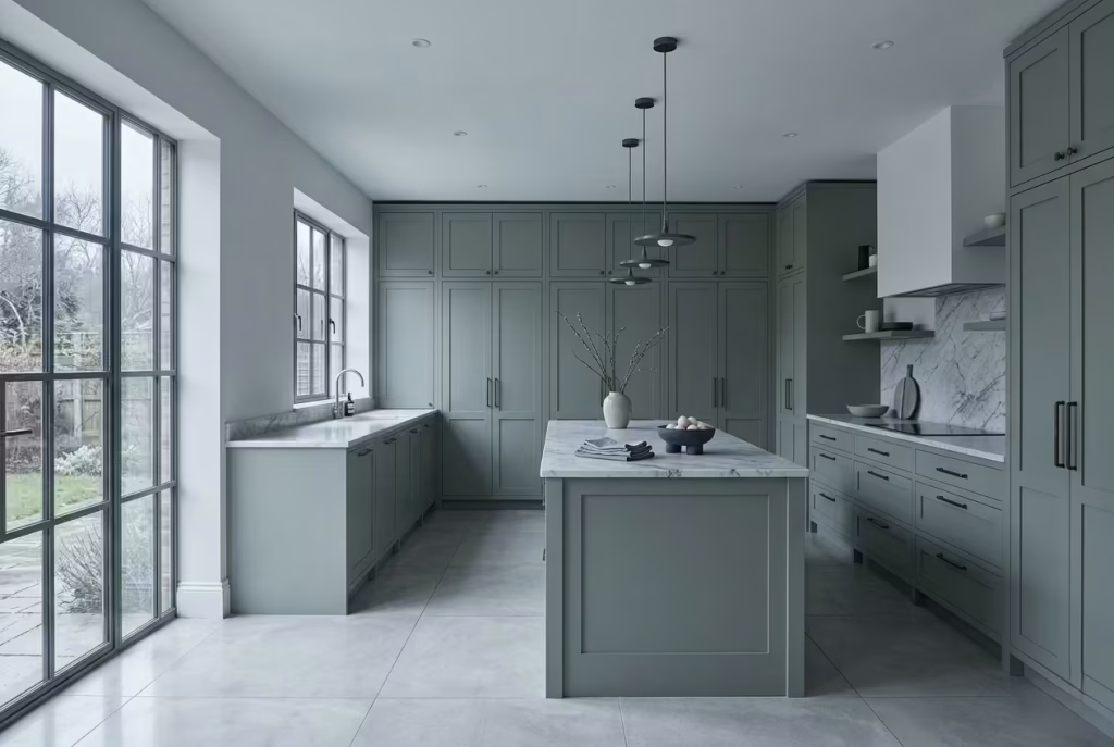
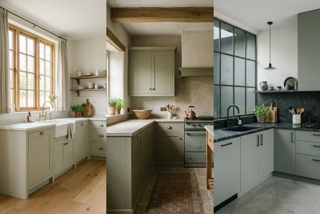
I have used sage green in everything from compact north-facing terraces to expansive open-plan family kitchens, and its versatility continues to surprise me. In darker kitchens where shadows tend to collect in corners, sage softens the heaviness without draining warmth from the room. In larger open spaces, it introduces definition and calm without visually chopping apart the architecture. It sits comfortably between classic and contemporary, which explains why it works equally well beside shaker cabinetry, flat-panel joinery, aged brass, or heavily veined stone.
The most successful sage kitchens, however, are never about paint alone. Their depth comes from layering. Textured plaster walls, brushed metals, warm timber grains, handmade tiles, and softly honed surfaces all help the colour feel settled rather than staged. That balance is what gives sage green its staying power. While trend-driven colours often burn brightly before fading out, muted greens tend to age gracefully, gathering character as the home evolves around them.
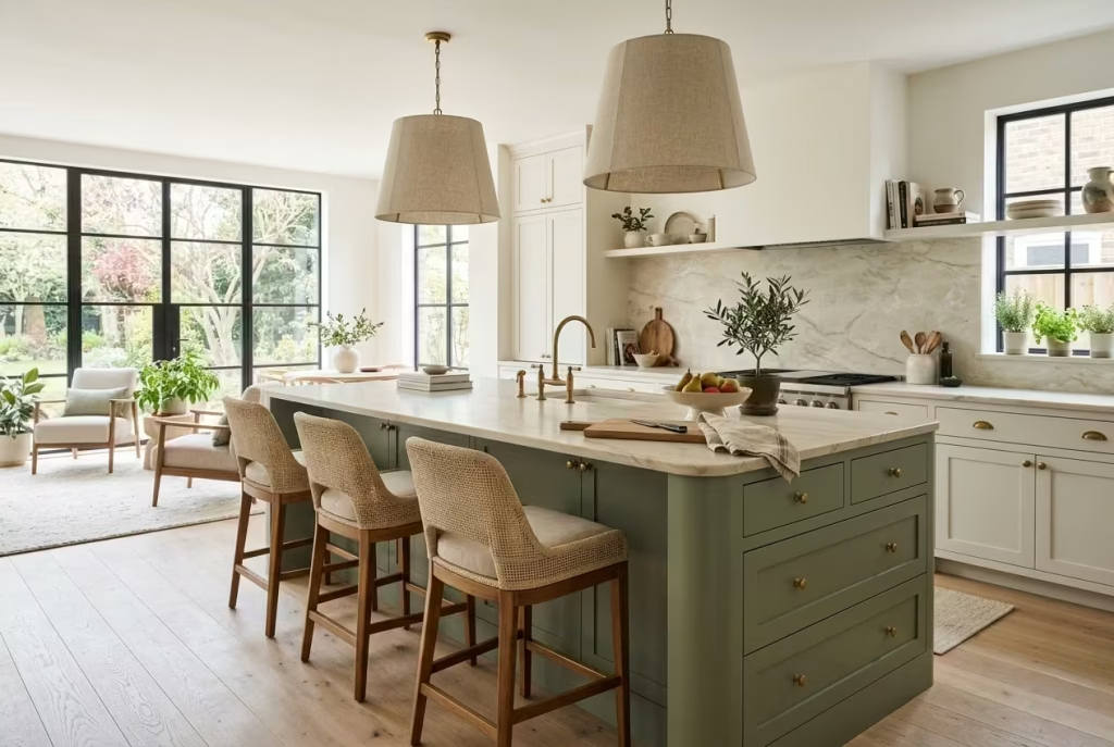
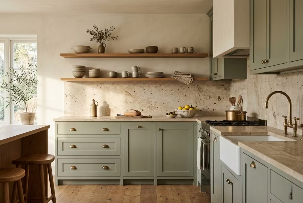
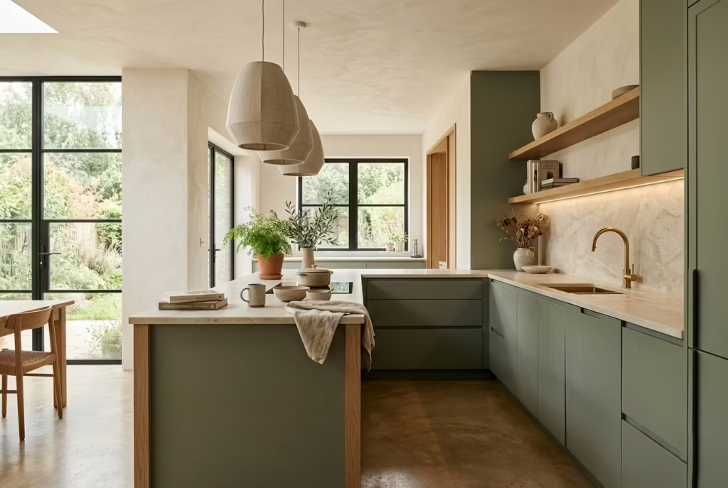
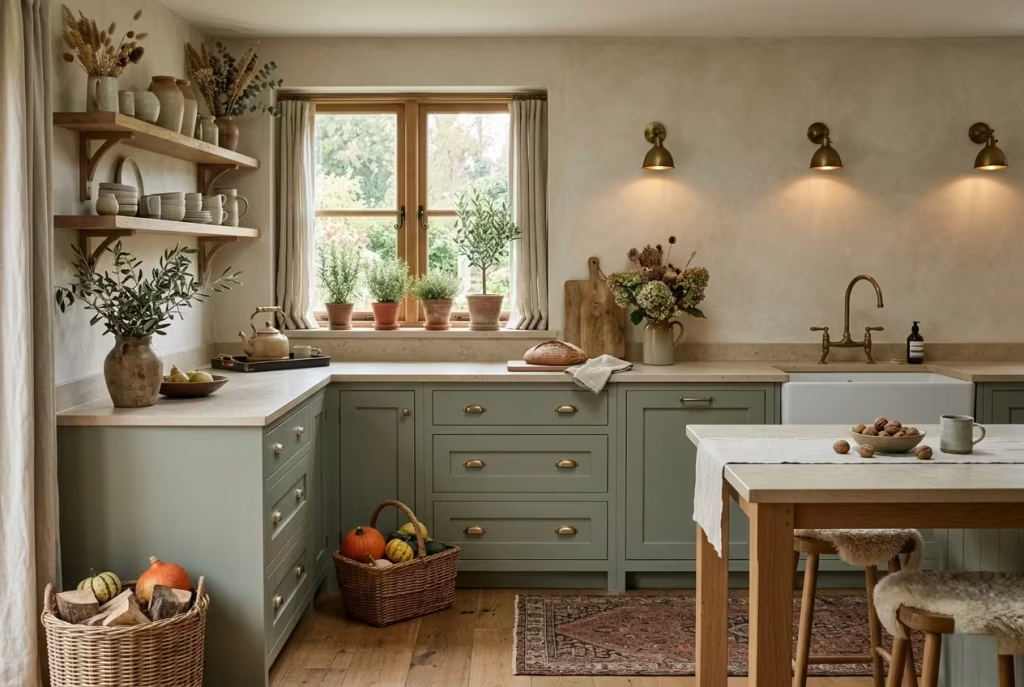
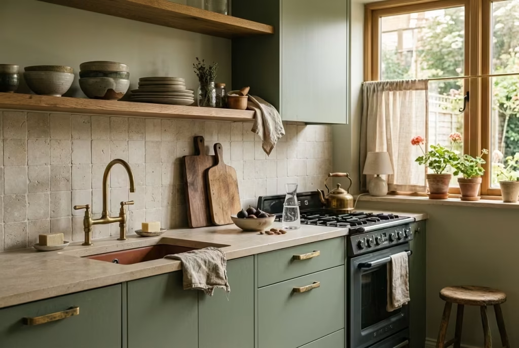
Pair Sage Green Cabinets With Warm Oak for a Relaxed Organic Look
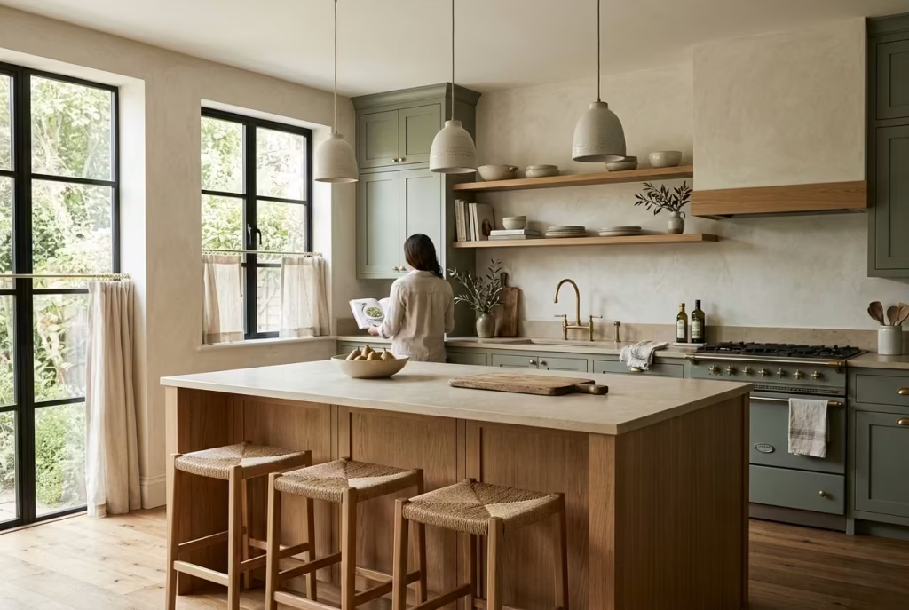
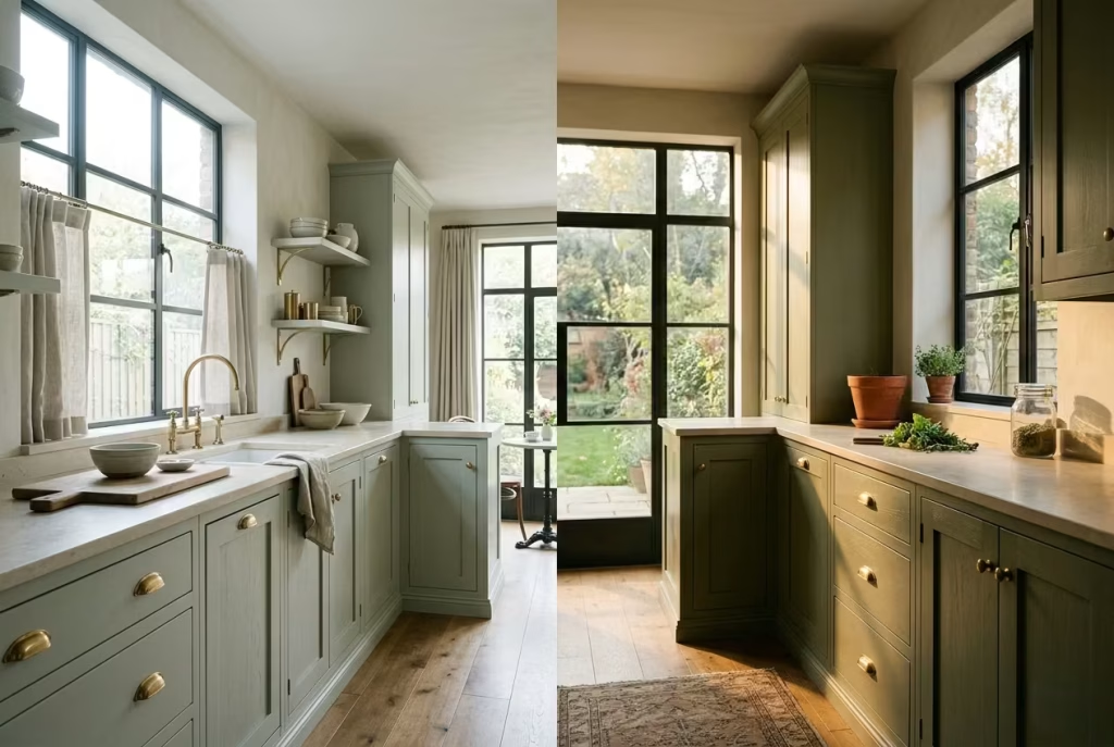
Some kitchen colour combinations make an instant statement, but sage green and warm oak do something far more lasting. They settle into a space quietly, creating a kitchen that feels grounded, breathable, and easy to live with day after day. It is the kind of pairing that does not shout for attention the moment you walk in, yet somehow keeps drawing you back in for a second look. Like a well-worn linen shirt or an old country house that has aged gracefully, the beauty sits in the layers rather than the spectacle.
One of the reasons this combination works so beautifully is the balance between softness and structure. Sage green brings a muted, nature-led calm, while oak introduces warmth, grain, and visual movement. Together, they stop each other from falling flat. Too much green on its own can sometimes feel cool under artificial light, particularly in contemporary homes with polished finishes. Oak steps in to warm the room from the ground up, almost like sunlight filtering across timber floorboards late in the afternoon.
In several family kitchen renovations I have worked on, this pairing proved especially effective in open-plan spaces where clients wanted the kitchen to feel connected to the living area rather than visually separated from it. In one project, we used pale sage cabinetry alongside rift-cut white oak panels on the island and pantry wall. The subtle grain pattern added texture without overwhelming the room, allowing the kitchen to feel calm but far from clinical. Even during winter months, the space carried a gentle warmth that cooler palettes simply could not achieve.
For proportions, kitchen islands between 240 and 300 cm, or roughly 8 to 10 feet, tend to work particularly well with this palette because they provide enough surface area for the timber grain to become part of the visual story. Smaller islands can sometimes make the wood feel incidental rather than intentional.
White oak is usually the safer choice if you want a refined, contemporary look. Its softer undertones prevent sage green from drifting into muddy territory. Knotty oak, on the other hand, introduces far more character and rustic texture, which can work beautifully in farmhouse homes but needs a careful hand. Too much heavy grain alongside muted green cabinetry can tip the room into cabin-like territory before you realise it.
Flooring matters enormously here. Wide plank oak flooring, natural limestone, or soft brushed travertine tend to complement sage effortlessly. Cooler grey flooring often jars against the warmth of the cabinetry, making the kitchen feel emotionally disconnected, as though the materials belong to different homes entirely.
Texture layering is where this palette truly comes alive. Linen café curtains, woven counter stools, brushed brass hardware, and softly textured ceramics help the room feel collected over time rather than installed all at once. The best kitchens rarely feel overly polished. They feel lived in, gently evolving around the rhythms of everyday life.
Pros
- Creates a timeless and calming atmosphere
- Adds natural warmth without relying on overly dark colours
- Works across Scandinavian, Japandi, farmhouse, and transitional interiors
- Ages gracefully as materials develop character over time
Cons
- Poor tonal balance can make the kitchen feel overly rustic
- Cool lighting may flatten the warmth of the oak
- Heavy timber grain can overwhelm smaller kitchens if overused
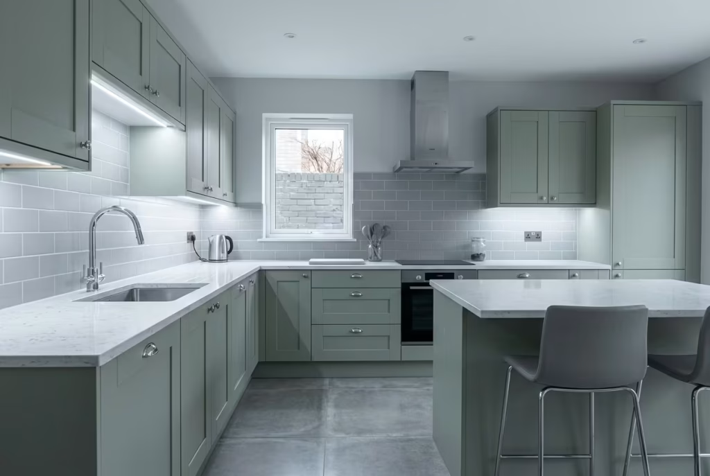
Use Sage Green on Lower Cabinets Only for a Lighter Feel
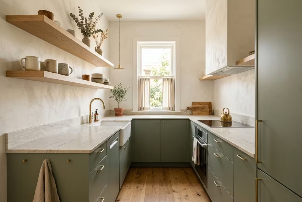
Not every kitchen can comfortably carry full sage green cabinetry from floor to ceiling. In smaller homes especially, too much colour at eye level can begin to feel visually heavy, almost as though the walls are slowly closing in. This is where using sage green exclusively on the lower cabinets becomes such a clever design move. It keeps the kitchen feeling airy and open while still bringing in warmth, depth, and personality where it matters most.
I often recommend this approach in kitchens with ceilings below 2.7 metres, or around 9 feet, because it helps preserve a sense of vertical openness. The eye naturally travels upward toward the lighter upper half of the room, allowing the ceiling to feel taller and the architecture less compressed. It is a subtle trick, but one that punches above its weight when the room lacks natural volume.
In several compact renovation projects I worked on, grounding the lower cabinetry in sage while keeping the upper sections warm white completely changed how the space felt emotionally. One narrow galley kitchen in particular had very little daylight and originally felt boxed in by dark cabinetry on every wall. The moment we switched to sage lower units paired with creamy white uppers, the room began breathing again. The green anchored the space beautifully without allowing visual weight to pile up around eye level.
There is also a psychological comfort to two tone kitchens that many homeowners underestimate. The darker base creates stability, while lighter uppers introduce softness and ease. It mirrors nature in a way. Think of how landscapes naturally ground themselves with darker earth tones below and lighter skies above. When colours follow that rhythm indoors, rooms tend to feel instinctively balanced.
Countertop selection becomes especially important with this combination. Warm quartzite, creamy marble, or lightly veined porcelain surfaces usually create the smoothest transition between the sage base and lighter upper walls. Bright icy whites can sometimes feel too sharp against muted green cabinetry, making the contrast look abrupt rather than relaxed. I usually lean toward surfaces with a little warmth tucked into the veining because they soften the shift between tones naturally.
Floating shelves can work beautifully here as an alternative to upper cabinets, particularly in kitchens where you want to avoid visual clutter. Oak shelves paired with sage lower units create an easygoing layered look that feels both functional and personal. That said, open shelving only works when it is treated with restraint. A handful of handmade ceramics, stacked cookbooks, or textured glassware will always feel more sophisticated than overcrowded displays fighting for attention.
Lighting also plays a surprisingly large role in whether this palette succeeds. Under cooler LEDs, sage can lose some of its softness and lean slightly grey. Warm ambient lighting, particularly around 2700K, helps the green retain its earthy richness and prevents the room from feeling sterile after sunset.
Pros
- Keeps smaller kitchens feeling visually open
- Makes lower cabinetry feel grounded without overwhelming the room
- Helps ceilings appear taller in compact spaces
- Creates an easy balance between warmth and brightness
Cons
- Poor colour matching can make the kitchen feel disconnected
- Open shelving requires regular styling discipline
- Very cool countertops may clash with the softness of sage green
Layer Sage Green With Creamy Limestone and Travertine
Some kitchens look beautiful in photographs but feel strangely lifeless once you step inside them. Often, the missing ingredient is texture. A room can have the perfect colour palette and still fall flat if every surface feels smooth, cold, or overly manufactured. Sage green kitchens, in particular, come alive when they are layered with materials that carry softness, movement, and subtle imperfections. This is where creamy limestone and travertine quietly steal the show.
There is something deeply grounding about pairing muted green cabinetry with natural stone that has been shaped by time rather than trend. Limestone brings a chalky softness that diffuses light gently across the room, while travertine introduces depth through tiny pores, tonal variation, and weathered texture. Together, they create a kitchen that feels settled and soulful, almost as though it has belonged to the house for years rather than being freshly installed last month.
I used this combination in a recent renovation for a family home where the clients wanted the kitchen to feel calm but not overly polished. We paired muted sage cabinetry with honed travertine countertops and a limestone backsplash that wrapped softly around the cooking zone. The result felt incredibly relaxed, like the room could exhale. Morning light skimmed across the stone surfaces beautifully, revealing subtle tonal changes throughout the day. It proved once again that the most luxurious kitchens are rarely the loudest ones. They whisper rather than shout.
Travertine works particularly well because it adds richness without introducing visual chaos. Unlike heavily veined marble, which can sometimes dominate a room if handled carelessly, travertine carries movement in a far quieter way. Its texture creates depth that feels organic and understated, especially when paired with brushed brass fixtures, oak flooring, or softly textured plaster walls.
The finish of the stone matters more than many people realise. Honed surfaces generally suit sage kitchens better because they absorb light softly and feel more tactile under hand. Polished stone, while glamorous in some settings, can sometimes make earthy palettes feel too slick or formal. A kitchen built around sage green usually benefits from materials that feel approachable and gently weathered rather than mirror-like and pristine.
There has also been a noticeable shift away from cool greys in recent years, particularly in luxury residential interiors. Beige based stones such as limestone and travertine bring emotional warmth back into kitchens that had started feeling overly clinical. Grey surfaces often flatten the softness of sage cabinetry, while creamy mineral tones help the green reveal its more natural, herbaceous side.
Of course, natural stone does ask for a little respect in return. Limestone and travertine require sealing and occasional maintenance, particularly in hardworking family kitchens where spills and acidic foods are part of everyday life. Still, most homeowners I work with quickly realise the trade-off is worth it. Materials that age naturally tend to gain character over time, and that lived-in patina is often what gives a kitchen its soul.
Pros
- Adds warmth and tactile depth to sage cabinetry
- Creates a timeless, quietly luxurious atmosphere
- Natural texture softens modern kitchens beautifully
- Works across classic, Mediterranean, and contemporary interiors
Cons
- Natural stone requires periodic sealing and care
- Travertine can stain if left unprotected
- Poor lighting may flatten the texture and tonal variation of the stone
Create Depth With Moody Sage and Antique Brass
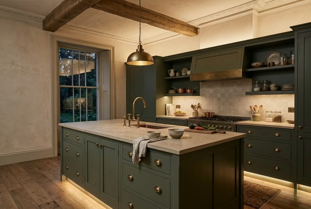
When sage green is taken a little deeper, it loses none of its softness, but it gains presence. That is where the real magic begins. A moody sage kitchen paired with antique brass feels composed, layered, and quietly assured, the kind of combination that never needs to raise its voice to make an impression. It has that rare quality of looking elegant without trying too hard, which, in design terms, is worth its weight in gold.
Darker sage tones work beautifully in kitchens that need a touch more drama but cannot afford to feel cold or severe. They sit somewhere between forest and mist, depending on the light, and that shifting character gives the room a lived-in depth that lighter shades often cannot match. In morning light, the cabinetry can feel soft and smoky. By evening, with warm lamps or under-cabinet lighting switched on, it settles into something richer and more enveloping, almost like the room is drawing itself in for the night.
Antique brass is the perfect companion because it brings warmth without tipping the room into shine-for-shine’s sake territory. Unlike bright polished brass, which can sometimes feel a little too glossy for an understated kitchen, antique brass has a gentler hand. Its surface develops patina over time, which means the finish does not fight the cabinet colour. Instead, it deepens alongside it. That natural ageing is part of the charm. Nothing looks frozen in time, and the kitchen, as a result, feels all the more authentic.
This pairing works especially well in heritage homes, where original detailing, cornices, sash windows, or older proportions can handle a darker, more atmospheric palette with ease. In those settings, moody sage has a way of respecting the bones of the house rather than competing with them. It can sit beautifully beside stone floors, timber beams, and reclaimed finishes, pulling the room together without making it feel staged. In more contemporary homes, the same pairing can still succeed, but it needs a firmer hand. Clean-lined cabinetry, balanced proportions, and thoughtful lighting help keep the overall effect refined rather than heavy.
I have found that hardware sizing makes a bigger difference here than most people realise. On darker cabinetry, delicate handles can vanish visually, while oversized ones can feel clumsy. For most kitchens, handles between 96 mm and 160 mm centre-to-centre work well on drawers, while longer pulls around 192 mm to 256 mm suit taller pantry doors or larger base units. The finish matters too. A brushed or aged brass handle tends to sit more naturally against moody sage than anything high-shine, because it allows the materials to feel layered rather than overly designed.
Warm metallic layering can elevate the palette further. A brass tap, matching cabinet hardware, and perhaps a softly toned pendant frame can create quiet continuity without making the room feel theme-driven. The trick is restraint. Too many competing metals and the whole thing starts to lose its footing. One or two carefully repeated finishes usually carry more weight than a medley of options, which can quickly muddy the waters.
Statement tapware ideas also deserve careful thought here. A gooseneck brass tap can look wonderfully elegant against a darker sage sink run, particularly when paired with a stone splashback or a belfast sink. For a more contemporary kitchen, a sculptural tap in a brushed finish can bring a sense of poise without becoming overly decorative. Either way, the tap should feel like part of the architecture, not a bolt-on afterthought.
This combination is at its best when it feels considered from top to bottom. Moody sage cabinetry, antique brass, and softly textured surfaces create a kitchen with backbone, but also one with a gentle soul. It is a bit like a beautifully tailored coat worn with soft knitwear. The structure is there, but so is the ease.
Pros
- Creates depth and atmosphere without feeling harsh
- Ages beautifully as brass develops patina
- Works especially well in period and heritage homes
- Adds a sense of quiet luxury that feels enduring rather than trend-led
Cons
- Can feel heavy if the room lacks enough natural light
- Requires careful balancing with lighter surfaces
- Too many metallic finishes can make the scheme feel restless
You May also Like: 25 Sage Green Basement Ideas for a Calm, Stylish, and Modern Lower-Level Space
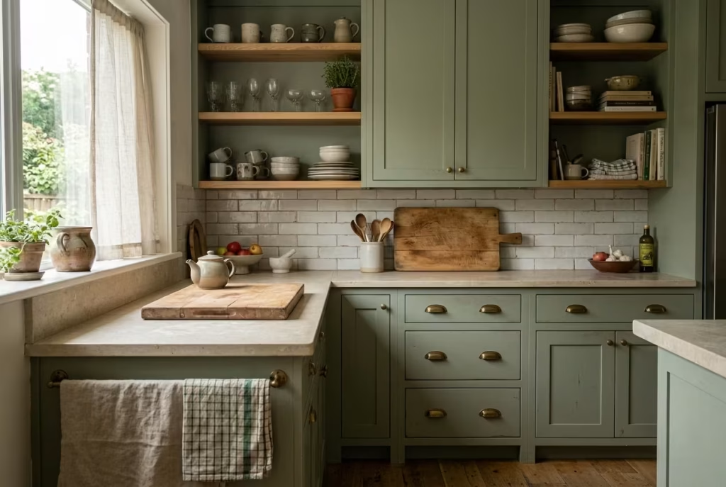
Add Character With Sage Green Shaker Cabinetry
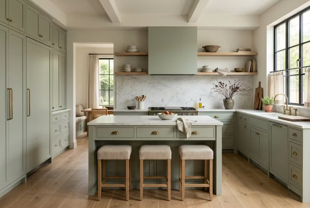
Shaker cabinetry and sage green are a natural match because both have a kind of quiet confidence about them. Neither one needs to shout to be noticed. Together, they create a kitchen that feels rooted, graceful, and easy to live with, the sort of space that looks as though it has grown into the house rather than being dropped in overnight. That is why this pairing has such staying power. It does not chase the moment; it outlasts it.
What gives shaker cabinetry its enduring appeal is its architectural balance. The framed design adds just enough definition to give the kitchen structure, while the soft sage tone keeps that structure from feeling too formal or rigid. In a well-planned room, the result is a beautifully judged middle ground. You get character without clutter, detail without fuss, and a finish that feels tailored rather than overworked. It is a bit of a masterstroke for homeowners who want charm but do not want the kitchen to tip into country-cute territory.
For modern homes, the real trick lies in the profile. Traditional shaker doors can sometimes feel too heavy in newer spaces, especially if the rails and stiles are broad and deeply stepped. Slim shaker detailing, by contrast, feels far more current. Rail widths around 20 to 30 mm usually strike the right balance, giving the cabinetry enough definition to read as shaker while keeping the overall look light on its feet. This narrower frame is particularly effective in open-plan kitchens, where bulky detailing can start to weigh the room down like an anchor.
I have found that slim shaker cabinetry works especially well when clients want a kitchen that feels polished but not sterile. In one recent renovation, the brief was to create something classic enough to age well but clean enough to sit comfortably beside contemporary furniture in the adjoining living space. Narrow-profile sage shaker doors gave us exactly that. They brought a sense of craftsmanship, but without the visual baggage that sometimes comes with more traditional joinery. The kitchen felt considered, not contrived, which is exactly where the sweet spot tends to lie.
Traditional shaker detailing still has its place, of course. In period homes, larger frames and more substantial proportions can feel entirely appropriate, especially when paired with timber floors, marble, and vintage-inspired brassware. But even then, proportion matters. If the doors are too chunky, the kitchen can begin to feel boxy and overfurnished. The best shaker kitchens know when to hold back. They leave a little room for light, a little room for air, and a little room for the materials to do their work.
Integrated appliances are another piece of the puzzle. Once you start combining sage shaker cabinetry with exposed stainless steel appliances, the calm can quickly start to unravel. Panel-ready refrigeration and concealed dishwashers help the cabinetry hold the line visually, allowing the rhythm of the joinery to remain uninterrupted. That matters more than many people realise. In a kitchen where detail is doing the heavy lifting, visual continuity is worth its weight in gold.
Panel-ready refrigeration, in particular, can make the whole scheme feel more cohesive. It allows the refrigerator to blend into the architecture rather than sitting on top of it like an afterthought. This is especially useful in smaller or open-plan kitchens, where large appliances can otherwise dominate the room. When the appliance fronts disappear behind sage panels, the kitchen feels calmer, more bespoke, and far less showroom-like.
The beauty of shaker cabinetry is that it sits comfortably between tradition and modernity, which makes it one of the most versatile choices in residential design. In sage green, that versatility becomes even more pronounced. It can feel heritage-led in one home and quietly contemporary in another, all depending on the surrounding finishes. Pair it with stone and brass, and it leans classic. Pair it with pared-back handles, clean splashbacks, and streamlined appliances, and it shifts towards modern restraint. That kind of flexibility is exactly why it continues to earn its keep.
Pros
- Adds structure and character without overwhelming the room
- Works across traditional, transitional, and contemporary homes
- Slim shaker profiles feel especially well suited to modern interiors
- Pairs neatly with concealed appliances for a more seamless look
Cons
- Broad shaker frames can feel heavy if the room is small
- Poor detailing can make the joinery look generic rather than bespoke
- Exposed appliances may interrupt the flow of the cabinetry
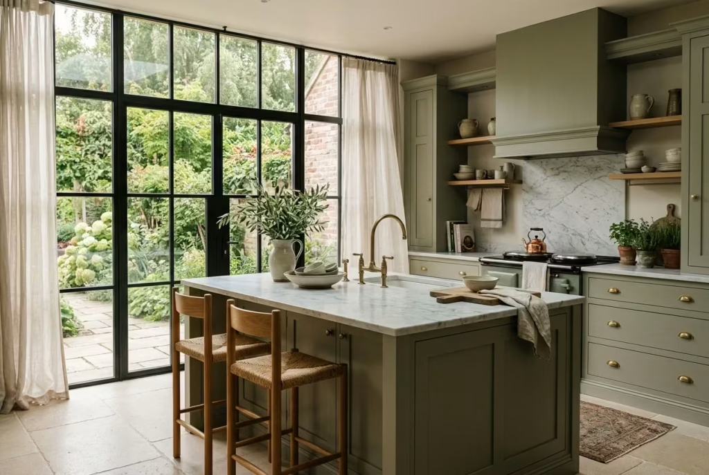
Combine Sage Green With Marble for Quiet Luxury
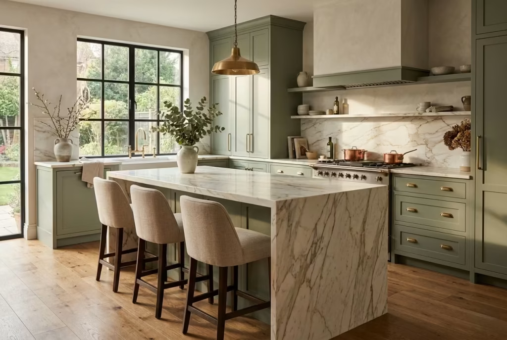
Some kitchen combinations feel luxurious the moment you see them, yet still manage to remain understated enough to live with comfortably for years. Sage green and marble fall squarely into that category. Together, they create a layered softness that feels refined without becoming overly polished or theatrical. It is luxury with its coat unbuttoned, relaxed, confident, and entirely at ease in its own skin.
What makes this pairing so effective is the contrast in texture and movement. Sage green cabinetry tends to feel calm and grounded, particularly in matte or satin finishes, while marble introduces fluidity through its veining. That natural movement stops the kitchen from feeling static. Even subtle marble surfaces can catch the eye unexpectedly as daylight shifts across the room, adding depth in a way flat materials simply cannot replicate.
The key, however, is restraint. One of the biggest mistakes I see in sage kitchens is the use of heavily patterned marble with dramatic, high-contrast veining. While striking in isolation, bold marble can quickly overpower muted green cabinetry, turning what should feel balanced into a visual tug of war. Sage works best alongside stones that carry softer veining and warmer undertones, allowing the materials to complement rather than compete with each other.
In one townhouse renovation I worked on, we paired pale sage cabinetry with lightly veined Calacatta marble that carried subtle taupe and warm grey undertones. The result felt airy yet grounded, particularly in the late afternoon when natural light washed across the waterfall island. Nothing felt forced. The marble brought elegance, but the sage cabinetry kept the room approachable and calm. That balance is often what separates timeless kitchens from ones that feel trend-led and overly curated.
Waterfall islands can be especially beautiful in this palette when handled thoughtfully. Allowing the marble to cascade down the sides of the island creates continuity and gives the stone room to breathe visually. In larger kitchens, this can anchor the entire space beautifully, particularly when the island measures around 240 to 320 cm, or roughly 8 to 10.5 feet in length. Smaller kitchens, however, sometimes benefit from a lighter touch. Too much stone wrapping can begin to dominate the room if the proportions are not carefully considered.
Slab backsplashes are another detail worth considering because they remove visual interruptions created by grout lines and busy tile patterns. In sage kitchens, this uninterrupted surface can feel especially calming. It allows the natural veining of the marble to become part of the architecture itself rather than simply a decorative layer applied afterward. The effect is subtle but incredibly powerful.
Quartzite alternatives are also becoming increasingly popular for homeowners who love the appearance of marble but want greater durability. Certain quartzites carry similarly soft veining while offering improved resistance to etching and staining. Taj Mahal quartzite, for example, works beautifully with sage green because of its creamy warmth and understated movement. It provides many of the visual qualities people love in marble while being a little more forgiving in busy family kitchens where life rarely stays picture-perfect for long.
Of course, marble does come with realities that should not be glossed over. It can etch, stain, and develop marks over time, especially around cooking zones or heavily used islands. Personally, I think that gentle ageing is part of its charm. Kitchens are living spaces, not museum pieces. A little patina often gives the room more soul, not less. Still, homeowners who prefer a pristine finish may find natural marble slightly nerve-racking, particularly if they have young children or entertain frequently.
Lighting also plays a pivotal role in whether marble feels warm and inviting or cold and clinical. Cooler LED lighting can flatten the richness of both the stone and the sage cabinetry, stripping away much of the atmosphere. Warm layered lighting, especially around 2700K, tends to enhance the creamier undertones within the marble and allows the green cabinetry to feel softer and more dimensional after sunset.
When sage green and marble are thoughtfully paired, the result rarely feels flashy. Instead, it creates the kind of kitchen people instinctively linger in, coffee cup in hand, conversations stretching long after dinner plates have been cleared away. That quiet sense of ease is often the real hallmark of luxury.
Pros
- Creates a timeless and sophisticated atmosphere
- Marble adds movement and visual softness to muted cabinetry
- Works beautifully in both classic and contemporary kitchens
- Slab backsplashes and waterfall islands elevate the architecture of the space
Cons
- Highly patterned marble can overwhelm sage cabinetry
- Natural marble requires ongoing care and maintenance
- Poor lighting may make the kitchen feel colder than intended
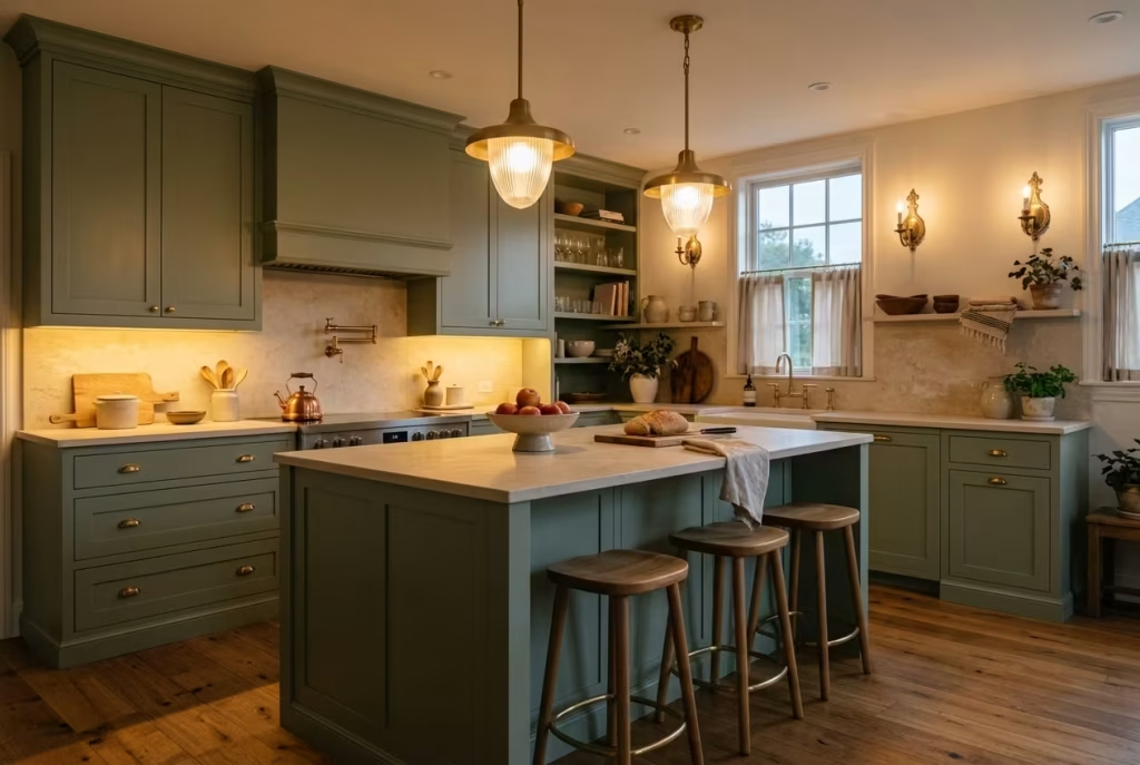
Introduce Sage Through a Statement Kitchen Island
Not every homeowner is ready to commit to an entirely green kitchen, and honestly, they do not need to. Sometimes the smartest design decisions come from knowing where to hold back. A sage green kitchen island can introduce colour in a way that feels thoughtful and inviting without allowing it to take over the whole room. It acts almost like the calm centre of gravity within the kitchen, drawing the eye naturally while still letting surrounding materials breathe.
This approach works particularly well for people who love the softness of sage but worry that full cabinetry may feel too permanent or too tied to a trend. An island offers flexibility. It becomes a focal point rather than a full immersion. In many ways, it is the best of both worlds. The kitchen gains warmth, personality, and depth, yet still maintains a light, adaptable framework around it.
I have used this strategy often in open-plan homes where the kitchen flows directly into dining and living areas. Full sage cabinetry across every wall can occasionally feel visually heavy in larger connected spaces, especially when natural light is inconsistent throughout the day. A statement island, however, introduces colour with a lighter touch.
It anchors the room beautifully without boxing it in. One family kitchen renovation comes to mind where we paired a muted sage island with warm white perimeter cabinetry and pale oak flooring. The island immediately became the heart of the room, almost like a gathering point pulling the family inward without shouting for attention.
Proportion is crucial here because a poorly sized island can throw off the entire rhythm of the kitchen. Maintaining at least 100 to 120 cm, or roughly 40 to 48 inches, of clearance around the island usually allows movement to feel comfortable and natural.
Anything tighter tends to create bottlenecks, particularly in busy family kitchens where several people may be cooking, unloading groceries, or circling around each other at the same time. Good kitchen design should feel intuitive underfoot. Nobody wants to dance around cabinet corners just to reach the fridge.
Contrasting island colours can also bring tremendous depth to a kitchen when handled carefully. Sage works especially well against warm whites, mushroom tones, soft taupes, and natural oak cabinetry. In contemporary homes, pairing sage with charcoal or dark walnut can create a moodier, more architectural look. The key is making sure the island feels intentionally connected to the rest of the palette rather than dropped into the room as an isolated accent piece.
Pendant lighting placement becomes even more important when the island is carrying visual weight. Lighting should frame the island rather than overwhelm it. I usually recommend hanging pendants around 75 to 90 cm, or approximately 30 to 36 inches, above the countertop surface to create balanced illumination without blocking sightlines across the kitchen.
Oversized pendants can work beautifully above large islands, though they need breathing room. Cramming multiple bulky fixtures into a compact kitchen often turns elegance into clutter faster than people expect.
Seating ergonomics deserve just as much attention because islands naturally become social hubs. Comfortable seating depth matters far more than many realise. An overhang of roughly 30 to 38 cm, or 12 to 15 inches, generally provides enough knee space for casual dining without forcing stools awkwardly into circulation paths. Upholstered counter stools or woven natural textures can soften the look further, making the island feel less like a workstation and more like part of the living environment.
What I appreciate most about a sage island is its ability to evolve with the home. Surrounding décor, lighting, textiles, and hardware can shift gradually over the years while the island continues quietly holding the room together. It brings colour into the kitchen in a measured, intelligent way, almost like seasoning in a well-cooked dish. Just enough to transform the atmosphere without overpowering everything else on the plate.
Pros
- Introduces sage green without committing to full cabinetry
- Works beautifully in open-plan kitchens
- Creates a strong focal point while keeping the room balanced
- Allows greater flexibility with future design updates
Cons
- Poor island placement can disrupt kitchen circulation
- Contrasting colours require careful tonal coordination
- Oversized pendants may visually overcrowd smaller kitchens
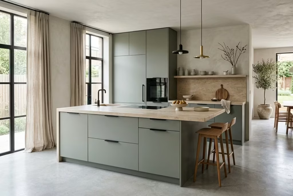
Soften Modern Kitchens With Matte Sage Finishes
Modern kitchens have come a long way from the stark, ultra-polished spaces that once dominated design magazines. For years, glossy cabinetry, sharp edges, and reflective finishes were seen as the gold standard of sophistication.
Yet many of those kitchens, while undeniably sleek, often felt emotionally distant once the novelty wore off. Beautiful to photograph, perhaps, but not always comforting to live in. That is exactly why matte sage finishes have found such a strong foothold in contemporary interiors.
There is something inherently calming about a surface that absorbs light rather than bouncing it aggressively around the room. Matte sage cabinetry softens the architecture of modern kitchens, taking the edge off rigid lines and making the space feel far more approachable.
Instead of glaring under daylight or reflecting every pendant bulb after dark, the finish diffuses light gently, almost like linen curtains filtering afternoon sun. The atmosphere becomes quieter, warmer, and infinitely easier on the eye.
This is particularly valuable in homes dominated by hard finishes such as concrete flooring, large expanses of glass, or minimalist layouts where visual warmth can easily slip through the cracks.
Sage green brings an earthy softness to those sharper environments, while the matte finish prevents the colour from feeling overly decorative. It keeps the palette grounded and understated, which is often the sweet spot in well-designed modern interiors.
I worked on one contemporary extension where nearly every surface before the renovation felt cold to the touch visually. White gloss cabinets, polished flooring, and metallic finishes created a kitchen that looked pristine but strangely uninviting. Once we introduced flat-panel matte sage cabinetry with integrated pulls, the room changed completely. The kitchen suddenly felt calmer and more human. Clients often underestimate how much sheen level influences mood, but it can shift the emotional temperature of a room almost overnight.
Flat-panel cabinetry works especially well with sage because it allows the colour itself to become the focal point without competing decorative details. Integrated pulls strengthen that seamless effect further. Without protruding handles interrupting the cabinetry lines, the kitchen feels cleaner and more architectural. In open-plan spaces, this simplicity becomes even more valuable because the kitchen blends more naturally into surrounding living areas rather than announcing itself loudly from across the room.
That said, practicality matters just as much as aesthetics in hardworking kitchens. Matte finishes have improved enormously in recent years, particularly with fingerprint-resistant technology now available across many premium cabinet materials. Older matte surfaces sometimes carried a reputation for marking easily, but newer finishes are far more forgiving, especially in family homes where little hands and constant use are part of everyday life. For busy households, this can be a genuine game changer.
Paint sheen levels deserve careful consideration too. Full matte cabinetry creates a beautifully soft appearance, but in some kitchens it may absorb slightly too much light, especially in rooms lacking natural daylight. Eggshell or low-sheen satin finishes often provide the best middle ground. They maintain the velvety appearance people love while still offering enough durability for daily wear and tear around cooking and cleaning zones.
Lighting pairings can either elevate matte sage cabinetry beautifully or flatten it completely. Warm layered lighting tends to work best because it enhances the earthy undertones within the green.
Wall sconces, concealed LED strips beneath cabinetry, and softly diffused pendants create depth without making the kitchen feel overly theatrical. Cooler lighting temperatures, on the other hand, can sometimes make matte sage lean dull or slightly muddy, draining away the warmth that makes the colour so appealing in the first place.
One of the reasons matte sage kitchens feel so enduring is that they leave room for life to happen naturally. They are not trying to sparkle under every spotlight or look untouched at all times. Instead, they invite use. Morning coffee cups, scattered recipe books, quiet conversations leaning against the island. Everything feels a little more relaxed, a little more grounded, and ultimately far easier to live with for the long haul.
Pros
- Softens modern kitchens without sacrificing sophistication
- Matte finishes reduce glare and create a calmer atmosphere
- Flat-panel cabinetry feels clean and architecturally refined
- Fingerprint-resistant finishes improve everyday practicality
Cons
- Lower-quality matte surfaces can show marks over time
- Very dark matte finishes may absorb too much light in smaller kitchens
- Poor lighting choices may flatten the depth of the sage colour
You May also Like: 25 Sage Green Living Room Ideas: Timeless Designs for a Calm and Stylish Space
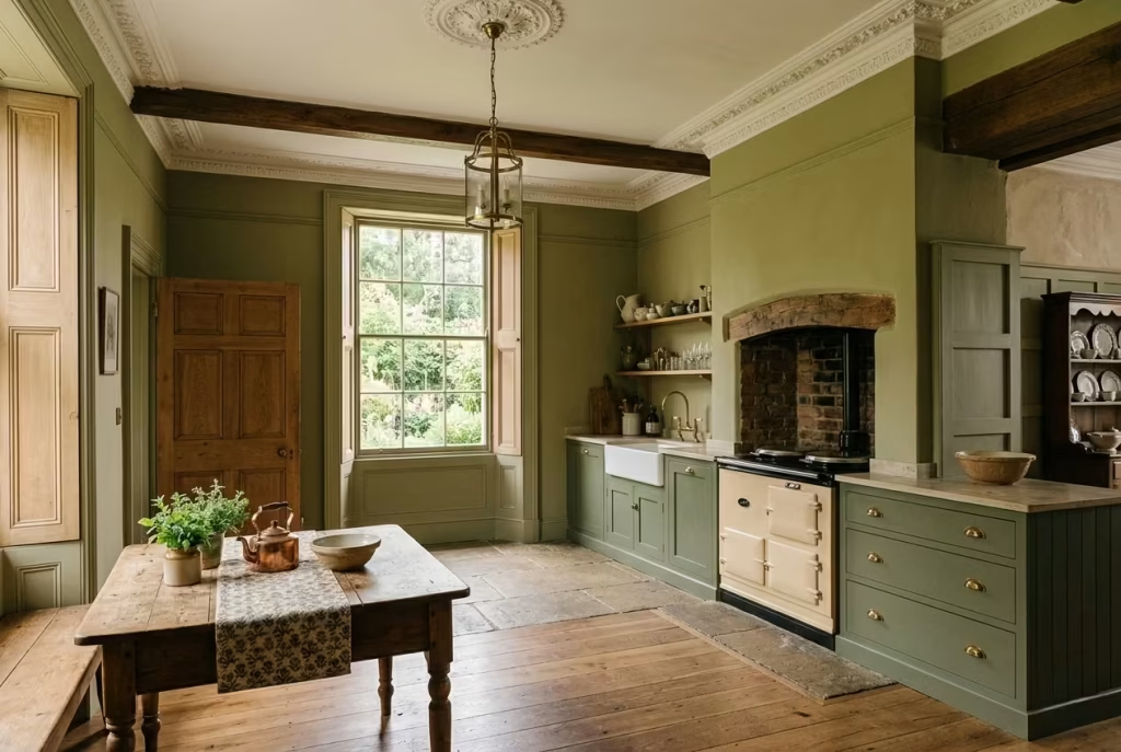
Blend Sage Green With Rustic Textures for a European Country Feel
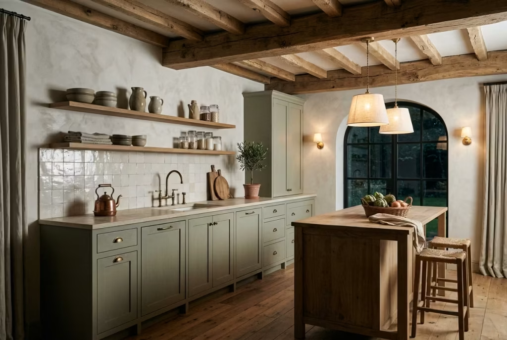
Some kitchens feel polished to perfection yet somehow miss the warmth that makes people want to linger. Others carry small imperfections, softened corners, weathered finishes, uneven textures, and end up feeling infinitely more inviting because of it. Sage green paired with rustic European textures belongs firmly in the second category. It creates kitchens that feel layered, storied, and deeply personal, as though life has unfolded naturally within them over many years.
What makes this style so compelling is its refusal to feel overly pristine. Limewashed walls with their cloudy movement, aged timber beams carrying visible grain, and unlacquered brass slowly developing patina all contribute to a kitchen that feels grounded in reality rather than staged for a showroom. There is a quiet honesty to these materials. They wear their age gracefully, and in doing so, they make the room feel more relaxed and emotionally rich.
Sage green works beautifully in this setting because it mirrors the softness found in natural landscapes. Against rough plaster walls or reclaimed oak, the colour feels calm and settled, almost as though it has always belonged there. I used this palette recently in a countryside renovation where the homeowners wanted the kitchen to feel connected to the age of the property without tipping into cliché. We combined muted sage cabinetry with lightly textured limewash walls, antique brass taps, and oak ceiling beams that still carried small knots and cracks from decades of use. The kitchen immediately felt warmer and more believable. Nothing appeared overly rehearsed, which was precisely the point.
Imperfection plays a surprisingly important role in creating authenticity. Modern homes often become trapped chasing flawless surfaces, but spaces with a little irregularity usually feel far more welcoming. A slightly worn brass handle, handmade zellige tiles with tonal variation, or timber shelves carrying natural movement all help soften the room emotionally. These details act almost like seasoning in cooking. Used carefully, they bring depth and soul that polished perfection alone rarely achieves.
The influence of Belgian-inspired kitchens is especially noticeable here. Belgian interiors have long mastered the art of restraint, balancing rustic texture with refined simplicity. Instead of overcrowding rooms with decorative details, they focus on tactile materials, muted colours, and thoughtful proportion. Sage green fits naturally into that philosophy because it adds colour without overpowering the architecture. Paired with limestone floors, linen curtains, and softly aged oak, the result feels quietly luxurious in a way that never begs for attention.
One of the biggest challenges with European farmhouse inspired kitchens is avoiding the temptation to over-style them. The moment every shelf is overflowing with pottery and every corner is packed with faux rustic accessories, the authenticity begins slipping through your fingers. Vintage accessories should feel collected gradually, not bought in one afternoon. A handful of worn cutting boards, aged ceramic pitchers, or antique brass candlesticks usually carries far more charm than shelves crowded with decorative clutter fighting for breathing room.
Open shelving can work beautifully in this style when approached with restraint. Floating oak shelves against sage walls create warmth and texture while keeping the kitchen visually lighter. The key is editing carefully. Stacked stoneware bowls, linen textiles, glass jars filled with dry ingredients, or a few handmade ceramics tend to feel timeless because they combine beauty with usefulness. Shelves styled too perfectly often feel stiff, while shelves overloaded with objects quickly tip into visual noise.
Lighting also deserves careful attention because rustic textures rely heavily on shadow and softness to reveal their depth. Warm wall sconces, linen shaded pendants, or understated brass fixtures help create that mellow evening glow which makes these kitchens feel especially inviting after sunset. Cooler lighting, by contrast, tends to flatten textured surfaces and strip away much of the atmosphere that gives this style its charm.
At its best, this look is less about recreating a countryside fantasy and more about creating emotional warmth through material honesty. Sage green becomes the thread tying everything together, allowing old textures, natural finishes, and lived-in details to coexist without feeling chaotic. The result is a kitchen that feels deeply comforting, like a place where conversations stretch long into the evening while something slow cooks gently in the background.
Pros
- Creates warmth and character through natural texture layering
- Sage green softens rustic materials beautifully
- Feels timeless and emotionally inviting
- Works especially well in farmhouse, cottage, and transitional homes
Cons
- Too many rustic elements can make the kitchen feel heavy
- Poor styling may push the look into themed territory
- Open shelving requires ongoing organisation and restraint
Use Sage Green in Small Kitchens to Create Calm
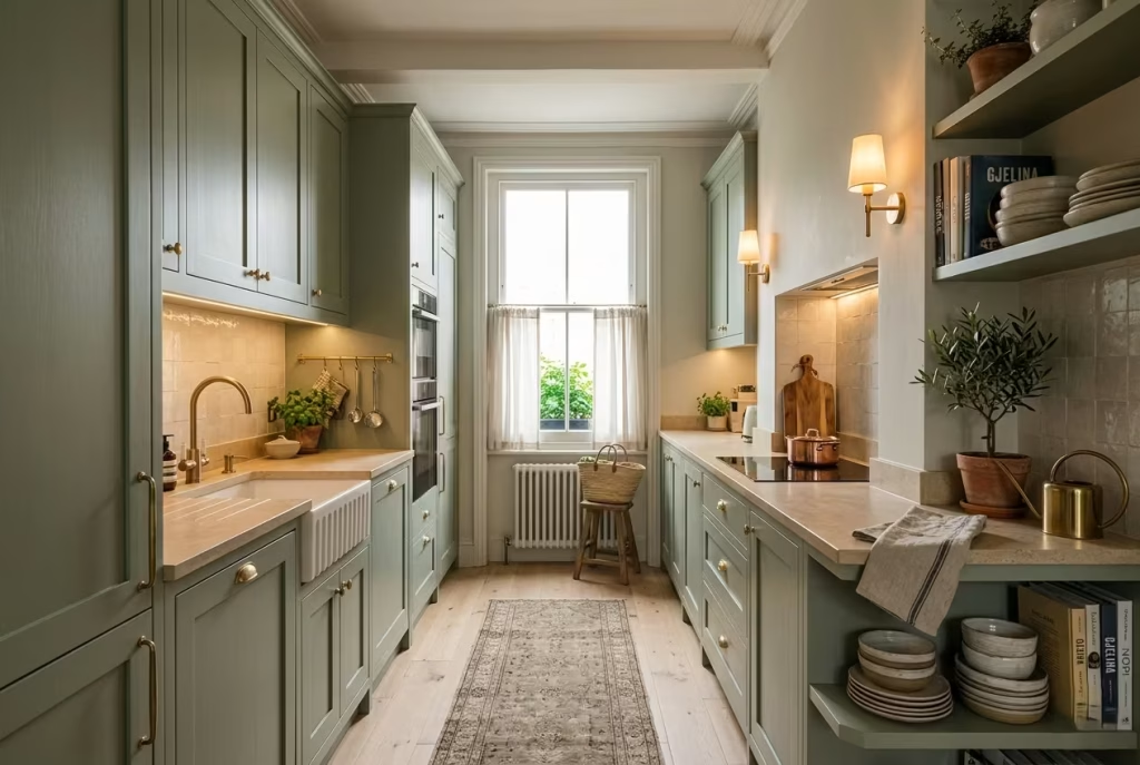
Small kitchens often carry more pressure than larger ones. Every cabinet, every centimetre of circulation space, and every lighting decision has to earn its keep. When handled poorly, compact kitchens can begin to feel cramped before breakfast is even on the table. Yet when the palette and layout are approached thoughtfully, even the smallest kitchen can feel calm, open, and surprisingly restorative to spend time in. Sage green has a remarkable ability to do exactly that.
Unlike darker colours that visually close in a room or stark whites that can sometimes feel clinical in tight quarters, muted sage sits comfortably in the middle ground. It softens edges, blurs harsh boundaries, and introduces colour without overwhelming the architecture. In smaller kitchens especially, that softness matters. The eye moves through the room more gently, which subtly changes how spacious the kitchen feels psychologically.
I noticed this clearly during the renovation of a narrow galley kitchen in a Victorian terrace where natural light only entered from one end of the room. Originally, the kitchen was fitted with bright white cabinetry paired with cold grey flooring. Although technically light in colour, the space felt sharp and uncomfortable, almost like a corridor rather than a kitchen.
Once we introduced muted sage cabinetry, warm stone surfaces, and layered lighting, the room softened instantly. The walls no longer felt as though they were pressing inward. Instead, the kitchen developed a sense of quiet rhythm that made the entire home feel calmer.
Reflective surfaces play an important supporting role here, though balance is key. Small kitchens benefit from materials that bounce light around gently rather than aggressively. Satin-finish tiles, lightly honed stone, glass pendants, or softly reflective splashbacks can all help distribute natural light more evenly throughout the space. High-gloss finishes, however, often create visual glare in compact rooms, which can make the kitchen feel restless rather than serene.
Layered lighting becomes absolutely essential once daylight fades. A single overhead fixture rarely does small kitchens any favours. Combining under-cabinet lighting, warm ceiling fixtures, and perhaps a small wall sconce or pendant near dining areas creates depth that prevents the room from feeling flat after dark.
I usually recommend warm lighting temperatures around 2700K because they preserve the earthy softness of sage green beautifully. Cooler bulbs can quickly drain the warmth from the palette, leaving the room feeling dull and slightly lifeless.
Good proportions also matter more than people often realise. In galley kitchens, maintaining a walkway width between 120 and 150 cm, roughly 4 to 5 feet, generally allows movement to feel comfortable without wasting valuable space. Anything narrower can create frustrating bottlenecks during daily use, especially when multiple people are moving through the kitchen at once. Small kitchens work best when circulation feels instinctive rather than forced.
Compact storage solutions can dramatically improve how a small sage kitchen functions day to day. Deep drawers often outperform traditional lower cabinets because they provide easier access without requiring awkward crouching or digging around in dark corners.
Slim pull-out pantry systems, integrated recycling drawers, and corner storage mechanisms can quietly increase usability without visually crowding the room. In compact kitchens, good storage is not just practical. It directly affects how calm the space feels emotionally.
Vertical storage planning is another trick that punches well above its weight. Extending cabinetry higher toward the ceiling draws the eye upward, making the room feel taller and more composed. In smaller homes, this also helps reduce visual clutter because fewer items are left sitting permanently on countertops. That breathing room matters enormously. Even beautiful kitchens begin to feel chaotic when every surface is overflowing with appliances and everyday objects.
Colour psychology plays a subtle but powerful role in all of this. Sage green connects naturally to landscapes, foliage, and organic textures, which helps create a sense of calm even in busy households. It feels softer on the eye than stark monochrome palettes and more enduring than trend-driven bold colours.
In compact spaces where people spend time cooking, cleaning, gathering, and passing through multiple times each day, that emotional softness can genuinely change how the room is experienced.
The beauty of sage green in small kitchens lies in its ability to make practical spaces feel emotionally generous. It creates breathing room where there may not be much physical space to spare, which, at the end of the day, is often exactly what a hardworking kitchen needs most.
Pros
- Makes compact kitchens feel softer and more visually open
- Pairs beautifully with layered lighting and reflective materials
- Creates a calming atmosphere in busy daily environments
- Works well across modern, farmhouse, and transitional interiors
Cons
- Poor lighting can make sage appear dull in small rooms
- Excessive dark accents may visually shrink the space
- Limited storage planning can quickly create cluttered surfaces
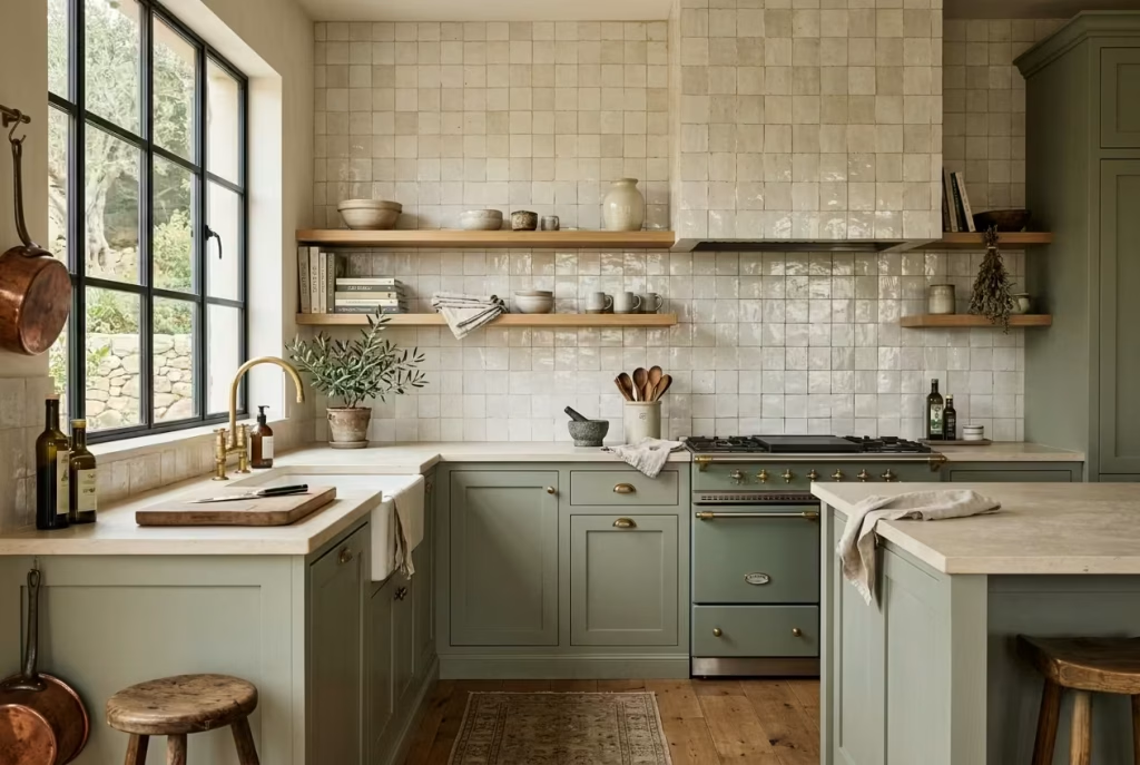
Bring in Handmade Zellige Tiles for Texture and Movement
A kitchen can have the perfect colour palette, beautifully crafted cabinetry, and expensive materials, yet still feel oddly flat once everything is installed. Often, what is missing is movement. Not loud pattern or visual clutter, but the quieter kind of movement created through texture, reflection, and subtle imperfections.
Handmade zellige tiles bring exactly that quality into a sage green kitchen. They catch light unevenly, shift tone throughout the day, and introduce a sense of craftsmanship that machine-perfect finishes rarely achieve.
What makes zellige so captivating is its irregularity. Each tile carries tiny variations in glaze, edges, and surface depth, which means no wall ever feels static. As sunlight moves across the kitchen, some tiles glow softly while others recede into shadow, creating a layered effect that feels alive rather than overly polished. In sage green kitchens especially, this gentle movement prevents the space from becoming too muted or one-dimensional.
I used pale ivory zellige tiles recently in a kitchen renovation where the cabinetry was painted in a dusty sage tone with warm oak detailing. Before the backsplash was installed, the room felt visually calm but slightly unfinished, almost as though it needed another layer of personality.
The moment the handmade tiles went up, the entire atmosphere shifted. Evening light began bouncing softly across the textured glaze, and the kitchen suddenly felt warmer and far more inviting. It was one of those finishing touches that quietly transformed the emotional feel of the space without screaming for attention.
Handmade finishes matter because they soften the precision of fitted cabinetry. Modern kitchens can sometimes become too exact, too symmetrical, too perfect for their own good. Zellige introduces a touch of unpredictability that makes the room feel more human. Like weathered linen or aged timber, the charm lies in the imperfections. Those slight inconsistencies are precisely what stop the kitchen from feeling sterile.
Backsplash height can dramatically influence the overall effect. In smaller kitchens, running zellige only between the countertop and upper cabinets creates enough texture without overwhelming the room. In larger kitchens or spaces with open shelving, extending the tiles fully to the ceiling can create a far more immersive and architectural feel. Behind a range cooker or along a statement wall, full-height zellige often looks particularly striking because the changing glaze catches shadows beautifully throughout the day.
Grout colour selection deserves far more attention than many people realise. Bright white grout can make handmade tiles feel overly grid-like and sharp, which defeats much of their softness. Warm beige, soft taupe, or closely colour-matched grout usually allows the texture of the tiles to remain the focal point. The goal is cohesion, not rigid definition. In kitchens built around sage green, softer grout tones tend to preserve the relaxed atmosphere far more successfully.
Tile maintenance is another consideration worth discussing honestly. Handmade zellige tiles are not completely fuss-free. Their uneven surfaces and porous nature can require sealing, especially around cooking areas where grease and moisture are part of daily life. Still, most homeowners quickly discover that the visual depth they add is well worth the occasional upkeep. Kitchens are meant to be lived in, after all. A little patina often gives handmade materials even greater character over time.
The Moroccan and Mediterranean influences behind zellige tilework also bring warmth and richness into sage kitchens without making them feel themed or overly decorative. The beauty lies in borrowing texture and craftsmanship rather than replicating an entire design style wholesale. Sage green cabinetry paired with softly glazed tiles, warm stone, and aged brass can hint at Mediterranean ease while still feeling entirely appropriate in contemporary, farmhouse, or transitional homes.
Lighting plays an enormous role in how these tiles perform visually. Under natural daylight, zellige reflects subtle tonal shifts that almost shimmer gently across the wall. In the evening, warm under-cabinet lighting can highlight the uneven glaze beautifully, creating depth that flat ceramic tiles simply cannot replicate. Cooler lighting temperatures, however, may flatten the handmade quality and make the surface feel harsher than intended.
What I love most about zellige in sage kitchens is the sense of quiet artistry it introduces. The room no longer feels assembled entirely by machines or governed by rigid perfection. Instead, it carries texture, softness, and the kind of visual nuance that keeps revealing itself slowly over time, which, more often than not, is what makes a kitchen truly memorable.
Pros
- Adds texture, movement, and warmth to sage kitchens
- Reflects natural and artificial light beautifully
- Handmade surfaces create a more layered and authentic feel
- Works across Mediterranean, farmhouse, and contemporary interiors
Cons
- Requires sealing and occasional maintenance
- Poor grout choices can disrupt the softness of the overall palette
- Uneven surfaces may not appeal to homeowners wanting perfect uniformity
Design a Sage Green Kitchen That Feels Seasonal Yet Timeless
The most memorable kitchens rarely feel frozen in time. They shift gently with the seasons, gather character year after year, and adapt naturally to the rhythms of everyday life without constantly demanding reinvention. That is one of the reasons sage green continues to resonate so deeply in residential design. It has enough softness to feel current, yet enough restraint to remain relevant long after louder trends have faded into the background.
A timeless kitchen is not built by avoiding personality altogether. Quite the opposite, actually. It comes from choosing materials and colours that can evolve gracefully rather than locking the room into one very specific moment.
Sage green excels at this because it behaves almost like a neutral under changing light and seasonal styling. In spring and summer, it feels fresh and airy beside linen textiles, pale ceramics, and woven textures. By autumn and winter, the same cabinetry becomes richer and more cocooning when layered with darker woods, aged brass, and warm ambient lighting.
I often tell clients that the strongest kitchens leave a little room for life to move through them. One family kitchen I redesigned several years ago still feels remarkably current today, not because it followed every trend of the moment, but because the palette was intentionally grounded in natural materials.
The cabinetry was painted in a muted sage tone, paired with brushed brass hardware, oak flooring, and lightly textured stone surfaces. Over time, the homeowners gradually introduced seasonal touches such as darker pottery in winter, linen runners in summer, and olive branches or dried florals throughout the year. The kitchen evolved naturally around them instead of needing constant cosmetic overhauls to stay relevant.
Natural textures play a huge role in making sage kitchens feel enduring. Linen, oak, ceramic, and brushed metals all carry an organic softness that ages gracefully. Unlike trend-driven glossy finishes that often look tired once the design cycle shifts, these materials gather character over time. Oak deepens slightly in tone, unlacquered brass develops patina, and handmade ceramics reveal subtle imperfections that make the room feel more lived in and personal.
Seasonal styling swaps can refresh a sage kitchen surprisingly effectively without requiring expensive changes. During warmer months, lighter linens, fresh greenery, woven baskets, and pale stoneware help the room feel breezy and relaxed.
As temperatures cool, introducing darker woods, textured throws on nearby seating, smoked glass, or richer earthy ceramics can create a warmer, more intimate atmosphere. The beauty of sage is that it supports all these transitions naturally without ever feeling out of step.
Layering natural materials also helps prevent the kitchen from looking overly designed or one-dimensional. A room built entirely around one finish or texture can quickly feel flat no matter how expensive the materials are. Pairing matte cabinetry with honed stone, brushed metals, soft timber grain, and tactile fabrics creates visual depth that slowly reveals itself over time. It is a bit like cooking a slow-simmered dish rather than relying on one overpowering ingredient. The richness comes from the layering.
Longevity-focused renovation decisions matter enormously here because timeless kitchens are usually the result of careful restraint rather than constant trend-chasing. I generally encourage homeowners to invest more heavily in enduring architectural elements such as cabinetry quality, storage planning, flooring, and natural materials while allowing smaller decorative layers to evolve gradually. Swapping textiles, lighting, stools, or accessories years later is relatively simple. Replacing poorly chosen cabinetry because the trend has gone stale is a far more painful and expensive lesson.
Lighting deserves special attention because seasonal atmospheres rely heavily on how the room feels at different times of day and year. In summer, natural daylight may flood the kitchen for long stretches, highlighting the freshness of sage cabinetry. In winter, warm layered lighting becomes essential for creating that cosy, settled feeling people instinctively gravitate toward. Under-cabinet lighting, wall sconces, and dimmable pendants allow the kitchen to shift mood naturally as daylight changes.
What makes sage green such a powerful foundation is its ability to support these transitions quietly in the background. It never feels desperate to impress or tied too tightly to one design era. Instead, it adapts, softens, and matures alongside the home itself. In many ways, that flexibility is the true hallmark of timeless design. Kitchens that age well are rarely the ones chasing the loudest trends. They are the ones built thoughtfully enough to grow more beautiful with use, memory, and time.
Pros
- Creates a kitchen that evolves naturally throughout the seasons
- Sage green pairs effortlessly with changing textures and materials
- Encourages longevity-focused design decisions
- Natural finishes develop character beautifully over time
Cons
- Poor material layering can make the room feel visually flat
- Trend-heavy accessories may disrupt the timeless atmosphere
- Inconsistent lighting can alter the warmth of the sage palette dramatically
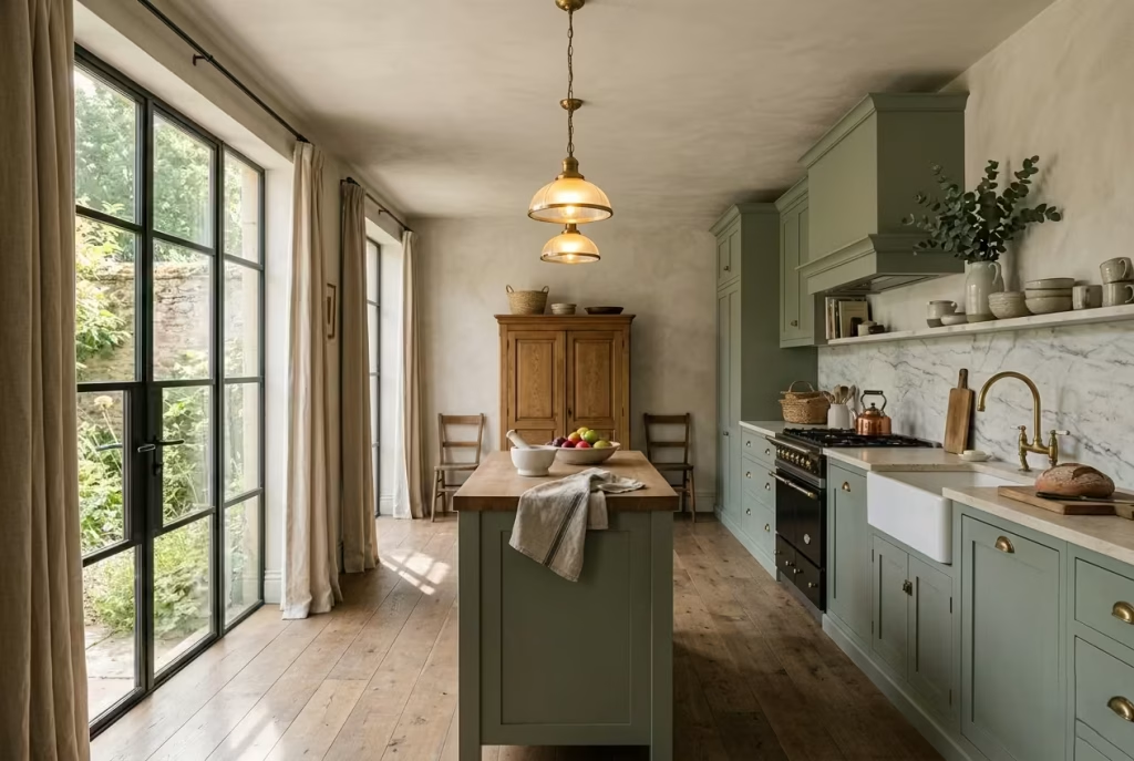
Use Sage Green Alongside Large Windows and Natural Light
Few colours respond to natural light as beautifully as sage green. It is never entirely static. Instead, it shifts gently throughout the day, revealing different undertones depending on the season, the weather, and even the angle of the sun moving across the room. In kitchens blessed with large windows and generous daylight, sage green develops a quiet depth that feels alive and deeply connected to the outdoors.
This changing character is one of the reasons sage kitchens rarely grow tiresome. In the soft glow of early morning light, the colour can appear almost silvery and airy, especially in east-facing kitchens where cooler daylight arrives gently at sunrise. By late afternoon, particularly in west-facing spaces, the same cabinetry often becomes warmer and richer, taking on an earthy softness that feels incredibly comforting. It is almost as though the kitchen breathes differently throughout the day.
I noticed this dramatically during the renovation of a countryside kitchen surrounded by oversized steel-framed windows overlooking the garden. The sage cabinetry behaved almost like a living material. On bright spring mornings, it felt crisp and fresh beside the pale stone flooring. During golden hour, however, the cabinetry deepened into a warmer olive-sage tone that made the entire room feel wrapped in warmth. That subtle evolution gave the kitchen a sense of movement that static colours often struggle to achieve.
Understanding how directional light affects sage is crucial before choosing the exact shade. East-facing kitchens typically receive cooler, bluer light in the morning and softer indirect light later in the day. In those spaces, warmer sage tones with muted earthy undertones usually perform best because they prevent the room from feeling chilly.
West-facing kitchens, on the other hand, benefit from intense golden afternoon light, which can make some greens appear far warmer and more saturated than expected. Testing paint samples morning, afternoon, and evening becomes absolutely essential because sage is highly responsive to surrounding conditions.
Large windows also introduce another important design consideration, balance. Without enough texture or grounding materials, kitchens flooded with daylight can sometimes feel too exposed or visually washed out. Sage helps soften that brightness naturally, while tactile materials such as oak, limestone, linen, and brushed metals add depth that anchors the room emotionally.
Window treatments play a surprisingly important role here. Heavy curtains often interrupt the openness that makes naturally lit kitchens feel so appealing in the first place. Sheer linen curtains tend to work far more successfully because they filter harsh sunlight gently without blocking it completely.
The effect feels relaxed and effortless, almost like sunlight passing through soft fabric in an old European farmhouse. Linen also introduces movement and texture that complement sage cabinetry beautifully without competing for attention.
Indoor greenery can strengthen the connection between the kitchen and the landscape outside, but restraint matters. A few thoughtfully placed olive trees, trailing herbs, or sculptural branches usually create a far more sophisticated atmosphere than overcrowding every surface with plants. Sage green already carries strong natural associations, so the goal should be enhancement rather than visual overload.
Countertop selection becomes especially important in kitchens with abundant natural light because surfaces will constantly reflect changing daylight back into the room. Light-reflective materials such as honed quartzite, creamy marble, softly polished limestone, or lightly textured porcelain help distribute brightness more evenly while keeping the palette calm and cohesive.
Highly reflective glossy surfaces, however, can sometimes create uncomfortable glare, particularly during midday sunlight when the room is already bright enough on its own.
Lighting after sunset matters just as much. Kitchens with large windows often feel wonderfully open during the day but can become dark voids at night if artificial lighting has not been layered carefully.
Warm under-cabinet lighting, dimmable pendants, and subtle wall sconces help maintain intimacy once daylight disappears. Sage green responds beautifully to warm evening lighting, becoming softer and more enveloping rather than fading into the background.
What makes this pairing so successful is the conversation between indoors and outdoors. Sage green mirrors the natural environment without imitating it too literally. Combined with shifting daylight, soft textures, and thoughtful materials, the kitchen begins to feel less like a sealed interior and more like an extension of the landscape itself. That connection brings a sense of calm that people often feel instinctively the moment they walk into the room.
Pros
- Natural light enhances the depth and variation of sage green beautifully
- Large windows create a calm, airy atmosphere
- Works especially well with natural textures and reflective stone surfaces
- Sage connects interiors softly with outdoor surroundings
Cons
- Changing daylight can alter the appearance of sage dramatically
- Poor window treatments may create excessive glare or heat
- Overusing greenery can make the space feel visually cluttered
Create a Full-Height Sage Pantry Wall for Architectural Impact
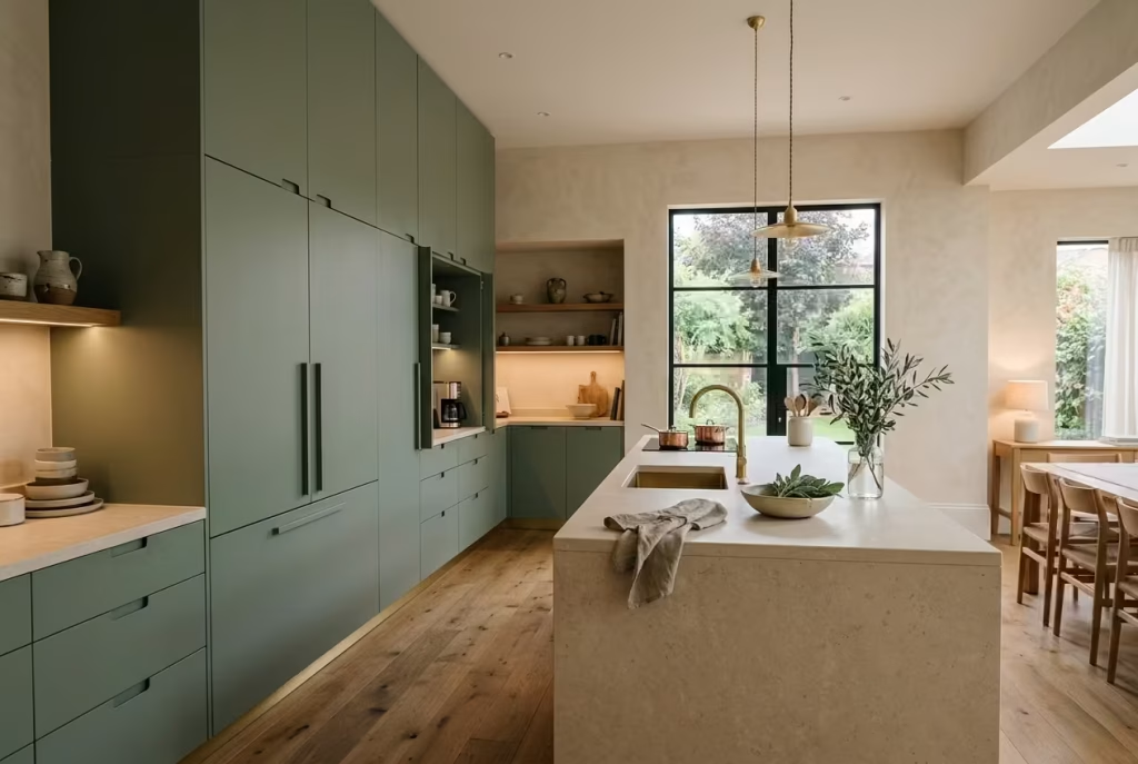
Some kitchens feel beautifully organised the moment you step into them, even before you notice a single decorative detail. More often than not, the secret sits in the storage planning. A full-height sage pantry wall has the ability to transform an ordinary kitchen into something far more architectural and composed, creating clean visual rhythm while quietly swallowing the clutter that usually spills across countertops.
There is something incredibly satisfying about cabinetry that stretches confidently from floor to ceiling. It draws the eye upward, strengthens the proportions of the room, and gives the kitchen a sense of permanence that standard upper cabinets rarely achieve.
In sage green especially, full-height pantry walls feel soft enough to avoid visual heaviness yet substantial enough to anchor the entire space. The effect becomes particularly striking in kitchens with ceilings above 2.8 metres, or roughly 9.2 feet, where the vertical scale allows the cabinetry to feel almost built into the architecture itself.
I used this approach recently in a large open-plan renovation where the homeowners were desperate to reduce visual noise. Appliances had slowly colonised every worktop over the years, and despite the generous square footage, the kitchen always felt slightly chaotic. We introduced a full-height sage pantry wall along one side of the room, concealing refrigeration, dry storage, small appliances, and even a coffee station behind flush cabinet fronts. The transformation was immediate. Suddenly, the kitchen felt calmer, taller, and far more intentional, as though the room had finally exhaled after years of holding its breath.
One of the biggest advantages of full-height cabinetry is its ability to create seamless storage without visually chopping the room into sections. Traditional upper cabinets can sometimes interrupt the flow of the walls, particularly in modern kitchens where cleaner lines are preferred.
Full-height systems simplify the architecture, allowing the eye to travel more smoothly across the space. Sage green softens this expansiveness beautifully, preventing large cabinet runs from feeling too imposing or monolithic.
Hidden appliance garages are another feature that can dramatically improve daily life in busy kitchens. Toasters, coffee machines, mixers, and charging stations all tend to create countertop clutter surprisingly quickly. Appliance garages tucked behind retractable or pocket doors keep those everyday essentials accessible without leaving them permanently on display. In family kitchens especially, this balance between practicality and visual calm is worth its weight in gold.
Integrated storage planning becomes essential when designing these larger cabinetry systems. Deep pull-out pantry drawers, vertical tray storage, concealed recycling zones, and adjustable shelving all help maximise usability without sacrificing aesthetics.
I often encourage clients to think carefully about their daily routines before finalising layouts. A beautiful pantry wall means very little if every frequently used item ends up awkwardly out of reach. Good design should support how people actually live, not just how the kitchen photographs.
Flush cabinetry systems help strengthen the architectural quality even further. Flat or slim-profile sage doors without excessive detailing allow the cabinetry to feel sleek and uninterrupted, almost like part of the wall itself. Integrated handles or discreet recessed pulls maintain that clean visual flow while preventing the kitchen from becoming overly decorative. This approach works especially well in contemporary homes, though it can also blend beautifully into transitional interiors when paired with warmer materials such as oak, limestone, or aged brass.
Visual symmetry also plays an important role in why full-height pantry walls feel so calming. Humans naturally respond to balance within a space, and aligned cabinetry lines create a sense of order that the eye instinctively finds reassuring.
Symmetrical layouts surrounding ovens, refrigeration, or central pantry sections tend to feel especially composed. That said, symmetry should never become rigid to the point of sacrificing functionality. The best kitchens know when to bend the rules slightly in favour of real life.
Lighting deserves thoughtful planning too because large cabinetry walls can absorb more light than homeowners anticipate. Under-cabinet lighting, ceiling spot placement, and warm wall sconces help prevent the room from feeling visually dense after sunset. Sage green responds beautifully to warm layered lighting, developing a rich softness that makes tall cabinetry feel inviting rather than overpowering.
What makes a full-height sage pantry wall so successful is not simply the storage it provides, but the emotional calm it creates. By hiding the practical chaos of everyday life behind beautifully considered joinery, the kitchen gains breathing room.
The architecture begins to feel cleaner, the surfaces quieter, and the entire room more intentional. In many ways, that quiet sense of order is what allows the rest of the design to truly shine.
Pros
- Creates seamless storage with strong architectural presence
- Reduces countertop clutter significantly
- Makes kitchens feel taller and more visually organised
- Hidden appliance garages improve everyday functionality
Cons
- Large cabinetry walls can feel heavy without proper lighting
- Poor internal planning may reduce usability
- Full-height systems often require higher renovation budgets
You May also Like: 25 Soft & Serene Sage Green Bedrooms for the Ultimate Relaxing Vibe
Common Mistakes That Can Make Sage Green Kitchens Feel Flat
Sage green has a reputation for being easy to work with, but that does not mean every sage kitchen automatically feels warm, layered, or beautifully resolved. In fact, some end up feeling surprisingly dull despite using expensive materials and carefully planned layouts. More often than not, the issue is not the colour itself. It is the surrounding decisions that either allow sage green to breathe or quietly drain the life out of it.
The most successful sage kitchens understand that atmosphere comes from balance, texture, and light working together behind the scenes. Without those supporting layers, even the most beautiful shade of green can begin to feel one-note. Like a meal missing seasoning, the room may look technically complete while still lacking depth and emotional warmth.
Choosing the Wrong Undertone
Not all sage greens behave the same way. Some lean warm and earthy with olive undertones, while others carry cooler grey pigments that can feel far sharper once installed across an entire kitchen. Choosing the wrong undertone for the room’s lighting conditions is one of the quickest ways to make the space feel flat or disconnected.
I have seen north-facing kitchens painted in cool grey-green shades that looked elegant on a sample card but turned lifeless once covering full cabinetry. The room lost warmth almost overnight. In spaces with limited daylight, warmer sages with muted earthy undertones usually perform far better because they soften shadows rather than exaggerating them.
Paint samples should always be tested morning, afternoon, and evening. Sage green is highly reactive to changing light conditions, and what feels calming at noon may feel muddy after sunset.
Ignoring Natural Light Direction
Light direction quietly shapes how every colour behaves. East-facing kitchens often carry cooler morning light, while west-facing rooms become much warmer and more golden later in the day. Ignoring these shifts can leave homeowners wondering why their carefully chosen sage suddenly feels completely different once installed.
Natural light is not just decoration. It acts almost like another material in the room. In kitchens flooded with daylight, pale sage tones can feel beautifully airy and expansive. In darker spaces, however, those same shades may lose definition unless paired with warmer textures and layered lighting.
This is why I always encourage clients to consider the room’s lighting before committing to paint, stone, or flooring. A kitchen that works with its light rather than against it will always feel more comfortable to live in.
Overusing Cool Grey Materials
There was a period when cool greys dominated nearly every modern kitchen, but when paired carelessly with sage green, they can flatten the atmosphere remarkably quickly. Grey flooring, icy quartz countertops, chrome finishes, and cool white lighting often pull the warmth out of sage, leaving the kitchen feeling emotionally cold despite the softness of the cabinetry.
Sage green tends to thrive beside warmer companions such as oak, limestone, travertine, aged brass, and creamy stone surfaces. These materials bring balance and help the colour reveal its richer, more natural side. Without that warmth, the room can begin feeling sterile, almost like a showroom designed for display rather than daily life.
Using Too Many Competing Green Shades
One sage tone used consistently usually feels intentional. Five different greens fighting for attention rarely do. Layering too many shades across cabinetry, tiles, accessories, walls, and furnishings often creates visual confusion instead of depth.
I once visited a kitchen where sage cabinetry, emerald bar stools, olive walls, mint accessories, and green marble all competed in the same space. Individually, many of the pieces were beautiful. Together, the room felt restless and visually exhausting. Sometimes less truly is more.
The strongest sage kitchens typically allow one dominant green tone to lead while surrounding materials support it quietly through texture and contrast.
Neglecting Texture Layering
Perhaps the most common mistake of all is relying on colour alone to carry the entire design. Sage green without texture can feel surprisingly flat, especially in modern kitchens dominated by smooth surfaces.
Texture is what gives the room soul. Linen curtains moving gently beside the windows, brushed brass hardware developing patina over time, lightly honed stone catching afternoon light, handmade ceramics resting on open shelving. These layered details create warmth that paint alone simply cannot provide.
Kitchens need tactile contrast to feel lived in rather than staged. Otherwise, even beautiful colour palettes can start feeling one-dimensional.
Why Lighting Temperature Matters
Lighting temperature changes everything in a sage kitchen. Cool white LEDs often strip away the softness of the green, pushing it toward grey and making the entire room feel harsher than intended. Warm lighting around 2700K generally creates a far more inviting atmosphere because it enhances the earthy undertones within the cabinetry and natural materials.
Layered lighting also matters enormously. Under-cabinet lighting, wall sconces, pendant lights, and softer evening illumination create depth that overhead lighting alone cannot achieve.
Avoiding Showroom Style Sterility
One of the easiest traps to fall into is over-designing the kitchen until it no longer feels personal. Perfectly styled shelves, untouched countertops, and excessive symmetry may photograph beautifully, but they can leave the room feeling emotionally distant.
The best sage kitchens leave space for life to happen naturally. A worn wooden board leaning casually against the backsplash, linen towels softening over time, ceramics collected gradually rather than bought all at once. These imperfections create warmth that polished perfection rarely manages to capture.
Balancing Warm and Cool Finishes
Balance is what ultimately gives sage kitchens their staying power. Too many warm finishes and the room may feel heavy or overly rustic. Too many cool finishes and it risks feeling clinical. The sweet spot usually sits somewhere in between.
Warm woods, creamy stone, and aged metals paired with controlled cooler accents such as black framing or lightly veined marble create tension in the best possible way. Like any beautifully composed room, the magic often lies not in extremes, but in the quiet conversation happening between them.
How to Choose the Right Sage Green Shade for Your Kitchen
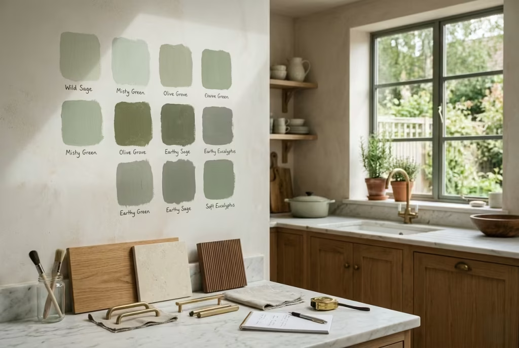
Choosing a sage green paint colour sounds deceptively simple until you stand in front of twenty nearly identical swatches wondering why each one suddenly looks completely different against your walls. Sage is one of those colours that changes personality constantly depending on light, surrounding materials, and even the time of day. The right shade can make a kitchen feel calm, elegant, and deeply welcoming. The wrong one can leave the room looking flat, murky, or unexpectedly cold.
The secret lies in understanding undertones, light behaviour, and the emotional atmosphere you want the kitchen to carry long after the renovation dust settles.
Understanding the Difference Between Pale Sage, Earthy Sage, and Grey Green
Not all sage greens create the same mood. Pale sages tend to feel lighter and airier, making them especially useful in smaller kitchens or homes where natural daylight is limited. They soften the room gently without dominating the architecture, almost like a light mist settling over the space.
Earthy sages carry warmer olive undertones and often feel richer, more grounded, and slightly more traditional. These shades work beautifully beside natural oak, limestone, aged brass, and textured plaster because they echo colours found naturally outdoors.
Grey-green sages lean cooler and more muted. In some modern kitchens, this can create a sophisticated restrained atmosphere. In darker rooms, however, these cooler undertones may feel slightly lifeless if not balanced carefully with warm materials and lighting.
I often tell clients that sage should feel settled rather than sharp. If the colour immediately screams green the moment you enter the room, it usually means the undertone is working too hard.
Best Sage Shades for Modern Homes
Modern kitchens generally benefit from cleaner, quieter sage tones with subtle grey or mineral undertones. These softer shades pair naturally with flat-panel cabinetry, integrated appliances, warm stone surfaces, and minimal detailing without making the room feel overly rustic.
In contemporary homes filled with glass, steel, or concrete, muted sages help soften harder architectural edges while still maintaining a refined look. Matte finishes usually work particularly well because they absorb light softly and allow the colour to feel more architectural rather than decorative.
Best Sage Shades for Period Properties
Older homes often suit warmer sage tones with slightly earthy undertones because they sit comfortably alongside original architectural details such as timber beams, mouldings, stone flooring, or traditional shaker cabinetry.
I worked on a Victorian townhouse kitchen where a cooler sage initially looked elegant on paper but felt disconnected once installed beside the original oak flooring and plaster cornices. Switching to a warmer herbaceous sage completely transformed the atmosphere. Suddenly, the kitchen felt as though it belonged to the house rather than competing against it.
Period homes generally respond best to colours that carry a little softness and depth rather than overly crisp modern tones.
Why Paint Sampling Matters More Than People Expect
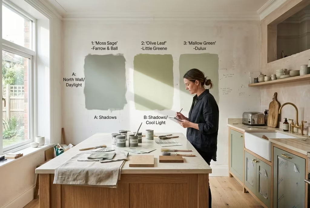
Paint sampling is not optional with sage green. It is essential. Few colours shift as dramatically throughout the day. A shade that feels beautifully soft in the morning may suddenly appear muddy or overly grey by evening once artificial lighting takes over.
I always recommend testing large samples on multiple walls and observing them from morning through night. Pay attention to cloudy days as well because natural light conditions can completely alter the personality of the colour.
One renovation taught this lesson particularly well. A homeowner chose a sage tone entirely from a tiny sample card under showroom lighting. Once applied across full cabinetry in their north-facing kitchen, the colour turned noticeably colder and flatter than expected. We eventually repainted using a warmer sage with a slightly higher light reflectance value, and the entire kitchen immediately felt brighter and more welcoming.
Understanding LRV and Why It Matters
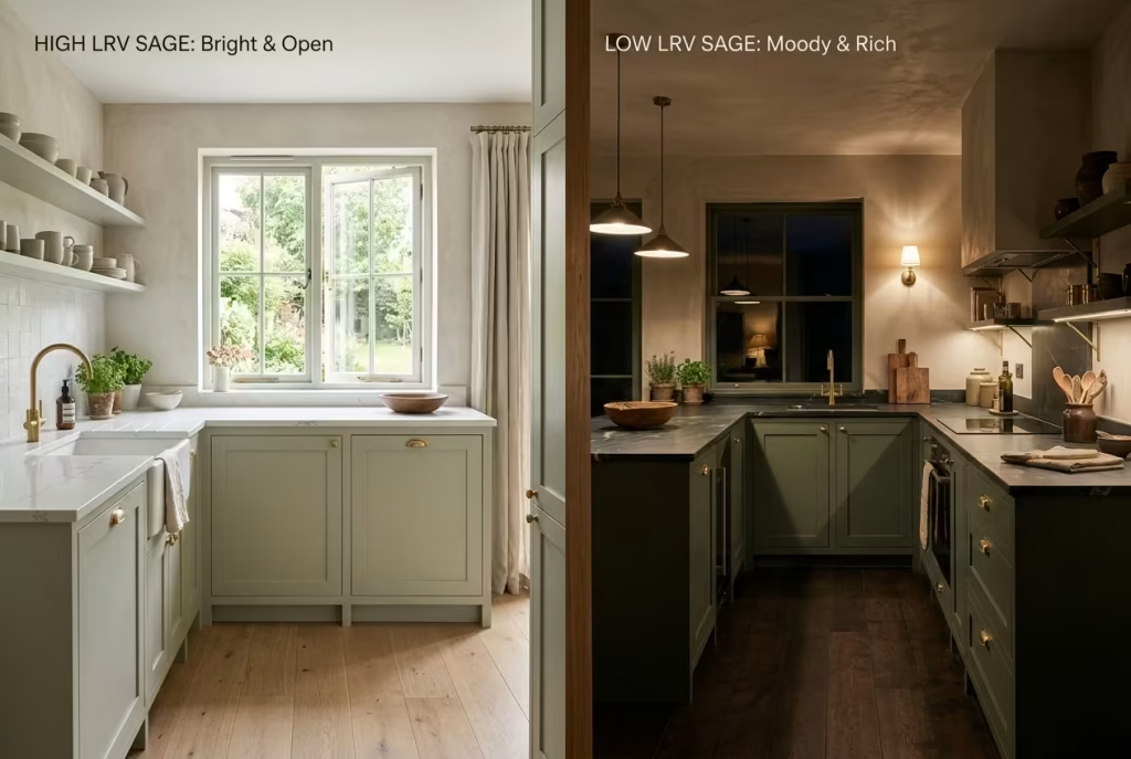
LRV, or Light Reflectance Value, measures how much light a paint colour reflects back into the room. Lower LRV colours absorb more light and generally appear moodier, while higher LRV shades feel brighter and more open.
In compact or darker kitchens, sage shades with a slightly higher LRV often perform better because they prevent the room from feeling visually compressed. Larger kitchens with abundant daylight can comfortably handle deeper, moodier sages without losing warmth.
North Facing vs South Facing Kitchens
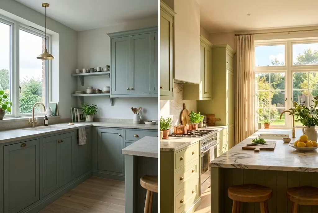
North-facing kitchens usually carry cooler natural light, which can exaggerate blue and grey undertones within sage paint. Warmer earthy sages tend to feel more balanced in these spaces because they counteract the coolness naturally.
South-facing kitchens receive warmer sunlight for most of the day, which allows slightly cooler sage tones to work more comfortably without feeling cold. These kitchens can often support richer or darker greens because natural light keeps the palette feeling lively.
Directional light quietly changes everything. Ignoring it is often where colour decisions begin to unravel.
Choosing the Right Paint Finish
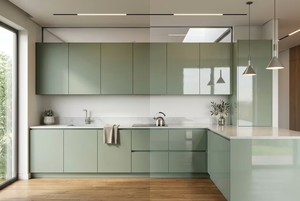
Finish matters just as much as colour. Full gloss tends to feel too reflective for sage kitchens, often making the cabinetry appear harder and less natural. Matte finishes create beautiful softness but may require more maintenance in busy family kitchens.
Eggshell or low-sheen satin finishes usually strike the best balance. They provide enough durability for daily use while still allowing sage green to retain its calm, velvety character.
Ultimately, the right sage green should feel effortless in the room, not forced into it. The best kitchens rarely rely on colour alone to create atmosphere. Instead, the shade works quietly alongside light, texture, and material warmth, creating a space that feels balanced from the very first glance.
Final Thoughts: Why Sage Green Kitchens Continue to Feel Effortlessly Relevant
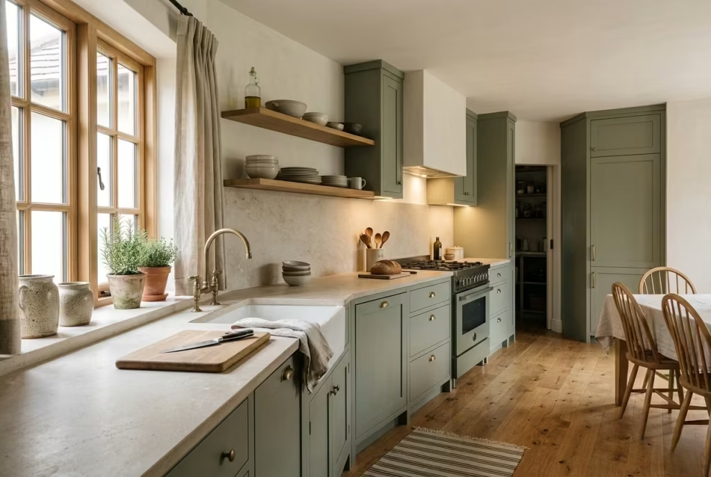
Kitchen trends have a habit of arriving with great fanfare before quietly slipping out the back door a few years later. One season it is high-gloss monochrome finishes, the next it is dramatic dark cabinetry or aggressively minimalist spaces that look immaculate but feel slightly untouchable. Sage green has managed to avoid that cycle almost entirely, and the reason runs far deeper than colour preference alone.
What gives sage green its staying power is its emotional balance. It carries softness without becoming sugary, warmth without feeling heavy, and character without demanding constant attention. In a world where many interiors seem desperate to impress instantly, sage green moves at a slower, steadier pace. It creates kitchens people actually want to live in rather than simply photograph.
That emotional longevity matters more than ever because kitchens are no longer purely functional rooms tucked away behind closed doors. They have become gathering spaces, work zones, quiet morning retreats, and social hubs all at once.
The colours surrounding those daily routines affect how the space feels on a subconscious level. Sage green brings a calmness that settles naturally into the background of everyday life, which is perhaps why people rarely tire of it.
I have seen homeowners initially hesitate over sage because they fear green may eventually date the kitchen. Interestingly, the opposite tends to happen. The muted, nature-led quality of sage allows it to evolve gracefully alongside changing furniture, lighting, and décor choices over time. While trend-driven colours often feel tied to a very specific design moment, sage behaves more like a natural material. It adapts rather than expires.
Its compatibility with other materials also plays a huge role in its enduring appeal. Sage green sits comfortably beside warm oak, limestone, marble, aged brass, black steel, linen textures, and handmade ceramics without fighting for dominance. That flexibility gives homeowners room to refresh smaller details over the years without needing to reinvent the entire kitchen. A space built around natural harmony will almost always outlast one built around novelty.
The best sage kitchens also understand the value of restraint. They do not rely on endless styling tricks or dramatic statement pieces to feel complete. Instead, they create atmosphere through quieter decisions. Soft lighting grazing textured surfaces. Warm stone catching afternoon sun. Cabinetry that feels integrated into the architecture rather than placed on top of it. These kitchens feel composed because every layer supports the next rather than competing for attention.
Perhaps that is why sage green continues to resonate so strongly in modern homes. It reflects a growing desire for interiors that feel restorative instead of performative. Spaces that welcome the messiness of real life while still offering beauty, calm, and a sense of order beneath it all. In many ways, sage green succeeds because it never tries too hard.
A successful sage green kitchen rarely depends on colour alone. What gives it lasting depth is the way texture, light, proportion, and material warmth quietly work together behind the scenes, creating a space that feels settled from the very beginning.
Frequently Asked Questions about Sage Green Kitchen
Is sage green a timeless colour for kitchens?
Yes, sage green has proven to be one of the few kitchen colours with genuine staying power. Unlike trend-driven shades that quickly feel dated, sage sits comfortably within natural, muted palettes that age gracefully over time. Its softness allows it to adapt across changing styles, whether the kitchen leans modern, farmhouse, transitional, or classic. Because it pairs so naturally with materials like oak, marble, limestone, and brass, it rarely feels locked into one specific design era.
What colours work best with sage green kitchen cabinets?
Sage green works beautifully with warm neutrals and natural textures. White oak, walnut, creamy limestone, travertine, marble, brushed brass, matte black accents, and soft taupe tones all complement sage effortlessly. Warm whites generally create a softer and more inviting atmosphere than cooler bright whites, which can sometimes make sage appear slightly flat or overly grey.
Does sage green work in small kitchens?
Absolutely. In fact, sage green often performs surprisingly well in compact kitchens because of its muted, calming quality. Unlike darker saturated colours that may visually shrink the room, sage tends to soften boundaries and create a more relaxed atmosphere. Pairing sage cabinetry with layered lighting, reflective stone surfaces, and lighter walls can help small kitchens feel more open and breathable.
Should sage green cabinets be matte or glossy?
Matte or low-sheen finishes usually suit sage green far better than high-gloss surfaces. Matte cabinetry absorbs light softly and allows the colour to feel more natural and sophisticated. Glossy finishes can sometimes make sage appear colder or overly artificial, particularly under strong artificial lighting. In busy family kitchens, eggshell or satin finishes often provide the best balance between durability and softness.
What countertop materials pair best with sage green kitchens?
Natural materials tend to work best because they enhance the organic quality of sage green. Marble, quartzite, limestone, travertine, and warm-toned quartz surfaces all pair beautifully with sage cabinetry. Countertops with soft veining or subtle movement usually create a more timeless effect than heavily patterned surfaces, which can compete visually with the cabinetry.
Does sage green look too dark in north-facing kitchens?
Not necessarily, but the undertone matters enormously. North-facing kitchens receive cooler natural light, which can make some sage paints appear greyer or flatter than expected. Warmer sage shades with soft earthy undertones generally perform better in these spaces because they counterbalance cooler daylight naturally. Testing samples throughout the day is essential before committing to a final colour.
Can sage green kitchens work in modern homes?
Yes, sage green can look incredibly refined in contemporary kitchens when paired with clean lines and restrained detailing. Flat-panel cabinetry, integrated appliances, matte finishes, warm stone surfaces, and slim black accents all help sage feel modern rather than overly traditional. The colour softens minimalist architecture beautifully without sacrificing sophistication.
What hardware finishes look best with sage green cabinets?
Brushed brass, antique brass, matte black, aged bronze, and warm nickel finishes tend to pair exceptionally well with sage green. Brass introduces warmth and softness, while black accents create sharper architectural contrast. The best choice usually depends on the overall atmosphere you want the kitchen to carry, whether that is relaxed and rustic or clean and contemporary.
Are sage green kitchens difficult to maintain?
Sage green kitchens are often easier to maintain than stark white kitchens because muted green tones tend to disguise fingerprints, dust, and minor wear more effectively. Matte and textured finishes can also help soften the appearance of everyday marks. However, lighter sage shades may still require occasional cleaning in high-traffic cooking zones, especially around handles and lower cabinetry.
How can I stop a sage green kitchen from feeling flat?
Texture and lighting are usually the missing ingredients when sage kitchens feel dull. Layering materials such as oak, limestone, handmade tiles, linen textiles, and brushed metals adds warmth and visual depth. Warm layered lighting also plays a huge role. Under-cabinet lighting, wall sconces, and softer evening illumination help sage green reveal its richness far more effectively than harsh overhead lighting alone.