25 Neutral Modern Bedroom Ideas That Feel Calm, Considered, and Timeless
Neutral modern bedrooms are often misunderstood as minimal to the point of feeling empty, but in practice, they are anything but plain. When I design these spaces, I approach them as carefully composed environments where restraint is not limitation but refinement, where every element earns its place rather than competing for attention. It is a discipline rooted in proportion, balance, and material intelligence, shaped over time rather than assembled in haste.
What defines a truly successful neutral bedroom is not the absence of colour, but the presence of depth, achieved through tonal layering, tactile contrast, and the quiet dialogue between light and surface. A soft linen headboard catching morning light, timber flooring warming underfoot, and plastered walls shifting subtly throughout the day all work together, almost behind the scenes, to create a space that feels calm yet considered.
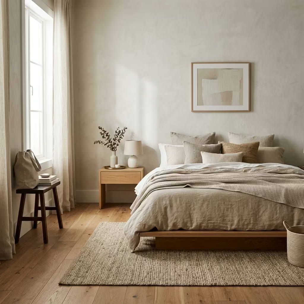
In real projects, I have seen that when neutrality is handled with intention, it becomes a canvas that adapts effortlessly to everyday life. Far from being one-note, these bedrooms reveal their richness gradually, offering a sense of ease that feels both lived-in and quietly luxurious.
What Defines a Neutral Modern Bedroom? (Design Framework)
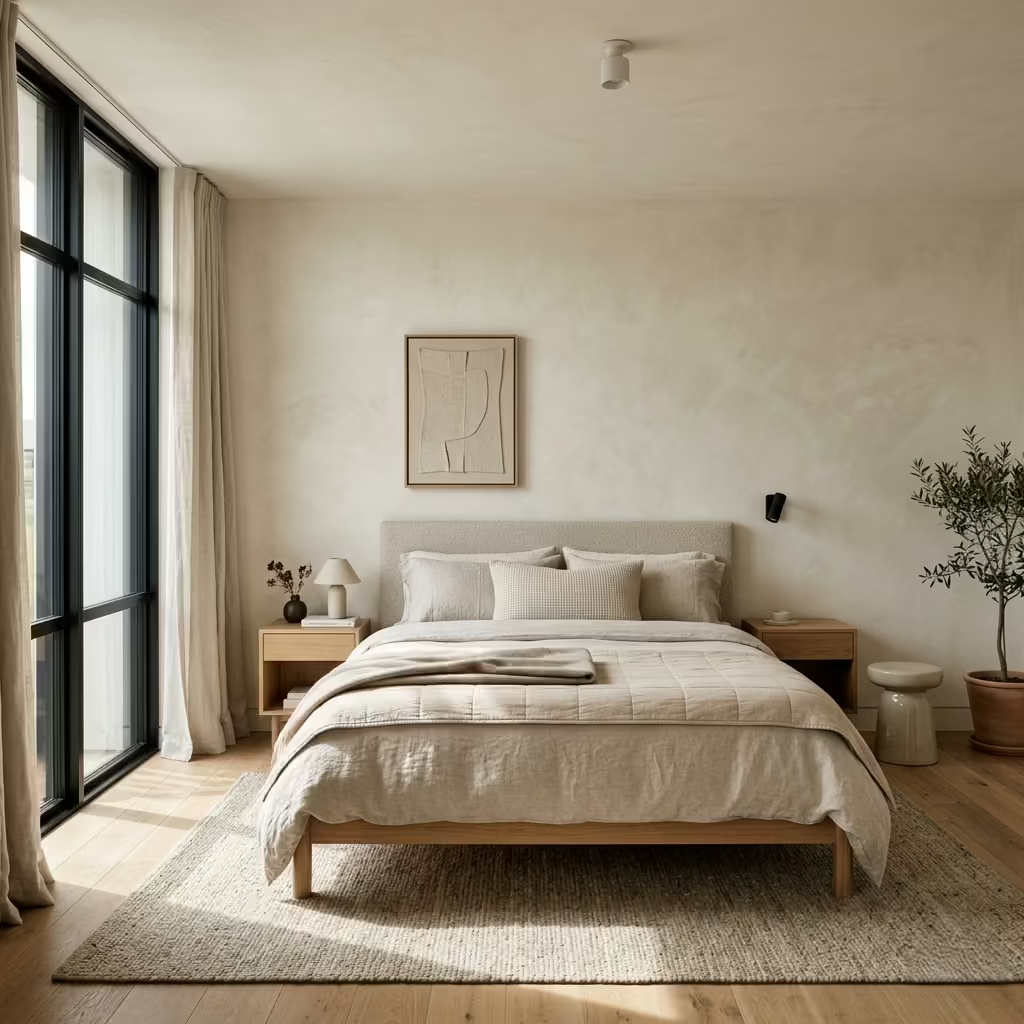
A neutral modern bedroom, when properly resolved, is not simply a palette choice but a spatial strategy. It relies on restraint, yes, but more importantly on how elements are composed, layered, and allowed to breathe. In my work, I treat neutrality as a framework, not a finish line, something that evolves through proportion, light behaviour, and material interplay rather than surface-level styling.
Tonal Layering vs Flat Colour Schemes
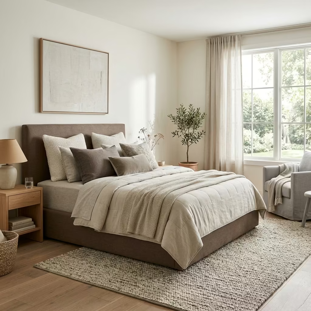
The difference between a refined neutral bedroom and one that falls flat often comes down to layering. A single shade of beige or grey, applied wall to wall, tends to feel one-dimensional, almost like it is missing a heartbeat. Instead, I build rooms using closely related tones, warm whites against soft greiges, muted taupes sitting alongside pale oak, each one slightly offset yet cohesive.
In practice, this might mean walls in a warm off-white, upholstery in a deeper neutral, and bedding in a lighter variation, all working together like a well-rehearsed ensemble. It is this subtle variation, almost under the radar, that gives the room depth without disturbing its calm.
Role of Natural Light and Shadow
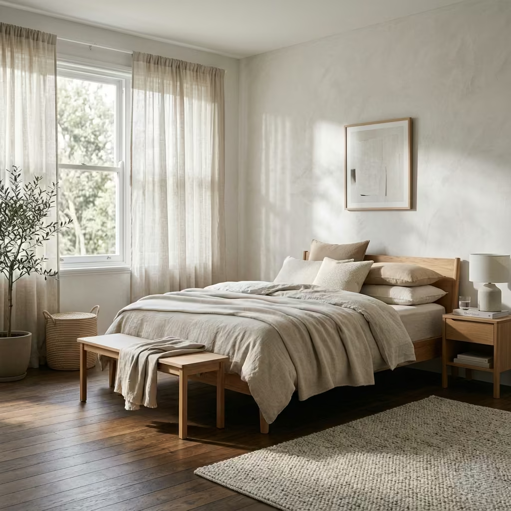
Neutral spaces live and die by light. Without it, even the best material palette can feel dull. With it, the room takes on a life of its own. I always study how daylight moves through a bedroom, from early morning softness to late afternoon warmth, because neutral surfaces respond differently at each hour.
A plaster wall, for instance, will catch shadows in a way flat paint never can, while linen curtains filter light, diffusing it gently across the room. It is a bit like watching a slow transformation unfold, where the space never feels static but quietly shifts throughout the day.
Material Hierarchy (Timber, Linen, Stone, Plaster)
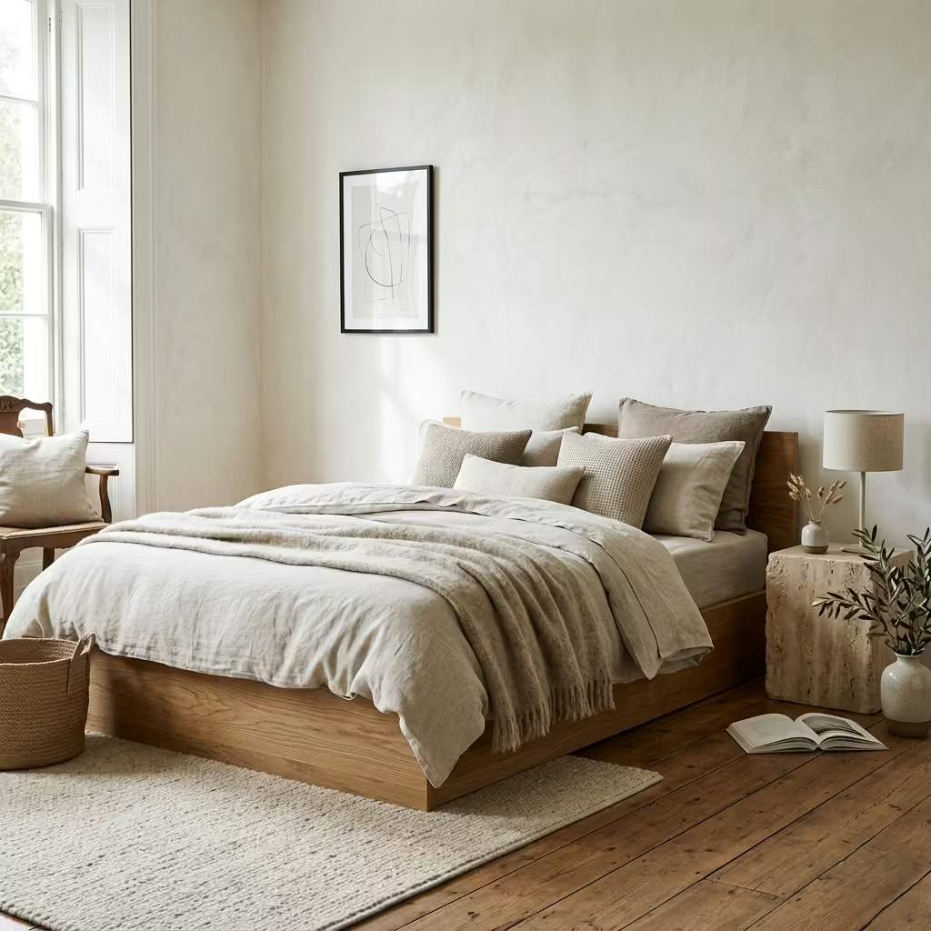
One of the biggest mistakes I see is treating all materials equally, which often leads to visual confusion. In a well-designed neutral bedroom, materials are layered with intent, each one playing a distinct role.
I typically anchor the space with something warm and grounding, such as timber flooring with a matte finish, laid in planks around 140–180 mm (5.5–7 inches) wide. From there, I introduce softness through linen bedding or upholstered elements, then contrast it with something more tactile or structured, like a stone bedside surface or a lightly textured plaster wall.
Think of it as a quiet hierarchy, where no element shouts, but each contributes, working in harmony rather than pulling in different directions.
Spatial Clarity and Visual Breathing Room
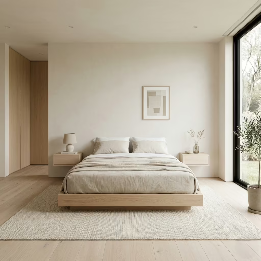
Neutral design is unforgiving when it comes to layout. Without bold colours or patterns to distract the eye, proportion and spacing become immediately noticeable. This is where spatial clarity comes into play.
I always ensure there is enough negative space around key elements, particularly the bed. As a rule of thumb, I maintain at least 75–90 cm (30–36 inches) of clear circulation on either side, allowing movement to feel natural rather than constrained. Furniture is selected not just for aesthetics but for its visual weight, often opting for lower profiles or floating elements to keep the room feeling open.
When done right, the room feels effortless, as if everything has fallen into place on its own, even though every decision has been carefully considered.
Real-Life Insight
I often explain to clients that neutrality is less about colour and more about how surfaces interact under light across the day. In one recent project, what initially felt like a “safe” palette of soft beige transformed entirely once we introduced textured plaster walls and sheer curtains. By the time the light filtered through in the afternoon, the room had depth, movement, and a quiet richness that no single colour could have achieved on its own.
25 Neutral Modern Bedroom Ideas
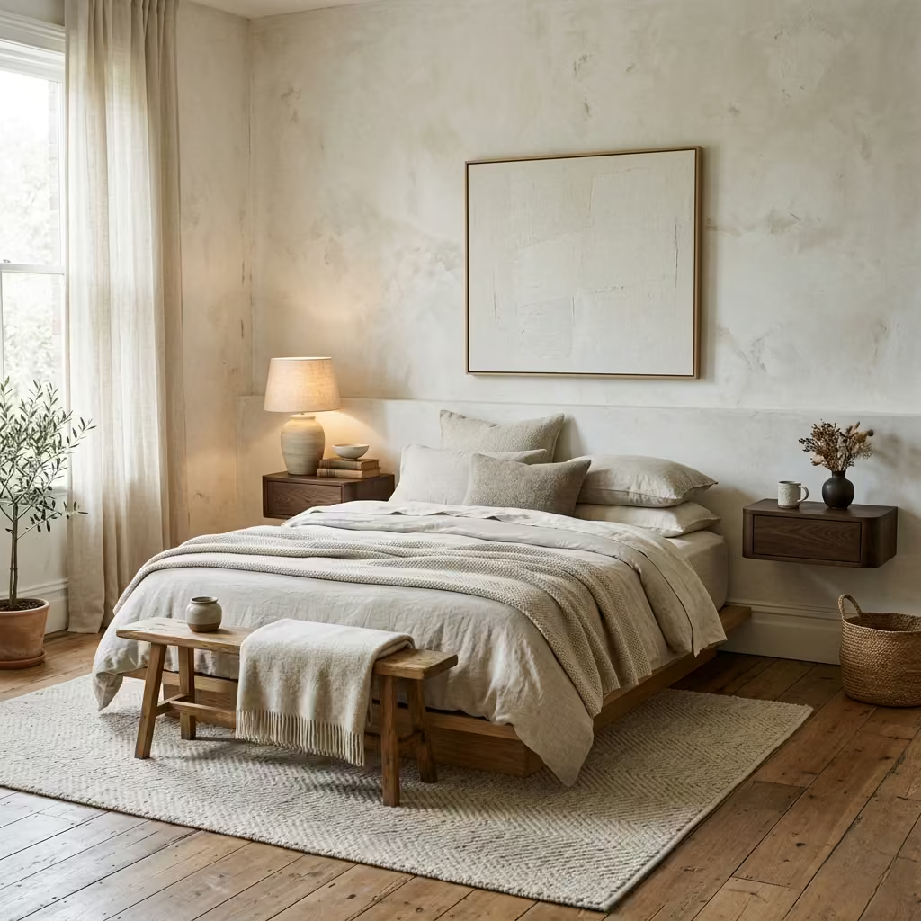
Before diving into the ideas, it is worth setting the tone. Neutral bedrooms, when done right, are far from a blank canvas; they are layered compositions, built piece by piece, where every detail, thoughtfully considered, plays its part. I often find that the magic lies in the fine margins, where subtle shifts in tone, texture, and proportion, quietly working together, create a space that feels effortless yet deeply intentional.
Layered Beige and Off-White for Depth
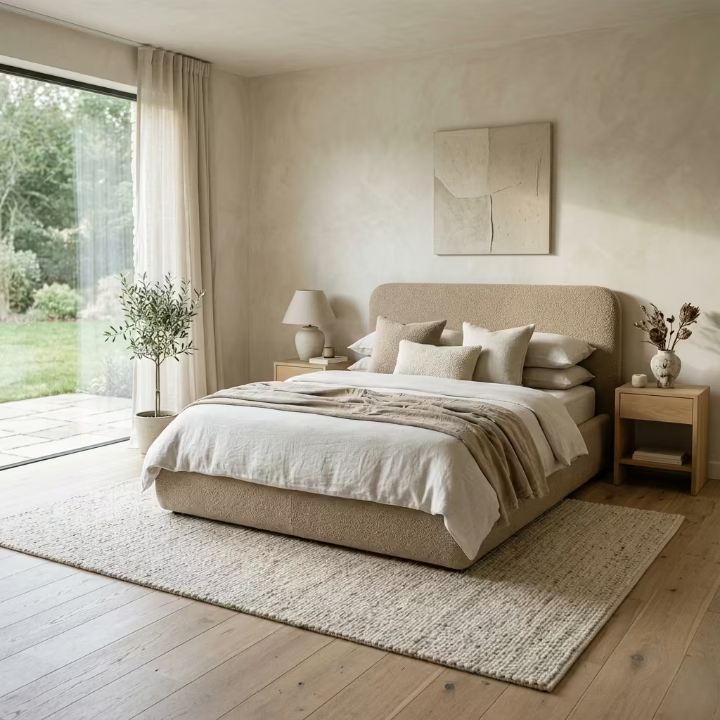
Layering beige and off-white is, in many ways, the foundation of a well-resolved neutral bedroom. Rather than relying on a single shade, which often falls flat, I approach this palette as a spectrum, where warm undertones, subtle shifts, and soft contrasts, carefully calibrated, create visual depth without disrupting the calm. The goal is not contrast in the traditional sense, but a gentle gradation, where each surface transitions into the next, almost seamlessly, allowing the room to feel cohesive yet far from one-dimensional.
Real-Life Application (First-Person Insight)
In one of my recent projects, the brief was simple on paper, a calm, hotel-like bedroom that would feel restful at any hour. Initially, the space leaned too heavily on a single off-white paint, and despite good natural light, it felt lifeless, like something was missing beneath the surface.
What changed everything was introducing layers, plaster-finished walls in a soft beige tone, a boucle-upholstered bed in a slightly warmer hue, and bedding in a lighter off-white, each element, subtly differentiated, starting to build quiet depth. By the time we added sheer curtains filtering the afternoon light, the room, almost effortlessly, came to life, proving that neutrality, when handled with care, is anything but boring.
Key Measurements (Metric + Imperial)
- Wall finish variation: Aim for a tonal shift of at least 10–15% between adjacent surfaces to avoid visual flatness
- Headboard height: 100–120 cm (39–47 inches) to anchor the bed without overwhelming the wall
- Bedside spacing: Minimum 60–75 cm (24–30 inches) clearance on each side for balanced proportions
- Rug extension: 60–75 cm (24–30 inches) beyond the bed edges to frame the composition
These dimensions, often overlooked, play a quiet but critical role in ensuring the layering feels intentional rather than accidental.
Material & Styling Notes
The success of this approach lies in material contrast, even within a tight colour range. I typically pair:
- Plaster or limewash walls for a soft, light-reactive surface
- Boucle or textured fabric upholstery to introduce tactile warmth
- Matte timber flooring in a light oak or ash tone to ground the palette
- Linen bedding in off-white, layered with throws in warmer beige
It is a case of mixing finishes, not colours, where texture, doing the heavy lifting, prevents the scheme from feeling flat.
Pros
- Creates a calm, cohesive environment that ages well
- Enhances natural light, making the room feel brighter and more open
- Highly versatile, allowing subtle updates over time without redesign
Cons
- Requires careful tonal control, as mismatched undertones can feel disjointed
- Can appear flat if texture and material variation are not introduced
- Demands good lighting design to fully realise its depth
You May also Like: 25 Minimalist Bedroom Ideas for a Clean, Modern, and Peaceful Sleep Space
Low Platform Beds for Visual Calm
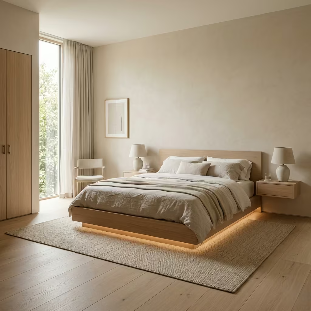
A low platform bed is one of the simplest yet most effective ways to establish visual calm in a modern bedroom. By reducing vertical mass, it shifts the eye horizontally, creating a sense of spaciousness and openness even in smaller rooms. The intention is not just aesthetic: a low bed fosters a grounded, restful feeling, reinforcing the serene, uncluttered atmosphere that neutral bedrooms thrive on. It’s about designing a bed that feels like it belongs to the room rather than dominates it, letting light, textures, and other architectural elements take the spotlight.
Real-Life Application (First-Person Insight)
In one project, the client’s previous high-profile upholstered bed made the 15 m² (160 sq ft) bedroom feel cramped and visually heavy. Swapping it for a low platform bed, just 35 cm (14 inches) in height, immediately opened up sightlines and allowed the timber flooring and linen textiles to become the hero materials. The result wasn’t just visually lighter; it felt calmer to enter at the end of a busy day, as if the room itself exhaled. A few subtle adjustments adding floating bedside tables and under-bed lighting amplified the horizontal flow, creating a bedroom that encouraged pause rather than stimulation.
Key Measurements (Metric + Imperial)
- Bed height: 30–45 cm (12–18 inches) from floor to mattress top
- Bed width: Standard proportions, but leaving at least 75–90 cm (30–36 inches) clearance on either side for circulation
- Headboard (if included): 80–100 cm (31–39 inches), preferably low-profile to maintain the horizontal emphasis
These dimensions help balance comfort, functionality, and the intended visual effect, ensuring the bed remains both practical and design-forward.
Material & Styling Notes
- Frame materials: Matte timber, oak, or ash; can also use upholstered panels in neutral tones
- Bed linens: Layered neutral linens in varying textures to reinforce softness against the minimal frame
- Accents: Floating bedside units, low-profile rugs, and subtle lighting support the horizontal flow without interrupting the visual calm
The focus is on simplicity and subtle detail rather than ornamentation; the low profile acts as a quiet anchor while other elements gently play around it.
Pros
- Instantly creates a sense of openness and visual calm
- Encourages a minimalist and uncluttered aesthetic
- Works well in small and medium bedrooms by freeing sightlines
Cons
- May feel too low for people with mobility issues
- Can require careful bedding styling to avoid looking sparse
- May not suit highly traditional or ornate interiors
Soft Greige Walls with Warm Timber Accents
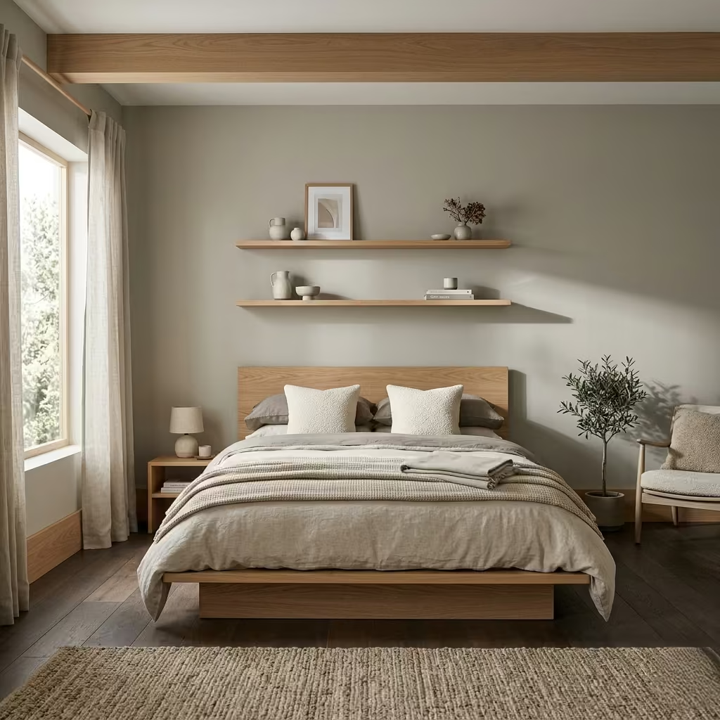
Soft greige a delicate fusion of grey and beige is a masterstroke for creating neutral bedrooms that feel both serene and layered. Unlike flat greys or stark whites, greige offers subtle warmth, acting as a versatile backdrop that enhances textures, light, and architectural details. Paired with warm timber accents, the palette comes alive, grounding the space while maintaining an understated elegance.
The intention here is to strike a balance between cool neutrality and welcoming warmth, giving the room a sense of permanence rather than fleeting trendiness. It’s about creating a bedroom that feels effortless to live in while subtly sophisticated, a space that whispers luxury rather than shouts it.
Real-Life Application (First-Person Insight)
In a recent project, a client wanted a bedroom that felt like a quiet retreat, a place where the outside world melted away. Walls painted in a soft greige, combined with ash timber skirting, floating shelves, and a platform bed frame, created a calm yet tactile environment. What stood out, however, was how the timber’s warmth interacted with morning sunlight: the room shifted almost imperceptibly throughout the day, offering soft highlights in the early hours and gentle depth in the afternoon.
By carefully layering these tones, we transformed a standard city bedroom into a space that felt both intimate and expansive, demonstrating that even subtle colour choices can have profound emotional impact.
Key Measurements (Metric + Imperial)
- Wall treatment: Apply greige tones across all walls for continuity; accent wall optional
- Timber elements: Bed frame or shelving thickness: 3–5 cm (1–2 inches); skirting boards: 10–12 cm (4–5 inches)
- Circulation: Maintain 75–90 cm (30–36 inches) clearance around key furniture for comfortable flow
- Ceiling contrast: Optional beam or trim height: 15–20 cm (6–8 inches) for visual framing
These dimensions ensure proportionate balance, helping the greige walls and timber accents feel intentional rather than afterthoughts.
Material & Styling Notes
- Walls: High-quality matte or eggshell paint to emphasise natural light reflection
- Timber accents: Ash, oak, or walnut with a natural matte finish for warmth and texture
- Furniture & textiles: Linen bedding, boucle cushions, and woven throws introduce soft tactile contrast against harder timber surfaces
- Accessories: Minimalist artwork in muted tones or low-contrast ceramics to maintain visual calm
The interplay of soft, warm greige and timber creates a subtle visual rhythm, drawing the eye across surfaces while keeping the mood serene and inviting.
Pros
- Creates a calm, timeless environment suitable for long-term use
- Allows natural light to play dynamically across surfaces
- Provides a neutral base that accommodates evolving décor and personal touches
Cons
- Requires careful selection of timber undertones to avoid clashing with wall tones
- Overuse of one material or texture can reduce perceived depth
- May feel too muted if lighting or textiles are not layered thoughtfully
Floor-to-Ceiling Curtains to Soften Architecture
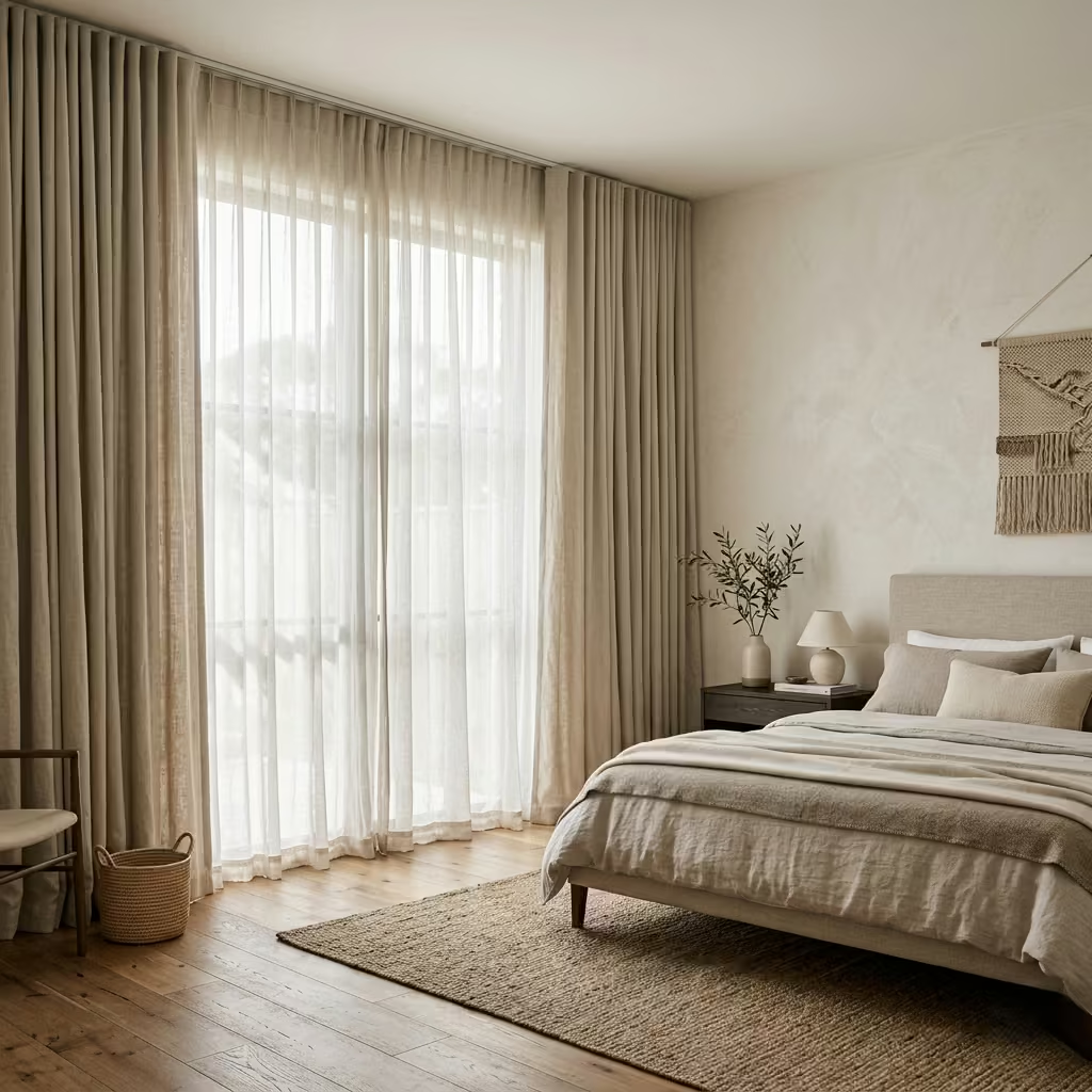
Floor-to-ceiling curtains are a deceptively simple tool that can profoundly alter the perception of a bedroom. Their purpose is not merely functional; they soften hard architectural lines, introduce a vertical rhythm, and create a subtle backdrop that frames the room rather than competes with it.
By extending the fabric from ceiling to floor, the eye is drawn upward, making ceilings feel taller and spaces more expansive, while the soft folds add texture, movement, and a quiet elegance. This design choice is particularly effective in neutral modern bedrooms, where restraint is key and the interplay of light and material takes centre stage.
Real-Life Application (First-Person Insight)
In one of my recent residential projects, the bedroom had high ceilings but visually felt constrained due to small window proportions. Installing floor-to-ceiling curtains in a soft, breezy linen not only added height but also introduced a tactile softness that softened the otherwise crisp modern bedroom architecture.
The sheer layers filtered morning sunlight, creating a gentle glow across plastered walls and timber floors. At night, a heavier curtain layer offered privacy and intimacy without disrupting the neutral palette. This approach transformed the space from functional to emotionally immersive, proving that fabric can be as influential as furniture in shaping perception.
Key Measurements (Metric + Imperial)
- Curtain height: Measure from ceiling to floor for a full-length effect, typically 250–300 cm (98–118 inches) depending on room height
- Curtain width: 1.5–2.5 times the window width to allow for natural folds and layering
- Clearance from floor: 1–2 cm (0.4–0.8 inches) above floor for airflow and easy maintenance
- Rod placement: 10–15 cm (4–6 inches) above window frame if ceiling is lower, but ideally flush with ceiling for true floor-to-ceiling impact
Proper measurements ensure curtains feel intentional and proportionate, maintaining the sense of height and fluidity throughout the room.
Material & Styling Notes
- Fabric selection: Light, breathable linen or cotton for day layers; heavier velvet or wool for night-time privacy and insulation
- Colour choice: Soft neutrals, slightly warmer than wall tones, to create depth without breaking the palette
- Hardware: Minimalist ceiling-mounted tracks or slim rods to maintain clean lines
- Layering: Sheer inner panels combined with heavier outer panels allow flexibility for light control and privacy
The combination of texture, weight, and drape ensures curtains contribute both functionally and aesthetically, softening corners, framing views, and creating a sense of calm luxury.
Pros
- Enhances perceived ceiling height and room proportions
- Softens architectural edges for a more relaxed atmosphere
- Provides versatile light control and privacy
- Adds tactile warmth and movement to neutral interiors
Cons
- Requires accurate measurements to achieve a seamless, elegant effect
- Heavier fabrics may require reinforced track systems
- Incorrect width or length can make the room feel disproportionate
Integrated Headboards with Wall Panels
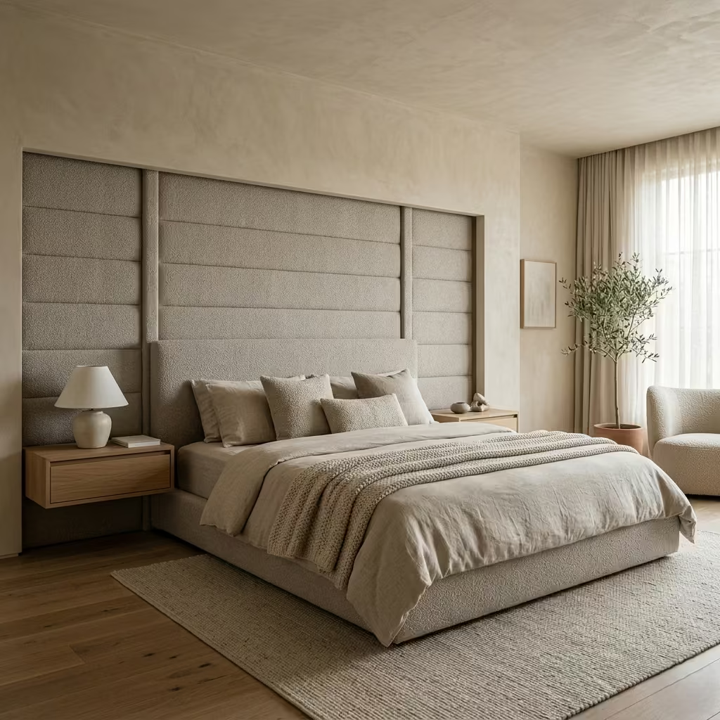
Integrated headboards paired with wall panels are a subtle yet transformative feature in neutral modern bedrooms. Unlike standalone headboards that can feel like an afterthought, integrated designs create a seamless visual flow, grounding the bed while giving walls a sense of depth and rhythm.
The goal is to blur the line between furniture and architecture, turning a functional element into a statement of quiet sophistication. Wall panels also allow for tonal layering, texture variation, or subtle patterning that enhances the sense of calm without breaking the neutral palette.
Real-Life Application (First-Person Insight)
In a recent project, the client’s room had simple plaster walls and a standard bed frame, which left the space feeling somewhat flat and uninspired. By introducing a 5–10 cm (2–4 inch) recessed wall panel behind the bed, upholstered in soft boucle fabric that matched the bedding tones, the entire room immediately felt anchored and cohesive.
The horizontal lines of the panels echoed the platform bed’s low profile, while the soft upholstery added a tactile contrast to the matte plaster walls. Over time, this subtle integration proved invaluable: it enhanced the room’s calm and visual continuity, making it a space that encouraged rest and lingered in memory.
Key Measurements (Metric + Imperial)
- Panel depth: 5–10 cm (2–4 inches) to provide texture without overwhelming the wall
- Headboard height: 100–120 cm (39–47 inches) from floor to top, proportionate to bed size
- Width: Extend panels slightly beyond the bed width (10–15 cm / 4–6 inches on either side) to create balance
- Bed-to-panel spacing: Ideally flush or recessed slightly for a seamless effect
These dimensions ensure the headboard reads as intentional architecture, rather than furniture bolted on after the fact.
Material & Styling Notes
- Upholstery: Boucle, linen, or leather for soft tactile layering
- Wall panels: MDF, timber veneer, or plasterboard, finished in complementary neutral tones
- Finishing details: Minimal seams, hidden fixings, and optional integrated lighting to enhance depth
- Styling tip: Layer cushions or throws that mirror panel tones to reinforce cohesion
Pros
- Creates a strong visual anchor without clutter
- Enhances perception of wall depth and room proportion
- Blends furniture and architecture seamlessly for a high-end look
- Allows flexibility in material and texture layering
Cons
- Requires precision in design and installation to avoid misalignment
- Limited flexibility if you want to move the bed or change the wall treatment
- Higher initial cost compared to standalone headboards
Minimalist Lighting with Warm Temperature Layers
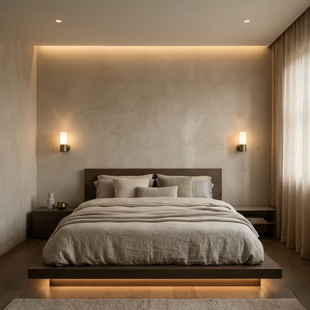
Lighting is often the unsung hero of neutral modern bedrooms, and when executed with intent, it can completely transform perception, mood, and functionality. Minimalist lighting emphasizes simplicity of form while layering multiple sources to create depth and ambiance. Warm temperature layers, typically in the 2700K–3000K range, gently illuminate surfaces, highlight textures, and accentuate tonal variation without overpowering the calm palette. The goal is to let light play quietly across walls, textiles, and timber, creating a subtle choreography that changes throughout the day and evening, reinforcing serenity and understated luxury.
Real-Life Application (First-Person Insight)
In one of my projects, a bedroom with soft greige walls and warm oak flooring initially felt a touch flat in the evenings. By installing recessed ceiling downlights at 2700K for general illumination, flanking wall sconces at 2800K for gentle accent, and low-level LED strips behind a platform bed at 3000K, the space came alive without losing its calm neutrality. The layers of light interacted with plaster walls, linen bedding, and timber accents, highlighting textures rather than colours. The effect was almost cinematic: the room transitioned from bright and airy during the day to soft and cocooning at night, proving that lighting is as much a design material as timber or textiles.
Key Measurements (Metric + Imperial)
- Ceiling recessed downlights: 150–200 cm (59–79 inches) spacing between fixtures depending on ceiling height
- Wall sconces height: 140–160 cm (55–63 inches) from floor to centre for balanced illumination
- Bedside LED strips: Installed at 10–15 cm (4–6 inches) above floor or behind bed frame for subtle underlighting
- Dimmers: Ensure all layers are dimmable to allow adjustment of intensity according to mood
Precise placement and layering ensure that the lighting feels intentional, guiding the eye and enhancing textures rather than creating glare or harsh shadows.
Material & Styling Notes
- Fixtures: Matte metal, black or neutral-toned finishes for a restrained aesthetic
- Shade materials: Frosted glass or fabric for diffused, soft illumination
- Light layering strategy:
- Ambient: recessed ceiling or flush-mounted fixtures
- Task: bedside sconces or pendant lights
- Accent: hidden LED strips, wall washers, or coves
- Integration tip: Use concealed wiring where possible to maintain minimalism
Layered lighting complements neutral palettes by enhancing perceived depth, warmth, and calm, while reinforcing architectural details without distracting from the room’s quiet sophistication.
Pros
- Adds depth and dimensionality to neutral spaces
- Enhances textures and tonal variation subtly
- Flexible and adjustable for different moods and times of day
- Minimalist fixtures maintain uncluttered, elegant lines
Cons
- Requires careful planning and wiring, particularly for concealed layers
- Can be costly if multiple layers or high-quality fixtures are used
- Poorly balanced lighting can flatten textures or make the space feel cold
You May also Like: Industrial Chic loft bedroom Design: A Perfect Blend of Raw Character and Modern Comfort
Textured Bedding Instead of Patterned Layers
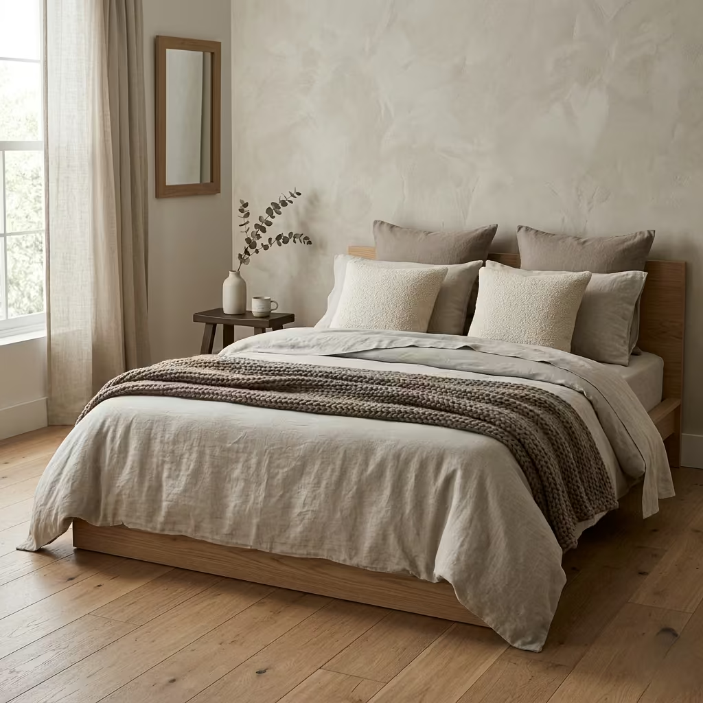
In a neutral modern bedroom, bedding can either elevate a space or make it feel flat. I favour texture over pattern, as tactile variation adds richness without disrupting the calm palette. Think of it as creating a quiet symphony: linen, wool, cotton, and boucle play together in layers, each contributing depth, softness, and visual interest without shouting for attention. Textured bedding ensures that the bedroom feels lived-in and inviting, while maintaining the sophistication and restraint central to neutral modern design. The goal is for each layer sheets, duvet, cushions, throws to interact subtly with light, shadow, and adjacent materials, creating movement and warmth without relying on contrasting colours or prints.
Real-Life Application (First-Person Insight)
In one project, a client insisted on patterned bedding to “brighten” a neutral palette. When I introduced textured alternatives instead linen sheets in soft greige, a wool throw in a slightly darker tone, and boucle cushions with a subtle looped weave the room immediately gained a sense of quiet luxury. The morning light danced across the folds and weaves, producing a dynamic depth that patterns could never achieve.
The bedroom became a tactile retreat: something you didn’t just see, but wanted to touch and settle into at the end of a long day. From experience, I know that textured bedding transforms a neutral room from static to soulful, engaging the senses while keeping the visual composition calm.
Key Measurements (Metric + Imperial)
- Duvet/comforter overhang: 30–45 cm (12–18 inches) beyond the bed edges for proportional layering
- Throw placement: Folded or casually draped across the lower third of the bed, approx. 90–120 cm (35–47 inches) wide
- Pillow layers: Standard pillows (~50×75 cm / 20×30 inches) at the back, with smaller cushions (~40×40 cm / 16×16 inches) in front for tactile variation
- Spacing: Leave at least 10–15 cm (4–6 inches) between decorative layers to avoid visual clutter
Measurements ensure bedding looks intentional, structured yet relaxed, maintaining calm proportions that complement the room.
Material & Styling Notes
- Fabrics:
- Linen for breathability and subtle creasing
- Boucle for tactile contrast
- Wool or cotton for warmth and softness
- Colours: Stick to layered neutrals beige, greige, soft taupe, warm ivory to keep the palette cohesive
- Styling tip: Alternate textures rather than introducing new colours; a single accent hue can feel jarring in a restrained scheme
- Maintenance: Choose machine-washable or easy-care fabrics to retain their texture and softness over time
By focusing on texture rather than pattern, bedding becomes an emotional and sensory anchor within the bedroom, adding comfort, tactility, and understated elegance that draws people in.
Pros
- Enhances depth and warmth without disrupting a neutral palette
- Encourages tactile interaction, making the bedroom feel lived-in and inviting
- Versatile and easily updated over time with throws or cushions
Cons
- Requires attention to material quality to avoid flattening textures after washing
- Poor layering or mismatched textures can feel haphazard
- Limited colour variation may feel too restrained if the rest of the room is very minimal
Natural Stone Bedside Surfaces
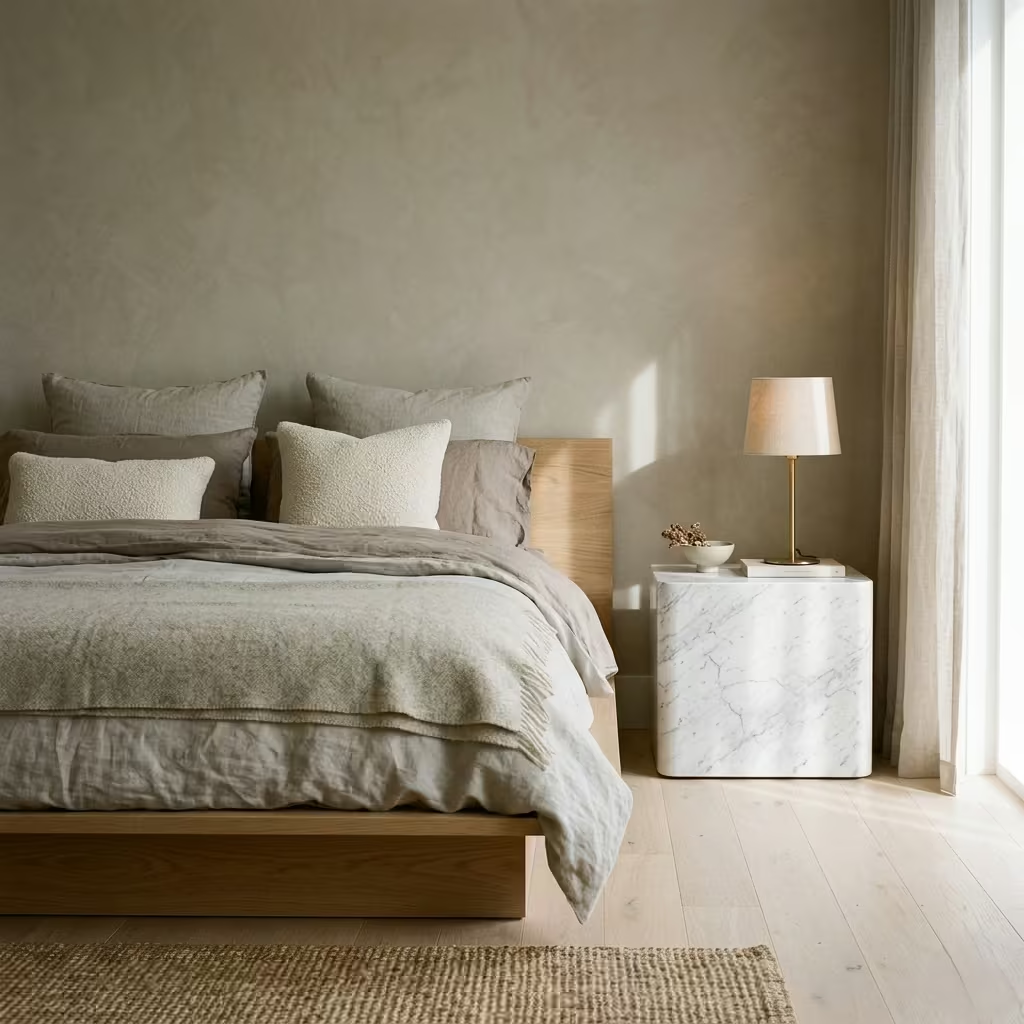
In a neutral modern bedroom, bedside surfaces offer a subtle opportunity to introduce material sophistication without overwhelming the calm palette. Natural stone marble, travertine, or limestone brings a tactile and visual depth that complements soft textiles, plastered walls, and timber floors. The intent is not to flaunt opulence but to anchor the room with quiet permanence, introducing weight, texture, and a sense of longevity that contrasts beautifully with lighter, softer materials. Stone surfaces act as a subtle stage for bedside essentials, reflecting light and shadow, while contributing to a balanced, layered aesthetic.
Real-Life Application (First-Person Insight)
On a recent project, I specified honed Carrara marble for bedside tables in a bedroom dominated by linen bedding and pale oak flooring. The clients were initially concerned that the stone might feel cold, but what emerged instead was a grounded, tactile counterpoint to the soft fabrics. In the morning, sunlight bouncing off the veining added subtle highlights; by evening, the warm timber tones and the stone’s matte finish created a serene, contemplative environment. It became evident that the material itself could dictate the emotional tone of the space, quietly elevating the bedroom’s sophistication without needing decorative excess.
Key Measurements (Metric + Imperial)
- Tabletop height: Align with the mattress top, typically 55–60 cm (22–24 inches) from floor
- Surface depth: 40–50 cm (16–20 inches) to accommodate essentials without overcrowding
- Table width: 45–60 cm (18–24 inches), proportionate to bed size
- Edge profile: Slightly beveled or rounded to soften visual weight and prevent injury
Properly scaled surfaces ensure that the stone complements rather than dominates the room, maintaining balance between durability, aesthetics, and comfort.
Material & Styling Notes
- Stone options:
- Marble for subtle veining and reflective qualities
- Travertine for soft, earthy textures and warmth
- Limestone for muted tonal depth and matte elegance
- Finishes: Polished for light reflection; honed or matte for tactile warmth and understated elegance
- Pairing: Combine with neutral woods or soft textiles to prevent the stone from feeling cold or sterile
- Maintenance tip: Use coasters or a subtle sealant to protect surfaces from everyday use
Natural stone introduces a sense of permanence and textural intrigue, providing a tactile, emotional anchor in a bedroom otherwise dominated by soft, transient materials.
Pros
- Adds tactile and visual depth to neutral bedrooms
- Durable and long-lasting, capable of withstanding daily use
- Enhances perception of luxury and material intelligence
Cons
- Heavier than other materials; may require reinforced support or installation
- Can feel cold if paired with insufficient warmth from textiles or timber
- Higher cost compared to alternative surfaces like laminate or engineered stone
Floating Nightstands for Spatial Lightness
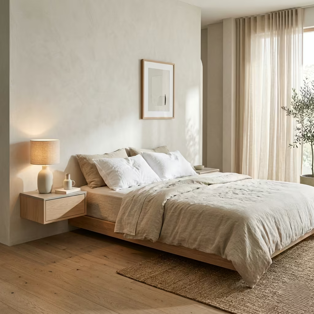
Floating nightstands are a deceptively simple design strategy that can dramatically enhance the feeling of openness in a neutral modern bedroom. By detaching from the floor, they create visual breathing room, allowing light and shadow to play across the floor and walls, and reducing the sense of furniture “weight” in the space.
The design intent is twofold: maintain functionality for bedside essentials while introducing a sense of airiness and proportion, reinforcing the calm, restrained aesthetic of neutral interiors. A floating nightstand also emphasizes horizontal lines, echoing platform beds and low-profile elements to create cohesion and subtle architectural rhythm.
Real-Life Application (First-Person Insight)
In one of my recent projects, a bedroom with a low platform bed and pale oak flooring felt slightly heavy when traditional bedside tables were added. By installing floating nightstands, aligned perfectly with the mattress top at 60 cm (24 inches), the room immediately felt lighter, more fluid, and open.
The space beneath the nightstands allowed the floor’s texture to remain visible, creating a seamless interplay between furniture and architecture. Functionally, the client could still store bedside essentials without cluttering surfaces, and aesthetically, the floating units subtly highlighted the bedroom’s calm, spacious composition. This small adjustment proved that sometimes, less truly is more when executed thoughtfully.
Key Measurements (Metric + Imperial)
- Height: Align with mattress top, typically 55–65 cm (22–26 inches) from floor to top surface
- Depth: 35–45 cm (14–18 inches) to accommodate lamps, books, and essentials without crowding
- Width: 45–60 cm (18–24 inches), proportionate to bed size
- Clearance beneath: 15–20 cm (6–8 inches) to allow visual lightness and easy cleaning
These measurements maintain a sense of balance and ensure that floating nightstands feel intentional rather than precarious, providing functionality without disrupting flow.
Material & Styling Notes
- Materials: Matte or natural timber, lacquered finishes, or stone-topped options to complement the room palette
- Edge design: Minimalist, clean lines with rounded or squared edges depending on the architectural style
- Mounting: Secure wall fixings to handle daily use while maintaining a “floating” appearance
- Styling tip: Keep accessories minimal one lamp, a small stack of books, or a vase to preserve the sense of spatial openness
Floating nightstands are particularly effective in neutral bedrooms, as they draw attention to architectural composition rather than objects, allowing subtle textures, light shifts, and tonal variations to take centre stage.
Pros
- Enhances perception of floor space and overall lightness
- Reinforces horizontal lines and low-profile aesthetics
- Flexible styling while maintaining minimal visual clutter
- Easy to clean under and around
Cons
- Requires professional installation for stability and safety
- Limited storage compared to traditional nightstands
- Heavier materials require reinforced wall mounts
Subtle Contrast with Charcoal or Black Accents
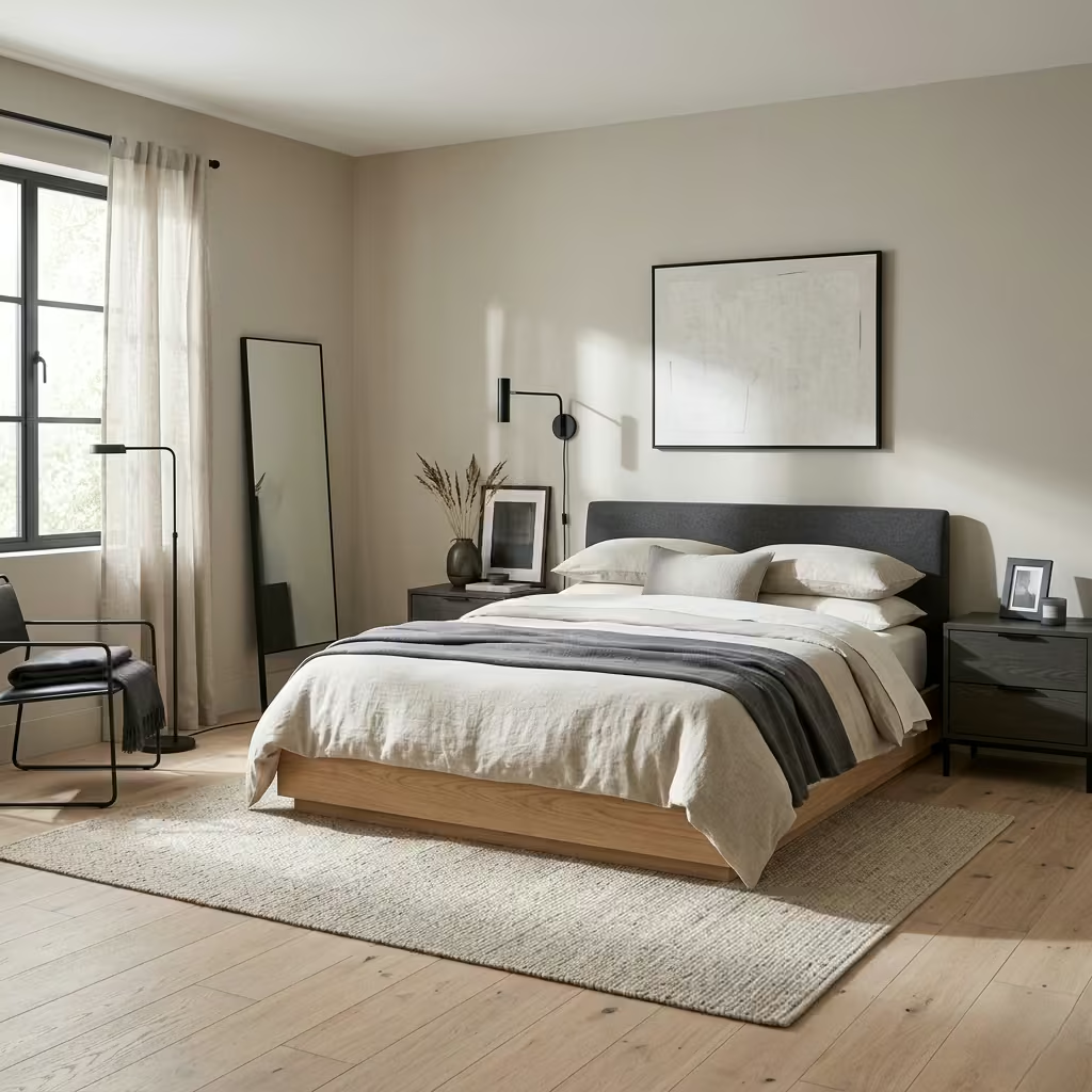
In a neutral modern bedroom, subtle contrast is the seasoning that prevents a space from feeling flat or overly uniform. Introducing charcoal or black accents whether through light fixtures, window frames, hardware, or small decorative objects creates definition, anchors the room, and provides visual punctuation without overwhelming the calm palette. The design intent is to enhance depth and clarity while maintaining restraint, letting the darker elements highlight architectural details, furniture lines, and textures rather than dominating the space. It’s about adding sophistication in whispers rather than shouts, giving the bedroom an understated edge.
Real-Life Application (First-Person Insight)
In one project, a bedroom with soft greige walls and timber floors initially felt too “safe” and washed out. By introducing slim black metal legs on the platform bed, a charcoal-framed mirror, and matching bedside lamp bases, the space instantly gained structure and focus. The contrast was subtle yet effective: it delineated furniture and wall planes, emphasized the geometry of the room, and added a layer of intentionality. Over time, the accents became touchpoints for the eye, making the neutral layers feel richer and more composed. It was a clear reminder that even minimal dark elements can dramatically elevate the perceived sophistication of a space.
Key Measurements (Metric + Imperial)
- Accent proportion: Keep black or charcoal elements under 10–15% of the visual field to maintain calm
- Hardware size: Handles, knobs, and fixtures: 5–8 cm (2–3 inches) depending on scale of cabinetry or furniture
- Lighting and frame dimensions: Slimline designs, 2–4 cm (0.8–1.5 inches) for minimal visual weight
- Spacing for visual balance: Ensure at least 30–50 cm (12–20 inches) of neutral surface between dark accents to avoid overpowering
These measured interventions ensure accents punctuate rather than dominate, supporting both function and aesthetic rhythm.
Material & Styling Notes
- Fixtures: Matte black or charcoal metals for lighting, handles, or frames
- Furniture: Timber or neutral-toned furniture with black legs or detailing for subtle contrast
- Textiles: Minimal accents such as cushions, throws, or rugs in charcoal tones
- Styling tip: Balance is key always pair dark elements with light textures and surfaces to keep the room feeling airy and calm
Charcoal and black elements are most effective when used sparingly, creating focal points and visual hierarchy that guide the eye while reinforcing the room’s neutral serenity.
Pros
- Adds depth, focus, and architectural definition to neutral spaces
- Creates sophisticated contrast without breaking calm or balance
- Timeless and versatile across various neutral palettes
Cons
- Overuse can create harshness or visual heaviness
- Requires careful placement to maintain proportional balance
- Dark finishes may show dust or fingerprints more readily
You May also Like: 25 Soft & Serene Sage Green Bedrooms for the Ultimate Relaxing Vibe
Neutral Rugs to Anchor the Bed Zone
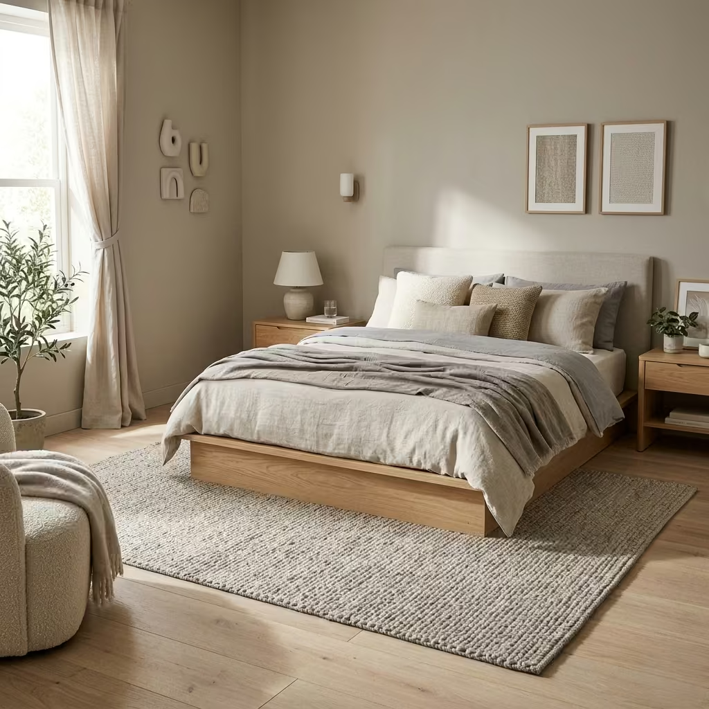
A well-chosen neutral rug can quietly transform a bedroom, creating a sense of cohesion and comfort while defining the bed zone. In modern neutral interiors, rugs serve as grounding elements, providing tactile warmth underfoot, softening the floor plane, and subtly delineating the bed from surrounding circulation areas. The intent is to unify textures, tones, and proportions, allowing the bed and surrounding furniture to “sit” harmoniously within the space. A neutral palette ensures that the rug complements rather than competes, enhancing depth and layering through texture rather than colour.
Real-Life Application (First-Person Insight)
In one of my projects, the bedroom had pale oak flooring and a low platform bed. Without a rug, the bed visually “floated” awkwardly, and the space lacked tactile intimacy. By introducing a handwoven wool rug in soft greige, extending 70 cm (28 inches) beyond each side of the bed, the area became grounded and welcoming. Morning sunlight bounced off the textured fibres, creating subtle highlights, while the softness underfoot enhanced the sense of calm and retreat. The rug also acted as a design buffer, connecting the bed with floating nightstands and allowing layered textures linen bedding, boucle cushions, and timber surfaces to resonate cohesively. This small addition proved that tactile layering is as important as colour layering in creating depth and calm.
Key Measurements (Metric + Imperial)
- Rug extension: 60–75 cm (24–30 inches) beyond bed sides for proportional framing
- Rug depth: Extend 60–100 cm (24–39 inches) beyond foot of the bed depending on room size
- Placement: Centre under the bed to ensure symmetry and visual balance
- Pile height: Low to medium (10–15 mm / 0.4–0.6 inches) for easy maintenance and furniture stability
Correct sizing ensures the rug feels anchored rather than tacked on, maintaining the bedroom’s calm proportions while supporting circulation.
Material & Styling Notes
- Materials: Wool, jute, or viscose blends for texture, durability, and tactile warmth
- Colours: Soft greige, ivory, or muted taupe to enhance tonal layers
- Texture: Flatweave or subtle patterning to add depth without visual clutter
- Styling tip: Layer with smaller rugs or throws at the bed’s foot for added texture and a sense of casual luxury
A neutral rug doesn’t just cover the floor it becomes a tactile and visual foundation, creating a sense of calm, cohesion, and intentionality in the bedroom layout.
Pros
- Anchors furniture and defines the bed zone
- Adds warmth, softness, and texture underfoot
- Supports layering of other neutral textures for depth
- Works as a long-term investment, timeless in aesthetic
Cons
- Improper sizing can make the bed look disconnected or off-balance
- Textured materials may require regular maintenance to retain visual appeal
- Overly dark rugs may disrupt the light, airy feel of neutral interiors
Warm White Walls Instead of Stark White Paint
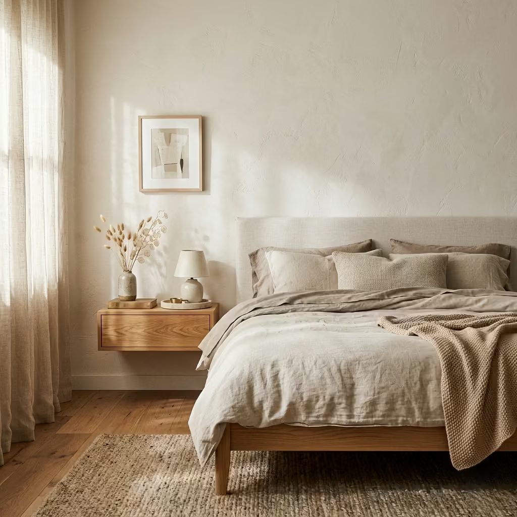
Choosing wall colour is one of the most influential decisions in a neutral modern bedroom, and warm whites are a subtle yet transformative choice. Unlike stark, cold whites, warm whites carry soft undertones beige, cream, or pale peach that create a sense of light without harshness.
The intention is to enhance natural light, complement textures, and foster a welcoming, calm atmosphere, rather than dominate or flatten the room. Warm whites act as a quiet backdrop, allowing furniture, textiles, and accessories to stand out while maintaining overall cohesion and visual serenity.
Real-Life Application (First-Person Insight)
In a recent bedroom renovation, the client initially chose pure white paint to maximize brightness. The space, however, felt clinical and lacked intimacy. After switching to a warm white tone with subtle ivory undertones, the difference was immediate.
Plaster walls absorbed sunlight differently throughout the day, highlighting texture and layering in bedding and timber furniture. Even small elements, like linen curtains and boucle cushions, became more luminous and harmonious. From experience, I often tell clients that warm whites are the unsung heroes of neutral design, creating emotional warmth without adding colour, and transforming a standard bedroom into a soothing sanctuary.
Key Measurements (Metric + Imperial)
- Wall coverage: Entire room, including ceiling if desired, to maintain consistency and height perception
- Ceiling height adjustment: Slightly warmer tones can reduce the starkness of lower ceilings (<2.4 m / 7’10”)
- Window reflection: Use samples near windows to observe natural light impact across different times of day
- Trim and mouldings: Slightly lighter or darker shades of the same warm white family to frame architectural elements subtly
Accurate observation and placement ensure that warm whites create depth and enhance, rather than flatten, the space.
Material & Styling Notes
- Paint finish: Matte or eggshell for subtle light diffusion and texture interaction
- Pairings: Soft timber, linen textiles, natural stone, or plaster for tactile layering
- Accent strategy: Keep complementary colours minimal; subtle greige, beige, or warm ivory elements work best
- Styling tip: Consider layering shadows and highlights through furniture placement or wall-mounted lighting to bring warmth to life
Warm white walls are a silent design asset, allowing all other elements furniture, textiles, and materials to harmonize effortlessly, enhancing the room’s sense of calm and understated sophistication.
Pros
- Enhances natural light and complements layered textures
- Creates a welcoming, soft, and timeless backdrop
- Works harmoniously with other neutral tones for flexibility in styling
Cons
- Undertones must be chosen carefully; wrong undertones can clash with flooring or furnishings
- Can appear flat in dimly lit spaces without layered lighting or textures
- Less dramatic contrast than grey or beige, which may be less appealing to some clients
Concealed Storage for Visual Clarity
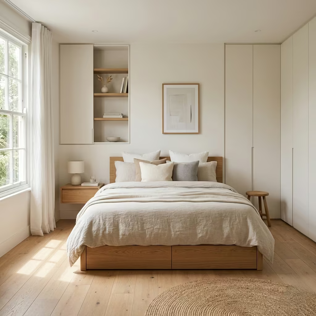
In a neutral modern bedroom, clutter can quickly undermine calm, regardless of the sophistication of materials or colour palette. Concealed storage built-in wardrobes, under-bed drawers, or recessed shelving maintains the serenity of the space by hiding essentials while reinforcing architectural clean lines.
The design intent is to keep surfaces visually light, circulation unobstructed, and the overall composition uncluttered. This approach aligns perfectly with neutral modern principles: restraint, proportion, and material intelligence, allowing the room’s textures, tonal layers, and architectural details to shine.
Real-Life Application (First-Person Insight)
On a recent project, the client struggled with bedside clutter and clothing overflow, which threatened the room’s calm aesthetic. By integrating under-bed drawers and a wall-hugging wardrobe with handleless doors, the space immediately felt lighter and more structured. The concealed storage allowed floating nightstands, platform beds, and open floor areas to remain visually uninterrupted.
Even small details like recessed shelving behind panels or hidden charging points contributed to the perception of order. I’ve found over years of practice that what is hidden often has as much impact on a room’s emotional resonance as what is on display.
Key Measurements (Metric + Imperial)
- Under-bed drawers: Depth 50–60 cm (20–24 inches), height 20–25 cm (8–10 inches) for practical storage without crowding floor space
- Built-in wardrobes: Depth 60 cm (24 inches) minimum for hanging space, height up to ceiling to maximize storage
- Recessed shelving: Depth 15–20 cm (6–8 inches), spaced 25–30 cm (10–12 inches) apart vertically
- Circulation: Maintain at least 75–90 cm (30–36 inches) of clearance in front of concealed storage to allow easy access
Properly planned dimensions ensure storage solutions feel built-in, seamless, and proportionate, rather than intrusive or makeshift.
Material & Styling Notes
- Materials: Laminated or veneered MDF for built-ins; timber, stone, or lacquer for drawer fronts
- Finishes: Handleless, push-to-open mechanisms, or discreet integrated pulls to preserve minimalism
- Colour palette: Match walls or slightly warmer/cooler tones to maintain visual continuity
- Styling tip: Incorporate hidden lighting within shelving to highlight contents subtly without breaking the neutral calm
Concealed storage is both practical and emotional, offering peace of mind by reducing visual clutter and reinforcing the tranquil, ordered environment of a neutral bedroom.
Pros
- Keeps bedroom surfaces and floors uncluttered
- Enhances perception of calm, spaciousness, and visual clarity
- Flexible: can accommodate both long-term storage and daily essentials
- Seamlessly integrates with neutral modern aesthetics
Cons
- Requires careful planning and professional installation
- Can feel rigid if too extensive or lacking texture breaks
- Initial cost is higher than standalone storage pieces
You May also Like: 25 Guest Bedroom Design Ideas to Create a Stylish, Comfortable, and Inviting Space
Soft Architectural Curves in Furniture
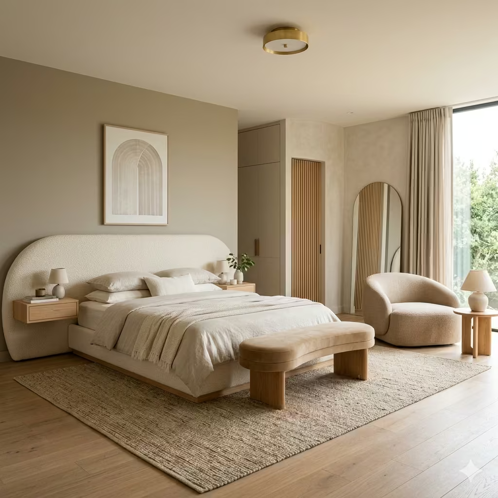
In a neutral modern bedroom, hard lines and rectilinear forms dominate, which can sometimes feel rigid or cold. Introducing soft architectural curves in furniture such as rounded headboards, curved benches, or sculptural chairs creates visual relief, tactile interest, and a sense of organic flow.
The design intent is to balance structure with softness, allowing the eye to move gently across the space and reinforcing a calming, human-centric environment. Curves also work beautifully in neutral palettes, as they add subtle drama without introducing additional colour or pattern.
Real-Life Application (First-Person Insight)
On a recent project, a bedroom featured a low platform bed, floating nightstands, and crisp cabinetry all in neutral tones. While the design was sophisticated, it initially felt slightly austere. Introducing a rounded headboard upholstered in boucle, a crescent-shaped lounge chair, and a small curved console softened the visual rigidity.
The gentle curves created a rhythm that guided the eye around the room and invited tactile engagement. Guests instinctively gravitated toward these pieces, lingering longer, showing that curved furniture adds both emotional warmth and human scale to otherwise structured interiors.
Key Measurements (Metric + Imperial)
- Rounded headboard height: 100–120 cm (39–47 inches) from floor, proportional to bed size
- Curved lounge chair width: 70–90 cm (28–35 inches) to maintain intimacy without overcrowding
- Curved bench length: 120–150 cm (47–59 inches) at bed foot, depth 35–45 cm (14–18 inches)
- Clearance: Leave at least 60 cm (24 inches) around curved furniture for circulation and visual breathing room
These measurements ensure that curved pieces feel deliberate, functional, and proportionate to the room’s scale.
Material & Styling Notes
- Upholstery: Boucle, velvet, or linen to accentuate softness and tactile interest
- Structure: Timber or metal frames concealed beneath upholstery to maintain clean lines
- Colour palette: Neutral tones warm beige, greige, ivory, or soft taupe to maintain calm
- Styling tip: Use curves sparingly to create focal points and avoid visual clutter; balance with rectilinear elements to reinforce harmony
Curved furniture subtly humanises a space, balancing the crisp modern framework with approachable softness, while remaining visually sophisticated and restrained.
Pros
- Introduces softness and tactility to structured, neutral interiors
- Guides the eye and encourages a sense of flow and rhythm
- Creates inviting focal points without overwhelming the palette
- Enhances emotional connection to the space
Cons
- Larger curved pieces can require more space and careful proportioning
- Overuse may dilute the calm, minimalist aesthetic
- Custom pieces can increase costs and lead times
Linen Upholstered Beds for Tactile Warmth
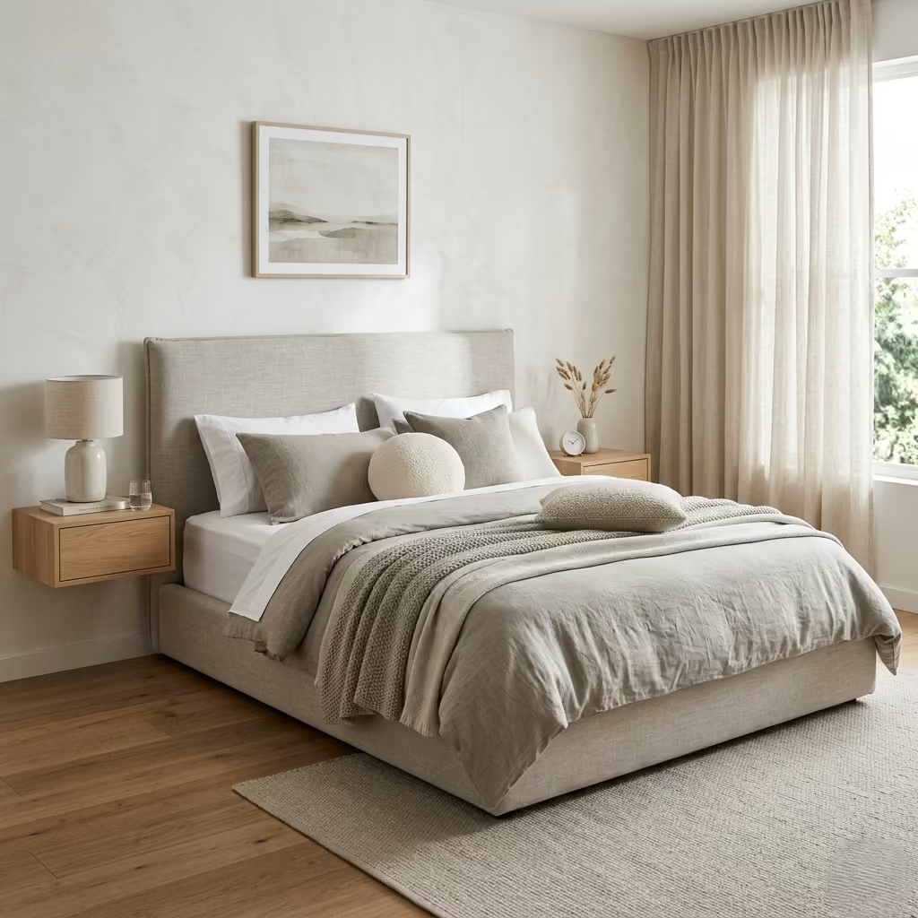
In a neutral modern bedroom, the bed is both the functional anchor and emotional heart of the space. Linen-upholstered beds combine comfort, tactility, and understated elegance, introducing warmth and texture without compromising the calm, restrained palette. Unlike leather or synthetics, linen has a natural softness, breathability, and a lived-in appeal that evolves beautifully over time.
The design intent is to create a bedroom that invites touch and relaxation, offering a sensory layer that complements plaster walls, timber floors, and neutral textiles, while keeping proportions grounded and refined.
Real-Life Application (First-Person Insight)
In one of my recent bedroom projects, the client desired a platform bed that felt “welcoming yet minimal.” I specified a linen-upholstered bed in soft greige with a gently padded headboard. The result was transformative: the upholstery softened the low-profile bed frame, balanced the horizontal lines, and invited tactile interaction.
Morning light highlighted the fabric’s natural weave, creating subtle tonal variations that enhanced the room’s depth. Over time, I noticed that clients naturally lingered longer in the bedroom, drawn to the comfort and understated sensory richness of the linen surface. From experience, a linen bed is as much about emotional connection as it is about visual design.
Key Measurements (Metric + Imperial)
- Bed frame height: 30–45 cm (12–18 inches) for platform base; headboard 100–120 cm (39–47 inches)
- Mattress overhang: 2–3 cm (1 inch) beyond frame to maintain clean lines
- Bed width: Standard sizing applies (Single 90 cm / 36 inches, Double 135 cm / 54 inches, King 150–180 cm / 60–72 inches)
- Clearance around bed: 75–90 cm (30–36 inches) for circulation and bedside furniture access
Proper proportions ensure the linen bed feels anchored, approachable, and in harmony with the bedroom’s layout.
Material & Styling Notes
- Fabric: Natural linen for breathability, texture, and visual warmth; can be blended with cotton for durability
- Frame: Timber or upholstered platform base to maintain structural integrity
- Colour palette: Soft greige, ivory, or muted taupe to complement neutral layering
- Styling tip: Pair with textured bedding, soft throws, or boucle cushions to enhance tactility and layering
Linen’s tactile qualities allow it to mediate between soft textiles and hard surfaces, like plaster walls and timber floors, creating a bedroom that is visually composed yet sensorially comforting.
Pros
- Introduces warmth and tactile richness without adding colour or pattern
- Breathable and naturally evolving with time, enhancing lived-in character
- Softens architectural lines and low-profile beds
- Complements layered neutral textures and materials effortlessly
Cons
- Linen wrinkles easily, requiring maintenance for a polished look
- Lighter colours may show stains more readily
- Premium linen-upholstered beds can be costlier than other upholstered options
Neutral Art with Large-Scale Impact
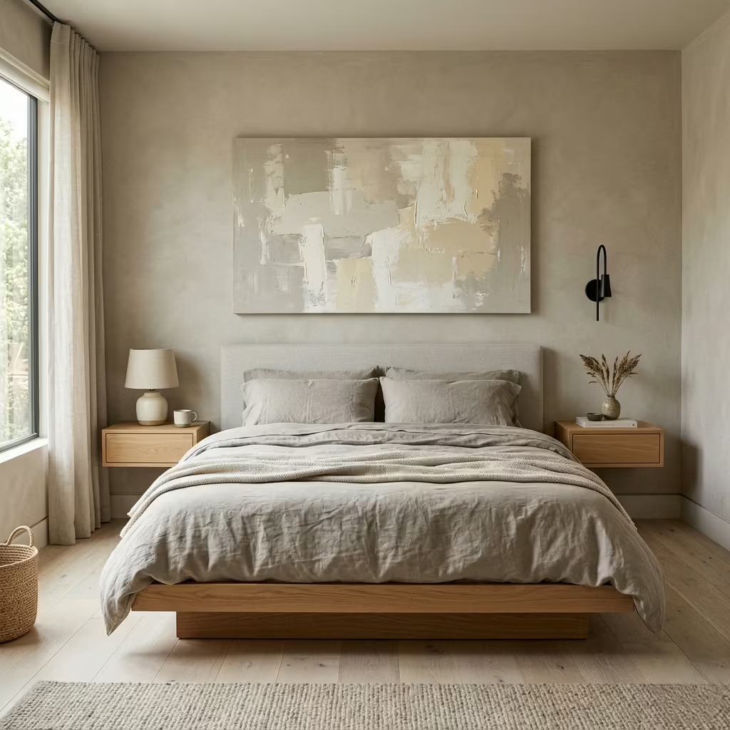
In a neutral modern bedroom, art can serve as both a visual anchor and a subtle narrative device. Large-scale neutral artwork think abstract canvases in greige, soft taupe, or muted ivory creates presence without distraction, giving the room a focal point while maintaining calm restraint.
The design intent is to balance the room’s tonal layers, textures, and architectural proportions while introducing scale, rhythm, and emotional resonance. Neutral art allows the bedroom to feel curated and sophisticated without relying on colour contrast or patterns, emphasizing composition, materiality, and intentional placement over overt visual excitement.
Real-Life Application (First-Person Insight)
In a recent project, a bedroom with soft plaster walls and timber floors felt visually calm but lacked focal interest. By introducing a single, large-scale canvas in muted greige with subtle textural brushstrokes above the headboard, the room gained a quiet gravitas. The artwork’s neutral palette allowed light to interact with both the canvas and surrounding surfaces, highlighting textures in bedding, curtains, and timber accents.
The piece became a point of emotional engagement: clients reported feeling both grounded and inspired, demonstrating that scale and subtlety in neutral art can dramatically elevate the experiential quality of a bedroom.
Key Measurements (Metric + Imperial)
- Art width: Ideally 2/3 the width of the bed for balance (e.g., for a 150 cm / 60-inch bed, artwork ~100 cm / 39 inches wide)
- Art height: 80–120 cm (31–47 inches), depending on ceiling height and wall proportion
- Placement: Centre the artwork horizontally above the bed; bottom edge ~20–25 cm (8–10 inches) above headboard
- Frame and spacing: Minimal or frameless to maintain modern restraint; ensure at least 30–50 cm (12–20 inches) of neutral wall space around the piece
Proper scaling and placement ensure the artwork feels integrated, intentional, and proportionate rather than overwhelming the room.
Material & Styling Notes
- Medium: Canvas, linen, or textured paper with subtle brushwork, washes, or reliefs
- Colours: Muted greige, soft ivory, off-white, or warm taupe to complement existing neutral layers
- Frame options: Minimal timber, thin metal, or no frame for a floating, gallery-like feel
- Styling tip: Pair with subtle textures in bedding or rugs to echo tactile qualities in the artwork; avoid bold colours that disrupt calm
Large-scale neutral art adds emotional depth and architectural rhythm while allowing furniture, flooring, and textiles to maintain their layered dialogue. It acts as a silent narrator of the room, enhancing both aesthetic and experiential cohesion.
Pros
- Creates a striking focal point without overwhelming neutrality
- Enhances scale, proportion, and spatial hierarchy
- Encourages a calm, reflective, and curated atmosphere
- Integrates seamlessly with layered textures and soft furnishings
Cons
- Requires careful scaling to maintain balance with furniture and ceiling height
- Can feel underwhelming if textures or tonal variation are too subtle
- Framing and installation must be precise to preserve clean, modern lines
Layered Lighting (Ambient, Task, Accent)
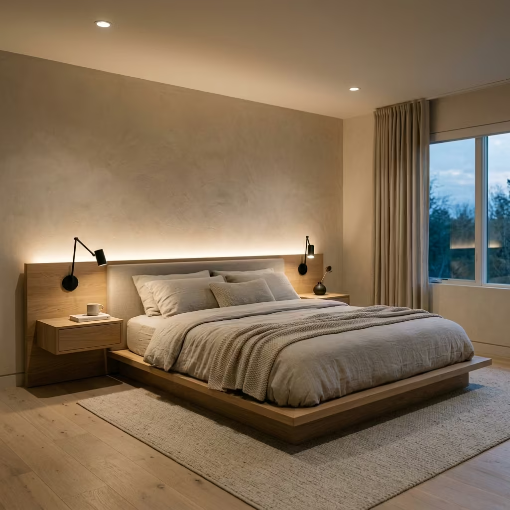
Lighting in a neutral modern bedroom is about more than illumination it’s about orchestrating mood, depth, and spatial perception. Layered lighting combines ambient, task, and accent sources to create a dynamic yet calm environment. Ambient lighting provides overall illumination, task lighting supports practical activities like reading, and accent lighting highlights architectural details, artwork, or textures.
The design intent is to allow the bedroom to transition seamlessly from day to night, balancing functionality with visual serenity while subtly enhancing the tonal and material layers present in the space.
Real-Life Application (First-Person Insight)
In one project, a client’s bedroom relied solely on a central ceiling fixture, resulting in a flat and harshly lit space. I introduced a three-tiered approach: a recessed dimmable ceiling light for ambient glow, wall-mounted reading sconces at 60 cm (24 inches) above the mattress for task lighting, and LED strips behind the headboard to accentuate texture. The result was transformative.
The room could feel bright and airy during the day, soft and contemplative at night, and visually layered even when unoccupied. From experience, I know that properly layered lighting not only supports function but deeply influences emotional connection to a room, making it feel more luxurious and considered.
Key Measurements (Metric + Imperial)
- Ambient lighting: Ceiling or recessed lighting 2.4–2.7 m (8–9 ft) above floor for balanced illumination
- Task lighting: Reading sconces or bedside lamps 55–65 cm (22–26 inches) above mattress top for ergonomic reach
- Accent lighting: LED strips or wall washers positioned to highlight artwork, textures, or wall panels; typically 15–20 cm (6–8 inches) offset from surfaces
- Spacing: Maintain 75–90 cm (30–36 inches) between light sources for balanced coverage and minimal shadows
Proper placement ensures a harmonious interplay of light, shadow, and texture, maintaining calm and functional clarity.
Material & Styling Notes
- Fixtures: Matte black, brushed metal, or neutral finishes to integrate with room palette
- Bulb temperature: Warm 2700–3000K to maintain cozy and inviting atmosphere
- Dimmers: Essential for controlling mood and adapting to different times of day
- Styling tip: Conceal wiring where possible, and ensure fixtures complement furniture lines and architectural rhythm
Layered lighting enhances both visual and emotional depth, emphasizing textures, tonal layers, and spatial composition while keeping the neutral palette coherent and sophisticated.
Pros
- Supports multiple functions (reading, ambience, accentuation) without disrupting calm
- Enhances depth, texture, and architectural details
- Allows mood control and versatility for day-to-night transitions
- Elevates the perceived quality and sophistication of the room
Cons
- Requires careful planning and sometimes professional installation
- Overcomplication can clutter ceilings or walls if not proportioned correctly
- Initial costs for layered fixtures and dimmers are higher than single-source lighting
Timber Flooring with Matte Finish
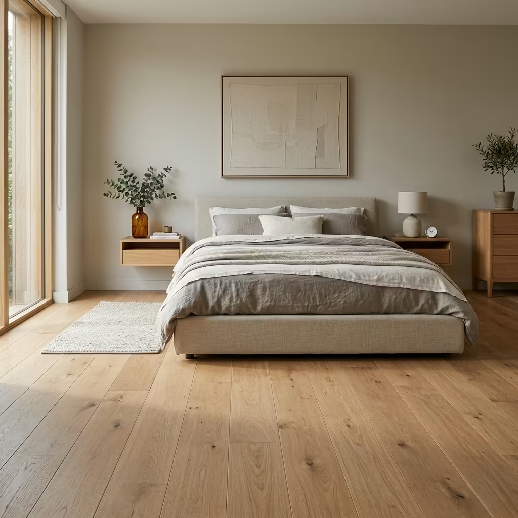
Timber flooring is the foundation of a neutral modern bedroom, providing warmth, texture, and a tactile connection to nature. Opting for a matte finish reinforces subtle sophistication and understated elegance, allowing light to play gently across the surface without glare or reflection. The design intent is to anchor the room with enduring material intelligence, harmonising with neutral walls, textiles, and furniture while creating visual continuity and a grounded, inviting atmosphere. Wider planks further emphasise horizontal lines, reinforcing calm proportions and a sense of spaciousness.
Real-Life Application (First-Person Insight)
In one project, I selected oak planks, 150 mm (6 inches) wide, for a master bedroom with soft greige walls and a linen-upholstered bed. The matte finish allowed sunlight to highlight subtle grain variations throughout the day, enhancing depth without competing with textiles or neutral wall tones. Clients reported that the room felt both grounded and luxurious, a tactile pleasure underfoot that invited barefoot walking. By pairing the timber with floating nightstands and minimal rugs, the flooring became a quiet hero, anchoring the bed zone while complementing layered textures.
Key Measurements (Metric + Imperial)
- Plank width: 120–180 mm (5–7 inches) for proportionate emphasis on horizontal lines
- Plank thickness: 15–20 mm (0.6–0.8 inches) for stability and durability
- Expansion gap: 10–15 mm (0.4–0.6 inches) around perimeter for wood movement
- Room coverage: Full coverage recommended; rugs can define zones but should allow the floor to remain visible
Proper plank width and spacing ensure the floor feels continuous and expansive, reinforcing calm proportions while supporting furniture layout and circulation.
Material & Styling Notes
- Wood species: Oak, walnut, or maple for neutral undertones and long-term durability
- Finish: Matte or low-sheen oil to highlight natural grain and texture; avoid high-gloss which can feel reflective or sterile
- Installation: Tongue-and-groove or engineered planks for stability; consider underfloor heating compatibility
- Styling tip: Layer soft rugs in neutral tones or subtle textures to accentuate warmth and provide comfort underfoot
Timber with a matte finish provides both functional durability and emotional warmth, serving as the unifying element that supports furniture, textiles, and lighting while subtly enriching the bedroom’s layered neutral palette.
Pros
- Timeless, durable, and visually grounding
- Matte finish reduces glare and highlights natural texture
- Complements neutral modern bedrooms with warmth and tactility
- Can integrate with underfloor heating and layered textiles seamlessly
Cons
- Susceptible to scratches; requires maintenance and occasional refinishing
- Softer timbers may dent more easily under heavy furniture
- Initial installation cost is higher than laminate or engineered alternatives
You May also Like: 25 Modern Victorian Bedroom Ideas That Feel Rich, Elegant, and Effortlessly Livable
Built-In Wardrobes with Flush Finishes
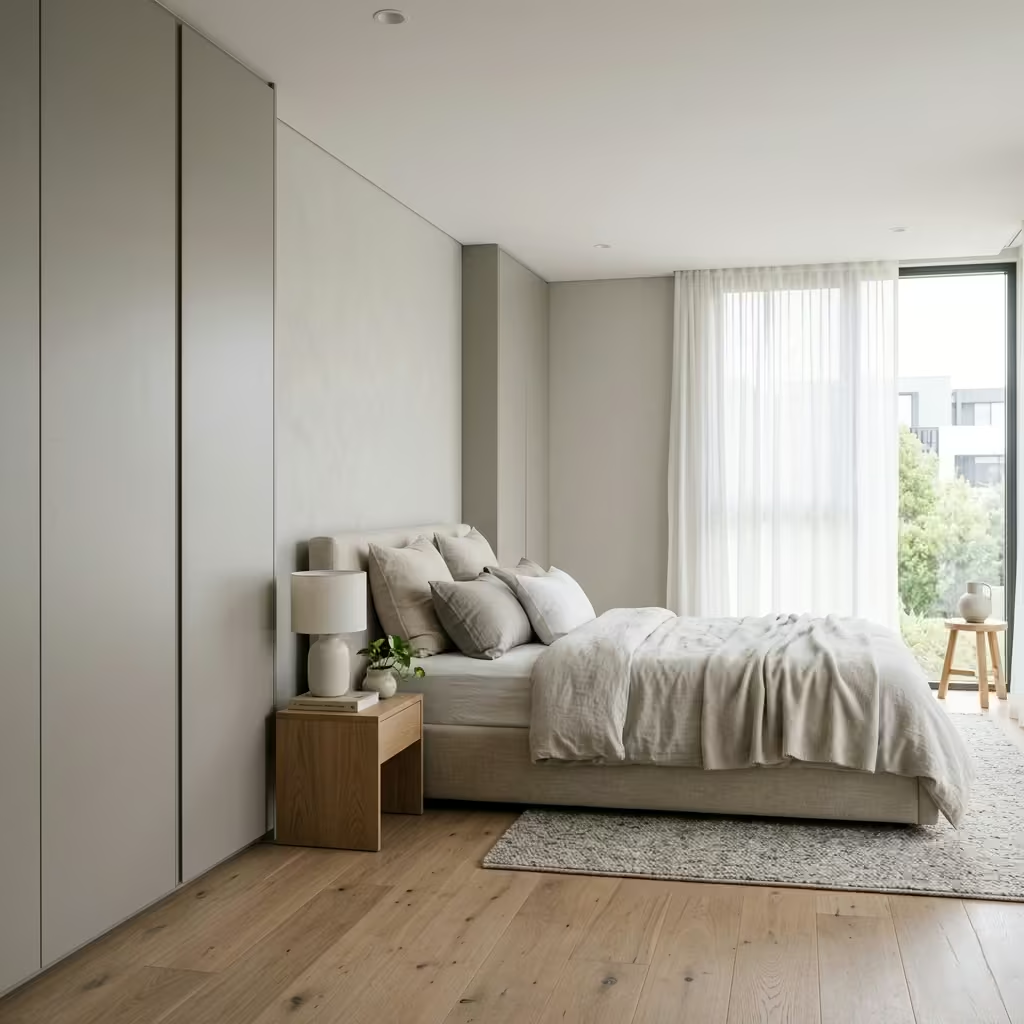
Built-in wardrobes with flush finishes are a cornerstone of neutral modern bedrooms, offering clean lines, visual calm, and functional efficiency. By aligning wardrobe doors seamlessly with walls and avoiding protruding handles, the design maintains spatial clarity and supports the overarching philosophy of restraint and proportion. The intent is to hide storage without compromising elegance, allowing the room’s textures, tonal layers, and architectural elements to remain the focal point. Flush wardrobes create a sense of continuity, making the bedroom appear larger, uncluttered, and deliberately composed.
Real-Life Application (First-Person Insight)
In a recent master bedroom renovation, the client wanted maximum storage without disrupting the room’s airy feel. We installed floor-to-ceiling built-in wardrobes with handleless doors finished in matte warm grey. The flush alignment with the walls created seamless integration, emphasizing the room’s horizontals and drawing attention instead to textured linen bedding and natural oak flooring. The client appreciated the hidden functionality: storage for clothing, linens, and accessories without visual clutter. From experience, I often find that the more you hide, the more serene a space feels, particularly in neutral modern design where restraint is key.
Key Measurements (Metric + Imperial)
- Wardrobe depth: 60–65 cm (24–26 inches) for hanging space; 45–50 cm (18–20 inches) for shelving units
- Height: Floor-to-ceiling (2.4–2.7 m / 8–9 ft) for maximum storage and seamless integration
- Door spacing: Flush panels with 2–3 mm (0.1 inch) spacing for smooth operation
- Clearance: Minimum 75 cm (30 inches) in front for wardrobe access and circulation
Correct measurements ensure the wardrobe feels built-in rather than appended, supporting the room’s compositional balance and functional requirements.
Material & Styling Notes
- Materials: Laminated or veneered MDF, timber, or lacquered finishes for durability and sleek appearance
- Finish: Matte or satin to maintain subtlety and reduce light reflection
- Hardware: Push-to-open mechanisms or concealed channels for handleless design
- Styling tip: Match wardrobe finish to wall tones or choose a slightly contrasting neutral to create subtle definition without breaking visual calm
Flush built-in wardrobes allow the bedroom to breathe visually, providing essential storage while maintaining a minimalist, cohesive, and sophisticated neutral palette.
Pros
- Maximizes storage while preserving spatial clarity
- Enhances perception of height and room continuity
- Seamlessly integrates with neutral modern aesthetics
- Reduces visual clutter and simplifies daily living
Cons
- Requires professional design and installation for precise alignment
- Higher upfront cost than standalone wardrobes
- Less flexibility to relocate or change compared to freestanding units
Subtle Metallic Accents in Brushed Finishes
In a neutral modern bedroom, subtle metallic accents introduce refined visual interest and tactile contrast without overwhelming the calm palette. Brushed finishes such as matte brass, soft nickel, or aged bronze add depth and sophistication, catching light gently and enhancing architectural details, fixtures, and furniture hardware.
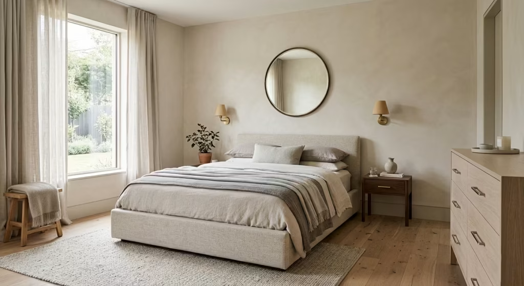
The design intent is to punctuate the space with understated luxury, complementing neutral textures and tonal layers while maintaining compositional restraint. These metallic touches act as visual signposts, guiding the eye and highlighting design features with quiet elegance.
Real-Life Application (First-Person Insight)
In one of my projects, a bedroom featured linen upholstery, timber flooring, and soft greige walls. To avoid monotony, we introduced brushed brass drawer handles, a slim pendant lamp, and a wall-mounted mirror with a soft metallic frame.
The effect was subtle yet transformative: the metallic elements reflected light softly, enriched the layered textures, and added an unexpected dimension without disrupting the room’s serenity. Clients often remark that these understated accents make the space feel carefully curated and luxurious, proving that small touches can dramatically elevate perceived quality and cohesion.
Key Measurements (Metric + Imperial)
- Hardware: Handles, knobs, and pulls 5–8 cm (2–3 inches) for proportional integration with furniture
- Lighting fixtures: Pendant diameters 15–25 cm (6–10 inches), hanging 60–75 cm (24–30 inches) above bedside surfaces
- Mirrors or wall accents: 80–120 cm (31–47 inches) height for balance above consoles or beds
- Spacing: Maintain at least 30–50 cm (12–20 inches) of neutral wall or furniture surface between metallic touches to avoid visual clutter
Measurements ensure accents enhance composition without competing with neutral textures or dominating the space.
Material & Styling Notes
- Materials: Brushed brass, satin nickel, aged bronze, or gunmetal for a matte, non-reflective finish
- Pairings: Works best with timber, linen, plaster, or stone to create tactile contrast
- Styling tip: Limit metallics to small, strategic points (lighting, hardware, mirror frames) to maintain calm; avoid high-gloss metals that disrupt neutrality
Brushed metallics bring subtle drama, refinement, and tactile appeal, reinforcing the bedroom’s layered texture and nuanced tonal narrative.
Pros
- Adds sophistication, depth, and subtle visual interest
- Highlights textures and architectural lines without overwhelming neutral palette
- Long-lasting, timeless, and versatile across materials
- Reflects light gently, enhancing perceived warmth and layering
Cons
- Overuse can distract from the overall calm of the room
- Maintenance may be required to retain finish, especially on high-touch surfaces
- Metallic tones must be carefully selected to harmonize with other neutrals
Soft Neutral Colour Blocking on Walls
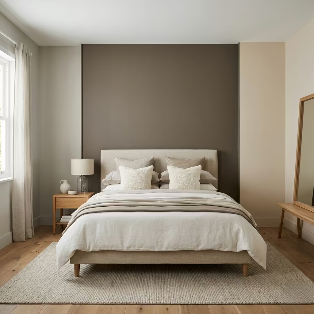
Soft neutral colour blocking is a refined technique that introduces subtle visual rhythm and depth in a modern bedroom without overwhelming the calm palette. By using shades within the same tonal family such as warm beige, greige, or muted taupe across different wall panels or sections, designers can create defined zones, accentuate architectural features, and add dimensionality.
The intent is to enhance spatial perception while keeping the bedroom visually serene, layered, and sophisticated, proving that neutrality can be anything but monotonous.
Real-Life Application (First-Person Insight)
In a recent project, a master bedroom had a large window wall and otherwise flat greige plaster walls. To introduce subtle interest, I painted the headboard wall in a slightly darker warm taupe and the adjacent side walls in lighter greige. This gentle colour blocking created a sense of depth and intentionality, drawing attention to the bed as the room’s focal point while maintaining a cohesive, calming atmosphere.
The technique also allowed layered textures linen bedding, boucle cushions, and timber furniture to pop against nuanced backgrounds. Clients often report that such subtle colour layering makes the bedroom feel both designed and lived-in, striking a balance between sophistication and comfort.
Key Measurements (Metric + Imperial)
- Panel width or height: Typically 50–120 cm (20–47 inches), depending on wall proportion and ceiling height
- Distance from ceiling/floor: Leave 10–15 cm (4–6 inches) to maintain visual breathing room
- Zone proportion: Accent walls or sections should not exceed 1/3 of the room’s total wall area to maintain balance
- Alignment: Horizontal or vertical blocking should relate to furniture placement for harmony and scale
Proper measurements ensure colour-blocked walls feel intentional and proportional, avoiding an unplanned or “patchy” appearance.
Material & Styling Notes
- Paint finish: Matte or eggshell for soft diffusion of light and subtle tonal variation
- Colours: Select muted, warm neutrals that complement timber floors, plaster walls, and linen textiles
- Styling tip: Pair blocked walls with minimal décor and layered textures to let subtle tonal shifts speak without distraction
Soft neutral colour blocking can subtly guide the eye, define zones, and enhance the emotional warmth of the room while preserving the understated elegance central to neutral modern design.
Pros
- Adds depth and visual interest without overwhelming neutrality
- Helps define furniture zones or architectural features
- Enhances the perception of space and proportion
- Works harmoniously with layered textures and materials
Cons
- Requires careful colour selection to avoid visual discord
- Overly large or contrasting panels can disrupt the calm aesthetic
- Professional execution recommended for clean lines and consistency
Open Space Around the Bed for Airiness
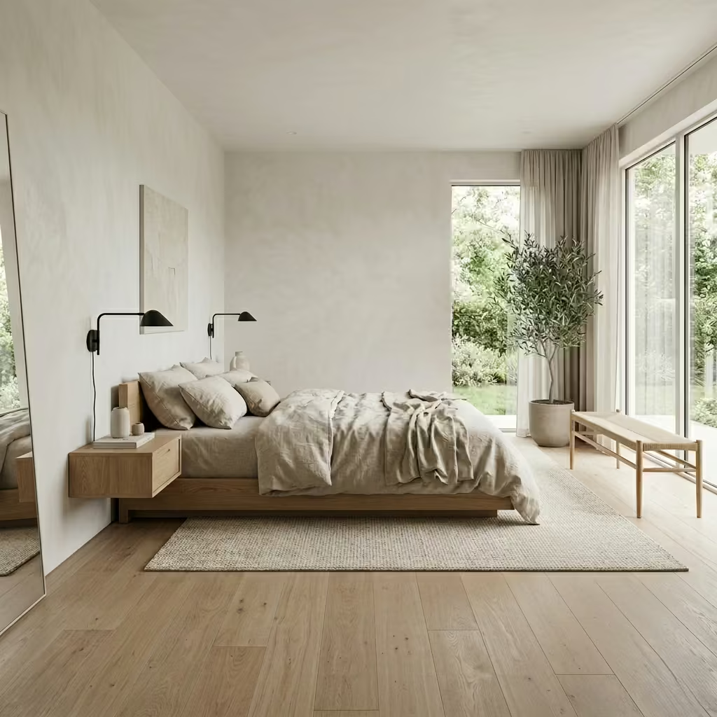
One of the simplest yet most powerful strategies in a neutral modern bedroom is maximizing open space around the bed. By maintaining generous circulation, the room feels airy, calm, and proportionate, allowing the eye to travel unimpeded across surfaces and textures.
The design intent is to prioritize spatial clarity over furniture overload, letting the bed serve as the visual and emotional anchor while other elements nightstands, rugs, and lighting support rather than compete with it. Open space also enhances the perception of light, accentuating tonal layers and material subtleties in a neutral palette.
Real-Life Application (First-Person Insight)
In a recent master bedroom, the client initially had the bed tucked too close to the wall with oversized nightstands. The room felt cramped, despite high-end finishes and a neutral colour palette. By repositioning the bed and reducing the size of side furniture, we created at least 80 cm (32 inches) of circulation on each side.
The impact was immediate: the room felt lighter, calmer, and more intentional, while the natural light played across timber floors, linen bedding, and soft plaster walls. Clients often remark that such “breathing room” changes the emotional experience of the bedroom, making it feel luxurious and intentionally designed rather than merely functional.
Key Measurements (Metric + Imperial)
- Minimum circulation: 75–90 cm (30–36 inches) on either side of the bed for comfortable movement
- Foot of bed clearance: 80–100 cm (31–39 inches) to maintain openness and access to storage or benches
- Nightstand sizing: Keep compact (40–50 cm / 16–20 inches width) to preserve circulation
- Rug placement: Extend rugs 60–75 cm (24–30 inches) beyond bed sides without obstructing pathways
Proper spatial planning ensures that open circulation enhances both comfort and perceived size, supporting the serene atmosphere that neutral modern bedrooms rely on.
Material & Styling Notes
- Flooring: Continuous timber or neutral stone surfaces to reinforce openness
- Furniture selection: Low-profile beds, floating nightstands, and minimal benches to avoid visual heaviness
- Lighting: Wall-mounted or pendant lights instead of large table lamps to maintain floor space
- Styling tip: Leave floor areas visible where possible to emphasize airiness and tactile flow
Open space around the bed is a quiet luxury, giving bedrooms room to breathe while subtly reinforcing calm, proportion, and architectural clarity.
Pros
- Enhances perceived spaciousness and airiness
- Improves circulation and functional comfort
- Highlights the bed as the central focus
- Supports visual and emotional calm in neutral modern design
Cons
- Requires careful selection of furniture to avoid wasted space
- Smaller rooms may limit the amount of circulation possible
- Overemphasis on open space can reduce storage opportunities if not planned
You May also Like: Bedroom Office Combo Ideas: Smart, Stylish Ways to Work and Sleep in One Space
Neutral Window Treatments with Sheer Layers
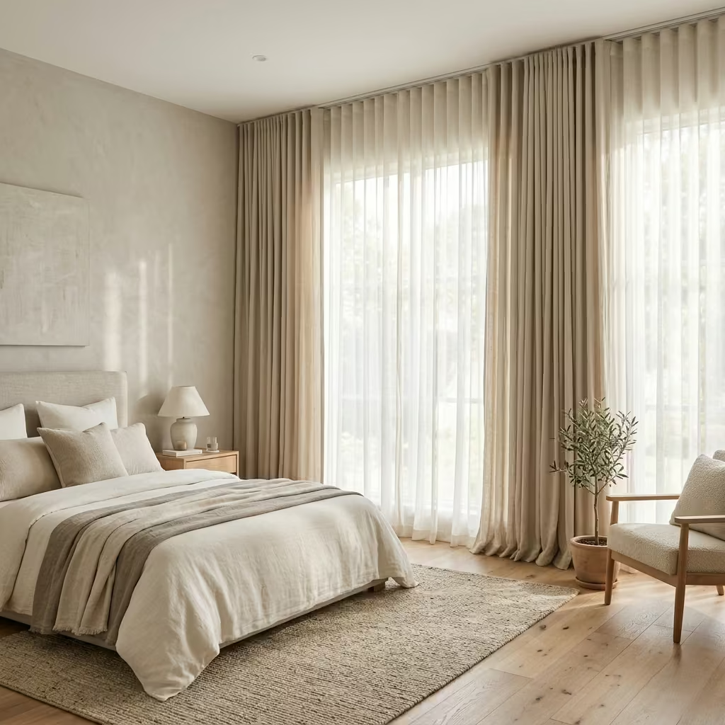
Window treatments in a neutral modern bedroom are more than privacy tools they are instruments of light modulation, texture, and emotional ambiance. Using neutral curtains layered with sheer fabrics allows natural light to filter softly into the room, accentuating tonal layers, materials, and architectural features.
The design intent is to soften the edges of the architecture, create a sense of height and airiness, and maintain visual calm while adding a tactile, human touch to the space. Sheers offer subtle movement and texture, enriching the sensory experience without introducing colour or pattern that might disrupt neutrality.
Real-Life Application (First-Person Insight)
On a recent summer bedroom project, clients had large south-facing windows that made the room bright but harsh at certain times of the day. I specified full-height linen curtains with sheer inner panels. The sheers diffused sunlight, casting a soft, layered glow on plaster walls and timber floors, while the outer curtains provided privacy and insulation.
The effect was transformative: the bedroom felt ethereal in the morning, intimate in the evening, and consistently cohesive with the neutral palette. This approach proved that window treatments can subtly dictate mood, control light, and reinforce the tactile calm of a space.
Key Measurements (Metric + Imperial)
- Curtain height: Floor-to-ceiling, 240–270 cm (8–9 ft), not limited to window frame, to enhance verticality
- Curtain width: 1.5–2 times the window width for full, soft folds
- Sheer layer: Slightly narrower than main curtain panels to allow smooth movement and layering
- Clearance: Minimum 15–20 cm (6–8 inches) from floor for gentle draping without obstruction
Correct proportions ensure a flowing, intentional silhouette that balances privacy, light control, and visual harmony.
Material & Styling Notes
- Materials: Linen, cotton voile, or lightweight polyester sheers for natural movement and soft diffusion
- Finishes: Matte or lightly textured to prevent glare and enhance tactility
- Colour palette: Ivory, soft beige, or warm greige to complement walls and furniture
- Styling tip: Layer heavier opaque curtains with sheers for flexibility; keep hardware minimal and aligned with ceiling to emphasize height
Sheer layers provide a sense of airiness, softness, and tactile elegance, enriching the bedroom’s material interplay while controlling light and mood naturally.
Pros
- Softens harsh sunlight and creates ambient glow
- Enhances verticality and architectural proportions
- Adds texture and subtle movement without breaking neutrality
- Flexible: sheers alone or layered with heavier curtains for privacy and insulation
Cons
- Requires careful coordination of layers and hardware for seamless operation
- Maintenance: sheers can attract dust and may require regular laundering
- Too heavy or patterned fabrics can disrupt calm, neutral aesthetic
Monochromatic Styling for Cohesion
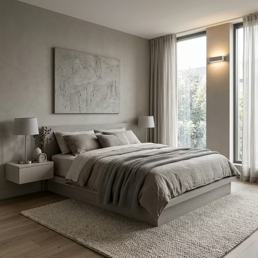
Monochromatic styling in a neutral modern bedroom is a refined strategy to achieve visual cohesion and calm sophistication. By layering multiple shades of the same tonal family think greige, warm taupe, or soft ivory across walls, furniture, bedding, and accessories, the room feels unified, expansive, and intentionally curated.
The design intent is to allow texture, proportion, and materiality to take center stage, rather than relying on contrasting colours or busy patterns, creating a space that is serene, balanced, and visually coherent.
Real-Life Application (First-Person Insight)
In one of my projects, a master bedroom featured plaster walls, timber flooring, and a low platform bed. By layering bedding, cushions, rugs, and even artwork in slightly varied shades of greige, the room achieved a subtle depth and refinement that clients described as “effortless calm.
The monochromatic palette allowed textures linen, boucle, timber grain, and stone to come forward as the main contributors to visual interest, rather than competing colours. In my experience, monochromatic styling encourages mindfulness and emotional ease, making the bedroom feel curated, luxurious, and purposefully composed.
Key Measurements (Metric + Imperial)
- Layering ratio: 60% dominant neutral (walls/floor), 30% secondary neutral (furniture/upholstery), 10% accent neutral (bedding/cushions/fixtures)
- Textile sizes: Throws and cushions sized proportionally to bed (cushions 45–60 cm / 18–24 inches, throw ~180 × 250 cm / 71 × 98 inches)
- Artwork placement: Maintain scale proportional to bed or wall to preserve harmony
- Furniture spacing: Allow 75–90 cm (30–36 inches) circulation around bed to maintain open feel
Proper proportioning and layering ensure a sophisticated interplay of shades that feels intentional rather than monotonous.
Material & Styling Notes
- Materials: Linen, wool, cotton, timber, plaster, and stone to enhance texture
- Finishes: Matte and soft textures for subtle contrast within the same tonal family
- Styling tip: Mix textures and finishes smooth plaster with nubby textiles or brushed metal accents to prevent the monochromatic scheme from feeling flat
- Palette guidance: Stick to one tonal family and use varying lightness or saturation to create depth
Monochromatic styling reinforces spatial clarity, emotional calm, and material intelligence, allowing neutral bedrooms to feel layered and engaging without relying on colour contrast.
Pros and Cons
Pros
- Achieves cohesive, sophisticated, and serene aesthetics
- Highlights texture and materiality rather than relying on colour
- Easy to maintain visual balance and harmony
- Enhances emotional and spatial calm
Cons
- Risk of monotony if textures and finishes are not varied
- Requires careful curation of tonal values for depth
- Can feel flat in poorly lit rooms without layered lighting
Statement Ceiling in Soft Neutral Tone
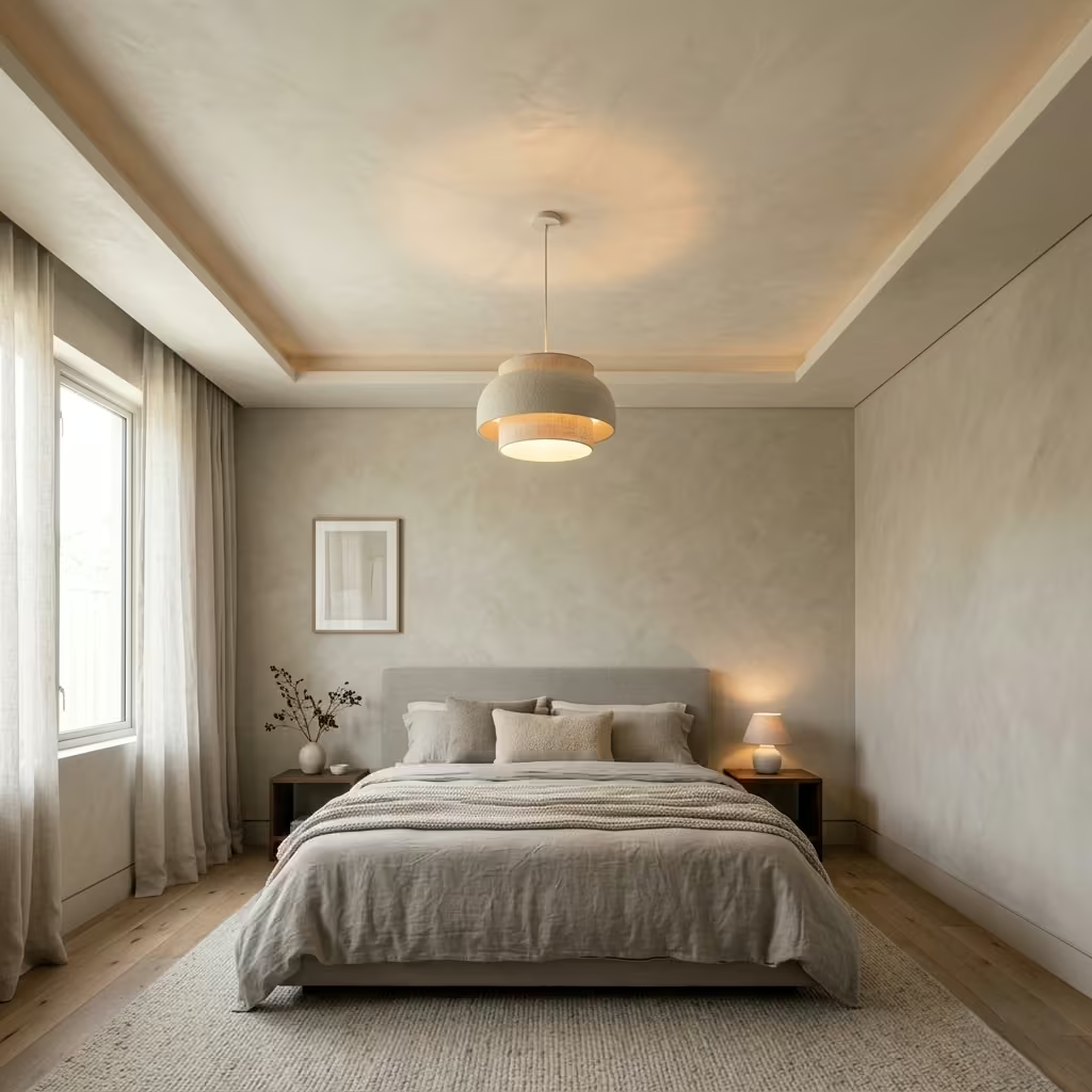
In a neutral modern bedroom, the ceiling is often overlooked, yet it offers an unexpected opportunity to add drama, depth, and architectural interest without introducing bold colours or patterns.
A statement ceiling in a soft neutral tone slightly warmer or cooler than the walls creates a layered, enveloping effect that frames the room and enhances spatial perception. The design intent is to draw the eye upward, balance proportions, and subtly influence mood, making the ceiling an integral part of the room’s layered, calm composition.
Real-Life Application (First-Person Insight)
On a recent project, the master bedroom had plaster walls in warm greige and timber flooring. Painting the ceiling in a soft ivory-grey created a cocooning effect, making the room feel taller and more intimate simultaneously. Layered lighting, including recessed LEDs and pendant fixtures, interacted with the ceiling’s tone, accentuating shadows and texture.
The client immediately remarked on the “soft drama” it added, proving that even subtle interventions above eye level can transform the perception and emotional impact of a bedroom. From experience, I’ve found that a statement ceiling can be the finishing touch that elevates a neutral room from functional calm to considered luxury.
Key Measurements (Metric + Imperial)
- Ceiling height: Standard 2.4–2.7 m (8–9 ft) works well for soft contrast without feeling oppressive
- Paint coverage: Ensure uniform application; matte or eggshell finishes diffuse light softly
- Proportional contrast: Choose a ceiling shade 5–10% lighter or darker than the walls to maintain subtlety
- Interaction with lighting: Position ambient and accent fixtures to highlight ceiling depth and texture
Proper tonal contrast ensures the ceiling feels intentionally layered, proportionate, and harmoniously integrated with walls, flooring, and furnishings.
Material & Styling Notes
- Paint finish: Matte or low-sheen to avoid glare and emphasize texture
- Colour palette: Soft neutral shades warm ivory, light greige, muted stone tones
- Styling tip: Pair with layered wall textures, subtle accent lighting, and neutral furnishings to reinforce calm and sophistication
- Additional ideas: Consider subtle moulding or plaster detailing to add dimensional interest without breaking neutrality
A soft neutral ceiling adds an unseen layer of luxury, calm, and architectural intelligence, enhancing the room’s overall tonal narrative while guiding light and mood naturally.
Pros
- Adds visual depth and subtle architectural interest
- Enhances perceived height and spatial proportion
- Complements layered textures and neutral palettes
- Influences light and mood subtly without overpowering the room
Cons
- Requires careful colour selection to avoid a flat or heavy effect
- Ceiling imperfections are more noticeable with darker shades
- Professional application may be needed for smooth, consistent finish
Common Mistakes I See in Neutral Bedroom Design
Even with the best intentions, neutral modern bedrooms can easily slip from serene sophistication into blandness. Over the years, I’ve observed recurring pitfalls that subtly undermine spatial harmony, material depth, and emotional resonance. Often, what clients describe as “boring” isn’t a lack of style.
it’s under-layering of textures, tones, and light, rather than over-simplification. Here’s a closer look at the most common missteps and how to avoid them:
Over-Reliance on One Shade (Flatness)
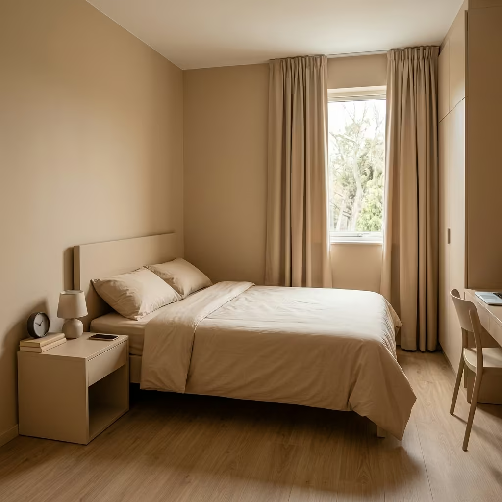
Relying solely on a single neutral whether it’s pale greige, ivory, or taupe can make a room feel flat, uninspiring, or visually static. Layering is key: combine slightly varying shades across walls, furniture, bedding, and textiles to create subtle depth and rhythm. In one project, a bedroom painted entirely in warm beige initially felt heavy. By introducing soft greige accents on a headboard wall and linen upholstery, the space gained a sense of movement and intentionality, proving that neutral doesn’t mean monotonous.
Practical takeaway: Use at least three tonal layers within the same neutral palette to enhance dimension while preserving calm.
Ignoring Lighting Temperature
Even the most carefully curated textures and colours can falter under inappropriate lighting. Harsh white light can wash out warm neutrals, while overly warm bulbs can flatten soft greys and taupes. In practice, I recommend 2700K–3000K for bedside and accent lighting, with dimmable options for ambient layers. On a project with a soft greige palette, switching to warmer LED strips behind the headboard transformed the mood entirely suddenly the bedroom felt inviting, layered, and alive, rather than sterile.
Practical takeaway: Plan layered lighting intentionally ambient, task, and accent to complement materials and tonal shifts.
Poor Material Contrast
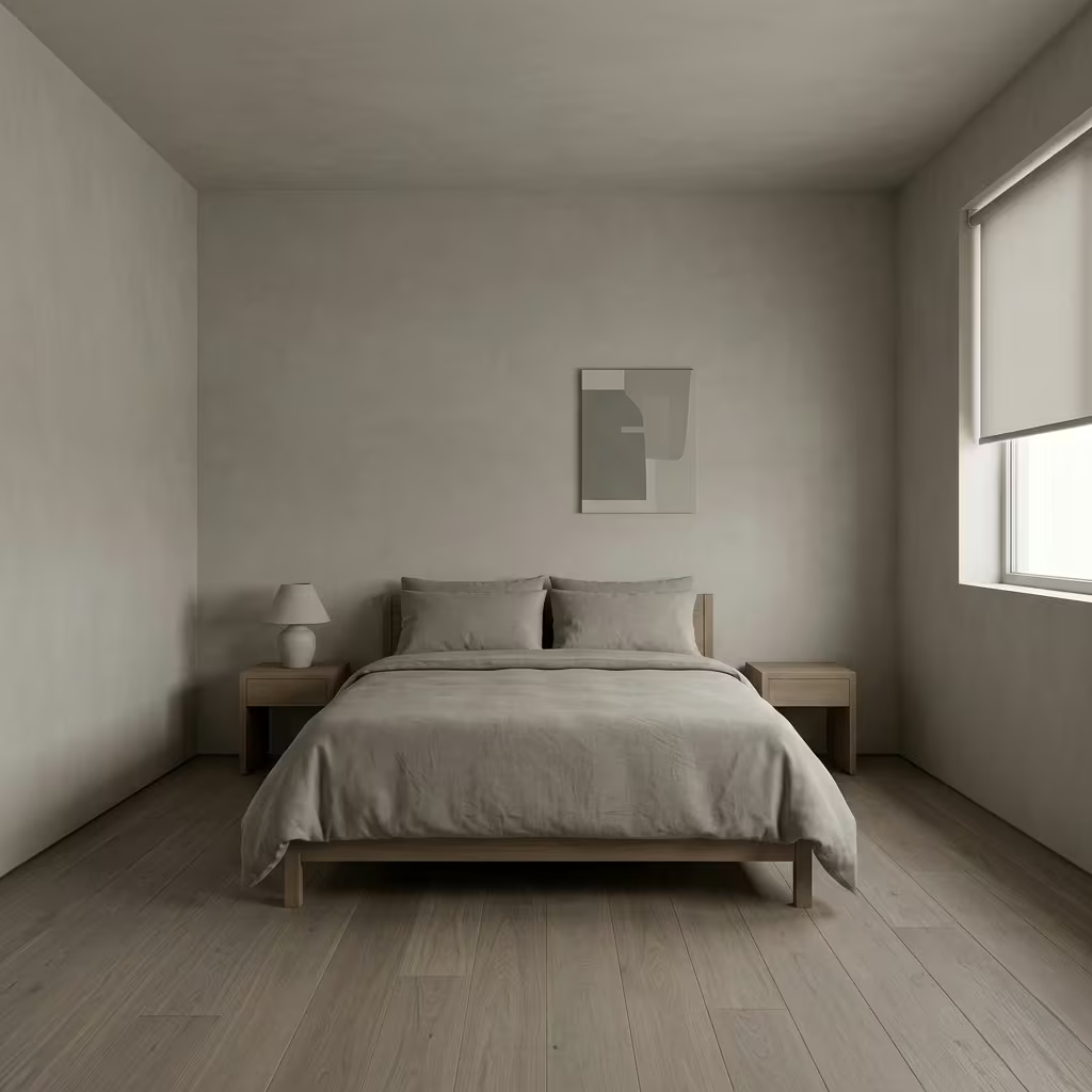
Neutral bedrooms thrive on tactile variety. Relying solely on smooth plaster walls, plain bedding, or uniform timber floors risks visual monotony. Contrast should be introduced through timber grains, boucle upholstery, stone bedside surfaces, linen bedding, or subtle metallic accents. In one master bedroom, adding a travertine bedside table against soft plaster walls and a linen bed elevated the emotional richness, making the space feel tactile, layered, and curated rather than overly neutral or cold.
Practical takeaway: Mix materials with different tactile qualities to maintain interest and dimensionality in a restrained palette.
Lack of Texture Hierarchy
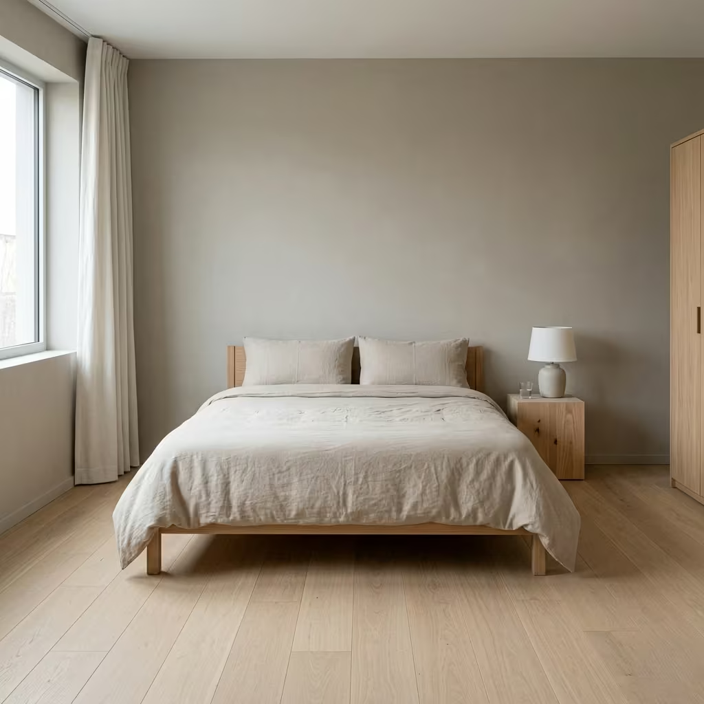
Not all textures are created equal, and failing to establish a hierarchy can make a room feel visually disorganized or underdeveloped. Heavy textures (wool rugs, timber floors) should form the foundational layer, mid-weight textures (linen bedding, upholstery) the middle layer, and lighter accents (throws, cushions, wall art) the top layer. In one project, layering was initially neglected once I introduced a boucle throw, textured cushions, and a subtle plaster wall finish, the bedroom felt complete, intentional, and alive without adding colour or clutter.
Practical takeaway: Think in layers floor, furniture, textiles, and accessories so textures work in dialogue rather than competing.
How to Make a Neutral Bedroom Feel Personal (Without Breaking the Palette)
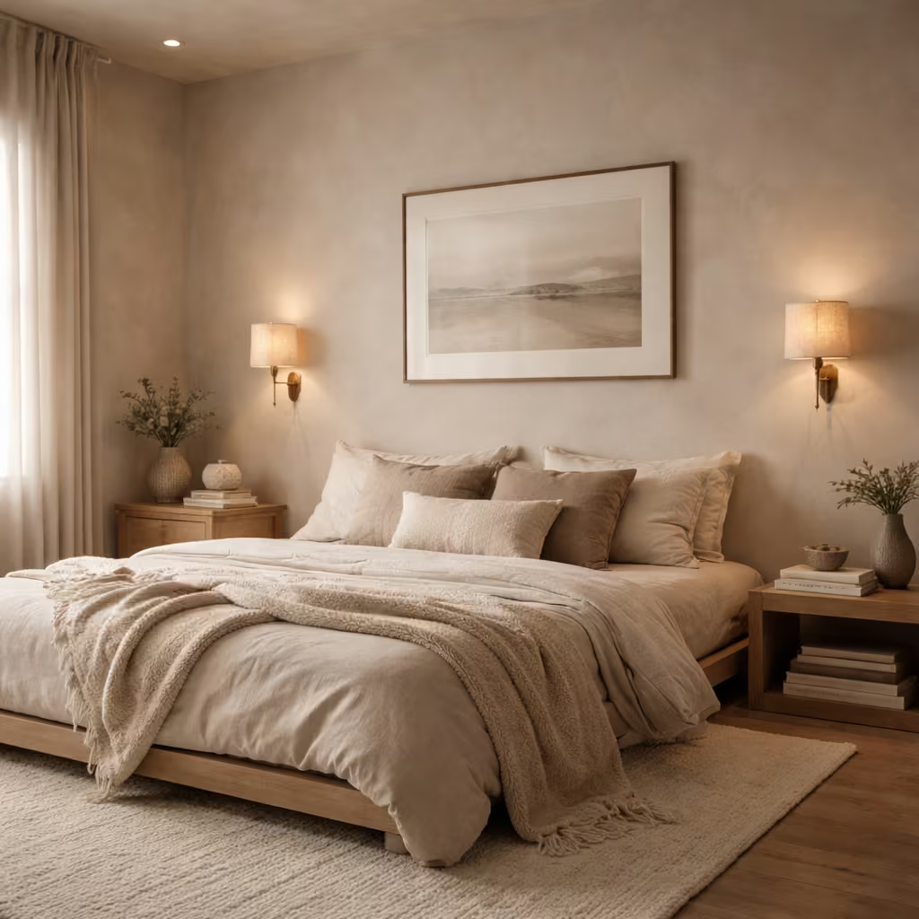
A neutral bedroom doesn’t have to feel impersonal or sterile. The beauty of neutral modern bedroom design lies in its restraint it provides a calm canvas that can be quietly customised, allowing your personality to shine without disrupting the overall harmony. The key is to introduce individuality through subtle interventions, tactile richness, and curated objects, all while maintaining tonal discipline. Here’s how I approach this in my projects:
Artwork as a Personal Touch
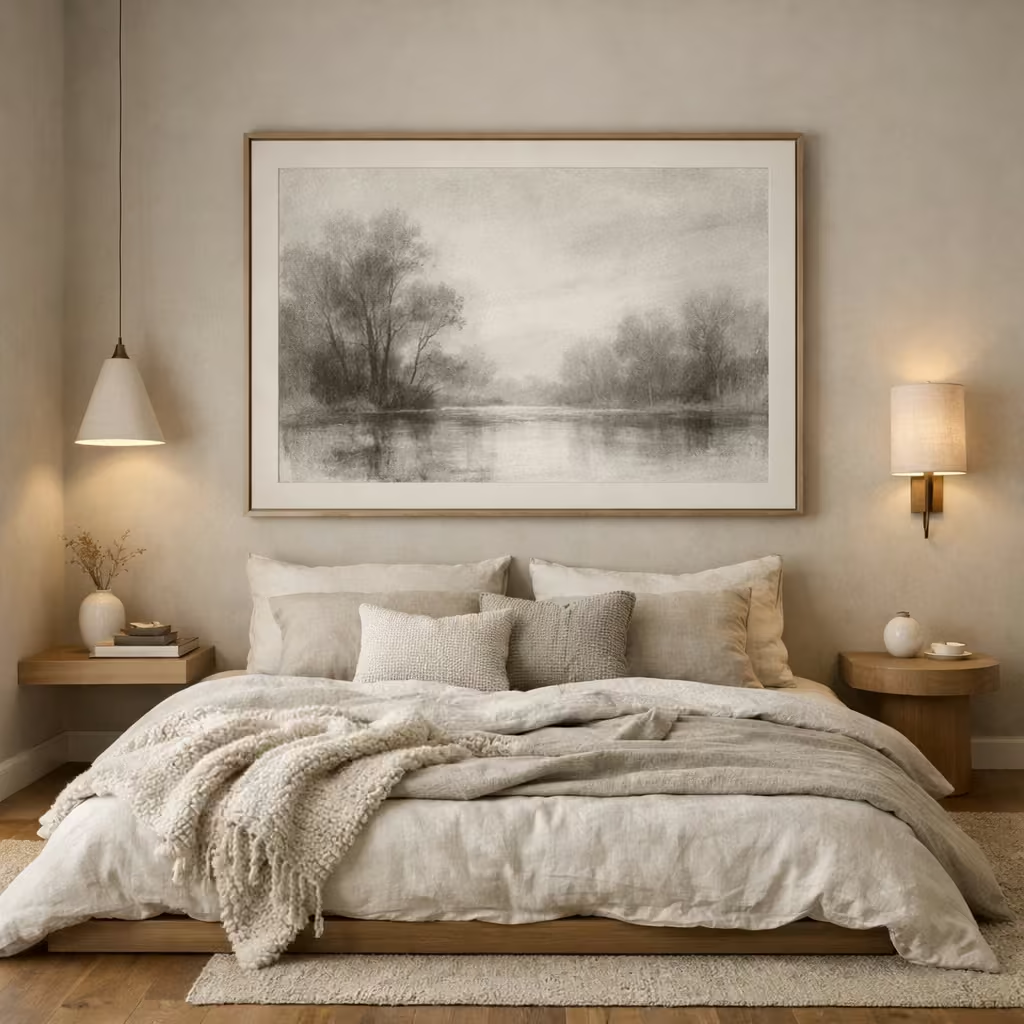
Artwork is one of the most effective ways to inject character into a neutral bedroom without adding jarring colour. Think large-scale monochromatic prints, soft sketches, or sculptural wall pieces that complement the room’s tonal palette. In one project, a client’s bedroom featured soft greige walls and a linen-upholstered bed; introducing a hand-framed charcoal sketch above the headboard immediately felt personal yet cohesive, providing a focal point that reflected taste without overwhelming the calm.
Practical takeaway: Choose pieces with subtle tonal variation and consider scale carefully large-scale works tend to anchor the room and create impact while maintaining serenity.
Textures as Expression
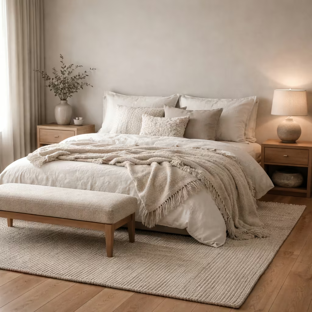
Texture is the language of subtle personality in neutral spaces. Layering boucle cushions, nubby throws, handwoven rugs, or a leather bench adds tactile depth that feels intimate and curated. On a recent project, incorporating a soft alpaca throw and a linen bedspread transformed a previously “flat” bedroom into a warm, inviting retreat. The client loved that the bedroom felt personalised without straying from the neutral palette.
Practical takeaway: Aim for at least three distinct texture layers foundational (floor/rug), mid-weight (bedding/upholstery), and accent (throws, cushions, small accessories).
Handmade and Curated Elements
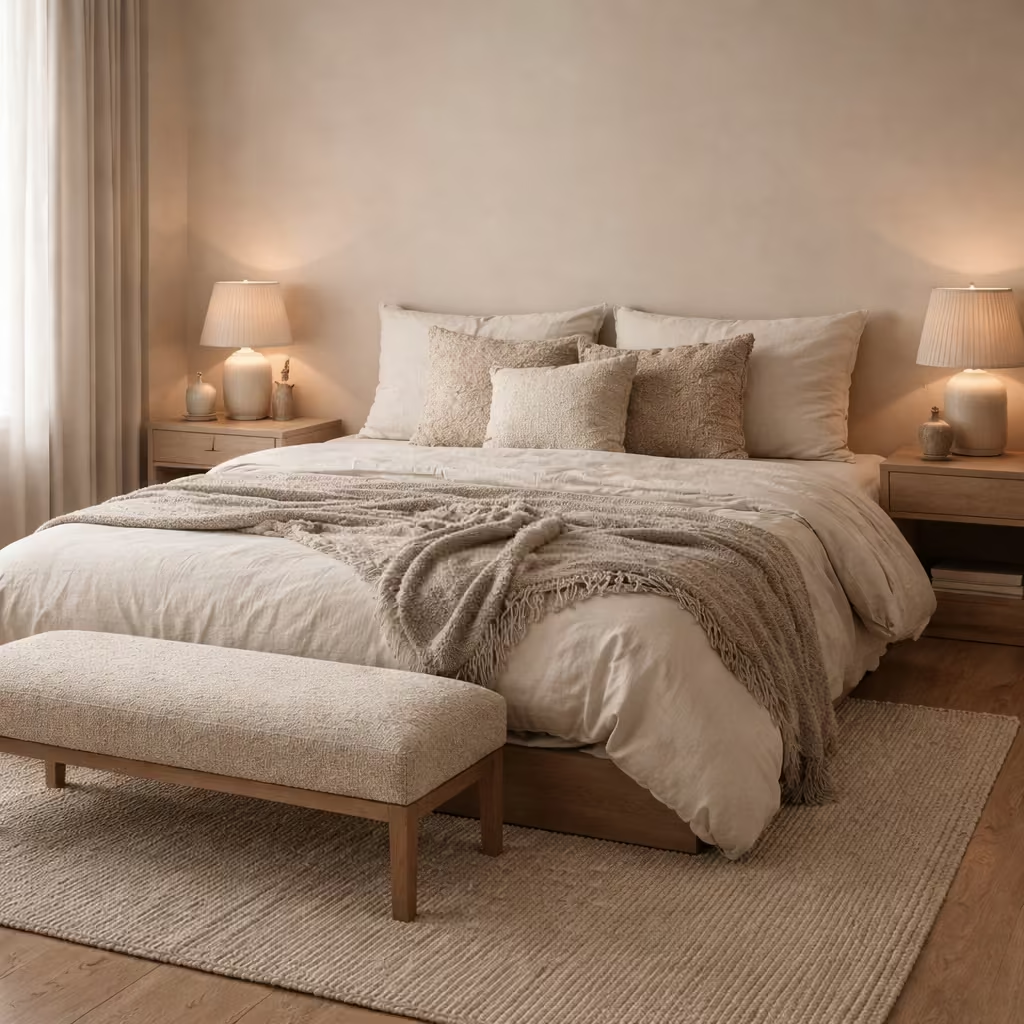
Introducing handmade or artisanal pieces ceramic vases, woven baskets, or small sculptural objects adds authenticity and a sense of story. I often source bespoke bedside lamps or wall-mounted elements for clients, which subtly signal individuality while maintaining tonal consistency. These pieces don’t shout they whisper character into the space, making it feel lived-in and intentionally curated.
Practical takeaway: Stick to natural materials and neutral shades to keep the bedroom cohesive. Even small handcrafted objects can create emotional resonance.
Maintain Tonal Discipline
The magic of a neutral bedroom is in subtle restraint. Even when personalising, it’s crucial to remain within the tonal family of the room warm greige, soft ivory, muted taupe, or soft stone shades. Too much contrast or bright accents can upset the careful balance of texture, light, and proportion. In practice, I encourage clients to experiment with materials, finishes, and form rather than bold colour. The result is a room that feels personal, layered, and timeless.
Practical takeaway: Keep personal touches subtle, scale them proportionally, and ensure they interact harmoniously with the room’s existing textures and layers.
Conclusion: Designing for Longevity, Not Just Aesthetic Trends
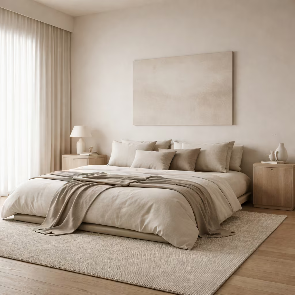
Neutral modern bedrooms have a deceptively simple charm, but their success lies not in fleeting trends or surface-level style it rests on careful layering, material intelligence, and spatial intention. The rooms I design and advise on consistently emphasise three pillars that ensure both timelessness and everyday comfort:
Material Quality
Durable, tactile materials form the backbone of a neutral bedroom. Timber floors, plastered or softly textured walls, linen and wool textiles, and subtle stone or metallic accents all contribute to a sense of enduring refinement. Investing in quality materials pays off over years, not months, allowing furniture and finishes to age gracefully, gain character, and retain their visual and tactile richness.
Spatial Clarity
Open circulation, well-proportioned furniture, and thoughtful storage solutions are the unsung heroes of calm bedrooms. Maintaining breathing room around the bed, employing flush built-ins, and carefully orchestrating nightstands, rugs, and lighting ensures the space feels organized, expansive, and emotionally restful. Spatial clarity is not only practical it reinforces the emotional serenity that makes a neutral bedroom feel truly luxurious.
Light Responsiveness
Natural and artificial light shapes perception, mood, and texture in subtle ways. Neutral surfaces respond to daylight shifts, while layered ambient, task, and accent lighting accentuates tonal variations and materiality. A room that interacts with light across the day feels dynamic, alive, and inviting, even without colour or bold visual statements.
Frequently Asked Questions About Designing a Neutral Modern Bedroom
Will a neutral bedroom feel boring or cold?
Not if it’s layered thoughtfully. The key is texture, tonal variation, and material hierarchy. For example, combining plaster walls, linen bedding, timber furniture, and subtle metallic accents can make a neutral palette feel warm, dynamic, and sophisticated. In my projects, clients often find that a well-layered neutral room feels more inviting and timeless than a brightly coloured space.
How do I prevent a neutral room from feeling flat?
Flatness usually comes from over-reliance on a single shade or lack of lighting variation. I recommend at least three tonal layers, along with layered lighting ambient, task, and accent. Small touches like a subtle colour-blocked wall, textured bedding, or a brushed metallic accent can create visual interest without breaking the calm palette.
What is the ideal lighting for a neutral bedroom?
Neutral spaces thrive under warm, dimmable light typically 2700K–3000K. Layering lighting is essential: recessed ceiling lights for ambient illumination, bedside task lamps, and accent lighting for wall textures or artwork. Proper lighting enhances texture, depth, and emotional warmth, especially in rooms with soft neutral tones.
How can I make a neutral bedroom feel personal?
Personality comes from artwork, textures, and curated handmade elements. Monochromatic artwork, linen throws, boucle cushions, or bespoke ceramics introduce character without disrupting the palette. Think in layers floor, furniture, textiles, and accessories so every item feels intentional and part of a cohesive story.
Should I add black or dark accents in a neutral bedroom?
Yes, but sparingly. Subtle dark or charcoal accents can anchor the composition and create contrast, helping layers and textures stand out. For example, a charcoal bedside lamp, picture frame, or small piece of furniture can punctuate a room without overwhelming its calm, neutral aesthetic.
What’s the best approach to storage in a neutral bedroom?
Flush-built wardrobes, concealed drawers, and floating nightstands maximize storage while preserving spatial clarity. Open floor space and careful circulation planning allow the room to breathe, enhancing both visual calm and functional comfort. I always advise clients to hide clutter rather than display it, keeping the room feeling elevated and serene.
Can I mix materials in a neutral palette?
Absolutely and you should. Neutral bedrooms rely on tactile variety for richness. Mix timber, plaster, stone, linen, wool, and subtle metallics to create a layered, curated feel. The trick is to keep materials in harmony with the tonal palette so contrast exists in texture and form, not in clashing colours.
How do I maintain a neutral bedroom over time?
Maintenance is mostly about textiles, lighting, and finishes. Natural materials like linen, wool, and timber age gracefully but require periodic care. Also, ensure lighting remains functional and flexible as furniture or accessories change. When layered thoughtfully, a neutral bedroom can remain timeless and adaptable for years, evolving with your lifestyle without feeling dated.