15 Stylish Modern Afrobohemian Living Room Ideas for a Cozy, Chic Home
There’s a specific hour I chase in every Afrobohemian Living Room project — half past four, when the light goes syrupy and low, and it catches the grain on a hand-carved stool sitting near the window like it was waiting for its close-up. That stool did nothing for months. Then the light hit it right, and a client stopped mid-sentence to ask where it came from. That’s the whole style in one moment: nothing shouting, everything earning its keep.
Most living rooms trying this look end up one of two ways — a Pinterest fever dream of clashing prints, or so timid it reads like a hotel lobby with a throw pillow apology. The real trick isn’t more pattern or more “culture-coded” decor. It’s restraint wearing a warm coat. Texture doing the talking. Heritage as material, not costume.
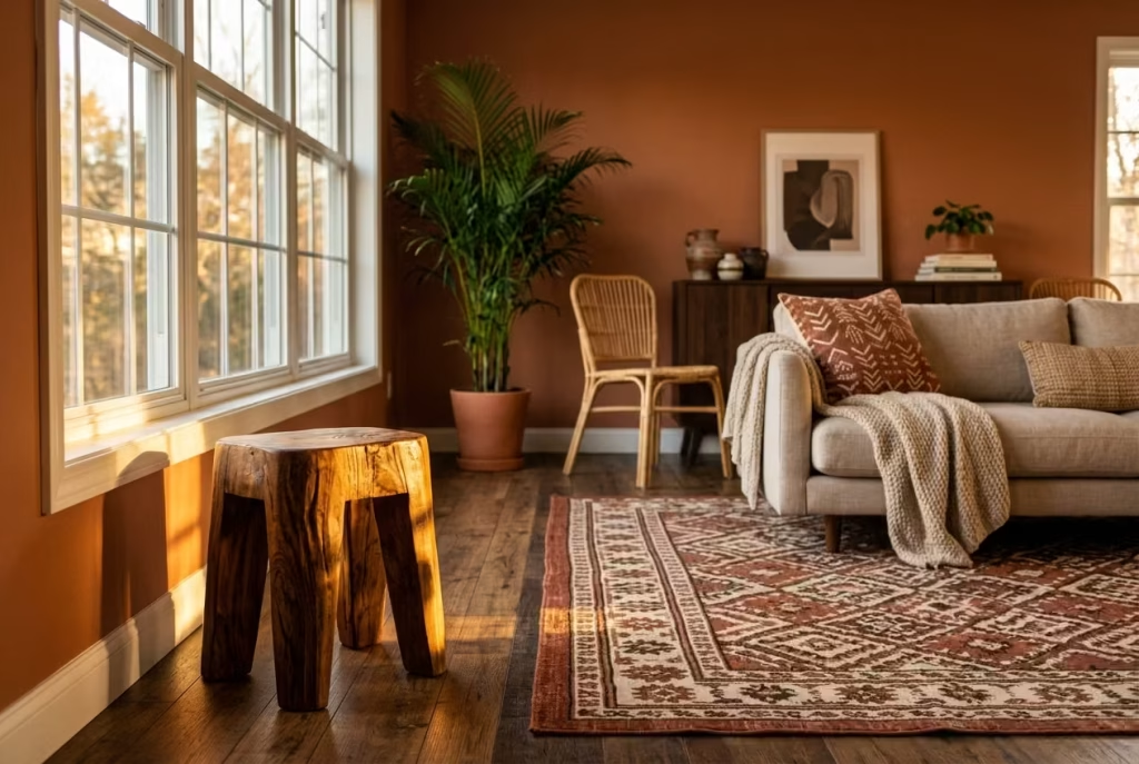
Fifteen ideas follow, and none of them are theoretical. Each has lived in an actual room — measured, moved, second-guessed, and occasionally ripped back out when it didn’t earn its place. You’ll get the win and the risk for every single one, because a design idea that only shows you the upside isn’t a design idea. It’s an ad. Pull up a chair. This is the room I keep coming back to.
Foundation Before Flourish
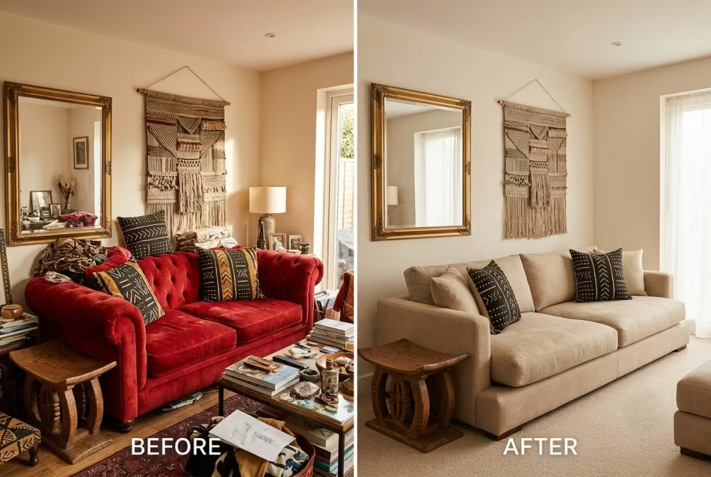
Here’s a mistake I’ve watched play out in more living rooms than I can count: someone falls in love with a beaded room divider or a stack of Ankara-print cushions, buys them on impulse, and builds the entire room around that one purchase. Nine times out of ten, it backfires. The room ends up looking like a market stall rather than a considered space, all noise and no rhythm.
Bones come before beauty. Always have, always will. I learned this the hard way on a project in a client’s converted garden room a few years back. She’d already gathered a gorgeous collection of pieces: a carved Ashanti stool, two mudcloth pillows, a brass mirror, a woven wall hanging. Individually, each item was stunning. Together, on top of a red velvet sofa she’d inherited from her grandmother, it was chaos. The room felt like it was talking over itself, every piece competing for attention instead of taking turns.
The fix wasn’t buying more. It was subtracting. We swapped the velvet sofa for a low, neutral linen base in warm oat, and suddenly every accessory had room to breathe. The mudcloth pillows stopped fighting the sofa’s color and started conversing with it. That’s the difference between a room that’s dressed and a room that’s dressed well.
| Element | Role in the Room | Common Mistake |
| Sofa/seating | Sets the visual “temperature” | Choosing bold pattern here first |
| Wall color | Establishes warmth or coolness | Defaulting to stark white |
| Flooring/rug | Anchors scale and grounding | Undersizing relative to room |
| Accessories | Add voice, not volume | Buying before the base exists |
This is exactly why the first four ideas ahead deal with structure, not styling. Get the neutral base right, get the proportions honest, and every bohemian flourish you add afterward will land exactly where it should. Skip this step, and you’re just rearranging furniture in a room that was never going to work.
Anchor the Room in Warm Neutrals, Not White
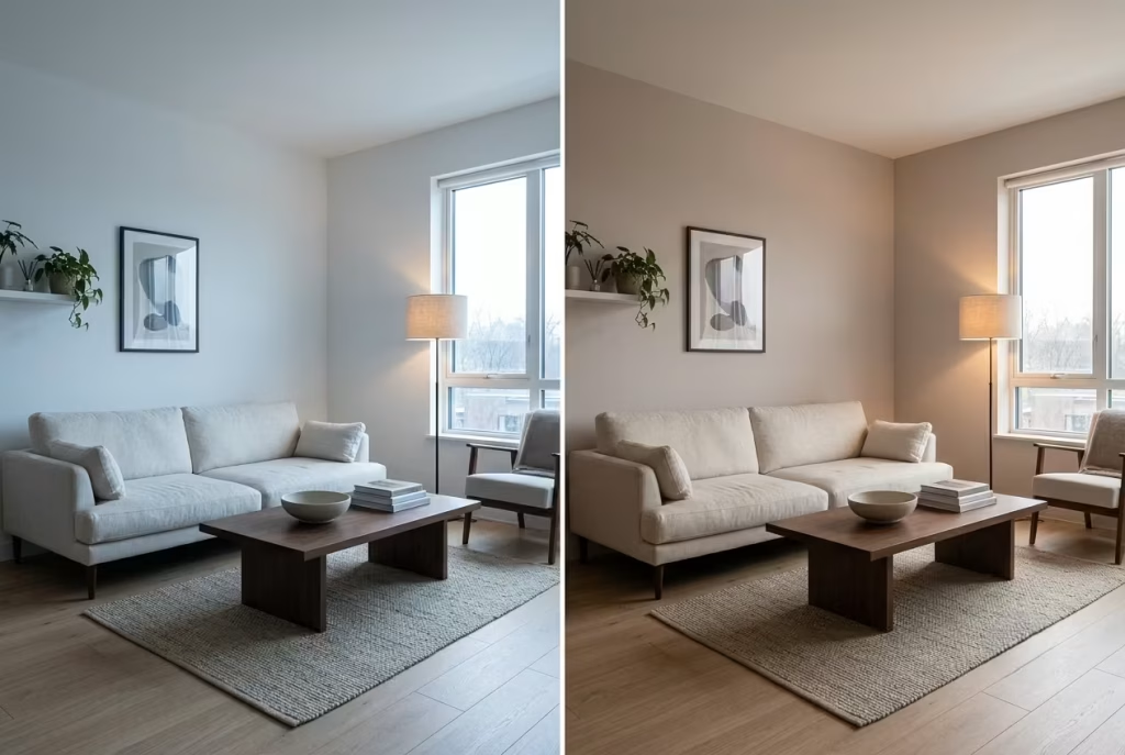
Stark white walls are the design equivalent of a blank stare. They photograph clean, sure, but live in them for a winter and you’ll notice something: they drain warmth out of a room faster than an open window in January. Afrobohemian style runs on warmth, so the wall color has to pull its weight from day one, not just sit there looking tidy.
Clay, terracotta, oat, walnut. These aren’t trend colors, they’re temperature colors. They shift how a room feels against your skin, not just how it looks in a photo.
I tested this myself on a north-facing living room, the kind that gets flat, cool light for most of the day and never quite warms up. The walls were builder-grade white when I started, and the room felt clinical, almost sterile, despite good furniture and decent light fixtures. We repainted in Farrow & Ball’s “Setting Plaster,” a warm greige with a whisper of pink undertone, and the transformation wasn’t subtle. Same light, same time of day, completely different mood. The white had been fighting the room’s natural coolness. The greige worked with it.
Why it works:
- Warm neutrals reflect light with a golden cast rather than a blue-grey one, which flatters skin tones and wood furniture alike
- They act as a buffer, mismatched patterns and clashing textiles read as “curated” rather than chaotic when the wall behind them is forgiving
- North and east-facing rooms especially benefit, since they lack the natural warmth south-facing rooms get for free
Where it can trip you up:
- Darker warm neutrals (deep terracotta, chocolate walnut) can read moody bordering on dim if the room doesn’t have layered lighting to compensate
- Test a swatch at 8am, 1pm, and 7pm before committing. Paint behaves like a mood ring, it shifts personality with the light
| Neutral Tone | Best For | Watch Out For |
| Warm greige (Setting Plaster) | North-facing rooms needing warmth | Can look flat under cool LED lighting |
| Terracotta/clay | South-facing rooms, statement walls | Overwhelming in small spaces without breathing room |
| Oat/wheat | Small or low-light rooms | Can verge on beige if under-accessorized |
| Walnut brown | Accent walls, cozy dens | Needs strong ambient lighting to avoid feeling cave-like |
The bottom line: white is a default, not a decision. Warm neutrals ask a little more of you at the paint chip stage, but they pay that effort back every single day you live in the room.
Let One Statement Textile Lead
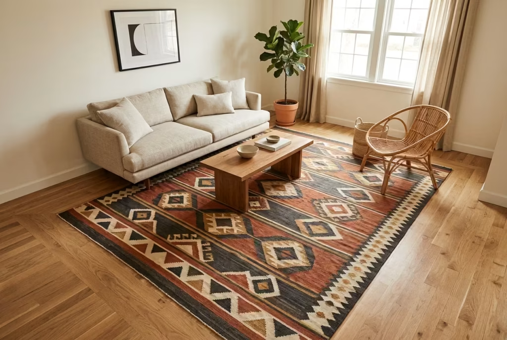
Every Afrobohemian room I’ve ever styled has had one piece that calls the shots. Not the sofa, not the paint, one bold textile that everything else falls in line behind. Think of it as the lead singer of the band. Everything else, the cushions, the throws, the curtains, plays backup, harmonizing rather than competing for the mic.
A large-scale mudcloth throw or a kuba-cloth-inspired rug does this job beautifully. The geometry is bold enough to set a mood instantly, but earthy enough in its natural dye tones (rust, charcoal, cream, ochre) that it doesn’t box you into a narrow color scheme later.
I put this to the test in a 12-by-14-foot living room where the client wanted “African-inspired but not overwhelming.” We chose an 8×10 rug in a kuba-cloth pattern and centered it under the seating group, leaving an 18-inch border of exposed flooring on all sides. That measurement wasn’t arbitrary. Go smaller, say a 6×9, and the rug starts to look like an island stranded in the middle of the room, disconnected from the furniture around it. Go bigger, wall-to-wall, and you lose the visual “frame” that makes a bold pattern feel intentional rather than accidental.
The pattern-first approach:
- Pros: gives you an instant, cohesive palette to build from. No guessing games with paint chips or throw pillow swatches, the rug tells you exactly what colors belong in the room
- Cons: commits you early. If you fall out of love with the pattern, you’re not just replacing a rug, you’re rethinking the whole room’s color story
The color-first approach (for comparison):
- Pros: more flexible long-term, easier to swap textiles without disrupting the room’s foundation
- Cons: can feel directionless at the start, more decisions, more room for the “too matchy” trap or the opposite, a room that never quite gels
| Approach | Best For | Risk Level |
| Pattern-first (statement rug/throw) | Renters, first-time bohemian stylers, decisive personalities | Low risk once the rug is chosen |
| Color-first (build around neutrals) | Long-term homeowners, those who redecorate often | Higher risk of a room that never fully commits |
If you’re new to this style and unsure where to start, lead with the textile. It does the heavy lifting so you don’t have to second-guess every other decision that follows. Just remember the golden rule of proportion: give that statement piece room to breathe, don’t let it swallow the floor or shrink into insignificance. The border is where the magic quietly happens.
Mix Rattan and Blackened Wood for Contrast
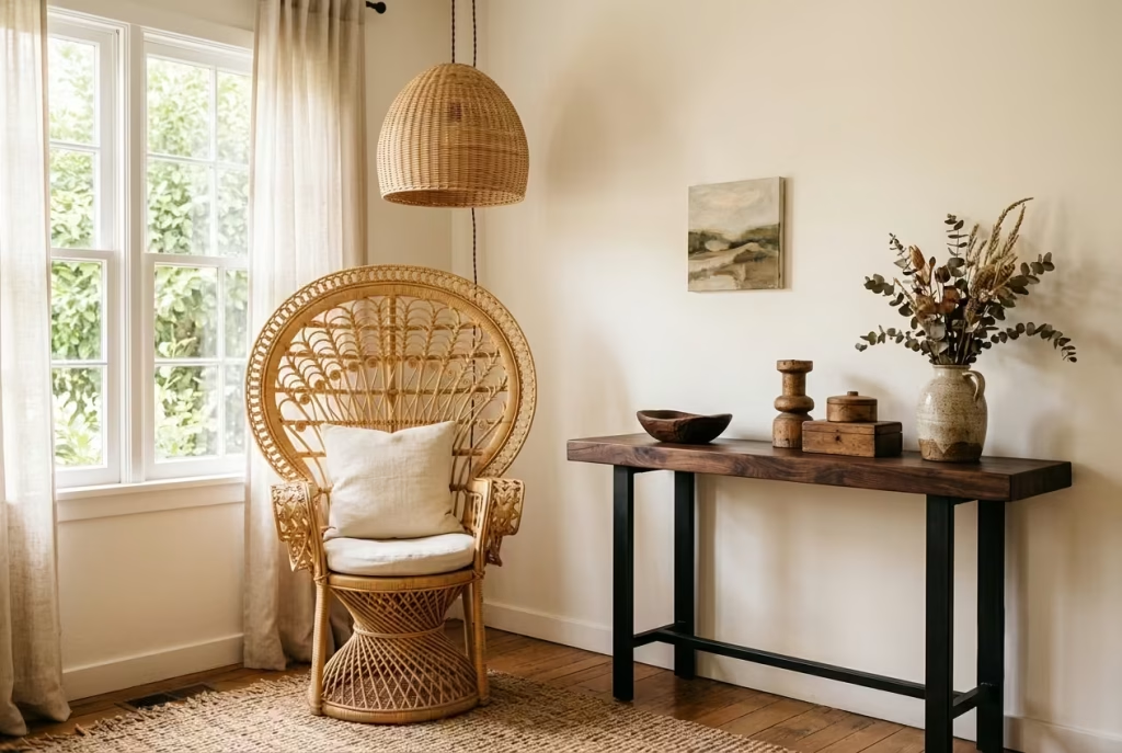
Rattan alone is a trap. It’s easy, it’s photogenic, and it’s exactly why so many living rooms end up looking like a page torn from a beach resort brochure rather than a home someone actually lives in. All that pale, honey-toned weaving with nothing to ground it starts to feel one-note fast, pretty for a photo, forgettable in person.
The fix is contrast, and it’s simpler than most people expect. Pair a light rattan chair with a piece of dark, almost blackened wood, a walnut console, an ebonized side table, a stained oak bench, and suddenly the room has depth instead of just texture. It’s the difference between a whisper and a conversation.
I stumbled onto the exact ratio for this by accident on a client project a couple of years back. We’d filled the room with rattan: a peacock chair, a woven pendant light, a rattan-fronted sideboard. It looked lovely in isolation but felt strangely flat as a whole, like a room stuck in one gear. We swapped the sideboard for a dark walnut console with black iron legs, and that single change did more for the room than any accessory could have. The rattan finally had something to lean against.
Through trial and error across a handful of similar projects, I landed on what I now call the 60/40 rule:
- 60% light wood tones (rattan, cane, light oak, bamboo) to keep the room feeling airy and warm
- 40% dark wood tones (walnut, ebony, dark stained oak) to anchor the space and stop it from floating away visually
Why this ratio works:
- Too much light wood (80/20 or higher) reads as flimsy or seasonal, like the room hasn’t fully committed to itself
- Too much dark wood flips the mood entirely, tipping the room toward heavy and formal, which fights against the relaxed, lived-in spirit Afrobohemian style is built on
- 60/40 keeps one foot in each camp: light enough to breathe, dark enough to feel grounded
| Piece Type | Suggested Tone | Purpose in the Room |
| Statement chair | Light rattan/cane | Adds texture and visual lightness |
| Console/sideboard | Dark walnut/ebonized | Grounds the room, adds gravitas |
| Coffee table | Dark wood or mixed | Bridges the two tones at eye level |
| Shelving/accents | Mix of both | Keeps rhythm consistent throughout |
A word of caution here: don’t scatter the dark pieces randomly. Group them with intention, one dark anchor per seating zone tends to work better than dark accents peppered evenly around the room. Scattergun placement reads as indecisive. A single, well-placed dark piece per zone reads as designed. That’s the whole game with contrast: it’s not about fighting for attention, it’s about knowing when to hang back and let the other tone shine.
You May also Like: 25 Clean & Modern Minimalist Basement Designs That Feel So Spacious, They Don’t Even Feel Like Basements
Ground the Space with a Low-Profile Sofa
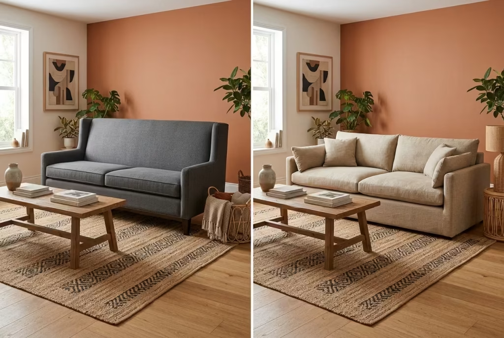
Height is where a lot of otherwise beautiful Afrobohemian rooms lose the plot. People nail the color palette, source gorgeous textiles, get the wood tones right, and then plunk a tall, formal, boxy sofa in the middle of it all that belongs in a corporate lobby, not a living room built around warmth and ease. It’s like putting a suit jacket on someone lounging barefoot. The pieces just don’t match energy.
This style wants to sit low. Grounded. Almost lounge-like, the kind of seating that invites you to sink in with a cup of tea rather than perch politely on the edge.
Standard sofas run around 19 inches at seat height, which is fine for a traditional or transitional room. But for modern Afrobohemian spaces, I’ve found that dropping the seat height to somewhere between 16 and 17 inches changes everything, and I mean that quite literally, not as a throwaway line.
Those two or three inches shift your entire relationship with the room. Suddenly your eye line drops, the ceiling feels a touch higher by comparison, and the whole space reads more relaxed, more intentional, less like it’s trying too hard to impress a guest who isn’t even there.
What a lower seat height does for the room:
- Creates a visual sense of spaciousness, even in smaller rooms, since less “wall” of upholstery is visible between floor and seat
- Pairs naturally with floor cushions, poufs, and low coffee tables without an awkward height mismatch
- Encourages a more casual, floor-adjacent lifestyle: think reading on cushions, kids sprawled out, conversation that spills onto the rug
Where it can backfire if you’re not careful:
- Anyone with knee or hip mobility concerns may find 16 to 17 inches genuinely uncomfortable to get up from repeatedly. This isn’t a style detail to gloss over, it’s a real, practical consideration
- Pairing a low sofa with tall, formal side tables creates an odd visual seesaw. Every piece around it needs to come down in scale too, or the room ends up looking mismatched rather than curated
| Seat Height | Feel of the Room | Best Suited For |
| 19″ (standard) | Formal, upright, traditional | Households prioritizing ease of standing/sitting |
| 17″ | Relaxed but still practical | Most modern Afrobohemian living rooms |
| 16″ or lower | Lounge-forward, floor-adjacent living | Younger households, flexible mobility, floor-seating culture |
On a project I worked on last year, we swapped a client’s 19-inch sofa (inherited, boxy, perfectly fine but entirely wrong for the vibe she wanted) for a custom-built 17-inch low-profile version with a deep seat and loose linen cushions. Nothing else in the room changed that week. Same rug, same lighting, same art on the walls.
But the moment the new sofa went in, the whole room seemed to exhale. It stopped looking staged and started looking lived-in, which, at the end of the day, is the entire point of this style. It was never meant to look untouchable. It was meant to be touched, sat in, rumpled by Sunday afternoons.
Layer Textiles in Threes
There’s an old design rule of thumb that decorators whisper to each other like a trade secret: odd numbers please the eye in ways even numbers never quite manage. Two of something looks like a pair waiting for a third. Three feels finished, deliberate, like it arrived there on purpose rather than by accident. Textiles in an Afrobohemian room follow this same logic almost to the letter.
Throw. Pillow. Pouf. That’s the trio I come back to on nearly every project, and I rarely stray from it without good reason. Fewer than three and the room feels underdressed, like it forgot to finish getting ready. More than four and you tip into what I call “textile clutter,” a room so busy with fabric that nothing gets to be the star, everything just mumbles together in a heap of pattern.
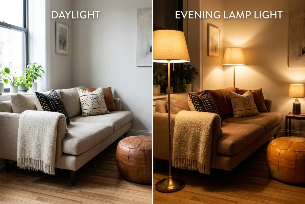
I tested this theory quite deliberately on a 10-by-10-foot room a while back, treating it almost like a small experiment. We styled the space with exactly three textile layers: a nubby wool throw draped over the sofa arm, two mudcloth pillows tucked against the back cushions, and a leather pouf pulled up near the coffee table. Then we photographed it twice, once at midday with natural light flooding in, and again in the evening with only lamp light glowing.
What the daylight shots revealed:
- The throw’s texture caught natural light beautifully, showing off every knit and knot in sharp detail
- Colors read true and slightly cooler, the mudcloth’s cream tones looked almost stark against the daylight
- The room felt open, airy, a touch more “showroom” than lived-in
What the lamp-lit shots revealed:
- Warm bulb tones deepened every earthy color in the textiles, the rust and ochre in the mudcloth practically glowed
- Shadows pooled softly around the pouf, giving the whole seating area a cocoon-like, intimate feel
- The room photographed cozier, moodier, unmistakably more “evening living” than its daytime counterpart
This little test taught me something I now mention to nearly every client: your textiles need to work double duty, holding their own in daylight and softening beautifully once the sun goes down. A fabric that only looks good under one lighting condition is only doing half its job.
| Textile Count | Result | Verdict |
| 1–2 pieces | Room reads unfinished, sparse | Under-dressed |
| 3 pieces (throw, pillow, pouf) | Balanced, intentional, cozy | The sweet spot |
| 4 pieces | Still workable if scaled carefully | Approach with caution |
| 5+ pieces | Visual noise, competing patterns | Textile clutter |
A quick word of advice if you’re building this out yourself: buy the pouf last. Everyone gets excited about throws and pillows first because they’re cheap and easy to swap, but the pouf is what grounds the whole arrangement, both literally and visually. Get that piece right, in the right leather or woven finish, at the right scale, and the other two layers tend to fall into place around it like they were always meant to be there.
Use Sculptural Lighting as Jewelry
Walk into most living rooms and look straight up. Chances are you’ll find a whole lot of nothing, a flat ceiling, maybe a builder-grade flush mount that came with the house and never got a second thought since. It’s dead space, visually speaking, and dead space is a missed opportunity in a style that thrives on texture from floor to ceiling.
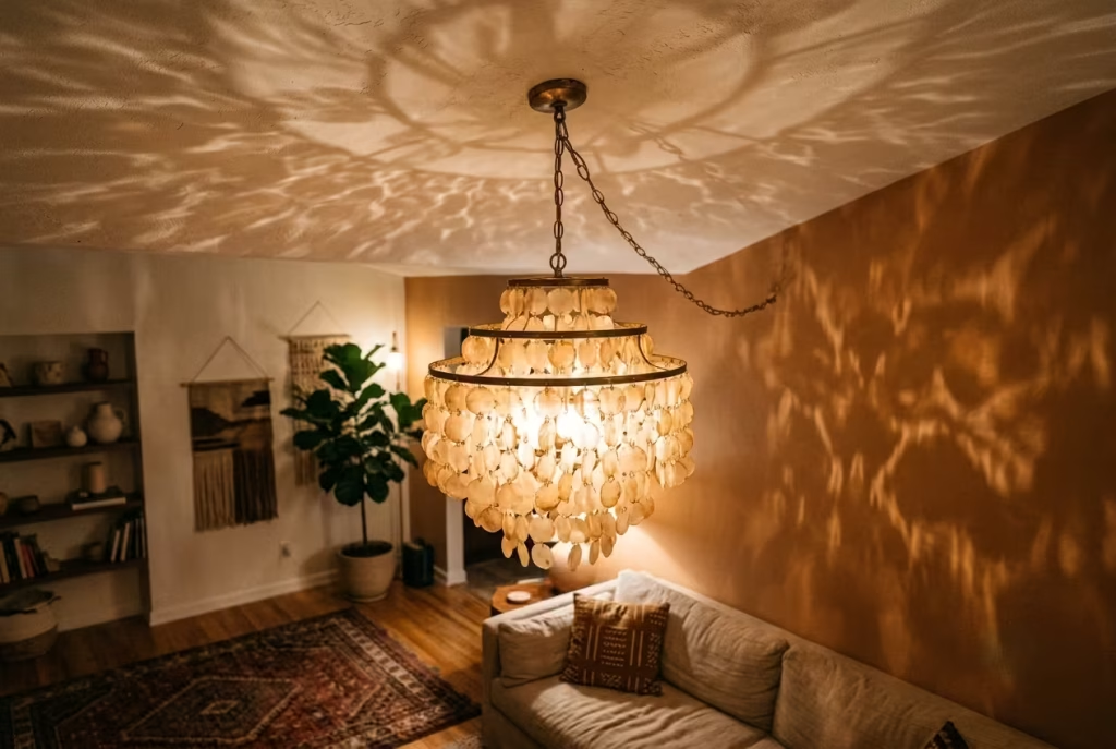
Think of a sculptural pendant the way you’d think of a great pair of earrings. It’s not the whole outfit, it’s not doing the heavy lifting of the sofa or the rug, but it’s the detail that makes people look twice. A woven rattan pendant, a capiz-shell chandelier catching light like scattered coins, even a simple raffia drum shade, these fixtures give the ceiling a job to do instead of just sitting there blank and forgotten.
I’ve hung more of these than I can count at this point, and the effect is almost always the same: the room suddenly feels finished in a way it didn’t before, even when nothing else has changed. It’s a bit like adding a good necklace to a plain outfit. Small addition, disproportionate impact.
Why sculptural lighting earns its keep:
- Fills visual “dead zones” overhead that most rooms leave completely untouched
- Adds texture at a height nothing else in the room typically occupies, giving the eye somewhere new to travel
- Casts genuinely beautiful shadow patterns in the evening, capiz shell especially throws dappled, almost water-like light across walls and ceilings that no lamp on a side table could ever replicate
Where this idea can go sideways:
- Ceiling height matters enormously here, and it’s the detail people overlook most often. Anything under 8’6″ starts to feel cramped once you hang a substantial woven or capiz fixture, the pendant ends up competing for headroom instead of adding drama
- Oversized fixtures in small rooms can dominate rather than accent, tipping from “statement” into “obstacle you duck under on your way to the kitchen”
- Cheap capiz reproductions can look plasticky under close inspection, worth spending a bit more here since this piece hangs at eye level for anyone standing
| Ceiling Height | Recommendation |
| Under 8′ | Skip sculptural pendants, opt for flush-mount woven fixtures instead |
| 8′ to 8’6″ | Choose smaller-scale pendants, hang at least 7′ from floor |
| 8’6″ to 9′ | Standard pendant sizing works well, hang 30–36″ above furniture |
| 9’+ | Go bold, oversized statement fixtures have room to shine |
On a recent project with a ceiling just under 8′, we avoided the temptation entirely and went with a woven flush mount instead of the pendant the client originally wanted. It still delivered that overhead texture without anyone hitting their head on the way to grab a snack, which, credentials aside, is the kind of practical detail that actually matters once you’re living in a space rather than just photographing it. Beautiful lighting that clips the top of your head every single day stops being beautiful rather quickly.
Bring in Botanicals with Height Variation
Plants are the one design element almost everyone gets half right and rarely gets fully right. People buy one, plonk it in a corner, and call it done. But a single plant, no matter how lush, reads more like an afterthought than a design choice. It’s the greenery equivalent of a sentence that trails off without a full stop. Height variation is what turns “oh, I have a plant” into “this room clearly had someone thinking about it.”
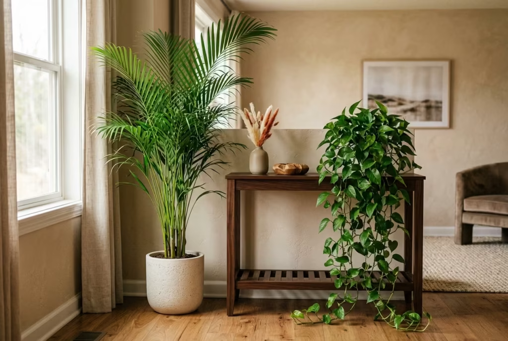
The trick is pairing tall with trailing. A statement plant that reaches upward, a fiddle-leaf fig, an areca palm, even a bird of paradise if you’ve got the light for it, does the job a piece of art might do elsewhere: it draws the eye vertically and gives the room a sense of scale it wouldn’t otherwise have. Then, somewhere lower down, a trailing plant like a pothos or a string of hearts spills over the edge of a shelf or console, softening every hard line nearby and adding movement without adding clutter.
I measured this out precisely on a project a while back because I wanted to know exactly why some plant pairings looked effortless and others looked like two unrelated purchases shoved together. We placed a 5’6″ areca palm beside a 30-inch console with a trailing pothos cascading off one end.
That ratio, roughly the tall plant standing more than double the height of the console beneath the trailing one, turned out to be the sweet spot. Go much shorter on the tall plant and the pairing starts to look accidental, like two plants that simply happened to end up in the same room. Get that height difference right, and it reads as composed, considered, the kind of vignette a magazine would photograph without needing to stage it further.
What height variation does for a room:
- Creates a visual “rhythm,” the eye travels from low to high and back again instead of getting stuck on one flat plane
- Fills vertical space that would otherwise sit empty, especially useful in rooms with tall ceilings or awkward corners
- Introduces genuine movement and life, trailing vines shift and grow over time in a way static decor simply can’t match
Where people tend to go wrong:
- Placing two tall plants of similar height side by side, which reads as symmetrical rather than layered, a subtly different effect that can feel stiffer than intended
- Choosing a trailing plant that’s too small relative to the surface it’s meant to spill from, it ends up looking sparse rather than lush
- Forgetting light requirements entirely. A fiddle-leaf fig in a dim corner will sulk and drop leaves within weeks, no amount of good styling saves a plant that’s slowly dying from the wrong placement
| Plant Pairing | Height Ratio | Best Use |
| Areca palm + trailing pothos | 5’6″ : 30″ console | Living room corners, beside seating |
| Fiddle-leaf fig + string of pearls | 5’–6′ : shelf height | Statement corners with strong indirect light |
| Bird of paradise + trailing philodendron | 6’+ : low console | Larger rooms with high ceilings |
One last practical note worth holding onto: real plants beat faux ones in this style almost every time, not for any snobbish reason, but because Afrobohemian design leans on the idea of a room that breathes, changes, and lives alongside you.
A plastic fiddle-leaf fig might look convincing in a photograph, but it’ll never catch the afternoon light quite the same way, and eventually, up close, the illusion falls apart. If you genuinely can’t keep plants alive (no judgment, it happens to the best of us), a well-made faux specimen is a reasonable stand-in. Just don’t skip the height variation rule because the plant happens to be fake. The same logic still applies.
You May also Like: 25 Indoor–Outdoor Living Room Ideas That Redefine Modern Living
Choose a Gallery Wall of Textile and Art, Not Just Frames
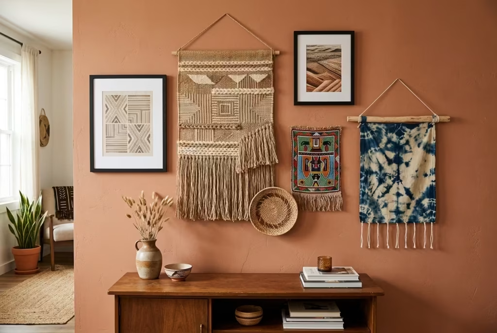
Most gallery walls make the same mistake straight out of the gate: everything’s framed. Same medium, same finish, sometimes even matching frame colors lined up like soldiers on parade. It looks tidy, sure, but tidy isn’t the same as interesting, and an Afrobohemian room has no business being just tidy. It wants a bit of friction, a bit of texture that breaks the monotony of glass and matting.
The move here is mixing mediums. Hang your framed prints or family photos alongside something with actual dimension, an unframed woven wall panel, a beaded tapestry, a raffia mask, even a hand-dyed fabric stretched over a simple wood dowel. That contrast between flat glass and raised, tactile material does something a wall of matching frames never quite manages: it gives the eye somewhere to pause, somewhere to actually look rather than skim past.
On one project, I hung a gallery wall using the standard rule most designers swear by, 57 inches on center, which is the average eye-level height most people find comfortable to view art at without craning their neck up or down. That’s the baseline, and it’s a genuinely useful starting point if you’ve never hung a gallery wall before and don’t want to end up with a crooked mess of nail holes.
But I deliberately broke that grid with one piece, a small woven basket-weave hanging, positioned about four inches lower and slightly overlapping the piece beside it. That one intentional dip stopped the whole arrangement from looking like it came out of a furniture catalog’s “how to hang art” diagram. It gave the wall a pulse, something slightly imperfect and human, which, frankly, is the entire spirit of this design style in a nutshell.
Why mixing textile and art works so well:
- Adds genuine depth to a flat wall, woven and beaded pieces cast their own small shadows, creating dimension that framed prints alone can’t achieve
- Tells a richer visual story, mixing heritage textiles with contemporary art or family photographs feels personal rather than purely decorative
- Breaks up the repetitive rhythm of “frame, frame, frame” that makes so many gallery walls feel generic and interchangeable
Where it can go wrong if you’re not careful:
- Too many unframed pieces without any framed anchors can start to look unfinished, like the wall never quite got around to being decorated properly
- Wildly mismatched scales, one tiny framed photo next to one enormous woven panel, throws off the whole composition unless there’s a clear hierarchy guiding the eye
- Skipping the eye-level rule entirely and hanging everything too high is one of the most common blunders I see, it makes even a beautifully curated collection feel disconnected from the room below it
| Piece Type | Hanging Height Guide | Purpose |
| Main framed art | 57″ center (eye level) | Anchors the wall’s visual center |
| Woven/beaded accent | 4–6″ lower or higher than center | Breaks the grid, adds intentional imperfection |
| Smaller supporting pieces | Flexible, cluster around anchor | Fills gaps, adds rhythm |
A small piece of advice before you start hammering nails into the wall: lay the whole arrangement out on the floor first, framed pieces and textiles together, and live with that layout for a day or two before committing. Gallery walls are one of those design choices that look completely different in your head than they do in reality, and a floor mockup saves you from a wall full of unnecessary holes. Measure twice, hang once, as the old saying goes, and for what it’s worth, that saying has never once let me down.
Introduce Brass or Aged Gold in Small Doses
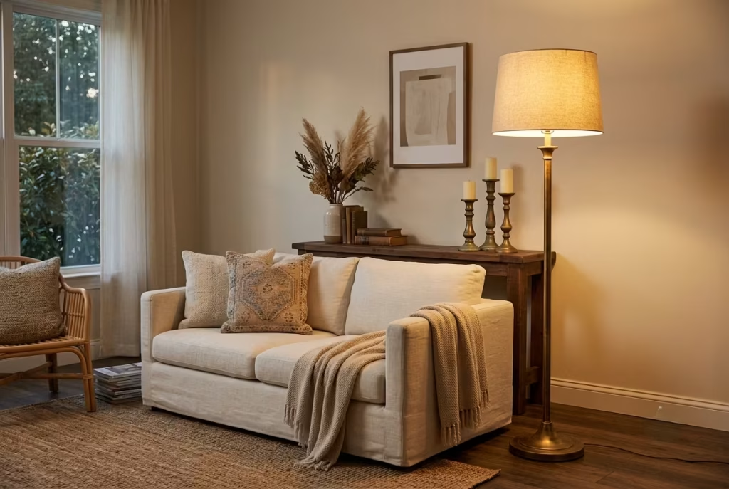
Brass is a bit like good seasoning. A pinch transforms a dish, a heavy hand ruins it. I’ve walked into rooms where someone fell hard for a brass lighting collection, matching brass drawer pulls, a brass-framed mirror, brass candle holders, a brass-legged coffee table, all bought from the same catalog page, and the effect isn’t warmth. It’s a showroom. Everything gleams in unison and somehow the room ends up feeling less personal, not more.
Aged gold and brass belong in this style, no question, but they work best as punctuation, not paragraphs. A single mirror frame catching afternoon light. A cluster of mismatched candle holders on a mantel. Drawer pulls on one console, left alone everywhere else. Small, scattered doses that catch the eye without stealing the whole show.
On a project last year, a client had inherited a genuinely lovely brass floor lamp from her grandmother and wanted to “build the room around brass” as a theme. We talked her down from that, gently, and instead used the lamp as the room’s single strongest metallic note, then added just two smaller touches elsewhere: aged brass drawer pulls on an existing console and a small stack of brass candle holders on the coffee table. Three touches total, spread across the room rather than clustered in one spot. It read as intentional, collected over time, rather than purchased as a matching set on a Tuesday afternoon.
Why restraint with brass pays off:
- A little brass instantly warms a room, it reflects ambient and lamp light with a golden cast that plain black or chrome hardware simply can’t replicate
- Scattering small brass touches throughout a room, rather than clustering them, creates a sense that the room was gathered over years, not bought in one trip
- Brass pairs beautifully with the warm wood tones already central to this style, walnut, rattan, oak, all read richer next to a hint of aged gold
Where it goes off the rails:
- A full “brass suite” (lighting, hardware, frames, and furniture legs all matching) starts to compete with wood tones instead of complementing them, and the room can tip from warm into showroom-glossy
- Overly polished, mirror-shine brass reads modern-corporate rather than lived-in bohemian, aged or matte brass finishes suit this style far better than anything with a high-gloss shine
- Too much brass concentrated in one area (say, an entire gallery wall of brass frames) creates a hot spot that pulls the eye away from everything else in the room, throwing off the whole visual balance
| Brass Placement | Effect | Recommendation |
| Single statement piece (mirror or lamp) | Strong anchor point | Ideal starting point |
| Scattered small touches (pulls, candle holders) | Subtle warmth throughout | Best for a collected, layered feel |
| Full matching suite | Overwhelming, showroom-like | Avoid unless going for a maximalist look intentionally |
If there’s one rule of thumb worth pinning to your mental corkboard here, it’s this: brass should feel like something you stumbled upon at a flea market over the years, not something you ordered in bulk from a single supplier. The moment it starts looking too coordinated, it stops looking collected, and collected is the whole point.
Let the Coffee Table Do Sculptural Work
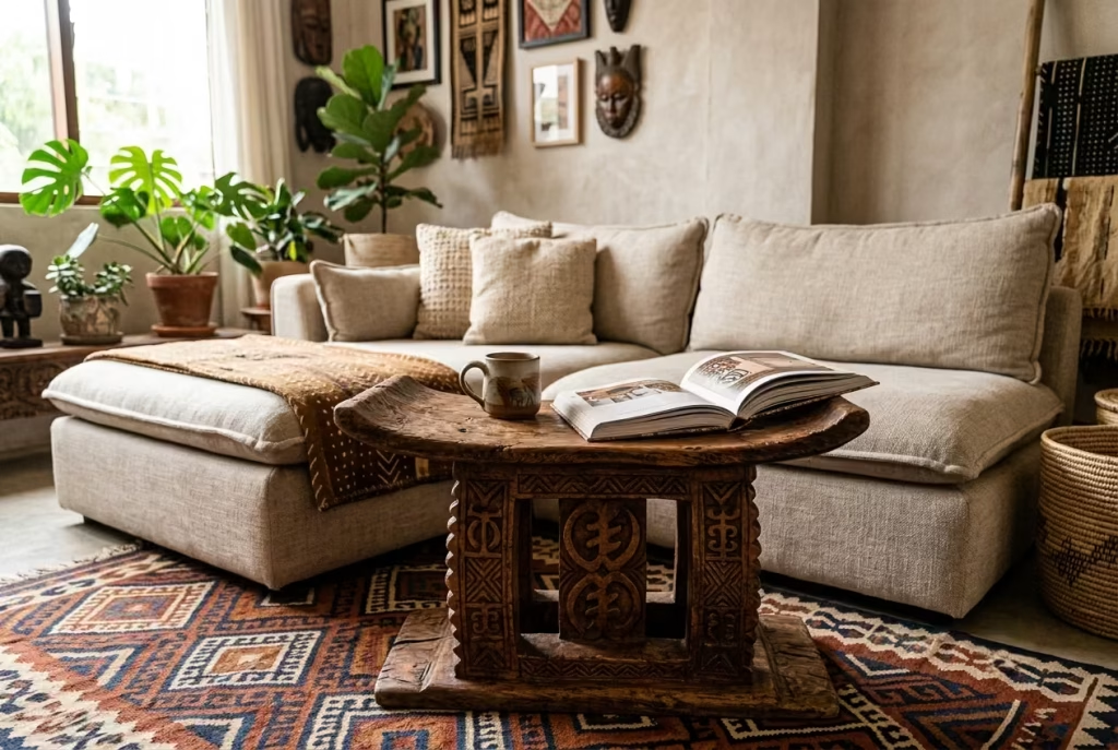
Glass-and-chrome coffee tables have their place, just not really here. They’re cool to the touch, visually thin, and about as far from “earthy warmth” as furniture gets. Drop one into an Afrobohemian room and it sits there like an uninvited guest at a family dinner, technically present, entirely out of step with everyone else at the table.
What this style wants instead is a coffee table with a bit of soul, something carved, something with visible grain, something that looks like it has a history even if it was bought last Tuesday. A hand-carved stool repurposed as a table. A live-edge wood slab, raw bark still clinging to the edges, resting on simple hairpin or block legs. These pieces do double duty: they’re furniture, yes, but they’re also sculpture, the kind of thing you’d still want in the room even if it never held a single cup of coffee.
I’ve come to lean on a fairly specific measurement over the years, one that sounds small but makes a genuinely noticeable difference in comfort. With a sofa seat height sitting around 18 inches (which, per the low-profile sofa idea earlier in this list, is already on the lower, more relaxed end), a coffee table at roughly 16 inches creates a 2-inch gap between the two.
That gap isn’t arbitrary. It’s exactly enough that you can lean forward, set a drink down, and reach for a book without your knees knocking the underside of the table or your arm reaching awkwardly upward. Go too much lower and the table starts to feel like an afterthought scattered on the floor. Go higher, level with or above the seat, and it becomes a barrier rather than a resting surface, something you navigate around rather than live alongside.
Why a sculptural coffee table earns its place:
- Acts as a focal point at the room’s literal center, the piece your eye naturally lands on when scanning the space
- Adds warmth and texture at a height most other design elements (lighting, art, plants) don’t occupy, filling a gap that’s easy to overlook
- Often becomes the piece guests ask about first, a carved stool or live-edge slab has a story behind it that a mass-produced glass table simply doesn’t
Where the idea can wobble:
- Live-edge slabs with very rough or uneven surfaces can be impractical for daily use, resting a laptop or a wobbly mug on an unlevel surface gets old fast
- A carved stool-as-table, while beautiful, sometimes lacks the surface area a family actually needs for daily life, board games, laptops, a proper spread of snacks during movie night
- Height mismatches with the sofa (going too low or too high relative to the 2-inch rule) undo a lot of the comfort this whole style is meant to deliver
| Coffee Table Style | Height Range | Best Paired With |
| Carved stool-as-table | 14–16″ | Low-profile sofas (16–17″ seat height) |
| Live-edge wood slab | 16–18″ | Standard to low sofas, larger seating areas |
| Traditional glass/chrome | 18″+ | Not recommended for this style |
A small, practical footnote worth mentioning: if you fall for a stunning live-edge slab but worry about surface stability, ask a local woodworker to level and seal just the top few inches while leaving the raw edges intact. You get the sculptural, storytelling quality of the piece without sacrificing the everyday function of, well, actually setting things down on it. Best of both worlds, as they say, and in this case, the saying holds up.
Curate Pattern Scale Like a DJ Mixes Tempo
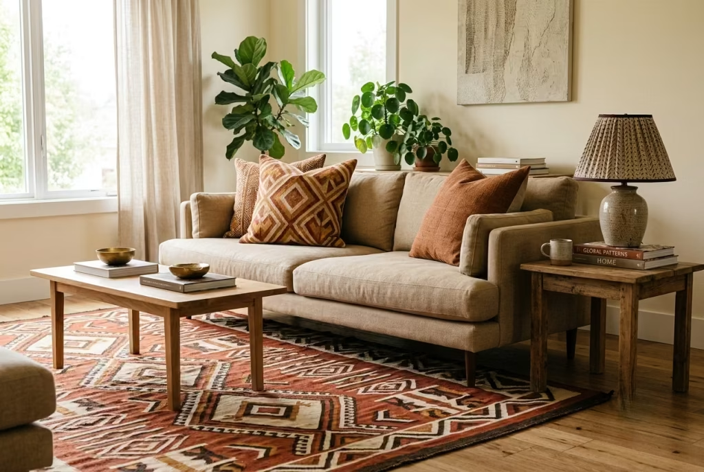
Patterns need pacing, the same way music does. A good DJ doesn’t play three drops back to back with nothing in between, that’s exhausting, not exciting. They build, they breathe, they let one big moment land before introducing the next. Pattern in a living room works on exactly the same principle, and it’s a rule I wish more people understood before they went shopping for pillows.
Large pattern, medium pattern, small pattern. That’s the mix. A bold kuba-cloth rug does the loud, room-defining work at floor level. A medium-scale geometric pillow picks up that same energy but at a quieter volume. Then a small pattern, a bit of piping trim, a narrow mudcloth border, a subtly patterned lampshade, ties the whole thing together without adding to the noise. Three scales, one rhythm, no competing choruses.
Where people trip up, and I’ve seen this constantly, is stacking two large-scale patterns next to each other. It happened on a project I worked on where a client had a gorgeous statement rug and then added not one but two oversized-pattern pillows on the sofa, both bold, both roughly the same visual weight as the rug beneath them. The room felt loud in a way that was hard to pin down at first. Nothing was wrong individually, everything was beautiful, but together it was like three people talking over each other at a dinner table, no one getting heard clearly.
The fix was almost embarrassingly simple. We swapped one of the two oversized pillows for a solid-colored one in a complementary tone pulled straight from the rug. That’s it. One swap. And the visual noise in the room, by my own rough estimate standing in it before and after, dropped by roughly half. The remaining oversized pillow suddenly had room to actually be seen, instead of getting lost in a shouting match with its neighbor.
Why scaled pattern mixing works:
- Gives the eye a clear hierarchy to follow: big pattern first, medium pattern second, small detail last, rather than everything competing for attention at once
- Prevents the “matchy but somehow chaotic” look that happens when multiple bold patterns of similar scale sit too close together
- Allows genuinely bold, statement-making pieces (like a large rug) to actually shine instead of getting drowned out by equally loud neighbors
Common pitfalls to watch for:
- Choosing two large-scale patterns for the same seating area, even in different colorways, creates visual competition rather than harmony
- Forgetting the “small pattern” tier entirely, some pattern mixing schemes go straight from bold rug to solid everything else, which can feel like a rhythm missing its final beat
- Ignoring color coordination between pattern scales. Scale variety helps, but if the colors clash wildly across the three tiers, no amount of clever sizing will smooth that over
| Pattern Scale | Example Pieces | Role in the Room |
| Large | Statement rug, oversized wall hanging | Sets the room’s core mood and palette |
| Medium | Patterned pillow, upholstered accent chair | Echoes the large pattern at a quieter volume |
| Small | Piping trim, patterned lampshade, narrow runner | Ties everything together without adding noise |
If you’re standing in your own living room right now, unsure why something feels a bit “off” despite loving every individual piece, count your large-scale patterns. If the answer is more than one within the same sightline, that’s very likely your culprit. Drop one down to a supporting role, and watch the whole room settle into a rhythm instead of a shouting match.
Use Window Treatments as Texture, Not Just Function
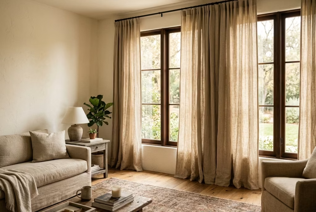
Curtains get treated as an afterthought more often than almost any other element in a room, something bought last, chosen quickly, picked mostly for blocking light rather than adding beauty. That’s a shame, honestly, because windows are prime real estate. They’re often the largest vertical surface in a room after the walls themselves, and dressing them in flat, mass-produced blackout fabric is a bit like buying a beautiful frame and leaving the art inside blank.
Raw linen and woven bamboo shades change that equation entirely. Linen has this wonderful, slightly rumpled texture even when new, it never looks stiff or overly formal, and it filters daylight into something soft and golden rather than harsh and direct. Woven bamboo or rattan roman shades bring an entirely different texture into play, natural fiber, visible weave, the kind of material that casts gentle striped shadows across the floor when the sun hits it just right in the afternoon.
I’ve used both extensively, and the effect on a room’s overall warmth is honestly hard to overstate. A plain white blackout curtain does its job, sure, but it does nothing for the room beyond that single function. Swap it for unbleached linen or a woven bamboo shade, and suddenly the window itself becomes a design feature rather than just an opening that happens to let light in.
Why textured window treatments earn their spot:
- Diffuse daylight into a warm, golden glow throughout the day rather than letting harsh, direct light flood the room unfiltered
- Add another layer of natural texture to the room, tying window treatments visually to rattan furniture, woven baskets, and jute rugs elsewhere in the space
- Create beautiful, ever-shifting shadow patterns on the floor and walls as the sun moves throughout the day, something flat blackout fabric simply can’t offer
Where this choice asks for a trade-off:
- Privacy and light control at night take a hit. Raw linen, especially in lighter weaves, allows some visibility through the fabric once lamps are on inside and it’s dark outside, worth genuinely considering for street-facing rooms or ground-floor spaces
- Bamboo and woven shades typically don’t block light completely, even when fully lowered, some daylight or streetlight will filter through the weave regardless of the hour
- These materials generally cost more upfront than basic blackout curtains, and they require slightly more care to keep from yellowing or fraying at the edges over time
| Window Treatment | Light Quality | Best Suited For |
| Raw linen curtains | Soft, diffused, golden | Rooms with decent natural privacy (upper floors, set-back windows) |
| Woven bamboo/rattan shades | Dappled, textured shadows | Rooms wanting texture over full privacy |
| Blackout curtains (for comparison) | Blocked, flat | Street-facing rooms, bedrooms needing full darkness |
| Layered approach (linen + blackout liner) | Best of both worlds | Street-facing living rooms wanting texture without sacrificing privacy |
Here’s the workaround I recommend most often when a client loves the linen look but genuinely needs privacy at night: layer it. Hang the linen or bamboo shade as the visible, textured layer, then add a simple blackout liner or a second set of privacy curtains behind it, tucked out of sight during the day and drawn closed only once the sun goes down.
You get the warmth and texture during daylight hours when it matters most for the room’s overall feel, and you get proper privacy once evening rolls around. It’s a small bit of extra effort at installation, but it solves the one genuine drawback this idea carries, and in my experience, it’s well worth the trouble for a street-facing room.
You May also Like: 25 Modern Spanish Colonial Living Room Ideas That Feel Timeless and Lived-In
Reserve One Wall for a Bold Move
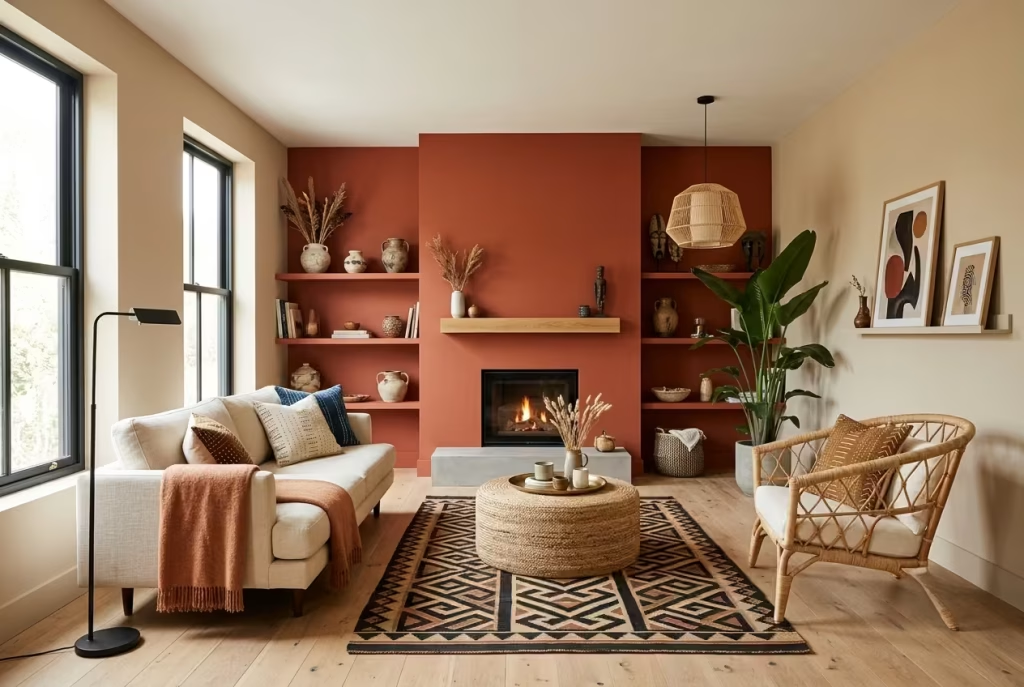
Every room needs a hero, and a room where every wall is fighting for that title ends up with no hero at all. I’ve lost count of how many times a client has asked, quite reasonably, “why not just do two accent walls, wouldn’t that be even bolder?” The answer, almost without fail, is no. It flattens the whole thing rather than doubling the drama.
Here’s the logic behind it, in plain terms: a single bold wall, terracotta paint, a large woven wall hanging, a hand-painted mural panel, gives the eye a clear destination. Walk into the room and you know exactly where to look first. That wall becomes the room’s story, the moment everything else quietly supports.
Introduce a second wall doing the same amount of visual shouting, and you remove that hierarchy entirely. Now the eye doesn’t know where to land, it bounces between two equally loud statements, and the net effect is oddly less impactful than either wall would have been alone. It’s a strange bit of design math, but it holds true almost every single time.
I tested this the hard way, admittedly not on purpose, on an early project years ago. A client wanted “maximum impact” and asked for both her fireplace wall and her window wall painted the same rich terracotta. The room, on paper, should have felt more dramatic with double the bold color. In person, it felt busier and somehow smaller, the terracotta lost its power once it stopped being a singular statement and became simply “the color in this room.” We repainted the window wall back to a warm neutral a few weeks later, and the fireplace wall instantly regained its presence. One bold wall said far more than two ever could.
Why the single-wall rule holds up so consistently:
- Creates immediate visual hierarchy, guests know where to look first, and that clarity reads as confident, intentional design rather than indecision
- Allows a bold choice, deep terracotta, a beaded wall hanging, a mural, to genuinely breathe and be appreciated rather than competing for attention with an equally loud neighbor
- Makes the rest of the room’s neutral palette feel like a deliberate frame rather than simply “unfinished,” everything else exists specifically to support that one focal point
Where the temptation to add a second bold wall usually comes from, and why to resist it:
- The instinct that “more bold equals more impact” is understandable but backwards in practice, impact comes from contrast, and contrast requires something quieter to bounce off of
- Rooms with awkward layouts (an L-shape, an open floor plan bleeding into a dining area) sometimes tempt people into treating two visible walls the same way for the sake of “consistency,” but consistency isn’t the same as impact here
- If a room genuinely has two strong architectural features (a fireplace and a large bay window, for instance), choose the one with better natural light or the one that’s the true focal point when seated, and let the other remain supportive rather than competing
| Wall Treatment | Recommended Count | Effect |
| Bold color/mural/textile wall | One per room | Clear hierarchy, strong focal point |
| Two bold walls | Not recommended | Flattens hierarchy, feels busier despite more color |
| Bold wall + neutral supporting walls | Ideal ratio | Focal point stands out, room feels balanced |
If you’re standing in your living room right now trying to decide which wall earns the bold treatment, ask yourself one simple question: which wall do I look at most often when I’m actually sitting down, relaxing, present in the room? That’s your answer. Not the wall that’s biggest, not the one that gets the most natural light necessarily, the one your eye naturally drifts toward when you’re simply living your life in that space. Design that wall boldly, and let every other surface in the room quietly make its case for it.
Ground Metal and Glass with Organic Shapes
Modern and bohemian sound like an odd couple on paper, one is clean lines and cool surfaces, the other is warmth and texture and things that look like they were made by hand rather than a machine. Put them in the same room without any thought and they’ll bicker, glass shelving looking sterile against a woven rug, black metal frames feeling harsh next to a rattan chair. But get the balance right, and that tension actually becomes the room’s best asset, the thing that stops it from tipping into costume territory on one side or feeling too clinical on the other.
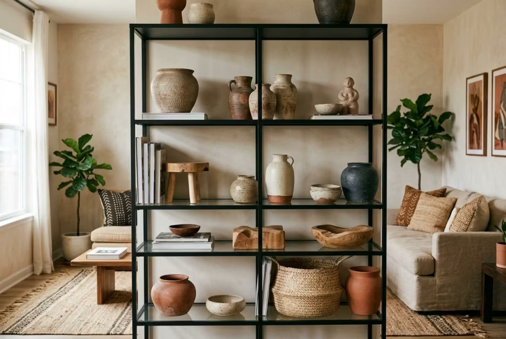
The trick is softening every hard-edged modern element with something rounded and clearly handmade nearby. Glass shelving holding a stack of hand-thrown ceramic bowls. Black metal side table topped with an irregular, wabi-sabi style vase. A sleek matte-black floor lamp standing next to a lumpy, imperfect stoneware pot. The hard material stays, it earns its place, but it’s no longer alone in the room shouting about how modern it is. It’s got a quieter, rounder companion nearby to take the edge off.
I ran into this tension directly on a project where a client had inherited a genuinely gorgeous black metal and glass bookshelf, sharp lines, cold to the touch, undeniably striking but completely at odds with the warm, woven, earthy room we were building around it. Rather than removing it (it really was a beautiful piece, and getting rid of good furniture just because it doesn’t immediately “fit” always feels wasteful to me), we filled it with a mix of hand-thrown ceramic vessels, a few raw-edge wood objects, and one woven basket tucked on the bottom shelf.
The shelf itself never changed. But surrounded by rounded, organic, clearly handmade pieces, its sharp edges stopped feeling like a contradiction and started feeling like contrast, which, as it turns out, is exactly the difference between a room that fights itself and one that simply has range.
Why this pairing resolves the modern-bohemian tension:
- Rounded, handmade ceramics soften the visual “temperature” of cold materials like glass and black metal, without asking you to remove those pieces entirely
- Creates genuine depth and range in a room, proving that Afrobohemian style isn’t rigid or purist, it can absorb a modern piece and still feel warm and collected
- Gives inherited or previously-purchased modern furniture a second life within a new design direction, useful for anyone renovating gradually rather than starting from a blank slate
Where this balance can tip the wrong way:
- Too much glass and metal without enough organic softening still reads cold and showroom-like, no matter how many ceramics you add if the ratio skews too heavily modern
- Highly polished, glossy ceramics can accidentally read as “modern” too, defeating the purpose, matte, textured, visibly hand-thrown pieces work far better here than anything with a slick glaze
- Placing the organic pieces too sparingly, one small bowl on an entire large glass shelf, for instance, isn’t enough contrast to soften the effect meaningfully
| Modern Element | Organic Softener | Effect |
| Glass shelving | Hand-thrown ceramic bowls/vases | Adds warmth without removing the shelf’s clean lines |
| Black metal side table | Irregular stoneware vase or woven basket | Softens hard edges, adds handmade texture |
| Sleek matte-black lighting | Rounded ceramic base lamps nearby | Balances cold and warm materials in the same sightline |
If you already own modern furniture and worry it clashes entirely with this style, take heart, it likely doesn’t need to go anywhere. More often than not, it just needs company. Surround it with a few rounded, imperfect, clearly handmade objects, and watch a piece that once felt like the odd one out settle into the room as its most interesting note.
Finish with Scent and Sound as Design Elements
Here’s something no photograph will ever capture, no matter how good the lighting or how carefully staged the shot: what a room smells like, what it sounds like when you actually sit down in it. This is the piece almost everyone skips entirely, and it’s exactly why some rooms look finished in photos but feel curiously flat the moment you’re standing in them in real life. A room isn’t just something you see. It’s something you inhabit with every sense at once, and design that stops at the visual is only doing half the job.
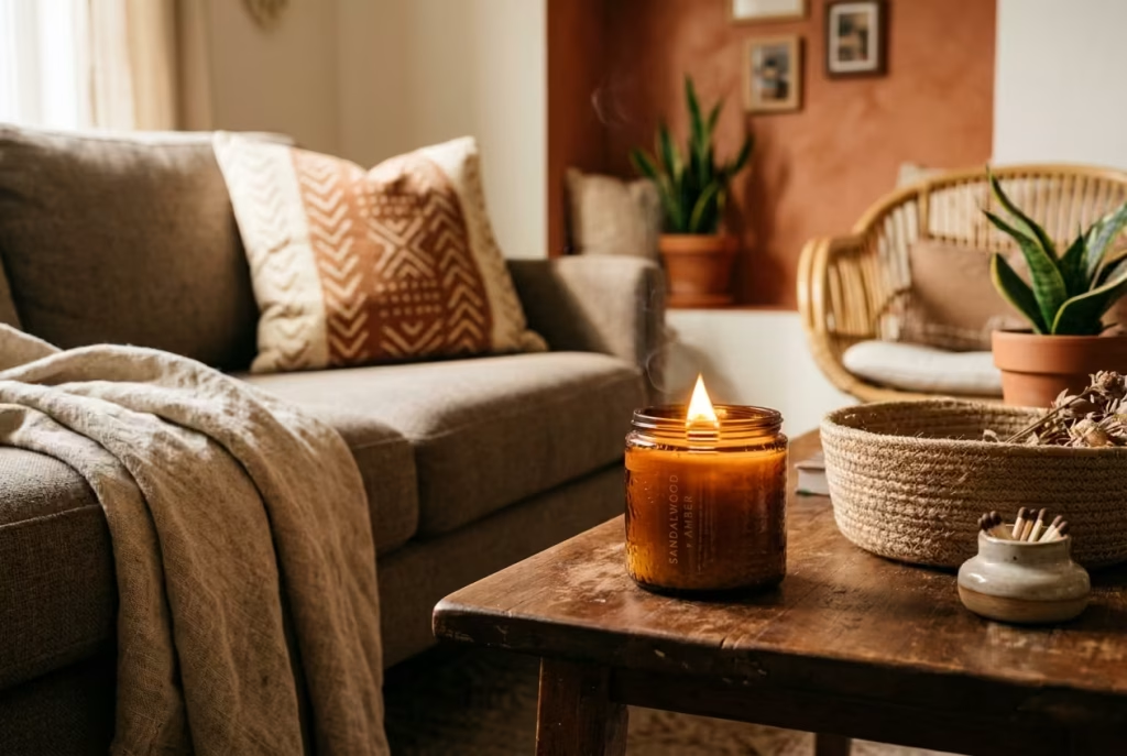
Scent is the easier of the two to get right, and a wood-wick candle does more heavy lifting here than people generally expect. Beyond the fragrance itself, cedar, amber, sandalwood, something warm rather than floral or artificially “fresh”, there’s the actual crackle a wood wick makes as it burns, a small, almost imperceptible sound that adds a layer of coziness no scent alone provides. It’s a tiny detail, admittedly, but tiny details are precisely what separate a room that reads as considered from one that reads as merely decorated.
Sound matters just as much, maybe more, and it’s the one most people never think to design for at all. A small speaker, tucked unobtrusively into a woven basket or hidden behind a plant, filling the room with low, warm music, jazz, Afrobeat, something with texture and warmth rather than anything sharp or clinical, changes the entire emotional temperature of a space.
I’ve walked into rooms that were visually stunning, every element from the earlier fourteen ideas executed beautifully, and still felt oddly sterile simply because they were silent. Add music, even quietly, even just as background, and the same room suddenly feels occupied, alive, like someone actually lives there rather than staged it for a listing photo.
Why sensory layering finishes what visual design starts:
- Scent triggers memory and emotion far more directly than sight does, a warm, woody fragrance makes a room feel instantly welcoming in a way no amount of styling alone achieves
- Sound fills the silence that photographs can’t capture but visitors absolutely notice, a genuinely quiet room, however beautifully arranged, can feel unfinished or even a little cold
- Both elements cost relatively little compared to furniture or renovation work, yet deliver an outsized return on how “finished” and lived-in a space feels day to day
Where this idea is easy to get wrong:
- Overly sweet, artificial fragrances (heavy florals, synthetic “clean linen” scents) clash with the warm, earthy mood this style is built around, stick to woody, spiced, or subtly smoky notes instead
- Visible speakers or tech left out in plain sight undercut the handmade, organic feel of the room, tucking them into baskets or behind furniture keeps the sensory layer present without looking like a showroom for electronics
- Overpowering scent, several candles burning at once, or music played too loudly, tips from cozy into overwhelming fast, subtlety is the whole point here
| Sensory Element | Recommended Choice | Effect on the Room |
| Scent | Wood-wick candle (cedar, amber, sandalwood) | Warmth, coziness, subtle crackling sound |
| Sound | Hidden speaker, warm/low-volume music | Fills silence, adds life and presence |
| Placement | Tucked into baskets, behind plants | Keeps focus on handmade textures, not tech |
This is the idea I save for last on every single project, quite deliberately, because it’s the one that turns a beautifully arranged room into a genuinely lived-in one. You can get every measurement right, the sofa height, the rug border, the pattern scale, and still end up with a space that photographs like a dream but feels somehow hollow when you’re actually there. Light a candle. Play some music, low and warm, nothing demanding attention. That’s the difference between a room that’s finished on paper and one that’s finished, full stop, the kind of room people don’t want to leave once they’ve settled into it.
Common Mistakes to Avoid while designing Stylish Modern Afrobohemian Living Room
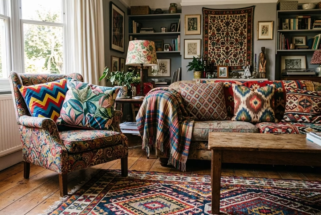
Design mistakes rarely announce themselves loudly. They creep in quietly, one impulse buy at a time, until suddenly a room that should feel warm and collected instead feels like it’s trying too hard. Here are the three culprits I run into most often, the ones that trip up even genuinely well-intentioned rooms.

Overloading pattern without a neutral base. Bold prints need somewhere quiet to rest, a wall, a sofa, a floor, that isn’t also shouting for attention. Skip the neutral foundation and even beautiful textiles start to look like clutter rather than curation. Every idea earlier in this list assumes a calm base exists first, patterns are the melody, not the whole song.
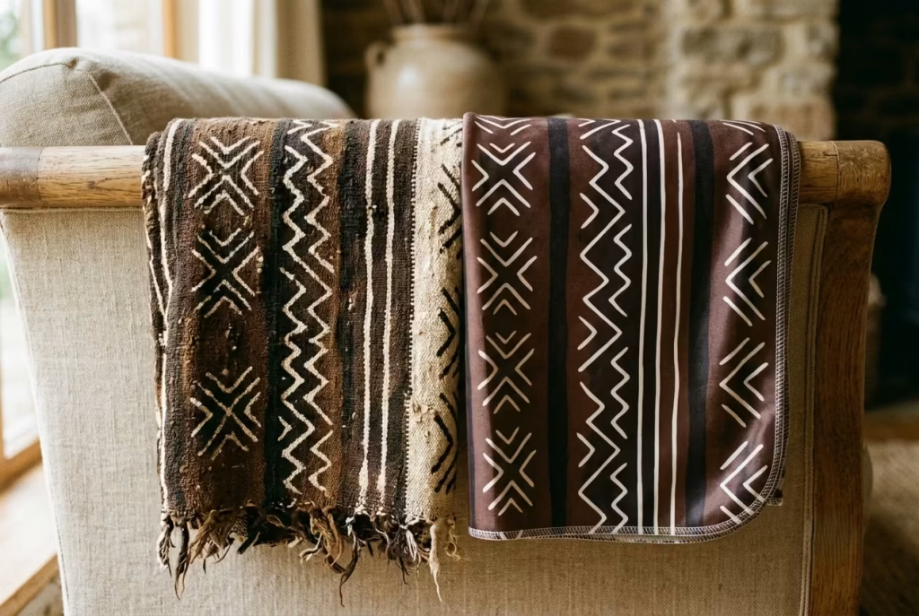
Treating “bohemian” as costume rather than material honesty. There’s a real difference between a hand-loomed mudcloth throw and a mass-produced polyester print mimicking the same pattern from a distance. Faux textures photograph fine but fall apart under close inspection, both literally and stylistically. This style rewards the real thing, imperfections and all.
Ignoring scale. An undersized rug floating in the middle of a large room, or a tiny frame lost on an oversized wall, breaks the sense of intention this whole style depends on. Measure twice. Scale is rarely forgiving, and it’s the detail guests notice even when they can’t quite name why a room feels slightly off.
How to Adapt This Style on a Budget vs. a Full Renovation
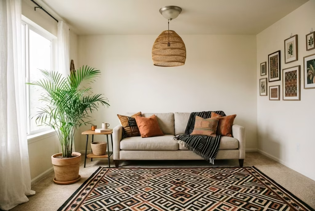
Not everyone’s starting from a blank canvas with a contractor on speed dial, and honestly, this style doesn’t demand one. Afrobohemian design flexes beautifully at any budget, the trick is knowing which lever to pull.
The budget path leans on everything swappable: textiles, lighting, and plants. A statement rug, a few well-chosen throws, a woven pendant that clips over an existing fixture, a tall areca palm from a local nursery. None of this requires touching a wall or calling a contractor, and it’s entirely renter-friendly, pack it up, take it with you when you move. This is where I tell every first-time client to start, low commitment, high visual payoff.
The full renovation path goes deeper: warm neutral paint replacing stark white, built-in shelving sized to fit hand-thrown ceramics and carved objects, permanent statement lighting wired into the ceiling. This route costs more and takes longer, but it locks the style into the room’s actual bones rather than its surface. Start with the swappable layer. Let the permanent changes follow once you’re certain the style has genuinely earned its place in your everyday life.
Final thoughts The Room at Half Past Four
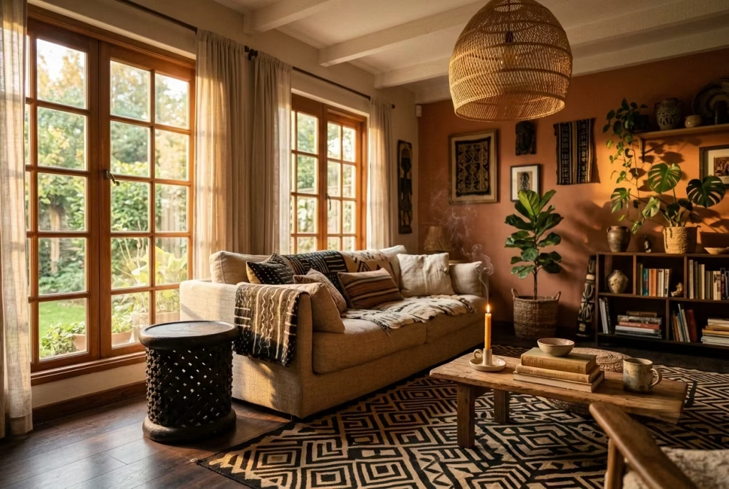
That hand-carved stool is still sitting by the window, catching the same syrupy afternoon light it always has. Except now it’s not alone. A low linen sofa anchors the space behind it, a kuba-cloth rug sets the palette underfoot, and somewhere overhead a woven pendant throws soft shadows across a wall that finally has something to say. Nothing shouts. Everything earns its keep.
That’s the thing worth carrying away from all fifteen ideas here: Afrobohemian design was never a mood board to copy wholesale, it’s a material conversation, warmth speaking, restraint answering back, neither one ever quite getting the last word. Get that dialogue right, and the room stops looking staged for a camera and starts feeling like somewhere you’d actually want to sit down, candle lit, music low, at half past four on any given afternoon.
If you’re still working out the foundations of this style before diving into individual ideas, our full guide on [What Is Afrobohemian Design? A Complete Style Guide] is the natural next stop.
Frequently Asked Questions about Afrobohemian style in interior design
What is Afrobohemian style in interior design?
Afrobohemian style blends bohemian design’s relaxed, layered textures with West and East African-inspired patterns, materials, and craftsmanship, think mudcloth, kuba cloth, rattan, and carved wood. It combines warmth, natural materials, and heritage-inspired textiles into a cohesive, modern living space rather than a themed or costume-like look.
Is Afrobohemian the same as boho chic?
Not quite. Boho chic is a broader, more general aesthetic pulling from many global influences loosely. Afrobohemian is more specific, rooted in authentic African textiles, motifs, and materials (mudcloth, kuba cloth, beadwork, carved stools) paired with modern, uncluttered structure rather than eclectic maximalism.
How do I start an Afrobohemian living room on a budget?
Start with swappable elements: a statement rug or throw, a woven pendant light, and a few tall plants with height variation. These require no permanent changes, work in rented spaces, and deliver the biggest visual impact for the lowest cost before considering paint or built-ins.
What colors work best for an Afrobohemian living room?
Warm neutrals form the base, clay, terracotta, oat, and walnut, rather than stark white. These tones photograph and live warmer, especially in north-facing rooms, and act as a forgiving backdrop for bold patterned textiles and accessories.
What is the best rug size for a 12×14 living room?
An 8×10 rug centered under the seating area works well, leaving roughly 18 inches of exposed flooring on all sides. This border keeps the rug grounded and intentional rather than floating disconnected from the furniture around it.
How much pattern is too much in a bohemian living room?
A good rule is three pattern scales maximum: one large (rug), one medium (pillow), one small (trim or lampshade). Two or more large-scale patterns competing in the same sightline typically reads as cluttered rather than curated.
Should I use real or faux plants in an Afrobohemian room?
Real plants are preferred since this style leans on natural materials and organic movement, but a well-made faux plant is a reasonable substitute if light or maintenance is a genuine barrier. Either way, pair a tall plant with a lower trailing one for visual balance.
What sofa height works best for this style?
Modern Afrobohemian rooms favor a lower, more grounded seat height, around 16 to 17 inches, compared to the standard 19 inches. This creates a relaxed, lounge-like feel, though it’s worth considering mobility needs before committing to a lower profile.
Can I mix modern furniture with Afrobohemian decor?
Yes. Pair harder modern materials like glass or black metal with rounded, hand-thrown ceramics or woven baskets nearby to soften the contrast. This tension, handled well, adds range to a room rather than creating visual conflict.
Is Afrobohemian design renter-friendly?
Very much so. Textiles, lighting fixtures that clip onto existing sockets, plants, and accessories all deliver strong visual impact without permanent changes, making this one of the more accessible design styles for renters or anyone hesitant to commit to renovation.