25 Clean & Modern Minimalist Basement Designs That Feel So Spacious, They Don’t Even Feel Like Basements
Basements rarely suffer from a lack of purpose. If anything, they are often expected to do too much. Home cinema, guest room, workspace, storage, sometimes all at once. The real issue sits elsewhere: a lack of clarity, a quiet confusion in how the space is structured, lit, and experienced.
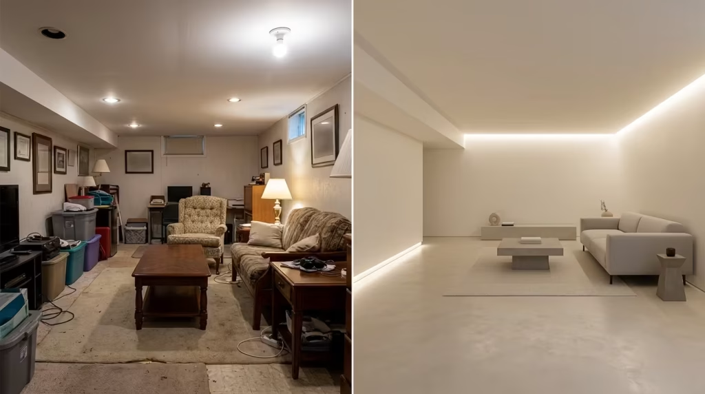
I have walked into basements that were technically generous in square footage. Yet, they felt tight, almost hesitant. Low ceilings pressing down, layouts broken into awkward fragments, lighting flickering between too dim and overly harsh. The result is a space that feels smaller than it is, as though it is holding its breath rather than opening up.
What many homeowners do, almost instinctively, is add more: more lighting fixtures, more furniture, more decorative elements to ‘fix’ the problem. In practice, that approach tends to muddy the waters. The space becomes busier, yet never clearer, like trying to solve a traffic jam by adding more cars.
On several basement projects, the turning point came not from introducing new elements, but from removing them. Stripping back roughly 15 to 20 percent of visual clutter, often things that seemed harmless at first glance, had a disproportionate effect. Sightlines extended. Light traveled further. The room began to breathe.
This is where minimalism, when handled with intent, proves its value. It is not about creating emptiness or chasing a stark aesthetic. It is about spatial correction, resolving the friction between structure, light, and movement. Every surface, every junction, every object either supports clarity or interrupts it.
A well-designed minimalist basement works quietly in the background. It guides how you move through the space, how your eye settles, how light softens edges instead of exposing them.
It is also worth noting that minimalism in a basement context is not about doing less blindly. It is about doing less, but better judged. Keeping what earns its place and letting go of what does not.
The ideas that follow are not surface-level styling suggestions. They come from real projects, constraints, and adjustments made on-site where things rarely go exactly to plan. You will notice that the focus leans heavily on proportion, material continuity, lighting control, and spatial flow.
If approached thoughtfully, a basement can move from being the most compromised part of a home to one of its most composed. Not loud, not attention-seeking, but quietly resolved, the kind of space that works so well you almost forget why it ever felt difficult in the first place.
Understanding Spatial Psychology in Basement Design
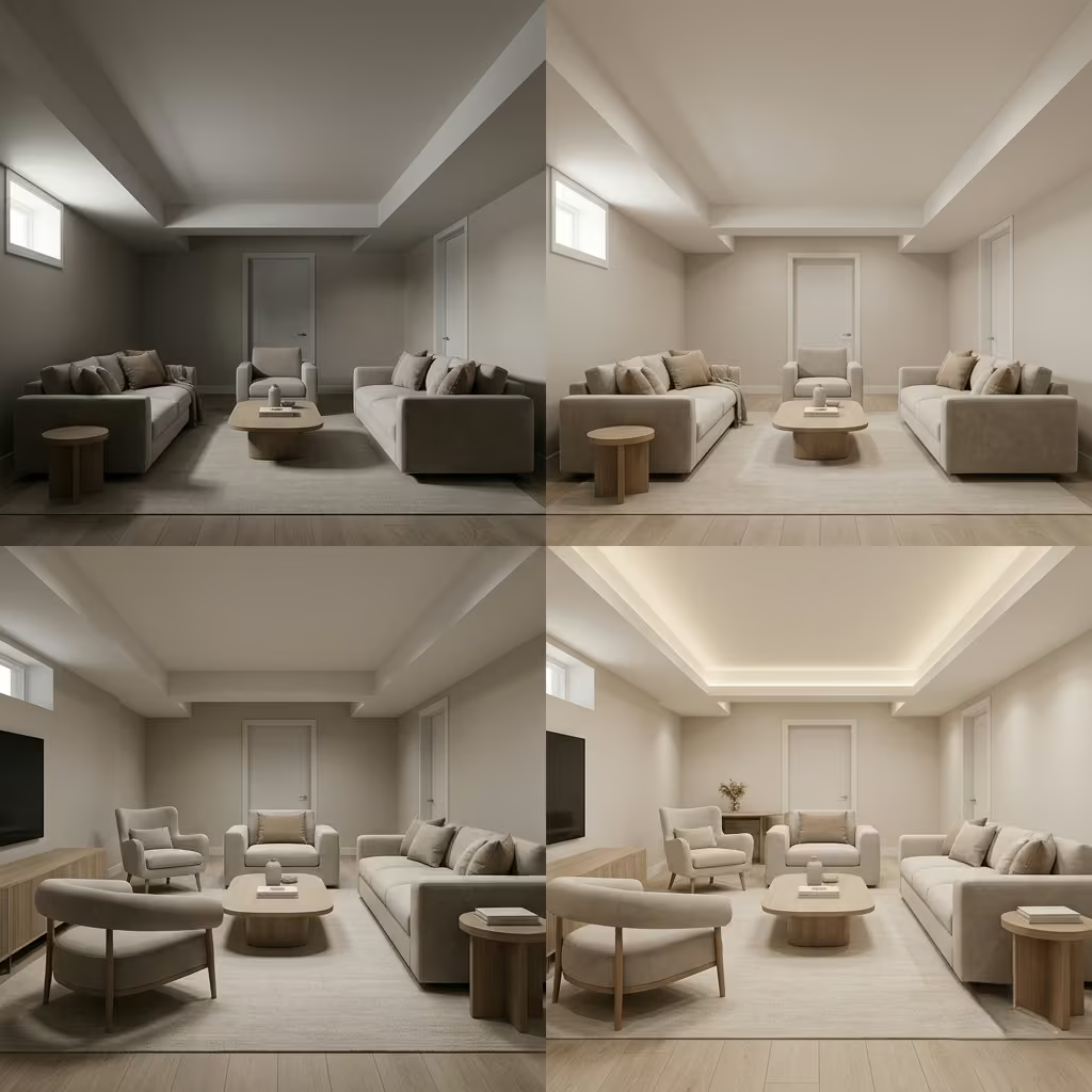
Before any material is selected or furniture layout is drawn, the real work begins at a less visible level. How a basement feels is rarely dictated by its square footage alone. It is shaped by how the eye reads volume, how light travels across surfaces, and how effortlessly the body moves through the space.
In basements especially, perception tends to lag behind reality. Rooms appear tighter, ceilings feel lower, and corners seem heavier than they actually are. I have found that once you understand these subtle psychological cues, design decisions become far more precise. You stop decorating the space and start correcting it, almost like tuning an instrument until everything sits in quiet harmony.
Why Basements Feel Smaller Than They Are
Basements rarely lack space in a technical sense. What they lack is perceived ease. The difference is subtle but decisive. A room can measure generously on paper, yet feel tight the moment you step into it, almost as if the walls have edged inward overnight. This disconnect comes down to how the human eye interprets enclosure, light, and continuity. Once you begin to notice these patterns, it becomes clear that the problem is not size itself, but how that size is communicated.
Ceiling Compression vs Perceived Volume
Ceiling height is often treated as a fixed limitation, something to accept and work around. In reality, it is only part of the story. What matters just as much is how that height is read. A ceiling at 2.2m or 7.2 ft can feel perfectly comfortable or noticeably oppressive depending on how the surrounding elements behave.
I have worked on a project where the ceiling height could not be altered due to structural constraints. Instead of fighting it, we adjusted everything beneath it. Lower seating, reduced to around 400mm or 16 inches, kept sightlines open. Vertical interruptions were minimised, and joinery was taken full height to draw the eye upward. The result was a space that felt composed rather than compressed, as though it had found its balance rather than lost it.
The mistake I often see is introducing bulky furniture or layered ceiling details that visually drag the height down further. It is a bit like wearing heavy boots in a low room. Every step feels heavier than it needs to. By contrast, a restrained approach allows the ceiling to recede quietly into the background, which is exactly where it should be.
Light Absorption in Lower-Grade Spaces
Light behaves differently below ground. It arrives weaker, often indirect, and tends to dissipate quickly. Basements absorb light rather than reflect it, especially when darker finishes or matte textures dominate the palette. The effect can feel subtle at first, then cumulative, until the room starts to feel dim even when lighting is technically sufficient.
In one basement living area I redesigned, the client had installed multiple overhead fixtures, assuming brightness would solve the issue. The space was well-lit in terms of lumens, yet still felt flat and slightly heavy. The turning point came when we shifted focus from quantity to distribution. Walls were finished in a soft, light-reflective plaster, and lighting was layered at different heights rather than concentrated overhead.
It changed the atmosphere entirely. Light began to travel, surfaces gained depth, and the room felt less like a contained box and more like an unfolding space. In basements, light needs guidance. Left on its own, it tends to fade into corners without making much of an impression.
Fragmentation Caused by Structural Elements
Beams, columns, bulkheads, ductwork. Basements are full of them, often positioned without regard for visual rhythm. These elements, while necessary, tend to break the space into smaller pockets. Each interruption creates a visual stop, and before long, the room feels segmented, almost hesitant in how it flows.
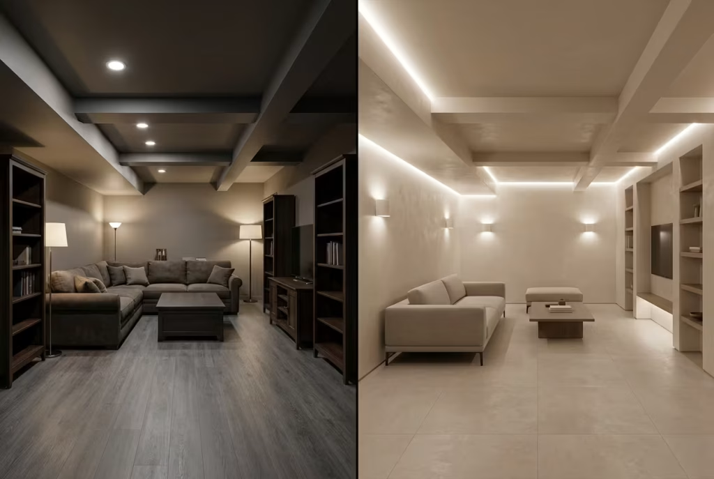
I once encountered a basement where a series of exposed beams cut across the ceiling at irregular intervals. Individually, they were not problematic. Together, they created a staccato rhythm that made the ceiling feel lower and the room more confined. Instead of concealing them entirely, which was not feasible, we unified them visually by painting them in the same tone as the ceiling and aligning lighting along their edges.
That small shift softened their presence. The eye stopped reading each beam as a separate interruption and began to see a continuous plane instead. It is a quiet adjustment, but one that changes how the space is experienced from the moment you enter.
Fragmentation is often the silent culprit in basement design. It chips away at spatial clarity, piece by piece, until the room feels smaller than it truly is. The goal is not always to remove these elements, which is rarely practical, but to integrate them so seamlessly that they stop demanding attention.
When you look at these factors together, ceiling perception, light behaviour, and structural rhythm, a pattern begins to emerge. Basements do not feel small because they are small. They feel small because too many elements are competing for attention. Once those elements are brought into alignment, the space settles. It opens up, almost quietly, like a room that has finally found its footing.
The Principle of Visual Continuity
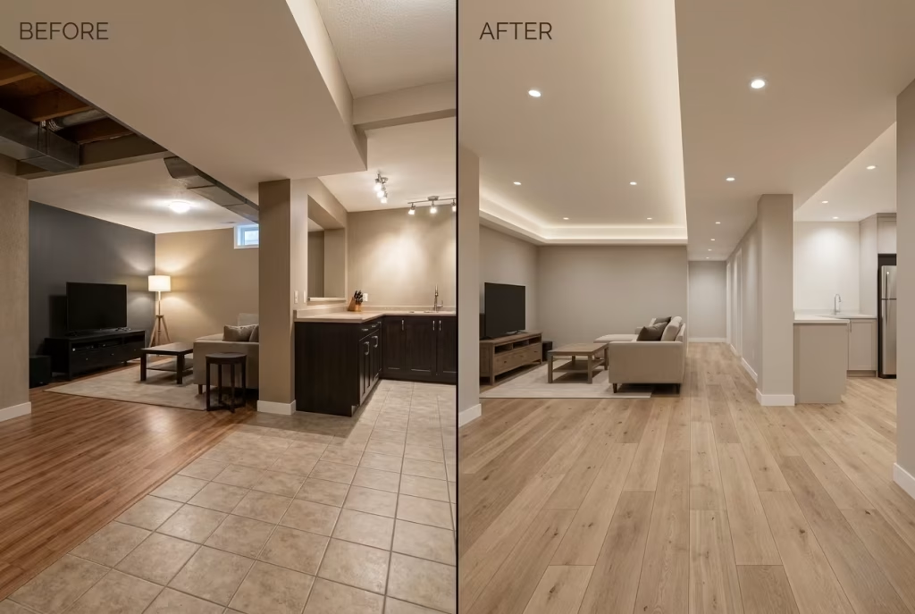
If there is one principle that quietly transforms a basement from feeling confined to feeling composed, it is visual continuity. Not in an abstract sense, but in the way surfaces carry through a space without interruption, allowing the eye to move freely rather than stopping short at every junction. When continuity is handled well, the room begins to read as a whole rather than a series of disconnected parts. It is the difference between a space that flows and one that feels pieced together, almost like a patchwork that never quite settles.
Continuous Surfaces vs Broken Planes
Every time a surface changes abruptly, whether through material, colour, or level, the eye registers a boundary. One or two boundaries are manageable. Too many, and the space starts to fragment. Basements, already working against lower ceilings and limited light, feel this more acutely than other areas of the home.
I have seen basements where flooring shifts between tiles, timber, and rugs within a few metres, walls change tone from one zone to the next, and ceiling treatments vary overhead. Each decision, taken in isolation, might make sense. Together, they create visual noise. The eye jumps from one surface to another, never quite settling, and the room feels smaller as a result.
On a recent project, we stripped the palette back to a single flooring material and carried it across the entire basement, including transitional zones. Walls were kept within a narrow tonal range, and ceiling finishes remained consistent throughout. The difference was immediate. The space felt calmer, more legible, almost as if the visual clutter had been ironed out.
That said, continuity does not mean monotony. The nuance lies in subtle variation rather than abrupt contrast. Texture can shift gently, finishes can deepen slightly, but the underlying language remains consistent. It is a bit like listening to music where the rhythm holds steady even as the melody evolves.
How Uninterrupted Flooring Transforms Perception
Flooring plays a particularly powerful role because it anchors the entire space. It is the surface we move across, the plane that connects every function within the basement. When that surface runs uninterrupted for a meaningful distance, ideally in the range of 5 to 7 metres or 16 to 23 feet, the effect on perception is surprisingly strong.
I often encourage clients to think of flooring not as a decorative layer, but as a spatial device. In one basement renovation, we used wide plank engineered wood, around 200mm or 8 inches in width, laid in a continuous direction from one end of the space to the other. There were no thresholds, no breaks, not even at the transition into a small kitchenette area.
What happened was subtle but unmistakable. The eye began to travel along the length of the boards, naturally extending the perceived depth of the room. Movement through the space felt smoother, less interrupted. Even areas that were physically compact seemed to borrow a sense of openness from the larger zones they connected to.
By contrast, when flooring is broken into smaller sections or interrupted by changes in material, the space tends to shrink visually. Each break acts like a full stop, cutting the flow short. It is the spatial equivalent of stopping mid-sentence, again and again, until the overall rhythm is lost.
There are, of course, practical considerations. Moisture levels, subfloor conditions, and expansion gaps all need to be addressed carefully. But from a design standpoint, the goal remains clear. Keep the floor as continuous as possible, allow it to guide the eye, and let it quietly do the heavy lifting.
Visual continuity, when applied with intent, becomes almost invisible in the best possible way. You do not notice it directly, yet you feel its effect in how easily the space reads, how naturally it holds together. In a basement, where every design decision carries a little more weight, that sense of quiet cohesion is often what makes the difference between a room that feels constrained and one that feels, quite unexpectedly, expansive.
Material Restraint as a Spatial Tool
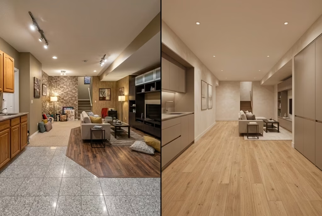
Material selection in a basement carries more weight than most people realise. In spaces where natural light is limited and proportions are already working against you, every finish either supports clarity or quietly undermines it. I often tell clients that materials do not just define how a room looks, they define how it behaves. Get it right, and the space feels calm, grounded, and expansive. Get it wrong, and it begins to feel restless, as though it cannot quite settle into itself.
Restraint, in this context, is not about holding back for the sake of simplicity. It is about editing with intention, keeping only what contributes to a coherent spatial story. A well-composed basement does not rely on variety to feel rich. It relies on depth, nuance, and continuity, layered carefully so the room reveals itself gradually rather than all at once.
Limiting Palette to 3–4 Core Materials
One of the most effective ways to bring clarity into a basement is by narrowing the material palette. In practical terms, this usually means working with three to four core materials across the entire space. Not per room, but across the basement as a whole.
On a recent project, we built the entire scheme around four elements. Engineered oak flooring, a soft mineral plaster for walls, matte lacquered cabinetry, and brushed metal accents. That was it. At first glance, it might sound restrictive. In reality, it created a sense of cohesion that allowed the space to breathe.
Each material was allowed to carry weight. The oak introduced warmth underfoot, running continuously for just over 6 metres or roughly 20 feet, which helped stretch the perceived depth of the room. The plaster walls caught and diffused light softly, avoiding the flatness that standard paint can sometimes create in basements. The cabinetry, kept flush and understated, blended into the architecture rather than competing with it.
What made this approach work was not just the limited number of materials, but how they were repeated. Repetition, handled with a steady hand, builds familiarity. The eye begins to recognise patterns, and the space feels more legible as a result. It is a bit like hearing a melody return in a piece of music. There is a sense of continuity that keeps everything anchored.
The common pitfall is introducing too many finishes in the hope of adding interest. Stone here, tile there, a different wood tone in another corner. Before long, the space starts to feel like a showroom rather than a home. Each material asks for attention, and the room becomes a conversation where everyone is talking at once.
Avoiding Visual Noise Without Making the Space Sterile
Restraint often gets mistaken for minimalism taken too far, spaces that feel cold, overly controlled, or lacking personality. The key is not to remove character, but to refine how it is expressed.
Visual noise usually comes from abrupt contrasts, overly busy textures, or finishes that do not quite relate to one another. In a basement, where light is already limited, this kind of noise tends to weigh the space down. It creates tension, even if you cannot immediately pinpoint why.
To counter this, I focus on layering subtle variations within a controlled palette. Instead of introducing a new material, I might adjust the texture or finish of an existing one. For example, pairing a smooth plaster wall with a lightly brushed timber surface adds depth without breaking continuity. The difference is felt rather than loudly seen.
In one basement lounge, the client initially wanted a feature wall with bold stone cladding. It would have become the focal point, but also a visual interruption. Instead, we used a continuous microcement finish across the wall and integrated a fireplace within it. The texture shift was minimal, yet the effect was far more refined. The room felt cohesive, not divided.
Lighting also plays a quiet but critical role here. Soft, layered lighting can bring out the richness in restrained materials, highlighting texture and tone without introducing additional elements. It allows the space to feel warm and lived-in, rather than stark or clinical.
The goal, ultimately, is to strike a balance where the space feels edited but not empty, composed but not rigid. A basement designed with material restraint should feel like it has been carefully considered, not stripped back for the sake of it. There is a certain ease to it, a sense that everything is where it should be, and nothing is trying too hard.
When material restraint is handled well, the result is a space that feels quietly confident. Nothing shouts for attention, yet everything contributes. The room holds together, almost effortlessly, allowing light, proportion, and movement to take centre stage. In a basement setting, where clarity is often hard-won, that kind of balance is not just desirable. It is transformative.
25 Clean & Modern Minimalist Basement Design Ideas
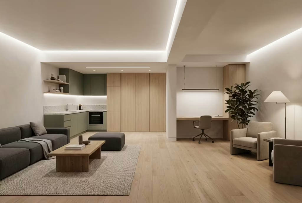
Once the underlying principles are in place, clarity, continuity, and restraint, the design begins to open up in a far more intentional way. This is where ideas move from theory into lived experience, shaped by real constraints, real proportions, and the kind of decisions that only reveal their value over time. What follows is not a catalogue of trends, but a collection of approaches I have seen work, tested in basements where space needed to be earned rather than assumed. Each idea addresses a specific challenge, whether it is low ceilings, limited light, or fragmented layouts, and reframes it into an opportunity. Taken together, they form a toolkit, one that allows a basement to feel less like an afterthought and more like a space that has finally found its footing.
Open-Plan Basement with Continuous Flooring
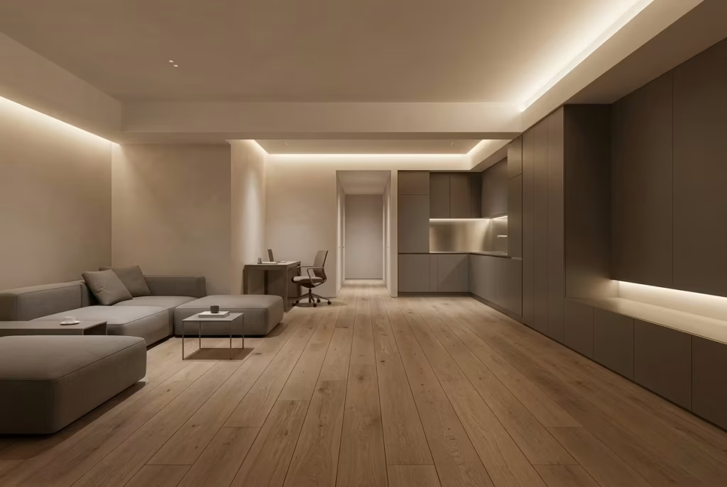
There is something quietly transformative about walking into a basement where the floor runs uninterrupted from one end to the other. No thresholds catching your step, no sudden shifts in material pulling your attention sideways. Just a steady, continuous surface guiding both movement and perception. In spaces that already feel constrained, this kind of clarity goes a long way. It allows the room to read as a single, composed volume rather than a series of smaller, disconnected zones.
In my own projects, this approach has often been the turning point. I recall a basement that was divided visually by three different flooring types within a span of just under 6 metres or around 20 feet. Each area had its own identity, yet together they felt disjointed, almost hesitant. By replacing everything with wide plank engineered wood, typically in the range of 180 to 220mm or 7 to 9 inches, and running it consistently across the entire footprint, the space began to settle. The eye could travel without interruption, and the room felt noticeably broader, as though it had finally exhaled.
The width of the planks plays a subtle but important role here. Narrow boards tend to create a busier rhythm, with more joints and visual breaks. Wider planks, laid with care, stretch the perspective. They create longer lines, which the eye naturally follows, extending the perceived dimensions of the basement. When those lines run in the same direction as the longest wall, the effect becomes even more pronounced, almost like drawing the space outward with a steady hand.
Extending the same flooring across different functional zones, whether it is a lounge, a workspace, or a small kitchenette, removes the need for visual boundaries. Zoning still exists, but it is defined through furniture placement, lighting, and proportion rather than abrupt material changes. It is a bit like shifting from bold punctuation to a more fluid sentence. The meaning remains clear, but the reading becomes effortless.
From a practical standpoint, engineered wood is often the preferred choice in basements due to its stability. It handles fluctuations in humidity better than solid timber, provided the subfloor is properly prepared. That said, this is where the detail work matters. Achieving a truly seamless run requires precise levelling, moisture barriers, and careful installation. Any inconsistency beneath the surface will eventually make itself known, sometimes in ways that are difficult to correct later.
Pros
- Creates a seamless visual flow that allows the space to feel unified rather than segmented
- Enhances perceived width and depth, especially in longer basements
- Supports flexible zoning without relying on physical divisions
- Brings warmth and texture into a space that might otherwise feel flat
Cons
- Demands accurate subfloor preparation, including levelling and moisture control
- Can highlight imperfections if installation is not handled with precision
- Requires thoughtful detailing at edges and transitions to maintain the illusion of continuity
When done well, continuous flooring becomes more than just a surface. It acts as a quiet framework, holding the entire design together. It does not draw attention to itself, yet without it, the space would feel noticeably less resolved. In a basement, where every decision carries a little more weight, that kind of understated impact is worth its weight in gold.
Low-Profile Modular Seating Layout
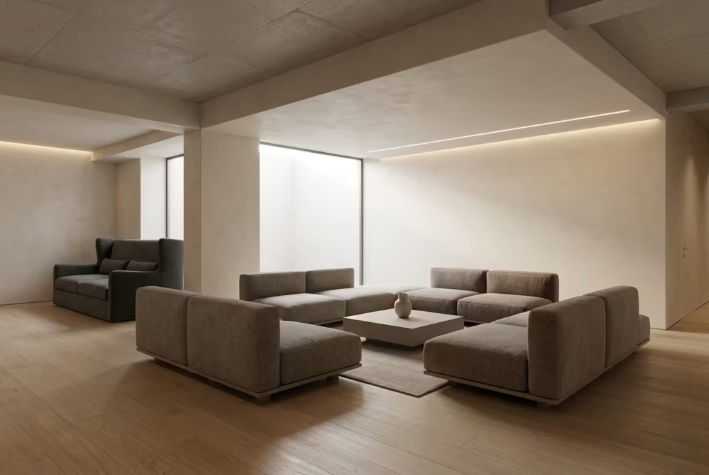
Seating in a basement is often where proportion quietly goes wrong. It is easy to underestimate how much visual weight a sofa carries until it is placed in a low-ceilinged space and suddenly begins to dominate everything around it. In tighter environments, furniture is never just functional. It actively shapes how spacious, or how compressed, the room feels the moment you step inside.
Low-profile modular seating changes that dynamic almost immediately. By keeping seat height within the range of 380 to 420mm or roughly 15 to 16.5 inches, the visual horizon drops just enough to open up the upper portion of the room. That subtle shift creates breathing room above the furniture line, which in basements is often the most valuable spatial commodity. The eye is no longer forced to navigate around bulky forms that block sightlines. Instead, it moves freely across the space, almost like a clear run of water finding its path.
I have worked on basements where oversized sectional sofas were initially the centrepiece. On paper, they made sense, generous seating, family-friendly proportions, and a sense of comfort. In reality, they swallowed the room. In one case, simply replacing a deep, high-backed sofa with a lower modular configuration changed the perceived volume so dramatically that clients described it as gaining nearly a third more usable visual space. Nothing structural changed, yet the experience of the room shifted completely.
Modularity plays a crucial role here as well. Instead of locking the room into one rigid arrangement, modular seating allows the layout to adapt over time. Pieces can be separated, reoriented, or grouped differently depending on use. This flexibility prevents the space from feeling frozen in a single configuration, which is particularly important in basements that often serve multiple functions throughout the week.
There is also a psychological layer at work. Lower seating naturally encourages a more relaxed posture in the room. It brings the body closer to the floor plane, which in turn reinforces the sense of height above. It is a subtle trick of perception, but an effective one. When done well, the room feels less like it is pressing down on you and more like it is opening around you.
From a design standpoint, fabric choice and base detailing matter just as much as height. Raised legs or slim metal bases allow light to pass beneath the furniture, preventing it from anchoring too heavily to the floor. This small gap, often no more than a few centimetres, can make a surprising difference in how weightless the seating feels within the space. Upholstery in muted, tonal fabrics further reduces visual interruption, allowing the seating to sit comfortably within the overall palette rather than breaking it apart.
Pros
- Maintains open sightlines, improving the sense of depth and spatial flow
- Reduces visual bulk, making low-ceiling basements feel more generous
- Offers flexible configurations that adapt to changing use cases
- Enhances comfort without overwhelming the architecture of the space
Cons
- May feel too low for users who prefer more upright, traditional seating heights
- Requires careful proportioning to avoid looking undersized in larger rooms
- Can lose impact if paired with overly bulky accessories or coffee tables
When approached thoughtfully, low-profile modular seating does more than provide a place to sit. It quietly reshapes the room’s proportions, almost without announcing itself. In basements where every visual decision carries extra weight, that sense of lightness becomes not just a design choice, but a way of unlocking the space itself.
You May also Like: Dark Minimalist Interior Design: Moody, Uncluttered Spaces That Feel Like an Exhale
Full-Height Wall Paneling in Neutral Tones
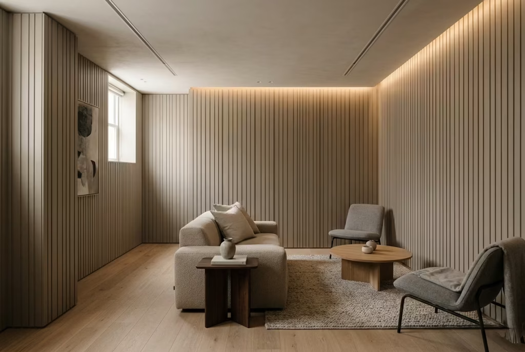
Wall paneling in a basement is never just a decorative layer. It is a spatial instrument, one that quietly recalibrates how tall, wide, and composed a room feels. When executed full height, running cleanly from floor to ceiling, it removes the visual interruptions that typically fragment basement walls. The result is a continuous vertical field that draws the eye upward, almost like the architecture itself is stretching to recover lost height.
In many basements I have worked on, the problem was not the actual ceiling height, but the way the walls broke it down. Dado rails, half-height cladding, and inconsistent finishes tend to chop the elevation into smaller segments. The eye stops and starts, never quite finding a rhythm. Once those interruptions are removed and replaced with uninterrupted paneling, the space begins to feel taller without a single structural change.
The choice of tone plays an equally important role. Warm whites and soft greiges work particularly well in below-ground spaces because they do not behave like flat white or heavy colour. Instead, they sit in that middle ground where light can still register texture and depth without creating harsh contrast. I have often found that in basements with limited daylight, overly crisp whites can feel slightly clinical, while deeper tones can weigh the room down. A softened neutral, carefully tuned, becomes the quiet mediator between light and material.
There was a project where we applied full-height MDF paneling, finished in a muted greige with a very subtle sheen, across an entire basement lounge measuring roughly 7 metres by 5 metres or 23 by 16 feet. The space originally felt segmented due to multiple structural columns and service runs. Once the paneling wrapped everything in a continuous vertical language, those interruptions faded into the background. The room did not just look more refined, it felt more unified, almost like the architecture had been smoothed into a single gesture.
What makes this approach particularly effective is the way it manipulates perception. Vertical lines naturally encourage the eye to travel upward. When those lines are uninterrupted, the ceiling feels slightly lifted, even if the actual height remains unchanged. It is a quiet illusion, but a powerful one. The kind that does not announce itself, yet changes how you experience the room every time you enter it.
There is also a tactile quality to consider. Paneling introduces subtle shadow play across the surface, especially when paired with layered lighting. These soft shifts in tone prevent the space from feeling flat or sterile, which is a common concern in minimalist basements. Instead of overwhelming the senses, the walls begin to respond gently to light throughout the day, giving the room a sense of depth that painted drywall alone rarely achieves.
From a practical standpoint, full-height paneling also helps conceal the realities of basement construction. Uneven surfaces, service channels, and minor structural inconsistencies can all be integrated behind a consistent finish line. When done properly, it is not about hiding flaws aggressively, but about composing them into a system that feels intentional rather than improvised.
Pros
- Enhances vertical perception, making low ceilings feel noticeably taller
- Creates a unified wall surface that reduces visual fragmentation
- Offers a refined way to conceal structural or service-related imperfections
- Works beautifully with layered lighting to add subtle depth and texture
Cons
- Requires precise installation to avoid visible misalignment across full-height runs
- Can feel overly uniform if not balanced with texture or tonal variation
- May increase material and labour cost compared to standard wall finishes
When approached with restraint and care, full-height wall paneling becomes more than a finishing choice. It becomes a framing device for the entire basement, quietly guiding how the space is perceived from edge to edge. In a setting where every centimetre of visual height matters, it is one of those decisions that pays back far more than it first appears to offer.
Integrated Linear LED Lighting Systems
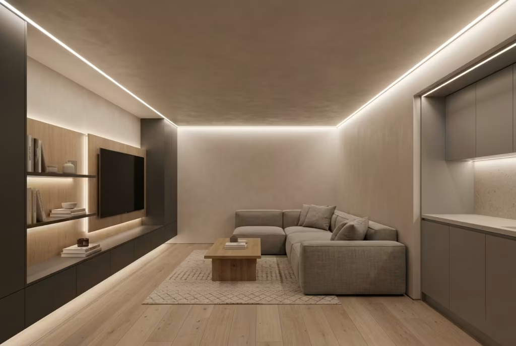
Lighting in a basement does far more than illuminate. It sets the emotional temperature of the room, defines how generous the space feels, and often decides whether the design reads as quietly sophisticated or unintentionally crude. In low-ceiling environments, lighting is especially unforgiving. A handful of visible fittings can clutter the ceiling before the room has even had a chance to breathe. That is why integrated linear LED systems are so effective. They work like a fine pencil line rather than a loud gesture, shaping the room with precision instead of shouting for attention.
What makes this approach particularly valuable is its ability to deliver brightness without visual bulk. Recessed strips tucked along ceiling edges, inside joinery, behind shelving, or beneath floating features create a soft wash of light that appears to emerge from the architecture itself. The fittings disappear, which is exactly the point. The room feels cleaner, calmer, and more resolved, as though every source of light has been edited down to its most essential form.
In one basement project I worked on, the client initially wanted a series of decorative pendant lights and several surface-mounted downlights. On paper, that sounded comprehensive. In practice, it would have crowded the ceiling and broken up the room’s proportions. Instead, we introduced linear LEDs along the perimeter ceiling detail and beneath built-in joinery. The effect was immediate. The light was still plentiful, but it felt woven into the architecture rather than applied on top of it. The space looked more expansive, and more importantly, it felt effortless to live in.
A well-executed linear lighting plan does more than brighten a room. It guides movement. It can lead the eye along a corridor, frame a seating area, or subtly define zones without the need for walls or bulky fixtures. In a basement, that kind of control is worth its weight in gold. You are not just lighting a space, you are helping the room understand itself. That may sound poetic, but in design terms it is entirely practical. Light tells the eye where to go, and in a compact or low-level room, that direction matters.
The placement of the strips is where the nuance sits. Ceiling-edge recesses soften the line between wall and ceiling, making the room feel slightly taller. Under-cabinet or under-shelf strips create floating effects that visually lift joinery off the floor. Behind a wall panel or media unit, concealed LEDs can produce a gentle halo that adds depth without clutter. Each application serves a slightly different purpose, but the common thread is restraint. The light should feel integrated, not decorated.
Colour temperature also deserves careful consideration. In basements, overly cool light can flatten surfaces and make the room feel stark, while very warm light can become muddy if the space already lacks natural brightness. A balanced tone, usually around 2700K to 3000K, tends to work best because it preserves warmth without sacrificing clarity. It gives timber, plaster, and upholstery a more honest reading, which matters in minimalist spaces where material quality does much of the heavy lifting.
There is also a practical advantage that often gets overlooked. Because integrated LEDs are distributed across key architectural lines, they reduce reliance on multiple standalone fixtures. That means fewer visual interruptions, fewer shadows pooling in awkward corners, and fewer objects competing for attention overhead. In a basement where the ceiling is already doing a lot of work, that reduction in noise is a very good thing.
Pros
- Keeps the ceiling visually clean, which helps low rooms feel less compressed
- Creates soft, even illumination without bulky fittings
- Supports zoning and atmosphere without introducing visual clutter
- Works particularly well with built-in joinery, media walls, and perimeter details
Cons
- Requires accurate planning early in the design process
- Can be costly if retrofitted after the main architecture is complete
- Needs careful dimming and colour temperature control to avoid a flat or overlit result
When done properly, integrated linear LED lighting is one of those details that quietly holds a basement together. It does not compete with the architecture. It supports it, almost invisibly, which is often where the best design lives. In a room where space is precious and atmosphere can tip either way, that kind of lighting is not a finishing touch. It is part of the structure of the experience itself.
You May also Like: 15 Stylish Modern Afrobohemian Living Room Ideas for a Cozy, Chic Home
Built-In Storage Walls That Disappear
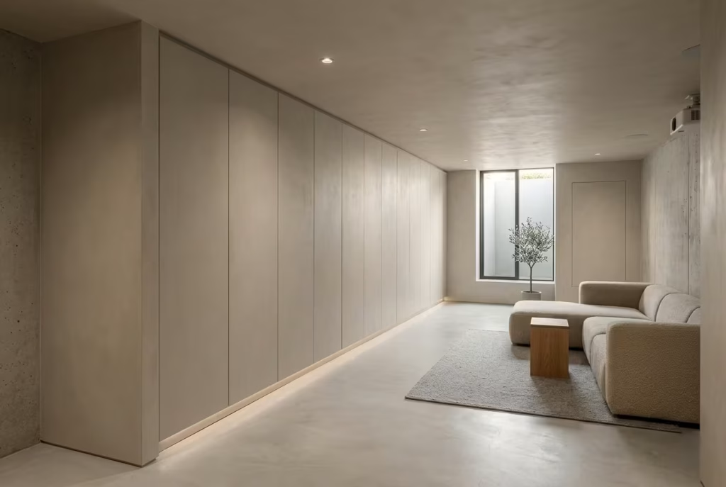
Storage in a basement is often where good intentions quietly go off track. What starts as a practical need tends to accumulate into visual clutter, freestanding units, mismatched cupboards, and awkward gaps that break the rhythm of the room. Before long, the space feels more like a storage depot than a lived-in environment. Built-in storage walls, when designed with restraint and precision, change that dynamic entirely. They allow function to exist without announcing itself.
The key principle here is disappearance, not absence. Storage does not vanish, but it recedes into the architecture so seamlessly that the eye no longer reads it as furniture. Flush cabinetry, handle-less systems, and continuous surface alignment create a single visual plane. The result is a wall that behaves less like a collection of cupboards and more like a quiet extension of the room itself.
In practical terms, I often work within a depth range of 450 to 600mm or roughly 18 to 24 inches for basement storage walls. This allows enough internal capacity for bulk storage, media equipment, seasonal items, or even concealed utilities, without pushing the cabinetry too far into the room. The balance is critical. Too shallow, and the storage becomes ineffective. Too deep, and it starts to dominate the footprint and compromise circulation.
I remember a basement project where storage had been scattered across three separate freestanding units. Each one served its purpose, yet together they fractured the room into visual fragments. Once we replaced them with a continuous built-in wall running nearly 7 metres or about 23 feet, everything changed. The clutter disappeared behind a single architectural surface. What had once felt busy and uneven suddenly felt composed, almost like the room had been quietly reset.
Handle-less design plays a major role in achieving this effect. Even small hardware details can interrupt continuity if they catch the light or create shadow breaks. Push-to-open systems, shadow gaps, or recessed finger pulls allow the surface to remain uninterrupted. When the cabinetry closes, it should read as a single material plane, not a grid of individual doors. It is a subtle shift, but one that dramatically reduces visual noise.
There is also a psychological benefit that often gets overlooked. When storage is visible, even in a subtle way, the mind registers it as clutter, whether it is full or not. By contrast, when storage disappears into the wall, the room feels lighter, even if the actual contents remain unchanged. It is a bit like tidying a workspace where everything has a place but nothing is shouting for attention. The mental clarity that follows is just as important as the visual improvement.
Material selection here needs to align with the broader palette of the basement. In most of my projects, I avoid introducing a contrasting finish for storage walls. Instead, I prefer to match or closely echo the surrounding wall tone, whether that is a soft greige, muted plaster, or warm neutral paint system. When cabinetry blends into the background, it stops competing for attention and starts supporting the architecture.
Lighting, once again, plays a supporting role. A soft linear wash along the base or within subtle reveals can prevent the wall from feeling heavy. It introduces just enough definition to avoid flatness, without breaking the illusion of continuity. The aim is not to highlight the storage, but to allow it to sit comfortably within the spatial composition.
Pros
- Eliminates visual clutter by integrating storage into the architecture
- Maximises usable space without fragmenting the layout
- Creates a calm, continuous wall surface that enhances spatial clarity
- Allows flexible storage capacity while maintaining a minimalist aesthetic
Cons
- Requires precise planning to balance depth, function, and proportion
- Can be costly compared to freestanding storage solutions
- Needs careful detailing to avoid visible breaks or misalignment over time
When built-in storage is executed properly, it stops behaving like furniture altogether. It becomes part of the room’s structure, quietly doing its job without drawing attention to itself. In a basement, where every surface carries visual weight, that kind of discipline is what keeps the space feeling open, intentional, and effortlessly composed.
Sunken Lounge for Depth Variation
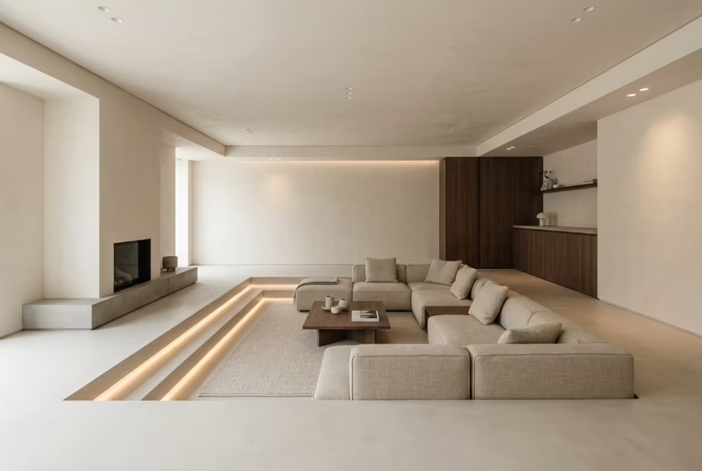
There is something almost architectural about a sunken lounge that goes beyond aesthetics. It changes how a basement is experienced at a fundamental level. Instead of relying on walls or partitions to define zones, it uses a quiet shift in level to create distinction. The result is subtle but powerful, like a whisper in design terms rather than a statement shouted across the room.
In basements where ceilings are already lower than average, zoning becomes a delicate exercise. Heavy partitions can quickly make the space feel boxed in, while open layouts sometimes struggle to establish identity between functions. A sunken lounge offers a third path. By dropping the seating area by just 150 to 300mm or roughly 6 to 12 inches, you introduce a natural sense of enclosure without visually closing anything off.
I have worked on projects where this single move changed the entire reading of the space. In one basement, the main living area initially felt flat and undefined, despite generous square footage of around 8 metres by 6 metres or 26 by 20 feet. Once the lounge was lowered, even slightly, the room gained a sense of hierarchy. It no longer felt like one large undifferentiated box. Instead, it had rhythm, variation, and a clear focal point that anchored everything else around it.
What makes this technique so effective is how it plays with perception. The human eye instinctively reads level changes as boundaries. You do not need walls, screens, or bulky furniture to signal a transition. The step itself does the work. It is a bit like shifting tone in a conversation without raising your voice. The message is clear, but it feels natural rather than forced.
From a spatial psychology perspective, the sunken lounge also creates a feeling of intimacy. By lowering the seating zone, the ceiling above feels marginally higher in contrast, which enhances the sense of volume in that specific area. At the same time, the act of stepping down creates a psychological threshold. You are entering a different mood within the same room, almost like moving into a quieter pocket of space that invites pause and relaxation.
There is also a tactile quality to consider. That slight change in level introduces variation underfoot, which makes the space more engaging to move through. It breaks monotony without relying on additional materials or decorative layering. When finished with consistent flooring or carefully matched materials, the transition feels smooth rather than abrupt, almost as if the architecture itself is gently guiding you downwards.
In one project, we paired a sunken lounge with low-profile modular seating and perimeter lighting tucked into the step edge. The effect was understated but deeply effective. The seating area felt grounded and cocooned, while the surrounding floor plane remained open and fluid. It created a natural focal point without needing a single feature wall or bulky divider. Clients often described it as the most inviting part of the house, which speaks volumes about how powerful subtle level changes can be when handled correctly.
That said, precision is everything here. A poorly proportioned sunken area can feel awkward or intrusive rather than intentional. The depth needs to be carefully calibrated to the overall ceiling height and circulation flow. Drainage, insulation, and structural feasibility also need to be considered early in the design process, especially in basement environments where moisture control is non-negotiable.
Pros
- Creates natural zoning without the need for walls or partitions
- Adds depth and visual interest in otherwise flat basement layouts
- Enhances perceived ceiling height in the sunken area
- Builds a strong focal point that anchors the living space
Cons
- Requires careful structural planning and execution
- Can complicate accessibility if not designed thoughtfully
- Needs precise proportioning to avoid feeling excessive or disconnected
When done well, a sunken lounge does not feel like an addition. It feels like it was always meant to be there. It introduces rhythm into the architecture, breaks monotony without noise, and gives the basement a sense of intention that lingers long after you leave the room.
You May also Like: 25 Beautiful Modern Farmhouse Home Office Ideas for a Stylish Workspace
Minimalist Home Cinema with Concealed Tech
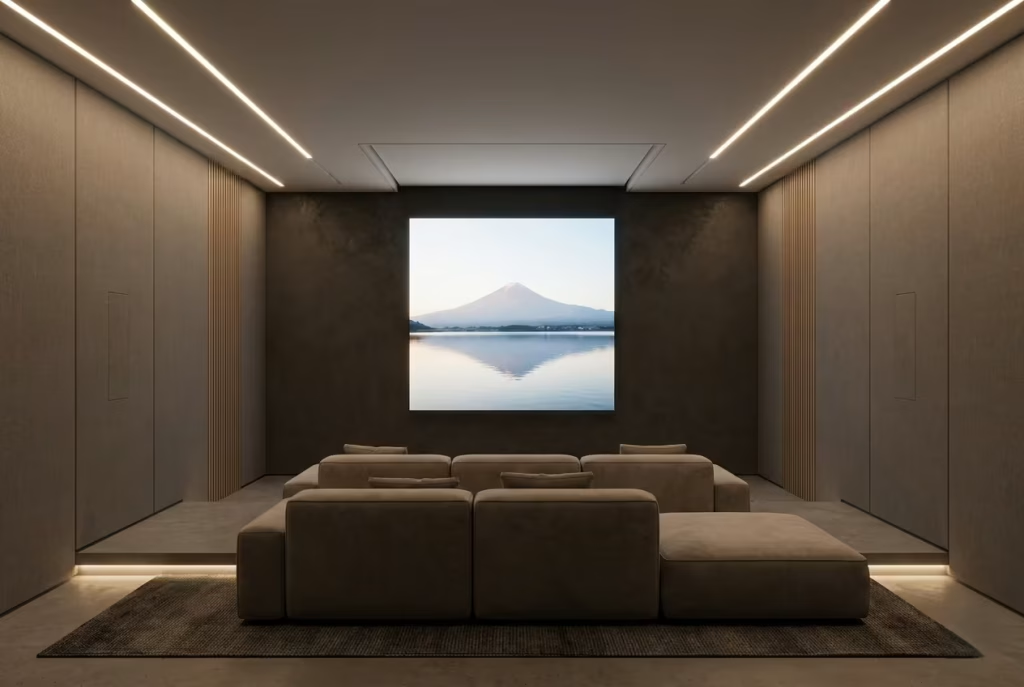
A basement home cinema works best when it disappears into itself. The irony is that the more restrained the design becomes, the more immersive the experience feels. When screens, speakers, and acoustic treatments are properly integrated, the room stops behaving like a collection of equipment and starts functioning as a controlled atmosphere. It is less about showing off technology and more about letting it quietly do its job in the background, almost like a well-rehearsed stage set that never distracts from the performance.
In practice, the challenge is not installing cinema elements, but concealing them without compromising performance. A projector-based system is often the most effective starting point in minimalist basements because it removes the need for a dominant television screen. When paired with a retractable or hidden projection surface, the wall remains clean when the system is not in use. The room, at rest, reads as a calm living space rather than a media-heavy environment.
I have worked on basement conversions where large wall-mounted screens initially dictated the entire layout. They became visual anchors, but not in a good way. Everything in the room seemed to revolve around a single dark rectangle. Once replaced with a ceiling-mounted projector and discreet projection surface, the spatial balance shifted. The wall regained its integrity, and the room felt more open, even when measured dimensions had not changed at all.
Acoustic treatment is another area where restraint makes a noticeable difference. Instead of applying visible foam panels or bulky acoustic inserts, I often integrate sound absorption directly into the architecture. Hidden acoustic panels behind fabric wall systems or within timber slats allow sound quality to be controlled without visual interruption. In one project, we concealed acoustic layers behind full-height joinery panels, which maintained a clean aesthetic while delivering excellent sound performance. The client experienced the room as refined and cinematic, without ever being aware of the technical complexity behind it.
Matte finishes are equally important in maintaining visual control. Basements with reflective surfaces tend to amplify glare from projection systems, which can disrupt immersion and flatten the viewing experience. By using matte paints, microcement, or low-sheen wall finishes, light is absorbed rather than bounced unpredictably around the room. This creates a more grounded visual field, where the screen remains the focal point without competing reflections pulling attention away.
Furniture selection also plays a supporting but essential role. Low-profile seating, often modular in nature, ensures that sightlines remain unobstructed. In a well-designed cinema basement, every seat should feel intentional, not squeezed in or secondary. The layout typically works best when arranged in a gentle stagger or tiered formation, allowing each position to maintain clear visibility without raising the overall height of the room excessively.
There is also a psychological layer at play here. A concealed-tech cinema feels calmer because it removes the constant visual reminder of equipment. When speakers are hidden, cables are invisible, and screens are integrated, the space becomes more about experience than apparatus. It allows the mind to settle more easily into the environment, which is ultimately what a cinema room should do.
Pros
- Creates a visually clean, distraction-free cinematic environment
- Enhances immersion by reducing visible technology and clutter
- Improves acoustic control when systems are properly integrated
- Allows the space to function as both cinema and casual living area
Cons
- Requires early-stage planning for concealment and wiring routes
- Can increase installation complexity compared to exposed systems
- Needs careful calibration to balance aesthetics with acoustic performance
When executed with restraint, a minimalist home cinema does not feel like a dedicated entertainment room in the conventional sense. It feels like a controlled experience, carefully shaped and quietly contained. Nothing competes for attention, yet everything works in harmony. In a basement setting, that kind of quiet discipline is what turns a simple viewing space into something far more atmospheric and enduring.
You May also Like: 25 Relaxing Coastal Home Office Ideas Inspired by Capri Living
Light Reflective Wall Finishes
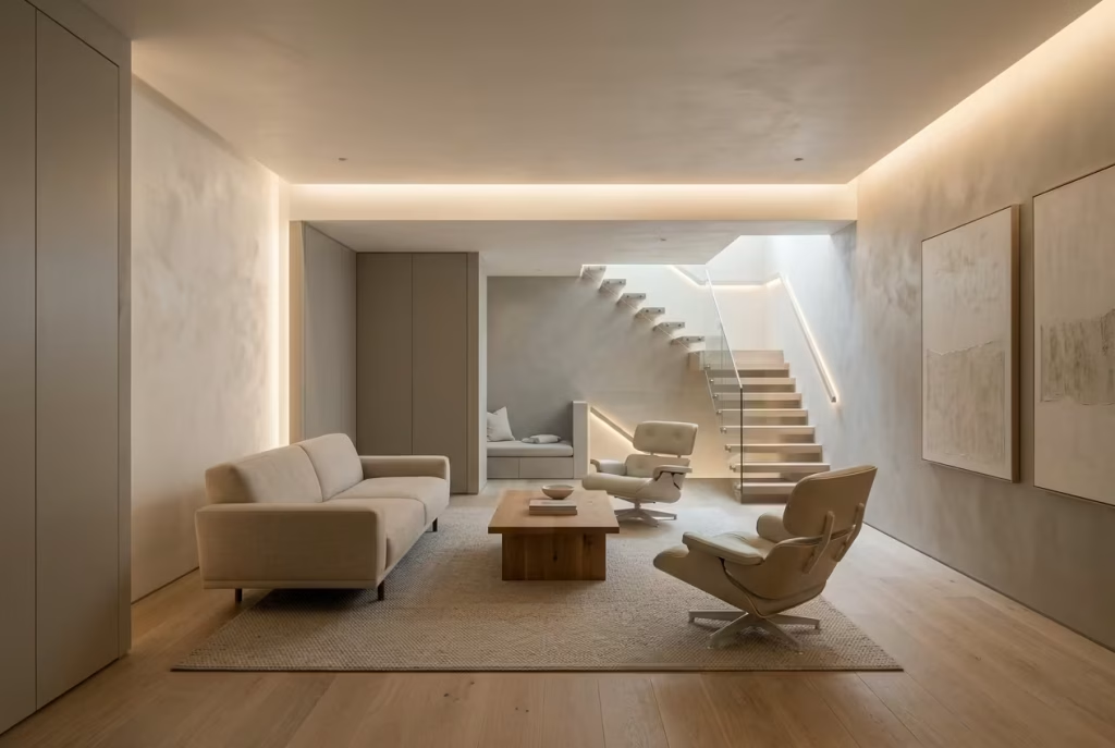
Basements live and die by how they handle light. When daylight is limited and artificial lighting carries most of the visual workload, wall finishes become far more than an aesthetic choice. They act as light modifiers, quietly shaping how brightness travels, softens, and settles across the room. In poorly considered spaces, light hits a surface and dies abruptly, leaving corners heavy and uninspired. In well-resolved minimalist basements, the walls seem to hold and redistribute light, almost like a calm afterthought that changes everything.
The aim here is not high gloss reflection or mirror-like bounce. That approach tends to feel harsh in lower-light environments, often exposing imperfections rather than enhancing atmosphere. Instead, the focus is on controlled reflectivity, surfaces that diffuse light gently, allowing it to wrap around the space rather than bounce off it in sharp, unflattering bursts.
Limewash is one of the most effective finishes for achieving this effect. Its layered mineral composition creates a soft, clouded texture that reacts subtly to changes in lighting throughout the day. In one basement project, we applied a warm-toned limewash across all primary wall surfaces, and the transformation was immediate. Under low evening lighting, the walls no longer felt flat or inert. Instead, they carried a quiet depth, as though the surface itself had absorbed and redistributed the light in a more forgiving way.
Satin paint sits in a slightly different category. It offers a controlled sheen without tipping into glare. When used carefully in basements, particularly in warm neutrals or softened whites, it helps reflect just enough light to prevent the space from feeling visually heavy. I often find it works best in combination with layered lighting systems, where the paint finish supports rather than competes with the lighting design.
Microcement introduces another dimension altogether. Its continuous, seamless application removes visual breaks, while its matte to soft-satin finish allows for a more grounded, architectural reading of surfaces. In a basement where walls can sometimes feel fragmented due to structural interruptions, microcement helps unify the entire envelope. I have used it in spaces where the goal was to make the room feel carved rather than built, and it consistently delivers that sense of quiet solidity.
What matters most, however, is not the material alone, but how it interacts with light. A reflective surface in isolation means very little. But when paired with carefully positioned lighting, recessed strips, wall washers, or concealed uplighting, it becomes part of a larger conversation. Light no longer behaves as a single source hitting flat planes. It becomes layered, softened, and distributed in a way that feels almost atmospheric.
There is also a practical advantage that often goes unnoticed. Light-reflective finishes can reduce the need for excessive lighting fixtures. Because the surfaces themselves assist in spreading illumination, the room feels brighter with fewer visible sources. This helps maintain ceiling clarity, which is especially important in basements where overhead clutter can quickly overwhelm the spatial perception.
Pros
- Enhances natural and artificial light diffusion for a softer overall atmosphere
- Reduces the need for excessive lighting fixtures, keeping ceilings visually clean
- Works across multiple finishes, including limewash, satin paint, and microcement
- Helps unify fragmented basement surfaces into a cohesive visual field
Cons
- Requires careful application to avoid uneven texture or tonal inconsistency
- Some finishes, like limewash, may need maintenance or reapplication over time
- Incorrect sheen selection can still result in unwanted glare in poorly lit zones
When handled with intention, light reflective finishes do more than improve brightness. They reshape the emotional temperature of the space. A basement that once felt dense or uneven begins to feel softened, more forgiving, and far more liveable. It is a quiet shift, but one that fundamentally changes how the room is experienced, especially in those long, low-light hours where atmosphere matters most.
Glass Partition Instead of Solid Walls
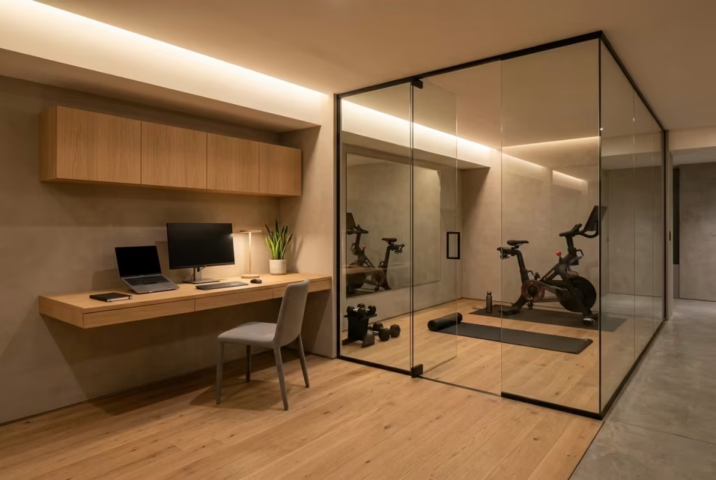
In basement design, walls are often the quickest solution to zoning, but not always the smartest. Solid partitions can divide space efficiently on paper, yet they frequently come at the cost of openness. In a below-ground environment where light is already limited and sightlines are precious, every solid barrier risks shrinking the room further. Glass partitions offer a far more considered alternative, allowing separation without sacrificing visual continuity.
The real strength of glass lies in its ability to define function without interrupting flow. It creates a boundary that the eye understands but does not feel blocked by. The space remains legible as a whole, even when divided into distinct uses. It is a subtle distinction, but one that completely changes how a basement behaves, especially when multiple activities need to coexist within a single footprint.
I have worked on several basement projects where the brief included both a home gym and a workspace within the same open area. Initially, the instinct was to build solid stud walls to separate the two. On drawings, it looked tidy and efficient. In reality, it would have split the room into smaller, more compressed zones. Instead, we introduced full-height glass partitions with slim metal framing, and the transformation was immediate. Each zone gained identity, but the overall space retained its sense of volume.
One of the most effective configurations I have used involves clear or lightly tinted glass with minimal framing, typically in matte black or soft bronze. The key is restraint. Heavy frames or excessive mullions can quickly defeat the purpose by reintroducing visual fragmentation. When done correctly, the structure almost disappears, leaving only a faint architectural outline that defines space without dominating it.
From a functional standpoint, glass partitions also support natural light transfer, even in basements where daylight is limited. Artificial lighting placed in one zone can spill visually into the next, softening transitions and preventing isolated pockets of darkness. In one project, a gym area positioned behind a glass divider benefited directly from the ambient lighting of the adjacent lounge, which reduced the need for additional fixtures and kept the ceiling visually clean.
Acoustics are often raised as a concern, and rightly so. Glass does not perform like a solid wall in sound control, but this can be addressed through careful detailing. Double-glazed panels, acoustic seals, and strategic placement of soft furnishings within each zone help manage sound levels effectively. It is less about eliminating noise entirely and more about controlling its behaviour so that each space retains its own atmosphere without becoming disconnected.
There is also a psychological benefit that should not be overlooked. Glass partitions create a sense of connection while still offering separation. You remain aware of the broader space, which prevents the feeling of isolation that solid walls often introduce in basement environments. This is particularly valuable in home gyms or office areas, where a sense of openness can make the space feel more motivating and less enclosed.
I often describe glass partitions as the architectural equivalent of a pause rather than a stop. They interrupt just enough to define function, but not enough to break rhythm. That balance is what makes them so effective in minimalist basements, where every decision needs to support both clarity and continuity.
Pros
- Maintains visual continuity while clearly defining functional zones
- Allows borrowed light and visual connection between areas
- Keeps basement layouts feeling open and less compartmentalised
- Works well for multi-use spaces such as gyms, offices, or studios
Cons
- Offers limited acoustic privacy compared to solid walls
- Requires precise installation and detailing to avoid visual clutter
- Can show fingerprints or smudges if not maintained properly
When used thoughtfully, glass partitions do not divide a basement. They organise it. They introduce structure without heaviness, clarity without confinement. In spaces where openness is already under pressure, that kind of restraint feels less like a design choice and more like a necessity handled with care.
Floating Staircase Connection
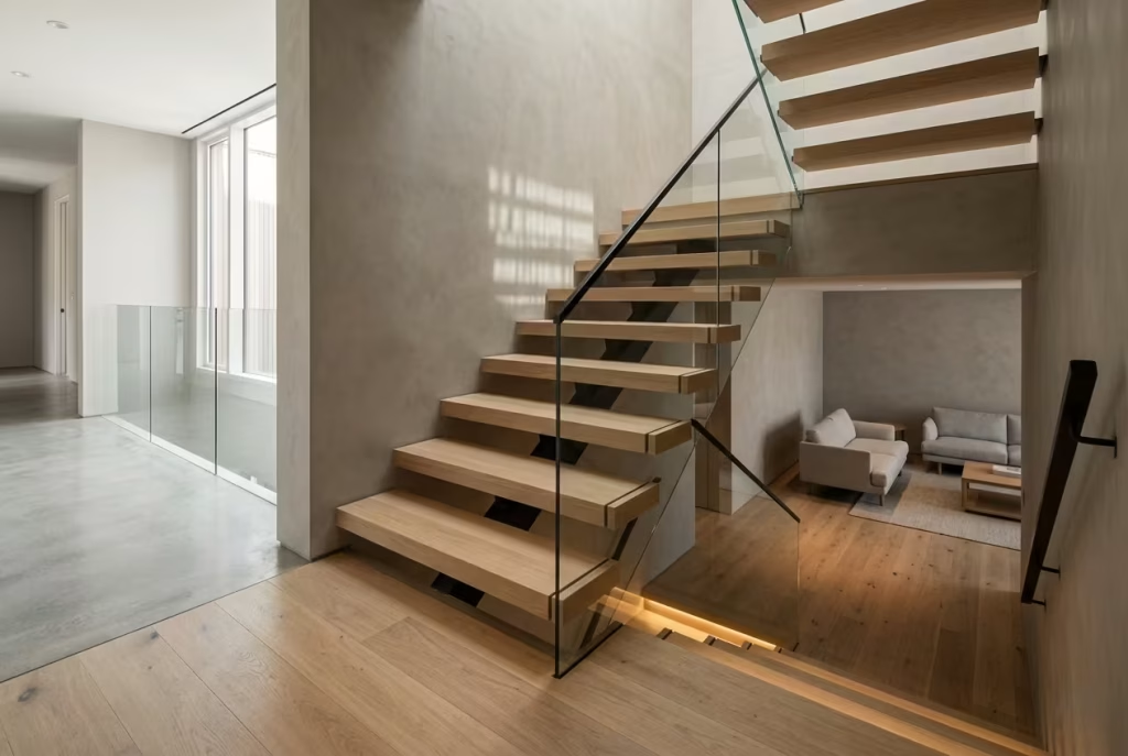
A basement staircase is often treated as a purely functional transition, a means of getting from one level to another without much thought given to how it shapes perception. In reality, it is one of the most powerful visual connectors in the entire home. It is the moment where the basement either feels like an isolated afterthought or a natural continuation of the upper floors. A floating staircase, when designed with restraint, changes that narrative completely.
The defining feature here is openness. Open risers allow light to pass through the structure rather than being blocked by solid treads. This simple shift has a surprisingly large impact. Instead of casting a heavy shadow into the basement entrance, the staircase becomes permeable, almost weightless in appearance. Light filters through, moving between levels like a quiet exchange, softening what is often the darkest point of the home.
I have worked on projects where the original staircase was a solid boxed structure, and the basement immediately felt cut off the moment you reached the bottom step. It created a psychological boundary as much as a physical one. Once replaced with a floating design, the entire atmosphere changed. The basement no longer felt like a separate world. It became part of a continuous spatial journey, as if the architecture itself had decided to breathe more freely.
The visual effect of a floating staircase is equally important. Slim treads, typically in timber or steel, appear to hover without heavy support. When paired with concealed structural fixings or side stringers hidden within walls, the staircase reads less like a bulky insertion and more like a carefully composed line within the space. This sense of lightness is particularly valuable in basements, where vertical pressure can otherwise dominate the experience.
One project that stands out involved a narrow basement entrance of around 1 metre or 3.3 feet in width. A traditional staircase would have overwhelmed the area immediately. Instead, we designed a floating oak staircase with open risers and a minimalist steel spine. The result was transformative. Rather than compressing the entry point, it expanded it visually. The eye could see through the structure, up toward the upper floor, which created a constant visual link between levels.
That connection matters more than it might seem at first glance. In well-designed homes, movement between floors should feel fluid, not segmented. A floating staircase helps maintain that continuity. You are never fully leaving one space or entering another in a harsh, abrupt way. Instead, you are transitioning through a shared architectural language, where each level feels like part of a larger composition.
There is also a subtle interplay with light that makes this approach particularly effective in basements. When positioned near natural light sources, such as stairwell windows or light wells, floating stairs help carry that light downward. Even in artificial lighting conditions, carefully placed wall washers or step lighting can enhance the sense of depth without adding visual weight.
Of course, this is not just about aesthetics. Safety and structural integrity are non-negotiable. Open riser designs must comply with building regulations, particularly in residential settings where spacing and load-bearing requirements are strict. The engineering behind a floating staircase is often more complex than it appears, which is why precision in design and execution is essential.
Pros
- Allows natural and artificial light to flow between levels
- Creates a strong visual connection between basement and upper floors
- Reduces visual bulk, making entrance areas feel more open
- Enhances architectural continuity across the home
Cons
- Requires careful compliance with building codes and safety regulations
- Can feel less private compared to enclosed stair designs
- Needs precise engineering to maintain structural stability and clean detailing
When executed properly, a floating staircase does not simply connect floors. It connects experiences. It turns a transition point into a design feature that quietly elevates the entire home. In a basement setting, where separation is often the default condition, that sense of openness and continuity becomes a defining advantage, almost like a visual thread stitching the architecture together from top to bottom.
Minimalist Basement Bedroom Suite
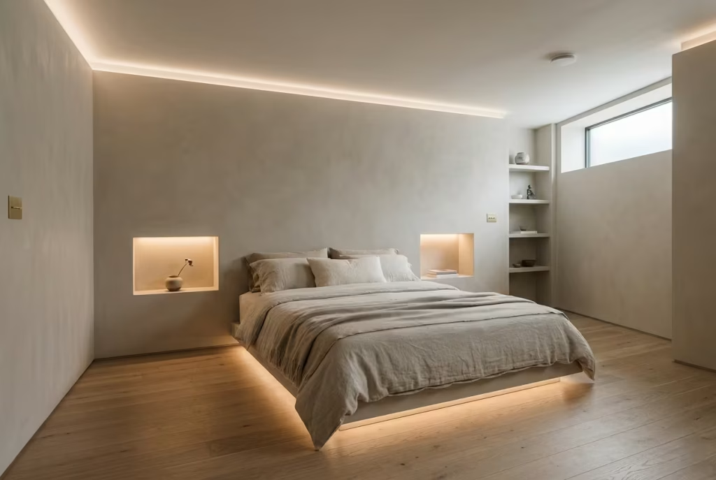
A basement bedroom carries a very different responsibility compared to other sleeping spaces in the home. It is not just about comfort or style, but about creating a sense of calm in an environment that can easily feel enclosed or heavy if not carefully handled. In minimalist design, the bedroom becomes less about filling space and more about refining it until everything unnecessary quietly falls away.
The platform bed is often the anchor point of this entire composition. Keeping the bed height under 300mm or roughly 12 inches changes the visual weight of the room immediately. Instead of sitting high and dominant, the bed settles closer to the floor plane, which in turn increases the perceived height of the surrounding walls. It is a subtle optical shift, but one that makes the room feel less compressed and more grounded at the same time. The effect is almost like lowering the volume in a crowded room so you can finally think clearly again.
I have worked on basement bedroom suites where traditional bed frames initially made the space feel tighter than it needed to be. The moment we switched to a low platform design, the proportions started to make more sense. The room felt wider, the ceiling felt less imposing, and the overall atmosphere became noticeably calmer. Nothing else changed structurally, yet the emotional reading of the space shifted in a way that clients immediately picked up on.
Built-in niches replace the need for bulky bedside tables in this type of layout. Instead of introducing additional furniture that competes for floor space, the wall itself becomes functional. Recessed shelving at a carefully considered height, typically around 450 to 600mm or 18 to 24 inches from the floor, provides just enough surface for essentials without breaking the visual continuity of the room. It is one of those details that feels almost invisible when done well, yet deeply frustrating when absent.
There is also a psychological clarity that comes with reducing surface clutter in a sleeping environment. When your immediate surroundings are visually quiet, your mind tends to follow suit. A basement bedroom, in particular, benefits from this sense of restraint. Without natural light as a dominant feature, the space relies heavily on composition, proportion, and material control to establish comfort. Too many objects, even small ones, can quickly tip the balance.
In one project, the bedroom was part of a larger basement suite measuring approximately 5 metres by 4 metres or 16 by 13 feet. Initially, the space felt functional but slightly cluttered due to freestanding furniture. Once we integrated the storage into the walls and introduced a low platform bed with recessed lighting beneath it, the entire room shifted. It felt less like a collection of furniture and more like a single, continuous environment designed for rest.
Lighting in these spaces also benefits from restraint. Instead of relying on bedside lamps, which add visual weight, integrated lighting within the niches or subtle wall washes can provide just enough glow for nighttime use. The aim is not to flood the room with brightness but to create layers of soft illumination that support relaxation without disturbing the calm rhythm of the space.
Material choices should follow the same principle. Soft neutrals, muted textiles, and low-contrast finishes help maintain a cohesive visual field. When everything speaks the same tonal language, the room stops competing for attention and starts working as a unified whole. It is a bit like a well-composed piece of music where no single note tries to overpower the rest.
Pros
- Enhances perceived ceiling height through low platform proportions
- Reduces visual clutter by integrating storage and surfaces into the architecture
- Creates a calm, cohesive environment ideal for rest and relaxation
- Maximises usable floor space in compact basement layouts
Cons
- Requires careful planning for built-in elements during early design stages
- Limited flexibility compared to freestanding furniture arrangements
- Can feel overly minimal if not balanced with soft textures and layering
When thoughtfully designed, a minimalist basement bedroom suite becomes more than just a place to sleep. It becomes a space that actively supports rest by removing visual tension and unnecessary distraction. In a setting where enclosure can easily become overwhelming, that sense of quiet control is what allows the room to feel not just functional, but genuinely restorative.
Compact Basement Kitchenette
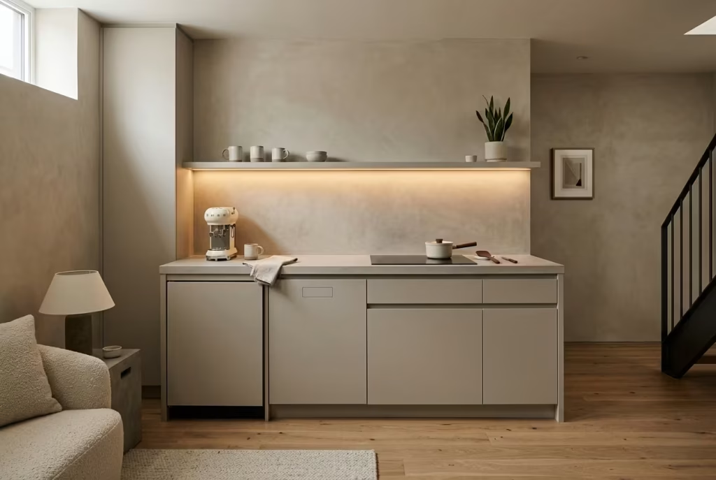
A basement kitchenette is where discipline in design truly gets tested. Unlike larger kitchens that can absorb inefficiency through scale, compact layouts expose every unnecessary gesture. There is no room for excess, no tolerance for awkward gaps or decorative indulgence that does not serve a clear function. Everything has to earn its place, quietly and deliberately, as if every centimetre has been accounted for in advance.
The linear layout, kept under 2.4 metres or roughly 8 feet, becomes the backbone of this approach. It forces clarity. Instead of spreading functions across multiple walls, everything is arranged in a single, controlled run. Sink, preparation surface, and integrated appliances sit in a logical sequence, almost like a measured rhythm rather than a scattered arrangement. I have seen this configuration transform basements that once felt fragmented into spaces that suddenly felt structured and purposeful.
On one project, the original kitchenette occupied two opposing walls, which created constant interruption in movement and visual flow. It felt functional on paper but disjointed in reality. By consolidating everything into a single linear unit, the space immediately gained coherence. The room stopped feeling like a series of compromises and started behaving like a properly resolved interior, where every element supported the next without friction.
Integrated appliances are essential in maintaining this level of clarity. When appliances sit flush within cabinetry, they stop breaking the visual plane. A built-in fridge, concealed dishwasher, and induction hob embedded into the counter allow the kitchenette to read as a continuous surface rather than a collection of separate machines. It is a bit like smoothing out a conversation so it no longer feels interrupted by unnecessary pauses.
In basements, where light is already limited and surfaces carry more visual weight, this continuity becomes even more important. Glossy or protruding appliances can easily dominate the space, reflecting light unpredictably and creating visual noise. By contrast, integrated units in matte or low-sheen finishes allow the kitchen to sit quietly within the architecture, supporting the space rather than competing with it.
There is also a practical benefit that often goes unnoticed. A well-designed linear kitchenette improves circulation. With everything aligned along one wall, the remaining space is freed up for movement, seating, or adjacent functions such as a lounge or workspace. In compact basements where every square metre matters, this efficiency is not just desirable, it is essential.
I recall a basement project measuring roughly 6 metres by 4.5 metres or about 20 by 15 feet, where space was at a premium. The original kitchen design felt intrusive, breaking the room into uneven fragments. Once reconfigured into a single 2.4 metre linear kitchenette with integrated appliances, the entire basement opened up. What had once felt constrained suddenly gained breathing room, as if the architecture had been given space to settle.
Material selection also plays a subtle but important role here. Continuity in cabinetry finish, often in soft neutrals or muted timber tones, helps the kitchenette blend into the wider basement palette. Handles are typically avoided in favour of push-to-open systems or discreet recesses, which keeps the surfaces uninterrupted and visually calm.
Lighting should be treated with equal restraint. Under-cabinet LED strips or concealed linear lighting work far better than exposed fixtures, as they provide functional brightness without adding clutter. The goal is not to spotlight the kitchenette as a separate feature, but to let it exist quietly within the overall composition of the space.
Pros
- Maximises efficiency in compact basement layouts without sacrificing function
- Maintains visual clarity through integrated appliances and continuous surfaces
- Improves circulation by freeing surrounding floor space
- Blends seamlessly into minimalist interior schemes
Cons
- Limited preparation and storage space compared to full kitchens
- Requires careful planning to ensure appliance integration is precise
- Less flexibility for multi-user or high-activity cooking environments
When designed with restraint and intention, a compact basement kitchenette does not feel like a compromise. It feels like a distilled version of a larger kitchen, stripped of noise and excess until only the essentials remain. In a basement environment where clarity is everything, that sense of focus can make the space feel far more capable than its size first suggests.
Neutral Layering Instead of Colour Contrast
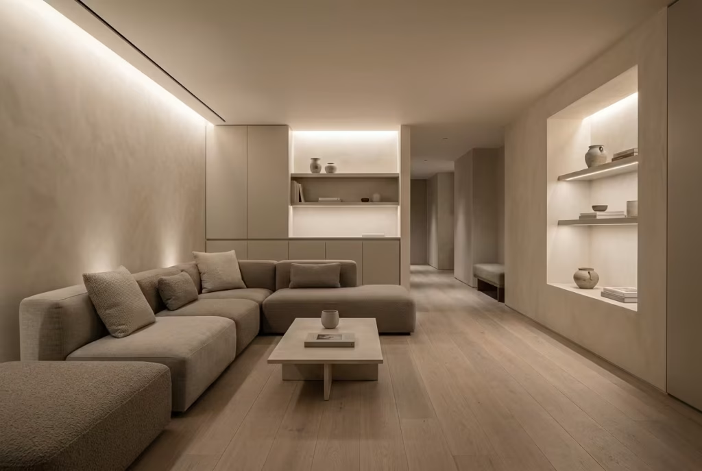
Neutral layering is often misunderstood as a safe design choice, something reserved for spaces that avoid risk. In reality, when handled with precision, it becomes one of the most powerful tools for shaping atmosphere in a basement. Unlike bold contrast, which tends to fracture space into visual segments, tonal layering works quietly in the background, building depth without ever breaking the flow. It is less about what you add, and more about how subtly each element speaks to the next.
In basement environments, this approach is particularly effective because it avoids the common trap of visual interruption. Strong colour contrasts can feel like sharp cuts in perception, especially in spaces where light is already limited. Instead of guiding the eye smoothly, they often create stop-start moments that make the room feel smaller than it is. Neutral layering avoids this entirely, allowing the space to read as a continuous, cohesive field.
The principle is simple in theory but nuanced in execution. Rather than introducing multiple unrelated colours, you work within a restrained palette, usually variations of warm whites, soft greiges, muted taupes, and gentle earthy undertones. The real skill lies in how these tones are distributed. Walls, flooring, joinery, and textiles each carry a slightly different depth within the same family, creating a layered effect that feels rich without being visually noisy.
I have worked on basement projects where the original design relied heavily on contrast, dark feature walls against light flooring, bold accent furniture, and mixed finishes throughout. While each element looked interesting in isolation, the overall space felt fragmented. Once we reworked the palette into a tonal system, keeping everything within a closely related range of neutrals, the transformation was immediate. The room stopped feeling like a collection of statements and started behaving like a single, unified environment.
What makes neutral layering so effective is how it interacts with light. In basements, where natural light is often minimal or indirect, colour behaves differently. Strong contrasts can become harsh under artificial lighting, whereas tonal variation absorbs and reflects light more gently. A soft shift from one neutral to another allows light to move across surfaces without interruption, creating a sense of depth that feels almost atmospheric rather than applied.
In one project measuring around 7 metres by 5 metres or roughly 23 by 16 feet, we used a layered neutral scheme across plastered walls, oak flooring, and upholstered seating. Each material sat within the same tonal bracket, but none matched exactly. The flooring carried a slightly warmer undertone, the walls leaned more towards soft limestone, and the textiles introduced a muted taupe. The effect was subtle, yet powerful. The space felt larger, calmer, and far more resolved, as though every surface was part of the same conversation.
This approach also helps reduce visual fatigue. When the eye is not constantly jumping between contrasting colours, it settles more easily into the space. That sense of ease is particularly valuable in basements, which can sometimes feel enclosed or heavy if not carefully balanced. Neutral layering softens that experience, making the environment feel more breathable and less visually demanding.
From a practical standpoint, this method also offers flexibility over time. Because the palette is restrained, it becomes easier to introduce or update elements without disrupting the overall harmony. Furniture, artwork, or decorative accents can evolve naturally within the same tonal framework without forcing a redesign of the entire space.
Pros
- Creates a cohesive and continuous visual flow without harsh interruptions
- Enhances the perception of space by reducing visual fragmentation
- Works exceptionally well in low-light basement environments
- Allows flexible styling and future updates without losing harmony
Cons
- Requires careful control of undertones to avoid a flat or washed-out look
- Can feel understated if not balanced with texture and material variation
- Demands precision in lighting to reveal depth within similar tones
When executed well, neutral layering does not draw attention to itself. It works quietly, almost invisibly, shaping how the space is experienced rather than how it is seen. In a basement, where clarity and calm often feel like a luxury, this approach becomes less of a style choice and more of a spatial strategy that holds everything together with quiet confidence.
Exposed Structural Elements, Refined
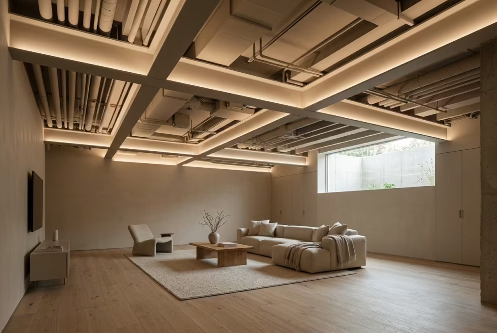
Basements often come with a structural honesty that cannot be avoided. Beams, columns, duct runs, and service lines are part of the architecture whether you want them or not. The real question is not whether to expose them, but how to treat them so they contribute to the space rather than dominate it. Left unrefined, they can feel heavy and disruptive. Treated with intention, they can become part of a quiet architectural rhythm that supports the overall composition.
Refinement here is not about hiding structure, but about softening its presence. When every exposed element competes for attention, the ceiling begins to feel busy and fragmented. The eye constantly jumps from one detail to another, never settling. In a basement, where vertical space is already limited, this can make the room feel more compressed than it actually is. The solution lies in visual unification rather than elimination.
One of the most effective approaches is to paint beams and structural elements in the same colour as the ceiling. This simple decision changes how the entire surface is read. Instead of seeing individual components, the eye begins to perceive a continuous plane. The structure is still present, but it recedes into the background, almost like a quiet framework holding everything together without announcing itself.
I have worked on basements where exposed timber or steel beams originally created a strong visual interruption. Each element was treated as a separate feature, which sounded appealing in theory but resulted in a ceiling that felt overly segmented. Once we unified everything under a consistent tonal finish, typically a soft warm white or muted grey, the transformation was immediate. The ceiling stopped feeling busy and started feeling composed, as though the structure had finally found its place within the design rather than sitting on top of it.
There is a subtle but important distinction here. The goal is not to erase character, but to prevent it from overwhelming the space. Exposed elements can add depth and authenticity, especially in modern basement conversions, but only when they are visually disciplined. When treated as part of a single language rather than isolated features, they begin to support the architecture instead of competing with it.
In one project, a basement with visible steel beams and service runs initially felt visually heavy, almost industrial in a way that was unintentional. The ceiling read as fragmented, and the room felt lower than its actual 2.4 metre or roughly 7.8 foot height. By aligning all structural elements in a single matte finish that matched the ceiling, the perception shifted dramatically. The eye no longer stopped at each beam. Instead, it moved across the ceiling as one continuous surface, which immediately improved the sense of openness.
Lighting integration also plays a crucial role in refining exposed structure. Rather than adding surface-mounted fixtures that further clutter the ceiling, concealed linear lighting or recessed channels can be aligned with structural lines. This creates a sense of order, as if the lighting is following the architecture rather than competing with it. The result is a ceiling that feels intentional, even when the structure itself is inherently complex.
From a material standpoint, matte finishes tend to work best in these situations. Glossy surfaces can highlight imperfections and draw unnecessary attention to structural irregularities. A low-sheen or completely matte treatment allows light to fall gently across surfaces, reducing contrast and helping everything sit within the same visual field.
Pros
- Unifies complex structural elements into a cohesive visual system
- Reduces ceiling fragmentation, improving perceived height and openness
- Preserves architectural character without visual clutter
- Works effectively with integrated lighting strategies
Cons
- Requires precise colour matching to avoid uneven visual breaks
- Can feel flat if not balanced with texture elsewhere in the space
- Demands careful lighting design to prevent shadows from becoming dominant
When handled with restraint, exposed structural elements stop being a visual challenge and start becoming part of the design language. In basements especially, this kind of refinement is what separates a space that feels busy and unresolved from one that feels calm, deliberate, and quietly confident in its own structure.
Continuous Ceiling Treatment
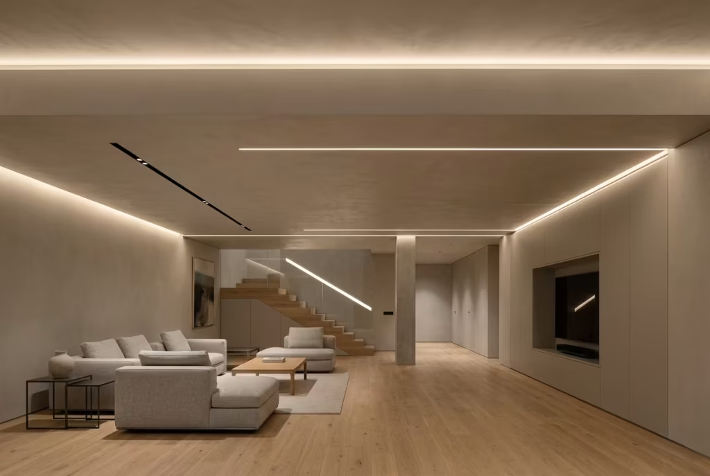
A basement ceiling carries more visual influence than people often realise. Because the eye naturally registers the ceiling plane as the boundary of the room, any break, change in finish, or patchwork of details tends to register immediately. In a space that is already working with lower height and less natural light, that is enough to make the room feel chopped up before it has even had a chance to settle. A continuous ceiling treatment avoids that problem by keeping one finish consistent across the entire surface, allowing the ceiling to behave as a single, calm field rather than a collection of interruptions.
I have seen basements where the ceiling was treated in sections, one finish over the seating area, another above circulation, and a different detail around services or structural beams. Each decision may have seemed minor on its own, but together they created a ceiling that felt busy and slightly restless. The eye had nowhere to rest. When we later unified the entire surface with one coherent treatment, the room changed almost overnight. It felt more expansive, more deliberate, and far less fragmented. That is the hidden power of continuity. It works quietly, but it works hard.
One finish throughout also helps the architecture read more honestly. Instead of drawing attention to changes in construction or service routing, it smooths over them visually and allows the room to present itself as one complete environment. This is especially valuable in basements where ducting, joists, access panels, and lighting runs can easily become a visual mess if each one is handled differently. A consistent ceiling turns those practical necessities into background noise rather than foreground drama.
From a design perspective, the ceiling finish should ideally support the rest of the material palette without competing with it. In most cases, I favour soft matte or low-sheen finishes because they absorb light gently and avoid the harsh bounce that can make a low ceiling feel even more oppressive. A warm white, muted greige, or refined plaster effect often performs beautifully because it keeps the ceiling visually quiet while still giving the room a sense of depth. The goal is not to make the ceiling invisible, but to make it disappear just enough that the room feels taller and more settled.
There is also a strong psychological benefit to this approach. A continuous ceiling reduces visual friction, and when the eye is not constantly stopping and starting, the whole space feels calmer. That matters in a basement, where the environment can already feel enclosed or subterranean. A smooth, uninterrupted overhead plane helps ease that feeling. It is a bit like clearing clutter from a desk. Nothing dramatic has changed, yet the mind immediately feels lighter.
In one project I worked on, the basement ceiling incorporated beams, access hatches, and multiple service routes. Rather than highlighting each element in a different way, we resolved them into a single ceiling treatment using a consistent matte finish and carefully integrated lighting. The result was far more successful than a heavily detailed approach would have been. The room felt cohesive, the ceiling receded, and the whole basement gained a sense of composure that had been missing before.
Pros
- Reduces visual segmentation and helps the room feel larger
- Makes structural and service elements recede rather than dominate
- Creates a calmer, more unified ceiling plane
- Works especially well in low-ceiling basements where every visual break matters
Cons
- Requires careful planning so access panels and services do not interrupt the finish
- Can feel flat if lighting and material texture are not considered properly
- Demands precision during installation to avoid visible inconsistencies
A continuous ceiling treatment does not ask for attention, which is exactly why it succeeds. It lets the room hold together with quiet confidence, removing unnecessary visual stops and allowing everything below it to feel more open, more refined, and far more intentional. In a basement, that kind of restraint is worth its weight in gold.
Minimalist Workspace with Built-In Desk
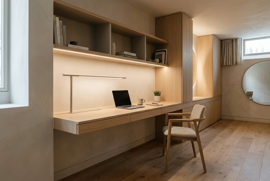
A basement workspace only succeeds when it stops behaving like a piece of furniture and starts acting like part of the architecture. The moment a desk is treated as a standalone object, it immediately introduces visual interruption, which is exactly what compact or low-light basement environments cannot afford. A built-in desk resolves this by embedding function directly into the wall, allowing the workspace to feel intentional, stable, and quietly integrated rather than placed as an afterthought.
The standard depth of around 600mm or 24 inches is not arbitrary. It strikes a practical balance between usability and spatial restraint. Anything shallower begins to feel compromised, especially when working with devices, documents, or dual-screen setups. Anything deeper starts to intrude into circulation space, which in basements is often already limited. This dimension, when carefully handled, allows the desk to perform efficiently without visually dominating the room.
Wall-mounted construction plays a critical role in maintaining that sense of lightness. By lifting the desk off the floor plane, even by a modest margin, you immediately restore visual continuity beneath it. The floor becomes uninterrupted again, which isup breathing room that was not there before.
In one project, the workspace was originally defined by a heavy freestanding desk placed against a narrow wall in a basement measuring roughly 4 metres by 3 metres or 13 by 10 feet. The setup worked functionally but visually overwhelmed the space. Once we replaced it with a continuous built-in desk running along the wall, integrated into a linear storage system, the room transformed. The desk no longer read as an object. It became part of the wall composition, and the space immediately felt more disciplined and expansive.
Integrated storage is where this approach becomes truly effective. Instead of introducing separate drawers or shelving units, everything is absorbed into the wall system. Niches, concealed cabinets, and flush storage compartments allow the workspace to function without visual fragmentation. The eye is no longer distracted by multiple furniture pieces competing for attention. Instead, it reads a single, coherent architectural gesture.
Lighting should be treated with equal restraint. A continuous LED strip integrated beneath the upper shelf or within a recessed pelmet provides even illumination without cluttering the wall with additional fixtures. This kind of lighting does not announce itself. It simply supports the workspace, reducing shadow build-up and keeping the surface visually clean. In basements where natural light is often secondary, this becomes an essential layer rather than an optional detail.
There is also a psychological advantage to this level of integration. A built-in desk reduces the sense of temporary occupation. The space feels settled, as if it was designed specifically for focused work rather than adapted out of necessity. That subtle shift in perception can make a noticeable difference in concentration and comfort over longer periods.
Material selection reinforces this calmness. Matching the desk surface with surrounding wall tones or joinery finishes helps maintain continuity, while subtle texture variation prevents the space from feeling sterile. It is a careful balance between presence and disappearance, where the workspace is clearly defined but never visually loud.
Pros
- Keeps floor area visually open, improving spatial perception in compact basements
- Integrates seamlessly into wall systems, reducing furniture clutter
- Supports focused work through a calm, controlled environment
- Allows efficient use of storage without disrupting visual continuity
Cons
- Requires precise planning during early design stages for wiring and storage integration
- Limited flexibility compared to freestanding desk setups
- Can feel too fixed if future layout changes are required
When executed properly, a minimalist built-in workspace does not feel like a desk placed in a basement. It feels like a natural extension of the architecture itself. It supports work quietly in the background, without ever interrupting the calm rhythm of the space, which in a minimalist basement is exactly where its strength lies.
Hidden Utility Zones
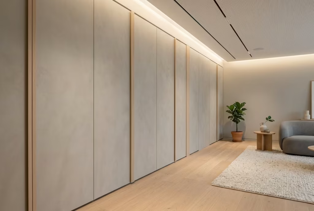
Utility spaces are the backbone of any basement, yet they are often the most visually disruptive if not carefully handled. Laundry appliances, cleaning equipment, boilers, and storage essentials are all necessary, but when left exposed or loosely arranged, they can quickly unravel the calm rhythm of a minimalist interior. Hidden utility zones solve this tension by allowing function to exist in full capacity while disappearing from view, almost like the machinery of a well-run system quietly operating behind a closed door.
The core principle here is concealment through continuity. Instead of treating utility areas as separate rooms or exposed corners, they are absorbed into the architecture using flush panels that align perfectly with surrounding surfaces. When closed, these panels read as part of a continuous wall system rather than a collection of access points. The eye no longer registers a “service area.” It simply sees a unified spatial envelope, which is exactly the intention.
In basement projects where space is already under pressure, this approach becomes even more valuable. I recall one renovation where the laundry zone was originally positioned in a highly visible corner, immediately breaking the flow of the main living space. Every time you entered the room, your attention was pulled toward machines, shelving, and exposed pipework. Once we reconfigured the layout and concealed everything behind full-height, handle-less panels, the entire atmosphere shifted. The room stopped feeling like it was working around utilities and started feeling like a cohesive living environment.
Depth planning is critical in these systems. Utility cabinetry typically requires a depth range that accommodates appliances comfortably, often between 600mm and 700mm or roughly 24 to 28 inches depending on equipment specifications. The challenge is not just fitting everything in, but doing so without pushing the cabinetry too far into the room. Poor planning at this stage can quietly compromise circulation, which becomes noticeable over time in compact basements.
Integrated appliances play a major role in maintaining this visual discipline. When washing machines, dryers, or even compact utility sinks are built into cabinetry systems rather than left freestanding, the entire zone becomes more controlled. Front-facing alignment allows panels to sit flush, reinforcing the idea that this is part of the architecture rather than a functional add-on. In one project, we even concealed a full laundry stack within a wall of joinery that, when closed, read as a simple storage surface. Visitors would often be surprised when the entire system opened to reveal a fully operational utility space.
The success of hidden utility zones also depends heavily on hardware detailing. Handle-less systems, push-to-open mechanisms, and shadow gaps ensure that nothing interrupts the visual plane. Even small protrusions can break the illusion of continuity, which is why precision becomes non-negotiable. When everything aligns correctly, the cabinetry behaves almost like a wall that occasionally opens rather than a storage unit sitting in plain sight.
There is also a psychological benefit to this level of concealment. Basements are often multi-functional by nature, and visible utility elements can create a sense of unfinished business in the mind. By removing them from view, the space feels calmer and more intentional. It is easier to relax, focus, or entertain when the background noise of domestic function is visually suppressed.
Ventilation and accessibility still need to be carefully addressed, of course. A hidden system is only successful if it remains practical to use over time. Adequate airflow, service access points, and maintenance clearance must be integrated from the beginning. When these considerations are overlooked, the design may look clean initially but become frustrating in daily use.
Pros
- Eliminates visual clutter by concealing laundry and utility functions behind seamless joinery
- Maintains a calm, uninterrupted architectural language throughout the basement
- Improves spatial perception by removing exposed functional zones
- Enhances the usability of compact layouts without compromising aesthetics
Cons
- Requires precise planning for appliance dimensions and ventilation needs
- Can increase installation complexity and cost due to integrated systems
- Needs careful detailing to ensure long-term accessibility for maintenance
When designed with intention, hidden utility zones do more than hide functional elements. They restore order to the space. They allow a basement to feel composed and deliberate, where even the most practical systems exist quietly in the background, supporting daily life without ever disrupting the visual calm of the environment.
Textured Rugs to Anchor Without Clutter
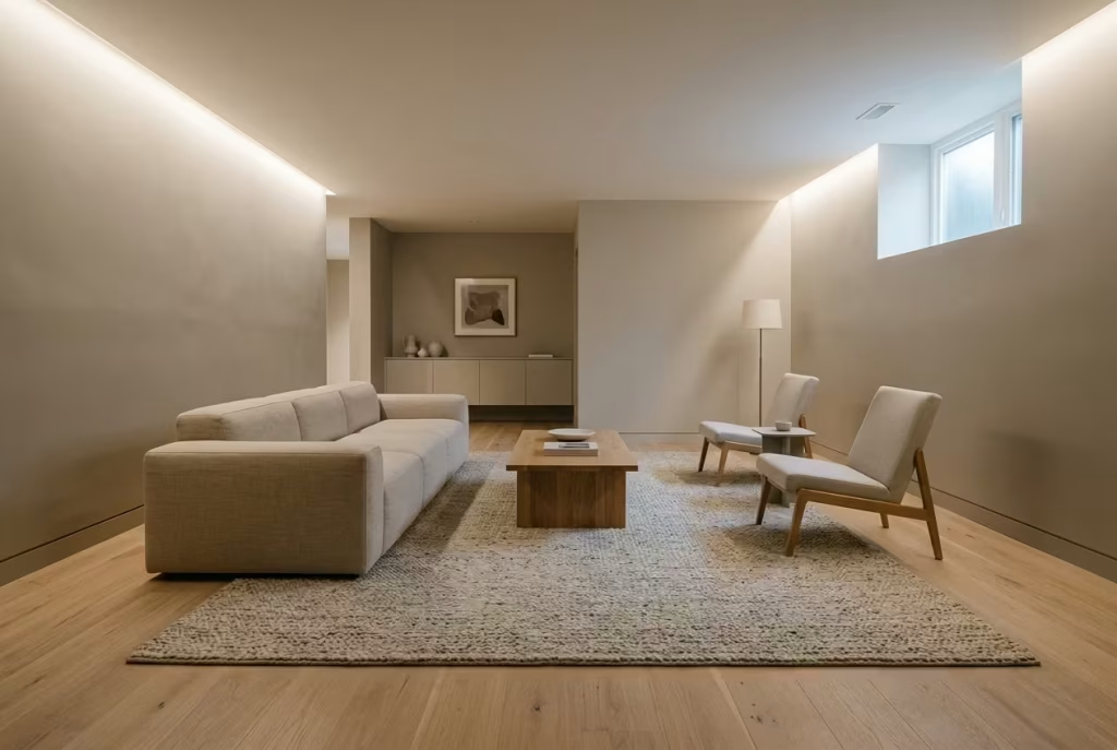
In a minimalist basement, where furniture is deliberately restrained and surfaces are kept visually calm, something surprisingly simple often carries disproportionate design weight. That is the rug. Without it, furniture tends to float, almost like islands drifting without a shoreline. With it, the room gains grounding, rhythm, and a sense of intentional placement that quietly holds everything together.
A textured rug is not just an accessory in this context. It is an anchoring device. It defines boundaries without building walls, separates zones without interrupting flow, and introduces warmth without adding visual clutter. In basement environments where hard surfaces and controlled palettes dominate, this soft interruption becomes essential to balance.
Size is where most mistakes occur. Anything too small immediately breaks proportion and exaggerates the feeling of fragmentation. I consistently recommend a minimum size of around 2.5 metres by 3.5 metres or roughly 8 by 11 feet for a typical basement lounge arrangement. This scale allows the rug to sit comfortably beneath key furniture pieces rather than floating awkwardly in the middle of the floor. Ideally, the front legs of seating should sit on the rug, creating a visual handshake between elements rather than disconnection.
I recall a basement project where the client initially used multiple small rugs across different seating zones. Each piece was visually interesting on its own, but collectively they created a patchwork effect that worked against the minimalist intent. The space felt fragmented, almost like it could not decide where it belonged. Once we replaced them with a single large textured rug that unified the main seating area, the transformation was immediate. The room felt anchored, calmer, and far more cohesive, as though everything had finally found its place.
Texture is equally important as scale. In basements, where lighting can be softer and more controlled, texture becomes the primary way a surface interacts with light. A flat, low-quality rug tends to disappear visually or feel lifeless. A well-chosen textured rug, whether in wool, loop pile, or subtle weave variations, introduces depth without demanding attention. It catches light gently, shifting slightly as you move around the room, which adds quiet movement to an otherwise still environment.
Colour should remain restrained within the broader neutral system. The goal is not contrast but continuity. Soft greys, warm taupes, muted stone tones, and earthy neutrals work particularly well because they support the surrounding palette rather than interrupting it. When the rug sits within the same tonal family as the flooring and furnishings, it becomes part of the composition rather than a separate feature.
There is also a subtle psychological effect at play. A well-anchored rug helps the mind interpret the space as organised and settled. Without it, furniture can feel temporarily placed, as though the room is still under construction. With it, the arrangement feels deliberate, even complete. It is a bit like framing a painting. The image may be the same, but the sense of resolution changes entirely once it is properly contained.
From a practical standpoint, rugs also improve acoustics, which is particularly valuable in basement environments where sound can bounce off hard surfaces. A large textured rug absorbs some of that reverberation, softening footsteps and reducing echo, which in turn makes the space feel more comfortable and controlled.
Pros
- Grounds furniture and prevents floating or disconnected layouts
- Improves spatial cohesion in open-plan basement designs
- Enhances acoustic comfort by reducing echo and sound reflection
- Adds subtle texture and warmth without visual overload
Cons
- Incorrect sizing can disrupt proportion and exaggerate fragmentation
- Requires regular maintenance to preserve texture in high-use areas
- Poor material choice may flatten the visual depth of the space
When used correctly, a textured rug does far more than soften a floor. It quietly organises the room, pulling everything into alignment without ever drawing attention to itself. In a minimalist basement, that kind of subtle structure is often what turns a collection of elements into a space that finally feels whole.
Monolithic Fireplace Feature Wall
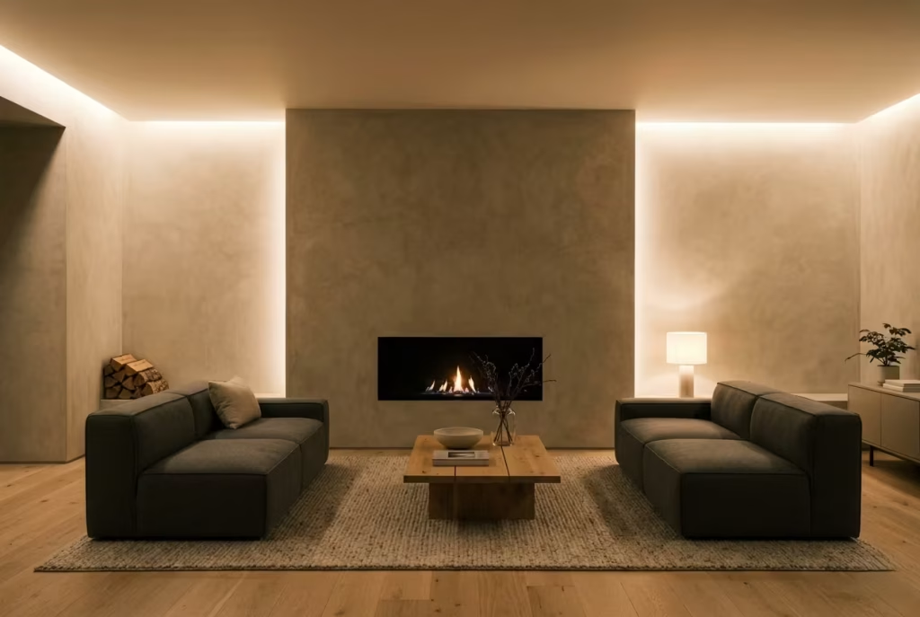
A fireplace in a basement carries a very different design responsibility compared to other areas of the home. It is not simply a heating element or a decorative focal point. In a space that already struggles with light, height perception, and visual fragmentation, the fireplace wall often becomes the single most dominant vertical surface. If handled poorly, it can feel heavy and overbearing. If handled correctly, it becomes an anchor that quietly stabilises the entire room.
The idea of a monolithic fireplace feature wall is rooted in reduction. Instead of layering materials, introducing trims, or breaking the surface into smaller visual components, the entire wall is treated as one continuous architectural plane. Microcement or large-format stone slabs are particularly effective here because they allow the surface to read as a single, uninterrupted gesture. There are no joints shouting for attention, no transitions interrupting the flow. Just a calm, grounded surface that holds its presence without trying to dominate the space.
I have worked on basement living rooms where the original fireplace design was overly detailed, with cladding, shelving niches, and contrasting finishes surrounding it. While each element was well-intentioned, the overall effect felt visually busy, almost like the wall was competing with itself. Once we stripped it back to a monolithic microcement finish, integrating a simple recessed firebox into the centre, the transformation was immediate. The room felt quieter, more composed, and significantly more spacious, even though nothing about the footprint had changed.
What makes this approach so effective is the way it consolidates attention. In minimalist basement design, too many focal points can fracture the room’s hierarchy. The eye is constantly pulled in different directions, which weakens the sense of spatial clarity. A monolithic fireplace resolves this by becoming a single, controlled anchor point. Everything else in the room begins to orient itself around it naturally, almost like gravity has been quietly introduced into the design.
Microcement works particularly well in this context because of its soft, continuous texture. It has just enough variation to feel tactile, yet remains visually calm. When applied across an entire wall, it creates a subtle sense of depth that changes gently with lighting conditions. In basements where artificial light dominates, this shifting surface quality helps prevent the wall from feeling flat or lifeless.
Stone slabs offer a slightly different character. Large-format panels, especially in neutral limestone or soft basalt tones, introduce a sense of permanence and weight. When installed with minimal joints, they create a sculptural effect that feels carved rather than constructed. In one project, we used a single uninterrupted stone-inspired surface spanning nearly 4 metres or about 13 feet wide, with a recessed linear fireplace positioned centrally. The effect was powerful but restrained, giving the room a sense of architectural calm that anchored everything else around it.
Lighting integration plays a critical supporting role here. Instead of adding visible fixtures around the fireplace, concealed linear lighting or subtle wall washes can be used to enhance the surface without breaking its continuity. This allows the material itself to remain the focal point, while light gently reveals its texture and depth rather than competing with it.
There is also a psychological dimension worth noting. A monolithic surface creates a sense of stability in the room. In basements, where walls can often feel segmented or visually interrupted by structural elements, this kind of uninterrupted plane offers a sense of grounding. It signals calm, permanence, and order, which subtly influences how the entire space is experienced.
Pros
- Creates a strong, unified focal point without visual fragmentation
- Enhances perceived spatial clarity through uninterrupted surface design
- Works effectively with microcement or large-format stone for a refined finish
- Provides a stable architectural anchor for minimalist basement layouts
Cons
- Requires precise installation to maintain a seamless, uninterrupted appearance
- Limited flexibility for future changes once the surface is completed
- Can feel heavy if not balanced with lighter surrounding elements and lighting
When executed with restraint, a monolithic fireplace feature wall becomes more than a design element. It becomes the quiet centre of gravity within the basement, holding the room together without demanding attention. In a minimalist setting, that kind of controlled presence is often what allows the rest of the space to feel open, balanced, and effortlessly resolved.
Indoor-Outdoor Connection via Light Wells
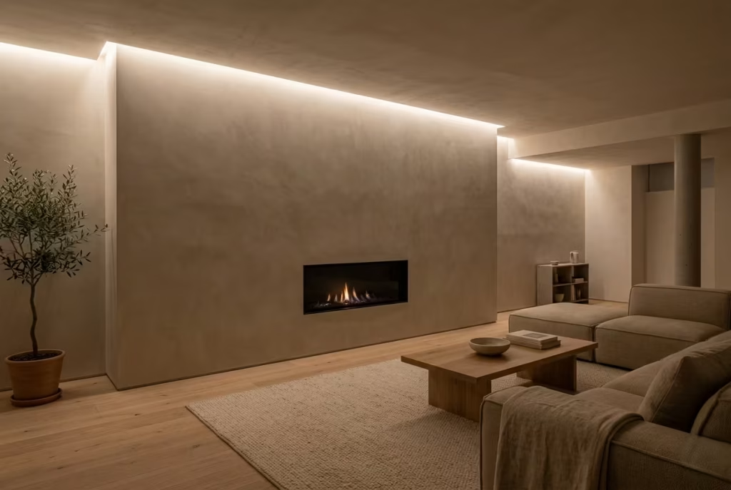
Basements often struggle with one fundamental limitation, not just lack of light, but lack of relationship to the outside world. Without that connection, even a well-designed space can feel slightly detached, as if it exists in isolation from the rest of the home. Light wells, even when modest in scale, quietly resolve this issue by reintroducing a sense of natural rhythm and spatial breathing that artificial lighting alone can never fully replicate.
A light well is not simply a source of brightness. It is a spatial interruption in the best possible way, a controlled opening that allows daylight to filter into a lower level and shift the entire atmosphere over the course of the day. Even a small well, sometimes no more than 600mm to 1200mm or roughly 2 to 4 feet in width, can dramatically change how a basement is perceived. It breaks the monotony of enclosed lighting and introduces a subtle dialogue between inside and outside, almost like a quiet exchange that the space has been missing all along.
I have worked on basements where the introduction of a single light well completely altered the emotional reading of the room. Before its inclusion, the space relied entirely on artificial lighting, which kept the environment consistent but slightly static. Once the light well was introduced, even in a relatively compact form, the room began to shift throughout the day. Morning light brought softness, midday light introduced clarity, and evening light created a calm transition. The space stopped feeling fixed and started feeling alive, almost like it had regained a sense of time.
One of the most overlooked benefits of light wells is how they influence perception of scale. In a fully enclosed basement, furniture can sometimes appear disconnected from its surroundings, as though it is floating in an undefined volume. When natural light is introduced, even in small amounts, it anchors the room visually. Shadows become more directional, surfaces gain depth, and the floor plane feels more grounded. This helps prevent the “floating furniture” effect, where pieces seem to exist without context or weight.
In one project, a narrow basement lounge measuring approximately 5 metres by 4 metres or about 16 by 13 feet initially felt slightly detached despite careful interior planning. After integrating a side light well with a vertical glazed opening, the entire composition changed. Seating that once felt visually isolated suddenly sat within a more grounded spatial field. The light created natural zones within the room without the need for physical partitions, subtly guiding how each area was perceived and used.
Material selection around light wells is also critical. Reflective yet soft finishes, such as limewash or micro-textured plaster, help diffuse incoming light rather than bouncing it harshly. This creates a gentle gradient of brightness that spreads deeper into the space. In contrast, overly glossy or dark finishes can absorb or distort this light, reducing its impact. The goal is not to amplify brightness aggressively, but to allow it to settle naturally into the environment.
There is also a psychological layer that often goes unnoticed until the space is lived in. Access to even partial natural light reduces the sense of enclosure that basements can sometimes carry. It introduces a subtle awareness of time passing, which makes the space feel more connected to daily life above ground. This is particularly valuable in multi-use basements, where long periods of time may be spent working, relaxing, or hosting.
From a design perspective, light wells also encourage more disciplined furniture placement. Because light becomes a directional force, it naturally influences layout decisions. Furniture tends to align itself in relation to brightness rather than floating arbitrarily across the room. This helps reinforce order and prevents the space from feeling visually scattered.
Pros
- Introduces natural light, improving atmosphere and spatial perception
- Reduces reliance on artificial lighting throughout the day
- Helps anchor furniture and reduce the floating layout effect
- Creates a dynamic environment that changes with time and weather
Cons
- Requires structural planning and careful waterproofing detailing
- Limited impact if poorly positioned or undersized
- Can increase construction complexity in retrofit basement projects
When thoughtfully integrated, a light well does more than brighten a basement. It reconnects the space to the rhythm of the outside world. That subtle connection changes everything. The room feels less like a sealed enclosure and more like a living extension of the home, quietly responsive, gently shifting, and far more grounded than it first appears.
Slimline Bar Area with Integrated Shelving
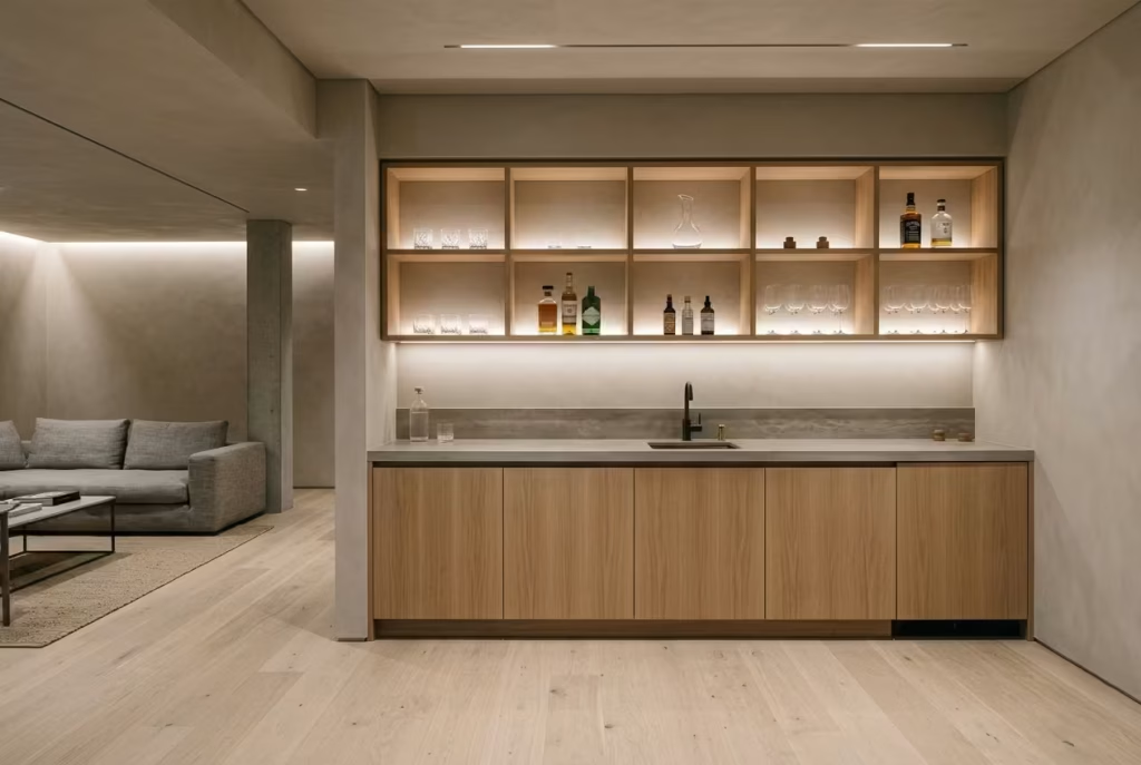
A basement bar works best when it behaves less like a standalone feature and more like a quiet extension of the architecture. The moment it starts projecting into the room as a bulky installation, it disrupts flow and competes with the surrounding spatial rhythm. A slimline bar, carefully restrained to a depth of under 450mm or roughly 18 inches, avoids this problem by keeping the footprint controlled and visually light, allowing it to sit comfortably within the broader composition of the basement.
The key principle here is restraint through integration. Instead of building out a heavy counter with multiple layers of cabinetry and protruding details, everything is pulled back into a shallow, disciplined profile. This creates a surface that performs its function without demanding unnecessary attention. I have seen basement lounges where oversized bar units overwhelmed circulation routes, making the space feel tighter than it actually was. Once reduced to a slimline configuration, the entire room immediately felt more open, as if someone had quietly stepped back and allowed the architecture to breathe again.
Integrated shelving plays a defining role in maintaining this balance. Open shelving, when carefully proportioned and aligned within the same depth range, allows display and storage to coexist without adding visual bulk. Bottles, glassware, and occasional decorative pieces sit within a controlled grid, rather than spilling into irregular arrangements that can quickly introduce visual noise. In one project, we used recessed shelving with consistent vertical spacing, which gave the bar area a rhythm that felt deliberate rather than improvised. The result was a composition that felt structured but never rigid.
Appliance integration is equally important, particularly in modern basement bar designs where functionality often includes refrigeration, wine storage, or compact beverage systems. These elements should be absorbed into the joinery so that the overall bar reads as a single continuous form. When appliances are exposed or partially protruding, they immediately break the visual language and create unnecessary interruptions. Fully integrated units allow the bar to maintain its identity as a calm, unified element within the space.
I recall a basement project where a client initially requested a full-width bar with multiple freestanding components, including a visible wine cooler and open shelving units. While each element had its own appeal, the combined effect felt visually heavy and slightly chaotic. By reworking the design into a slimline 400mm deep bar with fully integrated appliances and concealed storage, the transformation was immediate. The space regained clarity, and the bar stopped feeling like an object placed in the room. Instead, it became part of the wall system itself, almost as if it had always been there.
Lighting should be treated with equal subtlety. Rather than introducing prominent fixtures, concealed LED strips within shelving recesses or under the counter edge provide a soft, atmospheric glow. This type of lighting does not announce itself. It simply enhances depth and reveals texture without disrupting the clean lines of the design. In basements where lighting already carries significant weight, this restraint is essential to maintaining visual calm.
There is also a perceptual advantage to this approach. Slimline bar areas help prevent the floating furniture effect that often occurs in open basement layouts. Because the bar is anchored to the wall and kept shallow in profile, it reads as part of the architecture rather than a separate insertion. This strengthens spatial coherence and ensures that the room feels continuous rather than segmented into competing zones.
Material choice reinforces this sense of discipline. Consistent finishes, whether in matte timber, microcement, or muted stone, help the bar blend into the surrounding palette. The goal is not to make it invisible, but to ensure it feels like a natural extension of the space rather than an interruption.
Pros
- Maintains open circulation by limiting depth to under 450mm or 18 inches
- Integrates seamlessly into wall systems, reducing visual clutter
- Supports cohesive design through concealed appliances and shelving
- Prevents floating furniture effect in open-plan basement layouts
Cons
- Limited storage capacity compared to full-depth bar installations
- Requires precise planning for appliance integration and spacing
- Less flexibility for large-scale entertaining setups
When executed with restraint, a slimline bar area becomes less about display and more about composition. It sits quietly within the basement, offering function without excess and structure without heaviness. In a space where clarity is everything, that kind of controlled simplicity often carries more impact than any oversized statement ever could.
Minimalist Kids’ Zone with Concealed Storage
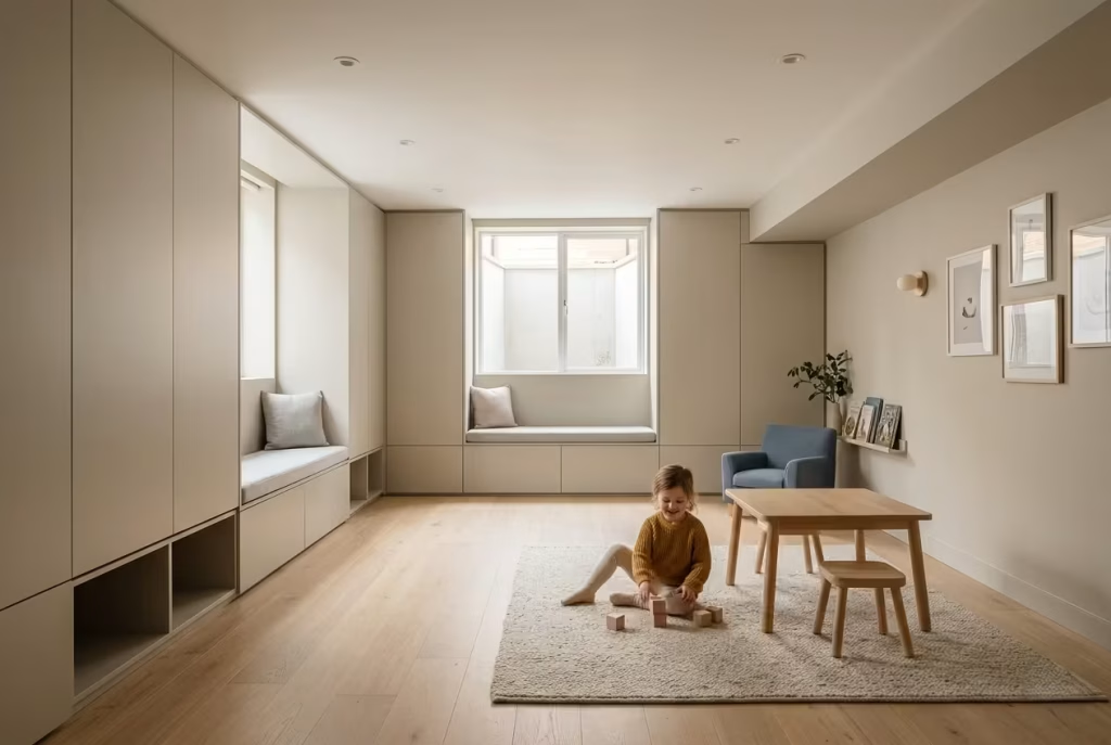
Designing a kids’ zone in a basement is always a balancing act between energy and control. On one hand, the space needs to feel soft, approachable, and adaptable to constant change. On the other, it must remain visually disciplined so it does not unravel the calm rhythm of the wider interior. The most successful solutions I have worked on sit right at that intersection, where playfulness is allowed, but clutter is quietly absorbed into the architecture.
The foundation of this approach is restraint, not restriction. A minimalist kids’ zone does not mean stripping away personality. It means ensuring that personality has a structured place to exist. Soft finishes, rounded edges, and tactile materials are introduced, but always within a controlled visual framework. Think muted tones, warm neutrals, and low-contrast surfaces that allow the space to feel gentle without becoming visually noisy.
Storage becomes the real backbone of the design. Instead of freestanding units that quickly break the flow of the room, everything is integrated into the wall system. Recessed cabinetry, full-height concealed cupboards, and low-level built-in storage benches allow toys, books, and everyday essentials to disappear when not in use. When closed, these elements read as part of the architecture, maintaining continuity across the basement rather than interrupting it.
I have worked on basement family rooms where the initial setup relied heavily on open toy storage and scattered furniture pieces. While functional in the short term, the space constantly felt unsettled, almost like it was in a permanent state of transition. Once we reconfigured the layout with integrated storage walls and concealed compartments, the entire atmosphere changed. The room stopped feeling chaotic and started feeling composed, even though its function remained exactly the same.
One of the key challenges in these spaces is preventing the “floating furniture” effect. This happens when pieces are placed without a clear spatial anchor, causing them to feel disconnected from the room. In a minimalist kids’ zone, this is particularly common because furniture is often lightweight and modular. The solution lies in grounding everything through built-in architecture. Low storage walls that run continuously along the perimeter, typically around 450mm to 600mm or roughly 18 to 24 inches in depth, help define the edges of the space while keeping the centre open for movement and play.
Integrated seating also plays an important role. Window benches or recessed seating zones within storage walls allow the room to serve multiple functions without adding visual clutter. In one project, we designed a continuous wall system that combined toy storage, reading nooks, and concealed compartments within a single linear composition. The result was a space that felt structured but still flexible enough to evolve as the children grew.
Material selection must be carefully considered. Surfaces need to be durable enough to handle daily use but soft enough to maintain a calm atmosphere. Laminated timber finishes in muted tones, matte painted MDF, and tactile upholstery fabrics tend to work well. The aim is to avoid anything overly glossy or visually aggressive, which can quickly disrupt the quiet balance of the room.
Lighting should reinforce calm rather than stimulation. Diffused ceiling lighting, recessed strips, or softly integrated wall washers create an even distribution of light that supports both play and rest. Harsh contrasts or overly decorative fixtures tend to fragment the space, which goes against the core principle of visual continuity.
Pros
- Keeps toys and clutter concealed through integrated wall storage systems
- Maintains visual calm while supporting active family use
- Prevents floating furniture effect by anchoring elements into architecture
- Creates a flexible space that can evolve as children grow
Cons
- Requires careful planning to balance accessibility and concealment
- Can feel overly restrained if not softened with tactile materials and warmth
- Needs durable finishes to withstand heavy daily use
When thoughtfully designed, a minimalist kids’ zone does not suppress energy. It channels it. It allows movement, play, and creativity to exist within a structured framework that quietly holds everything together. In a basement environment where clarity is essential, that balance between softness and control is what transforms a simple family space into something far more enduring and intelligently composed.
Acoustic Softening Without Bulk
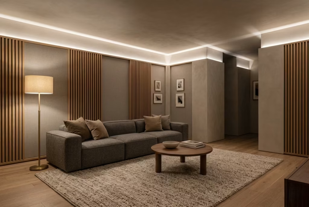
Acoustics in basement design are often treated as an afterthought, yet they quietly shape the entire experience of the space. A room can look visually perfect, but if sound behaves poorly, bouncing, echoing, or lingering too long, the comfort of the space breaks down almost instantly. In basement environments, where hard surfaces and enclosed geometry dominate, managing sound is not optional. It is part of the architecture itself.
The challenge is to control acoustics without introducing visual heaviness. Traditional acoustic solutions often rely on thick panels, bulky diffusers, or obvious surface treatments that immediately disrupt minimalist intent. While effective in performance terms, they can quickly overwhelm the visual language of a basement. The more refined approach is integration, where acoustic control becomes part of the wall system rather than something applied on top of it.
Fabric panels are particularly effective when handled with restraint. Instead of appearing as separate acoustic add-ons, they are recessed into wall frameworks or aligned flush within joinery systems. This allows them to absorb sound while remaining visually quiet. The surface reads as part of the architecture, not an intervention. In one basement project I worked on, we integrated full-height fabric panels behind timber slatted sections. The result was a wall that looked entirely architectural but performed far beyond its visual simplicity in controlling echo and softening sound reflection.
This approach is especially important in echo-prone basements, where sound tends to rebound off concrete, plaster, and glass surfaces. Without acoustic moderation, even small conversations can feel amplified and slightly disconnected. By introducing strategically placed fabric panels, particularly along longer uninterrupted wall runs of 3 to 5 metres or roughly 10 to 16 feet, the room begins to absorb sound more naturally. The effect is subtle but transformative. Voices feel more grounded, and the overall atmosphere becomes noticeably calmer.
I have seen basements where the absence of acoustic consideration made even well-designed interiors feel slightly tense. Every step, every conversation, every piece of movement echoed more than it should have. Once fabric-integrated wall systems were introduced, the change was immediate. The space did not become quieter in volume, but it became softer in character. That distinction is important. Good acoustic design does not silence a space. It refines how sound behaves within it.
One of the key principles is distribution. Acoustic panels should not be clustered in a single area but rather spread across key reflection zones. This includes opposite seating walls, behind entertainment units, and along circulation paths where sound tends to bounce repeatedly. When integrated properly, they disappear visually into the rhythm of the architecture, supporting the space without drawing attention to themselves.
There is also a strong relationship between acoustic control and spatial perception. Poor acoustics often make furniture feel disconnected, as if each element exists independently within a noisy environment. This contributes to the floating furniture effect, where nothing feels grounded. Once sound is softened and controlled, furniture begins to feel more anchored because the space itself behaves more cohesively. The room stops echoing back fragments of activity and instead absorbs them as a unified experience.
Material choice plays a critical role here. Wool blends, textured acoustic fabrics, and stretched textile systems tend to perform best because they balance absorption with durability. Colour selection should remain within the broader tonal palette of the basement to maintain visual continuity. The goal is not to introduce a new material language but to refine the existing one.
Lighting also benefits indirectly from acoustic treatment. Softer acoustics often allow for more controlled lighting environments, where shadows feel less harsh and transitions between light and dark become more gradual. This contributes to the overall sense of calm that defines well-executed minimalist basements.
Pros
- Reduces echo and improves sound clarity in basement environments
- Integrates seamlessly into wall systems without adding visual bulk
- Enhances spatial calm by preventing fragmented sound behaviour
- Supports cohesive interior design while remaining functionally discreet
Cons
- Requires precise placement for effective acoustic performance
- Needs careful material selection to avoid visual flatness
- Can increase detailing complexity within wall construction systems
When done well, acoustic softening becomes invisible. It does not announce itself, yet it fundamentally changes how a basement feels to inhabit. The space becomes easier to live in, easier to speak in, and easier to relax within. In minimalist design, that kind of quiet performance is often what separates a visually successful room from one that truly feels complete.
Mirror Placement to Extend Depth
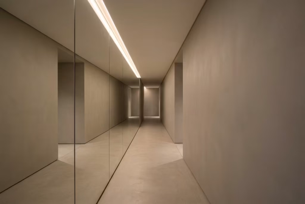
Mirrors in basement design are often misunderstood as decorative shortcuts for making a space “look bigger.” In reality, when used with discipline, they are spatial instruments. They do not simply reflect a room. They extend it, reframe it, and in some cases completely rewrite how depth is perceived. The difference lies in restraint. Used sparingly and with intention, mirrors become powerful. Used excessively, they create visual confusion that undermines the very clarity minimalist basements depend on.
The most effective approach is alignment with light sources. A mirror positioned opposite or adjacent to a controlled light wash, whether natural from a light well or artificial from a recessed LED system, does far more than increase brightness. It multiplies depth perception. The reflected light softens edges, extends shadow gradients, and creates a subtle illusion that the room continues beyond its physical boundary. It is not about brightness alone. It is about spatial suggestion, almost like the architecture is quietly hinting at more space than actually exists.
I have worked on basement living areas where mirrors were initially used as large feature walls. While visually striking at first glance, they quickly introduced distortion. Furniture appeared duplicated, movement felt slightly disorienting, and the room lost its composure. Once we scaled back to carefully positioned mirror panels, typically no wider than 800mm to 1200mm or roughly 2.6 to 4 feet, the effect became far more controlled. Instead of overwhelming the space, the mirrors began to support it.
One particularly effective application was in a basement corridor measuring around 1.2 metres or 4 feet in width. By introducing a full-height mirror along one side, aligned with a linear ceiling light, the corridor transformed from a tight passage into something that felt elongated and continuous. The reflection did not just double the visual field. It removed the sense of confinement entirely. It was a subtle shift, but one that changed how movement through the space was experienced.
Mirror placement also plays a crucial role in preventing the floating furniture effect. When furniture is reflected in a poorly considered way, it can appear duplicated or disconnected, which reinforces visual fragmentation. However, when mirrors are carefully aligned with architectural elements rather than directly with furniture, they reinforce grounding instead. They extend walls, floors, or light lines rather than multiplying objects. This maintains spatial coherence and keeps the composition stable.
In minimalist basements, mirror frames should remain understated or entirely absent. Frameless installations or recessed mirror panels that sit flush with wall surfaces are far more effective than decorative framing, which can interrupt continuity. The goal is always integration, not emphasis. A mirror should feel like part of the architecture, not an object placed within it.
Lighting interaction is where mirrors truly reveal their value. When paired with indirect lighting, such as concealed ceiling coves or wall washers, mirrors soften transitions between illuminated and shaded areas. This creates a layered depth that feels natural rather than artificially enhanced. The space begins to feel larger not because it is visually expanded, but because it is perceptually softened.
There is also a psychological layer that should not be overlooked. Carefully placed mirrors reduce the sense of enclosure that can sometimes build up in basement environments. They introduce visual escape routes for the eye, allowing it to travel beyond immediate boundaries. This helps reduce spatial fatigue, particularly in rooms where occupants spend extended periods of time.
Pros
- Extends perceived depth when aligned with light sources
- Enhances spatial continuity without structural changes
- Helps reduce the sense of enclosure in basement environments
- Supports lighting design by amplifying soft, indirect illumination
Cons
- Overuse can create visual confusion and fragmentation
- Poor placement may duplicate furniture awkwardly, disrupting balance
- Requires careful alignment with architecture to avoid distortion effects
When used with precision, mirrors stop being decorative surfaces and become spatial tools. They quietly reshape perception, extend light, and soften boundaries without ever drawing attention to themselves. In a minimalist basement, that level of restraint is exactly what turns a simple reflective surface into a subtle but powerful architectural device.
Gallery-Style Minimal Art Display
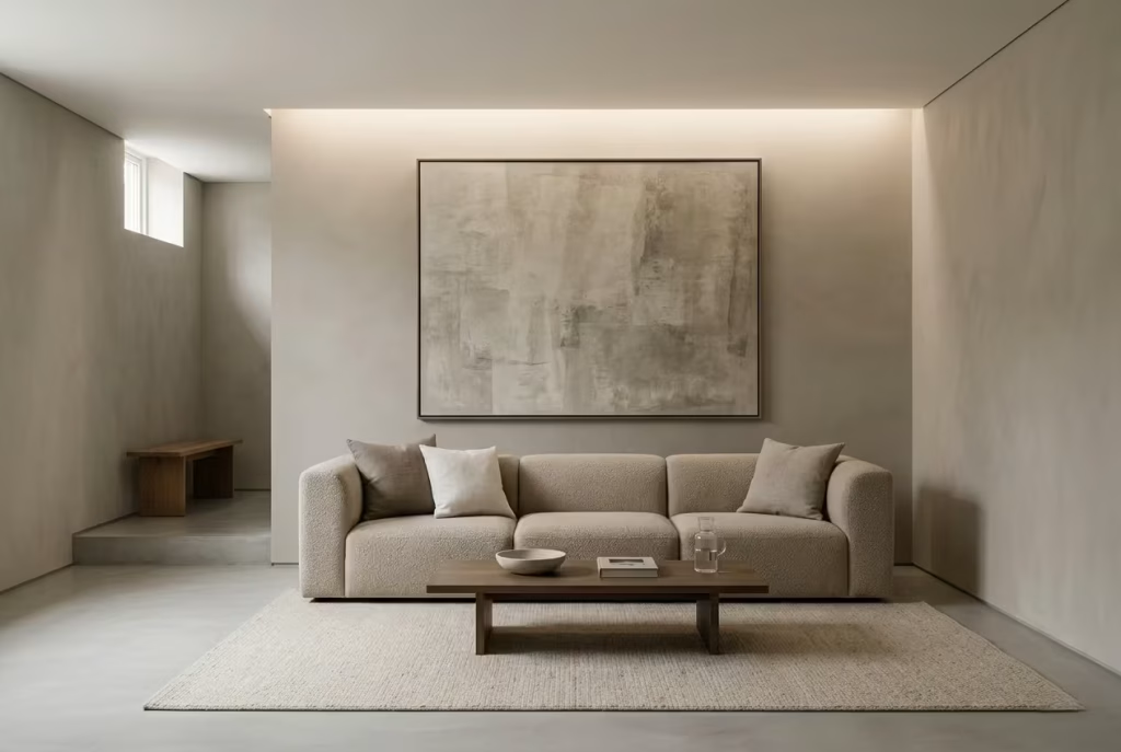
Art in a minimalist basement is not about filling blank walls. It is about restraint, precision, and knowing exactly when to stop. In spaces that already carry limited natural light and carefully controlled material palettes, the wrong approach to display can quickly tip the balance from calm to cluttered. A gallery-style art strategy avoids this entirely by treating artwork as a singular architectural moment rather than decorative repetition.
The principle is simple, but the impact is significant. Instead of scattering multiple small pieces across walls, the focus is narrowed to one or two oversized works. This shift immediately changes how the room is read. The wall stops behaving like a display surface and starts acting like a backdrop for intention. The eye is no longer pulled in multiple directions. It settles, lingers, and engages with a single focal point, almost like the space has finally decided what it wants to say.
I have worked on basement living areas where walls were originally filled with a collection of smaller framed prints. Individually, each piece had merit. Together, they created a sense of visual noise that quietly undermined the architecture. The moment we replaced them with a single large-scale canvas measuring approximately 1.5 metres by 2 metres or around 5 by 6.5 feet, the entire wall gained clarity. The room did not feel emptier. It felt more deliberate, more composed, as if the design had finally exhaled.
Scale is everything in this approach. Oversized pieces work because they relate to the proportions of the room rather than competing with them. In basements, where wall expanses can feel heavy or uninterrupted, a large artwork introduces rhythm without fragmentation. It anchors the space in the same way a well-placed architectural element would, giving the eye a point of rest that feels intentional rather than decorative.
Placement is equally important. Art should align with architectural logic, not float randomly on a wall. Centering pieces within sightlines, especially opposite seating areas or at the end of circulation paths, helps reinforce spatial structure. In one project, a single horizontal artwork was positioned along the main lounge wall of a basement measuring roughly 6 metres or 20 feet in length. The piece did not just decorate the wall. It defined the entire seating arrangement, subtly dictating how the furniture oriented itself around it.
Lighting should always support, never compete. Directional wall washers or discreet picture lights work best because they highlight texture and depth without creating harsh contrast. In basements, where lighting is already carefully layered, the goal is to integrate art into the existing illumination system so it feels naturally present rather than artificially spotlighted.
There is also a psychological clarity that comes from reduction. When the visual field is simplified, the mind engages more deeply with what remains. One or two well-chosen pieces allow for interpretation, pause, and emotional connection, whereas multiple smaller works often dilute attention. In a basement environment, where sensory input is already carefully managed, this restraint enhances the sense of calm.
Importantly, gallery-style display also helps prevent the floating furniture effect. When walls are cluttered or visually fragmented, furniture below them can feel disconnected. A single, strong visual anchor above the seating zone grounds the entire arrangement. It creates a vertical relationship between art and furniture that stabilises the room compositionally.
Frames, if used, should remain minimal and understated. Black, natural oak, or frameless floating mounts tend to work best. The intention is always the same: remove anything that competes with the artwork itself or interrupts the surrounding architecture.
Pros
- Creates strong visual focus without introducing clutter
- Enhances spatial clarity by reducing wall fragmentation
- Anchors furniture layouts and prevents floating composition issues
- Works seamlessly within minimalist basement environments
Cons
- Requires careful selection of artwork to justify large scale presence
- Limited flexibility compared to multi-piece gallery walls
- Poor placement or proportion can dominate rather than balance the space
When executed with discipline, a gallery-style art display does not behave like decoration. It becomes part of the architecture’s rhythm. In a minimalist basement, where every surface carries weight, that kind of clarity is not just aesthetic choice. It is what allows the entire space to feel resolved, confident, and quietly complete.
Material Strategy for Minimalist Basements
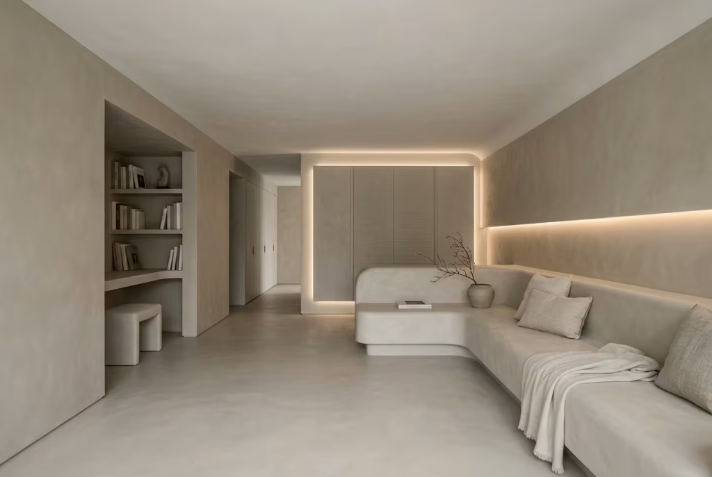
Material strategy in a minimalist basement is not a surface-level styling exercise. It is the underlying system that determines whether the space feels calm, coherent, and spatially expansive or fragmented and visually heavy. In below-ground environments, where natural light is limited and structural interruptions are common, materials carry more visual weight than in any other part of the home. Every finish either reinforces clarity or quietly undermines it. There is rarely a neutral outcome.
The most successful basement interiors I have worked on are never defined by abundance, but by discipline. A carefully curated material palette becomes the thread that holds everything together, ensuring continuity from floor to ceiling and across every functional zone. When handled correctly, materials stop behaving as separate design decisions and instead operate as a unified architectural language. That is where true minimalism begins to feel intentional rather than restrictive.
Best Materials for Low-Light Environments
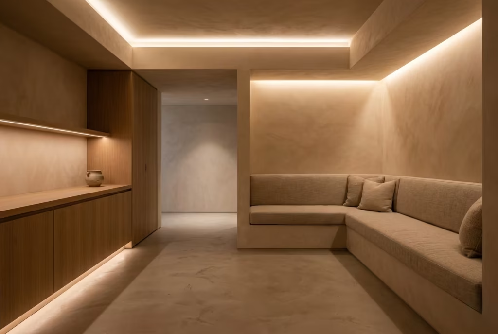
Low-light basement environments demand materials that do more than look good in isolation. They need to actively participate in shaping light, softening shadows, and preventing the space from feeling visually heavy or compressed. I’ve seen many basements fall into the same trap, where materials are chosen for style but not for behaviour. The result is a room that looks fine in photographs but feels flat, dull, or oddly closed in once you actually live inside it. The right material strategy changes that entirely. It turns limited light into a controlled design asset, almost like the architecture is quietly working behind the scenes to keep the space alive and readable.
In practice, the decision is rarely about choosing a single “best” material. It is about understanding how different surfaces interact with light, scale, and proportion, and then layering them in a way that avoids visual interruption. In basements especially, continuity is everything. The wrong combination of finishes can break that flow and lead to what I often call the floating furniture effect, where objects feel disconnected from the room because the surfaces around them lack cohesion or depth. The right materials, on the other hand, ground everything, pulling the space together like a well-tuned composition.
Engineered Wood vs Polished Concrete
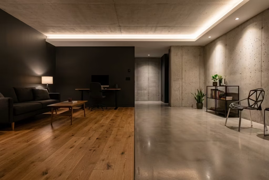
Engineered wood brings warmth into low-light basements in a way few materials can match. Its layered construction allows for stability in below-ground conditions, while its natural grain introduces subtle movement that prevents the space from feeling sterile. In one project, we used wide engineered oak boards around 180mm to 220mm (7 to 9 inches) to run continuously across a basement lounge and adjoining workspace. The effect was immediate. The uninterrupted grain direction created a visual flow that made the space feel longer than its actual 6 metre (20 foot) span. It quietly corrected proportion without drawing attention to itself.
Polished concrete, by contrast, behaves like a quiet reflector. It does not add warmth, but it amplifies structure. In low-light environments, its soft sheen can help distribute artificial lighting more evenly, especially when paired with carefully layered ceiling illumination. However, it requires discipline. If over-polished, it can become cold and unforgiving, almost flattening the emotional tone of the room. I have seen basements where polished concrete worked beautifully as a base plane, but only when balanced with softer materials above eye level.
The real decision here is emotional temperature versus architectural clarity. Engineered wood leans towards comfort and continuity. Polished concrete leans towards precision and restraint.
Microcement vs Plaster
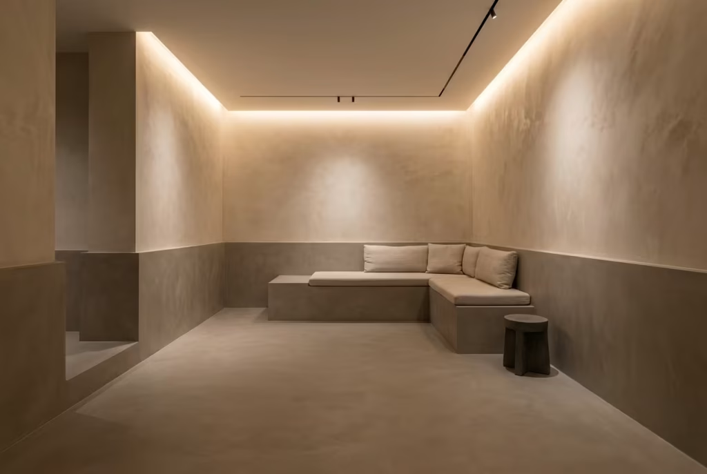
Microcement is one of the most effective materials for achieving visual continuity in basement environments. Its seamless application removes joints, breaks, and surface interruptions, which is crucial in spaces where every visual division feels amplified. When applied correctly across floors and selected wall sections, it creates a monolithic reading that makes the room feel carved rather than constructed. I’ve used it in compact basements around 4 metres by 5 metres (13 by 16 feet), where the goal was to eliminate fragmentation entirely. The result was a space that felt unified, almost like a single continuous surface shaped into function.
Plaster, particularly in soft matte or lime-based finishes, offers a more atmospheric quality. It absorbs light gently rather than reflecting it, which can be extremely effective in basements with controlled lighting schemes. Unlike microcement, plaster introduces subtle irregularity, a kind of human softness that prevents the space from feeling overly engineered. When used across full wall surfaces, it creates depth through texture rather than contrast, which helps avoid the harsh visual stops that often contribute to the floating furniture effect.
In one residential project, we combined microcement flooring with plastered walls in a restrained neutral palette. The interaction between the two created a layered but cohesive environment. The floor grounded the space with continuity, while the walls softened the light, preventing harsh bounce and visual fatigue. Nothing competed, yet everything contributed.
Preventing the Floating Furniture Effect Through Material Control
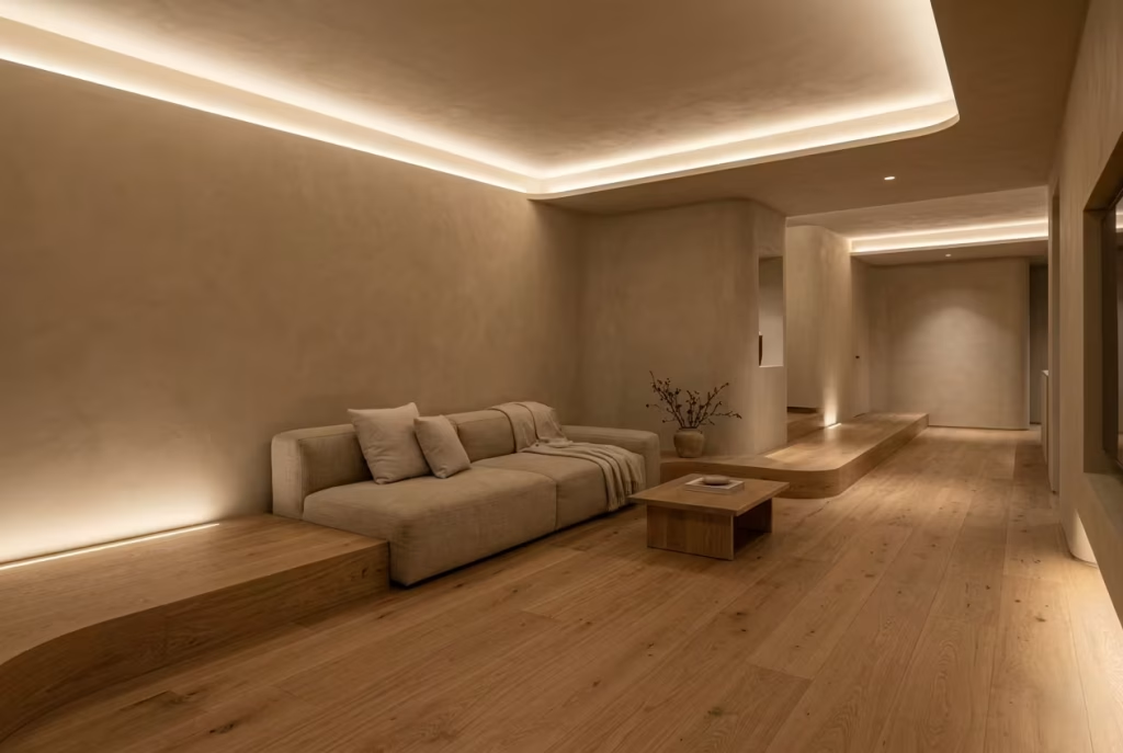
The floating furniture effect is rarely caused by furniture itself. It is almost always a material problem. When floors, walls, and ceilings do not share a coherent visual logic, furniture loses its anchor and begins to feel like it is hovering within the space. The eye has no reference points, so everything appears slightly disconnected.
Material continuity solves this by establishing a consistent backdrop. Wide engineered wood planks reduce visual breaks at floor level. Microcement eliminates surface transitions. Plaster softens wall reflection so furniture sits naturally against it rather than floating in front of it. Even integrated appliances in basement kitchens or utility zones benefit from this approach, because when materials are continuous, built-in elements feel like part of the architecture rather than separate insertions.
I often describe it this way: when materials are aligned, furniture behaves. When they are fragmented, furniture drifts.
Integrated Surfaces as the Hidden Structure
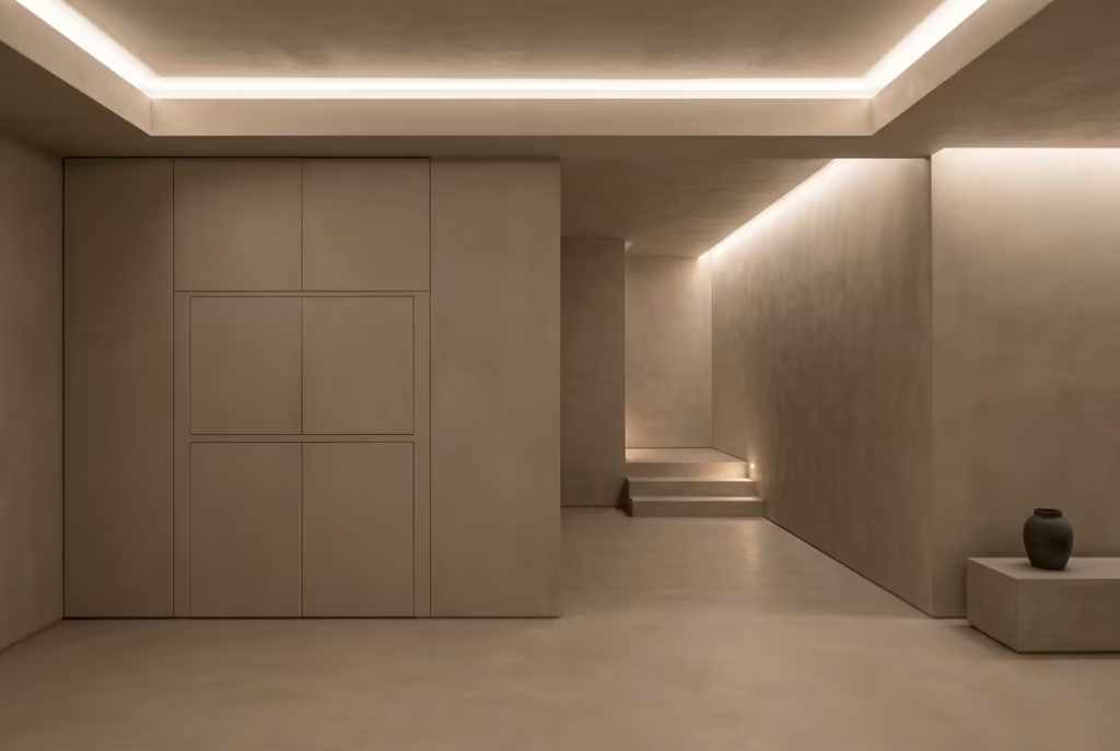
Integrated appliances and built-in elements only work properly when the surrounding materials support them. A flush cabinet in a microcement wall, or a concealed bar unit within plastered joinery, only disappears visually when the material language around it is calm and consistent. If the background is busy, the integration fails, no matter how well the joinery is executed.
This is why material strategy is never secondary in basement design. It is the foundation that determines whether integrated systems feel intentional or awkward. When done properly, appliances, storage, and structural elements stop reading as separate objects and instead become part of a single architectural sentence that holds the entire space together.
Finishes That Age Well
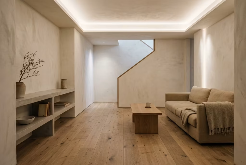
A basement is not a showroom. It is a lived-in environment that quietly accumulates use, light shifts, and subtle wear over time. That is exactly why finishes matter far more here than in more performative spaces of the home. I’ve seen basements designed to look flawless on day one, only to lose their clarity within months because the materials were chosen for immediate impact rather than long-term behaviour. A good basement finish should not resist time. It should negotiate with it gracefully.
When I approach material selection for lower-ground spaces, I always think in terms of endurance rather than effect. Some surfaces age like a well-written sentence, gaining depth and character as they settle into their environment. Others age like a loud headline, sharp at first, then quickly tiring as imperfections begin to show. The difference is rarely dramatic at the start, but it becomes obvious over years of use.
Why Overly Glossy Surfaces Rarely Work Long-Term
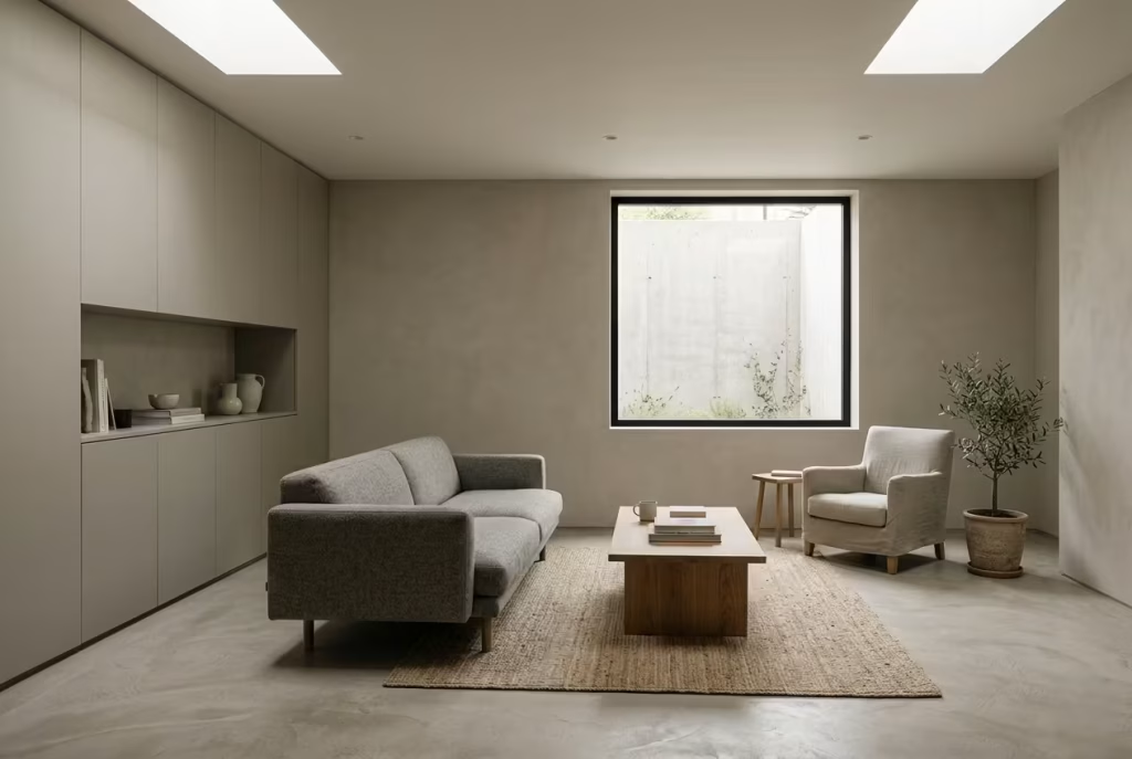
High-gloss finishes often appear appealing in early design stages because they promise brightness and visual impact. In controlled lighting conditions, they reflect surroundings cleanly and can make a basement feel more polished. However, in practice, they tend to struggle in real living environments.
In low-light basements especially, gloss behaves unpredictably. It amplifies every inconsistency, every fingerprint, every slight unevenness in surface preparation. Instead of softening over time, it exposes wear. I’ve worked on projects where glossy cabinetry initially looked sharp and architectural, but within a year it began to feel visually noisy. Reflections became fragmented, and the space started to lose its calm rhythm.
There is also a spatial consequence. Glossy surfaces tend to bounce light aggressively, which can create uneven brightness across a room. This often disrupts the grounded feeling that minimalist basements rely on. Instead of supporting the architecture, the finish begins to compete with it. Over time, this contributes to a subtle but persistent sense of visual fatigue.
Matte or low-sheen alternatives behave very differently. They absorb imperfections rather than highlighting them. They allow light to settle instead of scatter. In a basement where control is everything, that restraint is not just aesthetic, it is functional.
Patina vs Perfection
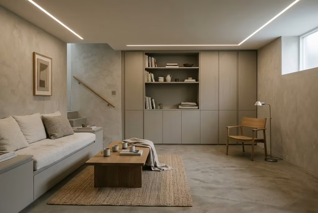
The real conversation in long-lasting basement design is not about shine versus matte. It is about perfection versus patina.
Perfection, in material terms, is often short-lived. It relies on surfaces remaining untouched, unmarked, and visually static. The moment life enters the space, perfection begins to break down. Small scuffs, softened edges, and slight tonal changes start to appear. On high-gloss or overly uniform finishes, these changes feel like damage. On more natural materials, they feel like development.
Patina, by contrast, embraces time as part of the design language. Materials like oiled timber, limewashed plaster, natural stone, or micro-textured surfaces do not resist ageing. They absorb it. In one basement project I worked on, we used engineered oak flooring with a natural oil finish in a space measuring roughly 6 metres by 4.5 metres (20 by 15 feet). Over time, the areas around circulation paths softened slightly in tone, while static zones retained their original depth. Instead of looking worn, the floor began to tell a quiet story of use. The space felt more grounded, not less.
This is where minimalist design becomes genuinely intelligent. It stops trying to freeze time and instead allows time to participate in the composition.
Preventing the Floating Furniture Effect Through Ageing Surfaces
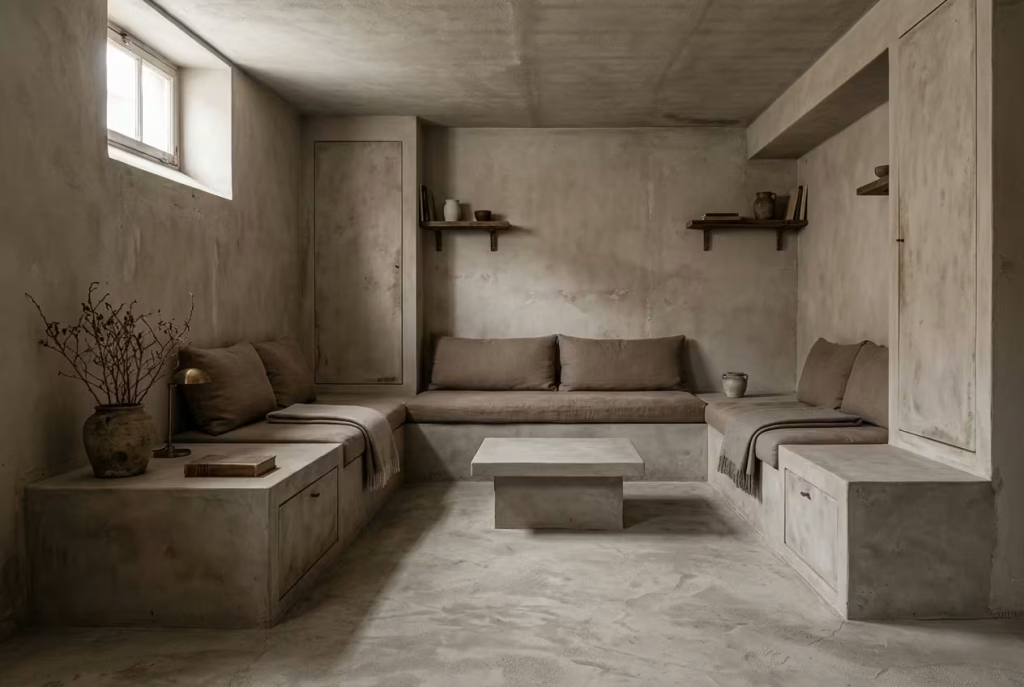
The floating furniture effect is not only a spatial issue. It is also a temporal one. When finishes age poorly or inconsistently, furniture begins to feel disconnected from its surroundings. Glossy or overly pristine surfaces exaggerate this, because they maintain an artificial separation between new objects and slightly worn environments.
In contrast, patinated finishes create continuity. When a microcement floor develops subtle tonal variation, or a plaster wall softens with time, furniture naturally settles into the space. It no longer feels placed on top of a surface. It feels embedded within it.
I’ve seen this most clearly in basement living areas where integrated appliances and built-in joinery were paired with soft, ageing finishes. Over time, the entire composition matured together. Nothing stood out awkwardly. Everything aged in conversation with everything else, which is exactly what creates long-term visual stability.
Integrated Elements and Long-Term Material Harmony
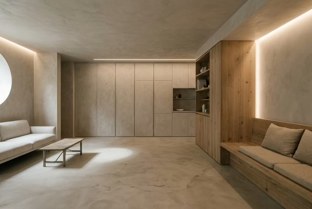
Integrated appliances only succeed when the surrounding finishes are capable of ageing with them. A perfectly flush cabinet loses its impact if the wall behind it begins to look tired or inconsistent. Similarly, concealed storage systems rely on surfaces that can absorb minor wear without breaking visual continuity.
This is why materials like microcement, natural timber, and lime-based plaster are so effective in basements. They do not demand constant correction. Instead, they evolve quietly, allowing integrated elements to remain visually stable within a shifting environment.
When everything ages together, the architecture does not degrade. It deepens.
Lighting Design That Transforms Basements
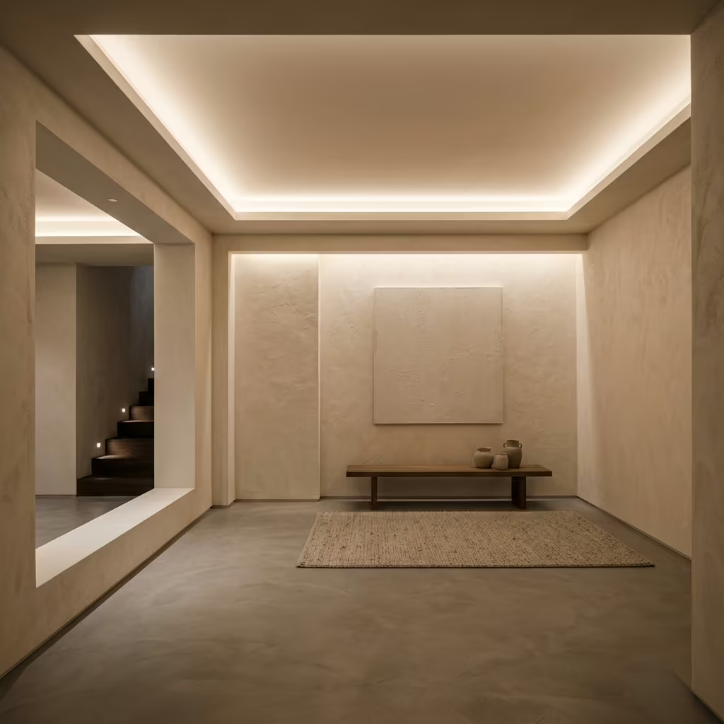
Lighting in a basement is never just a finishing touch, it is the element that quietly decides how the entire space is perceived, lived in, and emotionally experienced. With limited or no natural daylight to rely on, every lumen carries more responsibility than it would above ground. I’ve worked on basements where the architecture was strong,
materials were well chosen, and proportions were carefully resolved, yet the space still felt underwhelming until the lighting was corrected. Once the lighting strategy was reworked, the same room suddenly gained depth, warmth, and clarity, almost as if the walls had stepped back and allowed the space to breathe. In basement design, light is not decoration. It is structure in disguise.
Layered Lighting Without Visual Clutter
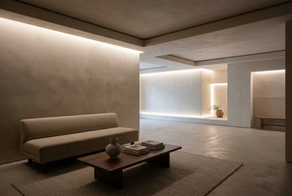
Layered lighting in a basement is not about adding more fixtures. It is about orchestrating fewer, more intelligent sources so the space feels naturally illuminated rather than mechanically lit. I’ve seen many basement projects fall into the same trap, where lighting is treated as a collection of separate decisions rather than a unified system. The result is often visual noise on the ceiling, too many fittings competing for attention, and a room that feels busier than it should.
A well-resolved approach begins with hierarchy. Ambient lighting establishes the base level of visibility, usually through recessed or softly diffused ceiling systems that wash the room evenly without drawing attention to themselves. Concealed lighting then shapes atmosphere, introducing depth through cove details, wall grazers, or linear strips hidden within joinery and architectural breaks. Task lighting sits quietly on top of this structure, supporting specific functions like reading, cooking, or working without disturbing the overall calm of the space.
I’ve worked on basements where removing even a handful of visible ceiling fixtures completely changed the spatial reading. Instead of looking up and seeing a scatter of downlights, the eye began to register a continuous plane. That shift alone made the ceiling feel higher and the room more composed. It is a reminder that in minimalist basements, visibility of lighting is often the problem, not the solution.
Concealed lighting plays a particularly important role in preventing the floating furniture effect. When light sources are hidden within architectural elements rather than attached to them, furniture feels anchored within a cohesive environment rather than isolated under spotlit islands. A sofa lit evenly from recessed coves and floor-level washes feels grounded. The same sofa under scattered overhead fittings can appear disconnected, almost like it is hovering in its own isolated pool of light.
Integrated lighting within joinery also reinforces this sense of continuity. In one project, we embedded linear LED strips within shelving systems and behind floating wall panels across a basement living space measuring roughly 7 metres by 5 metres or about 23 by 16 feet. The lighting was not visible as a source, only as a gentle reveal. Objects on the shelves appeared softly framed rather than harshly highlighted, which kept the visual language calm and consistent throughout the room.
The real strength of layered lighting lies in its restraint. Each layer has a purpose, but none of them should compete for attention. When done correctly, the lighting disappears into the architecture, and what remains is atmosphere rather than equipment.
Colour Temperature Strategy
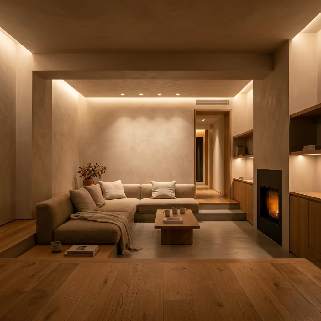
Colour temperature in basement lighting is one of those details that seems technical on paper but completely defines emotional comfort in practice. The wrong temperature can flatten materials, drain warmth from surfaces, and make even a well-designed basement feel slightly uninviting. The right temperature, however, can quietly transform the entire mood of the space without any visible design intervention.
For most residential basements, a range between 2700K and 3000K offers the most balanced result. At 2700K, the light leans warmer, creating a softer, more intimate atmosphere that works particularly well in lounge areas and bedrooms. Moving toward 3000K introduces a slightly cleaner tone, which is often better suited to multifunctional spaces like kitchens, work zones, or open-plan living areas where clarity is just as important as comfort.
I’ve seen basements where overly cool lighting was used in an attempt to mimic daylight. On paper it made sense, but in reality it stripped warmth from materials and made the space feel detached from human scale. Wood appeared flatter, plaster lost its softness, and even textiles felt less inviting. Once the colour temperature was brought back into the warmer spectrum, the entire room regained its sense of depth and calm.
The key is consistency. Mixing multiple colour temperatures within the same basement often leads to visual fragmentation. One zone feels warm, another feels clinical, and the transition between them becomes awkward rather than seamless. In contrast, a unified temperature strategy allows the eye to move through the space without interruption, reinforcing the sense of cohesion that minimalist design depends on.
Lighting at 2700K to 3000K also supports material honesty. Timber feels richer, microcement gains subtle depth, and plaster finishes develop a soft gradient rather than a flat surface. This is particularly important in low-light environments where every surface is doing more visual work than it would in a naturally lit room.
There is also a subtle psychological benefit. Warmer light tends to slow down perception. It encourages relaxation, reduces visual tension, and makes enclosed spaces feel more comfortable over longer periods of time. In basements, where enclosure can easily become overwhelming if not carefully managed, this becomes a quiet but powerful advantage.
Preventing the Floating Furniture Effect Through Lighting
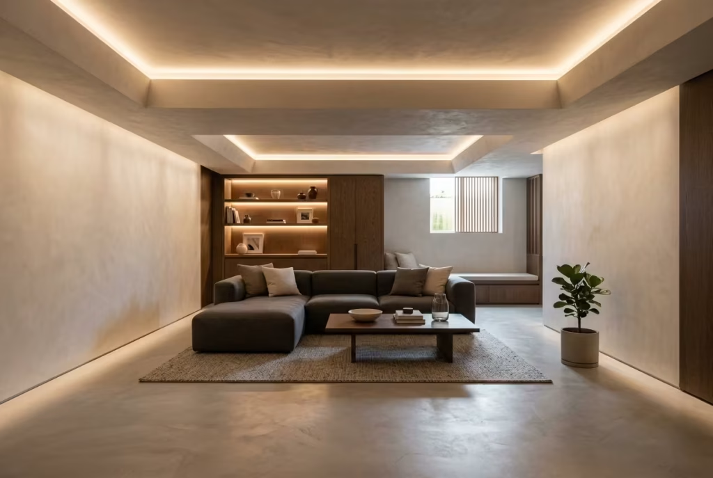
Lighting directly influences how furniture is perceived within a space. When lighting is uneven, overly directional, or visually exposed, furniture can lose its grounding and begin to feel disconnected from the architecture. This is where the floating furniture effect often begins, not in the furniture itself, but in how it is illuminated.
Layered and concealed lighting corrects this by distributing illumination evenly across planes rather than isolating individual objects. When the floor, walls, and ceiling are lit as a continuous field, furniture naturally sits within that field rather than floating on top of it. Integrated LED systems within joinery, subtle wall washes, and indirect ceiling lighting all contribute to this sense of visual stability.
In well-executed basement lighting schemes, furniture does not compete with light. It belongs to it.
Common Minimalist Basement Mistakes
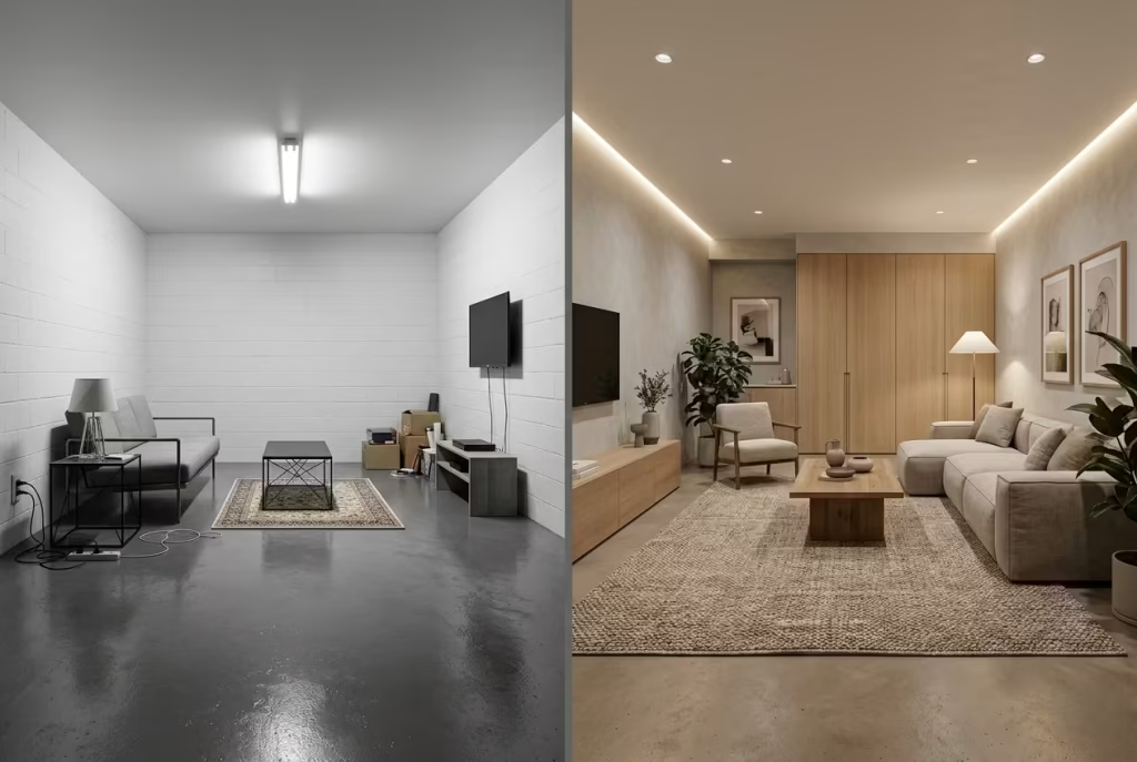
Minimalist basements tend to fail not because the intent is wrong, but because the execution quietly drifts away from the principles that make minimalism work in the first place. I’ve walked into countless basement spaces where everything looks “correct” at first glance, yet something feels off once you spend a few minutes inside. That disconnect usually comes from a handful of recurring mistakes that undermine spatial clarity, comfort, and long-term usability. The irony is that most of these issues are not visual at all. They are structural, behavioural, and often overlooked until the space is already finished.
Over-Minimalism That Feels Cold
One of the most common missteps is pushing minimalism too far, until the space loses its human warmth. Stripping back furniture, colour, and texture without considering emotional balance often results in interiors that feel sterile rather than calm. In basements, this effect is amplified because there is already limited natural light to soften the environment.
I’ve seen projects where every surface was reduced to the absolute minimum, yet the room felt strangely unwelcoming. The problem was not simplicity itself, but the absence of layered warmth. A well-designed minimalist basement should feel like it has been edited, not emptied. Subtle texture in plaster, soft tonal variation, and carefully chosen materials prevent the space from tipping into emotional flatness.
When handled correctly, restraint feels intentional. When overdone, it feels like something has been taken away rather than thoughtfully composed.
Poor Storage Planning Leading to Clutter Rebound
Minimalism collapses quickly when storage is treated as an afterthought. A basement can look pristine on day one, but without integrated storage systems, clutter inevitably finds its way back in. This is what I often refer to as the “clutter rebound effect,” where surfaces slowly accumulate objects because there is no structured place for them to disappear.
Integrated storage is not optional in basement design. It is the backbone of visual discipline. Full-height cabinetry, concealed utility zones, and recessed shelving systems ensure that everyday items do not spill into the open space. I’ve worked on basements where we retrofitted storage walls after completion, and the difference was immediate. The room did not become larger, but it finally felt controlled.
Without this foundation, even the most carefully designed minimalist interior will gradually lose its clarity over time.
Ignoring Acoustics
Acoustics are often overlooked because they are not immediately visible, yet they shape how a basement feels more than most finishes. Hard surfaces, low ceilings, and enclosed layouts naturally amplify sound, which can make even a beautifully designed space feel slightly tense or echo-prone.
I’ve experienced basements where conversations felt sharper than they should, footsteps echoed across rooms, and the overall atmosphere lacked softness. Once acoustic considerations were introduced, through fabric panels, textured surfaces, and soft furnishings, the change was not just audible but emotional. The space felt calmer, more grounded, and easier to inhabit for long periods.
Ignoring acoustics is like designing a visually perfect room that never feels comfortable to stay in. Everything looks right, but nothing feels settled.
Using Small Rugs and Fragmented Furniture Layouts
Another frequent issue is scale misjudgment. Small rugs and scattered furniture layouts can break the visual continuity of a basement, creating what I often describe as a “broken island” effect. Instead of anchoring the space, each element floats independently, weakening spatial cohesion.
I’ve seen lounges where multiple small rugs were used to define zones, but instead of organising the space, they fragmented it. Once replaced with a single large rug of around 2.5 metres by 3.5 metres or roughly 8 by 11 feet, the entire composition changed. Furniture immediately felt grounded, and the room gained a sense of unity.
The same principle applies to furniture placement. Fragmented layouts disrupt flow, while cohesive groupings reinforce spatial logic and prevent visual disconnection.
Treating the Basement as an Afterthought Rather Than a Primary Living Space
Perhaps the most fundamental mistake is psychological rather than technical. When a basement is treated as secondary space, design decisions tend to be rushed, diluted, or budget-restricted in ways that undermine long-term usability. The result is a room that never fully integrates into the home.
I’ve worked on basements where the brief was initially framed as “extra space,” and it showed in every detail. Lighting was minimal, storage was incomplete, and material choices lacked consistency. Once the mindset shifted and the basement was treated as a primary living environment, the design transformed. Suddenly, it had the same level of care, coherence, and spatial discipline as the main floors of the home.
A well-designed basement should never feel like an afterthought. It should feel like an extension of the home’s identity, fully resolved and equally considered.
Preventing the Floating Furniture Effect Through These Mistakes
Nearly every mistake above contributes in some way to the floating furniture effect. Over-minimalism removes grounding texture. Poor storage introduces visual clutter. Ignored acoustics create perceptual disconnect. Small rugs and fragmented layouts break spatial anchoring. And treating the basement as secondary leads to inconsistent design logic.
When these issues accumulate, furniture loses its relationship with the architecture and begins to feel suspended within the space. The solution is not more decoration, but better structure. Cohesion in materials, scale, acoustics, and storage ensures that furniture sits naturally within the environment rather than drifting away from it.
In well-resolved minimalist basements, everything feels anchored for a reason. Nothing floats. Nothing competes. The space simply holds together, quietly and confidently.
Real-Life Project Reflection (Experience-Based Insight)
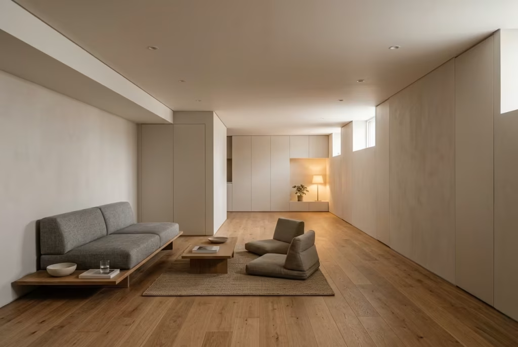
Some of the most revealing basement projects are not the ones with generous proportions or ideal structural conditions. They are the ones that force you to work within constraint and still deliver clarity. One recent project stands out clearly in my mind. The ceiling height was just 2.2 metres or roughly 7.2 feet, which immediately placed the design in a category where every decision had to earn its place. There was no room for excess, no tolerance for visual noise, and absolutely no margin for elements that might break the sense of proportion.
At first glance, the limitation could have easily dictated the outcome. Low ceilings often create a sense of compression that, if handled poorly, makes a basement feel more like a contained box than a liveable environment. But instead of treating the height as a problem to fight against, we treated it as a condition to design around. That shift in mindset changed everything.
The first decision was to reduce vertical interruption wherever possible. Low-profile furniture became the foundation of the spatial strategy. Seating was kept deliberately close to the floor, with restrained back heights that preserved sightlines across the room. This helped prevent the ceiling from feeling like it was pressing down on the space. When furniture respects the vertical limits of a room, the architecture stops feeling defensive and starts feeling composed.
Continuous finishes played an equally important role. We avoided unnecessary breaks in flooring and wall treatments, instead allowing materials to run uninterrupted across key surfaces. In a basement of this scale, even small visual interruptions can exaggerate compression. By maintaining consistency in finish direction and tone, the room gained a sense of flow that made it feel longer and more coherent than its actual footprint suggested.
Storage was handled entirely through integration. Instead of introducing standalone units that would fragment the space, we built concealed storage directly into the wall systems. Depth was carefully controlled, typically within 450mm to 550mm or roughly 18 to 22 inches, ensuring that cabinetry remained functional without intruding into the room’s circulation path. Once closed, these systems disappeared into the architecture, allowing the space to read as continuous rather than compartmentalised.
Lighting and services were treated with the same restraint. Integrated systems replaced visible fixtures wherever possible, ensuring that the ceiling remained visually clean. In a low-height environment, every exposed element competes with perception. By embedding lighting and technical components into architectural lines, the ceiling stopped feeling busy and started reading as a single calm plane.
The result was not a space that tried to disguise its height limitation, but one that accepted it and worked intelligently within it. Instead of feeling compromised, the basement felt composed. There was a quiet confidence in the way everything aligned, as if the space had been carefully edited down to its essential form without losing warmth or usability.
What stood out most was how quickly perception shifted once clutter and fragmentation were removed. The room did not become taller, but it began to feel more considered. Movement felt easier. Sightlines felt clearer. Furniture no longer floated visually because it had a defined relationship with the architecture around it.
Conclusion: Minimalism That Expands, Not Restricts
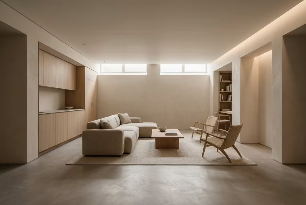
Minimalism in basement design is often misunderstood as subtraction for its own sake, yet the most successful spaces prove the opposite. They are not defined by absence, but by clarity. When every material, proportion, and detail is considered with intent, the result is a space that feels composed rather than emptied. There is a quiet confidence in that restraint, almost as if the room has been carefully distilled down to its most functional and emotional essence without losing depth or warmth.
Spaciousness, in this context, is never the result of simply removing elements. It is the outcome of eliminating anything that interrupts flow. I’ve seen basements where reducing visual fragmentation alone made the room feel significantly larger, even though the physical dimensions remained unchanged. When materials run continuously, when lighting is layered with restraint, and when storage is integrated rather than exposed, the architecture begins to breathe in a way that feels natural and unforced.
The real shift happens when a basement stops behaving like a secondary space. Instead of being treated as an afterthought, it becomes an extension of the home’s primary living environment. That change is not achieved through decoration or surface styling. It comes from disciplined decisions that align furniture, finishes, and lighting into a single coherent language. In one way or another, everything begins to serve the same purpose: maintaining spatial clarity.
I’ve worked on projects where this approach completely redefined how people used their basements. What once felt like a compartmentalised lower level became a fully integrated living zone, used daily and appreciated in its own right. The space did not shout for attention. It did not rely on statement features or visual excess. Instead, it held its presence quietly, like a well-structured sentence that does not need embellishment to be understood.
Integrated appliances and concealed systems played a subtle but essential role in this transformation. By removing visual interruptions and embedding functionality into the architecture, the space maintained its rhythm without breaking continuity. Furniture no longer felt like it was placed on top of the room. It belonged within it, supported by the surrounding material language.
This is where the idea of preventing the floating furniture effect becomes more than a design detail. It becomes a measure of spatial success. When furniture feels anchored, when materials behave consistently, and when lighting supports rather than disrupts, the entire environment gains stability. Nothing feels isolated. Nothing drifts. Everything settles into place with quiet precision.
In the end, minimalist basement design is not about doing less. It is about doing only what strengthens the relationship between space, function, and perception. When that balance is achieved, the basement no longer feels like a lower level of the home. It becomes something more resolved, more confident, and far more livable than its original constraints would suggest.
Frequently asked questions while Designing a Minimalist Basements
Is minimalism suitable for small or low-ceiling basements?
Yes, but only when it is handled with restraint rather than exaggeration. Minimalism can easily go wrong in tight spaces if it becomes overly stripped back, which often results in a cold or unfinished feel. In my experience, basements with ceiling heights around 2.2m to 2.4m (7.2 to 7.8 ft) benefit most from controlled minimalism, where proportions, lighting, and materials are carefully layered instead of reduced to extremes.
The key is not emptiness, but continuity. When surfaces run uninterrupted and furniture is scaled appropriately, the room feels taller and more composed rather than compressed.
How do you prevent a minimalist basement from feeling cold or empty?
This is one of the most common concerns. A minimalist space becomes cold when it lacks material warmth, tonal variation, and layered lighting. The solution is not to add more objects, but to refine the existing ones.
Warm neutrals, textured finishes like plaster or microcement, and soft indirect lighting help maintain comfort without breaking minimal clarity. I often introduce subtle layering within a tight palette so the space feels calm but never sterile. Think of it as depth through restraint rather than decoration through addition.
What is the best way to avoid clutter in a basement?
Clutter rarely comes from use alone. It usually comes from poor storage planning. In minimalist basements, integrated storage is non-negotiable. Full-height cabinetry, concealed utility zones, and built-in shelving systems allow everyday items to disappear into the architecture.
I’ve seen beautifully designed basements lose their clarity within months simply because storage was treated as secondary. Once everything has a designated hidden place, the space naturally stays visually controlled without constant effort.
How important is lighting in a minimalist basement?
Lighting is absolutely central. In fact, I would argue it is the most influential design layer in any basement. Without natural light, artificial lighting becomes the architecture’s primary way of shaping depth and mood.
Layered lighting, ambient, concealed, and task-based, ensures the space feels balanced rather than flat. Warm colour temperatures around 2700K to 3000K are typically ideal because they preserve softness without making the room feel dull or overly yellowed.
How do you make furniture feel grounded instead of floating?
The floating furniture effect usually happens when there is no clear relationship between furniture and surrounding surfaces. This is often a material and lighting issue, not a furniture issue.
Continuous flooring, cohesive wall finishes, and even lighting distribution help anchor furniture visually. Large rugs, properly scaled to at least 2.5m x 3.5m (8 x 11 ft), also play a key role in grounding layouts. When everything belongs to the same visual system, furniture naturally settles into place.
Should a basement be treated as a secondary space in the home?
No, and this is one of the biggest design mistakes I see. When a basement is treated as secondary, it receives inconsistent material choices, weaker lighting strategies, and incomplete storage planning. The result is a space that never fully integrates into the home.
When approached as a primary living zone, everything changes. Material quality improves, spatial planning becomes more disciplined, and the basement starts to function as a fully resolved extension of the home rather than an afterthought.
What materials work best for minimalist basements?
Materials that handle low light and long-term use gracefully tend to perform best. Engineered wood, microcement, lime plaster, and matte stone finishes are particularly effective because they reduce visual fragmentation and age naturally over time.
I tend to avoid overly glossy or high-contrast finishes because they often break continuity and highlight imperfections under artificial lighting. The goal is always cohesion, not visual noise.
Can a minimalist basement still feel warm and inviting?
Yes, absolutely. Minimalism is not about removing warmth, it is about controlling how warmth is delivered. When texture, tone, lighting, and proportion are balanced correctly, a minimalist basement can feel even more inviting than a heavily decorated one.
It becomes less about what is in the room and more about how the room behaves. That is where real comfort lives.