25 Relaxing Coastal Home Office Ideas Inspired by Capri Living
There is something quietly restorative about a coastal workspace done well, especially one shaped by the relaxed elegance of Capri living. It is not simply the pale colours or sea-inspired textures that make these interiors feel calming.
It is the way light moves through the room, the softness of natural materials under hand, and the sense of openness that allows the mind to settle almost instinctively.
In several residential projects I have worked on, the most successful home offices were never the most decorative. They were the spaces that felt breathable and emotionally balanced, layered with linen, limewashed finishes, sun-softened woods, and layouts that welcomed daylight rather than fighting against it. Much like Capri itself, the atmosphere feels effortless at first glance, though every material and proportion is doing quiet work behind the scenes.
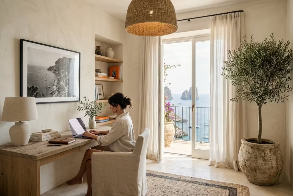
The ideas ahead explore how coastal design can move beyond obvious beach-house styling and become something far more timeless: a workspace that supports focus while still feeling deeply connected to ease, warmth, and everyday living.
Why Coastal Offices Feel Increasingly Relevant in Modern Homes
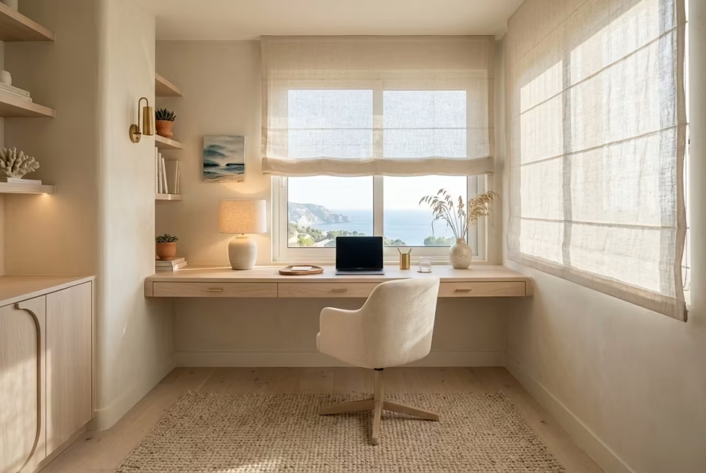
The modern home office has changed dramatically over the last few years. What once functioned as a spare corner with a desk and task chair now carries far more emotional weight. People are spending longer hours at home, shifting between meetings, creative work, admin, and everyday living often within the same four walls. As a result, many homeowners have started craving spaces that feel less clinical and far more grounding.
This is precisely why coastal-inspired offices continue to resonate. They soften the emotional temperature of a workspace. Instead of hard contrasts, artificial brightness, and visually busy styling, these interiors lean into calm transitions, natural textures, and breathable layouts that allow the room to exhale a little.
In practice, I have noticed clients respond particularly well to spaces that borrow from Mediterranean living because they encourage a slower visual rhythm. A softly textured plaster wall catches light differently throughout the day. Linen curtains move gently with airflow. Pale oak underfoot introduces warmth without heaviness. Together, those elements create an atmosphere that feels quietly restorative rather than overstimulating.
One project that still stays with me involved converting a compact upstairs box room into a full-time office for a client working in finance. Initially, the room was painted bright white with sharp black furniture and cool lighting. On paper it looked modern, but in daily use the space felt exhausting by mid-afternoon. We replaced the cold surfaces with chalky mineral paint, natural linen Roman blinds, brushed oak joinery, and a large textured rug measuring roughly 2.4 x 3 metres (8 x 10 feet). The transformation was immediate. The client later admitted the room finally felt somewhere they could think clearly instead of simply “survive meetings.”
That distinction matters more than many people realise.
A good coastal office is not about decorating with seashells or turning the room into a holiday postcard. It is about building a calmer framework for everyday life, one that supports concentration without making the home feel emotionally rigid. In many ways, these interiors work like a deep breath at the end of a long day: subtle, steady, and quietly effective.
Capri’s Influence on Relaxed Luxury Interiors
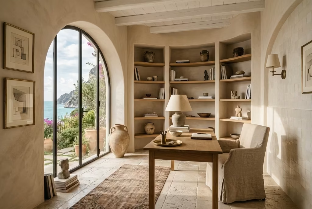
Capri has long represented a particular kind of understated luxury, one rooted less in perfection and more in atmosphere. The interiors associated with the island rarely shout for attention. Instead, they rely on tactile materials, filtered sunlight, faded pigments, and architectural simplicity to create spaces that feel naturally composed.
What makes Capri-inspired interiors so enduring is their refusal to feel overly staged. The stone floors may show gentle wear. Linen upholstery wrinkles slightly under use. Timber develops softness with age. Rather than fighting imperfection tooth and nail, these spaces embrace it as part of the charm. That lived-in ease is exactly what many modern workspaces are missing.
In residential design projects, I often draw from this philosophy when creating home offices that need longevity. Rooms designed purely around trends tend to age quickly. Capri-inspired spaces, by contrast, settle into a home naturally because they prioritise material honesty and comfort over visual spectacle.
I remember designing a coastal office overlooking a narrow garden terrace where the original request focused heavily on “luxury.” Yet once we stripped away the glossy finishes and introduced handmade zellige tiles, brushed limewash walls, and softly curved shelving, the room became far more sophisticated. Funny enough, the less polished it looked, the more expensive it felt.
That is the quiet trick behind Mediterranean restraint. Luxury comes from balance, proportion, and sensory calm rather than excessive styling.
Capri interiors also understand something many modern homes forget: people experience rooms emotionally before they analyse them visually. You notice how the room feels long before you consciously register the furniture inside it.
The Connection Between Light, Texture, and Mental Clarity
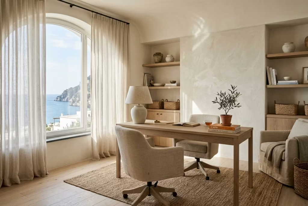
Light changes everything inside a workspace. Not just visually, but psychologically. One of the biggest mistakes I encounter in home offices is an overreliance on harsh overhead lighting paired with flat, synthetic materials. These combinations tend to create visual fatigue surprisingly quickly. The room may appear bright enough, yet it rarely feels comfortable for extended periods of focus.
Coastal interiors approach light differently. Instead of amplifying brightness aggressively, they diffuse it. Limewashed walls soften glare. Linen filters daylight instead of blocking it entirely. Matte timber absorbs rather than reflects excessive brightness. This layering effect creates what I often call “quiet light,” where illumination feels natural and stable throughout the day.
Texture plays an equally important role. Smooth glossy surfaces bounce light sharply around the room, while tactile finishes introduce depth and softness that help the eye relax. In practical terms, even small adjustments can change the emotional feel of a workspace dramatically.
In one recent project, we replaced lacquered cabinetry with wire-brushed oak panels and added textured plaster behind the desk wall. The room dimensions stayed exactly the same at approximately 3.2 x 3.8 metres (10.5 x 12.5 feet), yet the office suddenly felt calmer and noticeably more spacious. The client described it as “less mentally loud,” which, honestly, was the perfect description.
There is also a reason so many people instinctively feel more productive near natural light. Sunlight helps establish rhythm throughout the day. It reduces the cave-like atmosphere many offices suffer from and creates subtle movement as shadows shift across surfaces. Those tiny environmental changes keep a room feeling alive rather than static.
When texture and light work together properly, the workspace stops feeling purely functional and begins supporting mental clarity in a far deeper way.
Why Productive Spaces Should Also Feel Restorative
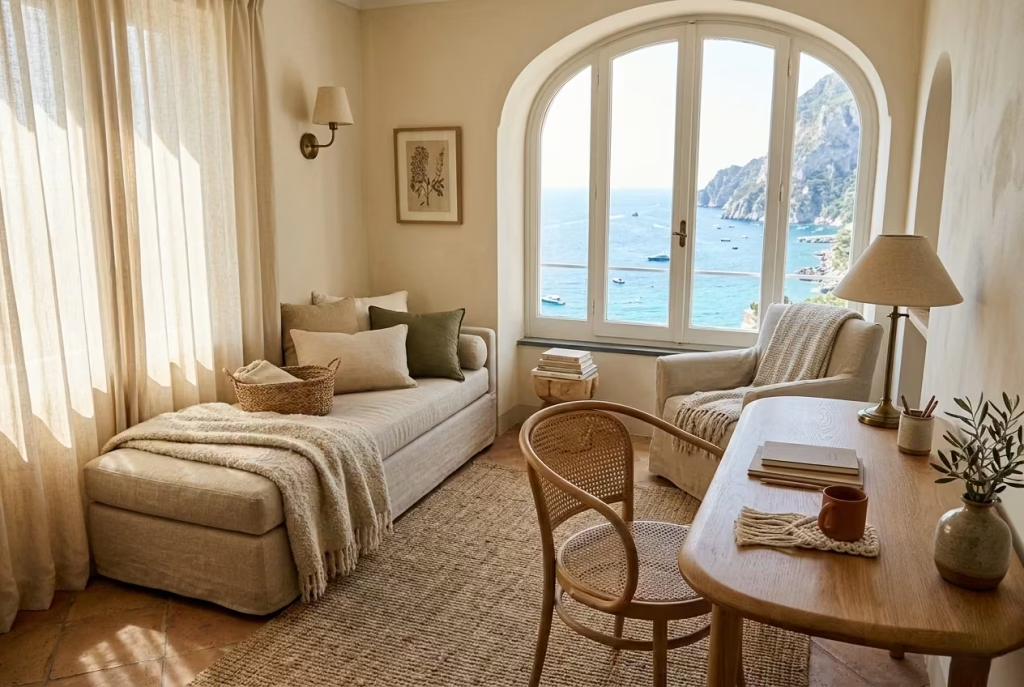
For years, productivity-focused interiors centred almost entirely on efficiency. Ergonomic chairs, streamlined storage, bright lighting, minimal distractions. While those elements still matter, they only solve part of the equation.
The reality is that people do their best work in spaces that support emotional wellbeing alongside functionality.
A restorative office does not mean a lazy one. Quite the opposite. It means creating an environment where the nervous system is not constantly under strain. Soft textures reduce visual harshness. Natural materials feel grounding. Warm neutrals help the room feel steady rather than overstimulating. Even something as simple as a comfortable reading chair positioned near a window can shift how the room is experienced throughout the day.
I once worked on a family home where both partners worked remotely full-time. Their original office setup prioritised maximum desk space and storage capacity, but after several months the room felt draining and joyless. We reworked the layout by introducing layered lighting, softer textiles, curved furniture edges, and a narrow daybed beneath the window measuring approximately 75 cm deep by 180 cm long (30 x 71 inches). Surprisingly, productivity improved after the redesign because the room no longer felt relentlessly task-oriented from morning until evening.
There is an old saying that “you cannot pour from an empty cup,” and honestly, it applies beautifully to workspace design. If a room constantly takes energy without giving anything back emotionally, concentration eventually suffers.
The most successful offices today understand that comfort and productivity are not rivals sitting at opposite ends of the table. When handled carefully, they strengthen one another.
The Difference Between Authentic Mediterranean Restraint and Themed Coastal Décor
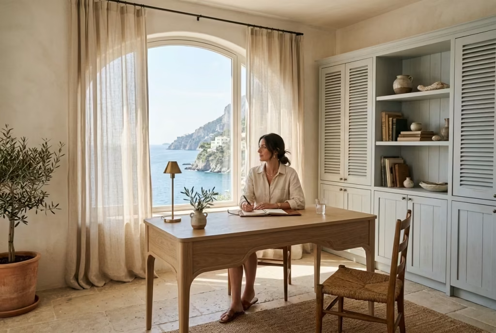
Authentic Mediterranean interiors rely heavily on restraint. They create atmosphere through texture, proportion, craftsmanship, and natural aging rather than obvious decorative motifs.
Themed coastal décor, on the other hand, often leans too heavily into visual clichés. Excessive navy stripes, anchor motifs, rope accessories, overly bright blues, and decorative signage quickly turn a workspace into something that feels more like a holiday rental than a sophisticated home.
True Capri-inspired design rarely announces itself so loudly. Instead, it whispers through material choices. A limestone surface worn softly with time. Hand-finished plaster catching afternoon light. A muted blue-grey cabinet that resembles faded shutters overlooking the sea. These details create depth without screaming for attention.
I have found that the most elegant coastal offices are often the least literal. One project used almost no overt coastal references at all, yet the atmosphere felt unmistakably Mediterranean because we focused on airflow, natural fibres, pale mineral tones, and relaxed spacing between furniture pieces.
That spacing matters enormously. Mediterranean interiors understand the importance of allowing rooms to breathe. Not every wall needs shelving. Not every corner needs styling. Sometimes the empty space itself becomes part of the luxury.
It is a bit like good tailoring. The finest details are often the ones you barely notice at first glance, though together they shape the entire experience beautifully.
You May also Like: 25 Cozy White Interior Ideas That Prove White Can Feel Warm
What Defines a Capri-Inspired Coastal Home Office?
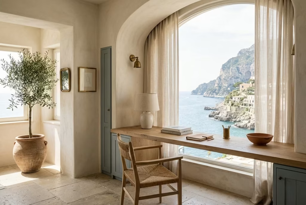
A Capri-inspired coastal home office is not built around obvious seaside references or decorative trends that come and go with the seasons. Its appeal runs much deeper than that. At its core, this design approach is about creating a workspace that feels airy, emotionally calming, and naturally connected to daily living. The room should feel as though it has evolved slowly over time rather than being assembled overnight from a catalogue of matching coastal accessories.
The beauty of Capri interiors lies in their restraint. Nothing feels forced. Materials carry quiet texture, sunlight becomes part of the composition, and the overall atmosphere leans relaxed without slipping into carelessness. In many ways, these spaces behave almost like a well-tailored linen shirt: refined, comfortable, and slightly undone in the best possible way.
In real residential projects, I have found that clients are often drawn to this style because it softens the pressure modern home offices tend to create. Rather than feeling corporate or overly styled, the space begins to support a calmer rhythm of work, which matters enormously when people spend six, eight, or even ten hours inside the same room every day.
Soft Mediterranean Minimalism
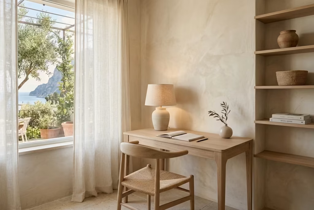
Mediterranean minimalism differs greatly from the sharper, colder forms of contemporary minimal design. It is less concerned with stripping everything away and more focused on removing visual tension. The result feels layered yet breathable.
Furniture tends to feature softened edges rather than rigid geometry. Shelving is often sparsely styled, allowing materials themselves to become the focal point. A pale oak desk, for instance, may sit against a mineral-textured wall with little more than a ceramic lamp and a linen notebook resting on top. The room feels complete not because it is full, but because every element carries visual purpose.
I worked on a coastal office renovation where the client initially wanted extensive built-in storage across every wall. After discussing how visual density impacts mental fatigue, we reduced the joinery by almost 40 percent and introduced more negative space instead. Funny enough, the room immediately felt larger despite losing storage capacity on paper. Sometimes less really does carry the day.
Mediterranean minimalism also embraces softness in transition. Curves appear naturally through arched alcoves, rounded chairs, and gently textured finishes. This subtle layering prevents the office from feeling emotionally cold, which can happen quickly in highly minimal interiors.
Limewashed Textures
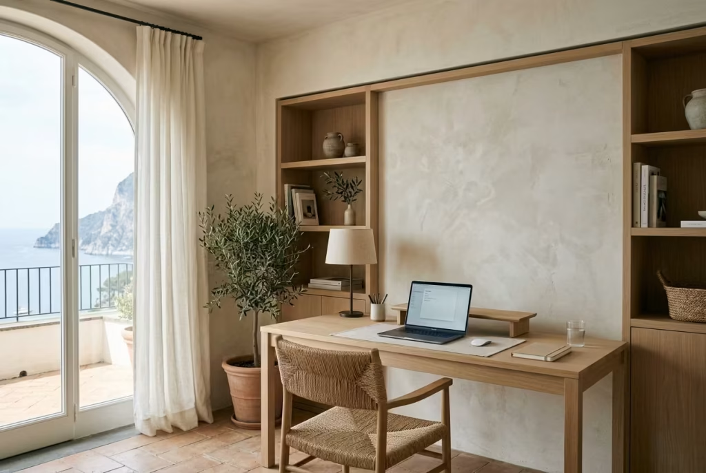
Limewash sits at the heart of many Capri-inspired interiors because it transforms the way light behaves within a room. Unlike flat synthetic paint, limewash introduces movement and depth through soft tonal variation. As daylight shifts throughout the day, the walls subtly change character, creating an atmosphere that feels alive rather than static.
In practical office design, this matters more than many homeowners expect. Flat white walls often create excessive glare during long working hours, particularly in south-facing rooms. Limewashed finishes diffuse brightness gently, helping the space feel visually calmer and easier on the eyes.
For one project near the coast, we applied a chalky limestone-toned limewash across a home office measuring roughly 3.5 x 4 metres (11.5 x 13 feet). Before the renovation, the room suffered from sharp afternoon glare bouncing off painted walls and glossy cabinetry. Once the textured finish was introduced alongside matte oak shelving, the room immediately felt softer and noticeably less fatiguing during video calls and screen work.
There is also an emotional quality to limewash that polished surfaces simply cannot replicate. It carries slight irregularities, subtle shadowing, and a handmade character that gives the office warmth without clutter.
Breezy Layouts and Airflow
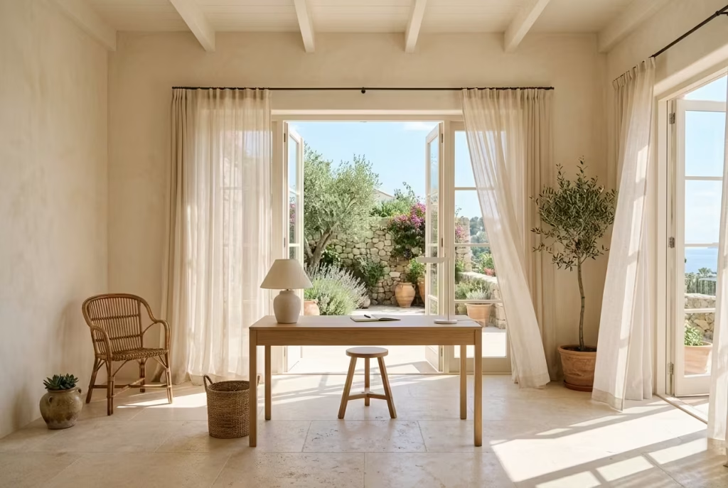
Capri-inspired interiors never feel boxed in. Even smaller rooms are arranged in ways that encourage openness and movement. Furniture placement tends to prioritise circulation and airflow rather than filling every available inch.
This becomes especially important in home offices where mental stagnation can creep in surprisingly fast. A cramped layout, no matter how attractive, eventually starts feeling oppressive after long hours of focused work.
In practice, I typically aim to maintain at least 75 to 90 cm (30 to 36 inches) of circulation space around primary furniture pieces whenever possible. That breathing room changes how the office feels psychologically. You move through the room more naturally, light travels more freely, and the space feels calmer overall.
Cross ventilation also plays a huge role in Mediterranean-inspired workspaces. Windows positioned opposite doorways, sheer curtains instead of blackout drapery, and lighter furniture profiles all help create that relaxed sense of airiness associated with coastal living.
One of the most successful offices I designed overlooked a narrow courtyard garden with French doors opening directly onto the terrace. Even during intense workdays, the simple ability to open the doors and feel airflow moving through the room transformed the emotional experience of working from home. Sometimes the smallest sensory details carry the most weight.
Sun-Faded Colour Palettes
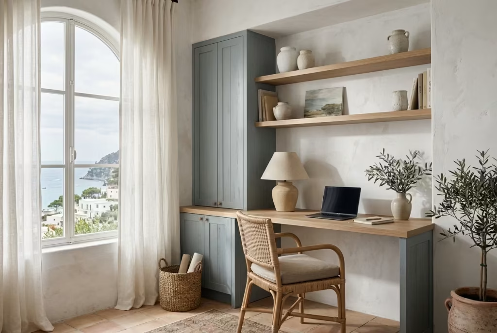
The Capri palette rarely relies on strong contrast. Instead, colours appear softened by sunlight and time. Think chalky whites, mineral beiges, dusty olive greens, faded terracotta, muted sand tones, and washed blue-greys rather than bright nautical blues. This distinction matters enormously in office design.
Overly saturated blues often become visually tiring in workspaces, particularly when paired with cool lighting or limited natural light. What initially feels fresh can quickly become overstimulating during long periods of concentration. I have seen beautifully photographed coastal offices feel surprisingly uncomfortable in daily use simply because the palette fought too aggressively for attention.
Capri-inspired tones behave differently. They recede softly into the background, allowing focus to settle more naturally. They also age better over time because they feel connected to natural materials rather than temporary trends.
In one renovation, we replaced bright navy cabinetry with a muted grey-blue finish inspired by weathered Mediterranean shutters. The room immediately felt more sophisticated and significantly calmer. The client later joked that the office no longer looked like “a beach café trying too hard,” which, honestly, captured the issue perfectly.
Organic Materials Over Polished Perfection
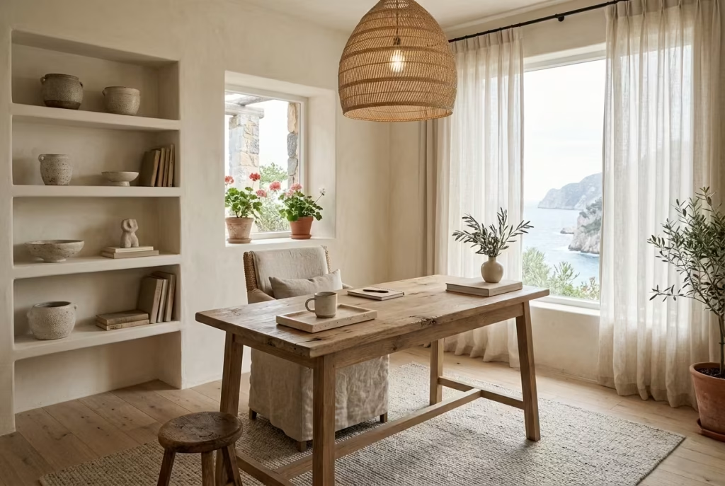
One of the defining characteristics of Capri interiors is their reliance on tactile, imperfect materials. Stone shows variation. Linen creases naturally. Timber develops softness through use. Nothing feels excessively polished or artificially pristine.
This philosophy creates offices that feel far more comfortable to inhabit long term.
Highly glossy surfaces may photograph beautifully for a moment, but in real life they often introduce glare, fingerprints, visual sharpness, and a sense of emotional distance. Organic materials, by contrast, invite touch and create warmth through texture.
In home offices, I often lean toward brushed oak, travertine, handmade ceramics, woven seagrass, and linen upholstery because these materials age gracefully while helping the space feel grounded. A textured rug beneath a desk, particularly one around 2 x 3 metres (6.5 x 10 feet), also improves acoustic softness while visually anchoring the workspace.
The result is not perfection in the traditional sense. It is something more human. A room that feels lived-in, comfortable, and quietly luxurious without trying to impress at every angle.
Indoor-Outdoor Visual Continuity
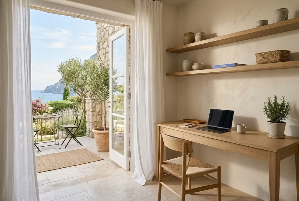
Mediterranean interiors rarely separate indoors and outdoors too aggressively. Instead, they allow visual flow between the two, creating spaces that feel connected to nature even when fully enclosed.
This principle works beautifully in home offices because it reduces the sense of isolation that often develops during remote work.
Whenever possible, I try to position desks where natural views remain visible without causing screen glare. Garden greenery, stone courtyards, olive trees, or even soft sky views help relax the eyes during long working sessions. There is a reason people instinctively feel better near natural elements. The visual rhythm changes constantly yet gently, keeping the mind engaged without overstimulation.
Material continuity strengthens this connection further. Limestone flooring extending toward an outdoor terrace, similar neutral palettes indoors and out, or linen curtains moving with natural airflow all help blur the boundary between the workspace and the wider environment.
In one compact coastal apartment, we used identical travertine-look porcelain flooring both inside the office and across the adjoining balcony. Though the room itself measured only 2.8 x 3.2 metres (9 x 10.5 feet), the continuous flooring visually expanded the space dramatically.
It is one of those quiet design tricks that punches above its weight.
Relaxed Luxury Versus Nautical Styling
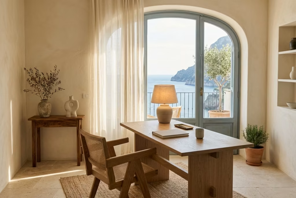
There is a world of difference between relaxed Mediterranean luxury and themed nautical décor, though the two are often confused.
Relaxed luxury focuses on atmosphere, proportion, texture, and comfort. Nautical styling tends to rely on decorative symbolism. One feels timeless. The other can quickly become gimmicky.
A true Capri-inspired office avoids obvious coastal clichés. You are unlikely to find anchor prints, excessive rope details, or aggressively marine-inspired colour schemes. Instead, the coastal feeling emerges subtly through natural materials, softened palettes, breezy spacing, and sunlight interacting with texture.
I often tell clients that the goal is to evoke the feeling of the Mediterranean rather than literally recreate it. That distinction changes everything.
In practice, this usually means editing far more than adding. Removing unnecessary décor. Choosing fewer but better materials. Allowing craftsmanship and proportion to carry the room rather than decorative accessories.
As the saying goes, “empty vessels make the most noise.” The most luxurious coastal interiors rarely shout for attention. They simply feel deeply comfortable the moment you step inside.
You May also Like: 25 Beautiful Modern Farmhouse Home Office Ideas for a Stylish Workspace
Why Overly Blue Palettes Often Fail in Real Offices
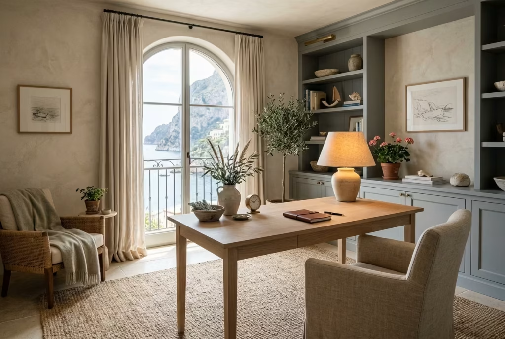
Blue works beautifully in moderation, but excessive cool tones can make offices feel emotionally cold and visually exhausting over time. Bright marine blues especially tend to dominate smaller spaces and reflect harshly under artificial lighting.
In real-world use, softer mineral tones usually perform better. Dusty sage, chalky sand, muted grey-blue, and warm whites create greater balance while still maintaining a coastal atmosphere.
The most successful coastal offices use blue as an accent rather than the entire identity of the room.
How Natural Light Direction Changes Material Choices
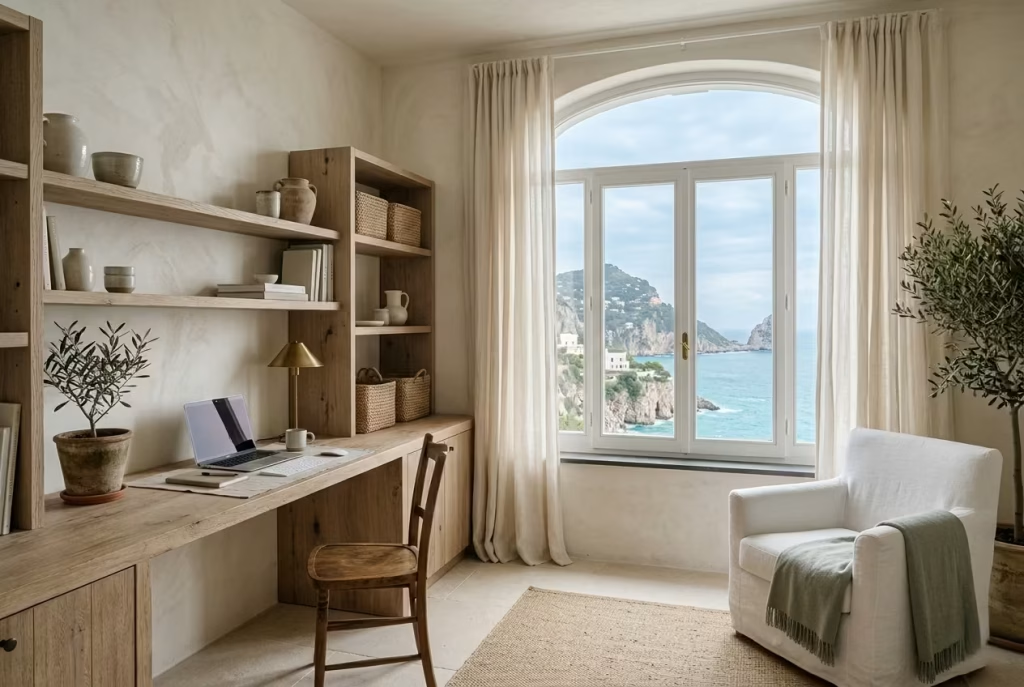
Light direction dramatically impacts how coastal materials behave. North-facing offices typically require warmer woods and creamy mineral tones to prevent the room from feeling flat or cold. South-facing spaces, meanwhile, benefit from cooler neutrals and textured finishes that soften intense sunlight.
I also avoid highly polished stone in bright west-facing offices because afternoon glare can become uncomfortable surprisingly quickly. Matte finishes almost always create a calmer environment for screen-based work.
Good coastal design is not just about colour selection. It is about understanding how materials interact with changing daylight hour by hour.
The Importance of Acoustic Softness in Coastal Interiors
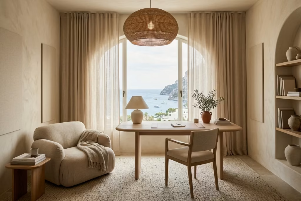
One detail often overlooked in beautiful home offices is acoustics. Hard surfaces may look elegant, but excessive echo creates subtle stress over time, especially during calls and long work sessions.
Mediterranean-inspired interiors naturally soften sound through layered textures. Linen curtains, textured rugs, upholstered seating, woven lighting, and plaster walls all help absorb acoustic harshness without making the room feel heavy.
In one minimalist office renovation, adding nothing more than floor-to-ceiling linen drapery and a thick wool rug reduced echo dramatically. The client later described the room as feeling “quieter emotionally,” which is exactly what good acoustic design should achieve.
Sometimes comfort is not only what you see. It is what the room allows you to stop noticing.
25 Relaxing Coastal Home Office Ideas Inspired by Capri Living
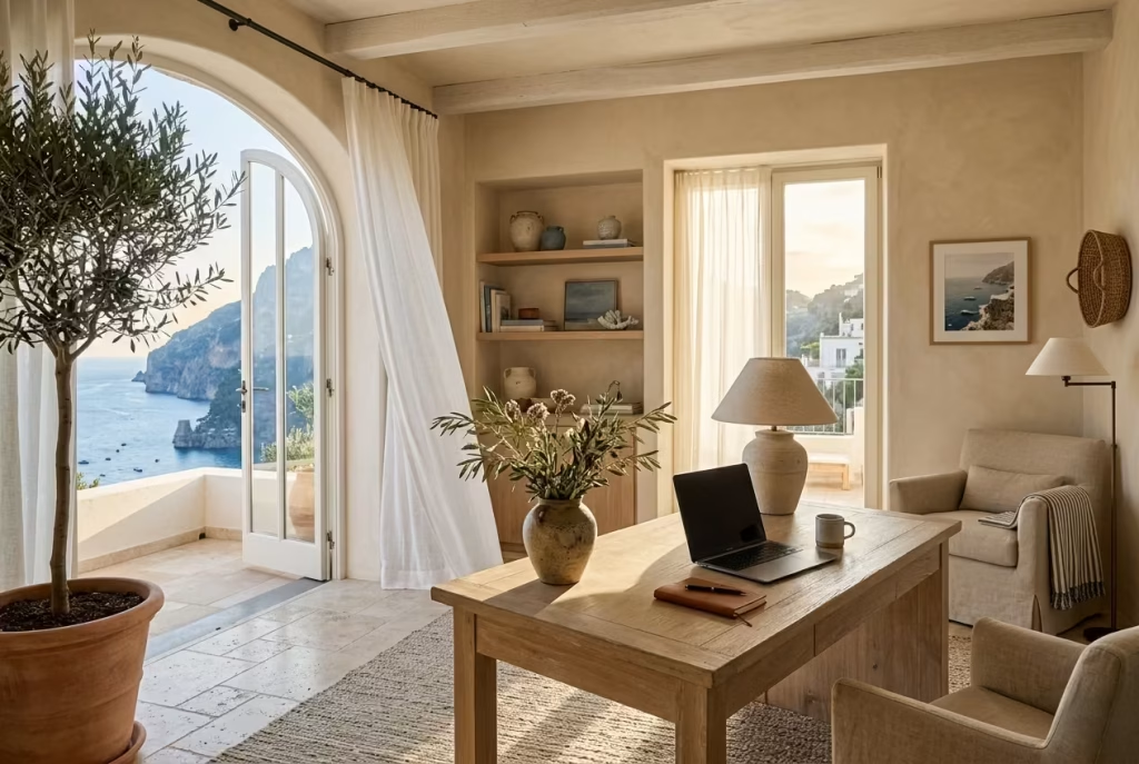
Designing a coastal home office inspired by Capri living is rarely about chasing a perfect Mediterranean postcard. The most successful spaces feel personal, layered, and quietly restorative, shaped less by decoration and more by atmosphere. They understand how natural light settles across textured walls, how softened colours reduce visual fatigue, and how materials like linen, oak, stone, and plaster can completely shift the emotional feel of a workday.
In real homes, this approach matters more than ever. People are no longer looking for offices that simply appear stylish in photographs. They want rooms that support long hours of concentration without feeling emotionally draining by mid-afternoon. They want spaces that feel calm on busy mornings, breathable during stressful deadlines, and comfortable enough to remain timeless long after trends have packed their bags and disappeared down the road.
Throughout the projects I have worked on, the most memorable coastal offices were never the most elaborate. Often, they were the simplest rooms, softened by filtered daylight, balanced proportions, tactile materials, and layouts that left enough breathing room for everyday life to unfold naturally. A chalky limewashed wall catching the evening sun.
A linen curtain shifting gently near an open terrace door. A pale oak desk worn softly over time. These details may seem subtle individually, yet together they create a workspace that feels grounded in a way glossy, overly styled interiors often struggle to achieve.
The ideas ahead explore that balance between beauty and practicality. Some focus on architectural changes, while others rely on smaller material decisions capable of transforming the atmosphere entirely. From breezy layouts and mineral finishes to calming palettes and indoor-outdoor flow, each concept draws from the relaxed sophistication Capri interiors are known for while remaining grounded in real daily living.
Because at the end of the day, the best home offices are not simply designed to impress visitors for five minutes. They are designed to support the people who live and work inside them, day in, day out, without missing a beat.
Limewashed Walls That Diffuse Light Softly
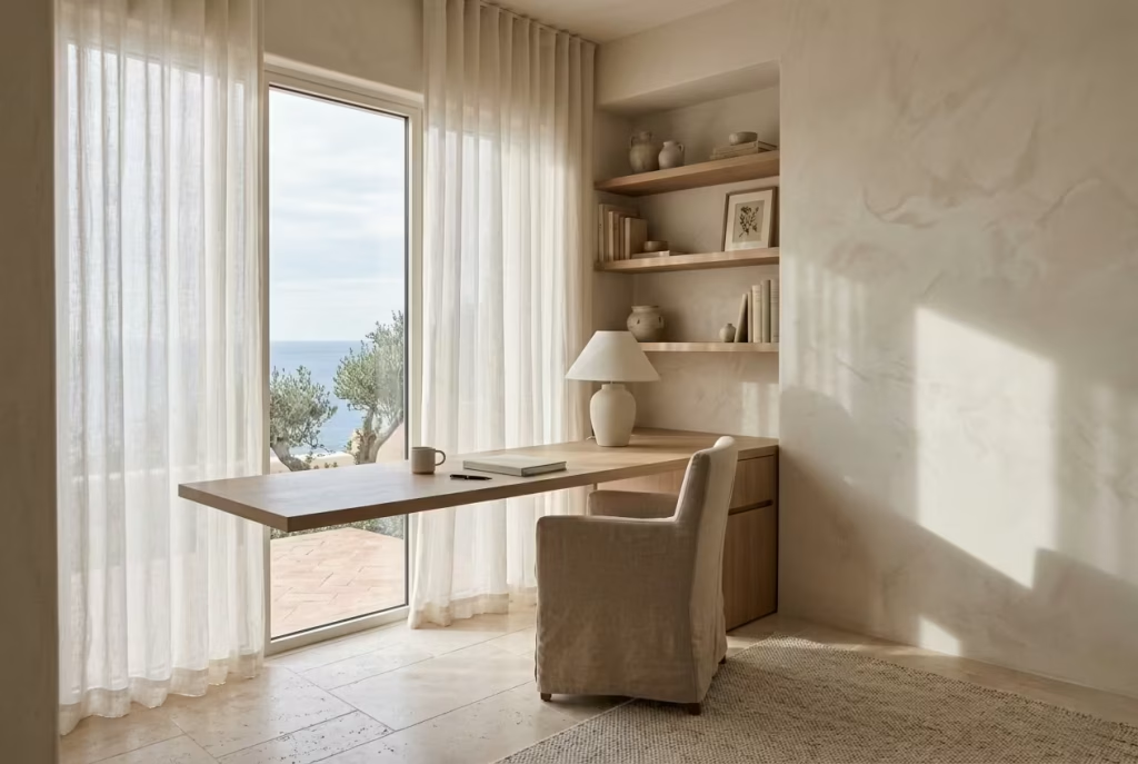
Few finishes capture the relaxed sophistication of Capri interiors quite like limewash. It has a quiet depth that ordinary paint rarely achieves, allowing walls to feel almost atmospheric rather than simply coloured.
In a coastal home office, that difference becomes surprisingly important because the walls occupy such a large portion of your visual field throughout the day. When those surfaces feel harsh or overly flat, the entire room can start feeling mentally tiring without you fully realising why. Limewash changes that experience completely.
Unlike standard emulsions that create a uniform surface from corner to corner, limewash carries movement within the finish itself. The subtle tonal shifts catch daylight gently, creating softness instead of glare. It behaves almost like sea mist settling across stone, slightly imperfect yet incredibly calming to live with day after day.
In real workspaces, this matters more than many homeowners expect. Home offices already contain enough visual stimulation from screens, cables, paperwork, and artificial lighting. Matte mineral finishes help counterbalance that overload by absorbing light rather than aggressively bouncing it around the room.
I often describe limewash as “quietening the walls.” The room suddenly feels less visually loud, particularly during long work sessions where eye fatigue starts creeping in through the back door.
Why Matte Mineral Finishes Calm Visual Noise
Modern interiors frequently lean too heavily on polished perfection. Crisp painted walls, glossy cabinetry, reflective flooring, and sharp contrasts may appear sleek initially, but after several hours inside the room they can become mentally exhausting. The eye never truly gets a place to rest.
Limewash introduces visual softness through texture and irregularity. Since the finish reflects light unevenly, the room develops a more relaxed rhythm. Shadows shift naturally across the surface throughout the day, which keeps the office feeling layered and alive without becoming distracting. This becomes especially beneficial in screen-heavy environments.
One client I worked with spent nearly ten hours daily in video conferences inside a bright south-facing office measuring approximately 3.8 x 4.2 metres (12.5 x 14 feet). Originally, the room had stark white walls paired with satin paint, and by late afternoon the reflected glare became uncomfortable enough to trigger headaches regularly.
Once we replaced the finish with a warm chalk-toned limewash, the atmosphere changed almost overnight. The brightness remained, yet the harshness disappeared. Funny enough, the client’s first comment after completion was, “The room finally feels like it has exhaled.”
That phrase has stuck with me ever since because it perfectly captures what matte mineral finishes do well. They soften tension without darkening the room.
Recommended Tones for a Capri-Inspired Office
The most successful limewash colours tend to feel sun-faded and mineral-based rather than overly pigmented. Capri interiors rarely rely on sharp colour statements. Instead, they lean into tones that appear naturally weathered over time.
Some of the most effective shades for coastal home offices include:
- Warm limestone
- Chalky ivory
- Soft oyster white
- Dusty sand
- Pale mushroom
- Faded clay
- Muted olive-grey
- Washed mineral beige
These tones work beautifully because they support concentration without dominating the room visually. They also adapt exceptionally well to changing daylight conditions, which is crucial in workspaces used from morning through evening.
I generally advise caution with bright pure whites in coastal offices, especially when paired with strong natural light. While they may appear fresh initially, they often create excessive glare by midday. Softer mineral whites with warmer undertones tend to age far more gracefully and feel considerably easier on the eyes.
In north-facing rooms, warmer limewash tones help prevent the office from feeling cold or lifeless. South-facing spaces, meanwhile, can handle cooler chalky neutrals because natural sunlight already introduces warmth naturally.
As the old saying goes, “too much of a good thing can spoil the broth,” and that absolutely applies to bright white interiors.
Real Project Insight About Glare Reduction
One renovation in particular completely shifted how I approach light management in coastal offices.
The project involved converting a former dining room into a full-time workspace overlooking a garden terrace. The room featured large west-facing windows nearly 2.1 metres tall (7 feet), which flooded the space with intense afternoon sun. Initially, the homeowners loved the brightness, but after working there for several months they realised the glare became unbearable during late-day meetings.
Rather than reducing natural light through heavy window treatments, we focused on diffusing the light more intelligently.
We applied a hand-brushed limewash finish in a pale stone tone with visible movement across the walls. We also replaced glossy cabinetry with brushed oak joinery and introduced linen drapery that filtered sunlight softly rather than blocking it completely.
The difference was remarkable.
The room retained its airy Mediterranean feel, though the brightness no longer felt sharp or fatiguing. Screen reflections improved significantly, and the office developed a much calmer atmosphere overall. Interestingly, the clients later mentioned they started spending more time in the office even outside work hours because the room simply felt emotionally comfortable.
That is often the hidden power of good material choices. They shape behaviour quietly in the background.
Best Ceiling Height Pairings
Limewash tends to perform best in rooms where the walls have enough vertical presence to showcase the texture naturally.
Ideal ceiling heights include:
- 2.4 to 2.7 metres (8 to 9 feet) for smaller home offices
- 2.7 to 3 metres (9 to 10 feet) for more expansive Mediterranean-inspired spaces
Lower ceilings can still work beautifully with limewash, though lighter tones become especially important to maintain openness. In compact rooms, I often continue the same wall colour across the ceiling to blur harsh transitions and create a softer architectural envelope.
For taller ceilings, limewash becomes even more dramatic because shifting daylight creates subtle tonal movement across larger wall surfaces. The room begins to feel layered almost effortlessly.
Recommended Wall Texture Depth
One of the biggest misconceptions about limewash is that heavier texture automatically creates more character. In reality, overly rough finishes can become visually chaotic in workspaces, especially behind computer screens or shelving.
For coastal home offices, I typically recommend:
- Light to medium texture depth
- Soft cloud-like variation rather than aggressive trowel marks
- Subtle layering visible only as light changes throughout the day
The goal is refinement rather than rustic heaviness.
A heavily distressed finish may work beautifully in a Mediterranean restaurant or holiday villa, though inside a daily workspace it can quickly become distracting. Offices benefit from restraint, where texture supports calmness instead of fighting for attention.
Pros of Limewashed Walls in Coastal Offices
Softens Natural Light Beautifully: Limewash diffuses daylight gently, helping reduce harsh glare and visual fatigue during long work hours.
Adds Depth Without Clutter: The finish introduces movement and atmosphere without relying on excessive décor or accessories.
Enhances Mediterranean Character Naturally: Even simple rooms instantly feel more architectural and grounded.
Ages Gracefully Over Time: Unlike flat synthetic paints that can feel dated quickly, limewash develops character subtly with age.
Improves Emotional Comfort: The tactile softness creates a calmer environment that supports focus and relaxation simultaneously.
Cons of Limewashed Walls in Coastal Offices
Higher Application Cost: Professional limewash application often costs more than standard paint due to specialist labour and preparation.
Requires Skilled Installation: Poor application can result in uneven patchiness rather than intentional texture.
More Delicate Than Standard Emulsion: Certain limewash finishes may mark more easily in high-contact areas.
Colour Variations Are Unpredictable: The natural movement within limewash means the final appearance can differ slightly from samples.
Touch-Ups Can Be Challenging: Spot repairs occasionally blend unevenly if not handled carefully.
Still, when done properly, limewash earns its keep many times over. It transforms an office from something merely functional into a space that feels emotionally restorative, which, in today’s world, is worth its weight in gold.
You May also Like: 25 Boho Office Ideas to Inspire a Creative Workspace
Built-In Oak Desks Facing Natural Light
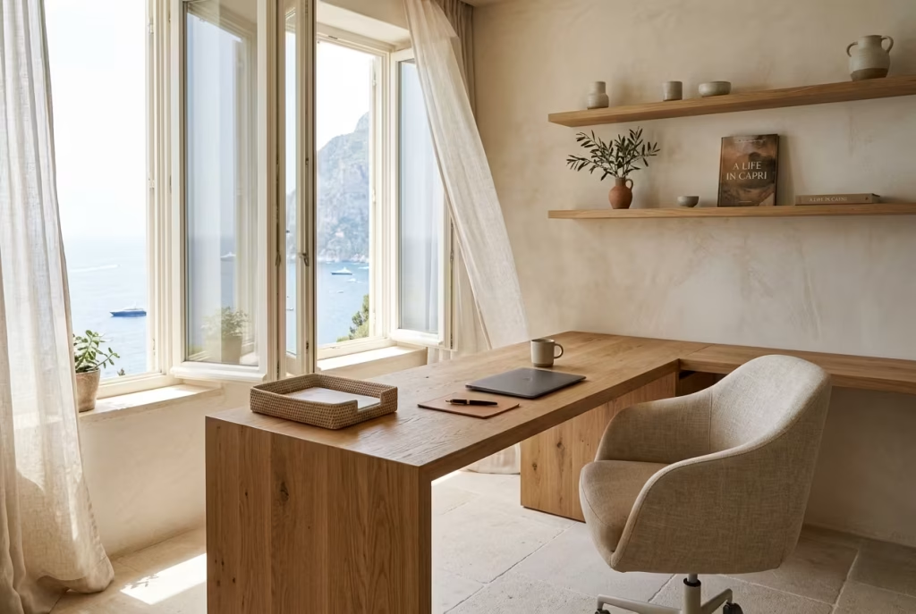
A built-in oak desk can completely change the way a coastal home office feels and functions. When it is handled properly, it becomes more than a work surface. It turns into part of the architecture, almost as though it has always belonged there. That sense of permanence matters in Capri-inspired interiors, where the best spaces rarely feel assembled in a hurry. They feel settled, thoughtful, and beautifully in tune with the room around them.
Oak is particularly effective because it carries warmth without tipping into heaviness. It has enough grain to add character, yet it remains calm enough to sit comfortably alongside limewashed walls, linen curtains, or pale stone flooring. In a workspace, that balance is worth its weight in gold. The room feels grounded, but never weighed down.
Positioning Desks Perpendicular to Windows
One of the most important decisions in any home office is how the desk sits in relation to the window. In coastal interiors, I almost always prefer a perpendicular arrangement rather than placing the desk directly facing or backing onto the glass.
When a desk faces a window head-on, the eye is often pulled constantly toward the outside, which can be distracting during focused work. On the other hand, placing the desk with the window behind it can cause glare on screens and awkward shadows during video calls. Positioning the desk perpendicular to the window gives you the best of both worlds. You receive natural side light, the screen remains more legible, and the room still feels visually connected to the outdoors.
This arrangement also suits Capri-inspired design because it allows daylight to wash across the room in a softer, more natural way. The light moves over the oak surface, picks up the grain, and creates a layered effect that feels relaxed rather than forced.
In one project I worked on, the clients originally wanted the desk directly in front of the window because they loved the garden view. It looked attractive in theory, but in daily use it became a recipe for fatigue. We rotated the desk 90 degrees so that the window sat to the side, and the improvement was immediate. The room still felt open to the landscape, though the workspace suddenly became far easier to use for long stretches of time. That small shift turned a nice room into one that actually worked.
Why Capri Interiors Rarely Block Sunlight
Capri-inspired interiors thrive on brightness, but not the harsh, stripped-back kind that makes a room feel exposed. They rely on sunlight being softened, filtered, and allowed to move. This is one of the reasons built-in desks in these spaces are often slim, unobtrusive, and placed with a light touch rather than bulked out across an entire wall.
Blocking sunlight with oversized furniture is a common mistake. It cuts the room off from the very quality that gives coastal interiors their charm in the first place. Capri design celebrates openness, so a built-in desk should support that feeling, not shut it down.
A well-placed oak desk should sit low enough to preserve the window line where possible, especially if the room has a garden or terrace view. Open shelving or airy storage above the desk can work beautifully, though it should never create a heavy visual lid. The goal is to let the room breathe.
In practical terms, sunlight is not only about beauty. It affects focus, mood, and even the perceived size of the room. In smaller offices, preserving daylight can make the difference between a space that feels slightly cramped and one that feels calm, buoyant, and full of life.
European Oak vs White Oak
When discussing oak for built-in desks, the terminology can get a little slippery, so it is worth slowing down here.
In many interiors, people use “European oak” and “white oak” as though they are interchangeable. In design practice, the differences can matter depending on the look you want and the level of durability required.
European oak tends to have a slightly warmer, more refined grain pattern. It often feels a touch softer in appearance, which suits Capri-inspired interiors beautifully. There is a restrained elegance to it, especially when finished with a natural oil rather than a heavy stain. It has that quietly confident quality that never tries too hard.
White oak, by contrast, is typically a little cooler in tone and often more resistant to moisture and wear, depending on the species and grade being used. It can be an excellent choice for hardworking home offices, especially when you want a slightly cleaner contemporary edge. In a coastal setting, white oak can feel crisp and architectural, though it needs careful finishing so it does not become too stark.
For Capri-style offices, I usually lean toward oak with a natural, lightly limed, or matte oiled finish. The objective is not to make the desk look glossy or overly refined. It should feel tactile, welcoming, and subtly sun-warmed, as if it has already spent years in the room.
Measurements
For a built-in oak desk to function properly, dimensions matter more than many people realise. A beautiful desk that is too shallow, too deep, or poorly positioned quickly becomes a frustration.
Recommended desk depth: 60 to 75 cm (24 to 30 inches) That range usually offers enough room for a laptop or monitor, a notebook, and a little breathing space without making the desk feel bulky. For primarily laptop-based work, the lower end of that range is often sufficient. If you use dual monitors, drawing tools, or physical documents regularly, aiming closer to 70 to 75 cm gives you more comfort and flexibility.
Window clearance recommendations: Keep at least 10 to 15 cm (4 to 6 inches) between the desk edge and the window wall where possible, particularly if curtains, blinds, or operable window handles are involved. In tighter spaces, even a small amount of clearance makes the room easier to live with.
If the window has a deep sill or substantial trim, that needs to be accounted for early in the design process. Otherwise, the desk can feel jammed in, and the whole composition loses its ease. In smaller offices, I often recommend a desktop height of around 74 to 76 cm (29 to 30 inches), which remains the standard comfort zone for most users, though ergonomics should always be tailored to the person using the room.
Proportion is everything here. A desk that is too deep can dominate the room like a bull in a china shop, while one that is too shallow can feel insubstantial and awkward. The sweet spot is a surface that supports work without swallowing the room whole.
Pros of Built-In Oak Desks Facing Natural Light
They Feel Architecturally Integrated: A built-in desk looks considered and permanent, which lifts the whole room beyond a simple furniture arrangement.
Oak Adds Warmth and Texture: It brings a grounded, natural quality that works beautifully with Mediterranean-inspired palettes.
Natural Light Improves the Workday: Positioned correctly, the desk benefits from daylight without creating screen glare.
Built-Ins Maximise Space: They make excellent use of walls and alcoves, particularly in compact rooms where every centimetre counts.
They Age Well: Oak develops character over time, so the desk often looks better after years of use rather than worse.
Cons of Built-In Oak Desks Facing Natural Light
Less Flexible Than Freestanding Furniture: Once installed, the desk cannot be moved around easily if your needs change.
Poor Placement Can Cause Glare: If the desk is not angled correctly, sunlight can become a nuisance rather than a benefit.
Higher Upfront Cost: Custom joinery typically costs more than a ready-made desk, especially when using quality timber.
Requires Careful Detailing: Cable management, edge profiles, and storage integration need to be resolved properly or the final result can feel clumsy.
Oak Can Pick Up Marks Over Time: A natural timber surface will show use, so it needs a finish that suits your lifestyle and maintenance expectations.
Still, when the proportions are right and the desk is positioned with a light hand, a built-in oak workspace can become the beating heart of the room. It gives the office structure without stiffness, warmth without fuss, and enough natural character to make the whole space feel quietly alive.
Sheer Linen Curtains That Move With Coastal Airflow
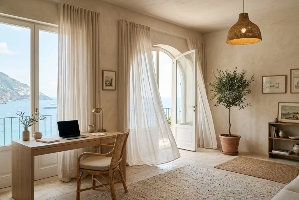
There is something deeply calming about sheer linen curtains in a coastal home office, particularly when they catch a gentle breeze and move almost imperceptibly throughout the day. That quiet movement changes the atmosphere of a workspace in ways that heavy blinds or structured drapery simply cannot replicate. The room feels softer, slower, and far more connected to the outside world.
In Capri-inspired interiors, curtains are rarely treated as purely functional window coverings. They behave more like part of the architecture itself, filtering light, shaping mood, and introducing a sense of ease that polished spaces often lack. Linen, especially in its lighter woven forms, carries an effortless quality that feels perfectly suited to coastal living because it never appears stiff or overly controlled. Even when slightly creased, it looks beautiful. In fact, the relaxed texture is part of the charm.
I have found that sheer linen works particularly well in home offices because it solves several problems at once. It softens direct sunlight, reduces visual glare on screens, improves acoustic comfort, and still allows natural brightness to pass through the room. That balance is crucial. Many people make the mistake of blocking too much daylight in an attempt to improve screen visibility, only to end up with an office that feels dim and emotionally flat by midday.
One project that comes to mind involved a narrow coastal-facing office where the afternoon light became overwhelmingly sharp during summer months. Initially, the homeowners considered blackout roller blinds, though the room instantly lost its airy Mediterranean character whenever they were lowered. Instead, we installed full-height sheer linen curtains mounted close to the ceiling line at approximately 2.7 metres high (9 feet).
The difference felt night and day. Sunlight became diffused rather than harsh, shadows softened beautifully across the walls, and the office maintained that breezy openness clients often chase but rarely achieve.
What made the room especially successful was not only the appearance of the linen itself, but the way it responded to airflow. With the windows slightly open, the curtains moved gently throughout the day, introducing a subtle sense of life into the workspace. It sounds like a small detail, though these sensory shifts matter enormously in rooms where people spend long hours working alone.
There is also a practical side to linen that often gets overlooked. Acoustically, it softens echo far better than bare windows, especially in offices with plaster walls, timber flooring, or minimal furnishings. Even lightweight linen panels can make conversations sound calmer and less sharp during calls or meetings.
Colour selection plays a huge role here as well. The most effective tones tend to sit within warm mineral palettes rather than stark whites. Soft oyster, chalky sand, flax, pale ivory, and faded stone shades all work beautifully because they filter daylight gently without turning the room cold. Bright optic white curtains, particularly against strong sunlight, can sometimes create an almost clinical brightness that feels at odds with the relaxed spirit of Capri interiors.
Length matters too. I nearly always recommend allowing linen curtains to fall fully to the floor, even in compact offices. Curtains that stop awkwardly at window height often feel visually abrupt, while full-length panels elongate the room and create a more graceful architectural line. Ideally, the fabric should either skim the floor lightly or just barely puddle for a softer Mediterranean feel.
As for fullness, linen performs best when generously gathered. Curtains stretched thin as a rake lose much of their softness and movement. A fuller installation allows the fabric to catch light properly while creating richer folds that feel luxurious without appearing formal.
Of course, linen is not entirely maintenance-free. Natural fibres wrinkle easily, and direct sunlight over many years can gradually soften the colour further. Yet in coastal interiors, those qualities rarely feel like flaws. They become part of the lived-in beauty of the space. Much like weathered stone or aged timber, linen gains character through time rather than fighting against it tooth and nail.
In many ways, sheer linen curtains capture the essence of Capri-inspired design perfectly. They are relaxed without feeling careless, elegant without becoming overly polished, and practical without sacrificing atmosphere. Sometimes the most powerful design choices are not the loudest features in the room, but the quieter layers working gently in the background day after day.
Soft Chalky Blue Cabinetry Instead of Bright Nautical Tones
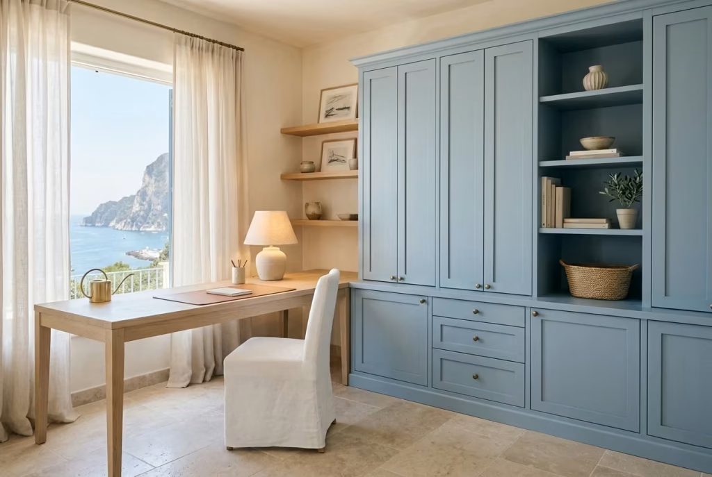
Chalky blue cabinetry sits in that rare sweet spot where colour feels present yet never overpowering. In a Capri-inspired home office, it behaves more like a softened memory of the sea rather than a literal interpretation of it.
There is restraint in it, a sense of fading sunlight and salt-washed surfaces that have been gently weathered over time. That subtlety is exactly what allows it to work so well in workspaces where focus and calm need to sit side by side.
Bright nautical blues often arrive with too much visual certainty. They tend to dominate a room quickly, especially when used across large cabinet runs or full wall joinery. While they can look striking in photographs, they frequently become tiring in daily use.
Chalky blue, on the other hand, behaves differently. It steps back slightly, allowing other materials like oak, linen, and limewash to carry equal weight in the composition.
In real residential projects, I have found that clients are often surprised by how much softer blue cabinetry changes their relationship with the room. One coastal office I worked on involved a long built-in storage wall measuring roughly 3.6 metres (12 feet). Originally, the design brief called for a crisp navy finish.
On paper it sounded bold and confident, though in the actual space it felt visually heavy once sampled against the natural light. We adjusted the tone to a muted, chalky blue with grey undertones, and the entire room immediately felt more breathable. The cabinetry still provided personality, just without shouting for attention.
That is the quiet strength of this colour approach. It whispers rather than declares itself. Chalky blue also responds beautifully to changing light conditions throughout the day. In the morning it often reads cooler and more subdued, almost like mist settling over water.
By late afternoon, especially in warm light, it softens further and takes on a gentle warmth that keeps the room from feeling static. This shifting character gives the office a subtle sense of movement without introducing visual chaos.
Another important consideration is how this tone interacts with surrounding materials. Against pale oak, chalky blue feels grounded and coastal without slipping into themed décor. When paired with limewashed walls, it gains depth and texture, almost as though the surfaces are quietly conversing with one another. Add linen curtains nearby and the whole palette begins to feel cohesive, like it has naturally evolved rather than been selected from a rigid colour chart.
There is also a psychological dimension worth noting. Cooler blues are often associated with clarity and focus, yet when they are too saturated, they can tip into emotional distance. Chalky variations avoid that issue by introducing a softness that keeps the space emotionally warm. The room still feels composed and structured, but not detached or sterile.
In one smaller home office project measuring around 2.9 x 3.3 metres (9.5 x 10.8 feet), we used chalky blue cabinetry only on the lower joinery, leaving upper shelving in pale oak. This prevented the colour from overwhelming the room while still giving it identity. The result felt balanced, almost like the cabinetry was gently anchoring the space rather than defining it too rigidly.
Lighting plays a crucial role here as well. Warm white lighting between 2700K and 3000K tends to flatter chalky blues far better than cooler LEDs, which can push the colour towards grey and strip away its softness. In a well-lit Mediterranean-inspired office, this small adjustment can make the difference between a space that feels inviting and one that feels slightly flat.
Of course, no colour choice is without its trade-offs. Chalky blue cabinetry, while forgiving and atmospheric, can appear slightly muted in very low-light rooms where natural daylight is limited. In those situations,
it may need careful layering with warmer materials to prevent the palette from feeling overly subdued. It is not a colour that thrives in isolation; it relies on context, texture, and light to truly come alive.
Still, when everything aligns, the effect is quietly powerful. Chalky blue cabinetry brings a sense of calm order without rigidity, a touch of coastal character without cliché, and a softness that allows the rest of the room to breathe.
It is less about making a statement and more about setting a tone, one that gently carries the rhythm of the entire workspace without ever stealing the spotlight.
Arched Alcove Workstations Inspired by Mediterranean Villas
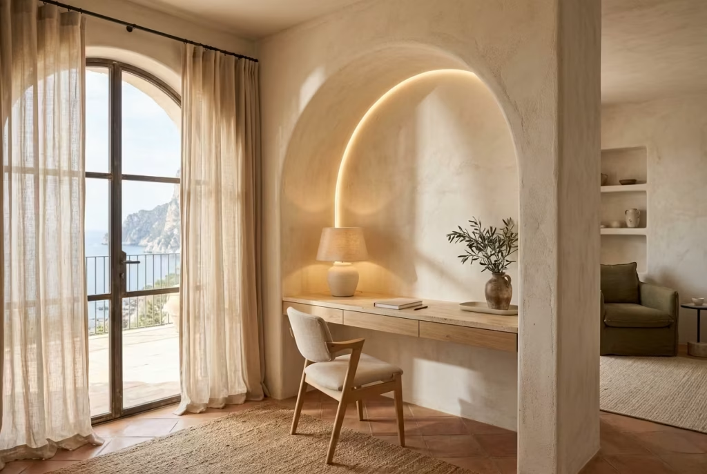
There is a certain quiet drama to an arched alcove that flat walls simply cannot replicate. It introduces a sense of depth, almost like stepping into a carved moment within the architecture rather than sitting against a surface. In Capri-inspired home offices, this detail carries real weight because it shifts the workspace from something placed into a room to something that feels naturally embedded within it.
An arched alcove workstation has a way of slowing the visual pace. The curved top softens the geometry, easing the transition between wall, desk, and ceiling so the eye is never confronted with hard interruptions.
That sense of continuity matters more than it first appears. In long working hours, especially in screen-heavy environments, even subtle architectural softness can reduce mental fatigue and make the space feel less rigid over time.
In practice, I have found that clients respond strongly to this type of design because it introduces character without clutter. One coastal renovation I worked on involved converting a recessed wall niche roughly 1.8 metres wide (6 feet) into a dedicated workstation.
Originally, it felt like an awkward architectural leftover, something the previous layout never fully resolved. Once reframed with a shallow arch and a built-in oak desk, the space transformed completely. It no longer felt like an unused recess. It felt intentional, almost like it had always been designed for that exact purpose.
The magic of arched alcoves lies in their ability to create focus without confinement. Unlike fully enclosed office rooms, they maintain a visual connection to the wider space while still offering a sense of separation. This balance is particularly valuable in homes where square footage is limited, or where the office needs to coexist with living areas without dominating them.
There is also a subtle psychological effect at play. The curved form naturally draws the eye inward, creating a gentle sense of enclosure that feels protective rather than restrictive. It is a bit like sitting within a quiet frame that holds your attention without demanding it. Over time, this can improve concentration simply by reducing peripheral distraction.
Material choice plays a crucial role in bringing the alcove to life. In Capri-inspired interiors, I often favour limewashed plaster or softly textured mineral finishes inside the arch, paired with pale oak or travertine for the desk surface.
The contrast between smooth curvature and natural material variation creates a layered effect that feels grounded yet refined. When light washes across the curved surface, it accentuates the depth in a way that flat walls rarely achieve.
Scale, however, needs careful handling. An alcove that is too shallow can feel decorative rather than functional, while one that is too deep risks becoming cave-like if not properly lit. In most residential projects, a depth of around 60 to 75 cm (24 to 30 inches) for the desk surface tends to work comfortably, with enough overhead clearance to maintain openness without compromising intimacy.
Lighting is another defining element. Integrated wall lighting or concealed LED strips placed along the arch can gently highlight the curvature without introducing harsh contrast. The aim is not to spotlight the form aggressively
but to let it emerge softly as the light changes throughout the day. In some projects, I have also used small brass wall sconces placed slightly forward of the alcove, which adds a warm Mediterranean glow in the evenings without overwhelming the space.
Ventilation and airflow should not be overlooked either. Because alcoves naturally feel more enclosed, ensuring nearby access to fresh air helps maintain comfort during long working sessions. Even a nearby window or opening within a few steps of the workstation can make a noticeable difference in how the space is experienced daily.
Of course, arched alcove workstations are not without limitations. They require more considered planning than a standard desk setup and often depend on existing architectural recesses or custom joinery solutions. In smaller budgets, they may not always be practical to implement fully. However, when executed well, they offer a level of spatial character that is difficult to replicate with freestanding furniture alone.
Ultimately, what makes this idea so compelling is its blend of architecture and atmosphere. It is not simply about creating a place to work, but about shaping a moment within the home that feels quietly immersive. A space where focus settles naturally, distractions soften at the edges, and the rhythm of the day feels just a little more composed, almost like time itself has slowed down for a breath.
Travertine Shelving for Quiet Texture
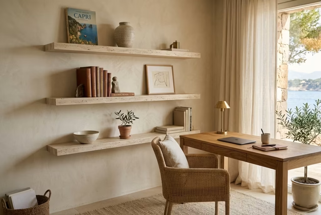
Travertine shelving brings a kind of understated permanence to a coastal home office that is hard to achieve with more conventional materials. It does not compete for attention, yet it quietly reshapes the entire mood of a room. In a Capri-inspired setting, where restraint often carries more weight than ornament, travertine feels almost inevitable, as if it belongs there without needing justification.
What makes it so effective is its natural variation. The subtle pits, tonal shifts, and soft mineral markings prevent it from feeling overly polished or synthetic. Instead, it introduces a grounded texture that sits comfortably alongside limewashed walls, linen fabrics, and pale timber. In a workspace, this matters because it breaks up visual uniformity without creating distraction. The eye can rest on it, then move on, without any sense of friction.
In real projects, I have found travertine shelving works particularly well in offices that need both storage and atmosphere in equal measure. One renovation involved a compact study measuring roughly 2.7 x 3.1 metres (9 x 10 feet), where the brief called for “light storage that does not feel heavy.”
Instead of bulky cabinetry, we introduced two floating travertine shelves, each around 20 to 25 cm deep (8 to 10 inches), mounted against a soft limestone-toned wall. The result felt almost architectural in its simplicity. Books, ceramics, and a few work essentials sat naturally within the stone’s quiet presence, and the room instantly felt more composed.
There is something about travertine that slows a space down. Unlike highly finished materials, it does not reflect light aggressively. Instead, it absorbs and diffuses it in a soft, almost sedimentary way. In a coastal office where natural light is constantly shifting throughout the day, this quality becomes incredibly valuable. Morning light settles differently on travertine than it does on painted MDF or metal shelving. It feels more grounded, less fleeting.
Placement also plays a defining role. Travertine shelving works best when it is treated sparingly rather than overused. A single well-proportioned run often carries more visual authority than multiple stacked layers. In Capri-inspired interiors, restraint is not just aesthetic, it is structural. Every element is allowed room to breathe, and travertine benefits enormously from that approach.
In terms of proportion, I typically avoid overly thick shelf profiles in smaller offices. A depth between 20 and 30 cm (8 to 12 inches) maintains practicality without overwhelming the wall plane. Thickness around 2 to 3 cm (0.8 to 1.2 inches) keeps the profile refined, allowing the material’s natural texture to do the work rather than heavy construction.
Travertine also pairs beautifully with warm metals and organic finishes. When combined with aged brass accents or softly oiled oak desks, it begins to feel less like a functional storage element and more like part of the room’s architectural language. It ties different materials together without forcing harmony, almost like a quiet mediator between textures.
Of course, it is not a material without considerations. Travertine is naturally porous, which means it requires sealing to protect against stains and moisture, particularly in workspaces where coffee cups, ink, or everyday office use can leave marks if left untreated. It is also heavier than many alternative shelving materials, so installation must be carefully planned with proper wall support.
Still, despite these practicalities, travertine shelving earns its place through atmosphere alone. It does not try to impress, yet it consistently elevates whatever sits upon it. In a coastal home office, that kind of quiet confidence is often what separates a merely functional space from one that feels thoughtfully composed and enduringly calm.
You May also Like: 25 Barndominium Office Ideas That Blend Rustic Charm with Modern Productivity
Handwoven Seagrass Lighting for Warm Diffused Illumination
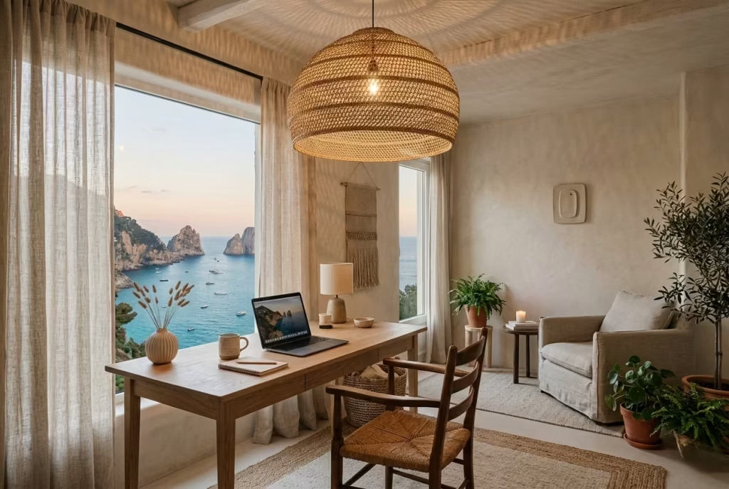
Handwoven seagrass lighting introduces a softness into a coastal home office that is difficult to replicate with glass or metal fixtures. It carries a tactile, almost human quality, as if the material still remembers the hands that shaped it. In a Capri-inspired workspace, where atmosphere is carefully layered rather than loudly constructed, this kind of lighting becomes less of an accessory and more of a mood setter.
What makes seagrass so effective is the way it interacts with light rather than simply containing it. When illuminated, the woven fibres break the glow into irregular patterns, scattering warmth across walls, ceilings, and nearby surfaces. The result is never harsh or overly direct. Instead, it feels diffused, softened, and gently atmospheric, like late afternoon sunlight filtered through coastal foliage.
In practical terms, this matters more than it first appears. Home offices often rely too heavily on overhead lighting that prioritises brightness over comfort. While functional, it can leave the room feeling flat and visually tense, especially during long evening work sessions. Seagrass pendants or table lamps counter this by introducing a layered lighting experience that supports focus without overwhelming the senses.
I worked on a coastal study where the original lighting scheme consisted of recessed ceiling spots arranged in a rigid grid. The room measured roughly 3.4 x 3.6 metres (11 x 12 feet), and although it was technically well-lit, it felt emotionally cold after sunset.
We introduced a large handwoven seagrass pendant positioned centrally above the desk zone, paired with a smaller linen-shaded floor lamp in the corner. The shift was immediate. The room lost its clinical edge and gained a warmth that encouraged longer, more comfortable working hours.
There is also an architectural quality to seagrass lighting that aligns naturally with Mediterranean interiors. The woven texture creates shadow play on surrounding surfaces, which adds depth without introducing clutter. Over time, these shifting patterns become part of the room’s rhythm, changing subtly as the day progresses and the light source evolves.
Scale is particularly important when working with this material. A seagrass pendant that is too small can feel visually insignificant, while one that is oversized can dominate the space unnecessarily.
In most home offices, diameters between 35 and 55 cm (14 to 22 inches) tend to work well for single pendants above a desk or seating area. In larger rooms, layered lighting using multiple fixtures at varying heights often produces a more balanced effect.
Placement should always consider both function and atmosphere. Over a desk, the fixture should hang at a height that avoids obstructing sightlines while still providing enough downward glow for practical tasks. Typically, a drop of around 70 to 90 cm (28 to 35 inches) above the work surface is comfortable, although this can shift depending on ceiling height and room proportions.
One of the understated strengths of seagrass is its ability to soften acoustics visually as well as physically. While it does not replace proper sound treatment, the organic texture reduces the visual harshness of echo-prone surfaces such as plaster or timber flooring. This subtle visual softness contributes to an overall sense of calm, especially in minimalist coastal offices where hard materials dominate.
Colour temperature also plays a key role in achieving the right effect. Warm white lighting, typically in the range of 2700K to 3000K, complements the natural tones of seagrass beautifully. Cooler lighting, on the other hand, can flatten the material and strip away its warmth, making it feel less inviting and more utilitarian.
Of course, seagrass lighting is not without its limitations. Natural fibres can be sensitive to prolonged direct sunlight, which may gradually fade or dry out the material over time. It also requires gentle maintenance, as woven textures can collect dust more easily than smooth surfaces. However, these considerations rarely outweigh the atmospheric benefits it brings to a space.
Ultimately, handwoven seagrass lighting excels because it does not try to compete with the room. It works quietly in the background, shaping mood rather than demanding attention. In a coastal home office, that sense of quiet contribution is often what transforms a purely functional workspace into something that feels warm, human, and gently alive throughout the day.
Plaster Walls Paired With Pale Timber Flooring
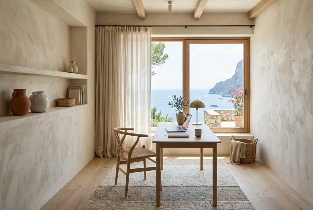
There is a quiet architectural honesty in the pairing of plaster walls with pale timber flooring that feels almost inseparable from Capri-inspired design. It is not a combination that relies on spectacle or contrast. Instead, it builds atmosphere through restraint, texture, and a slow layering of natural materials that feel grounded yet light on their feet. In a coastal home office, this pairing does something particularly important. It removes visual noise and replaces it with a sense of calm continuity that supports sustained focus without feeling sterile.
Plaster walls bring a soft, mineral depth that painted surfaces rarely achieve. Even when the colour is neutral, the finish carries subtle irregularities that catch daylight in a way that feels organic rather than manufactured. These slight shifts in tone prevent the walls from becoming flat backdrops. Instead, they behave almost like a living surface, gently responding to changes in light throughout the day. In workspaces where screens dominate the visual field, this softness becomes surprisingly valuable, helping the eye relax between tasks without feeling visually deprived.
I have worked on offices where clients initially underestimated the impact of plaster finishes, assuming they were purely aesthetic. In one project, a compact study measuring around 3.2 x 3.4 metres (10.5 x 11 feet) had previously been finished in standard matte paint. The room always felt slightly one-dimensional, especially under artificial lighting.
Once we introduced a hand-applied plaster finish in a warm chalk tone, the atmosphere shifted completely. The walls no longer felt like boundaries. They felt like part of the room’s emotional fabric, subtly absorbing light rather than reflecting it back harshly.
When paired with pale timber flooring, the effect becomes even more cohesive. Timber grounds the space without pulling it into heaviness, especially when the tone stays on the lighter end of the spectrum.
Think brushed oak, ash, or softly whitewashed planks rather than darker woods that can anchor a room too aggressively. The floor sets a natural rhythm underfoot, while the plaster walls lift the visual weight upwards, creating a balanced sense of airiness that suits long hours of work.
In practical terms, this combination also helps define zones within open-plan spaces. The flooring provides a consistent visual base that connects the office to adjoining rooms, while the plaster walls establish a quieter, more focused atmosphere within the workspace itself. It is a subtle distinction, though one that makes a noticeable difference in how the room feels throughout the day.
Light interaction is where this pairing truly shines. Morning sunlight skims across plaster surfaces, revealing soft tonal variations that change hour by hour. As the day progresses, pale timber reflects warmth upward, preventing the room from feeling too cool or detached. Together, they create a gentle dialogue between vertical and horizontal planes, almost like the room is quietly adjusting itself to match the rhythm of natural light outside.
Of course, material choice and finish quality are crucial here. Poorly executed plaster can feel patchy or overly rustic in a way that clashes with refined interiors. Similarly, overly glossy timber floors can disrupt the calm balance by introducing unwanted reflection and visual tension. In Capri-inspired offices, the goal is always moderation. Surfaces should feel tactile but not rough, refined but not polished to the point of artificiality.
There are also practical considerations worth noting. Plaster walls, depending on the type used, may require more careful maintenance than standard paint finishes. Small marks or imperfections can be more noticeable if not handled thoughtfully.
Pale timber flooring, while beautiful, will naturally develop character over time through use, which should be embraced rather than resisted. In fact, that gentle ageing process often enhances the Mediterranean quality of the space, reinforcing the sense that the room has evolved rather than remained frozen in time.
When everything comes together, the result is a workspace that feels quietly composed. No single element competes for attention, yet each one contributes to a layered sense of calm. It is the kind of interior that does not announce itself loudly when you enter. Instead, it settles around you gradually, like a familiar rhythm you did not realise you needed until you are already working within it, fully at ease.
You May also Like: 25 Cozy Fall Home Office Ideas to Create a Warm, Productive Workspacea
Indoor Olive Trees to Soften Work Corners
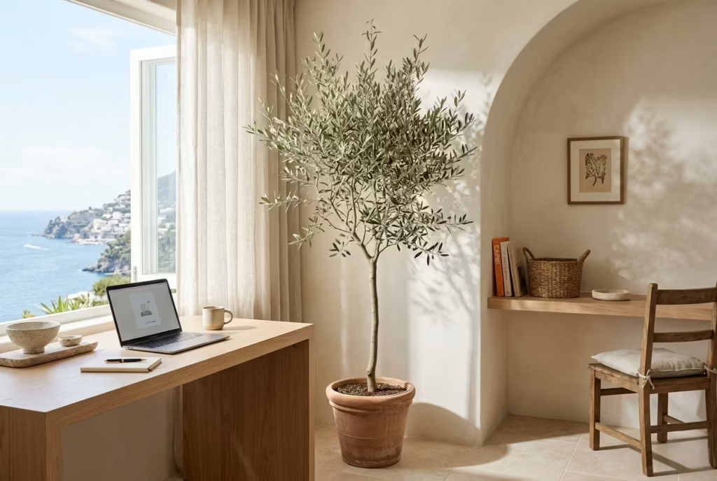
An indoor olive tree has a way of changing a home office without ever feeling like it is trying too hard. It does not behave like décor in the traditional sense. Instead, it brings a quiet presence into the room, almost like a soft punctuation mark placed carefully in a corner that would otherwise feel slightly unresolved. In Capri-inspired interiors, this kind of restraint matters, because the aim is never to fill space for the sake of it, but to let each element earn its place.
Olive trees carry a naturally sculptural quality. The slender trunk, the irregular branching, the muted green-grey foliage, all of it works together in a way that feels both structured and relaxed at the same time. In a coastal home office, that balance becomes particularly valuable. Hard edges from desks, shelving, and architectural lines can sometimes make a workspace feel visually rigid. An olive tree breaks that rigidity, softening corners without diluting clarity.
In real residential projects, I have often used olive trees specifically to “loosen” a space that felt too controlled. One office I worked on measured roughly 3 x 3.5 metres (10 x 11.5 feet), with built-in joinery running along two walls.
The room functioned well but felt slightly tight visually, almost like everything was holding its breath. Introducing a mature olive tree, approximately 1.8 metres tall (around 6 feet), in a simple terracotta planter shifted the entire mood. The corner that once felt visually heavy suddenly became the most relaxed part of the room.
What makes olive trees so effective in workspaces is their ability to introduce organic irregularity. Nothing about them is overly symmetrical or engineered, which is exactly why they work so well against the structured geometry of desks and cabinetry.
The eye naturally gravitates toward that irregularity, and instead of feeling distracted, it feels reassured. There is a subtle reminder there that not everything needs to be perfectly aligned to feel harmonious.
Light plays a huge role in how well an indoor olive tree performs. These trees thrive visually in bright, natural conditions, especially when placed near windows where daylight filters across their leaves.
In Capri-inspired offices, I often position them close to a light source but slightly offset, so they catch shifting sunlight throughout the day. This creates gentle movement in the foliage, which brings a quiet sense of life into the room without introducing visual noise.
Scale is equally important. A small olive plant can easily get lost in a workspace, while an oversized specimen may overwhelm the balance of the room. Most successful home office applications sit somewhere in the 1.2 to 2 metre range (4 to 6.5 feet), depending on ceiling height and available floor space. The goal is not dominance, but proportion, where the tree feels like it belongs rather than competes.
The choice of planter also shapes the final effect. Terracotta remains a classic option because it reinforces the Mediterranean reference without feeling forced. Its warm, earthy tone sits naturally against plaster walls, timber flooring, and linen textiles. Stone or aged ceramic planters also work well, especially in more refined spaces where the aim is to keep the palette subdued and cohesive.
There is also a psychological dimension that should not be overlooked. Studies aside, there is an instinctive calm that comes from having living greenery within sight while working. An olive tree, in particular, carries a sense of stability and quiet endurance.
It does not feel temporary or decorative. It feels rooted. In long working hours, especially in remote environments where days can blur together, that subtle grounding effect can make a meaningful difference.
Of course, indoor olive trees do require some consideration. They need consistent natural light and do not respond well to overly dark corners or neglected positioning. They also benefit from careful watering rather than heavy maintenance. But in return, they offer a presence that artificial styling simply cannot replicate.
In the context of a Capri-inspired home office, an olive tree does something very simple but very powerful. It softens the architecture without weakening it. It adds life without introducing clutter. And it reminds the space, quietly but consistently, that work does not have to feel detached from nature to be productive.
Coastal Home Offices With French Doors Opening Outdoors
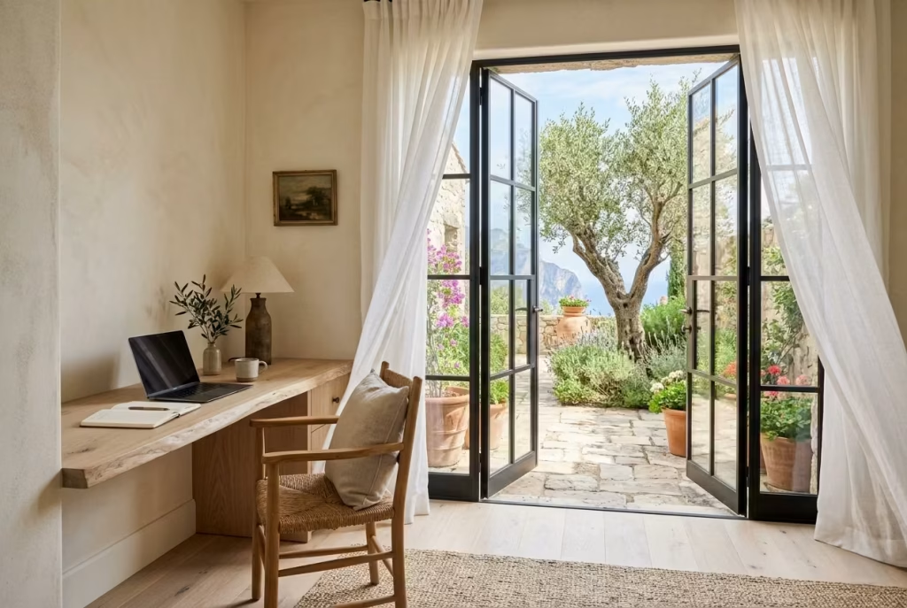
French doors have a way of quietly dissolving the boundary between interior life and the outdoors, and in a Capri-inspired home office that relationship becomes almost essential. They do not simply provide access to a garden or terrace, they reframe the entire rhythm of working from home. Suddenly, the room feels less enclosed, less static, and far more responsive to the natural world just beyond the threshold.
There is a particular kind of ease that comes from being able to glance up from a desk and see movement outside. Leaves shifting, light changing, shadows stretching across a patio. These subtle cues do something important in long working hours. They prevent the space from feeling mentally sealed off, which is often what leads to fatigue creeping in unnoticed.
In design terms, French doors also introduce vertical elegance. Their tall proportions elongate the wall plane and allow daylight to pour into the room in a more generous, even distribution.
Unlike standard windows, they extend the visual connection to the outdoors right down to floor level, which strengthens that sense of continuity between inside and out. In coastal interiors, this continuity is not just decorative. It becomes part of how the room is experienced on a daily basis.
From a material perspective, I often find that pairing French doors with soft, natural finishes inside the office creates a particularly balanced effect. Limewashed walls near the openings help diffuse intense sunlight, while pale timber flooring reflects warmth back into the space. Linen curtains or sheer panels soften the edges without interrupting the view, allowing the architecture to remain open but never exposed.
One of the most effective design decisions in these spaces is resisting the urge to over-furnish near the doors. Keeping this zone visually light ensures the transition between indoors and outdoors feels effortless rather than cluttered.
A desk positioned with a slight angle towards the doors often works better than placing it directly in line, as it allows the view to become a gentle backdrop rather than a constant distraction.
Real-Life Insights
I have worked on several coastal home office projects where French doors completely changed how the space was used, not just how it looked. One particular renovation involved a study that opened onto a narrow but beautifully planted garden, measuring roughly 4 x 6 metres (13 x 20 feet). Initially, the room felt enclosed despite having large windows on one side. The client described it as “productive but slightly boxed in,” which is something I hear more often than you might expect.
We replaced part of the rear wall with full-height French doors leading directly onto a small stone terrace. The desk was positioned at a slight offset so that the garden remained within peripheral view rather than directly in front of the screen. What happened next was interesting. The room did not just become brighter, it became easier to stay in for long periods without feeling mentally drained.
Over the following weeks, the client noticed a pattern. During intense work sessions, they would naturally pause, look outside for a moment, and return to tasks with a clearer head. It was not a conscious productivity strategy, yet it worked almost like a reset button built into the architecture itself. That simple visual connection to greenery reduced the sense of pressure that often builds up in enclosed work environments.
Another project, slightly smaller at around 3.2 x 3.2 metres (10.5 x 10.5 feet), used French doors opening onto a compact courtyard filled with olive trees and gravel planting. Here, the impact was even more pronounced.
The client reported fewer late-afternoon fatigue spikes, particularly during long video call days. The combination of natural light, soft outdoor movement, and easy visual access created a rhythm that felt far less draining than their previous enclosed office setup.
What stands out in both cases is not just the architectural upgrade, but the psychological shift it created. The presence of an outdoor view introduced a sense of spaciousness that no amount of interior styling alone could replicate. It became easier to think, easier to pause, and, perhaps most importantly, easier to step away when needed without feeling disconnected from the work environment.
There is a subtle truth here that often gets overlooked in home office design. Productivity is not only about what happens at the desk. It is also about what the eyes can rest on when the mind needs a brief moment of release.
French doors, when thoughtfully integrated, provide exactly that kind of relief. They turn a simple workspace into something that breathes with the rest of the home, and in doing so, they quietly improve the way the entire day unfolds.
Layered Neutral Rugs That Reduce Acoustic Echo
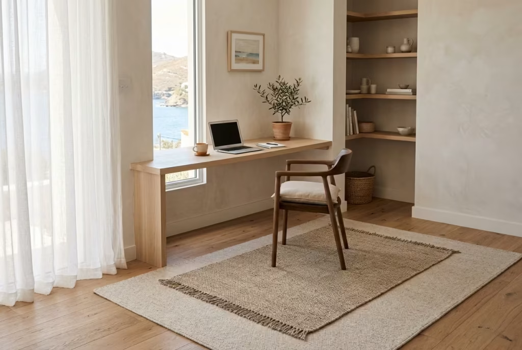
A coastal home office can look visually perfect and still feel slightly uncomfortable if the acoustics are not right. Echo is one of those invisible design flaws that rarely gets noticed at first glance, yet it slowly chips away at comfort over time.
Conversations feel sharper than they should, video calls carry a faint hollowness, and even footsteps can make the room feel more rigid than intended. This is where layered neutral rugs quietly earn their place.
In Capri-inspired interiors, softness is never just visual. It is spatial and sensory. Rugs play a far more important role than simply “finishing” a room. They absorb sound, soften transitions between materials, and introduce a grounded warmth that helps balance harder architectural surfaces like plaster, stone, or timber flooring.
Without them, even the most beautifully designed office can feel a little too crisp around the edges, almost as if the space has been polished to the point of losing its warmth.
Layering rugs, rather than relying on a single piece, adds depth without visual noise. A larger base rug in a muted tone sets the foundation, while a slightly smaller textured layer introduces variation underfoot. This combination helps break up sound reflections in a subtle but effective way. It is a bit like adding soft punctuation to a room that otherwise feels like it is speaking too loudly.
In practical terms, I often find this approach works exceptionally well in home offices with hard flooring surfaces such as oak, limestone, or polished concrete. One project I worked on involved a workspace measuring roughly 3.5 x 4 metres (11.5 x 13 feet), where the original setup had beautiful pale timber floors but very little acoustic control. During calls, the room had a faint echo that became more noticeable the longer the day went on. It was not dramatic, but it created a constant sense of subtle fatigue.
We introduced a layered rug system using a larger 2.5 x 3.5 metre (8 x 11.5 feet) flatwoven wool rug in a warm sand tone, topped with a smaller 1.6 x 2.3 metre (5 x 7.5 feet) handwoven piece in a slightly more textured weave. The change was immediate in how the room felt, not just how it sounded. Footfall became quieter, conversations felt more contained, and the space took on a softer, more grounded presence that supported longer working sessions without that background sense of hardness creeping in.
Colour selection plays a key role here, especially in coastal-inspired spaces where the aim is restraint rather than contrast. Neutral palettes work best because they support the wider Capri aesthetic without pulling focus.
Think layered tones of ivory, oatmeal, flax, muted stone, and soft greige. These shades allow the rugs to blend into the room while still contributing texture and depth. Bold patterns or high contrast designs tend to disrupt the calm visual rhythm that makes these interiors feel so effortless in the first place.
There is also a tactile dimension that should not be overlooked. Rugs influence how a room feels underfoot, which in turn affects how long people are comfortable staying in the space. A thin, unlayered surface can feel slightly unforgiving after hours of use, whereas a softly layered arrangement introduces a more forgiving, grounded sensation that makes the office easier to inhabit throughout the day.
Placement is another subtle but important consideration. In most home offices, positioning the rug so that it extends beyond the desk footprint helps anchor the workspace visually while also improving sound absorption in the main activity zone. This prevents the desk area from feeling like a floating island in the room and instead ties it back into the broader architectural context.
Of course, rugs are not a complete acoustic solution on their own. They work best as part of a broader material strategy that includes curtains, upholstered seating, and textured wall finishes. However, their impact is often underestimated because it is not immediately visible. You feel it more than you see it, and in design terms, that is usually a sign of something working exactly as it should.
In the end, layered neutral rugs do something quietly powerful. They soften the edges of a room that might otherwise feel too sharp, too echo-prone, or too exposed. They bring the space back into balance, almost like turning down the volume on the environment without dimming its character. And in a coastal home office, that sense of calm control can make all the difference between a room that simply looks finished and one that genuinely feels good to work in day after day.
You May also Like: 21 Cottage Office Design Ideas to Create a Cozy and Productive Workspace
Antique Mediterranean Pottery as Functional Styling
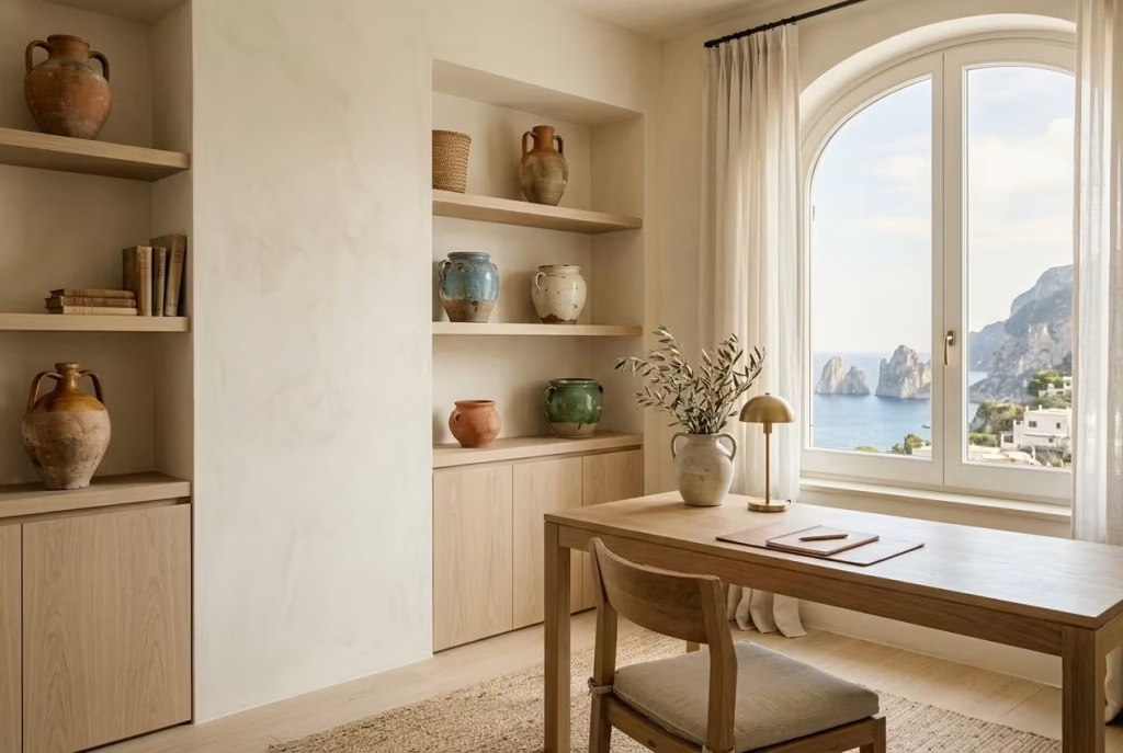
Antique Mediterranean pottery brings a quiet sense of history into a coastal home office, the kind of presence that does not demand attention yet somehow anchors the entire room. In Capri-inspired interiors, this kind of styling is never about filling shelves for visual effect. It is about introducing objects that feel lived-in, grounded, and gently timeworn, as though they have already carried a story long before arriving in the space.
What makes this approach so effective in a workspace is its dual role. These pieces are not purely decorative. They often serve practical functions, holding pens, sketch tools, dried stems, or simply acting as grounded counterpoints on shelving and desks.
That blend of usefulness and beauty prevents the office from feeling overly staged, which is a common pitfall in highly styled coastal interiors.
In real design work, I often find that pottery becomes the emotional punctuation of a room. A single terracotta vessel placed on a travertine shelf or a hand-glazed ceramic jar on a pale oak desk can shift the entire tone of the space.
It introduces warmth without clutter and texture without noise. In one coastal study project measuring roughly 3.3 x 3.6 metres (10.8 x 11.8 feet), we used only three antique-style ceramic pieces across the entire room, and yet those objects quietly tied the whole palette together in a way that larger furniture pieces could not.
The beauty of Mediterranean pottery lies in its imperfections. Slight variations in glaze, softened edges, and natural weathering give each piece a sense of individuality. Unlike mass-produced décor, these objects do not feel interchangeable.
They feel collected over time, even when introduced in a single design moment. That sense of accumulation, almost like fragments gathered from different places and eras, brings depth to a workspace that might otherwise feel too controlled.
There is also something to be said for how these pieces interact with light. On a desk near a window or a shelf positioned opposite a soft light source, antique pottery tends to absorb and reflect illumination in subtle, uneven ways.
A matte terracotta surface will soften brightness, while a lightly glazed ceramic might catch highlights just enough to create a gentle focal point. Nothing about it feels harsh or overworked. It is more like light resting on the surface rather than bouncing off it.
Placement, however, requires restraint. One of the easiest mistakes is overusing decorative objects until the calmness of the room starts to erode. In Capri-inspired interiors, negative space is just as important as the objects themselves.
A single well-chosen ceramic piece on an open shelf often carries more presence than a crowded arrangement. It is a reminder that confidence in design often comes from knowing what to leave out.
I have worked on offices where introducing just a handful of carefully selected pottery pieces transformed the entire shelving system. In one instance, a client initially filled their built-in shelves with books, accessories, and decorative items. It felt busy, almost like the shelves were competing with the rest of the room.
We gradually edited it down, leaving only a few antique-style vessels, each spaced deliberately. The result was striking. The shelving stopped feeling like storage and started feeling like part of the architecture itself.
Material pairing is equally important. Mediterranean pottery sits beautifully alongside limewashed walls, linen textiles, and natural timber because all of these materials share a similar honesty.
Nothing is overly polished or artificially refined. Instead, they feel tactile, slightly irregular, and deeply connected to natural processes of making and aging. That shared language is what allows the room to feel cohesive without becoming overly matched.
Even scale plays a subtle role here. Larger floor vessels, typically around 40 to 60 cm (16 to 24 inches) in height, can soften corners or empty architectural gaps, while smaller tabletop pieces work better in focused zones like desks or shelving clusters. Mixing scales carefully prevents the styling from feeling repetitive or predictable.
Ultimately, antique Mediterranean pottery works because it behaves like memory within a space. It suggests time, travel, and quiet observation without ever needing to explain itself. In a coastal home office, that sense of understated narrative can be surprisingly powerful.
It turns functional surfaces into moments of character, and it gives the room a depth that feels earned rather than manufactured, like a space that has gently grown into itself rather than been switched on overnight.
Whitewashed Ceiling Beams for Architectural Character
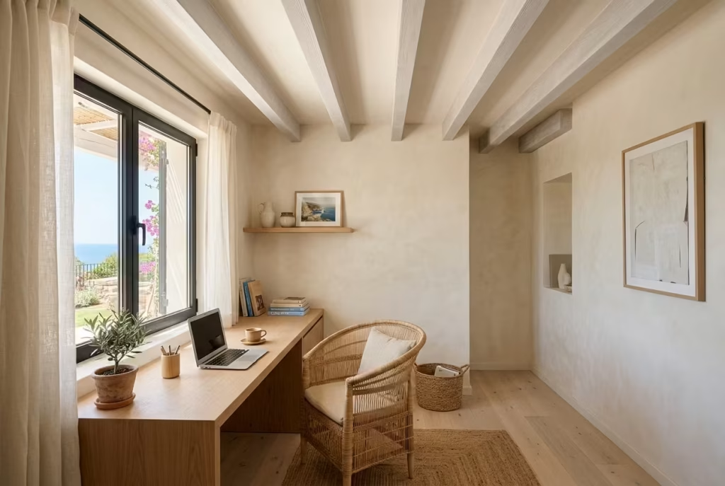
Whitewashed ceiling beams bring a quiet architectural rhythm to a coastal home office, the kind that subtly reshapes how a room is perceived without demanding attention. In Capri-inspired interiors, they are less about rustic drama and more about softening structure. They temper rigid ceiling planes, introduce horizontal cadence, and create a sense of relaxed proportion that feels naturally tied to Mediterranean living.
What makes whitewashed beams so effective is their ability to hold presence without heaviness. Left in raw timber, beams can sometimes dominate a space, pulling the eye upward in a way that feels visually weighty.
When softened with a chalky white finish, however, they retain their form while gently dissolving into the ceiling plane. The result is architectural interest that feels almost incidental, as though it has always been there, quietly shaping the room in the background.
In practical terms, this becomes particularly valuable in home offices where long hours are spent beneath the same visual field. A flat ceiling can feel unremarkable over time, especially in rooms dominated by screens and desk-level focus.
Beams introduce a secondary layer of visual engagement above eye level, giving the mind something soft to register during pauses in concentration without becoming distracting.
I have worked on projects where ceiling treatment alone transformed the emotional tone of a workspace. One study, measuring roughly 3.6 x 4.2 metres (12 x 13.8 feet), originally had a plain plaster ceiling that felt slightly uninspired despite the rest of the room being well resolved.
Once we introduced shallow-profile beams finished in a muted whitewash, spaced at regular intervals of around 90 cm (35 inches), the ceiling gained depth without feeling intrusive. The client described it as “the room finally feeling complete overhead,” which is often where many interiors quietly fall short.
There is also a subtle psychological effect at play. Horizontal ceiling lines naturally encourage a sense of stability and calm. Unlike busy decorative elements at eye level, beams operate in the periphery of awareness. They structure the space without interrupting focus, almost like a gentle architectural framework holding everything in place.
From a material standpoint, the whitewashing process is key. Fully opaque white paint can flatten timber beams and strip away their natural character, while a lighter limewashed or diluted finish allows the grain to remain faintly visible.
This balance is important because it preserves authenticity while still aligning with the softened Capri aesthetic. The goal is not to erase the material, but to quiet it just enough so it blends harmoniously with surrounding surfaces.
Proportion and spacing also matter more than many expect. Beams that are too closely spaced can make a room feel visually compressed, while overly wide spacing risks losing rhythm altogether. In most residential home offices, a spacing range between 80 and 120 cm (31 to 47 inches) tends to work comfortably, depending on ceiling height and room scale. Lower ceilings benefit from fewer, more understated beams, while taller spaces can carry slightly more architectural presence without feeling crowded.
Whitewashed beams also interact beautifully with natural light, especially in rooms with large windows or French doors. As sunlight moves across the ceiling throughout the day, it catches the softened timber surfaces in a way that changes subtly from hour to hour.
Early morning light tends to highlight the grain more gently, while late afternoon warmth deepens the tonal contrast slightly, giving the ceiling a quiet sense of movement.
There is a broader design principle here that aligns closely with Capri-inspired interiors. Architectural features should never feel like interruptions. They should feel like part of the room’s natural language. Whitewashed beams achieve exactly that by sitting between structure and atmosphere, offering definition without rigidity.
Of course, they are not always suitable for every space. In very low ceilings, poorly scaled beams can risk making the room feel heavier than intended, especially if the finish is too opaque or the timber too thick. Installation also requires careful consideration of existing ceiling structure, which means they are best approached as part of a considered design intervention rather than an afterthought.
Still, when executed with restraint and sensitivity, whitewashed ceiling beams bring something quietly powerful to a coastal home office. They add depth without clutter, character without excess, and a sense of architectural calm that lingers in the background throughout the day. Like much of Capri-inspired design, their strength lies not in what they loudly declare, but in what they allow the rest of the room to become.
Capri-Inspired Blue and Sand Colour Pairings
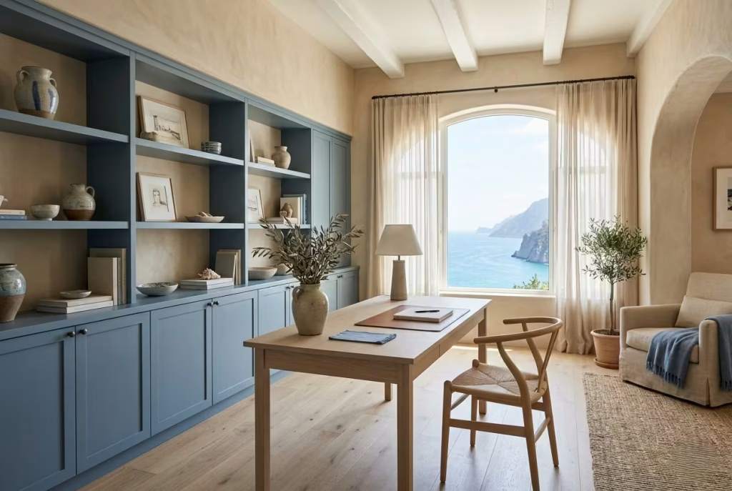
Blue and sand is one of those colour relationships that feels almost instinctively right in a coastal home office, yet it is surprisingly easy to misjudge. When handled with restraint, it carries the quiet elegance of Capri living, where colour is never shouted across the room but gently layered in like a memory of the sea meeting sun-warmed stone. When overdone, however, it can slip into something far more literal, losing its sophistication and becoming overly themed.
The strength of this pairing lies in balance. Sand tones provide warmth, grounding the space in a natural, earthy base that feels steady and calm underfoot. Blues, when softened correctly, introduce atmosphere and depth without overwhelming the room. Together, they create a visual rhythm that feels both expansive and composed, almost like standing at the edge of a shoreline where water meets pale rock.
In real design practice, I rarely treat this pairing as a strict formula. Instead, I think of it as a conversation between two moods. One is stable and grounding, the other is fluid and atmospheric. In a well-designed coastal office, neither should dominate for long. They should ebb and flow across surfaces in a way that feels effortless rather than staged.
I once worked on a home office where the original brief called for “strong coastal identity,” which initially translated into bright navy accents against beige walls. On paper, it sounded cohesive, but in the actual space it felt slightly heavy, almost as if the blue was competing for attention instead of supporting the room.
We softened the palette significantly, replacing the navy with a muted Mediterranean blue that carried grey undertones, and warming the base with a layered sand palette inspired by limestone and natural plaster. The transformation was immediate. The room did not become more colourful, it became more breathable.
That shift is often where Capri-inspired design reveals its true character. It is not about adding more contrast, but about refining intensity until the palette feels sun-faded and time-worn, as though it has already lived through years of coastal light.
Sand tones, in particular, do a great deal of quiet work in this scheme. They act as the stabiliser, preventing blue from drifting into coldness. Depending on undertone, sand can lean slightly warm with hints of beige and ochre, or cooler with soft greige notes. In home offices, I tend to favour warmer sand variations because they counterbalance screen light and artificial illumination, which can otherwise make cooler blues feel detached over long working hours.
Blue, when softened correctly, should never feel saturated or sharp in this context. Think instead of faded shutters, weathered ceramics, or the muted tone of sea glass worn down by time. These are colours that feel familiar without being predictable. They carry a sense of place, but not in an obvious or decorative way.
Scale and distribution of colour are just as important as the tones themselves. One of the most effective approaches is to let sand dominate the larger architectural surfaces, such as walls, flooring, or plaster finishes, while introducing blue in controlled moments through cabinetry, upholstery, or subtle decorative elements. This prevents the palette from tipping into visual overload and keeps the atmosphere grounded.
In one coastal office project measuring roughly 3.4 x 3.7 metres (11 x 12 feet), we used a soft sand limewash across all walls and introduced a muted Capri blue only in the lower cabinetry and a single upholstered chair. Nothing else in the room carried strong colour. Yet the balance felt complete because the blue was echoed subtly in small accents, like a ceramic vase and a handwoven throw. The effect was calm, layered, and quietly cohesive.
Natural light also plays a decisive role in how this pairing behaves. In bright south-facing rooms, blue tones tend to lighten further throughout the day, sometimes almost dissolving into a misty grey-blue.
Sand tones, meanwhile, deepen slightly in warmth, creating a gentle contrast that shifts with the sun. In lower-light spaces, however, care must be taken not to let either tone become too muted, as the palette can lose definition if everything drifts into softness without structure.
Texture helps prevent that issue. When colour remains restrained, material variation becomes the real driver of interest. Limewashed walls, linen textiles, brushed oak, and matte ceramics all reinforce the blue and sand relationship without requiring stronger pigmentation. In this way, the palette feels lived-in rather than applied, as though it has naturally evolved with the space.
There is also a psychological ease to this combination that should not be overlooked. Blue has long been associated with clarity and focus, while sand tones evoke warmth and grounding. Together, they create a balanced emotional field within the workspace, one that supports concentration without becoming mentally rigid. It is a bit like having one foot in calm water and the other on steady ground, neither element overpowering the other.
Of course, restraint is the thread that holds everything together. Without it, the pairing can quickly become overly literal, leaning too far into beach-house styling rather than refined Mediterranean calm.
But when handled with a lighter touch, blue and sand become something far more enduring. Not a theme, but a language. One that speaks softly through colour, texture, and light, shaping a home office that feels composed, grounded, and quietly connected to the coastal spirit it draws from.
Minimal Open Shelving Styled With Restraint
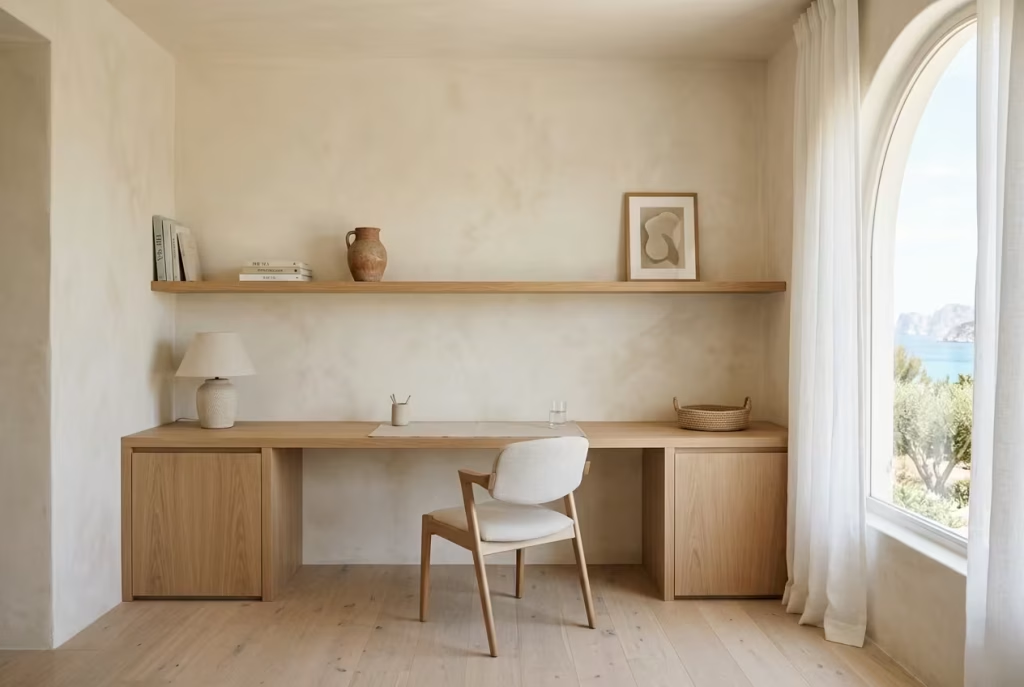
Open shelving in a coastal home office can either feel quietly elegant or visually overwhelming, and the difference almost always comes down to restraint. In Capri-inspired interiors, shelving is never treated as a stage for constant display. Instead, it behaves more like a breathing surface within the architecture, offering moments of interest without ever tipping into clutter.
There is a particular discipline required here. Open shelves naturally invite accumulation. Books, objects, personal items, and functional tools tend to gather over time, and before long the original calm intention can become diluted.
In design terms, this is where many well-composed offices begin to lose their clarity. What once felt effortless starts to feel slightly crowded, as if every surface is trying to speak at once.
In practice, I often remind clients that shelving is not a storage competition. It is a composition exercise. In one coastal workspace I worked on, the shelving ran along a 2.8 metre (9 foot) wall above a built-in desk. Initially, the client filled every section with books, framed prints, and decorative objects.
It looked interesting at first glance, but within a few weeks they mentioned it began to feel visually tiring during long work sessions. We stripped it back significantly, leaving generous negative space between selected pieces. The difference was immediate. The room felt lighter, almost like it had regained its breath.
This is where the idea of under-styling becomes powerful. In many interiors, there is a natural temptation to “complete” every surface, as if emptiness signals something unfinished. Yet in reality, the opposite is often true.
Empty space gives the eye somewhere to rest. It slows visual noise and allows each chosen object to carry more presence. In a home office, where focus is already under constant pressure, that sense of visual quiet becomes incredibly valuable.
Styling Fatigue
Styling fatigue is something I encounter more often than people expect, especially in work-from-home environments that evolve gradually rather than being designed all at once. It usually begins subtly. A few shelves are filled here and there, then more items are added over time, until the original composition loses its clarity. The space still functions, but it no longer feels calm.
The issue is not the objects themselves, but their density. When everything is styled to the same level of attention, nothing stands out. The eye has nowhere to pause, so it keeps moving without settling. In long working hours, that constant visual movement can become quietly exhausting.
In one project, a client described it perfectly without realising the design term behind it. They said, “It feels like the room never stops talking.” That is exactly what styling fatigue looks like in practice. Too many voices competing in the same visual field.
The solution is rarely adding more. It is usually editing with intention. Reducing repetition, spacing items further apart, and allowing certain shelves to remain almost empty. That negative space is not wasted. It is doing essential work in the background, restoring balance and calm.
Why Under-Styling Often Feels More Luxurious
There is a subtle sophistication in restraint that often gets misunderstood. Many people associate luxury with abundance, yet in well-resolved coastal interiors, luxury often emerges from what is deliberately withheld.
Under-styled shelving feels more luxurious because it signals control, confidence, and clarity. It suggests that every object present has been chosen carefully, rather than placed to simply fill a gap. This creates a sense of intentionality that the eye reads almost instantly, even if the viewer cannot articulate why the space feels so composed.
In Capri-inspired design, this principle is especially important. The aesthetic is rooted in ease rather than excess. Shelving that breathes, with space between objects and a rhythm that feels unforced, mirrors the wider architectural language of Mediterranean living. Nothing feels rushed or overworked. Everything has room to exist properly.
I often approach shelving as if I am composing pauses between sentences rather than listing items. A cluster of books might sit on one side, a single ceramic vessel on another, and then a stretch of empty space before the next visual moment. That rhythm creates a natural flow that feels calm rather than static.
Material also plays a supporting role here. When shelving is minimal, the quality of the materials becomes more visible. Oak grain, plaster textures, linen-backed panels, or stone surfaces all become part of the visual experience. Without clutter competing for attention, these quieter details begin to carry the room.
In the end, minimal open shelving works best when it resists the urge to perform. It is not a display case. It is a quiet structural rhythm within the room, one that supports the overall atmosphere rather than competing with it.
And in a coastal home office, that kind of restraint often becomes the difference between a space that simply looks styled and one that feels genuinely composed, lived in, and easy to be with over time.
You May also Like: 25 Mountain Home Office Designs to Inspire Your Cozy Workspace
Curved Furniture That Softens Rectilinear Rooms
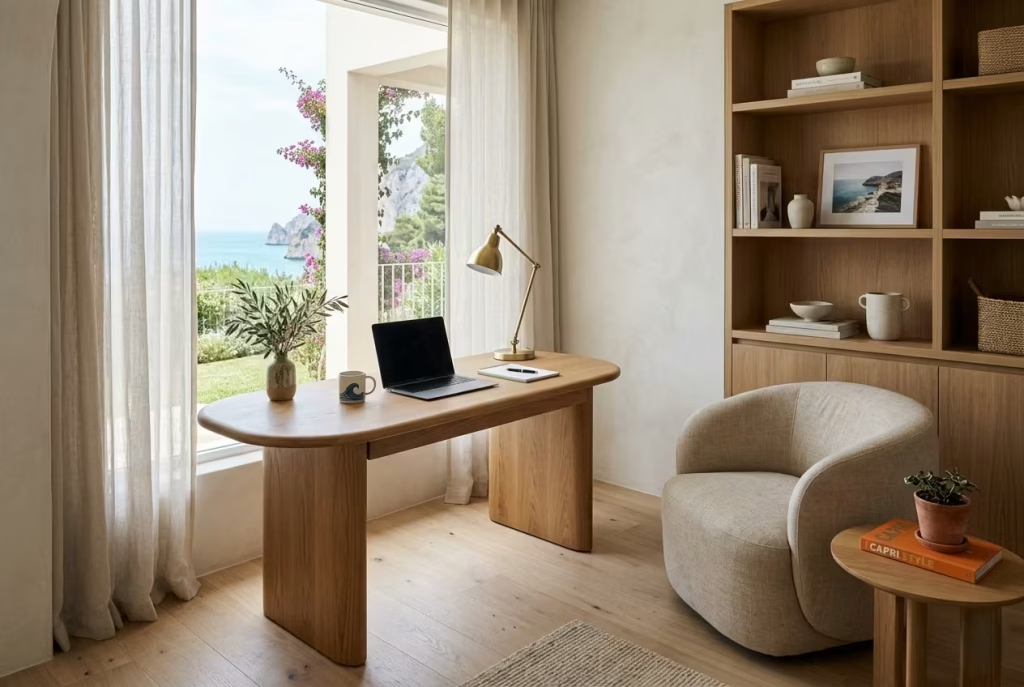
Rectilinear rooms dominate most modern homes, especially in new builds and renovated properties where clean lines, right angles, and predictable geometry set the tone. While this structure is practical, it can quietly create a visual stiffness over time. In a coastal home office inspired by Capri living, curved furniture becomes the counterbalance, easing that rigidity and introducing a sense of flow that feels far more natural to live and work within.
Curves do something quite subtle but important. They interrupt the constant language of straight edges without creating visual chaos. A curved desk edge, a rounded armchair, or a softly arched storage unit changes how the eye moves through the space. Instead of bouncing from corner to corner, it begins to glide. That shift alone can make a room feel more relaxed, especially during long working hours where mental fatigue builds quietly in the background.
In real design work, I often notice that clients initially underestimate the emotional effect of geometry. One coastal office project I worked on was entirely composed of strong rectilinear forms, from the built-in cabinetry to the desk placement and even the rug layout. On paper, it was clean and efficient. In practice, it felt slightly tense, almost as if the room was holding itself too tightly. We introduced a curved oak desk with softened corners and replaced a boxy reading chair with a rounded linen-upholstered piece. The change was immediate. The space did not become more decorative, it simply became easier to be in.
That is often the quiet power of curved furniture. It does not demand attention. It loosens the atmosphere.
In Capri-inspired interiors, this approach aligns naturally with the broader design language. Mediterranean spaces rarely rely on rigid geometry alone. Even when architecture is structured, there is usually a softness layered on top, whether through arched openings, rounded furniture silhouettes, or organically shaped objects. This interplay between structure and softness is what prevents the space from feeling overly engineered.
There is also a functional benefit that is often overlooked. Curved furniture improves movement flow within a room. In smaller home offices, especially those measuring around 3 x 3.5 metres (10 x 11.5 feet), sharp corners can interrupt circulation paths and make the space feel more segmented than it needs to be. A rounded desk edge or circular side table reduces those interruptions, allowing movement to feel more continuous and less constrained.
Light interaction also changes with curved forms. Unlike flat, angular surfaces that reflect light in predictable directions, curved furniture disperses it more gently. A rounded chair back, for example, catches daylight in a soft gradient rather than a harsh edge, which adds a subtle sense of depth without introducing visual tension. Over the course of a day, this creates a more forgiving visual environment, particularly in workspaces that receive strong natural light.
Material choice plays an important role in keeping curved furniture aligned with coastal interiors. Soft oak, rattan, linen upholstery, and plastered or matte-finished surfaces tend to work best.
These materials reinforce the relaxed Mediterranean character without making the curves feel overly modern or synthetic. The goal is always cohesion, where form and material speak the same language rather than competing for attention.
There is a tendency in some interiors to use curves as a statement feature, but in Capri-inspired design, restraint is essential. A single curved element in a room is often more effective than several competing ones.
It creates a focal softness without tipping the space into visual novelty. For example, a curved desk paired with rectilinear shelving can create a balanced dialogue between structure and ease, rather than flattening the entire room into one style direction.
Of course, curved furniture is not without considerations. It can sometimes be less space-efficient than straight-edged alternatives, particularly in compact rooms where every centimetre matters.
Custom curved pieces may also require a higher level of craftsmanship, which can influence cost and lead times. However, when integrated thoughtfully, these trade-offs are often outweighed by the improvement in spatial comfort.
Ultimately, curved furniture works because it introduces a human softness into architectural order. It takes the edge off literal geometry, quite literally in some cases, and replaces it with something more fluid and forgiving.
In a coastal home office, that shift is not just aesthetic. It changes how the room feels to work in day after day, turning a structured environment into one that quietly supports focus without ever feeling rigid or enclosed.
You May also Like: How to Create a Stunning Coastal Home: The Ultimate Design Guide
Breezy Corner Offices Designed Around Cross Ventilation
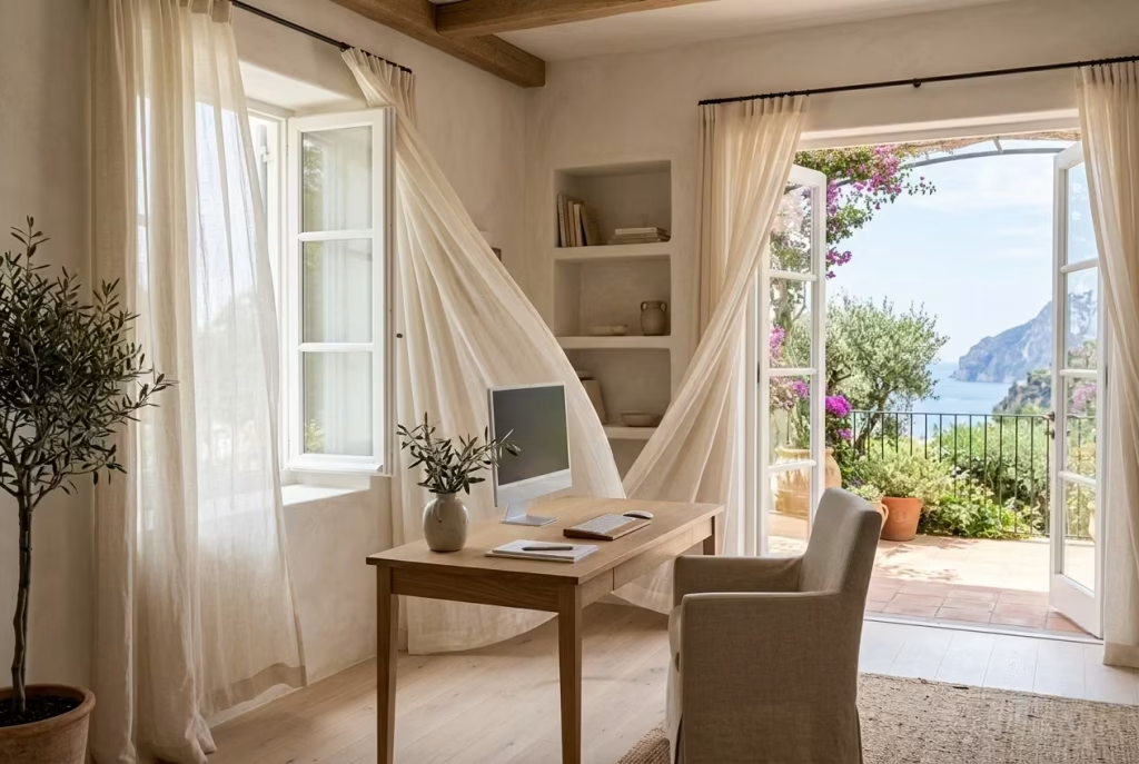
A corner office that embraces cross ventilation feels fundamentally different from a sealed, centrally conditioned workspace. In Capri-inspired interiors, airflow is not treated as a technical afterthought.
It becomes part of the design language itself, shaping how the room behaves across the day. When air moves freely through a space, the entire atmosphere lightens. The room stops feeling static and begins to feel responsive, almost alive in its rhythm.
Corner positioning is particularly valuable because it naturally introduces two external planes. With openings on adjacent walls, even modest windows can work together to create a gentle pressure difference that draws fresh air through the room. This constant but subtle movement prevents the space from becoming stale, especially during long working hours where mental clarity is closely tied to physical comfort.
In practical design terms, I often prioritise these corner zones for home offices whenever the architecture allows it. One project involved a compact study of roughly 3.2 x 3.8 metres (10.5 x 12.5 feet), positioned at the intersection of a garden-facing wall and a side elevation with a narrow operable window.
Individually, neither opening was particularly impressive. Together, however, they created a surprisingly effective cross breeze that transformed the usability of the space. The client described it as “the room that never feels stuck,” which is exactly the point.
What makes cross ventilation so important in coastal-inspired offices is not just temperature control, but sensory freshness. Air movement carries subtle shifts in scent, humidity, and sound, all of which influence how long a person can comfortably remain focused. Even a slight breeze passing through linen curtains or across a timber desk surface introduces a sense of lightness that mechanical cooling systems rarely replicate with the same softness.
In Capri-style interiors, this relationship between architecture and air is always handled with restraint. Openings are not exaggerated for effect. Instead, they are positioned to support natural flow without creating discomfort or drafts that interrupt concentration. The goal is to let air move like a quiet thread through the room, not a force that dominates it.
Furniture placement becomes critical in these environments. A desk positioned too close to a strong airflow path can feel distracting, especially if papers shift or screens catch reflections from moving light.
I usually recommend positioning the workstation slightly offset from the direct breeze line, allowing the air to circulate around the user rather than directly against them. This creates a more stable working environment while still benefiting from constant ventilation.
Material selection also plays a supporting role here. Natural finishes such as limewashed plaster, oak, linen, and stone respond well to moving air because they do not rely on gloss or artificial sheen.
Instead, they absorb and reflect environmental changes in a softer way. A linen curtain shifting gently in a cross breeze, for example, adds a quiet visual rhythm that reinforces the feeling of openness without becoming distracting.
There is also a psychological dimension worth acknowledging. Spaces with active airflow tend to feel less mentally dense. When air is stagnant, rooms can subtly feel heavier, even if the temperature is comfortable.
Cross ventilation disrupts that stillness in a positive way, helping to reset attention during periods of cognitive fatigue. It is one of those design elements that works continuously in the background, rarely noticed directly but deeply felt over time.
Of course, cross ventilation requires careful planning. Not all corner positions naturally support airflow, and external factors such as neighbouring buildings, prevailing wind direction, and window operability all influence performance. In some cases, even small adjustments to window opening styles or internal layout can significantly improve how air moves through the space.
There are also seasonal considerations. In cooler months, too much direct airflow can reduce comfort, so adjustable solutions like partially operable windows, linen layers, or light internal partitions become important for balancing flexibility. A well-designed coastal office should feel adaptable, not fixed in a single environmental condition.
When everything aligns, a breezy corner office becomes one of the most effortless working environments in the home. It feels open without being exposed, fresh without being unstable, and connected to the outdoors without losing its sense of enclosure.
In many ways, it captures the essence of Capri-inspired living itself, where comfort is not achieved by sealing the environment, but by allowing it to breathe naturally and quietly alongside you.
Coastal Textured Wallpaper With Mineral Finishes
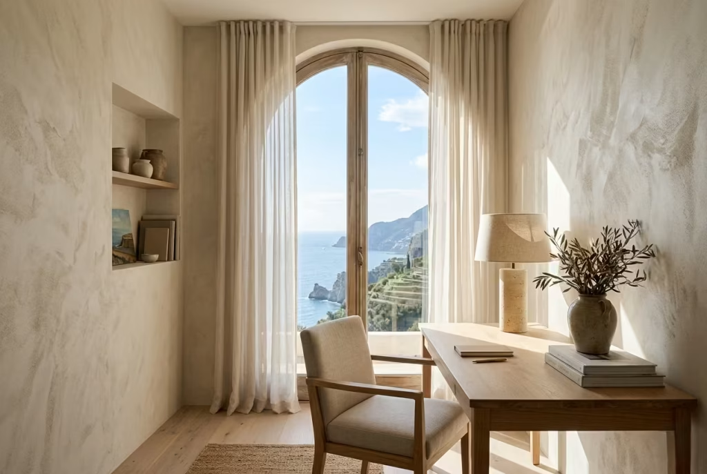
Textured wallpaper with mineral finishes introduces a quiet architectural depth that flat painted surfaces rarely achieve in a coastal home office. In Capri-inspired interiors, it sits in that refined middle ground where surface interest exists without visual noise.
It is not about pattern in the decorative sense. It is about atmosphere, where the wall begins to behave less like a backdrop and more like a soft, tactile field that interacts gently with light throughout the day.
Mineral-based wallpapers, especially those that mimic plaster, limewash, or clay finishes, carry a subtle irregularity that changes how a room feels over time. Instead of reflecting light uniformly, they diffuse it in uneven, natural ways.
This creates a sense of movement across the walls, almost like softened shadows shifting with the sun. In a workspace where screens already dominate visual attention, this kind of controlled softness becomes surprisingly valuable, giving the eyes somewhere calm to rest without introducing distraction.
In real design work, I often use these finishes when a space needs more depth but cannot handle additional furniture or styling. One coastal office project, measuring around 3.4 x 3.6 metres (11 x 12 feet), initially had plain painted walls that felt slightly one-dimensional despite good lighting and proportion.
Once we introduced a mineral-textured wallpaper in a warm chalk tone, the entire room changed character. It did not become louder or more decorative. It simply gained a quiet sense of presence that made the architecture feel more complete.
What makes this approach particularly effective in Capri-inspired interiors is its alignment with natural materials elsewhere in the room. When paired with oak desks, linen curtains, and stone or travertine accents, textured wallpaper acts as a connective surface. It ties everything together without drawing attention to itself. The effect is subtle but cumulative, like layers of soft sediment building up over time.
Colour selection is crucial here. The most successful options tend to sit within a muted coastal spectrum, soft limestone whites, pale sand, warm greige, or faded clay tones. These shades allow the texture to do the work rather than relying on colour contrast. When the palette is too strong, the texture loses its delicacy and can begin to feel overly decorative, which disrupts the calm rhythm that defines Capri-inspired spaces.
There is also a practical advantage that is often overlooked. Textured mineral finishes are far more forgiving than flat paint when it comes to everyday wear. In home offices where chairs move close to walls, shelving is installed, or natural light exposes imperfections, these surfaces tend to age more gracefully. Small marks or irregularities blend into the texture rather than standing out, which helps maintain a composed appearance over time without constant maintenance.
Lighting plays a decisive role in how these walls perform. Warm, diffused lighting between 2700K and 3000K tends to enhance the softness of mineral textures, allowing the subtle variations to emerge gently.
Harsh or overly cool lighting, on the other hand, can flatten the effect and strip away its natural depth. In well-designed coastal offices, lighting and wall finish should always be considered together, not as separate decisions.
Application scale also matters. In smaller rooms, using textured wallpaper on all four walls can create a cocoon-like atmosphere that feels immersive without being heavy, provided the tones remain light and restrained.
In larger offices, it is often more effective to apply it selectively, perhaps on a focal wall behind the desk or within a recessed architectural zone. This helps maintain balance while still introducing depth where it is most needed.
Of course, mineral-finish wallpapers require careful installation. Surface preparation needs to be precise, as uneven walls can disrupt the continuity of the texture. They also tend to sit at a higher price point than standard paint, reflecting both material quality and application skill. However, in return, they offer a level of refinement that is difficult to replicate through simpler finishes.
Ultimately, coastal textured wallpaper with mineral finishes works because it operates quietly in the background while transforming the overall perception of the room. It does not compete with furniture or architectural details.
Instead, it supports them, adding a soft visual foundation that makes everything else feel more intentional. In a Capri-inspired home office, that sense of understated depth is often what turns a functional workspace into a space that feels genuinely considered, calm, and enduringly balanced.
Stone Accessories That Add Weight and Grounding
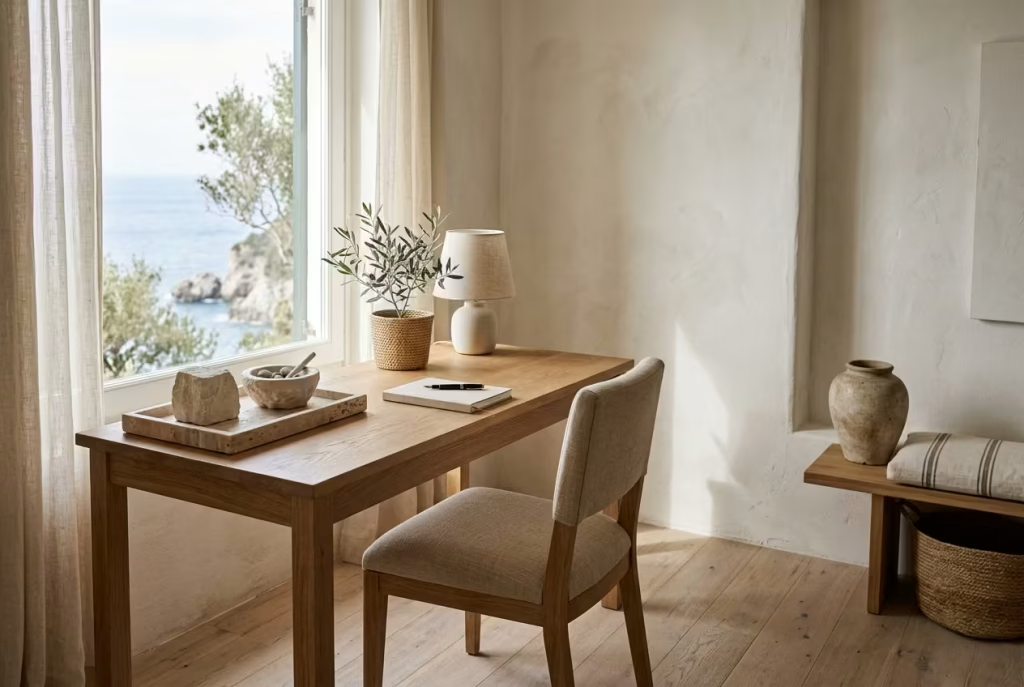
Stone accessories bring a quiet authority into a coastal home office, the kind that stabilises a room without ever feeling visually heavy. In Capri-inspired interiors, they play a grounding role that is often underestimated.
While lighter materials like linen, timber, and sheer fabrics create movement and softness, stone provides the counterbalance, anchoring the space so it does not drift into something overly airy or unstructured.
There is an honesty to stone that feels inherently architectural. It does not try to imitate anything else, nor does it rely on surface decoration to carry its presence. Whether it is travertine, limestone, marble, or rough-hewn river stone, each piece brings a natural sense of permanence. In a workspace, that permanence matters because it quietly reinforces focus. The eye recognises the weight of the material, and the room feels more settled as a result.
In real design practice, I often introduce stone accessories when a room feels visually too light or slightly unresolved. One coastal office project, measuring around 3.5 x 4 metres (11.5 x 13 feet), had been beautifully finished with limewashed walls and pale oak joinery, but the overall composition felt almost too delicate. It lacked anchoring points.
By introducing a few carefully chosen stone elements, including a travertine desk tray, a solid limestone bookend, and a sculptural bowl placed on a side shelf, the room immediately gained a sense of balance. Nothing changed structurally, yet the atmosphere became noticeably more grounded.
What makes stone so effective is its relationship with light. Unlike reflective or highly polished materials, stone tends to absorb and diffuse illumination in a soft, muted way. This prevents glare and helps maintain a calm visual field, especially in sunlit coastal offices where brightness can sometimes become overwhelming. The surface texture of stone also introduces micro-variations that keep it visually interesting without demanding attention.
Scale plays an important role in how stone accessories are perceived. Small pieces, such as paperweights or desk objects around 8 to 15 cm (3 to 6 inches), work well on work surfaces where subtle grounding is needed without interrupting functionality.
Larger sculptural pieces, typically between 20 and 40 cm (8 to 16 inches), are better suited to shelving or floor-level arrangements where they can hold visual weight without interfering with daily tasks. The key is proportion, ensuring that stone feels integrated rather than imposed.
There is also a tactile dimension that cannot be overlooked. Stone carries a natural coolness and density that contrasts beautifully with softer materials in the room. When placed alongside linen textiles, warm timber, or plaster finishes, it creates a sensory balance that feels deeply satisfying. It is this contrast, rather than uniformity, that gives Capri-inspired interiors their layered character.
In many ways, stone accessories act as visual punctuation within a space. They slow the eye down. A linen curtain might introduce movement, a timber desk might bring warmth, but a stone object interrupts that flow just enough to create rhythm. This rhythm is what prevents a room from feeling visually one-note, especially in minimalist coastal offices where restraint is a guiding principle.
Of course, stone requires careful editing. Too many pieces can quickly shift the atmosphere from calm to overly rigid. The most successful spaces tend to use stone sparingly, allowing each object to feel deliberate and considered. It is less about quantity and more about placement, where even a single well-positioned piece can shift the entire tone of a corner.
There are also practical considerations. Some stone types are porous and may require sealing, particularly if used on desks where spills are possible. Heavier pieces need stable surfaces and thoughtful placement to avoid damaging softer materials underneath. These are small but important details that ensure stone remains both beautiful and functional over time.
Ultimately, stone accessories succeed because they introduce a sense of permanence into an otherwise fluid environment. In a coastal home office filled with lightness, movement, and soft natural materials, stone acts as the grounding force that keeps everything in balance. It does not compete for attention, yet it quietly holds the room together, giving the space a sense of calm structure that feels both natural and enduring.
Low-Contrast Coastal Colour Palettes for Mental Calm
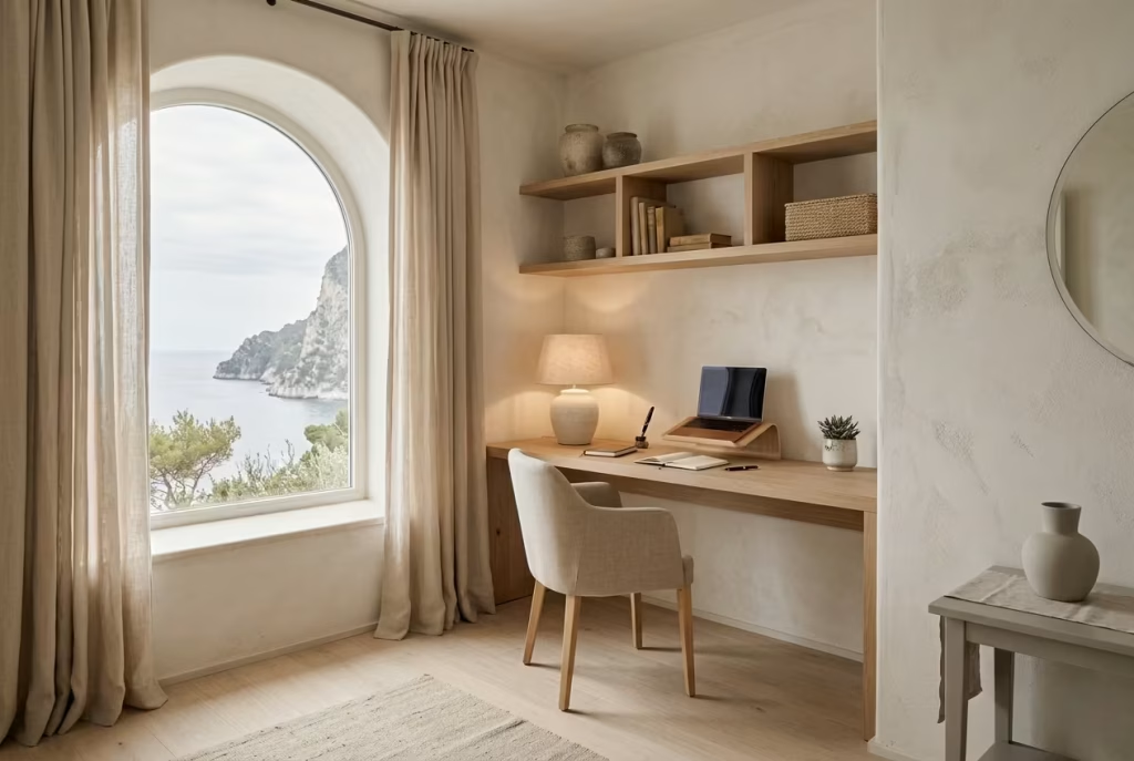
Low-contrast coastal colour palettes create a sense of quiet continuity that is especially powerful in a home office, where mental clarity is constantly tested by screens, tasks, and time pressure.
In Capri-inspired interiors, this approach is not about removing colour altogether, but about reducing visual friction so the eye moves through the room without interruption. The result is a space that feels calmer almost by default, as if the room itself is helping to steady the mind.
When contrast is softened, the architecture stops competing with itself. Walls, flooring, furniture, and textiles begin to sit within the same tonal family, shifting only slightly in depth rather than sharply in opposition.
This creates a gentle layering effect that feels cohesive rather than fragmented. In practice, it means you are not constantly adjusting your focus as you move around the room, which can subtly reduce cognitive fatigue over long working hours.
In real design work, I often find that clients initially worry low-contrast schemes might feel bland or unfinished. In reality, the opposite tends to happen when they are handled correctly. One coastal office project, measuring roughly 3.2 x 4 metres (10.5 x 13 feet), originally featured a strong contrast between crisp white walls, dark oak furniture, and deep navy accents.
While visually striking at first, the space felt slightly restless over time, especially during full workdays. We softened the palette into layered tones of sand, pale limestone, muted stone grey, and washed oak. Nothing about the room lost definition, yet everything became easier to sit within for extended periods.
That shift is important. Low-contrast does not mean low character. It means the relationships between tones are more subtle, more forgiving, and ultimately more sustainable for daily use.
In Capri-inspired interiors, this approach mirrors the natural environment more closely than high-contrast styling ever could. Coastal landscapes rarely present sharp boundaries. Sea, sky, sand, and stone often blur into one another through changing light and atmospheric conditions. Translating that into interior design means working with tones that gently overlap rather than sharply collide.
From a practical standpoint, this has a direct impact on how a workspace feels throughout the day. Early morning light tends to soften everything further, allowing pale neutrals to blend almost seamlessly. As the day progresses, warmer tones begin to emerge, especially in timber and textile surfaces, creating a slow tonal shift that keeps the room feeling alive without introducing visual disruption.
Material selection becomes especially important in low-contrast schemes because texture takes on a more dominant role. When colour differences are minimal, surfaces like limewashed plaster, brushed oak, linen, stone, and mineral finishes carry the visual interest. Without this textural variation, the room risks becoming too flat. In well-resolved coastal offices, it is often texture, not colour, that provides depth.
I have found that clients who initially gravitate towards bold accent colours often end up preferring these softer palettes once they experience them in practice. There is a noticeable difference in how long they can comfortably remain focused. The absence of strong visual interruptions allows the mind to settle into a more consistent rhythm, almost like background noise being gently turned down.
There is also a spatial benefit worth noting. Low-contrast palettes can make rooms feel larger and more continuous, particularly in smaller home offices where boundaries can otherwise feel visually tight. By reducing the contrast between walls, floors, and furniture, edges become less pronounced, and the room begins to feel more expansive than its actual footprint suggests.
Of course, achieving this balance requires restraint. If everything is too similar in tone without variation in texture or material, the space can drift into monotony. The key is to work within a narrow tonal range while still allowing subtle differences in surface quality, temperature, and depth. That interplay is what keeps the palette refined rather than flat.
Ultimately, low-contrast coastal colour schemes work because they respect the way the eye actually rests. Instead of demanding constant adjustment, they offer continuity. In a Capri-inspired home office, that continuity becomes a quiet advantage, allowing focus to deepen naturally while the room holds everything together in a calm, unbroken visual flow.
Reading Nooks Integrated Into the Office Layout
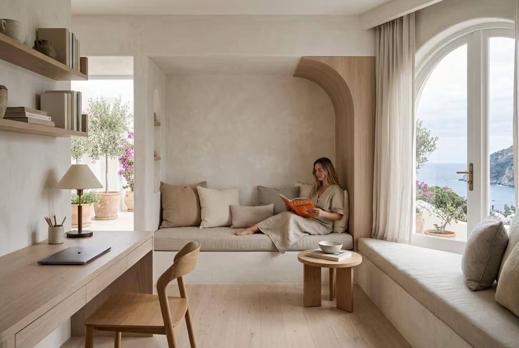
A reading nook inside a coastal home office is less about adding an extra function and more about softening the rhythm of work itself. In Capri-inspired interiors, these spaces are never treated as separate decorative corners. They are woven into the architecture so naturally that they feel like a pause built into the room, not an addition placed after the fact.
What makes integrated reading nooks so effective is their ability to reset mental pacing. A workspace, by nature, encourages forward motion, task completion, and constant focus. A reading corner does the opposite.
It invites stillness without disconnecting you from the room entirely. That balance between engagement and release is where the real value lies, especially in long working days where cognitive fatigue tends to creep in quietly.
In practical design work, I often look for underused spatial pockets when shaping these zones. One project involved a coastal office measuring roughly 3.6 x 4.2 metres (12 x 13.8 feet), where a deep window reveal and adjacent wall created a natural recess that was previously overlooked.
Instead of treating it as leftover space, we built a low upholstered bench with a curved oak side panel and soft linen cushions. The nook immediately became the most used part of the room outside the desk area.
The key is integration. A reading nook should feel like it belongs to the same material language as the rest of the office. In Capri-inspired interiors, that usually means continuity in finishes, limewashed walls flowing behind the seating, pale timber underfoot, and natural textiles that echo the softness found elsewhere in the space. When done correctly, the nook does not interrupt the room. It extends it.
Scale plays a crucial role in how successful these spaces feel. A reading nook that is too large can overwhelm the office and dilute its focus, while one that is too tight can feel like an afterthought.
In most residential settings, a seating depth of around 55 to 70 cm (22 to 28 inches) works comfortably for a built-in bench, with a width starting from approximately 1.2 metres (4 feet) for a single-user nook. This creates enough space to sit comfortably without breaking the visual flow of the room.
Lighting is equally important. Natural light is ideal, particularly if the nook is positioned near a window or French doors, but it should be softened rather than direct. Sheer linen curtains or lightly textured blinds help diffuse brightness, creating a calm reading environment that does not compete with the main workspace. In the evenings, a small wall-mounted sconce or warm table lamp in the 2700K to 3000K range adds a gentle, focused glow that feels intimate rather than functional.
There is also a psychological layer to consider. Having a dedicated space within the office that is not tied to productivity changes how the room is experienced. It signals that not every moment inside the workspace needs to be task-driven. That subtle shift in permission reduces pressure, particularly during long remote working hours where boundaries between work and rest often blur.
I have seen this play out in several projects where clients initially viewed reading nooks as secondary features. Over time, they became essential parts of the daily routine. One client described it as “the place where I stop pretending to be productive for a moment,” which captures its role more honestly than any design description could. It is a space for reset, reflection, and mental decompression, all within arm’s reach of the working zone.
Furniture selection should remain consistent with the wider interior language. Upholstered seating in linen or cotton blends, low timber side tables, and soft neutral cushions tend to work best. Overstyling should be avoided, as clutter can quickly disrupt the calm intent of the space. A single lamp, a small stack of books, and perhaps a ceramic object are often enough to complete the composition.
Ultimately, integrated reading nooks succeed because they introduce a different tempo into the office without breaking its coherence. They soften the edges of productivity, offering a place where the mind can briefly step sideways before returning to focus. In a Capri-inspired home office, that sense of rhythm is essential.
It is what prevents the space from feeling like a purely functional environment and allows it to support not just work, but the quieter pauses that make sustained concentration possible in the first place.
You May also Like: 25 Clean & Modern Minimalist Basement Designs That Feel So Spacious, They Don’t Even Feel Like Basements
Layered Ambient Lighting Inspired by Boutique Mediterranean Hotels
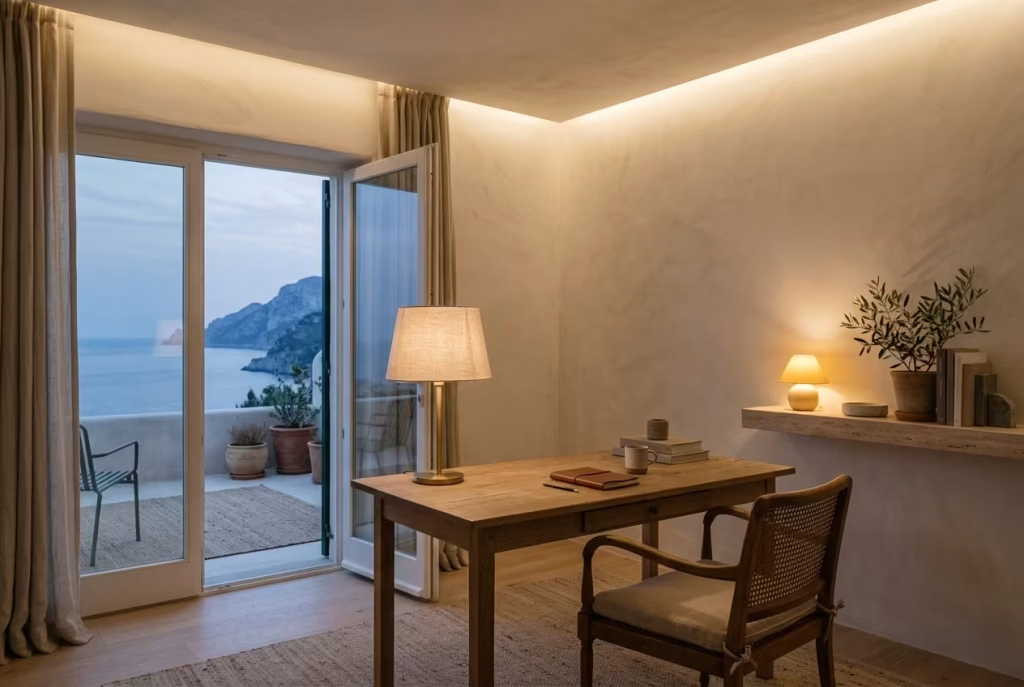
Lighting in a Capri-inspired home office is rarely about a single overhead source doing all the work. It is about layering, shaping, and softening illumination so the room feels adaptable from morning focus through to late evening wind-down. Boutique Mediterranean hotels do this exceptionally well. Their spaces never feel overlit or underlit. Instead, they carry a gentle glow that seems to settle into the architecture rather than sit on top of it.
In a home office, that approach becomes even more important because lighting is directly tied to mental stamina. Harsh, unbalanced light can make a room feel flat and mentally draining, while layered lighting creates rhythm, allowing the space to shift naturally with the day.
Task Lighting
Task lighting is the most functional layer, yet in well-designed coastal offices it is never treated as purely utilitarian. The aim is clarity without glare. A desk lamp positioned slightly to the side rather than directly in front helps reduce screen reflections while keeping the workspace visually comfortable.
In practical terms, I often recommend adjustable arms or sculptural desk lamps with warm diffused shades rather than exposed LEDs. The ideal brightness should illuminate the working surface evenly without creating sharp contrast between light and shadow. Around 300 to 500 lumens is usually sufficient for most desk tasks, depending on natural light levels.
In one coastal project, a client was struggling with eye fatigue during late afternoon work sessions. The issue was not the room itself, but a single overhead light source that created uneven shadows across the desk. Once we introduced a simple directional task lamp with a linen shade, the workspace immediately felt easier to stay in for longer periods. It was a small adjustment, but it changed the daily experience of the room.
Ambient Lighting
Ambient lighting sets the overall mood of the office, and in Mediterranean-inspired interiors it should always feel soft, indirect, and slightly diffused. This layer is what prevents the room from feeling too stark once natural daylight fades.
Instead of relying on strong ceiling fixtures, I often prefer wall washers, concealed LED strips, or softly shaded pendants that spread light gently across surfaces. The goal is not brightness for its own sake, but a balanced glow that allows the eye to relax.
Warm colour temperatures between 2700K and 3000K work particularly well here. Cooler lighting tends to flatten the warmth of natural materials like oak, linen, and plaster, which are central to Capri-inspired spaces. Ambient lighting should feel almost atmospheric, like the room is quietly illuminated from within rather than artificially lit.
In one renovation, we used concealed uplighting along a plastered ceiling edge in a 3.4 x 3.8 metre (11 x 12.5 feet) office. The effect was subtle but powerful. The ceiling appeared to float slightly, and the entire room felt more open without increasing actual brightness levels.
Candle-Inspired Warmth
Candle-inspired lighting is less about literal candles and more about replicating their emotional quality. There is a softness in candlelight that feels instinctively calming, almost nostalgic. It flickers gently, reduces visual sharpness, and introduces a sense of intimacy that harsh lighting cannot achieve.
In a home office, this can be translated through warm accent lighting such as small table lamps, frosted glass fixtures, or decorative wall lights that emit a low, golden glow. The idea is to introduce pockets of warmth within the room rather than uniform brightness.
I often use this layer in the evening zone of a workspace, especially near reading chairs or shelving areas. It helps signal a shift in pace, moving the room away from high-focus work and towards a more reflective, slower rhythm. In one coastal study, a simple ceramic table lamp with a textured shade became the most emotionally impactful element in the entire space, simply because of the warmth it cast in the late hours.
This type of lighting works best when it is slightly imperfect in diffusion. Overly crisp LED lighting loses that softness, whereas materials like linen, frosted glass, or lightly textured ceramics preserve it beautifully.
Evening Productivity
Evening productivity in a home office depends heavily on how lighting transitions are handled. If the shift from daylight to artificial light feels abrupt, the mind struggles to maintain focus. However, when lighting is layered properly, the room can support both concentration and calm well into the evening.
The key is gradual transition rather than sudden change. As daylight fades, ambient lighting should take over slowly, followed by task lighting for precision work, and finally softer candle-inspired sources for winding down tasks. This layered sequence helps maintain comfort without creating visual fatigue.
In practice, I often design lighting zones that can be controlled independently. This allows the user to adjust the atmosphere based on workload. For example, brighter task lighting for focused writing, softer ambient lighting for reading, and warm accent lighting for end-of-day reflection.
One client described this setup as “the room adjusting with me rather than me adjusting to the room,” which captures the intention perfectly. When lighting is designed in layers rather than as a single fixed condition, the workspace becomes far more adaptable.
Ultimately, layered ambient lighting in a Capri-inspired home office is about more than visibility. It is about rhythm, comfort, and emotional pacing. When task, ambient, and warm accent lighting work together, the room stops feeling static. It begins to move gently with the day, supporting focus when needed and easing tension when it is time to step back.
Vintage Capri Photography in Oversized Frames
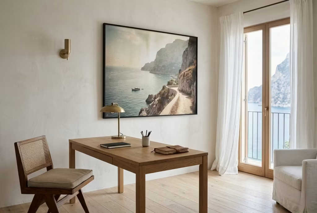
Vintage Capri photography, when introduced with restraint and scale, brings a quiet narrative layer into a coastal home office. It is not about decoration in the conventional sense, but about atmosphere, memory, and a subtle sense of place.
In Capri-inspired interiors, oversized framed imagery works best when it feels like a window into another moment rather than a visual interruption. The intention is to slow the room down, not to decorate it louder.
What makes this approach so effective in a workspace is its ability to anchor the emotional tone of the room. A large-scale photograph of sun-washed cliffs, faded harbour scenes, or soft Mediterranean streetscapes introduces depth without clutter.
It creates a visual pause, something the eye can settle into between tasks, which is particularly valuable in environments where screens dominate attention for most of the day.
In real design practice, I often find that scale is the deciding factor between impact and noise. One coastal office project, measuring roughly 3.3 x 3.7 metres (10.8 x 12.1 feet), initially featured several small framed prints scattered across the wall above the desk.
Individually they were pleasant, but collectively they created visual fragmentation. We replaced them with a single oversized black framed photograph, around 120 x 90 cm (47 x 35 inches), depicting a softly faded Capri coastline. The change immediately simplified the wall and introduced a sense of calm focus that the smaller pieces could not achieve.
There is a psychological clarity that comes with singularity. When the eye is not required to process multiple competing images, the mind settles more easily into its work. In a home office, that reduction in visual “decision-making” can subtly improve concentration over longer periods.
Framing also plays a crucial role. Slim, understated frames in matte black, aged oak, or brushed brass tend to work best in Capri-inspired interiors. They provide definition without overpowering the image itself. Overly ornate frames can shift the focus away from the photograph and disrupt the quiet elegance of the space. The goal is always balance, where the frame supports the image rather than competing with it.
Placement should feel deliberate but not rigid. Positioning oversized photography slightly off-centre above a desk or adjacent to a reading corner can create a more relaxed composition than strict symmetry.
In some cases, leaning a large framed piece against the wall on a low shelf or console also works beautifully, especially in more informal or layered interiors. It introduces a sense of ease, as though the artwork has been placed there naturally rather than installed with precision.
Lighting interaction is equally important. Vintage photography responds well to soft, indirect lighting that enhances tone without creating glare on the glass surface. In many projects, I prefer to use wall-mounted sconces or subtle directional lighting placed nearby rather than direct overhead illumination. This allows the image to reveal its depth gradually, particularly in the evening when warmer lighting brings out the faded textures within the photograph.
There is also an emotional quality that should not be overlooked. Vintage Capri imagery carries a sense of stillness, almost like a suspended moment in time. In a work environment, this can act as a gentle counterbalance to the constant movement of tasks, notifications, and deadlines. It is a visual reminder that not everything needs to be immediate or urgent.
I have seen this effect in several projects where clients initially chose abstract or highly modern artwork for their offices. While visually striking, these pieces sometimes created a subtle sense of restlessness.
When replaced with slower, more atmospheric imagery, particularly Mediterranean landscapes or archival coastal photography, the entire room felt more grounded and less mentally fragmented.
Of course, restraint remains essential. One oversized piece is often enough for a single focal wall. Introducing too many large images can dilute the impact and shift the room away from calm simplicity into visual competition. In Capri-inspired interiors, negative space is not empty. It is part of the composition, allowing both architecture and artwork to breathe properly.
Ultimately, vintage Capri photography in oversized frames works because it introduces story without noise. It adds character without clutter, memory without distraction. In a coastal home office, that balance is invaluable.
It turns a blank wall into a quiet moment of reflection, something that supports focus rather than pulling it away, and gives the room a deeper sense of place that lingers gently in the background throughout the working day.
Indoor-Outdoor Flooring Transitions for Seamless Flow
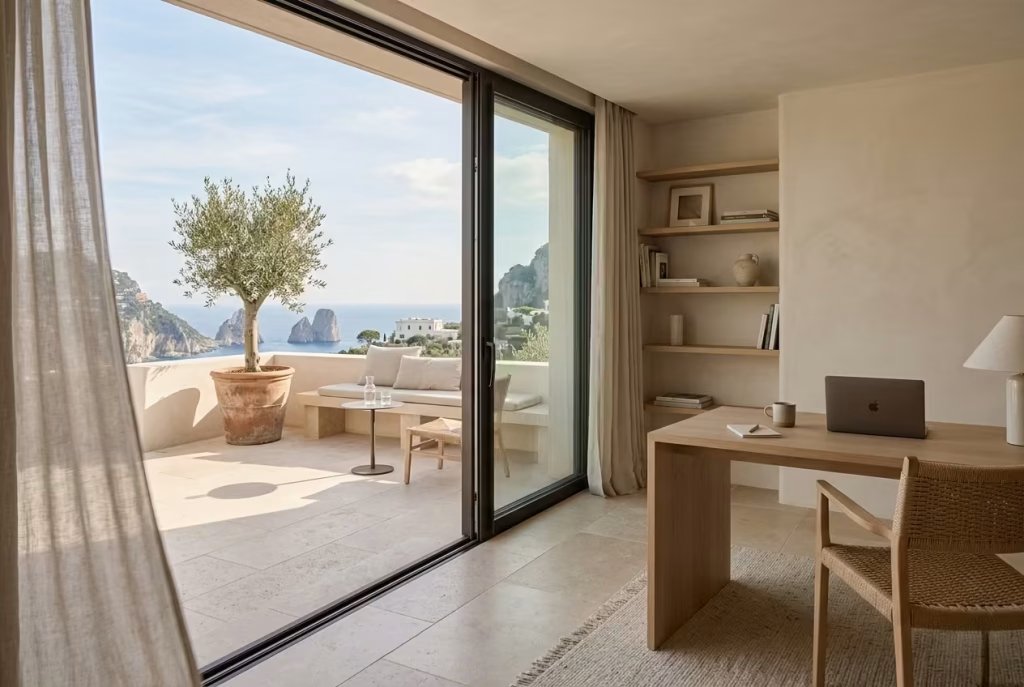
Indoor-outdoor flooring transitions are one of those design decisions that quietly redefine how a coastal home office feels in daily use. In Capri-inspired interiors, the boundary between inside and outside is never treated as a hard stop.
It is softened, blurred, and carefully calibrated so the space feels like it extends beyond its walls rather than ending at them. When done well, the effect is subtle but deeply influential, almost like the room is exhaling into the landscape.
The real strength of this approach lies in continuity. When flooring materials or tonal families are carried from interior to exterior thresholds, the eye reads the space as one connected experience.
This reduces visual interruption, which in turn supports a calmer mental state during work. Instead of stepping from one environment to another in a jarring way, the transition feels gradual, like moving through different levels of the same composition.
In practical design work, I often prioritise this continuity in rooms that open onto terraces, gardens, or courtyards. One coastal office project, measuring approximately 3.5 x 4.1 metres (11.5 x 13.5 feet), originally had a clear visual break between interior oak flooring and an outdoor stone patio.
The shift was functional, but it felt abrupt. We reworked the palette so that a honed limestone tile inside transitioned into a matching exterior finish with a slightly more textured surface for grip. The tonal consistency remained, but the material performance adapted to each environment. The result was a space that felt noticeably larger without altering its footprint.
That sense of expansion is one of the most powerful outcomes of seamless flooring transitions. When boundaries soften, rooms begin to feel less confined. In smaller home offices, this can be transformative, especially when natural light already plays a strong role in the space. The floor becomes a visual bridge rather than a divider, guiding the eye outward rather than stopping it at the threshold.
Material selection is critical here. In Capri-inspired interiors, the most successful transitions often rely on natural stone, muted timber, or mineral-based tiles that carry similar undertones indoors and outdoors.
The key is not identical replication, but tonal harmony. Slight variation in texture or finish is not only acceptable but often desirable, as it helps differentiate function while preserving visual unity.
For example, a lightly brushed oak floor inside might transition into a weathered stone terrace outside, both sharing warm sandy undertones.
Or a polished limestone interior surface might meet a more textured, slip-resistant version outdoors. The relationship is consistent, but not repetitive. That distinction is what keeps the design feeling refined rather than overly matched.
Threshold detailing also plays a significant role in achieving a smooth transition. In many well-resolved projects, I prefer minimal visual interruption at the doorway line.
Slim profiles, flush thresholds, and aligned floor heights help maintain continuity so that the transition is felt rather than visually broken. Even a slight misalignment can introduce unnecessary visual friction, which undermines the intended flow.
Lighting again becomes part of the experience. When interior and exterior flooring share a cohesive palette, natural light behaves more fluidly across both zones.
Morning light spilling into the office continues onto the terrace without interruption, while evening lighting creates a gentle gradient that ties both spaces together. This shifting interplay reinforces the idea that the room is not contained by walls, but extended by them.
There is also a psychological benefit that often goes unnoticed until experienced. When the eye can move freely from interior workspace to outdoor environment, it creates micro-breaks in focus without requiring physical movement. A glance towards a terrace or garden view becomes a brief cognitive reset, reducing the sense of enclosure that can build up during long working hours.
Of course, practical considerations must be handled with care. Outdoor materials need to account for slip resistance, weather exposure, and durability, while indoor finishes prioritise comfort and warmth underfoot. The challenge lies in balancing these requirements without breaking visual continuity. In most cases, this is achieved through subtle adjustments in surface texture rather than dramatic material changes.
In the end, indoor-outdoor flooring transitions are not simply a design feature. They are a spatial strategy. They reshape how a home office connects to its surroundings, turning walls and thresholds into softer gestures rather than rigid boundaries.
In a Capri-inspired setting, this creates a sense of ease that feels almost effortless, where the room does not end at the glass door or window line, but continues gently into the landscape beyond, carrying focus and calm along with it.
Relaxed Styling That Leaves Space to Breathe
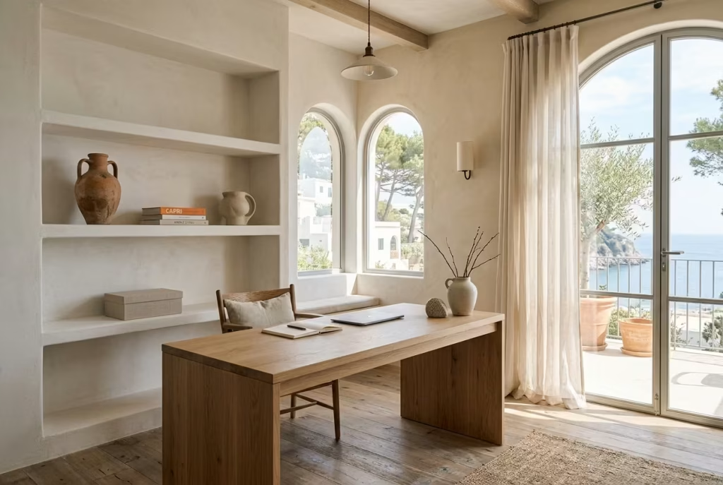
Relaxed styling is often misunderstood as “doing less,” but in a Capri-inspired coastal home office it is far more intentional than that. It is the quiet discipline of knowing what to leave out so that everything remaining can actually hold its weight. In these interiors, space is not treated as emptiness. It is treated as structure. The pauses between objects, surfaces, and focal points are what give the room its sense of calm authority.
When a workspace is overcrowded, even slightly, the eye never fully settles. It keeps scanning, processing, and adjusting. Over time, that constant visual activity becomes tiring in a way that is difficult to immediately identify. The room might look beautiful, but it does not feel restful. Relaxed styling resolves this by introducing rhythm, where the gaze is guided rather than overwhelmed.
Negative Space
Negative space is the quiet backbone of Capri-inspired interiors. It is the breathing room between furniture, the gaps on shelves, the clear surface of a desk, and the uninterrupted stretch of wall that allows everything else to feel intentional. Without it, even the most carefully chosen objects begin to lose impact.
In practical terms, I often find that clients initially resist leaving areas empty, especially in home offices where storage and function feel like priorities. But once they experience a more edited layout, the difference becomes obvious. In one coastal office project measuring around 3.4 x 3.6 metres (11 x 12 feet), we removed nearly a third of the decorative objects and cleared two full shelving sections completely. The room did not feel emptier. It felt more composed, almost as if it had been reorganised at a breathing level rather than a visual one.
Negative space also improves functionality. A clear desk surface, for example, does not just look calm. It reduces cognitive friction, making it easier to begin and end tasks without visual distraction. That simplicity often becomes one of the most valued aspects of the space over time.
Visual Rhythm
Visual rhythm is what turns restraint into something expressive. It is not about symmetry or repetition, but about balance and pacing. In a well-styled coastal office, the eye should move through the room in a gentle sequence, pausing naturally at focal points and resting in quieter zones.
This rhythm is created through spacing, material contrast, and scale variation. A stone object placed on a timber shelf, followed by an open stretch of wall, then a soft linen-draped chair creates a natural ebb and flow. Nothing feels rushed. Nothing feels forced.
In one project, I remember adjusting a shelving composition repeatedly because it felt slightly “too even.” Everything was spaced too uniformly, which paradoxically made it feel static. Once we introduced irregular spacing, leaving one shelf intentionally sparse while clustering objects on another, the entire composition came alive. It started to feel less like display and more like narrative.
Lighting also contributes to rhythm. Pools of warm light in certain areas, contrasted with softer ambient zones, help guide attention without overwhelming it. This layering ensures that the room has depth, not just decoration.
Why Luxury Coastal Interiors Avoid Overcrowding
Luxury in coastal interiors rarely comes from abundance. It comes from control, clarity, and restraint. Overcrowding undermines all three. When too many elements compete within the same visual field, the space loses hierarchy. Everything becomes equally loud, which is the opposite of what makes Capri-inspired design feel so refined.
High-end coastal interiors tend to prioritise fewer, better-considered elements. Each piece has room to exist properly, without being visually compressed by surrounding objects. This is not minimalism for its own sake. It is editing with intention, where every addition must justify its presence.
I have seen this distinction clearly across multiple projects. In one home office, the initial styling included layered décor, multiple artworks, and dense shelving arrangements. It looked impressive in photographs, but in daily use it felt slightly tense. After refining the composition down to fewer objects with more space between them, the room shifted completely. It became easier to focus, easier to think, and significantly more comfortable to spend long hours in.
Ultimately, relaxed styling works because it respects perception. It understands that the eye, much like the mind, needs intervals of rest. In a Capri-inspired coastal home office, that restraint becomes the defining feature. Not what is added, but what is intentionally left open, allowing the space to breathe, settle, and quietly support the rhythm of everyday work without ever feeling crowded or overworked.
You May also Like: 25 Productive Japanese Home Office Designs for a Soulful Workspace
Materials That Work Best in Coastal Home Offices
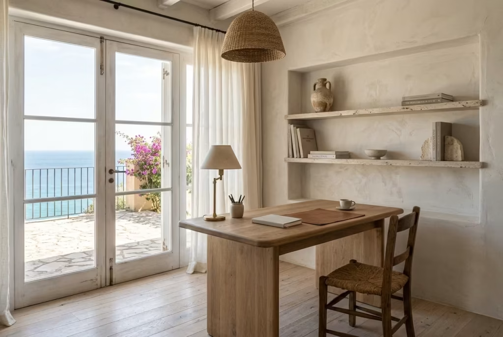
Material selection in a coastal home office is never just a stylistic decision. It quietly determines how a room feels at 9am on a focused workday, and again at 6pm when fatigue starts to settle in. In Capri-inspired interiors, materials are chosen less for visual impact and more for how they age, how they respond to light, and how they behave in naturally humid, sun-exposed environments. The aim is always the same: a space that softens over time rather than deteriorates.
What follows is not a catalogue of finishes, but a design logic I rely on in real projects where comfort, durability, and long-term patina matter just as much as first impressions.
Woods
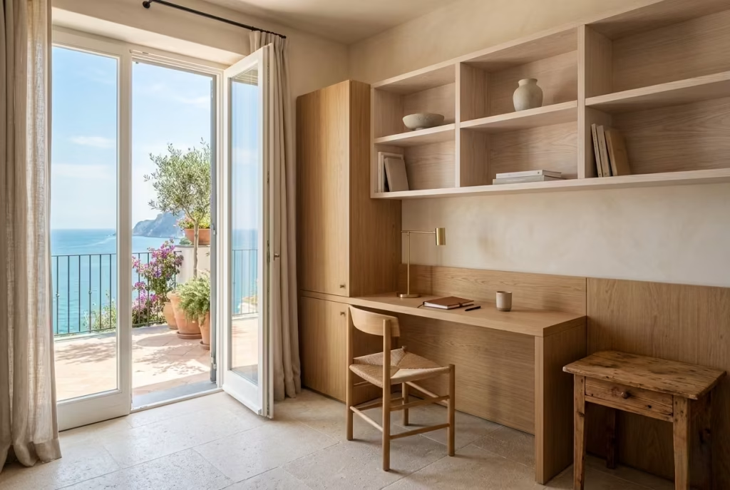
Wood is the backbone of coastal interiors, but not all species behave the same in light-filled, slightly humid environments. The right choice will age into warmth and character. The wrong one will feel tired far too quickly.
White Oak
White oak is often my first choice in coastal home offices because of its stability and subtle grain structure. It holds up well against humidity fluctuations and develops a gentle honeyed tone over time rather than darkening aggressively. In real projects, I often use it for desks and built-in joinery, typically with a matte oil finish that allows the grain to remain tactile.
From a durability standpoint, white oak is highly resistant to wear, especially in high-contact areas like desktops. Maintenance is relatively simple, usually requiring occasional re-oiling depending on usage. In warmer coastal climates, it tends to age gracefully, developing a slightly sun-softened appearance that fits naturally within Capri-inspired palettes.
Ash
Ash brings a lighter, more open grain pattern that works beautifully in smaller offices where visual weight needs to stay low. It reflects light well, which helps maintain brightness in rooms that may not have strong natural exposure.
However, ash is slightly more reactive to humidity compared to white oak. In real coastal settings, I tend to specify it for shelving, secondary furniture, or decorative joinery rather than heavy-use surfaces. Over time, it develops a soft amber undertone that pairs well with linen and plaster finishes.
Reclaimed Pine
Reclaimed pine introduces character that cannot be manufactured. Its knots, subtle imperfections, and aged patina bring immediate depth to a space. In coastal home offices, it works particularly well for accent furniture or feature shelving where a slightly more rustic voice is welcome.
The trade-off is consistency. Reclaimed pine can vary significantly in density and stability depending on its origin. It is also softer, meaning it is more prone to denting over time. That said, in well-balanced interiors, those marks often become part of its story rather than a flaw.
Stone
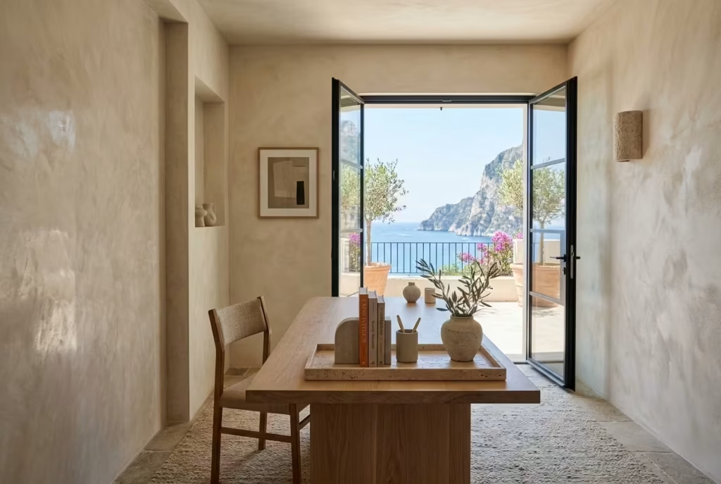
Stone grounds a coastal office in a way few other materials can. It slows the visual rhythm of a room and introduces permanence, especially when paired with lighter, more tactile surfaces.
Travertine
Travertine is one of the most aligned materials with Capri-inspired design language. Its natural pores and warm beige tones feel inherently coastal without being thematic. I often use it for desk accessories, shelving, or occasional tabletops where a soft, matte surface is preferred over polished stone.
It is relatively durable but does require sealing, especially in humid climates where moisture absorption can lead to surface marking. Over time, travertine develops a softened patina that enhances its depth rather than diminishing it, which is part of its long-term appeal.
Limestone
Limestone carries a more understated elegance compared to travertine. It is smoother in tone and slightly more uniform, which makes it ideal for larger surfaces such as flooring or feature walls in home offices.
Its main consideration is porosity. In real-world use, limestone needs proper sealing and occasional maintenance to prevent staining. However, when cared for correctly, it ages into a soft, chalky finish that feels almost architectural in its calmness.
Tadelakt Finishes
Tadelakt introduces a different kind of stone-like softness, achieved through polished lime plaster. It is often used in wall applications where a seamless, tactile surface is desired.
In coastal environments, it performs well when properly sealed, but it is more maintenance-sensitive than natural stone. Its beauty lies in its subtle variation and hand-applied texture, which gives walls a quiet movement under changing light. Over time, it can develop slight tonal shifts that add character rather than distraction.
Fabrics
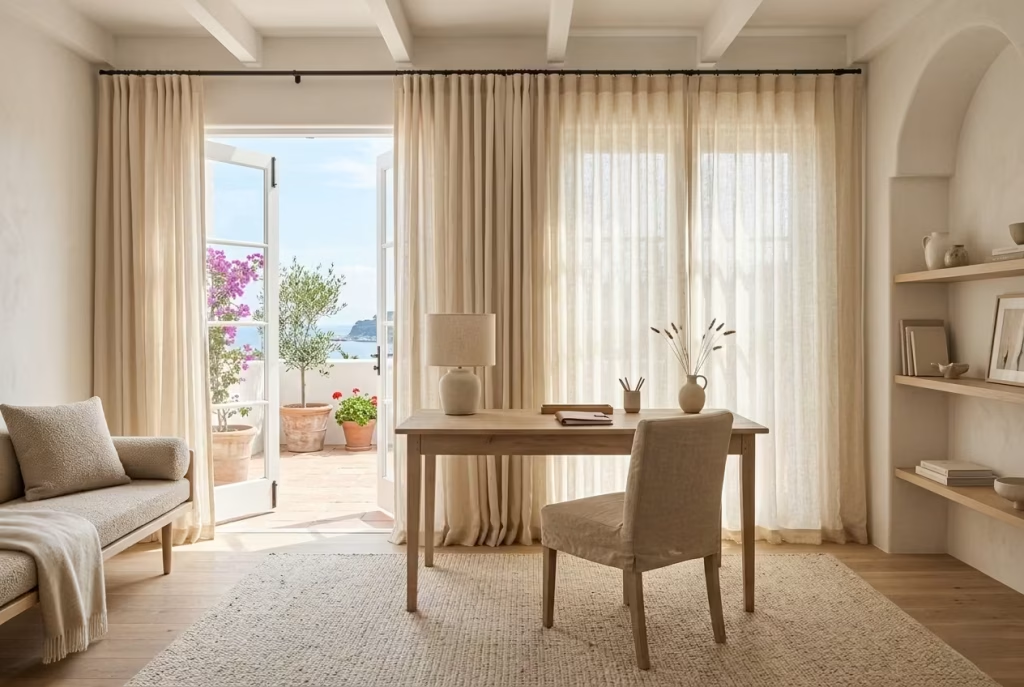
Textiles in coastal offices are responsible for softening acoustics and balancing harder architectural materials. They also play a significant role in how the room feels during long working hours.
Linen
Linen is almost non-negotiable in Capri-inspired interiors. It has a natural irregularity that prevents spaces from feeling overly polished. Curtains, upholstery, and soft furnishings in linen allow light to filter gently rather than block it.
In humid climates, linen performs well due to its breathability. It does wrinkle easily, but in this context that is not a drawback. It reinforces the relaxed, unforced character of the space. Over time, linen softens further, becoming more fluid in appearance.
Cotton Blends
Cotton blends offer a slightly more structured alternative to pure linen. They are particularly useful in upholstery where durability and shape retention are important.
From a maintenance perspective, cotton blends are easier to clean and tend to hold up better in high-use environments. They do not carry the same organic movement as linen, but they provide practical balance in workspaces that see daily activity.
Bouclé Accents
Bouclé introduces texture without visual noise. It works best in controlled doses, such as accent chairs or cushions within a reading corner.
While visually rich, bouclé can be more sensitive to wear and requires careful maintenance in humid environments to avoid flattening or moisture retention. Over time, it softens slightly but retains its tactile depth, which is what makes it so effective in grounding seating areas.
Metals
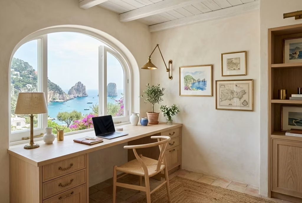
Metals in coastal offices are used sparingly, acting as quiet accents rather than dominant features. Their role is to introduce contrast and definition without disrupting the softness of the overall palette.
Aged Brass
Aged brass brings warmth and subtle patina. It works particularly well for lighting fixtures, drawer handles, and small decorative elements. Unlike polished brass, it does not rely on shine, which makes it more compatible with matte surfaces like plaster and timber.
Over time, aged brass continues to deepen in tone, developing a richer, more subdued finish. This natural evolution aligns well with the long-term aesthetic of coastal interiors, where materials are expected to age gracefully rather than remain static.
Soft Blackened Steel
Soft blackened steel introduces a grounded contrast without feeling harsh. It is often used for structural details, furniture frames, or shelving supports where a stronger visual anchor is needed.
Its durability is excellent, particularly in humid environments, provided it is properly sealed. Over time, it tends to maintain its depth rather than changing dramatically, which makes it a reliable structural accent in otherwise soft, light-filled spaces.
Durability, Maintenance, and Aging in Coastal Climates
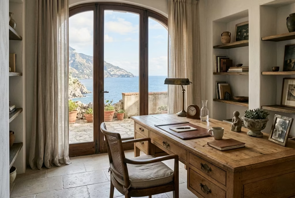
Across all materials in coastal home offices, humidity and light exposure are the two defining environmental factors. Materials that perform well are those that either adapt gracefully or remain structurally stable without excessive maintenance.
In practice, I always advise clients to think in terms of aging rather than permanence. White oak warms gradually, limestone softens into chalky depth, brass darkens into patina, and linen relaxes into softer folds. These shifts are not deterioration. They are part of the design outcome.
Maintenance should be realistic rather than idealised. Natural oils, breathable finishes, and periodic gentle care are far more effective than high-gloss protective coatings that can fight against the natural behaviour of the material.
Ultimately, the best coastal home offices are not built on materials that resist time, but on materials that collaborate with it. When that balance is achieved, the room does not just look refined on day one. It continues to evolve quietly, becoming more grounded, more characterful, and more personal with every passing season.
Common Coastal Design Mistakes That Make Home Offices Feel Themed
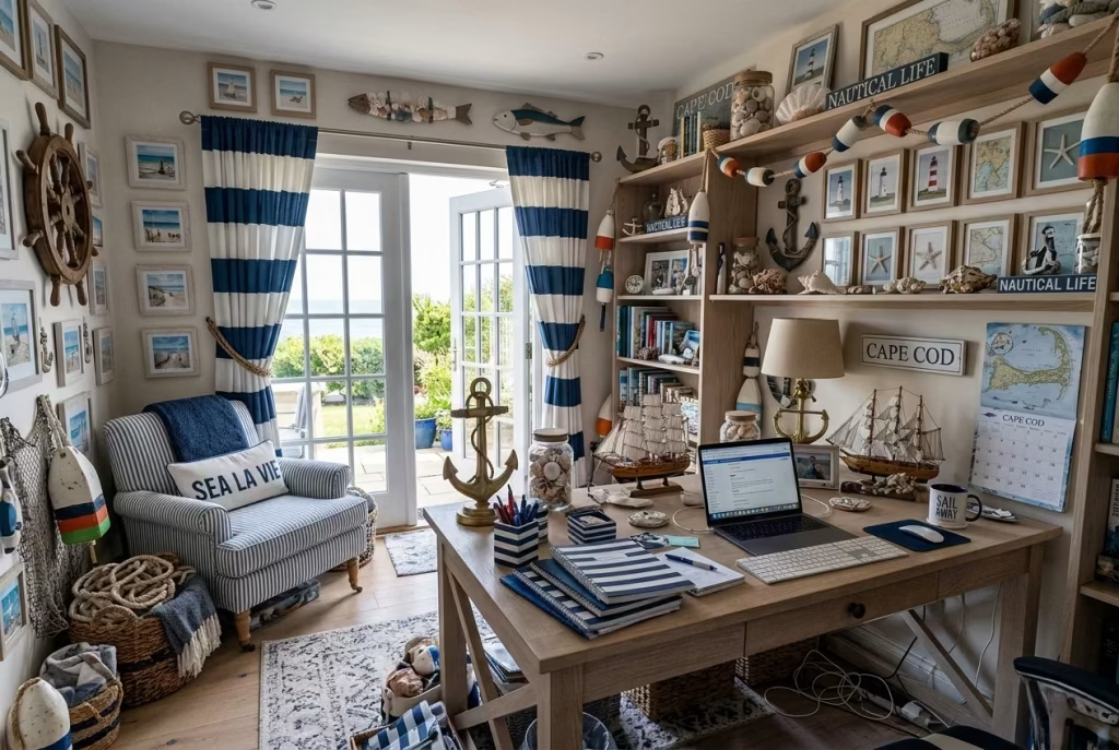
A coastal home office can easily drift from refined to over-stylised when the design leans too heavily on surface cues instead of spatial logic. In Capri-inspired interiors, the difference between “coastal atmosphere” and “themed room” is usually subtle at first glance, but it becomes very obvious once the space is lived in daily. A room might photograph beautifully yet quietly fail under the pressure of real work routines, long screen hours, and repetitive use.
In real projects, I often see the same pattern emerge. The initial brief focuses on mood boards, colour references, and coastal motifs, but the lived experience of the room is not fully tested. Over time, what looked expressive on paper begins to feel overly literal, visually busy, or simply impractical. The goal here is not to strip away character, but to avoid design decisions that prioritise aesthetic storytelling over functional calm.
Overusing Navy Blue
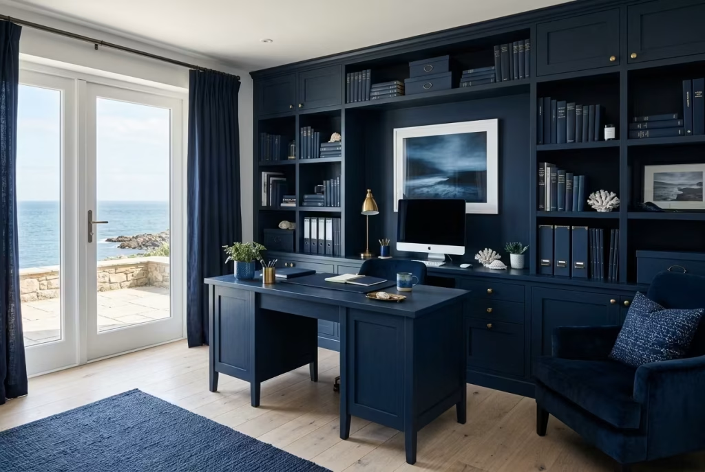
Navy blue is often treated as the shorthand for coastal design, but when it dominates a home office, the atmosphere can shift from relaxed to visually heavy. In moderation, it works beautifully as an anchoring accent. In excess, it starts to flatten the spatial softness that defines Capri-inspired interiors.
I have worked on offices where navy cabinetry, navy feature walls, and navy accessories were layered together with good intentions, yet the result felt more maritime than Mediterranean. The room looked cohesive at first, but over long working sessions, the depth of the colour became slightly fatiguing. When we reduced it to smaller accents and replaced larger surfaces with softer chalky neutrals, the space immediately felt more breathable.
The lesson is simple. Navy should support the palette, not define it.
Excess Rope Textures
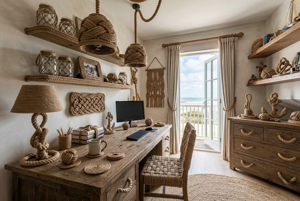
Rope textures are another common coastal cue that can quickly tip into visual cliché. Used sparingly, they introduce tactile interest. Used repeatedly, they start to feel like a theme park interpretation of coastal living.
In one project, rope detailing appeared on lighting, drawer handles, shelving accents, and even decorative objects. While each element made sense individually, collectively they overwhelmed the room’s subtle materials. The space lost its refinement and began to feel overly narrative, as if it were telling a story too loudly.
Once we removed most of the rope elements and replaced them with simpler natural textures like linen, timber, and stone, the room regained its quiet authority. Texture should feel discovered, not performed.
Overdecorating Shelves
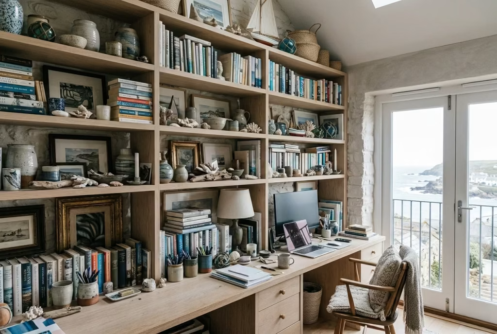
Shelving is where coastal offices often lose their restraint. The temptation to fill every surface with ceramics, books, framed prints, and coastal objects can quickly erode visual calm.
In practice, overdecorated shelves create what I often call “visual noise accumulation.” The eye never settles, constantly moving from object to object without rest. I have seen beautifully designed offices lose their sense of clarity simply because shelving became a display wall rather than a structured composition.
In one real project, reducing shelf styling by almost half transformed the entire workspace. The architecture of the shelving itself became visible again, and the room felt significantly more composed without adding or removing any furniture.
Poor Lighting Temperatures
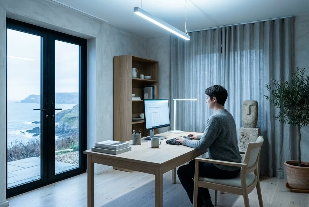
Lighting temperature is one of the most underestimated factors in coastal design. Cool white lighting can strip warmth from natural materials, making timber feel flat and plaster surfaces feel clinical. On the other hand, overly warm lighting can make the space feel dim and tired during working hours.
In a coastal home office, the balance typically sits in the warm neutral range. I often find 2700K to 3000K works best, depending on natural light exposure. Anything outside this range tends to disrupt the intended softness of the palette.
I have worked on offices where the entire material palette was beautifully resolved, yet the lighting choice made the room feel unintentionally harsh. Once adjusted, the same space immediately felt more cohesive and far easier to spend long hours in.
Ignoring Ergonomics
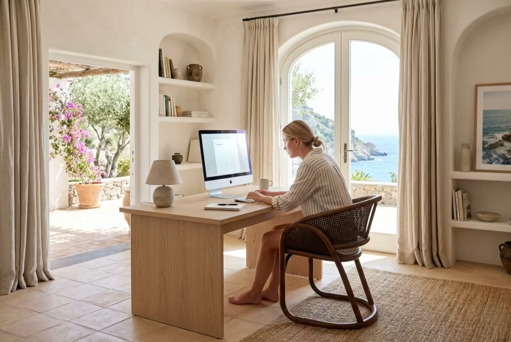
A visually perfect office that ignores ergonomics will always fail in practice. Coastal design often emphasises softness and atmosphere, but the workspace still needs to support posture, screen alignment, and long-term comfort.
I have seen desks placed too low for comfort, chairs chosen purely for aesthetics, and lighting positioned without regard for screen glare. These issues rarely show up in photographs, but they become very noticeable after a few days of actual use.
In one case, a sculptural chair that looked perfect in the space was replaced within weeks because it simply did not support extended working hours. Once an ergonomically considered alternative was introduced, the room finally functioned as intended without losing its visual character.
Prioritising Aesthetics Over Workflow
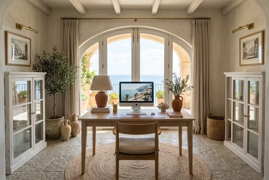
This is the most common and most critical mistake. A coastal home office should never feel like a styled set piece that happens to contain a desk. It needs to function first, with aesthetics supporting that function rather than competing with it.
In several projects, I have seen layouts prioritise symmetry or photographic composition over practical movement and daily use patterns. Desks faced the wrong direction, storage was inconveniently placed, and circulation paths were compromised for the sake of visual alignment.
When these spaces were reworked with workflow in mind, the improvement was immediate. Desks shifted slightly off-axis for better light control, storage moved within arm’s reach, and seating areas were integrated more naturally into the room’s rhythm. The aesthetic did not disappear. It simply stopped getting in the way of the work.
Real-Life Experience Angle
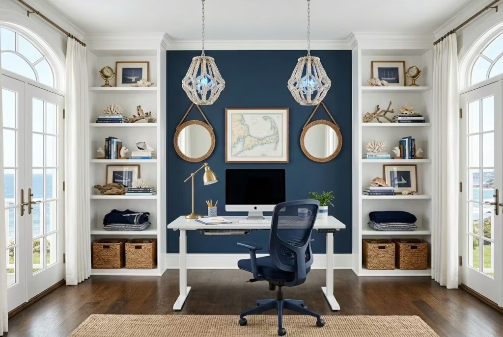
One project that stands out involved a coastal-inspired home office that was visually exceptional from the first moment you stepped into it. Soft navy accents, rope lighting details, curated shelving, and carefully styled décor created a strong coastal identity. It photographed beautifully and initially felt complete.
However, after a few weeks of use, the client reported that the space felt more like a showroom than a working environment. The lighting was slightly too cool for long sessions, the shelving required constant visual maintenance, and the layout prioritised symmetry over usability. The room was admired but not lived in comfortably.
We began a gradual refinement process rather than a full redesign. Navy elements were reduced to smaller accents, shelving was edited back to a more breathable composition, lighting was softened to warmer temperatures, and the desk position was adjusted for better natural light alignment. Ergonomic corrections were introduced quietly, without altering the core aesthetic language.
The transformation was not dramatic in appearance, but it was significant in experience. The room shifted from something that felt curated to something that felt usable, calm, and sustainable for daily work. That is often the real dividing line in coastal design. Not how it looks in isolation, but how it holds up when life begins to move through it.
How to Make a Coastal Home Office Feel Relaxing Year-Round
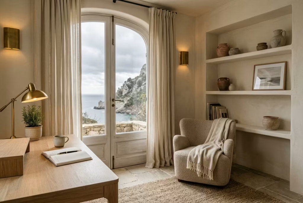
One of the biggest misconceptions about coastal interiors is that they only feel convincing in bright summer light. In reality, the most successful Capri-inspired home offices are designed to evolve naturally through the seasons, maintaining their calm atmosphere whether the room is filled with late afternoon sun or muted winter skies. A relaxing workspace should never feel dependent on one season to function emotionally.
What makes this possible is adaptability. Coastal interiors that age well over the year are not static compositions frozen in a permanent summer mood. They shift gently through texture, lighting, scent, and layering, responding to changing daylight and temperature without losing their identity.
In real projects, I often tell clients that a good coastal office should feel like the sea itself. Calm in summer, grounding in winter, and subtly different each time you return to it.
Seasonal Styling Shifts
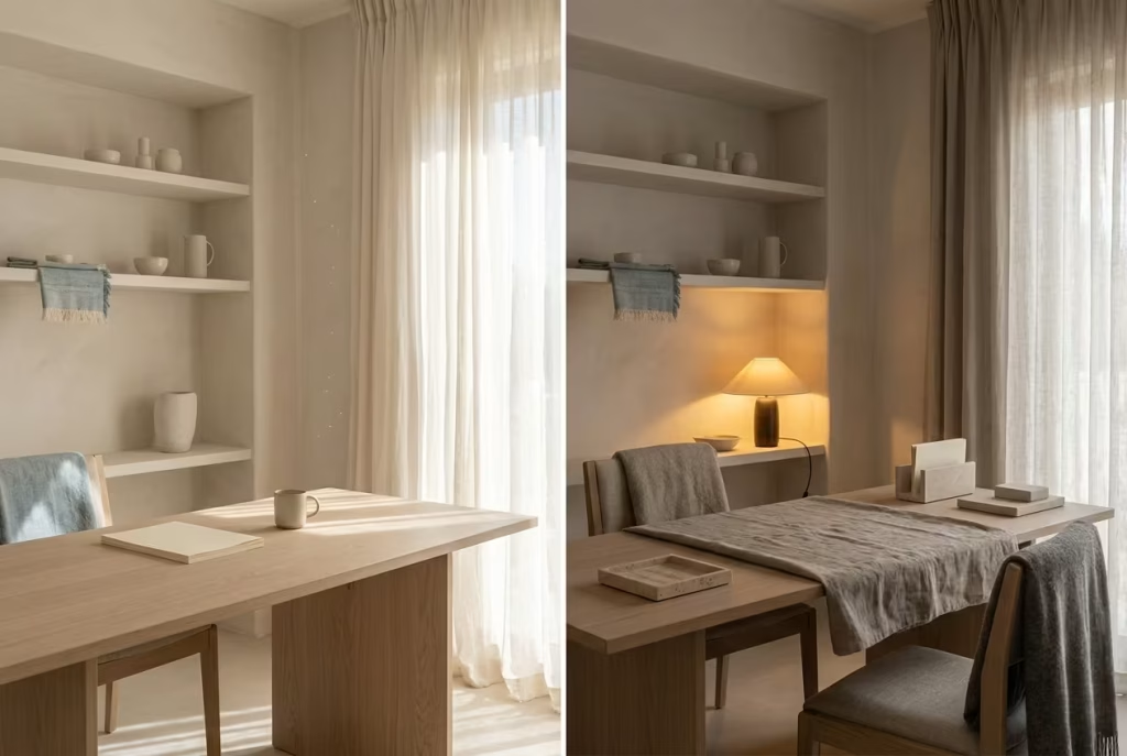
Seasonal updates in a coastal office should feel almost invisible at first glance. The goal is not dramatic redecorating, but subtle recalibration. Capri-inspired interiors rely on continuity, so seasonal adjustments work best when they refine the atmosphere rather than reinvent it.
During warmer months, I usually lean into visual lightness. Lighter ceramics, loosely woven textiles, and fewer layered accessories allow the room to breathe more openly. Shelves become slightly more restrained, and natural daylight takes centre stage.
As cooler months arrive, the styling shifts quietly. Stone accessories might become slightly darker in tone, woven baskets gain more presence, and textured fabrics begin to replace crisp summer linens. These changes are less about aesthetics alone and more about psychological comfort. The room starts to feel more grounded and protective as daylight hours shorten.
In one coastal office project, a client initially kept the same styling year-round and found the space slightly cold during winter months despite adequate heating. Once we introduced seasonal material shifts, heavier textiles, deeper tonal accents, and warmer lighting, the office began to feel emotionally warmer without losing its Mediterranean calm.
Winter Layering Techniques
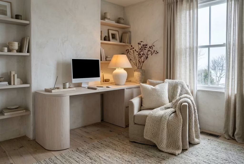
Winter layering in coastal interiors requires restraint. The aim is warmth without heaviness. Too many thick fabrics or dark additions can erase the breezy elegance that makes Capri-inspired spaces feel so restorative in the first place.
I usually approach layering through texture rather than colour saturation. Bouclé cushions, brushed wool throws, thicker linen drapery, and handwoven rugs all add warmth while preserving the softness of the palette. Layering should feel gradual, almost like adding quiet insulation to the room rather than dressing it for winter.
In practical terms, I often add one substantial tactile layer for every major seating zone. A linen-upholstered reading chair, for example, may gain a loosely draped wool throw and a heavier textured cushion during colder months. The office remains visually calm, but the physical comfort level shifts noticeably.
Flooring also plays a role here. In spaces with stone or timber floors, introducing a slightly thicker rug during winter helps soften acoustics while adding warmth underfoot. One project with limestone flooring became dramatically more inviting after we layered a heavier flatwoven wool rug beneath the desk zone during colder seasons.
Texture Rotation
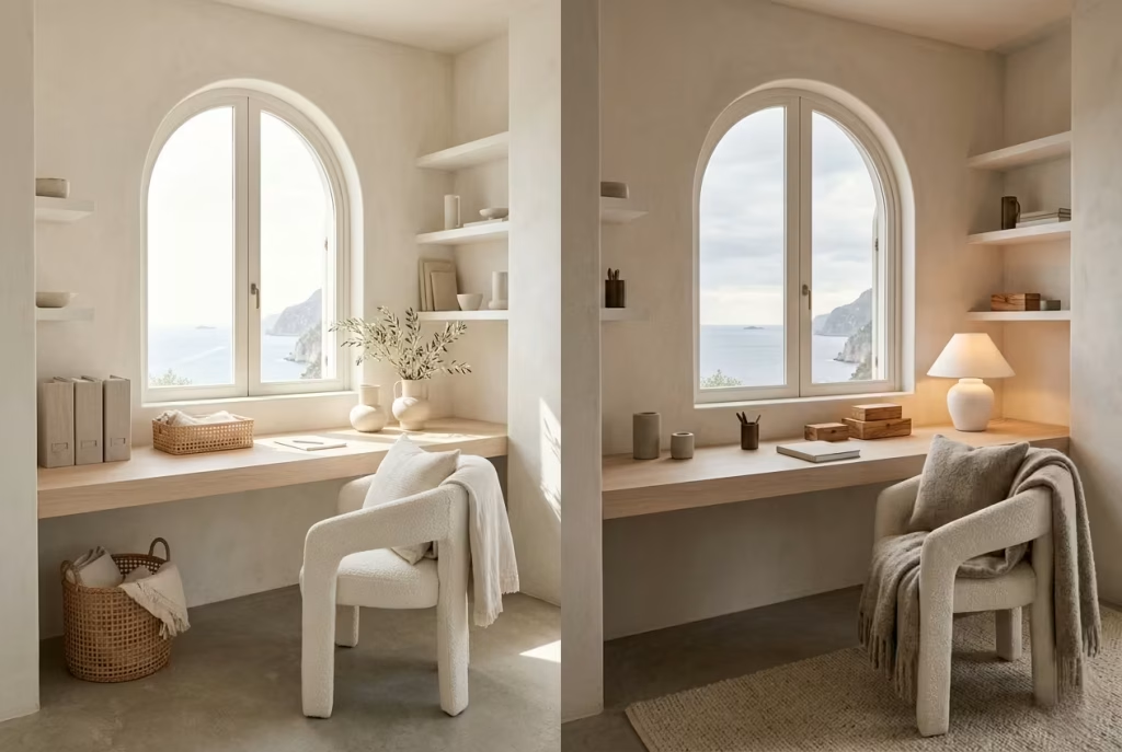
Texture rotation is one of the most overlooked ways to keep a coastal office feeling fresh throughout the year. Instead of constantly buying new décor, rotating tactile elements allows the room to adapt naturally to seasonal mood changes.
In summer, lighter textures dominate. Washed linen, open-weave baskets, pale ceramics, and lightly textured cottons keep the atmosphere airy. In winter, richer surfaces begin to take over, brushed fabrics, matte stone, aged woods, and softer woven textiles create more depth and warmth.
I often compare this process to adjusting layers in clothing. The room does not become a different style each season. It simply responds to environmental shifts with subtle changes in weight and texture.
In one home office, we rotated only a few key elements each season: cushion covers, desk accessories, a throw, and two ceramic pieces. Yet those small adjustments completely changed how the room felt emotionally across the year. It never looked staged or seasonally themed. It simply evolved quietly.
Scent and Sensory Atmosphere
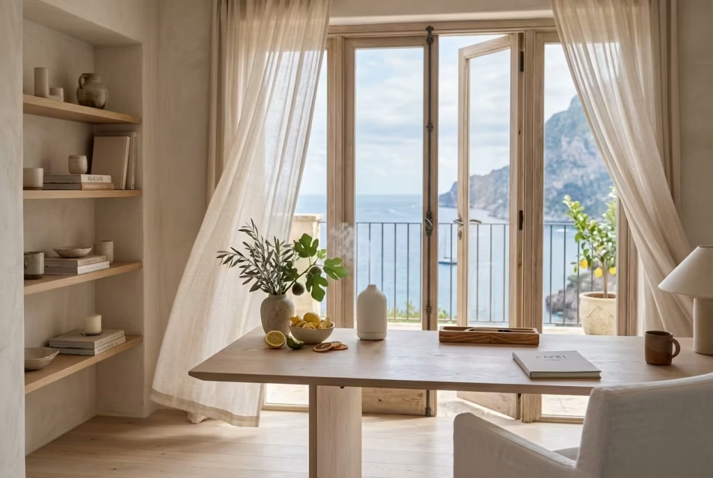
Relaxation in a home office is not driven by visuals alone. Scent, air quality, and subtle sensory cues play an enormous role in how a space is experienced during long working days.
In Capri-inspired interiors, scent should feel natural and understated. Citrus notes, olive wood, sea salt, fig, and soft herbal fragrances tend to work beautifully because they reinforce the coastal atmosphere without becoming overpowering. The key is diffusion rather than intensity. A room should smell gently present, not fragranced for effect.
I have worked on offices where introducing subtle scent layering changed the emotional experience of the room more than any decorative update. One client began using a soft bergamot and cedar diffuser during afternoon work hours and described the office as suddenly feeling “finished in a way I cannot explain.” That reaction is more common than people expect because scent bypasses visual processing and connects directly to memory and mood.
Natural airflow also contributes here. Opening windows periodically, allowing linen curtains to move slightly, and preventing stagnant air all reinforce the sensory freshness that defines Mediterranean-inspired living.
Lighting Adjustments Through Darker Months
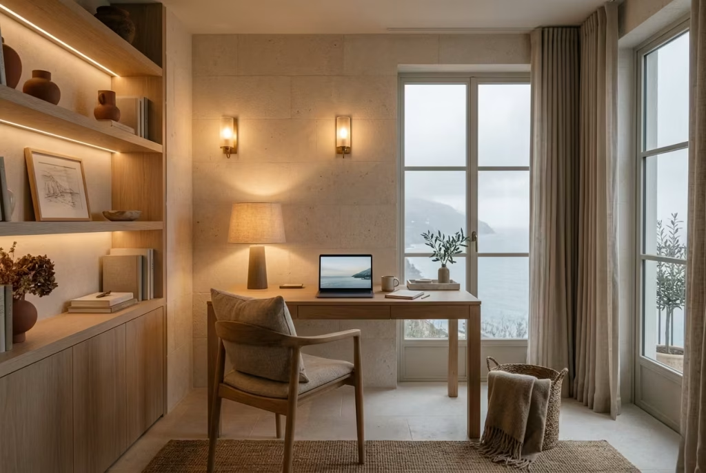
Lighting becomes increasingly important once daylight shortens. A coastal office that feels calm in summer can quickly feel flat or cold in winter if the lighting strategy remains unchanged.
The key is layered warmth. During darker months, I often increase ambient lighting levels while reducing harsh directional brightness. Warm wall sconces, table lamps with linen shades, and concealed lighting all help preserve softness once natural light fades earlier in the day.
One project with north-facing windows struggled significantly during winter because the room relied too heavily on daylight alone. We introduced layered evening lighting, including low-level shelf illumination and a warm reading lamp near the seating corner. The office immediately felt more inviting after sunset, almost like the room was gently glowing rather than simply being lit.
Dimming controls are also invaluable. They allow the room to transition gradually between work intensity and evening calm without abrupt shifts in atmosphere. That flexibility becomes especially important in multifunctional home offices that continue to be occupied well after formal work hours end.
Ultimately, a relaxing coastal home office succeeds year-round when it responds to seasonal change rather than resisting it. The room should evolve subtly with light, temperature, texture, and mood, becoming brighter and breezier in summer, then softer and more grounded in winter.
That adaptability is what gives Capri-inspired interiors their enduring appeal. They do not rely on trend-driven styling or permanent seasonal aesthetics. Instead, they create a calm foundation that shifts naturally over time, allowing the workspace to remain emotionally supportive no matter what is happening outside the window.
Designing Small Coastal Home Offices Without Losing Airiness
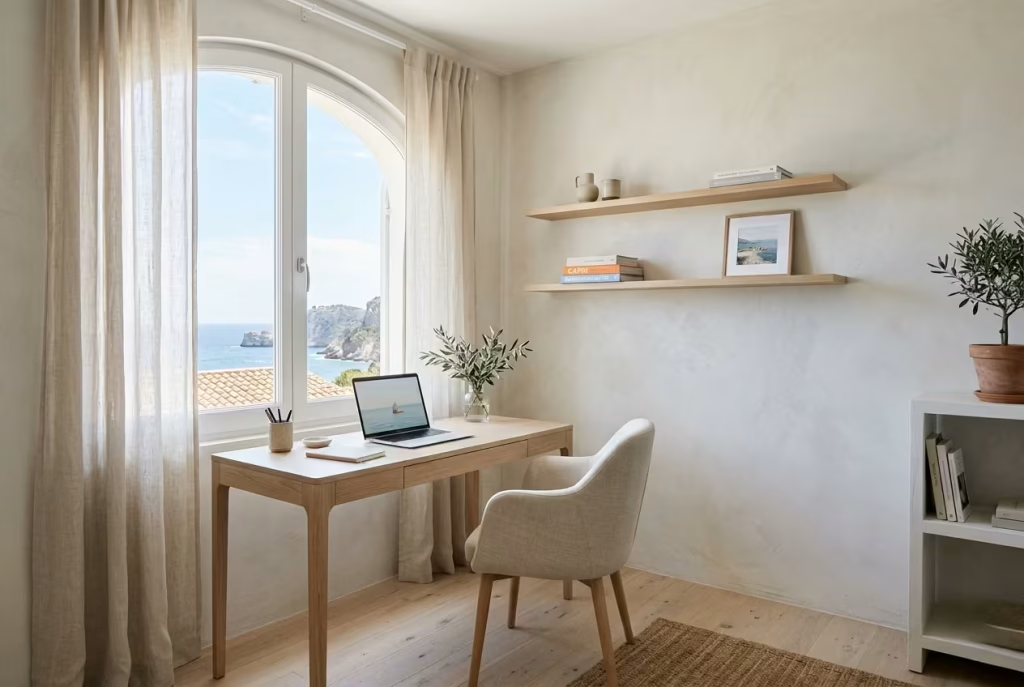
Small coastal home offices require a different kind of discipline. In larger rooms, atmosphere can sometimes compensate for inefficient planning. In compact spaces, every surface, proportion, and material choice becomes far more noticeable. A single oversized chair, a visually heavy desk, or poorly balanced shelving system can make the room feel tight almost immediately.
Yet when handled thoughtfully, smaller coastal offices often feel more intimate and calming than expansive workspaces. There is a certain quiet efficiency to them, almost like stepping into a well-designed cabin overlooking the sea where every detail has been considered carefully and nothing feels excessive.
The challenge is not simply making the room look bigger. It is preserving airiness while still allowing the office to function comfortably day after day.
Space-Expanding Palettes
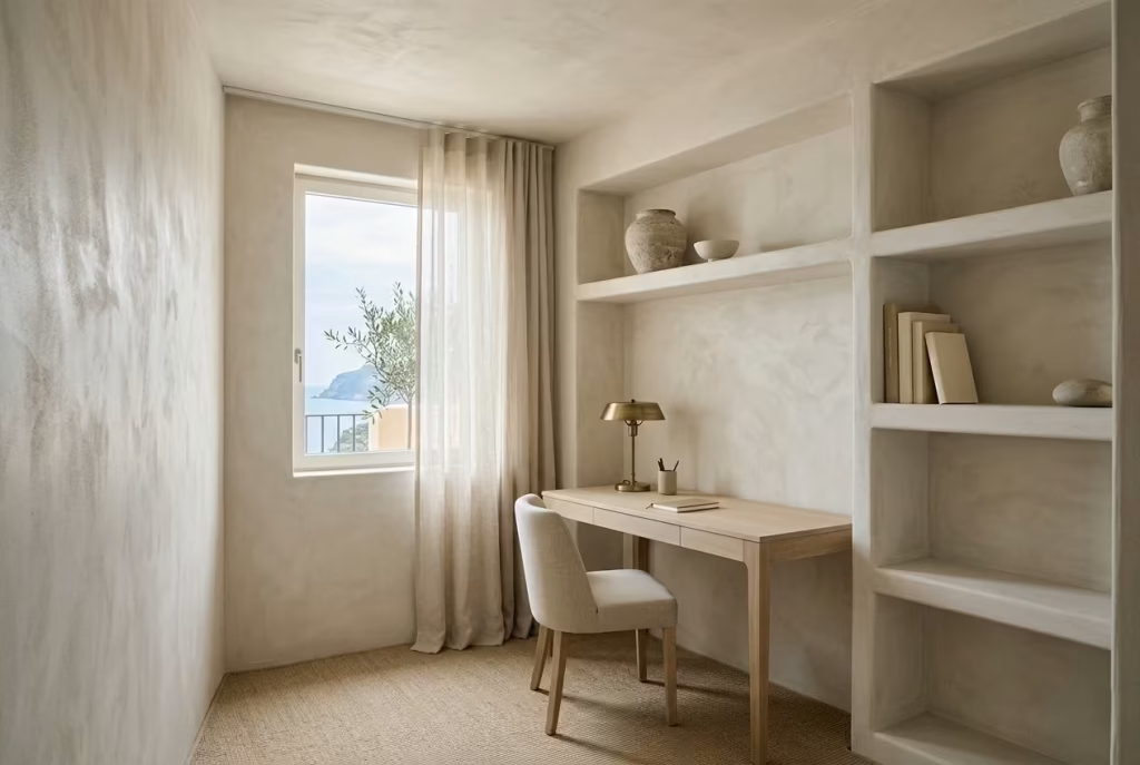
Colour is one of the most effective tools for altering spatial perception in smaller rooms. In Capri-inspired interiors, this does not mean painting everything stark white. Pure white can actually feel sharp and flatten the atmosphere, particularly in compact spaces with inconsistent daylight.
Instead, I often work with layered tonal palettes that sit close together visually. Soft limestone, pale sand, warm chalk, muted clay whites, and faded mineral greys create continuity across the room, allowing surfaces to flow into one another rather than breaking apart visually.
In one compact office project measuring roughly 2.7 x 3 metres (8.8 x 10 feet), we used a continuous warm plaster tone across walls, ceiling, and built-in shelving. The lack of sharp colour contrast made the boundaries feel softer, and the room immediately appeared larger despite its limited footprint.
This approach works because the eye stops measuring edges so aggressively. When transitions between surfaces are gentle, the room feels calmer and more expansive almost instinctively.
Reflective Mineral Finishes
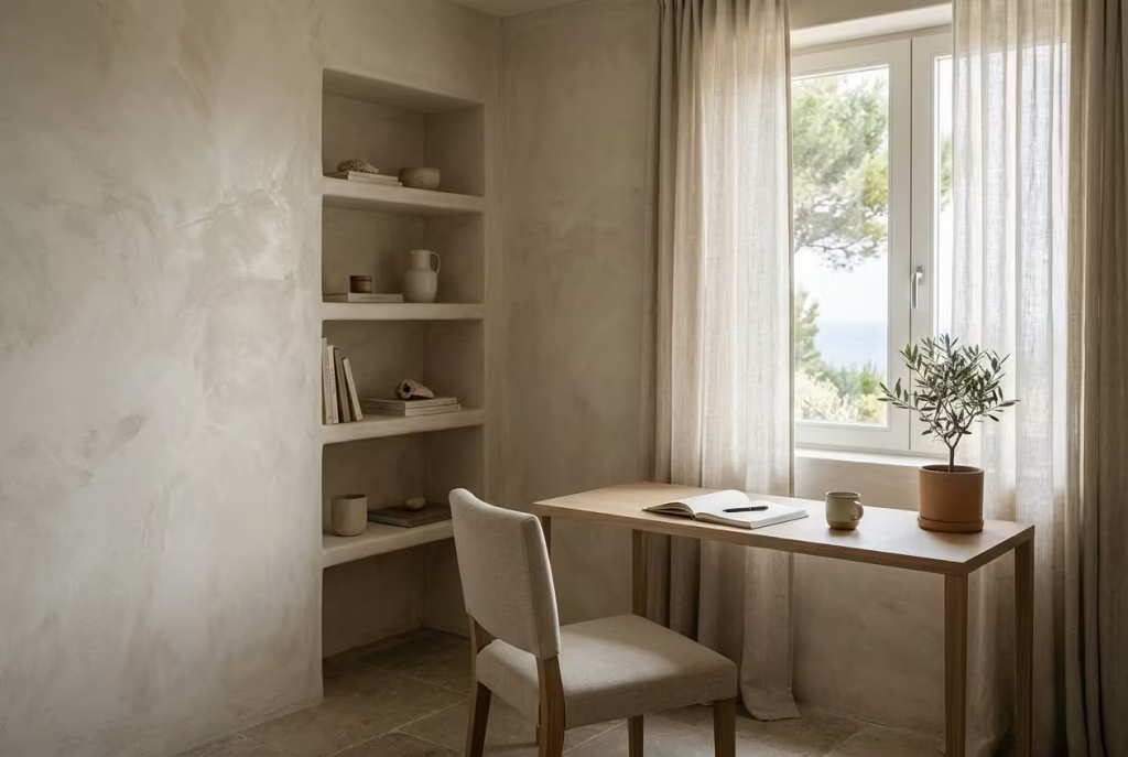
Reflective mineral finishes are particularly valuable in smaller coastal offices because they amplify light without introducing glare. Unlike glossy paint, which can feel artificial or visually harsh, mineral-based finishes such as limewash or polished plaster reflect illumination softly and unevenly.
This subtle diffusion creates movement across walls throughout the day, making the room feel more layered and dimensional. In compact spaces, that depth is important because flat surfaces tend to emphasise confinement.
I often specify limewashed finishes in offices with limited natural light because they respond beautifully to even small shifts in daylight. A room that might otherwise feel static begins to carry a softer atmospheric quality, almost as if the walls are gently absorbing and releasing light back into the space.
In one north-facing office renovation, applying a mineral finish alone significantly improved the perceived brightness without altering the actual lighting layout.
Slim-Profile Furniture
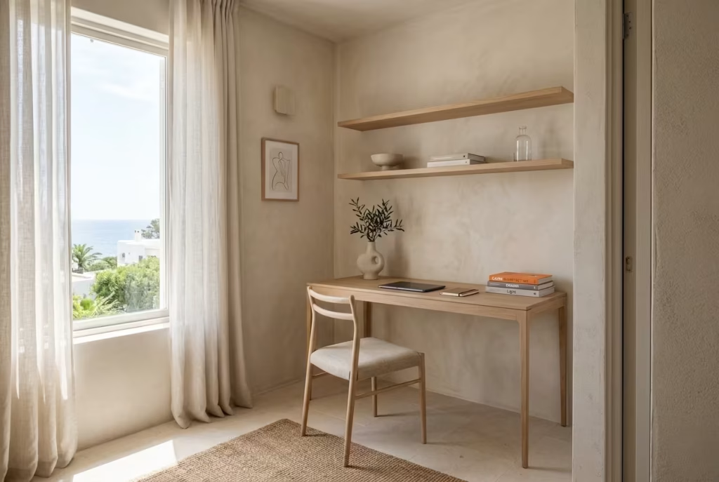
Furniture scale becomes critical in small coastal offices. Heavy furniture, particularly bulky desks or thick-framed seating, quickly overwhelms the room and disrupts circulation.
Slim-profile pieces allow more negative space to remain visible, which is essential for maintaining visual airiness. I often recommend desks with narrower leg structures, floating shelves, and chairs with exposed frames rather than heavily upholstered silhouettes.
For practical sizing, desks between 100 and 140 cm wide (39 to 55 inches) generally work well in smaller offices, depending on storage requirements. Depth should ideally stay between 55 and 70 cm (22 to 28 inches) to maintain functionality without crowding circulation zones.
In one project, replacing a deep executive-style desk with a slimmer oak built-in instantly transformed the room’s usability. The floor area became more visible, movement improved, and the office no longer felt visually compressed.
Vertical Storage
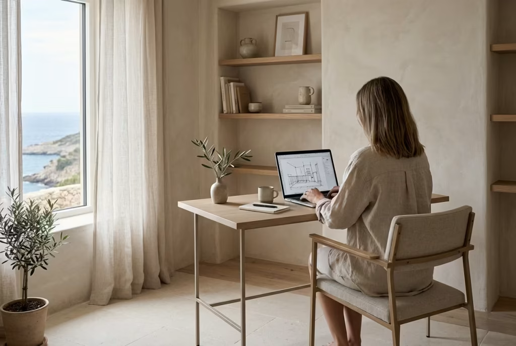
When floor space is limited, verticality becomes one of the most effective design strategies. Well-designed vertical storage keeps functional necessities accessible without allowing the room to become cluttered at eye level.
The key, however, is restraint. Full-height storage can easily feel imposing if it is visually heavy. In Capri-inspired interiors, I often break vertical shelving into lighter sections using open shelving, recessed niches, or softer material transitions.
Shelf depth also matters more than many realise. For most coastal home offices, shelf depths between 20 and 30 cm (8 to 12 inches) are usually sufficient. Anything deeper often begins to project too far into the room visually, especially in compact layouts.
One coastal office project used full-height shelving along a single wall, but by incorporating open upper sections and matching the shelving finish to the wall tone, the storage visually receded rather than dominating the space.
Visual Weight Management
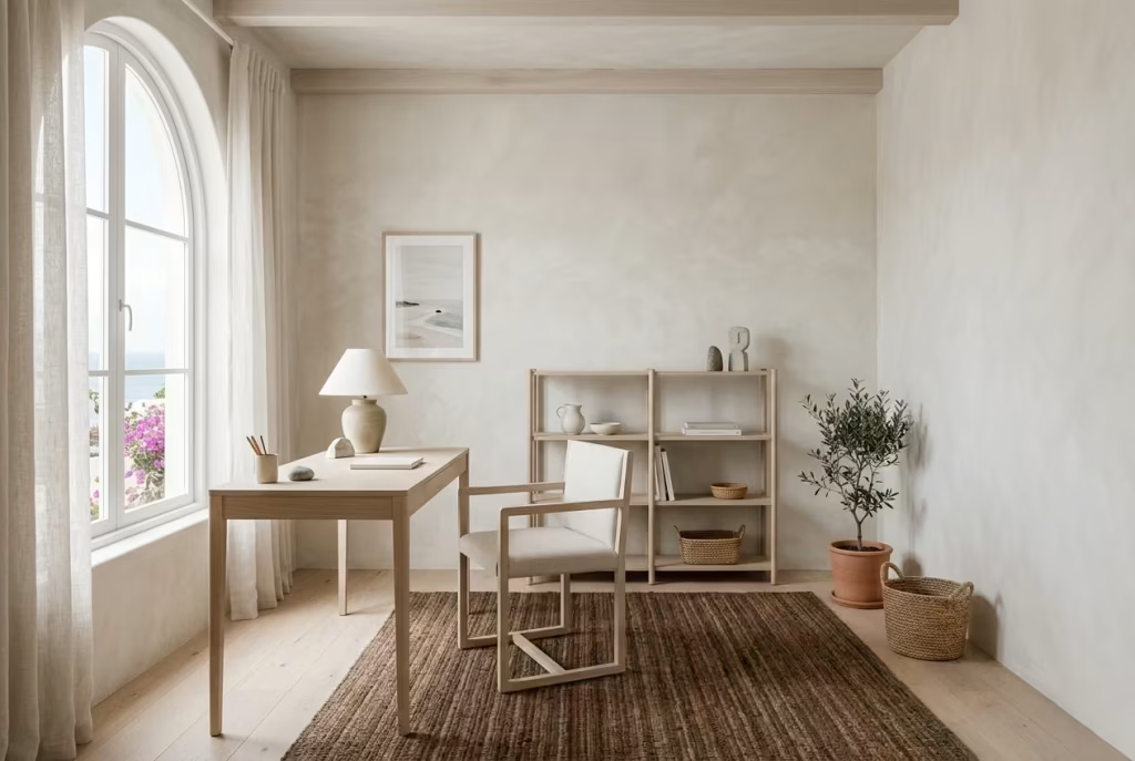
Visual weight is one of the defining factors in whether a small office feels calm or crowded. Even when dimensions are limited, a room can still feel spacious if heavier visual elements are carefully balanced.
Dark tones, oversized furniture, dense patterns, and thick materials all carry greater visual weight. In small coastal offices, I usually distribute these elements sparingly and low to the ground so the upper half of the room remains visually lighter.
For example, a darker woven rug may ground the floor while pale plaster walls and lighter shelving keep the vertical plane open. Similarly, heavier stone accessories can work beautifully when balanced by airy linen curtains and soft natural light.
I often explain this to clients by comparing the room to breathing. If every area is visually dense, the space feels like it is holding tension. Once lighter zones are introduced, the room begins to relax.
Measurements That Improve Small Office Functionality
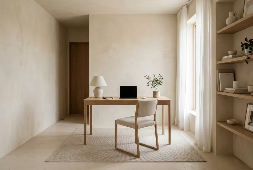
Small offices succeed through proportion as much as aesthetics. Even the most beautiful room becomes frustrating if circulation is compromised.
For comfortable movement, I generally recommend maintaining at least 75 to 90 cm (30 to 35 inches) of circulation clearance behind desk chairs where possible. In tighter layouts, 60 cm (24 inches) may function temporarily, but it can quickly feel restrictive in daily use.
Minimum desk widths depend on workflow, but I rarely go below 100 cm (39 inches) for a dedicated home office. Anything narrower often limits both functionality and visual balance. If dual monitors or extensive paperwork are involved, 120 to 140 cm (47 to 55 inches) provides a more comfortable working surface.
Shelf depth guidance is equally important. Open shelving between 20 and 25 cm (8 to 10 inches) typically feels lighter and more integrated into the architecture, while deeper shelving should be reserved for enclosed cabinetry where visual bulk can be controlled more effectively.
Ultimately, designing a small coastal home office is not about shrinking ideas to fit the room. It is about refining them. Every decision needs to work harder, more quietly, and more intentionally.
When colour, texture, proportion, and circulation align properly, even a modest workspace can feel remarkably open. In Capri-inspired interiors, airiness does not come from size alone. It comes from balance, restraint, and the careful shaping of how the eye moves through the room.
Why Capri-Inspired Workspaces Feel Emotionally Restorative in Modern Homes
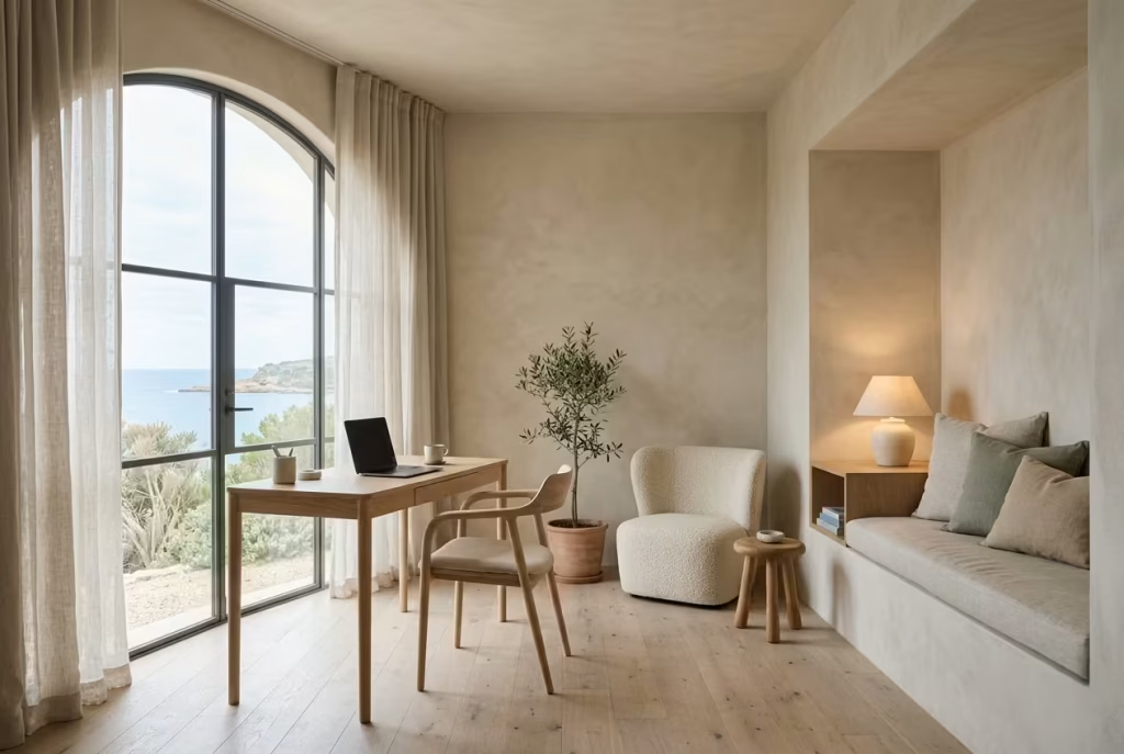
The growing appeal of Capri-inspired home offices has very little to do with trends and almost everything to do with emotional fatigue. Over the last several years, I have noticed a clear shift in what clients actually want from their workspaces. Efficiency still matters, of course, but it is no longer the sole priority. More and more people are asking for rooms that feel emotionally restorative, spaces that support concentration without carrying the cold, transactional atmosphere of a corporate office transplanted into the home.
That distinction changes the entire design conversation. In many modern homes, the office is no longer a room visited occasionally. It has become part of daily life, often occupied for eight or more hours at a stretch. When a workspace feels overly clinical, visually rigid, or emotionally sterile, the psychological weight of that environment accumulates quietly over time. Capri-inspired interiors respond to this by introducing softness, rhythm, and sensory calm without sacrificing functionality.
The Psychological Calm Created by Mediterranean Interiors
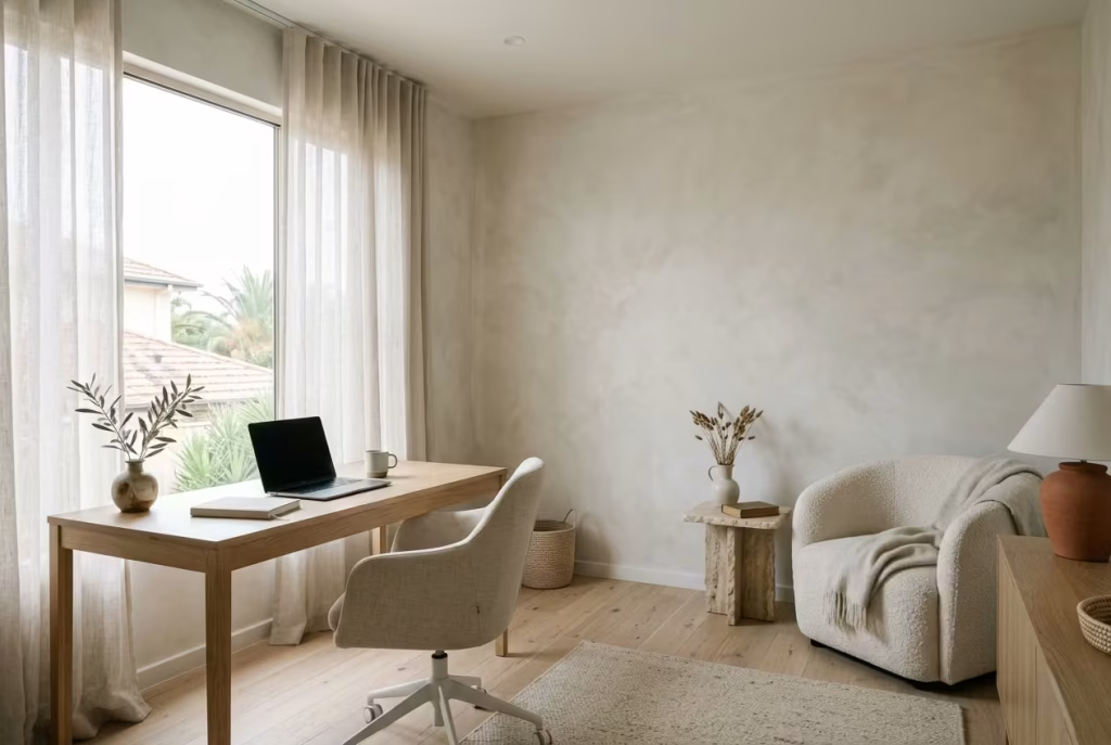
Mediterranean interiors have a unique ability to lower visual tension because they rely heavily on natural balance rather than high-contrast stimulation. The materials feel grounded, the palettes remain restrained, and the architecture often encourages softness over sharpness.
In practice, this creates environments where the eye does not need to work as hard. Limewashed walls diffuse light gently, linen softens acoustics, and natural timber introduces warmth without overwhelming the room. Together, these elements create what I often describe as “visual exhalation,” where the space quietly encourages the body to settle.
I have seen this psychological effect play out repeatedly in real projects. One client moved from a dark, highly structured office filled with black cabinetry and cool lighting into a softer Capri-inspired workspace with pale plaster walls, oak joinery, and filtered daylight. Within weeks, they described feeling less mentally drained at the end of the day despite working the same hours. The workflow had not changed. The environment had.
That is the hidden strength of Mediterranean-inspired design. It reduces friction without demanding attention for itself.
Why Relaxed Luxury Often Improves Concentration
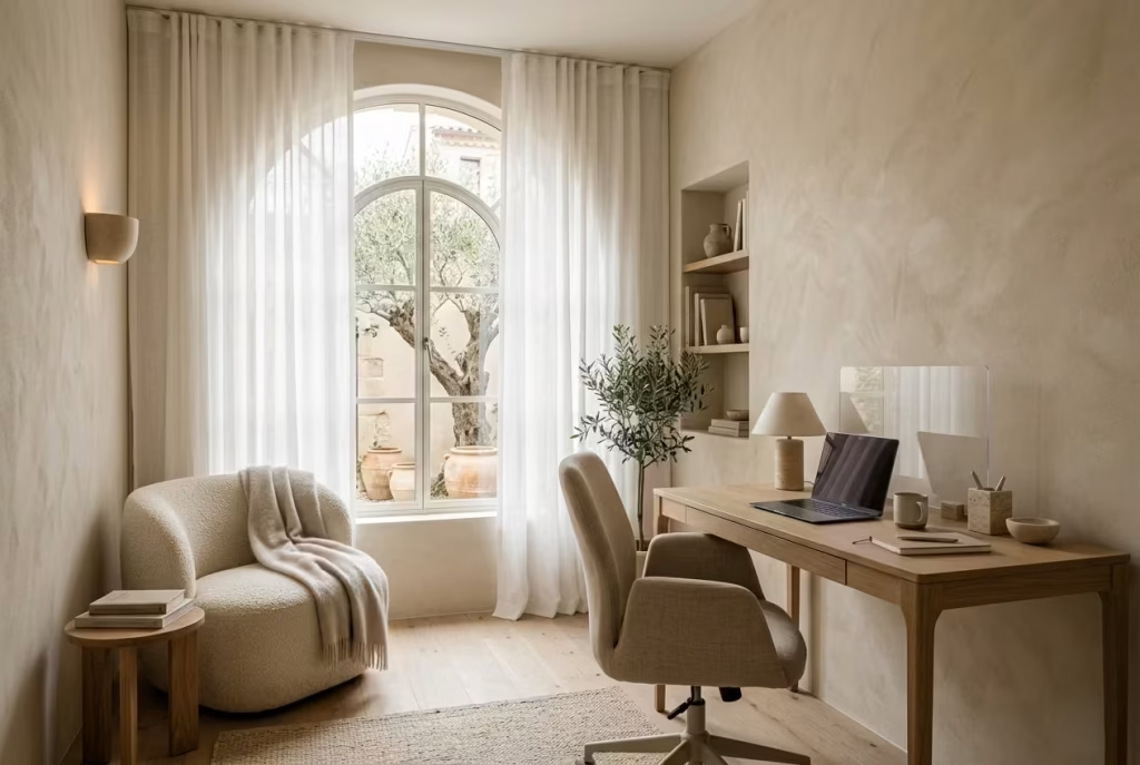
Relaxed luxury is not about indulgence or decoration layered for visual effect. In well-designed coastal interiors, luxury comes from comfort, material honesty, and spatial ease. It is the feeling that the room has been shaped carefully around human behaviour rather than designed purely to impress.
This matters enormously in home offices because concentration depends partly on nervous system regulation. Spaces that feel too sharp, overly bright, or visually crowded subtly increase mental fatigue. By contrast, rooms with softer transitions, tactile materials, and balanced lighting create conditions where focus can hold for longer periods without feeling strained.
I often notice that clients initially associate productivity with minimalism or strict organisation. Yet once they begin working in softer, more emotionally balanced interiors, their understanding of productivity changes. They stop chasing intensity and start valuing consistency.
One project involved transforming a highly polished modern office into a more layered Mediterranean-inspired workspace. We introduced warm limestone tones, textured fabrics, diffuse lighting, and a reading corner integrated beside the desk. The client later admitted they were initially worried the room would feel “too relaxed” for work. Instead, it became the space where they concentrated best because it no longer felt psychologically demanding before the workday had even started.
You May also Like: 15 Beach Cottage Design Ideas for a Relaxing Coastal Home
The Move Away From Corporate-Feeling Home Offices
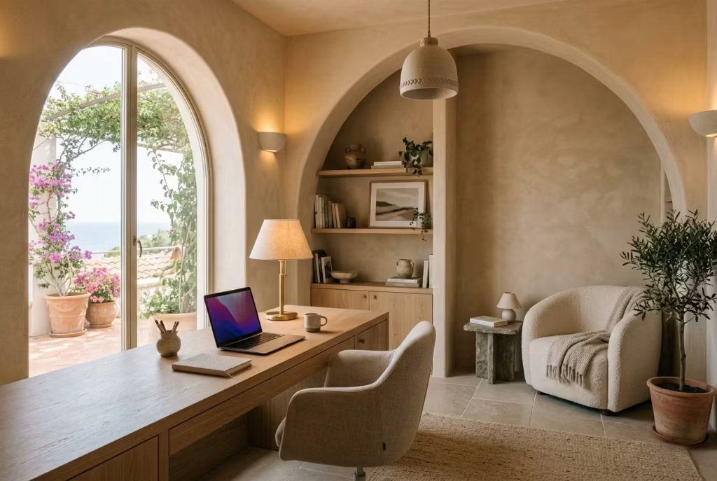
There has been a noticeable cultural shift away from home offices designed to imitate corporate environments. The old formula of glossy desks, cold lighting, sharp contrast palettes, and rigid layouts increasingly feels disconnected from how people actually want to live.
Clients now ask for spaces that integrate into the emotional rhythm of the home rather than standing apart from it. They want offices that still feel calm at 7pm, rooms that can transition naturally between focused work, reading, thinking, and quieter evening routines.
Capri-inspired interiors support this shift particularly well because they prioritise atmosphere without abandoning practicality. The materials feel lived-in rather than overly engineered. The layouts encourage flow rather than formality. Even the imperfections, limewash variation, weathered wood grain, softened stone edges, contribute to a sense of ease that modern corporate aesthetics often lack.
In real projects, I have increasingly removed features that once symbolised “professionalism” in home offices. Heavy executive desks, stark overhead lighting, and high-gloss cabinetry are being replaced with built-in oak surfaces, layered lighting, textured walls, and softer seating arrangements. Clients are not asking for offices that look impressive in photographs. They are asking for offices they genuinely want to spend time in.
Designing Workspaces That Support Slower, Healthier Routines
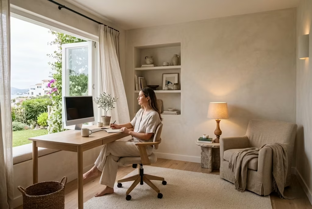
One of the most valuable shifts in modern workspace design is the growing awareness that productivity and wellbeing are not opposing forces. In fact, environments that support slower, healthier rhythms often lead to better long-term concentration and more sustainable work habits.
Capri-inspired offices naturally encourage this because they are rooted in sensory balance. Natural light becomes part of the daily rhythm. Reading corners introduce moments of pause. Textural softness reduces overstimulation. Indoor-outdoor connections encourage brief visual resets throughout the day.
I often design these spaces with intentional transitions built into the layout. A softer chair near a window, layered evening lighting, or even a slightly separated shelving niche can subtly encourage the mind to shift gears during the day rather than remaining locked into constant intensity.
One client described their redesigned office as “a room that reminds me to slow down before my body forces me to,” which captures the emotional value of these interiors remarkably well. The room still supported work, deadlines, and structure, but it no longer amplified stress unnecessarily.
Personal Insight From Real Client Projects
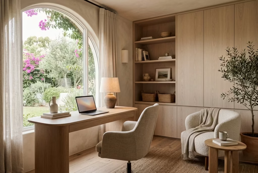
Across recent residential projects, one pattern has become impossible to ignore. Clients are increasingly requesting emotionally supportive environments instead of purely efficient ones. The language they use has changed noticeably. They speak less about productivity optimisation and more about calm, clarity, grounding, and comfort.
I remember one particular client who initially asked for “a beautiful office.” As the project evolved, what they actually wanted became clearer. They were exhausted by spaces that felt performative, overly polished, and mentally cold. The final room included pale oak joinery, limewashed walls, soft linen curtains, layered lighting, and a small reading area overlooking the garden.
Functionally, it remained highly practical. Ergonomics were carefully addressed, storage was integrated seamlessly, and workflow was efficient. Yet emotionally, the room felt entirely different from a traditional office. It carried a slower rhythm, one that supported concentration without constant tension.
That is ultimately why Capri-inspired workspaces resonate so strongly today. They acknowledge that people are not machines moving through tasks. They are individuals trying to maintain focus, creativity, and wellbeing within the same environment every single day. When a workspace supports that reality instead of resisting it, the impact reaches far beyond aesthetics alone.
Final thoughts about Designing Coastal Home Office
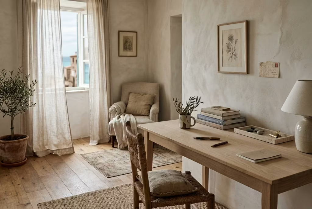
At its core, a Capri-inspired home office is never really about coastal styling in the decorative sense. It is about atmosphere. The softened light moving across limewashed walls, the quiet texture of linen catching a breeze near an open window, the grounding weight of stone beside pale timber, these elements work together not to impress loudly, but to shape how a space feels hour after hour. That distinction matters more than ever in modern homes where work and life now overlap so completely.
The most successful workspaces I have designed over the years rarely relied on dramatic statements or heavily curated perfection. Instead, they created an emotional steadiness that supported focus almost effortlessly. Calm interiors have a unique way of protecting creativity because they reduce unnecessary visual friction. When the eye is not constantly overstimulated, the mind has more room to think clearly, reflect deeply, and sustain concentration without feeling depleted by the environment itself.
This is where restraint becomes so powerful. Not minimalism for the sake of trend, but thoughtful editing that allows materials, light, and proportion to breathe properly. Rooms layered too heavily often age quickly because they are built around immediate impact. Spaces shaped with restraint tend to endure because they leave room for life to settle into them naturally over time. The softened oak desk gains character from daily use, linen curtains relax further into their folds, and stone surfaces slowly deepen in patina. Nothing feels frozen or overly controlled.
In many ways, the most memorable coastal workspaces feel slightly unfinished, though not incomplete. There is a looseness to them, an openness that allows the room to evolve gradually alongside the person using it. A stack of books shifts over months, a chair moves closer to the light in winter, fresh branches replace summer olive stems. The room continues breathing rather than remaining fixed in a perfectly staged moment.
That quiet adaptability is ultimately what gives Capri-inspired offices their emotional depth. They support productivity not through pressure or rigid efficiency, but through balance. They remind us that a workspace can still be functional while feeling restorative, that concentration grows more sustainably in rooms that soften the nervous system instead of constantly demanding from it.
And perhaps that is what people are searching for now more than ever. Not simply a beautiful office, but a space that carries them through the long rhythm of everyday life with a little more calm, a little more clarity, and a little more ease.
Frequently Asked Questions About Coastal Home Offices
What colours work best in a coastal home office?
The most successful coastal home offices usually rely on soft, low-contrast palettes rather than obvious nautical colours. Warm whites, chalky sand tones, pale mineral greys, muted olive, faded blue-greens, and light oak tones tend to create a calmer atmosphere for long working hours. In real projects, I often avoid highly saturated navy schemes because they can feel visually heavy over time, especially in smaller offices or rooms with limited daylight. Softer Mediterranean-inspired tones generally age better and feel less theme-driven.
How do I make a coastal office feel relaxing without looking overly beach-themed?
The key is restraint. Focus on natural materials, filtered light, texture, and spatial calm rather than decorative coastal motifs. Limewashed walls, linen curtains, pale timber, stone accessories, and layered lighting usually create a more authentic atmosphere than overt nautical references. One simple rule I often follow is this: if an object immediately announces “coastal décor,” it is usually too literal for a refined space.
Are coastal home offices suitable for year-round use?
Yes, provided the room is layered properly for seasonal shifts. A well-designed coastal office should feel airy in summer and grounded in winter without losing its identity. This often comes down to texture rotation and lighting adjustments. In colder months, adding wool throws, layered rugs, warmer lighting, and richer tactile materials helps maintain comfort while preserving the relaxed Mediterranean atmosphere.
What flooring works best in a coastal home office?
Pale oak, engineered white oak, limestone, travertine-look porcelain, and lightly textured timber floors all work beautifully in coastal offices. The best flooring choices tend to have matte finishes and subtle tonal variation rather than glossy surfaces. In humid environments, engineered timber is often more stable than solid hardwood because it responds better to moisture fluctuations. For stone surfaces, proper sealing is essential to prevent staining over time.
How can I make a small coastal office feel bigger?
Small coastal offices benefit from tonal continuity and visual lightness. Using similar tones across walls, shelving, and flooring softens spatial boundaries and makes the room feel more open. Slim-profile furniture, reflective mineral finishes, floating shelves, and sheer curtains also help preserve airiness. In compact spaces, I often recommend maintaining at least 75 cm (30 inches) of circulation space behind the desk chair whenever possible to avoid a cramped layout.
What lighting is best for a relaxing coastal workspace?
Layered lighting almost always performs best. A combination of warm ambient lighting, focused task lighting, and softer accent lighting creates a more balanced atmosphere throughout the day. Colour temperature matters significantly. Lighting between 2700K and 3000K generally complements natural materials like oak, linen, plaster, and stone far better than cool white lighting, which can make coastal interiors feel flat or clinical.
Do coastal home offices work in modern homes?
Absolutely. In fact, some of the most successful coastal offices I have designed were integrated into modern architectural settings. The contrast between clean contemporary lines and softer Mediterranean textures often creates a beautifully balanced environment. The key is avoiding overly decorative styling. When coastal design is approached through materials, light, and proportion rather than obvious motifs, it adapts very naturally to modern homes.
What desk material works best in a coastal office?
White oak and European oak are among the most practical and visually balanced choices because they bring warmth without becoming visually heavy. Matte finishes usually feel more natural and age more gracefully than glossy lacquered surfaces. For clients wanting more texture, reclaimed pine can work beautifully, although it requires acceptance of natural imperfections and wear over time.
How do I stop a coastal office from feeling cluttered?
Negative space is essential. Coastal interiors rely heavily on visual breathing room, so editing becomes just as important as decorating. I usually recommend styling shelves with fewer objects than feels necessary initially. Once the eye adjusts, the room almost always feels calmer and more luxurious. Overcrowding is one of the fastest ways for a coastal office to lose its sense of refinement.
Are natural materials difficult to maintain in home offices?
Not necessarily, but they do require realistic expectations. Linen wrinkles slightly, brass develops patina, timber softens in tone, and stone may show subtle wear over time. In well-designed coastal interiors, these changes are usually considered part of the room’s character rather than flaws. The goal is not preserving everything in perfect condition forever. It is allowing materials to age gracefully while still remaining functional for everyday use.
Why are Capri-inspired interiors becoming popular for home offices?
Many people are moving away from rigid, corporate-feeling workspaces and looking for environments that support emotional wellbeing alongside productivity. Capri-inspired interiors respond to this shift through softness, natural materials, layered light, and slower visual rhythms. In my experience, clients increasingly want offices that feel restorative rather than purely efficient. They still need practical workspaces, but they also want rooms that help reduce mental fatigue and support healthier daily routines.