15 Pink English Country Bedroom Ideas That Make Any Room Glow
I once had a client in Chichester whose bedroom I’d talked her into painting a soft blush pink, and by nine o’clock the following morning she rang me sounding rather betrayed. The wall she’d fallen for in the shop looked, in her words, “a bit plasters and bandages.” She wasn’t wrong. Her room faces due north, and the cool light coming through those sash windows had stripped every scrap of warmth from a shade that needed it desperately.
We repainted a fortnight later, half a shade deeper and pulled properly warm, and that same room now catches the afternoon light like something out of a period drama. It taught me more about pink than any mood board ever has: the colour was never the risk. The aspect was.
That’s the piece I want to hand you here. Not another parade of pretty rooms to scroll past and forget, but fifteen ways to get pink genuinely right in an English country bedroom, glowing rather than guessing, whatever way your windows happen to face.
Why Pink Keeps Getting Written Off as a Bedroom Colour (and Why That’s Wrong)
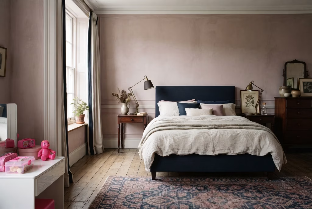
Ask most people to picture a pink bedroom and they’ll conjure up something out of a nine year old’s dream diary, all candyfloss and glitter, and I understand entirely why the colour gets shown the door before it’s had a fair hearing. That’s the trouble with pink. It carries baggage nobody actually asked it to carry, and most homeowners write it off long before they’ve worked out what actually makes a room feel grown up or feel like a nursery.
Here’s the thing nobody tells you at the paint counter: it was never the pink doing the damage. It’s depth, undertone, and what you put next to it that decides whether a room reads as considered or reads as a leftover from childhood.
Take a saturated, greyed-back shade like Sulking Room Pink and sit it against ink navy, aged brass, and a proper wool rug, and you’ve got something that wouldn’t look out of place in a Mayfair townhouse.
Take that same pink family but push it towards a sweet, bright bubblegum tone, pair it with white gloss and plastic-look fittings, and you’ve landed yourself back in the nursery whether you meant to or not. Same colour family, wildly different outcome, and the gap between the two comes down to choices most people never think to make consciously.
This is where I want you to start thinking about pink differently: as a neutral that happens to have warmth in it, rather than a “statement colour” you’re either brave enough to commit to or not. Treat it the way you’d treat a warm grey or a soft stone.
Let it sit quietly behind mahogany, brass, dark green, oak, ink blue, whatever your room already leans towards, and it will behave itself beautifully. Fight it with cool whites and sharp modern lines and it’ll sulk on you, quite literally in the case of that particular Farrow & Ball tin.
The other lever, and it’s one that gets glossed over constantly, is depth of tone. A pale, chalky pink close to white reads as gentle and grown up almost by default, because there’s so little saturation for the eye to latch onto.
Push further into the mid tones, your dusty rose, your faded terracotta pink, and you need the room around it to carry a bit of weight too, proper textiles, aged wood, something with a bit of history to it, or the colour starts to feel thin rather than rich.
Go bolder still, into raspberry or that spiced Rangwali territory, and now you’re working with genuine drama, the kind of pink that needs quieter neighbours rather than louder ones to hold its own.
So before you look at a single one of the fifteen ideas ahead, hold onto this rule. It’ll save you more grief than any swatch chart: the pink itself was never the problem, and once you understand what it’s paired with and how deep you’ve pushed it, every room from here on reads as a decision you made on purpose, not a gamble that happened to pay off.
You May also Like: 25 Minimalist Bedroom Ideas for a Clean, Modern, and Peaceful Sleep Space
Get the Undertone Right Before You Touch a Single Fabric
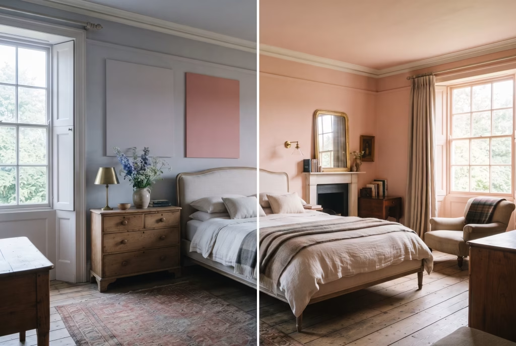
If there’s one section in this whole piece worth bookmarking, it’s this one, because it’s the bit almost nobody bothers to explain properly, and it’s the bit that decides whether your finished room glows the way you imagined or leaves you ringing your decorator at nine the next morning wondering where it all went wrong.
Pink is not one colour. It’s a family of undertones wearing the same name, and which member of that family you bring home depends entirely on which way your windows face.
North-facing rooms get the rawest deal of the four, and there’s no getting around it. The light coming through those windows is cool, flat, and faintly blue, the kind of light that never really warms up whatever the season. Put a pink with even a whisper of cool or blue undertone into that room and it will curdle, going grey, going flat, going, as one client of mine put it rather memorably, “properly bandage.”
What a north-facing room wants instead is warmth pushed in deliberately: something with red or apricot running underneath it, a Setting Plaster, a Templeton Pink, anything with enough backbone to fight off the chill rather than surrender to it. Think of it as bringing your own sunshine to a room the sky won’t provide.
South-facing rooms have the opposite problem, if you can call it a problem at all. You’re swimming in warm, generous light for most of the day, so a pink with a touch of coolness in it, something like Nancy’s Blushes, actually reads as fresher and cleaner rather than washed out.
Go too warm here and you risk the whole room tipping towards peachy or, worse, faintly orange by four in the afternoon. East and west-facing rooms sit somewhere between the two, and this is where living with a sample properly, not guessing, earns its keep more than anywhere else.
And that’s the crux of it: you cannot judge a pink off a two-inch chip held under the fluorescent strip lighting of a paint counter. I mean that quite literally. Shop lighting is a liar, and a fairly convincing one at that. It flattens undertone, boosts brightness, and shows you a colour that simply does not exist once it’s on your actual wall, in your actual light, at your actual time of day.
Here’s what I ask every client to do instead, and it’s non-negotiable in my book. Buy a proper sample pot, not a swatch card, paint a section at least A2 in size on the actual wall you’re planning to use, and live with it for a full 48 hours minimum. Watch it at nine in the morning, when the light is doing whatever it does in your particular room.
Watch it again at midday. Then watch it a third time in the evening once the lamps are on and the daylight’s gone, because a pink that reads perfectly cheerful at noon can turn suddenly murky or, just as often, suddenly saccharine, the second it’s lit by a warm bulb rather than the sky. I’ve seen colours shift so much across those three checkpoints that clients genuinely doubted I’d used the same tin twice.
Get this one step right and every idea that follows in this piece becomes considerably easier, because you’re no longer hoping the pink works. You already know it does.
Head to Toe Blush: The Enveloping Look
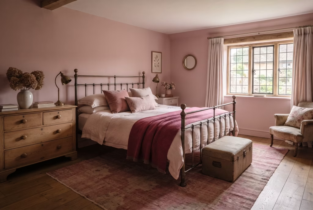
Wrap a whole room in blush and something shifts the moment you shut the door behind you. It stops being decorated and starts being held.
The trap most people fall into? Buying one tin and using it everywhere; walls, curtains, even the lampshade. Flat as a pancake within a week. A proper cocoon needs variation within the family, not repetition of it.
What actually makes this work:
- Walls a shade or two darker than you’d expect, this is your anchor tone
- Bedding two steps paler, closer to eggshell than blush
- Rug aged, faded, almost dusty rose rather than fresh off the loom
- One textile (a throw, a bolster) in the darkest pink you own, just to give the eye somewhere to land
I did this in a Cotswolds cottage bedroom last spring, three distinct pinks and not a scrap of white in sight, and the client’s exact words were “it feels like standing inside a shell.” That’s the whole trick. Variation within a single family, not a single flat coat pretending to be a scheme.
Skip this if: your room gets very little natural light. Total immersion needs daylight moving across it to actually breathe; in a dim room it just goes heavy.
Panelling Painted in a Deep, Dusty Pink
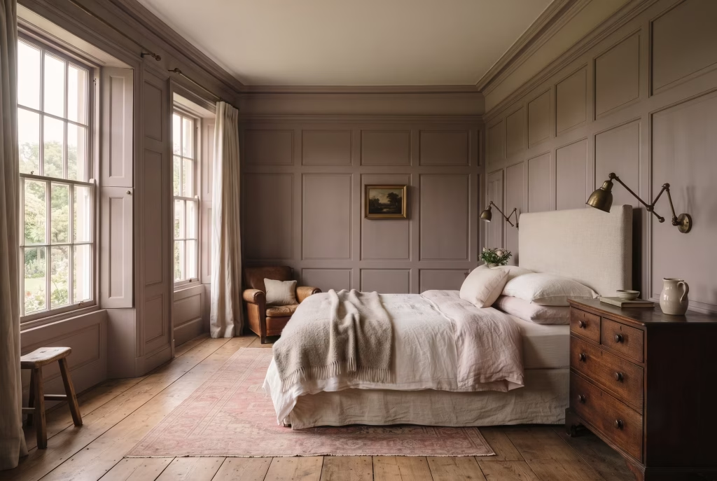
Flat colour asks for your attention. Panelling earns it. The moment you add raised timber to a wall and paint the whole thing one deep, dusty pink, something a decorator would call architecture starts happening.
Light catches the raised frames and slides straight past them. The recessed panels sit a shade darker in shadow, even though it’s the exact same tin. You end up with tonal movement across a single colour, which flat emulsion simply cannot fake no matter how good the paint.
Here’s where most people trip up though, and it costs them the whole effect: using one sheen throughout.
Paint the raised frame in eggshell and the recessed field in dead flat, same pink, same tin, and you get a proper play of light without touching a second colour. Eggshell bounces, dead flat absorbs. That contrast alone gives you depth that a beginner would swear came from clever colour mixing.
A dusty, greyed-back pink, something like Cinder Rose or Sulking Room Pink, suits this treatment far better than anything bright or sweet. Panelling wants gravitas, not sugar.
One warning worth heeding: run the panelling only to picture rail height and switch colour above it, and you’ll cut the wall in two, making a perfectly good ceiling look lower than it actually is. Take it floor to ceiling, or don’t bother at all.
A Brass or Iron Bed as the Room’s Anchor
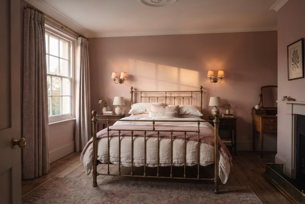
Metal changes the temperature of a room. Cold brushed nickel makes pink go clinical. Warm brass makes it glow like something out of a Sunday morning you never wanted to end.
There’s a reason brass and iron beds turn up in nearly every English country bedroom worth photographing. They catch morning light in a way upholstery never manages, throwing a soft gold sheen across the frame that a painted or fabric headboard simply hasn’t got in its repertoire.
Watch what actually happens at sunrise:
- East-facing window, low winter sun, brass bedstead: the metal practically hums, picking up warmth and bouncing it straight back into the pink walls
- Same room, chrome or brushed nickel instead: the light passes through flat, no conversation between metal and wall, the whole thing reads slightly sterile
Iron behaves a touch differently, older, quieter, more matte than shine. Where brass sparkles, iron settles. A dusty rose room with a black iron frame reads cottage and lived-in. The same room with polished brass tips towards something grander, more Georgian townhouse than farmhouse.
One rule I hold clients to without exception: pick your metal finish first, then match everything else to it. Wall sconces, door furniture, curtain rings, all in the same family. Mix brass with chrome in one room and neither wins, they just squabble quietly in the corner for the rest of time.
You May also Like: Terracotta Interior Design: 51 Warm & Stylish Ideas for Every Room
Chintz Curtains as the Room’s Whole Personality
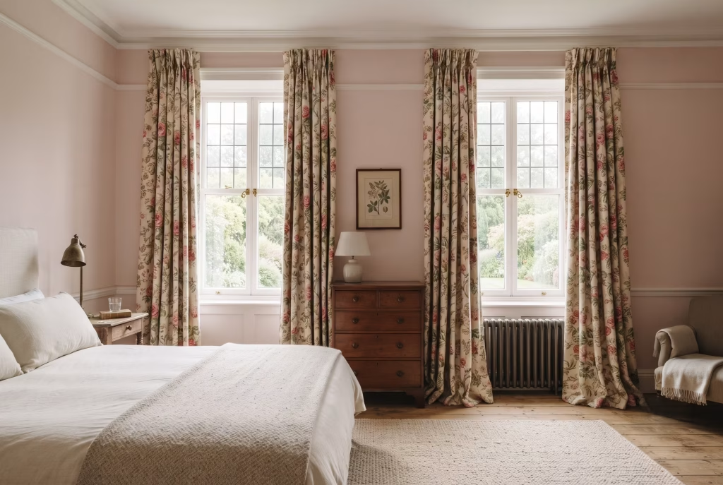
Chintz doesn’t ask permission. It arrives, fills the window, and tells the rest of the room how things are going to be.
That’s actually its strength, not its risk, and here’s the trick that stops it from swallowing the space whole: pick a single colour out of that busy print, usually the ground colour rather than the flowers, and carry it straight onto the walls. Nothing else. No pattern-matching, no second print fighting for attention.
Why this works, in plain terms:
- The curtain fabric holds all the visual noise (the roses, the trailing stems, the layered detail)
- The wall gives the eye a place to rest between glances at the fabric
- Everything else in the room, headboard, lampshade, bed linen, stays plain so the chintz has room to breathe
I worked this exact formula into a guest bedroom near Bath last year, floor-length chintz in a warm rose and cream, walls picked out in the softest blush from the print’s background. Not one other pattern in the room. The client called it “busy but calm at the same time,” which sounds like a contradiction until you’ve stood in a room where it actually works.
The mistake people make constantly: chasing every colour in the print across cushions, throws, and paint at once. A chintz might carry six or seven tones in a single repeat. Try to honour all of them and the room turns restless rather than rich, pattern chasing pattern with nowhere left for your eye to land.
One more thing worth knowing before you commit fabric to metre count. Full-length curtains, pooling slightly or just kissing the floor, let a chintz repeat unfold the way it was actually designed to. Cut them short and you chop straight through the pattern, leaving trailing stems with no top and figures with no feet. Chintz was never meant to be rushed, and shortening the drop is the fastest way to undercut everything it does so well.
Toile de Jouy Dressing a Single Window
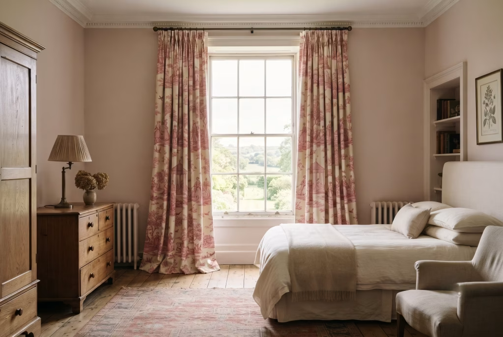
One window, one fabric, an entire story unfolding across it. That’s the promise a toile de Jouy curtain makes, and unlike most promises in decorating, this one actually delivers.
Paint gives you flat colour. Toile gives you narrative, shepherdesses, garden pavilions, figures caught mid-stroll, printed in a single ink over a soft rose or cream ground. It’s the one fabric in this whole piece that rewards standing close and looking properly, rather than just registering colour from across the room.
Scale is where most people come unstuck. Toile repeats are large, often eighteen inches or more between motifs, which means:
- A short curtain chops the story in half, figures with no feet, trees with no crowns
- A narrow window compresses the repeat so tightly the pattern looks cramped rather than storytelling
- A full-length drop, floor-skimming or gently pooled, lets the print unfold the way its designer actually intended
I dressed a single sash window in toile for a client in Marlborough last autumn, deliberately leaving every other window in the room plain, and the effect was closer to hanging a piece of art than fitting curtains. That’s the real strength of toile: it doesn’t need repeating across a whole room to earn its keep. One generous window, done properly, carries the character for the entire space.
Fix the pole as high as your ceiling will allow, tight to the cornice if you’ve got one, and even an ordinary window starts reading as something considerably grander than it is. Skimp on fabric here and the story simply never gets told properly, no matter how lovely the print itself happens to be.
Gingham on the Bed, Not the Whole Room
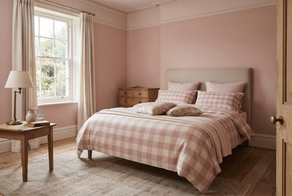
Gingham is the one pattern in this whole piece that knows how to behave itself. Give it the bed, and only the bed, and it does something no floral ever quite manages: a clean, repeating grid the eye can actually rest on.
That’s the styling rule worth writing down. Gingham stays confined to the bed linen. Everything else, walls, curtains, upholstery, stays solid or textured rather than patterned.
Here’s the scale logic behind it:
- Small check (quarter inch or under) on pillowcases, reads almost as texture from across the room
- Larger check on the duvet cover, gives the bed proper visual weight without shouting
- Zero pattern anywhere else, so the grid has nothing competing with it
The reason this pairing keeps turning up in country bedrooms worth photographing? Gingham makes any floral cushions sitting next to it look softer by contrast, not busier. It’s doing quiet balancing work most people never consciously notice, only feel.
One trap worth sidestepping entirely: reaching for a second check, tartan, stripe, another gingham at a similar scale, anywhere near the bed. Two grids in one sightline and the whole thing turns into visual static, neither pattern able to do its job properly. Keep gingham as the lone graphic voice in the room and it earns its keep every single time.
Wallpaper Above a Painted Dado Rail
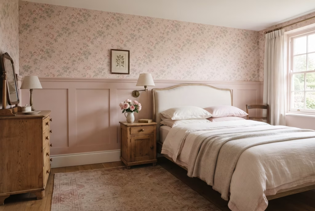
Two surfaces, one wall, and each half gets to shine without shouting over the other. That’s the entire appeal of splitting a wall at dado height, paint below, paper above, and it’s a trick that solves a problem most people don’t even realise they have: too much pattern feels chaotic, too little feels flat.
Panelling or painted wainscoting below the rail grounds the room. It’s solid, it’s tactile, it does the heavy lifting. Above it, a soft floral wallpaper gets to feel lighter than it would running floor to ceiling, because your eye’s already found somewhere plain to rest lower down.
The practical bit that actually determines whether this looks intentional or accidental:
- Match the paint to the paper’s ground colour, not a colour you think complements it. Most wallpapers have a background tone woven through the print, pull that exact shade for your dado paint and the two surfaces read as one considered decision
- Skip the skirting board treatment. Run wallpaper all the way down to the floor and the panelling below suddenly looks like an afterthought, bolted on rather than built in
- Keep the dado rail itself in a slightly deeper or lighter tone than the panelling, just enough to mark the division without drawing a hard line across the room
I did exactly this in a cottage bedroom outside Stroud, Farrow & Ball Pink Ground below the rail, a hand-painted style floral above it lifted straight from the same colour family. The client’s builder, who’d fitted panelling in a hundred houses before that one, said it was the first time he’d actually understood why the paint colour mattered as much as the paper.
Get the ground colour wrong, even by a shade, and the two halves of the wall will bicker rather than converse for as long as you live with them.
You May also Like: 21 Minecraft Bedroom Ideas to Build the Ultimate Gamer Room
A Faded, Shabby-Chic Layered Look
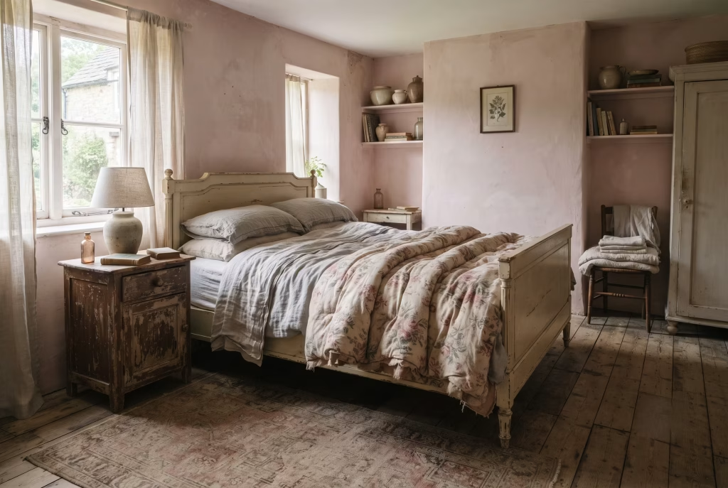
Nothing in this whole piece looks quite as effortless as this, and nothing takes longer to fake convincingly. That’s shabby chic done properly, distressed edges, softened colour, the kind of patina you can’t buy off a shelf no matter how much you’re willing to spend trying.
The pink family that actually works here isn’t bright, isn’t fresh, isn’t anywhere near the paint chip you’d pick if you wanted something bold. Think Pink Drab, that faded, chalky, sun-bleached quality that reads as though decades have already happened to it. Anything too saturated or too clean fights the whole point of the look before you’ve hung a single curtain.
Layer these in, roughly in this order, and the room starts earning its character rather than performing it:
- Antique linen bedding, plain, slightly grey-toned, never brand new
- A faded floral eiderdown on top, the print softened by decades of washing rather than a factory finish
- Distressed painted furniture, chipped at the corners deliberately or simply through real use, brings the wear down to floor level
- A threadbare rug, Turkish or Persian, worn thin in the traffic paths
That last detail matters more than people give it credit for. A pristine new rug under a shabby chic bed looks like a mistake, two different decades arguing in the same room.
I always tell clients this look is earned, not applied, and I mean that quite literally. One piece of properly aged furniture, even something as small as a bedside table with real chipped paint rather than a faux-finish, does more work than a whole room of new pieces styled to look old. Fake distressing has a tell, always slightly too even, too deliberate. Genuine wear never repeats itself the same way twice, which is exactly why it convinces.
Grasscloth on a Single Wall for Texture
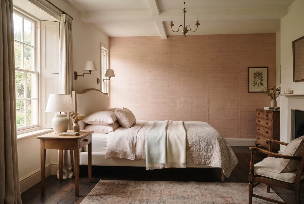
Flat paint can’t do what woven fibre does. That’s the honest reason grasscloth keeps turning up in rooms designers actually love working in, not because it’s fashionable this season, but because light behaves differently across a woven surface than it ever does across emulsion.
You don’t need a whole room of it either, and this is the bit that saves both budget and effort. Paper just the chimney breast, or the wall behind the bed, and you get every scrap of warmth grasscloth brings without the cost or the palaver of papering four walls in a natural fibre that isn’t the cheapest material going.
What you’re actually buying with grasscloth:
- Depth without pattern. No print, no repeat, just texture catching light differently hour to hour
- A softer edge to the pink. Woven fibre diffuses colour slightly, so the wall reads warmer and less flat than the same shade in paint
- Real tactility. Guests touch this wall. Every single time. It’s simply that kind of surface
Now the caution, and I mean this one properly, not as decorative small print. Grasscloth and moisture do not get along. Hang it in a bathroom, an en suite, or any room with poor ventilation and the natural fibres will absorb humidity, warp along the seams, and start lifting away from the wall within months, sometimes weeks in a genuinely steamy room. I’ve seen it happen to a beautifully papered chimney breast that backed onto an unvented shower room, and there was no saving it once the seams had gone.
Keep it to a proper bedroom with decent airflow and grasscloth will sit happily for decades. Put it somewhere damp and you’re paying twice, once for the paper, once for the removal.
Pink and Sage Green Together
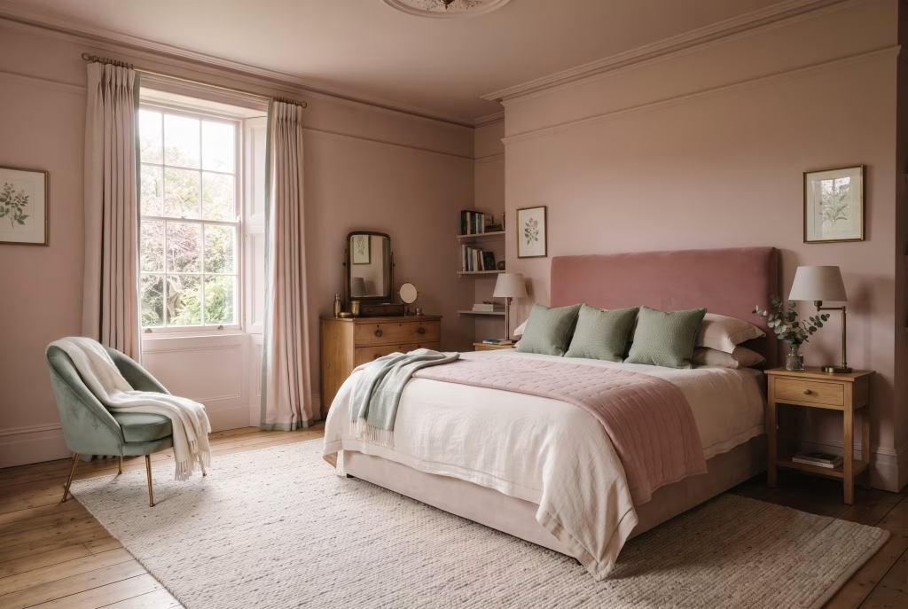
Opposites don’t just attract, they explain each other. Pink and green sit facing one another on the colour wheel, which is the actual, unglamorous reason this pairing works so reliably rather than by accident. Complementary contrast, textbook colour theory, dressed up in linen and looking rather lovely about it.
What that means in practice: a blush headboard next to leaf green cushions doesn’t read as a decorating decision at all. It reads as something that simply grew that way, the way a garden does without anyone standing over it with a colour wheel.
The question every client asks at this point is how much green is actually enough, and it’s a fair one, because too little looks accidental and too much dilutes the pink entirely.
I worked on a master bedroom in Sussex last year where we settled the ratio properly:
- Roughly 70 per cent pink, walls and headboard, doing the heavy lifting
- 20 per cent sage green, brought in through a velvet accent chair and cushions, never painted onto a full wall
- 10 per cent left neutral, linen and oak, so both colours had somewhere quiet to rest against
Push green past that 20 per cent mark, paint a second wall in it, add a green rug on top of green cushions, and the pink starts losing its footing. The room stops feeling like blush with a garden accent and starts feeling like it can’t decide what it wants to be.
One warning worth holding onto: reach for a bright or lime green as your contrast and you’ll strip out every scrap of the calm this pairing is meant to deliver. Sage, olive, a proper muted leaf tone, these hold hands with pink beautifully. Anything neon just shouts over it.
Pink and Deep Teal or Navy
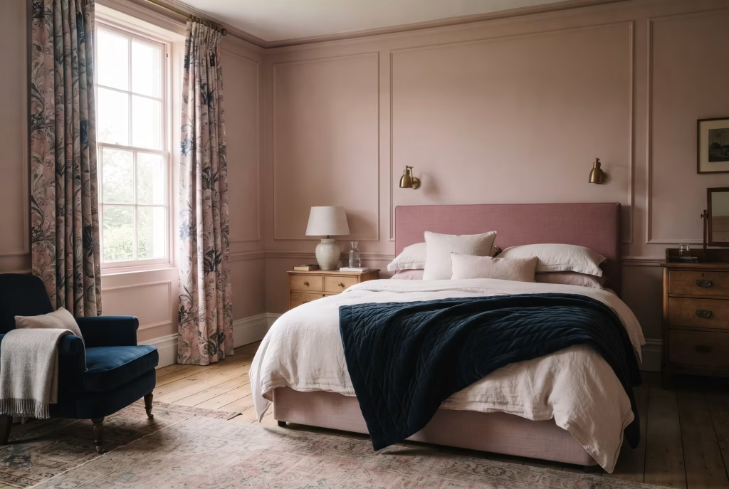
This is the pairing that puts the childish question to bed for good, no arguing required.
Teal and navy carry gravitas on their own, no help needed, and lending some of that weight to pink is exactly what stops a blush wall from ever tipping towards sweet. Put the two families side by side and something clicks: enough cool depth to steady the warmth, enough contrast to keep the room properly alive rather than settled into one flat mood.
The colour logic behind it, briefly: teal and navy sit close enough to pink’s cooler undertones to feel related, distant enough to create genuine lift rather than mush. You get romance and restraint occupying the same room, which is a harder trick than it sounds.
Where to bring the darker tone in, roughly in order of impact:
- A quilted throw or bedspread in teal, the single easiest way to test the pairing before committing to anything larger
- Curtains in a large-scale botanical print that already carries both colours, so the palette clicks into place without any separate colour-matching
- A single upholstered chair, if you want the navy or teal to hold real presence without taking over the walls
Letting teal creep across too many surfaces is the one mistake that undoes the whole effect. Cushion, throw, curtain, rug, all in teal, and the cool tone starts crowding out the warmth that made the pairing worth trying in the first place. Two or three touches, held back rather than let loose everywhere, keeps the room romantic without losing its nerve.
Find a fabric that carries both pink and teal already woven through the same print, botanical prints do this particularly well, and you’ll skip the guesswork of matching two separate tins entirely.
You May also Like: Best Warm Neutral Paint Colours That Never Feel Flat
A Canopy or Four-Poster Frame with Sheer Drapes
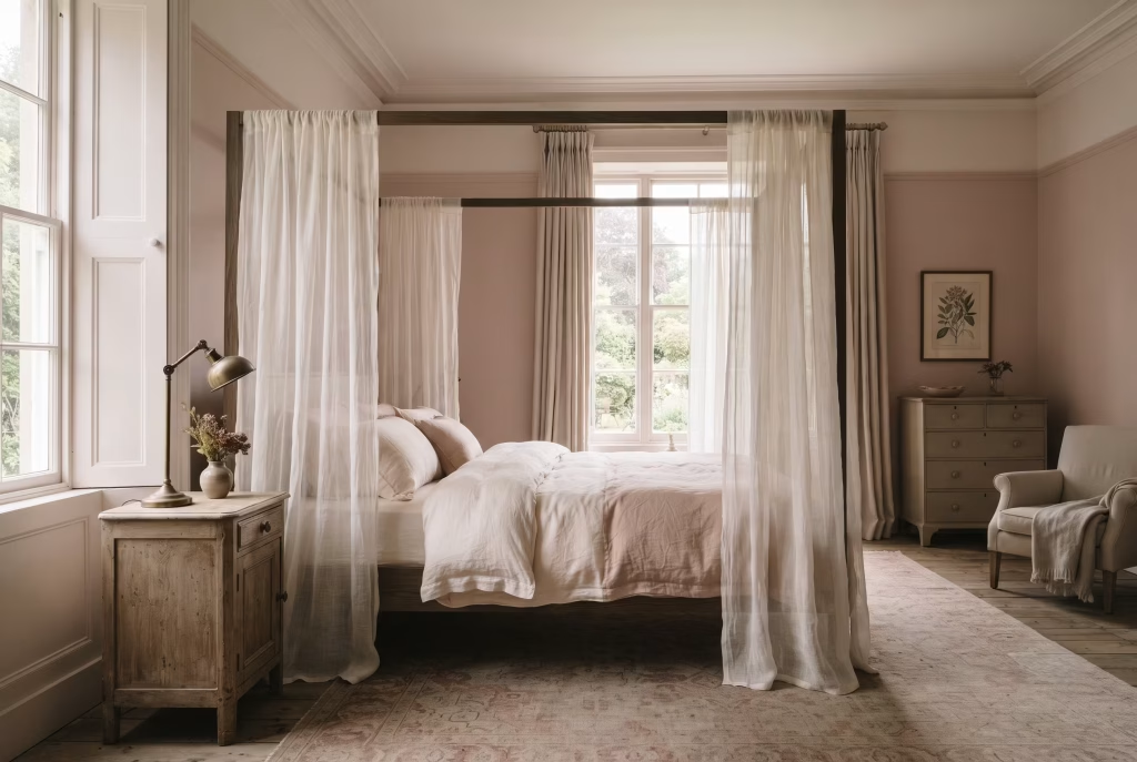
Nothing draws a room in quite like fabric hung overhead, and nothing punishes a low ceiling quite as unforgivingly either. That’s the honest trade a canopy bed asks you to make, and it’s worth understanding before you fall in love with the photographs.
What sheer drapery actually does, when the proportions are right, is filter light rather than block it. You get that gauzy, half-lit glow without shutting the room off, and translucent fabric holds colour gently enough that a blush wall reads straight through it, deepening the whole mood rather than hiding it.
Here’s the ceiling maths nobody puts in writing:
- 8ft ceilings or lower: skip this one. A frame plus drapes will visually shave off precious inches you genuinely can’t spare, turning a cosy room into something closer to a cave
- 9ft to 10ft: works well with a lightweight, low-profile frame and sheer fabric only, nothing heavy or blackout
- 10ft plus, or a room with real architectural presence: this is where a canopy earns its keep properly, drawing the eye up rather than down, making an already generous room feel like its own private world
The fabric choice matters more than the frame itself, if I’m honest. Heavy blackout drapery on a four-poster, in a room that’s already tight on height, pulls the ceiling down visually no matter how elegant the frame underneath it happens to be. Sheer linen or voile does the opposite, letting light move through it so the room keeps breathing even with fabric hanging on all four sides.
One touch that separates a considered canopy from one that looks bolted on as an afterthought: pull the same sheer fabric through onto a pillowcase or two. Small gesture, but it ties the drapes to the bed rather than leaving them floating above it as a separate decision.
A Quilted or Handmade Eiderdown as the Finishing Layer
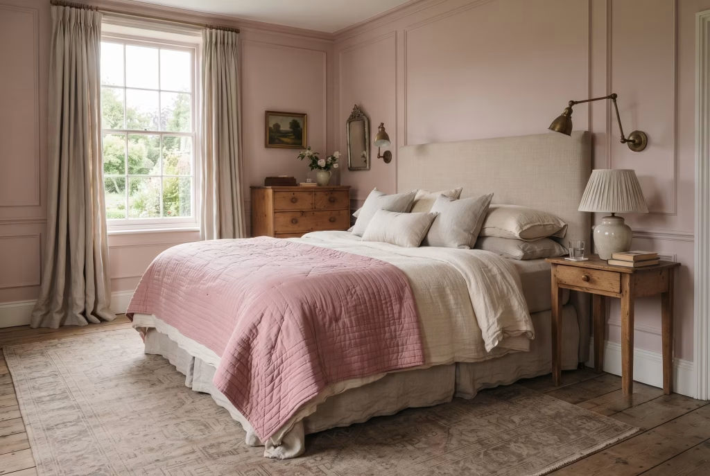
A duvet keeps you warm. A quilt tells you a story. That’s the difference in one sentence, and it’s why nothing off a shelf, however good the thread count, ever quite finishes a room the way a proper handmade piece does. Mass-produced bedding is flat by design, uniform stitching, machine-perfect edges, colour laid down evenly across every inch. Useful. Rarely beautiful.
A handstitched eiderdown carries the opposite qualities entirely:
- Slight unevenness in the quilting lines, the visible trace of a human hand rather than a factory line
- Raised seams that catch light differently depending on where you’re standing, something flat fabric genuinely cannot replicate
- Layered texture that breaks a bed’s surface into planes, giving your eye somewhere interesting to travel across rather than one uniform block of colour
Fold one across the lower third of the bed, over a plain duvet rather than instead of it, and you keep every layer visible underneath. That’s what gives a bed proper depth, three or four textures stacked and readable at a glance, not one flat surface pretending to be finished.
Here’s the mistake that catches people out more than any other: choosing a quilt in the exact same pink as the walls. Do that and the bed simply melts into the room, all that lovely handmade texture lost the moment colour stops providing contrast. Pick something a shade or two apart from your wall colour, warmer or cooler, doesn’t matter which, and the quilt keeps its own identity instead of disappearing into the scheme around it.
That crafted, slightly imperfect quality is exactly what the rest of an English country bedroom is quietly asking for. Everything else in this piece, the panelling, the toile, the brass, is really working towards the same end: a room that looks like it happened over years, not a weekend.
A No-Paint, Renter-Friendly Pink Bedroom
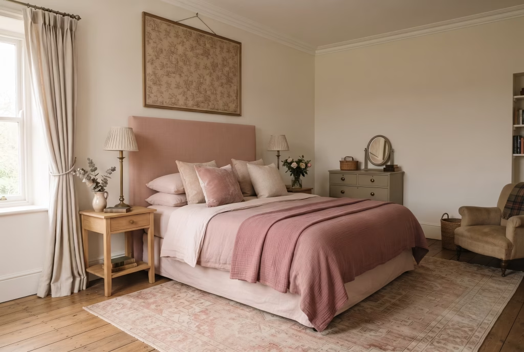
Renting doesn’t rule you out of any of this. It just changes which lever you’re allowed to pull, and honestly, some of the prettiest pink bedrooms I’ve styled belonged to people who couldn’t touch a wall.
Colour lives in more places than paint, and this is the fourteen-idea proof of it condensed into one room. Where the pink actually goes when the walls have to stay white:
- An upholstered headboard, freestanding, no wall fixing required, in a proper blush linen. This single piece does most of the work a painted wall would otherwise carry
- Layered bedding, your duvet, cushions, and throw carrying two or three pink tones between them the same way a painted room needs variation to avoid going flat
- One large framed textile, a chintz or toile panel stretched and hung, giving you pattern and story without wallpaper paste ever coming near the plaster
- A rug, faded or antique-look, doing the grounding work a panelled wall would in a permanent scheme
Removable wallpaper has come on considerably in the last few years, and a peel-and-stick panel behind the headboard, sized to look like a proper feature rather than a full room commitment, gives you architecture without a single hole drilled or a landlord’s permission form filled in.
The thing worth remembering through all of this: intensity comes from layering, not from square footage of paint. A room with three pink textiles, one framed piece, and a considered headboard reads every bit as intentional as a fully painted scheme, sometimes more so, because nothing in it looks accidental. You’re simply choosing where the colour lives rather than assuming it has to live on the walls at all.
Getting the Georgian Symmetry Trick Right in a Smaller Room
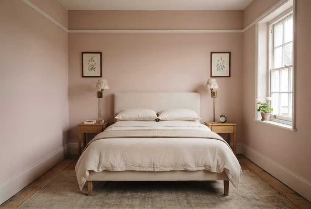
Symmetry doesn’t need square footage. It needs discipline, and that’s genuinely good news if your bedroom is closer to cosy than country pile.
The whole Georgian trick, matching lamps, paired prints, a centred bed, works because the eye reads order before it reads colour. Get that order right and even a modest room borrows a bit of the grandeur usually reserved for houses with servants’ quarters.
Here’s how it scales down without losing its nerve:
- Centre the bed on the longest wall, even if that means an odd gap on one side. Off-centre kills the whole effect before it starts
- A pair of anything either side, lamps, small prints, even matching plant pots if that’s all you’ve got room for. Pairs are the entire engine of this look
- Skip the sweeping cornice if your ceiling hasn’t got one. A simple picture rail does similar visual work at a fraction of the height requirement
- One statement piece, not several. A grand house spreads drama across a whole wall of art. A smaller room needs exactly one considered piece, centred, rather than a gallery wall competing with itself
I fitted this into a modest terraced bedroom in Bristol last winter, Nancy’s Blushes on the walls, two identical brass sconces either side of a plain upholstered headboard, nothing else fighting for attention. No cornice, no grand proportions, and it still read as considered rather than compromised, because the symmetry was doing the heavy lifting rather than the square footage.
Where people go wrong scaling this down is cramming the walls with decoration to compensate for a smaller room, filling every gap because it feels underdressed otherwise. Do that and you lose the very calm that made the symmetry worth borrowing in the first place. Two matching lamps and a centred bed will always outperform a room stuffed with mismatched pieces trying to prove a point.
You May also Like: 25 Modern Victorian Bedroom Ideas That Feel Rich, Elegant, and Effortlessly Livable
Common Mistakes and How to Avoid Them
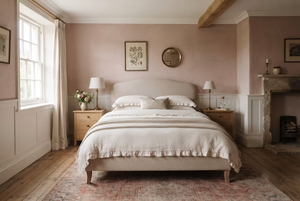
Every one of the fifteen ideas above works. What trips people up isn’t the pink itself, it’s a handful of habits that quietly undo good decisions after the tin’s already open.
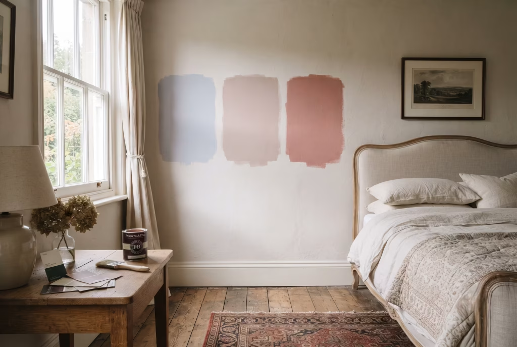
Judging colour off a tiny chip under shop lighting. Covered earlier in this piece, and worth repeating because it’s still the single most common reason a room disappoints. Fluorescent strip lighting flattens undertone completely. Paint a proper A2 sample on the actual wall and live with it 48 hours before committing.
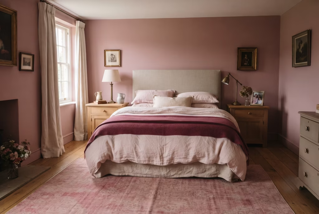
Matching every surface to the same saturated pink. One tin, walls to curtains to cushions, strips a room of shadow entirely. You end up with a single loud note instead of the layered, breathing palette that makes a scheme worth walking into.
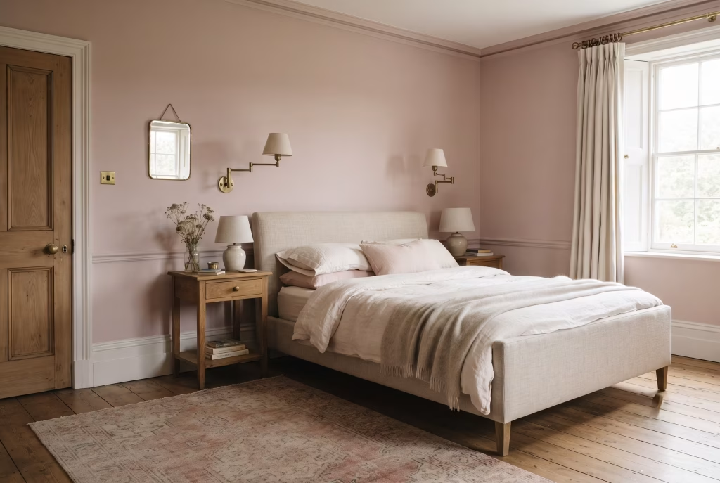
Mixing metal finishes without thinking. Brass wall lights against chrome door handles against nickel curtain rings, three metals arguing quietly in one room for years. Pick a finish early and hold the whole scheme to it.
Cutting curtains short on a patterned fabric. Chintz and toile both rely on their repeat unfolding properly. Sill-length chops straight through figures and florals, leaving the story half-told no matter how beautiful the print itself is.
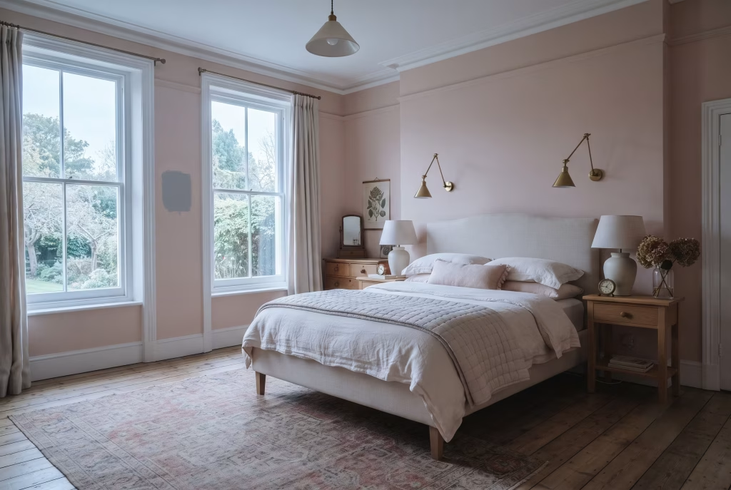
Skipping the aspect check entirely. A pink that glows in a south-facing showroom can go grey and cold the moment it lands on a north-facing wall. Warm undertones for cool light, always, no exceptions worth taking.
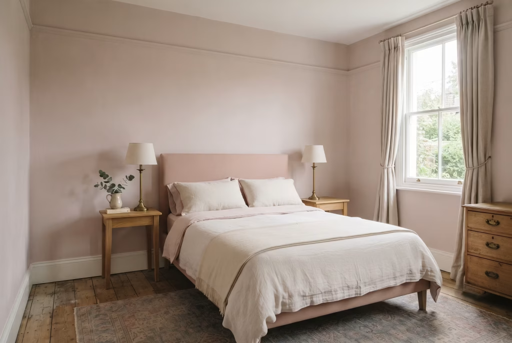
Cramming a small room to compensate for its size. More cushions, more prints, more furniture doesn’t make a modest bedroom feel grander, it just makes it feel crowded. Two matching lamps and a centred bed will outperform a room stuffed with mismatched pieces every single time.
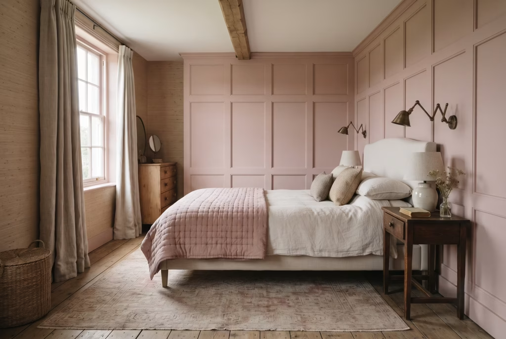
Forgetting texture altogether. A flat duvet, flat paint, flat rug, technically finished but nowhere for the eye to land. The rooms that actually glow are the ones with quilting, grasscloth, panelling, something with a bit of relief built in.
Get these seven habits sorted before you start, and every idea earlier in this piece has a considerably better chance of landing exactly the way you pictured it.
Final thoughts about Pink English Country Bedroom
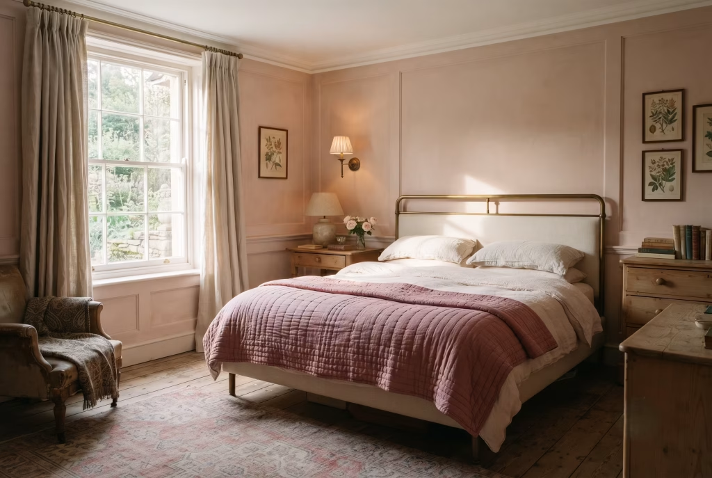
Pink was never the gamble in this story. Guessing was. Get the undertone right, let a piece of proper metal or a handstitched quilt do the talking, and a room stops looking painted and starts looking lived in, the kind of glow you can’t buy off a shelf, only build one honest decision at a time. That’s the whole point of an English country bedroom done properly. Nothing in it happens by accident, and everything in it earns its place.
Paint the sample. Live with it two days. Then trust your eye over anyone else’s opinion, including mine.
FAQs Frequently asked questions
Does pink make a bedroom look too young or childish?
Only if you let it get away with being bright and saccharine. Depth and undertone do the heavy lifting here, not the colour itself. A greyed-back, dusty pink like Sulking Room Pink, paired with something weighty such as navy, aged brass, or a proper wool rug, reads as considered rather than juvenile. Push towards a sweet, high-saturation candy tone and pair it with plastic-look fittings, and yes, you’ll land back in nursery territory whether you meant to or not. The pink was never the problem. What you sit it next to always was.
What’s the best pink for a north-facing room, and what should I avoid?
Reach for something with genuine warmth underneath, an apricot or red-leaning shade like Setting Plaster or Templeton Pink. North-facing rooms get cool, flat, faintly blue light all day long, and a pink with any coolness in its own undertone will curdle under that, going grey or, as one client put it, properly bandage-like. Avoid anything with a blue or lilac cast entirely in this aspect. Save those for a south or east-facing room, where the light’s already doing you a favour.
Is pink a good neutral, or does it need a bold accent colour?
Treat it exactly like a warm grey or a soft stone, and it behaves like one. Pink genuinely can act as a neutral, sitting quietly behind oak, brass, dark green, or ink blue without demanding a second colour to justify itself. That said, a bold pairing, teal, navy, sage, gives a scheme more personality and helps steady any lingering worry about the room reading too sweet. Neither approach is wrong. It comes down to whether you want the pink doing background work or standing centre stage.
What’s the real difference between blush, dusty rose, and a true English country pink?
Blush sits closest to white, a pale, chalky tone with very little saturation, which is why it reads as gentle almost by default. Dusty rose pushes further into the mid-tones and carries a grey undertone that keeps it from ever tipping sweet, the kind of pink that suits a Scandinavian-leaning room just as well as a cottage one. A true English country pink tends to sit somewhere warmer and slightly deeper again, think Setting Plaster or Cinder Rose, with enough red or apricot underneath to hold its own against mahogany, brass, and aged textiles without washing out.
Can I get this look without repainting, if I’m renting?
Absolutely, and it’s one of the most overlooked routes into this whole style. An upholstered headboard, layered bedding in two or three pink tones, one large framed textile, and a proper rug will carry a scheme every bit as convincingly as painted walls, provided the layering does the work paint would otherwise do. Peel-and-stick wallpaper behind a headboard adds architecture without a hole drilled anywhere. Colour lives in more places than a tin of emulsion.
Does pink work with dark wood furniture, or only pale oak?
Dark wood is arguably the better partner. Mahogany, aged pine, dark oak, all of it pulls warmth straight out of a pink wall rather than fighting it, which is exactly why Georgian and Victorian pink bedrooms lean so heavily on dark timber pieces. Pale oak works too, particularly with a cooler, cleaner pink, but it asks for more textile layering to avoid the room feeling a touch thin.
How do I stop a pink bedroom feeling too matched or showroom-like?
Vary the undertone within the same colour family rather than repeating one tin across every surface. Walls a shade darker, bedding a shade paler, one textile deeper still. A scheme built from three related pinks always looks more considered, and considerably less staged, than a single flat tone stretched across everything in the room.
Is a bold pink wall too much for a small bedroom?
Not if you’re deliberate with it. A saturated colour can genuinely make a small room feel enveloping rather than cramped, provided the furniture stays pared back and the metal finishes stay consistent throughout. Where small rooms actually struggle is clutter, not colour intensity. Keep the pieces few and considered, and even a compact bedroom can carry a proper depth of pink without feeling boxed in.