25 Best Beige Kitchen Cabinet Ideas for Your Next Remodel
Beige has long been misunderstood, often dismissed as the safe middle ground, the colour chosen when conviction runs thin. In practice, that reading rarely holds up. When handled with intent, beige is not passive at all. It is highly responsive, almost adaptive, shaping itself around light, material, and proportion in a way that louder colours simply cannot sustain over time.
What makes beige Kitchen Cabinet particularly compelling is not how it looks on day one, but how it behaves once the space begins to settle. It does not dominate the room or demand immediate attention. Instead, it absorbs. Light shifts across its surface throughout the day, softening in the morning, deepening toward evening, and quietly calibrating the entire atmosphere of the kitchen without ever feeling performative. Texture becomes more legible against it. Timber grains read warmer, stone surfaces feel more grounded, and even metal finishes appear more considered, as if everything has been brought into the same conversation.
This is where beige moves beyond neutrality and begins to function as a design tool. It allows contrast without tension, variation without noise. Used well, it creates a backdrop that is neither flat nor overly expressive, but something far more difficult to achieve: a sense of continuity. In open-plan layouts especially, beige cabinetry can carry visual calm across transitions, connecting kitchen, dining, and living zones without abrupt shifts in tone.
In several projects I have worked on, beige cabinetry only revealed its full character months after completion. What initially felt restrained, almost understated, began to evolve as natural light, wear, and daily use softened its edges. Subtle tonal variations emerged where shadows settled or surfaces were handled more frequently. The space became less about the cabinetry itself and more about how it supported everything around it, almost like a well-composed piece of architecture that becomes more convincing the longer you inhabit it.
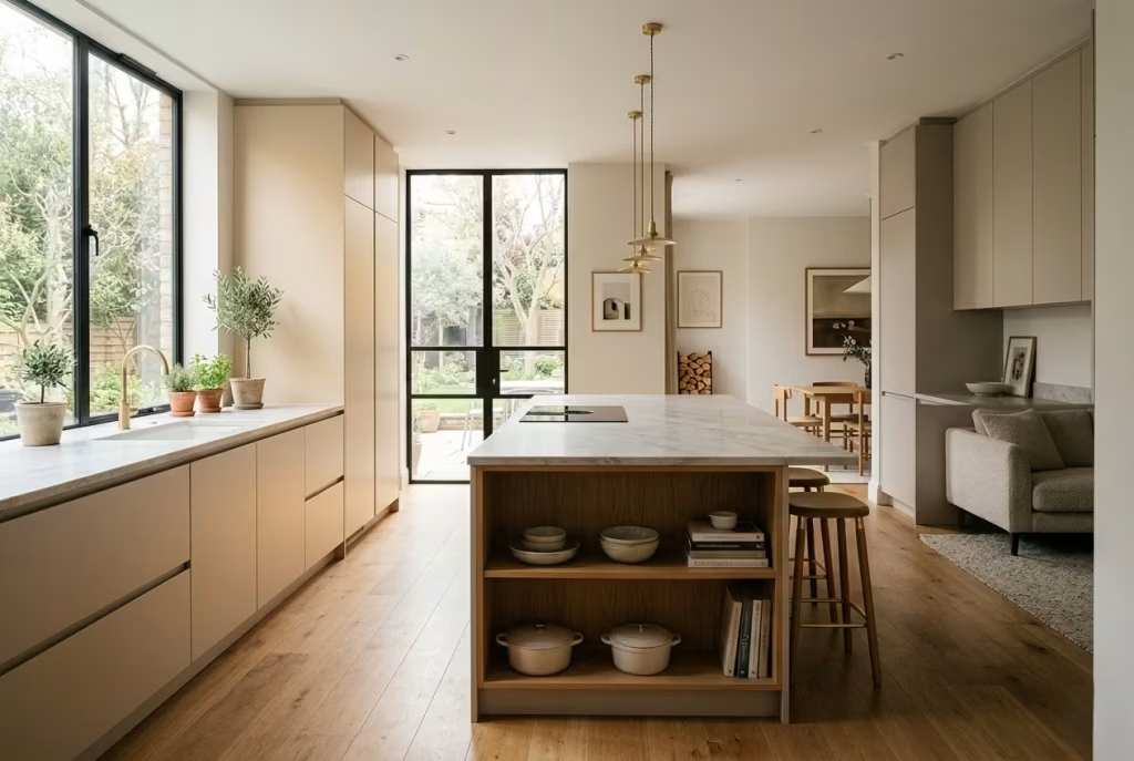
Beige, then, is not a fallback. It is a commitment to restraint, to material honesty, and to a slower kind of visual reward. It does not try to impress at first glance. It earns its place gradually, revealing depth through use, light, and time, which, in a kitchen designed for real living, is precisely where lasting value is found.
Understanding Beige Before You Design With It
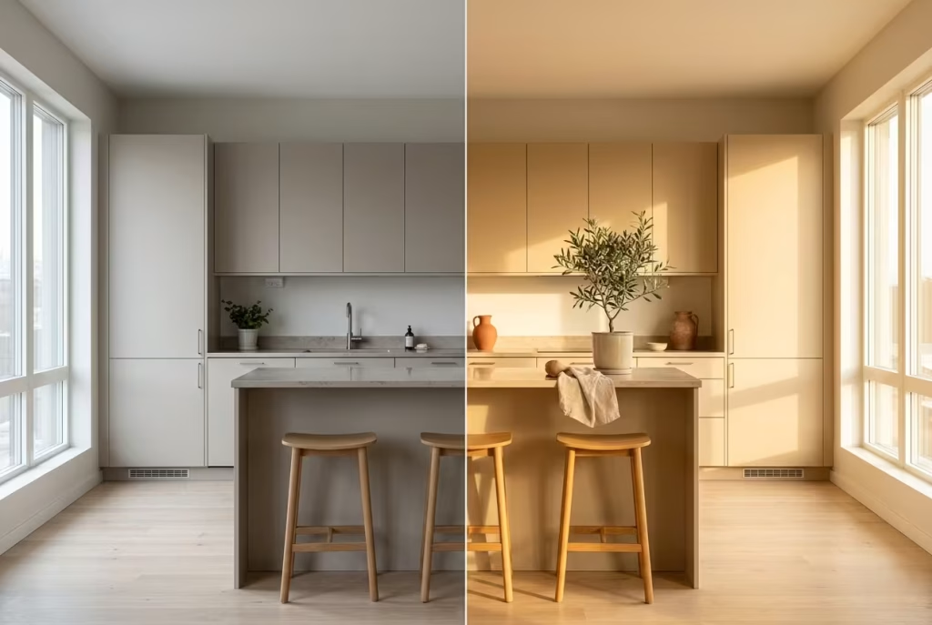
Before beige can be used with any real precision, it needs to be understood as a shifting spectrum rather than a fixed colour. What appears soft and balanced in a sample can lean unexpectedly warm, cool, or even slightly grey once placed within the full context of a kitchen, influenced by orientation, artificial lighting, and surrounding materials. In practice, I have seen beige read almost golden in south-facing spaces, yet flatten into something far more muted under cooler northern light, which is why early decisions made in isolation rarely hold up on site. The success of beige cabinetry lies in recognising these subtleties upfront, treating it less as a decorative choice and more as a responsive layer that will interact continuously with its environment.
The Undertone Spectrum
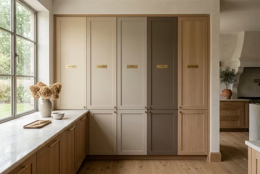
Beige is rarely just beige. What most people read as a single neutral is, in reality, a layered spectrum of undertones that quietly steer the entire mood of a kitchen. Miss that nuance, and the design can feel slightly off without anyone quite knowing why. Get it right, and everything seems to fall into place, almost as if the space had been waiting for it.
Warm Beige
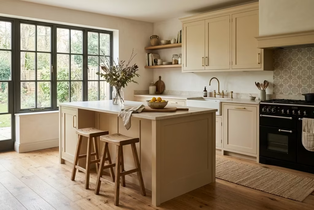
Warm beige carries subtle notes of yellow, cream, or even a trace of red beneath the surface. It leans inviting rather than stark, which makes it particularly effective in kitchens designed for long, everyday use. In one project I completed, a warm beige cabinetry finish paired with oak flooring at approximately 180 mm (7 in) plank width created a sense of cohesion that felt effortless. The cabinetry did not stand apart from the room. It settled into it.
This undertone works especially well in spaces that receive cooler daylight, where it acts almost like a counterbalance, softening what could otherwise feel clinical.
Pros
- Adds warmth without relying on darker colours
- Pairs naturally with timber and brass
- Creates a welcoming, lived-in atmosphere
Cons
- Can appear overly yellow if paired with the wrong lighting temperature
- May feel too traditional in sharply modern settings
Greige
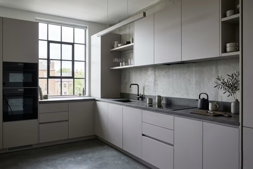
Greige sits between grey and beige, often described as the middle ground that refuses to take sides. It carries cooler undertones, sometimes with a faint violet or green base, which gives it a more contemporary, restrained presence.
I have used greige cabinetry in urban apartments where the brief called for calm without sterility. With handleless units at a standard 600 mm (24 in) depth and matte finishes, greige helped reduce visual noise while still maintaining warmth compared to pure grey.
Pros
- Feels modern and understated
- Works well with concrete, steel, and darker stone
- Less prone to looking dated over time
Cons
- Can feel flat if not layered with texture
- May read cold in low-light conditions
Sand
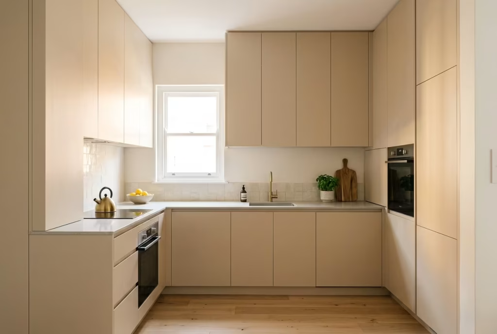
Sand tones sit slightly lighter within the beige family, often carrying a soft, sun-washed quality. They tend to reflect more light, making them particularly useful in smaller kitchens or spaces where brightness is limited.
In a compact kitchen renovation I worked on, full-height sand-toned cabinetry at 2400 mm (8 ft) helped stretch the perception of height. The colour caught daylight and distributed it gently across the room, almost like a reflector rather than a surface.
Pros
- Enhances light and openness
- Ideal for smaller or enclosed kitchens
- Feels relaxed and informal
Cons
- Can lack depth if overused across all surfaces
- Requires contrast to avoid a washed-out look
Taupe
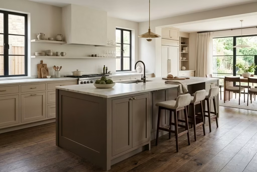
Taupe introduces a deeper, more grounded tone, sitting closer to brown with grey undertones woven through it. It brings weight and maturity to a space, often used when a kitchen needs presence without turning dark.
I often recommend taupe cabinetry for larger kitchens, particularly islands around 900 x 2400 mm (3 x 8 ft), where a slightly deeper tone helps anchor the layout. It gives the eye somewhere to land, which becomes important in open-plan environments.
Pros
- Adds depth and sophistication
- Anchors larger spaces effectively
- Pairs well with stone and darker flooring
Cons
- Can feel heavy in smaller kitchens
- Needs careful lighting to avoid dullness
Why Undertones Shift Under Artificial vs Natural Light
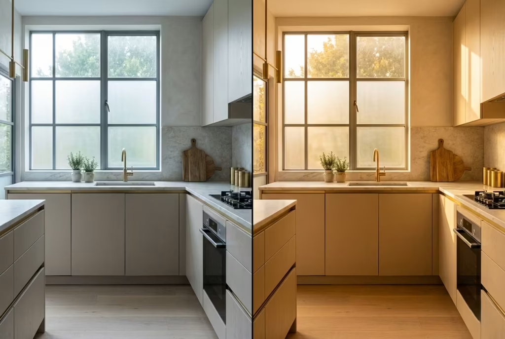
Undertones are not static. They behave differently depending on the light source, which is where many design decisions either succeed quietly or unravel over time.
Natural light changes throughout the day. Morning light tends to be cooler and softer, while afternoon light becomes warmer and more directional. A beige that feels balanced at midday can lean noticeably warmer by evening. In north-facing kitchens, where daylight is more diffused and cooler, beige often loses some of its warmth, sometimes appearing flatter than expected.
Artificial lighting adds another layer of complexity. Warm LED lighting around 2700K to 3000K will amplify yellow and red undertones, making warm beige feel richer but potentially pushing it too far if not controlled. Cooler lighting above 4000K can strip warmth entirely, leaving beige looking slightly grey or even lifeless.
I learned this the hard way early in my career. A project that looked perfectly calibrated during installation began to feel slightly off once the clients switched to cooler task lighting. The cabinetry had not changed, but its undertones had shifted just enough to alter the entire reading of the space.
The key is to test beige in context, not in isolation. Large samples, viewed at different times of day and under the exact lighting conditions planned for the kitchen, will reveal far more than a small swatch ever could. Beige is not a colour you set and forget. It is one you observe, adjust, and ultimately work with, rather than against.
How Beige Interacts With Light
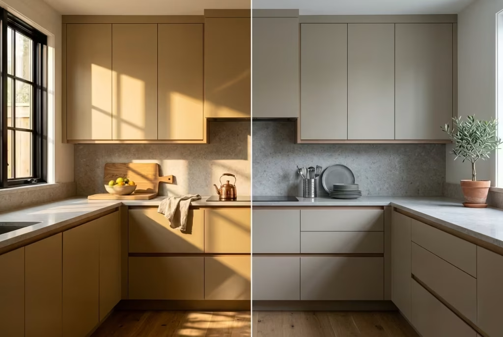
Light does not simply illuminate beige. It edits it, reshapes it, and at times completely rewrites its character. A cabinet finish that feels warm and composed in one kitchen can read muted or even lifeless in another, not because the colour is wrong, but because the light is telling a different story. Beige, more than most colours, sits quietly in the passenger seat, letting light take the wheel. If you understand that relationship early, you stay ahead of the curve rather than chasing corrections later.
North-Facing Kitchens
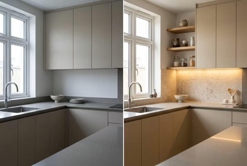
North-facing kitchens receive cooler, more diffused daylight. It is consistent, almost flat, with very little warmth coming through. In this setting, beige tends to lose some of its natural richness, leaning slightly grey or subdued. It is the kind of shift that creeps in quietly, not obvious at first glance but enough to change how the entire space feels.
I have worked on kitchens where a perfectly balanced beige sample, reviewed under showroom lighting, began to feel a touch dull once installed in a north-facing room. The cabinetry did not fail, but it stopped carrying the space on its own. What brought it back to life was layering. We introduced a limestone backsplash with gentle movement, oak shelving at around 300 mm (12 in) depth, and under-cabinet lighting set at 3000K. Suddenly, the beige had context. It no longer needed to perform solo.
What works well in north-facing kitchens
- Warmer beige undertones to counterbalance cool daylight
- Textural materials such as timber, stone, or fluted detailing
- Layered lighting to reintroduce warmth
What to watch for
- Flat finishes without variation
- Over-reliance on a single tone
- Cool lighting that further drains warmth
South-Facing Kitchens
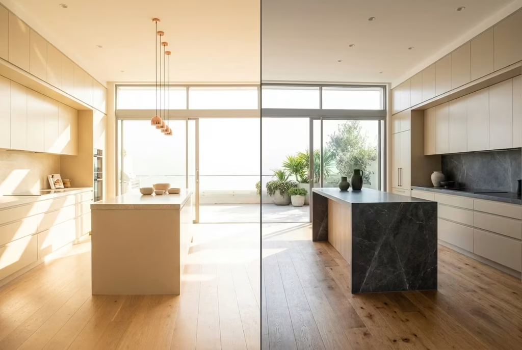
South-facing kitchens are an entirely different proposition. They receive generous, warm daylight for most of the day, often intensifying colour and bringing out the underlying warmth in beige. What felt subtle in a sample can quickly become more pronounced, sometimes tipping into overly creamy or yellow territory.
In one project with large south-facing glazing, beige cabinetry initially selected for its softness began to read much warmer once installed. The solution was not to replace it, but to ground it. We introduced a darker stone countertop and slightly deeper flooring tones, around medium oak with a 220 mm (8.5 in) plank width. The beige settled back into balance, like a note brought back into tune.
What works well in south-facing kitchens
- Slightly cooler or balanced beige tones to avoid excessive warmth
- Contrast through darker materials to anchor the palette
- Matte finishes to reduce glare and reflection
What to watch for
- Overly warm beige becoming too dominant
- High-gloss finishes that amplify brightness
- Lack of contrast leading to visual fatigue
Real-Life Note: When Beige Meets Low Light
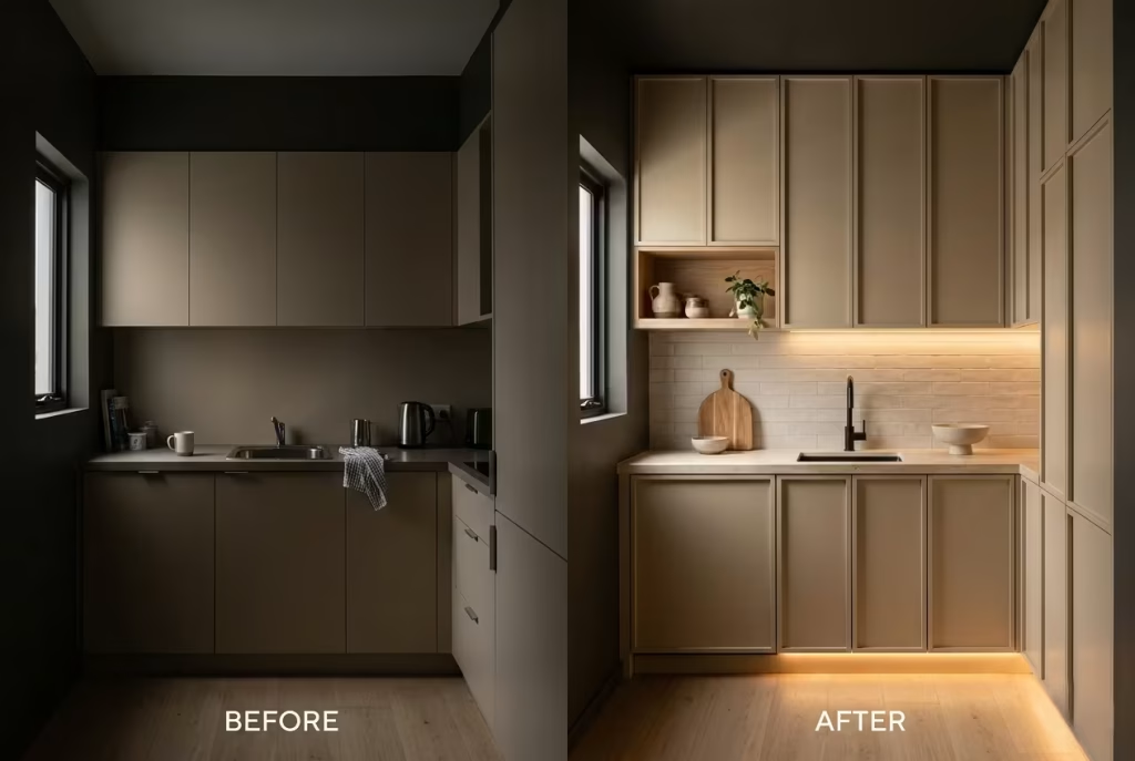
Beige can lose its voice entirely in low-light conditions if it is not supported properly. It flattens, almost like a photograph with the contrast dialled down too far. The cabinetry is still there, but the depth disappears, and with it, much of the atmosphere.
I have seen this happen in compact kitchens with limited natural light, where beige was chosen to brighten the space but ended up doing the opposite. The issue was not the colour itself, but the absence of layers. Once we introduced vertical elements such as full-height cabinets at 2400 mm (8 ft), combined with subtle shadow lines and integrated lighting, the space began to regain dimension.
The lesson is simple but often overlooked. Beige needs company. It thrives when paired with texture, shadow, and variation. Left on its own in low light, it can fall flat. Supported properly, it becomes something else entirely, quiet but deeply considered, the kind of backdrop that allows a kitchen to grow into itself over time.
Material Pairing Fundamentalsa
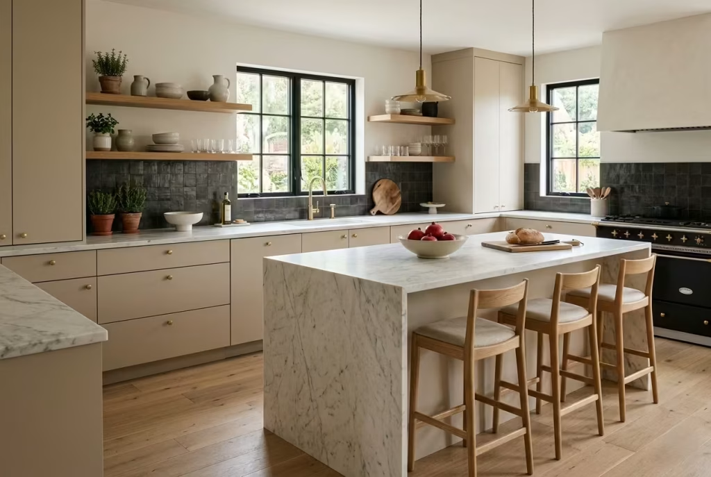
Beige cabinetry rarely succeeds on colour alone. Its real strength lies in what it sits beside, how it borrows character from surrounding materials and, in turn, allows them to speak more clearly. Treat beige as a quiet mediator rather than the main act, and the entire kitchen begins to feel composed rather than assembled piece by piece. When materials are chosen with intent, beige stops being background and starts becoming the thread that ties everything together.
Wood
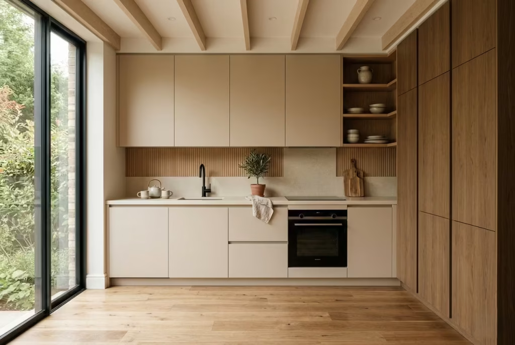
Wood brings warmth that beige alone cannot fully carry. The two, when paired well, feel instinctive, almost as if they belong to the same language. The key is contrast in tone and grain. A flat, pale beige placed next to equally pale, low-grain timber often slips into visual monotony. There is nothing for the eye to hold onto.
In one project, I paired soft beige cabinetry with natural oak flooring at approximately 180 mm (7 in) plank width and a slightly deeper oak veneer on tall units. That subtle shift created layers without shouting for attention. The cabinetry held its calm presence while the timber introduced movement and warmth.
What works well with wood
- Mid-tone oak or walnut to introduce depth
- Visible grain patterns to avoid flatness
- Slight tonal variation between cabinetry and timber
What to watch for
- Matching beige and wood too closely in tone
- Overusing pale timber without contrast
- Synthetic wood finishes that lack authenticity
Stone
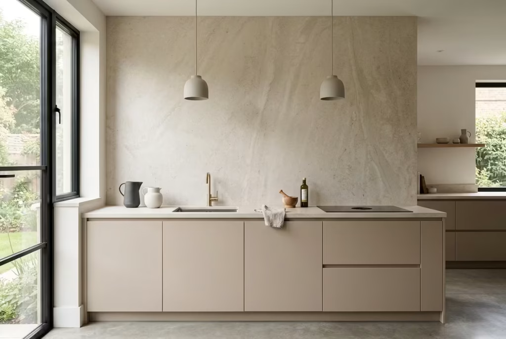
Stone adds weight and permanence. It grounds beige, preventing it from drifting into something overly soft or insubstantial. Whether it is marble, limestone, or quartz, the natural variation within stone surfaces brings a kind of quiet drama that beige alone cannot achieve.
I often lean towards stone with subtle movement rather than heavy veining. In a recent kitchen, a limestone backsplash with gentle tonal shifts sat behind beige cabinets, allowing the surface to catch light differently throughout the day. The cabinetry did not compete. It stepped back, letting the stone carry the narrative.
Typical applications
- Countertop thickness: 20–30 mm (0.8–1.2 in)
- Full-height backsplash for continuity
- Waterfall edges on islands for visual flow
Pros
- Adds texture and depth
- Ages gracefully with use
- Balances the softness of beige
Cons
- Highly patterned stone can overpower subtle cabinetry
- Lighter stones require maintenance
- Cost varies significantly depending on material
You May also Like: 25 Mountain Kitchen Design Ideas That Blend Rustic Charm with Modern Living
Metal
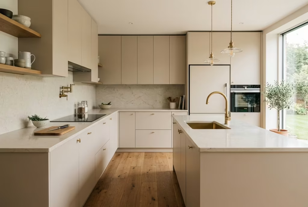
Metal introduces precision. It sharpens the softness of beige, adding just enough contrast to prevent the palette from feeling too relaxed. The choice of finish matters more than people expect. Brass warms the space, stainless steel keeps it crisp, while blackened metal adds a more architectural edge.
In one kitchen, we used brushed brass handles with a projection of 25 mm (1 in), paired with integrated appliances and soft beige cabinets. The metal did not dominate, but it punctuated the design at just the right moments, like a well-placed pause in a sentence.
Where metal works best
- Handles and hardware
- Lighting fixtures
- Tapware and appliances
What to watch for
- Overuse leading to visual clutter
- Mixing too many metal finishes without hierarchy
- High-gloss metals that feel out of place in softer palettes
Plaster
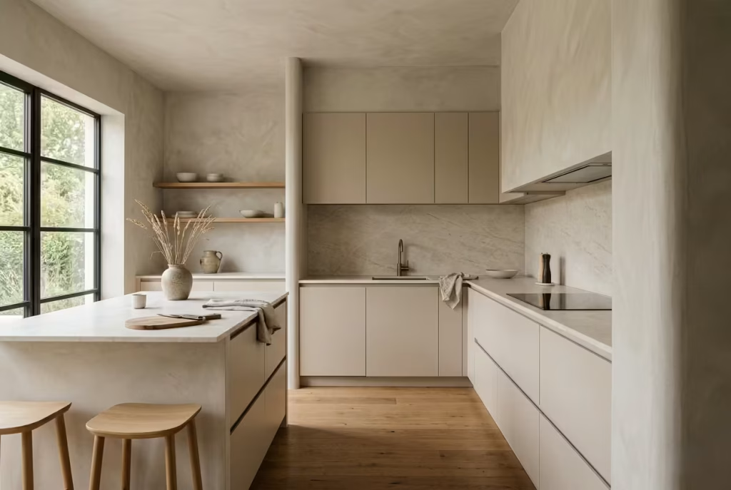
Plaster, often overlooked, can be one of the most effective companions to beige cabinetry. It brings a softness that feels architectural rather than decorative. Limewash or microcement walls introduce subtle variation, catching light in a way that painted surfaces simply cannot replicate.
I have used microcement walls alongside beige cabinets in kitchens where the goal was to create a seamless envelope. The result felt calm but not flat, with just enough movement across the surface to keep the eye engaged. Depth emerged not from contrast, but from texture.
Pros
- Adds understated texture
- Works well in both modern and rustic settings
- Enhances the tonal quality of beige
Cons
- Requires skilled application
- Repairs can be more complex than standard paint
- Needs proper sealing in kitchen environments
Avoiding Washed-Out Sameness
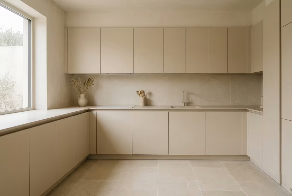
One of the most common pitfalls with beige kitchens is the temptation to keep everything within the same tonal range. On paper, it sounds cohesive. In reality, it often feels like the space has been drained of energy, as if all the contrast has been quietly removed.
I have walked into kitchens where beige cabinets, beige walls, beige flooring, and pale countertops blended into one continuous surface. Nothing stood out, but more importantly, nothing held together either. The space felt unfinished, even though every element was technically in place.
The solution is not contrast for the sake of drama, but variation with purpose. Introduce shifts in tone, texture, and material weight. Let one surface carry more depth while another remains soft. Allow light to create shadow lines, particularly around cabinetry with a depth of 600 mm (24 in), so the structure itself begins to define the space.
Think of it like cooking. Too many similar ingredients, and the dish falls flat. A balanced mix, even if subtle, brings everything to life. Beige thrives in that balance, where restraint meets variation, and the result feels considered rather than cautious.
25 Beige Kitchen Cabinet Ideas
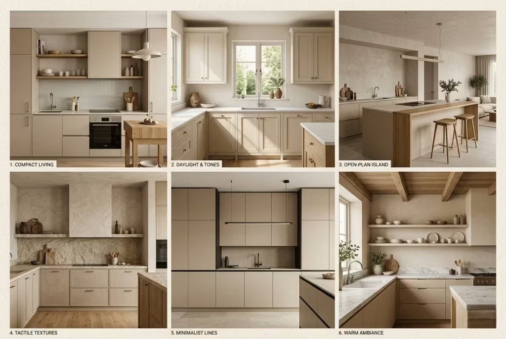
Ideas, on their own, rarely translate into good kitchens. What matters is how each approach responds to space, light, and the way the room is actually used day to day. The following concepts are not trend pieces or surface-level variations.
They are drawn from real design scenarios where beige cabinetry had to perform under different conditions, from compact layouts that demanded efficiency to larger, open-plan kitchens where visual balance becomes a delicate act.
Some lean architectural, others more relaxed, but each one carries a clear design logic behind it. Read them not as fixed formulas, but as adaptable directions, the kind you can shape and refine so the final result feels considered rather than assembled.
Soft Contemporary & Minimal
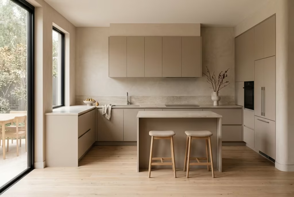
Soft contemporary kitchens ask for restraint, but not at the expense of warmth. This is where beige begins to do its most convincing work. Instead of leaning into stark contrasts or overly sharp lines, the focus shifts toward continuity, proportion, and subtle tonal control.
I often approach these spaces as a balancing act, keeping the architecture clean while allowing materials to carry quiet depth. Beige cabinetry, when handled with precision, softens the edges of minimalism, preventing it from feeling clinical or overworked.
The result is a kitchen that reads effortlessly at first glance, yet reveals its refinement slowly, the kind of space that does not try to impress, but settles in and holds its ground over time.
Seamless Handleless Beige Cabinetry
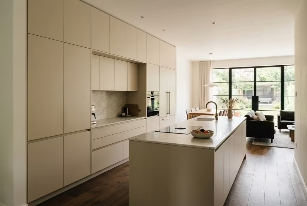
Seamless handleless cabinetry leans into clarity. It removes visual interruptions so the eye can travel across the kitchen without stopping at every door or drawer line. In beige, this approach becomes even more refined. The colour softens the geometry, taking what could feel stark and giving it a quieter, more livable edge.
Instead of sharp contrasts doing the heavy lifting, the design relies on proportion, alignment, and the way light skims across flat surfaces. When done well, it feels almost architectural, as if the cabinetry is part of the structure rather than something placed within it.
Real-Life Application Insight
I have used this approach most effectively in open-plan kitchens where the cabinetry needs to sit comfortably alongside living and dining areas. In one project, the brief was clear: reduce visual noise without stripping the space of warmth. We introduced handleless beige cabinets across a full wall run, paired with fully integrated appliances. At first glance, the kitchen almost disappeared into the background. Over time, though, subtle details began to surface, shadow gaps, clean junctions, the way daylight moved across the panels. It became a space that revealed itself slowly, rather than all at once.
There is a fine line here. Without careful detailing, handleless designs can feel cold or overly engineered. Beige helps bridge that gap, but it still requires discipline in execution.
Suggested Measurements
- Base cabinet depth: 600 mm (24 in)
- Tall unit height: typically 2100–2400 mm (7–8 ft), aligned with ceiling where possible
- Handleless rail or recessed grip: 20–30 mm (0.8–1.2 in) for comfortable usability
- Island spacing: minimum 1000–1100 mm (39–43 in) clearance for movement
These dimensions are not arbitrary. They ensure the cabinetry feels substantial without becoming bulky, and that circulation within the kitchen remains intuitive.
Material Pairings
Seamless beige cabinetry benefits from materials that introduce contrast without breaking the calm.
- Stone: Light quartz or softly veined marble to add movement without clutter
- Wood: Warm oak or walnut accents to prevent the space from feeling too uniform
- Metal: Minimal use of brushed brass or stainless steel, often limited to tapware or lighting
- Backsplash: Full-height slab or lightly textured surfaces to maintain continuity
The aim is not to compete with the cabinetry but to support it, like a well-composed backdrop that allows the main elements to breathe.
Pros
- Creates a clean, uninterrupted visual flow, especially effective in open-plan layouts
- Allows beige tones to read more evenly without being broken by hardware
- Enhances the sense of space, making kitchens feel larger and more cohesive
- Works seamlessly with integrated appliances, reducing visual clutter
Cons
- Demands precision detailing, even minor misalignments become noticeable
- Requires high-quality joinery and installation, which can increase cost
- Less tactile than traditional cabinetry, some users miss the physical grip of handles
- Can feel flat if not layered with texture, light, or contrasting materials
In the right setting, seamless handleless beige cabinetry does not shout for attention. It holds its composure quietly, allowing the rest of the space to unfold around it. Like any restrained design, its success lies in what you choose not to add as much as what you do.
Warm Beige With Micro-Cement Walls
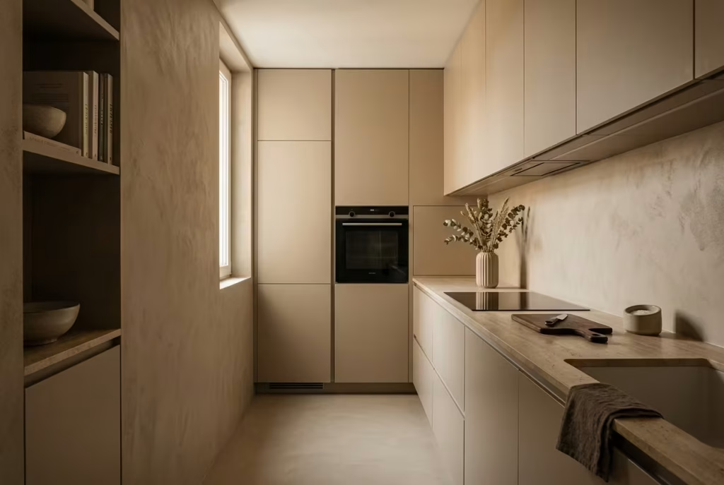
This approach leans into continuity rather than contrast. Warm beige cabinetry and micro-cement walls are brought into close tonal alignment, creating what feels like a single, enveloping surface. The boundaries between vertical and horizontal planes soften, and the kitchen begins to read as one cohesive volume rather than a collection of parts. It is a quiet kind of design move, but when it lands well, it pulls the room together in a way that feels almost effortless.
Micro-cement introduces a subtle, lived-in texture that keeps the space from feeling too polished or sterile. Paired with warm beige, it creates depth through variation rather than colour shifts. The result is immersive without being heavy, calm without drifting into monotony. It is the kind of palette that does not try to win attention, but ends up holding it anyway.
Real-Life Application Insight
I have used this combination in compact kitchens where the brief was to reduce visual clutter to the absolute minimum. In one project, the kitchen sat within a tight footprint, roughly 2.4 by 3 metres (8 by 10 ft), with limited natural light. Instead of introducing multiple materials and breaking up the space, we leaned into a tonal envelope.
The cabinetry was finished in a warm beige with a matte surface, while the surrounding walls were coated in micro-cement with a slightly deeper undertone. At first glance, the kitchen almost blended into itself. But as the day progressed, the texture of the walls began to catch light differently from the cabinetry, revealing a quiet layering that only became more apparent over time. It felt less like a designed feature and more like a space that had settled naturally into its surroundings.
This approach works particularly well when the goal is to make the kitchen feel less like a standalone zone and more like an integrated part of the home.
Suggested Measurements
- Base cabinet depth: 600 mm (24 in)
- Tall units: 2100–2400 mm (7–8 ft), ideally aligned with ceiling height
- Micro-cement wall thickness: typically 2–3 mm (0.08–0.12 in) applied over substrate
- Worktop thickness: 20 mm (0.8 in) to maintain a refined profile
- Clearance between runs: minimum 1000 mm (39 in) for comfortable circulation
These proportions help maintain the sense of flow while ensuring the kitchen remains practical for everyday use.
Material Pairings
With such a restrained palette, every additional material needs to earn its place.
- Stone: Soft, honed finishes in limestone or light quartz to maintain tonal harmony
- Wood: Minimal use of warm timber, often limited to shelving or flooring, to introduce contrast without breaking the envelope
- Metal: Subtle accents in brushed brass or muted stainless steel, used sparingly
- Lighting: Warm LED lighting around 2700K to 3000K to enhance the warmth of the palette
The idea is to support the tonal narrative without introducing elements that feel out of step.
Pros
- Creates a calm, immersive environment that reduces visual noise
- Makes compact kitchens feel more expansive by minimising contrast
- Micro-cement adds texture without disrupting the colour palette
- Works well in open-plan spaces where continuity is key
Cons
- Requires careful tonal balancing to avoid a flat or lifeless result
- Micro-cement application demands skilled craftsmanship
- Limited contrast can make it harder to define individual zones
- Repairs to micro-cement surfaces can be more complex than standard finishes
When executed with care, warm beige cabinetry paired with micro-cement walls creates a space that feels considered and quietly confident. It does not rely on bold gestures or obvious statements. Instead, it draws you in gradually, revealing its depth through texture, light, and the way it allows everything else in the room to settle into place.
Flat-Panel Cabinets in Greige-Beige
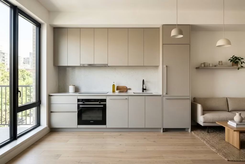
Flat-panel cabinetry strips the kitchen back to its essentials. No framing, no ornament, just clean planes that rely on proportion and alignment to carry the design. When finished in a greige-beige tone, that restraint gains warmth without losing its modern edge. The colour sits in a delicate middle ground, not fully warm, not fully cool, which allows it to adapt rather than dominate.
In this setting, the cabinetry behaves almost like a backdrop that knows when to step forward and when to recede. Light moves across the flat surfaces, picking up subtle shifts in tone, while the absence of detailing keeps the overall composition calm. It is a design approach that rewards precision. If the lines are right, everything else begins to fall into place.
Real-Life Application Insight
I have used greige-beige flat-panel cabinetry in urban apartments where space is limited and visual clarity becomes essential. In one project, the kitchen was part of a narrow open-plan layout, with the living area directly adjacent. The risk was obvious. Too much contrast, and the kitchen would feel intrusive. Too little, and it would disappear entirely.
We opted for flat-panel units in a greige-beige finish, paired with integrated appliances and a continuous run of cabinetry along one wall. The effect was immediate but understated. The kitchen sat quietly within the space, neither competing nor fading away. Over time, what stood out was how adaptable it felt. Morning light brought out cooler undertones, while evening lighting softened the palette, making the space feel more intimate.
It is the kind of solution that does not try to impress at first glance, but proves its value the longer you live with it.
Suggested Measurements
- Base cabinet depth: 600 mm (24 in)
- Wall cabinet height: 700–900 mm (28–35 in), depending on ceiling height
- Tall units: up to 2400 mm (8 ft) for a full-height, seamless look
- Handleless or minimal handle projection: 20–25 mm (0.8–1 in)
- Island width where applicable: minimum 900 mm (3 ft) for functionality
These dimensions help maintain a balanced proportion, ensuring the cabinetry feels neither too heavy nor too slight within the space.
Material Pairings
Greige-beige works best when paired with materials that reinforce its balanced nature.
- Stone: Light grey quartz or softly veined marble to echo the cooler undertones
- Wood: Subtle use of oak or ash to introduce warmth without overpowering the palette
- Metal: Brushed stainless steel or muted black finishes for a contemporary edge
- Backsplash: Full-height slabs or minimal grout lines to preserve visual continuity
The goal is to build layers without breaking the calm, allowing each material to contribute without pulling the design in conflicting directions.
Pros
- Balances modern minimalism with a softer, more livable tone
- Adapts well to changing light conditions throughout the day
- Ideal for compact or open-plan urban spaces where cohesion matters
- Works seamlessly with integrated appliances and clean layouts
Cons
- Can feel understated to the point of being overlooked if not layered carefully
- Requires precise installation, as flat surfaces highlight imperfections
- Limited detailing means material quality becomes more noticeable
- May need additional texture or contrast to avoid a uniform appearance
Flat-panel cabinets in greige-beige occupy a subtle but powerful position in kitchen design. They do not shout for attention, yet they hold the space together with quiet confidence. Like a well-cut garment, the success lies in the fit and finish. When those are right, everything else follows naturally.
Classic & Transitional
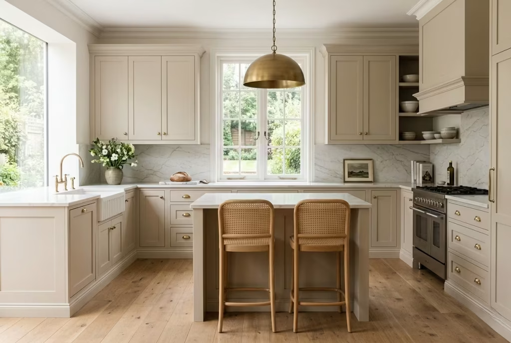
Classic and transitional kitchens sit in that carefully judged middle ground where tradition is refined rather than replicated. The aim is not to recreate the past, but to carry forward its proportions, detailing, and sense of permanence in a way that feels relevant today.
Beige cabinetry works particularly well here because it softens formal elements, allowing profiles, mouldings, and materials to read with clarity rather than heaviness.
I often find that in these kitchens, the success lies in restraint. Too much ornament, and the space feels dated. Too little, and it loses its character. When the balance is right, the result feels settled, almost as if the kitchen has always belonged to the house, even when it has been entirely reimagined.
Shaker Cabinets in Soft Linen Beige
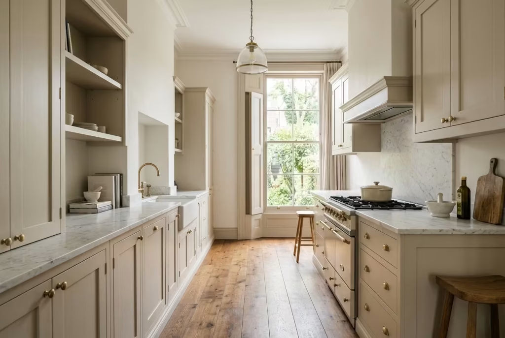
Shaker cabinetry carries a quiet authority. Its strength lies in proportion, not decoration, which is exactly why it adapts so well to a softer linen beige finish. The frame introduces structure, while the colour softens its presence, creating a balance that feels composed rather than overly traditional. This is where restraint becomes the guiding principle. The detailing is there, but it does not overwhelm. Instead, it anchors the kitchen, giving it a sense of order that feels steady and familiar.
Soft linen beige, in particular, brings a certain lightness to Shaker profiles. It lifts the framework just enough so it does not feel heavy or dated. The cabinetry holds its shape, but the colour allows it to breathe. In kitchens where the goal is longevity rather than short-term impact, this combination tends to stand its ground, quietly resisting the pull of passing trends.
Real-Life Application Insight
I have used Shaker cabinets in soft linen beige in period homes where the architecture already carried weight. In one renovation, the kitchen sat within a Victorian terrace, with ceiling heights just over 2700 mm (8 ft 10 in). The risk was tipping too far into a traditional aesthetic that felt overly formal.
By selecting a softer beige rather than a deeper tone, the cabinetry retained its structure without adding visual heaviness. We kept the rail width at around 70 mm (2.75 in), which felt proportionate to the room, not too delicate, not overly bold. Paired with a simple stone worktop and minimal hardware, the kitchen began to feel settled, as if it had always belonged there. Over time, what stood out was not the cabinetry itself, but how naturally it supported daily use. It aged well, handled wear gracefully, and never felt like it needed updating.
Suggested Measurements
- Frame (rail and stile) width: 60–75 mm (2.3–3 in) for balanced proportion
- Base cabinet depth: 600 mm (24 in)
- Wall cabinet height: 720–900 mm (28–35 in), depending on ceiling height
- Tall units: up to 2400 mm (8 ft) or aligned with ceiling for a built-in look
- Door thickness: typically 18–22 mm (0.7–0.9 in) for durability
These measurements ensure the Shaker profile feels intentional. If the rails are too thin, the design loses presence. Too thick, and it begins to feel heavy. The balance sits somewhere in between, where the detailing reads clearly but does not dominate.
Material Pairings
Shaker cabinetry benefits from materials that reinforce its sense of permanence while keeping the overall palette fresh.
- Stone: Honed marble or quartz with subtle veining to introduce movement without distraction
- Wood: Medium-tone oak flooring at around 180–220 mm (7–8.5 in) plank width to add warmth and contrast
- Metal: Brushed brass or aged nickel hardware to complement the softness of the beige
- Backsplash: Classic tiled surfaces such as simple rectangular tiles or full-height stone for a more refined approach
The aim is to support the cabinetry without crowding it. Each material should feel like it belongs, not like it has been added as an afterthought.
Pros
- Offers a timeless framework that adapts across different design styles
- Soft linen beige prevents the cabinetry from feeling too formal or heavy
- Works well in both traditional homes and more contemporary settings
- Holds up well over time, both visually and practically
Cons
- Requires careful proportioning to avoid looking dated
- More detailing means more visible joints and potential maintenance points
- Can feel predictable if not paired with thoughtful materials
- Slightly higher cost compared to flat-panel cabinetry due to additional joinery
Shaker cabinets in soft linen beige strike a careful balance. They do not chase attention, yet they rarely fall short. When proportion, colour, and material come together, the result feels steady, familiar, and quietly refined, the kind of kitchen that does not need to prove itself, because it simply works.
You May also Like: 25 Black Kitchen Cabinet Design Ideas That Transform Your Kitchen
Beige Cabinets with Marble Countertops
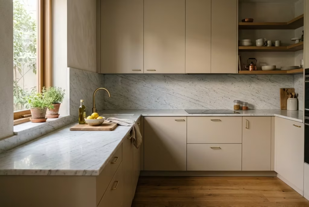
Beige cabinetry paired with marble is less about contrast and more about conversation. The cabinets provide a steady, composed base, while marble introduces movement that shifts gently across the surface. Veining becomes the storyteller here, not loud or overpowering, but enough to stop the space from feeling static. It is a classic pairing, yet far from predictable when handled with care.
The key lies in restraint. Beige already carries subtle tonal variation, so the marble should complement rather than compete. Think of it as a quiet ripple rather than a dramatic wave. In smaller kitchens especially, overly busy veining can quickly tip the balance, making the space feel crowded before a single object is placed. When the veining is controlled, the result feels calm but layered, the kind of balance that holds your attention without asking for it.
Real-Life Application Insight
I have used this pairing across a range of projects, but it proves its value most clearly in kitchens that need both softness and definition. In one compact layout, roughly 3 by 3.5 metres (10 by 11.5 ft), we introduced beige cabinetry to keep the space light, then added a marble worktop with fine, linear veining.
At first, the difference felt subtle. But as natural light moved across the surface, the marble began to animate the room. Morning light picked up the lighter tones, while evening shadows deepened the veins, giving the kitchen a shifting character throughout the day. What could have felt flat instead gained a quiet rhythm. It is often these understated moves that make a space linger in your mind long after you leave it.
Suggested Measurements
- Countertop thickness: 20–30 mm (0.8–1.2 in) depending on desired visual weight
- Backsplash height: minimum 450–600 mm (18–24 in), or full-height for continuity
- Island overhang: 250–300 mm (10–12 in) for seating areas
- Base cabinet depth: 600 mm (24 in)
- Joint spacing: keep minimal to maintain a seamless appearance
These dimensions help maintain proportion, ensuring the marble feels integrated rather than applied as an afterthought.
Material Pairings
Marble and beige together create a soft foundation, so supporting materials should bring subtle contrast and structure.
- Wood: Warm oak or walnut flooring to ground the palette and introduce natural variation
- Metal: Brushed brass or aged finishes to echo the warmth in beige tones
- Cabinet finish: Matte or satin beige surfaces to avoid competing reflections
- Backsplash continuation: Using the same marble slab vertically can strengthen cohesion
The goal is to let marble lead the visual movement while everything else supports without interruption.
Pros
- Marble introduces natural variation, preventing beige from feeling flat
- Timeless pairing that rarely feels dated when executed with restraint
- Reflects light softly, enhancing the overall brightness of the kitchen
- Works across both classic and contemporary settings
Cons
- Natural marble requires maintenance and can stain if not properly sealed
- Busy veining can overwhelm smaller kitchens
- Higher material and installation costs compared to alternatives
- Each slab is unique, making exact matching more complex
Beige cabinets with marble countertops strike a balance that feels both grounded and alive. The cabinetry holds the structure, while the marble carries the movement. When the two are aligned with intention, the kitchen begins to feel less like a static design and more like a space that evolves with light, use, and time.
Inset Cabinetry in Muted Beige
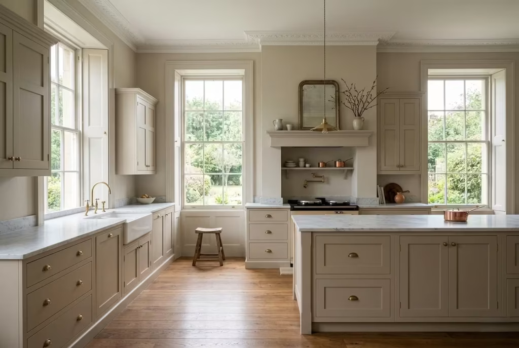
Inset cabinetry is about discipline. Doors and drawers sit flush within the frame, not on top of it, which creates a tight, tailored grid across the kitchen. Every reveal is deliberate, every junction visible. In muted beige, that precision softens just enough to feel livable, not museum-like. The colour tempers the formality of the construction, allowing the joinery to read clearly without becoming severe.
This approach rewards a careful eye. Because everything sits within the frame, small inconsistencies have nowhere to hide. When the proportions are right, though, the effect is quietly compelling. The cabinetry feels settled, almost architectural, as if it has been measured into the room rather than fitted after the fact.
Real-Life Application Insight
I tend to specify inset cabinetry in homes where the architecture already carries a sense of order. In one project, a Georgian-style property with tall ceilings and well-defined openings, we used muted beige inset cabinets to reinforce that rhythm. The grid of doors aligned with window mullions and wall proportions, which made the entire elevation feel intentional.
What stood out over time was how the kitchen held its composure. Even with daily use, the structure remained legible. Handles developed a light patina, edges softened slightly, but the overall read stayed crisp. It is not a forgiving system, but when executed well, it earns its keep, quietly, day after day.
Suggested Measurements
- Face frame width: typically 38–50 mm (1.5–2 in) for a balanced grid
- Door and drawer reveals: 2–3 mm (0.08–0.12 in) consistently across all fronts
- Base cabinet depth: 600 mm (24 in)
- Tall unit height: 2100–2400 mm (7–8 ft), aligned with ceiling where possible
- Door thickness: 20–22 mm (0.8–0.9 in) to maintain rigidity within the frame
These tolerances are tight by necessity. The success of inset cabinetry sits in these small numbers, which is why skilled fabrication and installation are essential.
Material Pairings
Inset cabinetry benefits from materials that respect its precision and do not compete with it.
- Stone: Honed marble or quartz with fine, controlled veining to add movement without distraction
- Wood: Select use of oak or walnut for flooring or interior shelving, bringing warmth to the composition
- Metal: Hardware in aged brass, nickel, or understated black, chosen for proportion and feel in hand
- Backsplash: Either a simple tiled surface with tight grout lines or a continuous slab to maintain order
The palette should feel measured, each element introduced with intent rather than impulse.
Pros
- Delivers a highly refined, tailored appearance
- Reinforces architectural rhythm and proportion
- Muted beige softens the precision, making the kitchen feel more approachable
- Holds visual clarity over time, even as surfaces age
Cons
- Typically costs 20–30% more due to complexity of joinery and installation
- Requires highly skilled craftsmanship, both in fabrication and fitting
- Less tolerance for movement or settling in older buildings
- Slightly reduced internal storage compared to overlay systems
Inset cabinetry in muted beige is not about quick impact. It is about getting the fundamentals right and letting them carry the design. When everything lines up as it should, the kitchen feels composed and quietly confident, the kind of space that reveals its quality slowly, but unmistakably.
Natural & Organic
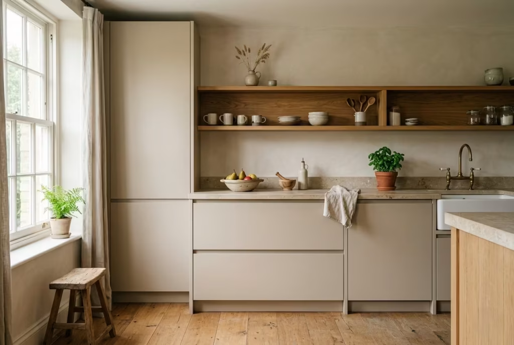
Natural and organic kitchens are less about styling and more about rhythm, how materials behave together over time, how surfaces respond to light, and how the space settles into daily life without feeling overly constructed.
In this context, beige becomes a connecting thread rather than a focal point, quietly absorbing the warmth of wood, the texture of stone, and the softness of plaster. I often approach these spaces with a “less but better” mindset, where every material earns its place and nothing feels forced into position.
When beige is used here with restraint and intention, it stops being just a colour and starts acting like a stabilising surface, holding the natural elements together with understated clarity.
Beige Cabinets Paired With Light Oak
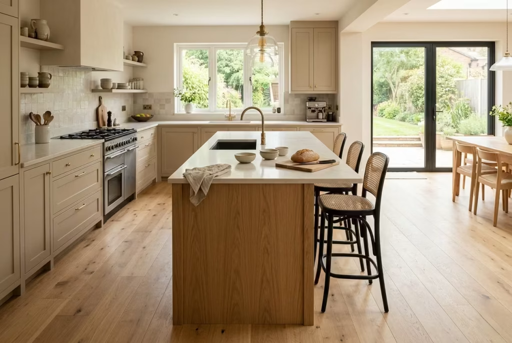
Beige and light oak form one of those quietly confident pairings that does not need to announce itself to feel complete. The cabinetry brings softness and tonal calm, while the oak introduces grain, direction, and a gentle sense of movement. Together, they create a kitchen that feels warm without tipping into heaviness, grounded without becoming visually dense. It is a balance that relies less on contrast and more on continuity, where colour and material sit side by side like they were always meant to share the same space.
What makes this pairing particularly effective is its restraint. There is no need for sharp interruption or dramatic shifts. Instead, the eye is guided across surfaces that feel naturally connected, almost as if the kitchen has been carved from a single, coherent idea rather than assembled in parts.
Real-Life Application Insight
I have used this combination in open-plan kitchens where the island becomes the social anchor of the space. In one project, the brief was to create warmth without introducing visual weight that would overwhelm the adjoining living area. We introduced beige cabinetry along the perimeter and a light oak island measuring 900 x 2400 mm (3 x 8 ft), positioned as the central gathering point.
What became immediately apparent was how the oak softened the geometry of the island. It did not compete with the cabinetry but gently counterbalanced it. As natural light shifted across the day, the oak picked up subtle variations in tone, while the beige remained steady in the background. The result was a kitchen that felt grounded yet open, structured yet relaxed, like a space that had grown into itself rather than being imposed all at once.
Suggested Measurements
- Island size: 900 x 2400 mm (3 x 8 ft) as a balanced focal point
- Island clearance: minimum 1000–1100 mm (39–43 in) around all sides
- Base cabinet depth: 600 mm (24 in)
- Tall units: 2100–2400 mm (7–8 ft) for vertical continuity
- Oak worktop or cladding thickness: 20–40 mm (0.8–1.6 in) depending on visual weight
These proportions help maintain spatial ease while allowing both materials to perform without overcrowding the layout.
Material Pairings
This pairing works best when other materials support the warmth rather than dilute it.
- Stone: Soft, honed limestone or light quartz to maintain tonal harmony
- Metal: Brushed brass or champagne finishes to echo the warmth in both beige and oak
- Flooring: Continuous oak flooring at 180–220 mm (7–8.5 in) plank width to extend the material language
- Splashback: Subtle stone or lightly textured plaster to avoid visual interruption
The intention is to build a layered but cohesive environment where no single element feels out of step.
Pros
- Creates a naturally warm and welcoming atmosphere without heaviness
- Works exceptionally well in open-plan layouts
- Ages gracefully as both materials develop subtle patina over time
- Offers strong visual cohesion without relying on contrast
Cons
- Can feel overly safe if not balanced with texture or tonal variation
- Requires careful selection of oak tone to avoid clashing with beige undertones
- May lack definition in very large or highly minimalist spaces
- Needs considered lighting to bring out depth in both materials
Beige cabinets paired with light oak succeed because neither element tries to dominate. Instead, they work in tandem, quietly reinforcing each other until the space feels complete, not in a finished sense, but in a way that suggests it was always meant to be this way.
Textured Matte Beige Finishes
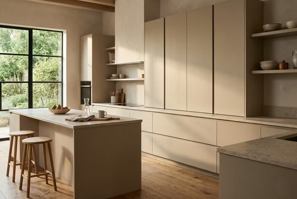
Textured matte beige finishes sit in that quiet space between simplicity and sensory depth. At first glance, they appear understated, almost restrained to the point of disappearing. But on closer reading, the surface begins to reveal itself, catching light in uneven, almost imperceptible ways. This is where the material earns its place. It does not rely on gloss or reflection to create interest. Instead, it works through tactility, offering a surface that feels as considered as it looks.
In beige, this becomes particularly powerful. The colour already leans toward softness, so introducing texture prevents it from falling into visual flatness. It is the difference between a surface that simply exists in a room and one that quietly participates in it. In daylight-rich spaces, this effect becomes even more pronounced, as shifting natural light draws out subtle variations across the finish, almost like a slow-moving rhythm across the cabinetry.
Real-Life Application Insight
I have used textured matte beige finishes in kitchens where natural light was a defining feature of the space. In one project with large south-facing glazing, the brief was to avoid glare while still maintaining warmth. High gloss was immediately ruled out, as it would have felt too reflective and unsettled in strong daylight.
Instead, we specified a soft textured lacquer in a muted beige tone across full-height cabinetry. What stood out after installation was how the surface behaved throughout the day. Morning light skimmed across it gently, revealing a soft grain-like quality, while afternoon sun deepened the shadows within the texture itself. The kitchen never felt static. It had a subtle movement to it, as if the surface was quietly breathing with the light.
It is often these tactile finishes that make a space feel grounded. Not loud, not decorative, just present in a way that feels deeply considered.
Suggested Measurements
- Cabinet depth: 600 mm (24 in) for standard base units
- Door thickness: 18–22 mm (0.7–0.9 in) to support textured finishes without warping
- Handle projection: 20–25 mm (0.8–1 in) where used, to maintain tactile balance
- Worktop thickness: 20–30 mm (0.8–1.2 in) to keep visual weight aligned with cabinetry
- Lighting temperature: 2700K–3000K recommended to enhance surface depth
These proportions ensure the texture reads clearly without overpowering the overall composition.
Material Pairings
Textured matte beige benefits from materials that either echo its softness or gently contrast its tactility.
- Wood: Light oak or ash with visible grain to complement surface variation
- Stone: Honed limestone or soft quartz for a calm, non-reflective counterpoint
- Metal: Brushed brass or muted black finishes used sparingly for definition
- Glass: Frosted or lightly tinted glass to maintain softness in upper cabinetry
The idea is to maintain a sensory balance, where no single material dominates the experience.
Pros
- Adds depth and tactility without introducing visual clutter
- Performs exceptionally well in natural light, revealing subtle surface variation
- Reduces glare, making kitchens feel calmer and more comfortable
- Works across both modern and transitional design styles
Cons
- Textured finishes can be harder to clean compared to ultra-smooth surfaces
- Requires careful lighting design to avoid flattening the effect
- Lower-quality finishes may wear unevenly over time
- Can feel understated if not balanced with stronger material contrast
Textured matte beige finishes succeed not because they demand attention, but because they reward it. The longer you spend in the space, the more you begin to notice how the surface shifts and responds, quietly reinforcing the idea that good design is not always about what you see at first glance, but what continues to unfold long after.
Beige and Stone Integration
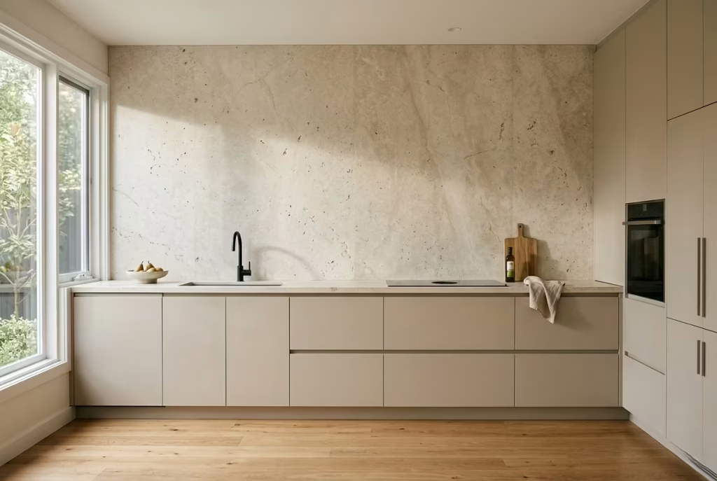
Beige and stone, when brought together with intention, create a dialogue rather than a contrast. Beige offers calm continuity, while stone introduces natural variation that prevents the palette from slipping into visual stillness. Limestone and travertine, in particular, carry a softened geological language, full of subtle pits, veins, and tonal shifts that feel inherently grounded.
This pairing works because neither material tries to dominate. Instead, they support each other in a way that feels almost effortless. Beige cabinetry becomes the steady backdrop, while stone brings rhythm and depth, like a quiet current running beneath a calm surface. The result is a kitchen that feels anchored yet alive, composed yet never static.
Real-Life Application Insight
I have used limestone and travertine backsplashes in beige kitchens where the primary challenge was avoiding visual flatness. In one project, the cabinetry was a soft, muted beige across a continuous run of base and tall units. Initially, the space felt composed but slightly restrained, almost too uniform under natural light.
The turning point came when we introduced a full-height limestone backsplash. The stone carried gentle irregularities that immediately lifted the entire composition. As daylight moved across the surface, shadows formed and dissolved within the natural texture, giving the kitchen a sense of quiet movement. The beige cabinetry, which had initially felt still, suddenly gained context and depth.
It is often in these moments that the space begins to feel resolved. Not because more elements were added, but because the right material was allowed to introduce variation in the right measure.
Suggested Measurements
- Backsplash height: 600 mm (24 in) minimum, or full-height up to 2100–2400 mm (7–8 ft) for continuous stone
- Stone thickness: 20–30 mm (0.8–1.2 in) for countertops, 10–20 mm (0.4–0.8 in) for vertical cladding
- Cabinet depth: 600 mm (24 in) standard base units
- Joint spacing: 2–3 mm (0.08–0.12 in) to maintain a refined, continuous look
- Overhang for countertops: 250–300 mm (10–12 in) for seating areas
These dimensions help maintain proportion while allowing the natural character of the stone to remain visually legible.
Material Pairings
Beige and stone already form a strong foundation, so additional materials should be introduced with restraint.
- Wood: Light oak or walnut used sparingly for shelving or flooring to add warmth
- Metal: Brushed brass or aged bronze to complement the natural tones of limestone and travertine
- Lighting: Warm white lighting around 2700K to enhance stone texture without flattening detail
- Flooring: Honed stone or wide-plank timber to maintain continuity across surfaces
The focus is on cohesion, where each material feels like it belongs to the same natural language rather than competing narratives.
Pros
- Stone introduces natural movement, preventing beige from feeling flat or static
- Creates a timeless aesthetic that rarely feels tied to trends
- Enhances tactile and visual depth through natural variation
- Works well in both compact and large kitchen layouts
Cons
- Natural stone requires sealing and ongoing maintenance
- Variability between slabs can make matching challenging
- Higher material and installation costs compared to engineered alternatives
- Overly patterned stone can overwhelm softer beige cabinetry if not carefully selected
Beige and stone integration works best when restraint leads the way. The cabinetry holds the composition steady, while the stone quietly animates it. Together, they create a kitchen that does not rely on visual drama, but instead builds its presence through texture, tone, and the slow unfolding character of natural materials.
High-Contrast & Architectural
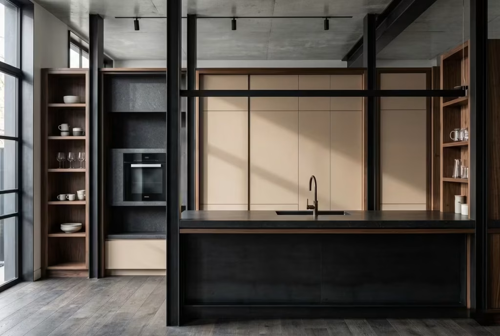
High-contrast and architectural kitchens move away from softness as the primary language and instead focus on structure, definition, and spatial clarity. This is where beige is no longer used to dissolve boundaries but to frame them, working alongside darker tones, sharper materials, and more deliberate lines.
The goal is not visual aggression, but controlled tension, where each element earns its place through contrast rather than continuity. I often approach these spaces like composing a well-balanced photograph, where light, shadow, and material weight need to hold each other in check.
When beige is introduced into this kind of framework, it acts as the stabilising field, preventing the composition from becoming too heavy or overly stark, while still allowing the architecture of the kitchen to take centre stage.
Beige Cabinets With Black Accents
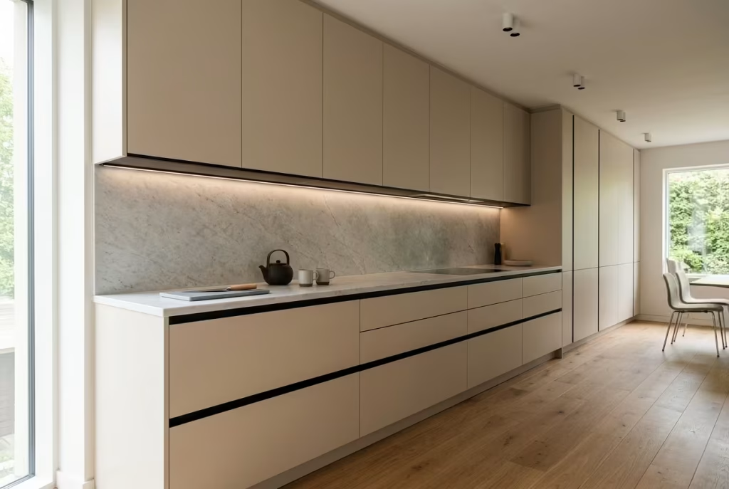
Beige and black, when handled with restraint, operate like a controlled dialogue between softness and structure. Beige brings a sense of calm continuity, while black introduces definition, almost like drawing a fine line around form to make it legible. The danger, of course, lies in overstatement. Too much black and the space hardens quickly. Too little and the framing effect disappears altogether.
In well-resolved kitchens, black is not treated as a dominant colour but as a precision tool. It appears in thin strokes, handles, shadow gaps, or lighting details, quietly sharpening the geometry of beige cabinetry. The result is a kitchen that feels composed rather than contrasted for effect, where boundaries are clarified without being shouted.
Real-Life Application Insight
I have used this approach in kitchens where the brief called for a more architectural presence without losing warmth. In one project, a beige flat-panel kitchen sat within an open-plan space that needed visual anchoring. The challenge was to define the cabinetry without breaking the softness of the overall palette.
We introduced slim black recessed handles and a linear black lighting strip beneath wall cabinets. The change was subtle but immediate. The beige no longer felt diffuse. It gained edges, rhythm, and a clearer reading within the room. What was once a soft block of colour became a structured composition, almost like a framed artwork within the wider space.
Interestingly, over time the black elements did not dominate. Instead, they receded slightly, allowing the beige to remain primary while still benefiting from that quiet framing effect. It is a reminder that contrast does not need to be loud to be effective.
Suggested Measurements
- Handle depth or recess: 20–25 mm (0.8–1 in) for comfortable grip without visual bulk
- Black shadow gap width: 3–5 mm (0.12–0.2 in) for clean architectural definition
- Base cabinet depth: 600 mm (24 in)
- Wall cabinet height: 720–900 mm (28–35 in) depending on ceiling height
- Lighting strip placement: typically 40–60 mm (1.5–2.4 in) below wall cabinets for even wash
These proportions ensure black accents remain precise rather than overpowering, maintaining clarity without visual aggression.
Material Pairings
When black is introduced into a beige kitchen, supporting materials must be chosen with care to avoid tipping the balance too far.
- Stone: Soft grey or lightly veined marble to bridge beige and black without harsh transition
- Wood: Warm oak or walnut to reintroduce organic softness and prevent the palette from feeling too rigid
- Metal: Matte black finishes used sparingly, ideally echoing the accent tone rather than expanding it
- Lighting: Warm neutral lighting around 3000K to soften contrast and avoid stark shadowing
The aim is to let black act as punctuation rather than narrative, guiding the eye without dominating it.
Pros
- Creates clear architectural definition within a soft beige palette
- Helps structure open-plan kitchens by visually anchoring cabinetry
- Works well in both modern and transitional design settings
- Adds depth and rhythm without requiring additional colours
Cons
- Overuse of black can quickly overpower beige and reduce warmth
- Requires precise detailing to avoid looking accidental or inconsistent
- Poor lighting can exaggerate contrast and feel harsh
- Needs careful balance with surrounding materials to avoid visual fragmentation
Beige cabinets with black accents succeed when restraint leads the design. The black does not take over the composition; it simply sharpens it. Like a well-drawn outline around a soft form, it gives clarity without stealing the focus, allowing the kitchen to feel structured, calm, and quietly confident all at once.
You May also Like: 21 Maximalist Kitchen Ideas to Make Your Space Bold and Vibrant
Two-Tone Beige and Deep Brown
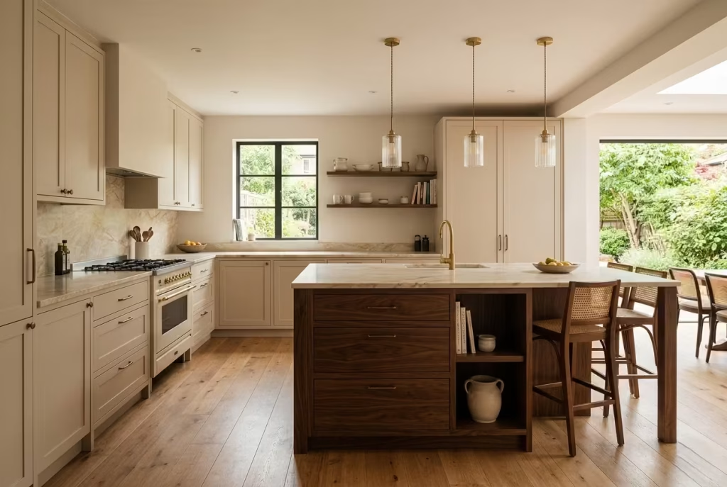
Two-tone kitchens in beige and deep brown operate on a simple but powerful principle: balance through weight. Beige lifts the composition, keeping it open and breathable, while deep brown grounds it, adding depth that prevents the space from drifting into visual lightness. Together, they create a grounded contrast that feels architectural rather than decorative.
This pairing works particularly well when the tones are distributed with intention rather than equality. Beige often performs best across larger, upper visual planes, while deep brown is used to anchor base units, islands, or tall structural elements. The result is not a split personality, but a controlled hierarchy, where the eye naturally understands what to read first and where to settle.
Real-Life Application Insight
I have used this combination in larger kitchens where scale needed to be managed carefully. In one project, the space extended into an open-plan living and dining area, and the challenge was to prevent the kitchen from feeling visually lost within the volume.
We introduced beige cabinetry along the perimeter to maintain lightness, while a deep walnut brown island, approximately 1000 x 2600 mm (3.3 x 8.5 ft), became the central anchor. The effect was immediate but not overpowering. The brown element grounded the space, while the beige kept it from feeling enclosed.
Over time, what became most interesting was how the two tones aged differently. The beige softened further under daylight, while the deep brown developed a richer patina under artificial lighting. Instead of drifting apart, they began to complement each other more strongly, like two voices finding harmony after repetition.
Suggested Measurements
- Island size: 900–1200 x 2400–2600 mm (3–4 ft x 8–8.5 ft) depending on room scale
- Base cabinet depth: 600 mm (24 in)
- Tall unit height: 2100–2400 mm (7–8 ft) for vertical continuity
- Colour zoning ratio: approximately 60 percent beige to 40 percent deep brown for balanced hierarchy
- Walkway clearance: minimum 1000–1200 mm (39–47 in) to preserve flow
These proportions help maintain spatial clarity while allowing the contrast to feel intentional rather than split.
Material Pairings
Two-tone kitchens rely heavily on supporting materials to bridge the contrast between light and dark.
- Stone: Warm-toned quartz or lightly veined marble that contains both beige and brown undertones
- Wood: Deep walnut or smoked oak to echo the darker cabinetry without adding harsh contrast
- Metal: Brushed brass or antique bronze to soften the transition between tones
- Flooring: Mid-tone timber (180–220 mm or 7–8.5 in planks) to sit comfortably between both shades
The key is cohesion. Each material should feel like it belongs to the same tonal family, even if it sits at different points within it.
Pros
- Creates strong visual grounding in larger or open-plan kitchens
- Adds depth and hierarchy without relying on additional colours
- Helps define zones within multifunctional spaces
- Ages well as both tones develop character over time
Cons
- Requires careful balance to avoid one tone overpowering the other
- Can feel heavy in smaller kitchens if not proportioned correctly
- Demands thoughtful lighting to maintain warmth in darker areas
- Material selection becomes critical to avoid tonal disconnection
Two-tone beige and deep brown kitchens succeed when the contrast feels measured rather than forced. The beige keeps the composition open and breathable, while the deep brown holds it steady. When balanced correctly, the result feels composed, grounded, and quietly assured, like a space that understands exactly where its weight should sit.
Beige Cabinets With Dark Flooring
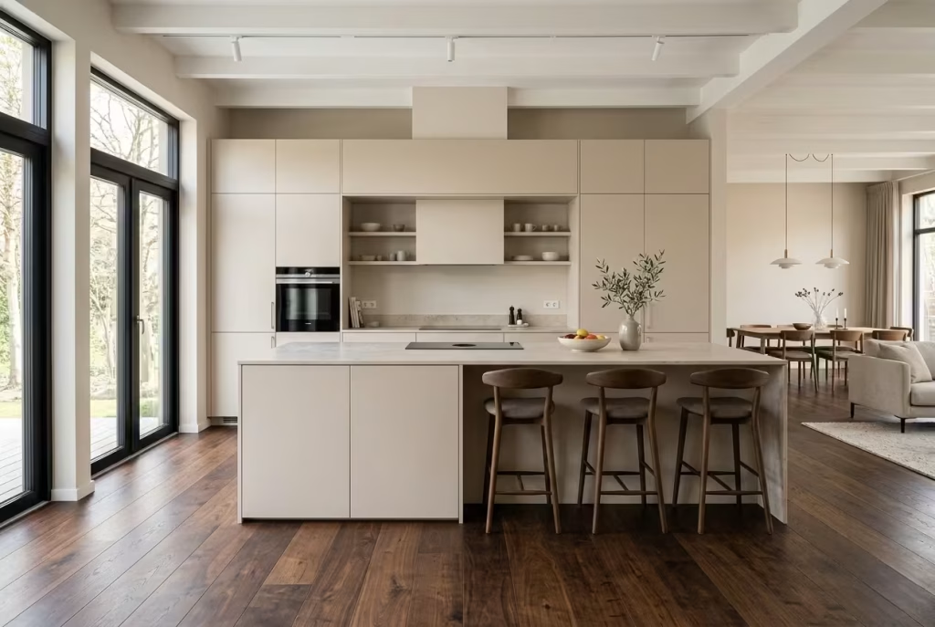
Beige cabinetry paired with dark flooring creates a deliberate sense of grounding, almost like setting a calm structure against a firm visual base. The cabinetry carries lightness and softness at eye level, while the flooring pulls the composition downward, anchoring the entire kitchen so it does not feel as if it is floating in space. This vertical tension is what gives the pairing its strength.
It is a relationship built on contrast, but not conflict. Beige softens the upper field of view, keeping the kitchen open and breathable, while dark flooring introduces weight and definition underfoot. When handled correctly, the result feels composed rather than split, like a room that understands where its centre of gravity lies.
Real-Life Application Insight
I have used this combination frequently in open-plan kitchens where visual zoning becomes essential without relying on physical partitions. In one project, a beige flat-panel kitchen sat within a long, continuous living space that lacked natural breaks between cooking, dining, and lounging areas.
By introducing a dark oak floor in a plank width of around 220 mm (8.5 in), the kitchen immediately gained definition. The cabinetry, finished in a muted beige, felt lighter by comparison, almost as if it had been lifted. What was particularly interesting was how the flooring subtly framed the kitchen footprint without needing additional architectural features.
Over time, the contrast became less about separation and more about hierarchy. The eye naturally settled on the cabinetry first, then dropped into the depth of the floor, creating a rhythm that felt intuitive rather than staged. It is one of those combinations that quietly earns its place the longer you live with it.
Suggested Measurements
- Flooring plank width: 180–220 mm (7–8.5 in) for visual stability
- Flooring tone depth: mid-to-dark oak or walnut equivalent for grounding effect
- Base cabinet depth: 600 mm (24 in)
- Kickboard height: 100–150 mm (4–6 in) to create a clean transition between cabinetry and floor
- Island clearance: minimum 1000–1200 mm (39–47 in) for flow and accessibility
These proportions help ensure the contrast feels structured rather than abrupt, allowing the transition between cabinetry and flooring to read as intentional design layering.
Material Pairings
The success of this pairing depends heavily on how surrounding materials bridge the tonal gap.
- Stone: Light or mid-tone quartz to prevent excessive heaviness between upper and lower planes
- Wood: If flooring is dark oak, keep cabinetry details minimal in additional wood elements to avoid duplication of weight
- Metal: Brushed brass or soft black finishes used sparingly for continuity in hardware and fixtures
- Walls: Warm off-white or muted plaster tones to keep the upper field light and consistent
The aim is to let the flooring do the grounding work while everything above it remains calm and controlled.
Pros
- Strongly defines kitchen zones in open-plan layouts
- Creates visual grounding that stabilises lighter cabinetry
- Enhances perceived depth and spatial structure
- Works well across both modern and transitional interiors
Cons
- Dark flooring can show dust and wear more easily
- Risk of visual heaviness if lighting is not carefully considered
- Requires balance in wall and ceiling tones to avoid enclosure effect
- Can feel overly contrasting if cabinetry or flooring tones are too extreme
Beige cabinets with dark flooring succeed because they understand balance at a fundamental level. One lifts, the other anchors, and somewhere in between, the kitchen finds its rhythm. When proportion and tone are handled with care, the space feels not only designed but naturally composed, as if every element knows exactly where it belongs.
Light-Filled & Airy
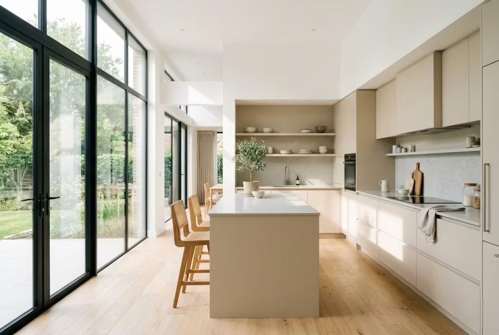
Light-filled and airy kitchens are built on a sense of visual restraint where brightness is not forced but allowed to unfold naturally through proportion, reflection, and material choice. In these spaces, beige shifts into a more delicate role, acting as a soft diffuser rather than a dominant tone, quietly carrying daylight across surfaces without absorbing too much of its energy.
I often approach this style with the mindset that the kitchen should feel almost unburdened, as if it has been lightly placed within the architecture rather than carved into it. When beige is used here with intention, it helps dissolve edges, soften transitions, and create that effortless sense of openness where the room feels larger, calmer, and gently lifted, without ever feeling empty or unfinished.
Pale Beige Cabinets With Glass Uppers
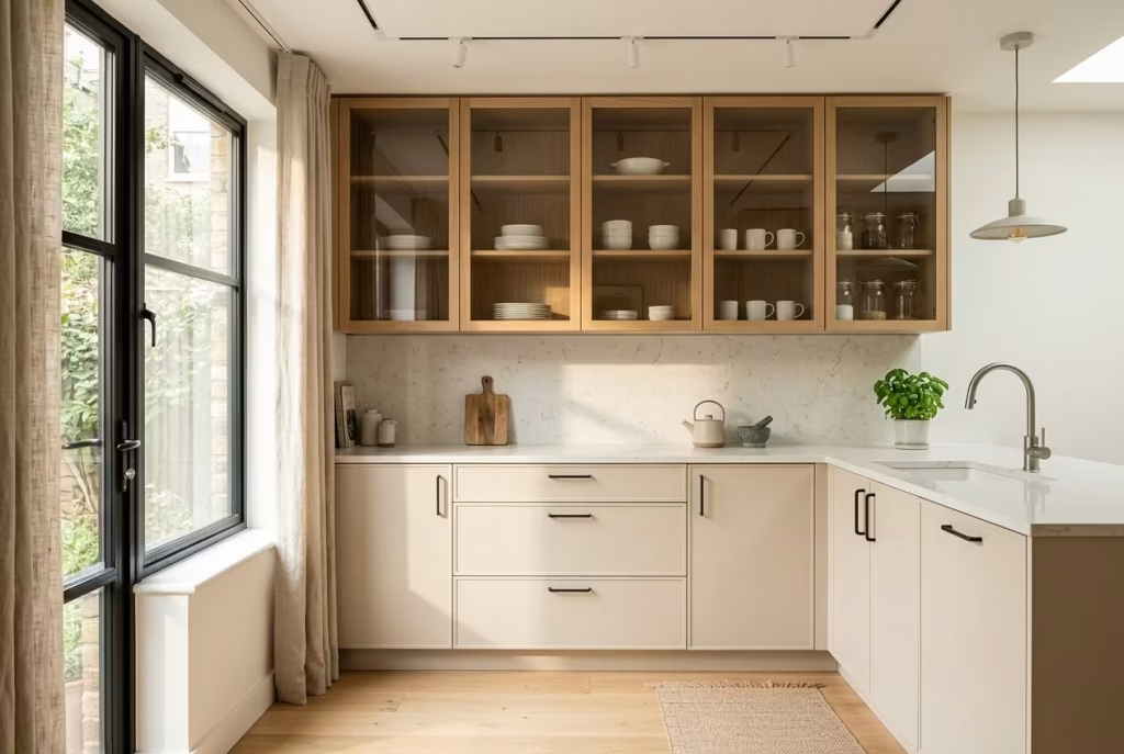
Pale beige cabinetry paired with glass upper units is fundamentally about lifting light through the vertical plane of the kitchen. The lower cabinetry establishes a soft, grounded base, while the glass introduces a sense of openness that prevents the composition from feeling visually weighted at eye level. It is a subtle architectural trick, but an effective one, as it draws the eye upward and allows daylight to travel more freely across the room.
The pale beige tone is critical here. It avoids visual interruption, ensuring that the cabinetry does not compete with the transparency of the glass. Instead, it behaves almost like a quiet frame, holding the structure together while allowing the upper section to breathe. The result is a kitchen that feels taller, lighter, and more spatially generous without physically changing its footprint.
Real-Life Application Insight
I have used this combination in kitchens where ceiling height was limited but the brief still demanded a sense of openness. In one project, the space measured just under 2400 mm (8 ft) in height, which can easily feel compressed if handled incorrectly.
We introduced pale beige base and tall units with slim-framed glass uppers above the main run. What became immediately noticeable was how the light began to behave differently within the space. Morning light passed through the glass and reflected softly onto the beige surfaces below, creating a layered brightness rather than a flat wash of illumination.
Over time, the kitchen felt less like a closed volume and more like a light conduit. The glass did not just display objects inside the cabinets; it redistributed light across the room, making even darker corners feel more connected to the whole.
Suggested Measurements
- Base cabinet depth: 600 mm (24 in)
- Glass upper cabinet height: 350–450 mm (14–18 in) per module
- Full upper run height: typically 700–900 mm (28–35 in) depending on ceiling proportion
- Ceiling height alignment: ideally 2100–2400 mm (7–8 ft) for visual continuity
- Shelf spacing inside glass units: 250–300 mm (10–12 in) for balanced display
These proportions help maintain clarity between solid and transparent elements, ensuring the composition feels structured rather than fragmented.
Material Pairings
This approach works best when supporting materials reinforce lightness without introducing visual heaviness.
- Stone: Light quartz or soft marble with minimal veining to maintain brightness
- Wood: Pale oak or ash used sparingly, often in flooring or shelving, to keep warmth present but controlled
- Metal: Brushed brass or soft satin finishes to add subtle definition without overpowering transparency
- Glass type: Clear or lightly frosted glass depending on how much visibility and softness is desired
The overall aim is to keep the upper half of the kitchen visually light while allowing the lower half to provide gentle structure.
Pros
- Enhances vertical light distribution, making ceilings feel higher
- Creates a lighter, more open visual field in compact kitchens
- Allows for subtle display without visual clutter
- Works well in both traditional and contemporary layouts
Cons
- Requires disciplined organisation within glass cabinets
- Can highlight clutter if not carefully maintained
- Glass surfaces need regular cleaning to maintain clarity
- Less concealed storage compared to fully solid cabinetry
Pale beige cabinets with glass uppers succeed because they understand the importance of vertical rhythm. The solid base grounds the room, while the glass lifts it, allowing light to move more freely through the space. When balanced well, the kitchen feels less like a contained room and more like a softly illuminated volume, composed, airy, and quietly refined.
Beige Cabinets With Reflective Backsplashes
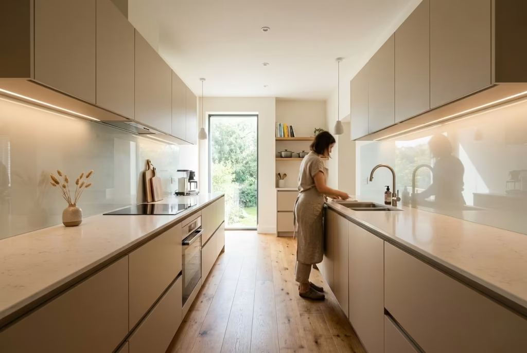
Beige cabinetry paired with reflective backsplashes is less about shine and more about controlled luminosity. The intention is not to create a glossy, high-glare surface, but to introduce a gentle bounce of light that subtly lifts the entire kitchen. In this context, reflection becomes a spatial tool rather than a decorative effect, extending perceived depth and preventing beige from settling too quietly into the background.
The key lies in restraint. Highly polished finishes can quickly overwhelm the softness of beige, tipping the space into something overly sharp or visually restless. Instead, softly reflective surfaces, such as satin glass, brushed mirror, or lightly honed metallic tiles, allow light to move without becoming distracting. The result is a kitchen that feels brighter, but not louder.
Real-Life Application Insight
I have used reflective backsplashes in beige kitchens where natural light was present but not evenly distributed. In one project, a long galley layout received strong daylight from one end only, which risked leaving the deeper sections feeling visually compressed.
By introducing a softly reflective glass backsplash behind the main work zone, the incoming light was redistributed across the cabinetry. The beige surfaces began to pick up subtle highlights throughout the day, almost like a slow ripple of brightness moving through the space. It did not feel mirrored in the literal sense, but more like the room had started to carry its own internal glow.
What was particularly interesting was how the reflection softened over time as everyday use introduced faint variations in surface patina. The backsplash did not remain static; it became part of the kitchen’s evolving light story.
Suggested Measurements
- Backsplash height: 450–600 mm (18–24 in) for partial reflection or full-height up to 2100–2400 mm (7–8 ft) for continuous light diffusion
- Glass or reflective panel thickness: 6–10 mm (0.25–0.4 in) depending on material type
- Countertop overhang: 20–30 mm (0.8–1.2 in) for clean junction with backsplash
- Distance between opposite reflective surfaces: minimum 1000 mm (39 in) to avoid visual clutter or over-reflection
- Lighting placement: under-cabinet lighting positioned 40–60 mm (1.5–2.4 in) from backsplash edge
These proportions ensure that reflection remains subtle and supportive rather than overpowering the visual field.
Material Pairings
Reflective backsplashes require careful material coordination to maintain balance within a beige palette.
- Stone: Soft quartz or lightly textured marble to counterbalance reflective surfaces with natural variation
- Wood: Warm oak or ash used in moderation to ground the visual lightness introduced by reflection
- Metal: Brushed brass or satin nickel to echo light without creating harsh highlights
- Glass finishes: Satin, smoked, or lightly antiqued mirror to avoid overly sharp reflections
The aim is to create a layered light effect, where reflection enhances atmosphere rather than dominating it.
Pros
- Subtly increases perceived brightness in kitchens with limited or uneven light
- Helps distribute natural and artificial light more evenly across surfaces
- Adds depth without introducing additional colour or pattern
- Works well in both compact and open-plan layouts
Cons
- Highly polished surfaces can feel visually harsh if not carefully controlled
- Requires frequent cleaning to maintain clarity and avoid streaking
- Overuse of reflection can create visual confusion in smaller spaces
- Poor lighting design can exaggerate glare rather than soften it
Beige cabinets with reflective backsplashes succeed when reflection is treated as a quiet amplifier rather than a focal point. The cabinetry remains calm and grounded, while the backsplash gently extends light across the space. When balanced correctly, the kitchen feels brighter, more open, and subtly animated, as if light itself has been given a little more room to move.
Beige-on-Beige Layering
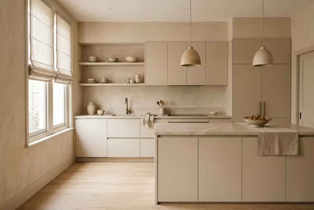
Beige-on-beige layering works when the palette is treated as a family of related tones rather than a single flat colour repeated across every surface. The strength of this approach lies in nuance. One beige might lean warm and creamy, another slightly sandy, another closer to taupe, and when those shifts are handled with a steady hand, the room gains depth without needing obvious contrast. It is a quiet kind of sophistication, the sort that does not shout to be noticed but still leaves a lasting impression.
The real challenge is avoiding sameness. If every surface sits within the exact same tone, the kitchen can begin to feel washed out, almost as if the volume has been turned down too far. But when cabinetry, walls, tiles, and soft furnishings carry subtle tonal differences, beige starts to behave like a layered composition rather than a single note. That is where the design finds its footing. The eye moves from one surface to another, picking up shifts in finish, texture, and light, and suddenly the room feels richer, more thoughtful, and far less predictable.
Real-Life Application Insight
I have used beige-on-beige layering in kitchens where the brief was to create calm without sacrificing depth. In one project, the client wanted a soft, tonal kitchen that felt immersive but not bland. We combined a muted beige shaker cabinet with slightly warmer wall finishes, a lighter stone worktop, and linen Roman blinds in a near-identical but not identical tone. On paper, the palette sounded simple. In reality, the success depended entirely on texture and finish.
What made it work was the contrast in surface quality. The cabinetry had a smooth painted finish, the walls carried a subtle matte plaster effect, and the worktop introduced a soft honed texture that caught daylight differently throughout the day. The result was layered, not repetitive. Each element belonged to the same tonal world, but none of them disappeared into the others. That is the trick. Beige layering is never about matching everything perfectly. It is about letting the room breathe through small, deliberate variations.
Suggested Measurements
- Base cabinet depth: 600 mm (24 in)
- Wall cabinet height: 720–900 mm (28–35 in) depending on ceiling height
- Worktop thickness: 20–30 mm (0.8–1.2 in) for a refined, light visual profile
- Splashback height: 450–600 mm (18–24 in), or full-height for a more immersive tonal field
- Ceiling alignment for tall units: ideally 2100–2400 mm (7–8 ft) to keep the vertical rhythm clean
These measurements help preserve proportion, which matters even more when the colour palette is restrained. Without good proportion, beige layering can drift from elegant to monotonous in a heartbeat.
Material Pairings
The success of beige-on-beige layering depends on material variation more than colour variation.
- Walls: Matte plaster, limewash, or a flat emulsion with low reflectivity
- Cabinetry: Painted MDF, timber veneer, or lacquered surfaces with a smoother finish
- Worktops: Honed stone or soft quartz to introduce a tactile shift
- Textiles: Linen blinds or woven upholstery in a related but slightly deeper tone
- Flooring: Warm oak, travertine, or a muted stone floor to anchor the composition
A kitchen like this benefits from materials that speak in a calm voice. Nothing should feel forced into the room. Each surface should add a little more depth, not more noise.
Pros
- Creates a calm, cohesive atmosphere that feels refined and lived-in
- Allows subtle shifts in tone and texture to carry the design
- Works particularly well in kitchens where softness and continuity are priorities
- Can make a space feel larger and more settled when proportions are handled well
Cons
- Can appear flat or washed out if too many surfaces share the exact same tone
- Requires careful texture and finish variation to avoid monotony
- Needs strong natural or layered artificial light to reveal depth properly
- Poor execution can make the kitchen feel timid rather than composed
Beige-on-beige layering is one of those approaches that looks deceptively simple but rewards a sharp eye and a disciplined hand. When done properly, it has a rare kind of grace. The room does not depend on contrast to make its point. Instead, it builds interest quietly, surface by surface, until the whole composition feels settled, balanced, and far more dimensional than it first appears.
Compact Kitchen Solutions
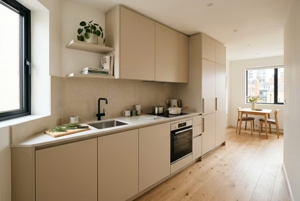
Compact kitchens demand a different kind of discipline, where every decision carries more weight because there is simply less room for excess or correction. In these spaces, beige cabinetry can become a strategic tool rather than just a stylistic choice, helping to reduce visual fragmentation and create a sense of continuity across tight footprints.
I often approach compact layouts by thinking in layers of efficiency rather than decoration, where proportion, storage logic, and light behaviour matter far more than surface detail. When beige is used well here, it quietly expands perception, softening edges and allowing the kitchen to feel less confined, almost as if the boundaries have been pushed outward without physically changing a single wall.
Beige Cabinets in Small Kitchens
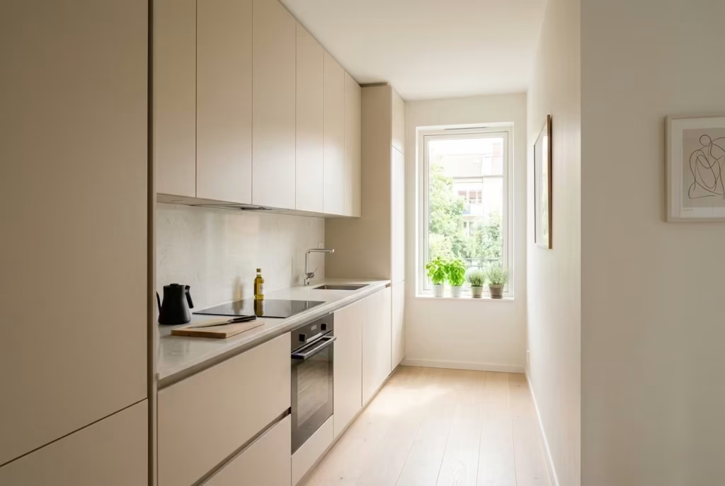
In small kitchens, beige cabinetry works less as a colour choice and more as a spatial strategy. The aim is not to decorate the room, but to quieten it, reducing the number of visual interruptions so the eye can move smoothly from one surface to another. Beige, when handled with restraint, dissolves hard boundaries and softens transitions between walls, cabinetry, and appliances, which helps the space feel less segmented and more continuous.
This is where proportion becomes everything. Full-height cabinetry aligned to the ceiling draws the eye upward, while a consistent beige tone prevents the walls from visually cutting the room into smaller fragments. It is a subtle form of spatial editing, where clutter is not only removed physically but also visually reduced through tonal consistency. The result is a kitchen that feels more open than its actual footprint would suggest.
Real-Life Application Insight
I have worked on several compact kitchens where the brief was simple but demanding: make it feel bigger without changing the structure. In one particularly tight layout, the kitchen measured just under 2.2 metres wide (around 7 ft 2 in), which left very little room for error in design decisions.
We opted for full-height beige cabinetry at 2400 mm (8 ft), running uninterrupted along one wall. At first glance, the kitchen felt almost too uniform, but once the appliances were integrated and lighting was introduced, the effect changed completely. The cabinetry began to behave like a continuous surface rather than separate units, which immediately reduced the sense of clutter.
Over time, what stood out was how forgiving the beige tone became in daily use. Marks, shadows, and reflections did not break the visual flow. Instead, they blended into the surface, allowing the kitchen to retain its calm even under constant activity. It is one of those situations where restraint, rather than addition, delivers the strongest result.
Suggested Measurements
- Full-height cabinet alignment: 2400 mm (8 ft) to ceiling for uninterrupted vertical flow
- Base cabinet depth: 600 mm (24 in) for standard functionality
- Wall cabinet depth: 300–350 mm (12–14 in) to avoid projection into narrow spaces
- Aisle clearance: minimum 900–1000 mm (35–39 in) in compact layouts
- Handle projection or recess: 20–25 mm (0.8–1 in) for space-saving ergonomics
These proportions are critical in small kitchens, where even a slight imbalance can make the space feel more compressed than it actually is.
Material Pairings
In compact kitchens, supporting materials should reinforce openness rather than introduce complexity.
- Stone: Light quartz or soft-toned engineered stone to maintain brightness
- Wood: Pale oak or ash used sparingly, often in flooring, to add warmth without visual weight
- Metal: Satin nickel or brushed brass for subtle definition without harsh contrast
- Glass: Clear or lightly frosted elements for upper cabinetry to avoid visual blockage
The goal is to keep surfaces visually quiet so the architecture of the space can lead the experience.
Pros
- Reduces visual fragmentation, making small kitchens feel more continuous
- Full-height beige cabinetry enhances perceived ceiling height
- Works well with integrated appliances for a seamless look
- Maintains a calm, consistent visual field even in high-use spaces
Cons
- Can feel monotonous if not balanced with texture or subtle variation
- Requires precise planning to avoid overwhelming narrow layouts
- Limited contrast may reduce visual focal points if not carefully considered
- Full-height joinery can increase cost and installation complexity
Beige cabinetry in small kitchens succeeds when it works quietly in the background, smoothing out visual interruptions and allowing the space to breathe. It does not rely on tricks or exaggeration. Instead, it earns its effect through continuity, proportion, and a disciplined approach to restraint, proving that sometimes the most effective way to make a space feel larger is simply to let it settle into itself.
You May also Like: 25 Open Kitchen Living Rooms ideas That Feel Stylish, Spacious, and Effortlessly Connected
Slimline Beige Cabinet Profiles
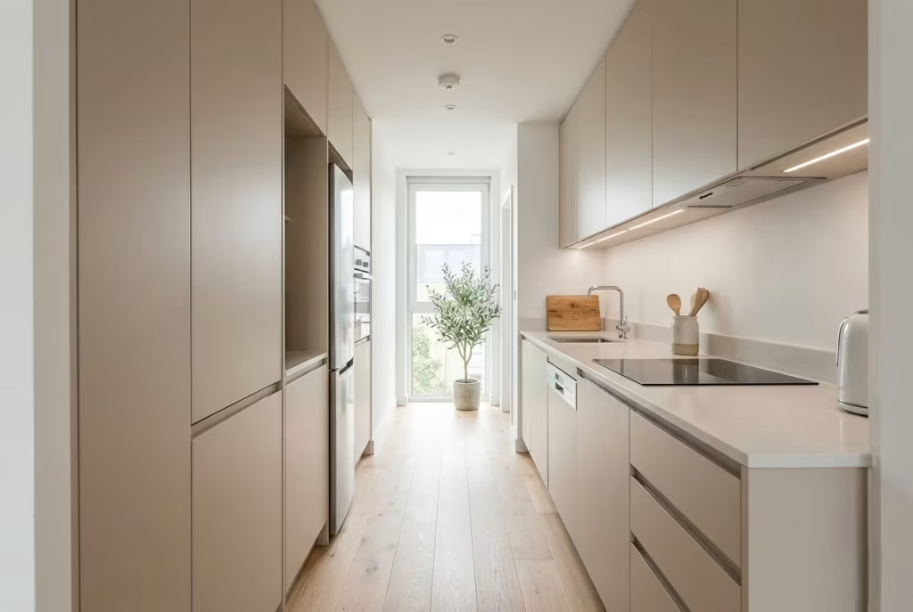
Slimline beige cabinetry is essentially an exercise in visual restraint, where reducing physical depth becomes a way of lightening the entire room. Instead of projecting into the space with standard proportions, the cabinetry pulls back slightly, allowing walls and circulation zones to feel less compressed. In beige, this effect is amplified because the colour itself already softens edges and reduces visual weight.
The idea is not to sacrifice function, but to refine presence. When cabinet profiles become slimmer, the kitchen begins to read as more architectural and less bulky, almost as if it has been carefully embedded into the wall rather than placed in front of it. Beige supports this illusion well, smoothing transitions and preventing the reduced depth from feeling like a compromise.
Real-Life Application Insight
I have used slimline cabinetry in kitchens where circulation space was extremely limited and every centimetre mattered. In one project, the layout formed a narrow corridor kitchen measuring just under 1.9 metres (6 ft 2 in) in width. Standard 600 mm (24 in) cabinetry would have made movement feel tight and slightly restrictive.
We reduced the depth to 500 mm (20 in) for the main run, paired with integrated appliances designed to sit flush within the reduced profile. At first, the adjustment seemed subtle on paper, but in practice it changed the entire spatial rhythm. The kitchen felt less intrusive, almost like it had stepped back to allow the room to breathe.
What was particularly noticeable over time was how the beige finish helped disguise the reduced depth. Instead of reading as “smaller cabinetry,” it felt intentional, almost tailored to the architecture. It is one of those solutions that works best when it is barely noticed.
Suggested Measurements
- Base cabinet depth: 500 mm (20 in) in compact or narrow layouts
- Standard alternative depth (for comparison): 600 mm (24 in)
- Wall cabinet depth: 250–300 mm (10–12 in) to maintain proportional balance
- Walkway clearance: minimum 900–1000 mm (35–39 in) for comfortable movement
- Countertop overhang: 15–20 mm (0.6–0.8 in) to keep the profile visually light
These adjusted dimensions are critical in tighter spaces, where even small reductions in depth can significantly improve circulation and perceived openness.
Material Pairings
Slimline cabinetry benefits from materials that reinforce lightness and avoid visual heaviness.
- Stone: Light quartz or slim-profile engineered stone to maintain proportion
- Wood: Pale oak or ash used selectively, often in flooring or shelving, to add warmth without bulk
- Metal: Minimal brushed brass or satin nickel hardware to avoid visual protrusion
- Backsplash: Simple, low-texture surfaces or full-height slab installations to maintain continuity
The key is consistency. Every material should support the reduced depth rather than draw attention to it.
Pros
- Reduces visual bulk, making narrow kitchens feel more open
- Improves circulation in tight layouts without structural changes
- Creates a tailored, integrated appearance within the architecture
- Beige helps disguise reduced depth, maintaining visual balance
Cons
- Reduced storage capacity compared to standard-depth cabinetry
- Requires careful appliance selection to maintain flush integration
- Can feel slightly restrained if not balanced with good organisation
- Limited flexibility for larger cookware or bulk storage needs
Slimline beige cabinetry works best when space is at a premium and clarity is the priority. It does not rely on excess or expansion, but on refinement and precision. When executed well, it feels almost like a quiet adjustment to the room’s proportions, subtle enough to go unnoticed at first glance, yet impactful in how the space is experienced day after day.
You May also Like: 25 Stylish Neutral Kitchen Ideas That Add a Unique Designer Touch
Integrated Beige Storage Walls
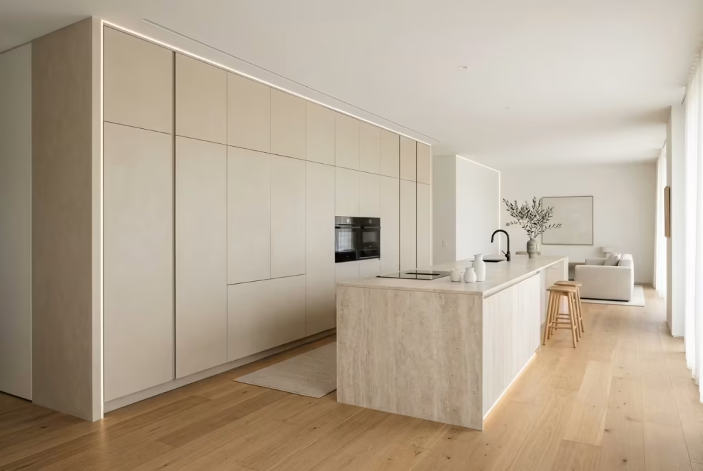
Integrated beige storage walls are fundamentally about control, not just storage. The intention is to absorb appliances, utilities, and everyday clutter into a single continuous architectural surface so the kitchen reads as calm, uninterrupted, and visually coherent. In beige, this approach becomes even more refined because the colour naturally softens the scale of large built forms, preventing them from feeling heavy or imposing.
Rather than treating storage as a series of individual units, this design consolidates everything into one composed elevation. Fridge, oven, pantry, and hidden prep zones all sit behind a unified façade, allowing the wall to behave almost like a quiet backdrop that supports the room instead of competing with it. When handled well, it feels less like cabinetry and more like spatial editing, where everything unnecessary has been tucked neatly out of sight.
Real-Life Application Insight
I have used integrated storage walls in kitchens where the brief was to achieve a near “gallery-like” calm, even in highly functional family homes. In one project, the kitchen formed part of a busy open-plan ground floor, where visual clutter had previously made the space feel fragmented.
We designed a full-height beige storage wall running approximately 4.2 metres (13.8 ft), concealing refrigeration, pantry storage, cleaning utilities, and small appliances. At first glance, it appeared almost monolithic, but once in use, its value became obvious. Everything had a place, yet nothing demanded attention.
What stood out over time was how the beige finish softened the sheer scale of the installation. Without it, the wall could have felt overly dominant. Instead, it receded visually, almost like it had been absorbed into the architecture. The family could move through the space without constantly negotiating visual interruptions, which, in everyday life, makes a surprising difference.
Suggested Measurements
- Full storage wall height: 2100–2400 mm (7–8 ft), aligned to ceiling for continuity
- Standard module width: 450–600 mm (18–24 in) for balanced rhythm
- Appliance integration depth: 600–650 mm (24–26 in) depending on specification
- Walkway clearance in front of storage wall: minimum 1000–1200 mm (39–47 in)
- Handle or push-latch reveal: 2–3 mm (0.08–0.12 in) for seamless appearance
These proportions ensure the wall reads as a unified surface while still functioning efficiently in daily use.
Material Pairings
Because integrated storage walls dominate visually by scale, surrounding materials must introduce balance rather than competition.
- Stone: Soft honed quartz or limestone to maintain visual calm across work surfaces
- Wood: Light oak or muted walnut used sparingly, often in adjacent islands or flooring
- Metal: Minimal brushed brass or satin black details, used only where necessary
- Lighting: Linear LED strips integrated into recesses to prevent the wall from feeling too flat
The aim is to let the storage wall disappear into the architecture, not announce itself.
Pros
- Conceals appliances and clutter for a highly streamlined appearance
- Creates strong architectural continuity in open-plan spaces
- Maximises storage efficiency within a single visual plane
- Beige finish helps reduce visual weight of large built forms
Cons
- Requires precise planning and high-quality joinery
- Higher upfront cost due to bespoke fabrication and integration
- Repairs or alterations can be more complex once installed
- Risk of feeling monolithic if not broken up with subtle detailing or lighting
Integrated beige storage walls work best when discipline leads the design. They do not rely on visual variety to create interest. Instead, they remove distraction altogether, allowing the architecture of the space to take precedence. When done properly, the result feels calm, composed, and quietly efficient, like a kitchen that has everything it needs, and nothing it does not.
Statement & Character-Led
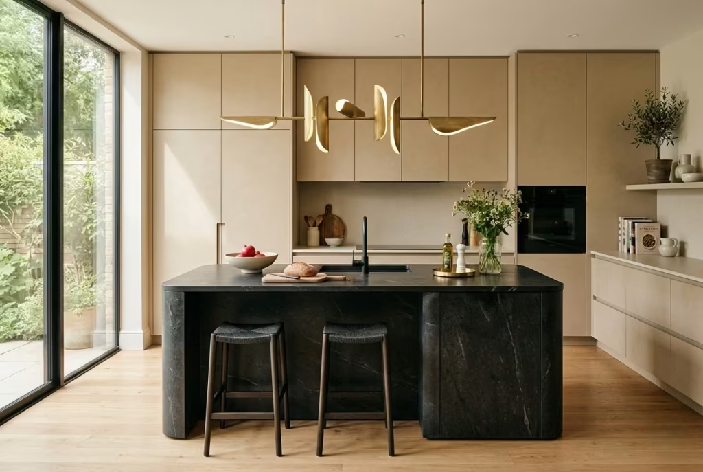
Statement and character-led kitchens move away from pure restraint and begin to embrace individuality, where beige is no longer just a balancing neutral but a deliberate foundation for expression. In these spaces, personality is introduced through form, detailing, and material contrast, yet still held together by the softness and adaptability of beige cabinetry.
I often treat this approach as a careful calibration rather than decoration, where every bold gesture needs grounding, otherwise the design risks feeling fragmented.
When handled well, beige becomes the quiet anchor that allows character to emerge without overwhelming the space, creating kitchens that feel distinctive, layered, and confidently composed rather than overly styled.
Beige Cabinets With Brass Hardware
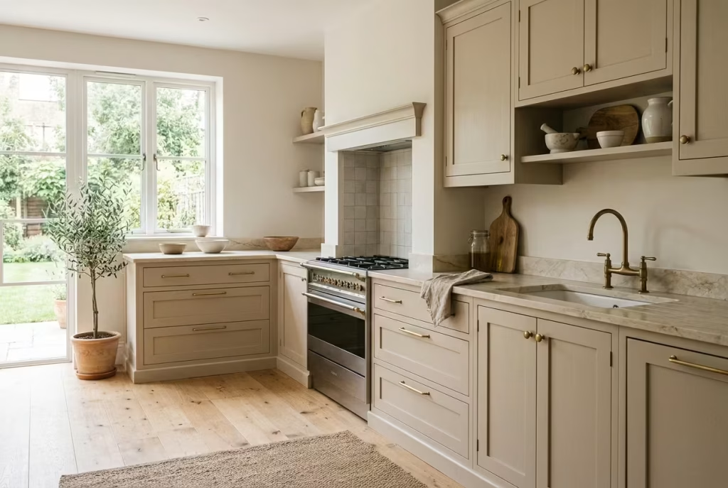
Beige cabinetry paired with brass hardware is one of those combinations that feels quietly assured rather than visually loud. The cabinetry provides a soft, grounding field, while brass introduces a controlled warmth that catches light in a restrained but meaningful way. It is not about shine or ornamentation. It is about subtle lift, where small metallic touches bring definition to otherwise smooth, uninterrupted surfaces.
Brass works particularly well with beige because both sit within a warm tonal family. Instead of clashing, they layer into each other, almost like different notes within the same chord. When used thoughtfully, brass does not dominate the cabinetry. It punctuates it, guiding the eye without pulling focus away from the overall composition.
Real-Life Application Insight
I have used this pairing in kitchens where the brief called for warmth without heaviness. In one project, a softly textured beige shaker kitchen initially felt slightly subdued under natural daylight. The architecture was strong, but the cabinetry risked blending into the background too much.
We introduced aged brass handles and discreet brass detailing around lighting trims and tap fittings. The change was immediate but not aggressive. Rather than transforming the kitchen, the brass seemed to wake it up gently. Light began to catch at different points throughout the day, especially around handle edges and corners, creating small moments of reflection that shifted with movement.
What became most noticeable over time was how the brass softened further as it aged. Instead of losing clarity, it developed a deeper patina that worked in harmony with the beige cabinetry. The kitchen felt more settled, as if it had been lived in and refined at the same time.
Suggested Measurements
- Handle length: 128–192 mm (5–7.5 in) for standard drawers and doors
- Knob diameter: 20–30 mm (0.8–1.2 in) for upper cabinetry or accent use
- Handle projection: 25–35 mm (1–1.4 in) to ensure comfortable grip without visual bulk
- Spacing from edge: 50–70 mm (2–2.75 in) for balanced placement
- Tap height above countertop: 250–350 mm (10–14 in) depending on sink depth
These measurements ensure brass detailing remains functional while maintaining proportion and visual restraint.
Material Pairings
Brass and beige create a warm base, but surrounding materials determine whether the space feels cohesive or overly decorative.
- Stone: Creamy marble or warm-toned quartz to support the shared warmth
- Wood: Light oak or walnut used in flooring or shelving to reinforce natural depth
- Glass: Clear or lightly tinted glass for display areas to keep light movement consistent
- Lighting: Warm white lighting around 2700K to enhance brass reflection without harsh glare
The goal is to allow brass to act as a highlight, not a competing element.
Pros
- Adds warmth and subtle contrast without disrupting the beige base
- Develops character over time as brass patinas naturally
- Works across both traditional and contemporary kitchen styles
- Enhances light play through reflective detailing
Cons
- Lower-quality brass finishes can tarnish unevenly
- Overuse can make the kitchen feel overly decorative
- Requires maintenance depending on finish type (polished vs aged)
- Needs careful proportioning to avoid visual clutter
Beige cabinets with brass hardware succeed because they understand restraint. The cabinetry provides calm continuity, while brass introduces just enough variation to keep the surface alive. When balanced correctly, the result feels warm, composed, and quietly expressive, like a space that does not try too hard, yet still leaves a lasting impression.
Beige Cabinets With Fluted Detailing
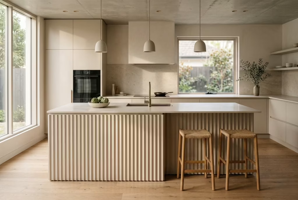
Fluted detailing brings a quiet sense of movement to beige cabinetry, which is precisely why the pairing works so well. Beige on its own can be beautifully restrained, but when the surface is completely flat it sometimes risks feeling too still. Fluting changes that. It introduces a gentle cadence across the elevation, creating light and shadow in a way that feels subtle rather than showy. The effect is a bit like adding texture to a calm voice. The message does not change, but the delivery becomes far more compelling.
What makes this approach especially effective in beige is the way the colour softens the sculptural quality of the grooves. Instead of reading as ornate or overly decorative, the detailing feels architectural, almost woven into the fabric of the kitchen. As daylight shifts, the ribs catch and release shadow in small, elegant intervals, giving the room a sense of depth that flat joinery simply cannot match. It is one of those details that does not scream for attention, yet somehow becomes the thing you keep noticing.
Real-Life Application Insight
I have used fluted beige cabinetry in kitchens where the client wanted something distinctive but not overly styled. In one project, the kitchen sat in a newly extended family home with generous glazing and a fairly clean architectural shell. The challenge was to introduce personality without upsetting the calmness of the larger scheme.
We specified fluted detailing for the island and selected beige cabinetry for the perimeter units. The island became the room’s quiet focal point, not because it was loud, but because the fluting gave it rhythm. As light moved across the surface, the cabinetry shifted from soft and understated in the morning to richly dimensional by late afternoon. It never felt static, which mattered in a space that was used constantly and needed to hold its own through different times of day.
What I found particularly effective was the way the fluting created a sense of presence without bulk. In larger rooms, that matters. A plain beige island can sometimes disappear into the background, but with fluted detailing, it gains enough texture to feel anchored. It is a small move with a surprisingly large payoff.
Suggested Measurements
- Flute width: 20–40 mm (0.8–1.6 in) depending on the scale of the cabinetry
- Flute depth: 8–15 mm (0.3–0.6 in) for a refined shadow line without heavy carving
- Cabinet depth: 600 mm (24 in) for standard base units
- Island height: 900 mm (35 in) including worktop, to keep the detailing visually balanced
- Panel spacing: consistent rhythm across the run, ideally aligned to drawer and door proportions
These measurements matter because fluting is all about rhythm. If the grooves are too tight, the surface becomes fussy. Too broad, and the effect loses its elegance. The sweet spot is where the texture reads clearly but still feels calm from across the room.
Material Pairings
Fluted beige cabinetry works best when the surrounding materials support its softness without dulling the effect.
- Stone: Honed limestone, travertine, or soft quartz to complement the textural language
- Wood: Warm oak or walnut in flooring or shelving to reinforce natural movement
- Metal: Brushed brass or muted black hardware used sparingly so the detailing remains the star
- Lighting: Side lighting or soft under-cabinet lighting to enhance shadow play along the flutes
The key is to avoid overly busy companions. Fluting already gives the cabinetry a strong visual identity, so the surrounding materials should feel measured and composed.
Pros
- Introduces depth and rhythm without relying on bold colour
- Makes beige cabinetry feel more bespoke and characterful
- Adds shadow variation that changes beautifully with daylight
- Works well in both contemporary and transitional kitchens
Cons
- Can collect dust more easily than flat-front cabinetry
- Requires high-quality fabrication to keep lines crisp and even
- Too much fluting can make a kitchen feel visually busy
- May increase cost depending on joinery complexity
Beige cabinets with fluted detailing succeed because they give the surface something to do without asking it to perform too loudly. The result is tactile, architectural, and quietly memorable. It is the kind of detail that rewards a second look, then a third, because it keeps revealing small shifts of light and shadow, the sort of understated richness that gives a kitchen its staying power.
Painted Beige Cabinets With Aged Patina
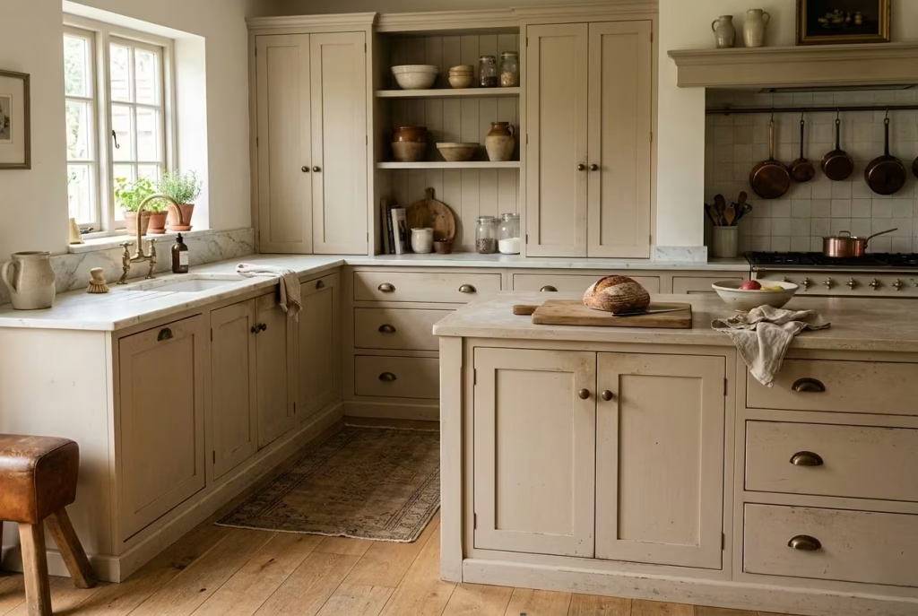
Painted beige cabinetry with an aged patina approach is built on a simple but often misunderstood idea: perfection is not the end goal, evolution is. Instead of aiming for a flawless, static finish, the surface is designed to soften, deepen, and subtly shift over time. Beige is particularly suited to this because it already sits in a restrained tonal space, so small changes in texture, edge wear, and surface variation feel natural rather than deteriorative.
The design intention here is not distress for effect, but controlled ageing. Light catching on softened corners, gentle variation around handles, and subtle tonal deepening in high-touch areas all contribute to a sense of quiet maturity. The cabinetry begins to feel less like a newly installed object and more like part of the architecture that has always been there, settling into the rhythm of daily life.
Real-Life Application Insight
I have worked on kitchens where the goal was to avoid that “just finished” feeling and instead create something that would improve with use. In one project, a softly painted beige shaker kitchen was specified with a hand-finished matte coating designed to develop a gentle patina over time, particularly around frequently used zones such as drawers, handles, and the sink run.
At the start, the finish was deliberately even, almost restrained to the point of feeling quiet. But within months, something interesting happened. The areas around the island began to develop a soft burnishing from repeated contact. The edges of doors caught slightly more light, and the surface started to feel less uniform in a way that actually added depth rather than diminishing it.
What stood out most was how the kitchen became more visually grounded as it aged. Instead of losing quality, it gained character. The beige, which initially felt understated, began to carry subtle variation that made the whole space feel more lived-in, more believable. It is one of those rare cases where time does not erode design intent, it strengthens it.
Suggested Measurements
- Cabinet door thickness: 18–22 mm (0.7–0.9 in) to support layered paint finish
- Handle placement: 50–70 mm (2–2.75 in) from edge to allow natural wear patterns to develop evenly
- Base cabinet depth: 600 mm (24 in) for standard functionality
- Island height: 900 mm (35 in) including worktop for comfortable daily use
- Clear walkway space: 1000–1200 mm (39–47 in) to avoid accidental impact wear in tight zones
These dimensions help ensure that patina develops naturally in high-contact areas rather than becoming uneven or uncontrolled.
Material Pairings
Aged beige cabinetry works best when paired with materials that also carry a sense of time and natural variation.
- Stone: Honed limestone or lightly veined marble that softens further with use
- Wood: Oak or walnut with visible grain that deepens in tone over time
- Metal: Unlacquered brass or aged bronze that naturally patinates alongside cabinetry wear
- Flooring: Natural timber or stone that can accept subtle surface ageing without looking tired
The key is harmony in ageing. When surrounding materials also evolve, the kitchen feels cohesive rather than uneven.
Pros
- Develops character and depth over time rather than remaining static
- Softens visual sharpness, creating a more relaxed, lived-in atmosphere
- Beige tones age gracefully, avoiding harsh contrast shifts
- Adds authenticity and warmth to otherwise new spaces
Cons
- Requires acceptance of visible wear as part of the design language
- May not suit clients seeking a consistently pristine finish
- Quality of paint and preparation is critical for controlled ageing
- Uneven usage can create inconsistent patina patterns if not planned carefully
Painted beige cabinetry with aged patina works because it embraces time rather than resisting it. Instead of trying to freeze the kitchen at the moment of installation, it allows it to evolve quietly, layer by layer. The result is a space that feels honest, grounded, and gently storied, where every mark and shift becomes part of a larger, more enduring composition.
Luxury & High-End Execution
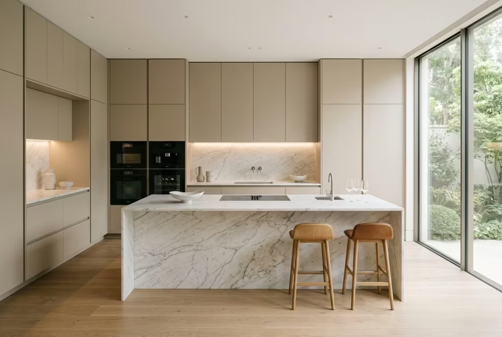
Luxury in kitchen design is rarely about overt display. It is more often found in restraint, precision, and the quality of decisions that are not immediately visible but deeply felt over time. In beige kitchens, this becomes especially important, because the palette itself is already quiet, which means execution must carry the weight of refinement.
Here, proportion, joinery accuracy, material sourcing, and detailing are not secondary considerations, they define the entire outcome. I often think of this category as where everything must feel inevitable, as if no other version of the kitchen could have existed.
When beige is elevated to this level of execution, it stops being a neutral backdrop and becomes a fully resolved architectural language, one that feels composed, confident, and quietly uncompromising.
Beige Cabinets With Waterfall Islands
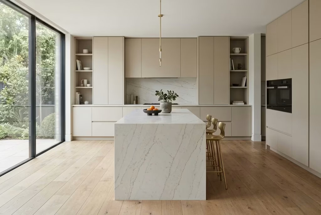
A waterfall island in a beige kitchen is fundamentally about continuity, where the worktop material extends vertically down to the floor, dissolving the traditional break between horizontal and vertical planes. When paired with beige cabinetry, the effect becomes even more refined, as the softness of the cabinetry allows the monolithic form of the island to feel grounded rather than heavy.
The intention is not spectacle, but coherence. The eye reads the island as a single sculpted volume rather than a collection of joined surfaces. Beige cabinetry surrounding it reinforces this idea by keeping the visual field calm, allowing the island to take on a more architectural presence. When done well, it feels less like a design feature and more like a structural element that belongs naturally within the space.
Real-Life Application Insight
I have used waterfall islands in projects where the kitchen needed a strong central anchor without introducing visual clutter. In one particular open-plan layout, the island sat between cooking and dining zones, acting as both a functional surface and a spatial divider.
We paired soft beige cabinetry with a light-veined quartz waterfall island measuring approximately 1000 x 2600 mm (3.3 x 8.5 ft). The vertical drop of the quartz was aligned precisely with the island ends, creating a clean, uninterrupted flow from surface to floor. What became apparent almost immediately was how the kitchen gained a sense of stability. The island no longer felt like a separate object placed in the room; it felt embedded within it.
Over time, the most interesting effect was how light interacted with the vertical slab. Morning light created a soft gradient along the quartz surface, while evening shadows deepened its presence. It gave the kitchen a quiet sense of permanence, as if the space had always been structured around it.
Suggested Measurements
- Island overhang: 300 mm (12 in) for seating comfort and visual balance
- Island height: 900 mm (35 in) including worktop
- Waterfall thickness: 20–30 mm (0.8–1.2 in) depending on stone selection
- Island length: 2200–2800 mm (7.2–9.2 ft) for proportional balance in medium to large kitchens
- Clearance around island: minimum 1000–1200 mm (39–47 in) for circulation
These proportions are essential because the success of a waterfall island depends heavily on balance. Too large, and it dominates. Too small, and the vertical gesture loses impact.
Material Pairings
Waterfall islands demand careful pairing to avoid visual overload or fragmentation.
- Stone: Light quartz, soft marble, or honed porcelain with subtle veining to maintain continuity
- Cabinetry: Matte beige or satin finishes to contrast gently with the solidity of the island
- Wood: Warm oak flooring to soften the architectural weight of stone
- Metal: Minimal brushed brass or matte black fixtures used sparingly to avoid competing focus
- Lighting: Warm, diffused lighting at 2700K–3000K to enhance stone depth without glare
The surrounding palette should support the island’s presence without challenging it.
Pros
- Creates strong visual continuity through uninterrupted material flow
- Acts as a natural focal point in open-plan kitchens
- Enhances perception of solidity and craftsmanship
- Works well with beige cabinetry by balancing softness with structure
Cons
- Higher material and fabrication costs due to precision stone work
- Requires flawless installation to avoid visible joints or misalignment
- Can feel visually heavy in smaller kitchens if not proportioned correctly
- Stone edges are more exposed to wear and potential chipping
Beige cabinets with waterfall islands succeed when restraint and precision work hand in hand. The cabinetry keeps the environment calm and composed, while the island introduces a sculptural moment of continuity. When balanced correctly, the result feels grounded, architectural, and quietly luxurious, like a space designed not just to function, but to hold its presence with understated confidence.
Beige Cabinets With Integrated Lighting
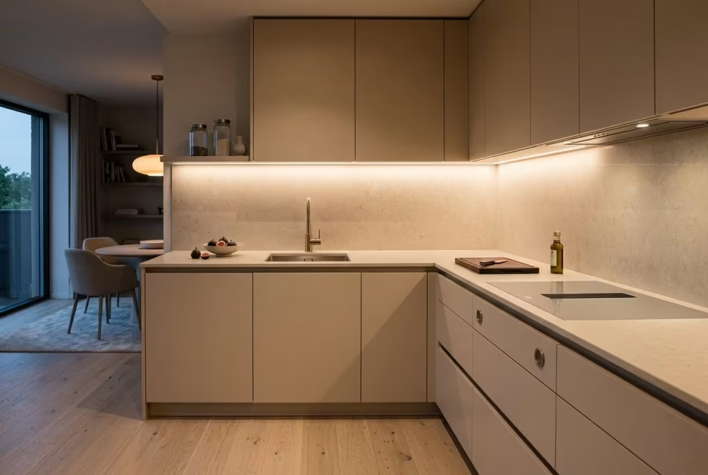
Integrated lighting in beige kitchens is less about brightness and more about shaping perception. The cabinetry provides a calm, continuous surface, while carefully positioned light introduces depth, rhythm, and subtle emphasis. At its core, this is about controlling how the eye reads the space, guiding it gently rather than forcing attention.
Beige responds particularly well to warm light, especially around 3000K, because it enhances the natural warmth already present in the material. Instead of flattening the cabinetry, the light grazes across surfaces, revealing texture, edges, and transitions that would otherwise go unnoticed. The goal is not to illuminate everything equally, but to create layers of visibility, where certain zones softly emerge while others recede.
Real-Life Application Insight
I have used integrated lighting in kitchens where the brief was to achieve warmth without visual heaviness. In one project, a beige handleless kitchen was installed in a space that initially felt slightly muted during evening hours, even though the daylight performance was strong.
We introduced under-cabinet LED lighting set at 3000K, positioned to wash gently down the backsplash and worktop. The effect was immediate but not theatrical. The beige cabinetry took on a richer tone, almost like the surface had been gently deepened rather than artificially brightened.
What stood out over time was how the kitchen changed character after sunset. During the day, it remained soft and understated. At night, the lighting introduced a subtle glow that made the entire space feel more intimate and grounded. It never felt like a spotlighted kitchen; instead, it felt softly held together by light that knew exactly where to stop.
Suggested Measurements
- Colour temperature: 2700K–3000K for warm, natural enhancement
- Under-cabinet light strip placement: 40–60 mm (1.5–2.4 in) from front edge
- Distance from countertop to underside of cabinet: 450–600 mm (18–24 in)
- Light diffusion angle: 90–120 degrees for even surface wash
- Dimming range: recommended 10–100 percent for layered evening control
These measurements ensure lighting supports the cabinetry without overpowering it, maintaining a balance between visibility and atmosphere.
Material Pairings
Integrated lighting works best when materials are chosen to respond gently to illumination rather than reflect it harshly.
- Stone: Honed quartz or soft marble that diffuses light rather than bouncing it sharply
- Wood: Warm oak or ash flooring to carry the glow across the room
- Cabinet finish: Matte or satin beige surfaces to avoid glare and enhance softness
- Metal: Brushed brass or muted nickel used sparingly to catch subtle highlights
- Splashback: Textured or lightly reflective surfaces to create depth without visual noise
The key is to allow light to feel absorbed, not reflected excessively.
Pros
- Enhances warmth and depth of beige cabinetry, especially in evening settings
- Improves task visibility without harsh overhead lighting
- Creates layered atmosphere through controlled illumination
- Works seamlessly in both modern and transitional kitchens
Cons
- Requires careful planning to avoid uneven lighting or hot spots
- Poor placement can highlight imperfections in surfaces or joinery
- Needs access for maintenance or replacement of LED components
- Overuse can reduce subtlety and make the space feel over-lit
Beige cabinetry with integrated lighting succeeds because it treats light as a design material rather than an accessory. The cabinetry provides calm structure, while the lighting introduces quiet dimension. When balanced correctly, the kitchen feels softly animated, shifting gently between function and atmosphere without ever losing its sense of composure.
Beige Cabinets With Full Slab Stone Backsplash
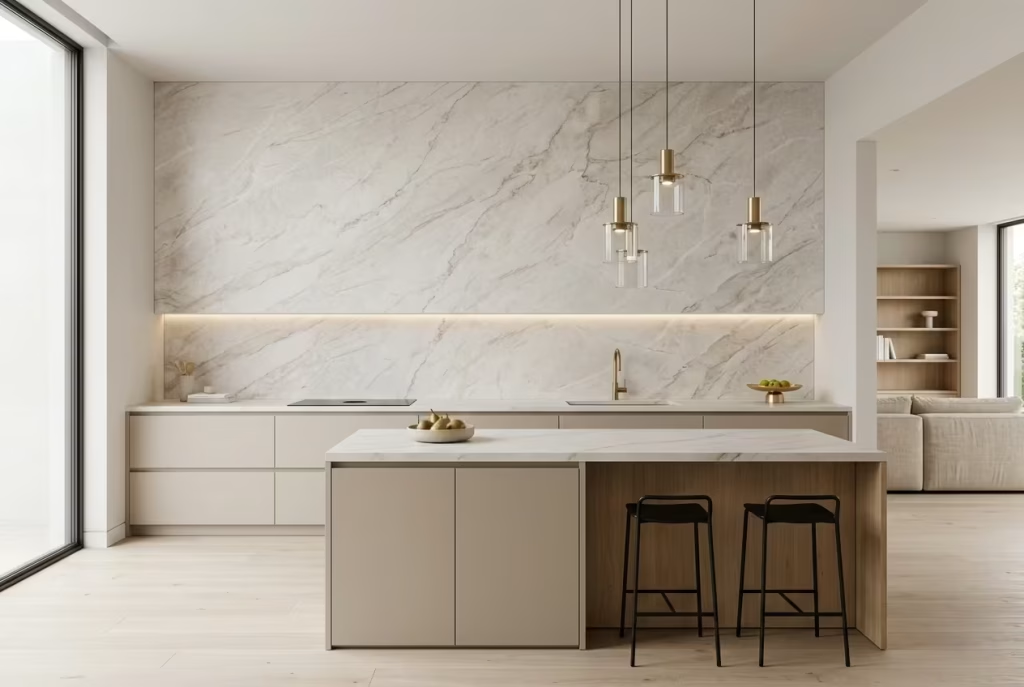
A full slab stone backsplash shifts a beige kitchen from composed to genuinely architectural. Instead of breaking the wall into tiled units, grout lines, or visual interruptions, the stone rises as one continuous plane, allowing the eye to travel without stopping. That uninterrupted surface gives beige cabinetry a stronger framework to sit against, almost like a calm foreground set before a richly detailed backdrop.
This pairing works because it understands restraint. Beige keeps the cabinetry soft and livable, while the slab backsplash introduces a sense of permanence and precision. The stone does the heavy lifting visually, but it does so without making a song and dance about it. In the right material, the effect feels quietly luxurious, the kind of finish that does not need to shout to be noticed.
The real strength of this approach lies in how it resolves the wall. A full slab backsplash removes the patchwork feeling that can creep into kitchens when too many separate finishes compete for attention. Instead, the space reads as one continuous composition, which is especially valuable in homes where the kitchen is visible from dining or living areas. It keeps the whole thing under one roof, visually speaking.
Real-Life Application Insight
I have used full slab backsplashes in kitchens where the client wanted a more elevated result without resorting to overt decoration. In one project, the cabinetry was a soft, warm beige with minimal detailing, and the kitchen sat within a large open-plan ground floor. The issue was not a lack of light, but a lack of cohesion. Too many small surface breaks had been making the room feel restless.
Replacing the tiled splash zone with a full slab of honed stone immediately changed the rhythm of the room. The beige cabinets suddenly felt more grounded, as though they had found their proper setting. The stone carried subtle movement, but not enough to distract. Instead, it gave the wall a quiet pulse, which became more noticeable as daylight shifted across it through the day.
What struck me most was how the kitchen began to feel more resolved. There was no visual clutter competing with the cabinetry, no busy joints pulling the eye around. The space became calmer, more deliberate, and far more convincing. It is a small detail on paper, but in practice it can change the whole tune of a kitchen.
Suggested Measurements
- Full slab backsplash height: typically 600 mm to 900 mm (24 to 35 in) above the countertop, or full height to ceiling for maximum continuity
- Stone thickness: 20 mm to 30 mm (0.8 to 1.2 in) for most kitchens, depending on stone type and structural support
- Countertop depth: 600 mm (24 in) standard, with a 20 mm to 30 mm overhang where needed
- Joint spacing: kept to a minimum, ideally 2 mm to 3 mm (0.08 to 0.12 in), so the surface reads as one plane
- If running full height, allow for precise alignment with cabinetry and ceiling lines to avoid awkward visual breaks
These measurements matter because a full slab backsplash succeeds or fails on precision. If the proportions are off, the entire effect starts to wobble. When the lines are clean, the result feels effortless.
Material Pairings
The materials surrounding a full slab backsplash should support its clarity rather than fight against it.
- Stone: Honed marble, limestone, or quartzite with soft veining works best, especially when the movement is subtle and controlled
- Cabinet finish: Matte or satin beige finishes help keep the cabinetry calm against the stone’s natural variation
- Wood: Warm oak flooring or shelving adds just enough softness to stop the space feeling too monolithic
- Metal: Brushed brass or muted black hardware can introduce quiet punctuation without breaking the flow
- Lighting: Warm directional lighting around 3000K helps bring out the depth of the stone without flattening it
The aim is balance. The stone carries the visual interest, while everything else behaves like a supporting cast that knows its lines.
Pros
- Creates a seamless, architectural look with very little visual interruption
- Reduces grout lines and surface breaks, which makes the kitchen feel cleaner and more refined
- Works beautifully with beige cabinetry by adding depth without noise
- Can make the whole room feel more expensive and thoughtfully resolved
Cons
- Higher material and fabrication cost than tiled alternatives
- Requires expert installation to achieve precise alignment
- Natural stone variation can be difficult to predict until slabs are selected in person
- Repairs or replacements are more complicated if the slab becomes damaged
Beige cabinets with a full slab stone backsplash succeed because they understand that quiet confidence often leaves the deepest impression. The cabinetry keeps the palette grounded and approachable, while the stone gives the wall a sense of permanence and poise. When those two elements are aligned properly, the kitchen does not just look finished. It feels inevitable, as though it had always been waiting to land exactly this way.
Bespoke Beige Cabinetry With Hidden Details
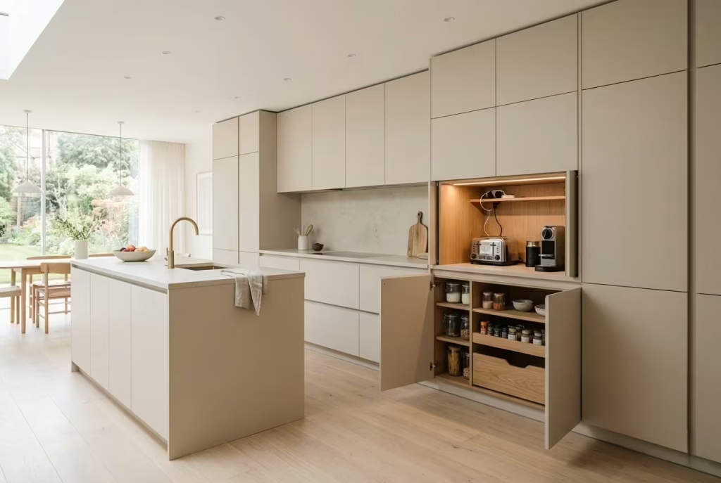
Bespoke beige cabinetry with hidden details is where restraint becomes unmistakably luxurious. The surface reads calm and composed, but beneath that quiet exterior sits a highly resolved layer of function. Push-latch doors, concealed drawer banks, integrated bins, hidden charging points, and appliance garages all work together to remove visual noise and elevate the way the kitchen operates day to day.
This approach is not about hiding for the sake of it. It is about refining what remains visible so the room feels composed at every angle. Beige is especially suited to this because it already softens the eye. When the joinery is bespoke, the cabinetry can disappear into the architecture in a way that feels intentional rather than minimal for effect. The result is a kitchen that feels well judged, with every reveal and every concealed function doing its work quietly in the background.
What gives this style its depth is the contrast between what is seen and what is sensed. You may not immediately notice the hidden spice drawers, the pull-out larder, or the recessed charging shelf, but their presence makes the room feel easier to use. That is the real luxury here. Not showmanship, but ease. The sort of ease that only comes when the details have been sweated over properly.
Real-Life Application Insight
I have used this approach in homes where the brief was very clear. The clients did not want a kitchen that looked busy, yet they needed it to work hard behind the scenes. In one project, the kitchen sat within a family home where daily life moved at a brisk pace. The challenge was to keep surfaces clear without making the room feel too precious to use.
We designed bespoke beige cabinetry with push-latch doors on the upper runs, concealed internal drawers behind larger cupboard fronts, and a hidden breakfast station tucked into a tall unit. When closed, the kitchen read as a calm architectural composition. When opened, it revealed itself to be extremely practical, almost deceptively so.
That is what tends to happen with this kind of work. The beauty is not in a dramatic reveal. It is in how naturally the space supports the rhythm of the household. A drawer opens where you expect it. A charging shelf keeps cables out of sight. The bin disappears behind a seamless panel. Nothing feels fussy. Nothing feels accidental. It just works, and that makes all the difference.
Over time, the most successful versions of this style become even more convincing because the eye is never distracted by clutter. The cabinetry settles into the background, and the hidden mechanisms become part of the kitchen’s intelligence rather than its spectacle.
Suggested Measurements
- Base cabinet depth: 600 mm (24 in) for standard concealed storage runs
- Tall unit height: 2100 to 2400 mm (7 to 8 ft) for integrated appliances and pantry systems
- Push-latch reveal: 2 to 3 mm (0.08 to 0.12 in) for a clean, precise visual line
- Internal drawer depth: 450 to 500 mm (18 to 20 in) for practical concealed storage
- Appliance garage height: 450 to 600 mm (18 to 24 in), depending on the equipment stored inside
- Charging niche depth: 100 to 150 mm (4 to 6 in) with adequate cable access and ventilation
These measurements matter because hidden details only feel luxurious when they are easy to use. If the mechanism is awkward, the whole idea loses its polish. Precision is not optional here, it is the foundation.
Material Pairings
Bespoke cabinetry with hidden details benefits from materials that support its calm, tailored nature.
- Stone: Honed marble, limestone, or soft quartz to keep the visual tone quiet and refined
- Wood: Internal oak veneers or shelving inserts to add warmth inside concealed storage zones
- Metal: Minimal brushed brass, bronze, or matte black hardware where needed, kept discreet rather than decorative
- Lighting: Integrated LED strips inside tall units, larders, and drawer interiors to make hidden storage easy to use
- Surface finish: Matte or satin beige finishes work best, since they avoid glare and preserve the sense of softness
The pairing should feel seamless. Every material ought to support the idea that the kitchen has been carefully thought through, not decorated to distraction.
Pros
- Creates a highly refined, calm visual field with minimal clutter
- Conceals everyday practical items without compromising usability
- Elevates the kitchen through craftsmanship and precision rather than ornament
- Allows beige cabinetry to feel both soft and deeply functional
- Works especially well in homes where open-plan living requires visual discipline
Cons
- Higher cost due to bespoke joinery, concealed mechanisms, and installation precision
- Hidden systems require careful planning and strong access considerations
- Push-latch and concealed hardware can need more maintenance over time
- Poorly executed details can feel awkward rather than elegant
- Less forgiving if future changes or appliance replacements are needed
Bespoke beige cabinetry with hidden details succeeds because it understands that real luxury is rarely loud. It is often tucked away, waiting in the background, doing its job without asking for applause. When the proportions are right and the craftsmanship is properly handled, the kitchen feels serene on the surface and brilliantly efficient underneath. That is where it leaves a mark, not in what it shows first, but in how effortlessly it holds together once you begin to live with it.
Common Mistakes to Avoid
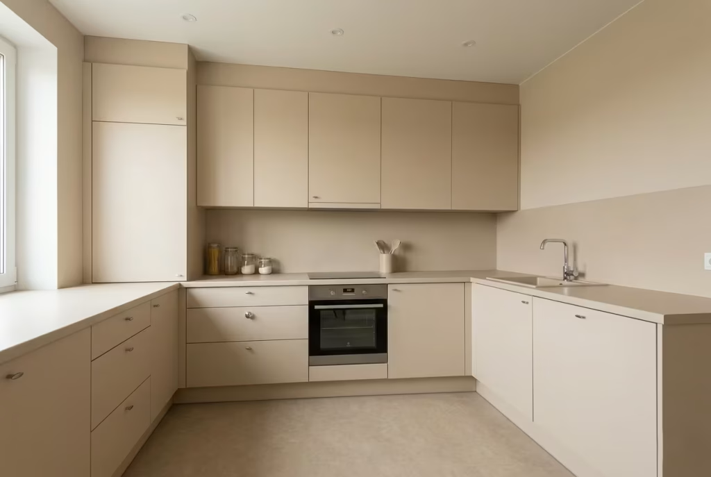
Beige kitchens are often underestimated, not because the colour is simple, but because it demands a more disciplined eye than people expect. What looks effortless in well-executed projects is usually the result of careful calibration behind the scenes. When that balance is missing, even high-quality materials can fall flat. These are the missteps I see most often, and the ones that quietly undermine otherwise strong designs.
Choosing Beige Without Testing Undertones
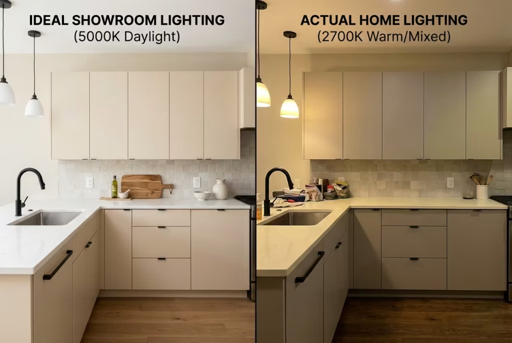
One of the most common errors is selecting beige as if it were a single, fixed colour. In reality, beige sits across a wide undertone spectrum, from warm yellow-based creams to cooler greige and taupe variations. What looks soft and inviting in a showroom can shift dramatically under real household lighting.
I have seen projects where cabinetry looked perfectly balanced in daylight samples but turned slightly grey or overly yellow once installed. That is the moment where the space starts to feel “off,” even if nobody can immediately explain why. The fix is simple in principle but often skipped in practice: always test samples in the actual room, at different times of day. Beige lives and dies by its undertone relationship with light.
Overmatching Surfaces
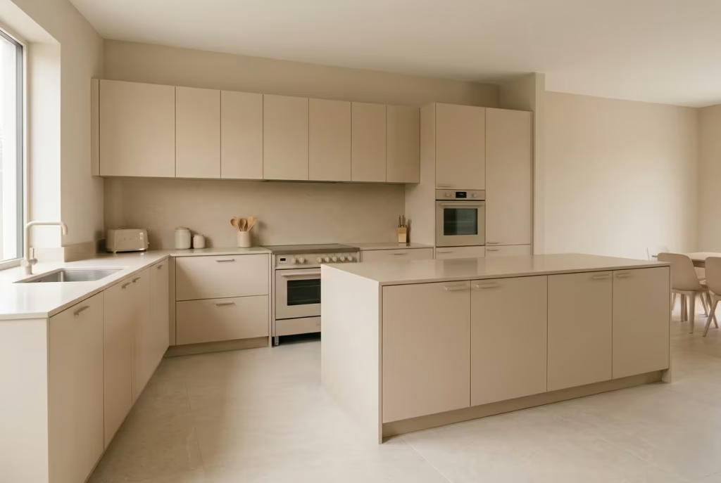
Another frequent mistake is pushing beige too far into uniformity. When cabinetry, walls, countertops, and flooring all sit in nearly identical tones, the result can feel visually flat, almost like the room has lost its depth. Instead of cohesion, you get sameness, and that is where beige stops feeling sophisticated and starts feeling dull.
The most successful beige kitchens I have worked on always include variation within the palette. A slightly warmer wall tone against cooler cabinetry, or a textured stone against smooth painted fronts. It is that subtle friction between surfaces that gives the room life. Without it, everything blends into a single note, and the space loses its rhythm.
Ignoring Lighting Conditions
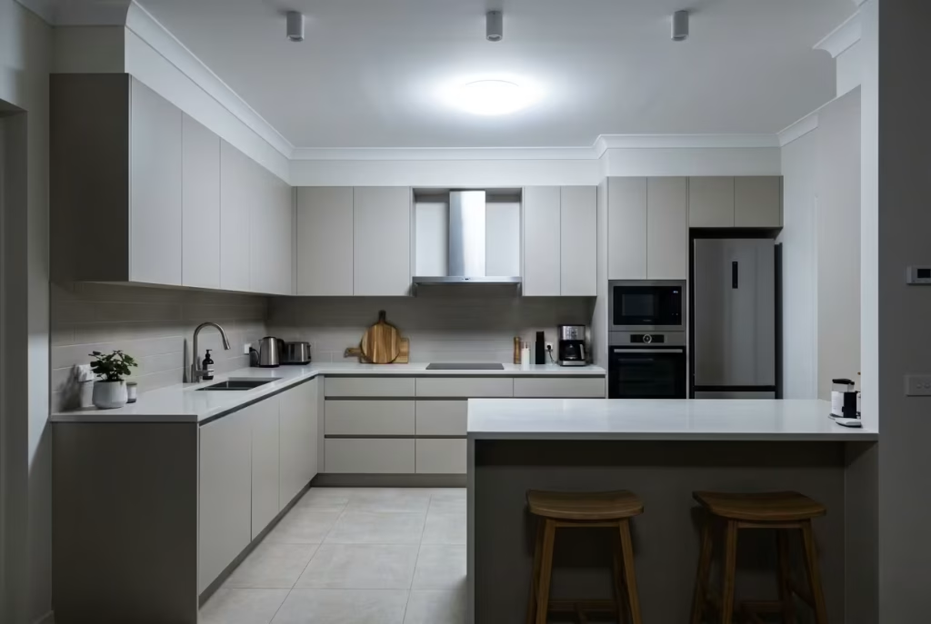
Beige is extremely responsive to light, which means lighting design is not an afterthought, it is part of the material palette itself. A kitchen that looks balanced in bright daylight can feel completely different in the evening if lighting is too cool, too harsh, or poorly positioned.
I have walked into kitchens where beautiful beige cabinetry appeared almost washed out simply because the lighting temperature was wrong. In contrast, a well-lit beige kitchen feels layered and dimensional, even with minimal decoration. Warm lighting around 2700K to 3000K tends to bring out the richness in beige, while poorly placed overhead lighting can flatten everything into a single plane.
The key is layering light, not relying on a single source. Under-cabinet lighting, ambient ceiling light, and subtle accent lighting all work together to reveal the material properly.
Using Low-Quality Finishes That Flatten Colour
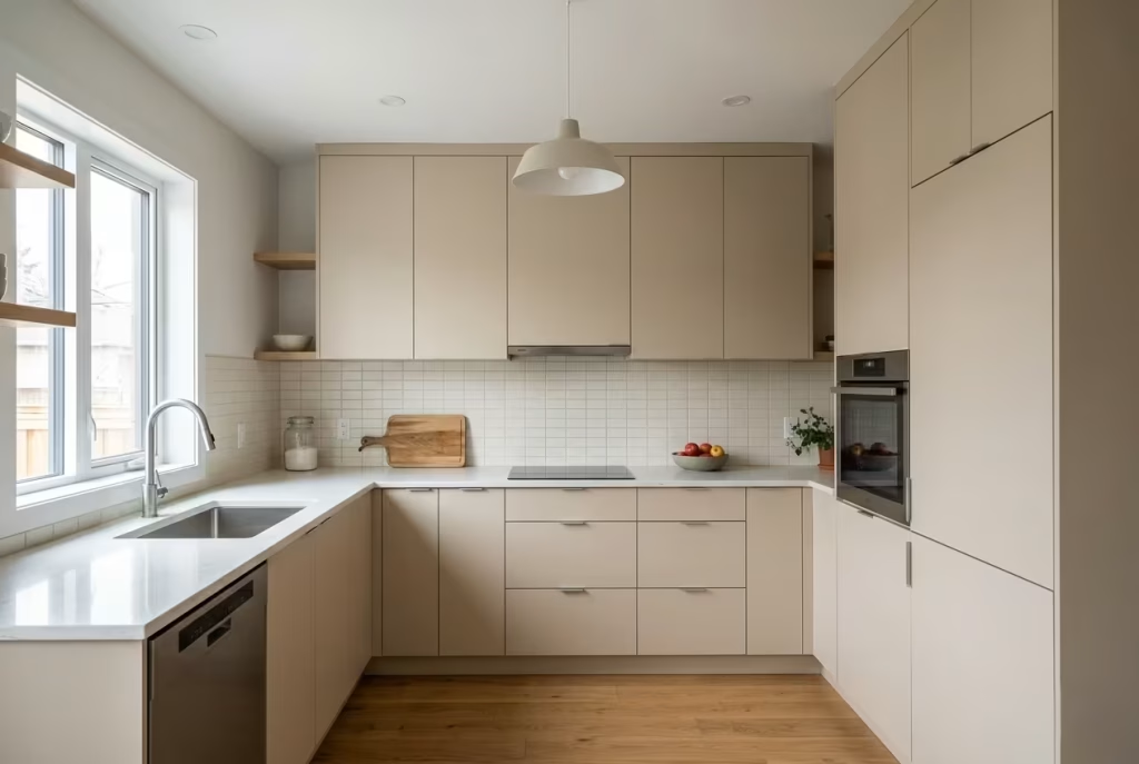
Beige demands material honesty. Low-quality paints, laminates, or veneers tend to strip away the depth that makes beige interesting in the first place. Instead of subtle variation, you get a flat, lifeless surface that reacts poorly to both light and touch.
In well-executed kitchens, beige should feel almost tactile, even when smooth. That comes from quality finishes that hold light differently across the surface. Cheaper alternatives often reflect light too uniformly, which removes the natural softness that gives beige its character.
I have seen the difference firsthand in refurbishment projects where upgrading just the cabinet finish transformed the entire room. Nothing else changed, yet the kitchen suddenly felt more considered, more grounded, and far more expensive in its presence.
How Beige Kitchens Age Over Time
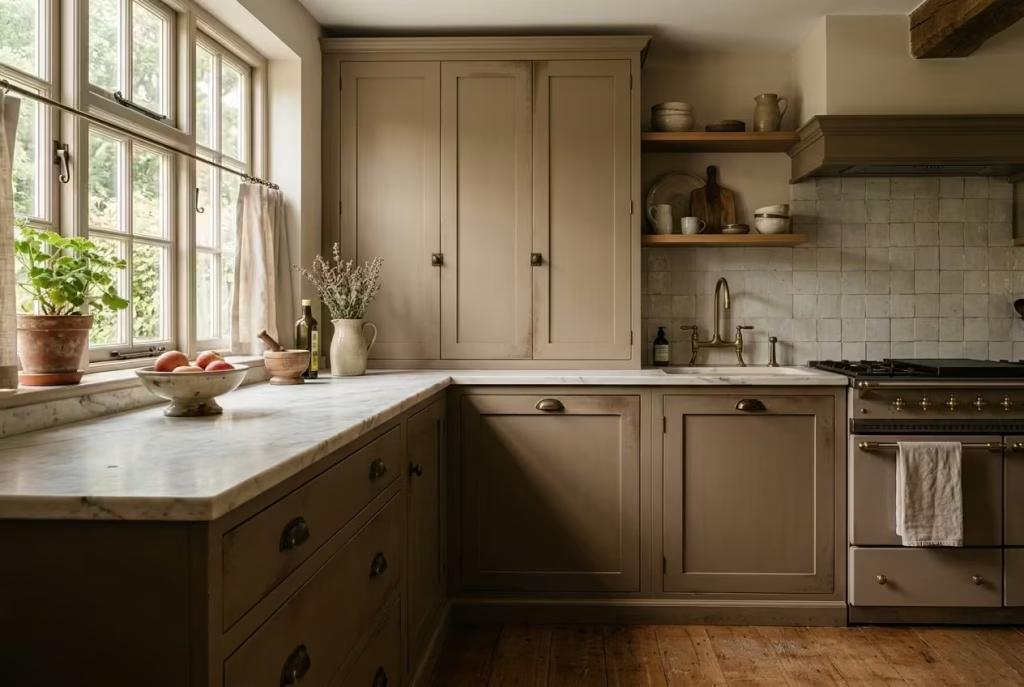
Beige kitchens have a very particular relationship with time, and it is not one of decline in the way many expect. Instead of losing their appeal, they tend to settle, soften, and develop a kind of quiet depth that only reveals itself after months of daily use. What starts as a carefully composed space gradually becomes more layered, more tactile, and in many cases more convincing. The colour does not fight against ageing, it absorbs it.
Patina, Wear, and Tonal Shifts
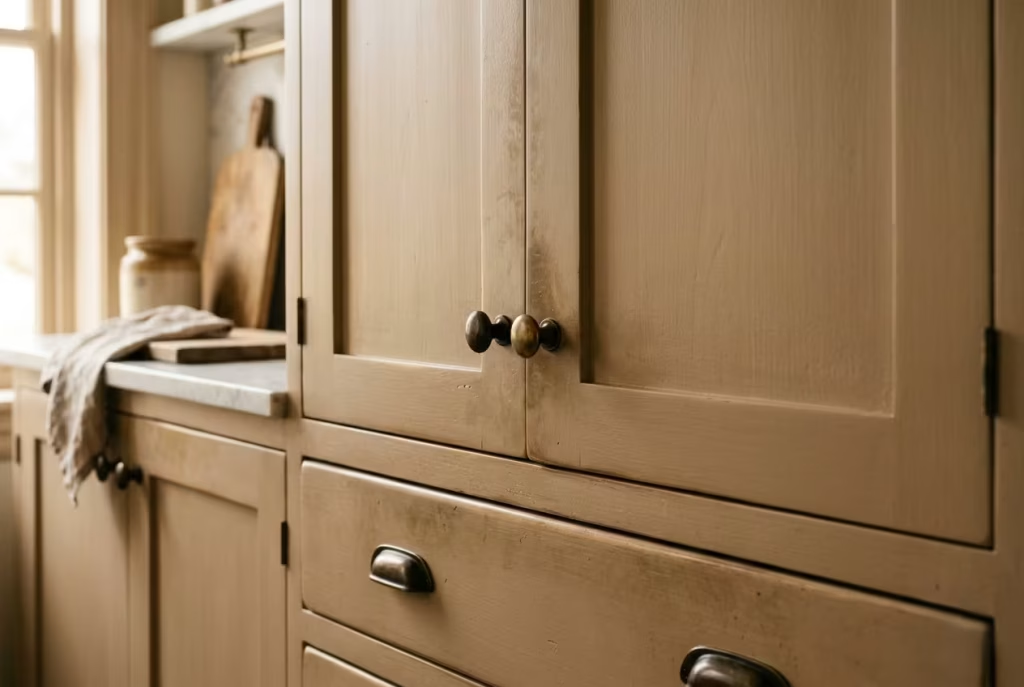
Over time, beige surfaces begin to shift in subtle but noticeable ways. High-touch areas around handles, drawers, and work zones develop a gentle polish, while less-used sections retain their original matte softness. This contrast creates a natural rhythm across the cabinetry, almost like a soft map of how the kitchen is actually lived in.
Natural light also plays its part. Beige is highly responsive to changing light conditions, so as the years pass, it continues to reinterpret itself depending on season, time of day, and even surrounding decor changes. A kitchen that once felt uniform gradually becomes more dimensional, as slight tonal variations emerge between surfaces that were initially indistinguishable.
Stone and wood elements within the same space also contribute to this evolution. Marble may soften at the edges, timber deepens in tone, and together they reinforce the sense that the kitchen is not static but quietly evolving in real time.
Why Beige Often Improves With Use Rather Than Deteriorates
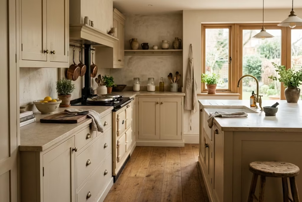
There is a misconception that kitchens should always look as they did on day one. Beige challenges that idea. Because it sits in a neutral but warm tonal range, it does not rely on sharp contrast or artificial brightness to maintain its appeal. Instead, it gains character through exposure, handling, and natural interaction.
Unlike high-gloss or stark white finishes, which can start to reveal imperfections quite quickly, beige tends to disguise minor wear. Small marks blend into the tonal field rather than breaking it apart. This means the surface does not degrade visually in a harsh way. It matures instead of deteriorating.
I often describe it as a “slow settling” material palette. The kitchen stops feeling newly installed and starts feeling integrated into daily life. That shift is subtle, but it is exactly what makes beige kitchens so enduring. They do not demand constant upkeep to maintain their beauty; they allow life to imprint itself gently onto the surface.
Real-World Reflection From Lived Projects
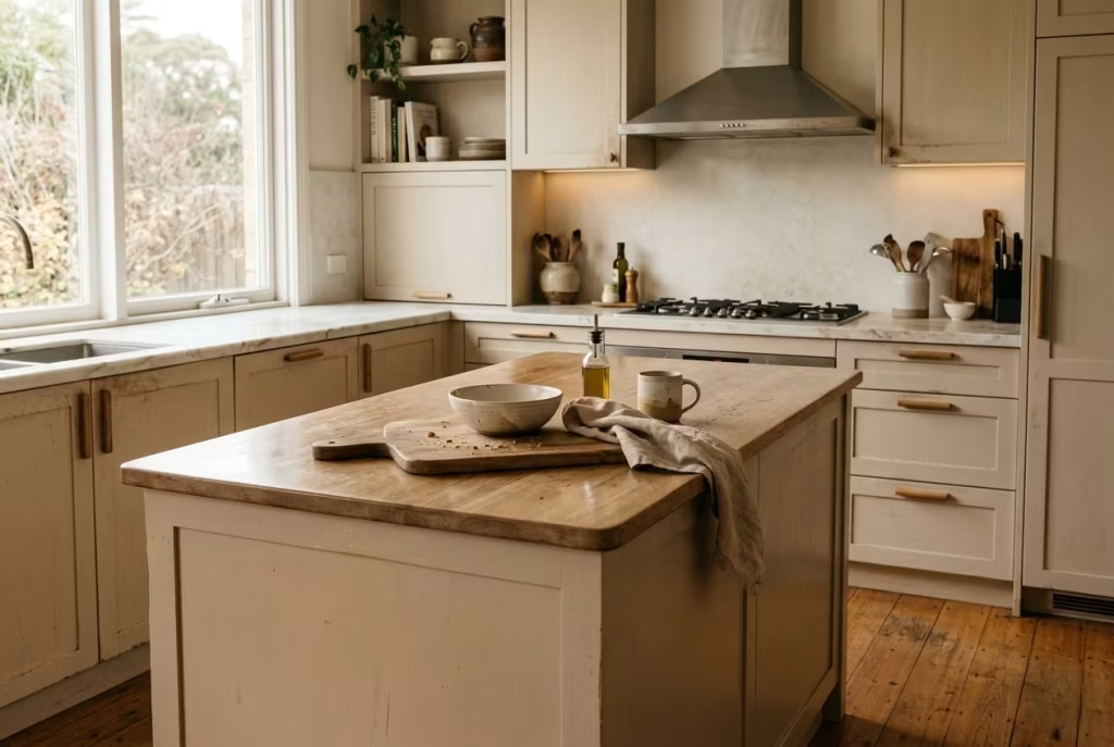
In several projects I have worked on, the most interesting transformations were not visible on installation day, but months later when the kitchen had been properly lived in. One particular beige kitchen, initially very controlled and precise in appearance, began to change character after about six months of use.
The island developed a soft sheen where daily activity naturally concentrated. Cabinet edges picked up a slightly warmer tone from repeated touch. Even the lighting seemed more effective over time, not because anything changed technically, but because the surfaces began to reflect and absorb light in a more complex way.
What stood out most was how the space felt increasingly “settled.” Early on, it had the clarity of a finished design. Later, it gained something more valuable: authenticity. It no longer looked arranged for presentation, but shaped by life. That is where beige quietly excels. It does not resist change, it absorbs it, and in doing so, often ends up looking better than when it was first completed.
Beige kitchens age well because they are not fighting for permanence through rigidity. They rely on tone, texture, and subtle variation, all of which become richer with time. When designed thoughtfully, they do not simply survive daily use, they improve because of it, like a space that learns how to belong to the people living inside it.
Material & Contractor Notes
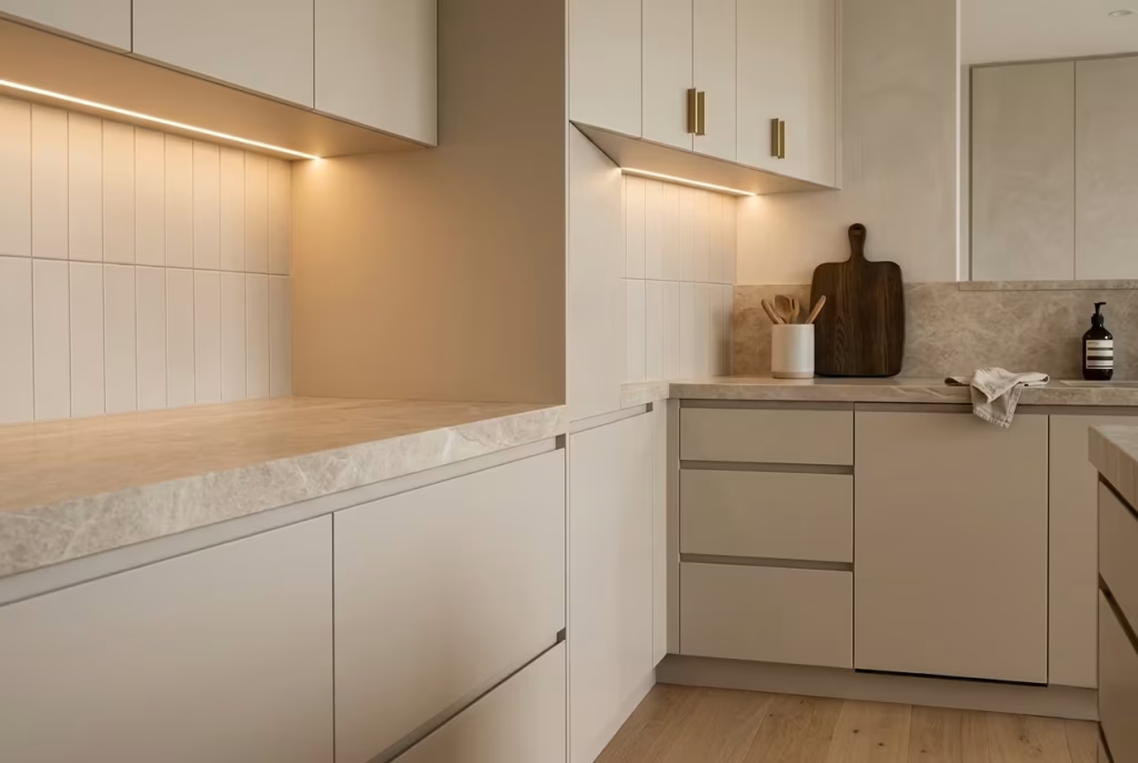
Behind every successful beige kitchen sits a set of decisions that rarely get noticed once the project is complete, yet they define how the space looks, feels, and ages over time. Material selection, finish quality, and contractor execution are not secondary details in this category, they are the backbone. Beige, more than most palettes, exposes inconsistency quickly, which means there is very little room for shortcuts.
Cabinet Finish Types: Lacquer, Veneer, Painted MDF
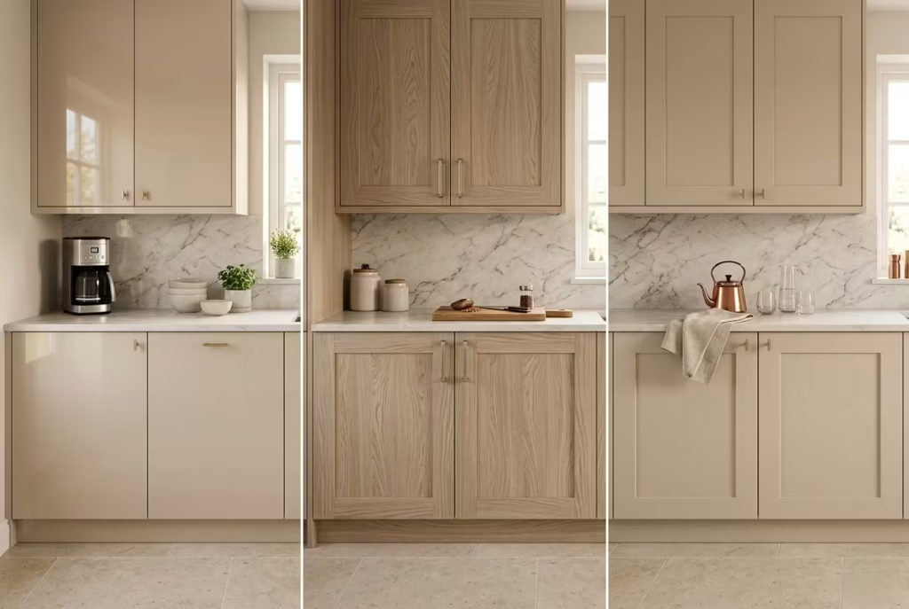
Each cabinet finish behaves differently with beige, and understanding these differences is essential if you want the colour to hold its depth rather than fall flat.
Lacquer finishes offer a smooth, controlled surface that works well in contemporary beige kitchens. When applied correctly, they give a soft, almost porcelain-like finish that reflects light gently rather than harshly. The risk, however, lies in poor application. If the lacquer is too thin or unevenly sprayed, beige can appear patchy under directional lighting.
Veneer brings a more natural language into the kitchen. Wood veneers under a beige tint or paired with beige-painted elements introduce grain variation that helps prevent the palette from feeling too uniform. In practice, veneer adds a subtle movement that becomes more noticeable over time, especially in daylight-rich spaces where texture plays a stronger role than colour alone.
Painted MDF is often the most flexible option, particularly for bespoke joinery. It allows for precise colour control and works well in both shaker and handleless designs. The key here is preparation. Without proper priming and sealing, MDF can absorb paint unevenly, which immediately weakens the integrity of beige tones. In high-end projects, I always treat surface preparation as half the job, not an afterthought.
Cost Considerations Across Quality Tiers
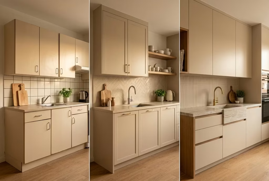
Beige kitchens can sit comfortably across a wide cost spectrum, but the difference between tiers is not always immediately obvious until you look closely at joinery, finish consistency, and hardware.
At entry level, laminated or lower-grade painted finishes can achieve the look, but often lack depth. Beige in this range tends to appear flatter, especially under artificial lighting, where cheaper surfaces struggle to hold variation.
Mid-tier kitchens typically introduce better painted finishes, improved MDF construction, and more consistent edge detailing. This is where beige begins to show its strengths properly, especially when paired with stone or timber accents.
At the high end, the cost is driven less by visible materials and more by execution. Custom joinery, concealed mechanisms, precision alignment, and high-quality finishing processes all contribute to a result where beige feels layered rather than applied. This is where the colour stops looking like a finish and starts behaving like part of the architecture.
The important point is simple: beige exposes quality. It does not disguise it. When budgets are stretched too thin in the wrong areas, the effect becomes immediately noticeable.
Importance of Sampling in Real Lighting Conditions
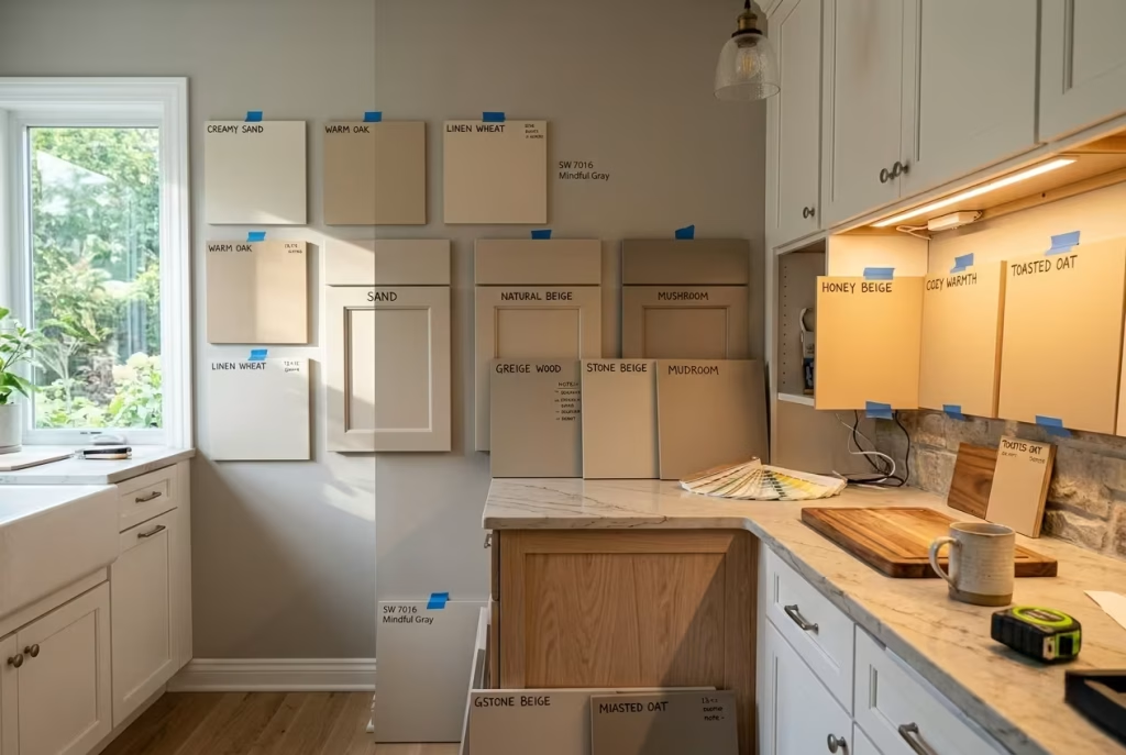
Sampling is where many beige kitchens either succeed quietly or fail subtly. A swatch on a showroom board tells you very little about how the colour will behave in your actual space. Beige is highly reactive to surrounding light, which means it can shift from warm and creamy to muted and grey depending on conditions.
I always insist on testing samples in at least three scenarios: natural daylight, evening artificial lighting, and transitional light periods such as late afternoon. This is where undertones reveal themselves properly. What looks balanced under showroom lighting can feel entirely different once placed against your own flooring, wall paint, and window orientation.
In one project, a beige that initially felt perfect in isolation turned noticeably cooler once installed in a north-facing kitchen. A second sample with a slightly warmer undertone resolved the issue completely. That small adjustment changed the entire atmosphere of the room.
The key takeaway is that beige should never be chosen in isolation. It needs to be tested in context, at scale, and across time of day. Anything less is a gamble that often shows itself too late in the process.
When you combine the right material choices, realistic budgeting, and proper sampling discipline, beige kitchens become remarkably consistent in performance. They do not rely on luck or lighting tricks. They rely on informed decisions made early, when the difference between good and exceptional is still entirely in your hands.
Conclusion: Beige as a Foundation That Evolves
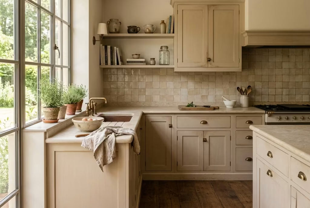
Beige, at its best, is never a static design choice. It behaves more like a living foundation, responsive to light, material context, and the rhythm of everyday use. What often gets mistaken for simplicity is, in reality, a highly sensitive palette that relies on restraint, layering, and material honesty to reveal its full potential over time.
In the kitchens I’ve designed and revisited over the years, the most enduring beige schemes were never the ones that felt complete on installation day. They were the ones that allowed space for subtle change, where finishes softened, tones deepened, and surfaces began to carry the quiet imprint of daily life. That slow evolution is where beige finds its strength. It does not demand attention immediately, it earns it gradually.
Restraint is what holds everything together here. Not emptiness, but deliberate reduction. When every material is chosen with care, when undertones are tested properly, and when layering is done with intention rather than excess, beige becomes remarkably expressive. It supports contrast without shouting for it, and it allows texture, light, and proportion to do the real storytelling.
Looking back across projects, the pattern is consistent. The most successful beige kitchens I’ve worked on never felt complete on day one. They settled slowly, gaining depth as light, use, and time shaped them into something far more nuanced than the original palette suggested. And that, more than any trend or finish, is what gives beige its quiet authority in contemporary kitchen design.
Frequently asked questions about Beige Kitchens Design
Are beige kitchens still in style?
Yes. Beige kitchens have moved well beyond being seen as a safe option. When handled with good proportion, material contrast, and proper lighting, they feel timeless rather than trend-driven. They adapt easily as surrounding elements change, which is why they continue to hold relevance.
What colours work best with beige kitchen cabinets?
Beige pairs naturally with warm woods, marble, limestone, brass, black accents, and soft greys. The exact pairing depends on the undertone. Warmer beige tones sit comfortably with oak and brass, while cooler greige tones align better with stone and deeper architectural contrasts.
How do I stop a beige kitchen from looking flat?
Introduce variation through texture and tone. A combination of matte cabinetry, natural stone, timber grain, and subtle metallic detailing creates depth. When everything sits at the same visual level, the space can feel one-dimensional, so layering becomes essential.
Is beige a good choice for small kitchens?
Yes. Beige reduces visual fragmentation and softens boundaries, which helps compact kitchens feel more open. When combined with full-height cabinetry and considered lighting, it can subtly expand how the space is perceived.
What lighting works best in a beige kitchen?
Warm lighting in the range of 2700K to 3000K typically works best. It enhances the natural warmth of beige without distorting its tone. Layered lighting, including under-cabinet and ambient sources, helps maintain depth throughout the day.
Does beige kitchen cabinetry look dated?
Only when paired with poor proportions or heavy, outdated detailing. In a well-resolved design, beige feels calm, refined, and enduring. Its longevity comes from how it supports materials and light rather than competing with them.
What finish is best for beige cabinets?
Matte finishes create a soft, contemporary feel, while satin finishes introduce a slight reflective quality that can enrich the tone. Painted MDF, lacquer, and veneer can all work effectively, provided the finish quality is high and applied with precision.
Can beige work in a modern kitchen?
Yes. Beige translates well into modern formats such as flat-panel, handleless, or inset cabinetry. When paired with stone, integrated appliances, and minimal detailing, it feels architectural and controlled rather than traditional.
What is the biggest mistake people make with beige kitchens?
Choosing a shade without testing it in real lighting conditions is the most common issue. Undertones shift significantly depending on light exposure. Another mistake is overmatching surfaces, which can flatten the entire composition.
Why do beige kitchens age well?
Beige is inherently forgiving. Minor wear blends into the tonal range rather than standing out. Over time, surfaces develop subtle variation, allowing the kitchen to feel more settled and naturally integrated into daily life.