25 Best Neutral bathroom Ideas Modern Trends for 2026
Neutral bathrooms are frequently dismissed as the safe route the quiet default for those wary of making a bold design mistake. But in reality, achieving a successful neutral space is anything but easy. When you strip away loud colors and patterns, there is absolutely nowhere to hide. Every joint, every texture, and every slight shift in shade is magnified. What appears effortless is usually the result of intense, meticulous control.
In my recent work, I’ve realized that the most effective neutral bathrooms aren’t actually colorless; they are carefully calibrated. It’s all about the layers. A wall might look like a crisp, cool beige in the morning light but shift into a deep, honeyed warmth by sunset. A subtly veined stone adds a sense of rhythm to the room without screaming for attention. These aren’t grand, theatrical flourishes, but they are intentional choices that define the atmosphere long after the initial wow factor of a statement piece would have faded.
As we move into 2026, we’re seeing a real break from the flat, sterile minimalism that used to dominate. That showroom look often felt finished but hollow as if the room had nothing left to say. Now, we’re leaning into a more tactile, material-focused neutrality. Surfaces are given room to breathe. We’re choosing finishes based on how they feel under your hand and how they react to the steam and light of a living home. The goal is a space that feels composed and thoughtful, rather than just emptied out.
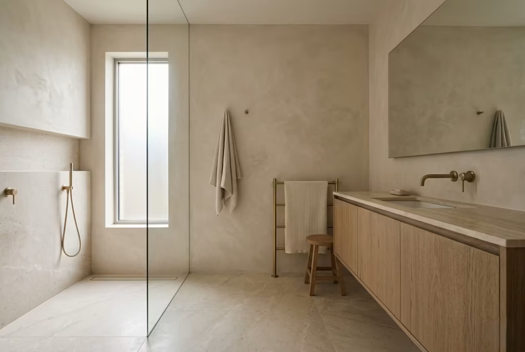
You can’t just copy-paste this look from a mood board. True neutral design is a slow burn. It reveals itself over time as the light changes and the materials settle into the architecture. The real triumph of these rooms is how they age how they handle the friction of daily life while maintaining their clarity. When done right, they don’t just look designed; they feel inevitable.
What Defines a Modern Neutral Bathroom in 2026
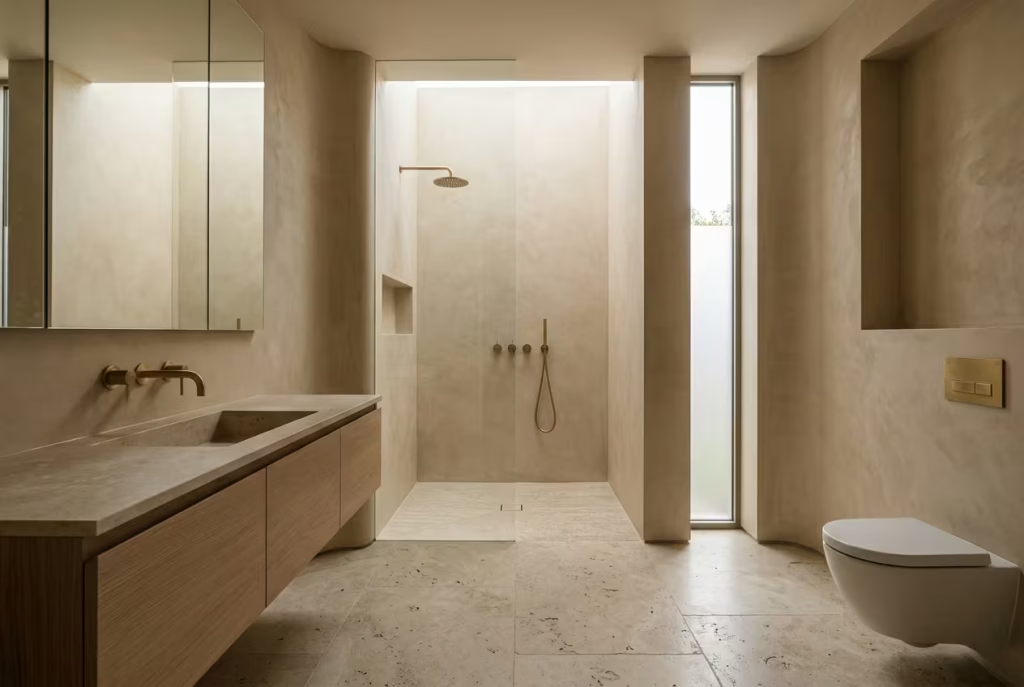
In 2026, a modern neutral bathroom is about much more than just playing it safe; it’s about how intelligently you handle that restraint. At first glance, the palette might seem quiet, but underneath that calm is a complex layering of materials, subtle undertones, and deliberate contrasts.
In my recent projects, I’ve noticed a clear shift: we’re moving away from those flat, one-note finishes. Instead, we’re focusing on how stone, plaster, timber, and light all work together. It’s less about picking a “safe” paint color and more about orchestrating how surfaces feel, how shadows fall in the corners, and how the mood of the room shifts from morning to night.
When you get this right, the space doesn’t feel minimal in that cold, empty way people often expect. It feels finished. It feels like every single element has found its rightful place, and because of that, nothing has to shout for your attention.
Beyond Beige The Expanded Neutral Palette
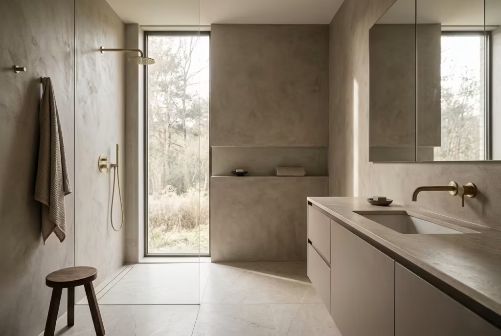
For a long time, beige was the only word we had for “neutral,” which usually resulted in bathrooms that were perfectly polite but totally forgettable. Thankfully, that narrow mindset has faded. Today, the palette is much broader and more sophisticated—it’s less about picking a static color and more about how materials and light interact over time.
The New Neutrals: A Breakdown
The shift in 2026 is toward tones that have “weight” and character. Here is how they are actually playing out in modern design:
- Clay Tones: These offer a grounded warmth that feels architectural rather than just decorative. I recently used a clay microcement in a small bathroom—about 6 m²—and while it looked like a simple earth tone on a sample board, it transformed the space. It glows in the morning and feels incredibly “cocooning” by night.
- The Complexity of Taupe: It’s often called the bridge between grey and brown, but it’s more of a stabilizer. In bathrooms with poor natural light where cool greys feel clinical and “hospital-like,” a balanced taupe takes the chill out of the room without making it feel heavy.
- Limestone’s Natural Variation: Whether it’s the real deal or a high-end porcelain, limestone brings its own movement. Using large formats—like 600 x 1200 mm slabs—on both floors and walls can make a room feel expansive. The subtle veining does the heavy lifting so the rest of the design can stay quiet.
- Evolved Greys: We’ve moved away from the cold, “millennial” greys. The new versions have hints of brown or even a tiny drop of red. This tiny tweak allows them to pair beautifully with timber and brushed metals rather than feeling like a cold, isolated island.
- Muted Olive Undertones: This is the “secret weapon” of 2026. These tones barely read as green, but they add an organic softness that other neutrals can’t match. It’s a way to bring the outside in without being “themed” or literal.
Why It Works
The real magic of these tones isn’t just the color—it’s their behavior. These aren’t “flat” choices; they shift as the sun moves and respond to the textures around them.
The Takeaway: Great neutral design doesn’t lock a bathroom into a single moment in time. Instead, it allows the space to settle and evolve, eventually feeling less like a calculated design choice and more like a natural, inevitable part of your home.
Texture as the New Contrast
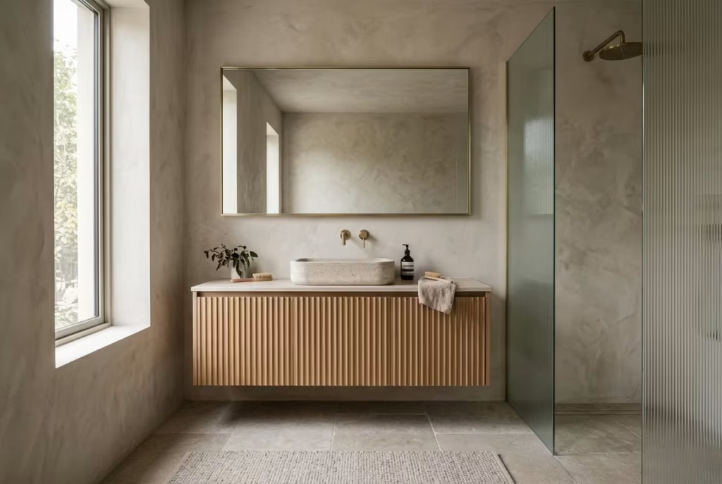
When colour steps back, material takes the lead: When colour is deliberately held back, contrast does not disappear, it simply changes its language. Instead of relying on light versus dark, the room begins to speak through surface, depth, and tactility. This is where many neutral bathrooms either come into their own or fall flat. Without texture, the space risks feeling one-note, like a story that never quite gets past the opening line. With it, even the quietest palette can carry a surprising amount of presence.
In one of my recent projects, a primary bathroom of around 7 m² (75 sq ft), the palette was intentionally restrained to soft limestone tones and warm whites. On its own, that combination could have felt predictable. What transformed it was the layering of textures, each introduced with purpose rather than decoration. Honed stone flooring, slightly matte underfoot, sat against softly trowelled plaster walls that carried just enough movement to catch the light. Add to that a fluted timber vanity front, detailed at 18 mm (0.7 inches) intervals, and the room began to hold depth without ever leaning on contrast in the traditional sense. It is a subtle shift, but one that changes how the space is experienced, almost like the difference between hearing a single note and listening to a full chord.
Natural materials tend to do this instinctively. Stone, in particular, rarely behaves like a flat surface. Even when cut precisely, it carries variation, small tonal shifts, faint veining, edges that soften over time. These qualities introduce what I often think of as “quiet movement,” the kind that reveals itself gradually rather than all at once. Porcelain alternatives can achieve a similar effect, though the key lies in selecting pieces with variation across batches rather than identical repeats. Otherwise, the illusion starts to wear thin, and the room can feel more manufactured than intended.
Plaster finishes have also found their way back into contemporary bathrooms, not as a nostalgic gesture, but as a practical response to the need for softness. A well-applied mineral plaster, typically at a thickness of 2 to 3 mm (0.08 to 0.12 inches), creates a surface that diffuses light rather than reflecting it sharply. The result is a gentler atmosphere, one that feels settled rather than stark. It is the kind of finish that does not try too hard, yet ends up doing a lot of the heavy lifting in shaping the room’s mood.
Then there is the role of joinery and detailing. Fluted, ribbed, or reeded surfaces introduce rhythm, breaking up larger planes without adding visual noise. I often specify these details sparingly, perhaps on a vanity or a storage wall, allowing them to act as a focal point without overwhelming the space. When used well, they draw the eye in just enough to create interest, like a pause in conversation that makes you lean in rather than step away.
Of course, texture is not only visual. It is experienced through touch, through daily interaction. The feel of a matte basin, the slight resistance of brushed metal, the warmth of timber against the hand. These are small moments, easy to overlook at the design stage, yet they accumulate over time. A bathroom is, after all, one of the most tactile spaces in the home. When materials are chosen with that in mind, the room begins to feel more intuitive, almost as if it understands how it will be used.
There is a fine balance to strike. Too many competing textures, and the space can feel unsettled, as though it is trying to say too much at once. Too few, and it risks fading into the background. The goal is not to fill every surface with variation, but to introduce contrast in a way that feels measured, almost instinctive. When that balance is right, the bathroom does not rely on bold gestures to make an impression. It draws you in slowly, layer by layer, until you realise that what seemed simple at first glance is, in fact, anything but.
Light as a Design Material
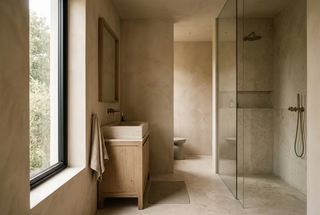
How natural and artificial lighting shape neutral perception: In a neutral bathroom, light is not simply a functional layer. It is, in many ways, the material that brings everything else to life. Strip back bold colour and sharp contrast, and what remains is a delicate interplay between surface and illumination. Get the lighting right, and even the most restrained palette begins to feel rich and dimensional. Get it wrong, and the entire space can fall flat, no matter how carefully the materials were chosen.
Natural light is often the starting point, though it rarely behaves in a predictable way. In one project, a modest bathroom of 5.5 m² (59 sq ft) with a north-facing window felt consistently cool despite warm-toned finishes. The clay walls, which should have read soft and inviting, took on a slightly muted, almost grey cast throughout most of the day. Rather than fighting this, we adjusted the material palette, introducing warmer timber and subtly golden stone to rebalance the room. It is a reminder that light sets the tone, quite literally, and materials follow its lead whether you intend them to or not.
Where natural light is generous, the approach shifts. Larger openings or skylights, typically around 600 x 900 mm (24 x 36 inches) or more, allow light to move across surfaces, creating gentle variation as the day unfolds. A limestone wall that appears pale and almost chalky in the morning can deepen into something warmer by late afternoon. These shifts are not dramatic, but they add a sense of life to the space, like a room that quietly changes its mood without ever making a scene.
Artificial lighting, on the other hand, requires a more deliberate hand. It is where many neutral bathrooms either find their balance or lose their way. A single overhead fixture, often chosen as an afterthought, tends to flatten the room, casting uniform light that erases texture and depth. Instead, layered lighting proves far more effective. In practice, this means combining ambient lighting, task lighting, and accent lighting, each serving a distinct purpose while working together as a whole.
For ambient lighting, recessed ceiling fixtures spaced approximately 900 to 1200 mm (36 to 48 inches) apart create an even base layer. The key is to avoid over-lighting. Too much brightness can strip a neutral palette of its subtlety, leaving it feeling exposed rather than composed. Task lighting, particularly around the vanity, benefits from a more considered placement. Vertical wall lights positioned at eye level, roughly 1600 to 1700 mm (63 to 67 inches) from the floor, provide balanced illumination that avoids harsh shadows. It is a small detail, yet one that makes daily routines feel noticeably more comfortable.
Accent lighting is where the room begins to show a bit of character. Integrated LED strips beneath floating vanities or within recessed niches introduce a soft glow, highlighting textures without drawing too much attention. It is the design equivalent of a quiet aside, subtle but meaningful. In one renovation, adding a concealed strip light beneath a stone vanity transformed the way the material was perceived, revealing its veining in a way that overhead lighting never could.
Colour temperature also plays a decisive role. Neutral bathrooms tend to respond best to warmer light, typically in the range of 2700K to 3000K. Anything cooler risks tipping the space into a clinical territory, especially when combined with stone or tile surfaces. That said, balance is everything. In bathrooms with ample natural light, a slightly cooler artificial source can help maintain clarity without overpowering the warmth of the materials.
What becomes clear, once you begin to pay attention, is that light does not just illuminate a neutral bathroom, it defines it. It shapes how colours are perceived, how textures are revealed, and how the space feels at different times of day. Much like a well-composed piece of music, it is not only about the notes themselves, but how they are played, how they rise and fall, and how they linger. When light is treated as a design material in its own right, the bathroom moves beyond being simply functional. It becomes something more considered, more responsive, and ultimately, more enduring.
25 Neutral Bathroom Ideas with Real-World Design Insight
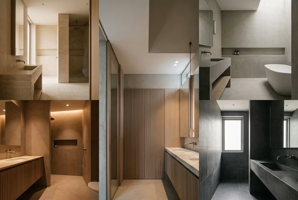
The strength of a neutral bathroom rarely reveals itself all at once. It unfolds gradually, almost quietly, as materials settle, light shifts, and daily routines begin to shape the space in ways no initial design can fully predict. In my own work, the most successful neutral interiors have never relied on a single defining feature. Instead, they are built through a series of considered decisions, each one carrying its weight without trying to steal the spotlight. What follows is not a checklist to replicate, but a collection of ideas observed in real projects, tested over time, and refined through use. Each one offers a different way of approaching neutrality, not as a limitation, but as a framework that, when handled with care, allows a bathroom to feel both composed and quietly alive.
Layered Beige with Architectural Depth
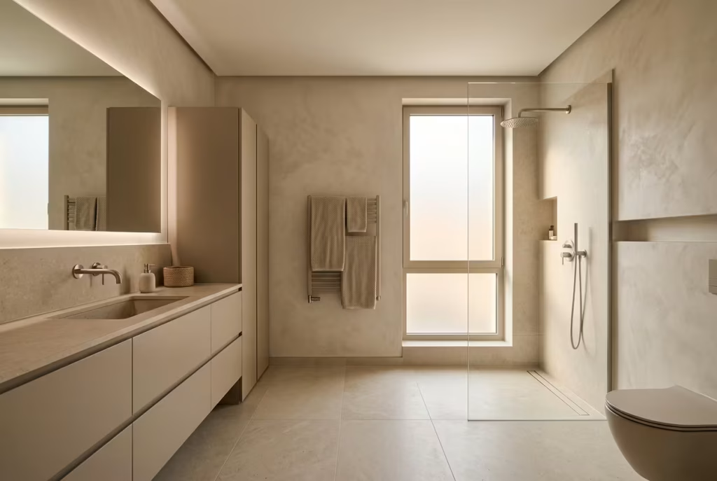
Use tonal variation instead of contrast: Beige, when handled without intention, can feel like it is treading water. Safe, predictable, and at times forgettable. Yet when it is layered with care, it begins to take on a different role altogether, one that feels grounded, almost architectural in its presence. Instead of relying on contrast to create interest, the focus shifts to tonal variation, subtle shifts that, little by little, build a sense of depth that holds the room together.
In a medium-sized bathroom, typically between 5 to 8 m² (54 to 86 sq ft), this approach comes into its own. These spaces sit in a delicate middle ground. Too small for bold gestures to breathe, yet large enough for flat finishes to feel underwhelming. It is here that layered beige proves its worth, not by shouting for attention, but by quietly shaping how the room is read.
From a spatial standpoint, the idea is to avoid treating walls, floors, and joinery as isolated elements. Instead, they should feel connected, almost as if they belong to the same conversation. For instance, a slightly deeper beige on the floor, paired with a lighter tone on the walls, creates a natural grounding effect. Introduce a third variation through cabinetry or niches, and the space begins to carry dimension without relying on obvious contrast. It is a bit like adding seasoning to a dish. Too little, and everything tastes flat. Too much, and the balance is lost. The sweet spot lies somewhere in between, where each layer enhances the next.
I recall a renovation where the initial specification leaned heavily on a single beige tile across all surfaces. On paper, it felt cohesive. In reality, it fell short, leaving the room looking washed out, as if it had been paused mid-thought. The turning point came when we introduced architectural detailing. Shadow gaps of around 10 to 15 mm (0.4 to 0.6 inches) were added at ceiling junctions and around wall panels. Wall relief, built out by approximately 20 mm (0.8 inches), created gentle shifts in depth that caught the light differently throughout the day. Almost overnight, the space found its footing. What had felt flat now carried a quiet confidence, as though it had finally settled into itself.
Material choice plays a significant role here. Matte finishes tend to work best, allowing light to diffuse softly rather than bounce sharply. Large format tiles, around 600 x 1200 mm (24 x 48 inches), reduce grout lines and help maintain visual continuity. Where possible, I often introduce a secondary texture, perhaps a lightly brushed stone or a subtle plaster finish, to prevent the palette from feeling too uniform. It is these small adjustments, almost under the radar, that give the room its depth.
Pros
- Creates a calm, cohesive environment that feels considered rather than staged
- Enhances spatial perception without relying on strong contrasts
- Works particularly well in medium-sized bathrooms where balance is key
- Ages gracefully, as tonal palettes tend to be more forgiving over time
Cons
- Requires careful calibration of tones, as small missteps can make the space feel flat
- Limited contrast may not appeal to those seeking a more dynamic or bold aesthetic
- Relies heavily on lighting and detailing to achieve depth, which can increase design complexity
When layered thoughtfully, beige stops being the background and becomes the framework itself. It is not about making a statement at first glance, but about creating a space that reveals its character slowly, almost like a story that unfolds the longer you stay.
Limestone Walls with Soft Matte Finishes
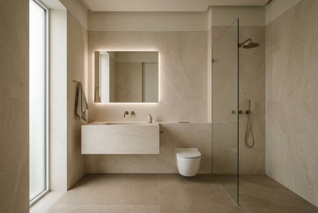
Natural stone or porcelain alternative: Limestone has a way of settling into a space without fuss. It does not try to steal the show, yet it quietly sets the tone, giving the bathroom a sense of permanence that feels hard-earned rather than staged. When finished in a soft matte, it avoids glare and allows the surface to read as calm and grounded. It is the kind of material that does not shout for attention but rewards a closer look, revealing variation and depth the longer you spend with it.
From a spatial perspective, limestone works particularly well when it is allowed to run uninterrupted across walls. Breaking it up too frequently can dilute its effect, like interrupting a sentence mid-flow. In bathrooms around 5 to 9 m² (54 to 97 sq ft), I often specify full-height wall applications to create a continuous envelope. The goal is to blur boundaries, so the room feels more expansive than its footprint suggests. When paired with a similarly toned floor, the transition becomes almost seamless, giving the impression that the space extends beyond its physical limits.
The choice between natural limestone and porcelain alternatives usually comes down to lifestyle and maintenance. Natural stone carries an authenticity that is difficult to replicate. Each slab or tile brings subtle shifts in tone, small imperfections that add character over time. Porcelain, on the other hand, offers consistency and durability, especially in high-use bathrooms. The key is to avoid overly uniform prints. A good porcelain limestone effect should include variation across tiles, otherwise the surface risks feeling manufactured, and the illusion begins to wear thin.
Wall thickness and grout spacing, often overlooked, can make or break the final result. Thinner tiles, typically around 10 to 12 mm (0.4 to 0.5 inches), help maintain a refined edge, particularly at junctions and corners. For grout lines, keeping joints tight, around 2 to 3 mm (0.08 to 0.12 inches), allows the surface to read as a cohesive plane rather than a grid. In one project, widening the grout to 5 mm (0.2 inches) unintentionally introduced a visual rhythm that distracted from the stone itself. It is a small detail, but one that can tip the balance.
I recall a renovation where we initially opted for a polished finish, assuming it would elevate the space. Instead, it reflected too much light, flattening the natural variation of the stone and making the room feel slightly clinical. Switching to a honed matte finish changed everything. The light softened, the texture became more pronounced, and the bathroom finally felt as though it had found its voice. Sometimes, less sheen carries more depth, a case of less being more in its truest sense.
In terms of practical application, large format tiles, around 600 x 900 mm (24 x 36 inches) or even 600 x 1200 mm (24 x 48 inches), tend to work best. They reduce visual breaks and allow the material to read more like a continuous surface. For smaller bathrooms, slightly scaled-down formats can still achieve the same effect, provided the grout lines remain restrained.
Pros
- Introduces natural variation and depth without relying on bold contrast
- Creates a calm, cohesive envelope that enhances spatial perception
- Matte finishes reduce glare and soften the overall atmosphere
- Works across both contemporary and more classic neutral schemes
Cons
- Natural limestone requires sealing and ongoing maintenance
- High-quality porcelain alternatives can be costly if variation is well executed
- Poor grout spacing or tile selection can disrupt the intended effect
- Overuse without variation in other elements may feel monotonous
When handled with care, limestone does more than cover a wall. It anchors the room, giving it a sense of quiet permanence. It is not a material that demands attention at first glance. Instead, it draws you in slowly, like a conversation that deepens the longer you listen.
Floating Vanities in Warm Wood Tones
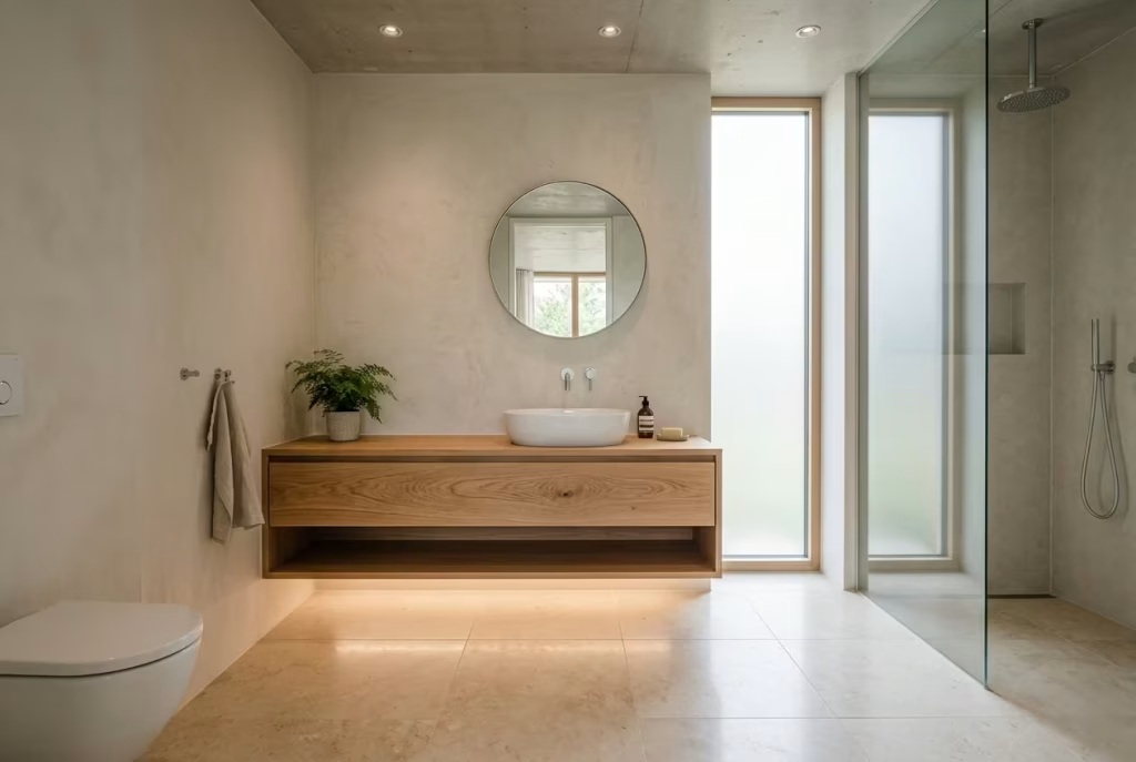
450–500 mm depth (18–20 inches) for balance: Floating vanities have a way of changing the entire reading of a bathroom without making a scene about it. By lifting storage off the floor plane, they introduce a sense of ease, almost as if the room is breathing a little more freely. When rendered in warm wood tones, this effect is amplified, bringing a grounded softness that prevents the space from drifting into something too sterile or overly designed. It is a subtle shift, yet one that quietly reshapes how the room feels at eye level and underfoot.
From a spatial reasoning perspective, the absence of a full floor-to-vanity connection alters perception in a meaningful way. Even in compact bathrooms around 4.5 to 7 m² (48 to 75 sq ft), that small visual break beneath the unit creates the illusion of expanded floor area. The eye is no longer stopped at ground level furniture; instead, it moves through the space uninterrupted, which, in design terms, is often half the battle in making smaller bathrooms feel considered rather than confined.
Warm wood tones play a crucial role in preventing the floating effect from feeling overly clinical. I have found that mid-tone oak, walnut, or smoked ash finishes tend to strike the right balance. They carry enough warmth to soften the geometry of the vanity, yet remain restrained enough to sit comfortably within a neutral palette. In one project, a walnut veneer vanity, paired with a limestone floor, created a dialogue between warmth and stone that felt almost instinctive. Nothing competed, nothing overreached, yet the room held together with quiet confidence.
Depth is where precision really matters. A vanity depth of 450 to 500 mm (18 to 20 inches) tends to be the sweet spot. Go shallower, and storage becomes compromised; go deeper, and the floating effect begins to lose its lightness, tipping into bulk. In practice, I often push for slimmer profiles in smaller bathrooms, especially where circulation space is tight, ensuring at least 700 mm (27.5 inches) of clear walking width is maintained in front of the unit. These are the kinds of details that do not immediately stand out, but they define how comfortably the space is lived in.
One real-world lesson came from a renovation where the floating vanity looked perfect on paper but failed in execution due to inadequate wall reinforcement. The structure had not been properly prepared to carry the load, and over time, slight movement became noticeable. It was not dramatic, but it was enough to undermine the sense of refinement the design was meant to achieve. After that, I never treat floating joinery as purely aesthetic. It always becomes a structural conversation first, design follows closely behind.
There is also something to be said about the shadow gap beneath a floating vanity. Typically around 100 to 150 mm (4 to 6 inches), this gap is not just functional for cleaning, but visually critical. It creates a thin line of negative space that separates the unit from the floor, reinforcing the sense of lightness. When paired with subtle under-cabinet lighting, it can gently lift the entire composition, especially in evening settings where artificial light takes over.
Pros
- Creates a lighter, more open visual footprint, especially effective in smaller bathrooms
- Enhances floor visibility, making spaces feel larger than their actual dimensions
- Offers a clean, contemporary aesthetic that integrates well with neutral palettes
- Allows for subtle lighting integration beneath the unit for added atmosphere
Cons
- Requires precise structural reinforcement, particularly on stud or plasterboard walls
- Limited storage capacity compared to full floor-standing vanities
- Poor installation can lead to long-term stability issues
- Overuse in poorly proportioned spaces can feel visually underwhelming rather than refined
When executed properly, a floating vanity does not simply provide storage. It shifts the entire rhythm of the room, lifting it just enough to introduce lightness without losing grounding. It is one of those details that works quietly in the background, yet once it is there, it is difficult to imagine the space without it.
You May also Like: 25 Eye-Catching Bathroom Floor Tile Ideas for a Luxurious Look
Soft Greige Bathrooms with Layered Lighting
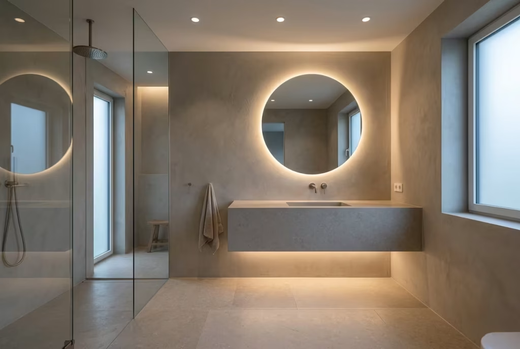
Combining warm and cool undertones carefully: Greige sits in that quiet in-between space where grey softens and beige steps back just enough for balance to emerge. It is a colour that does not rush to define itself, which is precisely why it works so well in bathrooms that aim for longevity rather than short-lived impact. On its own, greige can feel understated to the point of ambiguity, but when paired with layered lighting, it begins to show a depth that is often missed at first glance.
From a spatial reasoning perspective, greige performs best when it is allowed to act as a unifying backdrop rather than a dominant feature. In bathrooms ranging from 5 to 9 m² (54 to 97 sq ft), this neutrality becomes an advantage. It smooths transitions between materials, softens architectural edges, and allows the eye to move through the room without interruption. I often find that in these mid-sized spaces, greige prevents visual fragmentation, especially where multiple materials are introduced, such as stone, timber, and metal finishes. Instead of competing, everything feels loosely tied together, almost as if the room is exhaling rather than holding its breath.
The real transformation happens when lighting is introduced with intention. Greige is particularly sensitive to light temperature, which means the same wall can read entirely differently depending on the time of day or the artificial lighting scheme in use. In a recent project, we worked with a greige microcement finish across a bathroom that had limited natural light. Without careful lighting, the space risked feeling muted and slightly flat. The solution came through layering rather than intensity.
Ambient lighting was kept soft and even, with recessed fixtures spaced around 900 mm (36 inches) apart to avoid harsh pooling of light. Task lighting around the vanity was set at approximately 1600 mm (63 inches) from the floor, positioned to reduce shadowing while maintaining a natural tone on the face. The subtle shift came from accent lighting, particularly LED strips integrated beneath a floating stone shelf and behind a mirror frame. These elements did not announce themselves, but they changed how the greige surface was perceived, introducing a gentle gradient that moved across the walls like slow-moving light on water.
What becomes clear quite quickly is that greige is not a static colour. It behaves more like a responsive surface, absorbing warmth from timber finishes and coolness from stone or chrome depending on what surrounds it. This is where careful balancing becomes essential. If the lighting leans too warm, the space risks drifting into beige territory. Too cool, and it can tip into something slightly detached, almost clinical. The aim is not perfection, but equilibrium, where neither end of the spectrum takes full control.
I remember a project where the initial lighting plan relied heavily on cool white fittings, and the result felt unexpectedly sterile despite the soft palette. It was only after introducing warmer 2700K accents, particularly in the evening lighting scheme, that the room began to settle into itself. The greige surfaces responded immediately, picking up warmth in the lower light levels while still maintaining clarity during the day. It was a quiet reminder that colour does not exist in isolation, it is always in dialogue with light.
Pros
- Creates a highly adaptable neutral base that works across multiple design styles
- Balances warm and cool elements, making it easier to introduce mixed materials
- Responds beautifully to layered lighting, adding depth without visual clutter
- Offers long-term flexibility, especially in homes where styles may evolve over time
Cons
- Highly sensitive to lighting conditions, requiring careful planning to avoid imbalance
- Can appear flat if used without texture or material variation
- Poor lighting design can undermine its intended warmth and depth
- Requires precise coordination between finishes to avoid tonal inconsistency
When greige and layered lighting are brought into alignment, the bathroom begins to feel less like a static composition and more like a living environment. It shifts gently throughout the day, never quite the same from one moment to the next, yet always holding its composure.
Spa-Inspired Neutral Bathrooms with Walk-In Showers
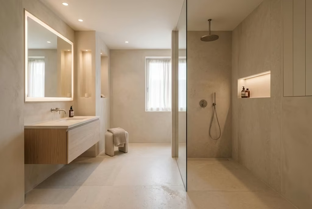
Minimum 900 x 1200 mm (36 x 48 inches): A spa-inspired bathroom is often misunderstood as a visual theme, when in reality it is a spatial experience first and foremost. It is not about adding candles or styling products, but about creating a sense of ease in how the body moves through the space. When neutrality is combined with a walk-in shower, the result is less about decoration and more about flow, almost as if the room has quietly learned how to step out of your way.
From a spatial reasoning perspective, the walk-in shower becomes the anchor that reorganises everything around it. In bathrooms where space ranges from 6 to 10 m² (65 to 108 sq ft), removing visual barriers such as bulky enclosures or raised trays immediately changes perception. A minimum internal shower footprint of 900 x 1200 mm (36 x 48 inches) allows enough room for comfortable movement without encroaching on the rest of the layout. It may sound modest on paper, yet in practice, that proportion creates a surprising sense of generosity when executed correctly.
The absence of a traditional enclosure is where the real shift happens. Instead of boxing in water, the design allows it to exist within a controlled openness. This is where detailing becomes critical. A gently sloped floor, typically around a 1 to 2 percent gradient, ensures water flows naturally toward a discreet linear drain, often positioned along the back or side wall. The effect is subtle but important. It removes the visual interruption of thresholds and creates a continuous surface that feels uninterrupted underfoot, like a quiet path that never quite breaks stride.
In real-life applications, I have found that material continuity plays a defining role in whether a spa-inspired bathroom feels convincing or merely decorative. Using the same or closely related materials across floor and shower zone helps dissolve boundaries. In one project, a honed limestone tile extended from the main floor directly into the walk-in shower, with only a slight shift in texture to improve grip. The transition was almost imperceptible, yet it changed how the room was experienced. There was no moment of entry into the shower, only a gradual shift in function, which is exactly the point.
Glass, when used, should feel almost secondary rather than dominant. Frameless panels, typically 8 to 10 mm thick, are often used sparingly, acting more as subtle spatial guides than barriers. In smaller bathrooms, I sometimes reduce or eliminate fixed glass altogether on one side, allowing the space to remain visually open. It is a delicate balance, because too much enclosure and the spa feeling disappears, too little control and practicality is compromised. The design has to walk a fine line, steady and considered, without tipping too far in either direction.
Lighting within a spa-inspired neutral bathroom should behave like a soft backdrop rather than a focal point. Warm, diffused lighting around 2700K to 3000K tends to work best, especially when integrated into niches or concealed within ceiling recesses. The goal is not to illuminate every corner equally, but to create gentle shifts in brightness that mimic natural relaxation environments. In one project, we used concealed lighting within a recessed wall niche at approximately 1500 mm (59 inches) height, which cast a soft wash across textured plaster. The effect was understated but transformative, giving the space a sense of quiet rhythm.
Pros
- Creates a seamless, open spatial experience that enhances comfort and ease of movement
- Eliminates visual clutter by reducing barriers and unnecessary partitions
- Works exceptionally well with continuous flooring and natural material palettes
- Enhances long-term usability, particularly for future accessibility considerations
Cons
- Requires precise waterproofing and drainage planning from the outset
- Can lead to water management challenges if slopes and gradients are poorly executed
- Limited enclosure may not suit all users or household preferences
- Higher installation complexity compared to traditional enclosed shower systems
When executed with care, a spa-inspired walk-in shower does more than elevate a bathroom visually. It changes the rhythm of how the space is used, encouraging a slower, more fluid experience. It is less about stepping into a shower and more about entering a space that has been quietly designed to let you pause, even if only for a moment.
Textured Plaster Walls for Organic Softness
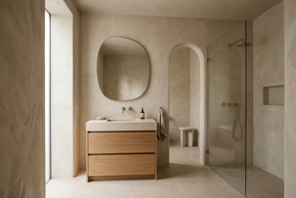
Textured plaster has a way of changing the emotional temperature of a bathroom without announcing itself. It removes the sharpness that tiles often bring and replaces it with a softened, almost hand-shaped quality that feels closer to architecture than finish. In neutral bathrooms, where restraint is already doing most of the talking, plaster introduces a quiet irregularity that keeps the space from feeling too controlled, almost as if the walls have been allowed to breathe rather than perform.
From a spatial reasoning perspective, plaster works best when it is allowed to run uninterrupted across larger wall surfaces. In bathrooms between 5 and 9 m² (54 to 97 sq ft), this continuity helps dissolve hard edges, especially around corners and ceiling junctions. Instead of reading the room as a collection of separate planes, the eye begins to experience it as one continuous envelope. That shift is subtle, but it changes everything. The space feels less constructed and more formed, as though it has been shaped rather than assembled.
In practical application, I have found that plaster finishes behave differently depending on how light interacts with them. A slightly uneven hand-applied surface, typically built up in layers of 2 to 3 mm (0.08 to 0.12 inches), creates micro-shadows that shift throughout the day. In one renovation, a north-facing bathroom initially felt too subdued. The material was correct, but the atmosphere was flat. Once the plaster texture was refined with a slightly more pronounced trowel movement, the walls began to catch light in a far more dynamic way. Nothing dramatic changed, yet the room suddenly felt alive, almost like it had quietly woken up.
There is also a tactile honesty to plaster that hard surfaces rarely achieve. It does not aim for perfection, and that is precisely where its strength lies. Small variations, faint ridges, and subtle tonal shifts are not flaws but part of its character. In a neutral scheme, where everything else is often controlled and measured, this softness becomes the counterbalance. It takes the edge off precision, without undermining it.
I often pair textured plaster with simple, grounded materials such as limestone floors or timber vanities. The contrast is not visual in the traditional sense, but experiential. One surface reflects structure and durability, while the other absorbs light and softens it. In one project, a bathroom with a 6 m² (65 sq ft) footprint used plaster walls alongside a brushed oak vanity and honed stone flooring. The combination created a layered calmness that felt almost instinctive, as if each material understood its role without needing instruction.
Waterproofing is, of course, a critical consideration. Not all plaster systems are suitable for wet environments, and the wrong specification can lead to long-term issues. Mineral-based or lime plasters designed specifically for bathrooms are typically used, often sealed with breathable protective coatings that preserve texture while resisting moisture. This is one of those areas where design intent and technical execution must move in step, otherwise the illusion quickly falls apart.
Pros
- Introduces soft, organic texture that reduces visual rigidity
- Enhances light diffusion, creating a calm and atmospheric surface quality
- Works seamlessly within neutral palettes without overwhelming other materials
- Ages gracefully, often developing more character over time
Cons
- Requires specialist application and proper waterproofing systems
- Can be sensitive to impact or abrasion in high-traffic zones
- Maintenance and repair are more complex than tiled surfaces
- Quality of finish depends heavily on craftsmanship, leaving little room for error
When textured plaster is handled with restraint and intention, it transforms a bathroom from something that feels built to something that feels composed. It does not compete for attention. Instead, it lingers quietly in the background, shaping the atmosphere in a way that is felt more than seen, like a soft echo that stays in the room long after you have left it.
Neutral Bathrooms with Statement Stone Basins
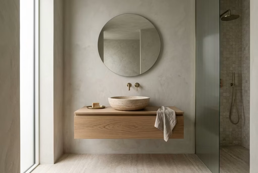
A statement stone basin introduces presence without noise. In a neutral bathroom, where everything else is deliberately restrained, it becomes the one element that carries quiet authority. Not loud, not decorative for the sake of it, but grounded, sculptural, and unmistakably tactile. It is the kind of detail that does not need to compete for attention, yet still manages to anchor the entire room in place, almost like a punctuation mark at the end of a carefully written sentence.
From a spatial reasoning perspective, the basin works best when it is allowed to read as a freestanding object rather than just a functional fixture. In bathrooms ranging from 5 to 8 m² (54 to 86 sq ft), scale becomes critical. A basin that is too large can overwhelm the vanity zone, while one that is too small risks losing its sculptural impact. Typical stone basin dimensions sit around 400 to 550 mm in diameter (16 to 22 inches), with a depth of 120 to 180 mm (5 to 7 inches), which tends to strike a balanced proportion in most residential layouts. The goal is not to dominate the space, but to introduce a focal point that feels intentional rather than inserted.
In real-life applications, I have often found that stone basins work best when everything around them steps back just slightly. In one project, a carved limestone basin was placed on a simple 450 mm (18 inch) deep floating vanity. The surrounding materials were kept deliberately quiet, soft greige walls and a matte stone floor, allowing the basin to carry visual weight without interruption. What became interesting over time was how the basin changed the perception of the entire room. It stopped being just a bathroom fixture and started behaving more like a sculptural object that happened to exist within a functional space.
The choice of stone itself plays a significant role in how the basin is experienced. Honed marble, travertine, and limestone each carry their own visual language. Marble introduces subtle veining that feels almost fluid, while travertine brings a more porous, earthy character that softens the overall composition. Limestone tends to sit somewhere in between, offering consistency with just enough variation to avoid monotony. I have seen polished finishes used, but more often than not, a honed or matte surface feels more appropriate in neutral bathrooms, as it absorbs light rather than reflecting it aggressively.
There is also an important practical layer that should not be overlooked. Stone basins are inherently heavier than ceramic alternatives, which means structural support becomes a non-negotiable consideration. Wall-mounted units typically require reinforced backing, especially when installed above floating vanities. In some cases, floor-supported vanity frames are used to carry the load more evenly. These decisions are rarely visible in the final result, but they are essential to ensuring the basin feels stable and permanent rather than precariously placed.
One detail I often pay attention to is the internal geometry of the basin. Slight variations in curvature, typically a 5 to 10 mm (0.2 to 0.4 inch) radius difference, can significantly affect how water behaves and how easy the basin is to maintain. A well-formed interior does not allow water to pool awkwardly or leave visible residue lines. It sounds minor, but over time, these small refinements separate a well-considered piece from something that simply looks good on installation day.
Pros
- Acts as a sculptural focal point without disrupting the neutrality of the space
- Introduces natural materiality and texture in a controlled, refined way
- Aged stone develops character over time, enhancing long-term visual depth
- Works particularly well in minimalist or spa-inspired bathroom schemes
Cons
- Heavy weight requires careful structural planning and reinforcement
- Higher cost compared to standard ceramic or composite basins
- Natural variation can be inconsistent, requiring careful selection
- Maintenance varies depending on stone type and finish, with some requiring sealing
When used thoughtfully, a stone basin does not simply serve a function. It becomes a quiet anchor in the room, something that draws the eye without forcing it, like a steady presence in the background of a space that has been carefully composed to feel calm, grounded, and enduring.
You May also Like: Mid-Century Modern Bathroom Ideas: 26 Ways to Create a Timeless, Stylish Space
Microcement Surfaces for Seamless Continuity
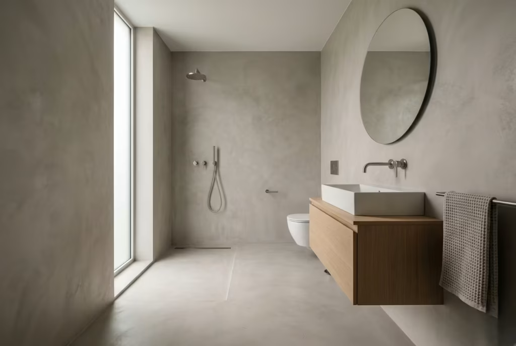
Microcement has become one of those materials that quietly redefines how a neutral bathroom is perceived. It does not rely on pattern, grout lines, or visual breaks to create interest. Instead, it works through continuity, wrapping floors and walls in a single, uninterrupted skin that feels almost architectural in its intent. In well-balanced neutral schemes, this seamlessness becomes the backbone of the design, allowing everything else to sit more lightly within the space.
From a spatial reasoning perspective, microcement is particularly powerful in compact to medium bathrooms, typically ranging from 4.5 to 8.5 m² (48 to 92 sq ft). In these settings, visual fragmentation can quickly make a room feel tighter than it actually is. By removing grout lines and material transitions, the eye is allowed to travel without interruption. The result is a space that feels slightly expanded, almost as if the boundaries have been softened rather than defined. In one renovation, a narrow bathroom that previously felt boxed in immediately changed character once microcement was applied across floor and walls. Nothing structural changed, yet the perception of width improved noticeably, like the room had quietly exhaled.
In real-life application, the success of microcement often depends on how restrained the rest of the palette is. Because the surface itself is continuous and visually active in a subtle way, it does not need much competition. I often pair it with simple, grounded elements such as timber vanities, matte black or brushed nickel fittings, and softly diffused lighting. In one project, a 6 m² (65 sq ft) bathroom was finished entirely in warm grey microcement, with a floating oak vanity and concealed lighting integrated into a ceiling recess. The space felt cohesive, almost monolithic in tone, yet never heavy. It had that rare quality of feeling both minimal and tactile at the same time, like a surface that had been shaped rather than applied.
The thickness of microcement is surprisingly slim, typically around 2 to 3 mm (0.08 to 0.12 inches), which allows it to be applied over existing substrates without significantly altering spatial proportions. This makes it particularly useful in renovations where retaining original structure is important. However, the success of the finish depends heavily on preparation. Any imperfections in the base layer will eventually read through the surface, so the underlying work must be precise, almost unforgiving in its execution. It is one of those materials where what you do not see is just as important as what you do.
There is also a quiet rhythm in how microcement interacts with light. Because it lacks grout lines and strong pattern breaks, light moves across it in a continuous way, creating soft tonal shifts rather than sharp contrasts. In north-facing bathrooms, this can help maintain consistency throughout the day, while in brighter south-facing spaces it enhances the sense of calm by reducing visual noise. I have found that slightly warmer light temperatures, around 2700K to 3000K, tend to complement its surface particularly well, preventing it from drifting into a colder, more industrial reading.
Waterproofing and sealing are critical considerations. Although microcement is water-resistant when properly installed, it relies on a sealed system rather than inherent impermeability. This means the quality of the installation is non-negotiable. In wet zones such as walk-in showers, additional attention is given to substrate preparation and sealing layers to ensure long-term performance. When done correctly, the finish holds up well under daily use, maintaining its appearance with minimal visual degradation over time.
Pros
- Creates seamless visual continuity across floors and walls, enhancing spatial perception
- Reduces visual clutter by eliminating grout lines and material breaks
- Works well in both modern and minimalist neutral schemes
- Thin application allows for renovation without major structural changes
Cons
- Highly dependent on installation quality and surface preparation
- Requires proper sealing and maintenance to ensure long-term durability
- Can show imperfections if substrate work is not precise
- Limited ability to introduce contrast without additional materials
When microcement is executed with care, it does more than create a surface. It reshapes how the bathroom is read altogether. It removes the visual interruptions that often fragment smaller spaces and replaces them with a quiet continuity that feels almost meditative. The result is not just a bathroom that looks cohesive, but one that feels uninterrupted, like a space designed to let everything settle, gently and without resistance.
Neutral Bathrooms with Black Accents (Used Sparingly)
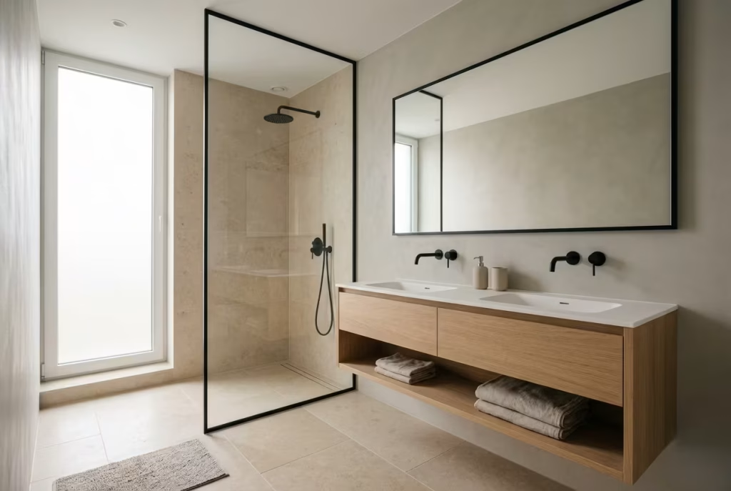
Black, when introduced into a neutral bathroom, behaves less like a colour and more like punctuation. It is not meant to lead the conversation, only to clarify it. Used with restraint, it sharpens the edges of an otherwise soft composition, giving the eye just enough contrast to rest on without pulling the entire room off balance. The challenge is not whether to use black, but how little is enough before it starts to dominate the narrative.
From a spatial reasoning perspective, black accents work best when they are placed at decision points within the room. In bathrooms typically ranging from 5 to 8.5 m² (54 to 92 sq ft), these moments are usually found at hardware, framing elements, and transitions. A black tap set against a limestone basin, a slim black shower profile outlining a glass panel, or a matte black mirror frame positioned above a soft neutral vanity. Each one acts as a visual anchor, gently guiding the eye through the space without overwhelming it. The key is rhythm, not repetition.
In real-life application, I have seen black either elevate a neutral bathroom or completely overpower it, with very little in between. In one project, a warm greige bathroom was initially specified with widespread black detailing, including full-profile window frames, heavy fixtures, and bold lighting. The result felt visually fractured, like the room had been outlined too aggressively. By stripping it back and limiting black to just three touchpoints, the tapware, shower frame, and mirror edge, the entire composition softened. Suddenly, the black no longer dictated the space. It simply refined it, like a well-placed underline rather than a headline.
The effectiveness of black depends heavily on scale and proportion. Fixtures such as taps and handles typically sit within the 10 to 25 mm (0.4 to 1 inch) visual range, which makes them ideal for subtle contrast. Shower profiles, often 15 to 30 mm (0.6 to 1.2 inches), can be slightly more assertive but still remain secondary to the surrounding materials. When used at this scale, black becomes a framing device rather than a dominant feature, helping to define edges without drawing attention away from the overall palette.
There is also an important material consideration. Matte black finishes tend to integrate more smoothly into neutral schemes than high-gloss alternatives. Gloss can introduce unintended reflections that break the calm of the space, while matte absorbs light, sitting more quietly within the composition. I often find that powder-coated or brushed finishes age more gracefully, particularly in bathrooms where water spots and fingerprints are a daily reality. It is one of those practical decisions that quietly supports the aesthetic over time.
Lighting plays a crucial role in how black is perceived. Under strong direct light, black can appear sharper and more graphic, which can be useful in contemporary schemes but risky in softer neutral environments. In more balanced designs, diffused lighting around 2700K to 3000K helps soften the contrast, allowing black to read as part of the material palette rather than an interruption. In one renovation, simply adjusting the beam spread of vanity lighting reduced the visual intensity of black fittings, making them feel more integrated and less imposed.
The most common mistake is overuse. Black has a strong visual voice, and when it is repeated too frequently across a small space, it begins to lose its elegance and instead feels heavy-handed. I often describe it as seasoning rather than structure. A pinch enhances the dish, too much overwhelms it. Neutral bathrooms rely on restraint, and black is no exception to that rule.
Pros
- Adds definition and clarity to soft neutral palettes without relying on colour
- Helps frame architectural elements such as mirrors, glass, and joinery
- Works well in modern and minimalist bathroom schemes when carefully controlled
- Enhances visual hierarchy when used at key focal points
Cons
- Overuse can quickly overpower a neutral palette and disrupt visual balance
- Gloss finishes may introduce unwanted reflections and visual noise
- Requires careful coordination with lighting to avoid harsh contrast
- Poor placement can make the space feel fragmented rather than cohesive
When used with a light hand, black does not compete with a neutral bathroom. It refines it. It draws quiet boundaries where needed, sharpens what matters, and then steps back just as quickly. In the end, it is less about making a statement and more about knowing exactly when to stop.
Warm White Bathrooms with Natural Light Emphasis
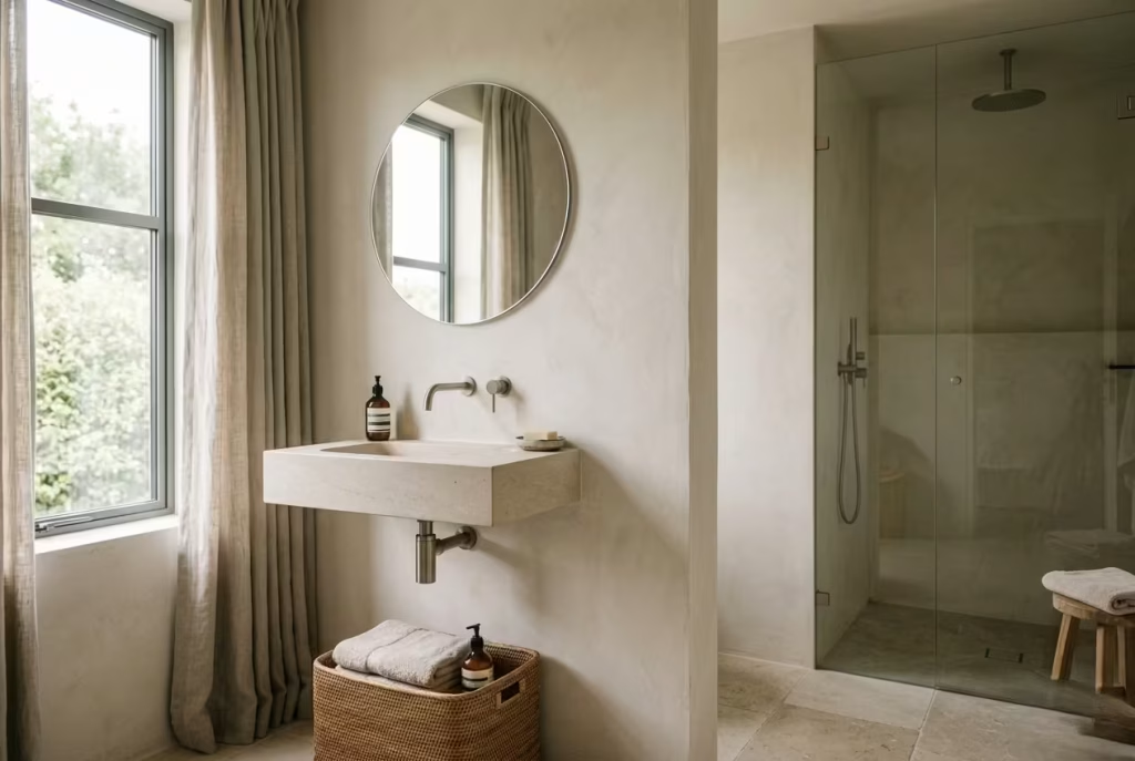
Warm white bathrooms often appear simple at first glance, almost deceptively so, yet they rely on a careful orchestration of light, proportion, and surface quality. When natural light is given priority, warm white stops being a flat colour choice and instead becomes a responsive backdrop, constantly shifting in tone throughout the day. It is a bit like a quiet canvas that never stays still for long, revealing subtle changes you only notice when the light shifts just enough to catch your attention.
From a spatial reasoning perspective, warm white works best in bathrooms where natural light is already present, whether through a window, skylight, or borrowed light source. In spaces ranging from 5 to 10 m² (54 to 108 sq ft), it can dramatically influence perception of scale. Lighter walls reflect available light deeper into the room, softening corners and reducing visual boundaries. The result is a space that feels slightly larger than its actual footprint, not through illusion alone, but through consistent light diffusion that keeps surfaces visually active without becoming distracting.
In real-life application, I have found that the success of a warm white bathroom often depends less on the paint colour itself and more on how light is allowed to move through the space. In one project, a south-facing bathroom of around 6.5 m² (70 sq ft) was finished in a warm white plaster tone with limestone flooring. Initially, the intention was minimalism, but what emerged was something far more atmospheric. Morning light brought a soft golden warmth across the walls, while late afternoon introduced a calmer, almost milky diffusion. The room never looked the same twice, yet it always felt coherent, as if the light itself was part of the material palette.
Window placement and proportion play a defining role here. Even modest openings, such as 600 x 900 mm (24 x 36 inches), can significantly alter the character of a warm white bathroom when positioned thoughtfully. Vertical windows tend to draw light deeper into the room, while wider horizontal openings create a more even spread across surfaces. In smaller bathrooms, I often prioritise uninterrupted wall space around windows, allowing light to wash across plaster or tile without visual interruption. It is less about the size of the opening and more about how freely the light is allowed to travel once it enters.
Material selection must support this light-led approach. Warm white is highly sensitive to undertones, and even slight shifts towards pink, yellow, or grey can alter the overall reading of the space. I tend to favour finishes that sit just off-white rather than pure white, as they respond more naturally to daylight. Matte or softly textured surfaces are particularly effective, as they diffuse light rather than reflecting it sharply. In one renovation, a lightly textured limewash finish at approximately 2 mm thickness (0.08 inches) transformed what could have been a flat white room into something that felt layered and quietly dynamic.
Artificial lighting should complement rather than compete with natural light. In practice, this means keeping fittings discreet and opting for warmer colour temperatures, typically between 2700K and 3000K. The aim is to maintain continuity between day and night, so the space does not feel like it changes personality too abruptly after sunset. In one project, dimmable wall lights positioned at 1600 mm (63 inches) from the floor allowed the evening atmosphere to gently mirror the softness of daylight, rather than replacing it with something harsher.
There is also an emotional quality to warm white bathrooms that should not be overlooked. They tend to feel calmer, almost slower in their rhythm. Without strong contrasts or heavy visual interruptions, the eye is free to rest. Over time, this creates a sense of ease that becomes part of daily routine, like a quiet pause built into the architecture itself.
Pros
- Enhances natural light, making spaces feel brighter and more open
- Creates a calm, timeless atmosphere that works across different design styles
- Highly adaptable, allowing materials and fixtures to take centre stage
- Ages gracefully, as subtle variations in light keep the space visually engaging
Cons
- Can feel flat or clinical if undertones are not carefully selected
- Highly dependent on natural light availability and orientation
- Requires careful coordination with artificial lighting to maintain warmth at night
- May lack contrast for those who prefer more visually defined interiors
When handled with care, a warm white bathroom becomes less about colour and more about atmosphere. It does not demand attention, yet it consistently rewards it. Like a space that understands the value of restraint, it allows light to do most of the work, and in doing so, creates a quiet sense of clarity that lingers long after you have left the room.
You May also Like: 25 Bathroom Organizer Ideas to Maximise Storage in Any Bathroom
Double Vanity Layouts in Symmetrical Neutral Design
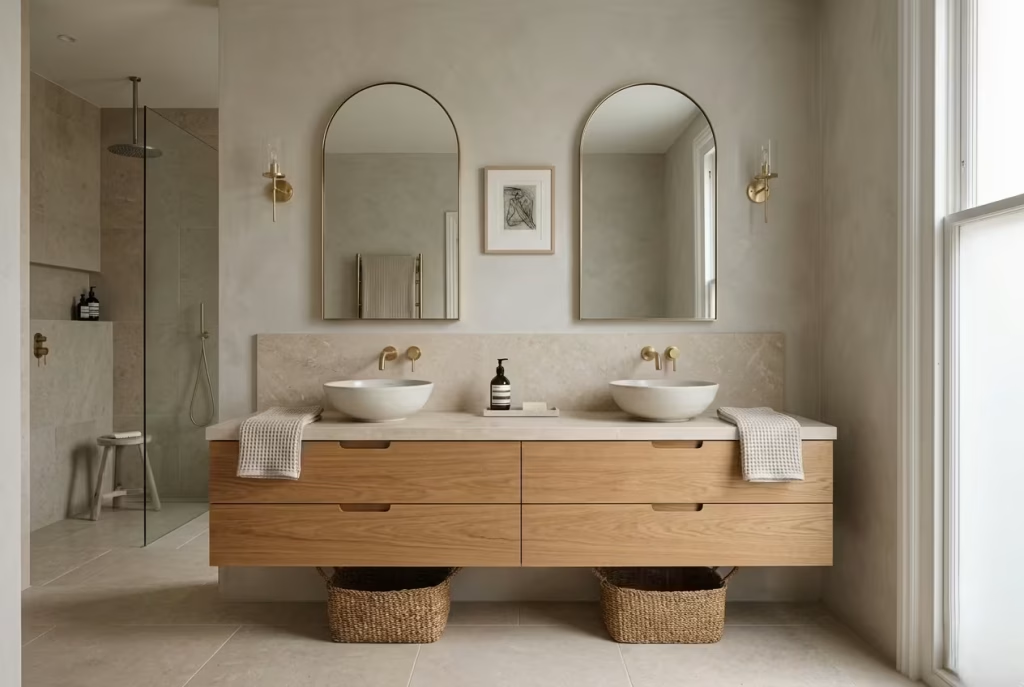
A double vanity in a neutral bathroom is less about doubling function and more about introducing order. When symmetry is handled with restraint, it brings a quiet architectural rhythm to the space, the kind that feels almost instinctive rather than designed. In neutral schemes, where visual noise is already reduced, symmetry becomes a stabilising force, like a steady hand keeping everything in balance without drawing attention to itself.
From a spatial reasoning perspective, double vanities work best when the surrounding circulation is generous enough to prevent congestion. In bathrooms typically ranging from 7 to 12 m² (75 to 129 sq ft), this layout feels most comfortable. Each user ideally requires a minimum of 600 mm (24 inches) of individual vanity width, with a total combined length often sitting between 1200 and 1800 mm (47 to 71 inches), depending on the overall proportions of the room. Clear circulation space in front should remain at least 800 to 1000 mm (31 to 39 inches), ensuring movement feels effortless rather than constrained.
What makes symmetry powerful in a neutral bathroom is not repetition alone, but the discipline of alignment. When two basins, mirrors, and lighting elements are carefully mirrored, the room begins to feel anchored. It is a bit like setting a table with intention, everything has its place, and nothing feels accidental. In one project, a greige-toned bathroom with limestone flooring used a double vanity aligned precisely with two vertical wall lights and twin arched mirrors. The effect was understated, yet undeniably composed. There was no focal point competing for attention, just a calm visual equilibrium that made the room feel quietly resolved.
In real-life application, I often find that double vanities succeed when the detailing is deliberately restrained. Overcomplicating the design with excessive hardware or contrasting finishes tends to disrupt the symmetry rather than enhance it. In a recent renovation, a warm oak double vanity was paired with simple integrated handles and a continuous stone countertop. The absence of visual interruption allowed the materiality to speak for itself. Even the sinks were chosen to be softly recessed rather than highly sculptural, ensuring the overall composition remained cohesive rather than fragmented.
Lighting plays a critical role in maintaining balance. In symmetrical layouts, lighting is often treated as a mirrored element, but the quality of that light matters just as much as its placement. Wall lights positioned at approximately 1600 to 1700 mm (63 to 67 inches) from the floor, flanking each mirror, tend to provide the most even distribution. This avoids shadow pooling across one side of the face, which can subtly disrupt the experience of balance. In some cases, I have also introduced a central overhead ambient light to reinforce the symmetry, though this is used sparingly to avoid flattening the space.
Material consistency is equally important. When each side of the vanity mirrors the other, even small inconsistencies become noticeable. That does not mean everything must be identical, but rather that variations should feel intentional. For example, a slight shift in stone veining across two basins can add natural character without breaking the overall rhythm. In one project, we allowed subtle tonal variation in the stone countertop while keeping all other elements perfectly aligned. The result felt organic yet controlled, like nature gently contained within a structured frame.
There is also a psychological aspect to symmetry that should not be overlooked. It introduces a sense of calm predictability, particularly in shared spaces. Two users can occupy the bathroom without visual competition or imbalance, each with their own defined space. Over time, this contributes to a feeling of ease, almost like the room has quietly learned how to accommodate routine without friction.
Pros
- Creates strong visual balance and architectural clarity within neutral schemes
- Enhances usability in shared bathrooms by clearly defining personal space
- Works well with minimalist and spa-inspired design approaches
- Provides a structured foundation that supports consistent material application
Cons
- Requires sufficient space to avoid feeling cramped or over-structured
- Can feel overly rigid if not softened with material variation or texture
- Higher cost due to duplication of fixtures, lighting, and joinery
- Poor alignment or proportion can quickly undermine the intended symmetry
When executed with restraint and precision, a double vanity layout does more than serve two users. It establishes a quiet sense of order that anchors the entire bathroom. In neutral design, where excess is already removed, that kind of balance becomes less about visual impact and more about lived comfort, the kind that reveals itself gradually, day after day, without ever needing to announce its presence.
Neutral Bathrooms with Fluted Wood Detailing
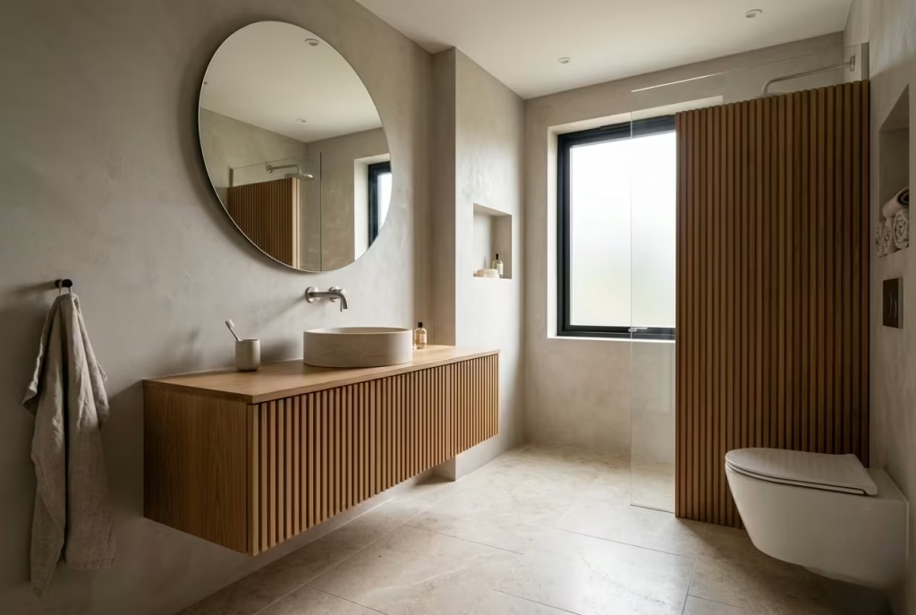
Fluted wood detailing has a quiet confidence about it. It does not rely on bold colour or dramatic form, yet it introduces a rhythm that subtly changes how a neutral bathroom is experienced. The repeated vertical lines catch light in a way that feels almost musical, breaking stillness into a gentle pattern without ever tipping into visual noise. In neutral interiors, where restraint already sets the tone, fluting becomes the detail that adds movement without disturbance.
From a spatial reasoning perspective, fluted wood works best when it is used to correct flatness or overly smooth surfaces. In bathrooms typically ranging from 6 to 10 m² (65 to 108 sq ft), it is often introduced on vanity fronts, tall storage units, or feature wall panels. The vertical rhythm naturally draws the eye upward, which can subtly enhance perceived ceiling height, particularly in rooms where proportions feel slightly compressed. In one project, a compact bathroom of around 5.5 m² (59 sq ft) used fluted oak on a full-height vanity wall. The effect was immediate. The room felt taller, more structured, almost as if the architecture had been gently stretched without altering its footprint.
In real-life application, fluted detailing performs best when it is not overused. It is a strong visual texture, and like any strong element, it benefits from restraint. I have seen bathrooms where fluting was applied across multiple surfaces, and instead of adding sophistication, it created unnecessary repetition. In contrast, when used selectively, it becomes a defining feature. In a recent renovation, a warm neutral bathroom paired fluted walnut cabinetry with smooth limestone walls and a microcement floor. The contrast between structured rhythm and soft, continuous surfaces created a balanced tension that felt intentional rather than decorative.
The scale of the fluting is critical. Narrow grooves, typically between 8 to 15 mm (0.3 to 0.6 inches), tend to feel more refined and suited to smaller or mid-sized bathrooms. Wider flutes, around 20 to 30 mm (0.8 to 1.2 inches), can work in larger spaces where there is enough visual breathing room. Depth also matters. A subtle projection of 5 to 10 mm (0.2 to 0.4 inches) is usually enough to catch light without creating harsh shadow lines. When the proportions are off, the detailing can quickly feel heavy-handed, almost like it is trying too hard to be noticed.
Wood selection plays a defining role in how fluted detailing is perceived. Mid-tone oak, walnut, and ash tend to work best in neutral bathrooms, as they sit comfortably within warm and cool palettes alike. I often avoid overly orange or yellow undertones, as they can disrupt the balance of greige, limestone, and soft white surfaces. In one project, smoked oak fluting was used on a vanity against a warm white plaster wall. The combination felt grounded yet soft, like the room had found its own internal rhythm without needing external contrast.
There is also an important tactile dimension to fluted wood that should not be overlooked. Even though it is primarily a visual feature, the slight recesses and ridges introduce a sense of texture that can be felt as much as seen. In daily use, this subtle interaction adds a layer of intimacy to the space. It is one of those details that does not demand attention, yet quietly shapes how the room is experienced over time.
Finishing and sealing are essential, especially in humid environments. In bathrooms, fluted wood is typically treated with moisture-resistant coatings or used in engineered forms that provide greater stability. This ensures the detailing retains its form and finish without warping or losing definition over time. It is a practical consideration, but one that directly supports the longevity of the design intent.
Pros
- Introduces rhythm and texture without overwhelming neutral palettes
- Enhances vertical perception, making spaces feel taller and more structured
- Works effectively as a focal detail on vanities or storage elements
- Adds tactile interest that enriches everyday interaction with the space
Cons
- Can feel visually repetitive if overused across multiple surfaces
- Requires careful proportioning to avoid heaviness or visual clutter
- Higher detailing and craftsmanship costs compared to flat surfaces
- Needs proper sealing and maintenance in humid bathroom environments
When used with restraint, fluted wood detailing becomes more than a decorative feature. It introduces a quiet cadence into the bathroom, a sense of order and movement that sits comfortably within neutral design. It does not compete for attention, yet it leaves a lasting impression, like a subtle pattern that reveals itself slowly, only when you take the time to notice.
You May also Like: 30 Stunning Desert Bathroom Design Ideas for a Warm, Natural Look
Large Format Tiles for Visual Calm
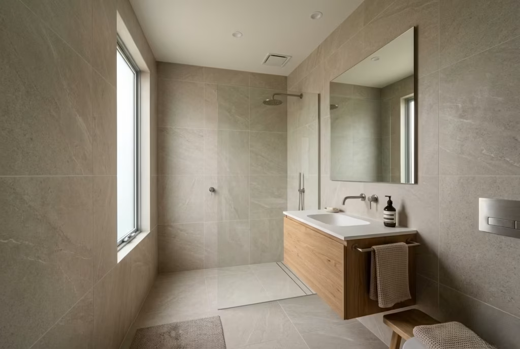
600 x 1200 mm (24 x 48 inches) reduces grout lines: Large format tiles have a way of simplifying a bathroom without stripping it of character. Instead, they remove the small interruptions that often break visual flow, allowing surfaces to read as continuous planes rather than fragmented grids. In neutral bathrooms, where restraint already sets the tone, this continuity becomes quietly powerful. The space feels less assembled and more composed, as though every surface has been allowed to settle into place without distraction.
From a spatial reasoning perspective, large format tiles are particularly effective in creating visual expansion. In bathrooms ranging from 5 to 10 m² (54 to 108 sq ft), reducing grout lines can significantly alter how the room is perceived. With standard tiling, the eye constantly registers boundaries, which can make smaller spaces feel busier than they actually are. By contrast, a 600 x 1200 mm (24 x 48 inches) format reduces those interruptions, allowing walls and floors to behave almost like uninterrupted surfaces. The result is a calmer visual field, where the architecture feels more legible and less segmented.
In real-life application, I have found that the success of large format tiles often depends on restraint in the surrounding design. In one renovation, a compact bathroom of around 6.5 m² (70 sq ft) was finished entirely in warm limestone-effect tiles of this size. Initially, there was concern that such large tiles might overwhelm the space. However, once installed, the opposite occurred. The reduced grout lines created a sense of openness, while the soft tonal variation within the tile added just enough movement to prevent monotony. The room did not feel larger in a literal sense, but it felt less interrupted, which is often more important.
The choice of layout pattern also plays a subtle but important role. A stacked grid layout tends to reinforce calmness and order, while offset patterns introduce a slightly more dynamic rhythm. In neutral bathrooms, I often lean towards a stacked configuration, particularly when working with stone or stone-effect finishes. It keeps the visual language disciplined, allowing the material itself to take centre stage rather than the layout pattern. When paired with continuous wall-to-floor applications, the effect can be quite striking in its simplicity, like the room has been wrapped in a single, cohesive material gesture.
Installation precision is critical with large format tiles. Even small deviations become more noticeable due to the scale of each piece. Substrate preparation must be carefully executed to avoid lippage, especially in areas where light rakes across the surface. In one project, a minor unevenness of just a few millimetres became visible only after afternoon light hit the wall at a low angle. It was a quiet reminder that with larger formats, imperfections are not easily hidden, they are simply revealed more honestly.
Grout lines, though reduced, still require attention. A typical joint width of 2 to 3 mm (0.08 to 0.12 inches) is often used to maintain structural tolerance while preserving visual continuity. Colour matching the grout to the tile surface is equally important. Even a slight contrast can reintroduce visual segmentation, undermining the very calm the format is meant to achieve. It is one of those details that feels minor during specification but becomes immediately noticeable once the space is complete.
There is also a material consideration worth noting. Not all large format tiles behave the same way in a neutral palette. Some carry strong printed patterns that can dominate the room if not carefully selected. The most successful choices tend to be those with subtle variation, soft veining, or tonal shifts that only become apparent on closer inspection. It is this quiet complexity that keeps the surface from feeling too static over time.
Pros
- Reduces visual clutter by minimising grout lines and surface interruptions
- Enhances spatial perception, making bathrooms feel calmer and more open
- Works well with both wall and floor applications for a cohesive finish
- Allows materials to read as continuous surfaces, strengthening design clarity
Cons
- Requires highly precise installation to avoid alignment and levelling issues
- Can be more expensive due to material size and handling complexity
- Limited flexibility in tight or highly irregular spaces
- Poor selection of tile pattern can lead to visual monotony over time
When large format tiles are used with care, they do more than simplify a bathroom visually. They create a sense of quiet continuity that allows everything else in the space to settle. There is a kind of stillness they introduce, not by removing detail entirely, but by letting the eye move without interruption, as though the room has finally stopped trying to speak in fragments.
Neutral Bathrooms with Freestanding Bathtubs as Anchors
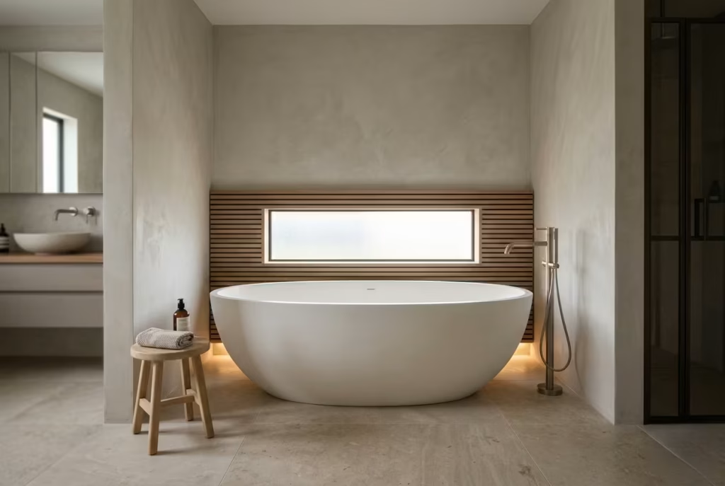
A freestanding bathtub has a quiet authority about it. It does not rely on ornament or complexity, yet it immediately establishes presence the moment it enters a room. In a neutral bathroom, where everything is intentionally restrained, the bathtub becomes the anchor point that holds the entire composition together. Not loudly, not theatrically, but with a steady sense of weight and calm that feels almost inevitable once it is in place.
From a spatial reasoning perspective, freestanding baths work best when they are given enough breathing room to be read as objects rather than fixtures. In bathrooms typically ranging from 8 to 12 m² (86 to 129 sq ft), this balance becomes achievable without compromise. A standard bathtub length of 1500 to 1700 mm (59 to 67 inches) requires clearance on all sides, ideally 100 to 200 mm (4 to 8 inches) from surrounding walls, and at least 600 to 800 mm (24 to 31 inches) of circulation space around the main approach side. When these proportions are respected, the bath stops feeling installed and starts feeling placed, almost like a sculptural element resting within the architecture rather than attached to it.
In real-life application, I have found that the success of a freestanding bathtub depends heavily on what surrounds it, or more importantly, what does not. In one renovation, a warm neutral bathroom of around 9 m² (97 sq ft) was designed around a simple oval stone resin tub positioned centrally against a softened plaster wall. Initially, there was hesitation about giving so much visual priority to a single object. However, once the surrounding elements were simplified, limestone flooring, concealed storage, and minimal fittings, the bathtub naturally became the focal point. It did not dominate the room, but it grounded it, like a quiet centre of gravity everything else gently revolved around.
The placement of the bath is just as important as its form. Central positioning often works well in larger bathrooms, where symmetry and balance can be fully expressed. In more constrained layouts, offset positioning near a window or feature wall can create a more layered composition. I often encourage aligning the bathtub with a key architectural axis, such as a window frame or ceiling detail, so it feels integrated rather than arbitrary. In one project, aligning a freestanding bath directly beneath a narrow horizontal window at 900 mm (35 inches) height created a calm visual dialogue between horizontal lines, almost like the room had quietly aligned itself without effort.
Material choice further defines how the bath is perceived. Stone resin and composite materials tend to offer a softer, more seamless silhouette, while cast iron or solid stone introduces greater visual weight. In neutral bathrooms, I often lean toward matte or satin finishes, as they absorb light more gently and avoid the reflective glare that can interrupt the calmness of the space. The bath should feel present, not polished to the point of distraction.
There is also a psychological dimension to freestanding bathtubs that often becomes apparent only after use. Unlike built-in options, they invite a slower, more deliberate interaction. Accessing them from all sides changes how the space is experienced, encouraging a sense of openness and ease. In daily routines, this can subtly shift the bathroom from a purely functional environment into something closer to a pause point within the home, a place where time feels slightly less compressed.
Lighting should support this atmosphere without overpowering it. Soft, diffused lighting positioned around 2700K to 3000K tends to work best, particularly when combined with natural light during the day. In one renovation, concealed floor-level lighting around the bathtub base created a gentle halo effect in the evening, subtly separating the bath from the floor without breaking the continuity of the neutral palette. It was understated, but it changed the entire mood of the room after dark.
Pros
- Creates a strong architectural focal point without relying on decorative excess
- Enhances spatial flow by allowing circulation around a central object
- Adds a sculptural quality that elevates even the simplest neutral schemes
- Encourages a more relaxed, immersive bathing experience
Cons
- Requires generous floor space to avoid feeling cramped or intrusive
- Limited storage integration compared to built-in bath solutions
- Higher installation and plumbing complexity, especially in repositioned layouts
- Can feel visually isolated if not properly integrated into the surrounding design
When a freestanding bathtub is placed with intention, it does more than occupy space. It anchors it. It gives the room a sense of direction, a point of calm around which everything else quietly settles. In a well-composed neutral bathroom, it does not compete for attention, it earns it slowly, and once it does, it becomes almost impossible to imagine the space without it.
Minimalist Neutral Bathrooms with Hidden Storage
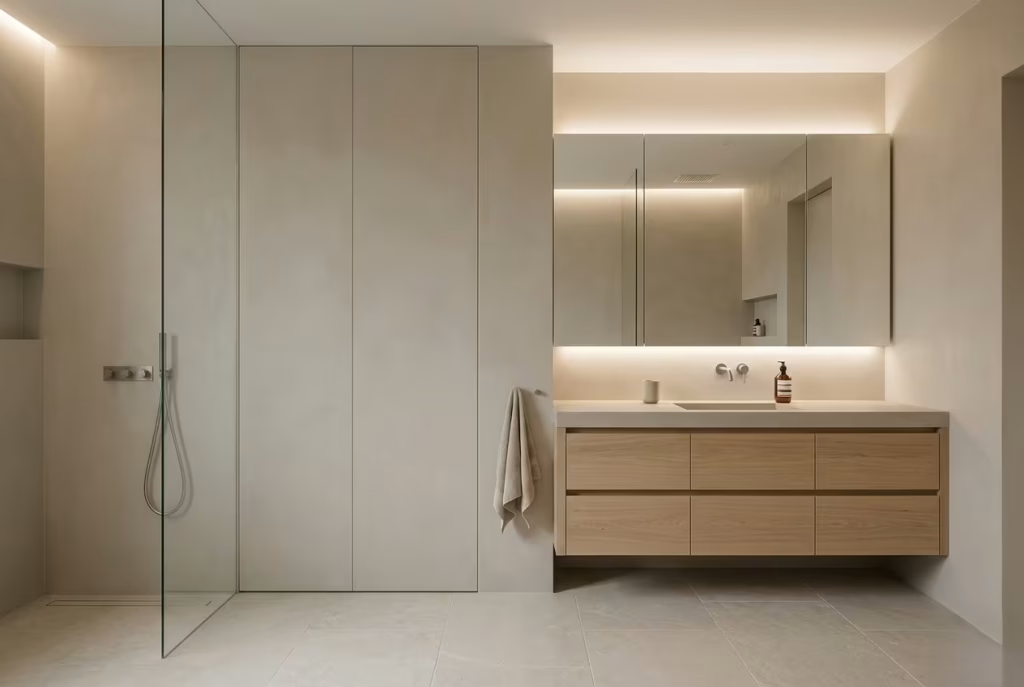
Minimalism in a bathroom only works when the clutter is truly gone, not just visually hidden in plain sight. Hidden storage is what allows a neutral palette to breathe properly. Without it, even the most carefully chosen finishes start to feel crowded, like a room trying to speak too many languages at once. When storage disappears into the architecture, the space gains a kind of quiet discipline that feels intentional rather than empty.
From a spatial reasoning perspective, hidden storage is about reclaiming visual continuity. In bathrooms typically between 6 and 10 m² (65 to 108 sq ft), wall planes become valuable real estate. Recessed cabinetry, flush wall units, and mirrored storage all help maintain uninterrupted surfaces, which in turn makes the room feel more expansive. In one project, a 7 m² (75 sq ft) bathroom used full-height concealed cabinetry integrated into a plaster wall. Once closed, it read as a continuous surface rather than a storage unit, which subtly elongated the perceived width of the room.
The real challenge is not adding storage, but removing its visual presence without compromising function. In practice, I often design storage depths between 120 and 200 mm (5 to 8 inches) for recessed wall niches, which are ideal for everyday essentials without intruding into circulation space. For full vanity units, depths of 450 to 500 mm (18 to 20 inches) remain standard, but the key is how they are finished. Push-to-open mechanisms or handleless designs allow the joinery to sit flush, avoiding unnecessary visual interruption. It is one of those details that feels almost invisible when done well, yet becomes immediately noticeable when absent.
In real-life application, hidden storage often transforms how a bathroom is used day to day. I recall a renovation where surface clutter was initially a constant issue, bottles, toiletries, and accessories accumulating on every available ledge. The redesign introduced concealed cabinetry behind a full mirrored wall panel, measuring approximately 1800 x 900 mm (71 x 35 inches). Overnight, the visual noise disappeared. The room did not change size, but it felt calmer, more composed, as if it had finally exhaled after holding its breath for too long.
Material integration is where hidden storage either succeeds or falls apart. When cabinetry aligns precisely with wall finishes, whether plaster, tile, or microcement, the result is a seamless architectural surface. Even a small misalignment of a few millimetres can disrupt the illusion. In one project, adjusting the reveal depth from 3 mm to 1.5 mm (0.12 to 0.06 inches) made the difference between a unit that felt inserted and one that felt embedded. These are subtle refinements, but they carry disproportionate visual impact.
Lighting also plays a supporting role. Recessed lighting within niches, or soft LED strips inside cabinetry, ensures functionality without breaking the visual calm. In neutral bathrooms, I often avoid overly bright internal lighting, opting instead for soft, diffused illumination around 2700K to 3000K. The goal is not to expose everything at once, but to reveal just enough for the space to feel usable without losing its sense of restraint.
There is also a psychological benefit to hidden storage that goes beyond aesthetics. When everything has a place but nothing is on display, the bathroom begins to feel less reactive and more composed. Daily routines become smoother, almost instinctive, because there is no visual distraction pulling attention away. It is a bit like clearing background noise from a conversation, what remains feels clearer, more intentional, and easier to navigate.
Pros
- Maintains clean visual lines, strengthening minimalist design language
- Reduces surface clutter, improving overall spatial calm
- Enhances perceived space by eliminating visual interruptions
- Supports long-term organisation and ease of maintenance
Cons
- Requires careful planning early in the design process for effective integration
- Reduced accessibility if storage is over-concealed or poorly positioned
- Higher construction complexity, especially with recessed systems
- Mistakes in alignment or detailing are immediately noticeable in minimalist schemes
When hidden storage is done properly, it does not announce itself. It simply allows the bathroom to function without visual interference. In a neutral scheme, where every surface already carries quiet weight, this kind of restraint becomes essential. It is the difference between a space that looks tidy and one that feels genuinely resolved, like everything has been placed exactly where it should be, and nothing more needs to be said.
Earth-Toned Neutral Bathrooms with Subtle Contrast
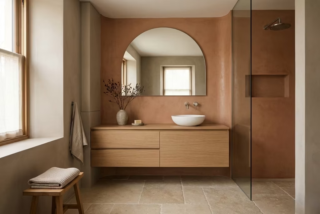
Earth-toned neutral bathrooms sit in a very specific design space, one that feels grounded without becoming heavy and warm without tipping into overt colour. The palette draws from soil, clay, stone, and softened mineral shades, yet the real sophistication comes from restraint. Subtle contrast is doing most of the work here, not loud differences but quiet tonal shifts that reveal themselves slowly, like layers of landscape exposed over time.
From a spatial reasoning perspective, earth tones are particularly effective in bathrooms where architectural form needs support rather than competition. In spaces typically ranging from 6 to 11 m² (65 to 118 sq ft), these tones help define volume without visually breaking it apart. A slightly deeper clay tone on a feature wall, paired with softer sand or stone finishes on surrounding surfaces, creates a gentle hierarchy. The eye understands where to settle, but nothing feels forced or over-emphasised. It is a bit like arranging stones in a riverbed, everything finds its place naturally, without needing to shout for attention.
In real-life application, I often find that earth-toned schemes succeed or fail based on how carefully contrast is moderated. In one project, a 7.5 m² (81 sq ft) bathroom was designed using a combination of warm terracotta microcement, soft limestone flooring, and muted taupe cabinetry. Initially, the concern was that the terracotta might dominate the space. However, once balanced with lighter mineral surfaces and restrained detailing, the palette began to feel layered rather than loud. The room did not rely on a single focal point. Instead, it moved between tones quietly, like shifting light across natural terrain.
The success of subtle contrast depends heavily on value relationships rather than colour itself. The difference between a light sand tone and a deeper clay shade may only be marginal in saturation, yet that small shift is enough to create depth. I often work within a controlled range of three to four closely related tones, ensuring that no single element breaks away too sharply from the rest. This approach prevents visual fragmentation while still maintaining enough variation to keep the space engaging over time.
Material selection reinforces this balance. Matte finishes tend to work best, as they reduce glare and allow the tonal relationships to remain soft and readable. In one renovation, a combination of honed travertine, clay plaster walls, and brushed oak joinery created a composition that felt cohesive without being monotonous. The materials were distinct, yet they spoke the same language. Nothing felt isolated, and nothing felt overly dominant.
Lighting plays a critical role in how earth tones are perceived. Warmer light temperatures, typically between 2700K and 3000K, enhance the natural warmth of clay and stone-based finishes. However, balance is key. Too warm, and the palette can drift into heaviness; too cool, and the earthy quality begins to flatten. In a recent project, carefully diffused ceiling lighting combined with concealed wall wash lighting helped maintain clarity while preserving warmth, allowing the materials to shift gently throughout the day.
There is also an emotional dimension to earth-toned bathrooms that often becomes apparent only after use. These spaces tend to feel more grounded, almost restorative in character. The absence of harsh contrast reduces visual tension, which in turn creates a slower, more settled atmosphere. It is not a dramatic transformation, but a gradual one, like the room has quietly adjusted itself to a more natural rhythm.
Pros
- Creates a grounded, calming atmosphere with strong connection to natural materials
- Offers subtle contrast without relying on bold or disruptive colour differences
- Ages well, as earth tones tend to remain relevant over time
- Works across a wide range of architectural styles, from modern to rustic
Cons
- Poor balance can lead to a heavy or overly muted appearance
- Requires careful tonal control to avoid visual monotony
- Lighting must be precisely calibrated to prevent dullness or over-warming
- Limited contrast may not suit those seeking more dynamic visual impact
When handled with care, earth-toned neutral bathrooms feel less like a designed space and more like a natural extension of material and light. They do not rely on contrast to create interest, but on subtle variation that unfolds gradually. In the end, it is this quiet layering that gives the room its depth, like a landscape that reveals more the longer you stand still and observe it.
Soft Taupe Bathrooms with Brushed Metal Fixtures
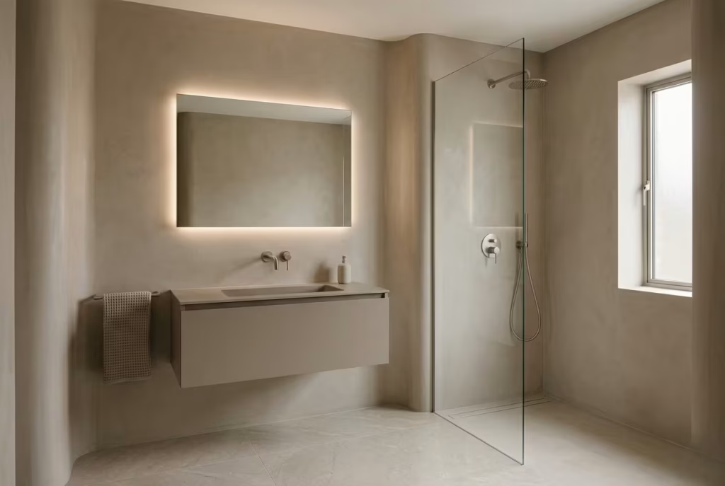
Soft taupe sits in that refined middle ground where warmth and restraint finally learn to coexist without tension. It is neither overtly beige nor fully grey, but something quieter and more considered, like a whisper rather than a statement. When paired with brushed metal fixtures, the result is a bathroom that feels composed yet gently lifted, with just enough contrast to keep the eye engaged without ever breaking the calm.
From a spatial reasoning perspective, taupe works particularly well in bathrooms where architectural simplicity needs softening rather than amplification. In spaces typically ranging from 5.5 to 10 m² (59 to 108 sq ft), it helps unify surfaces that might otherwise feel disjointed. Walls, floors, and joinery settle into a shared tonal language, allowing the room to feel more cohesive. Brushed metal fixtures then introduce a subtle point of interruption, not loud enough to dominate, but enough to create visual punctuation. It is a bit like adding rhythm to a steady piece of music, the structure remains calm, yet it never feels static.
In real-life application, I have often found that taupe performs best when it is allowed to behave as a backdrop rather than a feature. In one project, a 6.8 m² (73 sq ft) bathroom was finished in a soft taupe microcement, paired with brushed nickel fittings and a lightly veined limestone floor. Initially, there was concern that the palette might feel too subdued. However, once the brushed metal was introduced, the space gained just enough definition to feel resolved. The fixtures caught light gently throughout the day, shifting from cool to warm depending on the angle, while the taupe surfaces held everything together in a calm, consistent field.
The success of this pairing depends heavily on balance between warmth and reflectivity. Brushed metals, whether nickel, brass, or stainless steel, introduce a directional sheen that interacts with light in a controlled way. Unlike polished finishes, which can feel sharp or overly reflective, brushed surfaces diffuse light, allowing them to sit more comfortably within soft palettes. In practice, I often prefer brushed nickel or satin brass in taupe bathrooms, as both carry a muted quality that aligns naturally with the understated character of the base colour.
Spatially, fixture placement becomes a quiet but important consideration. In vanity zones, taps are typically set at 100 to 150 mm (4 to 6 inches) from basin edges, ensuring proportion feels deliberate rather than incidental. Shower fittings, often aligned at 900 to 1200 mm (35 to 47 inches) from floor level, should be positioned with restraint, avoiding visual clutter on key sightlines. When these elements are carefully spaced, they begin to read as part of a larger composition rather than isolated objects.
Lighting further shapes how taupe and brushed metal interact. Warm lighting between 2700K and 3000K tends to enhance the softness of taupe, while allowing brushed finishes to retain their subtle shimmer. In one renovation, adjusting the beam angle of vanity lighting reduced harsh reflections on metal surfaces, resulting in a more even visual tone across the room. It was a small adjustment, but it changed the overall reading of the space, making everything feel more intentional and less fragmented.
There is also a tactile quality to this combination that should not be overlooked. Taupe surfaces, particularly in matte plaster or microcement finishes, absorb light in a way that feels soft and grounded. Brushed metals, on the other hand, introduce a gentle resistance to touch, neither slippery nor glossy. Together, they create a sensory balance that feels understated but complete, like the room has been designed to be experienced rather than simply viewed.
Pros
- Creates a balanced, understated palette that feels calm and cohesive
- Brushed metal fixtures add subtle contrast without overwhelming the design
- Works well across both contemporary and transitional bathroom styles
- Ages gracefully, with finishes developing character over time
Cons
- Requires careful tonal matching to avoid flat or washed-out results
- Overuse of similar tones can reduce visual hierarchy
- Brushed finishes may show wear patterns if not properly maintained
- Lighting must be carefully controlled to avoid dullness or excessive reflection
When soft taupe and brushed metal are brought together with intention, the bathroom begins to feel quietly resolved. Nothing competes for attention, yet nothing disappears either. It is a composition built on restraint and balance, where every element has a role to play, and the overall effect lingers gently, long after you have left the room.
Neutral Bathrooms with Skylight Integration
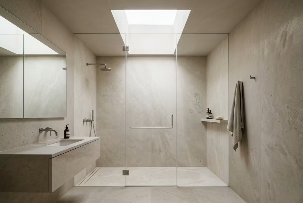
A skylight changes the entire personality of a neutral bathroom in a way that no surface finish can replicate. It does not add decoration or detail, yet it becomes the quiet director of everything happening below it. In neutral schemes, where restraint is already doing most of the visual work, overhead natural light introduces movement, softness, and rhythm that shifts throughout the day, almost like the room is breathing in real time.
From a spatial reasoning perspective, skylights are particularly effective in bathrooms that lack strong external windows or suffer from limited wall openings. In spaces ranging from 5 to 10 m² (54 to 108 sq ft), introducing overhead light immediately changes how volume is perceived. Instead of relying on side light, which often flattens one plane, skylights distribute illumination more evenly across all surfaces. This creates a subtle vertical expansion effect, making even modest bathrooms feel taller and less enclosed. In one project, a compact 6 m² (65 sq ft) bathroom shifted entirely in character once a 600 x 900 mm (24 x 36 inches) skylight was introduced above the shower zone. The room stopped feeling like a closed box and began to read as an open, upward-reaching space.
In real-life application, the positioning of a skylight is rarely accidental. It becomes a structural decision that influences every material choice below it. I often align skylights with key functional zones, such as walk-in showers or freestanding baths, so that natural light becomes part of the ritual of use rather than just background illumination. In one renovation, placing a skylight directly above a limestone-clad shower created a constantly shifting surface effect. Morning light revealed soft texture and detail, while late afternoon light introduced warmer tones that deepened the stone’s character. The same materials, yet completely different atmospheres, depending on the hour.
There is also a psychological quality to overhead light that should not be underestimated. Unlike side lighting, which can feel directional or partial, skylight illumination has a more enveloping quality. It reduces harsh shadows and creates a sense of openness that is difficult to achieve artificially. This is particularly valuable in neutral bathrooms, where the absence of strong colour means light itself becomes the primary source of variation. Without it, even the most carefully selected materials risk feeling static.
From a practical standpoint, skylight dimensions typically range between 500 x 700 mm and 1000 x 1200 mm (20 x 28 inches to 39 x 47 inches), depending on roof structure and room size. In smaller bathrooms, a single well-placed unit is often sufficient, while larger spaces may benefit from multiple skylights or elongated roof glazing. The key is not size alone, but positioning relative to circulation and water zones. A poorly placed skylight can create glare or overexposure, while a well-positioned one quietly enhances the entire composition.
Material selection beneath skylights requires careful consideration. Matte finishes tend to perform best, as they diffuse incoming light rather than reflecting it sharply. In one project, a glossy tile finish initially caused unwanted glare during peak daylight hours, making the space feel visually unsettled. Switching to a honed stone surface immediately softened the effect, allowing light to settle rather than bounce. It is a reminder that overhead light is not just an addition, but a force that actively shapes how materials behave.
Ventilation is another critical layer. Many modern skylights are designed to open, typically around 150 to 300 mm (6 to 12 inches), allowing natural airflow to complement moisture control. In bathrooms, this dual function becomes especially valuable, supporting both atmosphere and practicality without introducing visible mechanical systems into the design.
Pros
- Maximises natural light, creating a brighter and more spatially open bathroom
- Enhances vertical perception, making rooms feel taller and less confined
- Brings dynamic lighting changes throughout the day, enriching neutral palettes
- Reduces reliance on artificial lighting during daylight hours
Cons
- Requires careful structural planning and roof suitability assessment
- Can introduce overheating or glare if poorly positioned or oversized
- Higher installation complexity compared to standard window solutions
- Limited flexibility once installed, making early design decisions critical
When skylights are integrated with intention, they do more than illuminate a neutral bathroom. They reshape how the space is experienced hour by hour, quietly transforming surfaces, tones, and textures without changing a single material. It becomes a room that does not stay still, yet never feels chaotic, like light itself has been given permission to shape the atmosphere as it moves through the day.
Compact Neutral Bathrooms that Feel Expansive
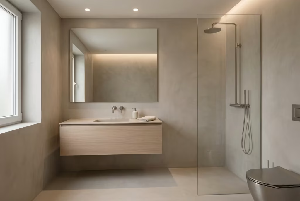
Compact bathrooms often reveal the real difference between decoration and spatial intelligence. When space is limited, every surface carries more weight, every reflection matters, and every decision either opens the room up or quietly closes it down. Neutral design, when handled properly in these conditions, becomes less about aesthetics and more about spatial discipline, where restraint does most of the heavy lifting.
From a spatial reasoning perspective, the perception of expansiveness is less about adding square metres and more about manipulating visual continuity. In compact bathrooms typically ranging from 3.5 to 6.5 m² (38 to 70 sq ft), layout becomes the primary tool for expansion. Aligning the vanity, toilet, and shower along a single visual axis reduces fragmentation and allows the eye to travel uninterrupted. In one project, repositioning a compact vanity from a corner placement to a central wall alignment immediately changed the reading of the room. It stopped feeling like separate zones stitched together and began to feel like one continuous, breathable space.
Mirrors play a decisive role, but not in the obvious way people often assume. A large mirror, typically ranging from 600 x 900 mm to 1200 x 1000 mm (24 x 35 inches to 47 x 39 inches), can double perceived depth, but only when it reflects something worth extending. In real-life application, I often avoid placing mirrors opposite cluttered or visually busy zones. Instead, I position them to reflect light sources, open walls, or continuous materials like plaster or stone. In one renovation, a full-width mirror above a floating vanity reflected a softly lit plaster wall opposite, creating a sense of depth that felt almost architectural rather than decorative.
Spatial expansion is also heavily influenced by how surfaces meet. In compact bathrooms, reducing visual breaks is essential. This is where continuous materials such as large format tiles or microcement become particularly effective. When floor and wall surfaces share tonal similarity, the boundaries of the room begin to blur slightly. In a 4.8 m² (52 sq ft) bathroom, using a single warm greige tile across both floor and shower walls created a subtle illusion of extended width. Nothing physically changed, yet the room felt less constrained, as if the edges had been gently softened.
Lighting further reinforces this effect. In small neutral bathrooms, layered lighting tends to outperform single-source illumination. A combination of recessed ceiling lights, mirror-integrated lighting, and subtle wall washing helps eliminate harsh shadows that can visually compress space. I typically work within a colour temperature range of 2700K to 3000K, as it maintains warmth without flattening the neutrality of the palette. In one project, replacing a single overhead fixture with a layered system immediately reduced the sense of enclosure, particularly in the shower zone where shadows previously made the space feel tighter than it was.
There is also a psychological layer at play. Compact spaces often feel restrictive not because of their actual size, but because of visual interruption. When the eye is constantly forced to stop and restart, the room begins to feel fragmented. By contrast, when surfaces, reflections, and lighting are aligned in a continuous flow, the brain reads the space as more open. It is a subtle shift, but one that fundamentally changes how the room is experienced day to day.
Storage integration becomes equally important. In compact neutral bathrooms, visible storage is often the first element to undermine spatial calm. Recessed niches, mirrored cabinets, and concealed joinery allow functionality to exist without visual interruption. In one renovation, a shallow recessed storage unit of 120 mm (5 inches) depth was integrated into a plaster wall, eliminating the need for external shelving entirely. The result was a cleaner visual field, which directly contributed to the sense of openness.
Pros
- Enhances perceived space without structural expansion
- Creates visual continuity through careful use of mirrors and materials
- Improves natural and artificial light distribution in small areas
- Encourages efficient, clutter-free spatial organisation
Cons
- Requires precise planning to avoid visual imbalance or reflection issues
- Overuse of mirrors can create disorienting or overly artificial effects
- Limited tolerance for design errors in small footprints
- Storage must be carefully integrated to avoid disrupting spatial flow
When compact neutral bathrooms are designed with intention, they stop behaving like small spaces altogether. Instead, they become carefully composed environments where light, reflection, and layout work together to stretch perception beyond physical limits. It is not about making the room bigger, but about making it feel less confined, like the boundaries have quietly stepped back without ever being removed.
You May also Like: 25 Barndominium Bathroom Design Ideas for Rustic-Chic Homes
Neutral Bathrooms with Layered Textiles
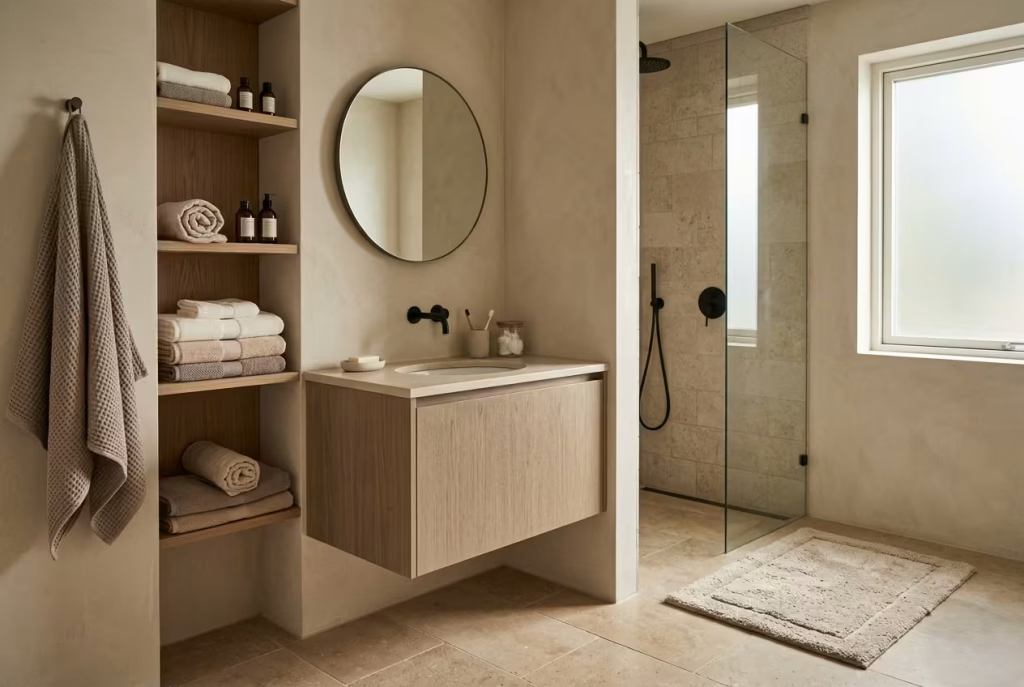
Neutral bathrooms often risk feeling visually complete but emotionally unfinished. Surfaces, no matter how well composed, can sometimes read a little too controlled, almost like a room that has been carefully set but not yet lived in. This is where layered textiles step in. Towels, bath mats, and soft accessories introduce a quieter human register, softening architectural precision and allowing the space to feel inhabited rather than staged.
From a spatial reasoning perspective, textiles operate as flexible visual mass. In bathrooms typically ranging from 5 to 9 m² (54 to 97 sq ft), they help balance hard surfaces such as stone, tile, and plaster. A well-placed bath mat of around 600 x 900 mm (24 x 35 inches) can visually ground a freestanding vanity or bath zone, while stacked towels introduce vertical rhythm in otherwise static compositions. In one project, a compact neutral bathroom felt slightly sterile after completion. The architecture was correct, the materials were refined, but the space lacked softness. Introducing layered towels in staggered tones of warm white, sand, and soft taupe immediately changed the reading of the room. It no longer felt like a display, but like a space in use.
In real-life application, textiles often act as the final calibration layer. I tend not to treat them as decorative afterthoughts, but as part of the spatial composition itself. In one renovation, a limestone and microcement bathroom was initially designed to feel highly minimal. However, without any soft elements, the room felt acoustically and visually sharp. Adding heavyweight cotton towels with a slight waffle texture, approximately 600 to 700 GSM, softened both the visual contrast and the acoustic reflection within the space. Even small adjustments, such as rolling towels rather than folding them flat, altered how light and shadow behaved on vertical surfaces.
The layering of textiles is not about quantity, but about hierarchy. A well-considered arrangement often includes three levels: primary towels for use, secondary towels for visual balance, and accent textiles such as mats or hand cloths that introduce subtle variation. Colour control is essential here. In neutral bathrooms, I typically work within a narrow tonal band, often no more than two to three shades apart. For example, pairing warm ivory with soft sand or muted stone grey avoids visual fragmentation while still allowing depth.
Material quality also plays a significant role. Natural fibres such as cotton, linen blends, and bamboo tend to integrate more naturally into neutral schemes. Linen, in particular, introduces a slightly irregular texture that prevents the space from feeling overly rigid. In one project, pre-washed linen towels were used specifically because their softened edges and subtle creasing complemented a plaster wall finish. The result was a quiet dialogue between structure and softness, rather than a clash between polished and raw elements.
Spatial placement matters more than most people expect. Hanging towels at consistent heights, typically around 1200 to 1400 mm (47 to 55 inches) from floor level, helps maintain visual order. Bath mats should align with key functional zones, such as the exit point of a shower or the side of a freestanding bath, rather than floating arbitrarily within the space. When these small alignments are respected, textiles begin to feel integrated rather than scattered.
There is also a sensory dimension to layered textiles that often goes unnoticed at first. They soften sound, reduce echo in hard-surfaced bathrooms, and introduce a tactile counterpoint to stone and tile. Over time, this contributes to a more comfortable lived experience, even if the change is not immediately visible. It is the kind of detail that quietly improves the atmosphere without ever drawing attention to itself.
Pros
- Softens hard architectural surfaces, creating a more balanced atmosphere
- Adds warmth and livability to otherwise minimal neutral bathrooms
- Flexible and easy to update without structural changes
- Improves acoustic comfort in spaces with hard reflective surfaces
Cons
- Can introduce visual clutter if not carefully controlled
- Requires regular maintenance to maintain a clean, composed appearance
- Poor colour coordination can disrupt neutral harmony
- Over-layering may reduce the clarity of minimalist design intent
When used with restraint and intention, layered textiles do not decorate a neutral bathroom, they complete it. They bring a sense of ease that hard materials alone cannot achieve, gently bridging the gap between architectural precision and everyday life. In the end, it is these soft, unassuming layers that make a space feel not just designed, but genuinely lived in.
Japandi-Inspired Neutral Bathrooms
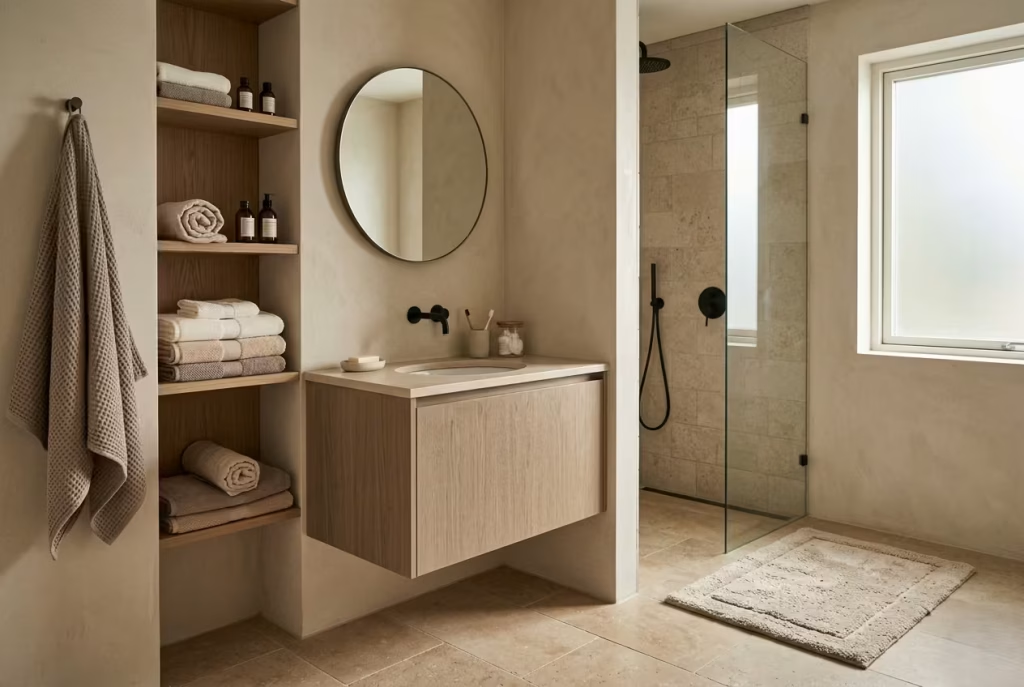
Japandi bathrooms sit in a very particular design balance, where warmth and restraint are held in careful tension rather than forced together. It is not about blending two styles superficially, but about finding a quiet middle ground where Japanese clarity and Scandinavian softness meet without either losing its identity. The result, when done properly, feels calm but not cold, warm but never cluttered, like a space that understands exactly how little it needs to say.
From a spatial reasoning perspective, Japandi design relies heavily on controlled simplicity and clear circulation. In bathrooms typically ranging from 6 to 11 m² (65 to 118 sq ft), this approach works by reducing visual interruptions and allowing negative space to become part of the composition. Every element is given breathing room, whether it is a vanity, a freestanding bath, or a simple storage niche. In one project, a 7 m² (75 sq ft) bathroom was reorganised around a low-profile timber vanity and a single linear wall shelf. By clearing unnecessary visual layers, the room began to feel more grounded and open at the same time, almost as if the architecture had quietly stepped back to let the space speak for itself.
In real-life application, Japandi-inspired bathrooms succeed when material restraint is paired with deliberate warmth. I often work with a limited palette of light oak, soft limestone, matte plaster, and muted greige tones. In one renovation, a compact bathroom was transformed using just three core materials: pale oak cabinetry, honed stone flooring, and limewashed walls. Initially, the concern was that the palette might feel too minimal. However, once natural light entered the space, especially in the morning, the materials began to shift gently in tone. The oak warmed slightly, the stone softened under diffuse light, and the walls acted as a quiet backdrop rather than a dominant surface.
The strength of Japandi design lies in proportion and restraint. Fixtures are typically low-profile, often with simple cylindrical or geometric forms that avoid unnecessary ornamentation. Vanity depths around 450 to 500 mm (18 to 20 inches) maintain functionality without intruding into circulation space, while clear walkway widths of at least 800 mm (31 inches) help preserve the sense of openness. In practice, I find that even small deviations from these proportions can disrupt the balance, making the room feel either too tight or too sparse.
There is also a strong emphasis on material authenticity. Surfaces are rarely high gloss or heavily polished. Instead, matte and honed finishes dominate, allowing texture to carry visual interest. In one project, replacing a glossy tile specification with a softly textured limestone completely changed the atmosphere. The space immediately felt more grounded, as though it had shifted from being visually sharp to gently diffused. It is a reminder that Japandi design does not rely on complexity, but on the subtle behaviour of materials under light.
Lighting is equally critical in achieving this balance. Natural light is prioritised wherever possible, often filtered through frosted glazing or softly diffusing blinds. Artificial lighting tends to be indirect, with warm tones typically between 2700K and 3000K. In one bathroom, concealed lighting within a ceiling recess created a gentle wash of light that mirrored daylight conditions throughout the day. The effect was subtle but important, maintaining continuity between morning and evening use without visual disruption.
Storage is handled with quiet discipline. Rather than open shelving or decorative display, Japandi bathrooms often rely on concealed or minimally exposed storage systems. Recessed niches, flush cabinetry, and integrated joinery help maintain clean architectural lines. In one renovation, a full-height storage wall was finished in matching oak veneer with invisible push mechanisms, allowing the entire surface to read as a continuous plane rather than a functional unit.
There is also an emotional quality to Japandi bathrooms that develops over time. They tend to feel less reactive than other styles, offering a sense of stillness that becomes more noticeable the longer you spend in them. It is not about visual drama, but about consistency. The space does not change its tone dramatically throughout the day, but instead holds a steady atmosphere that feels reassuring and balanced.
Pros
- Creates a calm, balanced atmosphere through controlled minimalism and warmth
- Encourages functional clarity with uncluttered spatial layouts
- Works well with natural materials that age gracefully over time
- Supports strong light quality and soft visual continuity throughout the day
Cons
- Requires strict restraint, where excess can quickly disrupt balance
- Limited tolerance for decorative or contrasting elements
- Can feel too minimal if material variation is not carefully introduced
- Depends heavily on quality of natural light to achieve full effect
When Japandi principles are applied with care, the bathroom becomes less about visual expression and more about spatial clarity. Nothing feels forced or overstated. Instead, everything settles into place with quiet intention, like a room that has learned the value of restraint and carries it effortlessly, without needing to prove anything at all.
Neutral Bathrooms with Integrated Seating
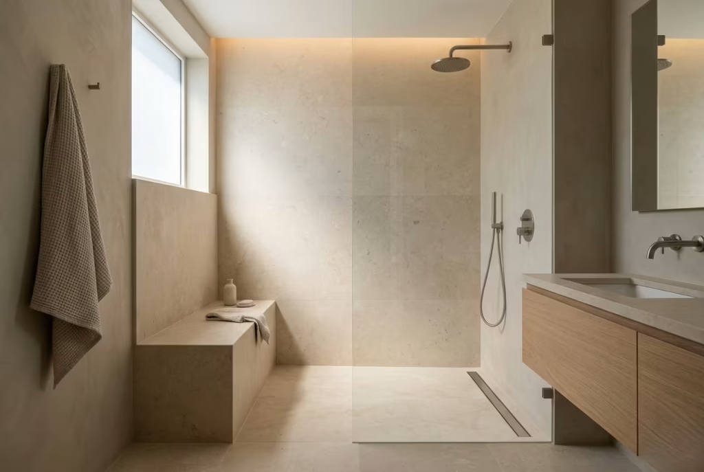
Integrated seating in a neutral bathroom is one of those details that quietly changes how the space is experienced, without ever needing to announce itself. It is not about adding furniture in the traditional sense, but about carving out moments of pause within the architecture. In neutral schemes, where everything is already stripped back to essentials, a built-in bench introduces a sense of human scale and ease, like a natural resting point in an otherwise continuous flow of surfaces.
From a spatial reasoning perspective, integrated seating works best when it is treated as part of the room’s circulation rather than an accessory. In bathrooms typically ranging from 6 to 10 m² (65 to 108 sq ft), even a modest bench can reshape how movement is experienced.
A standard depth of 300 to 400 mm (12 to 16 inches) allows comfortable seating without intruding into walkways, while lengths can vary depending on wall availability, often between 800 mm and 1500 mm (31 to 59 inches).
In one project, a 7 m² (75 sq ft) bathroom featured a continuous bench integrated into the shower wall. What was initially intended as a secondary feature ended up becoming a quiet focal point, subtly structuring how the space was used day to day.
In real-life application, I often find that integrated seating becomes most valuable when it serves multiple roles rather than a single function. In a recent renovation, a limestone-clad bench was introduced inside a walk-in shower of approximately 900 x 1200 mm (36 x 48 inches).
At first glance, it seemed almost secondary, but over time it became one of the most used elements in the room. It provided a resting point, a practical surface for daily routines, and a visual break within the vertical plane of tiled walls. The key was restraint. The bench was not oversized or overly detailed, but proportioned to feel like a natural extension of the architecture.
The success of integrated seating often depends on how it interacts with surrounding materials. In neutral bathrooms, I tend to favour continuity, using the same stone or microcement finish across both bench and wall surfaces.
This creates a sense of cohesion, almost as if the bench has emerged from the structure rather than being added onto it. In one project, a floating stone bench at 350 mm depth (14 inches) was installed within a plaster-finished shower enclosure. The transition between wall and seat was so subtle that it initially went unnoticed by visitors, which is often a sign that the integration has been handled correctly.
Ergonomics also plays a crucial role. Seat heights typically range between 430 and 480 mm (17 to 19 inches), which aligns with standard comfort levels for both sitting and transitional movement. In shower environments, ensuring adequate drainage slope around the seating area is essential, usually around 1 to 2 percent, so water does not pool. These technical details may seem secondary, but they determine whether the feature feels effortless in daily use or becomes a minor inconvenience over time.
Lighting can further enhance the presence of integrated seating without making it visually dominant. Soft under-bench lighting or adjacent wall grazing at low intensity helps define the form gently, particularly in evening use.
In one renovation, a concealed LED strip beneath a stone bench created a subtle floating effect that added depth without disrupting the calm neutrality of the space. It was not dramatic, but it changed how the bench was perceived, from a fixed element to something almost weightless.
There is also a behavioural aspect to integrated seating that becomes more apparent over time. It introduces pause into a space that is often purely functional. Whether used for dressing, resting, or simply stepping out of a routine, it creates a small but meaningful interruption in movement. In neutral bathrooms, where simplicity can sometimes risk becoming too transactional, this kind of pause adds a layer of lived experience that feels quietly essential.
Pros
- Introduces functional pause points within the bathroom layout
- Enhances usability in showers and dressing areas without requiring additional furniture
- Can be seamlessly integrated into walls or shower zones for a cohesive look
- Adds subtle architectural interest without disrupting neutral design balance
Cons
- Requires careful planning to avoid obstructing circulation space
- Improper waterproofing or slope design can lead to water pooling issues
- Fixed nature limits flexibility compared to movable furniture
- Can feel underused in very small bathrooms if not thoughtfully positioned
When integrated seating is handled with restraint and intention, it becomes more than a convenience. It becomes part of the rhythm of the space, a quiet pause embedded within the architecture itself. In a well-composed neutral bathroom, it does not draw attention to itself, but it consistently earns its place, day after day, through simple, unspoken usefulness.
Neutral Bathrooms Using Glass to Extend Space
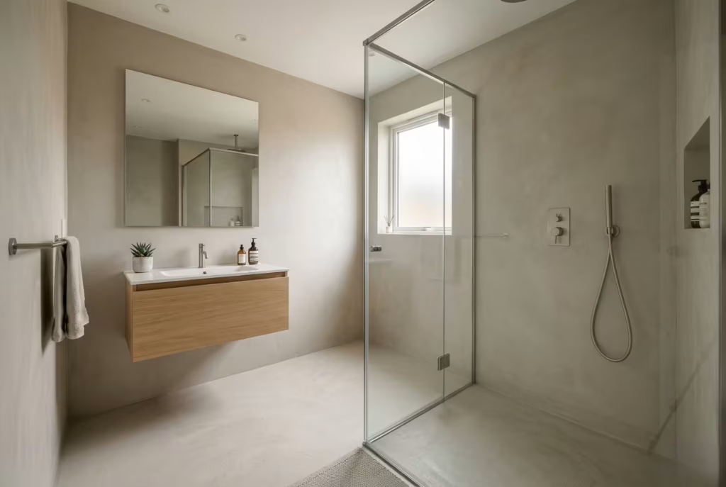
Glass in a neutral bathroom is never just a divider. When it is used well, it behaves more like a spatial illusion, quietly stretching perception without physically changing a single wall. It allows boundaries to soften, sightlines to continue, and light to travel further than the architecture would normally allow. In neutral schemes, where visual restraint is already doing most of the work, glass becomes the quiet enabler that stops the room from feeling boxed in.
From a spatial reasoning perspective, glass works by removing the psychological stop points that solid partitions create. In bathrooms typically ranging from 5 to 10 m² (54 to 108 sq ft), this can completely change how the room is read. A frameless glass shower enclosure, often 8 to 10 mm thick, replaces what would otherwise be a visual barrier with something almost invisible.
In one project, a narrow 6 m² (65 sq ft) bathroom felt divided and compressed due to a full-height tiled shower enclosure. Once replaced with a clear glass panel, the entire space opened up visually. The floor continued uninterrupted, the wall finishes extended further, and suddenly the room felt less segmented, like the boundaries had quietly stepped back.
In real-life application, the effectiveness of glass depends heavily on what it is reflecting and what it is revealing. Glass does not create space on its own, it borrows it. In a well-composed neutral bathroom, that borrowed space is usually a clean plaster wall, a softly lit surface, or a continuous material like limestone or microcement.
In one renovation, a walk-in shower enclosed in clear glass was positioned opposite a warm plaster wall. The reflection doubled the sense of depth, but more importantly, it kept the visual field calm and uninterrupted. Had the glass been reflecting clutter or harsh contrast, the effect would have been completely different, almost chaotic rather than expansive.
Spatial alignment becomes critical when working with glass. Shower enclosures, typically sized around 900 x 1200 mm to 1000 x 1400 mm (36 x 48 inches to 39 x 55 inches), should be positioned in relation to the room’s natural sightlines. If placed at the end of a visual axis, glass can extend depth dramatically.
If placed awkwardly across circulation paths, it can fragment the layout instead. In one project, shifting a glass panel just 150 mm (6 inches) off-centre aligned it with a window beyond, creating a layered visual corridor that made the bathroom feel significantly longer than its actual footprint.
There is also a subtle but important distinction between framed and frameless glass. Frameless systems tend to disappear more effectively into neutral schemes, especially when paired with minimal hardware such as discreet wall channels or slim stainless steel fixings.
Framed glass, while structurally more defined, can introduce visual interruption that undermines the sense of openness. In neutral bathrooms, where calmness is the goal, reducing visual edges usually delivers a more cohesive result.
Lighting plays an essential supporting role. Glass amplifies whatever light it receives, so poorly controlled lighting can quickly expose imperfections or create glare. I typically work with soft, diffused lighting in the 2700K to 3000K range, ensuring reflections remain gentle rather than harsh.
In one renovation, adjusting the angle of a ceiling downlight by just a few degrees eliminated an unwanted glare line across a glass panel, instantly restoring the intended clarity of the space.
Cleaning and maintenance are also part of the long-term performance of glass. In hard water areas, untreated surfaces can quickly lose their clarity, which diminishes the very effect they are meant to create.
In practice, I often recommend hydrophobic coatings or easy-clean treatments, particularly in walk-in showers where water exposure is constant. It is not a glamorous detail, but it ensures the spatial illusion remains intact over time.
Pros
- Enhances perceived space by removing visual barriers
- Allows natural and artificial light to travel freely through the room
- Maintains open sightlines, improving overall spatial continuity
- Works seamlessly with neutral palettes without introducing visual weight
Cons
- Requires consistent cleaning to maintain clarity and visual impact
- Poor placement can reflect clutter or disrupt spatial balance
- Limited privacy unless treated or strategically positioned
- Can feel cold or exposed if not balanced with softer materials
When glass is used with intention, it does more than divide a bathroom. It extends it. It allows light, material, and sightlines to move further than the walls physically permit. In a well-balanced neutral scheme, it becomes almost invisible, yet its impact is unmistakable, quietly stretching the room until it feels larger, lighter, and far more connected than its footprint suggests.
Subtle Pattern Play within a Neutral Palette
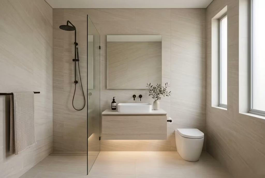
Subtle pattern play in a neutral bathroom is less about decoration and more about controlled rhythm. It is the difference between a space that feels quietly layered and one that feels visually flat.
In neutral schemes, where colour is intentionally restrained, pattern becomes the tool that introduces movement, but only when handled with a light enough touch not to disturb the calm. It is a bit like adding a faint echo to a quiet room, noticeable only when you pay attention, yet essential to the atmosphere.
From a spatial reasoning perspective, pattern works best when it supports orientation rather than competes with it. In bathrooms typically ranging from 5 to 9 m² (54 to 97 sq ft), subtle repetition can help define zones without introducing visual fragmentation.
For example, a lightly patterned tile used on a shower wall at 300 x 600 mm (12 x 24 inches) can create gentle vertical or horizontal rhythm, guiding the eye without locking it into a rigid grid.
In one project, a soft limestone tile with barely visible linear veining was used across both floor and walls. At first glance, it appeared almost uniform, but over time the subtle directional pattern began to quietly elongate the space, making the room feel more fluid than static.
In real-life application, the success of subtle patterning often lies in how restrained the contrast is. I have seen bathrooms where pattern was technically correct but visually too assertive, and the entire calmness of the space was lost. In contrast, a successful application tends to sit within a very narrow tonal range.
In one renovation, a 6.5 m² (70 sq ft) bathroom used handmade ceramic tiles with slight surface variation, each tile measuring 75 x 150 mm (3 x 6 inches). The variation was not immediately obvious, but under changing daylight it introduced just enough irregularity to keep the walls from feeling flat. It was the kind of detail that revealed itself slowly, almost like a background conversation you only notice after spending time in the room.
The key to subtle pattern play is scale control. Large, bold patterns can quickly dominate a neutral palette, while overly small patterns risk becoming visual noise. The most effective approach often sits somewhere in between, where pattern is present but softened through tone and finish rather than high contrast.
I often work with tonal differences of no more than 5 to 10 percent between pattern elements and base surfaces. This keeps the visual language cohesive while still allowing gentle variation.
Material choice also determines how pattern is perceived. Matte or honed finishes tend to diffuse pattern, making it feel more integrated into the surface, whereas glossy finishes can exaggerate it.
In one project, switching from a polished patterned tile to a honed version immediately softened the entire visual field. The pattern did not disappear, but it stopped demanding attention, allowing the rest of the room to breathe more freely.
Lighting is another critical factor. Directional light can either enhance or exaggerate pattern depending on its angle and intensity. In neutral bathrooms, I typically favour diffused lighting around 2700K to 3000K to ensure patterns remain gentle and non-intrusive.
In a recent renovation, adjusting wall lighting from direct spot illumination to a softer wash completely changed how a subtle linear tile pattern was perceived. Instead of reading as sharp stripes, it became a soft gradient of texture that shifted throughout the day.
There is also a psychological benefit to subtle patterning that often goes unnoticed. In purely minimal spaces, the eye can sometimes struggle to find rest, especially when surfaces are completely uniform. Introducing controlled pattern gives the eye a gentle place to land without disrupting overall calm. It adds a layer of quiet engagement that makes the space feel more considered and less sterile.
Pros
- Adds depth and visual interest without disrupting neutral calm
- Helps define spatial zones in compact or open-plan bathrooms
- Works well with natural materials like stone, ceramic, and plaster
- Enhances long-term visual engagement without feeling overwhelming
Cons
- Easy to overdo, which can quickly break the neutrality of the space
- Requires careful control of scale and tonal contrast
- Poor lighting can exaggerate pattern unintentionally
- Limited flexibility if patterns are too dominant or permanent
When subtle pattern is handled with restraint, it becomes less about decoration and more about quiet structure. It introduces just enough variation to keep a neutral bathroom visually alive, without ever tipping it into distraction. In the end, it is the kind of detail that does not announce itself, but steadily reveals its value over time, like a rhythm that only becomes clear once you have learned to live within it.
Timeless Neutral Bathrooms That Age Gracefully
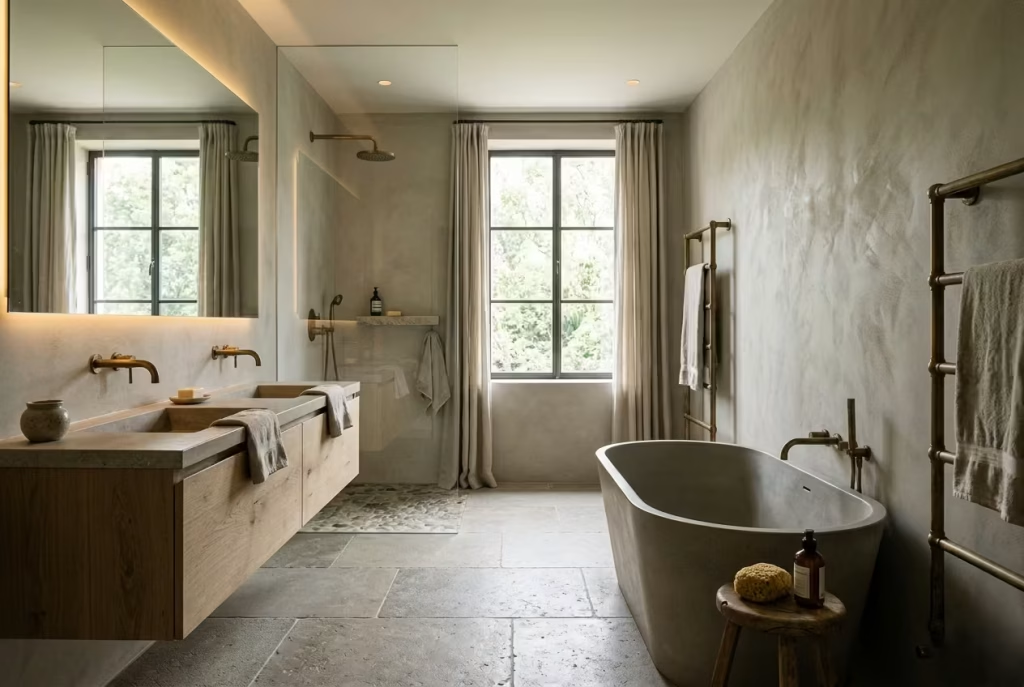
Timeless neutral bathrooms are rarely the ones that impress at first glance. They are the ones that quietly settle in, then slowly reveal their strength over months and years of use. There is a particular kind of restraint at play here, where nothing feels overworked, yet nothing feels accidental either. In many ways, these are the bathrooms that do not chase trends but instead allow time to become part of the design language.
From a spatial reasoning perspective, timelessness is achieved through balance rather than novelty. In bathrooms typically ranging from 6 to 12 m² (65 to 129 sq ft), the focus shifts away from statement features and towards proportional harmony. Circulation space, fixture placement, and material continuity take priority over visual impact.
In one renovation, a 9 m² (97 sq ft) bathroom was designed with a simple linear layout: vanity on one wall, walk-in shower at the far end, and a freestanding bath aligned with a central window axis. Nothing about the plan was dramatic, yet the clarity of arrangement made the room feel naturally composed. Over time, that sense of order became its defining quality.
In real-life application, I have found that bathrooms which age well are almost always those that avoid over-specification. Materials are chosen not just for their initial appearance, but for how they behave under use, light, and time. In one project, a combination of honed limestone flooring, soft plaster walls, and brushed metal fixtures was selected with durability and patina in mind.
At installation, the space felt understated, almost restrained to the point of simplicity. Yet after a year of use, the surfaces began to develop subtle variations. The limestone softened in tone, the plaster gained slight depth from natural light exposure, and the metal fixtures acquired a gentle patina. Far from degrading the design, these changes enriched it, like a room slowly learning how to carry its own history.
The key to long-term success lies in material honesty. Natural stone, lime-based plasters, solid timber, and high-quality ceramics tend to age in a way that feels organic rather than deteriorative. In contrast, overly synthetic or high-gloss finishes often show wear more abruptly, disrupting the intended calm.
I often encourage selecting materials that are not just visually consistent at installation, but capable of developing character without losing coherence. It is less about perfection on day one and more about how gracefully the surface adapts over time.
Spatial clarity also plays a significant role in timelessness. Bathrooms that resist unnecessary complexity tend to age more successfully because their layouts remain legible regardless of stylistic shifts. In practical terms, this means avoiding overly fragmented zoning or excessive decorative layering.
Clear sightlines, consistent material transitions, and well-proportioned fixtures all contribute to a sense of permanence. In one compact 7 m² (75 sq ft) bathroom, simplifying the layout and removing non-essential partitions created a surprising sense of openness that persisted long after the initial renovation impact had faded.
Lighting should also be considered with longevity in mind. Neutral bathrooms that age well typically rely on adaptable lighting schemes rather than fixed dramatic effects. Layered lighting with dimmable controls, often within the 2700K to 3000K range, allows the space to shift gently between morning clarity and evening softness.
In one project, integrating concealed wall washing alongside a simple overhead fixture ensured that the bathroom never felt over-lit or under-lit, regardless of time of day. This subtle flexibility becomes increasingly valuable as the space matures.
There is also an emotional dimension to timeless design that cannot be ignored. These are the spaces that do not demand constant reinterpretation. Instead, they quietly support daily routines without visual fatigue. Over time, familiarity becomes part of their strength. What initially feels understated gradually becomes reassuring, like a well-worn rhythm that never loses its balance.
Pros
- Ages gracefully as materials develop natural character over time
- Maintains visual relevance beyond changing design trends
- Encourages calm, functional layouts that improve long-term usability
- Supports emotional comfort through consistency and restraint
Cons
- May feel understated or incomplete immediately after installation
- Requires careful material selection to avoid premature wear issues
- Limited reliance on bold features can reduce initial visual impact
- Demands patience, as character develops gradually rather than instantly
The best neutral bathrooms I have worked on rarely revealed themselves straight away. They grew into themselves quietly, almost like a room learning how to breathe at its own pace. Over time, what once felt minimal begins to feel complete, not because anything was added, but because everything chosen was allowed to age with intention.
Common Mistakes That Undermine Neutral Bathroom Design
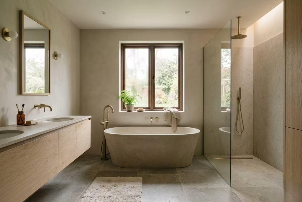
Neutral bathrooms are often assumed to be “safe by default,” but in practice they are anything but forgiving. When handled without precision, neutrality quickly slips into something flat, undercooked, or visually directionless. The difference between a space that feels quietly refined and one that feels unfinished usually comes down to a handful of recurring missteps that quietly erode the design intent over time.
Over-reliance on one tone
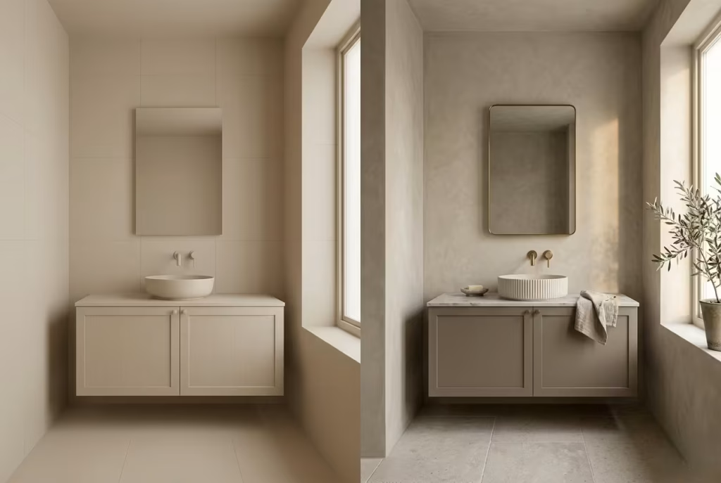
One of the most common pitfalls is building the entire bathroom around a single neutral shade and expecting it to carry the composition. On paper it feels cohesive, but in reality it often falls flat, like a conversation spoken in one tone from start to finish. Without variation, the eye has nothing to engage with, and the space loses depth almost immediately.
From a spatial and material perspective, neutrality only works when it is layered. In bathrooms typically ranging from 5 to 10 m² (54 to 108 sq ft), even subtle shifts in tone, for example warm greige walls paired with slightly deeper taupe joinery or a lighter stone floor, create the kind of visual rhythm that gives the room structure. I have seen projects where a single beige tone was applied across every surface. At first it looked cohesive, but over time it felt visually exhausted, as if the space had nowhere left to go.
The fix is not contrast for the sake of it, but controlled variation. Think in gradients rather than uniform fields.
Ignoring lighting temperature
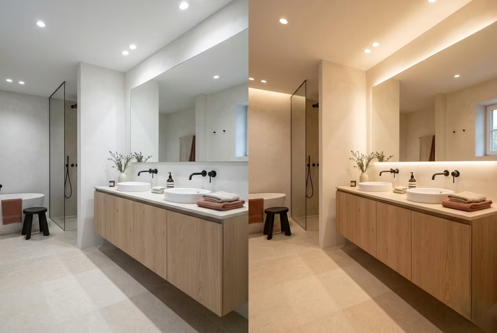
Lighting temperature is often treated as an afterthought, yet it is one of the most influential factors in how neutral materials are perceived. A beautifully specified bathroom can completely shift character under the wrong light. Cool lighting can drain warmth from stone and timber, while overly warm lighting can make even refined neutrals feel heavy and dated.
In real-world application, I have found that most successful neutral bathrooms sit within the 2700K to 3000K range. This range preserves warmth without flattening detail. In one renovation, a limestone and plaster bathroom initially felt slightly cold under 4000K lighting. The materials were correct, but the atmosphere was not. Once adjusted to a softer temperature, the entire space changed character. The same surfaces suddenly felt grounded, almost quietly atmospheric, like the room had finally found its intended tone.
Lighting should never sit in isolation. It should be treated as part of the material palette, not separate from it.
Flat surfaces without texture
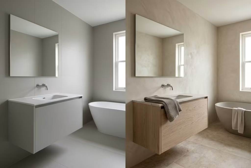
Neutral design without texture is one of the fastest routes to visual fatigue. When every surface is smooth, uniform, and highly controlled, the space can lose its sense of depth. Instead of calm, it begins to feel sterile, like a showroom that has never been touched.
From a spatial reasoning standpoint, texture is what allows light to behave dynamically. In bathrooms between 6 and 9 m² (65 to 97 sq ft), even subtle textural shifts, such as honed stone, limewashed walls, or lightly veined tiles, introduce movement without breaking neutrality. In one project, a fully smooth bathroom specification felt visually stagnant once completed. Introducing a lightly textured plaster finish on one wall changed the entire reading of the room. Light began to break across the surface in softer gradients, and the space immediately felt more alive.
Texture does not need to be loud. In fact, the quieter it is, the more effective it tends to be.
Poor material transitions
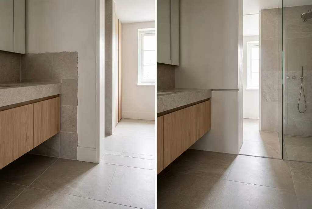
Material transitions are often where well-designed bathrooms quietly fall apart. Even when individual materials are strong, the way they meet can either reinforce or undermine the overall composition. Abrupt shifts, mismatched tones, or poorly aligned junctions can disrupt what should feel like a continuous spatial narrative.
In practical terms, transitions should feel intentional rather than accidental. For example, aligning tile edges with cabinetry lines or carrying a stone finish slightly beyond a visible boundary can help maintain visual flow. In one renovation, a small misalignment between floor tile and wall joinery created an unexpected visual break that made the space feel fragmented. Correcting that alignment, even by just a few millimetres, restored a sense of cohesion that had been subtly missing.
From experience, I have learned that neutral bathrooms are extremely sensitive to these details. They do not hide mistakes easily. Instead, they amplify them quietly over time, like a note slightly out of tune in an otherwise calm piece of music.
How Neutral Bathrooms Evolve Over Time
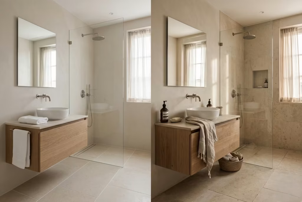
Neutral bathrooms rarely reach their full expression on the day they are completed. Unlike highly decorative schemes that rely on immediate impact, these spaces mature gradually. They absorb light, routine, and subtle wear, and over time, those quiet shifts begin to reshape the atmosphere.
What starts as controlled restraint slowly becomes lived-in clarity, where the design feels less like a finished composition and more like a space that has found its rhythm.
Patina and wear as part of the design story
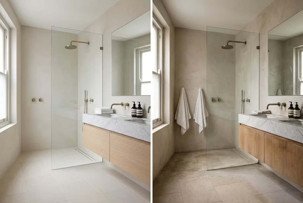
In neutral bathrooms, patina is not an imperfection to be avoided, it is part of the narrative. Surfaces respond to use in ways that cannot be fully predicted at the outset, and this is where character begins to emerge. A brushed metal tap softens at its edges, stone subtly deepens in tone around high-contact areas, and timber develops a quieter richness where it is touched most often.
From real project experience, I have seen how a once pristine limestone floor in a 8 m² (86 sq ft) bathroom gradually shifted in tone after a year of daily use. The variation was not uniform, but it was honest. Areas near the shower softened slightly faster, while less-used zones retained their original finish. Rather than diminishing the design, this variation gave it depth, like a map of daily movement written into the material itself.
Patina works best when it is allowed to develop naturally, not artificially accelerated. It is, in many ways, the room’s way of recording time without saying a word.
Materials that improve, not degrade
Not all materials age in the same direction. Some deteriorate under use, while others quietly improve. The difference is critical in neutral bathrooms, where every surface carries visual weight. Natural stone, lime plaster, solid wood, and high-quality ceramics tend to evolve rather than decline, gaining subtle variation that enhances their character over time.
In one renovation, a soft taupe lime plaster wall in a 7 m² (75 sq ft) bathroom began to shift gently after several months of exposure to steam and daylight. Instead of breaking down, the surface developed a soft variation in tone that made the wall feel more atmospheric. Similarly, honed travertine flooring in the same space developed a slightly richer depth in areas of frequent use, giving the floor a lived-in warmth that could not have been designed at installation.
This is where material selection becomes less about appearance on day one and more about behaviour over time. The best neutral bathrooms are often built from materials that are willing to change, but never lose their integrity while doing so.
Why restraint creates longevity
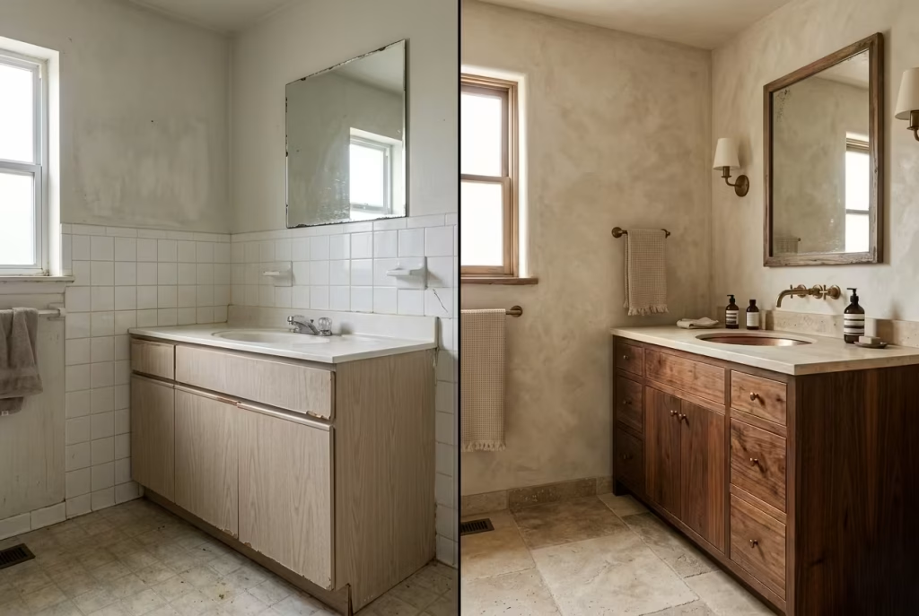
Restraint is often misunderstood as limitation, but in neutral bathroom design it is the foundation of longevity. When a space is not overloaded with visual noise, it has room to adapt. Trends pass through it without leaving disruption, and small changes in material or use feel like natural evolution rather than disruption.
From a spatial reasoning perspective, restrained bathrooms maintain clarity even as they age. In projects where layouts are simple and materials are consistent, the space tends to remain visually coherent for years. I have seen highly detailed bathrooms lose their appeal within a short period, not because the materials failed, but because the design relied too heavily on decorative moments that eventually felt dated. In contrast, restrained schemes continue to feel relevant because they were never anchored to a specific aesthetic moment in the first place.
In practical terms, restraint allows light, material, and proportion to do the work. It removes unnecessary friction from the visual field, so the space can quietly absorb time without losing its balance.
Warm Neutral vs Cool Neutral Bathrooms: Which Works Best?
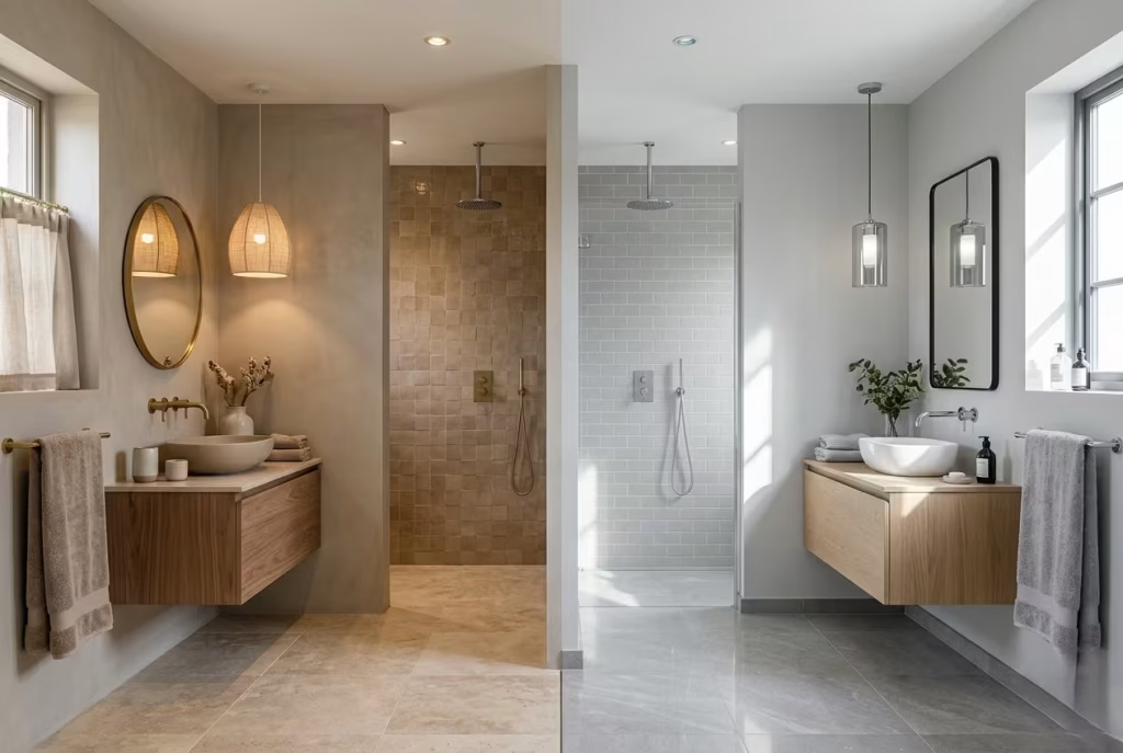
Choosing between warm and cool neutrals is rarely a matter of preference alone. It is about how light behaves in your specific space, and how you want the room to feel at different times of day. Warm neutrals, such as taupe, sand, and soft clay, tend to absorb light gently, creating a grounded, cocoon-like atmosphere. Cool neutrals, including soft greys, misty whites, and stone-based tones, reflect more light and often feel sharper, more architectural.
From experience, warm neutrals tend to perform better in north-facing or low-light bathrooms, typically under 6 to 9 m² (65 to 97 sq ft), where they prevent the space from feeling sterile. Cool neutrals, on the other hand, excel in well-lit rooms where clarity and crispness are desired. In one project, a cool grey scheme initially felt too clinical until warmer lighting and timber accents were introduced, shifting the balance without changing the palette.
The real decision lies in rhythm. Warm neutrals feel slower, more relaxed. Cool neutrals feel structured and precise. Both work, but only when aligned with light and proportion.
Best Materials for Neutral Bathrooms (Stone, Tile, Microcement)
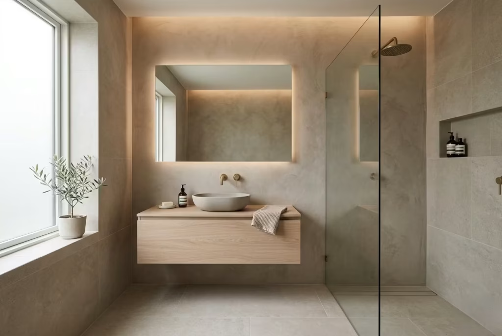
Material choice is where neutral design either holds its integrity or quietly falls apart. Stone brings natural variation and depth, tile offers structure and repetition, and microcement delivers seamless continuity. Each behaves differently under light, wear, and moisture.
In practice, honed limestone or travertine works beautifully in bathrooms between 5 and 10 m² (54 to 108 sq ft), where subtle variation prevents flatness. Ceramic tiles, especially in large formats like 600 x 1200 mm (24 x 48 inches), help reduce visual fragmentation. Microcement, meanwhile, is often used to create uninterrupted surfaces that make compact spaces feel larger than they are.
I have found that the strongest neutral bathrooms rarely rely on a single material. Instead, they combine two or three finishes that share tonal harmony but differ in texture, allowing the space to feel cohesive without becoming monotonous.
Lighting Design for Neutral Interiors
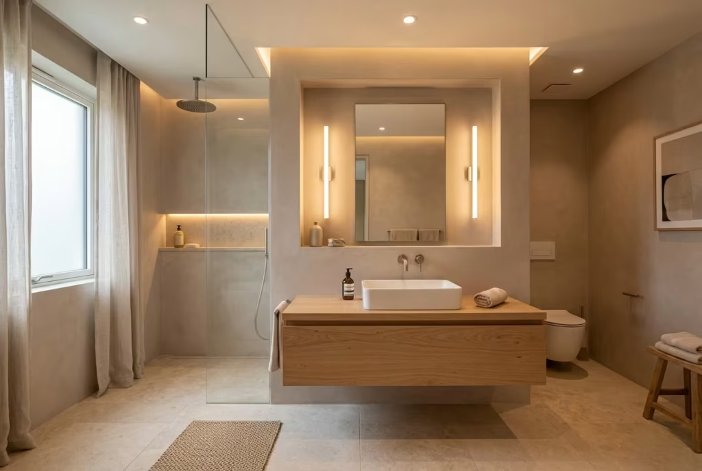
Lighting is not an accessory in neutral bathrooms, it is the atmosphere itself. Without careful lighting design, even the best materials can feel flat or disconnected. The goal is not brightness, but depth and control.
Layered lighting works best. Ambient lighting sets the base tone, task lighting supports functionality, and accent lighting introduces softness or definition. Most successful schemes sit within 2700K to 3000K, where warmth and clarity remain balanced. In one renovation, replacing a single overhead light with layered wall and ceiling sources completely changed how a 7 m² (75 sq ft) bathroom felt, shifting it from flat to dimensional.
Neutral interiors rely heavily on shadow control. Soft shadows add texture and depth, while harsh lighting flattens everything. When done well, lighting becomes invisible but deeply felt.
Small Neutral Bathroom Layout Strategies
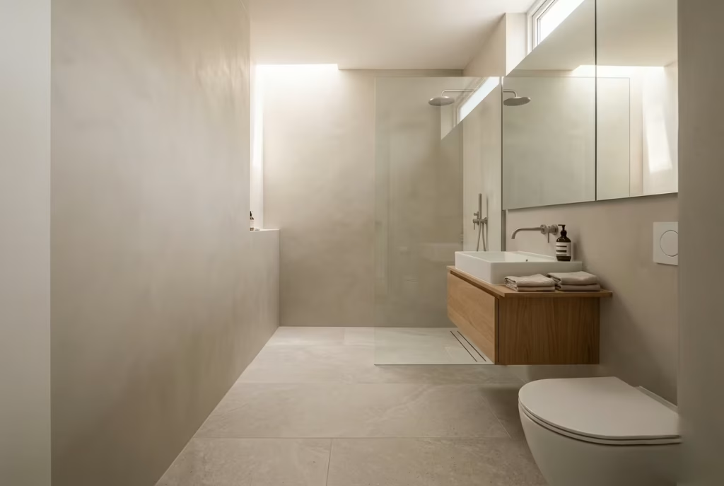
Small bathrooms demand discipline more than decoration. In compact spaces, typically under 6.5 m² (70 sq ft), layout decisions carry more weight than finishes. The goal is to create uninterrupted flow rather than segmented zones.
Wall-hung fixtures, clear circulation paths of at least 700 to 800 mm (27 to 31 inches), and aligned sightlines help reduce visual fragmentation. In one project, shifting a shower entrance just 200 mm (8 inches) improved movement and made the room feel significantly more open, even though no square footage was added.
Mirrors, glass partitions, and continuous flooring further extend perception. The trick is not to add elements, but to remove visual interruptions until the space feels naturally expanded.
Luxury Spa Bathroom Design Principles
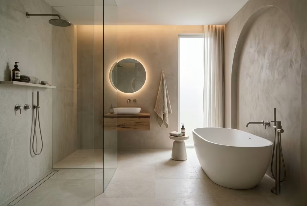
Luxury in neutral bathrooms is rarely about excess. It is about restraint, proportion, and sensory calm. Spa-inspired spaces rely on softness in material transitions, consistency in lighting, and carefully controlled spatial flow.
Walk-in showers, typically at least 900 x 1200 mm (36 x 48 inches), freestanding baths, and integrated seating all contribute to a sense of ease rather than display. Materials are usually matte, tactile, and natural, allowing light to diffuse rather than reflect sharply.
In real projects, the most successful spa-like bathrooms are those that feel slightly under-designed at first glance. Over time, their calmness becomes their luxury. Nothing competes, nothing shouts, everything simply settles.
Neutral Bathroom Colour Combinations That Always Work
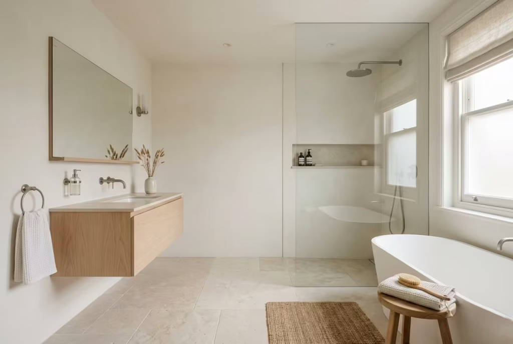
Some combinations consistently hold their balance, regardless of space or style. Warm white with soft oak, greige with limestone, taupe with brushed brass, and stone grey with muted clay all create dependable harmony.
The key is tonal proximity. Colours that sit too far apart create fragmentation, while those too close risk flatness. In one 8 m² (86 sq ft) bathroom, a combination of warm white walls, sandy stone flooring, and light oak cabinetry created a layered effect that felt effortless, even though the palette was extremely controlled.
The most reliable combinations are not bold. They are quietly consistent, allowing texture and light to do the heavy lifting.
How to Choose the Right Neutral Paint Undertone
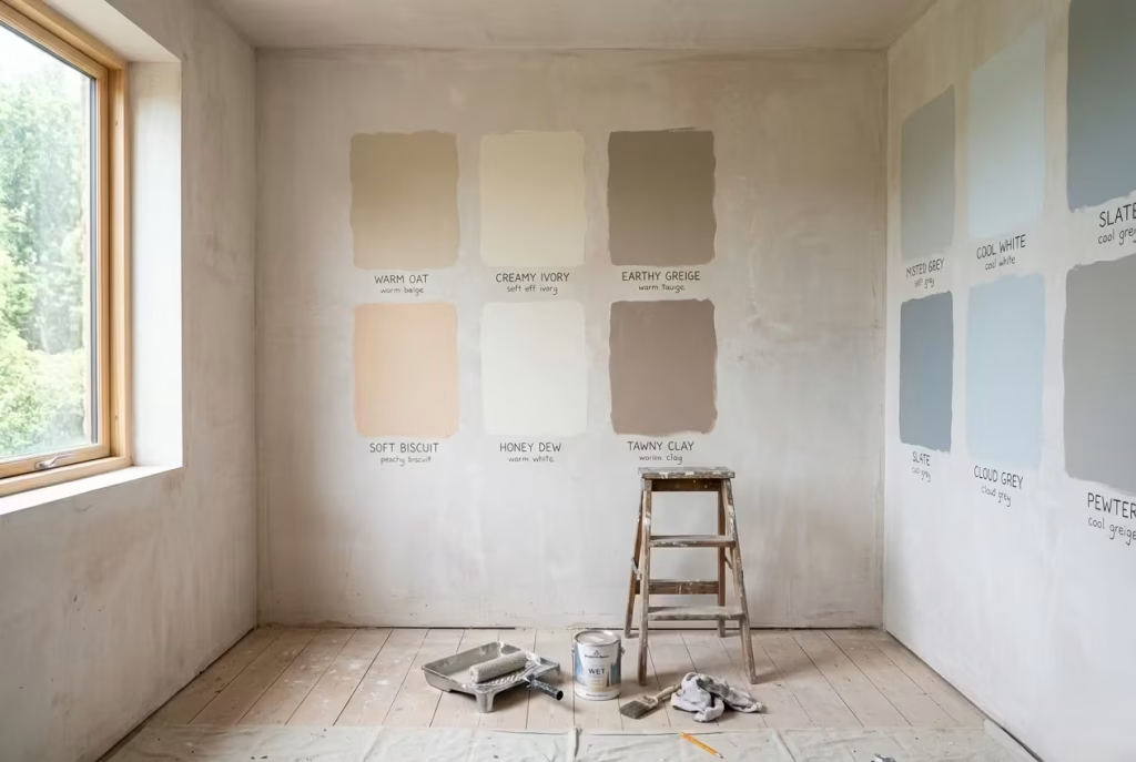
Undertone selection is where most neutral schemes succeed or fail. A paint colour may look perfect on a swatch, but shift dramatically once applied under real lighting conditions.
Warm undertones lean towards yellow, red, or earthy bases, while cool undertones carry hints of blue or grey. The mistake often lies in ignoring the room’s natural light direction. North-facing rooms typically benefit from warmer undertones to balance cooler light, while south-facing rooms can handle cooler neutrals without feeling harsh.
In practice, I always test large samples on multiple walls before committing. A colour that appears balanced in the morning may feel completely different by evening, and that variation is where the real decision is made.
Minimalist Bathroom Design vs Layered Neutral Design
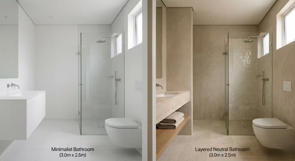
Minimalist bathrooms and layered neutral bathrooms often appear similar at first glance, but their intent is fundamentally different. Minimalism removes until only essentials remain. Layered neutral design, however, builds quiet depth through texture, tone, and material variation.
Minimalism can sometimes feel visually thin if not carefully balanced. Layered neutral schemes tend to feel richer over time because they allow subtle variation to accumulate. In one project, a strictly minimalist bathroom felt visually static after completion. Introducing layered stone textures, soft textiles, and tonal variation transformed it into a more engaging space without compromising simplicity.
The distinction lies in emotional response. Minimalism is immediate and sharp. Layered neutrality is slow and evolving, like a space that reveals itself gradually rather than all at once.
Conclusion: Neutral as a Living Language, Not a Static Choice
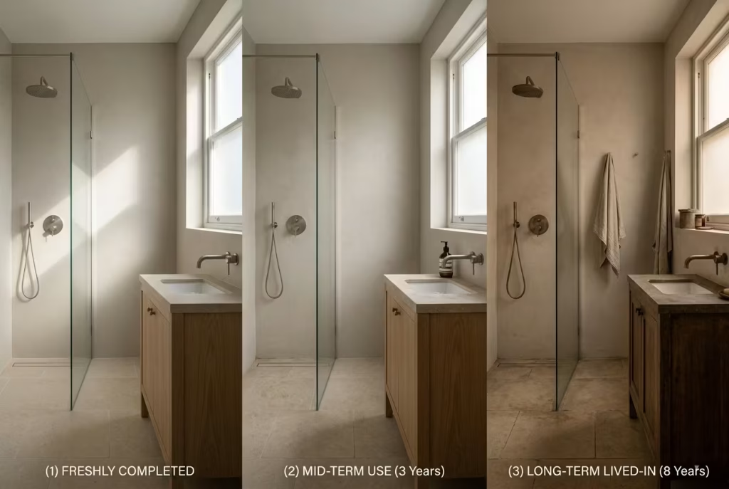
Neutral bathroom design is often misunderstood as a fallback, something chosen when colour feels too risky or expression too complex. In reality, it is the opposite. A well-composed neutral space is never passive. It is deliberate, disciplined, and quietly demanding in its execution. Every surface, every transition, every shift in tone carries weight. There is no hiding behind colour, no distraction to lean on. What remains is proportion, material, light, and restraint working in careful balance.
Neutrality, when done properly, is not a style that sits still. It behaves more like a living language that responds to time, use, and atmosphere. In early stages, it may feel understated, even restrained to the point of hesitation. But as the space settles into daily life, it begins to reveal its structure more clearly. Light starts to shape surfaces differently throughout the day, materials soften or deepen in tone, and the room slowly develops a sense of familiarity that cannot be designed in advance. It is earned, not applied.
From a design perspective, this is where control becomes essential. Neutral bathrooms require more attention, not less. More awareness of undertone, more precision in material pairing, more sensitivity to how light behaves across surfaces. A small misstep in tone or texture does not disappear in a neutral scheme. Instead, it lingers. This is why restraint is not a limitation but a discipline. It removes noise, but in doing so, demands clarity in every remaining decision.
The real success of these spaces is not measured at the point of completion. It is measured quietly, over weeks, months, and years of use. How the stone wears under daily contact. How the lighting feels in winter compared to summer. How the space accommodates routine without feeling tired of it. These are the details that define whether a neutral bathroom remains merely well-designed or becomes genuinely timeless.
In practice, I have seen the most successful neutral bathrooms evolve slowly, almost imperceptibly. What begins as a carefully composed interior gradually softens into something more natural, more grounded, more aligned with the rhythms of the people who use it. Nothing dramatic changes, yet everything feels more resolved. It is design that does not resist time, but moves with it.
And that is perhaps the quiet truth behind neutral design. It is not about creating something that stands out in a moment. It is about creating something that stays relevant without effort, something that does not depend on trends or attention to remain meaningful.
The most successful neutral bathrooms never announce themselves. They settle quietly into daily life, and somewhere along the way, become impossible to replace.
Frequently asked question while designing a Natural Bedroom
What makes a bedroom feel natural rather than just neutral?
A natural bedroom goes beyond a soft colour palette. It is defined by material honesty, texture, light behaviour, and spatial balance. Linen, oak, wool, stone, and clay-based finishes often shape the atmosphere more than colour itself. The result is a room that feels grounded rather than simply visually calm.
Which colours work best in a natural bedroom?
The most reliable palette sits within warm whites, oatmeal, sand, taupe, muted greens, soft browns, and clay-inspired neutrals. These tones tend to feel lived-in rather than flat, especially when layered with natural materials and softened daylight. The key is not the colour itself, but how the tones relate to each other across the space.
How do I keep a natural bedroom from looking dull?
Depth comes from variation. A natural bedroom should never rely on a single finish or tone across every surface. Mixing matte and textured materials, combining woven textiles with smoother elements, and allowing subtle tonal shifts prevents the space from feeling static. Without this layering, even a well-designed room can feel visually tired.
What materials are best for a natural bedroom?
Solid timber, rattan, linen, wool, cotton, jute, and natural stone all work well in creating a grounded atmosphere. Limewash and clay-based paints also play an important role because they soften light rather than reflect it harshly. These materials age gracefully, which helps the room feel more authentic over time.
How important is lighting in a natural bedroom?
Lighting is one of the most critical elements. Natural bedrooms depend on soft, layered lighting that shifts gently through the day. Warm light temperatures, typically around 2700K to 3000K, help maintain comfort and depth. Overly bright or cool lighting can quickly disrupt the calmness of the space.
Can a small bedroom still feel natural and calm?
Yes, and often more successfully than larger rooms. Smaller bedrooms benefit from restraint because there is less visual distraction to manage. A simple layout, a limited but thoughtful palette, and well-chosen materials can make even compact spaces feel open, quiet, and balanced.
What kind of bed frame suits a natural bedroom?
Low-profile timber frames, upholstered designs in linen or wool, and simple, well-proportioned structures tend to work best. The bed should feel steady and understated, acting as an anchor rather than a focal point. In natural interiors, simplicity in form usually supports longevity in design.
Should natural bedrooms include plants?
They can, but they should be used sparingly and with intention. One or two well-placed plants are often enough to introduce softness and a sense of life. Too many can shift the balance away from calmness and introduce unnecessary visual noise.
How do I make a natural bedroom feel warm in winter?
Layering is key. Wool throws, heavier curtains, brushed cotton bedding, and textured rugs help build warmth without overwhelming the space. The goal is to add softness in layers rather than increasing visual clutter.
What is the biggest mistake people make when designing a natural bedroom?
The most common mistake is assuming that beige alone creates a natural feel. Without texture, variation, and material depth, the space can quickly feel flat. A successful natural bedroom is built on subtle contrast, layered materials, and careful control of light, not just a single calming colour.