25 Productive Japanese Home Office Designs for a Soulful Workspace
Most Japanese Home Office do not fail because the desk is in the wrong place or the chair lacks support. They fail more quietly than that. They fail in the background, in the constant hum of visual clutter, in the subtle interruptions created by objects that serve no real purpose yet continue to demand attention. Over time, that noise builds. Not loudly, not all at once, but gradually, until focus becomes something you have to chase rather than something the space naturally supports.
I have seen this pattern repeat itself across projects of all scales. Rooms that appear functional on paper, well-measured, technically correct, yet something never quite settles. The issue is rarely layout alone. It is cognitive load. Too many surfaces competing, too many materials speaking at once, too many small decisions being asked of the mind before work even begins.
This is where Japanese design shifts the conversation entirely. It does not attempt to optimise productivity through addition. It approaches the problem from the opposite direction. Through restraint, through spatial clarity, through a deliberate use of emptiness, it begins to remove the friction that most workspaces unknowingly create.
Restraint, in this context, is not about limitation. It is about precision. Every element must justify its presence. Every surface is considered not only for how it looks, but for how it behaves under daily use. Spatial clarity follows naturally from this. When there is less competing for attention, the eye settles more easily, and with it, so does the mind.
Then there is intentional emptiness, often misunderstood, often dismissed as absence. In practice, it is one of the most functional tools available. Empty space is not wasted space. It is active. It gives objects room to exist without tension. It allows movement, both physical and visual, to feel uninterrupted. It creates a kind of quiet that cannot be achieved through decoration.
Productivity, within this framework, is not something that gets layered onto the room through gadgets or systems. It is something that emerges when the environment stops getting in the way. When the space holds back just enough, the work begins to move forward on its own.
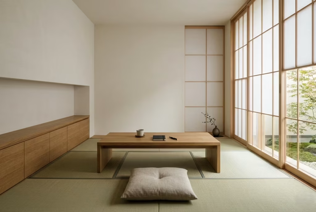
I have seen this shift happen in real terms. In several home office redesigns, the most noticeable improvement in productivity did not come from introducing new furniture or upgrading technology. It came from removal. Stripping back unnecessary shelving, reducing surface objects, redefining the working boundary within the room. In one project, simply clearing the visual field around the desk and repositioning it within a quieter zone of the room changed how the space was used almost immediately. The client described it not as a dramatic transformation, but as a sense of ease that had not been there before.
That is the difference. A workspace that demands effort to function will always feel heavy. One that allows clarity to surface, almost without asking for it, becomes something else entirely.
The Philosophy Behind Japanese Workspaces
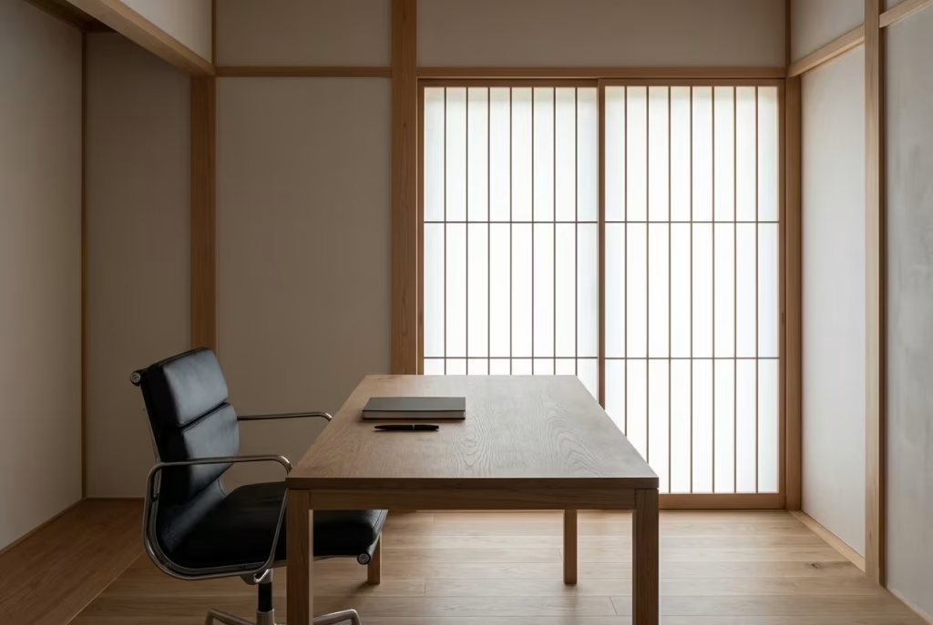
There is a quiet discipline running through Japanese workspaces that is easy to overlook at first glance. Nothing shouts for attention. Nothing tries too hard. Yet, the longer you sit within one, the more you begin to notice how deliberately everything has been resolved. It is not minimalism for the sake of appearance. It is a structured way of thinking about space, one that shapes how you move, how you focus, and ultimately how you work.
In my own projects, I have come to see that when clients struggle with focus, the problem is rarely motivation. More often, it is the environment asking too much of them. Japanese spatial philosophy addresses this not by adding solutions, but by refining the conditions in which work takes place. It clears the path, so to speak, rather than trying to push you forward.
Ma: The Power of Controlled Emptiness
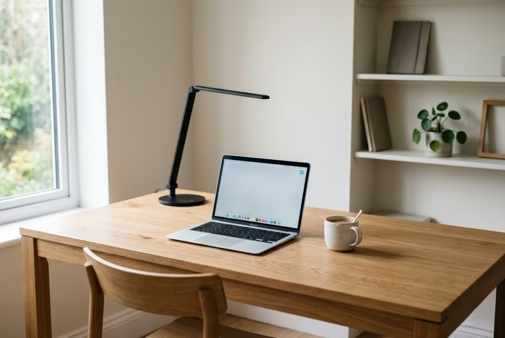
At the centre of this philosophy sits the concept of Ma, often translated as negative space, though that translation barely scratches the surface. It is not just the absence of objects. It is the intentional pause between them, the breathing room that allows each element to exist without interference.
In practical terms, this changes how a workspace is composed. Instead of filling a desk to make it feel complete, the design holds back. A desk surface, ideally around 1200 to 1600 mm wide and 600 to 750 mm deep or 47 to 63 inches by 24 to 30 inches, performs far better when only essential items are present. A laptop, a task light, perhaps one object of personal significance. The rest is left open, not as an omission, but as a decision.
I once worked on a compact home office where the client insisted on maximising storage within arm’s reach. The desk was efficient on paper, but in reality, it felt crowded, almost restless. We reduced the visible items by more than half, relocated storage to a concealed wall unit, and left clear zones around the working area. The difference was immediate. Focus improved, not because anything new had been introduced, but because the visual field stopped competing for attention.
Pros
- Reduces cognitive fatigue over long working hours
- Creates a calmer visual rhythm that supports sustained focus
- Allows flexibility as work patterns change
Cons
- Can feel uncomfortable initially for those used to fully furnished spaces
- Requires discipline to maintain over time
Ma works quietly in the background. You do not notice it when it is present, but you feel its absence almost immediately when it is not.
Wabi-Sabi in Daily Work
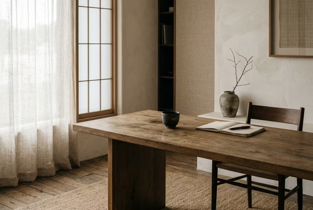
Where Ma defines space, Wabi-Sabi defines how that space feels over time. It embraces imperfection, ageing, and the subtle irregularities that come with natural materials and daily use. In a workspace, this translates into an environment that does not demand perfection from you, which, in turn, reduces a surprising amount of pressure.
Perfectly polished, high-gloss desks may look sharp on day one, but they tend to show every mark, every fingerprint, every sign of use. Over time, that creates a quiet tension. You begin to work around the space rather than within it. By contrast, a solid wood desk with a matte or lightly oiled finish, typically 25 to 40 mm thick or 1 to 1.5 inches, absorbs use more gracefully. Minor scratches blend into the material rather than standing out.
In one residential project, I specified a lightly brushed oak desk paired with linen-textured wall panels. Within weeks, the surface began to develop subtle variations, nothing dramatic, just enough to soften the overall feel. The client later mentioned that they felt less hesitant to use the space fully. It no longer felt precious. It felt lived in, which made it far more functional.
Pros
- Encourages consistent use without fear of wear
- Reduces perfection-driven stress
- Adds depth and character over time
Cons
- Not suitable for those seeking a pristine, high-gloss aesthetic
- Requires careful material selection to avoid looking unfinished
It is a bit like breaking in a good pair of shoes. At first, everything feels new and slightly rigid. Then gradually, almost without noticing, it begins to fit you.
Visual Silence vs Visual Minimalism
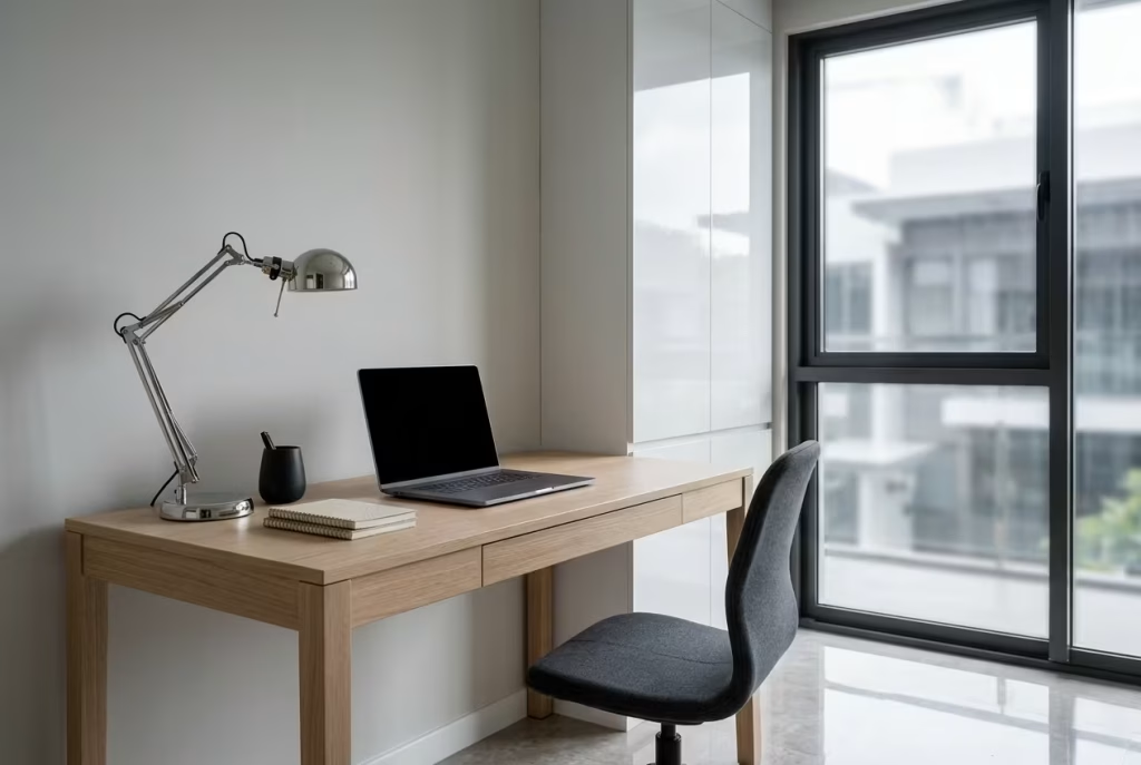
This is where many interpretations fall short. Minimalism is often reduced to having fewer items, but fewer does not always mean calmer. A space can be sparse and still feel unsettled if the remaining elements compete visually.
Visual silence, on the other hand, is about coherence. It is the alignment of colour, material, proportion, and light so that nothing feels out of place. The room stops trying to speak in multiple directions at once. Instead, it holds a steady, consistent tone.
In practical terms, this often comes down to material restraint. Limiting a workspace to two or three primary materials, such as wood, fabric, and matte metal, creates a far more cohesive environment than introducing five or six competing finishes. Colour palettes follow a similar logic. Soft neutrals, warm greys, and muted greens tend to settle the space, especially when applied across larger surfaces like walls and flooring.
I remember a project where the client had already embraced minimalism, at least visually. The desk was clear, the room was uncluttered, yet something still felt off. The issue became clear once we analysed the material palette. Glossy cabinetry, a glass desk lamp, polished metal handles, and a high-sheen floor were all reflecting light differently. The result was subtle but constant visual movement. Once we shifted to matte finishes and reduced reflectivity, the room finally settled. The difference was not dramatic at first glance, but over time, it made sustained focus noticeably easier.
Pros
- Reduces subconscious distraction
- Creates a more stable and predictable environment
- Enhances long-term comfort during extended work sessions
Cons
- Requires careful coordination of materials and finishes
- Can feel understated if not balanced with texture
Minimalism clears the stage, but visual silence writes the script. Without it, even the simplest room can feel like it is pulling in different directions.
Taken together, these principles do not just shape how a workspace looks. They shape how it behaves. They remove friction, soften distractions, and create conditions where focus does not need to be forced. It simply finds its way in, almost uninvited, and once it settles, it tends to stay.
Spatial Planning That Supports Focus
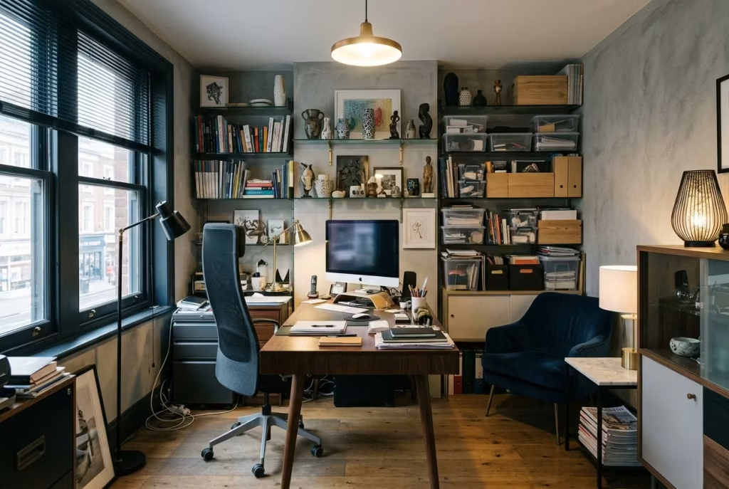
If philosophy sets the direction, spatial planning does the heavy lifting. This is where intention becomes physical, where abstract ideas like calm and clarity either hold their ground or quietly fall apart. I have seen beautifully styled home offices that photograph well yet fail within a week of real use. The issue is rarely aesthetic. It is spatial logic. When planning is off, even by a small margin, the room begins to work against you, slowly but surely, like walking into a headwind you did not expect.
Japanese workspace planning approaches this differently. It is not about filling a room efficiently. It is about allowing the room to function with the least resistance possible. Every movement, every line of sight, every transition is considered, often with a level of restraint that feels almost counterintuitive at first.
You May also Like: 21 Japandi Guest Room Ideas That Feel Calm, Thoughtful, and Effortlessly Stylish
Low Furniture and Eye-Level Calm
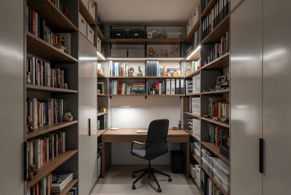
One of the most overlooked aspects of focus is eye level. Where your gaze naturally settles has a direct impact on how your mind behaves. In many Western setups, desks and storage units stack upward, pulling the eye into layers of visual information. It might seem harmless, but over time, it becomes a constant source of micro-distraction.
Japanese-inspired workspaces tend to lower the visual horizon. Standard desk heights remain within the ergonomic range of 700 to 750 mm or 27.5 to 29.5 inches, but surrounding elements are kept deliberately low. Storage units often sit below 900 mm or 35 inches, keeping the upper field of vision clear.
In smaller rooms, I sometimes push this even further by introducing low-profile desks paired with floor seating options at 350 to 400 mm or 13.5 to 16 inches. It shifts the entire spatial experience. The ceiling feels higher, the room breathes more easily, and the eye has fewer obstacles to navigate.
I remember working on a narrow home office where tall shelving units lined both sides of the room. Technically efficient, yes, but it felt like working in a corridor. We removed the upper sections, reduced storage height, and introduced a continuous low bench along one wall. The transformation was immediate. The space stopped feeling compressed. Focus followed naturally, almost as if the room had exhaled.
Pros
- Reduces visual clutter within the primary line of sight
- Enhances the perception of space, especially in compact rooms
- Supports a calmer, more grounded working posture
Cons
- May limit vertical storage capacity
- Requires thoughtful organisation to maintain functionality
Lowering the room, in this sense, is not about less. It is about clearing the path for attention to settle where it matters.
Zoning Without Walls
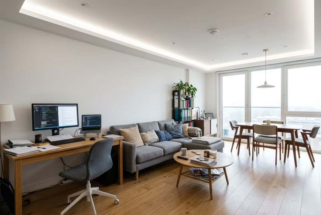
Open-plan living has its advantages, but when it comes to focus, it can be a double-edged sword. Without clear boundaries, work begins to bleed into everything else. The mind struggles to switch gears, caught somewhere between relaxation and productivity, never fully committing to either.
Japanese spatial planning handles this with subtlety. Instead of building walls, it creates zones through suggestion. A shift in material, a change in lighting, a slight variation in ceiling height, each one acting as a quiet signal rather than a hard division.
In practical terms, this might look like defining a workspace using a rug measuring 1600 x 2300 mm or 5.2 x 7.5 feet, paired with a focused lighting setup directly above the desk. The surrounding area remains open, yet the workspace feels contained, almost like a room within a room.
Sliding panels, inspired by traditional shoji screens, are another effective tool. Even a lightweight partition at 1800 to 2100 mm or 6 to 7 feet high can redefine a space without closing it off completely. It is not about isolation. It is about clarity.
In one project, the home office was positioned within a larger living area. The client struggled with constant distraction, particularly during evenings. Rather than enclosing the space fully, we introduced a partial timber screen and adjusted the lighting to create a more intimate zone. The change was subtle, but the effect was significant. Work hours became more defined, and switching off at the end of the day felt far more natural.
Pros
- Maintains openness while improving focus
- Allows flexibility as needs change
- Creates psychological boundaries without physical confinement
Cons
- Requires careful coordination of materials and lighting
- May not fully block noise in busy households
Zoning, when done well, feels less like a division and more like a gentle nudge in the right direction.
Window Alignment and Natural Orientation
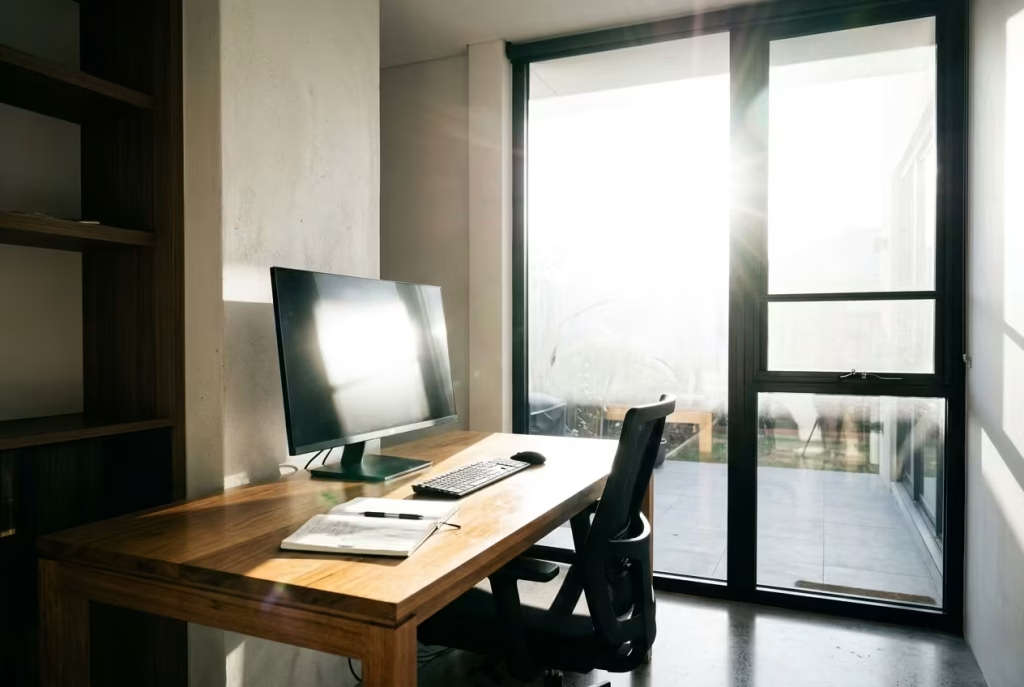
Light is often treated as a finishing touch, something to refine once the layout is in place. In reality, it should be one of the first considerations. The direction, intensity, and quality of natural light shape how a workspace feels throughout the day, influencing both mood and performance in ways that are easy to underestimate.
Desk placement relative to windows becomes critical here. Positioning a desk parallel to a window, rather than directly facing or backing it, tends to offer the best balance. It allows for consistent daylight without the harsh glare that can come from direct exposure. A comfortable distance is typically 600 to 1000 mm or 24 to 40 inches from the window, depending on room size and light intensity.
North-facing light, where available, provides a soft, even illumination that remains stable throughout the day. East-facing setups bring in morning light, which can be energising but may require sheer curtains or shoji-style panels to diffuse brightness. South and west-facing windows, while generous in light, often need more control to prevent overheating and glare.
I recall a project where the desk was originally placed directly in front of a large west-facing window. On paper, it seemed ideal. In practice, the afternoon glare made it almost unusable. We repositioned the desk to run alongside the window, introduced a linen screen to soften the light, and suddenly the space became functional throughout the day.
Pros
- Enhances natural focus cycles
- Reduces reliance on artificial lighting
- Supports visual comfort over long periods
Cons
- Requires adjustment based on seasonal light changes
- Poor placement can lead to glare or uneven lighting
When light is handled well, it does more than illuminate. It guides the rhythm of the day, almost like a quiet metronome in the background.
Spatial planning, when approached with this level of care, begins to feel almost invisible. You are not constantly aware of it, yet it shapes every interaction within the room. Movement becomes easier, focus comes more naturally, and the space starts to support you without asking for attention in return. That is where the real value lies. Not in what the room shows, but in how it quietly works behind the scenes.
Material Language That Shapes Behavior
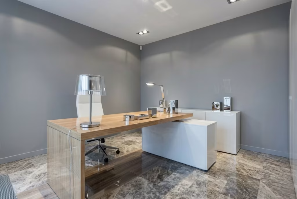
Materials do far more than define how a workspace looks. They influence how it feels under your hands, how light moves across surfaces, and how long you can remain focused before fatigue begins to creep in. Get the material language right and the room begins to support you almost quietly, almost without asking. Get it wrong and even the most carefully planned layout can feel unsettled, like something never quite lands.
In Japanese workspaces, materials are not layered for decoration. They are chosen with intent, each one carrying weight in how the space performs day after day. I have learned, often the hard way, that materials can either steady a room or scatter it. There is rarely a middle ground.
Natural Wood as a Grounding Element
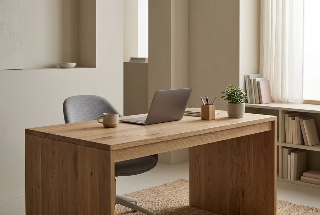
Wood sits at the heart of most Japanese interiors, not as a statement but as a stabilising force. It brings warmth, yes, but more importantly, it introduces a kind of visual consistency that helps the mind settle. The grain, the tone, the subtle irregularities all work together, creating a surface that feels alive without being distracting.
For workspaces, I typically specify solid or veneer desks in oak, ash, or similar pale timbers, with a thickness of 25 to 40 mm or 1 to 1.5 inches. That thickness matters more than most people expect. Too thin and the desk begins to feel insubstantial. Too thick and it becomes visually heavy. Within that range, it holds its ground, steady and balanced.
In one project, a client initially opted for a high-gloss engineered desk. It looked sharp under showroom lighting, but once installed, it reflected every movement, every shift in light, every object placed on it. Within days, it became a source of distraction. We replaced it with a matte-finished oak surface. Same dimensions, same layout, yet the difference was night and day. The room stopped flickering with visual noise. It settled.
Pros
- Introduces warmth without overwhelming the space
- Ages with character, developing a softer patina over time
- Provides a tactile surface that feels comfortable for long use
Cons
- Sensitive to humidity if not properly sealed
- Requires periodic maintenance depending on finish
Wood, when chosen well, does not compete for attention. It anchors the room, quietly doing its job in the background.
You May also Like: 25 Japanese Reading Nook Secrets for a Perfectly Calm Home
Paper, Linen, and Soft Diffusion
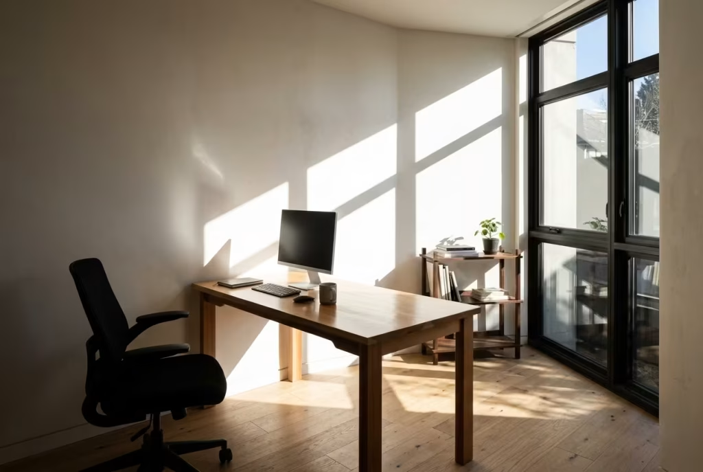
Hard surfaces define structure, but soft materials shape atmosphere. Paper and linen, often overlooked in modern workspaces, play a crucial role in controlling light and softening the edges of a room. They take the sharpness out of daylight, turning harsh glare into something far more usable.
Shoji-inspired panels, whether traditional or adapted into modern forms, diffuse light in a way that feels almost effortless. Linen curtains, slightly textured, slightly imperfect, achieve a similar effect. The key is in their permeability. They allow light to pass through while reducing its intensity, creating a consistent, low-contrast environment.
From a practical standpoint, I often specify linen curtains with a density that filters around 40 to 60 percent of incoming light, depending on orientation. This keeps the workspace bright without introducing the kind of glare that leads to eye strain over time.
In a recent home office project, the client struggled with an east-facing window that flooded the room with direct morning light. Blinds solved the glare but left the room feeling flat and lifeless. We replaced them with layered linen panels. The light remained, softened and more evenly distributed, and the workspace became usable throughout the day.
Pros
- Reduces glare and harsh contrast
- Creates a calmer, more even lighting condition
- Adds subtle texture without visual clutter
Cons
- Requires regular cleaning to maintain appearance
- May not fully block light when needed
These materials work a bit like a filter, taking the edge off without dimming the experience entirely.
Matte vs Gloss: Why Reflection Matters
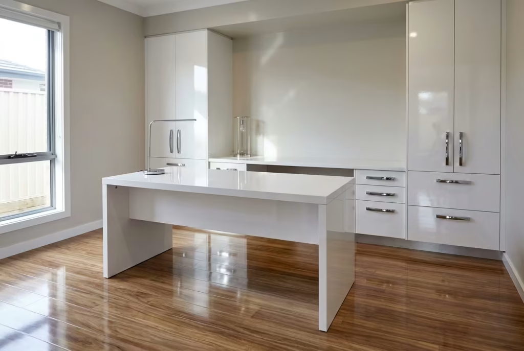
Reflection is one of those details that rarely gets attention until it becomes a problem. Gloss surfaces, polished metals, glass finishes, they all introduce movement into the visual field. Every shift in light, every small motion gets amplified. Over time, that movement becomes a low-level distraction, the kind that slowly chips away at concentration.
Matte finishes, by contrast, absorb light rather than bouncing it around. They create a more stable visual environment, one where surfaces remain consistent regardless of time of day or activity. This is particularly important for desks, cabinetry, and wall finishes within the immediate working zone.
In technical terms, I aim to keep reflectance levels low across key surfaces. Matte paints with a sheen level below 10 percent tend to perform well. For cabinetry and desks, satin or matte finishes provide enough durability without introducing excessive reflection.
I recall a project where a client had installed glossy white cabinetry around their workspace. It looked clean, almost clinical, but the constant reflection from both natural and artificial light made it difficult to focus for extended periods. We refinished the cabinetry in a soft matte tone. The change was subtle visually, but functionally, it made a significant difference. The room stopped shimmering. It became still.
Pros
- Minimises visual distraction
- Reduces eye strain over long working sessions
- Creates a more cohesive and grounded aesthetic
Cons
- Can show marks more easily than gloss in high-touch areas
- Requires careful cleaning to maintain a consistent look
It is often said that the devil is in the details. In workspace design, reflection is one of those details that can quietly make or break the experience.
Material language, when handled with care, begins to shape behaviour in ways that are not immediately obvious. Surfaces become easier to use. Light becomes easier to manage. The room stops asking for attention and starts offering support instead. It is a subtle shift, but once you experience it, there is no going back.
25 Productive Japanese Home Office Design Ideas
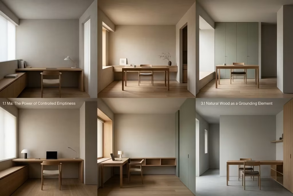
Before moving into specific layouts and compositions, it is worth pausing for a moment to understand what these ideas are really aiming to achieve. This is not a catalogue of trends or surface-level styling moves. Each approach that follows has been shaped by a deeper intention, one that prioritises clarity, rhythm, and the quiet removal of friction from daily work.
In practice, I have found that no two home offices ever resolve in exactly the same way. The constraints shift. Room sizes vary, often between 6 to 12 square metres or 65 to 130 square feet. Light conditions change from one orientation to another. Even the way people work carries its own set of habits and pressures. What remains consistent, however, is the need for a space that does not get in its own way.
The ideas ahead are grounded in real application, not just visual appeal. Some lean towards compact urban solutions where every centimetre counts. Others explore more open compositions, where space can be allowed to breathe a little. What ties them together is a shared discipline. Each one holds back where necessary, sharpens focus where it matters, and avoids the common trap of overworking the room.
You may find that certain ideas resonate immediately, while others feel slightly out of step with your current setup. That is part of the process. Japanese workspace design often reveals its value gradually, almost like a slow burn, where the benefits become clearer once the space begins to be used day after day.
Think of these not as fixed templates, but as spatial strategies. Taken together, they offer a way of rethinking how a home office can function, not through excess, but through refinement.
Minimal Grounded Workspaces
There is a particular stillness that comes from working close to the ground. It is not just a visual shift, it is behavioural. The body slows, posture becomes more intentional, and the room begins to feel less like a workstation and more like a place of quiet concentration. In several projects, especially where clients felt constantly on edge during work hours, bringing the workspace down, both physically and visually, changed the tone almost overnight. It is a case of less height, more clarity, and once it clicks, it tends to hold.
Floor Desk with Tatami Base
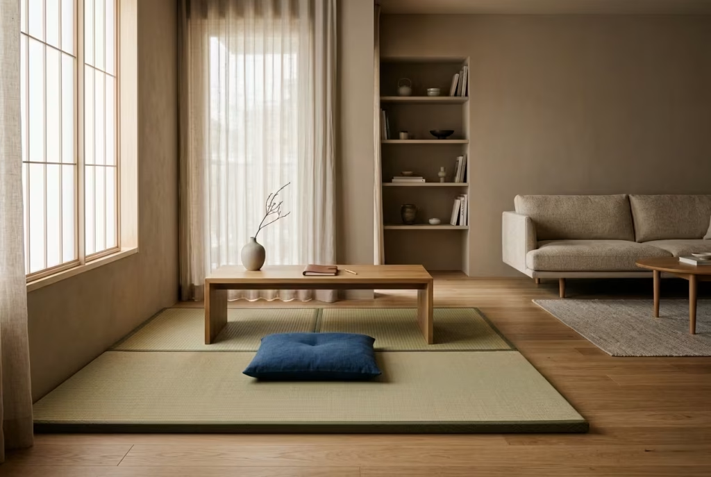
This is perhaps the most direct expression of Japanese spatial thinking. A floor-based setup, anchored by tatami, strips the workspace back to its essentials and in doing so, removes a surprising amount of mental noise.
A typical tatami module measures around 900 x 1800 mm or 3 x 6 feet, with a thickness of 50 to 60 mm or 2 to 2.5 inches. Even in smaller rooms, a single mat or a half layout can define a working zone without crowding the space. The desk itself usually sits low, within 300 to 400 mm or 12 to 16 inches in height, paired with a floor cushion or a low-back chair that supports a more grounded posture.
I worked on a compact apartment where the client had no dedicated office room. We introduced a tatami platform in one corner of the living area, just large enough to hold a low desk and a cushion. What began as a compromise turned into the most used part of the home. The client later described it as the only place where work felt contained, almost like stepping into a different mode without leaving the room.
Pros
- Creates a strong psychological separation from the rest of the home
- Encourages a slower, more focused working rhythm
- Maximises vertical space, making the room feel larger
Cons
- Requires adjustment if you are used to conventional desk seating
- Not ideal for extended screen use without ergonomic support
It is a bit like changing gears. At first, it feels unfamiliar, but once you settle into it, the shift becomes second nature.
You May also Like: Why Japanese Entryways are Never Messy: 25 Hidden Design Secrets
Low-Profile Timber Desk with Hidden Storage
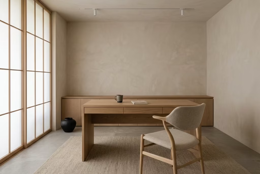
For those who prefer a more conventional setup while still holding onto that grounded quality, a low-profile timber desk offers a balanced approach. It keeps the visual field calm while maintaining ergonomic comfort for longer work sessions.
In most of my projects, I specify desks within 700 to 730 mm or 27.5 to 28.5 inches in height, paired with a reduced thickness top, around 25 to 30 mm or 1 to 1.2 inches, to avoid visual heaviness. The key detail here is hidden storage. Drawers integrated beneath the surface, often no deeper than 400 to 500 mm or 16 to 20 inches, allow essential items to stay close without spilling into view.
I recall a home office where the client had multiple organisers, trays, and open shelves within arm’s reach. Everything was accessible, yet nothing felt settled. We replaced the setup with a single timber desk, integrated drawers, and removed all surface clutter. The result was not just a cleaner look, but a noticeable shift in how the space was used. Work sessions became longer, interruptions fewer.
Pros
- Maintains a clean visual surface, reducing distraction
- Supports ergonomic working without sacrificing simplicity
- Hidden storage keeps essentials accessible yet out of sight
Cons
- Limited storage capacity compared to larger desk systems
- Requires discipline to avoid overfilling drawers
A desk like this does not try to impress. It holds its ground quietly, doing exactly what it needs to do, no more, no less.
Monochrome Workspace with Warm Undertones
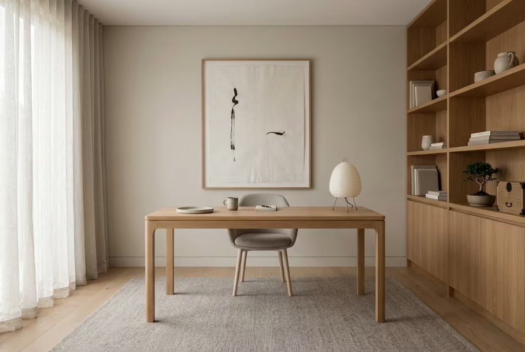
At first glance, monochrome might sound stark, almost clinical. In practice, when handled with warmth, it becomes one of the most effective ways to create visual calm. The trick lies in layering tones rather than relying on contrast.
A well-resolved monochrome workspace might sit within a palette of soft whites, warm greys, and natural timber accents. Walls finished in low-sheen paint, around 5 to 10 percent reflectivity, help absorb light rather than bounce it around. Flooring in light oak or similar tones, typically 15 to 20 mm or 0.6 to 0.8 inches thick, adds warmth underfoot without breaking the visual flow.
In one project, the client initially leaned towards a high-contrast black and white scheme. It looked striking in concept, but once applied, it felt restless. We softened the palette, introduced warmer undertones, and reduced sharp transitions. The space immediately felt more composed, like it had finally found its footing.
Pros
- Creates a cohesive, distraction-free environment
- Enhances the perception of space through tonal continuity
- Works well across different lighting conditions
Cons
- Can feel flat if texture is not introduced
- Requires careful material selection to avoid monotony
A monochrome scheme done well is not about stripping things back to nothing. It is about tuning the room so that everything sits in harmony, almost like notes in the same key.
This cluster, taken as a whole, leans into a quieter way of working. It does not push for attention or rely on bold gestures. Instead, it builds focus from the ground up, literally and figuratively, allowing the space to support you without getting in the way.
Light-Focused Environments
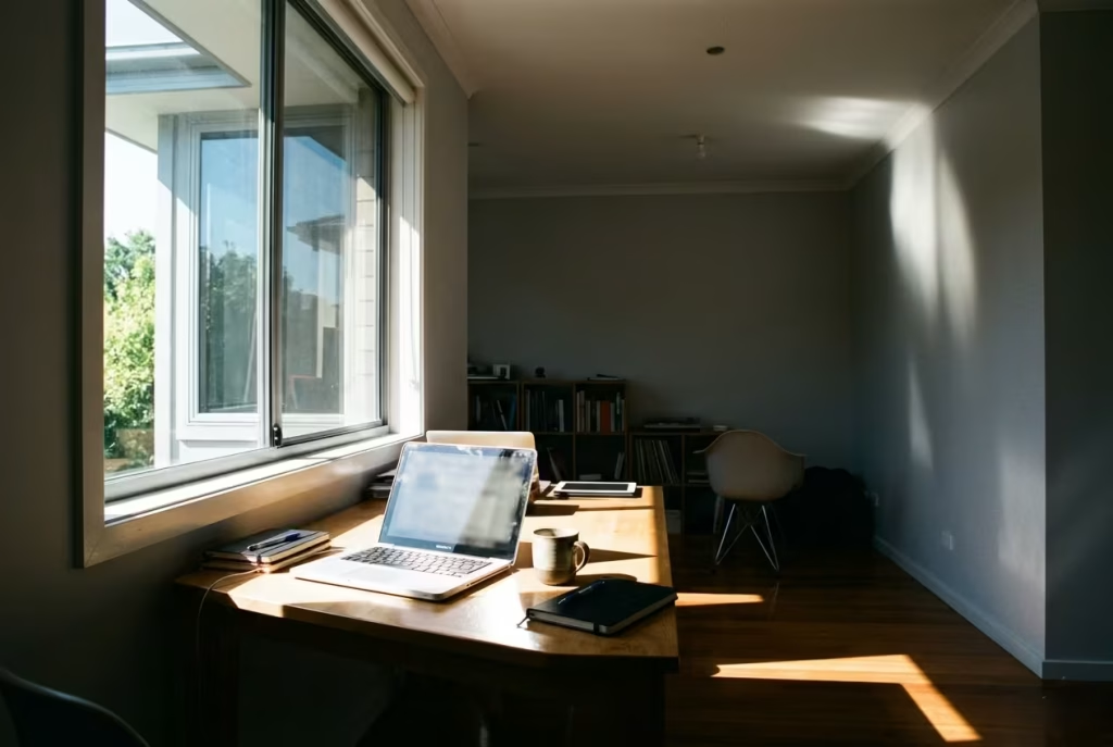
Light, when handled with care, becomes more than illumination. It becomes structure. It defines how the room wakes up in the morning, how it carries you through the afternoon, and how it winds down as evening sets in. Get it right and the workspace begins to run like clockwork, quietly supporting your rhythm. Get it wrong and even the most refined setup starts to feel like you are working against the tide.
In Japanese-inspired workspaces, light is rarely left to chance. It is shaped, filtered, and layered so that it behaves consistently, almost predictably. The goal is not brightness for its own sake, but clarity. A kind of visual steadiness that allows focus to hold without constant adjustment.
North-Facing Desk Layouts
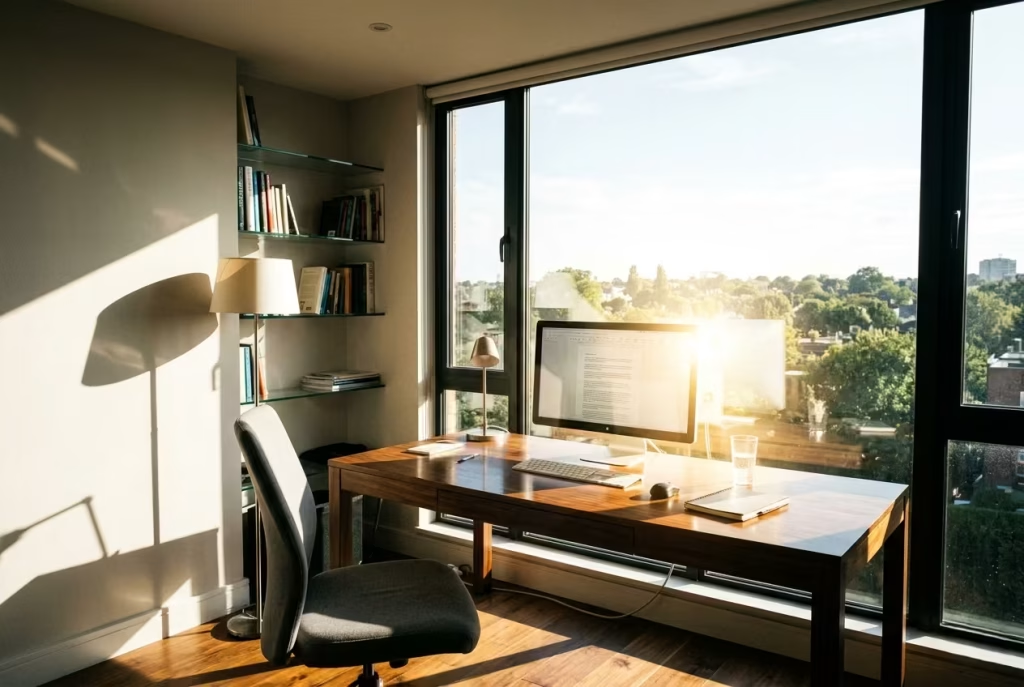
North-facing light is often described as the most balanced, and for good reason. It remains soft and even throughout the day, avoiding the sharp contrasts and shifting glare that come with direct sunlight. In a workspace, this consistency is worth its weight in gold.
Positioning a desk to take advantage of north light usually means placing it parallel to the window, at a distance of around 700 to 1000 mm or 27.5 to 40 inches. This allows daylight to fall across the work surface without hitting the screen directly. The result is a steady, low-contrast environment where the eyes do not have to constantly readjust.
I once worked on a home office where the client had been struggling with fatigue by mid-afternoon. The desk faced a south-west window, catching intense light for several hours each day. We relocated the setup to a quieter north-facing wall, softened the surrounding palette, and within weeks, the client reported longer, more consistent work sessions. No dramatic changes, just a better alignment with natural light.
Pros
- Provides stable illumination throughout the day
- Reduces glare and harsh shadowing
- Supports long periods of focused work
Cons
- May feel slightly cooler in tone without material warmth
- Less dynamic if you prefer shifting light conditions
It is a bit like working under a calm sky rather than a blazing sun. Nothing fights for attention, and that makes all the difference.
You May also Like: 25 Japandi Balcony Design: Calm Minimalism and Cozy Natural Textures
Shoji-Filtered Daylight Workspace
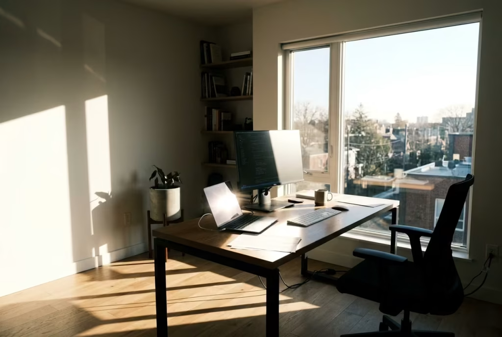
Direct sunlight can be a double-edged sword. It brings energy into a room, but without control, it quickly becomes overwhelming. This is where shoji-style filtering comes into play, softening light to a level that feels usable rather than intrusive.
Shoji panels, traditionally made with translucent paper, diffuse incoming light so that it spreads evenly across the space. In modern applications, similar results can be achieved using frosted glass or fabric panels. The key is maintaining a balance between transparency and diffusion.
For practical application, panels typically sit within window frames or as sliding partitions, often at heights of 1800 to 2100 mm or 6 to 7 feet, covering the main light entry point. The material should allow around 50 percent light transmission, enough to keep the room bright while eliminating sharp glare.
In one residential project, an east-facing workspace received strong morning light that made it difficult to use before midday. Rather than blocking the light entirely, we introduced a shoji-inspired screen. The change was immediate. The room remained bright, but the harshness disappeared. The client described it as the difference between squinting through the day and simply getting on with it.
Pros
- Softens natural light without reducing brightness significantly
- Creates a calm, evenly lit environment
- Adds a subtle architectural layer to the space
Cons
- Does not provide full blackout when needed
- Requires careful installation to maintain a clean aesthetic
Filtering light in this way is like taking the edge off a sharp tool. It remains effective, but far easier to work with.
You May also Like: 25 Beautiful Modern Farmhouse Home Office Ideas for a Stylish Workspace
Layered Lighting with Paper Pendants
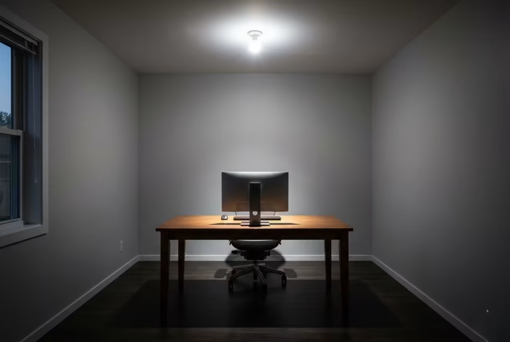
Natural light carries the day, but artificial lighting takes over when it fades. The transition between the two needs to feel seamless, otherwise the room can lose its balance as evening approaches. This is where layered lighting comes into its own.
A well-considered lighting plan typically includes three levels. Ambient lighting provides general illumination, task lighting focuses on the work surface, and accent lighting adds depth. In Japanese-inspired interiors, paper pendants often take the lead in the ambient layer, diffusing light in a way that feels soft and consistent.
A pendant positioned centrally or slightly offset above the workspace, at a height of around 1800 to 2000 mm or 6 to 6.5 feet from the floor, creates a gentle pool of light. Paired with a desk lamp delivering around 500 to 700 lux, the workspace remains functional without becoming overly bright.
I recall a project where the client relied on a single overhead light, bright but harsh, casting uneven shadows across the desk. We introduced a paper pendant for ambient light and a focused task lamp. The shift was subtle but effective. The room felt more layered, more intentional, and working into the evening became far less tiring.
Pros
- Creates a balanced lighting environment for day and night use
- Reduces eye strain by distributing light evenly
- Adds visual softness through diffused illumination
Cons
- Requires coordination between different light sources
- Poor placement can lead to uneven lighting zones
Layered lighting, when done well, feels almost invisible. You do not notice the fixtures, only the way the room holds together as the day moves on.
This cluster, centred around light, reveals how much of productivity is tied to what we often take for granted. When light is steady, softened, and thoughtfully layered, the workspace stops demanding constant adjustment. It allows you to settle in, stay longer, and work with a sense of ease that builds quietly over time.
Nature-Integrated Offices
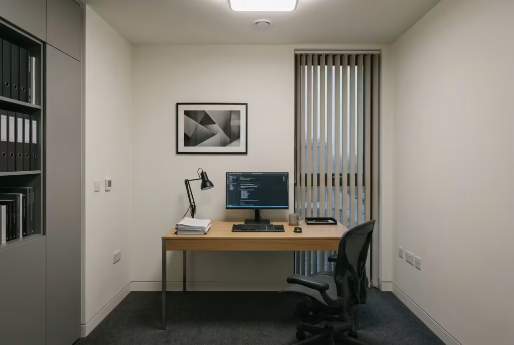
Bringing nature into a workspace is often treated as a finishing touch, a plant on the desk, a view through the window. In practice, it runs much deeper than that. When handled with intent, nature becomes part of the spatial structure itself, shaping how the room feels and how long you can remain focused without fatigue creeping in.
I have found that even small, well-placed natural elements can steady a space in ways that furniture alone cannot. It is not about turning the room into a garden. It is about introducing just enough of the outside world to take the edge off, to soften the environment so it does not feel sealed or overly controlled. Like opening a window in your mind, the effect builds gradually, then holds.
Indoor Plant Framing (Ficus, Bonsai)
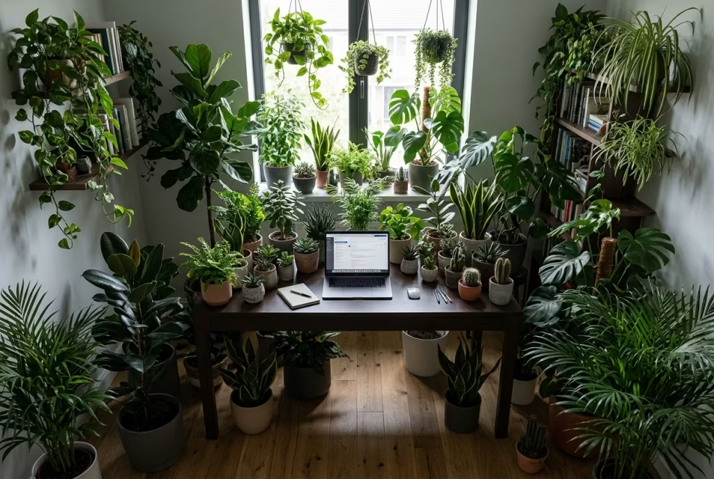
Plants, when placed with precision, act less like decoration and more like spatial anchors. They guide the eye, soften edges, and create a sense of depth that flat surfaces cannot achieve on their own. The key lies in restraint. One or two well-positioned plants will always outperform a scattered collection.
For workspaces, I tend to work with species such as Ficus or Bonsai, not just for their aesthetic quality but for their structure. A Ficus, placed slightly off to one side of the desk, ideally within 300 to 600 mm or 12 to 24 inches, can frame the working area without intruding into it. Height matters here. Keeping the plant between 900 to 1500 mm or 35 to 60 inches allows it to sit comfortably within the visual field without blocking light.
Bonsai, on the other hand, operates at a smaller scale. Positioned on a secondary surface or a corner of the desk, typically within a 200 to 300 mm or 8 to 12 inch zone, it introduces detail without clutter. It draws the eye in briefly, then lets it go, which is exactly what you want in a focused environment.
In one project, a client had filled their workspace with multiple small plants, each competing for attention. We reduced the selection to a single Ficus and one Bonsai, repositioned them to frame rather than fill the space, and the room immediately felt more composed. The greenery remained, but the distraction faded.
Pros
- Introduces natural variation without overwhelming the space
- Improves visual comfort and reduces mental fatigue
- Enhances depth and spatial layering
Cons
- Requires maintenance and consistent care
- Poor placement can block light or create clutter
Plants, when used well, do not demand attention. They hold the space together quietly, like a steady presence in the background.
Garden-Facing Workspace
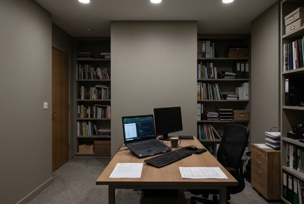
There is something fundamentally different about working with a view that extends beyond the room. It changes the way your eyes rest, offering moments of distance that screens simply cannot provide. Even a modest garden, when framed correctly, can shift the entire working experience.
Desk placement becomes critical here. Positioning the desk to face or sit adjacent to a garden view, at a distance of around 800 to 1200 mm or 31 to 47 inches from the window, allows for both connection and comfort. Too close and the view becomes overwhelming. Too far and it loses its impact.
The composition of the view matters just as much as its presence. A calm, layered garden with low planting, perhaps within 600 to 900 mm or 24 to 35 inches in height, works far better than dense, visually busy greenery. The goal is not to create a spectacle, but a backdrop that the eye can drift towards without effort.
I recall a residential project where the desk was originally positioned against an internal wall, facing shelves and storage. The client experienced regular eye strain and frequent breaks. We rotated the desk to align with a small, quiet garden outside. Nothing extravagant, just a simple arrangement of plants and stone. Over time, the client reported a noticeable reduction in screen fatigue and a more consistent working rhythm.
Real Experience Insight:
In one residential project, aligning the desk with a quiet garden view reduced screen fatigue significantly over time
Pros
- Provides visual relief during extended screen use
- Enhances mood and overall comfort
- Creates a subtle connection to natural cycles
Cons
- Requires control of light and glare depending on orientation
- Not always possible in urban or enclosed settings
A garden-facing workspace acts like a pause button you do not have to press. The moment your eyes lift, the room gives something back.
You May also Like: 15 Stunning Spanish Home Offices That Blend Beauty and Productivity
Stone and Wood Contrast Zones
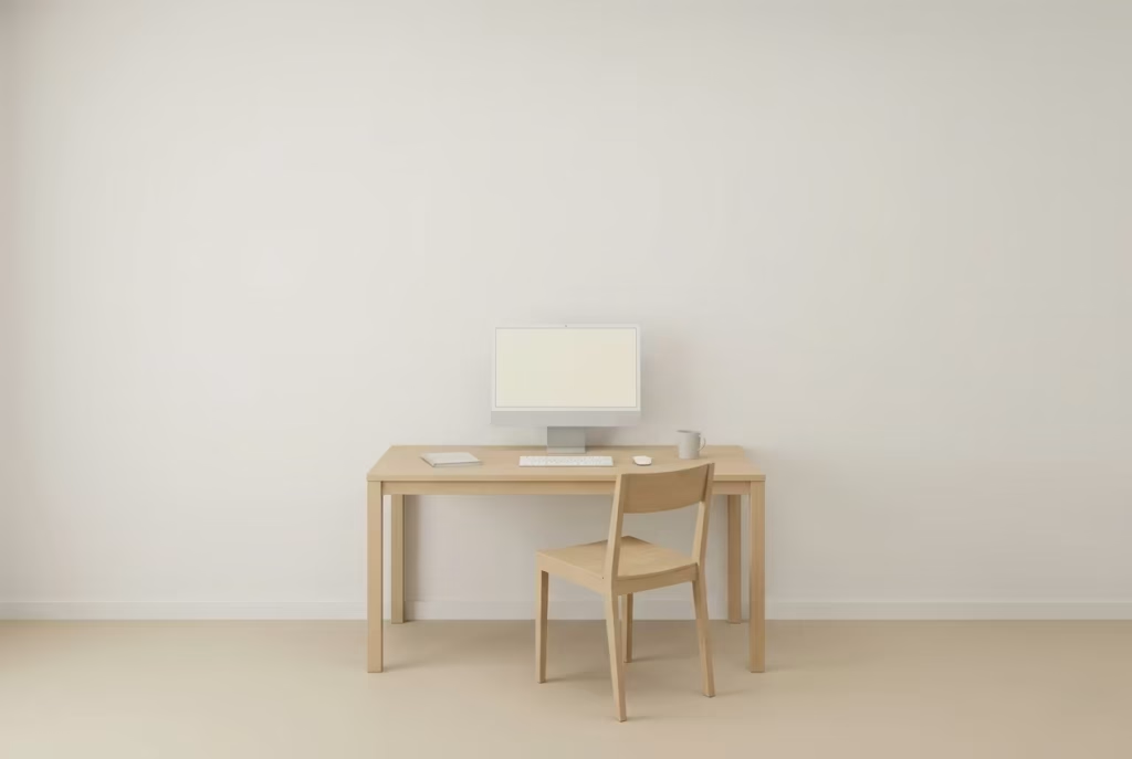
While plants and views bring nature in visually, material contrast brings it in physically. The pairing of stone and wood, in particular, creates a balance that feels grounded yet refined. It introduces variation without chaos, texture without noise.
In workspace design, this often plays out through flooring, wall finishes, or secondary surfaces. A timber desk set against a stone-textured wall, or a stone base paired with a wooden work surface, creates a dialogue between materials. The warmth of wood softens the coolness of stone, while the stone adds weight and stability.
From a technical standpoint, I usually limit stone application to controlled areas, perhaps a feature wall of 1200 to 1800 mm wide or 4 to 6 feet, or a flooring section beneath the desk measuring around 1500 x 2000 mm or 5 x 6.5 feet. This keeps the contrast intentional rather than overwhelming.
In one project, we introduced a textured stone wall behind the desk, paired with a simple oak work surface. The room, which previously felt flat, gained depth almost instantly. The client described it as feeling more anchored, as if the workspace had finally found its footing.
Pros
- Adds tactile depth and visual balance
- Reinforces a grounded, stable atmosphere
- Works well within restrained colour palettes
Cons
- Can feel heavy if overused
- Requires careful detailing to maintain a clean finish
Stone and wood, when brought together with restraint, create a kind of quiet tension that keeps the space from feeling static. It is a subtle interplay, one that adds richness without disrupting the calm.
This cluster shows how nature, in its various forms, can be woven into a workspace without turning it into something overly styled or contrived. It is about finding that fine line where the room feels connected, softened, and quietly alive. Once that balance is struck, focus tends to follow, almost as if it has been waiting for the space to catch up.
Compact Urban Solutions
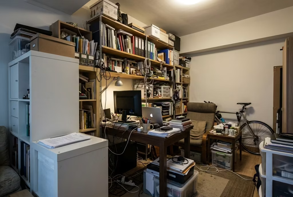
Working with limited space has a way of sharpening decisions. There is no room for excess, no space to hide inefficiencies. Every element has to earn its place, otherwise the room begins to feel tight, almost restless. In urban homes, where a dedicated office is often a luxury, the challenge is not just fitting a workspace in. It is making sure it performs without taking over the entire room.
I have worked on countless compact layouts where the difference between success and frustration came down to a few centimetres, a slight shift in proportion, or a smarter use of vertical space. When these details are resolved well, the room begins to work harder without feeling heavier. It is a fine balance, but once it lands, it changes how the space is experienced day to day.
Alcove Office with Sliding Panels
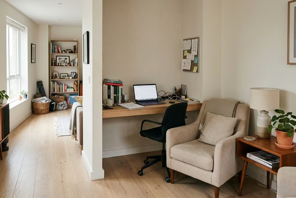
An alcove, often overlooked or underused, can become one of the most effective places to house a workspace. It naturally creates a sense of enclosure, a subtle boundary that helps separate work from the rest of the home without requiring a full room.
The key is to refine the proportions. A functional alcove office typically works within a width of 1000 to 1400 mm or 39 to 55 inches, with a depth of 500 to 700 mm or 20 to 28 inches. This provides enough space for a desk and essential movement without feeling cramped. The desk itself should sit comfortably within this footprint, often custom-fitted to maximise every millimetre.
Sliding panels, inspired by traditional Japanese partitions, take this concept a step further. Installed at a height of 2000 to 2100 mm or 6.5 to 7 feet, they allow the workspace to be concealed when not in use. This is particularly useful in living areas or bedrooms, where visual separation matters just as much as physical function.
I recall a project where the client struggled with switching off after work because their desk remained in full view within the living room. We introduced a simple sliding panel system. Nothing overly complex, just enough to close the space at the end of the day. The change was immediate. Work felt contained, and evenings felt like evenings again.
Pros
- Creates a defined workspace within a compact footprint
- Allows visual separation without permanent walls
- Enhances focus by reducing peripheral distractions
Cons
- Limited space for larger setups or multiple monitors
- Requires precise planning to avoid a cramped feel
An alcove office, when done right, feels like a space carved out with purpose, tucked in neatly yet fully functional.
You May also Like: 25 Japanese Mid-Century Modern Design Ideas You’ve Probably Never Seen (and Will Obsess Over)
Fold-Away Desk Systems
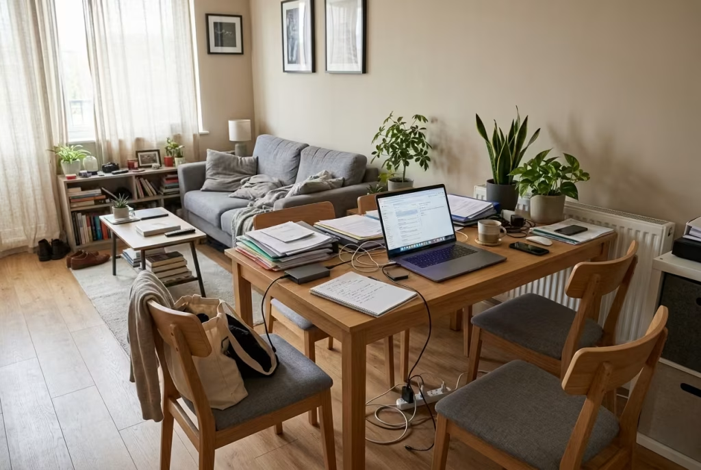
When space is at a premium, flexibility becomes essential. Fold-away desks offer a solution that adapts to the rhythm of daily life, appearing when needed and disappearing when not. It is a bit like having a workspace on standby, ready to step in without overstaying its welcome.
A well-designed fold-away desk typically measures 900 to 1200 mm or 35 to 47 inches in width and folds down to a working height of around 720 mm or 28 inches. Depth, when open, should sit within 450 to 600 mm or 18 to 24 inches, enough for a laptop and essential items without projecting too far into the room.
The success of this system lies in its detailing. Integrated storage within the fold-away unit, often shallow compartments of 100 to 150 mm or 4 to 6 inches deep, allows work essentials to remain in place even when the desk is closed. This avoids the need to set up and pack away repeatedly, which can quickly become a barrier to use.
In one compact apartment project, the client had been working from the dining table, clearing and resetting it multiple times a day. We introduced a fold-away desk along a quiet wall. It did not add square footage, but it changed how the space was used. Work became more structured, less intrusive, and far easier to manage.
Pros
- Maximises space in multi-functional rooms
- Keeps the workspace hidden when not in use
- Encourages a clear distinction between work and living
Cons
- Limited surface area compared to fixed desks
- Requires durable hardware to withstand daily use
A fold-away desk works best when it feels effortless. If opening and closing becomes a chore, the system loses its edge.
Vertical Storage with Concealed Compartments
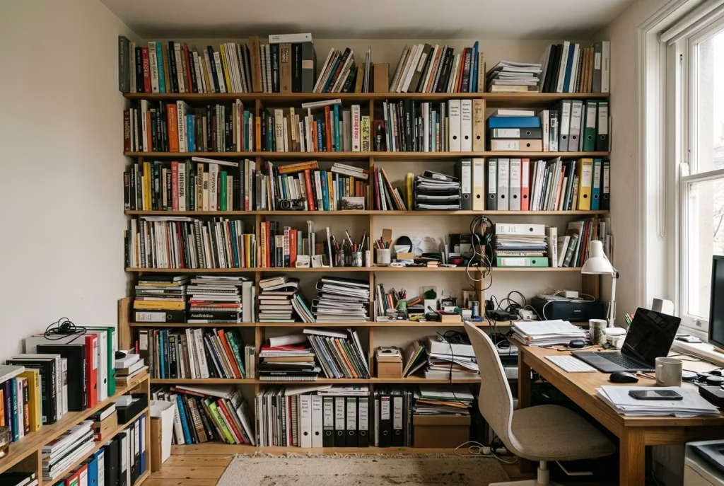
In compact spaces, storage often creeps upward. While this solves capacity issues, it can easily tip into visual clutter if not handled carefully. The goal is to use vertical space without overwhelming the room, keeping the visual field as calm as possible.
Concealed storage is key here. Full-height cabinetry, typically reaching 2100 to 2400 mm or 7 to 8 feet, can provide significant storage while maintaining a clean surface. Depth should remain controlled, ideally within 300 to 400 mm or 12 to 16 inches, to avoid encroaching too far into the room.
Push-to-open mechanisms or recessed handles help maintain a smooth, uninterrupted facade. Internally, dividing the storage into zones, with shelves spaced at 250 to 350 mm or 10 to 14 inches, allows for efficient organisation without overpacking.
I worked on a narrow home office where open shelving had taken over one entire wall. Books, files, and objects filled every inch, creating a constant sense of visual noise. We replaced it with concealed cabinetry, keeping only a small section open for essential items. The room immediately felt lighter, almost as if a weight had been lifted.
Pros
- Maximises storage without increasing visual clutter
- Keeps the workspace organised and distraction-free
- Supports long-term functionality in compact layouts
Cons
- Can feel heavy if not balanced with lighter elements
- Requires careful planning to avoid overfilling
Vertical storage, when concealed, works quietly in the background. It holds everything you need without putting it on display, which in a compact workspace, makes all the difference.
This cluster highlights how constraints, when approached thoughtfully, can lead to sharper, more efficient design decisions. Compact spaces do not need to feel limiting. With the right planning, they can become highly focused environments, where every element serves a purpose and nothing gets in the way.
Japandi Hybrid Workspaces
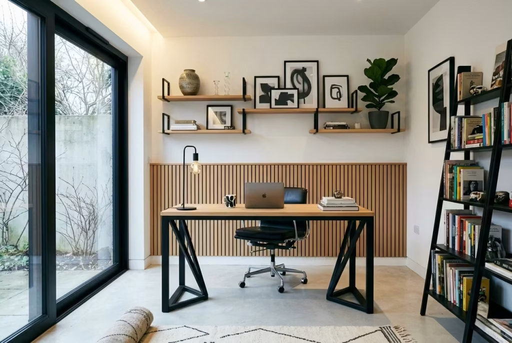
Japandi workspaces sit in a very particular space between two design philosophies that, on the surface, come from different worlds, yet meet naturally when applied with restraint. One leans towards Scandinavian clarity, the other towards Japanese discipline, and when balanced correctly, the result is a workspace that feels calm without being empty, refined without being rigid. It is a style that does not try to impress at first glance, yet quietly grows on you over time, like a space that earns your trust rather than demanding it.
In practice, I have found Japandi workspaces work best in homes where people want order without sterility. They are not loud environments. They are steady, composed, and grounded, almost like a well-tuned instrument that never feels out of place.
Scandinavian-Japanese Fusion Desks
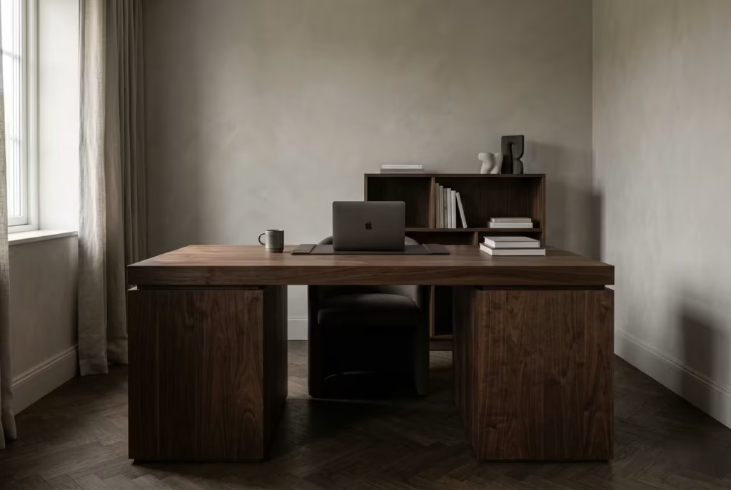
At the heart of a Japandi workspace is the desk, and this is where the balance between both philosophies becomes most visible. Scandinavian design brings in lightness, functional simplicity, and clean geometry, while Japanese design introduces restraint, proportion, and material honesty. When combined thoughtfully, the result is a desk that feels both practical and emotionally steady.
Typical proportions remain understated. A well-balanced fusion desk often sits within 1200 to 1600 mm or 47 to 63 inches in width, and 600 to 750 mm or 24 to 30 inches in depth, offering enough surface area without encouraging clutter. The legs are often slender, sometimes tapered, allowing visual space to flow underneath rather than stopping abruptly.
I worked on a home office where the original desk was visually heavy, almost block-like, and it anchored the room in a way that felt restrictive. Replacing it with a lighter oak-based Japandi desk completely changed the perception of space. Suddenly, the room felt less anchored to a single object and more evenly distributed. It is one of those changes that does not shout, but you feel it immediately when you sit down.
Pros
- Balances functionality with visual lightness
- Works well in both small and medium-sized spaces
- Encourages a clean and structured workflow
Cons
- Can feel too minimal if not paired with texture
- Requires careful proportioning to avoid looking underwhelming
A good Japandi desk does not dominate the room. It sits in it, quietly doing its job without asking for attention.
Soft Neutral Palettes with Black Accents
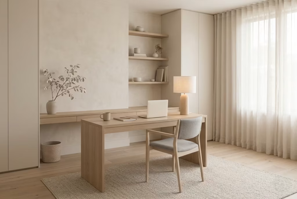
Colour plays a subtle but powerful role in Japandi interiors. The foundation is almost always neutral, but not flat. Think warm whites, muted greys, soft beiges, and pale timber tones that sit comfortably together without competing. These tones create a backdrop that feels easy on the eyes, especially during long working hours.
Black accents are introduced sparingly, almost like punctuation marks within a sentence. They are not used for decoration, but for definition. A black desk lamp, a slim metal frame, or subtle hardware details within cabinetry, often no more than 10 to 15 percent of the visual field, is enough to ground the palette and prevent it from drifting into softness.
In one project, the workspace initially leaned too heavily into beige tones, and while it felt warm, it lacked structure. By introducing a few matte black elements, the entire composition sharpened. The room did not become darker or harsher. It simply gained a point of focus, like drawing a line under a thought.
Pros
- Creates a calm, balanced visual environment
- Reduces visual fatigue during extended use
- Allows flexibility across different lighting conditions
Cons
- Overuse of black can disrupt the softness of the palette
- Requires restraint to maintain harmony
When handled well, this palette feels like a deep breath held steady, not rushed, not interrupted.
Textural Layering Using Wool and Wood
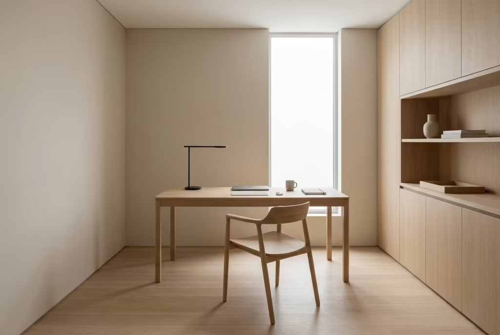
If colour sets the tone, texture gives the room its depth. Without texture, even the most carefully chosen Japandi palette can feel flat. Wool and wood become essential here, introducing a tactile quality that softens the space without disrupting its clarity.
Wood typically forms the structural base, desks, shelving, and flooring, often in light to medium tones with a natural or matte finish. Wool, on the other hand, enters through seating, rugs, or acoustic elements. A wool rug, usually sized around 1600 x 2300 mm or 5.2 x 7.5 feet, placed under or near the workspace, helps anchor the zone while absorbing subtle sound reflections.
I once worked on a home office where everything was visually correct, but the room felt slightly hollow. The surfaces were clean, the layout was efficient, yet something was missing. We introduced a wool rug beneath the desk and a wool-upholstered chair. The shift was immediate. The room stopped feeling echoey and started feeling inhabited, like it had finally been lived into.
Pros
- Adds warmth without visual clutter
- Improves acoustic comfort in hard-surfaced rooms
- Enhances the sensory quality of the workspace
Cons
- Requires maintenance to keep textures fresh
- Can feel too soft if not balanced with structured elements
Textural layering is what prevents Japandi spaces from feeling overly controlled. It is the difference between a room that looks designed and a room that feels considered.
Japandi hybrid workspaces succeed because they do not try to do too much. They hold themselves back just enough to let the user take the lead. Everything is intentional, but nothing feels forced. It is a design language that understands when to step forward and when to step aside, and in that balance, productivity finds a natural rhythm of its own.
Distraction-Free Environments
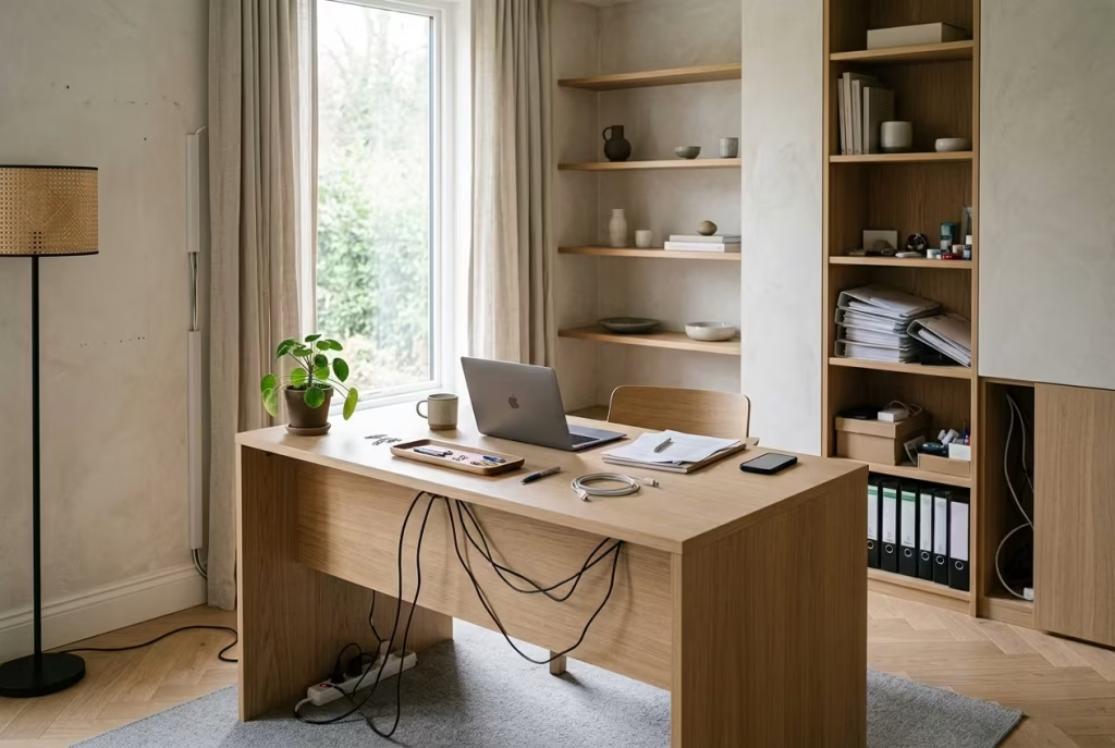
Distraction-free workspaces are rarely created through addition. They are built through discipline, through editing, and through a willingness to let go of what does not serve the task at hand. In my experience, this is where many home offices either quietly succeed or slowly unravel. A space can look refined at first glance, yet still feel mentally noisy if the underlying systems are not resolved. It is a bit like a calm surface hiding restless water underneath.
The aim here is simple but not easy: remove anything that pulls attention away from the work itself. When that is achieved, focus does not need to be forced. It simply settles in.
You May also Like: 25 Japandi Balcony Design: Calm Minimalism and Cozy Natural Textures
Hidden Cable Management Systems
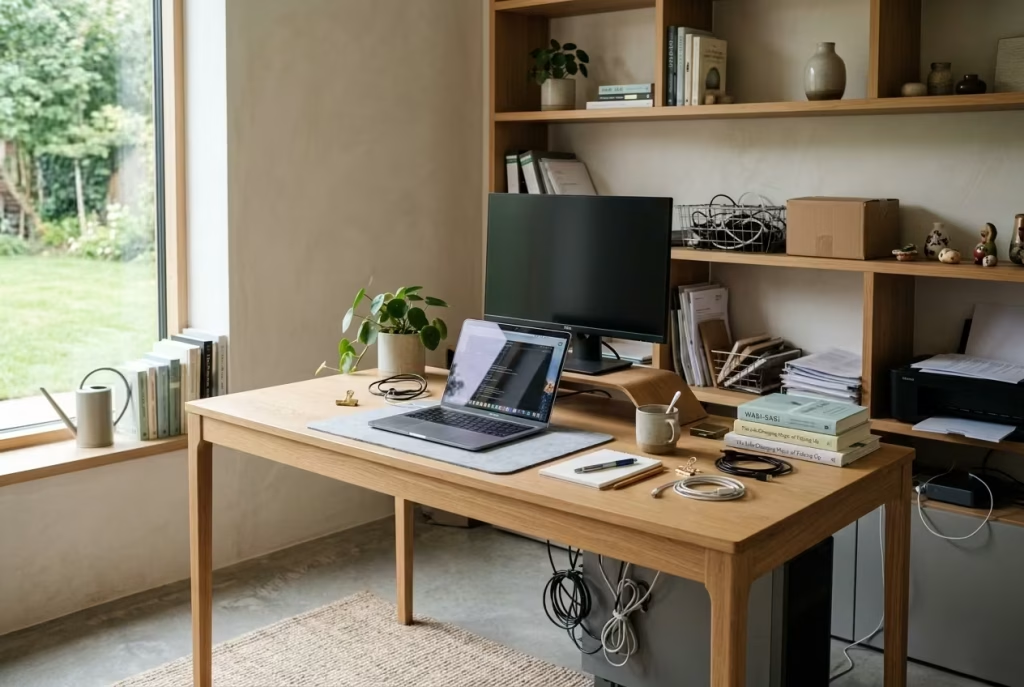
Cables are often underestimated, yet they are one of the most persistent sources of visual disruption. A few exposed wires may seem harmless, but over time they create a sense of unfinished business in the room. The eye catches them repeatedly, even if the mind tries to ignore them.
Hidden cable management is not just about tidiness. It is about removing micro-interruptions that quietly break concentration. In practical terms, this usually involves routing cables through desk grommets, internal trunking, or concealed wall channels. A typical desk setup benefits from at least one integrated cable channel of 50 to 80 mm or 2 to 3 inches in diameter, allowing power and data lines to remain completely out of sight.
I once worked on a workspace where the client had multiple devices, all powered through visible extension leads running across the floor. It did not look chaotic at first, but it created a subtle sense of disorder. We redesigned the system so that all cabling fed into a concealed spine behind the desk, with a single controlled outlet point. The transformation was immediate. The room did not just look cleaner. It felt quieter.
Pros
- Eliminates visual clutter at ground and desk level
- Improves safety and reduces tripping hazards
- Creates a more professional, composed workspace
Cons
- Requires planning during setup or renovation
- Less flexible for frequent equipment changes
When cables disappear from view, the room stops feeling “busy in the background,” and starts feeling intentional.
Closed Shelving vs Open Shelving
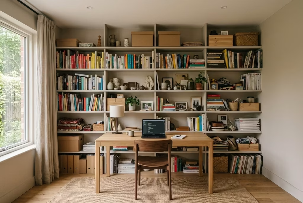
Storage plays a far bigger role in focus than most people realise. Open shelving can look appealing in styled interiors, but in a working environment, it often becomes a silent source of distraction. Every object, every colour variation, every uneven stack competes for attention, even if only briefly.
Closed shelving, by contrast, acts like a visual reset button. It allows the eye to rest rather than scan. In most of my workspace designs, I lean towards a ratio of around 70 percent closed storage to 30 percent open display, and even then, open shelving is treated with restraint.
Closed units typically sit within a depth of 300 to 400 mm or 12 to 16 inches, enough for functional storage without protruding into the room. The surfaces remain clean, uninterrupted, and visually calm. Handles are often recessed or push-to-open, avoiding unnecessary visual noise.
I remember a project where an entire wall of open shelving had been filled with books, decor, and miscellaneous items. It looked expressive, but the client struggled to focus. We replaced most of it with closed cabinetry, leaving only a small curated section open. It was as if the room exhaled. The difference was not dramatic in style, but profound in atmosphere.
Pros
- Reduces visual overload significantly
- Creates a cleaner, more controlled environment
- Improves long-term organisation
Cons
- Less opportunity for personal display
- Requires discipline to maintain internal order
Open shelving tells a story. Closed shelving lets you write it without interruption.
Minimal Object Philosophy (3–5 Items Rule)
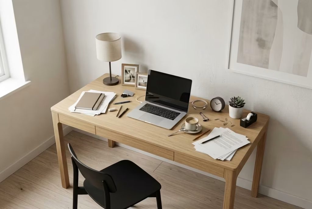
Perhaps the most powerful shift in distraction-free design is not structural at all. It is behavioural. The 3–5 items rule is simple in theory but transformative in practice. The idea is that only three to five objects should remain on the primary work surface at any given time.
These might include a laptop, a task light, a notebook, and perhaps one personal item. Anything beyond that begins to dilute attention. It is not about austerity. It is about clarity of purpose.
A desk measuring around 1200 to 1400 mm or 47 to 55 inches in width does not need to be filled to be functional. In fact, the more space that is left open, the easier it becomes to transition between tasks without visual friction. The empty surface is not wasted. It is active space, allowing the mind to reset between moments of work.
I have seen this principle change behaviour more than once. In one project, a client initially resisted the idea, feeling the desk would look too empty. Within weeks of trial, they noticed they were no longer “searching for focus” at the start of each session. The space itself guided them into it. Everything had its place, and everything else stayed out of the way.
Pros
- Reduces decision fatigue during work sessions
- Encourages consistent organisation habits
- Creates a visually calm and focused surface
Cons
- Requires ongoing discipline to maintain
- May feel too sparse for those used to expressive setups
It is often said that less is more, but in this context, less is what allows more to happen in the mind without interference.
Distraction-free environments are not created by stripping a room bare. They are created by refining what remains until nothing unnecessary is left competing for attention. When that balance is struck, the workspace stops pulling at you. Instead, it holds steady, allowing you to do the work without resistance, almost as if the room has finally learned when to stay quiet.
Ritual-Based Workspaces
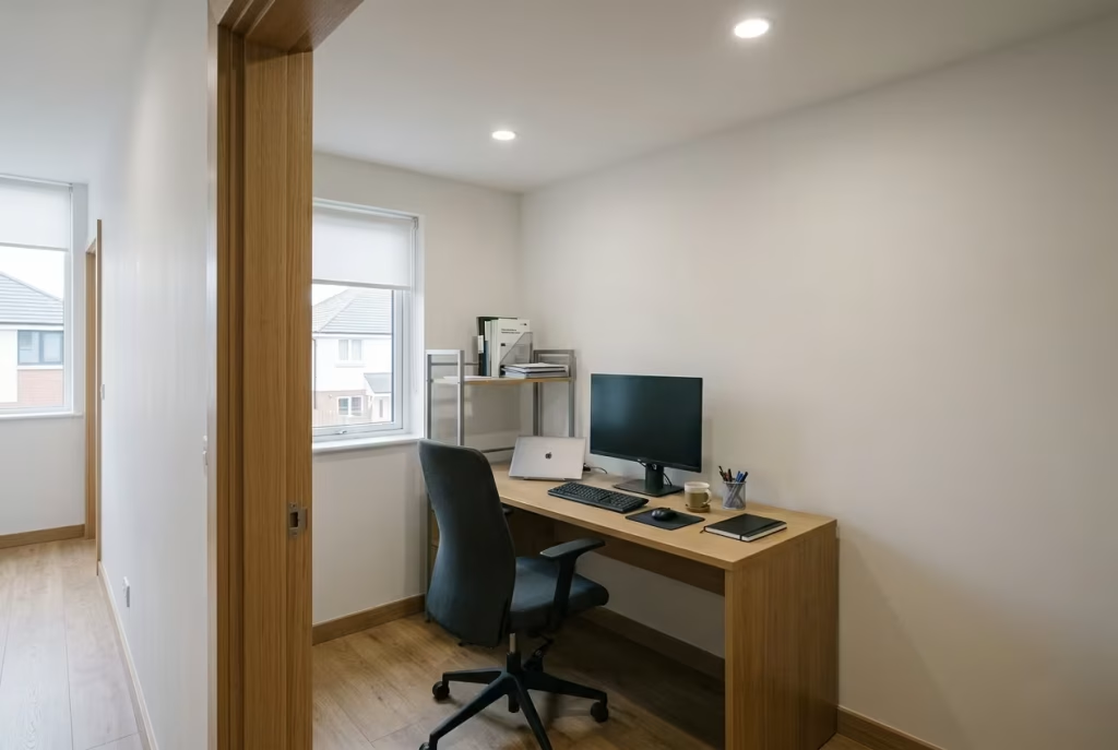
Not every workspace is built for speed. Some are built for rhythm. For the small pauses, the transitions, the moments that quietly signal the mind to shift gears. Ritual-based workspaces take this idea seriously. They recognise that productivity is not just about output, but about how you enter and exit focus. When this rhythm is missing, work can feel abrupt, almost mechanical. When it is present, everything begins to flow with far more ease.
I have seen this most clearly in projects where clients were struggling with burnout or inconsistent focus. The solution was not more structure, but softer transitions. Spaces that allowed work to begin gently, almost ceremonially, rather than all at once.
Tea Corner Integration
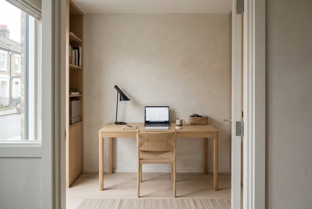
A tea corner in a workspace is often misunderstood as decorative, but in practice, it acts as a psychological buffer. It creates a pause between states of mind. Before work begins, or after it ends, that small act of preparation becomes a grounding ritual that quietly resets attention.
From a spatial point of view, a tea corner does not need much. A compact surface of around 600 to 900 mm or 24 to 35 inches in width, paired with a small shelf or niche for essentials, is often enough. The key is proximity without intrusion. It should feel accessible, but not part of the main working zone.
Materials matter here more than scale. Stone or ceramic surfaces work well because they slow things down visually. A wooden tray, a kettle, a single cup, each item placed with intention rather than accumulation. Nothing excessive, nothing rushed.
I once worked on a home office where the client had been jumping straight into work, feeling scattered within the first hour. We introduced a small tea corner just outside the main desk area. Within weeks, it became a natural starting point for the day. Not because it was functional in a technical sense, but because it created a moment of transition. A pause before the work began to take shape.
Pros
- Creates a calming entry and exit ritual for work sessions
- Encourages slower, more intentional pacing
- Helps separate work mindset from home mindset
Cons
- Requires discipline not to let it become cluttered
- May reduce usable space in very compact rooms
It is a small gesture, but it carries weight. Like the first page of a book, it sets the tone for everything that follows.
Writing-First Desk Layouts
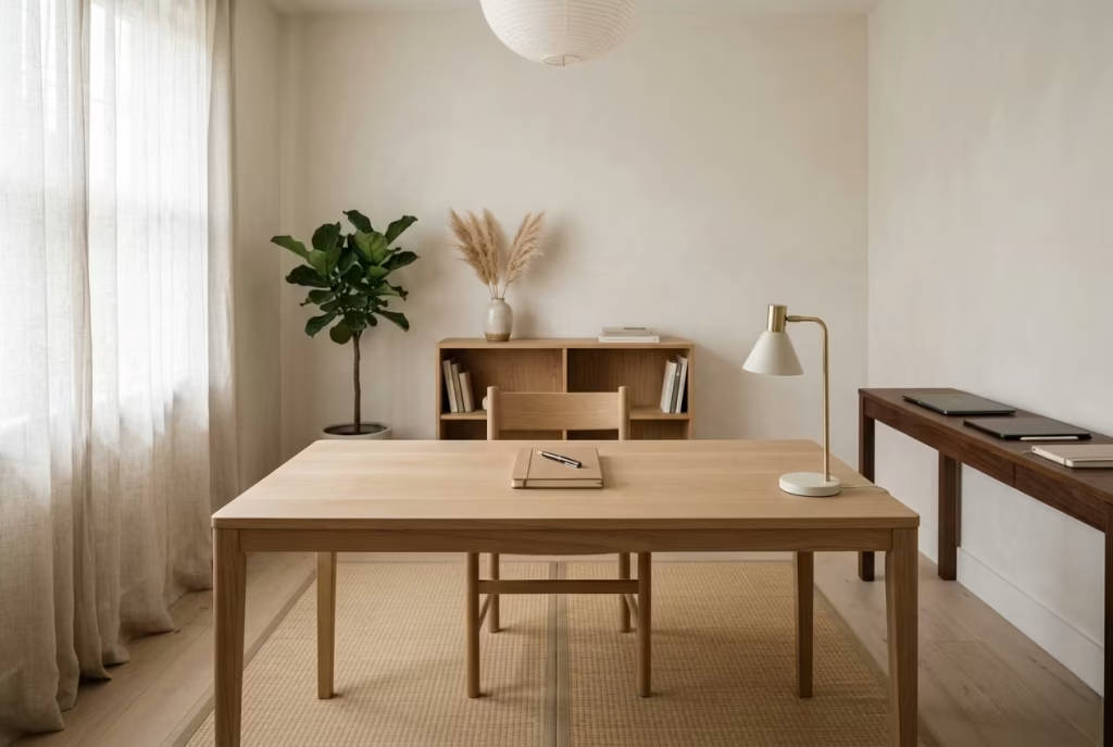
Not all work is digital. And even in digital-heavy environments, the act of writing by hand still holds a different kind of clarity. Writing-first desk layouts prioritise this slower, more deliberate form of thinking. They are designed to reduce friction between thought and expression.
A writing-focused desk typically sits within 1400 to 1600 mm or 55 to 63 inches in width, with a depth of 650 to 750 mm or 26 to 30 inches, giving enough space for paper, books, and tools without feeling scattered. The surface remains intentionally open, encouraging uninterrupted movement across the desk.
In one project, the client was constantly switching between digital tools and handwritten notes, which fragmented their focus. We restructured the desk layout so that the central zone was dedicated purely to writing, with digital tools positioned to the side rather than in front. The result was subtle but noticeable. Ideas felt more linear, less fractured.
The key here is hierarchy. Writing occupies the centre. Everything else supports it from the edges. Over time, this arrangement creates a habit loop. You sit down, and the mind already knows what kind of thinking is expected.
Pros
- Encourages deeper, more structured thinking
- Reduces digital distraction during planning or ideation
- Supports clearer cognitive flow
Cons
- Less efficient for highly digital workflows
- Requires conscious separation of tools
A writing-first layout does not speed things up. It slows them down just enough for thought to catch up.
Analog-Focused Workstations
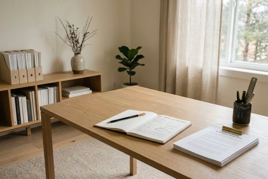
In a world dominated by screens, analog workstations bring something increasingly rare into the workspace: friction. Not the frustrating kind, but the kind that forces intention. Writing, sketching, planning, all without the instant feedback loop of digital tools. It changes the pace of thinking in a way that feels almost grounding.
An analog workstation often includes elements like notebooks, drafting tools, printed references, and physical storage for documents. The desk itself remains uncluttered, typically supporting only 3 to 5 core items at any given time, keeping attention anchored rather than dispersed.
In one residential project, the client deliberately used an analog setup for morning planning sessions. No screens, no notifications, just paper and pen. What began as an experiment quickly became a routine. The absence of digital interruption created a kind of mental clarity that the client had not experienced in years.
The physicality of analog tools matters. The weight of paper, the movement of handwriting, the slower pace of revision, all of it contributes to a different kind of focus. It is not about rejecting technology, but about creating space where thinking is not accelerated unnecessarily.
Pros
- Encourages deep focus without digital interruptions
- Supports reflective and structured thinking
- Reduces dependency on constant screen engagement
Cons
- Less efficient for fast-paced digital workflows
- Requires regular organisation to avoid paper clutter
Analog workstations are not about nostalgia. They are about control over pace. They remind you that not every idea needs to be rushed.
Ritual-based workspaces succeed because they acknowledge something often overlooked in modern design. Work is not just what happens at the desk. It is how you arrive there, how you move through it, and how you leave it behind. When those transitions are designed with care, the workspace stops feeling like a static environment and starts behaving more like a rhythm you can step into, and step out of, with far more ease.
Architectural Calm
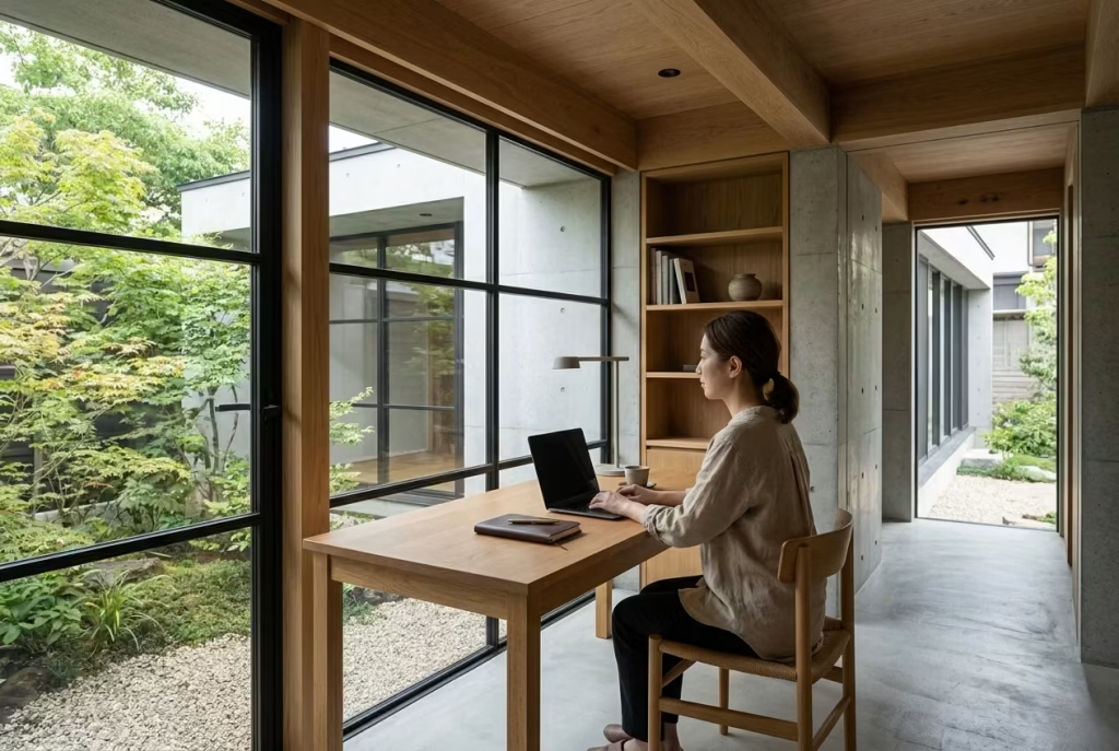
Architectural calm is what happens when a workspace stops relying on furniture to carry the entire narrative. Instead, the architecture itself takes responsibility for mood, proportion, and presence. It is a quieter form of design thinking, where structure is not hidden behind styling, but gently revealed and allowed to breathe. In the right setting, this approach feels almost effortless, as if the room was always meant to be understood this way.
I have found that these spaces tend to work best in homes where restraint is already part of the architectural language. Nothing feels added for effect. Everything feels like it belongs, even when it is minimal. And interestingly, the less you introduce, the more the room begins to speak.
Exposed Beams with Minimal Furnishing
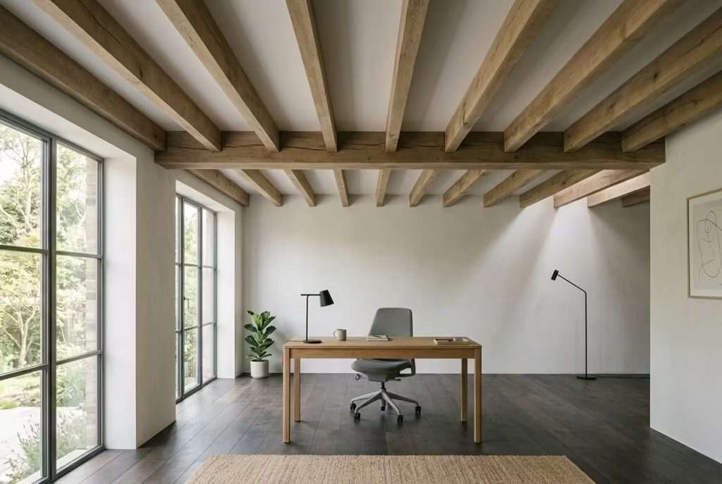
Exposed beams carry a certain honesty. They reveal how the space is constructed, and in doing so, they quietly anchor everything beneath them. When paired with minimal furnishing, they create a contrast between structure and softness, where the architecture becomes the dominant visual rhythm.
In practical terms, beam spacing and proportion matter more than decoration. In many residential projects, beams typically sit at intervals of 900 to 1200 mm or 35 to 47 inches, depending on structural layout. Leaving them visible works best when the furniture below remains deliberately restrained, often limited to essential pieces only.
I worked on a converted loft where the original beams were hidden behind false ceilings. Once exposed, the entire room changed character. We reduced the furniture to a simple timber desk, a chair, and subtle lighting. Suddenly, the beams were not just structural elements. They became part of the atmosphere, almost like a quiet rhythm running across the ceiling.
Pros
- Adds architectural depth without decorative excess
- Creates a strong sense of identity in the space
- Works particularly well in lofts and high-ceiling rooms
Cons
- Can feel heavy if paired with overly dark furnishings
- Requires balance to avoid visual clutter below
Exposed beams do not need attention. They already have presence. Everything else simply learns to sit beneath them.
Concrete and Timber Contrast Workspace
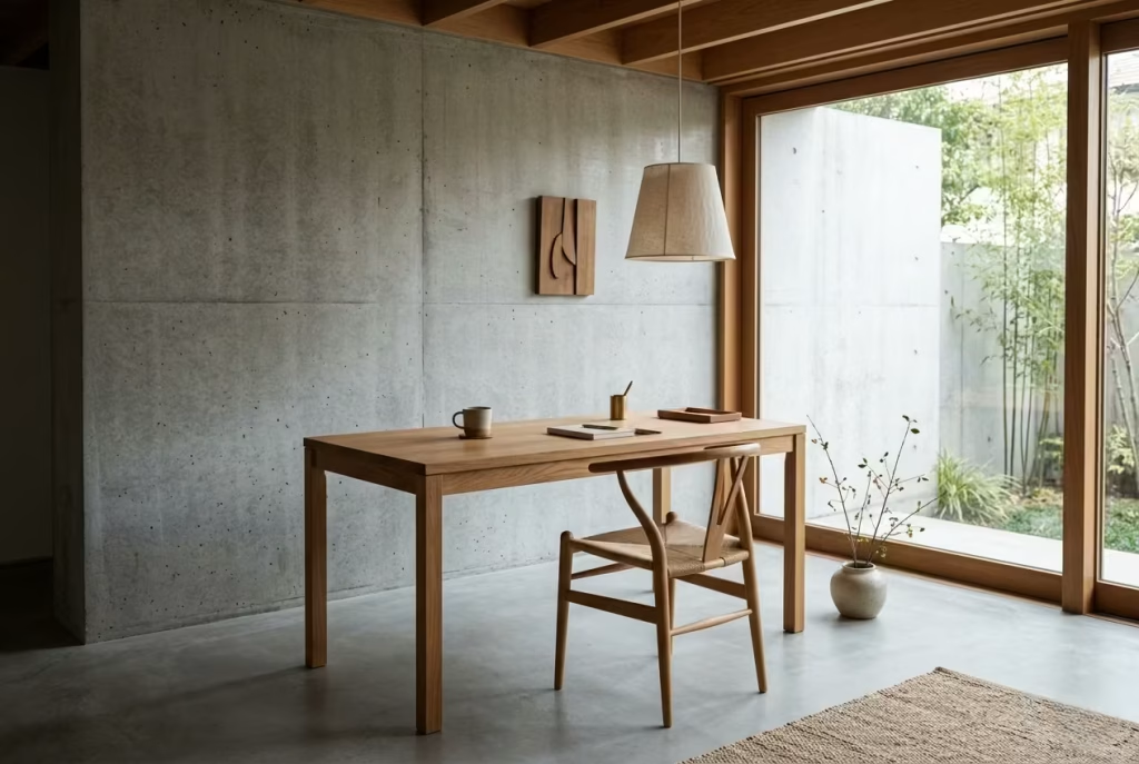
There is a particular tension that comes from pairing concrete with timber. One is cool, grounded, and structural. The other is warm, tactile, and familiar. When balanced correctly, the contrast does not feel harsh. Instead, it feels resolved, like two opposing elements agreeing to share the same space.
Concrete surfaces, often used in flooring or feature walls, typically work best in finishes with a subtle matte texture, avoiding high polish that can feel overly industrial. Timber, usually introduced through desks or shelving, softens this with natural grain and warmth. A common proportion I use is roughly 60 percent timber to 40 percent concrete, enough to maintain warmth while preserving architectural weight.
In one project, a client initially worried that concrete would make the workspace feel cold. Once paired with a warm oak desk and soft lighting, the opposite happened. The contrast created balance rather than discomfort. The room felt grounded, almost like it had been anchored properly for the first time.
Pros
- Strong visual contrast without decorative overload
- Highly durable and long-lasting materials
- Creates a refined, architectural atmosphere
Cons
- Can feel cold if timber is underused
- Requires careful lighting to soften surfaces
It is a bit like contrast in conversation. Too much of one tone becomes flat. The balance is what keeps it engaging.
Framed Negative Space Layouts
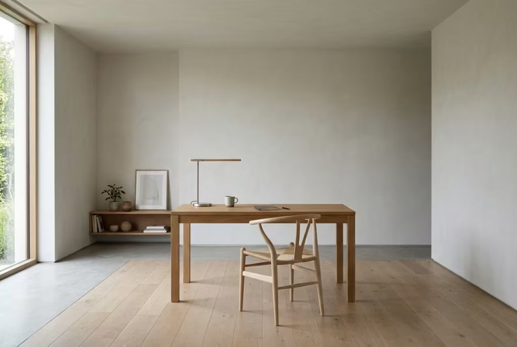
Negative space is often misunderstood as emptiness, but in architectural design, it is closer to structure than absence. Framing it correctly allows the eye to rest, to pause, and then return. It gives the room a kind of visual pacing that supports long hours of focused work.
Framed negative space layouts rely on intentional gaps between objects, walls, and furniture groupings. A desk positioned within a clear boundary of at least 800 to 1200 mm or 31 to 47 inches from surrounding elements allows the space to breathe. Instead of filling every corner, the layout leaves areas deliberately open, creating a rhythm of presence and pause.
I remember a project where the client’s workspace felt visually dense despite being well organised. Everything had a place, yet nothing had space. We restructured the layout so that the desk was isolated within a clearer zone, surrounded by controlled emptiness. The change was subtle but powerful. The room stopped feeling crowded and started feeling composed.
Pros
- Enhances visual clarity and mental focus
- Creates a sense of openness even in smaller rooms
- Supports long-term comfort during work sessions
Cons
- May feel sparse if not balanced with texture or light
- Requires discipline to avoid reintroducing clutter
Negative space, when framed properly, does not feel empty. It feels deliberate, like silence between well-chosen words.
Gallery-Like Office Composition
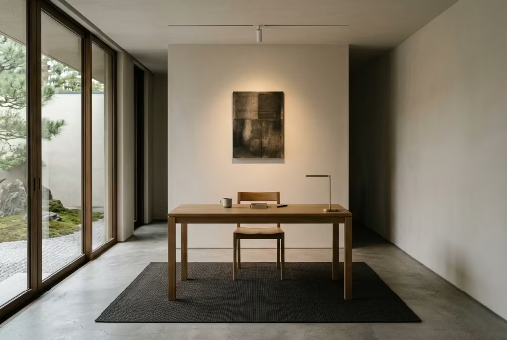
A gallery-like workspace treats the room as a curated environment rather than a functional setup. Every element is placed with intention, not for decoration, but for c
omposition. The result is a workspace that feels calm, controlled, and slightly removed from everyday chaos, like stepping into a space where attention naturally lowers its voice.
Walls are typically kept clean and uninterrupted, often in neutral tones with reflectance levels around 5 to 10 percent to avoid distraction. Furniture is reduced to essential forms, and objects are limited, often following a strict visual hierarchy. Lighting plays a critical role here, with focused pools of light directing attention rather than flooding the entire space.
In one residential project, we treated the office as if it were a small gallery installation. A single desk, one chair, and a carefully framed wall composition were all that remained. The client described the experience as “walking into focus” rather than trying to find it.
Pros
- Highly controlled and distraction-free environment
- Encourages intentional use of space
- Visually calming and refined
Cons
- Can feel overly restrained if not softened with material variation
- Requires careful maintenance to preserve clarity
A gallery-like workspace does not overwhelm you with information. It filters everything down to what matters most.
Architectural calm is not about stripping a space bare. It is about allowing the structure itself to take the lead, while everything else steps slightly back. When that balance is achieved, the workspace stops feeling like a collection of objects and starts feeling like a composed environment, steady, restrained, and quietly powerful in the way it holds your attention without ever demanding it.
Lighting Strategy for Sustained Focus
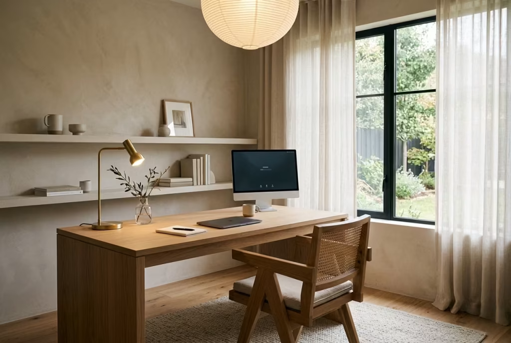
Lighting is often treated as a finishing layer, something adjusted once everything else is in place. In reality, it behaves more like the nervous system of the workspace. It quietly controls rhythm, alertness, and fatigue without ever announcing itself. When lighting is poorly considered, even a beautifully designed room begins to feel off balance, as if the space is slightly out of tune. When it is handled well, focus becomes easier to hold, almost by default.
In Japanese-inspired workspaces, lighting is never left to chance. It is layered, controlled, and softened so that it supports the mind rather than competing with it. The aim is not brightness for the sake of visibility, but stability that carries you through long hours without strain creeping in.
Layered Lighting Approach
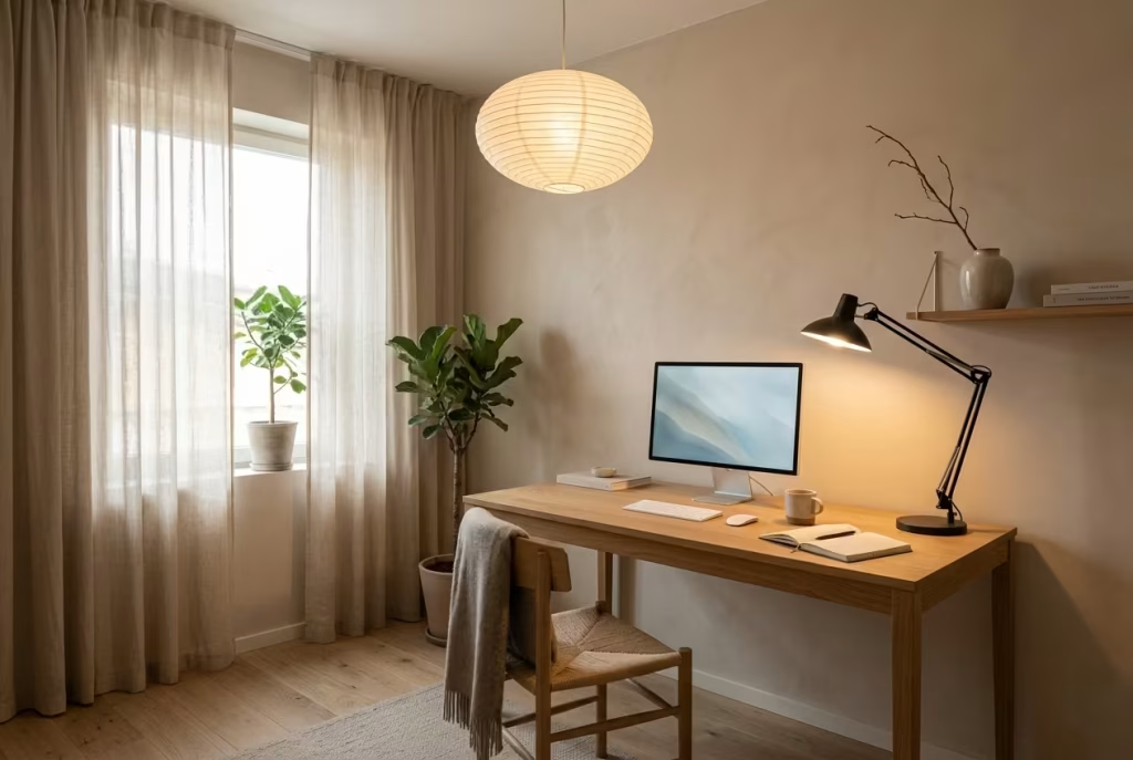
A well-composed workspace relies on more than a single light source. It uses layers, each serving a different purpose, working together like instruments in a quiet composition. When done correctly, you do not notice the lighting itself, only the ease with which the room feels usable at any time of day.
The foundation is ambient lighting, typically calibrated around 300 to 400 lux, providing a soft, even base that fills the room without overpowering it. This layer ensures that the space never feels visually harsh, even during early mornings or late evenings.
On top of this sits task lighting, stronger and more focused, usually within the range of 500 to 700 lux, directed precisely at the working surface. This is where clarity is needed most, especially for reading, writing, or screen-based work. The contrast between ambient and task lighting is what allows the eyes to stay comfortable without constant adjustment.
I have seen the difference this makes in real projects. In one workspace, a single overhead light was doing all the work. The result was a flat, tiring environment that drained energy faster than expected. Once we introduced a layered system, with a soft ambient pendant and a focused desk lamp, the room immediately felt more adaptable. It no longer dictated how the day should feel. It responded to it.
Pros
- Creates balanced illumination across different times of day
- Reduces sudden shifts in brightness that cause fatigue
- Supports longer, more consistent focus sessions
Cons
- Requires thoughtful coordination of multiple fixtures
- Poor calibration between layers can still feel uneven
Layered lighting is a bit like pacing in a well-written piece of music. Nothing dominates, yet everything supports the flow.
Warm vs Neutral Light
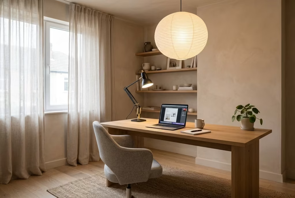
Colour temperature plays a subtle but powerful role in how a workspace feels. It is not immediately obvious at first glance, but over time, it shapes mood, alertness, and even how long you can comfortably remain in the space.
Warm light, typically around 3000K, introduces a softer, more relaxed atmosphere. It works particularly well in environments where calm thinking or reflective work is required. It takes the edge off visual intensity, almost like lowering the volume of the room without dimming it completely.
Neutral light, closer to 4000K, offers greater clarity and precision. It is often better suited for task-heavy environments where attention to detail matters. It feels cleaner, more direct, and slightly more alert in tone, without becoming harsh.
In one project, we experimented with both within the same workspace. The ambient layer remained warm at 3000K, while task lighting was set to 4000K. The combination created a balanced environment where the room felt calm overall, but the desk area remained sharp and focused. The transition between the two felt natural, almost imperceptible, yet it significantly improved how long the client could work without fatigue.
Pros
- Reduces eye strain over extended working periods
- Enhances mood stability and emotional consistency
- Creates a more adaptable environment for different tasks
Cons
- Poor placement can introduce unwanted shadows
- Overlapping light sources without planning can create glare zones
Lighting, when carefully structured, becomes almost invisible in its effectiveness. You do not think about it while working, which is exactly the point. It supports the space quietly, like a steady hand in the background, ensuring that focus does not have to fight for survival but instead finds a natural place to settle.
That Doesn’t Interrupt Thought
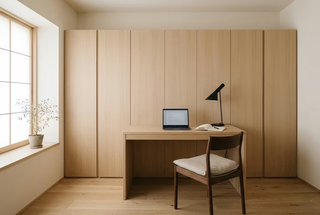
Storage is one of those elements in a workspace that quietly dictates how the mind behaves. When it is well resolved, you barely notice it. When it is poorly considered, it becomes a constant background distraction, like unfinished sentences lingering in the room. The challenge is not simply about storing things, but about making sure storage never interrupts the flow of thought.
In practice, I have seen beautifully designed workspaces fall apart at this stage. Everything looks composed at first glance, yet open papers, exposed files, and visual clutter slowly chip away at concentration. The real goal here is simple but often overlooked. Storage should disappear into the architecture of the room, not compete with it.
Concealed Storage Systems
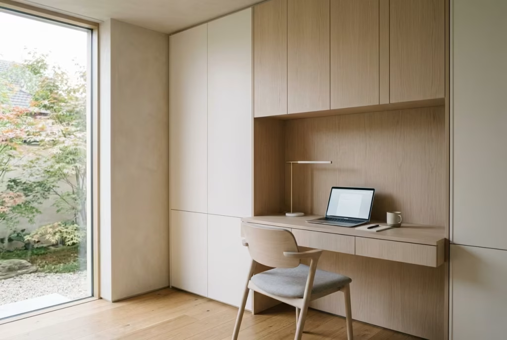
Concealed storage is the foundation of distraction-free organisation. It allows everything to have a place without everything being on display. When done well, it creates a visual calm that supports sustained focus, especially in workspaces where long hours are the norm.
In most residential projects, concealed storage is integrated into walls, under desks, or within full-height cabinetry. Depth typically ranges between 300 to 450 mm or 12 to 18 inches, enough to store essentials without projecting too far into the room. The key is continuity. Surfaces remain clean, uninterrupted, and visually steady.
I once worked on a home office where the client had relied heavily on open storage. Files, books, and everyday items were always visible, and although organised, the space never felt settled. Once we transitioned to concealed wall units with push mechanisms, the change was immediate. The room felt quieter, almost as if it had finally stopped speaking in the background.
Pros
- Maintains a clean and uninterrupted visual field
- Reduces cognitive overload during work sessions
- Improves long-term organisation and discipline
Cons
- Requires planning during design or renovation stages
- Can lead to forgotten items if not properly structured internally
Concealed storage works like a well-written paragraph. Everything is there, but nothing distracts from the main idea.
Push-to-Open Cabinetry
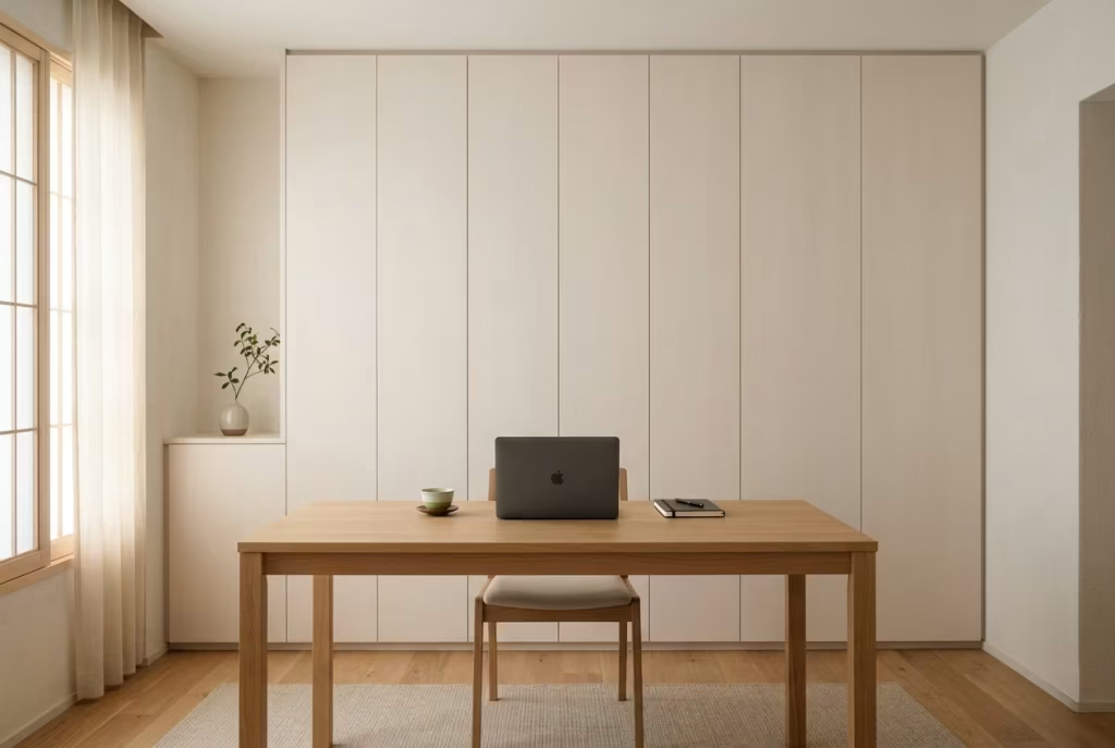
Push-to-open cabinetry removes one of the most visually disruptive elements in storage design: handles. While small, handles create visual rhythm breaks across a surface. Removing them results in a cleaner, more continuous form that aligns well with Japanese-inspired restraint.
Mechanically, these systems rely on internal spring or magnetic mechanisms. Panels typically open with a light press, often requiring minimal force, which keeps interaction smooth and intuitive. Cabinet fronts remain flush, usually within a depth of 18 to 22 mm or 0.7 to 0.9 inches per panel layer, maintaining a seamless surface.
In one project, we replaced traditional handled cabinetry in a compact workspace with push-to-open units. The visual difference was subtle at first, but over time, the room began to feel more cohesive. There was less interruption across the wall surfaces, and the workspace started to feel more composed, almost like everything had been ironed flat into clarity.
Pros
- Creates a seamless, uninterrupted visual surface
- Enhances modern, minimalist aesthetics
- Reduces visual fragmentation across storage walls
Cons
- Requires precise alignment for smooth operation
- Can feel less tactile for users who prefer physical handles
This system is not about novelty. It is about removing small visual interruptions that slowly accumulate into distraction.
Built-in Wall Storage
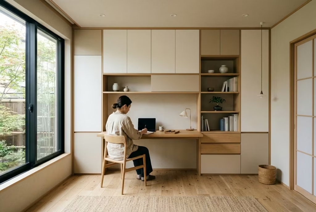
Built-in storage is where functionality meets architecture. Instead of adding storage to a room, it becomes part of the room itself. This integration is what allows compact spaces to remain visually calm while still being highly functional.
Typical built-in units span full wall heights, often between 2100 and 2400 mm or 7 to 8 feet, and are designed to align perfectly with architectural lines. Depth is carefully controlled to avoid encroachment, usually kept between 300 and 400 mm or 12 to 16 inches for workspace applications.
I remember a project where floor-standing furniture had made a small office feel fragmented. Once replaced with built-in cabinetry that aligned with the ceiling and wall geometry, the entire room felt more unified. It was no longer a collection of separate pieces. It became a single, cohesive environment.
Pros
- Maximises storage without occupying additional floor space
- Creates strong architectural cohesion
- Reduces visual fragmentation in compact rooms
Cons
- Less flexible once installed
- Requires precise planning and professional installation
Built-in storage works best when it feels like it has always belonged there, not something added later.
Measured Storage Ratios (70% Closed, 30% Open)
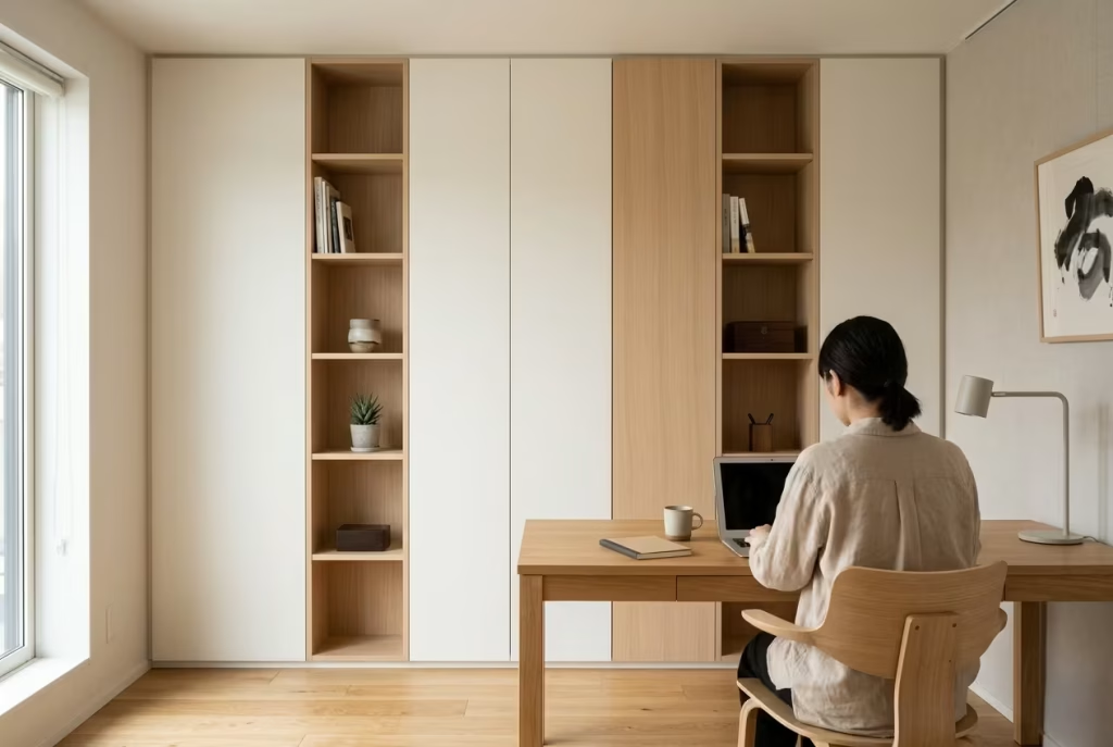
One of the most effective principles in maintaining visual calm is balance. Storage should never be entirely closed or entirely open. It needs a controlled mix, and in most cases, a 70 percent closed to 30 percent open ratio works best for workspaces.
Closed storage handles the functional load, keeping documents, tools, and everyday items out of sight. Open storage is reserved for carefully selected items, perhaps books, a few objects, or tools that are used frequently. This prevents the space from becoming visually overloaded while still maintaining accessibility.
I have applied this ratio across multiple projects, and the pattern remains consistent. When open storage exceeds this balance, clutter begins to creep in visually, even when physically organised. When closed storage dominates completely, the space can feel overly sterile. The balance is what holds everything together.
Pros
- Maintains visual order without feeling overly rigid
- Allows selective display without cluttering the space
- Supports both functionality and aesthetics
Cons
- Requires ongoing discipline to maintain balance
- Poor curation of open areas can still create distraction
This ratio is less about rules and more about rhythm. It ensures that what needs to be seen is visible, and what does not is quietly kept out of the way.
Real Project Note
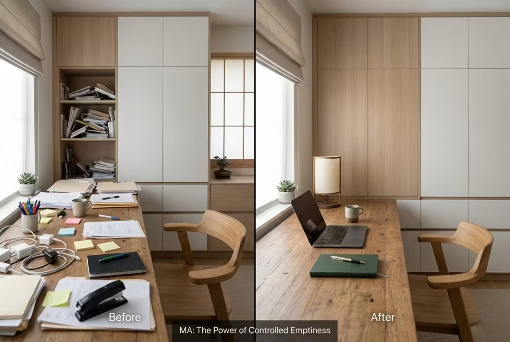
In multiple home office redesigns, reducing visible clutter improved task completion consistency
There is a pattern I have observed across different projects. Whenever visible clutter is reduced, not just tidied, but properly concealed or curated, work behaviour changes. Tasks are completed with fewer interruptions, and focus sessions last longer without unnecessary breaks. It is not a dramatic transformation, but a steady one, like the room slowly learning how to support concentration instead of fragmenting it.
Storage, when designed correctly, does not ask for attention. It removes itself from the equation so that thought can move freely. And in the end, that is what makes the difference between a workspace that simply holds things and one that actually helps you work.
Colour Restraint and Psychological Clarity
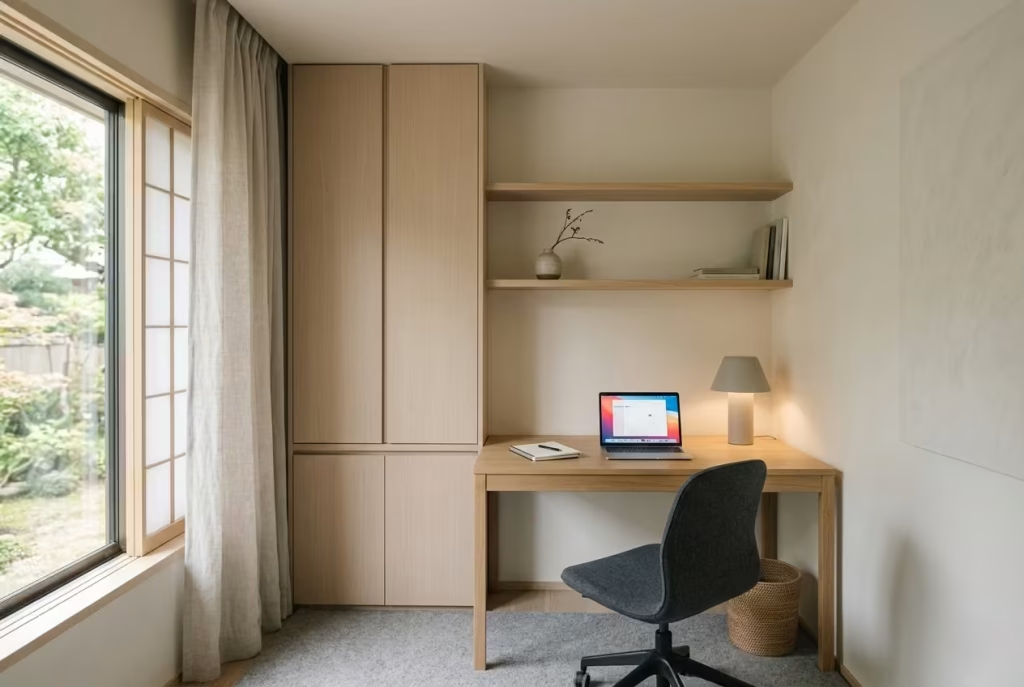
Colour in a workspace does not just shape atmosphere. It shapes behaviour, often in ways that are easy to miss until the room starts wearing you down. A palette that is too busy can leave the mind feeling overworked before the day has properly begun. A restrained palette, by contrast, clears the stage. It gives thought somewhere to land, which is no small thing when concentration is already under pressure.
In Japanese-inspired home offices, colour is rarely used for drama. It is used for steadiness. The aim is not to create a room that announces itself the moment you walk in, but one that settles quickly, almost quietly, and then stays out of the way. That is where psychological clarity begins.
Core Palette
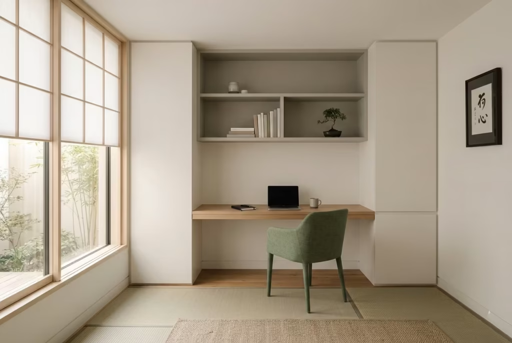
The most effective colour foundations in these spaces tend to sit within a narrow and carefully tuned range: soft whites, warm greys, and muted greens. Each plays a different role, and together they create a backdrop that feels composed rather than clinical.
Soft whites work best when they are not stark. A white with a slight warmth, often sitting just off pure white, helps reflect light without creating the kind of sharp brightness that can feel cold or sterile. It gives the room breathing space, especially in smaller home offices where every visual decision carries extra weight.
Warm greys add depth without heaviness. They act as the quiet middle ground, softening transitions between walls, furniture, and flooring. In many projects, this is the colour that keeps a room from tipping too far into either austerity or softness. It holds the balance, which is exactly what the space needs.
Muted greens bring in a natural register without becoming decorative noise. They tend to work best in restrained quantities, on a feature wall, an upholstered chair, or within a piece of storage. The key is that they should feel grounded, not theatrical. A green that is too bright can easily throw the room off course, while a muted tone settles in with far more grace.
In one project, I worked with a workspace that had originally leaned into cooler greys and bright white finishes. It looked crisp in photographs, but in daily use it felt a little severe, almost like it was expecting too much from the person sitting in it. We softened the palette by introducing warmer undertones across the walls and a subdued green in the soft furnishings. The change was immediate. The room stopped feeling like a stage and started feeling like a place to think.
Pros
- Creates a calm and low-pressure visual field
- Supports sustained concentration without visual fatigue
- Works well across changing light conditions throughout the day
Cons
- Can feel underwhelming if texture and material contrast are neglected
- May appear too flat in spaces with little natural light
A restrained palette is a bit like good manners. You only notice it when it is missing.
Accent Control
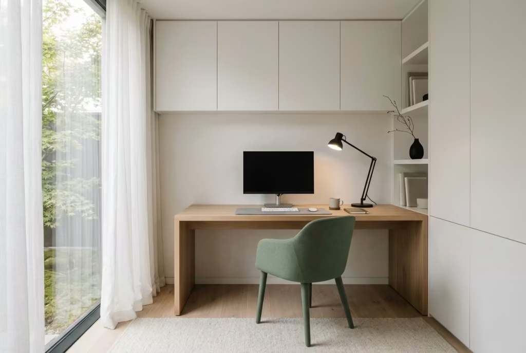
Accent colour is where many otherwise strong rooms begin to wobble. The temptation is to add just one more tone, then another, until the space starts losing its grip. In a focused workspace, accent colour should behave more like punctuation than conversation. It should clarify, not compete.
A useful rule of thumb is to limit the room to one dominant accent tone per space. That tone might appear in a chair, a piece of art, a desk lamp, or a storage detail, but it should never start scattering across every surface. Once a colour begins repeating too often, it stops feeling intentional and starts feeling restless.
In Japanese-inspired interiors, this controlled use of accent helps preserve the quiet discipline of the room. A muted olive cushion, a deep charcoal frame, or a single black pendant can give the space definition without pulling the eye in too many directions. It is the difference between a space that feels composed and one that feels like it is trying too hard.
I remember a home office where the client loved colour, but the palette had become fragmented. There were hints of blue, rust, green, and black all competing for space. None of them were wrong on their own, but together they created a kind of visual traffic jam. Once we narrowed the palette to a single subdued green accent, the room immediately became easier to read. The whole composition started pulling in the same direction.
Pros
- Prevents visual fragmentation
- Helps the workspace feel intentional and coherent
- Makes it easier for the mind to settle into focus
Cons
- Can feel too controlled if personal expression is completely removed
- Requires discipline to avoid introducing extra accent tones over time
Accent control works best when it knows its place. A good accent should sharpen the room, not steal the scene.
Why Colour Restraint Matters for Focus
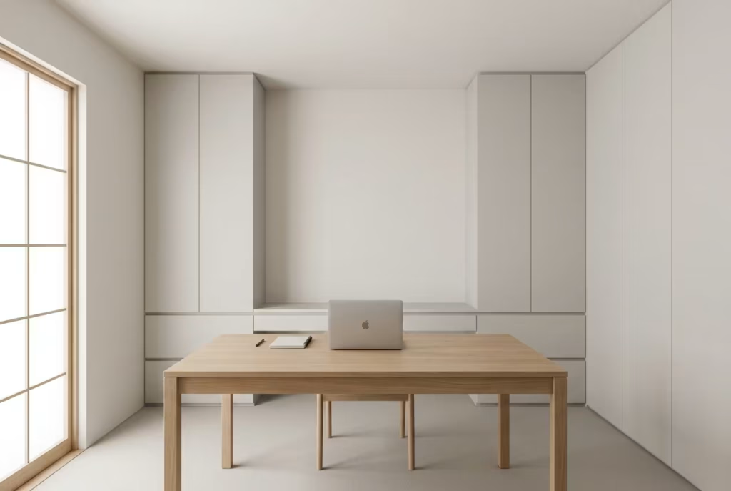
There is a psychological advantage to restraint that often gets overlooked. When colour is kept under control, the mind has fewer competing signals to process. That means less background stimulation, fewer subtle distractions, and a greater sense of ease. It may not sound dramatic, but in daily use, the effect is substantial.
A restrained palette also makes a workspace feel more cohesive over time. Because the colour story is simple, it is easier to maintain, easier to adapt, and less likely to feel dated or overly tied to a passing trend. It gives the room longevity, which is invaluable in a home office that needs to work hard year after year.
At its best, colour restraint creates the kind of environment that does not need to keep proving itself. It simply supports the work, quietly and consistently. That is where psychological clarity starts to take root, and once it does, it tends to stay put.
Common Mistakes That Break Productivity
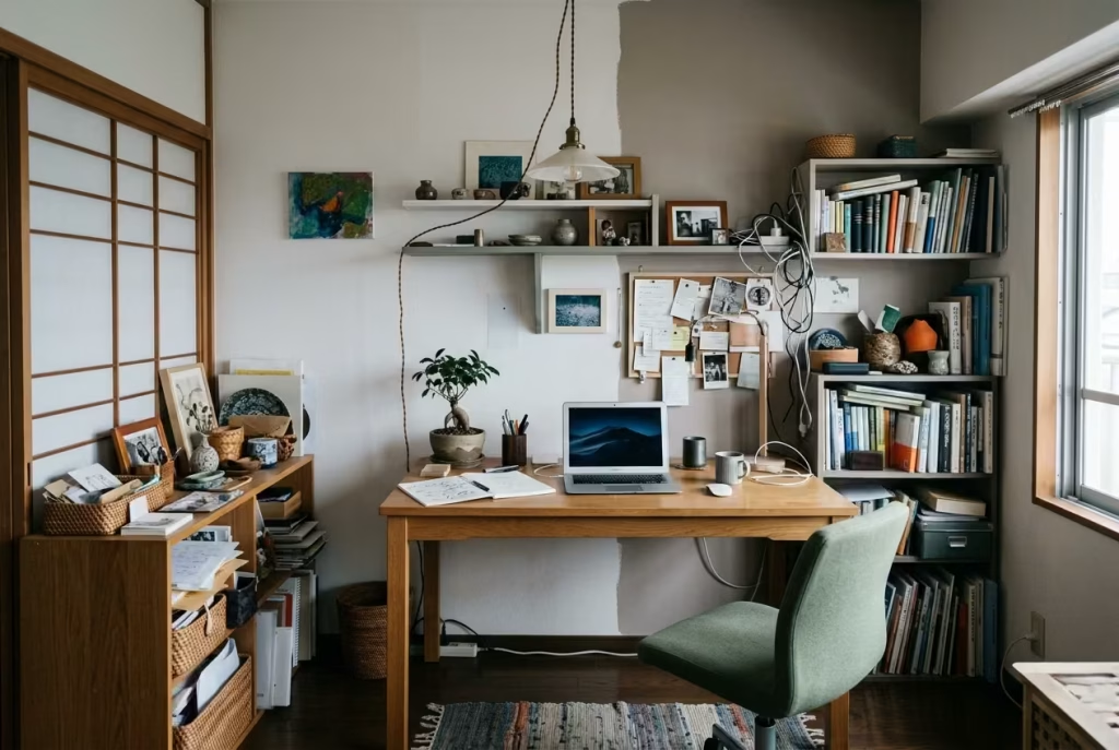
Even the most thoughtfully designed home office can lose its effectiveness when small missteps accumulate. What often begins as a well-intentioned design direction slowly tips off balance, and before long, the space that was meant to support focus starts working against it. I have seen this happen more times than I can count, and in most cases, it is not one major flaw but a series of subtle decisions that quietly erode productivity over time.
The tricky part is that these mistakes often look like design choices on the surface. They feel intentional, even refined, but in daily use they begin to reveal their shortcomings. That is where the gap appears between how a space looks and how it actually performs.
Over-Minimalising to the Point of Discomfort
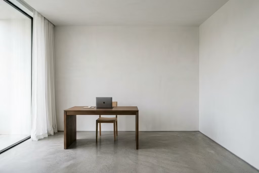
Minimalism can be incredibly powerful when handled with restraint, but there is a fine line between clarity and emptiness. Once a workspace crosses into excessive reduction, it stops feeling supportive and starts feeling stripped back in a way that can unsettle the user.
A desk with too few elements, bare walls, and almost no tactile variation may look visually pure, but in practice it can feel unanchored. The mind, quite naturally, looks for reference points. When it finds none, focus becomes harder to sustain for long periods.
I once worked on a workspace where everything had been reduced to its absolute minimum. No personal objects, no soft layers, nothing to visually break the flatness of the room. The client initially loved the aesthetic, but within weeks they reported feeling oddly disconnected while working. We reintroduced subtle texture through a wool rug and a small wood-toned object on the desk. Nothing dramatic, just enough to reintroduce grounding.
Key issue: When everything is removed, the room stops supporting human rhythm and starts feeling detached.
Ignoring Ergonomics in Pursuit of Aesthetics
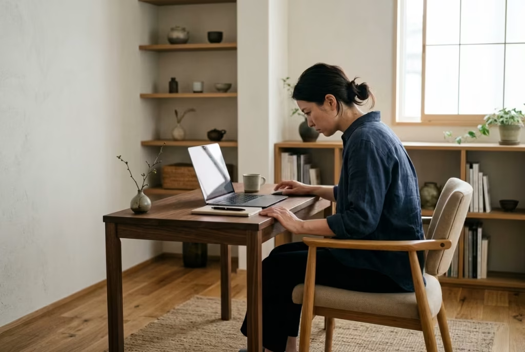
This is one of the most common traps. A workspace may look beautifully composed, but if ergonomics are compromised, the experience deteriorates quickly. Aesthetic decisions that ignore posture, reach, and comfort often lead to fatigue that builds quietly over time.
For example, desks that are too low or too high, often outside the ideal range of 720 to 750 mm or 28 to 29.5 inches, can strain posture without immediate awareness. Similarly, seating that prioritises form over support tends to shorten productive working sessions, even if it looks visually aligned with the space.
In one project, a client insisted on a low-profile chair that matched the aesthetic of the room. Within a few weeks, discomfort became a daily issue. We replaced it with an ergonomically balanced chair that still respected the design language, and the improvement in focus time was immediate.
Key issue: When the body is uncomfortable, the mind never fully settles, no matter how good the space looks.
Poor Lighting Hierarchy
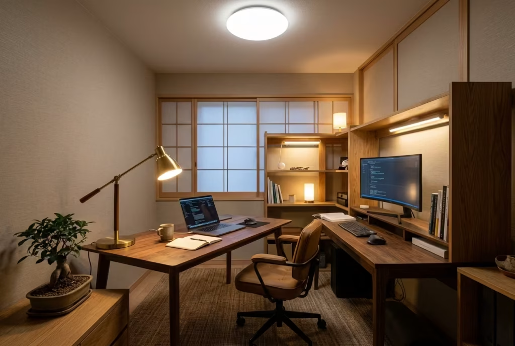
Lighting without hierarchy is like conversation without structure. Everything competes at the same level, and nothing feels clearly defined. This is where many otherwise well-designed workspaces begin to fall apart.
A common mistake is relying on a single overhead light source or layering multiple lights without clear purpose. Without a structured approach, shadows appear in the wrong places, brightness becomes uneven, and the workspace feels visually inconsistent throughout the day.
A properly layered system should always distinguish between ambient, task, and accent lighting. When this hierarchy is missing, the eye is constantly adjusting, which leads to unnecessary fatigue.
I recall a workspace where multiple decorative lights were installed, all of similar intensity. Instead of enhancing the room, they created visual competition. Once we simplified the lighting plan and introduced clear separation between functional layers, the space immediately felt more controlled and easier to use.
Key issue: Without lighting structure, the room never settles into a consistent visual rhythm.
Excessive Decorative Layering
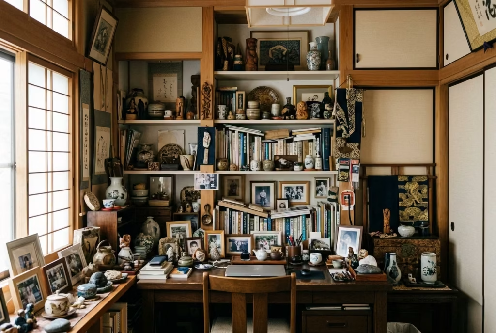
Decoration has its place, but when it accumulates without restraint, it begins to interrupt focus rather than enhance the space. The problem is not decoration itself, but the absence of hierarchy. When everything is treated as equally important, nothing stands out, and everything becomes noise.
This often shows up as multiple small objects across shelves, mixed materials on every surface, or decorative items that compete for attention on the desk. Individually, each piece might feel harmless, but collectively they create a restless visual field.
In one project, the workspace had evolved over time into a collection of personal items, souvenirs, and decorative objects. It had character, but it had lost clarity. We carefully reduced the display to a few selected pieces and reintroduced negative space around them. The difference was immediate. The room did not lose personality, it regained focus.
Key issue: Too many visual elements competing at once fragment attention and dilute productivity.
When these mistakes are viewed together, a pattern becomes clear. Productivity is rarely disrupted by one dramatic flaw. More often, it is slowly eroded by decisions that seem harmless in isolation but become disruptive when layered together. The goal, then, is not perfection, but awareness. A workspace that supports focus is one where nothing quietly gets in the way of how you think, work, and stay engaged over time.
Conclusion: A Workspace That Works Without Asking for Attention
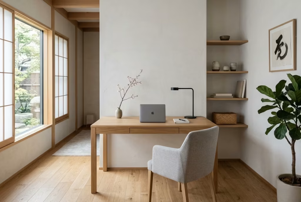
Japanese-inspired home offices are often misunderstood as a stylistic choice, something defined by aesthetics, clean lines, and carefully curated minimalism. In reality, what they offer runs much deeper. They are not about styling a room to look calm, but about designing behaviour into the space itself. When this is done well, the room stops demanding attention and starts shaping how +you think, move, and work without forcing anything.
This is where the philosophy proves its value. It is not decoration that drives productivity, but structure at a deeper level. The kind of structure that is felt rather than seen, experienced rather than noticed. Over time, the space begins to guide you, almost like a quiet framework that holds your focus steady even when your attention wants to drift.
In all the projects I have worked on, three principles consistently determine whether a workspace truly performs or simply looks the part.
Spatial clarity
When a room is easy to read, the mind follows suit. Clear zones, controlled proportions, and uninterrupted sightlines reduce the mental effort required to settle into work. It becomes easier to begin, easier to continue, and just as importantly, easier to stop.
Material honesty
When materials behave naturally, without pretending to be something they are not, the space feels more grounded. Wood that shows its grain, surfaces that respond gently to light, finishes that age rather than resist time, all of this creates a sense of ease that supports long hours without fatigue building in the background.
Visual restraint
When unnecessary detail is removed, what remains gains weight. The eye is no longer pulled in multiple directions, and focus stops being fragmented. It is not about emptiness, but about allowing only what truly supports the work to remain present.
These three elements do not operate independently. They reinforce one another, like different layers of the same discipline. When they align, something subtle but powerful happens. The room stops trying to impress and starts doing its job quietly in the background.
Closing Reflection
The most effective workspaces I have designed were never the ones that tried hardest. They were the ones that stepped back just enough, allowing the user to step forward without resistance.
And in that space, where nothing is competing for attention and everything has already found its place, work does not feel forced anymore. It simply begins.
Frequently Asked Questions About Japanese Home Office Designs
What makes a Japanese home office different from a regular minimalist office?
A Japanese home office is not just about having fewer things in the room. It is about creating a workspace that feels calm, intentional, and easy to use day after day. The difference lies in the discipline behind the design. Spatial clarity, material honesty, and visual restraint all work together so the room supports focus without feeling stripped bare. In that sense, it is less about style and more about behaviour shaping.
Can a Japanese-inspired home office work in a small space?
Yes, and in many cases it works especially well in smaller rooms. Japanese design handles tight spaces with a kind of quiet intelligence, using low furniture, concealed storage, and careful zoning to make the room feel larger than it is. A compact office of around 6 to 12 square metres, or 65 to 130 square feet, can still feel spacious if the layout is kept clean and the visual field is not overloaded.
What colours work best in a Japanese home office?
The strongest palettes usually stay close to soft whites, warm greys, muted greens, and natural timber tones. These colours help the room feel steady rather than busy. A good rule is to keep accents controlled, with one dominant accent tone at most, so the space does not start pulling in too many directions. When colour is restrained properly, the room feels calmer and more cohesive, like everything is speaking the same language.
How do I keep a Japanese home office from feeling too empty?
The answer is texture, proportion, and material balance. A room can be minimal without feeling cold if it includes natural wood, linen, wool, matte finishes, or a softly filtered light source. The key is not to fill the room with objects, but to give the few chosen elements enough presence. A workspace with thoughtful texture often feels richer than one packed with decoration, because every detail carries its weight.
What kind of desk works best in this style?
A low-profile timber desk is usually the most effective choice. It should feel light in the room, but still solid enough to support daily use. In many designs, I look for widths around 1200 to 1600 mm, or 47 to 63 inches, and depths of 600 to 750 mm, or 24 to 30 inches. That gives enough working space without encouraging clutter. Hidden storage can make the desk even stronger, because it keeps the surface visually clear.
Is Japanese home office design good for productivity?
Yes, very much so. The design works because it removes friction. Less visual noise, better light control, clear zoning, and calmer materials all help the mind settle into work more easily. Productivity improves when the room is not constantly asking for attention. In well-designed Japanese-inspired offices, focus tends to emerge naturally rather than feeling forced.
What is the biggest mistake people make with this kind of office?
The most common mistake is over-minimalising to the point where the room feels uncomfortable or unfinished. A Japanese-inspired office should feel quiet, not empty in a way that drains energy. Another mistake is choosing furniture or finishes purely for appearance without considering ergonomics and daily use. A beautiful workspace that does not support the body or the mind will always lose its charm in practice.
Can I mix Japanese design with other styles?
Yes, and that is often where the most interesting results appear. Japandi is a strong example of this, blending Scandinavian lightness with Japanese restraint. The important thing is to keep the foundation disciplined. Once the structure is clear, a second design language can be introduced through texture, tone, or material contrast without upsetting the balance.