Why Japanese Entryways are Never Messy: 25 Hidden Design Secrets
Most entryways begin to fail before clutter even appears. The issue is rarely the shoes by the door or the coats draped across chairs. It starts much earlier, in the way the space is designed and experienced. In many homes, the entrance is treated as leftover square footage rather than the first emotional threshold of the interior. Yet the atmosphere created in those first few seconds quietly shapes how the entire home feels.
I have walked into beautifully designed houses where the kitchen was refined, the lighting carefully layered, and the materials thoughtfully chosen, only for the experience to unravel the moment the front door opened. A cluttered or unresolved entryway creates immediate visual friction. The mind registers disorder before the body has fully settled inside, and that subtle tension often lingers far beyond the threshold itself.
Japanese-inspired entryways approach this moment very differently. In traditional Japanese homes, the entrance is not simply a passage between outside and inside. It is a deliberate transition point, often centred around the genkan, where movement slows and the outside world is gently left behind. Shoes are removed not just for cleanliness, but as part of a wider philosophy rooted in rhythm, awareness, and respect for space.
What makes these entryways feel calm is not minimalism alone. It is intention. Every storage solution, lighting decision, flooring transition, and material choice is designed to quietly support daily behaviour without feeling rigid or overdesigned.
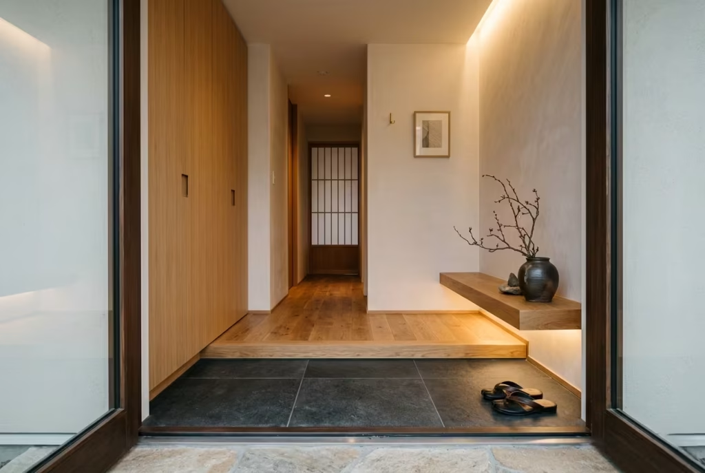
I once visited a compact Japanese-inspired townhouse renovation where the entryway measured barely 1.5 metres wide by 2 metres deep, roughly 5 by 6.5 feet, yet it transformed the emotional tone of the entire home. A subtle floor level change, concealed storage, warm oak surfaces, and soft indirect lighting created a space that instinctively slowed movement and softened the atmosphere.
That is the real lesson behind Japanese entryway design. Calm is not created through perfection. It is created through spaces that quietly support how people actually live, especially in the very first moments of arriving home.
25 Hidden Design Secrets Behind Clutter-Free Japanese Entryways
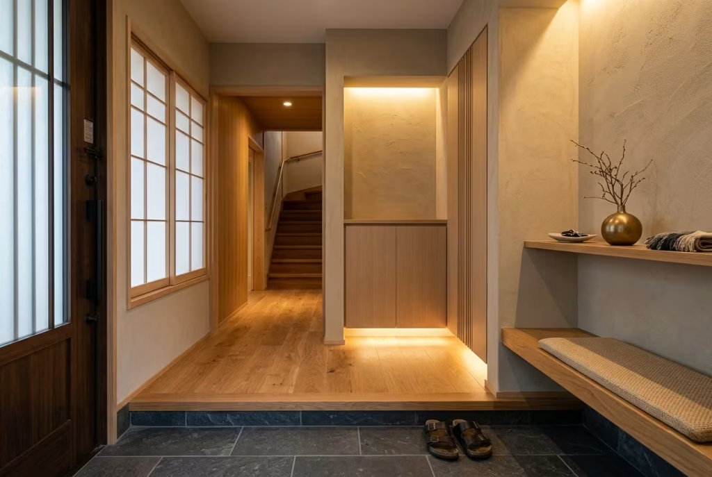
What makes Japanese entryways feel consistently calm is rarely one dramatic feature standing front and centre. More often, it is the accumulation of smaller decisions, layered carefully one upon another, that quietly shape the atmosphere over time. A recessed cabinet placed exactly where shoes naturally come off.
A flooring transition that subtly slows movement. Lighting softened just enough to remove harshness from the space at dusk. None of these choices scream for attention individually, yet together they work rather like a well-rehearsed orchestra, each element supporting the next until the entire experience feels effortless.
That is the hidden brilliance behind many Japanese entryways. They are not designed to impress at first glance alone. They are designed to reduce friction in everyday life so naturally that order begins to feel almost inevitable. In the projects I have worked on over the years, I have noticed that the most successful entrances rarely rely on expensive materials or oversized square footage.
Instead, they succeed because every centimetre earns its keep, every transition serves a purpose, and every detail quietly encourages calmer habits without turning the home into a museum of perfection. The following design secrets reveal how these spaces manage to stay visually light, emotionally grounding, and remarkably functional even when real life, with all its noise and unpredictability, is happening just outside the door.
Shoes Never Visually Dominate the Space
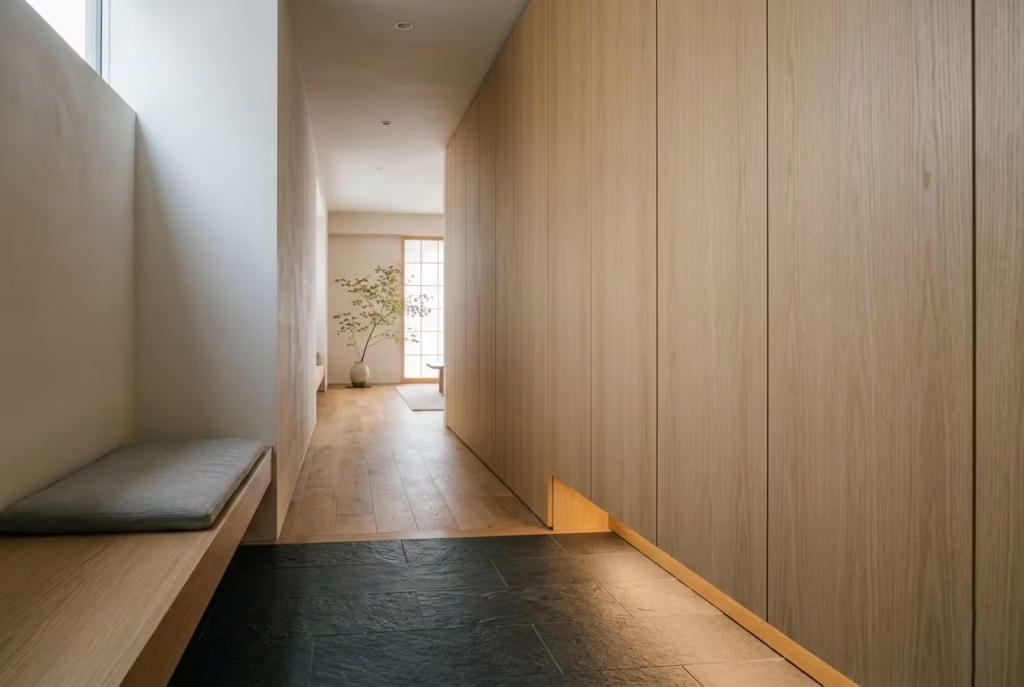
One of the quietest yet most transformative principles in Japanese entryway design is surprisingly simple: shoes are treated as functional necessities, not visual features. That distinction changes the entire atmosphere of the entrance.
In many homes, footwear gradually spreads across the floor like an untamed tide, turning even beautiful hallways into spaces that feel restless and unresolved. It only takes a few scattered trainers, boots leaning sideways, or mismatched pairs gathering near the door for the mind to register disorder before anything else.
Japanese interiors approach this problem at its root rather than chasing it with endless organisation hacks. The goal is not merely to store shoes. It is to reduce their visual presence altogether.
Once footwear disappears from immediate sightlines, the entryway begins to breathe differently. The space feels lighter, calmer, and unexpectedly more spacious, even when the actual square footage remains unchanged. In fact, I have seen compact apartments feel almost twice as composed simply because the visual clutter near floor level was eliminated properly.
That is the thing about clutter. It is rarely about quantity alone. What overwhelms people most is constant visual interruption.
Concealed Cabinetry Creates Psychological Calm
In Japanese-inspired entryways, concealed cabinetry often works harder than oversized storage rooms ever could. Instead of displaying every pair of shoes openly, storage is integrated quietly into the architecture itself.
Cabinet fronts sit flush with walls, hardware disappears into recessed pulls, and finishes blend seamlessly into surrounding surfaces so the eye moves across the room without friction. This approach matters more than many homeowners initially realise.
The human brain is constantly scanning environments for information. Open footwear, varied colours, dangling laces, and stacked soles create visual noise that quietly drains mental energy throughout the day. Concealed cabinetry removes that static almost instantly.
In residential projects, I often recommend shoe cabinets between 20 and 35 cm deep, roughly 8 to 14 inches, depending on the household’s footwear needs. Slim cabinetry works especially well in narrow hallways because it preserves circulation while still providing substantial storage. Floor-to-ceiling configurations are particularly effective in family homes where seasonal footwear tends to multiply faster than rabbits in springtime.
The most successful examples rarely announce themselves loudly. They almost disappear into the wall.
I once renovated a compact Victorian terrace where the entrance measured barely 1.4 metres wide, around 4.6 feet, yet concealed oak cabinetry transformed the experience completely. Before renovation, shoes gathered beside the radiator in chaotic little clusters.
Afterwards, the entire storage wall blended so naturally into the panelling that visitors often failed to notice it at all. The hallway suddenly felt composed, not because the clients owned fewer shoes, but because the room stopped advertising them. Good design often works exactly like that. Quietly, almost invisibly.
Toe-Kick Shadow Lines Make Storage Feel Lighter
One detail that often goes unnoticed in Japanese-inspired cabinetry is the use of recessed toe-kick shadow lines beneath storage units. It may sound minor on paper, but visually, it changes everything.
When cabinets extend heavily to the floor without relief beneath them, they can feel bulky and static, especially in compact entrances.
Recessed toe-kicks create a thin shadow gap at floor level, giving the illusion that cabinetry floats slightly above the ground. The result feels lighter, calmer, and far less imposing. It is a small trick with surprisingly large psychological impact.
I frequently use recessed shadow lines of approximately 5 to 10 cm high, around 2 to 4 inches, depending on ceiling height and flooring tone. Combined with warm indirect lighting, the effect becomes even softer. Storage begins to feel integrated into the architecture rather than dropped awkwardly into the room like oversized luggage waiting at a train station.
This detail also improves practicality. Shadow gaps make cleaning easier and prevent cabinetry from appearing visually heavy in low-light conditions.
Japanese interiors excel at this kind of restraint. They understand that serenity often lives in the details people feel before they consciously notice them.
Floating Storage Systems Reduce Visual Weight
Floating storage systems are another recurring feature in clutter-free Japanese entryways because they preserve openness near the floor, where visual congestion tends to accumulate fastest.
When cabinetry or benches lift slightly above the ground, even by 15 to 25 cm, approximately 6 to 10 inches, the room immediately gains a greater sense of airiness. The visible flooring beneath allows the eye to travel uninterrupted across the space, making smaller entrances feel less cramped and more composed.
This becomes particularly valuable in urban homes where square footage is tight and every design decision carries extra weight.
In one Tokyo-inspired apartment renovation, we installed a floating walnut shoe cabinet paired with soft underlighting against textured plaster walls. The apartment itself was compact, barely 68 square metres, roughly 732 square feet, yet the floating storage transformed the narrow entrance into something that felt unexpectedly tranquil.
Without bulky furniture anchoring heavily to the floor, the hallway carried a sense of lightness that extended into the rest of the home. Floating systems also encourage better daily habits almost by accident.
Because the floor beneath remains visible, people become more aware of stray shoes or clutter left behind. The space gently nudges occupants toward maintaining order without feeling rigid or overdesigned.
That subtle behavioural guidance is one of the hidden strengths of Japanese interiors. They do not rely on perfectionism. They simply make calmness easier to sustain.
Real-Life Insight From Small London and Tokyo-Inspired Projects
One lesson I have learned repeatedly across both London renovations and Japanese-inspired projects is that perceived clutter matters more than storage volume alone.
Many homeowners assume they need larger cupboards, additional shelving, or oversized mudrooms to fix chaotic entryways. Quite often, they are barking up the wrong tree. What usually transforms the space most dramatically is not adding more visible storage, but hiding everyday objects more intelligently.
I remember working on a narrow Edwardian home where the clients initially requested expansive open shelving for convenience. After discussing how visual clutter affects emotional perception, we shifted direction entirely. Instead of displaying everything openly, we created a concealed shoe wall finished in pale ash veneer with push-latch doors and recessed lighting beneath. The difference was immediate.
Even on busy weekdays, when school shoes, trainers, and umbrellas were technically still present inside the hallway, the room felt calm because the clutter no longer dominated the visual experience. The family later admitted they cleaned less obsessively because the space stopped feeling chaotic every time they walked through the door. That insight sits at the heart of many Japanese entryways.
The secret is not owning less for the sake of appearance alone. It is designing environments where necessary objects coexist quietly with daily life rather than constantly shouting for attention.
Storage Is Built Into Architecture, Not Added Afterwards
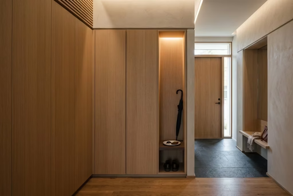
One of the clearest differences between many Western entryways and Japanese-inspired ones lies in how storage is approached from the very beginning. In countless homes, storage arrives late to the conversation, squeezed awkwardly into corners after the main design decisions have already been made. A freestanding shoe rack appears beside the door. Hooks multiply across the walls. Random baskets begin collecting umbrellas, bags, and parcels until the entrance slowly resembles a temporary holding station rather than a thoughtfully composed threshold.
Japanese interiors tend to avoid this entirely because storage is considered part of the architecture itself, not an accessory brought in afterwards to solve a problem. That shift in thinking changes the atmosphere dramatically.
When cabinetry is integrated directly into walls, circulation paths remain cleaner, visual interruptions become softer, and the entryway feels calmer almost instinctively. Instead of furniture competing for attention, the architecture absorbs function quietly into the background. It is a bit like good tailoring. The finest details are often the ones you barely notice because everything sits exactly where it should.
I have found that this principle alone can completely transform even the smallest homes. In renovation projects where clients initially complained about lacking space, the real issue was often fragmented storage rather than insufficient square footage. Once storage became integrated into the architecture itself, the same entrance suddenly felt more spacious, more organised, and far easier to maintain on a daily basis.
Good design rarely shouts. It settles in quietly and makes life feel smoother before you fully realise why.
Flush Cabinetry Creates Visual Stillness
Flush cabinetry is one of the most effective tools in Japanese-inspired entryways because it removes unnecessary visual friction from the room. Doors sit level with surrounding wall surfaces, hardware remains discreet or entirely hidden, and the eye moves across the space without constantly stopping at protruding handles, uneven shelving, or open clutter. That uninterrupted visual flow matters enormously in smaller entrances.
The moment cabinetry begins jutting outward aggressively, the room can feel tighter and more chaotic. Flush surfaces, by contrast, create stillness. They allow the architecture itself to feel composed rather than crowded with competing elements.
In practical terms, I often recommend cabinetry depths between 20 and 35 cm, roughly 8 to 14 inches, for entryway storage. This range accommodates most everyday footwear while preserving comfortable circulation in narrow hallways. Slim proportions are especially important in urban homes where every centimetre counts and oversized storage can quickly make the entrance feel claustrophobic. Material selection also plays a major role here.
In Japanese-inspired interiors, cabinetry finishes typically favour low-sheen textures such as brushed oak, ash veneer, smoked timber, or matte lacquer. Reflective surfaces tend to amplify visual noise, while softer finishes absorb light gently and allow the space to feel more grounded.
I once renovated a compact apartment where glossy white cupboards originally dominated the entrance. Technically, the storage capacity was adequate, yet the hallway always felt restless. Replacing those cabinets with flush walnut joinery transformed the atmosphere almost overnight. The room suddenly carried a sense of quiet permanence, as though the architecture had finally found its footing.
Sometimes calm is less about removing objects and more about removing visual agitation.
Wall-Integrated Joinery Makes Small Spaces Feel Larger
Japanese interiors excel at making compact spaces feel intentional rather than compromised, and wall-integrated joinery plays a significant role in that illusion.
Instead of placing separate furniture pieces throughout the entryway, storage is absorbed directly into the wall plane itself. Cabinets align with architectural lines, niches appear carved into existing structures, and shelving becomes part of the room rather than sitting awkwardly within it. This approach changes how space is perceived psychologically.
Freestanding furniture tends to break up circulation visually, creating little pockets of interruption that make rooms feel busier than they actually are. Integrated joinery, on the other hand, keeps sightlines cleaner and preserves a stronger sense of openness. The eye reads the room more continuously, which subtly expands the perceived volume of the space.
In one townhouse renovation inspired partly by Japanese spatial principles, we transformed an underused structural wall cavity into concealed shoe and coat storage. The hallway itself measured just under 1.2 metres wide, around 4 feet, so adding traditional furniture would have narrowed circulation dramatically. By recessing storage into the architecture instead, we maintained movement flow while increasing functionality at the same time.
The clients later admitted that guests often assumed the hallway had been physically enlarged during the renovation. It had not. The room simply stopped fighting against itself.
That is one of the hidden strengths of integrated design. It allows function and calmness to coexist without stepping on each other’s toes.
Recessed Millwork Reduces Visual Clutter Before It Starts
Recessed millwork is another detail frequently seen in Japanese-inspired homes because it prevents storage from dominating the room visually. Shelving niches, concealed cabinetry, and inset compartments sit slightly within the wall structure itself, creating depth without heaviness. This subtle recession matters more than many people expect.
When storage projects aggressively outward, it competes for attention constantly. Recessed elements behave differently. They feel quieter, more architectural, and less imposing even when storing exactly the same amount.
In practical applications, recessed millwork works beautifully for:
- Shoe storage
- Umbrella compartments
- Seasonal accessory niches
- Integrated benches
- Key trays and small object storage
- Hidden lighting channels
I often pair recessed joinery with shadow gaps or softly illuminated interiors to increase the sense of depth without making the entrance feel theatrical. The effect should feel calm and effortless rather than overtly decorative.
One Japanese-inspired family home I worked on included recessed oak shelving only 22 cm deep, approximately 8.5 inches, beside the entrance. On paper, the storage dimensions seemed modest. In reality, the integration into the wall made the hallway feel significantly more spacious because no bulky furniture interrupted the circulation path.
It is rather like clearing static from a radio signal. Once the visual interference disappears, the entire space feels easier to inhabit.
Why This Principle Changes Daily Life
What fascinates me most about Japanese entryway design is how deeply it understands human behaviour. Integrated storage does not merely improve appearance. It changes the rhythm of everyday life.
When storage feels effortless to access, people naturally maintain order more consistently. Shoes disappear quickly because cabinets are positioned exactly where they are needed. Bags find designated spaces because the architecture anticipates daily routines instead of reacting to them after the fact.
In homes where storage is improvised poorly, clutter becomes almost inevitable because the environment itself creates friction. People take the path of least resistance. If putting shoes away feels awkward, they stay on the floor. If coats lack proper placement, chairs slowly become makeshift wardrobes. Japanese interiors quietly eliminate that friction.
I have seen homeowners spend years blaming themselves for disorganisation when the real issue was simply poor spatial planning. Once the architecture began supporting their routines properly, maintaining calm no longer felt like an endless uphill climb.
That, perhaps more than anything, is the hidden intelligence behind these spaces. They are not designed around unrealistic perfection. They are designed around the realities of everyday living, where thoughtful architecture quietly does the heavy lifting in the background.
You May also Like: 25 Japanese Mid-Century Modern Design Ideas You’ve Probably Never Seen (and Will Obsess Over)
The Entryway Uses Very Few Materials
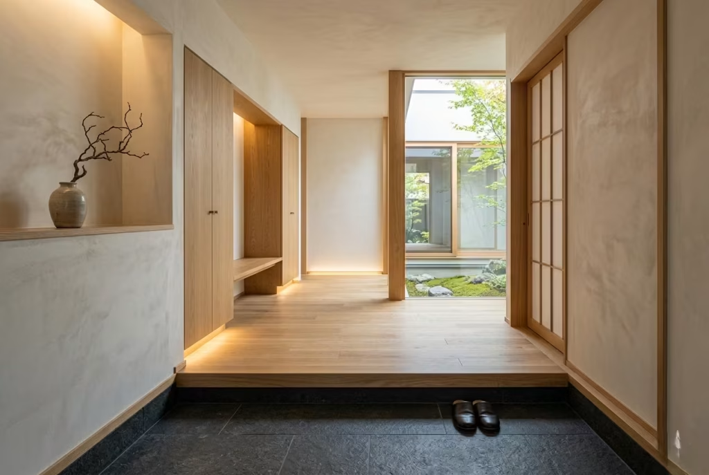
One of the most overlooked reasons Japanese entryways feel calm is the disciplined way materials are handled. In many modern homes, entrances become a patchwork of competing finishes almost without anyone noticing.
Glossy tiles meet painted skirting boards. Metal hooks clash against laminate cabinetry. Patterned rugs sit beside heavily veined stone. Before long, the space begins pulling in different directions at once, visually noisy and emotionally tiring despite expensive finishes. Japanese interiors tend to move in the opposite direction entirely.
Rather than layering endless materials into a small footprint, they narrow the palette deliberately. A restrained combination of timber, stone, plaster, and soft natural textures often carries the entire entryway.
The result feels cohesive because the eye is allowed to settle instead of constantly jumping from one visual statement to another. That restraint is not about minimalism for its own sake. It is about preserving calm.
I often tell clients that a successful entryway should feel like a deep breath rather than a showroom display. The moment too many finishes start clamouring for attention, the atmosphere fractures. Even beautifully chosen materials can lose their impact when they compete instead of cooperate. In Japanese-inspired design, fewer materials create stronger emotional clarity.
Oak Creates Warmth Without Visual Heaviness
Oak appears frequently in Japanese entryways because it brings warmth and grounding without overwhelming the room. Its grain carries subtle movement, enough to add character but restrained enough to remain calming over time.
Particularly in lighter tones, brushed or matte-finished oak reflects natural light softly, which helps compact entrances feel more open and breathable. Unlike highly polished woods that can feel formal or overly styled, oak tends to age with quiet dignity.
Small scratches and wear patterns become part of the material’s story rather than flaws demanding constant correction. That ageing process matters enormously in functional spaces like entryways.
I have worked on homes where clients initially insisted on ultra-perfect finishes, only to discover later that pristine surfaces become stressful in high-traffic areas. Oak handles daily life more gracefully. It absorbs the rhythm of the household rather than fighting against it.
In one townhouse renovation inspired by Japanese and Scandinavian principles, we used pale European oak across the raised entry platform, concealed shoe cabinetry, and integrated bench seating. The consistency of material created a sense of visual continuity that made the narrow hallway feel significantly wider than it actually was. Nothing shouted for attention, yet the atmosphere felt deeply composed. That is often the hidden power of restrained materials. They create confidence quietly.
Ash Keeps Small Entryways Feeling Light
Ash is another timber commonly associated with Japanese-inspired interiors because of its softer grain and lighter visual weight. In smaller homes, particularly apartments with limited natural light, ash can prevent entryways from feeling dense or enclosed. Its subtle texture works beautifully in spaces where calmness depends on visual softness.
Compared to darker woods with dramatic grain movement, ash tends to recede gently into the background. That quality allows architectural lines and spatial flow to take centre stage rather than the material itself dominating the room.
I remember designing a compact city apartment where the entryway lacked windows entirely. Heavy walnut cabinetry originally made the corridor feel narrow as a rabbit hole. Replacing it with pale ash joinery transformed the atmosphere immediately. Light bounced more evenly through the space, and the hallway suddenly felt less compressed despite no structural changes whatsoever.
Material choice can alter emotional perception far more than square footage alone. Ash also pairs exceptionally well with:
- Limewashed walls
- Soft grey stone flooring
- Warm indirect lighting
- Matte black detailing
- Handcrafted ceramics
Together, these combinations create depth without cluttering the visual experience.
Stone Grounds the Space Emotionally and Practically
Stone flooring plays a significant role in Japanese entryways because it anchors the threshold physically and psychologically. The transition from exterior ground to interior living space becomes clearer when the entry begins with a material that feels durable, tactile, and rooted.
There is something instinctively grounding about stepping onto textured stone after moving through the outside world.
In practical terms, stone also performs exceptionally well in entrances because it tolerates moisture, dirt, and daily wear with far greater resilience than delicate finishes. But beyond functionality, it introduces an important sensory shift. Cool stone beneath the feet followed by warm timber beyond the threshold subtly reinforces the transition between outside and inside.
That tactile contrast stays with people, even when they are not consciously aware of it. For Japanese-inspired projects, I often favour:
- Basalt
- Slate
- Honed limestone
- Charcoal porcelain with stone texture
- Sandblasted natural stone
The key is restraint in finish selection. Overly glossy stone tends to feel harsh and visually busy, particularly under artificial lighting. Matte or lightly textured surfaces absorb light more softly and develop a richer sense of depth over time.
One family home I renovated used dark basalt stone at the lower entry zone paired with pale oak flooring above. Years later, the clients told me it remained one of their favourite parts of the house because the transition still felt calming every single day. Good materials age into the experience of a home rather than simply decorating it.
Limewash Adds Softness Without Competing for Attention
Limewash walls are particularly effective in Japanese-inspired entryways because they bring texture without visual clutter. Unlike flat paint finishes that can sometimes feel sterile or lifeless, limewash carries subtle tonal movement that shifts gently throughout the day as light changes across the surface. The effect is quiet but deeply atmospheric.
In entryways especially, where natural light may be limited, limewash helps walls feel softer and more dimensional without resorting to loud colours or decorative patterns. It creates depth almost like mist rolling across a landscape, subtle enough to calm the eye while still giving the space character.
I often use warm off-whites, mushroom tones, muted clay colours, or soft greige limewash finishes in entrance spaces because they pair beautifully with timber and stone while preserving an understated elegance.
One thing Japanese interiors understand exceptionally well is that texture often matters more than colour intensity. A restrained palette with layered natural finishes feels far richer emotionally than rooms overloaded with contrasting materials trying to steal the spotlight. Sometimes less truly does carry more weight.
Textural Restraint Creates Lasting Calm
Perhaps the most important lesson Japanese entryways offer is the value of restraint itself. Many homeowners assume calm interiors require expensive materials or large architectural gestures. In reality, serenity often depends more on editing than adding.
Too many finishes fracture visual calm because the eye never fully settles. Every competing texture, pattern, and sheen pulls attention in another direction until the space begins feeling mentally exhausting. Japanese interiors avoid this trap by limiting variation carefully.
That does not mean spaces become boring or flat. Quite the opposite. When materials are restrained thoughtfully, subtle details suddenly gain greater emotional presence. The grain of timber becomes more noticeable. Light moving across plaster walls feels more atmospheric. A single ceramic vessel placed on a bench carries greater visual weight because the surrounding environment allows it room to breathe.
I have seen homeowners spend fortunes layering statement materials into tiny entryways only to end up with spaces that feel busier than a train station at rush hour. Meanwhile, some of the calmest entrances I have ever experienced relied on only three or four materials used exceptionally well. That is the quiet confidence behind Japanese-inspired design.
It understands that calm is rarely created through excess. More often, it emerges when unnecessary noise is stripped away and the remaining elements are allowed to speak softly, clearly, and with intention.
Lighting Is Intentionally Soft and Directional
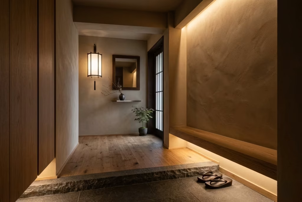
Lighting, perhaps more than any other element, determines whether an entryway feels calming or quietly chaotic. Yet it is often treated as an afterthought in many homes, reduced to a single ceiling fixture blazing overhead like an interrogation lamp the moment someone walks through the door.
Even beautifully designed entrances can lose their sense of warmth under harsh lighting. Surfaces flatten. Shadows disappear. Every object suddenly demands attention all at once. Japanese entryways approach light very differently.
Rather than flooding the space with brightness, they shape atmosphere through restraint, softness, and direction. The goal is not maximum illumination. It is emotional balance.
Light is used to guide the eye gently through the space, soften transitions, and create a slower visual rhythm that immediately eases the nervous system upon arrival. This distinction matters enormously in everyday life.
I have seen homeowners spend substantial budgets on bespoke joinery and natural stone only to undermine the entire atmosphere with cold white LEDs harsh enough to wake the dead. Meanwhile, modest entryways with carefully layered warm lighting often feel infinitely more luxurious because the environment itself encourages calmness.
Good lighting does not shout. It lingers softly in the background, shaping how the space feels long before anyone notices the fixtures themselves.
Wall Washing Creates Quiet Depth
Wall washing is one of the most effective techniques used in Japanese-inspired entryways because it introduces depth without visual clutter. Instead of directing strong beams downward from the ceiling, light is allowed to skim gently across vertical surfaces, creating soft gradients and subtle shadow play.
The effect is surprisingly emotional. Flat, evenly lit walls can feel lifeless and clinical, especially in narrow hallways or compact apartment entrances. Wall washing introduces movement and softness, allowing textured materials like limewash, timber grain, or stone surfaces to reveal themselves gradually rather than all at once.
I often incorporate concealed wall washing in entryways where clients want the space to feel calm but still layered with atmosphere. Recessed linear lighting positioned near ceiling edges works beautifully for this purpose, particularly when paired with textured plaster or brushed timber finishes.
One renovation that still stands out involved a narrow entrance corridor with no natural daylight whatsoever. Instead of compensating with brighter fixtures, we installed warm concealed wall lighting that grazed softly across pale clay plaster walls. By evening, the hallway carried a gentle glow that felt almost meditative.
The clients later admitted they began lingering in the entrance rather than rushing through it because the atmosphere shifted their mood so noticeably after work. That is the hidden power of directional light. It changes behaviour without demanding attention.
Indirect LEDs Reduce Visual Fatigue
Japanese-inspired interiors rarely rely on exposed, aggressively bright lighting because harsh illumination creates tension almost instantly. Indirect LEDs are preferred because they soften the visual experience while allowing architectural details to emerge naturally.
The difference between direct and indirect lighting is rather like the difference between someone shouting across a room and someone speaking quietly beside you. One demands attention immediately. The other invites calm.
Indirect LEDs work particularly well in entryways because they:
- Minimise glare
- Reduce harsh shadow lines
- Create visual softness
- Highlight textures gently
- Make smaller spaces feel more expansive
I frequently integrate concealed LED strips beneath floating benches, recessed cabinetry, or raised flooring platforms to create subtle ambient glow near floor level. This not only improves functionality during evening hours but also gives the room a stronger sense of depth.
Warm underlighting beneath floating shoe storage can completely transform how an entryway feels after sunset. Instead of heavy cabinetry anchoring the room visually, the storage begins to feel lighter and almost suspended within the architecture. There is also a practical advantage here that often gets overlooked.
Soft indirect lighting reduces sensory fatigue. After spending hours beneath bright office lights, traffic signals, screens, and city glare, arriving home to softer illumination allows the body to decompress more naturally. Japanese interiors understand this instinctively. They treat light not merely as utility but as part of the emotional experience of returning home.
Lantern-Inspired Lighting Introduces Warmth and Ritual
Traditional Japanese lanterns have long influenced the softer lighting language found in many Japanese interiors. Their glow tends to feel diffused, intimate, and atmospheric rather than sharply directional or overly decorative.
Modern interpretations of lantern-inspired lighting carry that same emotional quality beautifully into contemporary homes.
Paper-inspired pendants, frosted glass sconces, linen-shaded wall lights, and softly diffused ceiling fixtures all create a gentler relationship between light and shadow. Rather than exposing every detail instantly, these fixtures allow the space to unfold gradually, almost like pages turning slowly in a well-loved book. hat sense of visual pacing matters.
In one Japandi-inspired renovation project, we replaced a bright central spotlight with a pair of softly diffused wall sconces and concealed bench lighting near the entrance. The architectural layout remained identical, yet the emotional atmosphere changed completely. The hallway no longer felt like a transit zone. It felt intentional, grounded, and welcoming.
Lantern-inspired lighting also complements natural materials exceptionally well because it enhances texture rather than flattening it. Timber appears warmer. Stone gains depth. Limewashed walls reveal subtle tonal variation throughout the day. The room begins to feel alive in quieter ways.
Warm Lighting Between 2700K and 3000K Works Best
Colour temperature plays a huge role in how entryways feel emotionally. In Japanese-inspired interiors, lighting generally stays within the warm range of 2700K to 3000K because cooler tones tend to make natural materials feel sterile and overly sharp.
This warmth mimics the softer glow associated with evening light, candles, and traditional lanterns. It immediately creates a more restorative atmosphere upon entering the home.
I typically recommend:
- 2700K for intimate residential entryways
- 3000K for slightly brighter contemporary spaces
- Matte or frosted diffusers to soften light distribution
- Dimmable systems where possible for evening flexibility
One mistake I encounter repeatedly is homeowners choosing bright daylight LEDs for practicality, only to discover later that their beautiful oak cabinetry suddenly looks cold and washed out. Cooler lighting often strips warmth from natural materials entirely, particularly during evening hours when the entryway should feel most comforting.
Lighting should support the emotional tone of the architecture, not fight against it.
Why Soft Lighting Keeps Entryways Feeling Less Cluttered
Interestingly, soft directional lighting also contributes to the perception of cleanliness and organisation. Harsh overhead lighting exposes every surface equally, making even minor clutter appear louder and more visually intrusive.
Gentler lighting behaves differently. By guiding focus selectively and softening edges, the room feels calmer even during the natural messiness of daily life. This is not about hiding disorder artificially. It is about preventing the environment from feeling visually aggressive.
Japanese interiors excel at this balance. They acknowledge that homes are lived in spaces, not frozen showroom displays. Soft lighting allows entryways to retain warmth and humanity while still feeling composed.
I often tell clients that the best entryway lighting should feel a little like dusk settling over a quiet landscape. Calm, layered, and softly grounding. Not dramatic. Not theatrical. Simply enough to let the home exhale at the end of the day.
Every Item Has a Dedicated Resting Place
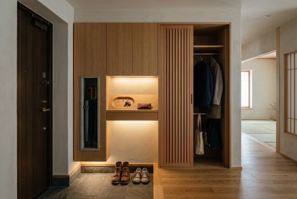
If there is one principle that quietly holds Japanese entryways together, it is this: nothing is left floating without purpose. Every object, no matter how small or seemingly insignificant, is given a defined resting place. That simple discipline changes everything about how the space behaves in daily life.
In many homes, entryway clutter does not appear all at once. It creeps in slowly, almost imperceptibly. A set of keys dropped on a console “just for now.” An umbrella leaning against the wall after a sudden downpour.
Mail stacked into an unruly pile because there was nowhere obvious for it to go. Before long, the entrance becomes a kind of in-between space where everything pauses temporarily, yet nothing truly settles. Japanese-inspired design removes that ambiguity at the source.
Instead of relying on memory or discipline alone, the architecture itself assigns a clear place for each everyday object. It is a bit like giving every item its own quiet corner of the stage so nothing competes for attention. The result is not just visual order, but behavioural ease.
I have seen this repeatedly in real projects. The moment you introduce defined resting points into an entryway, the entire rhythm of coming home shifts. People stop “dropping things wherever.”
Not because they are more organised by nature, but because the space finally supports their routines instead of resisting them.That is where calm actually begins.
Umbrella Niches Keep Wet Clutter Under Control
Umbrellas are one of those everyday objects that seem harmless until they start multiplying in a hallway. Left unchecked, they create visual noise and physical mess, especially on rainy days when they rarely return to their intended place immediately. Japanese entryways solve this with dedicated umbrella niches.
These are often narrow vertical recesses or discreet compartments positioned near the entrance, designed specifically to contain both wet and dry umbrellas without letting them spill into circulation paths. Sometimes they include drainage trays or stone bases to handle moisture quietly and efficiently.
In practical design terms, umbrella niches typically range from 10 to 15 cm in width per umbrella slot, around 4 to 6 inches, depending on household size. The key is not excess capacity, but precise intention. Enough space for real life, but not so much that items begin drifting aimlessly again.
I once worked on a renovation where umbrellas previously ended up propped against a radiator, leaving constant water marks and a lingering sense of disorder.
After introducing a slim recessed stone niche near the entrance, that small problem simply disappeared. No reminders were needed. The space itself absorbed the habit. Sometimes the smallest architectural gesture prevents the biggest daily frustrations.
Key Trays Turn Everyday Chaos Into Quiet Ritual
Keys are another classic entryway culprit. They are small, easy to misplace, and often dropped without much thought at the end of a long day. Without a defined home, they tend to migrate across surfaces, becoming part of a slow-building visual mess.
Japanese-inspired entryways address this through dedicated key trays or recessed catch zones.
These are usually positioned at a natural drop point near the entrance, often integrated into shelving, benches, or slim wall recesses. The key here, quite literally, is predictability. The hands know where to go without thinking. The ritual becomes automatic rather than deliberate.
In well-designed homes, a key tray is rarely just a bowl on a surface. It is part of the architecture itself. Sometimes carved into timber, sometimes lined in stone, sometimes softly lit so it becomes visually intuitive even in low light.
I have found that when this small detail is missing, entryway clutter tends to multiply in unexpected ways. Keys attract other objects, mail collects nearby, and the surface quickly becomes a catch-all for anything without a home.
Introduce a proper resting point, and the behaviour changes almost immediately. It is a small intervention, but it saves countless moments of frustration over time.
Hidden Hooks Keep Movement Clean and Uncluttered
Hooks are essential in any entryway, yet when they are too visible or too numerous, they can quickly make a space feel busy and visually fragmented. Japanese interiors take a more restrained approach by concealing or integrating hooks so they serve function without dominating sightlines.
Hidden hooks are often built into:
- Sliding panels
- Recessed wall niches
- Cabinet interiors
- Timber slats with concealed fixings
This keeps coats, bags, and accessories accessible but out of immediate view when not in use. The entryway remains visually calm, even during busy family moments.
In one project I worked on for a family with young children, we replaced an exposed wall of hooks with a concealed sliding panel system. Behind it, each child had their own designated hook space. The difference was immediate. Instead of coats spreading across the hallway like wild ivy, everything folded neatly into a controlled system that could be hidden when not needed.
That balance between accessibility and visual restraint is what makes the system so effective. Hooks should support life, not decorate it.
Seasonal Storage Rotation Keeps Clutter From Becoming Permanent
One of the more subtle yet powerful habits found in Japanese-inspired homes is seasonal rotation. Instead of keeping every item in circulation all year round, objects are cycled in and out depending on need.
In entryways, this often applies to:
- Shoes
- Outerwear
- Umbrellas
- Bags
- Seasonal accessories
Winter boots, for example, are stored away once the season changes, freeing up space for lighter footwear. Heavy coats are rotated out in warmer months, preventing overcrowding near the entrance. Even umbrellas are periodically reviewed and replaced as needed. This approach prevents accumulation from becoming invisible clutter.
I often describe it to clients as “stopping the slow creep.” Without rotation, entryways tend to expand their inventory over time, quietly absorbing more and more items until the space no longer feels intentional. With rotation, the entryway breathes with the seasons rather than becoming a static storage zone. In practice, seasonal organisation does not require perfection. It simply requires rhythm.
I once revisited a home a year after a renovation and noticed something interesting. The entryway had not just stayed tidy. It had adapted. The family had naturally developed their own rotation habits without being prompted, almost as if the architecture itself had set the pace.
That is when design truly succeeds. When order stops feeling like effort and starts feeling like second nature.
You May also Like: 15 Stunning Minimalist Mudroom Ideas to Turn Your Entryway from Chaos to Chic
Open Storage Is Used Sparingly
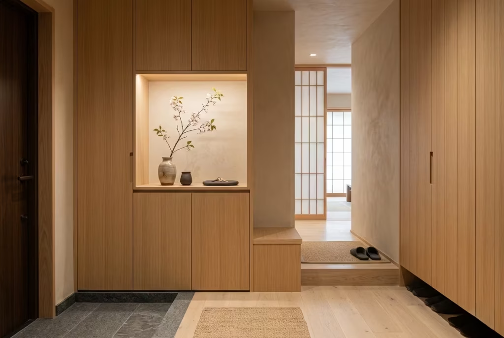
Open storage has a strange way of seducing homeowners at first glance. It looks effortless, almost editorial, like something lifted from a perfectly styled interior magazine spread. Shelves neatly arranged, baskets aligned, everyday objects displayed with intention.
Yet in real homes, with real schedules, real children, and real daily chaos, open storage often becomes a double-edged sword. What begins as visual elegance can quickly tip into visual noise, and once that balance is lost, it is surprisingly difficult to regain.
Japanese entryways tend to treat open storage with caution rather than enthusiasm. Not because it is avoided entirely, but because it is used with a kind of disciplined restraint. Only select items earn the right to be seen. Everything else is quietly tucked away, out of sight but never out of reach. That distinction is what keeps the space feeling composed rather than cluttered.
I have walked into homes where beautifully designed shelving systems were completely undermined by everyday accumulation. Keys, sunglasses, unopened mail, charging cables, half-used candles, even random receipts tend to creep onto open surfaces over time.
It rarely happens all at once. It is more like a slow fog settling over a landscape until the original clarity is barely visible beneath it. Japanese-inspired design avoids that drift by setting clear boundaries from the beginning.
Why Visible Storage Often Becomes Visual Noise
Open storage works best in theory. It promises accessibility, ease, and a relaxed approach to organisation. In reality, it demands constant discipline to maintain visual order, which is exactly what most busy households struggle to sustain over time.
The human eye is highly sensitive to repetition, clutter, and uneven visual density. Even small inconsistencies across open shelves can create a sense of unease that people often cannot quite articulate. A few mismatched objects, slightly misaligned items, or overfilled surfaces are enough to shift the entire mood of an entryway from calm to chaotic.
In entry spaces especially, this effect is amplified because the room is experienced in passing. There is no time to “adjust” to the clutter. The impression is immediate, almost like a snapshot taken without warning.
I remember working on a renovation where the clients initially insisted on open shelving for their entryway because they liked the idea of seeing everything at a glance. Within a few months of living with it, however, they admitted the space began to feel mentally “busy” the moment they walked in. Nothing was technically wrong, yet the entrance never felt restful.
We eventually rebalanced the design by introducing concealed storage for daily items and reducing open shelving to a very small, curated section. The change was immediate. The entryway stopped feeling like a staging area for life and returned to being a place of arrival.
That is often the hidden truth with open storage. It is rarely the concept that fails. It is the accumulation it quietly invites.
Selective Display Techniques Create Calm Without Sterility
Japanese entryways do not reject display entirely. Instead, they treat it as something deliberate, almost like editing a photograph rather than capturing everything in the frame. Selective display is not about filling space, but about choosing what deserves presence.
A single ceramic vessel placed with intention. A carefully chosen piece of timber sculpture. A seasonal branch arrangement that changes subtly throughout the year. These are not decorative fillers. They are pauses within the visual rhythm of the space. The difference is restraint.
Where Western-style open shelving often tries to express personality through quantity, Japanese-inspired interiors rely on quiet curation. Fewer objects, more space around them, and a strong sense of intentional placement allow each item to breathe.
In practice, I often recommend limiting open display in entryways to no more than two or three focal points. This might include a low shelf with a single sculptural object, a small tray with daily essentials, or a carefully lit niche that changes seasonally. Everything else is kept behind closed storage so the visual field remains calm and legible.
One project that stands out involved a compact entry corridor where the original design included a full wall of open shelving. It looked impressive on paper, but in reality it overwhelmed the narrow space.
After redesigning it into a combination of concealed cabinetry and one small display niche, the atmosphere shifted completely. The entryway no longer felt like a storage exhibition. It felt like a moment of pause before stepping deeper into the home.
That is the essence of selective display. It is not about showing less for the sake of minimalism. It is about showing only what adds meaning, and letting everything else stay quietly in the background. When done well, the result is not emptiness. It is clarity.
You May also Like: 20 Cozy Modern Farmhouse Entryway Designs for a Welcoming Home
Negative Space Is Protected Relentlessly
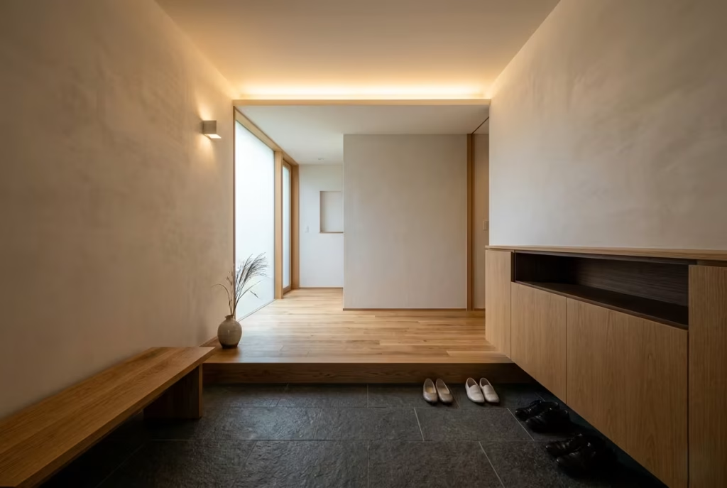
In many homes, space is treated like something that must be filled. Every surface becomes an opportunity. Every corner turns into a candidate for storage, decoration, or “just one more useful thing.” Before long, the entryway is no longer breathing. It is performing. And the more it is filled, the less it feels like a place of arrival and the more it becomes a holding zone for everything that has nowhere else to go.
Japanese entryways challenge that instinct at its core. Instead of treating emptiness as something to be fixed, they treat it as something to be preserved. Negative space is not an absence of design. It is part of the design itself, held with the same intention as any material or joinery detail. In fact, without it, the entire composition would lose its sense of calm.
I have stood in entryways where nothing “remarkable” was immediately visible, yet the atmosphere felt deeply composed. No visual pressure.
No overcrowding. Just a quiet sense of order that seemed to settle into the room like dust at the end of a long day. That feeling does not come from objects alone. It comes from what is intentionally left unsaid in the space. And that is where the idea of Ma becomes essential.
The Japanese Understanding of “Ma”
“Ma” is often translated as negative space, but that translation barely scratches the surface. It is not simply emptiness. It is meaningful emptiness. A pause that holds weight. A silence that shapes everything around it.
In entryway design, Ma is what allows the space to feel calm without relying on constant visual stimulation. It is the gap between elements. The breathing room around storage. The pause between floor transitions, lighting layers, and architectural gestures. Without Ma, even the most expensive materials begin to feel congested.
I often explain it to clients in a very simple way. If every wall is speaking, nothing can be heard clearly. But when there is space between the voices, the message becomes far more powerful. Entryways work in exactly the same way.
The absence of unnecessary elements allows the remaining ones to carry more emotional weight. In Japanese homes, this is not accidental. It is protected with intention.
Cabinetry is spaced deliberately. Walls are not over-occupied. Even storage solutions are designed with breathing room around them. Nothing feels pressed too tightly against anything else, as though the space itself is resisting the urge to become overcrowded.
In one renovation I worked on, a client initially wanted to “fill” a long, narrow hallway with built-in storage from floor to ceiling. On paper, it made practical sense. In reality, it would have suffocated the entrance visually. Instead, we reduced the storage footprint and introduced measured gaps between elements. Those gaps, surprisingly, became the most memorable part of the design.
The space stopped feeling like a corridor of cabinets and started feeling like a calm passage through the home. That is Ma at work. Not empty space, but controlled stillness.
Empty Space as an Active Design Element
One of the biggest misconceptions in interior design is that empty space equals wasted space. In reality, well-managed emptiness is often what gives a home its emotional structure. It is the quiet frame around the picture that allows everything else to make sense.
In Japanese entryways, negative space is never left to chance. It is carefully shaped, measured, and protected so it can perform its role properly. It guides movement. It softens transitions. It prevents visual fatigue. And perhaps most importantly, it gives the mind somewhere to rest the moment you walk in from the outside world.
Think of it like punctuation in a sentence. Without it, everything becomes overwhelming and difficult to process. With it, meaning becomes clear, rhythm becomes natural, and the experience becomes easier to absorb.
I have noticed in real projects that when entryways are over-designed, people tend to rush through them. There is no pause, no moment of grounding. But when negative space is respected, something subtle happens. People slow down. They adjust their pace without being told. The entrance begins to act less like a transit zone and more like a gentle threshold into domestic life.
One project that made this especially clear involved a compact urban apartment where we intentionally left a full section of the entryway completely free of storage, hooks, or decorative elements. At first, the client questioned the decision. It felt like “unused space.” Yet after living with it for a few weeks, they described it as the most calming part of the entire home.
It was not empty in a careless sense. It was intentionally quiet. And that quietness changed how the entire apartment felt.
This is the subtle intelligence behind Japanese entryway design. It understands that calm is not only created by what is added, but equally by what is held back. Like a well-composed piece of music, it is the pauses that give the melody its depth.
When negative space is protected with discipline, the entryway stops feeling like a clutter zone and starts feeling like a moment of arrival that gently resets the mind, every single time you step inside.
Furniture Rarely Touches Every Wall
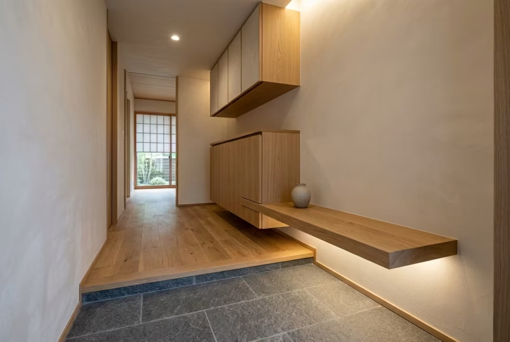
One of the most quietly radical ideas in Japanese entryway design is that furniture does not need to hug every wall to feel complete. In many homes, there is an almost automatic instinct to push everything flush against surfaces, as though filling every available edge equals efficiency.
Cabinets line the perimeter. Benches stretch wall to wall. Storage units occupy every corner they can physically reach. On paper, it feels organised. In reality, it often creates a space that feels visually heavy and slightly compressed, like a room holding its breath without realising it. Japanese-inspired entryways break that habit with intention.
Instead of treating walls as something to be fully occupied, they treat them as part of a larger spatial composition. Furniture is allowed to float, breathe, and sit with deliberate restraint. The result is an entryway that feels lighter, calmer, and far less rigid in its expression. It is a subtle shift, but one that changes the entire emotional reading of the space.
I have seen this approach completely transform narrow hallways that previously felt like tunnels. The moment furniture steps back from the walls, even by a few centimetres, the space suddenly gains depth, rhythm, and a sense of ease that was missing before.
It is a quiet reminder that design is not always about filling space, but sometimes about giving it room to exist.
Floating Benches Create Breathing Room at Entry Level
Floating benches are a signature feature in many Japanese-inspired entryways because they introduce functionality without visual weight. Instead of anchoring heavily to the floor, these benches are lifted slightly, often mounted directly to the wall, allowing the floor beneath to remain visible and uninterrupted.
That small detail has a surprisingly large impact. When the floor plane is visible, the room feels more expansive, even if the actual dimensions remain unchanged. The eye is not stopped by bulky furniture touching every surface. Instead, it flows smoothly across the space, almost like water finding its natural path.
In practical terms, floating benches are typically installed at a height of around 40 to 45 cm, approximately 16 to 18 inches, which feels comfortable for seating while maintaining ergonomic balance in compact entryways. Depth usually ranges between 30 to 40 cm, around 12 to 16 inches, enough for practical use without overpowering the space.
I once worked on a renovation where the entryway originally had a heavy freestanding bench that visually dominated the entire corridor. It was functional, but it made the space feel tight and slightly cluttered, especially when paired with shoes and bags underneath.
Replacing it with a floating oak bench instantly changed the atmosphere. The floor became visible again, light moved more freely, and the entrance stopped feeling like a storage corner and started feeling like a transition point. The client later described it as “the room finally exhaling.”That is often what good design feels like in practice. Not dramatic. Just quietly right.
Shadow Gaps Introduce Subtle Lightness and Precision
Shadow gaps might seem like a minor architectural detail, but in Japanese-inspired interiors they play a surprisingly important role in shaping visual calm.
A shadow gap is the small recessed space between furniture and surrounding surfaces, usually a few millimetres to a couple of centimetres wide, that creates the illusion of separation. That separation matters more than it first appears.
When furniture sits completely flush against walls or floors, it can feel visually heavy, almost as if it is pressing into the architecture. By introducing a thin shadow gap, the object begins to feel lighter, almost suspended within the space rather than fused to it. This creates a sense of precision and refinement that is deeply calming to the eye.
In entryways, shadow gaps are particularly effective because they reduce visual clutter at floor level, where the eye naturally scans first upon entering a home.
I often specify subtle shadow reveals beneath cabinetry or along the edges of built-in benches, typically around 5 to 10 mm, sometimes up to 15 mm depending on material and lighting conditions. When paired with soft indirect lighting, these gaps can create a delicate floating effect that makes even compact spaces feel more considered.
There is also a psychological benefit here. Shadow gaps introduce rhythm. They break visual mass into lighter, more digestible layers. Instead of reading furniture as a single heavy block, the eye begins to perceive it as part of a carefully composed system.
In one project, a narrow entrance hallway originally felt dense because every surface was fully sealed and grounded. After introducing shadow gaps beneath cabinetry and seating, the entire composition gained clarity. Nothing changed in size, but everything changed in perception.
It is a reminder that sometimes the smallest details carry the greatest weight in shaping how a space feels.
Air Circulation, Both Visual and Physical, Keeps the Space Alive
When furniture is pulled away from every wall, something subtle but important happens. The space begins to circulate more freely, not just physically but visually as well. There is a sense of openness that cannot be achieved when every surface is tightly packed or fully occupied. Japanese entryways understand this dual circulation instinctively.
On a practical level, leaving space between furniture and walls can improve airflow, reduce dust build-up in hard-to-reach corners, and make cleaning significantly easier. But beyond the practical benefits lies something more perceptual. The room simply feels less congested. Air circulation becomes part of the design language itself.
In compact homes especially, this breathing room can make a dramatic difference. Even a few centimetres of clearance behind a bench or cabinet can prevent the entryway from feeling visually locked in. Instead of edges pressing inward, the space feels open-ended, as though it is gently extending beyond its physical boundaries.
I have seen this effect repeatedly in real-world projects. One small apartment entryway, barely 1.2 metres wide, around 4 feet, originally felt restrictive because every piece of furniture was pressed tightly against the walls.
After reworking the layout to introduce subtle gaps and floating elements, the same space suddenly felt more generous and composed, even though no structural changes were made.
It is a bit like loosening a tightly tied knot. The structure remains the same, but the tension disappears.
And once that tension is gone, the entryway no longer feels like something to rush through. It becomes a space you naturally move through with ease, almost without thinking about it at all.
You May also Like: 25 Japanese Reading Nook Secrets for a Perfectly Calm Home
Entryways Are Designed for Quiet Movement
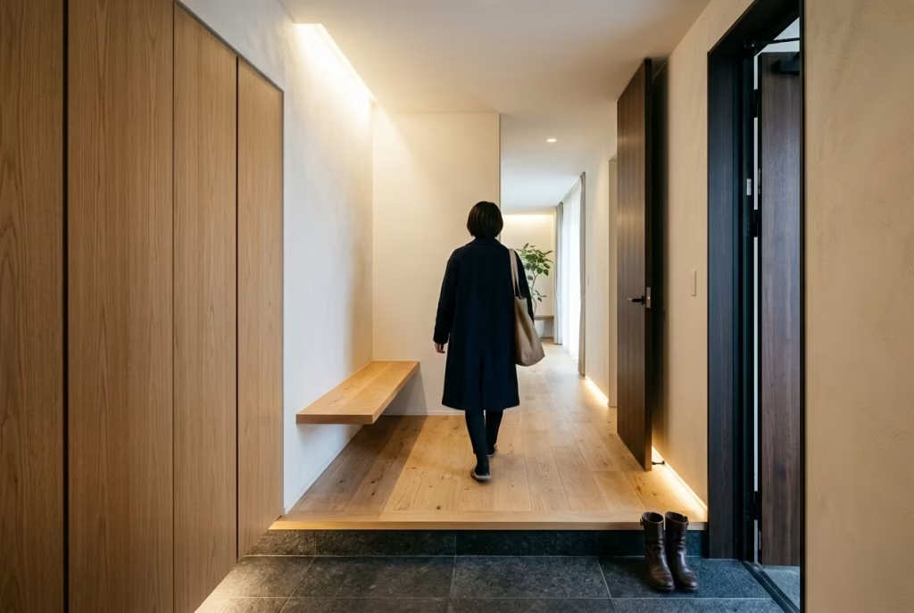
In Japanese-inspired design, an entryway is never treated as a static composition meant only to be looked at. It is, more importantly, a space that must be moved through with ease, almost without thinking. The difference is subtle at first glance, yet profoundly influential in how a home feels day to day. When movement is smooth, the entire atmosphere relaxes. When it is interrupted, even slightly, the space begins to feel tense, no matter how beautiful the finishes might be.
Many homes unintentionally create friction at the entrance. A door that swings awkwardly into circulation. A shoe cabinet that interrupts the natural walking line. A coat hook placed just where someone naturally turns. These are small miscalculations, but they accumulate like pebbles in a shoe, gradually making the simple act of coming home feel less fluid than it should be.
Japanese entryways approach this differently, almost like choreography rather than layout. Every step, turn, and pause is considered as part of a quiet sequence rather than isolated decisions. The result is a space that guides you gently, without ever demanding attention.
I have often noticed in renovation work that once circulation is corrected in an entryway, the rest of the home feels more organised almost by default. It is as if the body no longer has to negotiate with the architecture every time it enters or leaves.
That is the real value of quiet movement. It removes resistance you did not even realise was there.
Circulation Flow Shapes How Naturally a Home Feels
Circulation is often discussed in technical terms, but in reality, it is deeply emotional. It defines how comfortably a person can move through a space without hesitation, interruption, or subconscious effort. In Japanese-inspired entryways, circulation flow is treated as a continuous line rather than a series of stops and starts.
When the path from door to interior is clear, the home immediately feels more intuitive. You step in, you move forward, you settle. No second guessing, no awkward sidestepping around clutter, no tight corners forcing you to adjust your posture mid-stride.
In practical design terms, this often means keeping the primary walking path at least 90 cm wide, around 35 inches, where possible. In tighter spaces, even a consistent 75 cm, around 30 inches, can feel comfortable if the layout is carefully composed and visually uncluttered.
I remember a compact townhouse renovation where the entryway originally forced visitors to weave around a bench, a shoe rack, and a coat stand all within a few steps of the door. It was not unusable, but it never felt effortless. After reconfiguring the layout to establish a clear linear flow from door to interior corridor, the space immediately felt calmer. There was no more subconscious hesitation. People simply moved through it.
That ease, that lack of resistance, is what makes an entryway feel quietly well designed. It is not about speed. It is about smoothness.
Door Swing Planning Prevents Subtle Daily Friction
Door movement is one of those details that often goes unnoticed until it is wrong. A door that opens into the wrong direction can interrupt circulation, block storage access, or create awkward bottlenecks in an otherwise well-designed entryway. Over time, this small oversight becomes a daily annoyance, like a quiet background irritation that never fully disappears.
Japanese-inspired planning pays close attention to how doors behave in space, not just how they look when closed.
Ideally, entry doors should open in a way that supports natural movement rather than interrupting it. In some cases, this means using inward-swinging doors that align with circulation paths. In others, sliding or pocket doors become the preferred choice, especially in compact homes where every centimetre of clearance matters.
I have worked on projects where simply reversing a door swing transformed the usability of the entire entry zone. Storage that was previously blocked became accessible. Movement felt less constrained. Even the perception of space improved because there were fewer visual interruptions at eye level.
It is one of those design decisions that rarely appears dramatic on paper, yet has an outsized impact on daily life.
Good door planning feels almost invisible when done well. You do not notice it working, you only notice the absence of irritation. That is usually how the best design behaves.
Avoiding Friction Points Keeps Movement Effortless
Friction points are the hidden disruptors of entryway design. They are the spots where movement slows down, where people pause unintentionally, or where the body has to adjust slightly to navigate the space. A narrow gap between furniture and wall. A cabinet door that opens into circulation. A shoe bench placed just a little too close to the threshold.
Individually, these moments feel minor. Together, they create a subtle sense of tension that accumulates every time someone enters or leaves the home. Japanese entryways aim to eliminate these friction points as much as possible.
This is not about perfection. It is about predictability. When movement becomes predictable, the body relaxes. When it becomes unpredictable, even slightly, the space begins to feel more demanding than it should.
In one renovation I recall clearly, a family entryway had all the right elements in theory: storage, seating, hooks, and lighting. Yet something always felt slightly off. After observing how people actually moved through the space, it became clear that multiple friction points were disrupting flow.
A cabinet door opened into the walking path. A bench edge forced a narrow turn. A shoe drawer required stepping backwards into circulation. Once these were adjusted, without adding anything new, the entire atmosphere shifted.
The space stopped feeling like a sequence of small obstacles and started feeling like a continuous, gentle passage into the home.
That is the essence of Japanese-inspired entryway design. It does not rely on visual complexity or decorative excess. It relies on removing unnecessary resistance until movement feels almost effortless, like water finding its natural path without obstruction.
Seasonal Clutter Is Controlled Before It Builds
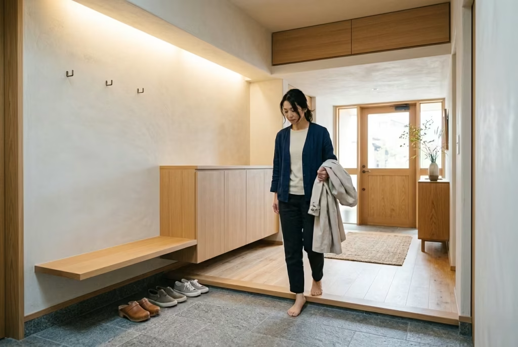
Clutter rarely arrives with warning signs. It does not announce itself. It accumulates quietly, almost politely at first, until one day the entryway that once felt manageable begins to feel slightly overburdened, like a room carrying more than it was ever designed to hold.
Shoes multiply with the seasons. Coats linger long after weather has changed. Bags, umbrellas, and miscellaneous items slowly rotate in and out without a clear system, and before long the entrance becomes a holding ground for everything seasonal and temporary.
Japanese entryway design takes a different stance entirely. Instead of reacting to clutter after it appears, it prevents it from taking root in the first place. The guiding idea is simple but powerful: nothing seasonal is allowed to remain permanently in circulation. Everything has rhythm, rotation, and a designated time to step back out of sight.
This approach changes not only how the space looks, but how it feels to live in it day after day. There is less mental friction, fewer visual distractions, and a quieter sense of control that does not rely on constant tidying.
I have seen homes transform almost overnight simply by introducing seasonal discipline into the entryway. Not by adding storage, but by rethinking timing and placement.
It is less about owning less, and more about letting things exist only when they are needed.
Rotating Footwear Keeps the Entryway Light and Intentional
Footwear is one of the first categories where seasonal clutter quietly builds up. Winter boots remain long after the cold has passed. Summer sandals linger into autumn. Everyday trainers accumulate alongside occasional pairs that are rarely used but somehow never fully removed.
Japanese-inspired entryways address this by treating footwear as a rotating system rather than a permanent display.
Only the shoes relevant to the current season are kept in immediate circulation. Everything else is stored away, often in concealed cabinetry or higher-level storage zones. This simple rotation prevents the floor level from becoming visually overloaded, which is where clutter tends to feel most intrusive.
In practical terms, this often means limiting visible footwear to just a few active pairs per person, typically two to three, depending on lifestyle. The rest are stored out of sight until needed again.
I once worked with a family who struggled with constant shoe clutter near their entrance despite having ample storage. The issue was not capacity, but lack of rotation. Once we introduced a seasonal shoe system, the change was almost immediate. The entryway stopped feeling crowded, even though the total number of shoes in the home had not changed at all.
That is the subtle power of timing in design. When things appear only when needed, they carry less visual weight.
Hidden Overhead Storage Removes Pressure From Everyday Spaces
One of the most effective yet understated strategies in Japanese-inspired entryways is the use of hidden overhead storage. Instead of allowing seasonal items to occupy valuable floor or eye-level space, they are shifted upward, out of immediate sight but still easily accessible when required. This creates a quiet hierarchy within the entryway.
Daily-use items stay within easy reach. Occasional items move above, almost like they are stepping back stage until their season returns. The result is a space that feels consistently lighter, because the most visually disruptive items are no longer competing for attention at eye level.
Overhead storage is often integrated seamlessly into cabinetry or concealed behind flush panels, maintaining the clean architectural lines that define Japanese interiors. When designed well, it disappears into the room rather than adding bulk to it.
In one compact apartment renovation, we introduced a slim overhead storage band above the entry corridor, only about 30 cm deep, roughly 12 inches. It was enough to store off-season footwear boxes, winter accessories, and occasional-use items without intruding into the living space below. The visual difference was striking. The entryway suddenly felt taller, calmer, and far less congested.
It is a simple idea, but one that quietly restores breathing room to the home.
Capsule-Style Organisation Prevents Accumulation From Spiralling
Perhaps the most powerful principle behind controlling seasonal clutter is adopting a capsule-style approach to organisation. Instead of treating entryway storage as an ever-expanding system, Japanese-inspired design encourages it to function like a curated set of essentials that changes intentionally over time.
This means only keeping what is currently relevant in active use. Everything else is rotated, stored, or removed until it is needed again.
The concept is deceptively simple, yet its impact on daily living is significant. When fewer items compete for attention, decision-making becomes easier. The space feels more composed. Cleaning becomes quicker. And most importantly, clutter never gets the chance to accumulate beyond control.
I often describe it to clients as preventing “slow overflow.” Without a system like this, entryways tend to expand their contents gradually, almost invisibly, until one day they feel overwhelming without any obvious cause. With capsule-style organisation, that drift never fully takes hold.
In practice, this might involve:
- Rotating footwear collections seasonally
- Storing off-season coats in concealed wardrobes
- Keeping only essential daily-use accessories in the entryway
- Reviewing stored items at the change of each season
In a real project I worked on, a family home in a busy urban setting, we introduced a quarterly reset system for the entryway. Nothing dramatic, just a simple seasonal review of what belonged in active circulation. Over time, the space developed a natural rhythm. It no longer accumulated unnecessary items. Instead, it stayed aligned with the pace of the household.
That is where the real elegance of Japanese-inspired entryways lies. Not in perfection, but in controlled simplicity that prevents chaos from ever taking root in the first place.
Natural Materials Age Gracefully Instead of Looking Worn
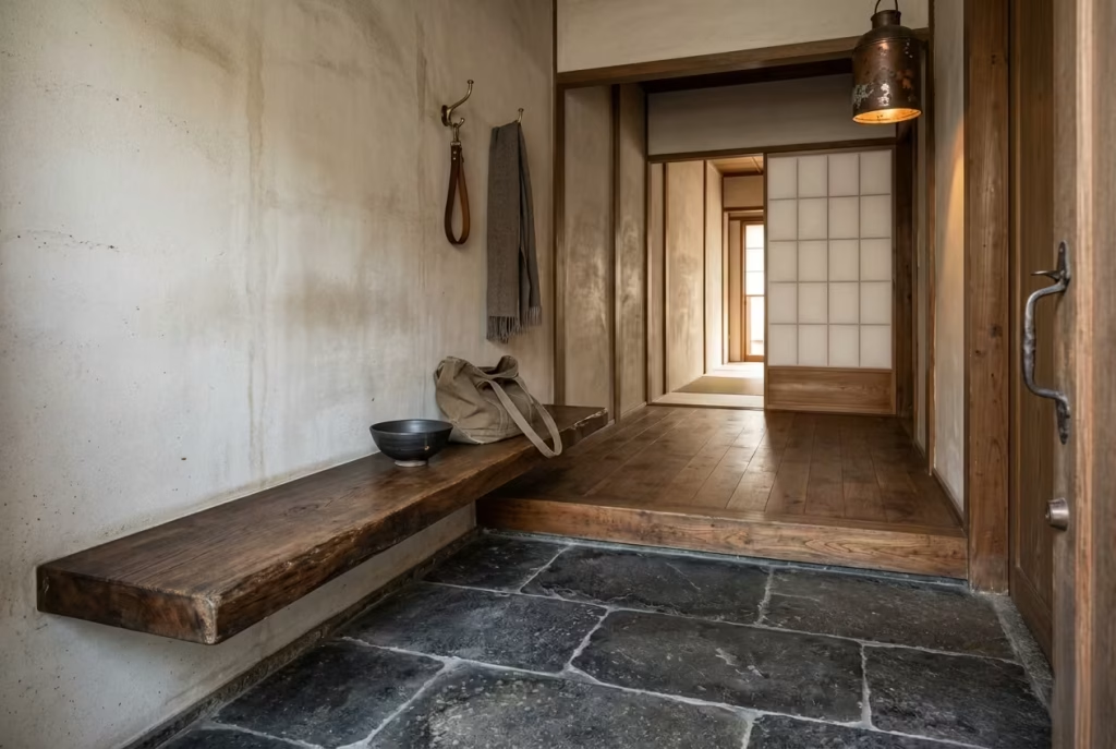
There is a quiet confidence in Japanese entryways that comes from how materials are allowed to age. Nothing feels overly protected or artificially preserved in a static, showroom-perfect state. Instead, surfaces are given permission to evolve over time, to record daily life in subtle layers rather than resisting it.
In many homes, wear is treated like failure. A scratch on timber becomes a flaw. A softened edge on stone feels like damage. Yet in Japanese-inspired design, those same marks are often seen as part of the story the home is quietly writing for itself.
An entryway, in particular, becomes a kind of memory threshold. It is where shoes touch down, where hands brush walls, where bags are placed down in haste after long days. It is only natural that materials begin to shift over time. The difference lies in whether that shift is embraced or constantly fought against.
When natural materials are chosen thoughtfully, they do not deteriorate. They deepen.
I have seen entryways years after installation where timber, stone, and limewashed surfaces felt more beautiful than the day they were completed. Not because they remained untouched, but because they had learned to live with their environment. That is where their character truly begins to surface.
Patina Philosophy Turns Ageing Into Quiet Beauty
Patina is often misunderstood as deterioration, but in Japanese-inspired interiors it is more accurately seen as accumulation. A gentle layering of time, touch, and use that slowly enriches a material rather than diminishing it.
In entryways, patina is particularly meaningful because this is where life makes its most frequent contact with the home. Hands resting on timber benches. Shoes brushing cabinetry edges. Light grazing surfaces at different times of day. Each interaction leaves a faint trace, almost imperceptible in isolation, but powerful when viewed as a whole over time.
Rather than resisting this process, Japanese design welcomes it. Timber becomes warmer as it darkens slightly with age. Stone develops softer tonal variation where footsteps naturally fall. Even metal fixtures begin to shift in tone, reflecting the rhythm of daily life.
In one renovation I worked on, a family was initially concerned about using untreated oak in their entryway bench because they feared it would look “tired” within a few years. When I revisited the home later, the opposite had happened.
The bench had become one of the most visually grounding elements in the entire space. Its surface told a quiet story of constant use, yet instead of feeling worn out, it felt lived in and deeply comforting. That is the essence of patina philosophy. It does not erase time. It collaborates with it.
Timber Ageing Adds Depth Rather Than Disorder
Timber plays a central role in many Japanese-inspired entryways, and one of its greatest strengths is the way it ages with grace when left in its natural or lightly finished state. Unlike synthetic materials that often degrade in a visually harsh or uneven way, timber tends to soften and deepen gradually, almost like it is settling into its surroundings.
This ageing process is rarely abrupt. It happens quietly, layer by layer, as light, touch, and environmental conditions shape its surface over time.
In entryways, where interaction is frequent, this evolution becomes part of the space’s identity. Edges smooth out subtly. Grain patterns become more pronounced in certain lighting conditions. Slight tonal shifts appear where hands or objects regularly make contact.
I often encourage clients to think of timber not as a fixed finish, but as a living surface that responds to its environment. When this mindset is embraced, what might once have been perceived as wear begins to feel like authenticity.
In a compact apartment entryway project, we used brushed ash for both cabinetry and a floating bench. At first, the surface appeared almost too simple, even understated. Yet after several months of use, it began to develop a gentle richness that could not have been designed into it artificially. The client later described it as “the space finally finding its tone.”
That is what well-chosen timber does. It grows into its role rather than remaining frozen in time.
Stone Weathering Grounds the Space in Time
Stone behaves differently from timber, but it carries its own form of ageing language that is equally important in Japanese-inspired entryways. Rather than softening visually in the same way wood does, stone develops character through subtle changes in texture, tone, and surface interaction.
Foot traffic, moisture, and light all contribute to a slow evolution that gives stone surfaces a sense of permanence without rigidity.
In entryways, this is especially valuable because stone acts as the grounding element of the transition space. It absorbs the first contact from the outside world and begins the process of filtering it into the home. Over time, this repeated interaction creates natural variation that feels entirely appropriate rather than disruptive.
In practical terms, materials like basalt, limestone, and honed slate are often chosen for their ability to age gracefully without losing structural integrity or aesthetic coherence. Matte or lightly textured finishes are particularly effective because they reveal change gently rather than exaggerating it.
I once worked on a home where a stone entry floor was initially chosen for purely practical reasons. The clients wanted durability above all else. Yet over the years, that same surface became one of the most admired elements in the home because of how subtly it recorded daily life. Not in an obvious or chaotic way, but in a soft, almost poetic layering of use.
It is easy to forget that homes are not meant to remain unchanged. They are meant to evolve alongside the people living in them. Stone, when allowed to age naturally, becomes a quiet witness to that evolution.
The Palette Rarely Competes for Attention
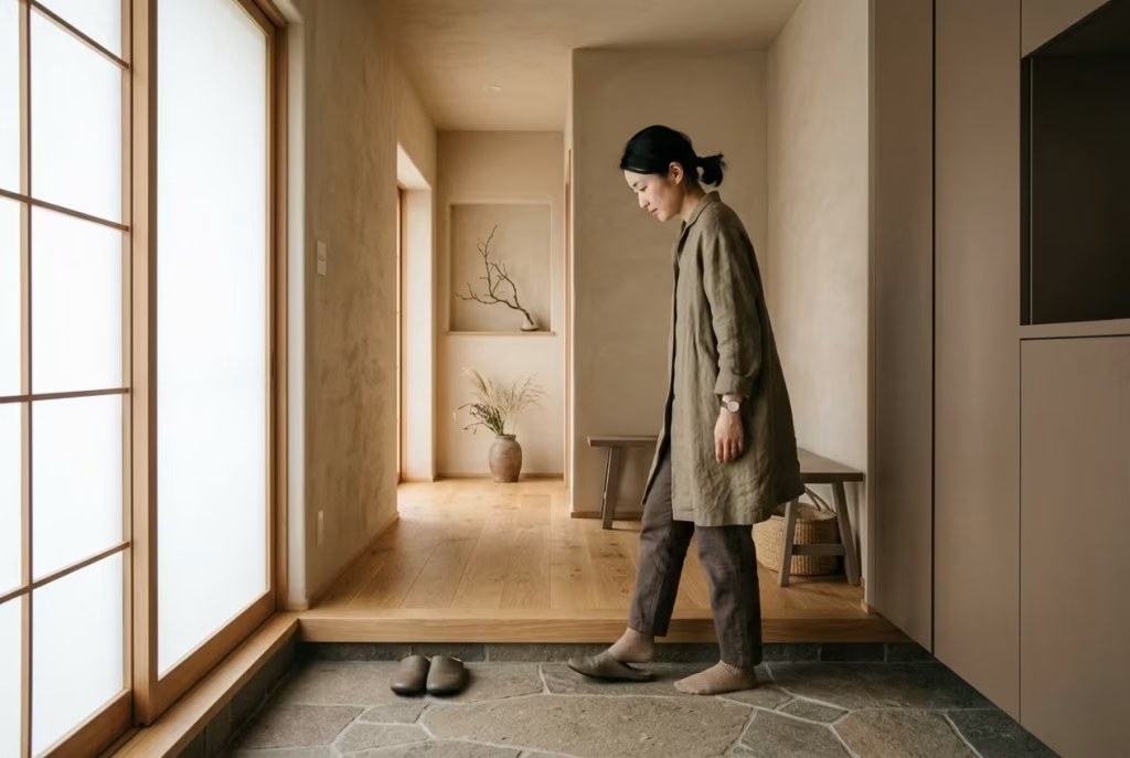
Color in Japanese-inspired entryways is never treated as a loud declaration or a competing voice in the room. Instead, it works more like a background rhythm, steady and understated, shaping mood without ever demanding the spotlight. In many homes, color is used to impress, to define personality, to “lift” a space.
Yet when too many tones start speaking at once, the entryway can quickly lose its sense of calm and begin to feel visually fragmented, almost like a conversation where everyone is talking but nobody is listening.
Japanese entryways move in the opposite direction. The palette is deliberately restrained so that materials, light, and proportion can take the lead. Rather than competing for attention, colors sit quietly in harmony, supporting the architecture instead of overpowering it.
I have often noticed in real residential projects that the most calming entryways are rarely the most colorful. They are the ones where everything feels gently tuned to the same emotional frequency, where nothing feels out of place or visually louder than it should be.
That restraint is not about limitation. It is about control, rhythm, and clarity.
Earth Tones Create a Grounded First Impression
Earth tones are at the heart of many Japanese-inspired entryways because they carry an instinctive sense of stability. These are colours that feel familiar to the human eye, drawn from soil, clay, timber, stone, and natural fibre. They do not demand attention. Instead, they settle into it.
Soft browns, muted beiges, warm taupes, and desaturated greens all help create a grounded atmosphere that feels immediately welcoming upon entry. There is a reason these tones appear so often in traditional Japanese interiors. They mirror the natural world in a way that feels unforced and timeless.
In entryways specifically, earth tones act as emotional anchors. They soften transitions from exterior environments, which are often visually noisy, into the quieter rhythm of the home.
I once worked on a renovation where the original entry palette included stark white walls paired with dark contrasting cabinetry. While visually striking, the combination created a sense of sharpness that never quite softened, especially in the evening light.
When we shifted the palette toward warmer earth-based neutrals, the entire space changed character. It no longer felt like a transition point that demanded adjustment. It felt like a gentle arrival. That shift is subtle, but deeply influential. Earth tones do not shout. They quietly hold the room together.
Smoky Neutrals Soften Light and Reduce Visual Tension
Smoky neutrals sit somewhere between colour and shadow. They are neither fully warm nor fully cool, which allows them to adapt beautifully to changing light conditions throughout the day. In Japanese-inspired entryways, this adaptability is crucial because the space is experienced at multiple times, often under very different lighting moods.
These tones include softened greys, muted stone hues, dusty taupes, and slightly desaturated charcoals. What makes them effective is not their individual identity, but their ability to absorb light gently rather than reflecting it harshly.
In practical terms, smoky neutrals help reduce visual tension. They prevent surfaces from feeling overly sharp or clinical, especially in compact or narrow entryways where every surface is close to the eye. Instead of creating contrast for its own sake, they allow forms and materials to blend more softly into one another.
I have seen smoky neutrals completely transform the perception of tight entry corridors. In one project, a cool white hallway felt sterile and slightly uninviting despite being well-lit. After introducing a layered smoky palette across walls, cabinetry, and flooring transitions, the same space began to feel more cohesive and relaxed. Nothing changed structurally, yet everything changed perceptually.
It was like the room finally stopped straining to be seen and started simply existing. That is the quiet strength of smoky neutrals. They do not dominate the space. They dissolve into it.
Tonal Layering Creates Depth Without Noise
Tonal layering is where Japanese-inspired entryway palettes become truly refined. Rather than introducing multiple contrasting colours, the design works within a narrow range of related tones, allowing subtle shifts in depth, warmth, and texture to create interest. This approach avoids visual noise while still maintaining richness.
For example, a soft clay wall might sit alongside slightly darker oak cabinetry, which in turn meets a stone floor in a muted grey-brown tone. Each element belongs to the same tonal family, yet each carries a slightly different weight. The result is not contrast in the traditional sense, but gentle variation that feels cohesive and intentional. This is where restraint becomes a design tool rather than a limitation.
In real-world applications, tonal layering allows entryways to feel sophisticated without becoming visually overwhelming. It gives the eye enough variation to remain engaged, but not enough disruption to create fatigue.
I recall a project where we used three closely related tones across an entry space: warm limestone flooring, mid-tone ash joinery, and soft greige limewashed walls. On paper, the palette sounded almost too restrained.
In reality, it created one of the most balanced entry experiences I have worked on. Light moved through the space in a soft gradient, and the materials felt like they were quietly speaking to each other rather than competing. That is the real advantage of tonal discipline. It allows complexity to exist without chaos.
When done well, the palette does not try to impress at first glance. Instead, it unfolds slowly, revealing its depth the longer you stay within the space.
You May also Like: 25 Productive Japanese Home Office Designs for a Soulful Workspace
Small Spaces Are Given Purpose, Not Decoration
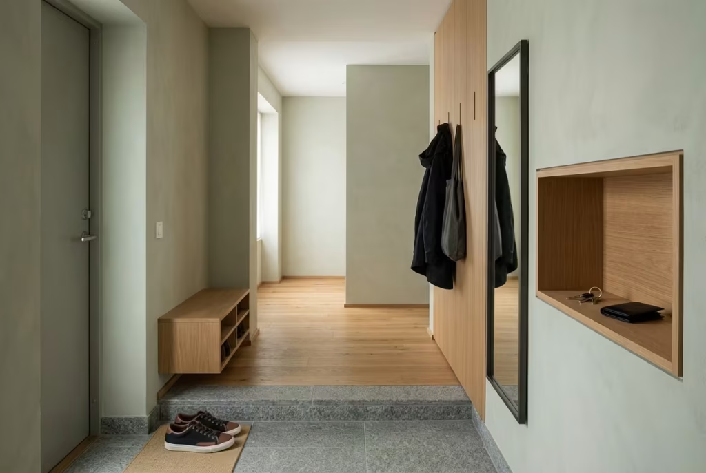
In many homes, small entryways are treated as awkward leftovers, spaces that were never quite large enough to be something meaningful. They often become the default location for decorative compromises: a mirror here, a narrow console there, a plant squeezed into a corner just to “finish” the look.
The intention is usually aesthetic, but the result can feel oddly performative, as if the space is trying too hard to justify its existence. Japanese entryway design refuses that mindset entirely.
Instead of decorating small spaces to make them appear complete, they are assigned clear, intentional roles. Every square centimetre is asked to do something useful, even if that usefulness is subtle.
It is not about filling space for the sake of visual satisfaction. It is about giving the space a reason to exist in the first place. This shift is surprisingly powerful in real homes.
When a small entryway has purpose, it stops feeling like a leftover zone and starts behaving like a functional threshold. The difference is not always visible at first glance, but it is immediately felt in how the space is used and experienced day to day.
I have worked on compact entryways where the transformation was not about adding more design elements, but about removing anything that did not serve a clear function. Once that clarity was established, the space began to feel larger, calmer, and far more intuitive than before.
Purpose, it turns out, expands perception more effectively than decoration ever could.
Spatial Efficiency Turns Constraints Into Quiet Strength
Spatial efficiency in Japanese-inspired entryways is not about squeezing in as much storage as possible. It is about ensuring that every element earns its place through function, proportion, and placement. Small spaces, when treated this way, stop feeling limited and begin to feel precise.
Instead of forcing decorative objects into tight corners, the architecture itself is used to carry multiple roles. A bench might also conceal storage. A wall recess might function as both display and organisation. A single vertical panel might combine hooks, shelving, and hidden compartments in a layered but unobtrusive way.
This approach reduces redundancy, which is often what makes small spaces feel visually crowded.
In practical design terms, spatial efficiency often means working with tighter but more intentional dimensions. A bench might be kept within 30 to 40 cm depth, approximately 12 to 16 inches, not because more space is unavailable, but because excess depth begins to interrupt circulation. Storage is carefully calibrated so that nothing feels oversized for its role.
I once redesigned a very compact apartment entryway that originally felt cluttered despite having relatively few objects. The issue was not quantity, but inefficiency. Each element was slightly oversized or poorly positioned, creating unnecessary visual weight.
After reworking the layout with a focus on purpose-driven proportions, the space felt significantly more open without losing functionality. That is the quiet paradox of spatial efficiency. Less excess often results in more comfort.
Ritual-Based Planning Gives Small Spaces Emotional Structure
One of the most overlooked aspects of Japanese entryway design is the idea that spaces should support rituals rather than simply store objects. When even the smallest entryway is shaped around daily routines, it gains an emotional structure that goes beyond physical layout.
A ritual-based approach asks a simple question. What actually happens here every time someone enters or leaves the home? From that answer, the design begins to take form.
Where do shoes come off? Where do keys naturally land? Where does the body pause before moving further inside? These micro-moments become the foundation of the design rather than an afterthought.
When small spaces are structured this way, they stop feeling like decorative zones and start functioning as behavioural anchors.
In Japanese-inspired homes, this often results in entryways that feel almost instinctive to use. You do not have to think about where things go. The space gently guides the action. Shoes are removed in a specific zone. Items are placed in consistent locations. Movement follows a familiar rhythm that reduces cognitive load at the end of a long day.
I have seen this approach completely change how families interact with compact entryways. In one project, a narrow entrance that previously felt chaotic was redesigned around a simple ritual sequence: step in, remove shoes, place keys, hang coat, move forward. Nothing extravagant, just carefully placed functional points aligned with natural behaviour.
Within weeks, the space stopped accumulating clutter almost entirely. Not because the occupants changed, but because the environment finally aligned with how they actually lived.
That is the real strength of ritual-based planning. It does not impose order. It supports it quietly, until order begins to feel natural rather than enforced.
And in small spaces, that sense of natural flow is often what transforms constraint into quiet comfort.
Vertical Storage Is Used Quietly
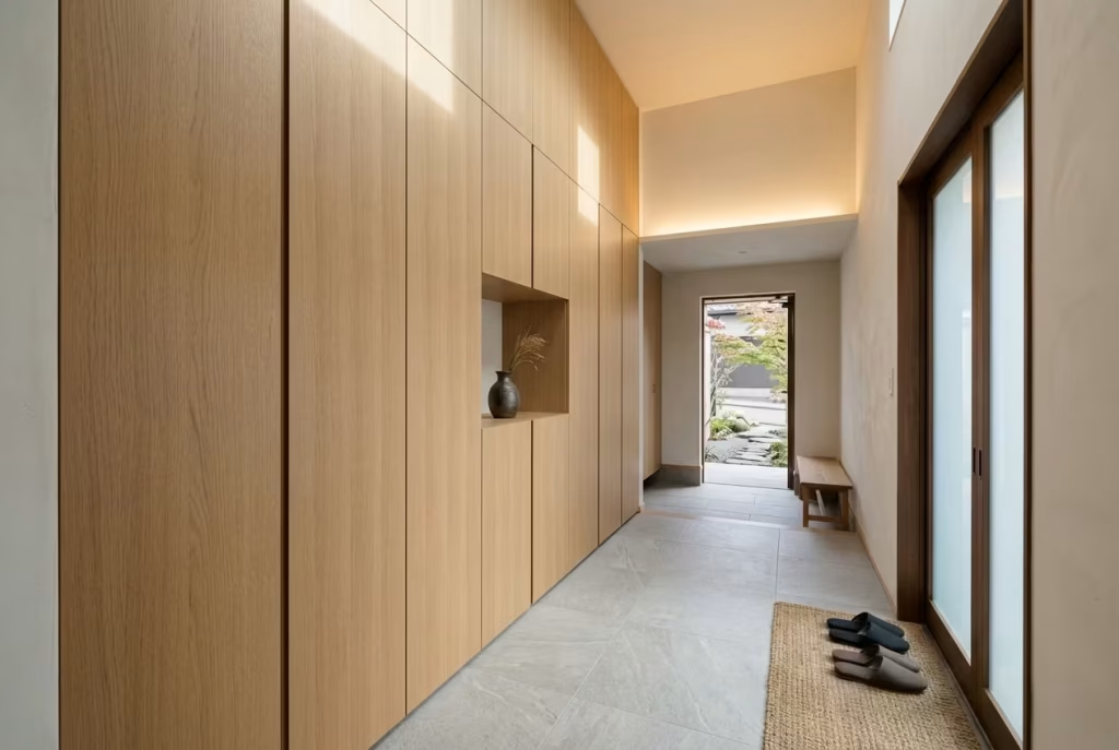
Vertical storage in Japanese-inspired entryways is never about visual dominance or architectural drama. It is not the kind of design that announces itself the moment you step inside. Instead, it works quietly in the background, like a well-trained system that knows its role without demanding attention.
The goal is not to make walls feel taller for the sake of impact, but to use height as a silent extension of function, allowing the floor plane to remain calm, open, and visually uninterrupted.
In many homes, storage tends to spread horizontally first. It creeps along floors, expands into corners, and gradually occupies valuable circulation space. Before long, the entryway begins to feel compressed at ground level, even if there is technically enough storage overall.
Japanese design reverses this instinct by lifting storage upward, letting walls carry the weight so the floor can breathe. This shift changes everything about how the space is experienced.
Instead of feeling crowded at eye level, the entryway feels lighter, almost as if the room is gently pulling clutter upward and away from daily movement paths. It is a subtle strategy, but one that has a lasting impact on how organised and spacious a home feels.
I have seen compact entryways completely transformed simply by rethinking verticality. Without adding square footage or increasing storage complexity, the space suddenly felt calmer, more structured, and far less visually congested.
Height, when used thoughtfully, becomes less about storage and more about clarity.
Slim Cabinetry Keeps Verticality Elegant Rather Than Overwhelming
Slim cabinetry is one of the most effective ways to introduce vertical storage without overwhelming the space. Instead of bulky units that protrude into circulation zones, Japanese-inspired entryways favour narrow, tall forms that align with the architecture rather than compete with it.
These cabinets are often designed with shallow depths, typically between 20 and 35 cm, approximately 8 to 14 inches, which is enough for functional storage without intruding into movement paths. The emphasis is on height rather than volume, allowing storage to rise quietly along the wall rather than spread outward. This approach has a surprisingly calming effect on the eye.
When cabinetry is slim and vertical, the visual weight is distributed more evenly. The room does not feel anchored by heavy forms at floor level. Instead, it feels structured yet open, almost like the walls themselves are organising the space rather than objects being added to it.
I once worked on a renovation where a narrow entry corridor felt constantly cluttered despite having relatively minimal furniture. The issue was not quantity, but proportion. Once we replaced wide, low storage units with slim vertical cabinetry, the entire space shifted in perception.
It no longer felt compressed at the base. The eye was guided upward, and the floor regained its sense of openness. It is a simple adjustment, but one that completely changes spatial balance.
Ceiling-Height Millwork Draws the Eye Upward Without Visual Noise
Ceiling-height millwork is another quiet but powerful strategy used in Japanese-inspired entryways. By extending storage all the way to the ceiling, the design eliminates the awkward visual gap that often sits above standard-height cabinets, a gap that tends to collect dust and visual clutter over time.
When cabinetry meets the ceiling cleanly, the architecture feels more intentional. The room reads as a complete vertical composition rather than a collection of disconnected elements. However, the key is restraint.
Ceiling-height storage does not need to feel heavy or imposing. In Japanese interiors, it is often softened through flush surfaces, minimal detailing, and consistent material continuity. This allows the structure to blend into the architecture rather than dominate it.
In practical terms, this type of millwork is especially effective in compact entryways where floor space is limited. By shifting storage upward, you effectively reclaim circulation area at ground level, which immediately improves movement and visual flow.
I recall a project where a small apartment entryway felt perpetually cluttered because of low, fragmented storage pieces. Replacing them with a single ceiling-height millwork system completely changed the experience of the space.
The floor felt clearer, the walls felt more composed, and the overall entry began to feel taller than it actually was. That perception shift is one of the hidden strengths of vertical design. It changes how space is read, not just how it is used.
Flush Doors Maintain Calm by Eliminating Visual Interruptions
Flush doors are an essential part of quiet vertical storage because they ensure that height does not translate into visual disruption. In many conventional storage systems, doors become visual interruptions, breaking up surfaces with handles, frames, and protrusions that draw attention away from the overall composition. Japanese-inspired design avoids this by keeping doors flush with surrounding surfaces.
When cabinetry doors sit perfectly aligned with the wall or millwork frame, the entire storage system reads as a single unified surface rather than a series of separate compartments. This reduces visual fragmentation and allows the entryway to feel calmer, even when it is functionally full.
Push-to-open mechanisms, concealed handles, and continuous grain matching all contribute to this effect, but the underlying principle remains the same. The storage should not announce itself unless it is being used.
I have seen this detail make a significant difference in small entryways where visual clutter was more of a perception issue than an actual storage problem.
Once flush doors replaced protruding handles and uneven cabinet faces, the space immediately felt more composed. Nothing was removed, yet everything felt lighter. It is a reminder that calm design is often about reducing interruption rather than reducing content.
Vertical storage, when handled quietly, does not compete for attention. It simply supports the life of the home from the background, allowing the entryway to remain clear, ordered, and quietly efficient without ever feeling overworked.
Visual Noise Is Eliminated at Eye Level
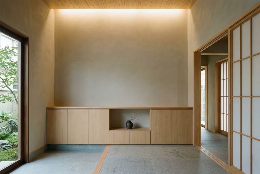
The human eye has a habit of scanning spaces at a very specific height. It naturally settles around eye level, picking up detail, contrast, and movement almost instinctively. In entryways, this is the zone where first impressions are formed within seconds, often before a person has even consciously registered what they are looking at. If this band of space is visually busy, the entire room can feel unsettled, no matter how well designed the rest of it might be.
Japanese-inspired entryways treat this zone with particular care. Instead of filling eye level with distractions, signage, fixtures, and visible mechanical details, they actively clear it. The result is a space that feels calmer almost immediately upon entry, as if the visual field has been gently decluttered before the mind even begins to process it.
This is not about hiding things randomly. It is about controlling what the eye encounters first, and allowing the architecture itself to do most of the talking.
I have often found in renovation work that once visual noise is removed from eye level, clients describe the space as feeling “instantly more expensive” or “strangely peaceful,” even when no major structural changes have been made.
That reaction is rarely about luxury in a traditional sense. It is about relief. The eyes are no longer fighting for clarity. And that relief, in a busy household, is more powerful than it first appears.
Hidden Hardware Keeps Attention on Space, Not Mechanisms
Hardware is essential in any functional entryway, but when it is overly visible, it can quickly begin to disrupt visual harmony. Hinges, handles, locks, brackets, and exposed fittings all create small interruptions at eye level that accumulate into a sense of visual fragmentation.
Japanese-inspired design solves this by concealing hardware wherever possible. Doors open with minimal visible mechanism. Cabinets use push-to-open systems or recessed detailing. Hinges are integrated into the structure rather than displayed as separate elements.
The intention is simple. The eye should register form and proportion, not the technical systems holding them together.
In practical terms, this creates a smoother visual experience, especially in narrow entryways where every detail is close to the observer. When hardware disappears, surfaces begin to read as continuous planes rather than assembled parts. That continuity is what gives Japanese interiors their sense of calm precision.
I once revisited a project where we had replaced standard exposed handles on entry cabinetry with fully concealed push mechanisms. The clients initially questioned whether the change was necessary, but after living with it for a few weeks, they admitted they could not imagine going back. The absence of visual interruption had made the space feel noticeably more composed, even though nothing else had changed.
It is a reminder that sometimes the most powerful design decisions are the ones that remove rather than add.
Minimal Signage Prevents Unnecessary Cognitive Load
Signage in residential entryways is often overlooked, yet when it appears at eye level, it can easily disrupt the visual flow of the space. Labels, instructions, reminders, or decorative text elements all compete for attention in a zone that should ideally feel calm and uninterrupted.
Japanese-inspired entryways avoid this by minimising signage almost entirely. Instead of relying on labels or visual cues, the design itself communicates function through placement, proportion, and repetition. When storage is intuitive, signage becomes unnecessary.
For example, a key tray placed consistently near the entrance, or a dedicated shoe zone defined by material change, naturally guides behaviour without the need for written indicators. The space becomes self-explanatory through design alone.
This reduces cognitive load significantly. The mind does not need to interpret or process additional visual information upon entering the home. Instead, it can transition more smoothly from the outside environment into a more relaxed internal state.
I have worked on homes where even subtle signage or decorative typography near the entrance created a sense of busyness that was difficult for clients to articulate but easy to feel. Once removed or relocated away from eye level, the entryway immediately felt more cohesive and less mentally demanding.
It is a small adjustment, but one that supports a much larger shift in how the home is experienced.
Concealed Electrical Elements Preserve Visual Continuity
Electrical elements are another common source of visual noise in entryways. Light switches, sockets, intercom panels, thermostats, and security systems are often placed at eye level by default, which can disrupt the calm flow of a carefully designed space.
Japanese-inspired design treats these elements with quiet discipline. Wherever possible, they are concealed, integrated, or relocated to less visually dominant positions. Switches may be aligned with architectural lines or finished in materials that blend into the wall.
Electrical panels may be hidden behind flush doors or integrated into millwork systems. Even small devices are carefully positioned so they do not interrupt the primary visual field. The goal is not to eliminate functionality, but to protect visual clarity.
In entryways, this is particularly important because the space serves as a transition point between exterior stimulation and interior calm. The more visual interruptions exist at eye level, the harder it becomes for the mind to settle upon entering.
I recall a renovation where a standard cluster of switches and intercom equipment sat directly beside the entrance at eye level. Although functional, it created a constant point of visual distraction. By reconfiguring and integrating these elements into a recessed panel system finished in matching wall material, the entire entryway immediately felt more unified.
Nothing about the function changed, yet the perception of the space improved dramatically.
That is the subtle strength of concealed design. It allows necessary systems to exist without interrupting the emotional experience of the space.
When visual noise is removed at eye level, the entryway stops competing for attention and starts supporting calmness in a far more effortless way, almost like the architecture itself has learned to step quietly out of the way.
Entryways Include Transitional Seating
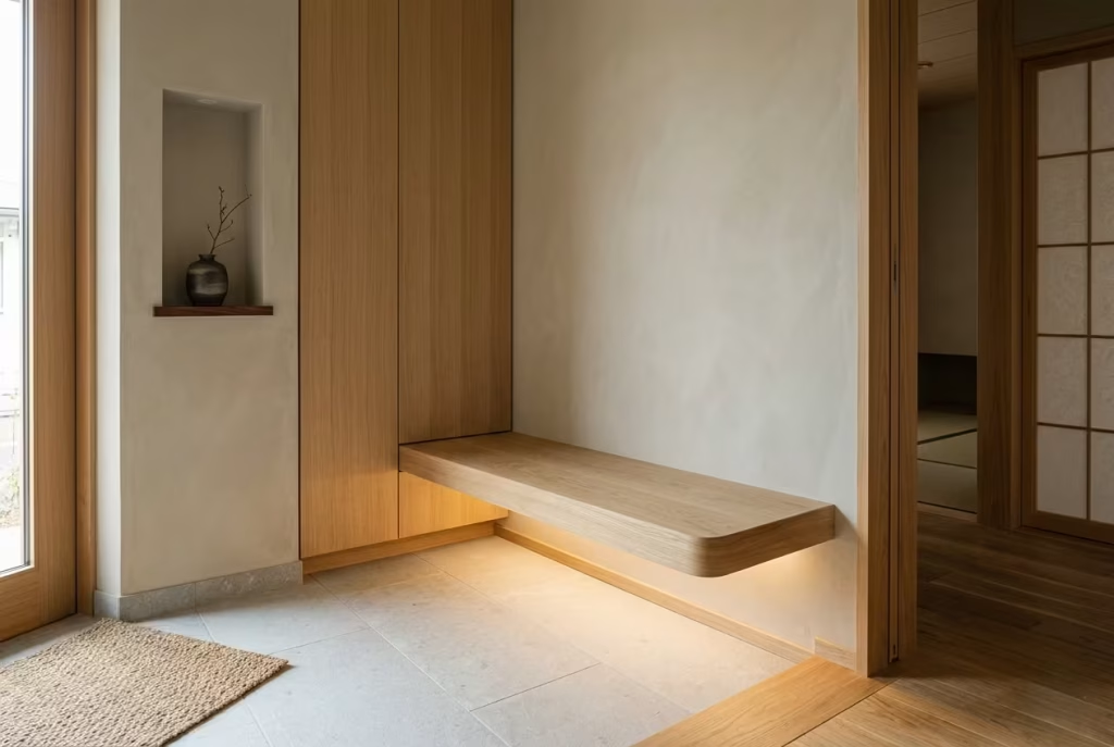
Seating in an entryway is often underestimated, yet in Japanese-inspired design it plays a far more meaningful role than simply providing a place to sit. It acts as a threshold between outside and inside, a moment of pause that quietly signals the shift from public rhythm to private life. Without it, entryways can feel like spaces you pass through too quickly, almost as if the body has nowhere to briefly settle before moving deeper into the home.
In many conventional layouts, seating is either absent or treated as an afterthought, squeezed into corners or added only if space allows. Japanese entryways, however, treat seating as part of the transition itself. It is not optional decoration. It is a functional pause built into the architecture. This small moment of stillness changes how the entire space is experienced.
I have seen even compact entryways feel noticeably more composed once a simple seating element is introduced. It becomes a natural point of adjustment, where shoes are removed, bags are placed, and the pace of arrival gently slows down without any conscious effort. It is a quiet but powerful form of spatial rhythm.
Integrated Benches Create Seamless Function Without Visual Disruption
Integrated benches are one of the most effective ways to introduce seating into Japanese-inspired entryways because they blend directly into the architecture rather than sitting as separate furniture pieces. This integration ensures the space remains visually calm while still providing a highly practical function.
Typically built from timber, stone, or a combination of both, these benches are often aligned with surrounding cabinetry or wall structures so they feel like part of a continuous composition rather than an added object. This helps maintain clarity in small or narrow entryways where standalone furniture could easily overwhelm circulation.
In practical terms, the standard bench height usually sits between 40 and 45 cm, approximately 16 to 18 inches. This range allows for comfortable seating during shoe removal while keeping proportions balanced within the entry zone.
I have worked on projects where replacing a freestanding chair with an integrated bench completely changed the behaviour of the space. What was once a clutter-prone corner suddenly became a structured pause point. Shoes were no longer removed awkwardly while standing or leaning against walls. Instead, there was a natural place to sit, settle, and transition properly into the home.
That sense of ease is often what separates a functional entryway from a thoughtfully designed one.
Timber Ledges Offer Subtle Resting Points for Daily Rituals
Timber ledges are a more understated form of seating, but they carry a quiet elegance that fits beautifully within Japanese-inspired interiors. Unlike full benches, they are often shallower and more integrated into wall systems, providing just enough surface for brief pauses rather than extended seating.
These ledges work particularly well in compact entryways where space is limited but functionality still needs to be preserved. They can support small daily rituals such as placing bags down, adjusting footwear, or setting down keys while entering or leaving the home.
Because they are visually lighter than full seating structures, timber ledges help maintain a sense of openness in the entryway. They do not interrupt circulation or dominate the visual field, yet they remain highly practical in daily use.
I once designed a narrow corridor entry where a full bench would have disrupted movement flow. Instead, we introduced a slim ash timber ledge integrated into the wall at a comfortable sitting height. The result was subtle but effective. People naturally used it without thinking, and the space retained its calm, uncluttered feel.
It is a reminder that seating does not always need to be prominent to be meaningful. Sometimes the smallest surfaces carry the most functional weight.
Compact Seating Zones Support Natural Transition Without Overcrowding
Not every entryway allows for full benches or extended seating features. In smaller homes, especially urban apartments, seating must be carefully calibrated so it supports transition without consuming valuable circulation space. This is where compact seating zones become particularly important.
These are intentionally small, well-defined areas within the entryway where seating is integrated in a way that feels natural rather than imposed. Often positioned near storage or shoe zones, they are designed to support quick, purposeful use rather than long stays. The key is restraint.
Instead of trying to replicate full living room seating at the entrance, Japanese-inspired design focuses on the essential function: a brief pause between arriving and entering deeper into the home. This keeps the space efficient while still emotionally supportive.
In one compact apartment renovation, we carved out a small seating niche using a combination of recessed millwork and a floating timber surface. The footprint was minimal, yet its impact was significant. The client described it as the point where “the day slows down for a moment” before moving into the rest of the home.
That is the true value of compact seating. It does not take up space. It gives structure to transition.
Why Transitional Seating Changes the Feel of Arrival
Seating in entryways is not just about convenience. It fundamentally changes the emotional pacing of arrival. Without it, movement tends to be rushed and functional. With it, there is a natural pause that allows the body and mind to recalibrate.
Japanese-inspired interiors understand this deeply. They treat entryways not as pass-through corridors, but as the first moment of decompression after external activity. Seating becomes the physical anchor for that shift.
I have noticed in real projects that even a modest seating element can reduce visual and physical clutter indirectly. When people have a designated place to sit, belongings are no longer dropped randomly. The act of entering becomes more intentional, almost ritualistic in nature.
That is where design and behaviour begin to align. A well-placed bench or ledge does not just serve a practical purpose. It quietly guides how people move, pause, and settle into the home. And in that gentle guidance, the entryway stops feeling like an afterthought and starts feeling like a carefully composed transition between worlds.
You May also Like: 15 Victorian Mudroom Design Secrets for a Timeless, Elegant Entryway
There Is Always a Sense of Ritual
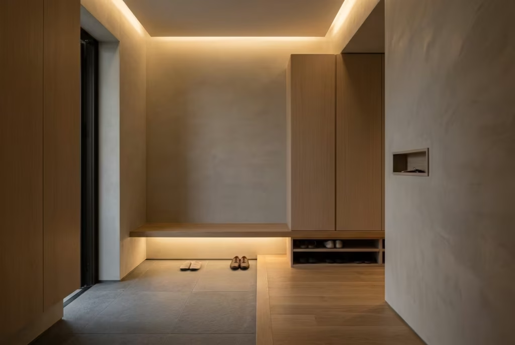
Japanese-inspired entryways are never just functional thresholds where people rush in, drop their belongings, and disappear into the home. They are designed with a quiet sense of ritual woven into every movement, almost like the space is gently teaching the body how to slow down without forcing it. In many modern homes, arrival can feel abrupt and fragmented, as if life simply continues at full speed right up to the front door. Shoes are kicked off in haste, keys are tossed aside, and the transition from outside to inside happens without any real pause.
In contrast, Japanese entryways treat arrival as a meaningful shift in state, not just a change of location.
There is a subtle choreography to it. A slowing down. A moment where the outside world is left behind, not just physically, but mentally. The space itself encourages this rhythm through layout, material choice, and repetition of small, intentional actions that become part of daily life.
I have seen this shift profoundly affect how people experience their homes. Once ritual enters the entryway, the entire atmosphere of arrival changes. It stops feeling rushed and starts feeling grounded, almost like the home is acknowledging your return. That is where design becomes more than visual. It becomes behavioural.
Slowing Down Upon Arrival Creates Mental Separation
One of the most powerful effects of a ritual-based entryway is how it naturally slows the pace of arrival. This is not enforced through rules or instructions, but gently encouraged through spatial cues. The layout, materials, and transitions all work together to signal that the outside world is over and something quieter begins here.
In many homes, there is no clear boundary between exterior and interior experience. People step inside and immediately continue moving at the same speed they had outside. Bags are still swinging, thoughts are still racing, and the mind has not yet caught up with the body.
Japanese-inspired entryways interrupt that momentum in a subtle way.
A change in flooring texture. A slight shift in lighting warmth. A dedicated seating point. These small elements collectively create a moment of pause that the body recognises instinctively. It is not dramatic, but it is noticeable. The pace naturally slows without conscious effort.
I have worked on homes where this effect became immediately apparent after redesign. Clients often mentioned that they found themselves lingering near the entrance longer than before, not because they had to, but because the space invited it. That pause, however brief, acted like a reset between the outside world and home life. And in a fast-paced lifestyle, that reset becomes surprisingly valuable.
Shoe Changing Habits Turn Function Into a Gentle Routine
The act of removing shoes is often treated as purely practical, but in Japanese entryways it becomes part of a quiet ritual that anchors the entire arrival experience. Instead of being a rushed action performed while moving forward, it is given a dedicated moment within the space. This is where design plays a crucial role.
A defined shoe zone, a seating point, or a slight change in flooring level all signal that this is where the transition happens. The body begins to associate this spot with a specific action, and over time, the behaviour becomes automatic, almost instinctive. There is a psychological clarity in this repetition.
Shoes come off here. Not anywhere, not eventually, but here. That certainty reduces mental friction and brings order to what is often a chaotic entry routine in many homes.
I have seen this play out in real projects where families initially struggled with shoes being left scattered around the entrance. After introducing a clearly defined shoe removal zone with integrated seating and storage, the behaviour naturally shifted. It was not about discipline. It was about clarity of place.
When a space makes something easy to do in a consistent way, habits follow almost effortlessly. That is where ritual begins to form quietly within daily life.
Intentional Routines Turn Entryways Into Emotional Anchors
Beyond individual actions like shoe removal or placing keys, Japanese entryways support a broader sense of intentional routine. These are not rigid sequences, but gentle patterns that shape how people move through the space every time they arrive home.
It might be placing keys in the same recessed tray, sitting on the same bench for a brief moment, or pausing under a softly lit wall before moving further inside. These repeated actions create familiarity, and familiarity, over time, becomes comfort.
The entryway begins to act like a small emotional anchor in the home. It marks the boundary between the outside world and personal space in a way that feels stable and reassuring.
I have observed in multiple residential projects that once these routines become established, people often describe their homes as feeling more “settled” or “balanced.” The architecture itself does not change, but the relationship between person and space becomes more grounded.
There is a certain elegance in that repetition. It is not about strict behaviour or overly controlled living. It is about creating gentle consistency in a world that is otherwise full of movement and unpredictability.
In one renovation, a client told me something that stayed with me. They said the entryway had become the part of their home where they could “leave the day behind properly.” Not because of any single design feature, but because the space quietly guided them through the same calming sequence every time they walked in.
That is the essence of ritual in Japanese-inspired entryways. It is not decoration. It is not formality. It is a lived rhythm that quietly shapes how the home feels, one arrival at a time.
Japanese Entryways Prioritise Maintenance, Not Just Appearance
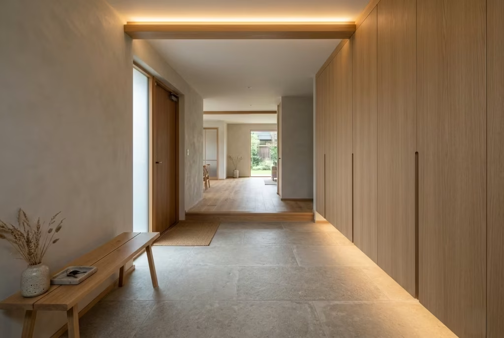
There is a quiet but often overlooked truth in Japanese-inspired entryway design: beauty is never treated as something that must be constantly preserved through effort. Instead, it is designed to survive daily life without becoming fragile or demanding.
In many homes, entryways are styled to look perfect at a single moment in time, yet the maintenance required to keep them that way slowly turns them into high-stress zones. A surface that marks too easily, a floor that shows every footprint, or a wall finish that cannot handle moisture quickly becomes part of a daily cycle of frustration. Japanese entryways take a more grounded approach.
They are designed with maintenance in mind from the very beginning, not as an afterthought once problems appear. The goal is not just to create a visually pleasing entrance, but to ensure that it remains calm, functional, and easy to care for over time without constant intervention.
I have often found in real renovation projects that the most successful entryways are not necessarily the most visually complex. They are the ones that quietly reduce effort in the background.
When maintenance becomes easier, the space naturally stays more orderly without requiring constant attention. That is where long-term design thinking truly shows its strength.
Easy-Clean Materials Reduce Daily Effort Without Sacrificing Calm
One of the foundational principles in Japanese entryways is the careful selection of materials that are easy to maintain without losing their visual softness. Instead of relying on delicate finishes that require constant care, the focus is placed on surfaces that can handle real life while still feeling refined.
Timber with durable oil finishes, honed stone, matte ceramics, and lightly textured plaster are commonly used because they do not exaggerate every mark or smudge. These materials are forgiving, which is exactly what a high-traffic space like an entryway requires.
When materials are easy to clean, the emotional weight of maintenance reduces significantly. A quick wipe becomes enough. There is no lingering anxiety about damaging surfaces or preserving perfection at all costs.
In one renovation I worked on, a client originally had high-gloss cabinetry in their entryway. While visually striking, it constantly revealed fingerprints, dust, and minor scuffs. The maintenance routine became exhausting over time.
After switching to a matte, textured finish with similar tonal depth, the difference was immediate. The space no longer demanded constant attention, yet still looked refined in everyday use. That is the quiet advantage of choosing materials that work with life rather than against it.
Washable Wall Finishes Keep the Entryway Practically Beautiful
Walls in entryways are often exposed to more contact than people realise. Bags brushing against them, hands steadying themselves while removing shoes, moisture carried in from outside weather, and the occasional accidental scuff all contribute to gradual wear. If wall finishes are not designed for this reality, maintenance quickly becomes a constant concern.
Japanese-inspired entryways address this through washable, durable wall treatments that maintain their appearance with minimal effort.
Limewash with protective sealers, washable mineral paints, and fine textured plasters are commonly used because they balance softness with resilience. They allow the walls to retain their natural character while also being practical enough for everyday cleaning. The key is subtle durability rather than visible toughness.
In many cases, these finishes are chosen specifically because they age gracefully and can be refreshed without major intervention. A gentle wipe or occasional touch-up is often enough to maintain their appearance over time.
I have seen homes where entryway walls previously required frequent repainting due to visible marks and stains. After switching to more resilient finishes, maintenance dropped significantly, and the space maintained a more consistent, calm appearance throughout the year. It is not about making walls indestructible. It is about making them forgiving.
And in a space that experiences constant contact, forgiveness becomes a form of design intelligence.
Dirt-Resistant Flooring Keeps the Threshold Calm Under Pressure
Flooring in entryways carries a unique burden. It is the first surface to meet outdoor conditions, often dealing with dust, moisture, grit, and constant foot traffic. If the material is too delicate or visually reactive, even small amounts of dirt can make the entire space feel untidy.
Japanese entryway design addresses this by selecting flooring that naturally resists visible wear and is easy to maintain under daily use.
Stone, porcelain tiles with matte finishes, and certain treated natural surfaces are commonly used because they handle both moisture and dirt without losing visual consistency. These materials do not amplify imperfections. Instead, they absorb them quietly into their texture. This creates a psychological benefit as well.
When floors do not constantly reveal every footprint or mark, the space feels more stable and less demanding. The entryway remains visually composed even during busy periods of use, such as rainy days or high household activity.
I recall a project where polished flooring initially made the entryway feel elegant but impractical. Every step left visible traces that required frequent cleaning to maintain the desired appearance. Once we transitioned to a more matte, textured surface, the maintenance demands dropped dramatically, and the space began to feel calmer on a daily basis.
That is the essence of dirt-resistant design. It does not eliminate mess. It simply stops it from dominating the visual experience.
In the end, Japanese entryways remind us that true design success is not measured only by how a space looks on day one, but by how easily it continues to live well over time, without becoming a constant task to manage.
Symmetry Is Used Softly, Not Rigidly
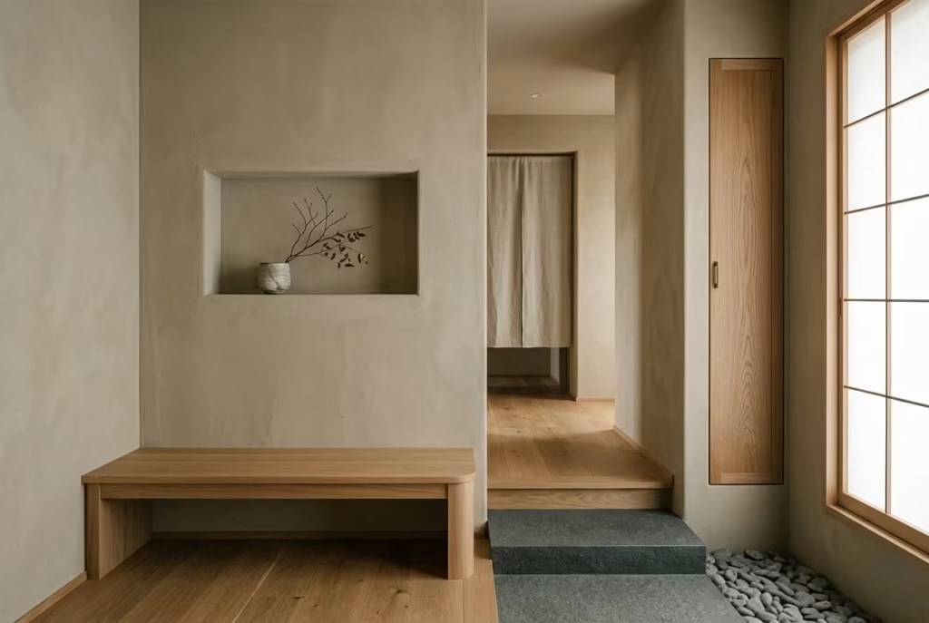
Symmetry in Japanese-inspired entryways is never about strict duplication or mechanical balance. It is not the kind of design where every object is mirrored perfectly on both sides, as if the space is trying too hard to achieve order through repetition. Instead, symmetry is treated more like a feeling than a formula, something that guides composition gently without locking it into rigidity.
In many homes, symmetry is often mistaken for control. Designers or homeowners try to align everything too precisely, expecting that perfect mirroring will automatically create calm. Yet in practice, overly rigid symmetry can feel static, almost staged, as if the space is frozen in place. It may look orderly at first glance, but it often lacks warmth and natural flow. Japanese entryways take a more nuanced approach.
They use balance, not duplication. Proportion, not repetition. The goal is not to mirror every element, but to allow the space to feel visually steady even when elements are slightly offset or varied. This creates a sense of ease that feels more natural to the human eye.
I have often noticed in real design projects that the most calming entryways are rarely perfectly symmetrical. Instead, they feel intuitively balanced, where nothing feels out of place even if it is not mirrored exactly. That subtle difference is what gives the space its quiet sophistication.
Balanced Asymmetry Creates Natural Visual Rhythm
Balanced asymmetry is one of the most important principles in Japanese-inspired entryway design. It allows the space to feel composed without becoming predictable or visually stiff. Rather than placing identical objects on either side of a central axis, the design distributes visual weight in a way that feels naturally stable.
This might mean a bench on one side balanced by vertical storage on the other, or a textured wall panel offset by a softer, lighter surface. The elements are not identical, but they feel equal in visual importance. The eye perceives balance not through sameness, but through harmony.
This approach creates a more dynamic and engaging entry experience. The space feels alive, but not chaotic. Structured, but not rigid. It avoids the “mirror effect” that can sometimes make interiors feel overly formal or static.
In one renovation I worked on, the original entryway was designed with strict symmetry. Identical cabinetry on both sides of the corridor created a sense of order, but also made the space feel narrow and repetitive. Once we introduced balanced asymmetry, replacing mirrored units with varied but visually weighted elements, the corridor immediately felt more open and fluid.
Nothing became less organised. It simply became more natural to experience. That is the essence of balanced asymmetry. It respects order without being controlled by it.
Calm Composition Relies on Visual Weight, Not Mirrored Layouts
Calm composition in Japanese entryways is achieved through careful control of visual weight rather than strict spatial duplication. Every element is considered for how much attention it draws, how it interacts with surrounding materials, and how it contributes to the overall sense of equilibrium.
Light surfaces might be balanced by darker, grounded materials. Solid forms might be offset by open space or negative gaps. Textural richness in one area is often countered by restraint in another. The result is not symmetry in the traditional sense, but a composition that feels steady and composed.
This is where the concept of visual weight becomes essential. Instead of asking whether both sides of a space match, the question becomes whether the overall composition feels stable when viewed as a whole.
This allows for far more flexibility in design decisions, especially in entryways where space constraints often make rigid symmetry impractical.
I have seen this approach transform compact entry corridors that initially felt visually tight due to over-mirroring. Once symmetry was softened and replaced with balanced composition, the space began to breathe more easily. The eye no longer stopped abruptly at identical elements. Instead, it moved smoothly through the space, guided by variation that still felt cohesive.
There is a quiet confidence in this kind of design. It does not rely on perfection to feel complete. It relies on balance, proportion, and a deep understanding of how the eye actually experiences space.
In the end, Japanese-inspired entryways show that calm is not created through repetition, but through thoughtful variation that feels effortlessly aligned, even when nothing is strictly identical.
Small Decorative Moments Are Highly Intentional
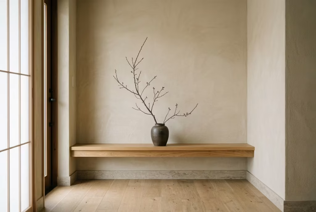
In Japanese-inspired entryways, decoration is never treated as a filling mechanism for empty space. It is not about scattering objects until a surface feels “complete” or visually busy. Instead, every decorative gesture is deliberate, almost restrained to the point where it feels carefully considered rather than casually placed. The idea is not to decorate the space, but to punctuate it, like placing well-timed pauses within a quiet conversation.
Many entryways in modern homes tend to accumulate décor in an attempt to add personality. A vase here, a framed print there, a decorative bowl on a console, all layered in the hope of creating warmth. Yet when too many visual moments compete at once, the result can feel fragmented rather than cohesive. The eye moves from object to object without ever settling, and the space begins to lose its sense of calm continuity.
Japanese entryways take the opposite path. They reduce the number of decorative moments and increase their meaning. What remains is not more decoration, but more intention.
I have often observed in real projects that the most memorable entryways are not the most decorated ones. They are the ones where a single object feels almost inevitable in its placement, as if the space itself called for it rather than having it added afterward. That restraint is what gives the composition its quiet strength.
One Branch Arrangement Creates Presence Through Absence
A single branch arrangement is one of the most iconic expressions of restraint in Japanese-inspired entryways. At first glance, it may seem almost too simple, even unfinished compared to more traditional decorative approaches. Yet its power lies precisely in that simplicity.
By isolating a single natural element, the space gains focus. The eye is not distracted by competing forms or colours. Instead, it is drawn into the subtle movement, shape, and imperfection of the branch itself. It becomes a moment of pause within the architecture.
Placed in an entryway, often within a narrow ceramic vessel or understated container, a branch arrangement introduces a living presence without overwhelming the space. It changes with time, season, and light, making it feel less like a static decoration and more like a quiet participant in the room.
I have worked on homes where removing multiple decorative items and replacing them with just one carefully chosen branch completely shifted the emotional tone of the entryway. The space felt less cluttered, but more meaningful at the same time. There was suddenly room for the eye to rest. That is the paradox of intentional minimalism. Less presence often creates more impact.
Ceramic Vessels Anchor Stillness Without Demanding Attention
Ceramic vessels in Japanese-inspired entryways are never chosen simply for decoration. They function as grounding objects, supporting the space without trying to dominate it. Their role is subtle but important, acting as quiet anchors for the few intentional decorative moments that are allowed to exist.
The appeal of ceramic lies in its imperfection and tactility. Slight variations in glaze, texture, and form prevent it from feeling overly polished or artificial. Instead, it carries a sense of craft that aligns naturally with the restrained character of the entryway.
Placed on a bench, recessed shelf, or narrow ledge, a ceramic vessel does not compete for attention. It supports whatever it holds, whether a branch, a single flower, or even empty space. In some cases, the vessel itself is enough, requiring no additional content to feel complete.
In one project, I deliberately left a ceramic vessel empty in a newly designed entryway. The client initially questioned whether it was unfinished. Over time, they came to appreciate its quiet presence more than any filled arrangement.
It became a reminder that not every object needs to be constantly “activated” to have value. Sometimes, stillness is the statement. Seasonal Décor Restraint Keeps the Space Emotionally Balanced
Seasonal décor in Japanese entryways is handled with a level of restraint that prevents the space from becoming visually overstimulated. Rather than layering multiple seasonal items at once, the design allows for a single, carefully chosen gesture that reflects the time of year without overwhelming the composition.
This might be a change in branch type, a subtle shift in ceramic tone, or a single textile accent placed with intention. The key is that seasonal change is present, but never excessive.
This approach keeps the entryway emotionally balanced. The space evolves gently throughout the year without ever feeling like it has been redecorated in a dramatic or disruptive way. The transition is soft, almost like a whisper rather than a statement.
I have seen homes where seasonal décor was previously introduced in a more traditional, layered way, resulting in visual fatigue as each season changed. Once a more restrained approach was adopted, the entryway began to feel more stable and less visually reactive.
The space no longer shifted dramatically with each change in décor. Instead, it evolved in a controlled, almost seamless rhythm. That is the real strength of intentional decoration.
It does not demand attention. It earns it quietly, through precision, restraint, and a deep understanding of when to stop.
Doors and Thresholds Help Hide Disorder
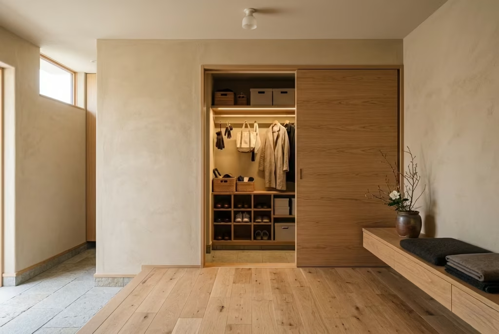
In Japanese-inspired entryways, doors are never treated as simple separators between inside and outside. They are active design tools that manage what is revealed, what is softened, and what is gently concealed from view.
In many homes, clutter is not always the result of lack of storage. It is often the result of constant visibility. When everything is always on display, even small levels of everyday disorder can begin to feel overwhelming. Japanese entryways understand this very well.
Instead of exposing every corner of the home from the moment you step inside, they use doors and thresholds to carefully stage what is seen and when it is seen. This creates a layered experience where disorder, if it exists, is quietly absorbed behind transitions rather than immediately revealed at eye level.
The result is a space that feels consistently composed, even during the most ordinary moments of daily life.
I have often found in real projects that when transitional elements are introduced properly, clients describe their homes as feeling “instantly tidier” without actually changing their storage habits. That perception shift alone can be transformative.
Because sometimes, the difference between feeling cluttered and feeling calm is simply what you are allowed to see at once.
Sliding Doors Create Fluid Boundaries That Control Visibility
Sliding doors are a cornerstone of Japanese-inspired entryway design because they offer a flexible way to manage visibility without interrupting flow.
Unlike hinged doors that swing into space and demand clearance, sliding systems move along a controlled plane, allowing areas to be revealed or concealed with minimal disruption. This controlled reveal is essential in managing visual order.
A cluttered zone does not need to be eliminated entirely if it can simply be hidden when not in use. Sliding doors make this possible by acting like gentle curtains over functional areas, whether that is shoe storage, coat recesses, or utility zones. The psychological effect is significant.
When storage disappears behind a smooth surface, the entryway immediately feels more composed. The eye is no longer drawn into the details of everyday mess. Instead, it reads the space as a continuous, uninterrupted composition.
I have worked on narrow entry corridors where visible storage created constant visual tension. After introducing sliding door systems to conceal these zones, the entire space felt calmer without reducing functionality in any way. The difference was not structural, but perceptual.
That is the quiet power of controlled visibility. It allows life to continue without forcing it into constant display.
Pocket Doors Make Disorder Disappear Into the Architecture
Pocket doors take the idea of concealment one step further by allowing entire sections of storage or utility space to vanish completely into the architecture. Instead of sliding across a visible track, the door disappears into the wall cavity, leaving no visual trace when open.
This creates a remarkably clean visual field in entryways, where even small interruptions can feel amplified due to the limited space and high level of daily activity.
When pocket doors are used thoughtfully, they allow disorder to exist without being constantly present. Shoes, bags, cleaning tools, or seasonal items can be tucked away instantly, restoring visual calm within seconds. The benefit is not just aesthetic. It is behavioural.
Knowing that clutter can be hidden quickly encourages more consistent tidiness, not through effort, but through ease of resolution.
I recall a compact apartment entryway where the lack of concealment meant that even minor messes remained visible throughout the day. Once pocket doors were introduced to enclose the storage zone, the entire rhythm of the space changed. It no longer felt like everything was always slightly out of place. Instead, it could be reset instantly with a simple gesture.
That sense of control, even in small doses, has a profound impact on how a space is experienced.
Layered Transitions Reduce the Impact of Everyday Mess
Layered transitions are one of the most subtle yet effective strategies in Japanese-inspired entryways. Instead of moving directly from exterior to interior in a single step, the space is designed with gradual shifts that soften the arrival experience and reduce the visual impact of any disorder that may exist.
This might include a change in flooring material, a slight level shift, a recessed entry zone, or a secondary door that separates the immediate threshold from the main living area. Each layer acts as a buffer, absorbing visual noise before it reaches the core of the home.
The effect is similar to a controlled filter. Even if there is minor clutter near the entrance, it does not immediately dominate the entire interior experience because it is contained within a defined transition zone. The rest of the home remains visually protected.
I have seen this approach work particularly well in family homes, where entryways are naturally more active and harder to keep perfectly tidy at all times. Instead of fighting against that reality, layered transitions allow the space to accommodate it without compromise.
In one renovation, we introduced a small intermediate zone between the front door and the main hallway, defined by a subtle flooring change and partial screening. The result was immediate. The home no longer felt like it opened directly into potential clutter. Instead, there was a moment of separation that preserved calm deeper inside. That is the essence of layered design thinking.
It does not eliminate disorder entirely. It simply ensures that disorder never gets the chance to define the entire space.
Sound Absorption Is Quietly Considered
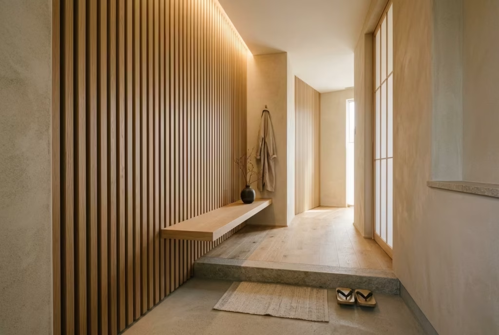
In Japanese-inspired entryways, silence is never an accident. It is carefully designed, almost composed like an invisible layer within the architecture. While most people focus on what a space looks like upon entry, what often defines its emotional character just as strongly is what it sounds like.
Hard surfaces, sharp reflections, and echo-prone materials can make even a beautifully designed entryway feel slightly tense, like every movement is being amplified without restraint. Japanese entryways approach this differently.
Instead of allowing sound to bounce freely and create unnecessary sharpness, they introduce subtle acoustic softness through materials that gently absorb and diffuse noise. The result is a space that feels calmer not just visually, but physically, as if the environment itself is exhaling when you walk in.
This is not about creating silence in a literal sense. It is about removing harshness from everyday sound so the entryway feels more forgiving, more grounded, and more comfortable to move through.
I have often noticed in real residential projects that once acoustic balance is introduced into an entry space, clients describe it as feeling “softer” or “quieter,” even when the level of actual noise has not significantly changed.
That perception shift is powerful, because it influences how the entire home is experienced from the moment of arrival. When sound becomes gentle, the space feels gentle too.
Timber Slats Soften Echo Without Disrupting Visual Calm
Timber slats are one of the most elegant ways to introduce acoustic control into Japanese-inspired entryways. They are not only visually refined, but also functionally effective in breaking up sound reflections that typically occur in narrow or hard-finished spaces.
Unlike flat, reflective surfaces that bounce sound back into the room, slatted timber allows sound waves to disperse gradually. The gaps between each slat act as micro-breaks in the surface, reducing echo and softening the overall acoustic environment. What makes this particularly effective in entryways is that it happens almost invisibly.
To the eye, timber slats read as a calm, architectural texture. To the ear, they quietly reduce sharpness and resonance. The space feels more composed without announcing that any acoustic intervention has taken place.
I have worked on entry corridors where hard plaster walls and tiled flooring created a slightly echo-heavy environment, especially during busy mornings. After introducing timber slatted panels along one side, the change was immediately noticeable. Footsteps felt less sharp, voices carried less tension, and the space as a whole felt more settled.
It is a reminder that not all improvements need to be seen to be felt. Some of the most effective design decisions operate in the background, shaping experience without demanding attention.
Textiles Introduce Warmth and Subtle Sound Dampening
Textiles play a crucial role in softening the acoustic character of Japanese-inspired entryways. Unlike rigid materials, fabric naturally absorbs sound, reducing reflections and adding a sense of warmth that balances harder architectural elements.
In entry spaces, this might appear in the form of woven mats, fabric-lined storage interiors, or subtle textile panels integrated into seating areas. Even small textile additions can have a noticeable effect on how sound behaves in a compact space.
Beyond their functional role, textiles also contribute to emotional comfort. They introduce a tactile softness that contrasts with harder surfaces like stone, timber, or plaster, creating a more layered sensory experience.
When used with restraint, textiles do not overwhelm the space visually. Instead, they act like quiet absorbers of both sound and visual tension.
I recall a project where a simple woven bench cushion and a small textile runner in the entryway dramatically changed the acoustic feel of the space. The home previously had a slightly sharp, echo-prone entrance due to polished flooring and minimal soft materials. Once textiles were introduced, the space immediately felt more welcoming, almost as if it had lowered its voice.
That is often how textile interventions work in design. They do not shout for attention. They simply soften everything around them.
Acoustic Softness Shapes Emotional Comfort at Entry
Acoustic softness is perhaps the most understated yet emotionally influential aspect of Japanese entryway design. It is not about eliminating sound, but about shaping how sound behaves so that it feels natural rather than harsh or disruptive.
In practical terms, this is achieved through a careful balance of materials that absorb, diffuse, and gently reflect sound. Timber, textiles, matte finishes, and layered surfaces all contribute to this acoustic equilibrium.
The impact on daily experience is subtle but meaningful. A softly absorbing entryway feels less abrupt when you enter. Footsteps are quieter. Doors close without sharp resonance. Even the act of placing items down feels calmer. This creates an emotional buffer between the outside world and the interior home environment.
I have seen this effect clearly in homes where entryways were redesigned with acoustic sensitivity in mind. Clients often could not initially identify what had changed, but they consistently described the space as feeling “more peaceful” or “less stressful” upon arrival.
In one renovation, a narrow entrance with multiple hard surfaces was reworked using a combination of textured plaster, timber detailing, and discreet textile elements. The transformation was not visually dramatic, but the emotional difference was immediate.
The space no longer felt like a loud transition point. It felt like a gentle arrival zone. That is the real strength of acoustic design in Japanese-inspired entryways.
It does not simply change how a space looks or sounds. It changes how it feels to step into it, which is often the first and most lasting impression a home can offer.
Clutter Is Prevented Through Behavioural Design
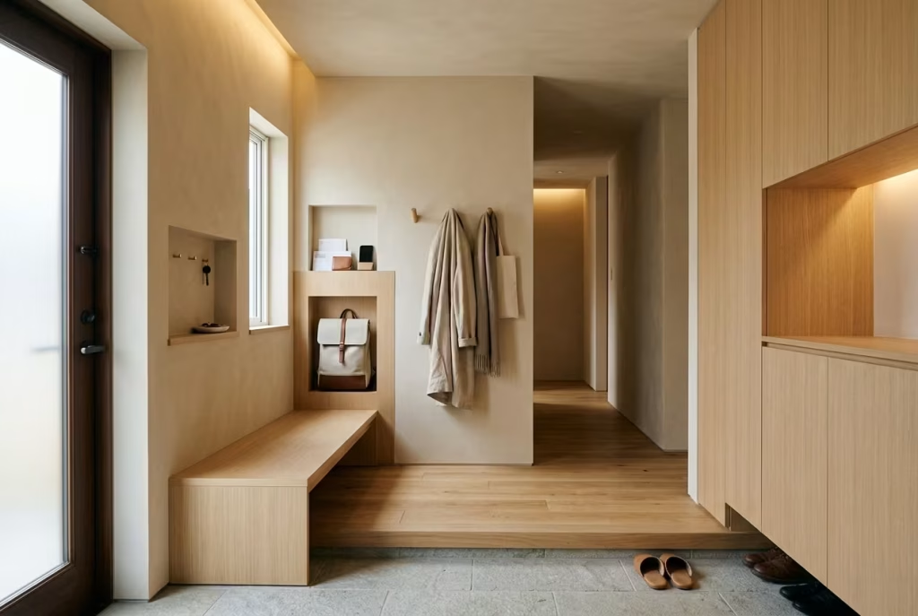
In Japanese-inspired entryways, clutter control is rarely treated as a matter of discipline or constant tidying. Instead, it is approached as a question of behaviour. The space is designed in such a way that disorder has very little opportunity to form in the first place. Rather than relying on reminders, rules, or effortful maintenance, the architecture itself quietly shapes how people act the moment they step inside.
This is where behavioural design becomes more powerful than storage capacity or decorative restraint.
A well-designed entryway does not just hold things. It guides actions. It reduces hesitation. It makes the right behaviour feel like the easiest option without forcing it. Over time, these subtle design cues shape habits that feel almost automatic, like second nature.
I have seen this repeatedly in real residential projects. The most consistently organised entryways are not the ones with the most storage or the strictest rules. They are the ones where behaviour flows naturally, almost without resistance. When design aligns with instinct, clutter loses its foothold.
Friction-Free Routines Stop Clutter Before It Starts
Friction-free routines are at the heart of behavioural design in Japanese-inspired entryways. The idea is simple but highly effective: if a task is easy to complete in a specific place, it is far more likely to be done consistently and correctly.
In entry spaces, this means removing any unnecessary steps between arrival and action. Shoes should have a clear place. Keys should land in a predictable zone. Bags should not require searching for a resting point. Every action should feel smooth, immediate, and intuitive. When friction is removed, clutter has fewer chances to accumulate.
If there is no clear place to drop something, it gets left somewhere random. If storage is inconvenient or slightly out of reach, items tend to remain in circulation rather than being put away properly. These small inefficiencies compound over time, eventually turning into visible disorder.
In one renovation project, I worked on a family home where entryway clutter was a recurring frustration despite regular cleaning efforts. The issue was not lack of storage, but friction in daily routines.
Once we repositioned hooks, introduced a clearly defined shoe zone, and simplified storage access, the behaviour shifted almost immediately. There were no reminders. No instructions. Just a smoother path for action. And that is often enough.
Habit Shaping Through Layout Turns Design Into Silent Guidance
Layout plays a far more influential role in habit formation than most people realise. In Japanese-inspired entryways, the arrangement of elements is carefully considered to guide behaviour without overt instruction. The space itself becomes a quiet teacher, shaping how people move and interact within it.
When a layout is intuitive, habits form naturally. When it is confusing or inconsistent, even simple tasks become fragmented, leading to small pockets of disorder throughout the day.
For example, placing a bench directly aligned with the shoe removal zone encourages sitting rather than standing awkwardly while changing footwear. Positioning storage at natural hand height encourages immediate placement rather than temporary drop zones. Aligning key storage near the point of entry ensures items are deposited consistently rather than carried deeper into the home.
These decisions might seem minor individually, but together they create a behavioural rhythm that supports order without effort.
I have often observed in real projects that once layout clarity is achieved, the need for verbal reminders within households decreases significantly. The space itself becomes the reminder.
One client described it perfectly after a redesign: “We stopped having to think about tidying the entryway. It just started happening on its own.”
That is the quiet success of habit-driven layout design. It removes the need for constant correction by making the correct action the easiest one available.
Real-Life Insight Shows That Behaviour Matters More Than Size
One of the most consistent findings in residential design is that entryway success is not determined by size, but by behaviour. Larger entryways can still become cluttered if routines are unclear or poorly supported. Smaller entryways, on the other hand, can remain remarkably organised if behaviour is naturally guided through thoughtful design.
I have worked on both types of spaces. In some large homes, entryways were constantly filled with scattered items despite having ample storage. In contrast, I have seen compact apartments where entry areas remained consistently tidy, not because of effort, but because the layout supported clear and repeatable actions. The difference was never about square footage. It was about behavioural alignment.
In one particular family home, the entryway was relatively modest in size, yet it functioned with surprising ease. Shoes had a dedicated landing zone. Storage was placed exactly where items were naturally dropped.
Movement through the space followed a clear and almost effortless sequence. There was no need for constant tidying because clutter never had a chance to establish itself.
The family later commented that the space felt “self-managing,” which is often the highest compliment a behavioural design can receive. That is the real lesson here.
When an entryway is designed with behaviour in mind, it stops relying on memory, discipline, or effort. Instead, it quietly supports the daily rhythms of life, ensuring that order is not something constantly maintained, but something that naturally emerges as part of how the space is used.
Japanese Entryways Respect Scale
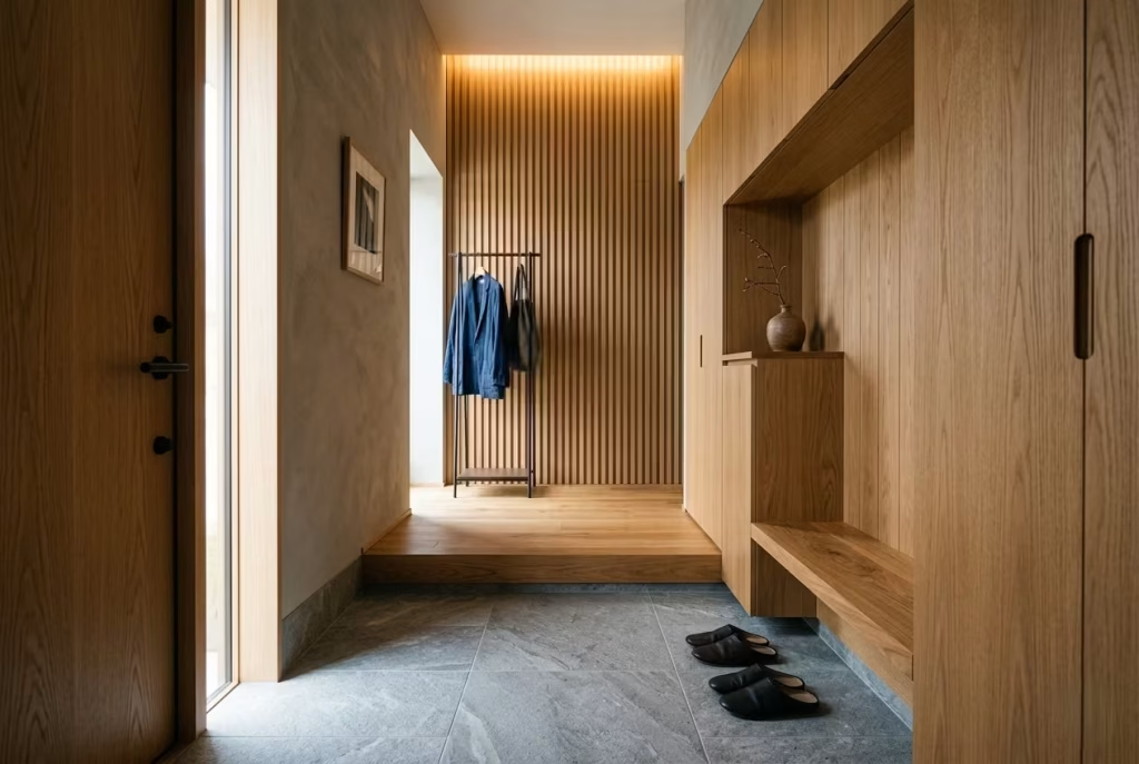
Scale is one of those design principles that often works quietly in the background, yet it has a profound influence on how an entryway feels the moment you step inside. In Japanese-inspired design, scale is never treated as an afterthought or a purely technical decision.
It is carefully tuned to the human body, the rhythm of movement, and the emotional experience of arrival. When scale is correct, the space feels effortless. When it is off, even slightly, everything begins to feel awkward without an obvious reason.
Many entryways in contemporary homes suffer from a disconnect between size and experience. Either they feel too empty and undefined, or too crowded and visually compressed. Japanese design avoids both extremes by focusing on proportion rather than volume, ensuring that every dimension feels intentional and human-centred.
There is a quiet discipline to this approach. Nothing is oversized for effect, and nothing is undersized for minimalism’s sake. Instead, the space is carefully calibrated so that the body feels naturally supported as it moves through it.
I have often found in real projects that when scale is corrected in an entryway, everything else begins to fall into place more easily. The space stops feeling like it is working against the user and starts feeling like it is working with them. That alignment is where comfort truly begins.
Human-Centred Dimensions Create Immediate Comfort
At the heart of Japanese entryway design is a deep respect for human-centred dimensions. Every surface, height, and clearance is considered in relation to how a person actually moves, pauses, and interacts within the space. The goal is not to impress with scale, but to ensure that nothing feels strained or exaggerated in daily use.
For example, seating heights are typically kept within a comfortable range of 40 to 45 cm, approximately 16 to 18 inches, allowing the body to settle naturally without effort. Circulation paths are maintained at widths that support easy movement without feeling overly expansive or unnecessarily tight. Storage is positioned where the hand naturally reaches rather than where it visually balances a composition.
These decisions may appear subtle, but they have a cumulative effect on how the entryway is experienced. When dimensions align with natural movement, the space feels immediately more comfortable, almost as if it has been designed around the body rather than imposed upon it.
I have seen this play out clearly in renovation projects where poorly scaled entryways created a constant sense of unease, even when the design itself was visually appealing.
Once human-centred proportions were introduced, the difference was immediate. Movement became smoother, pauses felt more natural, and the space stopped feeling like something to navigate carefully. It simply felt right.
Ceiling Proportions Shape Emotional Perception of Space
Ceiling height is often underestimated in entryway design, yet it plays a critical role in how scale is perceived. In Japanese-inspired interiors, ceiling proportions are carefully considered to ensure that the space feels balanced rather than overwhelming or compressed.
A ceiling that is too low can create a sense of pressure, especially in narrow entry corridors. On the other hand, excessively high ceilings without visual grounding can make the space feel disconnected or slightly unfinished. The key lies in proportion, not extremes.
Japanese design often achieves this balance through subtle techniques such as vertical rhythm, material continuity, and controlled lighting. These elements help guide the eye upward without creating a sense of emptiness or disorientation.
In practical terms, even modest ceiling heights can feel generous when paired with the right design strategies. Vertical storage, elongated lighting fixtures, or continuous wall finishes can all help reinforce a sense of height without physically altering the structure.
I once worked on a compact entryway where the ceiling height was relatively low, creating an initial feeling of constraint. Instead of attempting structural changes, we focused on proportion through material continuity and vertical detailing. The result was a space that felt noticeably taller and more balanced without any physical expansion.
That is the subtle intelligence of proportional design. It does not change the structure. It changes perception.
Compact Elegance Turns Limitations Into Design Strength
Compact entryways are often seen as challenging, but Japanese-inspired design treats them as opportunities for refinement rather than compromise. Scale, in this context, is not about making small spaces appear larger, but about making them feel complete without excess.
Compact elegance is achieved through careful editing. Every element must justify its presence. There is no room for unnecessary volume, oversized furniture, or decorative redundancy. Instead, each component is scaled precisely to serve both function and spatial harmony.
This approach creates a sense of clarity that is often missing in larger, more loosely designed spaces. The entryway feels composed, controlled, and intentional, even when the footprint is minimal.
I have seen compact entryways outperform larger ones in terms of usability and comfort simply because their scale was better resolved. One particular apartment entry, despite being very narrow, felt exceptionally well balanced because every element was proportioned with precision.
Nothing felt oversized. Nothing felt underwhelming. Everything fit, not just physically, but visually and emotionally. That is the essence of compact elegance.
It does not rely on size to create impact. It relies on proportion, restraint, and a deep understanding of how scale shapes human experience.
Calm Is Designed Into the Experience From the First Step
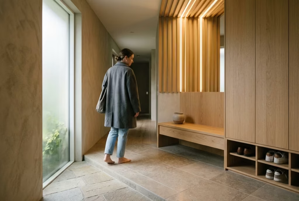
In Japanese-inspired entryways, calm is never something that appears accidentally at the end of a design process. It is not a decorative outcome or a mood that happens if everything else goes right.
Instead, it is deliberately built into the very first step of arrival. The moment the foot crosses the threshold, the space begins to shape how a person feels, moves, and settles into the home. This is not decoration at work. It is emotional design, carefully composed and quietly persuasive.
Many entryways in modern homes focus heavily on storage, finishes, and visual impact, yet overlook the emotional sequence of arrival. The result is a space that may look well designed in photographs but feels slightly unsettled in real life.
There is no clear transition, no moment of pause, no sense of grounding before entering the rest of the home. Japanese entryways correct this by treating arrival as an experience, not a moment.
Everything is designed to guide the body and mind into a calmer state, almost without awareness. From lighting to layout to material transitions, each detail plays a role in lowering the emotional tempo of the space.
I have often seen in real residential projects that the most successful entryways are not the most visually complex. They are the ones where people visibly slow down the moment they step inside, even if only for a few seconds. That pause is not accidental. It is designed. And in that pause, the home begins its conversation.
Emotional Pacing Shapes How the Home Is Felt, Not Just Seen
Emotional pacing refers to the subtle rhythm a space creates as someone moves through it. In Japanese-inspired entryways, this pacing is carefully controlled so that arrival does not feel abrupt or fragmented, but instead unfolds gently, almost like a quiet introduction.
Rather than stepping directly from exterior chaos into interior activity, the space slows the transition. This might happen through a change in flooring texture, a shift in lighting warmth, or the introduction of a small threshold zone that encourages a moment of pause. These cues are not dramatic, yet they are deeply effective.
When emotional pacing is handled well, the body instinctively adjusts. Movements become softer. Breathing slows slightly. The mind begins to separate from the external pace of the world outside. It is a subtle recalibration that happens without instruction.
I have worked on homes where clients described the entryway as feeling like a “deep breath” after a long day. That description is not about aesthetics. It is about pacing. The space was designed to reduce urgency, not just organise objects. When pacing is right, even the simplest entryway feels composed.
Arrival Psychology Turns Movement Into a Mental Reset
Arrival psychology explores what happens in the mind during the first moments of entering a home. It is a transition point where external thoughts, stress, and sensory input begin to shift into a more private and internal state. Japanese-inspired entryways are designed with this psychological transition in mind.
Instead of allowing the mind to continue its external momentum, the space introduces subtle interruptions that encourage mental deceleration. A designated shoe zone. A quiet seating point. A soft change in acoustics or lighting.
Each of these elements signals that a different mode of being is beginning. This is not about controlling behaviour. It is about supporting transition.
When arrival psychology is considered in design, the entryway becomes more than a passage. It becomes a reset point, a place where the mind naturally reorganises itself before moving further into the home.
I have seen this effect clearly in family homes where entryways were redesigned with psychological flow in mind. Before redesign, arrival felt rushed and fragmented. Afterward, even the same physical actions felt calmer and more deliberate. People slowed down without being told to slow down. That shift is often subtle, but it is deeply impactful over time.
Because when the mind is allowed to reset at the threshold, the rest of the home is experienced with far more clarity.
The Relationship Between Order and Wellbeing Begins at the Threshold
Order in Japanese entryways is not just a visual preference. It is closely tied to emotional wellbeing. The way a space is organised at the point of arrival influences how settled, grounded, and at ease a person feels as they enter their home.
When an entryway is cluttered or visually chaotic, that sense of disorder is often carried inward, even if unconsciously. The home feels less like a place of rest and more like an extension of external busyness.
Conversely, when the entryway is calm, structured, and intentionally composed, it signals a shift into a more restful environment. This connection between order and wellbeing is not abstract. It is experiential.
Japanese-inspired design reinforces this by ensuring that the entryway always presents a sense of clarity. Surfaces are controlled. Storage is intentional. Visual noise is reduced. Nothing feels unresolved at eye level.
I have worked on projects where improving the entryway alone had a noticeable effect on how clients described their overall experience of their home. They often reported feeling more relaxed upon entering, even though no changes were made to the rest of the interior. That is because the threshold sets the tone for everything that follows.
When order begins at the door, wellbeing is no longer something that needs to be created later in the home. It is already present from the very first step inside.
The Entryway Is Treated as a Boundary, Not Just a Door
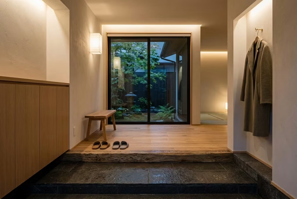
One of the most misunderstood aspects of Japanese entryway design is that the space is not viewed as a simple doorway connecting indoors and outdoors. It behaves more like a threshold in the truest sense of the word, a carefully considered pause where the rhythm of the outside world is intentionally slowed before domestic life begins.
In homes where this principle is handled well, you feel the difference almost instantly. The atmosphere softens. Movements become quieter. Even the act of arriving home feels less hurried, as though the house is gently asking you to leave the noise of the day at the door.
In many Western homes, the entrance often becomes a catch-all zone because it lacks definition. Shoes spill into circulation paths, coats gather like storm clouds on overloaded hooks, and deliveries linger underfoot until someone finally deals with them. Before long, the space begins wearing chaos like a second skin. The issue is rarely a lack of square footage alone. More often, the problem lies in the absence of psychological transition.
Japanese homes approach this differently because the entryway is designed to signal a change in behaviour. The moment you step inside, the architecture itself begins guiding you.
Emotional Transition From Outside Chaos to Interior Calm
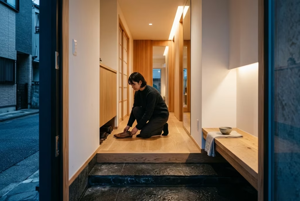
Good entryway design is not just visual. It is emotional architecture. In Japanese homes, the transition from exterior to interior is treated almost ceremonially. The entry sequence encourages people to slow down physically and mentally before entering the main living environment.
It is a subtle act, but one that carries enormous emotional weight over time. After all, home should not feel like an extension of the street outside. It should feel restorative.
I have noticed during renovation projects that homeowners often underestimate how deeply this transition shapes their relationship with the house. A chaotic entrance has a habit of following you from room to room, rather like muddy footprints carried across clean flooring. Even beautifully designed interiors struggle to compensate for a stressful arrival experience.
By contrast, when the threshold feels grounded and intentional, the entire home gains a stronger sense of order.
One project that stays with me involved a narrow townhouse where the clients initially wanted to maximise every centimetre for storage. Instead of filling the entrance with visible cabinetry, we created a restrained transitional zone using textured stone flooring below and pale oak above. The entry itself remained relatively simple, yet the emotional shift was remarkable. Visitors instinctively slowed their pace upon entering. Children stopped dropping school bags in random corners because the space itself quietly directed movement.
That is the thing about thoughtful design. When it works properly, it does not bark instructions at you. It whispers.
Why Flooring Levels Matter Psychologically
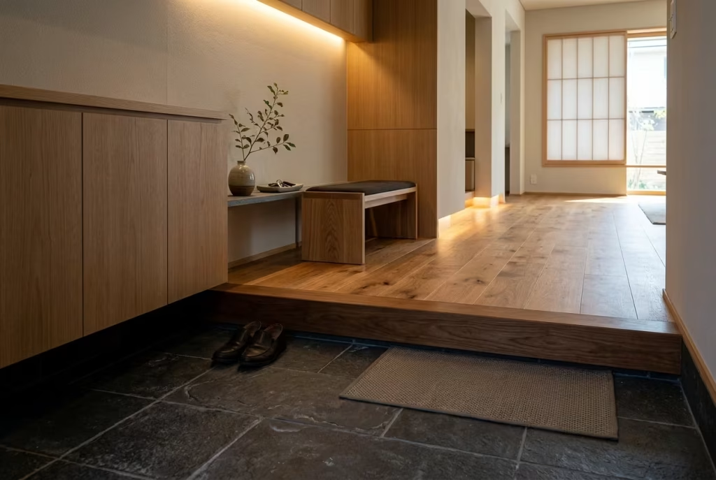
One of the defining features of a traditional Japanese genkan is the level change between the lower entrance floor and the raised interior platform. At first glance, it may seem purely functional, designed simply to contain dirt and outdoor debris. In reality, its psychological impact runs far deeper. The lowered section acts as a symbolic buffer zone between two worlds.
Stepping upward into the main home creates a subtle sense of arrival, almost like crossing an invisible line where outside stress begins losing its grip. Humans respond instinctively to spatial cues, even when they cannot fully explain why. A change in floor height, however modest, signals that the experience of the home has begun.
In modern renovations, I often adapt this principle even in homes without a traditional genkan layout. A recessed entrance area measuring approximately 90 to 120 cm deep, around 35 to 47 inches, can dramatically improve how an entryway functions.
Raising the interior platform by 15 to 20 cm, roughly 6 to 8 inches, creates visual separation while helping contain dirt, moisture, and clutter near the threshold. The beauty of this approach lies in its quiet effectiveness.
You are not relying on signs, baskets, or constant reminders telling people where things belong. The architecture itself establishes behavioural boundaries naturally.
That said, thoughtful planning is essential. In compact homes, excessive level changes can make the entrance feel cramped or awkward. Accessibility also deserves careful consideration, particularly in multigenerational households or homes intended for long-term ageing in place. In several projects,
I have softened the transition by incorporating wider step platforms, integrated seating edges, or subtle ramps concealed within the flooring composition itself. Like many things in Japanese design, restraint matters more than spectacle.
The Symbolism of Removing Shoes
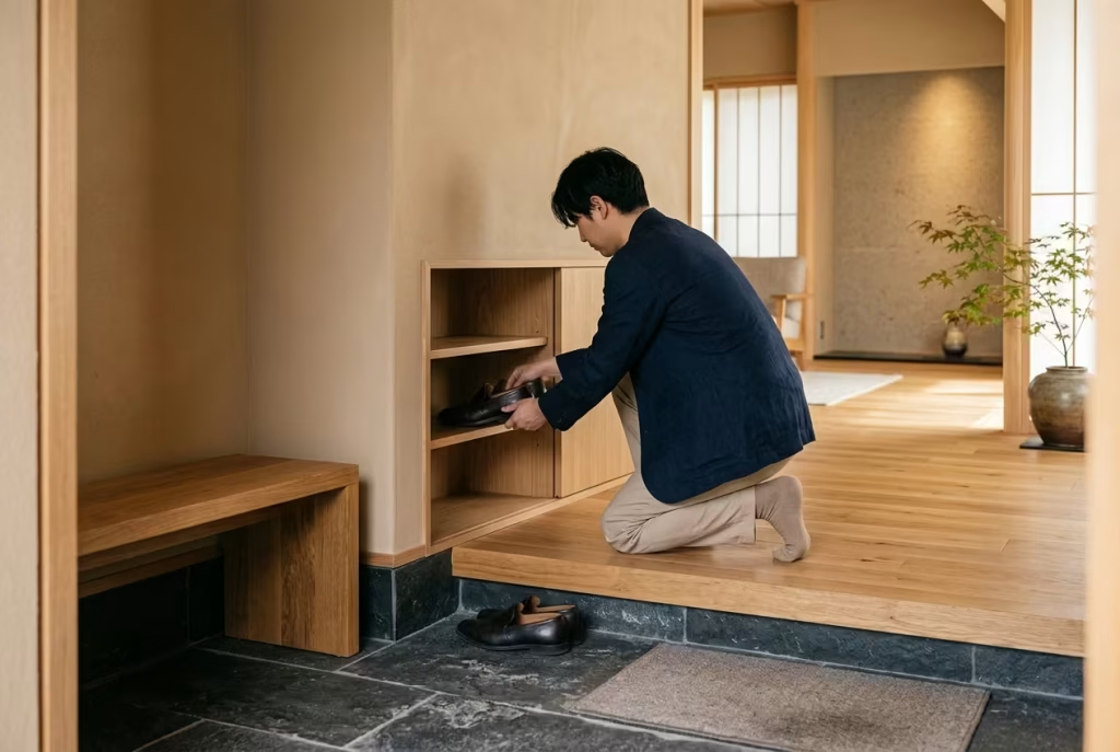
Few rituals reveal the philosophy of Japanese entryways more clearly than the removal of shoes.
In many cultures, taking off shoes is seen primarily as a matter of cleanliness. In Japanese homes, however, the gesture carries an added layer of meaning. It represents respect for the interior environment and awareness of transition. The act itself becomes a mental reset, however brief, where the concerns of the outside world are momentarily set aside.
There is something deeply grounding about this ritual when the space supports it properly.
A thoughtfully positioned bench, a recessed shoe zone, or even the tactile shift from cool stone to warm timber underfoot can transform what might otherwise feel mundane into a calming daily rhythm. Small moments like these often become the invisible glue holding a home together emotionally.
I once worked on a renovation where the clients initially resisted dedicating valuable floor area to a proper shoe transition zone. They considered it unnecessary. Six months after completion, they admitted it had become one of the most appreciated parts of the house. Not because it looked dramatic, but because it reduced friction in everyday life.
Mornings flowed more smoothly. Cleaning became easier. The entrance stopped feeling like a battlefield littered with trainers, bags, and umbrellas. Sometimes the smallest rituals quietly change the entire atmosphere of a home.
Cleanliness as Spatial Respect Rather Than Perfectionism
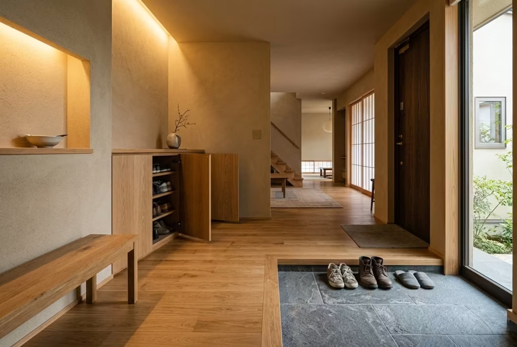
One of the biggest misconceptions surrounding Japanese interiors is the idea that they demand unrealistic perfection. In truth, the most successful Japanese-inspired homes rarely feel sterile or staged. They feel cared for. There is an important distinction.
The emphasis is not on obsessive tidiness for appearances alone. Instead, cleanliness becomes a form of spatial respect. Surfaces are kept clear because calmness requires room to breathe. Circulation remains unobstructed because movement through the home should feel effortless rather than chaotic. This mindset shifts how people interact with their surroundings.
When the entryway is designed with intention, maintaining order becomes significantly easier because the space supports good habits naturally. Recessed shoe zones prevent visual sprawl. Flush cabinetry reduces sensory clutter. Stone flooring captures dirt before it spreads deeper into the home. These are practical decisions, yes, but they also shape the emotional tone of daily living in surprisingly profound ways.
Quite often, homeowners assume they need larger houses to feel more organised. In reality, many simply need better transitions.
Practical Design Applications
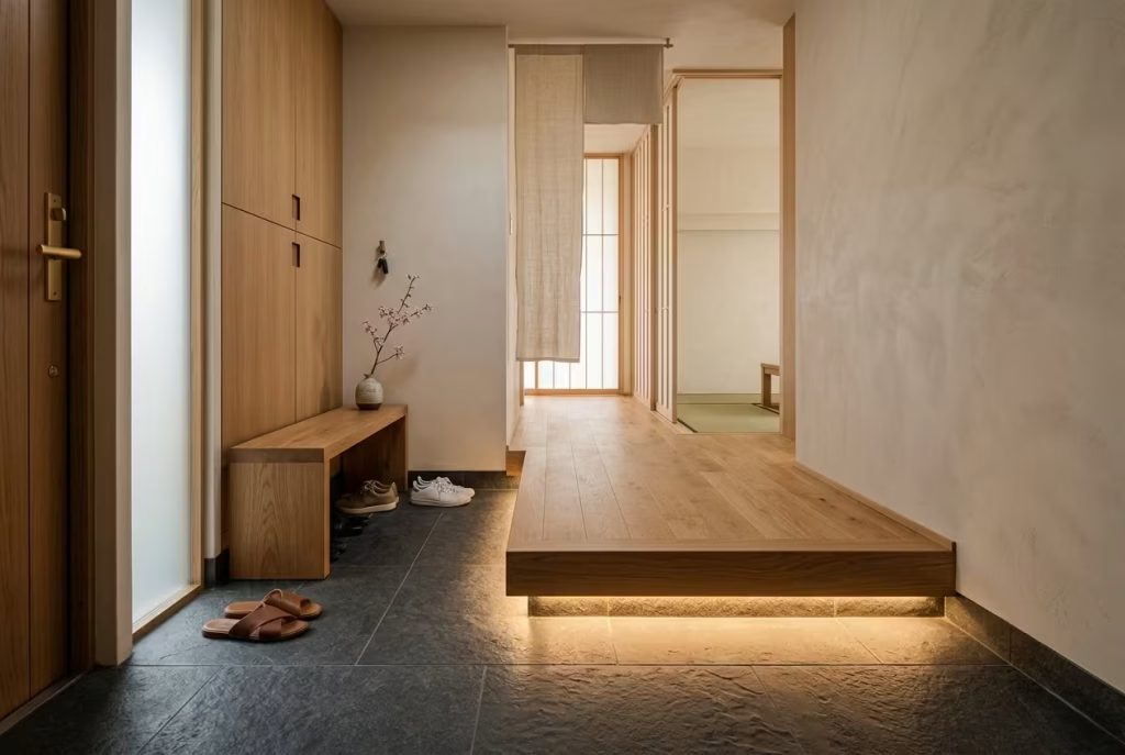
Raised platforms create a clear boundary between the outside world and the interior living environment. Even modest height changes can dramatically improve visual structure while helping contain dirt and moisture near the entrance.
In contemporary homes, I often favour transitions between 15 and 20 cm high, approximately 6 to 8 inches, paired with integrated timber edging or concealed lighting beneath floating platforms to soften the visual weight.
This approach works particularly well in:
- Narrow urban townhouses
- Japandi-inspired apartments
- Mudroom alternatives in compact homes
- Open-plan layouts lacking defined entrances
Stone-to-Wood Material Changes
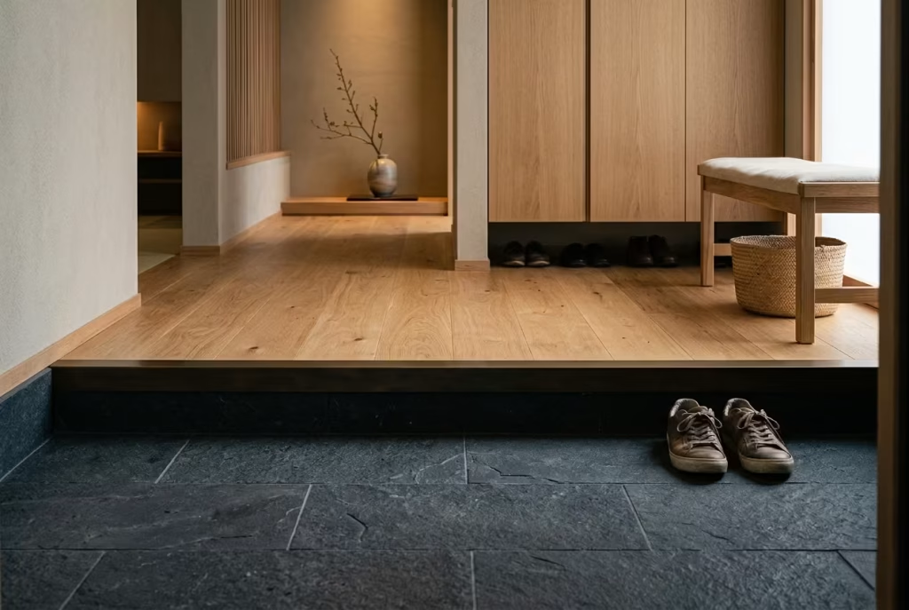
Material contrast plays an enormous role in Japanese entryways because it reinforces the psychological shift from exterior to interior.
Textured stone, porcelain, or dark slate flooring at the threshold provides durability and practicality where outdoor debris accumulates most heavily. Transitioning onto warm timber flooring beyond the raised platform immediately changes the sensory experience underfoot. That tactile difference matters more than many people realise.
In one renovation, we used charcoal-toned basalt stone at the lower entry paired with lightly brushed oak flooring above. The visual contrast was subtle yet deeply grounding. Visitors instinctively paused before stepping upward, almost without thinking about it. Good materials guide behaviour quietly.
Recessed Shoe Zones
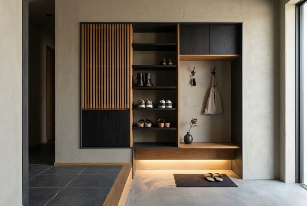
Recessed storage zones are one of the most effective ways to prevent visual clutter from taking over an entryway. Rather than allowing footwear to drift across the floor like tumbleweed, recessed niches create designated containment areas without dominating the room visually. Even a compact shoe recess approximately 20 to 35 cm deep, around 8 to 14 inches, can dramatically improve organisation.
Where possible, I prefer combining:
- Flush cabinetry
- Ventilated timber panels
- Floating shelves
- Concealed toe-kick lighting
- Matte finishes that absorb rather than reflect light
The result feels calmer because the storage integrates into the architecture itself rather than appearing added as an afterthought.
Pros of This Approach
- Defined thresholds reduce sensory overload immediately upon entering the home. The atmosphere feels more composed, even during busy seasons of life.
- Lowered entry zones help isolate moisture, dust, and debris before they spread through the house, particularly valuable in rainy climates or family homes with children and pets.
- Transitions in flooring, level, and material create a layered arrival experience that gives the home greater emotional depth and architectural clarity.
Cons to Consider
- Poorly proportioned transitions can make small entryways feel cramped if storage, circulation, and door clearances are not carefully balanced.
- Raised platforms may not suit every household. In homes designed for ageing in place or wheelchair accessibility, alternative approaches such as gradual floor transitions or level thresholds may be more appropriate while still maintaining visual separation through material changes.
You Do Not Need a Traditional Japanese Home to Use These Ideas
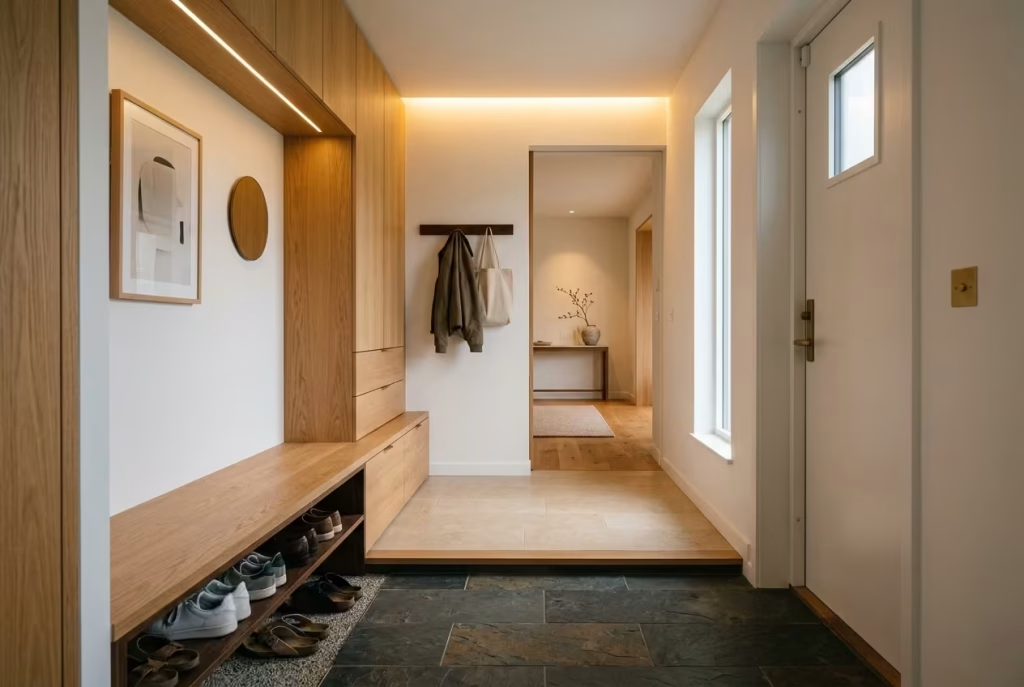
One of the most persistent misconceptions about Japanese-inspired entryway design is that it only belongs in traditional architecture or purpose-built interiors. In reality, the principles behind a calm genkan are not tied to a specific style, culture, or building type. They are rooted in behaviour, proportion, and transition, all of which can be adapted into almost any home with thoughtful editing. What matters is not replication, but translation.
Whether you are working with a compact apartment, a narrow Victorian terrace, or a modern suburban house, the underlying ideas remain surprisingly flexible. The goal is not to recreate a Japanese entryway visually, but to borrow its logic, the way it quietly shapes arrival, reduces clutter pressure, and introduces a sense of calm before the rest of the home unfolds.
I have applied these principles across a wide range of projects, from tight urban corridors to larger family homes, and the results are consistently similar. When the entryway is treated as a transition rather than leftover space, the entire home feels more composed, regardless of architectural style. Apartment Adaptations Turn Limited Space Into Structured Calm
In apartment living, entryways are often compressed into small zones with minimal architectural definition. Shoes, coats, and daily essentials tend to accumulate quickly, creating visual noise the moment the door opens. However, even in these constrained layouts, Japanese-inspired principles can be introduced with surprising effectiveness. The key is to define micro-zones within the available space.
A slim bench for transition, a vertical shoe storage unit, and a clearly defined landing area for keys can instantly introduce order without requiring structural change. Even a simple change in flooring material or a small recessed niche can signal the shift from outside to inside.
These adjustments do not require large footprints. In fact, they work best when space is limited because they bring clarity where it is most needed.
I have worked on compact city apartments where a small entry zone, no wider than a doorway and a half, was completely transformed through subtle zoning and concealed storage. The space did not become larger, but it felt significantly more controlled and easier to live with. In apartments, calm is not created through expansion. It is created through precision.
Narrow Hallway Solutions Use Flow Instead of Volume
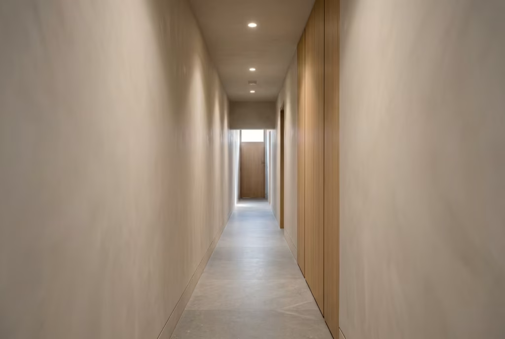
Victorian terraces and older urban homes often present a different challenge. Entryways tend to stretch into long, narrow hallways that can feel dark, repetitive, or visually heavy. In these cases, Japanese-inspired design does not try to fill the space, but instead focuses on improving flow and reducing visual interruption. One of the most effective strategies is to introduce rhythm through restraint.
This might include evenly spaced but minimal storage points, continuous material finishes, or carefully placed lighting that guides movement without overwhelming the corridor. Instead of treating the hallway as a passage to decorate, it is treated as a sequence of quiet moments that gently lead the body inward.
The use of concealed storage is particularly powerful here, as it prevents the corridor from feeling cluttered or visually compressed.
I have seen narrow hallways completely shift in character simply by reducing visual interruptions and introducing consistent material continuity from floor to wall transitions. What once felt like a tight, functional passage began to feel more like a composed approach into the home. It is not about making narrow spaces wider. It is about making them feel less mentally heavy.
Semi-Open Foyers Balance Visibility and Privacy
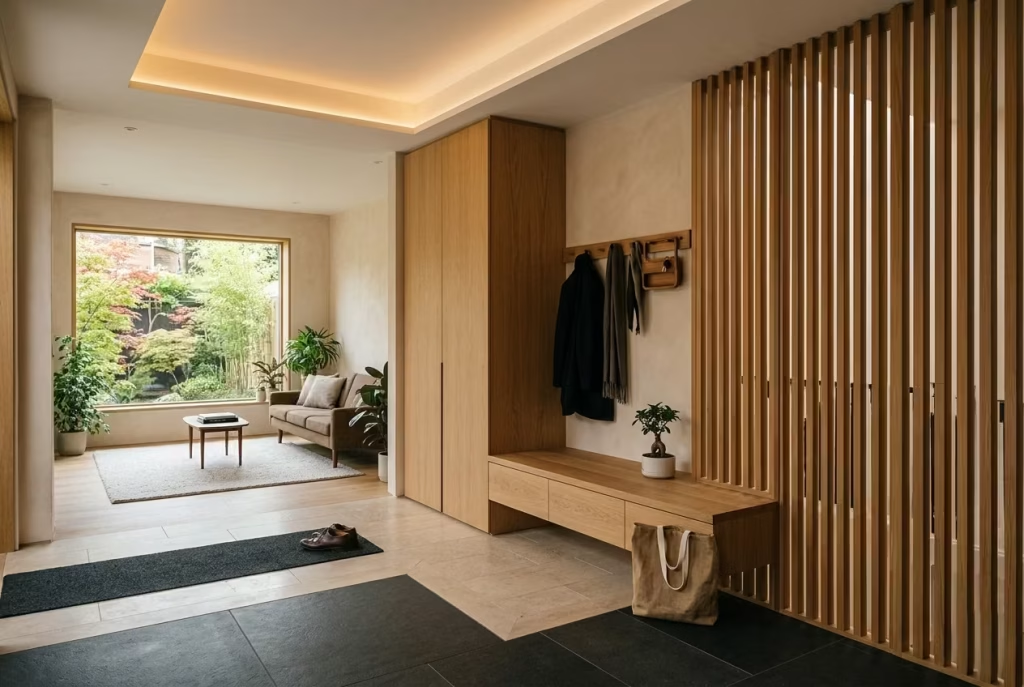
Many modern homes feature semi-open entry areas that blend directly into living spaces without a clear physical separation. While this can create a sense of openness, it also introduces the challenge of maintaining order in a space that is always partially visible. Japanese-inspired principles offer a useful framework here through controlled transitions.
Instead of fully closing off the entryway, subtle boundaries can be introduced through partial screening, changes in flooring, or shifts in ceiling detail. These elements create a psychological threshold even when physical walls are minimal.
Storage becomes especially important in these layouts. When everything is visible from multiple angles, even small amounts of clutter can feel amplified. Concealed cabinetry, integrated benches, and minimal surface exposure help maintain a sense of calm continuity.
I have worked on open-plan homes where entry clutter initially disrupted the entire living experience. Once a semi-defined foyer zone was introduced using material shifts and low-profile storage, the rest of the home immediately felt more organised without any change to the main living area. That is the advantage of controlled openness. It allows flow without sacrificing order.
Family Home Practicality Grounds Design in Daily Reality
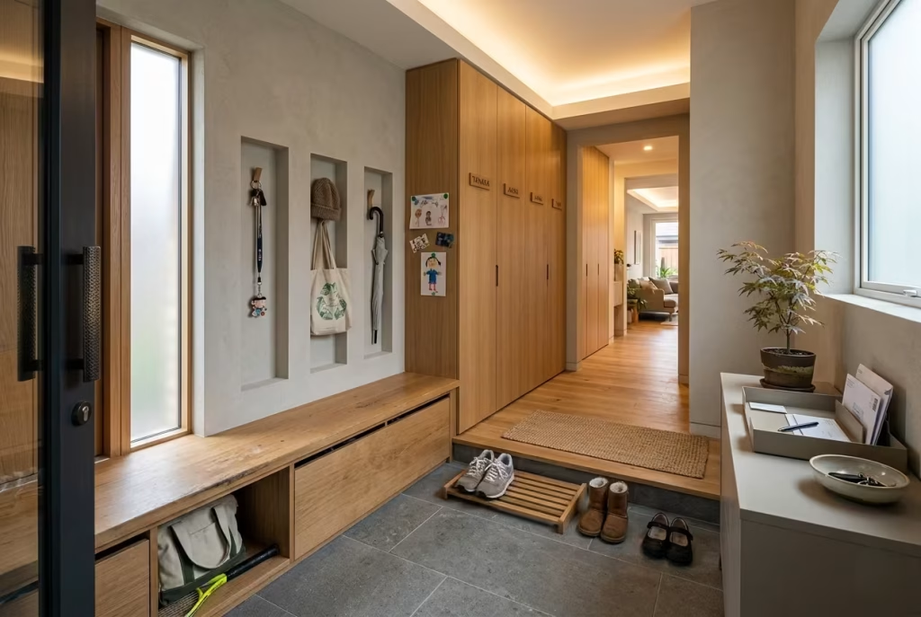
In family homes, entryways are often the most active zones in the entire house. Shoes, school bags, coats, sports equipment, and everyday items tend to cycle through the space constantly. Without clear structure, this area can quickly become visually overwhelming.
Japanese-inspired design does not ignore this reality. Instead, it embraces it by creating systems that support daily repetition without requiring constant correction.
Dedicated storage for each family member, clearly defined drop zones, and durable materials that handle frequent use all contribute to a more stable entry environment. The focus is not on maintaining perfection, but on reducing friction in everyday behaviour.
I have seen family homes completely change in atmosphere once entryway systems were aligned with actual usage patterns. Instead of constant tidying, the space began to self-regulate through design clarity.
One family I worked with described the transformation simply as “less chaos at the door.” Nothing about their lifestyle changed, but the entryway stopped fighting against it. That is the real measure of success in practical design.
Real-Life Application Shows That Style Is Not the Limitation
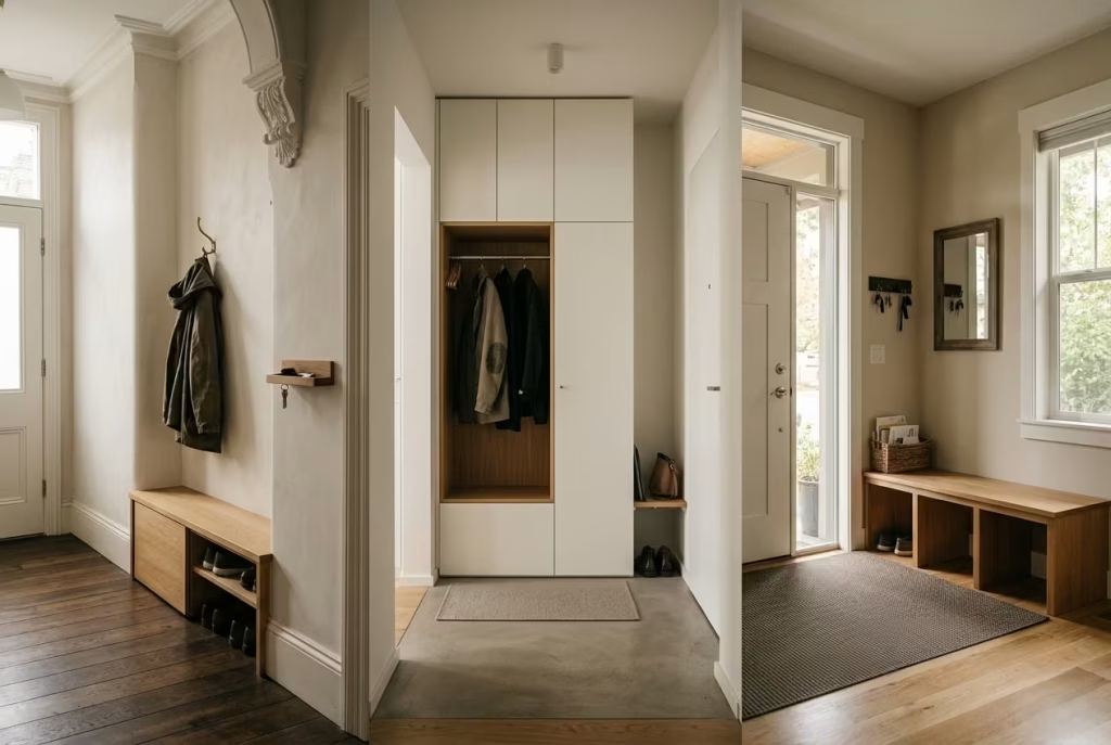
The most important takeaway is that Japanese-inspired entryway principles are not tied to a specific aesthetic. They do not require sliding doors, tatami floors, or traditional architectural references to be effective. What matters is the underlying logic of transition, clarity, and behavioural flow.
Victorian terraces, modern apartments, suburban homes, and renovated properties can all benefit from these ideas when they are adapted rather than copied.
The goal is not to create a themed space. It is to create a functional and emotionally grounded entry experience that works with the realities of everyday life.
I have applied these principles across very different architectural contexts, and the outcome is always consistent. When entryways are designed with intention rather than leftover space thinking, the entire home feels more settled. And that is where design becomes quietly transformative. Not in how it looks, but in how it allows life to move through it with less resistance and more ease.
Why Most Entryways Fail Despite Good Intentions
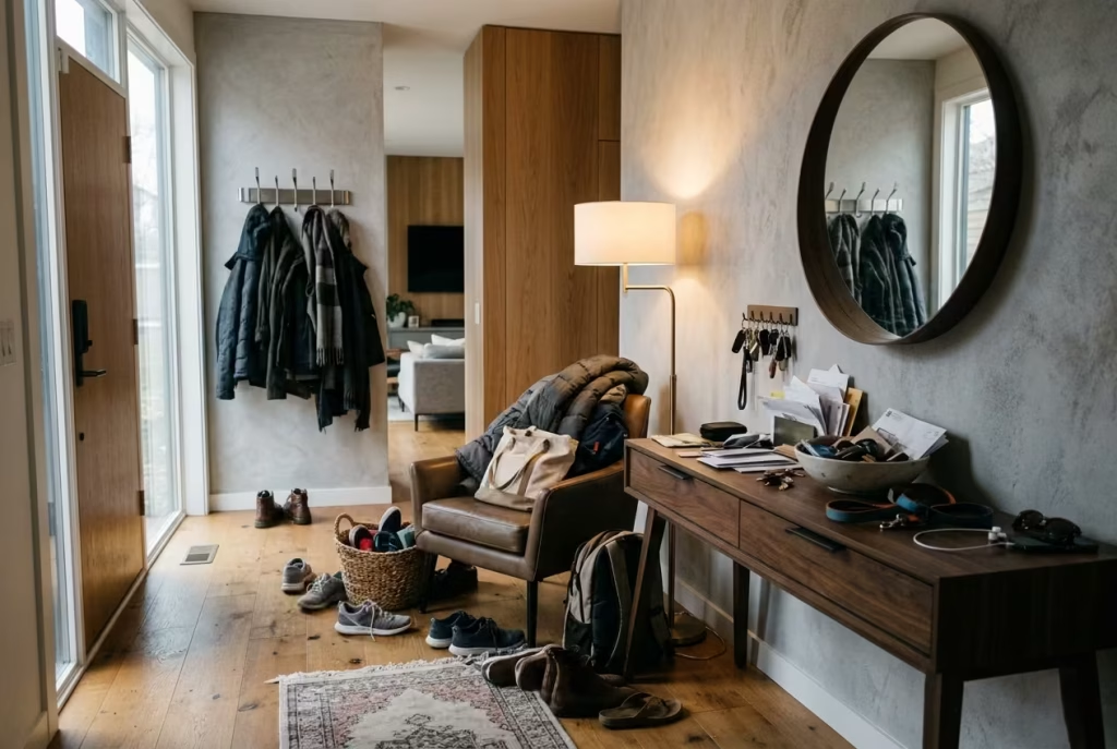
Most entryways do not fail because of a lack of care or effort. In fact, the opposite is usually true. Homeowners and designers often approach these spaces with good intentions, aiming to make them welcoming, functional, and visually appealing.
Yet somewhere between planning and daily use, the entryway begins to unravel. It becomes a place where clutter accumulates, where design intentions blur, and where the first impression of the home quietly loses its clarity.
The issue is rarely a single mistake. It is usually a combination of small misalignments that, over time, add up to visual and functional fatigue. When the entryway is not designed with behaviour, proportion, and transition in mind, even well-chosen elements can begin to work against each other.
I have seen this pattern repeatedly in real residential projects. Beautiful materials, expensive furniture, and carefully selected décor, yet the space still feels unsettled. Not because it lacks quality, but because it lacks coherence. That is where intention alone is not enough. Design needs structure to support it.
Oversized Furniture Disrupts Flow and Visual Balance
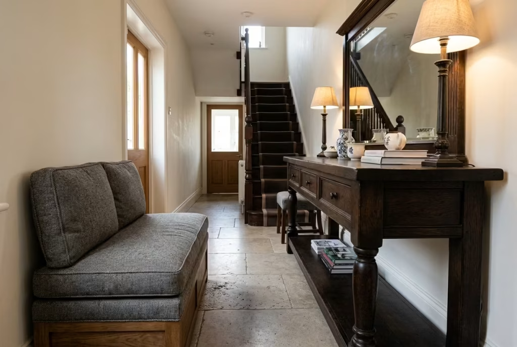
One of the most common issues in entryways is the use of furniture that is simply too large for the space it occupies. A console table that looks elegant in a showroom can quickly overwhelm a narrow corridor. A bench that appears inviting in isolation can dominate circulation when placed in a compact entry zone.
Oversized pieces create immediate visual pressure. They compress movement, interrupt flow, and reduce the sense of ease that should define an entry space. Instead of guiding the body gently inward, the furniture becomes something to navigate around. The problem is not the furniture itself, but the mismatch between scale and environment.
I have worked on homes where replacing a single oversized console with a slimmer, wall-integrated surface completely changed how the entryway felt. Suddenly, movement became smoother, and the space stopped feeling visually congested. When scale is off, even the most beautiful object can feel intrusive.
Open Coat Overload Turns Storage Into Visual Noise
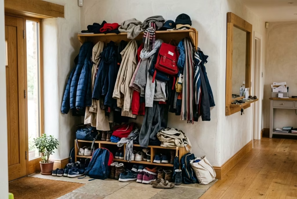
Open coat storage is often introduced with good intentions. It feels convenient, accessible, and practical for daily use. However, when overused or poorly controlled, it quickly becomes one of the biggest contributors to entryway clutter.
A row of coats, bags, and accessories constantly on display creates visual fragmentation. Instead of a calm threshold, the eye is pulled into multiple competing shapes, colours, and textures. Over time, this creates a sense of quiet chaos, even if everything is technically “organised.” The issue is not open storage itself, but lack of restraint.
Without limits, it expands naturally until it dominates the space. Seasonal items mix with everyday pieces, and the entryway begins to feel permanently busy.
In several family home projects, I have found that simply introducing concealed zones for part of the storage while limiting what remains visible has an immediate calming effect. The entryway does not lose functionality, but it regains visual order. When everything is always visible, nothing feels settled.
Cold Lighting Undermines Emotional Warmth at Entry
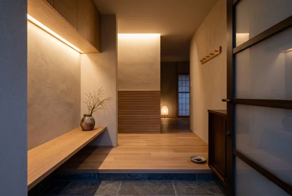
Lighting plays a far more important role in entryway design than it is often given credit for. Cold, overly bright lighting can make even a well-designed space feel harsh and unwelcoming. Instead of easing the transition into the home, it creates a sense of clinical exposure, almost as if the space is being interrogated rather than experienced.
Entryways are not task-heavy environments. They require clarity, yes, but also warmth. Without it, the emotional tone of arrival becomes flat and uninviting.
I have seen this effect clearly in homes where bright white lighting was used for practicality. While visibility was excellent, the space lacked any sense of calm. After shifting to warmer tones and introducing layered lighting, the entire mood of the entryway softened immediately. The difference was not in brightness, but in temperature and diffusion. Lighting should guide arrival, not overwhelm it.
Decorative Excess Breaks the Sense of Calm Composition
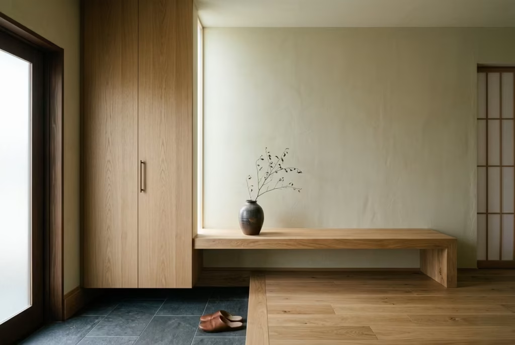
Decor is often added to entryways in an attempt to make them feel more welcoming or personalised. However, when too many decorative elements are introduced, the space begins to lose its compositional clarity.
A vase here, a framed print there, a tray, a sculpture, and suddenly the entryway becomes visually crowded. Instead of a calm introduction to the home, it turns into a collection of competing focal points. What was meant to feel inviting begins to feel overstimulating.
The issue is not decoration itself, but lack of hierarchy. Without a clear focal structure, decorative elements begin to compete rather than complement each other.
In practice, I have found that reducing decorative objects to one or two intentional moments often creates a far stronger emotional impact than layering multiple pieces. The space feels more deliberate, more composed, and far easier to read visually. Sometimes, restraint speaks louder than abundance.
Poor Flooring Transitions Break the Flow of Arrival
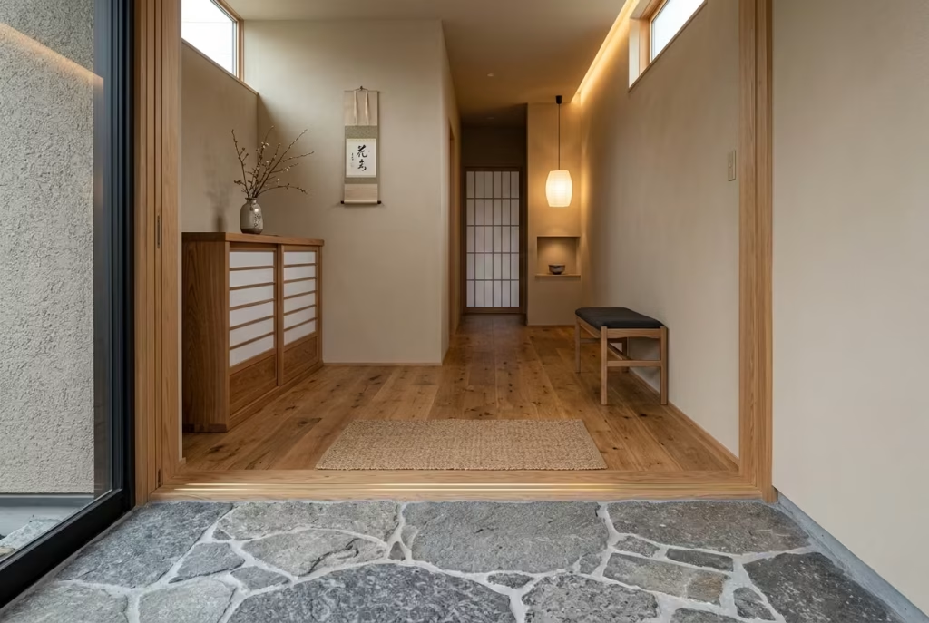
Flooring transitions are one of the most overlooked aspects of entryway design, yet they have a direct impact on how the space is experienced. When flooring changes feel abrupt, inconsistent, or poorly aligned, the entryway loses its sense of continuity.
A sudden shift in material without thoughtful transition can create a visual “jolt” at the threshold. Instead of a smooth arrival, the body experiences interruption. This breaks the natural flow that should define the entry experience.
I have worked on homes where mismatched flooring between entry and hallway created a subtle but persistent sense of imbalance. Once the transition was refined, either through material alignment or gradual shift, the space immediately felt more coherent. Good transitions do not draw attention to themselves. They disappear into the experience.
Lack of Behavioural Planning Lets Clutter Take Control

Perhaps the most fundamental issue in many entryways is the absence of behavioural planning. Spaces are often designed around appearance rather than action, which means they look good when staged but struggle to function in daily life.
Without clear behavioural cues, people default to convenience. Shoes are left wherever it is easiest. Bags are dropped at random points. Keys migrate across surfaces. Over time, these small actions accumulate into visible disorder. Japanese-inspired design addresses this by shaping behaviour through layout, not instruction.
When the space naturally guides where things should go, clutter becomes less likely to form in the first place. The entryway begins to regulate itself through design logic rather than constant effort.
I have seen this difference clearly in both compact and large homes. The most successful entryways are not those with the most storage, but those where the design quietly supports predictable, effortless behaviour.
When design and behaviour align, order stops being something you maintain. It becomes something that simply happens.
The Materials That Age Beautifully Over Time
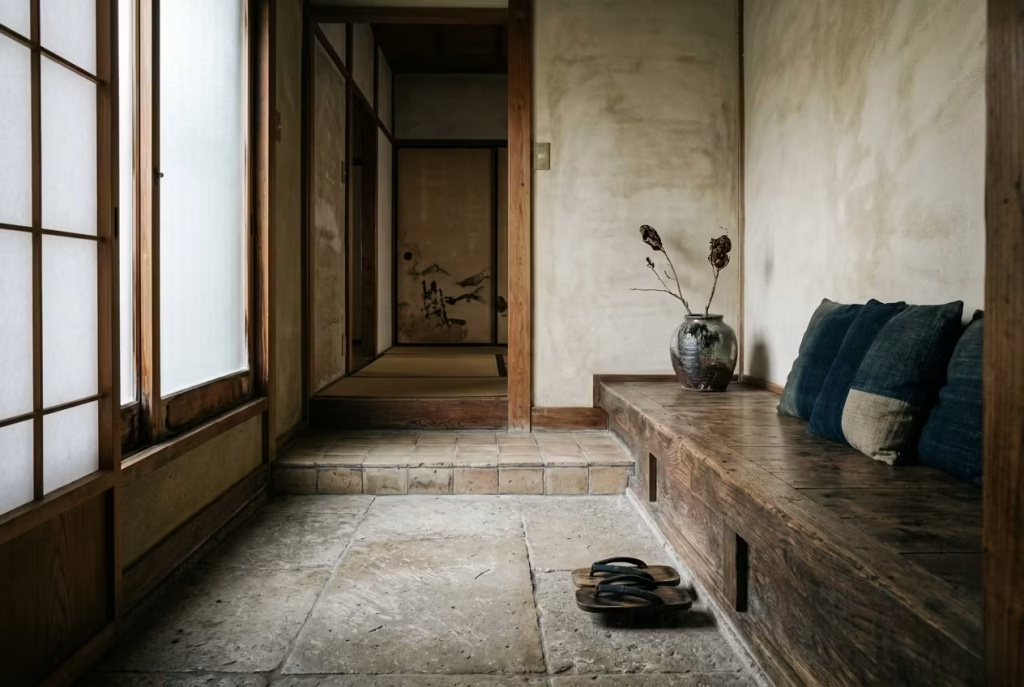
There is a quiet sophistication in materials that do not fight time but instead grow into it. In Japanese-inspired entryways, this idea is not an aesthetic preference, it is a guiding principle. Surfaces are chosen not just for how they look on installation day, but for how they behave after years of footsteps, weather shifts, and daily life passing through them.
In many modern homes, materials are expected to stay visually perfect, almost frozen in time. Yet entryways are working zones, not showrooms. They carry dirt, moisture, movement, and constant transition. When materials are too fragile or overly polished, they begin to degrade in a way that feels like damage. But when chosen well, they do the opposite. They develop character.
I have seen this difference clearly in real projects. Some entryways age into beauty, where every mark feels like part of a larger story. Others age into frustration, where wear and tear feels like something to constantly fix or hide. The difference lies in material intelligence.
Oak Brings Warm Stability That Deepens With Use
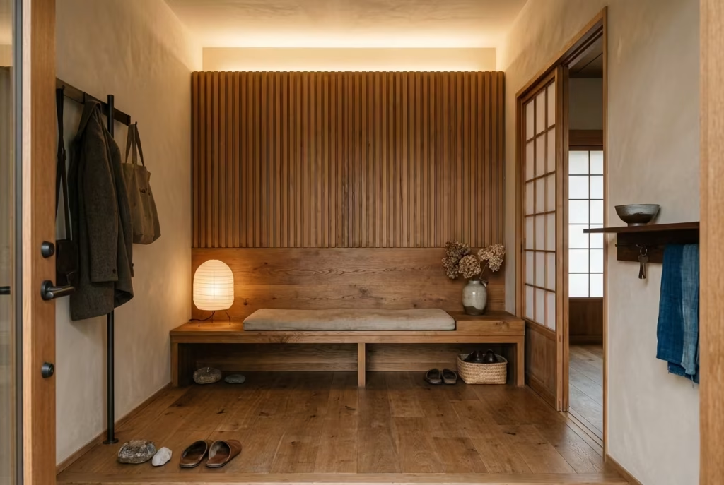
Oak is one of the most reliable materials for entryways because it balances strength with warmth. It handles daily wear well, but more importantly, it improves visually over time. The grain becomes richer, the tone deepens slightly, and minor surface changes blend into its natural texture rather than standing out.
From a durability standpoint, oak is highly stable and suitable for high traffic zones. It resists moderate impact and holds structural integrity for years when properly treated.
Maintenance is relatively straightforward. A simple cleaning routine and occasional oiling or refinishing are usually enough to preserve its quality.
In terms of ageing characteristics, oak is one of those rare materials that does not look worn when it ages. It looks lived in. That distinction is what makes it so valuable in entryways.
Cost sits in the mid to high range depending on grade and finish, but the long-term return in visual longevity often justifies the initial investment.
Walnut Adds Depth and Quiet Luxury Without Loud Expression
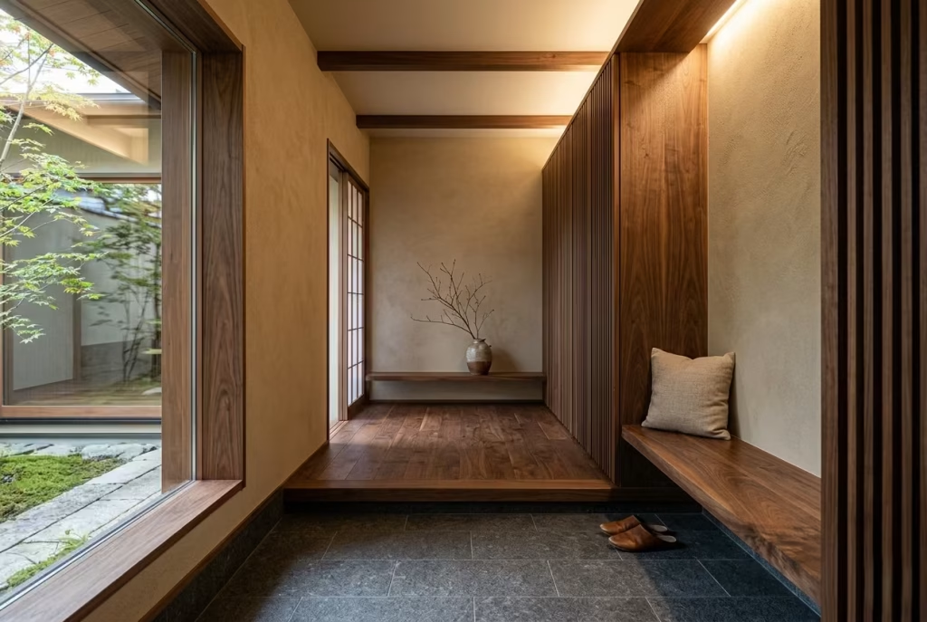
Walnut introduces a deeper tonal richness that brings subtle sophistication to entryway spaces. Its natural variation in colour and grain creates visual interest without the need for decorative excess.
In terms of durability, walnut is moderately strong but slightly softer than oak, which means it benefits from more mindful placement in high-contact zones. It performs best in areas where it is not constantly exposed to heavy abrasion.
Maintenance is simple but should be consistent. Regular dusting and occasional oiling help preserve its depth and prevent surface dulling.
The ageing process of walnut is particularly elegant. Over time, it develops a softer patina that enhances its natural darkness, making it feel more grounded rather than faded.
Cost is typically higher than oak, especially for premium cuts, but it is often chosen for its aesthetic depth rather than purely functional reasons.
In entryways, walnut does not shout for attention. It settles into the background and lets other elements breathe, like a quiet anchor holding the composition together.
Basalt Stone Grounds the Space With Quiet Strength
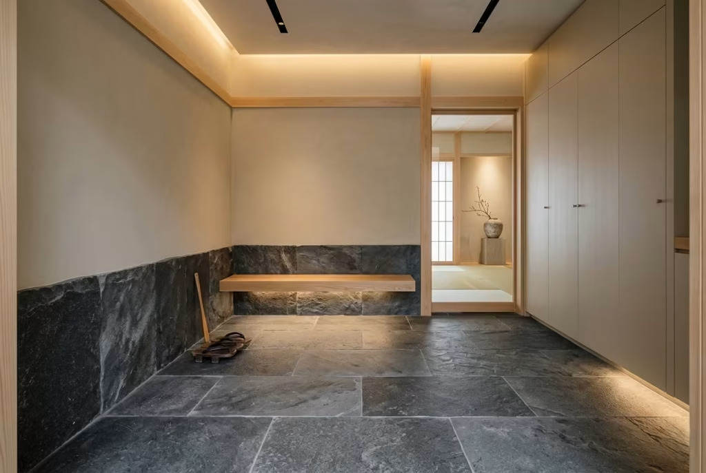
Basalt stone introduces a sense of permanence that works especially well in entryways where durability is essential. Its dense composition makes it highly resistant to wear, moisture, and impact, which is ideal for threshold areas exposed to constant movement.
From a durability perspective, basalt is exceptionally strong. It does not easily chip or degrade under normal residential use, making it one of the most dependable flooring and surface options.
Maintenance is relatively low, although sealing may be required depending on finish. Its naturally matte surface also helps conceal minor dirt and marks, which is particularly useful in high-traffic zones.
In terms of ageing, basalt does not dramatically change over time, but it develops subtle surface variations that add depth without compromising its visual consistency.
Cost can vary depending on sourcing and finish, but it generally sits in a mid to high range due to its material density and extraction process.
In entryways, basalt acts like a quiet foundation. It does not compete for attention, but it holds everything together with understated strength.
Clay Plaster Softens Walls With Natural Imperfection
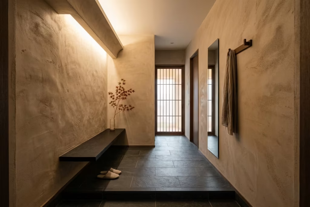
Clay plaster brings a tactile softness to entryway walls that is difficult to replicate with synthetic finishes. It introduces subtle texture variation that absorbs light gently, creating a calm and grounded atmosphere.
Durability is moderate, and it performs best when applied in protected interior zones rather than areas of direct impact. It is not a high-resistance material in the traditional sense, but its beauty lies in its natural character rather than hardness.
Maintenance requires some care, particularly in high-contact areas. However, minor marks can often be repaired locally without full resurfacing, which is one of its practical advantages.
As it ages, clay plaster develops a gentle patina that enhances its organic feel. Small imperfections become part of its surface identity rather than flaws to be corrected.
Cost is generally moderate, though skilled application can increase installation expenses.
In entryways, clay plaster does something important. It removes visual harshness and replaces it with softness that makes the space feel more human and less engineered.
Linen Introduces Soft Structure Through Subtle Texture
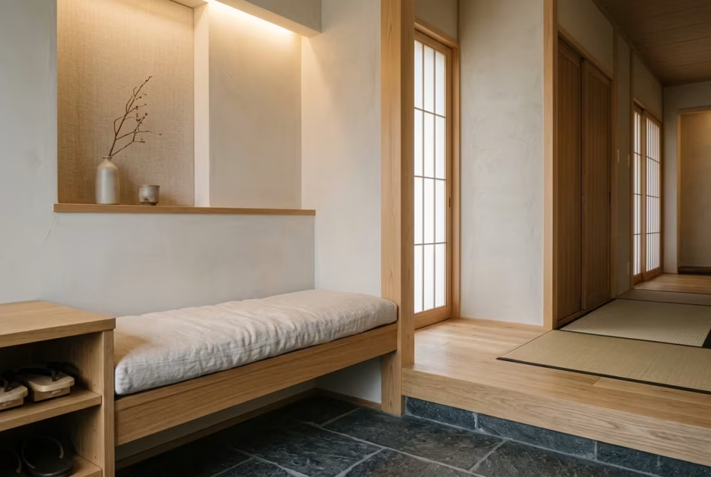
Linen is often used in entryway textiles such as bench cushions, panels, or soft storage elements. It brings a relaxed, natural texture that contrasts beautifully with harder architectural materials.
Durability is moderate, and it performs best in non-abrasive applications. It is not designed for heavy wear, but for controlled, intentional use.
Maintenance requires regular care, including gentle cleaning and occasional replacement depending on use. However, its natural fibres age in a way that often enhances its character rather than diminishing it.
Over time, linen softens visually and physically, creating a lived-in quality that feels calm rather than worn out.
Cost is generally moderate, though high-quality linen can be more expensive depending on weave and origin.
In entryways, linen acts as a softening agent. It breaks up rigidity and introduces a sense of ease that balances harder materials.
Blackened Steel Accents Add Structure Without Visual Noise
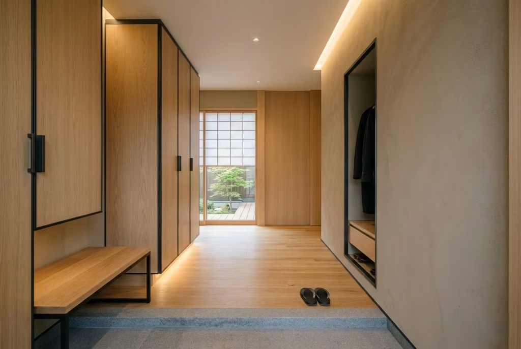
Blackened steel is often used in Japanese-inspired entryways for detailing, framing, and structural accents. It provides definition without introducing visual heaviness or unnecessary decoration.
In terms of durability, it is extremely strong and well-suited to high-use environments. It resists impact and maintains structural integrity over long periods.
Maintenance is relatively low, although surface care may be needed to preserve finish consistency depending on treatment type.
Its ageing process is subtle. Rather than deteriorating, it develops minor variations in tone that add depth while maintaining its core identity.
Cost varies depending on fabrication complexity, but it is often considered a premium material due to its finishing process.
Why Lighting Shapes Calm More Than Décor
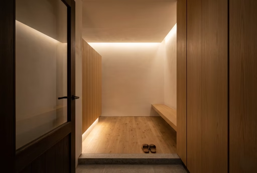
In entryway design, décor is often given far more attention than it deserves. People focus on objects, finishes, and styling details, assuming that visual richness is what creates atmosphere. Yet in practice, it is lighting that carries far more emotional weight. Décor may define character, but lighting defines feeling. It is the silent force that decides whether a space feels tense or tranquil the moment you step inside.
Japanese-inspired entryways understand this distinction deeply. They do not rely on decorative abundance to create calm. Instead, they use light as a shaping tool, controlling softness, direction, and intensity so that the space feels composed at every hour of the day. When lighting is right, even the simplest entryway feels intentional. When it is wrong, even the most carefully curated décor falls flat.
I have seen this repeatedly in real residential projects. Spaces filled with beautiful objects still felt unsettled, while more restrained interiors felt deeply calming simply because the lighting was handled with care. It is a reminder that atmosphere is not built from things alone. It is built from how those things are seen.
Layered Lighting Creates Depth Without Visual Clutter
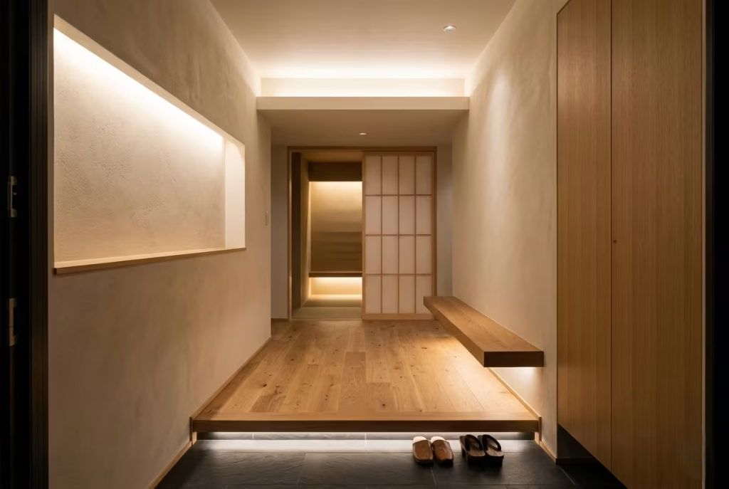
Layered lighting is one of the most effective techniques for shaping calm in an entryway. Instead of relying on a single overhead source, multiple levels of light are introduced to create depth, softness, and flexibility.
This might include ambient ceiling lighting for general illumination, subtle wall lighting for warmth, and low-level accent lighting to guide movement. Each layer plays a different role, ensuring that the space does not feel flat or overexposed.
The key advantage of layering is control. It allows the mood of the entryway to shift throughout the day without requiring physical changes to the space.
In one project, a simple entry corridor was transformed by replacing a single bright ceiling fixture with a combination of soft recessed lighting and indirect wall washes. The result was immediate. The space felt less harsh and far more inviting, even though no décor changes were made. Layered lighting does not add visual noise. It removes it.
Shadow Play Adds Softness and Emotional Texture
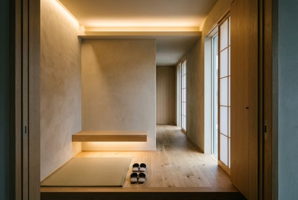
Shadows are often misunderstood in interior design. Many people try to eliminate them entirely, assuming that brighter equals better. In reality, shadows are essential for creating depth and emotional softness within a space.
In Japanese-inspired entryways, shadow play is carefully considered. Instead of harsh contrasts or overly bright surfaces, lighting is designed to allow gentle gradients of light and shade to form naturally across walls, floors, and materials.
These soft transitions give the space a sense of calm rhythm. The eye is not forced to process everything at once. Instead, it moves gradually, guided by contrast that feels natural rather than abrupt.
I have worked on entryways where reducing glare and allowing controlled shadow zones completely changed the emotional tone of the space. What once felt flat and overlit began to feel grounded and composed, almost like the architecture had gained breathing space. Shadow, when used well, does not create darkness. It creates balance.
Indirect Illumination Softens Every Surface It Touches
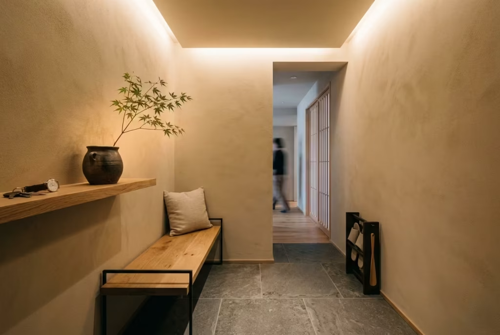
Indirect lighting is a defining feature of calm entryway design. Instead of pointing light directly at surfaces, it reflects illumination off walls, ceilings, or concealed channels, producing a softer and more diffused effect.
This technique removes visual harshness and prevents strong highlights that can make a space feel overly sharp or clinical. The result is a glow that feels natural, almost like light is gently filling the space rather than being projected into it.
In practical terms, indirect lighting works especially well in narrow or compact entryways where direct fixtures might feel overwhelming. It expands perceived space while maintaining softness.
I have seen this approach completely transform tight entry corridors. Once direct lighting was replaced with concealed uplighting and wall washes, the space immediately felt more open and less visually compressed. Indirect light does not compete for attention. It quietly supports everything around it.
Morning Versus Evening Ambience Shapes Emotional Rhythm
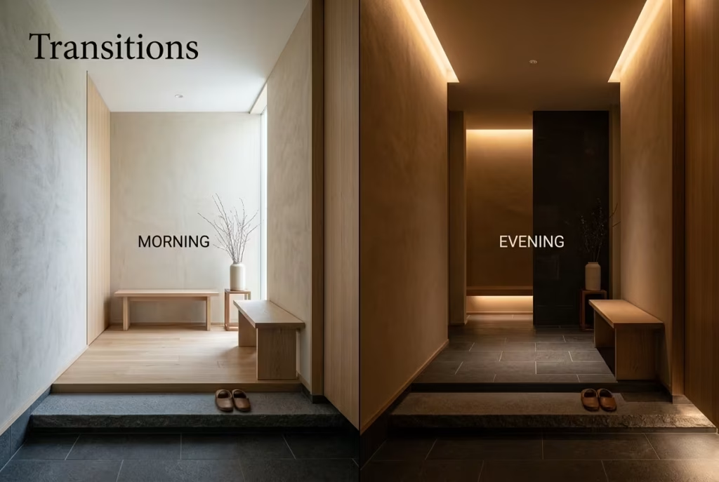
One of the most overlooked aspects of entryway lighting is how it behaves across different times of day. A well-designed entryway does not rely on a single fixed mood. Instead, it adapts subtly between morning and evening, supporting the natural rhythm of daily life.
In the morning, lighting tends to be clearer and more energising, helping the transition into the outside world. In the evening, it becomes warmer and softer, encouraging a slower return home and a sense of decompression.
This shift does not require complex systems. It can be achieved through thoughtful layering, warm temperature selection, and controlled dimming.
I have worked on homes where clients noticed a marked difference in how they felt upon entering at different times of day after lighting adjustments were made. Even without changing décor, the space felt more responsive, almost like it understood the rhythm of life passing through it. That responsiveness is what turns lighting from a functional requirement into an emotional tool.
When entryway lighting is designed with time in mind, the space stops being static. It becomes alive to the rhythms of everyday living, shaping calm not just in appearance, but in experience.
Conclusion: The Real Secret Is Not Minimalism, But Intention
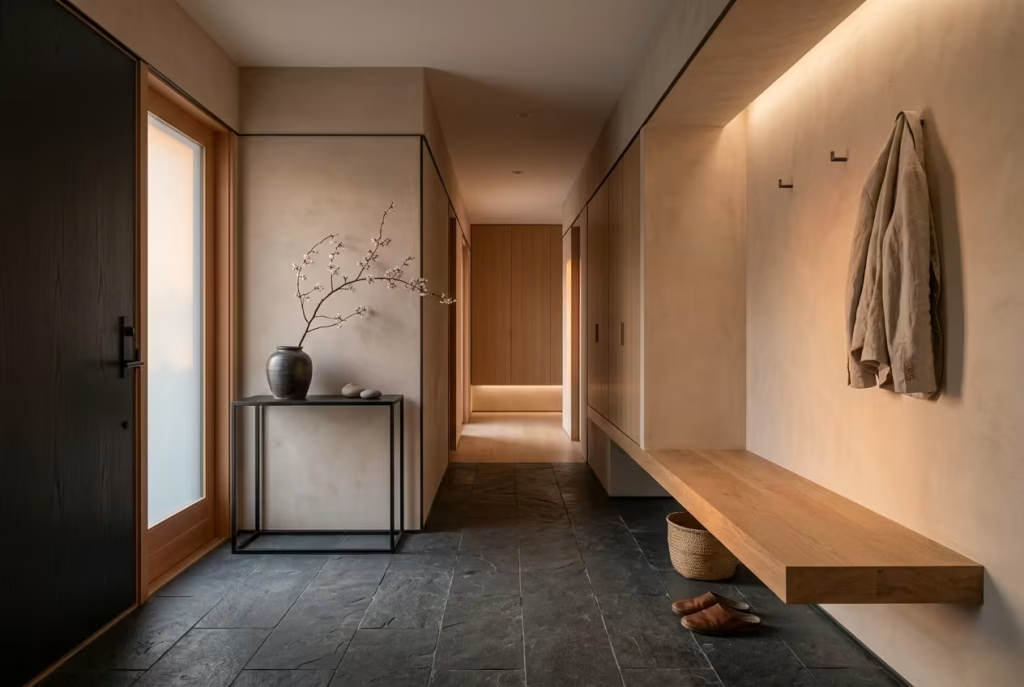
When you step back and look at Japanese-inspired entryways as a whole, a common misunderstanding starts to dissolve quite quickly. It is easy to label them as minimal, restrained, or even sparse. But that is only the surface reading. The deeper truth is far more interesting, and far more useful for real homes.
These entryways are not successful because they strip things away for the sake of style. They are successful because they remove friction. Every decision, from storage placement to lighting temperature, is shaped by how easily a person can move, pause, and transition through the space. Nothing is left to chance, yet nothing feels forced. That is where intention quietly takes over from aesthetics.
Japanese Entryways Succeed Because They Reduce Friction Rather Than Chase Perfection
At the core of every well-designed Japanese-inspired entryway is a simple but powerful idea: life should move through a space without resistance. Shoes have a place that feels obvious. Bags have a resting point that feels natural. Movement is not interrupted by confusion or unnecessary effort. This is not perfection in the visual sense. It is clarity in the functional sense.
Many entryways fail because they try to look perfect at all times, which often leads to fragile systems that cannot cope with daily reality. Japanese design takes the opposite route. It accepts that life is active, sometimes messy, and always moving. Then it builds a structure that quietly absorbs that reality without breaking down.
I have seen this principle transform homes more reliably than any decorative overhaul. When friction drops, order rises almost automatically.
Calm Comes From Systems, Rhythm, and Material Honesty
True calm in an entryway is not created by objects alone. It is created by systems that support behaviour, rhythm that guides movement, and materials that behave honestly over time.
Systems ensure that everything has a place and a logic behind its placement. Rhythm ensures that arrival feels like a sequence rather than a rush. Material honesty ensures that surfaces age gracefully instead of demanding constant correction.
When these three elements work together, the entryway stops feeling like a staging area and starts feeling like a stabilising point in the home.
In practice, this is where design becomes invisible but deeply felt. You do not necessarily notice the system, but you experience its effects every time you walk through the door. That is why these spaces feel calm without trying to look calm.
The Most Beautiful Entryways Are Often the Quietest Ones
There is a quiet confidence in entryways that do not try to impress at first glance. They do not rely on visual noise, oversized statements, or decorative overload. Instead, they hold themselves with restraint, allowing space, proportion, and light to do most of the talking.
These are the entryways that often leave the strongest impression, not because they demand attention, but because they do not.
In many projects I have worked on, the most memorable spaces were not the most visually complex ones. They were the ones where everything felt considered but never overworked. Nothing competed. Nothing shouted. Everything simply belonged. That kind of quietness is not empty. It is composed. And in design, composure often reads as beauty.
A Well-Designed Threshold Changes How the Entire Home Is Experienced
The entryway is not an isolated space. It is the first emotional contact point of the home. It sets tone, rhythm, and expectation for everything that follows. When it is chaotic, the rest of the home often feels slightly unsettled, even if the rooms themselves are well designed. When it is calm, the entire home feels more grounded.
This is why threshold design carries such weight in Japanese-inspired interiors. It is not treated as leftover space, but as a critical moment of transition where external life is gently set aside before entering the private world.
I have seen this shift play out repeatedly in real homes. Once the entryway is resolved properly, the perception of the entire interior changes. Rooms feel more organised, movement feels more intentional, and the home as a whole feels easier to live in. That is the real lesson here.
Not that entryways should be minimal. But that they should be intentional, structured, and quietly supportive of how life actually unfolds.
Because in the end, the first step inside is never just a step. It is the beginning of how the whole home is experienced.
Frequently Asked Questions About Japanese Entryway Design and Renovation
What makes a Japanese entryway different from a standard hallway or foyer?
A Japanese entryway is designed as a transition zone, not just a passage. It creates a clear psychological and physical boundary between outside and inside, often through changes in floor level, material, storage, and lighting. The goal is to slow the arrival experience and reduce visual clutter before it spreads through the home.
Do I need a traditional genkan to achieve this look?
No, and that is one of the most useful things to understand. You do not need a traditional Japanese layout to borrow the principles. A Victorian terrace, modern apartment, or suburban home can all use genkan-inspired ideas such as concealed shoe storage, a bench, softer lighting, and a subtle flooring transition. The logic matters more than the style copy.
How much space do I need for a functional Japanese-inspired entryway?
Even a compact area can work well if it is carefully planned. A lower entry zone around 90 to 120 cm deep, or 35 to 47 inches, can be enough to create a sense of arrival. A bench can sit comfortably at about 40 to 45 cm high, or 16 to 18 inches. The key is not size alone, but clarity of use.
What materials work best for this type of entryway?
The strongest choices are materials that age well and feel calm over time. Oak, walnut, basalt stone, clay plaster, linen, and blackened steel all work beautifully when used with restraint. These materials bring texture and depth without making the space feel busy or overdesigned.
How do I stop the entryway from becoming cluttered again?
The best answer is to design for behaviour, not just storage. When shoes, keys, bags, and coats each have a clear resting place, clutter has far less chance of taking hold. Hidden hooks, recessed trays, slim cabinetry, and seasonal rotation all help reduce the slow creep of everyday mess.
Should the entryway be completely minimal?
Not at all. The most effective Japanese-inspired entryways are not empty, they are edited. A single branch arrangement, one ceramic vessel, or a quiet bench can add warmth without disturbing the calm. The point is to keep decorative moments intentional, not decorative for its own sake.
What kind of lighting works best in a Japanese entryway?
Soft, layered lighting usually works best. Warm light in the 2700K to 3000K range helps create a calmer atmosphere than harsh white lighting. Indirect illumination, wall washing, and low-level accent lighting can all make the space feel more welcoming while avoiding glare and visual fatigue.
Is a raised threshold or flooring change necessary?
It is not essential, but it can be very effective. A slight change in flooring, even without a full step up, can help define the entryway as a separate zone. In homes where accessibility is a concern, the same sense of transition can be created through material shifts rather than height changes.
How do I make the design feel authentic without copying a theme?
Focus on principles rather than symbols. Calm proportions, natural materials, hidden storage, and restrained decoration will feel more authentic than adding obvious Japanese motifs. A good Japanese-inspired entryway should feel lived in, considered, and quietly functional, not staged as a theme room.
What is the most common mistake people make?
They overfill the space too quickly. Too much furniture, too many finishes, too much open storage, and too many decorative objects can undo the calm the design is trying to create. The strongest entryways are usually the ones that know exactly when to stop.