25 Modern Spanish Colonial Living Room Ideas That Feel Timeless and Lived-In
There is a reason Modern Spanish Colonial interiors continue to hold their ground while so many other styles come and go. They are not chasing attention. They are rooted in something slower, something more considered. At its core, this style is not about decoration layered on top, but about atmosphere built from the ground up, where texture, proportion, and light do the heavy lifting.
What draws people in, time and again, is the quiet balance it strikes. You have the warmth of sun-washed plaster walls, the weight of timber beams overhead, the honesty of stone underfoot, all working together without feeling overworked. It carries history, but not in a way that feels museum-like or fixed in time. Instead, it feels lived-in, as though the room has settled into itself over years rather than being pulled together in a weekend.
Modern interpretations, when handled properly, strip back the excess without losing the soul. I often describe it to clients as editing rather than reinventing. You keep the bones, the arches, the tactile finishes, the sense of enclosure, but you let the room breathe. Furnishings become simpler, lines a touch cleaner, palettes more restrained. The result is a space that feels easier to live in day to day, less precious, less performative, but still deeply atmospheric.
In practice, this shift makes a significant difference. Traditional Spanish Colonial rooms could sometimes feel heavy, particularly in homes with limited natural light. The modern approach lightens that weight just enough. Walls move from deep ochres to softer chalky neutrals. Furniture sits lower and wider, inviting use rather than admiration. Materials remain honest, but their application feels more deliberate, less layered for the sake of it. It is a subtle recalibration, but one that turns a period style into something genuinely livable.
The most successful rooms, the ones that truly resonate, never feel staged. They feel anchored. There is a sense that everything belongs, that nothing has been forced into place. You walk in and it feels as though the room has been there long before you arrived, quietly doing its job. That grounded quality is what sets this style apart. It does not shout for attention, but it holds it all the same.
From my own projects, I have found this approach particularly effective in spaces that feel a little too sharp or exposed. New-build living rooms, for instance, often come with clean lines but very little character. Introducing a plastered finish, even subtly, can soften those edges almost immediately. In one recent project, a plain rectangular room with standard ceiling height was transformed simply by adding a shallow arched recess of around 120 cm wide and finishing the walls in a warm limewash. The change was not dramatic on paper, but in reality, it shifted the entire mood of the space.
It also works beautifully in older homes that have lost their identity over time. Where original features have been stripped out, Modern Spanish Colonial elements can reintroduce a sense of permanence without feeling contrived. A reclaimed timber beam, properly scaled, or a stone fireplace with quiet detailing can give the room back its centre of gravity.
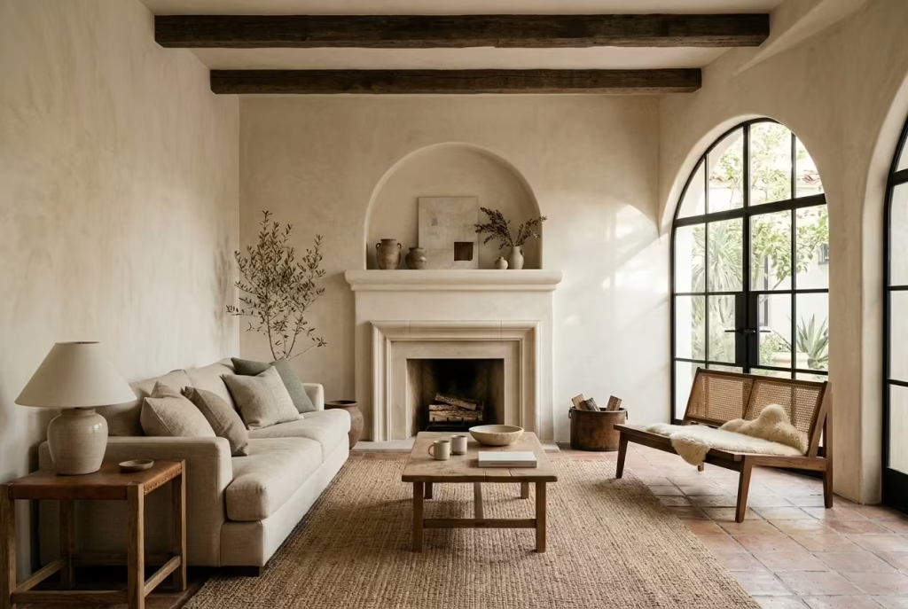
Ultimately, this style endures because it understands something many others overlook. A living room is not just something to look at. It is something to inhabit, to return to at the end of a long day, to sink into without thinking twice. When done well, Modern Spanish Colonial interiors do not just impress. They settle in around you, almost without you noticing, and that is precisely why they last.
What Defines a Modern Spanish Colonial Living Room
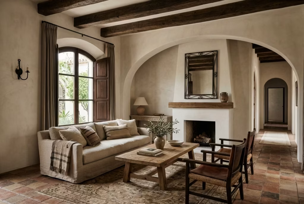
Before the ideas begin to take shape, it helps to understand what truly anchors a Modern Spanish Colonial living room. Without that foundation, it is all too easy to drift into something that looks themed rather than lived-in. This style is not built on surface-level gestures. It relies on a quiet interplay of structure, material, and restraint, where each decision carries weight and nothing is there by accident.
Whitewashed or Warm Neutral Walls
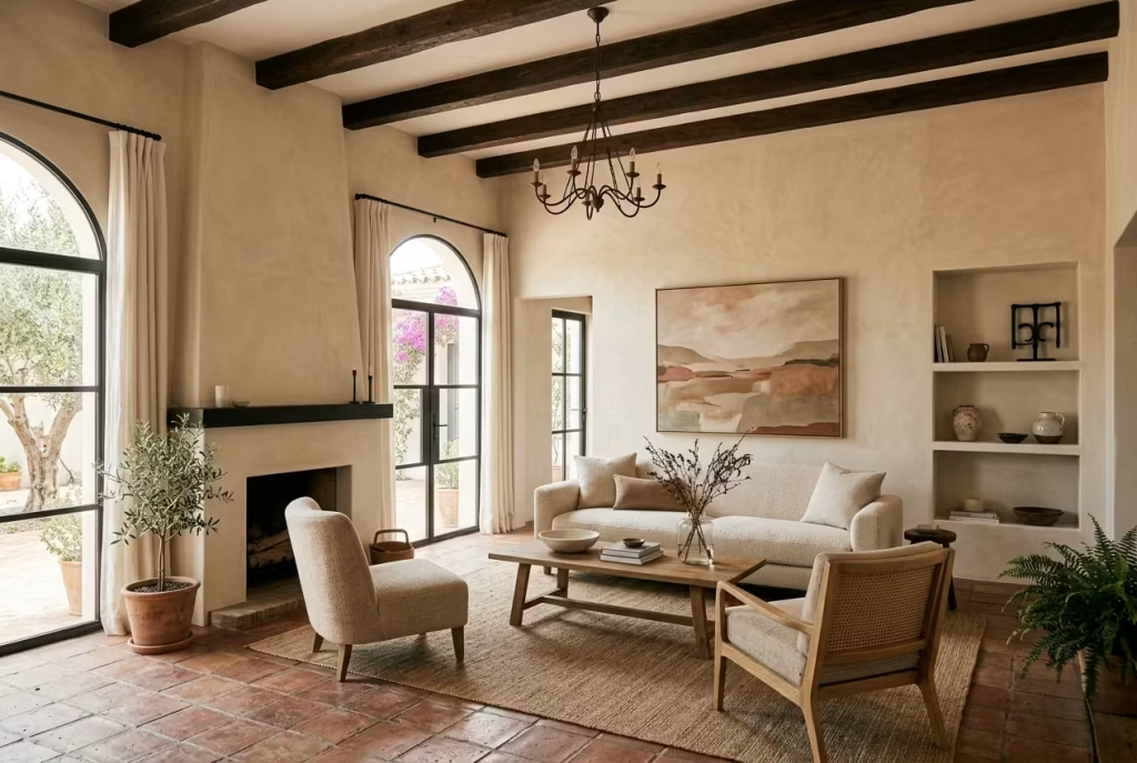
The walls set the tone long before furniture enters the room. In a Modern Spanish Colonial setting, they are rarely stark white or overly polished. Instead, they sit somewhere softer, think chalk, bone, warm ivory, or a muted sand tone, colours that catch light gently rather than bouncing it back harshly.
I have found that these tones work best when they occupy the majority of the visual field, often around 60 to 70 percent of the room. In one project, shifting from a cool white to a warmer off-white completely changed how the space held light, particularly in the late afternoon. The room stopped feeling flat and started to breathe a little.
It is a subtle move, but one that sets everything else up to succeed. Get the walls wrong, and the entire scheme feels slightly off-key.
Plaster, Limewash, or Textured Finishes
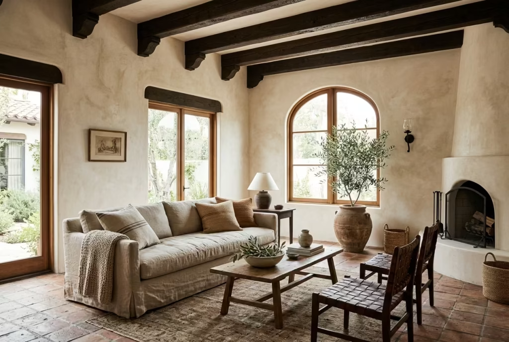
Flat paint rarely tells the full story here. Texture is where the room begins to come alive, almost quietly, in a way you notice more over time than at first glance. Plaster and limewash finishes introduce a softness that cannot be replicated with standard emulsions. They diffuse light, soften edges, and give the walls a sense of depth that feels inherently architectural.
In practical terms, I often recommend limewash in spaces that feel a little too sharp or newly built. It takes the edge off without making the room feel artificially aged. The finish is not perfect, and that is precisely the point. Those slight tonal variations, catching the light differently throughout the day, are what give the room its character.
The only trade-off is maintenance. Limewash can mark more easily than standard paint, but in the right setting, that gentle patina becomes part of the story rather than a flaw.
Arched Details
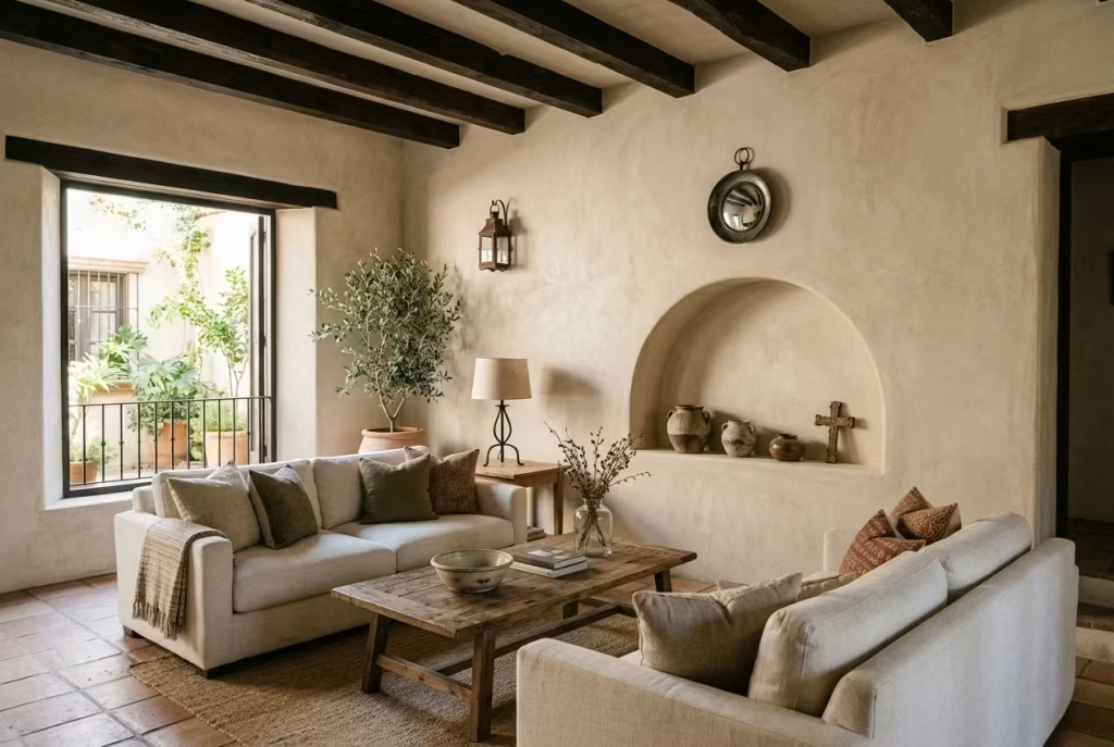
Arches are one of the most recognisable elements of Spanish Colonial design, but in modern interpretations, they are used with a lighter touch. It is not about repeating the motif endlessly. One well-placed arch can do more than three that compete for attention.
I often introduce arches where the room needs rhythm or a sense of transition. A shallow arched niche, around 100 to 120 cm wide, can turn an otherwise blank wall into a focal point. Likewise, softening a doorway with a curved head can shift the entire feel of circulation within the space.
Used sparingly, arches guide the eye without overwhelming it. Overused, they quickly tip into pastiche.
Timber Beams
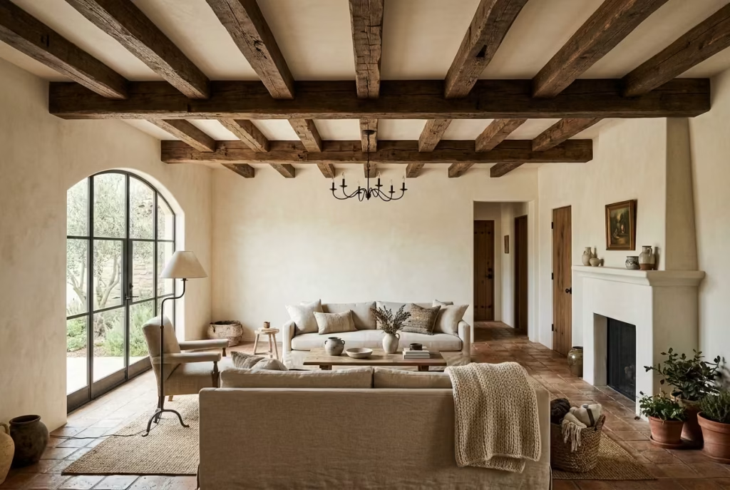
Timber beams carry both visual weight and a sense of history. They ground the ceiling plane, which in many modern homes can feel like an afterthought. Even in rooms without original beams, introducing reclaimed or well-finished timber can anchor the space in a way that feels convincing.
Scale matters here. Beams that are too small look decorative rather than structural. In a standard living room, I typically work with beams around 150 to 200 mm deep, spaced carefully to avoid visual clutter.
There is also a balance to strike. If the beams are dark and prominent, the rest of the room needs to remain relatively restrained, otherwise the ceiling begins to dominate rather than support.
Terracotta, Stone, Iron, Linen, and Leather
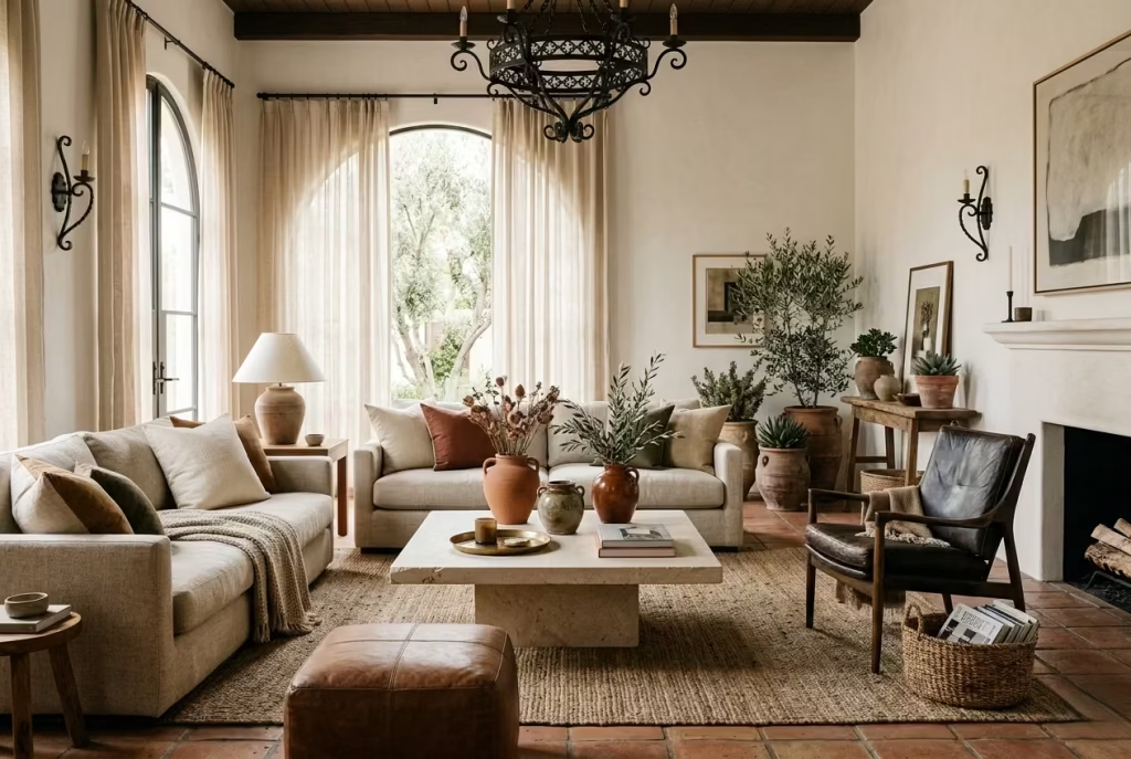
Materials do much of the storytelling in this style. They bring in warmth, texture, and a sense of permanence that cannot be faked.
- Terracotta adds an earthy undertone, whether through flooring, planters, or smaller accents.
- Stone, particularly limestone or travertine, introduces a quiet solidity, often best used in fireplaces or tables.
- Iron works as a counterpoint, adding definition through lighting, hardware, or subtle detailing.
- Linen softens the composition, especially in upholstery and window treatments, allowing the room to feel relaxed rather than formal.
- Leather, used sparingly, adds depth and a sense of age, particularly in occasional chairs or smaller pieces.
From experience, the key is balance. Too many heavy materials in one space, and the room starts to feel weighed down. The trick is to layer them lightly, letting each one have its moment without competing.
A Restrained Palette with Depth
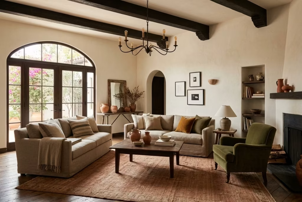
Colour in a Modern Spanish Colonial living room is never loud, but it is far from flat. It operates in layers, subtle shifts within a narrow range that create depth without obvious contrast.
Think of a base of warm neutrals, then introduce muted terracotta, soft olive, or a deep, aged brown in smaller doses. Black, often through ironwork, is used sparingly to sharpen the composition.
In one living room I worked on, we kept the palette almost entirely within a range of warm off-whites and soft clay tones, but introduced a single deep olive chair. It was a small move, but it gave the entire room a centre of gravity.
It is a reminder that restraint does not mean absence. It means knowing when to stop.
The Shift from Heavy to Light
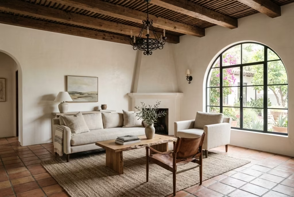
Traditional Spanish Colonial interiors can lean towards the ornate, layered with carved furniture, bold tiles, and strong colours. The modern approach pares that back, not by removing character, but by refining it.
Furniture profiles become simpler. Ornamentation is reduced. Surfaces are allowed to remain visible. The room feels lighter, both visually and physically, without losing its depth.
This is where many people misstep. In trying to modernise the style, they strip it too far, ending up with something that feels generic rather than grounded. The aim is not minimalism for its own sake. It is clarity.
Editing, Not Erasing
If there is one principle that ties all of this together, it is this: Modern Spanish Colonial design is about editing, not stripping the room bare.
You are not removing the essence of the style. You are refining it, keeping what matters and letting go of what does not. It is the difference between a room that feels curated and one that feels overworked.
In practice, this often means stepping back before adding more. I have lost count of how many times a room has come together not because of what we introduced, but because of what we chose to leave out.
Done well, the result is a space that feels settled, cohesive, and quietly confident. Nothing shouts, but everything speaks.
The Best Colour Palette for a Modern Spanish Colonial Living Room
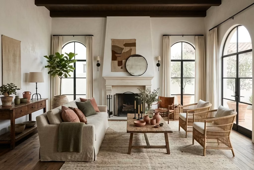
Colour, in a Modern Spanish Colonial living room, is not there to decorate. It is there to settle the space, to hold the architecture together, and to quietly shape how the room feels at different times of day. Get it right, and everything else begins to fall into place almost effortlessly. Get it wrong, and even the most beautiful materials can feel disconnected.
What makes this palette distinctive is not bold contrast, but depth within restraint. It leans into nuance rather than noise, where tones sit closely together, layered with intention, creating a room that feels cohesive rather than composed in parts.
Soft White and Bone as the Foundation
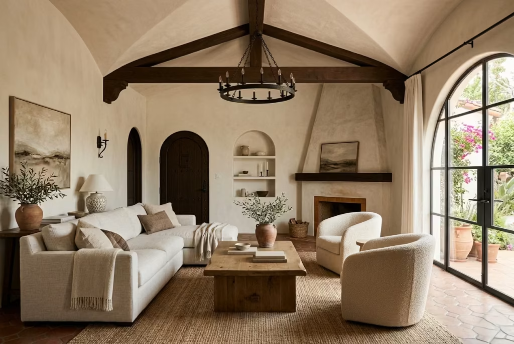
At the heart of the palette sits a soft, forgiving neutral. Not a stark gallery white, but something warmer, more settled. Bone, chalk, or a gently aged white tends to work best, particularly on walls.
In practice, I almost always let this tone carry the majority of the room, roughly 60 to 70 percent of the visual field. Walls, often ceilings, and sometimes even larger upholstery pieces sit within this range. It creates a calm backdrop that allows texture and form to do the talking.
I worked on a living room where the original brief called for a crisp white scheme. It looked clean on paper, but in reality, the space felt cold and slightly uninviting. Shifting to a warmer bone tone changed the atmosphere almost overnight. The light softened, shadows became more interesting, and the room finally felt like somewhere you could sink into rather than just pass through.
Sand, Taupe, Putty, and Clay for Depth
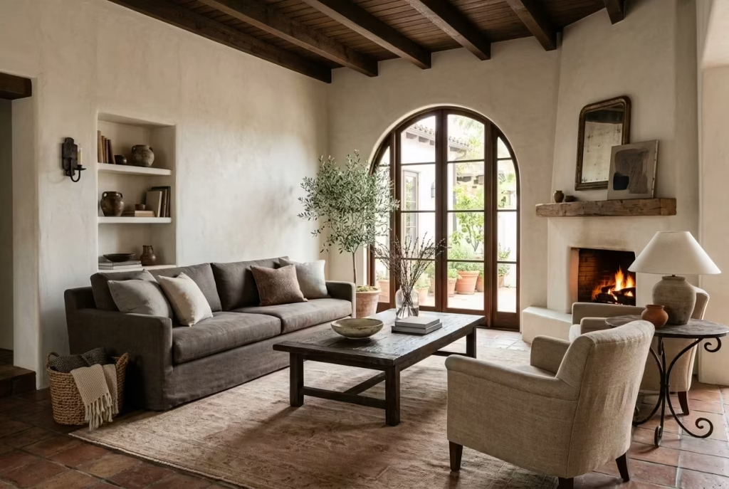
Once the base is established, the next layer comes through tonal variation rather than contrast. This is where sand, taupe, putty, and soft clay tones begin to build depth.
These colours often appear in larger elements, sofas, rugs, or even flooring, because they carry enough presence without overpowering the room. A deep taupe sofa against a bone wall, for instance, creates a gentle shift rather than a sharp line. It feels considered, not staged.
Clay tones, in particular, bring a subtle warmth that reads differently throughout the day. In morning light, they can feel almost neutral. By late afternoon, they take on a richer, sun-warmed quality that gives the room a quiet glow.
The key here is continuity. Rather than introducing entirely new colours, you are extending the same palette, nudging it slightly deeper or warmer.
You May also Like: 16 Dreamy White Oak Living Room Ideas to Make Every Corner Feel Like Home
Ochre and Muted Terracotta for Warmth
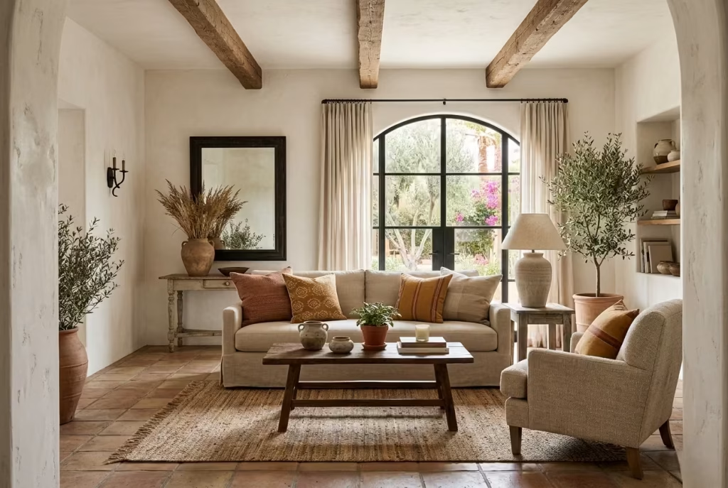
This is where the palette begins to show its character. Ochre and muted terracotta introduce that unmistakable sun-baked warmth associated with Spanish Colonial interiors, but in a modern setting, they are used with a lighter hand.
These tones work best as accents, appearing in textiles, ceramics, or smaller furniture pieces. A terracotta planter, a woven cushion, or even a single upholstered chair can shift the entire mood of the room.
I often caution against overusing these colours across large surfaces. Too much, and the room starts to feel heavy or overly themed. Used sparingly, they act like a thread running through the space, tying everything together without dominating it.
Deep Olive, Charcoal, and Aged Brown Accents
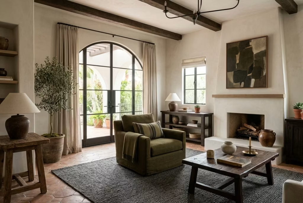
Every restrained palette needs a point of contrast, something to anchor it. In this case, that role is played by deeper, more grounded tones like olive, charcoal, and aged brown.
These colours are not there to stand out, but to hold the room steady. A deep olive armchair, a charcoal-toned rug detail, or a dark-stained timber piece can give the space a sense of weight and balance.
In one project, we introduced a single aged brown leather chair into an otherwise soft, neutral room. It was not a large piece, but it completely changed how the space felt. Suddenly, the room had a centre, something that grounded all the lighter tones around it. It is often the smallest moves that carry the most impact.
How Black Iron Sharpens the Palette
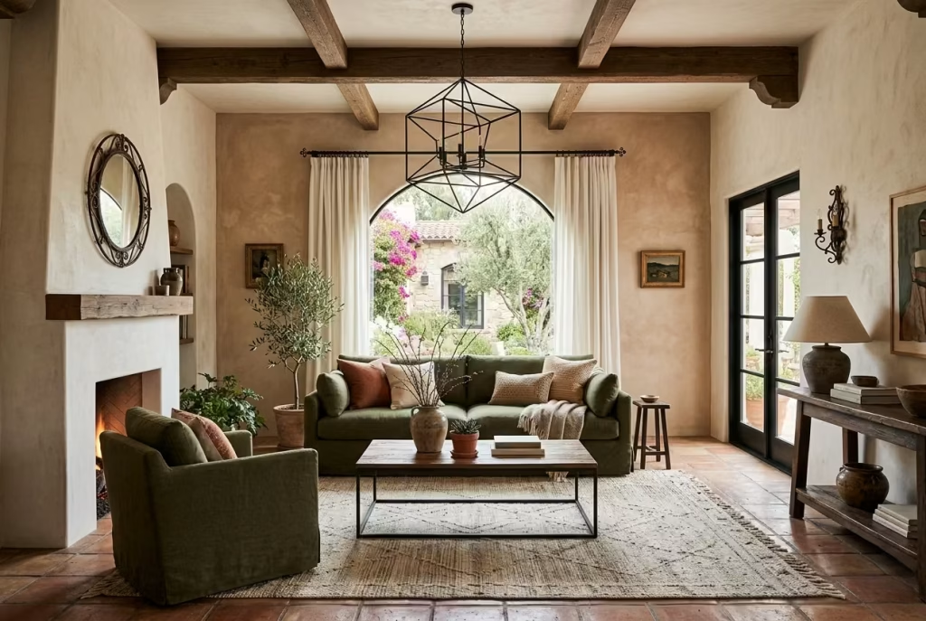
Black, in a Modern Spanish Colonial living room, is used almost like punctuation. It is not a dominant colour, but a precise one.
Wrought iron details, lighting fixtures, curtain rods, or occasional tables, introduce a crisp edge that prevents the palette from becoming too soft or washed out. They define lines, frame elements, and add a sense of structure.
The important thing is restraint. A few well-placed black elements can sharpen the entire composition. Too many, and they begin to compete, breaking the calm continuity that the palette relies on. Think of it as outlining the room, not filling it in.
You May also Like: 25 Timeless Spanish Kitchen Ideas That Capture the Beauty of Spain
How Light Changes Everything: North vs South Facing Rooms
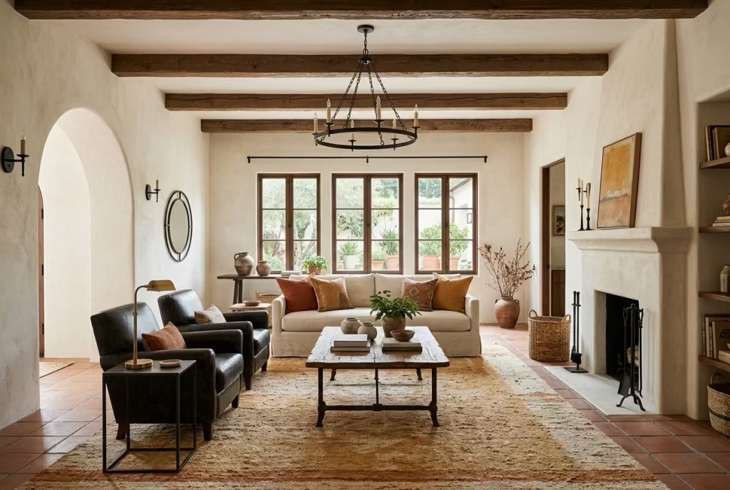
Colour never exists in isolation. It is always in conversation with light, and this is where many palettes either succeed or quietly fall apart.
In north-facing rooms, where light tends to be cooler and more subdued, warmer tones become essential. Soft whites should lean towards cream or bone rather than grey. Clay, ochre, and warmer taupes help counterbalance the cooler light, preventing the room from feeling flat or slightly blue.
I have seen north-facing living rooms transform simply by shifting the wall tone a fraction warmer. What once felt dull suddenly had depth, and the materials began to read as intended.
In south-facing rooms, the opposite is true. The abundance of warm natural light allows for slightly cooler or more neutral tones without losing warmth. Here, you can afford to introduce softer greys within your taupes or slightly muted whites without the space feeling cold.
That said, even in bright rooms, overly stark whites can feel glaring. There is always a case for keeping a touch of warmth in the palette, just enough to soften the edges.
How to Apply the Palette in Practice
To keep the room feeling cohesive rather than pieced together, I always return to a simple structure:
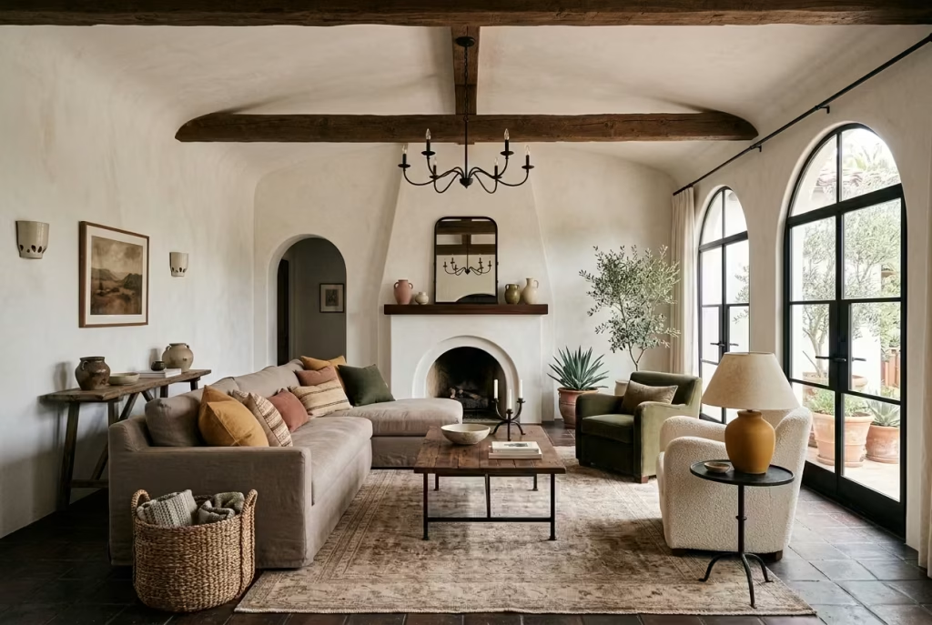
- Let one dominant neutral carry 60 to 70 percent of the space
- Introduce one or two supporting tones through larger elements like sofas or rugs
- Layer in accent colours, ochre, terracotta, olive, through textiles, ceramics, or smaller furniture
- Use black or dark tones sparingly to define and ground
It sounds straightforward, but the nuance lies in how these tones sit next to each other. The goal is not contrast, but conversation. Each colour should feel like it belongs to the same family, just expressed in a slightly different voice.
When done well, the palette does not draw attention to itself. Instead, it creates a room that feels calm, grounded, and quietly confident. The kind of space that reveals more the longer you sit in it, rather than everything at once.
25 Modern Spanish Colonial Living Room Ideas
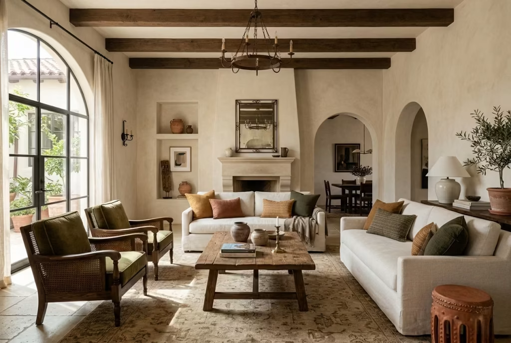
Once the foundation is in place, walls that hold light well, materials that feel honest, and a palette that knows when to hold back, the room begins to open up creatively. This is where design stops being theoretical and starts becoming personal. Each of the following ideas comes from situations I have either worked through or refined over time, where small, deliberate moves made the difference between a room that looked styled and one that felt quietly resolved.
You May also Like: 25 Apartment Living Room Designs Ideas for a Chic, Cosy, and Functional Home
Use Plaster-Style Walls to Soften the Room
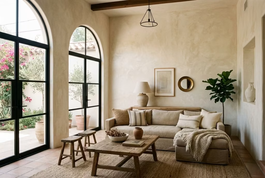
Plaster-style walls, whether achieved through traditional plastering or a refined limewash finish, shift the entire reading of a living room in a way that paint alone rarely manages. They do not sit flat. They carry light, absorb it, and release it unevenly, creating a surface that feels alive rather than sealed.
What it does visually
The immediate effect is softness, but not in a vague sense. It softens edges, reduces glare, and introduces a quiet variation across the wall plane. As daylight moves, the surface responds, sometimes appearing matte and chalky, other times slightly luminous. In a room that might otherwise feel rigid or overly defined, this subtle movement breaks things up just enough, like taking the sharpness off a new blade without dulling it completely.
Why it works in a modern setting
Modern interiors, particularly in newer homes, often lean towards precision. Clean lines, flat finishes, and uniform surfaces can leave a space feeling a touch sterile if not carefully balanced. Plaster-style walls counter that by introducing imperfection, but in a controlled, intentional way. It is not rustic for the sake of it. It is refinement through restraint. You keep the clarity of a modern layout, but layer in a finish that brings warmth and depth, allowing the room to feel settled rather than freshly assembled.
A real-world application note
In one project, a standard rectangular living room of around 4.5 by 5 metres (15 by 16.5 feet) felt surprisingly stark despite good proportions and natural light. Instead of adding more furniture or decoration, we shifted the wall finish to a warm limewash in a soft bone tone. Nothing else changed initially. Yet the room began to hold light differently, particularly in the late afternoon, where the walls picked up a gentle, almost sun-washed quality. It was one of those moments where the room stopped trying so hard and simply started working.
If you are working with plain plasterboard walls, this is often the single most effective move to introduce character without altering the structure.
Pros
- Adds depth without adding clutter
- Enhances natural and artificial light in a subtle way
- Creates an immediate sense of architectural character
Cons
- More sensitive to marks and wear compared to standard paint
- Requires a skilled applicator to avoid uneven or patchy results
Introduce a Low, Deep Sofa in Linen or Bouclé
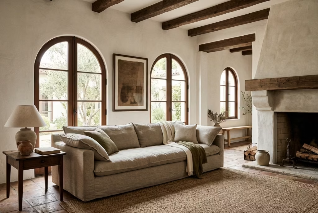
A low, deep sofa has a way of changing how a room is used almost overnight. It lowers the visual centre of gravity, draws people in, and sets a tone that feels relaxed without slipping into carelessness. In a Modern Spanish Colonial setting, where architecture often carries quiet weight, this kind of seating acts as a counterbalance, soft, generous, and easy to live with.
What it does visually
By sitting closer to the floor, typically with a seat height around 40 to 45 cm (16 to 18 inches) and a depth of 90 to 100 cm (35 to 39 inches), the sofa creates a more horizontal emphasis across the room. It allows walls, arches, or beams to breathe above it rather than competing for attention. The effect is subtle but telling. The space feels calmer, less upright, more at ease with itself.
Upholstery plays its part too. Linen, with its slightly relaxed weave, or bouclé, with its soft, tactile surface, catches light differently from flat fabrics. It breaks up large volumes of upholstery, giving the piece a sense of texture rather than mass. The sofa does not sit there like a block. It settles in, almost quietly, becoming part of the room rather than dominating it.
Why it works in a modern setting
Modern Spanish Colonial interiors thrive on balance. You often have solid architectural elements, plastered walls, timber beams, sometimes a stone fireplace, all of which carry visual weight. A bulky, upright sofa only adds to that heaviness. A lower, deeper piece, by contrast, introduces ease.
It also aligns with how people actually use their living rooms today. These spaces are no longer formal sitting areas kept for occasional use. They are lived in daily, stretched out in, leaned into after long days. A deep sofa acknowledges that shift. It invites you to sit, but also to lounge, to curl up, to stay a while rather than perch and move on.
There is a quiet honesty to it. It looks good, but more importantly, it works.
A real-world application note
In a recent project, the living room measured roughly 5 by 6 metres (16.5 by 20 feet), with exposed timber beams and a plastered fireplace that naturally drew the eye upward. The original furniture plan included a fairly upright sofa, and the room felt slightly stiff, as though everything was holding its breath.
We replaced it with a deeper linen sofa, just under 95 cm (37 inches) in depth, in a soft putty tone. The difference was immediate. The room relaxed. People sat differently, leaned back, stayed longer. Even visually, the space felt more grounded, the beams above no longer competing, but complementing the lower, broader form below.
It is one of those changes that looks modest on paper but shifts the entire atmosphere in practice.
Pros
- Encourages a relaxed, lived-in feel
- Balances heavier architectural elements
- Adds texture and softness through fabric choice
Cons
- Requires adequate space to avoid feeling oversized
- Deeper seats may not suit those who prefer more upright support
Frame the Room with Exposed Timber Beams
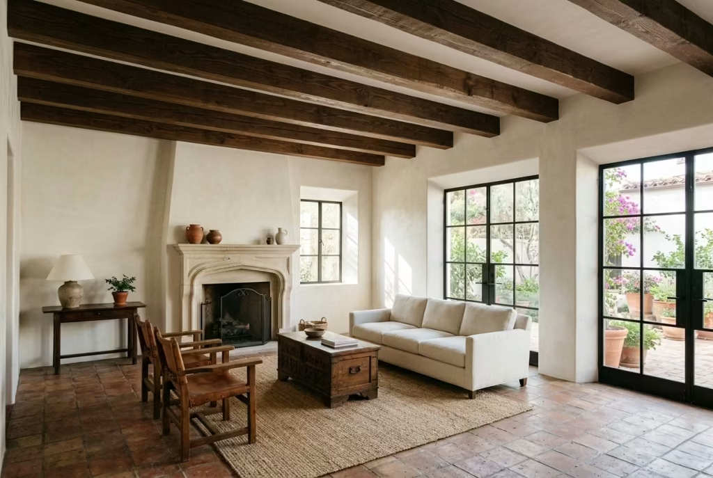
Exposed timber beams do more than decorate a ceiling. They give the room a backbone, something you feel even if you cannot immediately explain it. In a Modern Spanish Colonial living room, they act as a quiet framework overhead, grounding the space while adding a sense of history that feels earned rather than applied.
What it does visually
Beams introduce rhythm across the ceiling plane, breaking up what is often an overlooked surface. Instead of a blank expanse, the ceiling begins to read as part of the architecture. The eye moves across the beams, from one to the next, creating a gentle cadence that ties the room together.
They also add weight, but in a way that feels reassuring rather than heavy-handed. A beam depth of around 150 to 200 mm (6 to 8 inches), spaced proportionately across the ceiling, can shift the entire balance of the room. Suddenly, the space feels anchored, as though it has something holding it together above your head.
There is also a play of light and shadow that comes into its own as the day unfolds. Morning light skims across the edges, while in the evening, the beams cast softer, longer shadows that add depth without effort. It is a slow-burn effect, one that reveals itself over time rather than all at once.
Why it works in a modern setting
Modern interiors, particularly those built recently, often lack ceiling articulation. Walls and floors tend to carry the design, leaving the ceiling feeling like an afterthought. Timber beams correct that imbalance, introducing structure without complicating the layout.
In a Spanish Colonial context, they also bridge the gap between old and new. You retain the clean lines and openness of a modern plan, but layer in a material that carries warmth and a sense of permanence. It is not about recreating a historic interior beam for beam. It is about introducing just enough to give the room a centre of gravity.
Handled well, beams do not fight for attention. They sit there, quietly doing their job, like a well-cut suit that never needs adjusting.
A real-world application note
I worked on a living room where the ceiling height was a modest 2.7 metres (just under 9 feet), and the concern was that adding beams might make the space feel lower. Instead of opting for oversized, heavy sections, we introduced slimmer reclaimed timber beams, around 150 mm deep (6 inches), spaced evenly across the 5-metre (16.5-foot) width of the room.
The result was surprisingly the opposite of what the client feared. The room felt more structured, more intentional. The beams drew the eye across rather than down, creating a sense of width and proportion that had been missing before. Paired with soft plastered walls and a restrained palette, the ceiling became a feature, but one that knew its place.
It is often a case of getting the scale right. Too large, and the beams dominate. Too slight, and they look decorative rather than integral.
Pros
- Adds architectural character and a sense of permanence
- Introduces rhythm and visual structure to the ceiling
- Works well with both traditional and modern elements
Cons
- Incorrect scale can make the room feel heavy or artificial
- Installation can be complex, particularly in existing ceilings
Add an Arched Mirror or Niche for Architectural Rhythm
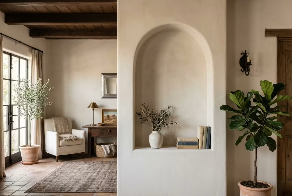
There is something quietly persuasive about a well-placed arch. It does not shout for attention, yet it shifts the entire reading of a wall. In a Modern Spanish Colonial living room, introducing an arched mirror or a recessed niche is often the smallest move with the longest reach, the kind that changes how the room flows without adding clutter.
What it does visually
n arch softens geometry, full stop. Where straight lines can feel abrupt, even slightly unforgiving, a curve introduces a sense of ease. It guides the eye upward and then gently back down, creating a rhythm that feels natural rather than forced.
A mirror, shaped with an arched top, reflects light in a way that feels less rigid than a rectangular frame. It diffuses the edges, almost blurring the boundary between reflection and wall. A niche, on the other hand, creates depth. Even a shallow recess of 12 to 20 cm (5 to 8 inches) can add a layer of shadow and highlight that gives the wall a sense of dimension.
In both cases, the effect is not loud. It is the kind of detail you notice gradually, like a well-turned phrase that lingers after the sentence has passed.
Why it works in a modern setting
odern interiors often rely heavily on straight lines, which can, over time, feel a touch repetitive. Introducing an arch breaks that monotony without disrupting the overall clarity of the space. It is a gentle interruption, one that adds character without tipping into ornamentation.
In a Spanish Colonial context, arches are part of the architectural language, but the modern approach is measured. Rather than repeating the motif at every opportunity, one or two carefully positioned elements are enough. It is a case of knowing when to stop, of letting a single gesture carry the weight rather than layering several and hoping for the best.
This restraint is what keeps the room from feeling themed. The arch becomes a point of interest, not a pattern.
A real-world application note
In one living room, a long, otherwise featureless wall was proving difficult to resolve. Artwork felt temporary, shelving felt too busy, and the space lacked any real focal point. We introduced a single arched niche, approximately 110 cm wide and 180 cm high (43 by 71 inches), set slightly off-centre.
Finished in the same limewash as the surrounding wall, but with a subtly smoother texture inside, it created a quiet contrast. A simple ceramic piece and a small stack of books were enough to give it presence. Nothing more was needed.
What changed was not just the wall, but the entire rhythm of the room. The eye had somewhere to land, somewhere to pause. It is often these moments, small but deliberate, that make a space feel considered rather than assembled.
Pros
- Adds architectural interest without adding physical clutter
- Softens rigid lines and introduces visual rhythm
- Works equally well in small and large living rooms
Cons
- Poor placement can feel arbitrary rather than intentional
- Overuse can quickly turn a refined detail into a repeated motif that loses impact
You May also Like: 15 Stylish Modern Afrobohemian Living Room Ideas for a Cozy, Chic Home
Ground the Scheme with a Terracotta or Patterned Rug
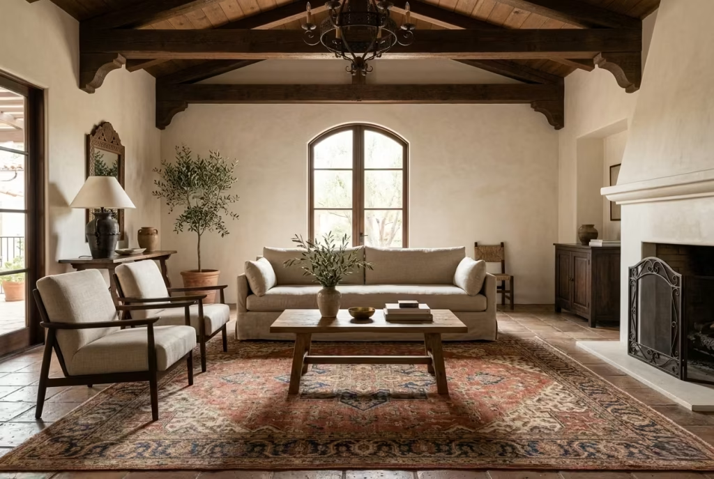
A well-chosen rug does more than sit under furniture. It quietly pulls the entire room into focus, like drawing a circle around a conversation so it does not drift. In a Modern Spanish Colonial living room, where tones tend to stay restrained and materials carry subtle variation, a terracotta or softly patterned rug becomes the element that anchors everything in place.
What it does visually
A rug in warm terracotta or a muted heritage pattern introduces an immediate sense of grounding. It defines the seating area, giving it weight and clarity, particularly in open or loosely arranged layouts. Without it, furniture can feel as though it is floating, slightly disconnected from the architecture.
The colour plays a crucial role. Terracotta tones echo the sun-baked warmth associated with Spanish Colonial design, but when softened or slightly faded, they avoid feeling overly saturated. Pattern, when handled with restraint, adds movement across the floor plane, breaking up large expanses without overwhelming the room.
There is also a layering effect at play. Against plaster walls, timber, and linen, the rug introduces a different kind of texture, one that sits underfoot but still contributes visually. It is not the loudest element in the room, but it often ends up being the one that ties everything together, almost quietly, behind the scenes.
Why it works in a modern setting
Modern Spanish Colonial interiors rely on balance. You have calm walls, edited furniture, and a palette that does not push too hard. Without something to anchor the lower half of the room, the space can feel slightly unresolved, as though it is still finding its footing.
A rug solves this without adding bulk or clutter. It brings in warmth and pattern, but in a controlled way. Instead of introducing multiple decorative objects, you allow one larger surface to carry that visual interest. It is a case of working smarter rather than harder.
It also aligns with how people use living rooms today. Rugs soften acoustics, add comfort underfoot, and create a more intimate seating zone. They do not just look good, they make the room function better, which, at the end of the day, is what good design should do.
A real-world application note
In a project where the living room measured approximately 4 by 5.5 metres (13 by 18 feet), the initial layout felt slightly adrift. The sofa and chairs were well proportioned, but without a rug, the arrangement lacked cohesion.
We introduced a terracotta-toned rug, around 2.4 by 3 metres (8 by 10 feet), large enough for the front legs of all seating pieces to sit comfortably on it. The change was immediate. The furniture grouping felt intentional, the colours across the room began to relate to one another, and the space took on a sense of completeness that had been missing.
It is often said that a rug finishes a room, but in this case, it felt more like it finally gave the room its footing.
Pros
- Defines and anchors the seating area clearly
- Introduces warmth, colour, and subtle pattern in one move
- Improves comfort and acoustics within the space
Cons
- Incorrect sizing can make the room feel smaller or disjointed
- Strong patterns, if overdone, can compete with other elements rather than complement them
Mix Rustic Wood with Tailored Upholstery
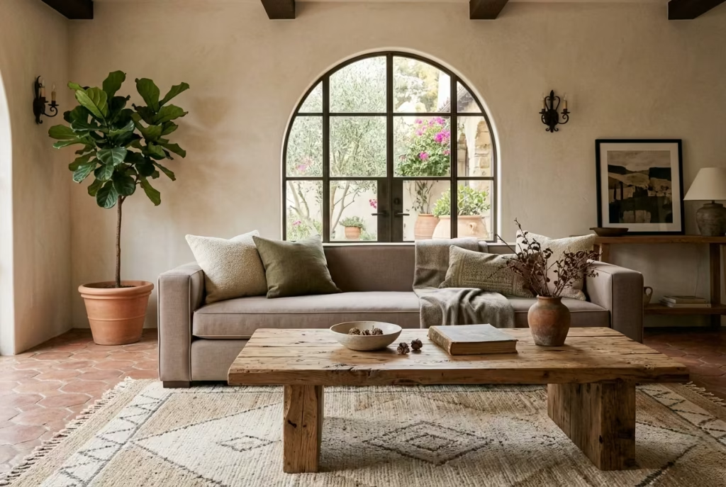
Some rooms fall flat not because they lack quality, but because everything speaks in the same tone. Too much refinement, and the space feels stiff. Too much rusticity, and it starts to feel heavy-handed. The sweet spot, particularly in a Modern Spanish Colonial living room, lies in the tension between the two, where rough meets refined and both are better for it.
What it does visually
Rustic wood introduces irregularity. Grain, knots, slight imperfections, these are the details that catch the eye in a quiet, unforced way. When placed alongside tailored upholstery, clean-lined sofas, structured armchairs, neatly piped cushions, the contrast becomes the point of interest.
It is a bit like pairing a well-worn leather belt with a sharply cut suit. One softens the other. A chunky reclaimed wood coffee table, for instance, sitting against a precisely upholstered linen sofa, creates a layered composition that feels neither overly polished nor overly casual. The eye moves between textures, between finishes, and the room gains depth without adding more objects.
Why it works in a modern setting
Modern interiors often lean towards control. Clean lines, smooth finishes, and uniform materials dominate. While that can look refined, it can also feel a touch one-note if left unchecked.
Introducing rustic wood breaks that uniformity. It brings in a sense of age and tactility, something that feels grounded and slightly imperfect. At the same time, tailored upholstery keeps the room from tipping too far in the other direction. It holds the line, ensuring the space still feels intentional and composed.
This balance is what gives Modern Spanish Colonial interiors their quiet confidence. They do not try too hard, but they are far from accidental.
A real-world application note
In one living room project, the client had invested in a beautifully made, structured sofa in a soft taupe linen, around 220 cm wide (87 inches), with clean, tailored edges. On its own, it felt elegant but slightly restrained, almost as though it was waiting for something to lean against.
We introduced a reclaimed timber coffee table, roughly 140 cm by 70 cm (55 by 28 inches), with visible grain and a slightly uneven finish. The contrast between the two elements changed the dynamic immediately. The sofa felt more relaxed, the table more intentional, and the room, as a whole, found its balance.
It was not about adding more pieces. It was about pairing the right ones, letting each do what it does best.
Pros
- Creates depth through contrast rather than excess
- Balances refinement with warmth and character
- Helps the room feel layered and lived-in
Cons
- Poorly chosen wood can feel too rough or out of place
- Overly tailored upholstery, if not softened elsewhere, can still read as formal
You May also Like: Why Modern Organic Living Rooms Feel So Warm, Calm, and Inviting
Keep Window Treatments Light and Textural
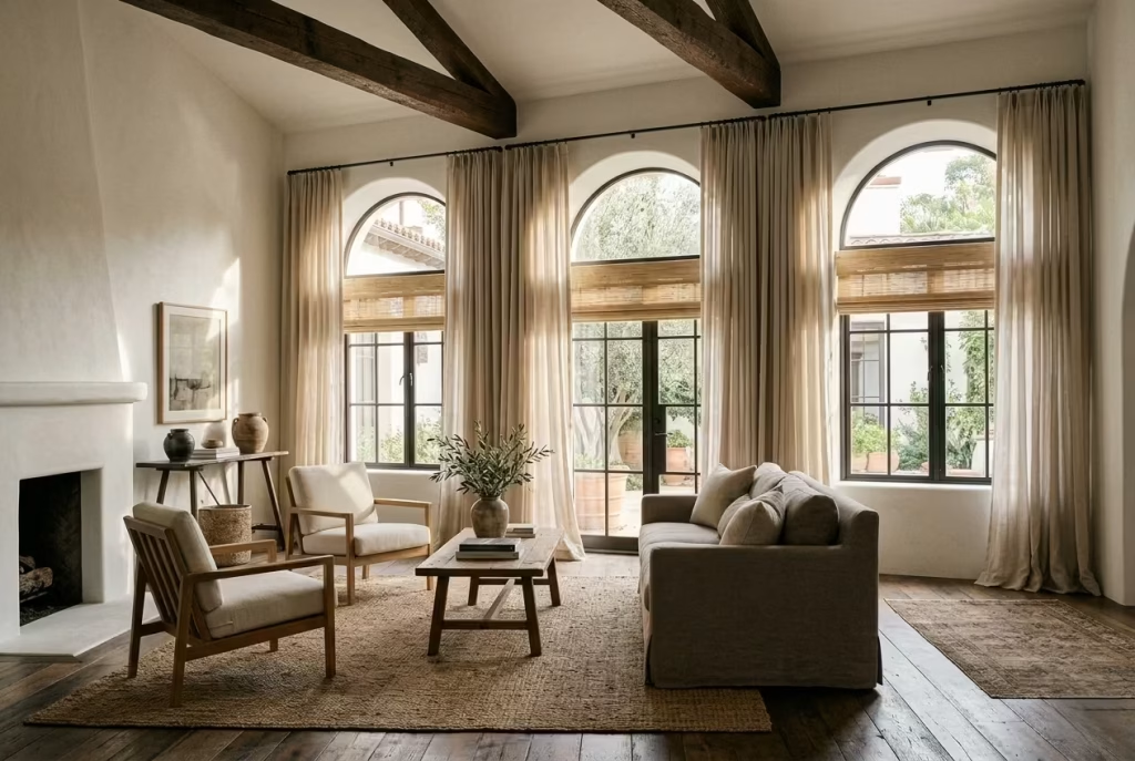
Windows are the eyes of a living room. How you dress them determines how the room sees the world and how the world sees the room. In a Modern Spanish Colonial interior, heavy curtains or ornate drapery often weigh the space down, whereas light, textural treatments allow light to wander freely, softening the room without smothering it.
What it does visually
Sheer linen panels, loosely hung or gently pooled on the floor, introduce movement and subtle pattern through their weave. They filter sunlight, creating soft, shifting shadows across walls and floors. A slightly crinkled texture or a loosely woven fibre catches the eye without demanding it, lending a sense of tactility and comfort. The room breathes. It feels open yet contained, airy but grounded.
Layered textures, such as pairing linen sheers with woven bamboo blinds or a simple cotton voile, create depth without clutter. The eye moves over the treatments as light shifts throughout the day, producing a gentle rhythm that feels organic. It is a quiet design trick, but one that significantly changes perception: a room that could feel static suddenly feels alive, even when empty.
Why it works in a modern setting
Modern interiors often emphasise clean lines and minimal ornament, which can sometimes make windows appear stark or unfinished. Light, textural treatments complement the architecture rather than compete with it. They add warmth and tactility while maintaining a sense of uncluttered calm.
In a Spanish Colonial context, where exposed beams, arched windows, and plastered walls already carry visual weight, understated window dressings prevent the room from feeling overworked. They whisper character rather than shout, allowing architectural details to take centre stage while still softening the overall experience.
Moreover, modern living demands flexibility. Sheers and light panels allow easy adjustment of privacy and sunlight. They help maintain the balance between filtered daylight and intimacy, which is essential for rooms that serve as both social hubs and private retreats.
A real-world application note
In a north-facing living room of approximately 4.8 by 5.5 metres (16 by 18 feet), the client initially had heavy, lined drapes that absorbed light and left the space feeling dim. We swapped them for soft, semi-sheer linen panels hung from a minimal iron rod, paired with natural woven shades that could be raised or lowered as needed.
The effect was dramatic without being theatrical. The room became luminous in the morning, while evening light cast warm, undulating shadows across the plastered walls. The overall aesthetic felt relaxed, tactile, and aligned with the Modern Spanish Colonial sensibility: intentional yet effortlessly liveable.
Pros
- Enhances natural light and room atmosphere
- Introduces subtle texture without adding visual clutter
- Flexible for privacy and light control
Cons
- Lightweight fabrics may lack insulation
- Can appear too sparse if the room requires more visual weight or layering
Use Wrought Iron in Small but Deliberate Doses
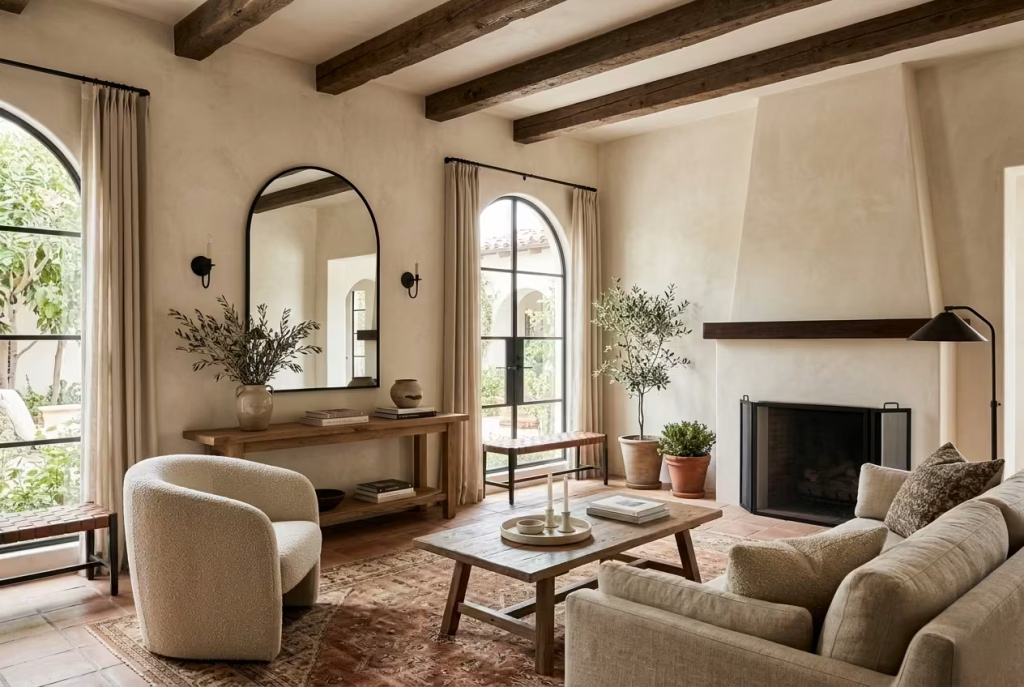
Wrought iron is a material that carries weight in both a literal and visual sense. It has a tendency to dominate if overused, but when deployed with restraint, it becomes a quiet punctuation mark, adding definition and structure to a Modern Spanish Colonial living room. Think of it as the exclamation point in a sentence: powerful when needed, subtle when balanced.
What it does visually
Even in small doses, wrought iron introduces contrast. A blackened iron side table, a slim-framed mirror, or a fireplace screen punctuates a soft palette without overwhelming it. The dark line of iron against plaster or timber draws the eye, guiding attention and providing structure across surfaces that might otherwise drift visually. It also introduces a graphic element linear, arching, or scrollwork—that complements arches, beams, and furniture lines, enhancing rhythm and cohesion.
Beyond visual contrast, wrought iron adds tactility. Its slight coldness and weight are counterbalanced by softer finishes: linen cushions, a boucle armchair, or a terracotta floor. This juxtaposition is subtle but impactful it keeps a room from feeling too “floaty” or undisciplined, providing a grounded counterpoint to lighter elements.
Why it works in a modern setting
In contemporary spaces, the risk is often that accents like iron can appear too decorative or old-fashioned. Restraint is key. Modern Spanish Colonial design is about translation, not replication: wrought iron should be a whisper, not a shout.
When handled thoughtfully, it introduces edge and definition without adding bulk. It punctuates rather than dominates, allowing clean-lined furniture and open layouts to breathe. It also creates tension, a subtle dialogue between softness and structure, old and new, organic and engineered qualities that are inherently satisfying to the eye and to the experience of inhabiting the room.
A real-world application note
On a project with a 5 by 6-metre (16.5 by 20-foot) living room, the client wanted the warmth of Spanish Colonial style without heavy ornamentation. We introduced wrought iron in two key places: a slim-framed mirror above a low console, roughly 100 by 70 cm (39 by 27 inches), and a fireplace screen with minimal scrollwork.
The effect was transformative. Both pieces provided structure and weight without competing with the timber beams, limewashed walls, or terracotta rug. Guests often commented on the sense of cohesion, noting that the room felt deliberate yet effortless—a rare combination that comes from careful, understated interventions rather than trying to fill every corner.
Pros
- Adds contrast, structure, and visual definition
- Complements both soft textures and architectural features
- Can elevate a restrained palette without overpowering it
Cons
- Overuse can make the room feel heavy or dated
- Needs careful placement to avoid competing with other architectural elements
Choose a Stone Coffee Table for Weight and Balance
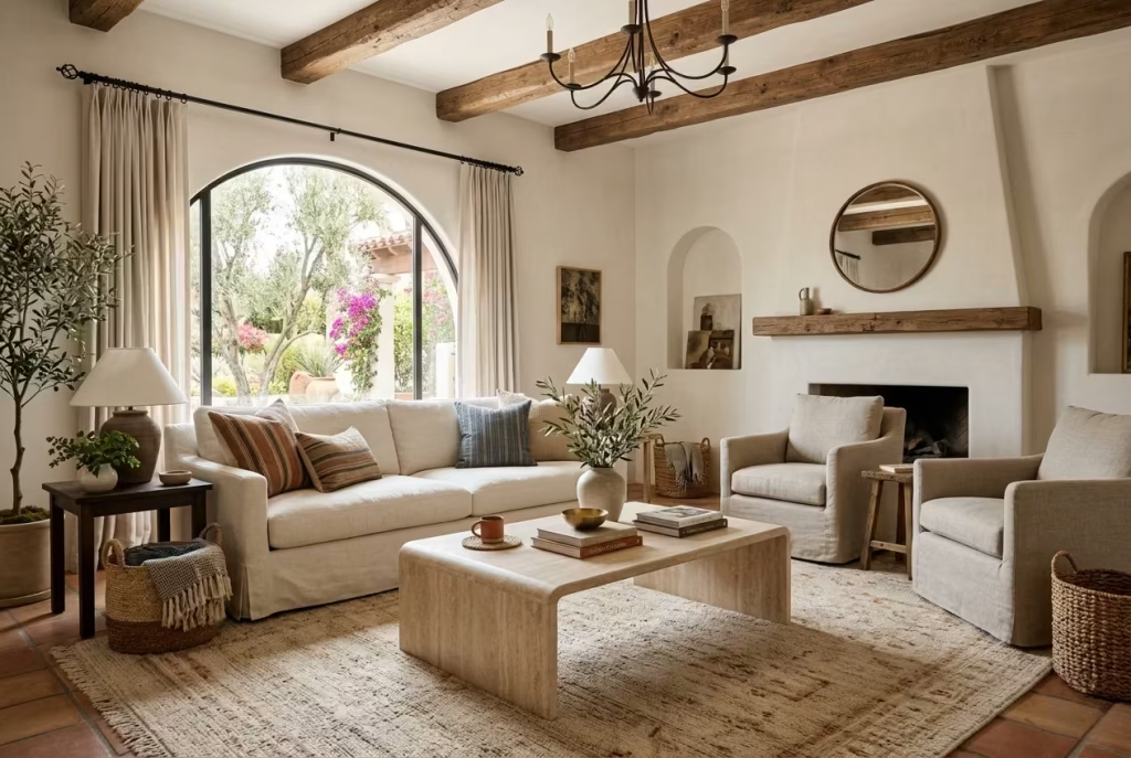
A stone coffee table has a way of anchoring a room without asking for applause. It brings a sense of permanence, the sort of grounded presence that can quietly steady a seating arrangement that might otherwise feel a little too light on its feet. In a Modern Spanish Colonial living room, where plaster walls, timber, linen, and iron are already doing a lot of subtle work, stone steps in as the calm centre of gravity.
What it does visually
Stone has visual authority. Whether it is travertine, limestone, marble, or a more tactile honed stone, the material reads as solid and assured from the moment you enter the room. Unlike glass or slender metal, it does not disappear into the background. It holds its place, giving the furniture arrangement a clear point of focus.
What makes it especially effective in this style is the contrast it creates. Against a soft linen sofa or a textured rug, a stone table introduces a necessary dose of stillness. The room stops feeling like separate pieces arranged in a space and starts feeling like a composition with proper structure. A table around 110 to 140 cm long / 43 to 55 inches, depending on the room size, usually provides enough presence without swallowing the seating area whole.
The finish matters just as much as the material itself. A honed or softly matte surface tends to suit this style better than a glossy one, because it keeps the look grounded and tactile rather than overly polished. That slightly muted finish catches light beautifully, especially in rooms with warm natural daylight, and gives the table an understated elegance that does not need to shout to be noticed.
Why it works in a modern setting
Modern interiors often lean towards lighter, more visually delicate furniture, which can be lovely, but sometimes leaves the room without enough ballast. A stone coffee table solves that problem neatly. It creates balance, both visually and spatially, helping the room feel settled rather than floating around the edges.
In a Spanish Colonial setting, this matters even more. The style already carries architectural warmth and historical depth, so the coffee table should not fight that character. Stone sits comfortably in that world because it feels timeless rather than trendy. It has the right kind of presence, firm but not flashy, like a well-chosen sentence that lands exactly where it should.
It also performs beautifully alongside modern upholstery. A sofa in linen, bouclé, or a tailored cotton blend can sometimes feel a touch airy on its own. The stone table gives it something to orbit around. In design terms, that kind of contrast is worth its weight in gold. It keeps the room from going soft around the edges.
A real-world application note
I once worked on a living room where the client had already chosen a beautiful pale sofa and a large wool rug, but the space still felt unfinished, almost as if it were waiting for its final note. The room was around 5 by 5.5 metres / 16.5 by 18 feet, with good proportions, but everything had a slightly floaty quality to it.
We introduced a rectangular travertine coffee table measuring 120 by 70 cm / 47 by 28 inches, with softly rounded corners and a thick, substantial profile. The impact was immediate. The room stopped drifting and started to settle. The table gave the seating arrangement a centre point, while the natural variation in the stone tied in beautifully with the plaster walls and timber accents.
What surprised the client most was not how striking the table looked, but how much calmer the room felt. That is often the real payoff with a piece like this. It is not about drama. It is about making the whole space feel more sure of itself.
Pros
Stone coffee tables add real visual weight, which is invaluable in rooms that need grounding. They work particularly well with soft textiles and warm neutral palettes, and they bring a level of material richness that reads as quietly luxurious rather than decorative for decoration’s sake. They also age well, and that patina can be part of the charm.
Cons
- Limited sound privacy
- Requires careful lighting and acoustic planning
- Not ideal for confidential or high-noise work
Cons
They are heavy, which makes them harder to move and less forgiving in compact spaces. Some stone finishes can stain or chip if not properly sealed, and the wrong shape or thickness can make the table feel overly dominant. Scale is everything here. Too small, and it looks apologetic. Too large, and it bulldozes the room.
Layer Cushions Instead of Over-Accessorising
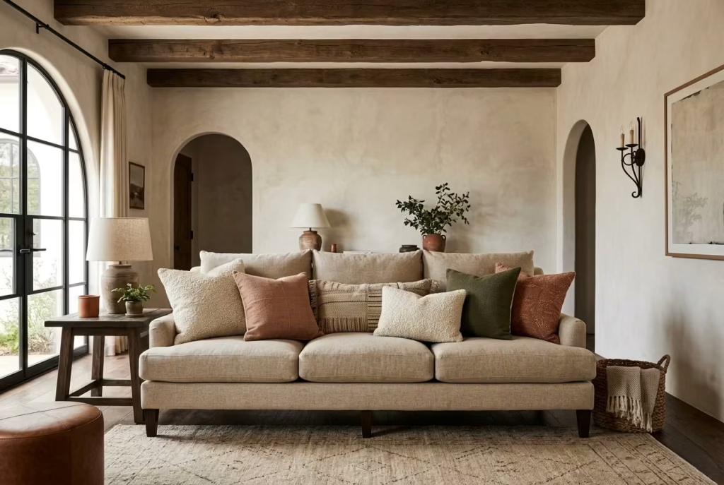
In a Modern Spanish Colonial living room, cushions are more than comfort they are a subtle language that speaks of texture, colour, and intimacy. The trick is not to scatter them like confetti but to layer thoughtfully, creating depth without clutter, and ensuring that each piece earns its place in the conversation.
What it does visually
Layered cushions introduce rhythm and scale across a sofa or seating arrangement. Begin with a couple of larger base cushions in neutral linen or cotton, roughly 60 x 60 cm / 24 x 24 inches, then add smaller accents in textured fabrics like boucle, suede, or woven cotton, around 45 x 45 cm / 18 x 18 inches. A single patterned cushion or one in a deeper ochre, olive, or muted terracotta acts as a focal point, drawing the eye without overwhelming the composition.
The layering creates a three-dimensional quality, giving the seating a sense of generosity and tactility. It is the difference between a room that looks styled versus one that feels inhabited. Each cushion adds a note to the overall palette, much like chords in music, so the seating arrangement feels harmonious rather than cluttered.
Why it works in a modern setting
Modern interiors prize clean lines and restraint, yet bare sofas can feel too austere. Layering cushions achieves balance: it introduces softness and personality without tipping the room into excess. Unlike multiple decorative objects scattered across tables or shelves, cushions are functional, inviting, and easy to change seasonally.
In a Spanish Colonial context, layered cushions echo the tactile richness of traditional interiors think handwoven textiles and textured surfaces but in a scaled, modern way. It is a small intervention with a big impact: tactile warmth, colour depth, and an invitation to sit, stay, and linger.
A real-world application note
On a 4.5 by 5-metre (15 by 16.5-foot) living room project, the client’s neutral linen sofa initially felt stark. Rather than filling tables and shelves with decorative clutter, I added four base cushions in bone linen, two smaller boucle cushions in muted terracotta, and a single deep olive accent pillow.
The transformation was subtle but undeniable. The sofa became a focal point, the space felt more intimate, and the cushions tied the palette together without feeling staged. Guests instinctively gravitated toward the seating—it was soft, approachable, and visually complete.
Pros
- Adds warmth, depth, and tactile interest without visual clutter
- Functional and flexible, easily swapped for seasonal updates
- Enhances the seating’s invitation factor
Cons
- Over-layering can still feel busy if scale and colour aren’t carefully considered
- Cushions alone cannot anchor a room; they need to work with furniture and architectural elements
Let a Sculptural Fireplace Become the Focal Point

Few elements in a living room demand attention like a fireplace, and in a Modern Spanish Colonial setting, it can serve as the gravitational centre around which the rest of the room orbits. But the key is subtlety: the fireplace should feel sculptural rather than theatrical, a calm anchor that draws the eye naturally and organizes the space around it.
What it does visually
A sculptural fireplace introduces weight, form, and rhythm all at once. Whether it’s a smooth plastered hood with a gently tapering curve, a stone-clad surround with clean lines, or an understated limewash finish, it commands attention without shouting. Its presence grounds the room, creating a natural gathering point while complementing timber beams, arched niches, and textural wall finishes.
The visual effect is a quiet tension between architecture and interior layers. Soft furnishings, rugs, and accents orbit this core, allowing the space to feel balanced and purposeful. A fireplace of roughly 120–150 cm / 47–59 inches wide and 90–110 cm / 35–43 inches high typically scales well in a medium to large living room without overwhelming the seating arrangement.
Why it works in a modern setting
Modern Spanish Colonial rooms thrive on contrast: warm textures meet clean lines, tactile materials meet open space. A sculptural fireplace bridges these elements. It’s not just a heat source—it is architecture in miniature, a tangible link to the style’s historical roots while still reading contemporary through its restraint.
Unlike heavy mantels or overly ornate surrounds, a minimalist sculptural form adds drama through proportion and presence rather than detail. It commands attention effortlessly, allowing the rest of the room’s softer, lighter elements to shine without competing. In essence, it gives the room a backbone without rigidity.
A real-world application note
In one living room measuring 5 by 5.5 metres / 16.5 by 18 feet, the existing corner felt disjointed and underutilized. We introduced a plastered, sculptural fireplace with a subtle taper and soft, rounded edges, finished in a pale limewash that echoed the walls.
The transformation was immediate. Furniture naturally aligned toward the fireplace, the terracotta rug and linen sofa gained context, and the iron accents and timber beams now read as supporting characters rather than standalone features. The room felt intentional, calm, and anchored—all with a single, well-considered intervention.
Pros
- Establishes a natural focal point and spatial anchor
- Adds architectural interest without excessive ornamentation
- Enhances the sense of warmth and intimacy in the room
Cons
- Requires careful proportion to avoid dominating the space
- Installation costs and building constraints can be significant
- Overly sculptural designs may clash with softer, lighter elements if not balanced carefully
Pair White Walls with Earthy Ceramics
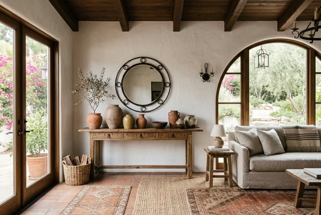
White walls are a staple in Modern Spanish Colonial living rooms, but without texture or contrast, they risk appearing flat or sterile. Introducing earthy ceramics handcrafted terracotta pots, stoneware vases, or subtle glazed pieces adds warmth, tactility, and visual rhythm, transforming a neutral canvas into a space that feels alive and rooted.
What it does visually
Earthy ceramics punctuate white or soft neutral walls with subtle colour and texture. Their ochre, clay, or muted terracotta tones provide a counterpoint to cool whites, creating depth and dimension. Grouped on shelves, consoles, or sideboards, they introduce a rhythmic, almost sculptural quality, guiding the eye along surfaces and adding a human touch.
The irregularities inherent in handmade ceramics slight glaze variations, uneven edges, or subtle markings enhance the tactile richness of the space. Against the crisp backdrop of plastered or limewashed walls, these imperfections feel intentional rather than messy, giving the room character without clutter.
Why it works in a modern setting
Modern interiors often risk feeling too uniform or clinical, particularly when pale walls dominate. Earthy ceramics introduce warmth and a sense of history, connecting contemporary furniture and finishes with the artisanal roots of Spanish Colonial design.
They also allow a room to evolve: pieces can be swapped seasonally, rotated, or layered with greenery, creating subtle shifts without the need for major changes. This approach respects the pared-back modern aesthetic while keeping the space tactile, approachable, and lived-in.
A real-world application note
In a living room measuring 4.5 by 5 metres / 15 by 16.5 feet, the walls were painted a soft bone white. We curated a series of small, handmade terracotta and stoneware vessels, ranging from 20 to 35 cm / 8 to 14 inches in height, placing them in asymmetrical clusters on a timber console and a shallow wall niche.
The effect was transformative. The ceramics drew the eye upward and outward, giving height to low walls and softening the room’s geometric lines. The space immediately felt warmer, more intimate, and subtly tied to the tactile materials elsewhere linen sofas, timber beams, and a terracotta rug.
Pros
- Introduces warmth, texture, and subtle colour contrast
- Highlights artisanal details, adding depth and human touch
- Flexible and easy to refresh with seasonal changes
Cons
- Excessive clustering can feel cluttered
- Heavier pieces require careful placement to avoid visual imbalance
- Fragility means they are not ideal for high-traffic households with young children
Bring in a Vintage Cabinet or Console
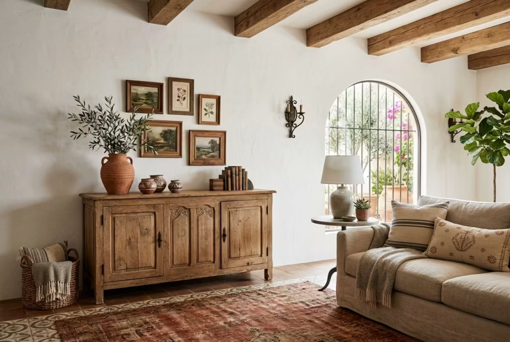
A vintage cabinet or console is like a whisper from the past that anchors a Modern Spanish Colonial living room in time without feeling museum-like. It introduces history, texture, and craftsmanship, all of which play beautifully against clean-lined sofas, plastered walls, and timber beams. A single well-chosen piece can transform a room from curated to lived-in, giving it soul and gravitas.
What it does visually
A vintage cabinet adds weight, proportion, and visual layering. Distressed wood, subtle patina, or hand-carved detailing contrasts with smooth walls and upholstery, creating depth and tactility. Placing it against a blank wall or beneath a gallery of mirrors or artwork gives the room a compositional anchor, guiding the eye and creating a rhythm that complements architectural features.
The choice of finish is critical. Warm walnut, aged oak, or lightly painted surfaces in muted tones work best, avoiding anything too glossy or modern. Typical dimensions for a medium living room are 120–160 cm / 47–63 inches wide, 40–50 cm / 16–20 inches deep, and 75–85 cm / 29–33 inches high, ensuring it reads substantial but does not overwhelm circulation space.
Why it works in a modern setting
Modern interiors can sometimes feel too transient, almost staged, if every surface is new or too perfectly matched. Introducing a vintage piece brings authenticity, grounding the room with a sense of history and craft. In Spanish Colonial design, this plays beautifully with other natural materials timber beams, iron accents, plaster walls allowing the space to feel curated yet warm.
Additionally, a vintage cabinet is functional as well as aesthetic. It can house books, ceramics, or linens, reducing clutter while maintaining a visually rich surface. It encourages a careful editing of possessions, aligning with the Modern Spanish Colonial ethos of layering thoughtfully rather than crowding indiscriminately.
A real-world application note
In a 5 by 5.5-metre / 16.5 by 18-foot living room, the client wanted a storage solution that felt integrated rather than utilitarian. We sourced a reclaimed oak cabinet with subtle carved panels, roughly 140 x 45 x 80 cm / 55 x 18 x 31 inches, and placed it beneath a collection of small framed artworks.
The transformation was immediate. The cabinet brought a grounding element, connected the timber beams and stone accents, and provided practical storage for throws and ceramics. The room felt complete without feeling contrived—an effortless mix of history and modernity that invited people to linger.
Pros
- Adds character, history, and craftsmanship
- Provides practical storage without cluttering the space
- Balances modern, clean-lined furniture with texture and depth
Cons
- Sourcing quality vintage pieces can be time-consuming or costly
- Poorly scaled or overly ornate pieces can dominate or feel out of place
- Requires careful maintenance to preserve finish and integrity
Use Curved Furniture to Soften Angular Rooms
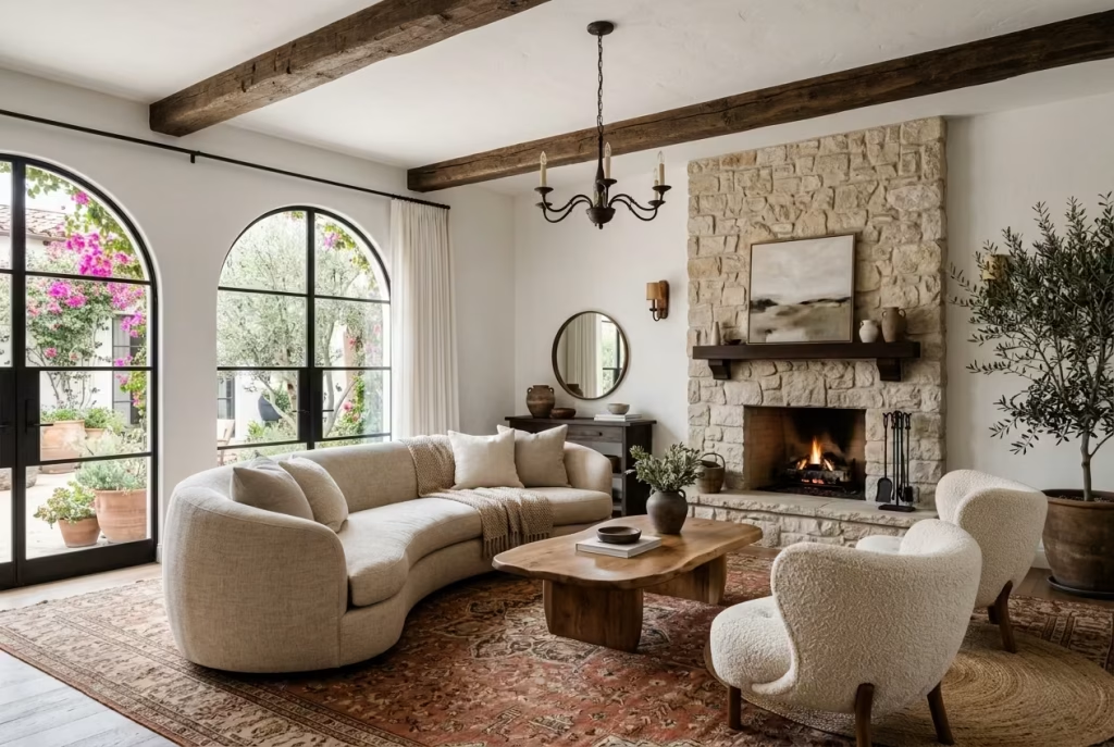
Angular rooms, with their sharp corners and linear layouts, can feel rigid and uninviting if left unchecked. Curved furniture acts like a gentle whisper in such spaces, introducing softness, flow, and visual relief. In a Modern Spanish Colonial living room, where timber beams, plaster walls, and architectural details already assert themselves, curves can balance the formality, creating a sense of approachability and comfort.
What it does visually
Curved sofas, armchairs, or even circular coffee tables break the rigidity of straight lines, introducing a subtle rhythm that guides the eye naturally around the room. For example, a sofa with a low, rounded back or chairs with sweeping arms encourage movement and conversation. They create intimate zones within larger spaces, reducing the harsh geometry of rectangular layouts.
Curves also play beautifully against the hard textures common in this style plastered walls, stone floors, terracotta tiles softening their edges and making the room feel more harmonious. They can also echo architectural arches or niches, reinforcing the Spanish Colonial language without resorting to literal mimicry.
Why it works in a modern setting
Modern interiors prize clean lines, but too much linearity can feel clinical. Introducing curved furniture balances precision with comfort, making the room feel less contrived and more lived-in. In the Spanish Colonial context, this approach merges historical warmth with contemporary sensibilities: the room feels structured yet human, formal yet inviting.
Additionally, curved forms encourage social interaction. Seating arrangements naturally orient people towards one another, fostering a convivial atmosphere ideal for a living room intended for gatherings, reading, or quiet relaxation.
A real-world application note
In a 5 by 6-metre / 16.5 by 20-foot living room, the client’s rectangular layout made the space feel elongated and slightly cold. We introduced a low, crescent-shaped linen sofa approximately 220 cm / 87 inches wide, paired with two curved boucle armchairs with rounded backs (80 cm / 31 inches each).
The impact was immediate. The space felt warmer and more approachable, with a conversational flow that encouraged movement and engagement. The soft curvature contrasted gently with exposed timber beams and a linear stone fireplace, creating a layered, tactile composition that felt intentional and lived-in.
Pros
- Softens rigid lines and adds visual fluidity
- Encourages social interaction and intimate seating arrangements
- Complements architectural arches and organic materials
Cons
- Curved pieces can be harder to place in tight or irregular layouts
- Often more expensive than standard linear furniture
- Oversized curves may dominate small rooms if not proportioned carefully
Incorporate Warm Oak or Walnut Tones
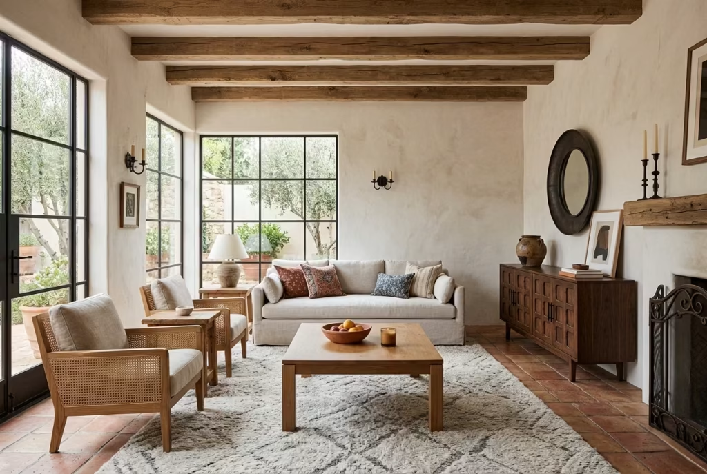
Wood is the heartbeat of a Modern Spanish Colonial living room, and warm oak or walnut tones bring both substance and soul. These rich hues introduce natural depth and sophistication, harmonizing with plaster walls, terracotta floors, and iron accents, while ensuring the room feels grounded and inviting rather than overly stylized.
What it does visually
Warm oak and walnut offer visual weight and texture. Flooring, timber beams, sideboards, or coffee tables in these tones create a layered effect that anchors lighter walls and furnishings. Their subtle grain and tonal variation add interest without needing ornament, and they naturally complement neutral palettes while deepening accent colours like terracotta, olive, and ochre.
Even smaller elements, such as picture frames, shelving, or console tables, carry the warmth through the room, creating continuity. The contrast between soft textiles—linen, cotton, or bouclé—and rich wood tones ensures a balanced composition that reads as intentional and luxurious.
Why it works in a modern setting
In contemporary interiors, whitewashed walls and light upholstery can sometimes make spaces feel airy but a little unmoored. Introducing oak or walnut restores equilibrium, providing structure and substance. It is particularly effective when paired with modern, clean-lined furniture, because it tempers crisp lines with a natural, tactile warmth.
Moreover, these woods age gracefully, developing patina over time, which adds to the timelessness that Modern Spanish Colonial aims for. Their versatility allows them to sit comfortably alongside iron, stone, and ceramics, bridging traditional elements with contemporary styling.
A real-world application note
In a 5 by 5-metre / 16.5 by 16.5-foot living room, the client had a neutral palette dominated by plaster walls and a pale linen sofa. Introducing a walnut sideboard (150 x 45 x 80 cm / 59 x 18 x 31 inches) and oak-framed armchairs immediately anchored the space. The beams overhead were also finished in warm oak, which tied the furniture and architectural features together.
The result was a cohesive, tactile environment. The warmth of the wood provided a visual counterpoint to lighter textures, enhanced natural daylight, and created a sense of permanence. Guests consistently commented that the room felt “both elegant and welcoming,” an outcome often achieved by thoughtful material layering rather than over-accessorising.
Pros
- Adds warmth, depth, and timeless sophistication
- Works seamlessly with neutral palettes and natural materials
- Ages well, developing character over time
Cons
- Can dominate a very small room if used excessively
- Darker tones may make north-facing or low-light rooms feel heavier
- Requires maintenance to preserve finish, particularly in high-traffic areas
Keep the Ceiling Visually Active but Not Busy
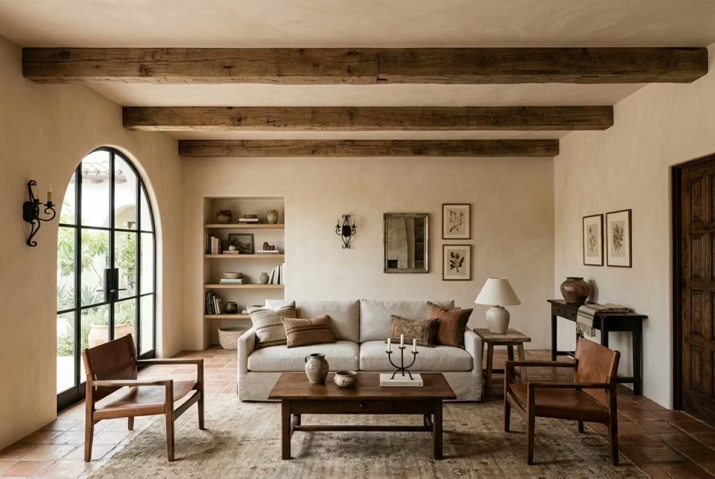
The ceiling is often the forgotten fifth wall, but in a Modern Spanish Colonial living room it can quietly carry a great deal of the atmosphere. Done well, it adds depth, proportion, and a sense of architectural intent. Done badly, it becomes noise overhead, and that is where the whole room can slip off balance. The aim is to give the ceiling something to do, without letting it steal the show.
What it does visually
A visually active ceiling introduces movement, rhythm, and subtle structure. This might come through exposed beams, a softly textured plaster finish, a gentle colour shift, or even a shallow tray detail that catches light and shadow as the day moves on. None of these gestures need to be dramatic. In fact, the quieter they are, the more successful they tend to be.
A ceiling with a little depth helps prevent a room from feeling boxy or unfinished. It gives the eye somewhere to travel upward, which matters especially in rooms with strong horizontal furniture lines. When the ceiling is treated with care, the entire room feels more composed, almost as if it has been properly tailored from top to toe.
The trick is to avoid overcomplication. One strong idea is usually enough. A set of proportionate beams, for example, can create a strong visual cadence, while a limewashed ceiling in a slightly warmer tone than the walls can shift the atmosphere without a single architectural intervention. It is often the second and third layer that cause trouble, not the first.
Why it works in a modern setting
Modern interiors tend to favour clarity, and that is no bad thing. But clarity can easily tip into flatness if every surface is treated the same. The ceiling is a useful place to add interest because it does not interfere with daily movement, yet it has a huge effect on how the room is read as a whole.
In Spanish Colonial design, ceilings have always mattered. They are part of the architecture, not just a blank lid above the furniture. The modern version keeps that principle but pares it back. Rather than ornate detailing or heavy embellishment, the ceiling becomes a place for texture, proportion, and quiet contrast.
This works particularly well in rooms that already have substantial materials elsewhere. If you have stone underfoot, timber in the joinery, and linen on the seating, a ceiling with some presence stops the room feeling too weighty at eye level only. It gives the composition a sense of completion, like a well-set table where every element has a role to play.
A real-world application note
In one living room I worked on, the architecture was strong but a touch severe. The room measured roughly 5.2 by 5.8 metres / 17 by 19 feet, with tall walls and a plain white ceiling that made the space feel slightly austere. Rather than adding more furniture or decorative items, we focused upward.
We introduced three reclaimed timber beams spaced evenly across the width of the room, each around 150 mm deep / 6 inches, and finished the ceiling in a warm matte limewash that sat just a shade softer than the walls. The change was immediate but not showy. The room gained rhythm, the beams helped visually lower the scale just enough to feel more intimate, and the whole space stopped feeling as though it were waiting for something else.
What I liked most was that the ceiling no longer disappeared. It contributed. That is often the difference between a room that looks finished and one that simply looks furnished.
Pros
- Adds architectural interest without cluttering the room
- Helps balance strong horizontal or vertical elements
- Can make a large room feel more intimate and resolved
Cons
- Too many ceiling treatments can feel fussy or overdesigned
- Poorly scaled detailing may make the room feel heavy or cramped
- Some interventions, such as beams or plaster work, may be costly to execute properly
You May also Like: 21 Minimalist Living Room Ideas That Make Your Home Feel Calm and Chic
Use Black-Framed Artwork for Quiet Contrast
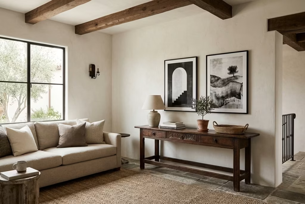
Black-framed artwork is one of those details that rarely shouts, yet it has a habit of pulling a room together behind the scenes. In a Modern Spanish Colonial living room, where walls are usually warm, materials are tactile, and the overall palette leans soft and earthy, a black frame gives the eye a place to rest. It sharpens the composition without hardening it, which is exactly the sort of measured contrast this style needs.
What it does visually
A black frame acts like a fine outline on a drawing. It gives shape to the artwork and creates a crisp visual pause against plaster, limewash, or warm neutral walls. That boundary matters. Without it, lighter artwork can disappear into the wall, especially in rooms where the palette stays within a narrow tonal range.
The effect is quiet, but not negligible. Black frames create a gentle punctuation mark across the room, especially when used in a small group or paired with simple, tonal artwork. They help define a wall arrangement, making it feel intentional rather than merely placed there because the wall needed something. If the room has arches, timber, or iron details, the black frame echoes those lines in a subtle, almost offhand way, which helps the whole scheme feel more cohesive.
The best part is that the contrast is clean rather than harsh. It gives the room a bit of backbone without tipping the space into a high-contrast modern look that would sit awkwardly against softer Spanish Colonial materials. It is a classic case of less being more, but with enough edge to keep the room from drifting into sameness.
Why it works in a modern setting
Modern interiors often rely on restraint, but restraint without contrast can quickly start to feel bland. Black-framed artwork solves that by introducing definition in a controlled, graceful way. It is not loud, not flashy, not trying to steal the scene. It simply gives the room a sharper read.
In a Modern Spanish Colonial interior, that matters because the surrounding palette is often soft and tonal. Warm walls, natural wood, linen upholstery, and stone finishes all tend to blend into one another unless something steps in to separate them. The black frame plays that role beautifully. It outlines, steadies, and quietly elevates.
It also offers a useful bridge between old-world warmth and contemporary clarity. A hand-drawn sketch, a monochrome print, or a muted landscape in a black frame can feel current without losing the soul of the room. The result is a wall arrangement that feels collected rather than arranged, which is a much more convincing note to land on.
A real-world application note
In one living room I worked on, the wall above a vintage console had become a problem area. The client wanted art, but every piece we tried either vanished into the wall or looked too delicate against the timber and stone around it. The room needed something with presence, but not drama for drama’s sake.
We eventually settled on two medium-scale prints in slim black frames, each around 70 by 50 cm / 28 by 20 inches, hung with a little breathing room between them. The artwork itself was understated, a soft charcoal study with warm undertones, but the black frames gave it exactly the right amount of grip.
The change was immediate. The wall no longer felt vague. The frames linked the iron light fixture, the dark timber console, and the deeper accents in the rug, so the whole corner began to read as one thought rather than a collection of separate objects. It is one of those small interventions that can make a room feel as though it finally knows where it is going.
Pros
Black-framed artwork adds structure without overwhelming the room, and it works particularly well in interiors where the palette needs a little sharpening. It is versatile, easy to source, and can make even simple artwork feel more resolved. It also helps unify other dark accents elsewhere in the room, which can be a real advantage in open layouts.
Cons
Used too heavily, black frames can start to feel formulaic or overly graphic. In a very small or dim room, too many dark outlines can make the space feel tighter than it should. The trick is moderation. One strong frame often says more than a wall full of them ever could.
Add Woven Textures to Avoid a Flat Finish
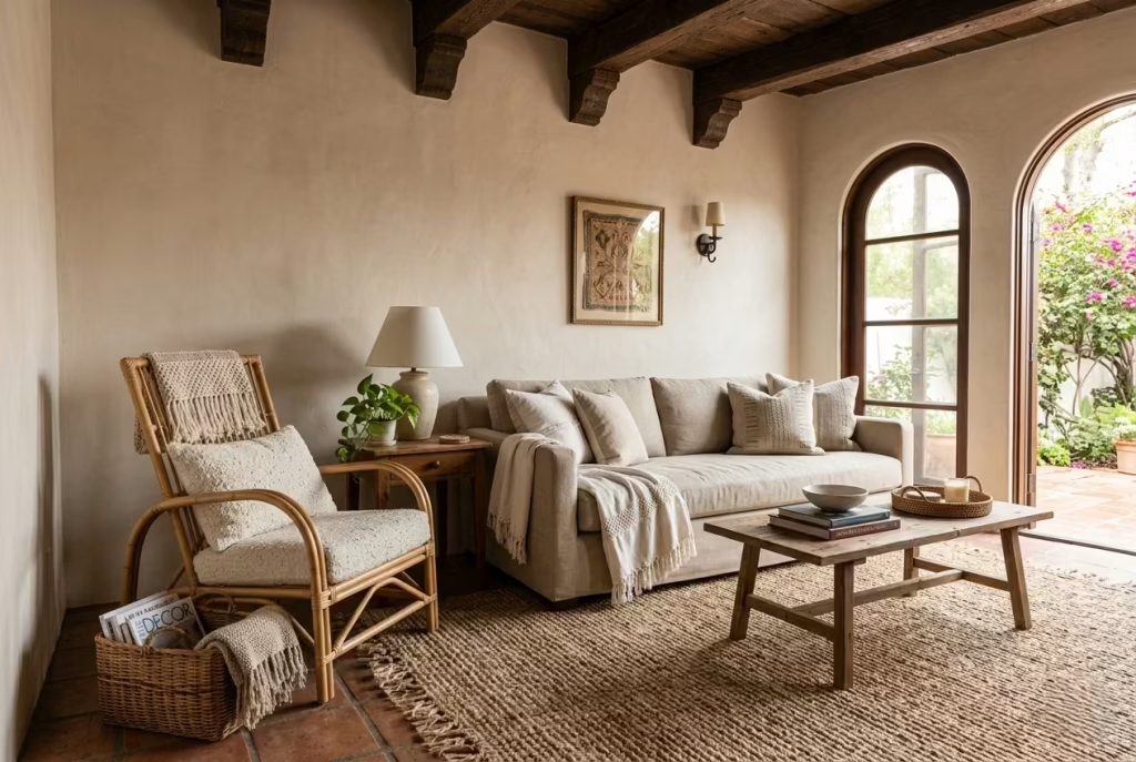
A Modern Spanish Colonial living room thrives on layers, and nothing adds subtle depth quite like woven textures. From jute rugs and rattan chairs to wicker baskets and linen throws, these elements prevent a room from feeling one-dimensional. They are the quiet heroes of the space, adding tactility, rhythm, and a whisper of organic warmth without overwhelming the design.
What it does visually
Woven textures create visual interest through shadow, pattern, and surface variation. A sisal rug underfoot, a rattan armchair, or a woven linen throw on a sofa introduces a tactile counterpoint to smooth plaster walls, polished timber, or sleek upholstery. Even subtle differences in weave density or fibre tone create a sense of depth that engages the eye and invites touch.
These textures break up expanses of neutral colour and soft surfaces, helping the room read as intentional rather than flat or overly staged. They also guide the eye naturally across the space: a rattan basket draws attention to a corner, while a textured rug anchors the seating arrangement.
Why it works in a modern setting
Modern interiors often favour clean lines and pared-back surfaces, which can sometimes feel sterile. Introducing woven textures softens that precision, balancing minimalism with warmth. In Spanish Colonial design, where materials like timber, terracotta, and iron dominate, woven elements act as a gentle connective tissue. They are forgiving, approachable, and flexible, allowing you to layer without clutter.
Additionally, these textures age beautifully. A jute rug or a handwoven throw will acquire a subtle patina over time, adding character and reinforcing the room’s lived-in, timeless feel. The organic irregularities of natural fibres enhance authenticity, making the space feel curated rather than manufactured.
A real-world application note
In a 5.5 by 6-metre / 18 by 20-foot living room, the client’s neutral palette risked feeling flat against the pale walls and light timber beams. We layered a natural jute rug, placed a woven rattan armchair in one corner (80 x 80 cm / 31 x 31 inches footprint), and added linen and cotton throws with subtle macramé detailing.
The result was immediate. The room gained rhythm and tactility without additional colour, and the layered textures encouraged casual interaction: blankets were draped over a sofa, baskets held magazines, and the armchair became a natural reading nook. The space felt dynamic, lived-in, and intimately human, all while retaining its clean, modern lines.
Pros
- Adds depth, tactility, and organic warmth without clutter
- Complements natural materials and neutral palettes
- Ages gracefully, enhancing authenticity and character
Cons
- Some woven fibres (like jute) can be coarse or shed initially
- Requires careful cleaning and maintenance in high-traffic areas
- Overuse can make a space feel too rustic if not balanced with smoother surfaces
Include One Statement Lantern or Pendant
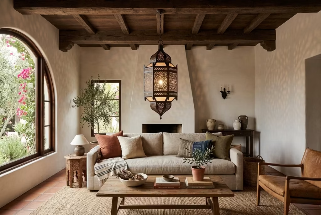
Lighting in a Modern Spanish Colonial living room is more than functional it’s an opportunity to punctuate the space with drama, warmth, and architectural character. A single statement lantern or pendant can anchor the room visually, creating a sense of hierarchy and focus without overwhelming the subtle layering of textures, timber, and plastered walls.
What it does visually
A well-chosen lantern or pendant introduces vertical interest, drawing the eye upward and emphasizing the room’s proportions. Materials like wrought iron, aged brass, or hammered copper provide texture and depth, while an intricate silhouette casts gentle shadows, animating ceilings and walls in the softest of ways.
For example, a lantern with geometric cutouts will scatter light across a plaster wall, subtly highlighting imperfections and texture in a manner that feels deliberate and artisanal. Even a minimalist iron pendant with a slightly oversized bulb can serve as a visual anchor above a low sofa or coffee table, giving the room rhythm and cohesion.
Why it works in a modern setting
Modern interiors often lean on understated colour palettes and pared-back furniture. A statement light does the heavy lifting for interest and personality, serving as both sculptural object and functional element. In Spanish Colonial style, where craftsmanship is celebrated, a lantern or pendant communicates this ethos without cluttering the floor or surfaces.
Additionally, it allows for flexibility. A single, strong piece is easier to edit around than multiple small fixtures, maintaining the calm and intentionality that modern interiors crave. It bridges old-world charm with contemporary restraint, a balance that makes the space feel both curated and approachable.
A real-world application note
In a 5 by 5.5-metre / 16.5 by 18-foot living room with high ceilings, the client wanted to add interest above the seating area without overwhelming the space. We selected a wrought iron pendant lantern approximately 60 cm / 24 inches in diameter, hung 210 cm / 7 feet from the floor.
The effect was immediate. The lantern brought focus to the centre of the room, subtly reflected the black iron accents on furniture and artwork, and worked with the timber beams overhead to create a sense of layered architecture. Even at night, the warm glow softened the room’s plastered walls and highlighted textures, making the living room feel simultaneously intimate and sculpturally refined.
Pros
- Creates a strong visual anchor without cluttering the room
- Adds warmth, texture, and subtle drama through light and shadow
- Bridges historic Spanish Colonial aesthetics with modern restraint
Cons
- Oversized or heavily ornate fixtures can overpower a modest space
- Installation may require structural reinforcement for heavier lanterns
- Poorly scaled lighting can disrupt the visual rhythm of the room if not carefully positioned
Style Shelves with Restraint
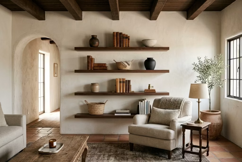
Shelves in a Modern Spanish Colonial living room are not just storage they are a stage for curation, a place where objects can speak quietly without shouting. Styling them with restraint ensures the room feels considered, calm, and elegant, rather than cluttered or chaotic. A thoughtfully edited shelf turns storage into storytelling.
What it does visually
When styled with restraint, shelves become a visual pause, guiding the eye without overwhelming it. Placing a few well-chosen objects ceramic vases, aged leather books, small woven baskets, or a single sculptural piece creates rhythm and balance. Negative space is as important as the items themselves; it allows textures, wall finishes, and architectural details to breathe.
A shelf curated in this way complements the overall Spanish Colonial aesthetic: tactile, layered, and quietly rich. A single niche or floating shelf can highlight the natural beauty of a timber beam, a textured wall, or the warm glow of light catching a copper detail. Overcrowding, by contrast, dilutes the effect, making even the most luxurious materials feel muddled.
Why it works in a modern setting
Modern interiors prize clarity and intention, and shelves are no exception. In a space with clean lines and a soft neutral palette, restraint ensures each object earns its place. It also allows flexibility—rotating pieces seasonally or according to mood keeps the room dynamic without introducing visual chaos.
In Spanish Colonial rooms, where materials are already rich plaster walls, terracotta floors, timber beams—an edited shelf ensures that texture, light, and proportion remain the focus. It is a subtle way to layer personality into the room while preserving the composure and calm essential to a modern interior.
A real-world application note
In a 4.8 by 5.5-metre / 16 by 18-foot living room, the client had a wall of built-in shelving that initially felt heavy with books, frames, and decorative objects. We pared it back to a few ceramics, one woven basket, and a small collection of leather-bound books.
Each shelf measured roughly 30 cm / 12 inches deep, and objects were spaced with at least 10–15 cm / 4–6 inches between them to let light and wall texture show. The room instantly felt lighter and more intentional. Guests noticed the shelves “felt curated, not cluttered,” and the negative space made the architectural features—the timber beams and plaster walls—more pronounced.
Pros
- Highlights architectural details and materials without competing with them
- Encourages intentional curation and seasonal rotation of objects
- Prevents visual clutter while maintaining warmth and personality
Cons
- Can feel sparse if over-edited or if objects lack visual weight
- Requires thought and occasional rotation to keep shelves looking fresh
- Some may struggle to resist the temptation to fill every gap, which can undo the effect
Style Shelves with Restraint
Shelves in a Modern Spanish Colonial living room are not just storage they are a stage for curation, a place where objects can speak quietly without shouting. Styling them with restraint ensures the room feels considered, calm, and elegant, rather than cluttered or chaotic. A thoughtfully edited shelf turns storage into storytelling.
What it does visually
When styled with restraint, shelves become a visual pause, guiding the eye without overwhelming it. Placing a few well-chosen objects ceramic vases, aged leather books, small woven baskets, or a single sculptural piece creates rhythm and balance. Negative space is as important as the items themselves; it allows textures, wall finishes, and architectural details to breathe.
A shelf curated in this way complements the overall Spanish Colonial aesthetic: tactile, layered, and quietly rich. A single niche or floating shelf can highlight the natural beauty of a timber beam, a textured wall, or the warm glow of light catching a copper detail. Overcrowding, by contrast, dilutes the effect, making even the most luxurious materials feel muddled.
Why it works in a modern setting
Modern interiors prize clarity and intention, and shelves are no exception. In a space with clean lines and a soft neutral palette, restraint ensures each object earns its place. It also allows flexibility rotating pieces seasonally or according to mood keeps the room dynamic without introducing visual chaos.
In Spanish Colonial rooms, where materials are already rich plaster walls, terracotta floors, timber beams—an edited shelf ensures that texture, light, and proportion remain the focus. It is a subtle way to layer personality into the room while preserving the composure and calm essential to a modern interior.
A real-world application note
In a 4.8 by 5.5-metre / 16 by 18-foot living room, the client had a wall of built-in shelving that initially felt heavy with books, frames, and decorative objects. We pared it back to a few ceramics, one woven basket, and a small collection of leather-bound books.
Each shelf measured roughly 30 cm / 12 inches deep, and objects were spaced with at least 10–15 cm / 4–6 inches between them to let light and wall texture show. The room instantly felt lighter and more intentional. Guests noticed the shelves “felt curated, not cluttered,” and the negative space made the architectural features the timber beams and plaster walls more pronounced.
Pros
- Highlights architectural details and materials without competing with them
- Encourages intentional curation and seasonal rotation of objects
- Prevents visual clutter while maintaining warmth and personality
Cons
- Can feel sparse if over-edited or if objects lack visual weight
- Requires thought and occasional rotation to keep shelves looking fresh
- Some may struggle to resist the temptation to fill every gap, which can undo the effect
Blend Old and New Pieces for Depth
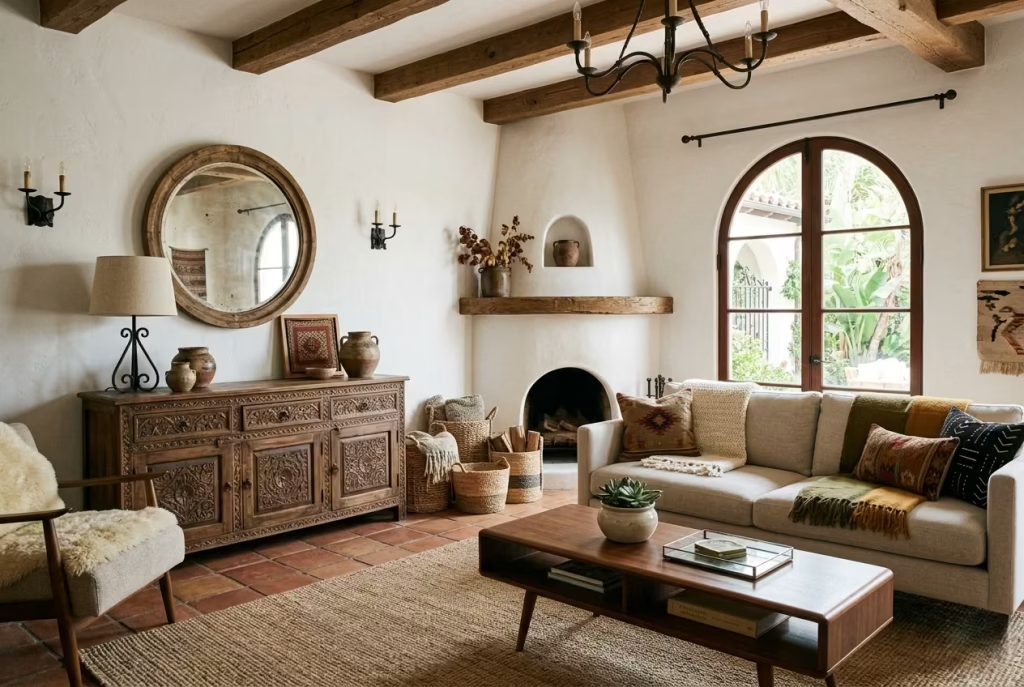
One of the hallmarks of a Modern Spanish Colonial living room is its layered narrative. Bringing together old and new pieces injects a sense of history and authenticity, allowing the room to feel curated over time rather than staged in a single sitting. It is a subtle way of telling a story without a single element overpowering the others.
What it does visually
Combining antique or vintage furniture like a worn leather armchair, a carved wooden console, or a reclaimed sideboard with contemporary sofas, lighting, or coffee tables creates contrast and dimensionality. The eye is drawn across textures, finishes, and forms, giving the room richness that flat, uniform styling rarely achieves.
This approach also prevents the room from feeling museum-like. The patina on an old piece, the imperfections in hand-hewn wood, or the slightly faded tones of a vintage rug communicate warmth and lived-in charm, which anchors modern elements that might otherwise feel clinical. Together, they generate a visual dialogue, layering character, scale, and subtle complexity into the space.
Why it works in a modern setting
Modern interiors often favour clean lines and restrained palettes, but these can feel sterile if unbalanced. Introducing older, characterful pieces gives the room soul while still respecting modern sensibilities. It provides a tension between the past and present that feels natural, effortless, and deeply human.
In a Spanish Colonial context, where timber beams, terracotta floors, and plastered walls already speak to tradition, contemporary furniture balances heritage with livability. The interplay ensures that spaces feel authentic and approachable, rather than overly polished or historicist.
A real-world application note
In a 5.2 by 6-metre / 17 by 20-foot living room, we paired a mid-century walnut coffee table with a reclaimed carved sideboard (180 x 50 x 80 cm / 71 x 20 x 31 inches). A modern linen sofa softened the contrast, while woven baskets and textured throws tied both eras together.
The effect was immediate: the room felt layered, thoughtful, and grounded. Visitors remarked on the “comfortable sophistication” and noted how the older pieces made the contemporary furniture feel more tactile and inviting. The result was a space that looked naturally evolved, as if each piece had arrived over time, yet still maintained coherence.
Pros
- Adds visual depth, character, and narrative to the room
- Creates a sense of history and authenticity without clutter
- Balances modern clean lines with tactile warmth
Cons
- Requires careful curation to avoid a mismatched or haphazard look
- Older pieces may need restoration or refinement to sit comfortably with new furniture
- Too many vintage items without modern counterpoints can make the room feel heavy or dated
Introduce a Sofa and Chair Pairing Rather Than a Full Matching Set
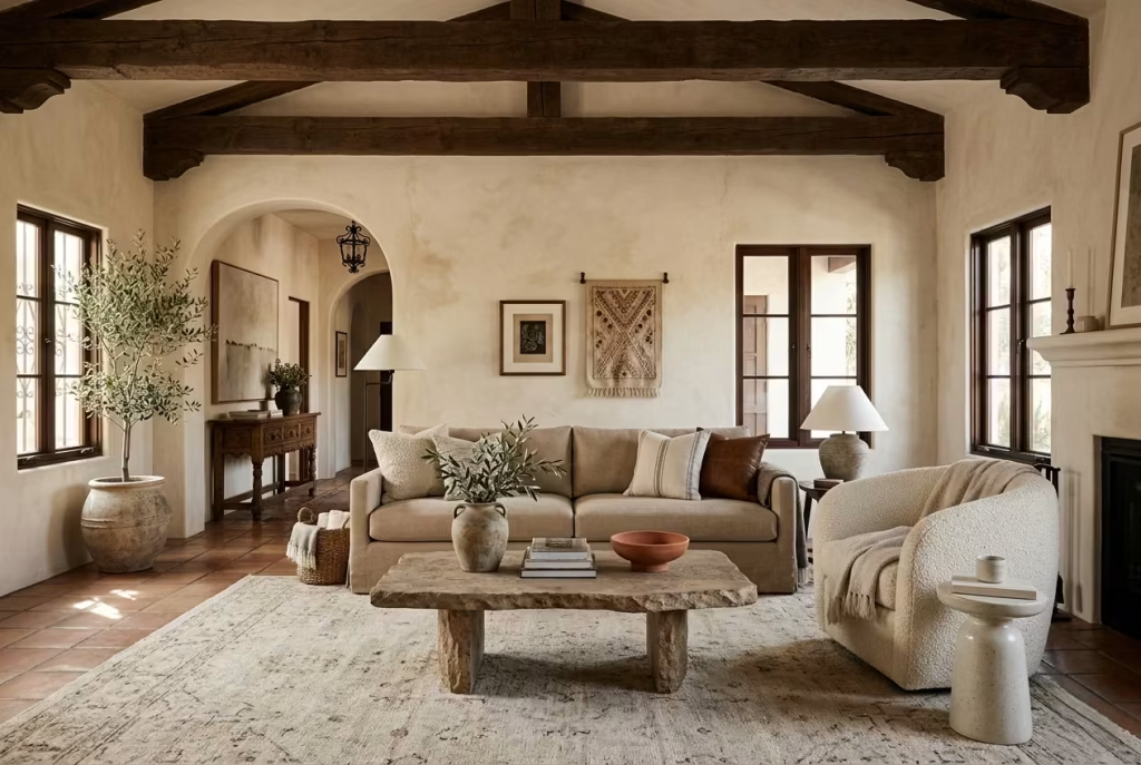
In a Modern Spanish Colonial living room, uniformity can sometimes feel rigid. Instead of opting for a matching sofa set, pairing a sofa with one or two complementary chairs introduces flexibility, personality, and visual rhythm. This approach allows each piece to breathe, creating a conversational layout that encourages both comfort and movement.
What it does visually
A sofa and chair pairing breaks up mass and scale while adding layers to the seating arrangement. For instance, a low, linen sofa can sit alongside a curved leather armchair, a rattan frame, or a boucle accent chair. The contrast in material, shape, or colour generates subtle tension that keeps the eye engaged.
Visually, this pairing prevents the room from feeling overly symmetrical or staged. Each piece has room to be appreciated on its own, while the combination reads as intentional rather than haphazard. It also opens up sightlines, making the space feel larger and more inviting, especially in rooms with architectural features like timber beams, arches, or textured walls.
Why it works in a modern setting
Modern interiors value clarity, proportion, and flexibility. By avoiding a full matching set, the room gains adaptability for entertaining, reading nooks, or informal gatherings. In a Spanish Colonial context, where textures, materials, and architectural details are rich, varied seating allows the furniture to complement rather than compete with the surroundings.
The approach also encourages layering of fabrics, finishes, and tones. A soft linen sofa paired with a dark leather chair or a carved wooden armchair reinforces the room’s tactile depth while maintaining a clean, modern edge. It’s a subtle way to make the room feel collected over time rather than formulaic.
A real-world application note
In a 5 by 5.5-metre / 16.5 by 18-foot living room, the client wanted a comfortable seating arrangement without creating a rigid, matchy feel. We selected a 2.4-metre / 8-foot linen sofa and paired it with a bouclé armchair measuring 85 x 85 cm / 33 x 33 inches.
The arrangement allowed for flow around the central stone coffee table and framed the fireplace naturally. The varied materials the soft linen against the textured boucle created subtle tension, while the warm wood legs echoed the timber beams overhead. Guests instinctively gravitated to the chairs, which felt intimate yet part of the overall conversation zone.
Pros
- Introduces visual interest and texture contrast without clutter
- Encourages flexible and conversational seating arrangements
- Prevents the room from feeling too rigid or formulaic
Cons
- Requires careful selection to ensure the pieces harmonize in scale and style
- Poorly balanced pairings can disrupt the room’s flow or feel disjointed
- Mixing too many materials or colours may dilute the cohesive Spanish Colonial feel
Use Layered Lighting for Evening Warmth
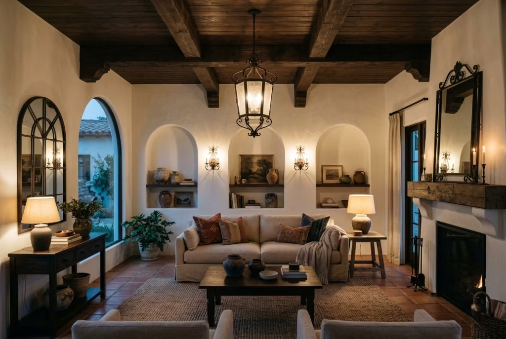
Lighting is more than illumination it is the mood, the atmosphere, and often the unsung hero of a Modern Spanish Colonial living room. Layered lighting, combining ambient, task, and accent sources, transforms the space after sunset, giving it depth, intimacy, and a subtle theatricality that feels natural rather than staged.
What it does visually
Layered lighting creates a sense of dimension, drawing the eye across planes and textures. A central pendant or lantern provides ambient light, wall sconces highlight plaster or limewashed walls, and table or floor lamps accentuate corners, seating areas, and textural details. The interplay between light and shadow emphasizes timber beams, woven rugs, and sculptural objects, making the room feel enveloping and alive.
A warm, layered glow softens edges and tones down high-contrast features. It encourages the eye to linger on details—the curve of a terracotta vase, the patina on a wooden console, the weave of a basket—rather than being dominated by a single overhead source. It also subtly modulates the room’s rhythm, helping each material and architectural feature tell its own quiet story.
Why it works in a modern setting
Modern interiors often rely on clean, neutral palettes and minimalism, which can feel flat without nuanced lighting. Layering ensures depth without adding clutter. In Spanish Colonial spaces, it allows the tactile, historic qualities of materials plaster, stone, timber, and iron to read as intended. Each layer can be dimmed, adjusted, or accentuated depending on activity: reading, entertaining, or simply winding down in the evening.
Moreover, layered lighting supports a sense of intentionality. It signals that the room was considered from multiple angles and times of day, giving it a subtle sophistication that feels earned rather than imposed.
A real-world application note
In a 5.5 by 6-metre / 18 by 20-foot living room with high ceilings and timber beams, we installed a wrought iron pendant above the central seating area (60 cm / 24 inches diameter, hung 2.1 m / 7 feet from the floor), flanked by wall sconces highlighting plaster niches, and two small table lamps (50 cm / 20 inches tall) on side tables.
At night, the layered combination created a soft, enveloping warmth. The shadows of the beams and textured walls danced subtly across the room, and the tactile elements the rug, linen upholstery, and woven baskets took on a richer, more intimate presence. The client noted how “the room feels alive, without ever being harsh or fussy,” which is exactly the balance layered lighting provides.
Pros
- Enhances depth, texture, and architectural features
- Provides flexibility for different activities and moods
- Softens modern minimalism while reinforcing Spanish Colonial warmth
Cons
- Requires planning and careful placement to avoid over-illumination or shadow clutter
- Installation can be more complex than a single overhead fixture
- Poorly balanced layers may create uneven light, which can diminish the room’s elegance
You May also Like: 25 Indoor–Outdoor Living Room Ideas That Redefine Modern Living
Add One Bold Textile with Heritage Character
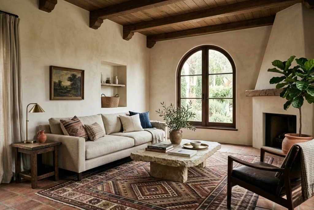
A single textile with real presence can do what a room full of ornaments often cannot. It brings the scheme to life, not by shouting, but by introducing pattern, history, and a sense of hand-made authenticity that feels lived in from the start. In a Modern Spanish Colonial living room, that one bold piece can become the thread that ties the whole composition together.
What it does visually
A heritage textile, whether it is a kilim cushion, a handwoven throw, an embroidered bolster, or a vintage rug with worn patterning, adds instant depth. It interrupts the calm of plaster walls and linen upholstery in exactly the right way, giving the eye something to land on. Without it, the room can sometimes feel a little too polite, all soft neutrals and sensible materials. With it, the room gains a pulse.
Pattern matters here, but so does restraint. The best bold textiles do not swarm across the room. They arrive as a single, confident gesture. A richly patterned throw folded over the back of a sofa, for example, can shift the mood of the entire seating area. It adds movement, colour, and a sense of story, almost like a well-placed quotation mark at the end of an otherwise quiet sentence.
The texture is just as important as the design. Woven wool, hand-knotted pile, or slightly irregular embroidery brings tactility that printed fabric cannot match. You feel the difference even before you touch it. The room stops reading as polished and starts reading as personal.
Why it works in a modern setting
Modern interiors can become too controlled if every surface is restrained and every fabric is neutral. A bold textile prevents the room from slipping into blandness. It adds a note of character without forcing the whole scheme to become busy. That balance is exactly what makes it so effective in a Spanish Colonial setting, where warmth and heritage should feel present, but never fussy.
This kind of textile also acts as a bridge between old and new. It can soften a clean-lined sofa, loosen up a formal layout, or bring life to an otherwise calm corner. In other words, it earns its keep. It is not there to decorate for decoration’s sake. It is there to introduce soul, and that is a far more valuable thing.
In practical terms, a strong textile gives you a flexible way to shift the atmosphere of a room without changing the furniture. Swap in one patterned cushion or a throw with deeper colour, and the whole space reads differently. That kind of adaptability is worth its weight in gold, particularly in homes that need to feel seasonal, layered, or gently evolving rather than fixed in place.
A real-world application note
In one living room I worked on, the room had all the right bones: warm limewashed walls, a low linen sofa, a stone coffee table, and oak joinery. Yet it still felt slightly underfed, as though it was waiting for a final flourish. The space measured about 5 by 5.5 metres / 16.5 by 18 feet, which gave us enough room to make a statement without overcrowding the plan.
We introduced a handwoven wool rug with a muted geometric pattern in clay, indigo, and softened cream, sized at 2.4 by 3 metres / 8 by 10 feet. It was bold, but not brash. The colour temperature tied in with the terracotta accents elsewhere in the room, while the pattern added enough movement to keep the lower half of the space from feeling too quiet.
The transformation was immediate. The rug gave the sofa a proper foundation, the timber pieces felt warmer beside it, and the room gained a sense of collected depth that had been missing before. It was one of those details that does not beg for attention, but once it is there, you cannot imagine the room without it.
Pros
A bold heritage textile brings warmth, personality, and texture into a room with very little effort. It can soften modern furniture, enrich a neutral palette, and add that slightly timeworn, collected quality that makes a space feel far more considered. It is also an easy way to introduce pattern without committing to something permanent.
Cons
Too many patterned textiles can tip the room into visual noise. The key is to let one piece lead and keep the rest quieter. A bold textile also needs the right scale. If it is too small, it can feel tokenistic; if it is too large or too busy, it can swallow the serenity of the room whole.
Finish with Plants or Olive Branches for Softness
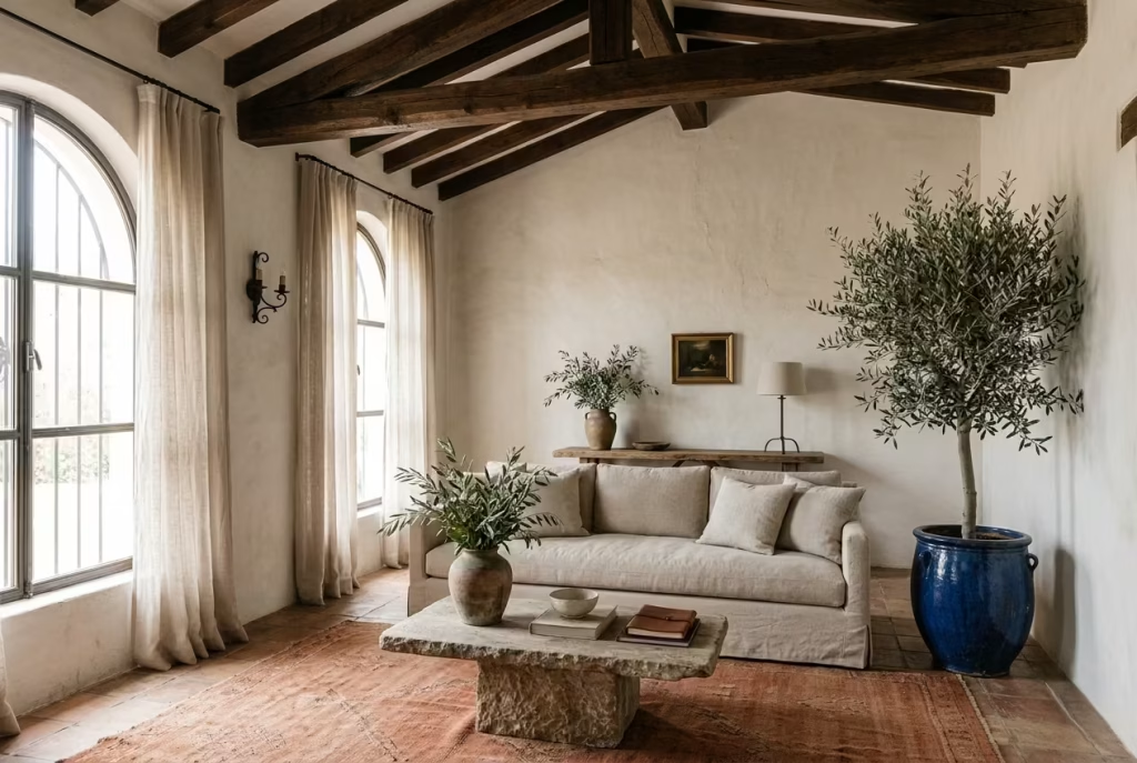
A Modern Spanish Colonial living room is as much about tactile warmth as it is about materials and architecture. Introducing greenery, whether through potted plants, a sculptural olive branch, or a simple arrangement of foliage, softens edges, introduces life, and adds a fleeting seasonal note that feels entirely natural. It is the final touch that makes a room feel lived-in, rather than staged, and brings a subtle poetry to the space.
What it does visually
Plants and olive branches introduce movement, organic shape, and a whisper of green against the neutral palette typical of Spanish Colonial interiors. Their forms break up straight lines and hard edges, drawing the eye upward or outward, depending on placement. A tall potted olive tree beside a sofa or a small grouping of herbs on a side table creates layered height, depth, and a sense of calm vitality.
Foliage also interacts beautifully with light. Sunlight streaming through linen curtains catches leaves in soft shadows, while evening lighting casts gentle shapes across plaster walls or timber beams, adding a quietly dynamic element to the room. Even small sprigs in a vase can punctuate corners or niches, giving the eye a moment to pause and the room a whisper of softness.
Why it works in a modern setting
In modern interiors, clean lines and minimal palettes can sometimes feel too rigid. Plants introduce unpredictability in shape and scale, creating visual interest without overwhelming the scheme. Olive branches, in particular, resonate with Spanish Colonial heritage: they hint at Mediterranean landscapes and historic gardens, reinforcing the narrative of place without resorting to cliché.
Greenery also contributes to wellbeing, a critical aspect of modern design thinking. It makes the room feel breathable, alive, and slightly fragrant. In spaces that are otherwise structured and polished, it softens and humanises, creating a sense of calm that contrasts beautifully with the architectural and material richness of the room.
A real-world application note
In a 5 by 5.5-metre / 16.5 by 18-foot living room with limewashed walls, exposed timber beams, and a terracotta rug, we added a 150 cm / 5-foot tall potted olive tree in a glazed ceramic planter beside a low sofa. Smaller sprigs were placed in aged clay vases on the coffee table and console.
The effect was immediate: the room felt “breathed into,” as the client put it, and the verticality of the olive tree drew the eye toward the ceiling beams, highlighting their texture. Evening lighting caused subtle shadows to play across the walls and floor, enhancing the sense of dimension and layering already established by furniture, textiles, and decorative objects.
Pros
- Adds softness and movement, counterbalancing structural and textural weight
- Introduces natural colour and seasonal variation without dominating the palette
- Reinforces heritage and narrative of the Spanish Colonial aesthetic
- Supports wellbeing and visual calm
Cons
- Requires maintenance and attention; plants can wilt or collect dust
- Poorly chosen scale or placement can block sightlines or interrupt flow
- Overcrowding with greenery can compete with architectural and material highlights, diluting the intended effect
This final touch, subtle yet deliberate, is often what makes a room feel complete, lived-in, and inherently welcoming proof that small interventions can have outsized impact on atmosphere and perception.
Layout and Proportion Tips That Make the Style Work
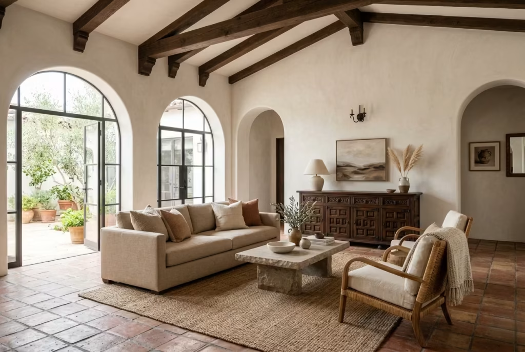
A Modern Spanish Colonial living room can have all the right materials, the right palette, and even the right furnishings, yet still feel slightly off if the layout is not doing its job. This style depends on breathing room. It needs space to let the architecture speak, space for light to move across surfaces, and space for furniture to feel intentional rather than squeezed in as an afterthought. When proportion is handled well, the whole room settles into itself. When it is not, even the most beautiful pieces can feel like they are elbowing one another for attention.
Why Spanish Colonial Rooms Need Breathing Room
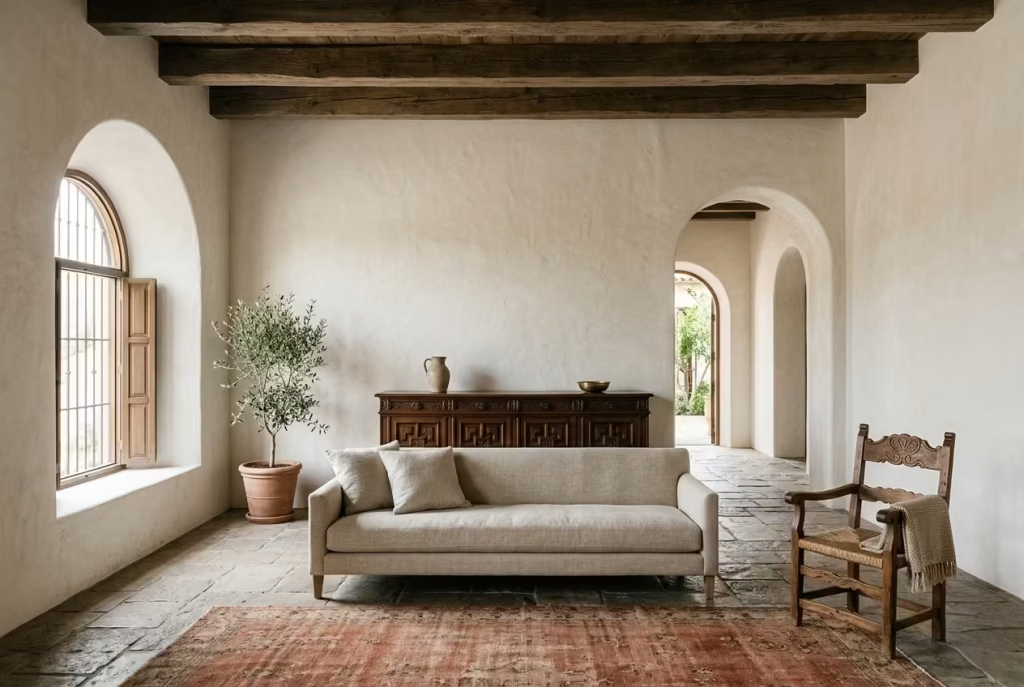
This style is not built on cramming more into a room. It works best when the composition is allowed to breathe. Plaster walls, timber beams, arches, stone, and textured fabrics already carry a fair amount of visual weight, so the layout should give those elements room to register. If the space is overfilled, the character gets smothered a little, and the room starts to feel heavy where it should feel grounded.
Breathing room also gives the eye somewhere to rest. That matters more than people often realise. A living room should not feel like it is competing with itself. The best Spanish Colonial rooms have pauses built into them, a blank wall left unforced, a stretch of floor visible between pieces, a quiet corner that is not overworked. That sense of ease is what allows the style to feel timeless rather than themed.
I have seen this firsthand in rooms that had all the ingredients but none of the space around them. Once we removed one or two unnecessary pieces, the whole atmosphere shifted. The architecture came forward. The room stopped straining and started holding itself properly. That is the real trick, not filling every inch, but knowing where to stop.
How Furniture Scale Affects Authenticity
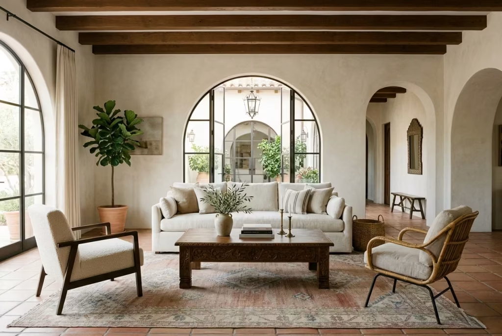
Scale is where this style often lives or dies. Too small, and the room can feel tentative, almost apologetic. Too large, and it starts to feel clumsy, as though the furniture was dropped into place without much thought. Spanish Colonial interiors have a strong architectural presence, so the furniture needs to sit comfortably within that framework. It should feel substantial enough to belong, but not so oversized that it flattens the room’s rhythm.
A sofa, for example, should be generous enough to hold the space, but not so deep or bulky that it overwhelms circulation. A coffee table should feel like part of the conversation zone, not a brute-force object that blocks it. Chairs should have enough visual presence to balance the room, but still leave light and air around them. It is a balancing act, and when it lands correctly, the room feels as though every piece was always meant to be there.
Authenticity is often tied to this sense of proportion. Rooms that feel true to the style usually look as though the furniture and architecture are in conversation with one another. Nothing is fighting for dominance. Nothing looks nervous. The result is quietly persuasive, which is exactly the point.
Why Oversized Seating Can Flatten a Room
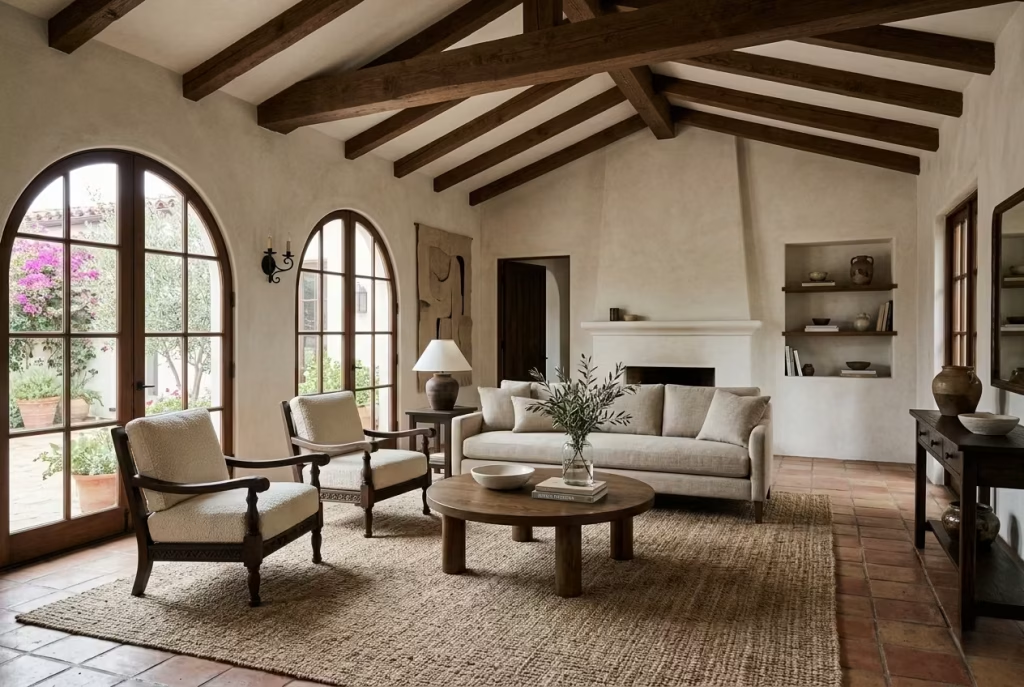
Oversized seating can be very comfortable, and in the wrong setting, that is precisely the problem. If the architecture already has weight through beams, stone, thick walls, or strong openings, then a sofa that is too large can press the room down visually. Instead of adding comfort, it can make the space feel compressed, especially in living rooms with lower ceilings or limited natural light.
There is also a tendency for oversized sofas to absorb too much of the room’s visual energy. They become the whole story. Once that happens, texture and architectural detail start to lose their voice. In a style that relies on interplay between hard and soft surfaces, that is a real loss. The room loses some of its layers and begins to feel one-note.
A better approach is to choose seating that is generous but proportionate, something that feels relaxed without swallowing the floor plan whole. A sofa with the right depth and a lower visual profile can give the room ease without tipping it into heaviness. That kind of restraint tends to age far better too. It reads as thoughtful, not showy, and it leaves room for the rest of the interior to breathe.
The Value of Symmetry Versus Softness
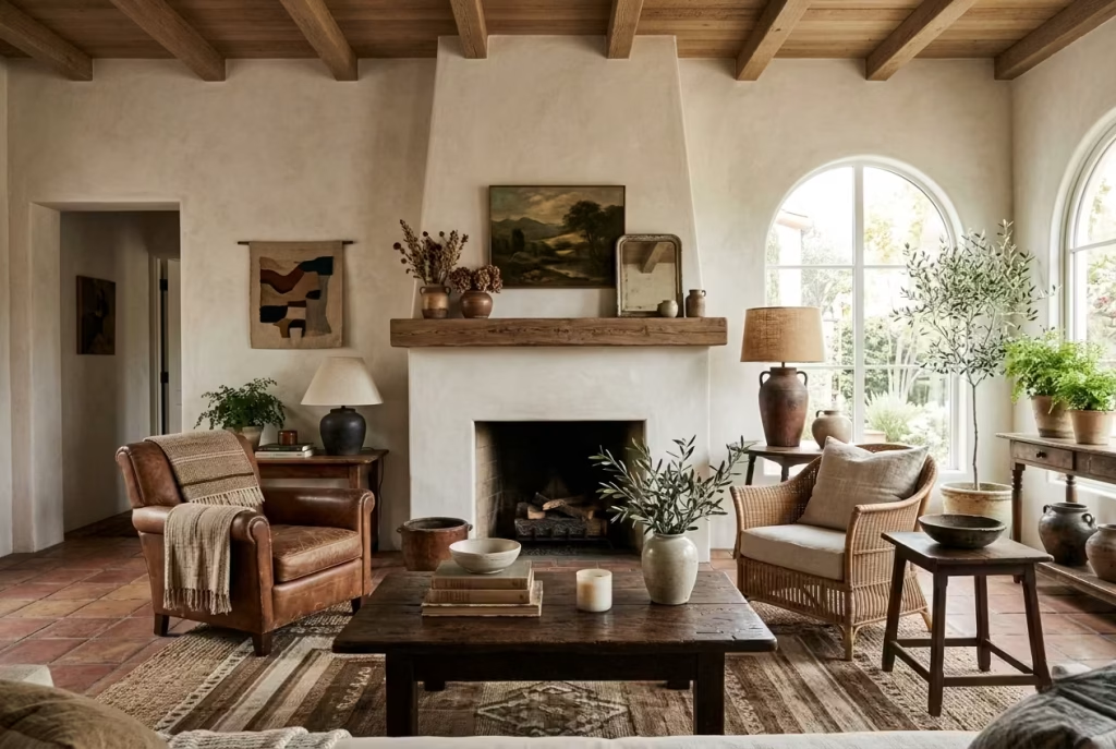
Symmetry can be incredibly effective in a Spanish Colonial living room, but it should never feel rigid for its own sake. This style has enough softness and material variation that an over-ordered layout can quickly feel a touch stiff. The best rooms often use symmetry as a quiet framework, then soften it with organic forms, relaxed textures, or slightly varied accessories.
A balanced pair of chairs, for example, can help anchor a fireplace or coffee table arrangement. But the room should not feel like it has been drawn with a ruler. A little looseness goes a long way. That might mean offsetting a side table with a lamp of a different height, or allowing one piece of artwork to sit a fraction lower than the rest. These slight irregularities keep the room human.
Softness is what stops the symmetry from becoming predictable. It gives the layout a bit of breathing space and helps the room feel more lived-in. In this style, perfection is not the goal. Ease is. And ease usually comes from a controlled imbalance, where things are aligned enough to feel composed, but relaxed enough to feel natural.
Core Measurements That Keep Everything in Check
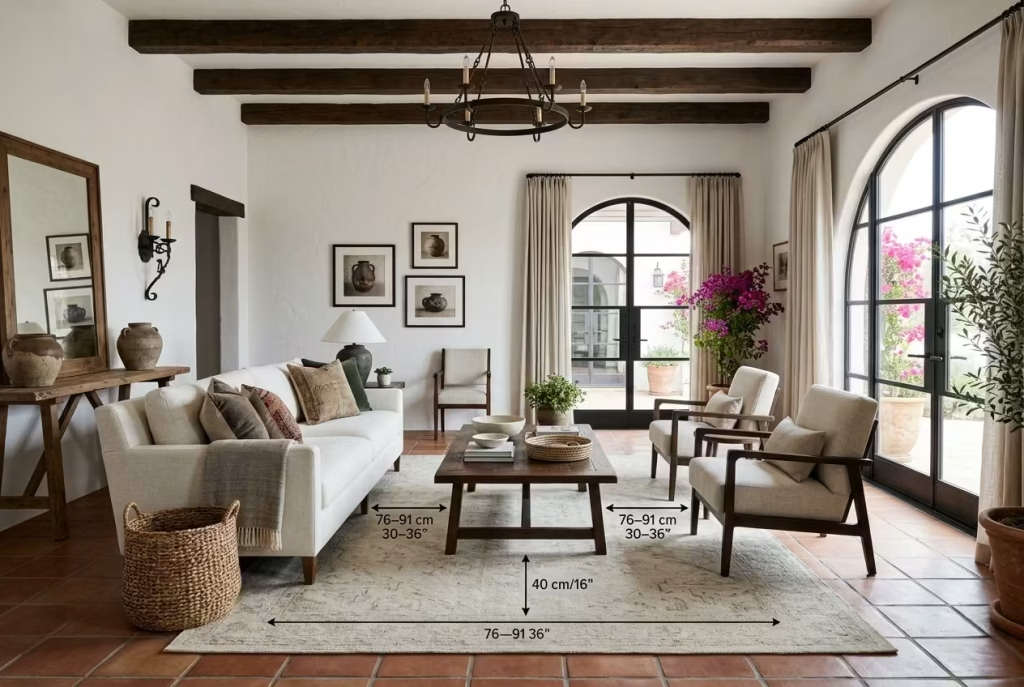
Good proportion is often less about instinct than disciplined spacing. The following measurements are small but important, and they make a noticeable difference to the way the room functions.
The coffee table should sit about 16 to 18 inches / 40 to 45 cm from the sofa. That distance is close enough to be useful, but open enough to allow movement without awkwardness. Too close, and it feels cramped. Too far, and the table becomes detached from the seating area.
The main circulation space should be around 30 to 36 inches / 76 to 91 cm wherever possible. This gives people enough room to move through the space without clipping furniture edges or feeling as though they are threading a needle. In rooms where the layout is more compact, being as close to this measurement as possible helps preserve comfort and flow.
For the rug, the rule of thumb is that it should be large enough for at least the front legs of the seating to sit on it. That is usually the point where the room starts to feel properly anchored. A rug that is too small tends to make the arrangement look disjointed, almost as if the furniture is floating independently. A larger rug creates cohesion and makes the seating zone feel settled.
These numbers are not just technical details. They are what give the room its sense of ease. They stop the layout from feeling improvised and allow the style to read with confidence.
Real-Life Insight: The Best Rooms Feel Settled, Not Crowded
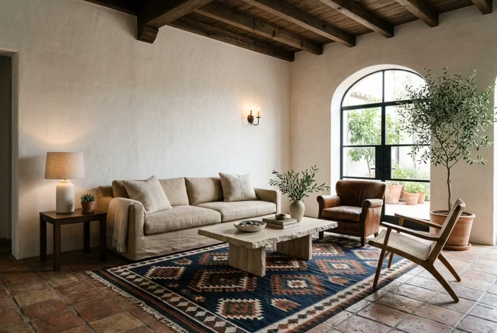
The most successful Modern Spanish Colonial rooms are rarely the ones with the most pieces. They are the ones that feel settled. There is a calmness to them, a sense that everything has found its place and is no longer competing for attention. That is what gives the style its quiet authority.
In practical terms, this means leaving some space unsaid. A room does not need every wall dressed, every corner filled, or every surface styled. In fact, it is often better when it does not. The negative space gives the materials room to speak. The eye moves more freely. The room feels less like a display and more like a place to live.
That is the deeper value of good layout in this style. It is not just about function, though function matters. It is about temperament. A well-proportioned Spanish Colonial living room feels composed, grounded, and unforced. It has enough structure to hold the room together, but enough softness to keep it from becoming stern. That is a hard balance to hit, but when it is right, the room has real staying power.
Materials That Carry the Look
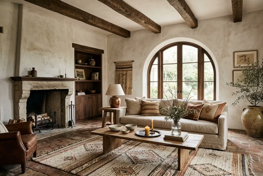
If the layout is the skeleton of a Modern Spanish Colonial living room, the materials are its skin, tone, and temperament. This is where the style either feels convincing or falls slightly flat. I have found, across real projects, that the difference is rarely about having more materiality. It is about choosing surfaces that age with grace, hold light well, and sit comfortably beside one another without fuss. The best rooms do not look newly assembled. They look as though the materials have settled into a quiet agreement.
Limewash and Plaster for Depth
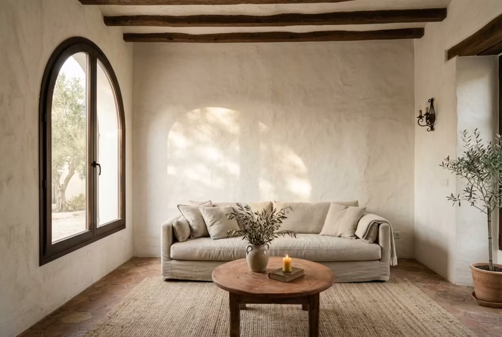
Limewash and plaster are often the first materials I turn to when a room needs softness without losing structure. They do something paint cannot quite manage. They carry light irregularly, so the wall never reads as a dead, flat plane. Instead, it has movement, a kind of quiet weathering that makes the room feel lived in from the start.
In practice, I like limewash when a room needs atmosphere but not ornament. It is especially effective in spaces with strong daylight, where the finish can shift subtly across the day. On overcast mornings it feels chalky and calm. By late afternoon it takes on a warmer, more sun-washed quality. That changing character is part of its charm. It gives the room a pulse without demanding attention.
Plaster, particularly in a softly worked finish, brings the same sense of depth but with a slightly more architectural reading. It can make a plain room feel considered, even when the furniture is restrained. I have used it in new-build living rooms that felt too slick at the outset, and it is remarkable how quickly the atmosphere changes once the walls stop looking machine-perfect.
Pros:
Limewash and plaster add depth, texture, and a sense of age. They soften hard light beautifully and help the room feel authentic rather than over-finished.
Cons:
They need a more careful hand than standard paint. Marks and patching can be harder to disguise, and the cost is usually higher than a straightforward painted finish.
Oak, Walnut, and Reclaimed Timber
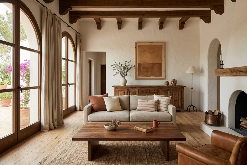
Wood is where this style finds its warmth. Oak, walnut, and reclaimed timber each bring a slightly different register, but all of them help the room feel grounded. Oak tends to read lighter and more relaxed. Walnut brings depth and a little more formality. Reclaimed timber carries the best kind of imperfect character, with grain variation and patina that you simply cannot fake.
I often use oak when I want the room to feel open and sunlit, particularly in properties that already have low ceilings or limited natural light. Walnut comes into its own when the scheme needs richness without heaviness. Reclaimed timber is the one I reach for when a room needs soul. A sideboard, beam, or coffee table in reclaimed wood can stop the room from feeling too polished, too neatly buttoned-up.
The trick is not to scatter three or four wood tones around and hope they get along. They usually will not. Better to choose one dominant timber tone and then let the others appear in smaller, supporting roles. That way the room feels layered rather than muddled.
Pros:
Wood adds warmth, tactility, and a sense of permanence. It ages well and sits naturally with plaster, stone, linen, and iron.
Cons:
It can push the scheme too rustic if overused, and darker woods may feel heavy in very small or low-light rooms. Quality timber also comes at a price.
You May also Like: Living Room Furniture Essentials: Designing for Comfort, Character, and Everyday Living
Natural Linen and Wool
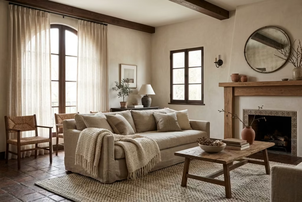
If wood gives the room its body, linen and wool give it softness and breathability. These are the fabrics that stop a Spanish Colonial room from feeling all hard edges and architecture. Linen, with its relaxed drape and slightly rumpled honesty, has a way of making even a formal room feel approachable. Wool, meanwhile, adds density and comfort, especially in rugs and throws.
I have specified linen sofas and curtains in rooms where the client wanted the look to feel refined but not precious. Linen is forgiving in the right context. It does not need to look perfectly pressed to work. In fact, a bit of looseness is part of the appeal. Wool is just as important, especially underfoot. A wool rug can calm acoustics, hold a seating area together, and give the room that slightly cocooned feeling that makes people linger.
These fabrics are doing more than looking pretty. They change how the room behaves. They soften echo, absorb light, and make the whole interior feel more inhabited. That is the kind of quiet work that good textiles do best.
Pros:
Natural linen and wool bring softness, comfort, and genuine tactile depth. They are timeless and work beautifully with the palette typically used in this style.
Cons:
Linen creases, wool can shed initially, and both need proper care. In a household with heavy wear, they may require more maintenance than synthetic alternatives.
Travertine, Limestone, and Tumbled Stone
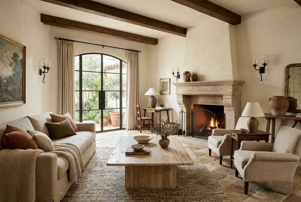
Stone introduces weight in the best possible sense. Travertine, limestone, and tumbled stone all bring a grounded, enduring quality that suits Spanish Colonial interiors beautifully. They never feel flashy. They feel inherent, as though they belong to the architecture rather than having been added as an afterthought.
Travertine has a slightly softer, more porous character that works well for coffee tables, fireplace surrounds, or flooring where a warm, honed finish is wanted. Limestone tends to feel a touch cleaner and quieter, making it ideal when the room needs a more restrained kind of solidity. Tumbled stone, with its softened edges and lived-in surface, carries an older, more tactile reading that feels especially at home in this style.
I have used stone in rooms where the client wanted a sense of permanence without going heavy-handed. The result is usually best when the stone is allowed to breathe. A thick slab coffee table or a simple limestone hearth can be enough. There is no need to overplay it. Stone is one of those materials that speaks louder when you do not keep interrupting it.
Pros:
Stone adds visual weight, natural variation, and lasting presence. It is highly effective for grounding lighter elements and giving the room a sense of permanence.
Cons:
It can be expensive, heavy to install, and sometimes prone to staining or marking if not sealed correctly. Some finishes also need more care than people expect.
Wrought Iron and Aged Brass
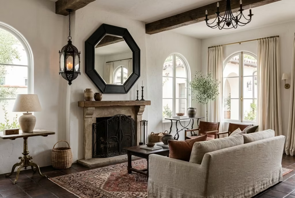
Metal in a Modern Spanish Colonial room should never feel cold for the sake of it. Wrought iron and aged brass both have a way of adding structure without spoiling the softness around them. They work like punctuation marks, small but essential. A lantern frame, mirror edge, curtain rod, or table base in iron can sharpen the room just enough. Aged brass does something similar, but with a warmer, gentler glow.
I tend to use wrought iron when a scheme needs a little edge. It pairs well with arches, black-framed art, and other graphic details that stop the room from becoming too diffuse. Aged brass is useful when the room needs a softer metallic note, especially against linen, plaster, or warmer woods. It catches the light in a quieter way, never too brash, always a bit more understated than polished brass.
The danger with metal is overdoing it. A few well-placed touches are enough. Too many and the room starts to lose its calm. Like good seasoning, the right amount makes the whole dish sing. Too much and it ruins the balance.
Pros:
Iron and aged brass add definition, contrast, and subtle richness. They are excellent for reinforcing the architectural language of the room.
Cons:
Used in excess, they can feel heavy or decorative in the wrong way. Quality finishes can also vary widely, and cheap versions often look flat very quickly.
Terracotta and Handmade Ceramics
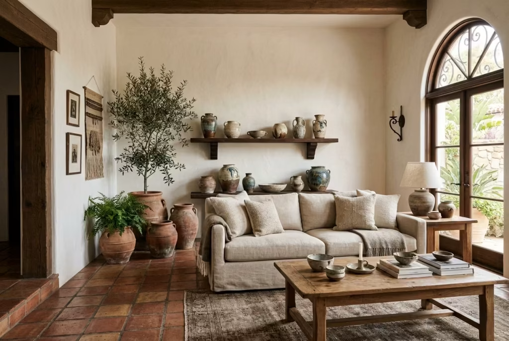
Terracotta and handmade ceramics bring the human side of the style. They are the materials that stop the room from feeling too carefully composed. Terracotta has that baked-earth warmth that instantly connects to Spanish Colonial heritage, while handmade ceramics introduce scale, imperfection, and character in a way that mass-produced pieces rarely do.
Terracotta works well in flooring, pots, and accent pieces because it carries warmth without needing explanation. It pairs beautifully with bone, clay, olive, and oak tones. Handmade ceramics are invaluable in smaller doses. A slightly uneven vase, a bowl with a reactive glaze, or a group of pieces on a console can add just enough irregularity to keep the room from becoming too polished.
I often tell clients that these materials are the difference between a room that looks styled and one that feels collected. They do not need to match perfectly. In fact, the charm lies in the slight differences. That unevenness, that hand-touched quality, is what gives the space its pulse.
Pros:
Terracotta and handmade ceramics bring warmth, authenticity, and artisanal character. They are ideal for softening a controlled palette and making the room feel personal.
Cons:
Terracotta can require sealing and care, particularly in flooring or high-use areas. Ceramics are fragile, and if overused they can push the room toward a decorative, more staged look.
The real strength of this material palette lies in balance. Texture versus durability, authenticity versus cost, beauty versus maintenance. Every project asks for a slightly different answer, but the principle stays the same. Choose materials that can hold their own, age with dignity, and support the atmosphere of the room rather than competing with it. When that happens, the design stops feeling assembled and starts feeling inevitable.
Lighting That Suits a Modern Spanish Colonial Living Room
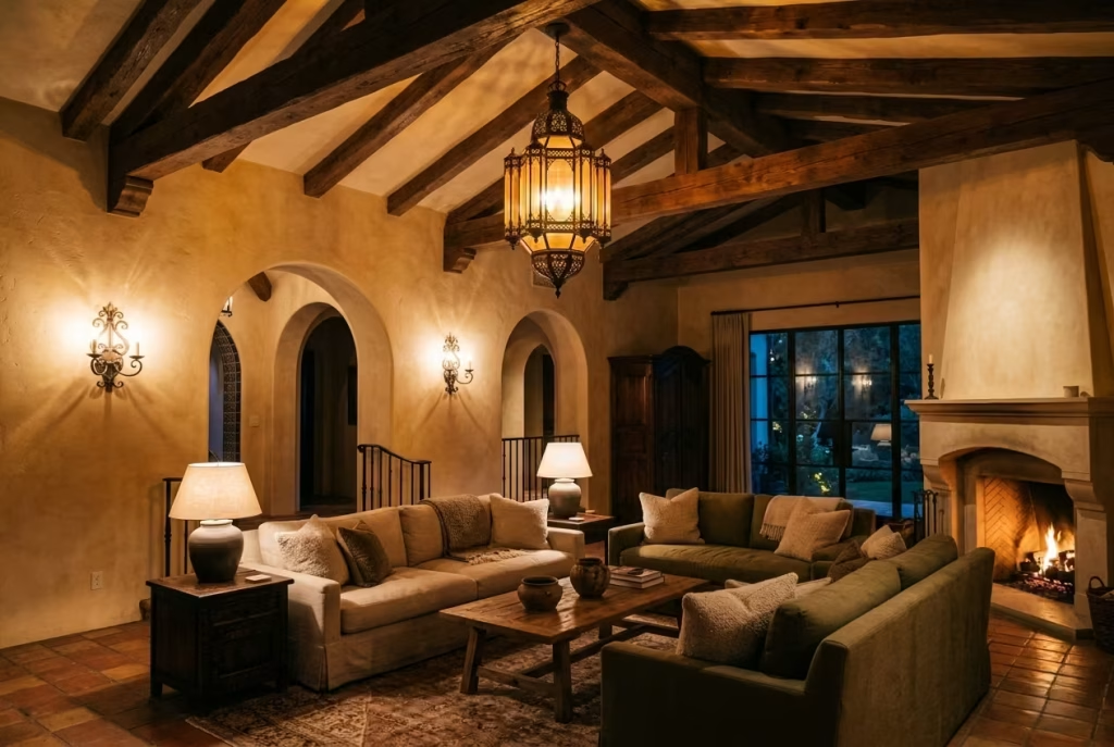
Lighting in a Modern Spanish Colonial living room is not just about illumination it is about shaping atmosphere, revealing texture, and guiding the eye across architectural features. Done right, it enhances the sense of permanence and warmth that this style is all about. Done poorly, it flattens the room, washes out textures, and robs the space of its innate charm.
Warm Ambient Lighting
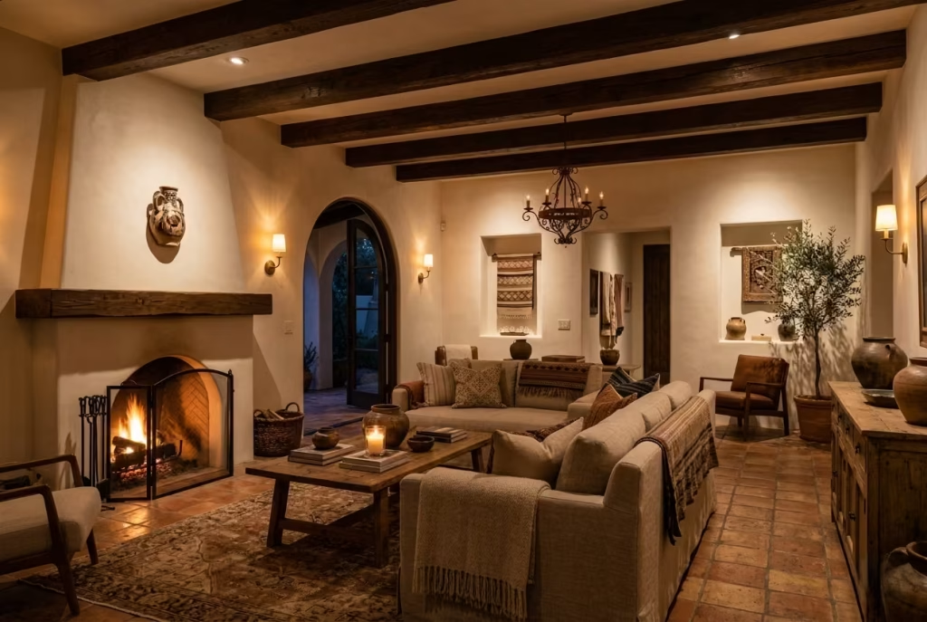
Ambient lighting forms the backbone of the room’s mood. I always aim for a warm glow that gently wraps the space rather than glaring down like a spotlight. Think low-wattage, dimmable sources that create pools of comfort rather than a uniform wash. In practice, this means choosing lights that sit around 2700–3000K, which keeps whites soft and natural, while enhancing the warm clay, timber, and plaster tones that define the style.
I often suggest layering ambient sources recessed floor or ceiling lights with hidden dimmers, complemented by wall sconces to make the light feel intentional. In rooms with strong daylight, ambient lighting is particularly important in the evening, allowing the interiors to maintain a sense of intimacy rather than looking stark and staged.
Pros: Warm ambient lighting enhances textures and creates a cozy, lived-in feel. It helps unify diverse materials.
Cons: Too low, and the room can feel gloomy; too high, and it defeats the subtlety that defines the style.
Lantern-Style Pendants
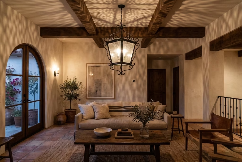
No Modern Spanish Colonial room is complete without at least one statement lantern or pendant. These fixtures do more than light the space—they punctuate it. I like iron-framed lanterns or those with aged metal finishes, suspended over a central seating area or a coffee table. They echo the historic roots of the style while providing a modern scale and presence.
The beauty of lantern-style lighting is how it casts shadows across textured walls, beams, and stone surfaces, subtly animating the room. In one project, I used a large aged-iron lantern above a linen sofa grouping, and it completely changed the perceived depth of the space—it drew the eye upward, emphasizing timber beams without crowding the room.
Pros: Adds heritage character and draws attention to architectural features. Works as both functional and sculptural.
Cons: Oversized lanterns can overwhelm smaller rooms; installation must consider ceiling height and proportion carefully.
Wall Sconces with Soft Diffusion
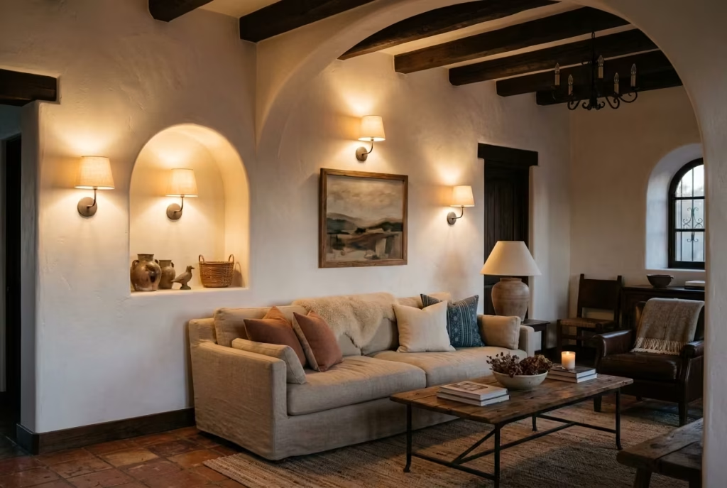
Wall sconces are the unsung heroes in this style. They can provide secondary ambient lighting while highlighting features like arched niches, plaster finishes, or framed artwork. I prefer sconces that diffuse light softly rather than harshly directing it, allowing the walls themselves to become part of the light play.
For real-world effect, I’ve paired sconces with small, textured linen shades or frosted glass, positioned around 60–65 inches / 152–165 cm from the floor to create an even eye-level glow. This keeps the room feeling settled, avoids high-contrast hotspots, and complements other low-glare sources.
Pros: Adds intimacy and highlights architectural rhythm. Works well for layered lighting schemes.
Cons: Can look fussy if overused or placed without rhythm; requires wiring consideration.
Table Lamps with Ceramic or Aged Metal Bases
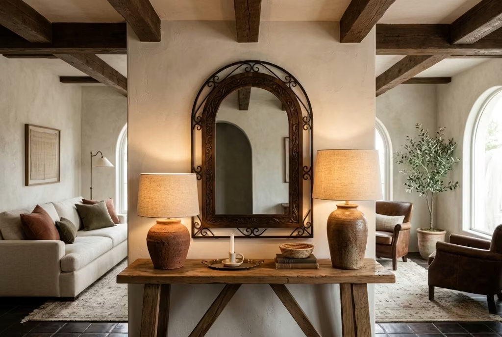
Table lamps are the finishing touch that introduces scale, tactility, and practicality. I often choose ceramic, terracotta, or aged metal bases paired with linen shades. The base material echoes the rest of the room’s material palette, while the shade softens the glow, preventing a harsh glare.
In a real project, a pair of ceramic-based lamps on a console flanking an arched mirror not only provided task lighting but also reinforced the colour story of clay, bone, and timber. Placement is key: avoid cluttered tabletops, keep cords discreet, and vary height slightly to maintain a sense of casual sophistication.
Pros: Offers task lighting and aesthetic continuity. Enhances material harmony.
Cons: Needs careful proportioning; too many lamps can make the room feel crowded or staged.
Avoid Overly Cold or Architectural-Heavy Schemes
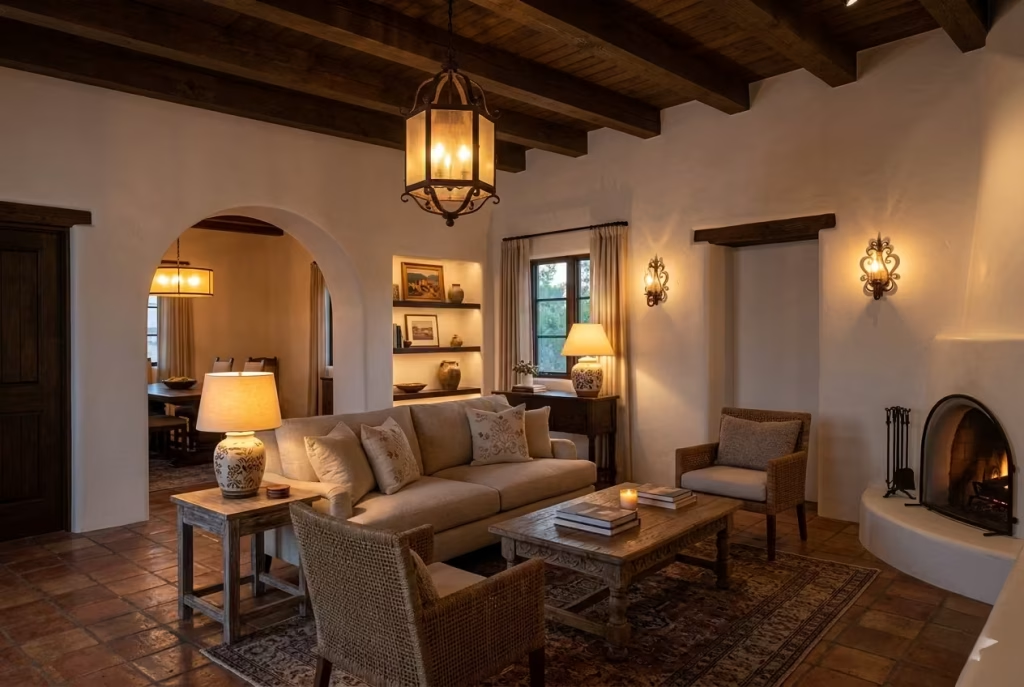
A common trap is to import modern architectural lighting straight into a Spanish Colonial room. Sleek, cold, or minimalist fixtures can undo all the warmth and texture the materials provide. I always recommend avoiding stark LED downlights, track lighting, or fixtures that are too white in colour temperature. The goal is to support, not compete with, the room’s soul.
In practice, I favour multiple low-glare sources over one harsh overhead light. Dimmers are non-negotiable they allow the room to shift from day to evening without feeling rigid. Even a north-facing living room, which might lack strong natural sunlight, benefits from the flexibility of layered, warm lighting.
Practical Tip: Maintain colour temperatures around 2700–3000K. Keep multiple sources at different heights to encourage layering. Use lanterns, sconces, and lamps strategically, not symmetrically, to let the room breathe.
Common Mistakes to Avoid
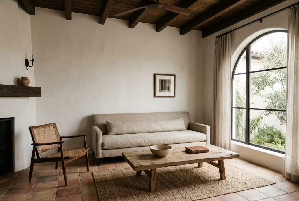
The strength of Modern Spanish Colonial design lies in its restraint. That may sound simple on paper, but in practice it is where many rooms go slightly off course. The style has enough character built into it already, so the challenge is not to keep adding. It is to know when the room has said enough. When people overcook it, the result can feel staged rather than soulful, and that is where the whole thing starts to lose its footing.
Making the Room Too Themed
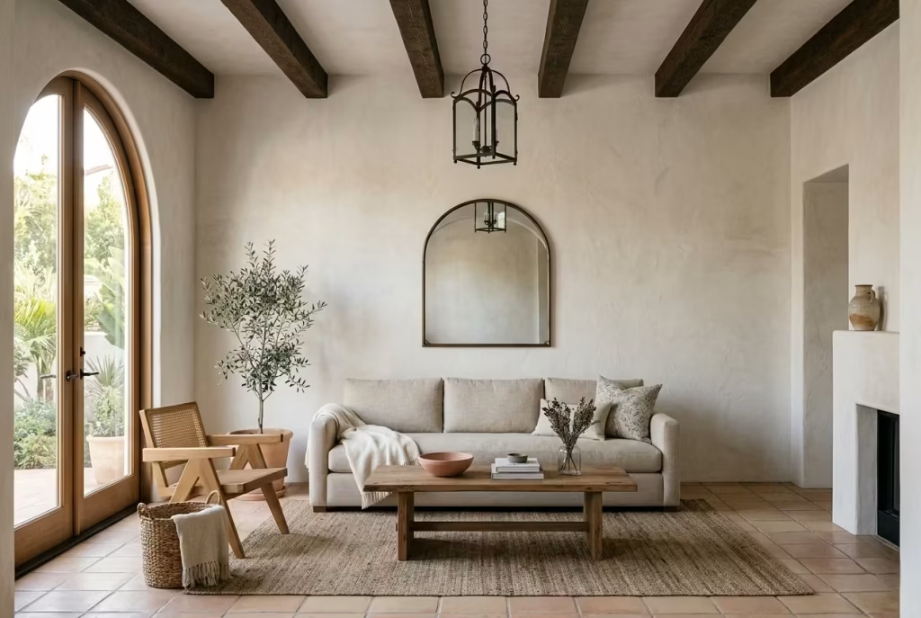
One of the quickest ways to flatten this style is to lean too hard into the obvious motifs. Arches everywhere, terracotta everywhere, too many wrought iron details, too much rustic pottery, and suddenly the room stops feeling contemporary and starts feeling like a set. It has all the right ingredients, but none of the subtlety.
A themed room often tries too hard to announce what it is. The best Spanish Colonial interiors do the opposite. They hint rather than proclaim. A single arched mirror, one well-chosen lantern, a plaster finish with depth, these carry more weight than a room full of decorative nods. When every surface is trying to speak, no one gets heard properly. The room needs a point of view, not a costume.
Overusing Distressed Finishes
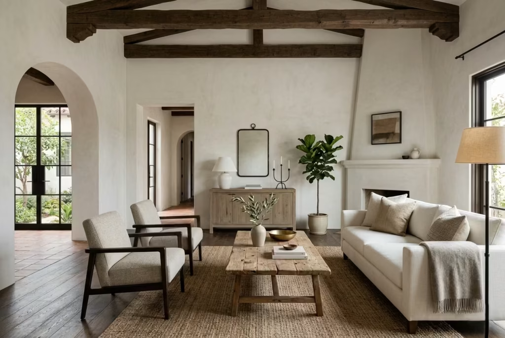
There is a fine line between texture and overdone ageing. A little patina can make a room feel settled and real. Too much distressing, though, and the space begins to look contrived, like it has been sanded, scraped, and weathered within an inch of its life. That is a common misstep, especially when people assume the style must always look old.
In reality, Modern Spanish Colonial design benefits from a cleaner interpretation. Not everything needs to appear timeworn. If the walls have texture, the furniture can be more refined. If the wood has character, the upholstery can be crisp. That push and pull is what keeps the room from sinking into a heavy, over-aged look. Distressing should feel like a whisper in the background, not the main event.
Pairing Too Many Rustic Elements Without Refinement
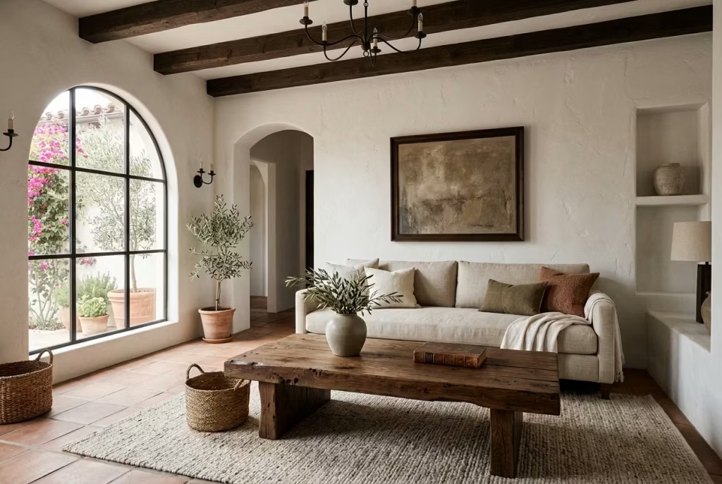
Rustic materials are central to the style, but if you layer too many of them without any balancing refinement, the room can start to feel clumsy. Reclaimed wood, rough ceramics, tumbled stone, woven baskets, ironwork, all of it has a place, but not all at full volume. Too much texture without contrast can leave the room feeling weighed down and a little rough around the edges.
The magic happens when rustic elements are paired with cleaner lines and more tailored pieces. A chunky wood table looks far better beside a structured sofa. A hand-thrown vase feels more deliberate on a simple console than on a crowded surface. In other words, the room needs some breathing room between the rough and the refined. That contrast is what gives the style its depth instead of letting it descend into visual clutter.
Choosing Cold White Paint
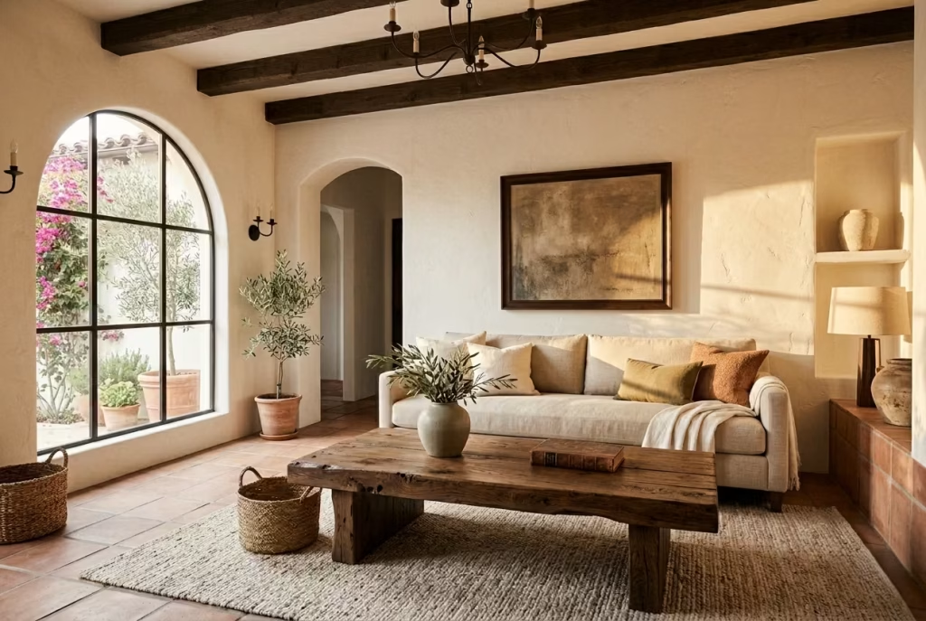
This is one of the easiest mistakes to make and one of the hardest to forgive. A cold white can strip the warmth out of the entire scheme in a heartbeat. Spanish Colonial interiors rely on softness, and when the walls feel stark or blue-toned, the whole room can lose its sense of ease. What should feel sun-warmed and grounded starts to look flat, sterile, and oddly disconnected from the rest of the materials.
Warm whites, bones, chalks, and soft creams are much more forgiving. They sit better beside timber, terracotta, linen, and stone. They also respond more kindly to changing light, which matters enormously in a room that depends on atmosphere. A white that looks lovely in the morning may feel harsh by evening if it is too cool. This is one of those details that seems small until it is not. Colour temperature can make or break the mood.
Ignoring Scale and Proportion
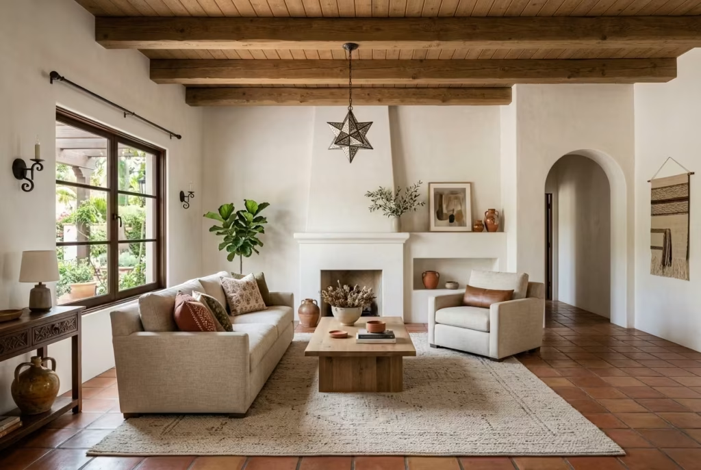
Even the best materials will falter if the proportions are wrong. A sofa that is too bulky can overpower a room. A coffee table that is too small can make the seating feel adrift. A pendant that hangs too low can crowd the space, while one that is too slight can vanish altogether. This style is particularly sensitive to scale because it already carries visual weight in the architecture and finishes.
Spanish Colonial rooms need a sense of balance. They should feel settled, not stuffed. That means choosing pieces that relate properly to one another, leaving enough circulation space, and resisting the urge to fill every gap. When proportion is right, the room seems to exhale. When it is not, everything starts to feel just a touch off, even if the individual pieces are beautiful in isolation.
Overcrowding the Room with Décor
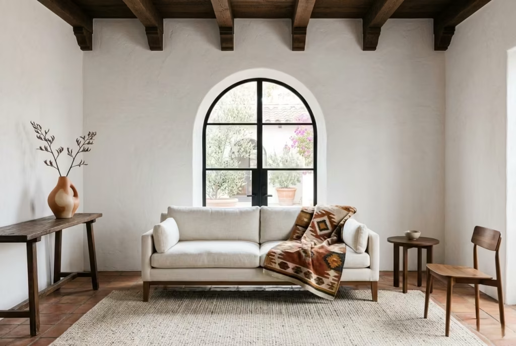
A room like this does not need to be dressed to the nines. In fact, over-accessorising can blunt its impact. Too many cushions, too many vessels, too many framed objects, and the composition starts to lose its clarity. The eye has nowhere to rest, and all the texture in the world cannot save a room that feels visually congested.
It is far better to choose fewer pieces and let them have space. One sculptural vase on a console has far more presence than a row of small objects all competing for attention. A single strong textile can carry more character than a dozen smaller decorative touches. Good styling is not about quantity. It is about conviction. When a room is edited properly, each object feels like it belongs because it has been allowed to matter.
A Note on Restraint
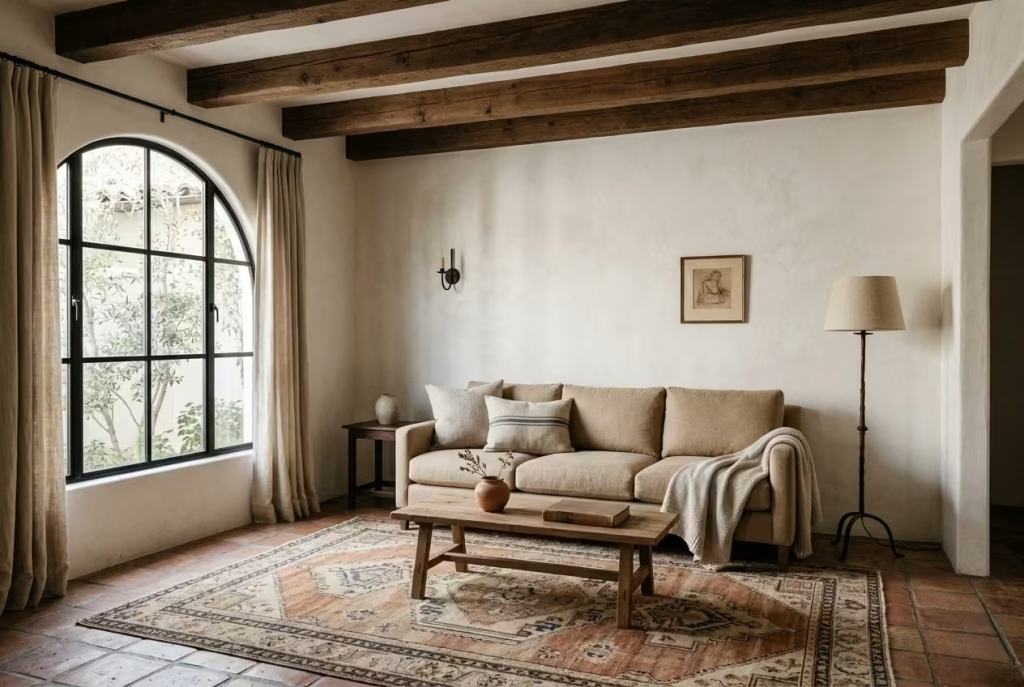
Modern Spanish Colonial succeeds because it holds back just enough. It allows texture, warmth, and architectural character to do the work without piling on unnecessary decoration. That restraint is what gives the style its composure. It feels rich, but never messy. Warm, but never overworked. Lived in, but never careless.
That is the real discipline of the look. Not adding more, but choosing better. When you keep that principle in mind, the room has room to breathe, and that is where the style finds its quiet confidence.
Best Rooms and Home Types for This Style
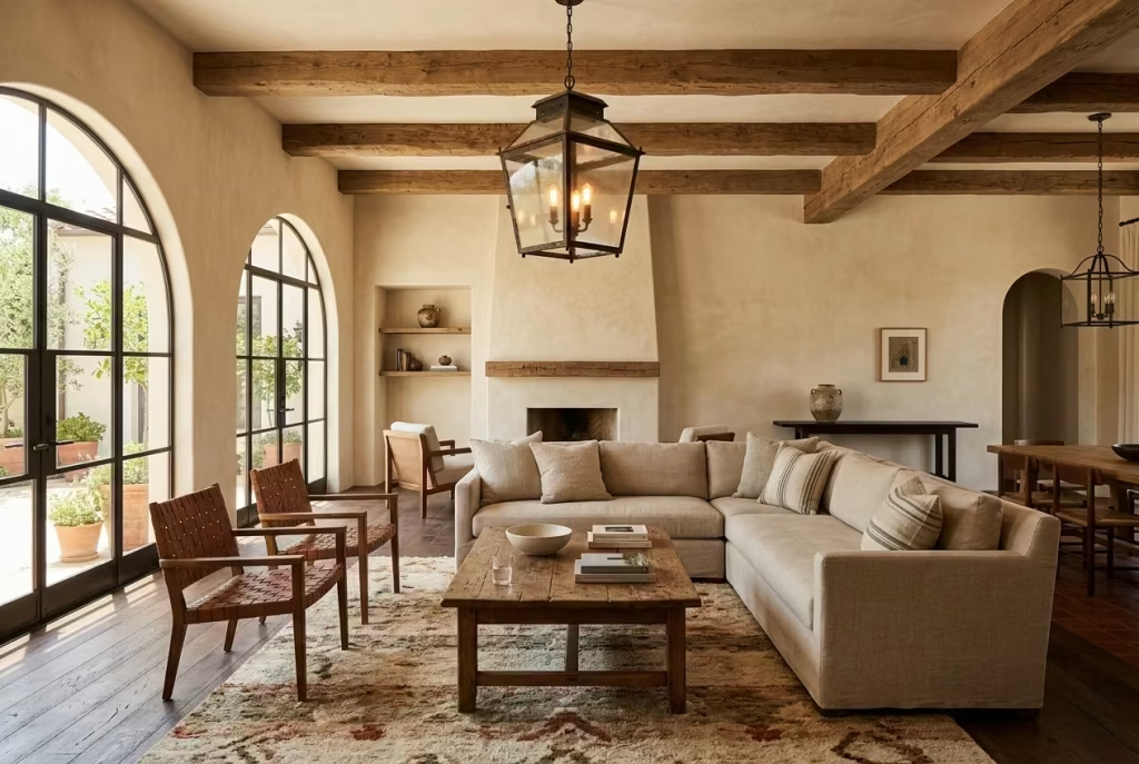
Modern Spanish Colonial is remarkably adaptable, but it does not flatten itself to suit every setting. It comes into its own in homes that can carry a bit of material depth, a bit of architectural pause, and a sense of quiet restraint. The style is at its strongest when it is allowed to work with the bones of a room rather than against them. That is why some homes take to it like a duck to water, while others need a more considered hand to make it feel convincing.
Period Homes
Period homes are often the most natural fit. They already have the kind of texture and irregularity this style responds to so well, whether that is original plaster, tall skirting, deep window reveals, alcoves, or a fireplace that still has some presence. In these houses, Modern Spanish Colonial does not feel imposed. It feels like a sympathetic extension of what is already there.
The real advantage is that period architecture can hold richer material layering without feeling crowded. A limewashed wall, timber beam, or arched mirror tends to sit more comfortably where the room already has some history in its bones. The architecture does half the work for you, which means the furnishings can be quieter and still feel complete.
That said, the key is not to overstate the heritage. A period home does not need to be dragged back into the past. In fact, the best results usually come from letting the room breathe a little, then introducing warmth and tactile finishes that feel current, not costume-like. It is a delicate balance, but when it lands, it is very hard to beat.
New-Builds That Need Warmth and Character
New-builds are often where this style proves its worth most dramatically. So many of them arrive with clean lines, pale walls, and little in the way of visual depth. They are workable, certainly, but they can feel a touch soulless at first glance. Modern Spanish Colonial is well suited to that problem because it adds character without needing major structural changes.
A plaster finish can soften the flatness. Oak or walnut can stop the room from feeling too boxy. A stone coffee table, a woven rug, or a lantern-style pendant can introduce the weight and texture that plain architecture so often lacks. It is a bit like giving the room a voice it did not know it had.
I have seen this work especially well in homes where the architecture is sensible but uninspiring. The trick is not to fight the simplicity of the shell. It is to use material and tone to give it some soul. A few well-judged details can turn a blank canvas into something that feels settled and lived in, without making it look as though it is trying to be something it is not.
Open-Plan Living Rooms
Open-plan living rooms can be an excellent match for this style, provided the space is handled with discipline. Because Spanish Colonial interiors already rely on material rhythm and visual layering, they can help define zones within a larger plan without needing walls to do all the work. That is no small advantage in a layout that can otherwise feel a little too expansive or loosely drawn.
The style is particularly effective when the room needs to feel connected but still legible. A terracotta rug can anchor the seating area. A lantern pendant can establish the dining zone. A console, cabinet, or arched niche can create a pause between one area and the next. These are small moves, but they stop the space from becoming an open-ended sprawl.
The important thing is not to let every zone shout at once. Open-plan rooms need hierarchy. The Spanish Colonial approach, with its warmth, texture, and quiet structure, helps create that without feeling overdesigned. It gives each area a role while keeping the whole composition coherent. That is where the style really earns its keep.
Small Living Rooms That Benefit from Texture and Visual Calm
Small living rooms can be surprisingly good candidates for this style, though they need a lighter touch. The appeal here lies in texture, not excess. When space is tight, you do not want to crowd the room with too many objects or bulky furniture. What you want is atmosphere, and this style delivers that through finish, tone, and proportion.
A small room can feel deeply inviting when the walls are softened with limewash, the furniture sits low, and the palette stays within a narrow, warm range. Textural variation then does the heavy lifting. A woven cushion, a linen curtain, a small ceramic vessel, or a timber side table can all add depth without making the room feel cluttered. It is a case of working in layers, but with a very sure hand.
What makes this style useful in a smaller room is its ability to create calm. The room does not need to be filled to be complete. In fact, leaving a little visual space can make it feel larger and more composed. The result is a room that feels intimate rather than cramped, which is a far better trade-off than trying to cram in too much and ending up with a space that feels hemmed in.
Homes with Strong Natural Light
Homes with strong natural light are almost made for this style. Good daylight gives limewash, plaster, stone, linen, and wood the chance to show their full character. It brings out subtle shifts in tone, highlights the grain in timber, and gives the entire palette more dimension. In these settings, the room can feel alive from morning to evening without much effort at all.
Bright rooms also allow for a slightly richer palette without tipping into heaviness. Warm neutrals, muted terracotta, and deeper wood tones tend to look especially good when the light can move across them freely. The finishes take on a softness that makes the room feel sunny even when the light is changing. That is part of the style’s quiet magic.
The only caution is to avoid over-bright, cold surfaces that fight the natural light rather than working with it. A warm white or soft mineral tone will always sit more comfortably than something stark or blue-toned. In a sunlit room, the goal is to let the light settle in, not bounce off every surface like it is trying to escape.
Real-Life Application: Adding Depth to Plain Architecture Without Forcing It
This is where Modern Spanish Colonial really proves its worth. Plain architecture does not need to be disguised or overcomplicated. It needs depth, temperature, and a sense of presence. The style does that beautifully when it is applied with a light hand.
I have worked on rooms where the architecture was almost aggressively ordinary, straight walls, standard ceiling height, little in the way of moulding or detail. Rather than trying to fake grandeur, we introduced material richness instead. A limewashed wall, a timber coffee table, a vintage cabinet, a simple arched mirror, and a wool rug changed the atmosphere almost completely. The room did not suddenly become historic, and that was the point. It became more grounded, more layered, and more believable.
That is the real strength of this style in plain homes. It does not demand that the architecture be something it is not. It simply gives it more dimension, more warmth, and more confidence. The room ends up feeling as though it has more history than it actually does, which is often exactly what people are hoping for, even if they do not say it out loud.
Modern Spanish Colonial works best wherever a room needs a bit of soul without a full architectural overhaul. Whether the space is old, new, large, modest, bright, or plain, the style has a way of putting down roots. And when it is handled with restraint, it never feels forced. It just feels right.
Final Thoughts: How to Make It Feel Personal
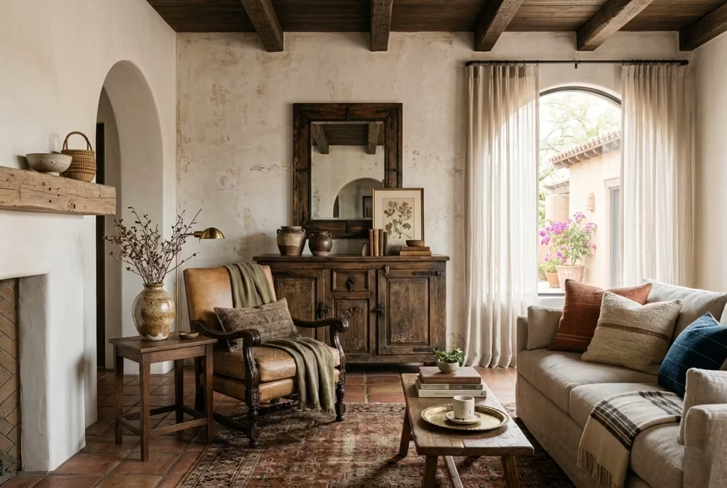
The essence of a modern Spanish Colonial living room lies not just in walls, beams, and rugs, but in the way a room tells a story. It is a style that thrives on subtlety, nuance, and a sense of accumulation rather than display. The trick to making it feel personal is to resist the urge to fill every corner at once. Instead, start with one or two pieces that carry meaning—perhaps a vintage armchair inherited from a family member, or a ceramic vase picked up during travel. These are the pieces that breathe life into a room, that lend character without shouting for attention.
Let patina, craft, and age do some of the heavy lifting. A well-weathered timber cabinet, the gentle tarnish of aged brass, or the slight unevenness in hand-thrown ceramics will quietly anchor the space in authenticity. These details suggest a narrative, a sense of history, even if the home itself is brand new. The room begins to feel inherited, layered, and lived-in rather than curated or staged.
Building the space slowly is crucial. Collect rather than buy wholesale. Layer textures and tones gradually, and allow the room to evolve. Over time, the interplay of natural light, soft furnishings, and carefully chosen accents will give the space a personality that feels effortless yet deeply intentional.
Ultimately, the best modern Spanish Colonial living rooms are the ones that feel quietly confident, grounded in material and proportion, yet alive with individuality. They suggest a home that has grown into its architecture and a style that has been lived with, appreciated, and allowed to settle exactly the kind of spaces that invite people to linger, feel at ease, and return to day after day.
Frequently Asked Questions About Modern Spanish Colonial Living Rooms
What exactly is Modern Spanish Colonial style?
Modern Spanish Colonial blends the rich heritage of traditional Spanish Colonial interiors think arched details, timber beams, terracotta floors, and textured walls with a cleaner, lighter, and more liveable approach. It is less about heavy ornamentation and more about material warmth, proportion, and timeless character. In practice, it’s a style that respects history while feeling fresh and approachable.
Can this style work in a small living room?
Absolutely. The key is restraint and layering. Use low-profile furniture, soft textures, and a controlled palette of warm neutrals. A terracotta rug or textured textiles can add depth without crowding the space. By focusing on finishes, proportion, and subtle accents rather than oversized or ornate pieces, a small room can feel intimate yet airy.
What colours work best for a modern Spanish Colonial living room?
Soft whites, bone, sand, taupe, and muted terracotta form the base. You can add depth with ochre, deep olive, charcoal, or aged brown accents. Black iron details or dark wood provide grounding contrast. For north-facing rooms, lean on warmer tones to combat cool light, while south-facing rooms can accommodate slightly richer, sun-kissed hues.
How important are natural materials in this style?
Extremely. Materials are the backbone of Spanish Colonial interiors. Limewash or plaster walls, timber beams, terracotta floors, hand-thrown ceramics, linen, wool, and wrought iron all create texture, warmth, and authenticity. The more tactile and aged these materials appear, the more grounded the room feels.
Can Modern Spanish Colonial work in a contemporary or new-build home?
Yes. In new-builds, this style can add personality, warmth, and a sense of history without structural renovation. A limewashed wall, oak furniture, textured textiles, and a few key architectural details like an arched mirror or niche can dramatically lift plain architecture while feeling entirely intentional.
What lighting is recommended?
Layered, warm lighting works best. Lantern-style pendants, wall sconces with soft diffusion, and table lamps with ceramic or aged metal bases all enhance the softness of the space. Avoid overly cold, bright overhead lights they can flatten the warm, lived-in quality the style relies on.
How do I avoid making the room feel themed or staged?
Focus on quality over quantity. Introduce a few meaningful pieces rather than an entire “look.” Let texture, patina, and age tell the story. Avoid over-accessorising or relying solely on distressed finishes. The goal is for the room to feel collected over time, not purchased in one sweep.
Are rugs and soft furnishings necessary?
Yes, they are essential for grounding and layering. A terracotta or patterned rug, linen or boucle sofas, woven cushions, and textured curtains all add depth and tactile warmth. Rugs also help define zones in open-plan spaces, creating intimacy and visual balance.
What common mistakes should I avoid?
Avoid making the room too themed, overusing distressed finishes, pairing too many rustic elements without refinement, or ignoring scale and proportion. Crowding the room with décor or choosing stark white paint can also flatten the space. Modern Spanish Colonial succeeds through measured restraint.
How do I make the room feel personal?
Introduce one or two meaningful items maybe a family heirloom, vintage furniture, or hand-crafted ceramics. Allow the room to evolve slowly rather than buying everything at once. Layer textures, materials, and tones gradually. Over time, the room will feel inherited, grounded, and intimately yours even if it’s newly designed.