25 Spanish Bathroom Design Ideas Full of Color, Texture, and Mediterranean Charm
Spanish bathrooms are often misunderstood as a collection of rustic finishes or decorative motifs, but in practice, they are far more architectural than ornamental. The character comes not from what is added, but from what is built into the space itself, shaped through mass, proportion, and material. When approached properly, the room feels composed rather than styled, with every surface carrying weight and intention.
What defines these interiors is a careful interplay between thermal comfort, material honesty, and light. Thick masonry walls and dense surfaces such as terracotta or stone regulate temperature naturally, keeping the space cool underfoot even in warmer climates. It is a quiet, physical comfort that you notice without needing to think about it. I have seen this most clearly in older properties where the walls are substantial, often exceeding 300 mm (12 inches) in thickness, creating an envelope that holds both coolness and calm.
Materials are left to age rather than be preserved in a pristine state. Lime plaster softens over time, developing tonal variation. Terracotta deepens in colour with use. Brass fixtures lose their brightness and settle into a muted patina. None of this is treated as wear in the conventional sense. It is part of the design language, where time becomes a collaborator rather than an enemy.
Light, too, is handled with restraint. Instead of flooding the room with uniform brightness, Spanish bathrooms tend to favour controlled openings, recessed windows, and filtered daylight. This creates a shifting atmosphere across the day, where shadows define edges and textures become more pronounced. In one project, I deliberately reduced the window width to just under 600 mm (24 inches), deepening the reveal so that light entered more directionally. The result was a space that felt grounded and calm, rather than exposed.
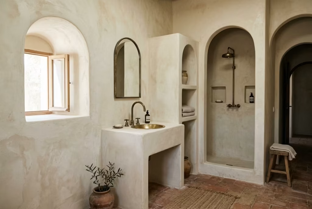
I have found that when clients ask for “Spanish style,” what they are often responding to is not a checklist of features, but a feeling. It is a sense of permanence, of spaces that feel settled, as though they have existed long before we arrived and will continue long after. That quiet confidence is difficult to manufacture, but when the architecture, materials, and light are working together, it emerges almost effortlessly.
What Defines a Spanish Bathroom? (Before You Start Designing)
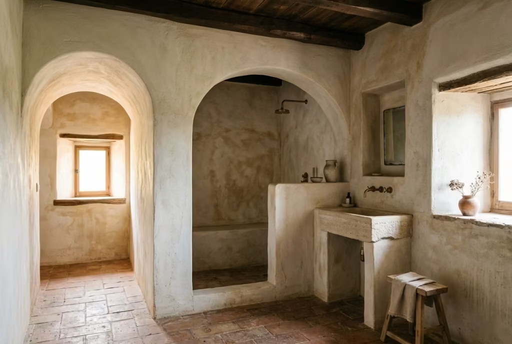
Before getting into materials or details, it’s worth stepping back and understanding that a Spanish bathroom is shaped more by architectural intent than surface styling. The success of the space lies in how it is formed, how it holds light, and how materials are allowed to behave over time. In my experience, when the underlying structure feels resolved, everything else falls into place with far less effort.
Material Honesty Over Perfection
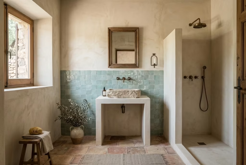
At the core of a Spanish bathroom is a quiet acceptance that materials should look and behave like themselves, not like polished imitations of something else. Lime plaster walls carry subtle movement, never flat or uniform, shifting gently with light throughout the day. Terracotta underfoot feels grounded and slightly irregular, often in formats around 300–400 mm (12–16 inches), where variation in tone becomes part of the visual rhythm rather than a flaw. Zellige tiles, with their uneven glaze and soft edges, catch light in a way machine-made tiles simply cannot replicate.
I tend to specify these materials with the expectation that they will evolve. Aged brass fixtures, for instance, will dull and deepen over time, losing that initial sheen and settling into something far more considered. It is not about chasing a finished look, but allowing surfaces to carry a sense of use without apology. In practice, this also means accepting minor inconsistencies during installation, because that slight irregularity is precisely what gives the space its authenticity.
Architectural Gestures That Do the Heavy Lifting
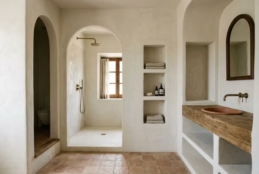
In a well-resolved Spanish bathroom, the architecture does most of the work. Arches soften transitions, niches introduce depth without adding clutter, and alcoves create moments of function that feel naturally embedded rather than applied. These gestures are not decorative extras; they define how the space is experienced and how it flows.
I consistently lean towards built-in elements over freestanding pieces, especially in smaller bathrooms where visual continuity matters. A recessed vanity niche at around 450–500 mm (18–20 inches) depth, or a shower alcove framed by a shallow arch, tends to feel far more grounded than standalone furniture. In one project, replacing a standard vanity with a full-width plastered niche immediately reduced visual noise and made the room feel calmer, almost monastic in its simplicity.
The key is proportion. Arches that are too tight can feel forced, while overly wide openings lose their intimacy. I often work within a span of 900–1100 mm (35–43 inches) for shower or passage arches, keeping the curve soft rather than exaggerated. When done well, these architectural moves carry the design quietly, allowing the space to feel intentional without relying on surface-level styling.
Light, Shadow, and Thermal Comfort
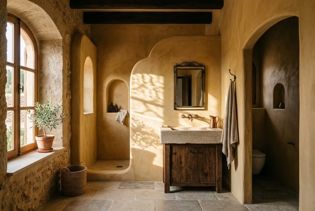
Light in a Spanish bathroom is never treated as something to maximise indiscriminately. It is shaped, filtered, and allowed to enter with a degree of restraint. Smaller openings, often deeply recessed within thick walls, create a directional quality of light that shifts throughout the day. Instead of flattening the space, it introduces contrast, allowing shadow to define edges and bring texture forward. I often work with window widths around 500–700 mm (20–28 inches), paired with deep reveals, so the light feels intentional rather than exposed.
That controlled daylight works hand in hand with thermal comfort. Dense materials such as stone or terracotta remain cool underfoot, particularly in warmer climates, while the surrounding palette of warm neutrals prevents the space from feeling stark. It is a balance I return to often, where tactile comfort and visual warmth sit side by side. In one project, pairing a cool limestone floor with softly pigmented plaster walls in a muted ochre tone created a space that felt both refreshing and grounded, even during peak summer heat.
The result is not just visual atmosphere, but a physical one. The room holds a steady, calm temperature, with light and shadow doing as much to shape the experience as the materials themselves.
25 Spanish Bathroom Ideas
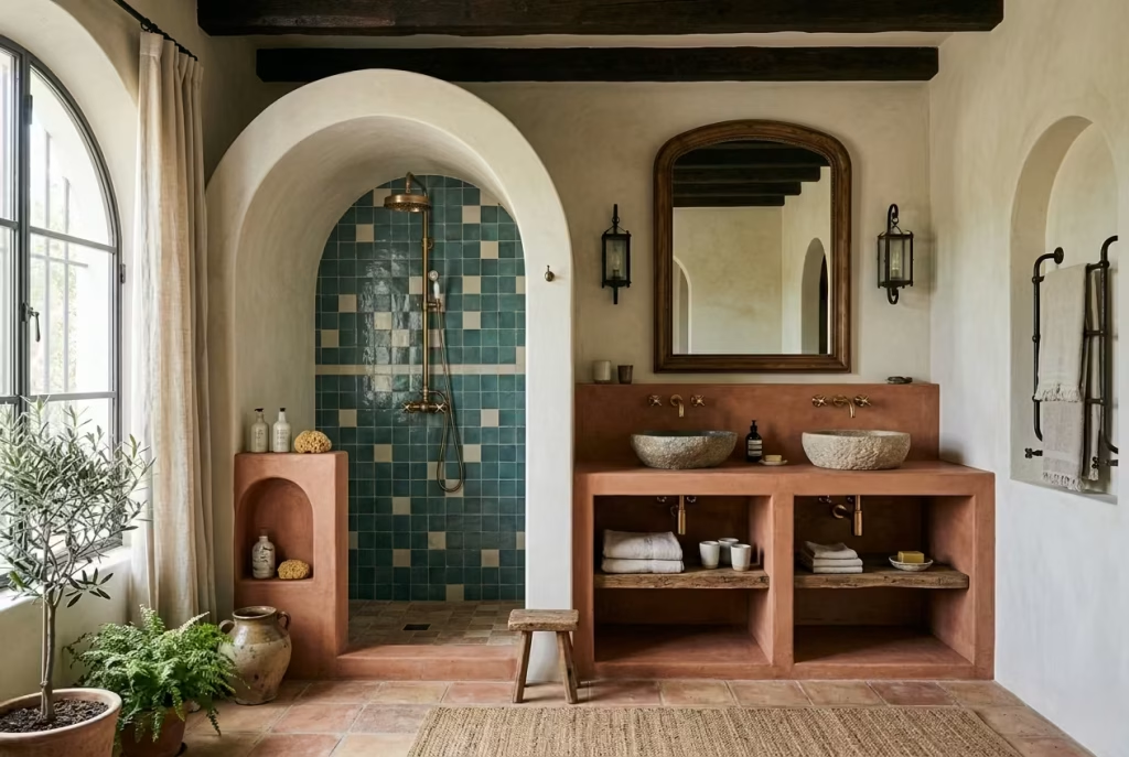
What makes these ideas work is not their surface appeal, but how they resolve the space as a whole. Some are architectural, others material-led, but each one leans into the same principle I return to often in practice: restraint tends to produce a stronger, more lasting atmosphere than excess. Let’s Dive into Spanish Bathroom Ideas and See What This Style Looks Like
Arched Walk-In Showers That Feel Carved, Not Built
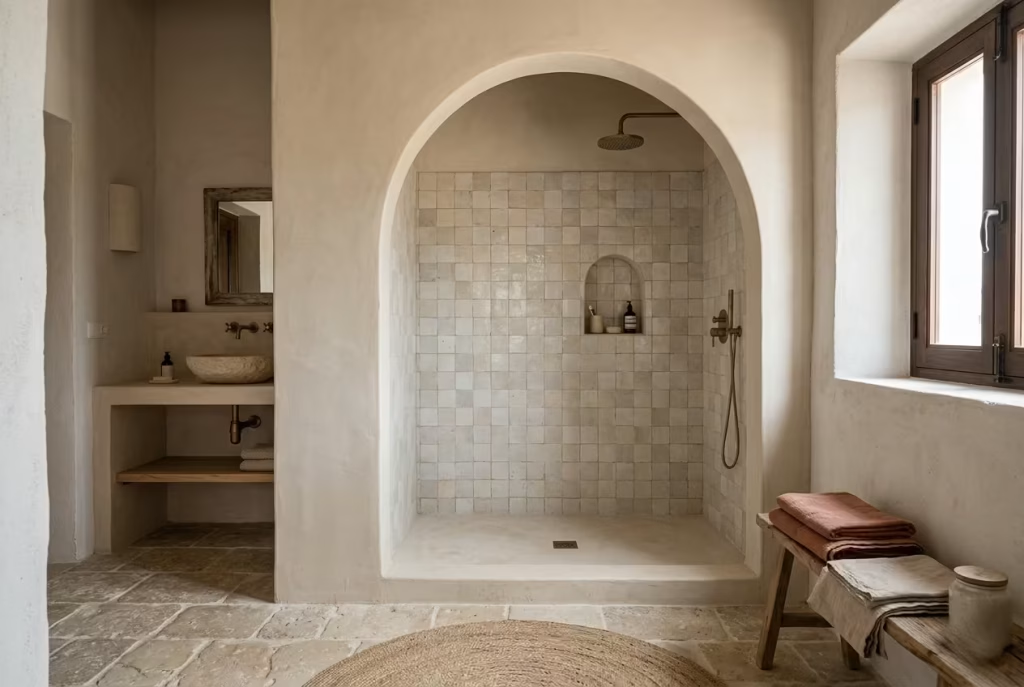
An arched walk-in shower has a different emotional register from a standard rectangular enclosure. It does not simply divide wet and dry zones. It gives the room a sense of being shaped from the inside out, as though the architecture had been pared back to something quieter and more permanent. That is where its appeal lies. The curve softens the hard lines that bathrooms so often rely on, and when it is handled with restraint, the result feels old-world without tipping into costume.
In practice, I usually look for a minimum opening of 90–110 cm (35–43 inches). Anything narrower and the shower can begin to feel like a compromise rather than a considered gesture. That width allows enough comfort for movement, a better sense of proportion, and a more generous relationship between the curve and the person passing through it. In larger bathrooms, I sometimes push the opening slightly wider, especially where the arch is intended to read as a feature rather than a subtle transition. The trick is not to make it dramatic for the sake of it. A good arch should feel inevitable, not performative.
This works particularly well in load-bearing masonry adaptations, where the wall depth already supports a sense of mass. In those spaces, the arch feels like a natural continuation of the structure rather than an applied decorative move. I have found that when plaster is carried continuously across the opening and into the shower zone, the whole composition gains a sculptural quality. The surfaces seem to fold into one another, and the shower begins to read less like a contained box and more like a carved recess. It is a small shift, but it changes everything.
There is also a practical benefit worth noting. An arched opening can help the room feel less visually rigid, especially in bathrooms where there are already a lot of hard, linear elements. When paired with a subtle plaster finish, tumbled stone, or zellige tile, the arch becomes the quiet anchor that pulls the scheme together. It gives the eye somewhere to rest. And in a room that is often dominated by utility, that matters more than people realise.
In one project, I replaced a standard framed shower entrance with a shallow plaster arch set within a thick masonry wall. The bathroom was not large, but the change made it feel calmer and more composed almost immediately. It was one of those moments where the whole room stopped shouting and started speaking properly. That is the effect you are after. Not attention for its own sake, but presence.
Pros
Timeless architectural character, a softer spatial rhythm, and a highly resolved look that elevates even modest bathrooms. It also tends to age gracefully, which is half the battle in a style like this.
Cons
It is not a casual detail. The structural coordination has to be right, the proportions need to be carefully judged, and waterproofing must be planned from the outset. Get any of those wrong, and the elegance can unravel quickly.
Terracotta Flooring That Grounds the Space
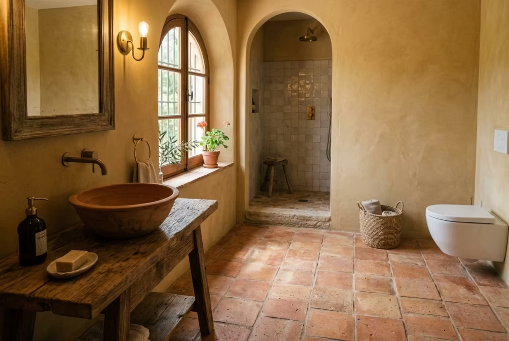
Terracotta floors have a way of rooting a bathroom in a sense of place that few materials can match. They bring a tactile warmth underfoot that feels immediately human, almost as if the room itself is breathing. There is a subtle, almost imperceptible narrative in each tile the slight variations in colour, the tiny surface pits, the gentle undulations all of which lend a sense of authenticity that polished porcelain cannot touch. In other words, terracotta doesn’t try to impress; it quietly asserts itself, carrying the history of craft and materiality into the modern home.
I usually recommend tiles in the 300–400 mm (12–16 inch) range for a genuinely Spanish feel. Smaller formats risk looking fussy, while oversized slabs can feel too contemporary, losing the intimate charm that terracotta naturally provides. Laid with minimal but deliberate grout lines, the pattern should feel almost accidental, like the floor “settled” into place over time rather than being meticulously arranged for display. That small imperfection is precisely what gives the floor its personality and makes the space feel lived-in rather than staged.
Practical considerations are equally important. Terracotta is naturally porous, which is part of its charm, but it also demands respect in wet areas. Sealants are not an afterthought—they are critical. A high-quality, penetrating seal will protect the tiles from moisture while still allowing them to breathe. From my experience, resealing every 3–5 years keeps the floor looking natural without turning it into a plastic facsimile of itself.
In one project, I combined warm terracotta tiles with a soft ochre lime plaster on the walls. The result was a bathroom that felt sun-kissed even in the depth of winter, a space that drew you in and encouraged lingering. The terracotta’s natural variance interacted beautifully with directional daylight, creating a subtle play of light and shadow across the floor. It was a reminder that material choices are rarely neutral they speak quietly, but insistently, about the atmosphere you want to inhabit.
Pros
Adds warmth, texture, and an authentic tactile experience; ages beautifully with use, improving character over time.
Cons
Requires sealing and periodic maintenance; care must be taken to avoid excessive staining or water damage in wet zones.
Lime Plaster Walls with Subtle Movement
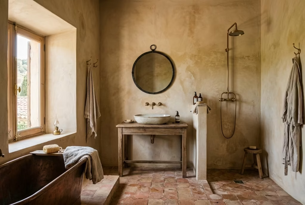
Lime plaster is one of those materials that quietly transforms a bathroom from a collection of finishes into a space that feels alive. Unlike flat paint, which sits uniformly across a wall and demands attention to perfection, lime plaster breathes. Its surfaces carry subtle undulations, tiny shadows, and gentle tonal shifts that interact with the natural light streaming through windows. These variations are not imperfections; they are the language of the material, a conversation between craft, time, and light that gives the room a sense of depth and warmth.
I always steer clients away from perfectly flat wall finishes in a Spanish-inspired bathroom. Flatness can make even a generous space feel sterile and lifeless. Instead, lime plaster allows walls to “settle” visually, giving them a slightly lived-in quality that softens the room. Even small changes in daylight across the day can make the wall seem to ripple, turning a routine glance into a quiet moment of visual delight. In one project, a north-facing bathroom with a single narrow window revealed the plaster’s subtle gradients beautifully, making a compact space feel more expansive and textured without adding a single accessory.
From a practical standpoint, lime plaster is breathable, which helps regulate moisture in a bathroom environment—an advantage over traditional paint that can trap condensation. It also pairs exceptionally well with other Spanish materials: warm terracotta floors, zellige tiles, and brass or iron fittings all gain extra nuance when contrasted against a softly shifting plaster backdrop.
The beauty of lime plaster is that it ages graciously. Minor scratches, water marks, or small chips rarely detract from the effect; they simply become part of the story, deepening the sense of permanence. In my experience, walls treated this way are not just a surface—they are an atmospheric canvas that evolves with the home, inviting the eye to linger and the senses to settle.
Pros
Adds texture, depth, and subtle tonal variation; breathable and moisture-friendly; improves with age, enhancing authenticity.
Cons
Requires skilled application; imperfections must be embraced as part of the material’s natural character rather than corrected.
Built-In Vanity Niches Instead of Cabinetry
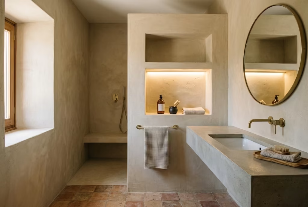
There’s something inherently satisfying about a vanity that feels as though it has always belonged in the space, rather than being tacked on like an afterthought. Built-in niches achieve this quietly, grounding the bathroom with a sense of permanence that freestanding cabinetry rarely delivers. I usually design these recesses with a depth of 40–50 cm (16–20 inches) enough to house essentials comfortably, but not so deep that the space feels hollow or wasted. The result is a composition that feels resolved, as if the room itself shaped the storage rather than the other way around.
The elegance of a built-in vanity niche is in its restraint. In one renovation, I removed a bulky freestanding cabinet and replaced it with a plastered niche, lined subtly with the same lime plaster as the walls. The transformation was almost magical the bathroom felt calmer, more cohesive, and the visual flow from floor to ceiling became uninterrupted. It’s a design move that doesn’t shout; it simply works, letting other architectural gestures, like a soft arch or textured wall, take the spotlight.
Practicality is also a hidden benefit. Because the niche is integrated, surfaces are easier to clean, and items within easy reach are framed neatly without clutter spilling into the rest of the space. This approach also frees up visual space around mirrors and light sources, allowing both to function optimally while maintaining a sense of calm.
From a tactile perspective, niches invite interaction in a way that standalone furniture cannot. Sliding a hand across the subtly curved edge of a plastered shelf, reaching for a softly folded linen towel—these small, almost subconscious moments enrich the daily experience. In my projects, these niches are often paired with small, understated details like recessed lighting or a hand-painted tile backsplash, which elevates the utility into something quietly sculptural.
Pros
Creates a seamless, integrated look; reduces visual clutter; enhances the architectural flow of the room; tactile and practical.
Con
Fixed once installed, offering less flexibility for future changes; requires precise planning and skilled construction to achieve clean lines and proper depth.
You May also Like: 30 Stunning Desert Bathroom Design Ideas for a Warm, Natural Look
Hand-Painted Tiles as a Controlled Accent
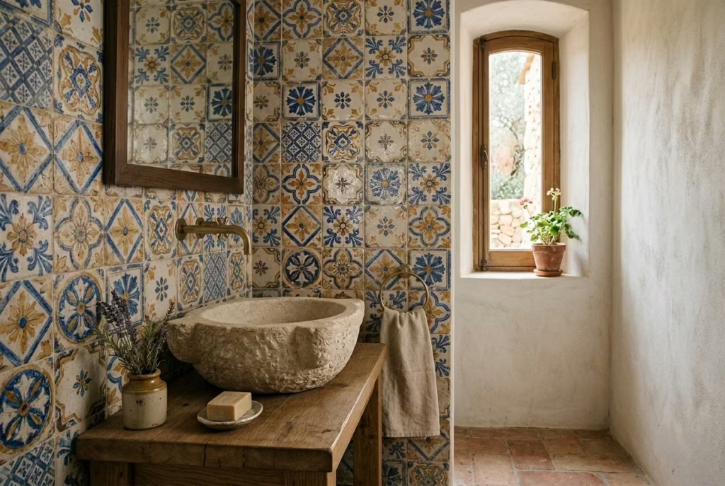
Hand-painted tiles carry a charm that is impossible to replicate with mass-produced alternatives they whisper stories of craft, colour, and subtle imperfection. Used judiciously, they can elevate a Spanish-inspired bathroom from simply authentic to memorably poetic. I tend to reserve them for areas like behind basins, within niches, or as a shallow backsplash, letting the tiles punctuate the space rather than dominate it. The key is restraint: a few well-placed tiles can feel intentional and timeless, while too many risk turning the bathroom into a themed set rather than a living, breathing space.
In practice, these tiles provide a visual heartbeat. I recall a project where a small vertical band of cobalt-and-ochre patterned tiles behind a hand-carved limestone basin gave the room its quiet drama. Daylight from a nearby window caught the glossy glaze, creating subtle reflections that shifted with the sun. The effect was never about bright distraction—it was a note of personality woven seamlessly into the larger material palette of lime plaster and terracotta.
Hand-painted tiles also offer tactile intrigue. Their slightly uneven surfaces and imperfect edges catch the eye and encourage touch, making the space feel more intimate and human. This is something I always emphasise to clients: in a bathroom dominated by stone, plaster, and wood, introducing a small element that engages both eye and hand can dramatically enhance the sensory experience.
The caveat is simple but crucial: overuse dilutes the subtlety. The moment a wall or entire floor is covered, the eye loses its place, and the architectural gestures the arches, niches, and built-in elements can be overshadowed. When you use these tiles like punctuation, however, they direct attention and highlight the architecture rather than compete with it.
Pros
Adds personality, craftsmanship, and visual rhythm; tactile and engaging; introduces colour without overwhelming.
Cons
Easily overdone; requires careful placement and moderation to maintain the sense of calm and restraint central to Spanish bathrooms.
Exposed Timber Beams in High Ceilings
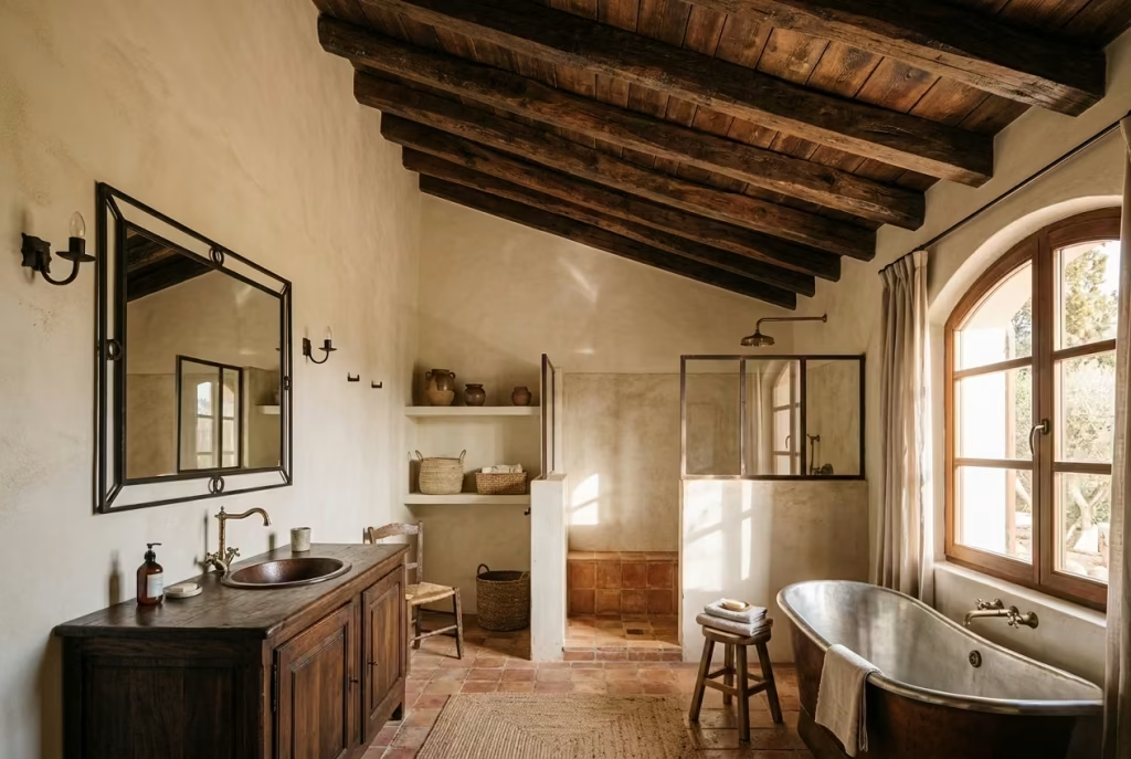
Exposed timber beams have a remarkable ability to anchor a bathroom’s design, introducing warmth, texture, and a sense of history that mineral-heavy finishes like stone, plaster, or terracotta can sometimes lack. Even in bathrooms, where moisture and ventilation are always a concern, carefully specified timber beams can work beautifully. The secret is ensuring proper airflow and humidity control so that the wood settles gracefully over time rather than warping or discolouring. When done well, it feels like the ceiling itself is breathing warmth down into the room.
High ceilings provide a canvas for these beams to make their statement without overpowering the space. I often position them spanning 150–200 mm (6–8 inches) in depth with subtle spacing, allowing shadows to play along the ceiling planes. The effect is architectural poetry: a rhythm overhead that draws the eye upward and balances the horizontal surfaces below. In one project, I paired dark-stained oak beams with pale lime plaster ceilings. The contrast introduced a quiet drama, giving the room a sense of groundedness without feeling heavy or overworked.
There’s also a tactile and emotional dimension that clients rarely anticipate. Reaching for a towel while standing beneath a warm timber canopy evokes a subtle connection to natural materiality, a reminder that this is a human-scaled space designed for sensory comfort as much as visual appeal. The interplay of light across the beams throughout the day further enhances the room, casting soft shadows that shift like a living artwork rather than a static detail.
The addition of timber overhead also helps balance cooler surfaces underfoot, such as stone or terracotta floors. It prevents the space from feeling antiseptic and introduces a psychological sense of warmth that no radiator or towel rail can replicate.
Pros
Adds visual rhythm, warmth, and architectural depth; enhances sensory experience; ages beautifully with proper care.
Cons
Requires careful ventilation and moisture management; heavier timber may demand structural reinforcement in older buildings.
Stone Basins That Age Gracefully
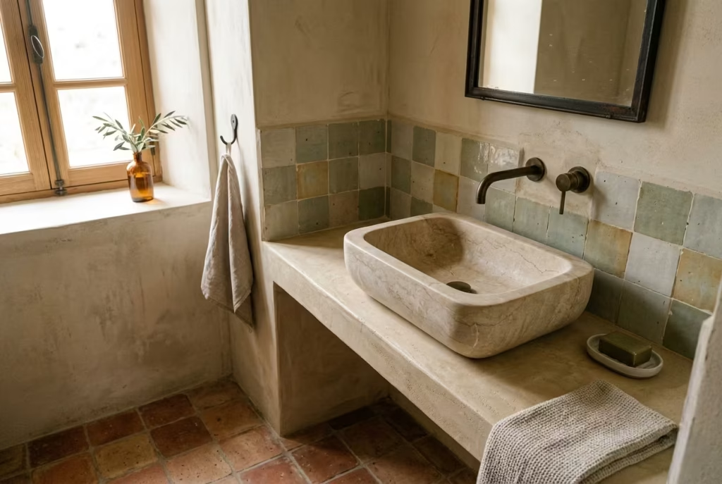
Stone basins are the kind of detail that can quietly elevate a bathroom from functional to tactilely and visually compelling. Travertine and limestone, in particular, are my go-to choices for Spanish-inspired bathrooms. Their inherent subtlety and natural veining create a surface that feels rooted in the earth, carrying a quiet permanence that contrasts beautifully with lighter, more ephemeral finishes like lime plaster. These are not elements that scream for attention—they whisper, drawing the eye in over time rather than demanding it upfront.
One of the most important lessons I’ve learned with stone basins is to embrace patina rather than perfection. Minor marks, slight colour variations, or the softening of edges are not flaws they are evidence that the material is settling into the space and interacting with daily use. In one project, a limestone basin installed in a busy family bathroom became increasingly beautiful over the course of a year, developing a warmth and subtle character that no factory finish could replicate. Clients often return to that space with a quiet smile, noting how it “feels lived in, but still luxurious,” which is exactly the effect I aim for.
From a practical standpoint, stone basins are robust, heat-resistant, and remarkably forgiving under water exposure—provided they are properly sealed. I recommend sealing at installation and reapplying every 2–3 years depending on water hardness. Pairing the stone with warm terracotta or subtle zellige tiles further enhances the basin’s textural interplay, creating a quiet counterpoint to the smoother wall surfaces.
Beyond the practical and aesthetic, stone basins add a sense of ceremony to daily routines. There is something almost ritualistic in lifting a towel, reaching for the basin, and letting your hands connect with a material that has history, substance, and a story to tell. In this way, the basin becomes more than functional it becomes a sensory touchpoint, a subtle anchor for the room’s atmosphere.
Pros
Durable, tactile, and visually enduring; develops patina and character with use; complements natural materials beautifully.
Cons
Requires periodic sealing and a tolerance for minor marks; heavier and more expensive than ceramic alternatives.
You May also Like: 16 Beautiful Lake House Bathroom Ideas to Create a Cozy Retreat
Softly Curved Built-In Bathtubs
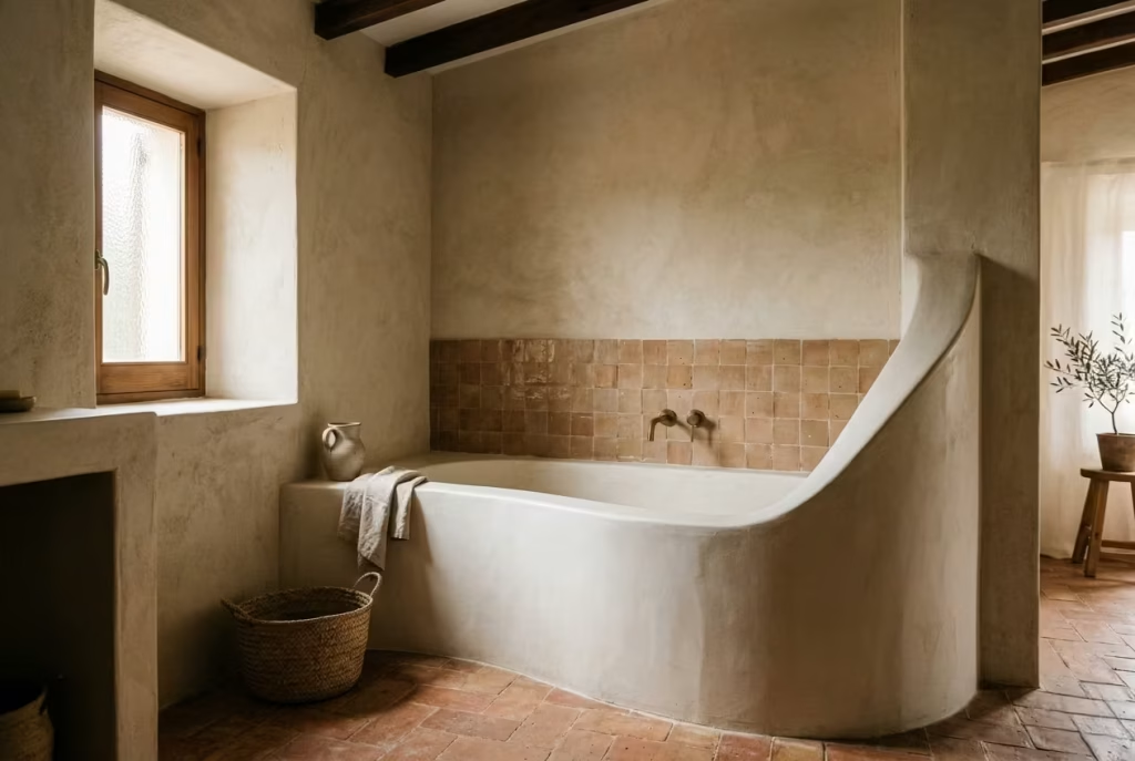
Softly curved built-in bathtubs are often overlooked in Spanish-inspired bathrooms, yet they offer one of the most subtle ways to introduce sculptural calm into a space. Unlike freestanding tubs, which can feel like furniture placed awkwardly in a room, a built-in form reads as if it has been carved from the architecture itself. The gentle curves, typically 50–60 cm (20–24 inches) in height, create a sense of enclosure and comfort while maintaining visual flow with surrounding surfaces. In my experience, this quiet continuity makes a bathroom feel more resolved, more intentional, and infinitely more inviting.
I recall a renovation where a previously standard rectangular bathtub was replaced with a curved built-in model, plastered seamlessly into the surrounding walls and paired with a narrow terracotta floor border. The room immediately felt calmer, softer, and more human-scaled. The curves invited the eye to linger, tracing lines rather than stopping abruptly at corners, and the result was a subtle interplay of shadow, light, and tactile materiality. It was one of those rare design moments where a single change transformed the emotional tone of a room without adding a single accessory.
From a practical standpoint, built-in bathtubs also offer efficiency. They allow for recessed storage ledges along the wall, making it easy to keep bath essentials within reach without cluttering surfaces. The surrounding plaster or tile can be finished in a single material, creating a waterproof, continuous plane that is both functional and visually cohesive.
Perhaps the most overlooked benefit is psychological: a softly curved tub feels cocoon-like, encouraging the user to pause and slow down. It transforms bathing from a routine into a ritual, grounding the space with a quiet sense of ceremony that is hard to achieve with standard rectangular forms. When paired with natural materials, warm light, and subtle textures, it becomes the anchor of a bathroom designed to feel both timeless and wholly human.
Pros
Seamlessly integrated, visually calming, tactilely inviting, and encourages a sense of ritual; complements architectural flow.
Cons
Custom sizing and installation required; less flexibility for future layout changes compared to freestanding alternatives.
You May also Like: 25 Timeless Spanish Kitchen Ideas That Capture the Beauty of Spain
Wrought Iron Fixtures for Subtle Contrast
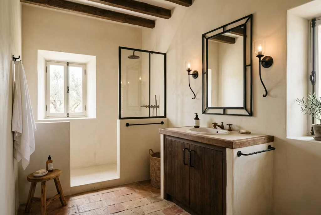
Wrought iron is a detail that can transform a Spanish bathroom from simply warm and textural to one with quiet, disciplined contrast. Unlike polished metals that call attention to themselves, wrought iron works best when it whispers rather than shouts. Think carefully chosen accents a mirror frame, a pair of wall lights, or discreet drawer handles rather than saturating the room with blackened metal. In small doses, it provides visual punctuation, drawing the eye and defining space without ever feeling heavy-handed.
In practice, wrought iron introduces a rhythm that complements softer, natural materials. I often pair it with lime plaster walls, terracotta floors, or gently aged timber, allowing the dark lines to anchor the composition. In one renovation, thin wrought iron frames for mirrors and a matching wall sconce created a subtle vertical cadence in a narrow bathroom. The effect was understated yet undeniably present the fixtures acted as a counterpoint to the warmer tones, giving the space structure while still feeling harmonious.
The material is also tactilely engaging. Iron’s cool surface offers a deliberate contrast to warmer finishes underfoot, and its slightly textured hand-forged character draws subtle attention to craftsmanship. In a space dominated by plaster, stone, and wood, this interplay of touch and sight keeps the room from feeling one-dimensional.
The guiding principle is restraint. Wrought iron is not meant to dominate; it is the punctuation in a longer sentence. Too many fixtures, and the room risks tipping from elegant contrast into visually heavy territory. Sparing placement ensures that each element serves both functional and aesthetic purpose, reinforcing the architectural intent rather than competing with it.
Pros
Adds depth, contrast, and architectural punctuation; tactilely engaging; complements natural materials beautifully.
Cons
Overuse can feel oppressive or heavy; careful placement is critical to maintain balance and subtlety.
Warm Neutral Palettes Inspired by Earth and Clay
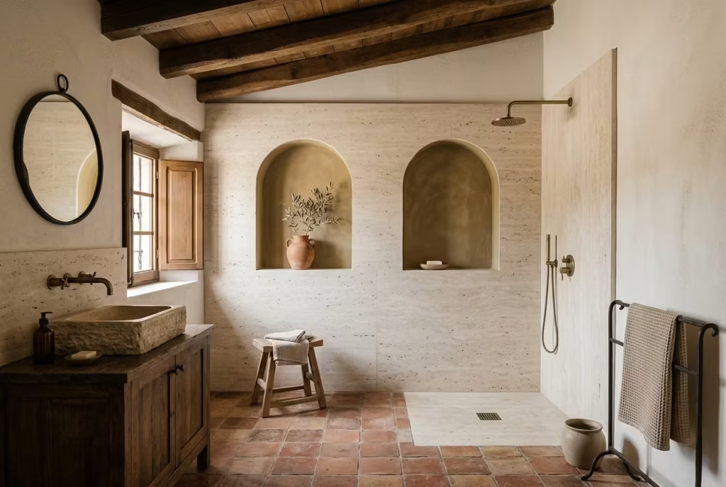
A warm neutral palette is the quiet backbone of any Spanish-inspired bathroom. Think sun-baked clay, soft ochres, muted terracotta, and pale limestone tones that feel drawn from the landscape rather than imposed on it. Unlike stark white schemes that can feel austere or clinical, these earthy hues carry a sense of permanence, grounding the room and creating a calm, enveloping atmosphere. In my experience, colour here is less about novelty and more about emotional resonance the kind that settles the eye and soothes the mind.
I often layer multiple tones to achieve subtle movement. Walls in lime plaster might be a soft cream, while floors are deeper terracotta, and built-in niches catch a gentle ochre highlight. The effect is never flat; the slight variation in hue, combined with natural light and the textures of stone, plaster, and timber, creates a space that feels alive and lived-in. In one bathroom I designed, pairing pale travertine with rich, sun-warmed floor tiles made a compact space feel expansive and simultaneously intimate a rare combination that many clients initially think impossible.
These palettes are also highly forgiving over time. Unlike saturated colours that can quickly date or clash with natural light shifts, warm neutrals evolve gracefully. A patina forms on floors, walls mellow subtly, and timber beams deepen in tone, all while maintaining a cohesive aesthetic. It is a colour story that ages with the home, rather than requiring constant intervention to keep pace with trends.
From a practical standpoint, warm neutrals also support flexibility in accessory and fixture selection. Brass, wrought iron, terracotta, or stone all integrate seamlessly, and subtle colour shifts allow for playful layering of texture without risking visual clutter. They create a backdrop that encourages the architecture and materiality to speak, rather than compete, which is the hallmark of thoughtful Spanish design.
Pros
Timeless, flexible, and calming; enhances material textures; evolves gracefully over time.
Cons
Requires careful coordination to avoid overly monochromatic or flat outcomes; subtle variations must be intentionally layered to retain depth and interest.
Mosaic Shower Floors for Grip and Detail
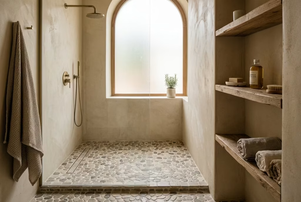
Mosaic floors in showers are one of those details that combine practicality with subtle artistry. They are especially valuable in walk-in showers, where a smooth slab can feel slippery underfoot. Small-scale mosaics, whether in natural stone, matte ceramic, or hand-cut zellige, provide texture and grip while introducing a visual rhythm that is more than just functional. In my experience, a well-considered mosaic can transform a shower floor from a utilitarian necessity into a tactile canvas that complements the larger material story of the bathroom.
The beauty of mosaic floors lies in their ability to integrate imperfection gracefully. Each tile edge, slight colour shift, or irregular joint contributes to the sense that the space has evolved naturally over time. I’ve often used subtle, muted palettes for these floors soft terracotta, warm greys, or earthy creams—so that the mosaic reads as a gentle whisper rather than a shouted pattern. In one project, a pebble-inspired mosaic underfoot created a visual and tactile anchor that balanced the softness of lime plaster walls and the warmth of timber accents. The shower became a small sanctuary, engaging the senses without ever feeling busy.
From a practical perspective, mosaics are forgiving. The multitude of grout lines helps channel water to the drain efficiently, reducing slip risk while maintaining a continuous, tactile experience. They also allow for slight floor slopes without obvious disruption in pattern, making them ideal for wet zones. Additionally, because mosaics are modular, damaged sections can often be replaced discreetly a subtle longevity benefit that clients often appreciate once the bathroom is in use.
A note on design restraint: while mosaics can be playful, overdoing pattern or colour can quickly overwhelm a small shower. The trick is to integrate them as a controlled accent, allowing other architectural gestures like a soft arch or built-in niche to remain the room’s focal point.
Pros
Provides slip resistance, tactile interest, and subtle visual rhythm; integrates with natural materials and ages gracefully.
Cons
Requires careful installation and maintenance of grout lines; busy patterns can overpower the space if overused.
Deep Window Reveals That Frame Light
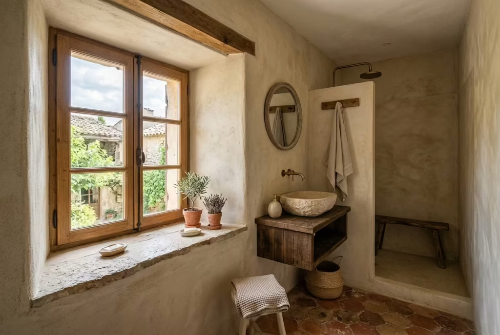
In Spanish-inspired bathrooms, light is not just illumination it’s a material in its own right. Deep window reveals are one of the most elegant ways to choreograph how daylight enters a room, framing it as a moving, breathing element that shifts throughout the day. Rather than flat windows that simply admit light, a deep reveal adds shadow, depth, and a sense of architectural intentionality. It creates a visual pause, allowing the eye to rest on the interplay of wall thickness, material texture, and the changing quality of light.
I often recommend reveals of 15–25 cm (6–10 inches), depending on wall thickness and window size. These proportions allow the light to diffuse softly across surfaces, highlighting the subtle undulations in lime plaster, the warm tones of terracotta floors, and the tactile character of stone or timber details. In one of my projects, a narrow, north-facing bathroom with a deeply recessed window suddenly felt expansive and calm, as the reveal created a gentle gradient of daylight that moved like a whisper across the room.
Deep reveals also offer practical benefits. They provide natural shelves for plants, candles, or personal items, integrating storage subtly into the architecture. From a thermal perspective, thick reveals contribute to insulation, helping maintain cooler temperatures in summer while retaining warmth in winter a nod to the traditional Spanish approach of balancing comfort with climatic reality.
The psychological effect is often underestimated. Bathrooms with shallow or frameless windows can feel abrupt or exposed, whereas deep reveals create a cocooned quality, a private space that encourages pause and reflection. They frame the outside world without letting it dominate, making the room feel anchored and serene.
Pros
Enhances light quality and architectural depth; offers subtle shelf space; improves thermal comfort; frames the view elegantly.
Cons
Requires careful proportioning relative to wall thickness; may limit window width or glazing options in retrofit projects.
Open Shelving in Recessed Niches
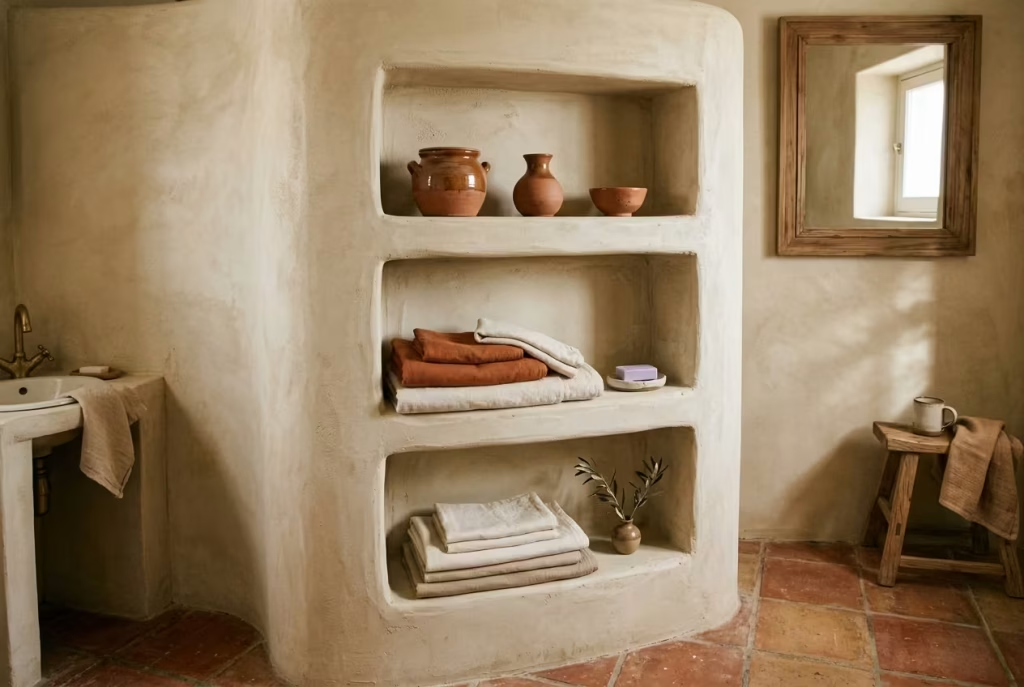
Open shelving in recessed niches is one of those deceptively simple touches that can quietly elevate a Spanish-inspired bathroom. By embedding storage into the architecture itself, you avoid the cluttered, “added-on” feel of freestanding shelves while giving everyday essentials a sense of permanence and purpose. I often design these niches at 120–140 cm (47–55 inches) height, striking a balance between accessibility and visual composition. This ensures towels, ceramics, or curated toiletries are within easy reach while keeping the lines of the room clean and uninterrupted.
The beauty of open shelving lies in its invitation to curate. A few hand-folded linens, an artisanal soap dish, or a small vase can transform a functional recess into a vignette that enhances the room’s tactile and visual narrative. I recall a renovation where shallow niches lined with lime plaster and framed by terracotta floor tiles became almost like small stages for personal items. The shadows cast across the shelves shifted subtly throughout the day, highlighting textures and colors that might otherwise go unnoticed, turning a practical feature into a quietly engaging design moment.
Beyond aesthetics, recessed shelving helps maintain a sense of calm and order in everyday life. It reduces countertop clutter, keeps frequently used items within reach, and allows the materiality of walls, floors, and fixtures to remain the visual hero. Unlike protruding shelving, the recessed approach ensures nothing interrupts the spatial flow, which is crucial in smaller or more architecturally intricate bathrooms.
From a sensory perspective, these niches encourage tactile interaction the coolness of stone jars, the softness of linens, the patina of hand-thrown ceramics. They offer a rhythm that complements other architectural gestures, reinforcing the room’s quiet ceremony and human scale. When thoughtfully composed, a recessed niche with open shelving can feel like a pause in the architecture, a deliberate moment that invites the eye and the hand to linger.
Pros
Creates accessible, organized storage; integrates seamlessly with architecture; enhances visual rhythm and material storytelling; encourages curated displays.
Cons
Fixed once installed, limiting flexibility; requires thoughtful styling to avoid appearing cluttered or utilitarian.
Rustic Wooden Doors or Sliding Panels
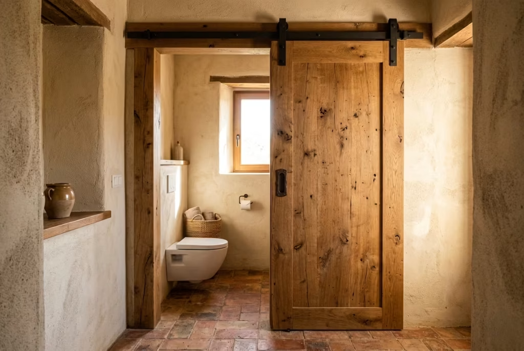
Rustic wooden doors or sliding panels bring a tactile, grounding quality to Spanish-inspired bathrooms, serving both functional and aesthetic purposes. Unlike sleek, mass-produced doors, timber with visible grain, knots, or hand-hewn edges introduces a sense of history and authenticity, anchoring the room in a human-scaled, lived-in rhythm. Sliding panels, in particular, allow for fluid spatial transitions, letting areas like toilet zones or laundry nooks remain discreet without interrupting the visual flow.
I typically specify doors or panels in solid timber, 40–50 mm (1.5–2 inches) thick, depending on ceiling height and weight distribution, ensuring a sense of substance and permanence. In one renovation, I replaced a plain painted door with a reclaimed oak sliding panel that spanned the entry to a walk-in shower. The effect was almost cinematic—the rich wood tones balanced the coolness of terracotta floors and lime-plastered walls, while the sliding mechanism introduced a sense of movement and ceremony to a routine entry.
Beyond the aesthetic, these doors offer sensory and practical benefits. The sound of a solid timber door closing, the tactile warmth of hand-finished wood, and the subtle visual texture all contribute to an environment that feels curated and intentional. Sliding panels also allow clients to play with light and shadow; partially open, they frame views or allow daylight to spill into darker corners, reinforcing the Spanish emphasis on natural illumination.
However, the key to success is restraint. Timber is inherently strong in visual language, so overuse or pairing with too many competing textures can tip a room from harmonious to heavy-handed. A single rustic door or a carefully positioned sliding panel, though, can anchor the design like a punctuation mark in a well-crafted sentence. It signals permanence and craft, without ever feeling ostentatious.
Pros
Adds warmth, texture, and tactile engagement; integrates seamlessly with architectural elements; provides functional privacy while maintaining flow; ages beautifully.
Cons
Requires careful selection for moisture resistance; heavier panels may need reinforced hardware; overuse can visually dominate the space.
You May also Like: 15 Bathroom Remodel Ideas That Will Inspire Your Dream Renovation
Brass Fixtures That Patinate Over Time
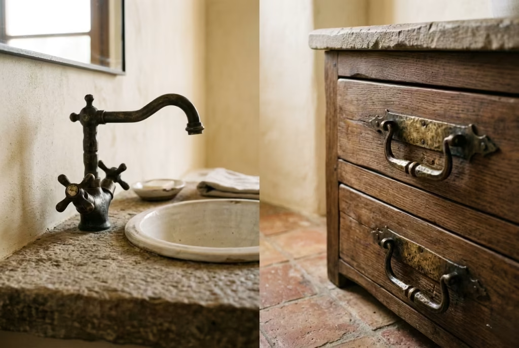
Brass fixtures are one of those timeless touches that can quietly elevate a Spanish-inspired bathroom, giving it warmth, character, and a sense of history. Unlike chrome or stainless steel, which can feel modern and precise to the point of sterility, brass develops a patina over time, subtly shifting in hue from burnished gold to warmer, softer tones. This natural aging process is not a flaw it is the material telling the story of daily use, light, and moisture, and it adds a dimension of authenticity that few other finishes can match.
I often specify taps, showerheads, and drawer handles in solid brass, paired with natural stone, lime plaster, or terracotta surfaces. The warm metallic sheen offsets cooler finishes, providing a visual anchor and tactile counterpoint. In one renovation, hand-forged brass fixtures against a backdrop of soft cream lime plaster created a quietly luxurious dialogue: the metal catches daylight in the morning, glows softly under pendant lighting at dusk, and evolves in a way that feels almost narrative each mark, shadow, or subtle discoloration adding to the room’s character.
Brass is also remarkably forgiving in terms of touch and maintenance. Minor water spots or fingerprints blend into the patina rather than standing out as imperfections, which aligns perfectly with the Spanish philosophy of material honesty over perfection. Over time, the metal softens in appearance, harmonizing with the other natural elements in the room timber, stone, and clay rather than competing for attention.
A word of caution: the choice of brass finish and quality matters. Low-quality plated fixtures may corrode or peel, undermining both appearance and function. Solid or carefully engineered alloyed brass, however, will age gracefully for decades. When installed with intention, brass fixtures do more than function they punctuate the space, drawing attention to key moments such as basins, baths, and showers while maintaining a calm, cohesive narrative across the room.
Pros
Ages gracefully into a patina, creating warmth and visual interest; tactilely pleasing; complements natural materials; highly durable.
Cons
Requires careful selection to ensure solid material; cost is higher than chrome or plated alternatives; overuse can make the space feel heavy if not balanced with lighter textures.
Courtyard-Style Bathrooms with Indoor-Outdoor Flow
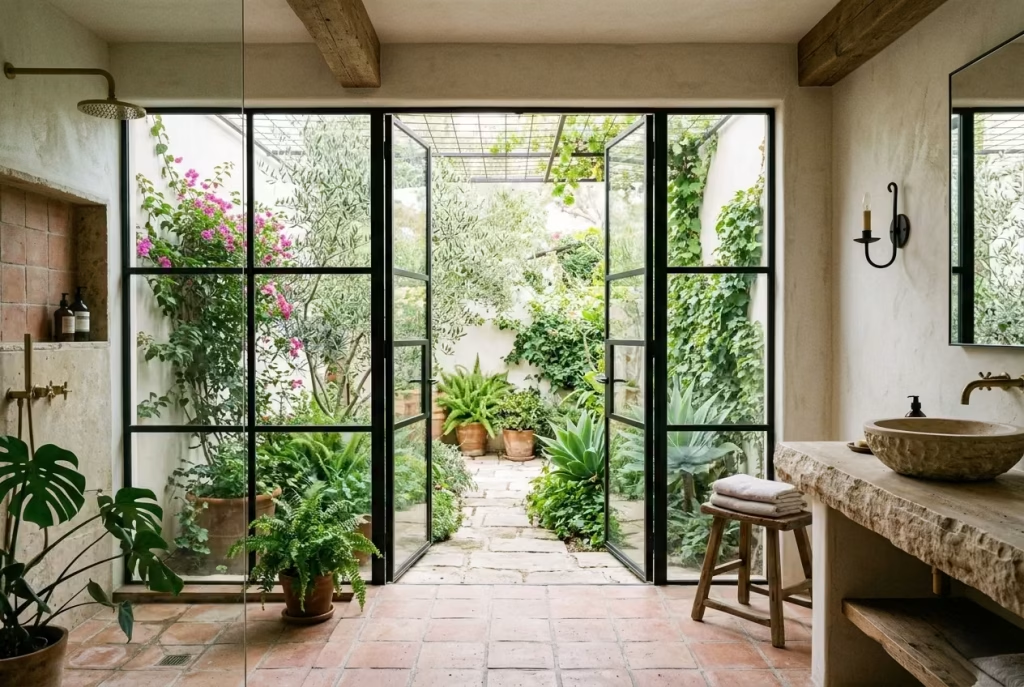
A courtyard-style bathroom is the ultimate expression of Spanish-inspired design, blending architecture and landscape to create a space that feels expansive, serene, and utterly immersive. By extending visual or even physical connections to an outdoor area, you invite light, air, and nature itself into the room, creating a dialogue between interior and exterior that transforms everyday routines into moments of quiet ritual. While climate-dependent, even a modest visual courtyard, a lush planter, or a glass-framed patio can dramatically elevate the experience.
From a practical perspective, I often design floor-to-ceiling glazing with operable panels or French doors, paired with deep overhangs or pergolas to mediate sun and rain. This allows natural light to flood the space without overheating it and provides the flexibility to open up the room fully during temperate months. Terracotta floors or stone paving can continue seamlessly from inside to outside, reinforcing the feeling of flow and continuity. In one project, a small urban bathroom felt instantly larger and more luxurious simply by introducing a recessed, planted courtyard visible from the shower a slice of greenery that brought both calm and a gentle sensory rhythm to the space.
The psychological benefits are profound. Courtyard-style bathrooms tap into the Spanish principle of creating spaces that feel “settled into themselves,” where every surface, light, and material appears purposeful. The indoor-outdoor connection encourages slow, mindful movement, softening the often utilitarian experience of bathing. Even subtle glimpses of greenery or filtered daylight cast dappled shadows across lime plaster and timber, adding a dynamic, almost cinematic quality that evolves with the sun.
The caveat, of course, is technical: moisture management, thermal comfort, and privacy must be carefully considered. High-quality glazing, proper drainage, and shading elements are non-negotiable. But when executed with intention, these spaces do more than function they transport, creating a daily encounter with nature that feels effortlessly luxurious and grounded at the same time.
Pros
Transforms daily routines into immersive experiences; maximizes natural light and ventilation; integrates greenery and architecture; creates a lasting sense of calm.
Cons
Climate-dependent; requires careful waterproofing, drainage, and privacy planning; can be costly to implement in retrofit situations.
Patterned Floor Tiles Paired with Plain Walls
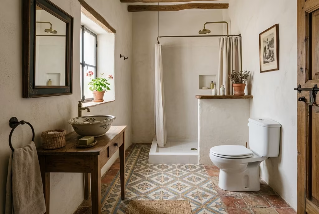
Patterned floor tiles are one of those tools that can quietly elevate a Spanish bathroom from functional to unforgettable. When paired with plain, understated walls, they create a visual anchor that draws the eye downward, allowing the architecture and materiality of the room to shine without overwhelming the senses. The juxtaposition of busy patterns underfoot with serene lime plaster or muted terracotta walls produces a rhythm that feels deliberate, lived-in, and entirely human-scaled.
I often recommend tile formats of 150–200 mm (6–8 inches) for a balance between detail and readability. Larger patterns can dominate smaller rooms, while tiny motifs risk becoming visually noisy. In a recent project, encaustic-style geometric tiles in soft ochres and muted blues were laid on the floor of a compact bathroom, while the walls were left in creamy lime plaster. The effect was subtle yet captivating the floor felt like a stage, guiding movement through the space, while the walls provided a calm backdrop that emphasized texture, light, and shadow.
Beyond aesthetics, patterned floors offer practical benefits. They naturally hide minor wear and water marks, making them ideal for busy family bathrooms, and they help define functional zones without introducing clutter or additional furniture. The pattern can also act as a subtle guide for circulation, drawing attention to showers, baths, or vanity areas while reinforcing a sense of order and proportion.
The magic lies in restraint. Too many patterns, or overly saturated colours, can tip the space into visual chaos, undermining the calm, considered atmosphere central to Spanish-inspired design. When executed thoughtfully, patterned floors paired with plain walls create a quiet, textural tension a dialogue between movement and stillness that keeps the eye engaged and the mind at ease.
Pros
Adds visual interest, guides circulation, hides wear, and enhances texture; balances boldness with restraint.
Cons
Requires careful scale and colour selection to avoid overpowering the room; installation and alignment must be precise for a polished effect.
Layered Lighting Instead of Overhead Harshness
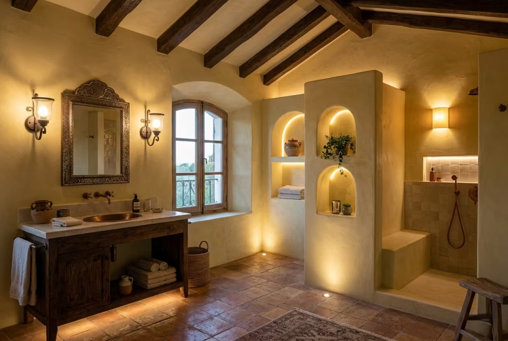
Lighting can make or break a Spanish-inspired bathroom, and layered strategies always win over a single, harsh overhead fixture. By thoughtfully combining wall sconces, recessed uplights, and accent illumination, you create a room that feels luminous, tactile, and quietly dramatic. I often position wall sconces at 160–170 cm (63–67 inches) height, striking the balance between ambient wash and functional task lighting. This ensures faces are evenly lit without casting unflattering shadows while keeping the fixtures within eye level for visual impact.
Layered lighting allows you to choreograph the room’s mood throughout the day. In one project, soft sconces complemented natural daylight streaming through a deep-recessed window, while a subtle strip of LED beneath a built-in niche highlighted artisanal soapware and folded linens. The interplay of shadows and highlights accentuated the textures of lime plaster, terracotta, and timber beams, reinforcing a sense of depth and architectural intentionality. Unlike a single overhead light, this approach transforms the bathroom from purely functional to sensory, encouraging slower, more mindful engagement with the space.
From a practical perspective, layering also enhances flexibility. Dimmers, separate circuits, and task-focused elements allow users to shift the atmosphere according to need—bright for morning routines, soft and meditative for evening rituals. It’s an approach that respects both function and emotion, aligning with the Spanish ethos of spaces that are lived in, appreciated, and subtly theatrical without ever feeling contrived.
The key to success is restraint and hierarchy. Each light must feel purposeful, not decorative for decoration’s sake. When done well, layered lighting becomes a silent narrator of the room, guiding movement, highlighting textures, and creating a sense of permanence that resonates far beyond the surface.
Pros
Enhances ambiance, highlights textures, provides task lighting without harsh shadows, and allows flexible control of mood.
Cons
Requires careful planning and multiple circuits; poor layering can create cluttered or uneven illumination; installation can be more complex and costly than single fixtures.
Textured Stone Feature Walls
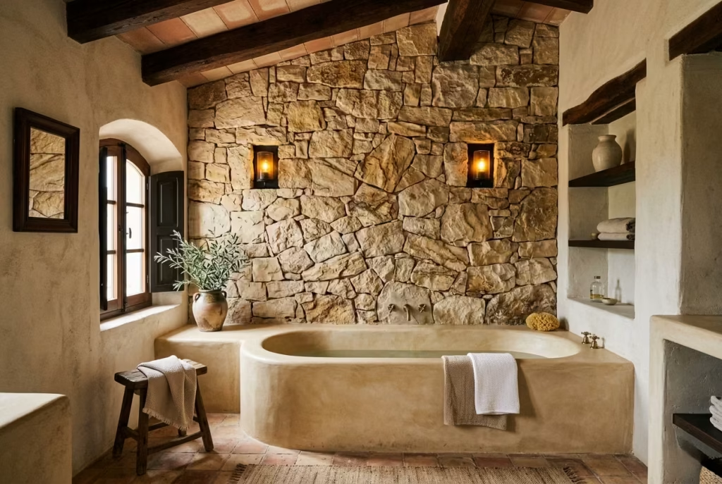
A textured stone feature wall is a bold yet grounded way to infuse a Spanish-inspired bathroom with character, tactility, and a quiet sense of permanence. Unlike smooth plaster or painted surfaces, stone carries weight, history, and a tactile honesty that instantly elevates the room. It anchors the space visually, providing a counterpoint to softer elements such as lime plaster, timber, or terracotta, and invites the eye to linger on the irregularities, veining, and subtle tonal shifts that make natural materials so compelling.
In my experience, walls clad in travertine, limestone, or sandstone often in 20–30 mm (0.75–1.2 inch) thickness strike the right balance between texture and practicality. One of my favourite applications involved a shower end wall rendered in stacked stone. The rugged surface contrasted with smooth plaster walls and a gently curved built-in tub, creating a dialogue between tactile roughness and soft architectural lines. Over time, moisture subtly deepened the stone’s colour, enhancing the sense of a room that has settled gracefully into itself.
Textured stone also performs on a functional level. Its density retains thermal comfort, keeping bathrooms cooler underfoot during hot months, and can serve as a sound buffer in multi-use homes. Recessed lighting or carefully placed wall sconces accentuate its relief, creating shifting shadows that animate the space throughout the day. This shifting play of light and texture gives the bathroom a dynamic quality without ever feeling staged a hallmark of well-executed Spanish design.
However, balance is critical. A feature wall should feel like a natural extension of the architecture, not a decorative afterthought. Overuse of heavy stone can dominate small rooms and disrupt spatial harmony. When chosen and positioned with care, textured stone becomes the quiet anchor of a bathroom, a material that ages gracefully, interacts with light, and encourages the kind of sensory engagement that makes a space memorable.
Pros
Adds tactile depth, visual anchor, thermal benefits, and a timeless sense of permanence; interacts beautifully with natural light.
Cons
Heavier installation and cost; can overwhelm smaller spaces if overused; requires careful waterproofing and planning for lighting to highlight texture.
Low Ceilings That Create Intimacy
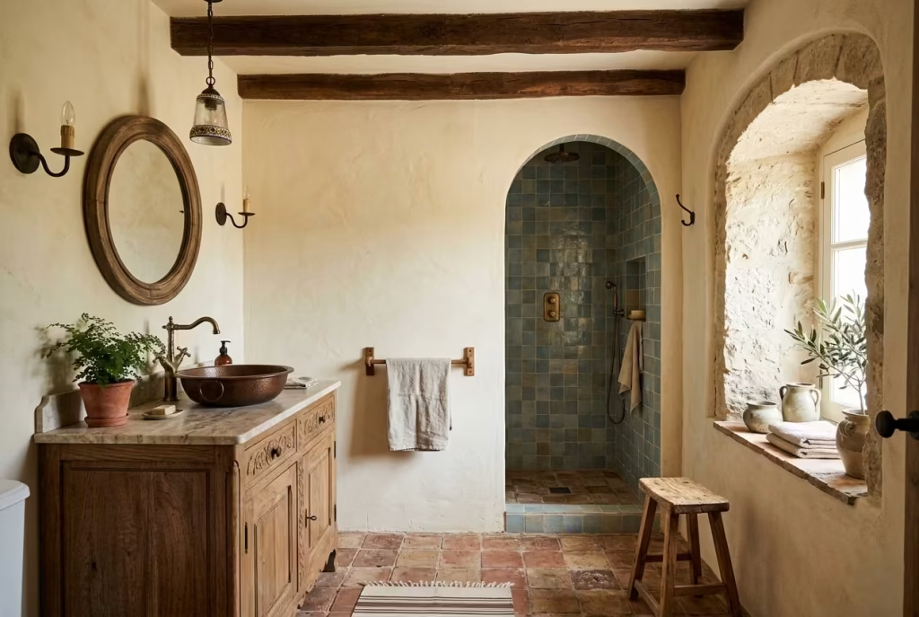
Low ceilings in Spanish-inspired bathrooms are often mistaken for a limitation, yet in my experience, they can become one of the room’s greatest assets. Instead of striving for vertical grandeur, embracing a lowered ceiling allows the space to feel enveloping, protective, and intimate, a quiet retreat from the outside world. When combined with warm materials terracotta floors, lime plaster walls, and exposed timber beams the lowered plane reinforces a human scale that feels deliberate and comforting rather than claustrophobic.
I frequently work with ceilings around 2.2–2.4 m (7’3”–8’), paired with well-positioned lighting and reflective surfaces to avoid any sense of confinement. In one urban renovation, the combination of a slightly lower ceiling, soft wall tones, and deep window reveals turned a modest bathroom into a cocoon-like sanctuary. The ceiling height guided circulation subtly, directing attention to textured walls, hand-painted tiles, and architectural niches rather than empty space above, creating a rhythm and focus that taller rooms often struggle to achieve.
From a sensory standpoint, low ceilings also enhance acoustic comfort, softening echoes in hard-surfaced rooms. When paired with suspended or wall-mounted lighting, the illumination feels warmer, cozier, and more considered, highlighting textures and materials without overpowering them. The intimate proportion encourages a slower pace of movement, a tactile and visual engagement that aligns perfectly with the Spanish philosophy of spaces that feel settled into themselves over time.
The key to success is balance. Too low, and the room can feel stifling; too high, and you lose that enveloping effect. When done right, low ceilings transform a functional space into one that feels deliberately crafted, quietly luxurious, and emotionally resonant—a room that invites pause, reflection, and connection with both the architecture and oneself.
Pros
Creates intimacy and human scale; emphasizes texture and materiality; improves acoustics and tactile experience; encourages slower, mindful use of the space.
Cons
Can feel confining if combined with poor lighting or overly dark materials; limits vertical design features like tall cabinetry or large mirrors.
Freestanding Tubs in Minimal Settings
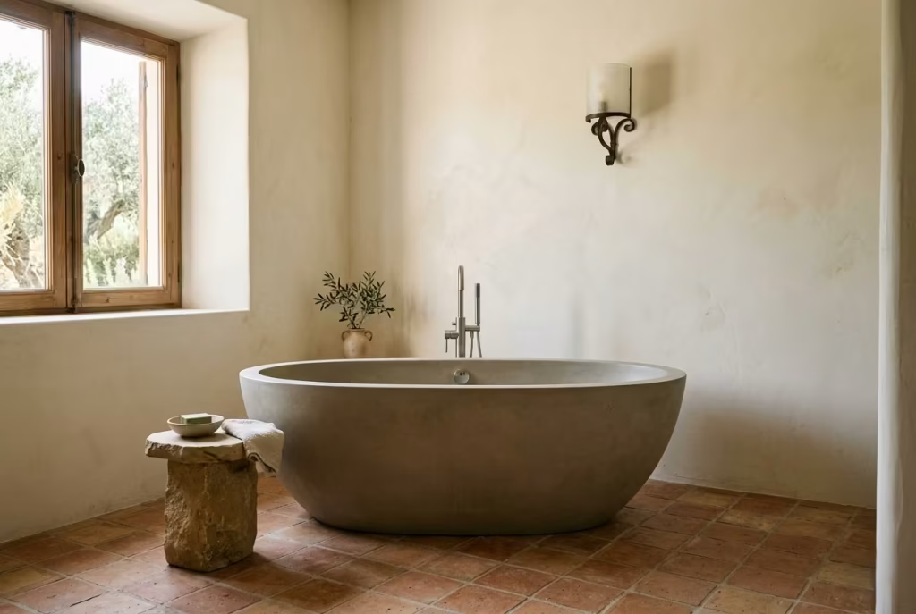
A freestanding tub can be a beautiful counterpoint in a Spanish-inspired bathroom, especially when the rest of the room is kept quiet and resolved. In a minimal setting, it becomes less of a centrepiece in the theatrical sense and more of a sculptural pause, a form that gives the eye somewhere to settle without cluttering the composition. That balance is exactly why it works so well. When the surrounding architecture is restrained, the tub does not have to compete for attention. It simply sits there with quiet authority, like a well-placed period in an otherwise fluid sentence.
I find this approach works best when the room has enough breathing space around the tub, usually at least 60–75 cm (24–30 inches) on the accessible sides, so the piece feels deliberate rather than squeezed in. In practical terms, the bath should be able to stand with a little room to breathe, not jammed against a wall like an afterthought. In one project, I placed a softly oval freestanding tub against a plaster wall with no surrounding cabinetry, only a small stone side table and a wall sconce. The result was striking in its calmness. Nothing was vying for attention, yet the room felt more complete, not less. That is the trick: a minimal setting lets the tub carry more visual weight without making the bathroom feel busy.
The most successful versions tend to rely on material contrast. A smooth mineral-finished tub against lime plaster, terracotta tile, or honed stone can feel beautifully grounded, while a bath with a matte or lightly textured surface avoids the high-gloss look that can feel too polished for this style. In a Spanish context, the tub should feel composed and tactile, not showroom-perfect. It is about ease, not display. I often say that the best pieces in a room do not need to shout to be heard, and freestanding tubs are a perfect example of that.
There is also a subtle emotional benefit here. A freestanding tub in a pared-back room encourages stillness. Without visual noise around it, the bathing experience becomes more immersive, almost ritualistic. The eye is not distracted by storage, hardware, or unnecessary detail, so the room feels slower and more restorative. That sense of pause can be deeply valuable in a busy home, particularly when the bathroom is intended as a retreat rather than a utility zone.
Pros
Creates a calm, sculptural focal point; works beautifully in minimal layouts; strengthens the sense of ritual and relaxation; pairs elegantly with natural materials.
Cons
Needs enough surrounding space to feel intentional; can become visually lost if the room lacks contrast or architectural clarity; plumbing and cleaning access must be considered early.
Subtle Colour Washes in Ochre or Sand Tones
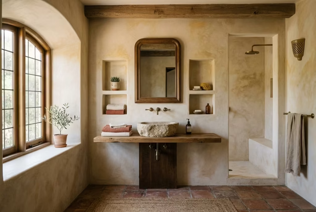
Subtle colour washes in ochre, sand, or muted terracotta can quietly transform a Spanish-inspired bathroom from merely functional to deeply atmospheric. Unlike bold or high-contrast palettes, these washes work as a soft whisper across walls, ceilings, or even niches, lending warmth and cohesion while still allowing textures and architectural features to take centre stage. They are the kind of detail that doesn’t demand attention but rewards careful observation, shifting in intensity with changing daylight and casting gentle, comforting shadows.
I often apply these washes over lime plaster or stucco walls, using diluted pigments to create depth without opacity. In one renovation, a wash of soft ochre over a textured plaster wall subtly reflected morning light through a deep window reveal, enriching the terracotta floor and oak beam tones around it. The result wasn’t just colour it was atmosphere, a sense of continuity and calm that felt almost innate, as if the walls had absorbed decades of sunlight and air. These subtle hues interact beautifully with both cool and warm materials, allowing stone basins, brass fixtures, or timber detailing to feel fully integrated rather than visually competing.
Beyond the visual appeal, the approach has practical benefits. Soft washes can disguise minor surface imperfections or the natural variations in handmade plaster, enhancing the material honesty central to Spanish design. They also reduce glare compared with stark white walls, which can feel harsh under midday sun or artificial lighting. The technique encourages layering elsewhere: textiles, ceramics, and metal accents gain resonance against the muted background, creating an ensemble effect that feels carefully orchestrated but entirely unforced.
The key to success is restraint. A wash that is too intense risks flattening textures or overwhelming subtle architectural gestures, while one that is too light may read as unfinished. When calibrated correctly, ochre and sand washes provide a quiet but profound anchor, enhancing the tactile richness of walls, the warmth of natural materials, and the serene, timeless quality that defines Spanish bathrooms at their best.
Pros
Enhances warmth and cohesion; complements natural materials; softens imperfections; interacts beautifully with natural and artificial light.
Cons
Over-application can flatten textures; subtlety requires careful pigment calibration; may need periodic refreshing in high-moisture areas to maintain vibrancy.
Built-In Benches Within Shower Spaces
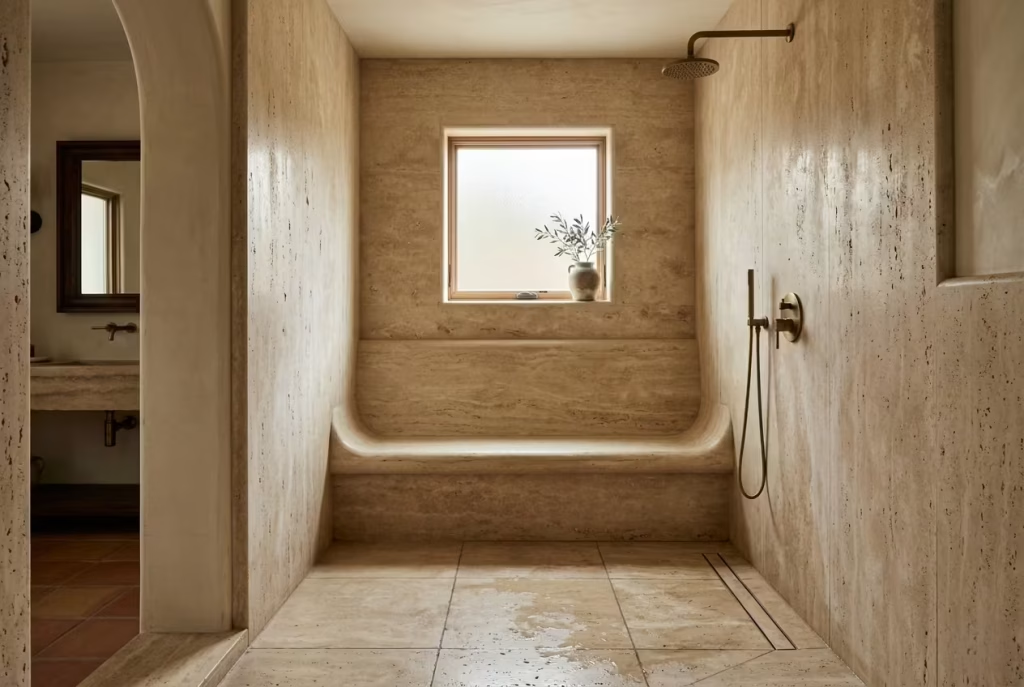
Built-in benches in shower spaces are one of those subtle gestures that quietly elevate a bathroom from functional to considered. Unlike freestanding stools, a bench carved into the architecture feels like it belongs, part of the room’s inherent rhythm rather than an afterthought. In Spanish-inspired design, these benches are usually modest in depth 30–40 cm (12–16 inches) enough to sit comfortably or place toiletries without breaking circulation or visual flow.
In practice, I often integrate benches using the same material as the shower walls or floor, such as lime plaster, terracotta, or natural stone, so the bench reads as a seamless extension rather than a separate object. In one renovation, a narrow travertine bench was recessed along the far wall of a walk-in shower. It created an elegant pause in the space, a tactile invitation to linger, whether for sitting while shaving, resting a foot for washing, or simply absorbing the filtered light from a small overhead window. The continuity of material amplified the calm, cohesive atmosphere, letting the space feel sculpted rather than constructed.
Functionally, built-in benches also help organize a shower environment without introducing clutter. Unlike freestanding alternatives, they remain stable, easy to clean, and visually light, reducing the risk of disrupting circulation or crowding compact layouts. They encourage mindfulness in movement, inviting users to slow down and engage with the textures, light, and materials around them a principle central to the Spanish approach to residential bathing spaces.
The only caveat is proportion and placement. Benches that are too deep or poorly positioned can feel intrusive, breaking the architectural flow or limiting shower usability. Done right, though, they are understated heroes, offering comfort, practicality, and a quiet sculptural presence that enriches both the experience and the tactile intimacy of the room.
Pros
Seamless integration, practical and durable, encourages mindful use, enhances tactile experience, and visually anchors the shower space.
Cons
Requires precise proportioning to avoid intrusiveness; must be waterproofed correctly; limited flexibility compared to movable seating.
Decorative Mirrors with Age and Character
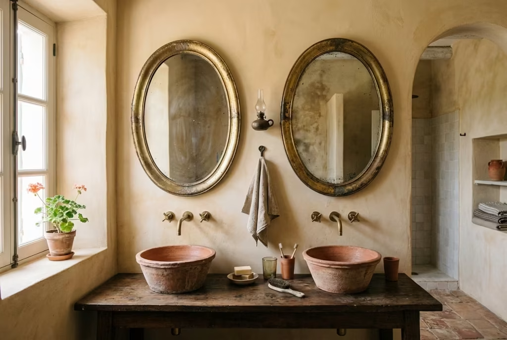
Decorative mirrors in a Spanish-inspired bathroom are far more than reflective surfaces; they are storytellers. A mirror with subtle imperfections, antiqued glass, or a hand-forged frame adds depth, warmth, and personality, transforming a purely functional element into a design gesture that feels collected over time rather than bought off a shelf. These mirrors echo the Spanish philosophy that beauty lies in imperfection, and they reward attention, catching light and shadow in unexpected ways while creating a sense of history within a modern renovation.
I often select mirrors with slightly oxidised silvering, gently worn frames, or distressed brass surrounds, pairing them with neutral walls or textured plaster to allow their character to emerge without overwhelming the room. In one project, a bathroom featuring soft ochre lime plaster and terracotta tiles came alive when I introduced a pair of oval antique mirrors above twin basins. The irregular reflections softened the light, creating a warm, almost cinematic glow that shifted with the day. They anchored the space visually while whispering subtle charm an effect no new, perfectly flat mirror could achieve.
Beyond aesthetics, mirrors with age and character serve practical purposes. They break up expanses of wall, amplify natural light, and enhance the sense of space, all while encouraging a slower, more deliberate engagement with the environment. Their imperfections act as gentle reminders that the space is meant to be lived in, handled, and enjoyed rather than treated as a sterile showcase.
The key is restraint. Too many heavily distressed mirrors or overly ornate frames can tip the room into pastiche, losing the elegant balance central to Spanish design. When chosen thoughtfully, however, they enrich the material palette, echo the textures of lime plaster, stone, and timber, and infuse the room with a quiet, lived-in sophistication that feels both timeless and entirely personal.
Pros
Adds warmth and character; enhances natural light and spatial perception; complements textured and natural materials; creates a sense of history and personality.
Cons
May require careful sourcing to find authentic patina; overuse can appear contrived; aged glass can have minor distortions that may not suit all users.
You May also Like: 16 Sage Green Bathroom Ideas for a Serene and Stylish Space You’ll Love
Layered Textiles to Soften Hard Surfaces
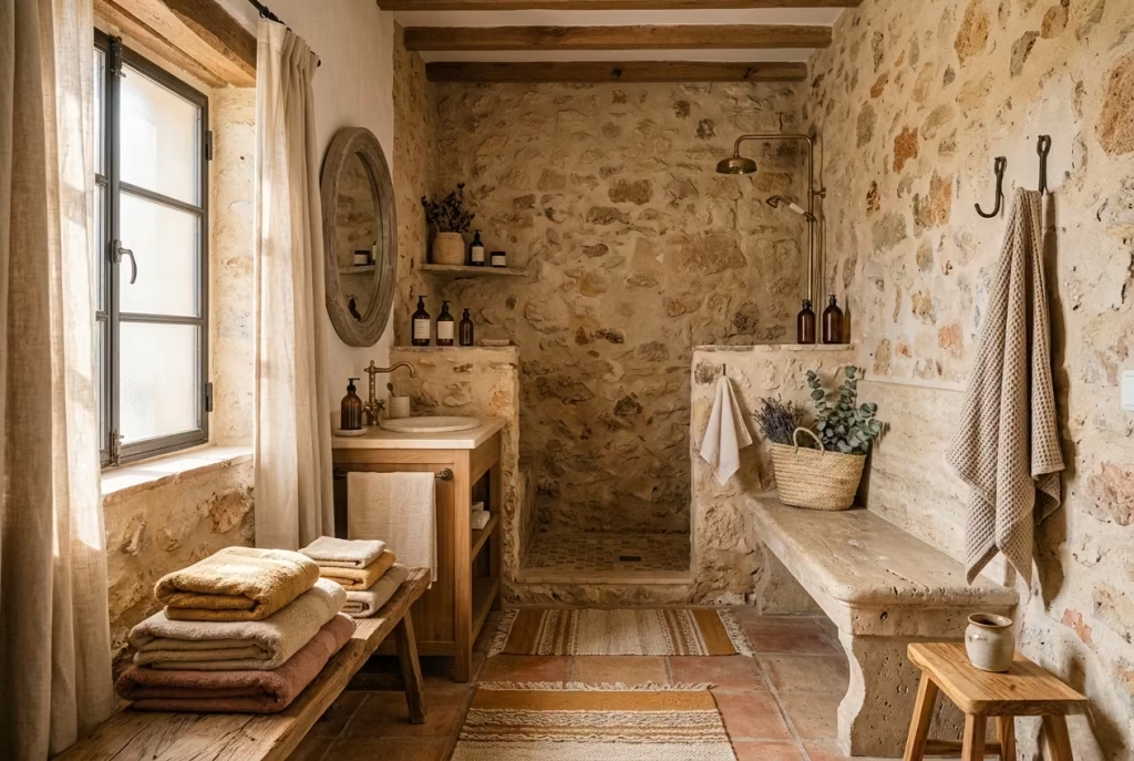
In Spanish-inspired bathrooms, the hard surfaces stone floors, lime plaster walls, terracotta tiles can feel resolutely architectural. Layered textiles act as the counterpoint, introducing softness, warmth, and tactility without diluting the room’s structural honesty. Think linen hand towels, cotton bath mats, and subtly patterned throws or window treatments. These are not mere accessories; they are integral to making the space feel inhabited, human, and immediately welcoming.
I often recommend textiles in muted, earthy palettes sandy beiges, soft ochres, or faded terracotta—that echo the surrounding materials while providing gentle contrast. In a recent project, a walk-in shower with textured stone walls and a travertine bench felt austere until a set of hand-dyed linen towels and a cotton mat were introduced. The effect was subtle yet transformative: the space softened without losing its architectural clarity, and the tactile richness encouraged a slower, more mindful interaction with the environment.
Beyond aesthetics, textiles perform functional tasks. Cotton mats provide grip on smooth floors, while linen absorbs moisture efficiently and dries quickly, reducing the harshness of stone underfoot. Layering allows variation in texture and tone, creating pockets of visual interest and comfort without cluttering the room. They also allow seasonal shifts a light linen in summer, a thicker cotton weave in winter adding a temporal dimension that reinforces the sense of a space evolving gracefully over time.
The art lies in restraint. Too many patterned or heavy fabrics can clash with the underlying simplicity, diluting the calm, grounded atmosphere. When selected and layered thoughtfully, textiles soften hard surfaces, enhance comfort, and complete the sensory experience, making the Spanish bathroom not just a room, but a retreat that feels both tactile and timeless.
Pros
Softens rigid surfaces; introduces tactile warmth and comfort; complements natural materials; allows subtle seasonal variation.
Cons
Requires careful colour and texture selection to avoid visual clutter; textiles in wet areas must be chosen for durability and quick-drying properties; over-layering can feel heavy or fussy.
Common Mistakes I See When Designing Spanish Bathrooms
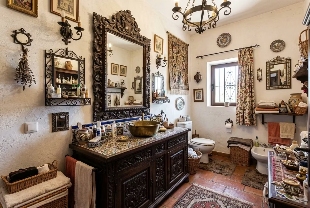
The strongest Spanish bathrooms are rarely the loudest. They work because the balance is right: materials feel honest, proportions feel settled, and nothing is trying too hard to steal the show. The trouble starts when the room is treated as a costume rather than a composition. At that point, the design begins to fray at the edges, and all the good intentions in the world cannot quite save it.
Over-theming with Excessive Ornamentation
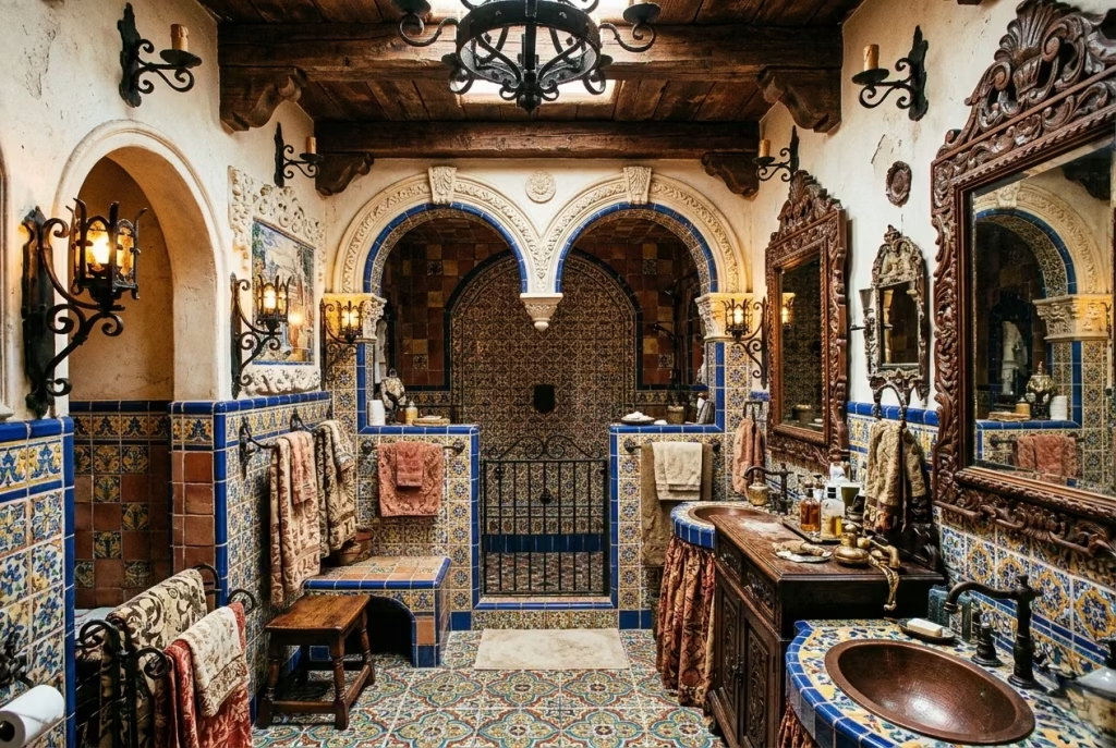
One of the quickest ways to lose the thread is to pile on too many references at once. Arches, patterned tiles, wrought iron, terracotta, carved mirrors, rustic timber, decorative plaster, all in the same room, can feel like too much of a good thing. The space starts to creak under its own weight. Instead of reading as authentic, it reads as overworked. Spanish design has strength precisely because it knows when to hold back. A single well-proportioned arch, a grounded floor finish, or one carefully chosen decorative detail will usually do more heavy lifting than a dozen gestures fighting for attention.
In practice, restraint allows the architecture to breathe. It also gives the eye somewhere to rest, which matters more than most people realise. A bathroom that is visually exhausted from the outset will age badly, no matter how expensive the materials were. The rooms that endure are the ones that feel composed, not crowded.
Using Polished, Uniform Materials That Lack Character
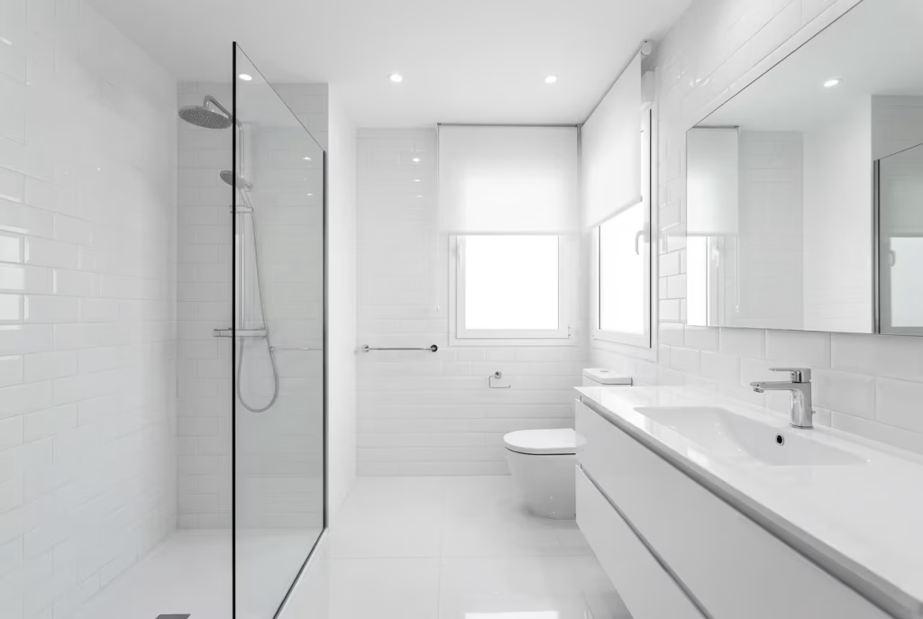
Another common misstep is choosing finishes that are too slick, too even, and too flawless for the mood the room is trying to create. Spanish interiors rely heavily on materiality, and materiality is rarely perfect in the factory-fresh sense. If every surface is polished to the same degree, the room loses depth. It becomes flat, and once that happens, even a generous layout can feel oddly lifeless.
I often find that clients are initially drawn to the idea of “clean” materials, but what they usually respond to is clarity, not sterility. Lime plaster with slight tonal variation, terracotta with a little movement, brass that can soften over time, these are the elements that give the room a pulse. They carry the sort of quiet imperfection that makes a space feel lived in rather than staged. Without that, the bathroom may look finished, but it will not feel grounded.
Ignoring Ventilation, Especially with Natural Materials
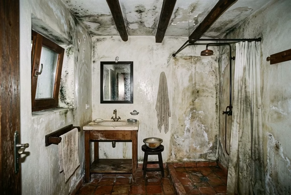
This is where good intentions can unravel in a hurry. Natural materials are a gift, but they are not forgiving if the room cannot breathe. Poor ventilation is one of the fastest ways to undermine terracotta, timber, lime plaster, and even brass finishes. Moisture builds, surfaces begin to age badly rather than gracefully, and the design starts working against itself. It is a classic case of the tail wagging the dog.
A Spanish-inspired bathroom should feel cool, calm, and materially confident, not damp or stuffy. That means ventilation needs to be planned from the outset, not treated as an afterthought once the pretty bits are in place. I have seen beautiful schemes go off the rails simply because the room could not manage humidity properly. When that happens, the finish may still look attractive on day one, but it will not hold its nerve over time. Good design is as much about maintenance as it is about mood.
Treating It as a Look Rather Than a Spatial Philosophy
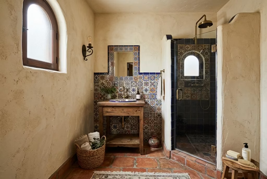
This is the biggest mistake of all. Spanish bathroom design is not just about selecting the right palette or ticking off the expected features. It is about how the space feels when you stand in it, move through it, and use it every day. If the room is built around the surface image alone, it will always feel a little hollow. It may photograph well, but it will not live well.
The most successful spaces in this style understand proportion, light, temperature, and tactility. They know when to create enclosure and when to open out. They understand that a bathroom should support routine while still carrying atmosphere. That is the real discipline here. Not imitation, but translation. Not a checklist, but a spatial logic.
Insight
More often than not, the designs that fall short are the ones trying too hard to announce themselves. Spanish interiors, at their best, feel like they have arrived quietly. They do not need to shout over the room to prove they belong there. They are confident enough to let light, texture, and proportion do the talking, and that is why they tend to stay in favour long after louder schemes have gone stale.
How to Bring Spanish Bathroom Design Into Modern Homes
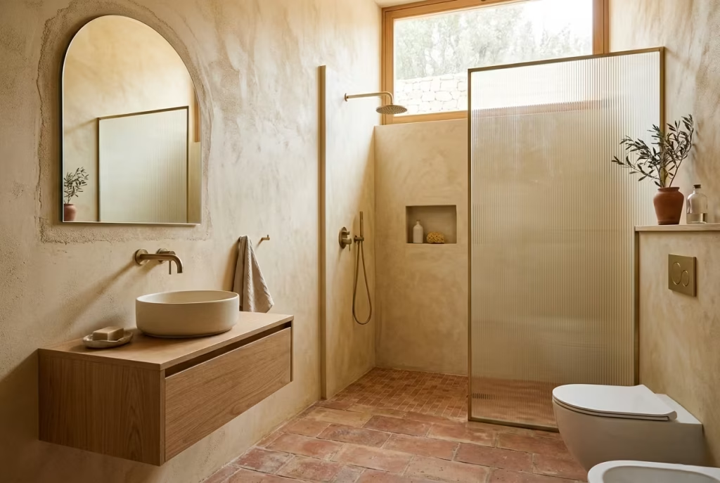
The most successful Spanish-inspired bathrooms in contemporary homes are never literal recreations. They do not rely on copying old-world details wholesale. Instead, they take the underlying principles, warmth, texture, restraint, and architectural clarity, then translate them into a setting that suits modern living. That is where the design begins to feel credible rather than theatrical.
Translate, Don’t Replicate
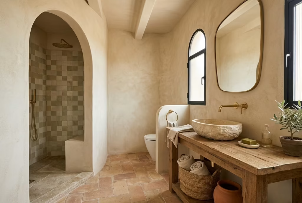
Replication is usually where the idea goes off the rails. A room full of borrowed motifs can feel like it is wearing a costume, and once that happens, the charm starts to thin out. Translation is different. It means understanding what gives Spanish interiors their character, then distilling that feeling into something that works for the house in front of you. In a modern home, that might mean a lime-washed wall instead of ornate plasterwork, or a softly arched shower entrance rather than a decorative arch repeated across the room.
I have found that the strongest results come when the reference point is atmospheric, not literal. You are not trying to recreate a villa in Andalusia inside a suburban extension. You are borrowing the sense of permanence, the warmth of earthy materials, and the quiet rhythm of handmade surfaces, then letting those ideas settle into a more contemporary framework. That way the room feels rooted, not pasted together.
Pair Traditional Materials with Clean Spatial Planning
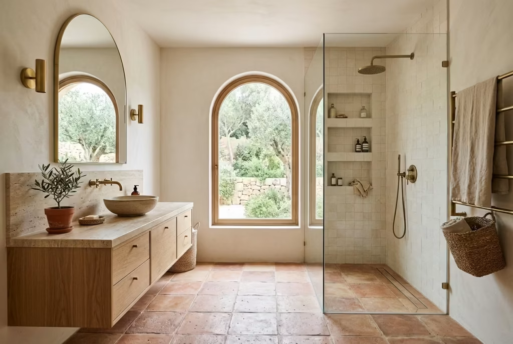
Traditional materials carry enormous visual weight, so they work best when the planning around them is disciplined. A terracotta floor, a stone basin, or a brass fitting has more presence when the room is not fighting itself. Clean spatial planning gives those materials room to breathe. It keeps the composition from becoming cluttered, which is often where otherwise beautiful schemes begin to lose their nerve.
In practice, this means being careful with circulation, storage, and fixture placement. A built-in niche will usually feel more coherent than a freestanding cabinet. A clear shower zone will feel more resolved than a crowded corner trying to do too much. The material palette can then do the expressive work while the layout quietly holds everything in place. That balance is often what separates a room that merely looks Spanish from one that actually feels thoughtful.
There is also a practical benefit here. Natural materials tend to look best when they are not competing with too many visual distractions. A restrained layout allows texture, patina, and light to take the lead. The room gains depth without having to resort to excess, and that is usually a better long-term proposition.
Adapt Proportions to Contemporary Layouts
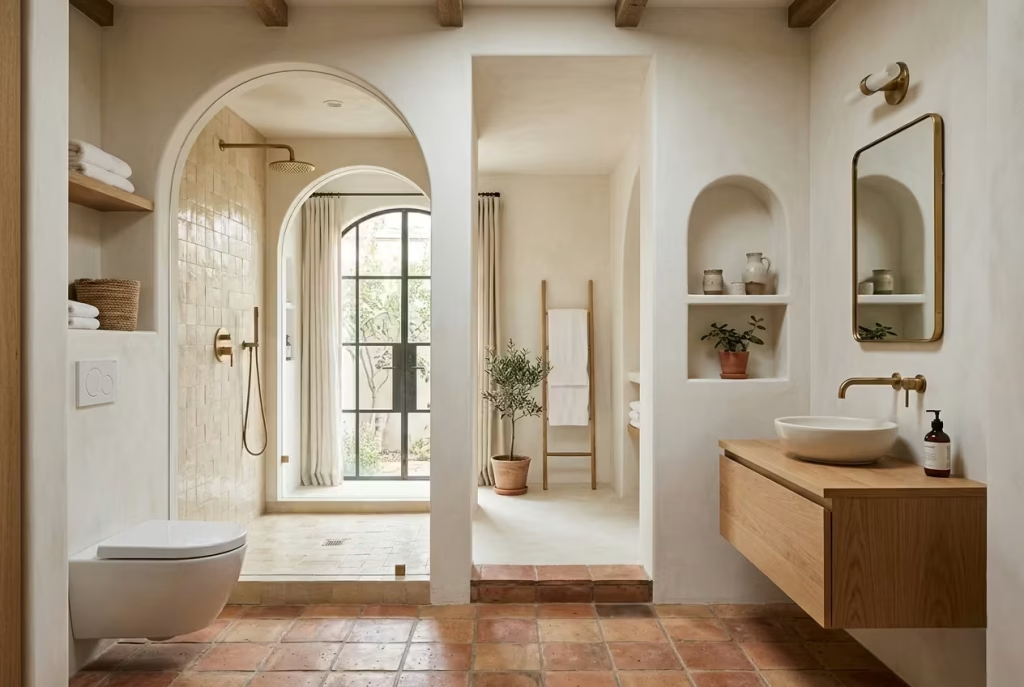
Spanish design principles are remarkably adaptable, but proportion is where modern homes need the most judgment. Older Mediterranean spaces often rely on generous wall thickness, deeper reveals, and a sense of enclosure that many contemporary homes simply do not have. Rather than forcing those proportions to match, it is better to interpret them in a way that suits the footprint you actually have.
That might mean using a shallow arch instead of a full structural curve, or choosing a compact plaster niche rather than a heavy built-in surround. It might mean keeping the material palette warm but the lines cleaner, so the room feels current without losing its character. In smaller bathrooms, this kind of adaptation is essential. Too much mass can quickly make the room feel cramped, while too little can strip away the very atmosphere you are trying to create.
I often say that good design knows how to read the room, and this style is no exception. A modern bathroom does not need to mimic historical proportions to capture the spirit of Spanish interiors. It simply needs to understand scale, restraint, and how to let materials carry the mood without overwhelming the architecture.
Closing Thought
Bringing Spanish bathroom design into a modern home is less about imitation and more about interpretation. Get the balance right, and the room will feel calm, grounded, and quietly expressive, with enough clarity to work in daily life and enough warmth to feel memorable for years to come.
Conclusion: Designing for Atmosphere, Not Just Aesthetic
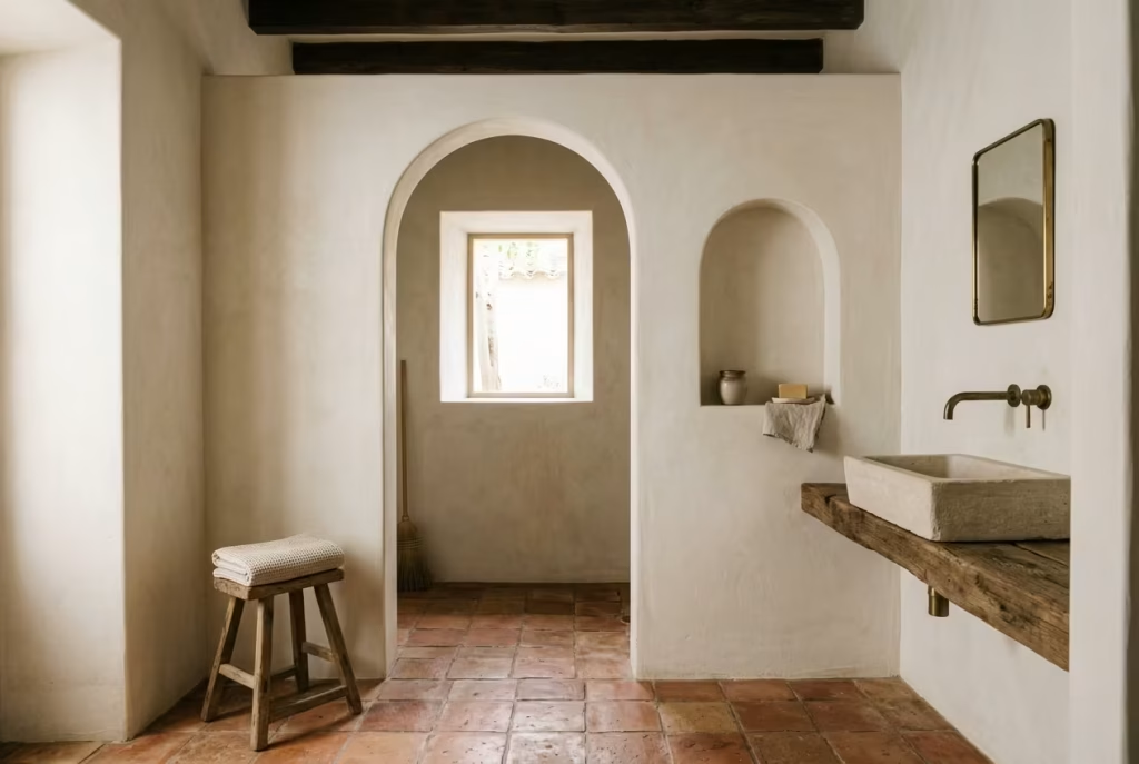
The most compelling Spanish bathrooms are never built on surface effect alone. They work because every element contributes to a broader atmosphere, one that feels calm, grounded, and quietly assured. That is the real measure of success here. Not whether the room looks decorative in a photograph, but whether it holds together in daily use, through changing light, moisture, routine, and time. A Spanish-inspired bathroom should feel as though it has a point of view, but never a performance.
At the heart of that atmosphere is restraint. The rooms that endure are usually the ones that know what to leave out. A single architectural gesture, an arched opening, a recessed niche, a well-placed basin, will often carry more weight than a room packed with references. Restraint gives the materials room to breathe and allows the architecture to do its job without clamouring for attention. It is a quiet discipline, but one that pays off every time. When the room is not overworked, it feels more settled, more believable, and ultimately more generous to live with.
Material depth is the next part of the equation. Spanish bathrooms depend on surfaces that have presence, not just finish. Lime plaster, terracotta, stone, timber, brass, these are materials that reward touch and improve through use. They do not need to look perfect to look right. In fact, a little variation is often what gives them their appeal. They carry the kind of visual richness that cannot be faked with a glossy substitute. That depth matters because it gives the room a sense of age, even when the space is new. It is what makes the design feel as though it has already lived a little.
Just as important is architectural clarity. A bathroom can be full of beautiful materials and still feel muddled if the layout lacks discipline. The strongest schemes understand proportion, circulation, and hierarchy. They know where the eye should land, where light should fall, and where the room should be quiet. That clarity is what lets the atmosphere settle in properly. Without it, even the best finishes begin to feel untethered.
In my experience, the most successful Spanish-inspired bathrooms are the ones that do not feel newly designed at all. They feel discovered, settled, and entirely at ease with themselves. There is no strain in them, no need to impress. They seem to have arrived with quiet confidence, like a room that already understands what it is supposed to be. And that is often what people are really looking for, whether they realise it or not. Not decoration for its own sake, but a space with depth, balance, and the kind of calm that lingers long after the door closes.
Frequently Asked Questions About Achieving Spanish Bathroom Design in Your Home
What makes a bathroom feel genuinely Spanish rather than just themed?
A truly Spanish-inspired bathroom feels grounded in architecture, materiality, and proportion rather than ornament alone. The strongest schemes rely on lime plaster, terracotta, stone, brass, and shaped openings, then keep the composition restrained enough for those materials to speak for themselves. When the room feels calm and resolved rather than decorated for effect, you are usually on the right track.
Do I need a large bathroom to create this style?
Not at all. Spanish design can work beautifully in compact spaces, provided the proportions are handled well. In a smaller bathroom, I would focus on one or two strong gestures, such as a plastered arch, a textured wall finish, or a warm natural floor, rather than trying to squeeze in every idea at once. A modest room often benefits from this kind of discipline, because it prevents the space from feeling overworked.
Which materials work best for a Spanish bathroom?
The most effective materials are those that age with grace. Lime plaster, terracotta, travertine, limestone, zellige, timber, and unlacquered brass all suit the style because they bring warmth, texture, and a sense of permanence. I would avoid finishes that look too polished or synthetic, as they can flatten the atmosphere and strip away the quiet depth that makes the style so compelling.
Can Spanish bathroom design work in a modern home?
Yes, and very well, provided it is translated rather than copied. In a contemporary home, the style often works best when paired with clean spatial planning and a more restrained layout. That means keeping the bones of the room simple, then layering in traditional materials and subtle architectural details. The result feels current, but still carries the warmth and character associated with Spanish interiors.
How do I keep the bathroom from looking too rustic or old-fashioned?
The key is balance. A Spanish bathroom does not need to feel overly rustic to be authentic. Pairing traditional materials with clean lines, understated fixtures, and a disciplined layout keeps the room from slipping into pastiche. A little contrast goes a long way, and when the room is edited carefully, it feels timeless rather than dated.
What is the most common mistake people make with this style?
The most common mistake is overdoing it. Too many arches, patterns, decorative tiles, and rustic elements can make the room feel forced. Spanish design has more impact when it is understated and confident. The spaces that work best are usually the ones that know when to stop, which is often the difference between a room that feels considered and one that feels like it is trying too hard.