25 Designer Secrets for Styling a Neutral Living Room That Feels Warm and Inviting
Neutral interiors are often treated like the easy route, the reliable fallback, the no-risk choice when colour feels daunting. On paper, that sounds sensible. In practice, it is rarely that simple. A neutral living room can be one of the hardest spaces to get right because, without a clear point of view, it can slip into something flat, brittle, and strangely indifferent. A room like that may look composed at first glance, but it does not hold you. It does not invite you to settle in, exhale, and stay a while. It is all polish and no pulse.
What gives a neutral room its warmth is not the absence of colour, but the presence of considered relationships. Tone, texture, proportion, finish, light, and placement all need to work in concert. That is where the real design work begins. A warm neutral room is never built by accident. It is shaped through restraint, yes, but also through layering with a light hand and a sharp eye. One wool rug too thin, one sofa too rigid, one wood tone too shiny, and the spell is broken. Get the balance right, though, and the whole space starts to hum quietly in the background.
I have seen neutral rooms fail not because the palette was wrong, but because nothing in the room was asked to carry any weight. Every piece looked agreeable, yet nothing anchored the eye or grounded the atmosphere. The result was a space that felt technically finished but emotionally unresolved, like a beautifully set table with no one invited to dinner. The rooms that succeed are the ones with a bit more backbone: a sofa with presence, a rug with enough texture to soften the floor, a lamp that pools light instead of flooding the room, and surfaces that offer depth rather than glare.
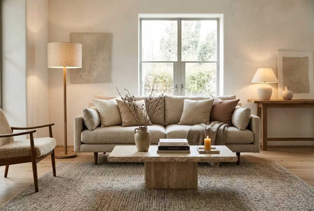
That is the real discipline of neutrality. It is not about playing safe. It is about editing with intent, holding back where necessary, and letting each element earn its place. When a neutral living room is designed well, it does not feel empty or timid. It feels settled, layered, and quietly assured, with just enough softness to draw people in and just enough structure to keep the room from drifting. In other words, it knows exactly what it is doing, even if it never shouts about it.
Foundations First Where Warmth Actually Begins
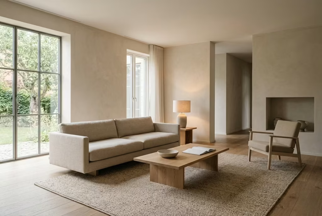
Before a room feels warm, it has to feel resolved. And that rarely comes down to styling at the end it’s set much earlier, in the bones of the scheme. The foundations, quietly doing the heavy lifting, determine whether a neutral space will read as layered and inviting or fall flat despite your best efforts. Get these early decisions right, and everything that follows starts to click into place almost effortlessly.
Start with Undertones, Not Colours
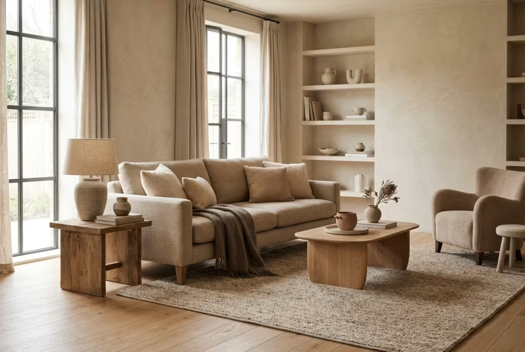
When people say they want a neutral living room, they usually mean a room that feels calm, timeless, and easy to live with. But the real work begins far beneath the surface, in the undertones. That is where a room either settles into a soft, cohesive rhythm or starts to feel slightly off, even if every item looks beautiful on its own. It is one of those subtle design truths that can make all the difference. You may not notice it straight away, but your eye certainly does.
Warm neutrals carry a little more cream, biscuit, taupe, honey, or clay in them. They tend to soften a room naturally and create that relaxed, lived-in feeling people often chase. Cool neutrals, by contrast, lean towards grey, blue, or a cleaner stone-like cast. They can feel refined and elegant, but in the wrong setting they can also read a bit aloof, especially if the room does not have enough texture or warmth elsewhere. Greige sits somewhere in between, which is exactly why it is so often misunderstood. It sounds like a safe compromise, yet in reality it can turn muddy or flat if it is not paired with the right light, flooring, and textiles.
This is where many rooms quietly come unstuck. A sofa with a warm beige undertone beside a rug that leans cool grey can look perfectly acceptable in isolation, but together they create a low-level visual tension that never quite lets the room breathe. It is not dramatic, not at first glance. It is more like a faint sense that the room is not singing in tune. You feel it before you can fully explain it. That is why I always say undertone is the backbone of a neutral scheme. Get it wrong, and the whole composition feels like it is working uphill.
The easiest way to avoid that mismatch is to choose a clear temperature direction and stay faithful to it. If the room has warm timber floors, plenty of natural light, and soft textile layers, warm neutrals usually feel more at home. If the space has cooler stone, blackened metal details, or a crisp architectural shell, cooler neutrals can work beautifully, but they need a deliberate hand. The secret is not to chase variety for its own sake. It is to create harmony. A well-judged neutral room should feel like it was always meant to exist that way, not like pieces were assembled one by one and hoped for the best.
In practice, this means checking every major element against the others, especially paint, upholstery, rugs, and wood tones. Hold samples together in the actual room, at different times of day, because undertones change with light more than most people realise. What looks creamy and warm at noon may turn oddly green by evening. What feels calm in a shop can look unexpectedly cold at home. That is the part people often miss. Neutral design is not about choosing the least risky shade. It is about choosing the right temperature for the room you actually have, not the one you imagined in your head.
A warm neutral room, when the undertones are aligned, has a quiet kind of confidence. It does not need to announce itself. It simply feels settled, comfortable, and easy on the eye, the sort of room people naturally drift toward and then linger in without quite meaning to.
Build a Tonal Spectrum, Not a Flat Palette
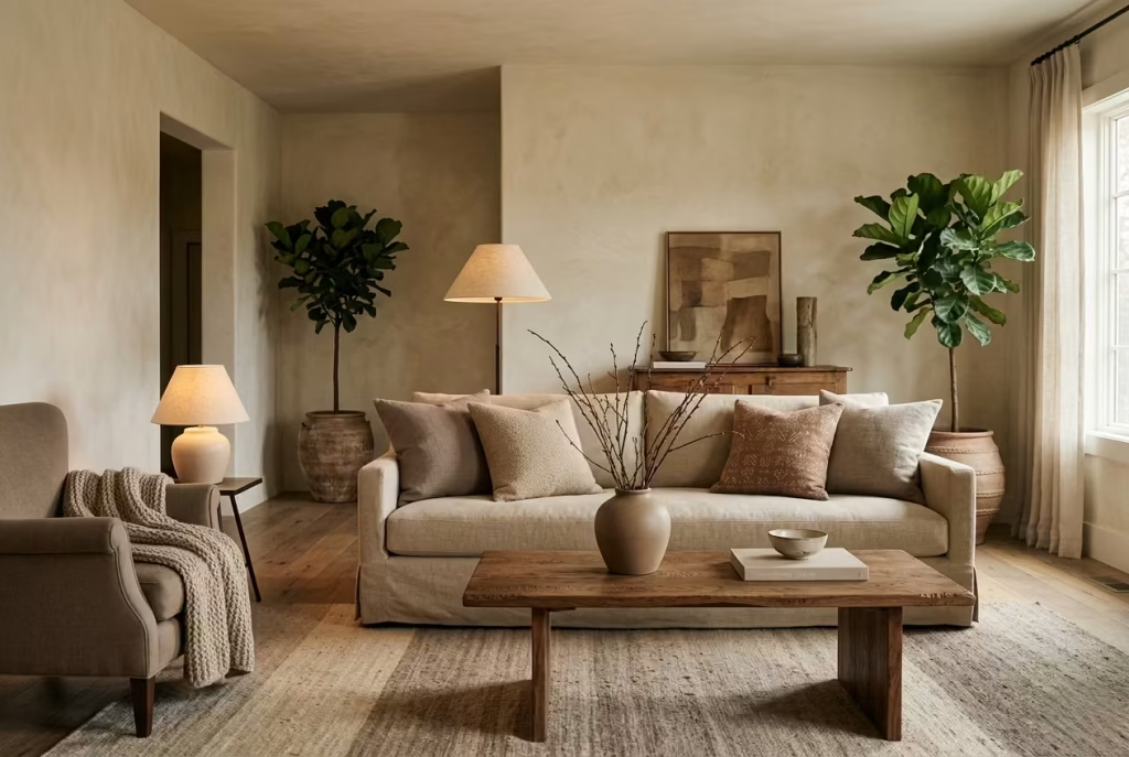
A neutral room comes alive not through contrast, but through nuance. Instead of relying on a single shade repeated across every surface, the aim is to build a gentle progression of tones within the same family. Think of it less like picking a colour and more like composing a quiet gradient that moves from light to mid to deep without ever feeling forced. Ivory walls, an oat-toned sofa, a sand-coloured rug, and touches of clay in smaller accents can sit together in a way that feels effortless, each tone supporting the next rather than competing for attention.
Design insight
Flat palettes are often the reason neutral rooms feel lifeless. When everything lands at the same visual pitch, the eye has nowhere to travel. The room becomes static, almost as if it is holding its breath. A tonal spectrum, by contrast, introduces depth without noise. It allows light to catch differently across surfaces, creating subtle shifts throughout the day.
I often think of it as the difference between a still image and something that quietly moves. The key is restraint. You are not layering for the sake of variety, but building a rhythm that feels cohesive from every angle.
In one project, a living room initially felt washed out despite beautiful materials. The issue was not quality, but sameness. The walls, sofa, and rug all hovered within a narrow band of pale beige. By introducing slightly deeper notes through a warm taupe armchair and a clay-toned textile, the room found its footing. Nothing dramatic changed, yet everything felt more grounded, as if the space had finally settled into itself.
Practical application note
Start by selecting a base tone, usually your wall colour, then build outward in measured steps. Introduce at least four to six variations within that same colour family, moving gradually from light to deeper shades. Keep transitions soft. If the jump between tones feels abrupt, it will read as contrast rather than cohesion. Sampling is essential here. Lay materials side by side in natural light, then revisit them in the evening. What feels like a gentle shift during the day can flatten out under artificial lighting if the tonal difference is too slight.
It also helps to distribute tones intentionally across the room. Lighter shades tend to sit comfortably on larger surfaces such as walls and ceilings, while mid and deeper tones can anchor furniture, textiles, and smaller accents. This creates a natural hierarchy, guiding the eye without making it work too hard. When done well, the room feels layered yet calm, as though everything has found its rightful place.
Typical size range (metric and imperial)
To make a tonal scheme read clearly, scale plays a quiet but important role. Larger elements carry the lighter tones, allowing the room to feel open and breathable. For example:
- Walls typically span standard ceiling heights of 2.4 to 2.7 metres, which is about 8 to 9 feet, making them ideal for your lightest tone such as ivory or soft cream.
- Sofas, often around 2.0 to 2.4 metres wide, roughly 79 to 95 inches, work well in mid tones like oat or warm beige, giving them enough presence without feeling heavy.
- Rugs, commonly 2.5 by 3.5 metres or 8 by 11 feet in a well-proportioned living room, can sit slightly deeper in tone such as sand or muted taupe to ground the seating area.
- Smaller accents like cushions, ceramics, or side tables can introduce the richest tones, clay or soft brown, in controlled doses that add depth without overwhelming the palette.
When these layers are scaled thoughtfully, the tonal spectrum does more than look good. It quietly shapes how the room feels, creating a space that draws you in and holds your attention without ever raising its voice.
Let One Element Anchor the Room
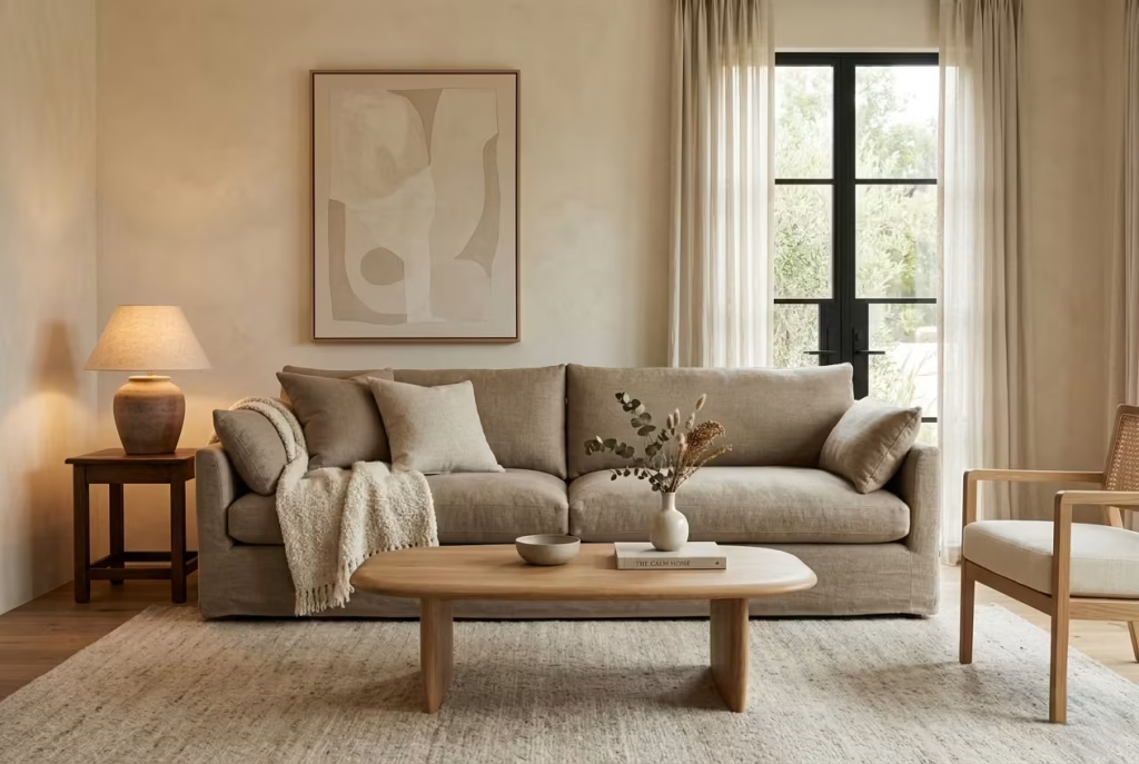
Every well-composed neutral living room needs a point of gravity, something that quietly holds the space together and gives the eye a place to land. Without it, the room can feel adrift, as though everything is politely stepping back at the same time. An anchor could be a generously scaled sofa, a rug with enough presence to ground the seating area, or a wall treatment that adds depth and structure. The goal is not to dominate, but to stabilise.
Design insight
Rooms that lack an anchor often fall into a very particular trap. Every piece is chosen to be agreeable, nothing too bold, nothing too heavy, and as a result, everything carries equal visual weight. On paper, that sounds balanced. In reality, it creates a kind of visual stalemate. The eye moves across the room but never settles, like a conversation where no one takes the lead.
When one element is allowed to take on more presence, the entire composition relaxes. I have found that the most inviting rooms tend to have a clear hierarchy. A sofa with depth and substance, set against quieter supporting pieces, can shift the atmosphere entirely. It gives the room a backbone, something solid enough to build around. From there, everything else can play a supporting role without feeling diminished.
In one project, the turning point came down to replacing a lightweight, leggy sofa with a deeper, more grounded piece in a warm neutral tone. Nothing else changed immediately, yet the room felt more anchored, more settled. It stopped feeling like a collection of items and started reading as a cohesive space.
Practical application note
Start by identifying where you want the visual weight to sit. In most living rooms, the sofa naturally takes on that role because of its size and function. Choose one with enough depth, both physically and visually, to hold the space. Alternatively, a rug with a richer tone or more tactile texture can act as the anchor, especially in open-plan layouts where the floor needs to define the zone.
Once the anchor is in place, allow surrounding elements to step back slightly. This does not mean everything else should disappear. It simply means they should not compete. Keep finishes lighter, forms simpler, or tones slightly softer so the room reads with clarity rather than confusion. It is a bit like setting a stage. One lead, a few strong supporting roles, and no unnecessary noise in the background.
Be mindful of placement as well. Anchors work best when they are positioned with intention, often centred or aligned with the main axis of the room. If they feel off balance or disconnected, the effect weakens.
Typical size range (metric and imperial)
Scale is what allows an anchor to actually function as one. If it is too small, it loses authority. If it is oversized without context, it can overwhelm.
- A sofa acting as the anchor typically sits between 2.1 and 2.6 metres wide, which is around 83 to 102 inches. Depth matters just as much, ideally between 90 and 105 centimetres, or 35 to 41 inches, to create a sense of comfort and presence.
- If the rug takes on the anchoring role, it should be large enough to sit beneath at least the front legs of all seating. In most living rooms, this means around 2.7 by 3.6 metres, approximately 9 by 12 feet, or larger depending on the layout.
- For wall treatments, whether panelling, limewash, or a textured finish, the full wall plane often becomes the anchor. Ceiling heights of 2.4 to 2.7 metres, about 8 to 9 feet, provide enough vertical scale for this to feel intentional rather than decorative.
When the proportions are right, the anchor does its job quietly. It does not shout for attention, yet everything seems to fall into place around it. The room gains a sense of direction, a kind of calm confidence that makes it feel considered rather than accidental.
You May also Like: Why Modern Organic Living Rooms Feel So Warm, Calm, and Inviting
Respect Natural Light Orientation
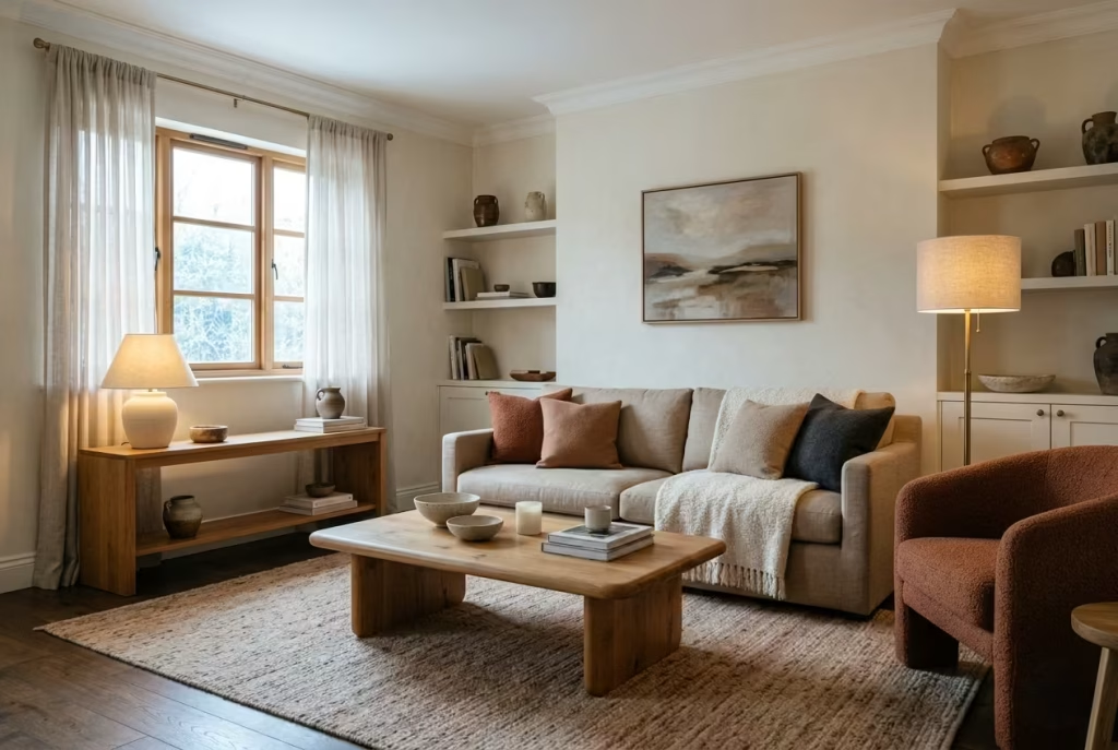
Light is the silent partner in every neutral scheme. It shapes how colour is perceived, how textures are read, and ultimately how a room feels to inhabit. A shade that looks warm and inviting in one space can turn flat or even slightly cold in another, simply because the direction of light has shifted. Understanding whether your room faces north or south is not a technical detail, it is the difference between a palette that works with the space and one that quietly fights against it.
Design insight
North-facing rooms tend to receive cooler, more diffused daylight throughout the day. This soft, bluish light can drain warmth from neutrals, leaving them looking greyer than intended. In these spaces, warm pigments become essential. Think creamy whites, soft taupes, muted clay tones, and natural materials with a tactile presence. These elements act almost like a counterbalance, restoring warmth that the light naturally removes.
South-facing rooms, on the other hand, are bathed in stronger, warmer sunlight for most of the day. This light enhances warmth, sometimes to the point where overly creamy tones can feel a touch heavy or overly yellow. Here, cooler neutrals such as soft stone, pale greige, or chalky off-whites can bring a sense of clarity and calm. The room feels brighter, but also more composed, as if the palette has been gently refined rather than overworked.
I have seen rooms transformed simply by adjusting the undertone to suit the light. One north-facing living room, initially painted in a cool grey, felt perpetually overcast even on bright days. Shifting to a warmer, slightly deeper neutral with layered textiles changed the atmosphere completely. It did not make the room brighter in a literal sense, but it made it feel warmer, more inviting, and far easier to live in.
Practical application note
Before committing to any colour or material, observe the room at different times of day. Morning light, midday brightness, and evening shadows all tell a slightly different story. Paint samples directly onto the wall and view them in context rather than relying on small swatches. What looks balanced in artificial lighting can shift dramatically once natural light enters the equation.
For north-facing rooms, lean into warmth not just through paint, but through materials. Upholstery in linen blends, wool rugs with a soft pile, and timber finishes with a honeyed undertone can all help soften the overall feel. In south-facing rooms, introduce restraint. Balance the abundance of warm light with slightly cooler tones and matte finishes that diffuse brightness rather than reflect it harshly.
Artificial lighting should also support the natural orientation. Warmer bulbs in the range of 2700K to 3000K help maintain consistency in the evening, ensuring the room does not lose its sense of cohesion once daylight fades.
Typical size range (metric and imperial)
Light behaves differently depending on the scale of the room and the size of openings, so proportions matter more than most people realise.
- In smaller living rooms, around 3.5 by 4.5 metres, roughly 11.5 by 15 feet, with limited window openings, the impact of orientation is more pronounced. A north-facing space of this size benefits greatly from warmer tones and reflective textures to prevent it from feeling enclosed.
- Medium-sized rooms, approximately 4.5 by 5.5 metres, or 15 by 18 feet, with balanced window placement, allow for more flexibility. Here, layering becomes key, adjusting tones across surfaces rather than relying on one dominant shift.
- Larger living areas with expansive glazing, often exceeding 6 metres in one direction, about 20 feet or more, amplify whatever light they receive. South-facing spaces of this scale can handle cooler, chalkier neutrals with ease, while north-facing ones need a stronger injection of warmth through both colour and material to avoid feeling stark.
When natural light is respected rather than overridden, a neutral room begins to feel in tune with its surroundings. It responds to the time of day, softens as evening draws in, and holds a quiet consistency that makes the space feel considered from morning through to night.
Materiality The Quiet Language of Warmth
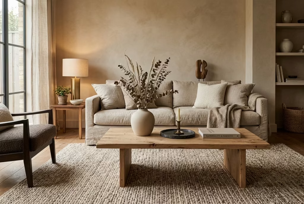
If colour sets the mood, material is what makes you believe it. This is where a neutral room either gains depth or falls short, because warmth is felt as much through the hand as it is seen by the eye. Smooth against rough, matte beside something gently reflective, fibres that soften over time rather than stay rigid and new, these are the quiet decisions that shape how a space lives and breathes.
In my experience, the most inviting neutral rooms are never reliant on colour alone. They lean on material contrast, subtle imperfections, and surfaces that carry a sense of life within them, creating a layered atmosphere that unfolds gradually rather than revealing everything at once.
Layer Natural Materials That Age Gracefully
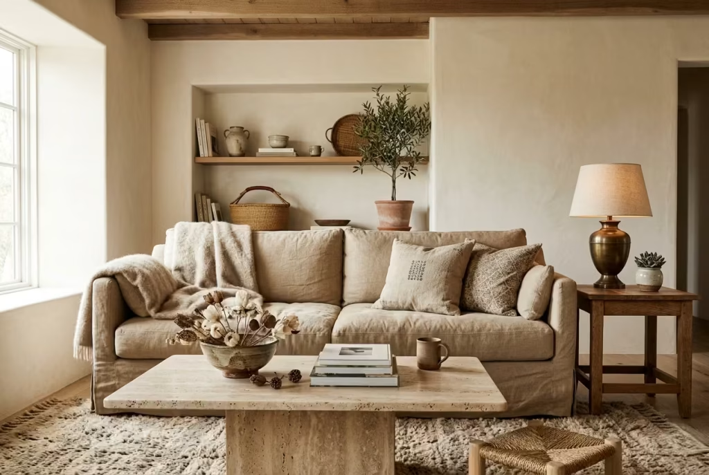
A warm neutral room rarely relies on colour alone to carry the atmosphere. It leans on materials that soften, deepen, and evolve over time. Linen that creases gently, wool that holds warmth underfoot, oak that darkens with age, travertine with its quiet variation, and clay that feels slightly imperfect to the touch. These are not just finishes. They are surfaces that tell a story, slowly and without fuss, making the room feel lived in rather than newly assembled.
Design insight
There is a tendency to chase perfection in neutral interiors, to look for flawless finishes and uniform surfaces. In reality, that approach often strips a room of its warmth. True comfort tends to come from materials that are a little less controlled, a little more forgiving. Subtle irregularities in stone, the soft slub of linen, the grain of timber that shifts in tone across a single plank. These details catch light differently, creating depth that cannot be replicated with anything overly polished.
I often think of it as the difference between a space that looks finished and one that feels settled. A perfectly smooth, high-gloss surface may photograph well, but it rarely invites you to relax. By contrast, a slightly worn oak table or a hand-finished ceramic piece carries a quiet confidence. It does not try too hard, yet it holds attention.
In one living room I worked on, replacing a sleek stone coffee table with a honed travertine piece, complete with natural pitting and tonal variation, shifted the entire mood. The room felt warmer, softer, and far more grounded, almost as if it had taken a deep breath.
Practical application note
Start by introducing a mix of natural materials across different surfaces, but keep the palette restrained so the room does not feel busy. Upholstery is often the easiest entry point. Linen or linen-blend fabrics for sofas and chairs bring an immediate softness, especially when paired with wool or wool-blend rugs that add weight underfoot.
Timber should be chosen with care. Oak works particularly well in neutral schemes because it carries warmth without feeling overly heavy. Aim for finishes that are matte or lightly oiled rather than glossy, allowing the grain to remain visible.
Stone elements, whether travertine, limestone, or even a softly textured marble, can be introduced through coffee tables, side tables, or decorative objects. The key is to let each material breathe. Avoid over-layering in one area while neglecting another. Balance is what keeps the room from tipping into clutter.
It also helps to think long term. Materials that age gracefully tend to improve with use. Linen softens, timber deepens, and stone develops a patina that adds character. This is where the real value lies. Instead of chasing a perfect finish on day one, you are allowing the room to evolve, gaining richness as it is lived in.
Typical size range (metric and imperial)
Material impact is closely tied to scale, so it is worth considering where each element sits within the room.
- Sofas upholstered in linen or linen blends typically range from 2.0 to 2.4 metres wide, around 79 to 95 inches, providing enough surface area for the texture to be appreciated without overwhelming the space.
- Rugs in wool or wool blends are most effective when sized at approximately 2.5 by 3.5 metres, or 8 by 11 feet, allowing the texture to anchor the seating area while remaining proportionate.
- Coffee tables in oak or travertine often sit between 100 and 140 centimetres in length, roughly 39 to 55 inches, with a height of 35 to 45 centimetres, or 14 to 18 inches, giving them presence without dominating the room.
- Smaller clay or ceramic accents, such as vases or bowls, usually range from 20 to 40 centimetres in height, about 8 to 16 inches, adding tactile interest in controlled, thoughtful doses.
When these materials are layered with intention, the room begins to feel less like a static composition and more like a space that has grown into itself. Nothing feels overly pristine, nothing feels forced. Instead, there is a quiet richness, the kind that reveals itself gradually and keeps drawing you back in.
Balance Soft and Hard Surfaces
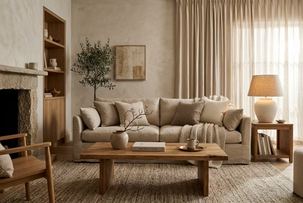
A warm neutral living room depends on contrast that is felt rather than loudly seen. Soft elements such as upholstery, rugs, and drapery need to sit alongside harder surfaces like stone, timber, plaster, or metal. When the balance is right, the room feels grounded yet comfortable. When it tips too far in either direction, it starts to feel either overly cushioned and undefined or sharp and uninviting.
Design insight
Rooms that lean too soft can feel like they are dissolving at the edges. Everything blends into everything else, with no structure to hold it together. On the other hand, spaces that are dominated by hard finishes often feel cold, almost echoing visually, even if the palette itself is warm. The sweet spot lies somewhere in between, where softness invites you in and solidity keeps the room anchored.
I often approach this as a quiet negotiation between comfort and structure. A deep, linen-upholstered sofa paired with a solid oak coffee table creates an immediate sense of balance. The softness encourages you to sit, while the timber adds weight and definition. In one project, a living room initially felt too polished, with stone surfaces and clean lines dominating the space.
Introducing a heavier wool rug and softer upholstery shifted the mood entirely. The room stopped feeling like a showroom and started to feel like a place to actually live in, the kind of space where you can put your feet up without a second thought.
There is also a visual rhythm at play. Soft materials tend to absorb light, while harder surfaces reflect it, even subtly. When these are layered together, the room gains depth and movement, keeping the eye engaged without overwhelming it.
Practical application note
Start by assessing what your room currently leans towards. If it feels too soft, introduce structure through materials like timber, stone, or even a plaster-finished wall. A solid coffee table, a sideboard with visible grain, or a ceramic lamp base can add just enough firmness to bring the space back into balance.
If the room feels too rigid, soften it deliberately. Upholstered seating with a deeper profile, layered textiles, and full-height curtains can all help ease the edges. Rugs are particularly effective here. A well-sized wool rug can soften both the visual and physical feel of a room almost instantly.
Try to distribute this balance evenly rather than concentrating it in one area. A common mistake is placing all the softness in the seating zone while leaving the rest of the room feeling bare or hard. Instead, think of the room as a whole. Each area should contribute to the overall equilibrium, allowing the space to feel cohesive rather than fragmented.
Typical size range (metric and imperial)
Achieving this balance often comes down to proportion as much as material choice.
- Sofas and upholstered seating typically range from 2.0 to 2.5 metres wide, around 79 to 98 inches, with depths of 90 to 105 centimetres, or 35 to 41 inches. These dimensions provide enough softness and presence to anchor the room.
- Coffee tables in timber or stone usually sit between 100 and 140 centimetres in length, roughly 39 to 55 inches, with heights of 35 to 45 centimetres, or 14 to 18 inches. Their solid form introduces the necessary contrast.
- Rugs, often 2.5 by 3.5 metres or 8 by 11 feet, help soften larger floor areas and tie seating elements together.
- Wall treatments such as plaster finishes or panelling typically span full wall heights of 2.4 to 2.7 metres, about 8 to 9 feet, providing a backdrop that can either soften or sharpen the overall feel depending on the finish.
When soft and hard surfaces are balanced with care, the room finds its footing. It feels comfortable without being shapeless, structured without being severe. The result is a space that welcomes you in and holds you there, quietly doing its job without ever feeling overworked.
Use Wood Tones with Intent, Not Variety
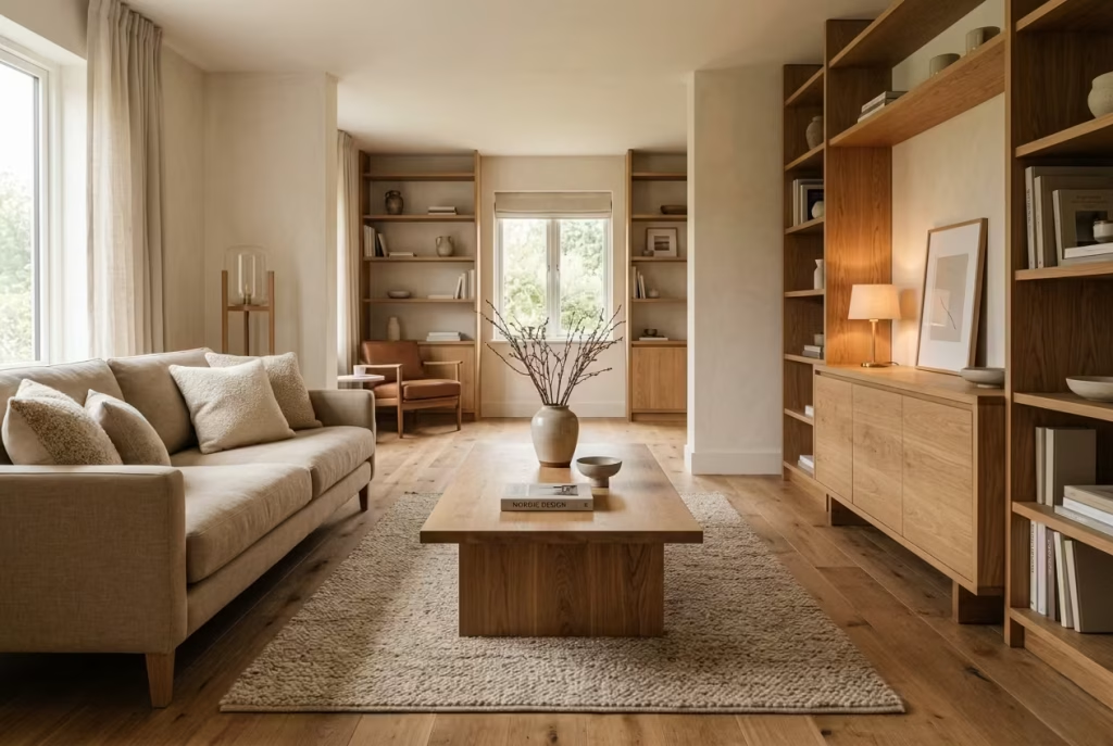
Wood brings instant warmth to a neutral living room, but only when it is handled with restraint. Instead of introducing multiple timber tones in an attempt to add interest, it is far more effective to work with one or two dominant finishes. This creates a sense of continuity that allows the room to feel composed rather than pieced together.
Design insight
There is a common temptation to treat wood like a neutral backdrop that can absorb endless variation. In reality, timber has a strong visual voice. Each tone carries its own undertone, grain pattern, and depth, and when too many are introduced, the room begins to feel unsettled. It is the classic case of too many cooks in the kitchen. Nothing clashes outright, yet nothing quite harmonises either.
What I have found over time is that consistency in wood tones does not make a room feel repetitive. Quite the opposite. It creates a quiet thread that runs through the space, tying everything together in a way that feels effortless. In one living room, we initially had a mix of cool ash flooring, mid-tone oak furniture, and a darker walnut coffee table.
Individually, each piece worked. Together, they created a subtle tension that made the room feel restless. By refining the palette to a single warm oak tone, repeated across key elements, the entire space settled. It felt calmer, more intentional, as though the room had finally found its footing.
Variation can still exist, but it should come from texture and finish rather than completely different tones. A lightly brushed oak, a smooth oak, and an oiled oak can sit together beautifully because they speak the same language, just in slightly different accents.
Practical application note
Start by identifying the dominant wood tone already present in the room. This is often the flooring, as it covers the largest surface area and naturally sets the direction. From there, choose furniture and accents that either match or sit very close in tone. If contrast is needed, introduce it through materials rather than additional timber finishes.
When working with two wood tones, keep them clearly defined. For example, a warm mid-tone oak paired with a slightly deeper walnut can work well, provided the rest of the palette remains restrained. The key is to avoid scattering different finishes across the room without a clear plan. That is when the space starts to feel like a showroom display rather than a cohesive interior.
It also helps to repeat each tone at least twice within the room. This creates a sense of rhythm and prevents any single piece from feeling isolated. A coffee table tone echoed in shelving or a side table can make all the difference. These small decisions, almost unnoticed at first glance, are what give a room its sense of quiet confidence.
Typical size range (metric and imperial)
The impact of wood tones is closely tied to the scale of the elements they appear on.
- Timber flooring typically spans the full room, with plank widths ranging from 12 to 20 centimetres, about 5 to 8 inches, and lengths varying depending on the layout. This often becomes the primary wood tone that guides all other choices.
- Coffee tables in oak or walnut usually measure between 100 and 140 centimetres in length, roughly 39 to 55 inches, providing a central point where the wood tone is clearly visible.
- Sideboards or consoles often range from 1.5 to 2.2 metres wide, around 59 to 87 inches, offering a larger surface to reinforce the chosen tone.
- Smaller accents, such as side tables or shelving elements, typically fall between 40 and 60 centimetres, about 16 to 24 inches, allowing the tone to be repeated in a more subtle way.
When wood tones are used with intent, the room feels grounded and coherent. Nothing feels accidental, nothing feels out of place. Instead, there is a steady visual rhythm, the kind that quietly holds everything together while letting the rest of the design breathe.
You May also Like: 25 Open Kitchen Living Rooms ideas That Feel Stylish, Spacious, and Effortlessly Connected
Introduce Subtle Patina
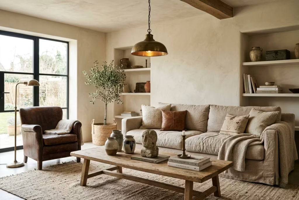
Patina is what gives a neutral room its sense of time. It softens edges, dulls the overly new, and introduces a quiet richness that cannot be manufactured in a single day. Aged brass, brushed metals, hand-finished ceramics, and lightly worn surfaces bring a depth that polished, factory-perfect pieces often lack. Without it, a room can feel pristine but oddly distant, like it has been staged rather than lived in.
Design insight
There is a certain chill that comes with everything being brand new. Surfaces are too sharp, finishes too consistent, reflections too clean. The room may look complete, yet it feels as though it is still waiting to be broken in. That is where patina steps in, not as decoration, but as a kind of quiet correction.
I have noticed time and again that warmth often comes from slight irregularities. A brushed brass handle that has dulled just enough to catch the light softly. A ceramic vase where the glaze shifts ever so slightly across its surface. These are the details that make a room feel grounded, as if it has a past rather than just a present.
In one project, a living room initially leaned too crisp. Polished chrome fittings, glossy finishes, and perfectly smooth surfaces gave it a refined look, but it lacked soul. Introducing aged brass lighting and a few hand-finished objects changed the atmosphere almost immediately. The space felt more relaxed, less self-conscious. It was as though the room had finally let its guard down.
Practical application note
Patina works best when introduced in measured doses. You are not trying to recreate age artificially, but to soften the overall composition. Start with smaller elements. Lighting fixtures, cabinet handles, side tables, or decorative objects are all effective entry points. Aged or brushed finishes in brass, bronze, or even softly worn steel can add warmth without overwhelming the palette.
Handcrafted pieces also play an important role. Ceramics with slight variations, woven baskets, or textiles with a natural irregular weave can introduce that sense of quiet imperfection. The key is to avoid overloading the room. Too many distressed or aged elements can feel forced, tipping the balance from considered to contrived.
It also helps to mix patinated finishes with cleaner ones. This contrast allows the aged elements to stand out without dominating. A brushed brass lamp placed on a smooth oak table, or a hand-thrown ceramic set against a simple linen backdrop, creates a layered effect that feels natural rather than staged.
Typical size range (metric and imperial)
Patina tends to have the most impact at a smaller, more tactile scale, where it can be experienced up close.
- Table lamps with aged or brushed metal bases typically stand between 50 and 70 centimetres tall, around 20 to 28 inches, making them ideal for introducing warmth at eye level when seated.
- Side tables or occasional tables in metal or mixed materials often range from 40 to 60 centimetres in diameter or width, about 16 to 24 inches, offering a subtle but noticeable presence.
- Decorative objects such as vases, bowls, or sculptural pieces usually sit between 20 and 40 centimetres in height, roughly 8 to 16 inches, allowing their texture and finish to be appreciated without overwhelming the space.
- Hardware elements like handles or knobs, though smaller in scale at around 3 to 15 centimetres, or 1 to 6 inches, can collectively make a significant difference when repeated across the room.
When patina is introduced with care, the room begins to feel less like a snapshot and more like a story in progress. Nothing feels overly polished, nothing feels too precious. Instead, there is a quiet ease to the space, the kind that invites you in and makes you want to stay a little longer.
Furniture Composition Designing for Living, Not Display
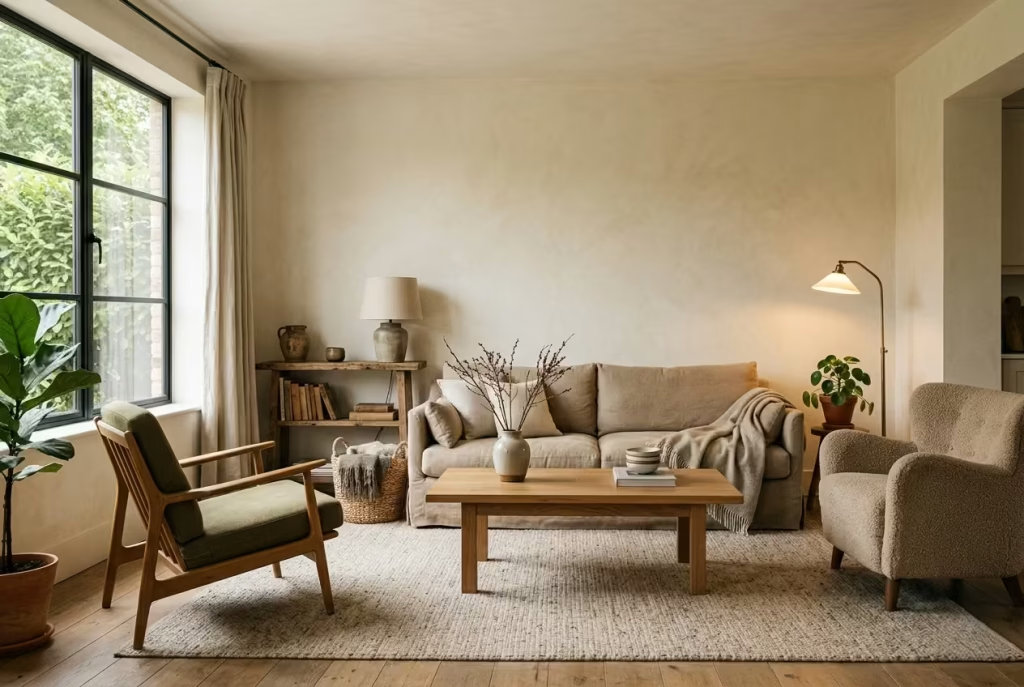
A neutral living room only succeeds when it is designed to be inhabited, not admired from a distance. This is where composition becomes critical. Furniture is not simply placed to fill space or achieve symmetry; it is arranged to support movement, comfort, and the natural rhythm of daily life.
When a room is over-styled or treated like a static display, it loses its ease. But when furniture is composed with intention, allowing breathing room, hierarchy, and flow, the space begins to feel instinctively right, as though it was always meant to be lived in rather than photographed.
Choose the Right Sofa Depth and Scale
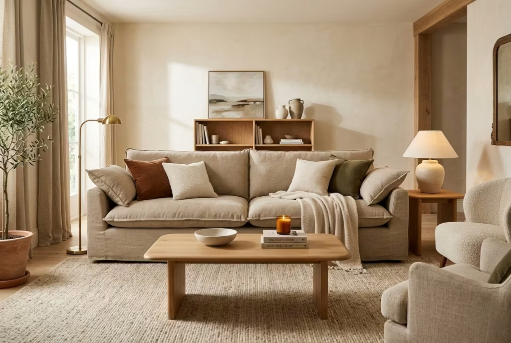
Sofa depth is one of those details that quietly decides whether a living room feels inviting or simply looks composed. A neutral space can have the perfect palette, the right lighting, and beautifully chosen materials, yet still fall short if the seating feels too shallow or overly rigid. Depth is what allows a sofa to hold you properly, to invite you in without hesitation, and to make the room feel genuinely lived in rather than politely arranged.
Design insight
There is a subtle but important difference between a sofa that looks good and one that feels right the moment you sit down. Shallow seating tends to create a more formal posture, which can unintentionally make the entire room feel restrained, almost like it is asking you not to relax too much. On the other hand, a well-proportioned deeper sofa encourages ease. It shifts the body into a more natural, informal position, which immediately softens the atmosphere of the room.
I have seen this shift play out countless times in projects. One living room in particular comes to mind where everything was visually resolved, but something still felt slightly off. The sofa was sleek and visually appealing, yet its shallow depth gave the space a slightly hesitant energy. Replacing it with a deeper, more generously scaled piece changed the entire dynamic. The room stopped feeling like a showroom and started feeling like a place where people naturally gathered, lingered, and let time slow down a little.
The key is not simply to go bigger for the sake of comfort, but to understand how scale interacts with the proportions of the room. A sofa that is too deep in a compact space can overwhelm circulation, while one that is too shallow in a larger room can feel visually and physically underwhelming. It is a balancing act, almost like tuning an instrument so it sits perfectly within the room’s acoustics.
Practical application note
When selecting a sofa, always consider how it will be used in daily life rather than how it appears in a showroom. Sit in it properly, not just for a moment but long enough to understand how your body settles into it. A depth that allows you to sit upright comfortably, while also giving you the option to recline slightly without feeling constrained, is usually the sweet spot.
Pay attention to leg position as well. If your feet hang awkwardly or your back feels too upright, the depth is likely off. Cushions also play a role here. A well-designed sofa often uses a combination of seat depth and cushion softness to achieve balance. Firmer cushions in a deeper frame can still feel supportive, while softer cushions in a shallower frame can quickly feel unstable.
In open-plan spaces, scale becomes even more important. The sofa often acts as a visual anchor, so it needs enough presence to hold its ground without dominating the room. In smaller living rooms, proportions should be more carefully controlled to ensure the sofa supports the space rather than consuming it.
Typical size range (metric + imperial)
- Ideal sofa depth ranges from 90 to 105 cm, approximately 35 to 41 inches, offering a balance between comfort and support without overwhelming the room.
- Seat height typically sits between 40 and 45 cm, around 16 to 18 inches, which supports natural posture and ease of movement.
- Sofa width varies widely depending on layout, but most living room sofas fall between 180 and 260 cm, or 71 to 102 inches, with larger spaces comfortably accommodating deeper modular configurations.
- Arm height generally sits between 55 and 65 cm, roughly 22 to 26 inches, which helps maintain proportion while supporting relaxed seating.
When the sofa is correctly scaled, it does more than furnish a room. It quietly sets the tone for how the space is used, how long people stay, and how easily they settle into it. It becomes less of an object and more of an invitation, which is ultimately what a well-designed living room should always feel like.
Float Furniture When Possible
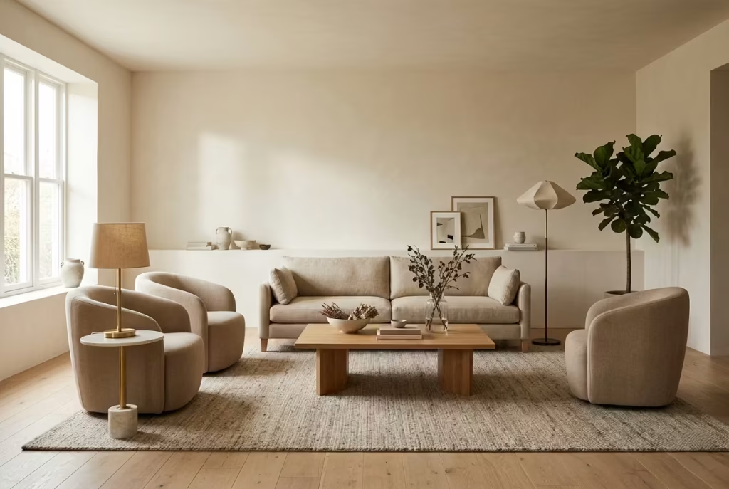
Pulling furniture away from the walls is a simple shift, but it changes the entire emotional temperature of a room. Instead of the space feeling like a perimeter that furniture is pressed against, the layout begins to breathe. Even a small gap of 20 to 30 cm, about 8 to 12 inches, creates the sense that the room has been thoughtfully composed rather than just filled.
Design insight
One of the most common instincts in living room planning is to push everything back against the walls, as if the aim is to maximise space. It sounds logical, but it often leads to a room that feels oddly hollow in the centre and visually tense at the edges. The furniture ends up acting like a border rather than a gathering point, and the space loses its sense of intimacy.
Floating furniture changes that dynamic completely. When seating is brought slightly forward, the room starts to form a more human scale. Conversations feel more natural, circulation becomes more fluid, and the eye no longer tracks the outer edges of the room. Instead, it settles into the arrangement itself.
I have seen this shift transform even the most awkwardly proportioned spaces. In one project, a long rectangular living room felt cold and corridor-like until the seating was pulled inward and anchored with a central rug. Suddenly, the room stopped feeling like a passageway and started behaving like a destination.
There is also a psychological element at play. When furniture hugs the walls too tightly, it can unconsciously signal distance, as though the room is holding itself back. Floating it, even slightly, introduces a sense of ease. It tells you the space is meant to be entered, not just observed from the edge.
Practical application note
Start by identifying the main seating group and treat it as a single composed unit rather than individual pieces. Pull the entire arrangement forward from the walls by at least 20 to 30 cm, or 8 to 12 inches. In larger rooms, this distance can be increased to 40 or even 60 cm, roughly 16 to 24 inches, to create a more defined central zone.
Anchor this floating arrangement with a properly scaled rug. The rug should sit beneath the front legs of all key seating pieces so the composition feels connected rather than adrift. Without this visual grounding, floating furniture can feel accidental rather than intentional.
Circulation paths are equally important. Ensure there is still enough space behind and around the seating for easy movement. A general guideline is to maintain at least 75 to 90 cm, about 30 to 35 inches, for comfortable walkways. This keeps the layout functional while still preserving that sense of inward focus.
In open-plan layouts, floating furniture becomes even more powerful. It helps define zones without needing walls or partitions, subtly signalling where the living space begins and ends without disrupting flow.
Typical size range (metric + imperial)
- Recommended furniture setback from walls: 20 to 30 cm, approximately 8 to 12 inches, for standard living rooms.
- In larger spaces, floating distance can extend to 40 to 60 cm, roughly 16 to 24 inches, to create stronger spatial definition.
- Clear circulation space around seating: 75 to 90 cm, about 30 to 35 inches, to ensure comfortable movement without breaking the composition.
- Area rugs used to anchor floating layouts typically range from 2.5 x 3.5 metres to 3 x 4 metres, or 8 x 11 feet to 10 x 13 feet, depending on room scale.
When furniture is allowed to float rather than cling to the edges, the room gains a quiet confidence. It feels considered, slightly more generous, and far more human in scale, as though the space has finally decided to welcome you in rather than keep you at the door.
You May also Like: 25 Sage Green Living Room Ideas: Timeless Designs for a Calm and Stylish Space
Work in Layers, Not Sets
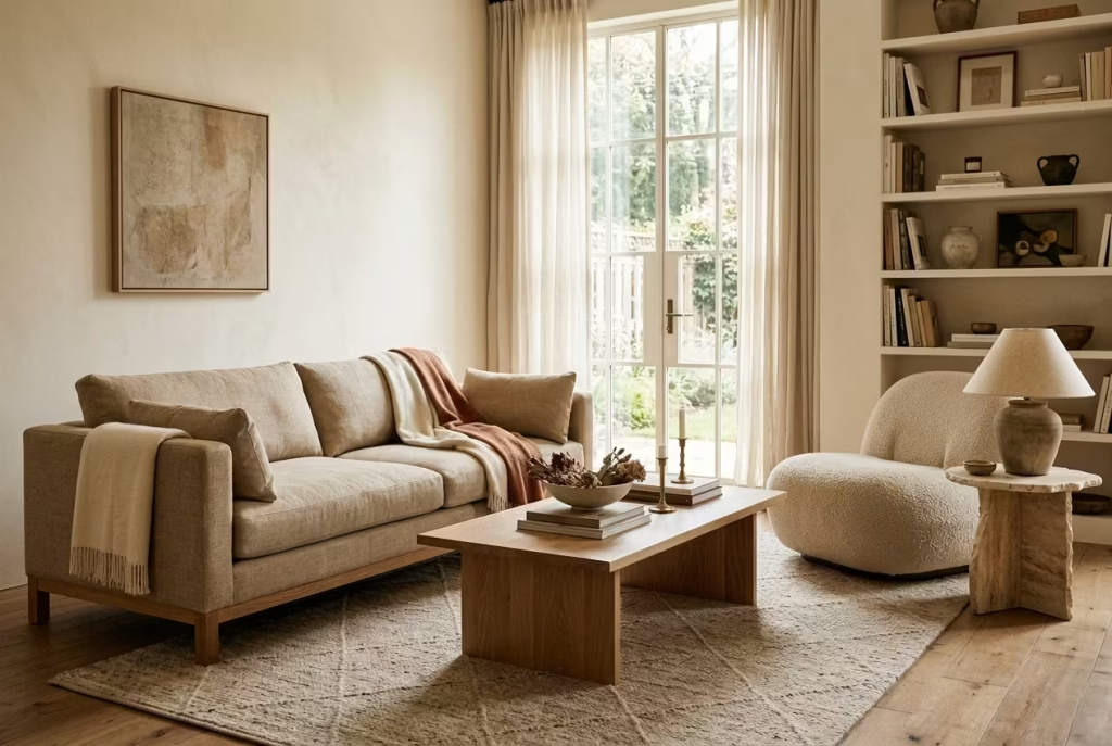
A neutral living room gains depth when it feels assembled over time rather than delivered as a matching set. Instead of repeating identical furniture pieces, the space should be built through layers of different silhouettes that share a tonal family. This approach avoids the “catalogue effect” and creates a room that feels curated, lived-in, and quietly individual.
Design insight
Matching furniture sets often promise simplicity, but they tend to flatten character. When everything shares the same proportions, finish, and visual language, the room starts to feel predictable, almost like it has been lifted straight from a showroom floor and left untouched. There is no tension, no rhythm, no surprise.
Layering, on the other hand, introduces a subtle sense of movement. A structured sofa paired with a softer, more organic armchair. A clean-lined coffee table set against a more sculptural side table. These contrasts, when kept within the same tonal palette, create a dialogue between pieces. The room begins to feel composed rather than coordinated.
I have seen this difference play out in real projects more times than I can count. One living room initially came together as a full matching set in a pale neutral finish. Technically correct, but emotionally flat. Once we introduced a woven occasional chair with a more relaxed frame and swapped the perfectly matched tables for a mix of oak and stone, the room immediately gained texture. It stopped feeling like a set piece and started behaving like a space that had evolved naturally over time.
The key is not to chase contrast for its own sake, but to allow gentle variation in form while holding the palette steady. It is a bit like a well-composed conversation where each voice is distinct, yet nothing feels out of place.
Practical application note
Begin by stepping away from the idea of purchasing furniture in sets. Instead, think in terms of individual pieces that complement one another through tone rather than identical design language. Choose a consistent colour family first, then introduce variation through shape, scale, and texture.
For example, a streamlined linen sofa can be paired with a more relaxed armchair in a similar neutral fabric, but with a softer silhouette or slightly lower profile. Coffee and side tables should avoid looking overly matched. One might be solid oak with clean edges, while another introduces a more sculptural stone or metal form, both still grounded within the same tonal spectrum.
Spacing also plays a role. Allow each piece enough room to be read individually rather than grouped too tightly. When items are given space to breathe, their differences become intentional rather than accidental.
Avoid repeating the same leg style, base shape, or finish across every item. Small variations in detail create a sense of depth that is often missing in matched sets.
Typical size range (metric + imperial)
- Sofas typically range from 2.0 to 2.6 metres wide, approximately 79 to 102 inches, forming the primary anchor of the composition.
- Armchairs vary between 70 to 95 cm in width, roughly 28 to 37 inches, allowing for contrast in proportion without disrupting balance.
- Coffee tables generally sit between 100 to 140 cm in length, or 39 to 55 inches, with side tables ranging from 40 to 60 cm, about 16 to 24 inches, offering opportunities for variation in scale.
- Recommended spacing between key furniture pieces is 45 to 90 cm, approximately 18 to 35 inches, depending on circulation needs and room size.
When a room is built in layers rather than sets, it gains a quiet richness that is hard to manufacture. Nothing feels overly uniform, yet everything still belongs. It is this subtle imbalance, carefully controlled, that gives the space its character and makes it feel as though it has grown into itself rather than been assembled in a single moment.
Prioritise Human Comfort Over Visual Symmetry
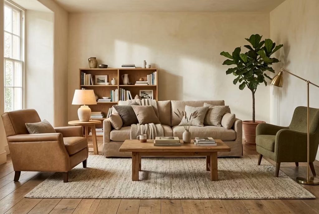
Perfect symmetry can be visually satisfying, but in real living spaces it often feels a little too rigid to truly relax into. A neutral living room becomes far more inviting when comfort is placed above strict alignment, allowing for subtle asymmetry that reflects how people actually live. A cushion slightly off-centre, a chair angled gently toward conversation, or a lamp that shifts the balance just enough can make the room feel grounded and human.
Design insight
There is a quiet irony in interiors that are overly symmetrical. While they may appear orderly at first glance, they can sometimes feel emotionally distant, almost as if they are waiting to be observed rather than used. Real comfort rarely lives in perfect alignment. It lives in softness, in those small deviations that suggest movement, interaction, and ease.
I often remind clients that a room is not a still photograph. It is a living environment that changes with time, people, and habit. In one project, a carefully symmetrical seating arrangement initially felt impressive but slightly stiff in daily use. Once we relaxed the layout, allowing one armchair to sit fractionally forward and softening the spacing between side tables, the entire atmosphere shifted. The room stopped feeling staged and started feeling inhabited.
These small imperfections are not mistakes. They are what give a space its character. A slightly uneven composition allows the eye to travel more naturally, rather than stopping at a rigid centre point. It is the design equivalent of a relaxed conversation rather than a formal speech.
Practical application note
Start by establishing a strong foundation of balance, then intentionally loosen it. This does not mean abandoning structure altogether, but rather allowing gentle variation within it. If a sofa is centred on a fireplace or focal wall, there is no need for every accompanying element to mirror each other perfectly.
Try offsetting side tables slightly rather than placing them in identical positions. Allow lighting to vary in height and placement instead of repeating exact pairs. A floor lamp on one side of the seating area and a table lamp on the other often creates a more natural rhythm than matching fixtures.
Circulation and usability should always take priority. If a perfectly symmetrical arrangement interferes with how people move or interact in the space, it is already working against its purpose. Comfort should lead every decision, even if it means breaking visual balance in subtle ways.
It also helps to step back and view the room from multiple angles. What feels slightly “off” in a photograph may actually feel perfectly natural in use. Trusting how a space behaves in real life, rather than how it appears in a static frame, is often the difference between a room that looks designed and one that feels lived in.
Typical size range (metric + imperial)
- Sofa centring tolerance around focal points typically allows for a shift of 10 to 30 cm, approximately 4 to 12 inches, without disrupting overall balance.
- Side tables are commonly placed within 30 to 60 cm of seating, about 12 to 24 inches, but can be staggered slightly to avoid rigid symmetry.
- Armchairs often sit 60 to 120 cm, roughly 24 to 47 inches, from the sofa depending on conversation grouping, allowing flexible asymmetry in layout.
- Lighting elements such as floor lamps or table lamps vary widely in height from 120 to 160 cm, or 47 to 63 inches, which naturally supports variation in visual rhythm.
When symmetry is softened and comfort is allowed to lead, the room gains a quiet authenticity. It feels less like it has been arranged for display and more like it has grown around the way people actually live, which is ultimately what makes it feel welcoming.
Textiles Where Warmth Becomes Tangible
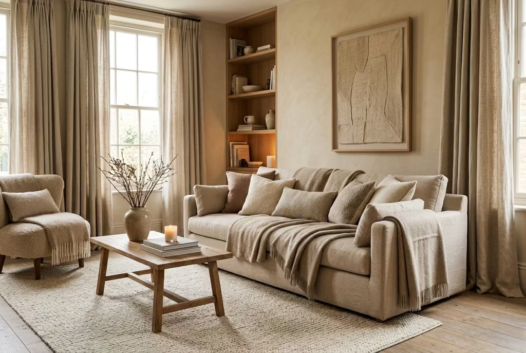
Once the structure of a neutral living room is in place, it is the textiles that begin to shift the atmosphere from something visually composed to something emotionally comfortable. This is where warmth stops being theoretical and becomes physical, something you can feel the moment you sit down.
Soft layers, tactile variation, and subtle movement in fabric bring a room to life in a way that architecture alone never can. In many ways, textiles are what allow a space to exhale, easing the edges and softening the overall composition until it feels instinctively inviting.
Mix Textures Within a Tight Palette
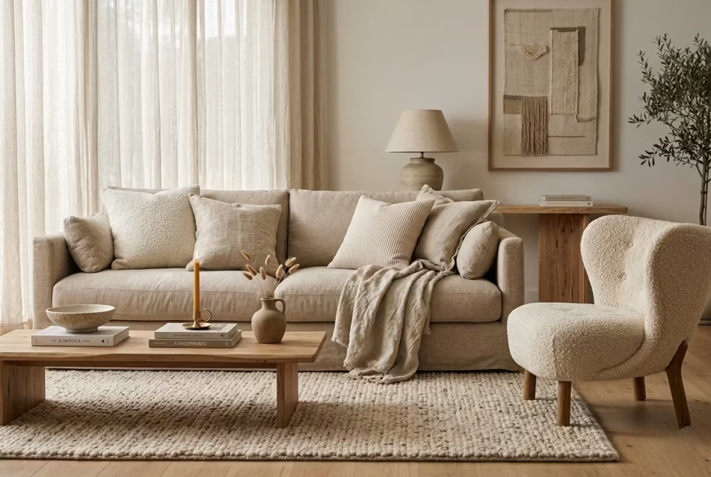
Warmth in a neutral living room is rarely achieved through colour alone. It is texture, layered carefully within a restrained palette, that gives the space its depth and tactility. Bouclé, linen, wool, and cotton blends can all sit within the same tonal range, yet each brings a completely different hand-feel and visual softness. When handled well, the room feels cohesive at first glance, but richly detailed the longer you sit with it.
Design insight
There is a quiet difference between a room that looks comfortable and one that actually feels comfortable. Texture is what closes that gap. A space can be perfectly coordinated in colour yet still feel flat if every surface shares the same finish. On the other hand, when textures are layered thoughtfully, the room starts to breathe. Light catches unevenly, shadows soften, and surfaces begin to interact rather than simply exist side by side.
I often describe texture as the unsung rhythm of a neutral scheme. It does not shout for attention, but it carries the emotional weight of the space. In one living room project, everything initially sat within a calm beige palette, yet the room felt strangely lifeless. Once we introduced a bouclé armchair, a loosely woven linen throw, and a wool rug with a deeper pile, the atmosphere shifted almost immediately. Nothing changed in colour, yet everything changed in feeling. It was as though the room had quietly come into focus.
The real skill lies in restraint. Too much texture layered without control can feel busy and unsettled, while too little can leave the room feeling sterile. The balance is delicate, almost like tuning an instrument until it feels just right.
Practical application note
Start by choosing a single dominant colour family for all major textiles. This creates a cohesive base that keeps the room calm and unified. From there, introduce variation through material rather than tone. For example, a linen sofa in a soft oat shade can be paired with bouclé cushions, a wool throw, and a cotton-blend rug, all within a similar neutral spectrum.
Keep repetition subtle but intentional. If bouclé appears in one element, echo it lightly elsewhere, but avoid overusing any single texture. The goal is not to create contrast for its own sake, but to build a quiet dialogue between surfaces. Think in terms of tactile progression rather than visual interruption.
Placement also matters. Heavier textures such as wool or dense weaves work well at floor level where they can ground the space, while lighter fabrics like linen feel more natural on seating and drapery where movement and softness are more visible. This vertical distribution of texture helps the room feel balanced from top to bottom.
Typical size range (metric + imperial)
- Sofas upholstered in linen or cotton blends typically range from 2.0 to 2.4 metres wide, approximately 79 to 95 inches, providing a broad surface for subtle texture to be appreciated.
- Armchairs in bouclé or textured upholstery usually measure between 70 to 95 cm in width, around 28 to 37 inches, allowing texture to read clearly at a smaller scale.
- Wool rugs generally range from 2.5 x 3.5 metres to 3 x 4 metres, or 8 x 11 feet to 10 x 13 feet, offering enough surface area for pile variation to influence the overall atmosphere.
- Cushions and soft accessories typically sit between 45 x 45 cm and 60 x 60 cm, roughly 18 x 18 inches to 24 x 24 inches, making them ideal for introducing layered texture in controlled, repeatable forms.
When textures are mixed within a tight palette, the room gains a quiet richness that unfolds slowly. It does not rely on bold statements or visual tricks. Instead, it draws you in gently, allowing comfort to reveal itself through touch, depth, and subtle variation, like a space that has been carefully composed but never overworked.
Use Rugs to Ground, Not Just Decorate
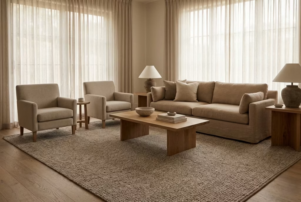
A rug in a neutral living room is far more than a decorative layer. It is the quiet anchor that brings furniture into relationship with one another. When sized correctly, it grounds the seating area and gives the composition a sense of belonging. When it is too small, the entire arrangement feels disconnected, as if the room is floating in separate fragments rather than forming a unified whole.
Design insight
Rugs are often underestimated, treated as an afterthought once furniture has already been placed. Yet they are one of the most powerful tools for shaping spatial coherence. A well-chosen rug does not just sit beneath furniture; it actively defines how the room is read. It creates a boundary without walls, a soft perimeter that tells the eye where the conversation begins and ends.
One of the most common missteps I see is the undersized rug. It might look neat in isolation, but once placed in the room, it immediately disrupts proportion. Furniture begins to hover awkwardly around it, with front legs barely touching or missing it entirely. The result is a layout that feels fragmented, almost like each piece is standing on its own little island. It is a subtle issue, but once you notice it, you cannot unsee it.
I have walked into rooms where everything else was beautifully resolved, yet the atmosphere felt slightly off. In nearly every case, the rug was too small. Once replaced with a properly scaled piece, the entire room settled. The furniture suddenly felt connected, the space gained weight, and the composition started to make sense. It is one of those quiet design corrections that does more heavy lifting than most people realise.
Practical application note
Start by treating the rug as the foundation of the seating arrangement rather than an accessory. It should be selected early in the process, not added at the end. Position it so that at least the front legs of all major seating pieces sit comfortably on its surface. This single rule immediately improves cohesion and prevents the floating effect that often undermines neutral living rooms.
In larger spaces, aim for all legs of the seating to sit fully on the rug. This creates a stronger sense of enclosure and helps define zones within open-plan layouts. In smaller rooms, partial placement is acceptable, but the rug should still feel generous in relation to the furniture, never squeezed or visually contained.
Orientation is equally important. A rug should mirror the shape of the seating group rather than the room itself. A rectangular layout typically works best for most living rooms, while square rugs can be effective in more compact or symmetrical arrangements.
Avoid layering rugs that are too visually complex unless the rest of the scheme is extremely restrained. The goal is grounding, not distraction. A neutral rug with subtle texture often performs better than one with strong patterns, especially in already layered interiors.
Typical size range (metric + imperial)
- Standard living room rugs typically measure 2.5 x 3.5 metres, approximately 8 x 11 feet, suitable for medium seating arrangements.
- Larger open-plan spaces often require 3 x 4 metres or larger, roughly 10 x 13 feet and above, to properly ground extended furniture layouts.
- Smaller living rooms may use rugs around 2 x 3 metres, approximately 6.5 x 10 feet, though careful attention must be paid to ensure furniture still connects visually.
- Clearance guidelines suggest that a rug should extend at least 20 to 30 cm, about 8 to 12 inches, beyond the outer edges of key seating pieces to maintain proportional balance.
When a rug is properly scaled and thoughtfully placed, it stops being background detail and becomes the quiet structure that holds everything together. The room feels more settled, more intentional, and far more complete, as if all the elements have finally agreed to sit in the same conversation.
Layer Soft Furnishings with Restraint
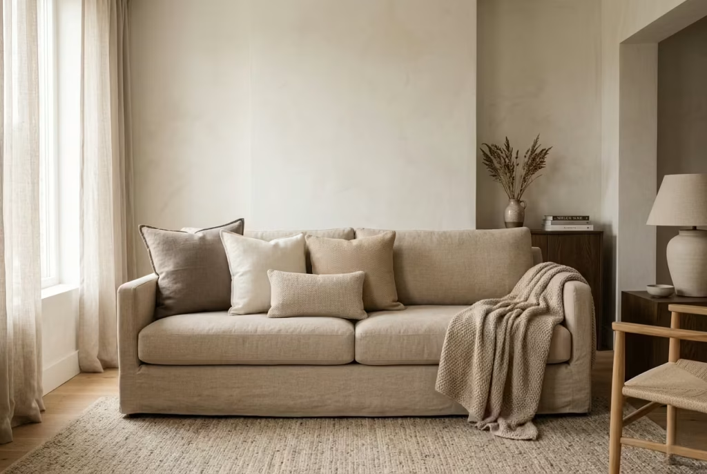
Soft furnishings are often where neutral living rooms quietly tip from refined to overworked. Cushions and throws have the power to soften a space instantly, but only when used with a light hand. The aim is not abundance, but control. A sofa styled with intention feels inviting; one overloaded with cushions starts to lose its shape, both visually and physically.
Design insight
There is a fine line between a room that feels thoughtfully dressed and one that feels like it is constantly being staged. Soft furnishings sit right on that line. Too few, and the space can feel bare and unwelcoming. Too many, and it starts to feel cluttered, almost like the sofa is no longer allowed to function as a place to sit.
In my experience, the most successful arrangements are those that feel slightly effortless, as if nothing has been overconsidered. A carefully chosen mix of three to five cushions allows enough variation in texture and scale without overwhelming the seating. The key is variation, not repetition. Different sizes, subtle tonal shifts, and a mix of textures create a quiet rhythm that feels natural rather than forced.
Throws often cause the most tension in styling. When perfectly folded and placed for display, they can feel rigid, almost performative. When used too casually, they can look accidental. The balance lies somewhere in between, where the throw feels like it has been placed for comfort first, not composition. I have often found that the most inviting rooms are the ones where a throw looks like it has simply settled into place, rather than being carefully arranged.
Practical application note
Begin with restraint as your default position. Start with two or three cushions on a standard sofa, then build gradually only if the composition feels incomplete. Aim for a maximum of five cushions on larger sofas, ensuring each one serves a clear purpose, whether it is adding contrast in texture, introducing a slightly deeper tone, or varying scale.
Mixing sizes is essential. A combination of 45 by 45 cm cushions, approximately 18 by 18 inches, with slightly larger 50 by 50 cm or 60 by 60 cm options, around 20 by 20 inches to 24 by 24 inches, creates a layered but controlled look. Avoid lining them up too symmetrically. Instead, allow a slight shift in placement so the arrangement feels relaxed rather than rigid.
Throws should be used sparingly and with intention. One well-chosen throw, typically around 130 by 170 cm or 51 by 67 inches, is usually enough for a standard sofa. Larger sofas may accommodate a 140 by 200 cm throw, roughly 55 by 79 inches. The key is placement. Drape it loosely over an arm or backrest rather than folding it into a perfect rectangle. This introduces softness without turning it into a focal point.
Also consider negative space as part of the composition. Not every section of the sofa needs to be styled. Leaving areas intentionally bare allows the eye to rest and prevents the arrangement from feeling visually crowded.
Typical size range (metric + imperial)
- Standard cushions: 45 x 45 cm, approximately 18 x 18 inches, form the base layer for most sofas.
- Larger cushions: 50 x 50 cm to 60 x 60 cm, roughly 20 x 20 inches to 24 x 24 inches, add depth and variation.
- Lumbar cushions: typically 30 x 50 cm to 40 x 60 cm, around 12 x 20 inches to 16 x 24 inches, introduce horizontal contrast.
- Throws: 130 x 170 cm to 140 x 200 cm, approximately 51 x 67 inches to 55 x 79 inches, depending on sofa scale.
When soft furnishings are layered with restraint, the room gains a quiet composure. It feels lived in but never cluttered, inviting but never over-styled, as if every element has been chosen with care and then allowed to simply belong.
You May also Like: 25 Farmhouse Living Room Ideas That Feel Warm, Timeless, and Lived-In
Curtains Should Soften Architecture
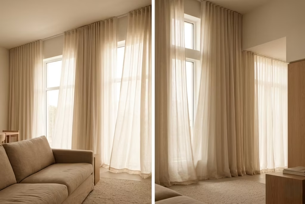
Curtains are not just functional window coverings in a neutral living room. They are the soft counterbalance to hard architectural lines. When done well, they blur edges, absorb excess light, and introduce a sense of ease that no rigid surface can replicate. Full-height curtains with a slight break at the floor bring a gentle fluidity to the room, allowing it to feel composed without ever feeling severe.
Design insight
Windows are often the most structurally dominant element in a room. Their clean lines, sharp edges, and fixed geometry can make a space feel more rigid than intended, especially in neutral interiors where colour is not used to disguise form. Curtains step in here as the quiet mediator. They soften what is hard, temper what is sharp, and introduce movement where everything else is still.
I have seen rooms transform simply by changing the way curtains meet the floor. Short or stiff drapery tends to visually truncate a wall, making ceilings feel lower and proportions more compressed. In contrast, full-height curtains that either just kiss the floor or pool ever so slightly create a sense of vertical generosity. The room suddenly feels taller, calmer, and far more considered, as if the architecture has been gently stretched into better proportion.
There is also a tactile psychology at play. Fabric introduces a softness that architecture alone cannot provide. When curtains move slightly with air, even in the most subtle way, the room gains a sense of breath. It stops feeling static and begins to feel alive in a quiet, almost imperceptible way.
Practical application note
Start by treating curtains as an architectural extension rather than an afterthought. They should begin as high as possible, ideally just below the ceiling line or within a few centimetres of it. This immediately draws the eye upward and enhances the sense of height in the room.
Aim for full-length curtains that extend from ceiling to floor, avoiding any visual interruption along the wall. The most refined look typically allows the fabric to either just touch the floor or pool slightly by around 1 to 2 cm, approximately 0.5 inch. This small break creates softness without appearing excessive or untidy.
Fabric choice is equally important. Linen blends, heavy cottons, or lightly textured wools work particularly well in neutral interiors. These materials drape naturally and avoid the overly crisp, formal appearance that can sometimes feel too controlled. The goal is a gentle fall rather than a rigid structure.
Avoid short curtains at all costs in living spaces. They visually cut the wall in half, disrupting proportion and making the room feel shorter and more fragmented. Likewise, overly stiff or heavily structured drapery can introduce unnecessary formality, which works against the relaxed tone of a warm neutral scheme.
In rooms with limited natural light, choose slightly lighter tones to maintain softness without heaviness. In brighter spaces, deeper neutrals can be used to anchor the windows and balance the intensity of daylight.
Typical size range (metric + imperial)
- Standard ceiling height for curtain installation ranges from 2.4 to 2.7 metres, approximately 8 to 9 feet, forming the ideal vertical span for full-height drapery.
- Curtain drop typically ranges from 240 to 300 cm, roughly 94 to 118 inches, depending on ceiling height and desired pooling effect.
- Slight pooling allowance at the floor should be 1 to 2 cm, approximately 0.5 inch, for a refined but relaxed finish.
- Curtain width per panel usually ranges from 140 to 300 cm, or 55 to 118 inches, depending on fullness requirements and window size.
When curtains are treated with this level of intention, they stop being background utility and become an essential architectural softener. The room feels taller, calmer, and more grounded, with edges that no longer feel abrupt but instead gently dissolved into fabric, light, and space.
Lighting The Most Overlooked Warmth Tool
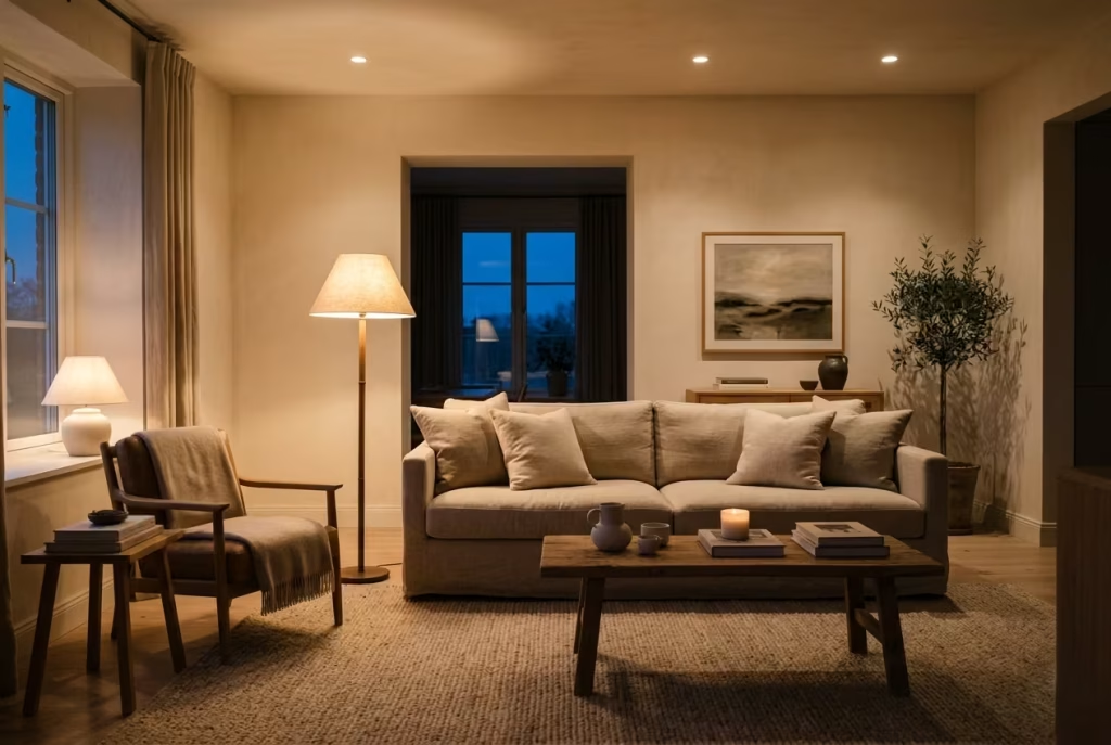
Lighting is often treated as the final layer in a neutral living room, almost an afterthought once furniture, colour, and textiles have been decided. In reality, it is one of the most decisive forces in shaping how the entire space feels. It can soften a rigid scheme, lift a flat palette, or quietly undo all the careful layering if it is handled without intent. Warmth in interiors is rarely just about materials or colour; it is how those elements are revealed, and lighting is what controls that revelation.
Build a Layered Lighting Scheme
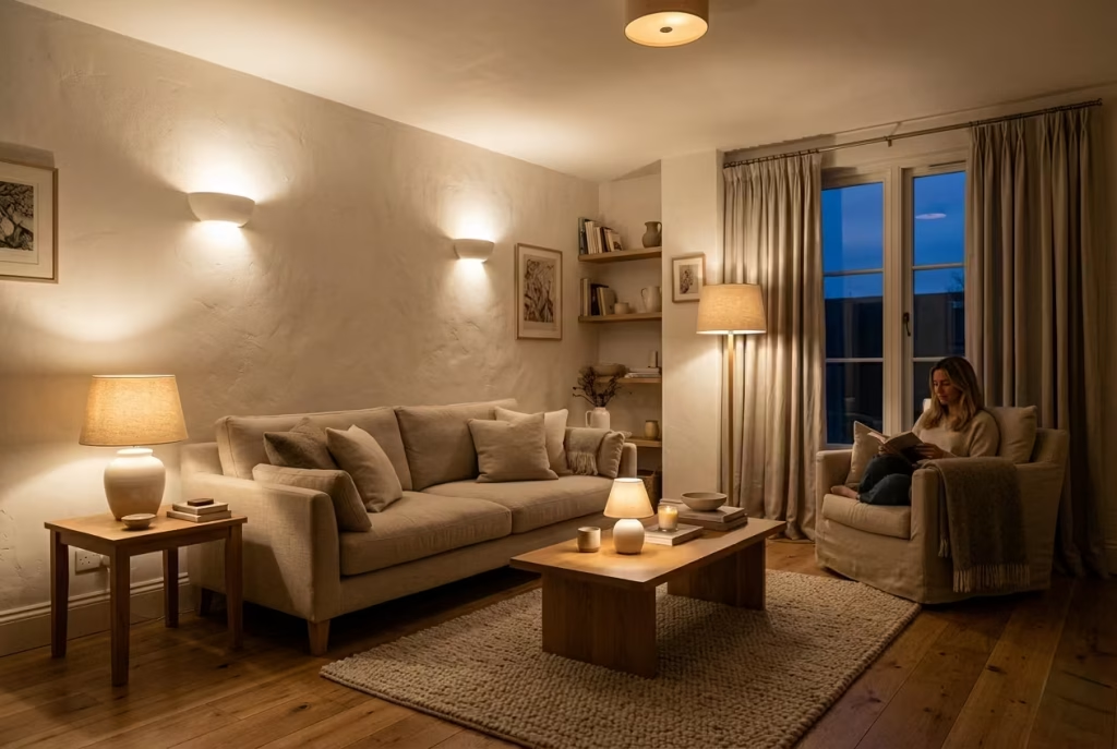
A well-designed neutral living room never relies on a single light source. Instead, it is built through layers of ambient, task, and accent lighting working in quiet harmony. Each layer serves a different purpose, but together they create depth, softness, and a sense of atmosphere that changes naturally throughout the day and into the evening.
Design insight
Lighting is where many neutral rooms quietly fall short. A single ceiling fixture, even a beautiful one, tends to flatten the entire space. It casts light evenly, but in doing so removes contrast, and without contrast, warmth becomes difficult to sustain. The room ends up fully visible, yet strangely uninviting, like everything has been brought into equal focus but none of it feels alive.
Layering changes that completely. Ambient lighting sets the base tone, but it should never carry the room alone. Task lighting introduces function with intimacy, pulling light closer to human scale. Accent lighting then steps in almost like punctuation, highlighting texture, depth, and architectural detail. When these three work together, the room stops behaving like a static space and starts feeling atmospheric, almost cinematic in the way it shifts from corner to corner.
I have seen this transformation happen in rooms that were otherwise well-designed. One living room in particular had beautiful materials and a balanced neutral palette, yet it felt oddly flat in the evenings. The issue was not the design, but the lighting hierarchy. Once we introduced layered sources, table lamps, wall lights, and subtle uplighting, the room changed character entirely. It gained depth, warmth, and a sense of quiet intimacy that simply did not exist before.
Practical application note
Start by establishing ambient lighting as your foundation. This could be ceiling-mounted fixtures, recessed lighting, or even a central pendant, but it should always be softened rather than harsh. Use warm colour temperatures, ideally between 2700K and 3000K, to maintain a gentle, inviting glow rather than a clinical brightness.
Next, introduce task lighting where real-life activities occur. Side tables beside sofas, reading chairs, or console areas all benefit from focused light sources. Table lamps and floor lamps work particularly well here because they bring light closer to eye level, creating pockets of comfort within the wider room.
Finally, layer in accent lighting to add depth and dimension. This might include wall sconces, uplighting behind furniture, or subtle illumination on textured surfaces such as stone, timber, or artwork. These smaller points of light create visual rhythm and prevent the room from feeling one-dimensional.
The key is not just adding more light, but distributing it thoughtfully. Avoid relying too heavily on overhead lighting, and instead allow different sources to overlap gently. This creates softness without darkness, clarity without harshness.
Typical size range (metric + imperial)
- Ceiling-mounted ambient fixtures typically suit rooms with standard heights of 2.4 to 2.7 metres, approximately 8 to 9 feet, providing even base illumination across the space.
- Table lamps used for task lighting generally range from 50 to 70 cm in height, about 20 to 28 inches, placing light at a comfortable seated eye level.
- Floor lamps typically stand between 140 and 170 cm, roughly 55 to 67 inches, ideal for reading corners or soft vertical illumination.
- Wall sconces are usually installed at 150 to 170 cm from floor level, approximately 59 to 67 inches, allowing light to wash gently across walls without glare.
When lighting is layered with intention, the room begins to shift throughout the day rather than remain static. It feels brighter when needed, softer when desired, and always attuned to how people actually live within it, which is where true warmth quietly reveals itself.
Choose Warm Colour Temperatures
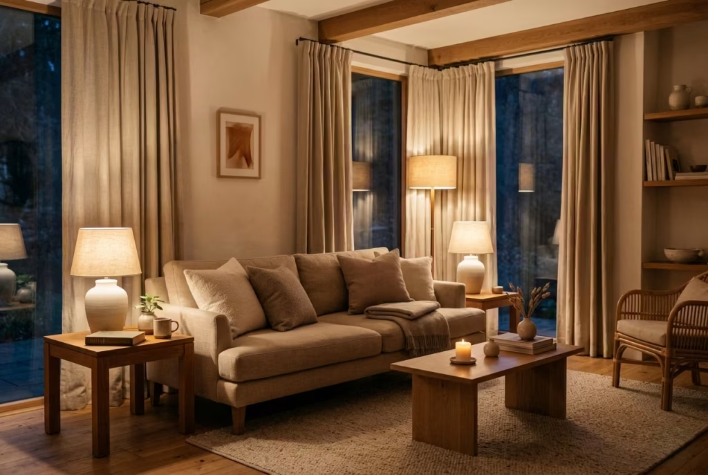
Colour temperature quietly determines whether a neutral living room feels inviting or flat. Even the most carefully designed space can lose its warmth if the lighting leans too cool. Staying within the 2700K to 3000K range helps preserve softness, depth, and the natural warmth of materials, allowing neutrals to feel rich rather than clinical.
Design insight
Lighting temperature is one of those details that often goes unnoticed until something feels slightly off. A room might be beautifully furnished, yet still feel cold in the evenings, almost as if the atmosphere has been drained out of it. More often than not, the culprit is lighting that sits too high on the Kelvin scale.
Cooler lighting tends to flatten everything it touches. Neutrals lose their depth, timber can appear greyer, and textiles feel less tactile. The room still functions, but it stops feeling emotionally engaging. On the other hand, warmer temperatures bring a quiet richness to surfaces. They soften edges, enhance undertones, and allow materials like linen, wool, and oak to reveal their natural character.
I have walked into spaces where the transformation was almost instant once the lighting was corrected. One living room, originally fitted with cooler white bulbs, felt stark despite having a beautifully layered neutral palette. Switching to warmer 2700K lighting did not change a single object in the room, yet the atmosphere shifted completely. It felt calmer, more grounded, and far more comfortable to be in, as though the space had finally exhaled.
Practical application note
Start by standardising all light sources within a consistent warm range. Aim for 2700K in spaces where relaxation is the priority, such as living rooms and bedrooms. If a slightly brighter, more balanced feel is needed, 3000K can be used, but it should still lean warm rather than neutral white.
Pay attention to how different fixtures interact with this temperature. Table lamps, floor lamps, and wall sconces should all share the same warmth so the room feels cohesive rather than patchy. Mixing warm and cool bulbs within the same space is one of the quickest ways to disrupt visual harmony.
It is also important to consider how lighting interacts with materials. Warm light enhances natural textures, especially timber, stone, and woven fabrics, making them feel richer and more dimensional. Cooler light strips this away, leaving surfaces looking flatter and less inviting.
Dimmers are a valuable addition here. They allow the warmth to be controlled throughout the day, shifting from brighter functional light to a softer, more atmospheric glow in the evening. This flexibility ensures the room adapts naturally to different moments rather than remaining fixed in one state.
Typical size range (metric + imperial)
- Standard living room fixtures perform best within spaces of 2.4 to 2.7 metres ceiling height, approximately 8 to 9 feet, where warm lighting can distribute evenly without overpowering the room.
- Table lamps typically range from 50 to 70 cm in height, around 20 to 28 inches, allowing warm light to sit comfortably at seated eye level.
- Floor lamps usually measure between 140 and 170 cm, approximately 55 to 67 inches, providing ambient warmth at a human scale.
- Recommended bulb temperature range remains 2700K to 3000K, which consistently supports warm neutrals without flattening their undertones.
When warm colour temperatures are used with intention, the entire room shifts in character. Neutrals regain their depth, textures become more tactile, and the space begins to feel less like a composition and more like a place you instinctively want to spend time in.
Use Lamps for Atmosphere, Not Just Function
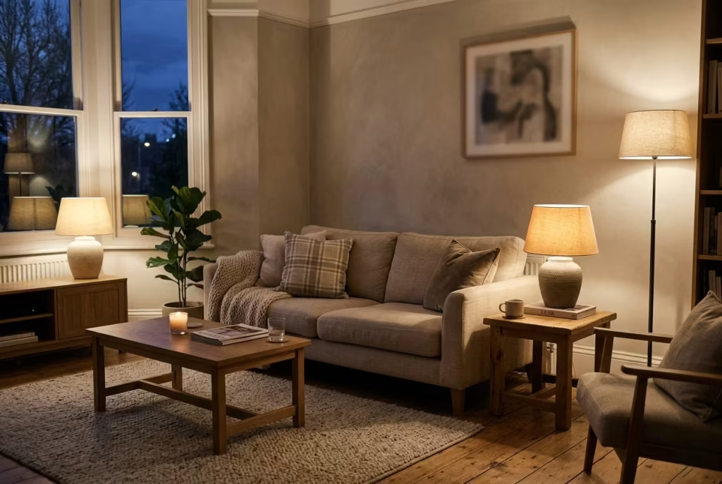
Lamps in a neutral living room are far more than task lighting. When positioned and chosen with intention, they become atmospheric tools that shape mood, soften transitions from day to evening, and introduce pockets of intimacy within the wider space. A well-placed table lamp does not simply illuminate, it gently changes the way a room feels.
Design insight
There is a noticeable difference between lighting that is purely functional and lighting that creates atmosphere. Overhead lighting tends to declare itself all at once, leaving little room for nuance. Lamps, on the other hand, work in quieter ways. They carve out smaller moments of light, creating layers of shadow and glow that feel far more human in scale.
I often find that the emotional temperature of a room shifts most noticeably in the evening, not because the furniture changes, but because the lighting does. A table lamp placed at eye level when seated draws the light closer to the body, which immediately softens the environment. It removes the sense of being fully exposed and replaces it with something more intimate, almost cocoon-like.
In one project, a living room that felt slightly formal during the day transformed completely after dusk simply by introducing a few well-placed lamps. Nothing structural changed, yet the room gained depth and warmth. Conversations naturally slowed down, the seating felt more inviting, and the space began to feel like it was designed for lingering rather than passing through. It is a subtle shift, but one that changes how a room is experienced more than any single piece of furniture.
Practical application note
Start by thinking of lamps as emotional tools rather than decorative objects. Place table lamps so that their light sits roughly at eye level when seated. This ensures the glow is soft and indirect, rather than harsh or overhead. Side tables, consoles, and reading corners are all ideal locations for this kind of placement.
Avoid relying on a single lamp to carry the room. Instead, distribute multiple light sources so that light feels layered and intentional. A sofa may be flanked by one or two lamps at different heights, creating variation in brightness and shadow. This prevents the room from feeling flat and encourages a more relaxed visual rhythm.
Pay attention to shade materials as well. Linen or fabric shades tend to diffuse light more gently, producing a softer, more atmospheric effect. Harder materials can create sharper light pools, which may feel too direct in a neutral setting that is meant to feel calm and layered.
Cord management and placement also matter more than people realise. Lamps should feel integrated into the composition, not added as an afterthought. A well-placed lamp feels as though it has always belonged in the room, quietly doing its job without drawing unnecessary attention.
Typical size range (metric + imperial)
- Table lamps typically range from 50 to 70 cm in height, approximately 20 to 28 inches, allowing the light source to sit comfortably at seated eye level.
- Larger table or console lamps may reach 70 to 85 cm, roughly 28 to 33 inches, suitable for deeper furniture pieces or taller surfaces.
- Shade diameters commonly range from 25 to 45 cm, about 10 to 18 inches, depending on base scale and desired light diffusion.
- Side tables used to support lamps usually measure between 40 and 60 cm in height, approximately 16 to 24 inches, ensuring correct proportional alignment with seating.
When lamps are used with restraint and intention, they stop being background utilities and become quiet atmosphere-makers. The room feels less like it is being lit and more like it is being gently revealed, one soft layer at a time, as the day begins to settle into evening.
Let Shadows Exist
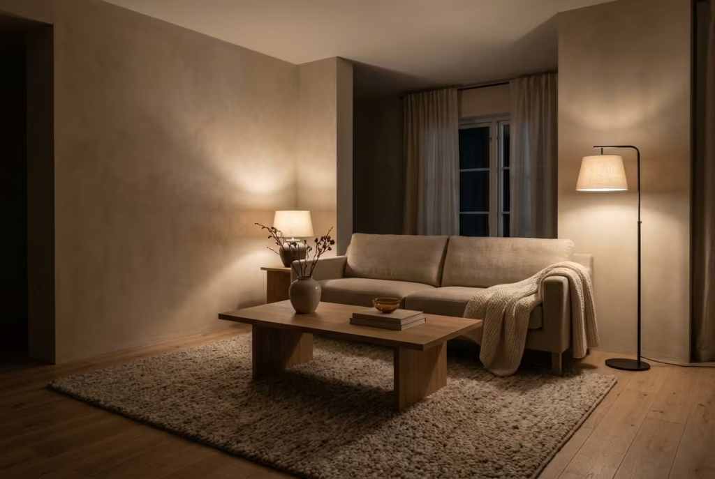
Shadows are not a flaw in lighting design, they are part of what gives a neutral living room its depth and atmosphere. When a space is over-lit, every surface is revealed at once, leaving nothing for the eye to explore. Allowing areas of softness and shadow preserves contrast, creates mood, and gives the room a more natural sense of rhythm.
Design insight
There is a tendency to treat lighting as something that should eliminate darkness entirely, as though every corner must be equally visible. In reality, this approach often strips a room of its character. Without shadow, surfaces lose their texture, edges lose their softness, and the space begins to feel strangely one-dimensional, even if everything is technically well lit.
I have always found that the most compelling interiors are the ones that do not reveal everything at once. A softly shadowed corner behind a sofa, a dimmer pool of light near a reading chair, or a gentle fall-off along a wall can all create a sense of quiet drama. These variations are what give a room depth. They allow the eye to rest, then wander, then return again. It is this subtle movement between light and dark that makes a space feel alive.
In one project, a living room initially felt overly bright despite having well-chosen fixtures. Everything was visible, but nothing felt particularly engaging. Once we reduced the overall intensity and introduced more controlled pockets of light, the atmosphere changed completely. The room gained warmth, texture became more pronounced, and the space suddenly felt calmer, almost like it had stepped back from itself just enough to breathe.
Practical application note
Start by resisting the instinct to fully illuminate every corner of the room. Instead, think in terms of zones and gradients. Some areas should feel softly lit, others gently dim, and a few should remain in partial shadow. This layering creates visual depth and prevents the space from feeling flat or overly clinical.
Use dimmers wherever possible. They allow you to adjust intensity throughout the day, so the room can shift from functional brightness to softer, more atmospheric levels as evening approaches. This flexibility is essential in neutral interiors, where subtlety does most of the design work.
Position lighting deliberately to avoid overexposure. Avoid placing too many high-output light sources at ceiling level, as this tends to flatten shadows and remove contrast. Instead, rely on lower, directional lighting to create pockets of illumination that sit within larger areas of calm darkness.
It is also important to consider what is left unlit. A partially shadowed wall or a softly obscured corner can add more to the atmosphere than another fully illuminated surface. These quieter areas give the room its rhythm, allowing brighter zones to feel more intentional and meaningful by contrast.
Typical size range (metric + imperial)
- Recommended ambient lighting levels in living rooms generally correspond to spaces of 2.4 to 2.7 metres ceiling height, approximately 8 to 9 feet, where light can be layered without overwhelming the architecture.
- Table lamps used to create softer pools of light typically stand between 50 and 70 cm, about 20 to 28 inches, helping establish controlled zones of illumination.
- Floor lamps often range from 140 to 170 cm, roughly 55 to 67 inches, allowing directional light that can be softened or angled to preserve shadow areas.
- Ideal spacing between light sources should generally fall within 1.5 to 3 metres, approximately 5 to 10 feet, depending on room size, to ensure balanced variation between light and shade.
When shadows are allowed to exist, the room gains a sense of quiet sophistication. It stops feeling over-exposed and instead becomes layered, atmospheric, and gently expressive, where light and darkness work together rather than compete for attention.
Styling The Art of Holding Back
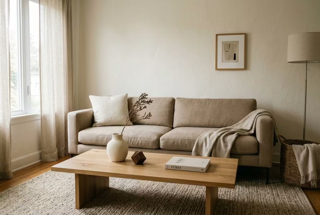
Styling is where a neutral living room either finds its quiet confidence or slips into overstatement. It is the final layer, yet it carries disproportionate influence, because this is where restraint is either honoured or abandoned. The temptation is always to add more, to fill surfaces, to “finish” every corner.
But in well-resolved interiors, styling is never about accumulation. It is about editing, pausing, and knowing when a space already says enough. In many ways, it is the moment where design stops being construction and becomes composition, where the discipline of holding back is what gives the room its poise.
Curate, Don’t Fill
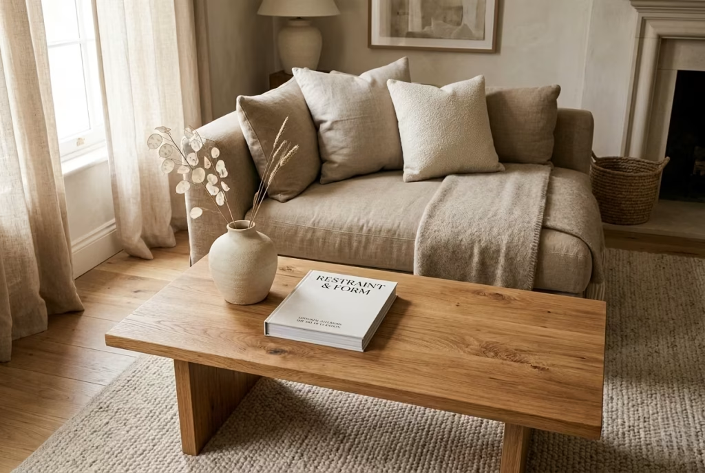
A neutral living room breathes when it is given room to do so. Negative space is not leftover space, and it is certainly not wasted space. It is part of the composition, quietly shaping how everything else is seen and felt. A surface with breathing room reads as calm and intentional; one that is packed edge to edge starts to lose its clarity, no matter how beautiful the objects may be.
Design insight
There is a real discipline in leaving something out. In styling, it is easy to fall into the trap of thinking that a surface only feels complete when every inch has been accounted for. Yet the opposite is often true. When too many objects compete for attention, the room starts to feel busy without becoming interesting. The eye has nowhere to settle, and the whole scheme loses its rhythm.
The most refined interiors understand that stillness has its own kind of power. A coffee table with one sculptural object and a well-chosen book often feels far more considered than a table crowded with candles, trays, and decorative catch-alls. That is because negative space gives each piece more authority. It allows form, material, and shadow to do some of the heavy lifting. You begin to notice the curve of a vase, the grain in a tray, the way light falls across an empty patch of timber. That quiet tension is where the room starts to feel alive.
I have often found that the rooms people remember most are not the ones filled to the brim, but the ones where every object seems to have been placed with a steady hand and then left alone. Nothing feels overworked. Nothing is trying too hard. The space has room to exhale, and because of that, so does the person moving through it.
Practical application note
Begin by editing rather than adding. Look at each surface and ask what is actually needed, not what might simply be nice to include. A side table does not need three decorative objects to feel finished. A console does not need to be styled from end to end. Leave pockets of emptiness so the eye can move through the room without getting stuck.
Think of styling as punctuation, not prose. One object can hold more weight when it is given space around it. A ceramic vase on a console, a stack of books on a coffee table, or a single bowl on a sideboard will often feel more elegant when there is a margin of calm around it. That margin is what gives the piece presence.
It also helps to vary density from one area to another. Not every surface needs the same level of attention. A room reads more naturally when one zone is lightly styled, another is almost bare, and a third carries a little more visual weight. This creates a subtle rhythm that feels unforced and human.
If something begins to feel crowded, remove one item and step back. In most cases, the room will improve immediately. That is the trick of it. Editing often does more than adding ever could.
Typical size range (metric + imperial)
- Coffee tables usually perform best when they retain at least 30 to 40 cm of clear surface space around key styling pieces, approximately 12 to 16 inches of breathing room.
- Side tables often feel most balanced with just one to three objects, keeping the usable surface area open rather than fully occupied.
- Console tables, typically 100 to 140 cm long or 39 to 55 inches, benefit from leaving at least one third of the surface visually open.
- Shelves and ledges generally work well when objects are spaced 10 to 20 cm apart, roughly 4 to 8 inches, so each piece can be read individually.
When negative space is handled well, styling stops feeling decorative and starts feeling composed. The room becomes clearer, calmer, and far more elegant, with just enough restraint to make every chosen object feel deliberate.
Work in Odd Numbers and Visual Rhythm
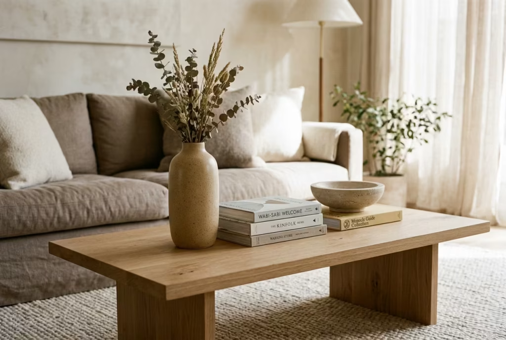
Styling in odd numbers introduces a natural sense of balance that feels less rigid and more visually engaging. Groups of three or five objects tend to feel more organic than even pairings, creating a rhythm that guides the eye without locking it into symmetry. In a neutral living room, this subtle irregularity helps surfaces feel curated rather than staged.
Design insight
There is something quietly compelling about arrangements that are not perfectly even. Even numbers often create a sense of formality, as if the eye is being asked to split attention equally between two identical forces. Odd groupings, by contrast, introduce a natural focal point. One element tends to lead, while the others support, creating a gentle hierarchy that feels far more relaxed and human.
I often think of it as visual conversation. In a group of three objects, one might be slightly taller, another softer in form, and the third more grounded in weight or texture. Together, they form a small narrative rather than a static arrangement. The eye moves through them rather than stopping at them, which gives the whole composition a sense of flow.
In one project, a coffee table styling exercise initially relied on paired objects, two candles, two books, two decorative pieces. It felt controlled but slightly rigid. Once we shifted to a grouping of three with varied heights, a sculptural object, a stack of books, and a low ceramic bowl, the entire surface felt more relaxed. Nothing changed in colour or material, yet the arrangement suddenly felt alive, almost as if it had been arranged with a lighter hand.
Height variation is what brings this principle to life. Without it, even odd-number groupings can feel flat. A subtle shift in vertical scale introduces movement, allowing each object to occupy its own visual space while still belonging to the same composition.
Practical application note
Start by limiting styling groupings to sets of three or five items. This works particularly well on coffee tables, consoles, and shelving, where visual balance is important but rigidity should be avoided. If a surface feels cluttered, reduce rather than add, and rebuild the arrangement using fewer, more intentional pieces.
When selecting objects, vary their height, form, and texture. For example, pair a taller vase with a medium-height stack of books and a low sculptural bowl. Keep the palette restrained so the variation comes from form rather than colour. This ensures cohesion while still allowing rhythm to emerge.
Avoid lining objects in a straight row, as this flattens the composition. Instead, allow slight shifts in positioning so the group feels naturally settled rather than precisely placed. Think of it as creating a small landscape rather than a display shelf.
It is also worth stepping back frequently during the process. What feels balanced up close may read differently from across the room. The goal is not perfection in alignment, but ease in perception.
Typical size range (metric + imperial)
- Coffee table styling objects typically range from 5 to 40 cm in height, approximately 2 to 16 inches, allowing for clear vertical variation within small groupings.
- Decorative vases often sit between 20 and 35 cm, around 8 to 14 inches, forming mid-height anchors in styling clusters.
- Sculptural objects and bowls usually range from 10 to 25 cm, roughly 4 to 10 inches, providing lower visual weight within arrangements.
- Books used in groupings commonly measure 20 to 30 cm in length, approximately 8 to 12 inches, and are often stacked to adjust height dynamically.
When odd-number groupings are used with care, the room gains a subtle rhythm that feels instinctive rather than calculated. Surfaces stop feeling static and instead begin to flow, with just enough variation to keep the eye engaged without ever overwhelming the calm of the space.
Introduce Organic Elements
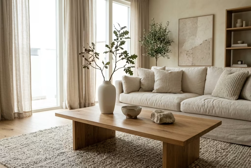
Organic elements bring a quiet softness to a neutral living room without relying on colour. Branches, handmade ceramics, and natural stone objects introduce irregularity, texture, and subtle imperfection. These details stop a space from feeling too controlled, adding a sense of ease that feels grounded in nature rather than design for design’s sake.
Design insight
There is a distinct difference between a room that feels composed and one that feels alive. Neutral interiors, when too polished, can start to lean towards precision that feels almost too intentional. Organic elements interrupt that rigidity in the most understated way. They introduce curves where there are straight lines, variation where there is uniformity, and softness where there is structure.
I often find that even a single branch placed in a simple vessel can shift the tone of an entire room. It brings height, movement, and an irregular silhouette that no manufactured object can replicate. Similarly, stone objects carry a quiet weight, both visually and physically, that anchors lighter materials around them. Ceramics, especially those with slight imperfections in glaze or form, add a human touch that prevents the space from feeling overly curated.
In one project, a neutral living room felt beautifully composed but slightly too polished. Everything was balanced, yet nothing broke the surface tension. Introducing a tall, sculptural branch arrangement and a handful of hand-thrown ceramic pieces immediately softened the atmosphere. The room did not change in colour or layout, yet it began to feel more relaxed, almost as if it had been gently loosened at the edges.
These elements work because they feel unforced. They do not demand attention, but they reward it. The longer you sit in the space, the more you notice their subtle irregularities, and that is where the quiet richness of the room begins to unfold.
Practical application note
Start with restraint and allow organic elements to act as accents rather than dominant features. A single large branch in a simple vase is often more effective than multiple smaller arrangements. Choose forms that feel natural rather than overly sculpted or artificial. Imperfection is not a flaw here, it is the point.
Ceramics should be selected for variation in surface and shape. Look for pieces that feel hand-formed rather than factory-perfect. These can be used on coffee tables, consoles, or shelving to introduce tactile contrast against smoother surfaces like glass or polished wood.
Stone objects work particularly well as grounding elements. Their weight, both visual and physical, helps anchor lighter textiles and softer furnishings. Place them in areas that need a sense of stability, such as central tables or lower shelving, where they can quietly hold the composition together.
Avoid overusing organic elements in one area. Their strength lies in subtlety. When too many are grouped together, the effect can become cluttered rather than calming. Instead, distribute them thoughtfully so they appear as natural interruptions within the wider scheme.
Typical size range (metric + imperial)
- Decorative branches typically range from 60 to 180 cm in height, approximately 24 to 71 inches, depending on ceiling height and vessel scale.
- Ceramic vessels and vases usually sit between 20 to 50 cm, around 8 to 20 inches, allowing for varied silhouettes and heights.
- Stone objects and sculptural pieces commonly measure 10 to 30 cm in height or width, roughly 4 to 12 inches, providing visual weight without overwhelming surfaces.
- Coffee table arrangements using organic elements should generally allow at least 25 to 35 cm, approximately 10 to 14 inches, of surrounding negative space to maintain clarity.
When organic elements are introduced with care, the room begins to feel less constructed and more discovered. It gains a quiet softness that cannot be manufactured, only suggested, as though nature itself has been gently invited into the space and allowed to settle in its own unhurried way.
Books as Texture, Not Just Content
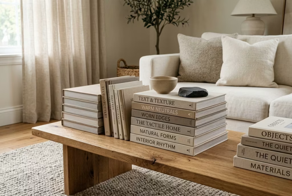
Books in a neutral living room are not only intellectual objects, they are visual and tactile building blocks. When treated as texture rather than display, they introduce structure, rhythm, and subtle tonal variation. Neutral spines, layered stacks, and alternating orientations allow books to support the composition without overwhelming it with visual noise.
Design insight
There is a tendency to treat books purely as storytelling objects, yet in interiors they often function more effectively as material. Their real strength lies in repetition, density, and edge variation. When arranged thoughtfully, they behave almost like a textile on a surface, softening hard materials and breaking up large visual planes.
I have often found that books can quietly stabilise a room that feels slightly unanchored. A stack placed on a coffee table can ground lighter decorative objects, while a vertical row on a shelf introduces rhythm without demanding attention. The key is not to display them all in the same way, but to allow variation in orientation so the arrangement feels natural rather than overly staged.
In one living room project, the shelves initially felt too sterile, almost like they were waiting to be styled. Once we introduced a mix of horizontal stacks and vertical groupings using books with muted, neutral-toned spines, the entire wall softened. It stopped feeling like storage and started feeling like a lived-in surface. Nothing decorative was added, yet the space gained warmth and depth simply through reorganisation.
Books work particularly well in neutral interiors because they absorb and reflect tone subtly. Pale spines blend into calm schemes, while deeper neutrals add quiet contrast without disrupting harmony. Over time, they become part of the room’s texture, rather than separate decorative objects.
Practical application note
Begin by editing book collections down to tones that support the room rather than compete with it. Neutral, earthy, or softly muted spines work best in restrained interiors. If colour is present, it should feel subdued rather than dominant.
Use a combination of horizontal and vertical arrangements. Horizontal stacks can act as platforms for small objects such as ceramics or candles, while vertical rows provide structure and rhythm along shelving. Avoid uniform repetition, as this can feel overly rigid and predictable.
Layering is key. A stack of books should feel slightly irregular in height and placement, not perfectly aligned. Allow some variation so the arrangement feels collected rather than arranged. This subtle imperfection is what gives the composition its ease.
Leave breathing space between groupings. Books should support the overall styling of a surface, not cover it entirely. When too densely packed, they lose their textural quality and begin to feel heavy rather than considered.
Typical size range (metric + imperial)
- Standard hardcover books typically range from 22 to 28 cm in height, approximately 9 to 11 inches, forming the base scale for most styling arrangements.
- Coffee table books often measure 25 to 35 cm in length, roughly 10 to 14 inches, and are ideal for horizontal stacking.
- Shelf spacing for book arrangements generally works best with 25 to 35 cm vertical clearance, approximately 10 to 14 inches, allowing both vertical and horizontal compositions.
- Horizontal book stacks typically range from 5 to 15 cm in height, about 2 to 6 inches, depending on quantity and styling intent.
When books are treated as texture rather than decoration, they quietly enrich the room. They bring structure without stiffness, softness without clutter, and a lived-in rhythm that makes the space feel naturally composed rather than carefully staged.
Let One Piece Break the Rules
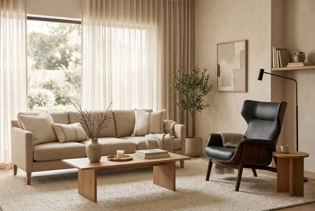
A neutral living room can become too controlled when every element follows the same tonal and material logic. Introducing a single piece that slightly disrupts the harmony, a darker chair, a sculptural object, or a well-chosen vintage find, prevents the space from feeling overly predictable. This “rule breaker” becomes the quiet focal point that gives the room personality without disturbing its overall calm.
Design insight
There is a fine line between cohesion and monotony. Neutral interiors rely heavily on restraint, but when everything is too aligned in tone, texture, and form, the result can feel a little too safe, almost like it is holding its breath. What the room often needs is a controlled interruption, something that shifts the rhythm just enough to keep the eye engaged.
I often think of this as the moment a composition becomes interesting rather than simply correct. A single piece that sits slightly outside the established language of the room can introduce tension in the best possible way. It might be a deep charcoal armchair in a warm beige scheme, a raw stone sculpture on an otherwise soft, layered surface, or a vintage timber piece with patina that refuses to match anything around it. These elements work because they carry their own story, their own weight, and their own quiet authority.
In one project, a living room felt beautifully resolved but emotionally flat. Everything was cohesive, but nothing stood apart. Introducing a mid-century chair in a darker walnut finish completely changed the dynamic. It did not clash, yet it did not blend either. Instead, it anchored the space in a new way, giving the eye a place to rest and return to. The room suddenly felt more intentional, as though it had gained a point of character rather than just consistency.
This is the paradox of good restraint. Sometimes, breaking the harmony is what allows the harmony to be fully appreciated.
Practical application note
Start by establishing a strong neutral foundation first. Only once the room feels balanced should you introduce a contrasting piece. The key is not to overwhelm the scheme but to gently interrupt it. One carefully chosen item is often enough. More than that can quickly shift the room from curated to chaotic.
The “rule-breaking” piece should still belong in terms of quality and intent, even if it differs in tone or material. A darker chair, for example, should still echo the same design language in proportion or craftsmanship, even if it introduces contrast in colour. The goal is contrast, not confusion.
Placement is equally important. Allow the piece some breathing room so it can be seen clearly within the composition. If it is hidden among too many similar elements, its effect is lost. Give it visual space so it naturally draws attention without feeling forced.
Avoid using contrast purely for shock value. The most successful disruptions feel inevitable rather than accidental, as though the room always needed that one slightly different note to feel complete.
Typical size range (metric + imperial)
- Accent or statement chairs typically range from 70 to 95 cm in width, approximately 28 to 37 inches, making them ideal for introducing contrast without overwhelming the seating arrangement.
- Sculptural objects often sit between 20 to 60 cm in height, roughly 8 to 24 inches, depending on surface scale and visual weight.
- Vintage furniture pieces such as side tables or stools usually range from 40 to 60 cm in height, approximately 16 to 24 inches, allowing them to integrate easily into living room layouts while still standing out.
- Recommended spacing around statement pieces is 30 to 60 cm, roughly 12 to 24 inches, ensuring they read as intentional focal points rather than crowded additions.
When one piece is allowed to break the rules with intention, the room gains depth, character, and a quiet sense of confidence. It stops feeling overly rehearsed and starts feeling composed in a way that is far more human, where perfection is softened just enough to let personality quietly take the lead.
You May also Like: 25 Edwardian Living Room Ideas That Celebrate Period Elegance and Modern Comfort
Common Mistakes That Make Neutral Rooms Feel Cold
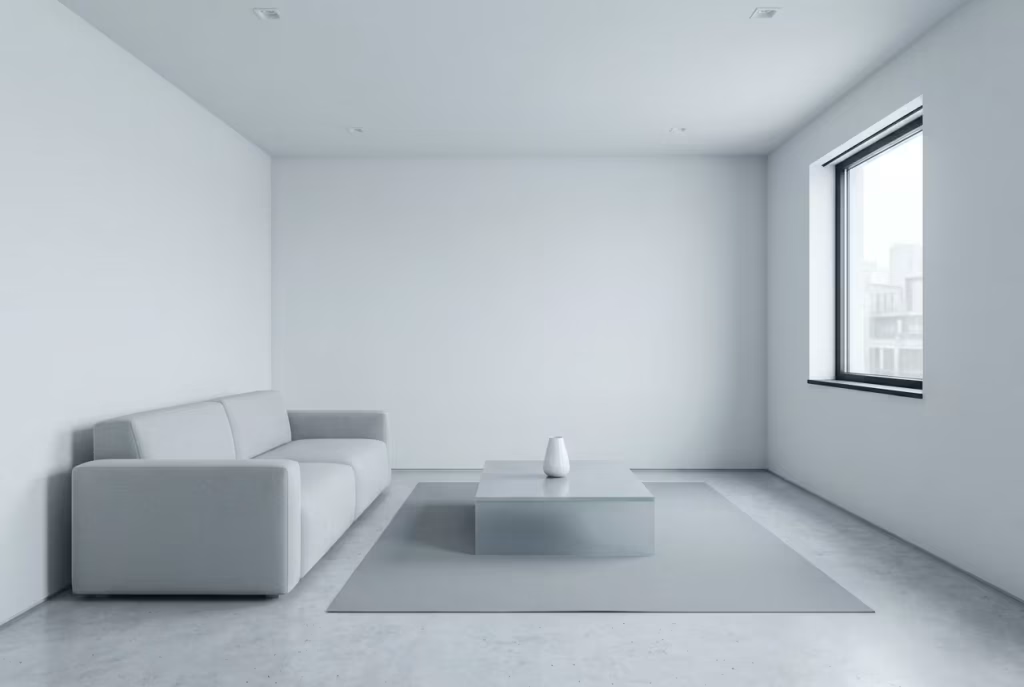
Neutral rooms only feel cold when the balance slips. It is rarely the palette itself that causes the problem, but the way it is handled. A neutral scheme needs depth, texture, warmth, and a clear sense of hierarchy. Without those things, the room can feel clean on the surface but strangely unwelcoming underneath, like a beautifully pressed shirt with no one wearing it.
Over-reliance on white without tonal depth
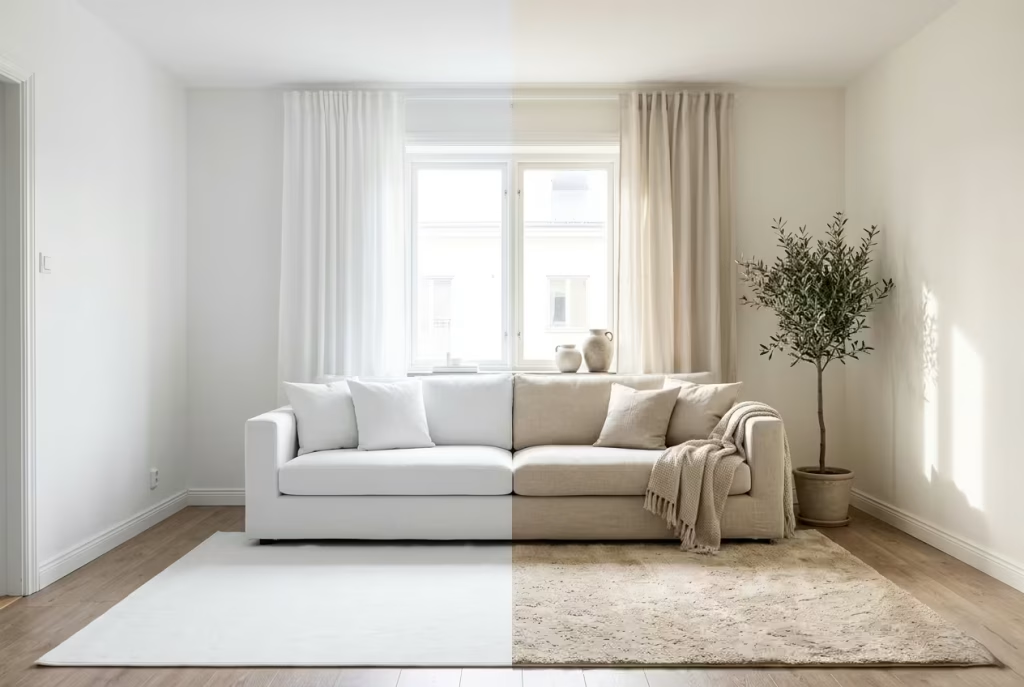
White is often treated as the safest neutral, but too much of it, especially when layered without variation, can flatten a room almost instantly. It removes nuance and leaves the eye with nowhere interesting to travel. What should feel calm can end up feeling stark, almost brittle.
In one living room I worked on, the walls, sofa, rug, and curtains were all variations of white. At first glance it looked pristine, but the room felt oddly clinical by mid-afternoon, even in good daylight. The fix was not dramatic. We introduced a warmer off-white on the walls, a softer oatmeal sofa, and a rug with a subtle sand undertone. That small tonal shift changed everything. The room stopped feeling like a blank sheet and started feeling layered, grounded, and quietly lived in.
The lesson is simple. White can work beautifully, but only when it is supported by depth around it. A room needs some warmth in the wings, otherwise white can steal the soul out of the space.
Too many identical finishes
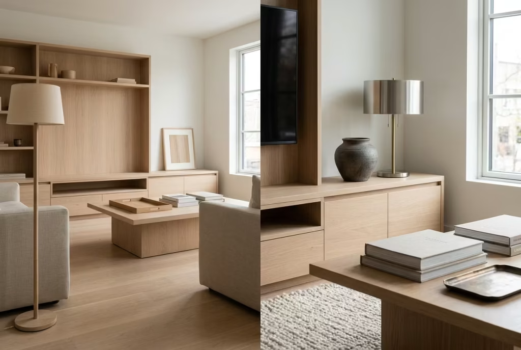
When every surface has the same sheen, same grain, or same temperature, a neutral room can start to feel flat and overmanaged. It reads less like an interior and more like a display board. That kind of sameness can be tidy, but it rarely feels inviting.
I once walked into a newly finished living room where the flooring, side tables, shelving, and even the lamp bases were all the same pale oak tone with the same smooth finish. Nothing was wrong, exactly, but nothing was doing any heavy lifting either. The room felt polite to the point of stiffness. We brought in a brushed metal lamp, a matte ceramic vase, and a wool rug with a deeper pile. Suddenly the room had a bit of texture in the conversation. It felt less showroom and more home.
The trick is to vary finishes without losing coherence. Matte beside soft sheen, brushed beside smooth, grainy beside polished. That contrast gives the room a pulse.
Poor lighting temperature
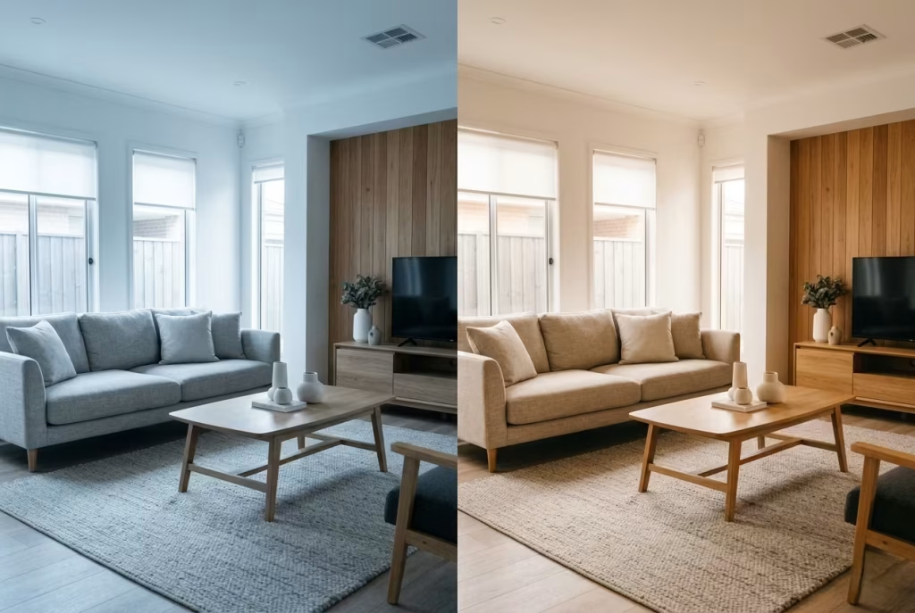
Lighting temperature can quietly undo an otherwise beautiful room. Too cool, and even warm materials begin to look washed out or slightly grey. The room may be bright, but it will not feel warm. It is one of those details people often overlook until the atmosphere feels off and they cannot quite put their finger on why.
I have seen this happen more times than I can count. A client once had a lovely neutral living room with linen upholstery, timber accents, and a layered rug, yet every evening it felt flat and unsociable. The problem turned out to be the bulbs. They were too cool, too white, too clinical. Changing them to a warmer range immediately softened the entire room. The same furniture, the same palette, the same layout, but the mood shifted from crisp to welcoming in one fell swoop.
Warm lighting is not about making a room dark or yellow. It is about letting the materials speak in a softer voice. If the room feels cold at night, lighting is often the first place to look.
Furniture pushed against walls
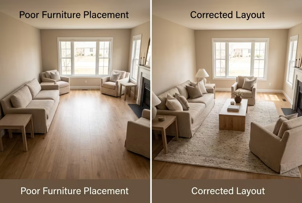
This is one of the fastest ways to make a room feel formal, hollow, and slightly disconnected. When all the furniture is pinned to the perimeter, the centre of the room can feel empty in a way that is not spacious, just awkward. The room loses intimacy and starts behaving like a waiting area rather than a living space.
I remember a narrow lounge where every piece had been lined up against the walls in an attempt to make the room feel larger. In reality, it had the opposite effect. The middle of the room felt like dead space, and the seating felt oddly detached from itself. Once the sofa and chairs were pulled forward and anchored with a properly sized rug, the room immediately felt more composed. It became a place to gather, not just a place to pass through.
Furniture needs room to breathe, but it also needs to belong to something. Floating pieces slightly off the wall creates a more human scale and gives the room a sense of intent. A little space can go a long way.
Ignoring tactile variation
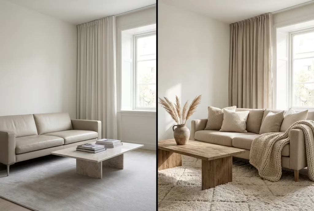
A neutral room without tactile contrast is like a song played in one note. It may be technically correct, but it will not hold your attention for long. Texture is what gives a neutral space its warmth, its depth, and its sense of life. Without it, even the most carefully chosen shades can feel flat and undercooked.
I once reviewed a room that looked lovely in photographs but felt strangely cold in person. Every surface was smooth. The sofa was sleek, the coffee table was polished, the curtains were crisp, and the rug barely had a pile to speak of. There was no friction, no softness, no sense of touch. We introduced bouclé cushions, a wool throw, a hand-thrown ceramic vessel, and a textured rug, and the whole atmosphere changed. It stopped feeling edited and started feeling inhabited.
Texture does not need to shout. In fact, the quieter it is, the better it usually works. A slub in the fabric, a little grain in the timber, a hand-finished edge, these details create warmth without fuss. They are the difference between a room that looks designed and one that feels deeply considered.
The deeper pattern
The coldest neutral rooms are usually not cold because they lack colour. They are cold because they lack contrast, softness, and rhythm. When those things are missing, the room cannot hold the eye, and if it cannot hold the eye, it will not hold the person either. That is the real test of a successful neutral interior. It should feel easy to live with, not just easy to look at.
If there is one rule worth keeping in mind, it is this: neutrality should never mean sameness. The best rooms use variation with a light hand, letting tone, texture, and light do the quiet heavy lifting.
Real-Life Application How These Secrets Come Together
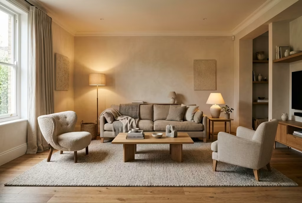
This is where theory stops being abstract and starts behaving like a real room. Neutral design only makes sense when you see how all the layers interact in practice, how scale, light, texture, and restraint begin to work as one system rather than isolated ideas. In reality, warmth is never the result of a single decision. It is the accumulation of many small, controlled choices that quietly reinforce each other.
Let’s take a grounded example from a typical residential living space, the kind I have worked with repeatedly in real projects, where proportions are generous but not oversized, and every decision carries visible weight.
Room foundation and spatial structure
- Room size: 4.5m x 5.5m (14.7 ft x 18 ft)
- Ceiling height: approximately 2.6m (8.5 ft), standard residential proportion
- Layout intent: centralised seating with circulation around perimeter edges, maintaining clear movement without pushing furniture to the walls
This kind of room often presents a subtle challenge. It is large enough to feel flexible, but not so large that you can be careless with scale. If handled poorly, it either feels empty or overfilled, with very little middle ground.
Core furniture placement
The sofa becomes the anchor point.
- Sofa: 2.2m (87 inches), centred on the longest wall but pulled slightly forward to avoid perimeter stiffness
- Positioning logic: not wall-hugging, but floating enough to create spatial breathing room behind it
- Supporting seating: two armchairs, placed at a soft angle rather than rigid symmetry, approximately 1.8m to 2.2m (6 to 7.2 ft) apart depending on circulation needs
This is where the earlier principles begin to merge. Floating furniture, asymmetry, and human comfort all come into play. The arrangement is not about perfect geometry, but about conversational ease. You should feel invited into the space, not positioned in it.
I have seen this exact adjustment transform rooms that initially felt flat. Simply shifting the sofa forward by 25 to 30 cm (10 to 12 inches) changes how the entire composition reads. It stops behaving like perimeter furniture and starts acting like a defined social zone.
Rug as the grounding layer
- Rug: 3m x 4m (9.8 ft x 13 ft)
- Placement principle: all front legs of seating sit on the rug, with generous overlap beyond the furniture edge
- Effect: visually binds seating elements into a single composed grouping
This is where cohesion is either established or lost. An undersized rug would break the entire structure here, causing each piece to feel slightly disconnected. But at this scale, the rug becomes the quiet stage that everything sits on.
I once worked on a similar layout where the original rug was nearly a metre too small in width. The room felt fragmented, despite beautiful furniture. Once corrected to a properly scaled 3m x 4m piece, the entire composition settled. Nothing else changed, yet everything started to belong to each other.
Lighting strategy and atmosphere control
This is where the room either becomes atmospheric or falls flat.
- Ambient layer: ceiling lighting at 2700K to 3000K, kept soft and diffused rather than harsh
- Task layer: two table lamps positioned at seated eye level, roughly 55 to 65 cm (22 to 26 inches) high
- Accent layer: a floor lamp in a reading corner, around 150 to 165 cm (59 to 65 inches), creating depth and shadow variation
The key here is not brightness, but distribution. Light is allowed to pool in some areas and soften in others. Shadows are not eliminated, they are managed. This is what gives the room its quiet depth.
In practice, I often reduce overhead lighting more than clients expect. The instinct is always to brighten everything evenly, but that flattens the entire scheme. Once you allow light to behave more naturally, the room begins to feel less like a showroom and more like a lived environment.
Material layering and tactile depth
This is where neutrality stops feeling flat.
- Sofa in a linen blend with a soft oat undertone
- Rug with a low to medium wool pile for grounding texture
- Occasional chair in bouclé for tactile contrast
- Timber coffee table in a muted oak tone with visible grain variation
- Ceramic and stone accents introduced sparingly for natural irregularity
Nothing here is loud, but everything is doing something different. That variation is what creates warmth. Without it, the room would collapse into visual sameness, no matter how well it is furnished.
I have seen rooms like this fail when everything is too polished or too aligned in finish. Once texture is reintroduced, even subtly, the space immediately becomes more forgiving and more human.
Styling and restraint
This is where discipline matters most.
- Coffee table: one sculptural object, one stack of books, one low bowl
- Side surfaces: deliberately left partially open
- Shelving: mixed horizontal and vertical book placement, avoiding uniformity
- Organic elements: a single branch arrangement placed off-centre for visual movement
The restraint is intentional. Nothing is fighting for attention, but everything has presence. Negative space becomes just as important as objects themselves.
The final atmosphere
When all of these layers are working together, something subtle happens. The room stops feeling designed in isolated decisions and starts feeling composed as a whole. Warmth is no longer dependent on colour alone, but on how space, light, texture, and restraint interact.
You feel it rather than analyse it. The room holds you gently without demanding attention. It does not overwhelm, yet it never feels empty. That balance is what separates a neutral room that simply looks good from one that actually feels right to live in.
Conclusion: Warmth Is a Result of Restraint, Not Addition
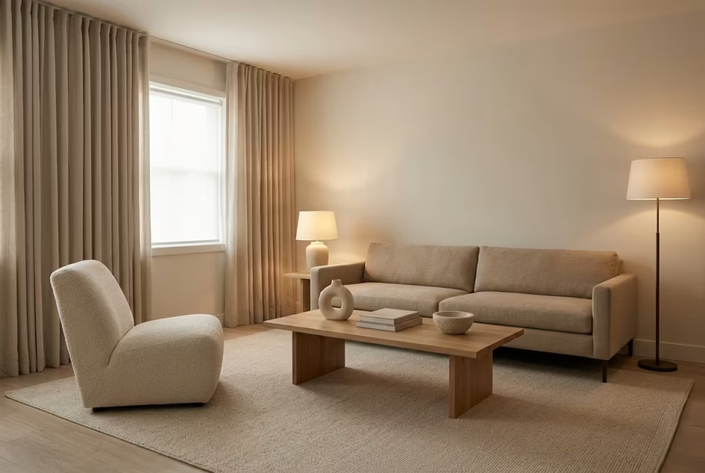
Warmth in a neutral living room is never something that arrives all at once. It builds slowly, almost imperceptibly, through a series of quiet decisions that prioritise balance over excess. It is not created by filling a space, but by understanding when to stop, when to soften, and when to let the room simply breathe on its own terms.
The most successful interiors I have worked on rarely began with the idea of adding more. They began with editing. Removing what was unnecessary, refining what remained, and allowing each element to earn its place. Over time, warmth emerges not as decoration, but as a byproduct of clarity, proportion, and thoughtful restraint.
When every surface, material, and light source is considered with care, the room begins to settle into itself. Nothing feels forced or overworked. Instead, everything feels quietly resolved, as though the space has naturally arrived at its own equilibrium.
And that is the real distinction. The most inviting rooms are not the ones that try the hardest to impress. They are the ones that feel complete without effort, where nothing feels missing, nothing feels excessive, and everything simply belongs.
Frequently asked questions about Styling a Neutral Living Room
How do you make a neutral living room feel warm rather than plain?
Warmth comes from layering, not from one colour choice. A neutral room feels inviting when tone, texture, light, and scale all work together. Warm timber, tactile textiles, soft lighting, and a clear focal point all help the room feel settled rather than flat. Without those layers, even the best palette can feel a bit thin around the edges.
What are the best neutral colours for a cosy living room?
The most successful neutrals usually sit in the warmer end of the spectrum, think ivory, oat, sand, taupe, mushroom, and soft clay. These shades tend to feel more forgiving in natural light and work especially well with linen, wool, oak, and stone. Cooler neutrals can still work beautifully, but they need stronger texture and warmer lighting to stop the room from feeling stark.
How many colours should a neutral living room have?
You do not need a wide colour range, but you do need tonal variation. A room usually feels richer with four to six related tones rather than one flat shade repeated everywhere. That subtle shift in depth is what keeps the room from looking one-note. The trick is to keep the palette close enough that it feels cohesive, but varied enough that the eye has somewhere to move.
Why does my neutral room feel cold even though the palette is soft?
Most often, the issue is not the palette itself, but the handling. Common causes include too much white without depth, poor lighting temperature, furniture pushed against the walls, or a lack of texture. A room can be full of neutral shades and still feel cold if every surface is smooth, bright, and visually equal. Warmth needs contrast, softness, and a little shadow to come through properly.
What size rug should I use in a neutral living room?
A rug should ground the seating, not just sit underneath it. As a rule, the front legs of all major seating should rest on the rug. In many medium living rooms, that means something around 2.5 x 3.5 metres or 8 x 11 feet, though larger rooms often need 3 x 4 metres or 10 x 13 feet. An undersized rug can make the whole room feel disconnected, no matter how beautiful everything else is.
How can I stop a neutral room from looking too staged?
The answer is restraint with a bit of looseness. Leave breathing room on surfaces, avoid matching everything too neatly, and allow one or two objects to break the rhythm slightly. A vintage chair, a hand-thrown ceramic vase, or a darker accent piece can stop the room from feeling predictable. The most convincing interiors often feel collected rather than arranged.
Do I need patterns in a neutral living room?
Not necessarily, but you do need visual variation. Pattern is one way to create interest, yet texture, shape, and material contrast can do the same job more quietly. A bouclé chair, a wool rug, a linen curtain, and a timber coffee table can all create depth without a single bold print. That usually makes the room feel calmer and more timeless.
What is the biggest mistake people make with neutral interiors?
Trying to make everything equally beautiful. When every item has the same visual weight, the room loses hierarchy and starts to feel static. A good neutral room needs one anchor, some supporting pieces, and enough negative space for the composition to breathe. Without that structure, the room can look polished but feel strangely unresolved.
How do I make a neutral room feel personal?
Bring in pieces with a bit of history or character. A vintage table, a well-loved book, handmade ceramics, or a piece of art with emotional meaning can stop the room from feeling generic. Personal details should not overwhelm the scheme, but they should sit within it naturally, like the final thread that ties everything together.
What is the simplest way to improve a neutral living room quickly?
Start with the lighting and the rug. Those two elements do more heavy lifting than most people realise. Warm lighting softens the entire mood, while the right rug grounds the furniture and creates cohesion. After that, add texture through cushions, curtains, and one or two organic objects. Small changes, handled well, can shift the atmosphere remarkably fast.