Bedroom Accent Wall Ideas That Feel Considered, Calm, and Built to Last
An accent wall in a bedroom should never feel like an afterthought. When it works, it brings balance to the room, anchors the bed, and adds depth without disturbing the calm that a bedroom needs. When it does not, it becomes a visual distraction that dates quickly or makes the space feel smaller than it is. In my experience working on bedroom renovations across a wide range of homes, the difference almost always comes down to proportion, material choice, and restraint.
Many homeowners assume an accent wall means bold colour or dramatic wallpaper. In reality, some of the most successful bedroom accent walls are subtle. A shift in texture, a change in finish, or a carefully considered tone can define the bed wall without overpowering the room. I often advise clients to think less about making a statement and more about how the wall will support rest, lighting, and everyday use over time.
This guide brings together 25-bedroom accent wall ideas that I have used, adapted, or refined on real projects. Each idea is explained with practical guidance, realistic measurements in both metric and imperial units, and clear pros and cons. The aim is not to overwhelm with trends, but to help you choose an accent wall that suits your bedroom size, layout, and lifestyle, and still feels right years from now.
Should You Add an Accent Wall in Your Bedroom at All?
An accent wall is not a requirement for a well-designed bedroom. In fact, some of the calmest, most successful bedrooms I have worked on rely entirely on balanced colour, good lighting, and proportion rather than a single highlighted wall. Before committing to one, it is worth stepping back and assessing what the room actually needs.
When an accent wall improves sleep and visual balance
An accent wall works best when it helps the eye settle. In most bedrooms, that means the wall behind the bed. This wall naturally carries visual weight, so adding depth through colour, texture, or material can make the room feel grounded rather than busy. In long or open bedrooms, a carefully chosen accent wall can also shorten the visual length of the space, creating a more enclosed and restful feel. I often use muted tones, textured finishes, or upholstered panels here, as they absorb light slightly and reduce visual noise, which supports better sleep.
When a plain wall is the better design decision
There are situations where an accent wall adds nothing or actively detracts from the room. Small bedrooms with low ceilings can feel cramped if the wrong wall is emphasised. Likewise, rooms with strong architectural features, such as large windows, sloped ceilings, or detailed joinery, often benefit from restraint. In these cases, keeping all walls consistent allows the architecture and natural light to do the work. I regularly recommend skipping an accent wall entirely and investing instead in layered lighting, better window treatments, or higher-quality finishes.
How bed placement and wall selection affect the outcome
Bed position should always determine whether an accent wall makes sense. The headboard wall is usually the right choice because it provides symmetry and a clear focal point. Accent walls on side walls or behind doors tend to feel accidental unless the layout demands it. Measurements matter here. If the bed is not centred, or if wardrobes or doors interrupt the wall, an accent treatment can look unbalanced. I typically aim for at least 600–750 mm (24–30 in) of clear wall on either side of the bed to make an accent wall feel intentional.
A project where I advised against an accent wall
On a recent renovation of a compact 10 m² (108 sq ft) bedroom, the client was keen on a dark feature wall behind the bed. After reviewing the layout and ceiling height, it was clear the room would feel heavier and smaller. Instead, we used a single warm neutral across all walls, added subtle texture through paint finish, and focused on soft lighting at 2700 K. The result felt calmer, brighter, and more spacious, without any feature wall at all. It is a good reminder that good design is not about adding elements, but about knowing when to stop.
A Painted Headboard Wall That Anchors the Bed Without Dominating the Room
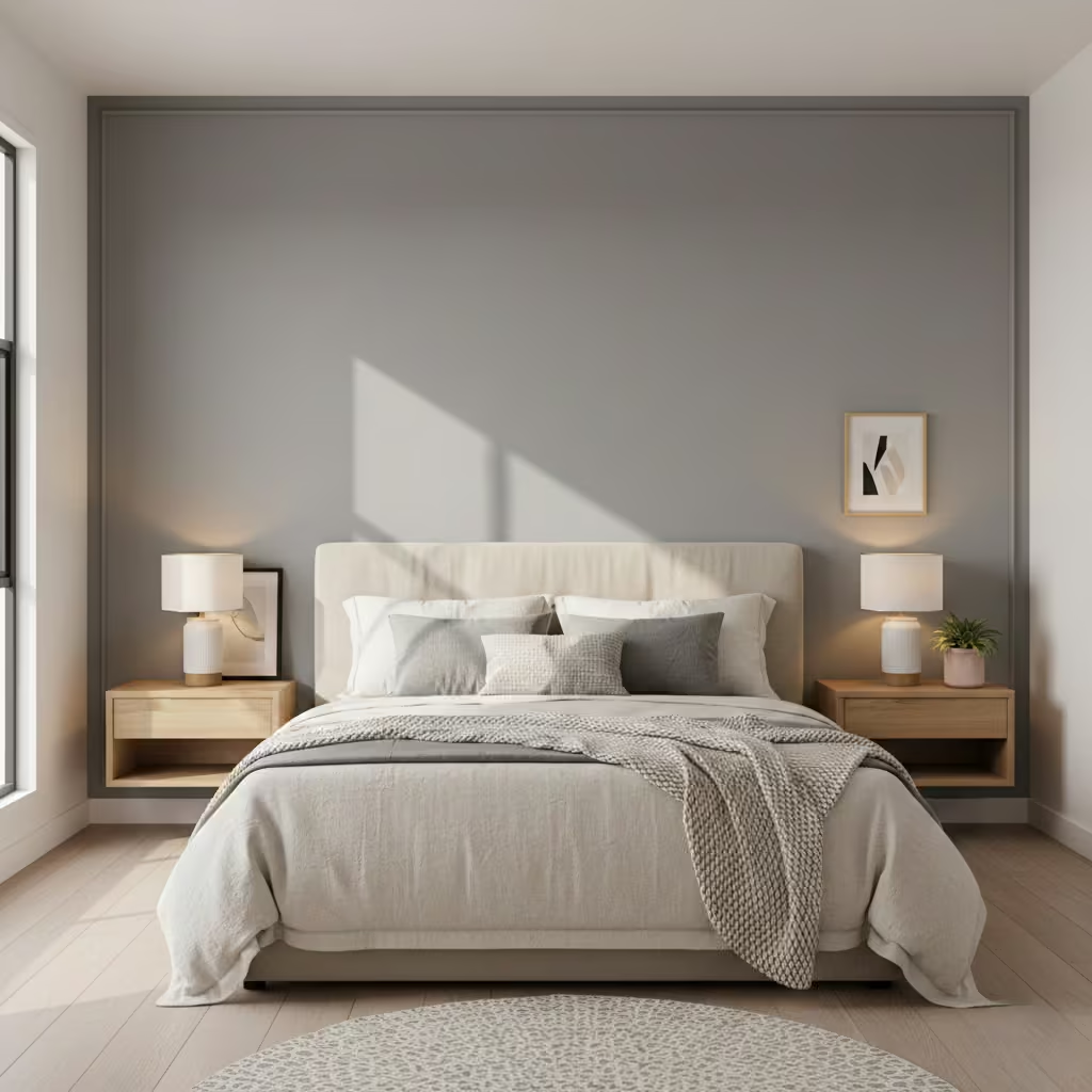
A painted headboard wall is one of the most reliable ways to introduce an accent wall in a bedroom without committing to heavy construction or high cost. I often recommend this approach when a room feels visually unsettled, particularly in bedrooms where the bed appears to float without enough presence against the wall. When handled correctly, paint provides definition and depth while remaining easy to change as tastes or needs evolve.
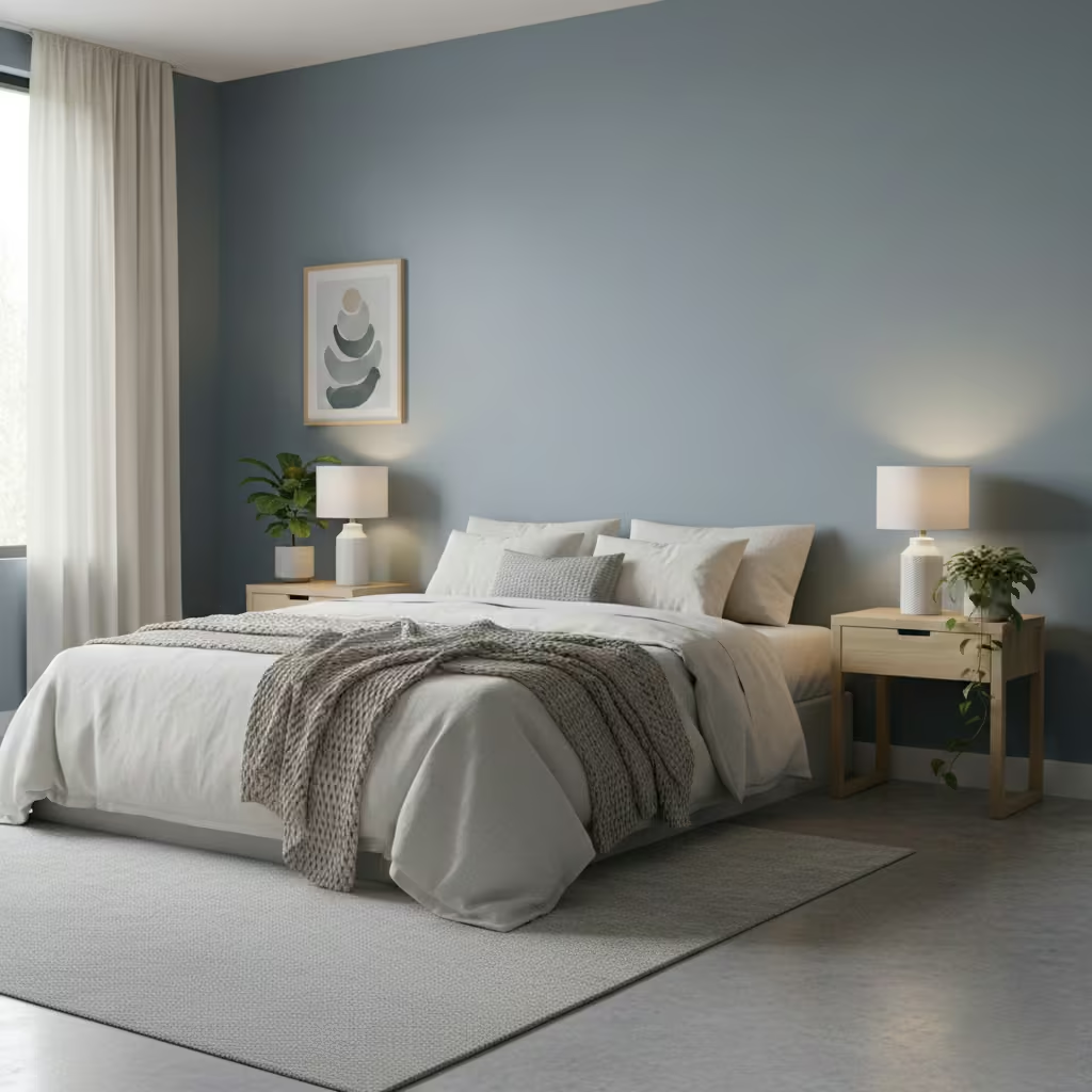
The key to long-term success is restraint. Bedrooms are spaces used in different light conditions throughout the day, so colours that feel balanced in both natural and artificial light perform best. In my projects, I favour warm neutrals, soft greys with brown or taupe undertones, muted greens, and chalky blues rather than high-contrast or saturated colours. These shades adapt well from bright mornings to low evening light without becoming harsh or flat.
For north-facing bedrooms, warmer undertones help counter cooler daylight. In south-facing rooms, slightly deeper or more muted colours prevent the wall from looking washed out. As a general guide, mid-tone colours with a Light Reflectance Value (LRV) between 30 and 55 tend to anchor the bed visually without making the room feel smaller.
Finish matters as much as colour. I rarely use full matt on a headboard wall unless the surface is flawless, as it can mark easily and show wear over time. Instead, I typically specify durable matt or soft eggshell finishes. These reduce glare, feel calm, and are far easier to maintain in everyday use.
In bedrooms where the bed sits close to the wall, especially with fabric headboards, a washable matt is a practical choice. For painted headboard shapes or colour-blocked designs, a low-sheen eggshell helps edges read cleanly without reflecting too much light. Avoid satin or gloss finishes, as they tend to feel too sharp and clinical for a sleep space.
From a renovation standpoint, a painted accent wall is one of the most cost-effective options available. In most homes, painting a single wall typically requires 2–2.5 litres (0.5–0.7 gallons) of paint, depending on wall size and surface condition. Labour is minimal, and the work can usually be completed in a day with little disruption.
The real advantage, however, is flexibility. Paint allows you to adapt the room over time. I have revisited several projects five to seven years later and simply refreshed or softened the accent colour to suit changing furniture or lighting. This is particularly valuable in family homes or rental properties, where permanence can be a drawback. A painted headboard wall offers visual structure now, without locking you into a design decision you may outgrow later.
Pros
- Cost-effective and quick to implement
- Easy to repaint or adjust over time
- Works in small and large bedrooms
- Minimal maintenance compared to textured finishes
Cons
- Relies on good surface preparation for a quality result
- Less tactile or layered than material-based accent walls
- Can feel flat if colour and finish are poorly chosen
You May also Like: 25 Minimalist Bedroom Ideas for a Clean, Modern, and Peaceful Sleep Space
An Upholstered Accent Wall That Adds Comfort, Warmth, and Quiet
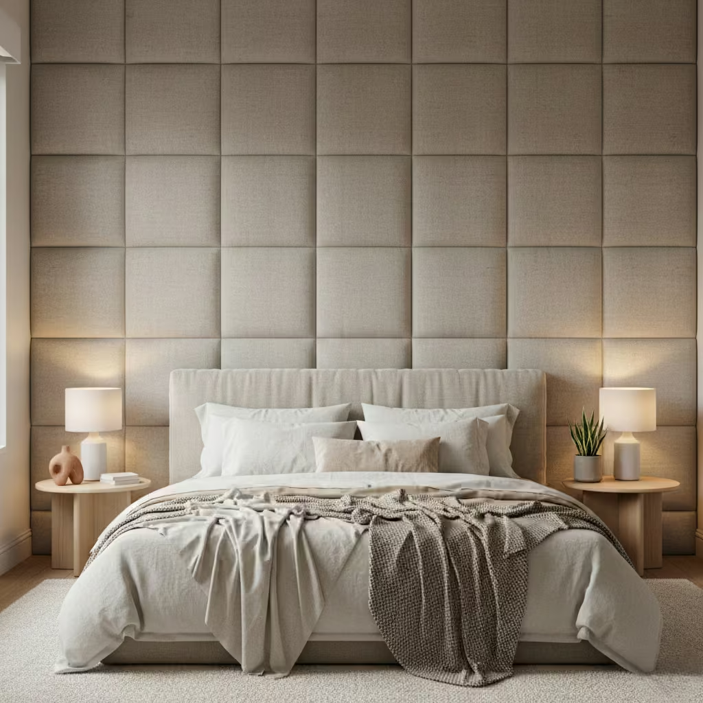
An upholstered accent wall is one of the most effective ways to make a bedroom feel intentionally designed and genuinely comfortable. I tend to recommend this solution when clients want a space that feels quieter, warmer, and more cocooned, particularly in urban homes, apartments, or properties with harder architectural surfaces. Unlike purely decorative accent walls, upholstery adds both visual softness and functional benefits.
Fabric choice is critical. Bedrooms may not experience the same wear as living spaces, but headboard walls still deal with regular contact, sunlight, and cleaning. In my projects, I favour tightly woven fabrics such as performance linens, wool blends, or high-quality polyester blends designed for upholstery. These materials resist pilling, hold their colour well, and are far more forgiving than loose weaves or delicate natural fibres.
For durability, I look for fabrics with a minimum Martindale rating of 20,000 cycles (or 30,000+ for family homes), which ensures the surface will not show wear prematurely. Light to mid-tone fabrics tend to age better than very dark or very pale colours, as they disguise marks and fading more effectively. If the bedroom receives strong daylight, UV-resistant or solution-dyed fabrics are worth the investment to prevent uneven fading over time.
The depth of an upholstered wall determines both comfort and acoustic performance. From experience, anything less than 30 mm (1.2 in) of padding often looks flat and feels decorative rather than functional. For most bedrooms, I recommend a total build-up of 40–60 mm (1.6–2.4 in), including backing board, foam, and fabric. This provides enough softness for sitting up in bed and noticeably reduces sound reflection.
High-density foam in the range of 30–40 kg/m³ offers the best balance between support and comfort. Softer foams may feel plush initially but compress quickly, while overly firm padding can feel rigid and uncomfortable. In rooms where noise control is a concern, such as apartments or terraced houses, adding an acoustic underlay behind the foam can further improve sound absorption without increasing visible bulk.
Maintenance is often the biggest concern clients raise, and rightly so. The solution lies in specifying fabrics with stain-resistant treatments or removable panels where possible. Many modern upholstery fabrics are treated with protective finishes that allow light marks to be cleaned using a damp cloth and mild detergent. I advise against fabrics that require specialist dry cleaning unless the panels are modular and easily removed.
Dust accumulation is minimal if the wall is properly installed with tight seams and clean edges. Regular vacuuming using a soft brush attachment once every few months is usually sufficient. In households with pets or children, textured or subtly patterned fabrics perform better than flat plains, as they disguise minor marks between cleans.
Pros
- Adds warmth, softness, and acoustic comfort
- Ideal for reading or sitting up in bed
- Visually luxurious without excessive decoration
- Reduces sound reflection in hard-surfaced rooms
Cons
- Higher cost than painted or wallpapered walls
- Requires careful fabric specification
- More complex installation than surface finishes
Vertical Wood Slats That Visually Raise Low Bedroom Ceilings
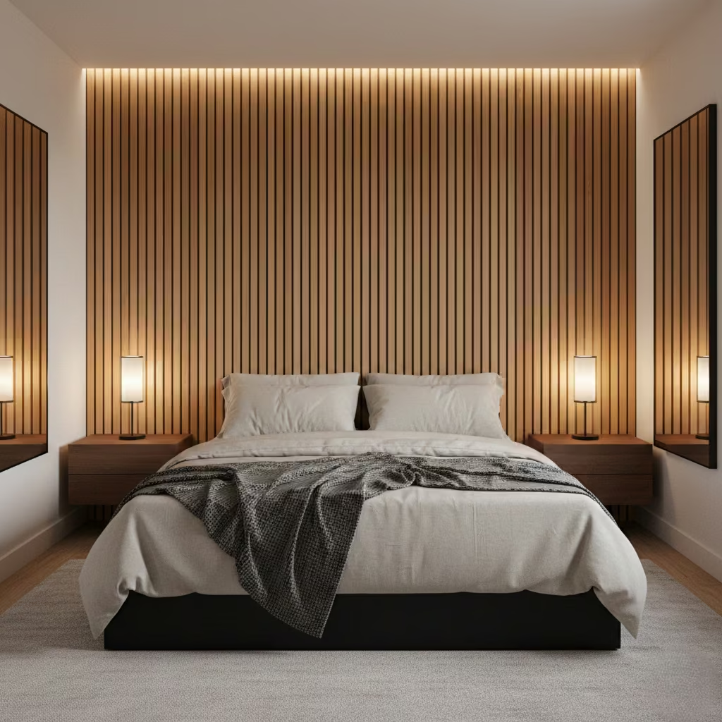
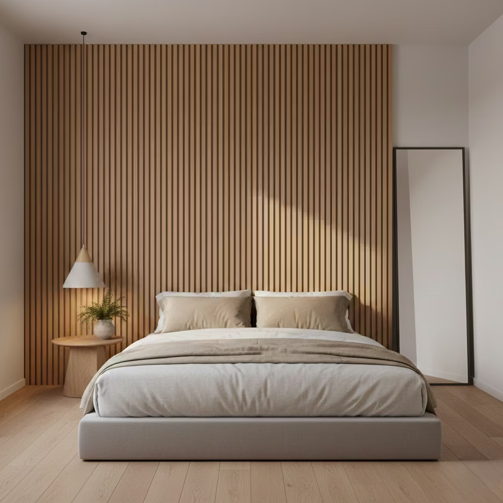
Vertical wood slat accent walls are a highly effective way to correct proportion in bedrooms with low ceilings or limited architectural interest. When executed with precision, they draw the eye upward, creating the impression of height without altering the structure of the room. I often use this approach in modern apartments and renovated homes where ceiling heights sit around 2.3–2.4 m (7 ft 6 in–7 ft 10 in) and the space needs visual lift rather than added colour.
Proportion is everything with slatted walls. Overly wide slats or inconsistent spacing can quickly make the wall feel heavy or dated. Through site testing and mock-ups, I have found that slats between 30–45 mm (1.2–1.75 in) wide, with equal spacing of 10–20 mm (0.4–0.8 in), strike the best balance between rhythm and restraint. This scale reads as refined rather than decorative, particularly behind a bed.
Depth also plays a key role. A total projection of 20–30 mm (0.8–1.2 in) from the wall is usually sufficient to create shadow lines without intruding into the room. Deeper builds can feel bulky in smaller bedrooms and complicate lighting and socket placement. Running slats from floor to ceiling without interruption reinforces the vertical effect and avoids visual breaks that shorten the perceived height.
Solid timber delivers the most authentic texture and variation, which works well in high-end or natural interior schemes. However, it comes with higher cost, potential movement due to humidity, and more involved finishing. In bedrooms with fluctuating temperatures or limited ventilation, timber needs to be properly acclimatised and sealed to prevent warping or cracking over time.
MDF, when specified correctly, offers a stable and cost-effective alternative. I frequently use moisture-resistant MDF for painted slat walls, as it provides consistent edges and a clean finish. For stained or wood-look applications, veneered MDF is often the most practical option, delivering visual warmth with far greater dimensional stability than solid timber. The choice ultimately depends on budget, finish preference, and environmental conditions within the room.
While slat walls appear straightforward, installation requires accuracy. Walls must be flat and properly prepared, as inconsistencies become very visible once vertical lines are introduced. I typically recommend battening or a backing panel to ensure precise alignment and to allow for concealed fixings.
Electrical planning should be addressed early. Wall lights, sockets, and switches need to be integrated cleanly, often requiring recessed boxes or carefully notched slats. In most bedrooms, installation takes two to three days, depending on wall size and complexity. This is not a typical DIY project unless the installer is experienced, as even small alignment errors undermine the intended visual effect.
Pros
- Visually increases ceiling height
- Adds warmth and architectural structure
- Works well in modern and transitional bedrooms
- Effective even in neutral colour palettes
Cons
- Higher cost than paint or wallpaper
- Requires precise installation
- Limits future wall modifications without removal
A Limewash Accent Wall That Adds Texture Without Visual Clutter
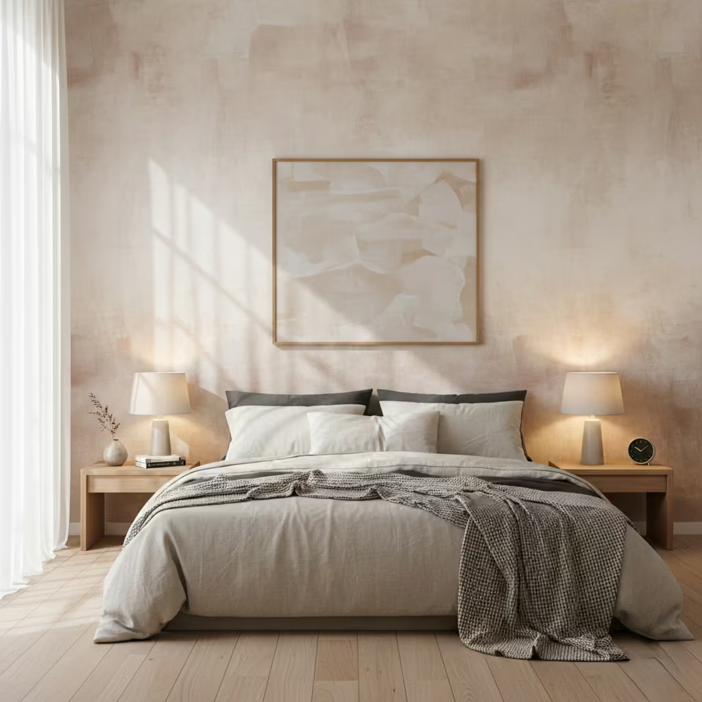
A limewash accent wall is one of my favourite ways to introduce subtle texture and depth to a bedroom without adding visual clutter. Unlike paint or wallpaper, limewash creates a soft, layered effect that reacts to light, giving a room a sense of movement and quiet sophistication. I often use this finish in bedrooms with natural materials like timber floors or linen bedding because it complements warmth and tactility while remaining understated.
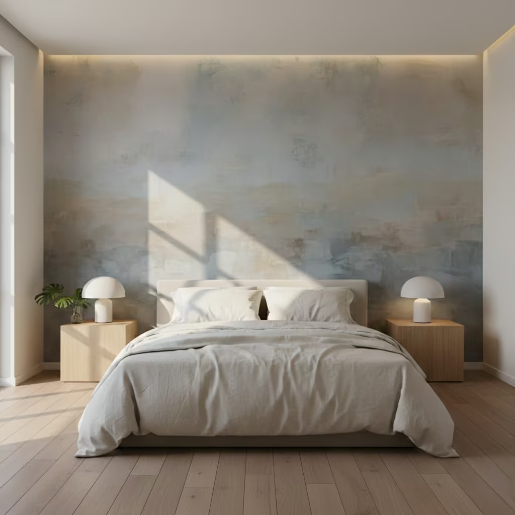
One of the most distinctive characteristics of limewash is how it interacts with light. Morning sunlight will highlight the wall’s natural variations, creating a luminous effect, while evening artificial light softens these contrasts, giving a gentle, cozy atmosphere. In north-facing bedrooms, the finish can appear cooler and more muted, while south-facing rooms bring out warmer undertones. I always advise clients to test a small patch in situ to observe how the wall behaves in different lighting conditions before committing to the full application.
Unlike standard paint, limewash is inherently variable. The application process often multiple thin layers brushed or rolled on creates a nuanced, almost painterly surface. Clients should expect subtle colour shifts and slight streaking, which are part of the aesthetic rather than flaws.
For a calm and balanced look, I typically recommend using one or two muted base tones, such as soft greys, earthy beiges, or chalky blues. The result feels dynamic yet controlled, giving the bedroom a sense of depth without overwhelming the space.
Limewash is surprisingly durable but requires some thought regarding maintenance. Minor scratches or marks can usually be repaired locally by lightly reapplying a thin layer to the affected area. Unlike traditional paint, which may require full repainting for colour consistency, limewash’s natural variation allows touch-ups to blend seamlessly if applied carefully.
It is also highly breathable, making it suitable for older or timber-framed homes where moisture needs to escape. However, it is not recommended for bedrooms where walls are frequently touched or where children may mark the surface, as heavy abrasion will alter the subtle texture over time.
Pros
- Adds natural texture and depth without visual clutter
- Changes subtly with lighting, enhancing the bedroom’s atmosphere
- Breathable and environmentally friendly finish
- Minor repairs blend naturally into the wall
Cons
- Colour variation may not suit those seeking uniformity
- Not ideal for high-contact areas or homes with children
- Requires skilled application for a polished finish
You May also Like: 21 Minecraft Bedroom Ideas to Build the Ultimate Gamer Room
A Dark Accent Wall That Makes a Bedroom Feel Restful and Cocooned
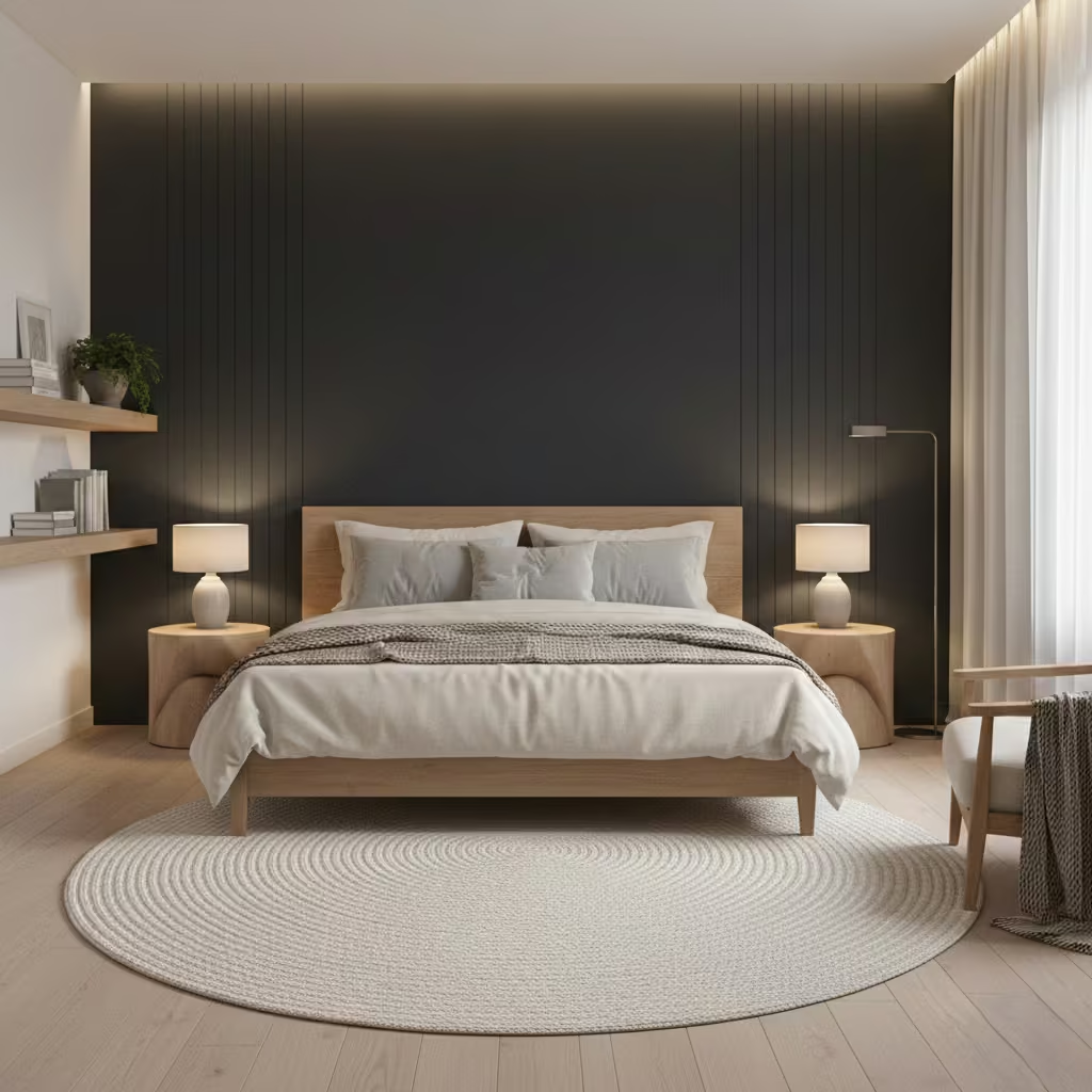
A dark accent wall is one of the most effective ways to give a bedroom a sense of intimacy and calm. In my experience, a carefully chosen deep tone whether charcoal, navy, forest green, or rich taupe can make the space feel grounded and restful without overwhelming it. When applied behind the bed, it naturally draws the eye and creates a focal point, giving the room a cocooned, luxurious atmosphere.
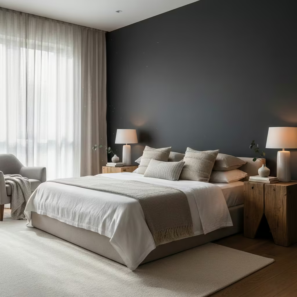
Dark walls can improve rest by reducing visual stimulation, especially in bedrooms where people spend a lot of time unwinding. Shades with muted undertones work best, as they absorb light gently and create a sense of calm. I often pair deep tones with soft, neutral bedding and natural textures like linen, wool, or timber. This combination reduces contrast and prevents the room from feeling heavy or oppressive while subtly supporting relaxation and sleep patterns.
Lighting is critical when using dark walls. A room with insufficient natural light can feel smaller or gloomy if a wall is too deep in tone. I recommend layering multiple light sources: bedside lamps, wall sconces, and ambient ceiling lights, ideally at warm temperatures (2700–3000 K). Reflective surfaces such as mirrors or metallic accents can bounce light back into the space, keeping it balanced. In larger bedrooms, wall-mounted lights or subtle LED strips along the perimeter can prevent the dark wall from visually swallowing the room.
The most frequent missteps I see are over-darkening multiple walls, ignoring ceiling height, or using a finish that is too glossy. A dark ceiling can create a boxed-in effect, and highly reflective paints amplify imperfections. Another common mistake is failing to consider the furniture scale. Small beds or low-profile furniture against a dark wall can appear lost. To avoid these issues, I usually recommend limiting the dark colour to a single focal wall behind the bed, keeping ceilings and other walls lighter, and testing the colour in situ before committing.
Pros
- Creates intimacy and a cocooned feeling in the bedroom
- Reduces visual stimulation, supporting better sleep
- Works beautifully with natural textures and neutral furnishings
Cons
- Can make poorly lit or small rooms feel cramped
- Requires careful lighting planning
- Shows dust and marks more readily than lighter shades
Half-Height Paneling That Adds Architectural Interest Without Overcrowding
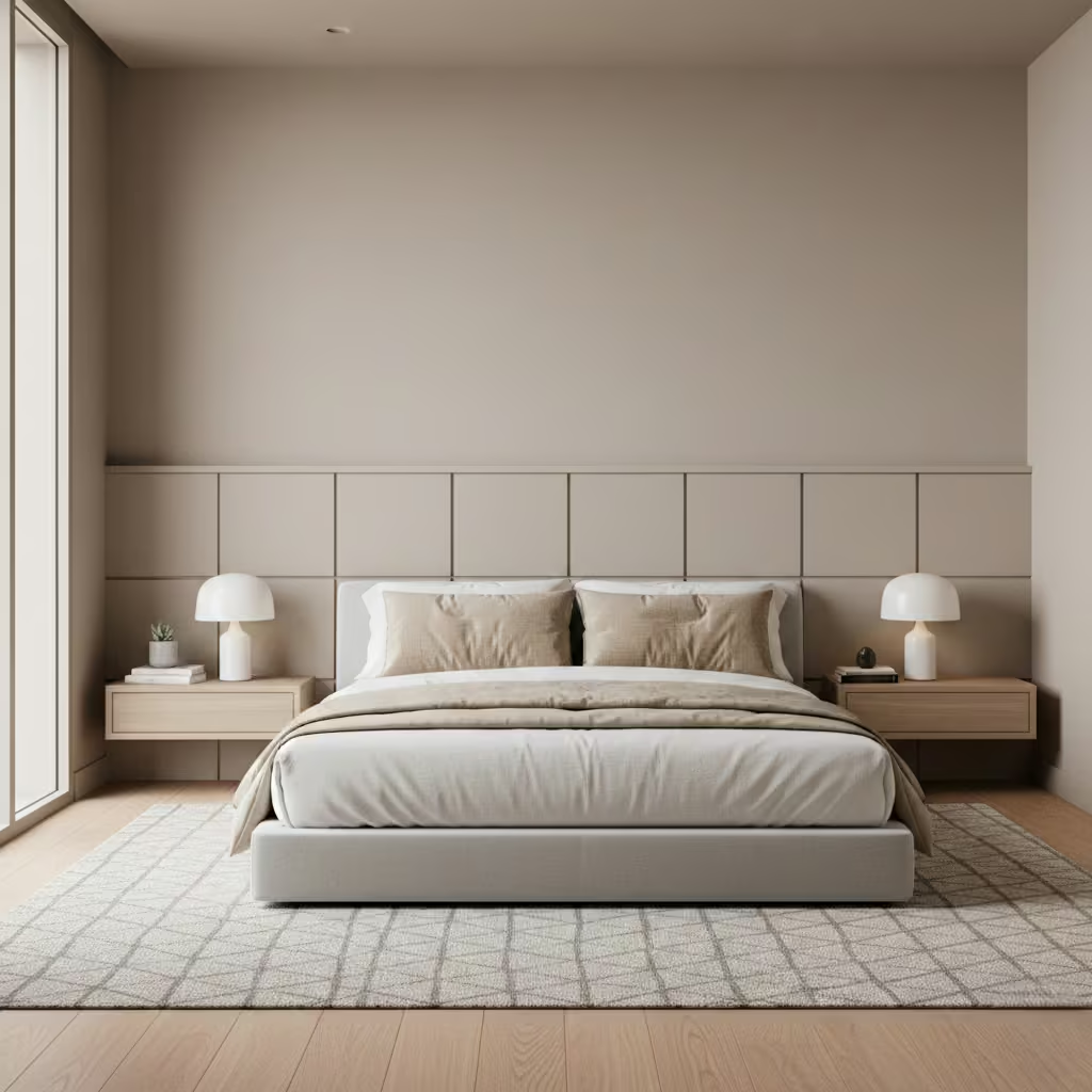
Half-height panelling is a design approach I often recommend when clients want to introduce texture, structure, and subtle sophistication to a bedroom without overwhelming the space. By covering just, the lower portion of the wall, this technique adds visual interest and depth while keeping the upper wall light and airy perfect for rooms of all sizes. It also provides a natural frame for the bed, helping the bedroom feel intentional and layered.
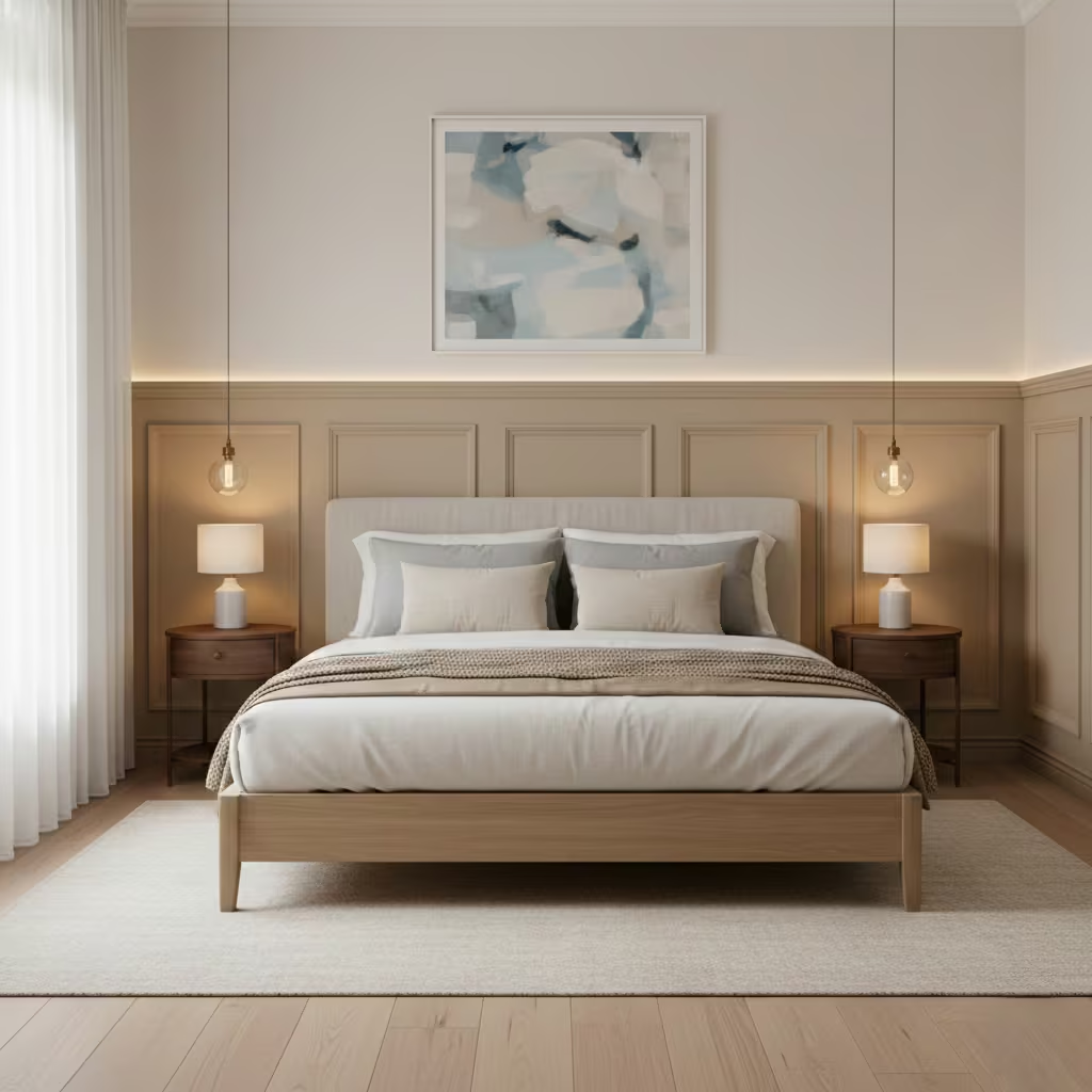
Proportion is critical for half-height panelling. As a rule of thumb, I aim for panels that reach about 900–1,200 mm (35–47 in) from the floor. This height generally aligns with standard headboard heights (approximately 900 mm / 35 in), creating a balanced visual composition. In rooms with higher ceilings (over 2.7 m / 9 ft), panels can be extended slightly to maintain proportionality and prevent the wall from feeling too bottom-heavy. Conversely, in low-ceilinged rooms, keeping panels on the shorter side ensures the space feels open rather than boxed in.
Traditional panel designs often feature rectangular frames, raised moulding, and a sense of formality, which works beautifully in period homes or classic interiors. Modern alternatives simplify the lines flat panels, square or geometric grids, and minimal detailing which suit contemporary bedrooms while still adding depth. I frequently blend styles, using modern minimal frames in a classic proportion to achieve a timeless feel that will age well.
For clients mindful of budget, there are practical ways to achieve the half-panelling look without custom joinery. MDF or plywood panels painted the same colour as the wall are inexpensive yet visually effective. Prefabricated panelling kits are also available and can reduce labour costs significantly. Another option I use on smaller projects is creating a “faux” panel effect using trim battens attached directly to the wall this gives the texture and structure of panelling without heavy construction or materials.
Pros
- Adds depth and architectural interest without overwhelming the room
- Frames the bed naturally, creating a focal point
- Works in both small and large bedrooms
- Flexible for traditional or modern interiors
Cons
- Requires precise installation for clean lines
- Painted MDF or faux panels may show wear more quickly than timber
- Misproportioned heights can make the room feel awkward
Built-In Joinery That Turns the Bed Wall Into Smart Storage
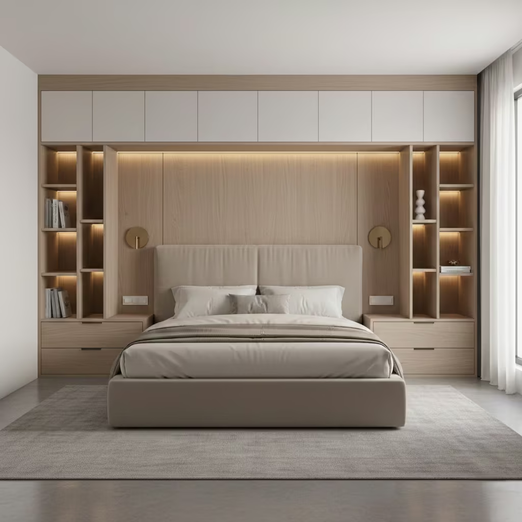
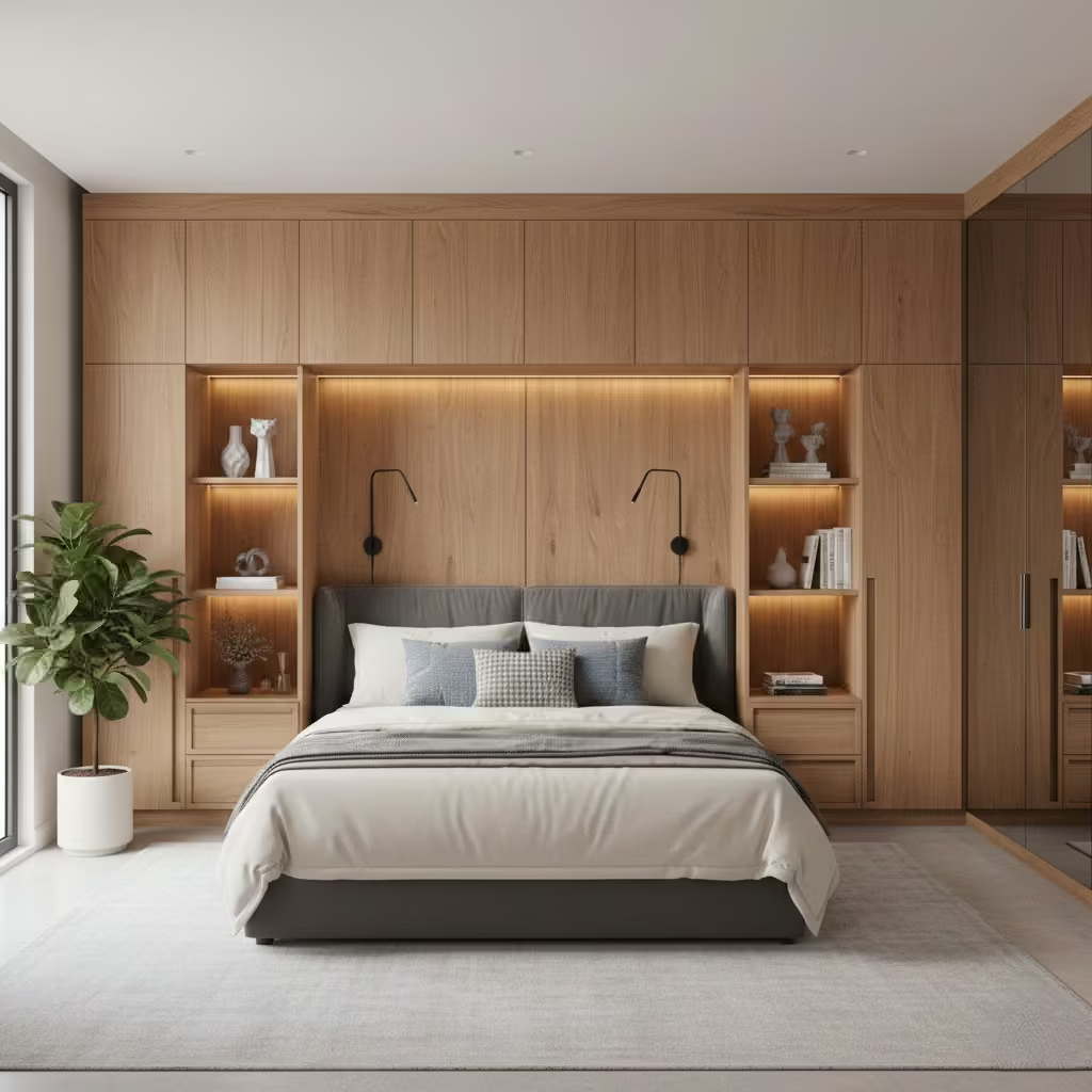
A built-in joinery accent wall is one of the most practical and visually impactful ways to combine storage, design, and focal interest in a bedroom. I often recommend this approach for bedrooms where floor space is limited or when clients want a clean, clutter-free look. By integrating storage around the bed, you create a bedroom that feels purposeful, organized, and tailored without adding freestanding furniture that can interrupt circulation or overwhelm the space.
Before designing, I map the bedroom layout carefully. Built-in joinery can include bedside drawers, shelving, wardrobes, or cupboards flanking the bed, as well as overhead storage if ceiling height allows. I usually allow at least 400–500 mm (16–20 in) clearance on either side of the bed for comfortable access, with shelving or cupboards extending vertically to maximize storage without crowding the sleeping area. Drawers or open shelves directly beside the bed can be aligned with mattress height for ease of use.
Custom joinery offers complete flexibility every shelf, drawer, and cupboard can be dimensioned to suit the client’s belongings, bed size, and aesthetic preference. This approach allows seamless integration with wall lighting, headboards, and ceiling lines, producing a high-end, cohesive look.
Modular solutions, however, are cost-effective, quicker to install, and easier to replace if needed. They work particularly well in rental properties or rooms where budget and timeframe are constraints. I usually balance the two approaches by combining modular units with bespoke panels or trim, achieving a tailored feel without the full cost of custom cabinetry.
Integrated joinery requires careful coordination with electrical services. Bedside wall lights, reading lamps, USB sockets, and switches should be planned in advance to avoid cutting panels or retrofitting wiring later. I typically position lights 1,000–1,200 mm (39–47 in) above the floor, ensuring they illuminate the bed without glare.
Sockets should be recessed into cabinetry or concealed behind panels for a clean look, and overhead LED strips can be integrated into shelving for ambient lighting. Proper planning at the design stage prevents costly modifications and ensures the joinery functions seamlessly with everyday use.
Pros
- Maximizes storage without cluttering the bedroom
- Creates a cohesive, high-end focal wall
- Integrates lighting and power for convenience
- Ideal for both small and large bedrooms
Cons
- Higher cost and longer lead time than painted or panelled walls
- Requires precise planning and installation
- Modifications after installation are complex
A Stone Accent Wall Used Subtly for Natural Character
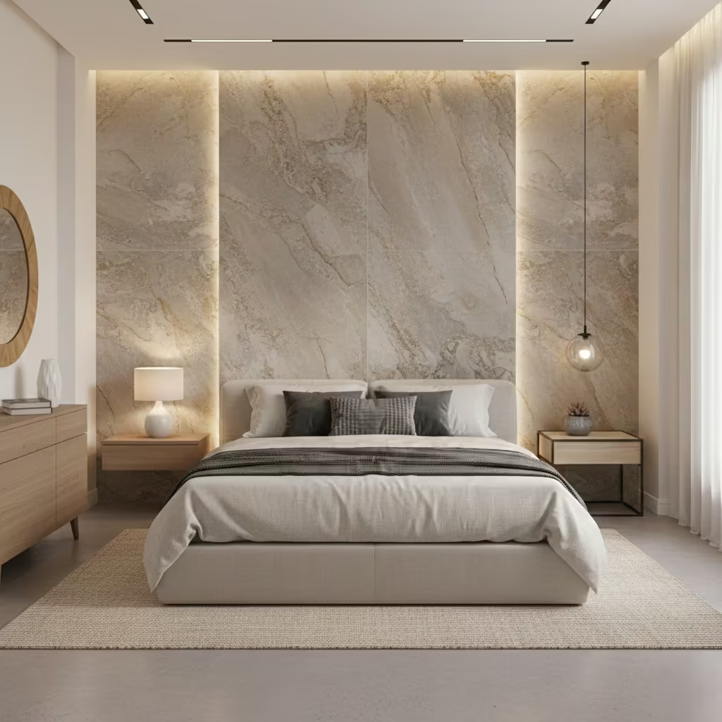
A stone accent wall adds natural texture and a sense of permanence to a bedroom, bringing in warmth and character that painted or wallpapered walls often cannot achieve. I typically recommend this approach for clients seeking a tactile, earthy feel that complements timber floors, linen bedding, and other organic materials. When used subtly, stone can transform a bedroom into a serene retreat without feeling rustic or overpowering.
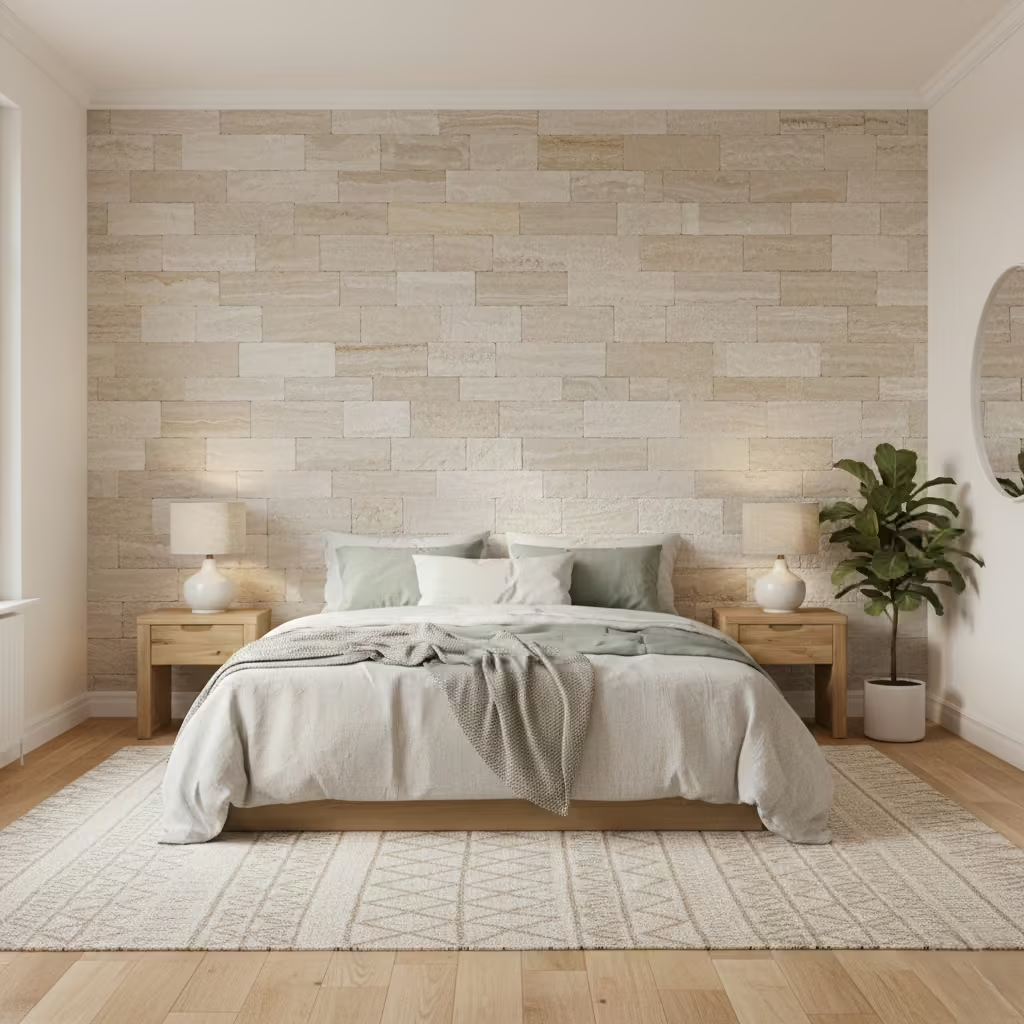
True stone panels can be heavy, which has significant implications for installation. The wall structure must be assessed to ensure it can safely support the material, particularly in apartments or older buildings. Lightweight stone veneers, engineered stone panels, or thin-cut natural stone (10–15 mm / 0.4–0.6 in thick) are practical options for most bedrooms, as they reduce load while preserving the authentic appearance. Fixing typically involves adhesive plus mechanical anchors in higher-risk areas, and a professional installer is recommended to ensure longevity and safety.
For those who love the look but not the weight or cost, there are several effective alternatives. Porcelain slabs or textured wall panels can mimic stone convincingly while being lighter and easier to install. Painted or textured plaster finishes can also create a subtle stone effect with minimal structural impact. In my projects, I often combine a stone-effect panel with complementary timber or painted elements to achieve visual depth without creating an overpowering wall.
Stone walls can feel visually “heavy” in small or low-ceilinged bedrooms. In these cases, I either limit the material to a section of the wall behind the bed or use lighter stone-effect alternatives. Dark stones, in particular, can compress the space if paired with heavy furniture or small windows. For small rooms, I generally recommend keeping at least 60–70% of the walls light and neutral to maintain openness, using stone as a subtle accent rather than a dominant feature.
Pros
- Adds natural texture and a sense of permanence
- Works beautifully with organic materials and warm colour palettes
- Can become a strong focal point without relying on colour
Cons
- True stone is heavy and requires structural assessment and skilled installation
- Can make small or low-ceilinged rooms feel cramped if overused
- More expensive than paint, wallpaper, or faux alternatives
Textured Wall Panels That Add Depth to Neutral Bedrooms
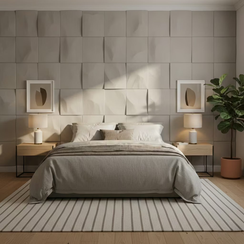
Textured wall panels are one of the most effective ways to add subtle visual interest to a neutral bedroom without relying on colour or bold patterns. I often use this approach when clients want a sense of depth and sophistication while maintaining a calm, understated palette. Panels can introduce shadow, tactility, and rhythm, turning a plain wall into a considered feature without overwhelming the room.
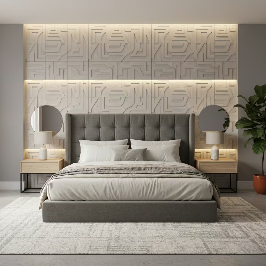
Material choice determines both the finish and longevity of textured panels. High-density MDF or HDF panels are common for painted installations they provide crisp lines, consistent surfaces, and excellent durability when sealed correctly. For a more tactile or luxurious feel, timber or veneered panels bring warmth and natural variation, while PVC or polyurethane panels can offer lightweight, easy-to-install alternatives for intricate 3D textures. In bedrooms, I prioritise materials that can withstand occasional contact, cleaning, and humidity changes, ensuring the feature remains attractive for years.
Textured panels create depth through shadows and surface variation, but the stronger the texture, the more care is required. Deep relief panels can collect dust and require regular gentle cleaning. Subtle patterns or low-relief panels are easier to maintain while still delivering visual interest. I always advise clients to weigh the desired impact against practical maintenance. Matte finishes also help diffuse light and hide minor imperfections, while gloss or reflective surfaces can emphasise every mark.
Textured wall panels excel in neutral bedrooms, especially when the palette is muted or minimalist. They work particularly well behind the bed or as a single accent wall, providing a focal point without colour contrast. Bedrooms with low ceilings benefit from vertical or gently angled panel designs that elongate the walls, while larger rooms can carry bolder geometric or 3D patterns without feeling overbearing. I have found this approach suits modern, Scandinavian, and transitional interiors exceptionally well, offering visual sophistication without distracting from the room’s calm ambience.
Pros
- Adds architectural interest and depth without bold colour
- Durable materials can last for years with minimal upkeep
- Works in a variety of interior styles, especially neutral palettes
- Can be customised in pattern, size, and material
Cons
- Strong textures may require more frequent dusting
- Installation is more complex than paint or wallpaper
- Deep relief panels can make small bedrooms feel busier if overused
Colour Blocking That Defines the Bed Area Without Construction
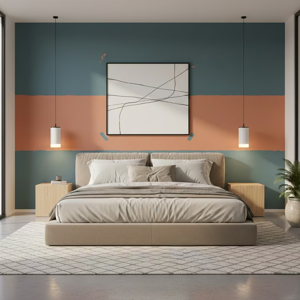
Colour blocking is a modern, cost-effective way to create a bedroom accent wall without building panelling, joinery, or installing textured materials. By applying two or more complementary or contrasting colours in deliberate sections of the wall, you can visually frame the bed and add structure to the room, all while keeping installation simple and flexible. I often recommend this approach for clients who want impact without permanent changes or high costs.
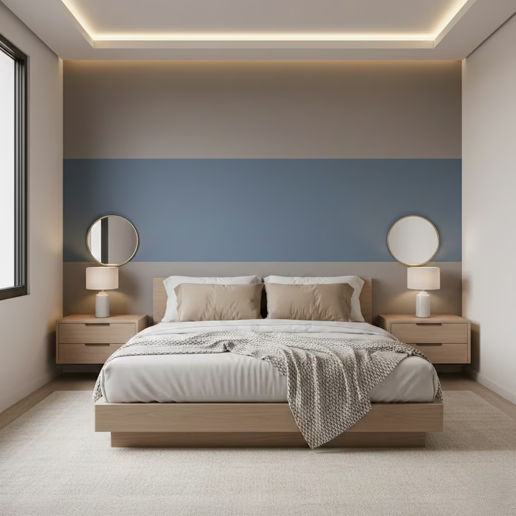
The success of colour blocking relies on proportion. I generally advise that the accent colour covers the height of the bed plus the headboard, typically around 900–1,200 mm (35–47 in) from the floor, or up to 1,500 mm (59 in) if the ceiling is high. Horizontal blocks can be used to visually shorten tall walls, while vertical blocks or stripes work well in rooms with low ceilings to create the illusion of height. Keeping the lines clean and consistent ensures the effect feels deliberate rather than arbitrary.
Choosing colours that harmonise is essential. I often use a muted neutral for the main wall, paired with a slightly deeper tone behind the bed, creating depth without high contrast that might disturb the calm of the bedroom. Soft complementary shades, like dusty blues with warm greys or muted greens with beige undertones, work particularly well. For bolder designs, I recommend limiting the palette to two colours to avoid visual clutter. Matte or soft eggshell finishes usually provide the best results, giving a subtle richness without glare.
One of the advantages of colour blocking is flexibility. If tastes change or a bedroom is redecorated, repainting is straightforward. Using painter’s tape and high-quality paint ensures clean edges that can be easily refreshed later. For smaller bedrooms or rental properties, this approach allows a temporary accent that can be updated with minimal disruption. Colour blocking is especially effective when paired with simple bedding and minimal furniture, allowing the wall to be the focal point without overwhelming the space.
Pros
- Quick, affordable way to define the bed area
- Flexible and easy to repaint or update
- Works well in both small and large bedrooms
- Minimal disruption compared to structural accent walls
Cons
- Requires careful planning of proportions and lines
- Strong contrasts may feel too bold if not balanced
- Edges must be precise; sloppy lines can ruin the effect
You May also Like: 25 Black Bedroom Ideas That Feel Bold, Cozy, and Timeless
Accent Walls with Integrated Lighting for Evening Ambience
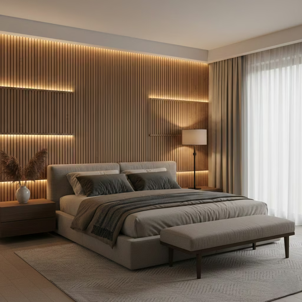
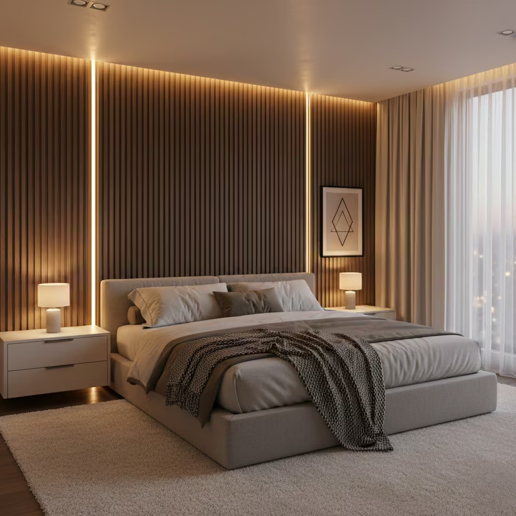
Incorporating lighting directly into an accent wall transforms a bedroom from purely decorative to functional and atmospheric. Integrated lighting creates soft, layered illumination that enhances the wall’s texture or colour while supporting relaxation and comfort in the evening. I often specify this approach for clients who want a subtle, high-end feel without adding floor or bedside lamps that clutter surfaces.
When designing integrated lighting for bedrooms, warmth is key. I typically recommend light sources around 2,700–3,000 K, which mimic evening light and help the body transition to rest. Cooler temperatures can feel stark and alerting, particularly when used behind the bed. Wall-mounted LED strips or recessed lights can be dimmed to create a calming, cocooned atmosphere. Adjustable dimming allows the same wall to feel bright and functional for reading or soft and ambient for winding down.
LEDs are ideal for accent walls due to their low heat output, slim profiles, and energy efficiency. I often conceal strips behind panelling, within recessed grooves, or under shelving to create a wash of indirect light. The key is subtlety: the lighting should enhance the wall without being the focal point. For textured walls like slats, panelling, or stone indirect LED illumination highlights the surface’s depth and shadow play, adding dimension and sophistication.
Integrated lighting requires careful planning early in the project. Electrical boxes, switches, dimmers, and potential power points must be coordinated with the wall design before installation. I usually plan concealed wiring behind panelling or within cavities, ensuring accessibility for maintenance while keeping cables invisible. Proper planning also avoids compromising the structure or finish of the wall later, and allows integration of bedside reading lights, USB outlets, or smart-home controls without retrofitting.
Pros
- Adds subtle, layered evening ambience
- Highlights textures and colours on the accent wall
- Can replace or reduce need for bedside lamps
- Adjustable dimming supports sleep-friendly lighting
Cons
- Requires early electrical planning and professional installation
- Minor repairs or modifications are more complex
- Initial cost is higher than a plain painted wall
Horizontal Timber Planks That Make Narrow Bedrooms Feel Wider
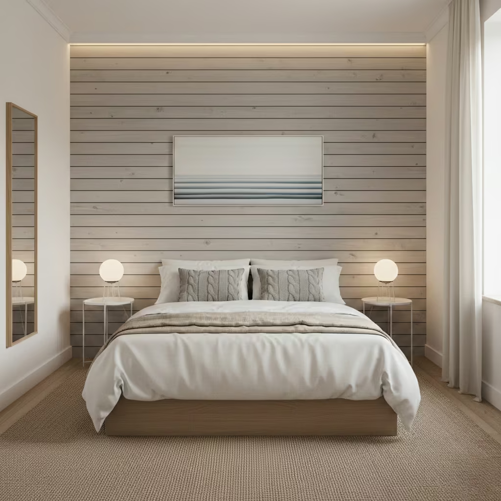
Horizontal timber planks are a simple yet highly effective way to visually expand narrow bedrooms while adding warmth and texture. By running planks parallel to the floor, the eye is drawn sideways, creating the illusion of width and a more open feel. I often use this approach in long, narrow rooms where proportion feels off and a simple colour change alone doesn’t achieve balance.
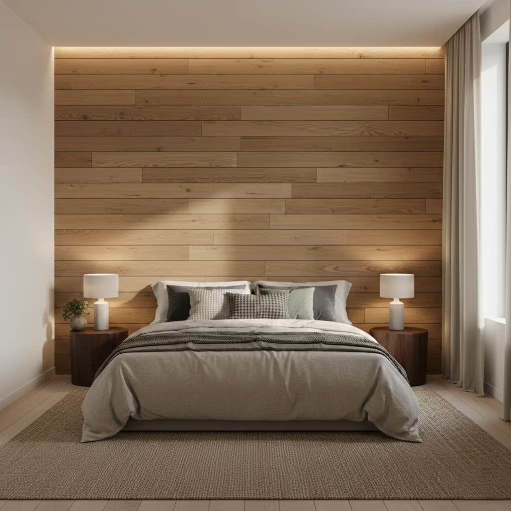
Proportion is critical for the illusion to work. Narrow planks (60–90 mm / 2.5–3.5 in) with consistent spacing create subtle texture without overpowering the space. Wider boards (120–150 mm / 4.5–6 in) work well in larger rooms, giving a more dramatic, contemporary look. I typically avoid extremely narrow or highly varied plank widths in small bedrooms, as this can break up the visual flow and counteract the widening effect.
The finish of the timber determines the style and feel of the room. Rustic, distressed planks add character and a tactile, cosy feel, particularly in country or coastal interiors. For more modern or minimalist bedrooms, smooth, refined timber with a natural or light stain achieves sophistication without distraction. Painted timber planks are another option, providing subtle texture while maintaining a neutral palette that works with a variety of furniture and bedding.
Textured horizontal planks collect dust more readily than flat walls, especially in rooms with open shelving or where bedding brushes against the wall. I recommend selecting finishes that can be lightly wiped, sealed, or treated with a low-sheen lacquer. Smooth surfaces are easier to maintain, while rougher, rustic textures may require more regular dusting. For narrow bedrooms, keeping planks low-profile and finishes practical ensures the aesthetic benefits do not come at the cost of excessive upkeep.
Pros
- Creates the visual illusion of a wider room
- Adds warmth, texture, and natural character
- Flexible in style from rustic to contemporary
- Can be combined with paint or wallpaper for layered effects
Cons
- Textured surfaces collect dust and require maintenance
- Installation must be precise for a clean, level look
- Overly wide or inconsistent planks can overwhelm small spaces
A Microcement Accent Wall for a Calm, Contemporary Bedroom
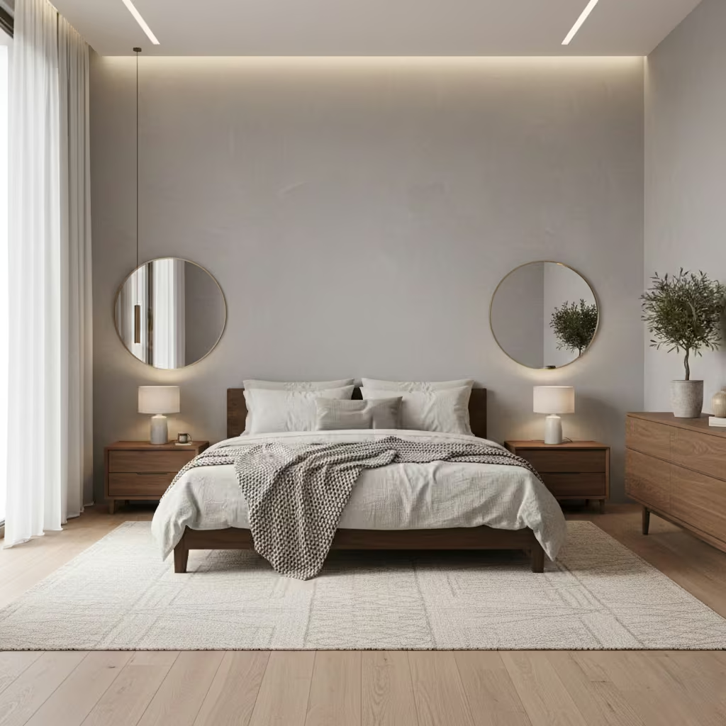
Microcement is a sleek, contemporary material that creates a seamless, minimalist accent wall in bedrooms. Its smooth, continuous surface adds subtle texture and sophistication, making it ideal for modern interiors where calm, restrained design is the priority. I often recommend microcement for clients seeking a low-profile yet tactile feature that doesn’t rely on colour or heavy patterning.
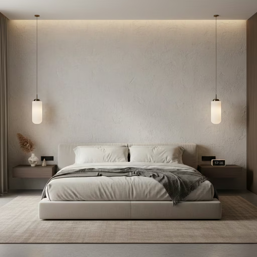
Proper surface preparation is crucial for a durable microcement finish. The wall must be clean, dry, and free from structural defects. Minor imperfections should be patched, and existing paint or wallpaper removed to ensure adhesion. In my projects, I often apply a primer and mesh reinforcement to strengthen the substrate, particularly on walls with slight movement or uneven surfaces. Skipping these steps can compromise the finish, so professional installation is strongly advised.
Microcement is often thought to be prone to cracking, but this is largely a myth. When installed with proper reinforcement, layered application, and flexible finishing coats, microcement performs exceptionally well even in residential walls. Minor hairline cracks may appear over time in areas with extreme temperature or humidity fluctuations, but these are rare in standard bedroom environments and can be touched up easily without compromising the overall effect.
Microcement is more expensive than paint or wallpaper due to material cost and skilled labour requirements. Prices vary depending on wall size and finish but generally range from £70–£120 per m² (£6–£11 per sq ft) installed. However, its longevity and low maintenance make it cost-effective in the long term. Unlike paint, it does not chip or fade and only requires occasional cleaning with mild soap and water. This durability, combined with its minimalist aesthetic, makes it a worthwhile investment for high-end contemporary bedrooms.
Pros
- Creates a seamless, modern, and calming focal wall
- Durable, low-maintenance, and long-lasting
- Smooth surface highlights natural light and shadow
- Minimal visual clutter, suitable for neutral palettes
Cons
- Higher upfront cost than paint or wallpaper
- Requires professional installation for best results
- Minor cracking possible if installation is not properly reinforced
Wallpaper and Maudling Combinations That Feel Elegant, Not Fussy
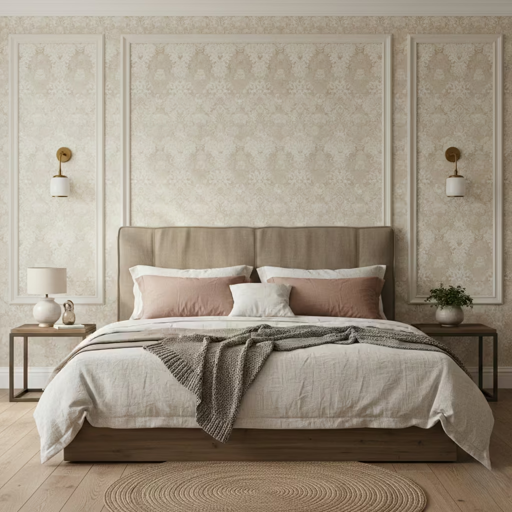
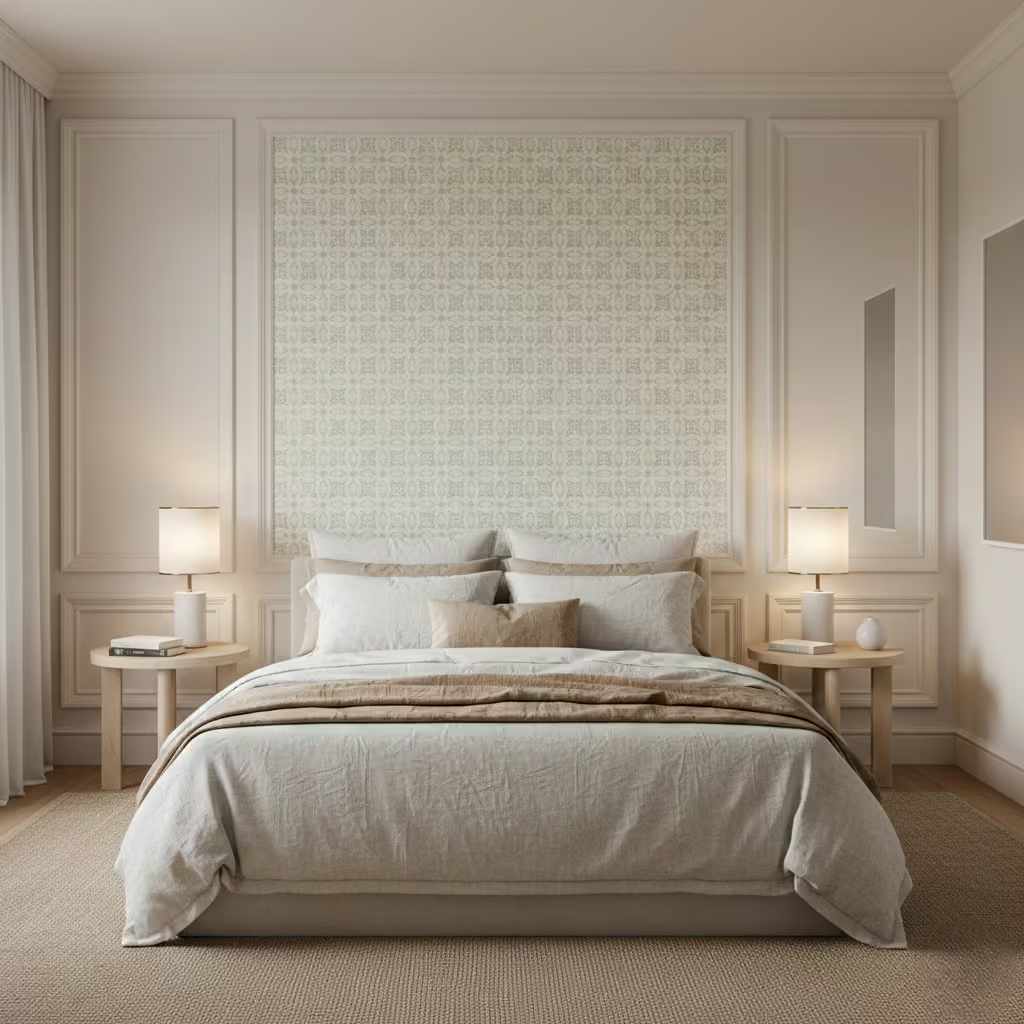
Combining wallpaper with moulding is a sophisticated way to create an accent wall that feels curated and timeless rather than cluttered. I often use this technique for clients who want depth, texture, and pattern while keeping the overall bedroom aesthetic calm and refined. When done correctly, it elevates the space without overwhelming it or competing with furniture and décor.
Proportion is key to achieving an elegant look. For standard bedrooms, I recommend keeping mouldings between 50–100 mm (2–4 in) wide, with vertical or horizontal spacing that aligns with furniture and wall dimensions. Panels that are too large can dominate the wall, while overly small or tightly packed mouldings risk looking fussy. I typically design moulding grids that frame the bed or wall features, creating subtle rhythm and balance that guide the eye rather than distract.
Wallpaper patterns should complement the moulding rather than compete with it. I usually select muted, low-contrast designs for small to medium bedrooms think soft geometrics, florals in tone-on-tone palettes, or natural textures. For larger rooms, slightly bolder patterns can work if the colour palette remains subdued. Limiting the number of colours within the wallpaper to two or three ensures cohesion and prevents visual clutter, while keeping the moulding painted in a complementary neutral tone maintains sophistication.
The accent wall should feel intentional and proportional within the room. I often align the moulding with the headboard height and maintain consistent spacing from ceiling and floor, which frames the bed as the focal point. Lighting also plays a role soft wall washers or bedside lamps can enhance shadow lines in the moulding, highlighting texture without overwhelming the pattern. For rooms with lower ceilings, I avoid extending panels too high, instead focusing on proportionate framing that enhances rather than compresses the space.
Pros
- Adds depth, texture, and pattern without bold colour
- Frames the bed beautifully, creating a focal point
- Works in both traditional and modern interiors
- Can be updated with new wallpaper or paint over time
Cons
- Requires careful planning to avoid a fussy appearance
- Installation is more labour-intensive than paint alone
- Mistimed scale or pattern choices can dominate small rooms
Curved or Arched Accent Walls That Soften Bedroom Geometry
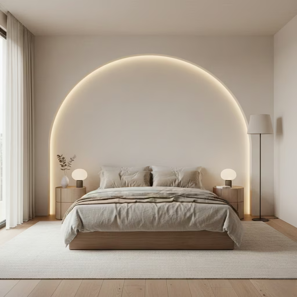
Curved or arched accent walls are a fantastic way to introduce softness and flow into a bedroom, particularly in spaces dominated by straight lines and right angles. I often suggest this approach for clients who want a gentle, organic feel that breaks up rigid geometry while still maintaining a modern, sophisticated aesthetic. When designed correctly, curves create a sense of intimacy and calm without feeling overly ornate.
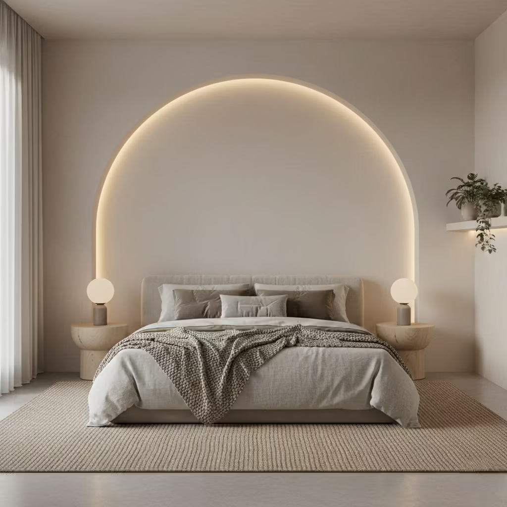
Curves are most effective in bedrooms with high ceilings, simple layouts, or minimal architectural detailing. They can frame a bed, create a sense of enclosure, or soften corners that feel too sharp. In rooms with low ceilings, subtle arches or half-curves can prevent the wall from feeling top-heavy. I usually recommend curves that are proportionate to the room too large or dramatic, and they can dominate the space; too small, and the effect is lost.
Curved accent walls are more complex to build than flat walls, and cost varies depending on material and finish. Timber battens, flexible plasterboard, or curved panels are common solutions, each with different installation requirements. I typically budget 20–40% higher than a standard flat accent wall, factoring in skilled labour for bending, fixing, and finishing. For smaller budgets, paint or wallpaper arcs can mimic the look of curves without structural modification, offering a subtler effect at a fraction of the cost.
To ensure curves feel intentional rather than fussy, I recommend pairing them with neutral colours, soft textures, and minimalistic furniture. Arches behind the bed or in a headboard wall work particularly well when the bedding and bedside furniture maintain clean lines, allowing the curve to be a quiet statement. Lighting can enhance the effect: concealed LED strips along the curve highlight the shape gently, reinforcing the wall’s form without drawing excessive attention. Avoid overly intricate moulding or contrasting colours, which can make the feature feel busy.
Pros
- Softens rigid bedroom geometry for a calming effect
- Creates intimacy and visual interest without colour or pattern
- Works with minimalist, modern, or transitional interiors
- Can be achieved with paint, plaster, or panels depending on budget
Cons
- Higher cost and installation complexity than flat walls
- Requires careful proportioning to avoid dominating the room
- Subtlety is key overly dramatic curves can feel fussy
Fabric Panels That Improve Comfort and Bedroom Acoustics
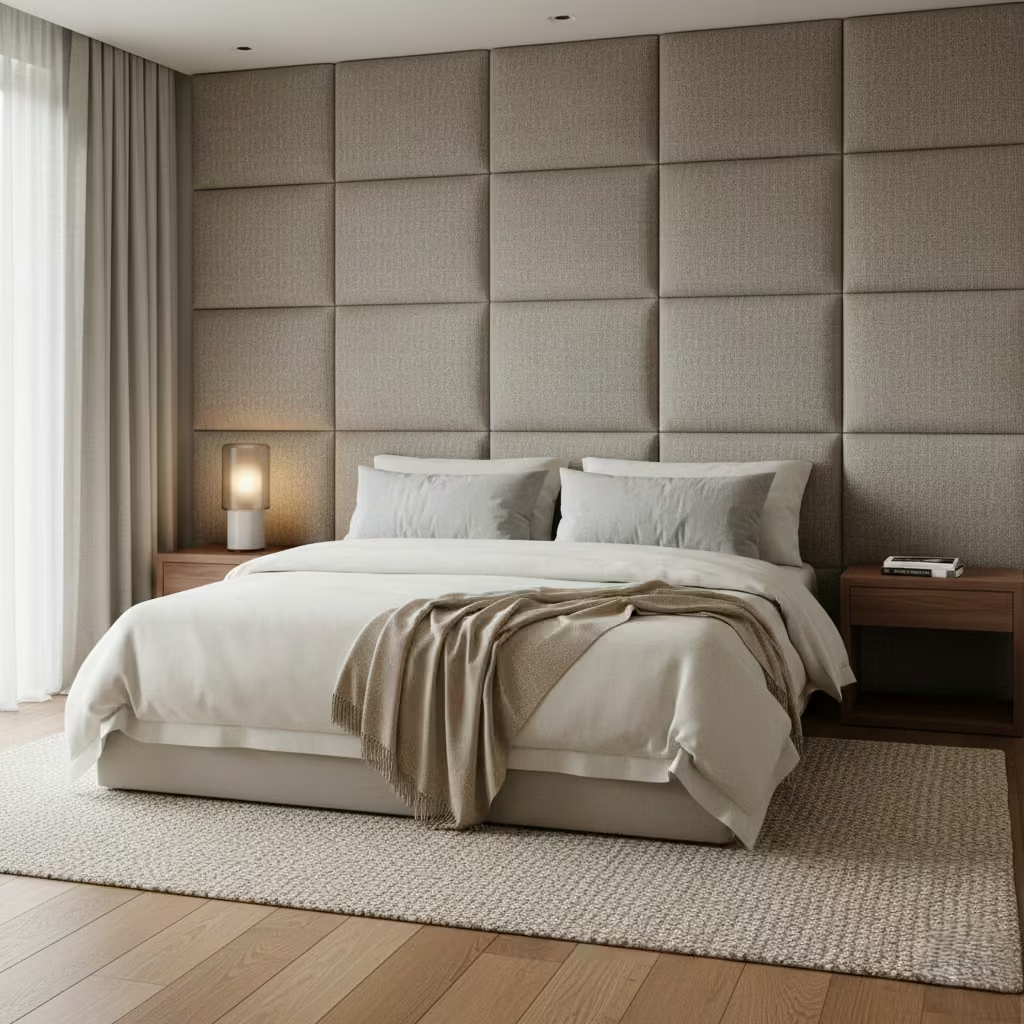
Fabric panels are a dual-purpose solution, adding both visual softness and acoustic comfort to bedrooms. I often recommend them for urban homes, apartments, or rooms with hard surfaces where sound can bounce and create an echo. Beyond aesthetics, well-specified fabric panels absorb ambient noise, making the bedroom feel calmer and more restful especially valuable for clients who prioritise sleep quality.
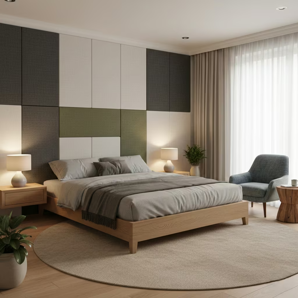
Fabric panels work by trapping and diffusing sound waves, reducing reverberation in the room. Thicker panels with dense backing, typically 40–60 mm (1.5–2.5 in) deep with acoustic foam or mineral wool inserts, provide the best results. In bedrooms, I usually install panels behind the bed, along sidewalls, or opposite hard floors and ceilings to dampen reflections. In my experience, even a modestly sized installation can significantly improve sound comfort, particularly in apartments or homes with thin walls.
Durability depends on fabric choice. I recommend performance fabrics like tightly woven linen blends, wool, or treated synthetics that resist fading and pilling. Lighter colours may show marks more quickly, so subtle patterns or mid-tone hues are often a better investment. Panels should be removable where possible, allowing fabrics to be cleaned or replaced. With proper maintenance, a well-specified fabric panel installation can last 10–15 years or more while retaining appearance and acoustic performance.
The most common placement is the wall behind the bed, which doubles as a headboard and acoustic buffer. Panels can also be applied to side walls, particularly in long or narrow bedrooms, or near windows to reduce reflection from glass. I advise avoiding full-wall coverage in small rooms, as this can feel overwhelming; instead, focus on strategic areas that improve acoustics and enhance comfort while maintaining open, airy space.
Pros
- Improves sleep and relaxation by reducing echo and ambient noise
- Adds tactile warmth and luxury to the bedroom
- Can be customised in size, fabric, and colour
- Serves as both headboard and feature wall
Cons
- Requires durable, high-quality fabric to prevent wear
- Can be costly depending on material and installation
- Full-wall coverage may overwhelm smaller bedrooms
Two-Tone Walls That Add Depth Without Strong Contrast
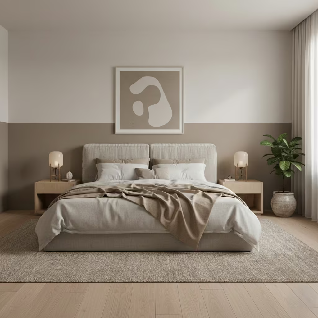
Two-tone walls are a sophisticated way to introduce depth and dimension into a bedroom while maintaining a calm, understated look. Unlike bold accent walls, this technique uses subtle variations in colour to define space and add visual interest without strong contrast. I often use two-tone walls behind the bed or across a feature wall to create layered depth that feels intentional and serene.
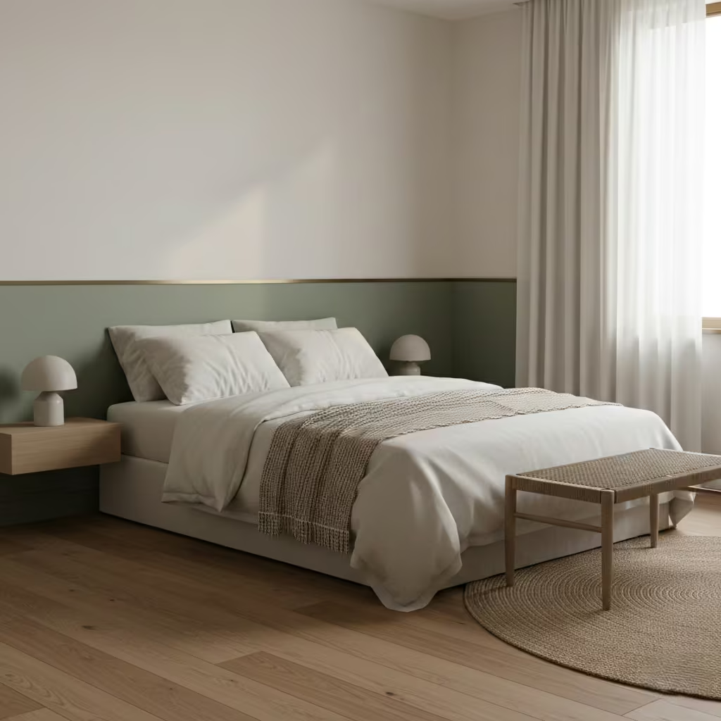
Proportion is key to a polished two-tone wall. A common approach is to paint the lower section between 900–1,200 mm (35–47 in) high, roughly aligning with standard headboard heights, and leaving the upper section lighter. For taller ceilings, increasing the lower section slightly maintains visual balance. The division line should be crisp and deliberate, sometimes accentuated with a thin moulding or trim for subtle framing. Proper ratio ensures the wall feels proportionate rather than split or awkward.
Two-tone designs work best when colour flow is considered across all walls in the bedroom. The upper tone should harmonise with ceilings, bedding, and trims, while the lower tone complements flooring and furniture. Soft tonal shifts like a pale taupe over muted greys or a dusty blue above a soft sand create cohesion without appearing segmented. This approach allows the room to feel spacious and calm while still benefiting from the dimensionality of the two tones.
One of the benefits of two-tone walls is adaptability. Because the colours are subtle, repainting either section is straightforward and doesn’t require full wall coverage. This is especially useful if clients want to refresh the space over time or adjust palettes with seasonal trends or furniture updates. Matte or eggshell finishes are recommended, as they allow easy touch-ups while maintaining a soft, even appearance.
Pros
- Adds visual depth without bold colour or pattern
- Frames beds or furniture naturally
- Harmonises with existing colours for a calm, layered look
- Flexible for future updates or repainting
Cons
- Requires precise masking and proportion planning
- Strong contrasts may defeat the subtle intent
- Poor colour selection can make the room feel segmented
Shelved Accent Walls That Balance Storage and Visual Calm
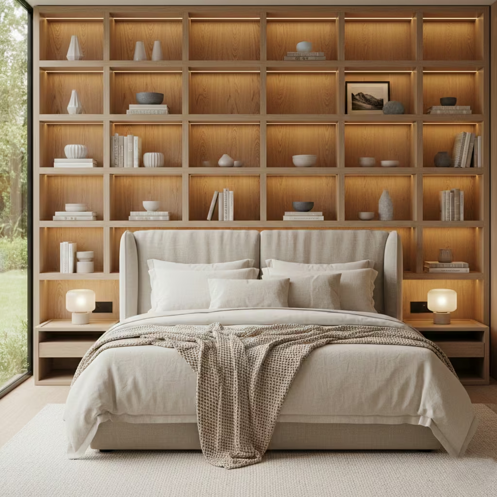
Shelved accent walls are an excellent way to combine practicality and style in a bedroom. I often use them to create a focal wall behind the bed while providing functional storage for books, décor, or personal items. The key is designing shelves that feel integrated, balanced, and uncluttered, so the wall enhances the room without dominating it.
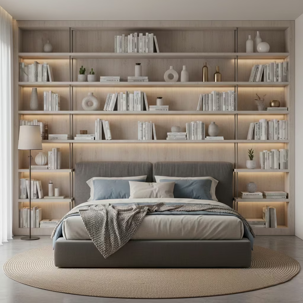
Proper shelf depth ensures usability without overwhelming the wall. I typically specify 150–250 mm (6–10 in) for display or decorative shelves, while deeper shelves may be used for books or storage boxes. Vertical spacing should align with the bed height and wall proportion, generally 250–400 mm (10–16 in) between shelves. Consistent spacing and alignment create rhythm and visual harmony, preventing the wall from feeling chaotic.
Shelves can easily look messy if overfilled. I recommend limiting items to a mix of books, curated décor, and personal touches, keeping roughly 60–70% of the shelf free space. Group objects in odd numbers, vary heights, and use colour restraint to maintain calm. In my projects, clients often pair shelving with subtle integrated lighting or neutral back panels to enhance depth while keeping the focus on the wall’s structure rather than its contents.
Load-bearing is critical, particularly for long or floating shelves. I advise using wall-mounted brackets or hidden supports rated for the intended load. MDF or timber shelves are popular for a sleek, uniform look, while steel or metal brackets provide strength for heavier displays. Overloading shelves can compromise both safety and aesthetics, so careful planning based on what will actually be displayed is essential.
Pros
- Combines functional storage with a design feature
- Frames the bed and adds vertical or horizontal interest
- Customisable in depth, finish, and layout
- Can integrate lighting or other design elements for emphasis
Cons
- Requires careful styling to avoid visual clutter
- Installation and weight planning are critical
- Overstuffed shelves undermine the wall’s calm effect
Concrete-Effect Walls That Still Feel Warm and Livable
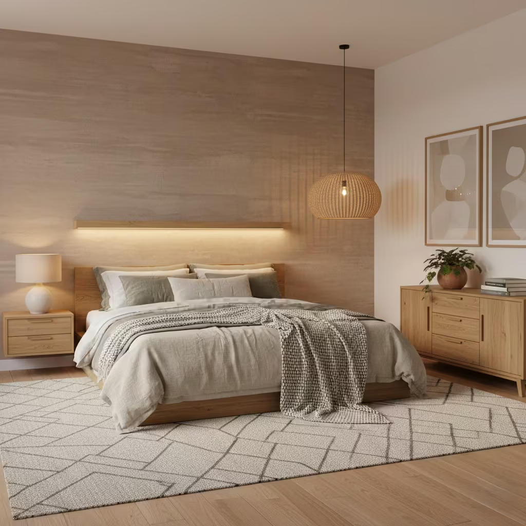
Concrete-effect walls bring an industrial, contemporary edge to a bedroom, but when specified carefully, they can feel warm, livable, and surprisingly inviting. I often use this approach in modern or minimalist bedrooms, pairing the raw texture with soft furnishings and natural materials to avoid a cold, austere feel. The key is balancing the wall’s tactile character with warmth, colour, and lighting.
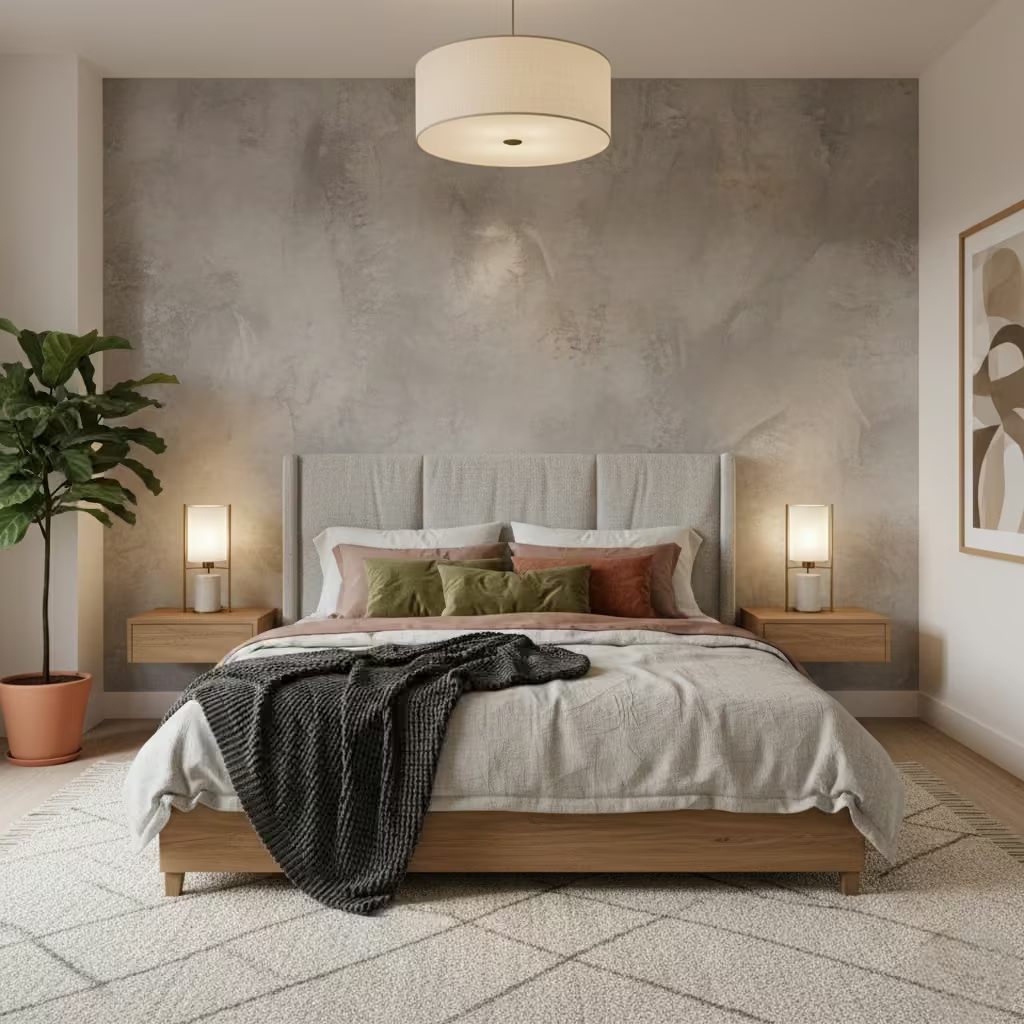
Concrete-effect walls can be achieved with either paint or plaster techniques. Textured paints are cost-effective and easier to apply, offering subtle variations with minimal disruption. Microcement or Venetian plaster creates a more authentic, layered finish with depth and texture, but requires professional installation and is more expensive. Both options allow flexibility in tone, from soft greys to warm taupes, and can be sealed to improve durability and maintenance. I usually advise clients to test a small sample patch under the room’s lighting to ensure the desired warmth and subtlety.
Concrete-effect walls work best when balanced with softer, tactile elements. I often combine them with timber furniture, linen bedding, or wool rugs to introduce warmth and contrast. Neutral upholstery and layered textiles prevent the wall from feeling too stark. Metallic accents, such as brass or matte black lighting, can also add sophistication while harmonising with the wall’s raw texture. For small bedrooms, pairing concrete-effect walls with lighter tones elsewhere in the room ensures the space remains airy and comfortable.
One of the advantages of concrete-effect finishes is durability. Painted concrete-effect walls can be wiped clean with a damp cloth, while plaster or microcement requires minimal care beyond occasional dusting. Unlike real concrete, these finishes do not crack or chip easily if installed correctly. However, textured surfaces can trap dust, so smooth finishes or periodic gentle cleaning are recommended to maintain their aesthetic over time.
Pros
- Introduces modern, industrial texture without feeling cold
- Durable and relatively low maintenance
- Works well with natural textures and warm colour palettes
- Flexible in application, from paint to plaster finishes
Cons
- Can feel stark if paired with minimal furnishings or cool tones
- Professional installation may be required for plaster/microcement
- Textured surfaces require occasional cleaning
Ceiling-to-Headboard Wallpaper Drops for a Cocooned Sleep Space
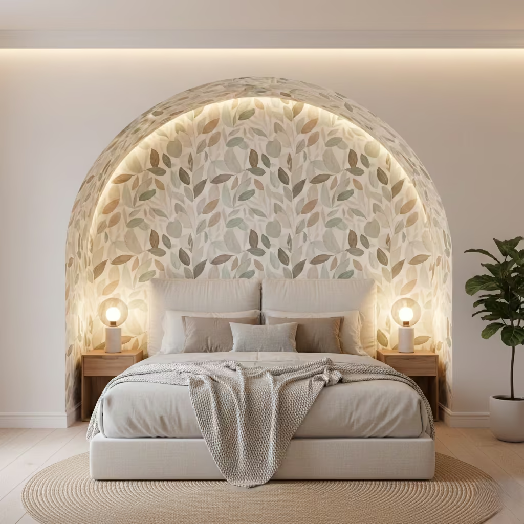
Extending wallpaper from the ceiling down to the headboard creates a striking, enveloping effect that frames the bed and defines the sleep zone. I often use this approach for clients who want a bedroom that feels intimate, layered, and thoughtfully curated. When done well, it transforms a standard wall into a design feature that enhances both comfort and visual cohesion.
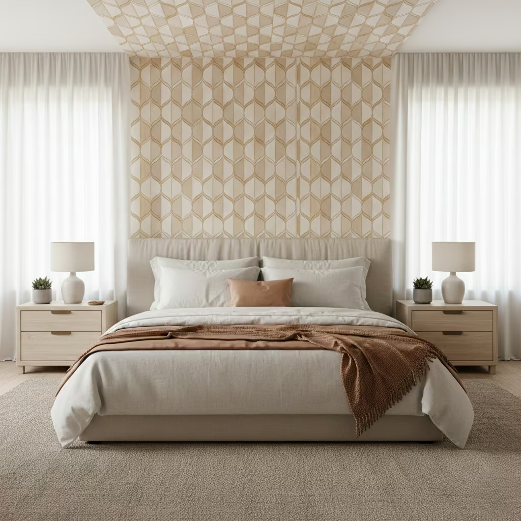
This technique works best in bedrooms with ceilings of at least 2.4 m (8 ft) to prevent the wall from feeling compressed or top-heavy. In lower rooms, I recommend lighter colours, subtle patterns, or partial ceiling coverage to maintain a sense of openness. For taller ceilings, the wallpaper can extend higher for dramatic impact, helping draw the eye upward and emphasising vertical space without overwhelming the room.
Ceiling-to-headboard wallpaper visually separates the bed area from the rest of the room, effectively creating a “sleep cocoon.” This helps smaller bedrooms feel more intentional and layered while giving larger bedrooms a defined focal point. The vertical continuity also adds rhythm and sophistication, particularly when paired with simple headboards and minimal bedside furnishings. The wall becomes both a decorative feature and a subtle spatial organiser.
Pattern and colour choice are key to longevity. I typically recommend muted tones, tonal patterns, or nature-inspired motifs that won’t feel dated quickly. Peel-and-stick wallpapers provide flexibility for future updates, while traditional wallpapers offer a more permanent, high-quality finish. This approach allows clients to refresh the look over time without extensive work, ensuring the bedroom remains stylish and restful for years.
Pros
- Frames the bed, creating a cocooned, intimate feel
- Defines the sleep zone in both small and large bedrooms
- Adds height and vertical emphasis to the room
- Flexible in pattern, colour, and long-term update options
Cons
- Can overwhelm very low ceilings if not carefully proportioned
- Pattern choice must be subtle to avoid visual clutter
- Installation requires precision for clean, continuous lines
You May also Like: 25 Fresh Light and Airy Bedroom Ideas for Summer Serenity
Timber Veneer Accent Walls That Look High-End Without Heavy Build-Up
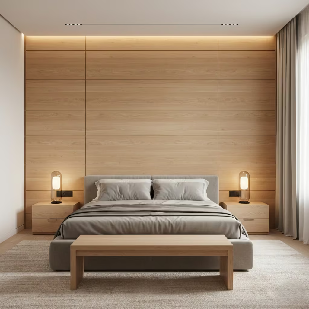
Timber veneer accent walls are a clever way to achieve the warmth and luxury of timber without the weight, cost, or construction complexity of solid wood. I often specify veneer panels for clients who want a high-end look that feels refined and tactile, while keeping installation straightforward and maintenance manageable.
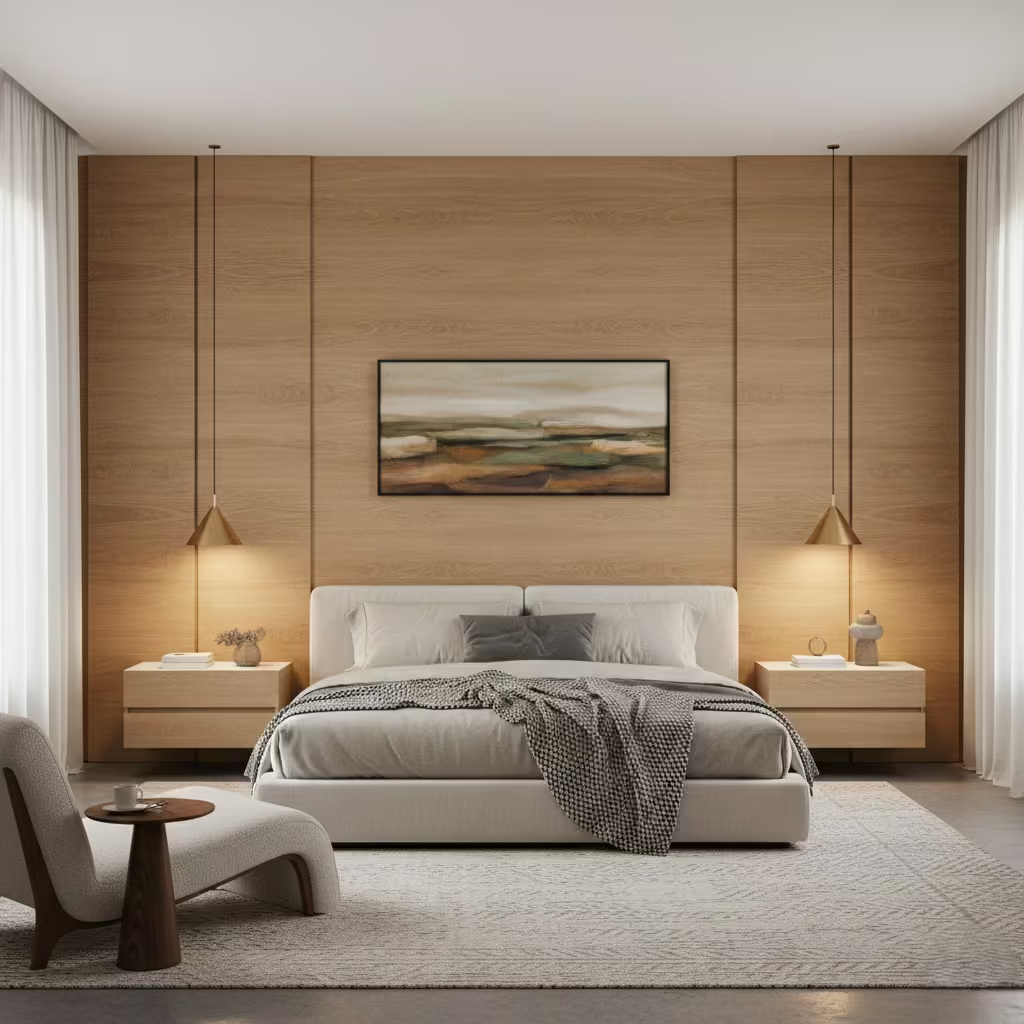
High-quality veneers typically range from 0.6–3 mm (0.02–0.12 in) thick, applied over MDF or plywood substrates. The key to a premium appearance is precise edge detailing mitred corners, shadow gaps, or concealed fixings prevent the wall from looking like a thin overlay. I usually recommend selecting panels with a natural grain direction and consistent colour tone, which can be stained or finished with clear lacquer for durability while retaining texture and depth.
While timber veneer is lighter than solid timber, it is still susceptible to moisture and heat. I advise clients to avoid installing veneer walls directly behind radiators or in high-humidity areas. Proper sealing and acclimatisation of panels before installation help prevent warping or splitting. In bedrooms with moderate heating and standard ventilation, high-quality veneers perform well and maintain their appearance for many years.
Veneer accent walls are more affordable than full timber construction but still require careful budget planning. Costs vary depending on wood species, panel size, and substrate, typically ranging from £50–£120 per m² (£4.50–£11 per sq ft) installed. Labour costs for precise fitting and finishing should also be factored in. I often combine veneer panels with simpler painted sections to achieve impact while keeping overall costs reasonable.
Pros
- Delivers a high-end timber look without heavy construction
- Lightweight and easier to install than solid wood
- Customisable in wood species, grain, and finish
- Adds warmth and texture while maintaining a sleek profile
Cons
- Sensitive to moisture and heat, requiring careful placement
- Installation must be precise to avoid visible seams or edges
- Cost can rise with premium wood species or intricate detailing
Charcoal or Black Accent Walls That Feel Intimate, Not Oppressive
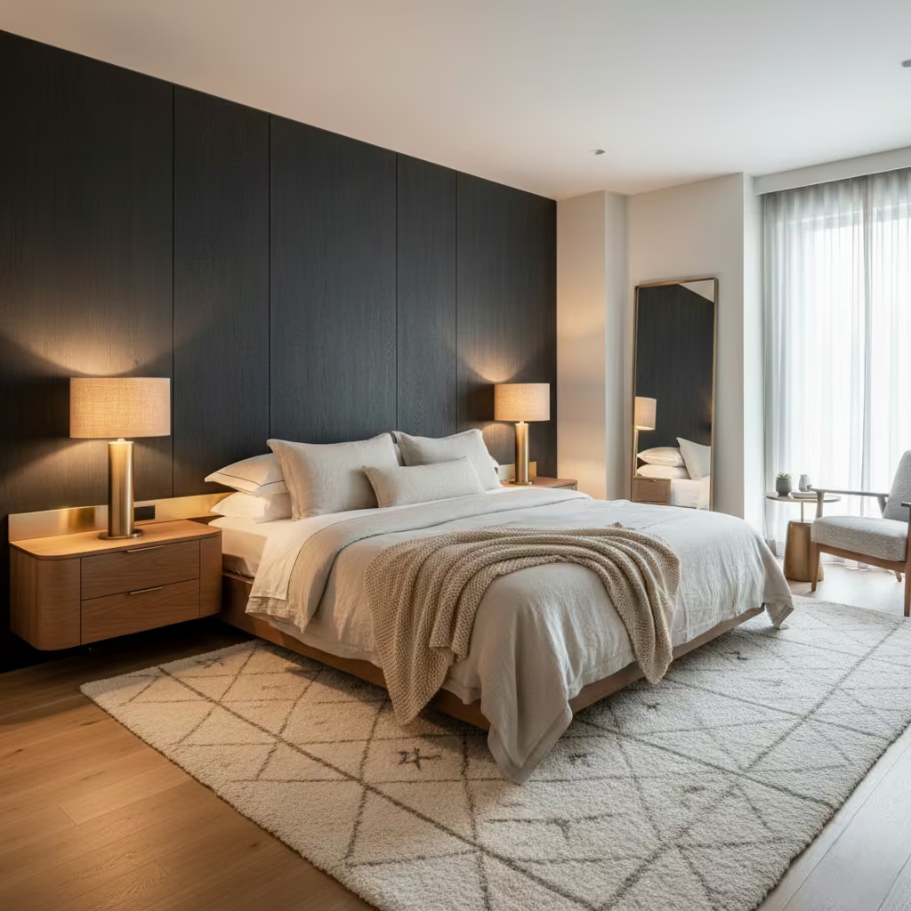
Charcoal and black accent walls can instantly add drama, sophistication, and intimacy to a bedroom. I often recommend these shades for clients seeking a cosy, cocooned feel, but the key is ensuring the wall feels inviting rather than heavy or oppressive. With careful finish selection, lighting, and styling, dark walls can elevate a bedroom to a modern, restful retreat.
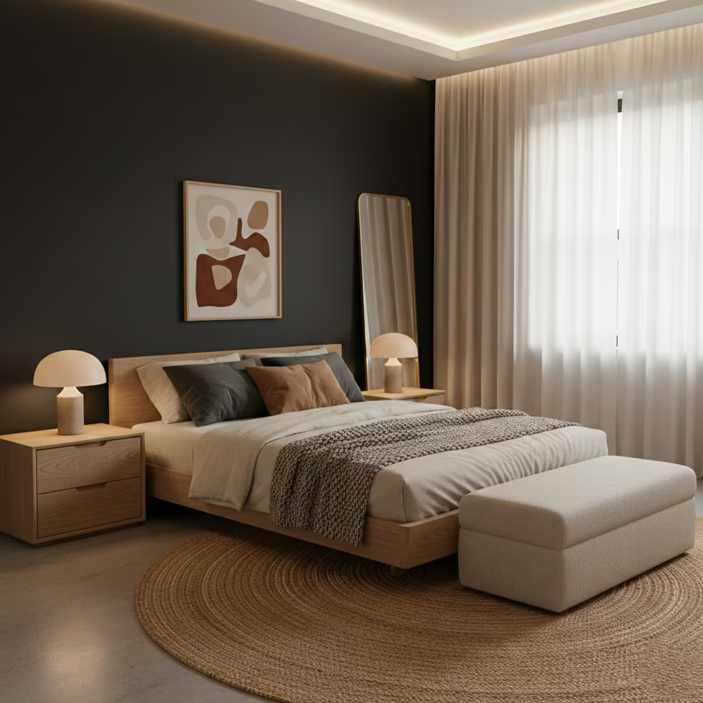
The paint finish significantly affects perception. Matte or eggshell finishes are ideal for dark walls they absorb light softly, reducing glare and creating a velvety, calm atmosphere. Satin or semi-gloss finishes reflect light more, which can unintentionally highlight wall imperfections and make the space feel smaller or harsher. In bedrooms, I usually opt for matte finishes to maintain intimacy while subtly enhancing textures like bedding, timber, or textiles.
Proper lighting is essential to prevent dark walls from feeling oppressive. Layered lighting ambient ceiling lights, wall sconces, and bedside lamps ensures the room remains functional and comfortable. I recommend warm light temperatures (2,700–3,000 K) to complement the depth of charcoal or black, and reflective accents like mirrors or metallic fittings to bounce light and maintain a sense of space. Positioning lights to wash gently over the wall can emphasise texture while avoiding stark contrasts.
Common errors include painting multiple walls dark in a small bedroom, using high-gloss finishes, or pairing dark walls with overly heavy furniture. To avoid a cramped feel, I usually limit dark tones to a single feature wall behind the bed, keep ceilings and adjacent walls lighter, and select furnishings with clean lines and lighter tones. Textured bedding, soft rugs, and natural timber details help balance the intensity and create a welcoming environment.
Pros
- Creates a sense of intimacy and cocooned comfort
- Adds drama and sophistication without relying on colour
- Works well with warm, natural textures and neutral palettes
- Pairs beautifully with layered lighting
Cons
- Can feel oppressive if overused or poorly lit
- Matte finishes show dust and marks more readily
- Styling must be considered carefully to maintain balance
Accent Walls Framed by Wall Lights for Balance and Symmetry
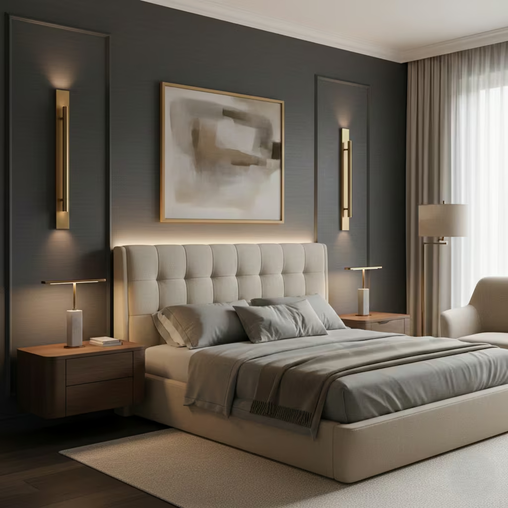
Framing an accent wall with wall lights is a subtle way to create symmetry, balance, and focus in a bedroom. I often use this approach for clients who want a curated, high-end feel without relying on oversized furniture or bold colours. Properly positioned lighting enhances the wall’s texture or colour while adding functional illumination for reading or ambient purposes.
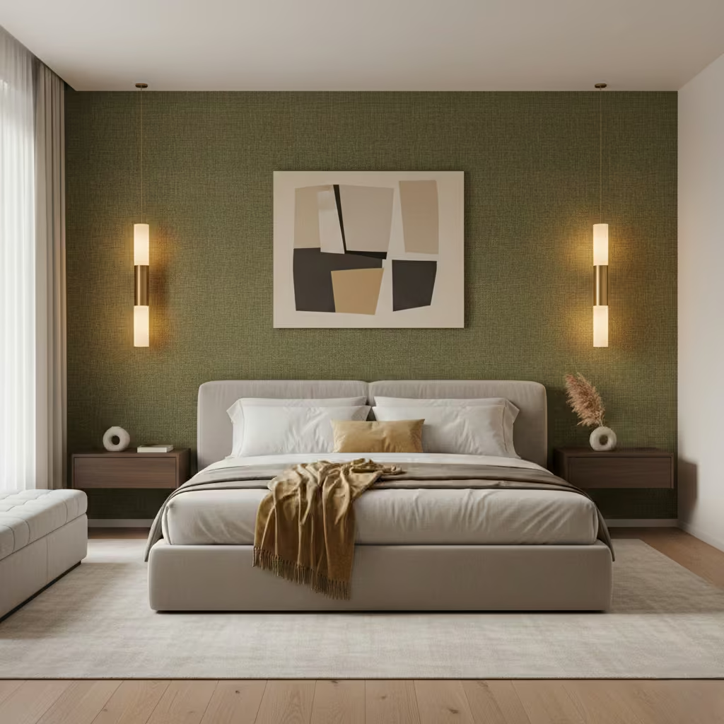
Placement is critical for both aesthetics and functionality. I typically install wall lights 1,000–1,200 mm (39–47 in) above the floor or 600–700 mm (24–28 in) above the bedside table, depending on ceiling height and bed size. Spacing should frame the bed symmetrically often 50–100 mm (2–4 in) beyond the headboard edges to create a sense of proportion and cohesion. Consistency in height and distance ensures the accent wall feels intentional rather than haphazard.
Choosing the right type of wall light depends on use. Adjustable swing-arm or directional wall lights are ideal for reading, allowing light to be focused without disturbing a partner. For ambient lighting, fixed wall sconces with diffused shades or LED strips provide soft illumination that highlights the wall texture or colour. I often combine both functions: warm ambient light for mood and a secondary, adjustable layer for task-specific use.
Framing a wall with lighting requires careful coordination with wiring, switches, and dimmers. I plan concealed wiring within the wall or behind panelling to maintain a clean look. Separate circuits for reading and ambient lights allow independent control, and dimmers enable adjustable brightness for different moods. Early electrical planning avoids retrofitting and ensures safety, functionality, and aesthetic precision.
Pros
- Adds symmetry, balance, and visual focus
- Combines style with functional lighting for reading or ambience
- Highlights wall texture, colour, or panelling
- Can create a boutique hotel-style feel in the bedroom
Cons
- Requires careful planning of spacing, height, and electrical layout
- Installation is more complex than standalone lamps
- Wall-mounted lights must complement the room’s style and scale
Texture-Only Accent Walls for Bedrooms That Need Subtle Definition
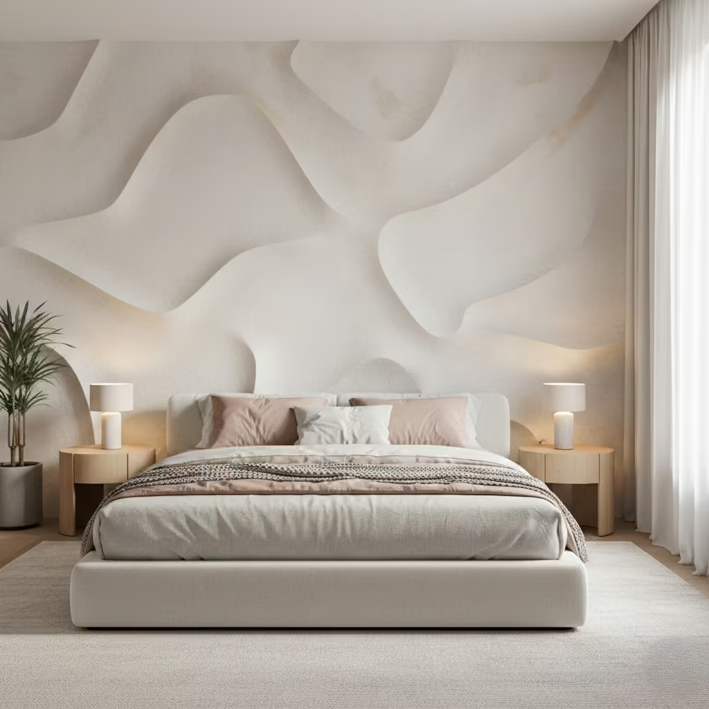
Texture-only accent walls are perfect for bedrooms that need a touch of definition without relying on colour, pattern, or heavy construction. I often specify this approach for small or minimalist bedrooms where the goal is to create depth, warmth, and visual interest while keeping the overall design calm and understated.
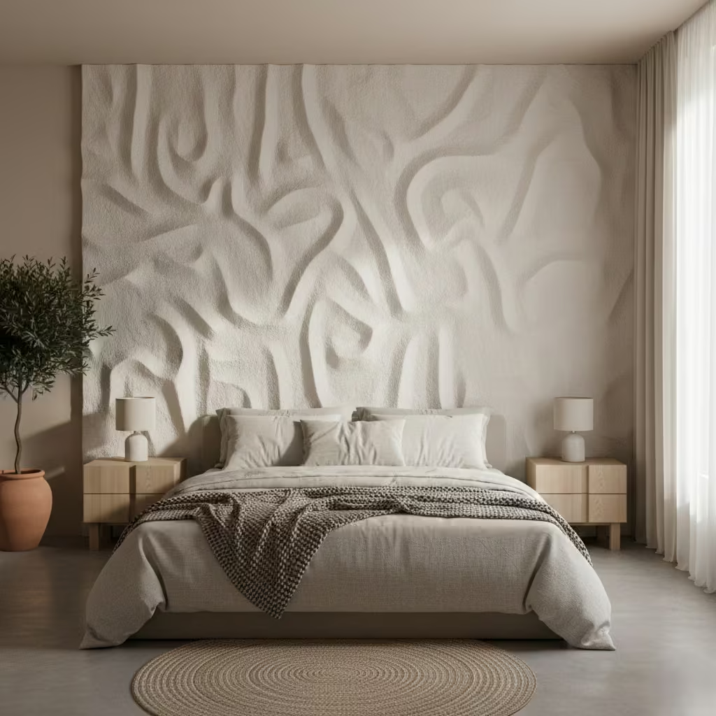
There are several ways to achieve a textured wall using paint. Stucco, Venetian plaster, or textured acrylic paints provide subtle relief, while specialty rollers or brushes can produce patterns like striations or gentle waves. I usually recommend matte or low-sheen finishes, as these soften light reflection and accentuate texture without drawing attention to every imperfection. Layering techniques can also enhance depth, giving the wall a natural, sophisticated feel.
Subtle textures work exceptionally well in compact or minimalist bedrooms, as they add character without overcrowding the space. By keeping the colour neutral and relying on the tactile effect, the wall becomes a gentle focal point behind the bed, creating a sense of warmth and layering. I often advise avoiding overly pronounced reliefs in very small rooms, as these can feel visually heavy or busy.
One of the advantages of texture-only walls is ease of maintenance. Minor scratches or marks can be repaired with a thin touch-up layer of paint or plaster, and repainting is straightforward if tastes change over time. This flexibility makes textured walls a practical choice for long-term bedroom design, combining subtle style with low upkeep.
Pros
- Adds depth and definition without bold colour or pattern
- Works well in small or minimalist bedrooms
- Easy to repair or refresh with repainting
- Creates a soft, tactile focal point that enhances calm
Cons
- Strong textures can overwhelm very small rooms if overdone
- Requires some skill to achieve consistent results
- Effect relies on subtlety too light may go unnoticed
How to Choose the Right Accent Wall for Your Bedroom
Selecting the perfect accent wall goes beyond picking a colour or material it requires understanding your bedroom’s proportions, lifestyle needs, and long-term goals. I always guide clients through a structured decision-making process to ensure the wall enhances both the design and functionality of the space.
Bedroom size and ceiling height checklist
The room’s dimensions heavily influence the type of accent wall that will work best. In small bedrooms, lighter colours, subtle textures, or vertical slats can create depth without overwhelming the space. Narrow rooms benefit from horizontal elements that make the room feel wider, while high ceilings allow for bolder textures, ceiling-to-floor features, or dramatic wall colours. I often recommend mapping the wall and considering bed placement before finalising the material or finish, ensuring proportion feels intentional.
Budget vs impact comparison
Different accent wall options carry varying costs. Painted or wallpapered walls are cost-effective and flexible, while timber veneer, microcement, or integrated lighting increase both budget and installation complexity. I usually help clients weigh upfront cost against visual and functional impact for instance, a timber veneer or upholstered wall may be more expensive, but it provides tactile luxury and longevity that paint cannot. Planning early helps prevent overspending while still achieving a feature that elevates the room.
Long-term maintenance and resale value
An accent wall should remain visually appealing for years. Materials like wallpaper or textured plaster may need periodic touch-ups, while durable options like microcement or timber veneer last longer with minimal upkeep. Consideration of future buyers is also key subtle, neutral finishes generally have wider appeal than bold, high-contrast colours. I often recommend designs that are flexible enough to adapt to new bedding, furniture, or colour schemes, ensuring the bedroom remains stylish over time and adds value at resale.
Accent Wall Mistakes I See Repeated in Real Bedroom Renovations
Even experienced renovators sometimes get accent walls wrong, turning what should be a design highlight into a visual distraction. Over the years, I’ve observed recurring mistakes that can easily be avoided with thoughtful planning. Understanding these pitfalls helps ensure the accent wall enhances rather than detracts from the bedroom.
Overuse of contrast
One of the most common errors is choosing colours or textures with too much contrast. A starkly dark wall in a small, poorly lit bedroom can feel oppressive, while a bright, bold pattern may compete with furniture and décor. I always advise clients to balance impact with subtlety using complementary or tonal shades that create depth without overwhelming the space. Strong contrast works best when paired with ample natural light, neutral adjacent walls, and minimalistic furnishings.
Poor wall selection
Not all walls are suitable as accent walls. I frequently see walls with doors, radiators, or windows selected, which interrupts the visual flow and reduces the intended impact. The ideal wall is usually the one behind the bed or a focal point free of heavy interruptions, allowing the accent to anchor the room. Before committing, I map out furniture placement, bed orientation, and traffic flow to ensure the accent wall truly complements the bedroom’s layout.
Ignoring lighting and proportion
Lighting dramatically affects how an accent wall is perceived. Dark or textured walls in poorly lit spaces can feel flat or oppressive, while bold patterns on low ceilings may make the room feel cramped. I always assess both natural and artificial light, recommending finishes, textures, and colours that respond well throughout the day. Proportion is equally important oversized patterns or panels can dominate a small room, while undersized features may feel lost in a large bedroom.
Final Thoughts: Designing a Bedroom Accent Wall You Will Still Love Years From Now
A bedroom accent wall is more than just a decorative afterthought it’s an opportunity to define your space, introduce texture, colour, or pattern, and create a focal point that enhances comfort and style. After working on countless bedroom renovations, I’ve learned that the most successful accent walls are those that balance impact with longevity, functionality, and personal taste.
The wall’s location, the bed’s positioning, and the ceiling height all influence how an accent wall will look and feel. Choosing the right wall ensures the feature anchors the room rather than competes with it. Consider visual balance, symmetry, and furniture layout to make sure the wall feels intentional and integrated into the space.
From paint and wallpaper to timber, microcement, or fabric panels, the material determines both aesthetic impact and maintenance requirements. I always recommend durable, timeless finishes that can evolve with changing styles. Subtle textures or neutral tones often outlast bold trends, while integrated lighting or shelving adds both beauty and function without locking you into a single design choice.
An accent wall should support your lifestyle. Dark walls can create intimacy but require appropriate lighting. Fabric panels improve acoustics but need care. Timber or veneer adds warmth but must be protected from moisture. By planning for cleaning, upkeep, and flexibility, you ensure the wall remains a pleasure rather than a hassle for years to come.
Finally, the best accent walls reflect your taste and complement your bedroom’s overall design. Avoid overly trendy patterns that may date quickly, but don’t shy away from subtle personal touches layered textures, tactile materials, and carefully curated colours can make a wall feel uniquely yours. In my projects, clients consistently find that walls designed with proportion, material integrity, and thoughtful styling remain favourites long after the initial renovation.
Frequently asked Questions
Do I need an accent wall in every bedroom?
Not necessarily. Accent walls are best when they enhance proportion, highlight a feature (like the bed), or introduce texture or colour that complements the room. In small bedrooms or highly patterned spaces, a plain wall can sometimes feel calmer and more balanced. Always assess light, size, and furniture layout before deciding.
Which wall should I choose for an accent?
The wall behind the bed is the most common choice because it anchors the space and frames the focal point of the room. Other options include walls with architectural interest, a window-free wall for texture, or a wall that naturally draws the eye. Avoid walls with doors, radiators, or heavy interruptions that can reduce visual impact.
What materials are best for long-lasting accent walls?
Durable options include paint (with matte or eggshell finishes), microcement, timber veneer, plaster, and fabric panels. Wallpaper can also last if installed and maintained well. Consider lifestyle, maintenance needs, and room conditions when selecting materials. Textured or tactile finishes often add depth without relying on colour alone.
Will a dark accent wall make my bedroom feel smaller?
It can if overused or in a poorly lit space. To avoid this, limit dark colours to one wall, use warm lighting, and balance with lighter adjacent walls and furnishings. Dark tones work best for creating intimacy and cocooned comfort rather than making a room feel closed in.
Can I combine patterns, textures, and colours?
Yes, but moderation is key. For example, subtle texture with neutral paint, a soft wallpaper pattern, or timber slats can add dimension without overwhelming the space. I advise layering textures in the same tonal family and keeping bold contrasts minimal.
How do I account for maintenance?
Painted walls and wallpapers are easiest to maintain, while textured panels or fabric may require periodic cleaning or touch-ups. For high-traffic bedrooms, choose durable finishes that can be wiped or repaired easily. Integrated lighting or shelving should be planned to allow access for cleaning or adjustments.
Are accent walls worth it for resale?
Yes, if done tastefully. Neutral tones, subtle textures, and well-proportioned designs appeal to most buyers. Bold or highly personalized patterns may need repainting, but classic finishes like timber, microcement, or muted wallpaper often enhance perceived value.
Can I DIY an accent wall?
Simple painted or wallpaper walls can be DIY-friendly. Textured finishes, timber veneers, curved walls, or integrated lighting usually require professional installation to ensure precision and longevity. Mistakes with proportion, alignment, or wiring can be costly to fix.
How do I test if my accent wall will work?
I always recommend creating small samples on the wall before committing. Paint swatches, wallpaper strips, or panel mock-ups allow you to see how light, colour, and texture interact throughout the day. Consider photographing the wall in different lighting conditions for a realistic preview.
What if I want to change the accent wall in a few years?
Opt for finishes that are flexible or easy to repaint. Peel-and-stick wallpapers, paintable panels, or removable fabric panels give the freedom to refresh the look without major renovations. Subtle colours and textures also age gracefully, reducing the need for frequent updates.