


16 Ibiza-Inspired Spanish Dining Room Ideas for a Stunning Mediterranean Home
There’s a particular hour in a whitewashed dining room, somewhere around seven in the evening, when the light stops being white and turns the colour of runny honey. It slides low across a lime-plastered wall, catches the grain of a teak table, and for about twenty minutes the whole room looks like it’s holding its breath. Anyone who has actually sat in a proper Ibiza-style dining room knows this moment. It’s not something a catalogue photograph can fake, and it’s the reason this style refuses to go out of fashion no matter how many trends come knocking.
I still remember converting a client’s cramped, north-facing dining nook in a Victorian terrace into something that channelled that same golden-hour magic, using nothing more exotic than lime wash, a secondhand olive-wood table, and a single well-placed arch cut into a load-bearing partition. The terracotta tiles we laid still click satisfyingly underfoot every time I visit, worn in just enough to look lived-in rather than staged.
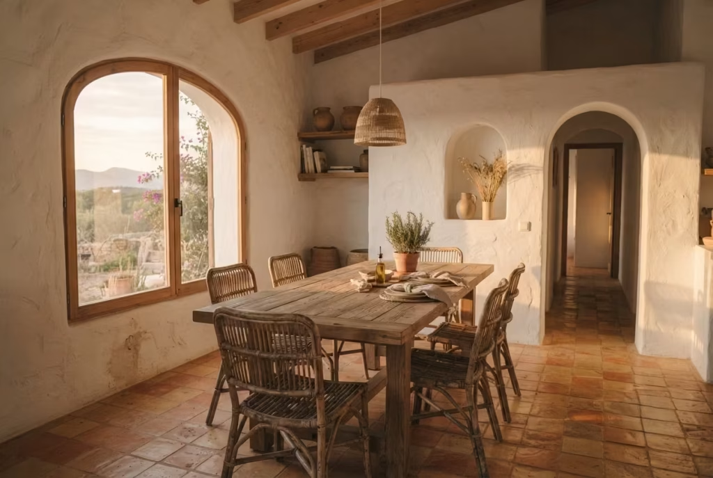
This isn’t a mood board. Everything ahead comes with the measurements, the trade-offs, and the occasional hard truth you won’t find on a Pinterest board. Before reaching for a single rattan chair or teak sideboard, though, it pays to understand what actually makes a room Ibiza in spirit and not just Spanish in name, which is exactly where we’re headed next.
What Actually Makes a Room “Ibiza,” Not Just “White”
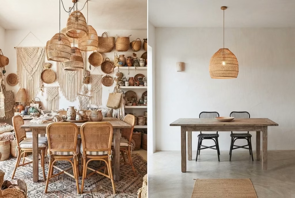
People throw the word “Spanish” around like it’s a single flavour, but ask anyone who’s actually renovated across the region and they’ll tell you it’s more of a family tree. Spanish Colonial leans formal, with dark carved wood and wrought iron doing most of the heavy lifting.
Andalusian pulls from Moorish patterning, all those intricate tiled courtyards and jewel-toned accents. Ibiza, or Balearic style if you want to be precise about it, is the quiet cousin who skipped the family reunion and went to sit on a rock by the sea instead. It’s pared back, sun-bleached, and built around restraint rather than ornament. Slapping white paint on four walls and calling it a day misses the point entirely.
What actually earns a room the Ibiza label comes down to three things, and none of them are optional extras. First is the architecture’s relationship with light, arched openings, deep-set windows, walls that seem to soak up sun and release it slowly through the evening. Second is texture you can genuinely feel:
hand-troweled plaster, splintery reclaimed wood, the slightly uneven weave of natural rattan. Machine-perfect surfaces work against the whole ethos. Third, and this is the one people botch most often, is colour discipline. A true Balearic palette rarely strays beyond bone white, sand, and the occasional whisper of ochre or sea blue.
Here’s the caveat I give every client without fail: more rattan does not equal more authenticity. I’ve walked into rooms so overloaded with woven pendants and cane chairs they read like a beach resort gift shop rather than a home. The magic lives in the gaps, in what you leave out, not what you pile in.
The Weathered Teak Table as the Room’s Anchor
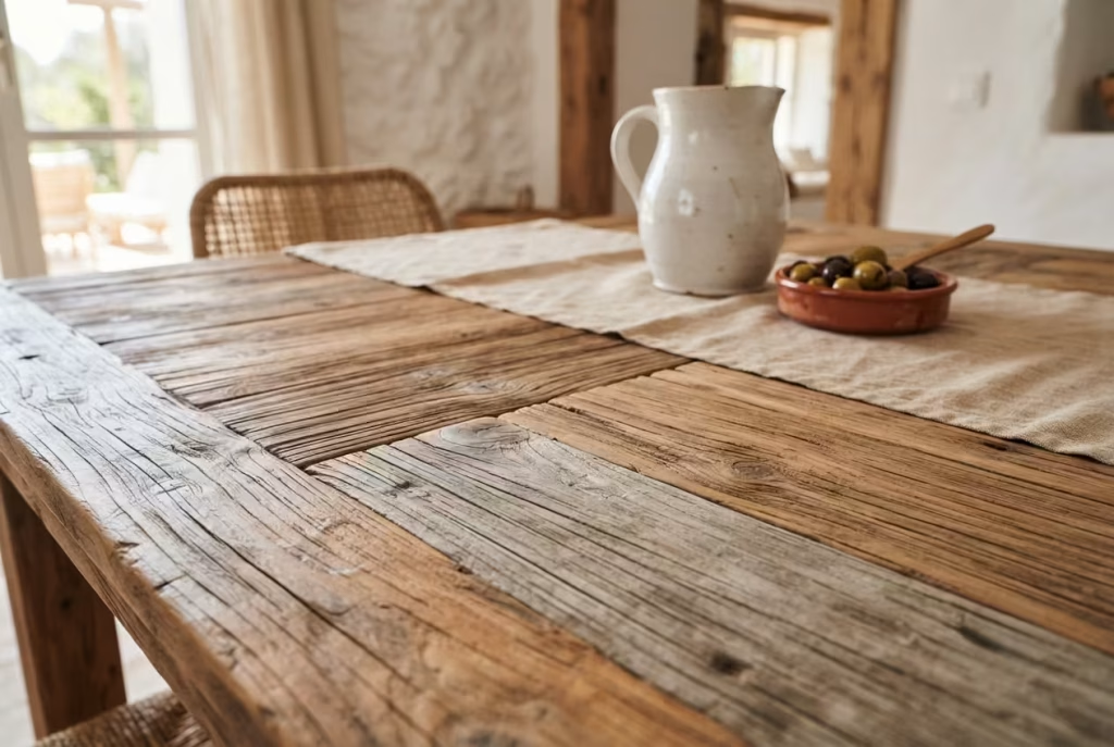
Teak earns its keep in a way few woods can match. Native to the tropics and naturally rich in oils, it shrugs off spills, humidity swings, and years of elbows leaning on its surface without cracking or warping the way oak often does when temperatures fluctuate.
Where oak needs regular oiling and babying to stay handsome, teak simply weathers into a soft, silvery patina if left untreated, or deepens to honeyed amber with the occasional feed of teak oil. Low maintenance, high reward, the kind of trade every busy household should welcome with open arms.
Sizing matters just as much as material, though it’s the detail most people skip past. As a working rule, leave a minimum of 36 inches behind every chair for someone to push back and stand without knocking into a sideboard or wall. For a table seating six, that generally means a room no smaller than roughly 11 by 13 feet once you account for circulation space. Skimp on this clearance and even the most beautiful weathered teak table starts to feel like a hazard course rather than a gathering point.
You May also Like: 21 Dining Room Renovation Ideas: From Modern Minimalism to Vintage Charm
Round Tables for Rooms That Want to Talk
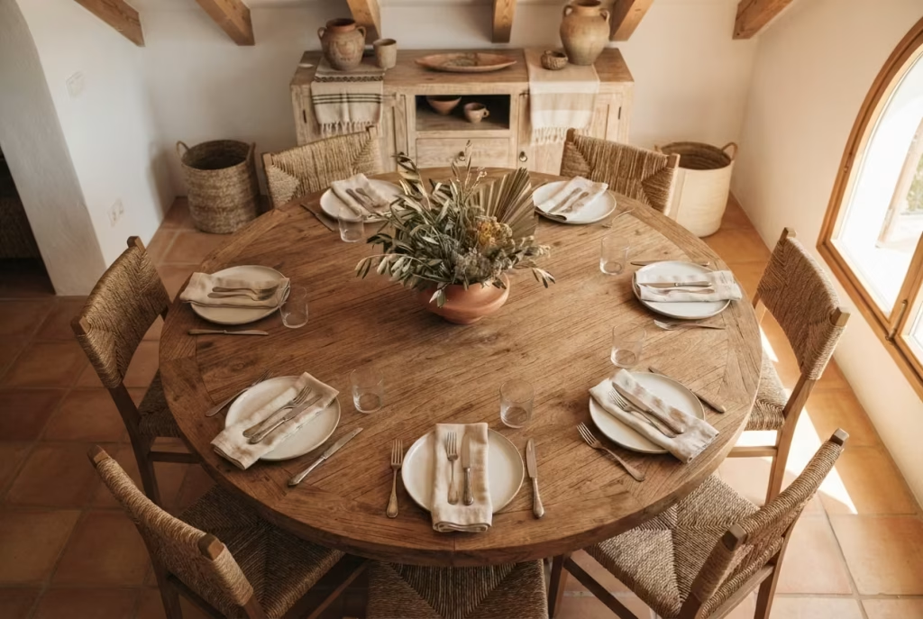
Some rooms are built for showing off, others are built for lingering over a second glass of wine, and the shape of the table you choose decides which camp yours falls into. A rectangular table sets up a hierarchy, head and foot, sides that face off like opposing teams.
A round table throws that hierarchy out the window. Nobody sits at the “end,” conversation drifts freely from one guest to the next, and in a snug Ibiza-style dining nook where every inch counts, that circular footprint also sidesteps the awkward sharp corners that tend to bruise hips on the way past.
Here’s where a lot of people trip up, though: a 48-inch round table looks generous in a showroom but comfortably seats six, not eight, no matter how the furniture listing tries to squeeze extra chairs into the render. Each diner realistically needs about 24 inches of table edge to eat without elbowing their neighbour, and a 48-inch circle only offers so much circumference to go around.
Push for eight and you’ll end up with everyone hunched shoulder to shoulder, which rather defeats the whole point of a table built for easy, unhurried conversation. If eight is the target headcount, look toward a 60-inch diameter instead, and make sure the room can actually swallow it with clearance to spare.
Whitewashed Walls That Hold the Afternoon Light
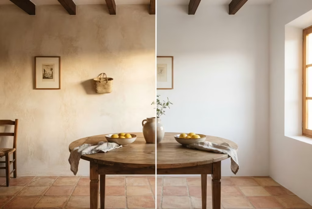
Stand in a properly lime-washed room around three in the afternoon and watch what happens. The wall doesn’t just reflect light the way a flat-painted surface does, it seems to hold onto it, releasing a soft glow back into the room even as the sun climbs higher and the shadows shorten. That’s the whole trick behind whitewashed walls in Balearic-style interiors, and it’s a trick modern emulsion paint simply can’t pull off, no matter how many coats you layer on.
The difference comes down to what’s actually happening at a chemical level. Traditional lime wash is breathable, it lets moisture pass through the wall rather than trapping it behind an airtight film, which matters enormously in older properties prone to damp. Standard acrylic paint seals the surface shut, and over time that can trap condensation and invite mould behind the scenes. Lime wash also dries with a soft, slightly chalky, uneven texture that catches light differently depending on the angle you’re standing at, while paint dries flat and uniform, more wallpaper than weathered plaster.
Cost-wise, expect to pay somewhere in the region of £15 to £30 per square metre for a professionally applied lime wash finish in the UK, factoring in surface prep, materials, and labour, versus £8 to £15 per square metre for a standard painted wall. It costs more upfront, no argument there, but it ages the way good things should: gracefully, deepening in character rather than yellowing and needing a fresh coat every few years. For a dining room where you’re chasing that golden, sun-soaked Ibiza feeling, it’s money spent in exactly the right place.
Terracotta Underfoot: Durability Dressed as Beauty
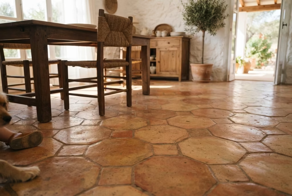
A client of mine once asked, half joking, whether terracotta tile was “too precious” for a household with two dogs and a toddler who treated the dining room like a racetrack. Eighteen months on, that same floor has survived spilled sangria, a dropped casserole dish, and daily paw traffic, and it looks better now than the day it was laid. That’s the quiet genius of terracotta: it’s rugged enough for real family life while wearing its imperfections like badges of honour rather than flaws to hide.
Terracotta earns its keep in Ibiza-style dining rooms because it does double duty, practical workhorse by day, warm visual anchor by evening. Unlike porcelain or ceramic tile, it’s fired at lower temperatures, which leaves it slightly porous and gives it that soft, matte, sun-baked look nothing else quite replicates. That same porosity, though, means it needs sealing to fend off stains and moisture, typically every twelve to eighteen months depending on foot traffic, using a breathable penetrating sealer rather than a surface film that would trap moisture underneath and eventually blister.
On cost, expect roughly £8 to £18 per square foot installed in the UK, depending on whether you go with handmade Spanish terracotta or a more uniform machine-pressed version, the handmade route costing more but delivering those irregular, sun-dried edges that make the floor feel authentically Mediterranean rather than manufactured.
One genuine bonus worth knowing: terracotta pairs beautifully with underfloor radiant heating, since its thermal mass absorbs warmth slowly and releases it evenly, turning a dining room floor into a gentle, ambient heat source rather than a cold slab underfoot come winter.
Arched Openings That Do the Architectural Talking
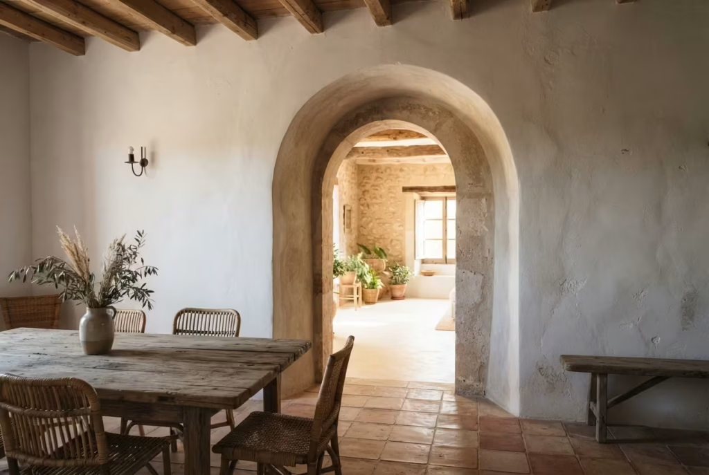
Here’s a myth worth putting to bed early: you do not need to knock down a wall and hire a structural engineer to get that soft, sculptural arch everyone associates with Ibiza-style interiors. I’ve talked more than one client out of an expensive renovation by pointing out that the effect is often about the eye reading a curve, not the wall itself being load-bearing history. Sometimes the boldest architectural statement is the one you fake convincingly rather than the one you demolish for.
Genuine structural arches, cut into a load-bearing partition, are the gold standard and worth pursuing if budget and building regulations allow, since nothing quite matches the depth and shadow play of a true carved opening. But for period homes, rentals, or anyone unwilling to touch structural walls, there are quieter workarounds that punch well above their cost.
An arched mirror or an arch-topped piece of furniture, like a rounded cabinet or console, introduces that curved silhouette without a single brick disturbed. Plaster arch inserts, prefabricated and simply fitted over an existing rectangular doorway frame, are another sleight of hand worth knowing about, typically running £200 to £600 installed depending on width and finish.
Even paint can do the job in a pinch: a hand-painted or stencilled arch motif above a doorway or on a feature wall tricks the eye into registering curvature where none physically exists. None of these routes replace the real architectural thing, and a design purist will always spot the difference up close. But for the vast majority of homes chasing that Balearic warmth without a full renovation budget, these retrofit options deliver eighty percent of the visual payoff for a fraction of the cost and disruption.
Rattan and Cane: Where Restraint Beats Abundance
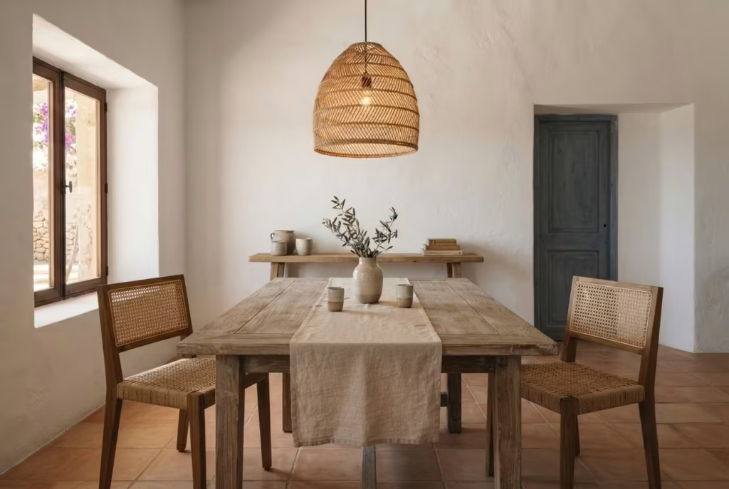
Ask yourself something honest before you order that third woven pendant light: are you decorating a dining room, or building a Balearic beach bar in miniature? It’s an easy trap to fall into, because rattan photographs beautifully, every catalogue image makes it look like more is always merrier. In practice, the opposite tends to be true, and I’ve lost count of the rooms I’ve walked into where cane furniture has multiplied like rabbits until the space reads more theme park than home.
A useful rule of thumb, drawn from years of getting this balance right and occasionally wrong: pick two, at most three, rattan or cane pieces per room, and let everything else provide contrast. That might mean a woven pendant light overhead, a pair of cane dining chairs at the ends of the table, and nothing more in that material family.
Pair those against solid, matte surfaces, whitewashed plaster, weathered teak, plain linen, so the rattan actually gets to shine as texture rather than drowning in a sea of its own kind. Diminishing returns set in fast past that third piece; the eye stops noticing individual craftsmanship and starts registering visual clutter instead.
Cost-wise, this restraint pays a second dividend beyond aesthetics. Quality handwoven rattan furniture isn’t cheap, a single pendant light typically runs £80 to £250 depending on size and craftsmanship, so keeping the count lean protects both your budget and your design integrity in one move. Choose your rattan moments deliberately, and each piece gets to do real work rather than blending into an overcrowded, undifferentiated tangle of weave.
You May also Like: 21 Earthy Cottage Home Decor Ideas for a Cozy, Soul-Calming Retreat
The Statement Pendant, Hung Low and Deliberate
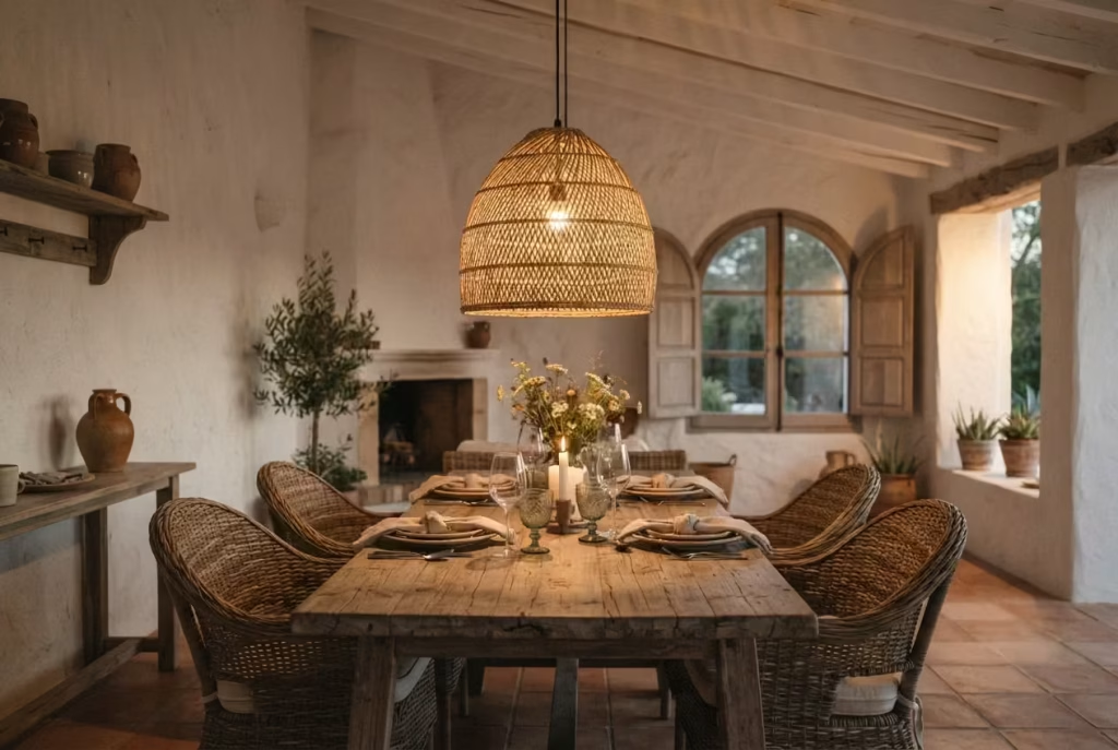
Height is where most pendant lights go wrong before a single bulb is even switched on. Hang a fixture too high and it floats aimlessly near the ceiling, all show and no purpose, casting light everywhere except where diners actually need it. Hang it right and the pendant becomes a kind of quiet conductor, drawing every eye downward toward the table and anchoring the whole room around the act of gathering. Spatial reasoning matters more here than taste, and the numbers behind it aren’t up for debate.
The working rule most lighting designers swear by, and one I’ve never had reason to abandon: the bottom of the fixture should sit 30 to 34 inches above the table surface. Go lower and taller guests start ducking around it mid-conversation; go higher and the light scatters upward, leaving the actual dinner plates in a dim half-shadow that no amount of ambient lighting fully corrects. It’s a narrow window, but hitting it transforms a pendant from decoration into function.
Width deserves just as much thought as height, arguably more, since it’s the detail that determines whether a fixture reads as a considered statement or an afterthought. As a general benchmark, the pendant’s diameter should measure roughly one-half to two-thirds the width of the table itself, so a 36-inch-wide table calls for a fixture somewhere between 18 and 24 inches across.
Undersize it and the light looks lost, swallowed by the table beneath; oversize it and it dominates the room at the expense of everything else. Get the proportions right, though, and that single fixture does more heavy lifting for the room’s Ibiza-inspired character than half the furniture combined.
Wrought Iron as Punctuation, Not Paragraph
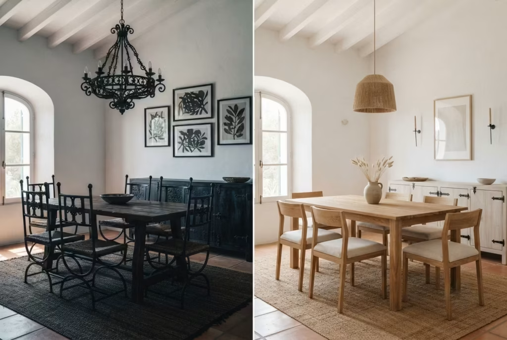
Iron has been part of the Spanish design vocabulary for centuries, forged by hand and shaped into everything from window grilles to candlesticks, and there’s a reason it still feels right at home in an Ibiza-inspired dining room.
Its dark, matte density offers exactly the visual weight that whitewashed walls and pale timber lack on their own, a grounding note in a room otherwise built on lightness and air. The material fact worth knowing: iron doesn’t fade, warp, or age the way wood and fabric do, so a well-forged piece bought today will look much the same in twenty years, developing character rather than deterioration.
The trick, though, lies in knowing where iron earns its place and where it starts talking over everything else in the room. Used sparingly, as slim sconce brackets flanking a mirror, as the delicate curved frame of a dining chair, or as door hardware and drawer pulls on a sideboard, wrought iron functions like punctuation in a sentence:
it pauses the eye, adds emphasis, and moves on. Deployed too generously, as an entire chandelier plus a full set of iron chairs plus iron-framed art, the room starts to feel like a wine cellar rather than a sun-drenched dining space, heavy where it should feel breezy.
My own rule of thumb, honed over plenty of rooms that got this wrong before I learned better: choose one or two iron “moments” per space and let them carry the material’s weight without duplicating it. A pair of sconces and a set of hardware pulls does the job beautifully; a full suite of iron furniture almost never does. Restraint here isn’t a limitation, it’s what lets the iron actually register as intentional rather than incidental.
Layering Wall Sconces With Your Pendant
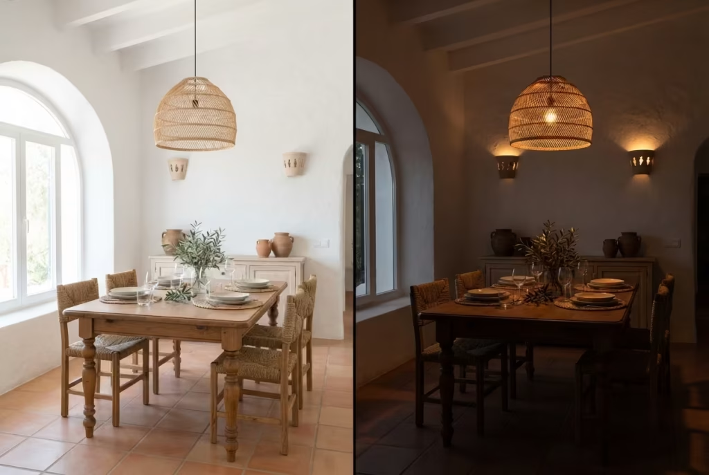
A single pendant, however beautifully chosen, will only ever do one job well: illuminating the table. Everything else in the room, the corners, the sideboard, the faces of people leaning back in conversation, gets left in shadow if that’s the only light source doing the work. This is where wall sconces earn their keep, not as decoration but as a second layer of lighting that fills the gaps a central fixture simply can’t reach on its own.
Here’s the practical setup worth following: install sconces at roughly 60 to 66 inches from the floor, positioned to flank a sideboard, mirror, or feature wall rather than scattered at random. Aim for warm white bulbs in the 2700K to 3000K range, since anything cooler starts to fight against the golden, sun-baked mood you’re chasing and instead makes the room feel clinical.
For lumens, ambient sconce lighting works best around 200 to 400 lumens per fixture, low enough to feel like a gentle wash rather than a spotlight competing with the pendant overhead.
Dimmers aren’t optional here, they’re the whole point. Fit both the pendant and the sconces onto separate dimmer circuits if your wiring allows it, so you can bring the pendant up bright for a family lunch and dial it back alongside the sconces for a slow, candlelit dinner later that evening.
That flexibility, more than any single fixture, is what makes a dining room feel genuinely considered rather than switched on and off like a light in a hallway. Layer the light properly and the room breathes differently depending on the hour, exactly the way the best Ibiza interiors always have.
A Jute or Sisal Rug to Ground an Open-Plan Room
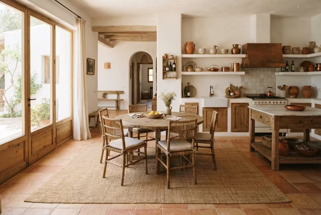
Walk into an open-plan home where the kitchen slides straight into the dining area with barely a change in flooring to mark the boundary, and you’ll notice something: without a rug, the dining zone has no edges.
Chairs seem to float in a kind of no-man’s-land, unanchored, and guests instinctively hover near the kitchen island rather than settling in at the table. A natural fibre rug fixes this in one stroke, drawing a quiet perimeter around the space and telling the room, and everyone in it, where the dining zone actually begins.
Jute and sisal are the two natural fibres worth knowing here, and each brings something slightly different to the table, quite literally. Jute is softer underfoot and slightly more forgiving on bare feet, though it handles moisture less gracefully and can show watermarks if a glass tips over.
Sisal is tougher, more resistant to daily wear and the odd dropped fork, but coarser to the touch. Either choice roots the room in that tactile, natural-material vocabulary that runs through every Ibiza-inspired space, standing in stark contrast to the smooth, machine-made rugs that feel a world away from Balearic warmth.
Sizing is where people most often shortchange themselves. The rule that never fails: leave a minimum of 24 inches of rug extending beyond the table’s edge on all sides, enough that a chair can be pulled back mid-meal without its back legs sliding off onto bare floor. For a table with a 60-inch footprint including chair clearance, that generally means a rug no smaller than roughly 8 by 10 feet. Undersize the rug and the whole arrangement looks like it was borrowed from a smaller room, an easy mistake to avoid once you know the number to aim for.
The Sideboard That Earns Its Footprint
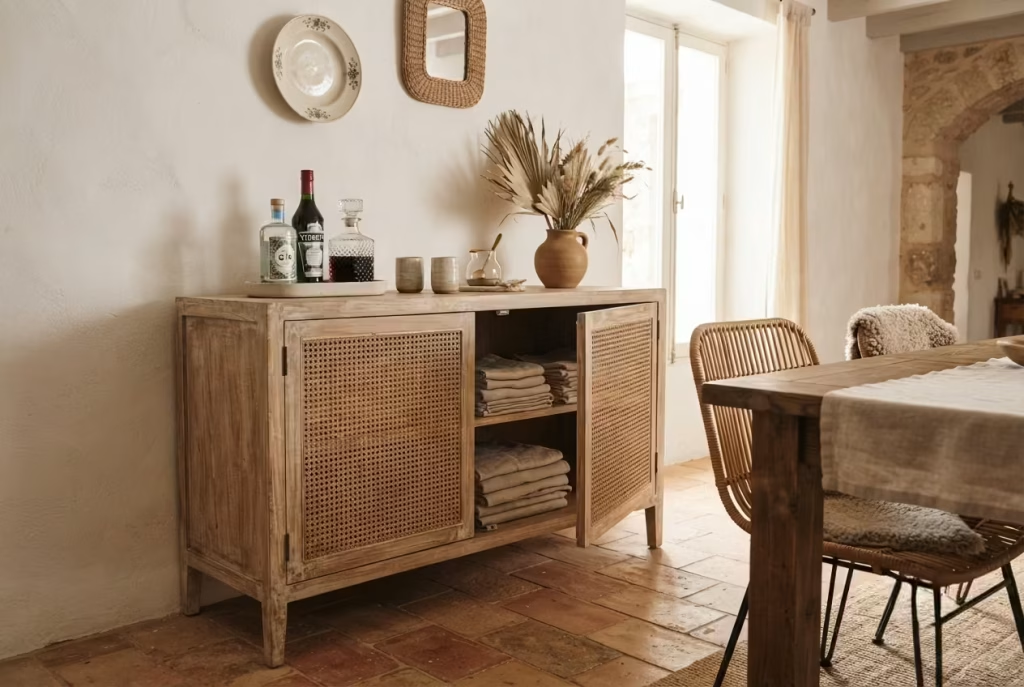
A client once told me her dining room felt like “a table surrounded by chaos,” linens stuffed in a hallway cupboard, serving dishes scattered across kitchen cabinets, nothing within arm’s reach when it actually mattered at dinnertime.
The fix wasn’t a bigger room or a clever storage hack, it was a single well-chosen sideboard, positioned against the one wall with enough breathing room to actually function. Within a week she called it the hardest-working piece of furniture she owned, which, frankly, is exactly what a sideboard should be.
A proper Ibiza-style sideboard needs to do more than look the part with its whitewashed finish or cane-fronted doors. It needs to genuinely earn its footprint by solving a real storage problem: tablecloths and napkins tucked out of sight, serving platters and glassware close at hand rather than a kitchen’s walk away, and enough surface on top for a bar setup or a vase of dried palm without feeling crowded. Beauty and usefulness aren’t in competition here, the best pieces manage both at once.
Depth is the measurement most people overlook until they’re squeezing past it every night. Standard sideboard depth runs 18 to 20 inches, and that dimension matters enormously for traffic clearance, particularly in a room where chairs need to slide back freely without diners bumping shoulders on the way past.
Go deeper than 20 inches in a tight room and you’ll find yourself apologising to guests every time someone needs to get up, which rather undercuts the relaxed, unhurried spirit this whole style is meant to conjure. Measure the walkway before falling in love with a piece, not after.
Sheer Linen Curtains as Climate Control, Not Just Decor
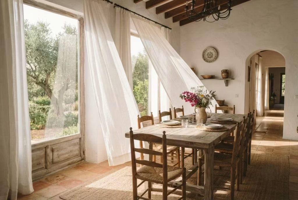
Most people choose curtains the way they choose a scarf, purely on how it looks draped over the frame. Sheer linen in an Ibiza-style dining room, though, is doing real physical work behind that soft, billowing appearance, and understanding the mechanics behind it makes the choice feel far less like decoration and much more like sound building sense.
Direct sunlight streaming through an unshaded window raises surface and air temperature fast, particularly in a south or west-facing dining room catching afternoon sun, and that’s precisely the problem sheer fabric was solving centuries before air conditioning existed.
The function comes down to diffusion rather than blocking. A tightly woven blackout curtain stops light entirely but traps heat against the glass and turns the window into a small oven when drawn shut. Sheer linen instead scatters incoming sunlight into a soft, even glow, letting a good portion of it bounce and diffuse rather than concentrating as direct heat on skin and furniture. The fabric breathes, quite literally, letting air move through its open weave, which matters enormously in a Mediterranean-style room where the whole point is comfort without mechanical cooling doing all the heavy lifting.
Weight is the detail worth getting right before ordering. Look for linen in the 4 to 5 ounce per square yard range, light enough to catch a breeze and move with genuine softness, but substantial enough to hold its shape rather than looking flimsy or see-through in bright light.
Anything heavier starts behaving more like a blackout curtain and loses that gentle, gauzy movement that makes sheer linen feel alive in a room rather than static. Hung floor to ceiling if the window allows, sheer linen curtains earn their place as one of the few pieces in this whole style that manages to be beautiful and genuinely functional in equal measure, no compromise required.
A Single Oversized Mirror to Double the Light
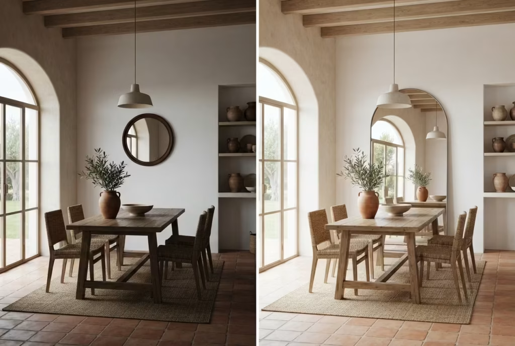
Most decorating advice tells you to scale furniture down for a small room, and most of the time that’s sound thinking. Mirrors are the glaring exception, and it’s a rule I’ve had to argue for more than once against a client’s instinct to play it safe with something modest.
Go small with a mirror in a dining room chasing that airy, sun-drenched Ibiza feel and you’ll end up with a decorative afterthought rather than the light-doubling workhorse a mirror is actually capable of being. Bigger, in this one specific case, is unambiguously correct.
The physics behind it are simple enough to explain without sounding technical. A mirror doesn’t create light, it bounces existing light back into a room, effectively doubling the perceived brightness of whatever it reflects.
A small mirror bounces a small pocket of light; a genuinely oversized one, think five or six feet across a wall, captures an entire window’s worth of sun and throws it straight back across the room, making even a modest dining area feel considerably more expansive than its actual square footage suggests.
Placement matters just as much as scale, and this is where people who buy the right mirror still get underwhelming results. Hang it directly opposite the room’s main light source, typically the largest window or the arched opening letting in afternoon sun, rather than on an adjacent wall where it merely reflects shadow and furniture.
Positioned correctly, a single oversized mirror becomes something close to a second window, pulling warmth and daylight deep into corners that would otherwise sit dim for most of the day. It’s one of the cheapest, fastest transformations on this entire list, and one of the most consistently underused.
You May also Like: 25 Christmas Room Decor Ideas That Bring Comfort, Charm, and Holiday Cheer
Bringing in One Real Plant, Not Five Fake Ones
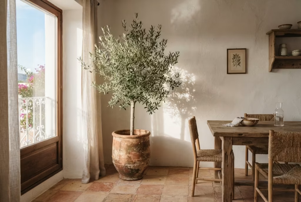
I’ll say this plainly, because it’s a hill worth dying on: a room full of silk greenery, however convincing from across the room, will never carry the same quiet authority as a single living plant standing in the corner catching real light.
Fake foliage doesn’t shift with the seasons, doesn’t lean toward the window over weeks the way a genuine plant does, and up close the illusion tends to fall apart faster than most people expect. One real plant, chosen well and placed with intention, does more for a Balearic-style dining room than a whole silk jungle ever could.
Two species tend to outperform everything else in this particular setting, and both have earned their reputation the hard way. An olive tree, potted in a generous terracotta container, brings that unmistakable silvery-green foliage straight out of the Mediterranean landscape itself, and it’s remarkably forgiving of the inconsistent light most dining rooms actually get.
A fig, whether the broad-leafed fiddle-leaf variety or a smaller weeping fig, adds a looser, more architectural silhouette and tolerates indoor conditions reasonably well once it settles into a spot it likes.
Light is the one non-negotiable both species share. Position either near a bright window, ideally one getting several hours of indirect or filtered sun through sheer curtains, rather than tucking it into a dim corner purely for symmetry’s sake. An olive or fig starved of light will drop leaves and sulk visibly within weeks, turning a design statement into a slow-motion apology.
Get the placement right, though, and that single plant becomes a living, breathing anchor, growing more characterful with every passing season rather than sitting frozen and lifeless like its fake counterparts.
The Bar Cart as a Small, Confident Gesture
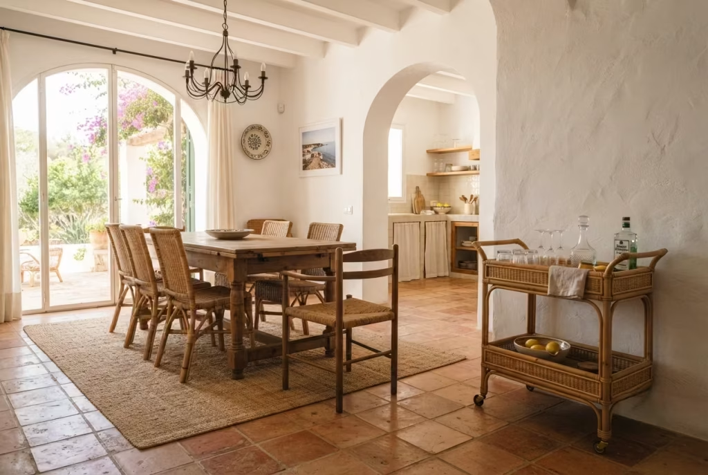
Picture a Friday evening, the sun long gone but its warmth still lingering in the plastered walls, glasses catching the low glow of a dimmed sconce, and someone reaching for a bottle without having to duck back into the kitchen mid-conversation. That’s the entire case for a bar cart in an Ibiza-inspired dining room, a small gesture that punches well above its modest footprint, turning a corner of the room into an invitation rather than dead space.
A rattan or iron-framed bar cart doesn’t need to shout to earn its place. Tucked against a wall or nestled beside the sideboard, it holds bottles, glassware, and the odd bowl of olives within easy reach, doing the quiet work of keeping the host out of the kitchen and in the conversation where they belong. It’s a piece that photographs beautifully sitting still, yet genuinely proves its worth once wheels are put to use and it rolls toward wherever the evening happens to be gathering.
Footprint is the practical detail worth nailing down before falling for a particular design. Most bar carts run 30 to 34 inches wide and roughly 18 inches deep, and that dimension needs at least 30 to 36 inches of clearance from the dining table itself to keep the path to the kitchen genuinely walkable rather than an obstacle course after the second course arrives.
Position it too close to the table and every trip for a refill turns into a minor negotiation with chair backs; position it well and the cart becomes part of the room’s natural flow, small in scale but confident in the role it plays.
Knowing When to Stop: Editing the Room Down
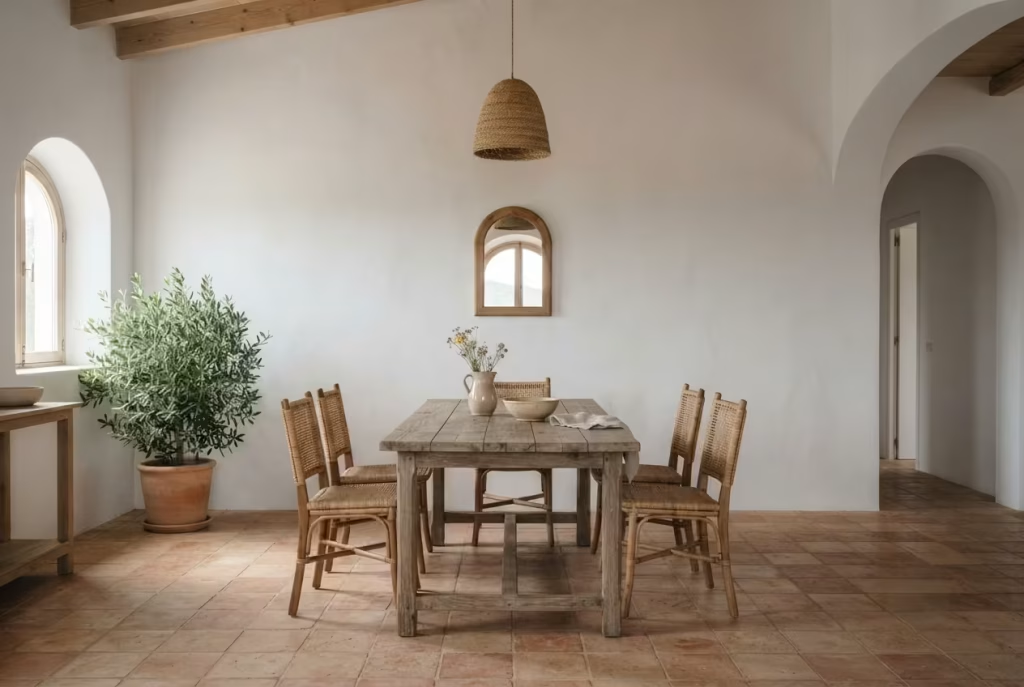
Every dining room I’ve ever finished has gone through the same final stage, and it has nothing to do with adding another piece. It’s the moment I walk back in with fresh eyes, usually a day or two after everything’s installed, and start removing things instead. A vase here, a spare cushion there, sometimes an entire piece of art that seemed essential during the shopping phase but now just crowds a wall that was breathing perfectly well on its own. This is the beat nobody talks about enough, and it’s arguably the single most important idea on this whole list.
Ibiza-style interiors live or die by negative space. Every whitewashed wall, every gap between furniture, every stretch of terracotta floor left bare is doing just as much work as the objects sitting on top of it. Fill every surface and hang something on every wall, and the room stops breathing, stops holding that particular quiet the style is built around in the first place.
The most beautiful Balearic dining rooms I’ve worked on all share one quality that has nothing to do with what’s in them: restraint, exercised right up to the edge of feeling almost bare, and then stopped exactly there.
So here’s the closing piece of advice, and it’s less a design idea than a discipline worth practising: once the room looks finished, wait a week, then walk back in and remove one thing. Just one. More often than not, the room will thank you for it, settling into itself rather than straining under everything it’s been asked to hold. That’s the real secret behind every Ibiza-inspired space that actually earns the description “stunning” rather than merely “busy,” and it’s the note worth carrying into every other room in the house.
Inside One Real Renovation: An 11×13 Dining Room in a Converted Farmhouse
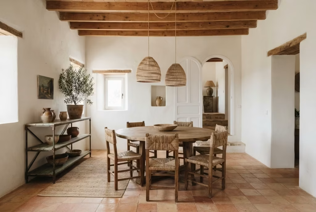
Every idea on this list sounds tidy in isolation, but real rooms rarely hand you a blank slate to work with, and one project from a few years back still sums up the whole balancing act better than any single tip could.
The brief came from a couple who’d bought a converted farmhouse with a dining room measuring roughly 11 by 13 feet, a single small window on the north wall, and a doorway positioned dead center on the opposite side, cutting straight through where a conventional rectangular table would naturally want to sit.
That doorway was the crux of the whole problem, and it’s exactly the kind of constraint no mood board ever accounts for. A rectangular table long enough to seat six would have jutted directly into the sightline of anyone walking through, forcing guests to squeeze past chair backs every time someone needed the kitchen.
Rather than fight the room’s geometry, we pivoted to a 54-inch round table instead, softening that central pinch point and letting foot traffic flow around the curve rather than colliding with sharp corners. It seated six comfortably, at 21 inches of table edge per guest, and freed up nearly 18 inches of extra clearance along the doorway path compared with what a rectangular equivalent would have demanded.
Budget sat firmly in the mid-range tier, just under £3,200 all in: reclaimed teak table, a pair of rattan pendant lights hung at 32 inches above the surface, lime-washed walls at roughly £22 per square metre, and a secondhand iron-framed sideboard sourced through a local salvage yard rather than bought new.
Nothing extravagant, nothing rushed, just a room built around the one measurement that actually mattered. Eighteen months later, that doorway still clears without a single bruised hip, and the couple still credit the round table as the decision that made the whole space finally click into place.
Getting the Look at Three Very Different Price Points
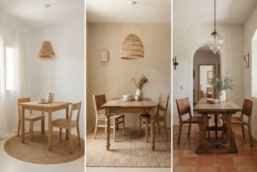
Not every reader chasing this look owns their walls outright, and not every budget stretches to lime plaster and structural masonry, so it’s worth laying out honestly what’s achievable at each level rather than pretending one price tag fits all.
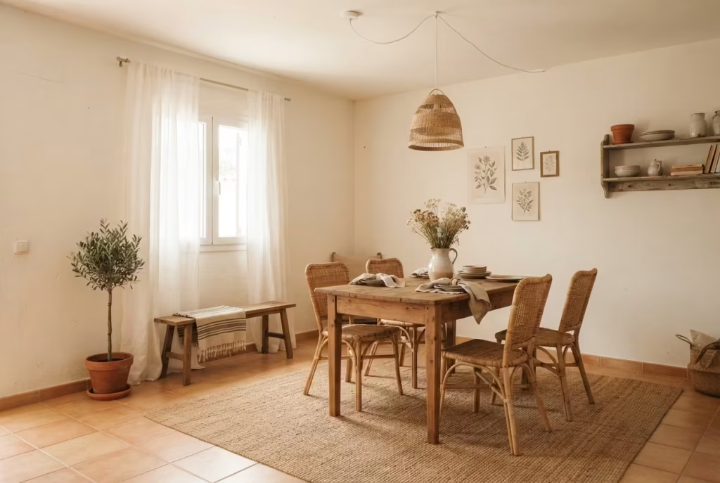
Renters and small budgets, roughly £150 to £600: this tier leans entirely on things you can take with you when you move. A few metres of sheer linen curtain, a jute rug, one rattan pendant swapped in for the landlord’s builder-grade fixture, and a warm white paint in place of stark magnolia does more heavy lifting than most people expect. If funds are genuinely tight, prioritise lighting and one anchor piece, a good pendant plus a single well-chosen table or sideboard, over spreading thin across a dozen small accessories that add up to very little visual impact.
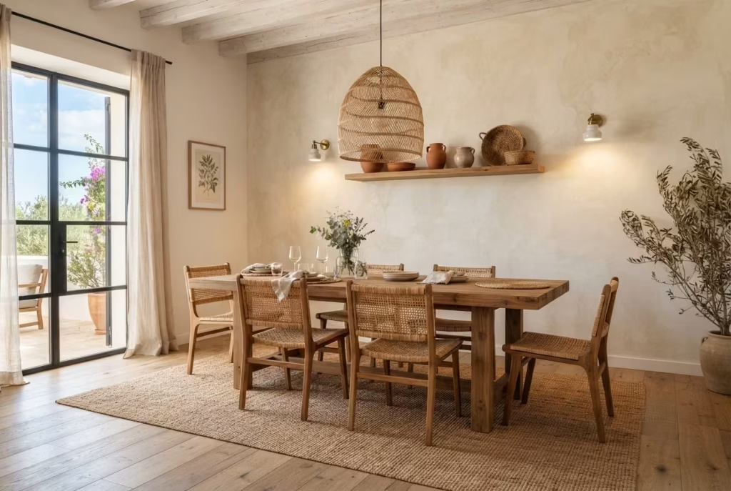
Mid-range refresh, £1,500 to £4,000: this is where a real teak or reclaimed wood table enters the picture, alongside proper lime wash on at least one feature wall, layered sconce and pendant lighting, and a quality rug sized correctly rather than squeezed to fit. The farmhouse project above sat comfortably in this bracket.
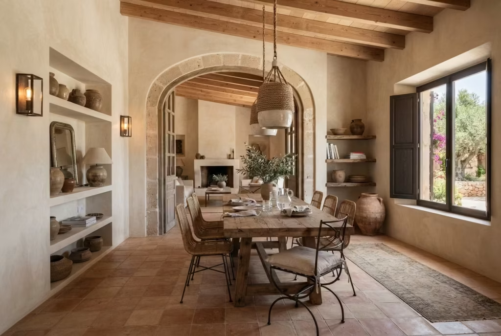
Full renovation, £6,000 and upward: structural arches, terracotta flooring throughout, whole-room lime plaster, and bespoke joinery all live here, the tier for anyone ready to commit to the architecture itself rather than layering decor on top of it. Even at this level, sequence lighting and one anchor piece first, everything else should build outward from those two decisions, never the reverse.
You May also Like: 25 Outdoor Dinner Party Ideas That Make Backyard Hosting Feel Special
Living With These Materials, Long After the Styling Photos Are Taken
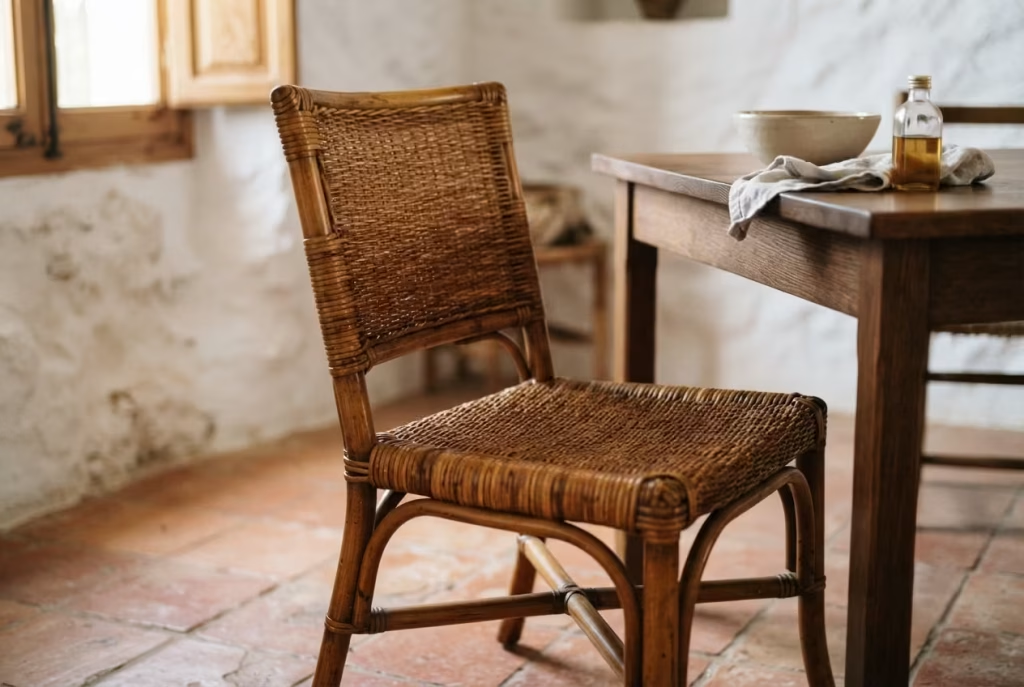
Nobody shows you what a room looks like eighteen months in, once the novelty’s worn thin and daily life has had its say, and that’s exactly where these materials either prove their worth or start showing cracks, sometimes quite literally. Lime plaster, for all its soft, sun-baked beauty, does hairline crack over time as a home settles, particularly around door frames and corners. Don’t panic at the first fine line, a simple touch-up with fresh lime wash blends in within a season and, if anything, adds another layer to that ever-deepening patina rather than detracting from it.
Rattan behaves rather differently depending on climate, and it’s worth knowing before a piece starts creaking or drying out unexpectedly. In humid conditions it can swell slightly and develop mould if left in a poorly ventilated corner, so a occasional wipe-down and decent airflow go a long way. In drier climates or centrally heated homes, rattan tends to dry and become brittle over years, and a light misting or occasional application of furniture oil keeps the fibres supple rather than snapping under pressure.
Terracotta, already covered on the sealing front, rewards a resealing check roughly every twelve to eighteen months, sooner in high-traffic households. Skip that maintenance and the surface stains permanently, a lesson best learned from someone else’s mistake rather than your own kitchen floor.
Where This Leaves You, Once the Sun Sets Again
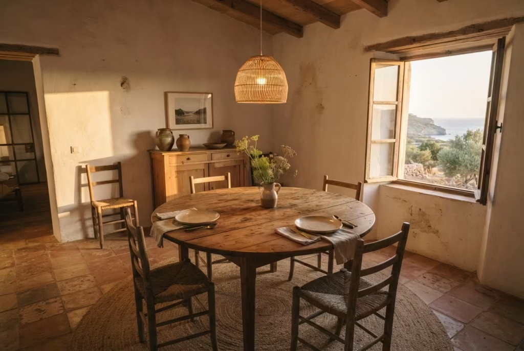
Come back to that seven o’clock light one more time, the honey-coloured glow sliding across a plastered wall, catching the grain of a teak table that’s earned every scratch and water ring along the way. That’s the room this whole guide has been quietly building toward, sixteen decisions deep, each one small on its own but collectively adding up to a space that feels lived in rather than staged, breathing rather than frozen mid-photograph.
If there’s a single thread worth carrying forward from everything above, it’s this: restraint will always outperform abundance in a room built on Balearic instincts. Choose fewer pieces and choose them properly, leave gaps where lesser rooms would rush to fill them, and let the light, the texture, and the quiet do the talking neither rattan nor iron ever could alone.
For the fuller picture of how this philosophy carries through an entire home, our Spanish Style Home Guide walks through every room with the same eye for restraint, and if the hallway leading into this dining room needs its own moment of Ibiza warmth, our Spanish Hallway Ideas picks up exactly where this one leaves off.
Frequently Asked Questions
What colours define an Ibiza-style dining room?
The palette stays deliberately narrow: bone white, sand, and warm neutrals form the base, with the occasional touch of ochre, terracotta, or sea blue used sparingly as accent rather than statement. Anything too saturated or jewel-toned starts pulling the room toward Andalusian or Moroccan territory instead of the sun-bleached, Balearic look this style is actually chasing.
Is Ibiza-style dining room decor practical for small spaces or apartments?
Yes, arguably more so than larger rooms. The style’s reliance on light colours, natural textures, and pared-back furniture counts genuinely helps a small dining area feel airier rather than cramped. A round table, one anchor lighting piece, and sheer linen curtains deliver most of the effect even in a modest apartment nook, no structural changes required.
What’s the difference between Ibiza style and Spanish Colonial style?
Spanish Colonial leans formal, built around dark carved wood, heavier wrought iron, and richer colour saturation. Ibiza, or Balearic style, strips that back considerably, favouring whitewashed walls, bleached or weathered timber, and a lighter, breezier material palette overall. Think coastal restraint versus colonial grandeur.
How much does it cost to get an authentic Ibiza-inspired dining room?
Budgets vary widely depending on ambition. A rental-friendly refresh with paint, textiles, and lighting swaps can land under £600, a mid-range update with real teak furniture and lime-washed walls typically runs £1,500 to £4,000, and a full renovation involving structural arches and terracotta flooring can climb past £6,000.
Can you achieve this look without renovating (paint/structure)?
Largely, yes. Lime wash or warm white paint, sheer linen curtains, a woven pendant light, and one well-chosen anchor piece of furniture cover most of the visual ground without touching a single wall structurally.
What materials should you avoid in an Ibiza-style dining room?
High-gloss finishes, cool-toned greys, heavily lacquered furniture, and synthetic wicker all work against the tactile, sun-worn quality the style depends on. These materials read as manufactured rather than lived-in, undercutting the room’s whole premise.
How do you keep an Ibiza-style room from feeling like a theme rather than a home?
Limit rattan and iron to two or three deliberate moments rather than filling every surface, mix in pieces that aren’t strictly “on theme,” and leave visible negative space. Restraint, more than any single product, is what separates an authentic Balearic room from a styled set.