25 Moody Dark Green Mudroom Ideas for a Stylish, Cozy Entryway
Most mudrooms are designed to manage clutter, but the best ones do something far more valuable. They shape the way a home feels from the very first step inside. Think about the moment you arrive home on a rainy afternoon. Shoes are damp, bags are dropped, coats need somewhere to go, and the day’s distractions are still following you through the door.
A well-designed mudroom absorbs that chaos before it reaches the rest of the house. It creates a pause, a subtle transition that helps everything beyond it feel calmer, more organised, and more welcoming.
That is one reason dark green has become such a compelling choice for modern mudrooms. Unlike bright white utility spaces that can feel stark or overly clinical, dark green introduces instant depth and atmosphere.
It softens visual noise, disguises everyday wear, and creates a sense of permanence that often improves with age. In busy family homes, it is a colour that works hard while still feeling refined.
There is also something inherently grounding about green. Forest tones, olive shades, moss colours, and deeper blackened greens connect naturally to the outdoors, making them especially effective in transitional spaces. Paired with warm timber, aged brass, natural stone, or textured finishes, they create an environment that feels rich, layered, and quietly inviting.
Another advantage is the way dark green responds to light. Throughout the day, the colour shifts and evolves. Morning sun may reveal warmer olive undertones, while evening shadows deepen the palette into something moodier and more dramatic. This constant variation gives the room a sense of character that lighter colours often struggle to achieve.
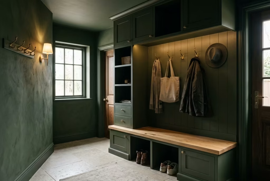
The ideas ahead explore how dark green can transform a mudroom from a purely functional space into one that feels thoughtful, atmospheric, and beautifully connected to the rest of the home. Whether your style leans classic, contemporary, rustic, or Scandinavian, these designs show how a darker palette can bring lasting depth, warmth, and sophistication to one of the hardest-working rooms in the house.
25 Moody Dark Green Mudroom Ideas
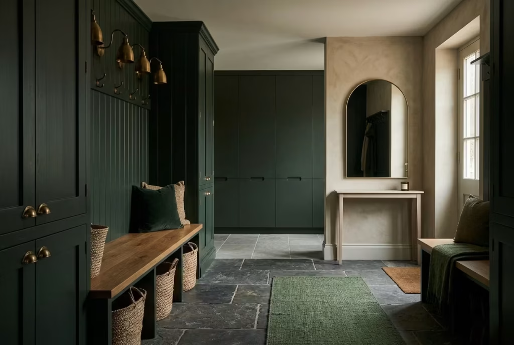
A dark green mudroom can take on countless personalities depending on how the colour is interpreted through texture, architecture, lighting, and material balance. In some homes, it leans tailored and dramatic with blackened cabinetry, slate flooring, and aged brass detailing.
In others, it feels softer and more organic, layered with warm oak, limewashed walls, woven storage, and stone underfoot that only grows better with age. That flexibility is precisely what makes moody green such a lasting choice. It adapts beautifully to both contemporary and traditional interiors without losing its sense of depth.
What I find particularly compelling about dark green in entry spaces is how naturally it disguises the realities of daily life while still feeling elevated. Mudrooms are rarely pristine for long. Shoes pile up. Wet umbrellas appear out of nowhere.
Dog leads, school bags, winter coats, and grocery baskets slowly begin staking their claim across every available surface. Yet darker green tones absorb that visual noise more gracefully than lighter palettes ever could. Instead of fighting against real life, they work alongside it.
The following ideas move beyond surface-level styling and focus on how these spaces actually function once people begin living in them. Some are rooted in classic English boot room traditions, others borrow from Scandinavian restraint or Mediterranean texture, but all of them share one thing in common: they treat the mudroom as a meaningful part of the home rather than a forgotten pass-through zone.
Whether you are designing a narrow secondary entrance or a large family mudroom with custom storage stretching wall to wall, these ideas are intended to spark inspiration while offering practical perspective along the way.
Because the most successful moody interiors are never built on colour alone. They are shaped through atmosphere, proportion, and those quieter details that slowly pull a room together piece by piece, until one day it simply feels right.
Floor-to-Ceiling Forest Green Paneling
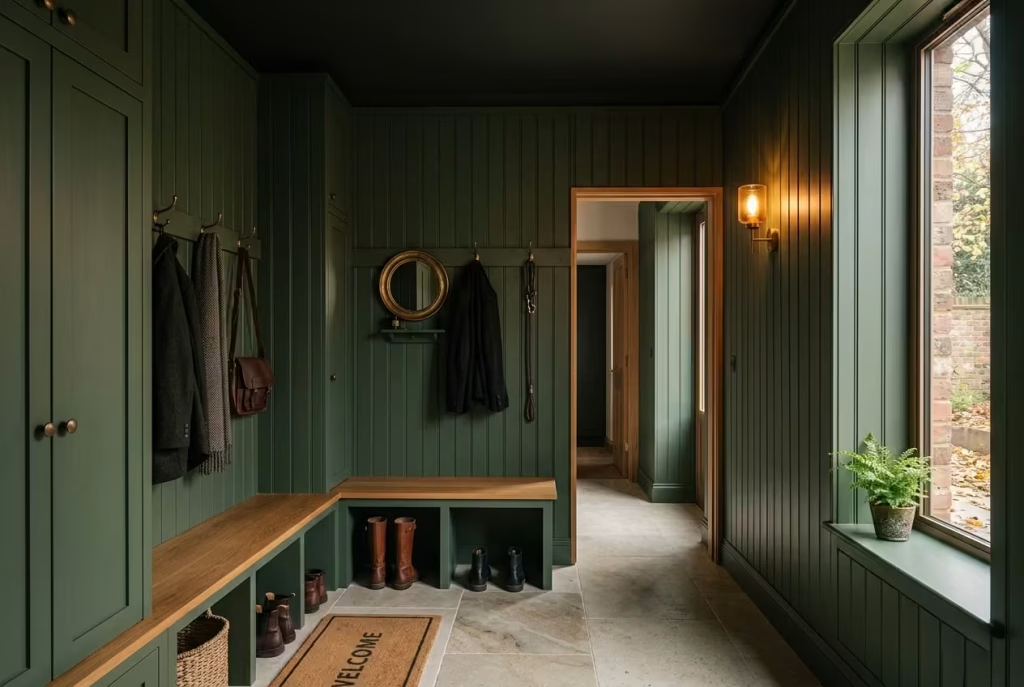
There is something undeniably cinematic about a mudroom wrapped entirely in forest green paneling. The moment you step inside, the atmosphere shifts. Noise softens. Architectural lines feel deeper. Everyday clutter begins fading quietly into the background instead of shouting for attention the way it often does in brighter utility spaces.
Done properly, this kind of full-height paneling creates a room that feels grounded, tailored, and deeply intentional, almost as though the space has been carved directly into the architecture rather than merely decorated.
In many homes, mudrooms suffer from feeling disconnected from the rest of the interior. They become practical dumping grounds with little emotional warmth. Floor-to-ceiling paneling changes that narrative completely. It gives the room permanence and structure while allowing darker green tones to envelop the space in a way standard painted drywall rarely achieves. What makes this approach especially effective is the sense of verticality it introduces.
Why Vertical Paneling Works So Well in Narrow Mudrooms
Mudrooms are often long, tight transitional areas where proportions can feel awkward if left untreated. Vertical paneling helps redirect the eye upward, making ceilings appear taller and the room itself feel more architectural. It is a subtle visual trick, but one that punches above its weight when working with compact footprints.
I typically find this style performs best in mudrooms with ceiling heights between 8 and 10 feet (2.4 to 3 metres). Within that range, the paneling feels immersive without becoming oppressive. In lower-ceilinged spaces, the detailing needs slightly more restraint to prevent the room from feeling visually boxed in.
Slim vertical battens or tongue-and-groove profiles tend to work particularly well because they introduce rhythm without excessive heaviness. Wider panel spacing can sometimes feel bulky in narrow mudrooms, especially once hooks, benches, and cabinetry begin occupying wall space.
One project that stays with me involved a townhouse mudroom barely wider than a corridor. Initially, the homeowners wanted pale walls to make it feel larger.
Instead, we installed narrow forest green paneling from skirting to ceiling with concealed storage integrated between sections. Counterintuitively, the darker vertical treatment made the room feel taller and calmer. The eye travelled upward naturally rather than focusing on the limited width. Sometimes lighter spaces do not feel larger at all. They simply feel emptier.
The Best Flooring Materials to Pair with Forest Green Paneling
Because forest green naturally absorbs light, flooring selection becomes incredibly important. The floor acts almost like a balancing element beneath the darker walls, helping determine whether the room feels warm and layered or visually too dense.
Some of the most successful pairings include:
- Honed limestone for softness and subtle reflection
- Reclaimed terracotta for warmth and lived-in character
- Slate for a richer, heritage-inspired atmosphere
- Smoked oak flooring for contemporary depth
- Tumbled porcelain tiles for durability in family homes
Personally, I often lean toward lighter stone flooring beneath darker paneling because it prevents the room from becoming visually top-heavy. Limestone, in particular, catches natural light beautifully while maintaining an earthy quality that complements deep greens effortlessly.
For homes with heavy outdoor traffic, textured porcelain alternatives can also perform exceptionally well. Modern porcelain has come a long way, and many high-quality options now replicate the tonal variation of natural stone surprisingly convincingly while requiring far less maintenance.
A practical detail worth considering is grout colour. Very pale grout lines in high-traffic mudrooms tend to age poorly, especially during wet seasons. Mid-tone or warm grey grout usually holds up far better visually over time.
Why Forest Green Paneling Feels So Immersive
One of the greatest strengths of full-height green paneling is how completely it transforms the mood of a space. Rather than reading as individual painted walls, the room begins feeling cocooned within a continuous architectural shell.
Shadows deepen softly between panel lines, lighting becomes warmer and more atmospheric, and even practical elements like hooks or storage benches begin feeling intentionally integrated.
This effect becomes particularly powerful during autumn and winter months. Coming home through a moody mudroom wrapped in forest green has a strangely grounding quality to it.
Wet coats, muddy boots, and scattered umbrellas somehow feel less chaotic against darker surroundings. The room absorbs the visual busyness of family life instead of amplifying it.
That ability to age gracefully is one reason darker paneling continues holding its appeal long after trend cycles begin shifting elsewhere.
Pros of Floor-to-Ceiling Forest Green Paneling
Creates an Immersive Atmosphere Full-height paneling introduces richness that standard painted walls often struggle to achieve. The room feels layered, architectural, and deeply connected to the home’s overall design language rather than functioning as a forgotten utility zone.
The effect is especially compelling in homes where the mudroom connects directly to kitchens or secondary hallways because it creates a more seamless emotional transition between spaces.
Hides Wear Beautifully Mudrooms endure constant abuse from shoes, bags, pet accessories, and seasonal clutter. Forest green paneling handles that reality remarkably well.
Minor scuffs blend more naturally into darker finishes, while textured panel lines help disguise imperfections that would stand out immediately on flat pale walls. In busy family homes, this practicality becomes worth its weight in gold over time.
I have revisited several mudrooms years after completion where the darker paneling still looked remarkably composed despite heavy everyday use.
Cons of Floor-to-Ceiling Forest Green Paneling
Requires Balanced Lighting Without thoughtful lighting, darker paneling can quickly feel visually heavy, particularly in mudrooms with limited natural daylight.
Layered lighting becomes essential here. Wall sconces, warm ceiling pendants, under-bench lighting, and even reflective materials like antique brass or softly honed stone all help prevent the room from slipping into gloominess.
I generally recommend warm bulb temperatures between 2700K and 3000K because they bring out the richness within forest green far more effectively than cooler lighting.
Can Overwhelm Compact Spaces Without Contrast Dark paneling alone is rarely the issue. Lack of contrast usually is. If every surface absorbs light equally, the room can begin feeling visually compressed. This is why balancing darker walls with lighter flooring, natural timber, mirrors, woven textures, or softer ceiling colours becomes so important.
Even small details can shift the atmosphere significantly. A warm oak bench, a pale linen runner, or aged brass hooks catching evening light can stop the room from feeling too enclosed. That balance between drama and softness is where these spaces truly come alive.
When handled thoughtfully, floor-to-ceiling forest green paneling does not simply decorate a mudroom. It reshapes how the room feels to move through day after day, season after season.
Deep Olive Green Built-In Storage Walls
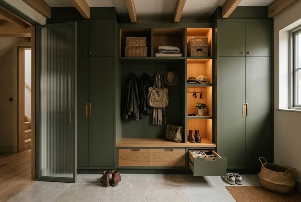
A well-designed mudroom rarely feels chaotic, even when real life is unfolding at full speed around it. That calm usually comes down to storage, not just how much exists, but how intelligently it disappears into the architecture. Deep olive green built-in storage walls achieve this beautifully because they allow functionality and atmosphere to work hand in hand rather than pulling in opposite directions.
Unlike brighter greens that can sometimes feel decorative or attention-seeking, olive tones carry a quieter kind of richness. They have enough warmth to soften hard architectural lines yet enough depth to conceal the visual clutter that naturally builds up in hardworking family spaces.
In many of my residential projects, particularly homes with children or pets constantly moving through the entryway, olive green cabinetry proves remarkably forgiving over time. It does not demand perfection. It absorbs the messiness of everyday life with far more grace than lighter painted storage ever could.
Why Deep Olive Feels More Livable Than Emerald Green
While emerald green can look striking in photographs, it often behaves differently once daily life settles in. Cooler jewel-toned greens reflect light more sharply and tend to highlight surface interruptions such as fingerprints, uneven shadows, shoe marks, or overfilled shelving.
Olive green works differently. Because of its earthy undertones, it visually softens clutter rather than exaggerating it. I noticed this clearly during a large countryside renovation where the mudroom functioned as the household’s primary entrance.
The family initially leaned toward a dramatic emerald cabinetry finish, but after testing several samples throughout the day, the cooler tones began feeling visually restless against the amount of activity flowing through the room.
Instead, we shifted toward a deeper olive with muted brown undertones. The result felt calmer immediately. Backpacks, coats, dog accessories, and winter boots blended into the palette far more naturally, allowing the room to maintain a composed atmosphere even during the busiest weeks of the year.
Sometimes the most successful design decisions are not the loudest ones. They are the ones that quietly make daily life easier.
Closed Cabinetry vs Open Cubbies
One of the biggest decisions when designing built-in mudroom storage is determining how much should remain visible. Open cubbies create accessibility and can feel wonderfully relaxed in smaller doses. They work particularly well for frequently used items such as:
- Everyday footwear
- Dog leads
- Sports bags
- Seasonal baskets
- Quick-access outerwear
Visually, open shelving also breaks up large walls of cabinetry, preventing darker mudrooms from feeling too monolithic.
However, open storage has a habit of becoming clutter magnets if not carefully managed. In family homes especially, what begins as organised styling can quickly spiral into piles of mismatched shoes, tangled scarves, and half-forgotten bags living rent free on every available shelf. This is why I often prefer a balanced combination of both.
Closed cabinetry handles the visual heavy lifting. It conceals bulkier items, reduces visual noise, and helps the room maintain a calmer appearance throughout the day. Tall cabinets are particularly useful for:
- Cleaning supplies
- Seasonal coats
- Sports equipment
- Pet food storage
- Vacuum stations
- Overflow household essentials
Open cubbies then become smaller moments of accessibility layered into the larger structure.
In practical terms, this hybrid approach also allows the room to evolve more naturally over time. Open sections can adapt seasonally while concealed storage maintains visual order behind the scenes.
Hidden Charging Drawers
Modern mudrooms are quietly becoming technological transition spaces as much as physical ones. Phones, tablets, wireless headphones, smart watches, portable chargers, and school devices often end up scattered across kitchen counters simply because homes lack a dedicated landing zone for them. Hidden charging drawers solve that problem elegantly without disrupting the moodier atmosphere of the room.
I frequently integrate charging drawers directly beneath mudroom benches or within upper cabinetry towers where devices can remain connected but out of sight. Besides reducing surface clutter, this also creates a healthier daily rhythm. People naturally drop devices into the drawer when arriving home instead of carrying digital noise deeper into living spaces.
A few practical details make a significant difference here:
- Integrated cable management
- Ventilation openings
- Soft-close mechanisms
- Moisture-safe positioning away from wet zones
- Internal power outlets with USB-C compatibility
One client described their charging drawer as “the peacekeeper of the house,” which honestly was not far from the truth. Small functional improvements often have a surprisingly emotional impact once families begin using them daily.
Bench Integration That Feels Intentional
No mudroom storage wall truly feels complete without seating integrated into the design. Benches do more than provide somewhere to remove shoes. They anchor the room visually and create a sense of pause within what is otherwise a highly transitional space. Without that grounding element, even beautiful cabinetry can feel slightly cold or overly utilitarian.
In most residential mudrooms, I aim for bench heights around 17 to 19 inches (43 to 48 cm) with depths between 16 and 20 inches (40 to 51 cm) depending on circulation space. Those dimensions tend to provide comfortable seating without interrupting walkway flow.
Material choice matters enormously here. Warm oak benches paired with olive cabinetry create balance instantly because the timber interrupts darker surfaces with natural warmth.
Upholstered cushions can soften the architecture further, though in busy family homes I usually specify durable performance fabrics or removable covers that can withstand muddy clothing and wet outerwear.
Integrated drawers beneath benches are also incredibly valuable in practice. They offer discreet storage for:
- Children’s shoes
- Pet accessories
- Winter gloves
- Reusable shopping bags
- Seasonal extras
The beauty of built-in benches is that they quietly encourage better daily habits. People naturally sit, organise, remove shoes, and settle themselves before entering the rest of the home. The mudroom begins functioning less like a corridor and more like a decompression space between outdoors and indoors.
Why Built-In Storage Walls Feel So Luxurious
Luxury in mudroom design rarely comes from expensive materials alone. It comes from ease. A thoughtfully designed storage wall removes friction from daily routines. Coats have somewhere to go. Shoes stop migrating across the floor. Chargers disappear neatly. Seasonal clutter remains controlled instead of spilling into adjacent rooms.
Deep olive cabinetry enhances this feeling because it introduces visual calm at the same time. One thing I consistently notice in successful mudroom projects is that darker storage walls create a stronger architectural presence than freestanding furniture ever could. The room feels cohesive and settled, almost stitched into the structure of the house itself.
That permanence changes how the space is experienced emotionally. Instead of feeling temporary or purely functional, the mudroom begins carrying the same design confidence as the kitchen, library, or living room nearby.
And honestly, that shift matters more than many homeowners initially realise. Because when the first room you step into each day feels calm, warm, and thoughtfully resolved, the rest of the house somehow follows suit a little more naturally too.
You May also Like: 21 Earthy Cottage Home Decor Ideas for a Cozy, Soul-Calming Retreat
Blackened Green Mudrooms with Brass Accents
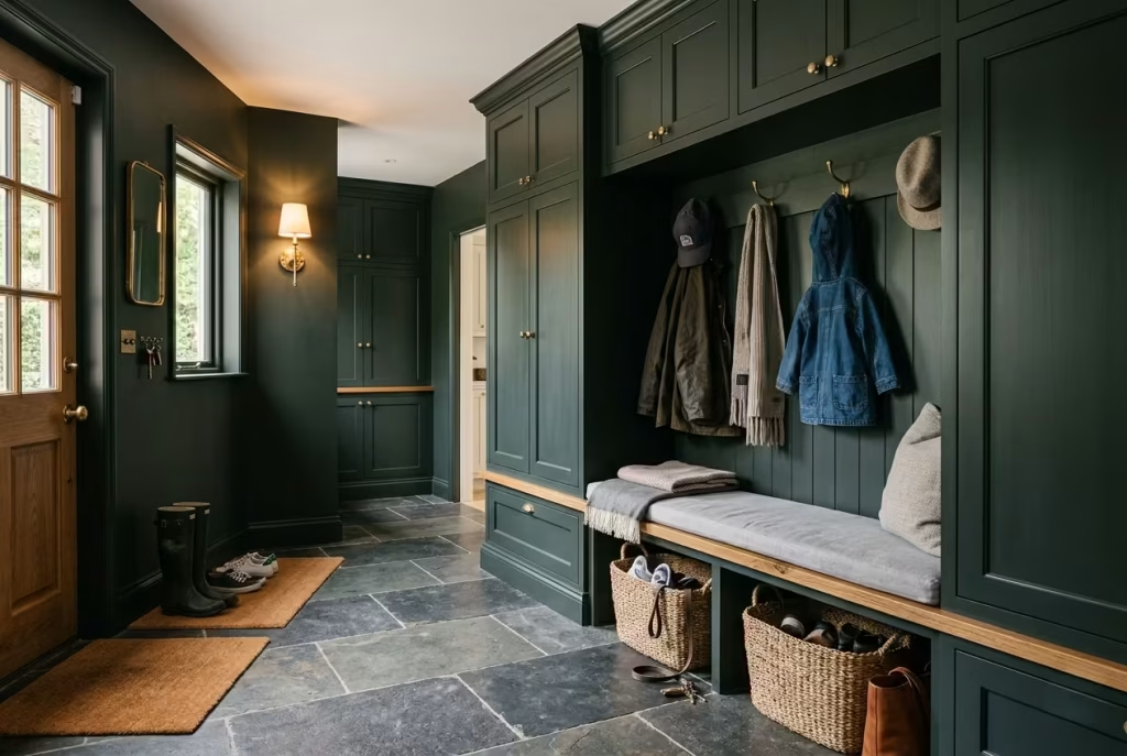
Some colour combinations carry an effortless sense of maturity the moment they enter a room. Blackened green paired with aged brass is one of them. Together, they create a mudroom that feels atmospheric and refined without slipping into anything overly theatrical. The green introduces depth and shadow, while the brass catches light in quieter, warmer flashes that keep the space from feeling too heavy.
It is a pairing that works particularly well in entryways because mudrooms naturally experience shifting light throughout the day. Morning brightness, cloudy afternoons, soft evening lamp glow, all of it interacts differently with darker greens and warm metallic finishes. When balanced thoughtfully, the room begins to feel layered and alive rather than static.
In many homes, especially those with transitional or heritage-inspired interiors, this combination hits the sweet spot beautifully. It feels grounded enough for daily family life yet elevated enough to carry genuine architectural presence.
Why Blackened Green Feels So Sophisticated
Blackened greens sit somewhere between forest green and charcoal, carrying enough pigment to feel dramatic while still retaining an earthy softness beneath the surface. Unlike brighter greens that announce themselves immediately, these darker shades unfold more slowly.
In direct light, olive or moss undertones may appear. In shadow, the colour deepens toward near-black, creating a cocoon-like atmosphere that feels intimate and calming. This complexity is precisely what makes them so compelling in mudrooms.
Entryways are transitional by nature. People move through them quickly, often distracted, carrying bags, shoes, coats, umbrellas, and all the little fragments of daily life. A darker palette visually steadies that movement. It absorbs some of the chaos instead of amplifying it.
I once designed a mudroom for a townhouse renovation where the homeowners initially worried that blackened green cabinetry would make the room feel too dark. Ironically, once installed, the opposite happened emotionally. The deeper colour gave the narrow entryway a sense of focus and calm that lighter paint had completely failed to achieve.
Sometimes darker interiors do not shrink a room at all. They simply make it feel more intentional.
Aged Brass Hooks That Feel Timeless
Hardware can quietly make or break a moody mudroom.mAgainst darker greens, aged brass hooks introduce warmth in a way few other finishes can. The soft golden undertones prevent the room from feeling cold or overly stark, particularly during winter months when natural daylight becomes more limited.
I tend to favour unlacquered or antiqued brass rather than highly polished finishes because they develop character over time. Scratches, fingerprints, and slight tarnishing become part of the material’s natural evolution rather than flaws demanding constant upkeep.
That lived-in quality matters in mudrooms more than almost anywhere else in the home.
Hooks in particular receive constant use, often far rougher treatment than people expect. Heavy winter coats, wet bags, dog leads, umbrellas, backpacks, all of it places stress on hardware daily. Solid brass not only ages beautifully but also holds up structurally over time when installed properly. For functionality, spacing matters just as much as aesthetics.
I usually recommend:
- Hook spacing between 8 and 12 inches (20 to 30 cm)
- Lower hooks for children around 36 to 42 inches (91 to 107 cm) high
- Adult hooks around 60 to 66 inches (152 to 168 cm) high
Layering different hook heights creates flexibility while also making the wall composition feel more visually relaxed.
One small design move I often incorporate is mounting brass hooks onto timber backplates or integrated paneling sections. Besides protecting painted surfaces from wear, it gives the storage wall more architectural weight and depth.
Warm Metallic Contrast Softens Dark Spaces
Without contrast, darker mudrooms can begin feeling visually dense. Brass helps break that heaviness gently. The key lies in temperature balance.
Blackened green naturally absorbs light and creates shadow, while brass reflects warmth back into the room in softer, less aggressive ways than chrome or polished nickel. This push and pull between depth and glow is what gives the combination its richness.
I have found that even small amounts of warm metal can dramatically change the emotional atmosphere of a mudroom. A pair of aged sconces, subtle cabinet pulls, umbrella stands, or bench brackets often provide enough contrast to keep the room feeling layered rather than flat.
In one family home renovation, the mudroom originally featured matte black hardware against dark green cabinetry. While visually striking at first, the room felt noticeably cold once winter arrived. Replacing only the hardware with aged brass transformed the atmosphere almost overnight. The space suddenly felt warmer, more welcoming, and far more connected to the oak flooring running throughout the house. It was proof that sometimes the smallest details quietly carry the most weight.
How Lighting Changes Brass Throughout the Day
One of the most beautiful things about brass is that it never looks exactly the same twice. Natural daylight pulls out different undertones depending on the hour. Morning light often gives brass a softer champagne warmth, while evening lighting deepens it toward amber and bronze. Against blackened green cabinetry or paneling, those tonal shifts create movement that keeps the room visually engaging over time.
Artificial lighting changes the experience even more. Warm bulbs around 2700K to 3000K tend to enrich brass beautifully, enhancing its depth without making it appear overly yellow. Cooler lighting, however, can flatten the metal considerably and make darker greens feel harsher in comparison.
This is why layered lighting becomes especially important in moody mudrooms with metallic accents.
Some of the most effective combinations include:
- Brass wall sconces beside mirrors
- Picture lights above cabinetry
- Lantern pendants in taller entryways
- Under-bench LED lighting for softer evening glow
I particularly love how low-level lighting interacts with brass after sunset. It creates little pockets of warmth throughout the room, almost like candlelight catching old metal in quieter corners.
That softness matters because mudrooms are emotional transition points as much as practical ones. They are the first spaces you step into after long days, cold weather, noisy commutes, or busy school mornings. The atmosphere should help the nervous system exhale slightly rather than keeping everything visually sharp and overstimulating.
Balancing Drama with Warmth
One risk with blackened green mudrooms is allowing the palette to become too severe. Brass helps counteract that, but material layering matters too.
The most successful spaces often combine:
- Warm oak benches
- Woven storage baskets
- Soft runners with subtle texture
- Honed limestone or terracotta flooring
- Linen cushions or upholstered panels
These elements stop the darker colour palette from feeling overly formal or untouchable. Instead, the room develops a lived-in richness that feels welcoming despite its dramatic undertones.
That balance is what gives blackened green mudrooms their staying power. They feel elegant without trying too hard. Rich without becoming oppressive. Tailored without losing warmth.
And in homes where everyday life moves at full tilt, that quiet sense of composure becomes worth far more than a room designed purely to impress at first glance.
Dark Green Shiplap with Stone Flooring
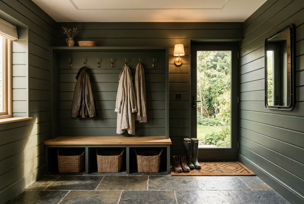
There is a quietly reassuring quality to dark green shiplap when it meets the grounded texture of stone flooring. It feels honest, slightly rustic without tipping into theme-driven design, and deeply practical in the way it handles everyday life. Together, these materials create a mudroom that feels rooted, almost as if it has always belonged to the architecture rather than being added as an afterthought.
Shiplap introduces rhythm through its horizontal lines, while stone flooring anchors the space with weight and permanence. The contrast between the two is what gives this combination its strength. One softens the walls visually, the other steadies the room physically. It is a pairing that works particularly well in homes where mudrooms carry heavy daily traffic and need to perform without fuss.
Ideal Bench Depth and Functional Proportions
In a shiplap-based mudroom, proportion is everything. Because the wall treatment already introduces strong directional lines, the built-in elements need to sit comfortably within that rhythm rather than fighting against it.
For seating, I typically recommend a bench depth of 16 to 18 inches (40 to 46 cm). This range allows enough space to sit comfortably while still maintaining circulation space in narrower entryways. Anything deeper can begin to disrupt movement, especially in compact mudrooms where multiple people are using the space at once.
Height also plays a subtle but important role. A bench positioned around 17 to 19 inches (43 to 48 cm) tends to feel most natural for everyday use, particularly when combined with shoe storage beneath.
Hook placement should be equally considered rather than treated as an afterthought. A spacing of 8 to 12 inches (20 to 30 cm) allows coats, bags, and accessories to hang freely without visually overcrowding the wall. In family homes, I often introduce staggered hook heights so both adults and children can use the space comfortably without everything clustering at one level.
These measurements might seem small in isolation, but together they shape how effortlessly the room functions day to day.
Why Shiplap Works So Well with Dark Green
Shiplap carries a quiet familiarity that feels especially effective when painted in deeper greens. The horizontal lines subtly widen the perception of the room, which is particularly useful in narrow mudrooms or corridor-like entryways.
Dark green adds depth to that structure, allowing the grooves between boards to read as soft shadow lines rather than sharp divisions. Instead of feeling overly rustic, the surface becomes more refined and architectural.
In one coastal renovation I worked on, we used deep olive shiplap in a compact mudroom that originally felt tight and underlit. Once painted and paired with warm lighting, the walls took on a gentle layered effect that shifted throughout the day. Morning light emphasised the grain and texture, while evening light softened everything into a more atmospheric backdrop. It never felt static. It simply evolved with the rhythm of the house.
Stone Flooring as the Grounding Element
Stone flooring brings a sense of permanence that few other materials can match. In mudrooms, where moisture, grit, and constant foot traffic are part of everyday life, stone performs with quiet confidence.
Materials such as limestone, slate, and honed porcelain each bring slightly different characteristics:
- Limestone introduces softness and warmth, with natural tonal variation that pairs beautifully with dark green walls
- Slate feels more architectural and textured, ideal for heritage or farmhouse-inspired interiors
- Porcelain stone-effect tiles offer durability with lower maintenance demands, particularly useful in busy family homes
What makes stone especially effective here is how it interacts with light. Unlike synthetic surfaces, it rarely reflects harshly. Instead, it diffuses light gently, softening the overall atmosphere and preventing darker walls from feeling too enclosed.
I often find that stone flooring becomes the silent stabiliser in a moody mudroom. It grounds the palette, absorbs wear gracefully, and gains character over time rather than deteriorating visually.
Pros
Creates a layered, textural atmosphere: The combination of painted timber and natural stone introduces depth without needing decorative excess. The space feels composed, tactile, and quietly architectural. It is one of those pairings that does not rely on trends yet still feels current in almost any setting.
Hides everyday wear with ease: Mudrooms are rarely pristine for long, and this material pairing embraces that reality. Dark green shiplap disguises scuffs and marks effectively, while stone flooring absorbs the impact of wet shoes, pet paws, and seasonal dirt without looking tired.
Over time, both materials tend to develop a softened patina that actually enhances the character of the room rather than diminishing it.
Cons
Maintenance expectations need to be understood early: While durable, stone flooring does require ongoing care. Sealing is essential, particularly in climates where moisture is frequent. Without it, porous stones like limestone can stain over time, especially near entry points where water tends to accumulate.
Similarly, shiplap, while forgiving visually, can collect dust in its grooves. In high-traffic homes, regular light cleaning becomes part of maintaining its crisp appearance. A soft brush attachment or gentle vacuuming usually keeps it under control, but it is still a consideration.
Can feel visually heavy if lighting is neglected: Dark green shiplap already introduces strong surface rhythm. If lighting is not layered thoughtfully, the combination with stone flooring can begin to feel dense, particularly in smaller mudrooms or those with limited natural light.
Warm lighting becomes essential here. Without it, the room risks losing the subtle softness that makes this pairing so appealing in the first place.
Maintenance and Cleaning Realities in Everyday Use
In real family settings, mudrooms are constantly in motion. Shoes come in wet, dogs shake off rain, children drop bags mid-step, and seasonal clutter builds almost without warning. This is where the honesty of shiplap and stone really shows its value.
Stone flooring handles moisture without complaint, provided it is sealed properly and cleaned regularly with pH-neutral products. Harsh chemicals should be avoided as they can gradually erode the surface seal and dull the natural finish.
Shiplap, on the other hand, benefits from occasional deep cleaning but otherwise remains relatively low maintenance. Painted in dark green, it is far more forgiving than lighter finishes, where every mark tends to stand out sharply.
One practical habit I often recommend to homeowners is placing a textured mat just inside the entrance zone. It acts as the first line of defence, catching grit and moisture before it reaches the stone floor. Over time, this simple addition significantly reduces cleaning demands while extending the lifespan of both materials.
When these elements are considered together, the mudroom becomes less about constant upkeep and more about quiet resilience. A space that handles life as it comes, without demanding perfection in return.
You May also Like: 20 Cozy Modern Farmhouse Entryway Designs for a Welcoming Home
Moody Green Mudrooms with Checkerboard Floors
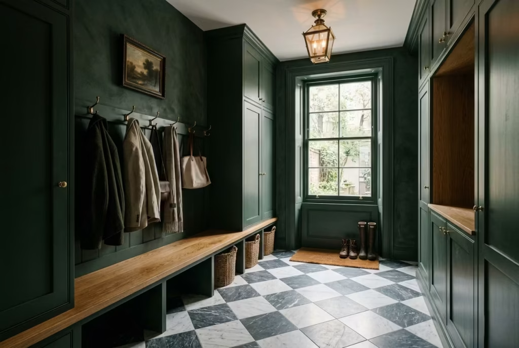
There is a certain old-world confidence that checkerboard flooring brings into a mudroom, especially when paired with deep, moody green walls. It feels deliberate without being loud, familiar yet still visually striking, almost like something borrowed from a historic European townhouse and reinterpreted for modern family living.
The geometry of the floor sets a strong foundation, while the green above it softens the overall mood, creating a space that feels structured but never rigid.
What makes this combination so effective is contrast. Not just in colour, but in philosophy. The floor is disciplined, rhythmic, almost architectural in its repetition, while the green walls introduce depth, softness, and atmosphere. Together, they strike a balance that feels timeless rather than trend driven.
Marble vs Porcelain Practicality
Choosing between marble and porcelain is often where design ambition meets everyday reality. Marble checkerboard flooring carries undeniable character. Each tile has natural variation, subtle veining, and a quiet sense of luxury that feels almost irreplaceable. In a mudroom, this can be incredibly beautiful, particularly when softened by warm green walls and gentle lighting.
However, marble is not without its demands. It is porous, sensitive to acidic cleaners, and can show wear more quickly in high-traffic areas if not properly sealed and maintained.
Porcelain, on the other hand, offers a far more forgiving approach. Modern manufacturing techniques have made it possible to replicate the look of marble with remarkable accuracy, while significantly improving durability. In busy households, where mudrooms are constantly exposed to moisture, grit, and movement, porcelain often becomes the more practical long-term choice.
I have worked on projects where homeowners initially insisted on natural marble, only to later appreciate the stability and low maintenance of porcelain once daily life settled in. It is one of those decisions where appearance and reality need to be weighed carefully against each other rather than chosen purely on aesthetic instinct.
Traditional European Influence
Checkerboard floors have deep roots in European interior design, particularly in historic French and English homes where patterned stone was used to bring structure and elegance to transitional spaces. In those settings, the floor was never just decorative. It signalled order, craftsmanship, and a quiet sense of permanence.
When paired with moody green mudroom walls, that heritage influence becomes even more pronounced. The green introduces a grounded, natural quality, while the checkerboard pattern anchors the room with architectural clarity.
In many restoration-style projects, I have found that this combination works particularly well in homes that already carry period features such as cornicing, timber panelling, or traditional joinery. The mudroom then becomes an extension of that architectural language rather than a separate stylistic insert.
There is also something emotionally reassuring about this pairing. It feels established, almost like the space has been there for generations, quietly absorbing the rhythms of daily life without ever feeling outdated.
Pattern Balancing in a Moody Setting
Pattern can easily overwhelm a space if not handled with restraint, and checkerboard flooring is no exception. Its strength lies in repetition, but that same strength can become visually dominant if everything else competes for attention.
This is where moody green walls play a critical balancing role. Their solid, uninterrupted surface helps absorb visual complexity, allowing the floor pattern to take centre stage without the room feeling chaotic. The green acts almost like a backdrop in a gallery, giving structure to what is happening below.
In smaller mudrooms, proportion becomes especially important. Larger checkerboard tiles, typically around 12 x 12 inches (30 x 30 cm) or 18 x 18 inches (45 x 45 cm), tend to feel more grounded and less busy than smaller, tightly gridded formats. Oversized patterns also help visually expand narrow entryways, guiding the eye across the space in a more fluid way.
Lighting again plays a subtle but decisive role. Warm, diffused lighting softens the contrast between black and white tiles, preventing the floor from feeling overly stark against darker green walls. Without this balance, the pattern can start to feel sharp or visually tiring, particularly in compact spaces.
One detail I often introduce in these schemes is a gentle transition strip between flooring and cabinetry. Whether through timber edging or subtle skirting, it helps break the direct meeting point between pattern and colour, allowing each element to breathe in its own right.
When everything is working in harmony, checkerboard flooring in a moody green mudroom does not feel decorative in the obvious sense. It feels architectural, almost like a quiet rhythm running beneath everyday life, steady, familiar, and subtly grounding every step that passes over it.
Mudrooms Wrapped in Soft Moss Green Limewash
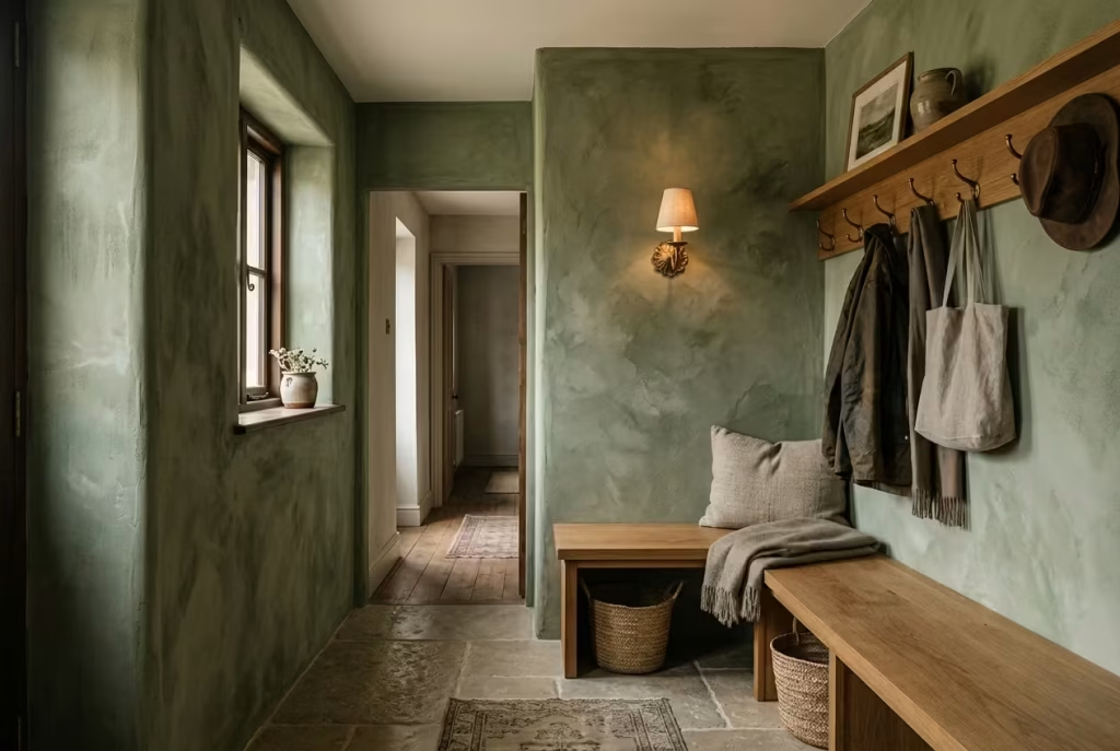
There is a particular kind of quietness that limewash brings into a mudroom, one that feels almost architectural in its softness rather than decorative in intent. When applied in a moss green tone, the effect becomes even more atmospheric.
The walls stop behaving like flat surfaces and begin to read as something more tactile, almost mineral in quality, as though the room has been gently carved out of stone over time rather than freshly painted.
Unlike standard paint finishes, which tend to sit uniformly on the surface, limewash interacts with light in a far more expressive way. It absorbs, releases, and diffuses illumination unevenly, creating subtle shifts in tone that change throughout the day. In a mudroom, where movement is constant and light conditions are rarely static, this quality introduces a sense of depth that feels quietly compelling rather than visually loud.
Texture Driven Depth That Changes with Light
Moss green limewash carries a layered visual language that standard paint rarely achieves. Instead of a single consistent colour, the surface reveals soft variations, cloudy transitions, and faint tonal shifts that give the walls a sense of movement.
In practical terms, this means the mudroom never looks exactly the same twice. Morning light might highlight warmer green undertones, while late afternoon shadows draw out cooler, more muted hues. Even artificial lighting at night reshapes the surface, creating a gentle interplay between brightness and shadow that feels almost organic.
I have seen this effect work particularly well in homes where homeowners want a mudroom that feels calm but not sterile. In one countryside renovation, moss green limewash was used across a narrow entryway with limited natural light. Instead of feeling flat or enclosed, the walls appeared to breathe softly with the space, especially when paired with warm oak benching and aged brass hooks.
That subtle depth is what makes limewash feel so different from conventional finishes. It does not demand attention, yet it quietly holds it.
Imperfect Finishes That Feel Authentically Lived In
One of the most appealing aspects of limewash is its inherent imperfection. Brush strokes remain visible. Layers overlap unevenly. Colour density varies slightly from one section to another. Rather than being flaws, these characteristics are exactly what give the finish its character.
In mudrooms, this sense of imperfection becomes surprisingly practical. Entry spaces are high-traffic by nature. Bags brush against walls, shoes leave occasional marks, and seasonal changes bring constant movement.
A perfectly flat painted surface can quickly begin to show wear in an unforgiving way. Limewash, however, absorbs that lived-in reality far more gracefully.
Over time, instead of deteriorating, it tends to develop more depth. The finish becomes softer around edges, richer in tone where layers overlap, and increasingly harmonious with the surrounding materials. It ages rather than simply wearing out.
I often describe limewash as a finish that feels comfortable with real life. It does not resist it, it accommodates it.
Why Limewash Feels Softer Than Standard Paint
The softness of limewash is not just visual, it is also psychological. Standard paint tends to reflect light in a uniform, predictable way. Limewash behaves differently. Its mineral composition allows light to scatter across the surface rather than bouncing directly off it. This diffusion creates a muted, almost velvety appearance that feels less rigid to the eye.
In moss green tones, this effect becomes even more pronounced. The colour feels grounded yet airy, present but never overpowering. It avoids the sharpness that sometimes comes with conventional matte paint finishes, particularly in darker shades.
In real design settings, this softness has a very practical benefit. Mudrooms often sit at transitional points between exterior brightness and interior calm. Limewash helps smooth that visual shift, making the space feel less like a boundary and more like a gentle passage into the home.
When paired with natural materials such as limestone flooring, woven baskets, or warm timber joinery, moss green limewash creates an atmosphere that feels almost effortless. Nothing competes for attention, yet everything feels considered.
There is also a subtle emotional effect at play. Spaces finished in limewash tend to feel more relaxed, less formal, and slightly more forgiving. They do not insist on perfection, and that in itself makes them incredibly suited to the realities of everyday family life.
In the end, moss green limewash mudrooms are not about precision or polish. They are about atmosphere, texture, and the quiet acceptance that homes are meant to be lived in, not preserved.
You May also Like: 21 Dining Room Renovation Ideas: From Modern Minimalism to Vintage Charm
Dark Green Lockers with Integrated Oak Seating
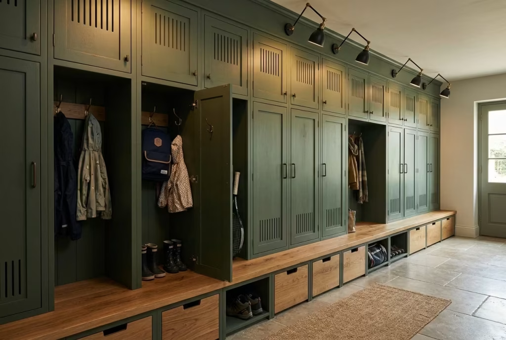
There is a certain quiet efficiency to locker-style mudrooms that makes everyday life feel noticeably more controlled. When finished in dark green and anchored with integrated oak seating, the whole composition takes on a grounded, almost institutional sense of order, but softened just enough to feel residential rather than rigid.
It is the kind of setup that works particularly well in larger households where movement is constant and storage needs evolve from one season to the next without much warning.
In practice, this design approach does not rely on decoration. It relies on structure. Each element has a clear purpose, and when that clarity is paired with deep green cabinetry and warm timber seating, the result feels calm, organised, and surprisingly welcoming, even on the busiest of mornings when the house is moving at full pace.
Especially Effective for Larger Households with Children
In family homes, especially those with children of different ages, mudrooms often become the unofficial command centre of daily life. School bags, sports kits, coats, shoes, and random items that never seem to find a permanent home all accumulate in one space. Dark green locker systems help bring order to that natural chaos.
Instead of a single shared storage zone where everything blends together, individual compartments give each family member their own defined space. This small psychological shift has a surprisingly strong impact on daily routines. Children begin to understand ownership of their belongings more clearly, while parents spend less time managing clutter that tends to migrate across the house.
In one suburban renovation I worked on, a family of five transformed their previously open mudroom into a full locker system. Within weeks, the difference was noticeable.
Morning routines became smoother, arguments over missing shoes reduced significantly, and the space finally began functioning as intended rather than constantly falling behind daily use. Sometimes structure does not just organise a room. It quietly reshapes behaviour.
Individual Locker Widths That Actually Work in Real Life
Proportion is what determines whether a locker system feels effortless or cramped. For practical everyday use, individual locker widths generally sit best between 16 and 24 inches (40 to 60 cm). Narrower sections can work for children’s storage, especially for younger age groups, but adults typically require slightly more generous spacing to accommodate coats, backpacks, and bulkier seasonal items.
Depth is equally important. A range of 18 to 24 inches (45 to 60 cm) tends to allow sufficient space without pushing the storage too far into the room. Anything deeper risks interrupting circulation, particularly in narrower mudrooms where walking space is already limited.
Height can be adjusted depending on whether lockers are full-height or combined with bench seating. Full-height units often create a more architectural presence, while half-height lockers with seating beneath offer a more relaxed, accessible layout for family interaction.
When paired with dark green cabinetry, these proportions begin to feel almost architectural in rhythm, like a quiet repetition that holds the entire room together.
Ventilation Considerations That Are Often Overlooked
Mudrooms deal with moisture constantly. Wet coats, damp shoes, umbrellas, and outdoor gear all introduce humidity into enclosed storage spaces. Without proper ventilation, even the most beautifully designed locker system can quickly become impractical.
This is where small design decisions make a significant difference. I usually recommend incorporating discreet ventilation slots at the back or base of each locker. These allow air to circulate naturally, reducing trapped moisture and helping garments dry more efficiently. In some projects, especially larger family homes, we also integrate perforated metal panels or timber slats that allow airflow without compromising visual cohesion.
Another subtle but effective detail is spacing lockers slightly off the floor when possible. Even a minimal gap can help improve air movement and reduce the risk of damp build-up over time.
In homes where seasonal weather is unpredictable, especially during wet winter months, these details become essential rather than optional. They are the difference between a storage system that simply looks good and one that genuinely performs under pressure.
Seasonal Storage Rotation That Keeps Life Flowing Smoothly
One of the most overlooked aspects of mudroom design is how storage adapts across seasons. A locker system that works beautifully in winter can quickly feel overcrowded in summer if not managed thoughtfully. This is where seasonal rotation becomes essential.
In practical terms, I often design upper compartments for long-term storage and lower sections for daily rotation. Winter coats, scarves, and heavy boots can be stored higher during warmer months, while lighter seasonal items move into more accessible zones.
Within dark green locker systems, this rotation feels particularly seamless because the cabinetry itself remains visually consistent. Even when contents change dramatically, the exterior maintains its calm, composed appearance.
I also find that labelled or subtly coded compartments help families maintain this rhythm without constant effort. Not overly decorative labels, but simple, understated systems that allow everyone in the household to understand where things belong at a glance.
Over time, this approach creates a mudroom that feels less like a cluttered transition space and more like a well-organised buffer between outside chaos and interior calm.
And when that rhythm is established, the entire home tends to follow suit with a surprising sense of ease.
Moody Cottage-Style Mudrooms
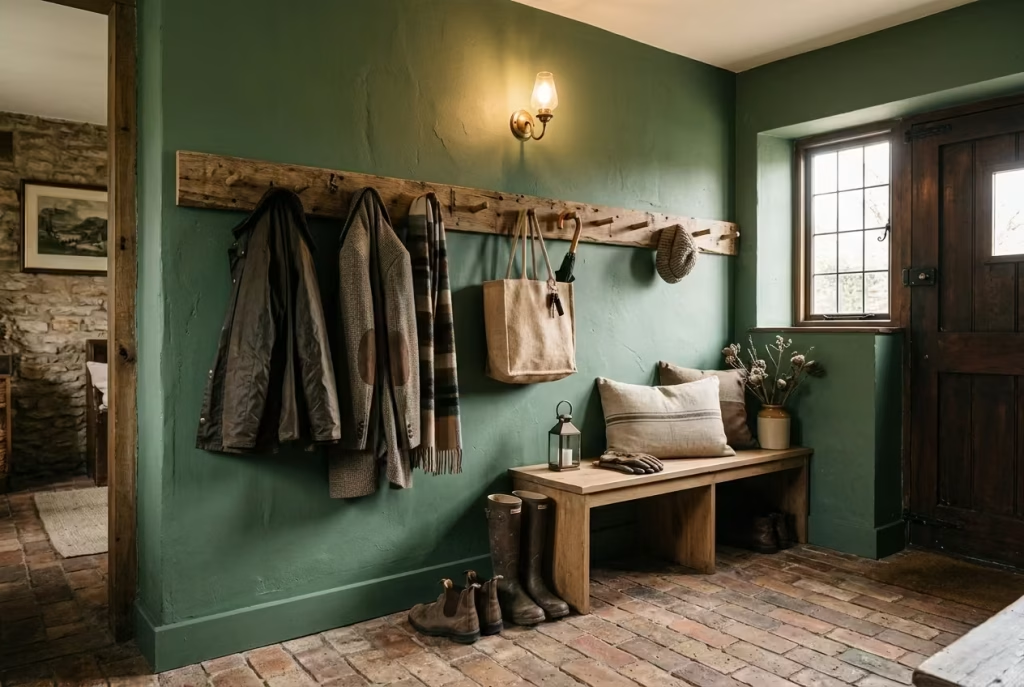
A cottage-style mudroom wrapped in moody green has a way of feeling instantly familiar, almost like it has always been part of the home’s story rather than recently designed. There is a gentle honesty to this style, where nothing feels overly polished or forced. Instead, it leans into texture, age, and everyday practicality, creating a space that feels lived in from the very beginning rather than waiting to be softened over time.
When deep green enters this setting, it brings a quiet richness that elevates the rustic character without stripping away its charm. The result is a mudroom that feels grounded, slightly nostalgic, and deeply comforting, especially in homes where the transition from outdoors to indoors is part of daily rhythm.
Vintage Pegs That Carry Everyday Life with Ease
There is something almost timeless about a row of vintage-style wooden or metal pegs set against moody green walls. They are simple, almost unassuming, yet they carry the weight of daily life without complaint.
In practical terms, pegs are one of the most efficient storage solutions for cottage-style mudrooms. Coats, scarves, dog leads, market bags, and even wet jackets can be hung quickly without the need for precise folding or organisation. This makes them particularly useful in households where movement is constant and routines are rarely predictable.
I often prefer staggered peg arrangements rather than perfectly linear layouts. This small shift creates a more relaxed rhythm on the wall and prevents the space from feeling overly formal. When paired with deep green backdrops, especially heritage-inspired shades with subtle brown undertones, the contrast feels warm and quietly traditional.
In one rural renovation project, aged brass and painted wooden pegs were mounted on reclaimed timber backing. Over time, the combination developed a patina that felt almost accidental in the best possible way, as though the space had been evolving naturally for years rather than being carefully designed in a single moment. That sense of ease is exactly what makes cottage-style mudrooms so enduring.
Brick Flooring That Grounds the Space
Brick flooring brings a sense of permanence that feels perfectly aligned with cottage interiors. It carries weight, texture, and a slightly irregular surface quality that softens over time, especially when exposed to everyday foot traffic.
Against moody green walls, brick introduces warmth that prevents the palette from leaning too cool or overly shadowed. The natural variation in tone, ranging from deep russet to softer terracotta, adds visual movement beneath the feet, which keeps the space from feeling static.
From a practical standpoint, brick also handles wear exceptionally well. Mudrooms see constant movement, particularly in rural or family homes where outdoor activity is part of daily life. Wet boots, muddy shoes, and seasonal debris are all part of the equation. Properly sealed brick flooring manages this reality with quiet resilience.
One detail I often encourage is choosing a slightly aged or reclaimed finish rather than perfectly uniform brick. The subtle imperfections help disguise future wear while enhancing the authenticity of the space.
There is a kind of quiet reassurance in walking across a floor that feels solid, slightly textured, and completely unbothered by the messiness of everyday living.
Heritage Greens That Feel Rooted in Time
Not all greens behave the same way in cottage interiors. Heritage greens, particularly those with muted olive, moss, or slightly greyed undertones, tend to sit most comfortably within this style.
These tones feel familiar rather than fashionable. They echo natural landscapes, aged paintwork, and older architectural details often found in countryside homes. When used in a mudroom, they create a sense of continuity, as though the space has grown organically from the structure itself.
In practical design terms, heritage greens also pair beautifully with traditional materials like brick, timber, and stone. They do not compete for attention. Instead, they settle into the background and allow texture to take the lead.
I have often found that homeowners respond emotionally to these colours in a way they do not expect. There is a softness to them that feels grounding, especially in transitional spaces where people are moving between outdoor chaos and indoor calm.
It is less about making a statement and more about creating a feeling that quietly supports daily life without drawing attention to itself.
Layered Textiles That Soften the Everyday
Textiles play a surprisingly important role in cottage-style mudrooms, especially when deeper green tones and brick flooring are involved. Without soft layers, the space can feel slightly too grounded, almost heavy underfoot and visually dense.
Adding textiles introduces relief. Simple elements such as woven runners, wool cushions on benches, linen-lined storage baskets, and slightly worn fabric seating pads help break up the solidity of the architectural materials. They also add a tactile softness that makes the room feel more inviting during colder months.
In one project, I introduced a handwoven runner with subtle earth-toned striping across a brick-floored mudroom. It immediately shifted the atmosphere. The space felt warmer, less rigid, and more connected to the rhythm of the rest of the home.
What makes textiles particularly effective in cottage mudrooms is their ability to evolve over time. They soften, fade slightly, and develop character with use. Rather than needing constant replacement, they become part of the room’s layered identity.
When combined with moody green walls, brick flooring, and vintage details, these softer elements prevent the space from feeling overly grounded or visually dense. Instead, everything begins to sit in gentle balance, like pieces of a story that has been unfolding slowly over time, quietly shaped by daily living rather than forced design decisions.
Minimalist Dark Green Mudrooms with Concealed Storage
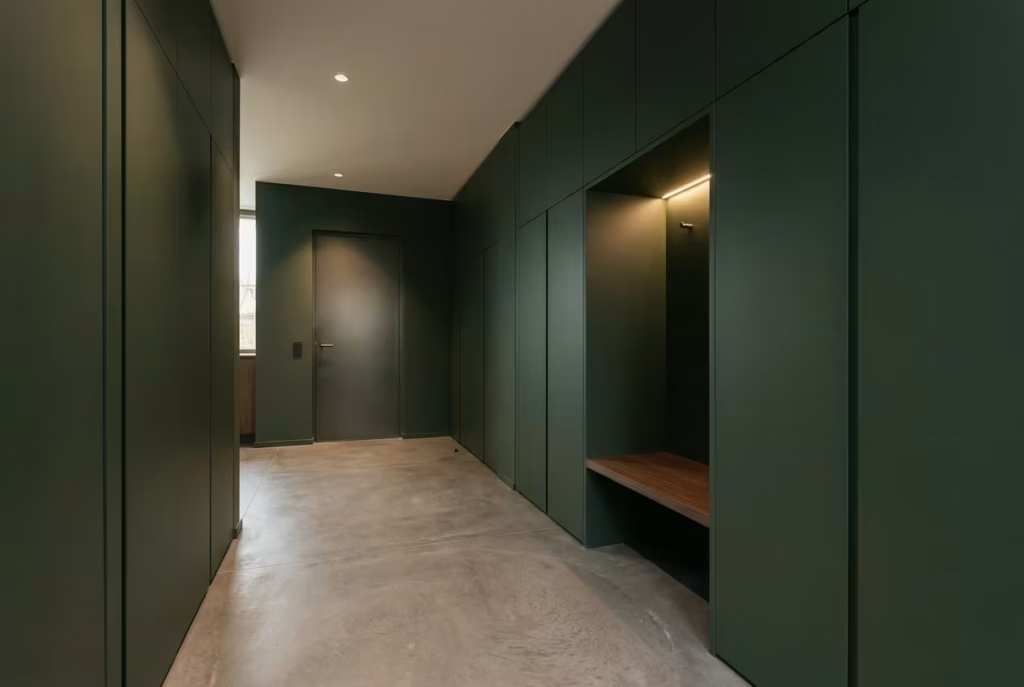
Minimalist mudrooms in dark green are not about absence, they are about precision. Every line, every junction, every hidden compartment is considered with quiet discipline so that the space feels calm rather than empty.
When storage disappears into the architecture, the room stops behaving like a utility zone and starts reading as a composed extension of the home itself. Deep green, in this context, becomes less of a decorative colour and more of an architectural atmosphere, holding everything together without drawing unnecessary attention.
This approach works particularly well in contemporary homes where visual clutter can easily disrupt the flow between interior spaces. Instead of showcasing storage, the design conceals it, allowing the mood of the room to feel uninterrupted and intentionally restrained.
Flush Cabinetry That Dissolves Into the Architecture
Flush cabinetry is the backbone of a minimalist mudroom. When doors sit perfectly aligned with surrounding walls, without visible frames or projections, the entire composition begins to feel seamless.
In dark green finishes, this effect becomes even more pronounced. The colour already carries depth, so when combined with uninterrupted surfaces, it creates a continuous visual field that feels calm and controlled.
I often specify push-to-open systems or integrated channel pulls in these designs. The goal is to avoid visual interruption at every possible point. Even traditional handles, no matter how refined, can begin to break the rhythm of a truly minimal surface.
In one modern townhouse project, we used full-height flush cabinetry in a deep forest green tone that wrapped around the entire mudroom. At first glance, the space appeared almost monolithic, but once opened, it revealed a carefully organised internal structure with seating, shoe storage, and hidden utility zones. That contrast between exterior simplicity and interior complexity is what gives this style its quiet strength.
It is a design approach that rewards restraint. Nothing is over-explained, yet everything has its place.
Shadow-Line Detailing That Adds Quiet Depth
Shadow lines are one of those architectural details that often go unnoticed at first, yet they completely change how a space feels.
By introducing a subtle gap between cabinetry and wall, or between ceiling and joinery, you allow light to fall into these recesses, creating a delicate outline that separates forms without using physical trims. In minimalist dark green mudrooms, this technique prevents the space from feeling flat or overly compressed.
Instead of hard edges, you get soft transitions. Instead of heavy boundaries, you get breathing space.
I have found that shadow-line detailing works especially well in rooms with limited natural light. It introduces just enough visual relief to keep darker greens from feeling too dense, particularly in narrow entryways where every surface is close to the eye.
In practice, even a 5 to 10 millimetre reveal can completely change the perception of cabinetry. It is a small adjustment with a surprisingly large impact, the kind of detail that quietly separates well-considered design from something that simply looks finished.
Minimal Hardware for a Cleaner Visual Language
Hardware in minimalist mudrooms is intentionally understated. The aim is not to eliminate function, but to reduce visual noise as much as possible.
Recessed pulls, edge channels, or touch-latch mechanisms allow dark green cabinetry to remain uninterrupted. When hardware is used, it is typically slim, linear, and closely matched to the cabinetry tone so that it blends rather than stands out.
This restraint is particularly important in mudrooms because the space already deals with constant visual activity, coats being hung, shoes appearing and disappearing, bags moving in and out throughout the day. If the cabinetry itself is also visually busy, the room quickly loses its sense of calm.
One detail I often rely on is concealed grip edges along vertical cabinet runs. They provide enough functionality for daily use while maintaining a clean façade that feels almost architectural in nature rather than decorative. The result is a room that feels composed even when life inside it is anything but.
Architectural Restraint That Shapes the Entire Atmosphere
At the heart of minimalist dark green mudrooms is a principle of restraint. Not emptiness, but careful editing.
Every element is questioned. Does it need to be visible. Does it contribute to function. Does it support the overall atmosphere. If the answer is no, it is removed or hidden.
This disciplined approach allows the green colour to take on a more atmospheric role. Without competing elements, the tone becomes the primary emotional driver of the space. It feels deeper, more continuous, and more intentional.
In practical terms, this restraint also makes maintenance easier. Fewer exposed elements mean fewer surfaces collecting dust, clutter, or visual distraction. Families often find that these spaces naturally stay tidier simply because there are fewer places for disorder to accumulate.
I have seen this play out repeatedly in modern family homes where minimalist mudrooms quietly encourage better habits without enforcing them. Shoes return to hidden compartments, coats disappear behind flush doors, and everyday items are stored almost instinctively rather than left out in the open.
That is the subtle power of architectural restraint. It does not demand order. It creates the conditions for it to happen naturally.
And when paired with dark green, that sense of calm order feels even more grounded, like a deep breath at the threshold of home, steady, composed, and quietly unshaken by the pace of everyday life.
You May also Like: 15 Victorian Mudroom Design Secrets for a Timeless, Elegant Entryway
Dark Green Mudrooms with Dramatic Wallpaper Ceilings
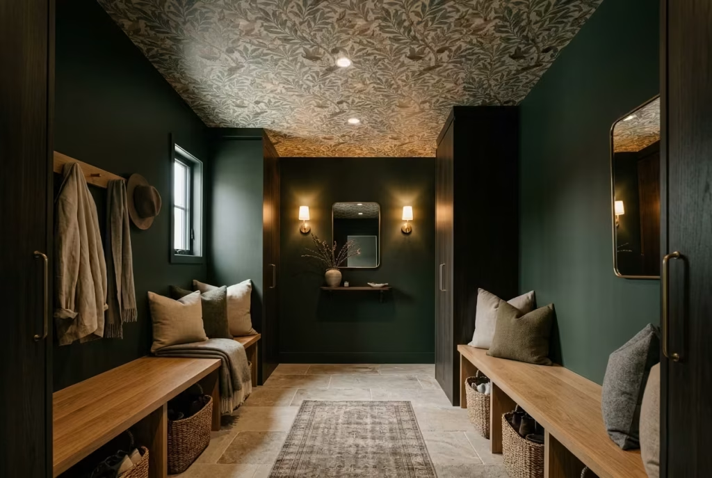
There is a certain unexpected confidence in looking up and finding the ceiling treated with the same level of intention as the walls. In dark green mudrooms, a dramatic wallpaper ceiling introduces a moment of surprise that quietly reshapes how the entire space is experienced.
It draws the eye upward, breaks the predictability of a box-like room, and adds a layer of narrative that feels both curated and slightly whimsical when done with restraint.
Rather than competing with the moody green walls, the ceiling becomes a counterpoint. It shifts the focus vertically, giving even compact mudrooms a sense of height and architectural drama that plain painted ceilings rarely achieve.
Ceiling Treatment Psychology
Ceilings are often referred to as the “fifth wall,” yet in most mudrooms they are treated as an afterthought. Introducing wallpaper overhead changes that hierarchy completely. The psychological effect is subtle but powerful. Instead of feeling enclosed, the room begins to feel more enveloping, almost like stepping into a carefully designed enclosure rather than a purely functional passage.
In darker green mudrooms especially, this upward attention shift prevents the space from feeling visually weighted at eye level. The mind is gently guided upward, creating a sense of openness even when the footprint is compact.
I have found that homeowners often underestimate how much emotional impact ceiling treatments can carry. In one renovation, a simple botanical print ceiling above a deep olive mudroom bench completely transformed the arrival experience. What was once a purely transitional space began to feel intentional, almost like a small entry gallery that set the tone for the rest of the home.
It is one of those design moves that feels small in theory but surprisingly atmospheric in practice.
Pattern Scale That Keeps the Space Composed
When introducing wallpaper overhead, scale becomes everything. In mudrooms already defined by strong wall colour, the ceiling pattern needs to complement rather than overwhelm.
Large-scale patterns can work beautifully in rooms with higher ceilings, typically above 8.5 feet (2.6 metres), where there is enough vertical breathing room to support visual drama. Oversized botanical prints, abstract textures, or softly distressed motifs tend to feel most balanced in these settings.
In lower ceilings, smaller, more restrained patterns usually perform better. Fine linework, subtle tonal variations, or muted repeating motifs help maintain visual calm without drawing excessive attention downward.
One important consideration is how the pattern interacts with lighting. Strong directional lighting can exaggerate contrasts in wallpaper, while softer diffused lighting allows the design to feel more integrated into the architecture. In moody green mudrooms, warm lighting between 2700K and 3000K tends to be most forgiving, gently blending wall colour and ceiling detail into a cohesive atmosphere.
The aim is never visual noise. It is controlled expression, like a quiet accent rather than a loud statement.
Balancing Darker Wall Colours with Decorative Ceilings
Dark green walls already carry a strong sense of presence. Without careful balance, adding a patterned ceiling can risk tipping the room into visual heaviness. The key lies in restraint and tonal harmony.
One effective approach is to ensure the ceiling design carries some form of connection to the wall colour, whether through muted green undertones, earthy neutrals, or softened botanical references. This creates continuity rather than competition between surfaces.
In practical design terms, I often keep cabinetry and flooring relatively grounded when the ceiling becomes the focal point. Warm oak benches, limestone flooring, or simple matte finishes help stabilise the visual hierarchy so the ceiling remains the expressive element without overwhelming the space.
I also find that breaking up large wall expanses with subtle architectural detailing, such as slim paneling or shadow gaps, can help distribute visual weight more evenly. This prevents the room from feeling top-heavy once a patterned ceiling is introduced.
There is a fine line here, and when it is handled well, the effect is quietly striking. The mudroom feels layered rather than busy, expressive yet still composed, like a space that understands how to hold attention without asking for it too loudly.
In the end, a dramatic wallpaper ceiling in a dark green mudroom is not about decoration for its own sake. It is about reframing how the room is experienced, shifting focus, adding depth, and creating a moment of unexpected beauty in a space that is often overlooked.
Olive Green Mudrooms with Rustic Brick Floors
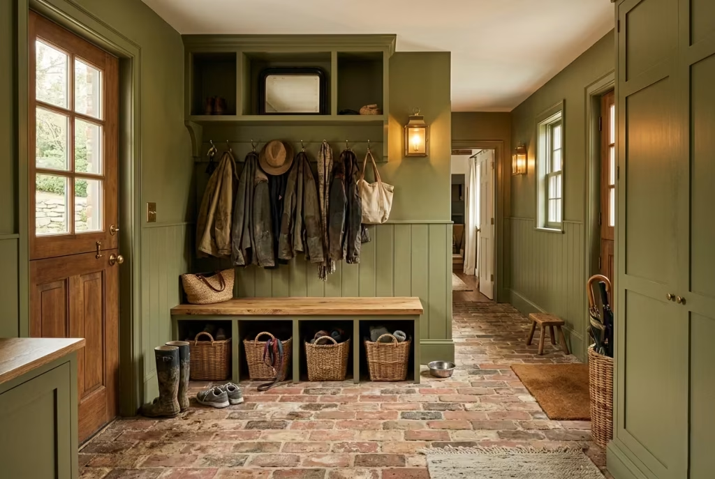
There is a grounded honesty to olive green paired with rustic brick flooring that feels almost instinctive, as if the two materials were always meant to coexist. The combination carries a kind of lived-in warmth that does not rely on polish or perfection. Instead, it leans into texture, subtle irregularity, and the quiet beauty of surfaces that improve with age. In a mudroom, where life rarely slows down, this pairing feels especially appropriate, absorbing the rhythm of daily comings and goings with understated ease.
Olive green introduces softness and depth without becoming overly dominant, while brick flooring anchors the space with weight and permanence. Together, they create a mudroom that feels rooted in tradition yet adaptable enough for modern family life.
The Natural Harmony Between Olive Green and Brick
Olive green has a unique ability to sit comfortably alongside earthy materials. Unlike cooler greens that can sometimes feel detached from natural textures, olive tones carry a subtle warmth that echoes the red and terracotta undertones found in traditional brickwork.
This harmony is what makes the combination so enduring. The wall colour does not compete with the floor, and the floor does not overpower the walls. Instead, they work in quiet dialogue, each enhancing the other without trying too hard.
In one renovation project set in a converted farmhouse, we used deep olive cabinetry against reclaimed brick flooring that had been salvaged from the original structure.
Over time, the slight variations in brick tone, softened edges, and worn surface created a backdrop that felt almost timeless. The olive green walls added just enough depth to modernise the space without erasing its history. That balance between old and new is where this pairing truly comes into its own.
Brick Flooring That Ages With Character
One of the most appealing aspects of rustic brick flooring is its ability to evolve rather than deteriorate.
Unlike more uniform surfaces, brick develops character through use. Slight variations in tone become more pronounced over time, and the natural wear from foot traffic gradually softens the surface in a way that feels authentic rather than damaged.
In mudrooms specifically, this becomes a significant advantage. These are high-traffic spaces exposed to wet shoes, muddy boots, pets, and seasonal debris. Brick handles this environment with surprising resilience, especially when properly sealed.
From a practical standpoint, I often recommend slightly irregular or reclaimed-style brick finishes rather than perfectly uniform options. The subtle imperfections help disguise everyday wear, meaning the space continues to feel visually rich even after years of heavy use.
There is also a tactile quality to brick that is difficult to replicate. The surface feels grounded underfoot, especially in colder months when the material naturally retains a sense of cool stability that contrasts beautifully with warmer interior spaces beyond the mudroom.
Olive Green as a Softening Architectural Layer
Olive green works particularly well in mudrooms because it does not demand attention. Instead, it settles into the architecture quietly, allowing surrounding materials to take on more expressive roles.
When paired with rustic brick, olive tones act almost like a visual buffer. They soften the intensity of the floor while still allowing its texture and variation to remain visible. This creates a layered effect that feels calm rather than visually busy.
In family homes, this subtlety becomes especially valuable. Mudrooms often sit at the intersection of outdoor mess and indoor order. A colour that is too bold can feel chaotic in that transition, while something too pale can feel unforgiving. Olive green sits comfortably in the middle, absorbing everyday visual noise without becoming dull.
I have found that warmer olive tones, particularly those with muted brown or grey undertones, tend to work best in brick-floored mudrooms. They complement the natural warmth of terracotta and red brick without clashing or competing.
Practical Considerations for Everyday Living
While the combination is visually compelling, it is also highly practical when considered carefully. Brick flooring requires proper sealing to protect against moisture and staining, particularly in climates where wet weather is frequent. Regular maintenance helps preserve its appearance, but the material is forgiving enough that minor imperfections rarely detract from its overall character.
Olive green finishes, whether on walls or cabinetry, are similarly practical in high-use spaces. Their mid-tone depth helps conceal minor scuffs and marks far more effectively than lighter colours. This makes them particularly suitable for households with children or pets, where constant movement is part of everyday life.
From a design perspective, one detail I often emphasise is the importance of lighting in this type of scheme. Warm, layered lighting around 2700K to 3000K enhances both olive tones and brick textures, preventing the space from feeling overly cool or flat. Wall sconces, low-level lighting near benches, and softly diffused ceiling fixtures all help bring out the natural richness of the materials.
Creating a Space That Feels Rooted and Real
What ultimately makes olive green mudrooms with rustic brick floors so successful is their sense of authenticity. Nothing feels overly staged or fragile. Instead, the materials work together in a way that feels grounded, dependable, and quietly expressive.
There is a certain comfort in that combination. It does not try to impress at first glance. It grows on you slowly, revealing its depth over time, much like a home that becomes more meaningful the longer you live in it.
When designed thoughtfully, this pairing creates a mudroom that does more than function as a transition space. It becomes a steadying moment in the home, a place where the outside world is gently left behind, and a calmer interior rhythm quietly begins to take over.
You May also Like: 21 Cottage Office Design Ideas to Create a Cozy and Productive Workspace
Contemporary Matte Green Utility-Mudroom Combos
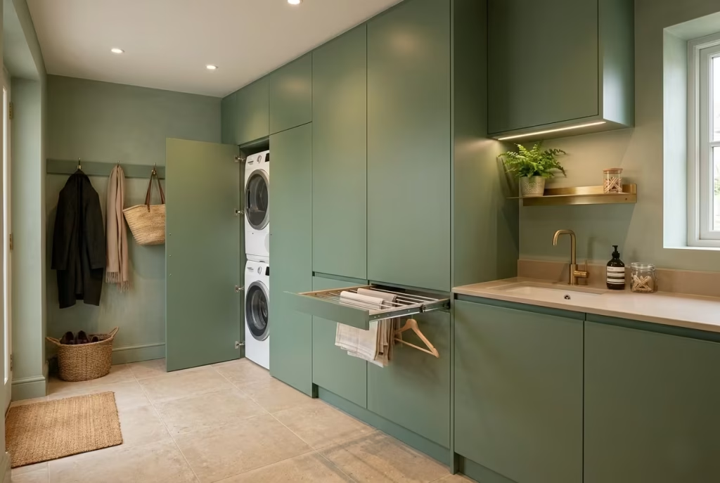
There is a growing shift in residential design where the mudroom is no longer treated as a standalone entry zone, but as a fully integrated utility space. When paired with a contemporary matte green palette, this hybrid approach feels both highly functional and visually composed.
It is the kind of space that quietly works behind the scenes, handling laundry, storage, and daily transition tasks without ever feeling visually chaotic or overexposed.
Matte green, in this context, becomes more than a colour choice. It becomes a unifying surface that absorbs the visual complexity of appliances, shelving, and storage systems, allowing the room to remain calm even when its function is anything but.
Washer Integration That Feels Seamless, Not Stuck On
Integrating a washer and dryer into a mudroom requires more than simply allocating space. It is about making the appliances feel like they belong within the architecture rather than interrupting it.
In contemporary matte green schemes, I often recommend fully enclosed cabinetry systems that conceal appliances behind flush doors. This approach allows the laundry zone to disappear visually when not in use, maintaining the calm continuity of the space.
Stacked washer dryer units work particularly well in narrower mudrooms, typically housed within tall cabinetry columns around 24 to 30 inches (60 to 75 cm) wide. In wider layouts, side-by-side installations beneath continuous worktops create a more balanced and accessible configuration.
One detail that is often overlooked is vibration control. Proper installation with anti-vibration pads or built-in stabilising plinths ensures that the cabinetry remains visually steady over time. Without this, even the most refined design can feel slightly unsettled during operation.
I have worked on several projects where homeowners were initially hesitant about placing laundry equipment within their main entry zone. Yet once concealed behind matte green cabinetry, the machines effectively disappeared into the background, leaving only a calm, unified wall of joinery that felt intentional rather than utilitarian.
Hidden Drying Racks That Preserve Visual Calm
Drying racks are one of those essential features that rarely photograph well, yet play a crucial role in daily household life. In contemporary mudroom designs, the goal is to make them functionally accessible but visually invisible when not in use.
Pull-out drying racks integrated within cabinetry are one of the most effective solutions. These systems allow garments to be aired discreetly without occupying valuable floor space or disrupting the visual flow of the room. When closed, they sit flush within the joinery, completely hidden behind matte green doors.
Another approach involves wall-mounted retractable systems positioned above utility counters or near laundry appliances. These can be extended during use and folded away seamlessly once the task is complete.
From a practical standpoint, placement is everything. Drying areas should be positioned away from direct circulation paths to avoid congestion, especially in shared family spaces where multiple routines overlap throughout the day.
In one compact urban renovation, we incorporated a concealed drying system above a matte green utility bench. What initially felt like a constraint in spatial planning ended up becoming one of the most appreciated features of the entire home, simply because it removed everyday clutter from sight without removing its function.
That balance between usefulness and invisibility is where good design quietly earns its keep. Moisture-Resistant Finishes That Handle Real Life
Mudroom utility combinations deal with a constant cycle of moisture, temperature shifts, and daily wear. From wet coats and damp shoes to laundry steam and accidental spills, surfaces are always under subtle pressure. This is where material selection becomes critical.
In matte green utility-mudroom spaces, moisture-resistant finishes are not just a recommendation, they are a necessity. Matte cabinetry should ideally be specified with durable, wipeable coatings that resist staining while maintaining a soft, non-reflective appearance.
For worktops, materials such as quartz, sealed stone, or compact laminate tend to perform exceptionally well. They resist water absorption and are easy to maintain, even under heavy daily use.
Flooring also plays a crucial role in maintaining longevity. Porcelain tiles with anti-slip finishes, sealed stone, or engineered vinyl systems often provide the most reliable performance in high-moisture environments.
One detail I always emphasise is edge protection. In utility zones, cabinet bases and lower panels are more exposed to water contact than most homeowners expect. Raising cabinetry slightly off the floor or using moisture-resistant kickboards can significantly extend the lifespan of the joinery.
I have seen beautifully designed mudroom-utility hybrids fail prematurely simply because moisture pathways were not fully considered at the detailing stage. When these small protective decisions are made early, however, the space tends to age far more gracefully.
Where Function and Calm Finally Meet
What makes contemporary matte green utility-mudroom combinations so effective is their ability to merge practicality with restraint. The room does not attempt to hide its purpose, but it also does not allow function to dominate visually.
Instead, everything is contained, integrated, and softened through a consistent material palette. Appliances disappear behind cabinetry, drying systems retreat into hidden compartments, and moisture-resistant finishes quietly support the demands of daily life without drawing attention to themselves.
The result is a space that feels composed even during its busiest moments. Laundry cycles run, coats dry, shoes gather at the entrance, yet the visual atmosphere remains steady and controlled.
In many ways, this type of design reflects a more realistic approach to modern living. Homes are no longer separated into rigid zones of beauty and utility. They overlap, intersect, and function simultaneously.
A well-executed matte green mudroom-utility space does not fight that reality. It absorbs it, organises it, and quietly turns it into something that feels remarkably easy to live with.
Moody Green Mudrooms with Arched Storage Niches
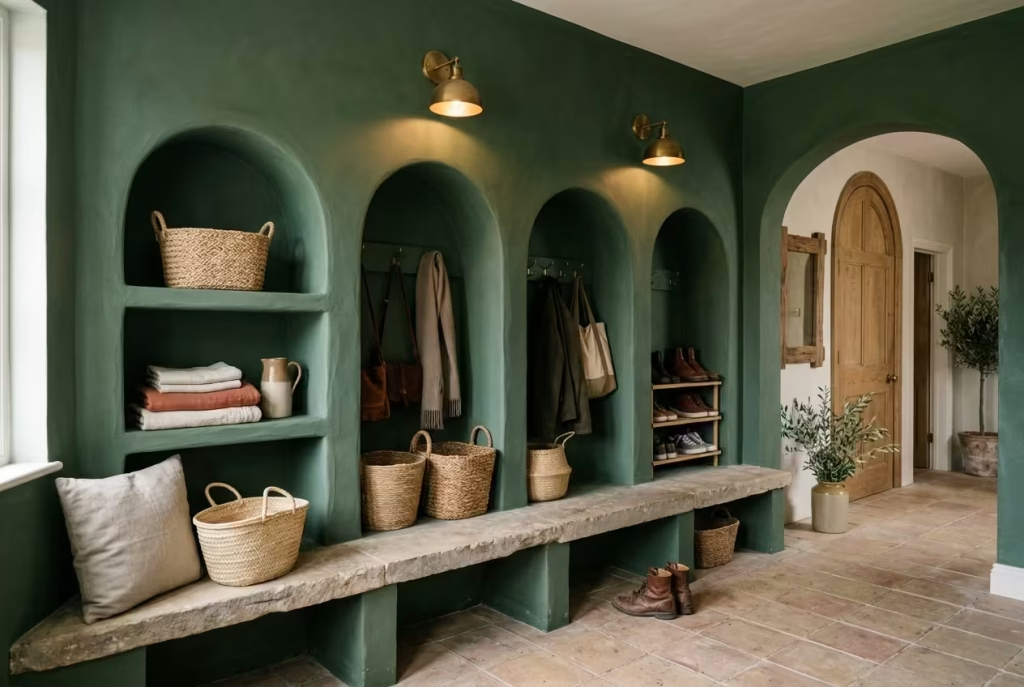
There is a quiet elegance to arches that straight-lined cabinetry simply cannot replicate. When introduced into a moody green mudroom, arched storage niches soften the entire architectural language of the space, shifting it away from rigid utility and toward something more sculptural and atmospheric.
The result feels less like a functional corridor and more like a carefully composed interior moment, where storage becomes part of the architecture rather than an afterthought.
Moody green enhances this effect beautifully. Its depth allows curved forms to stand out without feeling decorative for the sake of it. Instead, the arches feel grounded, almost carved into the structure, as if they have always belonged there.
Softening Architectural Geometry
Most mudrooms rely heavily on straight lines, flush cabinetry, and right angles because they are efficient and easy to build. Arches interrupt that predictability in a very intentional way. They soften the geometry of the room, introducing a visual rhythm that feels slower, calmer, and more considered.
In practice, even a single arched niche can change the perception of an entire wall. The eye naturally follows the curve, which reduces the visual tension that often builds in narrow entry spaces filled with vertical storage and repetitive cabinet fronts.
I have found that this effect becomes particularly noticeable in homes where the mudroom sits directly off a busy hallway or kitchen. The arched forms act almost like a visual pause, breaking up the linear flow of movement and giving the space a more relaxed, architectural presence.
When paired with moody green tones, the curvature feels even more pronounced. The colour absorbs light in a way that enhances shadow within the arch, subtly highlighting depth without requiring additional decorative detail. It is a quiet shift, but one that changes the emotional reading of the space entirely.
Mediterranean Influence and Timeless Character
Arched storage niches often carry a subtle Mediterranean influence, whether intentional or not. They echo the language of traditional European architecture, where curves were used to soften stone structures and introduce a sense of rhythm into otherwise heavy materials.
In moody green mudrooms, this influence feels particularly at home. The combination of deep colour and curved forms creates an atmosphere that feels both grounded and sun-warmed, even in more contemporary settings.
I have used this approach in projects where homeowners wanted a mudroom that felt less like a service zone and more like a transitional interior space with character. In one renovation inspired by coastal Mediterranean architecture, we introduced shallow arched niches above a limestone bench, finished in a muted moss green plaster. The result felt effortlessly aged, as though the space had been gently shaped over time rather than recently constructed.
What makes this style so compelling is its refusal to feel overly precise. The slight irregularities in curve, plaster finish, and shadow line all contribute to a sense of authenticity that polished, linear joinery often lacks. It is not about perfection. It is about atmosphere that feels quietly rooted.
Plaster Textures That Bring Depth and Warmth
Plaster plays a crucial role in achieving the softness that arched niches demand. Unlike painted drywall surfaces, plaster carries subtle variations in tone and texture that interact with light in a more organic way.
In moody green mudrooms, plaster finishes enhance both the colour and the curvature of the niches. Light grazes across the surface unevenly, picking up small imperfections and creating a layered visual depth that feels tactile even from a distance.
There are different approaches to plaster finishes depending on the desired effect. Smooth lime-based plaster creates a more refined, almost polished softness, while more textured applications introduce a rustic, hand-finished quality that leans further into Mediterranean or heritage-inspired design.
In one countryside project, we used a softly trowelled plaster in a muted green-grey tone within arched storage recesses. Over time, as natural light shifted throughout the day, the surface began to reveal subtle tonal changes that made the niches feel almost alive within the architecture.
That evolving quality is what sets plaster apart from more uniform finishes. It does not remain static. It responds to its environment, which is particularly valuable in mudrooms where lighting conditions are constantly changing.
When combined with deep green walls, plaster also helps prevent the space from feeling too heavy. It introduces softness at a material level, ensuring that even darker palettes retain a sense of warmth and approachability.
Where Function Meets Quiet Sculpture
Arched storage niches are not simply decorative features. When designed correctly, they remain highly functional, offering space for baskets, footwear, folded textiles, or everyday essentials that need to remain accessible but visually contained.
The key is proportion. Niches that are too shallow risk becoming purely visual, while those that are too deep can interrupt circulation within tighter mudroom layouts. A balanced depth, often around 12 to 16 inches (30 to 40 cm), tends to work well in most residential settings.
What makes them truly effective, however, is the way they change how storage is perceived. Instead of rigid compartments, storage becomes part of a softer architectural rhythm. Items feel placed rather than stored, and the entire space reads as more curated without losing its practicality.
In the end, moody green mudrooms with arched storage niches succeed because they do something rare in utility spaces. They combine discipline with softness, structure with flow, and function with a sense of quiet artistry that lingers long after you leave the room.
English-Inspired Dark Green Boot Rooms
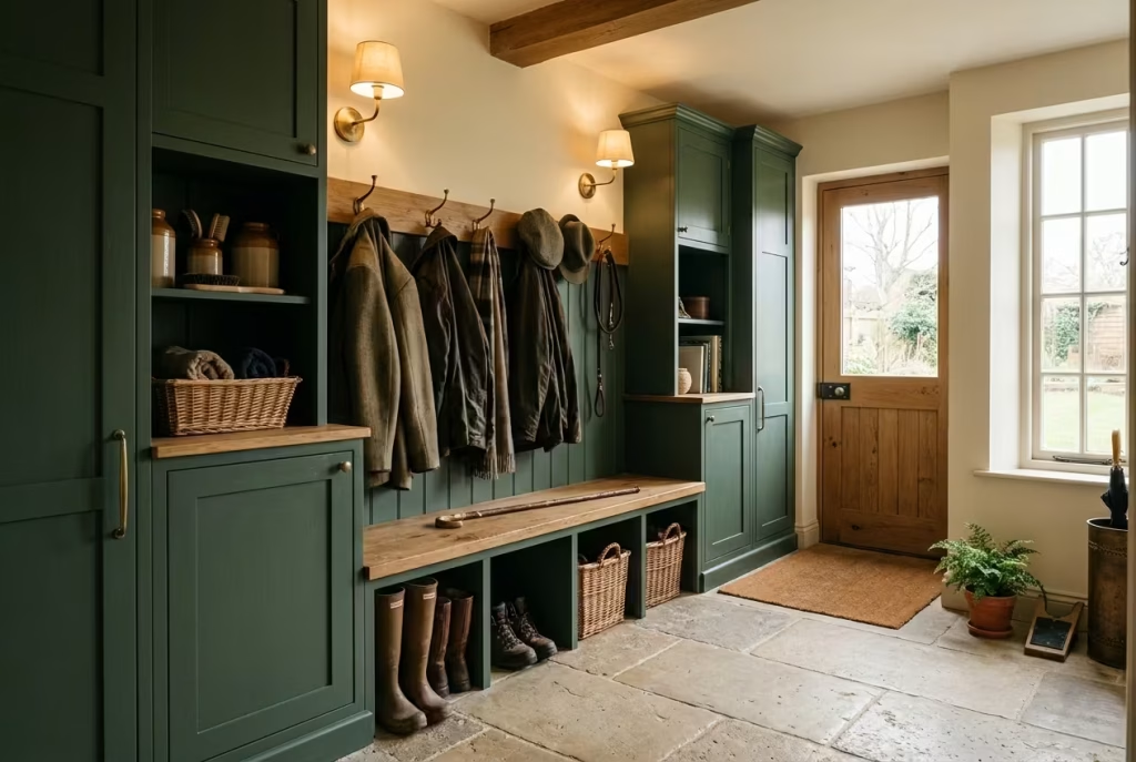
There is a certain quiet dignity to the English boot room that never really goes out of style. It is not designed to impress at first glance, but to function with calm consistency year after year, absorbing the rhythm of countryside living, wet weather, muddy boots, and layered outerwear without ever losing its composure. When reinterpreted in a deep green palette, this traditional concept feels even more grounded, almost as if it has been gently refined over generations rather than newly introduced.
Dark green brings weight and presence to the space, while the English-inspired detailing keeps it rooted in familiarity. The result is a boot room that feels both practical and enduring, a place where utility and quiet elegance sit comfortably side by side.
Heritage Cabinetry That Feels Built to Last
Heritage-style cabinetry is at the heart of any English-inspired boot room. Unlike sleek modern joinery, it carries subtle detailing such as framed doors, recessed panels, and slightly more substantial proportions that give the furniture a sense of permanence.
In dark green finishes, this cabinetry takes on an even richer character. The colour deepens the profile of the panels, allowing shadows to settle into the detailing and emphasise craftsmanship rather than flattening it.
I often find that homeowners are drawn to this style because it feels reassuringly solid. It does not chase trends. Instead, it leans into familiarity, the kind that feels like it could belong in both a country house and a modern family home without losing its identity.
In one renovation of a period property, we used deep forest green cabinetry with traditional framed detailing across an entire boot room wall. Over time, the surface developed a soft patina through use, which only enhanced its heritage feel. It was one of those spaces that quietly improved with age, rather than requiring constant refinement.
That sense of longevity is what makes heritage cabinetry so valuable in high-use environments.
Saddle Storage That Blends Function with Tradition
Saddle storage is a subtle nod to equestrian heritage often found in English rural homes. While not every household uses it for riding equipment today, the design principle remains highly functional.
These compartments are typically lower, more robust sections of cabinetry designed for heavier or bulkier items such as boots, outdoor gear, pet supplies, or seasonal equipment. In modern boot rooms, they serve as highly practical storage zones that keep the upper areas of cabinetry clean and visually balanced.
In dark green schemes, saddle storage often becomes visually discreet, blending into the lower half of the joinery while still providing essential everyday utility. It is one of those design features that quietly earns its place over time, especially in homes where outdoor activity is part of daily routine.
I have worked on properties where these lower storage sections effectively became the most used part of the entire room. Muddy walking boots, gardening tools, and winter accessories naturally gravitated there without needing instruction or constant organisation. That intuitive usability is where good boot room design really shows its strength.
Traditional Bench Detailing That Grounds the Space
A well-designed boot room bench is never just a place to sit. It is a structural anchor that shapes how the entire space is used.
In English-inspired designs, benches often feature solid timber construction, slightly heavier proportions, and subtle detailing that ties back to the cabinetry style. When finished in dark green or paired with green joinery, the bench becomes part of a continuous visual language rather than a separate element.
From a practical standpoint, I usually recommend bench depths of around 16 to 19 inches (40 to 48 cm). This range allows comfortable seating without encroaching too heavily into circulation space, which is particularly important in narrower boot rooms often found in older properties.
Under-bench storage is equally important. Whether through open cubbies or concealed drawers, this area becomes a natural catch-all for shoes, outdoor gear, and daily essentials. In busy households, it quickly becomes one of the most relied-upon zones in the entire room.
There is also something psychologically grounding about a bench in a boot room. It encourages pause. It slows down movement for just a moment, allowing people to transition more mindfully between outside and inside spaces.
Utility Elegance That Feels Effortless, Not Overdesigned
What sets English-inspired boot rooms apart is their ability to balance utility with quiet elegance. Nothing feels overly styled or unnecessarily decorative, yet everything feels carefully considered.
Dark green enhances this balance by introducing depth without overpowering the functional nature of the space. It allows timber tones, metal hardware, and traditional detailing to sit comfortably within the overall composition.
In practical terms, this approach often relies on simple but thoughtful details. Robust hooks for coats and hats, integrated umbrella stands, boot trays built into cabinetry, and durable flooring that can handle wet conditions without complaint.
I have seen many boot rooms fail not because of poor aesthetics, but because they prioritised appearance over everyday usability. The English-inspired approach avoids this mistake by placing function first, then refining it with subtle design choices that elevate the experience without complicating it.
When done well, the space feels almost effortless. Coats have a place, boots are contained, and daily clutter never fully takes over the room.
And yet, despite this strong functional backbone, the atmosphere remains calm, composed, and quietly refined.
It is that blend of practicality and understated elegance that gives dark green English boot rooms their lasting appeal, especially in homes where daily life is full, active, and always in motion.
Emerald Green Mudrooms with Gloss Finishes
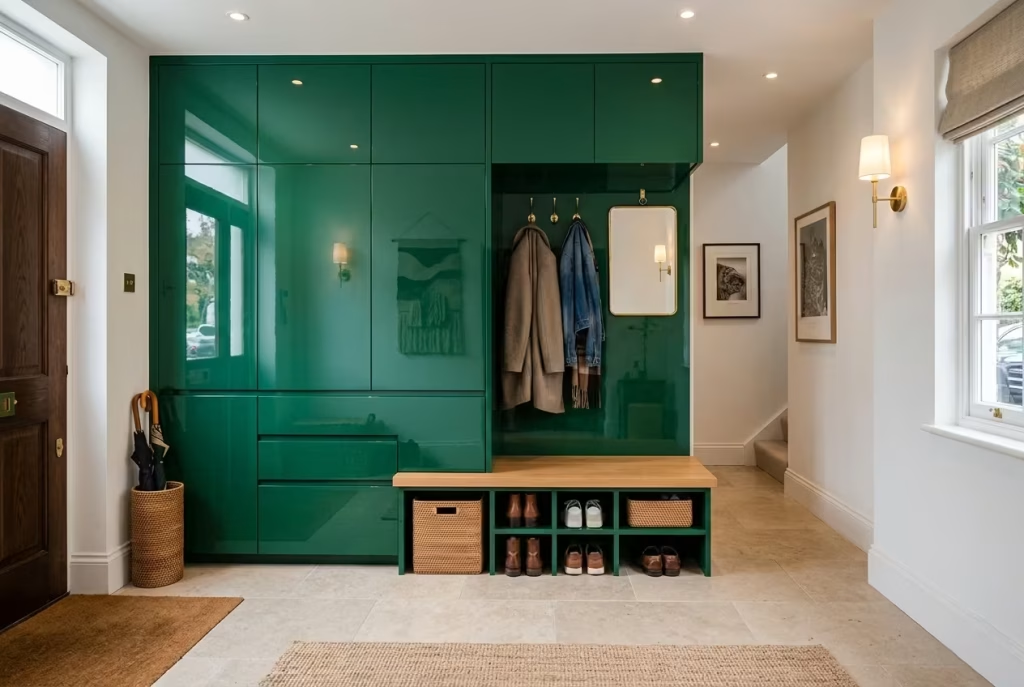
There is a certain boldness to emerald green in a high-gloss finish that immediately shifts the mood of a mudroom. It does not whisper into the space, it reflects, bounces, and amplifies everything around it. Light behaves differently here, almost as if the surface is in constant dialogue with its environment. In the right setting, this creates a mudroom that feels jewel-like, crisp, and surprisingly uplifting, even though the colour itself is deep and saturated.
Unlike matte or textured greens that absorb light quietly, gloss finishes introduce a layer of reflection that changes the entire spatial perception. What might feel compact or enclosed in another finish suddenly gains brightness and energy through reflected light, particularly in narrow or low-lit entryways.
Why Gloss Emerald Green Reflects Light So Beautifully
Emerald green already carries a natural vibrancy due to its rich blue undertones. When finished in gloss, that vibrancy is intensified through reflection rather than absorption. The surface begins to act almost like a soft mirror, capturing natural daylight, artificial lighting, and even surrounding materials such as timber flooring or brass hardware.
In practical terms, this can be incredibly effective in mudrooms that lack strong natural light. Instead of relying solely on additional fixtures, the cabinetry itself helps distribute brightness across the room. Even a small window can feel more impactful when its light is multiplied across glossy surfaces.
I have seen this effect transform quite modest entry spaces. In one compact city home, an emerald gloss mudroom with minimal natural light felt noticeably brighter after installation, not because the light source changed, but because the surfaces began working harder to reflect what was already there.
There is a sense of visual energy that comes with this finish. It keeps the space feeling active rather than static, which can be particularly useful in transitional zones where movement is constant throughout the day.
The Practical Reality of Fingerprints and Surface Maintenance
For all its visual appeal, high-gloss emerald green does come with practical considerations that should not be overlooked.
The same reflective quality that makes the finish so striking also makes it more sensitive to everyday marks. Fingerprints, smudges, and light surface streaks tend to show more easily, particularly around frequently used areas such as handles, edges, and lower cabinetry doors.
In family homes, where mudrooms are constantly in use, this is an important reality to accept early in the design process. It does not make gloss finishes unsuitable, but it does require a more considered approach to maintenance.
From experience, I often recommend using handle placements that minimise direct contact with flat panel surfaces. Integrated pulls or discreet edge detailing can significantly reduce visible marking over time. Similarly, placing higher-use storage zones slightly lower down the cabinetry run can help contain wear to less visually dominant areas.
Cleaning routines also become more regular with gloss finishes. A soft microfibre cloth and gentle, non-abrasive cleaners tend to work best, allowing the surface to retain its depth without dulling the reflective quality.
Interestingly, many homeowners find that once they adjust to this rhythm, maintenance becomes second nature rather than a burden. The visual payoff often outweighs the extra attention required.
Finding Balance Between Drama and Practicality
The key to making emerald gloss mudrooms successful lies in balance. Without careful grounding elements, the reflective intensity of the finish can become overwhelming, particularly in smaller or heavily enclosed spaces.
This is where material pairing becomes essential. Warm timber flooring, matte stone, or brushed metal accents help soften the visual impact and prevent the room from feeling overly polished or cold. The contrast between reflective cabinetry and more grounded surfaces creates a layered environment that feels intentional rather than one-dimensional.
Lighting design also plays a crucial role. Overly harsh lighting can exaggerate reflections in a way that feels visually restless. Instead, diffused lighting at a warm temperature around 2700K to 3000K helps control the reflective energy of the surface while maintaining its richness.
I have often found that a combination of overhead ambient lighting and subtle under-cabinet illumination works particularly well. It allows the gloss finish to reveal itself gradually rather than all at once, which keeps the space feeling more composed.
A Finish That Rewards Careful Design Choices
Emerald green mudrooms with gloss finishes are not a neutral choice. They are expressive, confident, and visually active. But when handled with care, they can elevate even the most functional entry space into something that feels distinctive and memorable.
They work best in homes where the mudroom is not just a drop zone, but a space that contributes to the overall character of the interior. When paired with thoughtful lighting, balanced materials, and practical detailing, the gloss finish becomes less about shine and more about depth.
In the end, this is a finish that rewards intention. It asks for a bit more consideration, a bit more upkeep, but in return it offers a presence that feels alive, reflective, and quietly captivating every time you step through the door.
Dark Green Mudrooms with Warm Walnut Joinery
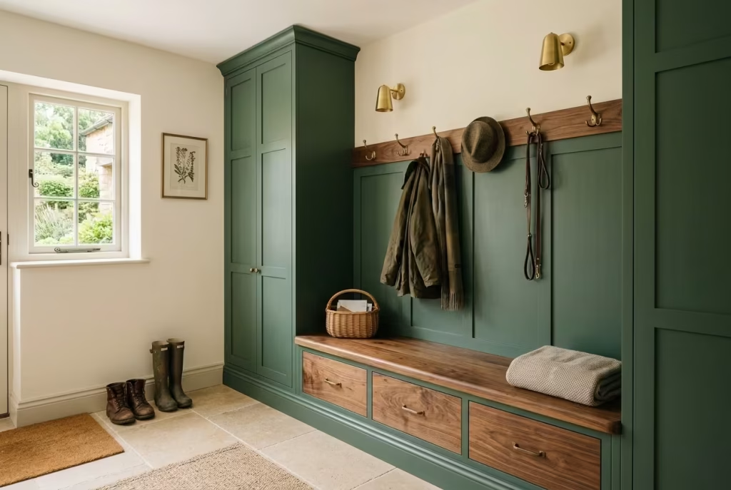
There is something unmistakably composed about dark green paired with walnut. It is a combination that does not rely on contrast for drama, but rather on depth, warmth, and material confidence.
In a mudroom setting, where surfaces are constantly tested by daily life, this pairing feels especially grounded. The green introduces calm shadow and atmosphere, while walnut brings a natural richness that softens the overall composition, like a steady hand balancing intensity with warmth.
This is not a pairing that shouts for attention. It settles in quietly, then reveals its strength over time, particularly as the wood develops a subtle patina and the green absorbs the rhythm of the home.
Why Walnut Changes the Entire Emotional Tone
Walnut is one of those timbers that carries an immediate sense of warmth without feeling overly rustic or heavy. Its natural grain variation introduces movement, while its deeper brown tones sit comfortably alongside moody greens without competing for visual dominance.
When used in mudrooms, walnut does something particularly interesting. It breaks the potential coldness that darker green palettes can sometimes lean towards, especially in spaces with limited natural light. Instead of feeling enclosed, the room gains a sense of welcome, almost like the architecture itself has softened its edges.
In one residential project I worked on, a narrow entryway was originally designed with all-green cabinetry. It felt visually coherent but slightly cool in tone. Once walnut benching and storage detailing were introduced, the atmosphere shifted immediately. The space felt more grounded, more inviting, and far less like a transitional corridor and more like a considered part of the home.
That subtle shift in emotional temperature is often where good material pairing shows its value.
The Role of Grain and Texture in Everyday Spaces
What makes walnut particularly effective in mudrooms is not just its colour, but its grain structure. The natural lines running through the timber introduce a quiet rhythm that contrasts beautifully with the flatter surface of painted green cabinetry.
This interplay between smooth and textured surfaces prevents the room from feeling visually static. Even when the layout is simple, the materials themselves carry enough variation to keep the eye engaged without overwhelming the space.
I often find that in practical, high-traffic areas like mudrooms, this kind of subtle texture becomes more important than bold decorative choices. It allows the space to feel considered without becoming visually demanding.
Over time, walnut also develops a softer sheen, particularly in areas of frequent touch such as bench edges, drawer pulls, or seating surfaces. This gentle ageing process adds character rather than deterioration, reinforcing the sense of a space that is being actively lived in.
Balancing Dark Green and Walnut Without Visual Weight
One of the key challenges in combining dark green with walnut is avoiding a sense of heaviness. Both materials carry depth, so without careful balance, the space can feel visually dense.
The solution lies in proportion and placement. In most successful designs, dark green tends to dominate the vertical surfaces such as cabinetry and wall panelling, while walnut is used more selectively for horizontal or tactile elements like benches, shelving, or detailing strips. This helps distribute visual weight more evenly across the room.
Lighting also plays a critical role here. Warm lighting in the range of 2700K to 3000K enhances both materials without flattening their natural variation. It allows the green to retain its depth while bringing out the richness of the walnut grain.
I often recommend introducing small moments of visual breathing space as well, such as lighter stone flooring or soft neutral textiles. These elements prevent the palette from becoming overly concentrated and give the eye a place to rest.
A Material Pairing That Ages With Grace
What ultimately makes dark green and walnut so effective in mudrooms is how well both materials age.
Painted surfaces in deep green tones tend to hold their richness over time, especially in matte or softly satin finishes. They conceal minor wear while maintaining their atmospheric quality. Walnut, on the other hand, evolves more visibly, developing subtle tonal shifts and surface warmth as it is used.
Together, they create a space that does not rely on constant upkeep to remain visually appealing. Instead, it becomes more interesting with age, which is particularly valuable in a room designed for daily movement, wet shoes, outdoor gear, and seasonal change.
In many ways, this combination reflects a more honest approach to interior design. It does not attempt to freeze the space at a perfect moment. It allows it to grow, soften, and settle over time.
And in a mudroom, where life is rarely still, that sense of quiet evolution feels not just appropriate, but deeply satisfying.
You May also Like: 20 Italian Fireplace Ideas That Bring Timeless European Warmth to Your Home
Moody Green Entryways with Layered Vintage Lighting
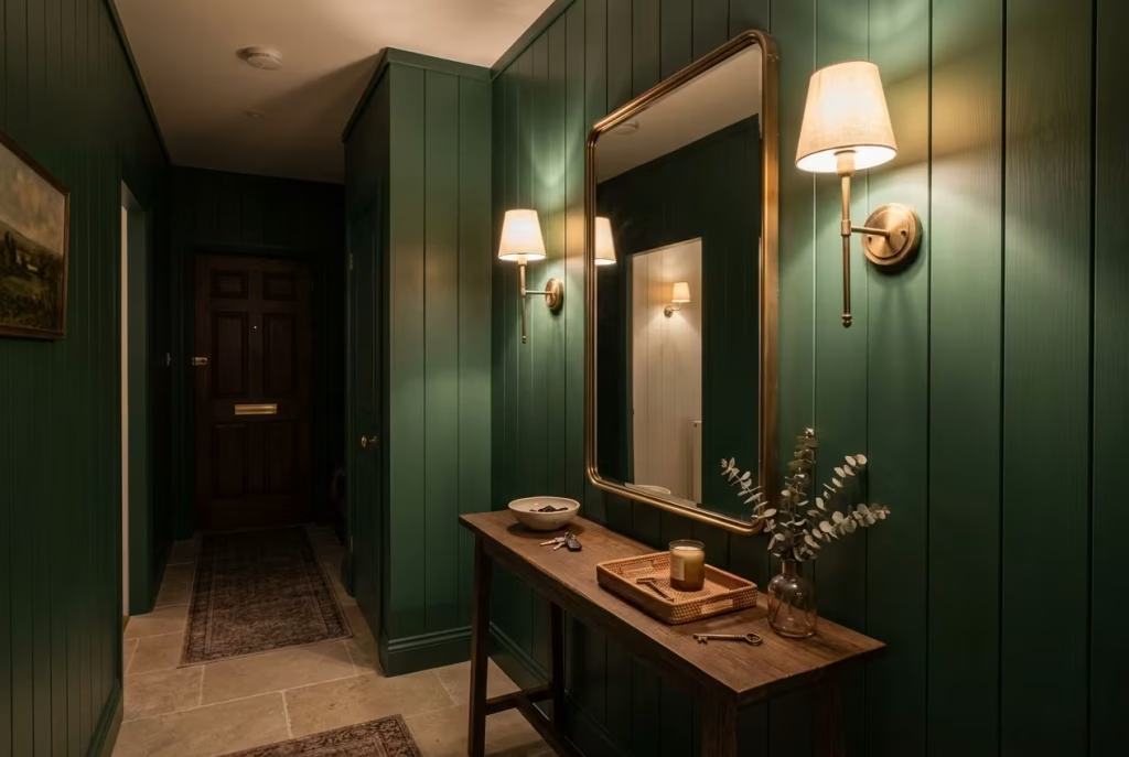
Lighting is often the quiet difference between a moody green entryway that feels atmospheric and one that feels flat or overly shadowed. When layered thoughtfully, especially with vintage-inspired fixtures, it brings depth, warmth, and a sense of rhythm to the space that changes gently throughout the day. In darker green interiors, light does not just illuminate surfaces, it sculpts them, revealing texture, softening edges, and guiding how the space is emotionally experienced.
Rather than relying on a single overhead source, layered lighting allows the entryway to feel lived-in and flexible, shifting between practical brightness and softer, more intimate moods depending on the time of day.
Wall Sconces That Shape Atmosphere at Eye Level
Wall sconces are one of the most effective tools in a moody green entryway because they operate at human scale. Positioned at eye level, they create pockets of light that break up darker wall surfaces and add a sense of rhythm to long or narrow corridors.
Against deep green walls, warm sconces introduce a gentle glow that feels almost architectural. The light does not flood the space, it settles into it, highlighting subtle variations in paint texture and creating a soft halo effect that prevents the room from feeling too enclosed.
I often prefer sconces with aged brass or patinated metal finishes in these settings, as they complement the depth of green without feeling overly polished. Frosted or opal glass shades also work particularly well, diffusing light in a way that feels calm rather than harsh.
In one townhouse entryway, a pair of vintage-style sconces flanking a dark green panelled wall completely changed the perception of scale. What once felt like a narrow passage began to read as a deliberate architectural moment, almost like a curated pause before entering the main living space.
Picture Lights That Add Quiet Focus and Detail
Picture lights bring a more refined layer of illumination, especially in entryways where artwork, mirrors, or architectural detailing plays a supporting role.
In moody green spaces, they introduce a controlled highlight that draws attention without overwhelming the surrounding atmosphere. Rather than brightening the entire wall, they create focused zones of light that feel intentional and slightly theatrical in the most understated way.
I often use picture lights above mirrors in entryways, not just for functionality but to create a subtle sense of welcome. The reflection combined with warm illumination softens the darker palette and adds depth to the space.
Placed above framed artwork or textured wall panels, they also help emphasise materiality. Brushstrokes, plaster variations, or timber grain become more pronounced under directional light, giving the space a layered, almost gallery-like quality.
The key is restraint. Too many picture lights can fragment the visual calm, but one or two carefully placed fixtures can elevate the entire composition.
Lantern Pendants That Anchor Vertical Space
Lantern-style pendants introduce a stronger vertical presence in moody green entryways, especially in spaces with higher ceilings or double-height voids. They act as visual anchors, drawing the eye upward and balancing the weight of darker wall tones below.
Their appeal lies in their structure. Unlike more modern minimalist pendants, lanterns carry a sense of familiarity and tradition, which sits beautifully alongside deep green palettes. The interplay between glass, metal framing, and warm light creates a layered glow that feels both functional and atmospheric.
In practical terms, I often position lantern pendants centrally in wider entryways or above key transition points such as seating areas or console tables. This helps define zones within the space without the need for physical partitions.
When lit with warm bulbs, lanterns produce a gentle diffusion that softens shadows rather than sharpening them. This is particularly important in darker schemes, where uncontrolled lighting can quickly feel harsh or uneven.
There is also a subtle psychological effect at play. Lantern lighting tends to feel slower and more grounded, which aligns perfectly with the transitional nature of an entryway. It encourages a moment of pause, almost like a visual exhale before moving deeper into the home.
Warm Dimmable Bulbs That Control the Mood
If layered lighting is the structure, then warm dimmable bulbs are what allow the atmosphere to shift throughout the day.
In moody green entryways, flexibility is essential. Morning light often benefits from brighter settings that support function and movement, while evening light calls for something softer and more atmospheric. Dimmable systems allow both states to exist within the same space without compromise.
I typically recommend colour temperatures between 2700K and 3000K for these environments. This range enhances the richness of dark green walls while maintaining a natural warmth that feels comfortable rather than overly yellow or artificial.
The ability to adjust intensity also changes how materials behave visually. At higher brightness, textures become more defined and architectural details stand out. At lower levels, the same surfaces soften and blend, creating a more cocoon-like effect.
In one family home, simply introducing dimmable lighting across sconces, pendants, and accent fixtures transformed the entryway from a purely functional space into something that adapted naturally to the rhythm of daily life. Bright and practical during school runs, soft and atmospheric in the evenings when the house settled down.
That adaptability is what makes layered lighting so powerful. It does not lock the space into a single mood. It allows it to evolve, moment by moment, in step with how the home is actually lived in.
Scandinavian-Inspired Moss Green Mudrooms
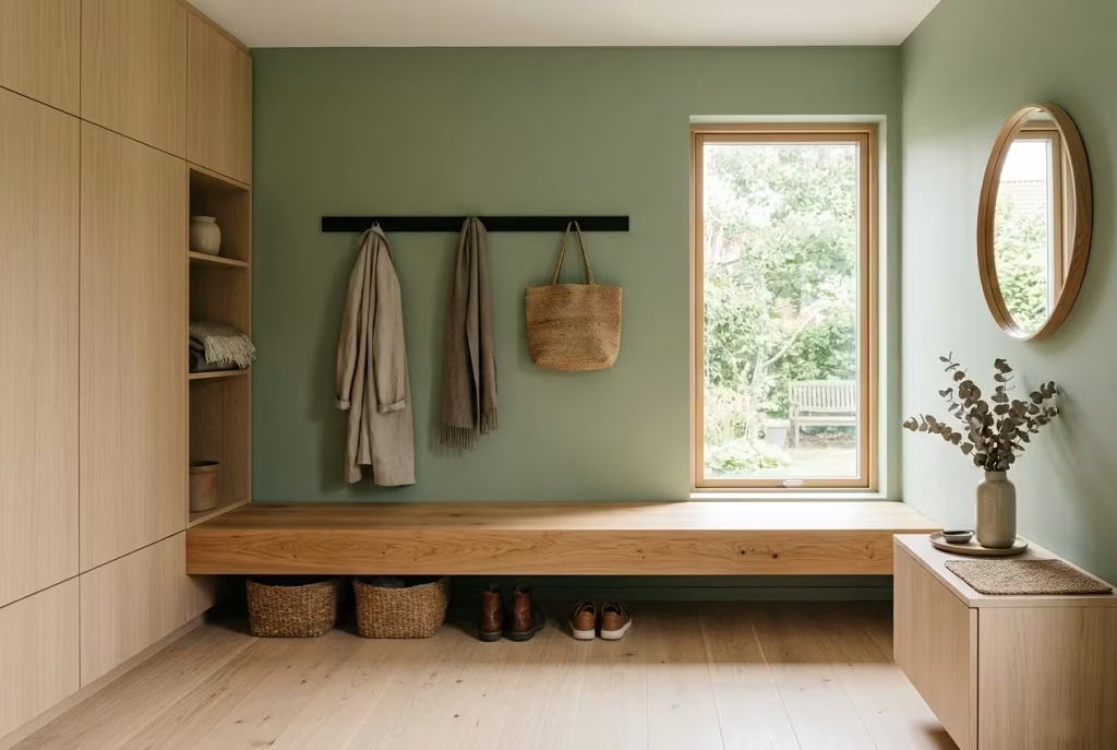
There is a particular quietness that Scandinavian-inspired design brings into a home, and when translated into a moss green mudroom, it feels even more grounded and restorative. It is not a style that relies on visual excess or decorative layering. Instead, it leans into restraint, lightness, and purposeful simplicity, creating a space that feels calm at first glance and even calmer the longer you spend in it.
Moss green sits beautifully within this language because it softens the starkness often associated with minimalism. It introduces just enough colour to feel lived-in, while still preserving the clarity and order that Scandinavian interiors are known for.
Simplicity That Feels Effortless, Not Empty
True simplicity in a mudroom is rarely about removing elements. It is about refining them until only what is necessary remains. In Scandinavian-inspired moss green spaces, this approach becomes especially important because the colour itself already carries presence.
Instead of layering multiple materials or decorative details, the focus shifts to proportion, clean lines, and thoughtful negative space. Cabinetry is kept streamlined, storage is integrated rather than exposed, and every surface serves a clear purpose.
I often find that homeowners initially worry this level of restraint might feel bare or unfinished. In practice, the opposite tends to happen. Once clutter is removed and visual noise is reduced, the space begins to feel more spacious, even when the footprint is relatively small.
In one compact city apartment, a moss green mudroom zone was simplified down to just a bench, concealed storage, and a single wall-mounted hook system. The result was not minimal in a cold sense, but quietly composed, almost like a deep breath at the threshold of the home.
That is the essence of Scandinavian simplicity. It does not take away comfort. It removes distraction.
Pale Wood Balance That Softens the Green
Pale woods are central to achieving the right balance in Scandinavian-inspired mudrooms. Without them, moss green can feel slightly too grounded or heavy, especially in spaces with limited natural light.
Timbers such as oak, ash, or light birch introduce a gentle contrast that lifts the overall composition. Their softness in tone prevents the green from becoming dominant, while their natural grain adds just enough texture to keep the space from feeling overly flat.
In practical application, I often use pale wood for bench seating, open shelving, or subtle architectural detailing such as trim and joinery edges. These elements act as visual interrupters, breaking up larger blocks of green and allowing the eye to rest naturally across the room.
I have seen this pairing work particularly well in homes where the mudroom connects directly to open-plan living spaces. The pale wood acts as a transitional bridge between more expressive interior areas and the quieter, more functional entry zone.
There is also a seasonal quality to this combination that feels especially relevant in Scandinavian design. In winter, the warm undertones of wood create comfort against darker surroundings, while in summer, the lighter palette feels fresh and airy without losing its grounding presence.
Functional Calm That Shapes Daily Routine
At the heart of Scandinavian-inspired mudroom design is the idea of functional calm. This is not just about how the space looks, but how it behaves in everyday life.
Everything is designed to support routine without adding friction. Coats have a clear place, shoes are easily accessible yet visually contained, and storage is intuitive enough that it does not require constant thought or adjustment.
Moss green plays a quiet but important role in this. Unlike brighter or more saturated colours, it does not overstimulate the senses. Instead, it helps settle the atmosphere, particularly during busy moments when the mudroom becomes a high-traffic transition zone.
In one family home I worked on, the introduction of a moss green Scandinavian-style mudroom had a noticeable effect on how the space was used. Morning routines became more efficient simply because everything felt calmer and more structured. There was less searching, less visual distraction, and more natural flow from one task to the next.
Lighting is also essential in reinforcing this sense of calm. Soft, diffused lighting around 2700K to 3000K, combined with natural daylight where possible, helps maintain clarity without harshness. The goal is not dramatic contrast, but a steady, even atmosphere that supports daily movement.
When all of these elements come together, the mudroom stops feeling like a transitional afterthought and starts functioning as a stabilising point within the home.
It becomes a space that quietly resets the rhythm of daily life, offering a moment of order before stepping out, and a sense of ease upon returning.
Dark Green Mudrooms with Built-In Pet Stations
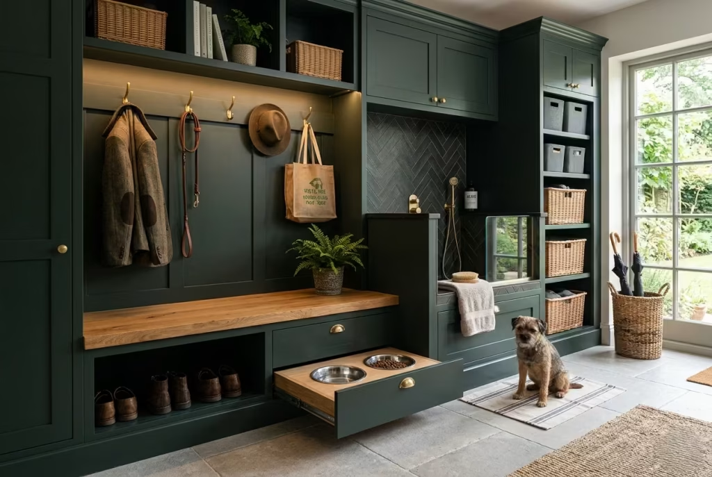
A mudroom that includes a built-in pet station is one of those quietly brilliant design moves that makes everyday life run more smoothly behind the scenes. When wrapped in dark green, the whole arrangement feels settled, practical, and surprisingly elegant rather than purely utilitarian. It acknowledges a simple truth that many homes eventually learn the hard way, pets are part of the household rhythm, and their needs are best handled with the same level of care as everything else in the home.
Dark green is especially well suited to this kind of setup because it absorbs the visual busyness that comes with bowls, leads, grooming supplies, and the occasional trail of water or fur. Instead of letting pet paraphernalia spill out into the wider interior, the mudroom contains it all in one considered place. That sense of order is worth its weight in gold in busy family homes, where the smallest moments of convenience can make a surprisingly large difference.
Real-Life Application
In real homes, pet stations work best when they feel like a natural extension of the mudroom rather than a bolted-on afterthought. I have found that families use them most consistently when the layout is intuitive, the surfaces are easy to clean, and everything has its own home. A dog coming in from a wet walk needs a place to be dried off, fed, and settled without the entire room turning into a scramble.
A well-designed pet station often sits low within the joinery, close to the entrance or near a bench zone where owners naturally pause anyway. This makes the routine feel seamless. Lead the dog in, set the bowl down, hang the coat, wipe the paws, and move on. No fuss, no faff, no endless back-and-forth across the house.
I have worked on homes where the pet station became one of the most used features in the room, not because it was elaborate, but because it removed friction from daily life. That is usually the hallmark of thoughtful design. It works quietly in the background and earns its keep every single day.
Washable Surfaces That Stand Up to Daily Life
Once a pet station is introduced, surface choice becomes crucial. This is not the place for delicate finishes or anything that needs constant coddling. Water splashes, drips from bowls, muddy paws, and the occasional food spill all need to be accounted for from the outset.
Dark green cabinetry with moisture-resistant paint or durable satin finishes is often a strong choice because it can be wiped down quickly without losing its depth. For the pet feeding area itself, I prefer robust materials such as sealed stone, quartz, or high-performance porcelain, all of which handle regular cleaning far better than more sensitive finishes.
One detail that often gets overlooked is splash protection around the feeding zone. A low stone backsplash or tiled rear panel can save a lot of headaches over time, especially in homes where pets are enthusiastic rather than tidy eaters. It is one of those small, practical additions that quietly prevents a lot of mess from spreading into the rest of the room.
In homes with larger dogs or more than one pet, I often recommend a slightly recessed feeding alcove. It helps contain the area visually while also making cleanup more manageable. Over time, that kind of restraint pays off beautifully. The room feels more composed, and the maintenance burden stays far lighter.
Hidden Feeding Drawers That Keep the Room Calm
Hidden feeding drawers are one of the most satisfying features in a pet-friendly mudroom because they allow the room to stay visually calm while still accommodating daily routines. When closed, the area reads as part of the joinery. When opened, the bowls slide out neatly and are ready for use.
This kind of solution is especially valuable in open-plan homes where the mudroom sits close to kitchens or living spaces. Nothing interrupts the visual rhythm of the interior, yet the practical needs of the pet are handled efficiently and without compromise. It is a classic case of having your cake and eating it too.
I often specify pull-out drawers at a lower height, usually within easy reach for adults but tucked away enough to maintain a clean profile. Stainless steel or ceramic bowls are generally the best fit because they are durable, easy to remove, and simple to clean. Some designs also include a non-slip insert or a wipeable tray beneath the bowls to catch stray drips.
There is also a subtle behavioural benefit to hidden feeding storage. When the ritual is built into the room properly, it becomes part of the household rhythm rather than a loose collection of items that live on the floor. The room feels more orderly, and feeding time becomes smoother for both pet and owner.
Leash Storage That Prevents Everyday Chaos
Leashes, collars, harnesses, and dog-walking accessories have a habit of scattering wherever they land unless they are given a proper landing zone. Built-in leash storage solves this neatly and keeps the mudroom from descending into clutter every time someone heads out for a walk.
In dark green mudrooms, I like to incorporate small internal drawers, shallow cubbies, or discreet hooks inside cabinets specifically for pet accessories. This keeps the items close at hand but out of sight, which is especially important in compact spaces where visual clutter can build up quickly.
One especially useful detail is a lower cabinet section near the exit door with a dedicated compartment for leads, paw wipes, spare bags, and travel bowls. This way, everything needed for the next walk is ready at a moment’s notice. No hunting around. No muttering under your breath as you search for the lead. Just a straightforward system that works.
The best leash storage systems also account for wetness. If accessories are often damp after walks, the compartment should be ventilated or lined with a wipeable material so moisture does not linger. A little forethought here goes a long way, particularly in wetter climates or active households where multiple walks happen each day.
A Mudroom That Works for the Whole Household
What makes built-in pet stations so valuable is not just the convenience for the pet, but the way they support the rhythm of the whole home. When bowls are concealed, leads are neatly stored, and washable finishes are doing the heavy lifting, the room feels calmer and more capable. It stops being a compromise and starts functioning as a genuinely useful part of the house.
Dark green brings a sense of depth and composure to the arrangement, which is exactly what these hardworking spaces need. It allows the practical details to blend into the architecture, so the room looks considered even when life is a little muddy at the edges.
In the end, a good pet station does not call attention to itself. It simply makes the day flow more easily, and that, in a busy home, is worth its weight in gold.
Moody Green Spaces with Reclaimed Wood Ceilings
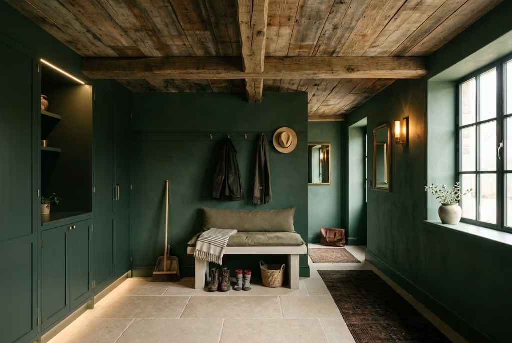
There is a particular depth that arrives when moody green walls meet a reclaimed wood ceiling. The room stops feeling like a simple utility space and starts carrying the atmosphere of something far more layered, almost lived in before the furniture has even been placed.
The green draws the eye inward, while the timber overhead adds warmth, grain, and a sense of history that softens the entire composition. It is a combination that feels quietly confident, never trying too hard, yet somehow leaving a lasting impression.
In mudrooms especially, this pairing makes a great deal of sense. These are high-traffic rooms that absorb coats, boots, bags, weather, and all the daily clutter of life. A reclaimed wood ceiling introduces a natural counterbalance to the darker palette below, keeping the room from feeling too hard-edged or overly enclosed. The effect is rich, tactile, and deeply grounding, like the room has found its footing and settled into itself.
Texture Layering That Gives the Room Real Depth
One of the strongest qualities of reclaimed wood is its ability to layer texture without feeling decorative for decoration’s sake. It carries its own story in the knots, grain shifts, weathering, and slight imperfections that come with age. Against deep green walls, that texture becomes even more pronounced.
The eye moves differently in a room like this. Instead of reading the space as a flat box, it begins to pick up layers. Painted cabinetry sits below. Dark walls frame the middle. The reclaimed timber above completes the picture. Each surface has its own voice, but none is shouting over the others.
This matters more than most people realise. In a moody mudroom, too many smooth or uniform finishes can flatten the atmosphere. Reclaimed wood breaks that pattern beautifully. It adds variation overhead, which is especially useful in rooms with simple layouts or minimal architectural detail. Even a fairly straightforward mudroom can feel far more considered when the ceiling has tactile movement and visible age.
I have found that the most successful versions of this look avoid perfection entirely. The charm lies in the slight irregularity. Boards with tonal variation, visible joins, and natural wear carry far more character than anything newly manufactured ever could. It is the design equivalent of letting the room speak in a lower, richer register.
Acoustic Warmth That Changes How the Room Feels
Ceiling materials do more than shape the look of a room, they influence how it sounds. This becomes especially relevant in mudrooms, where hard surfaces can easily create echo and sharpness.
Reclaimed wood introduces a surprising amount of acoustic softness. It helps absorb sound rather than bounce it around the room, which can make the space feel calmer almost immediately. That may not sound glamorous, but in a busy household it is worth its weight in gold.
Think about the reality of a mudroom. Doors opening and closing, shoes hitting the floor, coats rustling, children calling, pets moving in and out. Without some acoustic moderation, the room can begin to feel restless. A wood ceiling quietly changes that. It takes the edge off the noise and gives the space a more settled, comfortable tone.
This effect is particularly noticeable in homes with open-plan layouts where the mudroom connects directly to a kitchen or hallway. Instead of carrying every sound further into the house, the reclaimed timber helps contain the energy just enough to make the transition feel smoother.
It is one of those details that people may not consciously identify at first, but they absolutely feel it. The room seems calmer. Softer. More composed. That sense of ease can make all the difference in a space used every day.
Age and Patina That Bring Honesty to the Design
Reclaimed wood brings something that new materials often struggle to replicate, a sense of honest age. It does not pretend to be flawless. It shows its history openly, and that is exactly what gives it power in a moody green space.
The patina on reclaimed timber adds visual richness overhead, especially when paired with deep, saturated wall colour. Marks of time, softened edges, old nail holes, and tonal shifts all contribute to a ceiling that feels rooted rather than staged. It gives the room a quieter kind of luxury, one that comes from authenticity rather than polish.
In a mudroom, this aged quality is especially fitting. These are spaces that are meant to work hard. They deal with wet weather, dirty shoes, heavy movement, and seasonal chaos. A material that already carries the look of endurance feels emotionally aligned with that role. It does not mind the mess. It belongs to a world where things are used, not merely displayed.
I often find that homeowners are drawn to reclaimed wood ceilings because they make the room feel settled from the start. There is no need to wait years for the space to gain character. It arrives with a head start. The room instantly feels layered, grounded, and a little more lived in than a newly finished surface ever could.
Making the Combination Feel Balanced, Not Heavy
Because both moody green and reclaimed wood carry strong visual presence, balance matters. Without it, the room can begin to feel overly dense. The key is to introduce lighter elements somewhere in the composition so the eye has a place to rest.
Stone flooring works beautifully here, especially in honed or softly textured finishes. It grounds the room without competing with the timber overhead. Brass hardware can also help by introducing a warm reflective note that breaks up darker surfaces. Even a simple linen runner or lighter oak bench can shift the atmosphere enough to keep the room feeling welcoming rather than weighty.
Lighting is another crucial part of the equation. Warm, layered lighting around 2700K to 3000K keeps the timber tones alive and prevents the green from sinking too far into shadow. In a room like this, one strong overhead fitting is rarely enough. Wall sconces, under-bench lights, or subtle ceiling spots can all help the reclaimed wood reveal its grain and variation properly.
Handled thoughtfully, this combination becomes far more than a stylistic choice. It creates a space that feels rooted, tactile, and quietly enduring. A mudroom with a reclaimed wood ceiling and moody green walls does not just serve a function. It creates a mood, one that feels measured, welcoming, and full of depth from the moment you walk in.
Transitional Mudrooms with Soft Sage-Black Green Tones
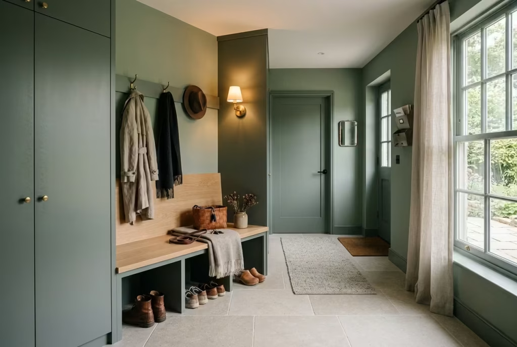
There is a particular kind of green that does not announce itself immediately, yet becomes more compelling the longer you sit with it. Soft sage-black tones sit exactly in that space. They are neither overtly dark nor traditionally pale, but somewhere in between, where restraint and depth quietly meet.
In a transitional mudroom, this kind of colour behaves almost like a stabiliser. It smooths the shift between exterior energy and interior calm, allowing the space to feel composed without becoming visually heavy.
What makes this palette so effective is its adaptability. It does not lock the room into a single mood. Instead, it shifts subtly with light, material pairings, and time of day, revealing different aspects of itself when you least expect it.
A Balanced Green That Bridges Light and Shadow
Soft sage-black green carries a dual nature. In bright daylight, it leans toward a muted sage softness, almost airy in its presence. As light fades, it deepens, gathering shadow in a way that feels grounded rather than overpowering. This natural fluctuation is what makes it so suited to transitional spaces like mudrooms, where lighting conditions are constantly changing.
In practical design terms, this means the colour works equally well in north-facing and south-facing rooms, provided the rest of the material palette is balanced thoughtfully. In low-light conditions, it offers depth without turning into a flat black mass. In brighter spaces, it retains enough softness to avoid feeling harsh or overly dramatic.
I have used this kind of tone in entryways where homeowners wanted something more refined than standard grey but less intense than full forest green. In one project, the colour shifted so noticeably throughout the day that the space almost felt like it had two personalities, calm and airy in the morning, quietly moody by evening. That subtle transformation added a layer of interest that static colours often lack.
Material Pairings That Keep the Palette Grounded
Because sage-black green sits in a mid-to-dark tonal range, it benefits from materials that introduce warmth and softness. Without this balance, the space can drift toward visual flatness.
Natural oak is often one of the strongest companions here. Its lighter grain prevents the green from becoming too heavy while adding a gentle, organic contrast. Even small applications, such as bench seating, shelving, or trim detailing, can shift the entire perception of the room.
Stone also plays an important role. Honed limestone or softly textured porcelain helps anchor the palette without introducing visual noise. These surfaces carry enough neutrality to support the green without competing with it, allowing the colour to remain the focal point.
In one townhouse mudroom, we paired sage-black cabinetry with pale oak flooring and a simple limestone bench top. The combination created a quiet tension between light and dark that felt incredibly stable. Nothing shouted for attention, yet everything felt intentionally placed, like pieces in a well-balanced composition.
Lighting That Reveals the True Character of the Colour
Lighting is where transitional greens either succeed or fall apart. Because sage-black tones are highly responsive to illumination, poor lighting can flatten their complexity, while well-considered lighting reveals their depth.
Warm lighting in the range of 2700K to 3000K tends to work best. It enhances the softness of the sage undertone while allowing the darker base to remain rich rather than muddy. Too cool a temperature and the colour can feel clinical. Too warm and it risks losing definition.
Layering is especially important in mudrooms. A single overhead source rarely does justice to this type of palette. Instead, a combination of ambient lighting, wall-mounted fixtures, and subtle task lighting helps the colour breathe across different surfaces.
I often notice that when lighting is correctly layered, sage-black green stops behaving like a flat paint choice and starts feeling more like a material in itself. It absorbs light in some areas and releases it in others, creating a gentle sense of movement across the walls.
A Transitional Mood That Works with Real Life
What makes this colour particularly effective in mudrooms is its ability to sit comfortably within the unpredictability of daily life. These are not static spaces. They deal with wet coats, muddy shoes, changing weather, and constant movement in and out of the home.
Soft sage-black green handles that reality with ease. It does not highlight every mark or imperfection, yet it remains refined enough to feel intentional. It strikes a rare balance between practicality and atmosphere, which is exactly what transitional spaces require.
In many homes I have worked on, this palette has become a kind of visual buffer between outdoors and indoors. It absorbs the chaos of arrival and departure without passing it further into the home. Over time, it becomes part of the rhythm of daily life, almost unnoticed yet deeply effective.
That is where its real strength lies. It is not trying to dominate the space. It is simply holding it together, quietly, consistently, and with a sense of understated confidence that reveals itself more with every use.
Dark Green Mudrooms with Statement Stone Sinks
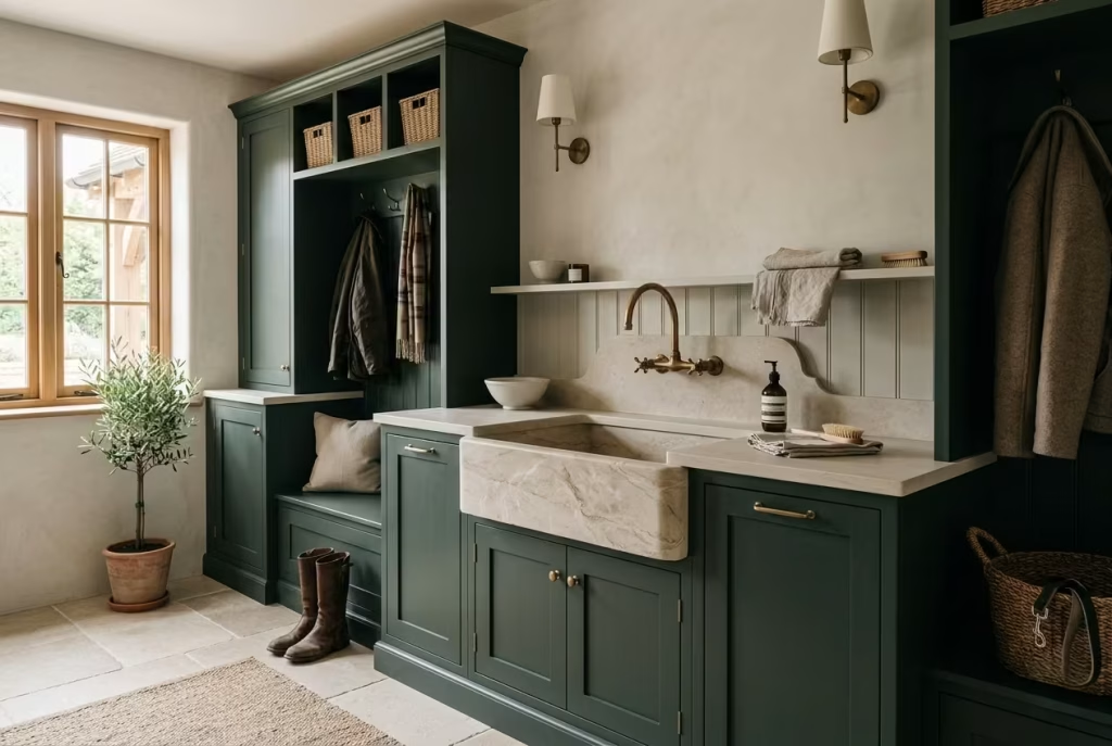
There is something quietly commanding about a stone sink set against deep green joinery. It does not try to behave like a secondary utility feature. Instead, it becomes an anchor point within the mudroom, a piece that signals durability, permanence, and a certain architectural confidence. In homes where the mudroom carries the weight of daily comings and goings, a statement stone sink feels less like a luxury and more like a considered necessity.
Dark green cabinetry intensifies this effect. It frames the sink like a backdrop in a gallery, allowing the natural variation of the stone to stand out without visual competition. The result is a space that feels grounded, functional, and unexpectedly refined at the same time.
Practical Drainage Realities That Cannot Be Overlooked
A stone sink may look effortless, but its success depends heavily on how well the practical infrastructure is handled beneath the surface. Drainage is one of the most important considerations, especially in mudrooms where sinks are frequently used for rinsing boots, washing hands after outdoor work, or cleaning pet accessories.
Proper slope and trap design are essential. Even a slight misalignment can lead to standing water, which not only affects usability but can also compromise the surrounding joinery over time. I always recommend ensuring that the plumbing layout is designed early in the process, rather than being adapted at a later stage when cabinetry is already in place.
Depth also plays a role. A sink that is too shallow can lead to unnecessary splashing, particularly in active households. On the other hand, overly deep basins can feel visually heavy and awkward to use on a daily basis. A balanced proportion tends to sit somewhere in the mid-range, allowing functionality without visual dominance.
In one rural property project, we adjusted the sink placement by just a few centimetres to improve the drainage fall. That small correction made a noticeable difference in how the space performed, preventing water pooling and keeping the surrounding stone worktop consistently dry. It is often these subtle adjustments that separate a good installation from a truly reliable one.
Maintenance Considerations That Shape Long-Term Use
Stone sinks bring a strong sense of permanence, but they do require a certain level of care to maintain their appearance over time. Unlike synthetic materials, natural stone is reactive to its environment, which means it benefits from regular sealing and mindful use.
In mudroom settings, where exposure to dirt, grit, and moisture is constant, this becomes particularly important. A well-sealed surface will resist staining far more effectively, but it still needs occasional attention to preserve its finish.
Hard water deposits can also become visible over time, especially around the edges of the basin where water tends to sit. Gentle cleaning routines using non-abrasive products help maintain the natural texture of the stone without dulling its surface.
From experience, I have found that homeowners who embrace the evolving nature of stone tend to enjoy it more. Rather than expecting it to remain untouched, they see it as a material that develops character with use. Small variations, subtle patina shifts, and gentle wear patterns become part of its identity rather than imperfections to be corrected.
In many ways, that philosophy suits a mudroom perfectly. It is a working space, not a showroom, and the sink is often at the centre of that daily activity.
Countertop Pairings That Elevate the Entire Composition
The success of a statement stone sink is heavily influenced by what surrounds it. Countertop pairing determines whether the sink feels integrated or isolated within the design.
Dark green cabinetry works beautifully with a range of natural surfaces, but the key is balance. If the sink is heavily textured or visually dominant, the surrounding countertop should offer a sense of calm continuity. If the sink is more refined and minimal, the countertop can afford to introduce a bit more visual texture.
Materials such as honed limestone, lightly veined marble, or durable quartz composites often perform well in this setting. They provide enough contrast to highlight the sink while still supporting the overall mood of the space.
Timber is another option, though it requires careful sealing and detailing around wet zones. When used thoughtfully, it can soften the transition between sink and cabinetry, particularly in designs that aim for a warmer, more lived-in atmosphere.
In one project, we paired a deep stone basin with a pale limestone countertop and matte dark green cabinetry. The combination worked because each material had a clear role. The sink provided weight, the stone surface offered calm continuity, and the cabinetry framed everything without distraction. Nothing felt overstated, yet the overall effect was undeniably strong.
Where Utility Becomes Quietly Architectural
What makes stone sinks in dark green mudrooms so compelling is the way they elevate everyday function without turning it into spectacle. This is not about decorative excess. It is about giving a hardworking space the dignity of good materials and thoughtful detailing.
When everything is aligned correctly, drainage, maintenance, and material pairing all work together, the sink becomes more than a utility feature. It becomes part of the architecture of the room, something that feels as though it was always meant to be there.
In the rhythm of daily life, that kind of quiet reliability is invaluable. It is the difference between a space that simply performs its function and one that does so with a sense of calm assurance, day after day, without ever asking for attention.
You May also Like: 15 Spanish Revival Mudrooms That Perfectly Blend Beauty and Practicality
Compact Moody Green Mudrooms for Small Homes
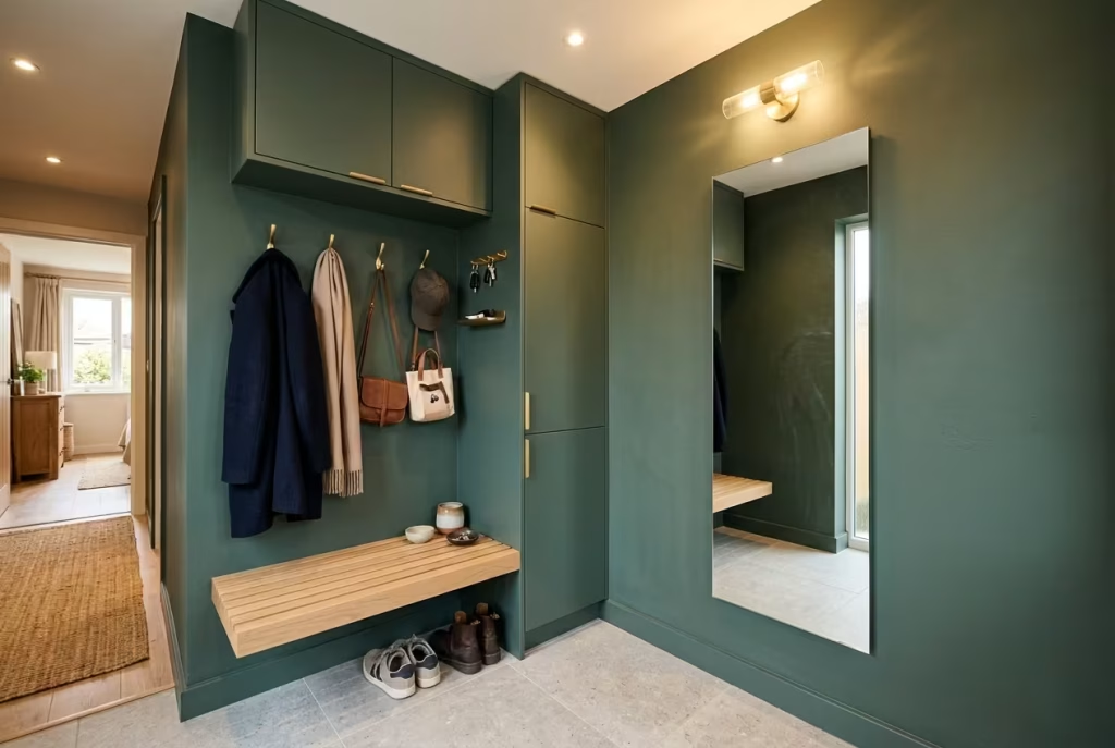
Compact mudrooms demand a different kind of discipline. Every centimetre has to work harder, every surface has to justify its presence, and every design decision needs to earn its place. When moody green enters this equation, the space gains depth and character without relying on physical expansion. It is a colour that can make a small footprint feel more intentional, almost like the walls themselves have been gently pulled into focus.
In smaller homes especially, the challenge is not just fitting storage into a tight area, but doing so without creating visual congestion. The goal is to keep the room functional, but also breathable, where nothing feels crammed or awkwardly forced into place.
Mirror Placement That Expands Without Distortion
Mirrors are one of the most effective tools in compact mudroom design, but their success depends entirely on placement. In moody green spaces, they do more than reflect light. They extend depth, break up darker surfaces, and introduce a sense of openness that the physical room might not naturally offer.
I often recommend positioning mirrors opposite or adjacent to the main light source, whether that is a window or a well-placed wall light. This allows them to capture and redistribute brightness across the green surfaces, softening any potential heaviness in the colour.
In one small townhouse project, a tall vertical mirror placed beside a dark green storage wall completely changed the perception of width. What once felt like a tight corridor began to read as a more generous transitional space, simply through controlled reflection.
Framed or frameless approaches can both work, but in compact rooms, minimal framing tends to preserve visual clarity, allowing the mirror to blend more seamlessly into the architecture.
Slim Storage Depth That Preserves Circulation
When space is limited, storage depth becomes one of the most critical design decisions. Oversized cabinetry can quickly overwhelm a compact mudroom, making movement feel restricted and visually heavy.
In these settings, slim-profile storage, typically ranging between 250 to 350 mm (10 to 14 inches) in depth, often provides the best balance between usability and spatial efficiency. It allows enough room for shoes, bags, and everyday essentials without encroaching too far into the walkway.
Moody green cabinetry works particularly well in this format because the depth of colour compensates for the reduced physical volume. Even shallow units can feel substantial when finished in a rich, grounded tone.
I have found that wall-mounted storage, rather than floor-standing units, also helps preserve a sense of openness. By lifting cabinetry off the ground, the floor remains visually uninterrupted, which subtly enhances the perception of space.
Vertical Organisation That Works with the Architecture
In compact mudrooms, the only direction left to expand is upwards. Vertical organisation becomes the backbone of a well-functioning layout, especially when combined with dark, atmospheric colour.
Tall cabinetry, stacked shelving, and vertical hook systems allow the room to store more without increasing its footprint. The key is to avoid visual clutter by keeping the vertical rhythm consistent and well-ordered.
In practice, I often divide vertical zones into clear functional layers. Lower sections handle heavier, more frequently used items. Mid-height zones are reserved for everyday access, while upper sections store seasonal or less frequently used belongings.
This layered approach prevents the space from feeling chaotic. Instead, it creates a structured flow that feels intuitive, almost like the room is quietly organising itself.
Against moody green surfaces, vertical lines become more pronounced, which helps reinforce this sense of order. The eye naturally follows the structure upward, making the room feel taller and more composed than its actual dimensions suggest.
Light Layering That Prevents Visual Compression
Lighting is what determines whether a compact moody green mudroom feels intimate or compressed. Without careful layering, darker tones can easily absorb too much light, making the space feel smaller than it is.
A combination of ambient, task, and accent lighting tends to work best. Overhead lighting provides general visibility, wall-mounted fixtures soften vertical surfaces, and subtle accent lighting helps break up shadow zones.
Warm light temperatures between 2700K and 3000K are particularly effective in this context. They enhance the richness of green without creating harsh contrasts that can visually tighten the space.
I often find that even a small adjustment in lighting placement can transform perception. In one narrow entryway, adding a soft wall sconce above a bench area immediately reduced the sense of confinement. The space did not change in size, but it felt more open, more forgiving, and easier to move through.
The goal is not brightness for its own sake. It is balance, ensuring that no corner feels overly dark or visually heavy.
Practical Measurements That Keep the Space Functional
In compact mudrooms, precision matters more than excess. The wrong measurement can quickly disrupt flow, while the right one can make even the smallest space feel surprisingly comfortable.
For bench seating, a depth of around 350 to 450 mm (14 to 18 inches) usually offers a workable balance between comfort and spatial efficiency. Anything deeper can begin to encroach on circulation, particularly in narrow layouts.
Minimum walkway clearance should ideally remain at least 900 mm (35 inches) where possible. This allows for natural movement without forcing people to turn sideways or navigate awkwardly around cabinetry.
These numbers might seem technical, but in practice, they shape how the room feels day to day. A well-measured compact mudroom does not feel restrictive. It feels precise, almost like every inch has been accounted for with quiet intention.
Where Small Spaces Gain Their Strength
Compact moody green mudrooms succeed not by trying to imitate larger spaces, but by embracing their limitations and refining them. The colour brings depth, the storage becomes disciplined, and the layout relies on clarity rather than excess.
When mirror placement, slim storage, vertical organisation, and layered lighting all work together, even the smallest mudroom begins to feel composed and capable. It does not pretend to be larger than it is. Instead, it feels well considered, efficient, and quietly confident in its role within the home.
And in many ways, that is the real strength of compact design. It proves that good spatial thinking is not about size at all, but about how intelligently each element is placed within the space it has.
Dark Green Mudrooms with Mixed Metal Details
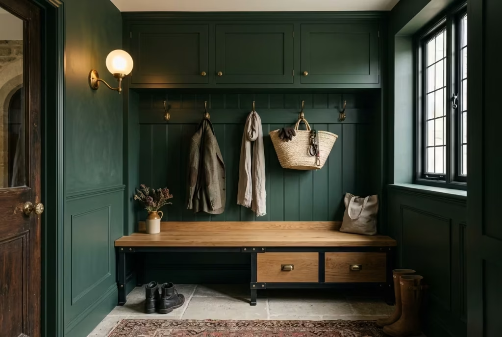
There is a fine line between richness and chaos when you start mixing metals in a dark green mudroom. Done well, it feels layered, almost collected over time, as if each piece has been chosen with intent rather than impulse.
Done poorly, it can quickly turn into visual noise that competes with the depth of the green rather than complementing it. The success of this approach lies in restraint, balance, and a clear understanding of how different finishes behave against a dark, saturated backdrop.
Dark green provides the perfect grounding canvas for mixed metals because it is neither too cold nor too warm. It absorbs contrast while still allowing reflective surfaces to stand out. This gives you room to play, but only if the combinations are handled with care.
Brass and Iron Combinations That Create Controlled Contrast
Brass and iron are one of the most effective pairings in moody green mudrooms because they sit on opposite ends of the visual spectrum. Brass brings warmth, glow, and a slightly softened reflectivity, while iron introduces structure, depth, and a more grounded, matte presence.
When used together, the key is not to treat them equally across every element. Instead, each metal should have a clear role within the space. Brass often works best for touchpoints, such as hooks, handles, or lighting accents, where its warmth can catch light and soften the darker tones of the green. Iron, on the other hand, tends to perform better in structural or functional elements, such as shelving frames, bench supports, or exposed detailing.
In one residential project, we used aged brass for all user-facing hardware and blackened iron for the supporting framework of a boot bench.
The result was a subtle hierarchy of materials that felt deliberate rather than decorative. Nothing competed for attention, yet each finish contributed to the overall rhythm of the room.
The success of this combination often comes down to proportion. Too much brass and the space can feel overly polished. Too much iron and it risks becoming visually heavy. The balance sits somewhere in between, where warmth and structure quietly support one another.
Understanding Warm and Cool Undertones in Metal Finishes
One of the most overlooked aspects of mixing metals is undertone. Not all brass is equally warm, and not all iron or blackened steel reads as fully cool. These subtle variations can completely change how a mudroom feels once the finishes are installed.
In dark green spaces, warm undertones tend to soften the overall composition. They draw out the earthy qualities of the green, creating a more inviting and settled atmosphere. Cool undertones, on the other hand, introduce contrast and definition, which can be useful for sharpening architectural lines or highlighting specific features.
I often advise homeowners to test metal samples directly against the chosen green paint or cabinetry finish under real lighting conditions. What looks balanced in a showroom can shift dramatically once placed in a shadowed entryway or under warm artificial light.
In one case, a brushed brass handle appeared perfectly matched in daylight but leaned slightly too yellow in the evening lighting of the mudroom. Switching to a more muted, aged brass resolved the issue instantly, allowing the finish to sit more comfortably within the darker palette.
These are small adjustments, but they have a significant impact on how cohesive the final space feels.
Avoiding Visual Clutter Through Material Discipline
Mixed metals only work when they are used with intention. Without clear boundaries, the combination can quickly become visually fragmented, especially in smaller mudrooms where every surface is close to eye level.
The simplest way to avoid clutter is to assign each metal a specific function and stick to it consistently throughout the space. This prevents repetition from becoming random and helps the eye understand the logic of the design.
Spacing also plays a role. When different metal finishes are placed too closely together without visual breathing room, they can begin to compete rather than complement. Allowing sections of uninterrupted cabinetry or continuous material surfaces between metallic elements helps reset the visual field.
In practice, I often find that fewer, well-placed details create a far stronger result than multiple competing accents. A single iron bench frame paired with brass hooks and subtle lighting elements can feel far more resolved than a room filled with mixed fittings across every surface.
There is also value in letting the dark green do some of the heavy lifting. Its depth naturally absorbs visual complexity, which means the metals do not need to carry the entire expressive load of the room. Instead, they should act like punctuation marks rather than full sentences within the design.
Where Balance Becomes the Defining Feature
A dark green mudroom with mixed metal details succeeds when it feels considered rather than assembled. Brass introduces warmth, iron brings structure, and the green ties everything together with a grounded, atmospheric base.
When the proportions are right, the room does not feel like a showcase of finishes. It feels cohesive, almost effortless, as if every element naturally belongs where it is. That sense of ease is what elevates the design beyond decoration.
In the end, the most successful combinations are not the most complex ones. They are the ones where every material knows its place, supports the others, and quietly contributes to a space that feels balanced, functional, and enduringly composed.
Tonal Green Mudrooms with Layered Natural Textures
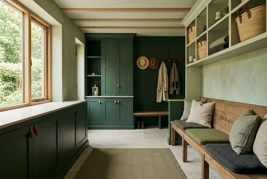
There is a quiet sophistication in tonal design that reveals itself slowly, almost like a conversation rather than a statement. In dark green mudrooms, moving away from a single flat colour and instead working with layered green tones opens up a far richer visual language. It allows the space to breathe, shift, and settle in a way that feels far more natural to how homes are actually lived in.
When multiple greens are handled with restraint, the result is not visual chaos but subtle depth. Each shade plays a slightly different role, some grounding, some lifting, others softening edges so the space feels composed rather than rigid. It is a technique that relies less on bold contrast and more on controlled variation, where small differences carry significant weight.
Multiple Green Shades That Build Quiet Depth
Working with tonal greens is less about choosing many colours and more about understanding hierarchy. A deeper forest green might anchor cabinetry, while softer sage or moss tones can appear in adjacent walls, panelling, or built-in details.
The key is to avoid abrupt shifts. Instead, the transitions between tones should feel gradual, almost as if one shade is naturally fading into the next under changing light. This creates a sense of continuity that feels calm rather than fragmented.
In one residential project, we layered three distinct green tones across a compact mudroom. The darkest shade was reserved for lower cabinetry, a mid-tone green softened the wall surfaces, and a pale, muted green appeared subtly in ceiling detailing. The effect was understated but deeply atmospheric, with each layer revealing itself more clearly as daylight moved through the space.
This approach works particularly well in entry areas where first impressions matter, but overstimulation does not. It creates depth without noise, richness without excess.
Linen That Softens the Architectural Edge
Linen introduces an essential softness into tonal green mudrooms. Its slightly irregular weave and natural drape prevent the space from feeling overly constructed or rigid.
Used in cushions, bench upholstery, or subtle window treatments, linen helps break up the solidity of cabinetry and painted surfaces. Against layered greens, it acts almost like a visual pause, allowing the eye to rest between stronger material moments.
I often find that off-white or natural flax tones work best here, especially when paired with darker greens. They lift the palette gently without disrupting its overall mood. Over time, linen also develops a softened patina that aligns beautifully with the evolving character of the space.
It is one of those materials that does not demand attention, yet quietly anchors the comfort of the room.
Leather and Wool That Introduce Tactile Warmth
Leather and wool bring a deeper sense of tactility into tonal green mudrooms, introducing warmth that balances the cooler architectural surfaces.
Leather, particularly in aged or saddle finishes, adds structure and depth. It works well in seating, handle details, or small accent pieces where durability and character are equally important. Over time, it develops a natural patina that complements the layered greens, reinforcing the sense of a space that matures rather than deteriorates.
Wool, on the other hand, introduces softness and acoustic comfort. Whether used in seat pads, rugs, or storage liners, it absorbs sound and adds a gentle tactile quality underfoot or at touch points. In busy households, this small acoustic benefit can subtly change how calm the space feels.
Together, leather and wool create a balance of strength and softness, grounding the tonal greens in materials that feel both functional and lived in.
Aged Wood and Stone That Anchor the Composition
Aged wood and stone are what ultimately hold a tonal green mudroom together. Without them, the palette can feel slightly weightless or overly colour-driven.
Aged wood introduces warmth, grain variation, and a sense of history. Whether in bench seating, shelving, or flooring, it prevents the green tones from becoming too uniform. The subtle imperfections in reclaimed or lightly weathered timber add depth that manufactured finishes often struggle to replicate.
Stone brings stability. Whether honed, textured, or softly polished, it anchors the space physically and visually. In mudrooms especially, where durability is essential, stone provides a reliable foundation that can withstand daily wear without losing its composure.
I have seen combinations where stone flooring, aged oak joinery, and layered green walls come together in a way that feels almost architectural in its calmness. Nothing competes for attention, yet everything feels grounded in place.
Editorial Perspective: Why Texture Matters More Than Colour
The most compelling dark green mudrooms rarely rely on colour alone. Their strength comes from the interplay of surfaces, the subtle shifts between matte and soft sheen, rough and smooth, warm and cool.
When texture is layered thoughtfully, even a restrained palette begins to feel rich and dimensional. The eye moves across the space in a slower, more considered way, picking up detail in linen folds, leather patina, wool softness, aged timber grain, and stone variation.
This is where tonal design becomes truly powerful. It is not about creating contrast for impact, but about building quiet complexity that reveals itself over time.
In the end, a well-composed tonal green mudroom does not try to impress at first glance. It rewards attention gradually, like a space that understands the value of restraint and the quiet strength of materials that speak softly, but with lasting presence.
Before Designing a Moody Dark Green Mudroom
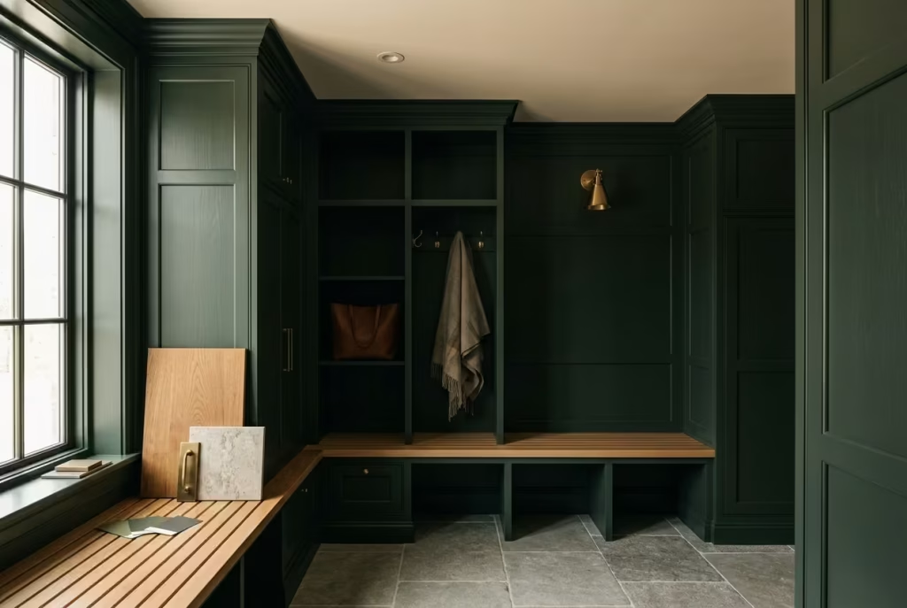
A moody dark green mudroom may appear effortless once completed, but the most successful spaces are rarely designed on instinct alone. Deep colours behave differently from lighter palettes in almost every way. They respond more dramatically to shadow, absorb light unevenly across surfaces, and amplify the presence of surrounding materials, whether that is warm oak joinery, aged brass hardware, or textured stone flooring. What feels rich and atmospheric in one home can quickly feel flat or overly heavy in another if proportion, lighting, and material balance are overlooked.
That is why the planning stage matters so much with darker entryways. Before selecting paint colours or cabinetry styles, it becomes essential to understand how the room functions throughout the day, how much natural light actually reaches the space, and how the mudroom connects visually to neighbouring interiors. In my experience, the difference between a mudroom that feels cocooning and one that feels oppressive often comes down to smaller spatial decisions most homeowners initially underestimate, ceiling finish, bulb temperature, storage depth, flooring texture, or even the amount of visual contrast built into the joinery.
A well-designed dark green mudroom should feel layered and grounding rather than simply dark for the sake of drama. The goal is not to create a trend-driven statement, but a space that absorbs the rhythm of everyday life gracefully while still feeling refined years later.
Understanding Light Before Choosing Dark Green
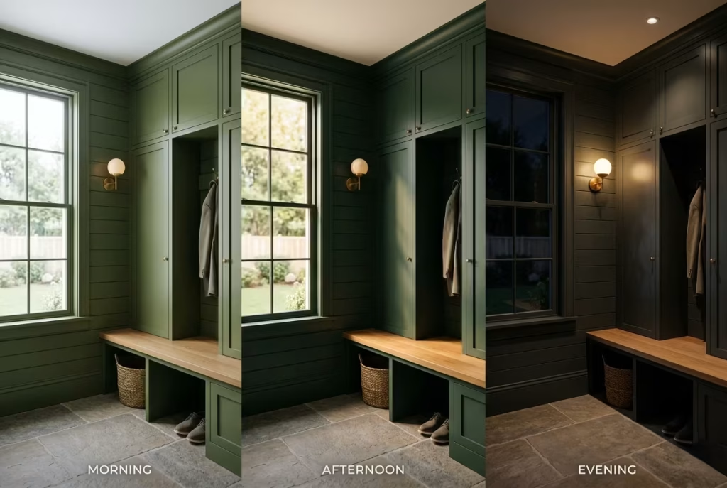
Dark green is one of those colours that can feel extraordinarily sophisticated in one mudroom and unexpectedly heavy in another. The difference, more often than not, comes down to light. Before choosing cabinetry finishes, paint samples, or flooring materials, I always study how the room behaves across an entire day because deep green tones are highly responsive to changing light conditions. They shift, deepen, soften, and sometimes disappear into shadow altogether depending on orientation, surface texture, and artificial illumination.
That unpredictability is part of their beauty, but it also means they demand a little more thought upfront.
North-Facing vs South-Facing Mudrooms
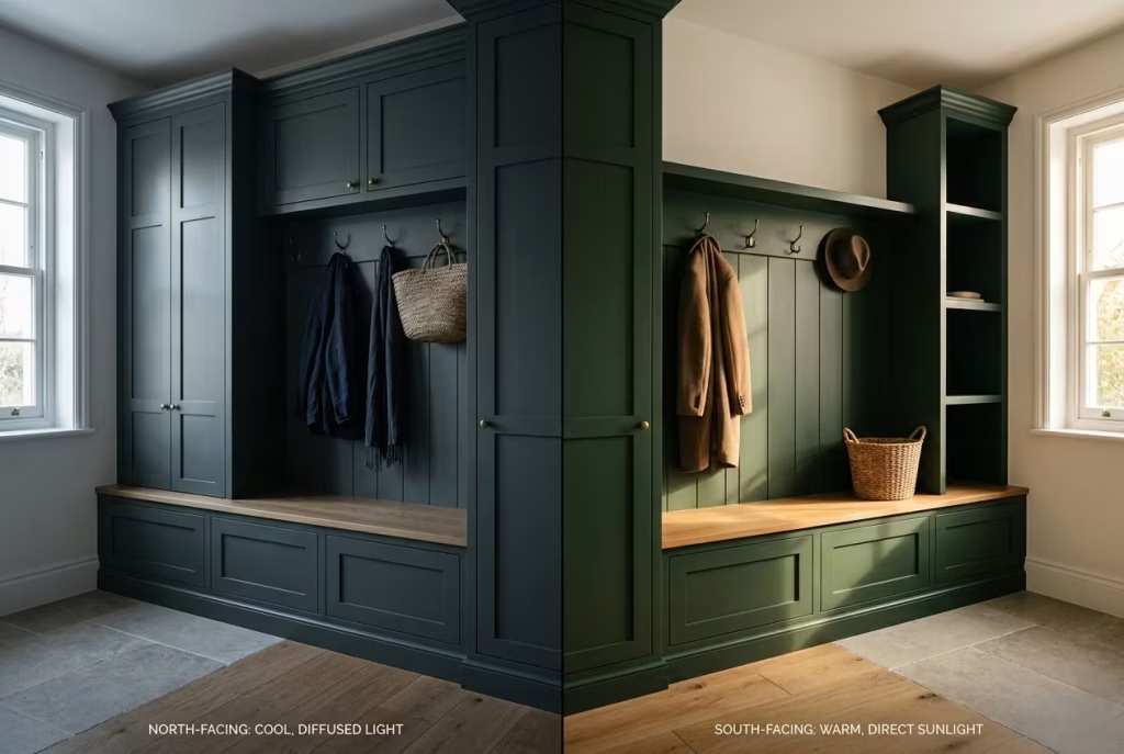
The direction your mudroom faces changes everything about how dark green will ultimately read.North-facing mudrooms tend to receive cooler, flatter daylight for most of the day. In these spaces, deep green paint can lean moodier and more restrained, sometimes taking on smoky blue or charcoal undertones once clouds roll in.
While that atmosphere can feel wonderfully cocooning, it needs balancing carefully. Without warmth elsewhere in the palette, the room risks feeling visually cold by late afternoon, especially during winter months.
In projects with limited northern light, I often lean toward greens with earthy undertones rather than jewel-like saturation. Moss, olive, and blackened sage usually hold their warmth more gracefully in shadow-heavy spaces. Pairing them with warm oak flooring, antique brass hooks, or limestone-style tiles keeps the room from feeling too stern.
South-facing mudrooms behave very differently. Because they receive stronger and warmer daylight throughout the day, darker greens tend to appear softer, fuller, and more dimensional. Even heavily pigmented shades reveal subtle undertones under sunlight, which gives the room a richer sense of depth rather than a flat wall of colour.
One thing I have noticed repeatedly in south-facing spaces is that homeowners often panic when testing paint swatches at night. A colour that feels perfectly balanced in daylight can suddenly look dramatically darker after sunset. This is why I always recommend evaluating paint at multiple times throughout the day rather than making decisions under a single lighting condition. Deep colours are shape-shifters by nature. They rarely sit still.
Why Some Dark Greens Appear Almost Black in Shadow
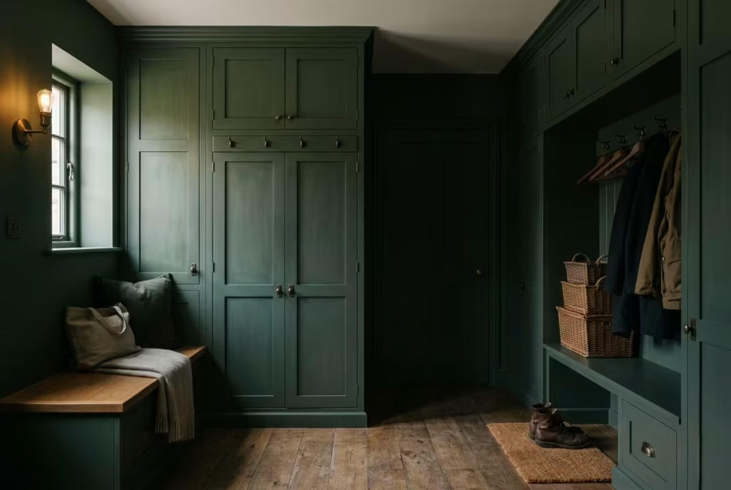
This catches homeowners off guard more often than almost anything else. Many dark green paints contain heavy black or blue pigments within their base, particularly heritage-inspired shades and highly saturated modern greens. Once natural light falls away, those undertones become dominant. Corners lose tonal separation, panel details soften into shadow, and the room can suddenly feel far moodier than expected.
I experienced this firsthand during a Victorian townhouse renovation where we installed deep olive paneling in a relatively narrow mudroom with minimal side windows. By mid-afternoon, the colour looked velvety and elegant, almost like aged moss against the timber flooring. But by early evening, particularly during overcast weather, the walls deepened so dramatically they appeared nearly charcoal from certain angles.
Interestingly, the issue was not the paint itself. It was the lack of layered lighting and reflective balance within the room.
Once we introduced aged brass sconces, a soft linen runner, and a lightly honed stone floor that bounced light gently upward, the entire atmosphere shifted. The room still felt moody, but it no longer felt visually compressed. That distinction matters enormously in smaller entryways.
Artificial Lighting Temperatures Matter More Than Most People Realise
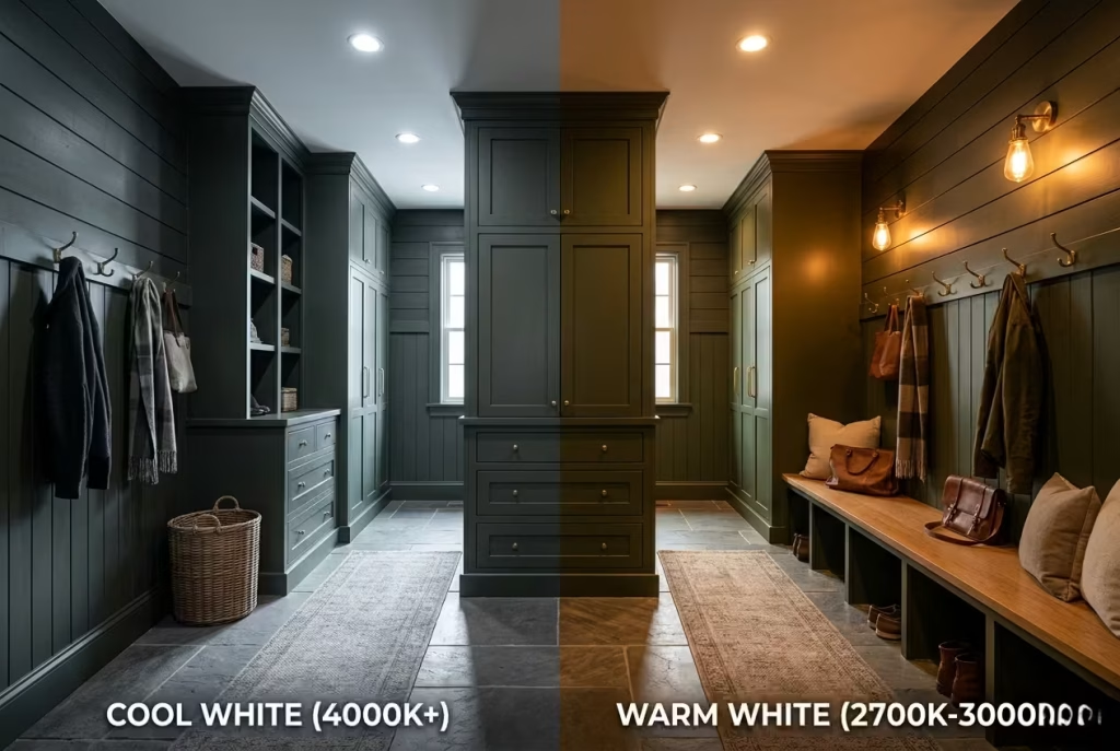
Artificial lighting can either elevate dark green beautifully or flatten it completely.Cool white bulbs, particularly those above 4000K, often strip warmth from darker greens and make the room feel clinical. Instead of feeling earthy and layered, the paint can suddenly appear muddy or grey. This becomes even more noticeable at night when artificial lighting takes over entirely.
For mudrooms, I almost always recommend warm lighting temperatures between 2700K and 3000K. These softer bulbs bring out the richness within olive, forest, and moss tones while creating a welcoming glow during darker evenings.
It is a subtle shift, but one with a surprisingly emotional effect. A mudroom illuminated with warm layered lighting feels intentional and calm, almost like the visual equivalent of taking off your coat beside a fire after walking through cold weather. Harsh lighting does the opposite. It exposes every surface equally and removes the atmospheric softness that makes darker interiors feel inviting in the first place.
Matte vs Satin Finish Behaviour
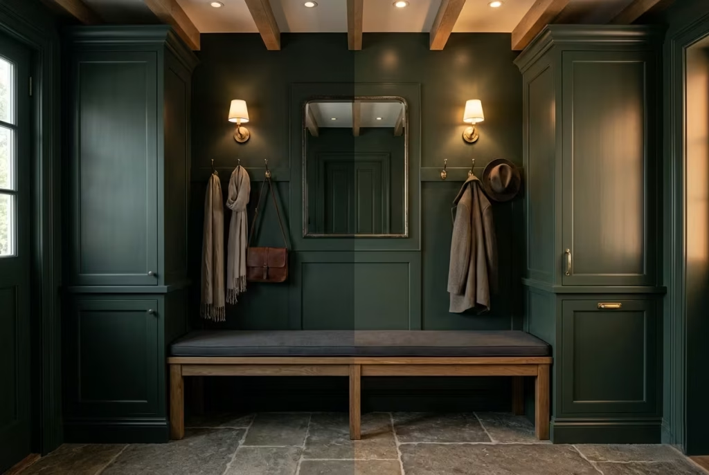
Finish selection changes how dark green behaves just as much as colour itself. Matte finishes absorb light rather than reflect it, which gives dark green walls a softer and more architectural appearance. They tend to feel quieter, richer, and slightly velvety, especially in older homes where textured surfaces already exist naturally. Matte paint also disguises minor wall imperfections exceptionally well, which is useful in heavily used family entryways.
However, matte finishes can sometimes deepen shadows considerably in compact mudrooms with limited daylight. In very narrow spaces, too much matte texture can make corners visually disappear.
Satin finishes reflect a little more light back into the room. That subtle sheen helps cabinetry edges, wall paneling, and mouldings retain definition even during darker hours. Satin is also easier to wipe clean, which makes it practical for homes with pets, children, or wet weather traffic constantly moving through the space.
In reality, the best mudrooms often balance both. I frequently specify matte walls paired with satin cabinetry or satin trim because the contrast introduces depth without making the room feel overly reflective.
Best Bulb Temperatures for Dark Green Rooms
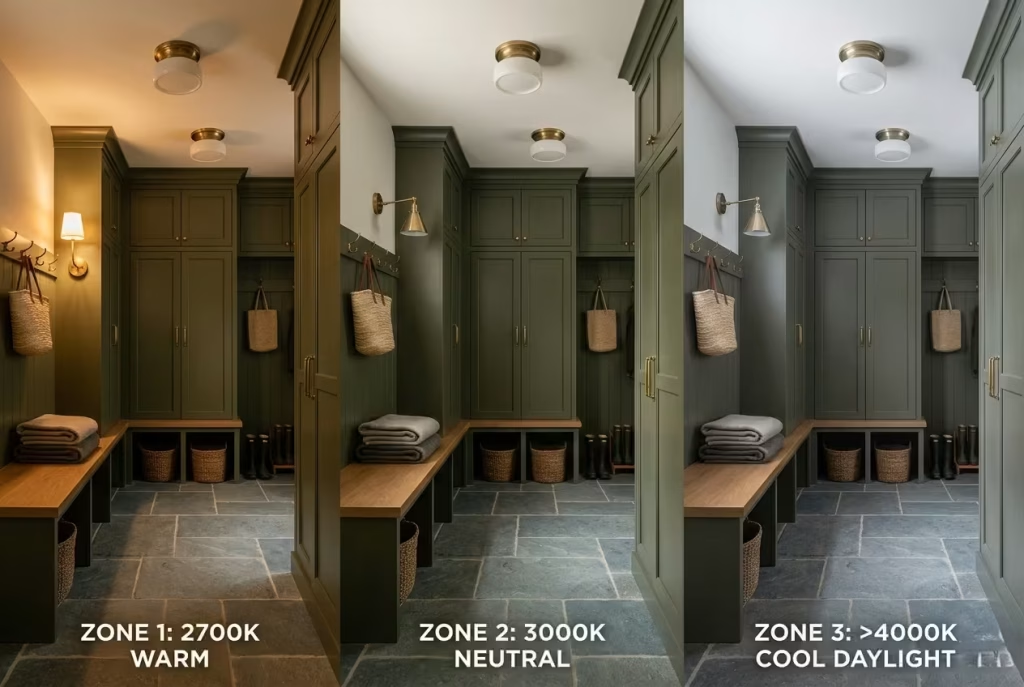
For a mudroom that feels warm rather than cave-like, lighting should feel layered and atmospheric instead of aggressively bright.
Generally, the most flattering ranges are:
- 2700K for a softer, more intimate glow
- 3000K for a slightly cleaner but still warm appearance
- Avoid overly cool daylight bulbs unless the room receives extremely limited natural light
Dimmable lighting also changes the experience entirely. Bright functional light may be useful during busy mornings, but softer evening lighting allows the room to transition into something calmer and more relaxed by nightfall.
That flexibility becomes especially valuable in homes where the mudroom doubles as a utility corridor, laundry transition, or secondary entrance.
Layered Lighting Strategies That Prevent Dark Rooms Feeling Flat
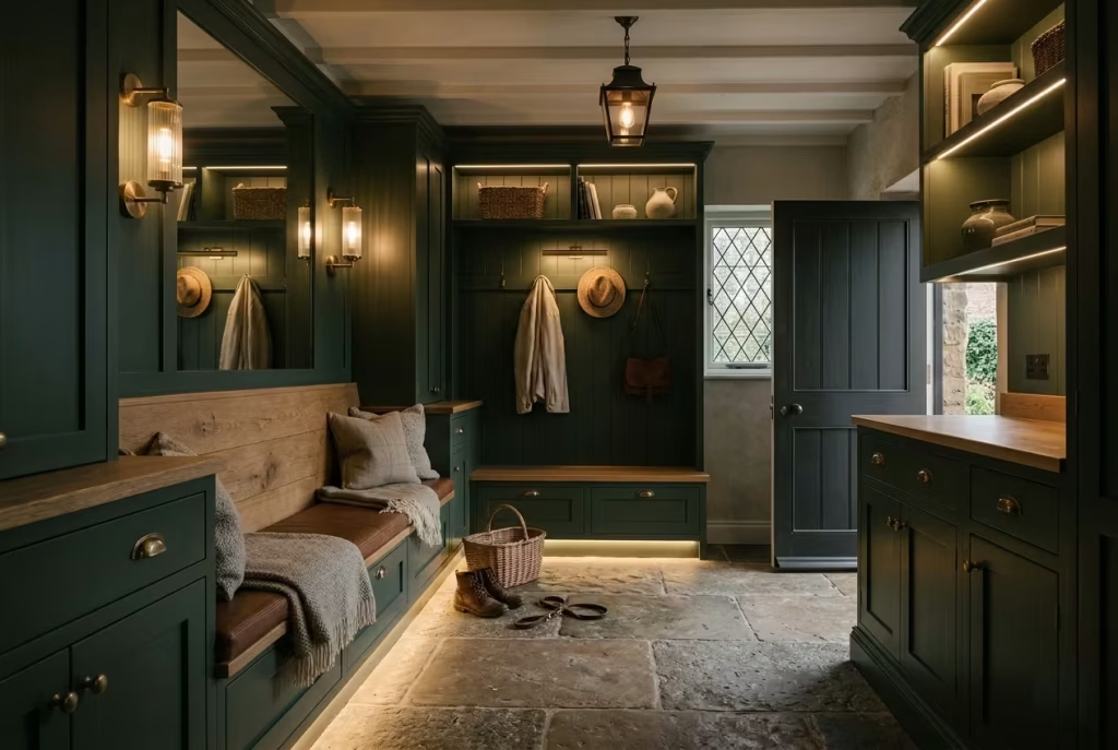
One overhead fixture alone rarely works in moody mudrooms. Dark palettes absorb light unevenly, so relying on a single ceiling fixture often creates harsh pools of brightness surrounded by heavy shadow. Instead, layered lighting introduces rhythm and visual softness throughout the room.
Some of the most effective combinations include:
- Wall sconces beside cabinetry
- Small picture lights above hooks or shelving
- Low-level bench lighting
- Lantern pendants for taller ceilings
- Under-cabinet LED strips concealed beneath joinery
In one countryside renovation project, we added discreet lighting beneath floating oak benches, and the difference was immediate. The lower illumination softened the room’s shadow lines while making the stone flooring feel warmer and more tactile after sunset.
Those quieter lighting decisions are often what make a mudroom feel thoughtfully designed rather than merely decorated.
Reflective Surfaces That Soften Dark Palettes
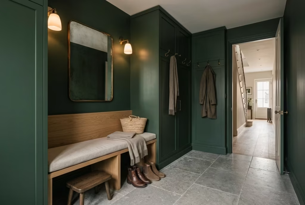
Not every surface in a moody mudroom should absorb light. Without contrast, darker schemes can begin to feel visually dense, particularly in homes with narrow entryways or low ceilings. Reflective materials help bounce light gently around the room while maintaining the richness of the palette.
Some of the most effective include:
- Honed limestone flooring
- Antique brass hardware
- Satin-finished cabinetry
- Softly glazed ceramic tiles
- Aged mirrors with warm patina
- Light oak or smoked timber accents
The key is restraint. Too many glossy finishes can strip away the quiet depth that makes dark green interiors feel grounded in the first place. What works best is a careful push and pull between absorption and reflection, shadow and softness, richness and relief.
That balance is where moody mudrooms begin to feel timeless rather than theatrical.
The Best Materials to Pair with Moody Green
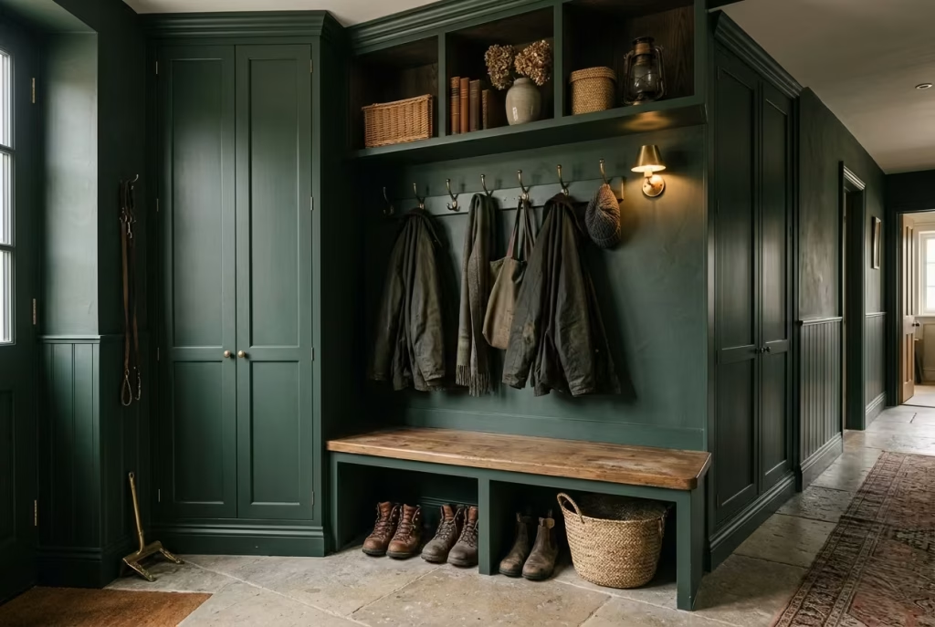
Dark green mudrooms succeed or fail less because of the paint colour itself and more because of what surrounds it. Material selection is what gives the room emotional depth. Without that layering, even the richest green can feel flat as a pancake, particularly in spaces built around heavy daily use.
But when the right surfaces begin working together, timber warming the shadows, stone catching stray light, aged metals softening sharp edges, the room starts to feel settled in the best possible way, as though it has quietly belonged to the house for decades.
This matters even more in mudrooms because they live hard lives. They absorb muddy boots, dripping coats, dog leads, grocery bags, school clutter, and damp winter air almost daily. A material may look beautiful in a showroom, but if it cannot age gracefully under pressure, the entire room quickly loses its charm.
In residential projects, I always approach mudroom materials with one question in mind: will this still feel beautiful after years of real use rather than a few carefully photographed weeks?
The answer usually lies in choosing finishes that become more characterful over time rather than precious.
Warm Oak and Smoked Timber
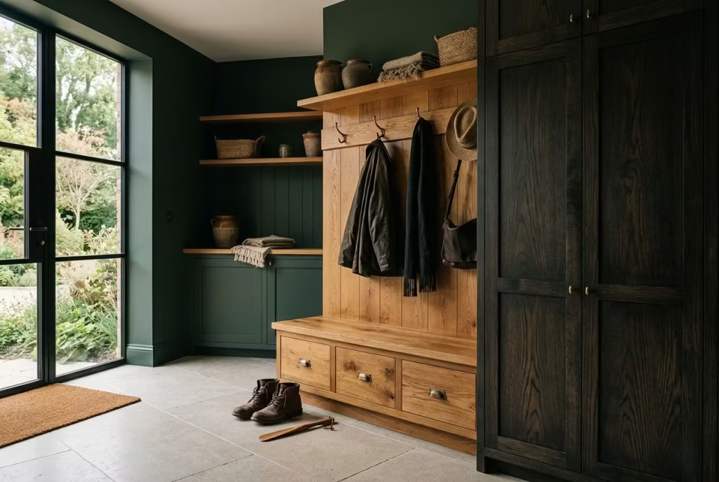
Few materials balance moody green as naturally as timber. Warm oak, particularly mid-tone European oak with visible grain movement, introduces softness into darker mudrooms almost immediately.
It stops the green from feeling overly formal and creates visual warmth that pulls the entire space back toward comfort. In homes where the mudroom connects directly to kitchens or family living areas, oak also helps create continuity, allowing the darker palette to feel integrated rather than isolated.
Smoked timber behaves slightly differently. It carries deeper undertones and adds a more dramatic, cocoon-like atmosphere that works beautifully in contemporary or heritage-inspired interiors alike. I often specify smoked oak cabinetry in larger mudrooms where there is enough natural light to support darker layering without making the room feel visually compressed.
One particularly successful project involved smoked oak locker-style cabinetry paired with blackened olive walls and limestone flooring. On paper, it sounded heavy. In reality, the variation in timber grain prevented the room from feeling static. Light caught the wood differently throughout the day, creating movement and warmth within the darker palette.
Timber also performs well practically. Minor scuffs, scratches, and daily wear tend to blend into natural grain patterns rather than standing out harshly the way they often do on flat painted surfaces.
Antique Brass Hardware
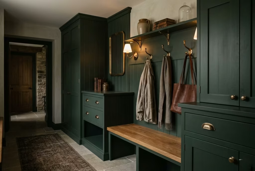
Hardware is one of those details people underestimate until it is missing. Dark green mudrooms can sometimes lean visually dense if every surface absorbs light equally. Antique brass interrupts that heaviness gently. It introduces warmth, reflection, and a touch of age without feeling flashy or overly decorative.
Unlike polished chrome, which can feel cold against deeper greens, aged brass softens the palette beautifully. As the metal develops patina over time, it begins contributing to the layered character of the room rather than fighting against it.
I often use antique brass for:
- Coat hooks
- Cabinet pulls
- Bench brackets
- Wall sconces
- Shoe storage rails
- Umbrella stands
In family homes especially, solid brass tends to age more forgivingly than lacquered finishes. Fingerprints, scratches, and minor wear become part of the material’s story rather than imperfections demanding constant maintenance.
That lived-in quality is precisely what makes moody mudrooms feel welcoming instead of overly staged.
Limestone Flooring
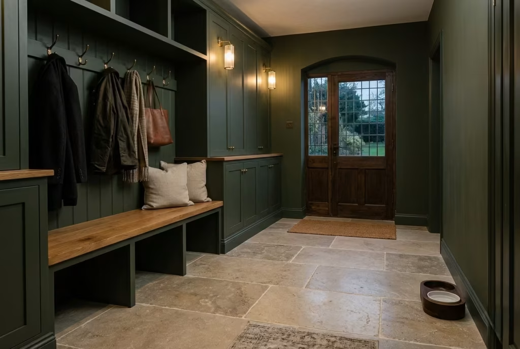
Limestone brings a quiet kind of luxury to darker entry spaces. Because deep green walls naturally create shadow and contrast, limestone flooring helps rebalance the room by reflecting light upward in a softer, more diffused way. Honed finishes work particularly well because they retain a natural texture without becoming slippery under wet shoes.
From a design perspective, limestone also introduces tonal complexity. Warm beige undertones soften cooler greens, while subtle fossil markings and natural variation prevent the floor from feeling overly uniform.
But practicality matters too. Mudrooms deal constantly with moisture, grit, and outdoor debris. Dense limestone, when sealed correctly, handles heavy foot traffic remarkably well. In one country property renovation, we used large-format limestone tiles measuring roughly 24 x 24 inches (60 x 60 cm), which visually expanded the narrow mudroom while disguising dirt more effectively than smaller grout-heavy layouts.
That said, limestone does require periodic sealing, particularly in climates with frequent rain or snow. Homeowners wanting lower maintenance may prefer porcelain alternatives with a limestone appearance, though genuine stone still offers unmatched depth under natural light.
Slate and Terracotta Accents
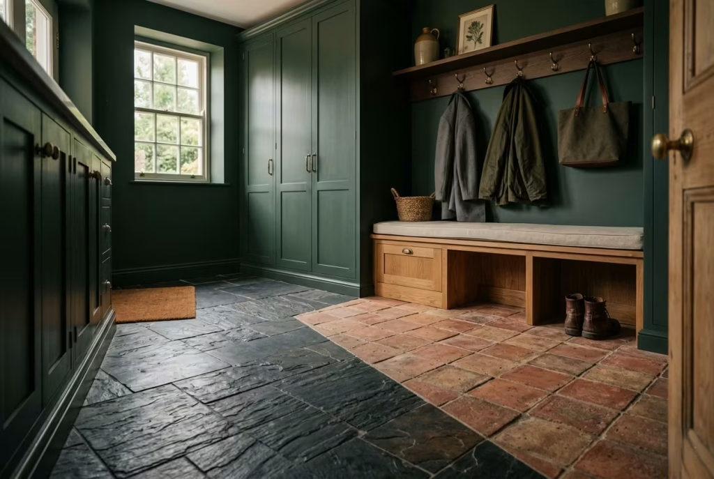
If limestone softens a dark green mudroom, slate and terracotta ground it. Slate introduces a more architectural, slightly rugged quality that pairs beautifully with blackened greens and heritage-inspired interiors. Its layered texture catches light unevenly, which adds movement beneath darker cabinetry and prevents the room from feeling too polished.
Terracotta brings something entirely different. Warmth. Earthiness. A slightly sunbaked softness that balances cooler greens exceptionally well.
I have used reclaimed terracotta tiles in mudrooms where homeowners wanted the space to feel relaxed rather than formal. Over time, the worn edges and subtle tonal shifts developed even more character, especially during rainy months when the clay deepened slightly in colour.
There is also a psychological comfort to these materials. They feel rooted and tactile beneath your feet, particularly after walking in from cold weather. Mudrooms should not feel sterile. They should feel capable of handling real life while still carrying warmth.
Textured Plaster Walls
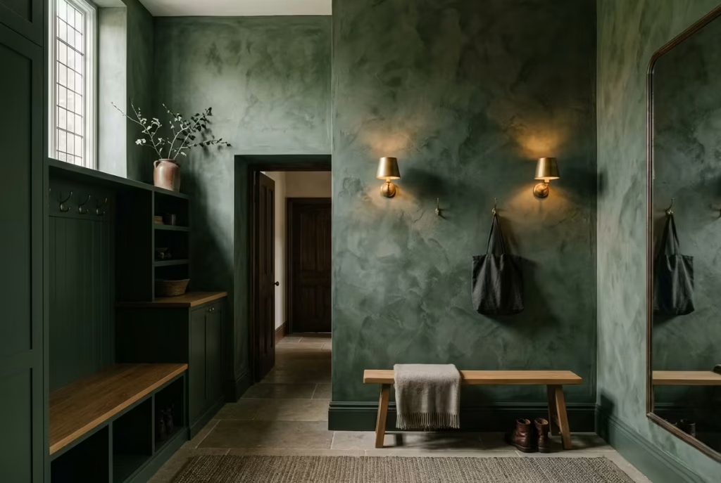
Flat drywall can sometimes make dark green feel visually abrupt. Textured plaster changes that entirely. Limewash, Venetian plaster, and softly textured mineral finishes diffuse light unevenly across the surface, creating shadow variation that gives darker colours far more dimension. Instead of one flat wall colour, the room begins to feel layered and atmospheric, almost shifting slightly as daylight moves through the space.
This becomes especially powerful in homes with limited natural light because texture prevents darker tones from reading as one-dimensional blocks of colour.
In one townhouse project with an extremely compact mudroom, we used a moss-toned limewash finish above panelled cabinetry. During the day, the walls appeared soft and smoky. By evening, the texture caught the warm sconces beautifully, creating depth that standard paint simply would not have achieved.
Plaster finishes also age gracefully. Minor imperfections, inevitable in high-traffic family areas, often blend naturally into the texture rather than becoming obvious blemishes.
Woven Storage Elements
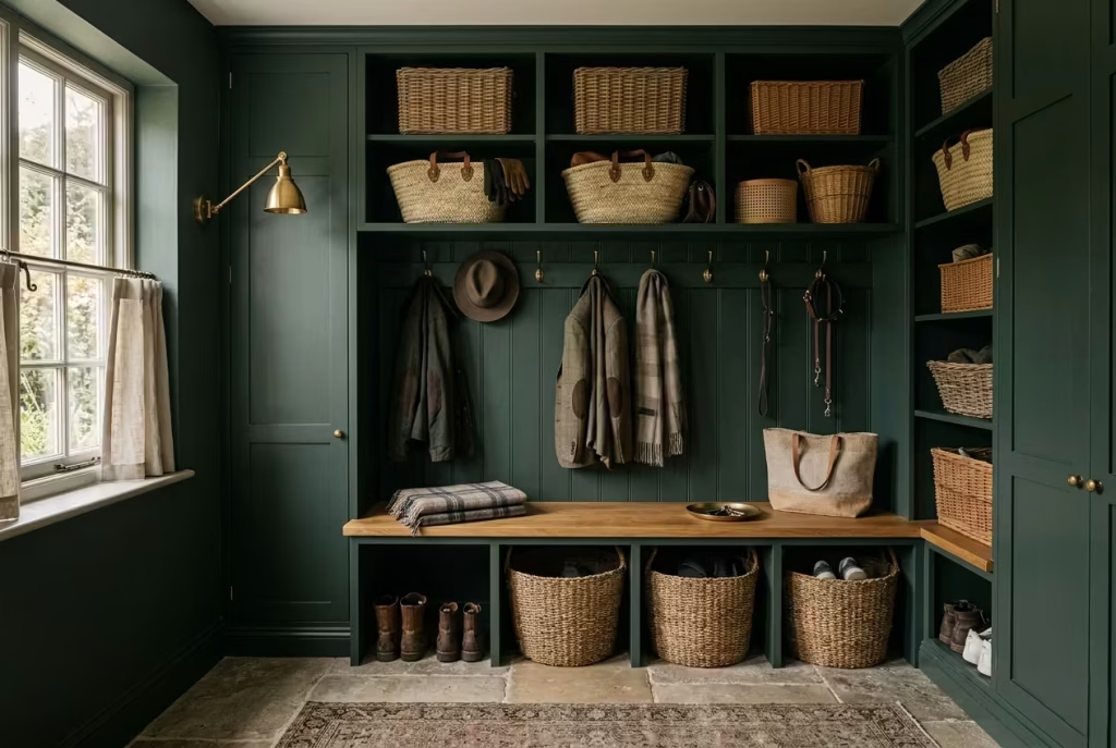
Mudrooms need storage, but too much solid cabinetry can make darker spaces feel visually heavy. That is where woven textures quietly earn their keep.
Baskets in rattan, seagrass, cane, or wicker introduce airflow and softness into the room while helping organise everyday clutter more naturally. They also break up larger stretches of painted joinery, which keeps the space from feeling overly rigid.
I frequently incorporate woven storage for:
- Scarves and gloves
- Dog accessories
- Children’s shoes
- Seasonal hats
- Sports equipment
- Reusable shopping bags
In practical terms, woven baskets are forgiving. They hide minor mess effortlessly and allow homeowners to maintain a sense of order without needing every shelf perfectly styled at all times.
That flexibility matters enormously in busy homes because no mudroom stays immaculate for long.
Designing for Real Family Life
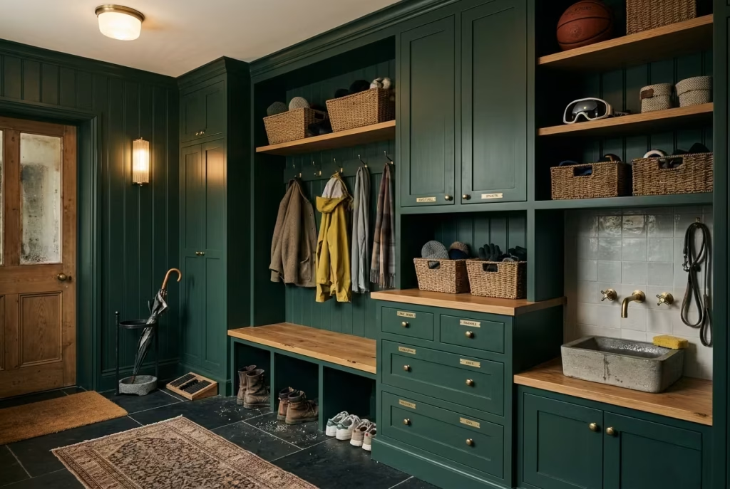
The most beautiful mudrooms are not the ones untouched by daily life. They are the ones designed to absorb it gracefully.
When planning darker mudrooms for families, I pay close attention to how materials will behave under constant use.
Boot Traffic
Heavy footwear can destroy delicate finishes quickly. Durable flooring becomes essential, particularly near entry points where grit and moisture accumulate.
Some of the most resilient combinations include:
- Honed limestone
- Tumbled porcelain
- Slate
- Sealed terracotta
- Engineered oak with strong wear layers
A practical detail I often recommend is a washable runner with subtle patterning. It softens acoustics, protects flooring, and visually warms the room without demanding perfection.
Wet Umbrellas and Moisture
Moody mudrooms need moisture-resistant surfaces because dampness has a habit of creeping into every corner during colder seasons.
Satin cabinetry finishes, sealed stone flooring, and plaster treatments designed for humidity all perform particularly well. I also prefer integrated drip trays or stone umbrella stands near entrances because they contain moisture before it spreads across the room.
Small functional decisions like these often prevent long-term wear that homeowners only notice once damage has already settled in.
Pet Storage
Homes with dogs require especially thoughtful planning. Built-in lower drawers for leads, washable bedding storage, hidden feeding stations, and durable wall finishes near entry zones all help maintain visual calm even when pets come charging through the door after muddy walks.
One feature clients consistently appreciate is elevated dog-washing areas with stone splashbacks and brass handheld fixtures. Besides protecting the room practically, they help preserve the overall atmosphere by containing mess in a more intentional way.
Seasonal Clutter Management
Mudrooms change constantly throughout the year. Winter coats replace linen jackets. Boots expand into scarves, gloves, and umbrellas. Summer introduces sports equipment, beach bags, and outdoor shoes seemingly overnight. That constant evolution means flexibility matters more than perfection.
The most functional mudrooms typically include:
- Adjustable shelving
- Deep overhead cabinets
- Pull-out drawers
- Hidden charging stations
- Closed storage mixed with open access areas
In my experience, a mudroom feels most luxurious when it quietly accommodates daily disorder without appearing chaotic. Good material choices support that feeling. They soften wear, absorb use gracefully, and allow the room to evolve naturally alongside the household itself.
Best Dark Green Paint Colours for Mudrooms
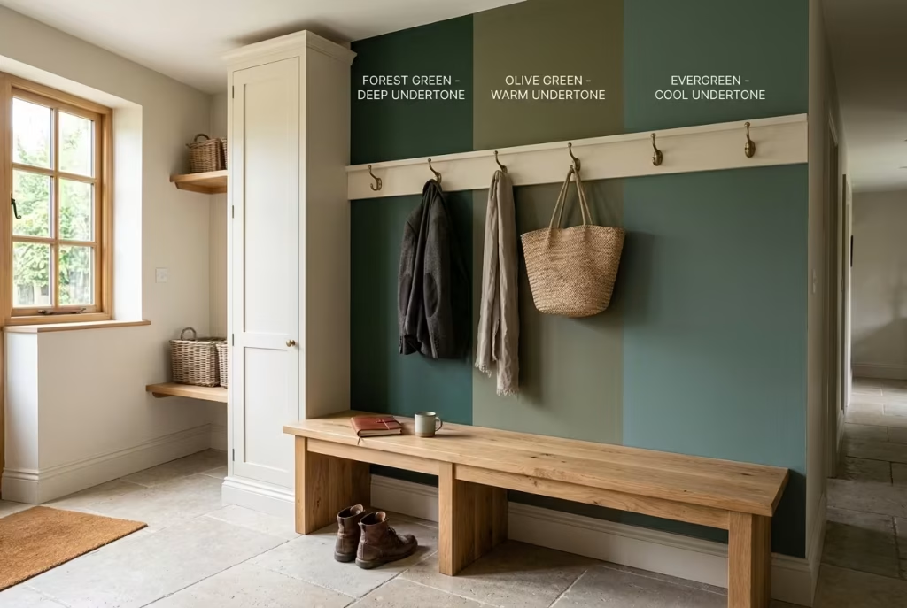
Choosing the right dark green for a mudroom is rarely just a colour decision. It is a spatial decision, one that influences how light behaves, how materials read against each other, and how the room feels the moment you step through the door with wet shoes and a heavy coat.
The most successful schemes are not simply “dark green,” but carefully tuned variations that sit between depth and softness, allowing the space to feel grounded without becoming visually heavy.
In practice, I tend to treat dark green as a family of tones rather than a single choice. Each category behaves differently depending on light exposure, room size, and surrounding materials.
Blackened Greens
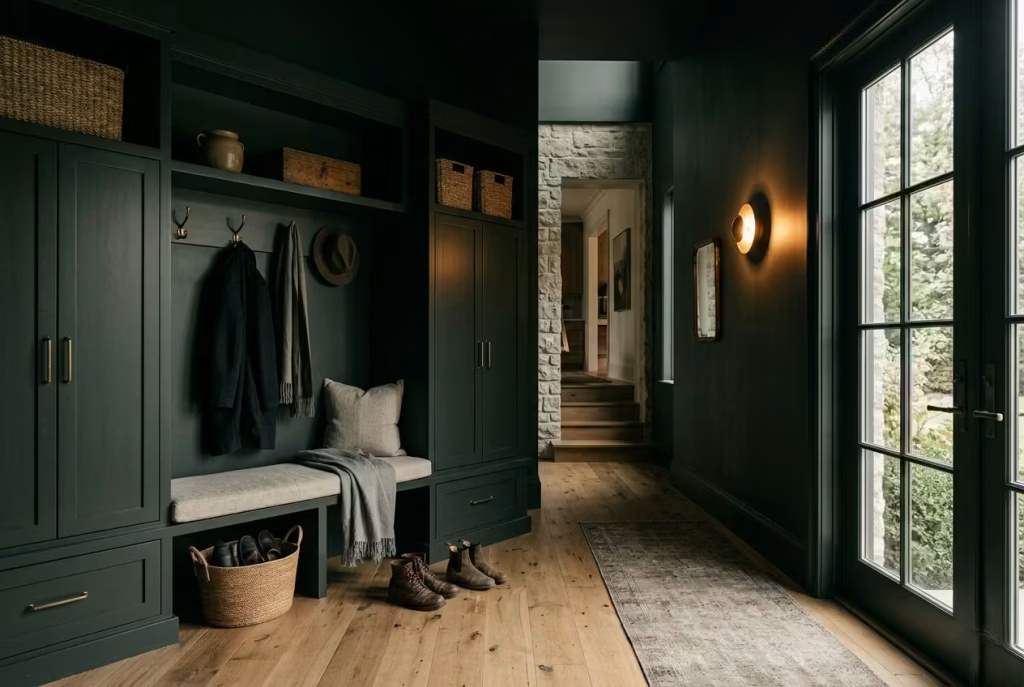
Blackened greens sit at the deepest end of the spectrum, where green is still present but heavily subdued by charcoal or near-black undertones. These colours are ideal for mudrooms where a strong architectural presence is desired, particularly in homes with generous natural light or higher ceilings.
They create a cocoon-like effect that feels controlled and immersive, especially when paired with lighter flooring or warm timber accents. However, in low-light spaces, they can quickly feel dense if not balanced with reflective surfaces or layered lighting.
I often use blackened greens in entryways where the goal is to create a dramatic threshold moment, something that feels almost cinematic as you move from outside to inside.
Olive Greens
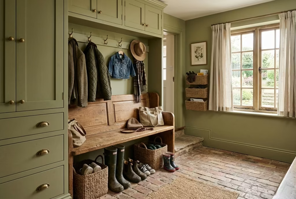
Olive greens are softer, earthier, and more forgiving. They carry warm brown undertones that make them particularly well suited to family homes and high-traffic mudrooms.
This category works beautifully when paired with natural materials such as limestone, aged oak, or brick flooring. The warmth in olive tones helps absorb visual clutter, making everyday mess feel less disruptive to the overall aesthetic.
In one renovation project, an olive green mudroom was chosen specifically because it softened the visual impact of constant boot traffic and seasonal storage. Over time, it became one of the most practical colour choices in the home, quietly hiding the rhythm of daily life.
Moss Greens
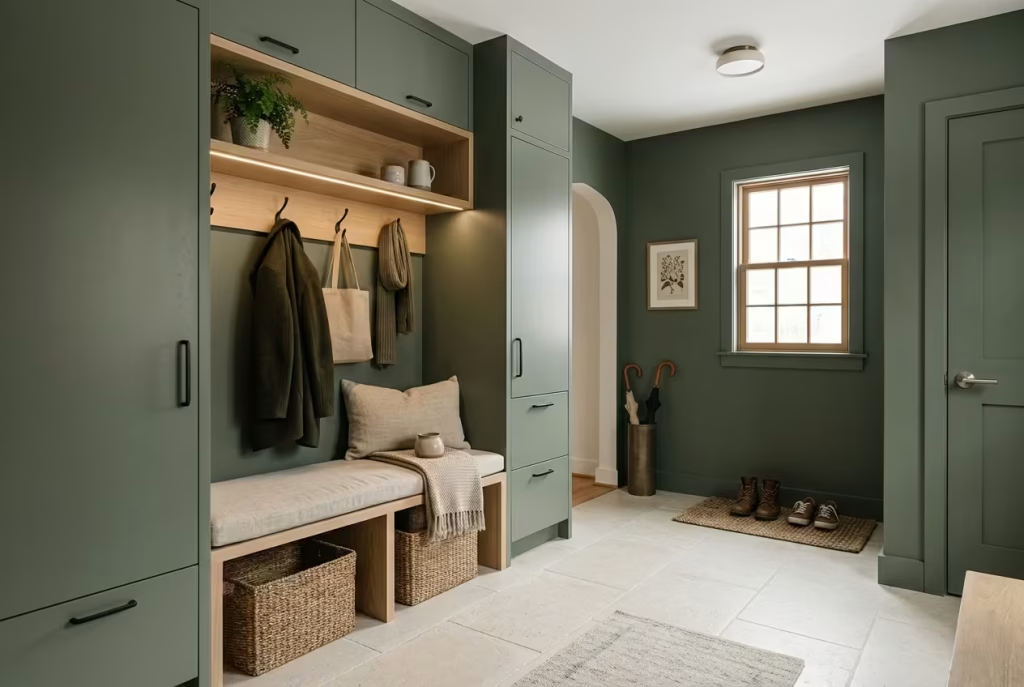
Moss greens sit in a slightly softer mid-dark range, often with muted grey undertones. They feel natural, calming, and slightly more contemporary than traditional heritage greens.
These tones are particularly effective in spaces with limited natural light, as they hold their depth without becoming overpowering. They also pair exceptionally well with pale woods, linen textures, and simple matte finishes.
Moss greens tend to create a very balanced atmosphere, neither too warm nor too cool, making them a reliable choice for transitional mudrooms that connect multiple areas of the home.
Heritage Greens
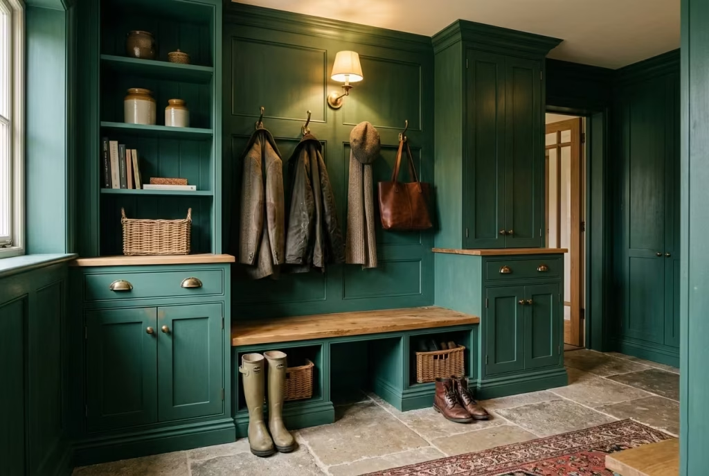
Heritage greens are rooted in traditional interior palettes, often seen in period homes or classic English-inspired designs. They carry a slightly richer, more historical quality, often with subtle blue or yellow undertones depending on the formulation.
These colours work especially well with detailed joinery, panelling, and traditional hardware. They tend to feel more structured and formal compared to softer moss or olive tones.
In mudrooms, heritage greens can elevate even simple layouts, giving them a sense of permanence and architectural weight that feels naturally established rather than newly introduced.
Blue-Greens
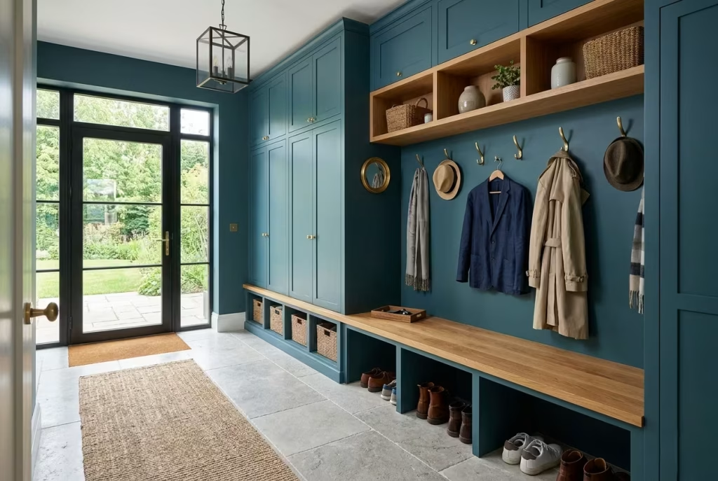
Blue-greens introduce a cooler edge to the palette. They sit closer to teal or deep sea-inspired tones, bringing a fresher, more contemporary energy to the mudroom.
These shades work particularly well in homes with strong natural light, where their cooler undertones can be balanced by warm materials such as timber or brass. Without that balance, they can feel slightly crisp or detached.
When used correctly, blue-greens can create a very refined entry experience, especially in modern interiors where clarity and freshness are preferred over heaviness.
Understanding Undertones
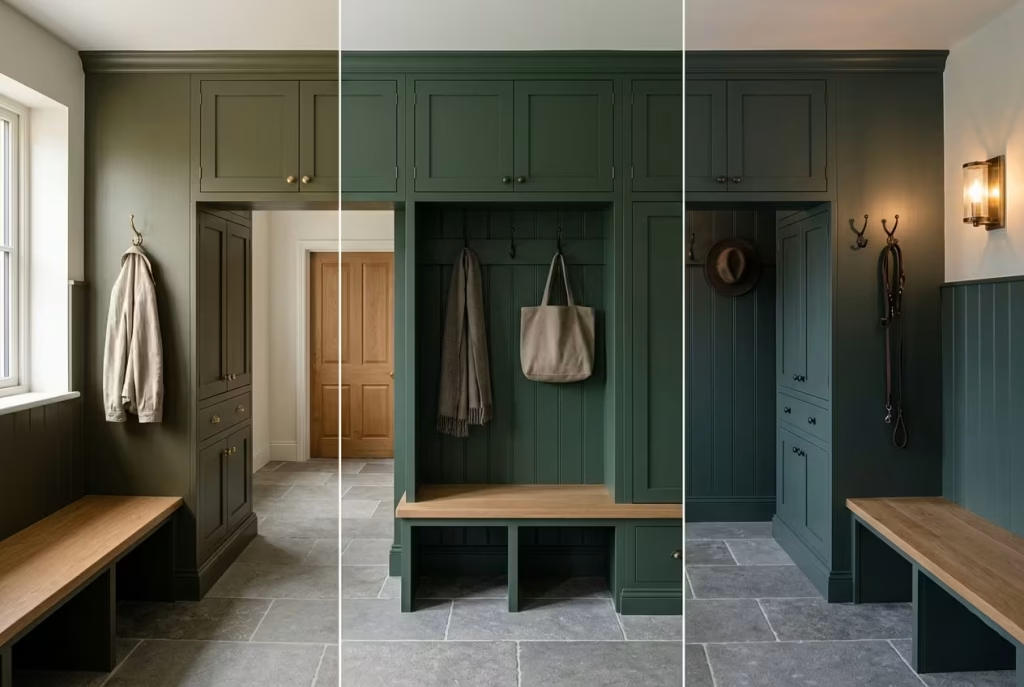
Undertones are what truly define how a dark green behaves in a real space. Two paints may look similar on a sample card, yet feel completely different once applied to a wall.
Warm undertones, often leaning towards yellow or brown, create softness and warmth. They help the colour sit comfortably alongside timber, leather, and stone.
Cool undertones, influenced by blue or grey, introduce clarity and depth. They work well in contemporary schemes but require careful lighting to avoid feeling too cold.
In mudrooms, where lighting changes constantly throughout the day, undertones become especially important. A colour that feels balanced in the morning may shift significantly by evening, so testing samples in different lighting conditions is essential.
Light Reflectance Values (LRV)
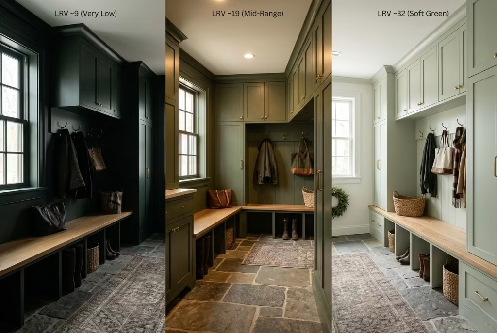
Light Reflectance Value, or LRV, measures how much light a colour reflects. In dark green mudrooms, this becomes a critical technical detail.
Lower LRV values, typically below 15, produce deeper, more atmospheric spaces. These are ideal for dramatic or cocooned entryways but require strong lighting design to prevent heaviness.
Mid-range LRVs, usually between 15 and 25, offer a more balanced approach. They retain depth while still reflecting enough light to keep the space comfortable and usable throughout the day.
Higher values soften the effect further, making the green feel lighter and more open, which can be useful in smaller or poorly lit mudrooms.
Finish Recommendations
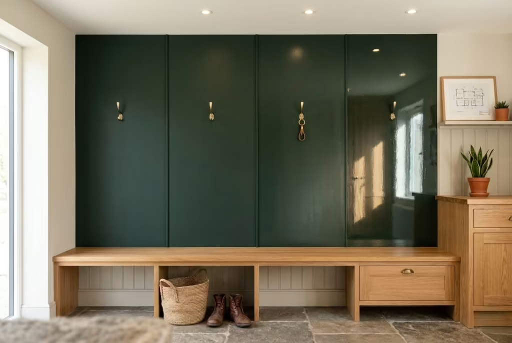
Finish plays a subtle but important role in how dark green is perceived. Matte finishes tend to absorb light, creating a soft, velvety appearance that works beautifully in moody, atmospheric designs. They help conceal imperfections and reduce glare, making them ideal for busy family spaces.
Eggshell or satin finishes introduce a gentle sheen that reflects a little more light, which can be useful in darker mudrooms that need slight visual lift without becoming glossy.
High gloss finishes are more expressive and reflective, but they require careful control of lighting and maintenance. In mudrooms, they are best used sparingly or in specific design moments rather than across entire surfaces.
Common Mistakes That Make Moody Mudrooms Feel Gloomy
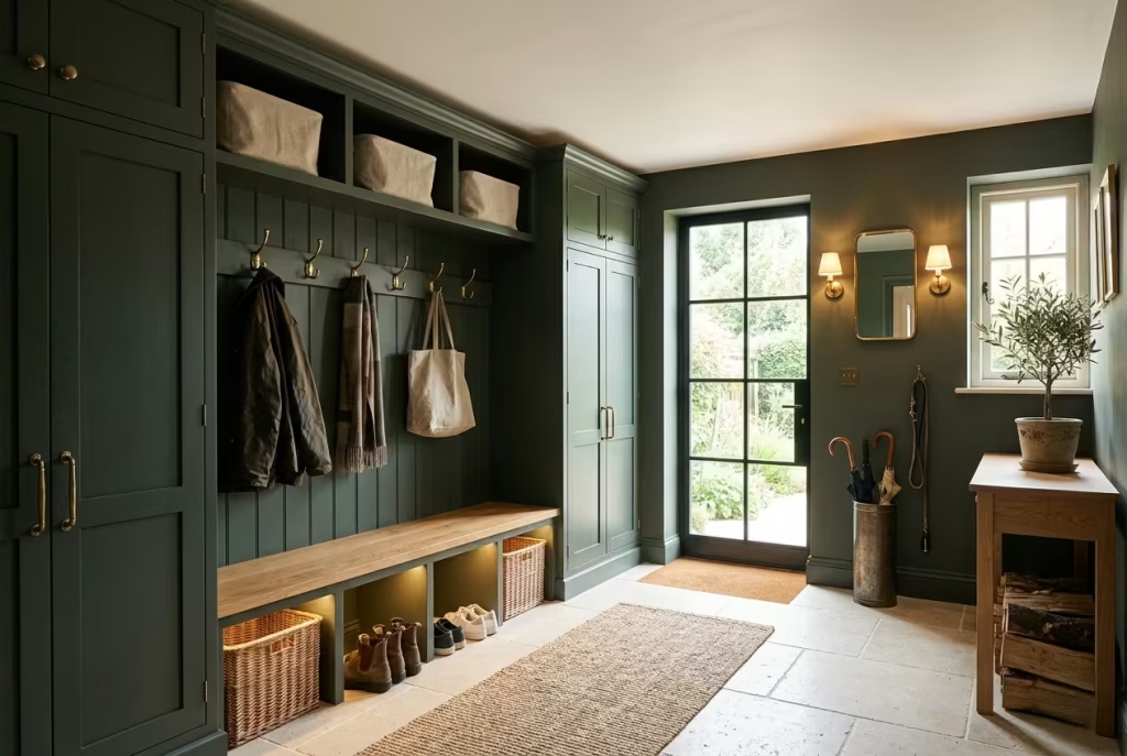
Moody green mudrooms can be some of the most atmospheric spaces in a home, but they also sit on a fine line. When the balance is off, what should feel rich and grounding can quickly tip into something flat, heavy, and unintentionally oppressive. In most cases, the problem is not the colour itself. It is how the surrounding elements either support it or quietly work against it.
The difference between a space that feels cocooned and one that feels closed in usually comes down to layering, light, and material contrast rather than paint choice.
Poor Lighting Layering That Flattens the Space
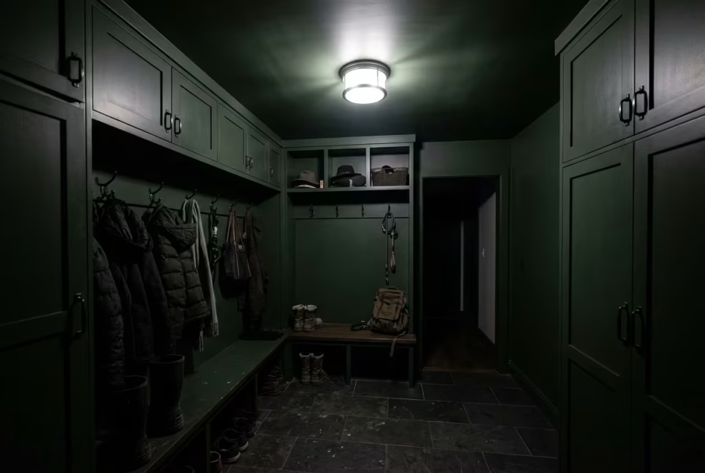
Lighting is often the first place things go wrong. A single overhead fixture might technically illuminate the room, but it rarely creates the depth needed for darker palettes to breathe properly.
Without layered lighting, moody greens lose their dimensional quality and start to feel like a solid block of colour. Shadows become harsh rather than soft, and architectural details disappear into uniform darkness.
In well-resolved mudrooms, lighting should operate at multiple levels. Ambient light provides general visibility, task lighting supports practical use, and accent lighting adds subtle definition to walls, joinery, or textures. When these layers are missing, the room loses its rhythm.
I have seen beautifully designed mudrooms fall flat simply because the lighting plan was treated as an afterthought. Once wall lights or secondary sources were introduced, the same green suddenly felt intentional rather than heavy, as if the space had finally been allowed to exhale.
Using Cold Bulbs That Drain Warmth from the Colour
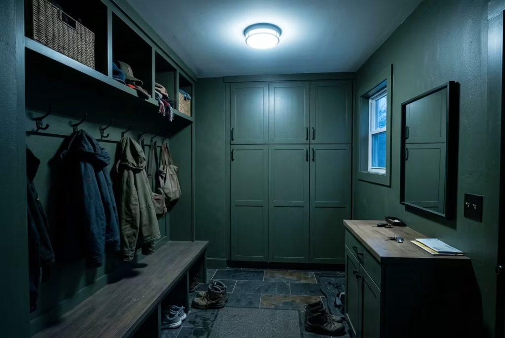
Colour temperature has a far greater impact on dark greens than most people expect. Cold bulbs, particularly those above 3500K, tend to strip warmth from the palette and push green tones towards a dull or slightly clinical appearance.
Instead of feeling rich and grounded, the room begins to feel stark. Even high-quality paint can lose its depth under the wrong lighting temperature.
In mudrooms, where transition and comfort are key, warm lighting in the range of 2700K to 3000K is far more effective. It enhances the natural complexity of green tones, allowing undertones to read properly while maintaining a soft, inviting atmosphere.
I often describe cold lighting in these spaces as “flattening the story of the colour.” It removes the nuance that makes moody palettes so compelling in the first place.
Ignoring Ceiling Colour and Its Visual Weight
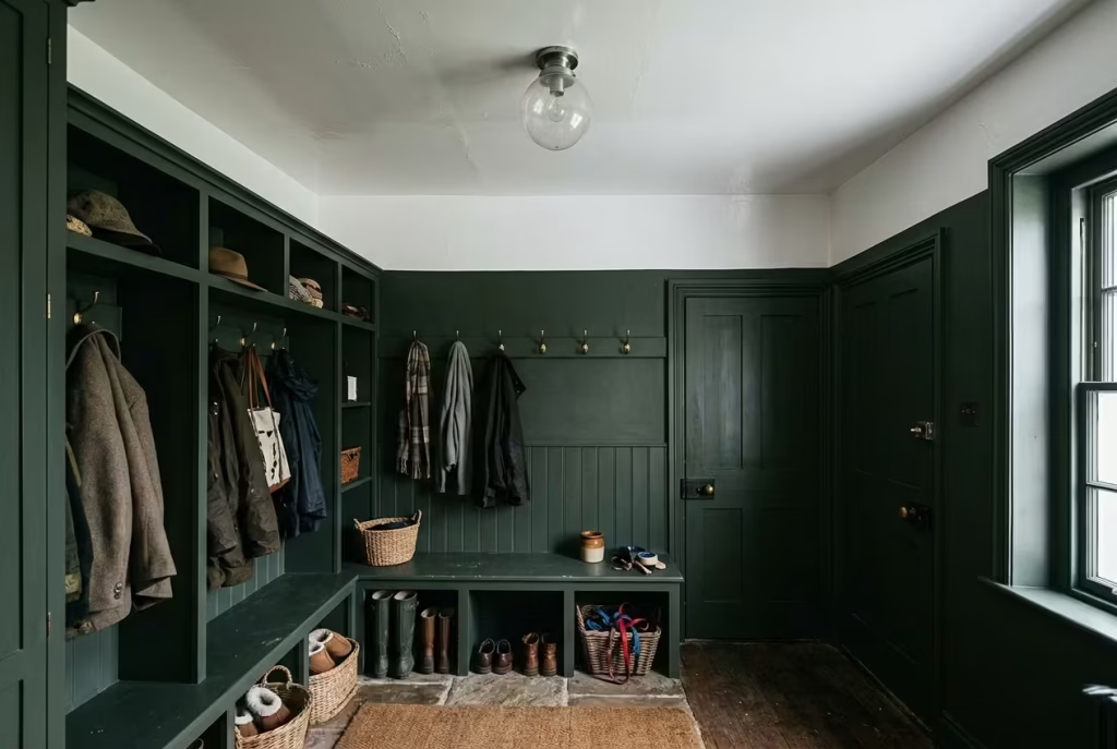
Ceilings are frequently overlooked, yet they play a critical role in how enclosed or open a space feels. A bright white ceiling paired with very dark green walls can sometimes create an uncomfortable visual contrast, especially in smaller mudrooms.
The eye naturally moves upward, and when the ceiling feels disconnected from the rest of the palette, the space can appear disjointed or top-heavy.
Softened ceiling tones, whether in warm white, muted off-white, or even a slightly lighter variation of the wall colour, help unify the room. This reduces harsh transitions and allows the green to feel more integrated within the architecture.
In one renovation, simply toning down a stark white ceiling to a warmer, softened neutral immediately changed the perception of height and balance. The room felt less fragmented and far more cohesive.
Lack of Texture Variation That Creates Visual Flatness
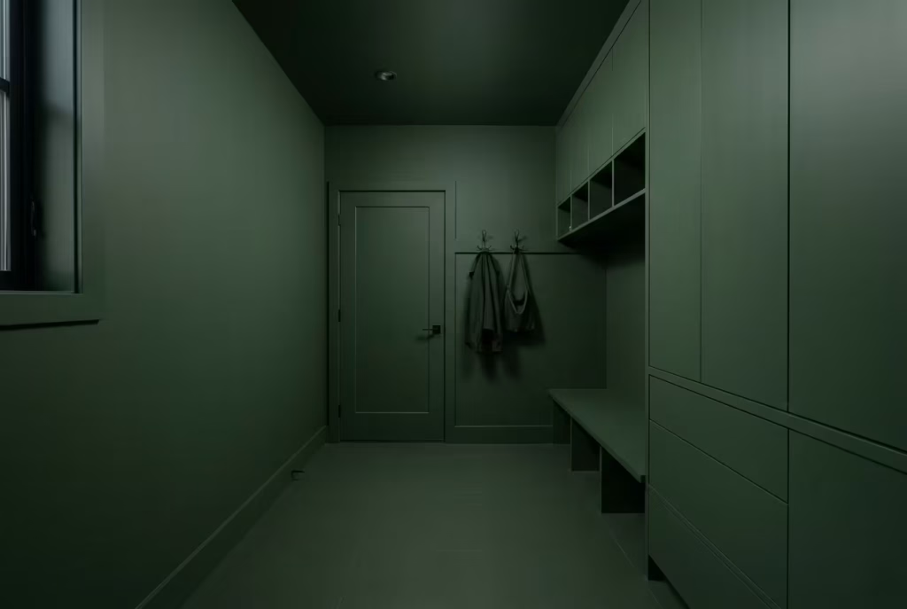
Moody green relies heavily on texture to stay visually alive. Without it, the colour can quickly become static, especially on large uninterrupted surfaces.
When every surface shares a similar finish, whether matte paint, smooth cabinetry, or uniform flooring, the room loses depth. There are no visual interruptions for the eye to engage with, which can make even a carefully chosen palette feel dull.
Introducing variation through wood grain, stone texture, woven materials, or subtle fabric elements helps break up this uniformity. These shifts do not need to be dramatic. Even small changes in surface quality can restore a sense of movement and layering.
In practice, I often find that the most successful moody mudrooms feel slightly imperfect in their texture composition. That variation is what keeps the space from slipping into monotony.
Overcrowded Storage That Breaks Visual Calm
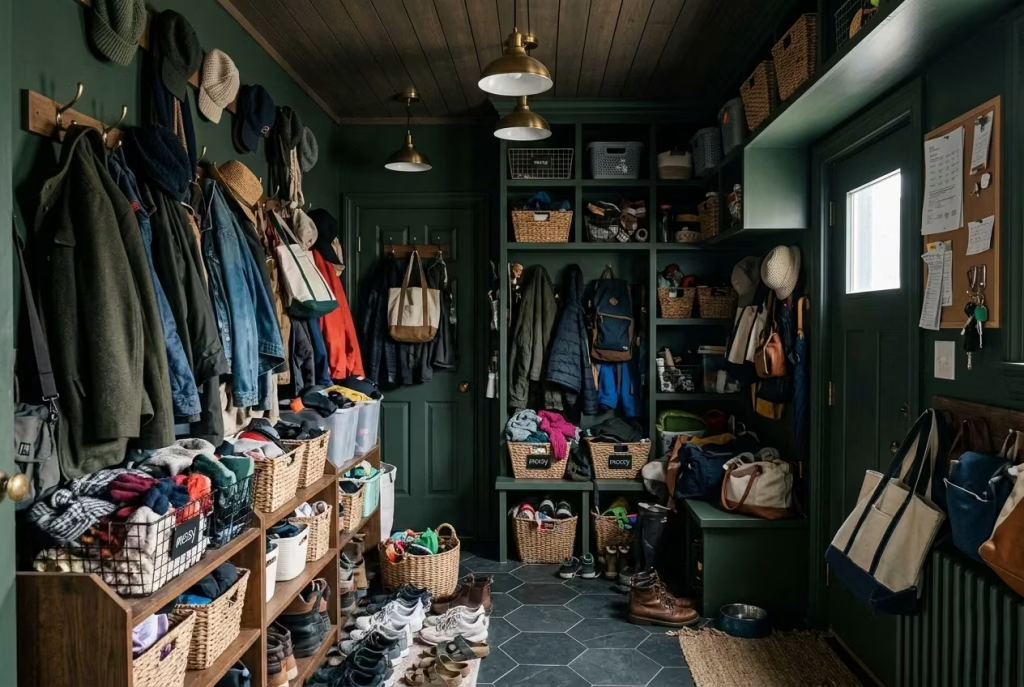
Storage is essential in any mudroom, but it is also one of the easiest areas to overcomplicate. When too many systems, hooks, baskets, and open compartments compete for space, the room begins to feel visually cluttered even when it is technically organised.
Dark green has a strong ability to absorb visual noise, but it is not limitless. If every wall is filled with functional elements, the calmness of the colour is overwhelmed.
The most effective approach is controlled restraint. Closed cabinetry should handle the majority of storage needs, while open elements are used sparingly and intentionally. This allows the eye to rest, rather than constantly scanning for visual information.
I often remind clients that good storage should feel invisible most of the time. If it is constantly drawing attention, it is usually doing too much.
Real Experience Insight
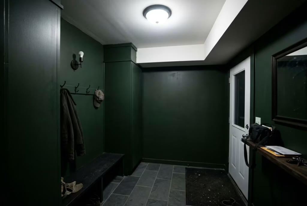
In several renovations I have worked on, the issue was never the dark colour itself. It was the absence of tonal warmth and material balance elsewhere in the room.
Once lighting was softened, ceiling tones were adjusted, and texture was introduced more thoughtfully, the same dark greens that initially felt heavy began to feel grounded and atmospheric. The transformation was rarely about changing the paint. It was about supporting it properly.
A moody mudroom succeeds when everything around the colour is doing its part quietly and consistently. When those supporting elements are missing, even the most beautiful green can feel like it is carrying the entire weight of the room on its own.
How to Make a Dark Green Mudroom Feel Expensive
A dark green mudroom feels expensive when it looks resolved rather than simply decorated. That difference matters. True refinement is rarely about piling on luxury-looking details. It comes from restraint, proportion, and the quiet precision of each decision, so the room feels as though nothing has been left to chance. When done properly, the space carries that elusive “finished” quality, the one that seems effortless but is usually the result of careful, disciplined design.
Dark green is already carrying a lot of the visual mood here, which means the surrounding elements have to do the subtle work of supporting it. The joinery, hardware, materials, lighting, and storage all need to speak the same language. When they do, the room feels composed, grounded, and far more expensive than its footprint might suggest.
Joinery Detailing
Joinery is where a mudroom either feels bespoke or off-the-shelf. The most elevated schemes rarely rely on standard boxes with a coat of paint. Instead, they use joinery that feels considered from edge to edge, with proportions that suit the architecture rather than fighting against it.
Inset doors, slim shadow gaps, framed panels, and carefully aligned lines all help create that tailored feel. Even small details, such as the thickness of a bench top or the depth of a cabinet reveal, can shift the room from functional to refined. In high-end interiors, those millimetres matter. They are the quiet difference between something that looks installed and something that looks designed.
I often find that deeper green joinery benefits from slightly more substantial detailing than pale cabinetry. The colour has enough weight to carry it. A narrow, delicate profile can sometimes feel underpowered, while a more confident frame or panel proportion gives the green presence. The result feels rooted, almost architectural, as though the joinery belongs to the structure rather than sitting inside it.
A really polished mudroom does not try to shout. It stands there quietly, with its sleeves rolled up, and lets the craftsmanship do the talking.
Hardware Selection
Hardware is one of those details that people underestimate until they see the wrong version. In a dark green mudroom, the hardware has to be chosen with a light hand and a clear point of view. Cheap or overly shiny fittings can undo the whole atmosphere in seconds.
Brushed brass, aged bronze, blackened iron, and muted nickel all have their place, but the finish should always feel intentional rather than decorative for decoration’s sake. In expensive-feeling interiors, hardware tends to be either beautifully understated or characterful enough to feel collected over time. What it is not, is loud.
I usually prefer finishes with some softness to them. A softly aged brass handle, for example, catches light in a warmer, more relaxed way than polished brass. It reads as lived-in rather than flashy. That little distinction can be the difference between “expensive” and “trying too hard.”
Consistency matters too. If the mudroom includes hooks, handles, drawer pulls, and lighting details, the finishes should feel related enough to create harmony. Too many competing metals and textures can make the space feel busy, which is the last thing a moody room needs. The eye should be able to settle, not keep jumping from one finish to another like a restless sparrow.
Material Continuity
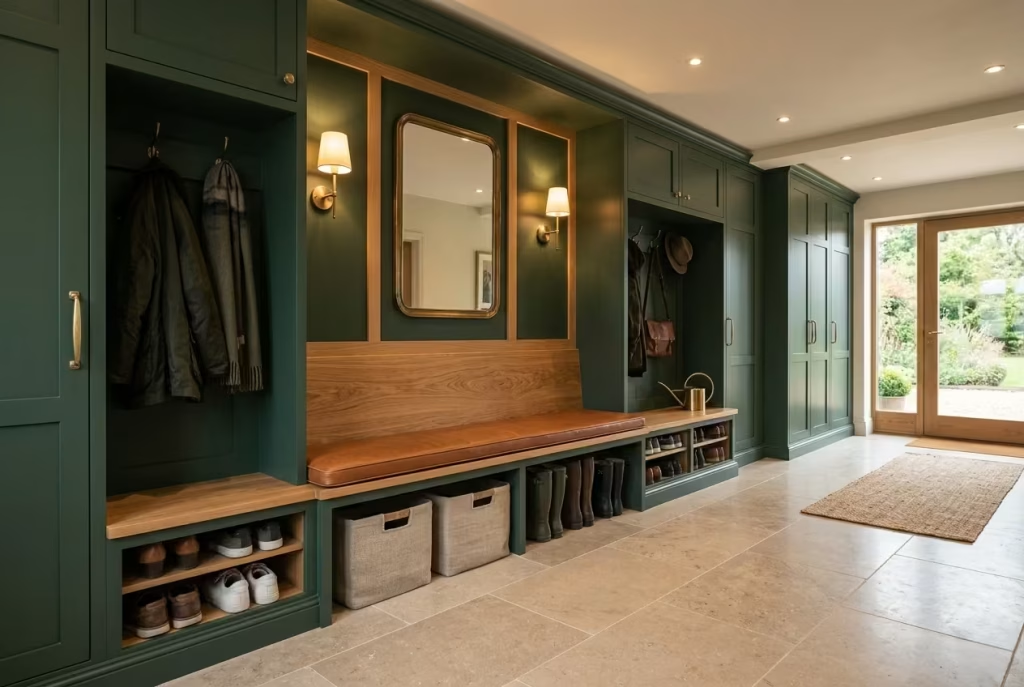
One of the clearest markers of a high-end mudroom is continuity. Materials should feel connected, not chopped into disconnected zones. When the flooring, cabinetry, benching, and accessories all belong to the same visual family, the room gains a calm confidence that reads as expensive almost immediately.
Dark green works particularly well when it is echoed by other grounded materials, such as warm oak, stone, leather, linen, or antique metal. That does not mean every surface has to match. Far from it. But there should be a clear sense that everything was chosen to support the same atmosphere.
For example, if the cabinetry is a deep forest green, the flooring might be honed limestone or large-format porcelain with subtle movement. A walnut bench or oak trim can soften the darker palette, while a linen cushion or wool basket adds texture without disrupting the visual logic. Each material has a role, and none of them should feel like an afterthought.
Expensive spaces rarely rely on one standout material doing all the heavy lifting. They feel rich because the materials are in conversation with one another. It is a bit like a good orchestra. No single instrument needs to dominate when the whole composition is working in tune.
Lighting Placement
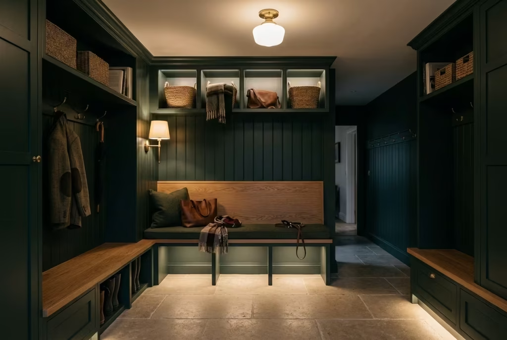
Lighting placement can make a dark green mudroom feel luxurious or completely flatten it. That is how much weight it carries. A beautiful room with poor lighting often ends up looking dull, while a modest room with thoughtful lighting can feel quietly exceptional.
The key is to avoid relying on one central source. Expensive-feeling interiors are almost always layered. Wall lights near a bench, subtle lighting inside open shelving, under-cabinet illumination, and a well-chosen ceiling fixture all help create depth. The goal is not brightness alone, but atmosphere with clarity.
In darker rooms, warm light in the range of 2700K to 3000K usually performs best. It flatters the green without making it look muddy, and it allows materials like brass, oak, and stone to show their richness properly. Overly cool light can strip all that warmth away and make even the best-designed room feel unfinished.
Placement matters just as much as the bulb temperature. Light should graze surfaces, not batter them. When shadows are handled with care, the room begins to feel layered, which is often where the sense of luxury really lives. Not in obvious sparkle, but in the way the room holds itself after dark.
Seamless Storage Design
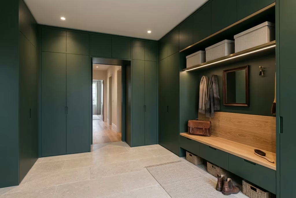
Nothing says expensive quite like storage that seems to disappear into the architecture. In a mudroom, that usually means concealed compartments, flush doors, integrated bench drawers, and carefully planned internal organisation that keeps the surface world calm.
The most successful storage systems do not just hide clutter. They make the room feel lighter because everything has a place, and that order is built into the design from the start. Open shelves can work, but only if they are controlled and purposeful. Too much open storage quickly makes a space feel like it is trying to keep up with daily life rather than quietly mastering it.
Seamless storage often depends on small details that are easy to miss at first glance. Matching door alignments, concealed handles, consistent reveals, and cabinetry that runs cleanly from floor to ceiling all contribute to the effect. When done well, the eye reads the room as a single composed gesture rather than a collection of separate units.
I often find that the best mudrooms feel almost deceptively simple. You sense the intelligence of the storage the moment you use it, but visually, it never feels busy. That is the sweet spot. The room works hard behind the scenes while looking calm, collected, and beautifully unruffled.
Bringing It All Together
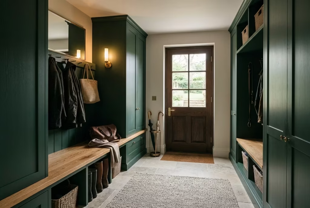
A dark green mudroom feels expensive when every detail supports the same mood of quiet confidence. The joinery should feel intentional, the hardware should look chosen rather than added, the materials should relate to one another, the lighting should flatter the depth of the colour, and the storage should vanish into the overall composition with as little fuss as possible.
When those elements are aligned, the room gains that rare quality people notice even if they cannot immediately explain why. It feels settled. Assured. A little old money in spirit, perhaps, but absolutely practical at heart. And that combination is often the real secret behind spaces that feel truly elevated.
Final Thoughts about Dark Green Mudroom
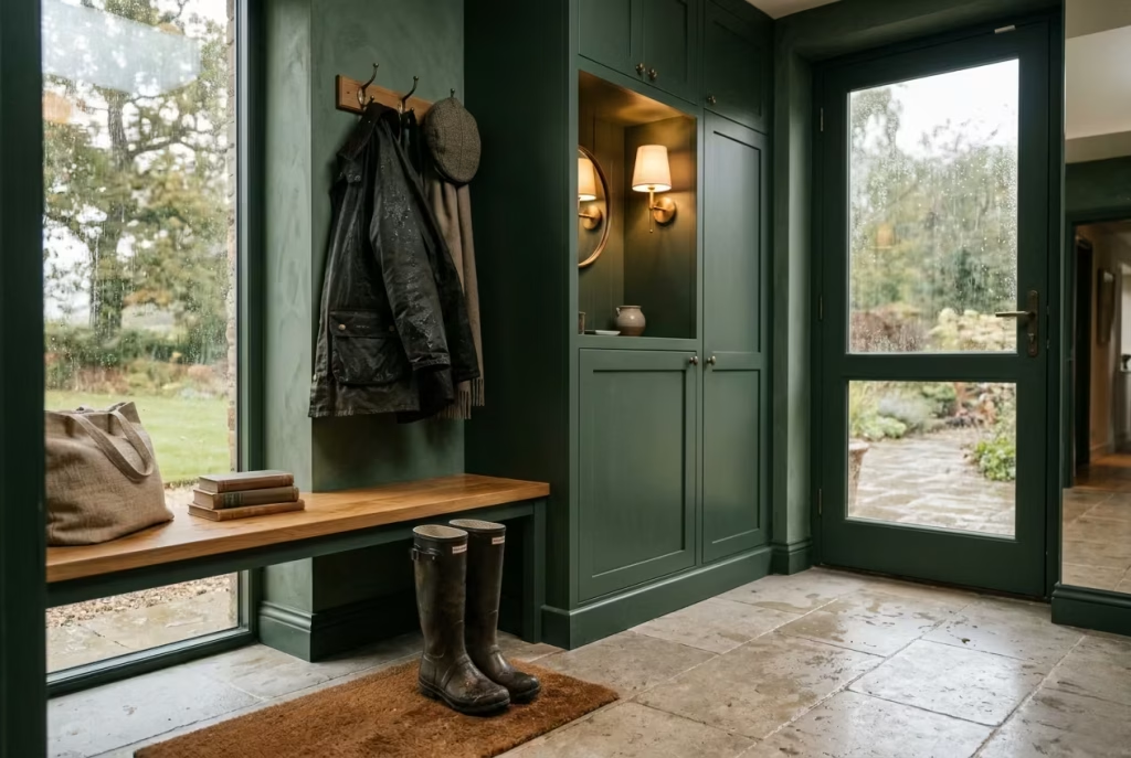
A well-designed mudroom should never feel like an afterthought or a purely functional corridor that simply absorbs the overflow of daily life. When it is considered with intention, especially in a dark green palette, it becomes something far more meaningful. It turns into a threshold space that gently slows the rhythm of the home, creating a quiet pause between the outside world and everything that lies within.
Dark green has a rare ability to hold contrast without conflict. It can feel dramatic in one moment and deeply comforting in the next, shifting subtly with light, material, and movement. In a space where muddy boots are kicked off, coats are shed, pets come and go, and life arrives in its most unfiltered form, that emotional balance becomes essential. It keeps the room grounded, even when everything in it is in motion.
The most successful mudrooms are not defined by perfection, but by how naturally they absorb the reality of everyday living without losing their sense of composure. Dark green, when used with care, does exactly that. It softens the edges of routine chaos, wraps it in a calm architectural presence, and allows the home to feel more considered from the very first step inside.
In the end, the real strength of a dark green mudroom lies not in how it looks in isolation, but in how it makes the transition into home life feel. And when that transition feels slower, calmer, and more intentional, the entire house benefits from it, almost without anyone noticing why.
Frequently asked questions about While Design or Renovate Dark Green Mudroom
Is dark green a good colour for a mudroom?
Yes, especially if you want the space to feel grounded, calm, and quietly stylish. Dark green handles daily wear well, and it gives a mudroom more depth than a pale neutral usually can. It also works beautifully in both traditional and contemporary homes when the lighting and materials are balanced properly.
Will a dark green mudroom make a small space feel smaller?
Not necessarily. In a compact mudroom, dark green can actually make the space feel more intentional and enclosed in a good way, rather than cramped. The key is to add contrast through lighter flooring, mirrors, timber, or layered lighting so the room still feels open enough to breathe.
What shade of dark green works best in a mudroom?
Olive, moss, blackened green, and heritage greens tend to work especially well. Olive feels warm and forgiving, moss feels softer and more natural, and blackened green creates more drama. The best choice depends on how much natural light the room gets and whether you want the space to feel softer or more architectural.
Should mudroom cabinetry be matte or gloss?
Matte and satin finishes are usually the safest choices for a mudroom because they feel softer and are generally more forgiving. Gloss can look striking, but it shows fingerprints more easily and needs more upkeep. For a busy family space, a low-sheen finish often gives the best balance of beauty and practicality.
What flooring works best with dark green mudroom walls?
Stone, limestone, slate, terracotta, and durable porcelain all work well. If you want a warmer, more lived-in feel, brick or terracotta can be lovely. If you prefer a cleaner, more refined look, limestone or stone-effect porcelain is often the stronger choice. The floor should ground the colour, not compete with it.
How do I keep a dark green mudroom from feeling gloomy?
Lighting is everything here. Use layered lighting instead of relying on one ceiling fixture. Warm bulbs, wall sconces, reflective finishes, and natural textures all help soften the mood. A dark green mudroom should feel cocooning, not cave-like, so the surrounding materials need to pull their weight.
Are dark green mudrooms hard to keep clean?
Not usually. In fact, darker colours can be quite forgiving in high-traffic areas because they disguise scuffs and everyday wear better than pale paint. The bigger concern is choosing durable finishes, moisture-resistant cabinetry, and flooring that can handle wet shoes, pets, and general family chaos without losing its polish.
What hardware looks best with dark green mudroom cabinetry?
Aged brass, antique brass, blackened iron, and muted bronze all work well. Brass brings warmth and lift, while iron gives the room a more grounded, utilitarian edge. The best choice depends on the mood you want. For a softer, more luxurious feel, brass is often the strongest option.
Can I mix dark green with other green shades in the same mudroom?
Yes, and it can look incredibly sophisticated when handled with restraint. Tonal layering, such as pairing forest green cabinetry with softer sage walls or moss accents, creates depth without visual chaos. The trick is to keep the undertones related so the scheme feels intentional rather than mismatched.
What makes a dark green mudroom feel expensive?
It usually comes down to details. Well-made joinery, seamless storage, quality hardware, thoughtful lighting, and materials that feel honest and durable all contribute to that elevated look. Expensive-feeling design is rarely about excess. It is about precision, proportion, and a sense that every element belongs where it is.