15 Stunning Italian Basement Design Ideas for a Luxury Home You’ll Never Want to Leave
Most basements don’t fail because the budget ran out. They fail because nobody in the process ever quite believed the room deserved better than it got. A few coats of magnolia, a laminate floor that photographs fine and feels like nothing underfoot, a sofa nobody chose so much as inherited from upstairs. That’s not a design decision. That’s a room being tolerated rather than designed, and clients can always tell the difference, even when they can’t name it.
Here’s the thesis, and I’ll stand behind it: a basement only becomes a luxury space once it stops apologising for being underground. Not by pretending it’s a ground-floor room with the windows painted on, but by leaning into what a subterranean space actually offers, which is cool stone, contained light you can shape however you like, and a kind of hush that upper floors simply can’t manufacture. Treated properly, a basement isn’t the room you settle for. It’s the room that ends up doing the heavy lifting on a house tour.
Italy, as it happens, worked this out centuries before anyone was writing “basement renovation” into a search bar. The cantina tradition, cool stone rooms built for wine and cured meat rather than television and sofas, understood that a below-ground room has a job to do and shouldn’t be dressed up as something it isn’t.
Later, in Italian-American households, the basement took on a second life entirely, becoming the working kitchen where the real cooking happened while the room upstairs stayed pristine for guests. Two traditions, two very different briefs, but both built on the same instinct: give the room a purpose first, and let the beauty follow from that.
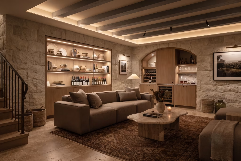
We’ve covered that heritage properly in our main guide to Italian basement design, and it’s worth a read if you want the full picture before diving into ideas. What follows here is the practical, image-led version of that same thinking, updated for a modern build and a client who wants the room to earn its keep.
This approach tends to suit three types of homeowner in particular: the family converting a period property where the basement was always the coal store or the scullery and has never once been asked to perform; the new-build owner who’s been handed a dead, echoey shell beneath the house and no real brief for it; and the multigenerational household who need a genuinely separate living zone rather than a spare room with delusions of grandeur.
If you recognise your own house in any of those, what follows should feel less like inspiration and more like a plan.
Limewashed Walls Over Plaster Perfection
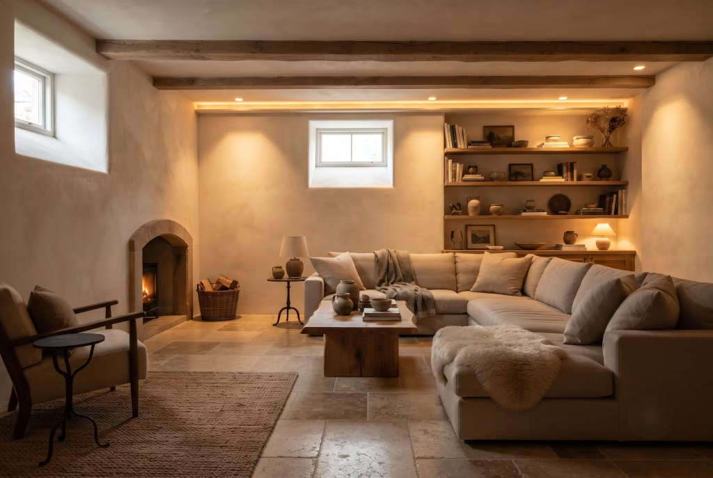
Plaster wants to be flawless. Limewash doesn’t, and that’s precisely its appeal in a room with no daylight to forgive it. A perfectly skimmed wall, the kind that goes for a mirror finish, needs raking light to look alive.
Take that daylight away, as any basement inevitably does, and flat plaster under a downlight starts to look chalky, almost clinical, like a doctor’s waiting room dressed up for company. Limewash behaves differently.
It’s porous, slightly cloudy, and it takes pigment the way old buildings always have, in soft, uneven washes rather than one flat coat. Under warm artificial light, that unevenness catches and shifts, giving the wall a kind of quiet depth that a pristine finish simply can’t fake.
There’s a practical case here too, and it’s one clients rarely ask about until they’re mid-renovation and wishing they had. Limewash is breathable, letting moisture pass through rather than trapping it behind an impermeable skin, which matters enormously below ground where damp has a habit of finding the path of least resistance.
Get a modern plastic paint on a basement wall and you’re often just postponing a problem, storing up trouble for a few years down the line. Limewash, done properly over a lime-based plaster rather than gypsum, works with the building rather than against it.
The trick most people miss is restraint with colour. A warm off-white, a dusty terracotta, or a muted sage reads as considered. Anything too saturated in a windowless room starts to feel like a stage set rather than somewhere you’d actually want to sit of an evening.
A Cantina Wall That Actually Gets Used
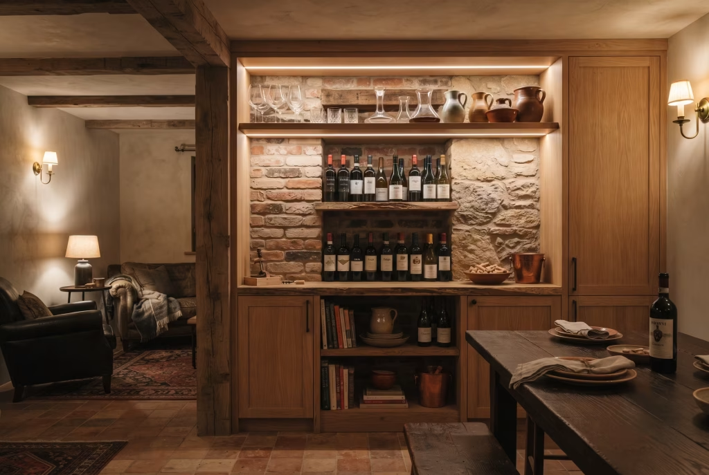
Most wine walls are for looking at, not living with. You’ll have seen them: a glass-fronted rack rising the full height of a stairwell, lit like a jewellery display, holding forty bottles nobody’s ever going to open because pulling one out means disturbing the whole carefully arranged composition.
It’s decoration wearing the disguise of function, and it’s one of the most common ways a basement budget gets spent on something that never quite justifies itself.
A proper cantina wall works the other way round. It starts with the question nobody asks at the design stage, which is simply: how many bottles do you actually drink in a normal month, and how do you want to reach them?
For a household that entertains regularly, that might mean open, low shelving at chest height rather than a locked cabinet, so a bottle can be grabbed mid-conversation without ceremony.
For someone building a proper collection, it might mean a cooler wall with real temperature control, tucked into a run of cabinetry rather than paraded on show. Neither approach is more luxurious than the other. What matters is that the wall is built around a habit, not a photograph.
There’s a spatial lesson here too, worth its weight in gold if you’re planning the room from scratch. A cantina wall works hardest when it sits at the threshold between two zones, say between a seating area and a dining table, because it does double duty as both storage and a soft division of space, without the room ever feeling chopped up.
Stone or reclaimed brick behind the bottles helps enormously, giving the wall a texture that reads as genuinely old rather than styled to look it. Add a shelf for glassware at the near end and you’ve built a station people gravitate towards without being told to, which, in a basement built for entertaining, is really the whole point.
Terracotta Underfoot, Underfloor Heating Beneath It
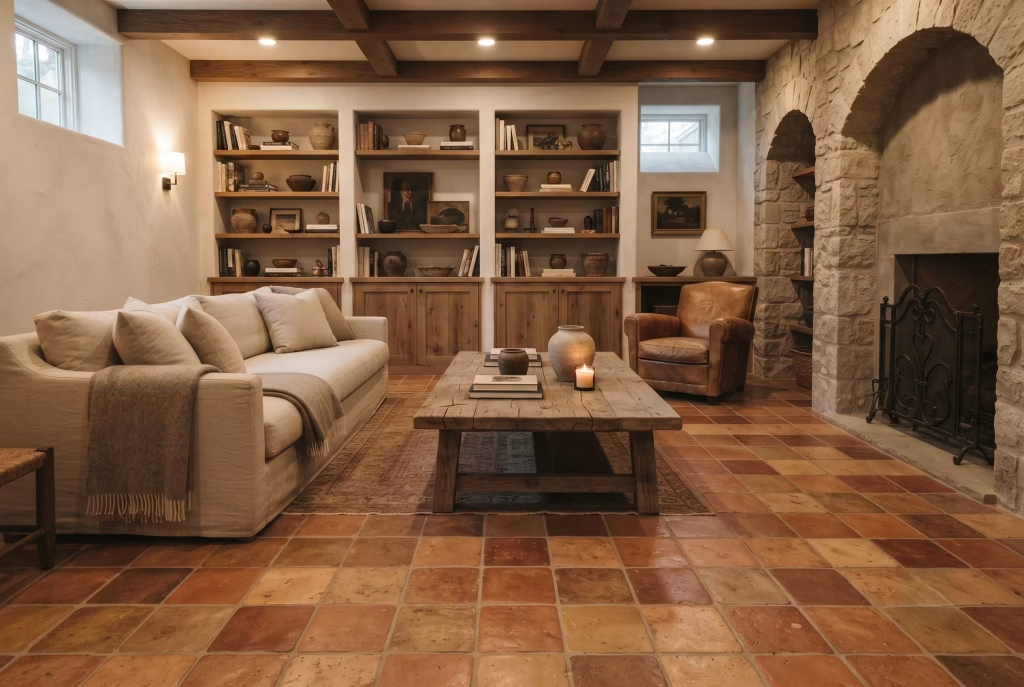
“Won’t it just be cold down there?” is the question every basement conversation eventually arrives at, usually asked with the slight wince of someone who’s already pricing up a rug thick enough to compensate. It’s a fair worry.
Concrete slabs hold the temperature of the ground around them, which in a British winter is not a temperature anyone wants against bare feet. But the answer isn’t to bury the problem under carpet. It’s to solve it properly, from the floor up, and let terracotta take the credit for a job that underfloor heating actually did.
Terracotta has a reputation for being a warm-climate material, all sun-baked courtyards and Tuscan farmhouses, which makes it seem like an odd choice for a room that never sees the sun at all. The truth is more useful than the cliché.
Terracotta is dense and holds heat exceptionally well once it’s been given some to hold, which makes it one of the best possible partners for underfloor heating of anything on the market.
Run a wet system beneath a terracotta floor and the tiles become a slow, even radiator, releasing warmth steadily rather than in the sharp bursts you get from a radiator on the wall. The room ends up warm in the way old farmhouses are warm, not from any single source you can point to, just an ambient, all-over comfort that a rug and a space heater will never quite replicate.
There’s a design payoff here too, and it’s not a minor one. Terracotta ages with real grace, taking on a deeper, richer patina the longer it’s walked on, unlike porcelain or engineered wood, which tend to look their best on installation day and slightly worse every year after.
For a basement, where footfall is often heaviest of anywhere in the house thanks to a home gym, a bar, or a cinema room all sharing the same floor, that’s not a small consideration. Choose handmade rather than machine-pressed tiles if the budget allows it.
The slight variation in tone and shape is exactly what stops the floor reading as a kitchen splashback and starts it reading as something with a bit of history behind it, even on the day it’s laid.
You May also Like: 25 Clean & Modern Minimalist Basement Designs That Feel So Spacious, They Don’t Even Feel Like Basements
The Reclaimed Stone Archway as a Room Divider
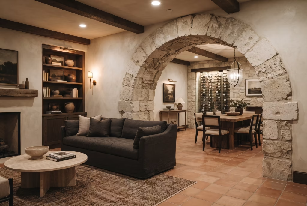
Picture the scene most basements start from: one long, low box of a room, plasterboard walls running the full length without a single break, a staircase at one end and nothing much happening in between. It’s not that the space is small. Plenty of basements are perfectly generous in square footage.
The trouble is that a single unbroken room, however big, tends to feel like a corridor that’s been asked to do a living room’s job, and no amount of clever furniture arranging quite fixes that on its own.
An archway solves it in a way stud walls never will. Where a full partition chops the room in two and shrinks both halves in the process, a reclaimed stone or brick archway does the opposite.
It suggests a division without committing to one, letting light, conversation and the eye all travel through while still giving each side its own distinct character. One end becomes the seating area, the other a dining or bar zone, and the archway between them does the work of a hallway without stealing an inch of usable floor.
Source the stone reclaimed if you possibly can. New stone dressed to look old rarely fools anyone up close, whereas genuinely weathered material, with its chipped edges and uneven mortar lines, carries a kind of quiet credibility that no amount of styling can manufacture from scratch. It’s the difference between a room that looks decorated and one that looks like it grew there.
Venetian Plaster in a Colour That Isn’t Beige
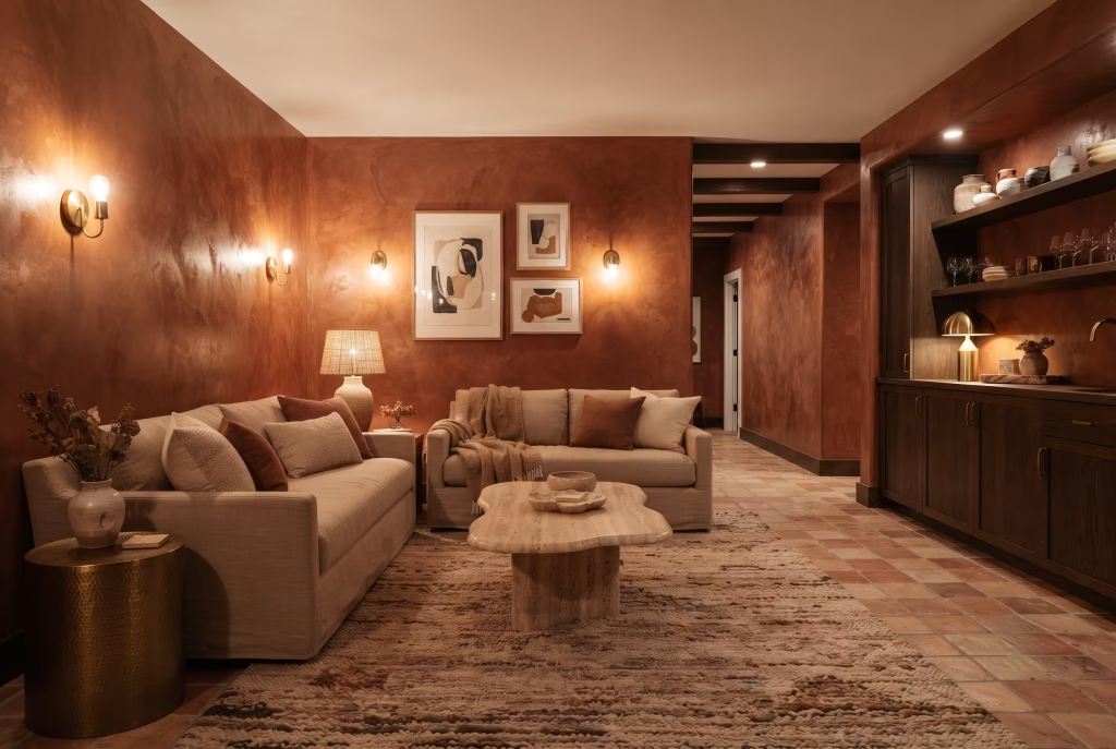
Beige has done very well for itself in the world of “luxury” finishes, and frankly it’s coasted on that reputation for far too long. Walk into a dozen show homes marketed as high-end and you’ll find the same safe, oatmeal-adjacent walls in nearly all of them, applied with real skill, sold at a real premium, and adding almost nothing anyone will remember by the time they’re back in the car.
Venetian plaster deserves better company than that. It’s a genuinely sophisticated finish, built up in thin layers and burnished to a soft sheen, and reducing it to a pricier way of achieving beige is a bit like buying a Ferrari and only ever driving it to the shops.
The pigment is where the real decision gets made, and it’s worth taking seriously rather than defaulting to whatever the sample pot in the showroom happens to be. A burnt sienna, worked in over a warm base coat, gives the wall an almost sunbaked quality that shifts gently as the light in the room changes through the evening.
A deep, mossy green sits beautifully against brass fittings and dark timber, giving a basement bar or snug the kind of enveloping, clubbable feel that flat paint can’t touch. Even a dusty rust or burnt umber, applied with a lighter hand in the upper layers so the base tone breathes through, gives you something with real depth rather than a single, static block of colour.
The technique matters just as much as the shade. A proper Venetian finish is built in at least two, often three, thin coats, each one troweled on and partially burnished before the next goes over the top, which is what creates that characteristic marbled depth rather than a flat, single-note wall.
Rush the application, or use a single-coat “faux Venetian” product from a tin, and you’ll end up with something that looks like plaster wearing a costume rather than the real thing. It’s a finish that rewards patience, and in a room built to be lived in for decades rather than redecorated every few years, that patience tends to pay for itself many times over.
A Working Kitchen, Not a Show Kitchen
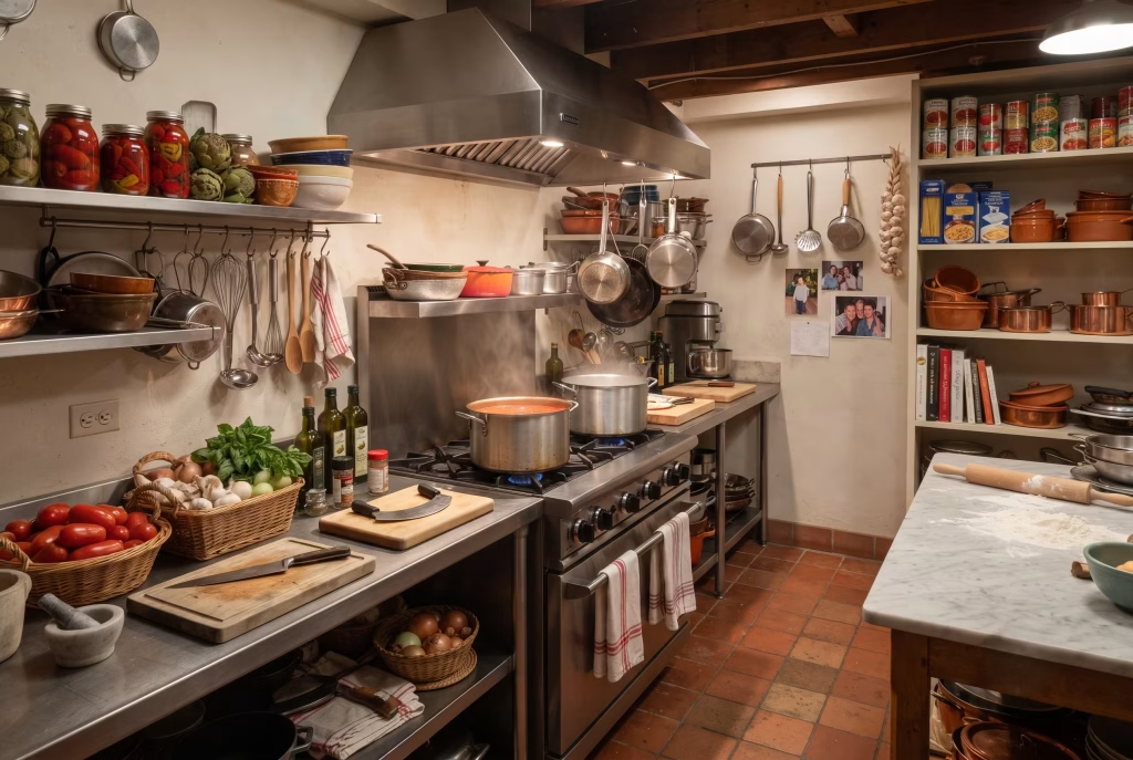
There’s a particular kind of household wisdom that never made it into interior design magazines but survived perfectly well in Italian-American basements for the best part of a century. The kitchen upstairs was for company: pristine worktops, matching crockery, the good tablecloth kept for occasions.
The kitchen downstairs was for the actual work, the vats of passata bubbling away on a second stove, the flour dust nobody minded settling on the floor, the mess that real cooking generates and that nobody wants their guests wading through on the way to the sitting room. It wasn’t a downgrade. It was a division of labour, and a remarkably sensible one at that.
That instinct is worth reviving wholesale for anyone who cooks properly, rather than just performing cooking for an audience. If your household does big-batch preserving, whether that’s tomatoes in late summer, chutneys, or simply a weekly meal-prep session that generates more pans than any single kitchen can comfortably absorb, a basement working kitchen earns its keep in a way a show kitchen never will.
Think a serious gas burner rather than induction, since real reduction and searing still favour a naked flame. Think open shelving over glass-fronted cabinetry, because a working kitchen shouldn’t need to hide what’s in it.
Think a floor that can take a spill without anyone breaking into a cold sweat, terracotta or sealed concrete rather than anything that shows every mark like a guilty conscience.
The layout differs from an upstairs kitchen in one crucial respect too: it doesn’t need to entertain anyone while it works. That frees up the design considerably. A run of deep, restaurant-grade worktop along one wall, a proper extraction system doing the heavy lifting overhead, and storage built around jars and preserving equipment rather than show plates and glassware.
It’s a room that looks a little unglamorous in photographs and works beautifully in practice, which, if you’ve ever tried to actually cook a proper Sunday ragù in a kitchen designed mainly to be photographed, is precisely the trade worth making.
Wrought Iron as Punctuation, Not Wallpaper
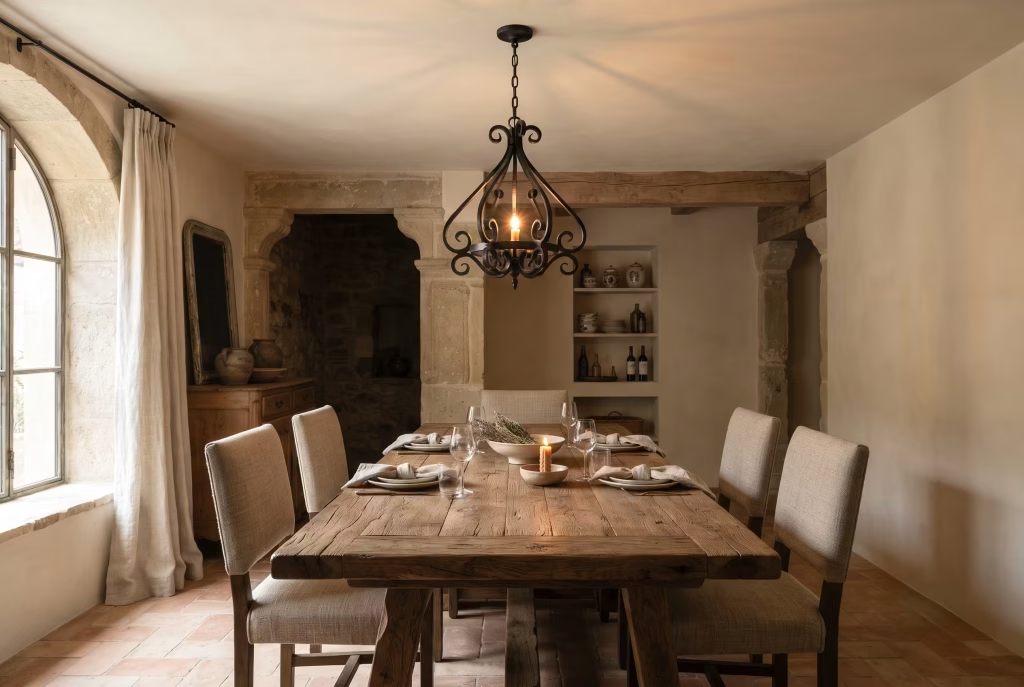
Wrought iron is one of those materials that gets away with murder in mood boards and comes badly unstuck the moment it’s actually installed. On Pinterest, a room dressed in ironwork from the light fittings to the door handles to the stair rail looks moody and romantic.
In real life, that same room tends to feel like a set from a period drama nobody quite finished dressing, heavy in a way that has nothing to do with luxury and everything to do with overkill. The material works best in small doses, doing a specific job, rather than being spread across every surface it can reach.
Think of it the way a good editor thinks of punctuation. A single well-placed comma changes the rhythm of a sentence without anyone noticing the comma itself. Wrought iron should work the same way in a room. A pendant light with a hand-forged fitting above a dining table earns its place because it’s the one thing in the eyeline drawing focus upward.
A stair rail in blackened iron against a limewashed wall reads as a deliberate flourish precisely because it’s the only piece of ironwork in the room doing anything at all. Add a second and third feature in the same material, a wine rack here, a mirror frame there, a set of wall sconces marching down the corridor, and the eye stops noticing any of them individually. It all blurs into a single dark note, and the room loses the very drama it was reaching for.
The rule of thumb worth pinning above the desk during any specification meeting is simple: one hero piece per zone, never per room. A basement with a seating area, a bar, and a dining nook can happily support three separate ironwork moments, one in each zone, without ever feeling heavy-handed, because each piece gets its own visual breathing room rather than competing with its neighbours for attention.
Sunken Seating Around a Stone Hearth
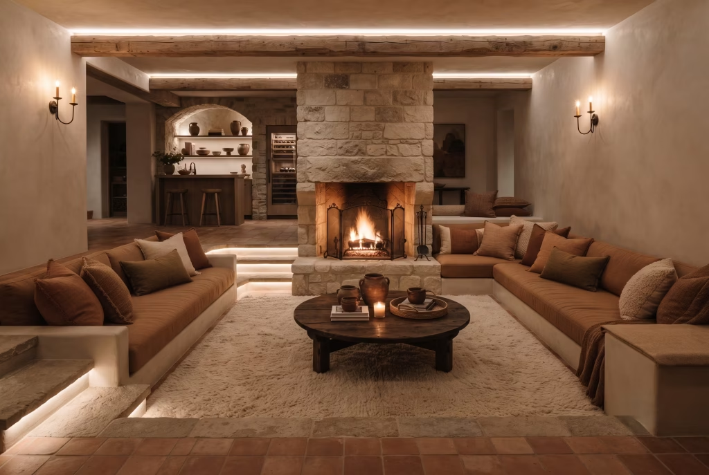
Low ceilings are the great unspoken anxiety of basement design, the thing every client mentions within the first five minutes and then tiptoes around for the rest of the meeting as though naming it too directly might make it worse. Most basements sit somewhere between two and a half and two and three-quarter metres, which is perfectly liveable but leaves precious little room for the sort of double-height drama that makes an upstairs living space feel grand.
The instinct is to fight it, adding tall furniture, high shelving, anything that might trick the eye into forgetting the ceiling is there. This nearly always backfires, because it draws attention to the very thing it’s trying to disguise.
A sunken seating area does the opposite, and does it rather cleverly. By dropping the floor level of one particular zone, even by a modest thirty or forty centimetres, the effective ceiling height above that spot increases without a single brick being moved.
Step down into a sunken lounge and the room suddenly feels generous overhead, because your head is that bit further from the joists than it was a moment ago walking through the rest of the space. It’s a sleight of hand, in the nicest possible sense, and it works every time.
The stone hearth is what turns this from a clever trick into a proper destination. Build it centrally within the sunken zone, surrounded by low, deep seating arranged to face inward rather than out toward a television, and you’ve created a room within the room, a place people gravitate to and settle into rather than simply pass through.
Crucially, a sunken area reads as a deliberate architectural gesture rather than a compromise forced by a low ceiling, which matters enormously for how the whole basement is perceived. Nobody walking into a beautifully lit conversation pit ever thinks “shame about the height.” They think “I want to sit there.” That’s the whole game, won in a single change of level.
Layered Lighting That Fakes Daylight Convincingly
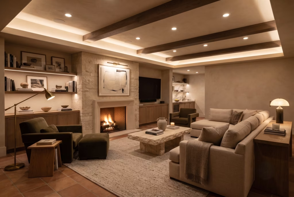
No window means no free daylight, and no amount of clever paint or mirror placement will ever quite make up the shortfall. This is the point where a lot of basement projects lose their nerve, reaching for one large central pendant and calling the lighting scheme finished.
It never works. A single overhead source in a room with no natural light casts everything in one flat, shadowless wash, and flat, shadowless rooms are precisely what make basements feel like basements in the first place, whatever else has been done to dress them up.
Daylight, as it happens, is never one single light source anyway. It’s several, arriving from different angles at different intensities throughout the day, which is exactly why a room lit naturally never feels flat even on a grey afternoon.
Replicating that layered quality artificially is entirely achievable, and it comes down to three distinct types of fixture working in concert rather than any single clever bulb.
Uplighting, washed gently up a textured wall or into a coved ceiling, mimics the soft, indirect quality of light bouncing off a ceiling on an overcast day, and it’s the layer most basements skip entirely, which is usually the first mistake.
Task lighting, close and focused, over a reading chair, a kitchen worktop, a bar counter, does the practical job that daylight through a window would otherwise handle without anyone thinking about it.
Accent lighting, picking out a piece of stonework, a piece of art, or the texture in a limewashed wall, gives the room the kind of visual depth and shadow play that a single flat source can never provide on its own.
Warmth of colour temperature matters just as much as the layering itself. Anything above roughly 3000 Kelvin starts to read as clinical rather than cosy, more office strip light than evening glow, and in a room already working hard to feel inviting, that’s a mistake worth avoiding at all costs.
Dimmable circuits on every layer, controlled separately rather than on a single master switch, let the room shift character across the day: bright and functional for a morning workout, warm and low for an evening in. Get this right and visitors genuinely stop registering the absence of windows. They just notice the room feels good to be in, which, in the end, is rather the whole point of lighting design done properly.
You May also Like: 25 Sage Green Basement Ideas for a Calm, Stylish, and Modern Lower-Level Space
A Marble-Topped Bar with Proper Storage Behind It
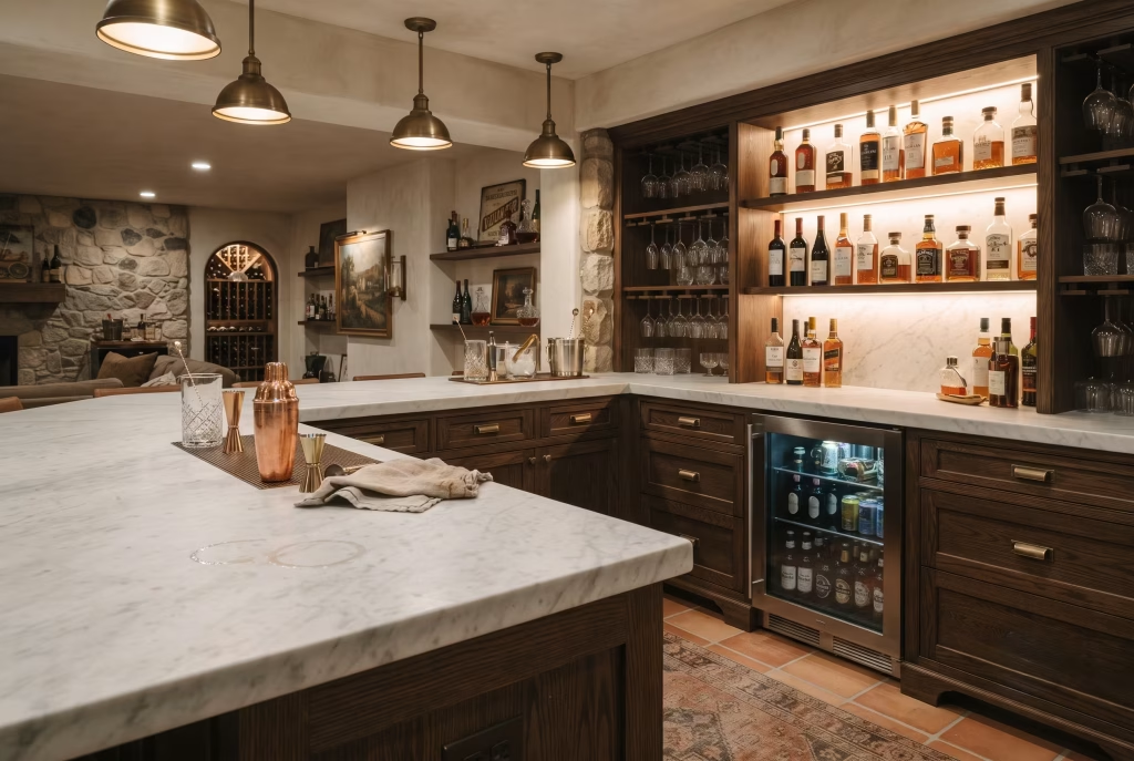
Start with what the bar actually needs to do before a single tile or bottle shelf gets chosen, because that’s the question most basement bars skip entirely in the rush to look the part. Does it need to hold four bottles of decent whisky and a cocktail shaker, or does it need to service a household that hosts fifteen people on a Saturday night and expects proper drinks made properly?
Get honest about the answer early, because it changes everything downstream, from the worktop depth to how many glasses need somewhere sensible to live.
There’s a particular renovation trend worth naming here, because it’s exactly the brief we keep seeing land on the desk: the “man cave to grown-up bar” upgrade. A room that started life as a beige box with a dartboard and a mismatched fridge, kitted out in someone’s twenties and never quite revisited since,
gets asked to grow up alongside its owner. The dartboard goes. The proper bar arrives. And the single biggest difference between the two, more than any amount of styling, is storage that’s actually been thought through rather than bolted on as an afterthought.
Marble earns its place on top for reasons well beyond how it photographs. It’s cool to the touch, which matters more than people expect when you’re mixing drinks or resting a chilled glass, and it takes a polish that shrugs off the odd splash of Campari without complaint, provided it’s properly sealed.
Go for a honed rather than a high-gloss finish if the bar sees regular use. It hides the small marks of daily life far better than a mirror-polished surface ever will, which matters enormously once the novelty of a brand-new bar has worn off and it’s just being lived with.
Behind the counter is where the real design work happens, and it’s the part most people underspend on relative to how much they’ll actually use it. Deep drawers for linens and openers, dedicated glass racks that keep stemware safely out of harm’s way, a proper under-counter fridge rather than a bar-top mini-fridge that never quite holds enough.
Build the storage first and let the marble sit proudly on top of a system that actually works, rather than the other way round, and you end up with a bar people use most weekends rather than one that gets photographed once and then quietly avoided because nobody can find the bottle opener.
Frescoed or Hand-Painted Ceiling Panels
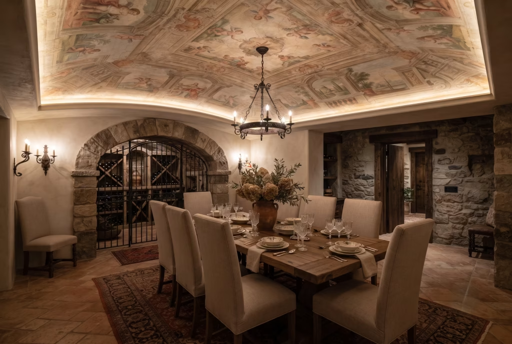
Every list like this one owes its reader at least one idea that’s frankly a splurge, and it seems only fair to be upfront about which idea that is rather than letting the price tag arrive as a nasty surprise three paragraphs in.
A hand-painted or frescoed ceiling is that idea. It is, without question, the most expensive line item on offer here, and it’s worth naming plainly rather than dressing up the cost in vague language about “investment pieces,” because clients deserve better than euphemism when real money is on the table.
The reason it earns its place regardless is simple: a ceiling is the one surface in a basement that nobody else is competing for. Walls get furniture leaned against them, floors get walked on and covered with rugs, but a ceiling stays entirely, gloriously untouched, which makes it the single best canvas in the room for something genuinely bespoke.
A muted, faded fresco panel, worked in earthy ochres and soft greens reminiscent of an old Italian loggia, or a simpler hand-painted trompe l’oeil suggesting an oculus opening to sky that was never actually there, turns a basement ceiling from the part of the room nobody looks at into the part everybody looks at first.
Cost, honestly stated rather than fudged, runs in three fairly distinct tiers. A skilled decorative painter working a smaller feature panel, say above a dining table or within a coffered section of ceiling, sits at the lower end of the splurge scale, still a proper spend but achievable for a genuinely committed renovation budget.
A full-room fresco, hand-mixed pigments and a specialist muralist working over several days, moves into serious money, the kind of figure that needs its own separate line item agreed with a client well before work starts, not discovered halfway through.
And a true buon fresco, painted into wet plaster in the traditional Italian method rather than onto a dry, prepared surface, sits at the very top of the scale entirely, reserved for households where the basement is genuinely being treated as the showpiece of the house rather than one room among several.
Nobody needs to do this. That’s rather the point of calling it a splurge. But for the client who’s already committed to doing the room properly and wants one moment of real theatre, a ceiling that took real skill and real time to make is the sort of detail that outlasts every trend the rest of the room might chase, and remains, decades on, the first thing anyone mentions when they describe the space to a friend.
Reclaimed Terracotta and Antique Furniture, Mixed Deliberately
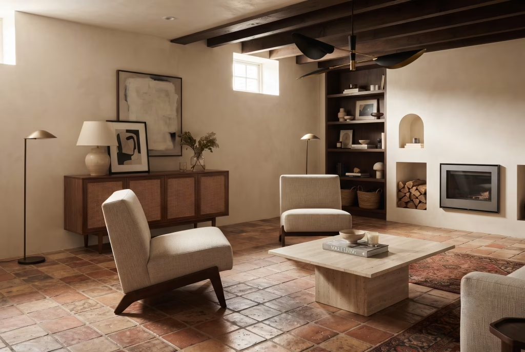
There’s a version of this whole exercise that goes badly wrong, and it’s worth naming honestly rather than pretending the risk doesn’t exist. Order every element from a single “Tuscan collection” catalogue, terracotta pots from one supplier, wrought-iron candle sconces from another arm of the same brand, a set of “aged” chairs manufactured last Tuesday to look three hundred years old, and the room lands somewhere between a chain restaurant and a wedding venue that’s booked out for hen dos.
It’s not that any single piece is badly made. It’s that everything arrived matching, at the same moment, from the same catalogue, and rooms furnished that way always carry the faint, slightly sad whiff of a stage set rather than somewhere a family actually lives.
The antidote is contrast, deployed on purpose rather than left to chance. Genuinely reclaimed terracotta, salvaged from an old Italian farmhouse or a demolished courtyard, carries the uneven wear of decades: a slightly different shade tile to tile, the odd chip along an edge, the faint sheen that only comes from thousands of actual footsteps rather than a factory tumbler designed to fake it.
Set that floor against furniture that isn’t trying to match it at all. A mid-century Danish sideboard. A pair of contemporary linen-upholstered chairs in a clean, undecorated shape. Even a single striking modern light fixture, something unapologetically of this decade rather than dressed up to look period. The old floor and the new furniture argue gently with each other, and that argument is precisely what stops the room reading as a themed set.
The reasoning behind this isn’t purely aesthetic, either, though it works beautifully on that level too. A room built entirely from one era, one region, one aesthetic idea, tends to date the moment that particular trend loses favour, because there’s nothing in the space anchoring it to anything beyond the trend itself.
A room built on genuine contrast, old stone against new upholstery, antique alongside deliberately contemporary, ages far more gracefully, because it was never trying to recreate a single moment in time to begin with.
It reads instead as a house that’s been lived in and added to over years by people with actual taste, rather than furnished in one weekend from a single delivery van, which, if you’re aiming for something that still looks right in fifteen years’ time, is worth every bit of the extra thought it takes to source properly.
A Tasting Table Instead of a Standard Dining Set
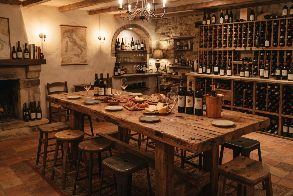
A standard dining set assumes a particular kind of evening: everyone seated at once, a starter, a main, dessert, the whole rigid choreography of a formal meal. That’s a fine format for certain occasions, but it’s not remotely how most good evenings around food and drink actually unfold, and it’s certainly not how aperitivo culture works, which has never been about a formal sitting so much as a slow, unhurried drift of small plates, refilled glasses, and conversation that doesn’t require everyone to be seated in the same direction at the same time.
A tasting table, lower and often longer than a conventional dining table, built for standing as comfortably as sitting, suits that rhythm far better. Guests can lean in, pick at a board of cured meats or a dish of marinated olives, top up their own glass from a bottle left within reach, and drift between conversations without the whole evening pausing every time someone needs to pass the salt.
It’s a piece of furniture built around movement rather than formality, and in a basement specifically, where the room is already doing double duty as a bar, a kitchen, and a place to sit, that flexibility earns its floor space several times over.
Material choice matters more here than it might for a formal dining table nobody actually leans on. A thick, honest slab of reclaimed timber, left with its natural edge rather than machined dead straight, holds up to years of glasses set down without a coaster and the odd bit of enthusiastic elbow resting mid-conversation.
Pair it with mismatched stools rather than a matching set of dining chairs, gathered over time rather than bought as a job lot, and the table starts to feel like the genuine centre of the room rather than a piece of furniture waiting patiently for a special occasion that never quite arrives.
That’s really the whole ambition here: not a table for the four times a year you host a dinner party, but one that gets used on a random Tuesday because it’s simply the best spot in the house to open a bottle and see who wanders down.
Courtyard Logic: Using a Light Well or Sunken Patio
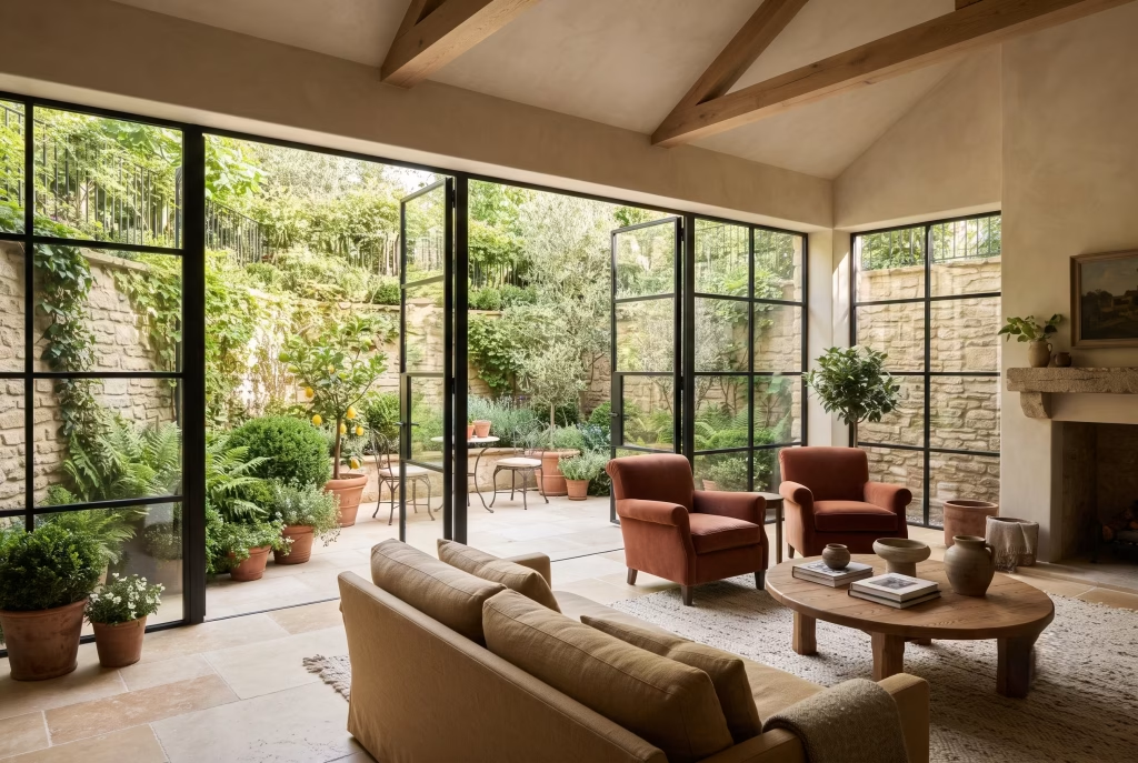
If there’s one question that comes up in nearly every basement consultation, in one phrasing or another, it’s this: is there any way to get real daylight down here, or are we resigned to faking it forever?
The honest answer is that it depends entirely on what sits outside the basement wall, and it’s worth checking this properly before assuming the room is destined for artificial light alone.
Where there’s any external access at all, even a modest strip of garden or side return, a light well or sunken patio can bring in genuine, honest daylight rather than a clever artificial substitute, and it changes the character of the room in a way no amount of lighting design ever quite manages on its own.
The Italian courtyard offers the right model to borrow from here, and it’s a cleverer one than it first appears. A traditional Italian courtyard was never simply a gap between buildings left over by accident. It was a deliberately excavated pocket of outdoor space, designed specifically to pull light and air down into rooms that would otherwise sit in shadow, often paved in the same stone as the interior floor so that inside and outside read as a continuous surface rather than two separate worlds divided by a pane of glass.
That same logic, shrunk down to domestic scale, is exactly what a basement light well does. Dig out a section against an external wall, drop it below the basement floor level, and glaze the resulting gap with a full-height window or a set of glazed doors, and daylight pours in at a level no window higher up the wall could ever quite manage, since it’s striking the room from below rather than filtering weakly from a strip of glass at ceiling height.
Where the garden allows for it, taking this further into a proper sunken patio pays dividends well beyond the basement itself.
A small paved seating area at the base of the light well, accessible via glazed doors rather than sealed off behind fixed glass, gives the room genuine indoor-outdoor flow, somewhere to step out for fresh air mid-evening without climbing back up a full flight of stairs.
Plant it generously, even in a modest footprint, with something that tolerates a shaded, sheltered pocket well: box, ferns, a fig tree in a large pot if the light reaches far enough down.
The greenery softens what would otherwise be a stark well of brick and glass, and gives the eye somewhere gentle to land from inside the room, which does more for the feeling of the space than almost any interior finish could achieve working alone.
It’s not a fix available to every basement, admittedly, since it depends on what lies beyond the wall. But where the ground allows it, it’s the single most effective answer there is to that recurring, entirely reasonable worry about light.
Acoustic Treatment Disguised as Design
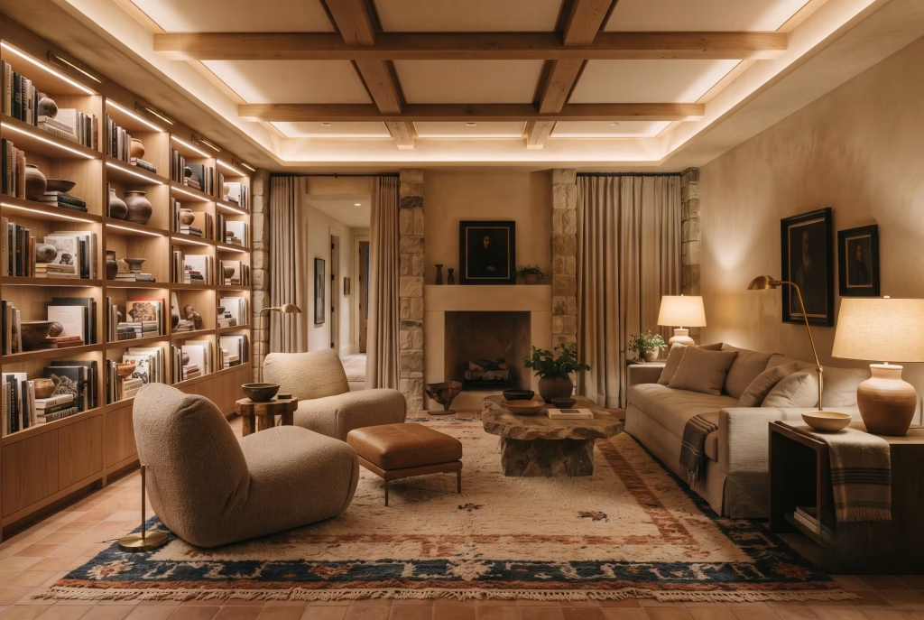
Nobody ever asks a designer about acoustics at the first meeting. They ask about stone, about lighting, about which shade of green might work behind the bar. Acoustics comes up later, usually a few months after the room is finished, when the family has actually started using it properly and someone mentions, almost apologetically, that conversation gets a bit lost when the television’s on, or that the room feels oddly harsh with more than a few people in it.
By then it’s a retrofit problem rather than a design decision, and retrofits are always more expensive and less elegant than getting it right from the start.
The reason acoustics matters more in a basement than almost anywhere else in the house comes down to what the room is built from. Concrete floor, masonry walls, a low ceiling holding everything close together.
Every one of those surfaces is hard and reflective, which means sound bounces rather than absorbs, and a room full of hard surfaces starts to feel loud and slightly clattery even at a perfectly normal volume, the sort of space where you find yourself instinctively raising your voice without quite knowing why.
That’s not a mood problem or a lighting problem. It’s a physics problem, and no amount of beautiful styling will paper over it once a dozen people are down there talking at once.
The trick, and it really is a trick worth knowing, is that acoustic treatment doesn’t have to look like acoustic treatment. Heavy curtains, hung floor to ceiling either side of a doorway or across a section of stone wall, do real acoustic work while reading simply as a rich, layered soft furnishing choice.
A generously sized rug over part of that terracotta or stone floor absorbs sound that would otherwise ping straight back off a hard surface, without anyone in the room clocking it as anything other than a nice rug.
Upholstered seating, properly padded rather than sparingly stuffed, does double duty as both comfort and sound absorption. Even a run of open bookshelves, densely packed rather than styled with careful gaps, breaks up sound waves far more effectively than the same wall left bare and plastered.
This is, deliberately, the least glamorous idea on this list, and it’s included last for a reason. It circles back to something worth remembering about basements generally: for generations, in households that understood the room properly, the basement wasn’t a novelty space trotted out for guests once or twice a year.
It was where actual life happened, meals, arguments, celebrations, ordinary Tuesday evenings, all folded into one working room rather than staged for a camera.
A basement built to that standard needs to sound as good as it looks, because it’s meant to hold real conversation, not just photograph well in passing.
Get the acoustics right and everything else on this list, the stone, the lighting, the marble bar, finally gets to do its proper job: hosting a room people actually want to stay in, rather than one they admire briefly and then quietly leave.
Where Most Basement Renovations Go Wrong
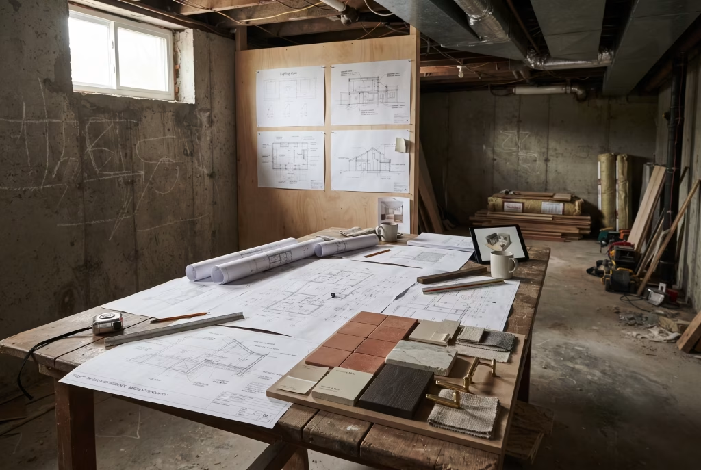
Every one of the ideas above works best when a handful of common pitfalls get avoided first, and it’s worth naming them plainly rather than letting a client discover them the expensive way, three months into a project that’s already had the plaster go on.
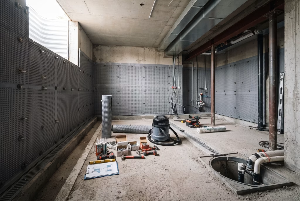
Treating Waterproofing as an Afterthought This is the mistake that costs the most and shows up the latest, sometimes not for a year or two after the room’s been finished and everyone’s stopped thinking about it. A tanking system or a proper drainage membrane installed after the fact means ripping out flooring, furniture, possibly a bar that’s only just bedded in. Sort the waterproofing before a single design decision gets made, not around it.
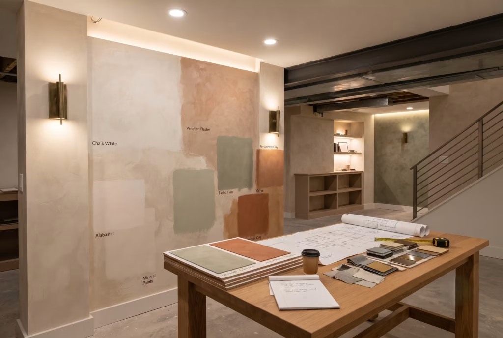
Choosing a Colour Scheme Before the Lighting Plan Exists Paint and plaster get picked in daylight, in a showroom, under conditions the basement will never actually see. That same shade often reads completely differently under a warm 2700K bulb at nine in the evening, sometimes muddier, sometimes flatter than intended. Settle the lighting layers first, then choose finishes under something close to the bulbs that will actually be installed.
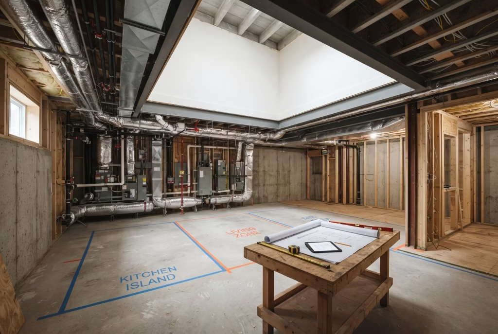
Skimping on Ceiling Height Wherever Services Run Ductwork, pipework and cabling all need somewhere to sit, and if that somewhere hasn’t been planned properly from the outset, they tend to eat into headroom in exactly the spots where a family will be standing most often, over a kitchen island or beside a bar. A good structural survey at the planning stage saves a good six inches of ceiling that nobody notices was ever at risk until it’s already gone.
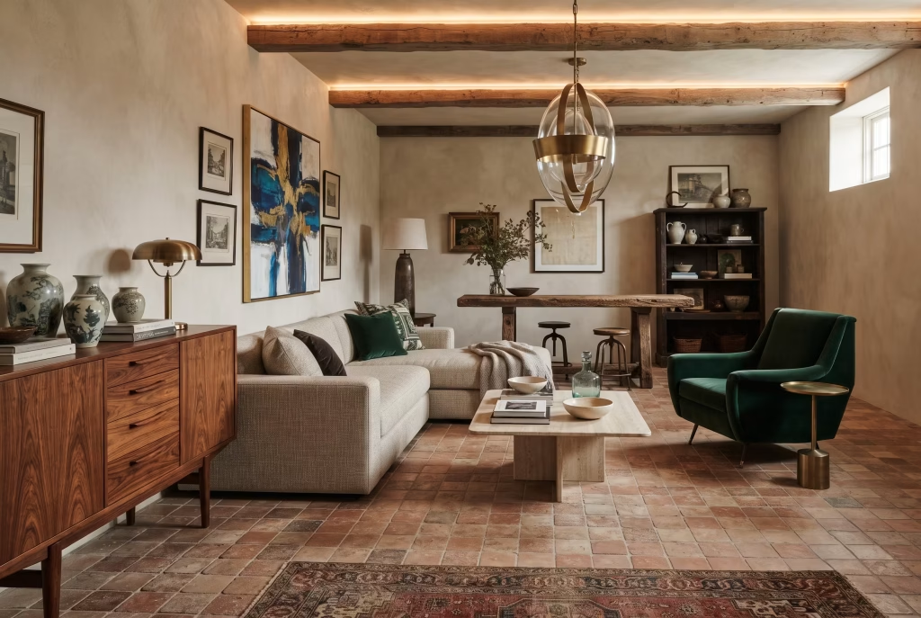
Furnishing the Room Entirely From One Supplier Touched on earlier with the “theme park Tuscany” warning, and it bears repeating here because it’s genuinely the single most common styling mistake seen across finished basements. A matching set, bought all at once, ages together and dates together. Mix eras, mix sources, and the room stays interesting far longer than any single catalogue collection ever manages alone.
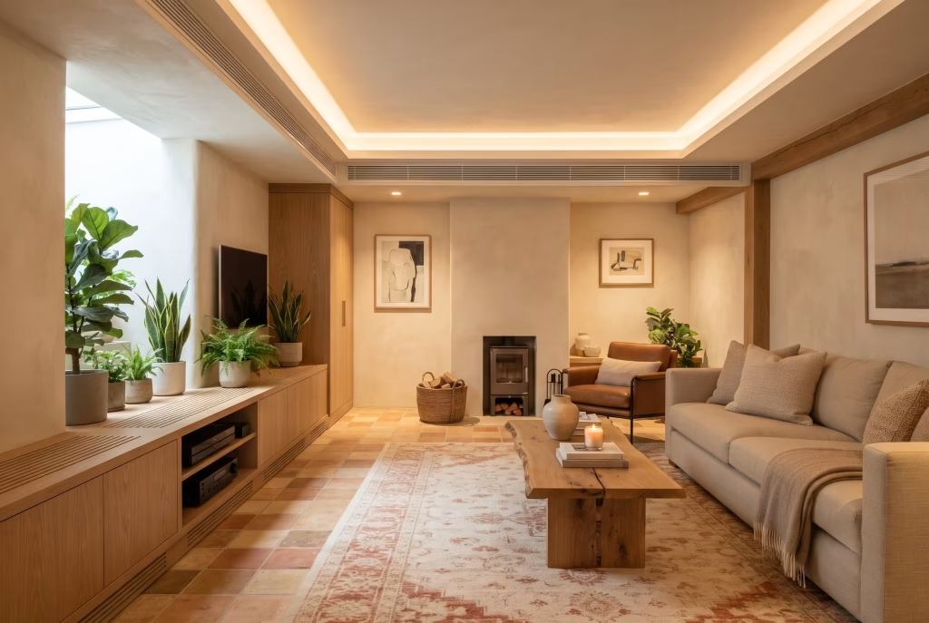
Forgetting Ventilation Entirely A basement with no window and no active ventilation plan will smell faintly musty within a year, however beautifully it’s finished, and no amount of limewash or terracotta will mask that once guests notice it. A proper mechanical ventilation system, sized correctly for the room’s volume, isn’t glamorous, but it’s the difference between a basement that feels genuinely fresh and one that merely looks it in photographs.
Making the Room Earn Its Keep
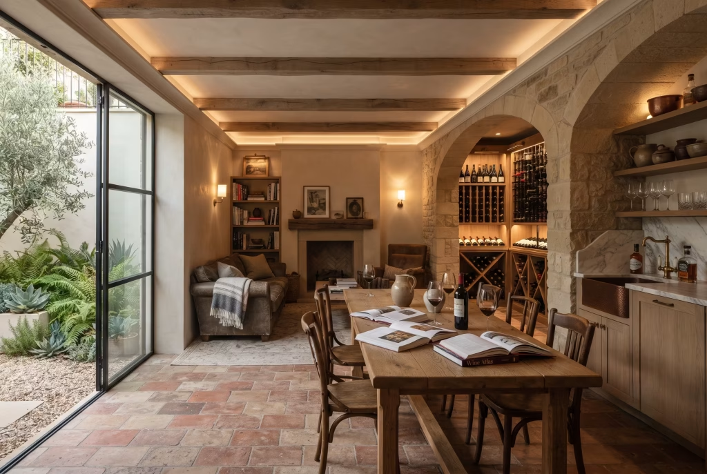
Look back over these fifteen ideas and one thread runs through every single one of them, whether it’s a limewashed wall, a cantina built for actual use, or a rug that’s quietly doing acoustic work while nobody notices.
None of it is about performing a style. It’s about understanding what a below-ground room genuinely is, cool, contained, private in a way upstairs rooms rarely manage, and designing with that nature rather than against it.
A basement dressed in borrowed Tuscan wallpaper and matching terracotta pots from a single catalogue will always feel slightly hollow, however expensive the components.
A basement built from real stone, real reasoning, and a proper understanding of how the room will actually be lived in feels grounded from the moment you step down into it, and that difference is the whole game.
There’s a sequencing lesson worth passing on here too, learned the hard way on more than one project over the years. Styling is always the part clients want to talk about first, the paint colour, the bar, the ceiling fresco, and it’s always the part that should come last.
Get the boring groundwork sorted before a single tin of limewash is opened: proper waterproofing to the walls and floor, structural checks if any openings or sunken zones are planned, first-fix electrics for that layered lighting scheme run before the plaster ever goes on.
Rooms that skip this order tend to look glorious for about eighteen months and then start quietly falling apart at the seams, a damp patch behind the bar, a lighting circuit that was never quite finished properly because it got squeezed in around furniture that had already arrived. Do the unglamorous work first and the glamorous work has something solid to stand on.
If you’d like the fuller picture behind all of this, the cantina tradition these ideas draw from, the Italian-American basement kitchen history that shaped idea six, and the more technical grounding on waterproofing and code that sits underneath everything here, our main guide to Italian basement design covers that ground properly.
Consider this piece the practical, image-led companion to it: the fifteen ways that heritage translates into a room worth actually living in, rather than one merely built to be looked at.
Frequently Asked Questions
How do I make my basement look Italian without it looking like a theme restaurant?
Avoid buying everything from a single “Tuscan collection” catalogue. Mix genuinely reclaimed materials, stone, terracotta, aged timber, with furniture that isn’t trying to match them, mid-century pieces, plain linen upholstery, contemporary lighting. The contrast between old and new is what reads as authentic. A room where everything arrived on the same delivery van rarely does.
What’s the single biggest mistake people make with basement lighting?
Relying on one central pendant and calling it finished. A single overhead source casts a flat, shadowless wash that makes a windowless room feel exactly like what it is. Layering uplighting, task lighting and accent lighting, each on its own dimmable circuit, does the job that daylight would otherwise be doing and stops the room feeling clinical.
Do I need planning permission for a wine wall or sunken seating area?
A wine wall built within the existing structure typically falls under building regulations rather than planning permission, since it doesn’t usually alter the building’s footprint or external appearance. A sunken seating area, if it involves lowering the floor slab or affects structural elements, is more likely to need building control sign-off. Always check with your local authority’s building control team before work begins, since requirements vary by property type and local conservation status.
What’s a realistic budget range for a basement like this?
Costs vary enormously depending on existing condition, ceiling height, and how much structural work is needed before styling even begins. As a broad guide, a basement already converted and structurally sound sits at the lower end, largely finishes and furnishing. A basement needing full waterproofing, underpinning or a change of floor level moves into the mid to upper range once structural and mechanical work is factored in. Get quotes from a structural engineer and a specialist basement contractor before settling on a figure, since assumptions made from photographs online rarely match what’s actually required once the walls are opened up.
Do Italian houses actually have two kitchens?
Not typically in Italy itself, where a separate basement kitchen isn’t the norm. The tradition of a second, working kitchen below ground is more strongly associated with Italian-American households, where it developed as a practical division between everyday cooking and the “good” kitchen kept for guests, rather than as a feature of Italian domestic architecture back home.
How do I stop my basement feeling like one long, boxy room?
Break the space visually rather than physically. A reclaimed stone archway, a change in floor level, or a cantina wall positioned at the threshold between two zones all suggest division without shrinking the room the way a full stud wall would. Full-height partitions tend to make a basement feel smaller, not larger.
What flooring works best in a basement with underfloor heating?
Dense, thermally conductive materials perform best. Terracotta and natural stone both hold and release heat evenly once warmed, giving a steady, ambient warmth rather than the sharp bursts of a wall-mounted radiator. Engineered wood can work with the right underfloor system, but always confirm compatibility and maximum operating temperature with the flooring manufacturer first, since not every product is rated for it.