Navy Blue Dining Room Ideas: 15 Show-Stopping Ways to Style This Sophisticated Hue
There’s a particular kind of confidence that Navy Blue Dining Room, the sort that quietly convinces even colour-shy homeowners to take the leap. It’s the one bold shade almost nobody talks themselves out of once they’ve lived with it for a fortnight, and it’s the colour that consistently earns the “why didn’t I do this years ago” reaction from people who hummed and hawed for months beforehand.
Ask anyone who has actually painted a dining room in navy blue, rather than simply pinned it to a mood board, and they’ll tell you the same thing: it’s less of a gamble and more of a slow-burn love affair.
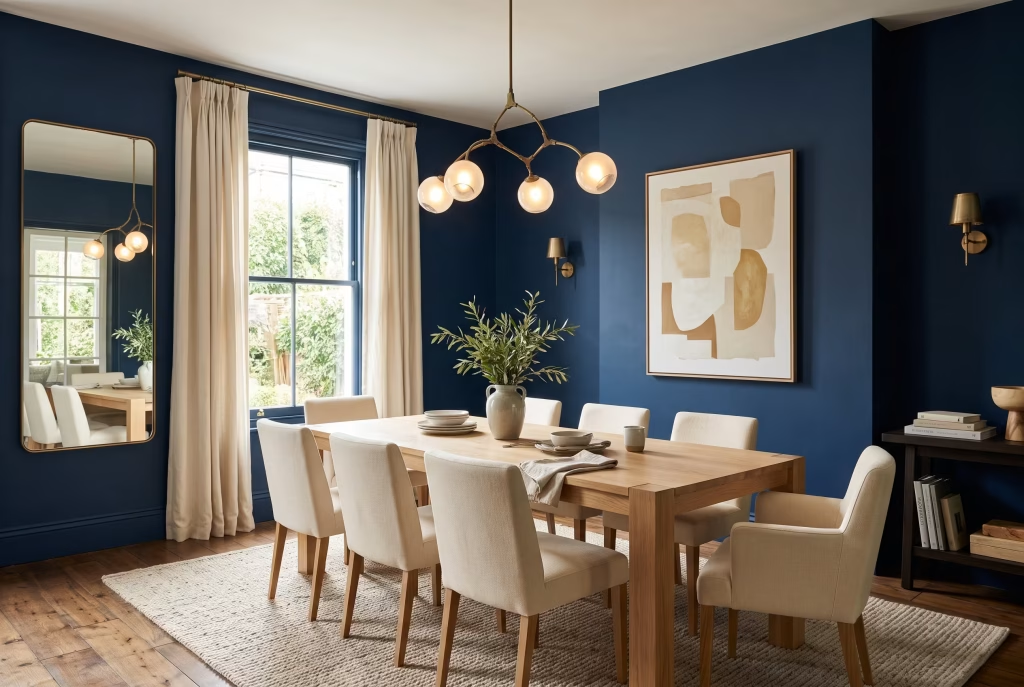
Quick answer, for anyone short on time: navy blue does not automatically shrink or darken a dining room. Deep, saturated hues do absorb more light than their pale cousins, so a navy wall will always read as heavier than a white one under the same bulb. But that isn’t the same thing as making a room feel poky or cramped.
What actually shrinks a dining space is a dark colour used without a proper plan for light, contrast, and where the eye naturally lands. Get those three elements right and even a boxy, low-light dining nook can look every bit as good in navy as a bright, generous one. Get them wrong, and a genuinely large room can start to feel like it’s closing in on you. This guide is built, brick by brick, around getting them right.
Why Navy Blue Suits a Dining Room Better Than Almost Any Other Room
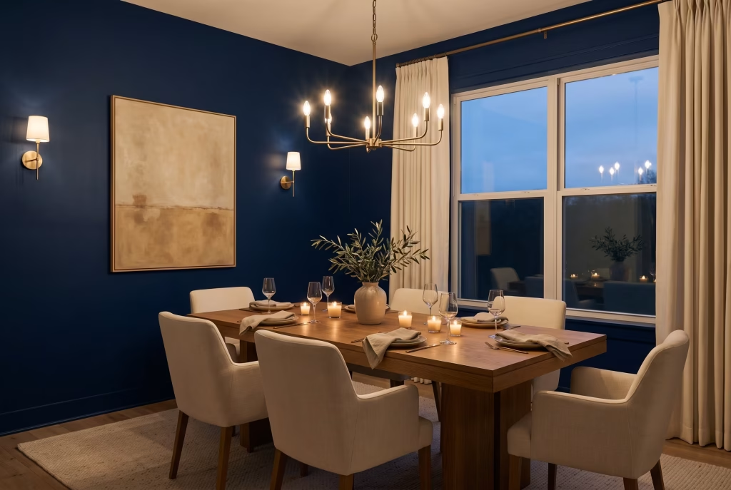
Here’s something worth chewing over before we get into the ideas themselves: a dining room behaves differently to a living room, a bedroom, or a home office. It comes alive mostly after dark, under warm, low, deliberately dimmed light, and for relatively short, concentrated bursts rather than all day long.
That happens to be exactly the condition navy blue was built for. It holds candlelight the way a good host holds a conversation, warmly and without competing for attention. It makes the people gathered around the table the brightest thing in the room, which is precisely where the focus should sit during a meal shared with family or friends.
A pale dining room can feel oddly exposed once the sun goes down and the big window turns into a black mirror reflecting the room back at itself. A navy one, by contrast, grows richer as the light fades rather than thinner. That’s the quiet psychological trick behind why so many homeowners describe a navy dining room as turning an ordinary
Tuesday supper into something that feels a touch more like an occasion. There’s also an honest truth worth naming here: committing to a colour this bold is a genuine leap of faith, and feeling hesitant about it before picking up a brush is nothing to be embarrassed about. Plenty of the most confident navy rooms you’ll ever see started life as a homeowner staring at a paint chip for three weeks straight.
Choosing Your Shade of Navy Undertones, Depth, and Real Paint Names
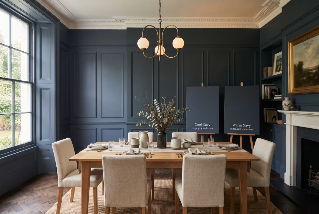
Navy isn’t a single, fixed colour the way most people assume. It’s a whole family of blues, stretching from a hue so deep it borders on black through to a brighter, denim-leaning tone that behaves more like a confident accent than a moody backdrop. Before you so much as pick up a roller, it pays to understand what you’re actually choosing between, because the wrong undertone can throw an otherwise beautiful scheme completely off balance.
Cool navies lean toward black or slate grey and read as formal, tailored, and faintly architectural, the kind of shade that suits a room with clean lines and minimal fuss. Warm navies, on the other hand, carry a whisper of purple or green in their undertone and feel softer, more forgiving, and considerably easier to live with on a day-to-day basis.
If you’ve ever stood in a paint aisle fretting that a navy sample looks suspiciously purple once it dries on the wall, you’ve bumped into undertone shift firsthand, and it’s a genuinely common headache. Navy blues shift far more dramatically under artificial light than almost any other colour family out there, which is precisely why testing a sample inside your actual dining room, at your actual dinner hour, matters more here than it ever would for a straightforward neutral.
A handful of real, widely stocked navy shades worth knowing by name: Sherwin-Williams Naval (SW 6244), a true, slightly warm navy and one of the most dependable shades going for a dining room; Benjamin Moore Hale Navy (HC-154), a gentler, more adaptable navy that reads beautifully whether it’s midday or candlelit dinner;
Sherwin-Williams Salty Dog (SW 9177), a deeper, moodier, near-black navy for those who want real drama; Farrow & Ball Hague Blue, a cooler, more mineral shade with a green undertone that suits panelled or period rooms down to the ground; and Farrow & Ball Stiffkey Blue, warmer and noticeably more forgiving once the light drops low.
If you only test two shades before committing, make them a true navy and a warmer navy, sample-carded side by side on the same wall. The difference will jump out at you far more obviously on plaster than it ever does on a tiny swatch card at the shop counter.
One more thing worth flagging before you commit: navy isn’t simply “dark blue” in the way most people picture it in their head. Painted alongside true black, most navies read as unmistakably blue, sometimes surprisingly vividly so. Painted alongside a mid-tone denim blue, that same navy can suddenly look almost black by comparison. Context changes everything with this particular colour family, and that’s exactly why the sample-on-card method earns its keep more here than with practically any other shade on the colour wheel.
The 27 Navy Blue Dining Room Ideas
1. Go All In: Paint All Four Walls a True Navy
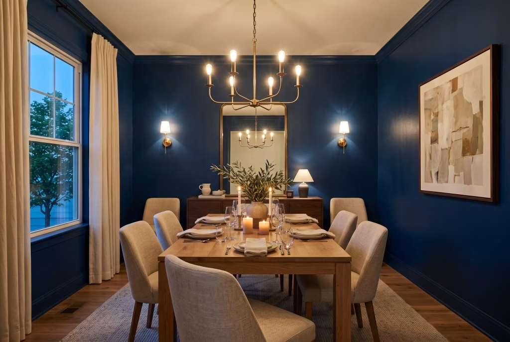
Full commitment is, somewhat counterintuitively, often the more forgiving path. A dining room used mostly of an evening, bathed in warm lamp or candlelight, can carry navy across every wall without the buyer’s remorse that a fully navy living room sometimes brings on. The knack lies in choosing an eggshell finish rather than a dead flat matt, so the walls hold just enough sheen to catch and bounce candlelight rather than swallowing it whole.
Cost and upkeep: a standard dining room takes roughly 2 to 3 litres of paint across two coats. Eggshell wipes down far more easily than matt, and that matters more than most people expect around a dining table, especially in a household with children old enough to sit properly but not yet old enough to eat tidily.
How it feels to live with: people who commit fully to navy walls consistently report the same arc happening within the first week or two. The initial “have I gone too far” jitters fade fast, and the room settles into being the one space in the house with genuine personality. It’s rarely the colour itself people come to regret. When regret does creep in, it’s almost always because the lighting wasn’t planned to match the ambition of the wall colour, a mismatch that’s entirely avoidable with a bit of forethought.
2. Dip a Toe In: Keep Navy to a Single Accent Wall
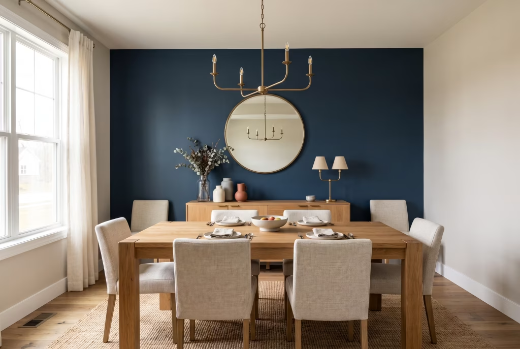
If full commitment feels like a bridge too far, one wall alone does far more heavy lifting than most people give it credit for. Put it behind the sideboard, the buffet, or the wall the table faces head-on rather than a side wall the eye merely skims past on its way somewhere else. This is the lowest-risk route into navy and the easiest one to undo entirely if your tastes shift down the line.
A word to the wise: choose the wall with the least visual competition already on it. An accent wall fighting for attention against a busy gallery wall or a large window loses its punch fast.
3. Wainscot It: Use Navy on Panelling Only
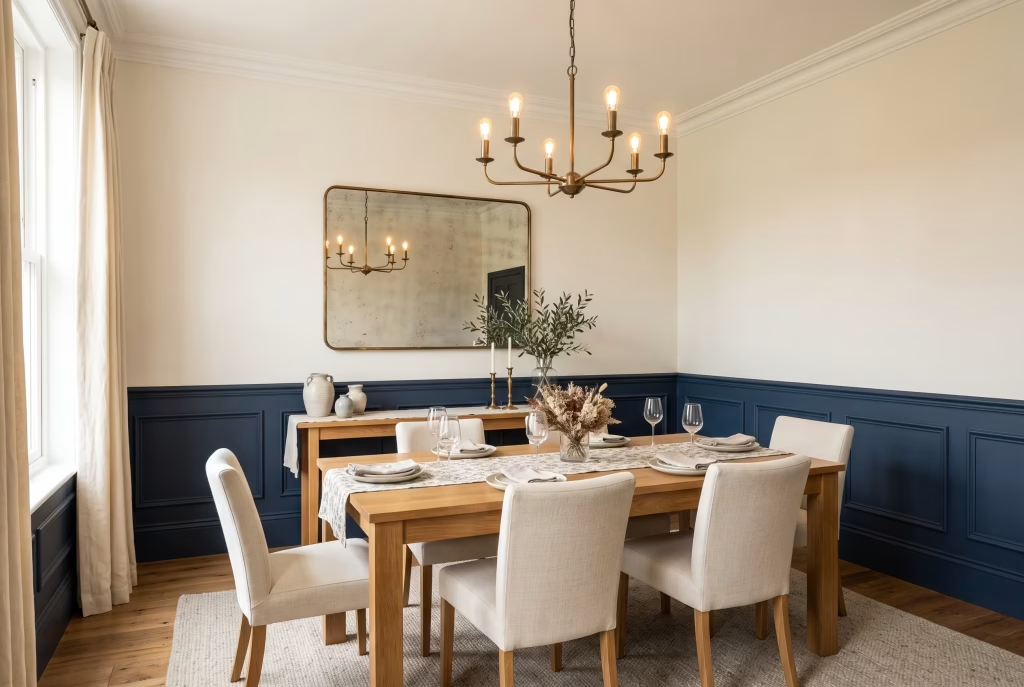
Painting the lower half of a wall navy and leaving the upper half pale is one of the oldest tricks in the interior design playbook for good reason: it works like clockwork. The chair rail acts as a natural full stop for the eye, so you get real depth of colour without the room ever feeling like it’s closing in overhead. Set the rail at roughly a third of your ceiling height; in a standard 2.4 metre room that lands around 80 to 90 centimetres up the wall, which keeps the lower panel looking grounded rather than squat and stubby.
4. Split the Difference Try a Two-Tone Colour Block Wall
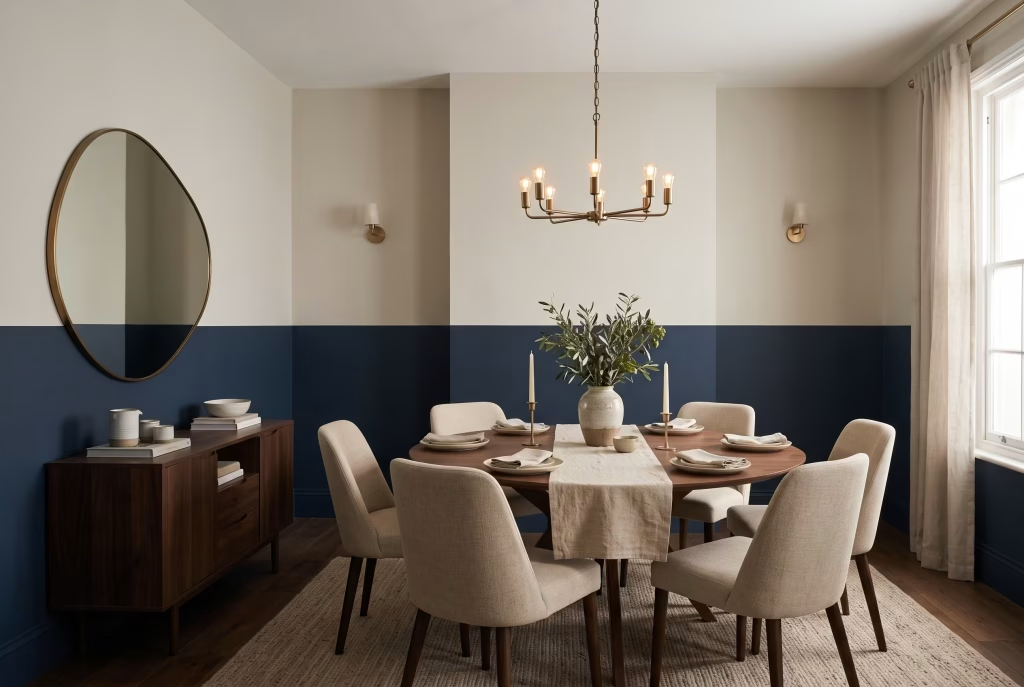
Split the wall horizontally, navy down below and a lighter shade above, without the physical joinery of proper wainscoting. Run the dividing line at chair rail height rather than an arbitrary halfway point, because that particular proportion is already baked into how the human eye reads a room’s architecture, and a random split tends to fight itself rather than flatter the space.
You May also Like: 25 Outdoor Dinner Party Ideas That Make Backyard Hosting Feel Special
5. Go the Whole Hog Full Colour Drenching
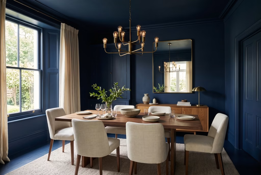
Painting the walls, ceiling, trim, and skirting boards all in one identical navy strips away every hard edge in the room in one fell swoop. Instead of a patchwork of wall colour, white ceiling, and separately painted trim, you get a single continuous surface, and furniture starts to read as objects floating inside the colour rather than merely sitting in front of it. This is a genuinely dramatic, jaw-dropping look, and it works best in rooms already blessed with generous natural light or plenty of layered artificial lighting, since there’s no pale surface left over to bounce light back once you’ve drenched the lot.
6. Look Up Paint Just the Ceiling Navy
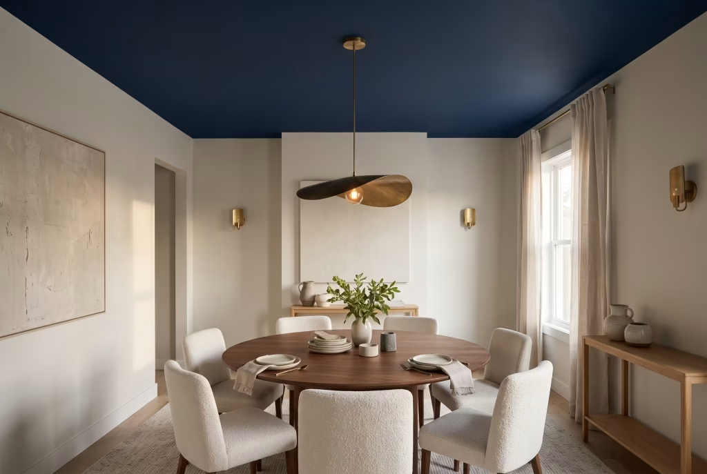
A navy ceiling paired with white or pale walls is the move that catches most people off guard, because a fourth wall of colour overhead does something a single accent wall simply can’t replicate. It draws the whole room together and lends it a lower, cosier, more deliberate feel, and it’s particularly striking in a room with a plain flat ceiling currently doing absolutely nothing for the space.
Steer clear of: a high-gloss ceiling finish, which throws harsh reflections straight back down onto the table below. Stick to a flat or matt finish overhead for this particular trick to land properly.
7. Play It Safer Choose a Lighter Navy for a Compact Room
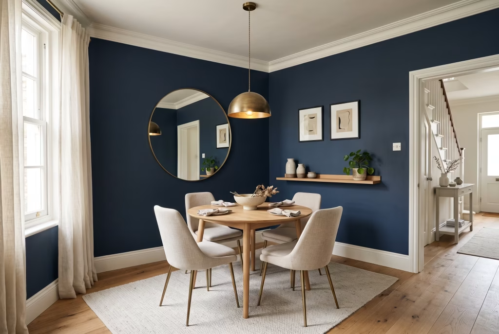
Not every navy behaves the same way inside a confined space. A true navy with a touch more grey or blue lift to it, rather than the deepest near-black options on the shelf, will still read as unmistakably navy while reflecting noticeably more light back into the room. This is the single easiest lever to pull if you’re nervous about a small dining room and don’t want to gamble the whole scheme on a shade that’s simply too dense for the square footage you’re working with.
8. Contain the Colour Use Navy on Cabinetry Instead of Walls
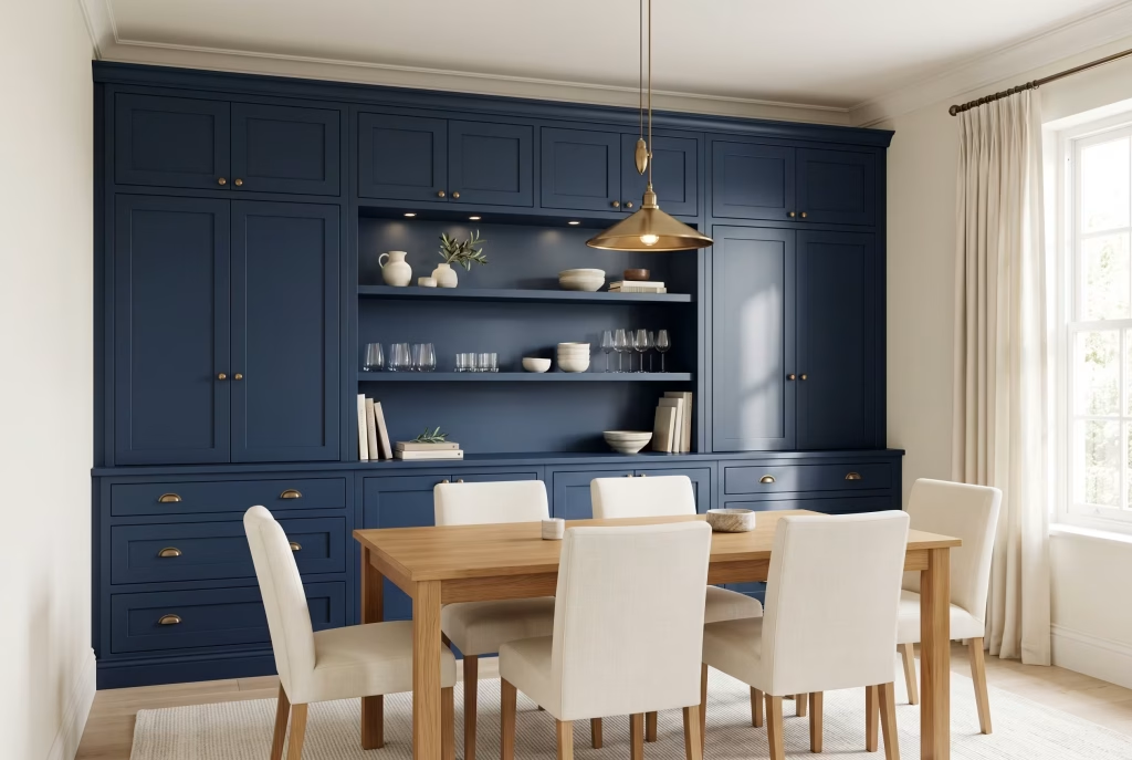
If a fully navy room still feels like too big a leap of faith, paint a hutch, a built-in dresser, or a run of cabinetry navy and leave the walls neutral. You get the depth and sophistication of the colour concentrated into one strong, considered element, and it’s a far smaller, far cheaper undertaking than repainting an entire room from skirting to cornice.
9. Add Contrast Pair Navy Walls With White Trim and Ceiling
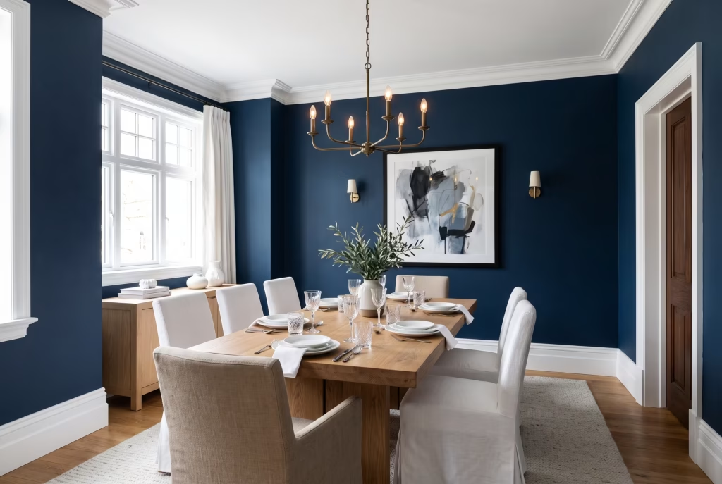
The classic pairing, and for very good reason: crisp white trim gives the eye somewhere to land and rest, so navy walls never tip over into feeling oppressive even when they cover every surface in sight. Aim for roughly two-thirds navy to one-third white across walls, trim, and soft furnishings so the contrast reads clearly rather than looking accidentally striped or half-finished.
Steer clear of: reaching for a warm or creamy white here. It softens the crisp line between the two tones and turns what should be a graphic, confident contrast into something muddy and indecisive.
10. Warm It Up: Pair Navy With Warm Wood Tones
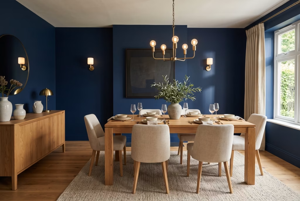
Cool navy and warm wood settle into each other in a way that feels almost inevitable, like two old friends who were always going to end up at the same table. The wood stops the room feeling clinical or chilly without softening the drama one bit, and the pairing reads as organic and grounded rather than laboured over with a stylist’s checklist. Keep your table, sideboard, and flooring in the same wood family so the warmth reads as intentional rather than accidental.
Steer clear of: wood with strong orange or red undertones. It pulls against cool navy and leaves the whole room feeling unsettled and slightly at odds with itself, rather than genuinely balanced.
11. Add Some Sparkle: Pair Navy With Brass or Gold
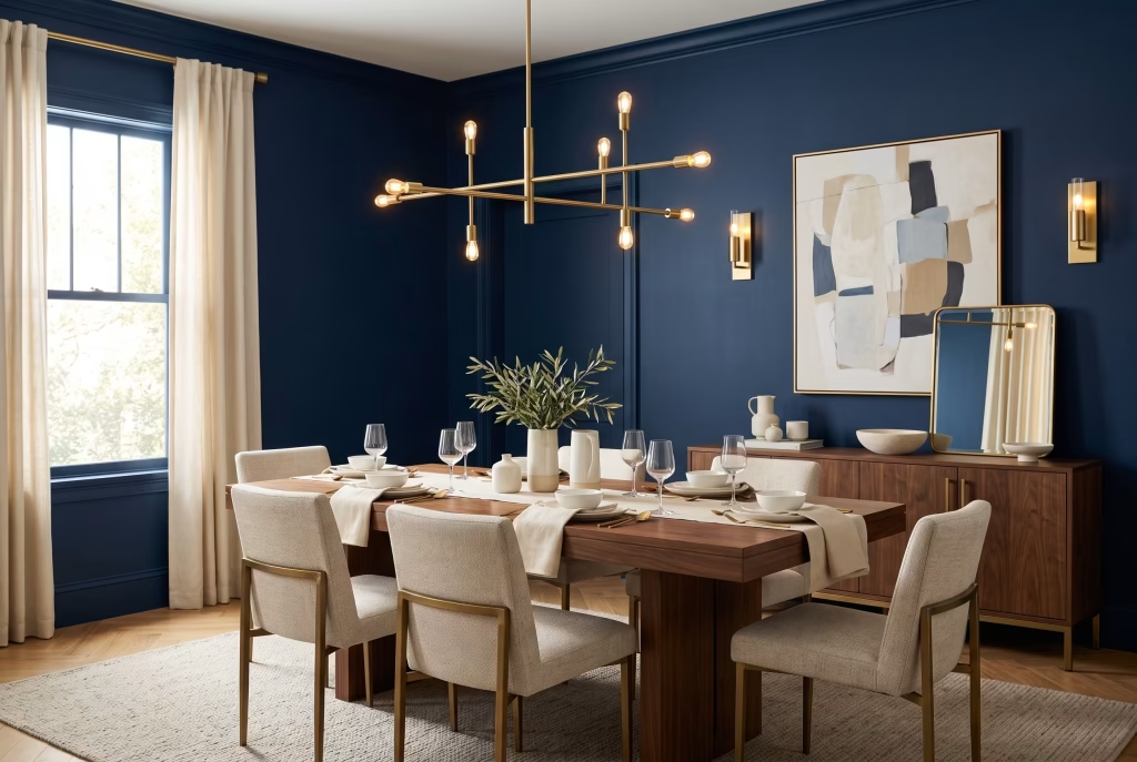
Brushed brass against navy is warmth against depth, glow against gravitas, and it’s one of the most bulletproof pairings going in the whole colour family. A brass chandelier, door handles, and picture frames all in the same warm tone give the eye a thread to follow right around the room, and the metal reads as a highlight rather than a competitor to the wall colour.
Steer clear of: mixing brass and silver finishes in the same room. It splits the warmth of the space in two directions at once and leaves the scheme feeling unresolved rather than genuinely layered.
12. Cool It Down Pair Navy With Soft Grey
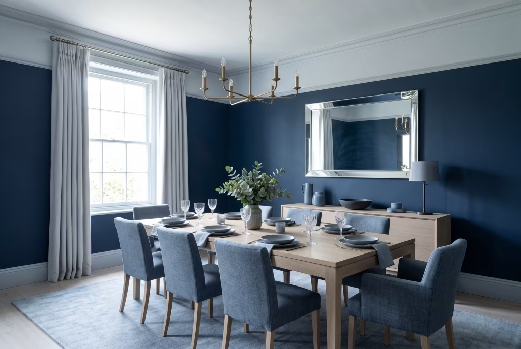
Grey and navy together deliver something the bolder pairings simply can’t: real calm, in spades. A blue-leaning grey breathes into the navy so the whole palette reads as one considered whole rather than two colours quietly competing for attention. Hold your grey sample against the navy in both daylight and evening light before you commit to anything, since a grey that pulls warm or green under your actual bulbs will sit in visual tension with the blue rather than complementing it.
13. Soften the Mood Pair Navy With Blush or Dusty Pink
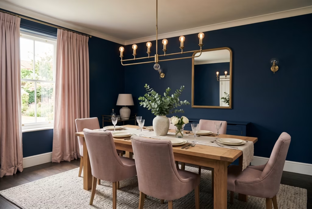
An unexpected combination on paper that works far better in practice than most people would guess. Soft pink takes the edge off navy’s natural formality and brings a gentle, almost romantic warmth without fighting the depth of the wall colour. This pairing is best introduced through chairs, curtains, or a table runner rather than paint, so the pink stays a considered accent rather than a competing statement.
You May also Like: 21 Earthy Cottage Home Decor Ideas for a Cozy, Soul-Calming Retreat
14. Bring the Cheer Pair Navy With Mustard or Ochre
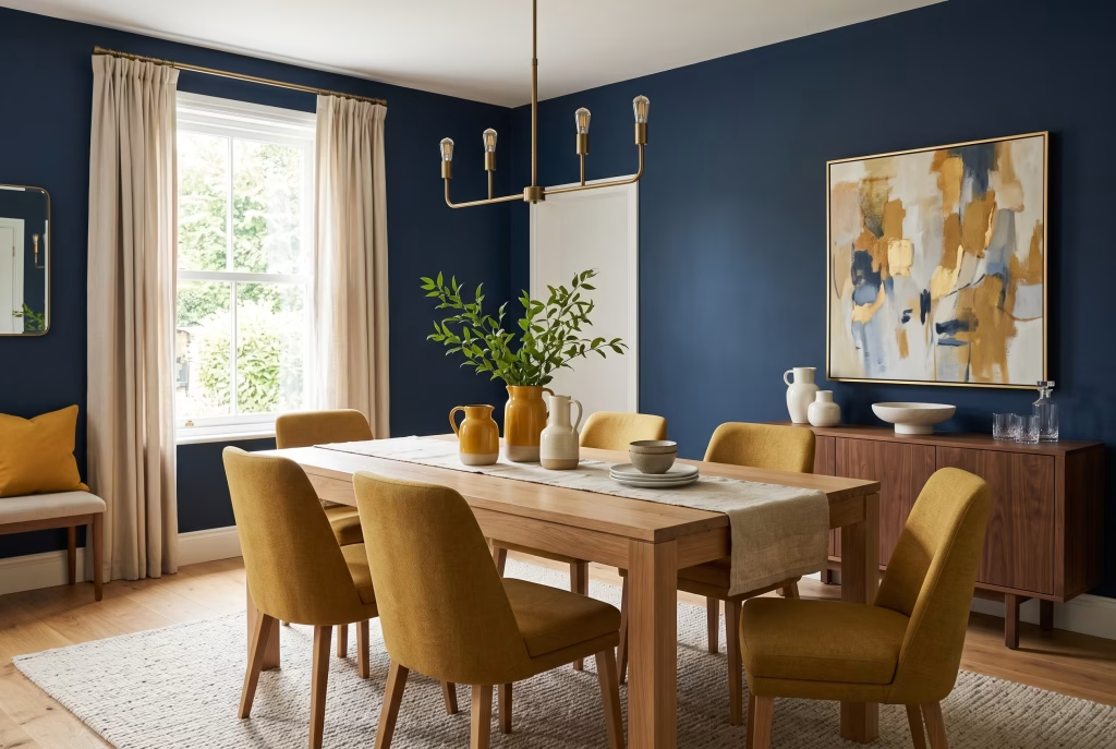
Bring in golden yellow through upholstery or artwork and navy immediately stops feeling remotely stuffy or formal. This is a genuinely cheerful pairing, better suited to a room hosting casual weeknight family dinners than one built purely for candlelit entertaining, and it’s one of the easiest ways going to stop navy walls from feeling heavy-handed.
15. Go Bold Pair Navy With Emerald or Forest Green
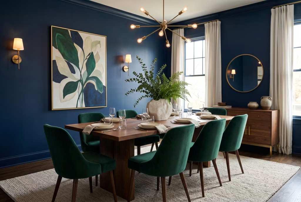
Two deep, saturated colours together sounds like a recipe for disaster on paper and instead reads as confident and richly layered in practice, provided navy stays the dominant tone throughout and green is used sparingly as an accent through chairs, artwork, or greenery rather than fighting for equal wall space. Warm brass sconces keep the pairing from tipping into cold or flat territory.
16. Ground It Pair Navy With Terracotta or Rust
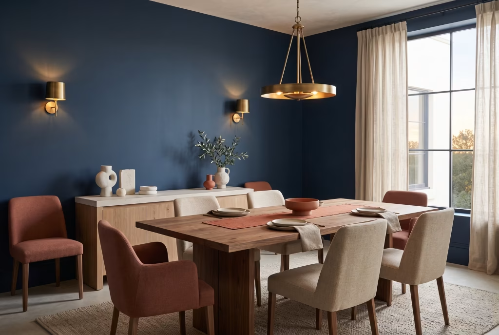
Cool navy walls softened with warm clay and earthy rust tones is a genuinely modern, of-the-moment combination, and one that works particularly well alongside concrete, stone, or matte finishes elsewhere in the room. The earthy tones stop a cool-toned navy from ever feeling austere or standoffish.
17. Layer Your Lighting Use at Least Three Light Sources
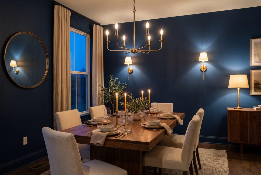
This is, hands down, the single most common mistake made in navy dining rooms everywhere, and thankfully it’s an easy one to fix before it turns into genuine regret. A lone overhead pendant in a dark room leaves everything below it languishing in shadow. Layer in a chandelier or pendant, wall sconces set at a lower height, and candles or a table lamp, then put the lot on dimmers so you can shift the mood through the meal rather than being stuck with a single, unchanging brightness all evening.
This is worth taking seriously before the paint ever touches the wall, not after the fact. The most common regret you’ll stumble across in navy dining room stories, time and time again, isn’t the colour choice at all. It’s people who painted first and only clocked afterward that their existing single ceiling light wasn’t doing the freshly darkened room any justice. Planning your lighting layers at the same time as your paint colour, rather than tacking it on as an afterthought once the walls are already dark, will spare you a frustrating second round of work down the line.
18. Get the Proportions Right: Nail Your Chandelier Height
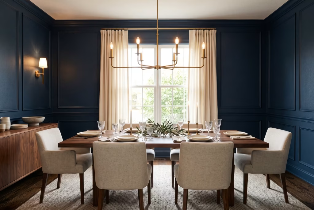
Hang the base of your chandelier roughly 75 to 85 centimetres above the table surface. Too high, and it stops doing any meaningful work for the mood of the room whatsoever. Too low, and it blocks sightlines across the table, which makes conversation feel oddly cramped even in an otherwise generous, spacious room.
19. Choose Warmth Fit a Brass or Warm-Metal Fixture Over the Table
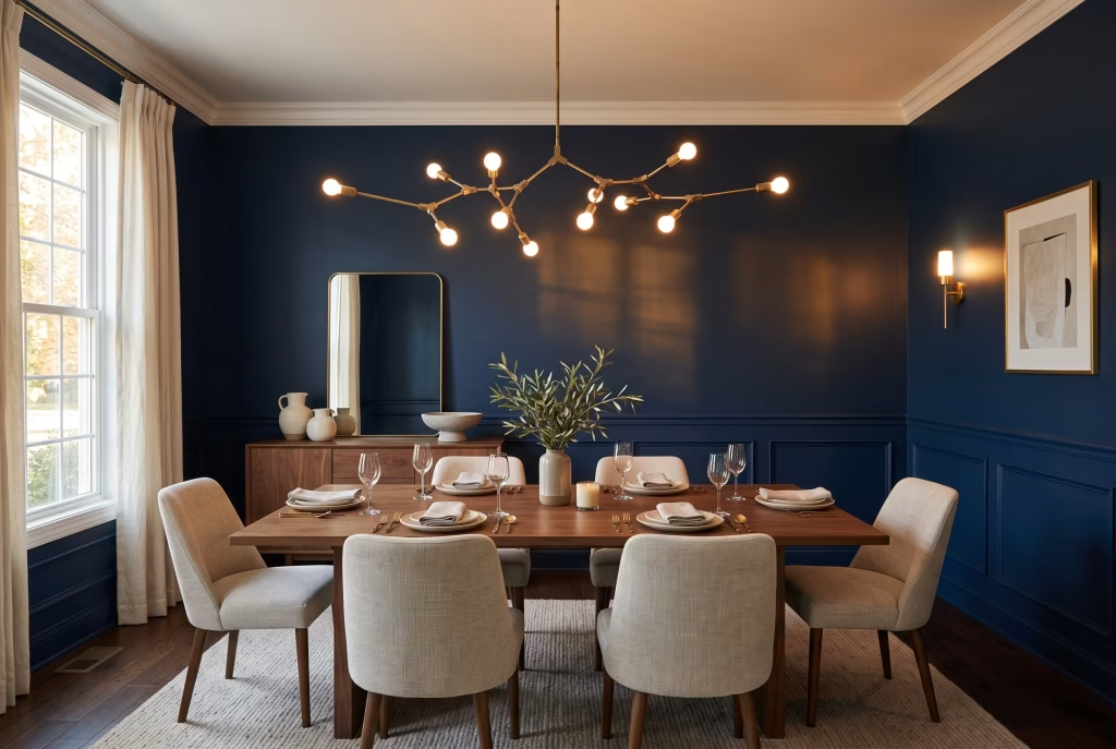
Warm metal against navy does more visual heavy lifting than almost any other single purchase you can make in this room. A geometric brass pendant, a branching chandelier, or a cluster of smaller pendants grouped together all read as confident rather than merely safe, and the contrast between warm metal and cool wall colour is precisely what stops the whole scheme feeling flat and one-note.
20. Go Graphic Use a Black Fixture for a Modern Edge
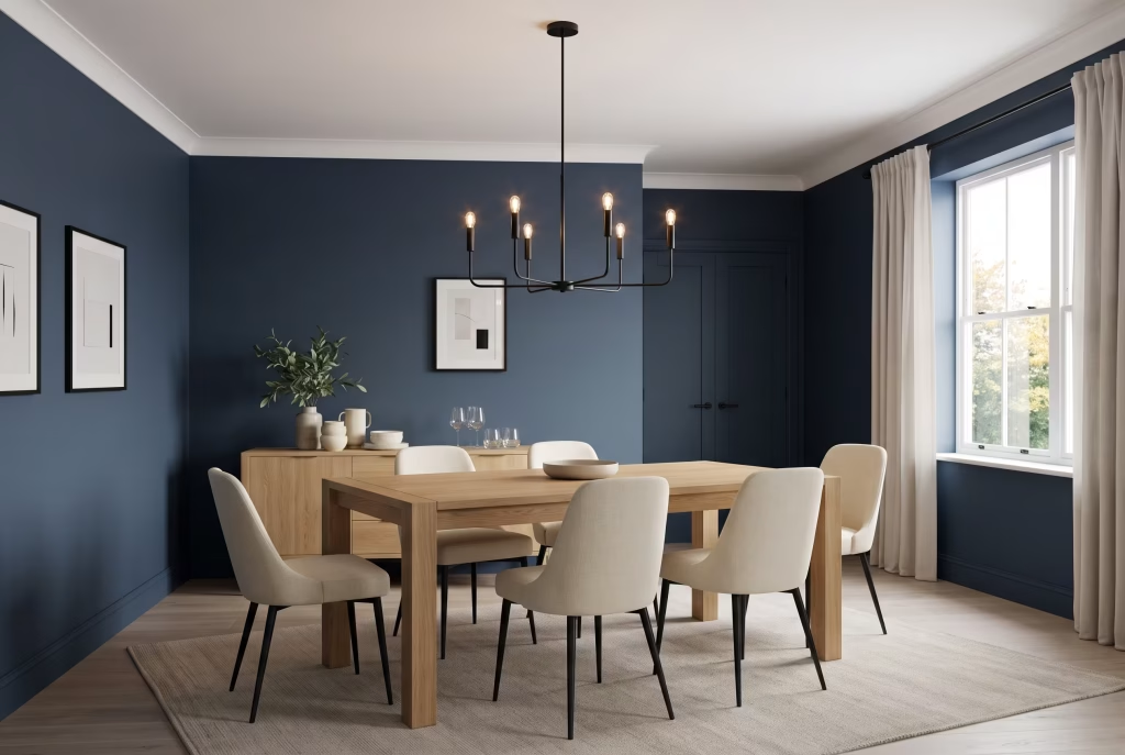
If brass feels a touch too traditional for your space, a matte black chandelier or pendant against navy walls creates real, unmistakable definition. It’s a more architectural, contemporary look than brass, and it works especially well against a lighter navy or a navy-and-white combination where you’re after a strong graphic contrast rather than warmth.
Steer clear of: leaving black as the only dark accent floating in an otherwise pale room. Repeat it somewhere else in the space, chair legs, picture frames, or door hardware, so it reads as a deliberate decision rather than a happy accident that nobody planned for.
21. Balance the Palette Choose Lighter Chairs Against Dark Walls
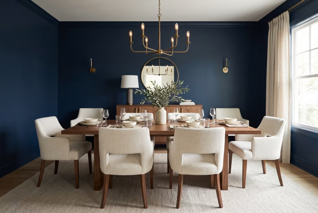
If your walls are already the darkest element in the room, let your chairs shoulder the opposite job. Cream, oatmeal, or pale grey upholstery keeps the seating from vanishing into the walls altogether, and it gives the eye somewhere genuinely lighter to rest as guests settle in around the table.
22. Flip the Script Try Navy Chairs Against Neutral Walls Instead
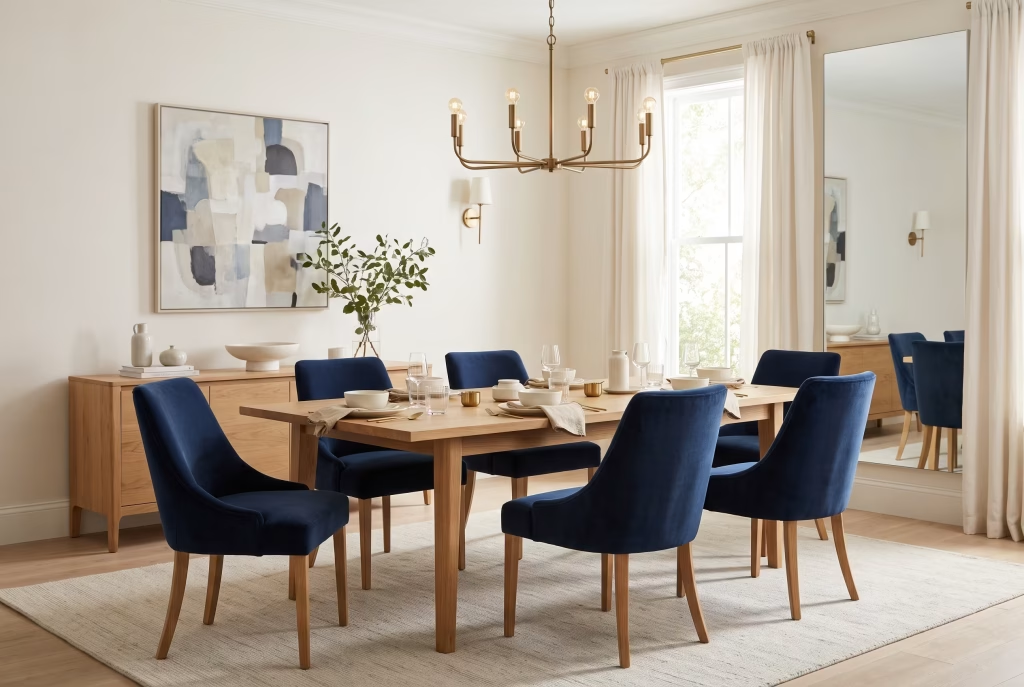
If you’re colour-cautious but still want a proper dose of navy’s depth in the room, put it in the chairs rather than committing it to the walls. Deep sapphire or navy velvet seating against a neutral wall gives you the richness without the full commitment, and it’s genuinely simple to swap out later on if your tastes drift in a different direction.
Steer clear of: delicate fabrics like silk or a loosely woven linen on dining chairs. Staining and general wear show up fast around a busy table, and the chairs will look tired long before you’re anywhere near ready to replace them.
You May also Like: 20 Luxurious Italian Dining Room Ideas for an Elegant, Timeless Home
23. Get Cosy Add an Upholstered Banquette
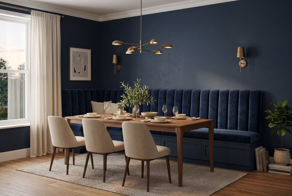
A banquette set against a navy wall gives the room a solid block of colour and texture that no freestanding chair could ever hope to match, and it brings a genuinely restaurant-level intimacy to whatever corner it occupies. Velvet channel tufting turns the seat itself into a design feature rather than merely somewhere to perch, and if space is at a premium, building lift-up storage into the base recovers room you’d otherwise sacrifice to a bulky sideboard.
Steer clear of: positioning the banquette too close to the table edge. Guests end up squeezing in sideways, and no amount of beautiful upholstery will save a meal eaten with your ribs pressed hard against the woodwork.
You May also Like: 25 Christmas Room Decor Ideas That Bring Comfort, Charm, and Holiday Cheer
24. Go Deep Choose a Dark Wood Table for Depth Against Depth
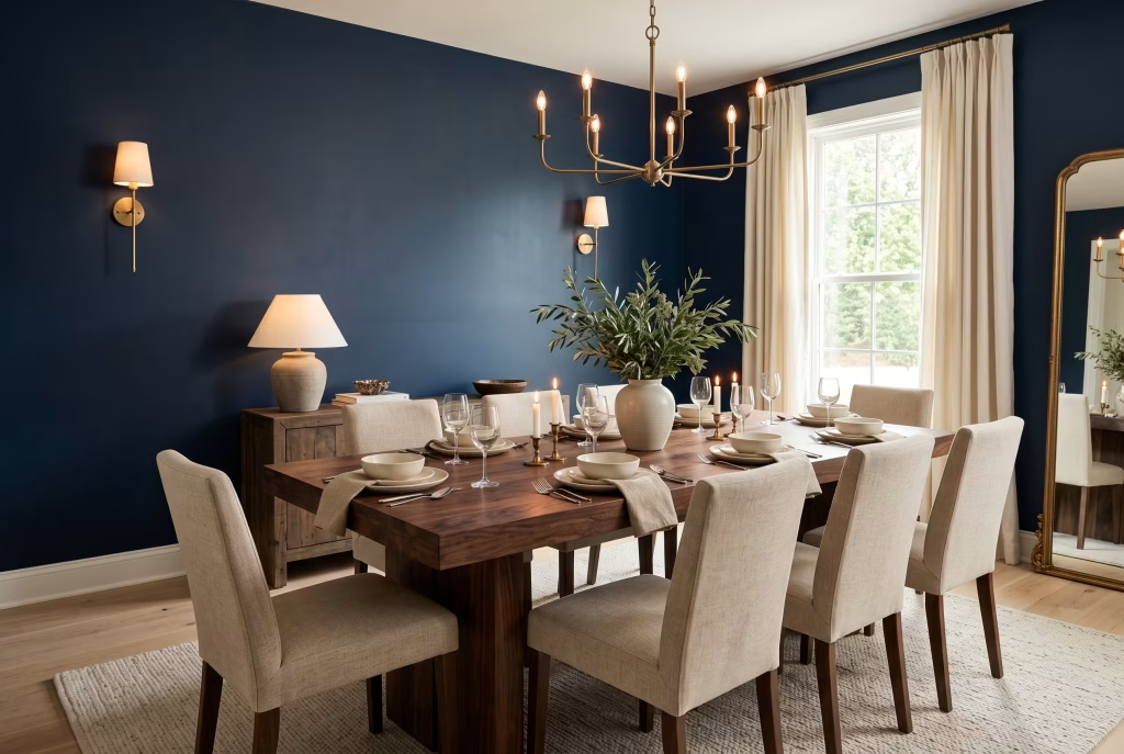
Dark walnut or mahogany set against navy walls is a pairing where neither colour fights for attention, and each surface seems to pull genuine richness from the other. It’s a properly layered look rather than a flat one, though it does need careful handling in a smaller or dimmer room where things can tip into heaviness fast.
Steer clear of: pairing very dark walls with an equally dark floor. It swallows the furniture whole and leaves the room feeling weighed down rather than richly appointed, particularly in a space that doesn’t see much natural daylight.
25. Lighten the Load Use a Pale or Marble Table
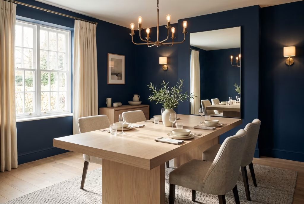
If your walls are doing the heavy lifting in this scheme, let your table do the opposite job entirely. A white marble, light oak, or pale-finished table breaks up the depth of the walls and stops the whole room reading as one solid, dark block. This is one of the single most effective moves available for a small or low-light navy dining room, bar none.
26. Dress the Table Style With Gold-Rimmed Glassware and Warm Metal
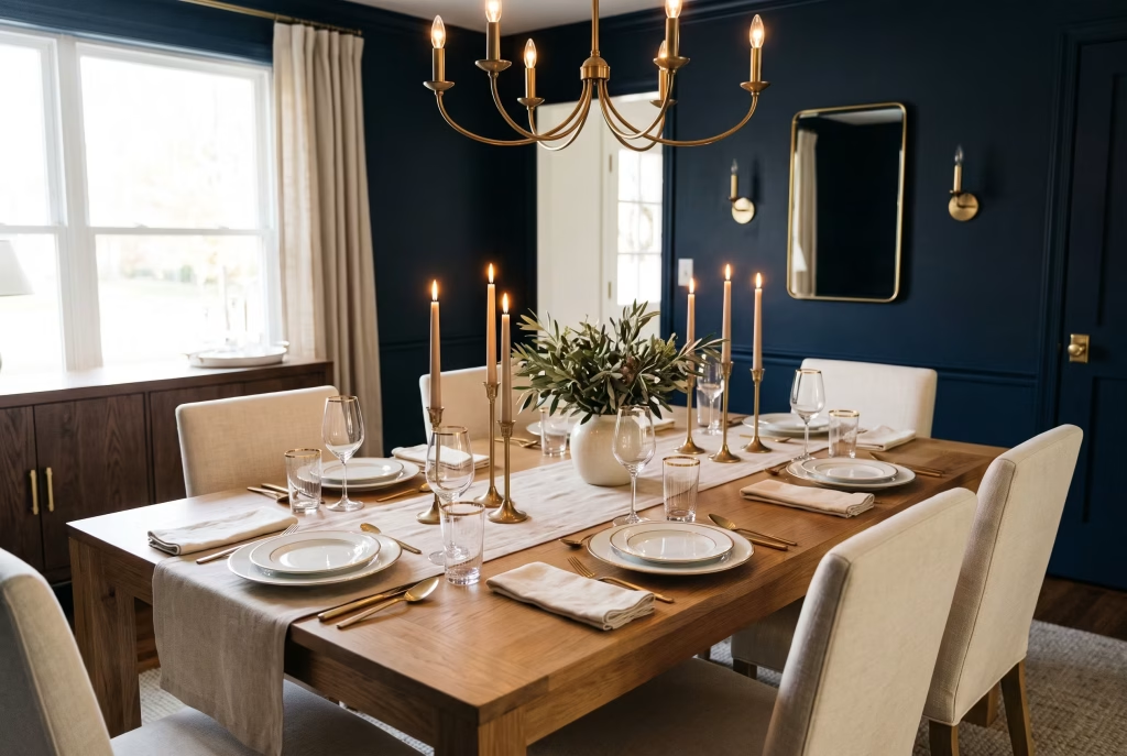
A navy room already has strong bones to work with, and the table is where that confidence finally gets rewarded. Gold-rimmed glassware, polished brass cutlery, and a scattering of tall candlesticks catch every scrap of available light and do the work of a full table restyle for a fraction of the cost involved. It’s genuinely the fastest upgrade on offer here if the budget for a complete redecoration simply isn’t there yet.
27. Bounce the Light Bring in a Mirror
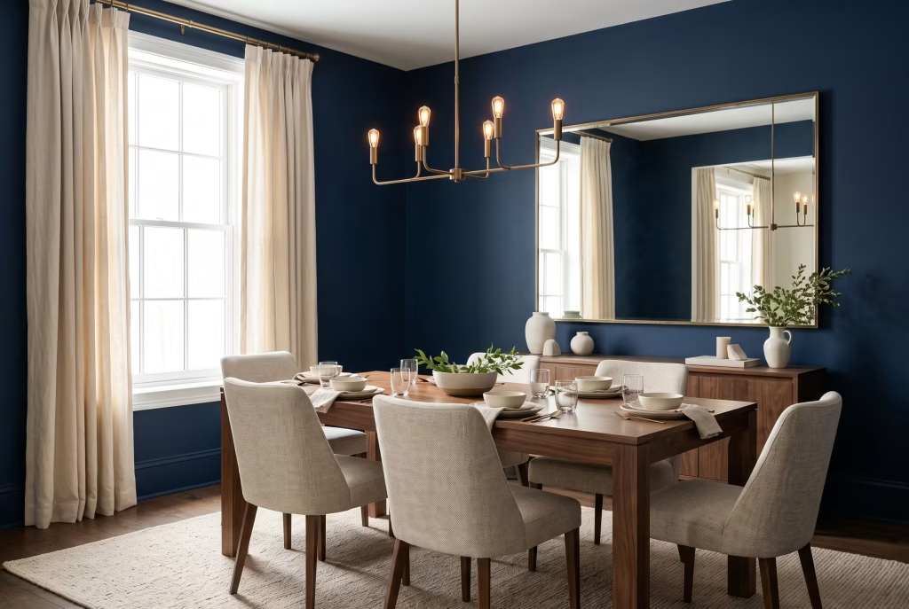
A large mirror in a metallic or wooden frame does real, measurable work in a navy room, well beyond simple decoration. It reflects whatever natural light you do have back across the space, and it adds visual interest without introducing yet another colour into the mix. Position it opposite a window or another light source rather than a blank wall, so it’s genuinely catching and bouncing light around rather than just reflecting more navy straight back at itself.
Small and Low-Light Dining Rooms The Honest, No-Nonsense Guide
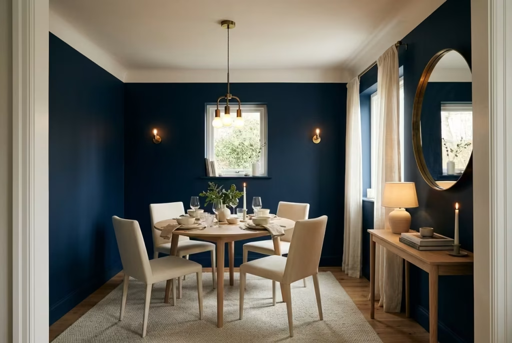
This is the section most navy dining room guides quietly skip over, and it happens to be the one thing people actually search for, in earnest, before committing to a colour that isn’t exactly a five-minute job to undo.
Here’s the straight-talking version: deep, saturated colours like navy genuinely do absorb more light than pale ones. That’s simple physics at work, not a matter of opinion, and any designer who insists a dark colour has zero bearing on how a room feels isn’t being entirely straight with you.
Colours with a low light reflectance value, or LRV for short (roughly how much light a shade bounces back, measured on a scale of 0 to 100), will always read as more enclosed than a colour sitting at the opposite end of that scale. A deep navy typically lands somewhere around 5 to 10 LRV. A soft white sits far closer to 85 or 90.
But a low LRV doesn’t automatically spell doom for a small room. It simply means the space needs a different strategy to a pale room, and there are four levers that genuinely move the needle here.
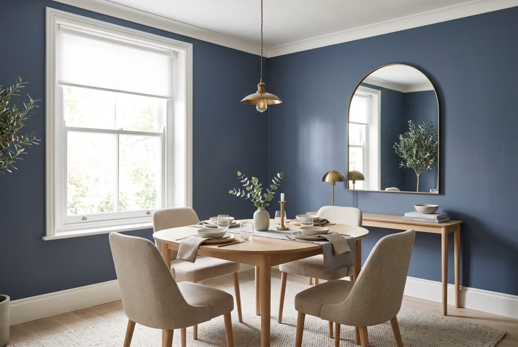
Reach for a slightly lighter navy, not the darkest tin on the shelf. A navy with a touch more grey or blue lift will still read unmistakably as navy while handing you meaningfully more light bounce than a near-black shade ever could.
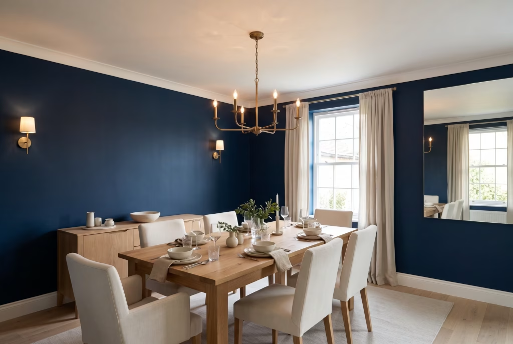
Keep at least one pale, reflective surface somewhere in the room. A white ceiling, pale trim, or a light-coloured table stops the whole space reading as one solid dark block and gives the eye somewhere to land amid all that colour.
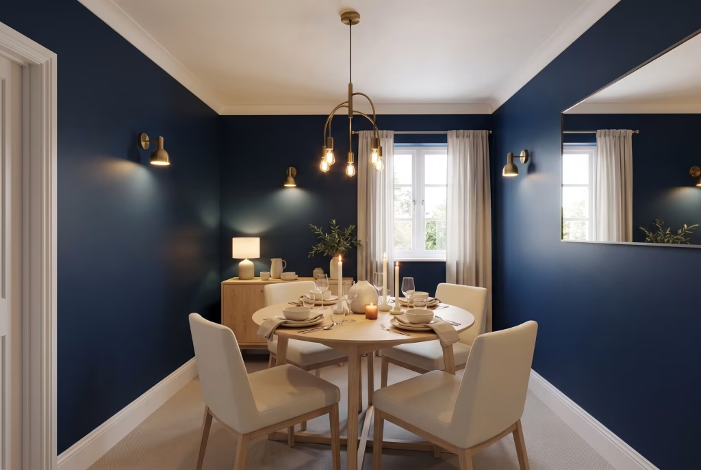
Add more artificial light than you’d instinctively think you need. A small navy room genuinely calls for more lumens than the same room painted white, simply because there’s less light bouncing around off the walls themselves to begin with. This is where the three-light-source rule from earlier in this guide really earns its place.
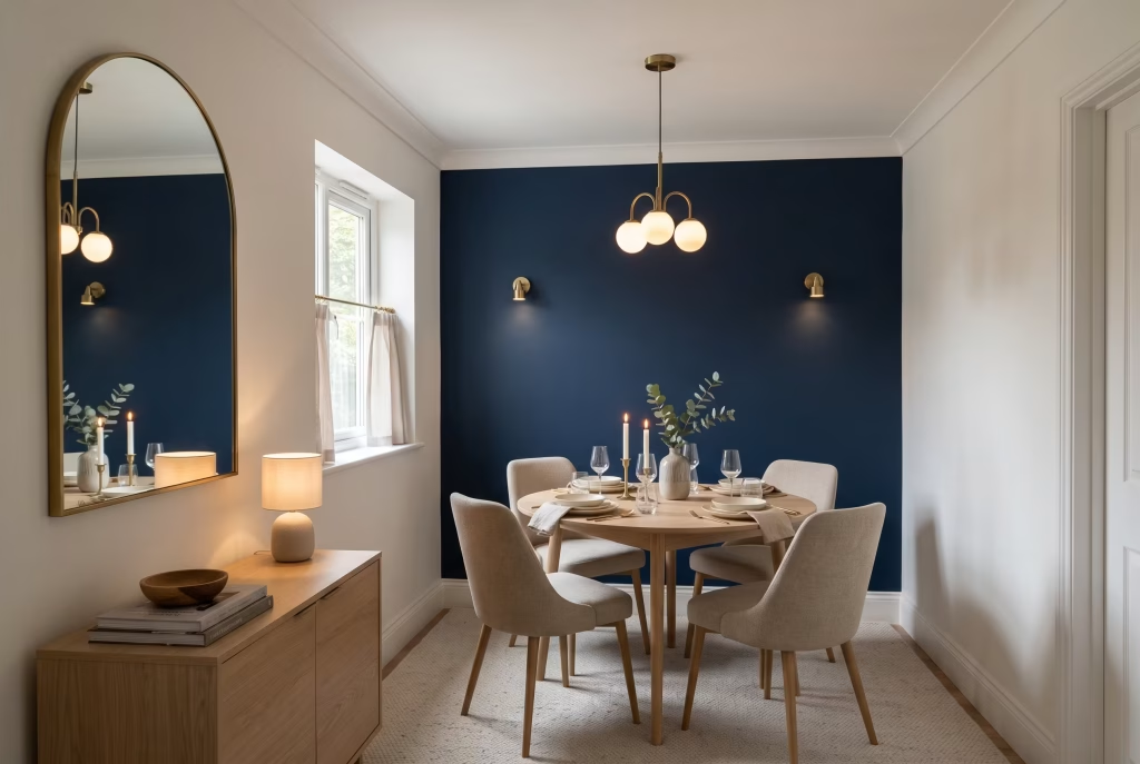
Put a mirror to work strategically. A mirror hung opposite a window is doing real optical work here, not just decorative window dressing, in a room that’s already short on natural light to begin with.
If your dining room is genuinely small and genuinely dim, with precious little natural light to speak of, the wainscoting or accent-wall approaches covered earlier will almost always outperform full-wall navy. You get the richness of the colour without asking a light-starved room to carry it across every single surface.
There’s also a genuine, ongoing disagreement among designers worth being upfront about rather than glossing over with false reassurance. Some designers will tell you dark colours can make a small room feel more intimate and cohesive, precisely because the walls seem to recede rather than announce themselves as hard boundaries, especially once the lighting is dialled in correctly.
Others maintain that in a genuinely small, genuinely low-light room, no amount of clever lighting fully offsets what a low-LRV colour does to a confined space, and that a paler shade is simply the safer, more forgiving choice for that particular room. Both camps are staffed by people who genuinely know what they’re talking about, and the honest answer is that it hinges heavily on your specific room, your specific light, and how much budget you’re willing to put toward the lighting side of things.
If you’re working with a small dining nook tucked off an already bright, sun-drenched kitchen, full navy is a far safer bet than if you’re working with a boxy, single-window room that barely sees direct sun at all.
If you’re still on the fence after testing a few samples, the lower-risk paths, wainscoting, a single accent wall, or navy introduced through furniture and chairs rather than walls, let you enjoy the colour without betting the entire room on a single roll of the dice.
What Navy Actually Costs, From Paint Tin to Finished Room
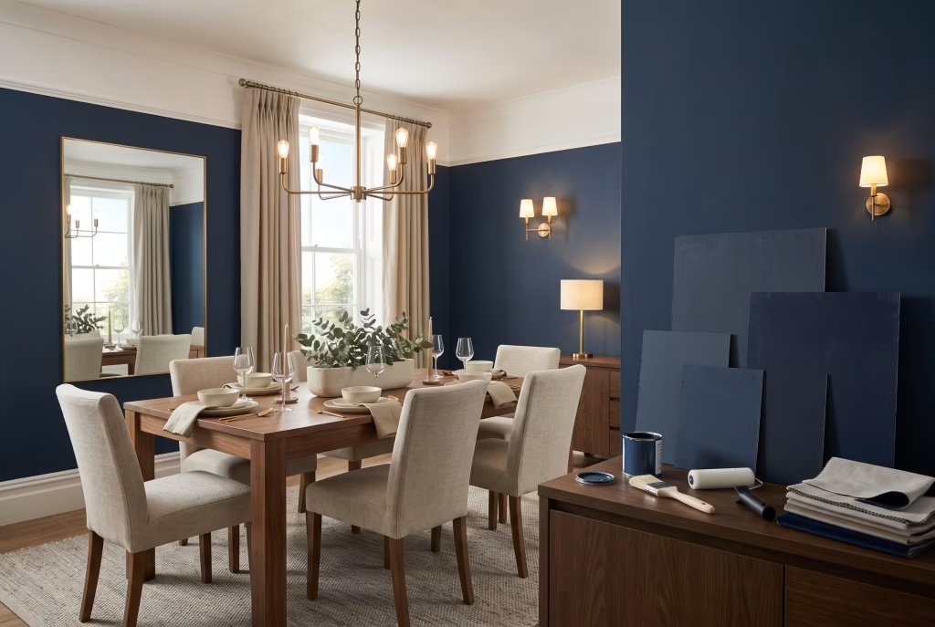
A straightforward two-coat paint job for an average-sized dining room, using a mid-range trade brand, typically calls for two to three litres of paint. Premium heritage brands like Farrow & Ball cost noticeably more per litre than a standard trade emulsion, but the depth and quality of finish is genuinely different, and for a colour this bold and this considered, that difference tends to show up in the final result.
Before committing to an entire room, buy sample pots and actually use them properly. Navy shifts more dramatically between daylight and artificial light than almost any other colour out there, and a sample painted onto a piece of card you can carry around the room, checked first thing at breakfast and again come dinner under your usual evening lighting, will save you the headache of repainting an entire wall twice over.
If full commitment feels like too much of a financial or practical risk right now, cabinetry, a single accent wall, or navy dining chairs against otherwise neutral walls all deliver a meaningful slice of the same effect for a fraction of the outlay and effort involved.
Lighting is the other part of the budget people consistently forget to plan for properly. If your existing dining room currently has one central pendant and nothing else to speak of, factor in the cost of at least one additional light source, whether that’s a pair of wall sconces, a table lamp on the sideboard, or a run of dimmable candle-style lighting, at the same time you’re budgeting for paint.
It’s a far smaller outlay than most people brace themselves for, and it’s the difference between a navy room that feels genuinely intentional and one that feels like it simply ran out of plan halfway through the project.
Frequently Asked Questions
Is navy blue too dark for a small or low-light dining room?
Not automatically, but it does need a proper plan behind it. Choose a slightly lighter navy rather than the darkest option on offer, keep one pale reflective surface somewhere in the room such as a white ceiling or a pale table, and layer in more artificial light than you’d typically use in a pale room. Wainscoting or a single accent wall are safer starting points than full-wall navy in a genuinely dark space.
Does navy blue paint make a dining room look smaller?
Deep, saturated colours absorb more light than pale ones, and that’s a real, measurable optical effect. But “absorbs more light” isn’t the same thing as “makes the room smaller.” A well-lit navy room with the right balance of pale surfaces and reflective metal accents can feel every bit as spacious as a white one. A poorly lit navy room, or one painted the darkest possible shade with nothing to lighten it, will feel more closed in.
What’s the difference between navy, indigo, and cobalt for a dining room?
Navy is the deepest and most neutral of the three, sitting close to black in low light and behaving like a genuine backdrop colour throughout the room. Indigo carries more visible purple undertone and feels richer, more jewel-toned, and a touch more theatrical. Cobalt is brighter and more saturated, closer to a true, punchy blue than a near-black, and it behaves more like a strong accent colour than a moody, enveloping backdrop.
Should I paint all four walls navy or just do an accent wall or wainscoting?
Full commitment works best in rooms already blessed with good natural or artificial light, used mostly of an evening. If you’re nervous, unsure, or working with a small or low-light space, wainscoting or a single accent wall delivers most of the visual impact with considerably less risk and cost attached.
What colours pair best with navy blue in a dining room?
White and brass are the two most dependable pairings going. Warm wood tones, soft grey, blush pink, mustard, emerald green, and terracotta all work beautifully too, depending on whether you’re after a formal, cheerful, calm, or earthy feel in the finished room.
How do I stop a navy dining room feeling too formal or heavy?
Bring in texture and softer materials: linen curtains, a woven rug, rattan chairs, or mixed metal finishes all take the edge off navy’s natural formality. Layered, warm lighting does more heavy lifting here than almost any single piece of furniture you could buy.
Do I need extra lighting for a navy blue dining room?
Generally speaking, yes, more than you’d use in a pale room. A single overhead pendant in a navy space tends to leave the corners and lower half of the room sitting in shadow. Layering a pendant or chandelier with wall sconces and candlelight, all fitted onto dimmers, hands you far more control over the mood as the evening goes on.
Is a navy blue dining room a passing trend or a genuinely timeless choice?
Navy has held its position as one of the most consistently recommended dining room colours for well over a decade now, largely because it works across so many different styles, from traditional wainscoted rooms right through to sleek modern minimalist spaces. It’s about as close to a genuinely timeless bold colour choice as you’ll find anywhere in interior design.
Can navy blue work in an open-plan kitchen-dining space without overwhelming the whole area?
Yes, but it works best when it’s given a defined zone rather than left to spread across the entire open-plan area unchecked. A navy accent wall, a run of navy cabinetry, or navy dining chairs against otherwise neutral surroundings all let the colour read as intentional zoning rather than an overwhelming wash of one dark hue across a large, connected space.
What’s the best navy shade for a north-facing dining room?
Look for a navy carrying a warmer undertone, one with a hint of purple or green rather than a pure, cool blue-black. North-facing light is naturally cooler and flatter to begin with, and a warm-leaning navy will stop the room feeling cold or clinical in a way a very cool, very dark navy can genuinely struggle with.
How do I test a navy paint colour properly before committing to the whole room?
Paint a sample onto a large piece of card, at least A3 size, rather than directly onto the wall itself, so you can carry it around the room and check it in different spots. Hold it against the wall you’re actually planning to paint, first thing at breakfast and again come dinner under your normal evening lighting, since navy shifts more between daylight and artificial light than most other colours going. Live with the sample for at least a few days before making your final call.