How Do You Use Hot Pink in Interior Design? 25 Bold Ideas for Every Room
Hot pink has a reputation problem it doesn’t deserve. Say the words out loud and most people picture a teenager’s bedroom circa 2004, all glitter and gloss. Walk into a well-dressed London townhouse or a Copenhagen apartment today, though, and you’ll find hot pink doing something far more grown-up: grounding a scheme, sharpening a neutral palette, or standing in for the drama a black accent wall used to provide.
So how do you actually use hot pink in interior design? The short answer is with restraint and repetition. Pick one or two hot pink moments per room, whether that’s a wall, a piece of furniture, or a run of soft furnishings, then echo the same shade elsewhere in the space through a cushion, a lampshade, or a piece of art. Balance it against a generous helping of neutrals (think a 70-20-10 split of neutral, secondary colour, and hot pink) and pair it with materials that carry weight, such as velvet, brass, or dark wood, so the colour reads as considered rather than accidental.
There’s a reason this colour keeps returning to serious design conversations rather than fading as a passing trend. Colour psychologists have long linked pink tones to warmth, comfort, and even a measurable calming effect on the nervous system (the phenomenon behind “Baker-Miller Pink” being used in prison holding cells and sports team changing rooms to reduce aggression).
Hot pink sits at the more energising end of that same family. It carries the softness people associate with pink, but with enough saturation and heat to feel confident rather than passive. Used well, it doesn’t just decorate a room, it changes how the room makes you feel: more alive in a kitchen, more indulgent in a bedroom, more sociable around a dining table.
That’s the principle. What follows are 25 room-by-room ideas that show exactly how to put it into practice, from the living room to the back garden, along with the psychology behind why each choice works, the colour science, the pairing rules, and the mistakes that turn a confident pink scheme into a headache.
Hot Pink, Fuchsia, or Magenta? Getting Your Terms Straight
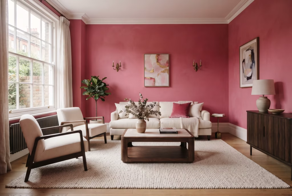
Before you pick up a paint chart, it’s worth knowing what you’re actually shopping for. Hot pink sits at the brighter, more saturated end of the pink family, closer to fuchsia than it is to blush or dusty rose. It has almost no white mixed in, which is what gives it that electric, slightly synthetic punch. Magenta leans a touch more purple, fuchsia a touch more red-violet, and coral pulls warm and orange. If a paint name promises “hot pink” but the swatch reads more like salmon, it’s coral in disguise, and it will behave very differently against your existing furniture.
Undertone matters more than most people expect, and not just visually. Warmer undertones tend to read as inviting and grounded, the kind of pink that makes a room feel like it’s holding you rather than performing at you. Cooler, blue-violet undertones read as sharper and more alert, closer to the energy of a gallery opening than a Sunday afternoon.
A hot pink with a cool undertone will feel electric and modern under daylight bulbs, almost neon in the right light. The same shade with a warmer, orange-leaning undertone will soften considerably under a 2700K warm bulb in the evening, reading closer to raspberry. If your room faces north and gets cooler, flatter light for most of the day, a slightly warmer hot pink will stop the wall from feeling clinical and will do more emotional lifting on grey days. South-facing rooms with strong afternoon sun can carry a cooler, punchier hot pink without it tipping into garish, because the warmth of the light does some of the softening work for you.
The 70-20-10 Rule for Confident Pink Rooms
This is the single most useful piece of guidance any designer will give you on a strong colour, and it holds true for hot pink specifically. Roughly 70 per cent of the room stays neutral (walls, floor, large furniture in white, cream, grey, or wood), 20 per cent carries a secondary colour or texture (black, gold, natural wood, sage green), and the remaining 10 per cent is where hot pink lives, concentrated rather than scattered. A single hot pink armchair in an otherwise neutral living room follows this ratio instinctively.
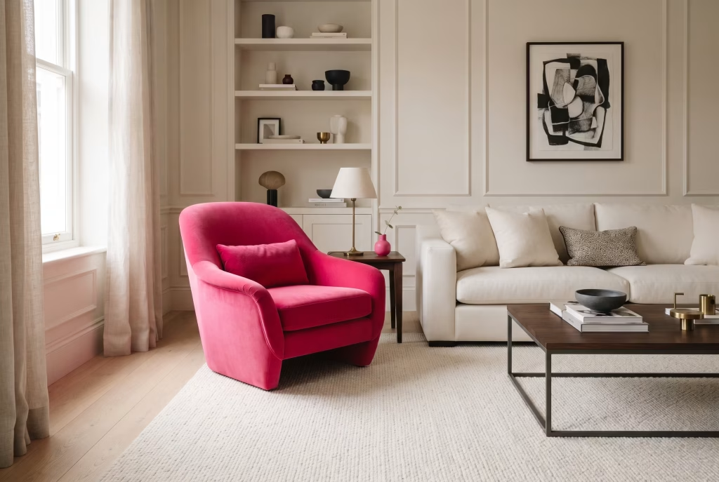
There’s a psychological reason this ratio works so consistently well. The eye and brain read a room in seconds, scanning for a focal point before they process anything else. When hot pink is contained to roughly a tenth of the visual field, it becomes that focal point immediately, giving the brain a clear place to land and a sense of resolution.
Spread across the whole room, the same colour removes that resting point entirely, and a space without a resting point tends to feel busy or even mildly anxious to sit in for long stretches, no matter how much you love the colour itself. A room painted entirely hot pink, with pink furniture and pink accessories on top, abandons the ratio, and that’s usually the point where a scheme stops feeling designed and starts feeling like a dare.
25 Hot Pink Interior Design Ideas by Room
Living Room
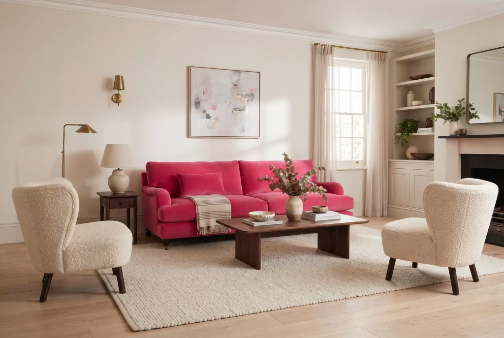
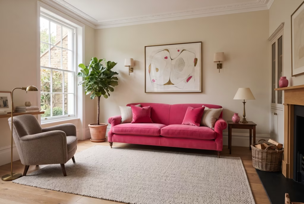
1. Anchor the room with one hot pink sofa, not a full suite. A single upholstered sofa in hot pink velvet does more work than an entire matching set. Keep the armchairs, coffee table, and rug neutral, and the sofa reads as a deliberate statement rather than a colour scheme run away with itself. Boucle or linen blends soften the shade slightly and wear better in a family living room than a slick satin finish. Emotionally, a sofa is the piece of furniture we spend the most unguarded time on, curled up, half-asleep, deep in conversation, so giving it a confident colour tends to make the whole room feel more welcoming rather than more formal, almost like the house itself is inviting you to relax into it. From a practical standpoint, choose a performance velvet with a rub count of at least 30,000 if the household includes children or pets, and ask for a fabric protector treatment at the point of order rather than after delivery.
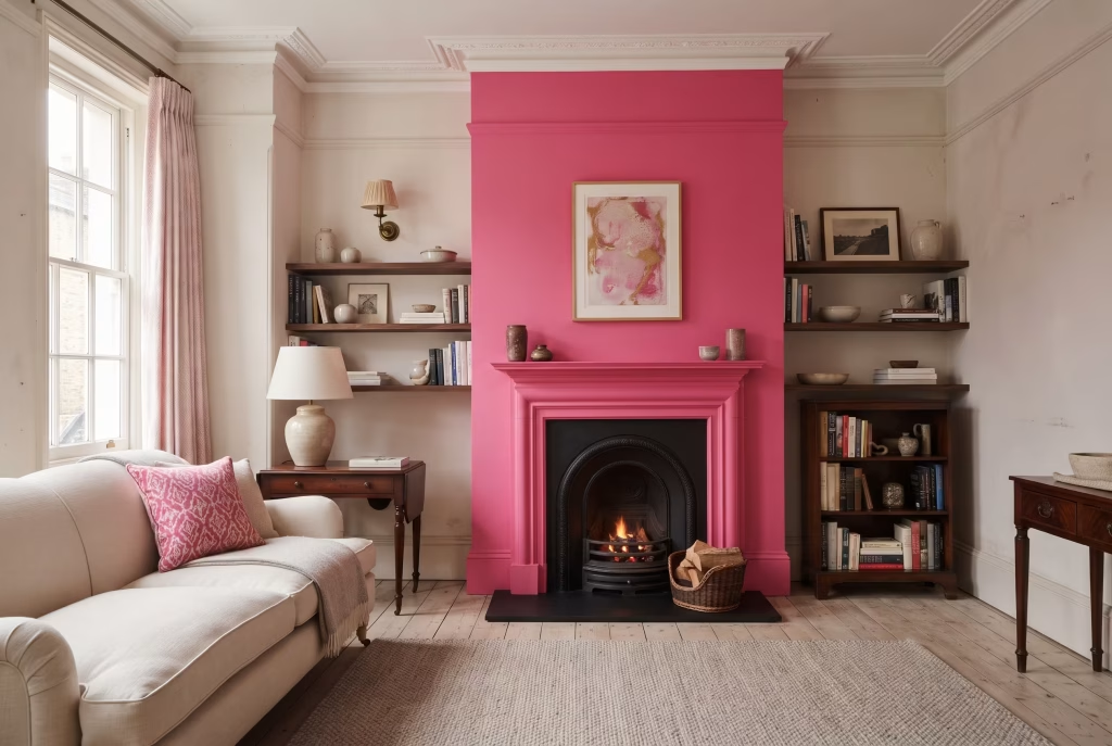
2. Paint just the chimney breast, not the whole wall run. Chimney breasts and fireplace walls are built for this. Painting the recessed alcoves either side in a soft off-white keeps the eye moving and stops the pink from feeling like it’s closing the room in, which matters a great deal in period properties with lower ceiling heights. Psychologically, this technique borrows from the same logic as a gallery wall spotlight: by narrowing the field of saturated colour to the architectural feature that was already the natural focal point of the room (the fireplace, historically the literal heart of the home), you reinforce a sense of warmth and gathering rather than simply adding colour for its own sake. Farrow & Ball’s estate emulsion or a comparable chalky matt finish will soften the intensity of hot pink considerably compared with a standard vinyl silk, which is worth knowing if you’re worried about the shade reading too sharp on a large flat wall.
You May also Like: Mid-Century Modern Living Room: The Complete Guide to Getting the Look Right
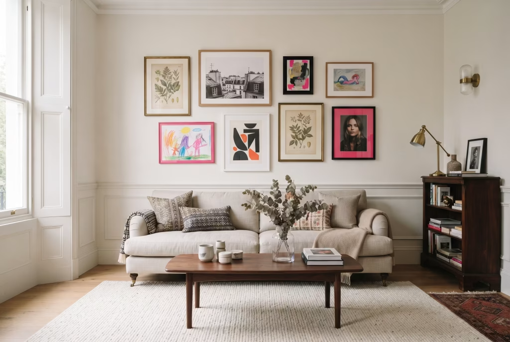
3. Use hot pink as the connective thread in an eclectic gallery wall. Frame a mix of prints, photography, and small artworks, then let one or two pieces carry the hot pink through mats, frames, or the artwork itself. It ties a busy wall together without needing paint at all, which suits rented properties particularly well. A gallery wall is also one of the few design elements in a home that tends to be genuinely personal, holiday photographs, a print bought on a trip, a child’s artwork, so introducing hot pink here rather than through paint often feels more like self-expression than decoration, and guests respond to that authenticity even if they couldn’t say why. Aim for odd numbers of frames (five, seven, or nine) and keep a consistent two to three inch gap between each piece for a result that reads as curated rather than cluttered.
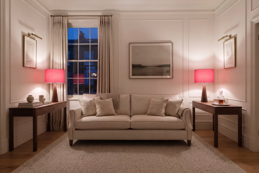
4. Bring it in through a set of lampshades instead of the walls. Two matching hot pink lampshades on console or side tables introduce the colour at eye level, where it catches attention every time a lamp is switched on, without the commitment of paint. This is the easiest starting point for anyone still testing whether they can live with the colour long term. There’s also a lighting-specific psychological effect at play: light passing through a hot pink shade takes on a warm, flattering glow that softens skin tones and makes a room feel more intimate the moment the lamp is switched on at dusk, which is part of why boutique hotels lean so heavily on coloured shades in their lobbies and lounges. A cotton or silk shade will diffuse the colour more gently than a stiff card shade, which tends to throw a harder, more graphic pink light.
Bedroom
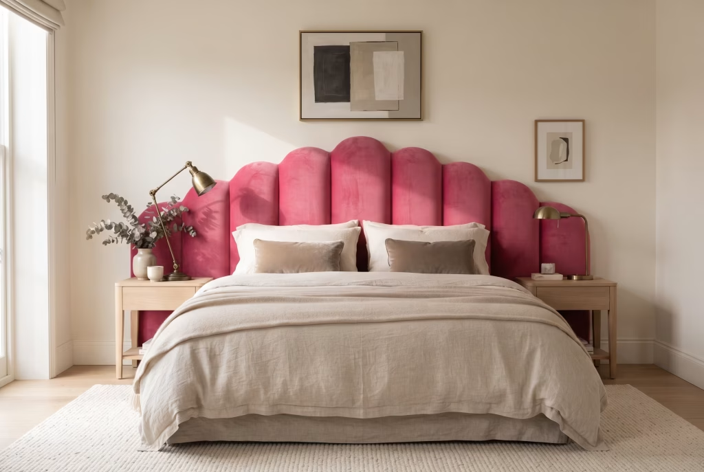
5. Choose a velvet headboard over painted walls for a softer first step. Velvet diffuses light in a way flat paint can’t, so a hot pink headboard tends to read as rich and cosseting rather than loud, particularly against white or oatmeal bedding. It’s also the easiest element to change your mind about later, since it doesn’t involve redecorating an entire wall. The tactile quality matters here almost as much as the colour: touch is one of the fastest routes to a feeling of comfort and safety, and a deep-pile velvet headboard invites the hand to rest against it in a way a painted wall simply can’t, reinforcing the bedroom’s job as the one room in the house built entirely around rest. Look for a channel-tufted or scalloped shape if you want the headboard to read as a genuine piece of furniture design rather than a flat panel.
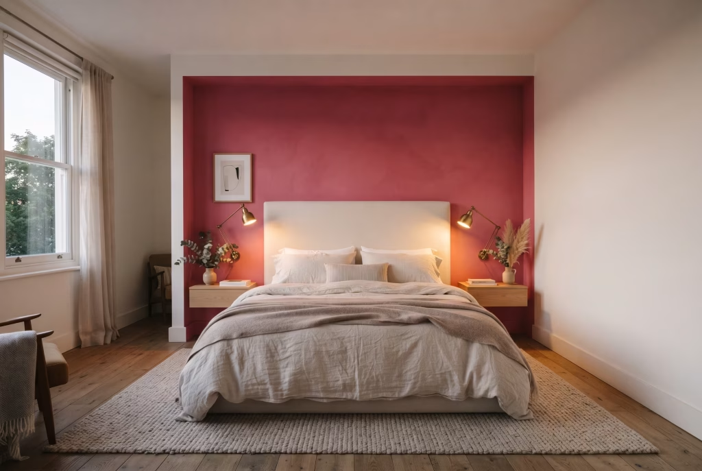
6. Reserve full pink walls for the wall behind the headboard only. If you do want paint, treat the headboard wall as a feature rather than painting all four walls. Sleep quality research consistently points to calmer, less saturated colours for rest, so containing the intensity to one wall lets you enjoy the drama during the day while keeping the room from feeling overstimulating at night. The psychology of a single feature wall in a bedroom also plays on containment: the colour surrounds you as you fall asleep, framing the headboard the way a stage set frames an actor, but it doesn’t surround you on every side, which avoids the slightly closed-in feeling a fully saturated bedroom can produce, especially for anyone prone to a racing mind at bedtime. Dim the room’s lighting to warm white in the evening and the same wall will noticeably calm in tone compared with how it reads under daylight.
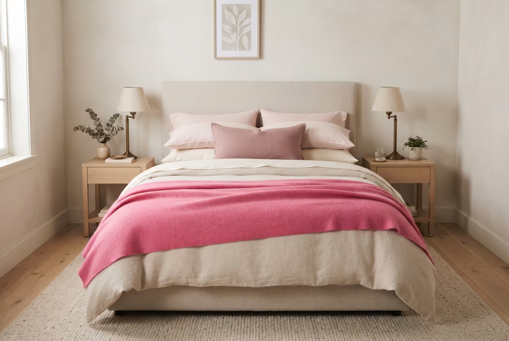
7. Layer three shades of pink through the bedding rather than one flat block. A hot pink throw, a blush pillowcase, and a dusty rose cushion together read as intentional layering rather than a single loud note. This is a trick borrowed directly from how stylists dress a shoot, and it works just as well in a real bedroom. Layering tonal shades rather than a single flat colour also mirrors how comfort is experienced physically, in gradients rather than blocks, so a bed dressed this way tends to look and feel more inviting to climb into, almost like the eye reads the softness before the hand ever touches it. Stick to natural fibres (linen, brushed cotton, or a wool-blend throw) across all three layers so the sheen level stays consistent and no single piece looks synthetic against the others.
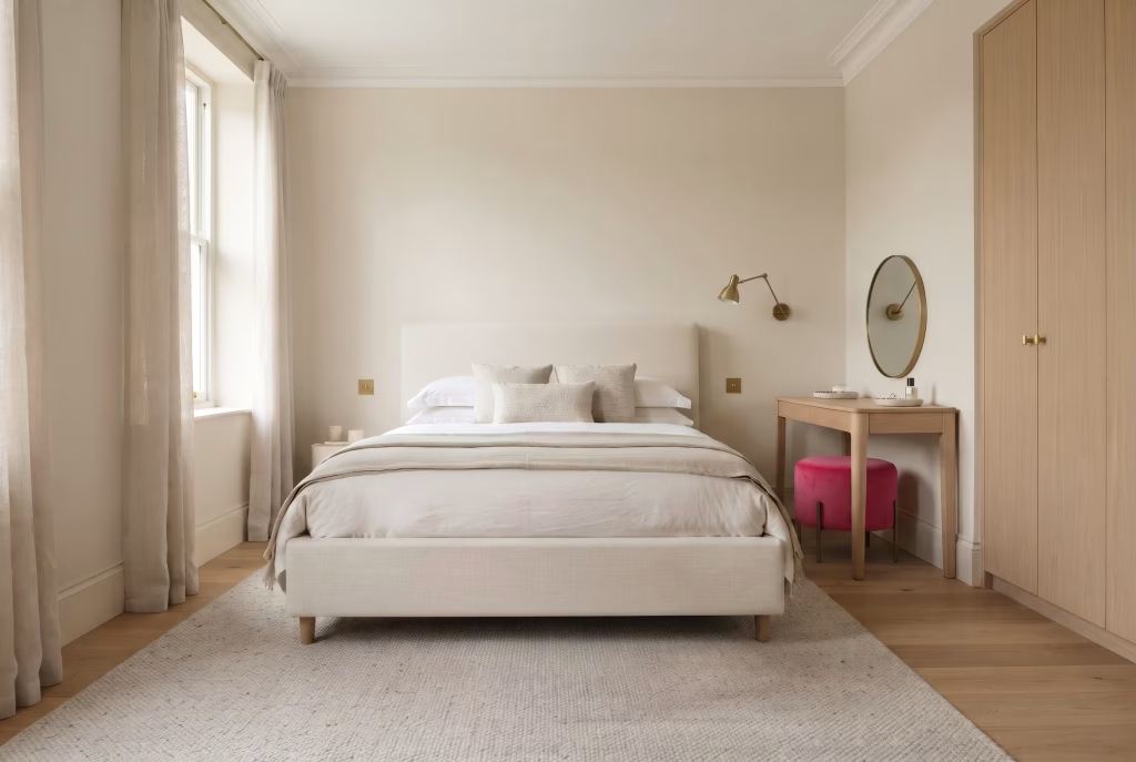
8. Introduce a hot pink dressing chair or stool as the sole furniture accent. A small upholstered stool at the end of the bed or beside a dressing table brings colour in without competing with the headboard or the bedding for attention. Keep everything else in the room, including the wardrobe and flooring, in its natural or neutral state. A dressing chair or stool is also, psychologically, associated with ritual, the few quiet minutes spent getting ready each morning, and giving that piece of furniture a colour you genuinely love can turn a routine task into a small daily pleasure rather than a chore performed on autopilot. A velvet or bouclé seat pad roughly 40cm in diameter is the most forgiving size for a bedroom stool, large enough to feel substantial without overwhelming a dressing table corner.
You May also Like: Nancy Meyers Style: The Ultimate Guide to Getting the Look in Every Room
Kitchen
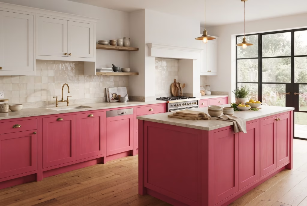
9. Paint lower cabinetry in hot pink and leave the uppers white. Two-tone kitchens have staying power precisely because they let a bold colour live at counter height rather than overhead, where it can feel oppressive. A hot pink base run with white wall units and a stone or butcher block worktop keeps the palette grounded. Kitchens are inherently social, high-energy spaces, the room where a household actually gathers day to day, and colour psychology consistently links warm, saturated tones at eye and hand level to increased appetite and conversation, which is part of why so many restaurants use pink and red in their dining areas. Choose a hard-wearing eggshell or fully cured cabinet paint (rather than standard wall emulsion) for the lower run, since it will take considerably more daily contact than a wall.
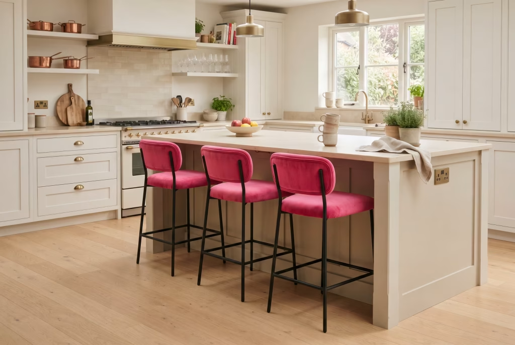
10. Choose hot pink bar stools for an island or breakfast bar. Stools are low-commitment, easy to swap, and sit at a scale that reads as playful rather than dominant. Two or three in a row against a neutral island front is one of the fastest ways to update a kitchen without touching a single cabinet. Because stools are pulled out and sat on rather than simply looked at, they carry a slightly different emotional register to wall colour, they feel like an invitation to linger over a coffee rather than a backdrop, which is exactly the mood most people want at a breakfast bar. Velvet or leatherette seat pads wipe clean far more easily than boucle in a kitchen setting, worth factoring in if the stools will see daily use.
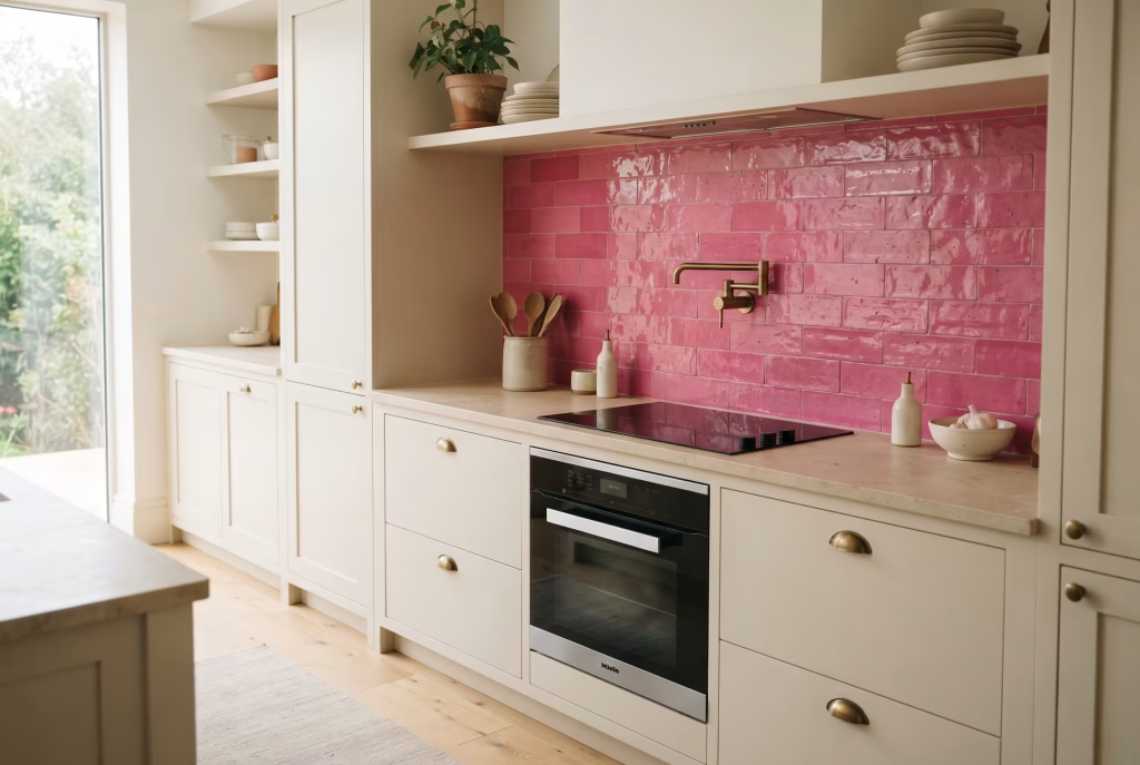
11. Bring the colour in through a splashback tile in a considered pattern. A hand-glazed or zellige-style tile in hot pink behind the hob or sink adds texture as well as colour, and the slight variation in glaze from tile to tile stops a small area from reading as flat or plasticky. The handmade irregularity of a zellige tile also carries a psychological warmth that a uniform, machine-printed tile can’t replicate, each tile catches the light slightly differently, so the wall seems to shift and breathe rather than sitting static, which keeps a small feature area visually interesting over years of daily use rather than becoming wallpaper you stop noticing. Budget roughly 15 to 20 per cent more tile than your measured area to allow for the natural variation and cutting waste that comes with handmade product.
Bathroom
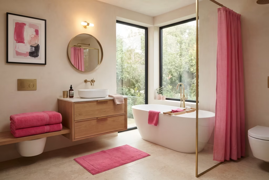
12. Keep sanitaryware white and let accessories carry the pink. Coloured baths and basins are a serious, expensive commitment. Towels, a bath mat, a shower curtain, and a single piece of framed art give you the same visual lift with none of the risk, and they’re trivially easy to change out in a few years’ time. Bathrooms are one of the few rooms in a home built entirely around self-care, and a considered hit of hot pink here, in a towel you reach for after a bath, in particular, taps into that same association pink carries with warmth and comfort, turning a purely functional room into one that feels a little more indulgent each time you use it. Choose towels in a combed cotton with a weight of at least 600gsm for the fullest, most saturated colour depth and the softest hand-feel.
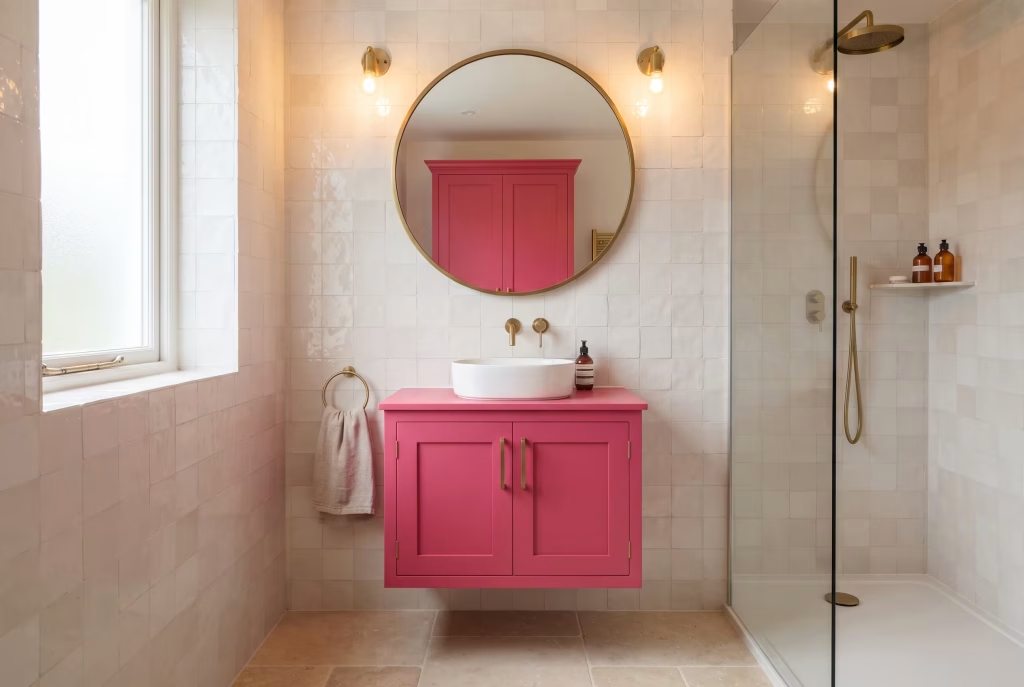
13. Paint the vanity unit rather than the walls in a small bathroom. Small bathrooms lose light quickly if every surface is saturated. Painting just the vanity in hot pink, with the walls left in a soft white or pale tile, keeps the room feeling open while still giving you a genuine hit of personality at sink height. There’s a particular psychological lift to seeing colour reflected back at you in a bathroom mirror each morning, it’s one of the first things registered on waking, and a confident colour choice at that exact sightline has been anecdotally linked by several UK interior designers to a more positive start to the day than an entirely white, clinical scheme. A satin or eggshell finish (rather than full gloss) on the vanity will resist the humidity and daily splashing of a bathroom far better than a standard wall paint.
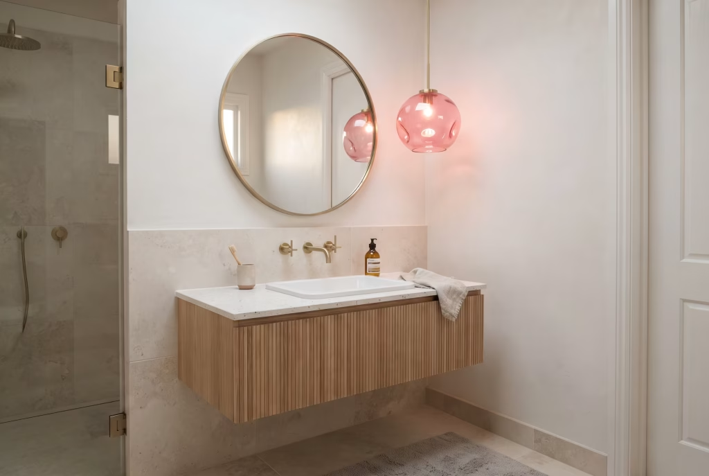
14. Use a pink pendant or wall light as a jewellery moment. A single statement light fixture in glass or ceramic, coloured or tinted hot pink, catches the eye without covering any real surface area, which makes it one of the lowest-risk ways to bring the shade into a room that’s otherwise entirely tiled and neutral. Much like a piece of jewellery draws the eye to a single point rather than covering the whole outfit, a coloured pendant light works as a moment of surprise and delight in what’s often the smallest and most overlooked room in a house, and that sense of a small discovered detail tends to leave a disproportionately warm impression on anyone using the room, including guests. Position the fixture at least 2.1 metres from the floor in a bathroom to keep it clear of splash zones and condensation.
You May also Like: 25 Dark Cottagecore Dining Room Ideas That Feel Intimate, Layered, and Lived-In
Dining Room
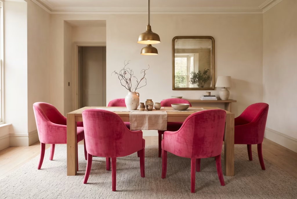
15. Upholster dining chairs in hot pink velvet against a pared-back table. A run of six chairs in the same fabric turns an ordinary dining table into the focal point of the room. Keep the table itself in raw or lightly stained wood, and the contrast between the warmth of the timber and the punch of the pink does most of the styling work on its own. Dining rooms are where a household’s most memorable conversations tend to happen, birthdays, Sunday lunches, difficult decisions talked through over a meal, and a colour linked to warmth and sociability surrounding the table reinforces that emotional function of the room rather than fighting against it. A performance velvet or a wool-mix upholstery will resist spills and everyday wear considerably better than a pure silk velvet in a room where food and wine are involved.
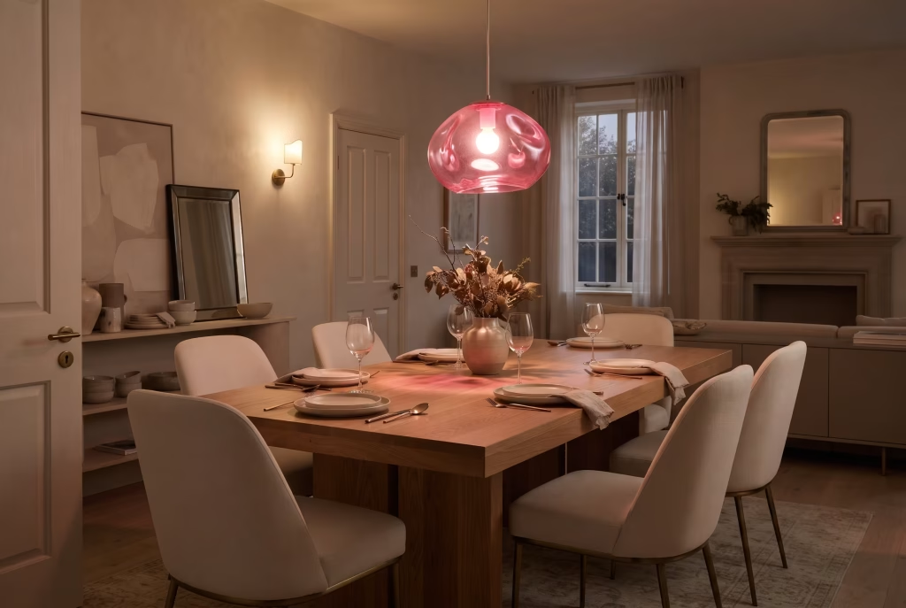
16. Choose a hot pink pendant light as the room’s centrepiece. Dining rooms are usually seen in the evening, under artificial light, which is exactly when a saturated colour like hot pink glows rather than shouts. A single striking pendant over the table gives you drama that switches off when you want it to. Overhead lighting also has an outsized psychological effect on how a shared meal feels, a warm, glowing pink fixture softens faces and flatters skin tones in a way cool white downlights never will, which is part of why so many well-regarded restaurants favour warm, coloured, or amber-toned pendant lighting over their tables. Hang the pendant roughly 75 to 90cm above the table surface for the most flattering pool of light without obstructing sightlines across the table.
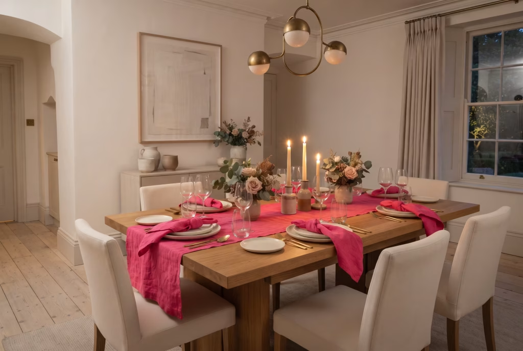
17. Layer table linen in hot pink for entertaining, then remove it for daily use. A hot pink table runner or set of napkins is the single most flexible idea on this list. It lets you commit to the colour for a dinner party or a special occasion and put it away the rest of the time, which suits anyone still nervous about permanence. There’s a genuine psychological ritual at play in the act of dressing a table for guests, laying out linen you reserve for special occasions signals to everyone at the table, including yourself, that the meal matters, and a confident colour like hot pink amplifies that sense of occasion far more than a safe white cloth ever could. Choose a linen or linen-cotton blend rather than pure cotton, since it holds its shape and colour saturation better through repeated washing.
Home Office
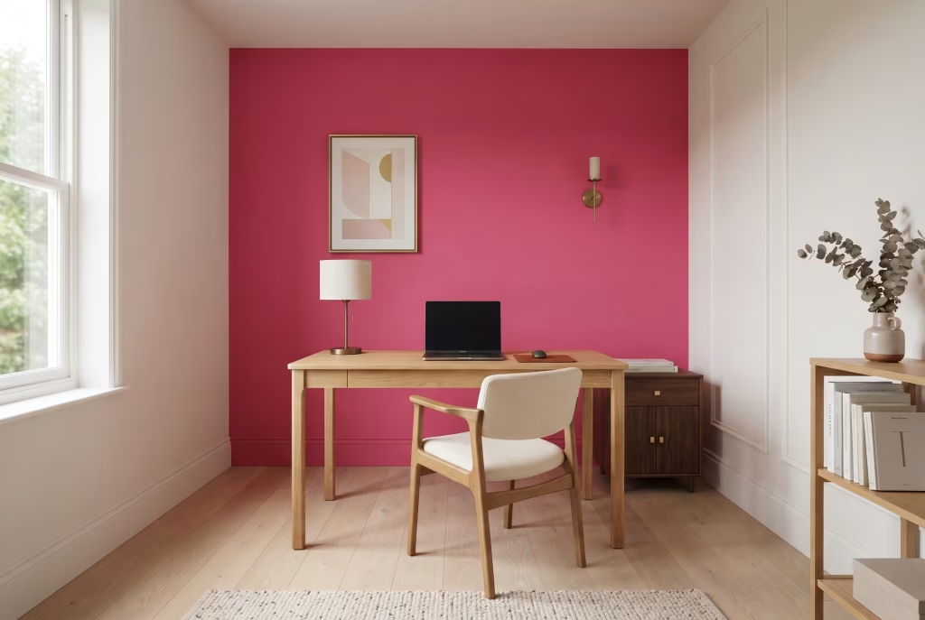
18. Paint a single wall behind the desk to sharpen focus during video calls. A hot pink accent wall directly behind where you sit on camera reads as confident and considered on screen, and it gives the eye somewhere to land during long stretches of concentrated work, rather than fading into beige the way most home offices do. There’s a genuine cognitive argument for this beyond aesthetics: studies on colour and productivity suggest that warmer, more energising hues in a peripheral rather than direct sightline can help sustain alertness during long working sessions, particularly in a home office where the boundary between work and rest can otherwise blur. Keep the desk surface and immediate work area neutral so the wall provides energy without becoming a visual distraction while you’re actually concentrating on a screen.
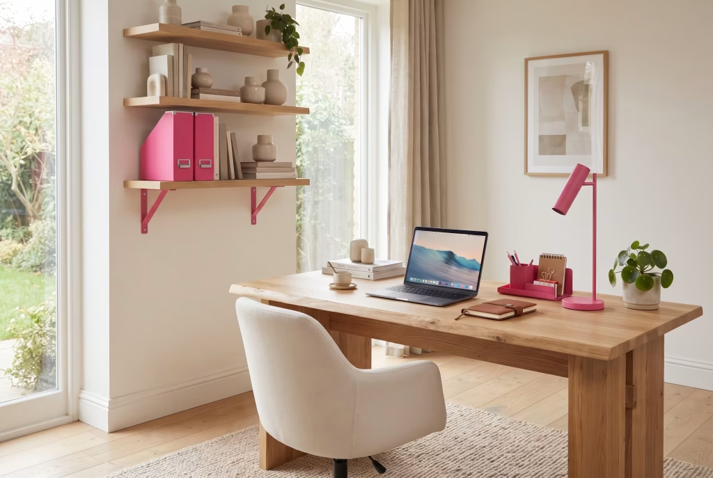
19. Choose hot pink storage and stationery for small, changeable hits of colour. Box files, a desk lamp, or a set of shelving brackets in hot pink bring energy to a workspace without requiring a single tin of paint. This is particularly useful in a shared or multi-purpose room where a full redecoration isn’t practical. Small, deliberately chosen objects like this also carry a quiet motivational function, a desk that includes even one object you find genuinely pleasing to look at has been shown in workplace psychology research to be associated with higher reported job satisfaction than an entirely utilitarian setup, even when the work itself hasn’t changed. Powder-coated metal storage in hot pink will hold its colour and finish considerably longer under daily handling than a painted or laminated equivalent.
You May also Like: California Coastal Interior Design: The Complete Guide to Getting the Look Right
Entryway and Hallway
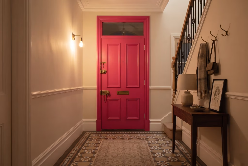
20. Paint the front door hot pink from the inside for a private surprise. A pink front door on a period terrace can be a step too far for some streets or freeholds, but painting the interior face of the same door lets you enjoy the colour every time you leave or come home, with none of the kerbside commitment. The psychological weight of a front door shouldn’t be underestimated, it’s the literal threshold between the outside world and home, and a warm, confident colour on the inside face has a genuinely welcoming effect each time it’s the first thing you see stepping in from a long day, a small but consistent moment of homecoming. A durable, hard-wearing door paint rather than standard wall emulsion is essential here, given how much daily contact and weather exposure that surface takes.
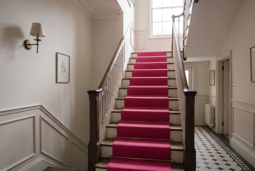
21. Use a runner or stair carpet in hot pink to draw the eye upward. Hallways and staircases are transitional spaces, seen for seconds at a time, which makes them ideal for a bolder colour choice than you might risk in a room you sit in for hours. A hot pink stair runner against neutral walls and skirting adds real personality to what’s usually the most overlooked part of a house. Because a staircase is a space of movement rather than rest, a bold colour underfoot here tends to register as energising rather than overwhelming, quite different from how the same saturation would feel on a wall you’re sitting opposite for an entire evening, which is why designers will often take colour risks on stairs and hallways that they’d hesitate to take in a living room. A wool or wool-blend runner in a tight weave will wear considerably better underfoot than a synthetic equivalent on a well-used staircase.
Children’s Room
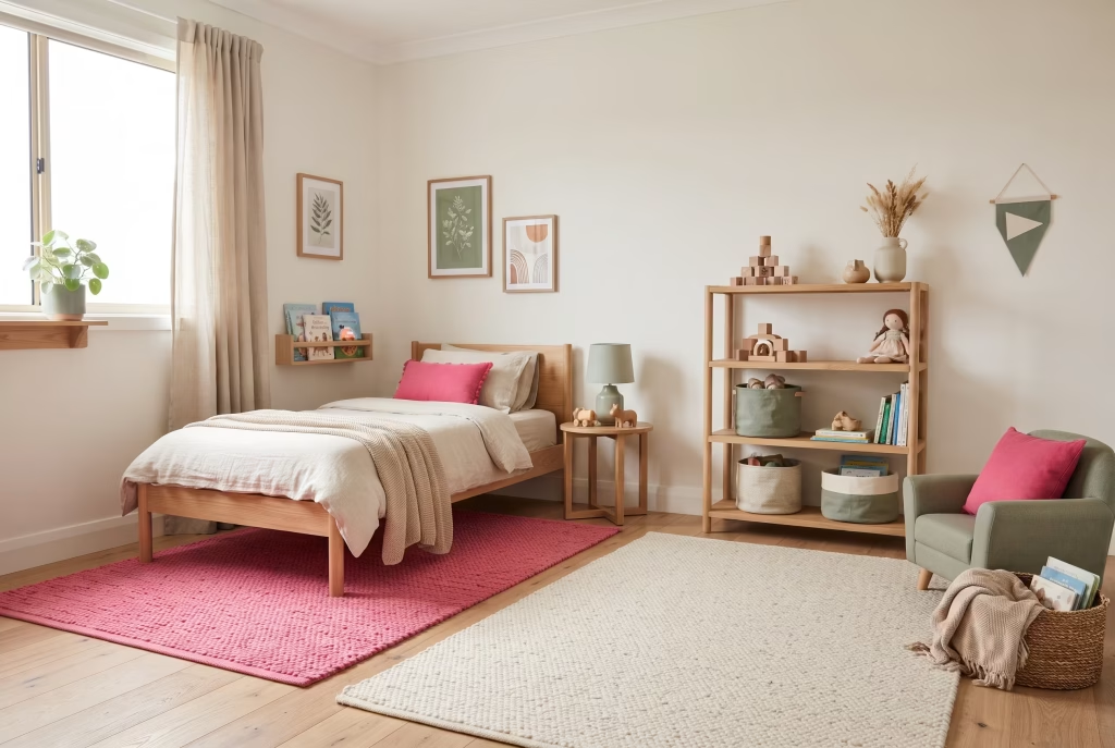
22. Choose hot pink as an accent rather than the room’s dominant colour. Children’s tastes change quickly, so treating hot pink as one element among several, such as a rug, curtains, or a single piece of furniture, means the room can evolve without a full repaint every couple of years. Child development research has associated brighter, warmer colours with increased energy and engagement in play, which makes hot pink a genuinely useful accent in a space meant for activity and imagination, provided it’s balanced with calmer tones in the areas meant for winding down and sleep. A washable rug or removable curtain is the most practical way to let a child’s own preferences evolve the room over time without a repaint.
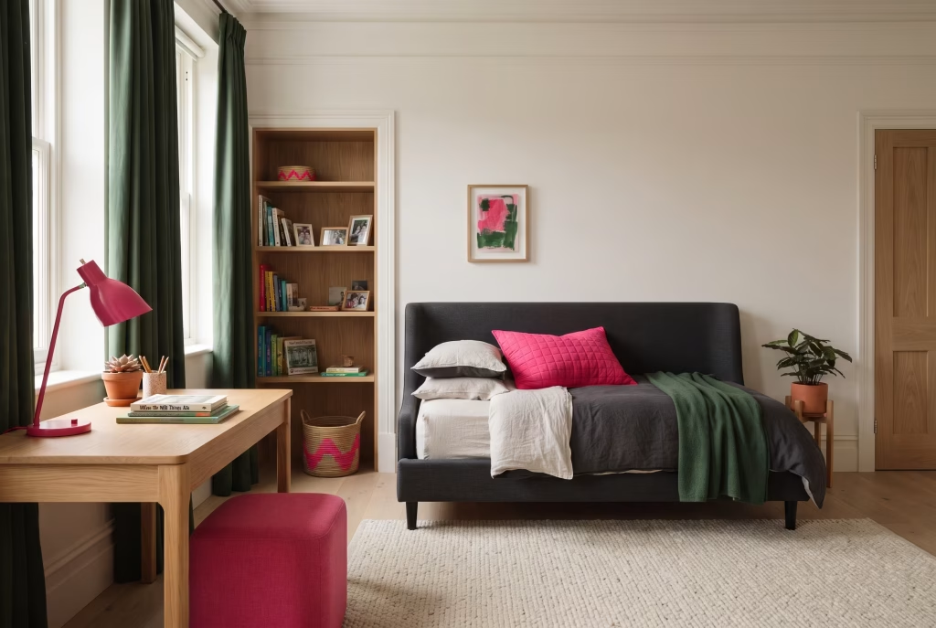
23. Pair hot pink with a mature, tonal palette to avoid it reading as babyish. Hot pink against charcoal, forest green, or warm terracotta feels current and sophisticated rather than saccharine, and it’s a palette that will comfortably see a child through from primary school into their teenage years without feeling outgrown. This pairing also has a subtle emotional benefit for the child themselves: a room that doesn’t read as overtly “for a small child” tends to be one they feel proud of and want to keep tidy and show friends, rather than one they outgrow and start resenting by the time they’re eight or nine. Choose fixed, larger elements (curtains, a rug, a bed frame) in the tonal neutral, and reserve the hot pink for smaller, easily replaced accessories as the child’s own tastes develop.
You May also Like: 15 Mid-Century Modern Garden Ideas to Transform Your Outdoor Space
Outdoor and Garden Rooms
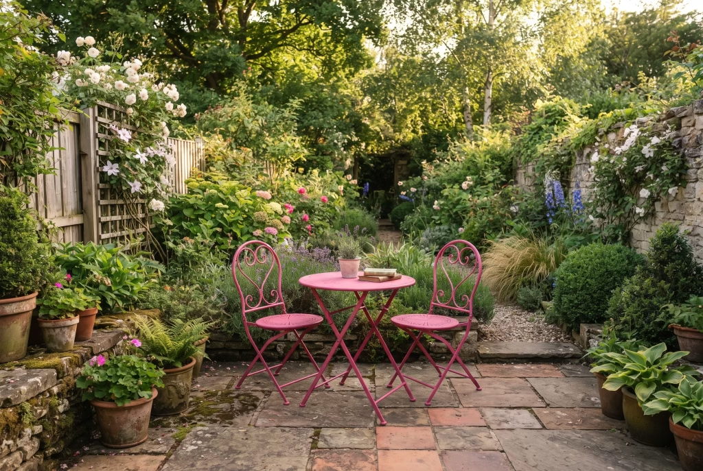
24. Paint garden furniture or a shed door in an exterior-grade hot pink. Outdoor spaces can carry far more saturation than interiors, since they’re seen against green foliage and open sky rather than four close walls. A hot pink bistro set or shed door becomes a genuine focal point in a garden that might otherwise rely entirely on planting for colour. There’s a particular joy attached to colour used outdoors that differs from indoor decoration, gardens are associated with leisure and escape rather than routine, so a playful, confident colour choice here tends to be read as fun and expressive rather than risky in the way the same shade might feel inside a formal sitting room. Always use a specific exterior or masonry-grade paint rather than an interior formula, since standard emulsion will fail quickly against UK weather.
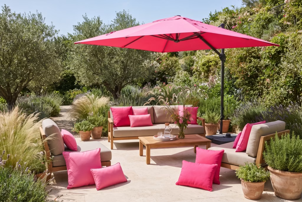
25. Use hot pink cushions and parasols to update outdoor seating each season. Outdoor textiles are the easiest and cheapest way to test hot pink before committing to anything more permanent. Swap them out at the end of summer, and you’ve had all the benefit of the colour with none of the long-term risk. Seasonal changeover of soft furnishings also gives a garden a genuine sense of anticipation each year, putting the pink cushions and parasol back out at the first warm weekend has become, for many households, a small ritual that marks the actual start of summer, which is a psychological benefit no permanent paint colour can quite replicate. Choose fade-resistant, solution-dyed outdoor fabric (rather than printed indoor fabric repurposed outside) to keep the colour from bleaching out by midsummer.
Best Colour Combinations for Hot Pink
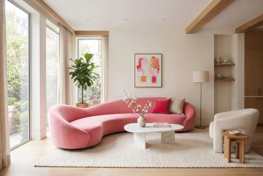
Hot pink and white gives the cleanest, most versatile result, and it’s the safest starting point in any room where you’re still finding your confidence with the colour. Psychologically, white reads as clarity and calm, so it tempers hot pink’s energy without dulling it, which is why this pairing is so often the first one people reach for.
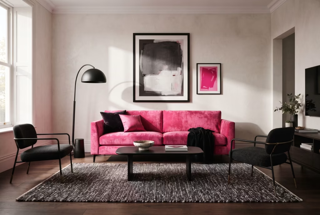
Hot pink and black creates real contrast and reads as considerably more grown-up than pink on its own, which is why so many designer schemes lean on it for living rooms and dining rooms. The gravity of black grounds the playfulness of pink, producing a combination that feels confident and a little theatrical rather than sweet.
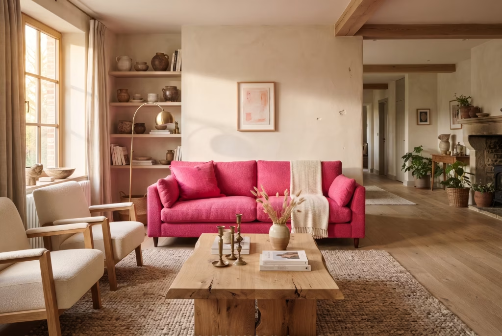
Hot pink and warm wood tones, particularly oak and walnut, soften the intensity of the colour and stop a scheme from feeling cold or overly graphic. Wood introduces a sense of nature and permanence that balances hot pink’s more synthetic, high-energy character, and the pairing tends to feel warm and lived-in rather than showroom-perfect.
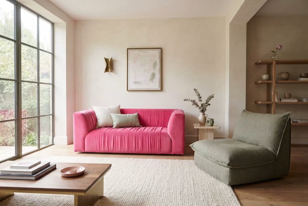
Hot pink and sage or forest green borrows from the same colour-wheel logic as red and green, offering genuine contrast without the clash that pink and true red can sometimes produce. Green is consistently linked in colour psychology to calm and restoration, which makes this one of the more soothing ways to use a high-energy pink.
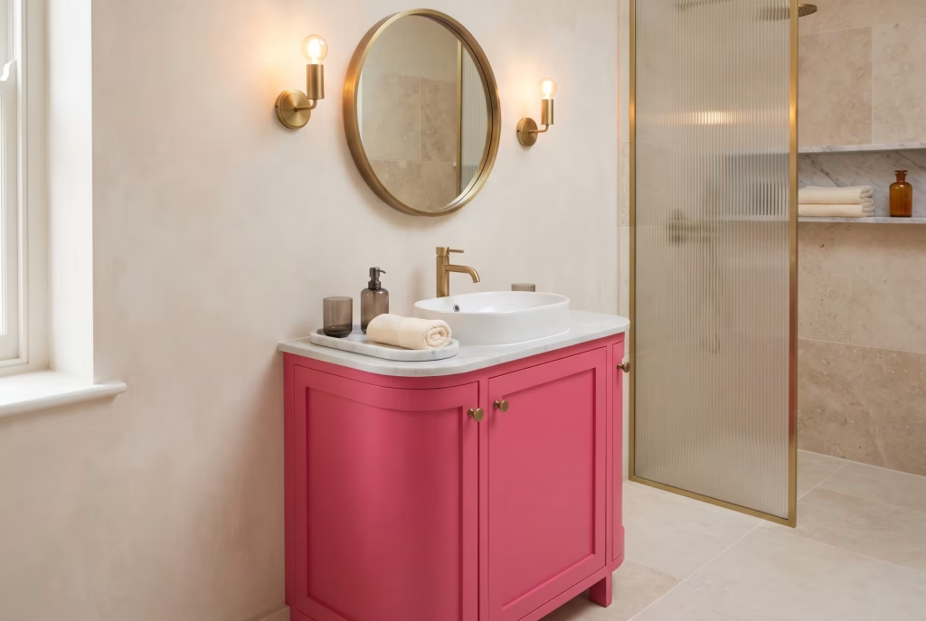
Hot pink and brass or gold leans into glamour and works particularly well in bathrooms, dressing rooms, and dining spaces where a little shine is welcome. Metallics catch and reflect light, amplifying the sense of occasion that hot pink already carries.
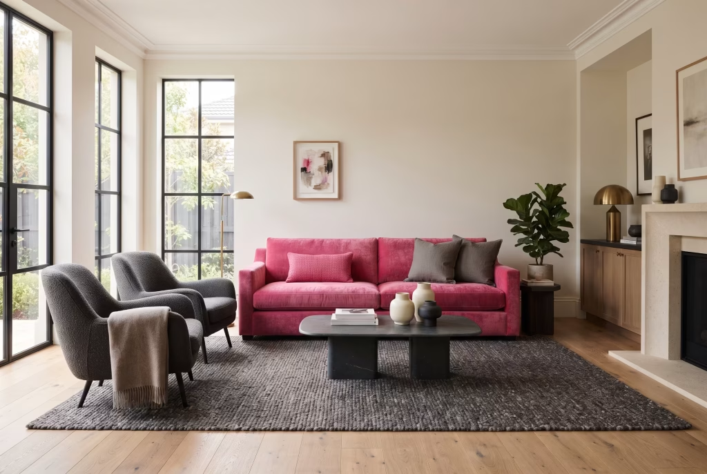
Hot pink and charcoal grey is the most forgiving neutral pairing of the lot, flattering almost every undertone of hot pink and working equally well in period and contemporary properties. Grey is the quiet, dependable partner in this combination, letting pink do all the emotional heavy lifting.
Mistakes to Avoid With Hot Pink
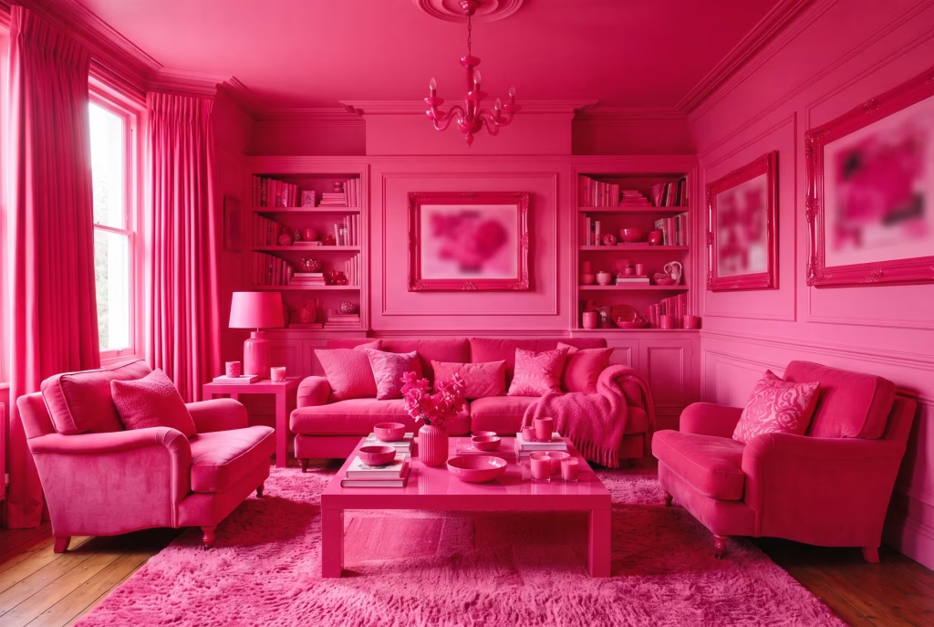
Using it on every surface in the room. Walls, furniture, and accessories all in the same saturated pink leaves nowhere for the eye to rest, and a scheme without a resting point quickly becomes exhausting to live in rather than exciting to look at, a phenomenon designers sometimes describe as colour fatigue, where a shade you initially loved starts to feel oppressive simply through sheer overexposure.
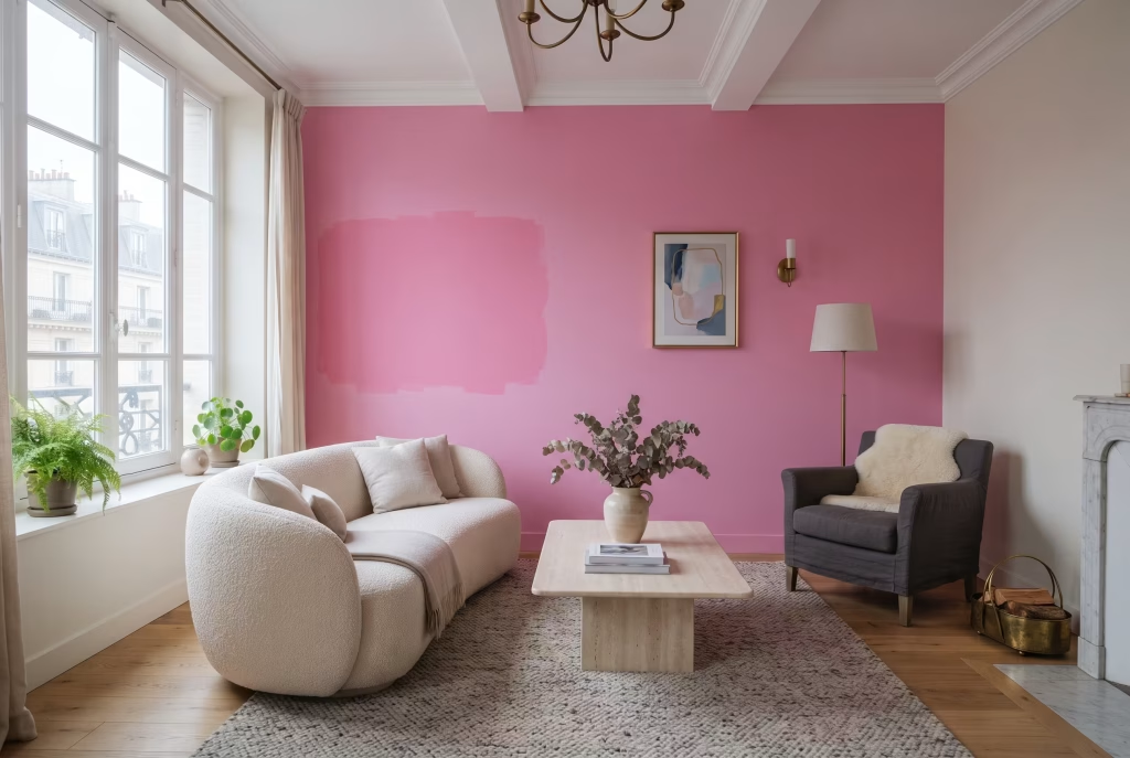
Ignoring the direction your room faces. A cool-toned hot pink in a north-facing room with limited natural light can feel flat and slightly grey rather than vibrant, so test your chosen shade on the actual wall, at the actual time of day you use the room most, before committing to a full tin.
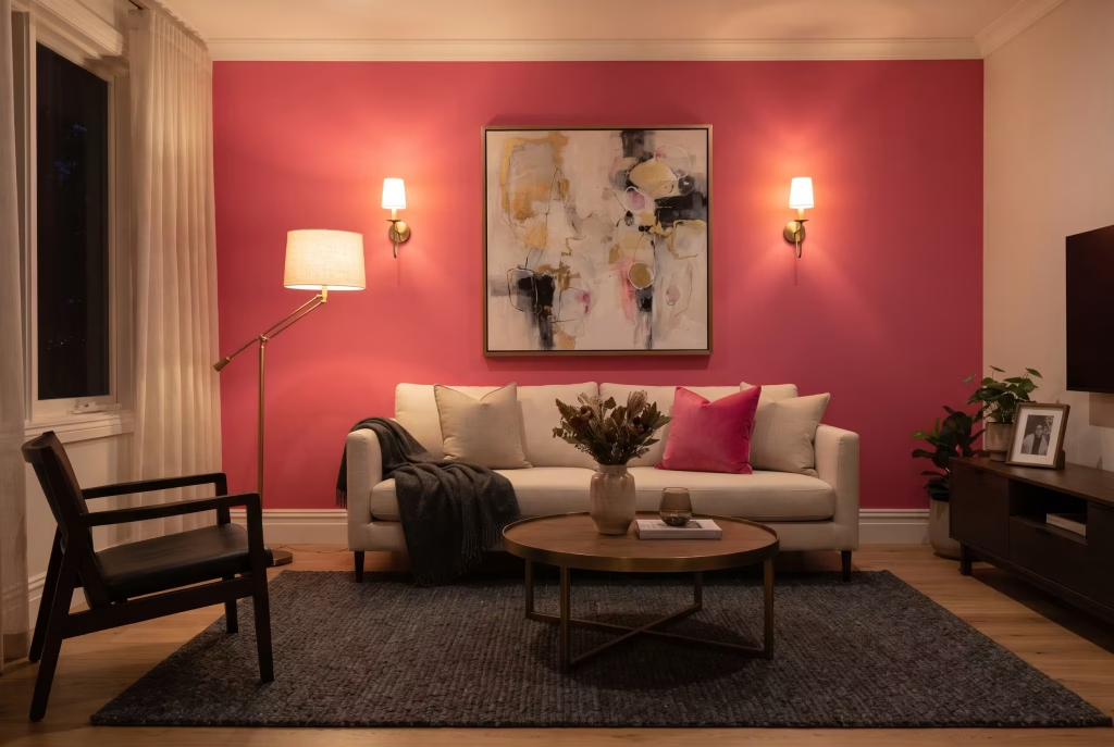
Pairing it with cool white LED lighting. Harsh, blue-white bulbs make hot pink feel synthetic and can tip it toward the exact “childish” territory most people are trying to avoid. Warm white bulbs, around 2700K, are far more flattering, and the emotional difference between the two is genuinely striking once you see the same wall under both.
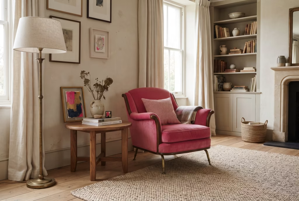
Treating it as a trend rather than a colour choice. Hot pink has moved in and out of fashion for decades, but a well-considered scheme, chosen because it suits the room’s light and your own taste, will outlast any single season’s trend cycle far better than one chosen purely because it’s currently popular. Colour chosen for personal meaning tends to age far better emotionally than colour chosen to chase a moment.
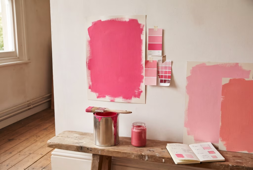
Skipping a sample test entirely. Paint charts and screens both distort colour. A hot pink that looks perfect on a swatch can read two shades brighter once it covers an entire wall, so a proper A2-sized sample, viewed morning, afternoon, and evening, is worth the extra week it takes, and it will save you from the very real disappointment of a colour that looked right in the tin but wrong on the wall.
Final Thoughts
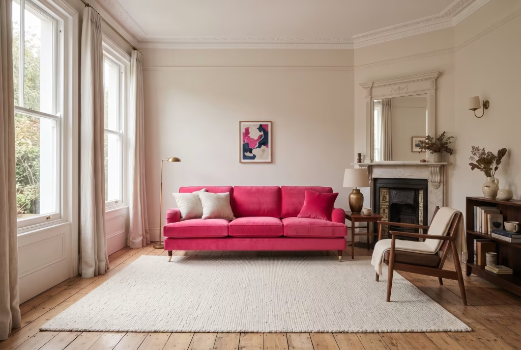
Hot pink rewards confidence more than caution, but it rewards restraint even more. The rooms that carry it best, whether that’s a single velvet sofa, a painted chimney breast, or a run of dining chairs, all share the same underlying logic: one considered moment of pink, set against a generous neutral base, echoed once or twice elsewhere in the room. Follow that principle and the colour behaves itself in almost any setting, from a Victorian terrace to a new-build flat.
What the 70-20-10 rule and the room-by-room detail above can’t fully capture, though, is why hot pink is worth the effort in the first place. Most colour choices in a home are made defensively, a safe grey because it won’t offend a future buyer, a neutral sofa because it goes with everything.
Hot pink asks something different of you. It asks you to decide what you actually want a room to feel like, not just how you want it to look in a photograph, and then to commit to that feeling with a single confident gesture rather than diluting it across a dozen half-measures. That’s a more honest way to decorate, and it tends to produce rooms people remember rather than rooms people simply pass through.
The psychology running underneath every idea in this guide comes back to the same handful of truths. Contained doses of a strong colour give the eye somewhere to rest and the brain a clear focal point, which is why restraint reads as confidence rather than caution. Context changes meaning, so the same shade that energises a kitchen needs to be handled more gently in a bedroom built for rest.
And light, more than any paint chart, decides how a colour actually behaves in your home, which is why a proper sample tested morning, afternoon, and evening will always tell you more than a swatch held up in a shop.
Start small if you need to. A pair of lampshades, a stack of outdoor cushions, a single dressing stool, any of these will tell you within a fortnight whether hot pink is a colour you want to live with more permanently.
If it is, move toward the wall, the sofa, or the chimney breast with the same rule guiding you throughout: one bold gesture, a generous neutral base, and a colour echoed just enough to feel intentional rather than accidental. Do that, in whichever room you’re working with, and hot pink stops being a risk and becomes one of the most useful, and most genuinely joyful, colours in your entire scheme.
Frequently Asked Questions
Is hot pink a good colour for interior design in 2026?
Yes. Hot pink has moved well beyond its association with children’s rooms and is now used confidently in living rooms, kitchens, and dining spaces, particularly when balanced against neutrals and paired with materials like velvet, brass, or dark wood.
Does hot pink work in small rooms?
It can, provided it’s used with intention. Concentrating hot pink on a single wall, a piece of furniture, or accessories, rather than covering every surface, keeps a small room from feeling closed in, while a feature wall can actually make a compact space feel more defined and characterful.
What colours pair best with hot pink?
White, black, charcoal grey, warm wood tones, sage green, and brass or gold all pair well with hot pink, each shifting the mood from clean and modern to warm, contrasted, or glamorous depending on the combination.
How do I stop a hot pink room from looking childish?
Pair the colour with mature, tonal neutrals rather than pastels, choose textured materials such as velvet, linen, or brass over glossy plastic finishes, and limit hot pink to one or two considered moments in the room rather than using it throughout.
Is hot pink suitable for a bedroom, given it’s a bright colour?
It can work well when contained to a single wall or a headboard rather than all four walls, since a full-room application of any saturated colour can feel overstimulating at bedtime. Layering it through soft furnishings alongside softer pinks is a gentler alternative.
Will a hot pink kitchen or bathroom affect resale value?
A hot pink accent, such as lower cabinetry, a splashback, or accessories, is unlikely to put off buyers and can even be a selling point, since it’s straightforward to repaint or replace. A hot pink bath or full-tile scheme in sanitaryware is a bigger commitment and worth thinking through if resale is a near-term concern.
Why does hot pink feel different in a bedroom compared with a kitchen?
Context changes how a colour is psychologically read. In a bedroom, associated with rest, hot pink is best used in small, contained doses so it doesn’t overstimulate. In a kitchen or dining room, associated with energy and sociability, the same colour can be used more generously, since it reinforces rather than fights against the room’s purpose.