15 Mid-Century Modern Garden Ideas to Transform Your Outdoor Space
There’s a house I keep coming back to in my mind, a low-slung 1960s architect’s own build tucked into the Sussex Downs, all Crittall glass and brick the colour of digestive biscuits. What struck me wasn’t the house at all.
It was the garden that leaned against it, unbothered by symmetry, where a gravel terrace slid straight into a sitting room with barely a threshold to mark where one stopped and the other began. Nobody had “landscaped” that garden in the fussy, borders-and-bedding-plants sense. It had simply been lived in, morning coffee and all, until the planting settled into place around the life happening on top of it.
That’s the whole trick of a mid-century modern garden, and it’s why the style refuses to go out of fashion no matter how many decades pass it by. These spaces were never designed to be admired from behind a window.
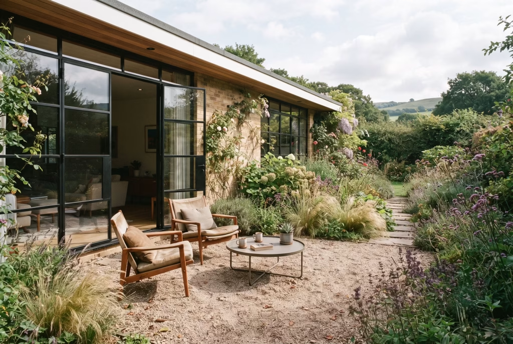
They were built to be walked on, sat in, and slightly untidied by real use. What follows are fifteen ideas pulled from exactly that kind of thinking, ideas that bend to suit a pocket-sized London terrace as readily as a sprawling plot, whatever the weather your postcode happens to throw at you.
What Makes a Garden Genuinely Mid-Century Modern
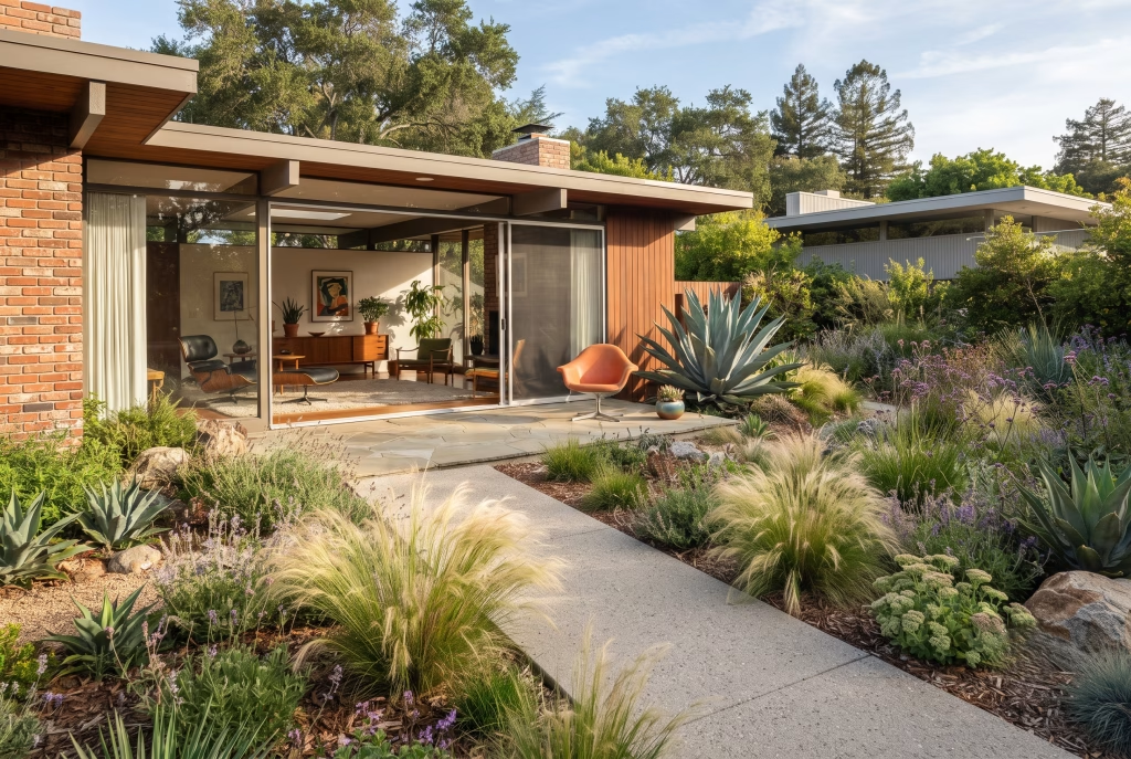
Every mid-century modern garden worth its salt is really an argument settled quietly on a patch of grass, and it helps to know what’s being argued before you borrow a single idea from it.
The first tension is structure against wildness. Post-war designers such as Thomas Church weren’t interested in taming nature into submission, nor were they happy to let it run riot. They wanted both at once, a poured-concrete path with hard, confident edges running straight through a stand of feathery grasses that couldn’t care less about staying in line. Get that balance wrong in either direction and the garden tips into something sterile or something scruffy. Get it right and it sings.
The second is the old chestnut of indoors versus out, though the era resolved it more thoroughly than any before or since. Sliding glass, matching floor materials, sightlines planned to the inch: the garden wasn’t an afterthought tacked onto the house, it was treated as another room, full stop.
The third, and the one most modern homeowners forget, is restraint against personality. These gardens were never bland. A single note of colour, a bit of retro furniture, a sculptural plant with more attitude than sense, these things were allowed to shine precisely because everything around them had been kept quiet enough to let them.
Keep those three threads in mind. Every idea that follows pulls on at least one of them.
Dissolve the Threshold Between House and Garden
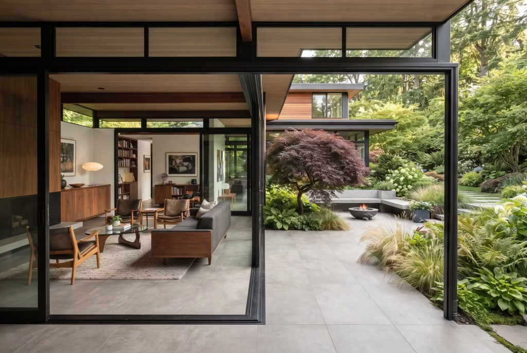
There’s a moment in almost every mid-century modern home I’ve worked on where a client stands at the back doors and says something like “I never sit out there.” Nine times out of ten, the problem isn’t the garden. It’s the door.
Sliding and glazed doors aren’t a nice-to-have in this style, they’re the whole hinge on which the design turns. A proper wide-track sliding door, or a run of Crittall-style glazing with slim steel frames, does something a hinged French door simply can’t: it lets the wall disappear.
Once that barrier is gone, the eye stops registering “inside” and “outside” as two separate rooms and starts reading the whole thing as one continuous space, which is precisely the trick that makes a modest garden feel twice its size.
Flooring is the quiet workhorse behind this. Carry the same material, or at least the same tone and format, from the kitchen or living room straight out onto the terrace, and the transition all but vanishes underfoot.
Large-format porcelain that mimics polished concrete indoors, laid in a matching or near-matching paver outside, does this job beautifully and copes far better with a British winter than natural limestone ever will.
Sightlines matter more than most people credit. Before committing to furniture or planting, stand at the spot where you’ll actually be seated indoors, the sofa, the kitchen island, wherever you linger, and look out. Whatever sits directly in that eyeline, a sculptural tree, a considered piece of furniture, a wall of planting, becomes the garden’s whole first impression. Get that one view right and the rest of the space follows its lead.
Let the Hardscape Do the Talking
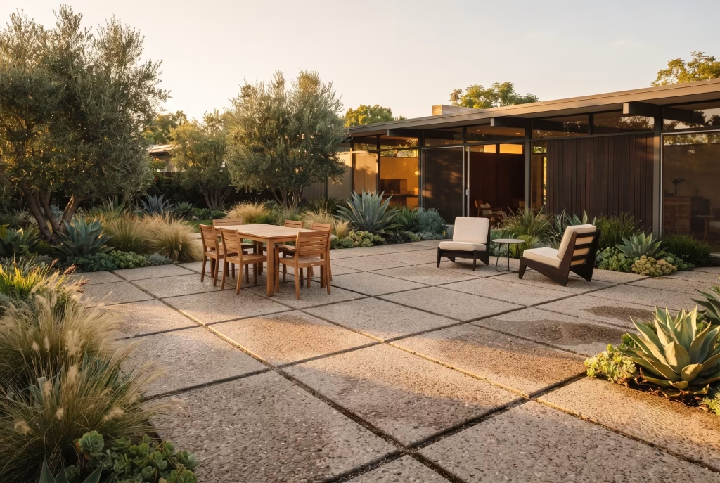
The material a garden sits on top of does most of the talking before a single plant gets a word in edgeways, and that’s precisely why I always start clients here rather than at the plant list.
Exposed aggregate concrete is the one I reach for most often. Ask a contractor to wash back the surface just enough to reveal the stone within, rather than leaving it smooth and flat, and you get texture underfoot that catches low evening light beautifully, a small detail that photographs poorly but lives wonderfully.
Board-formed concrete goes a step further for anyone building a retaining wall or raised bed, since the timber shuttering leaves a subtle grain pressed into the finished surface, a nod to carpentry that most passersby won’t consciously clock but will feel is right.
Large-format pavers, the kind that run 600mm or 900mm square rather than the fussy little slabs of a traditional patio, do the heavy lifting for that geometric, uncluttered look the era is known for.
Lay them in a simple grid or a running bond and resist the urge to mix in three different sizes, since mid-century hardscape earns its calm from repetition, not variety. A single, well-chosen paver laid with generous, consistent joints will always outshine a patchwork of leftover stone.
None of this needs to break the bank, either. Reclaimed concrete pavers, sourced through architectural salvage yards, carry the weathering and slight imperfection that new stone simply can’t fake, and they tend to cost a good deal less than a fresh order besides.
You May also Like: 25 Outdoor Area Ideas for Kids That Encourage Adventure, Creativity, and Outdoor Play
Build a Garden Room, Not a Garden
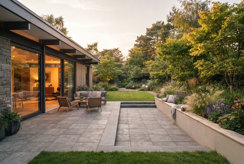
A garden doesn’t need a fence to feel like a room, and honestly, some of the most convincing outdoor spaces I’ve designed don’t have a single one in sight.
Mid-century designers worked out this trick decades before “open-plan living” became the property listing cliché it is today. Rather than chopping a garden into pieces with trellis and hedging, the way a Victorian garden might, they let a shift in level or a change of paving do the dividing instead.
Step down four inches from terrace to lawn and that lawn instantly reads as its own space, a separate scene, without a single upright barrier breaking the sightline across the whole plot. It’s a sleight of hand, really, borrowing the logic of an open-plan kitchen-diner and applying it to soil and stone.
Paving changes do similar work. Swap from a large-format paver on the seating terrace to a looser gravel or a softer bark path leading toward a planting bed, and you’ve marked out “dining zone” and “wandering zone” as clearly as any fence ever could, minus the visual clutter and the shadow it throws across your border. This matters more than it sounds for a typical UK garden, where plots tend to run narrow and every metre of width sacrificed to a boundary fence is a metre you’ll never get back.
A raised bed, low enough to double as informal seating, achieves the same end while earning its keep twice over. Build one at around 450mm high along one edge of a terrace and you’ve zoned the space, added planting height, and given six people somewhere to perch with a drink, all from a single structure that never once interrupts the view through to the garden beyond.
The Sunken or Raised Conversation Pit
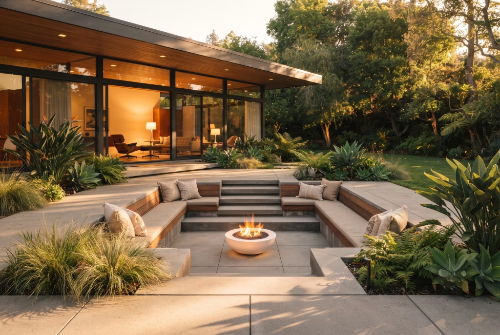
A conversation pit is the one idea in this whole piece that people either fall completely in love with or dismiss outright, and I understand both reactions. Get it right, though, and it becomes the single most-used spot in the entire garden.
The principle is simple: sink a seating area 300 to 450mm below the surrounding terrace, line the sides with built-in benches, and let the drop in level do what walls never could, wrapping the group inward without a single upright in sight.
A raised version works the same trick in reverse for a garden with poor natural drainage, lifting the seating deck rather than digging down, which sidesteps half the problems below in one move.
Drainage is where this idea lives or dies, and it’s the detail every inspiration photo conveniently leaves out. A sunken pit is, structurally speaking, a hole in the ground, and water has a habit of finding its way into holes.
A proper build needs a sub-base of compacted MOT type 1, a land drain running to a soakaway or existing drainage point, and a slight fall built into the floor itself so standing water has somewhere to go rather than somewhere to sit and rot your timber. Skip this step to save a weekend’s labour and you’ll be replacing waterlogged bench cushions by the following spring, guaranteed.
Safety and planning are worth a proper mention too, not just a footnote. Steps down into the pit need consistent risers, ideally no more than 170mm, since an uneven step is the sort of thing that catches out a guest after their second glass of wine.
As for planning permission, a conversation pit under 300mm deep with no permanent roof structure typically falls under permitted development for most UK homes, though anything deeper, anything close to a boundary, or any home in a conservation area is worth a quick call to your local planning office before the digger arrives. It’s a far cheaper phone call than a retrospective application.
Perforated Screens and Breeze Block Walls
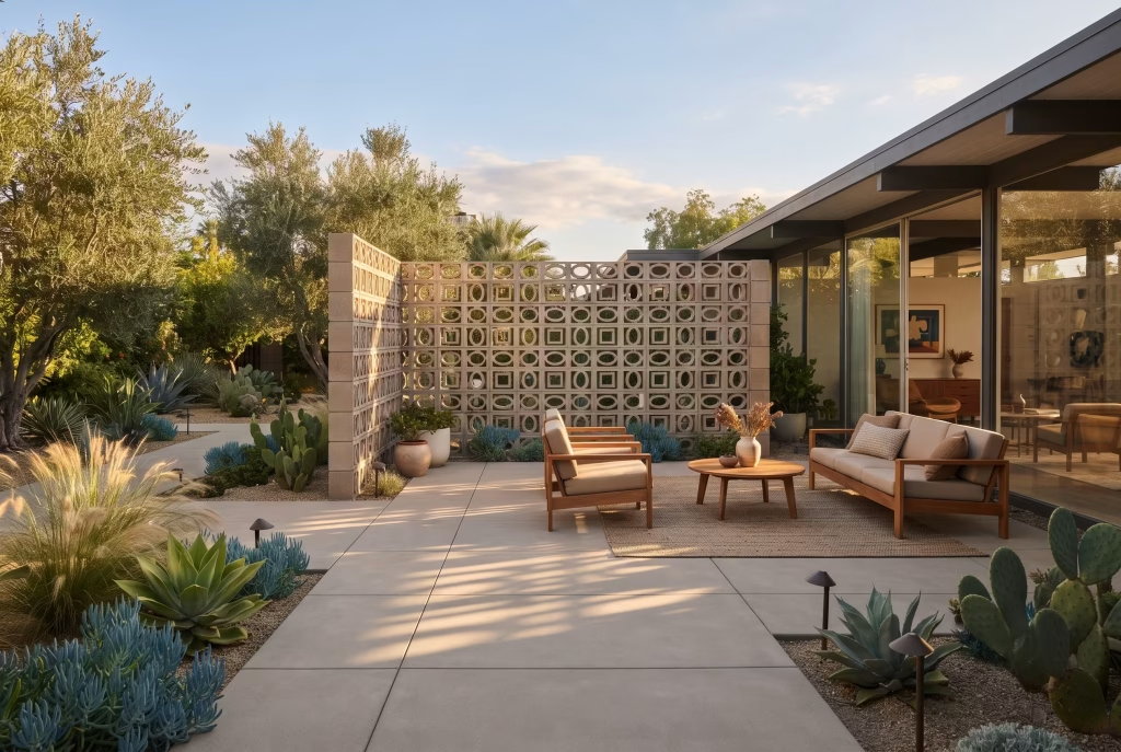
Breeze block gets a bad rap in this country, mostly because people remember it from a leaky garage extension rather than the sculptural, light-catching wall it can genuinely be. Used properly, it’s one of the most quietly clever materials the era left us.
The appeal is really about what happens to light and privacy at the same time. A solid brick or timber fence gives you privacy full stop, nothing more, nothing less. A perforated screen, whether that’s classic concrete breeze block or a slatted timber equivalent, gives you privacy and a constantly shifting pattern of shadow that moves across the terrace as the sun crosses the sky.
I’ve sat in gardens where the afternoon light through a breeze block wall throws a grid of soft ovals across the paving, and clients notice it every single time, usually before they’ve clocked anything else about the space.
For anyone weighing up DIY against buying it in, the honest answer depends on scale. A single low wall, up to around a metre high and a few metres long, is a genuinely achievable weekend project for someone comfortable mixing mortar, provided the foundation is properly set (a concrete strip footing, minimum 150mm deep, is non-negotiable here, whatever any online forum tells you).
Go taller or longer than that, particularly anything acting as a boundary or structural screen, and building regulations start to take a real interest, at which point a bricklayer who knows their vertical from their horizontal joints earns every penny.
Sourcing matters too. Reclaimed breeze block, increasingly available through architectural salvage yards and even some UK garden centres now stocking retro-style equivalents, carries a weathered, slightly irregular look that fresh-cast block can’t replicate no matter how it’s finished.
If budget allows only one splurge in the whole garden, this is often the wall worth spending it on, since it does the job of a fence, a piece of art, and a light fitting all in one.
A Courtyard or Atrium, However Small
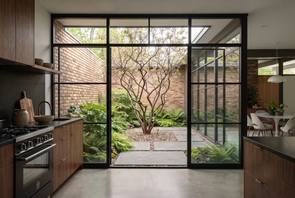
The Eichler homes of California made the atrium famous, an enclosed pocket of garden built right into the footprint of the house, open to the sky but sealed from the street on every side.
It’s the single most distinctive feature of the era and, frustratingly, the one that almost every roundup on this topic skips over entirely, probably because it doesn’t translate obviously to a British terrace. It does, though, once you stop thinking of it as a whole room and start thinking of it as a principle.
The idea, stripped back to its bones, is a garden that the house wraps around rather than merely faces. A UK side return, that awkward, often-wasted strip running down the side of a terraced or semi-detached house, is arguably a better canvas for this than a full American atrium ever was, precisely because it’s already enclosed on two or three sides by brick.
Glaze one end, lay a considered floor, add a single specimen plant with real presence, a multi-stem amelanchier or a well-placed olive in a large pot, and that dead strip becomes the view from your kitchen window rather than the bit you avoid looking at.
Light is the thing to solve first, before a single paver goes down. Most side returns and courtyard spaces sit in partial shade for a good part of the day, so the planting palette needs to lean toward shade-tolerant structural species:
fatsia japonica for that glossy, architectural leaf shape, ferns for texture at ground level, and a single upright tree or large shrub to give the eye somewhere to land. Skylights or a glazed roof section overhead, where the budget stretches to it, turn a merely functional side return into something closer to the real thing.
The pay-off, in my experience, is disproportionate to the space involved. A courtyard of just two or three square metres, glimpsed through a kitchen window or landing on a stairwell, does more for how a house feels day to day than a far larger, less considered garden ever manages. It’s the difference between a garden you visit and a garden you simply live alongside, glancing up from the washing-up to catch the light moving through it.
Furniture With a Point of View
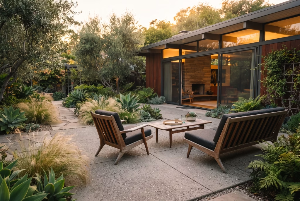
There’s a difference between garden furniture and mid-century furniture that happens to live outside, and clients feel it the moment they sit down, even if they couldn’t quite put their finger on why beforehand.
Teak is where this idea starts and, honestly, where it could quite happily end for most gardens. Properly sourced, FSC-certified teak silvers beautifully with age rather than rotting or warping the way softer woods do, and it needs nothing more than an occasional oiling if you want to keep that original honey tone rather than let it weather to grey.
Tapered legs are the visual signature to look for, that gentle narrowing toward the foot which reads as lighter and more considered than the thick, square-cut legs of a typical garden centre bench. Low-slung forms matter just as much: a lounge chair that sits closer to the ground changes how a whole terrace feels, encouraging people to linger rather than perch.
The vintage-versus-reproduction question comes up in nearly every consultation, and I never give a blanket answer, because it genuinely depends on what a client is after.
Original vintage pieces, sourced through auction houses or specialist dealers, carry a patina and a history no reproduction can fake, but they come at a price, and outdoor use accelerates wear on decades-old joinery in ways indoor use never would.
A well-made reproduction, from a maker who understands the proportions rather than merely approximating them, is often the more sensible choice for anything that’ll live outdoors year-round and take the brunt of a British summer’s unpredictable weather.
Whichever route you take, resist the urge to buy a full matching set. The gardens that feel most authentically of this era mix a couple of statement pieces, a proper lounge chair, perhaps a low table, with simpler surrounding seating, rather than presenting one uniform collection straight out of a catalogue.
You May also Like: 25 Outdoor Privacy Screen Ideas That Elevate Your Garden with Architectural Confidence
Sculptural Focal Points
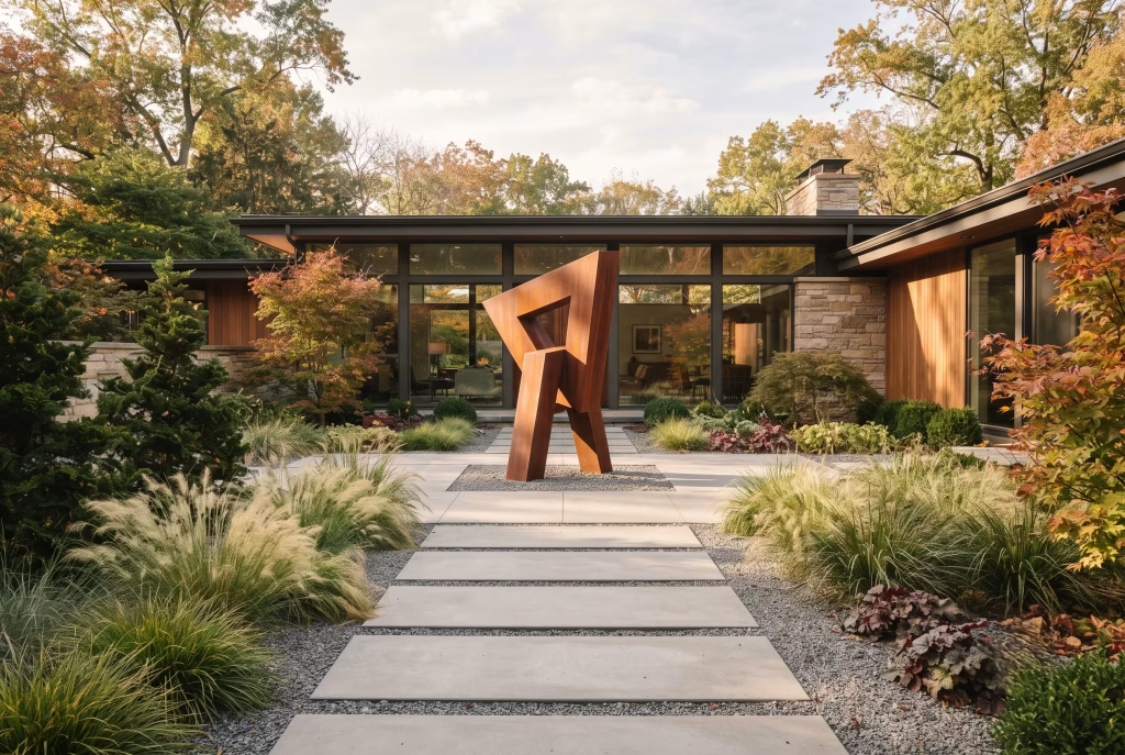
A garden can survive without a single ornament, but it cannot survive with a dozen mediocre ones, and this is the section where I tend to talk clients out of buying things rather than into it.
The instinct to fill an empty corner is a natural one, and it’s exactly the instinct mid-century designers trained themselves out of. One considered sculptural piece, whether that’s a cast concrete form, a piece of driftwood mounted deliberately rather than left where it washed up, or a genuinely good pot with nothing planted in it at all, does more work in a garden than ten smaller trinkets scattered across the same space. The eye needs somewhere to rest, and clutter denies it that.
Positioning matters more than the object itself, in my experience. A focal point works best when it can be seen from indoors, ideally from wherever you spend most of your time, the kitchen sink, the sofa, the desk.
That’s the whole logic behind sightline planning again, cropping up in a different guise: the piece isn’t there to be admired up close on a stroll around the garden, it’s there to be glimpsed daily, almost by accident, from inside the house.
A friend of mine has a single weathered corten steel form positioned dead centre in the view from her kitchen window, and she tells me it’s the thing she notices shifting with the seasons, catching rust-coloured light in autumn, sitting starkly against snow in winter, long before she notices anything else out there.
Scale is the detail that trips people up most often. A focal point needs enough presence to hold its own against the hardscape around it, not so large that it dominates, but never so timid that it disappears against a backdrop of paving and planting.
As a rough guide, aim for something at least a third the height of your boundary wall or fence line if it’s meant to be seen from any real distance, since anything smaller tends to read as an afterthought rather than the deliberate full stop it’s meant to provide.
The Restrained, Earthy Palette With One Bold Accent
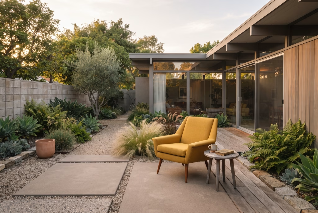
Colour is where most mid-century gardens go wrong, and they go wrong in one of two entirely opposite directions. Either everything gets drenched in that same tired grey-beige palette until the garden feels like an unfinished waiting room, or someone overcorrects and ends up with a jumble of accent cushions and painted pots fighting each other for attention. Neither is what the era actually did.
The real logic is closer to how a good tailor uses colour: one dominant neutral, drawn straight from the materials already in the garden, timber, stone, weathered concrete, sitting quietly in the background, and then a single, confident note of colour allowed to do all the talking.
Think mustard yellow, burnt orange, or a deep teal, the sort of hue you’d find on an original Eames shell chair or a 1960s enamel light fitting, appearing just once or twice rather than repeated across every cushion and planter in sight.
A single mustard-yellow chair against a backdrop of grey-brown stone and green foliage reads as considered. Six mustard-yellow cushions scattered about reads as a themed party.
Where that accent colour lands matters as much as the shade itself. It works best on something you’ll actually use, a chair, a door, a single glazed pot, rather than smeared across a whole wall or fence, which tends to date far faster than a smaller, more contained gesture.
I’ve swapped clients’ entire outdoor colour schemes simply by repainting one existing bench rather than buying anything new at all, and the transformation has genuinely stopped a garden looking flat overnight.
The neutral base deserves just as much thought as the accent, mind you. Warm greys and soft terracottas photograph and weather far better in British light than the stark white so many Mediterranean-inspired gardens lean on, since our grey skies flatten anything too cool or too bright.
Test a paint or stain sample against your actual boundary wall on an overcast afternoon before committing to a full tin, since a colour that looks glorious under a showroom’s spotlights can turn distinctly lifeless the moment a proper British drizzle sets in.
Water as Geometry, Not Decoration
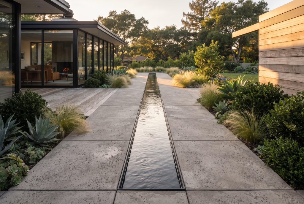
Water gets misused in most modern gardens, splashed about as an afterthought, a little tabletop fountain bought from a garden centre because the space felt like it wanted something. Mid-century designers thought about water in an entirely different register: not as decoration, but as another straight line or clean plane in the garden’s overall geometry, no different in principle from a paved path or a rendered wall.
A rill does this most obviously. Rather than a pond with soft, organic edges, a rill is a narrow, straight channel of moving water, often no more than 200 to 300mm wide, running along a sightline the way a path might.
Set one alongside a terrace, or better still, running straight out from a threshold so it appears to continue a line from indoors, and the water becomes part of the architecture rather than an ornament sitting apart from it.
The sound helps too, a rill’s shallow, constant trickle reads as calmer and less insistent than a bubbling fountain, which matters in a smaller UK garden where every feature is heard as clearly as it’s seen.
Reflecting pools take the geometry idea further still. A shallow, still pool, black-lined rather than pale, does two jobs at once: by day it mirrors the sky and whatever’s planted around it, effectively doubling the garden’s sense of depth without adding a single square metre of actual space, and by night, lit from below or from the edge, it becomes the garden’s quiet centrepiece long after the borders have gone dark.
Depth needn’t be dramatic. Most reflecting pools work perfectly well at 150 to 200mm, shallow enough to avoid the safety and regulation headaches that come with anything deeper.
Corten steel earns its place here too, and increasingly it’s my first suggestion for clients wanting a water feature with genuine mid-century credentials. A simple corten wall fountain, water sheeting down a rusted steel face into a stone or gravel basin below, brings texture and warmth that poured concrete alone can’t manage, and the material only improves with age, its rust patina deepening rather than degrading the way a painted or rendered feature eventually will.
Whichever route you take, the test is always the same: would this feature look at home if you removed the water entirely and simply left the structure standing? If the answer’s yes, you’ve got the geometry right, and the water is doing exactly the job it’s meant to.
Structural, Architectural Planting
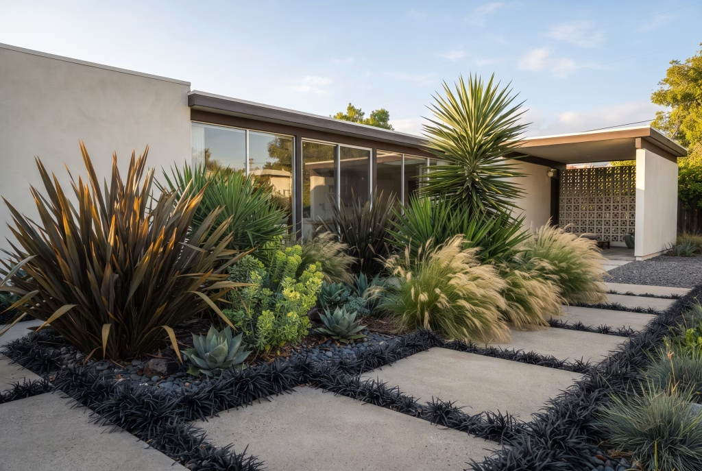
The old chestnut with mid-century planting is that everyone reaches straight for agave and yucca, then discovers three winters later that neither one has the faintest intention of surviving a proper British frost.
The good news is the architectural silhouette that makes those desert species so covetable can be found in plants perfectly happy on this side of the Atlantic, provided you know where to look.
Phormium, or New Zealand flax, is the first substitute I reach for on almost every UK project. Its stiff, sword-shaped leaves fan out in exactly the sculptural way agave does, and cultivars range from deep bronze to variegated cream and green, giving you real choice over how bold a statement it makes.
Hardy down to around minus 5 to 10 degrees depending on variety, phormium shrugs off a typical British winter without so much as a fleece thrown over it, and it holds that upright form twelve months of the year rather than dying back and leaving a gap.
Yucca filamentosa deserves a mention too, since unlike its more tender cousins, this particular species tolerates surprisingly hard frost and still delivers that stiff, spiky rosette people associate with desert planting.
Pair it with feather reed grass, calamagrostis x acutiflora if you want the full botanical credentials, and you get genuine mid-century geometry: one plant holding its rigid, upright form through every season, the other adding a softer, swaying counterpoint that keeps the whole bed from feeling too severe.
For structure at ground level, black mondo grass does more heavy lifting than almost anything else on this list. Planted between paving stones or edging a bed, its near-black foliage reads less like a plant and more like a deliberate design choice, a graphic line drawn straight onto the garden floor.
Fatsia japonica fills a similar role in shadier corners, its large, glossy, lobed leaves bringing genuine architectural presence to the parts of a garden that agave would never tolerate in the first place.
The principle underneath all of this, whatever species you land on, is silhouette over bloom. Mid-century planting was never really about flowers. Choose for shape first, for how a plant holds itself against a flat rendered wall or a run of decking, and colour becomes the bonus rather than the point.
You May also Like: Outdoor Chair Ideas: A Design-Led Guide to Comfort, Style, and Long-Term Use
Terracing a Sloped Garden
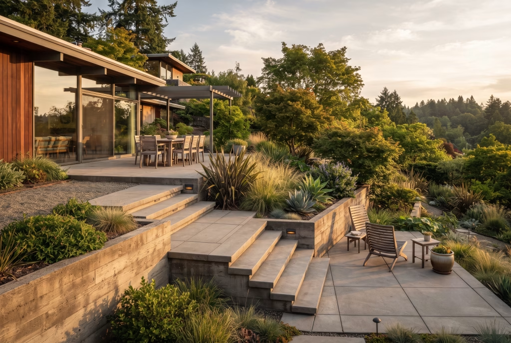
Most gardens attached to a mid-century modern home aren’t flat, whatever the glossy photographs would have you believe, and a sloped plot is precisely the problem that stops people from attempting this style at all. It shouldn’t. A change in level, handled properly, plays directly into the era’s hands rather than against them.
Terracing is the obvious starting point, and for good reason. Rather than fighting a slope with a single steep run of lawn nobody can mow safely, break it into a series of level platforms, each held back by a low retaining wall in board-formed concrete, natural stone, or the same breeze block used elsewhere in the garden for consistency.
Each terrace becomes its own small garden room in the process, one for dining, one for planting, one simply for standing and taking in the view, connected by shallow, wide steps rather than a single steep staircase that nobody enjoys climbing after a glass of wine.
The maths matters more than most homeowners expect going in. As a rough guide, a retaining wall over about a metre in height typically needs proper structural engineering input in the UK, along with building regulations approval, since the soil pressure behind a tall wall is nothing to gamble with.
Keeping individual terraces to 600 to 800mm in height each, stepped gradually rather than attempted in one dramatic drop, sidesteps most of that complexity while still delivering the sculpted, geometric look the style is known for.
Steps deserve just as much thought as the walls either side of them. Wide, shallow risers, no more than 150mm, paired with a generous 350 to 400mm tread depth, read as considered and unhurried rather than merely functional, and they’re a good deal safer underfoot on a wet British evening than anything steeper.
Run the same paving material up the steps as you’ve used on the terraces themselves and the whole slope reads as one continuous, deliberate composition rather than a series of separate fixes bolted together out of necessity.
Drainage, predictably, is the detail that catches people out. Water runs downhill whether you’ve planned for it or not, so each terrace needs a slight fall away from the house and toward a proper drainage channel or soakaway, rather than toward the retaining wall below it, where standing water will find every weakness in the pointing within a couple of winters.
Get a groundworker involved at the design stage, not after the first wall’s already gone up, and a sloped garden stops being the obstacle it first appears and starts being the single feature that makes your plot genuinely distinctive against every flat, predictable garden on the street.
You May also Like: How Do You Use Hot Pink in Interior Design? 25 Bold Ideas for Every Room
Period-Correct Lighting
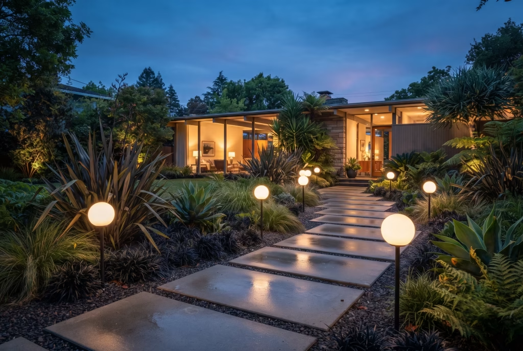
Lighting is the detail that separates a garden photographed for the day from one that’s genuinely lived in after dark, and it’s also the section clients most often skip, usually to their own regret once the clocks go back.
The globe light is where this idea starts, that simple sphere of white or milky glass on a slim metal stem, low enough to line a path without glaring straight into anyone’s eyes as they walk it.
Mushroom-style fixtures do a similar job with a slightly different silhouette, a shallow domed cap throwing light downward in a soft pool rather than out in every direction, which suits the restrained, considered look this whole style is built on far better than the harsh, bluish glare of a modern solar spike ever will.
I’ve had clients source original 1960s fixtures through architectural salvage and reclamation yards for next to nothing, rewired to modern safety standards by an electrician, and the character they bring simply can’t be bought new at any price.
Uplighting trees is the trick that does the most with the least effort, in my experience. A single ground-recessed spotlight, angled up into the canopy of a specimen tree or large architectural shrub, throws dramatic shadow patterns across a wall or fence behind it once darkness falls, turning a plant that reads as ordinary by day into the garden’s genuine centrepiece by night.
It’s a technique borrowed straight from stage lighting, really, and it costs remarkably little to achieve given the transformation on offer.
Warmth of colour temperature matters more than most people realise until they’ve got it wrong. Anything above 3000K starts to feel clinical and cold rather than inviting, so stick to warm white fixtures throughout, and where budget allows, look for anything rated 2700K, closer to candlelight than to an office strip light.
Low-voltage garden lighting systems, run on a single transformer rather than a scattering of solar units each fading at a different rate, also give far more control over dimming and layering, letting you build up light gradually across an evening rather than switching a whole garden on and off like a light switch.
Sourcing genuinely vintage fixtures takes patience, admittedly, but it’s patience well spent. Architectural salvage yards, specialist online vintage lighting dealers, and even the odd car boot sale turn up period pieces more often than you’d expect, and a good electrician can rewire almost anything to current UK safety standards without disturbing the character of the original design one bit.
Where an authentic vintage find proves impossible, a handful of contemporary makers now produce faithful reproductions in the same proportions and finishes, and unless you’re standing right beside one, most guests will never know the difference.
A Kitchen Garden That Still Reads as Mid-Century
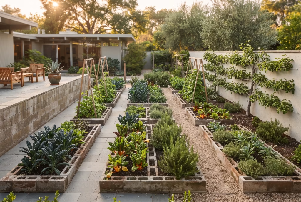
The mistake most people make with a kitchen garden is treating it as the messy, practical bit tacked onto the end of an otherwise considered space, and it needn’t be that at all. Handled properly, edible planting sits just as comfortably within a mid-century modern garden as any ornamental bed, provided you apply the same geometric discipline to a row of chard as you would to a lawn edge.
Narrow raised beds are the structural backbone here, and they suit this style rather better than the sprawling allotment plot most of us picture when someone mentions growing your own.
Build beds around 600 to 750mm wide, narrow enough to reach the centre from either side without stepping onto the soil itself, and run them in a simple, repeated pattern, three or four identical rectangles laid parallel, rather than the higgledy-piggledy arrangement of a traditional vegetable patch.
Timber sleepers, board-formed concrete, or even the same breeze block used elsewhere in the garden all keep the beds visually tied to whatever hardscape you’ve already committed to, so the whole thing reads as one considered scheme rather than two competing gardens bolted together.
Layout does more work than most people credit. A grid, evenly spaced, with clean gravel or paved paths running between each bed, borrows the exact same logic as the geometric hardscape covered earlier in this piece:
repetition and restraint over variety and clutter. Underplant the edges with something structural, chives or ornamental alliums both do a fine job, and the bed reads as considered even in the depths of winter, when half the vegetables have long since been harvested and the soil sits bare.
Choosing what to grow matters for the look as much as the eating. Leafy, upright crops such as chard, kale, and runner beans trained up a simple timber frame all carry real architectural presence, standing tall and structural in a way a sprawling squash plant never will.
Herbs earn their place twice over, rosemary and thyme bring genuine Mediterranean texture that suits the era’s restrained palette, and they’re rarely out of season in a way that leaves a bed looking empty. A single espaliered fruit tree trained flat against a fence or wall, an apple or pear works beautifully in most UK gardens, brings height and real structure without eating into precious floor space at all.
The pay-off here goes well beyond appearances, mind you. There’s something genuinely grounding about stepping out to cut your own herbs for dinner from a bed that also happens to look considered enough for a design magazine, and it’s precisely that blend of function and form, of a garden earning its keep rather than merely posing for a photograph, that the whole mid-century modern movement was built on in the first place.
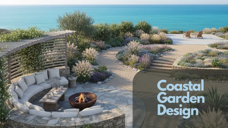
You May also Like: Coastal Garden Design: Creating Landscapes That Withstand Exposure and Age Gracefully
Let a Little Personality In
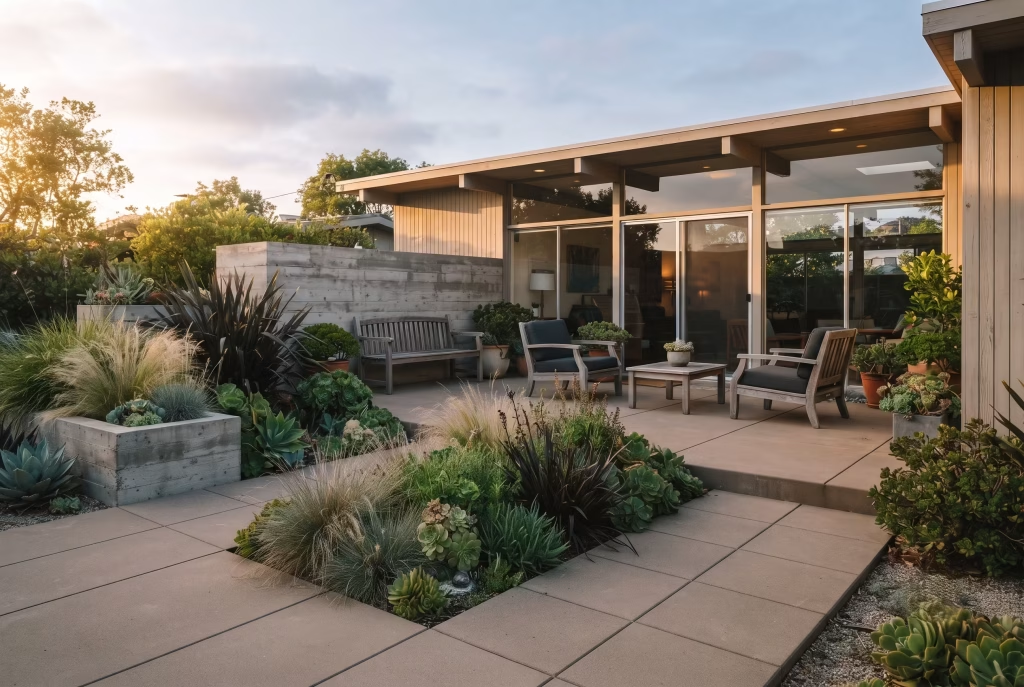
I always know when a garden’s gone one step too far into purism, because I stop wanting to sit in it. It’s beautiful, technically flawless even, and utterly forgettable, like a hotel lobby dressed up as somewhere to live.
The gardens that actually stay with people, the ones a client mentions years later, usually have one thing in every case the showroom versions lack: a single detail that has no business being there, and is all the better for it.
A slightly kitsch lawn ornament that’s followed a family through three house moves. A hand-thrown pot, wonky in exactly the way only a genuinely handmade thing can be, sitting among a run of otherwise perfect, matching planters. It doesn’t fit the scheme, not strictly, and that’s precisely the point.
There’s a lesson buried in the old California Eichler estates worth borrowing here, oddly enough. Plenty of those original owners kept a garden gnome or a flock of pink flamingos tucked among their carefully considered agave and breeze block, and rather than undoing the design, that touch of playfulness somehow proved it.
A garden built entirely from rules, however good those rules are, reads as designed at someone rather than lived in by them. One rule broken on purpose, chosen rather than accidental, does the opposite: it tells a visitor that a real person made every other decision in the space too, quite deliberately, and simply decided this one thing mattered enough to keep regardless.
So here’s my advice, for what it’s worth, and I give it to nearly every client who’s read one too many minimalism guides before calling me. Pick one thing that means something to you personally, whatever it happens to be, and let it stay exactly where it is, geometry and restraint be damned.
A garden this considered can absolutely carry one small act of rebellion, and more often than not, it’s the detail that makes the whole space finally feel like home rather than a show flat waiting for its next viewing.
Common Mistakes to Avoid
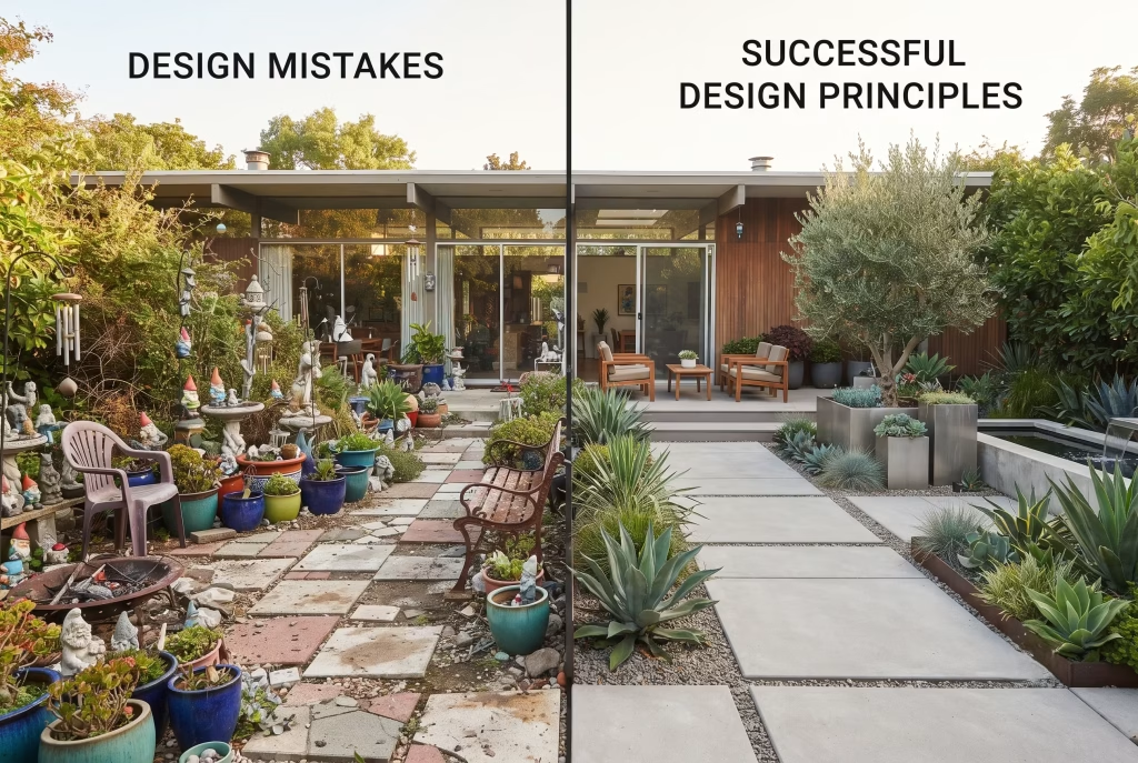
Even a well-briefed garden goes wrong in fairly predictable ways, and after enough years doing this professionally, the same handful of mistakes turn up again and again, regardless of budget or the size of the plot in question.
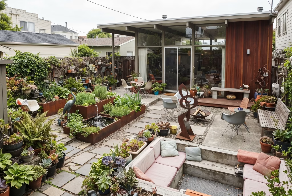
Chasing every idea at once. This is the one covered already, and it bears repeating on its own here: a garden trying to be a courtyard, a conversation pit, and a kitchen bed all in the same ten square metres ends up feeling like a show home stuffed with sample rooms rather than somewhere a person actually lives.
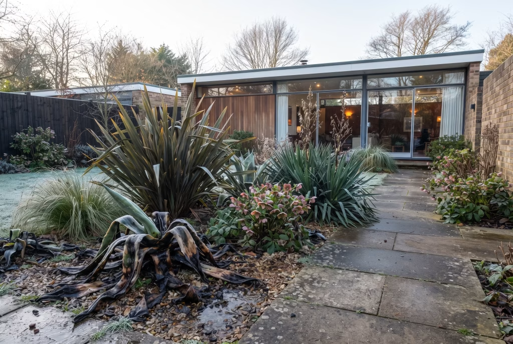
Going warm-climate before checking hardiness. Agave and yucca gloriosa photograph beautifully, but plenty of homeowners plant them straight from a magazine spread without a thought for what a proper British frost does to a soft-leaved succulent left out overnight in January. Check the hardiness rating before falling in love with anything, phormium and yucca filamentosa give the same silhouette without the annual gamble.
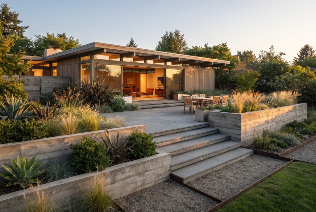
Treating hardscape as an afterthought to planting. Plants come and go with the seasons, but paving, walling, and steps are the bones of the whole design, and skimping on them to save budget for pots and border plants nearly always shows. Spend where it lasts.
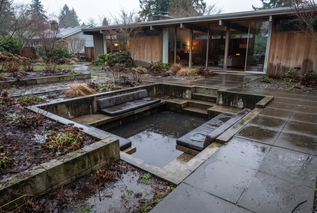
Skipping drainage to save a weekend. Whether it’s a sunken pit, a terraced slope, or a simple raised bed, water finds every shortcut a build has taken, and it usually finds it the following winter rather than immediately, by which point the fix costs considerably more than doing it properly the first time.
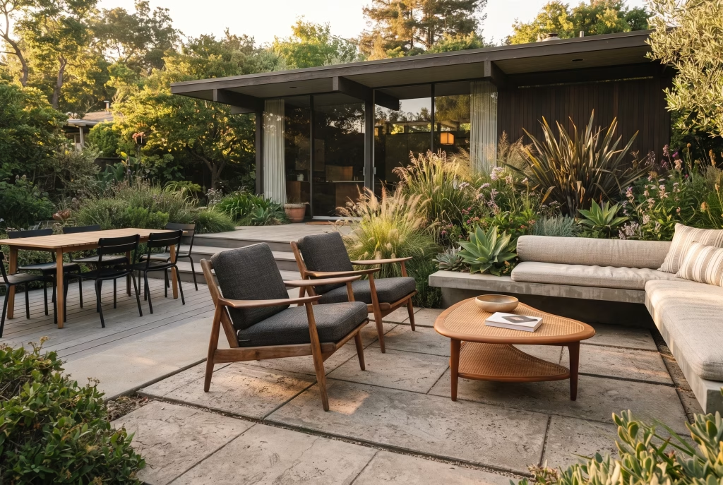
Buying a full matching furniture set. A uniform catalogue collection reads as bought rather than curated. One or two proper pieces, mixed with simpler surrounding seating, will always look more considered than everything arriving in the same delivery van.
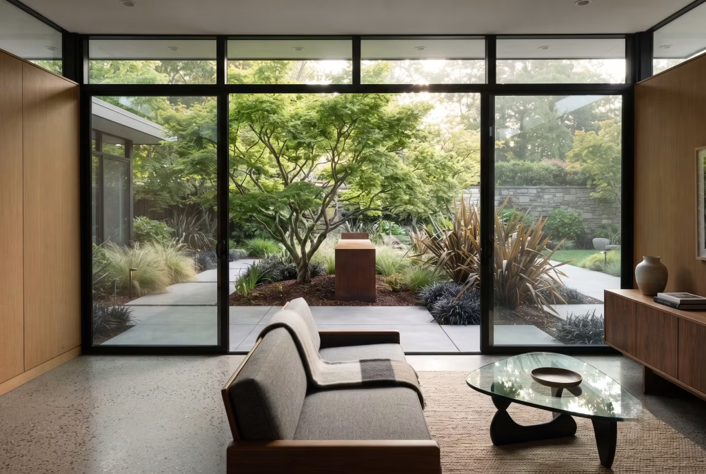
Forgetting the view from indoors. Plenty of gardens are designed to be walked through and never once considered from the sofa or the kitchen sink, which is, in practice, where most of us actually experience our own gardens for ten months of the year.
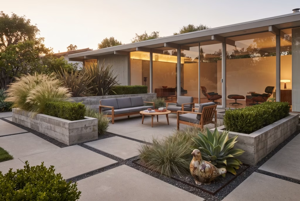
Stripping out every last bit of personality. A garden built purely from rules, however sound those rules are, tends to feel designed at someone rather than lived in by them. Leave room for the one detail that doesn’t quite fit the brief, and let it stay.
You May also Like: Mid-Century Modern Living Room: The Complete Guide to Getting the Look Right
Bringing It All Together
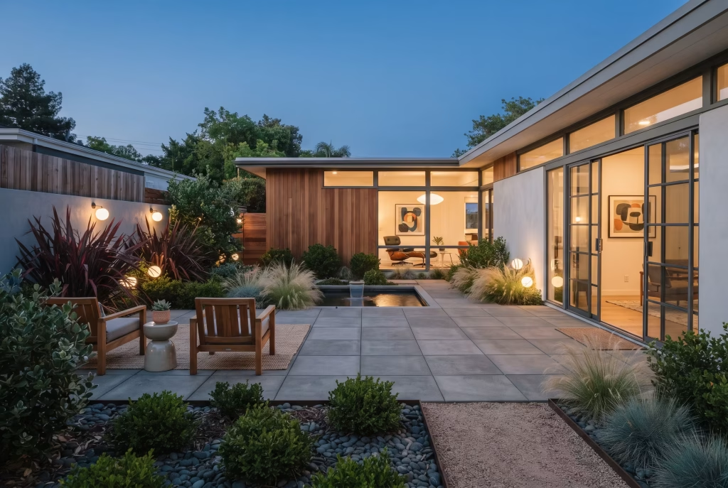
Trying to squeeze all fifteen of these into one garden at once is the surest way to end up with none of them done properly, and it’s a mistake I watch clients make more often than any other.
The better approach is to pick three, perhaps four, ideas that genuinely speak to the space you’ve actually got, rather than the space in the photographs that first caught your eye. A cramped London side return has no business chasing a sunken conversation pit, but it’s the perfect candidate for a glazed courtyard and a run of considered lighting.
A generous, sun-baked plot in a milder pocket of the country can carry structural planting and a proper terrace without breaking a sweat, where a shadier, boggier garden further north might do far better leaning into water as geometry and a kitchen bed tucked against a warm wall.
Budget and climate, in other words, aren’t obstacles to work around. They’re the honest starting point every good design should be built from. Begin with whichever one or two ideas solve a genuine problem in your own garden, live with them a season, then let the next idea follow naturally once the first has properly settled in.
FAQ (Frequently asked questions)
What is a mid-century modern garden?
A mid-century modern garden is an outdoor space designed on principles borrowed from 1940s to 1960s architecture: clean geometric lines, a restrained material and colour palette, and a deliberate blur between indoor and outdoor living. It’s built to be used daily, not merely admired from a window.
Can I create a mid-century modern garden in a small or narrow UK garden?
Yes, and arguably it’s the ideal candidate. Narrow plots and side returns suit courtyard-style zoning, glazed thresholds, and structural planting far better than a sprawling acreage does. Scale the ideas down rather than dropping them, a single considered corner beats an ambitious plan half-finished.
What plants work in a mid-century modern garden if I don’t live somewhere hot and dry?
Phormium, yucca filamentosa, feather reed grass, and black mondo grass all deliver that same architectural silhouette as agave without needing a desert climate. Choose for shape and structure over flowers, and check the hardiness rating before anything goes in the ground.
How much should I budget for a garden renovation like this?
A sensible rule of thumb, borrowed from professional practice, is 5 to 10 percent of your home’s build or purchase value, excluding luxuries like a swimming pool. Start with hardscape and structure, since that’s what lasts, and layer planting and furniture in afterward as funds allow.
What materials are most typical of mid-century modern garden design?
Exposed aggregate concrete, board-formed concrete, natural stone, teak, corten steel, and perforated breeze block all recur throughout the era’s best work. These materials share one trait worth noting: they weather honestly, ageing with real character rather than simply looking tired.
How do I stop a mid-century modern garden from looking sterile or showroom-like?
Leave room for one detail that doesn’t strictly fit the brief, a slightly kitsch ornament, a handmade pot, something chosen rather than specified. Purism taken too far reads as designed at someone. One small, personal rebellion proves a real person lives there.
Do I need planning permission for a sunken seating area or retaining walls?
Often not, provided a sunken pit stays under 300mm deep with no permanent roof, and a retaining wall stays below roughly a metre in height. Anything taller, near a boundary, or within a conservation area is worth a quick call to your local planning office first.
What’s the difference between a modernist garden and a mid-century modern garden?
Modernist gardens favour restraint above all else, muted palettes and pared-back planting with little ornamentation. Mid-century modern shares that structural discipline but welcomes bolder colour and playful personal touches, a single mustard-yellow chair or bright accent pot, that modernism would generally decline.
Can this style work with an older or period property, not just a mid-century one?
Absolutely. The underlying principles, indoor-outdoor connection, restrained materials, structural planting, transplant well onto a Victorian terrace or period cottage precisely because they’re about spatial logic rather than replicating a specific 1960s facade. The garden simply needs to feel like an extension of whatever house it sits behind.