15 Stunning Modern Barndominium Exterior Ideas to Inspire Your Dream Home
The first time a client walked me around their five acres and said, “I just don’t want it to look like a shed with a mortgage,” something clicked. That line has stuck with me through every barndominium project since, because it captures exactly what people are afraid of. Nobody wants to sink their savings into a structure that reads as agricultural on a good day and accidental on a bad one.
I’ve spent the better part of a decade designing Barndominium Exterior, and barns, real ones, not the metaphor, taught me more about proportion than any design textbook did. There’s a particular tension that shows up on every barndominium job: the bones are rural, honest, almost stubborn in their simplicity, but the intent is modern. Getting those two to sit comfortably at the same table takes more than a paint color and a Pinterest board.
So this isn’t a scroll-and-forget gallery. Every idea here comes with what it actually costs you, in dollars, in upkeep, in the compromises nobody mentions in the glossy after photos, and what it gives back once it’s built and lived in. Some of these choices will save you money down the line. Others will test your patience the first humid summer.
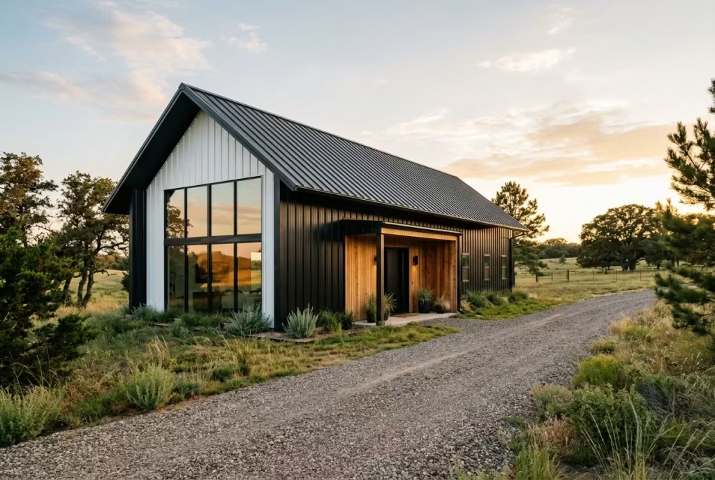
Here’s the thesis I keep returning to, project after project: modern doesn’t mean cold, and rustic doesn’t mean tired. It comes down to restraint, to proportion, and to picking exactly one material that gets to raise its voice while everything else quietly holds the room together. That’s the whole game, really. Once you see it, you can’t unsee it.
The Matte Black Monolith
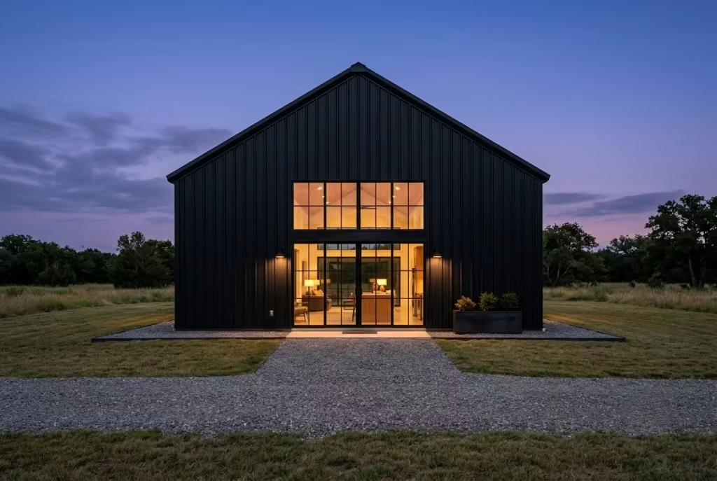
There’s a moment on almost every black-steel project when the client gets cold feet halfway through framing. The siding goes up, the house looks like a shadow against the sky, and someone inevitably asks if we’ve made a mistake. I’ve learned to expect that call. And I’ve learned, every single time, that the doubt disappears the day the windows go in and the black stops looking like an absence and starts looking like a decision.
That’s really the psychology at work here. A pale exterior tends to recede into its surroundings, pleasant, unobtrusive, forgettable within a year. Black does the opposite. It commits. Paired with black-framed glass, floor to ceiling where the budget allows, the whole structure reads as intentional rather than foreboding, a home that knows exactly what it is instead of one still figuring itself out. Full black steel siding on a barn silhouette has a way of sharpening every line it touches, turning a simple gable into something that looks drawn rather than built.
Now, the part nobody puts on the brochure: dark steel absorbs heat like nobody’s business. On a July afternoon in a climate with real sun, that south-facing wall can run noticeably hotter than a lighter-clad equivalent, and if your insulation package is an afterthought, you’ll feel it in the electric bill long before you feel it underfoot. I always spec a continuous rigid foam layer behind black siding, non-negotiable, along with reflective roof underlayment. Skip that step to save a few thousand upfront, and you’ll pay it back in cooling costs for the life of the house. Do it right, and matte black stops being a risk and becomes the single boldest, most maintenance-forgiving choice on this entire list.
Two-Tone Restraint: Black Base, White Upper

I once worked on a build where the client insisted on splitting the color right down the middle, fifty-fifty, black on the bottom half, white up top, because it looked clean in the rendering. It did not look clean once the steel was up. It looked like a house wearing someone else’s coat, the proportions fighting each other instead of working together, and we ended up repainting six months after move-in. That job taught me a rule I now treat as close to gospel: the split has to be lopsided to actually work.
The magic ratio, the one that reads balanced instead of top-heavy, sits closer to 70/30 or 60/40, with the darker tone claiming the larger share, usually the base and the garage or workshop volume, while white or a soft cream takes the upper story and the gable peaks. Do it this way and the eye reads the home as grounded, as though it grew out of the site rather than sitting on top of it. Flip that ratio, let white dominate the base with black stacked heavy above, and the whole structure starts to feel precarious, like it might tip over in a strong wind, even though structurally nothing’s changed at all.
There’s a reason this two-tone approach keeps showing up in the strongest modern barndominium builds circulating right now, sharp black rooflines against crisp white siding, a contrast that feels timeless rather than trend-chasing. It photographs beautifully in flat afternoon light and it ages gracefully, because neither color is fighting for constant maintenance the way an all-white exterior does with rain streaking. If there’s one lesson worth carrying into your own build, it’s this: let one color lead the conversation, and let the other one simply nod along.
Stone-Wrapped Lower Third
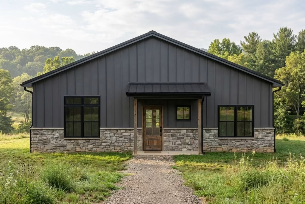
Tall barn forms have one structural quirk that nobody warns you about until you’re standing in front of one: they look like they’re floating. All that vertical steel or siding running straight to grade with nothing to anchor it visually, and the eye starts hunting for something solid to rest on. Stone solves that problem the way a good foundation garment solves a fit issue, quietly, from the bottom, without anyone quite clocking why the whole thing suddenly looks pulled together.
Wrapping roughly the lower third of the exterior in stone, typically up to window-sill height, somewhere in the three to four foot range depending on your elevation, gives the eye a resting point before it travels up toward the roofline. It’s a wainscoting trick borrowed straight from traditional architecture, and it works just as hard on a barndominium as it ever did on a colonial. The barn stops looking like it’s perched and starts looking like it grew there.
Material choice changes the whole personality of this move. Limestone brings a cut, formal edge, pale and even-toned, the kind of stone that reads expensive because it genuinely is, and it tends to run on the higher end of the cost spectrum among natural options. Fieldstone goes the opposite direction entirely, irregular, weathered, full of character, and it’s the material I reach for when a client wants the house to feel like it’s been there for generations rather than months. Cultured stone, the manufactured alternative, splits the difference nicely on budget while still delivering real depth and shadow if it’s installed by someone who actually understands coursing and doesn’t just glue panels flat to a wall.
Here’s the honest trade-off, and I’d rather tell you now than have you discover it during a bid: natural stone costs meaningfully more than manufactured veneer, sometimes several times over once you factor labor, since skilled masons aren’t cheap and shouldn’t be. Cultured stone narrows that gap considerably and, done well, fools almost everyone who isn’t running their hand across it. Get quotes from at least two local suppliers before committing either way, because stone pricing swings wildly by region depending on quarry distance and mason availability, and what I paid on a project two states over won’t tell you much about your own site.
You May also Like: Essential Approaches to Contemporary Facade Design: Architectural Principles, Material Choices, and Real-World Application
Board-and-Batten Vertical Siding, Minimal Trim
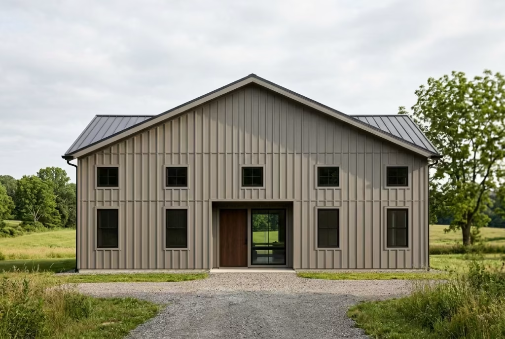
Most people assume the way to modernize a farmhouse staple is to add something, a sleeker fixture, a bolder color, a statement door. With board-and-batten, the opposite holds true, and it’s a lesson that trips up even experienced builders. The real transformation happens when you start taking trim away, not piling it on.
Traditional board-and-batten leans on generous window casings, decorative corner boards, and fussy detailing around every opening, all of it borrowed from a farmhouse vocabulary that’s a century old and shows its age the moment you look closely. Strip that trim down to almost nothing, flush mounted windows, corners that meet in a crisp line instead of a built-up frame, and the same vertical siding suddenly reads contemporary. It’s the architectural equivalent of a well-tailored coat with the extra buttons cut off. Less fuss, sharper silhouette.
The vertical lines themselves do a lot of quiet work here too. They draw the eye upward, which makes a single-story barndominium feel taller than its actual footprint, and they photograph with a clean rhythm that horizontal lap siding simply can’t match. I’ve used cedar, fiber cement, and engineered wood battens across different climates, and each carries its own maintenance story worth knowing before you commit. Cedar ages into a soft silver-gray if left unsealed, which some clients love and others find alarming until I explain it’s not decay, it’s patina. Fiber cement holds paint longer and shrugs off moisture without much complaint, making it the safer bet in humid regions where wood battens can cup or split over a decade of seasons.
One caution worth sitting with: minimal trim only reads modern when the underlying carpentry is precise, because there’s nowhere left to hide a sloppy seam. Skimp on the install here and every gap becomes visible instead of forgiven, so this is one detail where paying for an experienced crew earns back every dollar spent.
The Glass Gable End
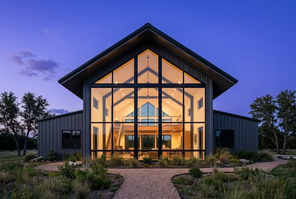
Every barn has a gable end, that triangular wall rising to meet the roof peak, and for most of architectural history it’s been treated as dead space, maybe a small vent, maybe nothing at all. The first time I convinced a client to glaze the entire thing floor to ceiling, I remember standing inside during framing and watching the light hit the far wall in a way that made the whole 2,400 square foot space feel like it had doubled. That’s the trick nobody quite believes until they’ve stood in it themselves.
A fully glazed gable end turns the tallest, most dramatic part of a barndominium’s silhouette into its most functional feature instead of its most wasted one. From the street, it reads as bold, almost sculptural, the kind of detail that makes a passerby slow the car down. From inside, it becomes a two-story window wall that floods a great room or a loft with light no ordinary window arrangement could match.
Here’s where lived project logic actually matters more than any rendering. Orientation decides whether this feature becomes a blessing or a headache, and I mean that quite literally. A south-facing glass gable in a warm climate turns into a greenhouse by early afternoon, gorgeous in January, punishing in July, unless you’ve planned for it with deep roof overhangs that block high summer sun while still letting in the lower winter light. I’ve seen clients skip that overhang to save a few feet of roofline and regret it every single cooling season afterward.
A north-facing gable, by contrast, is where this idea truly earns its keep. You get consistent, even light all day long with none of the harsh glare or heat spikes that come with direct sun exposure, which matters enormously if that wall backs a kitchen, a studio, or anywhere color and detail work happens. East and west orientations sit in between, manageable but worth pairing with tinted or low-E glazing to soften the low-angle morning or evening sun. Before anyone commits to this feature, I always walk the site at different times of day first, because a compass reading on paper tells you far less than watching where the shadows actually fall.
Standing-Seam Metal Roof in Anthracite
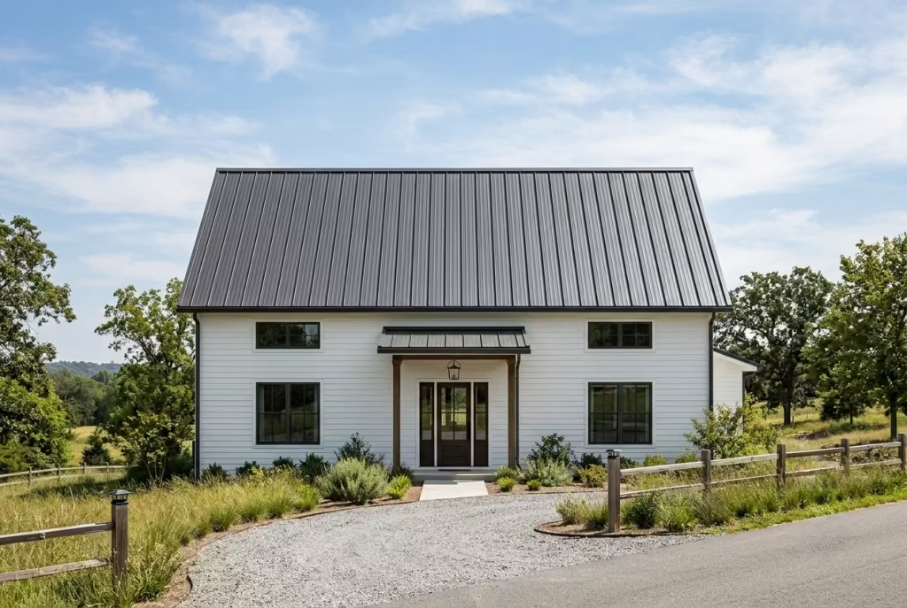
A roof rarely gets top billing in these conversations, and that’s a mistake I see clients make over and over, because on a barndominium the roof isn’t a lid sitting on top of the design, it’s a third or more of what the eye actually sees from the road. Walk any neighborhood with a mix of builds and you’ll notice the modern ones almost always share one thing: a dark, quiet roofline that doesn’t compete with anything below it. Anthracite, that deep charcoal-gray that reads almost black in shade and pewter in full sun, has become the default for a reason. It’s dark enough to feel intentional but carries none of the stark, almost theatrical weight of true black.
What actually separates a roof that reads modern from one that reads like a metal building with a house attached comes down to details most homeowners never think to ask about. Panel width is the first one. Wide panels, anything pushing past eighteen inches, start to look industrial, more pole barn than residence, while narrower panels in the twelve to sixteen inch range give the roof a tighter, more refined rhythm that photographs beautifully against a clean facade. Seam spacing follows the same logic. Evenly spaced standing seams running the full slope, unbroken by unnecessary transitions, create a kind of visual hum, a consistency the eye reads as deliberate rather than accidental.
I worked on a build a few years back where the original quote specified wider panels purely to shave labor costs, since fewer seams meant fewer man hours on installation. It would have saved perhaps a few hundred dollars total. We switched to narrower panels instead, and the difference in the final elevation photos was the sort of thing you can’t unsee once you’ve seen it done right. The narrower profile made a fairly simple gable roof look custom rather than off the shelf, and that’s money well spent for a detail nobody will ever mention but everyone will notice.
Anthracite also earns its keep in ways that go beyond looks. Standing-seam metal in this finish reflects a meaningful share of solar heat compared to darker asphalt shingle equivalents, and it typically carries a service life measured in decades rather than the fifteen to twenty years you’d budget for standard shingles, though actual warranty terms vary by manufacturer and you should always confirm those figures directly before signing a contract. It sheds snow cleanly, resists algae staining that plagues lighter roofs in humid climates, and pairs with nearly every siding color story on this list without a fight. If there’s one line item on a barndominium build worth spending a little extra to get exactly right, the roof is it, since everything else you choose has to live underneath whatever decision you make up there.
The Low, Deep Overhang
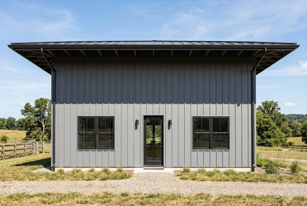
Spend any time reading actual homeowner threads about barndominiums, the honest ones, not the marketing copy, and one complaint surfaces again and again: people worry their barn is going to look like a giant rectangle dropped onto a lot, tall, flat, and a little humorless. It’s a fair concern. A two-story metal box with a shallow roofline and nothing softening its edges can feel less like a home and more like a shipping container with ambitions. The fix for this, more often than any single paint color or window upgrade, comes down to a detail most people never think to specify: how far the roof actually extends past the wall.
Most standard builds ship with an eave somewhere around twelve to eighteen inches, enough to keep water off the siding and not much else. Push that overhang out to three or even four feet, and something genuinely changes in how the whole structure reads. That deeper eave casts a real, visible shadow line along the top of the walls, and shadow is doing a lot of the heavy lifting here, because it visually chops the height of the building into two distinct zones instead of one uninterrupted vertical slab. The eye stops climbing straight up the wall and instead settles into a rhythm, base, shadow line, roof, the same way a well-tailored jacket breaks at the right point on the shoulder instead of running shapeless from collar to hem.
There’s also a practical dividend here that goes well beyond curb appeal. A deep overhang keeps rain off your siding and foundation, which matters enormously for anyone running board-and-batten or a lighter-colored exterior that shows water staining. It shades windows during the highest, harshest summer sun while still letting the lower winter sun reach inside, the same passive logic I mentioned back with the glass gable end, and it gives you dry, usable space right at the door on the days when the sky opens up without warning.
None of this comes free, and I’d rather say so plainly than let you find out at the framing stage. Extending the roof structure that far out means more rafter length, more structural bracing, and in some cases outriggers to support the extra reach, so budget for a real bump in framing and roofing costs over a standard shallow eave.
Get a structural engineer to confirm what your specific roof pitch and span can support before you commit to four feet, since not every truss design accommodates that kind of overhang without added engineering. But of everything on this list, this is the one detail I’d fight hardest to keep in the budget if something has to give, because it solves the single complaint people voice most often about this style, and it does it quietly, from the roofline down, without anyone needing to explain why the house suddenly feels grounded instead of stacked.
Mixed Cladding: Metal + Warm Wood Entry Surround
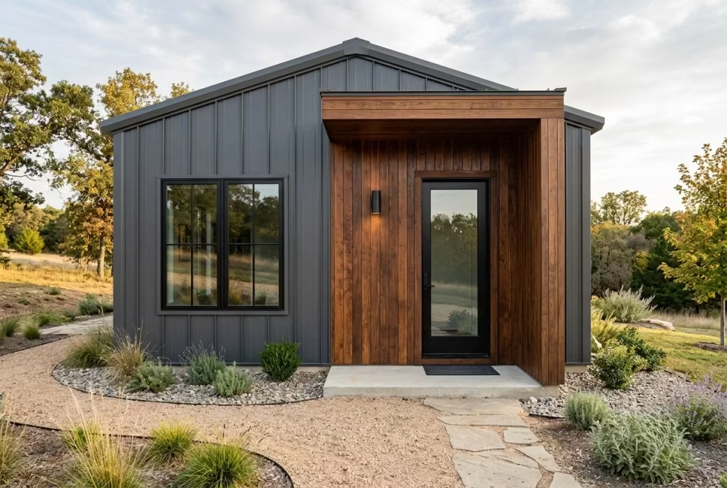
There’s a rule I’ve carried from job to job long enough that it’s become something close to instinct: a home gets to have one warm material, and only one, if it wants to look curated instead of confused. Metal siding, on its own, can feel a touch clinical, efficient, honest, but cool to the touch even in a photograph. Wood is the antidote, but only in the right dose. Wrap too much of the exterior in timber and you’ve built a cabin. Use it as a single, well-placed gesture, and you’ve built something that looks like it belongs in a design magazine rather than a materials catalog.
The entry is where that one warm material earns its keep the hardest. I’ve framed doorways in vertical cedar boards, sometimes stained a deep walnut, sometimes left to weather naturally into that soft silvered gray I mentioned with board-and-batten, and in almost every case it becomes the first thing a visitor’s eye lands on before they’ve even reached the door. That’s not accidental. Human attention is drawn to warmth and texture change, the same reason a single houseplant in an all-white room pulls focus instantly. A wood surround does that job for an entire facade, framing the entrance the way a good picture frame draws the eye to the art rather than the wall around it.
Where should the wood budget actually go, if you’re working with a number that doesn’t stretch to cover every surface, which is most budgets, if we’re being honest with each other. Concentrate it at the entry surround itself, extend it slightly overhead if your porch or portico allows, and consider one secondary appearance somewhere visible but not competing, a garage door perhaps, or a small accent wall on an otherwise metal facade. Spreading wood thin across multiple disconnected spots dilutes the impact and starts to look accidental rather than intentional. Concentrating it in one confident gesture does the opposite. It reads like a decision, not a leftover.
Material choice within that wood budget matters too. Cedar remains the standard for exterior applications because it resists rot and insect damage naturally without heavy chemical treatment, though it does require periodic sealing or staining to hold its color rather than silvering out, depending on the look you’re after. Thermally modified wood, a newer option gaining ground in colder and wetter climates, resists warping and rot even further through a heat-treatment process rather than chemical means, though it typically costs more upfront than standard cedar, and availability varies quite a bit by region, so it’s worth calling around to a few suppliers before assuming it’s off the table. Whichever you choose, this is a spot where spending a little more on quality installation pays back every time someone walks up your driveway and their eye catches on that one warm, textured moment before anything else.
Offset Volumes / Broken Massing
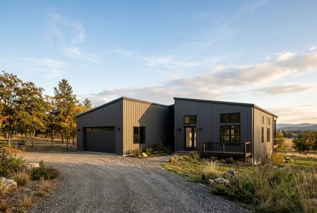
Every material trick on this list, the black steel, the stone base, the wood entry, works within a single constraint that nobody talks about enough: the shape of the box itself. You can paint a shed beautifully and it will still read as a shed if the silhouette never changes. This is the one idea on the list that isn’t about surface at all. It’s about geometry, and it’s arguably the hardest one to retrofit after the foundation is poured, which is exactly why it needs to enter the conversation early, ideally at the site plan stage, not after the framing crew has already shown up.
The move itself sounds almost too simple to matter. Instead of running one continuous rectangular volume from end to end, you pull one section forward, or push another back, breaking the roofline and the wall plane at the same time. I worked on a build where the garage wing sat a full six feet forward of the main living volume, and that single shift did more to kill the shed silhouette than any paint scheme could have.
Suddenly there were two rooflines instead of one, a recessed shadow gap between the volumes, and a building that read as composed rather than extruded, the architectural equivalent of a sentence with a comma in it instead of one that just runs on and on without ever pausing for breath.
This matters because the human eye is remarkably good at detecting monotony, and a single unbroken volume, however well clad, triggers that detection almost instantly, even in viewers who couldn’t articulate why something feels flat. Break the massing and you’re giving the eye somewhere to rest, a transition point, the same reason a good floor plan avoids one long hallway with doors punched into it like a barracks.
Now, the honest cost conversation, because this is not a free move architecturally. Offsetting volumes means more roof planes, more flashing details where those planes meet, more corners in the foundation, and generally a more complex framing package than a simple rectangle demands, so expect your structural and roofing costs to climb somewhat over a single-volume equivalent, with the exact premium depending heavily on your framer and roofline complexity, something only a local contractor’s quote can tell you accurately.
But this is also one of those rare details where the spatial return dwarfs the material cost. You’re not buying a fancier finish. You’re buying an entirely different read on the building’s proportions, and once you’ve broken a massing successfully on one project, it becomes very hard to look at a single unbroken barn box again without itching to pull a piece of it forward.
You May also Like: 25 Outdoor BBQ Area With Roof Ideas That Elevate Year-Round Outdoor Living
Black Steel Windows in Grid Pattern
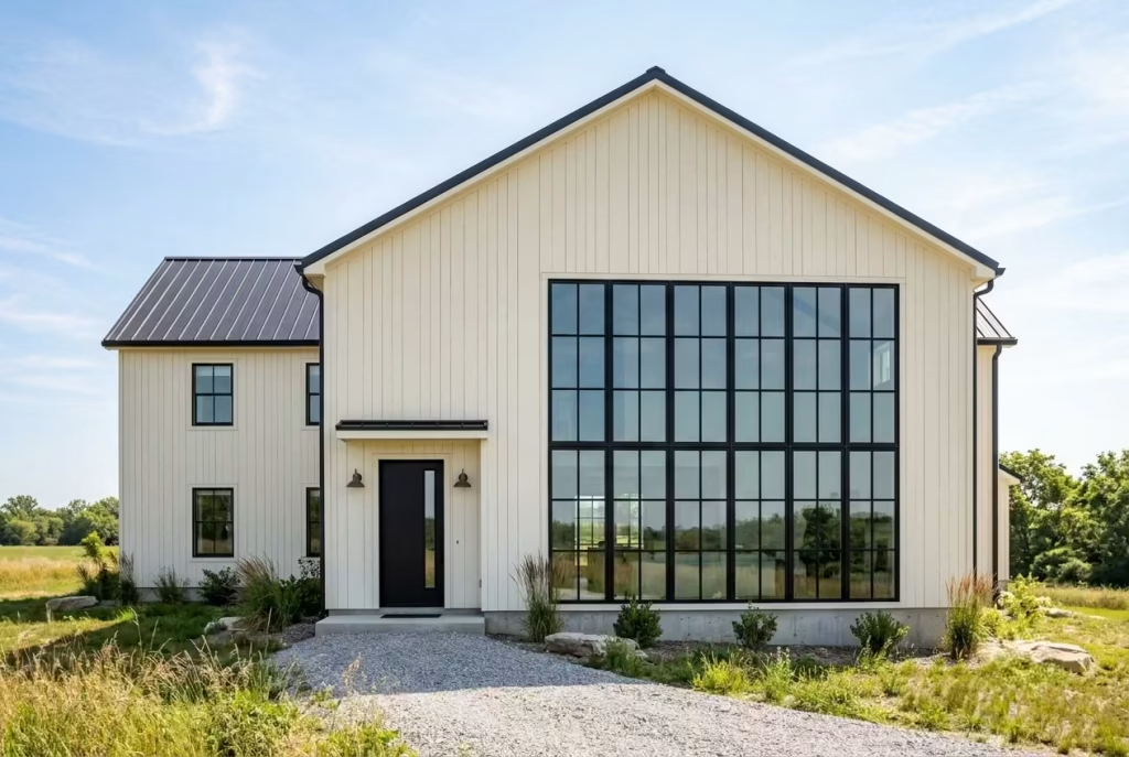
Ask any client what sold them on a modern barndominium exterior and nine times out of ten, somewhere in the answer, they’ll mention the windows. Not the siding, not even the roofline. There’s something about a black-framed window, gridded, storefront-style, sitting against a pale wall that reads instantly upscale, the kind of detail that makes a passerby assume an architect was involved even when the rest of the build came straight off a steel kit catalog. It’s one of the cheapest ways, relatively speaking, to buy that impression, and one of the easiest to overdo.
The storefront look borrows directly from commercial architecture, thin black mullions dividing large panes into a grid, and it works because black trim does something white trim simply can’t. It creates crisp, deliberate lines against almost any siding color, the same way a dark picture frame makes a pale wall gallery-ready instead of blank. Colonial-style grids, the traditional multi-pane pattern, actually pair beautifully with this modern intent too, giving a barn form a settled, less industrial feel without dragging in anything that reads dated. I’ve used both patterns across different projects, and the choice usually comes down to how much visual noise the rest of the facade can absorb before it starts to feel busy.
Here’s the cost conversation worth having before you fall for the mood board. Black-framed windows, especially in larger custom sizes with true divided grids rather than snap-in grilles, carry a real premium over standard white vinyl units, sometimes a meaningful jump depending on frame material, size, and whether you’re going aluminum, fiberglass, or a painted composite. Aluminum performs well for oversized openings and holds a crisp black finish for decades, but it needs a thermal break built into the frame or you’ll pay for that clean look every winter in your heating bill. Get quotes on both thermally broken and standard aluminum before you commit, since the price gap between them is smaller than most people assume and the comfort difference is not.
The real skill, though, is restraint. Windows deserve the loudest voice on the front elevation, the great room, the gable end, the spot where someone parks and looks up before they even reach the door. Repeat that same grid pattern on every single opening around the entire structure, utility room, laundry, side elevations nobody sees from the road, and you’ve spent premium dollars on a detail that’s lost its impact through sheer repetition. I always tell clients to pick their two or three hero windows first, price those properly, and let simpler standard units handle the rest of the building’s less visible faces. That’s not a compromise. That’s just where the smart money actually goes.
The Wraparound or Partial Covered Porch
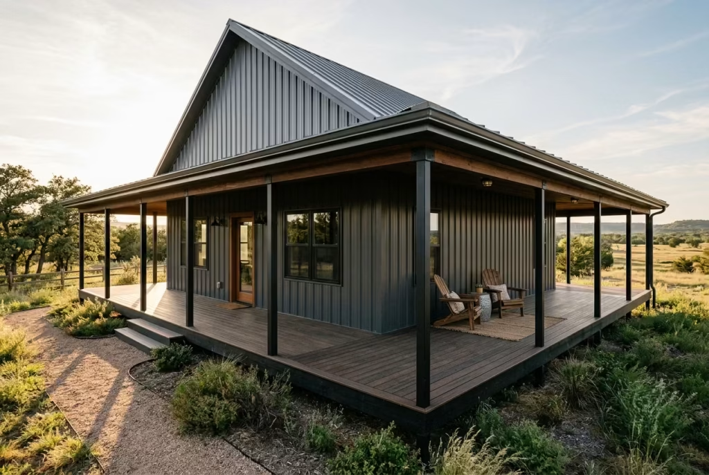
There’s a version of this idea that gets sold purely on charm, rocking chairs, sweet tea, the whole postcard image, and that version isn’t wrong exactly, it’s just incomplete. A covered porch, wraparound or partial, earns its keep on a barndominium for reasons that have almost nothing to do with nostalgia and everything to do with how a tall, simple building actually functions day to day.
Start with shade. A barn form with minimal roof overhang bakes in direct sun for most of the afternoon, and that heat doesn’t stay outside, it radiates straight through the wall and becomes your air conditioner’s problem by four o’clock. Wrap even a partial porch along the south or west face, and you’ve effectively built a buffer zone, a covered strip of shadow that keeps direct sun off the wall and off the windows behind it. It’s the same passive logic as the deep overhang mentioned earlier, just extended outward into usable square footage instead of stopping at the eave line.
Then there’s sightlines, which nobody thinks about until they’ve stood on a porch that got the depth wrong. Too shallow, and you’re squinting into full sun with your coffee, no real shelter, just a decorative gesture bolted to the front door. Deep enough, and it becomes what I’ve started calling the outdoor room, a genuine extension of the living space where furniture actually fits, where you can sit through a summer downpour and watch it rather than run from it, where the transition from indoors to out doesn’t feel like stepping off a ledge. That depth matters more than most floor plans account for early on, and it’s worth mocking up with stakes and string on the actual site before anyone pours a foundation.
The honest cost conversation here has a wide range, and I’d rather give you the real spread than a comforting single number. A straightforward covered porch typically runs somewhere in the neighborhood of forty to a hundred and twenty dollars per square foot depending on roof style, materials, and labor in your market, with a full wraparound configuration often landing closer to sixty to a hundred and fifty dollars per square foot once you factor in the extra corners, additional roof angles, and the simple fact that wrapping a structure means more linear footage of everything, framing, decking, railing, roofing. Foundation choice shifts that further.
A concrete slab base tends to run cheaper per square foot than a raised wood deck or a pier-and-beam system, though pier-and-beam earns its cost back in flood-prone or uneven sites where a slab simply isn’t practical. None of these numbers replace an actual local quote, materials and labor swing hard by region, but going in with realistic expectations means you won’t flinch when the bid lands.
What I’d tell anyone weighing partial versus full wraparound is this: measure your actual sun exposure and your actual foot traffic before committing to wrapping every side. A partial porch, placed where the sun and the sightlines genuinely need it, often delivers ninety percent of the benefit at a fraction of the linear footage, and that’s money you can put toward the roofline or the windows instead, where it might matter more.
Cedar Slat Screening / Privacy Battens
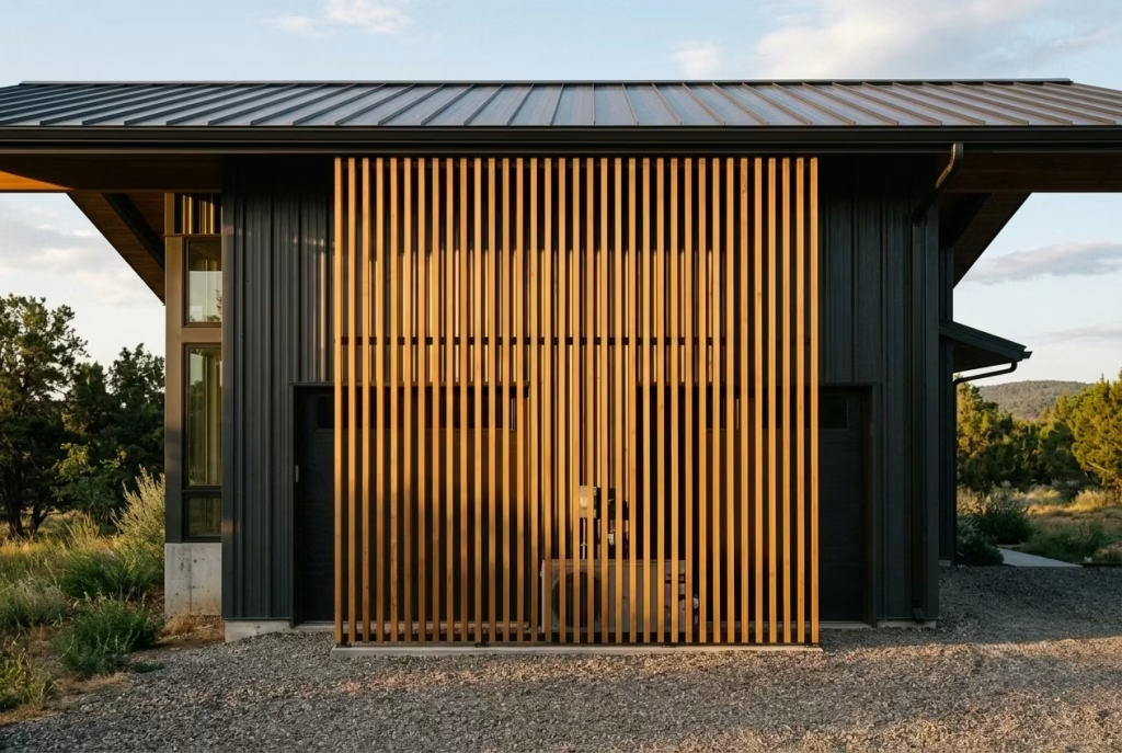
Every barndominium has at least one wall it would rather not talk about. The utility side, the garage doors, the spot where the propane tank sits or the trash cans live out their quiet existence, and most people either ignore that wall entirely or bury it behind a solid fence that turns the whole area into a box within a box. Cedar slat screening solves this differently, and it’s become one of my favorite quiet fixes precisely because it hides without ever boxing anything in.
The idea is straightforward once you see it done well. Vertical cedar battens, spaced evenly along a simple frame, mounted in front of whatever needs concealing, garage doors, mechanical equipment, a stretch of blank metal siding that reads a little too utilitarian up close. Unlike a solid privacy fence, slats with gaps between them let air move freely behind the screen, which matters more than people expect, since trapped, stagnant air behind a solid barrier invites moisture problems and mildew over time in a way a breathable slat wall simply doesn’t.
Spacing is where the whole effect lives or dies, and it’s worth getting specific rather than eyeballing it on site. A gap of around half an inch to a full inch between slats gives you what I’d call semi-privacy, enough visual interruption that a passerby’s eye doesn’t catch on whatever’s behind it, while still letting light and air filter through in a way that reads intentional rather than accidental. Butt the slats tight against each other with no gap at all, and you get full opacity, useful if what’s being hidden genuinely shouldn’t be glimpsed at any angle. Most of my utility-wall projects land somewhere in that half-inch to one-inch range, since full privacy on a garage door screen is rarely the actual goal, the goal is simply softening a hard, mechanical surface into something with rhythm and texture.
Cedar earns its place here for a reason beyond looks. It resists rot and insect damage naturally without heavy chemical treatment, which matters on an exterior application exposed to full weather, though it will need a fresh coat of stain or sealant roughly every two to three years to hold its color rather than drifting into that silvered gray patina, which some homeowners actually prefer and others find alarming until someone explains it’s weathering, not failure. Posts need real depth too, at least two feet into the ground, sometimes three if the screen runs tall, set in concrete footings so a gust of wind doesn’t turn your privacy feature into a lawn ornament by October.
Where this trick pays off best is against a plain expanse of metal siding that’s otherwise doing nothing for the eye. Layer cedar battens in front of it, even a modest run, eight or ten feet, and suddenly that wall has depth, shadow lines shifting through the day as the sun moves, texture that a flat steel panel could never offer on its own. It’s a small, honest fix, cheap relative to reworking the actual siding, and it turns the one wall nobody wanted to look at into the one detail visitors actually ask about.
You May also Like: 52 Beautiful Fall Exterior Decor Ideas to Make Your Home Cozy & Welcoming
Concrete or Steel-Look Composite Base
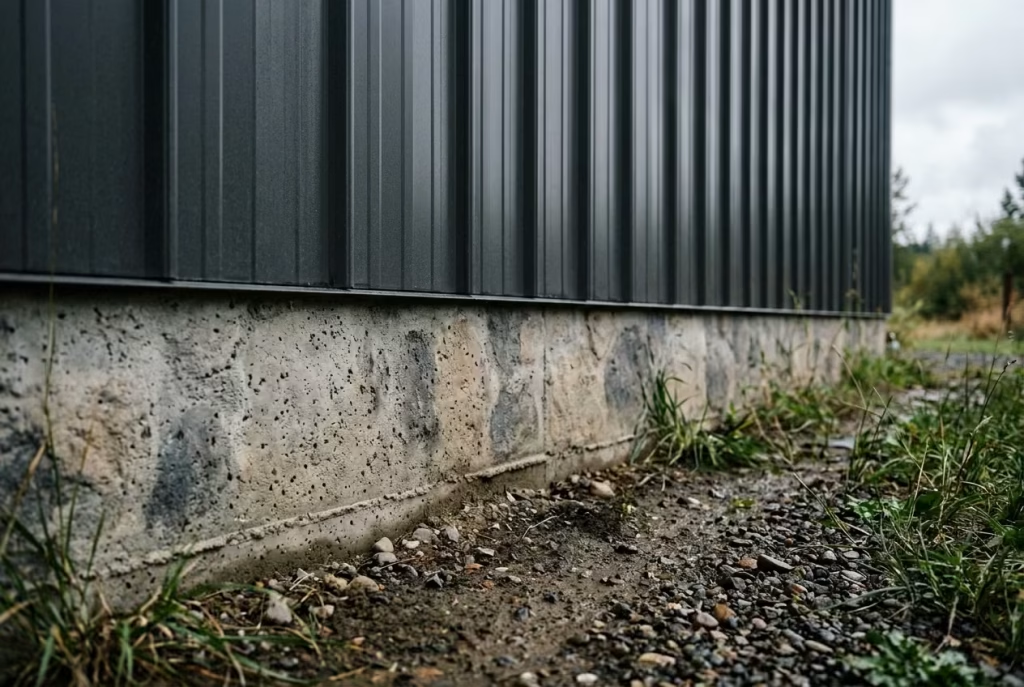
Every exterior has a ground floor problem that architecture magazines rarely photograph honestly, and that’s the bottom foot or two of wall where splash-back, snow melt, sprinkler overspray, and general ground moisture do their slow, patient work. On a barndominium, where the walls often run straight to grade with far less transitional detailing than a traditional home, that ground-level zone takes a beating year after year, and whatever material sits there needs to shrug it off rather than absorb it.
This is where a hard, non-organic base course earns its keep, and I mean that almost literally, organic materials, wood especially, wick moisture upward through capillary action whether you want them to or not. Stand a wood board flush against wet soil or a splash zone long enough and it will eventually cup, split, or invite rot regardless of how well it was sealed at install. Concrete doesn’t have that vulnerability. Neither does a well-made steel-look composite panel, engineered specifically to handle constant moisture exposure without swelling, warping, or feeding mold the way cellulose-based materials quietly do over a decade of seasons.
In genuinely humid climates, the Gulf Coast, the Southeast, anywhere summer air feels like standing in a warm towel, this detail stops being a design preference and becomes something closer to insurance. I’ve walked homes in these regions where the wood trim at grade level had failed within a handful of years while everything above it still looked fresh, simply because that lowest band never got a chance to dry out between rain events. A poured concrete base, or a composite panel system built to mimic weathered steel or board texture, sidesteps that entire failure mode. It doesn’t care how many humid nights pass before the next dry spell arrives.
Concrete brings its own honest trade-offs worth naming plainly. As a standalone material for a porch or base course, it tends to run cheaper per square foot than most wood or composite alternatives, and it holds up for decades with nothing more than an occasional reseal, but it also reads cold and hard on its own, which is exactly why I rarely leave it bare.
Pair it with a texture or stain that mimics stone, or let it sit quietly beneath a stone or composite veneer as structural backup, and it disappears into the design rather than announcing itself as slab. Steel-look composite panels cost more upfront than plain concrete but deliver a warmer, more finished appearance straight out of the box, no additional treatment required, which some clients find worth the premium simply for the time it saves.
The lesson that’s cost more than one client an unplanned repair bill is this: whatever sits at the bottom of your exterior wall works harder than anything above it, and it deserves a material chosen for resilience first, aesthetics second. Get that order backwards, and you’ll be repainting or replacing that base course long before the rest of the house shows its first sign of age.
You May also Like: 25 Front Yard Landscaping Ideas That Elevate Curb Appeal with Architectural Intention
Courtyard or L-Shaped Configuration
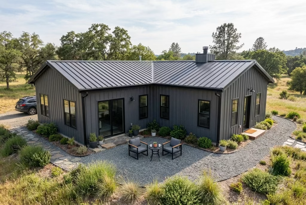
Somewhere in nearly every barndominium conversation, a client will describe wanting the place to feel like a home rather than a building, and it took me longer than I’d like to admit to realize that word, feel, often has almost nothing to do with materials or color and everything to do with shape. A straight rectangular volume, however beautifully clad, reads as utilitarian at some deep, almost instinctive level, because that’s exactly the shape a barn or a warehouse has always taken. Bend that same footprint into an L, or wrap it further into a courtyard, and something shifts that goes well beyond curb appeal.
The logic here is spatial rather than material, the same category as the offset massing idea mentioned earlier, but taken a step further. An L-shaped configuration creates an outdoor space with actual edges, a corner where two wings meet and enclose something, rather than a flat yard stretching away from a flat wall with no sense of containment.
That enclosed corner becomes usable in a way open exposure never quite manages, sheltered from wind on two sides, private from the road, the kind of spot where a table and chairs actually get used instead of sitting there for show. A full courtyard configuration pushes this further still, wrapping the barn form around three sides of an outdoor room, and the psychological effect is almost immediate.
Visitors stop reading the building as a shed with a house attached and start reading it as a residence with genuine architectural intention, because that’s precisely what a courtyard has signaled in domestic architecture for centuries, going back to farmhouses that clustered buildings around a working yard long before anyone called it a design feature.
There’s a practical dividend too, one I’ve watched surprise clients more than once. That enclosed outdoor space naturally becomes the transition zone between indoor and outdoor living, morning coffee somewhere sheltered from the wind, an evening fire pit shielded from the road’s sightline, dogs and kids with a bounded space to roam that doesn’t require constant supervision the way an open yard does. It does double duty as both a design statement and a genuinely more livable layout, which is rarer than it sounds.
None of this comes without its own honest cost conversation, and I’d rather flag it now than let anyone discover it mid-bid. Bending a floor plan into an L or a courtyard means more exterior wall perimeter relative to interior square footage than a simple rectangle delivers, more corners, more roof intersections, more foundation complexity, and that translates to a real bump in framing and roofing costs over an equivalent straight-run footprint, the exact premium depending heavily on your specific site, foundation type, and local labor rates, something only a contractor’s actual quote for your plan can tell you with any accuracy.
But of every idea on this list that changes how a barndominium is fundamentally read, from utility building to residence, this is the one doing the heaviest lifting, and it does it through geometry alone, before a single material or color decision even enters the conversation.
Minimal Color, Maximum Texture
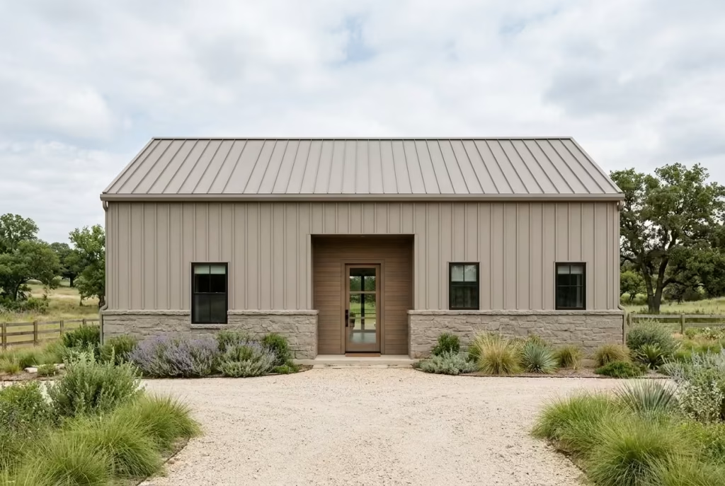
There’s a trap I’ve watched more than one client fall into, and it usually starts with good intentions. They want their barndominium to feel calm, restrained, the kind of exterior that doesn’t shout, so they pick a single neutral, one shade of gray or greige or warm white, and paint the whole thing that color top to bottom. What they end up with, more often than not, is a house that looks unfinished rather than refined, flat in a way that reads as budget-conscious even when the actual build wasn’t cheap at all. Restraint and monotony are not the same thing, and this final idea is about the difference between the two.
The trick, the one that separates a genuinely sophisticated neutral exterior from a beige box, is holding the color still while letting texture do all the talking. One neutral, applied consistently, but expressed across three distinct surfaces, smooth metal siding, a rougher stone or stucco base, a warm wood accent at the entry, so the eye reads variation and depth even though the palette itself never wavers. It’s the same principle a good tailor uses building an outfit entirely in navy, different weaves, different finishes, same color family, and the result looks considered rather than lazy precisely because of that discipline.
Here’s why this approach costs more than it looks like it should, and why I’d rather tell you that plainly than let a contractor’s invoice be the one to break the news. Achieving genuine texture variation within a single neutral tone means specifying and sourcing three separate material systems rather than one, smooth fiber cement or metal panel, a textured stone or manufactured veneer, a distinct wood species for the accent, and getting all three to read as intentionally related rather than randomly assembled takes a level of coordination most single-material builds skip entirely.
Color matching across different material types is its own small headache too, since paint, natural stone, and wood stain all absorb and reflect light differently even when you’re aiming for the same general neutral family, which is exactly why I always request physical samples of every material together, in the actual site light, before anything goes on order.
What fifteen ideas eventually teach you, if you sit with them long enough, is that this final one is really the thesis the whole list has been circling. Whether it’s the shadow line under a deep overhang, the warmth of a single wood surround against cool metal, or the quiet grounding of a stone base beneath a tall wall, the barndominiums that actually look expensive are rarely the ones doing the most.
They’re the ones that picked their handful of moves carefully, let one material or color lead, and trusted restraint to do the rest of the talking. That’s a harder discipline than it sounds, and it’s the one thing every genuinely modern exterior on this list, in one form or another, has in common.
Common Mistakes to Avoid While Designing a Modern Barndominium Exterior
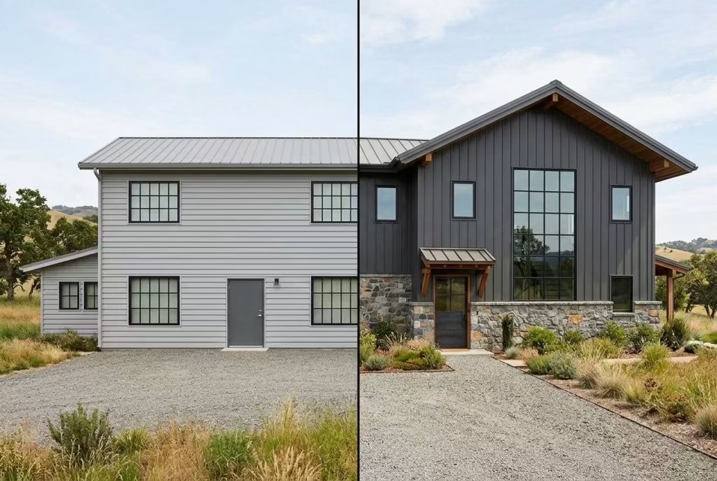
Fifteen ideas in, it’s worth pausing on the flip side, because I’ve walked enough finished builds to know that most disappointing barndominium exteriors weren’t ruined by a bad idea. They were ruined by a good idea taken too far, or a small decision nobody thought carried any weight until the scaffolding came down. These are the mistakes I see repeat themselves across otherwise capable builds, and every single one is avoidable if you catch it before the framing crew shows up.
Treating the whole exterior as one uniform surface. This is the single most common misstep, and it usually comes from a place of wanting things to look clean and cohesive. One material, one color, no breaks, and the result almost always reads flat rather than refined. A modern exterior needs contrast to feel intentional, whether that’s the two-tone split mentioned earlier, a stone base grounding a metal upper story, or simply a wood accent doing its quiet work at the entry. Sameness isn’t sophistication. It’s just sameness.
Skipping the roof overhang to save a few hundred dollars in framing. I’ve mentioned this trade-off before because it genuinely comes up on nearly every project, and it’s almost always the wrong place to cut. A shallow eave might shave a modest sum off your framing bid, but it’s also the single detail most responsible for that “giant metal box” complaint people voice constantly in owner forums and comment threads. Spend the money here before you spend it somewhere more decorative and less structural.
Choosing black-framed windows and then repeating the exact same grid pattern on every single opening. I covered this in detail earlier, but it deserves its place on this list too, because it’s an easy trap even for people who’ve read every design article going.
Storefront-style black grids carry a genuine cost premium over standard units, and spreading that premium evenly across a building’s utility windows, side elevations, and garage bays dilutes the very impact you paid for. Save the grid pattern for the two or three windows that actually get seen from the road.
Ignoring orientation before committing to large glazing. A glass gable end or an expansive window wall photographs beautifully in a rendering, but renderings don’t account for which direction the sun actually travels across your specific lot.
South-facing glass in a hot climate without adequate overhang protection turns a design statement into an afternoon greenhouse, and that’s not a flaw you can paint over later. Walk your actual site at different times of day before locking in glazing placement, not just once, but across a few different seasons if your schedule allows it.
Letting wood do too much or too little. This one cuts both ways. Some builds skip warm materials entirely and end up cold and clinical, all metal and stone with nothing to soften it. Others go the opposite direction, wood everywhere, wood surrounds, wood accents, wood soffits, until the barn form starts drifting toward cabin territory instead of the sleek modern read the client actually wanted. One confident gesture, concentrated at the entry or one secondary spot, does more work than wood scattered thin across five different surfaces.
Building a wraparound porch bigger than the site or budget actually calls for. Porches are genuinely functional, shading walls, sheltering entries, creating that outdoor room effect I mentioned earlier, but there’s a real temptation to wrap the entire structure simply because the floor plan allows it. Full wraparound configurations run meaningfully more per square foot than a partial porch placed only where sun exposure and foot traffic actually demand it, and oversizing this feature is one of the fastest ways to blow a budget on square footage that ends up rarely used.
Placing the wrong material at grade level. Wood or organic-based cladding sitting flush against soil or a splash zone will eventually cup, split, or invite rot, no matter how well it’s sealed at installation. This mistake doesn’t show up on day one. It shows up three or four years in, quietly, at exactly the height most people never think to inspect until the damage is already visible.
Forgetting that a straight rectangle reads as utilitarian no matter what you clad it in. This is the mistake that sits underneath several of the others. No siding color, no window upgrade, no roofing choice fully overcomes a floor plan that never breaks its own silhouette.
If the budget allows even a modest offset volume or an L-shaped bend around an outdoor space, that geometric decision does more to shift a building from shed to residence than almost any material choice made afterward.
If there’s a single thread running through this list, it’s that most of these mistakes aren’t failures of taste. They’re failures of sequencing, spending on the wrong detail before the right one, or trusting a rendering over an actual walk of the site. Catch these early, while they’re still line items on a plan rather than finished walls, and the modern read you’re after gets a great deal easier to land.
What Is a Modern Barndominium Exterior
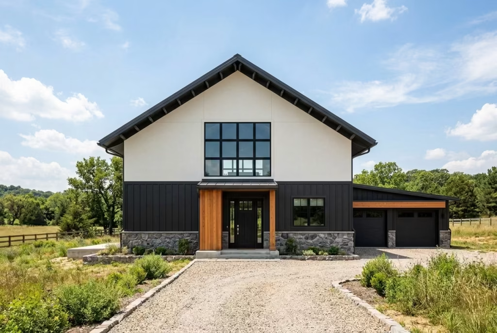
Ask ten people what makes a barndominium “modern” and you’ll get ten different answers, most of them circling the same handful of words without ever quite landing on a definition. Black, sleek, minimalist. True enough, but none of that actually tells you what to specify when a contractor asks for details. After years of standing on these job sites, watching which choices age well and which ones start looking dated before the paint’s even cured, I’ve settled on a definition that’s less about vibe and more about a specific set of design decisions working together.
A modern barndominium exterior, at its core, takes the honest bones of a barn form, tall walls, a simple gable or shed roofline, metal cladding, and applies a restrained, architecturally deliberate treatment to it rather than leaving it in its raw, agricultural state. It’s the difference between a building that happens to be shaped like a barn and one that’s been genuinely designed around that shape. Five things tend to separate the two, and every idea covered earlier in this piece traces back to one of them.
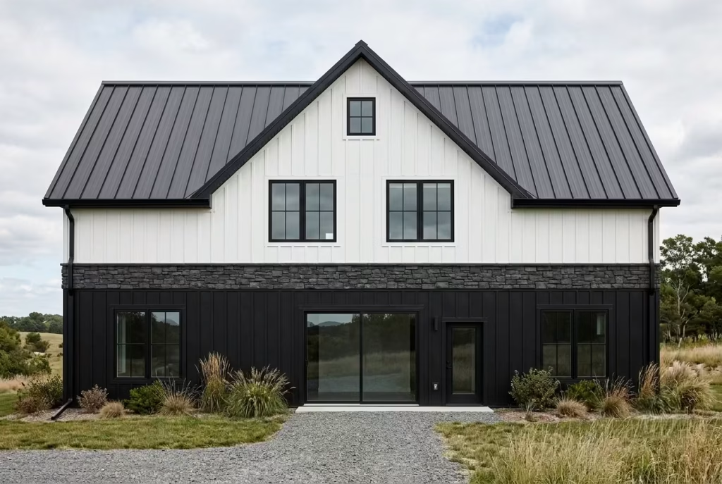
The first is palette discipline. Monochromatic or two-tone color schemes, matte black, charcoal, crisp white, sometimes a warm gray, dominate the modern category because a limited palette reads as intentional in a way scattered colors never do. This doesn’t mean the exterior has to be visually flat. It means the color story stays disciplined while texture and material carry the visual interest instead.
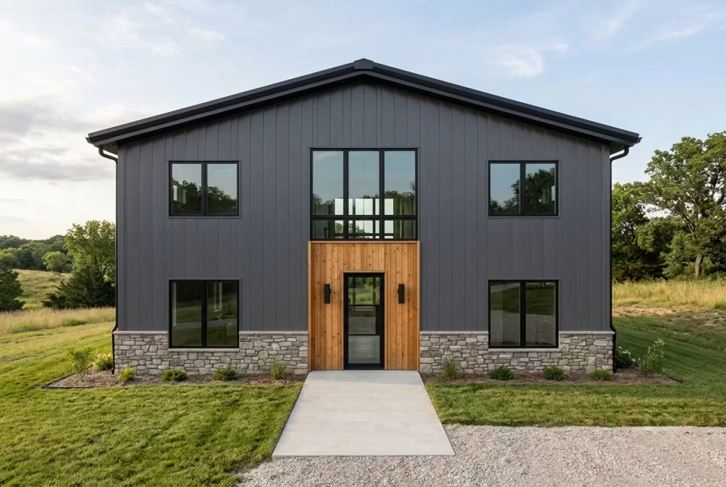
The second is material mixing done with restraint. Pure metal siding on its own can feel a touch clinical, so modern barndominiums typically pair steel or metal panels with one grounding or warming material, stone at the base, wood at the entry, concrete underfoot, and never more than that. Overload the mix and you drift toward rustic. Underdo it and you drift toward cold.
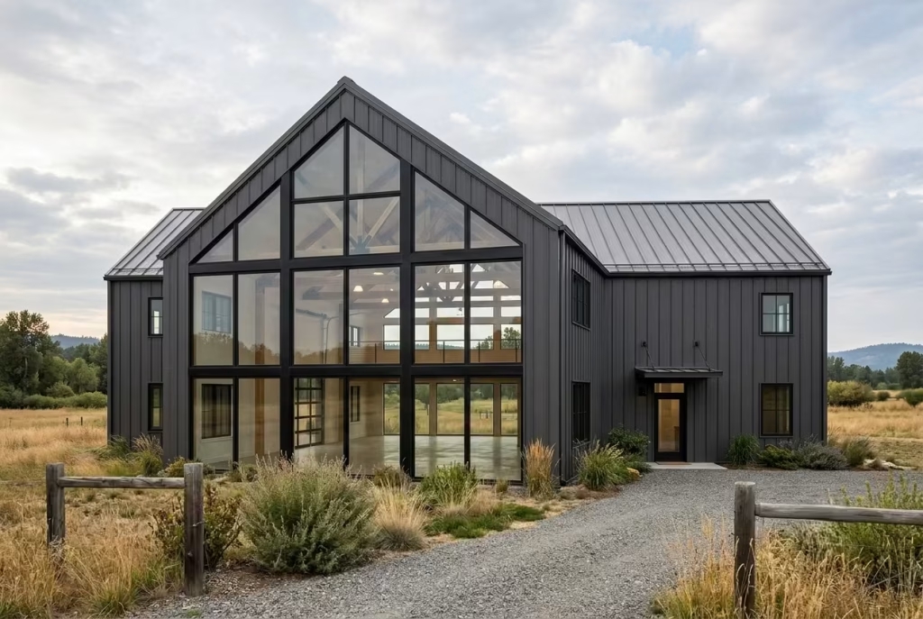
The third is glazing that behaves like architecture rather than an afterthought. Large-format windows, black-trimmed or storefront-style, floor-to-ceiling glass at a gable end, these aren’t decorative extras bolted onto a barn shape. They’re treated as structural, deliberate openings that shape how light and sightlines move through the building, chosen for orientation and function first and appearance second.
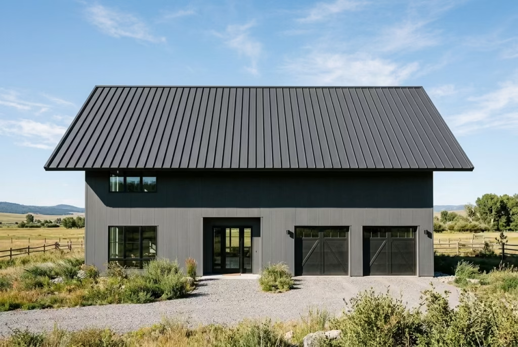
The fourth is a roofline and overhang that’s been considered rather than defaulted to. Standing-seam metal in anthracite or another dark, quiet tone, paired with a generous eave rather than the bare minimum, does more to signal modern intent than almost any other single decision, because it solves the tall, boxy silhouette that reads as agricultural rather than residential.
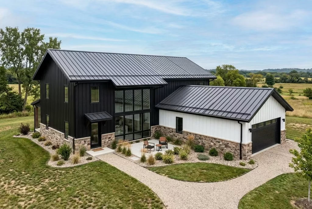
The fifth, and the one most competitors skip entirely, is massing that breaks its own rectangle. Offset volumes, an L-shaped footprint, a courtyard configuration, anything that stops the building from reading as one long, uninterrupted shed. This is the detail that separates a barndominium with a modern paint job from one that’s genuinely been designed as a residence.
Put those five elements together, palette restraint, deliberate material mixing, purposeful glazing, a considered roofline, and broken massing, and you’ve got the actual working definition of a modern barndominium exterior, not just the mood, but the mechanics behind it. Everything else, the specific colors you choose, the exact stone you source, the porch configuration you settle on, is really just personal expression layered on top of those five structural decisions. Get those right, and almost any material palette you choose afterward is going to look considered rather than accidental.
You May also Like: 25 Outdoor Kitchen and Bar Ideas That Elevate Backyard Entertaining: Inspiring, Practical Designs to Transform Your Garden
What Fifteen Exteriors Actually Teach You
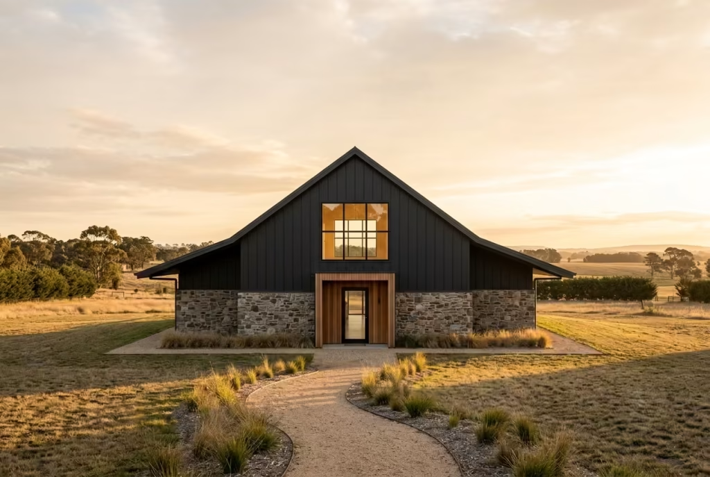
Stand back far enough from any of these fifteen ideas and a pattern starts to surface that has almost nothing to do with the individual choices themselves. It isn’t the black steel, or the stone base, or the cedar screening that makes an exterior feel considered. It’s what those choices have in common, a willingness to let one thing lead while everything else quietly falls in line behind it.
That’s the thread running underneath this entire list, whether it showed up as a single warm material against a field of cool metal, a shadow line cast by an overhang deep enough to actually matter, or a floor plan bent just enough to stop reading as a shed. Restraint, in every case, did more work than addition ever could. The barndominiums that end up looking expensive aren’t the ones piling on every trend at once. They’re the ones that picked their handful of moves with real intention and trusted proportion to carry the rest.
There’s a kind of confidence in that approach that’s hard to fake and even harder to teach, the sense that a building knows exactly what it is rather than still auditioning for the role. If there’s one habit worth carrying forward from everything covered here, it’s learning to ask which single material or gesture deserves to speak loudest on your own exterior, and then having the discipline to let everything else stay quiet around it.
Inspiration only carries a project so far, though. Once you’ve settled on a direction, the real questions start, what materials actually cost in your region, how climate should shape your choices, what trade-offs are worth making and which ones aren’t. That’s a different kind of conversation, and it’s the one we’ve laid out in full in our companion guide on modern barndominium exteriors, the one built for the planning stage rather than the daydreaming one.
Frequently Asked Questions
Is a modern barndominium exterior more expensive to build than a traditional one?
Not necessarily, but it depends entirely on which modern elements you choose. A simple two-tone paint scheme or board-and-batten siding with minimal trim adds very little to a standard barndominium build. Where costs climb is with large-format glazing, stone wainscoting, and complex rooflines with multiple offset volumes, since each of those adds material and labor beyond a basic steel shell. The honest answer, from having priced dozens of these builds, is that the barn’s core cost advantage holds up fine until you start layering on customization, at which point that gap narrows fast.
How do you keep a barndominium from looking like a plain metal box?
Break the massing, vary the roofline, and give the eye somewhere to rest. The three moves that do the most work here are a deep overhang to visually shorten a tall wall, a stone or wood band along the lower third to ground the structure, and at least one offset volume, a pulled-forward wing or a covered porch, that interrupts the straight rectangle everyone recognizes as “just a barn.” Skip all three and even a beautifully colored exterior will still read as a shed with good paint.
Are black steel or dark exteriors more expensive to maintain?
Dark siding generally shows less dirt and staining than lighter colors, which cuts down on how often you’re pressure washing, but it does absorb more heat, so proper insulation behind it isn’t optional in warmer climates. Beyond that, matte black steel and metal siding hold up well over time and don’t require repainting the way traditional wood siding does. The real maintenance cost sits in the insulation package upfront, not in the color itself down the line.
What’s the difference between natural stone and cultured stone on a barndominium exterior?
Natural stone, limestone or fieldstone, brings genuine texture and weight, and it costs meaningfully more once mason labor is factored in. Cultured stone is manufactured to mimic that same look at a lower price point, and when installed by someone who understands proper coursing, it holds up visually far better than people expect. Neither is objectively better; the choice usually comes down to budget and how long you plan to stay in the home.
Do barndominiums hold up as well as traditional homes in storms or extreme weather?
Steel-framed barndominiums generally perform well against wind and storm damage, since steel doesn’t rot, warp, or attract termites the way wood framing can. That said, actual storm resistance depends heavily on local building codes, wind ratings, and how the structure is engineered, not just the material itself. Anyone building in a high-wind or hurricane-prone region should confirm wind load requirements with a local structural engineer rather than relying on general claims about steel durability.
Can you achieve a modern barndominium look on a smaller or tighter budget?
Yes, and some of the most cost-effective choices happen to be the most modern-reading ones. A single bold color, minimal trim, and clean rooflines cost less than ornate detailing, not more. The idea that “modern” automatically means expensive doesn’t hold up in practice; restraint is often the cheaper path, since you’re paying for precision rather than for extra material.