Nancy Meyers Style: The Ultimate Guide to Getting the Look in Every Room
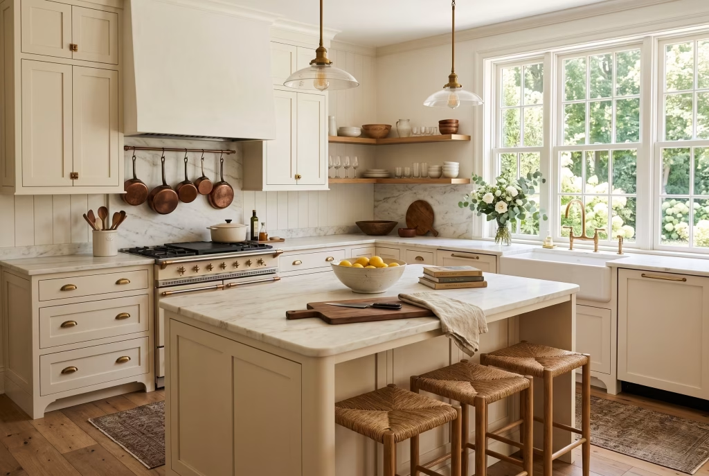
There is a particular kind of kitchen that stops you mid-scroll. Marble worktop worn soft at the edges, a bowl of lemons doing absolutely nothing except looking beautiful, copper pots hanging within arm’s reach of a stove that has clearly cooked a thousand family dinners. You know the one. It belongs to Diane Keaton in Something’s Gotta Give, or Meryl Streep in It’s Complicated, or any number of the warm, sun-washed interiors that filmmaker Nancy Meyers has been quietly setting the design agenda with for over two decades.
Ask ten people what “Nancy Meyers style” actually means and you will get ten slightly different answers, and that is rather the point. It is less a fixed rulebook than a feeling: elevated but unpretentious, expensive-looking but never showy, the sort of home you could genuinely imagine living in rather than merely admiring from a doorway.
I have redesigned enough client kitchens chasing this exact brief (“can you make it feel like that film, but liveable”) to know where people usually go wrong, and it is almost never the big-ticket items. It is the small, easily skipped details that either sell the look or quietly undo it. This guide works through both, room by room, so you can bring the aesthetic home without needing a Hollywood production budget or a production designer on speed dial.
Where the Nancy Meyers Aesthetic Actually Comes From
It is worth pausing on the origin story, because it explains why the style works so consistently well on screen and, by extension, why it translates so beautifully into real homes.
Nancy Meyers has written and directed a string of films built around women in their forties, fifties and beyond, among them Something’s Gotta Give (2003), The Holiday (2006), It’s Complicated (2009) and The Intern (2015). Her long-time collaborators, production designer Jon Hutman and set decorator Beth Rubino, are the ones who actually built these interiors, and their brief was never simply “make it look expensive.”
It was closer to “make it look lived in by someone with taste, time, and a genuine love of cooking and reading.” Hutman has spoken in past interviews about designing the Something’s Gotta Give Hamptons house almost as a character study of Erica Barry herself, working out what a successful, self-possessed playwright would actually collect over thirty years, rather than styling a generic “beach house.”
That distinction matters enormously when you’re trying to recreate the look at home. A showroom-perfect kitchen photographs beautifully but feels cold to sit in. A Nancy Meyers kitchen has half-empty jam jars and a toaster that isn’t remotely photogenic sitting quietly next to the styled bits, because real life happens in these rooms. Keep that principle in mind as we go through each space; it is the difference between a home that looks like a film set and one that simply feels like it belongs on one.
The Two Faces of Nancy Meyers Style
Here is something most guides skip over entirely, and it is the single most useful thing to understand before you start buying anything: there isn’t one Nancy Meyers look, there are two, and they pull in slightly different directions.
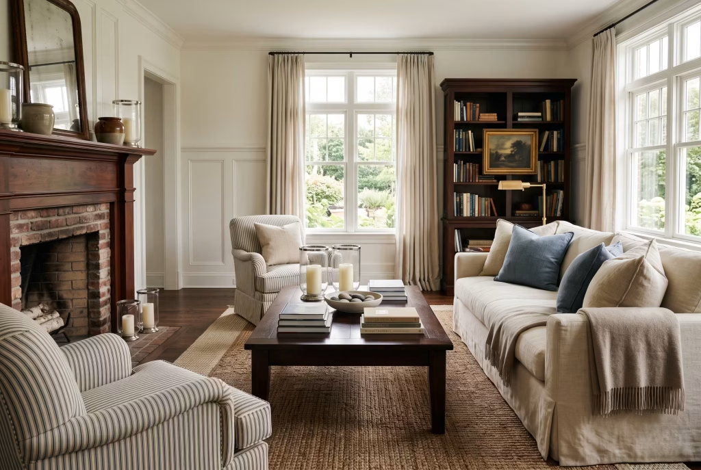
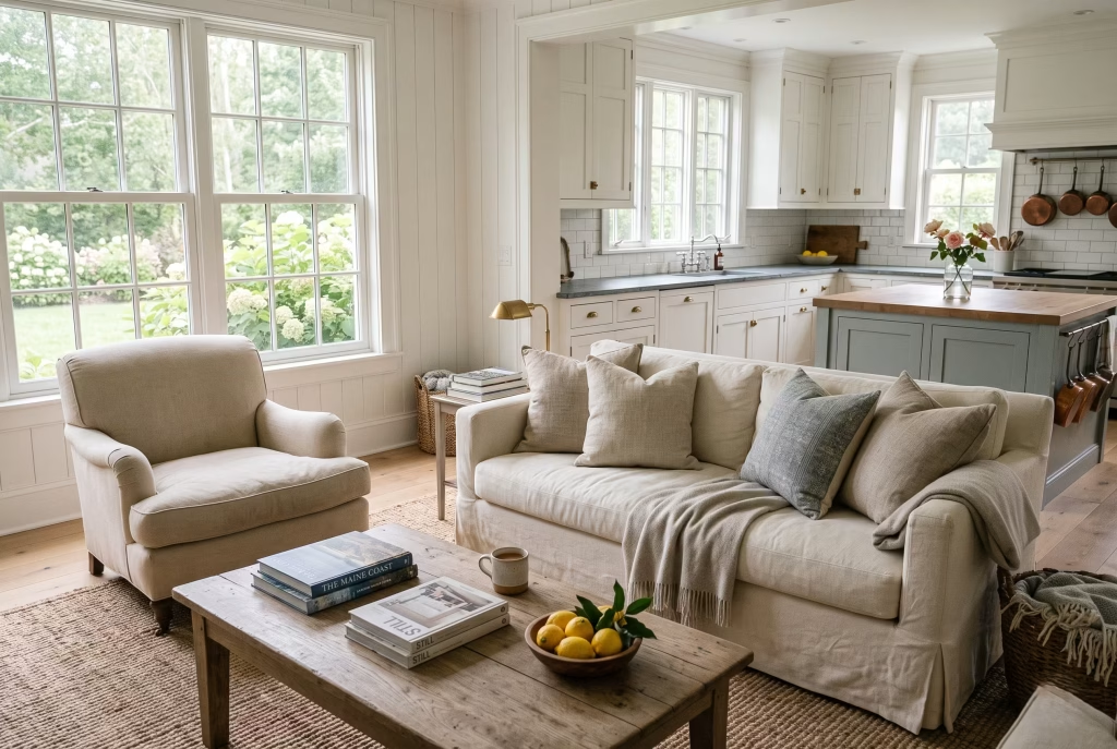
Coastal Grandmother is the quieter, breezier sibling. Think Diane Keaton’s Hamptons house in Something’s Gotta Give or the Los Angeles side of The Holiday. It leans into soft whites, sisal and jute underfoot, linen slipcovers, striped upholstery, and a distinct absence of light wood tones (mahogany and darker finishes do the heavy lifting instead). Candles here tend to be generous pillar candles in glass hurricanes rather than fussy tapers.
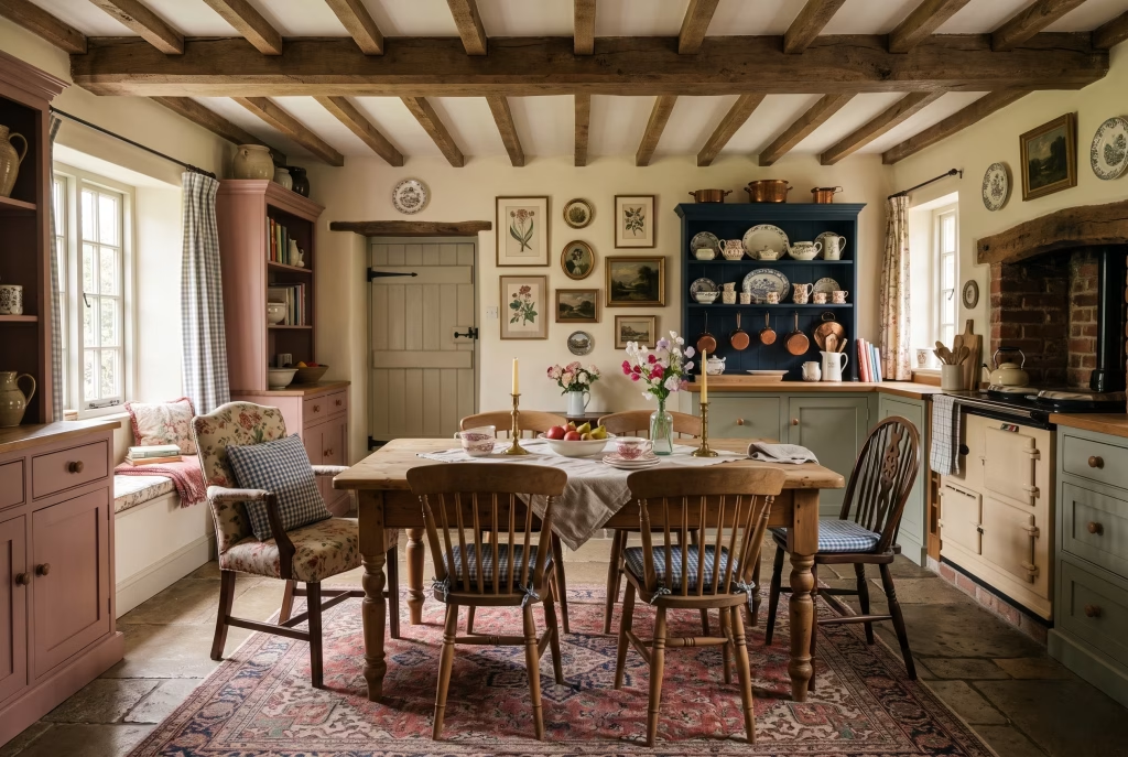
Pastoral English Country is the warmer, more layered cousin, closer to the London house in The Parent Trap or the cottage in The Holiday‘s English half. Chintz, gingham, floral prints, Windsor-style dining chairs, patchwork quilts, botanical prints on the walls, spindle metal beds. Pattern-matching rules go out the window here, in the best possible way; it should feel like it was collected over decades rather than bought in a single afternoon.
Most homes borrow from both, which is entirely in keeping with the spirit of the style. But choosing a lead direction for each room, rather than mixing the two at random, will keep your finished space feeling intentional instead of muddled. My rule of thumb with clients: pick one direction for the “anchor” pieces (sofa, bed frame, dining table) and allow the smaller layers (cushions, throws, artwork) to borrow a little from the other. That’s how the real film sets do it too; nothing is ever 100% one or the other.
| Coastal Grandmother | Pastoral English Country | |
|---|---|---|
| Palette | Soft white, sand, sea-glass green, chalky blue | Cream, dusty pink, sage, warm navy |
| Wood tone | Dark mahogany, ebonised finishes | Mixed light and mid-tone woods |
| Rugs | Sisal, jute, subtle stripe | Vintage Persian, faded florals |
| Pattern | Pinstripe, plain linen | Chintz, gingham, botanical florals |
| Candles | Large pillar candles, glass hurricanes | Taper candles, brass candlesticks |
| Best-suited rooms | Kitchen, living room, bathroom | Bedroom, dining room, entryway |
You May also Like: What an English Country Entrance Is Actually Trying to Do
Nancy Meyers Kitchen Ideas
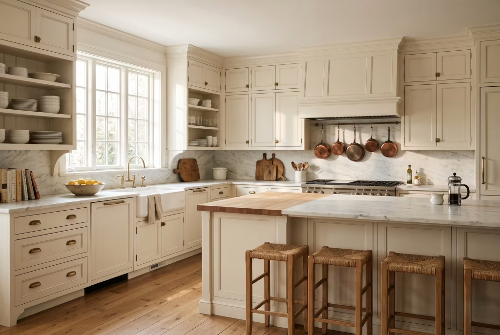
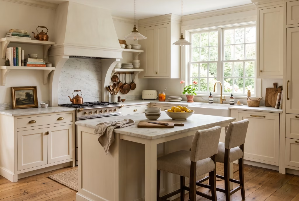
If there is one room where this aesthetic was born and perfected, it’s the kitchen. The Something’s Gotta Give kitchen is still, over two decades on, one of the most referenced kitchens in interior design, and for good reason: it manages to look expensive without a single surface feeling untouchable.
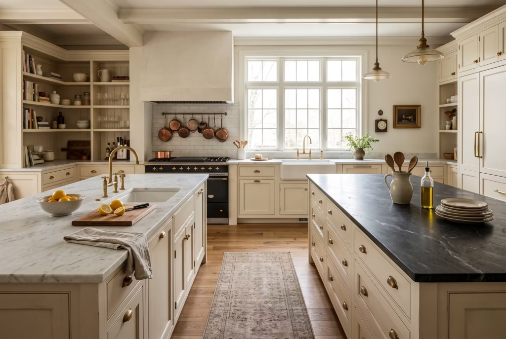
Countertops and islands. Marble is the material of choice, whether that’s a full marble island like the one in It’s Complicated or a mixed approach with one marble surface and one darker stone or butcher block, as in the Something’s Gotta Give house, which famously ran two islands side by side, one topped in black, one in white marble with an integrated prep sink. If genuine marble is outside budget or you’re worried about etching from lemon juice and wine (a legitimate concern with a busy family kitchen), a good quartz with soft, realistic veining will do the job convincingly from a few feet away, which is honestly all that matters in daily life. Honed rather than polished marble also hides everyday wear far better if you do go the real-stone route; I specify honed finishes on almost every project chasing this look, because a high-gloss polish reads far more “showroom” than “collected over years.”
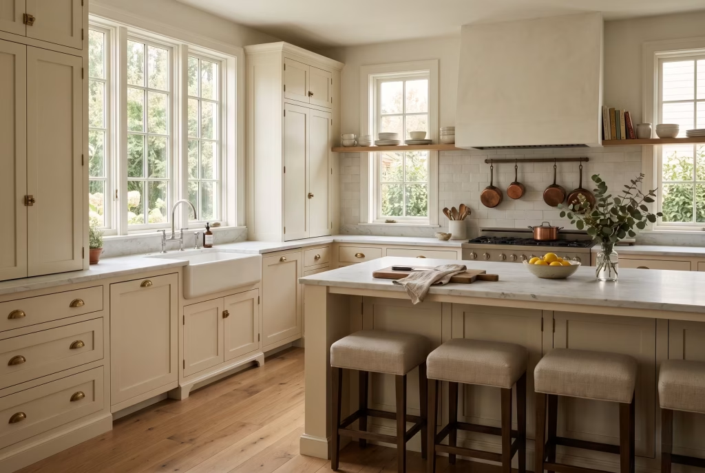
Cabinetry. Shaker-style doors in soft whites, warm creams, or a muted sage or navy blue (the blue cabinetry in The Holiday‘s cottage kitchen is a frequently referenced touchpoint) work best. Avoid anything glossy or handleless; the whole point is a slightly softer, more traditional silhouette. Aim for cabinet doors with a simple recessed panel rather than a flat slab front, and if your budget allows one splurge in the kitchen, put it into proper solid brass or unlacquered brass hardware rather than a plated finish. Unlacquered brass develops a genuine patina over a year or two of hands touching it daily, which is exactly the “aged in” quality this style is chasing; plated brass stays shiny and slightly plasticky-looking indefinitely.
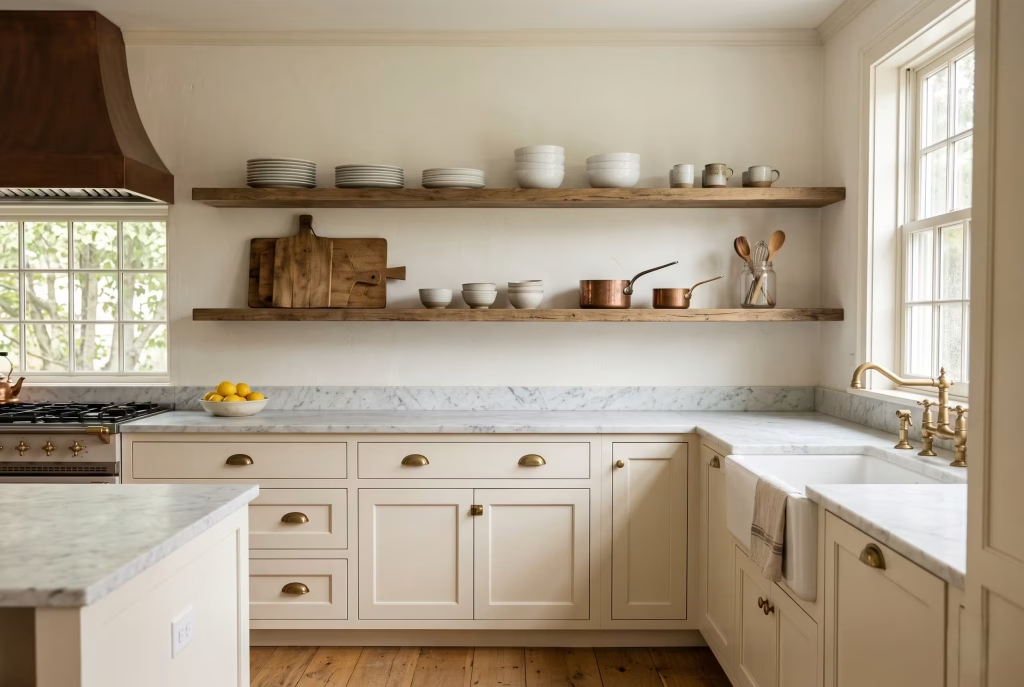
Open shelving, used properly. This is where a lot of homeowners overdo it. The trick isn’t to display everything, it’s to display the good-looking third of your kitchenware (the white porcelain, the wooden boards, the copper) and quietly tuck the rest away in closed cabinets. A shelf that is fully styled end to end starts to look like a display rather than a working kitchen. As a working guideline, leave roughly a third of any open shelf visually empty; it gives the eye somewhere to rest and stops the whole wall reading as clutter.
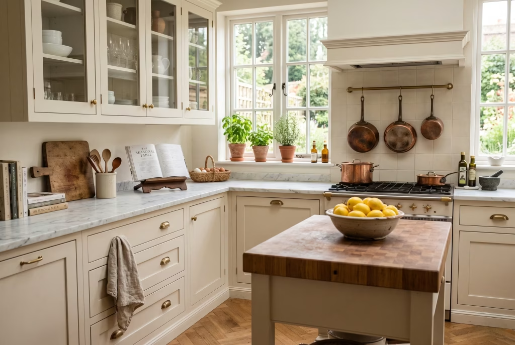
The details that do the real work. A bowl of lemons or seasonal fruit, replenished weekly so it never looks tired. Fresh herbs in terracotta pots on the windowsill, basil and rosemary hold up best indoors. A stack of well-used cookbooks, ideally one left open on a stand as though someone was mid-recipe. Copper pots on a rail, if you have the ceiling height and the patience to keep them polished (a light beeswax polish every few months keeps them warm rather than dull). Linen tea towels rather than novelty prints. None of this is expensive, and all of it does more heavy lifting than a single big-ticket purchase.
You May also Like: 15 Boho Mid-Century Modern Kitchen Ideas That Blend Warmth, Style, and Personality
Nancy Meyers Living Room Ideas
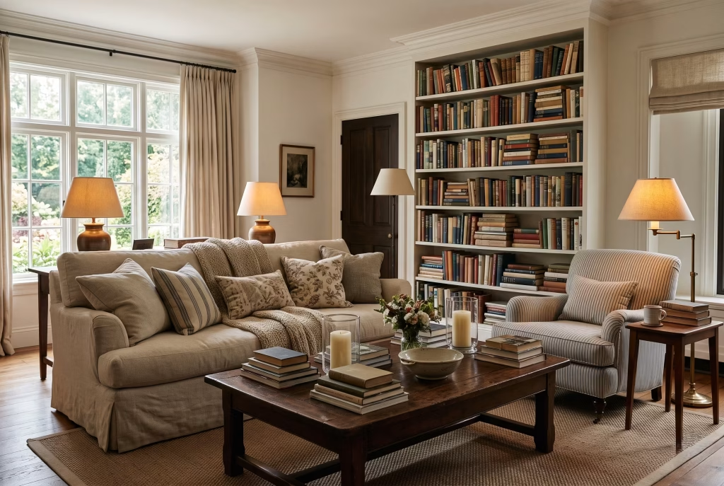
The living room is where the “sink in and stay for hours” quality of this style is most obvious. Slipcovered sofas in a durable cotton or linen blend are the backbone, deep enough to properly curl up in with a book, never so structured that you have to sit up straight.
A seat depth of around 60 to 65cm is roughly where that “sink in” feeling starts; anything much shallower and the sofa reads as more formal than the style intends.
Layer in an armchair with a bit of pattern, whether that’s a subtle pinstripe for the coastal direction or a proper floral or check for the English country route.
Rugs should read as natural fibre wherever possible: sisal, jute, or a faded vintage-style Persian if you’re leaning pastoral. Candles everywhere, genuinely, in numbers that would look excessive in most other styles but are exactly right here.
Table lamps with warm bulbs (look for a colour temperature around 2700K rather than the cooler 3000K+ many off-the-shelf bulbs default to) rather than a single overhead light doing all the work.
The detail people miss most often is the bookshelf. Books should be stacked in genuinely uneven, slightly imperfect ways, some upright, some on their sides, some doubled up in front of others, rather than colour-coordinated or arranged by height.
That imperfection is doing a lot of the “lived in” heavy lifting. I generally tell clients to resist the urge to buy books by the metre for colour matching; secondhand hardbacks from a charity shop, with actual worn spines, do more for authenticity than a perfectly toned set ever will.
Nancy Meyers Bedroom Ideas
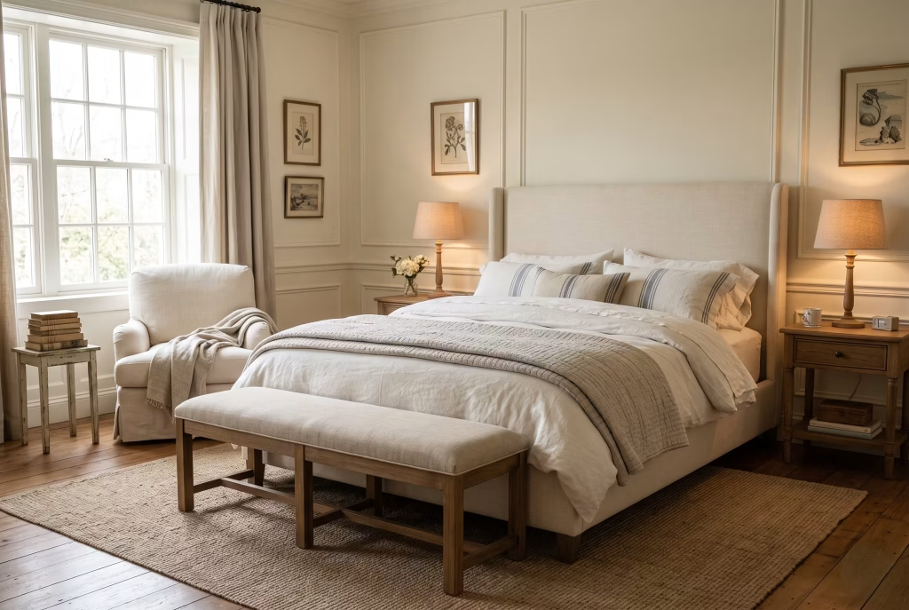
Soft, layered, and calm rather than showy. An upholstered headboard or a metal spindle bed frame both fit, depending on which of the two style directions you’re leaning towards; spindle beds tend to skew more pastoral English, upholstery more coastal.
Bedding should be soft and textured rather than crisp hotel-white, with a quilt or coverlet layered over the top, patchwork if you’re going English country, a simple stripe or solid if coastal. Aim for at least three layers on the bed itself (a base sheet set, a duvet or blanket, and a folded quilt or throw across the foot), because a single flat duvet, however nice the fabric, tends to read as sparse rather than collected.
A bench at the foot of the bed earns its keep both practically and visually, roughly two-thirds the width of the bed frame is a comfortable proportion. Keep lighting soft with a bedside lamp on each side rather than relying on ceiling lights, and if the room allows it, a small reading chair by a window does more for the atmosphere than almost anything else you could add.
Nancy Meyers Dining Room Ideas
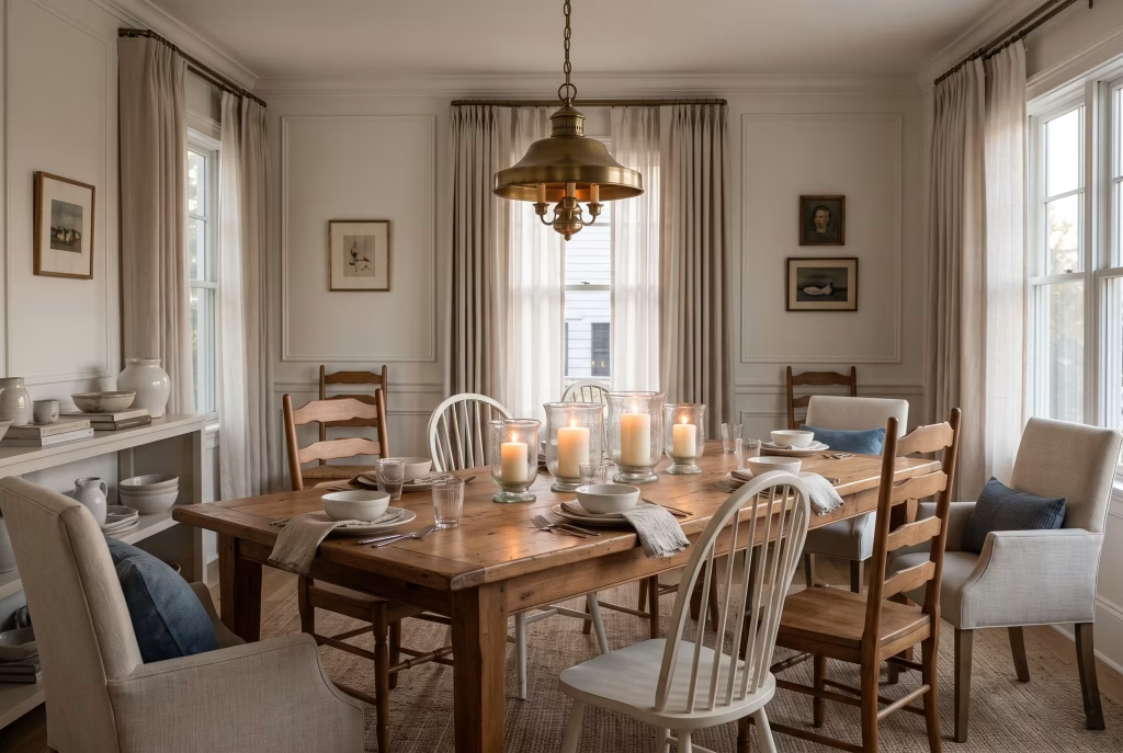
Candlesticks, always. Taper candles for the more formal, English-leaning dining rooms, chunkier pillar candles for the relaxed coastal version. A warm wood table, ideally with some age or character to it rather than a flat, uniform factory finish, works better here than anything glossy.
Chairs are where you can have real fun mixing things up. Windsor-style chairs, ladder-back chairs, or a set of dining chairs paired with mismatched armchairs at either head of the table all read correctly.
White or cream dinnerware, layered window treatments rather than bare glass, and if you want one genuinely high-impact touch, a proper chandelier or pendant with some presence, brass or aged metal rather than anything too sleek and contemporary.
As a hanging-height guide, the bottom of a dining pendant should sit roughly 75 to 80cm above the tabletop; much lower and it interferes with eye lines across the table, much higher and it loses the intimate, candlelit quality this style depends on.
You May also Like: 15 Gray and Green Living Room Ideas: How to Pair Gray and Green for a Stylish Space
Nancy Meyers Bathroom Ideas
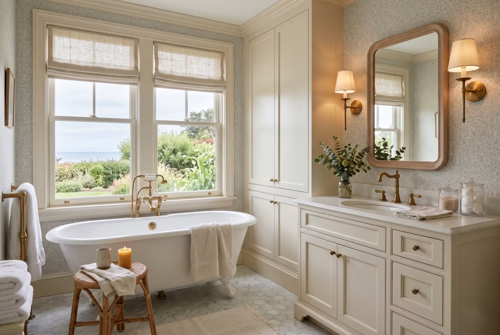
Bathrooms are a slightly overlooked corner of this aesthetic, which is exactly why a small powder room or guest bath is such a good place to experiment. Wallpaper earns its place here in a way it might feel bold elsewhere in the house; a small room limits both the cost and the commitment. Brass or antique brass fittings, a freestanding tub where space allows, and layered lighting via a mix of a statement mirror and wall sconces rather than a single harsh overhead strip.
Keep the palette soft: pale blues, warm whites, or a muted sage tie the room back into the rest of the house without feeling like an afterthought. Where floor space allows, a woven stool or small bench beside the tub adds the same “someone actually lives here” quality that a bowl of lemons does in the kitchen.
You May also Like: 16 Dreamy White Oak Living Room Ideas to Make Every Corner Feel Like Home
Nancy Meyers Entryway Ideas
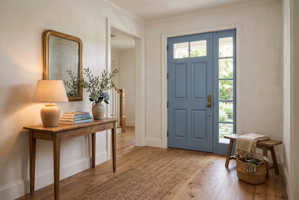
First impressions matter enormously in this style, and the good news is that entryways are one of the cheapest rooms in the house to get right. A jute or sisal runner, warm white or lightly textured walls, wood flooring where you have it, and a console table dressed with a lamp, a stack of books, and a single decorative jar or vase.
If your front door isn’t already a colour you love, this is one of the highest-impact, lowest-cost changes available to you; a soft denim blue or a deep, warm green both do the job beautifully, and a front door is typically a weekend project for a competent painter rather than a major renovation.
Paint Colours for the Nancy Meyers Look
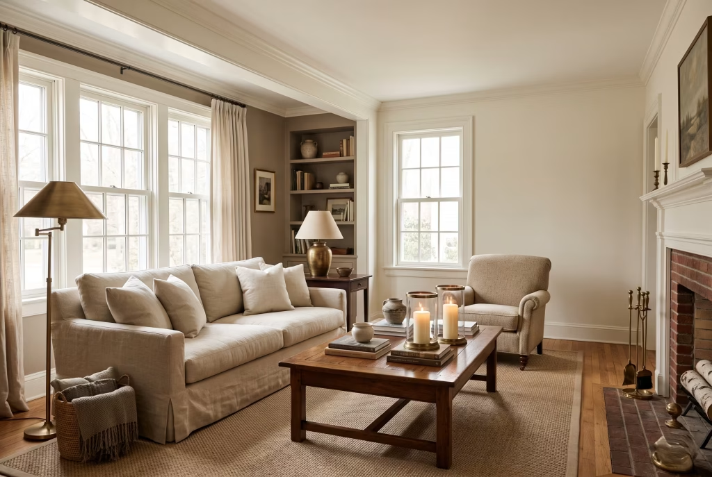
Colour is doing more of the work here than people tend to assume, and it is worth naming actual paint references rather than leaving you to guess at “soft white.”
For walls and trim, Benjamin Moore White Dove is the most consistently recommended warm white across designers working in this space, soft enough to avoid looking clinical, still bright enough to keep rooms feeling airy.
Sherwin-Williams Taupe of the Morning is a reliable warm taupe for anyone wanting a slightly deeper neutral without tipping into grey. For cabinetry and trim with a touch more character, muted sage greens and soft navy or denim blues both show up repeatedly across the films, particularly in kitchens.
If you’re shopping from a UK palette, Farrow & Ball’s Card Room Green and similarly muted, slightly dusty greens and blues sit comfortably in the same family, and are a sensible substitute if the US paint names above aren’t available to you locally.
Always test a paint colour on the actual wall, in the actual room, morning and evening, before committing; the warmth of this style depends heavily on how a colour behaves under real daylight, and a swatch card under shop lighting will consistently mislead you.
How to Get the Look on a Budget
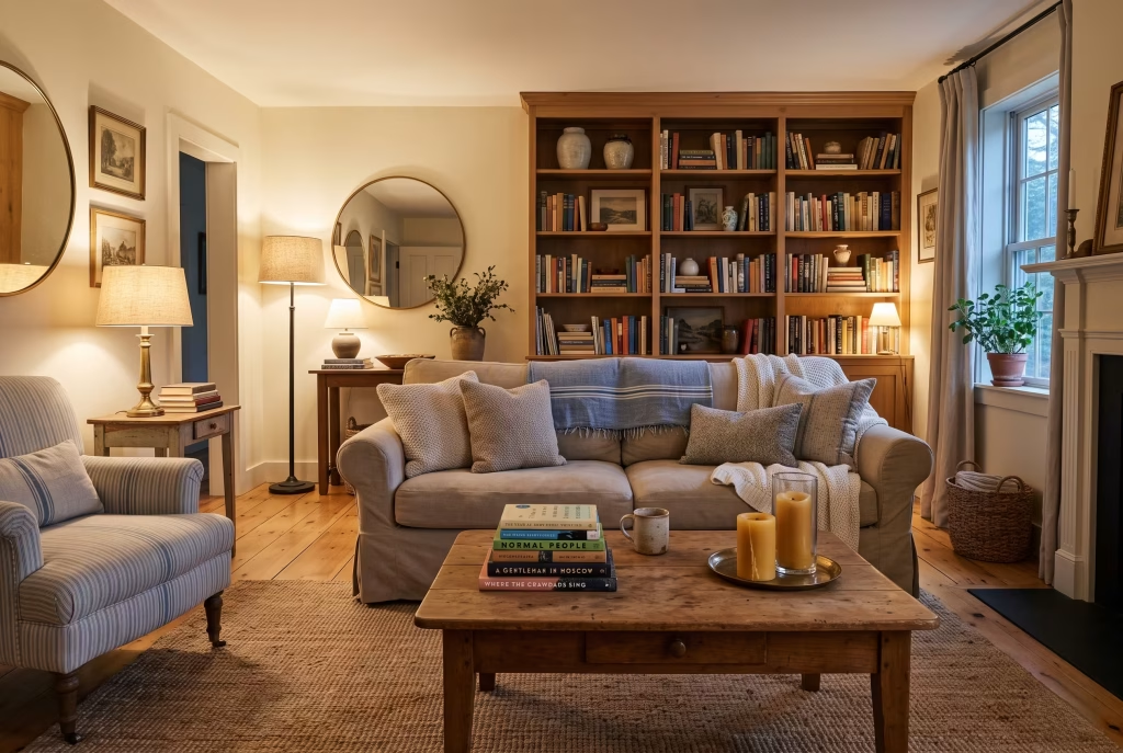
You do not need a film production budget to pull this off, and treating it as an accumulation of small, considered choices rather than one enormous shopping trip will actually get you a more convincing result.
Start with what costs nothing: decluttering surfaces, rearranging books unevenly rather than by colour, swapping harsh overhead lighting for lamps you already own. From there, prioritise the handful of items that do disproportionate visual work, a good throw, a stack of secondhand hardback books, a jute rug, before spending on anything structural like cabinetry or upholstery.
Charity shops, estate sales and vintage marketplaces are genuinely useful here, arguably more useful than new-furniture retailers, because a piece with a bit of age and patina reads as authentically collected in a way that a brand-new “distressed” reproduction rarely manages.
Save the bigger spend, a proper slipcovered sofa, a marble-effect worktop, real brass hardware, for the pieces you’ll live with daily and that are hardest to fake convincingly. As a rough phasing guide for anyone doing this room by room over time: soft furnishings and styling first (lowest cost, highest visual return), lighting and hardware second, structural changes like cabinetry or flooring last, once you’re confident the direction is right for how you actually live.
Mistakes That Tip the Look Over the Edge
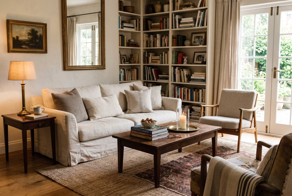
A few things reliably push this aesthetic from “warm and collected” into either “beige and characterless” on one side or “twee and overdone” on the other, and it’s worth knowing where those edges sit before you start.
Going too matchy with your wood tones flattens the whole look; real Nancy Meyers interiors deliberately mix a few different wood finishes rather than coordinating everything to the same shade. Overdoing the styling on open shelves, so that every single item is arranged and nothing looks like it’s actually used, tips a kitchen from lived-in into staged.
Buying everything new and matching from a single retailer’s catalogue is another common trap; even a beautifully coordinated set can end up looking flat if nothing in the room has a different origin or a bit of age to it.
And leaning too hard into pattern on every single surface at once, florals on the curtains, the cushions, and the wallpaper simultaneously, is where the pastoral English direction can tip into costume rather than decor. One or two pattern moments per room, balanced by plenty of solid, textural neutrals around them, is the formula that actually works on screen and off it.
You May also Like: California Coastal Interior Design: The Complete Guide to Getting the Look Right
Final Thoughts: Nancy Meyers Style
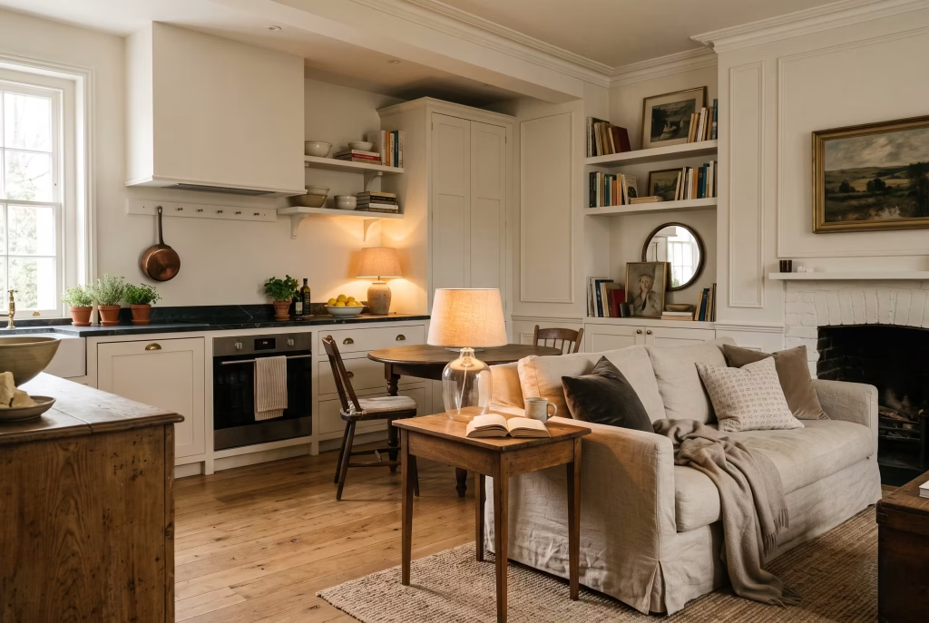
If you take away one thing from this guide, let it be this: the Nancy Meyers look was never really about the marble, or the brass, or any single item you can add to a basket and check out. It’s about restraint dressed up as abundance, a home that looks effortless because someone spent real thought getting it there.
Start with the room you use most, layer in the details slowly rather than all at once, and let a few imperfect, well-loved things sit right alongside anything new. That’s the whole trick. Do that consistently, room by room, and the feeling those film sets capture so well stops being something you’re borrowing and starts being something that’s genuinely yours.
Frequently Asked Questions
What is Nancy Meyers style called?
It doesn’t have one single official name, though it overlaps heavily with what’s now widely called “coastal grandmother” style, and with the more layered, floral “pastoral” or English country direction. Both fall under the broader umbrella of “Nancy Meyers style” or “Nancy Meyers aesthetic.”
Who designed the interiors in Nancy Meyers films?
Her long-standing production designer is Jon Hutman, with set decoration by Beth Rubino, and the two have worked together across most of her major films, which is part of why the look feels so consistent from one movie to the next.
Is Nancy Meyers style the same as coastal grandmother?
They overlap significantly but aren’t identical. Coastal grandmother describes the breezier, whiter, more relaxed half of the aesthetic. Nancy Meyers style also includes a warmer, more pattern-rich English country direction that coastal grandmother doesn’t really cover.
Can you get the Nancy Meyers look in a small apartment?
Yes, and arguably it translates well because the style relies more on texture, colour, and considered objects than on sheer square footage. Focus on soft lighting, a slipcovered chair, natural fibre rugs and a well-styled bookshelf corner rather than trying to replicate a full kitchen island in a compact space.
What paint colour is closest to a Nancy Meyers kitchen?
Benjamin Moore White Dove is the most frequently referenced warm white for walls and cabinetry, with muted sage green and soft navy as common accent choices for cabinetry specifically.
How much does it cost to get the Nancy Meyers look?
It scales enormously depending on how far you take it. A styling-only refresh (soft furnishings, lighting, decluttering) in a single room can realistically be done for a modest sum using secondhand and mid-range pieces. A full kitchen renovation with real marble and custom cabinetry sits at the opposite end entirely. The style is genuinely achievable at almost any budget because so much of its character comes from styling choices rather than construction.
Does this style work with a modern home?
It can, though it will read slightly differently. The core principles, natural materials, warm neutral palette, layered lighting, and genuinely used-looking objects, translate into more contemporary architecture reasonably well, even if the furniture silhouettes end up a touch cleaner than the traditional pieces shown here.
How do I stop the look feeling dated rather than timeless?
Avoid buying every element from a single “Nancy Meyers style” curated collection at once; a room built entirely in one shopping trip rarely ages as gracefully as one assembled gradually, with some pieces inherited, thrifted, or simply owned for years already. Mixing eras and origins, rather than a uniform new set, is what keeps the look feeling collected rather than trend-chased.