15 Boho Mid-Century Modern Kitchen Ideas That Blend Warmth, Style, and Personality
I’ve lost count of the number of clients who’ve sat at my kitchen table, laptop open, forty tabs deep into Pinterest, and said some version of the same thing: “I love the clean lines, but I don’t want it to feel like a showroom.”
That’s the whole conversation, really. Mid-century modern gives a kitchen its bones, the flat fronts, the tapered legs, the sense that everything has been considered. Boho gives it a pulse. Put the two together properly and you get a room that looks finished in photographs but feels lived in the moment you walk through the door, which is, if I’m honest, the only measure of a good kitchen that actually matters.
What follows isn’t a mood board. Every idea below has earned its place on a real worktop, in a real kitchen, under real morning light rather than a studio softbox. Some of these are big decisions you’ll make once and live with for a decade. Others cost less than a takeaway and can be swapped out on a whim.
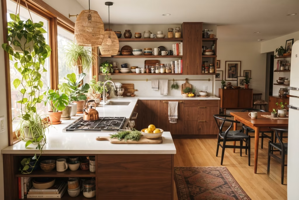
If you want the fuller grounding first, the difference between the two styles, where they genuinely clash, and how to budget for the whole project, that lives on our full guide. Here, we’re getting straight into the ideas.
Walnut Flat-Fronts With a Cluster of Rattan Pendants
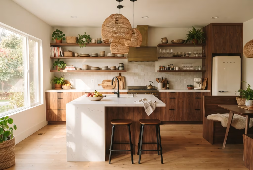
Walnut does something no paint colour ever quite manages: it warms a room up without you having to try. Flat-front cabinetry in a rich walnut veneer gives you all the discipline of mid-century joinery, no fussy panelling, no unnecessary detail, while the grain itself does the decorating.
Hang a cluster of woven rattan pendants above the island and you’ve paired the two textures that make this whole style work: the smooth, considered plane of the cabinet door against the loose, handmade weave of the light fixture overhead.
The trick I always come back to on site is repetition. Pick your one hero material, walnut in this case, and find at least two more places for it to show up: a shelf edge, a utensil holder, the legs of a bar stool.
That thread running through the room is what stops the eye feeling like it’s being pulled in three directions at once, and it’s the single easiest way to make an expensive-looking kitchen out of a modest budget.
You May also Like: 25 Open Kitchen Living Rooms ideas That Feel Stylish, Spacious, and Effortlessly Connected
An Earthy Colour Story: Olive, Rust, and Sage Together
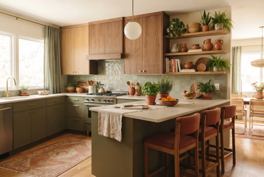
Colour is where most people either nail this look or quietly talk themselves out of it. The palette that keeps proving itself, time after time, is olive, rust, and sage sitting together with a warm neutral to hold them all in check.
None of these are shy colours exactly, but grouped in the right proportions they read as grounded rather than loud, which is precisely the balancing act boho and mid-century are both trying to pull off from opposite directions.
Here’s the bit that catches people out: these tones behave completely differently depending on which way your kitchen faces. In a north-facing room, olive can tip cool and slightly flat by mid-afternoon, so I’ll often warm it up a shade or swap it for a mossier green with more yellow in the base.
South-facing kitchens can carry a much richer, deeper rust without it ever feeling heavy, because the light’s already doing half the work for you. Test your sample against the actual wall, at the actual time of day you’ll be cooking, before you commit a whole kitchen to it.
Terrazzo or a Simple Stone Slab Instead of Busy Tile
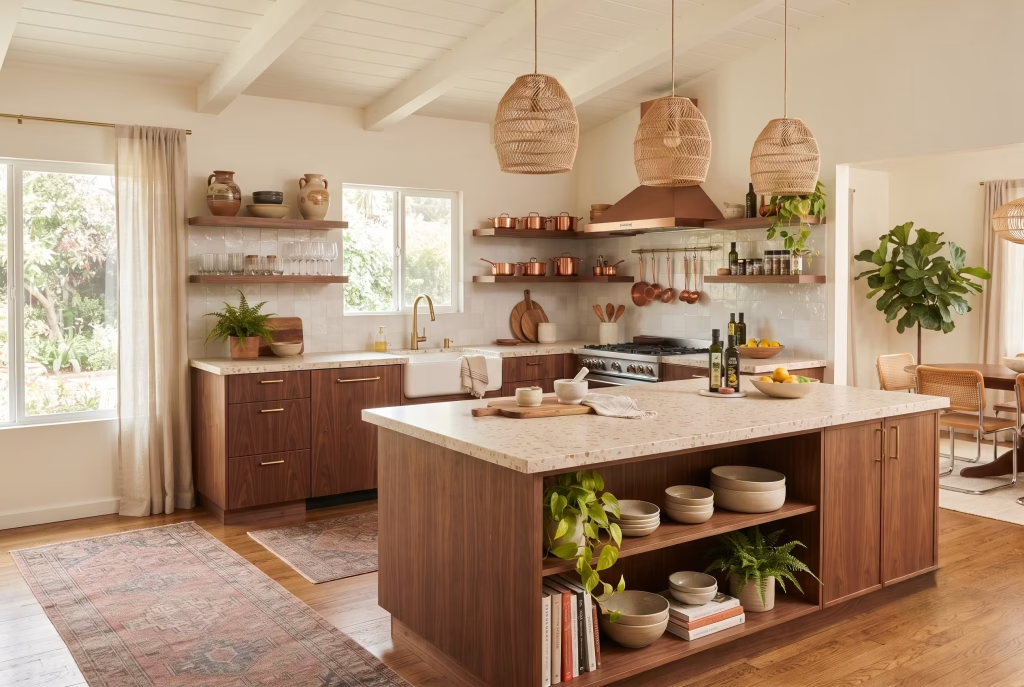
There’s a temptation, once you’ve decided to embrace pattern and personality, to let it run riot across every surface. Resist it on the countertop. A busy patterned tile worktop fights for attention with everything else you’re trying to layer in above it, rattan, ceramics, a runner underfoot, and the room ends up feeling exhausting rather than warm.
Terrazzo solves this beautifully because it’s technically a pattern, but a quiet, confetti-scattered one that reads almost as a neutral. A plain honed stone slab does the same job with even less noise.
This is one of those decisions that only really shows its worth after you’ve lived with it for a few months. Clients who’ve gone bold on the worktop almost always end up simplifying everything else in the room to compensate, whereas starting quiet on the counter gives you far more room to play elsewhere without ever feeling like you’re chasing your own tail.
A Washable Vintage Runner Over Tired Existing Tile
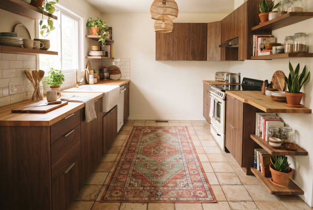
If there’s one idea on this list that pays for itself ten times over, it’s this one. A colourful, low-pile kilim or vintage-style runner laid straight over an ugly or dated kitchen floor is the fastest, cheapest transformation available to you, full stop.
I’ve seen it rescue a tired eighties tile job in an afternoon, no trades booked, no dust, no disruption to a working kitchen.
Choose a washable weave rather than a delicate antique original, because a kitchen floor is a working surface and flour, oil, and the odd dropped glass of red wine are simply part of the deal. Go for one with a strong border rather than an all-over busy print, it grounds the pattern and stops it feeling like it’s floating on the floor.
This is the idea I’d suggest to anyone renting, anyone mid-renovation with a longer wait ahead than they’d like, or anyone simply not ready to commit to new flooring just yet.
Open Shelving Styled With Global Ceramics
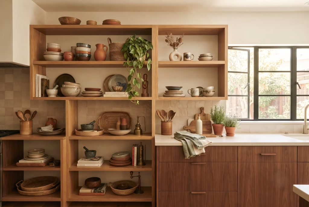
Take the doors off a run of upper cabinets and you’re immediately doing two things at once: opening up the sightline in a way flat-front closed cabinetry can’t, and creating a stage for exactly the kind of collected, well-travelled objects that give boho its warmth.
Hand-thrown stoneware, a cluster of terracotta vessels, a single striking ceramic picked up on holiday, these all earn their keep on open shelving in a way they never would tucked behind a door.
The rule I give every client nervous about clutter is one shelf spare, one shelf loaded. Let one run of shelving carry the weight, the collected pieces, the plants, the visual interest, and leave the shelf above or beside it deliberately quiet.
That contrast is what reads as curated rather than crammed, and it’s far more forgiving than trying to spread everything evenly across every available surface.
Brass or Champagne Bronze Hardware as the Bridge
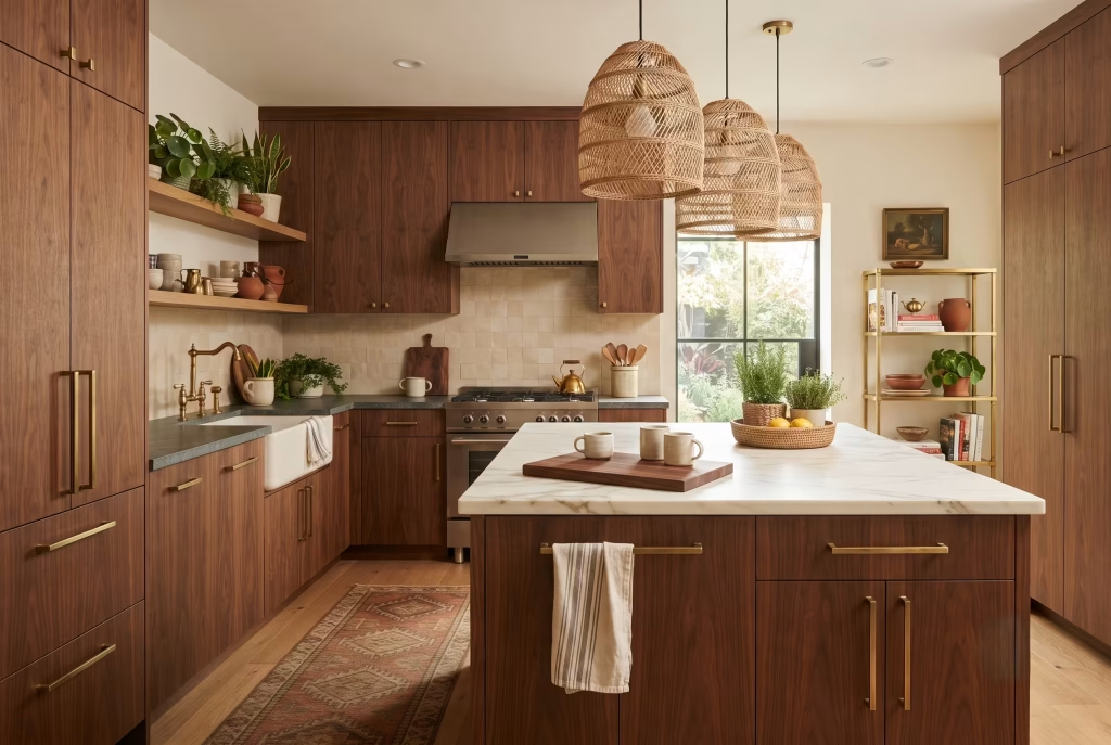
Hardware is a small decision that carries an outsized amount of weight in this style, and it’s the detail I see get overlooked most often. Chrome and polished nickel, however beautifully made, read cold against warm walnut, terracotta, and rattan.
They pull the whole scheme towards a clinical, showroom feel that fights everything else you’ve built into the room. Swap to unlacquered brass or a champagne bronze finish and suddenly the same cabinet doors feel considerably warmer, without you having touched the paint or the wood at all.
This is genuinely one of the cheapest, highest-impact swaps available in any kitchen renovation, boho mid-century or otherwise. If a full hardware change isn’t in the budget this time round, it’s worth flagging as the very next thing you tackle. It’s a weekend job with a screwdriver, and the difference it makes is completely out of proportion to the effort involved.
One Vintage or Retro-Style Appliance as the Room’s Anchor
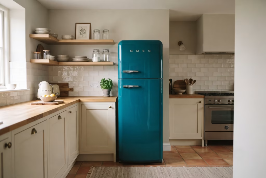
A saturated, rounded, genuinely retro fridge or range does something no cabinet colour can: it plants a flag in the room the moment you walk in, and every other decision gets built around it rather than competing with it. I’ve watched this single purchase carry an entire kitchen’s personality on its own, letting everything around it, walls, worktop, hardware, stay comparatively calm.
Here’s the part people get wrong, though, and it costs them the effect they were after: they add a second bold colour somewhere else in the room to “balance it out.” Don’t. One saturated statement piece reads as confident. Two start competing with each other, and the room stops feeling curated and starts feeling like an argument nobody’s won. Pick your one hero appliance, then let the rest of the palette work quietly in its favour.
Macrame and Woven Texture Tipping Into Clutter
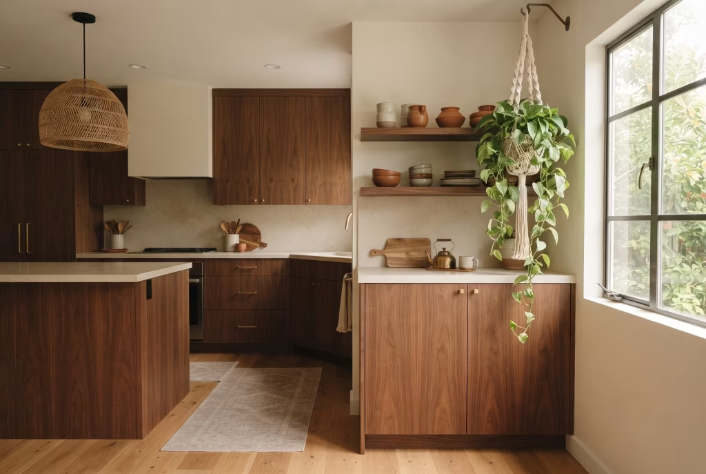
I understand the hesitation here, because I hear it constantly: “I love the look, but I’m worried it’ll end up feeling like a student flat.” Fair concern, and the difference between the two comes down almost entirely to restraint and quality rather than quantity.
One well-made macrame plant hanger, one woven wall piece, one textured runner, chosen with real care, does more for a room than five cheaper versions of the same idea scattered about hopefully.
Think of woven texture the way you’d think of seasoning in cooking: enough to lift everything else, never so much that it’s all you can taste. A single macrame hanger holding a trailing plant above an open shelf, positioned somewhere the light catches it in the afternoon, will do more heavy lifting than an entire wall given over to fibre art. Less genuinely is more here, and it’s the single easiest way to keep this style from tipping over into pastiche.
You May also Like: 25 70s Apartment Design Ideas That Bring Retro Vibes to Modern Homes
A Fluted or Ribbed Cabinet Front for Quiet Depth
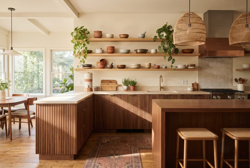
Fluted cabinetry is the detail that separates a kitchen that feels crafted from one that simply feels finished, and it’s become one of my favourite specifications of the last few years for exactly that reason.
Those shallow vertical grooves catch the light differently depending on where you’re standing, creating a gentle rhythm across an otherwise flat surface, which gives you texture and depth without introducing a single new colour into the room.
Keep the fluting to your lower run of cabinets and leave the upper shelving open and plain, so the detail reads as a deliberate feature rather than wallpaper repeated across every surface in the room. Running it everywhere, island included, spreads the effect too thin, and a kitchen that could have felt genuinely considered ends up reading as busy instead. Restraint, again, is doing most of the work here.
Terracotta Flooring That Grounds a Clean-Lined Room
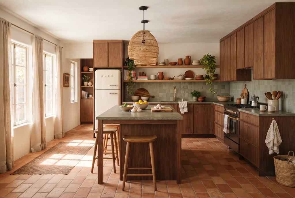
Terracotta manages something almost no other flooring material can: it reads as earthy and handmade while sitting completely at ease beneath the cleanest, most disciplined mid-century lines.
That warm, burnt-orange undertone pulls rattan, walnut, and linen into the same quiet conversation without you having to engineer it, and it gives a brand-new kitchen the sense of having always been there, which is exactly the feeling this whole style is chasing.
Lay it in a simple running-brick pattern rather than anything fussier, and it stays honest to the geometry mid-century demands rather than fighting it. One practical note worth flagging before you fall in love with a sample:
seal it properly and don’t over-seal it, because too many coats of a glossy sealant will kill the matte, slightly rough quality that makes handmade terracotta beautiful in the first place, leaving you with something that looks disappointingly plasticky underfoot.
A Curved Island as the Room’s Furniture Moment
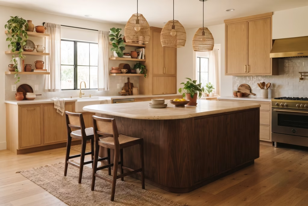
Most kitchen islands are treated as pure joinery, an extension of the fitted units around them. Give yours a genuinely curved profile instead, rounded corners or a soft, sculptural silhouette, and it stops reading as cabinetry and starts reading as furniture, which is a subtle but important shift. That’s exactly the kind of organic shape boho design has always leaned on, meeting the tapered-leg confidence of mid-century head-on in the one piece of the room everybody gathers around.
Finish the island two or three tones darker or lighter than your perimeter cabinets and the effect compounds, because now it looks like a considered, standalone piece rather than simply the middle bit of the same run of units. It’s a small structural decision at the joinery stage, but it changes how the whole room is read the moment you walk in.
Layering a Kilim Under the Dining Chairs, Not Just the Kitchen Floor
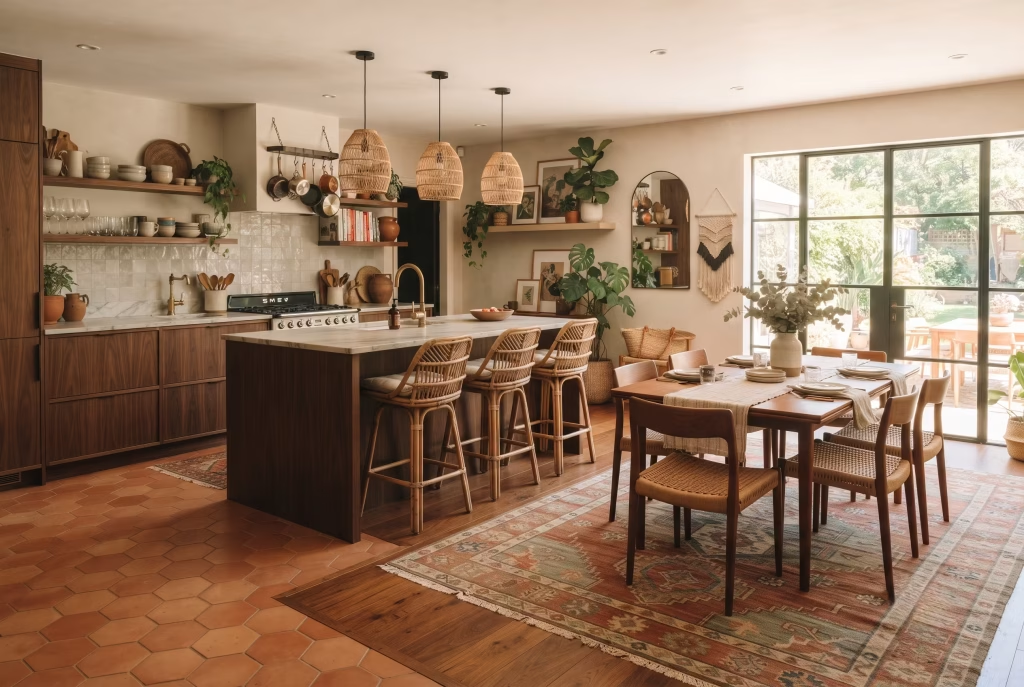
If your kitchen opens into a dining area, and increasingly most do, don’t stop at one rug for the whole footprint. A second, distinct kilim or vintage-style rug specifically under the dining table does genuine work: it gives that end of the room its own identity without a single wall going up, which matters enormously in open-plan layouts where everything can otherwise blur into one undifferentiated stretch of floor.
I’ve watched open-plan kitchens go from feeling oddly directionless to properly zoned purely on the strength of this one move. The kitchen stays practical underfoot, tile, stone, or whatever’s hardest wearing, while the dining zone gets its own softer, warmer footing that signals “linger here” the moment you step onto it. It costs a fraction of what a structural change would, and the payoff is disproportionate.
You May also Like: 30 Kitchen Makeover Ideas That Make Old Kitchens Feel Brand New
Warm, Low-Temperature Lighting Instead of Showroom-Bright Bulbs
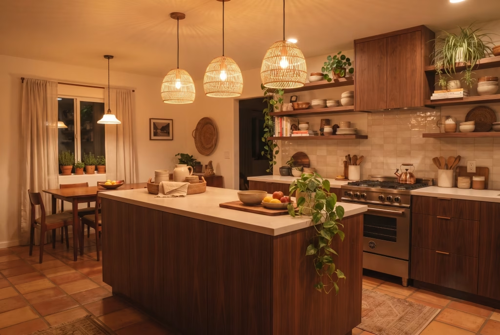
Here’s a mistake I see constantly, and it’s an easy one to make because it happens at the very last stage of a project, when everyone’s tired and just wants the job finished: cool, harsh bulbs under any pretty pendant will undo an enormous amount of good design work in one go.
Warm 2700K lighting is non-negotiable for this style. Anything cooler, and all that carefully chosen walnut, terracotta, and rattan starts reading flat and slightly clinical, exactly the showroom feeling you were trying to avoid from the outset.
This is genuinely one of the cheapest fixes on this entire list, sometimes it’s literally the price of swapping a bulb, and yet it’s the one people notice least until it’s pointed out to them. If you take away only one piece of practical advice from this whole guide, make it this: check your bulb temperature before you sign off on anything else.
Scaling the Look Down for a Small Kitchen
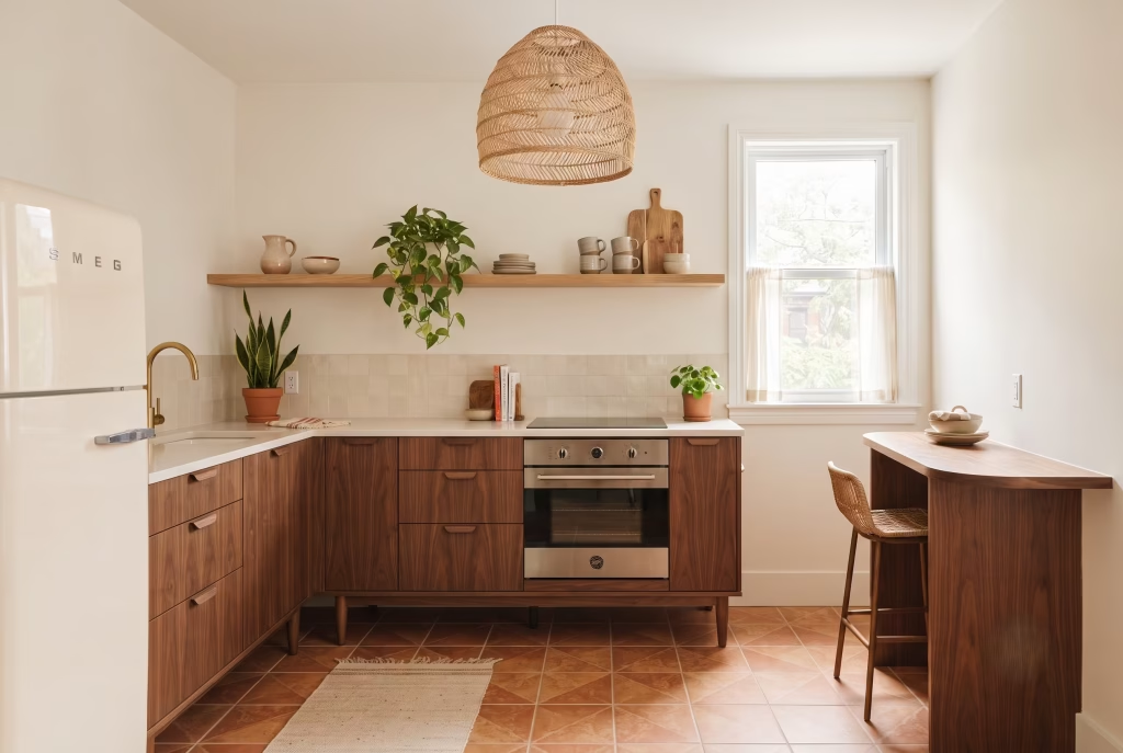
I hear this worry constantly, and I understand exactly why: “Won’t all this pattern and texture just make a small kitchen feel smaller?” It’s a fair instinct, but the answer, reassuringly, is no, provided you scale rather than strip.
A single well-proportioned pendant instead of a cluster, tapered cabinet legs that let light pass beneath them, one run of open shelving rather than three, all of this keeps the bones of the style intact without crowding a compact room.
Scaling down is a genuinely different exercise from stripping out, and it’s the distinction that keeps a small kitchen feeling fully designed rather than merely tidied up and left bare. I’d always rather see one perfect terracotta tile run and one confident colour than a small room trying to squeeze in everything from the bigger version of this list at once.
Trailing Plants as the Cheapest Boho Signal You Own
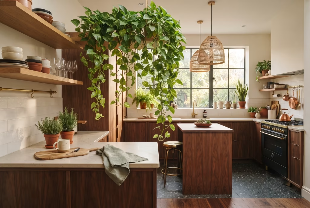
I’ll end where most of my own kitchens end up, in practice: a trailing pothos or similar plant, positioned somewhere it can genuinely tumble, on top of a fridge, along an open shelf, cascading from a macrame hanger, is the single cheapest, most forgiving way to bring this whole style to life.
It costs next to nothing, it’s endlessly adjustable, and unlike almost everything else on this list, it actually improves with a bit of neglect and time.
If you’ve read all fourteen ideas above and still feel uncertain about where on earth to start, start here. A single plant in the right spot won’t fix a kitchen that’s fighting itself on every other front, but it will tell you, almost immediately, whether the rest of the room is warm enough to hold it properly, or whether there’s still work to do underneath.
The Common Mistakes That Quietly Undo a Boho Mid-Century Modern Kitchen
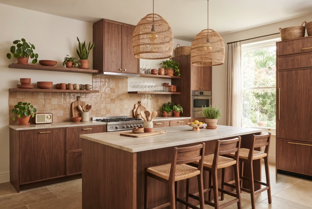
This is the mistake I see more than any other, and it’s an easy trap to fall into with the best of intentions. It happens when the mid-century pieces get grouped on one side of the kitchen, the flat-front units, the tapered stools, and the boho layer gets bolted on somewhere else entirely, a rug here, a macrame hanger there, with nothing actually connecting the two. The eye reads it instantly as two rooms fighting for the same square footage rather than one considered whole.
The fix isn’t complicated, but it does need doing deliberately: pick one material, walnut, rattan, terracotta, whatever you’re already leaning on, and repeat it in at least three separate places across the room. That thread is what tells the eye these two styles were chosen together rather than assembled by committee.
Lighting the Room Like a Dentist’s Waiting Area
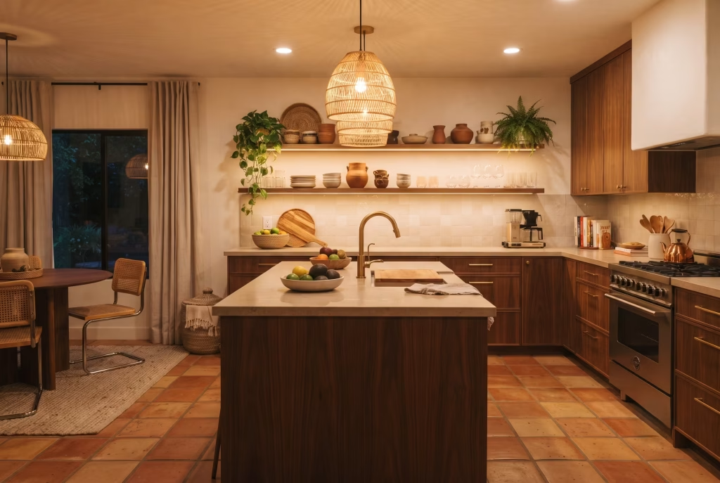
Nothing sabotages a warm, earthy palette faster than a cool white bulb, and it’s the mistake I catch clients making right at the very end of a project, when everyone’s exhausted and just wants the lights switched on. Anything above 2700K starts flattening walnut, terracotta, and rattan into something closer to grey than gold, and suddenly all that carefully chosen warmth reads as clinical instead.
It costs next to nothing to fix, which somehow makes it worse when it’s overlooked. Before you sign off on a single other decision in the room, check the bulb temperature going into every fixture. It’s a five-minute job that protects every pound spent on everything else.
You May also Like: Nancy Meyers Style: The Ultimate Guide to Getting the Look in Every Room
Reaching for Bright White Uppers to “Balance” an Earthy Scheme
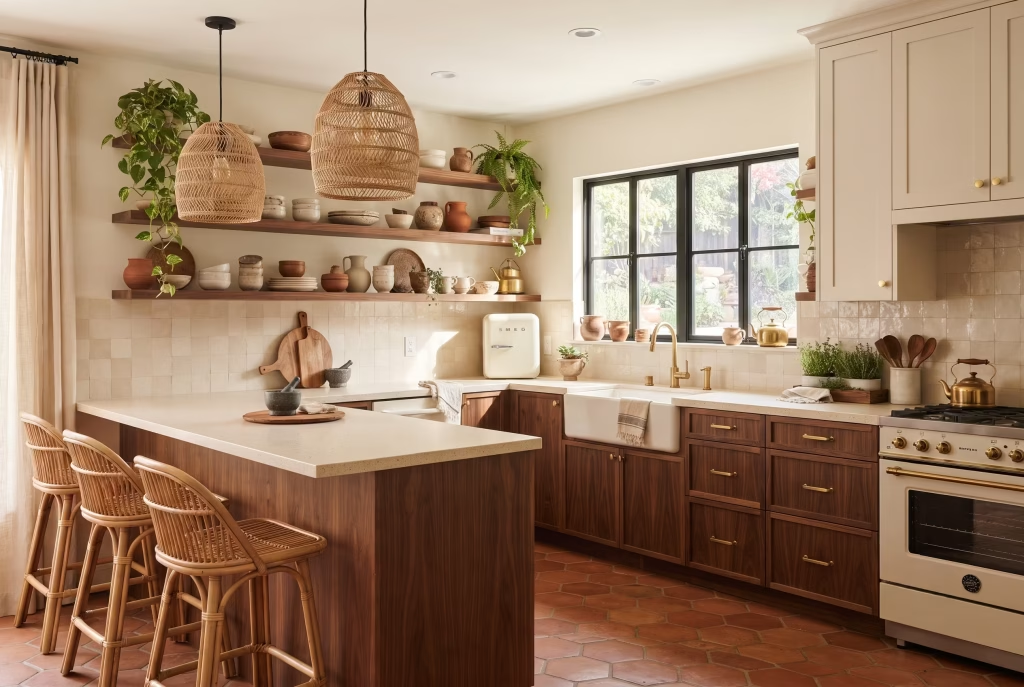
There’s a persistent instinct to cool a warm, layered kitchen down with a run of stark white cabinetry, the thinking being that it’ll stop the room feeling heavy. In practice, it does the opposite. Against terracotta, rattan, and rust, bright white doesn’t calm anything, it clashes, and the eye clocks the contrast as jarring rather than restful.
If you want a lighter cabinet tone, reach for an off-white with a yellow or pink undertone instead of a cool, blue-leaning white. It gives you the airiness you’re after without draining the warmth out of everything you’ve worked to build around it.
Loading Every Idea In on the Same Weekend
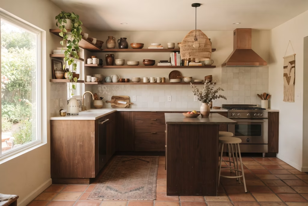
I understand the temptation completely: you’ve fallen in love with the whole aesthetic, and you want the room to feel finished right away. But bringing in the rug, the macrame, the ceramics, the retro fridge, and a full re-tile all in the same fortnight tips a kitchen from considered into cluttered almost overnight, and it’s a far slower job to quietly undo than it was to create.
Pace yourself. Two or three additions at a time, lived with for a season before the next layer goes in, is how every genuinely successful version of this style has come together in my experience, never all at once.
Letting Two Bold Statement Pieces Compete for the Same Spotlight
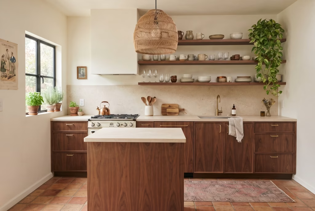
A single saturated retro fridge or a vintage range does an enormous amount of work in a room on its own, planting a flag the moment anyone walks in. The mistake is adding a second bold colour or appliance elsewhere to “match the energy.” Two loud focal points don’t reinforce each other, they squabble, and the room ends up feeling restless rather than confident.
Choose your one hero piece and let everything else in the palette work quietly in its favour. Restraint everywhere else is precisely what makes the one bold choice land.
Choosing a Countertop That Argues With Everything Above It
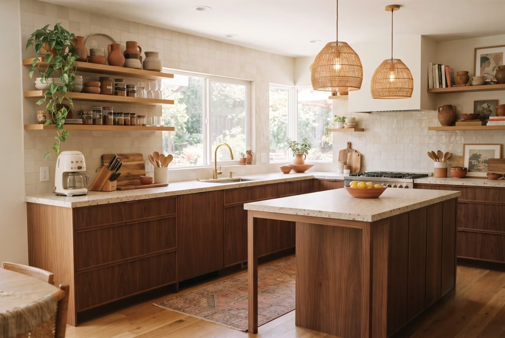
A heavily patterned tile or a wildly veined stone worktop looks striking on a sample board, but once it’s sitting beneath open shelving, a rattan pendant, and a runner underfoot, it starts fighting for attention with every other layer in the room. The countertop should be doing quiet, supporting work, not stealing the show.
Terrazzo or a simple honed slab gives you texture without the noise, and it’s a decision that only proves its worth after a few months of actually living with the room, once you notice how much easier it is to add personality elsewhere without ever feeling like you’re competing with your own worktop.
You May also Like: Mid-Century Modern Living Room: The Complete Guide to Getting the Look Right
Mixing Wood Tones That Don’t Actually Speak the Same Language
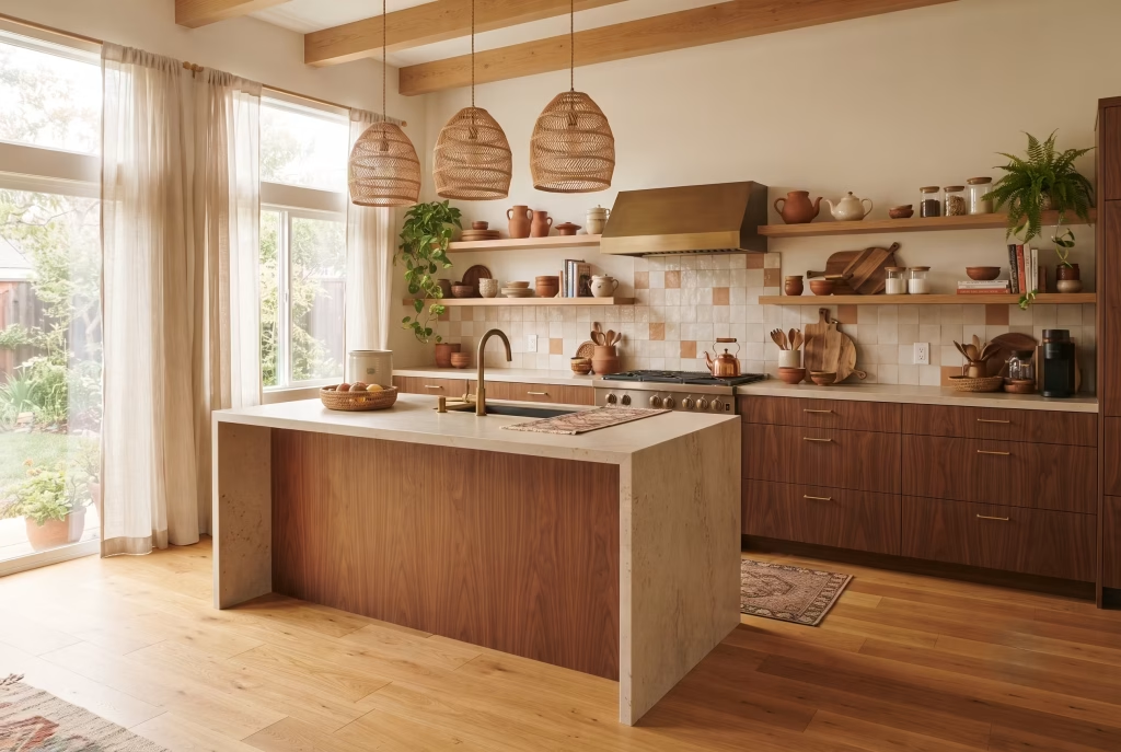
Warm, amber-leaning walnut sitting next to a cool, ash-grey floor or shelf is a mismatch that’s subtle in a sample room and glaring in daylight. When wood tones pull in opposite directions, warm against cool, the whole scheme starts to feel muddy rather than rich, even though each material might be beautiful on its own.
Before committing, hold your cabinet sample against your flooring and open shelving in natural light, not under a shop’s fluorescent strip lighting. If the undertones don’t agree, one of them needs to move, because no amount of styling elsewhere will paper over that particular crack.
You May also Like: 25 Dark Cottagecore Kitchen Ideas That Feel Warm, Rich, and Full of Character
The Shortlist, Not the Whole List
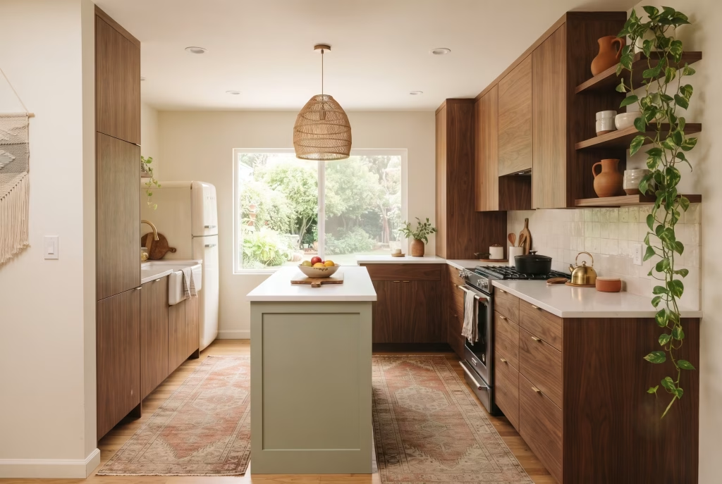
If there’s one thing I’d genuinely want you to take from all this, it’s that you’re choosing a handful of these ideas, not attempting all fifteen in one weekend. The single most common mistake I see clients make, understandably, given how much they’ve fallen in love with the whole aesthetic, is layering everything in at once: the rug, the plants, the ceramics, the pendant cluster, the retro fridge, all landing in the same fortnight. The room tips over from considered into cluttered almost overnight, and it takes far longer to quietly undo than it did to create.
Pick two or three ideas that genuinely suit your kitchen’s size, light, and your own daily habits, live with them for a season, and add from there. That’s how every good boho mid-century kitchen I’ve ever worked on actually came together, not all at once, but layer by layer, each addition earning its place before the next one arrived.
If you’d like the fuller picture first, the comparison between the two styles, honest budget ranges, and answers to the most common questions we get asked, our complete guide to the boho mid-century modern kitchen covers all of it in one place.
Frequently asked questions
Does boho go with mid-century modern?
Yes, and it’s one of the more natural style pairings you can attempt. Both are quietly obsessed with natural materials and warm tones, so walnut cabinetry, rattan lighting, and terracotta ceramics sit together without ever feeling like two competing decades in one room.
What is the difference between bohemian and mid-century modern?
Mid-century modern is built on restraint: clean lines, flat-panel cabinetry, and tapered legs, with function leading every decision. Bohemian is built on layering: woven textures, global objects, and an eclectic mix collected over time rather than bought as a set. Together, one supplies the structure and the other supplies the warmth.
What colours work in a boho mid-century modern kitchen?
Earthy, muted tones read best: olive, rust, mustard, sage, and terracotta, grounded by warm neutrals like putty or linen rather than stark white. These colours echo both mid-century’s classic 1950s palette and boho’s natural, botanical influences at the same time.
Is mid-century modern still in style in 2026?
Yes, it remains one of the most enduring interior styles going, and current design coverage frequently points to boho mid-century as one of the fastest-growing fusions within it. Its longevity comes down to function-first design ageing far better than purely trend-led choices.
Is boho decor out of style in 2026?
No, though it has matured. The maximalist, pattern-on-pattern version of boho has calmed into a more curated, material-led approach, fewer trinkets, better textiles, which is exactly the version that pairs so well with mid-century’s clean lines.
What is the 3-5-7 rule in interior design, and does it apply here?
The 3-5-7 rule is a styling guide for grouping objects (on a shelf, a console, or a countertop) in odd numbers, typically three, five, or seven pieces, at varying heights, for a display that reads as considered rather than accidental. It applies directly to open shelving in this style, where ceramics, plants, and objects need that same deliberate, uneven grouping to avoid looking either sparse or cluttered.
How much does a boho mid-century modern kitchen renovation cost?
Costs vary hugely by scope, but the biggest-impact, lowest-cost swaps, hardware, lighting, a runner rug, a single vintage appliance, can transform the feel of a kitchen for a few hundred pounds. A full cabinetry and flooring renovation sits at the higher end of any kitchen remodel budget, regardless of style.
Can a small kitchen pull off the boho mid-century modern look?
Yes, provided the details are scaled down rather than stripped out entirely. A single well-proportioned pendant, tapered cabinet legs, and one run of open shelving keep the style’s character intact without crowding a compact room.