25 Blue Living Room Decor Ideas That Balance Calm, Character, and Longevity
Blue remains one of the most enduring colour choices for living rooms, yet it is also one of the most frequently misapplied. I have worked with blue in everything from compact city apartments to large, light-filled family homes, and its reputation swings between being seen as safely neutral and worryingly cold. The reality sits somewhere in between. Blue is neither inherently calming nor inherently stark. Its success depends almost entirely on how it is specified, where it is used, and what it is asked to support within the room.
One of the most common mistakes I see is treating blue as a purely decorative decision. Decorative blue is surface-led. It appears as cushions, artwork, or a single feature wall chosen late in the design process. Architectural blue, by contrast, is planned from the outset. It is applied to walls, ceilings, joinery, or key volumes to shape how the room feels and functions. When blue is used architecturally, it influences proportion, light distribution, and visual weight in a way that softer neutrals cannot. This is where blue moves from being a colour choice to a spatial tool.
Undertone is the deciding factor in whether blue feels inviting or unforgiving. Blue with green or grey undertones tends to sit more comfortably in living spaces, particularly in north-facing rooms where daylight is cooler. Cleaner, purer blues can work beautifully, but only where there is strong natural light or warm artificial lighting to counterbalance them. I always assess light direction before committing to a blue, because the same shade can feel refined and calm in one room and flat or oppressive in another.
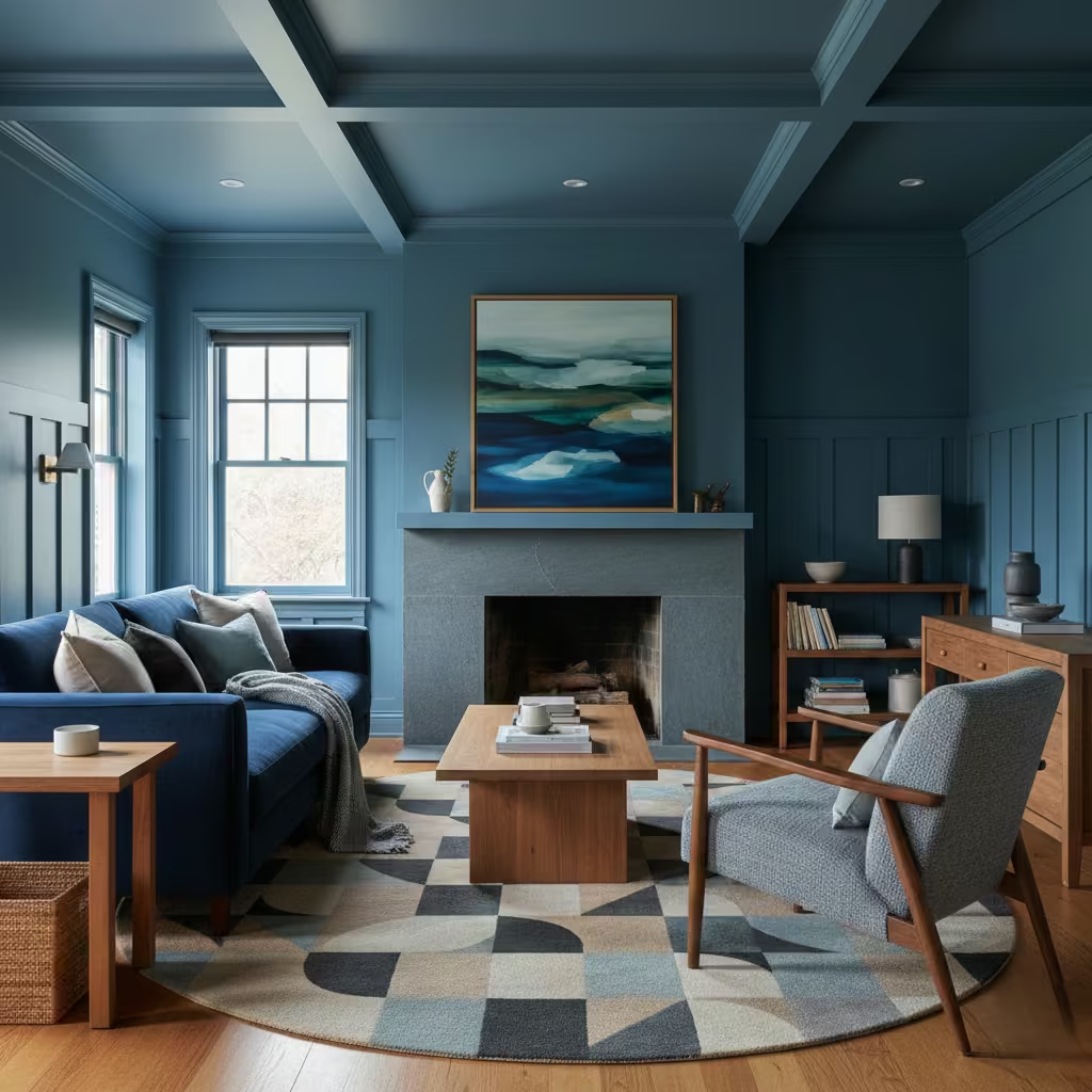
Material pairing is equally critical. Blue becomes richer alongside timber, stone, leather, and textured fabrics, while it can feel thin or clinical when paired only with smooth white surfaces. This article is structured as a comparison-led guide, not a moodboard. Each idea examines how blue behaves in real living rooms, what it suits, and where it fails, so you can make informed decisions rather than aesthetic guesses.
25 Blue Living Room Decor Ideas
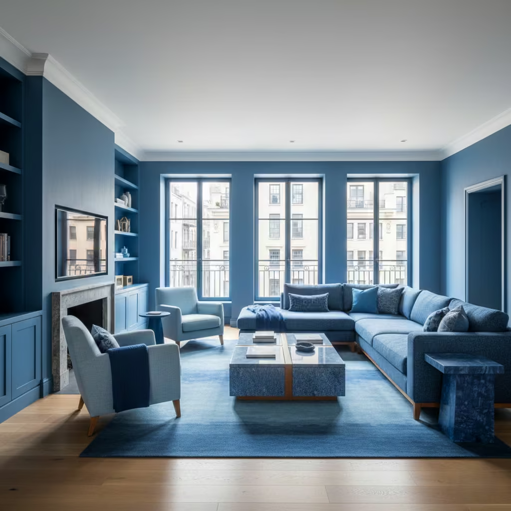
Blue works best in living rooms when it is approached as a system rather than a styling afterthought. Across real projects, I have found that the most successful blue interiors follow clear design patterns, each with its own spatial logic, material requirements, and performance characteristics.
The ideas below are not variations of the same look. Each represents a distinct way of using blue to influence proportion, mood, and usability. By breaking them down into concept, room suitability, and lived-in experience, you can compare approaches objectively and identify which pattern aligns with your space, light conditions, and daily use rather than relying on surface-level inspiration.
Deep Navy-Blue Walls with Soft Neutral Seating
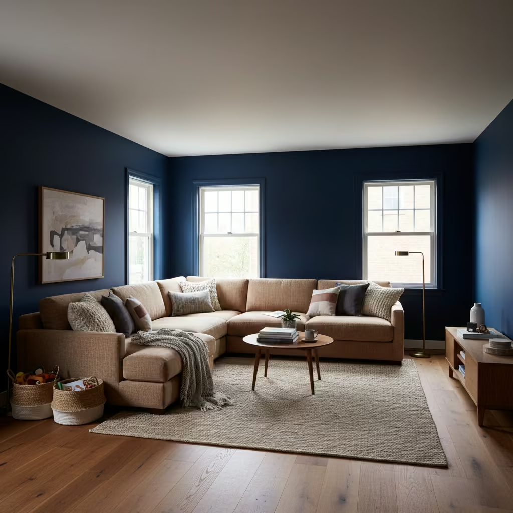
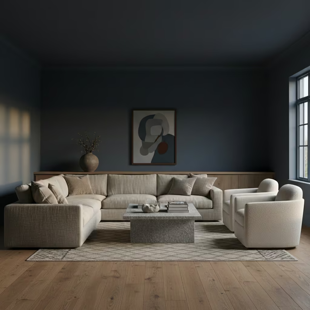
Deep navy works best when it is treated as an enveloping architectural colour rather than a feature. Used across all four walls, it provides visual depth and weight, allowing furniture and artwork to sit forward in the space. I typically specify navy in living rooms where the aim is to create a sense of calm and containment rather than brightness. Matte or eggshell finishes are essential, as higher sheens tend to exaggerate imperfections and reflect light unevenly, which can make dark blues feel restless rather than grounding.
Room-Fit Suitability
This approach is most successful in medium to large Blue living rooms, ideally from 20 m² (215 sq ft) upwards, with ceiling heights of at least 2.6 m (8 ft 6 in). Natural light is important, but not necessarily direct sunlight. East- or west-facing rooms perform particularly well, as the shifting light brings variation to the navy throughout the day. In smaller rooms or those with low ceilings, the same treatment can feel overly dense unless carefully offset with lighter ceilings and flooring.
Real-Life Application Insights
Where I have used this successfully, I avoid pairing navy with sharp white seating, which creates high contrast and visual fatigue over time. Instead, I lean towards soft neutrals with texture, such as oatmeal linen, brushed cotton, or lightly napped wool upholstery. In one long-term family Blue living room, a navy envelope paired with a 900 mm (35 in) deep sofa in warm stone fabric proved far more forgiving in daily use, masking wear while maintaining a composed, tailored feel.
Muted Gray Blue Living Rooms for North-Facing Spaces
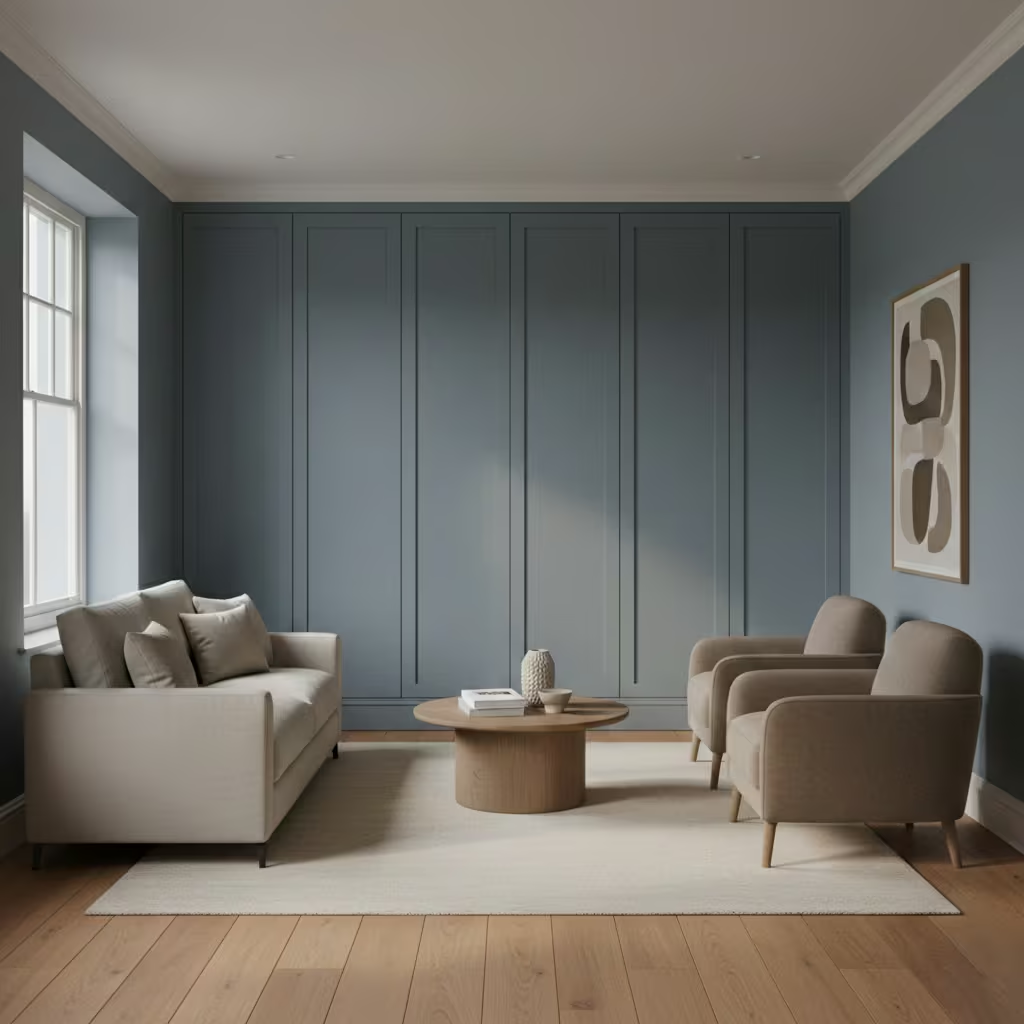
Muted blue-gray tones are one of the most reliable solutions for north-facing living rooms, where daylight tends to be cool, indirect, and consistent throughout the day. Rather than fighting this light quality, blue-gray works with it, softening the inherent chill while avoiding the heaviness that deeper blues can introduce.
I treat this palette as a neutral with depth, specifying shades with a subtle green or taupe undertone to prevent the colour from reading flat or lifeless. Applied to walls or full-height joinery, blue-gray creates a calm, cohesive backdrop that supports both contemporary and traditional interiors.
Room-Fit Suitability
This approach suits small to medium Blue living rooms from approximately 14–24 m² (150–260 sq ft), particularly those with ceiling heights between 2.4–2.7 m (8–9 ft). It performs well where natural light is limited or filtered by surrounding buildings or trees. Blue-gray is forgiving in rooms with multiple openings, as it maintains tonal consistency across shadowed corners, unlike cleaner blues that can shift abruptly and appear uneven.
Real-Life Application Insights
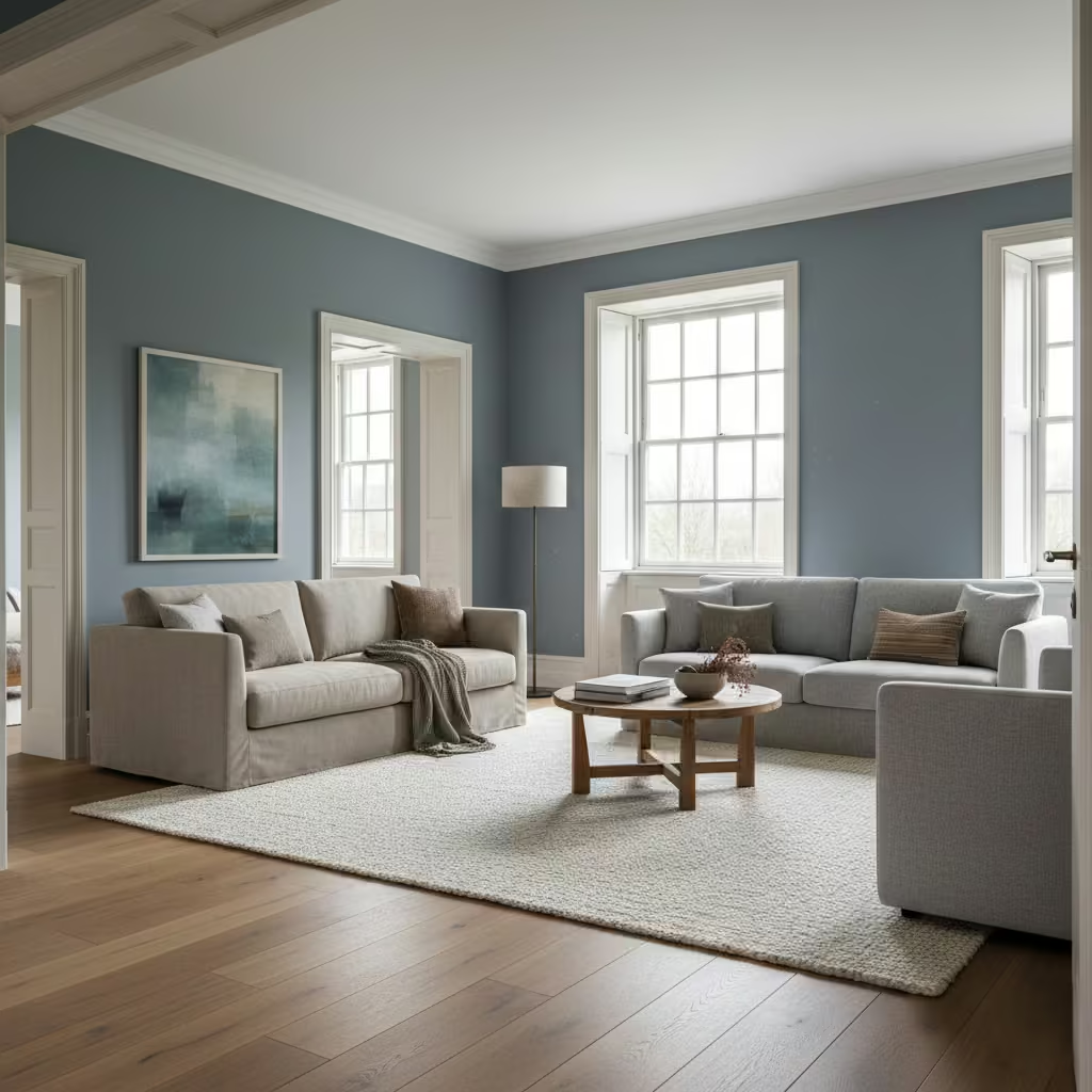
In practice, I have found that the success of blue-gray hinges on material layering. In one north-facing terrace Blue living room, walls finished in a blue-gray with a slight green bias were paired with warm oak flooring and a wool rug with a dense, low pile of around 10 mm (0.4 in).
This combination countered the cool light without introducing warmth through colour alone. I also avoid high-contrast trims, opting instead for off-white or pale stone finishes, which allow the blue-gray to read as quietly architectural rather than overtly decorative.
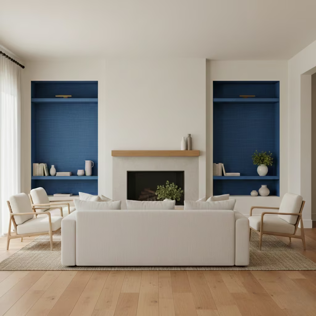
Blue Accent Wall Behind Built-In Joinery
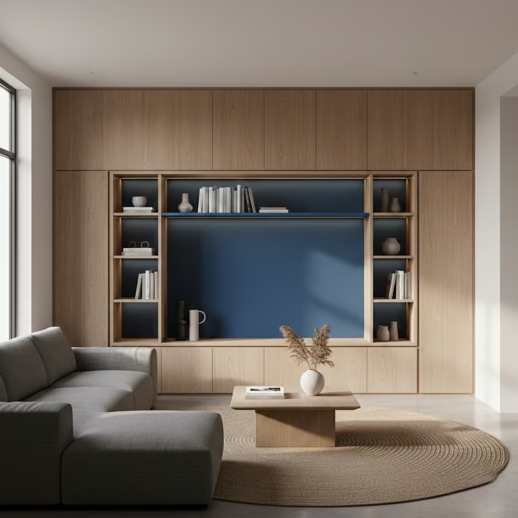
Using blue behind built-in joinery is an architectural move rather than a decorative one. The colour is not intended to stand alone, but to sit in dialogue with cabinetry, shelving, or media units, allowing the joinery to read as a defined volume within the room.
I often use mid to deep blues in this context to create depth behind open shelves or framed storage, reducing visual clutter and giving displayed objects a calmer backdrop. The blue effectively recedes, allowing the joinery lines and proportions to take precedence.
Room-Fit Suitability
This approach works well in Blue living rooms of almost any size, from compact spaces of around 12 m² (130 sq ft) to large open-plan rooms, provided the joinery is well-proportioned. Ceiling height is less critical here, as the joinery naturally breaks up vertical scale. It is particularly effective in open-plan layouts where a living zone needs subtle definition without physical partitions or changes in flooring.
Real-Life Application Insights
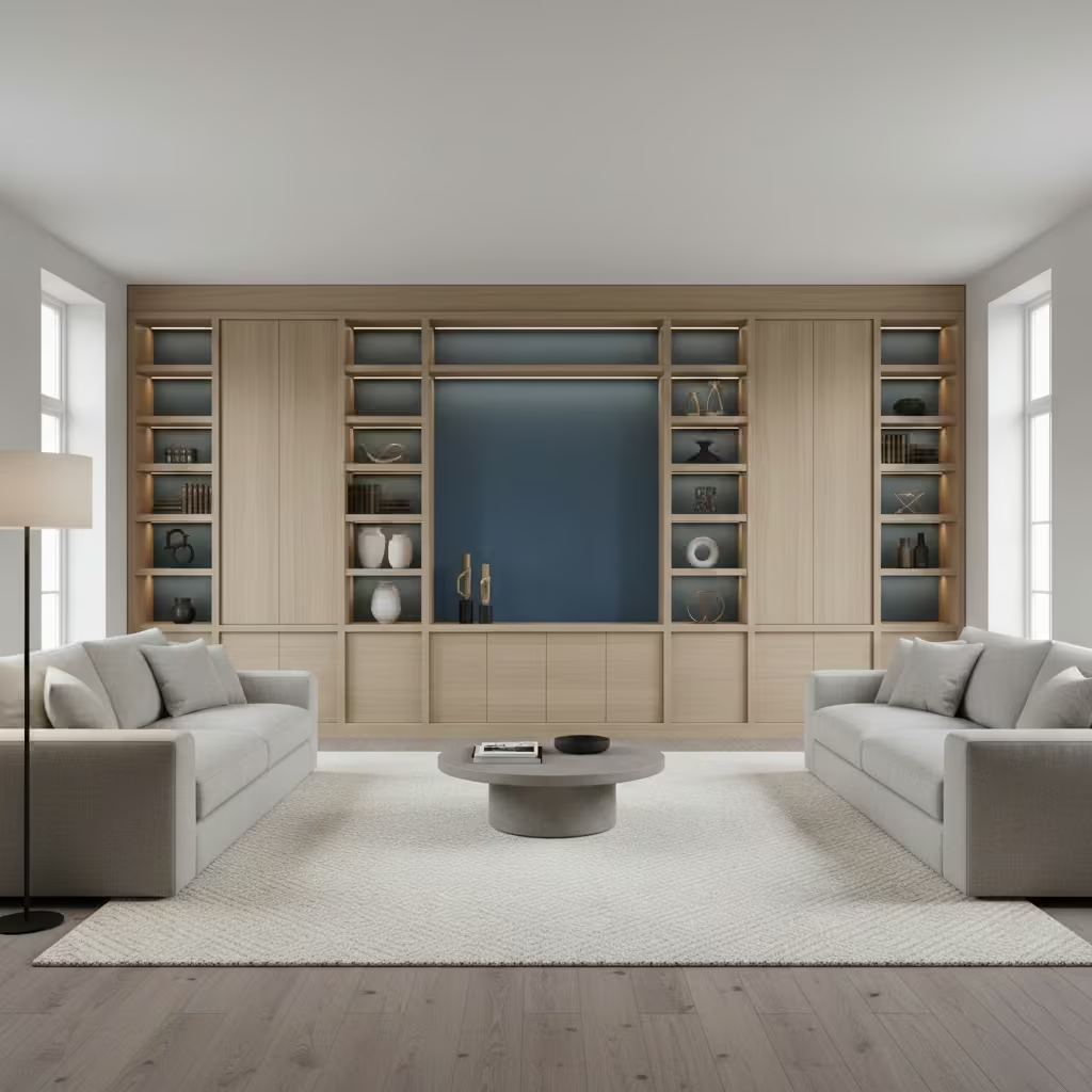
On recent projects, I have found this strategy especially effective behind media walls, where darker blue tones reduce the visual dominance of screens. In one family Blue living room, a built-in unit measuring 3.6 m wide by 2.4 m high (11 ft 10 in by 7 ft 10 in) was set against a muted blue backdrop.
The colour softened the joinery’s presence while making the space feel more intentional and less furniture-led. I always specify the same finish for both wall and joinery back panels, usually in a durable eggshell, to maintain consistency and avoid a piecemeal look.
You May also Like: 25 Edwardian Living Room Ideas That Celebrate Period Elegance and Modern Comfort
Layered Textiles in Neutral Blue Living Rooms
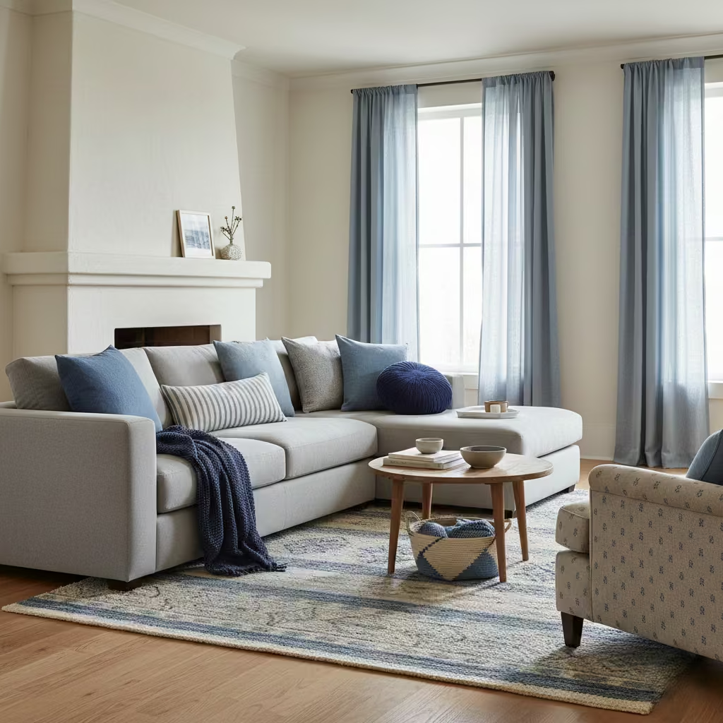
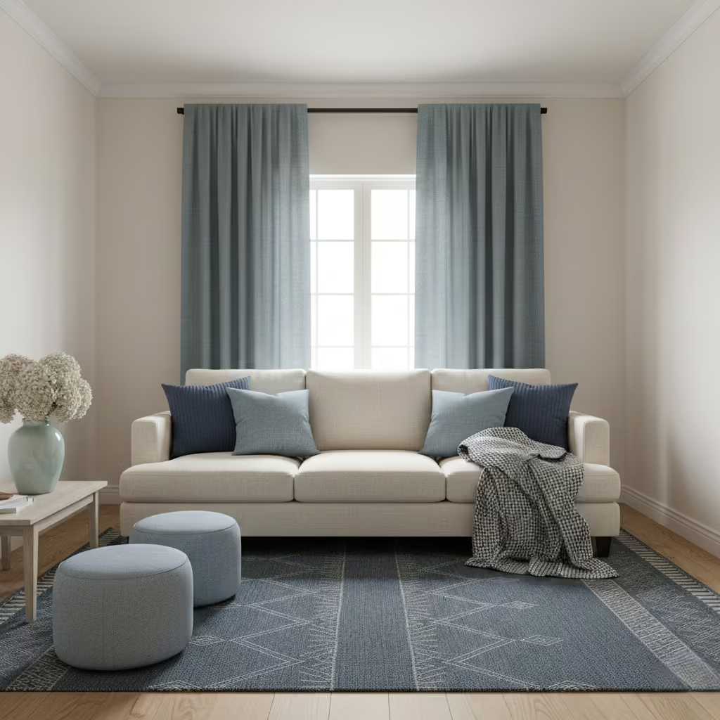
Layering blue through textiles is a controlled way to introduce colour without committing to architectural finishes. Rather than relying on a single statement piece, this approach distributes blue across rugs, cushions, upholstery, and window treatments so it reads as a coherent undertone throughout the room. I treat textiles as a colour system, not accessories, selecting two to three related blue values that move from darker at floor level to lighter at seating and eye height. This creates visual depth while keeping walls and major surfaces neutral.
Room-Fit Suitability
This pattern is particularly well suited to small living rooms from around 10–18 m² (110–195 sq ft), rental properties, or homes where flexibility is important. It also performs well in open-plan spaces where permanent colour changes could disrupt adjacent zones. Ceiling height and light direction are less critical, as the colour sits within the furnishing layer rather than altering the room envelope.
Real-Life Application Insights
In practice, the key is scale and texture. I have seen this fail when blue is introduced only through small cushions, which reads as indecisive rather than layered. In one neutral Blue living room, I anchored the scheme with a 2.4 m × 3.0 m (8 ft × 10 ft) rug featuring a muted blue field, then echoed the tone in full-length curtains with a heavy linen weave. Smaller accents followed naturally. This approach allowed the room to evolve over time, with textiles refreshed as wear appeared, without ever needing to repaint or rework the space.
Dusty Blue Limewash Walls for Soft Depth
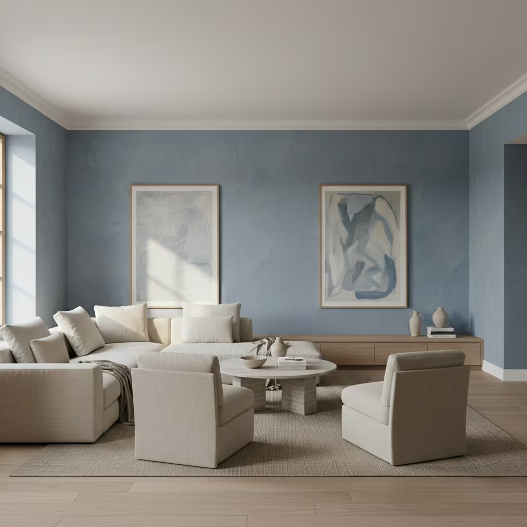
Dusty blue limewash introduces colour through movement rather than saturation. Unlike flat paint, mineral finishes create subtle tonal variation across the wall surface, allowing blue to appear lighter or deeper as daylight shifts. I use this approach when a Blue living room needs softness and character without visual noise. Dusty blues with a grey or chalky base are particularly effective, as they avoid the crispness that can make blue feel sharp. Applied to full-height walls, limewash gives the room a quiet, layered quality that feels architectural and considered.
Room-Fit Suitability
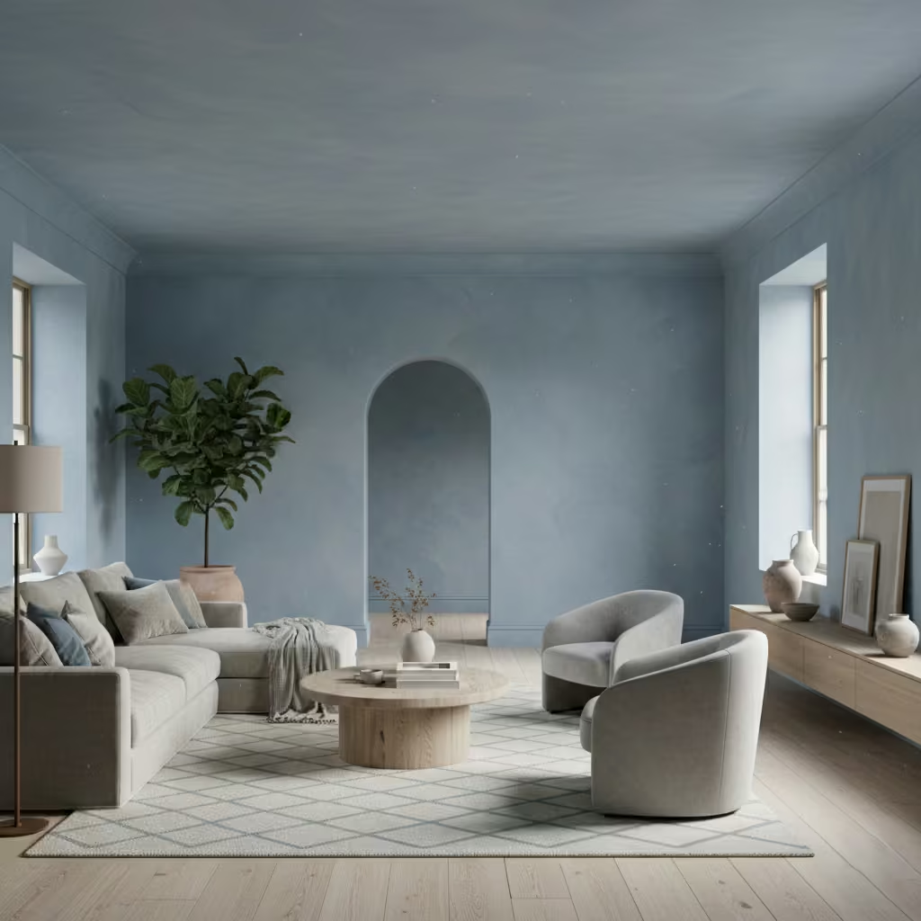
This treatment works best in medium to large living rooms from approximately 18–30 m² (195–320 sq ft), where there is enough wall area for the finish to read intentionally rather than as patchy texture. It performs well in rooms with good natural light from one or two directions, especially south- or west-facing spaces. Ceiling heights above 2.5 m (8 ft 2 in) help the tonal variation feel expansive rather than busy.
Real-Life Application Insights
From experience, preparation and application technique are critical. In one project, a dusty blue limewash was applied over a carefully levelled substrate, with two diluted coats applied in opposing directions to avoid striping. The result was a living room that changed subtly from morning to evening without ever feeling inconsistent. I typically balance limewash walls with smoother materials, such as plaster ceilings and upholstered seating, to prevent the room from becoming overly textured. This contrast ensures the finish reads as depth, not distraction.
Blue and Warm Timber Pairings
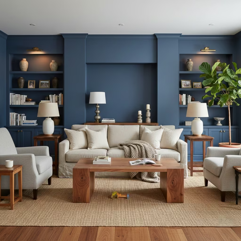
Pairing blue with warm timber is one of the most effective ways to prevent blue living rooms from feeling cold or austere. Timber introduces natural warmth and grain variation that counterbalances blue’s inherent coolness, creating a space that feels grounded and habitable rather than purely visual. I use this pairing architecturally, allowing timber to occupy horizontal planes such as floors, shelving, and furniture, while blue defines vertical surfaces like walls or joinery. Oak, walnut, and ash each shift the balance differently, with oak offering softness, walnut adding depth, and ash providing a lighter, more contemporary counterpoint.
Room-Fit Suitability
This approach is highly adaptable and works across a wide range of Blue living room sizes, from compact spaces around 14 m² (150 sq ft) to expansive open-plan rooms. It is particularly effective in rooms with limited natural warmth, such as north- or east-facing Blue living rooms, where timber compensates for cooler daylight. Ceiling height is less critical, as the timber introduces warmth at eye and touch level rather than relying on vertical volume.
Real-Life Application Insights
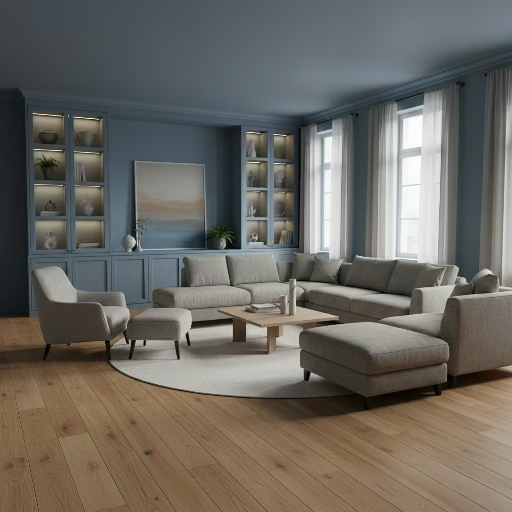
In practice, proportion matters more than species choice. On one renovation, a mid-blue wall colour was paired with engineered oak flooring in 180 mm (7 in) wide planks, which provided enough visual weight to balance the blue without dominating the room.
I avoid mixing too many timber tones, as this can dilute the calming effect. Instead, I anchor the space with one primary timber finish and allow blue to do the atmospheric work, resulting in a Blue living room that feels warm, composed, and resilient to daily use
Tonal Blue Living Rooms with No True Neutrals
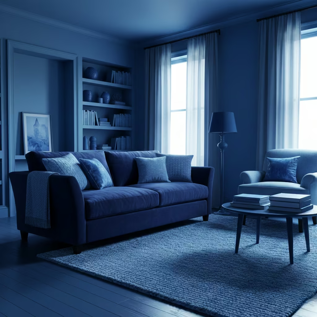
A tonal blue scheme creates a sophisticated, immersive environment by layering three to four complementary blue shades across walls, joinery, textiles, and furnishings. Instead of relying on whites or beiges to break the palette, the blues themselves define depth and hierarchy within the space.
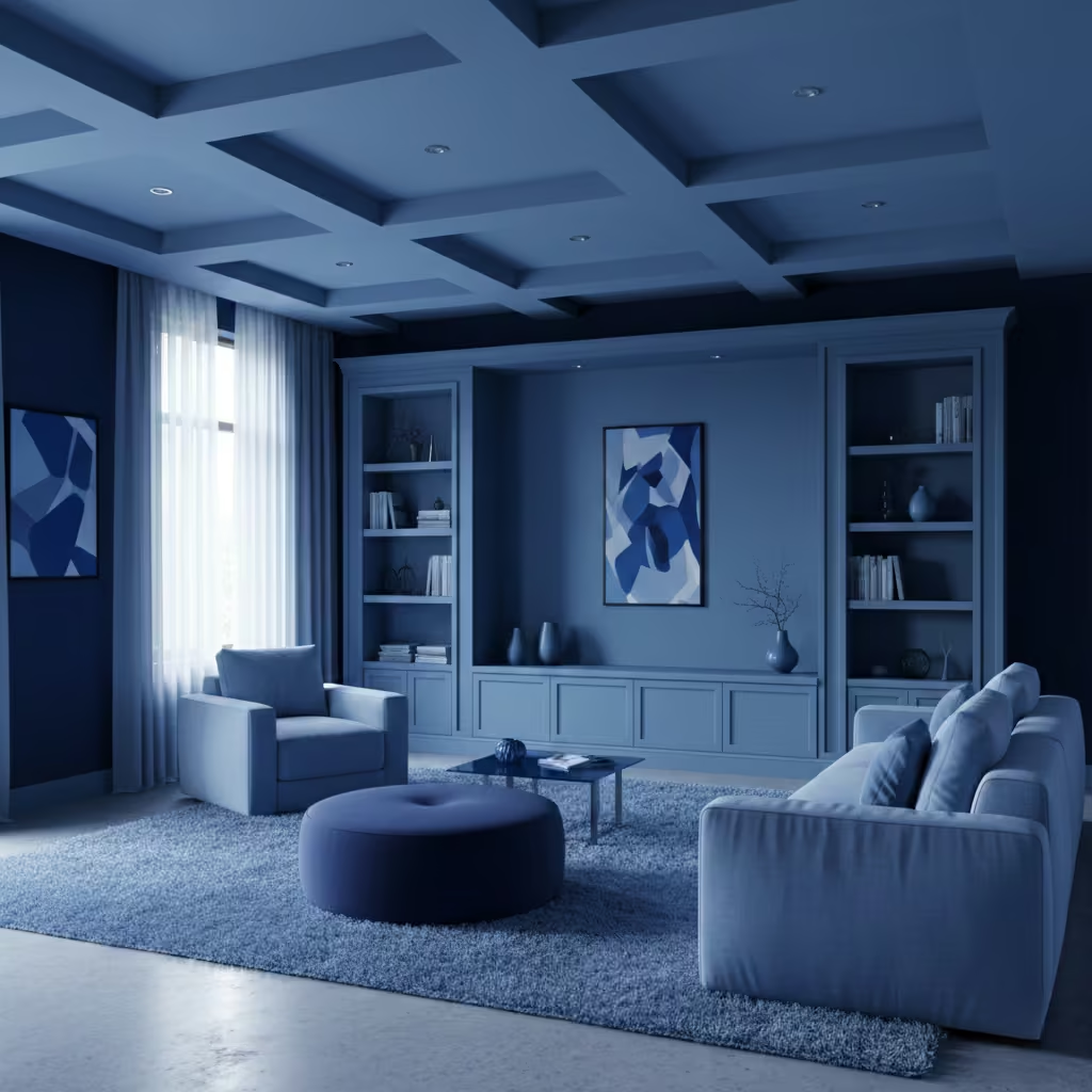
I often combine a darker, grounding blue at wall or floor level with mid-tones in upholstery and lighter, airy blues on soft furnishings or ceiling features. This approach highlights architectural volumes and encourages subtle variation, making the room feel cohesive yet dynamic.
Room-Fit Suitability
Tonal blue schemes work best in medium to large Blue living rooms, typically 18–28 m² (195–300 sq ft), where multiple shades have room to interact without overwhelming the occupant. North-facing rooms particularly benefit, as layering allows light to animate the colour throughout the day. In smaller rooms, I recommend limiting tonal variation to two shades to avoid a cramped, monochromatic effect.
Real-Life Application Insights
In one contemporary townhouse project, I layered a deep navy on the feature wall, a slate blue for shelving and joinery, and soft powder blues across rugs, cushions, and curtains. This prevented the scheme from feeling flat while creating a calm, immersive environment.
I found that matching undertones carefully ensuring all blues had either warm or cool bias was critical; mismatched undertones can make the scheme feel disjointed. By controlling texture and sheen, the tonal approach can feel luxurious and lived-in, rather than overly stylized.
You May also Like: Transform Your Space with These 25 Desert Living Room Inspirations
Blue Painted Ceilings to Visually Lower High Rooms
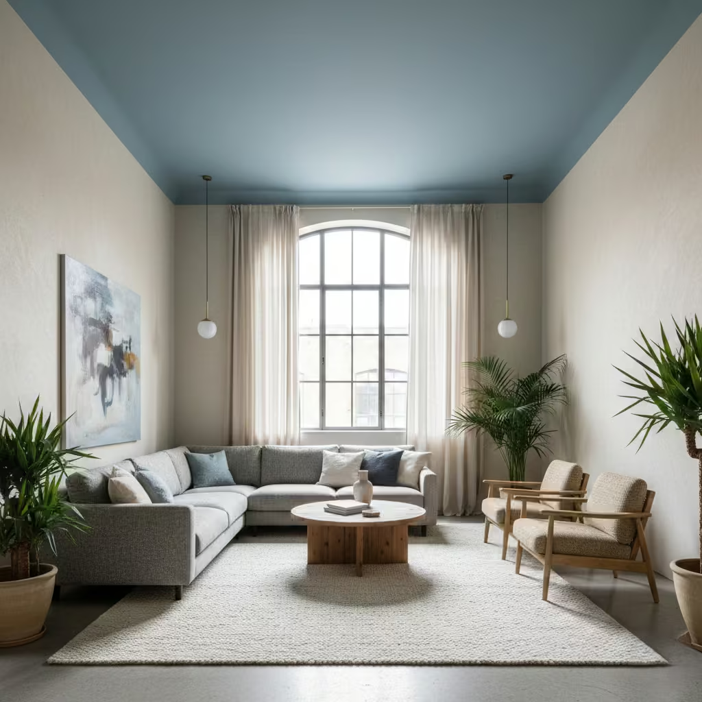
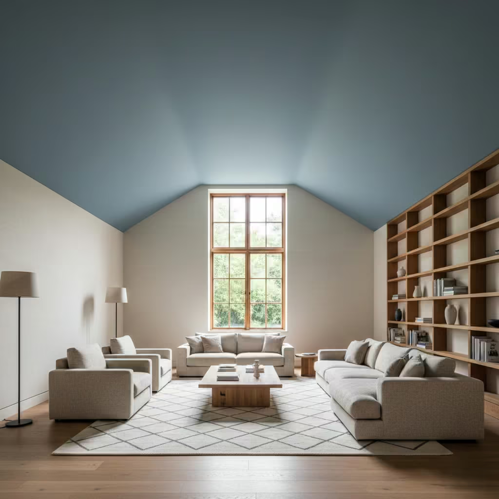
Painting the ceiling a soft or mid-tone blue is a subtle architectural trick I use to bring tall, echo-prone Blue living rooms into proportion. The blue ceiling visually lowers the vertical scale, creating intimacy without reducing light or making the space feel heavy. I often pair it with lighter walls or warm timber accents to avoid an oppressive feel, and select a matte or eggshell finish to prevent glare from natural light. This technique works particularly well in rooms with open-plan volumes, vaulted ceilings, or double-height windows where proportion can feel off-balance.
Room-Fit Suitability
This strategy is ideal for large living rooms with ceiling heights above 3 m (10 ft) or for open-plan spaces where volume needs to feel more human-scaled. It is especially effective in rooms with east- or north-facing light, as blue ceilings subtly reflect daylight and soften harsh shadows. For smaller rooms, a darker ceiling can make the space feel too compressed, so I generally limit the shade to pale or muted blue tones.
Real-Life Application Insights
On one loft conversion with a 3.6 m (12 ft) ceiling, I painted the ceiling a muted powder blue and kept walls off-white. The effect immediately reduced perceived height and improved acoustic comfort when the family used the room.
I complemented the ceiling with a textured wool rug and soft linen curtains in complementary shades, which helped integrate the overhead colour into the room’s palette. The result was a space that felt balanced, calm, and visually cohesive, proving that ceiling colour can be as decisive as wall colour in shaping perception.
You May also Like: 25 Indoor–Outdoor Living Room Ideas That Redefine Modern Living
Blue Upholstered Sofas as the Primary Colour Anchor
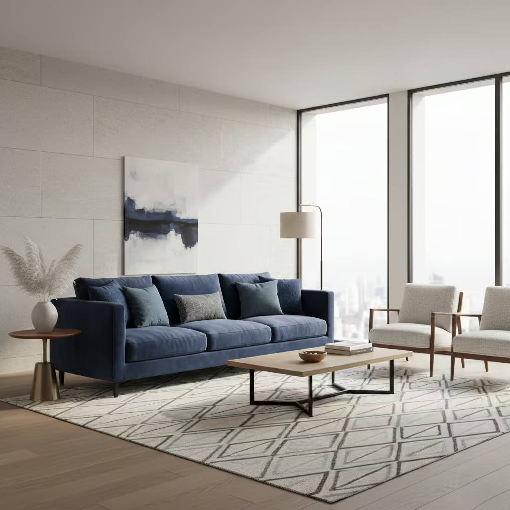
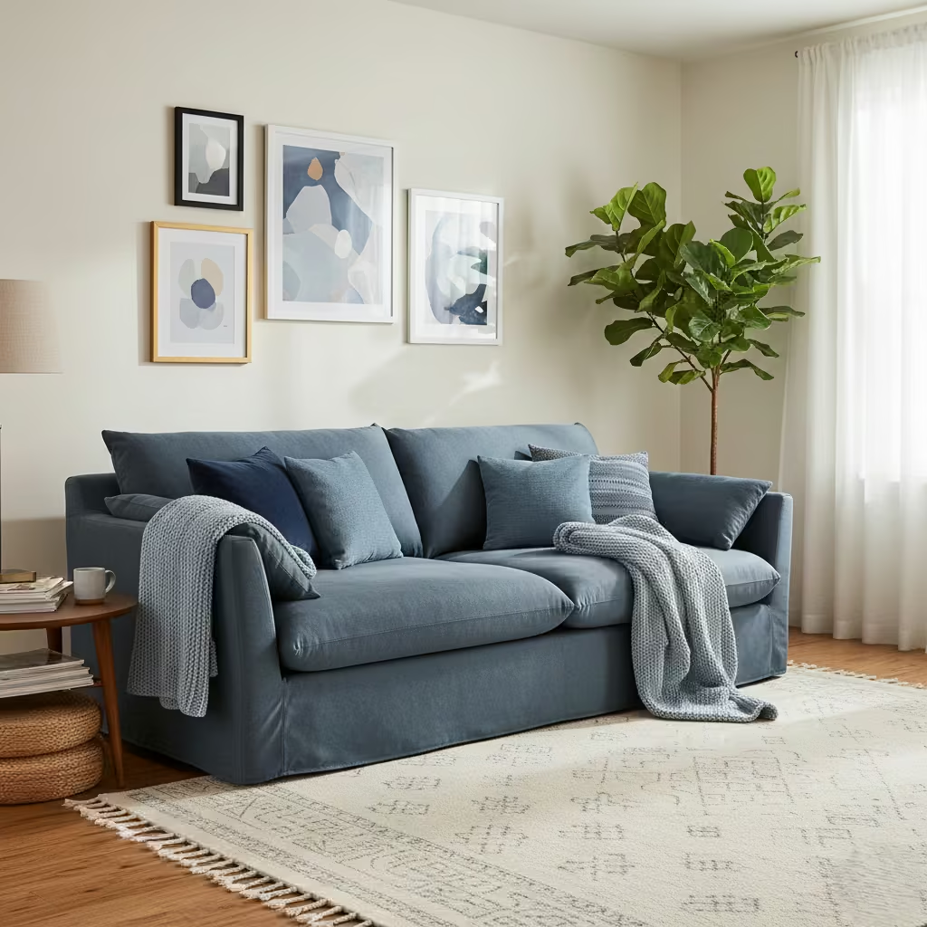
Using a blue sofa as the central colour anchor allows you to introduce blue into the living room without committing to painted walls or built-in joinery. I approach this as a furniture-led strategy: the sofa sets the tone, while surrounding elements rugs, cushions, throws, and occasional chairs either complement or contrast the primary shade.
Deep navy or indigo works well for formality and grounding, while lighter blues like powder or slate bring softness and approachability. Upholstery texture is equally important: velvet, brushed cotton, or boucle can add tactile richness that reinforces the colour choice.
Room-Fit Suitability
This method is suitable for virtually any living room size, from compact apartments around 12 m² (130 sq ft) to large open-plan spaces, as the sofa provides a clear visual anchor. It works particularly well in rooms where architectural alteration is not feasible, such as rental properties, or where flexibility is desired. Proper scale is critical: the sofa should occupy roughly one-third of the primary wall length to establish dominance without overpowering circulation.
Real-Life Application Insights
In one family living room I designed, a 2.7 m × 0.9 m (9 ft × 3 ft) indigo velvet sofa became the focal point, with complementary mid-blue cushions and a muted geometric rug. This approach allowed the surrounding walls to remain off-white, keeping the room light while still feeling cohesive.
I often recommend pairing this with subtle timber or metallic accents to introduce warmth and dimension, ensuring that the blue sofa reads as intentional rather than decorative. Over time, this strategy has proven durable: the upholstery anchors the room visually and allows accessories to be refreshed seasonally without repainting.
Inky Blue Feature Fireplaces
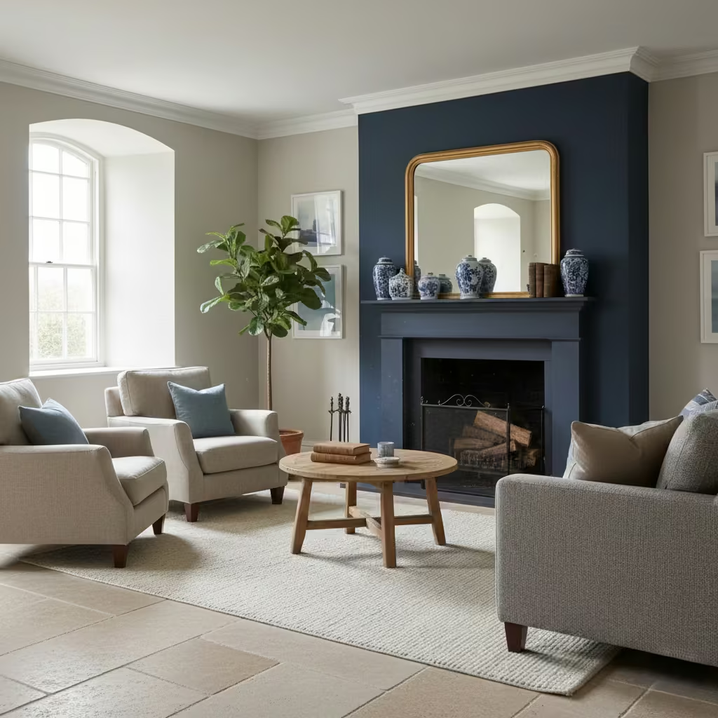
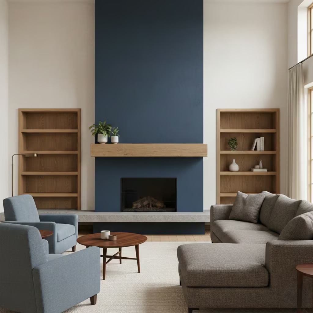
An inky blue fireplace creates a striking architectural focal point without dominating the entire living room. By painting the surround or hearth in a deep, matte blue, the feature draws the eye while allowing surrounding walls and furnishings to remain neutral or lightly coloured.
I often combine this with complementary materials such as stone hearths, timber mantels, or textured plaster to ensure the blue feels integrated rather than theatrical. This technique works particularly well in contemporary or transitional spaces where a single, grounded anchor is needed.
Room-Fit Suitability
This approach is ideal for medium to large living rooms, typically 16–28 m² (170–300 sq ft), where the fireplace can act as a true visual centre without crowding circulation. Ceiling heights of 2.5 m (8 ft 2 in) or above help balance the intensity of the colour, and it performs best in rooms with moderate natural light, as very dark shades in low-light spaces can feel heavy.
Real-Life Application Insights
In one Victorian living room renovation, I painted the fireplace surround a rich inky blue (RAL 5003) and paired it with pale limestone flooring and soft wool furnishings. The colour enhanced the architectural detail and gave a sense of depth to the chimney breast, while the room’s overall palette remained calm.
I recommend a matte or low-sheen finish to avoid glare and maintain a tactile, crafted feel. Over time, this approach has proved highly practical: the blue frame hides minor dust and wear, keeping the fireplace feature striking without appearing high-maintenance.
Blue and Stone Combinations for Timeless Calm
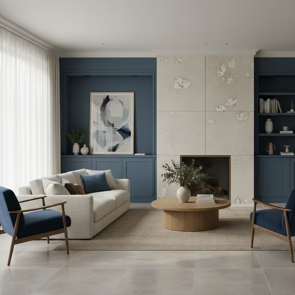
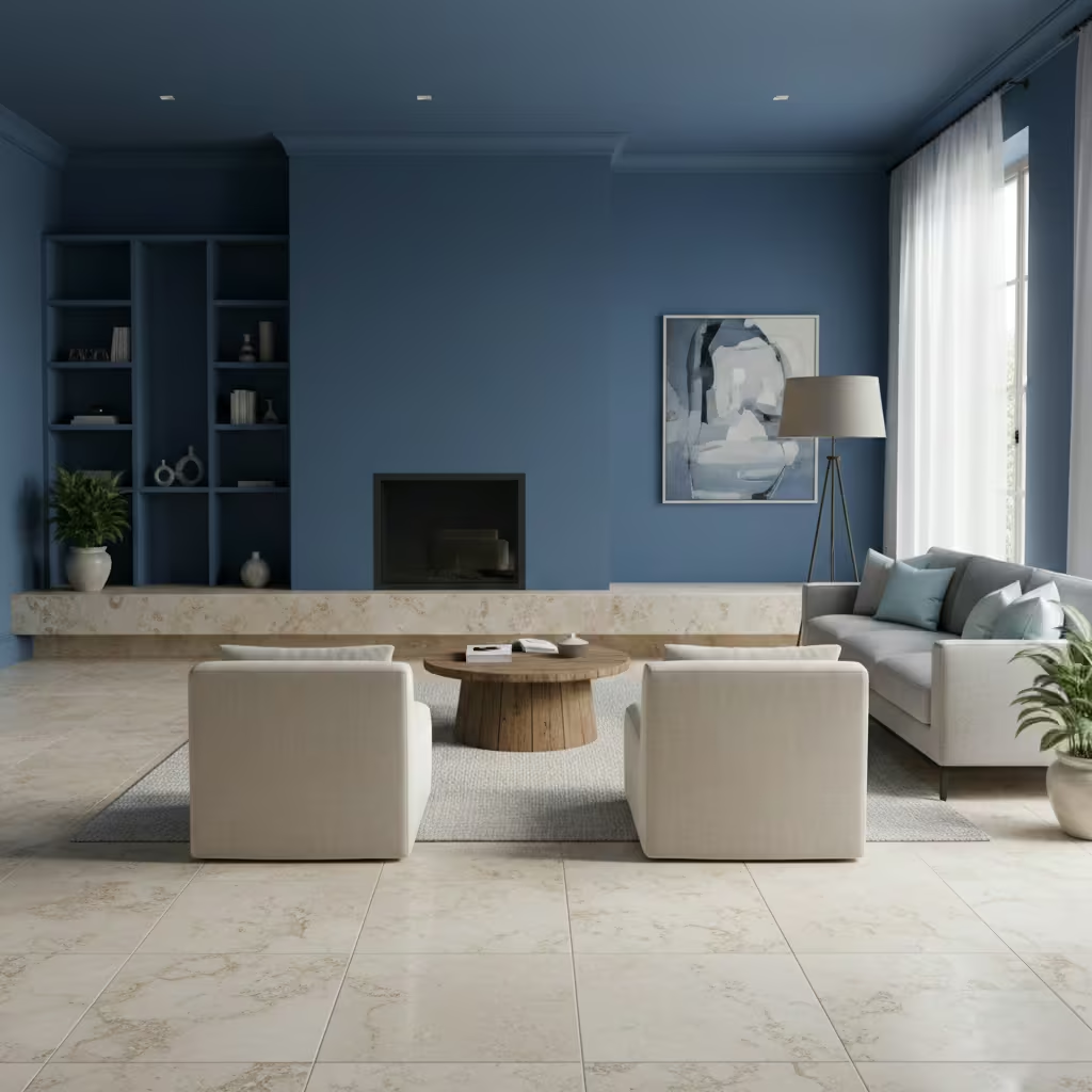
Pairing blue with natural stone introduces a sense of permanence and serenity that few other combinations achieve. I often use mid- to deep-blue walls or joinery alongside travertine, limestone, or high-quality composite stone surfaces. The stone’s natural variation and subtle tonal shifts complement blue’s depth, creating a calm yet tactile environment.
This approach works across both contemporary and traditional interiors, providing visual weight without feeling heavy, and allows blue to function as an architectural element rather than a decorative accent.
Room-Fit Suitability
This combination is best suited to medium to large living rooms, from 18–30 m² (195–320 sq ft), where stone features fireplaces, hearths, flooring, or wall cladding can be proportionally scaled. North- or east-facing rooms benefit most, as the neutral warmth of stone offsets cooler light, while south- or west-facing spaces amplify blue’s vibrancy, particularly when paired with lighter stone tones. Ceilings above 2.6 m (8 ft 6 in) help prevent the palette from feeling compressed.
Real-Life Application Insights
On a recent renovation, I paired a slate-blue painted chimney wall with a honed travertine hearth and ash timber flooring. The contrast between the cool blue and the stone’s subtle veining created a layered, tactile effect that remained visually interesting throughout the day.
I often recommend matte or low-sheen finishes for both paint and stone to maintain cohesion, and I ensure joins and edges are precise uneven stone or glossy paint can disrupt the subtle interplay of materials. The result is a living room that feels timeless, grounded, and low-maintenance, where blue enhances the natural material rather than competing with it.
You May also Like: 25 Apartment Living Room Designs Ideas for a Chic, Cosy, and Functional Home
Pale Blue Living Rooms for Period Properties
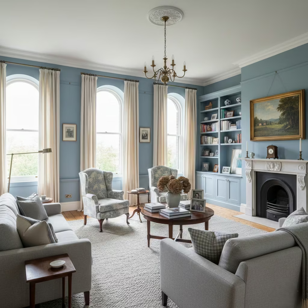
Pale blue is an ideal choice for period properties where the goal is to refresh the interior without compromising original proportions or architectural character. I use soft, muted blues on walls, ceilings, or built-in joinery to subtly highlight decorative moldings, cornices, and paneling.
The understated colour maintains the elegance of high ceilings and tall windows while updating the palette for modern living. Finishes are typically matte or eggshell, which complement plaster surfaces and provide a gentle, diffused light reflection.
Room-Fit Suitability
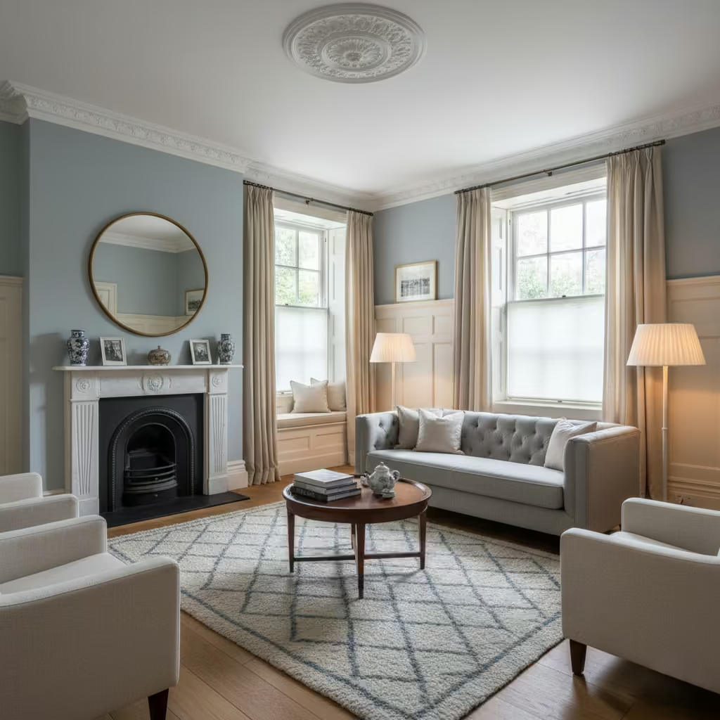
This approach works particularly well in medium-sized period living rooms, around 15–25 m² (160–270 sq ft), with ceiling heights of 2.7 m (9 ft) or higher. North-facing rooms benefit from pale blue’s ability to warm cool daylight, while south-facing spaces retain brightness without appearing washed out. Rooms with intricate joinery, fireplaces, or sash windows gain the most from this restrained colour strategy, as it emphasizes detail without overwhelming the space.
Real-Life Application Insights
In one Victorian townhouse I renovated, I used a pale blue with subtle grey undertones on walls and ceiling, paired with off-white timberwork and oak flooring. The colour respected the period proportions while bringing a calm modernity to the space.
I avoid high-contrast trims, instead opting for soft off-white or chalky cream, which allows pale blue to act as a cohesive backdrop. Over time, the palette proved forgiving for furniture and accessory updates, allowing the room to evolve without clashing with the original architecture.
Blue Wall Panelling for Structure and Rhythm
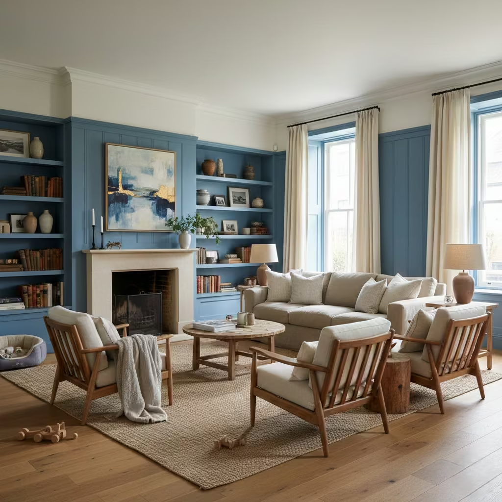
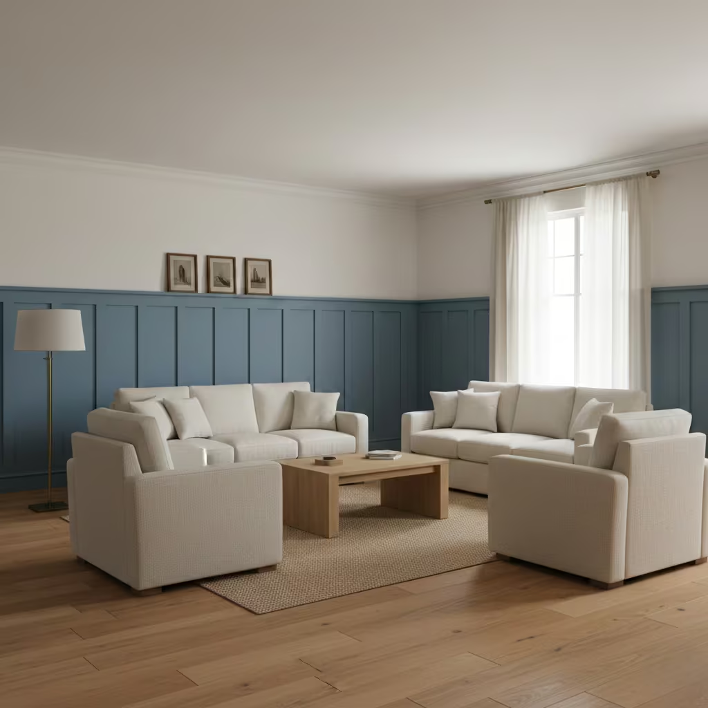
Blue wall panelling introduces colour strategically while adding architectural structure and rhythm to a living room. Instead of covering the entire wall in paint, I often apply blue to panelled sections, wainscoting, or dado heights, creating depth and visual interest without overwhelming the space.
This approach allows the room’s proportions and detailing to remain clear, while the blue acts as a framework for furniture, artwork, and lighting. Mid-tone or muted blues work best, as they enhance the panel definition without creating stark contrasts.
Room-Fit Suitability
This method suits medium to large living rooms, approximately 16–28 m² (170–300 sq ft), and works particularly well in spaces with high ceilings or long walls. Ceiling heights above 2.5 m (8 ft 2 in) allow the panelling to create proportion and rhythm without compressing the space. It is ideal for both contemporary and traditional interiors, offering a flexible way to introduce blue where full-height walls may feel too dominant.
Real-Life Application Insights
On a recent project, I painted lower wall panels and built-in shelving units in a muted slate blue, leaving the upper walls and ceiling off-white. The effect was structural yet subtle, giving the living room a sense of order and refinement.
I often recommend using an eggshell finish for durability, particularly in high-traffic family spaces, and pairing the panels with timber flooring or soft furnishings in complementary tones. The result is a space that reads as deliberate and sophisticated, with blue providing visual structure without overpowering the room.
Blue and Brass Accents for Controlled Warmth
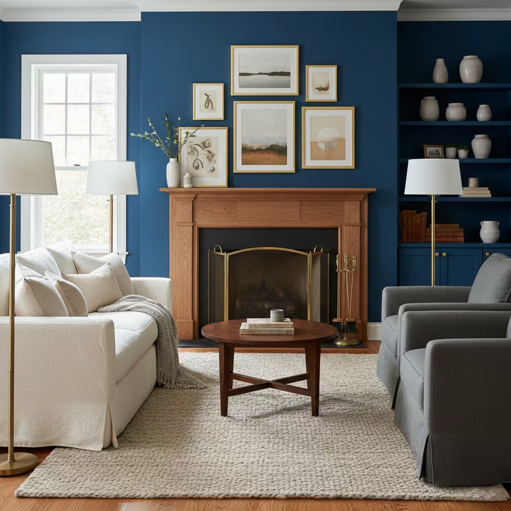
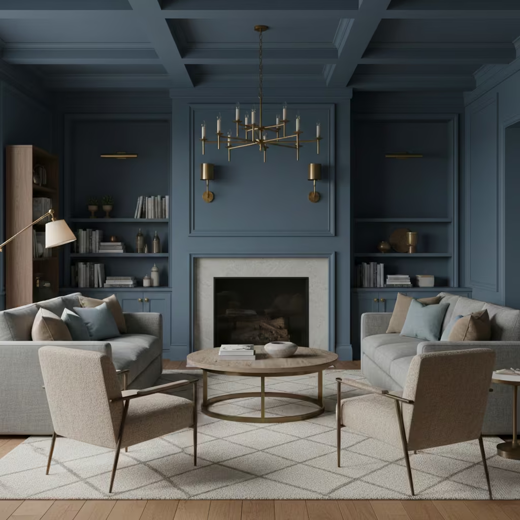
Pairing blue with brass introduces warmth and sophistication while maintaining calm and balance. I recommend using aged or brushed brass rather than polished finishes, as this prevents harsh reflections and overly stark contrast with deep or muted blues.
Brass works well in lighting fixtures, cabinet handles, frames, and occasional furniture legs, providing subtle highlights that draw the eye without competing with the primary blue palette. This combination adds a sense of luxury while keeping the room grounded and inviting.
Room-Fit Suitability
This approach is suitable for medium to large living rooms, typically 16–28 m² (170–300 sq ft), where accents have enough scale to be noticed without dominating the room. It performs particularly well in rooms with cooler blue walls or joinery, as brass introduces a balancing warmth. North-facing or shaded interiors benefit most, as brass reflects available light and prevents the room from feeling cold or static.
Real-Life Application Insights
In one townhouse living room, I paired a deep indigo painted feature wall with brushed brass wall sconces and cabinet hardware. The result was a balanced, layered interior where the blue provided depth and the brass added warmth without looking ostentatious.
I also paired this combination with soft-textured rugs and timber furniture, which further moderated the contrast and created a cohesive, lived-in feel. Over time, the aged brass proved low-maintenance and resilient, retaining character without showing fingerprints or wear.
You May also Like: 25 Dark Cottagecore Dining Room Ideas That Feel Intimate, Layered, and Lived-In
Blue Rugs as Spatial Anchors in Open-Plan Living
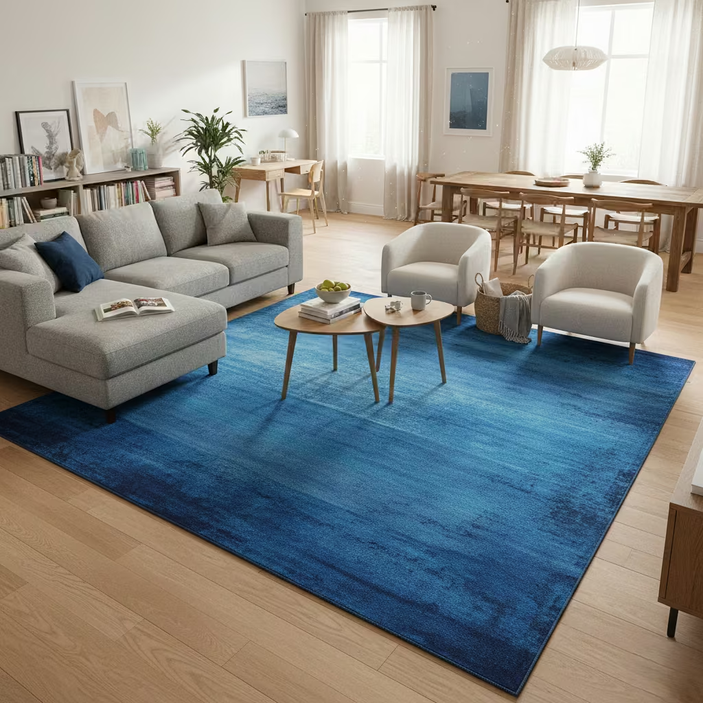
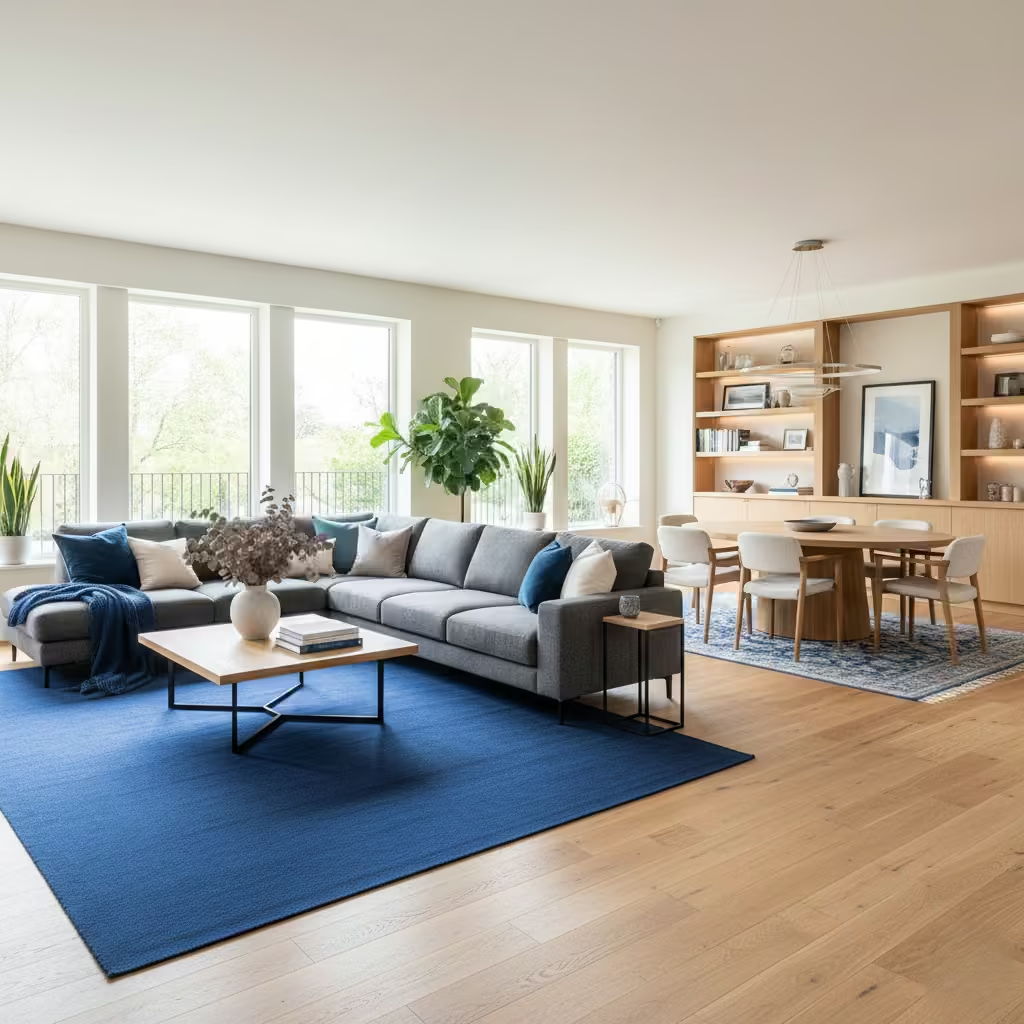
In open-plan living areas, a blue rug can function as a subtle yet effective spatial anchor, defining seating zones without the need for partitions or physical dividers. I use mid to deep blue rugs often with muted patterns or tonal variation to ground furniture layouts and provide cohesion across multiple functions within the same space. Layering complementary cushions, throws, or low-level furniture in related blue tones reinforces the effect, creating a sense of intentionality and flow.
Room-Fit Suitability
This strategy works best in large open-plan living spaces above 25 m² (270 sq ft), particularly where the layout includes multiple functional zones such as a lounge and dining area. It performs well on light timber, stone, or neutral flooring, allowing the rug to clearly delineate space without overwhelming visual continuity. In smaller open areas, I recommend rugs sized at least 2.0 m × 3.0 m (6 ft 6 in × 10 ft) to ensure proportional impact.
Real-Life Application Insights
On one contemporary loft project, I placed a 2.4 m × 3.6 m (8 ft × 12 ft) indigo wool rug beneath a modular sofa and coffee table, visually separating the lounge from the adjoining dining zone. The blue anchored the furniture while complementing pale oak floors and soft cream walls.
Over time, the rug proved practical for daily family use, and its tonal depth allowed additional accents such as cushions and throws to be rotated seasonally without disrupting the colour harmony. This approach demonstrates that blue can define space as effectively as walls or screens, with greater flexibility and lower permanence.
Denim and Indigo Tones for Relaxed Family Rooms
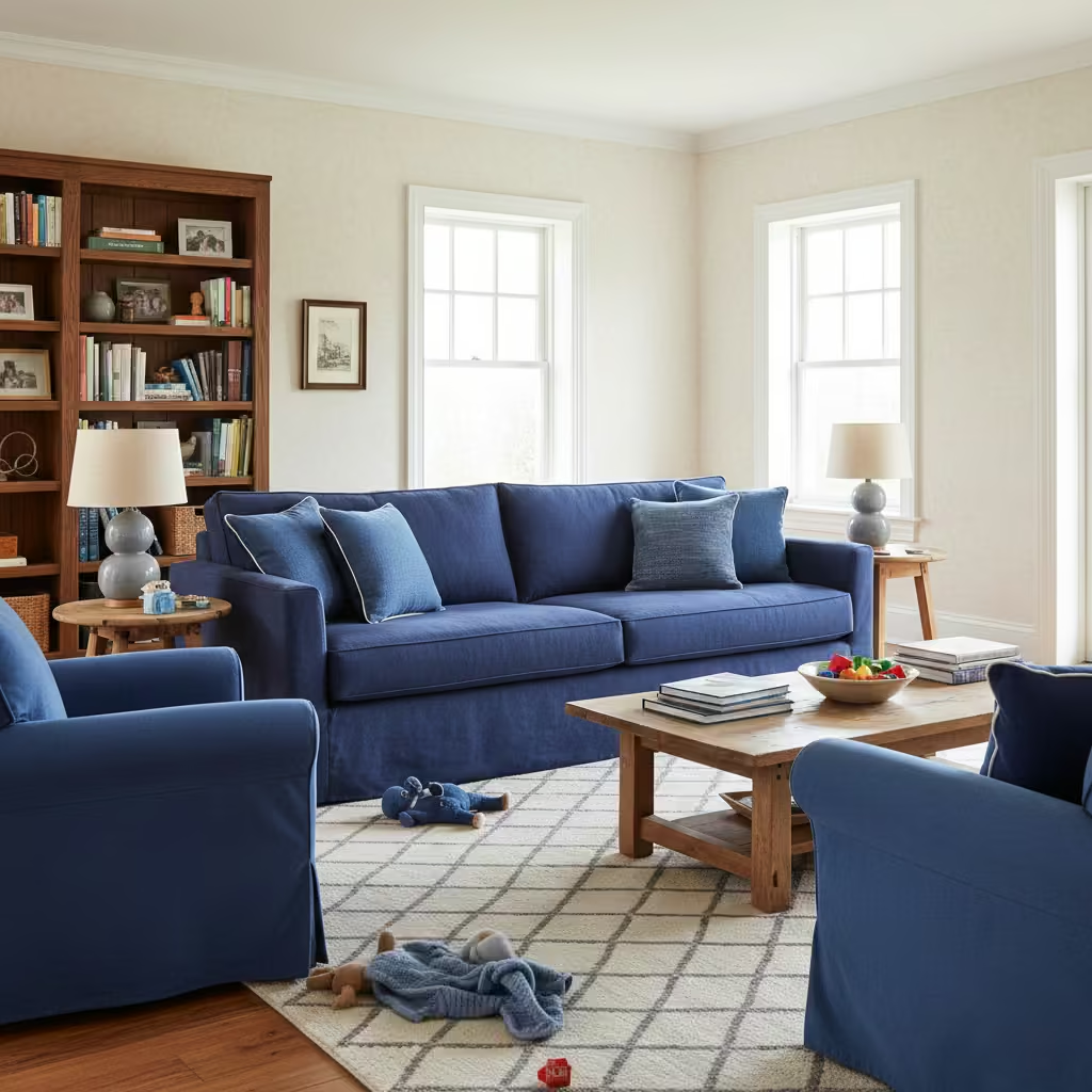
Denim and indigo blues are ideal for family-oriented living rooms where durability and practicality are as important as aesthetics. These mid-to-deep blues conceal wear, stains, and daily traffic marks far more effectively than lighter or brighter blues, making them perfect for sofas, upholstered chairs, rugs, and cushions. I often combine these tones with soft neutral fabrics, natural timber, and textured rugs to create a relaxed, layered environment that feels lived-in without appearing tired or neglected.
Room-Fit Suitability
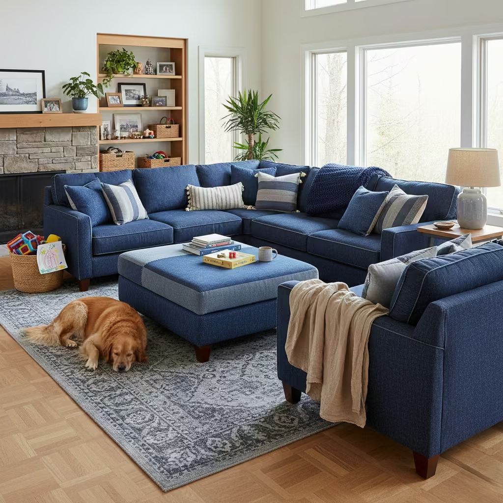
This strategy works across medium to large family living rooms, typically 15–28 m² (160–300 sq ft), and performs especially well in high-traffic zones or multi-functional spaces. North-facing or shaded rooms benefit from the warmth of timber or earthy textiles to prevent the deep blues from feeling too cool, while south-facing rooms allow denim tones to appear slightly brighter throughout the day.
Real-Life Application Insights
On a townhouse family living room project, I specified an indigo cotton-linen sofa measuring 2.4 m × 0.9 m (8 ft × 3 ft) paired with matching cushions in slightly lighter denim shades. This layering created a cohesive, relaxed palette that hides everyday wear from children and pets.
I also incorporated a low-pile wool rug and oak shelving to balance texture and introduce warmth. Over time, the layered denim approach has proven forgiving, maintaining a visually cohesive and comfortable environment without demanding frequent reupholstery or replacement.
Blue and Cream Living Rooms for Soft Contrast
Pairing blue with cream provides a soft, approachable contrast that feels warmer and more inviting than traditional blue-and-white schemes. I use mid to muted blues on walls, joinery, or textiles, balanced with cream elements in upholstery, curtains, or ceilings.
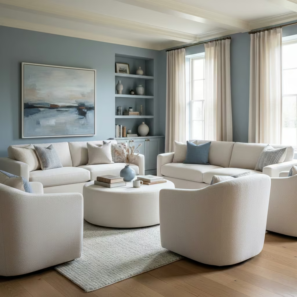
This combination allows blue to remain the dominant tone while cream introduces warmth and subtle light reflection, creating a calm, layered atmosphere. It works particularly well in spaces aiming for timeless elegance without appearing formal or cold.
You May also Like: 41 Coastal Living Room Design Ideas That Feel Calm, Fresh, and Timelesss
Room-Fit Suitability
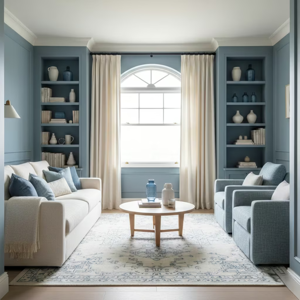
This approach is suitable for small to medium living rooms, around 14–24 m² (150–260 sq ft), as the cream offsets the density of blue, preventing the space from feeling enclosed. It also works well in north-facing rooms or spaces with filtered light, where cream enhances brightness without overwhelming the palette. Ceiling heights of 2.5–2.7 m (8–9 ft) are ideal, providing enough vertical space for the interplay of soft contrast without compressing the room visually.
Real-Life Application Insights
In a Georgian apartment, I used a muted blue on three walls with cream-painted joinery and linen curtains. The result was a room that felt both refined and inviting, with the cream tempering the coolness of the blue. I often specify textured fabrics, such as boucle or brushed cotton, to reinforce the soft contrast and add tactile interest.
Over time, this combination has proven low-maintenance: cream surfaces can be refreshed easily, while the blue continues to provide a grounded, cohesive backdrop for evolving furnishings and accessories.
Blue Living Rooms with Black Detailing
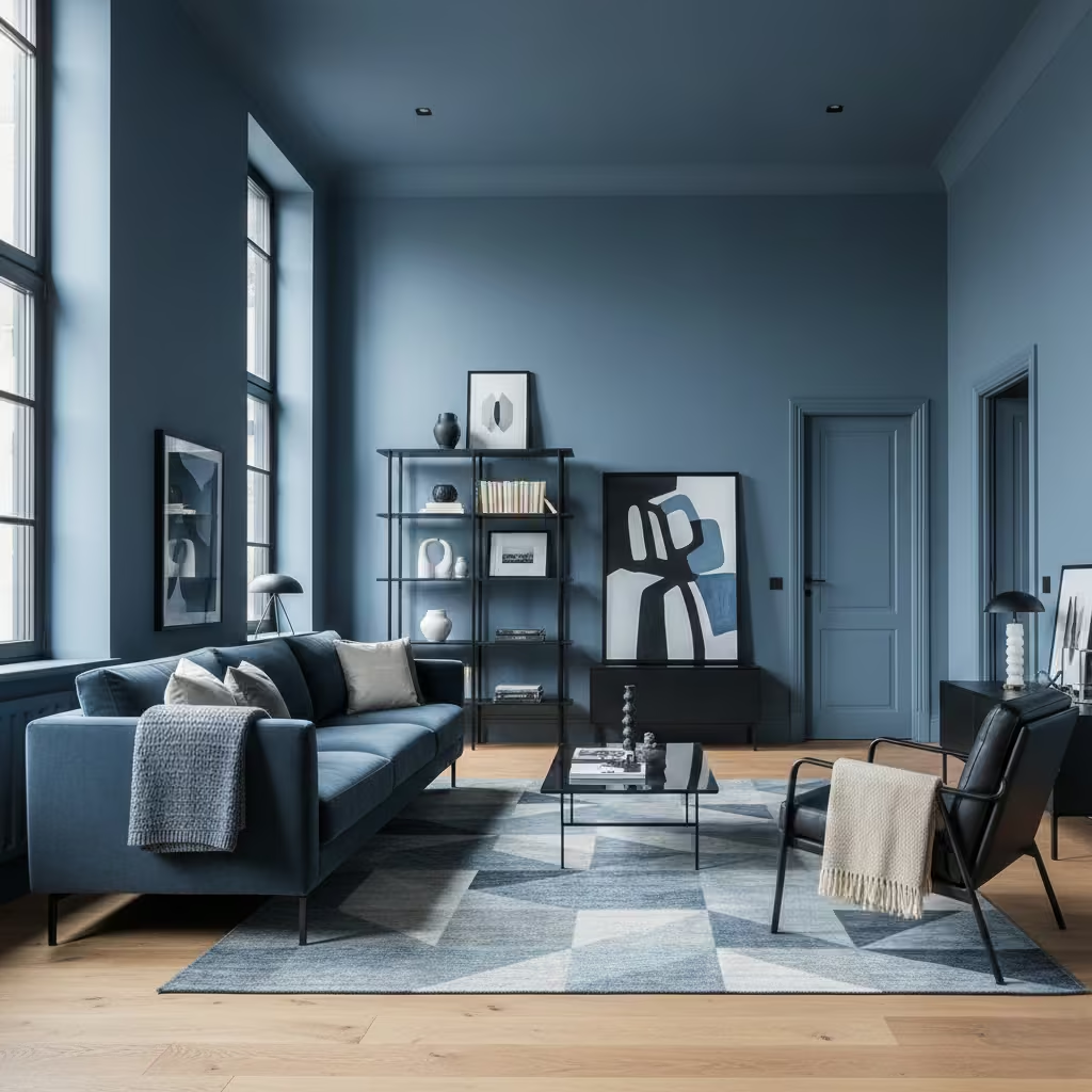
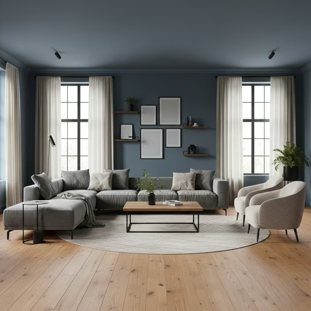
Introducing black detailing into a blue living room adds definition and precision, creating visual clarity without overwhelming the space. I use black sparingly on picture frames, window trims, door handles, shelving edges, or slim furniture legs to sharpen architectural lines and highlight volumes. This approach works particularly well with mid to deep blues, as the black accent reinforces structure while maintaining a cohesive, layered palette. It is a subtle way to modernise a space while keeping the overall mood calm and sophisticated.
Room-Fit Suitability
This strategy is most effective in medium to large living rooms, around 16–28 m² (170–300 sq ft), where black accents have sufficient visual weight to be noticed. It performs well in rooms with moderate natural light; black detailing in very dark, shaded spaces can feel heavy, so I usually pair it with lighter blue undertones or reflective surfaces. High ceilings above 2.6 m (8 ft 6 in) allow the detailing to read clearly without compressing the space.
Real-Life Application Insights
In one contemporary loft project, I paired a deep slate-blue painted feature wall with black metal-framed shelving and door trims. The black lines provided definition, making the room feel structured and intentional without introducing harsh contrast.
I also balanced the detailing with warm timber floors and soft-textured fabrics, which prevented the combination from feeling stark. Over time, I found that black detailing offers durability and timeless appeal, as it hides wear and scuffs better than brass or lighter metal accents while enhancing the overall sophistication of the blue palette.
Blue Wallpaper Used in Architectural Panels
Using blue wallpaper within architectural panels allows pattern and colour to enhance structure rather than simply decorate surfaces. I apply wallpaper selectively inside framed wall panels, wainscoting, or recessed joinery to introduce depth and texture without overwhelming the room.
Subtle, tonal patterns or textural finishes work best, as they complement blue’s calmness while reinforcing the panel’s geometry. This approach transforms walls into architectural elements, creating rhythm and visual interest that feels deliberate and considered.
Room-Fit Suitability
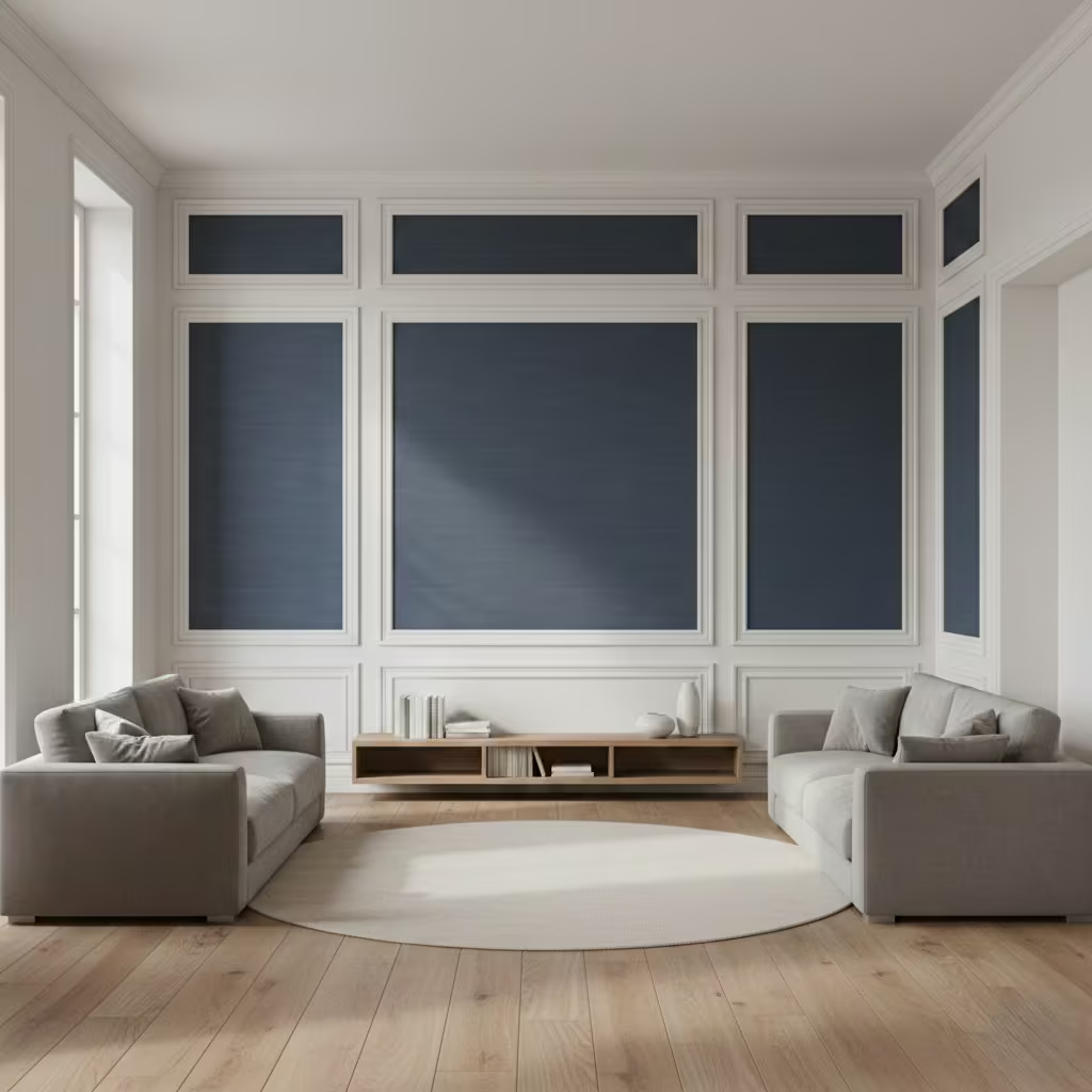
This method is ideal for medium to large living rooms, approximately 16–28 m² (170–300 sq ft), where panel dimensions are proportionate to the wall. It works well in both period and contemporary properties, particularly where full-height wallpaper might feel overpowering. North-facing rooms benefit from the slight variation in colour and texture, which interacts with indirect light to give panels subtle movement throughout the day.
Real-Life Application Insights
On a recent renovation of a period townhouse, I used a muted navy wallpaper with a soft metallic sheen inside wall panels measuring 1.2 m × 2.4 m (4 ft × 8 ft). The wallpaper acted as a backdrop for artwork and shelving, providing interest without cluttering the visual field.
I paired it with off-white walls and oak flooring to maintain warmth and balance. Over time, the wallpaper proved durable in a family setting, with scuffs less visible on patterned surfaces, demonstrating that strategic use of wallpaper can enhance both structure and longevity in a living room.
You May also Like: 16 Dreamy White Oak Living Room Ideas to Make Every Corner Feel Like Home
Coastal Blues Without Themed Styling
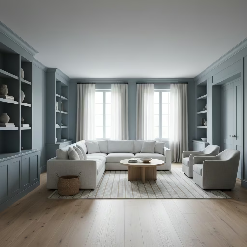
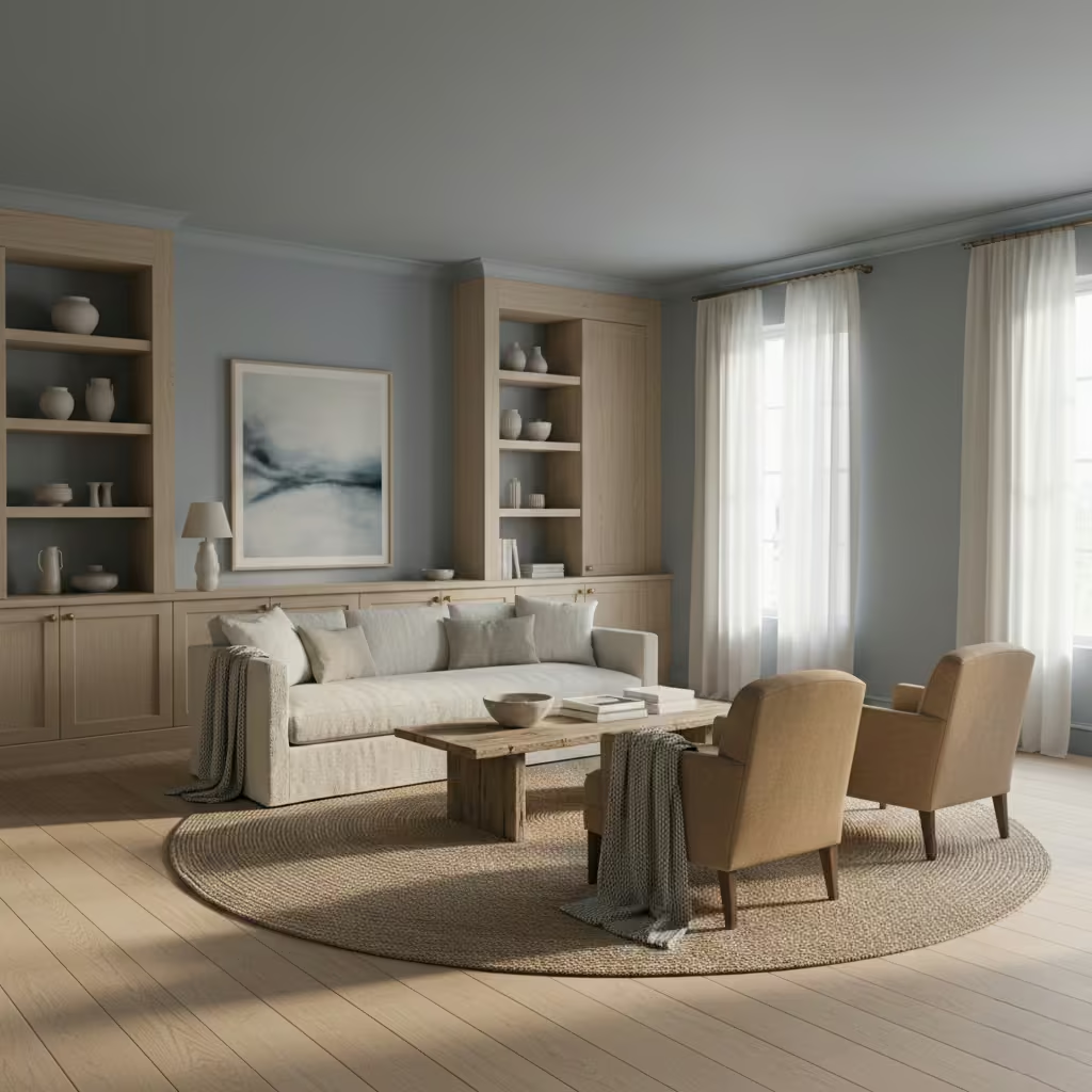
Coastal-inspired blues can feel fresh and relaxing without resorting to cliché “beach-house” motifs. I focus on selecting muted or greyed blues that reference sea and sky, rather than literal navy-and-white stripes or nautical accessories.
By pairing these tones with natural textures limestone, oak, or soft woven fabrics I create a layered, sophisticated palette that evokes coastal calm without gimmick. Accessories and finishes are kept minimal, letting the blue speak architecturally and atmospherically rather than as a decorative statement.
Room-Fit Suitability
This approach works best in medium to large living rooms, from 16–28 m² (170–300 sq ft), particularly those with ample natural light from south- or west-facing windows. It is ideal for rooms where owners want a relaxed, timeless aesthetic that complements a seaside or suburban context without enforcing a “theme.” It also performs well in open-plan spaces, where a restrained coastal palette can unify connected zones without appearing costume-like.
Real-Life Application Insights
On one coastal townhouse project, I used a soft grey-blue on walls and built-in joinery, paired with pale oak flooring and linen curtains. No literal nautical accessories were used; instead, texture and tone conveyed the reference to coastal light and air.
I found that integrating tactile materials like jute rugs and unpolished timber furniture was key to keeping the scheme grounded and lived-in. Over time, this approach has proved practical and versatile: it maintains a sense of freshness while allowing owners to change accents and furnishings without the room feeling themed or dated.Top of Form
Blue Built-In Storage for Visual Weight Control
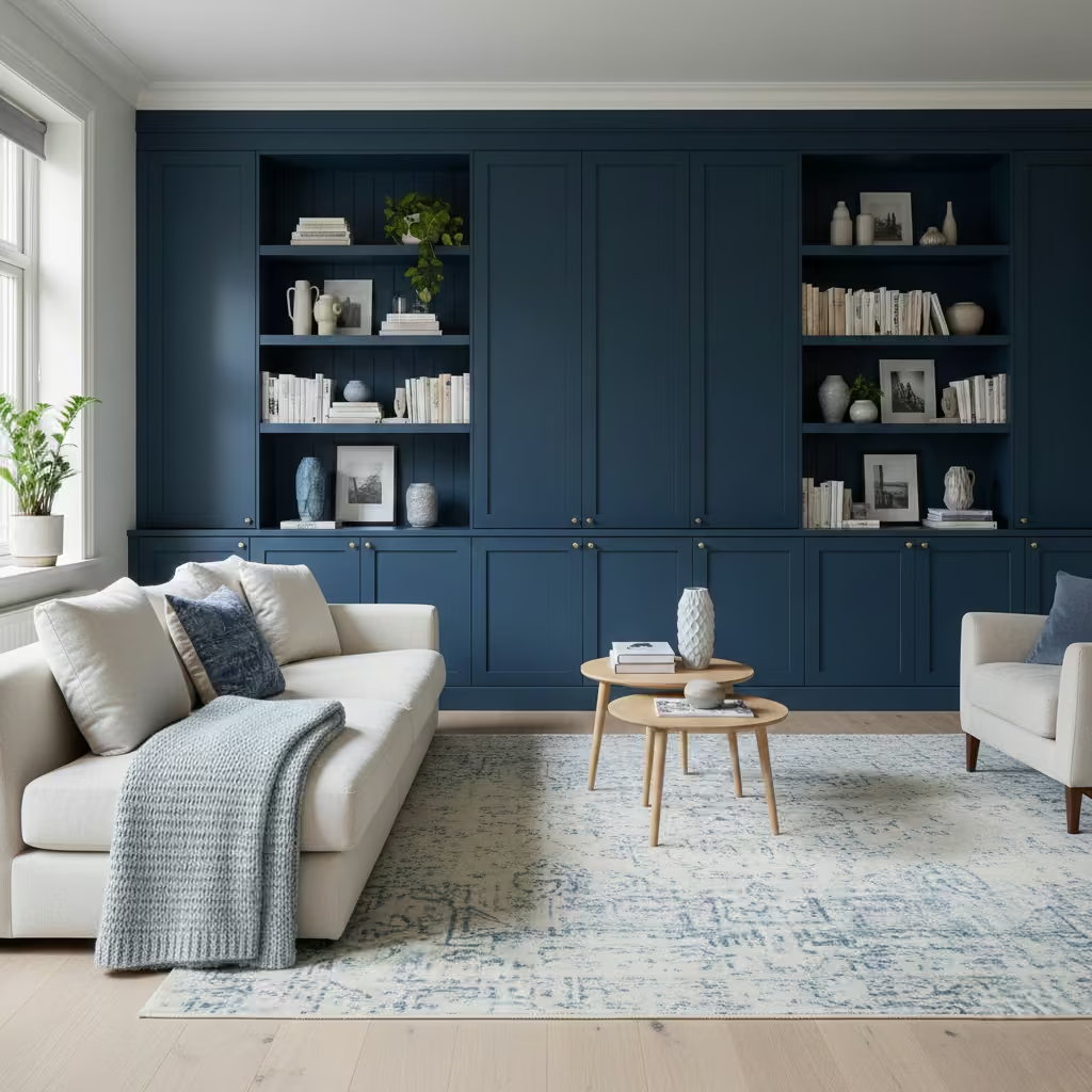
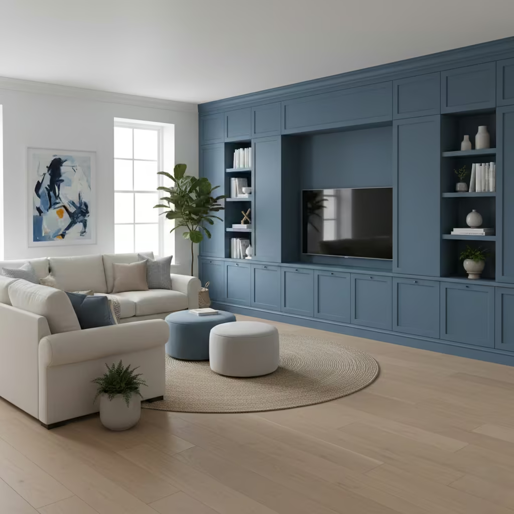
Painting built-in storage in blue is an effective way to manage the visual weight of large cabinetry without making it feel heavy or intrusive. I use mid to deep blues on shelving, cupboards, or media walls to create a sense of cohesion with the room, allowing the storage to recede while still appearing intentional.
By selecting a matte or low-sheen finish, the units feel integrated with surrounding walls and furnishings, avoiding the stark, boxy appearance that full-height cabinetry can sometimes create.
Room-Fit Suitability
This strategy works well in medium to large living rooms, typically 16–30 m² (170–320 sq ft), where storage walls could otherwise dominate the space. North- or east-facing rooms particularly benefit, as the blue softens cooler daylight. In rooms with low ceilings, I recommend lighter blue tones or limiting coverage to lower units to prevent the storage from visually compressing the space.
Real-Life Application Insights
In one townhouse project, a 3.6 m × 2.4 m (12 ft × 8 ft) storage wall was painted in a muted indigo with subtle texture. The colour provided enough visual weight to balance the opposite feature wall while preventing the cabinetry from feeling bulky.
I paired it with pale oak flooring and soft furnishings in complementary blue and neutral shades, which created harmony and depth. Over time, this approach has proven highly practical: the units remain visually anchored without overwhelming the room, and blue helps mask minor scuffs or wear in high-traffic areas.
Blue and Clay Tones for Earthy Balance
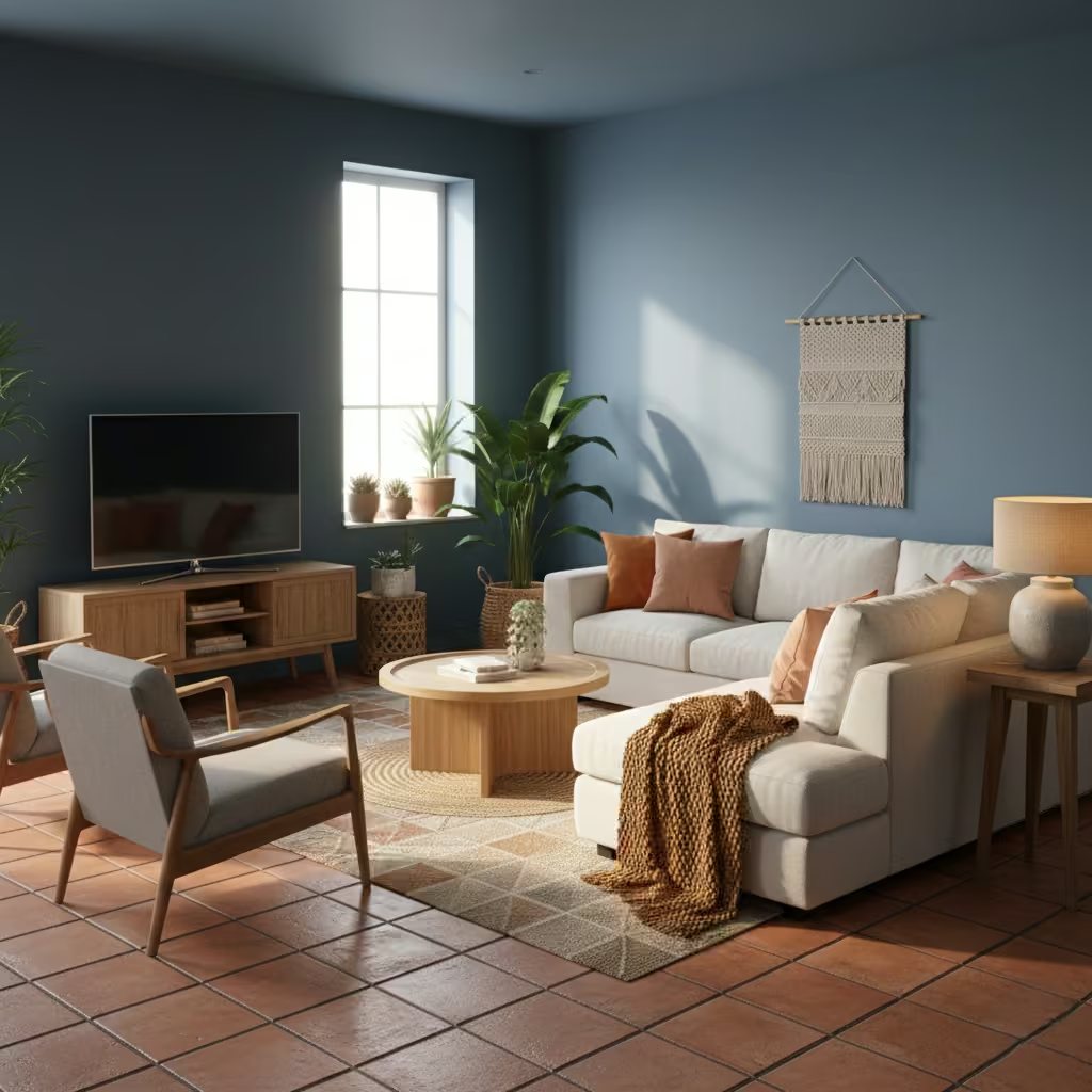
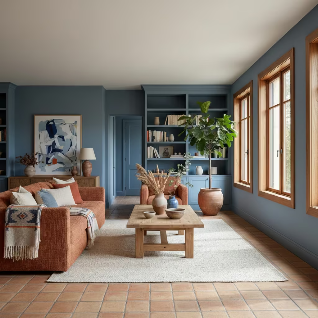
Pairing blue with clay or terracotta tones creates an unexpected but highly livable palette that feels grounded and tactile. I often combine muted or mid-tone blues on walls, joinery, or textiles with clay-coloured ceramics, upholstery, or terracotta flooring to introduce warmth and natural texture.
The key is balance: blue provides calm and depth, while clay tones inject earthiness without making the room feel heavy or rustic. This approach works particularly well for interiors that need subtle contrast and a sense of materiality rather than literal colour decoration.
Room-Fit Suitability
This combination is best for medium to large living rooms, roughly 16–28 m² (170–300 sq ft), where there is enough surface area for both colours to interact without crowding the space. North-facing rooms benefit from the warmth of clay tones, which counteract cool daylight, while south-facing rooms allow the blues to retain vibrancy. Ceiling heights above 2.5 m (8 ft 2 in) help maintain proportion, especially when clay is introduced through larger floor surfaces or accent walls.
Real-Life Application Insights
In one family home, I paired slate-blue painted walls with terracotta floor tiles and clay-hued linen cushions. The combination created a living room that felt both contemporary and grounded, avoiding the coldness that can occur when blue dominates alone.
I also incorporated natural timber furniture and woven textures to unify the palette and provide tactile warmth. Over time, this approach proved practical: the clay elements hide wear and dirt in high-traffic areas, while the blue maintains calm, ensuring a balanced and resilient living environment.
Mid-Blue Living Rooms with Monochrome Art
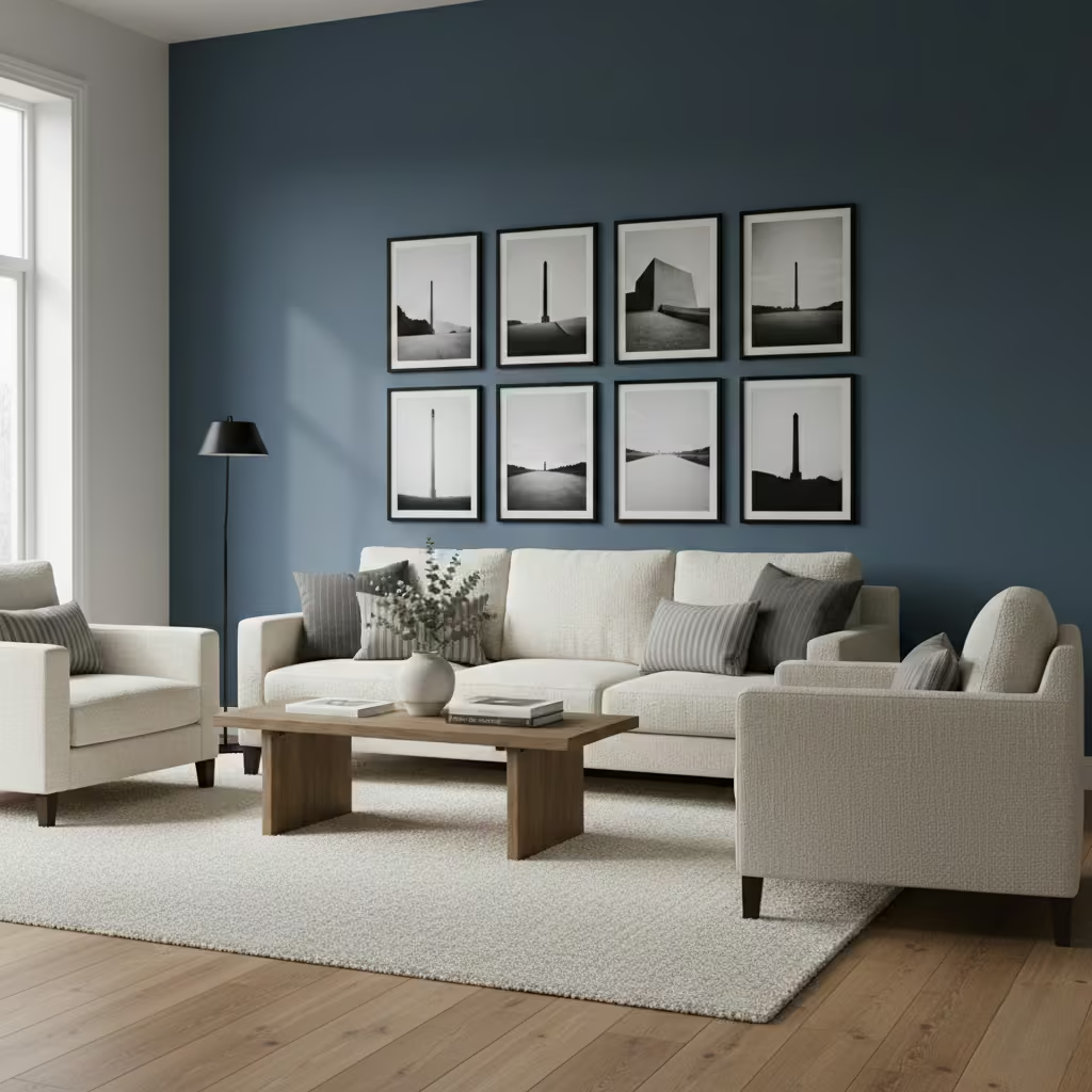
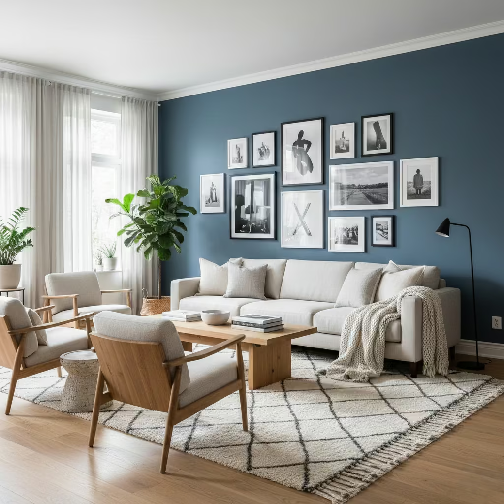
Using mid-blue walls as a backdrop for monochrome art allows the artwork to define visual contrast and focal points within a room. I often select muted or mid-tone blues for walls or large panels, then layer black-and-white prints, sketches, or photography to create rhythm and movement without adding competing colours.
This approach lets the blue act as an atmospheric canvas, enhancing the artwork’s impact while maintaining a cohesive, calm palette. Textured frames or subtle relief mounts further reinforce depth without overpowering the room.
Room-Fit Suitability
This strategy works well in medium to large living rooms, approximately 16–28 m² (170–300 sq ft), where walls are sufficient to display multiple pieces at scale. North-facing spaces benefit, as the indirect light emphasizes tonal variation in both the blue background and monochrome artworks. For smaller rooms, I recommend limiting the number of pieces to one or two key artworks to avoid visual clutter.
Real-Life Application Insights
In one townhouse renovation, I painted a 5 m × 2.6 m (16 ft × 8 ft 6 in) wall in a mid-blue matte finish and installed a series of black-and-white photographic prints in slim black frames. The blue provided depth and cohesion, while the monochrome art created contrast and focal interest.
I found that pairing the scheme with natural timber flooring and neutral upholstery prevented the palette from feeling cold or static. Over time, this approach allows flexibility: artwork can be rotated or updated seasonally without disturbing the overall harmony of the room.
You May also Like: 21 Minimalist Living Room Ideas That Make Your Home Feel Calm and Chic
Blue Used Only Below Dado Height
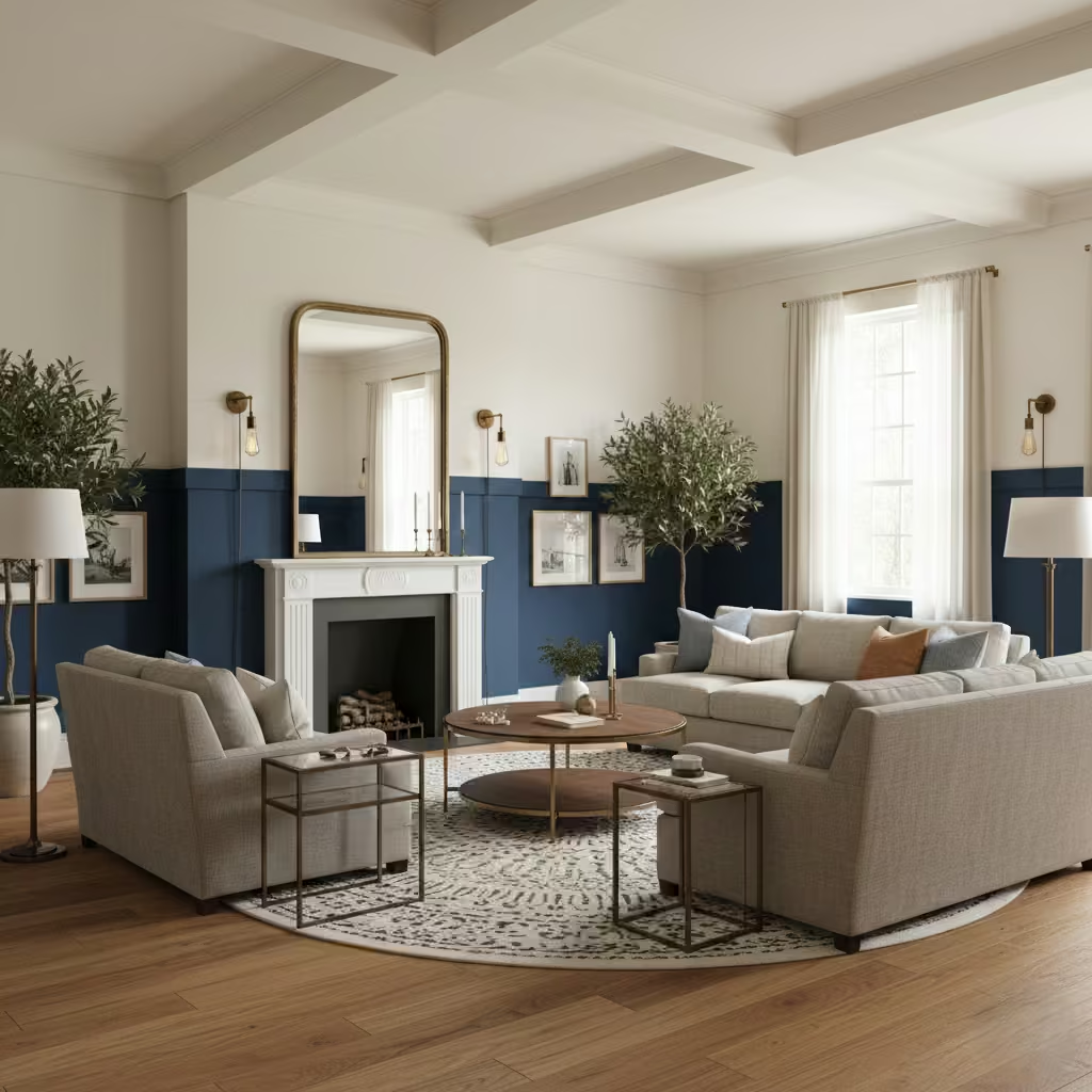
Applying blue exclusively below dado height (typically 90–110 cm / 3–3.5 ft) is an architectural strategy to ground a room while keeping upper walls light and airy. I use this method to add depth and weight to living spaces without compromising ceiling height or light reflection.
Darker or mid-tone blues work best in this context, paired with lighter upper walls, ceilings, and joinery to create a subtle two-tone effect that feels structured and elegant rather than segmented.
Room-Fit Suitability
This approach is particularly effective in medium to large living rooms, around 16–28 m² (170–300 sq ft), and in spaces with high ceilings above 2.6 m (8 ft 6 in). It works well in both period and contemporary interiors, providing visual grounding without overwhelming the room. North-facing or shaded rooms benefit, as the blue lower zone absorbs cooler light and balances spatial perception.
Real-Life Application Insights
On a townhouse renovation, I painted the lower 1 m of all walls in a muted navy, leaving the upper sections and ceiling off-white. This visually anchored the furniture and made the room feel proportionate while maintaining brightness. I paired the treatment with oak floors, soft-textured sofas, and brass accents to integrate warmth.
Over time, I found that this technique is practical in family homes: the lower blue panels hide scuffs and wear naturally, while the lighter upper walls keep the space feeling open and inviting.
Blue Living Rooms Designed for Low Maintenance
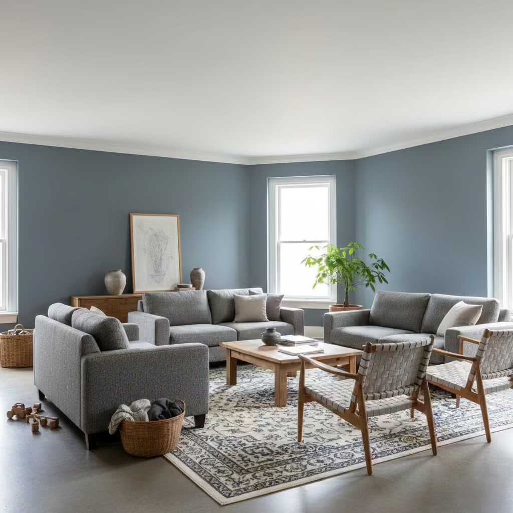
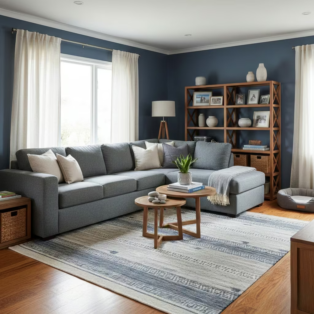
Designing a blue living room with low maintenance in mind requires careful selection of colour, finish, and materials that wear gracefully. I often specify mid to deep blues with slightly muted or greyed undertones, as they hide minor scuffs, fingerprints, and dust better than pure or pastel blues.
Finishes such as matte or low-sheen paints, hard-wearing fabrics like wool or cotton-linen blends, and durable timber or stone surfaces ensure the room remains attractive over time with minimal upkeep. This approach is about creating a practical, resilient environment without compromising on style or sophistication.
Room-Fit Suitability
This strategy is suitable for medium to large living rooms, approximately 16–30 m² (170–320 sq ft), particularly in family homes or high-traffic areas. It works well in rooms with varying light conditions, as muted blues remain visually consistent under both natural and artificial lighting. High ceilings and well-balanced proportions further help the room feel spacious and comfortable, even with darker or deeper colour choices.
Real-Life Application Insights
On several family living room projects, I paired a muted indigo wall colour with textured wool rugs, mid-tone timber furniture, and upholstered seating in durable linen-cotton blends. The result was a room that looked cohesive and refined while tolerating daily use from children and pets.
I also found that matte or eggshell paint finishes significantly reduced the need for frequent touch-ups, and low-maintenance blue rugs or upholstery allowed seasonal changes in accessories without affecting the core colour scheme. This approach proves that blue can be both beautiful and practical, delivering long-term satisfaction and resilience in everyday living.
Comparison & Decision Guidance
Choosing the right blue approach for a living room requires careful consideration of scale, light, function, and the level of architectural commitment. From my experience on multiple projects, there are clear patterns that determine success or failure, and understanding them early saves costly mistakes.
Small vs Large Living Rooms
In smaller rooms under 16 m² (170 sq ft), I tend to favour lighter or muted blues, or layering blue through textiles rather than full-height paint. Dark, enveloping blues can feel oppressive, while accent walls or furniture-led approaches such as a blue sofa or rugs add interest without compromising spatial perception. Larger rooms over 20–25 m² (215–270 sq ft) can accommodate deeper or more saturated blues, including full-height walls, panelled joinery, or architectural features like ceiling or fireplace treatments, as there is enough volume for the colour to feel intentional rather than constrictive.
North vs South-Facing Light
Light direction is a crucial factor. North-facing rooms, with cooler, indirect light, benefit from blue-gray, dusty blue, or slightly warmer mid-blues paired with timber or earthy accents, as these colours soften the perceived chill. South-facing or bright west-facing rooms can handle deeper, purer blues, as the warmer, abundant light prevents the space from feeling dark or heavy. Overlooking light quality can turn a well-intentioned colour choice into a visually flat or cold environment.
Formal vs Family Living
Formal living rooms are well-suited to architectural blue: walls, joinery, or ceiling treatments in deep or tonal blues create depth, proportion, and compositional clarity. Family-focused spaces often require practicality: denim or indigo upholstery, muted blue rugs, or lower wall treatments can provide resilience to wear, stains, and daily traffic while maintaining a cohesive palette. Textured finishes and low-sheen surfaces help balance sophistication with functionality in these high-use spaces.
When Blue Should Be Architectural vs Decorative
Blue is architectural when it defines volume, proportion, or function think full-height walls, joinery, paneling, or ceilings. It becomes decorative when limited to accessories, artwork, or textiles. I always recommend architectural blue when the goal is to shape the room’s spatial perception or create a primary visual anchor. Decorative blue is best for flexible, low-commitment updates, rental properties, or layering in smaller spaces.
Common Mistakes I See Repeatedly
The most frequent errors involve ignoring undertone, light, and finish. For example, pairing pure or cool blues with north-facing rooms often results in spaces that feel sterile. Over-relying on accessories or small accents can make blue appear indecisive rather than cohesive.
Misjudging scale using dark blues in small rooms, or insufficient contrast in large ones frequently leads to visually imbalanced interiors. Lastly, neglecting material pairing, such as combining deep blue with overly cold surfaces, can make a space feel harsh instead of welcoming.
Final Thoughts
Blue is far more than a decorative choice it is a strategic design tool that can shape perception, define proportion, and anchor living room interiors for years to come. When approached thoughtfully, it brings depth, calm, and cohesion, whether applied as an architectural element, a piece of furniture, or a subtle textile layer.
The most successful blue living rooms are those where light, scale, and daily use are considered before any colour is applied. Undertone, finish, and material pairing are just as important as the shade itself, and neglecting these factors is what often turns a potentially timeless palette into a visually flat or impractical space.
I encourage homeowners and designers to assess their living room’s function, orientation, and traffic patterns before selecting a blue strategy. Large, sunlit rooms can carry deep, enveloping blues, while smaller or north-facing spaces benefit from muted or layered approaches. Family spaces require durable finishes and fabrics, while formal or display-focused rooms allow for architectural applications that establish mood and structure.
This guide has been structured as a reference you can return to throughout your planning and decision-making process. Each of the 25 ideas represents a discrete pattern with clear room-fit, real-life insights, and practical applications.
Rather than chasing fleeting trends, use these strategies to make deliberate, lasting decisions that balance aesthetic ambition with everyday usability. Blue, when used with intention, becomes a framework for living room design, offering both style and resilience that endures well beyond seasonal preferences.
Frequently asked questions
What shade of blue works best for small living rooms?
For smaller spaces, muted or lighter blues are ideal. They reflect light, prevent the room from feeling enclosed, and can be layered through textiles or accent walls rather than full-height paint. Soft blue-grays or powder blues are particularly effective for north-facing rooms.
Can blue make a room feel cold?
Yes, but it depends on undertone, finish, and material pairing. Cool, pure blues in low-light or north-facing rooms can feel sterile. Introducing warmth through timber, textiles, brass accents, or complementary muted undertones balances the palette and prevents the space from feeling uninviting.
Should blue be used on walls or furniture?
Both options work, depending on commitment and function. Architectural blue walls, joinery, paneling is best for shaping space and establishing depth. Decorative blue sofas, rugs, cushions offers flexibility, especially in rentals or family rooms, without the permanence of paint.
How do I choose between dark or light blue?
Consider room size, ceiling height, and light quality. Dark blues suit large, well-lit spaces, adding drama and grounding. Light or muted blues are better for smaller rooms or shaded orientations, keeping them bright and airy while still providing depth.
Can blue work in family living rooms with high traffic?
Absolutely. I recommend denim, indigo, or mid-tone blues on durable fabrics and low-sheen paints. Layering through rugs, cushions, and upholstery allows the room to look cohesive while tolerating daily wear, stains, and activity.
How do I avoid cliché “coastal blue” interiors?
Focus on tone, texture, and architectural application rather than motifs. Muted blues paired with natural materials, timber, and subtle accents create a fresh, sophisticated coastal reference without literal nautical décor.
How can I combine blue with other materials?
Blue pairs beautifully with warm timber, stone, clay, brass, and natural fabrics. The key is balance: use blue to anchor the space, and let complementary materials introduce warmth, texture, and depth to create a cohesive, enduring interior.