25 Soft & Serene Sage Green Bedrooms for the Ultimate Relaxing Vibe
Sage green is not the kind of colour that storms into a bedroom and demands attention. It works more quietly than that, and in my experience, that is precisely why it lasts. Unlike trend-driven shades that often feel tied to a moment, sage has a steadier presence. It does not chase the room for attention. It settles into it, softens the edges, and begins to change how the space feels as a whole. A bedroom in sage green rarely reads as “decorated” in an obvious sense. Instead, it feels considered, lived in, and deeply composed.
What makes sage green so effective is the way it behaves with light, shadow, and texture. In morning light, it can appear fresh and airy, almost dusted with grey. By evening, under warmer lamps, it takes on a more cocooning quality, which is exactly what a bedroom should do. It responds beautifully to linen, oak, plaster, wool, and painted timber, which means the colour does not sit alone. It shifts in conversation with the materials around it. That is where its strength lies. It gives a room depth without heaviness, colour without noise.
I have seen this time and again in real projects. Sage green is often the shade clients hesitate over at first, worried it might feel too muted or too safe. Then, once it is in place and the room has had a chance to breathe, the reaction changes. It becomes one of those colours that feels understated at first, indispensable later. The room stops feeling harsh, the light feels kinder, and the whole atmosphere settles.
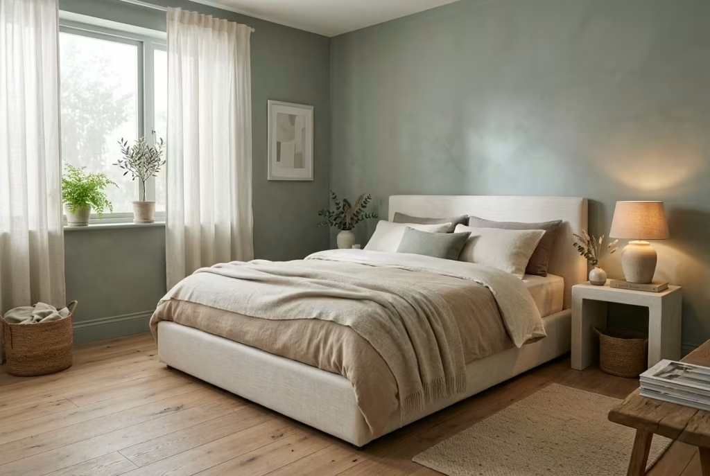
This is not just a roundup of pretty bedrooms. It is a closer look at how sage green spaces actually live and breathe. The best ones do more than look serene in photographs. They support rest, hold warmth, and create a backdrop that feels calm in daily life, not just polished for the moment.
Why Sage Green Feels Inherently Calm in a Bedroom Setting
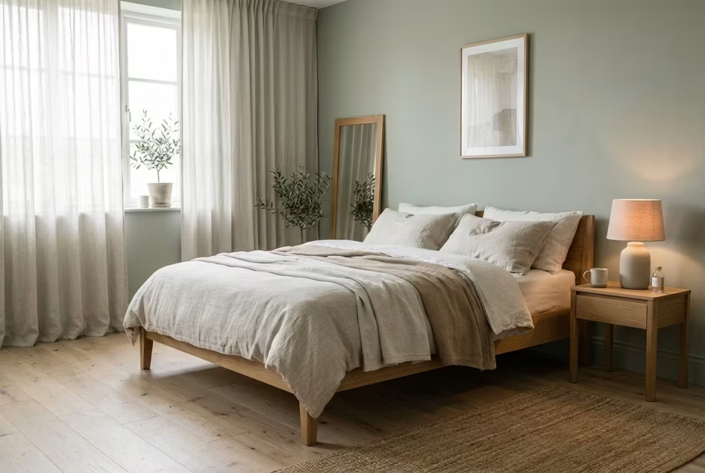
Before getting into the finer details, it is worth understanding why sage green behaves so differently from most colours people bring into a bedroom. I have worked with clients who arrive convinced they need something bold to make the space feel designed, only to realise later that what they were actually missing was a sense of ease. Sage green answers that need quietly. It does not try to impress at first glance. It builds its case slowly, almost in the background, until the room begins to feel softer, more settled, and easier to live in.
What makes it compelling is not just how it looks, but how it performs over time. It absorbs the daily rhythm of the room, shifting with light, textures, and use. The result is a space that feels less like a staged environment and more like a place that supports rest without asking for attention.
The Psychological Effect of Muted Greens in Rest Spaces
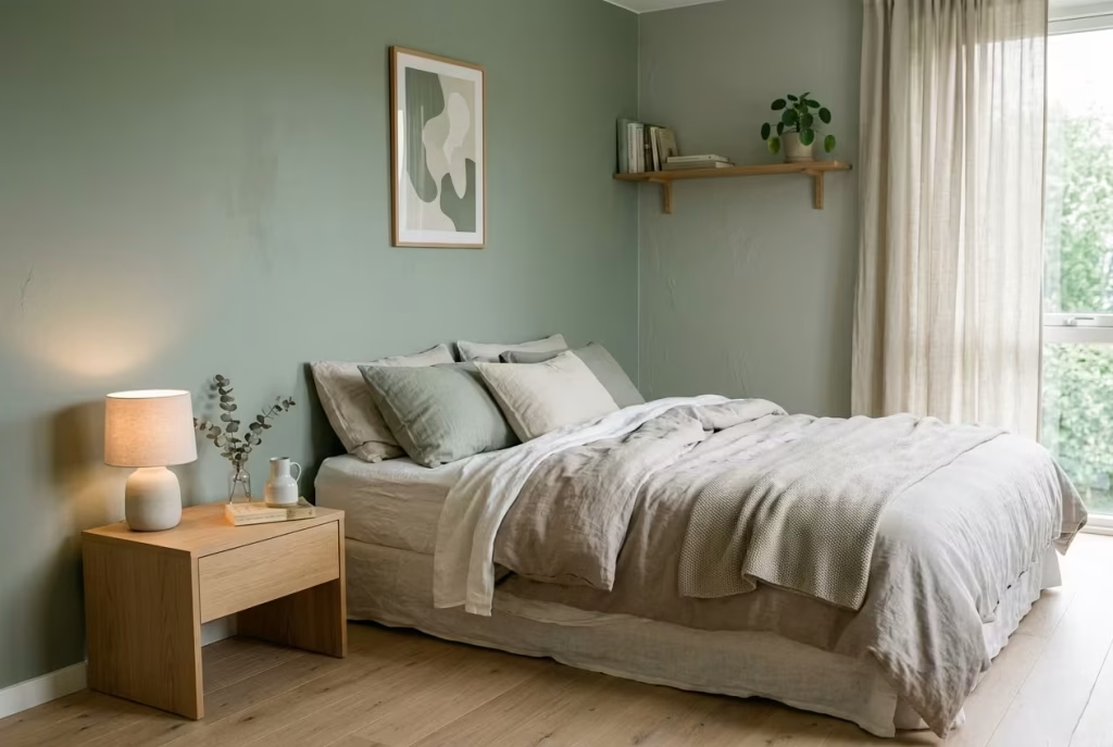
Muted greens, especially sage, sit in a very particular place psychologically. They borrow from nature, but without the intensity of fresh grass or deep forest tones. That restraint is important. In a bedroom, you are not trying to energise the mind. You are trying to quiet it, to take the edge off the day.
Sage green does this by lowering visual tension. It does not create sharp contrast or demand focus. Instead, it allows the eye to move gently across the room, almost as if everything is slightly softened at the edges. I often describe it to clients as a colour that lets the room exhale. When used well, it takes a space that might feel a little restless and smooths it out, like running a hand over creased fabric until it settles.
In one project, a compact 12 m² bedroom that always felt slightly on edge despite neutral walls, we introduced a mid-tone sage across the main wall plane. Nothing else changed dramatically. Yet the difference was immediate. The room felt quieter, almost as if the noise had been turned down a notch. That is the subtle power of a colour that knows when to hold back.
How Sage Interacts with Natural and Artificial Light
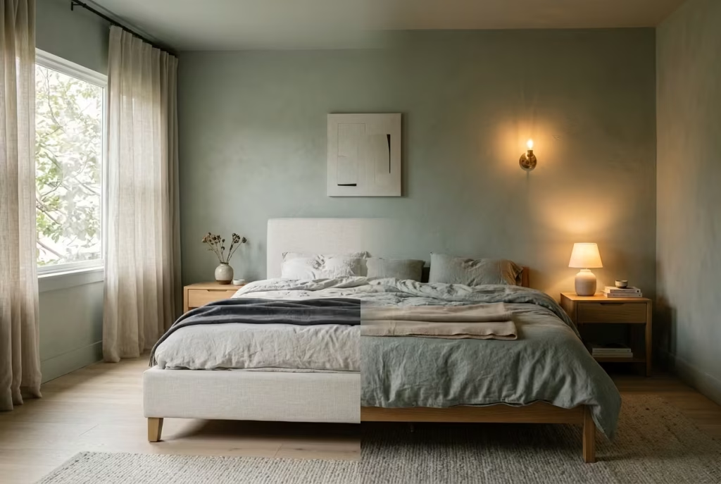
Sage green is highly responsive to light, which is both its strength and something to handle carefully. In natural daylight, particularly in east or south-facing rooms, it tends to appear lighter and slightly fresher. It can pick up soft grey undertones, giving the space an airy, almost lifted quality. This is where it works beautifully with materials like washed linen, pale oak, and matte plaster finishes.
As the day moves on and artificial lighting takes over, the same colour deepens. Under warm lighting around 2700K, sage becomes more cocooning, wrapping the room in a gentle warmth without tipping into heaviness. It is this transition, from fresh in the morning to restful in the evening, that makes it so well suited to bedrooms.
I have seen it perform particularly well in rooms with moderate ceiling heights around 2.4 to 2.7 metres, where the colour can hold the space without closing it in. In contrast, in poorly lit rooms, especially those facing north with limited daylight, the wrong shade of sage can start to feel flat or slightly dull. That is where careful selection becomes critical. A slightly warmer sage with a hint of yellow undertone can lift the space just enough to keep it from feeling lifeless.
Why It Reduces Visual Noise Rather Than Adding to It
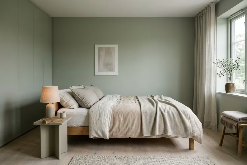
Some colours enter a room and immediately create hierarchy. They tell your eye where to go, what to focus on, what matters most. Sage green does the opposite. It levels the playing field. Instead of creating focal points through contrast, it allows materials, textures, and forms to share attention more evenly.
This is particularly useful in bedrooms where you want the environment to feel cohesive rather than fragmented. A sage backdrop softens transitions between elements. The bed, the curtains, the joinery, even the smaller details like lighting and accessories, all begin to sit more comfortably together.
In practical terms, I have found that using sage across larger surfaces such as walls or wardrobes reduces the need for excessive styling. The room already feels complete. You are not chasing balance through additional objects. It is a bit like tuning an instrument properly. Once the base note is right, everything else falls into place without forcing it.
Real-Life Note: Where I’ve Seen It Fail
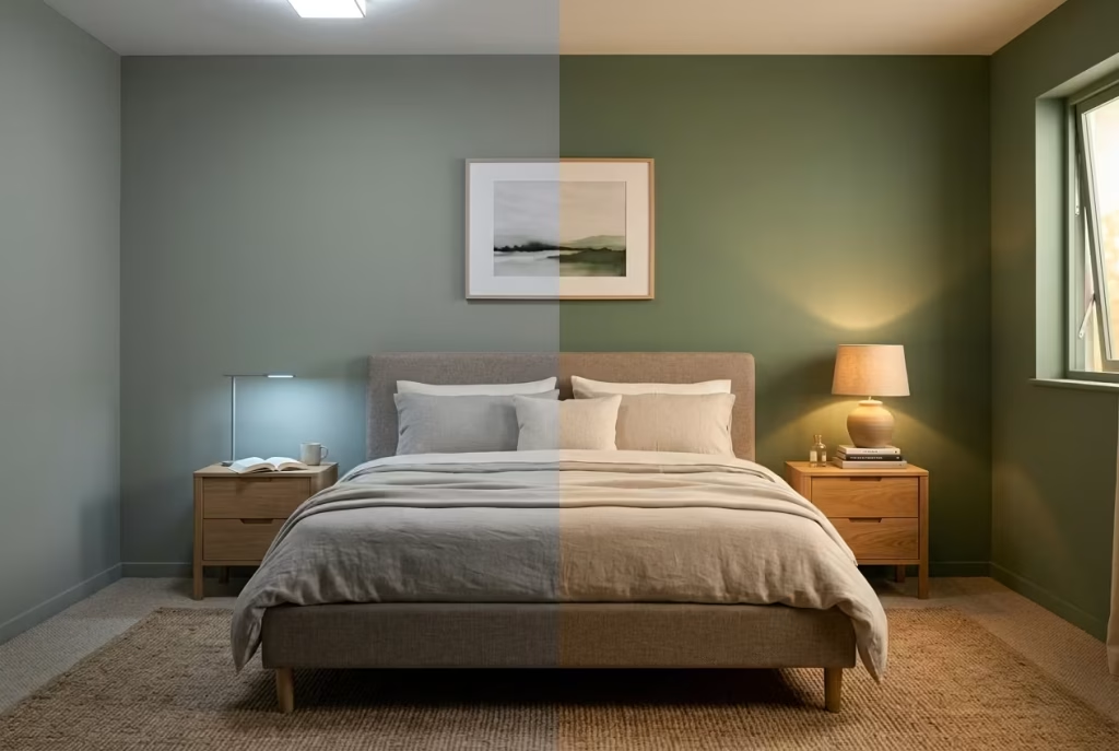
As forgiving as sage green can be, it is not immune to mistakes. The two most common issues I have seen come down to lighting and undertone mismatch.
Poor lighting can flatten the colour completely. In one project, a bedroom with limited natural light and cool artificial bulbs ended up feeling slightly dull, almost greyed out in an unintended way. The fix was not repainting immediately, but correcting the lighting first. Switching to warmer bulbs and introducing layered lighting brought the colour back to life. It is a reminder that paint does not exist in isolation. It relies on its environment to perform properly.
Undertones are another frequent pitfall. Not all sage greens are created equal. Some lean slightly blue, others carry a yellow or earthy base. When paired with the wrong materials, the clash can be subtle but unsettling. I have seen cool sage walls paired with warm oak flooring, where the combination never quite settled. The room felt caught between two temperatures, never fully resolved.
When sage works, it feels effortless. When it does not, the discomfort is often hard to pinpoint but easy to feel. Getting it right is less about chasing the perfect shade in isolation and more about understanding how it sits within the full composition of the room.
You May also Like: Bedroom Office Combo Ideas: Smart, Stylish Ways to Work and Sleep in One Space
25 Soft & Serene Sage Green Bedroom Ideas
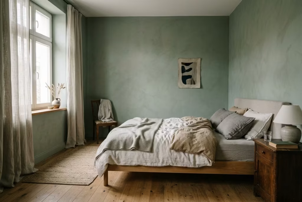
Before diving into the individual ideas, it helps to shift the mindset slightly. Designing with sage green is not about picking a colour and applying it in isolation. It is about shaping an atmosphere. The most successful bedrooms I have worked on were never built around a single statement moment. They came together through a series of quiet, deliberate decisions, each one reinforcing a sense of calm rather than competing for attention.
Sage green works best when it is allowed to move through the room in different ways. Sometimes it holds the walls and defines the architecture. Other times it appears more subtly, woven into upholstery, textiles, or joinery. The effect is layered, almost instinctive, rather than overly planned. You begin to notice how the light lands on it in the morning, how it softens in the evening, how it sits against wood, linen, and plaster without ever feeling forced.
What follows is not simply a list of ideas to replicate. Think of these as spatial approaches, each one tested in real settings where proportions, light, and daily use shaped the outcome. Some are suited to compact rooms around 10 m², where every decision carries weight. Others unfold more comfortably in larger spaces, where sage can stretch out and breathe. Each idea is designed to help you understand not just how a sage green bedroom can look, but how it can feel to live in over time.
Full Sage Green Envelope Walls
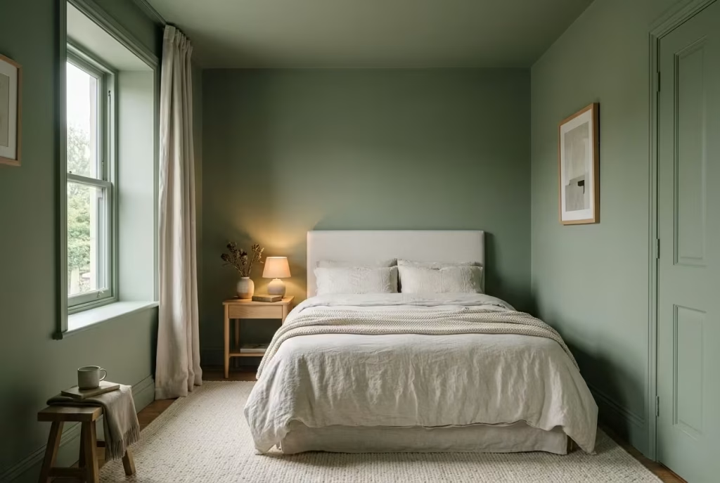
There is something quietly transformative about committing to a single colour across every surface. Walls, skirting, ceiling, even the finer trims all carried in the same sage tone begin to dissolve the usual boundaries of a room. Corners soften, edges blur, and what you are left with feels less like a constructed space and more like an atmosphere you step into.
In smaller bedrooms, particularly those around 10 to 14 m² or 108 to 150 sq ft, this approach can feel like a breath of fresh air rather than a constraint. Instead of breaking the room into visual segments, the eye travels uninterrupted, which paradoxically makes the space feel more expansive. It is a bit like lowering the volume on background noise. Everything becomes easier to sit with.
How It Plays Out in Real Spaces
I have used this approach in compact urban bedrooms where every centimetre counts. One project that still stands out involved a 11.5 m² room with a ceiling height just under 2.6 metres. Initially, the space felt slightly boxed in, made worse by contrasting white ceilings and darker furniture that chopped the room into layers.
By taking sage green across the walls, ceiling, and skirting, the entire reading of the room shifted. The ceiling no longer felt like a lid sitting on top. Instead, it receded gently, almost disappearing into the rest of the space. The result was not dramatic in a showpiece sense, but it changed how the room felt to wake up in and return to at night. It became calmer, more settled, easier to live in without quite knowing why.
That cocooning effect is where this idea earns its keep, especially when ceiling heights are under 2.7 metres or 9 ft. Rather than fighting the proportions, it works with them, wrapping the room in a consistent tone that feels intentional rather than restrictive.
Materials and Finishes That Make It Work
The success of a full sage envelope does not rest on colour alone. Finish plays a quiet but decisive role. A flat or matte emulsion works best across walls and ceilings, absorbing light rather than bouncing it back harshly. This keeps the effect soft and cohesive.
For skirting and woodwork, I often specify an eggshell or soft satin finish in the same colour. It gives just enough durability without introducing a noticeable shift in sheen that would break the illusion. When everything sits in harmony, the room feels composed rather than overly styled.
Texture then becomes your ally. Washed linen bedding, a lightly grained oak bedside table, perhaps a wool rug underfoot extending around 60 cm or 24 inches beyond the bed, all help prevent the space from feeling flat. The colour sets the tone, but the materials give it life.
The Balance That Makes or Breaks It
There is a fine line here, and it is worth respecting. Done well, a full sage envelope feels like stepping into a quiet retreat. Done poorly, it can feel heavy or slightly dull.
Lighting is often the tipping point. In rooms with limited natural light, a sage that leans too cool can lose its softness and start to feel muted in the wrong way. I have seen spaces where the colour itself was well chosen, but harsh, cool artificial lighting drained it of warmth. Switching to warmer bulbs around 2700K and introducing layered lighting, bedside lamps, wall lights, even a soft overhead glow, brought the room back into balance.
There is also the question of contrast. When everything is one tone, even subtle variation becomes important. This is where textiles, timber, and small accents quietly step in. A slightly deeper green cushion, a warm wood finish, or aged brass detailing can stop the space from feeling one-note without disrupting the calm.
Living With It Day to Day
What I appreciate most about this approach is how it settles over time. It does not rely on a single focal point to carry the room. Instead, it creates a consistent backdrop that supports daily life, whether the bed is perfectly made or not, whether the light is bright or fading.
Clients often worry it might feel too much at first, too enclosed, too committed. Yet more often than not, the opposite happens. After a few weeks, the room begins to feel natural, almost inevitable, as if it was always meant to be this way. That is the quiet strength of a full sage green envelope. It does not try to impress you on day one. It grows on you, steadily, until you cannot quite imagine the room any other way.
Sage Green Upholstered Headboard as a Focal Anchor
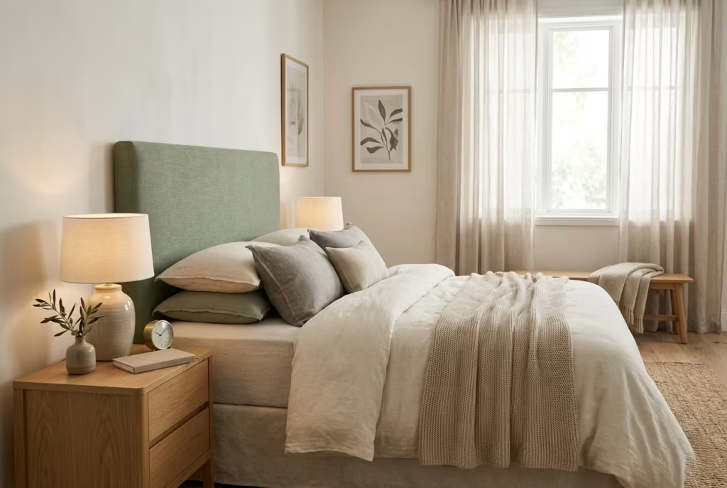
A sage green upholstered headboard can do a remarkable amount of heavy lifting without ever looking like it is trying too hard. In a bedroom that is otherwise kept intentionally neutral, it gives the eye something to settle on, while still keeping the mood calm and controlled. That balance matters.
You want a focal point, yes, but not one that barges into the room and steals the show. The best headboards I have specified in this tone work a bit like a good supporting actor. They do the job beautifully, then let the rest of the space breathe.
What makes sage so effective here is its restraint. A deeper emerald can feel dramatic, sometimes almost theatrical. A pale greige can disappear altogether. Sage sits in that sweet spot where it has enough presence to anchor the bed, yet enough softness to keep the room feeling restful. It is a classic case of less is more, and in bedroom design, that usually pays dividends.
Why It Works So Well in Neutral Rooms
Neutral bedrooms can be lovely, but without a point of visual grounding they often drift into bland territory. That is where a sage upholstered headboard earns its keep. It introduces depth without upsetting the wider palette. If the room is built from off-white walls, pale oak flooring, and soft linen bedding, a sage headboard gives the composition a bit more backbone. It stops the room from feeling wafer-thin.
I have seen this work especially well in rooms that feel technically finished but emotionally undercooked. On paper, everything is in place. In practice, the space lacks warmth or definition. A sage headboard can fix that in one move. It introduces colour where it matters most, at the heart of the room, and because upholstery naturally softens edges, the result feels inviting rather than stark.
There is also a subtle psychological benefit here. The bed is already the emotional centre of the bedroom. Giving it a sage upholstered frame or headboard reinforces that sense of calm refuge. It signals rest. It says, quite gently, this is where the day stops.
Getting the Proportions Right
Proportion is where this idea can either sing or stumble. An upholstered headboard that is too low can feel timid, almost unfinished. One that is too tall can begin to dominate the room and throw off the balance, especially in smaller spaces.
In most residential bedrooms, a height between 110 and 130 cm, or roughly 43 to 51 inches, tends to work beautifully. That range gives the headboard enough visual authority to anchor the bed, while still leaving breathing room above. In rooms with standard ceiling heights around 2.4 to 2.7 metres, I find this proportion reads particularly well. It feels considered without becoming overbearing.
Width matters too. Ideally, the headboard should extend slightly beyond the mattress, by around 10 to 20 cm on either side if the room allows. That small margin helps the bed feel settled and intentional, rather than squeezed into place. In smaller rooms, even a modest extension can make the whole arrangement feel more composed.
If the room is especially tight, then a slim-profile headboard with clean lines is often the wiser move. It keeps the footprint disciplined while still giving the bed the visual weight it needs. It is all about knowing when to hold back and when to lean in.
Materials and Finishes That Do the Tone Justice
Fabric selection is crucial here. Sage green upholstery looks most elegant in materials that have a soft, tactile quality. Linen blends, brushed cotton, velvet with a low sheen, and textured weaves all work well, depending on the mood you want to set. A matte or lightly napped finish tends to enhance the colour’s quiet sophistication. It lets the sage feel layered and soft rather than flat.
Velvet can be particularly effective if the room needs a touch more depth. It catches light in a subtle way, which helps the colour shift gently throughout the day. That said, it needs to be used with a bit of judgement. In very small or dim rooms, a heavy velvet in a dark sage can start to feel a touch weighty, like a good idea that has been slightly over-seasoned.
For a more relaxed, breathable look, I often lean toward a linen or linen-look upholstery. It gives the headboard a slightly lived-in quality, which works especially well in summer bedrooms or spaces that aim for effortless ease. There is a natural charm to it. Nothing feels overpolished.
The frame and detailing matter too. If the headboard has piping, channel stitching, or a gently curved silhouette, sage green can take on a more tailored, high-end feel. Clean-lined rectangular shapes, on the other hand, feel more contemporary and restrained. Either can work beautifully, depending on the room, but the key is consistency. The shape, fabric, and surrounding palette should all be pulling in the same direction.
Real-World Insight: Where This Idea Often Pays Off
In my experience, sage green upholstered headboards are especially effective in bedrooms that have been built around restraint. Think neutral walls, minimal artwork, pale flooring, and soft lighting. These rooms often need just one element with enough presence to tie everything together, and the headboard becomes that steady hand.
I once worked on a bedroom where the client had been using a plain white frame and neutral bedding, but the room kept feeling unresolved. It was not unattractive, just a little too thin around the edges. Once we introduced a sage upholstered headboard with a simple vertical panel detail, everything clicked into place. The room did not suddenly become dramatic. It became settled. That is often the real win.
This kind of solution is especially useful if you want colour in the room but do not want the walls to do all the talking. For anyone nervous about committing to sage across an entire space, the headboard offers a lower-risk entry point. It brings the colour in with a lighter touch, which can be the right move when you are testing the waters.
The Trade-Offs Worth Considering
As much as I like this approach, it is not without its compromises. Upholstery, by nature, needs a bit more care than a painted wall or timber finish. It can collect dust, and lighter sage tones may show marks over time if the room is used heavily. That does not make it a bad choice. It simply means the material should suit the lifestyle of the people living with it.
Another consideration is scale. In a very ornate room, a soft sage upholstered headboard can sometimes feel underpowered if everything around it is highly decorative. In that case, you either need to simplify the surroundings or choose a headboard with a little more structure and presence. Otherwise, it can be lost in the mix, which is a shame because the colour has so much to offer.
Still, when the balance is right, it is hard to beat. A sage green upholstered headboard gives a bedroom structure without stiffness, colour without noise, and calm without blandness. It is one of those design choices that quietly earns its place. Nothing flashy, nothing forced, just a well-judged anchor that lets the whole room exhale.
Washed Linen Bedding in Layered Sage Tones
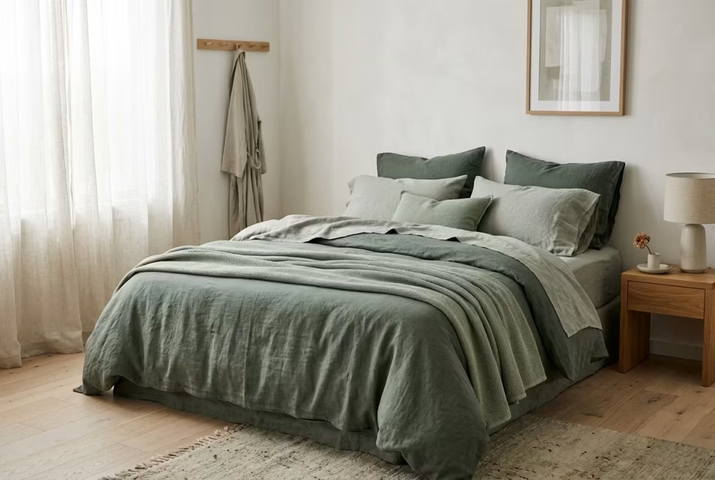
There is a quiet difference between a bedroom that looks arranged and one that feels naturally lived in. Washed linen bedding in layered sage tones sits firmly in the second category. It does not rely on precision or symmetry to create impact. Instead, it builds atmosphere through softness, movement, and subtle variation, as if the bed has gradually evolved over time rather than been styled in a single moment.
When sage is introduced through linen rather than paint or upholstery, it takes on a more relaxed personality. The colour becomes less about definition and more about mood. It folds, creases, and shifts with use, which is exactly where its charm lies. Nothing feels static or overly curated. It is the kind of bedding that makes a room feel gently inhabited, not staged.
Layering Sage Without Losing Its Calm
The real strength of this idea is in tonal layering. Rather than using a single flat shade of sage, you build across variations that sit close together but are not identical. Think soft sage, muted eucalyptus, and slightly greyer green undertones working in quiet conversation with each other.
In practice, this might look like a deeper sage duvet cover paired with lighter pillowcases and a washed throw in an even more desaturated tone. The trick is restraint. You are not trying to create contrast for the sake of it. You are allowing the eye to move gently across subtle shifts in colour, almost like reading soft brushstrokes on canvas.
I often find that when a room feels too flat or emotionally one-note, it is not because the colour is wrong, but because it has been used in a single layer. Introducing tonal variation in bedding immediately changes that. The bed starts to feel dimensional rather than surface-level. It gains depth without becoming visually noisy.
How It Performs in Real Bedrooms
In real-world projects, this approach has consistently proven its worth in bedrooms that lean heavily on neutral architecture. White or off-white walls, pale timber floors, and minimal furniture can sometimes risk feeling a little too restrained. Everything behaves, but nothing quite sings.
Layered sage bedding becomes the soft counterbalance. It brings movement into the room without introducing clutter. I remember one project in a compact 13 m² bedroom where the client felt the space looked “finished but cold.” We did not change any structural elements. We simply reworked the bedding into layered sage linens with varying weights and tones. The transformation was immediate. The room felt warmer, not because it became louder, but because it finally had texture you could feel, not just see.
It is one of those changes that does not demand attention when you walk in. It reveals itself gradually, which is often how the best bedroom atmospheres work.
Materials That Carry the Look Properly
Washed linen is the backbone of this idea, and not all linen behaves the same. The most effective versions are pre-washed or stonewashed linen with a slightly softened hand feel. This treatment removes stiffness and allows the fabric to drape naturally across the bed, creating those effortless folds that feel uncontrived.
Weight also matters more than people realise. Mid-weight linen, typically around 160 to 200 GSM, tends to strike the right balance. Too light and it can feel flimsy or overly crumpled. Too heavy and it loses that breathable, relaxed character that makes it so suited to sage tones in the first place.
Texture is just as important as colour. A slightly irregular weave, faint slubs, and natural variations in tone all add to the authenticity of the material. These imperfections are not flaws. They are what stop the bed from feeling overly manufactured.
The Subtle Discipline Behind Layering
Although this look feels relaxed, there is a quiet discipline behind it. Layering sage tones successfully is less about abundance and more about editing. It is very easy to overdo it and drift into a muddled palette where nothing quite stands out.
The most successful versions I have seen tend to stick to three tonal levels at most. Any more than that and the effect starts to lose clarity. The eye no longer knows where to rest, and the calm begins to dissolve into visual fatigue.
There is also a tendency to overlook scale. Larger beds, such as king sizes around 150 to 180 cm wide (60 to 70 inches), can carry more layering without feeling crowded. Smaller beds need a lighter hand. Fewer layers, more space between elements, and a clearer sense of negative space help maintain balance.
Where This Approach Can Miss the Mark
As forgiving as linen is, there are a few common missteps. One of the most frequent is using overly similar tones that lack enough separation. When everything sits too close together in value, the layering effect disappears and the bed ends up looking slightly washed out rather than intentionally composed.
Another issue arises when linen is paired with overly rigid surroundings. If the rest of the room is highly polished, glossy finishes, sharp furniture lines, very structured styling, the softness of the bedding can feel disconnected. It is a bit like wearing relaxed fabric in a very formal setting. The contrast becomes awkward rather than intentional.
Lighting plays its role here as well. In very cool artificial light, sage linen can lose some of its warmth and feel slightly muted. This is where warmer bulbs and layered lighting again become essential in holding the mood together.
Why It Works So Well in Everyday Living
The real strength of layered sage linen bedding is not how it photographs, but how it behaves in daily life. It does not demand constant adjustment or perfection. It improves with use. It wrinkles, softens, and settles in a way that feels natural rather than neglected.
Over time, the bed stops looking like a styled feature and starts feeling like a place that has its own rhythm. That is where the magic sits. Not in perfection, but in comfort that does not need to be staged.
It is, quite simply, one of those design decisions that pays you back quietly, day after day, without ever needing to shout about it.
You May also Like: 25 Minimalist Bedroom Ideas for a Clean, Modern, and Peaceful Sleep Space
Pairing Sage with Warm Off-Whites
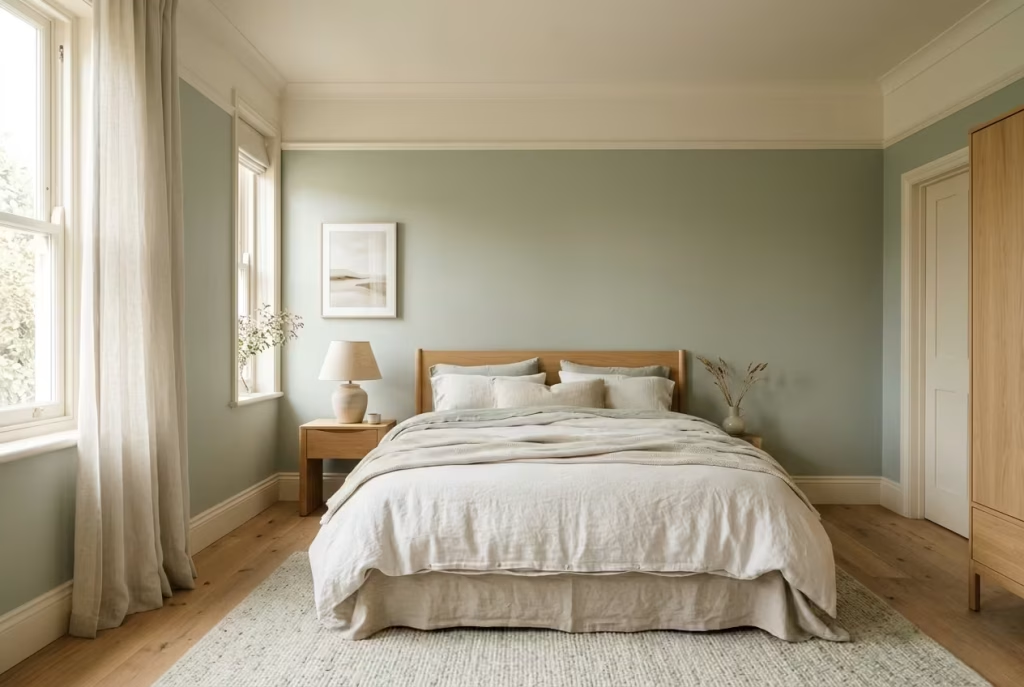
Sage green rarely works at its best when it is left to stand alone. It comes alive when it is paired with something that knows how to support it rather than compete with it. Warm off-whites do exactly that. They do not interrupt the calm; they refine it. Together, they create a tonal relationship that feels easy on the eye, almost like two voices speaking in low tones rather than one trying to dominate the conversation.
The key here is restraint. Stark whites tend to introduce a clinical edge that can quietly undo the softness sage is trying to establish. Warm off-whites, on the other hand, carry a slight creaminess, a hint of warmth that takes the sharpness out of contrast. The result is a bedroom that feels gentle rather than graphic, layered rather than flat.
Why This Combination Feels So Naturally Balanced
There is a reason this pairing shows up repeatedly in well-resolved interiors. Sage green holds the emotional weight of calm, while warm off-whites provide visual relief. It is a bit like rhythm and pause in music. One gives structure, the other gives breathing space.
In practice, I often use this combination in bedrooms that need softening without losing clarity. For example, in a room with sage walls, introducing an off-white ceiling with a warm undertone helps prevent the space from feeling too enclosed. The ceiling still lifts the room, but it does so gently, without the harsh boundary that a pure white would create.
The same logic applies to joinery and larger furniture pieces. Wardrobes, wall panelling, or even built-in shelving in a creamy off-white can sit quietly against sage walls, allowing both tones to feel intentional without competing for attention.
Real-Life Application: Where This Pairing Changes Everything
I worked on a bedroom not long ago where the original palette relied heavily on crisp white walls paired with soft green accents. On paper, it sounded fresh. In reality, it felt slightly disjointed. The white was too sharp, almost bouncing light in a way that made the sage elements feel disconnected.
We softened the entire base palette, replacing the pure white with a warm off-white that had a subtle vanilla undertone. Nothing else in the room changed structurally, yet the effect was immediate. The space felt more cohesive, as if the pieces finally belonged in the same sentence rather than speaking over one another.
This is where nuance matters. You do not always need more colour. Sometimes, what a room really needs is better temperature control between tones. Once that balance is right, everything else falls into place almost effortlessly.
Getting the Proportions Right in the Room
When working with sage and warm off-whites together, proportion quietly dictates the mood. A useful rule of thumb in bedrooms is to let one tone lead while the other supports. In many cases, sage carries around 60 to 70 percent of the visual weight, while off-white provides the remaining balance.
For example, sage walls paired with off-white ceilings and soft furnishings create a grounded yet airy composition. In smaller rooms, around 10 to 12 m² (108 to 130 sq ft), flipping that ratio slightly can help maintain brightness, with off-white taking a stronger role on vertical surfaces and sage used more selectively on furniture or textiles.
Ceiling height also plays a subtle role. In rooms under 2.7 metres (9 feet), a warm off-white ceiling prevents the space from feeling compressed, while still allowing sage to define the walls without visual heaviness.
Materials That Make the Pairing Feel Intentional
The success of this combination often comes down to material selection as much as colour. Matte or softly matte finishes tend to work best for both tones, as they absorb light in a way that keeps transitions smooth. High-gloss surfaces can disrupt this balance, introducing reflections that feel slightly out of sync with the overall calm.
In fabrics, natural fibres like linen, brushed cotton, and wool help bridge the two colours. An off-white linen curtain next to a sage-painted wall, for instance, creates a soft gradient effect that feels almost atmospheric rather than decorative.
Timber also plays an important supporting role. Light oak works particularly well here, especially in finishes that are not overly yellowed. It sits comfortably between the two tones, acting almost like a mediator in the palette.
The Subtle Risks Worth Noting
As effortless as this pairing appears, it can lose its strength if not handled carefully. One of the most common issues is choosing an off-white that is too close to pure white. On its own, it may look clean, but next to sage it can reintroduce that sharpness you were trying to avoid in the first place.
Another challenge is imbalance. If sage is used too sparingly against a dominant off-white backdrop, the green can feel like an afterthought rather than an anchor. The relationship between the two needs to feel deliberate, not accidental.
Lighting, once again, has the final say. Cool lighting can strip warmth from off-whites and push sage towards grey, flattening the entire scheme. Warmer lighting, particularly layered sources at different heights, helps maintain the softness that makes this combination work so well in bedrooms.
Why This Pairing Stays With You
What makes sage and warm off-white such a reliable pairing is not its visual drama, but its emotional consistency. It does not shift dramatically from day to night. Instead, it holds its tone, quietly adjusting as light changes, without ever feeling unstable.
In a well-balanced bedroom, this combination creates something that feels almost effortless, yet deeply considered. It is the kind of palette that does not ask for attention but rewards it over time. You stop noticing the individual colours and start responding to the atmosphere they create together.
And in the end, that is often the goal. Not to impress in the moment, but to create a space that continues to feel right long after the first impression has faded.
Sage Green Panelled Walls for Subtle Architecture
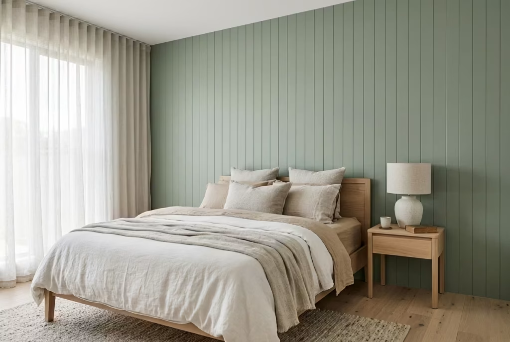
Panelled walls in sage green sit in that refined space where architecture and colour begin to work as one language. Instead of relying on artwork or heavy styling to give a bedroom character, the room itself starts to carry a sense of structure. The walls no longer feel like passive boundaries. They become part of the design narrative.
What makes this approach so effective is its restraint. The panels introduce rhythm and proportion, while sage green softens the geometry so it never feels rigid or overly formal. The result is a bedroom that feels composed, almost tailored, but never stiff. It is architecture with a gentler voice, if that makes sense, something that shapes the room without overpowering it.
How Panel Geometry Changes the Feel of the Room
The success of sage green panelling is not just about colour, but about proportion and rhythm. Vertical panels tend to subtly lift the eye, which can be particularly helpful in rooms with standard ceiling heights around 2.4 to 2.7 metres (8 to 9 feet). They introduce a quiet sense of height without making the space feel forced.
In contrast, more traditional rectangular panelling can ground a space, giving it a sense of stability. In bedrooms, I often find that a simple, evenly spaced vertical rhythm works best. It keeps the walls visually interesting without creating too much visual interruption.
Panel depth is where things become especially important. A depth of around 12 to 18 mm (0.5 to 0.7 inches) tends to strike the right balance. Anything too shallow can disappear into the wall once painted, while anything too deep risks feeling heavy or overly architectural. The goal is subtle shadow play, not visual dominance.
Real-World Application: When Structure Brings Calm
I worked on a bedroom project where the client originally wanted feature wallpaper to add interest to an otherwise plain room. The space was around 13 m² (140 sq ft), with fairly standard proportions and decent natural light. On paper, wallpaper seemed like the obvious choice.
But the room needed something more enduring, something that would not compete with furniture or change its mood over time. We shifted instead to sage green panelling across the main wall behind the bed. The transformation was immediate, but not in a loud way. The room did not suddenly become dramatic. It became grounded.
What surprised the client most was how the panelling changed the perception of scale. The bed felt more anchored, the wall behind it less like a blank surface and more like a considered backdrop. Everything else in the room relaxed into place around it.
That is often what good panelling does. It does not announce itself. It settles the space so everything else feels easier to place.
Materials and Finishes That Hold the Look Together
The material choice for panelling is just as important as the design itself. MDF remains a reliable option for painted panelling due to its smooth surface and stability, especially in controlled indoor environments. When properly sealed and finished, it provides a clean, uninterrupted base for sage paint to sit on.
For a more premium approach, timber panelling can introduce a subtle grain beneath the paint, which adds depth when light moves across the surface. This works particularly well in bedrooms where you want a slightly more tactile, lived-in feel rather than a perfectly uniform finish.
Paint finish is where the final tone is set. A matte or ultra-matte finish tends to work best, as it absorbs light and allows the panel shadows to read softly rather than sharply. Satin finishes can be used sparingly if durability is a concern, but they should be handled carefully so they do not introduce unwanted reflectivity that disrupts the calm.
Where This Approach Succeeds and Where It Can Struggle
Sage green panelling has a very specific strength. It works best when the rest of the room is relatively restrained. Neutral bedding, simple furniture lines, and soft lighting allow the panels to take on their role as the architectural backbone of the space. When everything is competing for attention, the effect can become diluted.
One of the most common missteps I see is overcomplicating the panel design. Too many divisions, too much ornamentation, or overly complex geometry can quickly shift the mood from calm to busy. The beauty of this approach lies in simplicity. Once you start overworking it, the quietness that makes it effective begins to disappear.
Lighting is another critical factor. In rooms with strong directional light, panels can cast sharper shadows, which may or may not suit the intended mood. Softer, diffused lighting tends to bring out the gentle rhythm of the panelling without exaggerating its structure.
Why It Feels So Naturally Settled in a Bedroom
There is something inherently calming about introducing structure that does not feel rigid. Sage green panelling achieves exactly that balance. It gives the eye something to read, a rhythm to follow, but it never becomes visually demanding.
Over time, what you notice is not the panels themselves, but how they influence the atmosphere of the room. The space feels more grounded in the morning, more cocooned in the evening, and consistently more composed in between. It is the kind of design decision that quietly earns its place, not through spectacle, but through consistency.
And in bedrooms, that consistency is often what matters most.
Soft Sage and Natural Oak Combination
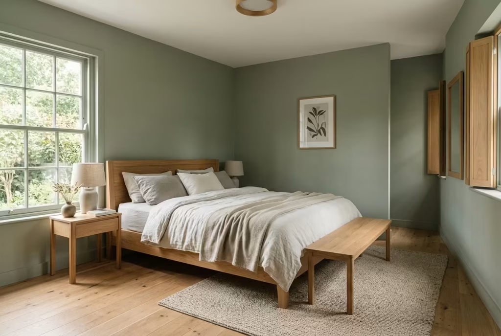
There is a certain ease that happens when sage green meets natural oak. It does not feel designed in a loud or overly deliberate way. Instead, it feels as though the two have always belonged in the same space, simply waiting to be introduced. Sage brings calm, oak brings warmth, and together they settle into a rhythm that feels steady and grounded, almost like a room finding its natural temperature after a long adjustment.
What makes this combination so enduring is its balance. Sage has a cool, muted restraint, while oak carries warmth through its grain and undertones. When handled correctly, they do not compete. They support each other in a way that feels effortless, yet deeply considered.
Why This Pairing Works So Naturally in Bedrooms
In bedroom design, contrast is useful only when it feels soft enough to live with. Harsh contrast can create visual tension, which is the last thing you want in a space meant for rest. Sage and oak avoid this entirely by meeting somewhere in the middle.
I often describe this pairing as a quiet handshake between colour and material. Sage green calms the visual field, while oak introduces a natural, organic warmth that keeps the space from drifting into something too cool or sterile. The result is a bedroom that feels balanced throughout the day, whether it is catching soft morning light or settling into evening shadows.
This combination is particularly effective in rooms that already have strong natural light. In south or east-facing bedrooms, oak helps ground the brightness, while sage prevents the space from feeling washed out. In lower light rooms, careful selection of oak tone becomes even more important, as the wrong shade can tip the balance too far towards yellow warmth.
Real-Life Application: When Balance Changes Everything
I once worked on a bedroom where the original concept relied heavily on cool neutrals, white walls, grey textiles, and chrome detailing. On paper, it was clean and modern, but in reality it felt slightly detached, almost like the room had not fully decided how it wanted to feel.
Introducing sage green walls and shifting the furniture to natural oak completely changed the atmosphere. The oak softened the coolness of the palette, while the sage anchored the walls in something more grounded. What surprised the client most was how quickly the room stopped feeling “styled” and started feeling lived in.
The key was not adding more elements, but aligning the existing ones with a shared temperature. Once that balance was established, everything else fell into place without force.
Getting the Timber Tone Right
Oak is not a single note. It ranges from pale, almost honeyed tones to deeper, more golden variations. This is where many pairings go slightly off track. If the oak is too yellow, it can clash with cooler sage tones, creating a subtle tension that is difficult to ignore even if you cannot immediately explain why.
In most bedroom settings, I tend to lean towards light to mid-tone oak with a natural or matte finish. These finishes preserve the grain without exaggerating warmth. A lightly whitewashed oak can also work well in smaller spaces around 10 to 12 m² (108 to 130 sq ft), where keeping the palette visually light is important.
Scale also plays a role here. Larger oak elements, such as bed frames or wardrobes around 180 to 240 cm in width (70 to 94 inches), carry more visual weight and therefore need a slightly more restrained sage tone to keep the balance intact. Smaller oak accents, like bedside tables or shelving, allow more flexibility in sage depth.
Materials and Finishes That Hold the Relationship Together
The success of this pairing often comes down to finish. For sage surfaces, matte or ultra-matte paint works best, as it absorbs light and keeps the colour feeling soft and breathable. Anything too glossy can introduce an artificial sharpness that disrupts the natural pairing with wood.
For oak, a natural oil or matte lacquer tends to preserve the authenticity of the material. It allows the grain to remain visible without adding unnecessary sheen. This matters more than people realise, because reflective finishes can start to compete with the softness of sage rather than complement it.
Textiles act as the bridge between the two. Linen, wool, and cotton in neutral or slightly desaturated tones help unify the palette. A wool rug beneath an oak bed frame, for example, can quietly tie the entire composition together without drawing attention to itself.
Where This Combination Works Best and Where It Can Drift
When sage and oak are in harmony, the effect is incredibly stable. However, there are a few conditions that can unsettle it. The most common issue is undertone imbalance. If the oak leans too heavily into warm yellow or orange tones, it can start to overpower softer sage shades, making the room feel slightly uneven.
Lighting once again plays a defining role. Cool artificial lighting can flatten oak, stripping it of warmth and making the pairing feel less cohesive. Warm layered lighting, particularly with soft diffusion, helps both materials sit comfortably within the same visual temperature.
Another consideration is overuse. While this pairing is strong, it still benefits from breathing space. If every surface in the room is heavily wood-focused, the sage can begin to feel secondary. The best results often come when oak is used as structure and sage is used as atmosphere.
Why This Pairing Stays With You Over Time
What makes sage and oak so compelling is not just how they look when first completed, but how they age together. Both materials and colour tend to soften over time rather than deteriorate visually. The oak develops a subtle patina, while the sage continues to sit gently in the background, adjusting to changing light conditions without losing its identity.
It is the kind of pairing that does not rely on trend cycles or seasonal shifts. Instead, it builds familiarity. The more you live with it, the more natural it feels, until eventually it stops feeling like a design choice at all and starts feeling like the room simply belongs that way.
Sage Green Curtains That Filter, Not Block
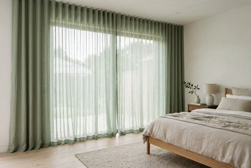
Curtains are often treated as a finishing touch, something added once everything else is in place. But in reality, they shape the entire emotional temperature of a bedroom. Sage green curtains, when done well, do not shut the world out completely. Instead, they soften it. They behave more like a gentle veil than a barrier, allowing light to pass through in a controlled, diffused way that feels calm rather than closed off.
There is a subtle intelligence to this approach. You are not blocking light, you are refining it. The room still breathes, still feels connected to the outside, but the edges are softened, almost as if the harshness of daylight has been gently edited before entering the space.
Why Floor-to-Ceiling Drapery Changes Everything
One of the most impactful decisions in bedroom design is extending curtains from ceiling to floor. It is a simple move, yet it completely shifts how the room is perceived. When sage green fabric runs uninterrupted from the highest point of the wall down to the floor, it draws the eye vertically, quietly enhancing the sense of height.
In rooms with standard ceiling heights around 2.4 to 2.7 metres (8 to 9 feet), this treatment can make the space feel more generous without any structural change. The fabric becomes part of the architecture rather than an accessory added on top of it.
I have seen this transform otherwise plain bedrooms into spaces that feel intentionally composed. Even when the rest of the room is minimal, floor-to-ceiling sage curtains introduce a sense of softness that feels almost architectural in its own right.
Getting the Drop Right Without Overthinking It
Curtain length is one of those details that seems minor until it is wrong. In most well-resolved bedrooms, I aim for a curtain drop that sits roughly 1 to 2 cm above the floor, or just lightly grazing it. This creates a clean, tailored finish that still feels relaxed.
For a slightly more atmospheric approach, a gentle “puddle” of fabric can work beautifully, where the curtains extend 3 to 6 cm beyond the floor. This works especially well in more relaxed, textural bedrooms where softness is part of the design language. It should feel effortless rather than exaggerated, as though the fabric has naturally settled there over time.
In smaller rooms, especially those under 12 m² (130 sq ft), I often lean towards a cleaner break just above the floor. It keeps the space feeling crisp while still maintaining that soft diffusion of light.
Materials That Make Sage Curtains Feel Alive
Fabric choice is where sage curtains either come alive or fall flat. Lightweight linen blends are often my first choice because they allow light to pass through in a way that feels natural and unforced. The weave catches sunlight gently, creating a soft shifting effect throughout the day.
Cotton voile and sheer linen are particularly effective in rooms where privacy is still needed but full blackout is unnecessary. They filter light rather than block it, which is exactly what makes sage so effective in this context. The colour becomes part of the light itself rather than sitting in front of it.
Heavier fabrics like linen-cotton blends or lightly textured drapery fabrics can also work, especially in bedrooms that need more insulation or light control. In those cases, the sage tone deepens slightly, creating a more cocooned feeling in the evenings without becoming visually heavy.
Real-Life Application: When Curtains Become the Atmosphere
In one project I worked on, the bedroom felt structurally sound but emotionally unfinished. The client had strong natural light coming in through large windows, but it was unfiltered and slightly harsh in the mornings. The room felt awake before the person did, which is never ideal in a space meant for rest.
We introduced full-height sage green linen curtains, extending from just below the ceiling line to barely touching the floor. The change was immediate, not because the room became darker, but because the light became softer. Morning sunlight no longer cut sharply across the space. Instead, it arrived gently, almost diffused through a thin layer of calm.
What stood out most was how the room began to feel consistent throughout the day. It no longer shifted dramatically between bright and harsh or dim and closed. It held its tone, which is often what makes a bedroom feel truly restful.
Where This Approach Succeeds and Where It Needs Care
Sage green curtains are incredibly effective, but they rely heavily on context. In rooms with very limited natural light, overly dense fabrics can tip the balance too far, making the space feel subdued rather than serene. This is where lighter weaves become essential, allowing enough daylight to pass through to keep the room feeling open.
Another common challenge is undertone mismatch. If the sage leans too cool and the room has warm lighting or timber finishes, the curtains can feel slightly disconnected from the rest of the palette. This is where careful selection becomes important, ensuring the green carries just enough warmth to sit comfortably within the room’s overall temperature.
Overly short curtains are another subtle but significant issue. Anything that breaks too high above the floor can interrupt the visual flow, making even a beautifully designed room feel slightly unresolved. In contrast, properly scaled drapery has a way of anchoring everything else in place.
Why This Detail Has Such Lasting Impact
What makes sage green curtains so effective is not just how they look when first installed, but how they behave over time. They move with air, shift with light, and soften with use. They never feel static. Instead, they become part of the room’s rhythm.
Over time, they stop being noticed as individual elements and start feeling like part of the atmosphere itself. The bedroom becomes less about what is inside it and more about how it feels to be in it. And that is often the quiet difference between a room that is simply decorated and one that truly feels lived in.
Minimalist Sage Accent Wall Behind the Bed
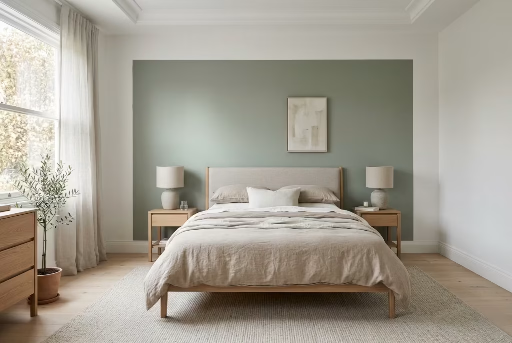
An accent wall behind the bed is one of those design moves that sounds simple on paper but can easily go wrong if it is treated too literally. In sage green, however, it becomes something far more refined. Instead of shouting for attention, it works like a soft frame around the bed, quietly defining the most important part of the room without overwhelming it.
The idea here is restraint. You are not trying to create a feature wall in the traditional sense. You are shaping focus. The bed remains the hero, while the sage wall acts like a backdrop that gently holds everything in place. When done well, it feels less like decoration and more like spatial clarity.
Why Proportion Matters More Than Colour Here
The success of this approach often comes down to width and balance rather than the intensity of the green itself. A common mistake is making the accent wall too narrow, which can make the bed feel visually squeezed, as if it has been pinned into place.
In practice, I always extend the sage accent wall approximately 20 to 30 cm beyond the width of the bed frame on each side. For a standard double bed around 135 to 150 cm wide (53 to 59 inches), this creates a total wall width that feels intentional and grounded rather than restrictive.
That small extension makes a surprising difference. It gives the bed room to breathe visually, allowing bedside tables and lighting to sit comfortably within the composition rather than feeling like they are hanging off the edges of the design.
In larger rooms, especially those above 14 m² (150 sq ft), the accent wall can be treated with a little more generosity, but the principle remains the same. It should frame, not contain.
How It Shapes the Mood of the Room
A sage accent wall has a very specific psychological effect. It subtly pulls the eye inward, anchoring the bed without demanding attention from the rest of the room. This creates a natural focal hierarchy, where the sleeping area becomes the visual and emotional centre without needing additional decoration.
I have seen this work particularly well in bedrooms that feel slightly undefined. The furniture is in place, the layout is functional, but the room lacks a sense of grounding. Introducing a sage backdrop behind the bed instantly changes that. It gives the space a point of rest, almost like an anchor dropped into calm water.
The rest of the room often benefits from this clarity. Once the wall behind the bed is resolved, everything else feels easier to place. Artwork becomes secondary. Accessories become lighter. The room no longer feels like it is searching for structure.
Materials and Finishes That Support the Simplicity
Because this approach relies on subtlety, the finish of the wall becomes incredibly important. A flat matte paint is usually the most effective choice, as it absorbs light and allows the sage tone to sit quietly in the background. Any sheen tends to introduce unwanted reflection, which can disrupt the calmness of the surface.
In more textural interpretations, a limewash or mineral paint finish can add depth without breaking the minimalist intent. These finishes introduce soft variations in tone that shift gently with light, giving the wall a slightly atmospheric quality without turning it into a feature in the traditional sense.
I have also used very fine wall panelling behind sage paint in some projects, particularly in rooms that need a bit more architectural interest. The key is keeping the detailing subtle. Once you start overworking the surface, the simplicity that makes this idea so effective begins to disappear.
Real-Life Application: When Less Truly Does More
In one bedroom project, the client initially wanted a heavily styled headboard wall with shelving, artwork, and layered lighting. The room itself was not large, and the ceiling height was around 2.5 metres (8.2 feet), so there was a risk of the space feeling visually crowded.
Instead, we introduced a single sage green accent wall behind the bed, extending it cleanly beyond the frame on both sides and keeping everything else in the room deliberately restrained. No additional built-in features, no competing focal points.
What changed was not just the look of the room, but its sense of order. The bed finally felt grounded. The surrounding space felt calmer, almost as if the visual noise had been dialled down. It was a classic case of doing less, but achieving more clarity in the process.
Where This Approach Works Best and Where It Can Struggle
A minimalist sage accent wall performs best in rooms where the surrounding palette is relatively neutral. Off-whites, soft greys, and natural wood tones allow the green to sit comfortably without competing for attention. When too many strong colours are introduced elsewhere in the room, the effect can become diluted and lose its focus.
Lighting is equally important. In poorly lit rooms, especially those with limited natural daylight, a darker sage tone can sometimes feel slightly heavy if not balanced with lighter surrounding elements. This is where careful shade selection becomes critical, opting for softer, more desaturated greens that hold light gently rather than absorbing it entirely.
Another consideration is symmetry. If bedside furniture is uneven or the layout is unbalanced, the accent wall can exaggerate that imbalance rather than resolving it. This is why I always look at the full composition of the room before committing to this approach.
Why This Idea Feels So Naturally Settled
There is a quiet confidence in a well-executed sage accent wall. It does not rely on complexity or excess. It simply defines, supports, and then steps back. Over time, it becomes one of those design decisions that feels obvious in hindsight, as if the room was always meant to be organised that way.
It is not about creating drama. It is about creating clarity. And in bedrooms, where calm is the ultimate goal, that kind of restraint often speaks louder than anything else.
You May also Like: 25 Desert Bedroom Designs That Feel Warm, Grounded, and Effortlessly Stylish
Sage and Stone Textures for Quiet Depth
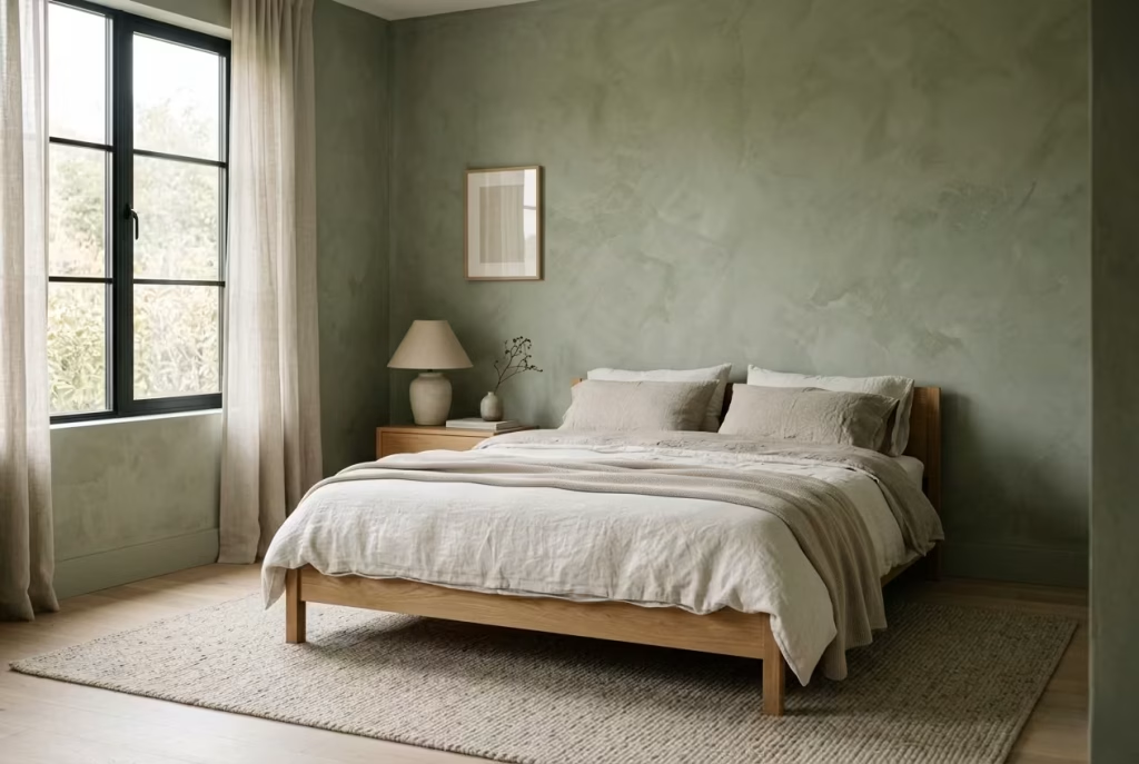
There is a point in bedroom design where colour, on its own, stops carrying the full emotional weight of a space. Sage green is already inherently soft, but when it is paired with stone-like texture, something deeper begins to happen. The room stops feeling purely visual and starts feeling tactile, almost as if you could sense the walls before you even touch them.
This combination is not about contrast in the traditional sense. It is about layering quietness on top of quietness, but in different forms. Sage brings the colour field, while stone texture introduces depth, variation, and a sense of natural irregularity that prevents the space from feeling too controlled.
Why Flat Paint Eventually Falls Short
Flat paint has its place, especially in minimal, clean-lined interiors. But in sage green bedrooms that aim for atmosphere rather than just colour coverage, it can sometimes feel too uniform. It sits on the wall, but it does not really interact with it.
Stone textures, whether achieved through limewash, mineral paint, or plaster-based finishes, change that completely. They allow light to behave differently across the surface. Instead of bouncing evenly, light breaks gently, creating soft variations in tone that shift throughout the day. The wall becomes something you experience over time, not just something you look at.
I have often seen this difference most clearly in rooms with large uninterrupted wall surfaces. In a flat finish, sage can feel slightly static. Introduce texture, and suddenly the same colour feels layered, almost atmospheric, as if the room has gained a second dimension it was missing before.
The Quiet Power of Limewash and Textured Finishes
Limewash is one of the most effective ways to introduce this subtle depth. It carries a naturally chalky, mineral quality that works beautifully with sage tones. Rather than sitting on the surface, it almost sinks into it, creating soft tonal shifts that never feel repetitive.
The beauty of limewash lies in its imperfection. It moves slightly as it dries, leaving behind faint variations that make the wall feel alive in a restrained way. In a bedroom setting, this is particularly powerful because it avoids visual monotony without introducing visual noise.
Mineral paints and fine plaster finishes achieve a similar effect, often with slightly more control over consistency. These are especially useful in more contemporary interiors where you want texture, but still need a sense of precision.
In rooms around 12 to 16 m² (130 to 170 sq ft), I find textured sage walls can completely change the spatial reading. What was once a flat boundary becomes a softly evolving surface that shifts with light rather than resisting it.
Real-Life Application: When Texture Rescues Flatness
I once worked on a bedroom that initially used a standard sage matte emulsion. The colour itself was right, soft, muted, well balanced, but the room still felt slightly incomplete. It had no real depth. Everything looked correct, but nothing felt grounded.
The turning point came when we reworked the main walls in a soft limewash sage finish. The transformation was subtle at first, almost understated. But as natural light moved through the space during the day, the walls began to behave differently. Morning light brought out a chalky softness, while evening light deepened the tonal variation just enough to create mood.
What had been a visually flat room suddenly felt layered. Not busy, not dramatic, just quietly dimensional in a way that made the space more engaging to be in.
That is often the hidden strength of texture. It does not announce itself immediately. It reveals itself slowly, almost as an afterthought, but once you notice it, it becomes impossible to ignore.
Materials and Finishes That Bring It to Life
Limewash remains one of the most effective finishes for this pairing. It works best on mineral-based plaster or properly prepared matte surfaces, where it can bond naturally and develop its characteristic soft variation. Application depth is usually thin, often built up in two or three light layers rather than a single heavy coat.
For a more controlled approach, mineral paints with subtle aggregate content can introduce a similar effect without the unpredictability of traditional limewash. These are often preferred in bedrooms where consistency across larger surfaces is important.
Plaster-based finishes, such as microcement or fine clay plasters, can also work well when used with restraint. A very light trowel texture, typically under 2 to 3 mm in surface variation, is usually enough to create movement without overwhelming the space.
The key across all of these is subtlety. If the texture becomes too pronounced, it risks shifting the mood from calm to visually busy, which defeats the purpose entirely.
Where This Combination Excels and Where It Needs Care
Sage and stone texture work best in rooms where light has room to move. Natural daylight is particularly important, as it allows the subtle variations in surface to reveal themselves gradually. In darker rooms, the effect can become subdued, sometimes losing the very depth it is meant to create.
Undertone balance is also critical. Sage greens with overly cool undertones can sometimes clash with the earthy warmth of stone finishes, creating a slight disconnect. A more balanced sage, with muted grey-green characteristics, tends to sit more comfortably against mineral textures.
There is also a fine line between texture and distraction. The goal is not to create a feature wall in the traditional sense. It is to introduce enough variation that the surface feels alive without ever becoming the focal point of the room.
Why This Approach Feels So Naturally Settled
What makes sage and stone texture so compelling is its restraint. It does not rely on bold gestures or strong contrasts. Instead, it builds atmosphere through subtle variation, the kind that only reveals itself over time.
In a well-executed bedroom, you stop noticing the wall as a separate element. It becomes part of the room’s emotional backdrop, quietly shifting with light, time, and movement. It is the kind of design decision that does not ask for attention, yet somehow holds it longer than anything more obvious ever could.
Pale Sage Ceilings for Unexpected Calm
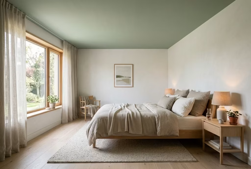
Ceilings are often the most overlooked surface in a bedroom, treated almost like a default rather than a design opportunity. Yet the moment you introduce pale sage to the ceiling, the entire spatial experience begins to shift in a way that feels surprisingly subtle but deeply effective. It is not about drawing attention upward in a dramatic sense. It is about softening what you already see above you every day without really noticing.
Pale sage on the ceiling works almost like a visual filter. It takes the hard edge off brightness, especially in rooms where light tends to flood in from above or bounce strongly off pale walls. Instead of a flat white plane reflecting everything back at you, you get a softened canopy effect that gently absorbs and diffuses light across the room.
Why This Works So Well in Bright, Sun-Filled Rooms
In climates or spaces where natural light is strong and consistent, ceilings can become unexpectedly harsh. White ceilings, while traditionally safe, often exaggerate glare, especially during peak daylight hours. That brightness can feel energising in living spaces, but in bedrooms it sometimes tips into overstimulation.
Pale sage changes that dynamic entirely. It introduces just enough pigment to break the intensity of reflected light without darkening the room. The result is a more comfortable visual environment where the ceiling no longer feels like a reflective surface, but rather a soft overhead field that gently contains the space.
I have seen this work particularly well in south-facing bedrooms where sunlight arrives early and stays strong throughout the day. Instead of fighting the light, the pale sage ceiling works with it, muting its sharpness and allowing the room to feel more balanced from morning through evening.
The Subtle Psychology of Looking Up and Feeling Calm
There is something deeply instinctive about how we respond to ceilings. Even if we do not consciously notice them, they form part of our peripheral awareness. A harsh or overly bright ceiling can subtly elevate tension in a room without us realising why.
When the ceiling is softened with pale sage, that subconscious pressure eases. The eye no longer meets a stark boundary. Instead, it meets a gentle continuation of the room’s palette, slightly cooler or warmer depending on the undertone, but always softened.
In bedrooms around 11 to 15 m² (120 to 160 sq ft), this effect can be particularly noticeable. The space feels less boxed in, even though no structural changes have been made. It is a psychological widening rather than a physical one, which is often the most interesting kind of transformation in interior design.
Real-Life Application: When the Ceiling Quietly Fixes the Room
I once worked on a bedroom where everything at eye level was well resolved. The walls were a soft neutral, the furniture was balanced, and the layout was functional. Yet something about the room felt slightly tense, especially during the day.
The issue was not immediately obvious until we looked upward. The ceiling, painted in a stark white, was reflecting a high level of natural light that created a faint visual glare across the upper part of the room. It was subtle, but it was enough to keep the space from feeling fully settled.
Introducing a pale sage ceiling changed the atmosphere almost instantly. The light softened, the room felt less reactive, and the overall tone became more consistent. It did not feel like a dramatic redesign. It felt like someone had quietly turned down the brightness in the background.
That is often the value of working with ceilings. They rarely demand attention, but they influence everything beneath them.
Materials and Finishes That Keep It Soft, Not Heavy
The success of a pale sage ceiling depends heavily on finish. A flat or ultra-matte emulsion is usually the most effective choice, as it prevents unwanted reflection and allows the colour to sit quietly above the room. Any sheen, even subtle satin, can reintroduce brightness that defeats the purpose.
The shade itself also needs careful calibration. A pale sage that leans too green can start to feel dominant overhead, while one that is too grey can lose its identity entirely and drift back towards a standard neutral ceiling. The balance sits in a soft, desaturated green with a clear but restrained undertone.
In terms of application, consistency matters more than complexity. Ceilings should feel uninterrupted. Avoid breaking them up with unnecessary detailing unless the architecture demands it. The strength of this idea lies in its simplicity.
Where It Works Beautifully and Where It Needs Restraint
Pale sage ceilings perform best in rooms with strong natural light or high reflectivity from surrounding surfaces. They are particularly effective when paired with off-whites, soft greys, or natural wood tones, where the overall palette remains light but gains depth through subtle variation.
In darker rooms, however, the effect needs careful handling. If both walls and ceiling are too muted or cool, the space can begin to feel slightly subdued rather than calming. In those cases, balancing the palette with warmer materials at eye level becomes essential.
Ceiling height is another factor worth considering. In rooms under 2.4 metres (8 feet), a very pale sage can help soften the sense of compression, but only if the tone is kept light enough not to visually lower the ceiling. In higher rooms, it can be used more confidently without affecting perceived height.
Why This Detail Stays With You Long After Installation
What makes a pale sage ceiling so effective is not how immediately noticeable it is, but how quietly it changes your perception of the room over time. It does not announce itself as a feature. It simply adjusts the atmosphere in a way that feels natural and consistent.
After a while, you stop noticing the ceiling as a separate surface. It becomes part of the room’s overall calm. The space feels less bright in a harsh sense, more softened in a lived-in sense, and far more comfortable to spend extended time in.
It is one of those design decisions that rarely gets talked about loudly, but once experienced, it becomes difficult to unsee its impact.
Sage Green Built-In Wardrobes That Blend In
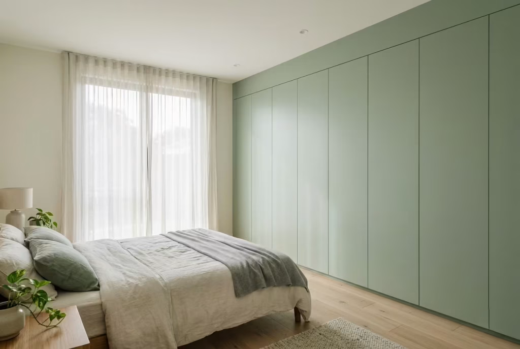
Built-in wardrobes often carry more visual weight than we give them credit for. In many bedrooms, they quietly dominate one entire wall, and if handled poorly, they can tip the balance from calm to cluttered without adding a single extra object. This is where sage green becomes particularly powerful. Instead of turning storage into a statement, it allows it to recede, almost slipping into the background while still doing its job.
A sage green wardrobe does not demand attention. It absorbs it. The eye moves across it without interruption, which is exactly what you want in a bedroom setting. The goal is not to highlight storage, but to let the room feel cohesive, as though everything belongs without trying too hard to prove it.
Why Handle-Less Design Changes the Entire Reading
Handles, though small, can break the visual rhythm of a wardrobe surprisingly quickly. Each one introduces a point of contrast, a tiny interruption that the eye registers again and again. In a space built around calm, those interruptions begin to add up.
Handle-less or recessed grip designs remove that friction entirely. The surface becomes continuous, allowing the sage finish to read as a single, uninterrupted plane. It is a bit like smoothing out ripples in water until the surface becomes still.
In practical terms, this approach works particularly well in bedrooms where wardrobes span significant widths, often between 180 to 300 cm (70 to 118 inches). Without handles, even large storage units feel lighter, less imposing, and more integrated into the room’s architecture.
Push-to-open mechanisms or discreet recessed channels can maintain functionality without disturbing the visual flow. The key is subtlety. When the mechanism disappears, the room feels more resolved.
Real-World Application: When Storage Stops Feeling Like Storage
I worked on a bedroom where the wardrobe originally felt like an afterthought, a standard white unit added purely for function. It did its job, but visually it cut the room in half, creating a sense of imbalance that was difficult to ignore.
We redesigned it as a full-height built-in in a soft sage tone, extending from floor to ceiling at approximately 2.6 metres (8.5 feet), with a handle-less profile. The transformation was not about making the wardrobe stand out. It was about making it belong.
What changed was the perception of space. The wall no longer felt divided. Instead, it read as a continuous surface, with storage quietly integrated into it. The room felt larger, not because its dimensions changed, but because its visual interruptions were reduced.
That is often the hidden value of this approach. It does not add anything new to the room. It simply removes what should not have been drawing attention in the first place.
Getting the Proportions and Layout Right
For built-in wardrobes to truly blend in, their proportions need to align with the room rather than fight against it. Full-height designs, extending up to the ceiling, tend to work best. They eliminate awkward gaps above the unit, which often collect visual clutter and disrupt the vertical flow.
Depth is equally important. Standard wardrobe depths of around 55 to 65 cm (22 to 26 inches) provide enough storage for hanging clothes without protruding too far into the room. In smaller bedrooms, closer to 10 to 12 m² (108 to 130 sq ft), keeping this depth under control is essential to avoid the space feeling compressed.
Panel width also plays a role in how refined the wardrobe feels. Wider panels, typically between 50 to 70 cm (20 to 28 inches), create a cleaner, more contemporary look with fewer vertical breaks. Narrower panels can work, but they introduce more lines, which can subtly increase visual activity.
Materials and Finishes That Support the Illusion
The finish of the wardrobe is where the blending effect is either achieved or lost. Matte or ultra-matte finishes are almost always the right choice for sage wardrobes. They absorb light and prevent reflections, allowing the surface to sit quietly within the room.
A slightly textured paint or sprayed lacquer can add depth without introducing shine. In some cases, I have used very subtle grain finishes beneath the paint, which catch light just enough to give the surface character without making it stand out.
Consistency is key. The wardrobe colour should either match the wall tone exactly or sit very close to it. When the difference is too noticeable, the unit starts to feel like a separate object again, which defeats the purpose.
Where This Approach Excels and Where It Needs Thought
Sage green built-in wardrobes perform exceptionally well in bedrooms that aim for visual calm. They are particularly effective when paired with neutral walls, soft textiles, and minimal decorative elements. In these settings, the wardrobe becomes part of the background architecture rather than a competing feature.
However, this approach does require careful execution. In rooms with very little natural light, a darker sage can sometimes feel heavier than intended, especially if used across a large surface area. In those cases, a lighter, more desaturated sage tends to hold the space more comfortably.
Functionality should also not be overlooked. Handle-less systems need to be well designed and properly installed to ensure they remain practical in daily use. There is little value in visual clarity if it comes at the cost of usability.
Why It Feels Effortless When It Is Done Well
When sage green wardrobes are handled with restraint and precision, they almost disappear in the best possible way. You notice the room, not the storage. The space feels calmer, more continuous, and easier to live in.
Over time, this becomes one of those design decisions that quietly proves its worth. The room does not feel cluttered, even as life moves through it. The visual flow remains uninterrupted, allowing everything else, light, texture, and space, to take the lead.
It is not about hiding storage completely. It is about letting it sit where it belongs, supporting the room without ever trying to lead it.
Mixing Sage with Soft Blush Undertones
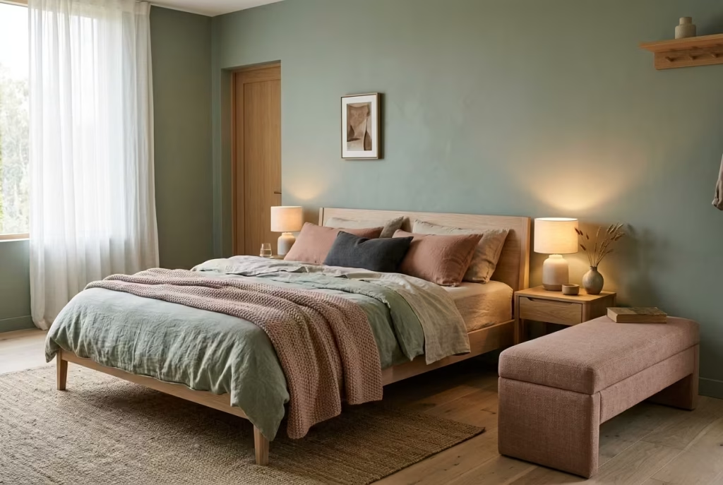
Sage green has a naturally calming presence, but on its own it can occasionally lean a touch too cool, especially in rooms that lack warmth in light or material. Introducing soft blush undertones is a way of correcting that balance without tipping the room into anything overly styled or thematic.
When handled carefully, blush does not read as pink in the obvious sense. It behaves more like a quiet warmth sitting just beneath the surface, softening sage in a way that feels almost instinctive.
The key is subtlety. This pairing is not about contrast that grabs attention. It is about tonal interplay that unfolds slowly. Think of it less as a colour combination and more as a temperature adjustment. Sage cools the room, blush gently warms it, and somewhere in between the space begins to feel settled.
Why This Pairing Avoids Feeling Overly Feminine
There is often hesitation around introducing blush into a bedroom, particularly for fear that it might push the space into something overly decorative or gendered. In reality, the outcome depends entirely on tone and proportion.
Soft, desaturated blush tones with a slight earthy or dusty quality work best alongside sage. They avoid the sugary brightness that can feel overly stylised. Instead, they sit closer to muted clay or warm neutral territory. When paired with sage, they create a balance that feels grounded rather than delicate.
I often approach this combination as a quiet dialogue between cool and warm. Neither dominates. Each one tempers the other. The result is a bedroom that feels layered and considered, rather than leaning in any one direction.
Real-World Application: When Warmth Changes the Mood
I once worked on a bedroom that relied heavily on sage and off-white. The space was calm, well proportioned, and visually clean, but it felt slightly restrained, almost as if it was holding back from becoming fully comfortable.
Rather than introducing stronger colour, we layered in soft blush through textiles, a throw at the end of the bed, a pair of cushions, and a subtle upholstered bench. Nothing large or overwhelming, just enough to shift the temperature of the room.
The difference was immediate but quiet. The space felt warmer, more inviting, without losing its calm. What stood out most was how the sage seemed to deepen slightly in response, as if the blush had given it something to lean against. That is often how this pairing works best. Not as two separate statements, but as a shared atmosphere.
Getting the Balance Right in Practice
Proportion is where this idea either succeeds or falls apart. Sage should remain the dominant tone, carrying around 70 to 80 percent of the palette. Blush, by contrast, works best as a supporting layer, introduced sparingly and with intention.
In practical terms, this might mean sage walls paired with blush accents in bedding or upholstery. For a standard double bed around 140 to 150 cm wide (55 to 59 inches), two or three blush elements are often enough to create balance without cluttering the visual field.
In smaller bedrooms, particularly those under 12 m² (130 sq ft), restraint becomes even more important. Too much blush can quickly shift the room’s identity. A single well-placed element, such as a cushion or a lightweight throw, can often achieve more than multiple competing accents.
Materials and Finishes That Keep It Grounded
The success of this pairing relies heavily on material choice. Matte finishes are essential for both colours, as they prevent unwanted shine that can make blush appear overly polished or artificial.
For sage, painted walls or upholstered elements in linen or cotton blends maintain softness and depth. For blush, textured fabrics such as washed linen, wool blends, or lightly brushed cotton help keep the tone grounded. These materials introduce a tactile quality that prevents the palette from feeling flat or overly decorative.
Avoid overly glossy finishes or synthetic fabrics that reflect too much light. These can push the blush into a brighter, more saturated territory that disrupts the calm balance of the room.
Where This Combination Works Best and Where It Needs Care
Sage and blush perform particularly well in bedrooms that already lean towards natural materials and soft lighting. Timber furniture, woven textiles, and warm lighting around 2700K help both tones sit comfortably within the same visual temperature.
In cooler, more minimal spaces with hard finishes and sharp lines, the pairing can feel slightly disconnected if not handled carefully. In those cases, introducing additional grounding elements such as wood or stone textures helps bridge the gap.
Lighting once again plays a defining role. Under cool artificial light, blush can lose its warmth and appear slightly grey or dull. Warm, layered lighting helps maintain its softness and ensures the pairing reads as intended.
Why This Pairing Feels So Comfortable Over Time
What makes sage and blush such a compelling combination is its ability to evolve quietly. It does not rely on bold contrasts or strong visual statements. Instead, it builds comfort gradually, almost without you noticing.
Over time, the room begins to feel more balanced, more human. The sage continues to provide calm, while the blush adds just enough warmth to keep the space from feeling distant. It is a pairing that does not try to impress immediately. It earns its place slowly, becoming more natural the longer you live with it and in a bedroom, that kind of quiet consistency often makes all the difference.
You May also Like: 25 Modern Victorian Bedroom Ideas That Feel Rich, Elegant, and Effortlessly Livable
Sage Green and Black Accents for Definition
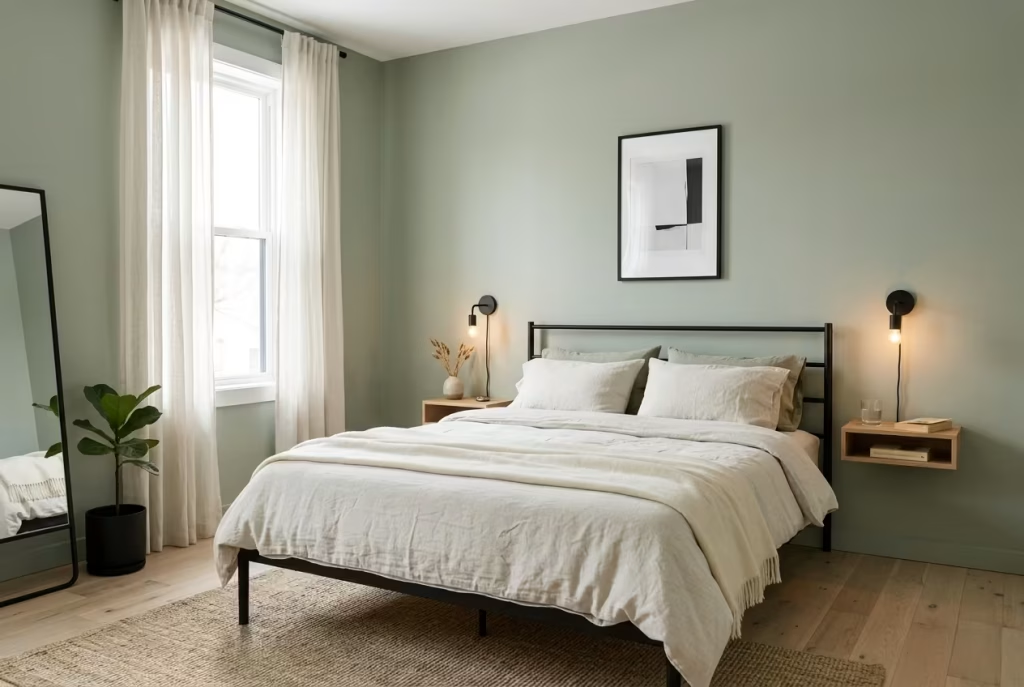
Sage green, for all its calm and softness, can sometimes drift into a space that feels a little too gentle, almost as if the room has been softened to the point where nothing quite holds its shape. This is where black accents step in, not to disrupt the calm, but to sharpen it. Think of them as punctuation marks in an otherwise flowing sentence. They give clarity, they create pause, and they allow the rest of the palette to feel more intentional.
Used well, black does not overpower sage. It defines it. It draws subtle boundaries, helping the eye understand where one element ends and another begins. Without it, a sage-based room can occasionally feel slightly washed out. With it, the same room gains structure without losing its softness.
Why Less Really Does More Here
The temptation with darker accents is often to add just a little more, and then a little more again. Before you know it, the balance shifts and the room starts to feel heavier than intended. With sage, restraint is everything.
In most bedrooms, I keep black elements within roughly 5 to 10 percent of the overall palette. That might sound precise, but in practice it is more intuitive than mathematical. It simply means black should appear in moments, not in masses.
A slim bed frame, a pair of bedside lamps, a narrow picture frame, or even the base of a chair can be enough. These elements introduce definition without pulling focus away from the calm atmosphere sage is creating. It is a classic case of knowing when to stop. Once the room feels grounded, adding more rarely improves it.
Real-World Application: When a Room Needs a Backbone
I remember a bedroom that was beautifully composed in sage and soft neutrals, yet it felt slightly adrift. Everything blended into everything else. There were no clear edges, no points of contrast to anchor the eye.
We introduced black in a few carefully chosen places. A slim metal bed frame, a pair of matte black reading lights, and a simple framed artwork above the headboard. Nothing excessive, nothing decorative for the sake of it.
The transformation was immediate, but not loud. The room did not suddenly feel dramatic. It felt resolved. The sage walls appeared richer, the textiles more layered, and the overall composition gained a sense of structure it had been quietly missing.
That is often how black works in this context. It does not change the room entirely. It simply brings everything into focus.
Getting the Proportions and Placement Right
Placement matters just as much as quantity. Black accents should be distributed in a way that feels balanced, not clustered in one corner of the room. A useful approach is to introduce them at different heights, perhaps a lamp at bedside level, a frame at eye level, and a base or leg detail closer to the floor.
In rooms around 12 to 16 m² (130 to 170 sq ft), this kind of distribution helps maintain visual flow without creating heavy zones. The eye moves naturally from one point to another, guided gently rather than pulled abruptly.
Scale is equally important. Large black surfaces can quickly dominate, especially against soft sage backdrops. Keeping elements slim and well-proportioned ensures they define rather than overwhelm. A bed frame with a profile of around 3 to 5 cm (1.2 to 2 inches) thickness, for example, feels light yet structured.
Materials and Finishes That Keep It Refined
The finish of black accents plays a crucial role in how they are perceived. Matte or satin finishes tend to work best, as they absorb light and maintain a soft presence. High-gloss black, while striking, can introduce unwanted reflection and visual sharpness that disrupts the calm.
Metal finishes such as powder-coated steel or brushed blackened metal bring a subtle texture that pairs beautifully with sage. They feel grounded, almost architectural, rather than decorative.
In softer elements, such as textiles, black can be introduced through fine detailing. A narrow border on a cushion, a stitched edge, or a subtle pattern can add definition without feeling heavy. It is often these quieter touches that make the biggest difference over time.
Where This Combination Excels and Where It Needs Restraint
Sage and black work particularly well in bedrooms that lean towards minimalism or modern design. Clean lines, simple forms, and a restrained palette allow the contrast to feel intentional rather than abrupt.
However, in rooms that already carry a lot of visual detail, ornate furniture, patterned textiles, or multiple colour layers, adding black can sometimes tip the balance too far. In those cases, it is often better to refine what is already there rather than introduce a new layer of contrast.
Lighting also influences how black behaves. In low-light rooms, black can appear heavier and more dominant. In well-lit spaces, it reads as a crisp outline that enhances the overall composition.
Why This Pairing Feels So Satisfying Over Time
There is something inherently satisfying about a room that feels clearly defined without being overly designed. Sage green and black achieve that balance with quiet confidence. The sage sets the tone, calm, soft, understated, while black provides the structure that keeps everything in place.
Over time, this combination continues to hold its ground. It does not rely on trends or bold statements. It simply works, day in and day out, creating a space that feels both relaxed and resolved.
It is a reminder that sometimes, the smallest additions, when placed with care, can make the biggest difference.
Aged Brass and Sage Pairing
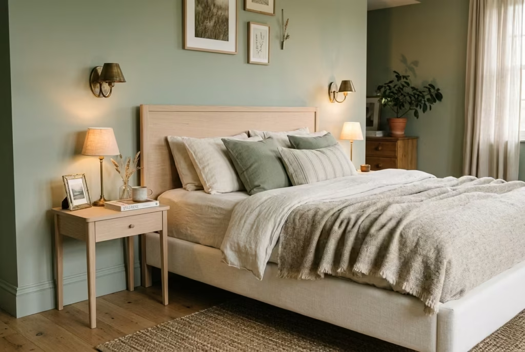
There is a particular kind of richness that does not arrive loudly. It settles in quietly, almost under the radar, and then reveals itself over time. That is exactly what happens when sage green is paired with aged brass. It is not a high-contrast pairing, nor is it designed to catch the eye immediately. Instead, it builds a sense of depth that feels warm, grounded, and gently refined.
Sage carries a muted, calming presence. Aged brass introduces warmth, but in a softened, time-worn way. Together, they create a palette that feels collected rather than styled, as if the room has evolved naturally rather than being assembled in a single moment. There is a quiet confidence to it, the kind that does not need to prove anything.
You May also Like: 60 Italian Bedroom Design Ideas: Stunning Styles, Colours & Decor Inspiration
Why Patina Matters More Than Shine
The success of this pairing hinges almost entirely on the quality of the brass finish. Highly polished brass, with its bright reflective surface, tends to sit uncomfortably against sage. It feels too sharp, too eager to stand out, which disrupts the calm atmosphere sage is trying to establish.
Aged brass, on the other hand, carries a softened patina. Its surface is slightly dulled, sometimes uneven in tone, with subtle variations that catch light gently rather than reflecting it directly. This patina is not a flaw. It is what gives the material its depth and character.
In a bedroom setting, that difference becomes particularly important. You are not looking for sparkle or shine. You are looking for warmth that feels settled, almost as if it has been there for years. Aged brass does exactly that. It adds richness without introducing noise.
Real-World Application: When Warmth Needs Subtlety
I worked on a bedroom where the palette was built around sage walls, soft linen bedding, and pale oak furniture. The space was calm, but it lacked a certain depth. It felt slightly restrained, as though it was holding back from becoming fully comfortable.
We introduced aged brass in small, carefully placed elements. A pair of bedside wall lights, a slim picture frame, and the base detail of a reading lamp. Nothing excessive, nothing decorative for the sake of it.
The shift was immediate, but not dramatic. The room did not become brighter or more colourful. It became warmer. The sage deepened slightly in response, the oak felt more grounded, and the entire space gained a sense of quiet richness that had been missing before.
What stood out most was how the brass seemed to settle into the room rather than sit on top of it. That is often the sign that the finish is right.
Getting the Scale and Placement Right
With aged brass, proportion and placement are everything. It is not a material that needs to be used in large quantities to be effective. In fact, too much of it can quickly shift the mood from understated to overly decorative.
In most bedrooms, I keep brass elements within a small percentage of the overall palette, often no more than 5 to 8 percent. This might include lighting fixtures, small hardware details, or a few carefully chosen accessories.
Placement should feel intentional but not symmetrical to the point of stiffness. A pair of wall lights positioned around 140 to 160 cm (55 to 63 inches) above the floor can introduce warmth at eye level, while a lower element, such as a lamp base or furniture detail, helps distribute that tone across the room.
The key is to allow the brass to appear in moments rather than in clusters. When spaced thoughtfully, it creates a rhythm that feels natural rather than forced.
Materials and Finishes That Bring Out the Best in Both
The beauty of aged brass lies in its texture as much as its colour. Brushed, antiqued, or lightly oxidised finishes tend to work best, as they carry subtle variation that interacts gently with light. These finishes pair particularly well with matte sage surfaces, creating a balance between softness and warmth.
In lighting, brass fixtures with diffused shades, such as frosted glass or linen, enhance this effect further. The light passes through the material softly, while the brass frame adds a quiet glow around it.
Textiles and surrounding materials play an important supporting role. Linen, wool, and natural timber help anchor the palette, ensuring the brass feels integrated rather than isolated. When everything shares a similar level of softness, the room begins to feel cohesive.
Where This Pairing Works Best and Where It Needs Care
Sage and aged brass excel in bedrooms that lean towards calm, layered interiors. They are particularly effective when the overall palette is restrained, allowing the brass to introduce warmth without competition.
However, this pairing requires careful restraint. In rooms that already contain multiple metallic finishes, adding brass can create visual confusion. It is often better to commit to one dominant metal tone rather than mixing several.
Lighting also influences how brass behaves. In cooler artificial light, brass can lose some of its warmth, appearing flatter than intended. Warm lighting, especially around 2700K, enhances its depth and allows the patina to reveal itself properly.
Why This Combination Feels So Enduring
What makes sage and aged brass such a compelling pairing is its ability to age gracefully. Neither element relies on trend or novelty. Instead, they settle into the room over time, becoming more comfortable and more familiar with each passing day.
The brass develops subtle changes in tone, the sage continues to respond to light, and the overall space begins to feel lived in rather than designed. It is not a pairing that demands attention. It earns it slowly, almost without you noticing.
And that, in many ways, is what makes it so effective. It does not try to impress. It simply feels right, long after the initial design decisions have faded into the background.
Layering Rugs in Muted Green Variations
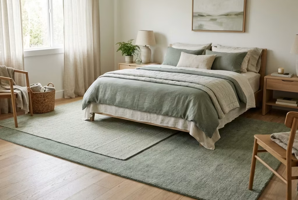
Floors are often treated as a backdrop, something to walk over rather than something that shapes how a room feels. Yet the moment you begin layering rugs in muted green tones, the entire atmosphere starts to shift from the ground up. Instead of a single flat surface, you introduce depth, softness, and a sense of quiet movement that anchors the room without drawing attention away from it.
With sage-led bedrooms, this approach works particularly well because it extends the colour story downward in a way that feels natural rather than forced. The greens are not loud or overly defined. They sit close together in tone, almost blending into one another, creating a layered base that feels settled and cohesive.
Why Tonal Variation Matters More Than Contrast
The success of layered rugs lies in variation, not contrast. You are not trying to create bold visual breaks between pieces. Instead, you are building a subtle gradient, where one tone gently transitions into another.
Think of a base rug in a soft sage or muted olive, paired with a slightly lighter or more desaturated top layer. The difference should be noticeable, but only just. It is the kind of detail you feel more than you immediately see, like the difference between still air and a soft breeze.
This tonal approach prevents the room from feeling flat. A single rug, even in the right colour, can sometimes sit too quietly. Layering introduces a second rhythm, a quiet echo that adds depth without introducing visual noise.
Getting the Size Right So the Room Feels Anchored
Rug proportion is one of those details that quietly defines whether a bedroom feels resolved or slightly adrift. A rug that is too small can make the bed feel disconnected, almost as if it is floating rather than anchored.
As a general rule, the main rug should extend at least 60 cm or 24 inches beyond the sides and foot of the bed. For a standard double bed around 140 to 150 cm wide (55 to 59 inches), this often translates to a rug size of approximately 200 x 300 cm (6.5 x 10 feet). This ensures that when you step out of bed, your feet land on something soft, not on bare flooring.
When layering, the top rug is typically smaller, often placed partially under the bed or offset slightly to one side. This creates a relaxed, lived-in effect rather than a perfectly centred, overly formal arrangement.
In larger rooms, the layering can be more generous. In smaller spaces, restraint is key. Even a slight overlap between two rugs can achieve the desired effect without crowding the floor.
Materials That Add Depth Without Weight
Material choice plays a significant role in how layered rugs feel both visually and physically. Natural fibres tend to work best, particularly wool, cotton, and jute blends.
A wool base rug provides warmth and softness underfoot, while a lighter top layer, perhaps a flatweave or a lightly textured cotton rug, introduces variation without adding bulk. The difference in texture is just as important as the difference in colour. It creates a layered effect that feels tactile rather than decorative.
Muted green dyes in natural fibres often carry slight variations in tone, which adds to the overall depth. These subtle inconsistencies are not imperfections. They are what make the layering feel authentic rather than overly controlled.
Real-World Application: When the Floor Completes the Room
I worked on a bedroom where everything above waist height was beautifully resolved. Sage walls, soft textiles, balanced lighting. Yet the room still felt slightly unfinished, as though something was missing beneath it all.
The floor was the issue. A single neutral rug sat under the bed, doing its job but not contributing much to the overall atmosphere. We replaced it with a larger muted sage wool rug and layered a slightly lighter, more textured piece partially across it.
The change was immediate. The bed felt grounded, the room felt warmer, and the entire space gained a sense of depth that had been absent before. It was not a dramatic shift, but it was enough to tip the room from complete to complete and considered.
That is often the role of layered rugs. They do not define the room on their own. They support everything else, quietly tying the elements together.
Where This Approach Works Best and Where It Needs Care
Layering rugs in muted greens works particularly well in bedrooms that already lean towards softness and texture. Linen bedding, timber furniture, and matte finishes all help reinforce the effect, allowing the rugs to sit naturally within the space.
However, there are a few pitfalls to avoid. Too many layers can quickly feel cluttered, especially in smaller rooms. The goal is depth, not excess. One base rug and one additional layer is usually enough.
Colour balance is another consideration. If the greens are too similar, the layering effect can disappear entirely. If they are too different, the calm can be disrupted. The sweet spot sits somewhere in between, where the variation is subtle but intentional.
Maintenance is also worth noting. Layered rugs require occasional adjustment to keep them sitting neatly, particularly in high-traffic areas. This is a small trade-off for the depth they bring, but it is something to be aware of.
Why This Detail Feels So Naturally Settled
What makes layered rugs so effective in sage bedrooms is how quietly they integrate into daily life. They are not elements you actively notice all the time. Instead, they influence how the room feels underfoot, how it absorbs sound, how it holds warmth.
Over time, they become part of the room’s rhythm. The slight shifts in position, the soft wear of fibres, the way light falls across their surface, all of it contributes to a space that feels lived in rather than staged.
It is a subtle move, but one that carries weight. Like many of the best design decisions, it does not demand attention. It simply makes everything else feel more complete.
You May also Like: 25 Neutral Modern Bedroom Ideas That Feel Calm, Considered, and Timeless
Sage Green Alcove Bed Designs
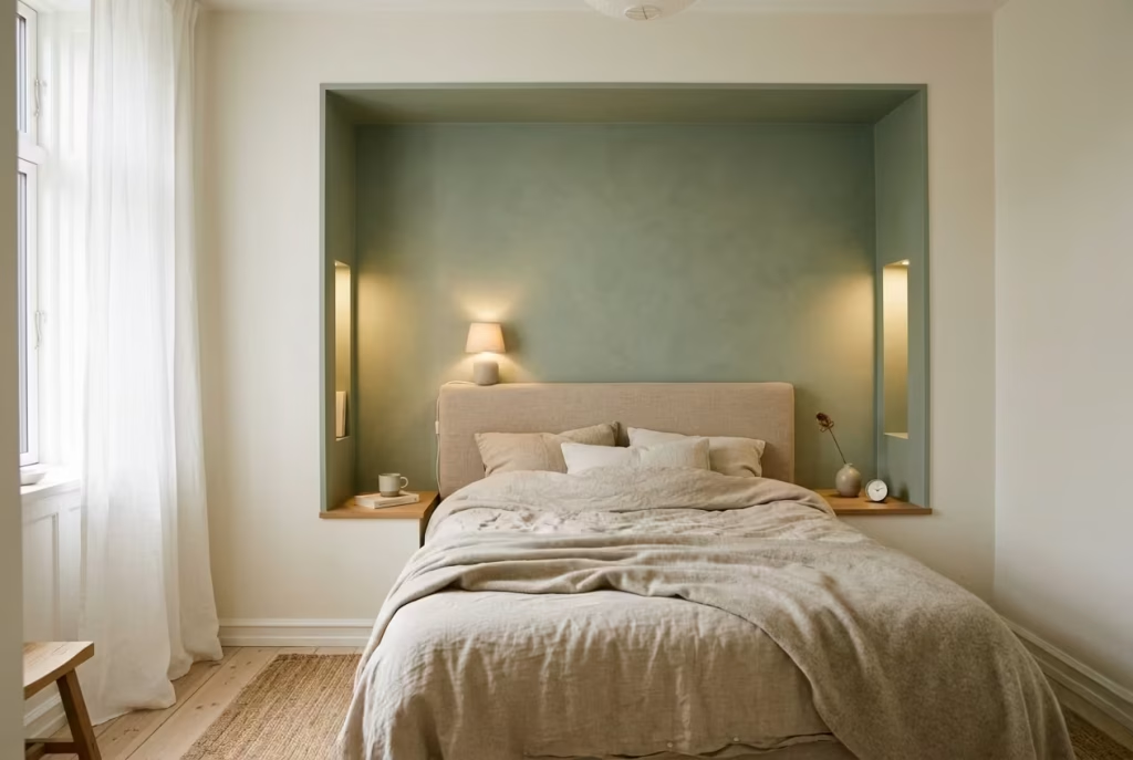
There is something deeply comforting about a bed that feels held rather than placed. Alcove bed designs tap into that instinct, creating a sense of enclosure that naturally signals rest. When finished in sage green, that feeling becomes even more pronounced. The colour softens the edges of the structure, turning what could feel confined into something that reads as sheltered and intentional.
This is not about building a feature for the sake of it. It is about shaping space so that the bed becomes its own quiet retreat, almost like stepping into a smaller, calmer world within the larger room. In smaller bedrooms especially, this approach can shift the entire atmosphere from exposed to protected without reducing functionality.
Why Alcoves Work So Well in Compact Rooms
In rooms where space is limited, every surface needs to work a little harder. Traditional layouts often leave the bed sitting in the open, which can make the room feel busier than it actually is. An alcove changes that dynamic by giving the bed a defined place, reducing visual clutter around it.
In bedrooms around 9 to 12 m² (95 to 130 sq ft), this can be transformative. Instead of furniture scattered across the room, the bed becomes integrated into the architecture. Storage, lighting, and even shelving can be incorporated into the alcove, allowing the rest of the room to remain lighter and less congested.
There is also a psychological benefit. When the bed is partially enclosed, the mind reads it as a place of retreat. It feels quieter, more contained, and easier to unwind in, particularly at the end of the day when the room shifts from functional to restful.
Real-World Application: Turning Constraint into Comfort
I worked on a small bedroom where the layout felt awkward from the outset. The bed had to sit against a narrow wall, leaving little room for circulation and making the space feel slightly cramped. Rather than fighting the limitations, we leaned into them.
We created a shallow alcove around the bed, extending roughly 20 to 25 cm (8 to 10 inches) from the surrounding wall. It was not deep enough to feel enclosed in a heavy way, but just enough to define the sleeping area. The entire alcove was finished in a soft sage tone, while the outer walls remained a lighter neutral.
What changed was not the size of the room, but how it was experienced. The bed no longer felt like it was taking up space. It felt like it belonged there. The rest of the room opened up visually, even though nothing had physically expanded.
That is often the strength of alcove design. It works with the room rather than against it.
Getting the Proportions Right Without Overcomplicating
Depth and width are the two critical dimensions in an alcove design. Too shallow, and the effect is lost. Too deep, and the space can begin to feel enclosed in a way that is less comfortable.
In most bedrooms, an alcove depth of around 15 to 30 cm (6 to 12 inches) is enough to create definition without sacrificing too much floor space. For the width, the alcove should extend at least 10 to 20 cm (4 to 8 inches) beyond the bed frame on each side, ensuring the bed feels comfortably framed rather than tightly fitted.
Height is equally important. Full-height alcoves that extend up to standard ceiling levels around 2.4 to 2.7 metres (8 to 9 feet) tend to feel more integrated, as they read as part of the architecture rather than an added element.
Built-in niches or shelving within the alcove can also add function without increasing footprint, particularly for bedside essentials.
Materials and Finishes That Enhance the Retreat Effect
The choice of finish plays a significant role in how the alcove feels. Matte sage paint is often the most effective option, as it absorbs light and enhances the sense of softness. In some cases, a lightly textured finish, such as a subtle limewash, can add depth without introducing visual distraction.
Timber elements, particularly in light oak or neutral tones, work well within alcoves, adding warmth that balances the coolness of sage. Upholstered headboards, especially in soft fabrics like linen or wool blends, further enhance the sense of comfort and enclosure.
Lighting should be integrated rather than added as an afterthought. Recessed or wall-mounted fixtures within the alcove keep the space uncluttered while providing focused, gentle illumination.
Where This Approach Excels and Where It Needs Care
Sage green alcove beds excel in smaller rooms where space needs to be used efficiently and thoughtfully. They are also highly effective in larger rooms where you want to create a more intimate sleeping zone within a broader layout.
However, there are a few considerations to keep in mind. Poor lighting can make an alcove feel darker than intended, particularly if the sage tone is too deep. This can be balanced with layered lighting and lighter surrounding walls.
Ventilation and airflow are also important. While the alcove should feel enclosed, it should never feel stagnant. Keeping the design open enough to allow air and light to circulate ensures the space remains comfortable.
There is also a balance to strike between integration and overdesign. Too many built-in features can make the alcove feel heavy or overly structured. The best results often come from restraint, allowing the form itself to do most of the work.
Why This Design Feels So Instinctively Right
At its core, an alcove bed taps into something fundamental. It offers a sense of shelter, a place that feels slightly removed from the rest of the room without being isolated from it. When combined with sage green, that feeling becomes softer, more natural, and easier to live with over time.
It is not a design that relies on bold gestures or dramatic statements. Instead, it builds comfort through proportion, colour, and enclosure. Over time, it becomes less about how the alcove looks and more about how it feels to step into it at the end of the day.
And that quiet shift, from space to experience, is often where the most successful bedrooms truly begin.
You May also Like: Transform Your Space: 15 Sage Green Kitchen Ideas That Feel Soft, Fresh, and Elegant
Soft Botanical Styling Without Overcrowding
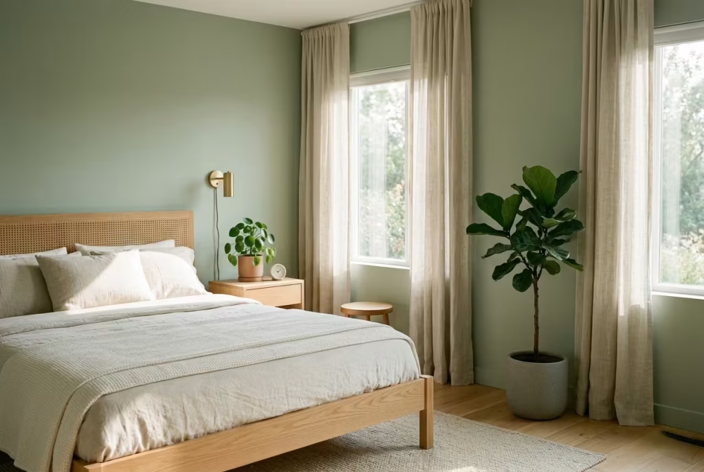
There is a fine line between a bedroom that feels gently connected to nature and one that slips into something overly themed. Sage green already carries a botanical reference, so adding plants should feel like a quiet extension of that idea, not a literal repetition of it. The goal is suggestion, not saturation.
When handled with restraint, greenery behaves like a soft accent rather than a focal point. It introduces life, a sense of movement, and a subtle shift in air and atmosphere. When overdone, it can crowd the room visually, pulling attention away from the calm foundation you have carefully built.
Think of plants here as punctuation, not paragraphs. A well-placed leaf does more than a crowded corner ever will.
Why One or Two Plants Are Often Enough
It is tempting to layer greenery across shelves, windowsills, and corners, especially in a sage-based palette where everything already leans towards natural tones. But more often than not, this dilutes the effect rather than enhancing it.
In most bedrooms, one or two plants are enough to introduce that organic softness. This allows each plant to have presence without competing for attention. The room remains calm, and the greenery feels intentional rather than decorative.
I often treat plants the same way I treat artwork in a restful space. Give them space to breathe, and they will hold their own. Cluster them too tightly, and they start to blur into background noise.
Real-World Application: When Less Creates More Presence
I worked on a bedroom where the client loved plants and had gradually filled the space with them. Every surface held something green. Individually, the plants were beautiful, but together they created a sense of visual clutter that worked against the calm we were trying to achieve.
We reduced the number down to two carefully chosen pieces. A medium-height plant near the window and a smaller one on the bedside table. Nothing else changed.
The shift was immediate. The room felt lighter, more composed. Each plant suddenly had presence, rather than disappearing into a crowded arrangement. The sage walls and textiles began to breathe again, no longer competing with layers of greenery.
It was a reminder that restraint often reveals more than abundance ever can.
Getting Scale and Placement Right
Proportion plays a quiet but important role in botanical styling. A single medium plant, around 80 to 120 cm tall (31 to 47 inches), can anchor a corner or sit comfortably near a window without overwhelming the space. A smaller plant, perhaps 20 to 40 cm in height (8 to 16 inches), works well on bedside surfaces or shelves.
Placement should feel natural rather than staged. Near windows is often ideal, not just for plant health, but because it aligns the greenery with natural light. This reinforces the connection between interior and exterior in a way that feels effortless.
In smaller bedrooms under 12 m² (130 sq ft), keeping plants off the floor and on elevated surfaces can help maintain a sense of openness. In larger rooms, a single floor-standing plant can add vertical interest without crowding the layout.
Materials and Planters That Keep It Grounded
The container you choose is just as important as the plant itself. Glossy or overly decorative pots can quickly shift the tone from calm to styled. Instead, matte finishes, natural clay, stone, or lightly textured ceramics tend to sit more comfortably within a sage palette.
Neutral tones, soft greys, warm off-whites, or even muted earthy hues, allow the greenery to stand out without creating unnecessary contrast. The aim is cohesion, not competition.
Plant selection should also lean towards softer, more natural forms. Leaves with gentle curves or slightly irregular shapes tend to complement sage better than highly structured or spiky varieties. It is about echoing the softness already present in the room.
Where This Approach Works Best and Where It Needs Restraint
Soft botanical styling works particularly well in bedrooms that already incorporate natural materials, timber, linen, wool. These elements create a consistent language that allows plants to integrate seamlessly.
However, it requires discipline. In rooms with limited light, too many plants can feel heavy rather than fresh. In highly styled spaces, they can tip the balance towards something overly thematic.
Maintenance is another quiet consideration. Plants need care, and neglected greenery can quickly undermine the calm atmosphere you are trying to create. Choosing low-maintenance varieties ensures the styling remains consistent over time.
Why This Approach Feels Effortless Over Time
What makes restrained botanical styling so effective is how naturally it settles into the room. It does not draw attention to itself. It simply adds a layer of life that evolves quietly alongside the space.
Over time, the plants grow, shift, and respond to light, becoming part of the room’s rhythm. Because they are few in number, they never feel overwhelming. Instead, they act as small, living anchors within the space.
It is a gentle reminder that in design, as in nature, balance is rarely found in excess. It is found in knowing when to stop, and allowing what remains to speak clearly.
Sage and Textured Plaster Walls
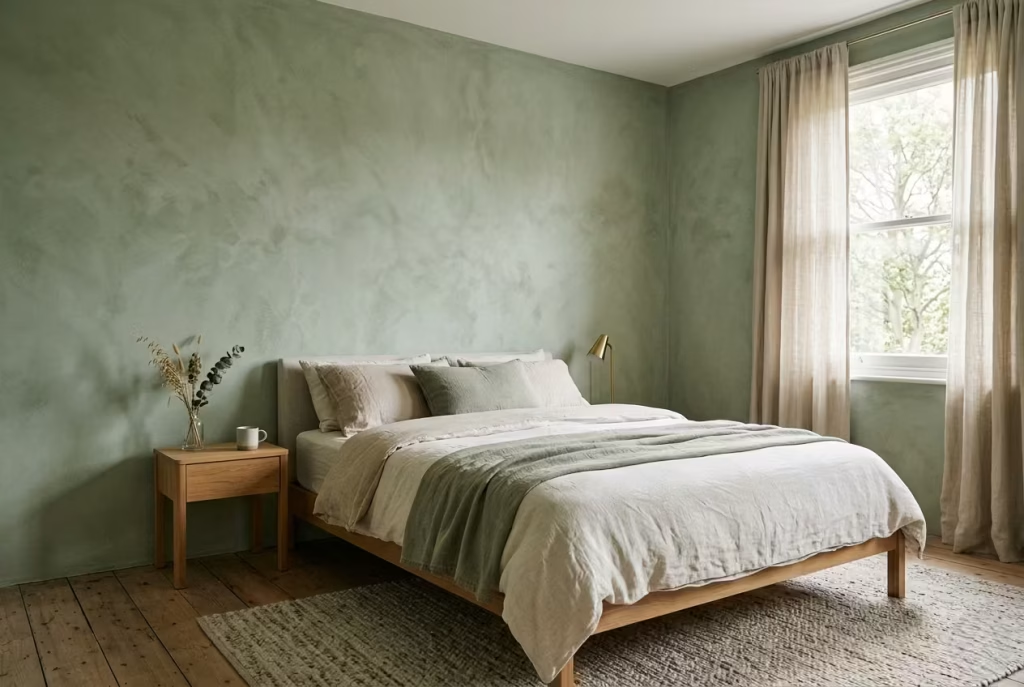
Textured plaster and sage green work together in a way that feels almost instinctive. One brings softness, the other brings depth, and the two together create a wall surface that feels far more dimensional than standard paint ever could. This is especially valuable in bedrooms where the light is not generous. In low-light rooms, flat finishes can easily fall into the trap of looking one-note or slightly lifeless. Textured plaster, by contrast, gives the wall a pulse. It catches the light, holds it, and lets it shift across the surface in a slower, more interesting way.
That difference matters. A sage bedroom should feel calm, yes, but calm does not have to mean plain. Textured plaster gives the room a quiet sense of presence, almost like the walls are breathing rather than standing still. It is one of those details that works behind the scenes but changes the whole mood.
Why Texture Makes Sage Feel Richer
Sage is already a colour with a softened, muted character, but when it is applied to a smooth wall in a dark or unevenly lit room, it can sometimes lose some of its depth. The colour is still there, of course, but it can read slightly flat. That is where texture steps in and saves the day.
Plaster introduces subtle variation in tone and surface. Even if the shade remains exactly the same, the way light moves across it changes constantly. In the morning, the surface may appear lighter and more diffuse. Later in the day, the same wall can deepen into something moodier and more grounded. This is what makes the combination so compelling. It is not about making a statement. It is about giving the room more layers to work with.
I have often found that rooms with poor daylight need this kind of surface treatment more than anything else. A beautiful colour alone cannot always carry the atmosphere. Texture gives it a bit of backbone.
Real-World Application in a Low-Light Bedroom
One of the strongest examples I have seen was a north-facing bedroom that struggled with dullness almost all year round. The original finish was a standard matte emulsion in a lovely sage tone, but the room still felt a little undercooked. It was technically fine, but emotionally it was not quite landing.
We changed the main walls to a fine textured plaster finish in a soft sage blend. Nothing else in the room changed significantly, yet the difference was immediate. The walls began to hold shadow in a more elegant way, and the space felt warmer without actually becoming warmer in temperature. It sounds subtle, but that is exactly the point. In a room like that, subtle is everything.
The plaster gave the room a sense of depth that flat paint had not been able to achieve. Instead of simply reflecting the light available, it seemed to absorb and soften it. The result was a space that felt more settled, more layered, and far less dependent on perfect daylight to feel complete.
Getting the Finish Right Without Overdoing It
With textured plaster, restraint is essential. If the texture becomes too pronounced, it can quickly tip the room from quietly sophisticated into visually busy. The best results usually come from a surface that feels gently worked rather than heavily sculpted.
A fine lime plaster or clay-based finish is often ideal for this kind of bedroom. These materials naturally create tonal variation without requiring excessive pattern or decoration. In most residential settings, a surface variation of around 1 to 3 mm is enough to introduce that softness without making the walls feel rough or overly rustic.
Sage tones work best when the finish is matte or softly mineral in character. Anything too polished will flatten the effect. You want the wall to catch light in a soft, almost diffused way, not bounce it back sharply.
This is also where room size becomes relevant. In smaller bedrooms around 10 to 12 m², too much texture on every wall can start to feel dense. In those cases, I often suggest applying the plaster finish to the main walls only, while keeping secondary surfaces more restrained. That keeps the room from feeling overworked.
Materials and Finishes That Bring the Look Together
Lime plaster, clay plaster, and mineral plaster each bring their own character, but they all share one important quality: they allow the colour to live inside the surface rather than sitting on top of it. That gives sage a more atmospheric reading.
Clay plaster, in particular, can be excellent in bedrooms because it has a soft, earthy quality that complements sage beautifully. It feels natural without being obvious about it. Lime plaster has a slightly chalkier, more timeworn effect, which can work beautifully in rooms that need a touch more character. Mineral plasters tend to sit somewhere between the two, offering a clean but tactile result.
Pairing these finishes with natural materials helps reinforce the effect. Linen curtains, oak furniture, wool bedding, or a simple jute rug all work well because they echo the tactile quietness of the walls. It all starts to feel like it belongs to the same conversation.
Where This Approach Excels and Where It Needs Care
Textured plaster and sage are particularly effective in bedrooms that lack strong daylight or architectural detail. The surface itself becomes the interest, so the room does not need to rely on excess styling to feel resolved. In fact, too much styling can compete with the subtle movement of the walls and muddy the effect.
That said, this finish does require a bit of confidence. It is not the right choice if you want a highly crisp, uniform look. The beauty lies in its softness and variation. If perfection is the goal, this may feel too loose. But if atmosphere is the goal, it is hard to beat.
Maintenance is another point to consider. Textured plaster can be more delicate than standard paint, especially in high-contact areas. It is worth placing it where it can shine without being knocked about. Behind the bed or on the main feature walls is often the sweet spot.
Why It Leaves Such a Lasting Impression
What makes sage and textured plaster so memorable is that it does not rely on obvious drama. It works quietly, almost under the radar, until you realise the room feels better than you expected. The walls have depth. The colour feels richer. The light behaves more gently.
That is often the hallmark of a really good design move. It does not announce itself, but it changes the entire experience of the room. Over time, the surface begins to feel almost inseparable from the atmosphere itself.
In a bedroom, that kind of quiet confidence goes a long way.
Light Wood Flooring with Sage Walls
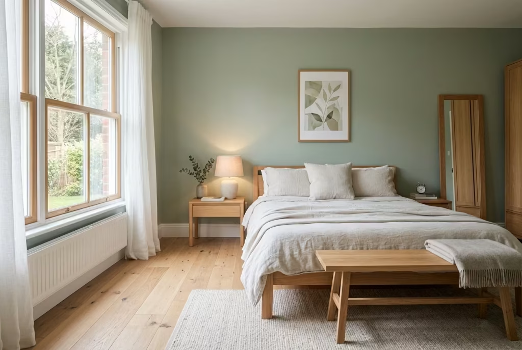
When sage green settles onto the walls, the instinct is often to keep everything equally soft and muted. That works to a point, but without a grounded base, the room can begin to feel slightly weightless, almost as if it is hovering rather than holding together. Light wood flooring corrects that balance in the most natural way possible. It introduces warmth and structure while still keeping the palette open and breathable.
The relationship between sage and light timber feels effortless because it mirrors what we already recognise in nature. Soft greenery above, warm earth below. It is a pairing that does not need to be explained. It simply feels right, almost as if the room has found its footing.
Why This Combination Feels So Visually Comfortable
Sage green carries a muted coolness, even when it leans slightly warm. Light wood flooring introduces the counterbalance, bringing in a gentle warmth that stops the room from feeling too restrained. Together, they create a quiet equilibrium where neither element dominates.
What makes this pairing particularly effective is its ability to hold light. Sage absorbs and softens it at eye level, while light timber reflects it subtly from below. The result is a room that feels evenly lit and visually calm throughout the day.
I often describe this combination as one that keeps the room “open at both ends.” The walls do not press in, and the floor does not weigh down. Everything sits in a comfortable middle ground.
Real-World Application: When the Floor Changes the Atmosphere
I worked on a bedroom where the walls were already finished in a beautiful soft sage, but the existing flooring was a dark-stained timber that absorbed far too much light. The contrast was strong, but not in a way that felt restful. The room felt slightly heavy, particularly in the evenings.
We replaced the flooring with a light oak finish, nothing overly pale, just a natural tone with a soft grain. The change was immediate. The room lifted, quite literally. The sage walls began to feel lighter, the overall palette opened up, and the space finally felt cohesive.
What stood out most was how the floor began to support the walls rather than compete with them. It became a foundation instead of a focal point.
Getting the Tone and Scale Right
Not all light wood is created equal, and this is where many pairings either succeed or quietly fall apart. The key is choosing a timber tone that does not lean too heavily into yellow or orange undertones. Those can clash subtly with sage, creating a tension that is hard to pinpoint but easy to feel.
In most cases, I lean towards light to mid-tone oak or ash with a neutral or slightly warm undertone. These woods sit comfortably alongside sage without pulling the palette in a different direction.
Plank size also plays a role in how the floor reads. Wider planks, typically around 120 to 180 mm (4.7 to 7 inches), create a calmer, more continuous surface with fewer visual interruptions. This works particularly well in bedrooms where you want the floor to feel expansive rather than busy.
In smaller rooms around 10 to 12 m² (108 to 130 sq ft), keeping the plank direction aligned with the longest wall can help visually extend the space, making the room feel slightly larger than it is.
Materials and Finishes That Keep It Natural
Finish is everything when it comes to light wood flooring. A matte or satin finish is usually the best choice, as it preserves the natural character of the timber without introducing unwanted shine. Glossy finishes can reflect too much light, disrupting the calm, grounded feel that makes this pairing work so well.
Engineered wood flooring is often a practical choice in bedrooms, offering stability while still maintaining the look and feel of solid timber. For those looking for a slightly more textured surface, lightly brushed or wire-brushed finishes can add subtle depth without becoming overly rustic.
Pairing the floor with natural materials above, linen bedding, wool rugs, soft cotton upholstery, helps tie everything together. The room begins to feel cohesive not because everything matches, but because everything shares a similar level of softness.
Where This Combination Excels and Where It Needs Care
Light wood flooring and sage walls perform exceptionally well in bedrooms that aim for a calm, airy atmosphere. They are particularly effective in spaces with good natural light, where the interplay between floor and wall can fully develop throughout the day.
However, there are a few details that need attention. If the wood tone is too pale, almost bleached, it can sometimes feel slightly cold against certain sage tones. On the other hand, if it is too warm, it can shift the palette away from its intended balance.
Rugs also play a supporting role here. Without them, the floor can feel slightly exposed, particularly in larger rooms. A well-placed rug, extending around 60 cm (24 inches) beyond the bed, can soften the transition between floor and furniture while maintaining the overall lightness.
Why This Pairing Feels Timeless Rather Than Trend-Driven
What makes light wood and sage so enduring is that it does not rely on contrast or novelty. It relies on balance. The materials and colours work together in a way that feels grounded in something familiar, something that does not need to change with trends.
Over time, the timber develops a subtle patina, the sage continues to respond to light, and the room begins to feel more settled rather than dated. It is not a combination that demands attention. It supports the way you live in the space, quietly and consistently.
And in a bedroom, that kind of steady, understated comfort is often exactly what you want to come home to.
Monochromatic Sage Layers with Subtle Contrast
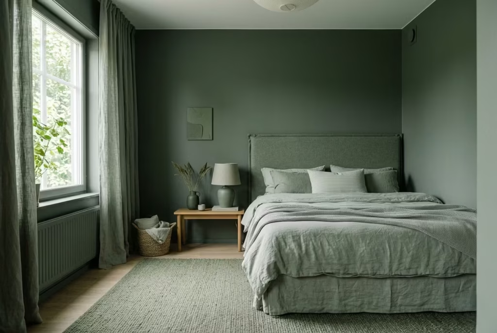
There is a quiet confidence in committing to a single colour and allowing it to do all the heavy lifting. A monochromatic sage bedroom, when handled with care, does not feel repetitive. It feels composed. The room reads as one continuous idea, but with enough variation to keep the eye engaged without ever feeling restless.
This approach is less about colour choice and more about control. You are working within a narrow palette, but stretching it just enough to create depth. It is a bit like listening to the same note played in different tones and textures. The melody stays consistent, but the experience evolves.
Why Tonal Variation Prevents the Room from Falling Flat
A single shade of sage, applied everywhere without variation, can quickly lose its impact. It becomes background rather than atmosphere. The key is to introduce 3 to 4 tonal variations, each one slightly lighter or deeper than the next.
These shifts do not need to be dramatic. In fact, they work best when they are barely noticeable at first glance. A slightly deeper sage on the walls, a softer, more washed tone in bedding, a muted green-grey in upholstery, and perhaps a lighter sage in curtains. Together, they create a layered field that feels alive rather than static.
What happens here is subtle but powerful. The eye moves across the room without stopping abruptly. There are no hard breaks, no jarring contrasts, just a gentle progression of tone that keeps the space from feeling stagnant.
Real-World Application: When One Colour Needed More Voices
I once worked on a bedroom where the client had chosen a beautiful sage paint for the walls and carried the same shade into almost every other element. On paper, it made sense. In reality, the room felt slightly flat, as though everything had merged into a single surface.
We did not change the colour. We expanded it. We introduced a deeper sage in the headboard, softened the bedding into a lighter, almost faded green, and added a mid-tone through curtains and a rug. Each element stayed within the same family, but none matched exactly.
The result was immediate. The room gained depth without gaining noise. It still felt calm, still cohesive, but now it had layers that could be read individually if you looked closely. That is often the turning point with monochromatic schemes. It is not about adding more colour. It is about letting the existing colour speak in different tones.
Getting the Balance Right in Practice
Working with 3 to 4 tonal variations tends to be the sweet spot. Fewer than that, and the room risks feeling flat. More than that, and the palette can start to feel fragmented rather than unified.
A practical way to approach this is to assign each tone a role. The darkest variation often works best on larger surfaces such as walls or upholstered elements, where it can anchor the room. Mid-tones can sit comfortably in curtains, rugs, or secondary furniture. Lighter shades are ideal for bedding and softer textiles, where they catch more light and keep the space feeling open.
In bedrooms around 12 to 16 m² (130 to 170 sq ft), this distribution helps maintain clarity. Each layer has its place, and the room feels structured without being rigid.
Scale also matters. Larger elements should carry the more stable tones, while smaller accessories can introduce lighter or slightly varied shades without disrupting the overall flow.
Materials and Finishes That Enhance the Layers
Material choice is what brings these tonal differences to life. If everything is rendered in the same finish, even varied tones can begin to blur. Mixing textures is what allows each shade to hold its own.
Matte painted walls, soft linen bedding, lightly textured wool rugs, and upholstered elements in cotton or velvet all interact with light differently. This variation in surface is what makes the tonal shifts visible without needing strong colour contrast.
A matte finish remains the foundation for most sage elements, as it keeps the palette soft and grounded. Slightly textured fabrics, however, add that extra layer of interest that prevents the room from feeling overly controlled.
Where This Approach Excels and Where It Needs Care
Monochromatic sage layering works particularly well in bedrooms designed for calm and retreat. It creates a consistent atmosphere that does not demand attention, making it ideal for spaces where rest is the priority.
However, it does require discipline. Without enough variation, the room can feel one-dimensional. With too much variation, it can lose its sense of unity. Finding that balance is where experience comes into play.
Lighting also influences how these layers are perceived. In strong natural light, the differences between tones become more apparent. In lower light conditions, they soften further, which can either enhance the calm or flatten the effect if the variation is too subtle.
Why This Approach Feels So Effortless Over Time
What makes a monochromatic sage bedroom so compelling is its ability to settle into itself. It does not rely on contrast or statement pieces. Instead, it builds a quiet rhythm through repetition and variation.
Over time, the layers begin to feel inseparable. The room reads as a whole rather than a collection of parts. It becomes easier to live in because nothing competes for attention. Everything works together, almost instinctively.
It is a reminder that sometimes, the most interesting spaces are not the ones that try to say more, but the ones that say just enough, in different ways, over and over again.
Sage Green Upholstered Benches or Ottomans
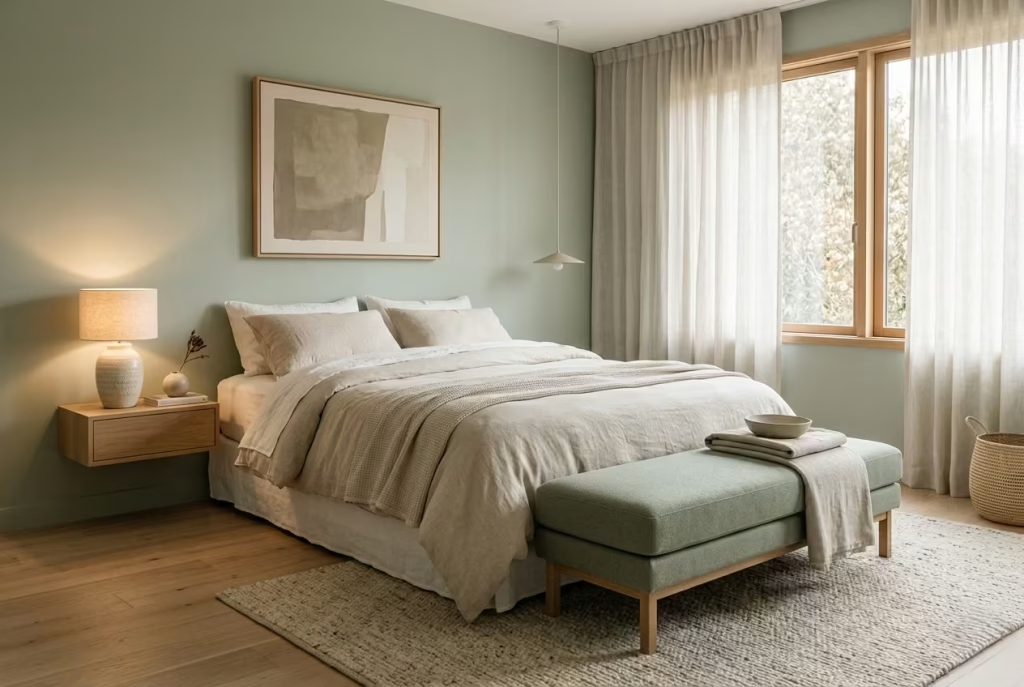
There is a moment in many bedrooms where the layout feels almost complete, but not quite resolved. The bed is placed, the walls are settled, the lighting is considered, yet the space at the foot of the bed feels slightly underused, almost like a sentence missing its final word. This is where a sage green upholstered bench or ottoman steps in, not as an accessory, but as a quiet conclusion to the room.
It does not shout for attention. It simply sits there, soft, grounded, and intentional, tying the entire sleeping area together. In sage, it blends rather than contrasts, becoming part of the room’s language rather than interrupting it.
Why This Element Feels More Important Than It First Appears
A bench or ottoman at the foot of the bed serves more than one purpose, and that is what makes it so effective. Visually, it extends the presence of the bed, giving it a stronger footprint within the room. Practically, it offers a place to sit, to set down a throw, or to pause for a moment before starting or ending the day.
What I find most compelling, however, is how it softens the transition between the bed and the rest of the room. Without it, the bed can sometimes feel slightly abrupt, almost as if it stops too suddenly. The bench acts as a buffer, easing that shift in a way that feels natural and unforced.
In sage green, this effect becomes even more subtle. The piece does not read as a separate object. It reads as an extension of the palette, a continuation rather than a contrast.
Real-World Application: When the Room Needed One Last Layer
I worked on a bedroom that was beautifully balanced in terms of colour and proportion, yet it felt just a touch incomplete. The bed sat confidently against a sage backdrop, but the space at its foot felt open in a way that did not quite support the rest of the design.
We introduced a low upholstered bench in a slightly deeper sage tone, positioned about 35 cm or 14 inches from the bed. The change was immediate, but not dramatic. The room did not feel fuller. It felt finished.
What stood out most was how the bench subtly anchored the bed. It gave the entire composition a sense of closure, almost like drawing a line under a well-written paragraph. Everything that was already working began to feel more intentional.
Getting the Placement and Proportion Right
Placement is where this idea either settles naturally or feels slightly forced. A distance of around 30 to 45 cm, or 12 to 18 inches, from the foot of the bed tends to work best. This allows enough space for movement while keeping the bench visually connected to the bed.
In terms of size, the bench should generally align with the width of the bed or sit just slightly shorter. For a bed around 150 to 180 cm wide, or 59 to 71 inches, a bench between 120 to 160 cm, or 47 to 63 inches, often feels well proportioned.
Height also matters more than people expect. A seat height of around 40 to 45 cm, or 16 to 18 inches, keeps the piece comfortable for sitting while maintaining a low, unobtrusive profile. Anything too tall can start to compete with the bed rather than complement it.
In smaller bedrooms, a compact ottoman or even a pair of smaller pieces can achieve a similar effect without crowding the space.
Materials and Finishes That Enhance the Softness
The upholstery is where the character of the piece really comes through. Linen, cotton blends, and soft woven fabrics tend to work best in sage tones, as they maintain the colour’s natural softness. Velvet can also be effective if used carefully, adding a slightly richer texture without becoming overly formal.
A matte finish is essential. Glossy or heavily treated fabrics can disrupt the calm, introducing a level of shine that feels out of place in a restful bedroom.
The base of the bench, whether timber or upholstered, should remain understated. Light oak or neutral wood tones work particularly well, echoing other natural elements in the room. Fully upholstered bases can also work, especially in more minimal settings where continuity is key.
Where This Approach Excels and Where It Needs Care
Sage upholstered benches or ottomans work best in bedrooms where there is enough space to allow them to breathe. In rooms under 10 m², or 108 sq ft, they can sometimes feel like an extra piece rather than an integrated one, unless carefully scaled.
They are particularly effective in rooms that already lean towards softness and layering. Paired with rugs, textured bedding, and gentle lighting, they reinforce the overall atmosphere without adding visual noise.
However, restraint is important. Overly decorative designs, heavy tufting, or bold detailing can pull the piece away from its intended role. The strength of this idea lies in its quiet presence, not in its ability to stand out.
Why This Detail Feels So Naturally Settled
What makes a sage green bench or ottoman so effective is how seamlessly it integrates into daily life. It becomes a place to pause, to sit, to set something down, without ever feeling like it was added just for the sake of it.
Over time, it stops being noticed as a separate element. It becomes part of how the room functions and feels. The bed feels more grounded, the layout more complete, and the overall space more considered.
It is one of those additions that does not change everything, but somehow makes everything feel more resolved. And in a bedroom, that quiet sense of completion often makes all the difference.
Soft Sage Lighting Schemes
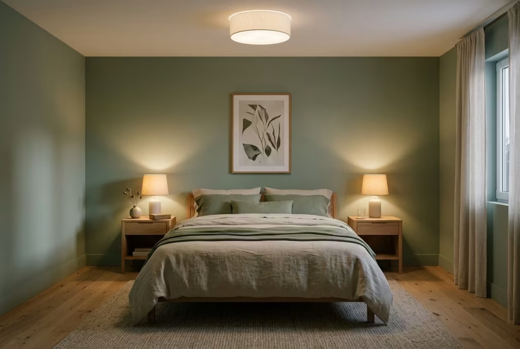
Lighting is often treated as a technical decision, something solved at the end of a project, yet in sage green bedrooms it quietly becomes one of the most defining elements. The colour itself is sensitive to light, which means the atmosphere of the entire room can shift depending on how it is illuminated. Soft sage lighting is not about brightness. It is about control, diffusion, and warmth that feels almost imperceptible but deeply influential.
In the right lighting, sage feels calm and grounded. In the wrong lighting, it can drift towards flatness or coldness. The difference is subtle, but once you notice it, it becomes impossible to ignore.
Why 2700K Warm Light Works So Naturally with Sage
Colour temperature plays a far bigger role in interior mood than most people realise. A 2700K warm bulb sits in that soft, golden range that gently enhances sage without distorting it. It avoids the clinical edge of cooler lighting and instead wraps the room in a subtle warmth that feels lived in.
At this temperature, sage green holds its softness. It does not shift too blue or too grey. Instead, it settles into a balanced tone that feels comfortable at all times of day. In the evening, especially, this warmth becomes essential. It slows the visual energy of the room, signalling rest without needing anything dramatic.
I often describe 2700K lighting in sage rooms as the equivalent of turning the volume down without losing clarity. Everything is still there, just quieter, softer, more considered.
Real-World Application: When Lighting Rescued a Flat Bedroom
I worked on a bedroom where everything had been beautifully designed, sage walls, natural wood furniture, soft textiles, yet the atmosphere still felt slightly unfinished. The issue was not colour or layout. It was lighting.
The client had installed cool white LEDs around 4000K, which flattened the sage and made the room feel slightly clinical, especially in the evenings. It looked clean, but it did not feel comfortable.
We replaced all the lighting with 2700K warm sources and introduced layered lighting instead of a single overhead fixture. Bedside lamps, a soft ceiling wash, and low-level accent lighting completely changed the experience of the room.
What had once felt flat suddenly gained depth. The sage regained its softness, shadows became gentler, and the entire space felt more welcoming without any structural changes at all. It was a reminder that light does not just reveal design, it defines it.
Layering Light to Avoid Harsh Contrast
A single light source rarely does justice to a sage-based interior. The goal is to create layers rather than intensity. Overhead lighting provides general illumination, but it should never carry the room alone.
Bedside lighting is where much of the atmosphere is shaped. Lamps placed at approximately 50 to 65 cm above bedside table height, or around 20 to 26 inches, create a comfortable glow at eye level. This helps maintain warmth without overwhelming the space.
Accent lighting, whether through wall sconces or concealed strips, can add subtle depth when used sparingly. The key is diffusion. Light should feel like it is spilling into the room rather than hitting it directly.
In bedrooms around 12 to 16 m², this layered approach prevents shadows from becoming too harsh or uneven, ensuring the sage tones remain consistent throughout the space.
Materials and Fixtures That Support Soft Illumination
The fixtures themselves matter just as much as the bulbs. Materials that diffuse light gently tend to work best in sage environments. Frosted glass, linen shades, and lightly textured ceramics all help soften the output, preventing glare and harsh edges.
Metal finishes should remain subdued. Brushed brass, matte black, or soft bronze tend to integrate more naturally than highly reflective chrome or polished surfaces. These finishes allow the light to feel grounded rather than visually sharp.
Lamp shades in natural fabrics like linen or cotton help break direct light and distribute it evenly across the room. This ensures that sage surfaces are lit in a way that enhances their softness rather than flattening their tone.
Where This Approach Works Best and Where It Needs Care
Soft sage lighting schemes are particularly effective in bedrooms where calm is the priority. They work beautifully in spaces with natural textures, muted palettes, and layered materials, where the lighting can gently enhance what is already there.
However, there are a few considerations. In very dim rooms with limited natural light, relying solely on warm low-level lighting can sometimes make the space feel overly subdued. In those cases, balance becomes essential, ensuring there is enough ambient light during the day to keep the room feeling open.
Another important factor is consistency. Mixing too many colour temperatures within the same space can disrupt the calm effect. Sticking closely to the warm 2700K range ensures the sage remains visually stable across different times of day.
Why Lighting Ultimately Defines the Experience of Sage
What makes lighting so critical in sage bedrooms is that it does not just support the colour. It shapes how the colour is perceived moment by moment. The same wall can feel airy in the morning, grounded in the afternoon, and deeply soothing in the evening, all depending on how it is lit.
Over time, this becomes part of the room’s identity. The lighting is no longer something you think about. It becomes part of how the space feels to live in. And when it is done well, it quietly ties everything together, making the entire room feel balanced, intentional, and effortlessly calm.
Sage and Grey Done the Right Way
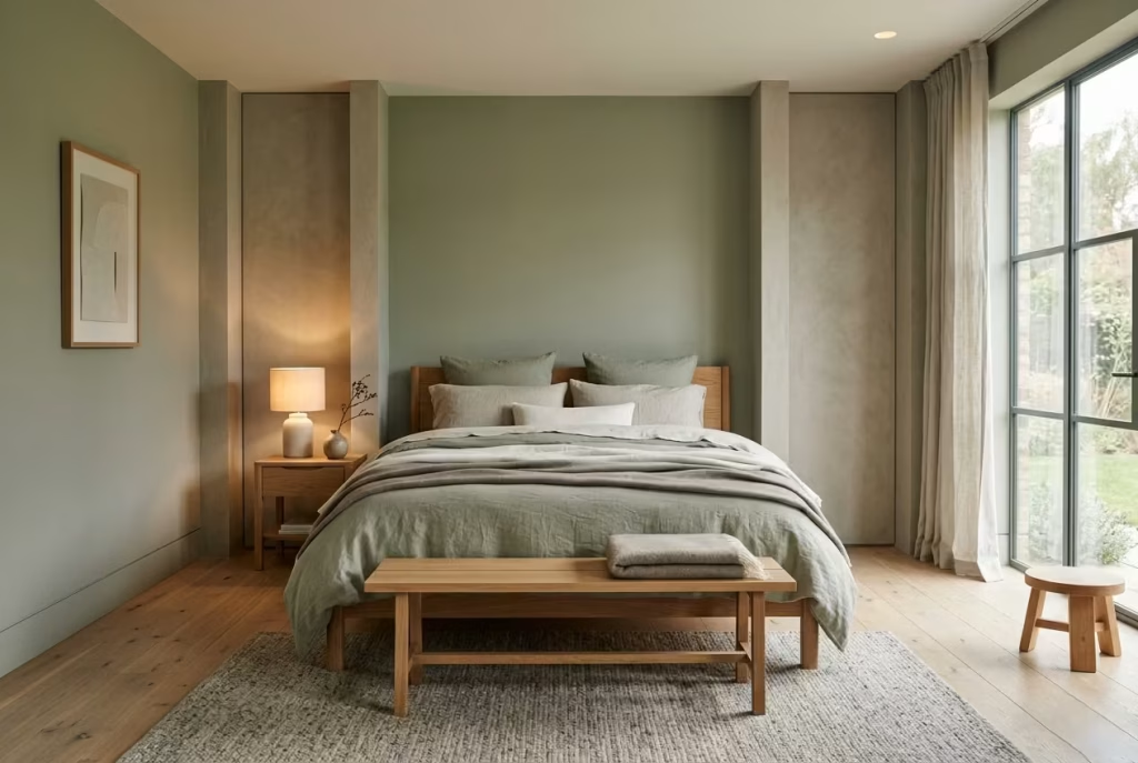
Sage and grey can be a beautifully restrained pairing, but only when the grey is chosen with a careful hand. Used carelessly, the combination can slip into something flat, cool, and slightly aloof, which is the last thing a restful bedroom needs. Used well, though, it becomes one of the most elegant tonal pairings you can bring into a sleeping space. It feels calm, layered, and deeply settled, almost like the room has been softly filtered through a piece of stone and linen.
The secret is simple enough in principle but easy to get wrong in practice. Sage needs a grey with warmth in it, not one that feels icy or overly architectural. Think stone, dove, putty, taupe-grey, clay-grey. These shades sit naturally beside sage because they share a muted softness. They do not fight for attention. They sit side by side, letting the room breathe.
Why Warm Greys Make Sage Feel More Grounded
Cold grey can be unforgiving in a bedroom. It often sharpens the edges of sage rather than softening them, which pulls the room away from its restful centre. Warm, stone-based grey behaves differently. It has enough depth to anchor the palette, but it keeps a gentle hand on the wheel.
In practical terms, this means choosing greys with undertones of beige, brown, or soft green rather than blue. In a bedroom, that slight warmth matters more than people often realise. It keeps the room from feeling sterile and gives sage a more mature, natural backdrop.
I have seen this pairing work especially well in rooms where the client wanted something neutral but not bland. Sage handled the emotional softness, while the warm grey kept everything disciplined and composed. The result was never showy, but it was the kind of room that stays with you. It had poise.
Real-World Application: Where This Pairing Comes Into Its Own
In one bedroom project, the walls were originally painted a cool grey that looked fine in the tin but felt strangely detached once it was on the walls. The sage textiles in the room, a headboard, cushions, and curtains, kept losing their softness against it. The whole scheme felt like it was almost working, but not quite.
We changed the grey to a warm stone tone with a slightly earthy base. That single adjustment made the sage come alive. It no longer felt muted in a dull way. It felt intentional. The room gained coherence almost instantly, and the client described it as the moment the space finally “clicked into place.”
That is often the value of this combination. It is less about contrast and more about tonal conversation. When the grey is right, sage does not have to carry the full emotional load on its own.
Getting the Balance Right in the Room
The balance between sage and grey should feel measured rather than symmetrical. In most bedrooms, one of the tones should lead while the other supports. If both compete equally, the room can lose its sense of direction.
A useful approach is to let sage introduce the softness through larger features such as walls or upholstered elements, while grey sits in the supporting role through flooring, bedding, joinery, or secondary textiles. In a room around 12 to 15 m², this kind of distribution helps preserve clarity without making the palette feel sparse.
The greys that work best in this setting are often those that change slightly with the light. A stone-grey wall that reads warmer in the morning and cooler by evening can add quiet depth, provided it remains within a soft tonal range. It should feel like a natural backdrop, not a colour trying to make a statement.
Materials and Finishes That Strengthen the Pairing
Texture plays a huge role here. Sage and warm grey can easily feel too smooth if every surface is treated the same way. Introducing linen, wool, brushed plaster, or lightly textured paint helps break up the sameness and gives the eye something subtle to work with.
Mattes and soft finishes are usually the best choice. They keep both colours grounded and prevent either one from becoming too sharp. A soft-touch painted wall, a wool rug in a stone-grey tone, or a linen bedspread in muted sage all work together because they share the same low-noise quality.
Timber also helps mediate the relationship. Light oak or smoked oak adds a third note that keeps the palette from drifting into cool territory. It is a small move, but one that often makes the whole thing hold together more confidently.
Where This Pairing Works Best and Where It Can Drift
Sage and grey are especially effective in bedrooms that aim for calm, minimal composition without feeling too stark. They suit rooms with good natural light, where the subtle undertones can reveal themselves properly across the day.
The pairing can falter when the grey is too blue or too pale. In those cases, sage starts to look slightly muddy or washed out. The room may still be technically neutral, but emotionally it can feel thin. That is the trap to avoid.
Lighting is another piece of the puzzle. Warm lighting around 2700K will usually flatter both tones, while cool lighting can make the grey feel colder and the sage more subdued. It is one of those details that quietly makes or breaks the atmosphere.
Why This Combination Rewards a Careful Hand
When sage and grey are done properly, the result feels timeless rather than trendy. It does not lean too soft, and it does not slip into anything severe. Instead, it holds a lovely middle ground where the room feels calm, balanced, and quietly sophisticated.
That is the beauty of this pairing. It does not need to shout to be effective. It just needs the right undertones, a bit of restraint, and enough material depth to keep the palette from going flat. When those pieces fall into place, the bedroom feels beautifully composed, and that is hard to beat.
Sage Green with Woven Natural Materials
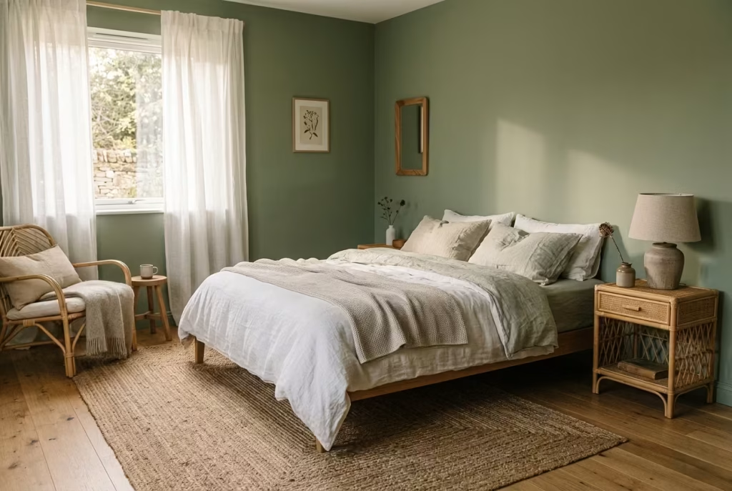
Sage green has a quiet, grounded quality on its own, but it becomes something far more layered when it meets woven natural materials. Rattan, jute, linen, and similar textures introduce a tactile honesty that stops the colour from feeling too smooth or overly polished. Together, they create a bedroom that feels lived in rather than staged, as if every surface has been gently shaped by time and use.
There is a kind of rhythm that emerges from this pairing. Sage brings calm, while woven materials bring structure through texture. One soothes the eye, the other engages the hand and body. It is a combination that feels unforced, almost instinctive, like it was never designed but discovered.
Why Texture Matters as Much as Colour
A sage bedroom without texture can sometimes feel slightly incomplete, even if the colour itself is perfect. That is because sage relies heavily on variation in surface and material to express its depth. Woven natural materials fill that gap beautifully.
Rattan introduces a light, airy structure that keeps the room from feeling too closed in. Jute grounds the space with a slightly rougher, earthier texture. Linen softens everything with its relaxed, slightly crumpled character. When used together, these materials create a layered tactile experience that complements sage rather than competing with it.
What makes this pairing so effective is that it does not rely on visual contrast alone. It works through touch, texture, and light interaction. The room begins to feel richer without becoming visually busy.
Real-World Application: When a Room Needed More Than Colour
I once worked on a bedroom where the palette was beautifully restrained, sage walls, soft neutral flooring, and minimal furniture. On paper, everything was right. In reality, the room felt slightly flat. It lacked texture, almost like it had been carefully arranged but not yet fully lived in.
We introduced woven elements gradually. A rattan bedside table, a jute rug sized around 160 x 230 cm (63 x 91 inches), and linen bedding with a slightly relaxed weave. Nothing dramatic, just a shift in material language.
The transformation was subtle but undeniable. The sage stopped feeling one-dimensional and began to sit within a richer sensory environment. The room felt warmer, more grounded, and far more comfortable to be in. It was no longer just visually calm. It felt physically inviting.
Getting Scale and Placement Right
Woven materials work best when they are placed with intention rather than spread evenly throughout the room. A single larger statement piece often has more impact than several smaller scattered items.
For example, a rattan chair placed in a corner around 60 to 80 cm (24 to 31 inches) wide can introduce structure without overwhelming the space. A jute rug should be large enough to anchor the bed, ideally extending at least 50 to 60 cm (20 to 24 inches) beyond each side to keep proportions balanced.
Linen works best when it is allowed to feel slightly relaxed. Over-pressed or overly structured linen can lose the softness that makes it work so well with sage. Slight natural creasing is not a flaw here. It is part of the character.
The key is to avoid overfilling the room with woven textures. One or two strong gestures are usually enough to set the tone.
Materials and Finishes That Keep the Look Honest
Natural materials carry their own language, and part of their strength lies in their imperfection. Rattan should feel slightly irregular, not overly lacquered or glossy. Jute should retain its coarse, organic weave rather than being refined into something too polished. Linen should feel breathable and unforced, with a matte surface that catches light softly.
When these materials sit alongside sage, the contrast is not about colour. It is about texture versus smoothness. Sage-painted walls, particularly in a matte or mineral finish, act as the calm backdrop that allows these woven elements to stand forward without noise.
Wood also plays an important supporting role here. Light oak or slightly weathered finishes tend to sit more comfortably than high-gloss or heavily stained woods, which can feel too structured against the softness of woven materials.
Where This Combination Works Best and Where It Needs Restraint
Sage and woven natural materials work exceptionally well in bedrooms that aim for a relaxed, organic atmosphere. They are particularly effective in spaces that receive good natural light, where the textures can shift gently throughout the day.
However, there is a fine line between layered and cluttered. Too many woven elements can quickly tip the room into a themed or overly rustic direction. The strength of this pairing lies in restraint, letting each material have space to be appreciated rather than competing for attention.
Humidity and maintenance are also worth considering. Natural fibres can require more care over time, especially in environments with fluctuating moisture levels. Choosing quality pieces that age well makes a noticeable difference in how the room holds up.
Why This Pairing Feels So Naturally Settled
What makes sage and woven materials so effective together is their shared sense of ease. Neither tries to dominate the space. Instead, they support one another quietly, building an atmosphere that feels grounded, breathable, and unforced.
Over time, these materials soften even further. Linen relaxes, rattan develops a gentle patina, jute wears in subtly. The room begins to feel more personal, not because more has been added, but because what is already there has been allowed to evolve.
It is a reminder that comfort in design rarely comes from perfection. It comes from texture, warmth, and the kind of quiet layering that makes a space feel like it has always belonged to you.
A Barely-There Sage for Minimalist Bedrooms
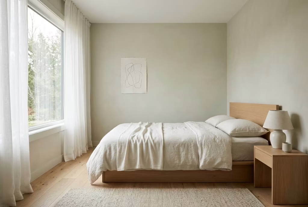
There is a point in colour work where it almost disappears, not because it is absent, but because it is so finely tuned that it behaves like a neutral. A barely-there sage sits exactly in that space. It is not a statement colour, and it does not try to be. Instead, it introduces just enough pigment to shift a room from plain minimalism into something with breath and softness.
In minimalist bedrooms, this is often the difference between a space that feels empty and one that feels intentionally calm. The colour is present, but it never shouts. It lingers in the background, shaping the atmosphere in a way you only fully notice when you leave the room and come back into it.
Why Subtle Sage Works So Well in Small and North-Facing Rooms
Small bedrooms, especially those under 10 to 12 m² (108 to 130 sq ft), can easily feel tight if the palette is too heavy or too contrasted. A barely-there sage avoids this by behaving almost like a tinted neutral rather than a defined colour. It softens edges without visually closing the space in.
In north-facing rooms, the challenge is different. The light is cooler and more indirect, which can flatten traditional neutrals. A whisper of sage introduces just enough warmth and depth to counter that effect without overpowering the limited daylight.
What makes this version of sage so effective is its restraint. It does not try to correct the room. It simply works with what is already there, gently refining it.
Real-World Application: When a Room Needed Less, Not More
I worked on a compact bedroom where the original brief was pure minimalism, white walls, simple furniture, no visual distraction. On paper, it should have worked. In reality, the room felt slightly sterile, particularly in the morning light.
We shifted the walls to an extremely diluted sage tone, almost indistinguishable from warm white at first glance. The change was subtle enough that some people did not notice it immediately, but the atmosphere shifted completely.
The room stopped feeling stark. It gained a softness that was hard to define but easy to feel. The bed no longer floated in a blank space. The walls began to carry a quiet depth that made the entire room more comfortable to be in, especially during low light hours.
It was one of those rare cases where the success of the change came from what you did not immediately see.
Getting the Tone and Light Balance Right
With barely-there sage, precision is everything. If the colour leans too green, it can quickly lose its minimal quality and start to feel like a pale statement wall. If it leans too grey or too beige, it risks becoming flat again.
The ideal version sits somewhere between a softened sage, a muted stone, and a warm off-white. It should respond gently to light changes throughout the day, appearing slightly warmer in the evening and more neutral in bright daylight.
In practice, sample testing across different walls is essential. A colour that feels perfect near a window can behave very differently on a shaded surface. In rooms around 8 to 10 m² (85 to 108 sq ft), even a slight shift in tone can change the entire spatial reading of the room.
Materials and Finishes That Keep It Subtle
Finishes matter more than colour strength in this type of scheme. A matte or ultra-matte paint finish is almost always the right choice. It prevents light reflection from exaggerating the colour and keeps the surface calm and consistent.
Pairing the walls with similarly restrained materials is key. Linen bedding in off-white or soft grey tones, light timber flooring, and minimal upholstery allow the barely-there sage to sit quietly without competition.
Avoid overly glossy or highly textured surfaces here. They introduce contrast that can break the illusion of softness. Everything should feel like it belongs to the same quiet register.
Where This Approach Works Best and Where It Can Fall Short
Barely-there sage excels in minimalist bedrooms, especially where the goal is calm rather than visual drama. It is particularly effective in smaller rooms, rented spaces, or homes where you want colour without commitment.
However, it can fall short if the lighting is too weak or inconsistent. In very dim rooms, the subtlety of the tone can disappear entirely, leaving the space feeling closer to standard white. In those cases, a slightly stronger sage may be more appropriate.
It also requires discipline in furnishing. If too many contrasting elements are introduced, the subtlety of the colour is easily lost. The strength of this approach lies in consistency and restraint, not layering or complexity.
Why This Level of Subtlety Feels So Modern
There is something deeply contemporary about a colour that almost hides itself. Barely-there sage reflects a shift in how people approach interiors, moving away from obvious statements and towards atmosphere-led design.
It does not ask to be noticed. It simply improves how a space feels to live in, quietly and consistently. Over time, that kind of restraint becomes more valuable than any bold gesture.
And in a minimalist bedroom, where every element carries weight, that softness is often exactly what makes the space feel complete.
Common Mistakes That Disrupt the Calm
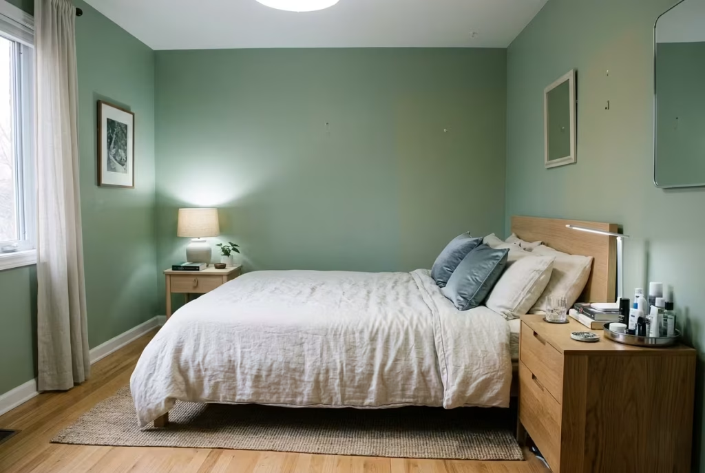
Even the most carefully considered sage green bedroom can lose its sense of ease if a few quiet principles are overlooked. The colour itself is forgiving, but it is also highly sensitive to undertone, light, and surrounding material choices. When things go slightly off balance, the effect is rarely dramatic at first glance, yet the room begins to feel subtly unsettled, as if something is not quite landing.
In practice, it is often not one big design error that disrupts the calm, but a series of small missteps that gradually pull the atmosphere away from its intended softness.
Using the Wrong Undertone of Sage
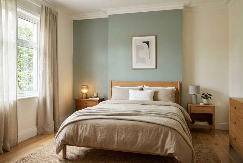
Not all sage tones behave the same way. Some lean more towards grey, others carry a stronger yellow or even olive base. When the undertone does not align with the rest of the room, the entire palette can feel disconnected.
A cool, grey-leaning sage placed in a warm-toned interior can feel slightly detached, while an overly yellow sage can start to look tired under artificial light. The goal is not perfection, but alignment. The undertone should quietly echo the surrounding materials rather than compete with them.
In well-balanced rooms, the sage feels like it belongs from the start. In poorly matched schemes, it always feels slightly introduced rather than integrated.
Over-Layering Green Without Contrast
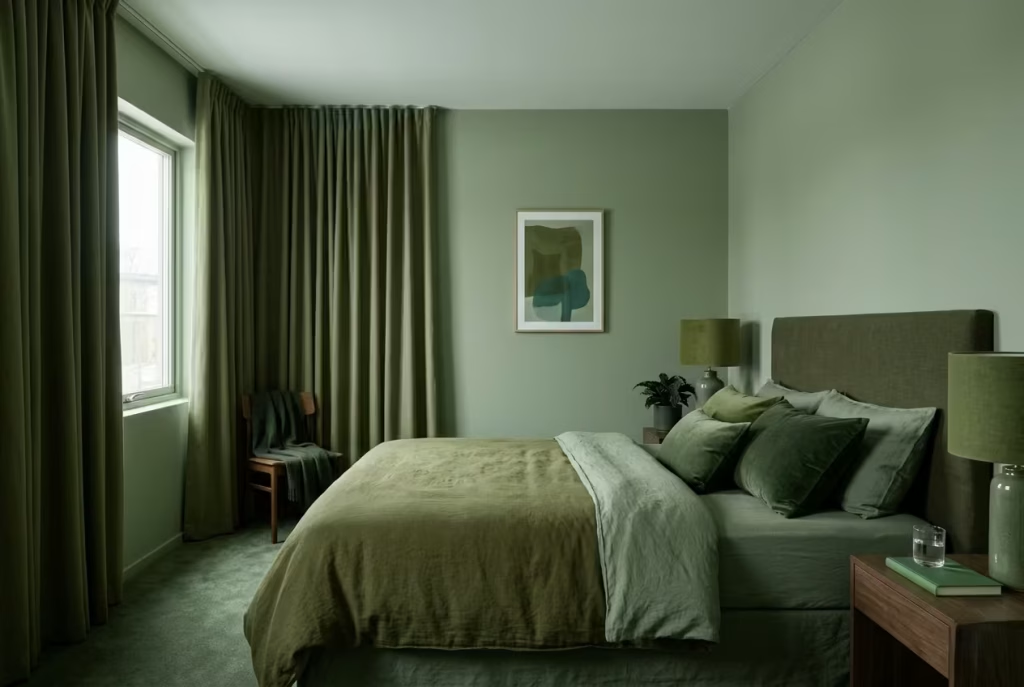
It is easy to assume that more green will deepen the effect, but this is where many rooms begin to lose clarity. When too many similar green tones are layered without variation, the space can flatten rather than evolve.
Instead of creating depth, the room starts to feel visually repetitive. The eye has nowhere to rest, and the subtlety of sage is lost in a wash of near-identical shades.
What works far better is controlled variation. Sage should be supported by neutrals, warm woods, or soft off-whites that allow it to breathe. Without that contrast, even the most beautiful green palette can start to feel monotonous over time.
Poor Lighting Choices
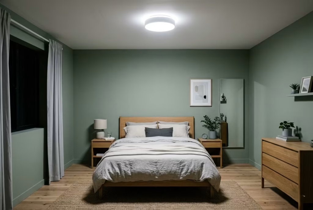
Lighting is often the quiet deciding factor between a sage room that feels atmospheric and one that feels dull. Cool white light, in particular, can strip sage of its warmth and reduce it to something flat and clinical.
Even strong natural sage tones can appear lifeless under harsh 4000K lighting. On the other hand, overly dim lighting can make the colour feel heavy and underdeveloped, especially in smaller rooms or north-facing spaces.
Warm lighting in the 2700K range usually supports sage most effectively, allowing its softness to remain intact. Layered lighting, rather than a single overhead source, helps maintain depth and prevents shadows from feeling harsh or uneven.
Ignoring Material Balance
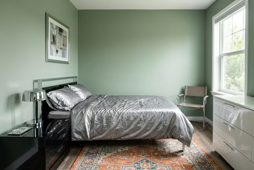
Sage works best when it is surrounded by materials that support its natural softness. When this balance is ignored, the colour can feel isolated, no matter how well it is chosen.
Highly glossy surfaces, overly synthetic fabrics, or harsh contrasts in texture can quickly disrupt the calm. Sage thrives in environments where materials feel grounded, linen, wool, timber, plaster, and matte finishes all help reinforce its quiet character.
When the material language is consistent, sage feels effortless. When it is not, the room starts to feel fragmented, even if the colour palette is technically correct.
In the end, sage green does not ask for complexity. It asks for coherence. When undertone, light, and material all move in the same direction, the room settles into something far more enduring than trend, it becomes genuinely restful.
How to Choose the Right Shade of Sage for Your Space
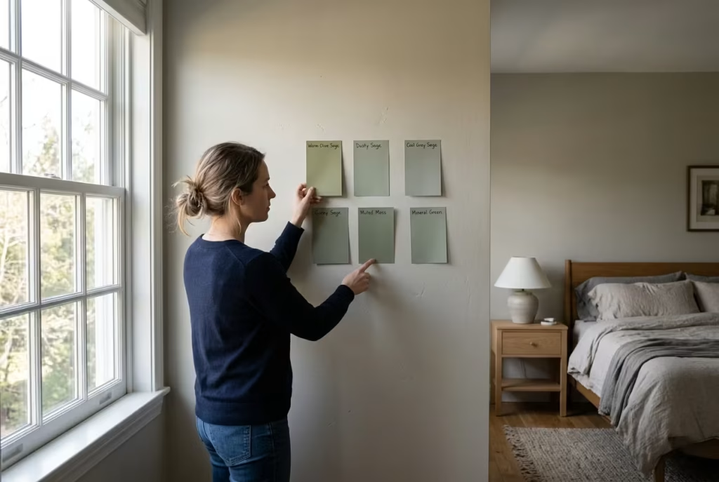
Choosing the right sage is rarely about picking a colour you simply like on a swatch. It is about reading the room properly, understanding how it behaves with light, scale, and surrounding materials. Sage is one of those tones that can shift character quite dramatically depending on context, so the decision needs to be grounded in how the space actually lives, not just how it looks on a paint card.
When it is right, it feels effortless. When it is slightly off, you will sense it every time you walk in, even if you cannot immediately explain why.
Based on Room Size
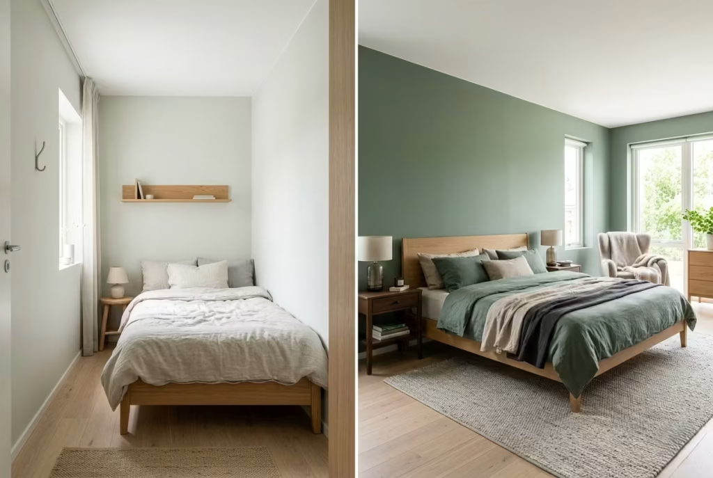
Room size quietly dictates how sage should behave. In smaller bedrooms, especially those around 8 to 12 m² (85 to 130 sq ft), lighter and more diluted sage tones tend to work best. These softer versions keep the space open, allowing walls to recede visually rather than close in. A barely-there sage or a sage with a higher proportion of grey or white prevents the room from feeling visually heavy.
In contrast, larger bedrooms can carry deeper, more saturated sage tones without losing their sense of airiness. In spaces above 15 m² (160 sq ft), richer sage shades can actually add structure, helping the room feel more composed rather than empty or under-furnished.
The key is proportion. In smaller rooms, sage should behave almost like a whisper. In larger rooms, it can afford to speak a little more clearly without overwhelming the space.
Based on Natural Light Direction
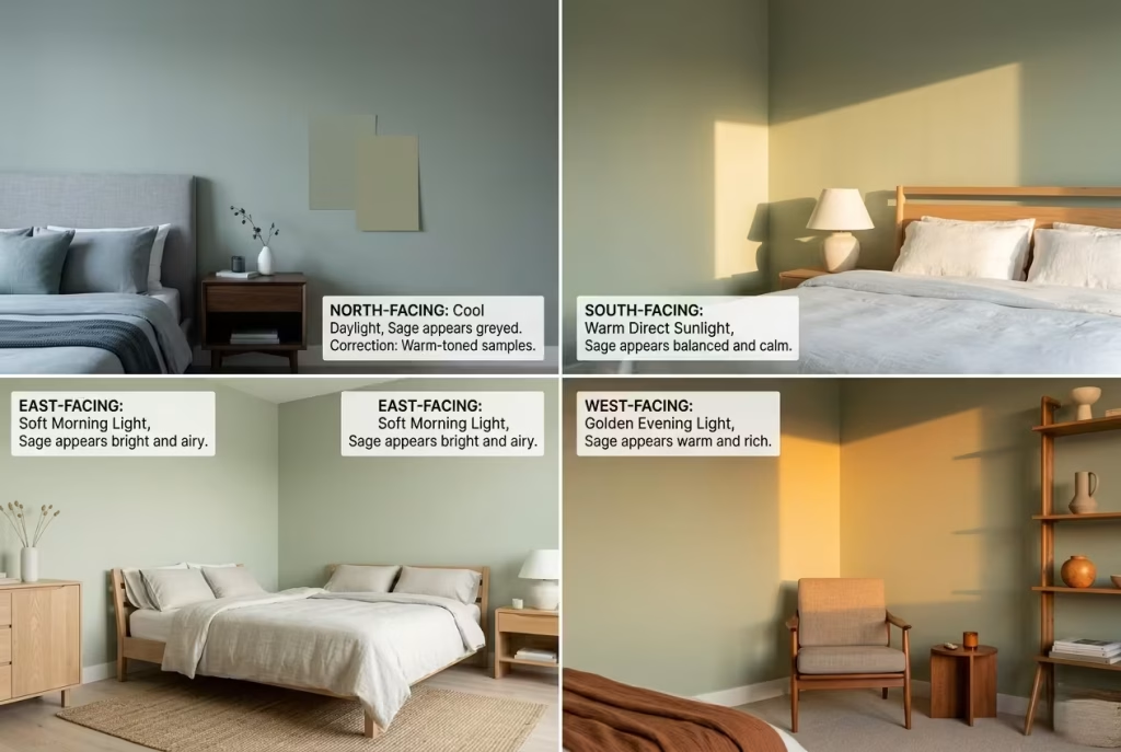
Light direction changes everything about how sage is perceived. North-facing rooms receive cooler, more indirect light, which can make sage appear slightly subdued or greyed out. In these spaces, warmer sage tones with a subtle green-yellow undertone often perform better, as they compensate for the lack of warmth in the light itself.
South-facing rooms, by contrast, receive stronger and warmer daylight throughout the day. Here, sage can afford to be cooler and more muted, as the natural light already brings enough warmth into the space. These rooms tend to be more forgiving, allowing a wider range of sage tones to work successfully.
East-facing rooms feel brighter in the morning and softer in the afternoon, which makes mid-tone sage shades particularly effective. West-facing rooms shift from cooler mornings to warm, golden evenings, so a balanced sage that does not lean too strongly in either direction tends to hold up best across the full day cycle.
Understanding this relationship with light is often what separates a good choice from a great one. Sage is not static. It responds constantly to its environment.
Based on Existing Materials
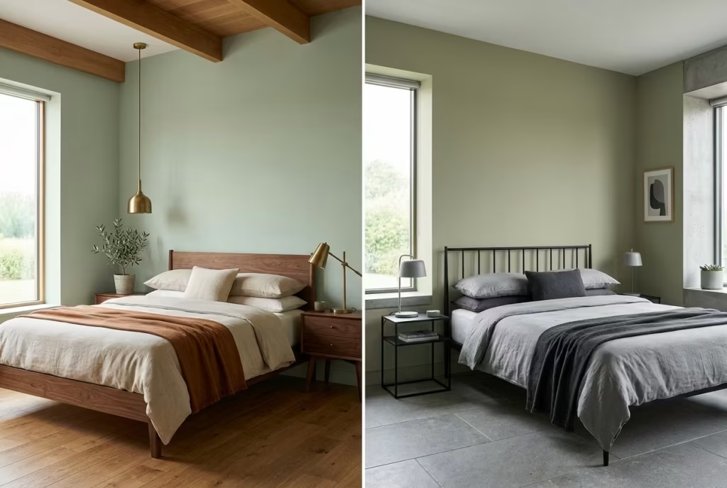
Sage does not exist in isolation. It always sits alongside other materials in the room, and those materials will influence how it reads more than most people expect.
If your space already contains warm materials such as oak, walnut, brass, or natural linen, sage will naturally soften and blend into that warmth. In these cases, slightly cooler or more neutral sage tones can help maintain balance, preventing the room from becoming overly warm or heavy.
In rooms with cooler materials such as grey stone, black metal, or polished concrete, sage needs a touch more warmth in its undertone to prevent the palette from feeling disconnected. A sage with a hint of earthiness or beige undertone will sit more comfortably in this kind of environment.
Even flooring plays a significant role. Light timber flooring tends to pair well with almost all sage variations, while darker floors often require lighter sage tones to maintain visual balance.
When materials and colour are in conversation rather than competition, the room begins to feel cohesive without effort. That is where sage performs at its best, not as a feature, but as the quiet thread that ties everything together.
Materials That Elevate Sage Green Bedrooms
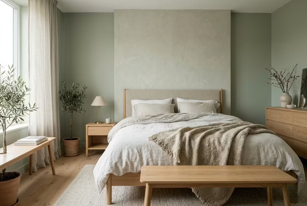
Sage green has a rare kind of flexibility, but it only really sings when the surrounding materials are chosen with a bit of discipline. The colour itself is quiet, so the materials have to do some of the heavy lifting in the background. They need to add depth, warmth, and tactility without disturbing the calm. When that balance is right, the room feels layered in a way that is hard to fake. It stops being a colour scheme and starts becoming an atmosphere.
Limewash vs Matte Paint
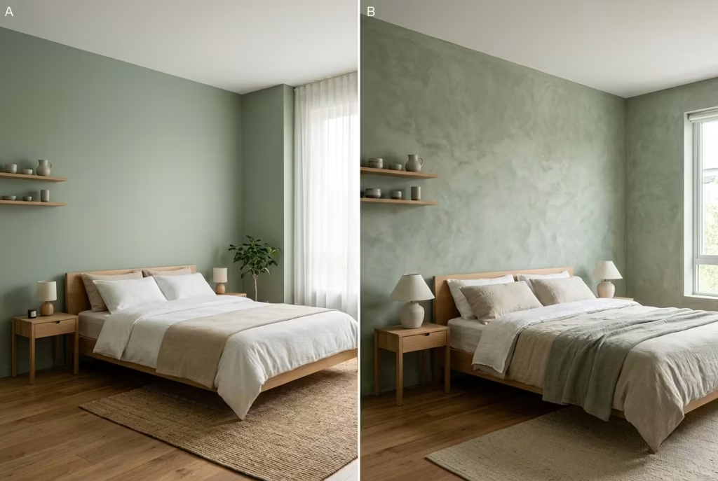
Limewash and matte paint may look similar at first glance, but they behave very differently once they are on the wall. Matte paint gives sage a clean, even presence. It is reliable, understated, and works especially well when you want the colour to feel controlled and contemporary. It is a solid choice in bedrooms where the architecture already has enough character, or where the rest of the room is deliberately restrained.
Limewash, by contrast, brings movement. It creates those subtle shifts in tone that make a sage wall feel alive rather than static. In daylight, the surface can look softly clouded, almost like the colour is breathing in and out with the room. That quality is especially valuable in bedrooms that need more depth or warmth, because limewash never sits flat for long. It catches light in fragments, which gives the room a quieter sense of richness.
If I am working on a bedroom that already feels clean and balanced, matte paint usually does the job beautifully. But if the room risks feeling a little one-note, limewash often saves the day. It adds character without shouting about it, which is exactly what sage tends to need.
Linen vs Cotton
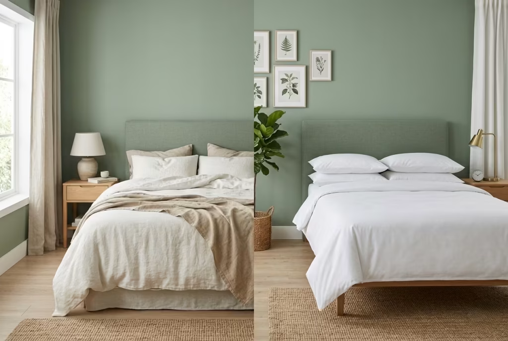
Linen and cotton both work well in sage bedrooms, but they create very different moods. Linen has a relaxed, slightly rumpled quality that pairs naturally with sage’s softness. It feels breathable, tactile, and unforced. In a bedroom, that matters. Linen has a way of making a space feel lived in, not staged. Even when it is carefully chosen, it never seems to be trying too hard. That easygoing quality sits beautifully beside sage, especially in summer bedrooms or rooms where you want a calmer, more natural feel.
Cotton is crisper. It offers more polish, more structure, and often a more tailored finish. In bedrooms where you want the sage palette to feel fresh and clean rather than loose and textural, cotton can be the better choice. Percale, for instance, brings a coolness that works well in warmer climates, while brushed cotton adds a touch more softness without losing clarity.
The choice often comes down to how you want the room to behave. Linen gives you softness with a bit of visual texture. Cotton gives you precision with a lighter hand. In my experience, the most successful sage bedrooms often mix the two carefully, using cotton where a cleaner line is needed and linen where the room needs to breathe a little more.
Oak vs Walnut Pairing
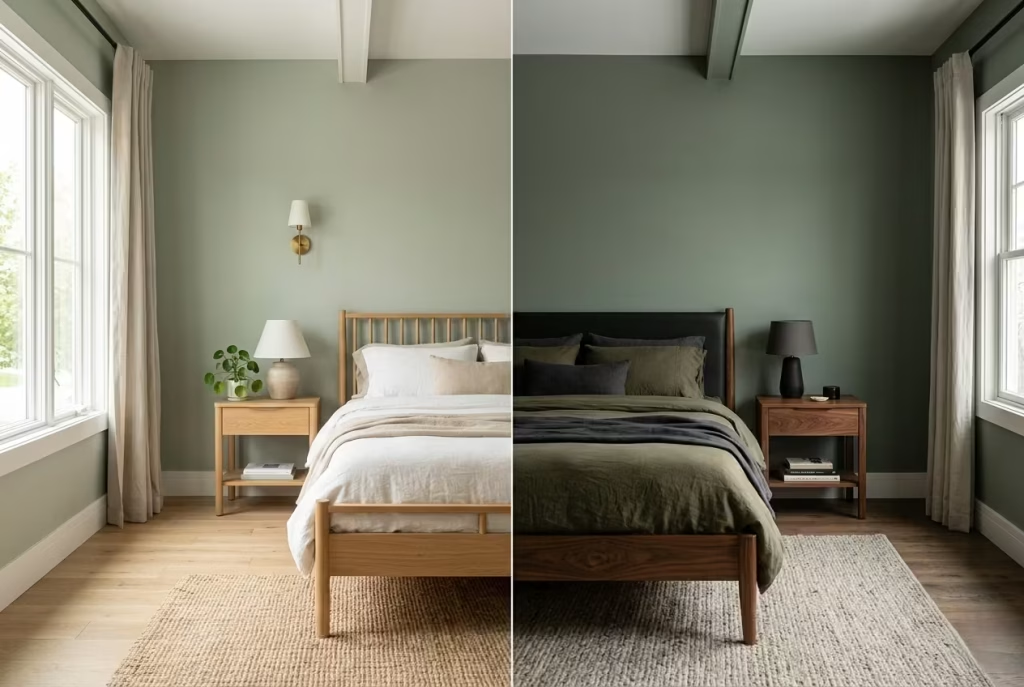
Oak and walnut both work with sage, but they bring very different temperatures to the room. Oak has a lighter, more open quality. It keeps the palette airy and grounded, which makes it especially effective in smaller bedrooms or spaces that already receive strong natural light. Light oak sits naturally beside sage because it does not compete with it. It supports the colour with a kind of quiet confidence, allowing the room to feel fresh without drifting into something too pale.
Walnut is richer, deeper, and more grounded. It introduces contrast in a far more pronounced way. Used well, walnut can give a sage bedroom a sense of depth and maturity that feels especially refined. It works beautifully when you want the space to feel a little more enveloping, perhaps in a larger room or one where the architecture needs a stronger visual anchor.
That said, walnut needs careful handling. If the room is already dark or the sage shade leans too cool, the combination can tip toward heaviness. Oak is the safer route when you want softness and lightness. Walnut is the stronger hand when the room needs more weight and substance. Both have their place, but they solve different problems.
Metals That Work and Those That Don’t
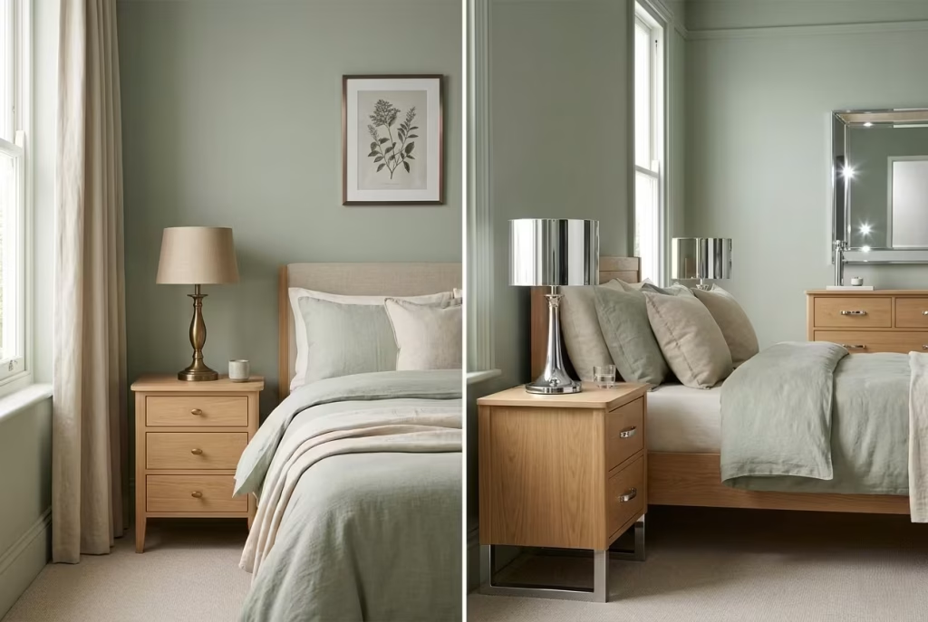
Metal finishes can quietly make or break a sage bedroom. The best ones are the ones that support the softness of the colour rather than pulling the room into a harsher register. Aged brass is one of the strongest choices because it adds warmth without sparkle. It feels settled, almost timeworn, which sits beautifully beside sage. Brushed bronze and soft blackened metal can also work well, especially when the room needs a little definition.
What tends to work less well are highly polished or overly cool metals. Chrome, for example, often feels too sharp next to sage. It can introduce a brightness that cuts across the calm rather than reinforcing it. Polished nickel can be difficult too, unless the rest of the room is very carefully balanced. In many cases, it adds a level of shine that feels slightly out of step with sage’s quieter nature.
The best metal finishes in sage bedrooms are usually the ones that look touched by time rather than freshly minted. They do not need to stand out from across the room. They just need to hold their own in the mix. A bedside lamp base, a handle, a picture frame, or a small table leg detail can be enough to lift the room if the finish is right. Used sparingly, metals become punctuation. Used badly, they become noise.
When sage is paired with the right materials, the result is much more than a colour scheme. It becomes a room with texture, temperature, and rhythm. That is what makes it feel calm in a way that lasts.
Real-Life Reflection: When Sage Green Actually Works Best
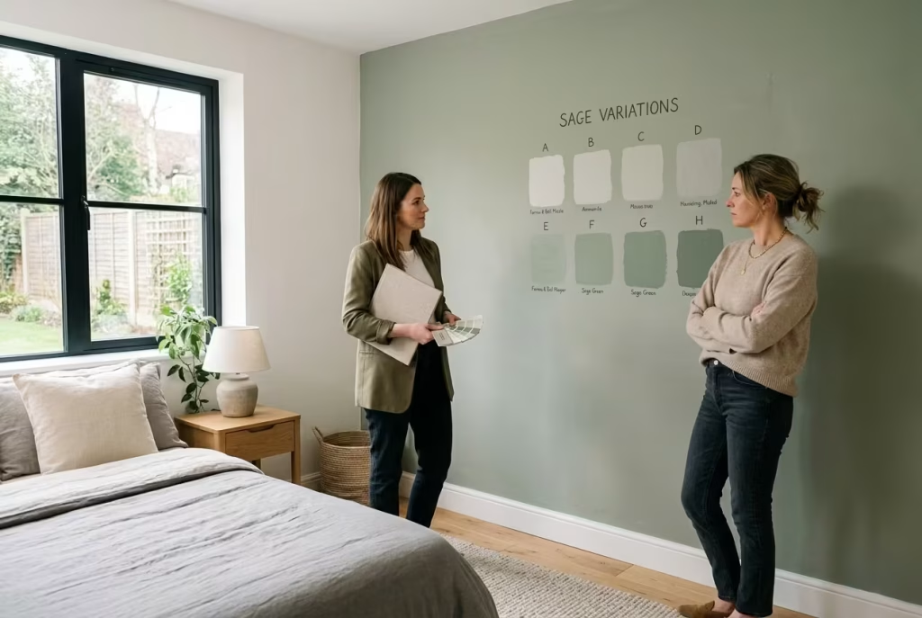
There is a point in almost every sage green project where hesitation shows up. It is rarely about dislike. More often, it is uncertainty. Clients see the sample on a wall or a fabric swatch in isolation and quietly wonder if it is too muted, too grey, or perhaps not “finished” enough. I have seen this reaction enough times to know it is part of the process rather than a red flag.
Sage is not a colour that performs instantly. It does not win people over in the first five minutes. It needs context, light, and time to settle into its environment.
Personal Project Insight
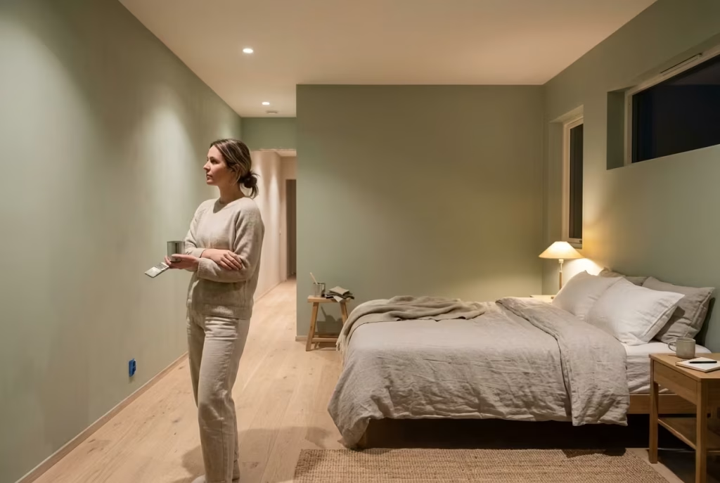
One of the most memorable bedrooms I worked on involved a fairly simple brief: calm, natural, not too cold, not too styled. The client initially leaned towards a safe off-white, worried that sage might feel too green once it was on all four walls. We tested it anyway, but very lightly, almost as a compromise.
At first, even I could sense the hesitation. Under artificial light, the colour felt restrained, almost shy. Nothing about it demanded attention, which made it easy to second-guess. But I have learned over time that sage often behaves like a slow burner. It does not reveal its strength immediately.
We completed the room with very minimal intervention, soft linen bedding, light oak flooring, warm 2700K lighting, and very little contrast. No dramatic styling moments, no visual distractions. Just restraint, everywhere.
Why Some Clients Hesitate at First
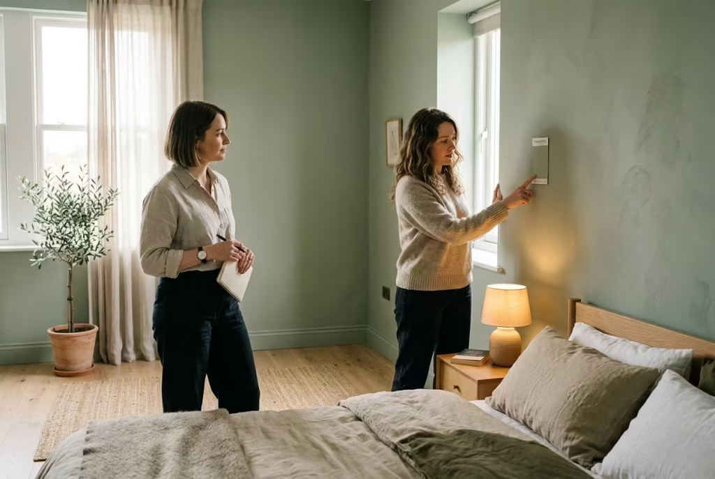
The hesitation usually comes from expectation. People are used to seeing colour that announces itself quickly, whether through bold contrast or obvious warmth. Sage does neither. It sits in a quieter register, closer to nature than to decoration.
In the first few days, it can feel almost unfinished, particularly in rooms that are used to stark whites or cooler greys. It takes time for the eye to adjust. Once it does, the same colour that felt uncertain begins to feel incredibly steady.
I often explain it like this to clients: sage does not change the room immediately, it changes how you experience the room over time. That distinction is subtle, but it matters.
How the Colour Settles Over Time
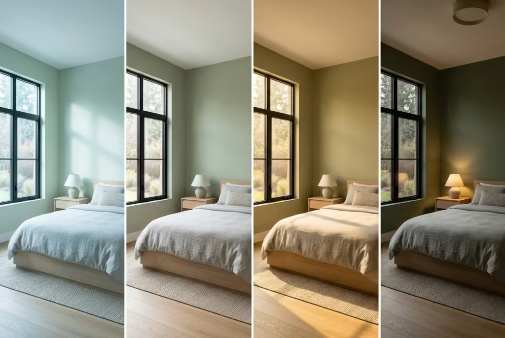
After a few weeks, something interesting happens. The same bedroom that once felt slightly cautious begins to feel intentional. The sage stops reading as “a colour choice” and starts behaving like part of the architecture.
Natural light plays a big role in this shift. In the morning, the walls feel fresher and lighter. By late afternoon, they soften. In the evening, under warm lighting, they take on a grounded, almost cocoon-like quality. The room starts to feel less like a designed space and more like a lived environment that simply makes sense.
This is when sage really earns its place. It is not about transformation in the dramatic sense. It is about quiet consistency.
The Lived-In Effect After Months or Years
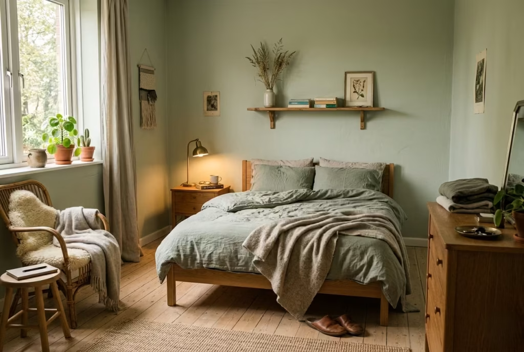
What I find most rewarding is returning to a sage green project months later. The colour tends to age gracefully, not in a deteriorating sense, but in how it integrates with the life of the space. Furniture shifts slightly, textiles soften, natural materials develop patina, and the sage backdrop absorbs all of it without losing its calm.
It becomes less about perfection and more about continuity. The room does not feel staged anymore. It feels established.
In one project I revisited after nearly a year, the client mentioned something simple but telling. They said they no longer noticed the colour at all, but they noticed how good the room felt every time they walked in. That is usually the quiet sign that sage has done its job properly.
It does not dominate the space. It holds it together. And over time, that kind of stability becomes the real luxury.
Conclusion: A Colour That Doesn’t Demand Attention, It Earns It
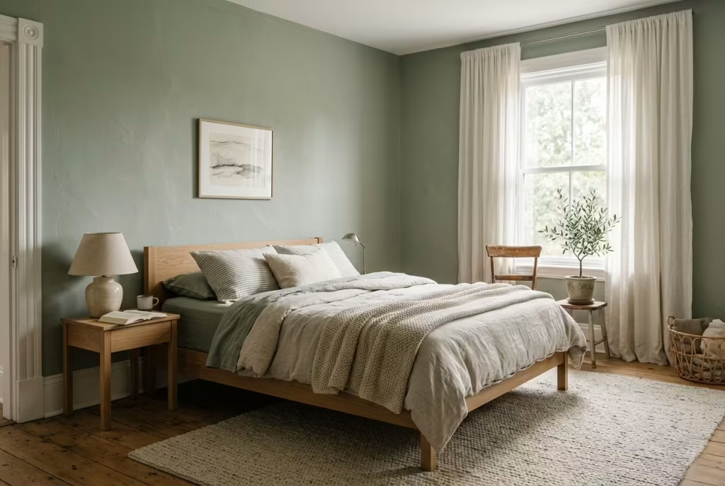
Sage green sits in a very particular place within interior design. It is not trying to impress on arrival, and it does not rely on contrast or drama to hold a room together. Instead, it works quietly in the background, shaping atmosphere through consistency rather than spectacle. That is exactly why it endures.
Across bedrooms of different sizes, lighting conditions, and material palettes, one pattern repeats itself. Sage rarely feels complete on day one. It needs time to settle, to sit alongside light, texture, and lived-in objects before it reveals its full character. And when it does, it rarely feels like a “choice” anymore. It feels like the room simply found its natural state.
The most successful sage interiors I have worked on share a common thread. They are not overloaded with ideas. They are not chasing attention. They rely on restraint, layered materials, and a careful reading of tone rather than trend. Over time, those rooms stop being visually analysed and start being experienced. That shift is where the real value lies.
In many ways, sage green rewards patience. It does not offer instant impact, but it gives something far more lasting in return. A sense of ease that holds steady through changing light, shifting seasons, and everyday life. And in the long run, that is what makes it quietly unforgettable.
Frequently Asked Questions: Achieving Soft & Serene Sage Green Bedrooms
What makes sage green such a popular choice for bedrooms?
Sage green works because it sits in a rare middle ground. It carries just enough colour to feel intentional, yet remains soft enough to behave like a neutral. In bedrooms, this balance is crucial. It does not overstimulate the eye, and it naturally softens under both daylight and warm evening lighting. The result is a space that feels calm without becoming visually dull.
Does sage green work in small bedrooms?
Yes, and in many cases it works better than stronger neutrals. In smaller rooms around 8 to 12 m² (85 to 130 sq ft), lighter sage tones help reduce visual compression by softening wall boundaries. The key is to avoid overly saturated or dark sage shades, which can make compact rooms feel heavier than they are. A diluted, almost misted sage tends to perform best in tighter layouts.
What lighting works best with sage green bedrooms?
Warm lighting around 2700K is generally the most flattering. It preserves the softness of sage and prevents it from shifting too grey or too cold. Layered lighting also matters more than most people expect. A mix of ceiling wash, bedside lamps, and low accent lighting helps maintain depth and avoids flattening the colour.
What colours pair best with sage green?
Sage works best with warm, grounded neutrals. Off-whites, stone greys, soft taupes, and natural wood tones all support it without overpowering it. Materials like oak, linen, and aged brass tend to enhance its calm character. Cooler tones like stark white or blue-heavy grey can sometimes interrupt its softness.
Can sage green feel too cold or too dull?
It can, but usually only when the undertone or lighting is wrong. If sage leans too grey and is paired with cool lighting, it may feel flat. Similarly, if it is overused without enough variation in texture or tone, the room can lose depth. The solution is usually balance, introducing warmth through materials, lighting, or slightly richer supporting tones.
Should all walls be painted sage green?
Not necessarily. Full sage walls work beautifully in some bedrooms, especially when the goal is a cocoon-like atmosphere. However, in many spaces, sage is more effective when used selectively, such as on an accent wall, combined with neutral ceilings, or balanced with softer off-whites. It depends on room size, light, and how immersive you want the effect to feel.
What finishes work best with sage green?
Matte and mineral finishes tend to work best because they keep the colour soft and reduce glare. Limewash can add depth and subtle movement, especially in rooms that need more texture. Glossy finishes are generally less suitable, as they can make sage feel sharper and less natural.
How do you keep a sage green bedroom from feeling flat?
The key is layering. Mixing subtle tonal variations of sage, introducing natural materials like linen and wood, and balancing light and shadow all help prevent flatness. Even small adjustments in texture or tone can make a significant difference in how dynamic the room feels.
Is sage green still a timeless choice or just a trend?
Sage green has moved beyond trend status because it behaves more like a neutral than a statement colour. Its connection to natural tones gives it long-term staying power. When applied with restraint and proper balance, it tends to age well rather than date quickly, especially in bedrooms designed for calm and longevity.