25 Stylish Modern Small House Exterior Ideas You’ll Love
Small homes are often spoken about as though they come with built-in limits, as if modest square footage automatically means modest ambition. I have never found that to be true. In practice, smaller homes tend to sharpen the design brief. They strip away the luxury of excess and ask for a more disciplined eye, which is precisely where good architecture and considered exterior design begin to earn their keep. When space is tight, every decision matters a little more, and the result can feel far more resolved than a larger home that has been allowed to drift.
That is why constraints should not be treated as a drawback. They can be the very thing that gives a façade its clarity. A smaller house benefits from proportion, restraint, and light in a way that larger buildings sometimes do not. The balance of solids and openings becomes critical. So does the weight of each material, the rhythm of the elevations, and the way the structure meets the ground. A home of reduced scale has no room for decorative noise. It needs composure, not clutter.
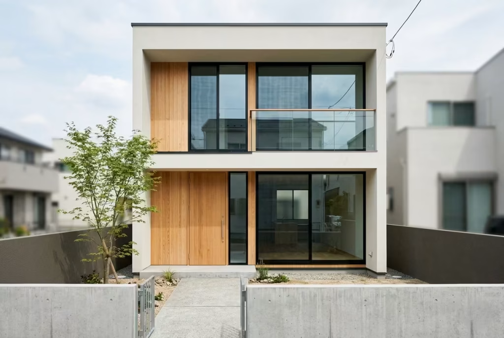
I have often found that smaller façades demand sharper decisions. There is nowhere to hide poor proportions or unnecessary detail. Every line, every junction carries weight. That is exactly what makes them so rewarding to design. When the composition is right, even the simplest exterior can feel quietly exceptional, with a kind of confidence that does not need to announce itself.
Understanding Scale Before Style
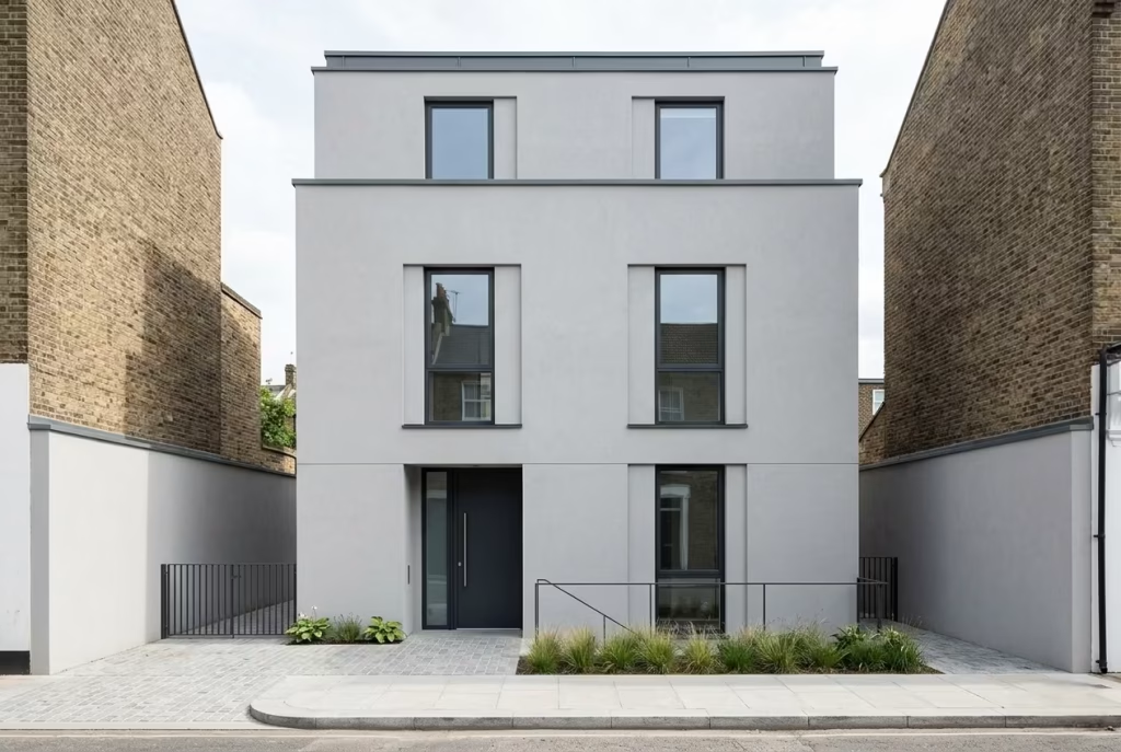
Before style enters the conversation, scale quietly sets the rules. It is the underlying framework that determines whether a small house feels composed or compromised, intentional or slightly unresolved. In larger homes, scale issues can sometimes blur into the background. In smaller homes, they stand front and centre, impossible to ignore, shaping how the entire exterior is read from the street.
What I have learned, working across compact plots and tight urban frontages, is that scale is not just about size. It is about relationship. The relationship between height and width, between openings and solid wall, between materials and the way they occupy visual space. When those relationships are misjudged, even the most expensive finishes struggle to hold the composition together. When they are right, even the simplest façade can feel quietly assured.
Why Small Exteriors Often Fall Short
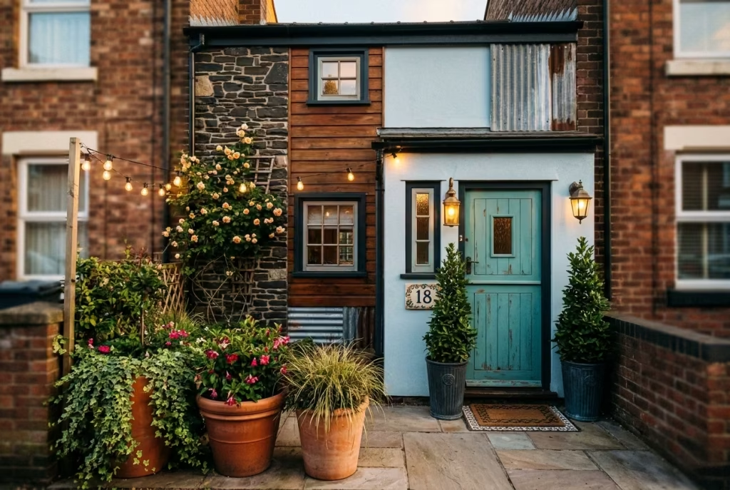
There is a familiar pattern I see time and again. Homeowners approach a small exterior with big ideas, often borrowing elements from larger homes without recalibrating them. On paper, it feels ambitious. In reality, it can feel like trying to fit a grand gesture into a space that cannot quite carry it.
One of the most common missteps is overcomplication. Too many materials, too many lines, too many ideas competing for attention. Instead of creating interest, it fragments the façade. The eye does not know where to land, and the house ends up feeling smaller than it actually is. It is a bit like overfurnishing a compact room. The more you add, the tighter it feels.
Then there is the issue of proportion, which is often where things quietly unravel. Windows that are too small or awkwardly placed can make a façade feel pinched. Doors that feel underscaled relative to the elevation can unintentionally diminish the entrance. I have worked on a project where the original façade had multiple small windows scattered across a 6 m (20 ft) frontage. Once we replaced them with fewer, larger openings aligned with the internal layout, the entire house seemed to breathe again. Nothing about the footprint changed, yet the perception shifted completely.
Material misuse is another subtle but powerful factor. Heavier materials, when used excessively on a small elevation, can visually weigh the building down. Dark stone cladding, for instance, may look striking in isolation, but across a narrow frontage it can feel dense, almost compressed. On the flip side, overly light or reflective finishes, when not balanced, can make a façade feel flat and lacking depth. It is a delicate balance, and one that requires a measured hand rather than a heavy one.
The Discipline of Restraint
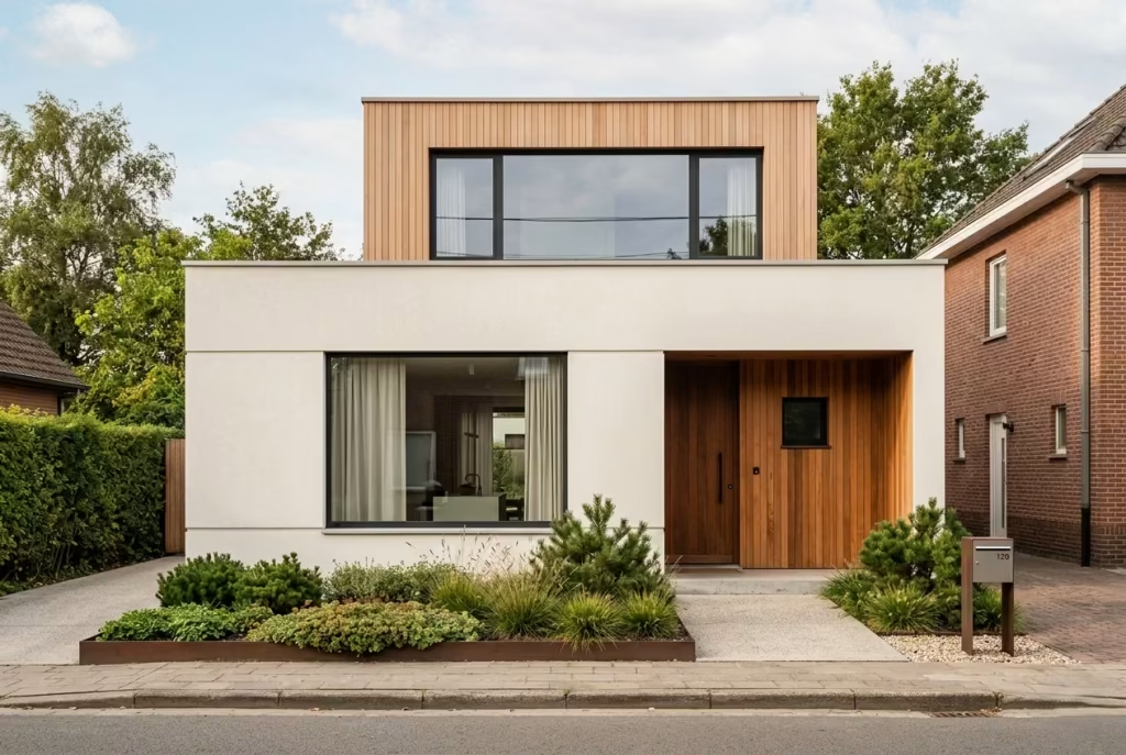
If there is one principle that consistently improves small house exteriors, it is restraint. Not as a limitation, but as a form of precision. Knowing what to leave out becomes just as important as knowing what to include.
In smaller façades, a reduced material palette almost always performs better. Two, at most three materials, used with clarity and purpose, tend to create a more cohesive result. I often advise clients to think of materials not as decoration, but as structure. Each one should have a role, whether it is grounding the base, framing an opening, or adding warmth to an otherwise minimal composition.
The same applies to architectural lines. Clean, deliberate geometry tends to age better and read more confidently. Horizontal lines can stretch a compact frontage, giving it a sense of width. Vertical elements, used sparingly, can introduce height and rhythm. It is not about following rules for the sake of it, but about understanding how the eye interprets form. Once you see it, you cannot unsee it.
Light as a Design Tool, Not an Afterthought
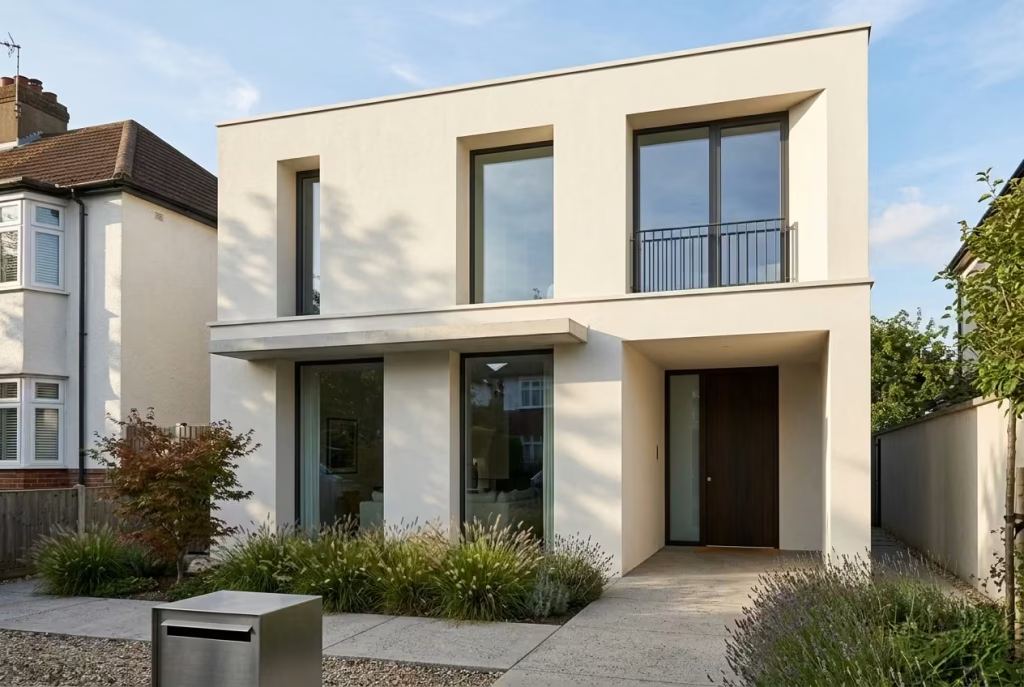
Light is often discussed in relation to interiors, but on a small exterior, it becomes equally critical. It shapes how the façade is perceived throughout the day, creating shadow lines, revealing textures, and adding depth where physical space is limited.
Deep-set windows, for example, even by 150–300 mm (6–12 inches), can introduce a subtle shadow that gives the wall thickness and presence. Similarly, modest overhangs or recessed entries can create moments of contrast, breaking up flat surfaces without adding visual clutter. I have used this approach on narrow plots where adding more materials would have felt excessive. Instead, we let light do the heavy lifting, carving out depth in a way that felt natural rather than forced.
Artificial lighting, when integrated thoughtfully, can extend this effect into the evening. A well-placed wall washer or a concealed strip along a façade line can highlight textures and reinforce the architectural intent. Done poorly, it becomes glare. Done well, it quietly elevates the entire composition.
Reading the Façade as a Whole
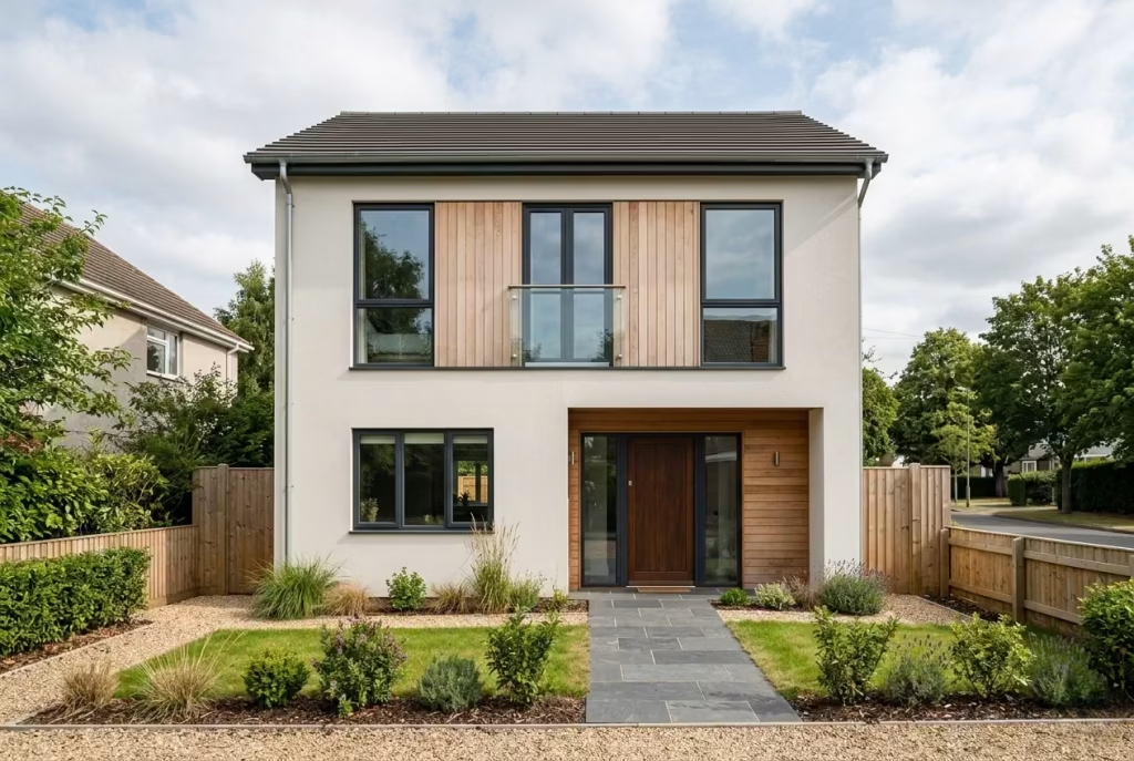
Perhaps the most important shift is learning to read the exterior as a single composition rather than a collection of parts. It is easy to focus on individual elements, the door, the windows, the cladding, but what matters is how they come together.
I often step back, quite literally, during a project and view the house from a distance. That broader perspective reveals whether the proportions hold, whether the materials sit comfortably together, whether the façade feels balanced or slightly off-kilter. It is in that moment, away from the details, that the success of the design becomes clear.
Small homes do not need to try harder. They need to think sharper. When scale is understood and respected, style follows naturally, almost effortlessly, settling into place rather than being forced. And that is when a compact house begins to carry itself with a kind of quiet confidence, the kind that does not shout for attention but holds it all the same.
25 Stylish Modern Small House Exterior Ideas
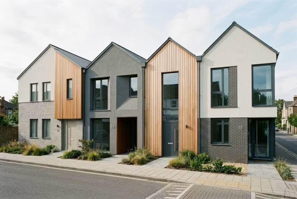
When you start to explore exterior ideas for a small house, it quickly becomes clear that success is less about chasing standout features and more about making a series of well-judged decisions that quietly reinforce one another. In compact homes, design works best when it feels edited rather than assembled, where each move earns its place.
What follows is not a checklist to copy, but a collection of approaches I have seen hold their ground in real projects, each one shaped by proportion, material discipline, and the kind of lived-in practicality that stands the test of time.
Flat Roof Minimalism with Strong Horizontal Lines
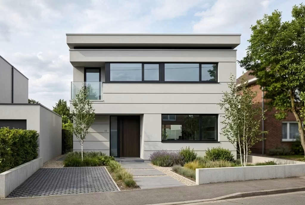
Flat roof minimalism has a way of cutting through the noise, especially on smaller plots where too many ideas can quickly muddy the waters. When the façade width sits within that 5 to 8 metre range (roughly 16 to 26 feet), leaning into strong horizontal lines can subtly stretch the house outward, giving it a calmer, more grounded presence. It is a quiet trick, but one that earns its keep. The eye reads those continuous lines as length, not limitation, which is exactly what a compact frontage needs.
What makes this approach work is not just the flat roof itself, but how the edges are handled. A well-defined parapet, crisp and deliberate, acts almost like a frame holding the composition together. I often refine this edge to a minimal thickness, keeping it visually light so it does not sit heavy on the structure. On one project with a 6 metre (20 foot) frontage, we introduced a continuous shadow gap just beneath the parapet line. It was a small move, barely noticeable at first glance, but it added a layer of depth that stopped the façade from feeling flat or one-dimensional. That is often how good design works, not with grand gestures, but with details that reveal themselves slowly.
Material choice plays a supporting role here, and it needs to be handled with a steady hand. Smooth render, large-format panels, or even finely jointed brickwork can reinforce those horizontal lines when aligned correctly. The mistake I see far too often is introducing too many breaks, joints, or contrasting materials, which interrupts the flow and weakens the whole idea. In a small house, once the rhythm is broken, it is difficult to recover. Better to keep it tight, almost disciplined, letting the geometry do the talking.
There is also a practical side that cannot be brushed aside. Flat roofs, for all their visual clarity, demand proper drainage strategy. Falls need to be carefully calculated, outlets positioned intelligently, and waterproofing detailed without compromise. It is one of those areas where cutting corners will come back to haunt you, usually at the worst possible time. I always tell clients that the simplicity you see on the outside is only possible because the technical side has been resolved properly behind the scenes.
Pros
- Clean, contemporary aesthetic that does not date easily
- Cost-efficient in structural terms compared to more complex roof forms
- Enhances perceived width, making compact homes feel more expansive
Cons
- Requires precise drainage detailing and ongoing maintenance awareness
- Poor execution can lead to water pooling or long-term durability issues
Handled well, this approach feels effortless, almost inevitable, as if the house could not have been designed any other way. And that, in my experience, is usually the sign that you are on the right track.
Vertical Cladding to Add Height Illusion
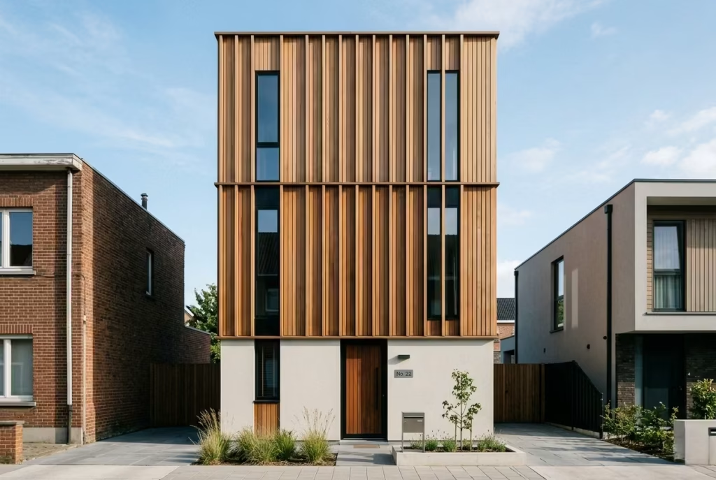
When a house feels a little pressed down, almost as if it is sitting too heavily on its plot, vertical cladding can quietly tip the balance. It draws the eye upward, stretching the façade in a way that feels natural rather than forced. On narrower frontages, particularly anything around 4 to 5 metres (13 to 16 feet), this approach can be the difference between a house that feels constrained and one that stands with a bit more poise.
The principle is straightforward, but the execution is where it either sings or falls flat. Running timber or fibre cement boards continuously from base to roofline creates a visual rhythm that the eye instinctively follows. Break that rhythm with awkward joints, misaligned trims, or inconsistent spacing, and the illusion starts to unravel. It is a bit like a well-tailored suit. When the lines are sharp, everything looks elevated. When they are off, even slightly, the flaws become hard to ignore.
I remember working on a narrow 4.5 metre (15 foot) frontage where the original façade felt squat and slightly lifeless. The proportions were not technically wrong, but they lacked presence. We introduced vertical fibre cement boards, evenly spaced, running uninterrupted across the upper elevation. Nothing else changed dramatically, yet the perceived height increased almost immediately. The house began to feel lighter on its feet, as though it had gained an extra storey without actually doing so.
Material choice matters here, not just aesthetically but practically. Timber brings warmth and texture, softening the rigidity of modern forms, but it does ask for maintenance over time. Fibre cement, on the other hand, offers durability and consistency, holding its finish with far less intervention. In climates where heat and moisture fluctuate, I tend to lean toward fibre cement for its stability, though well-treated timber can age beautifully if cared for properly.
Spacing is another detail that often gets overlooked. Boards that are too wide can feel heavy, almost clumsy, while overly narrow boards can look busy and fussy. I usually find that widths between 150–250 mm (6–10 inches) strike a comfortable balance, giving enough presence without overwhelming the façade. The gaps between boards, subtle as they may seem, also play a role in creating shadow lines that add depth throughout the day.
That said, this approach does not forgive poor workmanship. Vertical lines have a way of amplifying imperfections. A slight misalignment, a wavering edge, or inconsistent fixing can stand out like a sore thumb, especially once light hits the surface at an angle. It is one of those details where precision is not a luxury, it is a requirement.
Pros
- Visually elongates the façade, making small homes feel taller and more proportionate
- Introduces rhythm and texture without relying on multiple materials
- Works well with both modern and transitional styles
Cons
- Installation must be precise, as imperfections become highly visible
- Timber options require ongoing maintenance to retain their appearance
When handled with care, vertical cladding does more than just adjust proportions. It gives the house a certain upright confidence, a sense that it knows exactly what it is doing, even within a limited footprint.
Monochrome Exterior with Texture Contrast
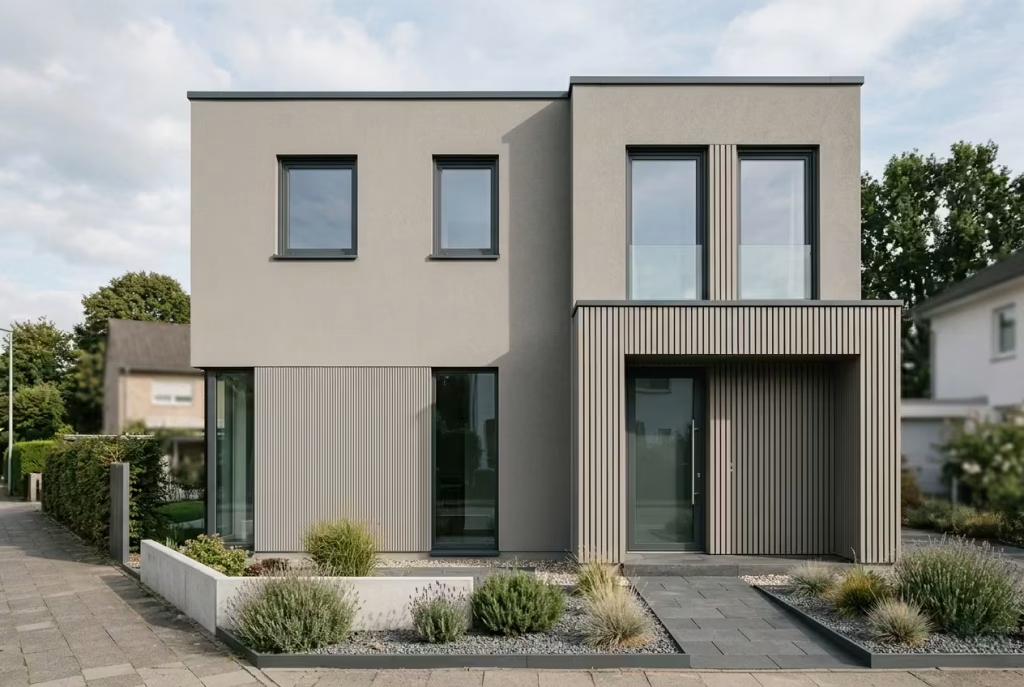
A monochrome exterior, when handled with intent rather than habit, can feel quietly powerful. It does not rely on colour to carry the design. Instead, it leans on depth, light, and material expression to do the heavy lifting. In smaller homes, where too many colours can quickly turn into visual clutter, a restrained palette of black, off-white, or warm grey often brings a sense of order, almost like clearing the table before setting it properly.
What gives this approach its edge is texture. When colour steps back, texture steps forward. Smooth render paired with ribbed panels, slatted timber, or even subtly profiled cladding introduces variation without breaking the visual calm. It is a measured contrast, not loud, not showy, but enough to keep the façade from feeling flat. I often think of it as layering without noise, where each surface plays its part without trying to steal the scene.
On a recent project, we worked with a warm grey palette across a compact 5.5 metre (18 foot) frontage. At first glance, it could have felt too uniform, almost one-note. To offset that, we introduced vertical slatted panels around the entrance zone, set slightly proud by about 40 mm (1.5 inches). That small shift created shadow lines that changed throughout the day, adding depth that no additional colour could have achieved. It is often these quiet moves, sitting just beneath the surface, that give a façade its staying power.
Material transitions need to be handled with care. In a monochrome scheme, junctions become more visible because there is no colour shift to disguise them. Clean detailing, precise alignment, and consistent finishes are essential. A poorly resolved joint in a multi-colour façade might slip under the radar. In a monochrome one, it tends to stand out, front and centre.
Lighting also plays a more active role here. As daylight moves across textured surfaces, it reveals subtle variations, almost like the façade is shifting in tone without actually changing colour. In the evening, carefully placed lighting can amplify this effect, grazing across ribbed or slatted elements to bring out their depth. Done well, it feels understated yet considered, never overworked.
There is also a practical benefit to keeping the palette tight. Maintenance becomes simpler, and future updates are easier to manage. However, darker tones, particularly blacks and deep greys, can show dust, water marks, and sun fading more readily, especially in exposed conditions. Lighter monochromes are more forgiving but can risk feeling too plain if texture is not doing enough of the work.
Pros
- Creates a cohesive, timeless look that avoids visual clutter
- Allows texture and light to define the character of the façade
- Easier to maintain a consistent design language across the exterior
Cons
- Requires high-quality finishes and precise detailing, as flaws are more visible
- Darker palettes may demand more maintenance to keep their appearance sharp
At its best, a monochrome exterior does not shout for attention. It holds it, slowly and steadily, revealing its depth over time. When texture is used with intention, it becomes the ornament, proving that restraint, when done well, is anything but boring.
You May also Like: 25 outdoor entryways to transform your outdoor arrival into a composed, lasting first impression
Large Glazing Panels with Slim Frames
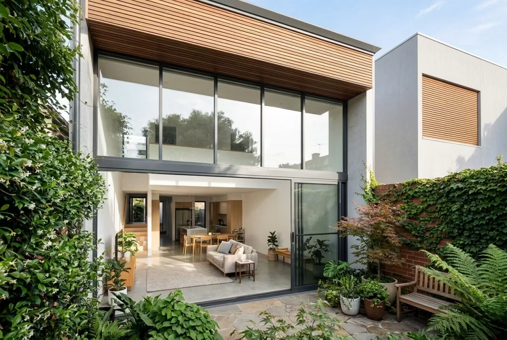
Few interventions transform a small house as immediately as well-proportioned glazing. Large panels, particularly those between 2.1 and 2.4 metres (7–8 feet) in height, can dissolve the barrier between inside and out, making even the most modest footprint feel surprisingly generous. In compact homes, where every metre counts, the illusion of space can be as powerful as actual square footage. The eye reads transparency as extension, allowing rooms to breathe and light to move freely, turning tight corners into welcoming areas.
Slim frames are essential in this approach. Bulky mullions or thick profiles fight against the openness, chopping up views and defeating the very purpose of generous glazing. I have used aluminium frames as narrow as 50–60 mm (2–2.5 inches) on urban infill projects, and the effect is transformative. Even in a 5-metre (16-foot) wide frontage, the home felt lifted, airy, and far less constrained. It is a bit like replacing heavy curtains with sheer fabrics; suddenly, the space stretches without physically altering it.
Placement is just as important as size. In one project, floor-to-ceiling glazing faced a small courtyard, while the street façade remained restrained and private. The result was a façade that read calm from the outside but opened dramatically inside, connecting living spaces with light and landscape. The key is balance: too much glazing without careful orientation can lead to glare, overheating, or unwanted exposure. That is why I always integrate shading devices timber slats, recessed overhangs, or low-maintenance external screens to manage both light and privacy.
Materials also play a role in comfort and longevity. High-performance double or triple-glazed units with low-emissivity coatings are non-negotiable in modern builds, especially on compact homes where a single window can dominate a wall. Thermally broken frames help prevent heat loss in winter and limit solar gain in summer, protecting both comfort and energy efficiency.
Pros
- Expands perceived space, creating a light, airy interior
- Strong visual connection with outdoor spaces, enhancing the sense of openness
- Works well with modern minimalist façades, complementing restrained material palettes
Cons
- Requires careful thermal control to avoid overheating or heat loss
- Installation and specification must be precise to ensure performance and durability
When executed with care, large glazing panels are almost like a design sleight of hand. They pull the eye outward, extend interiors visually, and allow small houses to live larger than their footprint. In my experience, the right glazing doesn’t just admit light it choreographs it, turning tight spaces into environments that feel expansive, calm, and exceptionally considered.
Box Form Architecture with Cantilever Detail
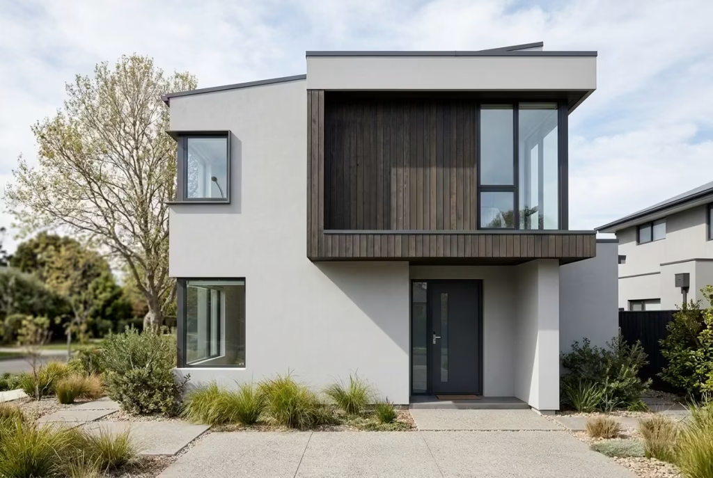
Boxy forms have an undeniable clarity, and when executed thoughtfully, they can make a small house read as deliberate and composed rather than confined. The charm of the box lies in its honesty simple geometry, clean lines, and restrained materiality which is why I often pair it with cantilevered elements to introduce subtle tension. A small overhang of around 600–900 mm (2–3 feet) can lift a façade visually, creating shadows and movement without adding structural drama or clutter. It is like a whispered accent in a conversation small but profoundly effective.
Cantilevers, when applied judiciously, transform the perception of mass. On a compact 5-metre (16-foot) frontage I recently worked on, a slightly projecting upper floor created a sense of depth while providing a modest covered entry. Nothing about the footprint changed, yet the house felt lighter on its base and more confident in its composition. The overhang not only added visual interest but also performed functionally, offering shade to windows and a small area of shelter at the entrance.
Materiality is crucial here. A cantilevered section in a contrasting cladding, such as a dark-stained timber or fibre cement panel, reinforces the sense of layering and depth. Conversely, using the same material as the main façade can unify the form, making the projection feel like a natural extension rather than a bolted-on feature. I often choose to accentuate cantilevers subtly, ensuring they are legible but not showy, which preserves the calm, restrained character of a small home.
The shadow lines created by cantilevers can be a designer’s best friend. Even a modest 600 mm (2-foot) overhang casts a shifting shadow that changes with the sun, adding life to an otherwise static façade. In small homes, such subtleties are critical; there is little room for distraction, so every line, every plane must earn its place. Poorly proportioned cantilevers, by contrast, can overwhelm the frontage, making the house feel top-heavy or awkward.
Pros
- Adds visual depth and architectural tension without complicating the overall form
- Provides functional shading and minor shelter, enhancing usability
- Works with minimal material palettes, maintaining a clean, contemporary aesthetic
Cons
- Requires careful proportioning to avoid the façade feeling top-heavy
- Structural detailing must be precise to ensure stability and durability
When done right, a small cantilever reads as elegance in restraint a confident gesture that adds intrigue without shouting. It proves that even simple box forms, when given thoughtful articulation, can feel far more substantial, refined, and considered than their size might suggest.
Mixed Material Façade with Defined Zones
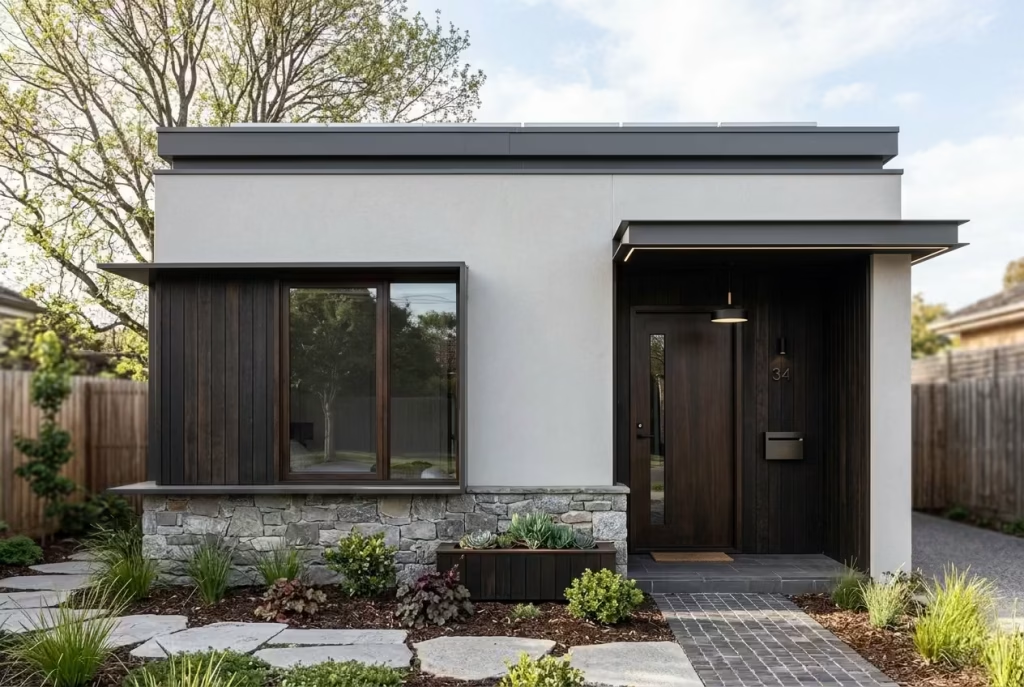
A small house can gain a surprising sense of complexity and richness without expanding its footprint, simply by layering materials with intention. Mixed material façades are not about flamboyance they are about clarity. Using render, timber, and stone together allows each part of the façade to perform a role, rather than acting as mere ornament. In my experience, when materials are used as functional markers, the house reads as thoughtful and composed, even on a modest scale.
I often approach this with zoning in mind. Render can form the neutral backdrop, smooth and unbroken, allowing timber to articulate key functional elements like window frames, entry porches, or cantilevered volumes. Stone, grounded at the base, anchors the building and gives weight where the façade might otherwise float. On a 5.5-metre (18-foot) frontage I recently completed, this strategy transformed a relatively plain exterior into a layered composition, where the materials guided the eye and hinted at internal functions without a word of explanation.
Scale and proportion remain crucial. On compact façades, material transitions cannot be frequent or arbitrary they must be deliberate, measured, and aligned with architectural lines. Too many contrasting surfaces in a tight space can fragment the reading, making the house feel cluttered rather than composed. The goal is cohesion, where the eye moves naturally across the façade, registering shifts in material as purposeful pauses rather than distractions.
Lighting interacts beautifully with this approach. Smooth render and timber absorb light differently, and stone introduces subtle shadows across the façade. Even minor overhangs or recessed joints can accentuate these differences, creating an impression of depth and dimension. The result is an exterior that evolves throughout the day, as light and shadow play across materials, giving a sense of vitality and tactility that single-material façades often lack.
Pros
- Adds visual richness and depth without enlarging the footprint
- Materials define function and hierarchy, making the façade easier to read
- Enhances perceived sophistication and craftsmanship
Cons
- Requires careful coordination and precise detailing to avoid visual clutter
- Material junctions must be meticulously resolved to prevent weathering and maintenance issues
When done with discipline, a mixed-material façade turns a small home into a study of composition and tactility. Each material contributes purposefully, creating an exterior that is more than the sum of its parts, quietly confident and endlessly engaging.
Light-Coloured Exterior to Amplify Space
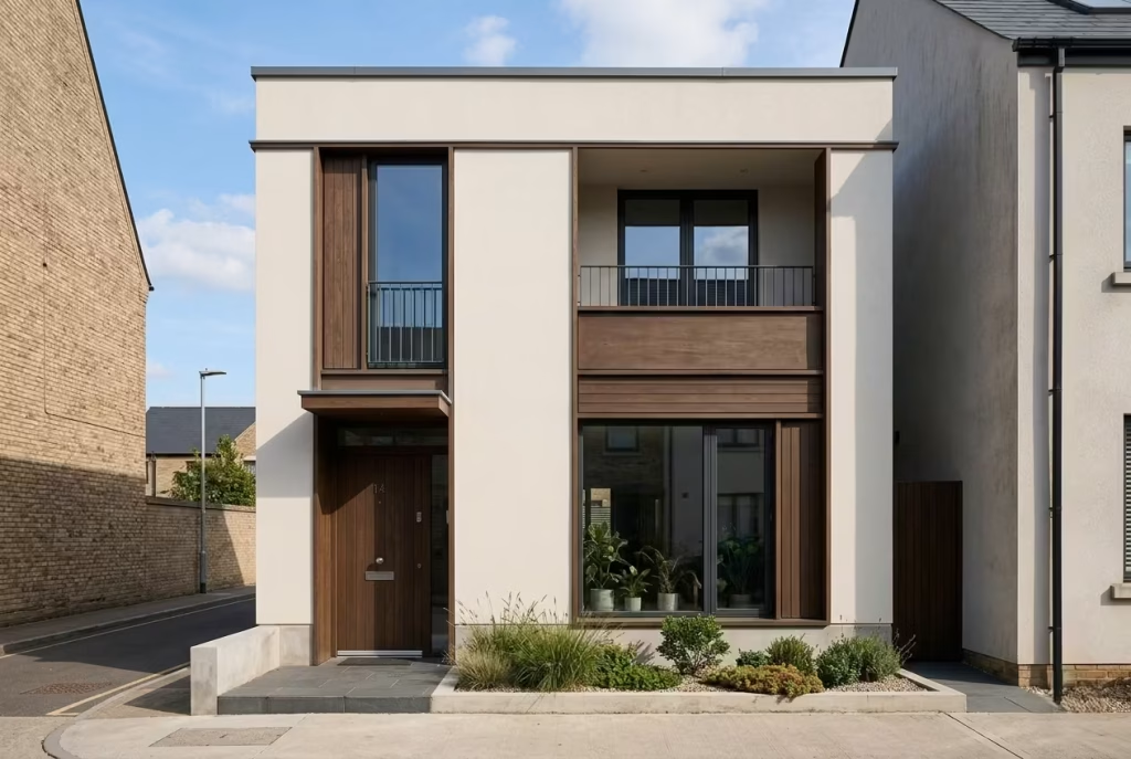
In small homes, colour can be your secret tool for expanding perception without touching the structure itself. Light-coloured exteriors think soft whites, gentle taupes, or muted greys have an almost magical ability to amplify space. They reflect sunlight, bounce it across façades, and make a compact frontage feel airier and more open, even when the footprint remains modest. It’s one of those design tricks that works quietly but consistently, giving the impression of generosity without adding a single square metre.
I often pair light tones with restrained detailing. On a 5-metre (16-foot) urban frontage I worked on, a soft off-white render served as the primary canvas. It allowed the darker timber accents and minimal metal framing to read clearly while the overall composition felt far less compressed. The reflective quality of the render caught morning light, subtly animating the façade as the day progressed. On small plots, these shifts in light and shadow are especially valuable they can make compact volumes feel dynamic and expansive rather than static and confined.
Texture plays a supporting role as well. Smooth finishes enhance reflectivity, while lightly profiled or sandblasted surfaces add gentle variation without breaking the sense of openness. Even minor shadow gaps, recessed trims, or horizontal reliefs can enrich the visual experience while keeping the palette understated. In small homes, restraint in colour combined with considered texture is often more impactful than bolder, more complex schemes.
There is also a psychological element. Lighter façades feel inviting and approachable. They read as calm and composed, reducing the sense of enclosure that can come with darker tones, particularly in narrow streets or tight urban contexts. The trade-off, however, is maintenance: light exteriors show dirt, pollution, and water marks more readily, so careful selection of finish and ongoing cleaning is part of the strategy.
Pros
- Reflective surfaces make small homes feel larger and more open
- Enhances natural light and overall street presence
- Complements restrained material palettes for a sophisticated finish
Cons
- Shows dirt and environmental wear more quickly, requiring maintenance
- Must pair with subtle detailing to avoid feeling overly plain or sterile
A light-coloured exterior is deceptively simple yet profoundly effective. It lets the architecture breathe, plays with natural light, and subtly expands the perception of space. For compact homes, it’s a measured, confident move that reads as calm, considered, and enduring.
Dark Exterior for Dramatic Contrast
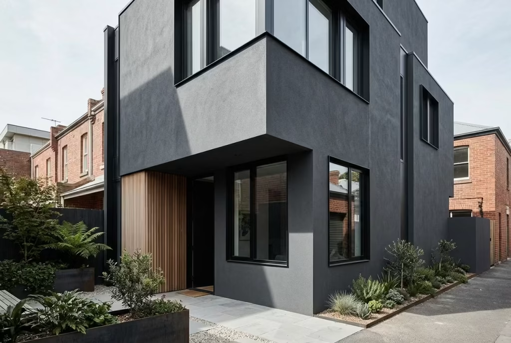
While light façades are often recommended for small homes, a dark exterior can be equally compelling when handled with precision. Deep charcoals, muted navies, or rich graphite tones create a bold, confident statement, especially when contrasted against carefully considered landscaping or light-coloured hardscaping. In smaller homes, the risk of overpowering the structure is real, but when proportions are measured and detailing is crisp, darkness adds depth, drama, and a sense of presence that many pale exteriors simply cannot achieve.
I recently applied a deep graphite render on a 4.8-metre (16-foot) frontage urban house. To prevent the dark tones from feeling heavy, we juxtaposed the façade with pale paving, green planting, and natural timber accents. The contrast allowed the home to feel anchored yet dynamic, almost theatrical, without overwhelming its modest scale. Dark exteriors also excel in highlighting subtle architectural moves: recessed entries, cantilevered volumes, and window frames all become more pronounced, almost sculptural, against a rich background.
Detailing is critical. Dark tones are unforgiving any misalignment in joints, uneven render, or inconsistent trims immediately catches the eye. I often recommend smooth finishes, precise shadow lines, and minimal but deliberate material transitions. Even small overhangs or shadow gaps, around 50–100 mm (2–4 inches), can add sophistication and soften the perception of mass.
Another advantage is how landscaping interacts with darkness. Lush greenery, pale stone paths, or light timber decks pop against a deep façade, making the outdoor spaces feel more vibrant and defined. In small plots, this relationship between exterior colour and landscape can create layers of perceived depth, giving a sense that the home is larger and more articulated than its actual footprint.
Pros
- Provides bold, contemporary statement without increasing the footprint
- Highlights architectural detailing and adds depth
- Works beautifully with landscaped elements to enhance visual interest
Cons
- Dark finishes can absorb heat, impacting internal comfort in warmer climates
- Any imperfections in material or detailing become more visible
- Requires careful planning to avoid making the façade feel heavy or oppressive
When executed with discipline, a dark exterior transforms a small house from modest to commanding. It demonstrates that compact homes can carry bold colour choices elegantly, provided that every junction, line, and shadow has been thought through with care.
Sloped Roof Reinterpreted in Modern Form
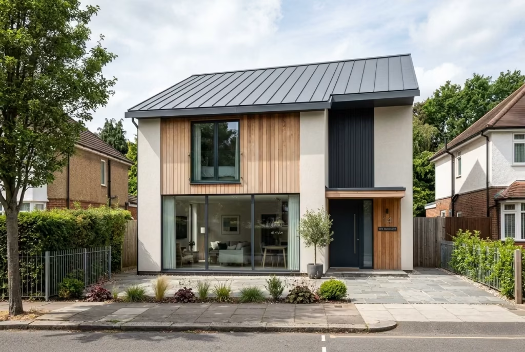
A sloped roof need not feel traditional or heavy-handed. When reinterpreted in a modern language, even a modest pitch can add both presence and practical performance to a small home. Clean, simple lines with minimal overhang allow the roof to read as an elegant continuation of the façade rather than an added layer, creating a sense of calm proportion that works particularly well in suburban streetscapes. It’s about suggesting volume without overwhelming the plot like sketching a confident outline with a single, assured stroke.
In practice, I often work with pitches between 20–30 degrees for compact houses. On a 6-metre (20-foot) frontage suburban home, a subtle sloped roof allowed rainwater to shed naturally while keeping the silhouette crisp and minimal. The minimal overhang, roughly 300–400 mm (12–16 inches), prevents the roof from dominating the façade and helps integrate the structure neatly into its plot, particularly where setbacks are tight. The roof can also act as a backdrop to other features: a projecting timber cladding, vertical slats, or floor-to-ceiling glazing are all accentuated by a clean, understated roofline.
Material choice plays a quiet but decisive role. Standing seam metal, slate, or lightweight tile can reinforce modernity while ensuring durability. I often favour muted tones that complement the façade palette rather than compete with it, letting the roof feel integrated rather than an afterthought. Internally, the slope can create subtle ceiling drama or allow for discreet loft spaces, which adds functionality without changing the external footprint.
The beauty of this approach lies in balance. A shallow pitch keeps the home grounded and approachable, while the simple geometry adds visual interest. Small homes, in particular, benefit from this restraint. Overly steep roofs or overly detailed gables can make the structure feel top-heavy or busy, drawing attention away from the subtleties of the façade and landscaping.
Pros
- Maintains a modern, minimal silhouette while allowing practical water runoff
- Enhances proportion and presence without increasing the footprint
- Complements both urban and suburban plots, integrating seamlessly with surroundings
Cons
- Requires precise detailing at eaves and junctions to avoid leaks and water staining
- Minimal overhang offers less protection for walls and windows in harsh weather
A modern sloped roof, when treated with simplicity and attention to proportion, becomes more than just a functional element. It frames the architecture, celebrates restraint, and proves that even small homes can carry subtle elegance without compromise.
Integrated Carport as an Architectural Element
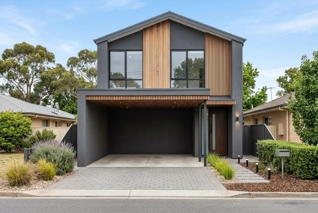
A carport, when treated as an afterthought, often feels exactly that an appendage that disrupts the façade rather than belonging to it. But when it is designed as part of the architecture from the outset, it can become a defining feature, adding structure, rhythm, and even a sense of arrival. In smaller homes, where every square metre needs to pull its weight, integration is not just good design, it is essential.
The starting point is proportion. A functional single-car width typically sits between 2.7 to 3 metres (9 to 10 feet), but it is not just about fitting the vehicle. It is about aligning that width with the overall composition of the façade. When the carport lines up with window bays, structural grids, or material transitions, it reads as intentional, almost inevitable, rather than something tacked on at the last minute.
I worked on a compact suburban project where the frontage was just under 6 metres (20 feet). Instead of squeezing the carport beside the house, we folded it into the main volume, using a flat roof extension that projected forward by about 900 mm (3 feet). The supporting columns were kept deliberately slender, and the ceiling of the carport was finished in timber slats, subtly echoing the entrance detailing. The result was cohesive. The carport did not interrupt the façade, it completed it.
Material continuity plays a quiet but crucial role here. Extending the same cladding or colour palette from the main structure into the carport helps unify the design. Alternatively, introducing a complementary material, such as timber against a rendered façade, can define the carport as a distinct zone without breaking harmony. It is a delicate balance, like adding a supporting note in music that enhances rather than distracts.
There is also an opportunity to think beyond shelter. A well-designed carport can double as a transitional space, softening the threshold between street and home. Integrated lighting, subtle landscaping, or even a built-in storage wall can elevate it from purely functional to quietly considered. In smaller homes, these layered uses are where design begins to feel intelligent rather than merely efficient.
Of course, structural clarity is key. The span, load distribution, and drainage must be resolved early in the design process. Trying to retrofit these elements later often leads to compromises, both visually and practically. I have seen many cases where a poorly added carport ends up dominating the façade, pulling the composition off balance.
Pros
- Creates a cohesive, integrated façade rather than a fragmented one
- Maximises functionality without expanding the footprint
- Can enhance the sense of arrival and architectural rhythm
Cons
- Requires early planning and coordination with structural design
- Poor proportions or detailing can make the façade feel unbalanced
When approached with intention, an integrated carport becomes more than just a place to park. It becomes part of the architectural language, quietly reinforcing the design while serving a very real, everyday need.
Narrow Frontage with Deep Set Entry
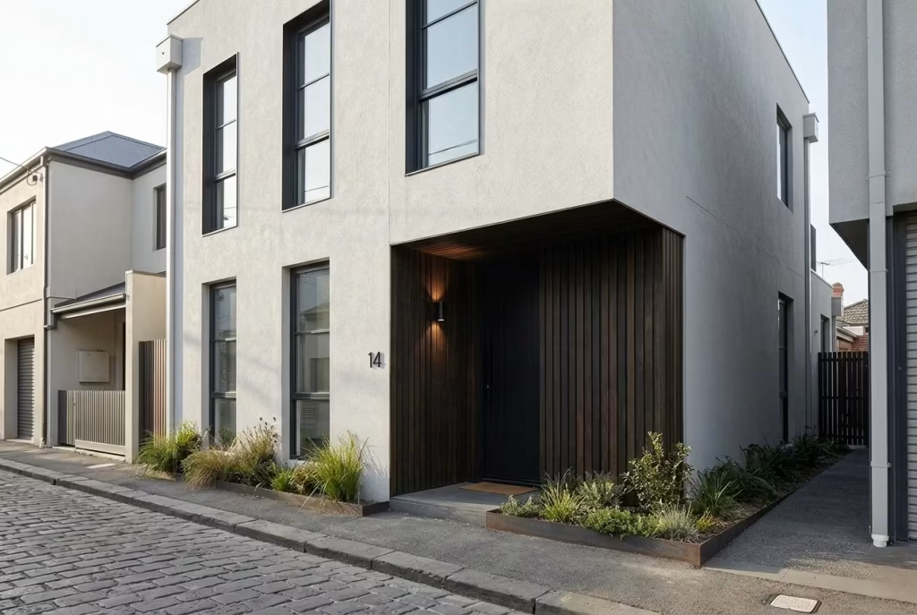
A narrow street frontage does not have to feel flat or one-dimensional. In fact, embracing a recessed entry can turn a constraint into a design advantage. By setting the doorway back from the plane of the façade, you create depth, layering, and subtle shadow play all of which add richness without introducing additional materials or cladding. It is a small move that delivers outsized visual impact, like using a pinch of seasoning to elevate an entire dish.
On a project with a 4.5-metre (15-foot) wide frontage, we recessed the entry by around 800 mm (2.5 feet). The effect was immediate: the façade felt lighter, more sculptural, and considerably more composed. Shadows fell naturally across the entry recess, introducing movement that shifted throughout the day. From the street, the house reads as more dimensional, even though the actual footprint has not changed at all. It is a subtle strategy, but in my experience, one of the most effective ways to give a small façade character without cluttering it with decoration.
Material choices for the recess can reinforce the sense of depth. A contrasting timber or dark-stained render inside the recess, paired with a lighter main façade, enhances perception of spatial layering. Minimalist lighting, such as wall-mounted sconces or linear LED strips, can animate the recess in the evening, emphasizing its three-dimensionality. In small homes, these carefully orchestrated contrasts often feel like choreography, guiding the eye without ever needing to shout.
A deep-set entry also contributes to function, providing shelter from rain and sun, creating a transition zone that is both welcoming and practical. In dense urban contexts, it can offer privacy and a buffer from street noise, while still signalling the entrance clearly to visitors. The key, however, is proportion: too deep, and the entry can feel like a cave; too shallow, and the effect is lost. A modest recess, roughly 20% of the frontage width, tends to strike the right balance.
Pros
- Introduces visual depth and richness without additional materials
- Provides functional shelter and a welcoming threshold
- Enhances façade composition on narrow plots
Cons
- Requires careful proportioning to avoid overwhelming the frontage
- Lighting and material contrasts must be considered to fully realize the effect
When executed thoughtfully, a deep-set entry is a simple yet powerful way to make a small house façade feel considered, layered, and confident. It proves that sometimes, the most effective moves are not about adding more, but about pulling back strategically.
Industrial-Inspired Exterior with Steel Accents
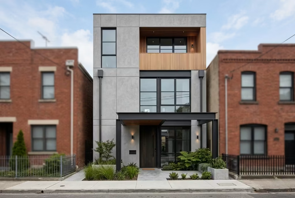
An industrial-inspired exterior can lend a small home a confident, contemporary identity, provided the approach is measured and deliberate. Black steel frames, exposed beams, and subtle structural elements create a sense of strength and permanence, giving the façade a sculptural quality that reads as intentional rather than utilitarian. In smaller homes, where proportions are critical, the sharp lines and bold materials of an industrial palette can anchor the design, making it feel composed and resilient.
I applied this approach on a 5-metre (16-foot) narrow lot recently, using slender black steel window frames combined with a projecting steel beam over a modest entry porch. The contrast against a soft grey render brought focus and rhythm to the façade, turning structural elements into aesthetic features. It’s the kind of detailing that reads almost like punctuation: small, precise, yet fundamentally shaping the way the architecture is perceived.
The key to success is balance. Industrial materials can feel harsh if left unchecked, especially on compact façades. Pairing steel with warmer elements timber cladding, soft landscaping, or pale renders softens the perception while retaining clarity and strength. Even modest landscaping, such as a planter along the base or a climbing vine near the entry, can temper the austerity and introduce a tactile, human scale.
Scale and proportion of steel elements are also critical. Window frames, beams, or cantilevers that are too heavy will dominate the façade, making the home feel smaller rather than more grounded. Conversely, thin, precise steel profiles create definition without overpowering, subtly accentuating the geometry of the building.
Pros
- Strong, confident identity that immediately defines the home
- Steel accents can highlight key architectural lines and volumetric shifts
- Works well in modern or urban settings where a sculptural aesthetic is desired
Cons
- Can feel cold or harsh if not balanced with warmer materials
- Precision in detailing is required to avoid visual clutter or disproportion
- Maintenance of steel elements (corrosion, finishes) must be considered
When executed with restraint, industrial accents turn a small home into a statement of composure and character. The façade becomes a quiet dialogue between strength and subtlety, proving that even compact architecture can feel bold, intentional, and thoughtfully layered.
Scandinavian-Inspired Simplicity
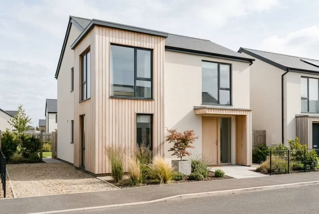
Scandinavian design has a remarkable way of making small homes feel generous, calm, and entirely lived-in. Its strength lies not in flamboyance but in restraint soft, pale timber paired with crisp white render creates an exterior that is understated yet undeniably elegant. In compact homes, this approach allows the architecture to breathe, letting proportion, light, and texture take centre stage. It is the design equivalent of a well-tailored suit: clean lines, thoughtful material, and effortless harmony.
I recently applied this palette to a 5.5-metre (18-foot) frontage home in a suburban setting. Pale larch cladding wrapped a small projecting volume, while smooth off-white render formed the backdrop. The effect was immediately softening: the façade read as light and inviting, while subtle shadow lines from cladding joints added depth without complexity. In smaller homes, such layering of light and texture compensates for the lack of footprint, making spaces feel both larger and more considered.
Materials are key. Timber not only introduces warmth but also ages gracefully, developing a patina that enhances character over time. Render keeps the façade feeling fresh and structured. Together, they strike a balance between visual comfort and architectural definition. Proportion is equally important; overly large timber panels can dominate, while tiny details can feel fussy. In this context, panels between 300–600 mm (12–24 inches) provide a rhythm that reads naturally and comfortably.
Functionality subtly reinforces aesthetic. Scandinavian exteriors often incorporate simple overhangs, recessed entries, or minimal landscaping that complements the clean lines. These small gestures enhance usability while reinforcing the calm, orderly character of the home. Even in compact footprints, this strategy ensures the house feels open, approachable, and inherently livable.
Pros
- Creates a soft, inviting façade that reads larger than its footprint
- Balances warmth and structure for enduring aesthetic appeal
- Enhances natural light reflection and spatial perception
Cons
- Pale finishes require maintenance to retain crispness
- Over-simplification can risk blandness if texture and proportion are ignored
A Scandinavian-inspired small house proves that simplicity is never boring. With considered timber, restrained render, and careful proportions, a modest façade becomes quietly elegant, inviting, and timeless an approach that celebrates living well within a limited scale.
Brick Modernism with Clean Mortar Lines
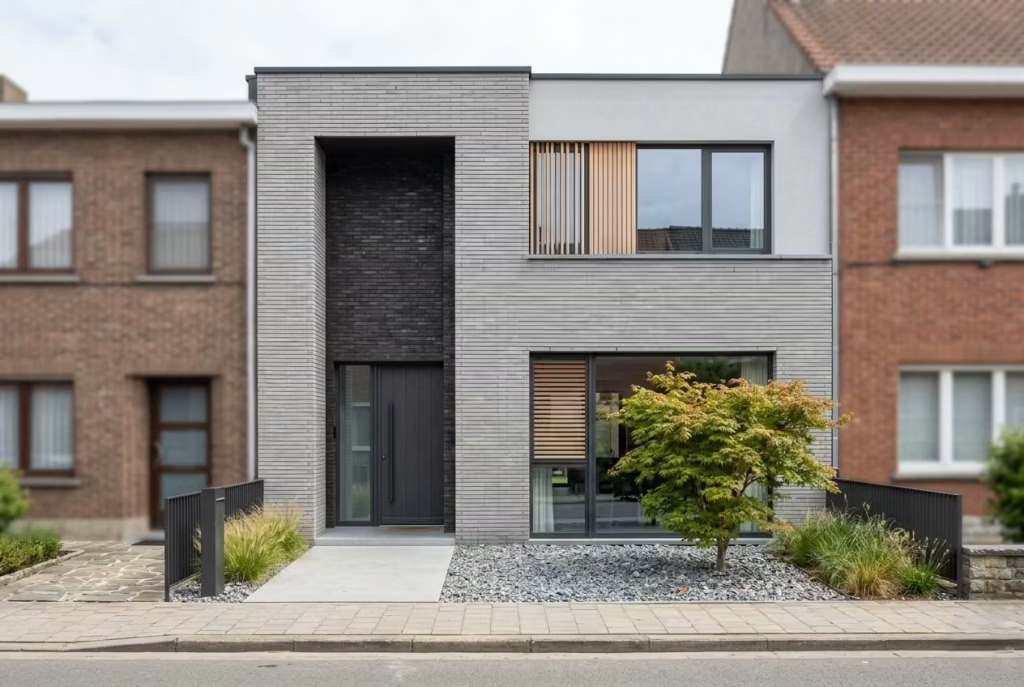
Brick, when handled with precision, can be a quietly powerful tool in a small house façade. Modern brickwork relies on clarity and restraint: flush or recessed mortar joints, carefully chosen brick formats, and disciplined running patterns transform the humble material into a refined, contemporary expression. In compact homes, where every centimetre counts, the texture and rhythm of brick can add depth and sophistication without increasing bulk or relying on additional finishes.
I applied this approach on a 5-metre (16-foot) urban infill project. Using elongated modular bricks in a soft grey tone, laid with flush joints, the façade read as sleek and structured. The linearity of the bricks accentuated the horizontal proportions, making the house appear longer and more composed. A small vertical recess over the entry, clad in darker brick, created a subtle focal point without disrupting the restrained rhythm. The effect was almost architectural punctuation: minimal, precise, yet remarkably expressive.
The choice of brick format is particularly important in small homes. Standard modular bricks can feel chunky, overpowering narrow façades, while longer, slimmer formats stretch the elevation visually, enhancing proportion and composure. Recessed joints, around 10 mm (0.4 inches), create shadows that enliven the wall, while flush joints maintain a smooth, contemporary reading. Both strategies require careful craftsmanship irregularities are magnified on smaller surfaces, and poor detailing can quickly undermine the minimalist intention.
Brick also plays beautifully with other materials. A pale render, timber infill, or steel-framed glazing can punctuate the façade without competing, creating a tactile, layered composition. Even modest landscaping gravel beds, low planters, or a single sculptural tree can highlight the texture and depth of the brickwork, further enhancing perception of size and sophistication.
Pros
- Adds texture, depth, and visual interest without expanding footprint
- Clean joints and modern formats make brick contemporary and elegant
- Durable, low-maintenance material that ages gracefully
Cons
- Requires high-quality craftsmanship to avoid irregularities on small façades
- Poor proportioning or overly traditional formats can overwhelm compact frontages
- Limited colour palette may be necessary to maintain a modern reading
When done with attention to scale, proportion, and joint detail, brick becomes far more than a construction material. It articulates the façade with subtlety and confidence, turning a small home into a composition that feels anchored, tactile, and quietly modern.
Asymmetrical Window Placement
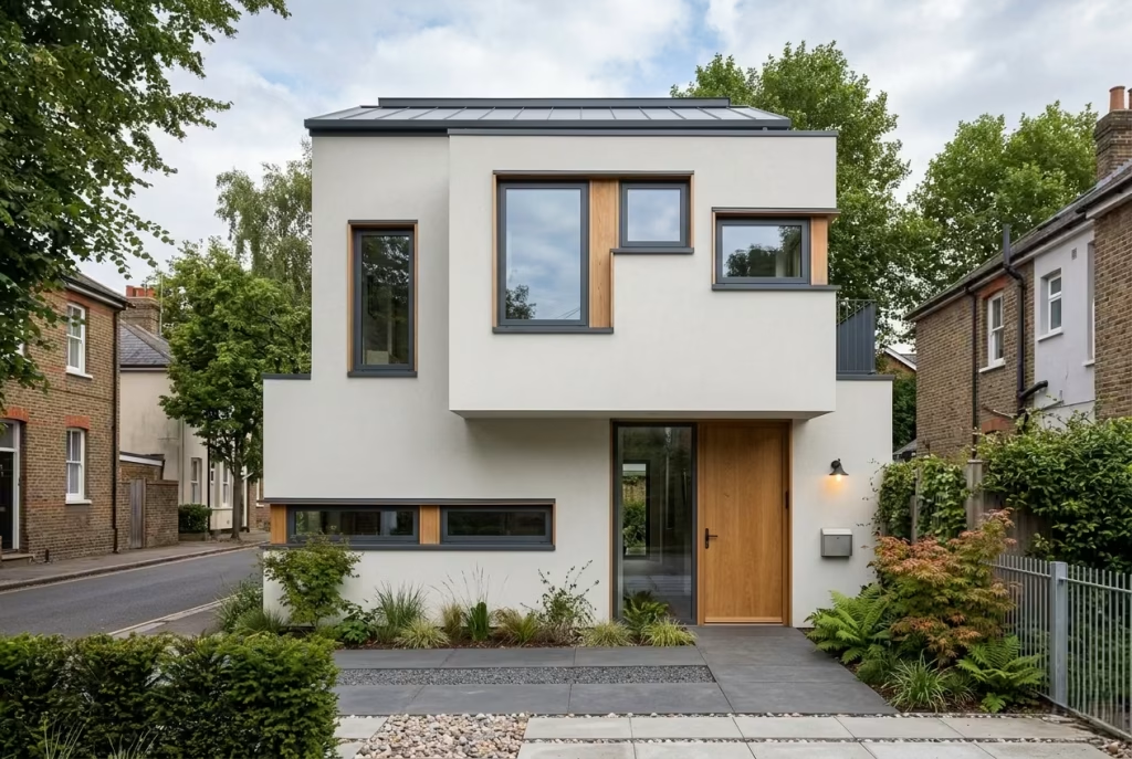
Windows are more than openings they are the punctuation of a façade, guiding the eye, controlling light, and framing views. In small homes, asymmetrical placement can be a quiet game-changer, breaking the monotony of rigid symmetry while adding rhythm and visual interest. It’s a strategy that, when executed thoughtfully, makes a modest frontage feel dynamic, sculptural, and deliberately composed. Think of it as adding a playful note to a measured melody: unexpected yet harmonious.
I employed this approach on a 5.2-metre (17-foot) wide urban project, arranging glazing of varying widths and heights across a simple rendered façade. The entry window, slightly taller than the adjacent fixed panes, created a visual hierarchy while remaining balanced with the cantilevered upper volume. The result was subtle yet commanding: the façade felt lively without ever appearing chaotic. In small homes, the stakes are high every millimetre of window placement matters because there is little room to absorb imbalance.
Composition is everything. Asymmetry is not license for randomness; each window must relate to the façade’s lines, the roofline, and internal spatial function. I often sketch multiple iterations, treating the façade as a grid of rhythm rather than a mirror of internal layout. Even a single tall vertical window paired with a low horizontal band can create tension and movement while keeping proportion intact. Lighting and shadows accentuate the effect: recessed frames and slight offsets allow sunlight to animate the exterior across the day, giving depth to what might otherwise read as a flat surface.
Material and frame selection support this strategy. Slim black or dark grey frames accentuate geometry and reinforce the design’s modernity, while timber reveals or pale aluminium soften the lines, making the façade feel approachable. In compact homes, these subtle material choices can tip the balance between architectural precision and visual harshness.
Pros
- Introduces rhythm, depth, and dynamism to small façades
- Breaks monotony without adding clutter or extra materials
- Allows light to be strategically directed into the interior, enhancing livability
Cons
- Poorly considered asymmetry can feel chaotic or disjointed
- Requires careful coordination with internal layouts to avoid awkward views or privacy issues
- Detailing around frames must be precise to maintain compositional harmony
Asymmetrical window placement proves that small façades can carry energy, personality, and subtle complexity. When compositional balance is respected, even the simplest house can read as intentionally modern, confident, and visually engaging.
You May also Like: 25 Mid-Century Modern House Exteriors That Prove This Timeless Style Is Here to Stay
Green Façade Elements
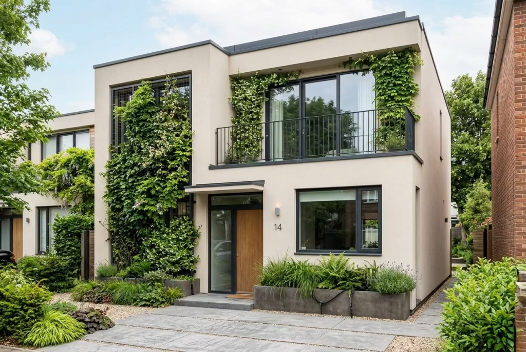
In small homes, rigid geometry can sometimes feel austere or stark. Integrating greenery into the façade softens lines, introduces texture, and creates a sense of life that no material alone can achieve. Vertical planting, climbing vines, or modular living walls can be woven into the architecture, turning the exterior into a subtle interplay of structure and nature. It’s like giving the house a quiet heartbeat organic movement that contrasts yet complements disciplined lines.
I recently applied vertical climbers on a narrow 4.8-metre (16-foot) frontage with a predominantly rendered façade. By guiding greenery along a trellis recessed slightly from the wall, the façade gained depth and tactility. The plants were selected for form and seasonal interest: evergreen foliage maintained year-round softness, while deciduous varieties added ephemeral colour and texture. Even small façades benefit from this layering; the eye perceives depth and vitality, making the home feel larger and more inviting.
Integration is key. Green elements should feel intentional, not tacked on. Recessed planters at the base, hidden irrigation channels, or vertical supports aligned with structural grids help maintain compositional clarity. Climbers can follow shadow lines or frame windows, accentuating rather than obscuring architectural intent. Lighting can enhance the effect after dark subtle uplights highlight textures and create shifting shadows that enrich perception of depth and form.
Maintenance is a consideration. While green façades are visually rewarding, careful plant selection, irrigation, and pruning are essential. Choosing species suited to local climate and light conditions ensures longevity without compromising the clean, modern aesthetic.
Pros
- Introduces softness and organic texture to compact, geometric façades
- Enhances visual depth and seasonal interest
- Improves microclimate and can contribute to passive cooling in warm climates
Cons
- Requires ongoing maintenance to prevent overgrowth or damage to surfaces
- Must be carefully integrated to avoid disrupting architectural clarity
- Irrigation and structural supports need early coordination in design
Green façade elements transform a small home from austere to approachable. By weaving life into structure, they create visual richness and a dynamic, ever-evolving exterior that feels thoughtful, natural, and entirely modern.
Concrete Finish for Raw Minimalism
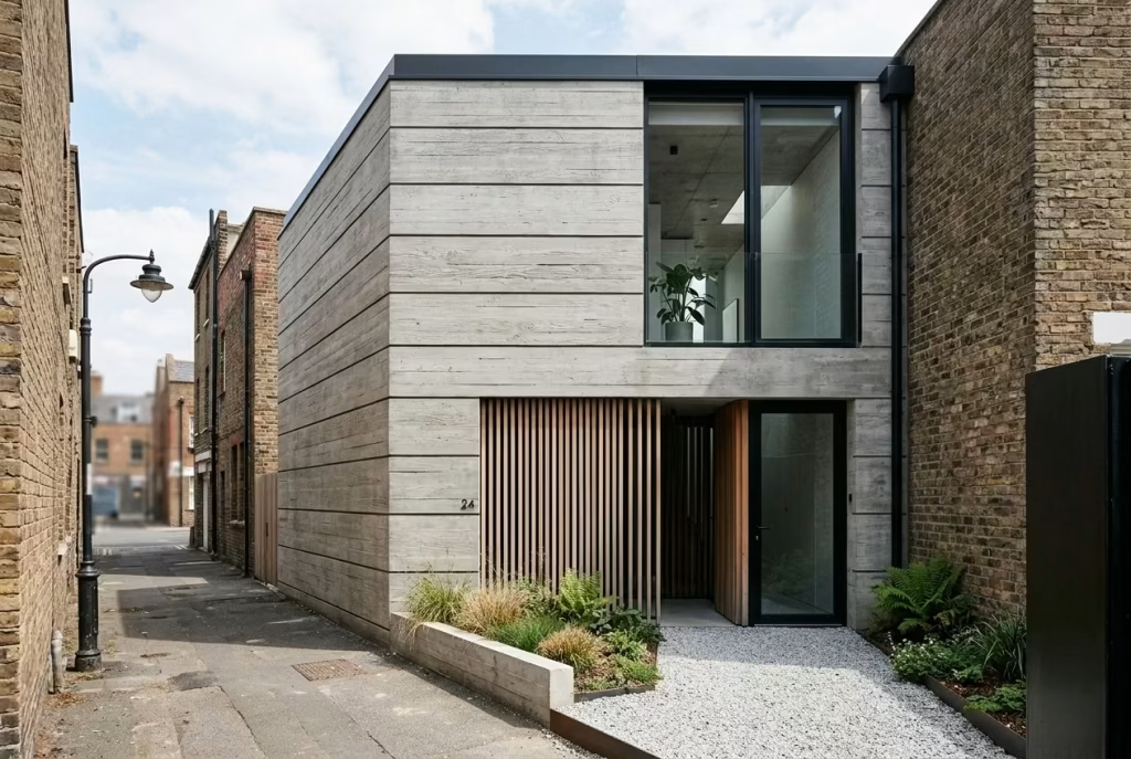
Concrete is a material that speaks in quiet authority. When applied thoughtfully, it can transform a small home façade into an exercise in raw minimalism, communicating strength, modernity, and understated elegance. Board-formed or smooth concrete surfaces add texture and weight, creating a tactile presence that contrasts with lighter, softer materials like timber or glass. In small homes, where every line is scrutinised, the honesty of concrete can be liberating it leaves nothing to hide, every joint, edge, and surface plane clearly exposed.
I once worked on a 5-metre (16-foot) narrow urban house where we used board-formed concrete panels on the main volume. The horizontal grain of the timber formwork subtly animated the façade, giving depth and rhythm without clutter. The key was precision: any imperfections are magnified at this scale, so careful alignment of panels, clean shadow gaps, and seamless junctions were non-negotiable. A well-executed concrete finish reads as deliberate and considered; even the smallest misalignment can disrupt the calm, minimal aesthetic.
Material interplay is vital. Pairing concrete with softer textures pale timber slats at the entry, dark-framed glazing, or a light gravel path prevents the façade from feeling cold or forbidding. The concrete becomes a canvas for contrast rather than a monolithic statement, allowing the house to feel sculptural but still approachable.
Another subtle advantage of concrete is its permanence. Unlike paint or render, it ages gracefully, developing natural patina over time. This is especially valuable in compact façades, where durability and low maintenance are as important as visual impact. Board-formed patterns can also add a human scale, breaking the expanse into measurable, digestible segments, making a small house feel both robust and approachable.
Pros
- Provides a modern, sculptural aesthetic with raw, tactile appeal
- Extremely durable and low-maintenance when detailed correctly
- Acts as a neutral, versatile backdrop for complementary materials
Cons
- Flaws in execution are highly visible and can compromise the minimal aesthetic
- Can feel cold or austere if not softened with complementary materials
- Requires skilled contractors and careful detailing to avoid cracking or misalignment
Concrete finishes demand confidence and precision. In small homes, when every plane matters, a well-crafted concrete façade can elevate modest architecture into a statement of quiet sophistication, proving that raw minimalism, executed properly, is anything but austere.
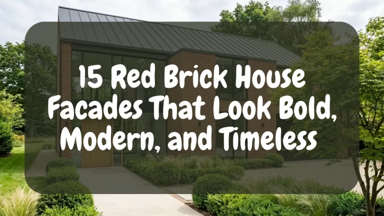
You May also Like: 15 Red Brick House Facades That Look Bold, Modern, and Timeless
Layered Façade with Setbacks
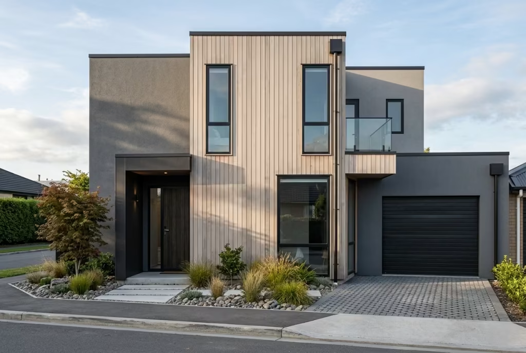
In small homes, creating a sense of depth and dimensionality is often more powerful than simply expanding the footprint. Layered façades, achieved through subtle setbacks of even 300–600 mm (1–2 ft), introduce shadow, hierarchy, and visual intrigue, transforming a compact frontage into a composition that feels thoughtful and measured. It’s the architectural equivalent of layering textures in fashion: small shifts add richness without overcomplicating the design.
I recently applied this on a 5.2-metre (17-foot) narrow house, offsetting the living volume slightly forward while recessing the entry and garage. The result was immediate: the façade gained rhythm and shadow play, making it read larger than its actual width. Each layer acted as a stage for materials and detailing timber cladding highlighted the forward volume, smooth render emphasized the recessed entry, and slim vertical windows punctuated the planes. Even minimal offsets can dramatically alter perception, making the home feel sculptural rather than flat.
Proportion and alignment are critical. Setbacks must relate to window placement, rooflines, and structural grids to avoid a disjointed appearance. In small homes, a misaligned plane is highly visible and can disrupt the overall compositional harmony. I often recommend using even minor shifts as opportunities to integrate functional elements like a recessed planter, subtle lighting, or overhang so the design feels purposeful rather than decorative.
Material choices amplify the effect. Contrasting textures or colours on layered planes enhance the perception of depth, while uniform finishes can make the setbacks feel seamless and cohesive. Light also plays a pivotal role: as the sun moves, shadows fall across the layers, adding subtle dynamism to an otherwise modest façade.
Pros
- Adds depth and visual interest without increasing footprint
- Enhances the perception of size and spatial hierarchy
- Provides opportunities to highlight materials, lighting, and landscaping
Cons
- Requires careful proportioning to maintain compositional balance
- Misaligned planes can appear awkward and unrefined
- Subtle setbacks may demand additional detailing and structural consideration
Layered façades prove that small homes need not feel flat or one-dimensional. Even a modest shift of a few centimetres can create an interplay of shadow, texture, and rhythm that elevates the architecture, giving compact structures an unexpected sense of grandeur and refinement.
Glass and Wood Combination
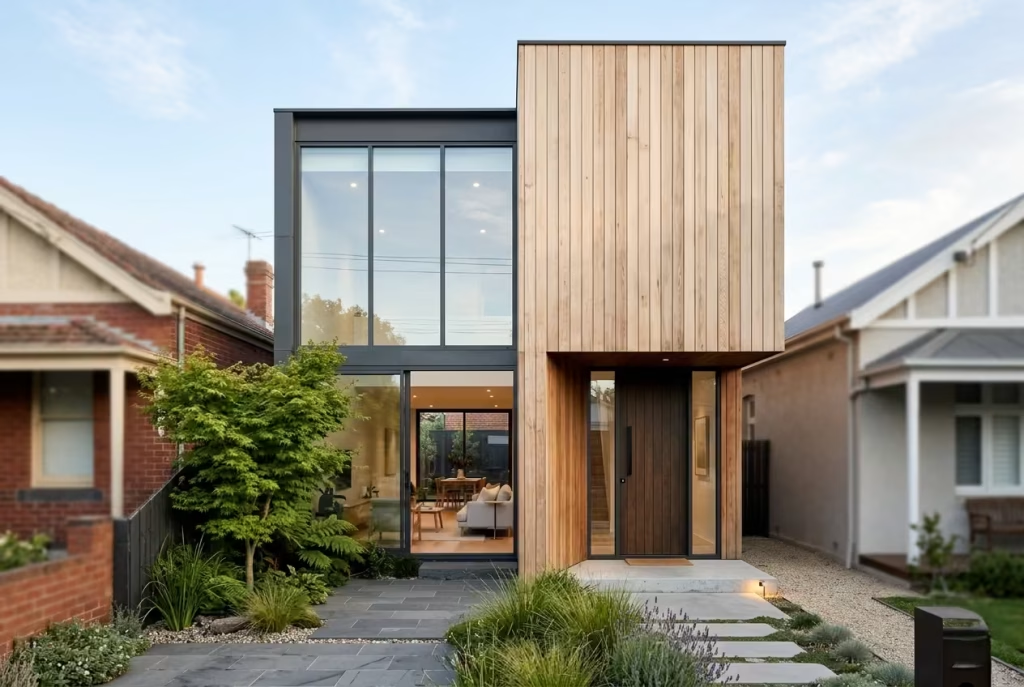
Pairing glass with timber is one of the most effective ways to make a small home feel both warm and expansive. Glass introduces transparency and openness, visually extending interior spaces, while wood adds tactility, texture, and an inviting, human scale. Together, they create a façade that balances modern minimalism with approachable warmth, proving that compact homes can feel generous and sophisticated without resorting to oversized volumes or excessive detailing.
I used this approach on a 5.5-metre (18-foot) narrow house with a modest footprint. Floor-to-ceiling glazing along one side maximised natural light and connected the interior to a small courtyard, while pale cedar panels framed the entrance and a projecting volume. The combination softened the hard edges of the glass, providing visual grounding and a sense of intimacy. In small homes, this balance is crucial: too much glass can feel exposed, while too much timber can close in the façade.
Proportion and alignment matter as much as material choice. Timber panels should align with glazing heights or façade planes to maintain compositional clarity, and glass should be framed minimally slim aluminium or concealed framing helps the transparency feel light rather than heavy. Strategic use of reflective or tinted glass can further enhance privacy without sacrificing openness.
Beyond aesthetics, this pairing has practical benefits. Timber can act as a shading device or privacy screen, while glazing maximises daylight, contributing to energy efficiency and livability. In small homes, where every interior metre counts, connecting visual and physical space to the outdoors can transform the perception of scale and make rooms feel brighter, more expansive, and inviting.
Pros
- Creates a warm, inviting façade with a sense of openness
- Visually extends interior space, enhancing the perception of size
- Works well in compact plots, connecting interior and exterior seamlessly
Cons
- Requires careful detailing to avoid thermal bridging or excessive heat gain
- Glass must be balanced with privacy considerations, especially on narrow plots
- Timber maintenance is needed to retain warmth and finish over time
When executed thoughtfully, the combination of glass and wood transforms a small home into a space that feels simultaneously contemporary and human. It’s a pairing that celebrates light, texture, and proportion, proving that even modest façades can exude generosity, warmth, and quiet sophistication.
Compact Balcony as a Visual Feature
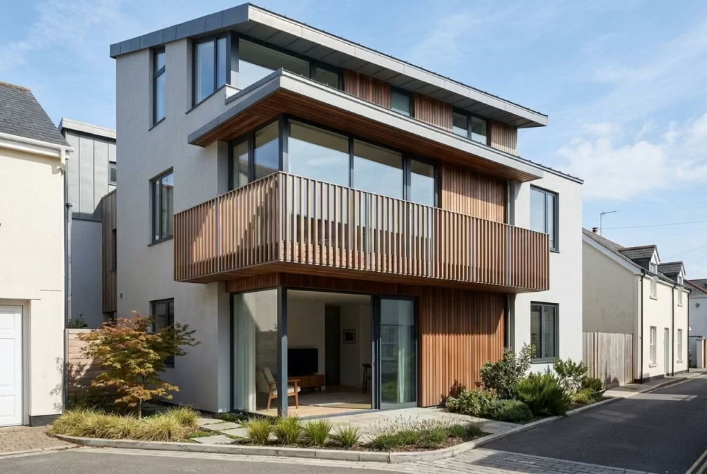
Even a small balcony can be a transformative element on a modest house façade. While its footprint may be minimal, the projection introduces depth, shadow, and architectural rhythm, turning a flat elevation into a façade that feels intentional and sculptural. It’s proof that, in small homes, even modest gestures can have an outsized impact like a single well-placed accessory that lifts an entire outfit.
On a recent 5-metre (16-foot) narrow home, we incorporated a 900 mm (3-foot) deep cantilevered balcony above the living area. The balcony was not designed primarily for occupancy; its value lay in articulation. The projection created shadow lines that changed throughout the day, breaking up the plane of the façade and giving it a subtle dynamism. Timber balustrades and carefully aligned glazing ensured that the balcony read as part of the composition rather than a tacked-on feature.
Proportion and alignment are critical. A balcony too deep can dominate a narrow frontage, while one too shallow may seem insignificant. In compact homes, 600–900 mm (2–3 feet) typically strikes the right balance, providing enough projection to generate visual interest without overwhelming the façade. Integration with window placements, cladding lines, or roof overhangs further reinforces the sense of cohesion, ensuring that the balcony enhances rather than disrupts the design.
Material choice and detailing elevate the effect. Timber or metal balustrades, sometimes paired with frosted or clear glass, add texture and lightness. Shadow gaps at the balcony base or subtle soffit lighting can enhance depth, making the small projection feel purposeful. In my experience, these details are what distinguish a small home that reads as thoughtfully composed from one that feels static or unconsidered.
Pros
- Adds depth and shadow, enhancing façade composition
- Provides a visual focal point and architectural rhythm
- Can serve functional or purely aesthetic purposes without increasing footprint
Cons
- Requires careful proportioning to avoid overwhelming a narrow frontage
- Structural detailing and waterproofing are critical to long-term durability
- Poor integration with materials or lines can appear disconnected
A compact balcony is a masterclass in “less is more.” Even a minor projection can turn a small façade into a carefully layered, visually engaging composition, demonstrating that subtlety, proportion, and thoughtful material use often matter more than scale in residential design.
Metal Cladding for Contemporary Edge
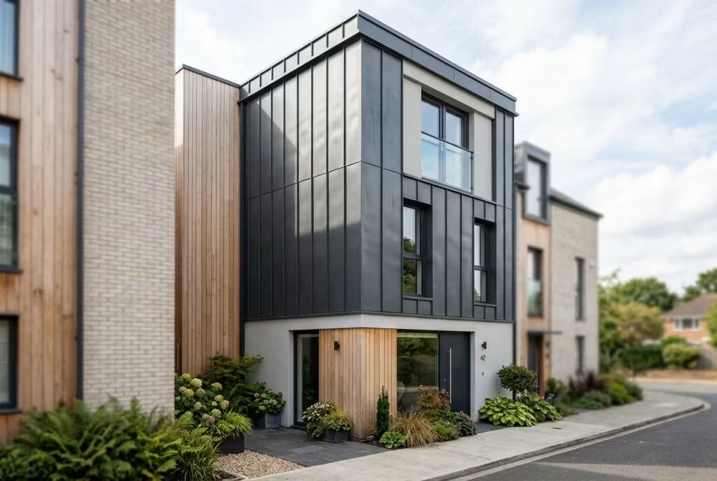
Metal cladding is a powerful tool for adding a contemporary edge to small homes. Aluminium or zinc panels lend façades a sleek, precise appearance, conveying modernity without relying on ornamentation. When executed with care, metal introduces both texture and rhythm, creating a sense of sophistication that belies the compact scale. In small homes, where every surface is magnified, the reflective quality and crisp lines of metal can articulate volumes and emphasise geometry like no other material.
I recently used zinc rainscreen panels on a 5-metre (16-foot) narrow urban dwelling. The panels were aligned vertically, creating a subtle play of light and shadow that changed throughout the day. By offsetting the metal panels from adjacent timber and render sections, we established a clear hierarchy and layering, making the façade feel composed and deliberate. In small-scale projects, even a minor material shift like a 50 mm (2-inch) reveal between cladding types can dramatically alter perception, adding depth without expanding the footprint.
Durability is another advantage. Both aluminium and zinc resist weathering, rot, and fading, making them low-maintenance solutions for homeowners seeking longevity. Thermal movement and fixings must be carefully considered, however: improper detailing can lead to buckling or water infiltration, which is especially noticeable on smaller façades. In addition, the reflective qualities of metal require careful colour selection; dark, matte finishes often provide a strong, grounded presence, while lighter, metallic tones can enhance visual lightness and openness.
Metal cladding pairs beautifully with other materials. Smooth render, timber accents, or glass can soften its sharpness, providing a tactile and visual counterpoint. Even small touches like a concealed drip edge or precision corner joint reinforce the sense of refinement, proving that attention to detail matters more than scale in compact architecture.
Pros
- Adds a sharp, contemporary aesthetic that reads confidently on small façades
- Durable and low-maintenance, with long-term visual impact
- Highlights geometry and volume through texture, shadow, and reflectivity
Cons
- Requires precise detailing to avoid visual or structural flaws
- Can feel cold or harsh if not balanced with warmer materials
- Reflectivity and colour selection must be carefully considered to avoid glare or imbalance
Metal cladding demonstrates that even the smallest home can have a strong architectural voice. When proportion, alignment, and material interplay are carefully orchestrated, it delivers an unmistakably modern façade that feels polished, confident, and entirely intentional.
Symmetrical Minimalist Design
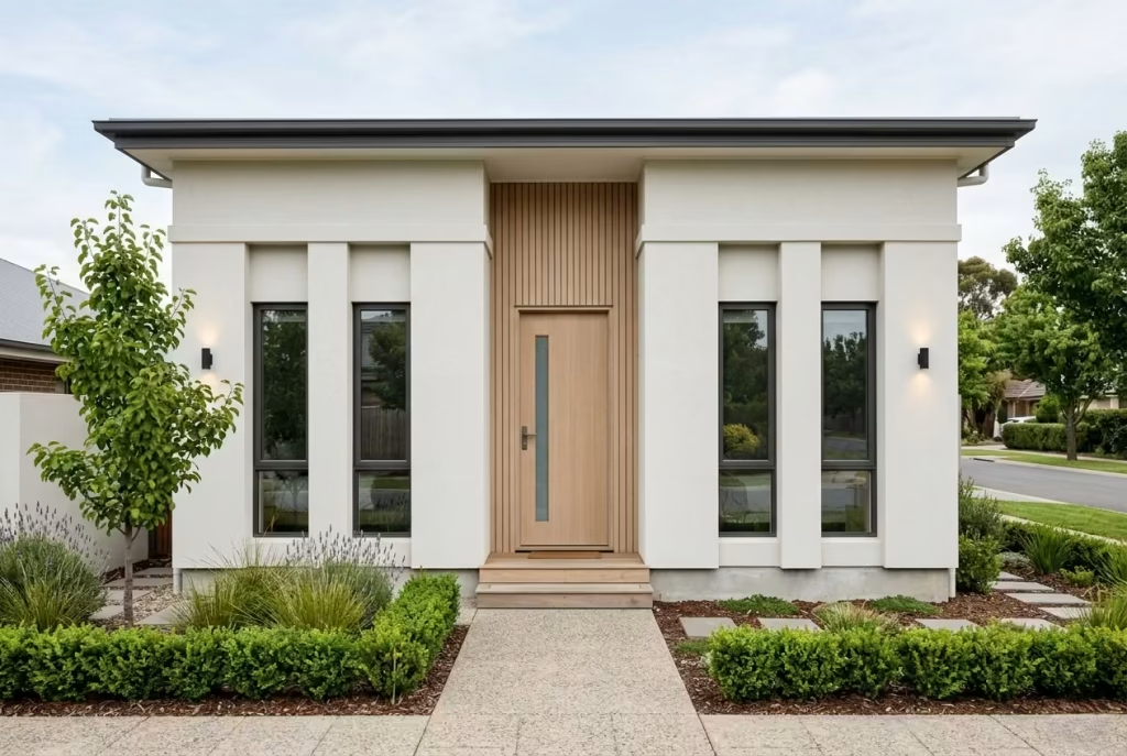
Symmetry in a small home can be deceptively powerful. A centered entry flanked by balanced windows establishes order and calm, giving the façade a timeless, considered presence. Unlike asymmetrical façades, which rely on playful tension, symmetrical compositions communicate quiet confidence and clarity, immediately reading as intentional. It’s the architectural equivalent of a well-composed photograph: every element has its place, and the result is harmonious without effort.
I recently implemented a symmetrical approach on a 5.5-metre (18-foot) suburban frontage. The door was perfectly centred, with two slim, vertically proportioned windows on either side. The choice of pale render and timber accents reinforced simplicity, while subtle recessed panels added shadow and texture. Despite the compact scale, the façade felt grounded and substantial, with a calm dignity that belied its modest footprint. The key lies in proportion: even minor deviations in window spacing or door alignment can disturb the balance and undermine the serenity of the composition.
Symmetry also allows small façades to showcase material restraint. With limited width, it’s easy to overcomplicate, but here less truly is more. Consistent window heights, matching reveals, and aligned cladding lines all contribute to a cohesive reading. Lighting, too, can accentuate symmetry: concealed downlights flanking the door or subtle uplights on cladding panels enhance rhythm and shadow play without detracting from the minimalist intent.
Function subtly reinforces form. In narrow homes, a symmetrical façade can guide the internal layout, making spaces feel intuitively organized. Even with modest setbacks or small courtyards, the exterior symmetry communicates a sense of order that carries through to the interiors, giving compact layouts a psychological sense of spaciousness.
Pros
- Creates a calm, timeless aesthetic that reads confident and refined
- Enhances perception of proportion and balance on narrow façades
- Simple material palette and detailing reduce visual clutter
Cons
- Requires precise alignment and proportional accuracy to avoid visual tension
- Can feel rigid or formal if overused without subtle texture or shadow
- Less dynamic or playful compared with asymmetrical alternatives
Symmetrical minimalist design proves that elegance is not about size or complexity. In a small home, deliberate balance, restrained materials, and careful proportion combine to create façades that feel composed, confident, and quietly enduring, offering a serene visual anchor in an otherwise busy streetscape.
Corner Windows to Open Up the Structure
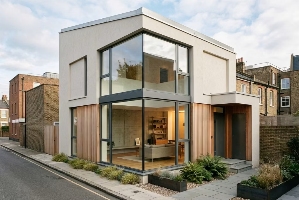
Corner windows are a masterstroke in compact home design, dissolving edges and visually expanding the façade. By wrapping glazing around a corner, the house appears lighter, more open, and far less boxed-in than its footprint might suggest. It’s like turning a tight-knit room inside out suddenly, the corners breathe, and the boundary between inside and outside becomes almost imperceptible.
I applied this technique on a 5-metre (16-foot) narrow urban house where the living area sat at the front corner. By using slim aluminium frames and flush glazing, the corner “disappeared” visually, creating a sense of flow and connection to the small courtyard beyond. The effect was immediate: the structure, though compact, read as expansive and elegant. Even modest corner windows can produce this optical lift, provided they are proportionally aligned with adjacent walls and rooflines.
Proportion, detailing, and privacy are key considerations. Glass corners should be framed minimally and joined carefully at the junction to avoid bulky mullions that interrupt the fluidity. Internally, corner windows can flood living spaces with light, but careful planning is required to avoid awkward glare or exposure. I often pair them with subtle timber screens, low parapets, or recessed sills to preserve comfort while enhancing the visual effect.
Material interplay enhances the illusion. Smooth render, pale timber cladding, or metal panels can frame the corner glazing and reinforce its sense of lightness. Shadows created by recessed panels or slight offsets in the wall further accentuate depth, making the house feel layered and sculptural rather than flat or constrained.
Pros
- Reduces perceived bulk at edges, making the home feel more open
- Maximises natural light and views in tight spaces
- Creates a striking architectural feature without additional footprint
Cons
- Requires precise detailing at glazing junctions to avoid leaks or visual heaviness
- May need shading or screening for privacy and thermal comfort
- Can be expensive compared with standard glazing, especially if structural support is needed
Corner windows demonstrate that small homes don’t have to read as compact or confined. Thoughtful placement and proportion transform corners into moments of light, openness, and architectural elegance, proving that even a modest façade can feel generous, airy, and carefully composed.
Hybrid Traditional-Modern Exterior
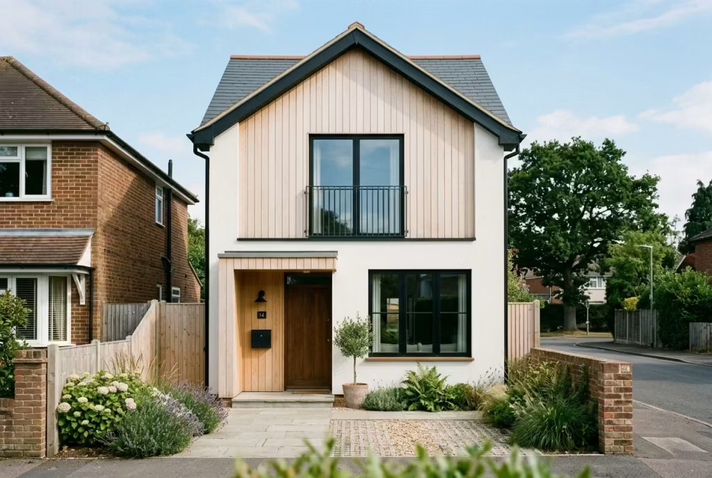
A hybrid traditional-modern exterior allows a small home to sit comfortably in transitional neighbourhoods while asserting a contemporary identity. By blending familiar forms such as a pitched roof or classic window proportions with modern materials like smooth render, timber panels, or metal accents, the home feels both grounded and forward-looking. It’s like striking a conversation between heritage and innovation: respectful of context yet unapologetically modern.
I implemented this on a 5.3-metre (17-foot) narrow suburban plot where the surrounding homes were conventional brick-and-tile. We maintained a simple gabled roof to echo the local vernacular but stripped the massing of ornamentation. Smooth white render and timber cladding articulated volumes, while black-framed glazing and subtle metal details added crisp modernity. The result was a house that blended seamlessly with the street but read as precise, considered, and confident when viewed up close.
Scale and proportion are critical. Small façades cannot accommodate heavy ornamentation or overly complex roof forms. Keeping the pitched roof minimal, with clean eaves and shallow overhangs, preserves the simplicity of the design while allowing modern materials and detailing to shine. Similarly, window and door proportions should respect the rhythm of the roofline, ensuring a coherent visual hierarchy.
Contextual sensitivity adds longevity. By nodding to traditional forms, the house feels familiar to neighbours and reduces visual tension, while modern materiality signals a deliberate, contemporary approach. I often recommend blending textures strategically: a smooth rendered main volume paired with a timber-clad recessed entry, or a modest zinc-clad accent to break the monotony. Lighting can reinforce this duality, with warm uplighting highlighting timber textures and cooler downlights emphasizing clean modern planes.
Pros
- Allows small homes to harmonize with diverse or transitional neighbourhoods
- Combines the familiarity of traditional forms with the freshness of modern materials
- Creates visual interest and depth without complicating the footprint
Cons
- Balancing traditional and modern elements requires careful proportioning and detailing
- Overcomplication can lead to a design that feels conflicted or confused
- Material choices must complement each other to avoid visual clash
Hybrid traditional-modern façades prove that even small homes can be contextually aware and architecturally confident. By blending old and new thoughtfully, the house reads as respectful, composed, and timeless demonstrating that compact scale does not preclude sophistication, personality, or enduring design.
Material Strategy for Small House Exteriors
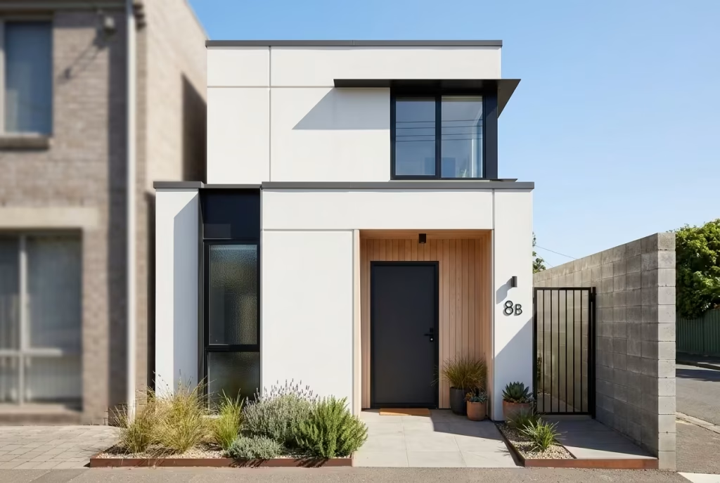
In small house design, material choices carry disproportionate weight. Every surface is scrutinised, every junction visible, and every finish tells a story about the house’s character and longevity. Limiting the palette to two or three complementary materials is not just an aesthetic decision it’s a strategy for coherence, durability, and timeless appeal. When I approach small façades, I treat materials as a vocabulary: each one has a role, a voice, and a rhythm. Overloading the palette is like using too many spices in a delicate dish it masks rather than enhances.
Durability is paramount. Small homes often have tight budgets but limited space means that repairs or replacements are highly visible and disruptive. Materials such as fibre-cement panels, treated timber, zinc, or high-quality render stand the test of time, resisting fading, warping, or staining. On a 5-metre (16-foot) frontage I recently worked on, combining smooth white render with pale cedar panels and black aluminium framing created a clean, enduring composition. Each material was chosen not only for its visual impact but for how it ages: the cedar would patinate gracefully, the render would retain its smoothness with minimal maintenance, and the aluminium would resist corrosion, even in damp climates.
Climate responsiveness is another critical factor. Small façades are highly exposed, and every material must perform under local weather conditions. In sunny regions, lighter colours and reflective surfaces prevent overheating, while shaded timber or deep reveals help moderate temperature swings. In cooler or wetter climates, rainscreen cladding and moisture-tolerant finishes are essential to avoid accelerated wear. I often recommend detailing that anticipates exposure slight setbacks, shadow gaps, and protective overhangs can dramatically extend material life and maintain aesthetic clarity.
Material layering should communicate function and proportion, not just decoration. For example, I often use timber or stone to articulate entries, framing the threshold with warmth and texture, while keeping the primary volume in render or concrete to maintain visual simplicity. Even small shifts in material like a 50 mm reveal between panels can catch light and cast shadows, adding subtle depth and richness to an otherwise compact façade.
Key Principles for Small House Materials:
- Limit palette: 2–3 materials to ensure clarity and cohesion
- Prioritise durability: Choose finishes that weather gracefully and require minimal maintenance
- Respond to climate: Factor in sun, rain, and local microclimates to protect finishes and optimise comfort
- Articulate function: Use material changes to highlight entries, setbacks, or functional zones rather than merely decorative accents
By thinking of materials as both narrative and tool, small homes can exude confidence, clarity, and tactility. A restrained, climate-conscious palette does more than beautify it structures perception, enhances proportion, and ensures that a small façade continues to feel composed and deliberate long after completion.
Common Mistakes I See in Small Exterior Projects
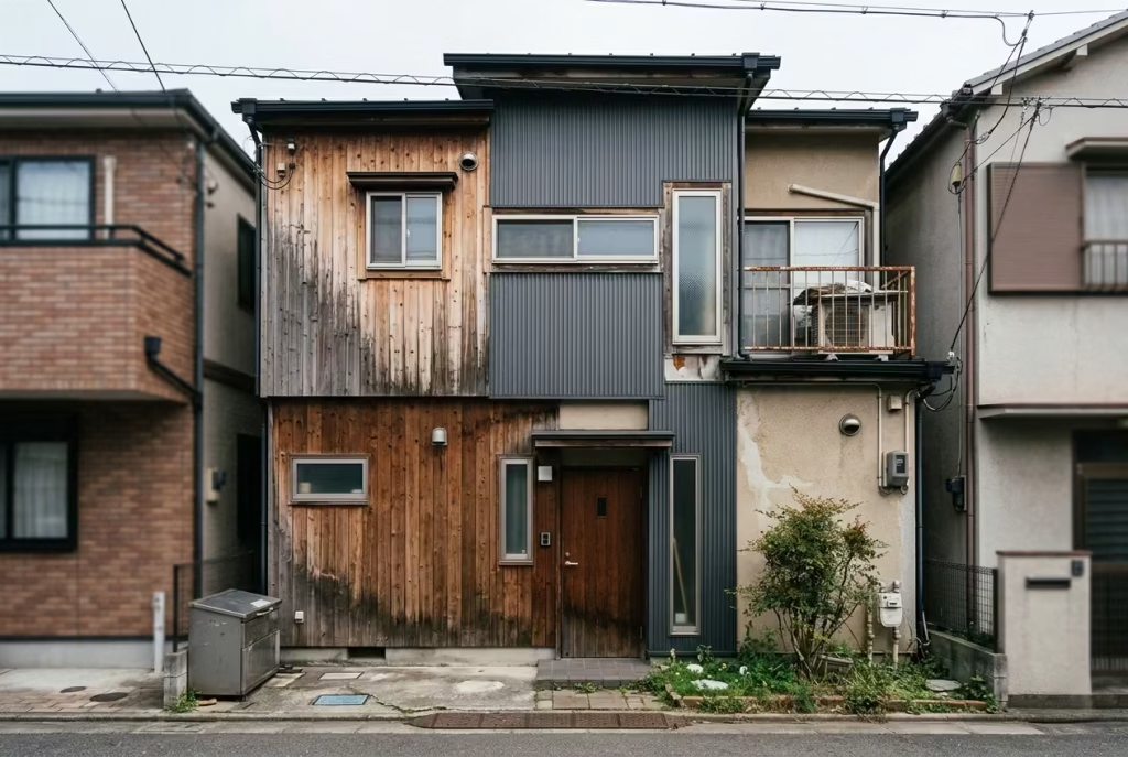
Small homes are unforgiving canvases. Unlike larger residences, where mistakes can hide behind mass or ornament, every decision on a compact façade is amplified. Over the years, I’ve observed recurring pitfalls that undermine the potential of these modest structures. Understanding and avoiding them is essential if you want a small home to read as considered, elegant, and spacious rather than cluttered, awkward, or contrived.
Over-layering Materials
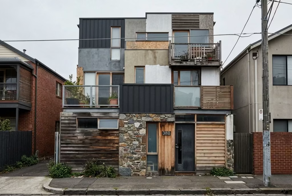
One of the most common missteps is trying to do “too much” with the façade. Over-layering materials mixing timber, stone, metal, render, and sometimes brick on a frontage barely 5–6 metres wide creates visual chaos. Instead of depth, it produces confusion, making the house appear smaller and restless. I always advocate restraint: choose two or three materials at most, and let each serve a purpose, whether functional, structural, or to highlight an architectural feature. For example, I once consulted on a narrow house where four materials were crammed across the frontage. After simplifying to smooth render with timber accents, the home immediately read taller, cleaner, and more deliberate. Less really is more when space is tight, and subtlety often trumps spectacle.
Ignoring Proportions
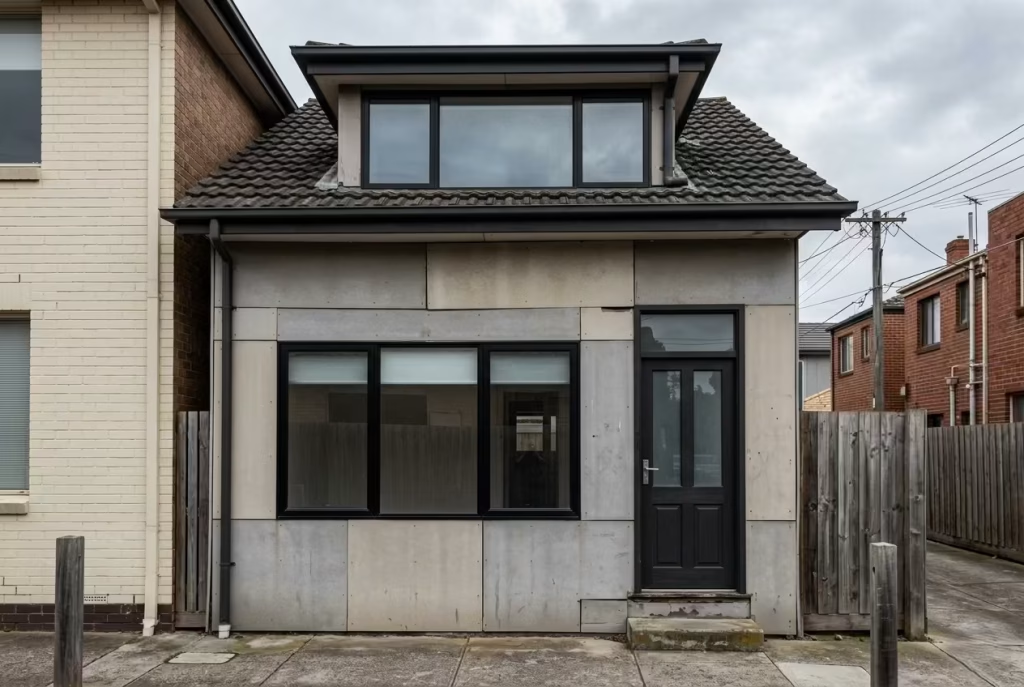
Small homes demand razor-sharp attention to proportion. Window heights, door widths, rooflines, and panel dimensions all carry far more weight when the façade is compact. I often see projects where oversized windows dwarf the frontage, or heavy rooflines compress the visual scale. Proportions are not arbitrary they guide the eye, reinforce rhythm, and create perceived spaciousness. Even a minor misalignment between cladding panels or window frames can upset the balance, making a house look cramped or awkward. In my own projects, I typically map façades to a subtle grid, ensuring every element relates harmoniously to the overall width and height.
Treating the Façade as Decoration Instead of Architecture
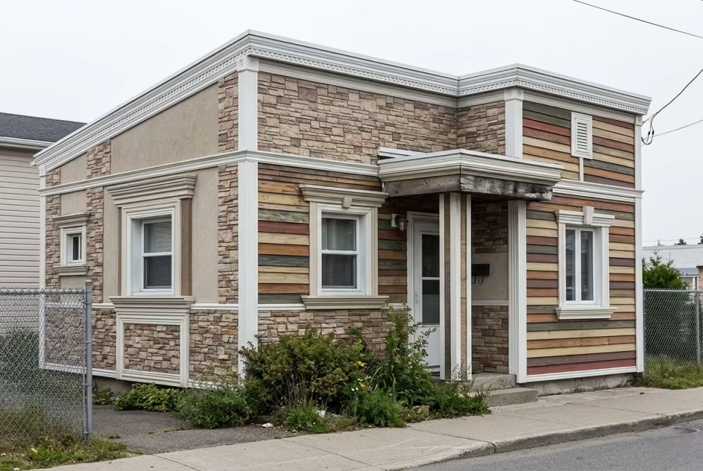
A façade should never be a canvas for decoration alone. Small homes especially benefit from façades that are functional, expressive, and structurally legible. Overemphasis on decorative cladding, fussy trims, or superficial detailing often results in façades that feel pasted together rather than integrated. I remind clients to think in terms of volumes, planes, and shadow rather than stickers or superficial “enhancements.” For instance, a recessed entry, a cantilevered balcony, or a subtle material change conveys richness and purpose far more effectively than decorative mouldings ever could. Architecture, even on a small scale, should speak for itself ornament follows proportion, not the other way around.
Cost vs Impact Considerations
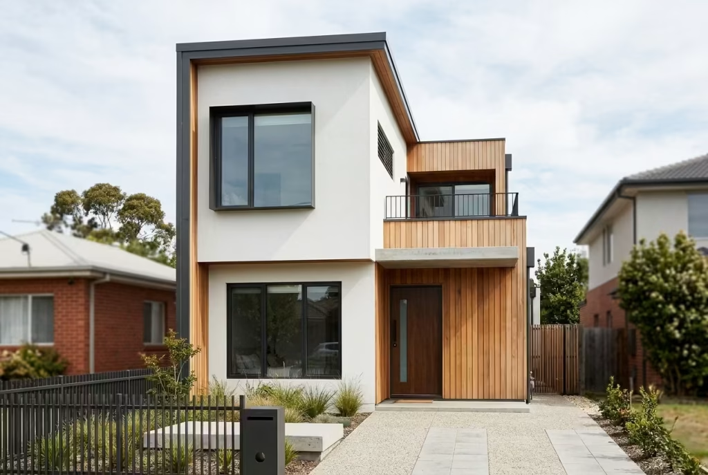
In small house design, every penny counts but not all investments deliver equal visual or functional return. Understanding where to focus resources and where to simplify is critical if you want a compact home to feel premium, considered, and enduring without overextending the budget. Think of it as a high-stakes balancing act: some moves carry disproportionate impact, while others add little more than noise.
Where to Invest
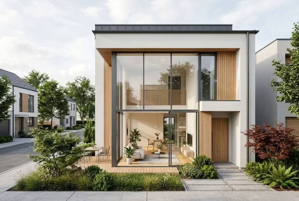
Windows
indows are more than just openings; they shape perception, light, and connection to the outdoors. High-quality glazing and slim, well-proportioned frames can make even a narrow frontage feel expansive and refined. I often prioritise full-height or floor-to-ceiling panels on key elevations, particularly in living areas or courtyards, because the perceived scale gain is immediate. Properly aligned and detailed, they read as deliberate design moves rather than functional necessities, giving the home a confident presence without increasing footprint.
Entry Detailing
The entry is the face of the house and a natural focus point for investment. A carefully designed door, subtle recess, integrated lighting, and thoughtful material layering can elevate the façade dramatically. On a 5.5-metre (18-foot) frontage, I recently used a recessed timber entry with a narrow canopy and concealed downlights. It cost slightly more than a standard flush door but immediately read as intentional, commanding attention while anchoring the overall composition. In small homes, investing in a single, well-executed focal element often delivers far more impact than multiple minor upgrades.
Where to Simplify
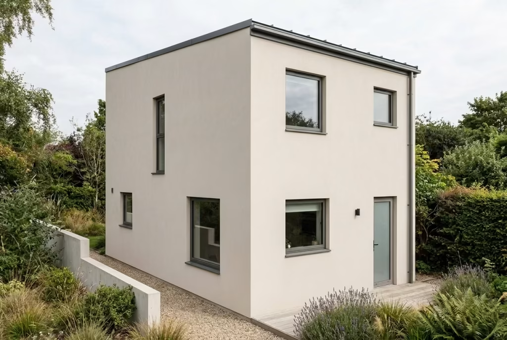
Secondary Elevations
Not every wall needs to carry the same level of polish or material layering. Side and rear elevations can often be pared back smooth render, simple cladding, or modestly sized openings suffice. This approach keeps the budget focused on high-impact zones, avoids overcomplication, and reinforces the hierarchy of the house. I always advise clients to prioritise façades that face the street or courtyards while treating secondary sides as quieter, functional planes.
Materials and Ornamentation
Similarly, subtle restraint in materials saves cost without diminishing visual sophistication. Avoid layering too many finishes on minor façades, and resist decorative flourishes that offer little spatial or aesthetic return. Small, deliberate touches like a continuous reveal or aligned paneling deliver far more elegance than gratuitous detailing.
Conclusion Small Homes, Sharper Design Thinking
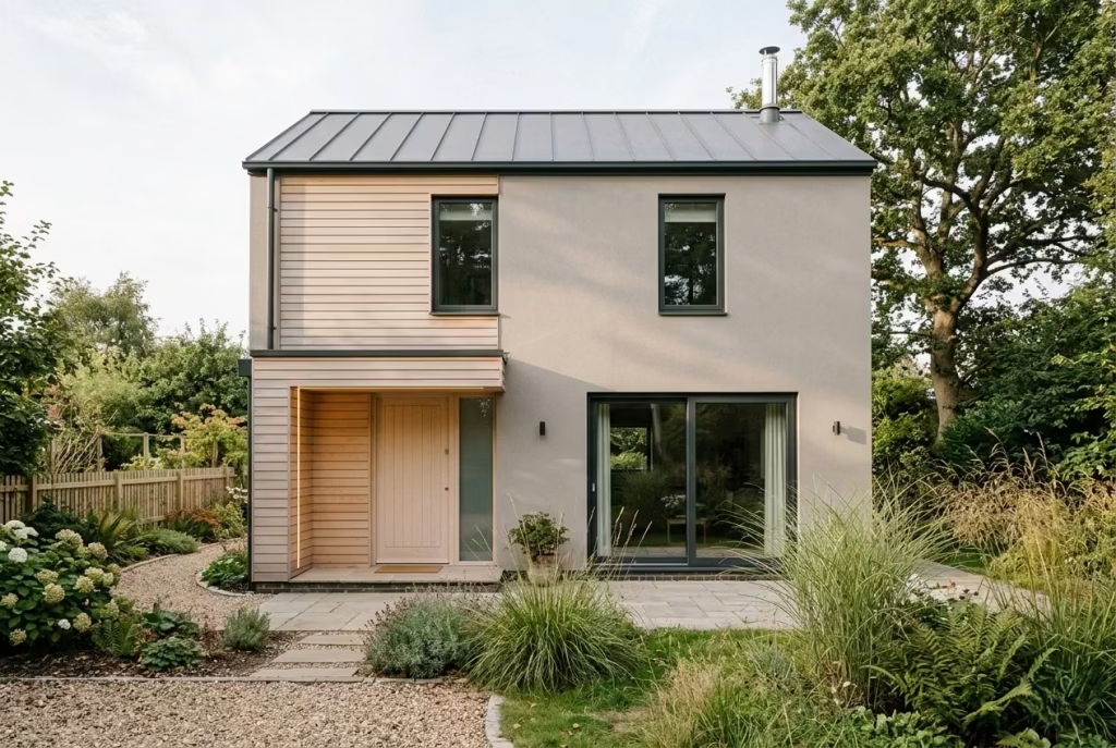
Small homes ask for discipline, and that is precisely where their strength lies. There is no slack in a compact façade, no room for filler, no hiding place for weak proportion or lazy detailing. Every choice has to earn its keep. That can feel demanding at first, but in practice it is what gives small homes their poise. The best ones do not look as though they were forced to do more than they could. They look resolved, measured, and completely at ease with themselves.
That is why lasting design thinking matters more than passing fashion. Trends may come and go, but a well-composed small house has a way of settling into its setting and ageing gracefully, without fuss or fanfare. When the roofline is clean, the materials are restrained, the openings are balanced, and the entry is handled with care, the house begins to work on a deeper level. It supports daily life, rather than merely dressing it up. That is where real value lives. Not in novelty for its own sake, but in the kind of design decisions that still feel right years later, when the gloss of something new has long worn off.
In my experience, the smallest homes often leave the strongest impression. Not because they try harder, but because every decision is doing real work. And that, in the end, is the whole point. When scale is limited, clarity matters more, restraint carries further, and good design gets to speak without raising its voice.
Frequently asked questions while designing small home exteriors
What is the best exterior style for a small house?
There is no single “best” style, but the most successful small-house exteriors tend to share the same discipline: clean lines, restrained materials, and well-balanced proportions. Minimalism, Scandinavian simplicity, modern box forms, and hybrid traditional-modern approaches often work well because they avoid visual clutter and let the architecture breathe. In small homes, clarity usually beats complexity.
How many exterior materials should a small house use?
Two to three materials is generally the sweet spot. Any more, and the façade can start to feel busy or fragmented. A limited palette allows each material to have a clear role, whether that is grounding the base, framing the entry, or adding warmth to a recessed volume. In small-scale design, restraint almost always reads as more refined.
Should a small house exterior be light or dark?
Both can work beautifully. Light exteriors tend to reflect more daylight and can make a compact home feel larger and softer. Dark exteriors create depth, contrast, and a more dramatic presence, especially when paired with good landscaping and crisp detailing. The right choice depends on context, climate, and the atmosphere you want the home to carry. It is less about right or wrong, more about what the house can wear well.
How do I make a small house look more expensive?
Focus on the parts people notice first and the details that hold everything together. A well-designed entry, slim windows, consistent material joints, and sharp roof edges often make a bigger difference than expensive decoration. Quality shows in proportion and precision. A house with modest materials can still look highly resolved if the composition is disciplined.
Do small homes work better with flat or pitched roofs?
Either can work, provided the roof suits the architecture and the setting. Flat roofs often suit modern, compact forms and can help create clean horizontal lines. Pitched roofs can add charm, height, and practicality, especially in suburban or transitional neighbourhoods. The key is not the roof type alone, but how cleanly it is detailed and how well it balances the rest of the façade.
What is the most common mistake in small exterior design?
Trying to do too much. Too many materials, too many colours, too many gestures, and the façade quickly loses its composure. Small houses need sharper editing than larger ones. Every added element has to justify itself, otherwise it becomes visual noise. The strongest exteriors usually feel calm, deliberate, and slightly understated.
How important is landscaping around a small house exterior?
Very important. Landscaping can soften hard geometry, frame the façade, and make a compact home feel more settled in its plot. Even small things, such as low planters, a slender tree, or a simple path treatment, can change how the house is perceived. Good planting works like a well-chosen frame around a painting. It does not compete with the house, it completes it.
Can a small house still have strong character?
Absolutely. In fact, small houses often have more character because the design has to work harder. When proportion, materials, light, and entry detailing are all handled with care, the result can feel quietly memorable. Strong character does not come from scale. It comes from judgment.