


25 Cozy Reading Nooks That Make Quiet Moments Feel Special
A reading nook is rarely about the chair itself. More often, it is about the feeling that settles around it once the rest of the room falls quiet. The softened light beside a window on a slow afternoon, the worn texture of linen beneath your hand, the sense of enclosure that makes even a busy home feel momentarily still, these are the details that quietly transform an ordinary corner into something deeply personal.
In modern homes, where open-plan layouts and constant digital noise have become the norm, spaces that encourage pause feel more valuable than ever. A well-designed reading nook offers exactly that. Not as a grand architectural gesture, but as a subtle retreat woven into daily life. It creates a place to sit without distraction, to slow down for half an hour, or simply to let a room breathe differently.
Over the years, I have noticed that the most successful reading corners are rarely the most decorated. In real residential projects, the nooks people return to again and again are usually the ones shaped with restraint and understanding.
A comfortable seat positioned where natural light moves gently across the room. A lamp placed low enough to soften the atmosphere after dark. A sense of proportion that makes the corner feel sheltered rather than exposed. These choices matter far more than styling alone.
The best reading nooks do not announce themselves loudly. They settle naturally into the home, almost like they have always belonged there, offering a quiet kind of luxury that feels increasingly rare.
Why a Reading Nook Feels So Restorative
There is something quietly transformative about a well-placed reading nook. It does not demand attention the way a dramatic kitchen island or statement chandelier might. Instead, it works its charm slowly, almost under the radar, shaping the emotional atmosphere of a home in ways people often do not notice until they begin using it every day. A comfortable reading corner can soften the sharp edges of modern living, offering a place where the noise of daily routines begins to loosen its grip, even if only for half an hour.
In homes that are constantly multitasking, where dining tables double as workstations and living rooms absorb everything from family film nights to endless notifications buzzing in the background, that sense of retreat has become worth its weight in gold. A reading nook creates a boundary without needing walls. It tells the mind, gently but clearly, that this is where the pace changes. That distinction may sound subtle on paper, but in real homes it can shift the entire emotional rhythm of a room.
The Role of Retreat in Busy Homes
Modern interiors often lean heavily toward openness. Large sightlines, connected spaces, and flowing layouts can make homes feel brighter and more social, but there is a flip side to that coin. Without smaller moments of containment, rooms can start to feel emotionally flat, as though every part of the house is performing at the same volume all day long. This is exactly where reading nooks come into their own.
A good nook creates a pocket of stillness within the larger landscape of the home. It becomes somewhere to land after a long day, somewhere to gather your thoughts before the morning properly begins, or simply somewhere to breathe for a moment while the world keeps moving around you. In many projects I have worked on, clients initially underestimate how much they will use these corners. Then, a few months later, they mention that the nook has quietly become their favourite spot in the house. That happens time and time again.
Part of the reason is psychological. Human beings are naturally drawn to spaces that offer a subtle sense of shelter. It is the same instinct that makes window seats feel comforting or explains why people instinctively choose the quieter booth in a restaurant tucked slightly away from the crowd. A reading nook taps into that feeling beautifully when it is designed with intention rather than treated as an afterthought.
How a Small Defined Space Changes the Rhythm of a Room
One of the most surprising things about reading nooks is how little square footage they actually require to change the entire personality of a room. Even a compact setup, perhaps a deep chair beside a linen curtain with a warm lamp glowing nearby, can anchor a space emotionally. Suddenly the room feels layered rather than simply furnished. That shift often comes down to visual pacing.
Large rooms, especially open-plan spaces, can sometimes feel as though the eye skims across them too quickly. There is nowhere for attention to pause. A reading nook interrupts that movement in the best possible way. It introduces intimacy into rooms that might otherwise feel expansive but impersonal. In design terms, it creates what many experienced interior designers quietly chase in residential work: moments of compression within openness.
I have seen this work particularly well in living rooms where seating arrangements originally felt too spread out. Adding a reading chair with a small side table, positioned beneath a floor lamp and grounded with a textured rug roughly 150 cm by 200 cm (about 5 by 6.5 feet), suddenly gives the room a heartbeat. People begin gravitating toward that corner almost instinctively. It becomes the spot where someone reads on rainy afternoons, answers late-night calls, or simply sits with a cup of tea while the house wakes up around them.
The magic lies in the fact that the nook feels defined without becoming disconnected. It remains part of the room while offering a slightly different emotional tempo.
Why Quiet Corners Work Especially Well in Bedrooms, Living Rooms, Landings, and Window Bays
Some areas of the home lend themselves naturally to reading nooks because they already carry a quieter energy.
Bedrooms, for example, are often the easiest place to create a restorative corner because the room is already associated with rest. A small upholstered chair beside a window, paired with a low table no taller than about 450 mm or 18 inches, can completely shift how the bedroom functions throughout the day. Instead of becoming a room used only for sleeping, it begins to feel layered and lived in from morning to evening.
Window bays are equally effective because they combine enclosure with natural light, which is a powerful combination. Daylight softens surfaces in ways artificial lighting rarely can. A built-in window seat with a seat depth between 500 and 650 mm, or roughly 20 to 26 inches, creates enough comfort for extended reading while still maintaining proportion. Add linen cushions, a textured throw, and perhaps a nearby wall sconce for evening hours, and the space starts to feel deeply rooted rather than decorated for effect.
Landings, interestingly enough, are often overlooked goldmines. In larger homes especially, upper-floor corridors can become dead space if left unresolved. But introducing a slim chair, compact bookshelf, and warm lighting into a landing corner can transform circulation space into somewhere emotionally useful. It is one of those moves that quietly elevates an entire house because it signals intention. Every inch feels considered.
Living rooms, meanwhile, benefit from reading nooks because they counterbalance entertainment-focused layouts. In homes dominated by televisions and large seating arrangements, a reading corner introduces a more personal layer. It says the room is not only for hosting or watching, but also for solitude, reflection, and slowing down every once in a blue moon.
Why the Best Reading Nooks Feel Lived In Rather Than Staged
The most memorable reading nooks are rarely the ones that look overly polished. In fact, spaces that feel too styled often lose the very quality that makes a nook appealing in the first place. Comfort should feel believable.
This is where many homeowners accidentally miss the forest for the trees. They focus heavily on aesthetics but forget the lived experience of the space itself.
A truly restorative nook needs practical softness. That means the chair should support the body properly. The lighting should flatter the room without straining the eyes. Nearby surfaces should actually function for books, tea, or reading glasses.
Even fabrics matter more than people think. Boucle may look beautiful in photographs, but in some homes washed linen or brushed cotton simply feels better for everyday use because it invites relaxation without feeling overly formal.
In real residential work, I have found that the most successful reading corners usually evolve naturally over time. A folded throw appears after winter arrives. Books begin stacking casually on the lower shelf. The cushion softens slightly with use. Those details give the nook soul. They make it feel inhabited rather than staged within an inch of its life.
There is also an important lesson here about scale and enclosure. A reading nook should feel gently contained, not cramped. Even in smaller homes, a slight visual boundary can work wonders. That boundary might come from a curtain, a bookshelf, a change in wall colour, or simply the way the furniture is positioned. Once that sense of enclosure exists, the mind begins to relax almost automatically.
And perhaps that is the real reason reading nooks continue to resonate so deeply. They remind us that comfort is not always about grandeur. Sometimes the spaces that stay with us longest are the quieter ones, tucked near a window or hidden at the edge of a room, where the light falls softly and the rest of the world fades into the background for a little while.
25 Cozy Reading Nook Ideas, Grouped by Space and Mood
The beauty of a reading nook is that it rarely depends on the size of the home. Some of the most inviting corners I have seen over the years were not grand architectural moments at all.
They were modest spaces shaped thoughtfully, perhaps a quiet chair beside a rain-soaked window, a built-in bench tucked beneath shelving, or a softly lit corner upstairs where the rest of the house seemed to fade into the background.
When approached well, even the smallest underused area can begin to feel like a sanctuary in disguise. What matters most is not perfection, but atmosphere.
A successful reading nook should feel emotionally distinct from the rest of the room. The moment you sit down, there should be a subtle shift in mood, almost as though the space exhales around you.
That feeling often comes from layered details working quietly together: the warmth of a linen cushion that has softened over time, the way late afternoon light lands across timber flooring, or the comfort of a chair deep enough to properly settle into after a long day. These are the details that turn ordinary corners into spaces people genuinely return to.
In real residential projects, I have found that homeowners often assume they need a dedicated library or large footprint to create this kind of experience. In truth, that is rarely the case. A well-balanced nook can fit into places many people overlook entirely, awkward landings, empty bedroom corners, bay windows, even the narrow space beside a bookshelf that once felt too small to matter. Sometimes the coziest spaces are hiding in plain sight, waiting for someone to connect the dots.
The following reading nook ideas are grouped not only by room, but by mood and how the spaces are actually lived in. Some lean bright and airy for slow summer mornings, while others feel cocooning and intimate, perfect for colder evenings when the weather outside turns grey and the house begins to feel especially comforting.
Throughout each idea, the focus stays rooted in real livability, thoughtful proportions, and the kinds of material choices that age gracefully over time rather than fading with trends.
Because ultimately, the best reading nooks are not just beautiful to look at. They become part of the rhythm of everyday life, quietly offering comfort, stillness, and a place to land whenever the world outside starts moving a little too fast.
Window-Focused Reading Nooks
There is a reason window-side reading nooks feel almost timeless. Natural light has a way of softening a space that artificial lighting rarely manages to replicate fully. It changes throughout the day, shifting gently across fabrics, timber, and painted walls, giving even the simplest corner a sense of movement and atmosphere. A reading nook positioned near a window taps into that quiet magic beautifully, creating a place that feels connected to both the interior of the home and the world outside it.
In real residential design projects, window-focused nooks are often the easiest way to make a room feel instantly more inviting without major structural changes. Bay windows, underused alcoves, and even narrow corners beside tall glazing can become deeply comforting once layered with the right seating, texture, and lighting. These spaces work especially well because they naturally offer two things people gravitate toward without even realising it: daylight and a subtle sense of retreat.
What makes these reading corners particularly effective is the balance they create. During the day, they feel bright, open, and calming. By evening, once paired with a warm lamp and softer textures, they become cocooning in an entirely different way. It is the best of both worlds, really. You get the openness of natural light without sacrificing intimacy, which is often where the true charm of a reading nook lies.
The following ideas explore different ways to shape window-focused reading corners that feel layered, comfortable, and genuinely livable rather than overly styled for appearance alone.
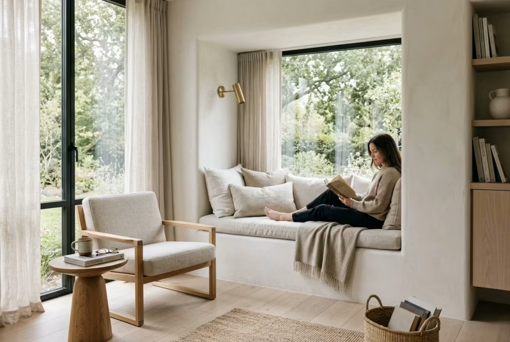
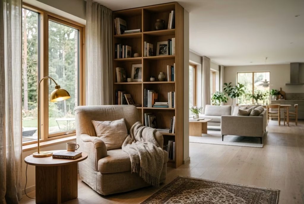
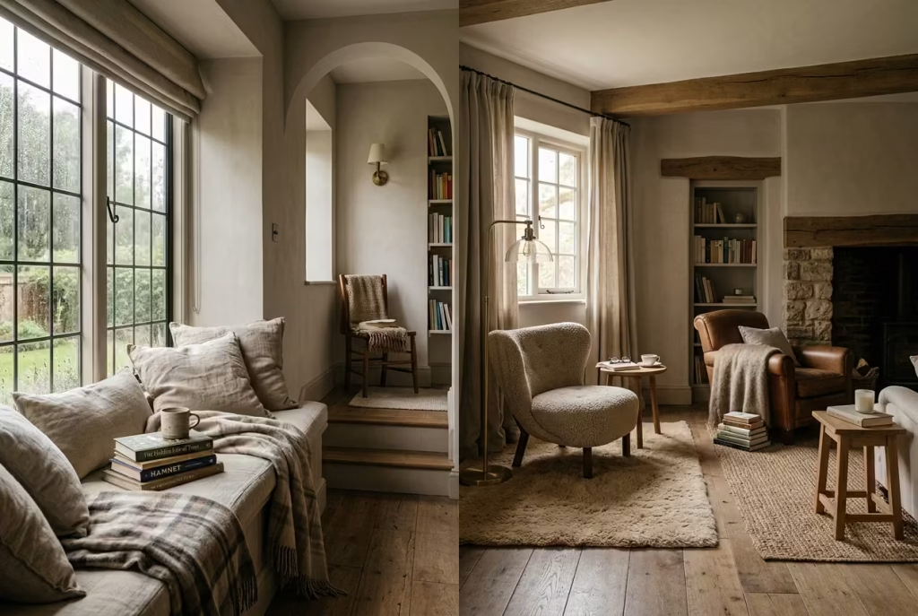
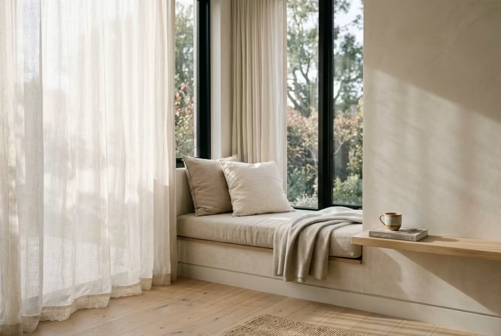
A Built-In Window Seat With Layered Cushions
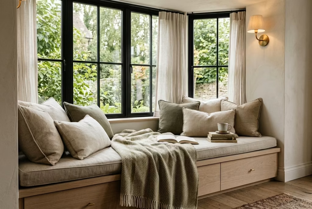
There is something undeniably comforting about a built-in window seat. It carries the kind of old-world charm that never really goes out of style, yet it can feel equally at home in contemporary interiors when handled with restraint. Positioned within a bay window or deep recess, a built-in seat naturally creates the feeling of being tucked away from the rest of the room without becoming disconnected from it. That balance is often where the magic happens.
What makes this type of reading nook especially successful is the sense of permanence it brings. Unlike a freestanding chair that can sometimes feel temporary or visually detached, a built-in seat becomes part of the architecture itself. It feels rooted. Intentional. As though the room was always meant to hold moments of quiet there.
In residential projects, I have seen this single feature completely change how people use a space. Corners that once collected clutter suddenly become the first place someone heads on slow Sunday mornings with coffee in hand and a book balanced beside them.
Proportion matters enormously here, more than many homeowners initially realise. A seat height between 450 and 500 mm, roughly 18 to 20 inches, tends to feel most comfortable for extended sitting, while a seat depth of around 500 to 650 mm, or 20 to 26 inches, creates enough room to curl up properly without feeling awkwardly oversized.
If the seat is too shallow, people perch rather than settle. Too deep, and it quickly becomes uncomfortable unless layered with oversized cushions behind the back. Getting those measurements right is worth its weight in gold because comfort is what ultimately determines whether the nook becomes part of everyday life or simply another pretty corner.
Layering also plays a surprisingly important role. The most inviting window seats rarely rely on a single fabric or cushion style. Instead, they build warmth gradually through texture and variation. Washed linen, brushed cotton, boucle, and soft wool blends all work beautifully together because they catch natural light differently throughout the day.
That subtle mix keeps the nook from falling flat visually. In one townhouse project, I paired warm oat-toned linen cushions with a lightly textured olive wool throw and a pale oak seat base beneath a north-facing bay window. By late afternoon, once the softer daylight settled across the fabrics, the entire corner seemed to glow quietly without needing excessive styling.
Storage beneath the seat can also be a game changer, particularly in smaller homes where every square foot matters. Deep drawers hidden below the bench work well for storing books, extra throws, or seasonal textiles, helping the nook feel calm rather than crowded. It is one of those practical decisions that quietly improves daily living behind the scenes.
Lighting deserves equal attention. Window seats naturally shine during the daytime, but many lose their appeal after sunset if artificial lighting has not been considered carefully. A nearby wall sconce with a warm bulb temperature around 2700K often creates a softer, more intimate mood than harsh overhead lighting. That small adjustment can mean the difference between a nook that feels atmospheric at night and one that fades into the background once daylight disappears.
What I find most interesting about built-in window seats, though, is how emotionally grounding they become over time. They are not flashy features shouting for attention from across the room. Instead, they settle quietly into the rhythm of the home. Books begin stacking casually beside the cushions.
A throw gets left crumpled after an evening read. Morning sunlight starts marking familiar patterns across the fabric. Before long, the nook stops feeling designed and starts feeling lived in, which is usually the point where a space truly comes alive.
There is an old saying about homes needing a place where the heart can rest for a while, and honestly, few features capture that feeling better than a thoughtfully designed window seat.
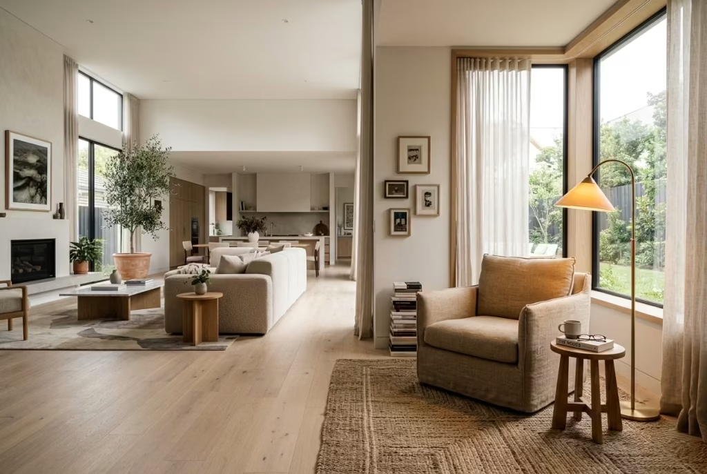
A Slim Armchair Beside a Full-Height Window
Sometimes the most effective reading nooks are also the simplest. A slim armchair placed beside a full-height window can transform an otherwise overlooked stretch of wall into a quiet retreat that feels both elegant and deeply calming. There is no need for excessive layering or complicated built-ins here. When natural light is doing the heavy lifting, restraint often becomes the smartest design decision in the room.
This type of setup works particularly well in homes blessed with generous glazing, where daylight pours in for most of the day and the outside view becomes part of the atmosphere itself.
In many ways, the window acts almost like living artwork, changing with the weather, the season, and the hour. Morning light can feel crisp and energising, while late afternoon sunlight softens everything around it, warming fabrics and timber finishes in a way that no styling trick can truly imitate. It is one of those situations where less really can be more. The key, though, lies in choosing the right chair.
A bulky armchair with oversized arms or a visually heavy base can quickly overpower the delicacy of the space, especially near tall glazing where openness should remain the focal point. Slim silhouettes tend to work far better because they allow the room to breathe visually.
Chairs with exposed timber legs, softly curved backs, or narrower proportions often feel lighter on the eye while still offering comfort. In one coastal renovation project, I used a compact linen armchair with a slightly reclined back beside a steel-framed window nearly 2.4 metres tall, around 8 feet.
The chair itself was relatively understated, yet the overall effect felt incredibly atmospheric because nothing interrupted the relationship between the interior and the changing landscape outside.
Scale matters more than people often expect in these corners. A side table between 300 and 450 mm wide, approximately 12 to 18 inches, is usually enough to comfortably hold a book, cup of tea, or reading glasses without crowding the area.
Oversized tables can make the arrangement feel cramped surprisingly quickly, particularly when paired with slimmer seating. I often lean toward smaller round tables in these spaces because they soften the geometry around the chair and make movement feel easier within tighter layouts.
Material choices can quietly elevate the entire nook as well. Light oak, walnut, brushed brass, linen, and textured cotton all respond beautifully to natural daylight, creating subtle tonal variation throughout the day.
That gentle shift is part of what keeps a reading corner emotionally engaging over time. It never feels static. The space changes mood alongside the weather outside, which gives it a kind of lived rhythm that purely decorative spaces often lack.
One detail many homeowners overlook is what happens after sunset. Full-height windows are beautiful during the day, but once darkness falls, large panes of glass can sometimes feel cold or visually empty if lighting has not been considered carefully.
A slim floor lamp or softly diffused wall light nearby helps maintain intimacy in the evening hours. Warm lighting layered against the darker exterior creates a cocooning effect that makes the nook feel inviting long after daylight has faded.
There is also something psychologically soothing about sitting near tall windows while remaining comfortably grounded inside. The experience feels expansive without being exposed, especially when softened by linen drapery or lightly textured curtains that filter the light gently. It is the design equivalent of killing two birds with one stone. You gain openness and comfort simultaneously, which is not always easy to achieve in residential interiors.
In practice, these window-side armchair nooks often become everyday sanctuaries precisely because they feel effortless. They do not demand attention. They simply invite people in quietly, whether for ten minutes with a novel before work or a long evening spent listening to rain tapping softly against the glass. And in homes where life rarely slows down for long, that kind of understated comfort can feel priceless.
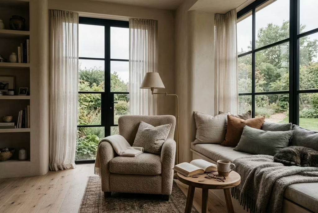
A Corner Bench That Wraps Around the Glass
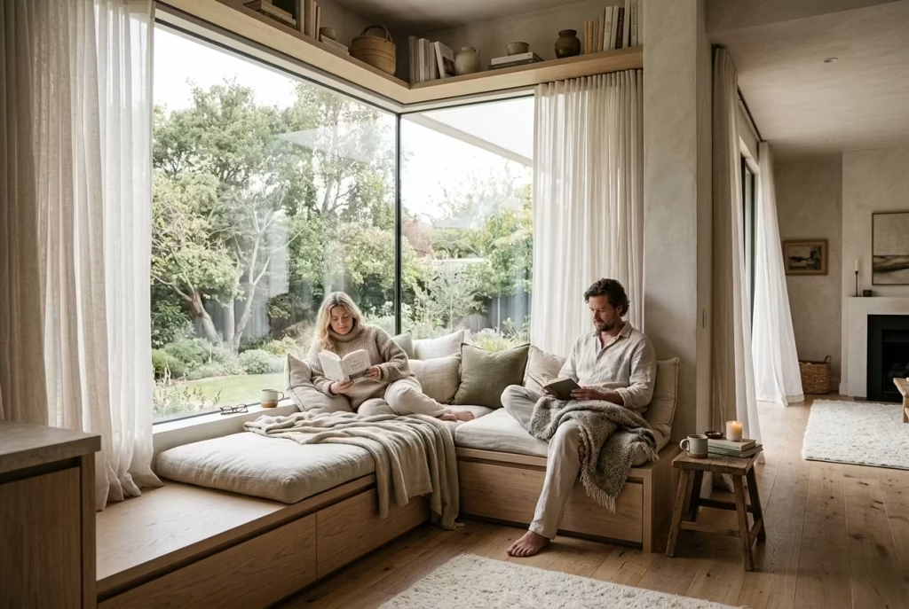
Some of the most memorable reading nooks are born from spaces that initially seem difficult to use well. An awkward alcove, an empty corner beside tall glazing, or a neglected edge of the room can easily become dead space if left unresolved.
Yet with the right approach, those overlooked areas often turn into the very soul of the home. A corner bench that wraps around the glass does exactly that. It transforms forgotten square footage into something immersive, intimate, and quietly luxurious without shouting for attention.
What makes this arrangement especially compelling is the way it reshapes the architecture of the room itself. Unlike a standalone chair or small seating arrangement, a wraparound bench feels integrated into the structure.
It creates stronger lines, introduces rhythm, and gives the eye somewhere intentional to land. In homes where layouts feel slightly disjointed or visually flat, this type of nook can tie the room together beautifully, almost like connecting the missing pieces of a puzzle.
I have used this approach several times in residential projects where standard furniture layouts simply were not solving the room properly. In one narrow corner extension with floor-to-ceiling glazing overlooking the garden, the owners originally planned to place two chairs by the windows. But the space still felt disconnected, as though the furniture was floating awkwardly rather than belonging there.
We eventually introduced an L-shaped oak bench wrapping around the corner glass, finished with warm linen cushions and concealed drawers underneath. The transformation was night and day. Suddenly the room felt grounded, architectural, and emotionally warmer all at once. That is the hidden strength of a wraparound nook. It creates enclosure naturally.
Human beings tend to relax more easily in spaces that feel gently protective without becoming boxed in. A corner bench quietly taps into that instinct. Sitting there feels different from sitting in the middle of an open room. Your back feels sheltered, your sightline extends outward toward the light, and the corner itself begins to feel almost cocoon-like in the best possible way. It is the kind of space people drift toward instinctively once the house settles down in the evening.
From a practical standpoint, this setup is also incredibly efficient. In smaller homes especially, making every inch count can be half the battle. A built-in corner bench allows seating and storage to work hand in hand rather than competing for floor space.
Deep drawers or lift-up compartments beneath the seat are ideal for storing extra cushions, books, blankets, or even seasonal décor that would otherwise create visual clutter elsewhere. It is one of those design moves where function quietly slips under the radar while still improving daily life enormously.
Comfort, however, should never be sacrificed for aesthetics. Benches that look beautiful in photographs can quickly become uncomfortable if dimensions are poorly considered. In most cases, a seat depth between 550 and 700 mm, around 22 to 28 inches, works well for relaxed reading, especially once cushions are layered in.
Seat heights around 450 mm or 18 inches tend to feel most natural ergonomically. I also recommend incorporating a gently angled upholstered back wherever possible because people are far more likely to linger when proper support exists. Otherwise, even the prettiest nook can become all hat and no cattle.
Material selection carries enormous emotional weight here too. Since these benches often occupy corners flooded with natural light, textures become highly visible throughout the day. Pale oak, walnut, limewashed timber, linen upholstery, and softly woven wool all respond beautifully to changing daylight conditions.
The nook begins to evolve visually hour by hour, particularly during early mornings and late afternoons when sunlight skims gently across surfaces. Those small atmospheric shifts are what give the space longevity emotionally. It continues revealing new moods rather than feeling static after a few weeks.
Curtains can also soften the architecture beautifully. Full-height linen drapery positioned around the glazing adds movement and texture while preventing the corner from feeling overly sharp or exposed. In one countryside project, sheer oatmeal-toned curtains transformed a relatively hard-lined modern corner into somewhere that felt almost poetic by evening once the light began fading outside.
Perhaps most importantly, wraparound corner benches encourage people to slow down without forcing the issue. The layout naturally invites lingering. Someone stretches out with a book while another person sits nearby with coffee.
A child climbs into the corner on rainy afternoons. Sunlight shifts quietly across the cushions while conversations drift in and out. Before long, the nook stops behaving like a design feature and starts becoming part of the family’s rhythm.
And truthfully, that is often the difference between a room that merely looks beautiful and one that genuinely feels alive.
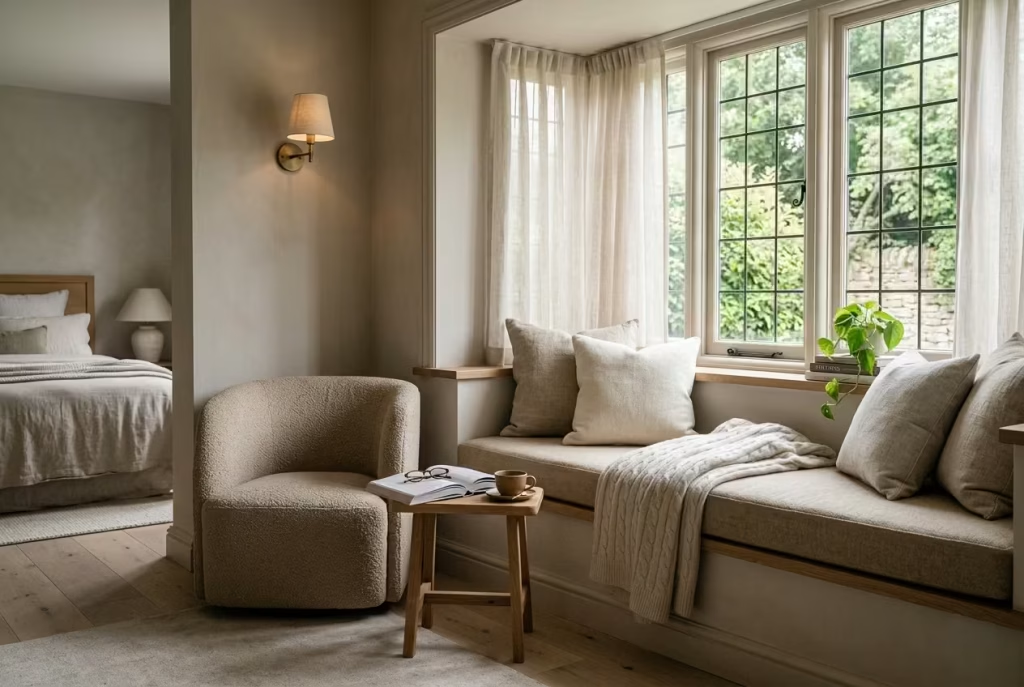
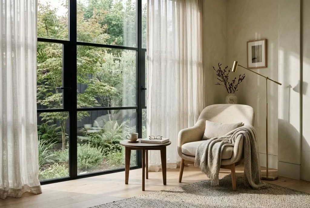
A Reading Perch With Sheer Curtains and Softened Daylight
Some reading nooks do not rely on dramatic furniture or layered styling to feel memorable. Instead, their entire atmosphere is shaped by light itself. A reading perch framed with sheer curtains and softened daylight carries that kind of quiet beauty, one that feels effortless, airy, and deeply calming without ever trying too hard.
In many homes, particularly summer bedrooms or south-facing spaces flooded with sunlight for most of the day, this softer approach can feel far more restorative than heavier, cocoon-style corners. The real charm here lies in restraint.
Rather than filling the nook with oversized throws, dense textures, or excessive décor, the focus shifts toward how natural light moves through the room. Sheer curtains become incredibly important because they filter daylight instead of blocking it outright.
The result is a softer, diffused glow that settles gently across the space, reducing harsh contrast and giving the room a slower, more relaxed atmosphere. It is the kind of light that makes even ordinary mornings feel slightly cinematic.
In one coastal bedroom project, the reading nook itself was remarkably simple. A low upholstered perch positioned beside tall south-facing windows, framed by loosely gathered linen sheers extending from ceiling to floor. Yet every afternoon, once the sunlight filtered through the fabric, the corner took on an entirely different mood.
The light wrapped around the textures softly, shadows became blurred at the edges, and the room developed the kind of warmth that photographs rarely capture fully. Sometimes it is these quieter design decisions that steal the show without making a song and dance about it.
This type of nook works especially well in bedrooms because bedrooms already carry a slower emotional rhythm than other parts of the home. Introducing a softly lit perch near the window reinforces that feeling rather than interrupting it.
Even compact spaces can benefit. A seat around 500 to 600 mm deep, approximately 20 to 24 inches, is often enough to create a comfortable lounging spot without overcrowding the room. Pairing it with a slim side table or floating shelf nearby helps keep essentials within reach while preserving visual lightness.
Fabric choice matters enormously in these spaces because textiles become part of the light experience itself. Linen is particularly effective during warmer months because it catches daylight beautifully while still feeling breathable and relaxed.
Washed cotton creates a softer, more casual atmosphere that works well in family homes or coastal interiors where formality would feel out of place. During colder seasons, washed velvet can introduce a richer sense of depth without overwhelming the softness of the nook, especially in muted earthy tones like olive, clay, or warm taupe.
One mistake people often make with bright reading corners is trying to over-style them. They add too many cushions, too many decorative objects, or fabrics that feel visually heavy against the natural openness of the light.
Before long, the nook loses the very quality that made it appealing in the first place. In spaces like these, knowing when to pull back is half the battle. The room should feel breathable, not burdened.
The positioning of the curtains also changes the atmosphere more than many homeowners expect. Hanging sheers slightly wider than the window frame allows the fabric to soften the surrounding wall visually, creating a more relaxed architectural feel.
Ceiling-mounted curtain tracks can make the room appear taller and more elegant as well, particularly in smaller bedrooms where verticality helps prevent the space from feeling boxed in.
There is also something emotionally grounding about filtered daylight that should not be underestimated. Harsh direct sun can sometimes feel energising to the point of distraction, whereas softened daylight encourages stillness.
It creates an environment where reading feels natural rather than forced, where time seems to stretch a little slower in the background. That subtle emotional shift is often what separates a merely attractive nook from one people genuinely return to every day.
And perhaps that is the real beauty of this kind of reading perch. It reminds us that comfort does not always need to arrive wrapped in layers and excess. Sometimes the most restorative spaces are the quietest ones, where sunlight drifts gently through linen curtains, the outside world softens at the edges, and the room feels calm enough to simply sit still for a while.
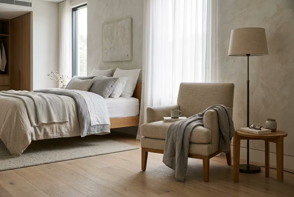
A Window Nook With a Floor Lamp for Evening Use
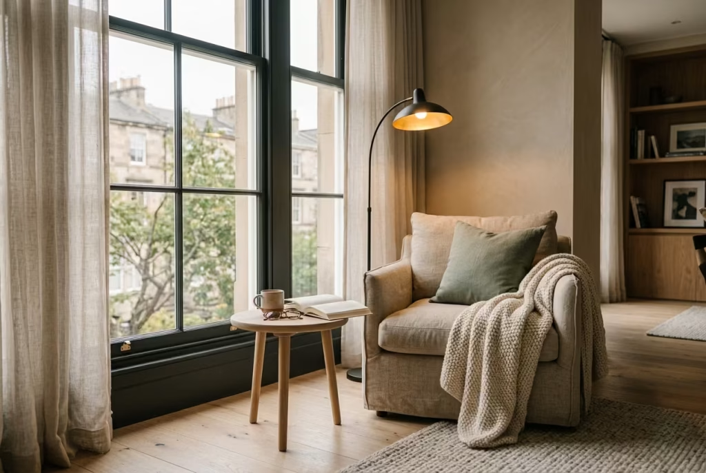
There is a particular kind of reading nook that quietly earns its place in a home not through visual drama, but through sheer reliability. A window nook paired with a well-positioned floor lamp falls into exactly that category.
It is the kind of setup that works from sunrise to long after dusk has settled, shifting effortlessly with the rhythm of the day without ever losing its sense of purpose. In many ways, it is less about styling a corner and more about designing a space that simply refuses to go unused.
During daylight hours, the window does most of the work. Natural light pours in, shaping the nook with a softness that feels effortless and familiar. But as the sun begins to drop and the room slowly transitions into evening, many otherwise beautiful corners tend to lose their presence. They fade into the background, as though they were never fully designed for life after sunset. This is where a thoughtfully chosen floor lamp changes everything.
The right lamp does more than just illuminate a chair. It anchors the entire corner emotionally. A warm-toned bulb, ideally within the 2700K range, casts a gentle glow that feels inviting rather than clinical.
It wraps the space in a soft halo, allowing textures like linen, wool, or brushed cotton to regain depth even in low light. Without this layer, a reading nook can easily feel flat or forgotten once natural daylight disappears, no matter how beautiful it looked earlier in the day.
In real residential projects, I have found this combination to be one of the most consistently successful layouts because of its adaptability. It is not tied to a single moment of the day. Instead, it evolves. In one townhouse living room, a compact armchair was placed beside a tall sash window, with a slender arched floor lamp positioned slightly behind it, angled gently toward the seat.
During the morning, the space felt open and refreshing, with sunlight streaming through sheer curtains. By evening, the lamp took over completely, casting a warm pool of light that made the corner feel almost cinematic in its quietness. The same spot that hosted a quick morning coffee became a late-night reading retreat without any need for rearrangement.
Scale and placement are what make or break this kind of nook. A floor lamp that is too bulky can overwhelm the composition, especially in tighter spaces where visual lightness matters. Slim-profile designs with curved arms or adjustable heads tend to work best because they allow the light to be directed precisely where it is needed without dominating the room. Ideally, the lamp should sit just behind or slightly to the side of the seating, creating layered light rather than a single harsh beam.
Comfort also plays a more important role here than people often realise. Since this nook is expected to function across both bright and low-light conditions, the seating needs to remain inviting regardless of time of day.
A medium-depth armchair, typically around 500 to 600 mm in seat depth, roughly 20 to 24 inches, tends to strike the right balance. Deep enough to settle into properly, yet not so oversized that it feels heavy beside the window. When paired with a small side table in the 300 to 400 mm range, the arrangement stays practical without becoming visually cluttered.
There is also a subtle psychological advantage to this type of setup. Because the nook remains usable after dark, it naturally becomes part of the home’s evening rhythm. Instead of drifting toward screens or less comfortable seating elsewhere, people often find themselves gravitating back to this corner without thinking twice. It becomes a kind of soft landing point at the end of the day, somewhere to decompress, read a few pages, or simply sit quietly while the rest of the house winds down.
What makes this arrangement especially valuable is its honesty. It does not rely on seasonal styling or perfect lighting conditions. It adapts, almost imperceptibly, to whatever the day brings. And in homes where life rarely follows a predictable schedule, that kind of flexibility is worth its weight in gold.
Ultimately, a window nook with a floor lamp is not just a design choice. It is a small but meaningful commitment to everyday comfort, one that proves the best interiors are not the ones that look good only in photographs, but the ones that continue to feel right at every hour of the day.
Bedroom Reading Corners
Bedroom reading corners carry a different kind of intimacy compared to the rest of the home. They are less about display and more about withdrawal, where the pace of the day begins to loosen and the room settles into a quieter rhythm.
Tucked beside a window, at the foot of the bed, or within an unused alcove, these corners often become the most personal part of the bedroom without ever needing to announce themselves.
When shaped with the right balance of comfort, light, and proportion, they feel almost second nature, as if they were always meant to be there, quietly waiting for moments of pause at the end of a long day.
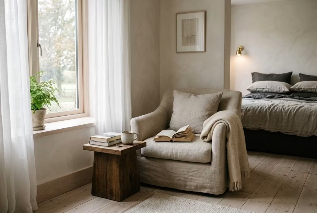
A Quiet Chair at the Foot of the Bed
There is a certain understated elegance in placing a reading chair at the foot of the bed. It does not demand attention the way statement furniture often does, yet it quietly completes the room in a way that feels almost inevitable once it is there.
In bedrooms with enough circulation space, this arrangement can introduce a sense of balance, as though the room has finally found its final missing note. The key here is proportion and breathing room.
A reading chair positioned too tightly against the bed can make the entire layout feel compressed, as if the room is holding its breath. But when you allow around 600 to 750 mm of clear movement, roughly 24 to 30 inches, the space begins to relax.
That simple buffer changes everything. It gives the eye space to travel naturally between the bed and the seating, and it ensures the chair feels like a considered addition rather than an afterthought squeezed into a leftover gap.
In practice, I often find that this setup works best in bedrooms where the architecture already carries a sense of calm order. Think high ceilings softened with fabric drapery, timber flooring that carries a gentle grain underfoot, or a symmetrical bed placement that anchors the room.
Within that structure, a chair at the foot of the bed acts almost like a punctuation mark, quietly reinforcing the rhythm of the space without overpowering it.
Material continuity plays a surprisingly important role here. When the chair subtly echoes the bed frame, either through timber tone, upholstery texture, or metal detailing, the room begins to feel more cohesive. It is not about perfect matching, but about conversation between elements.
For example, in one summer bedroom project, a soft linen-upholstered chair with warm oak legs was placed opposite a similarly toned oak bed frame. The materials were not identical, yet they spoke the same visual language. The result felt intentional without being rigid, like two notes in harmony rather than repetition for its own sake.
Comfort should never be treated as an afterthought in this arrangement. Although the chair is visually important, it must still function as a genuine place to sit and unwind. A seat depth around 500 to 600 mm, or 20 to 24 inches, usually provides enough support for relaxed reading without making the chair feel overly bulky within the bedroom. If the chair feels too formal or upright, it rarely gets used. It becomes scenery rather than part of daily life, which is exactly what you want to avoid.
Lighting, too, plays a quiet but decisive role. Bedrooms often rely heavily on overhead lighting, but for a reading corner like this, a softer secondary source makes all the difference. A small floor lamp or a wall-mounted sconce nearby can create a gentle pool of light that allows the chair to function well into the evening without disrupting the calm atmosphere of the room. It is one of those subtle adjustments that quietly elevates the entire experience.
What I find most interesting about this type of reading corner is how it changes the perception of the bedroom itself. Once a chair is placed thoughtfully at the foot of the bed, the room begins to feel less like a purely functional sleeping space and more like a layered environment with different modes of use.
Morning light might fall across the chair as the day begins, while evenings invite a slower rhythm, where the same spot becomes a place to unwind, reflect, or simply sit in stillness for a few minutes before sleep takes over.
It is a simple addition on paper, but in lived experience, it carries surprising emotional weight. A well-placed chair at the foot of the bed often becomes the first thing you notice when entering the room and, over time, one of the most quietly used features in the entire space.
You May also Like: 25 Creative Ways to Transform Your Spanish Reading Nook This Weekend
A Small Chaise in a Summer Bedroom
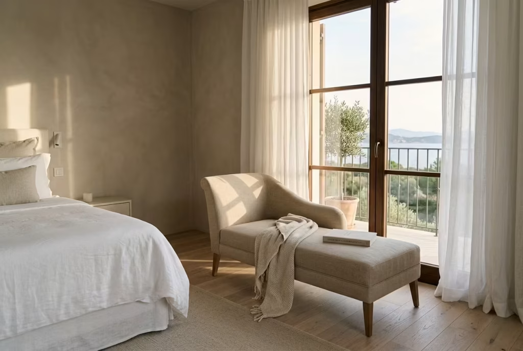
A chaise in a summer bedroom carries a different kind of rhythm altogether. It is not simply a place to sit, nor just a decorative flourish placed for visual balance. It introduces a slower, more indulgent tempo into the room, almost like the interior equivalent of long, unhurried afternoons where time seems to soften at the edges. In larger bedrooms with a resort-like atmosphere, this single piece can quietly shift the entire emotional register of the space.
Unlike more compact reading chairs, a chaise naturally encourages pause and stretch. It invites a more relaxed posture, one that feels closer to reclining than sitting, which is exactly why it works so well in bedrooms designed around rest and recovery.
In real residential projects, I have often found that once a chaise is introduced into a well-proportioned summer bedroom, it quickly becomes the most emotionally used element in the room, even more than the bed during daytime hours.
People gravitate toward it instinctively, almost without thinking, especially during those quiet, in-between moments of the day when life is neither rushing forward nor fully at rest.
The spatial requirement is important here. A chaise needs breathing room to feel intentional rather than intrusive. In larger bedrooms, it often works best when placed near a window or angled slightly toward natural light, allowing it to catch the shifting tones of the day.
When positioned too tightly against other furniture, it can lose its sense of ease and begin to feel visually crowded, which undermines its purpose entirely. The aim is to let it sit within the room as though it has always belonged there, quietly anchoring one side of the space without dominating it.
Materiality is where the summer character of this piece truly comes alive. Pale timber floors, linen upholstery, and softly muted neutral palettes create a sense of ease that feels almost effortless, yet is carefully considered. Linen, in particular, has a way of softening light rather than reflecting it harshly, which makes the chaise feel more integrated into the room throughout the day.
In one coastal bedroom project, a low-profile linen chaise in a warm stone tone was positioned beside a tall window framed with sheer curtains. By late afternoon, the sunlight would skim across the fabric in a way that made the entire corner feel suspended in a kind of quiet stillness, as if the room had exhaled completely.
There is also a subtle psychological comfort to having a reclining element in a bedroom that goes beyond aesthetics. A chaise suggests permission to slow down. It signals that the room is not solely about sleep or function, but also about recovery, reflection, and unstructured time.
That shift in perception often encourages people to use the space more intentionally during the day. A few pages of a book in the afternoon, a moment of rest before dinner, or simply sitting with no particular agenda becomes part of the room’s natural rhythm.
Scale plays a decisive role in maintaining this balance. A chaise that is too oversized can easily overwhelm a bedroom, particularly if the space already contains substantial furniture like a king-sized bed or built-in storage.
Ideally, it should feel proportionate to the room, typically occupying a generous but not dominant footprint, allowing circulation to remain fluid and uninterrupted. When placed correctly, it feels less like an addition and more like a continuation of the room’s architecture.
What makes the small chaise particularly effective in summer bedrooms is its ability to reflect seasonal lightness. It does not rely on heavy layering or dense textiles to feel complete. Instead, it thrives on openness, soft neutrals, and a sense of air flowing through the space.
When everything comes together, pale timber underfoot, linen that moves slightly with the breeze, and muted tones that do not compete for attention, the room begins to feel like a quiet retreat from the outside world.
And in those moments, when the light begins to fade and the day slows to a near standstill, the chaise becomes more than just furniture. It becomes a place where time loosens its grip, even if only for a little while.
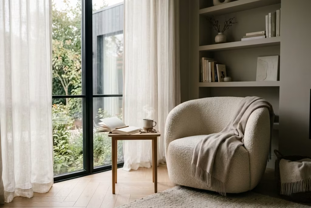
A Compact Bouclé Chair Beside a Bedroom Lamp
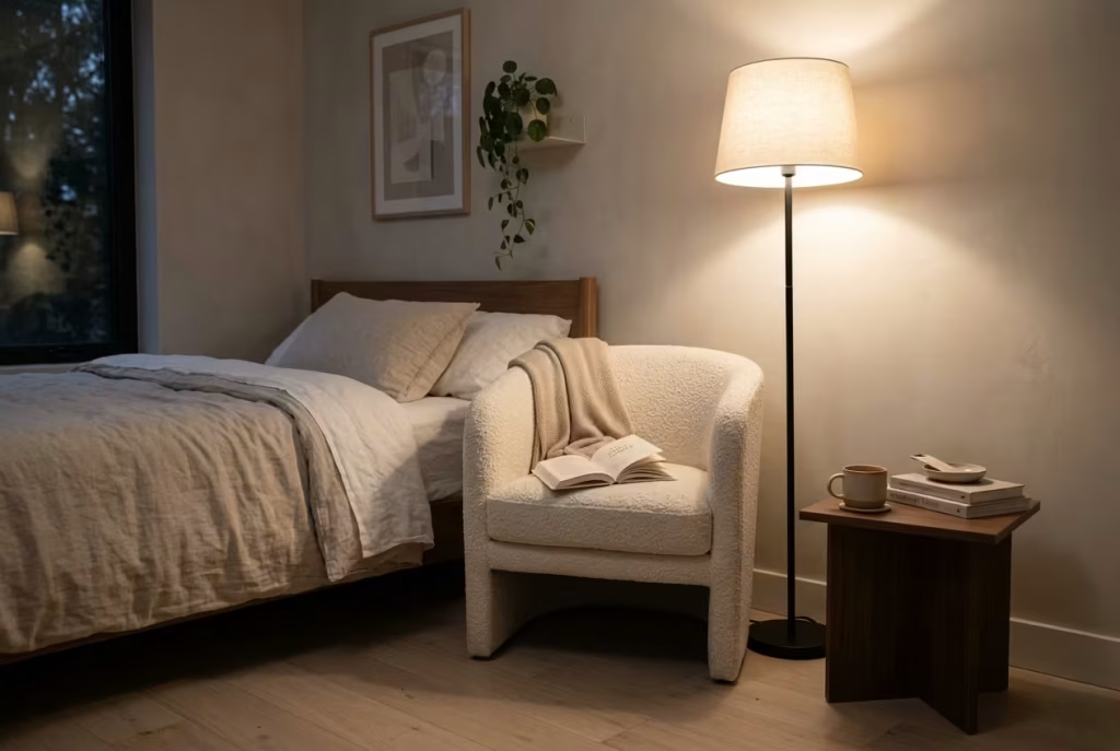
There is a quiet sophistication in restraint, especially in smaller bedrooms where every piece of furniture needs to earn its place. A compact bouclé chair positioned beside a softly glowing bedroom lamp is one of those understated combinations that can transform a room without making a song and dance about it. It does not rely on scale or drama. Instead, it works through texture, proportion, and atmosphere, all layered together with a sense of ease that feels completely unforced.
Bouclé, with its gently looped surface, brings an immediate sense of tactility to a space that might otherwise feel visually flat. In smaller rooms, where clean lines and limited square footage can sometimes lean toward starkness, this fabric introduces softness without adding bulk. It catches light in a subtle, almost broken way, which means it never feels heavy or overpowering. Instead, it sits quietly in the room, adding depth without shouting for attention.
In practice, I have found this pairing to be one of the most reliable ways to bring a bedroom to life when space is at a premium. In one compact city apartment project, the bedroom layout was extremely tight, with just enough room for a bed, a small wardrobe, and a narrow walkway.
There was no possibility of introducing anything oversized or architecturally built-in. Yet by placing a petite bouclé armchair in a soft ivory tone beside a slim brass floor lamp, the entire room shifted in character. What was once purely functional suddenly felt considered, layered, and complete, as though the final piece of a quiet puzzle had fallen into place.
The lamp plays an equally important role here, often more than people initially realise. A bedroom lamp with a warm, diffused glow helps anchor the chair and define its purpose. Without it, the chair risks becoming purely decorative, floating visually without context. With it, the corner becomes purposeful.
It signals a space for pause, whether that is reading a few pages before bed, sitting quietly while the day winds down, or simply taking a moment away from screens and noise. A warm colour temperature around 2700K tends to work best, as it softens the edges of the room and creates a cocoon-like atmosphere that feels especially comforting in the evening.
Scale is everything in these kinds of arrangements. A compact bouclé chair should feel tailored to the room rather than competing with it. Oversized arms or deep proportions can quickly overwhelm a small bedroom, making circulation feel tighter than it actually is.
Instead, slimmer silhouettes with slightly rounded forms tend to work best, as they maintain comfort without adding visual weight. When paired with a small side table or even a wall-mounted shelf within arm’s reach, the setup becomes fully functional without cluttering the floor space.
What makes this combination particularly effective is its ability to bring a sense of completion to a room that might otherwise feel unfinished. In many residential projects, I have noticed that smaller bedrooms often suffer not from lack of furniture, but from lack of atmosphere.
Everything is technically in place, yet the room still feels like it is missing something subtle but essential. Introducing a bouclé chair beside a lamp often resolves that tension almost immediately. It adds a point of pause, a visual resting place, and a layer of softness that ties the whole space together.
There is also something emotionally grounding about this setup. It does not demand long periods of use or grand gestures. Instead, it invites small, everyday moments that quietly accumulate over time. A few minutes of reading before bed.
A slow morning coffee while the rest of the house is still waking up. A brief moment of stillness at the end of a long day when everything else finally quiets down. These are not dramatic experiences, but they are the ones that often define how a room feels to live in.
And that is where the real strength of this pairing lies. It proves that even in the smallest of bedrooms, thoughtful detail can carry more weight than scale ever could.
A Bedside Reading Niche With a Wall Light and Shelf
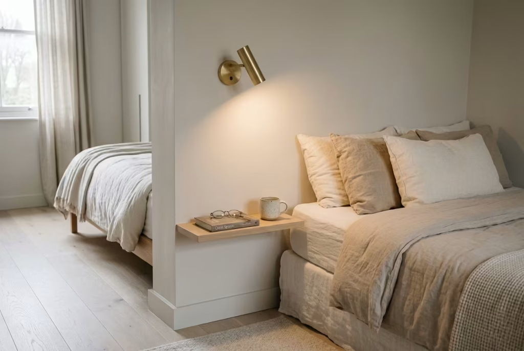
In tightly planned bedrooms where every centimetre is spoken for, a reading niche beside the bed often becomes the quiet hero of the space. It is a solution that works not by adding more, but by refining what is already there.
Instead of forcing in a chair that might tip the balance of the room, this approach carves out a calm, intentional moment within the architecture itself, almost like a pause written directly into the wall.
What makes this idea so effective is its discipline. There is no excess, no visual noise, just a carefully considered pairing of light and function. A small wall-mounted shelf holds the essentials, a book in progress, a pair of reading glasses, perhaps a ceramic cup in the early morning, while a wall light provides focused illumination without consuming valuable floor space. It is simple on paper, but in lived experience it can completely change how a bedroom feels and functions.
In many real residential projects, I have seen this approach rescue rooms that initially felt too constrained for traditional furniture layouts. One compact guest bedroom, for example, had just enough clearance for a double bed and minimal circulation space.
Introducing a slim oak shelf integrated into the wall, paired with a softly adjustable brass wall sconce, instantly gave the room purpose beyond sleep. What was once a purely transitional space began to feel intentional, almost curated, as though every element had been placed with quiet confidence rather than compromise.
The real strength of a bedside niche lies in how effortlessly it keeps the room visually light. Floor space remains untouched, circulation flows naturally, and the eye is not interrupted by bulky furniture.
This is particularly valuable in minimalist or refined contemporary schemes where clarity and restraint are central to the design language. The space feels composed, yet never overworked. Everything sits exactly where it should, without trying to overperform.
Lighting is the defining element here, and it deserves careful attention. A well-placed wall light, ideally with a warm, diffused glow around 2700K, creates a gentle pool of illumination that feels intimate rather than harsh.
Adjustable arms or pivoting heads can add flexibility, allowing the light to be directed precisely where it is needed. In practice, this is what transforms a simple shelf into a functioning reading moment. Without it, the niche risks feeling purely decorative. With it, it becomes a fully realised experience.
Shelf design also plays a subtle but important role. Depth should remain modest, typically around 150 to 200 mm, roughly 6 to 8 inches, just enough to hold essentials without protruding into the room.
Materials like pale oak, walnut, or matte-finished stone tend to work well because they age gracefully and sit quietly within the overall composition. The aim is not to dominate the wall, but to blend into it so naturally that it feels like it has always been part of the architecture.
There is also a psychological comfort in having everything within arm’s reach while still maintaining visual order. Unlike traditional bedside tables, which can sometimes accumulate clutter over time, a well-designed niche encourages a more deliberate approach.
It gently limits excess, almost like a soft boundary that keeps the essentials close while discouraging unnecessary accumulation. Over time, this can make the entire bedroom feel calmer and more composed.
What is particularly interesting about this setup is how it changes the rhythm of bedtime itself. Instead of reaching for devices or being surrounded by scattered objects, the experience becomes more intentional.
A book, a soft light, and a quiet moment of transition before sleep. It is a small adjustment, but one that can subtly improve the quality of how the space is used day after day.
And in the end, that is the quiet success of a bedside reading niche. It proves that even in the most compact bedrooms, thoughtful design does not need to compete for space. It simply needs to work smarter, not louder, allowing the room to breathe while still offering moments of calm exactly where they are needed most.
A Dressing-Room Reading Corner With a Soft Ottoman
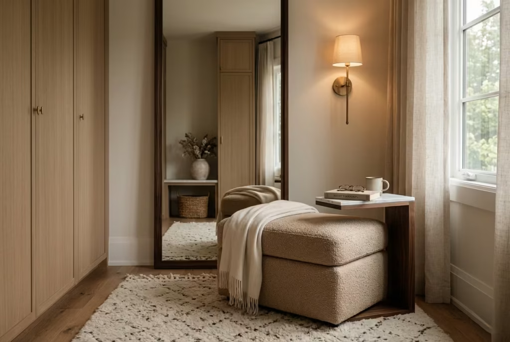
There is a particular kind of quiet luxury that reveals itself in dressing rooms, especially when they are treated as more than just transitional spaces between bedroom and wardrobe.
A reading corner placed here, anchored by a soft ottoman, introduces an unexpected layer of calm into what is often a purely functional environment. It slows the pace down, almost imperceptibly, turning a space of routine into one of pause and composure.
In larger suites, this approach works particularly well because dressing rooms already carry a sense of separation from the main living and sleeping areas. They sit slightly off to the side of daily life, which makes them ideal for moments that do not demand attention but still deserve comfort.
A softly upholstered ottoman placed beside a slim chair or near a window can quietly shift the room from being purely utilitarian to something more atmospheric, almost like a private interlude within the home.
The ottoman itself is doing far more work than it initially appears to. It is not just a decorative object or an afterthought placed to fill space. In well-designed interiors, it becomes a multifunctional anchor.
It offers a place to sit while dressing, a surface to rest a robe, or a quiet perch for a few pages of reading while the day slowly begins or winds down. That kind of flexibility is what gives it lasting value. It earns its place not through statement design, but through everyday usefulness that never feels forced.
In real residential projects, I have often found that dressing-room seating is underestimated. Homeowners tend to prioritise storage systems and lighting layouts, which are of course essential, but they sometimes overlook the emotional quality of the space.
In one large master suite renovation, a previously empty corner near a full-height mirror was reworked with a compact boucle ottoman in a muted stone tone, paired with a slender wall light and a small marble side ledge. The transformation was subtle at first glance, yet it completely changed how the room was experienced. What was once a place of quick movement became a space where people naturally paused, even if only for a moment.
Material choice plays a defining role in how this type of reading corner feels. Soft upholstery like linen, velvet, or bouclé works beautifully here because dressing rooms often benefit from tactile contrast.
These textures soften the typically structured nature of wardrobes, mirrors, and cabinetry. When light moves across these materials, particularly in the early morning or late afternoon, it creates a gentle sense of depth that feels almost effortless. Nothing is shouting for attention, yet everything feels considered.
Proportion is equally important. A dressing-room reading corner should never feel intrusive or oversized. The ottoman, for example, should sit comfortably within the circulation flow, allowing movement between wardrobe, mirror, and exit points to remain fluid.
Typically, leaving at least 600 mm, around 24 inches, of clearance around seating ensures the space feels open rather than constrained. This is where restraint becomes essential. A well-placed piece should feel like it belongs without interrupting the rhythm of the room.
Lighting completes the atmosphere. Dressing rooms often rely heavily on functional illumination, but a softer secondary layer can transform the mood entirely. A warm wall light or discreet floor lamp helps shift the corner from purely practical to quietly reflective.
It is that transition that allows the space to support slower moments, whether it is sitting down to tie shoes properly, folding a garment with care, or simply taking a breath before stepping out into the day.
What makes this idea particularly compelling is its emotional subtlety. It is not a space designed for long hours of reading or extended use. Instead, it supports fragments of time, those small, often overlooked pauses that sit between larger routines.
And yet, those fragments add up. Over time, they create a sense that the home is not only functional, but also attentive to how life actually unfolds within it.
A dressing-room reading corner with a soft ottoman, when done well, feels like a quiet gesture of thoughtfulness. It does not demand attention, but it consistently rewards it.
Built-In and Bespoke Nooks
Built-in and bespoke reading nooks represent the most intentional expression of quiet comfort within a home. Unlike freestanding arrangements that can shift or evolve over time, these spaces are shaped directly into the architecture, which gives them a sense of permanence and quiet authority.
They feel considered from the ground up, as though the room itself has been designed around moments of pause rather than simply accommodating them. When handled with care, these nooks become more than seating areas.
They become integrated pockets of calm, where craftsmanship, proportion, and material detail come together to create something deeply personal and enduring.
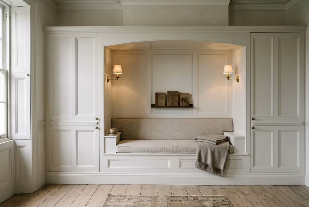
A Bespoke Joinery Nook With Storage Below
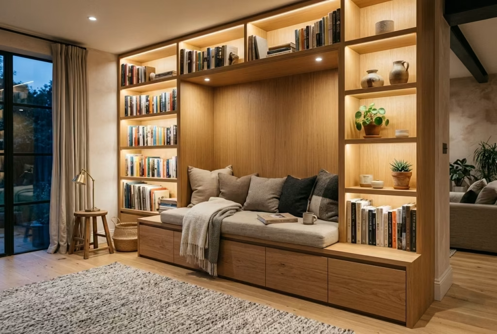
A bespoke joinery reading nook is where design stops feeling like furniture placement and starts behaving like architecture. It is not something added into a room at the end of a project, but something that is quietly woven into it from the beginning, almost as if the space was always waiting for that moment of completion. In family homes especially, this type of built-in solution becomes a grounding element, anchoring everyday life with a sense of order that feels calm rather than clinical.
What sets this approach apart is its ability to resolve multiple needs in one considered gesture. On the surface, it is a comfortable reading seat. But beneath that, it becomes a highly efficient storage system that keeps the visual language of the room clean and uninterrupted.
Books that tend to migrate across surfaces, spare throws that accumulate over time, even chargers and small everyday objects that usually create visual noise, all disappear neatly into the joinery below. The result is a space that feels composed without ever feeling rigid.
In real residential projects, I have seen bespoke joinery nooks transform how families use shared spaces. One open-plan living area, originally designed with generous proportions but very little intimacy, had a long underutilised wall that felt slightly empty and unresolved.
By introducing a full-length timber bench with integrated drawers below and a softly upholstered seat above, the entire dynamic of the room changed. What was once a pass-through zone became a destination.
Children naturally gravitated toward it with books after school, while adults used it as a quiet corner away from the main seating area. It became one of those spaces that quietly earns its relevance every single day.
The success of this kind of nook lies in precision. Joinery allows every millimetre to be considered, which means proportions can be tuned exactly to the room rather than relying on off-the-shelf limitations.
A seat height around 450 to 500 mm, or roughly 18 to 20 inches, typically works best for comfort, while storage depth can be adjusted depending on what the space needs to hold. Deep drawers offer practicality, while lift-up compartments maintain a seamless visual line. Either way, the key is ensuring that storage feels invisible in use, so the calmness of the nook is never disrupted.
Material selection also carries significant weight in bespoke work. Because the nook becomes part of the architecture, it needs to age gracefully alongside it. Timber finishes such as oak, walnut, or ash tend to work particularly well, especially when paired with soft upholstery in linen or tightly woven cotton.
These combinations strike a balance between durability and comfort, ensuring the nook feels inviting rather than overly engineered. Over time, these materials develop a natural patina that adds depth, giving the space a lived-in character that cannot be artificially replicated.
Lighting, once again, plays a decisive role in shaping how the nook is experienced. Integrated wall lighting or discreet LED strips within shelving can gently highlight the joinery without overwhelming it.
The aim is not to spotlight the space dramatically, but to allow it to glow softly within the room, especially during the evening hours when the rest of the home begins to dim. It is this subtle layering of light and material that gives bespoke nooks their quiet presence.
What is particularly compelling about built-in joinery seating is how it changes the perception of permanence in a home. Unlike movable furniture, which can be rearranged or replaced, these nooks feel anchored.
They settle into the structure of the house itself, becoming part of its identity over time. And because of that, they tend to gather meaning naturally. A cushion that softens slightly with use, a shelf that slowly fills with well-thumbed books, a drawer that quietly holds the rhythm of daily life, all of these details accumulate until the nook feels less like a design feature and more like a lived experience.
Ultimately, a bespoke joinery reading nook with storage below is not just about saving space or improving function. It is about creating a moment within the architecture where life can slow down, even briefly, and where everything has its place without ever feeling overmanaged.
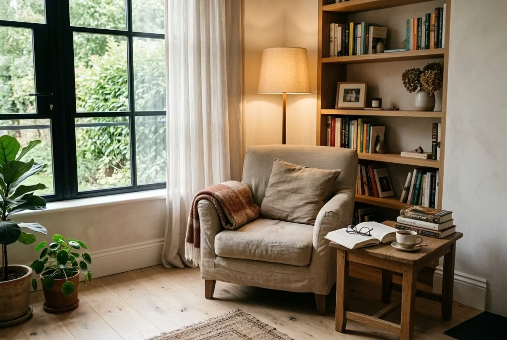
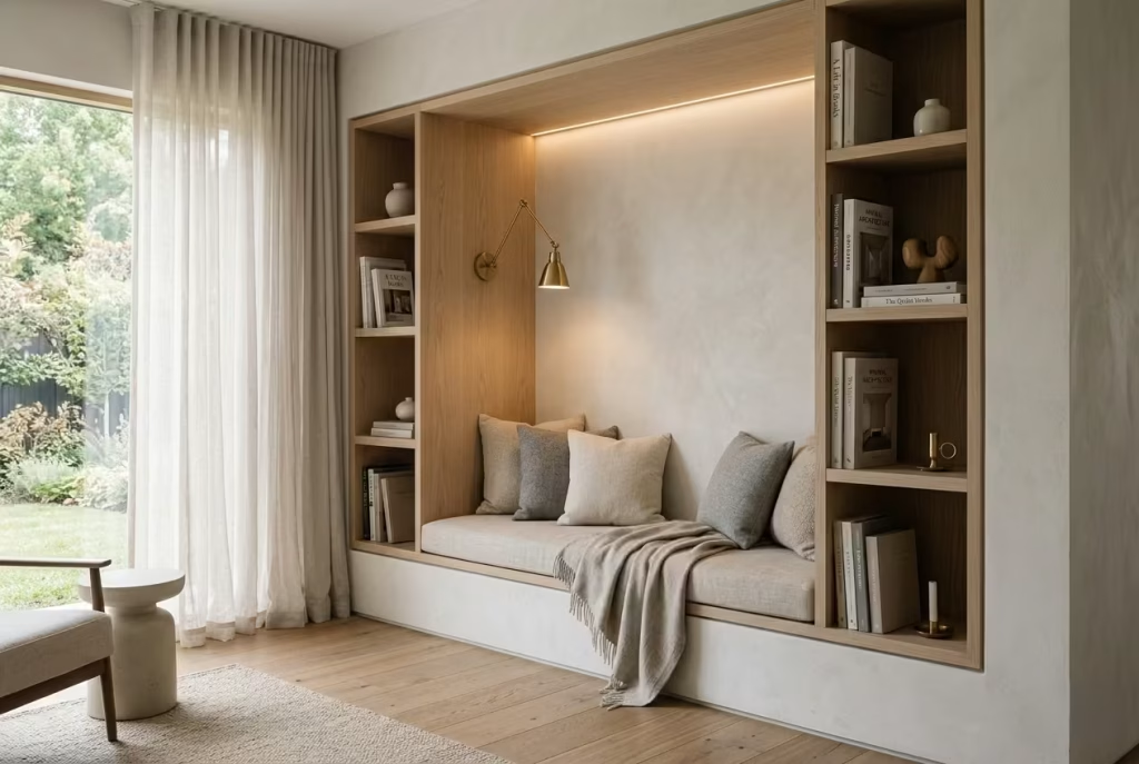
A Book-Lined Alcove With an Integrated Seat
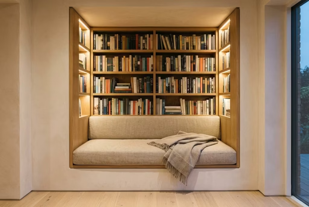
There is something quietly transportive about an alcove that is wrapped in books from floor to ceiling. It does not try to impress in a loud or theatrical way, yet it holds a kind of depth that you feel the moment you step into it.
A book-lined alcove with an integrated seat turns leftover architecture into something immersive, almost cocoon-like, where the boundary between storage, seating, and atmosphere begins to dissolve.
These spaces often begin as forgotten geometry in a home. A recessed wall that does not quite suit a full furniture arrangement, or a narrow pocket of circulation space that feels too generous to ignore but too awkward to style conventionally.
In many projects I have worked on, these are the exact areas that, when handled with care, end up becoming the most emotionally engaging parts of the home. It is a classic case of turning “what do we do with this” into “this is where we stay a while”.
What makes this idea so powerful is the way books themselves shape the mood of the space. Unlike decorative objects that remain static, books carry a sense of lived time. Their spines, colours, and subtle imperfections introduce variation that softens the architecture around them.
When an alcove is lined with books on all sides, the effect is less like shelving and more like being gently enclosed within a narrative. It feels layered, familiar, and slightly hushed, as if the room has naturally lowered its voice.
The integrated seat is what completes the experience. Without it, the alcove remains visual. With it, the space becomes inhabitable. A simple bench, ideally between 450 and 500 mm in height and around 550 to 650 mm in depth, allows the body to settle comfortably while maintaining the immersive quality of the surrounding books.
When upholstered in a tactile fabric such as linen, wool blend, or softly textured cotton, the seat begins to visually recede into the alcove rather than compete with it, which is exactly the effect you want in such a contained environment.
In real residential design work, I have seen this type of nook completely redefine how circulation spaces are perceived. One townhouse project had a narrow recessed wall along a stair landing that originally served no real purpose.
Once we introduced full-height oak shelving with an integrated cushioned seat below, the entire landing shifted from a transitional zone into a destination in its own right.
It became a place where people naturally slowed down, even if just for a few minutes, to browse, sit, or simply pause between floors. It was a subtle intervention, but one that changed the emotional geography of the home.
Lighting plays a crucial role in reinforcing the cocooning effect. Rather than relying on overhead fixtures, soft integrated lighting within the shelving can create gentle highlights across the book spines, adding depth without harsh contrast.
Warm, diffused lighting at around 2700K works particularly well here, as it enhances the natural tones of timber, paper, and fabric without making the space feel overly staged. In the evenings, this glow becomes almost lantern-like, giving the alcove a quiet sense of enclosure that feels incredibly grounding.
Material continuity is equally important. Because the alcove is visually dense due to the presence of books, the surrounding finishes should feel calm and restrained. Natural timber, muted wall tones, and simple upholstery allow the books to take centre stage without overwhelming the eye. When everything is balanced correctly, the space feels rich rather than busy, layered rather than cluttered.
What I find most compelling about book-lined alcoves is their ability to create emotional immersion without scale. They do not need to be large to feel impactful. In fact, some of the most successful examples are modest in footprint but carefully composed.
The key lies in enclosure. When the body feels gently held by the architecture and the mind is surrounded by familiar objects like books, there is an immediate sense of ease that is hard to replicate elsewhere in the home.
And perhaps that is the quiet success of this type of reading nook. It does not simply store books or provide a place to sit. It creates a small, self-contained world within the home, where time slows just enough to notice it passing.
A Panelled Wall With an Inset Bench
A panelled wall with an inset bench carries a quiet sense of authority that feels deeply rooted in tradition, yet still remarkably relevant in contemporary homes when handled with restraint. It is the kind of reading nook that does not rely on softness alone to create comfort.
Instead, it draws its strength from structure, rhythm, and architectural clarity, offering a space that feels composed, settled, and deliberately placed within the room.
In more formal interiors, especially heritage homes or carefully restored properties, this approach often feels like it belongs there from the outset. Panelled detailing naturally introduces order to a wall, breaking large surfaces into measured proportions that are pleasing to the eye without being overly decorative.
When an inset bench is introduced within that framework, the result feels almost architectural in its intention, as though the nook was carved into the fabric of the building rather than added later as an afterthought.
I have seen this approach work particularly well in period renovations where homeowners want to respect the original character of the house while still introducing moments of modern usability. In one Victorian townhouse project, a previously bare reception room wall was reimagined with full-height timber panelling painted in a muted chalk tone, with a recessed seating bench integrated at mid-level.
The transformation was subtle but deeply effective. What once felt like a formal, slightly underused room became a space with a clear point of pause, somewhere people naturally gravitated toward during quieter moments of the day.
What makes this type of reading nook so compelling is the balance it strikes between structure and softness. The panelled walls provide visual discipline, almost like a framework that holds the room together, while the inset bench introduces a softer, more human layer within that structure. Upholstered seating in linen or finely woven wool prevents the space from feeling rigid, ensuring that comfort is never sacrificed for the sake of aesthetics. It is a careful interplay, where firmness and ease meet halfway.
Scale and proportion are absolutely critical in this design. The bench should sit comfortably within the rhythm of the panels, neither dominating the wall nor feeling too recessed to function properly.
A seat height around 450 to 500 mm, roughly 18 to 20 inches, typically works best, while depth can be adjusted depending on whether the space is intended for brief pauses or longer reading sessions. The key is ensuring that the bench feels integrated rather than inserted, as though the wall and seating were conceived as a single gesture from the beginning.
Lighting, as always, plays a quiet but decisive role in shaping atmosphere. In panelled spaces, wall-mounted lighting works particularly well because it enhances the vertical rhythm of the detailing.
Soft uplighting or directional sconces can highlight the texture of the panels while gently illuminating the seating area without overwhelming it. In the evenings, this layered lighting creates a refined glow that enhances the architectural quality of the nook, giving it depth and presence without harsh contrast.
Material choice in these settings tends to lean toward timelessness rather than trend. Painted timber panelling, natural oak, or softly limewashed finishes all work beautifully because they age gracefully and sit comfortably within more traditional interiors.
Upholstery should complement rather than compete with the wall detailing. Muted tones, understated textures, and natural fabrics allow the architectural language to remain the focal point while still ensuring the bench feels inviting.
One of the most interesting aspects of this type of nook is how it changes the emotional tone of a formal room. Spaces that might otherwise feel reserved or slightly distant begin to soften once a human-scale seating element is introduced.
The room becomes less about presentation and more about experience. People naturally slow down when they approach the bench, even if just for a moment, and that shift in pace quietly alters how the entire space is perceived.
There is also something enduring about panelled architecture that gives these nooks a sense of permanence. Unlike more flexible furniture arrangements, they feel anchored, almost ceremonial in their stillness.
Over time, they gather subtle traces of use, a softened cushion edge, a faint sheen on the armrest, a familiar book resting in the same corner. These small details accumulate, turning the nook from a designed feature into a lived experience.
Ultimately, a panelled wall with an inset bench offers more than just a place to sit. It introduces a sense of order and calm that runs through the room, grounding the interior with quiet confidence. It is a reminder that sometimes the most powerful design moves are not about adding more, but about refining what is already there until it feels unmistakably complete.
A Low Built-In Daybed in a Long Room
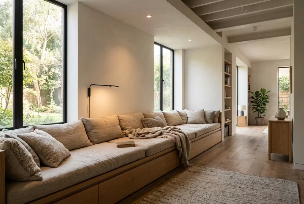
Long rooms can be deceptively difficult to get right. On paper they offer generous square footage, yet in practice they often feel awkwardly stretched, as though the space never quite settles into a comfortable rhythm. This is where a low built-in daybed comes into its own, quietly breaking the length of the room and giving it a point of rest that feels both architectural and deeply human.
Unlike freestanding furniture that can sometimes float aimlessly within an elongated layout, a built-in daybed anchors the space with intention. It creates a visual pause along the wall, a moment where the eye naturally slows down instead of racing from one end of the room to the other.
In many real residential projects, I have seen this simple intervention completely reframe how a long living room or converted loft is experienced. What once felt like an echoing corridor of unused space suddenly becomes layered, grounded, and surprisingly intimate.
The strength of this approach lies in its ability to reclaim what would otherwise be dead space. In narrow rooms, furniture placement often becomes a compromise. Push everything to the sides and the centre feels empty.
Fill the centre and circulation becomes awkward. A low built-in daybed resolves this tension elegantly by sitting directly within the architecture itself. It hugs the wall, extends the usable surface area, and transforms an otherwise passive stretch of interior into something actively lived in.
In one loft conversion project, for example, a long rectangular space with sloping ceilings initially felt slightly unresolved. The proportions were generous but difficult to furnish in a way that felt balanced.
By introducing a continuous oak-framed daybed along the longest wall, finished with upholstered linen cushions and integrated under-seat storage, the entire room changed character. It no longer felt like a passageway. It became a sequence of moments, with the daybed acting as the calm centre of gravity.
Comfort is essential here, and it should never be treated as secondary to aesthetics. A well-designed daybed typically works best with a seat height around 400 to 450 mm, roughly 16 to 18 inches, allowing it to feel relaxed and easy to access without dominating the vertical scale of the room.
Depth is equally important. Around 700 to 900 mm, or 28 to 35 inches, creates enough space to stretch out fully, which is what ultimately gives the piece its versatility. It becomes seating, lounging, and occasional sleeping space all in one, without ever feeling like it is trying too hard.
Materiality plays a defining role in softening the architectural weight of a long room. Timber framing, particularly in oak or ash, introduces warmth and grounding, while upholstery in natural linen or brushed cotton keeps the surface visually light.
In more contemporary settings, muted tonal palettes, soft greys, warm stone, or dusty neutrals, help the daybed blend into its surroundings rather than stand apart from them. The goal is not to create contrast for its own sake, but to allow the piece to feel like an extension of the room’s original language.
Lighting, too, becomes part of the composition. In elongated spaces, one of the most effective strategies is to break the rhythm of overhead lighting with softer, localized sources.
A wall-mounted reading light or discreet floor lamp near the daybed helps create a pool of warmth that anchors the space visually. In the evening, this glow subtly shortens the perceived length of the room, making it feel more intimate and less linear.
What is particularly interesting about built-in daybeds is how quickly they become the most used part of the room, even when they were not initially intended as the primary seating area. In real homes, I have often seen families gravitate toward them instinctively.
Children stretch out with books, guests naturally settle into them during gatherings, and even quiet moments of solitude tend to unfold there without planning. It is as though the body recognises the comfort before the mind has time to analyse it.
There is also a psychological benefit to breaking up long rooms in this way. Instead of experiencing the space as one continuous stretch, the mind begins to read it in sections. This shift makes the room feel more balanced and less overwhelming, particularly in homes where open-plan living can sometimes tip into visual fatigue. The daybed becomes a resting point, not just physically, but visually and emotionally as well.
Ultimately, a low built-in daybed in a long room is not about filling space for the sake of it. It is about restoring proportion, creating pause, and giving structure to what might otherwise feel undefined.
When done well, it turns an architectural challenge into one of the most quietly cherished corners of the home, proving once again that thoughtful design is less about adding more, and more about knowing exactly where to stop.
A Staircase Landing Reading Seat
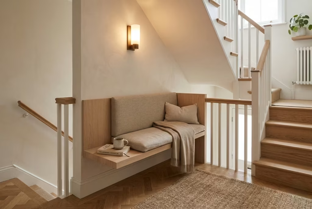
Staircase landings are often treated as nothing more than transitional pauses between levels, a space you pass through without really noticing. Yet, when approached with a bit of design discipline, they can become some of the most unexpectedly charming reading corners in the entire home. There is something quietly rewarding about turning a space meant for movement into a moment of stillness, almost like finding a pocket of calm halfway through the architecture.
The key here is intention. A landing reading seat only works when it feels deliberately placed, not squeezed in as an afterthought. In many residential projects I have worked on, these areas initially felt like dead zones, slightly too generous to ignore but too awkward to furnish in a conventional way.
However, once a properly scaled seat, thoughtful lighting, and a compact surface were introduced, the transformation was immediate. The landing stopped being a corridor of passing and became a destination in its own right.
What makes this idea particularly effective is how it changes the rhythm of a home. Staircases are inherently functional, always guiding you from one level to another, but a reading seat introduces a pause in that flow.
It creates a natural resting point, almost like a comma in the architectural sentence of the house. You ascend, you pause, you breathe, and then you continue. That subtle interruption can make the entire home feel more considered and less rushed.
Proportion is absolutely critical in these spaces. Because landings are often narrower than main rooms, everything needs to be carefully scaled to avoid visual clutter. A slim bench or compact upholstered seat, typically around 450 mm in height and proportionally restrained in depth, tends to work best. Anything oversized risks overwhelming the circulation space, making the landing feel tighter than it actually is. The goal is to maintain clarity, so the architecture still feels open and easy to navigate.
Lighting carries even more weight here than in most other reading nooks. Staircase areas are often underlit or rely heavily on overhead fixtures, which can feel harsh or uninspiring in the evening. A well-placed wall light at reading height, or a soft directional sconce, can completely change the mood.
Warm, diffused light around 2700K tends to work best, casting a gentle glow that makes the seat feel inviting rather than functional. In some projects, I have even used small recessed lighting within adjacent shelving to subtly reinforce the sense of enclosure without adding visual bulk.
Adding a small surface, such as a narrow ledge or floating shelf, completes the composition. It does not need to be large. Just enough space for a book, a cup of tea, or a pair of reading glasses is more than sufficient.
These small details are what make the seat feel genuinely usable rather than purely decorative. Without them, the space risks becoming something you admire but never actually engage with.
Material choice also plays a quiet but important role. Since stair landings are often connected to multiple rooms, the reading seat needs to sit comfortably within the broader material language of the home. Soft upholstery, natural timber, and muted finishes tend to work well because they avoid visual conflict with surrounding spaces.
In one townhouse renovation, a pale oak bench with a linen upholstered seat was introduced into a landing framed by simple white-painted balustrades. The result felt cohesive, almost as though the seat had always belonged there.
What is particularly interesting about staircase reading seats is how naturally they begin to integrate into daily routines. Unlike more formal reading corners, they are encountered repeatedly throughout the day.
You pass them in the morning, notice them again in the afternoon, and perhaps sit there briefly in the evening without even planning to. Over time, they become part of the home’s rhythm in a way that feels organic rather than designed.
There is also something emotionally grounding about having a quiet seat positioned between levels of a home. It symbolises transition, but in a softened form.
Instead of rushing from one space to another, the landing offers a moment to slow down, reset, and collect your thoughts. It is a small gesture in design terms, but one that often has an outsized impact on how a home feels to live in day to day.
Ultimately, a staircase landing reading seat proves that even the most overlooked parts of a home can carry real emotional value when treated with care. With the right balance of proportion, light, and restraint, what was once a simple passageway becomes a quiet, reflective pause in the rhythm of everyday life.
Living Room and Shared-Space Nooks
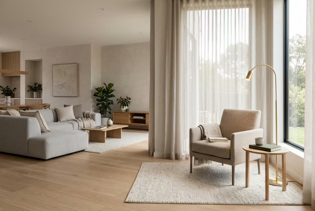
Living room and shared-space reading nooks sit at the intersection of daily life and quiet retreat. Unlike private bedroom corners, these areas need to balance presence with restraint, offering comfort without disrupting the social rhythm of the home.
When designed thoughtfully, they become subtle anchors within open spaces, places where conversation, rest, and solitude can coexist without friction. It is here that material choice, proportion, and placement truly matter, because the nook must feel naturally embedded in the flow of the room rather than carved out as an isolated feature.
An Armchair Grouped With a Side Table and Lamp
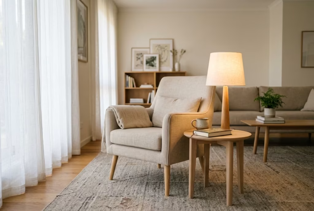
There is a reason this trio has endured across generations of interior design. An armchair, a side table, and a lamp may appear almost too simple at first glance, yet when handled with care, it becomes one of the most effective ways to establish a reading corner within a living room or shared space. It is a composition that relies less on invention and more on refinement, where proportion, material, and restraint do all the heavy lifting.
What makes this arrangement so dependable is its clarity. There is no ambiguity in how the space is used. The armchair signals rest, the side table supports daily rituals, and the lamp defines atmosphere once daylight begins to fade.
Together, they create a self-contained moment within a larger room, almost like a quiet pause button in the middle of a busy composition. In real residential projects, I have often returned to this setup when clients want impact without complexity, especially in living rooms where too many competing elements can quickly dilute the sense of calm.
The success of this grouping depends heavily on material selection rather than decorative excess. A well-chosen fabric on the armchair can do more for the mood of the space than any number of accessories. Bouclé, linen blends, or tightly woven cottons introduce texture that feels tactile without being visually heavy.
Similarly, the side table should not dominate the arrangement. A small surface in timber, stone, or matte metal is often enough, provided it sits in proportion to the chair. The aim is to let each piece breathe individually while still reading as a single, coherent vignette.
Lighting is where the atmosphere truly comes alive. A table lamp or slim floor lamp positioned close to the seating area creates a sense of enclosure without physically closing the space in. Warm light, typically around 2700K, softens edges and allows textures to reveal themselves gradually as the room transitions into evening.
In one open-plan living project I worked on, a simple linen-shaded lamp placed beside a compact oak side table completely changed the way the corner was perceived after sunset. What was once a visually neutral area became the most naturally used reading spot in the entire room.
Scale should always be approached with discipline. Oversized armchairs can overwhelm the composition, particularly in shared spaces where circulation and visual flow are critical. A slightly slimmer profile with a balanced seat depth, typically around 500 to 600 mm or 20 to 24 inches, tends to feel more integrated and easier to live with day to day. The side table should remain secondary, supporting function rather than asserting presence.
What often surprises homeowners is how quickly this simple arrangement becomes part of daily habit. Without any architectural intervention or built-in joinery, the corner begins to accumulate meaning through repetition.
A morning coffee placed on the table, a book left open on the armrest, a quiet moment at the end of the day when everything else settles. These small, almost incidental uses gradually turn the space into something familiar and grounding.
The real strength of this setup lies in its honesty. It does not rely on complexity to feel complete. Instead, it demonstrates that when materials are chosen with care and proportions are respected, even the simplest arrangement can carry a quiet sense of refinement. In many ways, it is a reminder that good design is not about adding more, but about getting the essentials exactly right.
A Reading Corner Anchored by a Rug
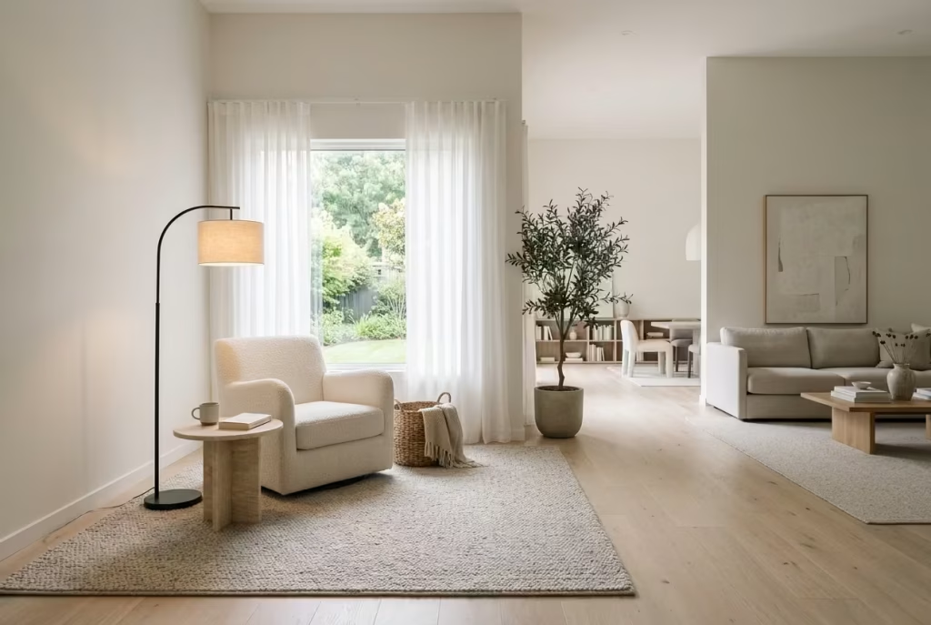
In open-plan living, the hardest thing to achieve is definition without division. Spaces often flow beautifully, yet lack clear moments of pause, which can make even well-furnished rooms feel slightly unanchored.
A reading corner grounded by a rug is one of the most effective ways to resolve that tension. It is a quiet intervention, but one that gives structure to softness, turning an ordinary corner into a clearly defined place of retreat.
The rug does the heavy lifting here, almost without being noticed. It draws an invisible boundary around the reading nook, separating it gently from the surrounding circulation without interrupting the openness of the room.
This sense of spatial clarity is what makes the arrangement feel intentional rather than accidental. In real residential projects, I have often seen a simple rug transform what was previously a “leftover” corner into one of the most naturally used areas of the entire space.
What matters most is proportion and placement. A rug that is too small can make the seating feel isolated and visually disconnected, while one that is too large risks swallowing the corner entirely.
Ideally, the rug should extend beyond the armchair and side table, allowing the entire composition to sit comfortably within its edges. This creates a grounded, almost architectural feeling, as though the reading nook has its own defined footprint within the wider room.
Material choice is equally important. Textured wool, flatweave natural fibres, or subtly patterned weaves tend to work best because they introduce depth without visual noise. In shared spaces where multiple functions overlap, restraint is often more powerful than decoration.
A rug with too much contrast or overly dominant pattern can compete with the furniture, whereas a quieter surface allows the reading corner to settle naturally into the background while still feeling distinct.
In one open-plan renovation I worked on, a previously undefined corner between a living area and dining space was brought to life using a large handwoven wool rug in a muted stone tone. On its own, the rug was simple.
But once an armchair and small timber side table were placed within its boundary, the space shifted immediately. What once felt like an awkward gap in the floor plan became a calm, grounded reading spot that the homeowners began using daily, often without consciously planning to.
Lighting completes the composition, as it always does in well-considered reading spaces. A floor lamp positioned just outside the rug’s edge helps extend the sense of enclosure into the evening, while maintaining flexibility in the broader room.
The warmth of the light interacts subtly with the rug’s texture, creating a soft gradient that visually holds the corner together after dark. It is a small detail, but one that dramatically affects how the space feels at night.
There is also a psychological clarity that comes with rug-defined zones. In open-plan homes, the absence of walls can sometimes blur the purpose of different areas, leading to a sense of visual drift. Introducing a rug under a reading corner helps resolve that ambiguity. It signals, almost instinctively, that this is a place to slow down. A place to sit, to read, to pause. No instructions needed.
What makes this approach so valuable is its accessibility. It does not require built-in joinery, structural changes, or complex planning. It is simply about understanding how the floor plane can be used to organise experience. And in many homes, that small shift is enough to change how a room is lived in on a daily basis.
In the end, a rug-anchored reading corner proves that clarity does not always come from adding more architecture. Sometimes it comes from drawing a soft boundary on the floor and allowing everything within it to feel just a little more intentional.
A Pair of Chairs for Shared Quiet Time
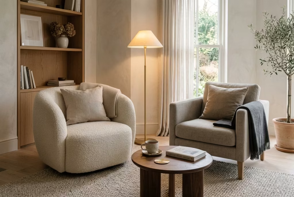
There is a quiet intelligence in designing for two rather than one. A pair of chairs arranged for shared reading or conversation brings a different kind of energy to a living space, one that feels both social and introspective at the same time. It is not about symmetry for the sake of aesthetics, but about creating a soft equilibrium where two people can occupy the same moment without competing for it.
In family homes or couple-centric spaces, this arrangement often becomes the most organically used corner in the room. Unlike a single reading chair, which clearly signals solitude, a pair introduces flexibility.
One person might be reading while the other rests with a drink, or both might slip into conversation that naturally drifts in and out without needing a defined structure. It is this adaptability that gives the setup its quiet strength.
The key lies in balance, not duplication. The chairs do not need to be identical, although they often share a visual language through material or silhouette. What matters more is that they feel like they belong to the same conversation within the room.
In one residential project I worked on, for example, a bouclé armchair was paired with a slightly more structured linen chair, both anchored by a shared walnut side table between them. The combination felt intentional but never overly styled, like two different notes resolving into the same chord.
Spatial planning is where this idea can easily succeed or fail. Too close, and the arrangement feels cramped. Too far apart, and the sense of intimacy disappears. A comfortable spacing of around 600 to 900 mm between chairs usually works well, roughly 24 to 35 inches, allowing both personal space and conversational ease. The shared table or central surface becomes the quiet anchor that holds the composition together, preventing it from drifting visually.
Lighting plays a subtle but defining role here. A single floor lamp positioned slightly behind or between the chairs can create a shared pool of warmth that gently connects the two seating positions.
Alternatively, twin table lamps on either side can introduce a more symmetrical and formal feel, which works beautifully in refined or traditional interiors. Either way, the goal is to create a light that feels shared rather than segmented.
Material selection should lean toward comfort and tactility. Soft upholstery like linen, bouclé, or brushed cotton helps the chairs feel inviting without becoming visually heavy. In shared spaces, especially living rooms, there is always a risk of over-designing. The most successful pairings tend to rely on restraint, allowing texture and proportion to do more of the expressive work than ornamentation ever could.
What is particularly interesting about this setup is how naturally it becomes part of daily rhythm. Unlike more formal seating arrangements, a pair of chairs invites use in a variety of ways throughout the day.
Morning coffee, casual conversation, quiet reading, or even moments of pause between activities. It adapts without needing to be reconfigured, which is often what makes it so consistently loved in real homes.
There is also an emotional dimension to it that is easy to overlook. Shared quiet time is different from solitary reading. It carries a gentle awareness of presence without pressure, a kind of comfortable coexistence that does not demand interaction but allows it to happen naturally. And when a space supports that kind of interaction, it tends to become one of the most valued corners in the entire home.
Ultimately, a pair of chairs for shared quiet time is less about furnishing a corner and more about shaping a relationship within the space. When done well, it turns a simple arrangement into a lived experience that feels both grounded and quietly generous.
A Sculptural Chair Near a Fireplace
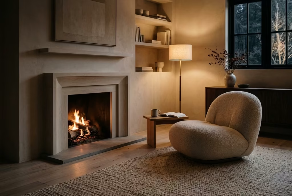
There is something almost instinctive about placing a reading chair near a fireplace. It is one of those arrangements that feels less like a design decision and more like a natural conclusion the room was always heading toward.
When firelight enters the equation, the atmosphere shifts immediately. Everything slows down a little, edges soften, and the room begins to carry that unmistakable sense of seasonal calm that autumn and winter interiors do so well.
A sculptural chair works particularly well in this setting because it brings character without disrupting the quiet rhythm of the space. Unlike bulkier lounge seating, a sculptural piece often relies on form, silhouette, and proportion rather than excess padding or visual weight.
This allows it to sit comfortably beside the fireplace without competing with it. In fact, when done well, the chair and the fire begin to feel like they are in conversation, one offering warmth, the other offering structure.
In real residential projects, I have often seen this pairing become the emotional centre of a room. One countryside living space I worked on had a low stone fireplace framed by muted plaster walls and timber flooring.
The introduction of a softly curved sculptural chair in a warm neutral tone completely changed the way the room was used. What was once a space for occasional gathering became the most naturally occupied corner of the home during colder months. People would drift toward it without thinking, drawn as much by the glow of the fire as by the comfort of the seating.
Comfort, however, cannot be sacrificed for aesthetics here. A sculptural chair still needs to support extended reading, especially in winter when these corners tend to be used for longer, slower stretches of time.
Seat depth in the range of 500 to 600 mm, roughly 20 to 24 inches, usually provides the right balance between relaxation and posture support. If the form is too shallow or overly stylised, the chair quickly becomes more of an object than a usable space, which defeats its purpose entirely.
The positioning relative to the fireplace is equally important. Too close, and the heat can become overwhelming or uneven; too far, and the connection to the firelight is lost.
The ideal placement often sits slightly offset, where the glow from the flames can wash across the chair without dominating it. This creates a layered warmth, both physical and visual, that makes the corner feel naturally inviting without needing additional decoration.
Material choice plays a defining role in how the space feels through the seasons. Upholstery in textured wool, bouclé, or brushed linen tends to respond beautifully to firelight, absorbing and reflecting it in soft, broken tones. These materials avoid glare and instead enhance the depth of the room as daylight fades. In darker evenings, this interaction between flame, fabric, and shadow becomes the quiet centrepiece of the interior.
The surrounding architecture should remain intentionally restrained. Fireplaces already carry a strong visual presence, so the chair needs space to breathe. Clean wall finishes, minimal clutter, and carefully controlled accessories help maintain focus on the interplay between heat and seating.
In one renovation project, a simple plastered chimney breast paired with a single oak sculptural chair and a low wool rug was enough to create a reading corner that felt complete without any additional styling. It was a reminder that restraint often carries more impact than accumulation.
Lighting beyond the fire should be handled with equal subtlety. In the evenings, a soft ambient lamp placed slightly away from the fireplace can extend the usability of the space without competing with the natural glow. The aim is not to replicate daylight, but to support the firelight so the room retains depth even when flames are low.
What makes this arrangement particularly compelling is its emotional weight. Fireplaces already carry a sense of gathering and reflection, but when paired with a well-considered reading chair, they create a space that feels both grounding and restorative. It is where people tend to unwind without intention, slipping into a book, a conversation, or simply stillness without needing to plan for it.
In the end, a sculptural chair near a fireplace is not just a seasonal comfort. It is a reminder that the most enduring interiors are often built around simple, elemental pairings, warmth, light, and a place to sit quietly within both.
You May also Like: 25 Japanese Reading Nook Secrets for a Perfectly Calm Home
A Low Lounge Chair Beside Open Shelving
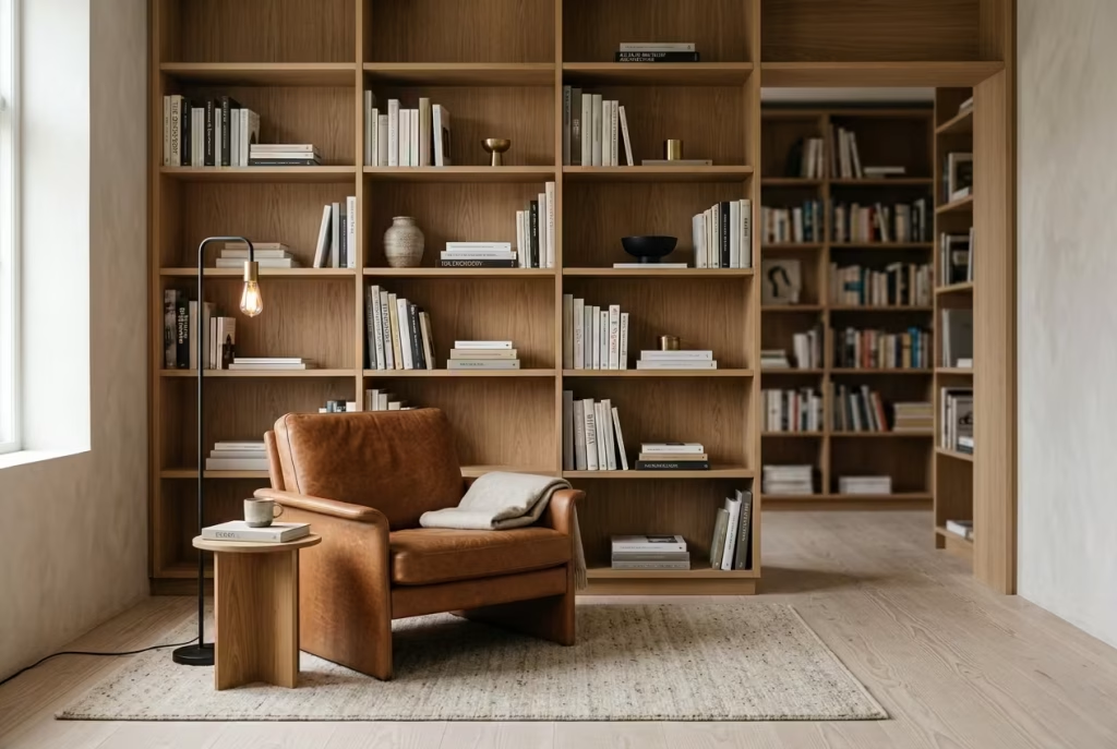
There is a quiet confidence in pairing a low lounge chair with open shelving, especially in homes where books are not just stored but lived with. This is not a decorative gesture in the superficial sense. It is a spatial decision that allows reading, resting, and visual storytelling to sit within the same frame, creating a corner that feels naturally composed rather than styled into existence.
The low lounge chair plays a subtle but important role here. Its reduced height keeps the visual weight closer to the ground, which helps maintain openness around the shelving behind it. In rooms where vertical storage is already doing much of the visual work, this restraint is essential. A chair that sits too tall can interrupt the flow of the wall, while a lower silhouette allows the shelving to remain the dominant architectural rhythm without overwhelming the space.
In practice, I have found this combination works particularly well in living rooms or studies where books form part of the overall material language rather than being hidden away. In one residential project, a long wall of oak shelving was installed in a slightly recessed alcove.
Instead of filling the space with additional seating or decorative objects, a single low leather lounge chair was placed slightly off-centre, angled toward the shelves. The effect was immediate. What had the potential to feel like storage became something far more atmospheric, almost like a quiet reading gallery within the home.
The key to making this work is restraint in curation. Open shelving can easily tip into visual overload if every surface is filled. The most successful arrangements tend to follow a rhythm of density and pause, allowing books to breathe rather than stacking them tightly from edge to edge.
A few well-placed objects, a stack of horizontal books, or a single sculptural piece interspersed among vertical rows can be enough to give the shelving character without turning it into clutter.
The chair, in turn, should feel visually light but materially grounded. Leather, linen, or tightly woven upholstery often works well because these materials age gracefully and respond beautifully to natural light.
In rooms where shelving dominates one wall, the chair acts as the human counterpoint, a place where the body meets the architecture. Its presence softens the rigidity of the shelving grid, introducing a sense of ease that prevents the room from feeling overly curated.
Proportion plays a critical role in maintaining balance. A low lounge chair typically works best with a seat height around 380 to 450 mm, roughly 15 to 18 inches, which keeps it visually subordinate to the shelving without sacrificing comfort.
The aim is not to compete with the vertical structure behind it, but to quietly complement it. When the proportions are right, the entire composition feels almost inevitable, as though nothing could have been placed differently.
Lighting should be approached with equal subtlety. Open shelving often benefits from integrated or directional lighting that highlights texture and depth without creating harsh contrast. When combined with a nearby floor or table lamp positioned close to the lounge chair, the space begins to take on a layered evening presence. Books become softly illuminated, shadows deepen gently, and the reading corner naturally draws attention without demanding it.
What makes this arrangement particularly effective is its honesty. It does not try to disguise its function or overcomplicate its purpose. Instead, it allows books, seating, and architecture to coexist in a way that feels grounded and familiar.
Over time, this kind of corner tends to evolve naturally. Books rotate, objects shift, and the chair slowly develops the patina of use, all of which contribute to a sense of lived-in authenticity.
There is also a psychological ease to having reading material within direct visual reach of where you sit. It removes friction. You are not searching for a book, you are already within its environment. This subtle convenience often encourages more spontaneous reading, which is where the real value of such spaces tends to emerge.
Ultimately, a low lounge chair beside open shelving is less about styling and more about creating a relationship between object and inhabitant. When done well, it feels collected over time rather than composed in a single moment, which is exactly what gives it its quiet, enduring appeal.
Flexible and Unexpected Reading Corners
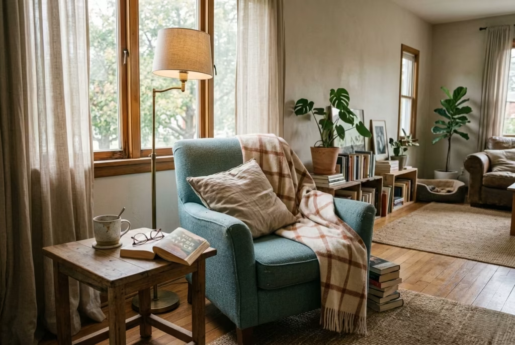
Not every reading nook needs to be planned with precision or carved into the architecture to feel meaningful. Some of the most memorable corners emerge from flexibility, from spaces that were never originally intended for stillness but quietly evolve into it over time.
These unexpected reading spots often carry a sense of ease that more formal setups struggle to replicate, precisely because they are shaped by habit rather than design intent. In real homes, it is often these adaptable corners that become the most frequently used, shifting naturally with light, mood, and daily routines, proving that comfort is not always built, sometimes it is discovered.
A Hallway Nook With a Narrow Bench
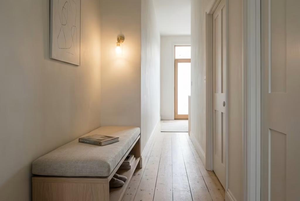
Hallways are often treated as pure circulation, a space to pass through rather than pause within. Yet when approached with a careful eye for proportion, a narrow bench can quietly transform this transitional strip into a reading nook that feels unexpectedly considered.
It is one of those design moves that proves even the most overlooked parts of a home can carry purpose when handled with restraint and intention.
The challenge here is balance. Hallways are unforgiving when it comes to scale, and anything oversized immediately disrupts flow. A narrow bench works best when it feels almost like it is hovering within the space rather than occupying it.
In many residential projects, I have seen this approach turn previously empty corridors into soft moments of pause, where movement slows just enough to feel natural rather than forced.
Careful measurement is absolutely critical. A depth kept modest, typically around 300 to 400 mm, roughly 12 to 16 inches, ensures the bench remains usable without intruding into circulation.
The aim is not to create a full seating experience in the traditional sense, but rather a gentle perch, a place to sit briefly, to place a book, or to pause for a moment of stillness before continuing through the home. When the proportions are right, the bench feels like it belongs to the architecture rather than competing with it.
What makes hallway nooks particularly effective is their surprise value. Unlike living rooms or bedrooms, where reading corners are expected, a bench in a corridor introduces an element of unexpected comfort. In one townhouse renovation I worked on, a long, narrow hallway leading to the rear of the property was originally little more than a connecting passage.
By introducing a slim oak bench with a softly upholstered linen top and a discreet wall light above, the space shifted entirely. It no longer felt like a route between rooms. It became a place where people instinctively slowed down, even if just for a moment.
Lighting is especially important in these transitional spaces. Hallways often suffer from either harsh overhead lighting or insufficient ambient glow. A well-placed wall sconce at reading height can completely change the atmosphere, casting a soft, directional light that defines the bench without overwhelming the corridor. In the evening, this gentle illumination helps the nook feel intentional, almost like a quiet pause embedded into the architecture itself.
Material choice should remain understated to preserve flow. Light timber, muted upholstery, and simple finishes work best because they allow the bench to integrate seamlessly with surrounding walls and flooring.
Overly decorative or heavy materials can easily break the rhythm of a hallway, making it feel segmented rather than continuous. The strength of this idea lies in its subtlety, not its statement.
What is particularly interesting about hallway reading nooks is how organically they become part of daily routines. Unlike more formal seating areas, they are encountered repeatedly throughout the day, often without conscious thought.
A moment of pause while waiting for someone, a quick glance at a book left on the seat, or a brief sit-down while putting on shoes. These small, incidental uses accumulate over time, giving the space a sense of lived familiarity.
There is also a psychological benefit to introducing pause points in circulation-heavy areas. Homes can often feel too fluid, with movement happening continuously from one room to another. A narrow bench interrupts that flow just enough to create rhythm. It reminds the body, even briefly, that not every part of the home needs to be rushed through.
Ultimately, a hallway nook with a narrow bench proves that even the most utilitarian parts of a home can hold quiet moments of comfort. With careful proportion, thoughtful lighting, and a restrained material palette, a simple corridor can be transformed into a subtle but meaningful pause in the everyday rhythm of living.
A Conservatory or Garden Room Reading Seat
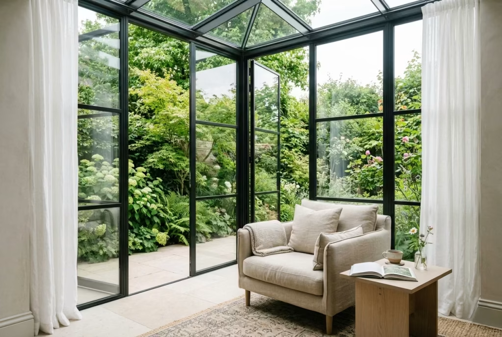
A conservatory or garden room offers one of the most naturally generous settings for a reading seat, where light becomes the dominant architectural material. Unlike interior rooms that rely on layered lighting strategies, these spaces are shaped directly by the rhythm of the sun, shifting hour by hour in a way that feels almost alive. When a reading corner is introduced here, it does not need to compete with the environment. It simply responds to it.
The strength of this setting lies in its immediacy. You are never far from daylight, greenery, or seasonal change, which gives the reading experience a certain clarity that is hard to replicate elsewhere in the home.
In spring and summer especially, these rooms take on an effortless quality, where mornings feel bright but gentle, and late afternoons stretch into long, unhurried periods of stillness. A well-placed seat in this environment becomes less of a furniture choice and more of a way to inhabit the landscape from within.
In real residential projects, I have often seen conservatory seating evolve from something purely functional into one of the most emotionally used corners of the home. One garden room I worked on, framed in slim black metal glazing and opening directly onto a planted courtyard, originally contained only a dining arrangement.
By introducing a low-profile reading chair angled toward the garden, paired with a compact side table and a softly filtered shade system, the space shifted entirely. It stopped being a room used only for meals and became a place where people lingered long after they had finished eating, often with a book or simply a quiet moment of reflection.
Comfort in these spaces depends heavily on material selection. Because conservatories are exposed to higher levels of natural light and temperature variation, upholstery needs to be breathable, durable, and seasonally responsive.
Linen, cotton blends, and lightweight woven fabrics tend to work best, as they allow air to circulate while still providing softness. Heavier materials can feel restrictive in these environments, particularly during warmer months when the space naturally encourages longer periods of use.
Shading is another critical consideration, and one that is often underestimated. Strong natural light can quickly become overwhelming if not moderated correctly. Adjustable blinds, sheer curtains, or external shading systems help soften glare without blocking the connection to the outdoors.
The aim is not to reduce light entirely, but to filter it so that it remains comfortable throughout the day. When done well, the light shifts from bright to gently diffused, creating a layered atmosphere that feels calm rather than harsh.
Proportion also plays a subtle but important role. Seating in conservatory reading corners should remain visually light, avoiding bulky silhouettes that compete with the openness of the glazing. A compact armchair or low lounge seat often works best, particularly when positioned to take advantage of natural views. The surrounding space should remain uncluttered, allowing the eye to move freely between interior and exterior without interruption.
What makes this type of reading nook particularly compelling is its connection to nature. Unlike interior corners that rely on curated atmosphere, conservatory seating changes constantly with the weather, the season, and even the direction of light. A book read on a bright spring morning feels entirely different from the same book in the soft haze of an overcast afternoon. The space never truly stays still, which is part of its quiet appeal.
There is also a psychological ease that comes from sitting within a space that feels partially open to the outdoors. It creates a sense of expansion without exposure, allowing the mind to relax in a way that feels both sheltered and connected at the same time. This balance is often what makes garden room reading seats so consistently loved in everyday life.
Ultimately, a conservatory reading corner is not about adding furniture to a bright space. It is about working with light, temperature, and seasonality to create a setting where reading feels as natural as looking out into the garden itself.
A Loft or Attic Corner With a Low Chair
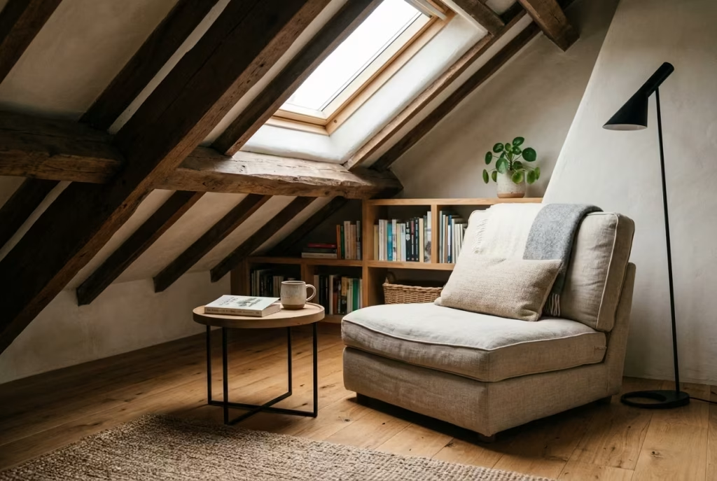
Lofts and attic rooms carry a very particular kind of atmosphere, one that feels inherently private, slightly introspective, and removed from the pace of the rest of the home. Their sloped ceilings and tucked-away proportions can be challenging at first glance, yet when approached with sensitivity, they often reveal some of the most characterful reading corners in residential design. There is a quiet charm in these upper-level spaces, where the architecture itself naturally encourages stillness. A low chair is often the key to unlocking that potential.
Because attic rooms tend to have reduced head height along the edges, introducing standard-scale furniture can quickly make the space feel compressed. A lower seating profile, typically closer to the floor, helps re-establish visual balance and allows the ceiling lines to remain expressive rather than restrictive. It is one of those subtle adjustments that can completely change how the room is perceived, turning awkward geometry into a defining feature rather than a limitation.
In real residential projects, I have seen loft corners evolve into deeply personal reading retreats simply through restraint in furnishing. One converted attic bedroom, originally framed by exposed beams and irregular ceiling slopes, was initially used only for storage.
By introducing a compact linen-upholstered chair with a low oak frame, positioned beneath the highest point of the roofline, the entire character of the room shifted. What was once an underused space became a quiet sanctuary, often described by the homeowner as the most peaceful corner in the entire house.
What makes loft reading nooks so compelling is their sense of enclosure. Unlike open-plan spaces that rely on visual zoning, attic rooms already feel naturally contained. This gives them an almost cocoon-like quality, where distractions fade away and focus becomes easier to settle into. When a reading chair is placed thoughtfully within that environment, it enhances rather than interrupts this feeling of retreat.
Scale and proportion are especially important in these settings. A lower seat height, often around 380 to 420 mm, roughly 15 to 16.5 inches, helps keep the visual weight close to the floor, preventing the furniture from competing with the angled architecture above. If the chair sits too high, the sloping ceiling can feel oppressive, but when scaled correctly, the same geometry becomes expressive and atmospheric. The room begins to feel intentional rather than constrained.
Lighting plays a defining role in shaping the mood of attic corners. Natural light is often limited to roof windows or small gable openings, which means artificial lighting must be carefully layered. A warm, diffused source placed near the reading chair helps soften the angular nature of the architecture. In the evening, this creates a gentle pool of light that contrasts beautifully with the darker edges of the sloped ceiling, adding depth without visual clutter.
Material choice can further enhance the atmosphere. Soft textiles like linen, wool, or brushed cotton work particularly well in attic spaces because they absorb light rather than reflect it, reinforcing the sense of calm.
Timber elements, especially in natural or lightly stained finishes, help ground the composition and connect it back to the structural honesty of the roof itself. When these materials are kept understated, the architecture is allowed to remain the focal point.
What is particularly interesting about loft reading corners is how naturally they become associated with personal time. Because these spaces are physically removed from the main living areas, they often carry a sense of quiet independence.
People tend to use them not just for reading, but for thinking, unwinding, or simply stepping away from the rhythm of the household for a while. It is this emotional separation that gives them their lasting appeal.
There is also something deeply grounding about sitting beneath a sloped ceiling while reading. The geometry gently guides attention inward, creating a feeling of focus without effort. It is not a
space that demands activity. It encourages stillness in a way that feels almost instinctive, which is why, when done well, loft reading corners often become some of the most cherished areas in the home.
Ultimately, a loft or attic reading nook proves that atmosphere is not dependent on perfect proportions or generous space. With the right balance of scale, light, and restraint, even the most irregular corners can become profoundly comforting places to pause.
A Tucked-Away Corner in a Child’s Room
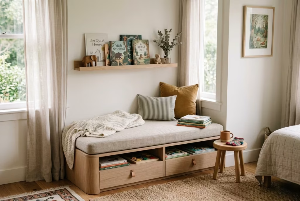
A child’s bedroom often carries more emotional layering than any other room in the home, and a tucked-away reading corner fits into that rhythm with surprising ease. It is not simply a place for books, but a soft landing point at the end of the day, where routines begin to slow and imagination quietly takes over. When designed with care, it becomes less of a styled feature and more of a familiar ritual space that grows with the child over time.
The most successful versions of this idea are rarely complex. They rely on clarity, durability, and a sense of gentle enclosure. In many family homes I have worked on, the transformation often begins with a simple underused corner, perhaps beside a window, wardrobe, or even at the foot of the bed. Once softened with low seating, cushions, and a small shelf or basket for books, the space naturally starts to collect meaning through repetition rather than decoration.
Comfort here needs to be approachable rather than formal. A low bench or small upholstered seat, typically around 300 to 400 mm in height, roughly 12 to 16 inches, allows children to access the space independently without assistance.
This autonomy is important. It turns the nook into something they claim as their own, rather than something they are guided toward. Over time, that sense of ownership is what makes the space so frequently used.
Durability is equally important, especially in family environments where furniture is rarely treated delicately. Fabrics should be chosen with practicality in mind, tightly woven cottons, performance linens, or wipeable upholstery that can withstand everyday use without losing softness. Rounded edges and sturdy construction also help the space feel safe and forgiving, which is essential in a room that naturally sees movement, play, and rest overlapping throughout the day.
In real residential projects, I have often seen these corners evolve far beyond their initial purpose. One child’s room I worked on had a small recessed area that was originally intended for toy storage.
By introducing a soft bench with integrated drawers below and a low wall shelf above, the space slowly transformed into a nightly reading ritual zone. What started as a simple storage adjustment became the place where bedtime stories consistently unfolded, almost without planning.
Lighting plays a subtle but powerful role in shaping the mood. Harsh overhead lighting tends to disrupt the softness of these moments, so a warm, dimmable lamp or small wall light is often a better choice.
Around 2700K warmth works particularly well, creating a gentle glow that signals wind-down time rather than activity. In many homes, this shift in lighting becomes part of the bedtime routine itself, quietly cueing the transition from day to night.
Scale should always remain gentle and unpressured. Oversized furniture can overwhelm a child’s room quickly, making the space feel more like a showroom than a lived environment. Instead, the nook should sit comfortably within the room’s proportions, leaving enough circulation space for play and movement. When done correctly, it feels like a soft extension of the room rather than an interruption within it.
What makes these reading corners especially meaningful is how they evolve with time. As children grow, the books change, the cushions shift, and the habits surrounding the space naturally adapt. Yet the corner itself remains a constant. It becomes a familiar point of return, associated with comfort, storytelling, and quiet moments shared with family.
There is also an emotional value that extends beyond function. These spaces often become tied to memory, the sound of a parent reading aloud, the feeling of settling down after a busy day, or the comfort of revisiting a favourite story. Long after the room is updated or repurposed, the sense of that corner often lingers.
Ultimately, a tucked-away reading nook in a child’s room is not about creating a perfect design moment. It is about building a small, reliable world within the larger one, where comfort is accessible, imagination is supported, and daily routines quietly take root in the most natural way.
A Terrace-Adjacent Indoor Nook
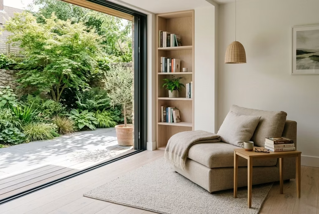
There is a particular kind of ease that comes from sitting close to the threshold between inside and outside, where the home begins to loosen its edges and the garden quietly slips into view. A terrace-adjacent reading nook captures exactly that feeling.
It is not fully indoors, yet not exposed to the elements either, existing in that in-between zone where light, air, and architecture begin to blur in the most natural way.
These spaces often carry a seasonal rhythm without trying to. In spring and summer, they feel open and airy, with daylight stretching deeper into the room and garden views becoming part of the reading experience itself.
Even in cooler months, the proximity to the outdoors brings a sense of calm continuity, as though the landscape is still present even when the doors are closed. It is this gentle connection that gives the nook its understated sense of luxury.
In real residential projects, I have found that these corners often become the most unexpectedly used areas of a home. One contemporary renovation I worked on had a set of full-height sliding doors opening onto a small courtyard.
The original layout treated the area as circulation space, but once a low lounge chair was introduced beside the glazing, paired with a slim side table and a softly textured rug, the entire mood shifted. What had been a passage to the terrace became a place where people naturally paused, often staying longer than intended with a book or a cup of coffee in hand.
The success of a terrace-adjacent nook depends heavily on material honesty. Natural textures tend to perform best here because they echo the language of the outdoors without competing with it.
Linen upholstery, woven wool, unfinished timber, and stone accents all help ground the space, allowing it to feel connected rather than staged. These materials also respond beautifully to changing light throughout the day, softening in the morning brightness and deepening in the evening glow.
Proportion should remain relaxed but considered. Seating that is too formal or oversized can disrupt the fluidity between interior and exterior, making the nook feel like an isolated feature rather than part of a larger spatial conversation.
A low lounge chair or compact sofa, typically with a seat height around 400 to 450 mm, works well in maintaining that visual continuity. The aim is to keep sightlines open so the garden remains visually present even when you are seated inside.
Lighting plays a subtle but important supporting role. During the day, natural light does most of the work, filtering through glass and reflecting off surrounding surfaces. In the evening,
however, a soft floor lamp or concealed wall light can extend the usability of the space without overpowering its natural atmosphere. Warm, diffused lighting around 2700K tends to work best, echoing the softness of sunset light and maintaining the connection to the exterior even after dark.
What makes these nooks particularly compelling is their sense of permeability. Unlike more enclosed reading corners, they exist in constant dialogue with the outside world. A shift in weather, a change in season, or even the movement of trees in the wind becomes part of the reading experience. It is this subtle interaction with nature that gives the space its quiet depth.
There is also an emotional ease that comes from being close to an opening. The presence of a terrace or garden door introduces a sense of possibility, even when you are sitting still. You are not cut off from the outside world, yet you are comfortably within it. This balance between openness and enclosure is often what makes these corners so consistently loved in everyday living.
Ultimately, a terrace-adjacent indoor reading nook is less about creating a defined zone and more about softening the boundary between architecture and landscape. When handled with restraint, it becomes a place where light, texture, and seasonality come together in a way that feels effortless, quietly luxurious, and deeply human.
The Design Details That Make a Reading Nook Work
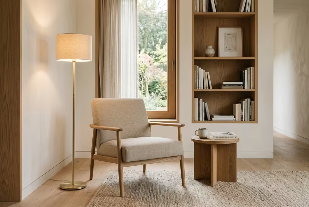
A reading nook succeeds or fails on the quiet decisions most people do not notice at first glance. The chair may be beautiful, the corner may look composed, and the styling may photograph well, but if the proportions are off or the atmosphere feels wrong, the space will not invite anyone to stay. Good reading nooks are rarely built on one dramatic gesture. They are shaped by a series of small, intelligent choices that work together in the background, almost like the supporting cast in a strong film. When those details are right, the nook stops feeling like a decorative corner and starts feeling like a place the body instinctively understands.
Seating comfort: seat depth, back support, and arm height
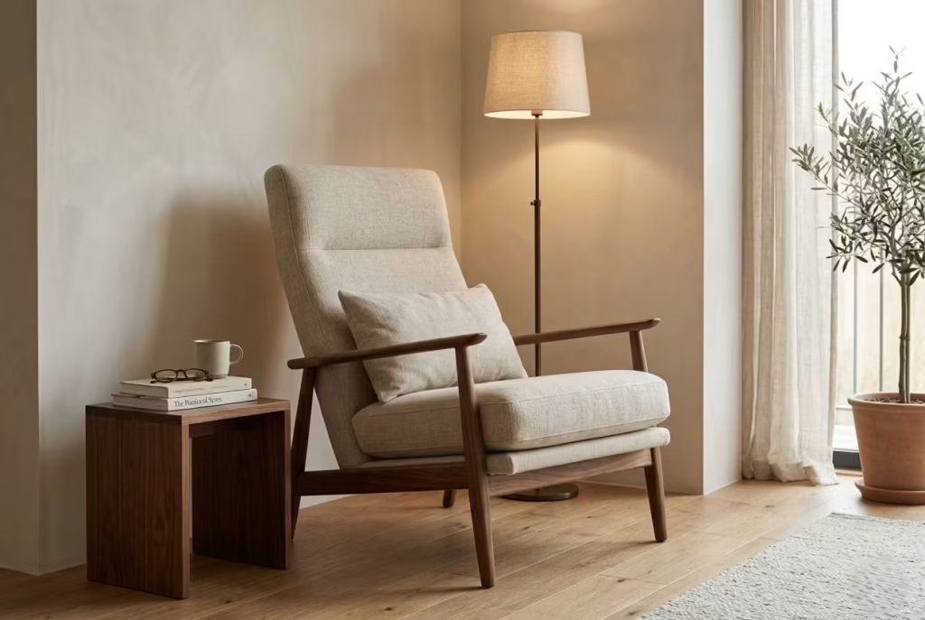
Comfort begins with the seat itself, and this is where many reading corners quietly fall short. A chair that looks elegant but does not support the body properly will only ever be admired from a distance. For a reading nook to feel genuinely usable, the seat depth, back support, and arm height all need to work in harmony. If the seat is too shallow, the body never fully settles. If it is too deep without proper cushions or a supportive back angle, the person sitting there ends up perching rather than relaxing. It becomes a place for passing through, not lingering.
In most homes, a seat depth of around 500 to 600 mm, or roughly 20 to 24 inches, offers a balanced starting point for relaxed reading. That depth allows enough room to sit comfortably without forcing the back forward. The back support matters just as much. A reading nook should not feel like a formal dining chair. It needs a gentler recline, something that supports the spine while still encouraging an easy, unforced posture. Arm height also plays a subtle but important role. Arms that are too high can make the chair feel rigid and boxy, while arms that are too low leave the body feeling unsupported. The best versions let the shoulders drop naturally, which is often when the space starts to feel properly restful.
In real projects, I have found that clients often fall in love with a chair for its silhouette and only discover later that they never really use it. The fix is usually not complicated. A deeper cushion, a slightly softer back angle, or a better scaled armrest can change the experience completely. It is a classic case of form needing to earn its keep. A reading nook should feel like an invitation, not a posture test.
Lighting: layered ambient and task light, ideally warm and adjustable
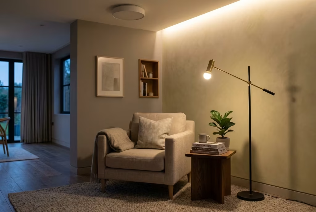
Lighting is the backbone of atmosphere in a reading nook. Without it, even the most carefully designed space can feel flat after sunset. Good reading corners need more than just brightness. They need layers. Ambient light creates the background mood, task light supports the act of reading itself, and together they keep the nook functional without making it feel harsh or overexposed.
Warm light is almost always the right place to start. A colour temperature around 2700K tends to feel soft, calm, and visually kind to the eye, especially in spaces meant for unwinding. Cooler light can make a nook feel clinical, which is the last thing you want in a corner meant to encourage stillness. Adjustable lighting is equally important because the way a nook is used changes throughout the day. Morning reading near a window may need very little artificial light, while evening use often requires a more focused beam that does not spill too broadly across the room.
The best nooks often combine a ceiling light or nearby wall light with a dedicated reading lamp. That combination allows the space to feel rooted in the room while still offering practical control. In a living room setting, for example, I often like to see the nook softly lit from above and then anchored with a lamp beside the chair. It gives the space depth, almost like there is a gentle glow coming from within rather than a single bright source glaring from one angle. That layered effect is what makes a room feel composed rather than simply lit.
Materials: linen, boucle, wool, timber, leather, stone, and their different emotional effects
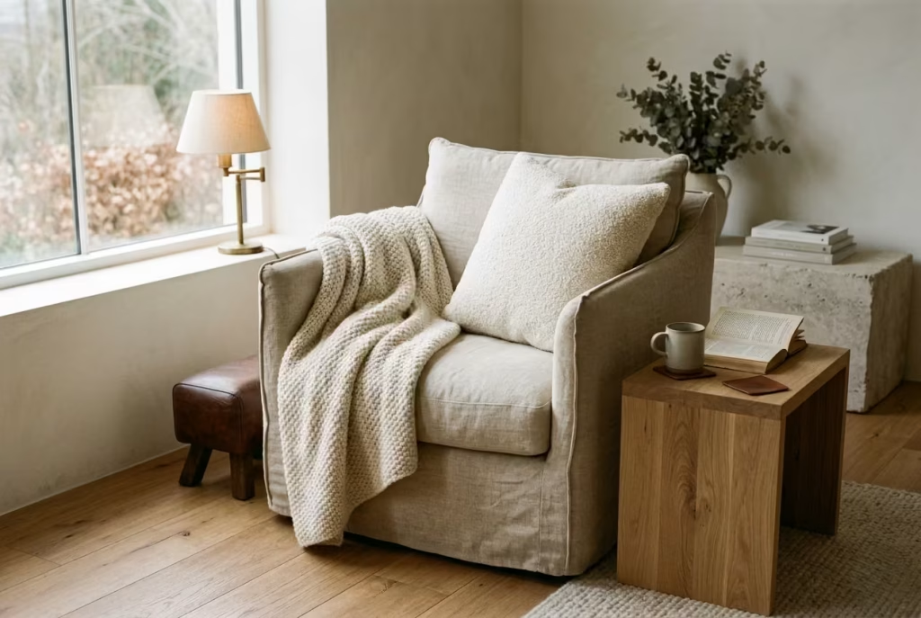
Material choice is where a reading nook begins to develop its emotional character. Each surface contributes something different, not just visually but physically, and the right combination can change how a corner feels the moment you sit down. Linen tends to bring ease and breathability. It feels relaxed, understated, and slightly softened by life, which makes it ideal for rooms that should feel calm without becoming overly precious. Boucle adds tactility and warmth. It has a plush, cloud-like quality that makes a nook feel instantly more inviting, especially in smaller rooms where softness matters more than visual weight.
Wool carries a different kind of comfort. It feels grounded, seasonal, and quietly protective, which is why it works so well in cooler climates or in reading corners that are meant to feel cocooning. Timber introduces structure and natural warmth. It brings a sense of honesty to the space, helping the nook feel connected to the architecture rather than floating as a loose furnishing. Leather, by contrast, adds depth and maturity. It can make a reading nook feel collected and slightly more substantial, particularly in rooms where a more tailored mood is wanted. Stone is cooler and more restrained, but in the right proportions it adds a sense of permanence and calm that can be very powerful.
The key is not to use materials for decoration alone. They should do emotional work. A linen chair beside a timber side table feels very different from a boucle chair set against a stone shelf, even if the overall palette is neutral. One reads softer and more relaxed, the other more grounded and architectural. In practice, the best reading nooks usually mix materials with intent, so the corner feels textured rather than flat. That contrast gives the space depth, and depth is often what keeps a nook from feeling one-note over time.
Storage: baskets, side tables, shelves, and concealed drawers
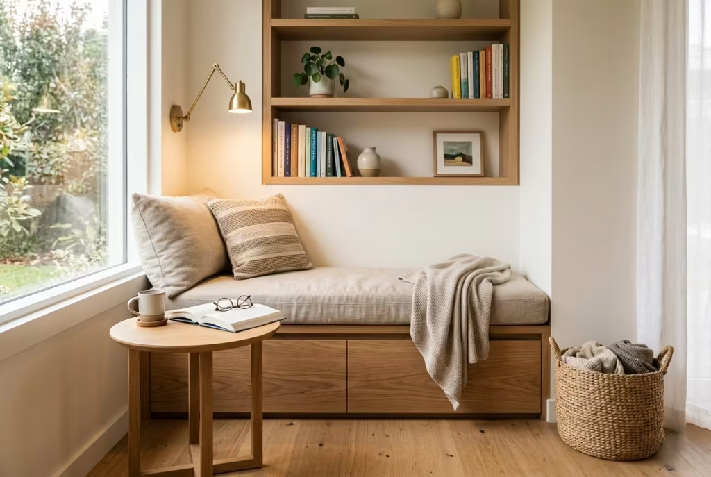
Storage may seem secondary in a reading nook, but it is often what determines whether the space remains calm or gradually turns messy. A nook without a place for books, glasses, throws, or a cup of tea quickly starts accumulating loose objects, and once that happens, the sense of rest begins to slip. The most successful reading corners make storage feel easy and almost invisible, so the essentials are close at hand but never visually noisy.
Baskets are useful for softer items such as blankets, magazines, or seasonal cushions. They bring a relaxed, lived-in quality without making the nook feel cluttered. Side tables matter just as much, especially when there is no built-in ledge nearby. A small surface gives the nook practical credibility. It means there is somewhere to place a book, a drink, or reading glasses without awkward improvisation. Shelves are ideal when the nook is meant to feel slightly more curated, particularly in book-heavy corners where the objects themselves are part of the atmosphere. Concealed drawers, meanwhile, are the quiet luxury option. They keep everything visually clean and work especially well in bespoke joinery nooks or window seats.
In real homes, I often find that the best storage is the storage people do not think about. A drawer beneath a bench, a shelf tucked beside a chair, a basket that disappears under the seat, these small things make daily use easier without breaking the mood. That is the real trick. A reading nook should never feel like it is trying to solve too many problems at once, but it should quietly handle the small practical ones so the space can stay restful.
Colour: how muted palettes calm the eye without making the nook feel cold
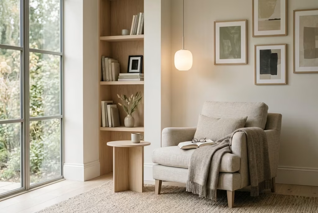
Colour sets the emotional tone before anyone even sits down. In reading nooks, muted palettes often work best because they calm the eye and allow the mind to slow down. Soft neutrals, earthy tones, dusty greens, warm greys, pale timber tones, and chalky off-whites all tend to create a sense of ease. They do not compete for attention, which is exactly what makes them so effective in spaces meant for concentration and rest.
The challenge with muted colour is avoiding sterility. A room can be quiet without feeling lifeless. The difference usually comes down to temperature and layering. A pale palette that includes warm undertones, such as sand, oat, stone, or mushroom, often feels more welcoming than a stark white or a cool grey. These colours hold light gently and make the nook feel breathable rather than cold. Even darker muted shades can work beautifully if they are softened with texture and natural materials. A deep olive chair or a soft taupe wall can feel enveloping rather than heavy when balanced properly.
In practice, a reading nook should feel restful to the eye without becoming bland. That means avoiding overworked contrasts or colours that feel too sharp against one another. Instead, a small range of related tones usually creates a more sophisticated result. In one project, for example, a corner finished in warm stone paint, linen upholstery, and pale oak shelving felt calm from every angle, yet never flat. The palette was restrained, but it had enough warmth and variation to feel alive. That is often the sweet spot.
Texture: why tactile contrast matters more than decoration alone
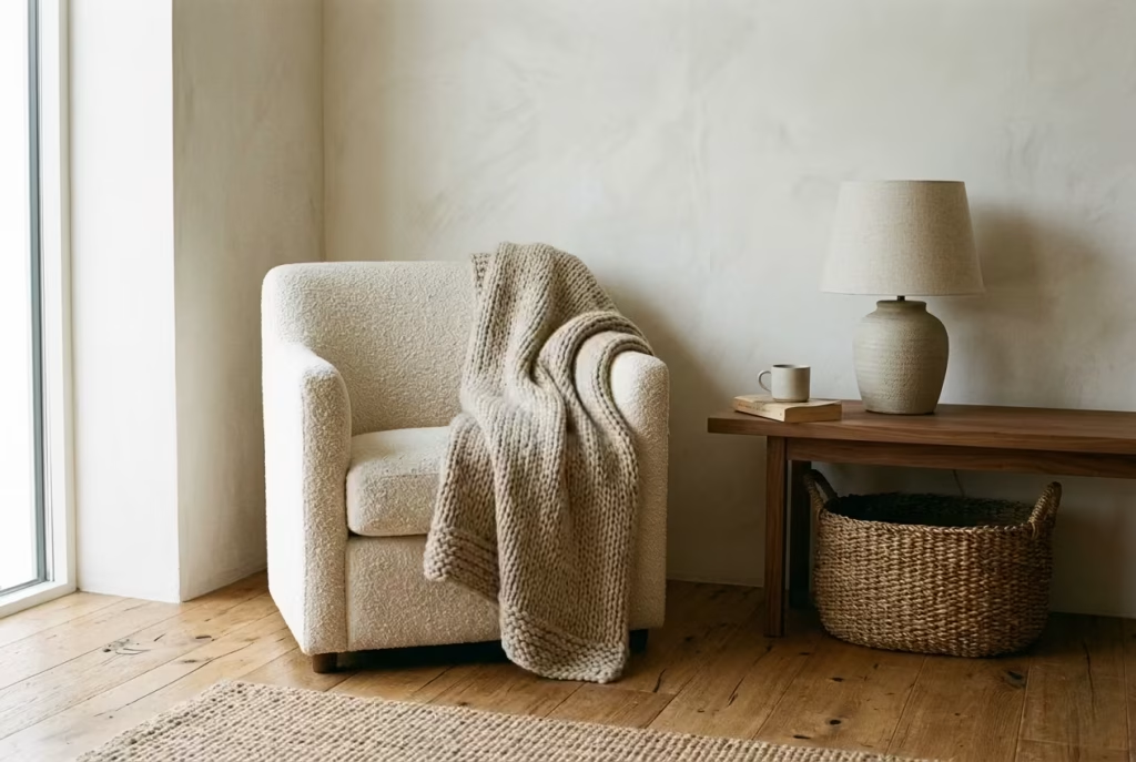
Texture is what gives a reading nook its depth. Without it, even a perfectly arranged space can feel strangely empty. Tactile contrast creates richness without requiring visual clutter. It is the difference between a room that simply looks styled and one that feels genuinely inhabitable. A soft chair against a timber floor, a wool throw over linen upholstery, a matte lamp beside a brushed metal side table, these are the kinds of combinations that give the nook a quiet pulse.
The value of texture becomes especially clear in minimalist or pared-back interiors. When ornament is limited, the eye begins to read surface quality more closely. A boucle chair feels different from a smooth cotton one. A woven basket brings a more relaxed rhythm than a polished table. Even a simple cushion can change the mood if it introduces the right kind of touchable contrast. That is why texture often matters more than decorative objects. A room filled with ornaments can still feel hollow if the surfaces themselves are flat.
In reading nooks, tactile contrast helps the body settle before the mind does. People respond instinctively to texture. They want to sink into it, touch it, lean against it. That physical response is what makes a nook feel welcoming on a deeper level. It is not just about visual beauty. It is about the kind of comfort that sneaks up on you gradually and then stays with you.
Real-life application insights
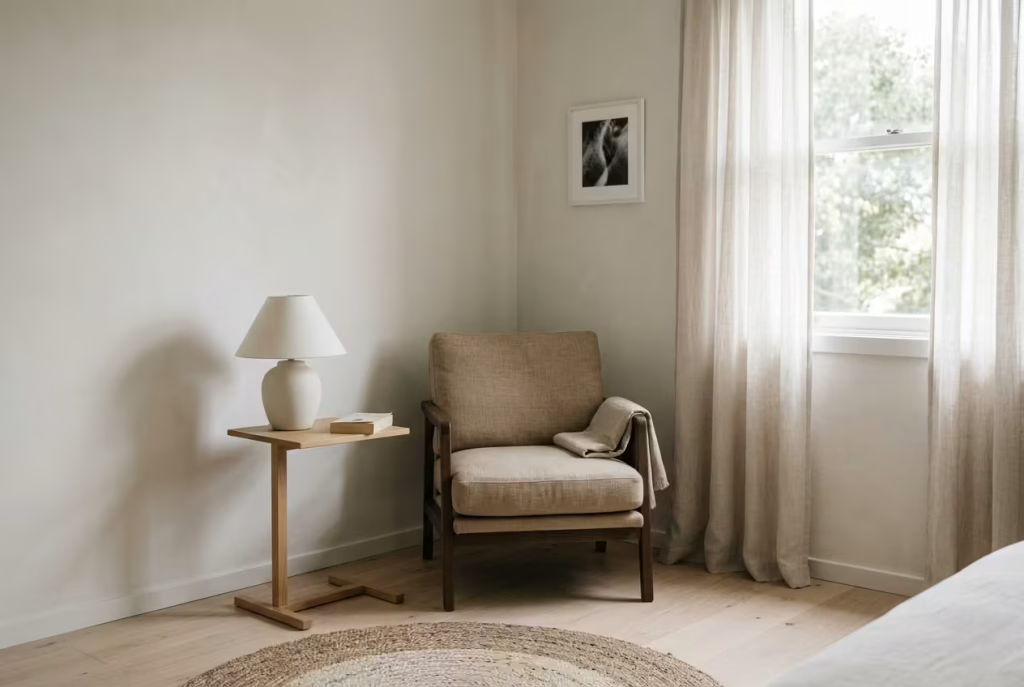
In smaller rooms, restraint usually wins. When space is limited, every added item carries more visual weight, so the reading nook needs to be edited with discipline. A single chair, a compact table, and a soft lamp may be more effective than a layered arrangement trying too hard to do everything at once. Small spaces often benefit from breathing room more than decoration. Leave enough space around the nook so the eye can rest, and the corner will feel more generous than its dimensions suggest.
In larger rooms, the opposite problem tends to appear. The nook can feel exposed if it is not given enough enclosure. In an expansive living area or a long bedroom, a reading corner may need a rug, a wall behind it, a lamp, or a shift in texture to help it feel anchored. Without that sense of definition, it risks looking like furniture placed in transit rather than a space with purpose. A good nook should feel like a destination, even if it occupies only a modest footprint.
A reading corner often succeeds because of what is left out, not what is added. This is where the real discipline lies. Too many accessories can dilute the atmosphere. Too many materials can weaken the focus. The strongest corners usually feel almost effortless because they have been edited carefully behind the scenes. That restraint gives them longevity. They do not tire the eye, and they do not need constant refreshing to stay relevant. They simply do their job quietly, day after day, which is often the mark of the best design.
Seasonal Styling Notes for a Cozier Feel
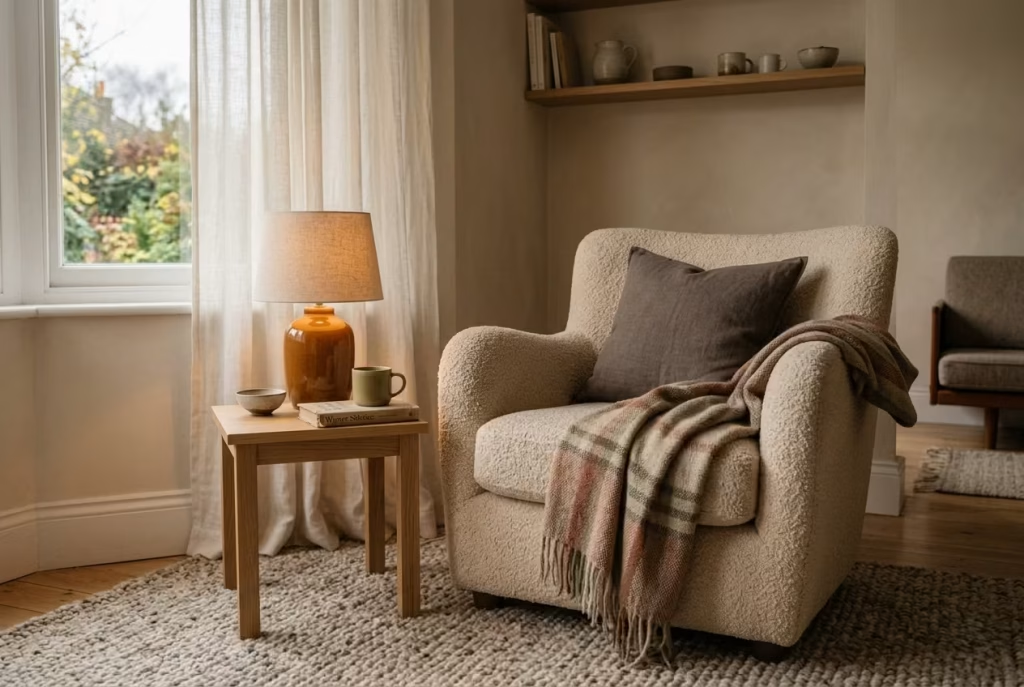
A reading nook is never truly static. Even when the furniture stays the same, the atmosphere shifts with the seasons in subtle but meaningful ways. Light changes direction, fabrics respond differently to temperature, and the emotional tone of a corner evolves almost without notice. The most successful spaces are the ones that adapt gently rather than dramatically, staying comfortable year-round without losing their sense of identity. This is where seasonal styling becomes less about decoration and more about tuning the mood of the space with care and restraint.
Light linen and cotton for summer
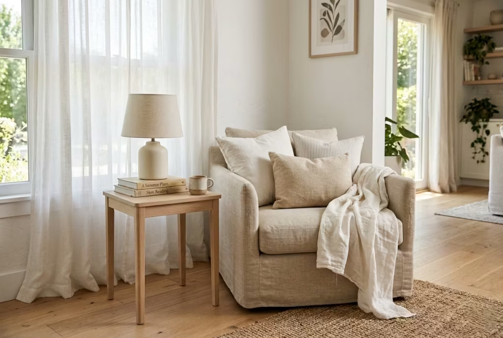
In warmer months, a reading nook should feel like it can breathe. Heavy textures and dense layers tend to sit too firmly in the space when daylight is strong, which is why lighter fabrics such as linen and cotton become so effective. They allow air to move through them, both physically and visually, which keeps the corner feeling fresh rather than weighed down.
Linen in particular has a naturally relaxed quality that works beautifully in summer bedroom transformations or sunlit living spaces. It does not try to look perfect, and that slight irregularity in its weave is exactly what makes it feel so human. Cotton, especially in soft washed finishes, brings a similar ease but with a slightly smoother hand feel, which works well for cushions or light upholstery.
In practice, these materials respond to daylight in a very forgiving way. They soften glare, absorb warmth rather than reflect it harshly, and help the reading nook feel quietly connected to the outside world. Paired with pale timber, muted walls, and natural light filtering through sheer curtains, the entire corner begins to feel effortless, almost like it belongs to the season rather than the room itself.
Wool throws and heavier textures for autumn and winter
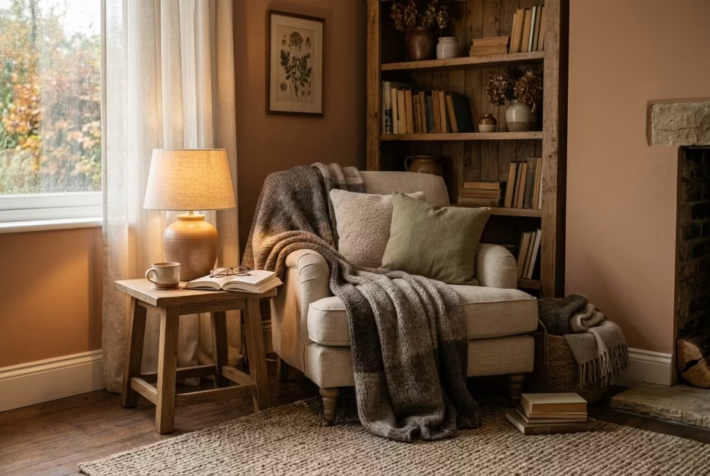
As the light softens and temperatures drop, the reading nook naturally calls for more weight and depth. This is where wool, heavier knits, and layered textiles come into their own. A well-placed wool throw draped over a chair or folded at the end of a bench instantly changes the emotional temperature of the space. It signals comfort, stillness, and a slower rhythm of living.
Unlike summer fabrics, winter textures are less about breathability and more about containment. They hold warmth, both physically and visually, which is exactly what makes a nook feel inviting during colder months. Bouclé cushions, thick wool blankets, and brushed cotton upholstery create a sense of softness that encourages longer sitting, slower reading, and more time spent in quiet corners of the home.
In real residential projects, I often see this seasonal shift happen naturally once homeowners begin using their spaces differently. A light summer chair that felt crisp and open in June becomes layered with throws and cushions by November, gradually turning the nook into something more cocoon-like. The key is not to replace everything, but to build gently on what is already there.
How to keep a nook visually light even when it feels warm
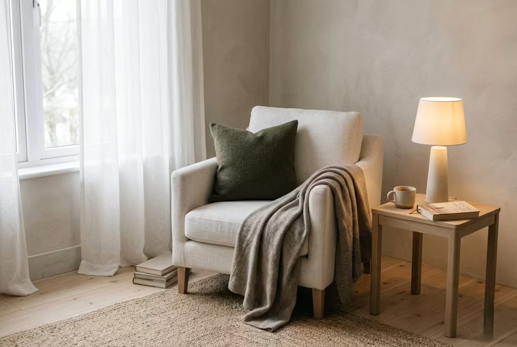
One of the most common challenges in seasonal styling is avoiding visual heaviness. It is easy to add warmth, but much harder to maintain clarity at the same time. A reading nook should feel comforting, but it should never feel visually crowded or overwhelmed by its own softness.
The solution lies in balance and restraint. Even in winter, not every surface needs to be filled. Leaving portions of the chair exposed, allowing timber or stone to remain visible, and keeping negative space around the nook helps maintain a sense of airiness. Light should still be able to move through the space, even when textures become richer.
Colour also plays a quiet role here. Warmer seasons often benefit from pale neutrals and softened tones, while colder months can introduce deeper hues like muted olive, charcoal, or earthy browns. However, these darker notes work best when used sparingly, almost like accents rather than full coverage. This prevents the nook from tipping into visual density.
In one project, a reading corner that shifted from summer to winter simply by adding a wool throw and deep-toned cushion still felt open because the base palette remained light oak, soft stone, and off-white linen. The warmth was added in layers, not replacements. That is often 777where the real elegance lies.
Why layered comfort should never tip into clutter
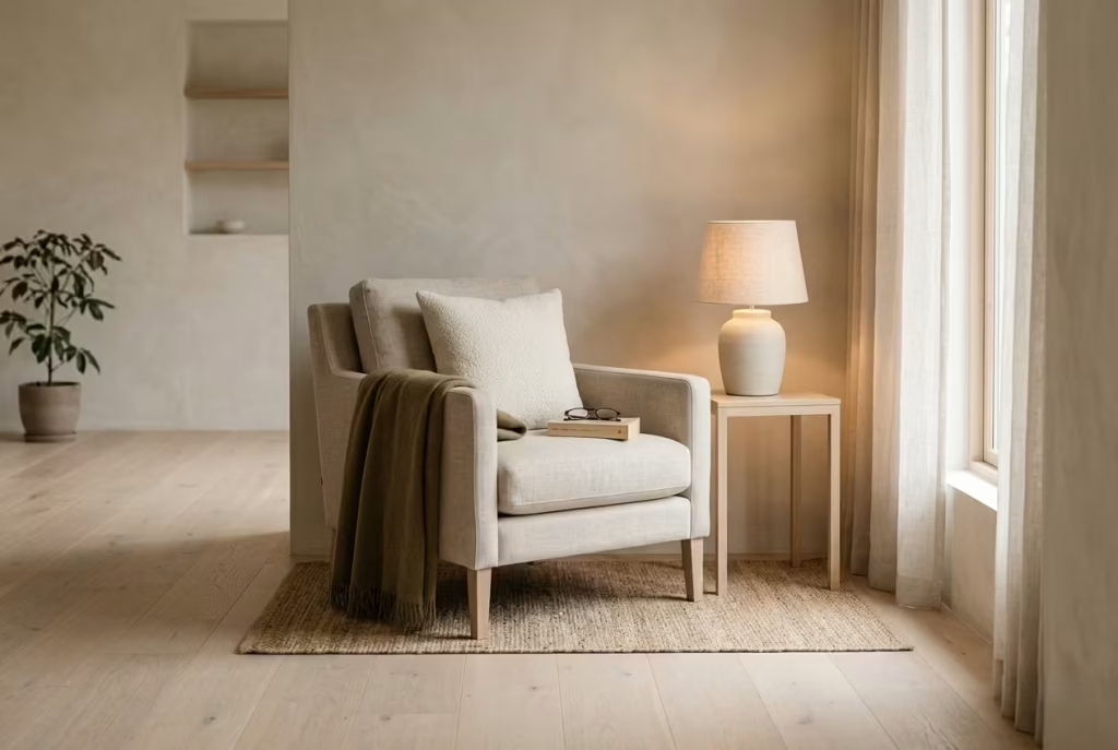
There is a fine line between a space that feels layered and one that feels overloaded. In reading nooks, this distinction becomes even more important because the purpose of the space is calm focus. Too many cushions, excessive throws, or competing textures can quickly disrupt that sense of ease, no matter how beautiful each element might be individually.
Layering should feel intentional, almost like each addition has a reason for being there. A throw for warmth, a cushion for support, a rug for grounding. When everything has a role, the space remains coherent. When items are added purely for styling, the nook begins to lose its quiet clarity.
In real homes, the most successful reading corners often follow a simple principle: add warmth, not weight. This means choosing fewer, better pieces that work harder emotionally rather than filling every surface. A single wool throw can do more than three decorative blankets. One well-chosen cushion can shift the tone of the chair more effectively than a cluster of mismatched ones.
The goal is always the same, comfort without clutter. A reading nook should feel like it is gently layered over time, not assembled in one moment. When that balance is achieved, the space feels both lived-in and light, holding warmth without ever losing its sense of calm.
Common Mistakes to Avoid
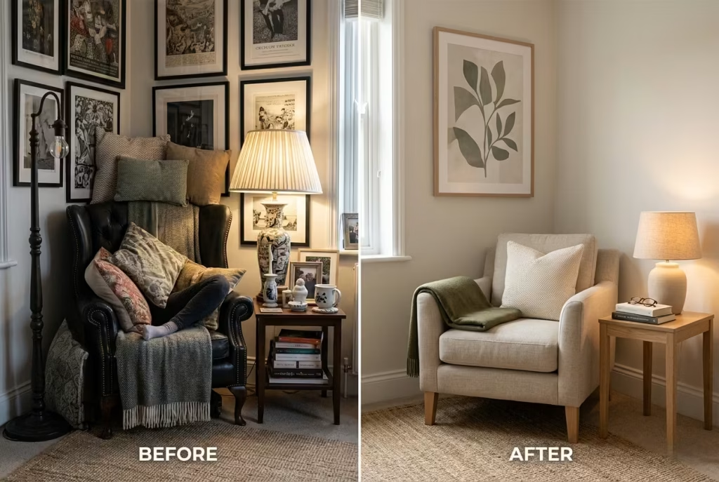
Reading nooks look simple on the surface, but the difference between one that feels naturally lived-in and one that feels awkwardly staged often comes down to a handful of subtle missteps. These are not dramatic design failures. They are quiet oversights that only reveal themselves once the space is actually used. And in real homes, it is always use, not appearance, that exposes what works and what does not.
Choosing a seat that is too bulky for the room

One of the most common mistakes is overestimating the size of seating required. A reading nook does not need to dominate the corner to feel comfortable. In fact, when the chair is too large for the space, it immediately disrupts the balance of the room and makes everything feel tighter than it actually is. What should feel like a calm pause instead becomes a visual obstruction.
In smaller rooms especially, bulky armchairs or oversized loungers can block natural movement and reduce the sense of flow. The eye struggles to move around them, and the space begins to feel compressed rather than restful. A well-proportioned chair, often with a lighter frame and a more modest footprint, allows the nook to breathe. It feels intentional rather than imposed, which is often the real difference between comfort and clutter.
Forgetting lighting after dark
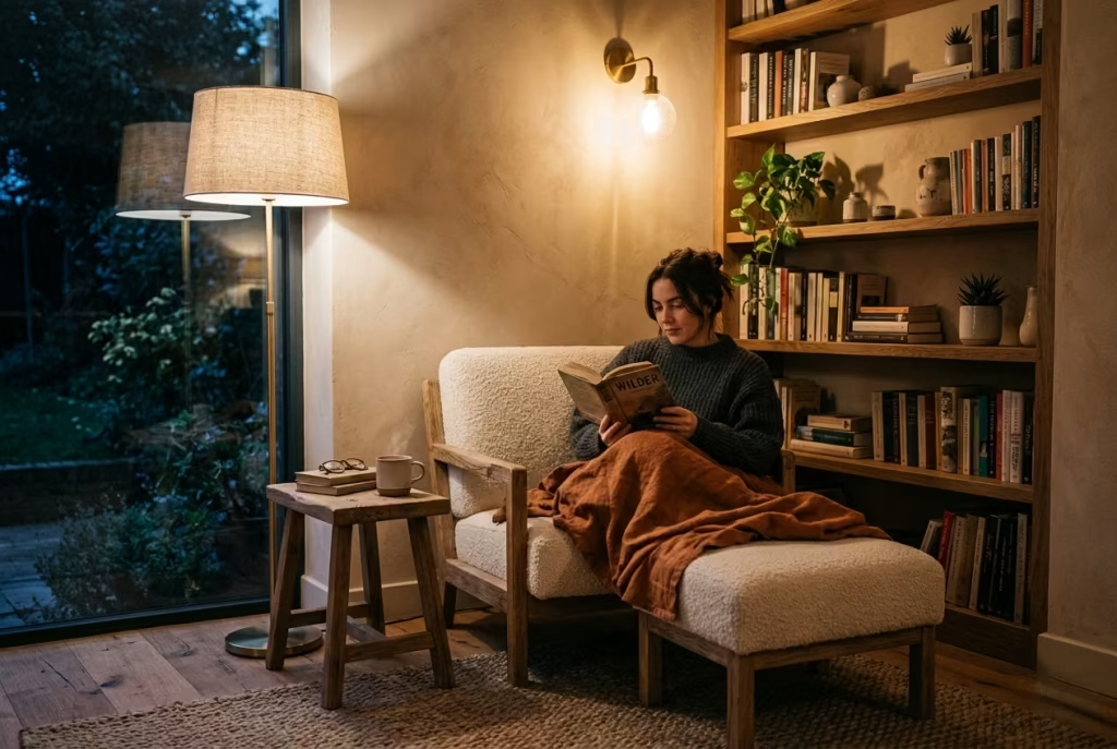
A reading nook that only works during the day is, in practical terms, incomplete. Natural light is often what inspires the placement of the corner in the first place, but without thoughtful lighting for evening use, the space quickly loses its purpose once the sun goes down. This is where many otherwise beautiful nooks quietly fall short.
Good lighting should feel layered rather than singular. A single overhead bulb tends to flatten the mood, making the corner feel functional but uninspiring. Instead, a combination of warm ambient light and focused task lighting allows the space to shift naturally into evening use. In real homes, I often find that a simple wall light positioned beside the chair or a softly shaded floor lamp makes the biggest difference. It creates depth, softens shadows, and keeps the nook feeling inviting long after daylight fades.
Overdecorating the space until it loses its quiet
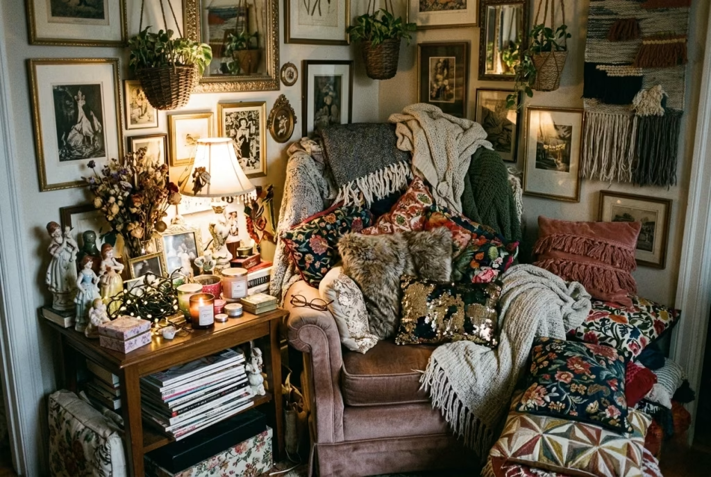
There is a fine line between a thoughtfully styled corner and one that has been overworked. It is easy to assume that adding more cushions, more objects, or more decorative layers will make the nook feel cozier. In reality, it often has the opposite effect. The space starts to lose its sense of calm and becomes visually noisy.
A reading nook relies on restraint. It is the negative space between objects that allows the mind to settle. When every surface is filled, the eye has nowhere to rest, and the corner stops feeling like a retreat. In practice, the most effective reading nooks often use fewer elements but with more intention. A single throw, a well-chosen lamp, and a carefully placed side table can be far more powerful than multiple competing accessories.
Ignoring circulation and clearance
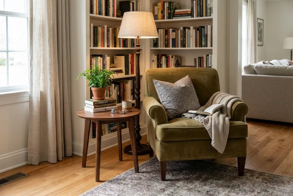
Comfort in a reading nook is not just about what you sit on, but how the space around you behaves. Ignoring circulation is one of the quickest ways to make a corner feel awkward. If you have to squeeze past furniture, adjust your body to move around it, or navigate tight gaps, the sense of ease disappears immediately.
Clearance matters more than most people expect. Even in compact corners, there should be enough space to enter, exit, and settle without friction. In real projects, I have often seen a beautifully styled nook lose its appeal simply because it interrupts the natural flow of the room. A well-planned reading corner feels like it belongs to the architecture rather than sitting on top of it. You should be able to approach it without thinking twice about how to move through the space.
Making the nook look styled but not actually comfortable
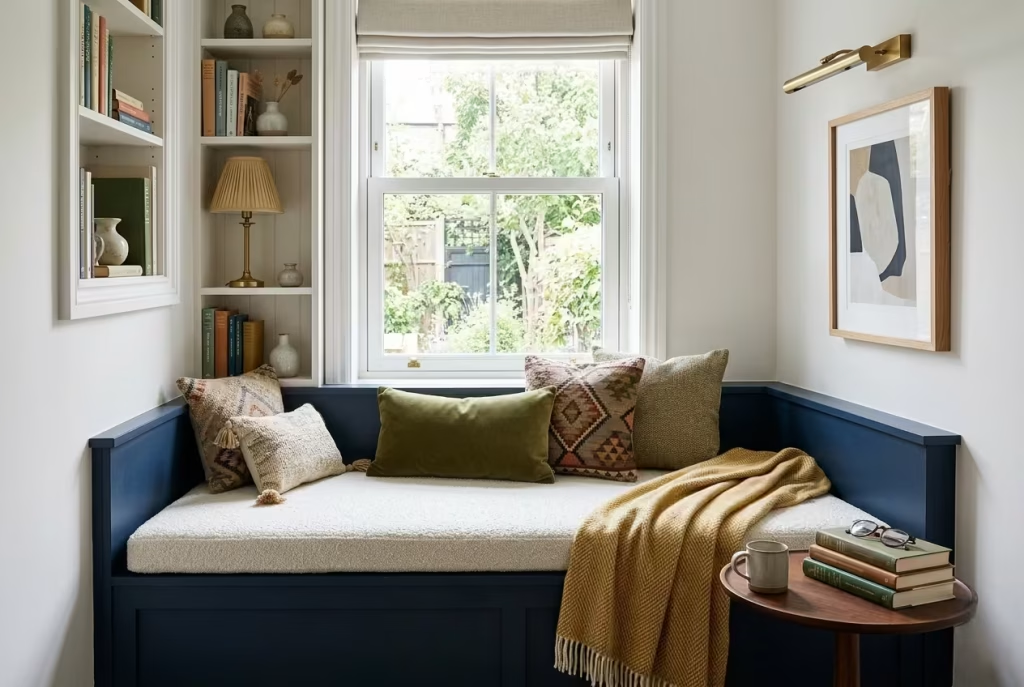
Perhaps the most overlooked mistake is prioritising appearance over usability. A reading nook can look perfect in photographs yet fail completely in daily use if comfort has been treated as secondary. This usually happens when cushions are too firm, seating is too shallow, or materials are chosen for aesthetics alone without considering how they feel over time.
A real reading corner should invite you to stay without adjustment. You should not need to reposition cushions, shift your posture repeatedly, or search for a comfortable angle. If the space is designed well, it simply works from the moment you sit down. In many homes I have visited, the difference between a decorative corner and a truly successful one comes down to this single detail: ease of use without effort.
Real-life insight

A reading nook should feel like a place you could settle into for half an hour without adjusting anything. That is usually the real test. If you find yourself constantly rearranging cushions, reaching for better light, or shifting position to get comfortable, something in the design is off. The best corners remove friction entirely. They do not ask you to adapt to them. They adapt to you.
In practice, the most successful reading nooks are rarely the most complex. They are the ones where proportion, light, and comfort align so naturally that you stop noticing the design altogether. And when that happens, the space quietly earns its place in everyday life without ever needing attention.
Final Thoughts about designing or renovating reading nooks
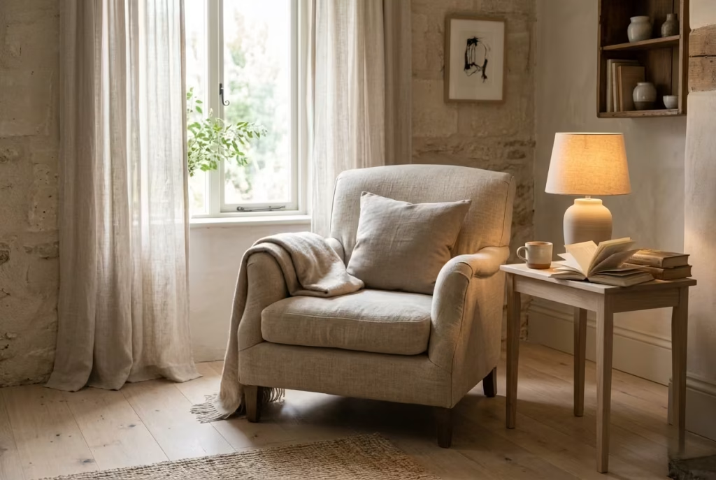
The most enduring reading nooks are rarely the ones that try to make a statement. They are the ones that settle quietly into a home and begin to feel inevitable, as if they were always meant to be there.
Over time, what matters far less is how a corner was styled on day one, and far more how naturally it holds the rhythm of everyday life. A well-shaped reading nook does not compete for attention. It earns it slowly, through comfort, ease, and the way it quietly supports ordinary moments without interruption.
When you strip everything back, the foundations are always the same. Proportion that feels balanced rather than forced. Light that shifts gently through the day without overwhelming the space. Materials that soften with use instead of resisting it.
And above all, a sense of ease that allows the body to settle without negotiation. When these elements align, even the simplest corner can feel considered, not because it is decorated, but because it is resolved.
There is a subtle emotional quality to these spaces that is easy to underestimate. A reading nook becomes more than a chair or a bench placed in a corner.
It becomes a small pause within the home, a place where time feels slightly less urgent and attention is allowed to soften. In many ways, it is not about reading at all, but about creating the conditions where stillness feels natural rather than imposed.
In real homes, I have often noticed that the most loved corners are not the most visually complex ones. They are the ones where nothing feels forced. A chair positioned where the light naturally falls, a surface within easy reach, a texture that feels good to the touch without needing explanation. These details do not call attention to themselves, yet they quietly shape how a room is experienced day after day.
Ultimately, a reading nook is not defined by trend or styling formula. It is defined by atmosphere. When proportion, comfort, and restraint come together, the result is a space that does not just look complete but feels complete.
And that feeling, more than anything else, is what turns a house into a home that people genuinely want to return to, again and again, for those small, quiet moments that end up mattering the most.
Frequently asked question while designing or renovating a reading nooks
How much space do I need for a reading nook?
A reading nook does not need a large footprint to feel effective. Even a small, overlooked corner can work if the proportions are handled well. A compact armchair with a side table and a well-placed light is often enough. In tighter rooms, built-in seating or a window bench tends to be more efficient because it integrates into the architecture rather than competing with it.
What is the best seat depth for a reading nook?
Comfort usually sits in a balanced middle range. A seat depth of around 500 to 600 mm, roughly 20 to 24 inches, generally works well for relaxed reading. Shallower seating can feel restrictive, while deeper seating without proper support often shifts the posture too far into lounging. The goal is a position that supports the back while still allowing ease of movement.
What kind of lighting works best?
Layered warm lighting is the most reliable approach. A reading nook should feel soft and usable without harsh contrast. A floor lamp, wall-mounted light, or table lamp with a warm tone around 2700K typically creates the right atmosphere. If the nook sits near a window, it is still important to consider how it performs after dark so the space remains functional throughout the day.
Should a reading nook be built in or freestanding?
Both approaches work, but they serve different needs. Built-in nooks feel more architectural and permanent, especially in alcoves, window bays, or awkward corners. Freestanding arrangements offer flexibility and can be adjusted over time. The decision usually depends on how fixed you want the space to be and how the room is used on a daily basis.
What materials make a reading nook feel cozier?
Tactility is key. Linen creates a light, breathable feel, boucle adds softness, wool brings warmth, timber introduces structure, and leather gives depth and character. In most cases, combining two or three materials creates a more layered and natural atmosphere than relying on a single finish. The aim is comfort that feels physical as well as visual.
How do I keep a reading nook from looking cluttered?
Simplicity is usually what keeps the space calm. A reading nook works best when it feels edited rather than filled. Essential elements such as seating, lighting, and a small surface should take priority. Storage through baskets, shelves, or concealed compartments helps keep everyday items out of sight so the corner maintains its sense of quiet.
Where should I place a reading nook in the home?
Reading nooks work well in bedrooms, living rooms, window bays, landings, conservatories, and other transitional spaces. The most successful locations tend to be slightly set apart from high-traffic areas while still feeling visually connected to the rest of the home. Natural light is a strong advantage, but not essential if lighting is handled properly.
How do I make a reading nook feel comfortable all year round?
Seasonal layering is the most effective approach. Lighter fabrics such as linen and cotton work well in warmer months, while wool and heavier textures add comfort in colder seasons. The base structure of the nook should remain consistent, allowing you to adjust softness and warmth without redesigning the entire space.
What is the biggest mistake people make?
The most common issue is prioritising appearance over usability. A reading nook can look visually perfect but fail in practice if it is uncomfortable, poorly lit, or awkward to access. The best spaces are the ones that feel effortless to use, where you can sit down and immediately settle without needing to adjust anything.
How do I know if the reading nook works?
A simple measure is consistency of use. If the space naturally invites you to sit and stay for a while without constant adjustment, it is working as intended. A successful reading nook feels intuitive rather than staged. You do not need to think about how to use it. You simply do.