


15 Beautiful Ways to Create a Mexican-Inspired Bedroom You’ll Never Want to Leave
A few years back, I walked into a client’s guest bedroom in Austin carrying a single tile sample a hand-painted talavera piece, cobalt and ochre, chipped slightly at one corner from the trip over. The room, until that morning, was a study in beige restraint: safe walls, safe linens, safe everything. My client picked up the tile, turned it over twice in her hands, and said, “This is the room.” Not a mood board. Not a Pinterest folder six months deep. One tile, and suddenly the whole space had permission to mean something.
That’s the moment I come back to whenever someone asks me how to “do” a Mexican-inspired bedroom, because the question itself is slightly off. This isn’t a theme you apply — it’s a sensibility you build toward, room by room, decision by decision. Color earned through clay and pigment, not decor-store approximation. Craft that shows the maker’s hand, whether it’s a woven Saltillo blanket or an equipale chair with its leather slightly uneven at the seams. Warmth that comes from material, not from a color palette borrowed wholesale and stripped of context.
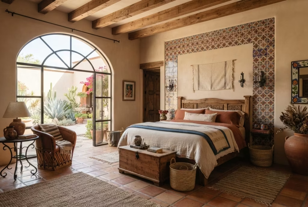
What follows are fifteen ways into that sensibility each one pulled from rooms I’ve actually built, materials I’ve actually sourced, and a few mistakes I’ve made along the way so you don’t have to.
What “Mexican-Inspired” Actually Means in a Bedroom
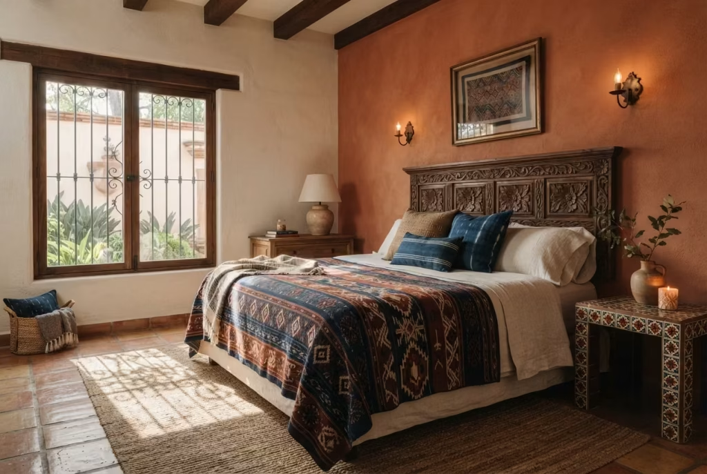
Here’s where a lot of well-meaning homeowners get tripped up: they picture a sombrero on the wall and a serape thrown over the armchair, and they call it a day. That’s decorating by costume, not by design, and it wears thin faster than cheap paint.
Real Mexican-inspired interior design borrows from something older and sturdier: regional craft traditions that have survived centuries because they work. Talavera pottery from Puebla. Saltillo tile fired in the sun until it earns its color. Hand-loomed textiles from Oaxaca, where the dye comes from cochineal and indigo, not a swatch book. Even the color logic follows a region’s light, its clay, its churches and courtyards, rather than whatever’s trending on a design app this season.
Get the sourcing right and the room practically designs itself. Get it wrong, and no amount of styling will save it from looking like a themed restaurant. The difference, as they say, is in the details, and the fifteen ideas ahead are built entirely on that principle.
Anchor the Room in Terracotta and Clay Tones
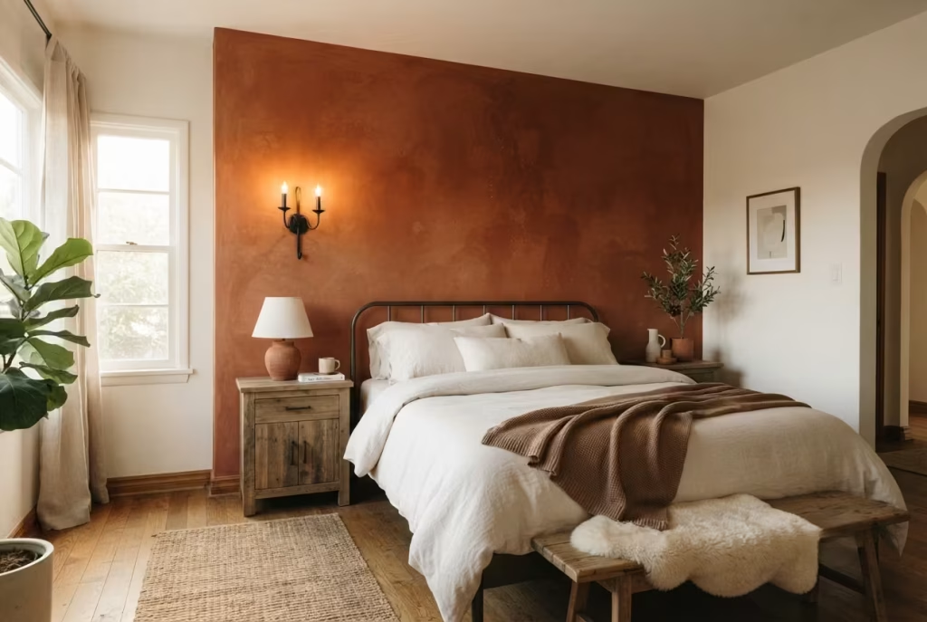
Every Mexican-inspired bedroom I’ve built starts the same unglamorous way: paint chips scattered across the floor, and me squinting at them under both morning and evening light, because terracotta is a color that lies to you under the wrong bulb.
Terracotta, in the truest sense, isn’t a single shade you pick off a fan deck. It’s a family of tones, ranging from sun-baked adobe to a deeper, almost brick-like rust, and the trick lies in choosing the one that matches your room’s natural light rather than a photo you saved on your phone. A north-facing bedroom, for instance, tends to cool color down, so a terracotta that reads warm and earthy in a showroom can turn oddly muddy by four in the afternoon. Test large swatches, at least two feet by two feet, on more than one wall, and live with them for a few days before committing.
In one Scottsdale project, we anchored the room with a terracotta accent wall behind the bed, roughly 12 feet wide, paired with warm white on the remaining three walls. The result gave the room gravity without swallowing it whole, and the client’s exact words were that it finally felt like the room had “roots.” That’s the whole point of clay-based tones: they ground a space the way good architecture grounds a neighborhood, quietly, but unmistakably.
If a full wall feels like too big a leap, terracotta works just as hard in smaller doses. Think a clay-toned area rug, a ceramic table lamp base, or even a terracotta plant pot doing double duty as a nightstand accent. Just don’t scatter it too thin across the room, or you’ll lose the very warmth you’re chasing. Clay tones want to be felt in a few confident places rather than sprinkled everywhere like an afterthought.
Pros: Instantly warms a room, pairs beautifully with natural wood and wrought iron, and photographs well in nearly any light. Cons: Can feel heavy in small, low-light rooms if overused, and cheap synthetic paint finishes rarely capture the depth of true clay pigment.
Introduce Talavera Tile as a Focal Accent
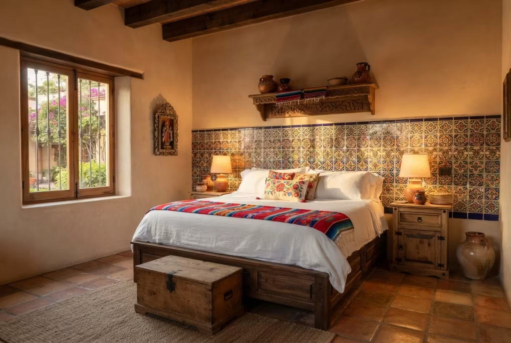
If terracotta gives a room its bones, talavera tile gives it a pulse. This is hand-painted earthenware, traditionally made in and around Puebla, Mexico, using techniques that trace back to Spanish colonial pottery and, further still, to Moorish ceramic work brought over centuries ago. Each tile is fired, glazed, and painted by hand, which means no two pieces are ever perfectly identical, and that slight imperfection is exactly what gives the material its soul.
The mistake I see most often is homeowners tiling an entire wall in talavera and wondering why the room suddenly feels busy rather than beautiful. Talavera is a showstopper, not a supporting actor, and it needs room to shine rather than compete with itself. Used sparingly, it becomes the kind of detail a guest notices immediately and asks about before they’ve even sat down.
A headboard backsplash is one of my favorite applications, and it’s simpler to execute than most people assume. A band of talavera tile, typically 18 to 24 inches tall, installed directly behind the bed frame in place of a traditional headboard, does something a painted wall simply cannot. It catches light differently throughout the day, and by evening, with a warm lamp nearby, the glaze practically glows.
Nightstand tops are another quiet win. Commissioning or sourcing a talavera-tiled tabletop, roughly 16 by 16 inches, turns a functional piece of furniture into a small work of art, one you’ll actually enjoy setting your coffee cup on each morning. And for anyone building from the ground up, a threshold tile inlay at the bedroom’s entrance, maybe 6 to 8 inches wide running the width of the doorway, marks the transition into the room the same way a courtyard gate signals arrival in traditional Mexican architecture.
One caution worth its weight in gold: authentic talavera is porous and needs proper sealing, especially on surfaces that see daily wear like nightstands. Skip that step, and staining becomes a when, not an if.
Pros: Adds unmatched texture and craftsmanship, works as a focal point without requiring a full room redesign, and ages beautifully rather than looking dated. Cons: Genuine talavera carries a higher price tag than mass-produced tile, and poor-quality imitations can look flat and lifeless by comparison.
Layer Hand-Woven Textiles as Bedding, Not Just Throws
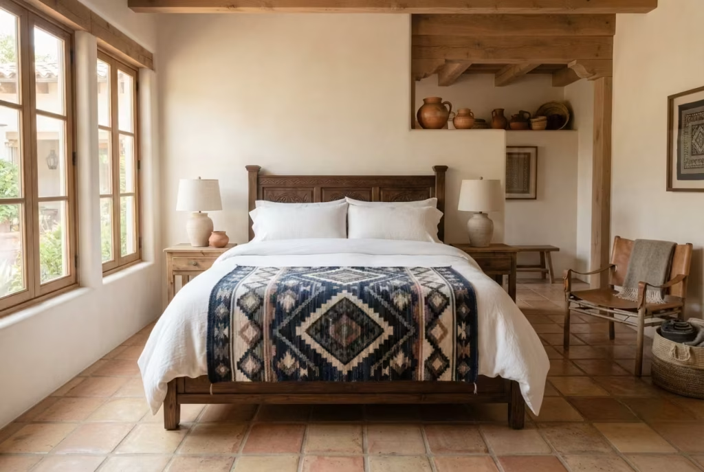
Most people treat a Saltillo blanket or an Oaxacan rug the way they’d treat a souvenir: fold it neatly, drape it over the foot of the bed, and call it decoration. That’s a missed opportunity, and honestly, it undersells the craftsmanship behind these pieces. A textile woven by hand, thread by thread, on a traditional loom deserves a bigger role than an afterthought accent.
I learned this lesson properly on a project in Santa Fe, where the client owned a gorgeous Oaxacan wool rug, deep indigo with a diamond motif, that had been sitting folded in a closet for years because she “didn’t know where it fit.” We used it as the actual bed runner, laid flat across the foot of a king-size mattress, roughly 90 inches wide by 30 inches deep, instead of hiding it away. The transformation was immediate. Suddenly the bed had a story to tell, and the rest of the room’s neutral palette had something to lean on.
The same logic applies to Saltillo blankets, which carry a slightly heavier hand and bolder stripe pattern than their Oaxacan cousins. Rather than tossing one over an armchair, consider using it as a top layer on the bed itself, folded back a third of the way, roughly 24 inches from the footboard, so the pattern reveals itself the moment someone walks in. It’s a small styling choice that makes a world of difference, turning a made bed into a genuine focal point.
For those hesitant to commit a whole textile to daily bedding wear, a hallway runner cut from the same weaving tradition, or a wall-mounted tapestry above the headboard, achieves a similar effect without the wear and tear of nightly use. Either way, the goal is the same: let these textiles do the heavy lifting they were always capable of, rather than relegating them to background noise.
One practical note, and it’s worth remembering: authentic wool textiles need gentle, infrequent washing and should be aired out rather than machine-dried, or you’ll flatten the very texture that makes them special in the first place.
Pros: Brings genuine craftsmanship and story into the room, adds texture that mass-produced bedding simply cannot replicate, and works as a statement piece without needing additional decor. Cons: Authentic pieces require careful cleaning and can be an investment, and lower-quality machine-made imitations often lack the depth of color and weight of true hand-woven textiles.
You May also Like: 24 Dark Apartments Ideas to Brighten and Transform Your Space
Use a Carved Wood Headboard as Sculptural Focus
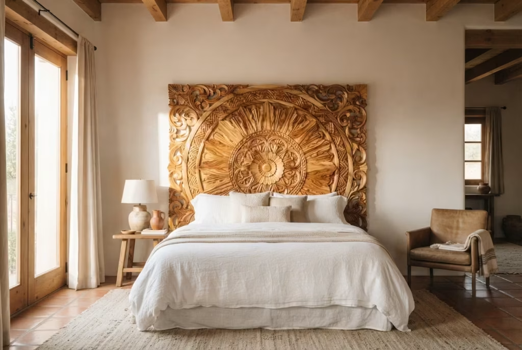
There’s a particular kind of quiet drama that only a carved wood headboard can bring to a bedroom, and I’ve watched it work its magic in rooms that otherwise had very little going on. Where talavera tile earns its keep through color and pattern, a carved headboard earns its place through shadow, texture, and sheer physical presence. It’s furniture that behaves like sculpture, and once it’s in the room, everything else arranges itself around it.
Traditional Mexican carpentry leans heavily on mesquite, parota, and cedar, each with its own character. Mesquite carries a dense grain and rich, almost chocolate tone, while parota tends toward lighter honey shades with dramatic swirling patterns that look nearly hand-painted despite being entirely natural. Cedar, lighter still, brings a fragrant warmth and takes carving beautifully, which is why so many traditional headboards feature deep relief patterns, sunbursts, botanical motifs, or geometric repeats inspired by colonial-era church doors.
Scale matters more here than people expect. A headboard that’s too modest gets swallowed by the wall behind it, while one too large can dwarf the bed itself and throw the whole room off balance. For a queen-size bed, I typically recommend a headboard height between 48 and 54 inches, extending a few inches wider than the bed frame on either side, roughly 66 to 70 inches total width, so it reads as intentional rather than accidental.
On a project in Tucson, we sourced a hand-carved parota headboard with a sunburst motif nearly three feet in diameter, and positioned it against a plain plaster wall, painted in a soft, warm white. No other wall decor was added. The headboard did all the talking, and the room felt finished the moment it went up, proof that sometimes restraint is the smartest design move available.
One thing worth keeping in mind: solid wood pieces like these are sensitive to humidity swings, so in particularly dry or particularly humid climates, a light annual conditioning with wood oil keeps the carving crisp rather than letting it crack or warp over time.
Pros: Serves as an instant focal point without requiring additional wall art, brings warmth and craftsmanship that mass-produced headboards can’t match, and tends to age gracefully rather than going out of style. Cons: Solid carved wood pieces can be heavy and costly to ship, and they require some climate care to prevent cracking in extreme conditions.
Bring in Wrought Iron Details
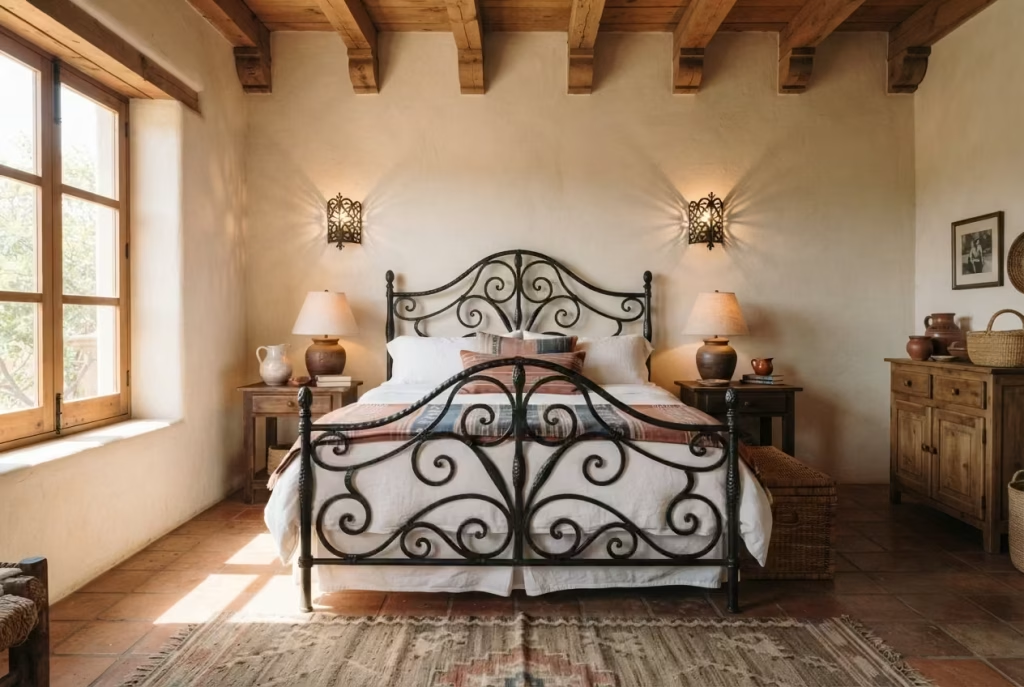
If wood carving speaks in warmth, wrought iron speaks in line and shadow, and a bedroom that leans on both tends to feel layered rather than lopsided. Ironwork has deep roots in Mexican design, tracing back to Spanish colonial blacksmithing traditions that shaped everything from cathedral gates to humble courtyard railings. Bring even a modest amount of it indoors, and a room starts to feel like it has history baked into its bones, not bought off a shelf last Tuesday.
Bed frames are the boldest way in. A hand-forged iron frame, scrolled at the corners or finished with simple hammered texture, brings a certain old-world sturdiness that upholstered frames simply can’t fake. For a queen-size frame, expect a footboard height around 24 to 30 inches and a headboard reaching closer to 48 inches, enough presence to anchor the room without turning it into a wrought iron museum piece. Pair it with lighter bedding and a few soft textiles nearby, or the whole room risks feeling cold rather than characterful.
Sconces are the quieter cousin here, and honestly, they might be the easiest entry point for anyone dipping a toe into this style for the first time. Mounted on either side of the bed, roughly 24 to 28 inches above the mattress line, a pair of iron sconces with punched or scrolled detailing throws warm, dappled light across the wall each evening, the kind of lighting that does double duty as both function and art. I’ve installed these in more client bedrooms than I can count, and it’s rarely the headline feature, yet it’s almost always the detail people mention first when friends visit.
Window grilles, meanwhile, are the detail that separates a room that merely borrows the aesthetic from one that fully commits to it. A decorative iron grille mounted just inside or outside a bedroom window, whether structural or purely ornamental, echoes the courtyard architecture so common across central Mexico, where iron and light have always worked hand in glove. Even a small window, say 30 by 40 inches, benefits enormously from this treatment, throwing beautiful shadow patterns across the floor as the sun moves through the day.
A quick word of caution, though: raw iron needs a proper protective finish, whether powder-coated or hand-waxed, especially in coastal or humid climates, or rust will creep in far sooner than anyone wants.
Pros: Adds architectural character and timeless durability, works beautifully alongside both wood and tile, and creates striking light and shadow effects through sconces and grilles. Cons: Can feel cold or heavy if overused without warm textiles to balance it, and untreated iron is prone to rust in humid conditions.
Paint One Wall in Saturated Color The Accent Wall Done Right
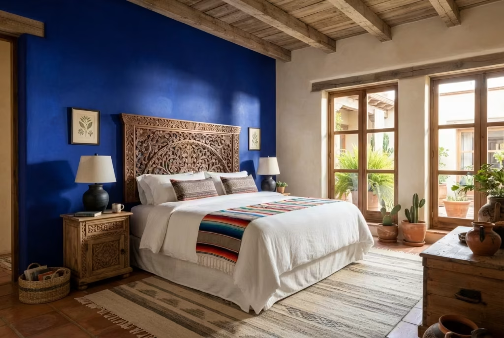
The phrase “accent wall” makes a lot of designers wince, myself included, mostly because it’s been done so poorly for so long that people associate it with a single stripe of navy behind a bed and nothing else. Done right, though, a saturated accent wall in cobalt, magenta, or marigold isn’t a trend chasing attention. It’s a color decision rooted in an entire architectural tradition, the same one responsible for the pink walls of Luis Barragán’s houses and the cobalt courtyards scattered across San Miguel de Allende.
The trick, and it really is a trick worth learning, lies in picking one wall and committing fully rather than hedging with a muted version of the color. A true cobalt, the kind that borders on electric under direct light, needs to be paired with restraint everywhere else in the room. White or warm cream on the remaining walls, natural wood tones in the furniture, and minimal competing pattern nearby. Otherwise the color fights for attention instead of commanding it.
Marigold works a little differently, and it’s often the gentler entry point for anyone nervous about going bold. It reads warmer, almost golden at certain times of day, and pairs beautifully with terracotta and wood tones already discussed earlier in this guide. In a Phoenix bedroom project, we chose marigold for the wall directly behind a carved wood headboard, and the pairing did something unexpected: the wood’s grain seemed to deepen in contrast, and the whole wall felt like it was glowing from within by late afternoon.
Magenta, admittedly, is not for the faint of heart. It’s the boldest of the three, and I generally reserve it for smaller accent walls, perhaps behind a reading nook or a single dresser wall, rather than the entire space behind a bed. Used in a smaller dose, roughly one wall no larger than 10 to 12 feet wide, it reads as confident rather than overwhelming, and it photographs beautifully in natural light, which matters if the room ever ends up on a listing or a design portfolio.
One piece of practical advice that saves headaches later: saturated colors like these often need two to three coats for even coverage, and a slightly higher sheen, eggshell rather than flat, helps the color hold its depth rather than looking chalky once dry.
Pros: Creates instant visual impact and architectural character, pairs beautifully with wood and terracotta tones, and photographs exceptionally well in natural light. Cons: Requires careful color testing since saturated shades can shift dramatically under different lighting, and repainting or repainting over these colors later often takes extra coats of primer.
Ground the Room with Saltillo or Terracotta Flooring
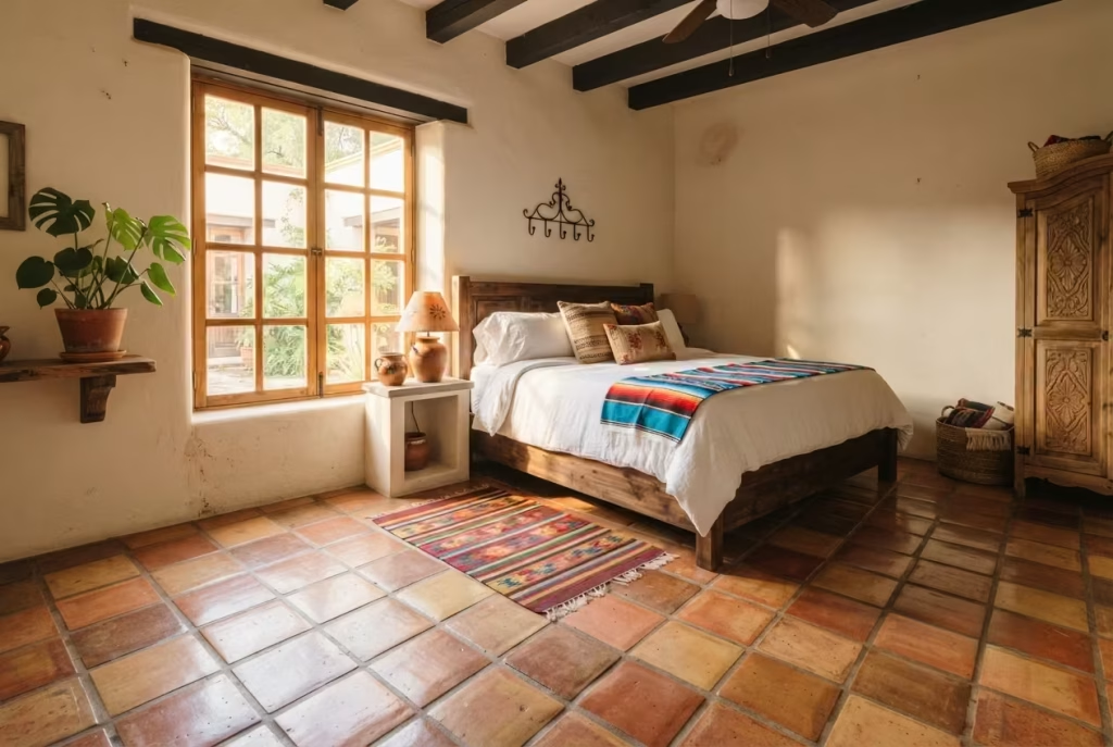
Flooring rarely gets the credit it deserves in these conversations, yet it’s often the single decision that makes or breaks the whole room’s authenticity. Saltillo tile, named for the Mexican city where it’s traditionally made, is fired clay left slightly irregular in shape and color, no two tiles ever quite matching, which is precisely what gives a floor its lived-in, sun-warmed character rather than the sterile uniformity of factory ceramic.
Real Saltillo, laid properly, needs sealing, and this is where a lot of homeowners get caught off guard. The tile is porous by nature, so without at least two coats of a penetrating sealer, it stains at the first spilled glass of water. Done correctly, though, it develops a beautiful patina over the years, deepening in color the way a well-loved leather jacket softens with age. Standard tile sizes run 12 by 12 inches for most bedroom applications, though larger 16 by 16 inch tiles work well in bigger rooms where you want fewer grout lines interrupting the visual flow.
Now, full disclosure: not everyone is in a position to rip out existing flooring, especially in a rental or a room where budget is tight. That’s where a well-chosen rug earns its keep. Look for pieces that mimic the warm, slightly mottled color variation of true terracotta, rather than a flat, uniform orange that reads more like a costume than a design choice. A jute or wool blend rug in rust and clay tones, sized to sit just under the bed’s front legs, roughly 8 by 10 feet for a queen room, achieves nearly the same grounding effect without a single tile being laid.
I’ve done both versions plenty of times, and honestly, the rug route surprises people with how convincing it can be. On a project in Dallas, we used a hand-knotted wool rug in graduated terracotta tones over existing hardwood, and more than one guest assumed the floor itself had been retiled. That’s the whole goal here: the room should feel rooted from the ground up, whether that’s achieved with real clay underfoot or a clever textile stand-in.
One last note worth remembering: Saltillo tile stays cool underfoot, which feels wonderful in warmer climates but can be a genuine shock on a winter morning, so factor in a bedside rug regardless of which flooring route you choose.
Pros: Creates authentic warmth and texture underfoot, ages beautifully with a natural patina, and works in both real tile and rug form depending on budget. Cons: Real Saltillo requires ongoing sealing and stays cold in winter months, while cheaper synthetic rug imitations can look flat and unconvincing.
You May also Like: 25 Guest Bedroom Design Ideas to Create a Stylish, Comfortable, and Inviting Space
Add Papel Picado or Textile Art as Wall Decor
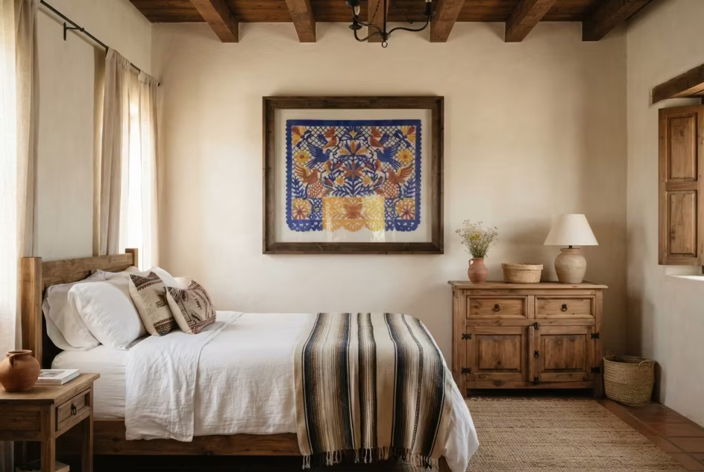
Papel picado, the intricately cut tissue paper banners traditionally strung up for celebrations across Mexico, might seem like an odd fit for a bedroom at first glance. It’s festive by nature, designed for fiestas and Día de los Muertos altars, not exactly the quiet retreat most people want from a place meant for rest. And yet, used with a light hand, it brings a kind of playful craftsmanship that framed prints simply cannot replicate.
The key word here is restraint, and it’s worth repeating because this is the detail most likely to tip a room from charming into cluttered. A single framed piece of papel picado, mounted behind glass to protect the delicate paper, roughly 16 by 20 inches, works beautifully as a small gallery moment above a dresser or reading chair. Strung banners, on the other hand, the kind meant to flutter freely, tend to read more like party decor than considered design when hung permanently in a bedroom. If you love the look, save the loose banners for a special occasion rather than year-round display.
Textile art offers a steadier alternative for anyone wanting that same handcrafted energy without the fragility of paper. A woven wall hanging, whether a small Oaxacan tapestry or a more abstract fiber art piece inspired by traditional Mexican weaving patterns, brings texture and story to a wall the same way a good piece of literature brings depth to a quiet evening. Size these thoughtfully, somewhere between 24 and 36 inches wide for a single statement piece above a headboard, and resist the urge to cluster multiple large pieces on the same wall, or the room starts to feel like a market stall rather than a considered retreat.
On a recent project outside Sacramento, we mounted a single, large-format woven textile, nearly three feet across, on the wall opposite the bed rather than behind it. This placement let it become the first thing seen upon waking, a small daily moment of color and craft, rather than something glanced at only in passing. The client later mentioned it was the piece she found herself staring at most mornings, coffee in hand, and that’s really the goal with wall art in a bedroom: something worth looking at twice, not just once.
One small but important note: both papel picado and delicate textiles fade with direct sun exposure over time, so positioning them away from a west-facing window, or adding UV-protective glass for framed pieces, keeps their color vivid for years rather than months.
Pros: Adds handcrafted texture and cultural depth without requiring major renovation, works well in rentals since most pieces are easily hung or removed, and introduces color and story in a way mass-market art rarely achieves. Cons: Papel picado is fragile and prone to fading, and overusing either element can tip a calm bedroom into visual clutter if not chosen with restraint.
Choose Woven Leather Equipale Seating for a Reading Corner
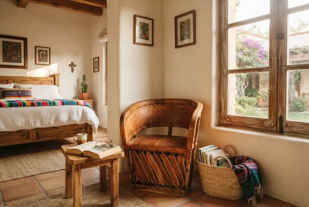
Every bedroom deserves a corner that isn’t about sleeping, a spot where a book, a cup of tea, or a quiet moment before the day starts actually has somewhere to happen. Equipale furniture, the traditional Mexican woven leather seating originating from Jalisco, fills that role in a way few other furniture styles manage, blending rustic charm with genuine comfort rather than sacrificing one for the other.
Traditionally built on a cedar frame lashed together without nails, using techniques passed down through generations of craftsmen, equipale chairs feature pigskin or cowhide strips woven across a curved wooden base. The result is a chair that looks sculptural even when empty, its rounded silhouette and natural hide tones bringing warmth to a corner that might otherwise sit forgotten. A single equipale chair, typically standing around 30 to 34 inches tall with a seat depth close to 20 inches, fits comfortably into a corner as small as 4 by 4 feet, making it a realistic addition even in bedrooms that aren’t overly generous in square footage.
What makes this piece work so well in a reading nook specifically is the way it ages. Unlike upholstered furniture, which tends to flatten and wear thin in predictable spots, the leather strips on an equipale chair develop character over time, each one taking on a slightly different patina depending on light exposure and use. It’s furniture that improves with age rather than merely surviving it, and that quality alone makes it worth the investment for anyone planning to keep the piece for years rather than seasons.
Pair it with a small side table, ideally one in matching or complementary wood, and a floor lamp with warm, low lighting nearby, and the corner starts to feel like an invitation rather than an afterthought. On a project in Albuquerque, we tucked a single equipale chair beside a window with natural morning light, added a small woven basket beside it for magazines and books, and the client later told me it became her favorite five minutes of the day, coffee in hand before anyone else in the house woke up.
One practical note worth remembering: leather woven furniture like this needs occasional conditioning, particularly in dry climates, to keep the strips supple rather than brittle, and it should be kept out of direct, prolonged sun exposure to avoid premature cracking.
Pros: Adds sculptural, handcrafted seating that develops character over time, fits well even in smaller bedroom corners, and brings genuine comfort alongside its rustic visual appeal. Cons: Requires occasional leather conditioning to prevent cracking, and authentic hand-woven pieces carry a higher price point than mass-produced accent chairs.
Incorporate Niche Shelving Inspired by Adobe Architecture
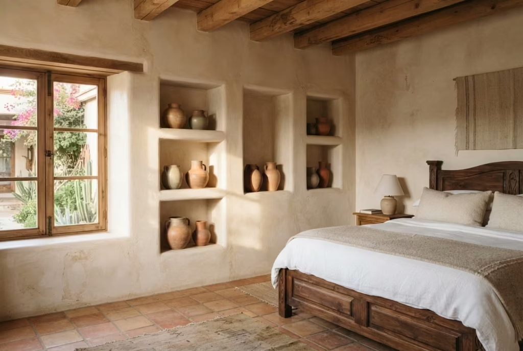
Adobe architecture, the sun-dried mud brick building tradition found throughout central and northern Mexico and the American Southwest, has given the design world one of its most quietly brilliant ideas: the built-in wall niche. These recessed shelves, carved directly into thick adobe walls out of pure necessity, since load-bearing mud brick doesn’t leave much room for freestanding furniture, have become one of my favorite details to bring into modern bedrooms, even ones with nothing close to a real adobe wall.
The logic behind niche shelving is worth understanding before installing it, because it’s not simply a shelf, it’s an architectural statement carved into the wall itself. Traditional niches, called nichos, run anywhere from 12 to 24 inches wide and 10 to 16 inches deep, recessed into the wall by several inches rather than mounted on its surface. This depth is what gives them their character, casting soft shadows that shift throughout the day as sunlight moves across the room, turning even an empty niche into a small study of light and form.
In a modern build or a full renovation, framing out a niche during drywall installation is fairly straightforward for any contractor familiar with the technique, and it costs surprisingly little more than standard drywall work. For those not ready to open up walls, a floating shelf recessed visually with a shadow box frame achieves nearly the same effect, particularly when painted the same color as the surrounding wall so the shelf reads as part of the architecture rather than an addition bolted on afterward.
What goes inside the niche matters just as much as the niche itself. I’ve seen these spaces used beautifully for a single piece of pottery, a small collection of votive candles, or a rotating display of personal treasures collected over years of travel. On a project in El Paso, we built three staggered niches beside a headboard wall, varying heights between 14 and 20 inches, and filled them with nothing more than hand-thrown ceramic vessels in varying earth tones. The client mentioned it was the first piece of “architecture” she’d ever had in a bedroom, rather than simply furniture arranged around a room’s existing bones, and that distinction stuck with me.
One small consideration worth flagging early: niches recessed into exterior walls need proper insulation behind them, or they can become a subtle source of drafts and temperature loss, something worth discussing with a contractor before cutting into any wall.
Pros: Adds genuine architectural interest without requiring extra furniture, creates beautiful shadow play with natural light, and offers a curated display space for meaningful objects. Cons: Requires construction work if built into an existing wall, and niches on exterior walls need proper insulation to avoid drafts.
Use Woven Baskets and Pottery for Functional Storage
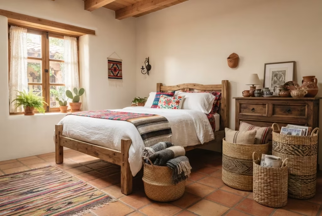
Storage is where a lot of otherwise beautiful bedrooms fall apart, quite literally, because the moment clutter enters the picture, even the most carefully chosen tile or textile loses its impact. This is exactly where Mexican craft traditions solve a problem that most design styles treat as an afterthought: woven baskets and hand-thrown pottery, built for centuries as functional necessities, double beautifully as storage that never once looks like storage.
Baskets woven from palm fiber, willow, or pine needles, techniques found throughout Oaxaca and Michoacán, bring a texture that soft-sided fabric bins simply can’t touch. A medium basket, roughly 14 inches in diameter and 12 inches tall, works well tucked beside a bed for extra blankets, while a taller floor basket, closer to 20 inches, handles everything from laundry to spare pillows without ever feeling like it’s hiding a mess. The beauty here lies in the fact that these pieces earn their keep twice over: once as genuinely useful storage, and again as objects worth looking at even when they’re doing nothing at all.
Pottery plays a slightly different role, better suited to smaller, more intentional storage needs. A mid-sized ceramic jar, hand-thrown and often left in its natural clay finish or glazed in a single earthy tone, makes an excellent catch-all for jewelry, hair ties, or the small daily items that otherwise clutter a nightstand surface. I’ve used these in dozens of projects as a substitute for plastic organizer trays, and the difference in how a room feels is immediate, less like a bedroom trying to stay tidy, more like one that was simply built with beauty and order in mind from the start.
On a project in Mesa, we lined the base of a closet with three graduated woven baskets, largest to smallest, for shoes, folded sweaters, and accessories respectively, and topped the dresser with a single ceramic jar for jewelry. The client mentioned that for the first time in years, tidying the room felt less like a chore and more like arranging a small still life each morning, a small shift in mindset that came entirely from choosing storage that looked as good as it functioned.
A quick practical note worth remembering: natural fiber baskets can be sensitive to moisture, so keeping them away from bathroom-adjacent walls or humid corners helps them last for years rather than months.
Pros: Combines genuine functionality with handcrafted beauty, reduces visual clutter without resorting to plastic bins, and adds texture that complements nearly every other element in this style. Cons: Natural fiber baskets are sensitive to moisture and can wear down faster in humid climates, and finding quality handmade pieces sometimes takes more sourcing effort than a quick trip to a big-box store.
Layer Lighting with Tin or Punched-Metal Fixtures
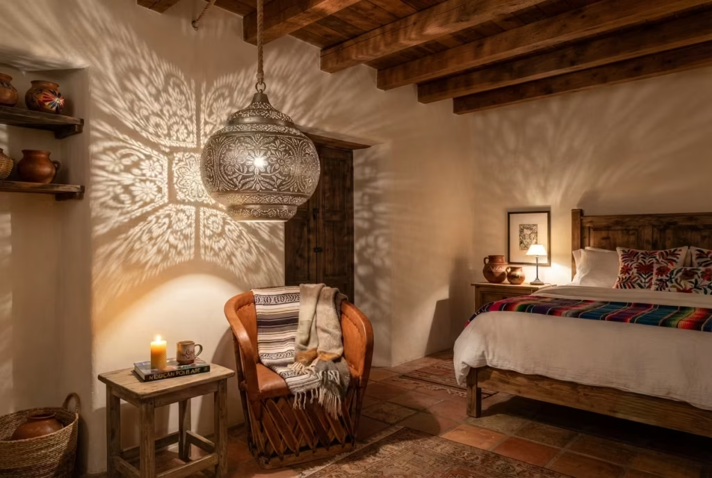
Lighting rarely gets the spotlight it deserves in design conversations, which is a bit of an irony considering it’s the one element responsible for how every other choice in the room actually reads once the sun goes down. Tin and punched-metal fixtures, a hallmark of Mexican folk craftsmanship, solve this beautifully, because they don’t just illuminate a room, they paint it with pattern, turning a plain ceiling or wall into a small canvas of light and shadow each evening.
Punched tin, traditionally made by hammering small holes into sheets of metal in decorative patterns, ranging from simple geometric repeats to elaborate floral and star motifs, has been used for centuries in Mexican lanterns and pendant fixtures. What makes it so effective in a bedroom specifically is the quality of light it casts. Rather than a flat, even glow, punched metal scatters light through dozens of tiny openings, throwing intricate shadow patterns across walls and ceilings that shift subtly depending on the bulb’s warmth and the fixture’s distance from the surface.
A pendant fixture, hung centrally or slightly off-center above a seating area, works best at a height roughly 30 to 36 inches above where someone would be sitting or standing, low enough to cast dramatic shadows nearby without becoming a hazard to walk under. For bedside lighting, a smaller punched-metal sconce, mounted 24 to 28 inches above the mattress line, achieves a similar effect on a more intimate scale, ideal for reading light that still carries visual interest even when switched off during the day.
Layering matters just as much here as it does with textiles or color. A single overhead fixture rarely does a room justice on its own. Pairing a punched-metal pendant with a pair of matching sconces, or a small tin table lamp on a dresser, creates depth through light the same way layered textiles create depth through texture. On a project in Santa Fe, we used a large punched-tin pendant above a reading chair alongside twin iron sconces flanking the headboard, and the client mentioned that even on nights when she wasn’t reading, she’d leave the pendant on simply to watch the shadow pattern move across the ceiling as the evening went on.
One practical note worth keeping close: warm-toned bulbs, generally in the 2700 to 3000 Kelvin range, bring out the richness of tin and punched metal far better than cooler white light, which tends to flatten the material’s natural warmth and make the shadows feel harsh rather than inviting.
Pros: Creates dramatic, ever-changing light patterns that add ambiance beyond simple illumination, works beautifully layered with other lighting sources, and brings authentic craft detail even in smaller fixtures. Cons: Punched-metal fixtures can produce sharper shadows that feel overwhelming in very small rooms, and authentic hand-punched pieces cost more than mass-produced metal fixtures.
You May also Like: 25 Kids Room Renovation Ideas That Are Trending Like Crazy Right Now
Bring in Greenery That Echoes Courtyard Gardens
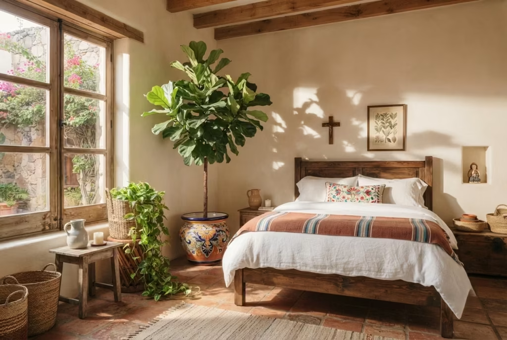
Walk through any traditional Mexican courtyard, whether in Oaxaca, San Miguel de Allende, or a quiet residential patio in Mexico City, and you’ll notice greenery isn’t scattered randomly. It’s placed with intention, softening hard architectural lines like adobe walls and iron grilles, bringing life into spaces that might otherwise feel a touch too structured. Bringing that same instinct indoors, into a bedroom, does something similar: it takes all the warm terracotta and carved wood discussed so far and gives it room to breathe.
Certain plants simply carry more of that courtyard spirit than others, and it’s worth being selective rather than grabbing whatever’s available at the nearest garden center. A potted fiddle leaf fig, standing tall in a terracotta or talavera-glazed planter, echoes the height and drama of courtyard trees without requiring an actual courtyard. For something smaller and more forgiving, especially for anyone who forgets to water on schedule, a snake plant or a trailing pothos works beautifully tucked into a woven basket planter, the kind discussed earlier in this guide, bringing texture and greenery together in a single gesture.
Succulents deserve a special mention here, given how naturally they echo the arid landscapes surrounding much of central Mexico. A small grouping, three or four varieties in mismatched terracotta pots, arranged on a windowsill or a niche shelf, brings that same desert-courtyard feeling into even the smallest bedroom corner. On a project in Palm Springs, we clustered five different succulent varieties in graduated terracotta pots along a deep windowsill, and the effect was almost cinematic by late afternoon, when the low sun cast long shadows from each plant’s silhouette across the sill and onto the floor below.
Placement matters more than people tend to assume. A single larger plant, positioned in a corner that otherwise feels empty, does more visual work than several small plants scattered without purpose across a dresser or nightstand. Think of it the way a courtyard uses one dominant tree rather than a dozen competing shrubs. Restraint here, as with several other elements in this guide, tends to serve the room better than abundance.
One practical note worth remembering: most bedrooms don’t receive the same intense, direct light a true courtyard would, so choosing lower-light tolerant varieties, like pothos or snake plants, over sun-hungry succulents in a north-facing room saves both the plant and the homeowner some frustration down the line.
Pros: Softens hard architectural elements like tile and iron, adds life and color that shifts naturally throughout the day, and works at nearly any budget from a single succulent to a statement floor plant. Cons: Requires matching plant choice to the room’s actual light conditions, and larger statement plants need occasional repotting and care that not every homeowner wants to take on.
Mix Pattern Intentionally: The Rule of One Dominant Pattern
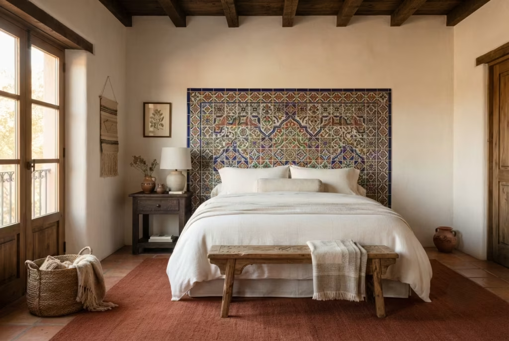
By this point in the guide, it’s clear that Mexican-inspired design rarely relies on a single element working alone. Tile, textile, and rug all bring pattern to the table, and that’s exactly where things can go sideways if approached without a clear plan. I’ve walked into more than one homeowner’s bedroom where every good idea from this list had been used at once, talavera tile, a striped Saltillo blanket, a diamond-patterned rug, all fighting for attention in the same 200 square feet, and the result felt less like a considered room and more like a market stall on a busy Saturday morning.
The fix is simpler than most people expect, and it comes down to a principle I call the rule of one dominant pattern. Choose a single pattern to lead the room, whether that’s the talavera tile behind the bed, a boldly striped textile draped across the footboard, or a geometric rug anchoring the floor, and let every other patterned element step back into a supporting role. If the tile carries bold color and intricate detail, the rug beneath it should lean solid or subtly textured rather than competing with its own busy motif. If the textile on the bed is the star, keep the walls and floor comparatively calm, allowing that one piece to command the room the way a lead singer commands a stage while the rest of the band holds steady rhythm behind them.
Scale plays a supporting role in this same principle. A large-scale pattern, like a bold striped blanket, pairs more comfortably with a smaller-scale supporting pattern, like a finely woven rug with subtle repeat detail, rather than two patterns of similar size and boldness competing at the same visual volume. On a project outside Denver, we let a single talavera-tiled headboard backsplash lead the room entirely, keeping the rug a solid rust tone, the textiles a simple ivory with minimal woven texture, and the walls painted warm white. The room read as rich and layered, yet calm, proof that pattern, used with a light touch rather than a heavy hand, does more for a space than piling on every beautiful textile available.
One practical trick worth keeping in your back pocket: photographing the room in black and white before finalizing decisions strips away color and reveals purely how the patterns and textures balance against each other, often exposing visual clutter that’s harder to spot in full color.
Pros: Prevents visual overwhelm while still celebrating multiple craft traditions in one room, creates a layered yet calm aesthetic, and works at any budget since it’s about restraint rather than spending more. Cons: Requires some editing discipline, especially for those drawn to every beautiful textile or tile they encounter, and may mean setting aside pieces you love in favor of the room’s overall balance.
Close with Restraint Why the Best Mexican-Inspired Rooms Know When to Stop
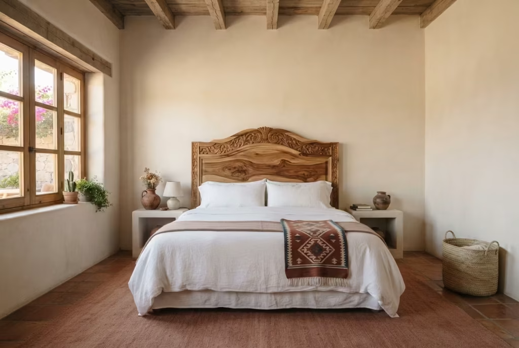
There’s an old habit among first-time renovators, and I say this with plenty of affection since I fell into it myself early in my career: once a room starts coming together beautifully, the instinct is to keep going, add one more tile detail, one more textile, one more piece of pottery, because if a little brings warmth, surely more brings even more. In my experience, that instinct is exactly where the best rooms quietly part ways from the merely good ones.
The truest Mexican-inspired bedrooms I’ve worked on, the ones that make a guest pause at the doorway rather than simply glance and move along, almost always have less in them than you’d expect. A single talavera accent. One saturated wall. A carved headboard given room to be seen rather than crowded by competing decor. Restraint, in this context, isn’t about holding back out of caution. It’s a design decision as intentional as choosing the cobalt paint or the hand-loomed rug in the first place, and it’s often the hardest lesson for enthusiastic homeowners to learn, myself included, back when I was still cutting my teeth in this business.
Think of it the way a good cook treats a strong spice. A pinch of saffron transforms a dish; a heavy hand ruins it entirely. The same logic governs this style of interior design. Every element covered in this guide, terracotta tones, punched-metal lighting, woven baskets, carries genuine character, and character, by its very nature, doesn’t need to be shouted from every corner of the room to be felt. A room with three confidently chosen details will almost always outperform one crowded with ten timid ones.
On a final project in Tucson, a client asked me point-blank why we were stopping after just a headboard, a rug, and a single wall color, when she had budget left for far more. I told her what I’ll tell you here: the goal was never to use every beautiful thing available, it was to build a room that felt complete, calm, and unmistakably hers. Months later, she wrote to say the room still felt fresh, nothing about it had grown tiresome or dated, and that, more than any single design choice covered in this guide, is the real reward of knowing when enough truly is enough.
If there’s one closing thought worth carrying forward from these fifteen ideas, it’s this: authenticity in design rarely shouts. It simply shows up, quietly confident, and lets the craftsmanship speak for itself.
From the Field: How It Actually Comes Together
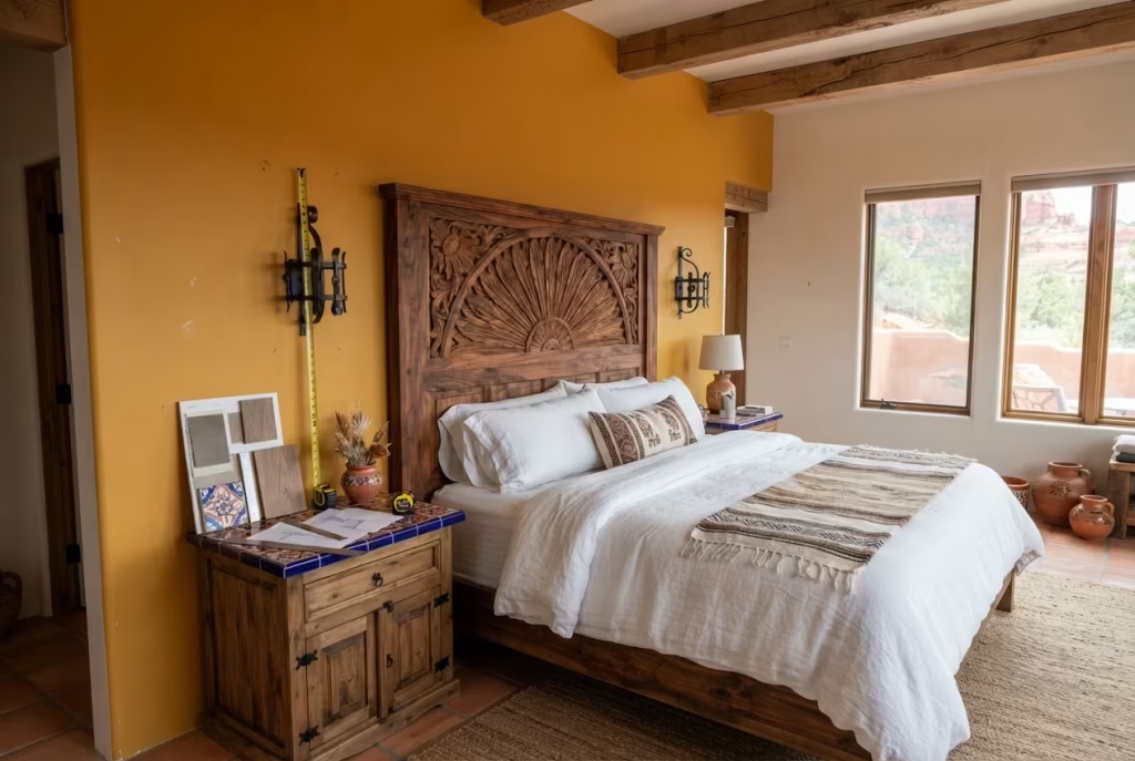
Theory is one thing. Watching a room take shape, mistakes and all, is another thing entirely, and it’s worth sharing exactly how one project unfolded, warts and all, because real design work rarely goes as smoothly on-site as it does on paper.
The client, a couple renovating a guest bedroom in Sedona, came to me with three fixed points: they wanted a carved wood headboard, some form of talavera detail, and a saturated wall color, but beyond that, the room was a blank slate. We started with the headboard, a hand-carved parota piece with a sunburst motif, and built outward from there, choosing a marigold accent wall behind it to let the wood’s natural grain deepen in contrast, much like the pairing described earlier in this guide.
Talavera came in through nightstand tops rather than a full tile installation, partly due to budget and partly because, once the headboard and wall were in place, a large tiled surface would have competed rather than complemented. This is the rule of one dominant pattern playing out in real time, not just as advice on a page, but as an actual decision made standing in a half-finished room, tape measure in hand.
Here’s the honest misstep, though: we initially installed iron sconces at 32 inches above the mattress line, following a fairly standard guideline, only to find they sat awkwardly close to the headboard’s carved detail, visually crowding a piece that was meant to stand alone. We lowered them to 26 inches and shifted them six inches further from center, and the room finally breathed the way it was supposed to.
The lesson, one worth carrying into any similar project, is that measurements and rules of thumb get you close, but the final calibration always happens in the room itself, under real light, beside real furniture, not in a plan.
A Final Word on Building It Right
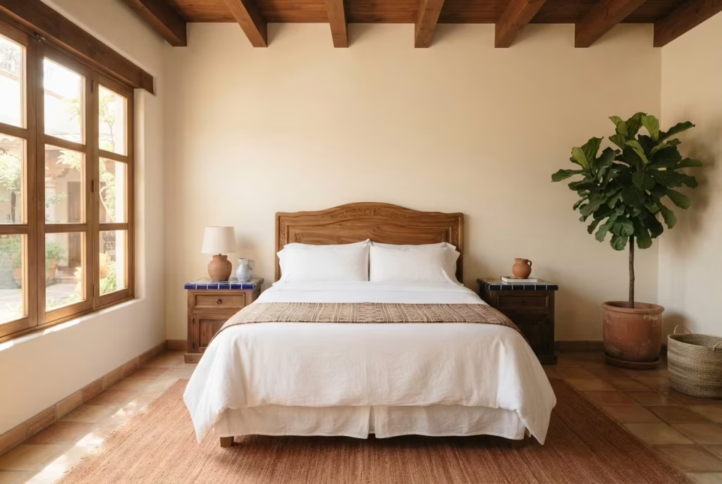
Fifteen ideas, in the end, aren’t a checklist to complete but a palette to draw from, and the best rooms I’ve built rarely use more than four or five of them at once. What ties every idea in this guide together, from carved wood to punched tin, isn’t a color scheme or a shopping list. It’s a respect for craft, for materials that carry the mark of a maker’s hand, and for the quiet confidence that comes from choosing well rather than choosing much.
If this piece has sparked something, whether a single tile you can’t stop thinking about or a whole room slowly forming in your mind, it’s worth stepping back to see the fuller picture of what this design tradition can offer beyond the bedroom. Our complete guide to Mexican-inspired interior design walks through how these same principles extend into living rooms, kitchens, and outdoor spaces, each one built on that same foundation of authenticity over imitation.
Frequently Asked Questions
Is Mexican-inspired design the same as Southwestern design?
Not quite, though the two often get lumped together. Southwestern design leans on desert motifs, like turquoise and cattle skulls, born from Native American and ranch traditions in the American Southwest. Mexican-inspired design draws instead from colonial architecture, talavera pottery, and regional weaving traditions, giving it a richer, more layered color story and a distinctly different craft lineage.
How do I add this style without it looking like a theme park?
Focus on one or two authentic materials, like real talavera tile or a hand-loomed textile, rather than piling on every motif at once. Skip the novelty decor, sombreros, cacti figurines, and let genuine craftsmanship carry the room instead. Authenticity, not abundance, is what separates a considered space from a costume.
What’s the best paint color to start with?
Marigold tends to be the friendliest entry point, warm without overwhelming, and it pairs beautifully with wood and terracotta tones already in most bedrooms. If you’re feeling bolder, cobalt makes a stunning single accent wall. Either way, test large swatches under your room’s actual light before committing to a full gallon.
Can this style work in a small bedroom?
Absolutely, and in some ways it works even better. Smaller rooms benefit from restraint, which is already central to this design approach. A single talavera nightstand, one saturated wall, and a woven textile can transform a modest room without ever feeling cramped or overdone.
How do I keep the room feeling calm and not overstimulating?
Lean on the rule of one dominant pattern, discussed earlier in this guide. Let one bold element, tile, textile, or color, lead the room, while everything else stays comparatively quiet. Calm comes from hierarchy, not from avoiding color and pattern altogether.
Where can I source authentic textiles and tile?
Look for artisan cooperatives and fair-trade importers who work directly with weavers in Oaxaca or tile makers in Puebla, rather than mass-market retailers using the aesthetic without the craft behind it. Many independent online shops and specialty home stores now partner directly with these makers, which also means your purchase supports the tradition itself.