15 Red Brick House Facades That Look Bold, Modern, and Timeless
Some homes stop you in your tracks without relying on grand entrances or dramatic architecture. More often than not, it’s the quiet confidence of a beautifully composed red brick facade that catches your eye. It feels established yet fresh, familiar yet unmistakably refined. While exterior trends come and go, authentic red brick continues to prove that true curb appeal is built on lasting design principles rather than passing fashions.
Over the years, I have worked on renovation and new-build projects where homeowners initially believed updating a brick house meant painting it or covering it with modern cladding. In reality, the most successful transformations rarely involve changing the brick itself. Instead, they come from refining everything around it. Proportion, carefully crafted window openings, a well-balanced roofline, thoughtful landscaping, natural light, and restrained material choices all work together to elevate the facade without erasing its character.
What makes today’s most compelling red brick homes feel contemporary is their respect for the material’s heritage. Clean architectural lines, slim window frames, warm natural timber, textured stone, and layered planting allow brick to remain the visual anchor while giving the entire home a more sophisticated, timeless presence. The result is an exterior that feels connected to its surroundings, functions beautifully through every season, and will continue to age with quiet elegance.
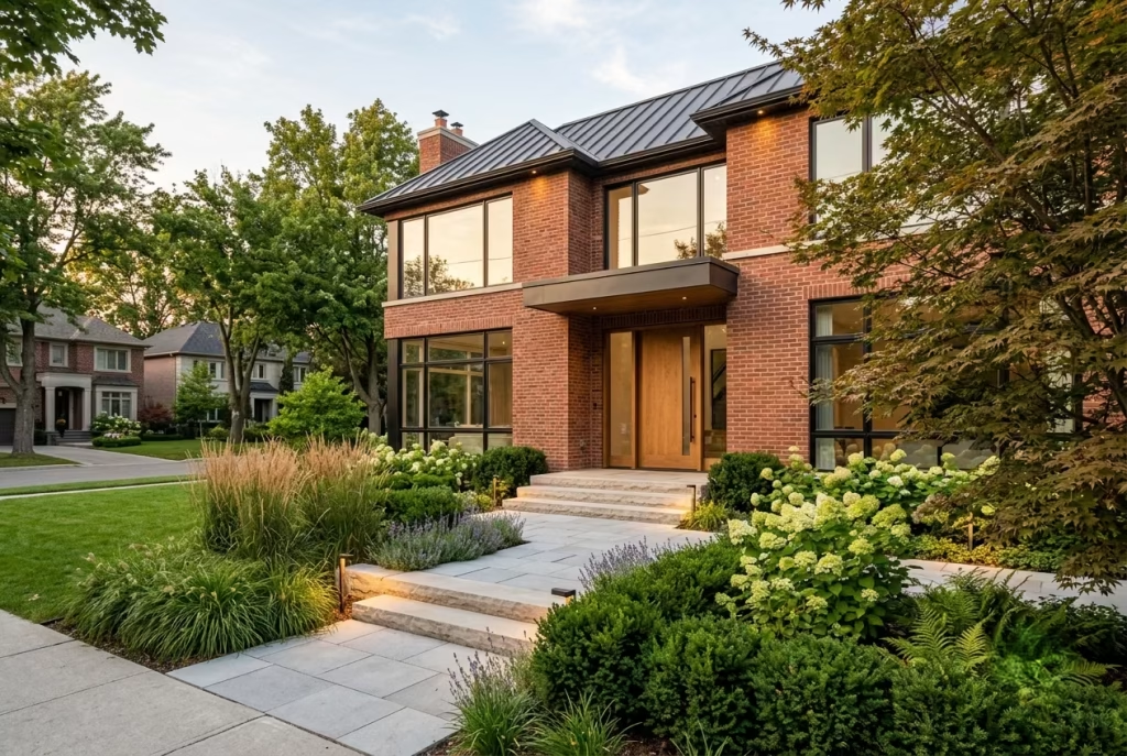
The 15 design ideas that follow are not fleeting trends or quick cosmetic updates. They are enduring architectural approaches inspired by real residential projects and thoughtful design practice, each showing how red brick can feel bold, modern, and unmistakably timeless for decades to come.
Pair Traditional Red Brick with Slim Black-Framed Windows
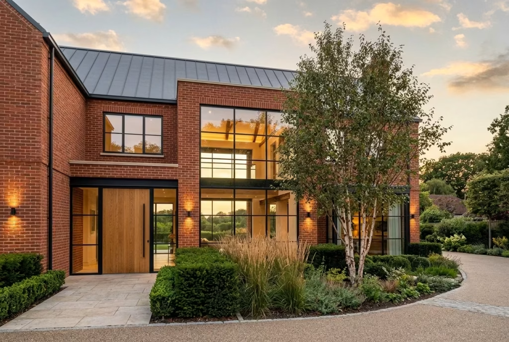
There is a reason this combination continues to appear in some of the most admired residential projects. Slim black-framed windows have an understated confidence that allows traditional red brick to feel lighter, sharper, and remarkably current without stripping away its history. Instead of competing for attention, the two materials complement one another, creating a facade that feels composed from every angle. It is a classic example of how a subtle design decision can punch well above its weight.
In my own renovation projects, I have found that homeowners are often surprised by how dramatically new window frames transform the appearance of an older brick house. Many expect the brick itself to be the defining feature, but once the windows are updated with slimmer sightlines and better proportions, the entire elevation feels as though it has been carefully redrawn. The brick remains the hero, while the windows quietly sharpen every architectural line.
Why Contrast Gives Traditional Brick a Contemporary Character
Red brick naturally carries warmth, texture, and visual depth. Black window frames introduce crisp definition, creating a balanced contrast that highlights rather than overwhelms the masonry. This relationship works because each material plays a different role. The brick provides richness and permanence, while the dark frames create visual precision.
Unlike bulky white uPVC frames, which can interrupt the rhythm of a facade, slim black profiles recede into the architecture. From a distance, the glazing appears larger, allowing natural light to become a stronger design element. The result is an exterior that feels clean, intentional, and timeless instead of overly decorative.
This approach is particularly effective because it bridges traditional craftsmanship with contemporary detailing. Rather than reinventing the home, it simply reveals its strongest architectural qualities.
Choose Window Proportions That Respect the Architecture
One mistake I regularly see is replacing original windows with units that ignore the home’s proportions. Even premium materials cannot compensate for poorly scaled openings.
As a general guide:
- Sightlines between 25 and 45 mm (1 to 1.75 inches) create an elegant contemporary appearance.
- Window mullions should remain visually slender so the brickwork continues to dominate.
- Taller windows often improve vertical balance on two-storey homes.
- Wider glazing panels work best when divided thoughtfully to avoid an oversized commercial appearance.
- Consistent window heights across the facade create rhythm and visual harmony.
If the home has original brick arches or decorative lintels, preserving these details while upgrading the glazing often produces the most convincing result.
Roofing Choices That Complete the Composition
Windows may modernise the facade, but the roof quietly determines whether the entire composition feels cohesive.
For most red brick homes, I recommend:
- Charcoal concrete roof tiles for a refined contemporary look.
- Natural slate where traditional architecture deserves a more premium finish.
- Standing seam metal roofing for modern extensions or architect-designed homes.
- Dark zinc gutters and downpipes that visually disappear into the roofline.
Avoid bright red, orange, or heavily mottled roofing materials that compete with the richness of the brick. When too many warm colours occupy the same elevation, the facade can quickly lose its sense of balance.
Architectural Styles That Benefit Most
This pairing is remarkably versatile because it enhances existing architecture instead of forcing a new identity onto the home.
It works particularly well with:
- Georgian-inspired homes
- Victorian terraces
- Edwardian residences
- Contemporary farmhouse designs
- Scandinavian-inspired homes
- Transitional architecture
- Modern new-build brick houses
- Mid-century renovations featuring clean geometry
Each style benefits differently, yet they all share one principle. Simplicity allows quality materials to speak for themselves.
Landscape the Facade, Not Just the Garden
A beautifully designed facade rarely stands alone. Landscaping acts as the final layer that ties every architectural element together. I often encourage clients to think of planting as a frame rather than decoration. Some combinations consistently produce outstanding results:
- Layered evergreen shrubs positioned below window sills.
- Ornamental grasses that soften straight architectural lines.
- Multi-stem trees that create seasonal interest without hiding the brick.
- Bluestone or limestone pathways that introduce cooler tones against the warm masonry.
- Low planting beds between 600 and 900 mm (24 to 36 inches) deep to create depth without overwhelming the entrance.
Warm exterior lighting placed within planting beds can further emphasise the texture of brick after sunset, giving the home a welcoming presence throughout the evening.
Why This Design Approach Works
The strength of this combination lies in restraint. Every element supports the next instead of competing for attention. The warmth of the brick, the crisp definition of black frames, and the surrounding landscape work together to create an exterior that feels balanced, confident, and enduring.
Rather than chasing trends that may fade within a few years, this approach builds upon architectural fundamentals that continue to look relevant decade after decade.
Professional Design Insight
One lesson that has stayed with me across numerous residential projects is that homeowners often focus on selecting beautiful materials while overlooking proportion. Yet proportion is what separates a pleasant facade from one that truly leaves a lasting impression.
Before specifying new windows, I always study how shadows move across the brickwork during different times of the day. Morning and afternoon light can dramatically influence how window frames interact with the surrounding masonry. When the proportions are right, the changing daylight naturally accentuates the brick’s texture, giving the facade depth that no decorative feature could ever replicate.
As the saying goes, the devil is in the details, and nowhere is that more apparent than in window design.
Ideal Home Types
This approach is particularly suited to:
- Traditional detached homes
- Semi-detached family houses
- Victorian and Edwardian renovations
- Executive new-build properties
- Contemporary farmhouse residences
- High-end suburban developments
- Architect-designed extensions using existing brickwork
Pros
- Modernises traditional brick without concealing its character.
- Enhances natural light by visually enlarging glazing.
- Creates timeless contrast that rarely dates.
- Complements a wide range of architectural styles.
- Increases perceived property value through refined detailing.
- Pairs beautifully with timber, stone, steel, and contemporary landscaping.
Cons
- High-quality aluminium or steel frames represent a larger initial investment than standard alternatives.
- Poorly proportioned replacement windows can undermine the home’s architectural balance.
- Black frames may show dust, pollen, and water marks more readily than lighter finishes.
- Achieving the best result often requires coordinated updates to roofing, lighting, and landscaping rather than replacing windows alone.
Soften a Bold Brick Facade with Natural Limestone Accents
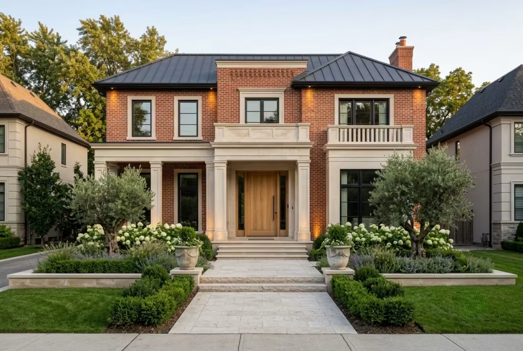
A striking red brick house already possesses strength and permanence, yet even the most beautiful masonry can feel visually heavy when every surface speaks with the same intensity. This is where natural limestone quietly changes the conversation. Rather than competing with brick, it introduces moments of visual relief, allowing the facade to breathe while preserving the warmth and authenticity that make brick so enduring.
I have found this combination especially successful on family homes where clients wanted a more refined exterior without losing the character that drew them to brick in the first place. More often than not, the solution was not replacing materials but creating a thoughtful dialogue between them. Limestone adds brightness where the eye naturally pauses, while brick continues to provide depth and architectural weight. It is a classic case of less is more. A carefully placed stone detail often contributes far more than an entire facade covered in multiple finishes.
When designed with restraint, limestone brings a sense of craftsmanship that feels collected over time rather than newly assembled. The result is an exterior that appears elegant today and continues to gain character as the years pass.
Find the Right Balance Between Brick and Stone
The success of this pairing depends less on the quantity of limestone and more on its placement. Brick should remain the dominant material because it establishes the home’s identity. Limestone works best as an architectural accent that highlights important features instead of becoming a competing focal point.
Across many residential projects, I have consistently achieved the most harmonious results when limestone occupies approximately 15 to 30 percent of the visible front elevation. This proportion allows the lighter stone to introduce contrast without diluting the richness of the brick.
Some of the most effective locations include:
- Entrance surrounds
- Window sills and lintels
- Porch columns
- Low garden walls
- Stair treads
- Plinths around the base of the house
- Chimney detailing
- Retaining walls that connect the home to the landscape
Once stone begins covering entire sections of the facade, the architectural hierarchy often becomes confused. Every material should have a clear purpose, and brick deserves to remain the visual anchor.
Let the Entrance Become a Natural Focal Point
People instinctively notice the entrance before almost anything else. A well-designed front door framed with limestone creates an inviting transition between landscape and architecture, giving the home a welcoming sense of arrival.
One project that still stands out involved a traditional two-storey brick residence whose entrance had become visually lost within the large expanse of masonry. Instead of recommending expensive structural alterations, we introduced honed limestone around the doorway, widened the front steps to 1800 to 2400 mm (6 to 8 feet), and added matching stone planters with layered greenery. The transformation was remarkable. Visitors naturally gravitated toward the entrance, and the home immediately felt more balanced without altering its original character.
Features that elevate an entrance include:
- Limestone door surrounds
- Deep stone thresholds between 75 and 100 mm (3 to 4 inches) thick
- Wide stone steps with generous landings
- Matching stone seating walls
- Oversized planters with evergreen planting
- Warm wall-mounted lighting that gently washes across the stone surface
These elements work together to create a first impression that feels intentional rather than overstated.
Layer Textures Instead of Collecting Materials
One of the most common design mistakes I encounter is assuming that adding more materials automatically creates visual interest. In reality, the opposite is often true. A carefully edited palette usually produces a richer and more sophisticated result.
Red brick already introduces variation through its colour shifts, mortar joints, and handmade texture. Limestone contributes a completely different tactile quality with its subtle veining, soft edges, and natural surface movement. Together they create contrast that feels effortless because each material expresses its own character.
To strengthen this layered composition, consider incorporating:
- Smooth black aluminium window frames
- Natural oak or walnut entrance doors
- Bronze exterior lighting
- Matte charcoal metal roofing
- Fine gravel planting beds
- Soft ornamental grasses
- Large-format limestone paving measuring approximately 600 × 900 mm (24 × 36 inches) or 900 × 900 mm (36 × 36 inches)
Each layer contributes quietly to the overall composition, proving that good design is often about knowing what to leave out.
Choose Limestone That Improves with Age
One reason I frequently recommend natural limestone is its remarkable ability to mature gracefully. Unlike many manufactured cladding products that can appear tired after years of weather exposure, genuine limestone develops a soft patina that adds depth and authenticity.
As sunlight, rain, and changing seasons leave their mark, subtle tonal variations emerge across the surface. Rather than looking worn, the material acquires a lived-in quality that complements ageing brick exceptionally well. Not every variety performs equally, however.
For exterior applications, I generally recommend:
- Dense French limestone
- Portuguese limestone
- Indiana limestone
- High-quality Jura limestone
These stones offer excellent durability while maintaining their refined appearance over decades when properly detailed and installed by experienced masonry contractors. As the old saying goes, good things come to those who wait. Natural materials reward patience, revealing more character with every passing season.
Create Premium Curb Appeal Through Material Restraint
Luxury rarely announces itself loudly. More often, it is expressed through careful proportions, exceptional craftsmanship, and confidence in the materials themselves.
Homes that feel genuinely premium rarely rely on excessive ornamentation. Instead, they allow authentic materials to carry the visual narrative. Brick establishes permanence. Limestone introduces elegance. Landscaping softens transitions. Lighting reveals texture after dusk. Together, these elements create an exterior that feels considered from every viewpoint. To elevate curb appeal further, I often recommend:
- Layered planting beds between 900 and 1200 mm (36 to 48 inches) deep
- Warm LED uplighting positioned 300 to 450 mm (12 to 18 inches) from stone walls
- Wide limestone pathways measuring at least 1500 mm (5 feet) for a generous approach
- Dark metal house numbers mounted directly onto stone rather than brick
- Oversized timber doors that introduce warmth between the masonry elements
These subtle details may seem modest individually, yet together they transform an ordinary facade into one that quietly commands attention.
Why This Design Approach Works
Red brick provides visual strength, while limestone introduces softness and refinement. The contrast feels natural because both materials originate from the earth and age beautifully alongside one another. Instead of chasing seasonal trends, this pairing embraces permanence, creating a facade that feels grounded, welcoming, and architecturally balanced.
The relationship between warm masonry and cool stone also improves how natural light moves across the exterior throughout the day. Morning light gently brightens the limestone, while afternoon shadows deepen the richness of the brick, giving the home an ever-changing character that photographs can rarely capture.
Professional Design Insight
One lesson I have carried through countless residential projects is that premium design is rarely about selecting expensive materials. It is about placing the right material in exactly the right location.
I often encourage clients to invest more in beautifully crafted entrance details than in covering larger areas with stone simply because quality leaves a longer-lasting impression than quantity. When guests arrive, they touch the handrail, step onto the limestone threshold, notice the texture beneath changing light, and experience the home before they even cross the front door. Those carefully considered moments are what people remember long after they have forgotten the square metre cost of the materials.
Ideal Home Types
This design approach works particularly well for:
- Georgian-inspired homes
- Traditional detached residences
- Contemporary country houses
- Luxury suburban properties
- Tudor-inspired renovations
- Transitional architecture
- Executive new-build homes
- Architect-designed brick residences
Pros
- Softens the visual weight of expansive brick facades.
- Adds timeless elegance without overwhelming the architecture.
- Creates strong focal points around entrances and windows.
- Develops an attractive natural patina over time.
- Pairs beautifully with timber, steel, glass, and mature landscaping.
- Contributes to long-term property value through authentic materials.
Cons
- Natural limestone typically carries a higher installation cost than manufactured alternatives.
- Some lighter limestone varieties require occasional cleaning in shaded or damp environments.
- Successful execution depends on skilled masonry detailing and accurate joint alignment.
- Excessive use of stone can reduce the visual impact of the brick and make the facade feel overly busy.
You May also Like: 20 Gorgeous White Stucco Townhouse Ideas for Timeless Curb Appeal
Add Warm Timber Features That Bring Texture Without Competing
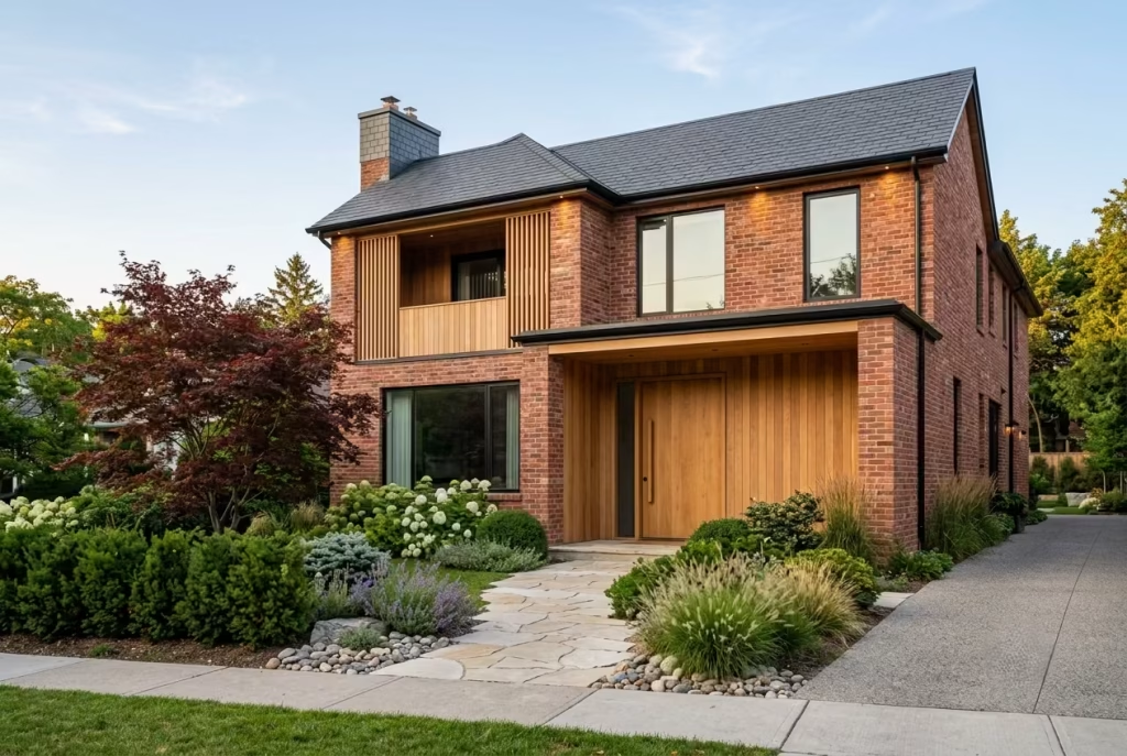
Red brick has a natural richness that immediately grounds a home, but even the most beautiful masonry benefits from a material that softens its visual weight. Warm timber does exactly that. It introduces texture, depth, and a welcoming character without asking to become the centre of attention. When thoughtfully integrated, wood acts almost like the quiet supporting actor in a great film. It never steals the spotlight, yet the entire composition feels incomplete without it.
Throughout my residential projects, I have noticed that homeowners often assume timber should be used generously to make an impact. In reality, the opposite usually produces a more sophisticated result. A few carefully positioned timber elements can transform an ordinary brick facade into one that feels layered, balanced, and unmistakably contemporary. It is another reminder that quality speaks louder than quantity. The goal is not to decorate the exterior but to create visual warmth that naturally complements the permanence of brick.
Unlike painted finishes that can quickly fall out of fashion, genuine timber develops a living character. As sunlight shifts throughout the day, its grain catches the light differently, introducing subtle movement that makes the facade feel more inviting. Combined with mature landscaping and natural stone, timber helps create an exterior that feels settled into its surroundings rather than imposed upon them.
Position Timber Where the Architecture Naturally Needs Warmth
One of the biggest mistakes I encounter is seeing timber scattered across a facade without any architectural logic. Random cladding often creates visual noise and distracts from the brick instead of enhancing it.
Instead, timber should be reserved for areas where people naturally focus their attention or where large brick surfaces benefit from a softer counterbalance. Some of the most effective locations include:
- Entrance recesses that create a warm point of arrival.
- Upper-storey feature panels that visually reduce the scale of taller walls.
- Gable ends on contemporary farmhouse designs.
- Covered porch ceilings that introduce warmth overhead.
- Balcony soffits and privacy screens.
- Garden-facing elevations that connect indoor and outdoor living spaces.
In most projects, allowing timber to occupy approximately 10 to 20 percent of the visible front facade creates enough contrast while ensuring the brick remains the dominant material.
Vertical timber boards often make a house appear taller, while horizontal cladding can visually widen narrower elevations. Understanding this relationship allows materials to improve architectural proportion rather than simply adding decoration.
Let the Front Door Become the Warmest Welcome
If the facade tells the story of a home, the front door is its opening chapter. Few upgrades create a stronger first impression than replacing a standard painted entrance with a beautifully crafted timber door. Every visitor interacts with it, making it one of the few architectural features that is experienced both visually and physically.
In one renovation, we replaced a dated white door on a traditional red brick property with a full-height European oak pivot door measuring 1200 mm wide by 2400 mm high (48 by 96 inches). Without altering the brickwork or roofline, the entrance immediately felt more generous and considerably more luxurious. Clients often expect dramatic structural changes to create impact, but thoughtful detailing frequently delivers the biggest transformation.
For lasting appeal, I typically recommend:
- European oak
- Accoya timber
- Thermally modified ash
- Western red cedar for sheltered entrances
- Teak for premium coastal applications
Pairing timber with slim black hardware and warm architectural lighting creates a refined entrance that feels timeless rather than trend driven.
Coordinate Garage Doors with the Overall Material Palette
Garage doors occupy a significant portion of many modern facades, yet they are often treated as an afterthought. A poorly chosen door can upset the balance of an otherwise carefully designed exterior.
Whenever possible, I encourage clients to view the garage as another architectural surface rather than a functional necessity.
Timber garage doors or high-quality timber-look finishes work exceptionally well alongside red brick because they soften large expanses without introducing unnecessary complexity. For the most harmonious appearance:
- Match the timber tone to the entrance door.
- Align horizontal joints with nearby window lines where possible.
- Conceal tracks and framing details whenever practical.
- Keep surrounding trim simple and understated.
Sectional garage doors finished in natural timber veneers often deliver the warmth of solid wood while requiring less ongoing maintenance. When every element shares a common language, the facade feels intentional from top to bottom.
Introduce a Pergola That Extends the Architecture Outdoors
A thoughtfully designed pergola does much more than provide shade. It creates a gradual transition between architecture and landscape, allowing the house to feel connected to its garden rather than ending abruptly at the exterior wall.
On several projects, I have used timber pergolas to soften modern brick homes that initially appeared too formal. Once climbing plants matured and outdoor furniture settled beneath the structure, the entire property felt more relaxed and welcoming. For comfortable outdoor living, pergolas generally perform well when designed with:
- Heights between 2400 and 3000 mm (8 to 10 feet).
- Beam spacing of approximately 450 to 600 mm (18 to 24 inches).
- Walkways at least 1500 mm (5 feet) wide beneath the structure.
- Seating areas measuring 3000 × 3600 mm (10 × 12 feet) or larger for family use.
Adding climbing plants such as jasmine, wisteria, or climbing roses allows the pergola to evolve naturally over time, creating seasonal interest that cannot be achieved with hard materials alone. As the saying goes, nature always has the final word. Good architecture simply gives it the opportunity to shine.
Choose Timber That Ages with Grace
One question homeowners frequently ask is whether timber will become difficult to maintain. The answer depends almost entirely on selecting the right species and accepting that natural materials are meant to evolve.
Wood should never be expected to remain exactly as it appeared on installation day. Exposure to sunlight, rainfall, and changing temperatures gradually deepens its colour and softens its appearance. That subtle weathering often enhances the home’s character rather than diminishing it. For exterior applications, I typically recommend species known for stability and durability, including:
- Accoya
- Western red cedar
- Siberian larch
- Thermally modified ash
- European oak
- Teak for demanding climates
Clients seeking a consistently warm tone should plan for periodic maintenance oils every 2 to 4 years, depending on climate and sun exposure. Those who appreciate a naturally weathered silver-grey finish can simply allow the timber to age gracefully with minimal intervention. The beauty lies in understanding that authentic materials tell their own story through time.
Why This Design Approach Works
Brick provides permanence. Timber introduces warmth. Together they create a balanced architectural language that feels both sophisticated and approachable.
The contrast is subtle rather than dramatic, allowing each material to retain its individual identity. Instead of relying on bold colours or decorative ornamentation, the design celebrates texture, proportion, and craftsmanship. That quiet confidence is precisely why this combination continues to appear in some of the world’s most admired residential architecture.
Professional Design Insight
One principle I return to repeatedly is that timber should always feel connected to the home’s architecture rather than applied as decoration. Before specifying any cladding or joinery, I study how sunlight moves across the facade throughout the day. Timber positioned where morning or late afternoon light gently grazes the grain develops remarkable depth and warmth. Conversely, timber placed without considering orientation can appear flat or unnecessarily dark.
Another lesson I have learned is that consistency matters more than variety. Using the same timber species for the entrance door, garage door, pergola, and selected architectural details creates a sense of continuity that immediately elevates the overall design. As the old expression goes, too many cooks spoil the broth. Restrained material choices almost always age more gracefully than facades filled with competing finishes.
Ideal Home Types
This combination is particularly effective for:
- Contemporary farmhouse homes
- Scandinavian-inspired residences
- Transitional architecture
- Mid-century modern renovations
- Luxury suburban properties
- Architect-designed custom homes
- Modern barn-style houses
- Traditional brick homes receiving contemporary updates
Pros
- Softens the visual weight of brick without diminishing its character.
- Introduces natural warmth and texture throughout the facade.
- Creates a stronger connection between architecture and landscaping.
- Ages beautifully when high-quality timber is selected.
- Complements stone, steel, glass, and black aluminium effortlessly.
- Adds perceived craftsmanship and long-term value.
Cons
- Natural timber requires periodic inspection and maintenance in exposed locations.
- Premium species carry a higher upfront investment.
- Poor detailing around joints and moisture-prone areas can shorten lifespan.
- Mixing too many timber colours or species may weaken the overall architectural composition.
Create Strong Horizontal Lines with Contemporary Landscaping
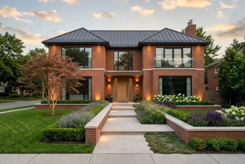
A beautifully designed red brick house does not end where the walls meet the ground. In many ways, the surrounding landscape determines whether the architecture feels complete or unfinished. Even a carefully restored facade can lose its impact if it sits within an unstructured garden. On the other hand, thoughtful landscaping can quietly elevate an ordinary brick home into one that feels architect-designed from the street.
One lesson I have learned after working on residential renovations is that landscaping should never compete with the house. Its role is to guide the eye, soften transitions, and reinforce the building’s proportions. This is particularly important with red brick because its warmth and texture already create plenty of visual interest. The garden should support that character rather than overwhelm it.
Contemporary landscapes achieve this through long, clean horizontal lines. They visually widen the property, create a stronger connection between different outdoor spaces, and introduce a sense of calm that remains attractive year after year. Like a well-tailored suit, every line serves a purpose. Nothing feels unnecessary, and nothing is trying too hard.
Build Depth Through Layered Planting Instead of Isolated Shrubs
One of the quickest ways to make a brick facade feel disconnected from its surroundings is to scatter individual shrubs across the front garden. While each plant may look healthy on its own, the overall composition often lacks rhythm and purpose.
A layered planting scheme creates a far more natural transition between architecture and landscape. Rather than viewing plants as individual specimens, think of them as overlapping layers that gradually lead the eye from the pavement to the front door. A planting arrangement I frequently recommend follows this structure:
- Low groundcovers at the front of the border.
- Ornamental grasses that introduce movement.
- Evergreen shrubs providing year-round structure.
- Flowering perennials for seasonal colour.
- Multi-stem feature trees positioned as architectural accents.
For most front gardens, planting beds measuring 900 to 1500 mm (36 to 60 inches) deep provide enough space to build these layers without making the entrance feel crowded.
Species such as lavender, boxwood, salvia, Japanese forest grass, hydrangeas, and olive trees often pair beautifully with the warm tones of traditional brick. As seasons change, each layer contributes something different, ensuring the facade never feels static.
Use Low Retaining Walls to Reinforce the Architecture
Retaining walls are often treated as purely practical features, yet they can become some of the strongest architectural elements within a landscape.
On sloping sites especially, I have found that low masonry walls help anchor the home while visually extending the brick facade into the garden. This creates continuity between building and landscape, making the property feel larger and more cohesive.
Where possible, I prefer retaining walls constructed from matching brick or complementary limestone to maintain a consistent material palette. Practical dimensions include:
- Heights between 450 and 750 mm (18 to 30 inches) for comfortable visual scale.
- Wall caps extending 25 to 40 mm (1 to 1.5 inches) beyond the face to improve water runoff.
- Seating walls approximately 450 mm (18 inches) high for informal outdoor use.
These walls also provide opportunities to integrate planting, subtle lighting, or built-in seating, allowing every feature to perform more than one function.It is often these quiet details that tie the entire composition together.
Design Wider Pathways That Feel Comfortable and Inviting
A narrow pathway can unintentionally make even a generous home feel constrained. Wider walkways, by contrast, create an immediate sense of openness while allowing visitors to appreciate the architecture from multiple viewpoints.
During one front garden redesign, simply widening the approach from 900 mm (3 feet) to 1800 mm (6 feet) completely changed the arrival experience. Visitors no longer hurried directly to the front door. Instead, they naturally slowed their pace, noticing the brickwork, planting, and entrance details along the way. For comfortable circulation, I generally recommend:
- Main front paths between 1500 and 1800 mm (5 to 6 feet) wide.
- Secondary garden paths at least 1200 mm (4 feet) wide.
- Large-format paving measuring 600 × 900 mm (24 × 36 inches) or larger for a contemporary appearance.
- Minimal joint lines to maintain visual simplicity.
Materials such as limestone, bluestone, porcelain paving, or exposed aggregate concrete complement red brick without competing for attention. Sometimes the journey to the front door is just as memorable as the entrance itself.
Let Groundcovers Unite the Entire Landscape
Groundcovers are frequently overlooked because they remain close to the ground, yet they quietly perform some of the hardest work in a landscape. Instead of leaving exposed soil between larger plants, a continuous carpet of greenery creates visual unity while reducing maintenance over time.
Depending on climate and design style, some excellent choices include:
- Creeping thyme
- Dwarf mondo grass
- Irish moss
- Sedum
- Vinca
- Ajuga
- Low-growing junipers
- Native spreading perennials
Beyond their appearance, these plants help suppress weeds, reduce soil erosion, retain moisture, and soften the transition between paving and planting. In design, it is often the smallest details that carry the greatest weight.
Reveal Brick Texture with Carefully Planned Landscape Lighting
A red brick facade transforms after sunset when lighting is treated as part of the architectural design rather than an afterthought. I often visit projects both during the day and after dark because exterior lighting changes how every material is perceived. Brick, in particular, responds beautifully to warm illumination that grazes across its textured surface.
Instead of flooding the house with bright light, I recommend creating layers of subtle illumination. Some of the most effective techniques include:
- Warm LED uplights positioned 300 to 450 mm (12 to 18 inches) from feature walls.
- Recessed pathway lights spaced approximately 2400 to 3000 mm (8 to 10 feet) apart.
- Soft lighting beneath retaining wall caps.
- Tree uplighting that adds vertical interest.
- Step lighting integrated into entrance stairs.
- Gentle wall washers highlighting textured brickwork.
A colour temperature between 2700K and 3000K generally produces the warmest and most natural appearance for red brick, preserving its richness without introducing harsh glare. Like the final brushstroke on a painting, good lighting completes the composition without drawing attention to itself.
Why This Design Approach Works
Strong horizontal landscaping creates visual stability while allowing the architecture to remain the primary focus. Long planting beds, generous pathways, low walls, and continuous groundcovers guide the eye across the property, making the facade feel broader, calmer, and more intentional.
Rather than relying on decorative features, the design uses proportion and repetition to create harmony. The landscape becomes an extension of the architecture, helping the home settle naturally into its surroundings instead of standing apart from them.
Professional Design Insight
One observation has stayed with me through years of residential design. Homeowners often devote considerable attention to selecting exterior finishes while leaving landscaping until the final stages of the project. More often than not, this approach misses a valuable opportunity.
I prefer designing the garden alongside the architecture from the very beginning. When pathways align with window bays, retaining walls echo the home’s horizontal lines, and planting reinforces the building’s proportions, the entire property feels remarkably cohesive. It becomes difficult to tell where the architecture ends and the landscape begins, and that is usually the hallmark of thoughtful design.
Another principle I rarely compromise on is allowing space for gardens to mature. Freshly planted landscapes can appear sparse during the first season, but resisting the temptation to overplant almost always leads to healthier growth and a more balanced composition in the years ahead. As the old saying goes, Rome wasn’t built in a day, and neither are exceptional gardens.
Ideal Home Types
This landscaping approach is particularly suited to:
- Contemporary brick homes
- Mid-century modern residences
- Luxury suburban properties
- Modern farmhouse designs
- Georgian-inspired architecture
- Executive new-build homes
- Architect-designed custom houses
- Renovated traditional brick residences
Pros
- Visually widens the property and strengthens architectural proportions.
- Creates a seamless transition between house and garden.
- Improves curb appeal throughout every season.
- Enhances drainage, accessibility, and circulation when professionally designed.
- Allows mature planting to increase beauty over time.
- Adds long-term value through cohesive landscape planning.
Cons
- Professional landscape construction requires careful planning and a larger initial investment.
- Newly planted gardens need time before reaching their intended appearance.
- Larger paving areas require occasional cleaning to maintain their finish.
- Poor plant selection or inadequate spacing can reduce the long-term effectiveness of the design.
Let a Charcoal Roof Anchor the Entire Composition
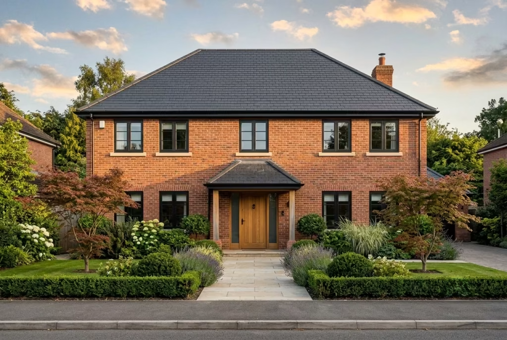
When people admire a well-designed red brick home, they often compliment the brickwork, the windows, or the landscaping first. Yet one of the most influential design elements usually goes unnoticed. The roof quietly holds the entire composition together. It is the visual anchor that gives the home stability, proportion, and a sense of permanence.
Among all roofing colours, charcoal consistently delivers the most balanced partnership with traditional red brick. It is neither harsh nor overpowering. Instead, it provides a calm backdrop that allows the warmth of the masonry to remain the defining feature. Much like the foundation of a beautifully furnished room, a thoughtfully chosen roof creates harmony without demanding attention.
I have worked on several exterior renovations where homeowners were convinced they needed to replace windows, repaint trim, or even alter the brick itself. In reality, once an ageing brown or faded red roof was replaced with a deep charcoal finish, the entire property took on a more refined architectural presence. The improvement was immediate, yet it never felt forced. That is the hallmark of timeless design. It quietly enhances what already exists instead of trying to reinvent it.
Understand How Roof Colour Shapes the Entire Exterior
Colour influences far more than appearance. It changes how we perceive scale, proportion, and even the emotional character of a home.
Charcoal performs exceptionally well because it visually recedes into the background. Rather than competing with the natural variation found in red brick, it frames the architecture and creates a sense of order. This allows details such as window proportions, stone accents, and landscaping to stand out with greater clarity.
By comparison, roofs in bright red, terracotta, or heavily blended tones often compete with the brick, creating unnecessary visual tension. When every surface is trying to capture attention, the facade loses its sense of hierarchy. A restrained roof colour offers several advantages:
- It balances the warm undertones of red brick.
- It creates stronger contrast with light-coloured trim and natural stone.
- It allows landscaping to appear more vibrant throughout the year.
- It complements both traditional and contemporary architectural styles.
- It remains relevant even as exterior design trends evolve.
As the old saying goes, steady wins the race. A timeless roof colour will continue to look elegant long after trend-driven palettes have faded from fashion.
Consider Standing Seam Metal for a Crisp Contemporary Finish
For homeowners seeking a modern interpretation of a brick house, standing seam metal roofing is one of the most compelling choices available.
Its clean vertical seams introduce subtle rhythm without overwhelming the architecture. Because the profile is simple and uninterrupted, it pairs naturally with the texture of brick, creating an attractive contrast between smooth precision and handcrafted masonry.
On a recent renovation of a 1970s brick residence, we replaced worn concrete tiles with a charcoal standing seam roof while leaving the brick untouched. The transformation was remarkable. The home immediately felt lighter, more architectural, and considerably more current, despite the fact that its original structure remained exactly the same.
Standing seam systems generally perform best with roof pitches above 14 degrees, although specifications vary between manufacturers. Beyond appearance, they also provide practical benefits:
- Excellent weather resistance.
- Long service life, often exceeding 40 to 60 years.
- Lightweight construction that reduces structural load.
- Low maintenance requirements.
- Strong compatibility with solar panel installations.
For contemporary extensions or architect-designed homes, few roofing materials deliver such a clean architectural expression.
Explore Premium Slate Alternatives for Traditional Homes
Not every property calls for a modern metal roof. Traditional brick houses often benefit from roofing materials that respect their original architectural language while offering improved performance. Natural slate remains one of the finest options available. Its subtle texture and colour variation introduce depth without distracting from the brickwork.
Where budget or structural considerations make natural slate impractical, today’s premium composite alternatives have improved dramatically. High-quality options include:
- Fibre cement slate.
- Composite polymer slate.
- Architectural asphalt shingles with deep charcoal tones.
- Concrete slate-effect tiles.
- Recycled synthetic slate products.
These materials often replicate the appearance of natural slate while reducing weight and installation costs. For many homeowners, they strike an excellent balance between authenticity, durability, and long-term value.
Choose Gutters That Blend into the Architecture
Gutters rarely receive much attention during the design process, yet poorly chosen rainwater goods can interrupt the clean lines of an otherwise elegant facade. Rather than treating gutters as separate accessories, I always encourage clients to think of them as part of the architecture itself.
Dark gutters finished in charcoal, black, or graphite tend to disappear against a similarly coloured roof, allowing the eye to remain focused on the brick and windows. For most premium projects, I recommend:
- Powder-coated aluminium.
- Zinc.
- Galvanised steel with high-quality coatings.
- Copper where a natural patina is desired over time.
Oversized white plastic gutters, by contrast, often create unnecessary visual interruptions, particularly against traditional brickwork. Concealing functional elements wherever possible helps maintain a calm, uncluttered appearance.
Refine the Roofline with Thoughtful Fascia Detailing
Fascias perform an important practical role, but they also influence how crisp the roof appears from the street. Heavy decorative fascias can make the roofline feel bulky, especially on contemporary homes. Slim, well-proportioned detailing creates a cleaner silhouette that allows the roof to sit more comfortably above the brick facade.
In many of my projects, we specify:
- Fascia boards between 180 and 250 mm (7 to 10 inches) deep, depending on roof scale.
- Matching soffits in charcoal or natural timber.
- Concealed ventilation systems where possible.
- Integrated rainwater outlets for a cleaner finish.
- Minimal overhangs that emphasise architectural simplicity.
These details may seem subtle in isolation, but together they strengthen the home’s proportions and contribute to a more refined exterior. It is often the smallest adjustments that separate good architecture from exceptional architecture.
Why This Design Approach Works
A charcoal roof provides visual stability without becoming the centre of attention. It anchors the composition, balances the warmth of red brick, and creates a neutral backdrop that allows every other material to perform at its best.
Whether paired with natural stone, timber, black-framed windows, or mature planting, charcoal remains remarkably versatile. It reinforces the architecture instead of competing with it, ensuring the home feels cohesive from every viewpoint.
Just as importantly, darker roof colours tend to age gracefully. They conceal minor weathering more effectively than lighter finishes and continue to complement evolving landscape conditions as trees mature and planting becomes denser.
Professional Design Insight
One principle I have learned through years of exterior renovation work is that homeowners often underestimate the roof because it occupies the highest part of the house. Ironically, it is also one of the largest visible surfaces.
Before selecting any roofing material, I study the home from multiple viewing angles, including the approach from the street, neighbouring properties, and even upper-floor windows where possible. A roof that appears perfect in isolation can feel disproportionately heavy or visually disconnected once viewed within its broader setting.
I also encourage clients to look beyond sample boards. Roofing materials reveal their true character only when sunlight, cloud cover, and evening shadows interact with them across different seasons. The best decisions are rarely made under showroom lighting. As the expression goes, don’t judge a book by its cover. Context matters just as much as colour.
Ideal Home Types
A charcoal roof complements a wide variety of residential styles, including:
- Traditional red brick family homes.
- Georgian-inspired residences.
- Contemporary farmhouse properties.
- Victorian renovations.
- Mid-century modern houses.
- Executive suburban developments.
- Architect-designed custom homes.
- Transitional homes blending classic and modern architecture.
Pros
- Creates a balanced relationship with warm red brick.
- Enhances the appearance of windows, stone, and landscaping.
- Provides a timeless colour palette that remains relevant for decades.
- Pairs well with both traditional and contemporary roofing materials.
- Conceals everyday weathering more effectively than lighter roof colours.
- Strengthens overall curb appeal and perceived property value.
Cons
- Dark roofing materials may absorb more solar heat in warmer climates, making proper roof ventilation and insulation particularly important.
- Premium materials such as standing seam metal and natural slate require a higher initial investment.
- Colour inconsistencies can occur if repairs are completed using products from different manufacturing batches.
- Poorly detailed fascias or gutters can reduce the visual impact of even the highest-quality roofing system.
You May also Like: 25 Outdoor Tiles for Floor Stylish Patio, Garden and Terrace Flooring Ideas
Design Around a Statement Entrance Rather Than Decorative Ornament
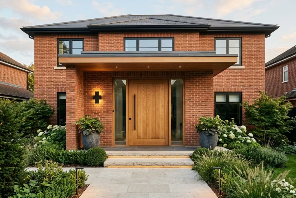
The entrance to a home tells visitors everything they need to know before the front door even opens. It communicates the character of the architecture, hints at the lifestyle within, and sets the emotional tone for every arrival. Yet, surprisingly, it is one of the most overlooked elements during exterior renovations.
Many homeowners instinctively add decorative shutters, ornate columns, or elaborate trim in the hope of making a brick house feel more impressive. In my experience, these additions often create visual clutter instead of genuine sophistication. The most memorable entrances are rarely the most decorated. They succeed because every detail has been carefully considered, from the scale of the doorway to the rhythm of the approach, the quality of the lighting, and the way visitors naturally move toward the house.
A beautifully designed entrance acts like a quiet invitation. It guides rather than shouts. Instead of relying on ornament, it uses proportion, craftsmanship, and material honesty to create an experience that feels welcoming from the very first step. As the saying goes, first impressions last, and nowhere is that more evident than at the front entrance of a home.
Oversized Doors Create Presence Without Excess
One of the most effective ways to elevate a red brick facade is by increasing the scale of the entrance door rather than adding more decorative features. A taller, wider door immediately shifts the visual balance of the house. It gives the entrance greater importance, making the home feel more generous and architecturally confident without changing the surrounding brickwork.
During the renovation of a traditional brick property, the clients initially considered adding decorative stone mouldings around the entrance. Instead, we removed the unnecessary trim and installed a solid European oak door measuring 1200 mm wide by 2400 mm high (48 by 96 inches) with narrow sidelights. The transformation was remarkable. The entrance suddenly became the focal point, yet it still felt understated because the materials were allowed to speak for themselves.
For larger homes, I often recommend:
- Door widths between 1100 and 1400 mm (43 to 55 inches).
- Heights between 2200 and 2700 mm (87 to 106 inches).
- Slim glazed side panels for additional daylight.
- Minimal hardware finished in matte black, bronze, or brushed stainless steel.
- Flush detailing that complements modern architecture.
Natural oak, Accoya, teak, or thermally modified ash remain some of the finest choices for premium residential entrances because they age beautifully and develop character over time.
Pivot Doors Bring Contemporary Elegance
For homeowners seeking a more architectural statement, pivot doors offer a compelling alternative to conventional hinged entrances. Unlike traditional doors that rotate on side-mounted hinges, pivot systems rotate around an offset pivot point. This subtle engineering change creates a smooth, effortless movement while allowing much larger door panels to operate comfortably.
Beyond functionality, pivot entrances create a sense of occasion. Every arrival feels intentional.I have incorporated pivot doors into several custom homes where clients wanted a contemporary entrance without excessive ornamentation. Interestingly, guests often notice the experience before they notice the mechanism. The movement feels graceful, almost weightless, adding an element of quiet luxury that photographs rarely capture.
For comfortable proportions:
- Pivot doors generally begin around 1200 mm (48 inches) wide.
- Premium installations often reach 1500 mm (60 inches) or more.
- Heights of 2400 to 3000 mm (96 to 118 inches) create impressive vertical emphasis.
- Recessed handles maintain clean architectural lines.
When paired with red brick, a pivot door creates an appealing contrast between traditional craftsmanship and modern engineering.
Use Lighting to Shape the Arrival Experience
Lighting should do far more than illuminate the front door. It should gently guide visitors, reveal material textures, and establish a welcoming atmosphere long before anyone reaches the entrance.
One mistake I frequently encounter is relying on a single bright wall light above the doorway. While functional, it often creates harsh shadows and fails to highlight the architectural qualities of the facade. Instead, I recommend building several layers of illumination.
An effective lighting composition may include:
- Wall-mounted sconces positioned between 1600 and 1800 mm (63 to 71 inches) above finished ground level.
- Recessed ceiling lights beneath covered porches.
- Low pathway lights spaced approximately 2400 mm (8 feet) apart.
- Step lights integrated into entrance stairs.
- Uplights that softly graze the surrounding brick and planting.
- Illuminated house numbers for practical visibility.
Warm lighting between 2700K and 3000K enhances the richness of red brick while creating an inviting atmosphere that feels comfortable rather than theatrical. Good lighting never competes with architecture. It simply helps people appreciate it.
Covered Porches Add Depth and Shelter
A covered entrance offers benefits that extend well beyond protection from rain or strong sunlight. It introduces depth, creates shadow, and establishes a gradual transition between the public street and the private interior.
In one family home renovation, extending the porch by just 1200 mm (4 feet) dramatically improved both appearance and usability. Visitors no longer stood exposed while searching for keys, deliveries remained protected from bad weather, and the entrance gained a stronger architectural presence.
Design considerations that consistently perform well include:
- Porch depths between 1800 and 2400 mm (6 to 8 feet) for comfortable shelter.
- Ceiling heights of 2700 to 3000 mm (9 to 10 feet) to maintain generous proportions.
- Timber-lined ceilings that introduce warmth.
- Brick or limestone columns that match the existing architecture.
- Integrated seating where space allows.
- Large planters framing the entrance without restricting movement.
A thoughtfully designed porch also creates opportunities for seasonal planting and decorative lighting while maintaining a clean architectural appearance.
Think About Entry Sequencing Instead of a Single Front Door
One of the biggest differences between an average entrance and an exceptional one lies in how people arrive. Rather than treating the front door as an isolated destination, I encourage clients to consider the entire sequence of movement from the street to the interior. Every step contributes to the overall experience.
An inviting approach often includes:
- A clearly defined pathway leading toward the entrance.
- Gradual changes in paving texture to slow movement naturally.
- Layered planting that reveals the doorway rather than exposing it immediately.
- Subtle lighting that guides visitors after dark.
- Architectural framing through trees, pergolas, or low walls.
- A sheltered threshold that marks the transition between outside and inside.
This sequence creates anticipation. Visitors experience the home gradually, discovering details along the way instead of seeing everything at once. Like a well-written story, the strongest entrances unfold chapter by chapter rather than revealing the ending on the very first page.
Why This Design Approach Works
A statement entrance establishes hierarchy. It tells the eye exactly where to look first while allowing every surrounding element to support that focal point. Oversized doors, carefully proportioned porches, layered lighting, and a considered approach all contribute to an entrance that feels welcoming without becoming overly decorative. The design relies on architectural confidence rather than ornament, creating a facade that remains elegant regardless of changing trends.
For red brick homes especially, this restraint allows the warmth and authenticity of the masonry to remain the defining characteristic while the entrance quietly elevates the entire composition.
Professional Design Insight
One lesson I have carried through countless residential projects is that homeowners often invest heavily in decorative finishes while overlooking how people actually experience the entrance.
Before making any design decisions, I like to walk the route exactly as a visitor would. I pay attention to where the eye naturally travels, where daylight falls during different times of the day, how the front door appears from the pavement, and whether the transition feels inviting or abrupt.
More often than not, the improvements that make the greatest difference are surprisingly simple. A wider landing, better lighting, a taller door, or a more generous porch frequently transforms the entrance far more effectively than expensive decorative additions. As the old saying goes, actions speak louder than words. In architecture, thoughtful planning speaks louder than ornament.
Ideal Home Types
This entrance strategy works beautifully for:
- Traditional detached brick homes.
- Georgian-inspired residences.
- Contemporary farmhouse properties.
- Luxury suburban houses.
- Transitional architecture.
- Mid-century modern renovations.
- Executive new-build developments.
- Architect-designed custom homes.
Pros
- Creates a memorable first impression without relying on decorative excess.
- Enhances both functionality and curb appeal.
- Improves weather protection and visitor comfort.
- Establishes a clear architectural focal point.
- Complements natural materials such as brick, timber, limestone, and steel.
- Increases perceived craftsmanship and long-term property value.
Cons
- Oversized doors and pivot systems require a larger initial investment.
- Structural modifications may be necessary when enlarging existing entrances.
- Covered porches require thoughtful drainage and roof detailing.
- High-quality lighting systems should be carefully planned to avoid glare and uneven illumination.
Combine Red Brick with Crisp White Render for Architectural Contrast
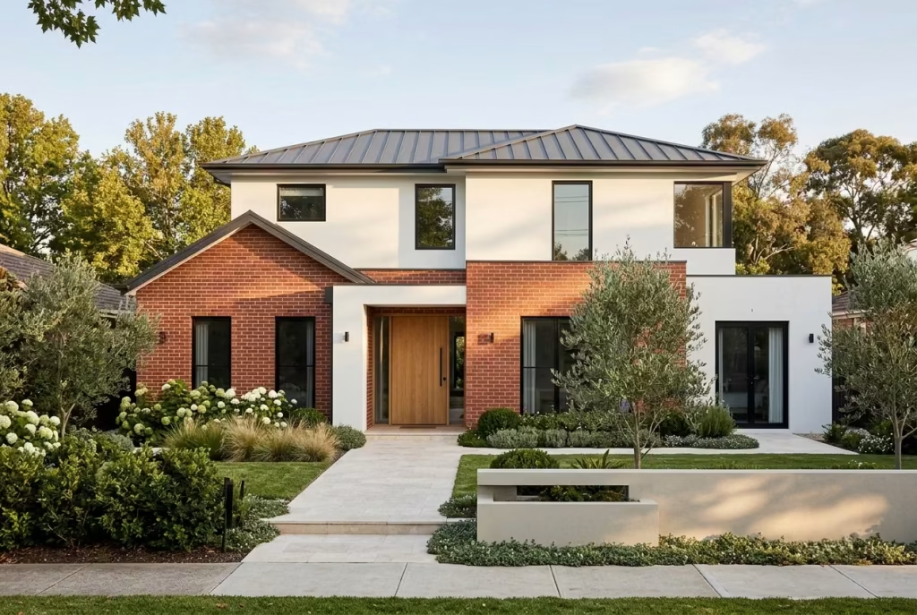
Some of the most compelling homes manage to honour their past while embracing the present. Pairing traditional red brick with crisp white render achieves exactly that. It is a combination that feels fresh without being fashionable, bold without becoming overpowering, and contemporary while still respecting the character of the original architecture.
What makes this pairing so successful is not simply the contrast in colour. It is the contrast in texture, visual weight, and architectural expression. Brick carries depth, warmth, and permanence. White render introduces calm, simplicity, and clarity. Together, they create a facade that feels layered and thoughtfully composed, allowing each material to highlight the strengths of the other.
I have recommended this approach on several renovation projects where clients wanted a modern appearance but were reluctant to paint or remove the original brickwork. Rather than erasing history, we selectively introduced white rendered volumes for new additions while allowing the existing brick to remain untouched. The result felt authentic because the home openly celebrated both its heritage and its evolution. It never tried to pretend the extension had always been there, and that honesty gave the architecture far greater character.
As the saying goes, you cannot have your cake and eat it too. Yet in this case, thoughtful design comes remarkably close. You enjoy the timeless warmth of brick alongside the clean elegance of contemporary architecture.
Use Contemporary Massing to Create Clear Architectural Hierarchy
The most successful two-material homes begin with strong massing, not decorative finishes. Before choosing colours or cladding, architects establish the primary and secondary forms of the building.
This hierarchy helps the eye understand which parts of the home are original, which are new, and how each volume relates to the landscape.
When I work with brick renovations, I often encourage clients to think of the rendered sections as quieter architectural forms. Their purpose is not to compete with the brick but to frame it. Effective massing strategies include:
- Retaining brick for the main body of the house.
- Using white render on upper-storey additions.
- Wrapping rear extensions in rendered finishes.
- Introducing simple rectangular forms with clean rooflines.
- Minimising unnecessary projections that interrupt visual flow.
This approach allows the architecture to breathe. Each volume has its own identity while contributing to a cohesive whole.
Design Two-Material Facades with Intention Rather Than Symmetry
One misconception I regularly encounter is that brick and render must appear in equal amounts to create balance. In reality, symmetry is rarely the goal. Instead, successful facades rely on visual hierarchy.
Across many projects, I have found that allowing red brick to occupy approximately 60 to 75 percent of the primary street elevation often creates the strongest composition. White render then becomes an accent that introduces relief without dominating the facade.
Some of the most effective applications include:
- Rendered entrance volumes.
- First-floor bedroom wings.
- Garden-facing extensions.
- Stair towers.
- Recessed balconies.
- Detached garages connected by rendered walls.
The relationship between these materials should feel purposeful, not evenly divided. Architecture is much like music. Silence is just as important as sound.
Achieve Visual Balance Through Proportion Instead of Decoration
Balance is not created by adding more details. It is achieved by carefully controlling where the eye naturally rests. Brick already provides considerable texture through its mortar joints, colour variation, and handcrafted finish. White render performs a different role. Its smooth surface offers moments of visual rest, preventing the facade from becoming too busy.
Several design principles consistently produce harmonious results:
- Align rendered sections with window openings wherever possible.
- Maintain consistent horizontal rooflines.
- Repeat similar window proportions across both materials.
- Limit additional cladding materials to avoid visual clutter.
- Use dark window frames to unify brick and render.
One project involved replacing an awkward collection of small extensions with a single rendered garden addition measuring approximately 4500 mm (15 feet) wide. Although the extension was physically larger than the structures it replaced, the house immediately appeared calmer because the architectural composition became simpler. Sometimes removing complexity creates the greatest sense of luxury.
Let Modern Extensions Complement the Original Home
Many homeowners worry that a contemporary extension will look disconnected from a traditional brick property. In practice, thoughtful contrast often feels far more convincing than imitation.
Trying to replicate historic brickwork exactly can leave new construction looking artificial. Instead, allowing the extension to express its own identity creates an honest dialogue between old and new. When designing extensions, I often recommend:
- Flat or low-pitched roofs for clear distinction.
- Large sliding glass panels opening onto the garden.
- White rendered walls with minimal detailing.
- Deep roof overhangs for shade and proportion.
- Flush thresholds connecting interior and exterior spaces.
- Simple geometric forms free from unnecessary ornament.
A garden extension between 4500 and 7000 mm (15 to 23 feet) deep can significantly improve family living while preserving the architectural integrity of the original house. Rather than competing with history, contemporary additions should quietly support it.
Handle Colour Transitions with Precision
One of the easiest ways to weaken a two-material facade is through poorly resolved junctions. Where brick meets render, every line becomes highly visible. Clean transitions communicate craftsmanship.
To achieve a refined appearance, I typically recommend:
- Slim shadow gaps where practical.
- Recessed movement joints carefully aligned with architectural lines.
- Minimal trim pieces.
- Dark metal flashings that visually disappear.
- Continuous window head heights across both materials.
Avoid introducing additional accent colours simply because two materials are already present. Brick and white render provide sufficient contrast on their own. Supporting colours work best when kept restrained:
- Charcoal roofing.
- Black aluminium windows.
- Natural oak entrance doors.
- Bronze or matte black lighting.
- Soft grey paving.
- Muted green planting.
This disciplined palette allows every material to retain its individual character without overwhelming the composition.
Why This Design Approach Works
Red brick and white render succeed because they represent opposite qualities while sharing a common architectural purpose.
Brick contributes warmth, texture, and permanence. Render introduces clarity, lightness, and contemporary simplicity. Together, they create a balanced facade that feels timeless rather than trend driven.
The contrast also improves the perception of scale. Rendered volumes often appear lighter and less imposing, making larger homes feel more approachable while allowing the original brick architecture to retain its prominence.
Professional Design Insight
One principle I have learned through years of residential renovation is that clients often become preoccupied with choosing the perfect shade of white. Surprisingly, colour is rarely the deciding factor. The real success lies in proportion.
Before selecting finishes, I spend far more time studying where brick should end and render should begin. Those decisions influence the architecture for decades, while paint colours can always be adjusted later.
Another lesson worth remembering is that natural light dramatically changes how white render appears throughout the day. North-facing walls often feel cooler, while western elevations become noticeably warmer during the evening. Viewing material samples in different lighting conditions is always worthwhile before making a final decision.
As the old expression reminds us, measure twice, cut once. Careful planning almost always produces better architecture than hurried decisions.
Ideal Home Types
This material combination works particularly well for:
- Victorian and Edwardian renovations.
- Georgian-inspired homes.
- Contemporary extensions to traditional houses.
- Scandinavian-influenced architecture.
- Luxury suburban residences.
- Transitional family homes.
- Modern farmhouse designs.
- Architect-designed custom builds.
Pros
- Creates a refined balance between traditional and contemporary architecture.
- Preserves the character of original brickwork while introducing modern elements.
- Makes larger homes appear lighter and more elegant.
- Enhances natural light through carefully placed rendered surfaces.
- Pairs beautifully with timber, glass, steel, and natural stone.
- Offers excellent long-term design flexibility for future additions.
Cons
- Render requires periodic inspection to maintain a clean appearance.
- Poorly detailed junctions between brick and render can become visually distracting.
- Achieving seamless colour consistency often requires experienced installers.
- Excessive use of white render may reduce the warmth and visual richness that make red brick so appealing in the first place.
Introduce Floor-to-Ceiling Glazing to Lighten Heavy Masonry
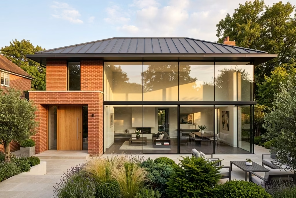
Red brick possesses an undeniable sense of permanence. Its texture, colour variation, and craftsmanship give a home character that few exterior materials can replicate. Yet, on larger houses or homes with long uninterrupted walls, that same strength can sometimes make the architecture feel visually dense. One of the most effective ways to introduce balance is through thoughtfully positioned floor-to-ceiling glazing.
Large expanses of glass do much more than increase daylight. They reduce the perceived weight of masonry, establish a stronger relationship between the home and its surroundings, and transform how interior spaces are experienced throughout the day. Rather than breaking up the brick with decorative features, glazing introduces openness while allowing the masonry to remain the defining material.
I have recommended this approach on several renovation projects involving traditional brick homes that backed onto mature gardens or countryside views. Instead of replacing the existing brick, we carefully inserted generous glazed openings into rear extensions and selected side elevations. The result was remarkable. The homes retained their reassuring solidity from the street, yet once inside, they felt dramatically brighter, calmer, and far more connected to the landscape. It was a reminder that exceptional architecture is often about revealing opportunities rather than replacing what already works.
As the saying goes, let the light do the heavy lifting. Natural daylight has an extraordinary ability to reshape how we perceive both space and material.
Prioritise Window Proportions Before Window Size
One of the most common misconceptions is that bigger glass automatically creates better architecture. In reality, proportion matters far more than sheer scale.
A poorly proportioned glazed wall can dominate a brick facade and make the composition feel unstable. By contrast, a carefully designed opening respects the rhythm of the masonry while introducing transparency exactly where it is needed.
Whenever I begin planning large glazed areas, I first study the structural grid of the house and the proportions of existing windows. Maintaining this visual rhythm helps the new glazing feel integrated rather than added as an afterthought. For many contemporary residential projects, these dimensions work particularly well:
- Floor-to-ceiling heights between 2400 and 3000 mm (8 to 10 feet).
- Sliding or fixed panels ranging from 1200 to 1800 mm (4 to 6 feet) wide.
- Slim aluminium frame sightlines of approximately 25 to 40 mm (1 to 1.6 inches).
- Consistent head heights that align with adjacent openings.
Repeating similar proportions across the elevation creates a sense of order that quietly strengthens the architecture.
Work With the Sun Instead of Fighting It
Glass performs differently depending on orientation. A beautifully designed window in one location may create overheating or glare in another if solar exposure has not been carefully considered.
Before specifying glazing, I always study how sunlight moves across the property during different seasons. That understanding shapes every design decision. General principles include:
- South-facing glazing captures generous winter daylight but often benefits from roof overhangs or external shading during summer.
- East-facing windows provide gentle morning light, making them ideal for kitchens and breakfast areas.
- West-facing glazing delivers beautiful evening warmth but may require external screening to reduce heat gain.
- North-facing glass produces soft, consistent daylight with minimal glare, making it excellent for living spaces and studios.
On one family home renovation, we extended the roof projection by just 900 mm (36 inches) above a large glazed wall. That relatively modest adjustment significantly reduced summer overheating while preserving winter solar warmth. Sometimes the simplest architectural changes produce the greatest improvements in comfort.
Balance Openness with Everyday Privacy
One concern homeowners frequently raise is whether large glazed walls will leave their home feeling exposed. Fortunately, privacy and openness are not mutually exclusive. They simply require thoughtful planning. Rather than relying on curtains throughout the day, I prefer using architecture and landscaping to shape privacy naturally.
Effective strategies include:
- Positioning glazing toward private gardens rather than public streets.
- Incorporating mature trees that filter views without blocking daylight.
- Using ornamental grasses and layered shrubs to soften sightlines.
- Introducing courtyard layouts that create secluded outdoor spaces.
- Specifying low-iron privacy glass where necessary.
- Integrating timber screens that provide partial enclosure while maintaining airflow.
Planting beds between 1200 and 1800 mm (4 to 6 feet) deep often create enough separation to preserve privacy while strengthening the landscape design.
Good architecture allows occupants to enjoy expansive views without feeling like they are living in a display window.
Invest in High-Performance Glazing for Long-Term Comfort
Floor-to-ceiling windows should improve everyday living, not compromise it. Modern glazing technology has advanced considerably, making it possible to enjoy generous glass areas without sacrificing energy efficiency.
Whenever clients ask whether large windows make a home harder to heat or cool, my answer is always the same. Performance depends far more on specification than on size alone.
Features worth prioritising include:
- Double or triple glazing depending on climate.
- Low-emissivity coatings that reduce unwanted heat transfer.
- Thermally broken aluminium frames.
- Argon-filled glazing units for improved insulation.
- Warm-edge spacers that minimise condensation.
- High-quality weather seals around operable panels.
Combined with appropriate insulation and ventilation, these systems help maintain comfortable indoor temperatures throughout the year while reducing long-term energy costs.
Choosing quality glazing is very much a case of buy once, benefit for decades.
Strengthen the Connection Between Interior and Landscape
Perhaps the greatest advantage of floor-to-ceiling glazing is not what it adds to the facade but what it does for daily life inside the home.
Large glazed openings dissolve the visual boundary between interior rooms and outdoor spaces. Gardens become part of the living experience rather than scenery viewed from a distance.
I often encourage clients to think beyond the glass itself. The relationship between flooring, terraces, planting, and furniture plays an equally important role.
Some design principles consistently create stronger connections:
- Continue similar flooring tones from inside to outside where appropriate.
- Align internal circulation routes with garden pathways.
- Position seating to capture the best views rather than facing televisions.
- Create terraces at the same finished floor level whenever possible.
- Frame mature trees or carefully selected landscape features as focal points.
One recent project involved replacing a small kitchen window with a 5400 mm (18-foot) sliding glazed wall overlooking a courtyard garden. Although the room’s footprint remained unchanged, the space immediately felt significantly larger because the eye naturally travelled into the landscape.
Sometimes expanding the view is more powerful than expanding the building.
Why This Design Approach Works
Floor-to-ceiling glazing introduces lightness without diminishing the strength of red brick. The contrast between solid masonry and transparent glass creates a balanced architectural composition that feels contemporary while remaining respectful of traditional materials.
Glass also reflects changing skies, surrounding trees, and seasonal light, ensuring the facade never appears static. Throughout the day, the exterior evolves naturally, revealing different qualities as sunlight shifts across the brickwork.
This constant interaction between light and material gives the home a quiet sense of movement that decorative features simply cannot replicate.
Professional Design Insight
One principle I have learned over years of designing residential extensions is that the best glazing rarely draws attention to itself. Instead, it frames the life unfolding around it.
Before deciding where large windows should go, I spend time identifying the views worth celebrating. Sometimes that is a mature oak tree. Sometimes it is the morning sunrise, a carefully designed courtyard, or even the changing shadows cast across a brick garden wall.
Equally important is understanding what should remain hidden. A neighbouring fence, parked cars, or service areas should never become the focal point simply because a large window has been introduced.
Another lesson I frequently share with homeowners is to furnish the room before choosing the glazing layout. Furniture placement, circulation, and everyday routines often reveal opportunities that architectural drawings alone cannot. As the old saying reminds us, the proof of the pudding is in the eating. Great design succeeds through lived experience, not just visual impact.
Ideal Home Types
This approach works exceptionally well for:
- Contemporary brick extensions.
- Modern farmhouse residences.
- Architect-designed custom homes.
- Mid-century modern renovations.
- Luxury suburban properties.
- Courtyard houses.
- Garden-facing family homes.
- Transitional homes combining traditional and contemporary architecture.
Pros
- Reduces the visual weight of expansive brick facades.
- Maximises natural daylight throughout the interior.
- Creates a stronger connection between indoor and outdoor living.
- Enhances contemporary architectural character without removing traditional materials.
- Supports excellent energy performance when professionally specified.
- Adds long-term lifestyle value as well as visual appeal.
Cons
- Premium glazing systems represent a significant investment.
- Large glazed openings require careful structural engineering.
- Poor orientation may lead to overheating or excessive glare if shading is overlooked.
- Glass surfaces require regular cleaning to maintain uninterrupted views and their refined appearance.
Frame the Home with Mature Trees and Layered Planting
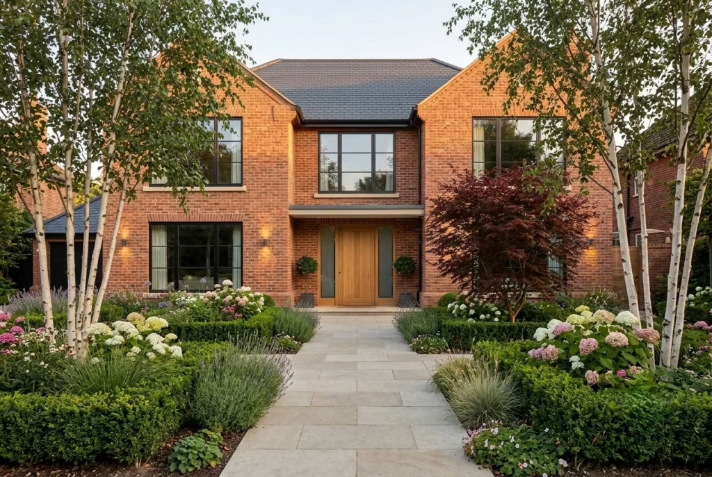
A beautifully designed red brick facade should never feel isolated from its surroundings. The most memorable homes are those where architecture and landscape seem to have grown together over time. Mature trees, layered planting, and thoughtful garden planning soften the strength of brick while adding depth, colour, and movement that change with every season.
Throughout my projects, I have noticed that homeowners often invest heavily in exterior finishes but underestimate the role of landscaping. Yet a carefully planned garden can elevate a brick home just as much as new windows or a premium roof. The goal is not to hide the architecture but to frame it, allowing the warm texture of brick to remain the focal point while nature adds balance and life.
Use Trees That Match the Scale of the Home
The size of your trees should always complement the architecture rather than dominate it. An oversized canopy can overwhelm a modest house, while small ornamental trees may look lost beside a large facade.
For most front gardens, I recommend planting feature trees at least 3000 to 4500 mm (10 to 15 feet) away from the house to allow healthy root growth and balanced canopy development. Multi-stem trees such as birch, olive, Japanese maple, or serviceberry provide year-round interest without obscuring the architecture.
Layer Planting for Colour Throughout the Year
Great gardens evolve with the seasons instead of relying on a single burst of colour. A balanced planting scheme typically combines:
- Evergreen shrubs for year-round structure.
- Flowering perennials for seasonal interest.
- Ornamental grasses that add movement.
- Groundcovers to create a unified appearance.
Planting beds between 900 and 1500 mm (36 to 60 inches) deep usually provide enough space to build these layers while keeping the entrance open and inviting.
Prioritise Native Plants for Long-Term Success
Native planting often requires less maintenance because it naturally adapts to local weather and soil conditions. It also supports birds, bees, and beneficial pollinators, creating a healthier landscape over time.
Mixing native species with a few carefully selected ornamental plants delivers a garden that feels established rather than overly designed.
Soften Brick Without Hiding It
Landscaping should complement the architecture, not compete with it. Position shrubs beneath windows, allow ornamental grasses to soften pathways, and use climbing plants selectively around boundary walls or pergolas instead of covering the brick facade itself. This creates a gentle transition between the house and garden while allowing the masonry to remain the visual anchor.
Plan for the Garden You Want in Ten Years
One of the biggest mistakes I see is planting purely for immediate impact. Gardens mature, and successful landscape design anticipates that growth from the very beginning.
Leave enough spacing between trees, shrubs, and pathways so plants can develop naturally without overcrowding. As the saying goes, good things come to those who wait. A landscape that matures gracefully will continue to enhance the home long after the renovation is complete.
Why This Design Approach Works
Layered planting and mature trees soften the strong geometry of red brick while reinforcing the home’s proportions. The changing colours, textures, and seasonal light give the facade a living quality that evolves throughout the year without ever feeling dated.
Professional Design Insight
I always encourage clients to view landscaping as part of the architecture rather than the finishing touch. A well-placed tree can frame a home more effectively than an expensive decorative feature, while thoughtful planting helps the property feel settled and welcoming from the day it begins to mature.
Ideal Home Types
- Traditional brick homes
- Contemporary farmhouses
- Georgian-inspired residences
- Luxury suburban properties
- Modern family homes
- Architect-designed custom houses
Pros
- Softens the appearance of brick without masking its character.
- Creates year-round visual interest.
- Supports local biodiversity with native planting.
- Improves curb appeal and long-term property value.
- Makes the home feel naturally connected to its surroundings.
Cons
- Trees and shrubs require time to reach their full potential.
- Poor plant spacing can lead to overcrowding.
- Mature planting needs regular pruning and seasonal maintenance.
- Incorrect tree placement may interfere with foundations or underground services if not professionally planned.
You May also Like: 25 Stylish Modern Small House Exterior Ideas You’ll Love
Use Black Metal Details for Quiet Architectural Definition

Some of the most impressive red brick homes are not defined by grand architectural gestures but by the small details that quietly bring everything together. Black metal accents may seem insignificant on their own, yet when thoughtfully integrated, they create a sense of order, sharpen architectural lines, and give the entire facade a refined, contemporary character.
What makes black metal so effective is its ability to recede rather than dominate. Against the warmth and texture of red brick, slim steel elements create crisp definition without distracting from the masonry. They act like punctuation in a well-written sentence. You may not notice each one individually, but together they improve the clarity of the whole composition.
I have seen homeowners spend thousands on new windows or premium landscaping while overlooking the smaller fixtures that tie everything together. More often than not, replacing mismatched metalwork with a coordinated black finish gives the facade a far more polished appearance. It is proof that the little things often make the biggest difference.
Install Railings That Complement the Architecture
Railings should feel like an extension of the house rather than decorative accessories. Simple steel railings with clean vertical or horizontal lines pair beautifully with traditional brick because they introduce structure without unnecessary ornament. Decorative scrollwork, by comparison, can quickly make a timeless facade feel dated.
For comfortable proportions, I typically recommend:
- Handrails approximately 900 to 1000 mm (35 to 39 inches) high.
- Baluster spacing that complies with local building regulations, often no more than 100 mm (4 inches) apart.
- Matte or satin black powder-coated finishes for durability.
- Slim profiles that preserve open views of the brickwork.
When railings echo the window lines or entrance geometry, the entire facade feels more cohesive.
Add a Minimalist Canopy for Shelter and Definition
A well-designed canopy provides more than weather protection. It frames the entrance, introduces depth, and creates subtle shadow that enhances the texture of the brick.
Rather than choosing bulky structures with decorative brackets, I prefer slim steel canopies supported by concealed fixings or slender columns. Their understated appearance keeps the focus on the entrance while adding a contemporary architectural layer.
For most homes, a canopy projecting 1200 to 1800 mm (4 to 6 feet) provides comfortable shelter without overwhelming the facade. Pairing black steel with timber soffits or a limestone threshold creates a balanced mix of warmth and precision.
Layer Exterior Lighting with Black Fixtures
Lighting fixtures should complement the architecture during the day and reveal it after sunset. Black wall lights naturally blend into the facade, allowing the warm glow rather than the fitting itself to become the focal point.
An effective lighting scheme often includes:
- Wall sconces beside the entrance.
- Path lights leading to the front door.
- Step lighting for safety.
- Uplights highlighting feature trees or textured brick.
Choose warm LEDs between 2700K and 3000K to enhance the richness of the brick and create a welcoming evening atmosphere.
Keep House Numbers and Mailboxes Simple
House numbers and mailboxes are practical necessities, but they also contribute to the home’s overall character. I often recommend oversized black metal numbers mounted directly onto brick or stone because they remain easy to read while complementing modern architectural detailing.
Likewise, a simple steel mailbox with clean lines feels far more timeless than ornate decorative designs. Keeping these everyday features consistent with the rest of the metalwork helps the facade feel intentional rather than pieced together over time.
Let Downpipes Disappear into the Design
Downpipes are essential, but they should never become the feature that catches the eye first. Powder-coated black aluminium or steel downpipes blend naturally with charcoal roofs and black window frames, allowing attention to remain on the architecture instead of functional services.
Where possible, align downpipes with window mullions or building corners so they become part of the architectural rhythm rather than visual interruptions. It is often these carefully considered decisions that separate a well-designed home from one that simply looks renovated.
Why This Design Approach Works
Black metal introduces crisp definition without competing with the warmth of red brick. Repeating the same finish across railings, lighting, canopies, house numbers, mailboxes, and rainwater goods creates a consistent visual language that feels calm, refined, and timeless.
Instead of relying on decorative embellishments, the facade gains character through precision and thoughtful restraint.
Professional Design Insight
One principle I follow on every exterior project is limiting the number of metal finishes. Mixing black, chrome, brass, and painted steel on the same facade often creates unnecessary visual noise.
Using one consistent finish across all architectural metalwork gives the home a stronger identity while making future updates much easier. As the saying goes, too many cooks spoil the broth. Simplicity almost always leads to better long-term design.
Ideal Home Types
- Traditional brick homes
- Georgian-inspired residences
- Contemporary farmhouse designs
- Modern suburban homes
- Mid-century renovations
- Architect-designed custom houses
Pros
- Creates clean architectural definition.
- Modernises traditional brick without major structural changes.
- Coordinates easily with charcoal roofs and black-framed windows.
- Durable powder-coated finishes require relatively little maintenance.
- Enhances long-term curb appeal through consistent detailing.
Cons
- Lower-quality coatings may fade or chip over time.
- Black finishes can show dust and water spots more readily.
- Inconsistent metal finishes reduce the overall visual impact.
- Professional installation is important to achieve clean alignment and lasting performance.
Celebrate Brick Texture Through Strategic Exterior Lighting
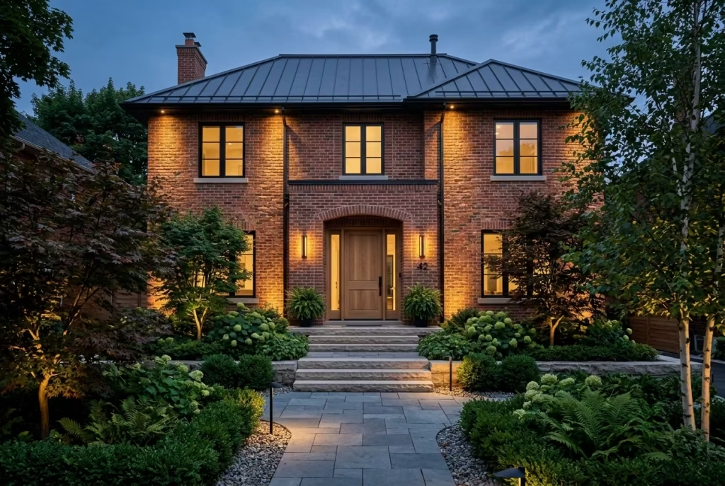
A red brick home has a unique advantage that many other exterior materials simply cannot match. Throughout the day, its texture shifts with the movement of the sun, revealing subtle colour variations, mortar lines, and handcrafted imperfections that give the facade genuine character. Yet the story should not end at sunset. With carefully planned exterior lighting, the same brickwork can take on an entirely different personality after dark, becoming richer, warmer, and far more inviting.
One of the biggest misconceptions I encounter is that exterior lighting is purely functional. While safety certainly matters, the best lighting schemes also enhance architecture. They reveal texture, create atmosphere, and guide visitors naturally toward the entrance. When done well, the lighting itself almost disappears, leaving only beautifully illuminated brickwork and thoughtfully composed shadows.
I have visited projects both before and after the lighting installation, and the difference is often remarkable. A home that felt flat and ordinary during the evening suddenly gained depth, warmth, and architectural presence simply because the light was positioned with intention. It is a reminder that good lighting does not change the house. It changes the way you experience it.
Use Grazing Light to Reveal Every Detail in the Brickwork
Among all exterior lighting techniques, grazing light is one of the most effective for textured materials like brick.
Instead of directing light outward, fixtures are positioned close to the wall so the beam travels across the surface. This shallow angle highlights every subtle variation in the masonry, creating depth that cannot be achieved with standard floodlights. For the strongest effect, I typically recommend:
- Positioning uplights 300 to 450 mm (12 to 18 inches) away from the wall.
- Using narrow beam angles to emphasise texture.
- Spacing fixtures approximately 1800 to 3000 mm (6 to 10 feet) apart, depending on the facade.
- Concealing fittings within planting beds wherever possible.
The result is a facade that feels sculptural rather than simply illuminated.
Choose Warm LEDs That Complement Red Brick
Colour temperature has a surprisingly large influence on how brick appears after dark. Cool white lighting can make warm masonry feel flat or slightly grey, reducing the richness that gives brick its timeless appeal. Warm LEDs, on the other hand, enhance the natural reds, browns, and earthy undertones already present in the material.
For most residential projects, I recommend lighting between 2700K and 3000K because it creates a welcoming atmosphere while preserving the authentic colour of the brick. Warm lighting also pairs beautifully with timber doors, natural stone, and mature planting, creating a balanced evening palette that never feels harsh or artificial.
Create Depth Through Carefully Controlled Shadows
Great lighting is not about making everything equally bright. In fact, some of the most memorable exteriors rely on shadow just as much as light. Architectural recesses, brick piers, pergolas, and mature trees all create opportunities for subtle contrast that gives the facade visual depth.
I often encourage homeowners to think of light and shadow as partners. One defines the other. Effective techniques include:
- Highlighting entrance recesses while leaving surrounding walls softly illuminated.
- Casting gentle shadows from ornamental trees across brick surfaces.
- Illuminating textured planting instead of every wall.
- Allowing darker areas to frame brighter focal points.
As the saying goes, less is more. A restrained lighting scheme often creates a stronger impression than one that floods every corner with brightness.
Make the Entrance Feel Warm and Inviting
The entrance deserves special attention because it is the point where architecture and everyday life meet. A welcoming entry should feel comfortable to approach while providing enough illumination for practical tasks such as unlocking the door or greeting visitors.
A balanced lighting arrangement often includes:
- Wall sconces positioned on either side of the entrance.
- Recessed ceiling lights beneath a covered porch.
- Step lights integrated into stair risers.
- Low pathway lighting leading visitors naturally to the front door.
- Soft uplighting for nearby feature planting.
Keeping brightness levels consistent prevents harsh contrasts while making the entire approach feel calm and inviting.
Extend Curb Appeal Beyond Daylight Hours
Many homeowners focus entirely on how their house looks during the day, yet the property is often viewed just as frequently during the evening. Thoughtfully planned lighting allows the home to retain its architectural presence after sunset without appearing overdesigned.
One project I particularly remember involved a traditional brick home that looked almost invisible once darkness fell. We introduced warm grazing lights, subtle tree uplighting, and discreet pathway fixtures while leaving the brick untouched.
The transformation was immediate. The home became a welcoming landmark within the street, and neighbours commented that it appeared as though the entire facade had been renovated, even though only the lighting had changed.
That experience reinforced an important lesson. Sometimes the most effective renovation is not replacing materials but revealing their beauty in a new way.
Why This Design Approach Works
Exterior lighting enhances qualities that already exist within the architecture rather than introducing new ones. By revealing the texture of brick, defining entrances, and creating gentle layers of light and shadow, the facade gains depth and character that continue long after the sun has set.
Instead of treating lighting as a finishing touch, it becomes part of the overall architectural composition, working alongside brick, landscaping, and natural materials to create a home that feels equally beautiful by day and by night.
Professional Design Insight
One principle I follow on every exterior project is visiting the property after dark before finalising the lighting plan. Architectural drawings cannot fully predict how brick will respond to changing light, surrounding trees, or seasonal shadows.
I also encourage clients to avoid the temptation of installing brighter fixtures than necessary. Excessive illumination often washes away the very texture they hope to highlight. A carefully positioned low-output fitting usually delivers a more refined result than a powerful floodlight.
Like a good conversation, the best lighting never needs to raise its voice to leave a lasting impression.
Ideal Home Types
- Traditional brick residences.
- Georgian-inspired homes.
- Contemporary farmhouse designs.
- Luxury suburban properties.
- Mid-century renovations.
- Architect-designed custom homes.
- Garden-facing family houses.
Pros
- Highlights the natural texture and craftsmanship of brick.
- Improves safety while enhancing architectural character.
- Extends curb appeal into the evening.
- Creates a welcoming entrance for family and guests.
- Complements landscaping and other exterior materials.
Cons
- A professionally designed lighting system increases the initial project cost.
- Fixtures require occasional cleaning and maintenance.
- Poor placement can create glare or uneven illumination.
- Low-quality fittings may lose performance or colour consistency over time.
Mix Traditional Brick Bonds with Contemporary Architectural Forms
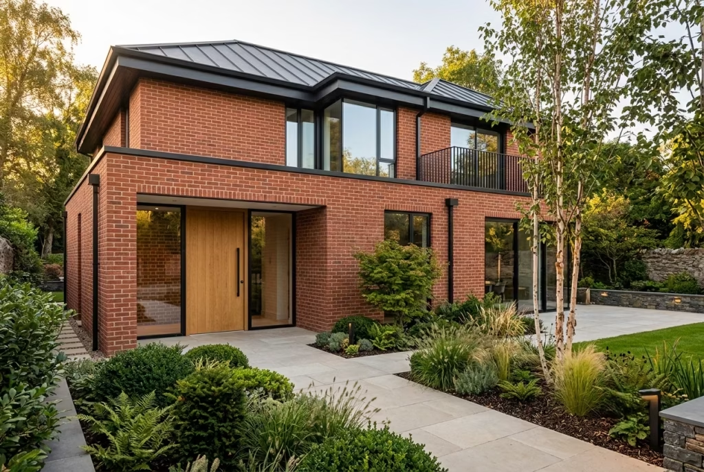
A truly memorable red brick home is not defined solely by its colour or size. Often, its character lies in something far more subtle: the way each brick has been laid. Brick bonding patterns have shaped residential architecture for centuries, yet they are frequently overlooked during modern renovations and new builds. When paired with clean contemporary forms, these traditional patterns create facades that feel rich in history while remaining unmistakably current.
I have worked with homeowners who initially viewed brick simply as a background material. Once they understood how different bonding patterns influence texture, shadow, and scale, their perspective changed completely. Instead of searching for expensive feature materials, they realised the craftsmanship already existed within the masonry itself. Sometimes the greatest design opportunity is hidden in plain sight.
The beauty of combining historic brickwork with modern architecture lies in its honesty. Rather than pretending an older home is brand new or forcing a contemporary extension to imitate the past, each element celebrates its own identity. The result is an exterior with depth, authenticity, and lasting architectural confidence.
Celebrate the Simplicity of Running Bond
Running bond remains one of the most widely used brick patterns for good reason. Its staggered horizontal joints create a calm rhythm that feels balanced and timeless across both traditional and contemporary homes.
Although simple in appearance, running bond has an important architectural advantage. The continuous horizontal lines visually widen the facade, making homes appear more grounded and composed.
I often recommend running bond for:
- Main front elevations.
- Garden walls.
- Contemporary extensions.
- Boundary walls.
- Detached garages.
Using high-quality handmade or water-struck bricks further enhances the subtle variation in colour and texture, allowing natural daylight to create gentle movement across the facade throughout the day.
Introduce Flemish Bond Where Craftsmanship Deserves Attention
If running bond expresses simplicity, Flemish bond celebrates craftsmanship. By alternating headers and stretchers within each course, this historic pattern creates a richer texture that rewards closer inspection. It has long been associated with Georgian and traditional architecture, yet it can also bring remarkable character to contemporary homes when used selectively.
I particularly enjoy incorporating Flemish bond around:
- Entrance walls.
- Chimneys.
- Garden courtyards.
- Feature garden walls.
- Porch surrounds.
These carefully positioned areas become subtle focal points without overwhelming the overall composition. Like a fine piece of tailoring, the quality reveals itself through the details rather than bold decoration.
Use Stack Bond as a Contemporary Accent
While traditional bonding patterns establish heritage, stack bond introduces a distinctly modern architectural language. Because the vertical joints align precisely above one another, stack bond creates a crisp grid that complements clean geometric forms and minimalist detailing.
Rather than applying it across the entire facade, I prefer using stack bond as an accent in carefully chosen locations, including:
- Entrance volumes.
- Garden extensions.
- Feature privacy walls.
- Courtyard screens.
- Interior courtyard elevations.
Limiting stack bond to approximately 10 to 20 percent of the visible masonry prevents the contemporary detailing from overpowering the warmth and texture of traditional brickwork. The contrast between historic and modern masonry creates visual interest while maintaining architectural balance.
Invest in Skilled Brick Craftsmanship
Even the finest brick cannot compensate for poor workmanship. Throughout my projects, I have found that carefully executed mortar joints, consistent alignment, and clean detailing contribute far more to the finished appearance than selecting an expensive brick alone.
Some details I always review with masonry contractors include:
- Uniform mortar joint thickness, typically around 10 mm (⅜ inch).
- Consistent brick alignment across corners.
- Neatly finished expansion joints.
- Accurate window and door reveals.
- Carefully detailed brick sills and copings.
Brickwork is one of the few elements that homeowners will look at every single day for decades. Investing in skilled craftsmanship pays dividends long after construction is complete. As the saying goes, a chain is only as strong as its weakest link. Precision matters.
Pair Traditional Masonry with Clean Modern Geometry
One of the most successful design approaches today is allowing traditional materials to sit within simple architectural forms. Instead of relying on decorative rooflines, ornate trim, or excessive projections, contemporary geometry creates a calm backdrop that allows the brickwork to become the feature.
Some combinations that consistently perform well include:
- Rectangular building volumes.
- Flat or low-pitched roofs.
- Large floor-to-ceiling glazing.
- Slim black aluminium windows.
- Recessed entrances.
- Minimal roof overhangs.
This balance between handcrafted masonry and disciplined geometry creates homes that feel timeless because they respect both history and innovation.
Why This Design Approach Works
Traditional brick bonds introduce texture, craftsmanship, and historical character, while contemporary forms provide clarity and simplicity. Together they create an architectural dialogue that feels authentic rather than nostalgic.
Instead of copying the past or rejecting it entirely, the design builds upon proven principles while embracing modern lifestyles and construction methods. The result is a home that remains visually interesting from a distance yet reveals even greater richness as you move closer.
Professional Design Insight
One lesson I have learned over years of residential work is that homeowners often focus on choosing the right brick colour while overlooking the bond pattern itself. Before finalising any design, I always ask clients to view full-sized sample panels rather than individual bricks. A single brick rarely tells the full story. It is only when dozens of bricks are laid together that the rhythm, texture, mortar colour, and craftsmanship become apparent.
I also encourage keeping architectural forms simple whenever intricate masonry is involved. When both the building shape and brick pattern compete for attention, the facade quickly feels busy. Allow one element to lead while the other provides quiet support. Much like a well-conducted orchestra, every part has its role, but harmony is what people remember.
Ideal Home Types
- Georgian-inspired residences.
- Contemporary brick homes.
- Luxury suburban properties.
- Architect-designed custom houses.
- Modern farmhouse designs.
- Victorian renovations.
- Transitional family homes.
Pros
- Celebrates authentic masonry craftsmanship.
- Creates visual depth through varied brick patterns.
- Blends traditional materials with contemporary architecture.
- Enhances long-term character and resale appeal.
- Allows subtle architectural detailing without unnecessary ornament.
Cons
- Complex brick bonds require experienced masons.
- Intricate patterns increase construction time and labour costs.
- Poor workmanship is more noticeable on decorative bond patterns.
- Careful planning is essential to achieve clean transitions between different masonry styles.
You May also Like: Baja Earth House: How to Keep a Desert Home Cool Naturally
Design a Courtyard Entrance That Makes Brick Feel More Inviting
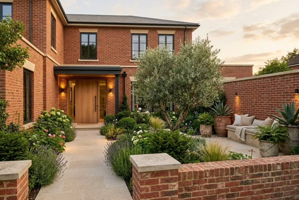
Some homes impress from the street, while others reveal their greatest qualities only as you move closer. A thoughtfully designed courtyard entrance belongs to the second category. Rather than presenting the front door immediately, it creates a gradual journey that builds anticipation, softens the strength of red brick, and makes arriving home feel like an experience instead of a routine.
I have always believed the entrance should do more than connect the pavement to the front door. It should slow your pace, encourage you to notice the architecture, and create a quiet separation between public life and private living. On several residential projects, introducing even a modest courtyard completely changed how the home was perceived. Without altering the brick facade itself, the property felt more welcoming, more spacious, and noticeably more luxurious.
As the saying goes, good things come to those who wait. A layered entrance rewards those extra few steps by revealing the home gradually rather than all at once.
Create a Layered Arrival That Builds Anticipation
The most memorable entrances rarely follow a straight line. Instead, they unfold naturally through a sequence of spaces that gently guide visitors toward the front door.
Rather than walking directly from the pavement to the entrance, consider creating several moments along the journey. A well-planned arrival may include:
- A defined front gate or low garden wall.
- A pathway between 1500 and 1800 mm (5 to 6 feet) wide.
- Planting beds that gently frame the route.
- A change in paving texture near the entrance.
- A sheltered porch or recessed doorway.
Each layer creates a stronger sense of arrival while giving the brick architecture more opportunity to be appreciated from different angles.
Use the Courtyard to Increase Privacy
Privacy is one of the greatest advantages of a courtyard entrance. Instead of exposing the front door directly to the street, the layout creates a comfortable buffer between the public realm and the home. This can be achieved without making the property feel closed or unwelcoming.
Effective privacy features include:
- Low brick or limestone walls approximately 900 to 1200 mm (3 to 4 feet) high.
- Decorative steel or timber screens.
- Multi-stem feature trees.
- Evergreen hedging.
- Timber entrance gates with open slatted detailing.
These elements filter views rather than completely blocking them, allowing the entrance to feel secure while remaining visually connected to the surrounding neighbourhood.
Choose Hardscape Materials That Complement the Brick
The paving within a courtyard should feel like a natural extension of the architecture. Because red brick already introduces warmth and texture, I usually recommend hardscape materials with quieter tones that allow the masonry to remain the focal point.
Some of my preferred combinations include:
- Honed limestone paving.
- Bluestone slabs.
- Clay pavers that complement the brick rather than match it exactly.
- Exposed aggregate concrete.
- Fine gravel for informal seating areas.
Large paving units measuring approximately 600 × 900 mm (24 × 36 inches) create a clean contemporary appearance while reducing visual clutter through fewer joints. Limiting the number of paving materials also helps the courtyard feel calm and cohesive.
Soften the Space with Layered Planting
Even a compact courtyard benefits from carefully planned greenery. Plants soften masonry, introduce seasonal colour, and make enclosed spaces feel more comfortable throughout the year. I often recommend combining several planting layers rather than relying on isolated shrubs.
A balanced courtyard might include:
- Evergreen shrubs for permanent structure.
- Ornamental grasses that move gently in the breeze.
- Flowering perennials for seasonal interest.
- Climbing plants on pergolas or boundary walls.
- A feature tree positioned to frame the entrance.
Keeping planting beds between 900 and 1200 mm (36 to 48 inches) deep usually provides enough room for healthy growth while maintaining generous circulation. Over time, the landscape matures alongside the architecture, making the courtyard feel increasingly established.
Introduce Comfortable Outdoor Seating
A courtyard becomes far more valuable when it encourages people to pause rather than simply pass through. Even a small seating area can transform the entrance into an extension of daily living.
Depending on the available space, consider:
- Built-in brick or limestone benches.
- Timber seating integrated into retaining walls.
- A pair of comfortable outdoor chairs with a side table.
- Large planters that define the seating zone.
- Warm lighting that allows the space to remain usable during the evening.
For practical comfort, allow a seating area measuring at least 2400 × 2400 mm (8 × 8 feet) so furniture feels appropriately scaled without restricting movement.
A welcoming courtyard often becomes the perfect place to enjoy a morning coffee, greet neighbours, or simply appreciate the changing seasons.
Why This Design Approach Works
A courtyard entrance transforms the experience of approaching a home. Instead of presenting the architecture all at once, it creates a sequence of carefully connected spaces that balance privacy, landscaping, and craftsmanship.
The surrounding planting softens the visual strength of brick, while high-quality paving and seating introduce warmth and everyday functionality. Together, these elements make the facade feel more inviting without changing its architectural character.
Professional Design Insight
One lesson I have learned over years of residential design is that people remember how a home makes them feel long before they remember individual materials.
Whenever I design a courtyard, I focus on movement first. I imagine arriving with shopping bags, welcoming guests, collecting deliveries, or simply returning after a long day. If the journey feels comfortable, intuitive, and peaceful, the design has achieved its purpose.
I also encourage clients to resist filling every corner with planting or decorative features. Leaving open space is just as important because it allows the eye to rest and gives the architecture room to breathe. As the old saying reminds us, less is more, especially when every detail has been chosen with care.
Ideal Home Types
- Traditional detached brick homes.
- Contemporary farmhouse residences.
- Georgian-inspired architecture.
- Luxury suburban properties.
- Courtyard houses.
- Architect-designed custom homes.
- Transitional family homes.
Pros
- Creates a memorable and welcoming entrance experience.
- Improves privacy without isolating the home.
- Softens the appearance of large brick facades.
- Provides additional outdoor living space.
- Increases curb appeal and long-term property value.
Cons
- Requires additional landscape planning and construction.
- Planting needs seasonal maintenance to remain balanced.
- Premium paving materials can increase project costs.
- Smaller sites may require careful space planning to avoid overcrowding.
You May also Like: How to Create a Stunning Coastal Home: The Ultimate Design Guide
Balance Large Brick Walls with Carefully Chosen Greenery
Large expanses of red brick can feel impressive and permanent, but without the right planting they may also appear visually heavy. The goal is not to hide the masonry. It is to soften its scale, introduce movement, and create a stronger connection between architecture and landscape.
I often remind clients that greenery should act like a frame around a painting. The brick remains the artwork, while the planting helps it feel more inviting and lived in. A few well-chosen plants, positioned thoughtfully, usually achieve more than a garden filled with competing colours and textures.
Use Vertical Planting to Break Up Long Facades
Vertical planting helps the eye travel upward, making large walls feel less monolithic without interrupting the architecture.
Some effective options include:
- Multi-stem trees positioned near corners.
- Slender evergreens that add height without excessive width.
- Decorative metal trellises fixed to garden walls.
- Climbing plants trained around entrances or pergolas.
Leaving at least 600 to 900 mm (24 to 36 inches) between planting and the wall allows airflow and easier maintenance.
Choose Climbing Plants That Age Gracefully
Climbing plants can add softness and seasonal interest, but they should be selected carefully. Rather than covering the entire facade, I prefer using them on secondary walls, courtyard screens, or pergolas so the brick remains visible.
Reliable choices include:
- Star jasmine for fragrance and evergreen foliage.
- Climbing hydrangea for shaded areas.
- Clematis for seasonal colour.
- Wisteria where strong support structures are available.
Used with restraint, climbing plants create a layered, established appearance that feels collected over time rather than newly installed.
Create Year-Round Structure with Evergreens
One mistake I see frequently is relying only on flowering plants. When winter arrives, the facade can suddenly feel bare.
Evergreens provide the backbone of the landscape and keep the house looking composed throughout the year. Boxwood, yew, holly, and evergreen viburnum work particularly well against warm brick because their deep green tones create a natural contrast without competing for attention.
For most front gardens, shrubs spaced 900 to 1200 mm (36 to 48 inches) apart allow room for healthy growth while maintaining a full appearance over time.
Add Seasonal Colour Without Overwhelming the Facade
Brick already brings strong colour to the composition, so seasonal planting should feel supportive rather than dominant.
I often recommend repeating a limited palette through the garden, such as:
- Lavender and salvia for soft purple tones.
- White hydrangeas for brightness.
- Ornamental grasses for movement.
- Spring bulbs tucked between evergreen shrubs.
This approach creates interest through changing seasons while keeping the overall landscape calm and cohesive.
Plan for Easy Maintenance
The most successful planting schemes are those homeowners can realistically maintain. Before choosing any plant, consider how much pruning, watering, and seasonal care it will require.
As a general rule:
- Use drought-tolerant species where possible.
- Group plants with similar water needs.
- Leave adequate spacing for mature growth.
- Install mulch to reduce weeds and retain moisture.
- Keep climbing plants away from gutters and roof details unless they can be regularly managed.
A garden that matures gracefully will continue to enhance the brickwork for decades instead of becoming a constant maintenance burden.
Why This Design Approach Works
Carefully chosen greenery softens large brick surfaces, introduces seasonal change, and helps the home feel connected to its surroundings. The combination of vertical planting, evergreen structure, and restrained colour creates a landscape that complements the architecture without overwhelming it.
Professional Design Insight
When I walk a property for the first time, I pay close attention to where the brick feels heaviest. Those are usually the areas that benefit most from planting. A single well-placed tree or a layered shrub border can change the way the entire facade is perceived. As the saying goes, nature has a way of softening hard edges. Good landscape design simply gives it the opportunity.
Ideal Home Types
- Traditional brick homes
- Contemporary farmhouse designs
- Georgian-inspired residences
- Luxury suburban properties
- Architect-designed custom homes
- Garden-facing family houses
Pros
- Softens the scale of large brick facades.
- Adds year-round visual interest.
- Improves curb appeal naturally.
- Supports biodiversity with thoughtful plant selection.
- Helps the home feel established and welcoming.
Cons
- Requires ongoing pruning and seasonal care.
- Poor plant selection can lead to overcrowding.
- Climbing plants need regular management around roofs and gutters.
- Mature planting takes time to reach its full effect.
Keep the Palette Simple and Let the Brick Become the Hero
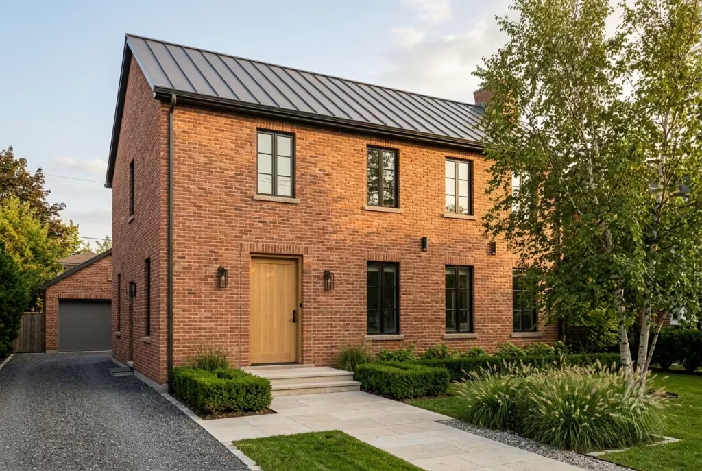
One lesson I have returned to throughout my career is that the most enduring homes rarely rely on an abundance of colours or materials. Instead, they succeed because they know where to stop. Red brick already carries remarkable depth through its natural variation, texture, and craftsmanship. Trying to compete with it often weakens the overall composition rather than strengthening it.
Some homeowners feel tempted to introduce multiple cladding materials, bold feature colours, decorative stone, or contrasting trims in the hope of creating a more luxurious exterior. In reality, these additions can dilute the very quality that makes a brick home special. The strongest facades allow the brick to lead while every other element quietly supports it.
I have worked on several exterior renovations where simplifying the palette produced a far greater transformation than adding expensive new features. Removing unnecessary colours, replacing mixed finishes with a consistent material language, and allowing the brickwork to take centre stage gave each home a calmer, more confident presence. As the saying goes, too much of a good thing can become too much. Restraint often creates the greatest sense of luxury.
Practise Colour Restraint for a More Refined Exterior
Colour should guide the eye, not distract it. Red brick already introduces warm tones ranging from burnt orange to deep terracotta and rich crimson. Supporting colours should therefore provide balance rather than competition.
Across many residential projects, I have found that limiting the exterior palette to three or four primary colours consistently produces the most timeless results. A dependable combination includes:
- Natural red brick as the dominant material.
- Charcoal or dark grey roofing.
- Black aluminium windows and architectural metalwork.
- Natural timber or painted white accents where appropriate.
This restrained palette feels sophisticated because every colour has a clear purpose.
Establish a Clear Material Hierarchy
Exceptional architecture always has a hierarchy. One material becomes the focal point while others provide contrast, texture, or support. For red brick homes, the hierarchy is usually straightforward:
- Brick forms the primary architectural surface.
- Timber introduces warmth.
- Glass adds openness and light.
- Metal provides crisp detailing.
- Stone grounds entrances or landscape features.
Whenever too many materials receive equal attention, the facade begins to feel fragmented. On one renovation project, we reduced five different exterior finishes to just brick, limestone, black aluminium, and oak. The home immediately appeared more expensive despite using fewer materials because the architecture finally had a clear visual order.
Maintain Architectural Consistency
Consistency does not mean every element must look identical. It means every decision should feel connected to the same architectural story.
Before selecting any finish, I always ask one question: Does this strengthen the overall composition or simply add another layer of decoration? Simple ways to create consistency include:
- Repeating the same metal finish across windows, lighting, railings, and gutters.
- Matching paving tones with the roof or stone detailing.
- Using one timber species throughout entrance doors, pergolas, and screens.
- Limiting decorative features to preserve clean architectural lines.
These subtle connections help the home feel carefully designed rather than gradually assembled over many years.
Prioritise Timeless Design Over Passing Trends
Exterior renovations represent long-term investments, often expected to last several decades. For that reason, chasing short-lived trends rarely delivers lasting satisfaction.
Over the years I have watched fashionable colours, decorative cladding systems, and highly contrasting palettes appear and disappear. Red brick, however, has remained consistently relevant because it is rooted in craftsmanship rather than fashion.
Choosing timeless companions such as charcoal roofing, natural stone, timber, and simple landscaping ensures the home continues to feel current even as design trends evolve. As the old expression reminds us, fashion fades, quality endures.
Think About Long-Term Resale Appeal
While every renovation should reflect the owner’s personality, it is also worth considering how future buyers will perceive the property.
Homes with restrained material palettes generally appeal to a broader audience because they feel adaptable and well maintained. Features that consistently strengthen resale value include:
- Authentic brickwork left unpainted.
- High-quality natural materials.
- Neutral architectural colours.
- Mature landscaping.
- Consistent exterior detailing.
- Durable roofing and window systems.
These choices allow potential buyers to imagine their own lives within the property without first needing to reverse bold design decisions.
Why This Design Approach Works
A restrained palette allows red brick to perform the role it was always intended to play. Instead of competing with multiple finishes, the masonry becomes the visual anchor that gives the home warmth, texture, and permanence. Supporting materials work quietly in the background, creating balance and refinement without distracting from the architecture. The result is an exterior that feels elegant today and remains relevant for decades to come.
Professional Design Insight
One principle I return to on almost every project is removing something before adding anything new. Simplifying an exterior often reveals qualities that were hidden beneath years of unnecessary decoration.
I also encourage clients to view material samples together rather than individually. Brick, stone, timber, metal, and roofing all influence one another, and the most successful palette is one that feels harmonious as a complete composition. In architecture, confidence rarely comes from excess. More often, it comes from knowing exactly when enough is enough.
Ideal Home Types
- Traditional brick homes.
- Georgian-inspired residences.
- Contemporary farmhouse designs.
- Luxury suburban properties.
- Architect-designed custom homes.
- Transitional family houses.
- Mid-century brick renovations.
Pros
- Creates a timeless and sophisticated exterior.
- Highlights the natural beauty of red brick.
- Reduces visual clutter through clear material hierarchy.
- Simplifies future maintenance and renovations.
- Improves long-term resale appeal.
- Complements a wide variety of architectural styles.
Cons
- Requires careful planning because every material becomes more noticeable.
- Premium natural materials may increase the initial budget.
- Minimal palettes rely heavily on quality craftsmanship.
- Poor colour coordination is more obvious when using fewer finishes.
Why Red Brick Continues to Define Exceptional Residential Architecture
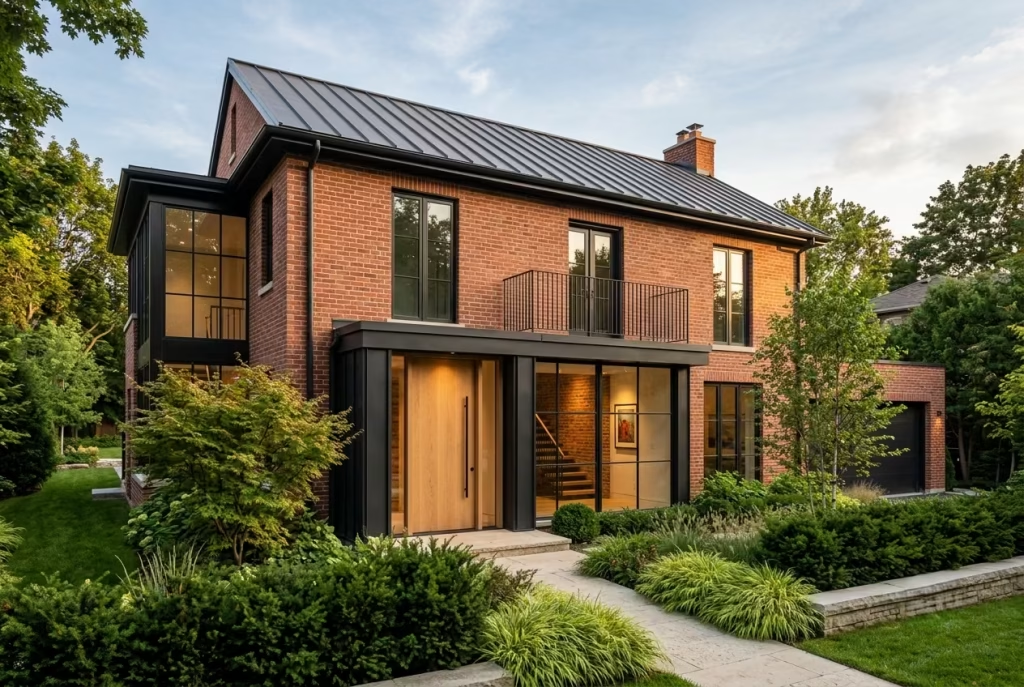
Few exterior materials have earned the level of trust and admiration that red brick continues to enjoy. While architectural styles have evolved from ornate Victorian homes to minimalist contemporary residences, brick has remained remarkably relevant. Its appeal goes far beyond tradition or nostalgia. It offers a rare combination of authenticity, durability, craftsmanship, and timeless beauty that few modern cladding materials can consistently match.
Throughout my years working on residential renovations and new-build homes, I have noticed that the most successful brick houses are rarely defined by the brick alone. Their lasting character comes from how the masonry works alongside thoughtful proportions, carefully selected materials, natural light, and well-designed landscapes. Brick provides the foundation, but great architecture gives it purpose.
Unlike many exterior finishes that follow short-lived design trends, natural masonry develops character as it matures. Sunlight, seasonal weather, and the gentle passage of time enrich its colour rather than diminish it. Small variations in tone, texture, and mortar joints become part of the home’s story, giving every property a unique identity that cannot be manufactured or replicated by synthetic alternatives.
Brick also performs exceptionally well from a practical standpoint. Its thermal mass helps moderate indoor temperatures by absorbing heat during the day and releasing it gradually as temperatures fall. Combined with quality insulation and modern construction techniques, this contributes to comfortable living throughout the year while supporting long-term energy efficiency.
Across different regions, red brick has adapted to local climates and architectural traditions with remarkable flexibility. From Georgian townhouses and Victorian terraces to contemporary farmhouses and architect-designed family homes, it continues to evolve without losing its sense of permanence. That ability to bridge heritage and modern living is one of its greatest strengths.
Perhaps the biggest misconception is that brick homes cannot feel contemporary. In reality, modern architecture is no longer defined by the materials it uses but by how those materials are composed. Clean lines, generous glazing, restrained colour palettes, and carefully considered detailing allow traditional brick to feel every bit as current as glass, steel, or concrete.
Ultimately, exceptional residential architecture is built on materials that stand the test of time rather than the latest fashion. Red brick has proven its value across generations because it combines beauty with performance, warmth with strength, and tradition with remarkable adaptability. It is not simply a material that survives changing trends. It is one that continues to shape them.
You May also Like: 15 Modern Outdoor Sofa Ideas to Transform Your Patio Into an Outdoor Oasis
Understanding What Makes a Red Brick Facade Feel Modern Instead of Dated
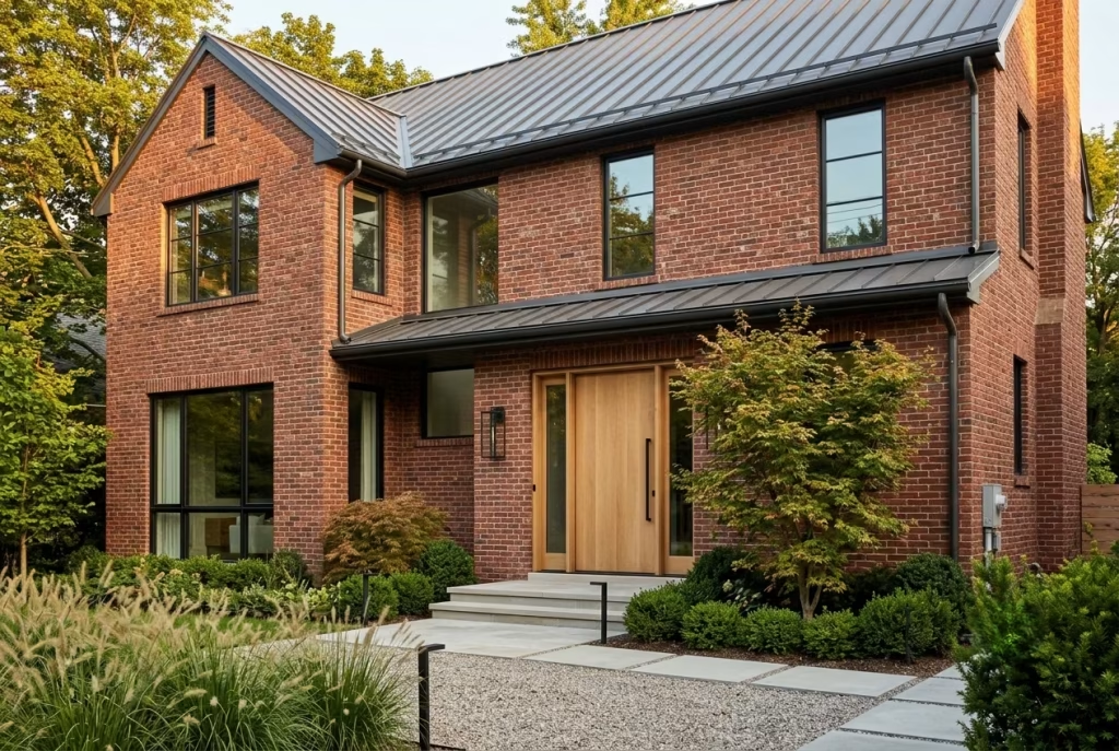
A red brick home does not become modern simply because it features black windows or a new front door. Likewise, it does not feel dated merely because the brick itself is decades old. In my experience, the difference almost always comes down to composition rather than age. The most successful facades are guided by proportion, restraint, and thoughtful material choices instead of decorative trends.
When I evaluate an existing brick house, I rarely begin by asking what should be replaced. Instead, I study the architectural framework already in place. Window proportions, rooflines, entrances, landscaping, and the relationship between materials usually reveal far greater opportunities than changing the brick itself. More often than not, simplifying the composition creates a stronger result than adding new decorative elements.
Modern brick facades rely on clear architectural hierarchy. Windows are carefully proportioned rather than oversized for the sake of impact. Rooflines remain clean and disciplined. Materials are selected with purpose, allowing brick to remain the dominant feature while timber, stone, glass, and metal provide subtle contrast. Landscaping is treated as an extension of the architecture, softening strong masonry without competing for attention, and a restrained colour palette ensures every element works together as a unified whole.
Texture also plays a significant role. Brick naturally provides visual richness through its handcrafted surface, so surrounding materials should balance rather than overwhelm it. Smooth render, slim metal detailing, generous glazing, and layered planting create moments of visual relief that allow the masonry to stand out even more. At the same time, careful attention to scale and visual weight prevents larger brick facades from feeling heavy or imposing.
The following design ideas demonstrate how these principles come together in real homes. Each one illustrates a different way to modernise a red brick facade while respecting the material’s heritage, proving that timeless architecture is rarely about following trends. It is about making thoughtful design decisions that continue to feel relevant year after year.
Professional Design Principles I Always Follow When Working with Red Brick Homes
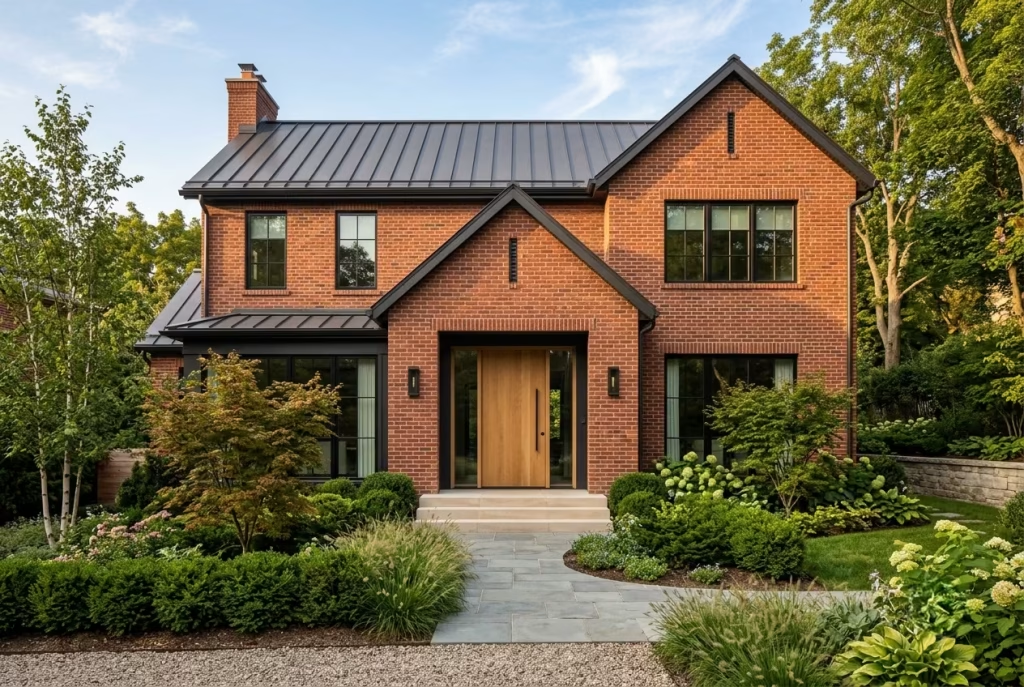
After years of working on red brick renovations, new builds, and full exterior transformations, I have realised that successful facades are rarely the result of one dramatic decision. They emerge from a series of thoughtful choices, each building upon the last. Clients often ask which material, colour, or architectural feature will have the biggest impact, expecting a single answer. The truth is rarely that straightforward.
The homes that continue to impress me years after completion are not necessarily the most expensive or the most ambitious. They are the ones where every decision feels connected to the next. The proportions feel balanced, the materials age gracefully, the landscaping belongs to the architecture, and nothing appears to have been added simply because it was fashionable at the time.
Designing with red brick has taught me to value restraint over excess and long-term thinking over short-term trends. Brick already possesses warmth, texture, and permanence. My role is rarely to compete with those qualities. Instead, it is to reveal them more clearly.
These are the principles I return to on every project, regardless of the home’s size, budget, or architectural style.
Every Successful Facade Starts with Proportion Before Decoration
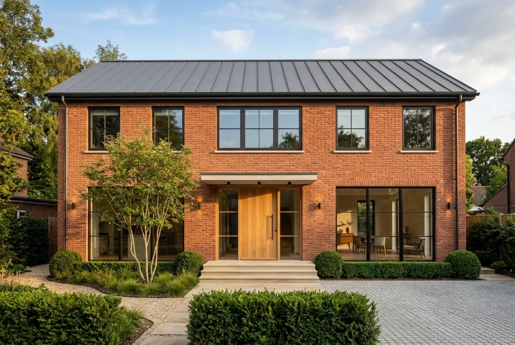
Whenever I visit a property for the first time, I spend surprisingly little time thinking about colours or finishes. Instead, I study proportions. I look at the relationship between the roof and the walls, the spacing of the windows, the width of the entrance, the height of the eaves, and the balance between solid brick and glazed openings. These elements determine whether a home feels composed long before decorative details enter the conversation.
I have worked on projects where clients planned to replace brickwork, install expensive cladding, and redesign the landscaping. In the end, improving window proportions, enlarging the entrance, and simplifying the roofline produced a far greater transformation than any decorative upgrade could have achieved.
As the old saying goes, you cannot build a strong house on weak foundations. In design, proportion is that foundation.
Natural Materials Deserve Equally Authentic Companions
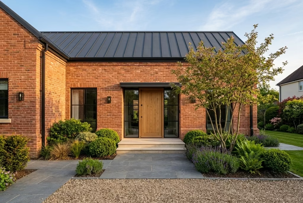
One lesson experience has reinforced time and again is that authentic materials elevate one another. Red brick pairs beautifully with limestone, natural timber, slate, steel, and carefully detailed glass because each material carries its own honesty. None tries to imitate something else.
Whenever possible, I avoid synthetic finishes that attempt to copy natural materials. They may appear convincing at first, but they often lose their character as they weather. Some combinations I consistently return to include:
- Red brick with European oak or thermally modified timber.
- Limestone entrance steps.
- Charcoal metal roofing.
- Powder-coated aluminium windows.
- Gravel, bluestone, or clay paving.
When materials age naturally together, the home develops character rather than simply growing older.
Landscaping Should Complete the Architecture, Not Disguise It
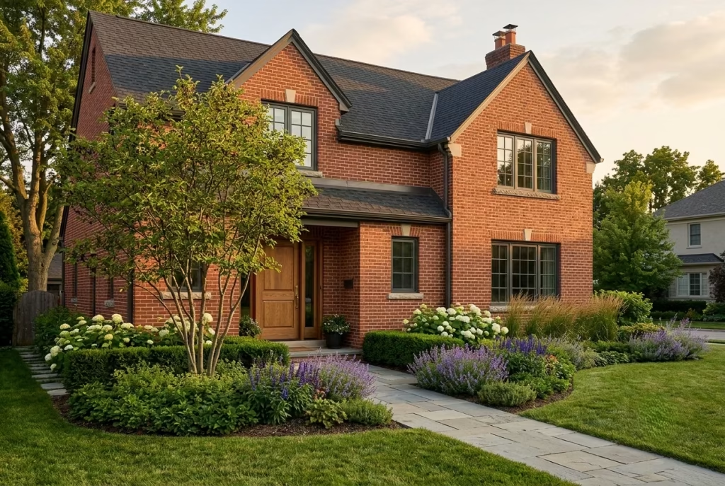
One mistake I occasionally see is treating planting as a way to hide architectural weaknesses. I take the opposite approach. Landscaping should reinforce the architecture by framing important views, softening transitions, and introducing seasonal movement while allowing the brick to remain the hero.
On many projects, I begin planning the landscape while the architectural drawings are still evolving. That collaboration produces far better results than treating planting as the final stage of construction.
I encourage clients to think in layers:
- Trees establish scale.
- Shrubs create structure.
- Perennials introduce seasonal interest.
- Groundcovers unify the composition.
The result feels settled and effortless rather than overly designed.
Light Changes Brick More Than Paint Ever Will
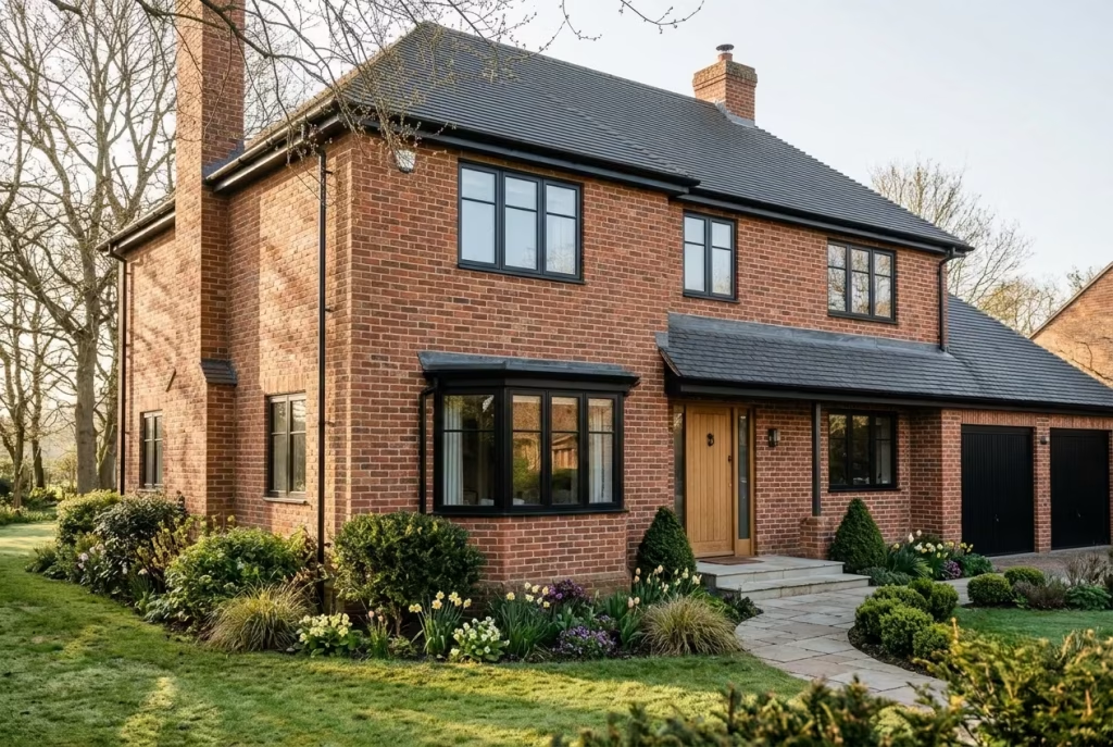
One of the most fascinating qualities of red brick is that it never looks exactly the same twice. Morning sunlight reveals different colours than the warm glow of late afternoon. Rain deepens the tones. Winter skies cool the palette, while summer evenings enrich its warmth.
That is why I always encourage homeowners to observe their house at different times of day before making major design decisions.
In one project, a client planned to paint a north-facing brick elevation because it appeared dull during an afternoon visit. We returned the following morning when softer sunlight revealed beautiful colour variation that had been hidden the day before. Instead of painting the brick, we improved the landscaping and introduced carefully positioned lighting. The original masonry became one of the strongest features of the entire home.
Sometimes patience reveals possibilities that quick decisions overlook.
Simplicity Almost Always Ages Better Than Complexity
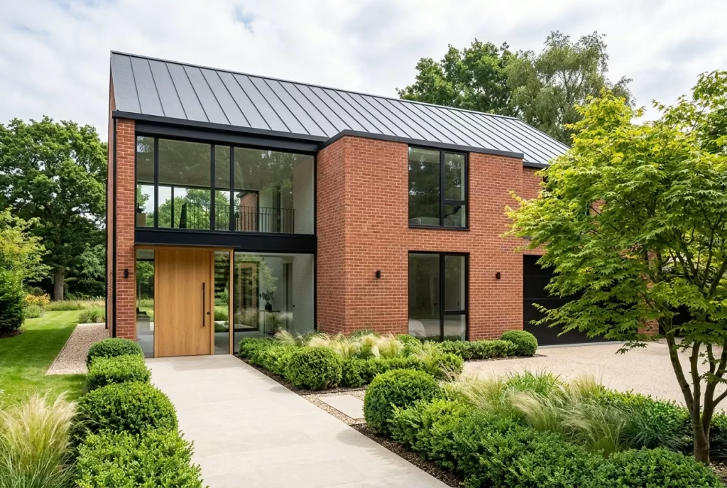
Design trends come and go with surprising speed. Over the years, I have watched decorative trims, bold accent colours, feature walls, and fashionable cladding systems rise in popularity before quietly disappearing again.
The homes that continue to feel fresh after twenty or thirty years usually share one characteristic. They were never designed around trends in the first place. Whenever I feel tempted to add another material or architectural feature, I ask myself a simple question.
Does this genuinely improve the architecture, or does it simply add more visual noise?
More often than not, removing something strengthens the design.As the saying goes, less is more. Few principles have served me better.
Invest in Permanent Architectural Elements Before Decorative Upgrades
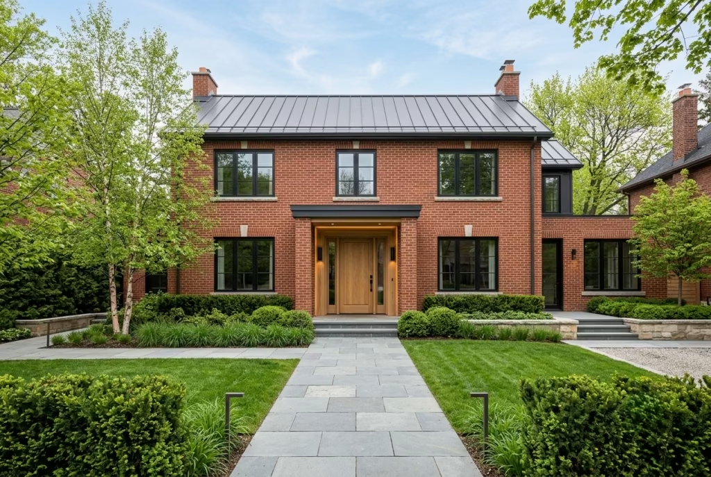
If a client has a limited renovation budget, I always encourage investing in the elements that are difficult to replace later.
These include:
- High-quality windows.
- Roofing.
- Entrance doors.
- Masonry repairs.
- Structural landscaping.
- Exterior lighting infrastructure.
Decorative accessories, furniture, planters, and seasonal styling can always be introduced gradually. Permanent architectural improvements, however, continue adding value every single day for decades.
A home with excellent fundamentals will almost always outperform one filled with decorative features but built on weaker foundations.
Think About Every Season, Not Just Completion Day
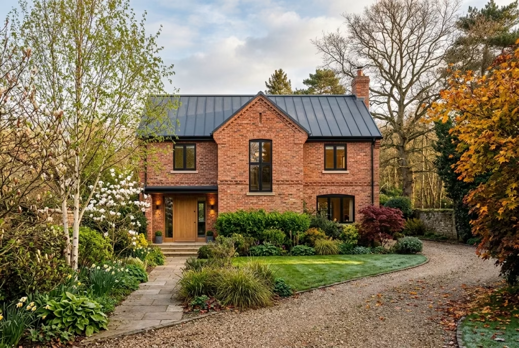
One of the biggest differences between a professionally designed exterior and a showroom-inspired renovation is how it performs throughout the entire year. I never judge a house solely by how it looks on completion day.
Instead, I imagine how it will feel:
- During winter when deciduous trees lose their leaves.
- On rainy autumn afternoons when brick becomes darker and richer.
- During bright summer mornings when strong sunlight creates deep shadows.
- In spring as fresh planting begins to soften the architecture.
- On quiet evenings when carefully positioned lighting brings the facade to life.
A successful home continues to evolve with changing seasons instead of relying on a single perfect photograph. That long-term perspective often shapes better decisions than any trend forecast ever could.
Common Design Mistakes That Can Make a Red Brick Exterior Feel Dated
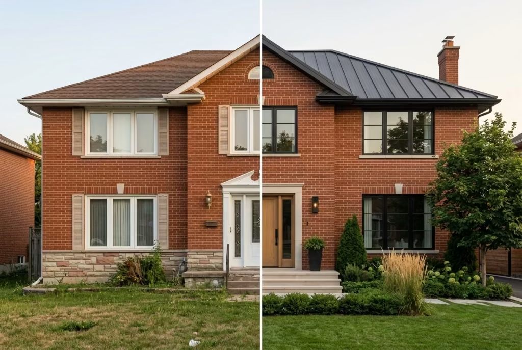
Red brick itself rarely makes a home look outdated. More often than not, it is the collection of design decisions surrounding the brick that slowly ages the exterior. Over the years, I have visited countless properties where homeowners assumed the masonry was the problem, only to discover that the real issue lay elsewhere. The roof colour clashed with the brick, the windows disrupted the proportions, the landscaping lacked structure, or decorative features had gradually accumulated over time.
One of the greatest strengths of red brick is its timeless character. Unlike painted render or trend-driven cladding, brick provides a dependable architectural foundation that can evolve with changing lifestyles. When a brick home feels tired, replacing the masonry is usually the last solution I would recommend. More often, simplifying the composition and correcting a handful of design decisions brings the entire facade back to life.
As the saying goes, the devil is in the details. Small choices, repeated across the exterior, often have a far greater impact than one major renovation.
Combining Too Many Competing Materials
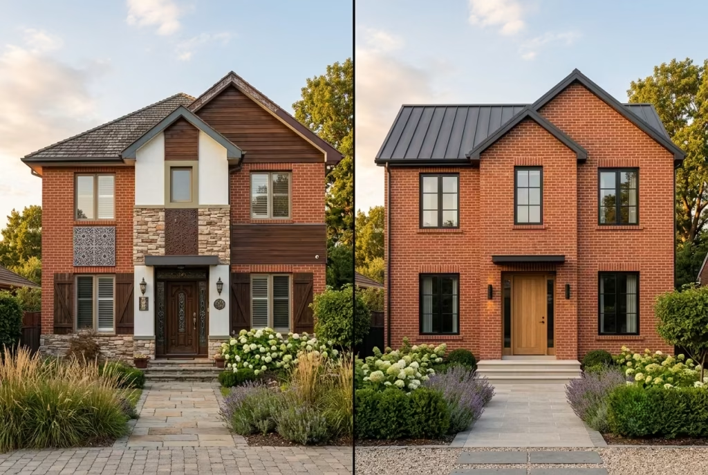
One mistake I see repeatedly is introducing multiple feature materials in the hope of making the house appear more luxurious. Stone veneer, timber cladding, render, decorative panels, coloured brick, and metal accents can all be beautiful individually, but when too many appear on one facade, the eye struggles to identify a clear focal point.
I generally recommend limiting the exterior to three or four primary materials. Allow red brick to remain dominant while supporting materials play quieter roles. A clear material hierarchy creates confidence. Too many finishes create confusion.
Installing Bright White Vinyl Windows
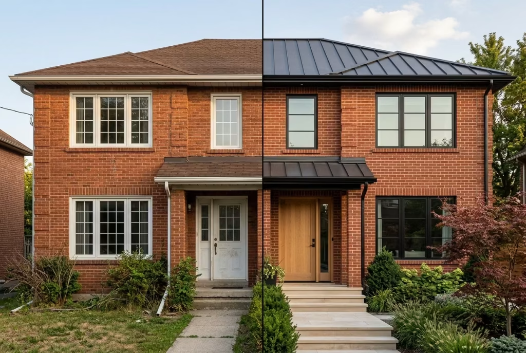
Window frames occupy a surprisingly large percentage of the facade, making their colour and material extremely influential. Bright white vinyl windows often create harsh contrast against the warmth of traditional red brick, particularly on larger homes. Over time, they can make an otherwise timeless exterior feel noticeably dated.
Where budgets allow, I usually recommend:
- Slim black aluminium frames.
- Bronze or charcoal metal finishes.
- High-quality timber windows.
- Composite frames with narrow sightlines.
These options complement the brick rather than competing with it.
Choosing the Wrong Roof Colour
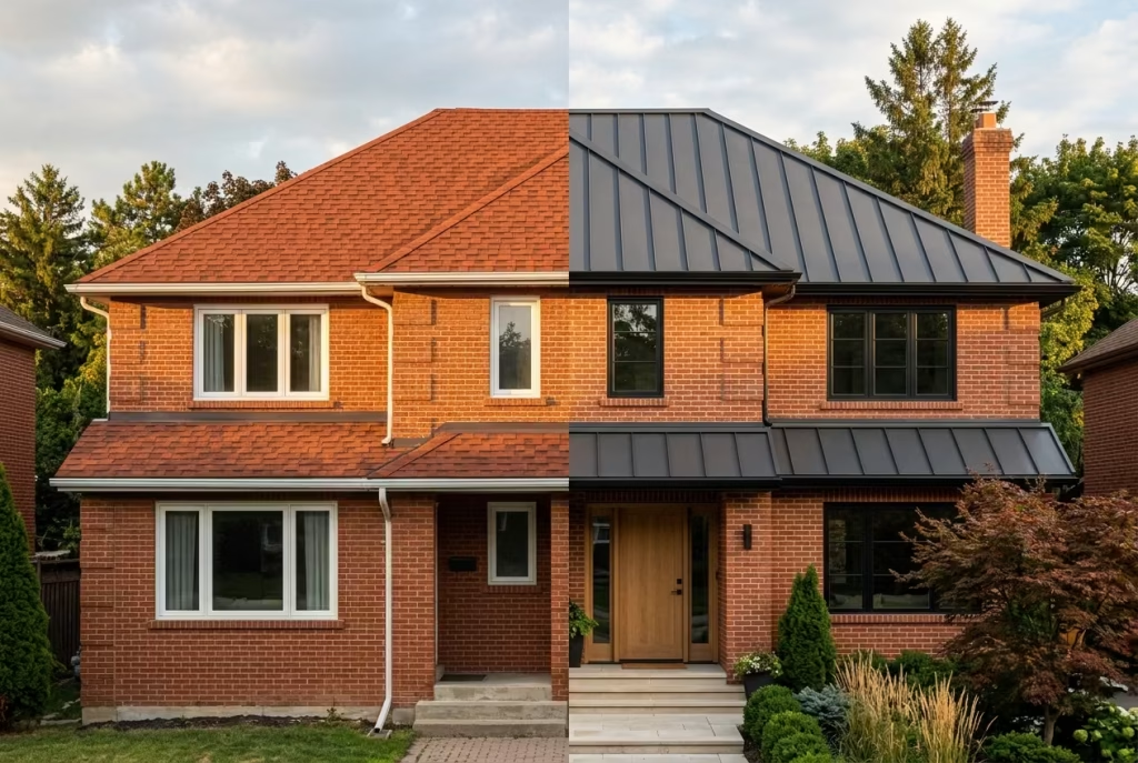
The roof is one of the largest visual surfaces on any house, yet it is frequently selected without considering its relationship to the brick. Roofs in bright red, orange, or heavily blended tones often compete with masonry instead of supporting it.
In my projects, charcoal, graphite, deep grey, and natural slate consistently produce the strongest results because they anchor the composition while allowing the brick to remain the hero. A carefully chosen roof can modernise an entire home without altering a single brick.
Relying on Oversized Decorative Columns
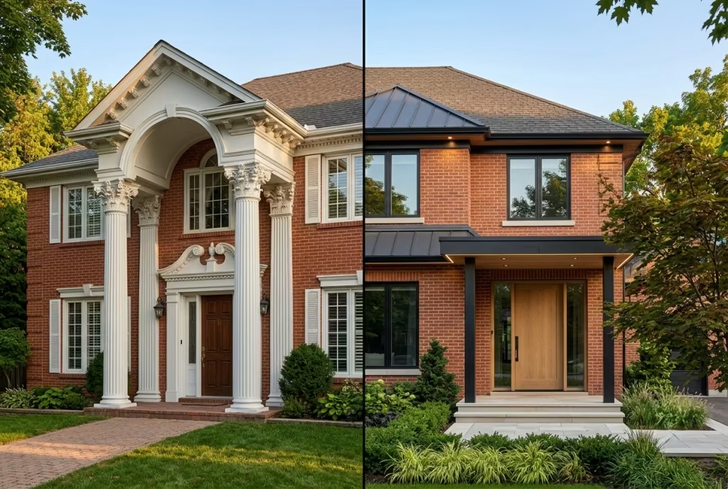
Large decorative columns became popular during certain periods, but they often overpower the honest simplicity of red brick architecture. Unless the home’s architectural style genuinely calls for classical detailing, oversized columns, elaborate capitals, and heavy mouldings can feel disconnected from the building itself.
Where possible, I prefer:
- Slim steel posts.
- Simple brick piers.
- Timber structural columns.
- Minimal detailing with clean proportions.
Architecture should express structure before decoration.
Neglecting the Landscape Design
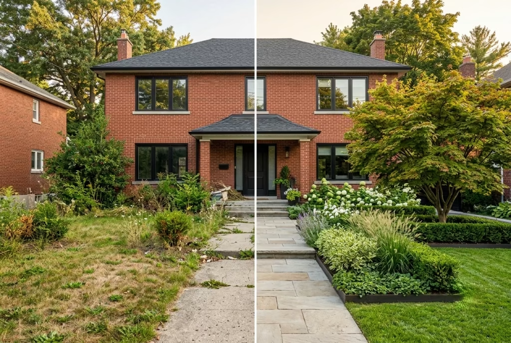
Even a beautifully renovated facade can feel unfinished if the surrounding landscape has been overlooked. Patchy lawns, isolated shrubs, and randomly placed planting rarely complement the strength of brick architecture.
Instead, I encourage homeowners to create:
- Layered planting.
- Defined pathways.
- Evergreen structure.
- Feature trees.
- Cohesive edging and groundcovers.
Landscaping should frame the architecture, not compete with it.
Using Too Many Trim Colours
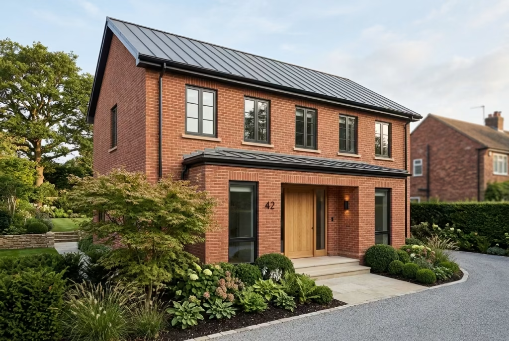
One of the quickest ways to introduce visual clutter is by assigning different colours to fascias, gutters, soffits, window trims, doors, and decorative mouldings. A restrained palette almost always produces a more sophisticated result.
I typically limit exterior colours to:
- Red brick.
- Charcoal roofing and metalwork.
- Black or dark bronze windows.
- Natural timber or subtle white accents where appropriate.
Repeating these colours consistently creates rhythm and visual harmony.
Following Short-Lived Fixture Trends
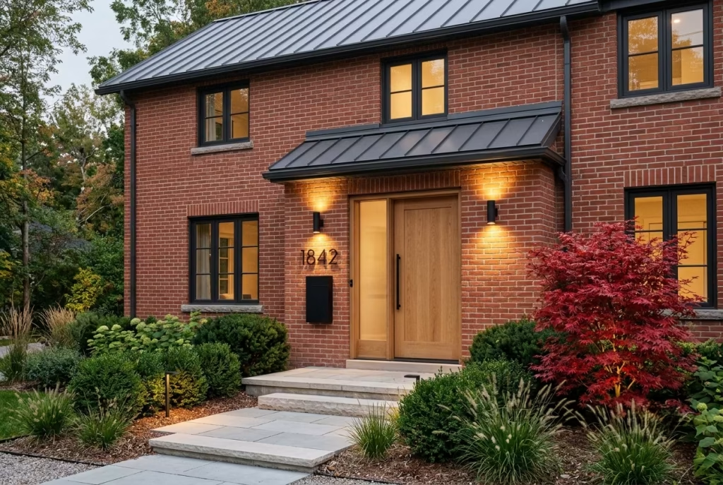
Exterior lighting, house numbers, mailboxes, and hardware may seem like small decisions, but they can quickly date a home when chosen solely because they are fashionable. I encourage clients to select fixtures with clean lines, durable finishes, and timeless proportions rather than highly decorative or novelty designs.
Matte black, bronze, and brushed stainless steel continue to perform exceptionally well because they complement a wide range of architectural styles without dominating the facade. Good design should still feel relevant ten years from now.
Ignoring Architectural Proportions
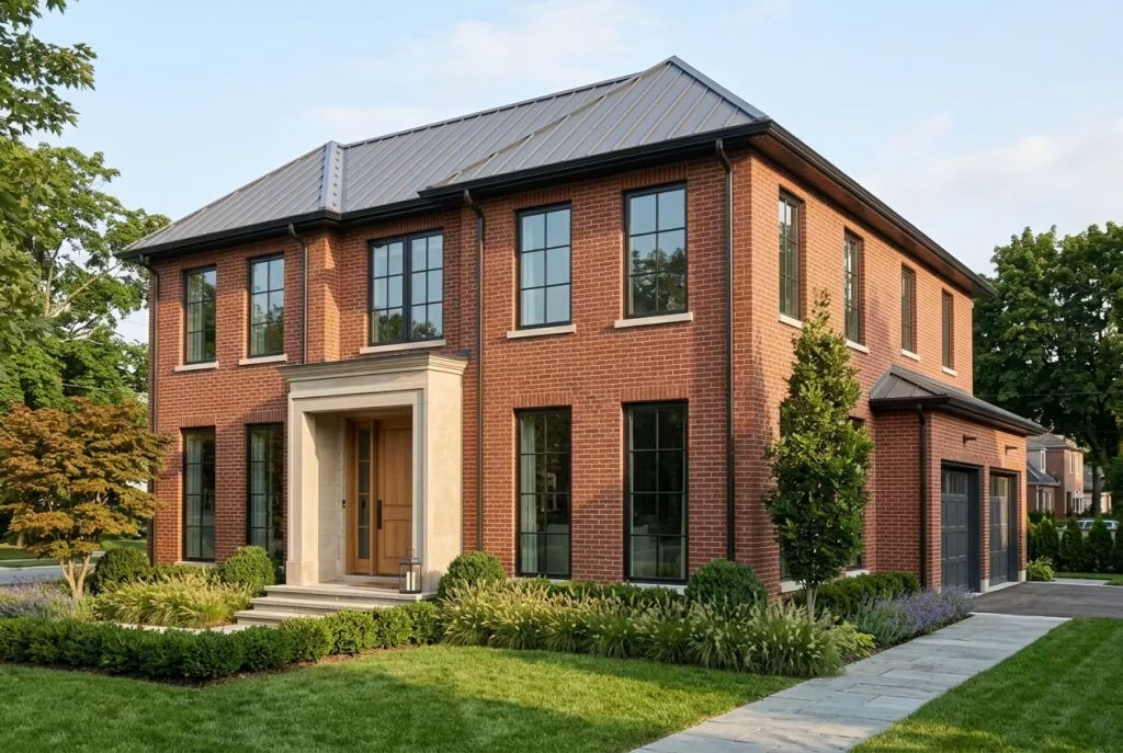
If there is one principle that influences every successful exterior, it is proportion. No amount of expensive materials can compensate for windows that are too small, an entrance that lacks presence, or a roofline that feels disconnected from the rest of the house.
Before recommending cosmetic changes, I always study:
- Window alignment.
- Roof pitch.
- Entrance scale.
- Wall-to-glass ratios.
- Horizontal and vertical balance.
Correcting these relationships often transforms a home more effectively than replacing finishes. As the old saying reminds us, you cannot polish a flawed composition. Strong proportions create timeless architecture.
Why Avoiding These Mistakes Matters
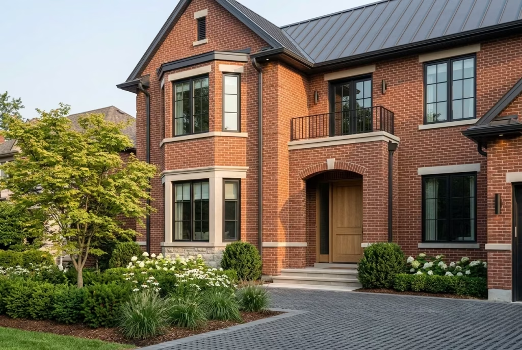
Red brick has already proven its ability to stand the test of time. The challenge is ensuring every surrounding design decision supports that quality rather than undermines it. When materials are carefully edited, colours remain restrained, landscaping is thoughtfully planned, and architectural proportions are respected, the facade feels calm, balanced, and enduring. Instead of chasing trends, the home develops a character that becomes richer with every passing year.
How Red Brick Homes Become More Beautiful with Age
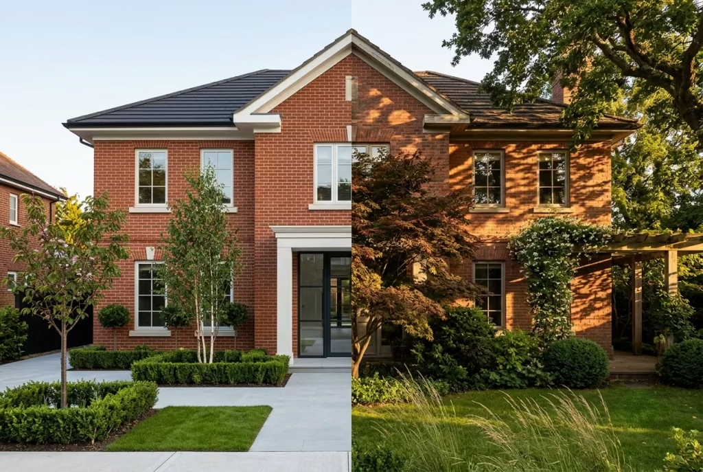
One of the qualities I admire most about red brick is that it refuses to remain static. Unlike many modern exterior finishes that begin to lose their appeal as soon as they weather, natural brick develops character with every passing year. The home you complete today will not look exactly the same in ten or twenty years, and that is precisely its strength. Time does not diminish good brickwork. More often, it enriches it.
Throughout my career, I have revisited homes years after their renovations were completed, and the difference has always fascinated me. Freshly laid brick has a crisp, almost formal appearance. A decade later, the same facade feels softer, richer, and more settled within its surroundings. Mature trees cast shifting shadows across the walls, climbing plants become more refined, mortar tones mellow gently, and the landscape begins to feel as though it has always belonged there. The architecture no longer appears newly built. Instead, it feels rooted in its place.
That gradual transformation is something I always encourage clients to embrace rather than resist. As the saying goes, time tells the tale. Great architecture is never judged solely by how it looks on completion day but by how gracefully it responds to the years that follow.
Natural Patina Gives Brick Authentic Character
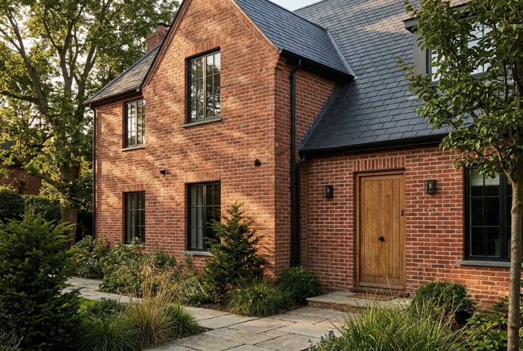
Unlike painted finishes that often require complete renewal, brick develops a natural patina that enhances its appearance. Sunlight, rainfall, changing temperatures, and everyday weather slowly soften sharp edges and deepen subtle colour variations. No two homes age in exactly the same way, giving each property a unique identity that cannot be manufactured.
This authenticity is one of the reasons red brick continues to outperform synthetic cladding systems. Rather than hiding the effects of time, it wears them with quiet confidence.
Changing Seasonal Light Constantly Reshapes the Facade
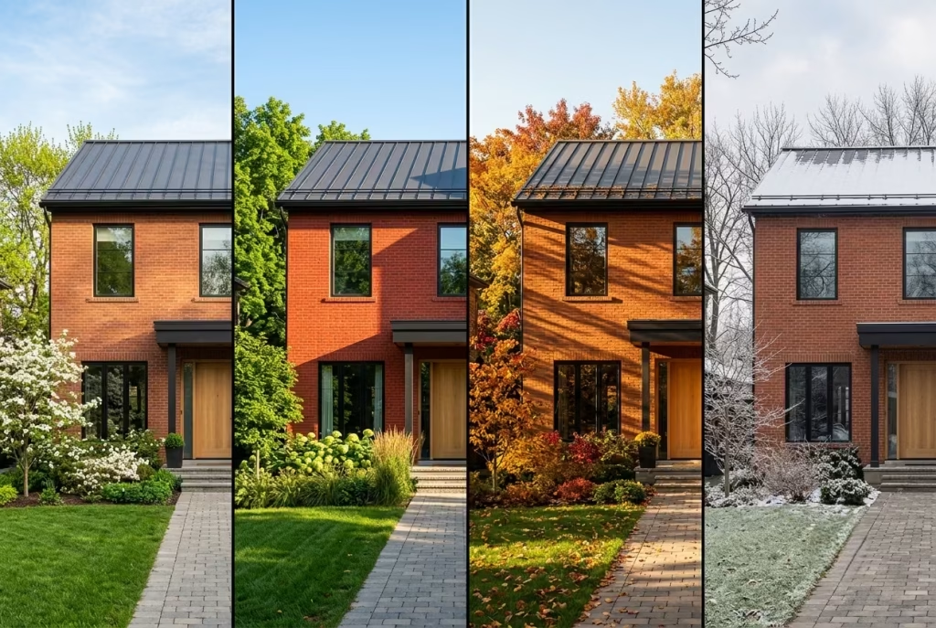
Brick is one of the few materials that seems to interact with light almost like a living surface. On bright summer mornings, warm reds and burnt oranges become more pronounced. During autumn afternoons, lower sunlight introduces longer shadows that reveal every variation in texture. Winter skies create softer, muted tones, while evening light often brings unexpected richness to the masonry.
I always advise homeowners to observe their home throughout the year before making significant design decisions. A facade that appears understated in one season may become remarkably vibrant in another. Light has a greater influence on brick than many people realise.
Mature Landscaping Completes the Architecture
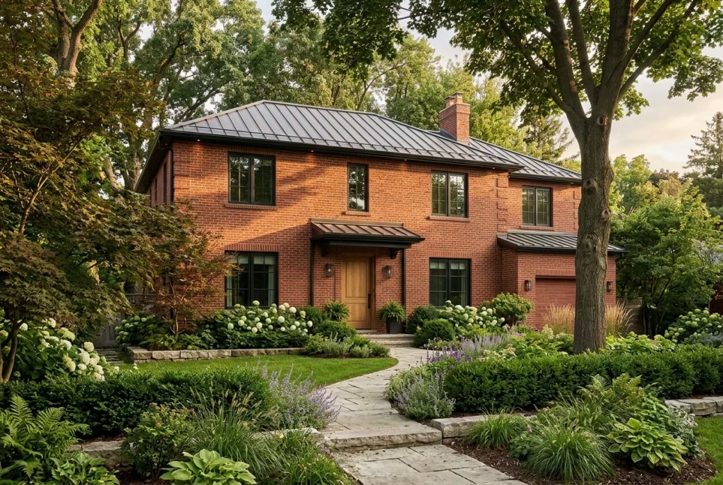
The finest brick homes rarely stand alone. Their beauty grows alongside the landscape. Young gardens often appear carefully arranged, but mature landscapes feel effortless. Trees broaden their canopy, shrubs fill out naturally, ornamental grasses sway with the wind, and seasonal planting creates changing layers of colour and texture.
I have returned to projects where the architecture remained untouched for years, yet the property looked dramatically better simply because the landscape had reached maturity. Good planting does not compete with brick. It gives it context.
Consistent Maintenance Preserves Long-Term Beauty
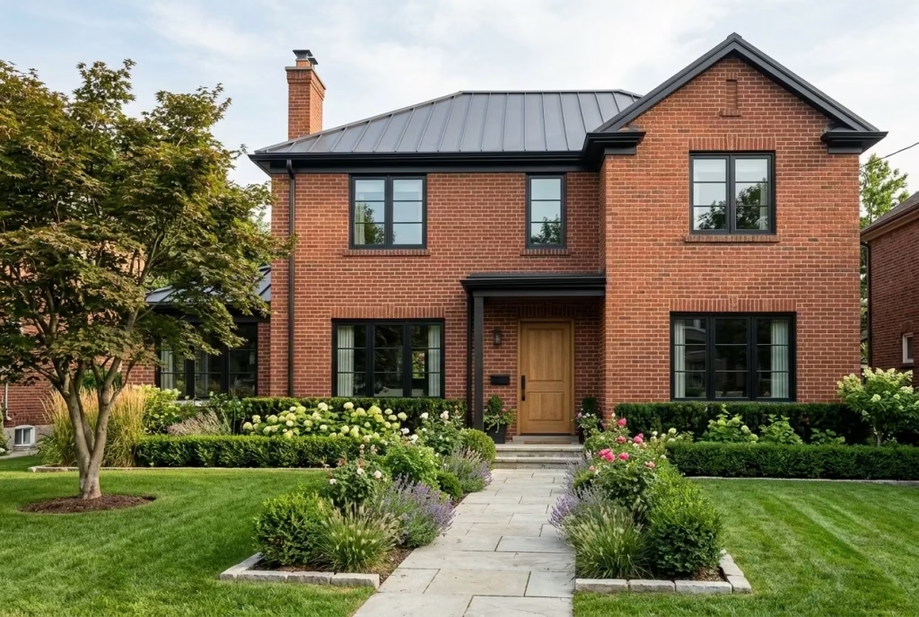
Although brick is exceptionally durable, longevity should never be mistaken for neglect. Simple maintenance carried out at regular intervals protects both appearance and performance.
I generally recommend:
- Inspecting mortar joints every few years.
- Keeping gutters and downpipes clear.
- Removing moss or organic growth where necessary.
- Cleaning brick gently without abrasive methods.
- Pruning nearby planting to maintain airflow.
These small tasks prevent minor issues from becoming expensive repairs while allowing the facade to age naturally. Looking after a brick home is less about constant renovation and more about thoughtful stewardship.
Timeless Design Is One of the Best Long-Term Investments
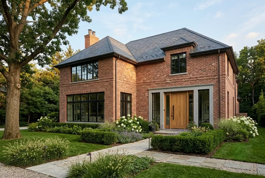
Exterior renovations often focus on immediate visual impact, but the strongest homes are designed with decades in mind. High-quality brick, durable roofing, carefully detailed windows, and authentic natural materials continue delivering value long after trend-driven alternatives have begun to date.
From a financial perspective, timeless design also tends to support stronger resale appeal because buyers recognise materials that have proven their durability over generations. More importantly, it provides something that cannot easily be measured in monetary terms: confidence that the home will continue to look relevant year after year.
A Home Becomes Part of Your Story
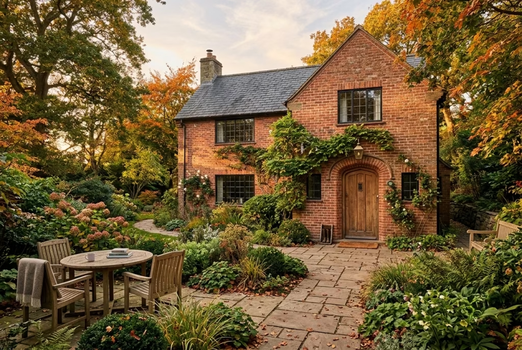
Perhaps the most meaningful transformation has little to do with architecture at all. As families grow, seasons pass, and daily routines unfold, a brick home gradually becomes a backdrop for life’s most important moments. Children play beneath trees that were once newly planted. Garden paths become familiar routes. The entrance welcomes friends, celebrations, and quiet evenings alike.
I have visited clients many years after completing their projects, and they rarely speak first about the brick or the roof. Instead, they talk about birthdays celebrated in the garden, summer evenings on the terrace, and grandchildren running through spaces that have become part of the family’s history.
That, to me, is the true measure of successful residential design. A house should not simply survive the passing of time. It should become richer because of it.
Why This Enduring Quality Matters
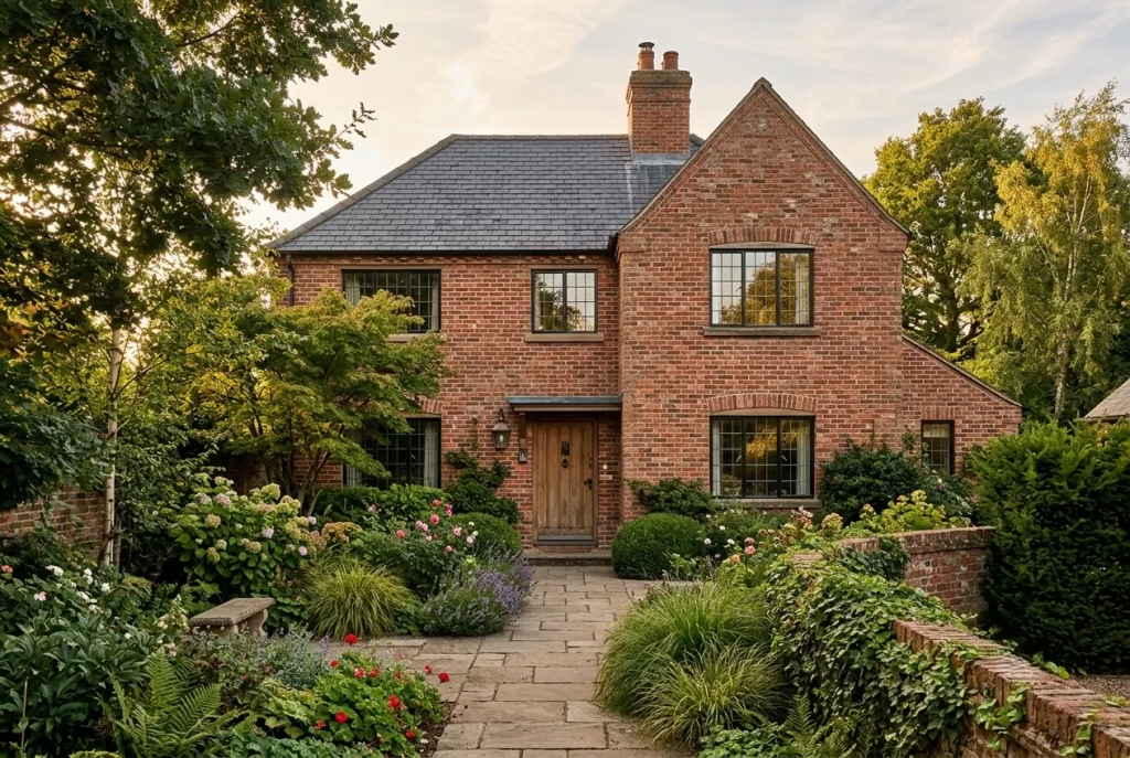
Red brick has remained one of the world’s most trusted building materials because it improves through use rather than losing its appeal. As natural patina develops, landscaping matures, and changing light reveals new layers of texture, the home gains depth that cannot be recreated through decorative finishes alone.
The best brick houses are never designed to impress for a single season. They are designed to age with dignity, reward patient stewardship, and continue offering comfort, beauty, and lasting value for generations. In the end, that quiet ability to grow more beautiful over time is what truly makes red brick timeless.
Final Thoughts: Timeless Design Begins with Respect for the Material
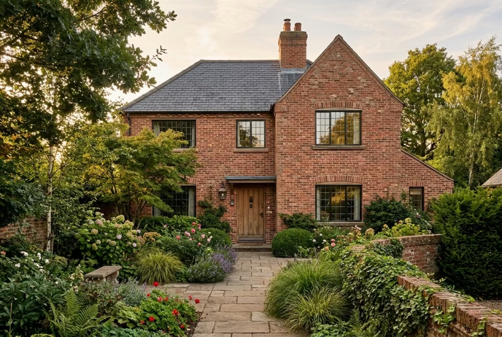
Red brick has earned its place in residential architecture not because it follows fashion, but because it quietly outlasts it. Generation after generation, it has remained one of the few materials capable of adapting to changing architectural styles without losing its identity. Whether paired with contemporary glazing, natural timber, limestone, or traditional detailing, its greatest strength lies in its authenticity.
Throughout my experience designing and renovating homes, I have found that the finest red brick facades are never the ones trying hardest to attract attention. They succeed because every decision has a purpose. The proportions feel balanced, the roof belongs to the architecture, the windows frame rather than dominate, and the landscape appears to have grown naturally alongside the home. Nothing feels excessive, yet nothing feels overlooked.
That is the quiet confidence of thoughtful design. Instead of layering decorative features onto the facade, it focuses on craftsmanship, material honesty, and architectural clarity. As the old saying goes, quality speaks for itself. A home designed with restraint rarely needs bold gestures to leave a lasting impression.
Perhaps the most valuable lesson red brick teaches is patience. Unlike trend-driven exteriors that often look their best only in the first few years, brick continues to evolve. Sunlight softens its colours, planting matures around it, and the home gradually settles into its surroundings. Rather than fighting the passage of time, it embraces it.
As you plan your own exterior renovation or new build, begin by respecting the material already doing much of the work. Let the brick remain the foundation of the design, then choose windows, roofing, lighting, landscaping, and architectural details that complement rather than compete with it. Prioritise proportion before decoration, authenticity before imitation, and permanence before passing trends.
The result will be far more than an attractive facade. It will be a home that feels welcoming from the street, functions beautifully through every season, and grows richer in character with each passing year. Long after design trends have come and gone, those thoughtful decisions will continue to shape a house that feels timeless, lived in, and unmistakably enduring, just like the red brick at its heart.
Frequently Asked Questions while building Red Brick House Facades
How can I make a red brick house look more modern without painting it?
The most effective way to modernise a red brick home is by improving the elements that surround the brick rather than covering it. Slim black or bronze window frames, a charcoal roof, contemporary exterior lighting, natural timber accents, and simplified landscaping can dramatically refresh the facade. I also recommend removing unnecessary decorative trim and focusing on clean architectural lines. In many of my projects, these changes have delivered a more significant transformation than painting the brick itself while preserving the warmth and authenticity that make masonry so timeless.
What roof colour works best with a red brick exterior?
Charcoal, graphite, and natural slate tones consistently work best with red brick because they anchor the composition without competing with its warm colour variations. These darker shades create a balanced contrast and complement both traditional and contemporary architecture. Bright red, orange, or heavily blended roof colours often fight for attention, making the facade feel visually busy.
Which window frame colours complement red brick the most?
Black remains one of the strongest choices because it creates crisp definition and highlights the natural richness of the brick. Dark bronze, charcoal grey, and high-quality timber frames also perform beautifully, depending on the architectural style. I generally avoid bright white vinyl frames on traditional brick homes, as they can create a stark contrast that makes the exterior feel dated rather than refined.
Is red brick still fashionable for new-build homes?
Absolutely. Red brick has never fallen out of favour because its appeal is based on craftsmanship and durability rather than short-term trends. Today’s architect-designed homes often combine traditional brick with large glazed openings, minimalist rooflines, timber cladding, and restrained detailing to create exteriors that feel both contemporary and timeless. The material continues to evolve while retaining its authentic character.
What landscaping works best with red brick houses?
The most successful landscapes soften the strength of brick without hiding it. I recommend layered planting with evergreen shrubs, ornamental grasses, flowering perennials, and one or two carefully positioned feature trees. Natural stone pathways, gravel, and muted planting palettes also complement red brick beautifully. Well-designed landscaping should frame the architecture and provide seasonal interest while allowing the masonry to remain the focal point.
Can red brick be combined with wood or stone?
Yes, and it is one of my favourite combinations. Natural timber introduces warmth and texture, while limestone or other natural stone adds elegance and visual depth. These authentic materials complement the handcrafted quality of brick instead of competing with it. The key is to establish a clear material hierarchy so the brick remains the dominant feature while timber and stone provide contrast and balance.
How do I prevent a red brick facade from looking too dark?
Large brick facades benefit from thoughtful contrast and generous natural light. Introducing floor-to-ceiling glazing, lighter paving materials, carefully positioned planting, and restrained white render on modern extensions can reduce visual heaviness without losing the character of the brick. Exterior lighting also plays an important role by highlighting texture and creating depth after sunset.
What exterior lighting highlights brick texture best?
Warm LED lighting with a colour temperature between 2700K and 3000K generally produces the best results. I often recommend grazing lights positioned close to the wall because they emphasise the natural texture of the brick and create attractive shadow lines. Layering pathway lights, entrance lighting, and discreet landscape uplighting creates a welcoming evening atmosphere while showcasing the craftsmanship of the masonry.
Does a red brick home increase resale value?
While no material can guarantee a higher selling price, well-maintained red brick homes tend to have broad market appeal because buyers associate them with durability, low maintenance, and timeless design. Pairing brick with quality roofing, modern windows, mature landscaping, and authentic natural materials often strengthens both curb appeal and long-term resale potential.
How often does a red brick exterior require maintenance?
Compared with many other exterior finishes, red brick requires relatively little maintenance. I usually recommend inspecting mortar joints, gutters, and drainage systems every few years, gently cleaning the brick if necessary, and trimming nearby vegetation to maintain airflow around the walls. With proper care, a high-quality brick facade can remain beautiful and structurally sound for many decades, making it one of the most durable investments in residential architecture.