Transform Your Space 25 Maximalist Kitchen Ideas You’ll Love
Maximalism, when it is understood properly, has very little to do with excess. What it actually demands is control of contrast, of material, of visual weight. It is not about filling a room; it is about layering it with intent, so that every surface, finish, and object contributes to a larger spatial rhythm.
In a well-resolved maximalist kitchen, nothing feels accidental, even when the composition appears relaxed or collected over time.
This is where the distinction between clutter and composition becomes critical. Clutter is indiscriminate. It lacks hierarchy, ignores proportion, and often competes for attention at every level. Composition, on the other hand, is structured even when it feels expressive.
There is a clear reading of foreground and background, of dominant and supporting elements. A richly veined stone worktop, for instance, might carry the visual weight of the room, while surrounding cabinetry deliberately steps back in tone or texture. Without that restraint within the layering, maximalism quickly collapses into noise.
Kitchens, perhaps more than any other space in the home, are uniquely capable of carrying this level of expression without losing their purpose. Unlike living rooms or bedrooms, where stillness and visual calm often take priority, kitchens are inherently active. Movement, texture, and variation already exist in the way the space is used through cooking, gathering, and daily routines.
This built-in dynamism gives you more latitude. You can introduce bold colour, contrasting materials, even decorative elements, and the room still holds together because function anchors it. In other words, the kitchen can absorb complexity without feeling overwhelmed provided the underlying layout and circulation remain sound.
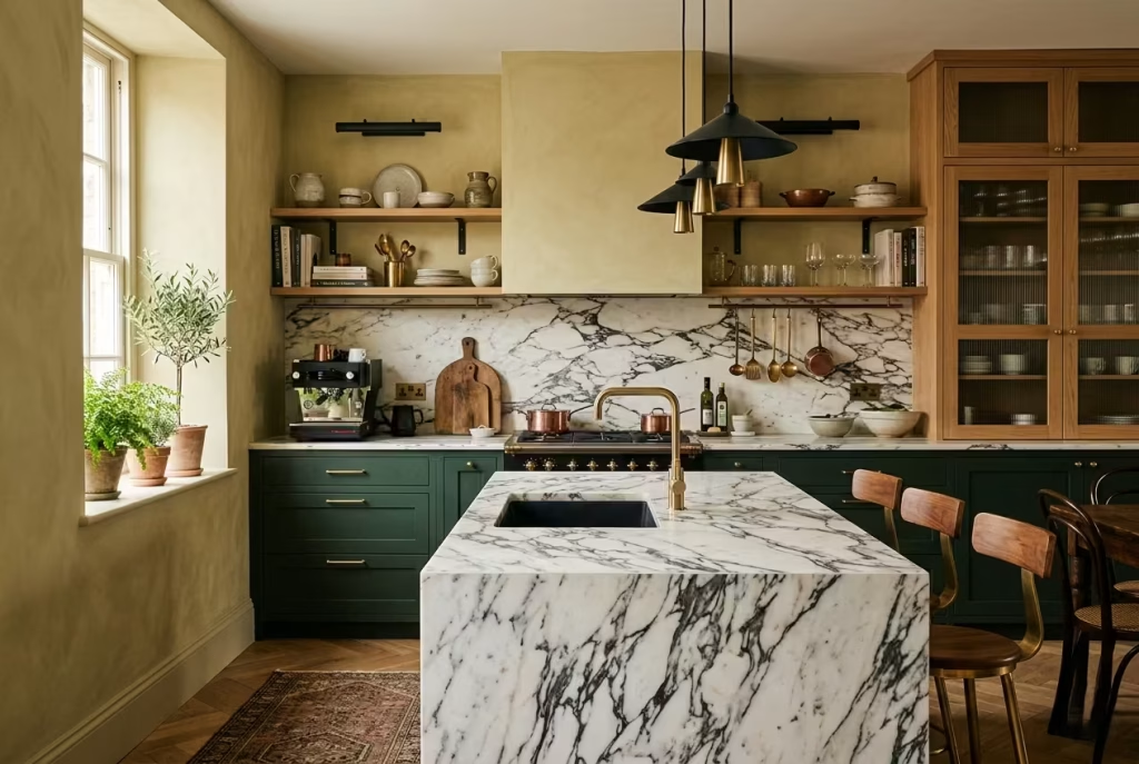
In several projects I’ve worked on, the real turning point never came from simply adding more elements. In fact, over-layering too early often made the space feel unresolved. What changed everything was allowing contrast, colour, and material to coexist without apology. A deep lacquered cabinet sitting comfortably against natural timber. A heavily patterned stone paired with a quieter, matte surface.
These decisions, when made with confidence, shift the room from something that feels styled into something that feels lived in and intentional. It is less about pushing boundaries for effect, and more about trusting the composition to carry weight without constant correction.
Maximalism, at its best, is not loud. It is assured. It does not ask for attention it holds it.
Understanding Maximalism in a Functional Space
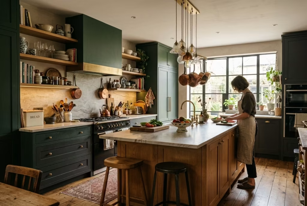
Designing a maximalist kitchen is, in many ways, an exercise in controlled contradiction. You are asking a highly practical, performance-driven space one that must withstand heat, moisture, and constant use to also carry visual richness, personality, and depth.
That balance does not happen by instinct alone. It relies on understanding how layers behave under real conditions: how materials age, how light shifts across surfaces throughout the day, and how movement through the space affects what is seen and what recedes.
In my experience, the kitchens that succeed here are not the ones that simply add more, but the ones that organise complexity with precision so the room feels expressive, yet never compromised in how it works.
Beyond Decoration: Designing with Density and Rhythm
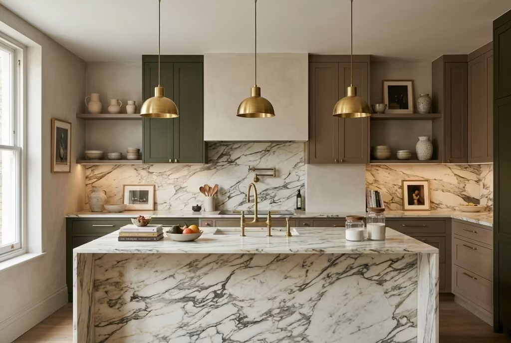
Maximalism begins to make sense the moment you stop treating it as decoration and start reading it as composition. Density is not about how much you include, but how closely ideas sit together and how they relate across the room.
In a kitchen, this often plays out through the layering of cabinetry, worktops, splashbacks, and objects that are used daily yet still carry visual presence. When everything pulls in the same direction, the space feels full but never heavy, like a well-orchestrated piece of music where every note lands exactly where it should.
Rhythm is what prevents that density from turning into visual fatigue. It is created through repetition, spacing, and contrast. I often think of it as a visual cadence that guides the eye without forcing it. For example, repeating a warm brass finish across tapware, handles, and lighting at measured intervals creates continuity, while allowing other elements to shift in tone or texture without feeling disconnected.
In Our Recent project, we layered a richly veined marble splashback behind open shelving filled with everyday ceramics. On paper, it risked tipping over into excess. In reality, the repetition of soft neutral tones within the objects allowed the stone to breathe, so the composition held together rather than fighting itself.
The key is knowing when to let one element take the lead and when to let others fall into step. Not everything needs to sing at full volume. When density is controlled and rhythm is intentional, the kitchen stops feeling busy and starts feeling alive, the kind of space that reveals more the longer you spend in it.
Balancing Utility with Visual Complexity
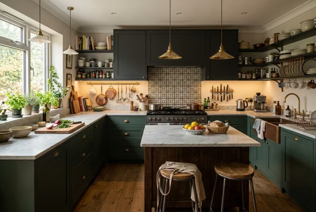
A kitchen cannot afford to be all show and no substance. No matter how expressive the design becomes, it still has to function under pressure, quite literally at times. Heat, spills, and constant movement have a way of exposing weak decisions, so every layer you introduce must earn its place both visually and practically. This is where many maximalist schemes fall short. They look compelling at first glance, but begin to unravel once daily use kicks in.
The balance comes from integrating complexity into the structure of the space rather than applying it on top. Durable materials take priority. Surfaces that can handle wear without losing character become essential. I have found that honed stone, for instance, often performs better than highly polished finishes in busy kitchens.
It softens reflections and hides minor marks, allowing the visual richness to remain intact over time. Similarly, painted cabinetry in deeper tones tends to age more gracefully in a maximalist setting, as it absorbs light rather than constantly reflecting it back.
There is also a spatial discipline at play. Clearances, workflow, and storage must remain uncompromised. A walkway of at least 900 mm or 36 inches becomes even more critical when the visual environment is layered, as it provides physical breathing room to match the visual one.
In one renovation, we introduced bold patterned tiles, mixed metals, and open shelving, yet kept the central island deliberately restrained in both colour and form. That single decision acted as a visual anchor and a practical workspace, proving that complexity works best when it is grounded by moments of calm.
When utility and visual ambition are working hand in hand, the kitchen feels effortless to use, even if it looks anything but simple. That is when maximalism earns its keep.
Why Kitchens Can Handle More Than Living Rooms Ever Could
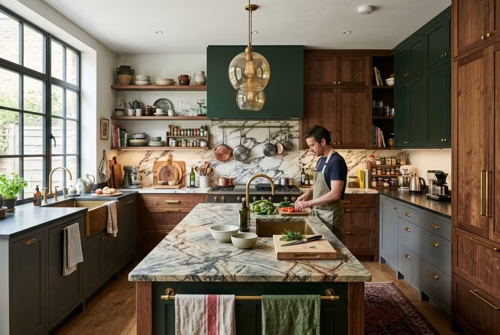
There is a reason kitchens can carry a heavier design language without feeling overdone. Unlike living rooms, which are often designed for pause and quiet, kitchens are built around movement, sound, and interaction. They are spaces in constant motion, where layers of activity naturally soften the impact of visual complexity. In other words, the room already has a pulse, so it can absorb more without missing a beat.
From a spatial perspective, kitchens are also broken into functional zones. Cabinet runs, islands, tall units, and service areas create natural divisions that allow design elements to be distributed rather than concentrated.
This segmentation works in your favour. You can introduce variation across these zones without overwhelming the overall composition. A bold splashback in one area, darker cabinetry in another, and open shelving elsewhere can coexist because the layout itself creates boundaries.
Lighting plays a subtle but powerful role here as well. Kitchens benefit from layered lighting by necessity, including task lighting, ambient lighting, and often feature lighting. This variation adds depth and shadow, which helps define surfaces and prevent the room from reading as flat.
I once worked on a project where we combined deep green cabinetry, a patterned stone island, and aged brass fittings. On paper, it sounded like a lot to carry. Yet under layered lighting, each element found its place. The materials did not compete. They conversed.
Living rooms, by contrast, rely more heavily on visual stillness to feel comfortable. Too many competing elements can quickly tip the balance. Kitchens, however, thrive on a certain level of controlled chaos. When designed thoughtfully, they become spaces where bold decisions feel not only acceptable but entirely natural, like a story that unfolds layer by layer rather than all at once.
25 Maximalist Kitchen Ideas with Real-World Design Insight
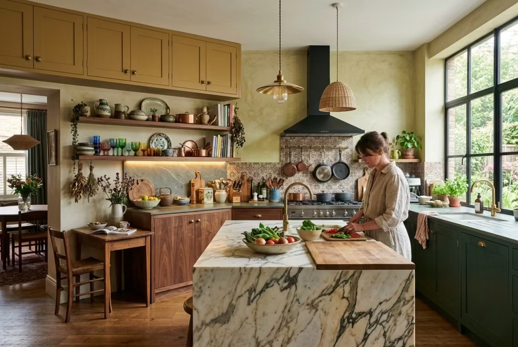
Maximalism only begins to feel convincing when it is translated from concept into lived space. Ideas, no matter how visually compelling, have a way of falling flat if they ignore how a kitchen actually performs day in and day out. What follows is not a catalogue of surface-level inspiration, but a set of design directions shaped by real projects, material behaviour, and spatial constraints that tend to reveal themselves only over time.
Some of these approaches may feel bold at first glance, even a little close to the edge, but that is often where the most character sits. When handled with intent, each idea has the capacity to turn a kitchen from something merely functional into a space that holds attention, carries memory, and, quite frankly, earns its place at the heart of the home.
Layered Cabinet Colours That Shift Throughout the Day
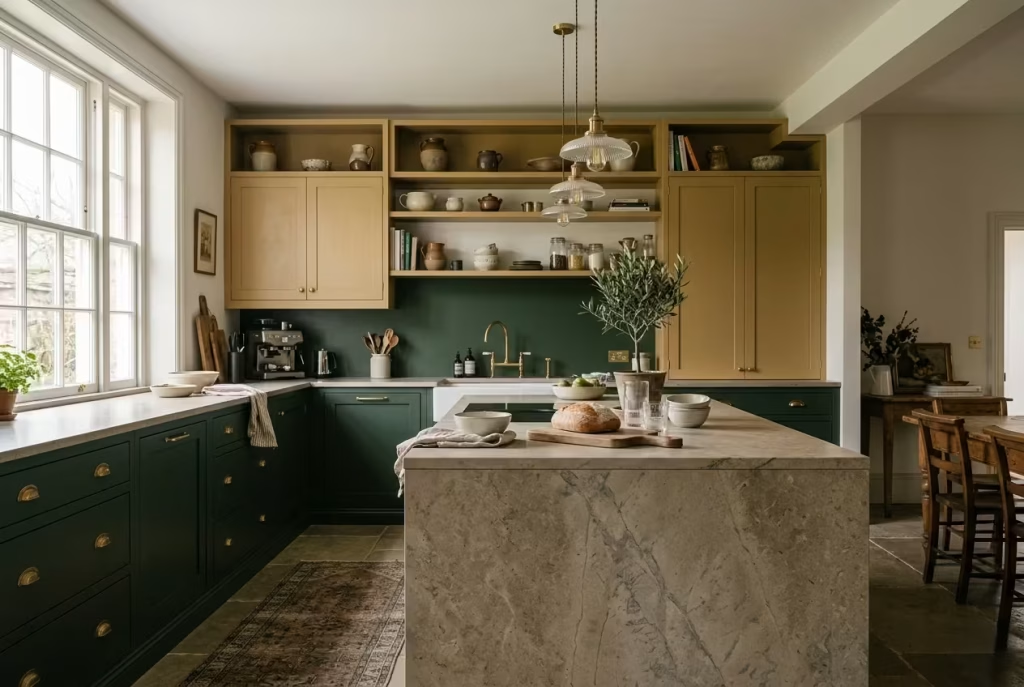
There is a quiet confidence in a kitchen that does not rely on a single colour to carry the entire scheme. Layered cabinetry, when handled with intention, introduces depth that reveals itself gradually, almost like a room that changes its mood as the hours pass. It is not about being bold for the sake of it. It is about allowing different tones to take their turn in the spotlight, depending on how light moves through the space.
Spatial Context
This approach works particularly well in kitchens that have clear vertical separation, where base units, wall cabinets, and tall storage can each hold their own visual identity without stepping on each other’s toes. In open plan layouts, it becomes even more valuable. The cabinetry begins to define zones without the need for physical partitions. A deeper tone at the base visually anchors the room, while lighter or warmer tones above keep the upper field from feeling heavy.
In smaller kitchens, restraint becomes the name of the game. Two tones often suffice, with the darker shade sitting below eye level to avoid closing the space in. When the proportions are right, the room feels grounded but still open, like it has found its feet without trying too hard.
Real-Life Application
In one project, we worked with a north-facing kitchen that struggled with flat, cool light for most of the day. A single colour felt lifeless, no matter how carefully we sampled it. The turning point came when we introduced a deep green on the base cabinets and paired it with a muted ochre on the upper units. At first glance, it felt like a bold move, perhaps even a gamble. But once installed, the space began to breathe.
By late morning, the ochre would gently catch what little warmth filtered in, while the green held steady below, giving the room a sense of weight. Come evening, under artificial lighting, the balance shifted again. The colours did not compete. They conversed. It was one of those moments where the design stopped feeling staged and started feeling lived in, the kind of kitchen that reveals its character slowly rather than all at once.
Measurements and Proportions
A reliable starting point is the 60:30:10 ratio, though it should be treated as a guide rather than gospel. Roughly 60 percent of the cabinetry can sit in the dominant tone, often the base units. Around 30 percent can be assigned to a secondary tone, typically wall cabinets or tall units. The remaining 10 percent can be reserved for accents such as an island, internal shelving, or even a contrasting pantry door.
In practical terms, base cabinets usually sit at a height of around 720 mm or 28 inches, with worktops bringing the total to approximately 900 mm or 36 inches. This naturally positions the darker tone in the lower visual field, which helps ground the composition. Wall cabinets, often between 600 and 900 mm in height or 24 to 36 inches, become the ideal canvas for lighter or warmer colours that lift the eye.
Material Reasoning
Colour alone does not carry this idea. The finish plays an equally important role. Matte or satin finishes tend to absorb light, allowing deeper tones like green, navy, or charcoal to feel rich rather than overpowering. On the other hand, slightly reflective finishes on lighter tones can help bounce light around, especially in kitchens that do not enjoy generous daylight.
Material pairings also matter. A deep green base cabinet in a painted timber finish, paired with a natural stone worktop, introduces texture that keeps the scheme from feeling flat. The ochre above, when applied in a smoother lacquer or satin paint, creates a subtle contrast not just in colour, but in how the surface behaves under light. It is these small shifts that quietly elevate the room.
Pros
- Creates visual depth that evolves throughout the day
- Helps define zones within open plan kitchens without physical barriers
- Allows bolder colours to be used in a controlled and balanced way
- Grounds the space, particularly when darker tones are used below
Cons
- Requires careful proportioning, as too many competing tones can quickly muddy the composition
- Colour combinations that look striking in isolation may clash under different lighting conditions
- More complex to execute, often requiring precise sampling and on-site adjustments
- Can feel overwhelming in very compact kitchens if contrast is pushed too far
When done well, layered cabinetry does more than add colour. It builds a rhythm into the room, one that shifts quietly in the background while daily life carries on in the foreground. It is a subtle move on paper, yet in reality, it often becomes the detail that ties everything together, the thread that keeps the entire composition from unravelling.
Statement Stone That Refuses to Blend In
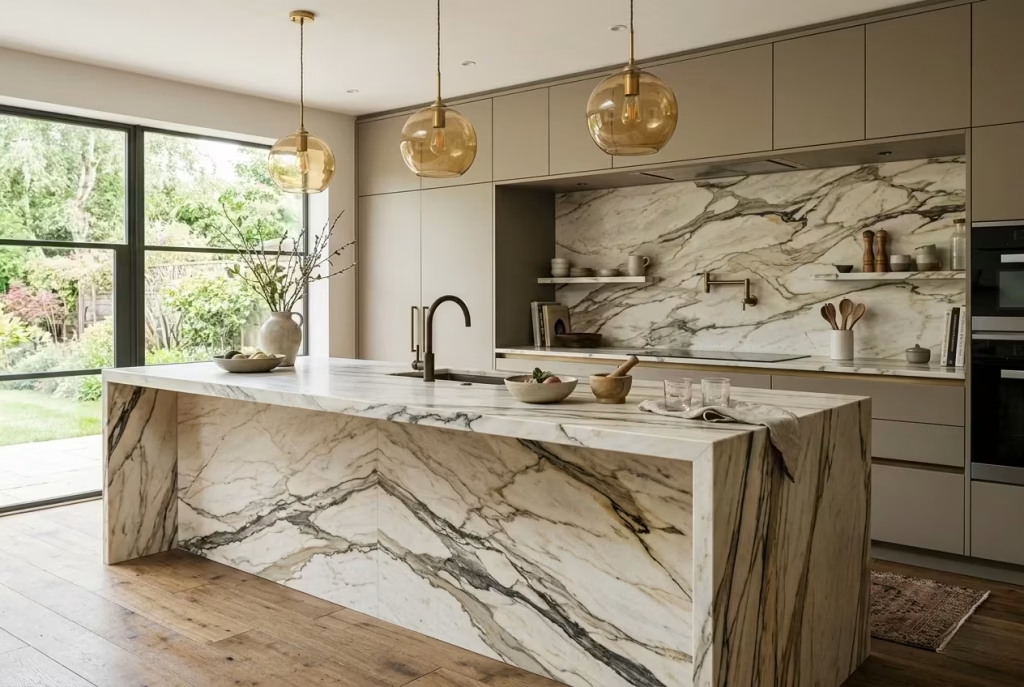
There comes a point in many kitchen projects where restraint starts to feel like it is holding the space back. That is usually where statement stone steps in and changes the entire reading of the room. A boldly veined marble or quartzite does not sit quietly in the background. It takes the lead, often becoming the element that everything else falls into line behind. When chosen well, it does not just decorate the kitchen. It gives it a backbone, a sense of permanence that feels grounded rather than theatrical.
Spatial Context
Statement stone works best when it is allowed to occupy a clear, uninterrupted surface. Kitchen islands are the natural candidate, especially in layouts where the island sits centrally and is visible from multiple angles. A continuous run across the worktop and down the waterfall edges creates a strong visual anchor, almost like the room has found its centre of gravity.
In more compact kitchens, the splashback becomes the stage. Extending the stone from the worktop all the way to the underside of the wall cabinets, or even to the ceiling where possible, allows the veining to read properly. Breaking it up into small sections tends to dilute its impact. It ends up looking hesitant, as if it cannot quite commit.
Real-Life Application
I worked on a project where the client initially leaned toward a safe, pale quartz. It was clean, predictable, and, to be honest, forgettable. During slab selection, we came across a heavily veined quartzite with deep charcoal lines running through a warm off-white base. It was the kind of piece that stops you in your tracks, the sort that makes you think twice before walking away.
We decided to take the leap and use it across the island and full-height splashback. At installation, it felt almost too much, like we had pushed the envelope a little too far. But once the rest of the kitchen settled in, softer cabinetry, restrained hardware, controlled lighting, the stone began to do exactly what it should. It carried the room without shouting. Months later, it still draws attention, but in a way that feels earned rather than forced.
Measurements and Proportions
For most kitchens, a slab thickness of 20 to 30 mm, or roughly three quarters to one and a quarter inches, strikes the right balance between presence and practicality. Thicker profiles can be introduced through mitred edges if a more substantial look is required, particularly on islands where visual weight matters.
Splashbacks typically extend 500 to 600 mm, or 20 to 24 inches, between the worktop and wall cabinets. However, taking the stone full height, often around 900 mm or 36 inches, or even up to ceiling level where there are no upper units, allows the veining to unfold naturally. This is where the material begins to feel architectural rather than applied.
If you are working with an island, consider lengths of at least 1800 mm or 6 feet to give the stone enough surface area to express its pattern. Smaller sections can feel cropped, as if the story has been cut short.
Material Reasoning
Not all stone behaves the same, and this is where decisions carry real consequences over time. Marble offers unmatched depth and softness in its veining, but it comes with a level of porosity that requires acceptance. It will mark, it will patinate, and over time, it will tell the story of how the kitchen has been used. For some, that is part of the appeal. For others, it becomes a point of frustration.
Quartzite, on the other hand, provides a similar visual drama with greater durability. It is harder, more resistant to staining, and better suited to high-use kitchens. It does, however, require careful fabrication, as its density can make it challenging to cut and install.
Finish also plays a role. A honed surface softens the contrast in the veining and reduces glare, making the stone feel more integrated. A polished finish amplifies the pattern, catching light and pushing the stone further into the spotlight. Neither is right or wrong. It depends on how much presence you want the material to carry.
And then there is the sourcing, which, quite frankly, is everything. No two slabs are identical. What you see in a small sample rarely tells the full story. Viewing full slabs, ideally in person, allows you to understand how the veining flows, where the focal points sit, and how the pattern will align across cuts. It is a step that cannot be rushed.
Pros
- Creates a strong visual anchor that elevates the entire kitchen
- Adds natural variation and depth that cannot be replicated by manufactured surfaces
- Works across both traditional and contemporary schemes when balanced correctly
- In the case of quartzite, offers excellent durability alongside visual impact
Cons
- High cost, particularly for premium slabs and full-height applications
- Marble requires ongoing maintenance and develops a patina that not everyone appreciates
- Poor slab selection or cutting can disrupt the flow of veining, weakening the overall effect
- Can dominate the space if not balanced with quieter surrounding materials
A statement stone, when chosen with care and allowed to speak for itself, does more than fill a surface. It sets the tone for the entire kitchen, quietly steering every other decision that follows. It is not a detail you add at the end. It is the move that often defines everything else.
Mixed Metal Finishes That Feel Collected, Not Matched
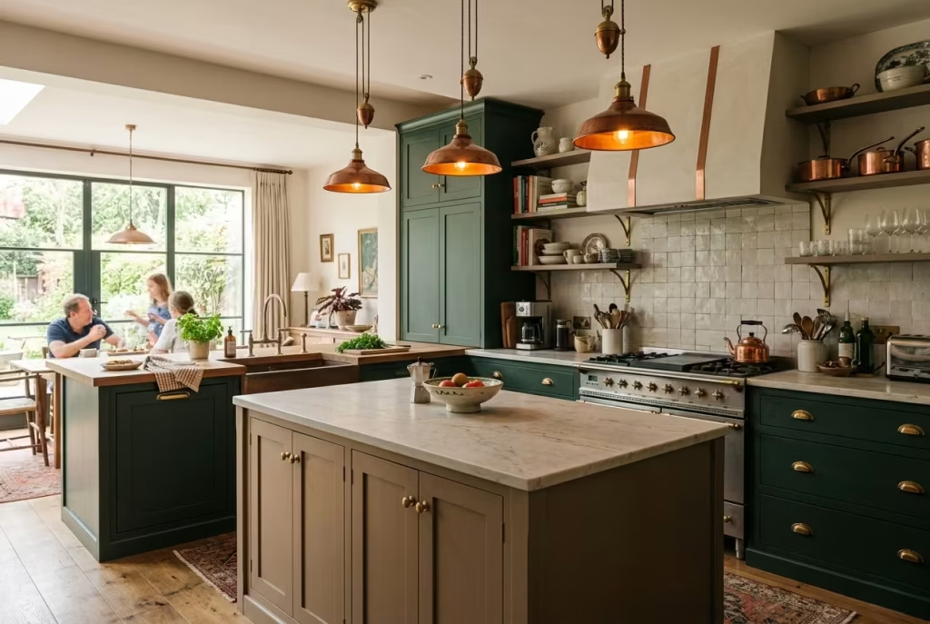
There is a certain flatness that creeps into kitchens where every metal finish lines up perfectly, like a showroom display that has been over-rehearsed. It looks neat, yes, but it rarely feels lived in. Mixing metals, when done with a steady hand, introduces a quiet tension that gives the room character. It is the difference between a space that feels assembled in one go and one that reads as layered over time, almost as if it has picked up pieces along the way.
Spatial Context
Kitchens offer natural opportunities to distribute metal finishes across different zones. Tapware, cabinet hardware, lighting, and appliances all sit in distinct areas, which allows variation without everything crowding into the same visual field. The trick is not to scatter finishes randomly, but to let each one settle into a role.
For instance, warmer metals like brass or aged copper tend to sit comfortably in areas that benefit from a softer glow, such as around open shelving or decorative lighting. Cooler finishes like brushed nickel or stainless steel often anchor functional zones, particularly near sinks and appliances. When these are spaced thoughtfully, the room starts to feel balanced rather than busy.
The guiding principle is simple but often overlooked. Each finish should appear at least twice within the space. This repetition, even if subtle, creates a thread that ties everything together, preventing the scheme from feeling disjointed.
Real-Life Application
In one kitchen renovation, the initial brief leaned heavily toward uniformity. Polished chrome was specified across taps, handles, and lighting. It was safe, predictable, and, if I am honest, lacking any real depth. During the design development, we began to loosen that approach.
We introduced aged brass handles on the cabinetry, kept brushed nickel for the tapware, and added a pair of pendants with a soft copper interior above the island. At first, it felt like we were walking a fine line, almost as if the elements might pull against each other. But once installed, the space settled in a way that surprised even the client.
The metals did not clash. They complemented. The brass added warmth where the eye naturally lingered, the nickel handled the functional areas without drawing too much attention, and the copper lighting brought a gentle glow in the evening. It felt less like a coordinated set and more like a collection that had grown into the space over time.
Measurements and Proportions
While metals do not rely on measurements in the same way as cabinetry or worktops, scale and placement still matter. Cabinet handles, for example, typically range between 128 mm and 256 mm in length, or roughly 5 to 10 inches. Choosing a slightly larger size in a warmer metal can give it more presence without needing to increase quantity.
Lighting fixtures, particularly pendants above an island, often sit 700 to 900 mm, or 28 to 36 inches, above the worktop. This positioning allows the finish to catch light at eye level, making it more noticeable without overwhelming the space.
Spacing also plays a subtle role. Repeating a finish across two or three key points, such as handles and lighting, creates a rhythm that the eye can follow. Too many isolated instances, and the room begins to feel scattered, like it cannot quite find its footing.
Material Reasoning
Different metals age in different ways, and this is where mixing them begins to make practical sense. Brass and copper, for instance, develop a natural patina over time. They soften, deepen, and, in some cases, darken with use. This ageing process adds character, but it also means they will not remain uniform.
Brushed nickel and stainless steel, on the other hand, tend to hold their appearance more consistently. They resist fingerprints and wear more gracefully in high-use areas. Pairing these with warmer, more reactive metals creates a balance between durability and character.
Finish selection is equally important. A brushed or satin finish tends to sit more comfortably alongside other metals than a highly polished one, which can feel too sharp or reflective. The aim is not to create contrast for its own sake, but to allow each finish to contribute without overpowering the others.
Pros
- Introduces depth and variation without relying on colour or pattern
- Creates a more relaxed, collected feel rather than a rigid, showroom look
- Allows different areas of the kitchen to take on subtle identities
- Balances durability with character by pairing stable and reactive metals
Cons
- Requires careful planning, as random mixing can quickly feel chaotic
- Finishes that age differently may create contrast that not everyone appreciates over time
- Overuse of polished metals can lead to visual conflict rather than cohesion
- More difficult to coordinate during sourcing, particularly across different suppliers
When mixed with intention, metal finishes stop being background details and begin to shape how the kitchen is read. It is not about getting everything to match. It is about letting each piece hold its own, while still playing as part of a larger composition. When that balance is struck, the space feels less like it was designed in a single moment and more like it has evolved, piece by piece, into something that truly belongs.
Patterned Flooring That Anchors the Chaos
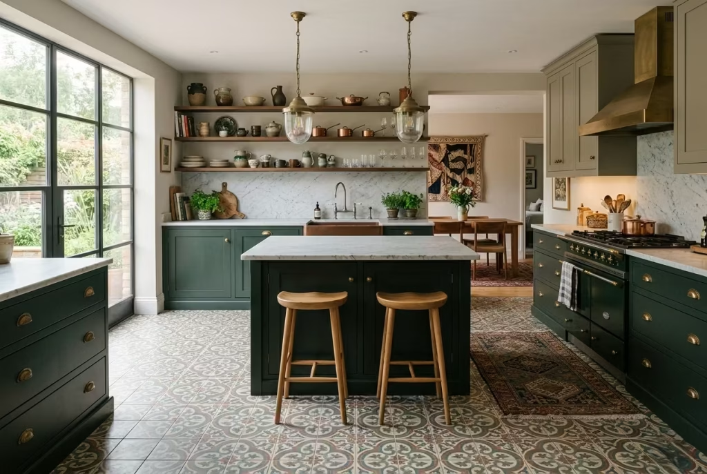
In a maximalist kitchen, flooring is often doing more work than people realise. It is not just the surface underfoot. It is the thing that quietly gathers the whole room together when the cabinetry, metals, and stone are all pulling in different directions.
Patterned flooring can act like a visual anchor, giving the eye somewhere to land and the scheme a sense of order beneath the richness. Without that grounding layer, a bold kitchen can start to feel like it is floating, which is where the magic begins to slip through the cracks.
Spatial Context
Patterned flooring works best when the kitchen has enough visual breathing room for the pattern to read properly. In smaller and mid-sized kitchens, it can be the perfect counterweight to more expressive cabinetry and statement surfaces because it introduces rhythm at ground level, where the eye naturally returns again and again.
That said, it needs space to be seen in full. If the room is chopped up too tightly with awkward returns, excessive fixed furniture, or too many competing floor transitions, the pattern can lose its clarity and start to feel muddled.
This is why kitchens under 25 sqm, or around 270 sq ft, often suit patterned flooring particularly well. In those spaces, the floor can act almost like a frame, holding the rest of the scheme in place without needing a lot of additional visual noise. It is a bit like a good bassline in music. You may not notice it immediately, but take it away and everything else starts to wobble.
Patterned flooring also works beautifully in kitchens with simple cabinetry, because the contrast gives the room its energy. In a more layered scheme, it becomes the steadying force. The important thing is not to let the floor compete with every other surface. It should support the room, not steal the whole show.
Real-Life Application
I once worked on a compact kitchen that felt oddly unsettled despite having beautifully finished cabinetry and good natural light. The room had the ingredients, but it lacked a sense of grounding. Everything above waist height was doing its job, yet the lower half of the room felt flat, almost unfinished. We introduced encaustic-style patterned tiles in a muted palette, and the effect was immediate. The room stopped feeling as though it was all reaching upward and instead began to sit properly on its own feet.
What surprised the client most was how much calmer the kitchen felt once the floor was in place. The pattern added interest, yes, but more importantly, it created structure. The room no longer needed to shout from the walls and surfaces because the floor was carrying part of the conversation. It was one of those changes that looked bold on paper, yet in practice made the entire room feel more settled, more composed, and far more expensive than the budget suggested.
Measurements and Proportions
A tile size of 200 x 200 mm, or roughly 8 x 8 inches, is a strong starting point for most patterned kitchen floors. It is large enough for the pattern to be legible without becoming overly busy, yet small enough to work in kitchens where space is at a premium. In tighter rooms, very small-format patterns can sometimes read as fussy, while oversized tiles may lose the intimacy that makes the design feel considered.
Grout lines also matter more than people think. A slightly darker grout can help define the pattern and hold the floor together visually, while a pale grout may lighten the overall effect but risks blurring the edges if the tile design is intricate. In practical terms, I often find that a pattern with a repeat that does not dominate every square inch works best in kitchens around 12 to 25 sqm, or 130 to 270 sq ft. It gives the eye enough variation without exhausting it.
If the kitchen opens into another room, the transition needs care. A patterned floor can work beautifully as a contained zone, but only if the edge is handled cleanly. A hard stop against another surface can feel abrupt, so thresholds, trims, or a natural break in the plan need to be considered from the outset. Otherwise, the whole thing can feel stitched together at the last minute, which is never the right note.
Material Reasoning
Encaustic tiles have an old-world richness that suits maximalist kitchens particularly well. Their depth of colour and slightly tactile surface gives the room a lived-in quality from day one. They are ideal for designs that lean into character, heritage influence, or a collected feel. The drawback is that they can require more care, especially if they are porous or need sealing depending on the material composition. That said, for the right client, the character they bring is well worth the upkeep.
Geometric stone layouts offer a different kind of strength. They are often more refined, more architectural, and a little less decorative in the traditional sense. When cut and laid properly, they can create movement without leaning too heavily on colour. This makes them useful in kitchens where the cabinetry or worktops are already doing plenty of visual work. A stone floor with a repeating geometric arrangement can feel elegant rather than ornate, which is a useful distinction when you want richness without tipping into excess.
Durability is another consideration. Kitchens are high-traffic spaces, and the floor has to withstand not just footfall but dropped objects, spills, and constant cleaning. A patterned floor only earns its place if it can take the rough and tumble of everyday life. That is why surface finish matters as much as the design itself. Slightly honed or textured finishes tend to age more gracefully than highly polished ones, especially in a kitchen where practicality is non-negotiable.
Pros
- Grounds an otherwise visually busy kitchen and gives the scheme a sense of structure
- Adds personality without relying on wall space or decorative objects
- Can make smaller kitchens feel more intentional and layered
- Works particularly well as a counterbalance to bold cabinetry or statement surfaces
- Helps define zones in open-plan layouts without physical barriers
Cons
- Can feel visually restless if combined with too many competing patterns elsewhere
- Requires careful planning at transitions, especially in open-plan homes
- Some materials need more maintenance than homeowners expect
- In very large kitchens, smaller patterns may lose impact unless scaled correctly
- Mistakes in alignment or cutting become immediately obvious, so installation quality matters greatly
Patterned flooring is one of those choices that pays you back over time. At first glance, it may feel like the bold move. In reality, it is often the thing that allows the rest of the room to make sense. It anchors the chaos, steadies the composition, and gives the kitchen a sense of purpose that goes beyond decoration. When it is done well, the floor does not just support the design. It quietly completes it.
Open Shelving That Becomes a Living Display
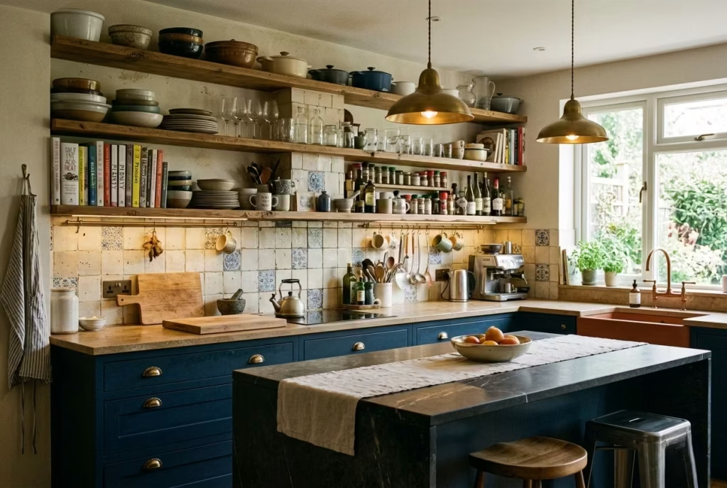
Open shelving has a way of exposing the truth of a kitchen. There is no hiding behind doors, no chance to sweep things out of sight at the last minute. That is exactly why, when it is done well, it carries a kind of quiet authenticity that closed cabinetry rarely achieves.
In a maximalist kitchen, shelving is not there to be styled once and forgotten. It becomes a living layer, shaped by daily use, shifting slowly over time as objects are added, removed, and rearranged without ceremony.
Spatial Context
Open shelving works best where it can breathe. Long, uninterrupted runs along a splashback or between vertical cabinet blocks allow the display to read clearly rather than feeling chopped into fragments. It tends to sit comfortably above base units or in areas where wall cabinets would otherwise feel heavy, particularly in kitchens that need to maintain a sense of openness.
In tighter kitchens, a single stretch of shelving can often achieve more than multiple scattered sections. Too many short runs can feel restless, like the room cannot quite settle. In larger kitchens or open-plan spaces, shelving can be used to soften the transition between functional zones and more relaxed areas, almost acting as a bridge between the working kitchen and the rest of the home.
There is also a natural relationship between shelving and eye level. What sits here becomes part of the everyday visual field, so it needs to feel intentional without looking overworked. The moment it starts to feel staged, the whole effect loses its footing.
Real-Life Application
In one project, the client was initially hesitant about open shelving, concerned it would look messy within weeks. The kitchen already had strong elements in place, a patterned floor, mixed metals, and a statement stone island. Adding shelves felt like it might tip things too far. We introduced a single run above the worktop, keeping the rest of the cabinetry closed to maintain balance.
At first, the shelves were lightly dressed, a few ceramics, some glassware, nothing too deliberate. Over the following months, something interesting happened. The display began to shift on its own. Everyday items found their place, favourite mugs, well-used bowls, a stack of plates that were always within reach. It stopped looking like a design feature and started behaving like part of the kitchen’s rhythm.
When I revisited the space later, it had changed completely, yet nothing felt out of place. The shelves had taken on a life of their own, almost like they were telling the story of how the kitchen was actually used. That is when open shelving earns its keep, not when it looks perfect, but when it feels real.
Measurements and Proportions
Shelf depth is where practicality meets proportion. A range of 250 to 300 mm, or 10 to 12 inches, tends to work comfortably for most kitchens. It allows enough room for standard plates, bowls, and glassware without pushing too far into the space. Anything shallower can feel limiting, while deeper shelves risk becoming bulky and harder to access.
Vertical spacing between shelves usually sits between 300 and 450 mm, or 12 to 18 inches, depending on what is being stored. Everyday items benefit from tighter spacing, keeping them within easy reach, while more decorative or oversized pieces may need additional height.
Length also matters. Longer shelves create a calmer, more continuous line, while shorter segments can introduce unnecessary breaks. If the run exceeds around 1200 to 1500 mm, or 4 to 5 feet, additional support may be needed to prevent sagging, particularly with heavier materials like solid timber or stone.
Material Reasoning
Material choice plays a significant role in how shelving sits within a maximalist kitchen. Solid timber brings warmth and a sense of familiarity, especially when paired with richer colour palettes or layered materials. It softens the composition and helps bridge the gap between more structured elements.
Metal shelving, particularly in finishes that echo other hardware in the room, can feel lighter and more architectural. It works well in kitchens where the overall scheme leans toward contrast and sharper definition. Glass shelves introduce a different dynamic altogether, almost disappearing into the background while allowing the objects themselves to take centre stage.
Durability is key. Shelves in a kitchen environment need to withstand not just weight, but also humidity, heat, and regular handling. Finishes that can cope with this, without showing every mark or scratch, tend to age more gracefully. A slightly textured or matte surface often proves more forgiving than something highly polished.
Pros
- Adds a lived-in, evolving layer that reflects how the kitchen is actually used
- Keeps everyday items within easy reach, improving functionality
- Softens the visual weight of wall cabinetry, particularly in smaller spaces
- Allows personality to develop over time without constant redesign
- Can act as a bridge between bold design elements, tying the scheme together
Cons
- Requires a level of ongoing curation to avoid looking cluttered
- Exposes everyday items, which may not always align with the desired aesthetic
- Can collect dust and grease more easily than closed storage
- Limited capacity compared to full cabinetry, particularly for concealed storage needs
- Poorly proportioned or overcrowded shelves can quickly feel chaotic
Open shelving, when approached with a bit of patience and a willingness to let it evolve, becomes more than just storage. It turns into a quiet record of daily life, shifting subtly as habits change and the kitchen settles into itself. It is not about getting it perfect on day one. It is about allowing the space to find its rhythm, one object at a time.
Colour-Drenched Kitchens That Ignore White Ceilings
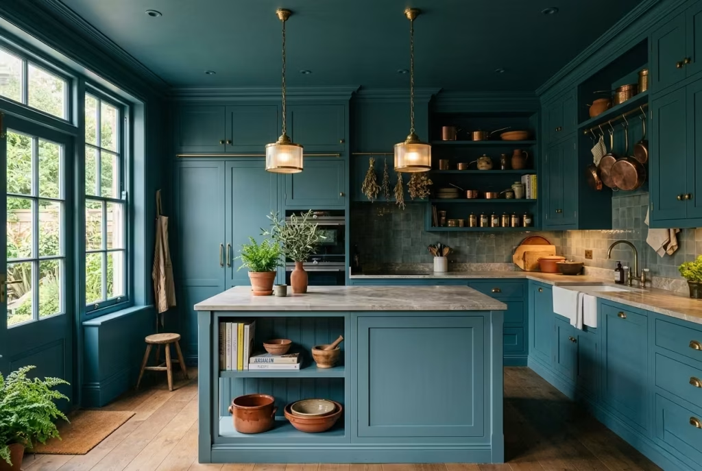
There is a moment in many kitchen designs where the ceiling quietly pulls rank, staying white while everything else leans into colour. It feels safe, almost automatic. Yet the instant you allow colour to climb all the way up, wrapping walls, cabinetry, and ceiling into a single envelope, the room shifts in a way that is hard to ignore.
It stops feeling like a collection of surfaces and starts behaving like a complete environment. Done well, this kind of colour drenching does not shrink a space as people often fear. It deepens it, like stepping into a room that knows exactly what it wants to be.
Spatial Context
Colour drenching tends to thrive in kitchens where the boundaries are clearly defined. Enclosed or semi-enclosed spaces respond particularly well because the continuity of colour reinforces the architecture rather than fighting it. In open-plan layouts, it can still work beautifully, but it needs a deliberate edge, a point where the colour either stops cleanly or transitions with intent into the adjoining space.
Ceiling height plays its part too. In kitchens with standard ceiling heights around 2400 mm or 8 feet, a fully drenched scheme can create a cocooning effect that feels considered rather than confined. In taller spaces, pushing the same colour upward can draw the eye vertically, making the volume feel more connected and less top-heavy.
This approach also has a way of simplifying busy layouts. When cabinetry, walls, and ceiling share a unified tone, the visual noise of multiple junctions begins to soften. Edges blur slightly, and the room reads as one continuous composition rather than a series of disconnected elements.
Real-Life Application
I worked on a kitchen where the client had already committed to a strong palette on the cabinetry, a deep, earthy blue with a hint of green. Initially, the ceiling remained white, and something about the room felt unresolved, as though it stopped short of its full potential. The cabinetry was doing all the heavy lifting, while the ceiling hovered above, detached from the rest of the scheme.
We decided to extend the same tone across the ceiling and upper walls. It felt like a bold move at the time, the kind that makes you pause before signing off. Once completed, the difference was immediate. The room no longer felt like it had layers stacked on top of each other. It felt whole. Light behaved differently too. Instead of bouncing sharply off a white surface, it softened, creating a more even, atmospheric glow.
Months later, the client mentioned how the space felt calmer despite the stronger colour. That is often the unexpected benefit. When everything speaks the same language, the room stops trying to prove a point and simply settles into itself.
Measurements and Proportions
While colour drenching is not defined by strict dimensions, proportions still guide how it is perceived. In kitchens with ceiling heights between 2400 and 2700 mm, or 8 to 9 feet, carrying the same tone across all vertical and horizontal planes tends to create a balanced enclosure.
Cabinet heights, typically around 2100 mm or 83 inches for full-height units, can either blend seamlessly into the ceiling colour or be slightly offset with a tonal variation to maintain subtle definition. The key is to avoid abrupt breaks that interrupt the flow.
If the kitchen includes an island, it can either follow the same colour or introduce a closely related shade within the same palette. Keeping the contrast minimal ensures the drenched effect remains intact, rather than fragmenting into separate zones.
Material Reasoning
Colour alone does not carry the success of this approach. The finish and material underneath play a crucial role in how the space is experienced. Matte and eggshell finishes tend to absorb light, creating a softer, more enveloping atmosphere. They are particularly effective in deeper tones, preventing the colour from feeling too stark or reflective.
In contrast, satin finishes can introduce a gentle sheen that catches light without becoming overpowering. This can be useful in kitchens with limited natural light, where a slight lift is needed to avoid the room feeling too enclosed.
Material consistency also matters. If cabinetry, walls, and ceiling are all painted, the transitions feel seamless. Introducing a different material, such as timber or stone, within the same colour family can add depth without breaking the continuity. It is a delicate balance, like walking a tightrope, but when it lands, the result feels cohesive rather than contrived.
Durability should not be overlooked. Kitchens are demanding environments, and painted surfaces need to withstand moisture, heat, and regular cleaning. High-quality, washable finishes are essential, particularly on ceilings where condensation can occasionally build up.
Pros
- Creates a cohesive, immersive environment that feels considered and complete
- Softens visual boundaries, making the space feel more unified
- Enhances atmosphere by allowing light to interact more evenly across surfaces
- Works across both small and large kitchens when proportioned correctly
- Reduces the need for multiple contrasting elements, simplifying the overall scheme
Cons
- Requires confidence in colour selection, as mistakes are harder to disguise
- Poor lighting can make darker tones feel heavier than intended
- Demands high-quality finishes to withstand kitchen conditions
- Can feel overwhelming if combined with too many additional bold elements
- Difficult to adjust later without repainting multiple surfaces
A colour-drenched kitchen, when approached with clarity and restraint, does not shout for attention. It draws you in, slowly but surely, until you realise the room has wrapped itself around you. It is a move that asks for a bit of courage, but more often than not, it pays off in a space that feels grounded, intentional, and quietly compelling.
Decorative Lighting as a Focal Layer
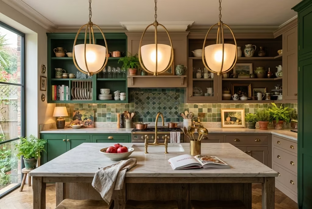
Lighting in a maximalist kitchen should never be treated as an afterthought or a purely functional line item. It is one of the few elements that can shift the entire mood of the room without changing a single cabinet or worktop.
Decorative lighting, in particular, brings a layer of personality that feels both practical and atmospheric. It can sharpen a scheme, soften a hard edge, or give a room that final lift it was quietly waiting for. When selected with care, it does not just illuminate the space. It gives it presence.
Spatial Context
Decorative lighting works best when it is given room to breathe rather than being crowded into every available corner. In kitchens, the most effective placements are often above an island, over a dining nook, or within a double-height void where the fitting can be appreciated from multiple angles. These are the moments where lighting stops being background support and starts becoming part of the architecture of the room.
A pendant above an island, for example, does more than cast light onto a work surface. It establishes a focal point, pulling the eye to the centre of the room and helping define the social heart of the kitchen. In open-plan spaces, decorative lighting can also act as a subtle transition between cooking and living zones, which is especially useful when you want the kitchen to feel expressive without becoming visually chaotic.
The danger lies in overloading the ceiling with too many competing fixtures. That is where a room begins to lose its footing. Decorative lighting should feel deliberate, almost like punctuation. A few well-placed pieces carry more weight than a scattering of forgettable ones ever could.
Real-Life Application
In one project I worked on, the kitchen had strong bones from the outset. There was beautiful cabinetry, striking stone, and a well-planned layout. Yet the room still felt unfinished, almost as if the story had stopped halfway through. The missing ingredient turned out to be lighting. The client had initially opted for simple recessed spots and a modest pendant, but the room lacked definition, particularly in the evening when daylight dropped away.
We introduced a pair of sculptural pendants with a softly aged brass finish and opaque glass shades. Nothing overly theatrical, just enough shape and weight to command attention without overpowering the rest of the scheme.
Once installed, the whole room changed character. The island suddenly felt anchored. The reflective quality of the glass caught the surrounding materials in a way that made the kitchen feel layered and alive, rather than merely lit.
What struck me most was how quickly the space moved from technically correct to emotionally engaging. That is the real power of decorative lighting. It can take a kitchen that functions perfectly and make it feel memorable, even slightly magnetic, the kind of room people linger in without quite realising why.
Measurements and Proportions
Proportion is everything when it comes to decorative lighting. A fitting that is too small will disappear into the background and lose its impact. One that is too large can dominate the room and throw the entire composition off balance.
Above an island, pendants are usually positioned around 750 to 900 mm, or 30 to 36 inches, above the worktop. This gives enough clearance for practical use while still allowing the fitting to sit within the visual field.
For a single pendant, a diameter of around 300 to 450 mm, or 12 to 18 inches, works well in most kitchens, though larger islands may call for something more substantial. When using multiple pendants, spacing them evenly at around 650 to 900 mm, or 26 to 36 inches apart, helps preserve rhythm and avoids visual crowding.
Ceiling height also changes the equation. In standard kitchens with ceilings around 2400 mm or 8 feet, compact or medium-scale fittings tend to feel most balanced. In taller rooms, larger pendants or fixtures with more vertical presence can be introduced without overwhelming the space. The overall rule is simple enough: the lighting should feel scaled to the room, not imposed on it.
Material Reasoning
The material of a decorative light fitting has a direct impact on how it reads in the room. Brass and bronze bring warmth and a sense of depth, especially in kitchens with rich colour palettes or natural timber. They tend to feel more relaxed than polished chrome or stark black metal, which can sometimes introduce a sharper, more contemporary note.
Glass is particularly useful in maximalist kitchens because it introduces texture without adding bulk. Clear glass keeps the light airy, while frosted or opal glass diffuses it, softening the atmosphere and preventing glare. Ribbed or seeded glass can add even more character, catching light in a way that feels subtle but expressive.
The finish matters just as much as the form. A brushed or aged finish usually sits more comfortably in a layered interior than something highly reflective, which can quickly feel overdesigned if repeated too often. In a kitchen already rich with pattern, colour, and material variation, a decorative light should support the composition rather than trying to steal the show.
Pros
- Creates an immediate focal point and strengthens the identity of the kitchen
- Helps define zones, especially above islands or dining areas
- Adds warmth and atmosphere that functional lighting alone cannot provide
- Can echo or balance other materials in the room, tying the scheme together
- Makes the space feel more finished, considered, and emotionally engaging
Cons
- Poorly scaled lighting can overwhelm the room or disappear entirely
- Too many decorative fittings can create visual clutter
- Some materials, especially glass and polished finishes, require regular cleaning
- Statement fixtures can date a kitchen quickly if chosen without restraint
- Lighting that looks beautiful in daylight may feel flat once illuminated at night if the quality is poor
Decorative lighting is often the detail that separates a kitchen that merely performs from one that truly resonates. It brings a little theatre, yes, but the best versions do so with tact. They settle into the room as though they were always meant to be there, quietly reinforcing the mood rather than forcing it. That is the sweet spot, and it is well worth chasing.
Vintage and Modern Furniture in One Space
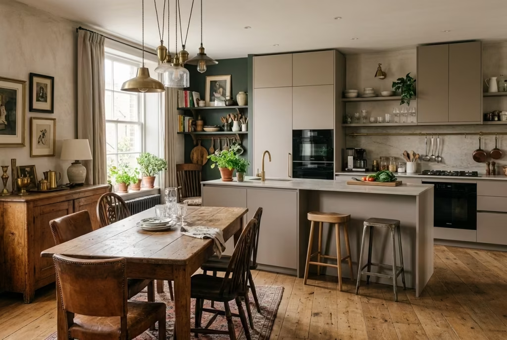
There is a quiet tension that happens when vintage and modern furniture share the same kitchen. At first glance, it can feel like a mismatch waiting to happen, yet when handled with intention, it becomes one of the most effective ways to soften a highly designed space. The kitchen stops reading as a showroom and starts to feel collected, as though it has been assembled gradually rather than delivered in one perfectly coordinated package.
Spatial Context
In a maximalist kitchen, furniture is rarely just functional. It often becomes a bridge between zones, especially in open-plan layouts where the kitchen bleeds into dining and living areas. This is where the mix of old and new starts to work in your favour. A contemporary island or streamlined cabinetry can hold the structure of the space, while vintage pieces introduce character and unpredictability in all the right ways.
The key is placement. Vintage chairs around a modern island, or an antique sideboard tucked against a clean-lined wall, can instantly shift the emotional reading of the room. It is not about scattering pieces randomly, but about letting each item occupy a clear role within the spatial rhythm. When everything feels too new, the kitchen can lack depth. When everything is vintage, it can drift into nostalgia without function. The balance sits somewhere in between, where contrast quietly does the heavy lifting.
Real-Life Application
I once worked on a kitchen where the initial brief was extremely contemporary. Sleek handleless cabinetry, polished stone, and integrated appliances created a very controlled, almost architectural shell. It looked impressive on paper, but in reality, the space felt slightly sterile, like it was waiting for life to happen rather than already hosting it.
We introduced a reclaimed oak farmhouse table that the client had inherited, along with a set of slightly worn leather dining chairs that had seen years of use. Nothing else in the room changed, yet the atmosphere shifted immediately. The modern island suddenly felt less rigid, more grounded. The imperfections in the wood, the softened edges of the chairs, and the subtle patina on the leather brought a sense of ease that no new piece could have delivered.
Over time, the client added a vintage sideboard for extra storage, and that became the informal heart of the space. It is one of those rare cases where the room did not feel “styled” in the traditional sense, yet it felt completely resolved, as if everything had found its place without trying too hard.
Measurements and Proportions
When mixing vintage and modern furniture, scale becomes more important than exact measurements. Modern kitchen islands typically sit at around 900 mm or 36 inches in height, which pairs comfortably with seating that ranges from 650 to 750 mm or 26 to 30 inches for counter stools. Vintage chairs, however, often vary more in seat height, so adjustments may be needed to maintain comfort and usability.
Dining tables introduced into kitchen spaces usually range from 750 to 800 mm or 30 to 32 inches in height. Length is more flexible, but allowing at least 600 mm or 24 inches per person ensures the table does not feel overcrowded, especially when surrounded by visually heavier cabinetry.
Spacing is equally important. Vintage pieces often carry more visual weight due to texture and material variation, so they need breathing room. Allowing at least 900 mm or 36 inches of circulation space around key furniture pieces helps prevent the room from feeling compressed, particularly in kitchens where multiple zones overlap.
Material Reasoning
Material contrast is what gives this combination its strength. Modern kitchens often rely on smooth, consistent finishes such as lacquered cabinetry, engineered stone, and brushed metals. These surfaces create clarity and precision, but they can also feel slightly detached if left unbroken.
Vintage furniture introduces texture that has been softened by time. Solid wood with natural grain variation, aged leather with subtle creasing, or painted finishes that have gently worn at the edges all contribute to a more grounded atmosphere. These imperfections are not flaws. They are what make the space feel lived in rather than staged.
The success of this pairing depends on restraint in material repetition. If every vintage piece introduces a different tone, the room can become visually fragmented. Instead, allowing one or two dominant materials to echo across both old and new elements helps maintain cohesion. For example, a warm oak tone might appear in a vintage table and be subtly echoed in modern shelving or accents elsewhere in the kitchen.
Pros
- Creates a layered, collected feel that avoids a showroom finish
- Adds warmth and personality to highly contemporary kitchens
- Introduces texture and history that balances smooth modern surfaces
- Allows flexibility over time as new and old pieces are added gradually
- Helps large open-plan spaces feel more human and less rigid
Cons
- Requires careful editing to avoid visual clutter or inconsistency
- Mismatched scales can create awkward proportions if not considered properly
- Vintage pieces may require restoration or ongoing maintenance
- Harder to achieve cohesion if materials and tones are not intentionally linked
- Can feel disjointed if too many contrasting styles compete for attention
When vintage and modern furniture are allowed to coexist with purpose, the kitchen gains something that cannot be manufactured: a sense of continuity over time. It begins to feel like a space that has evolved rather than been installed, which, in the end, is often what makes it feel truly complete.
Maximalist Backsplashes with Narrative Pattern
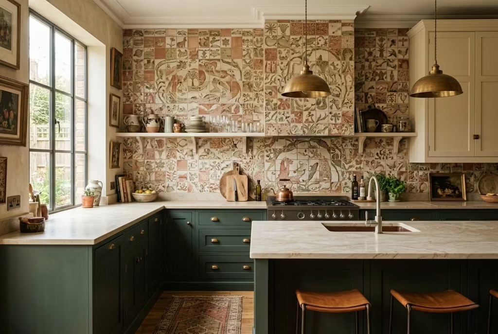
A backsplash is often treated as a supporting act in kitchen design, something purely functional that quietly protects the wall. In a maximalist kitchen, that thinking gets turned on its head. The backsplash becomes a storytelling surface, carrying pattern, texture, and rhythm in a way that can completely redefine how the entire kitchen is read. When it is treated as a narrative element rather than a background detail, it stops being a necessity and starts behaving like a focal point with intent.
Spatial Context
The backsplash sits in one of the most visually active zones of a kitchen, right at eye level and directly between worktop and cabinetry. That positioning makes it incredibly powerful, but also unforgiving. In smaller kitchens, a narrative pattern can act like a visual corridor, drawing the eye along the length of the space and giving it direction. In larger kitchens, it can break up long runs of cabinetry and introduce moments of pause within an otherwise continuous surface.
Full-height applications tend to work best in maximalist schemes. Extending the backsplash from worktop to underside of wall units, or even to the ceiling where upper cabinets are absent, allows the pattern to unfold properly. When it is cropped too tightly, the narrative loses its flow and feels interrupted, like a sentence cut short before it has finished speaking.
The key is to decide whether the backsplash is leading the conversation or supporting it. In some kitchens, it becomes the primary visual statement. In others, it works more like a supporting layer that quietly reinforces the rest of the material palette without overwhelming it.
Real-Life Application
In one project, the kitchen already had a strong identity forming through layered cabinetry colours and a statement stone island. Initially, the backsplash was planned as a simple, neutral tile to avoid competing with everything else. But as the design developed, it became clear that the wall space between worktop and cabinets was doing very little to contribute to the overall character of the room.
We introduced a hand-glazed tile with a subtle narrative pattern, not overly bold in colour, but rich in variation and depth. At first installation, it felt almost too expressive, as if it might pull attention away from the stone and cabinetry. However, once the rest of the kitchen was complete, the effect shifted entirely. The backsplash began to act like a connecting thread, linking the upper and lower zones rather than competing with them.
What stood out most was how the light interacted with the surface. As daylight moved across the kitchen, the glaze would catch differently throughout the day, almost like the wall was quietly shifting its mood. It was one of those moments where the material stopped being static and started participating in the life of the room.
Measurements and Proportions
Backsplash height typically sits between 500 mm and 600 mm, or roughly 20 to 24 inches, in standard kitchen layouts. However, in narrative-driven designs, extending this to full wall height can have a much stronger impact, particularly where upper cabinetry is minimal or absent.
Tile sizing plays an important role in how the pattern is read. Smaller formats, such as 100 x 100 mm or 4 x 4 inches, often create a more intricate, woven effect, while larger tiles, around 200 x 200 mm or 8 x 8 inches, allow the pattern to feel more graphic and architectural. The choice depends on how dominant you want the narrative to be.
Grout spacing, usually between 2 to 5 mm, or roughly 1/8 to 3/16 of an inch, also influences the final reading. Narrow joints tend to create a more seamless, continuous surface, while wider joints introduce rhythm and separation that can either enhance or dilute the pattern depending on the design intent.
Material Reasoning
The success of a narrative backsplash often comes down to material behaviour rather than just pattern selection. Hand-glazed ceramics, for example, introduce natural variation in tone and surface reflection. This variation prevents the pattern from feeling too rigid, allowing it to shift subtly as light moves across it.
Stone-based tiles offer a more grounded, mineral quality. They tend to feel heavier visually, which can be useful in kitchens where the cabinetry is lighter or more minimal. However, they require careful sealing and maintenance to preserve their finish over time.
Gloss levels are equally important. A high-gloss surface will amplify light and make the pattern more dynamic, while a matte or satin finish will soften the effect and allow the cabinetry or stone worktops to remain dominant. In a maximalist setting, this balance becomes critical, as too much reflectivity can quickly tip the space into visual overload.
Durability should never be overlooked. The backsplash sits in a high-use zone exposed to heat, moisture, and cooking activity. Whatever material is chosen needs to withstand daily life without losing its character, otherwise the narrative weakens over time.
Pros
- Introduces storytelling and visual depth to a highly functional surface
- Creates a strong focal point without requiring additional furniture or objects
- Enhances light interaction, adding movement and variation throughout the day
- Helps connect upper and lower kitchen zones into a cohesive composition
- Works as a long-lasting design feature when materials are chosen carefully
Cons
- Can dominate the visual field if not balanced with quieter surrounding elements
- Complex patterns may feel overwhelming in very small or heavily detailed kitchens
- Requires careful installation to ensure alignment and continuity of the narrative
- Some materials demand higher maintenance, especially in cooking-heavy environments
- Difficult to modify later without significant disruption to the overall scheme
A narrative backsplash, when done with restraint and clarity, becomes more than a decorative surface. It acts like a visual current running through the kitchen, quietly shaping how the space is experienced from moment to moment. It does not just sit behind the worktops. It participates in the life of the room, subtly shifting the atmosphere every time the light changes or a new detail is added around it.
Contrasting Worktops Across Zones
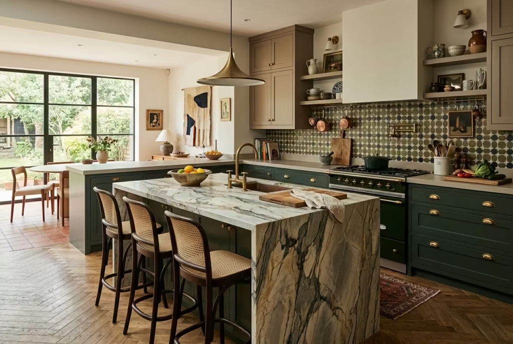
A single material across every work surface can feel orderly, almost reassuring, but in a maximalist kitchen it often flattens the experience. Introducing contrasting worktops across different zones changes that dynamic entirely. It allows the kitchen to develop a sense of internal geography, where each surface carries its own role, its own tone, and its own level of visual intensity. When handled with care, it creates a layered composition that feels far more considered than a one material approach ever could.
Spatial Context
Contrasting worktops work best when the kitchen is already divided into clear functional zones. An island, perimeter counters, and secondary preparation areas naturally lend themselves to variation. Instead of forcing uniformity, each zone can be given a material that reflects how it is used. A more durable, visually expressive surface on the island, for instance, can act as the focal point, while quieter, more functional materials sit along the perimeter where heavy daily work takes place.
In open-plan kitchens, this strategy becomes even more powerful. It helps define boundaries without walls, almost like drawing invisible lines that guide how the space is experienced. The eye begins to understand where cooking happens, where preparation takes place, and where more social interaction is intended, all without the need for physical separation.
The danger lies in treating every surface as equal. When everything competes for attention, the result can feel fragmented. But when each zone has a clear purpose, the contrast starts to feel intentional, almost like different chapters in the same story.
Real-Life Application
In one renovation, the original brief called for a uniform quartz worktop throughout the kitchen. It was practical, safe, and easy to coordinate, but something about it felt overly controlled. The layout itself had strong zoning, with a central island used for entertaining and a perimeter run dedicated to cooking and prep. Keeping everything identical felt like ignoring the natural rhythm of the space.
We introduced a honed quartzite island with strong veining, paired with a softer, more understated engineered stone along the perimeter. The shift was subtle at first glance, but once installed, the difference was immediate. The island began to read as a gathering point, almost like a piece of furniture, while the surrounding surfaces receded slightly, allowing function to take priority.
What was most interesting was how the client naturally began to use the space differently. Food preparation gravitated toward the quieter surfaces, while the island became a place for conversation and casual dining. The material contrast did not just change how the kitchen looked. It changed how it was lived in.
Measurements and Proportions
Worktop height typically sits at around 900 mm or 36 inches, including cabinetry and surface thickness. This consistency allows contrast to exist without disrupting ergonomics. Where variation becomes important is in thickness and edge detail.
Standard worktop thickness ranges from 20 mm to 30 mm, or roughly ¾ to 1¼ inches. A slightly thicker profile on the island can give it a more grounded, architectural presence, while slimmer profiles along the perimeter can help reduce visual weight. This subtle shift reinforces hierarchy without needing bold colour changes.
Depth is another consideration. Worktops generally range between 600 mm and 650 mm, or 24 to 26 inches. Extending depth on an island slightly beyond this standard can help emphasise its role as a central feature, especially when paired with a more expressive material.
Material Reasoning
Material selection is where this idea either succeeds quietly or falls apart completely. The key is contrast without conflict. Pairing materials that differ in tone, texture, or pattern intensity works far better than trying to match opposites that compete too strongly.
For example, a heavily veined stone on the island can introduce movement and character, while a more uniform quartz along the perimeter ensures durability and calm. The contrast should feel like a conversation rather than a disagreement. Both surfaces need to belong to the same broader palette, even if they express it differently.
Finish also plays a role. Honed or matte surfaces tend to absorb light and feel more grounded, while polished finishes reflect light and increase visual activity. Balancing these across zones helps control how busy the kitchen feels at any given moment.
Practicality cannot be ignored. High-use areas benefit from materials that resist staining and wear, while more expressive surfaces can afford to be slightly more delicate if they are not exposed to constant heavy use. It is a balancing act between beauty and resilience, and neither should be sacrificed entirely.
Pros
- Creates clear visual hierarchy between different functional zones
- Adds depth and complexity without relying on colour alone
- Helps guide natural movement and use within the kitchen
- Allows statement materials to be used without overwhelming the space
- Enhances the feeling of a layered, thoughtfully composed interior
Cons
- Requires careful planning to avoid visual fragmentation
- Can feel inconsistent if materials are not linked through tone or texture
- Slightly more complex to source and install compared to a single surface
- Risk of imbalance if one material dominates too strongly
- Harder to update later without affecting multiple zones
Contrasting worktops, when approached with restraint and a clear sense of hierarchy, do more than add visual interest. They introduce a quiet logic to the kitchen, shaping how it is read, used, and experienced over time. It is not about making every surface different for the sake of it. It is about allowing each zone to carry its own identity, while still belonging to the same carefully composed whole.
Wallpaper in Unexpected Kitchen Zones
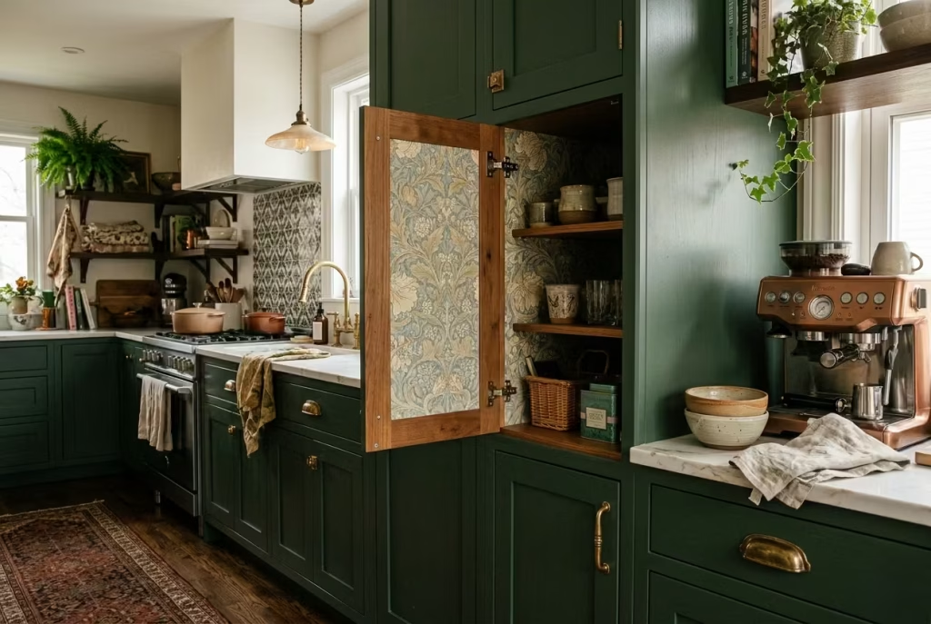
Wallpaper in a kitchen is one of those moves that can feel slightly left of centre at first, then suddenly obvious once you see it done well. It introduces softness into a room that is often dominated by hard edges, reflective finishes, and work surfaces that are there to be used rather than admired. Placed in the right zone, wallpaper can bring the kitchen to life in a way that paint rarely manages. It adds atmosphere, yes, but more importantly it adds character with a light touch, which is often where the real sophistication lies.
Spatial Context
The success of wallpaper in a kitchen depends almost entirely on placement. It works best in zones that are visually present but not constantly exposed to grease, steam, or heavy splashback conditions. Breakfast nooks, recessed pantry fronts, alcoves, the inside back wall of open shelving, or even a tall side return can all become ideal spots. These are areas where wallpaper can be seen, absorbed, and enjoyed without being put through the wringer.
In maximalist kitchens, wallpaper is especially effective when used as a pause point. If cabinetry, stone, and hardware are already carrying a lot of visual weight, a patterned wall in a tucked-away zone can give the eye a place to rest while still keeping the room richly layered. It is a bit like adding a well-chosen sentence in the middle of a busy conversation. It lands, it holds, and it changes the rhythm without shouting over everything else.
Unexpected zones are where wallpaper can be most rewarding. The back of a glazed cabinet, the wall behind a freestanding dresser, or the short return wall at the end of a kitchen run all offer opportunities to introduce pattern without overwhelming the main working surfaces. In these smaller doses, wallpaper feels considered rather than decorative for decoration’s sake.
Real-Life Application
In one kitchen project, we used wallpaper on the back wall of a shallow breakfast cupboard rather than on the main walls of the room. The kitchen itself was already rich in layered materials, deep green cabinetry, brass hardware, and a patterned floor, so the wallpaper needed to do something quieter. We chose a softly scaled botanical print with a slightly aged colour palette, and the result was far more powerful than anyone expected.
At first glance, it was barely noticeable. But that was exactly the point. As the cupboard doors opened and closed throughout the day, the pattern revealed itself in passing, almost like a small secret built into the room. It gave the kitchen a sense of depth that only became apparent over time. That is often the mark of a good design decision. It does not demand applause on day one. It grows on you, and before long, the space would feel strangely incomplete without it.
I have found that the best wallpaper applications in kitchens often happen where they are least expected. A client may initially assume the wallpaper will be the boldest element in the room, but in practice, it often becomes the detail that makes everything else feel more alive. It adds a whisper of surprise, which can be worth more than a shout.
Measurements and Proportions
Wallpaper in kitchen zones should be scaled with the size of the surface in mind. In alcoves or recessed spaces, panels around 900 to 1200 mm wide, or roughly 36 to 48 inches, often give enough room for the pattern to read properly without feeling cramped. For taller surfaces, allowing the wallpaper to run from countertop height to the ceiling, typically around 2400 mm or 8 feet, creates a more complete and confident effect.
If wallpaper is being used inside shelving or cabinetry, depth becomes a quiet but important factor. Shelves usually sit between 250 and 300 mm deep, or 10 to 12 inches, which means the pattern needs to be legible from a reasonable viewing distance. Small-scale prints often work better here than large motifs, which can become distorted or chopped up.
In breakfast nooks or dining corners, a full wall or partial wrap can be effective, especially when the seating area is compact. A repeated pattern across a surface around 1800 mm wide, or 6 feet, can feel balanced without overwhelming the room. The key is to avoid forcing wallpaper onto surfaces that are too broken up by sockets, doors, or awkward returns. When that happens, the whole thing can feel stitched together rather than composed.
Material Reasoning
Not all wallpaper is suited to kitchen use, and that is where the material conversation matters. Vinyl-coated or scrubbable papers are generally better choices in areas with occasional moisture or handling, especially if the wallpaper is near breakfast zones, shelving, or lightly used walls. Traditional paper-backed wallpapers can still be used, but only in protected areas where they are less likely to mark or lift.
Textural wallpapers can be especially effective in maximalist kitchens. Grasscloth, silk-effect finishes, or printed papers with a matte surface add depth and softness, which helps offset the harder materials typically found in kitchens. That said, texture in a kitchen needs to be chosen with care. Too much surface variation near heat or moisture can become a maintenance headache down the line.
Colour and scale are equally important. Large-scale patterns can be spectacular, but in a compact kitchen they need enough uninterrupted surface to breathe. Smaller repeats tend to work better in tighter zones, especially where the wallpaper is intended to be a supporting layer rather than the star of the show. A muted but detailed pattern often gives more longevity than something that feels overly trend-driven. It is better to choose a design that can age gracefully than one that burns bright and fast.
Pros
- Adds personality and softness to a room full of hard, practical materials
- Creates surprise in places where the eye does not immediately expect decoration
- Works well in compact zones where paint alone would feel flat
- Can tie together colours already present elsewhere in the kitchen
- Offers an easy way to introduce pattern without committing to a full wall treatment
Cons
- Not suitable for every area of the kitchen, particularly high-splash or high-heat zones
- Requires careful product selection to ensure durability and cleanability
- Can look awkward if applied to fragmented surfaces with too many interruptions
- Bold patterns may overpower small spaces if they are not scaled correctly
- Harder to update than paint, especially if the wallpaper becomes damaged over time
Wallpaper in unexpected kitchen zones is one of those details that quietly lifts a scheme from good to memorable. It gives the room a bit of wit, a touch of mystery, and, when done properly, a layered finish that feels anything but ordinary. It is not about covering every wall. It is about choosing the right moment to let pattern step forward, just enough to catch the light and keep the room feeling alive.
Ceiling Treatments That Complete the Room
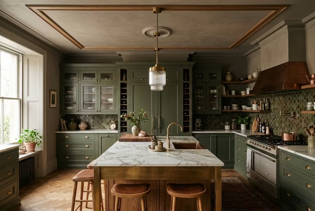
The ceiling is often the most neglected surface in a kitchen, which is precisely why it can have such a dramatic effect when it is treated with real intent. In a maximalist scheme, a ceiling should not feel like a blank afterthought hovering above the room.
It should finish the composition, almost like the final brushstroke that brings the whole canvas into focus. When it is handled well, the ceiling stops being passive overhead space and becomes part of the room’s visual language, quietly strengthening the atmosphere below.
Spatial Context
Ceiling treatments work best when the kitchen already has strong vertical elements in play. Tall cabinetry, open shelving, pendant lighting, and full-height splashbacks all draw the eye upward, so the ceiling becomes the natural place to resolve that upward movement. Without some kind of treatment, the room can feel as though it has run out of energy just when it should be landing its final note.
In smaller kitchens, a subtle treatment can make the room feel more considered rather than enclosed. A painted ceiling in the same tonal family as the walls, for example, creates a cocooning effect that can feel beautifully intimate rather than heavy. In larger kitchens, more architectural treatments such as timber battens, shallow moulding, coffered details, or a contrasting colour can help bring definition to a space that might otherwise feel too open and unanchored.
This is where the ceiling becomes more than a surface. It becomes a stabiliser. It can soften a room that is too sharp, warm a room that feels cold, or give a sense of closure to a scheme that is almost, but not quite, holding together.
Real-Life Application
I once worked on a kitchen that had everything going for it on paper. The cabinetry was strong, the worktops were beautiful, and the layout was well resolved. Yet the room kept feeling incomplete, as though the design had stopped at head height. The walls carried plenty of character, but the ceiling remained plain white, and that break in continuity meant the room never quite settled.
We introduced a pale, chalky tone across the ceiling and carried a simple timber trim detail around the perimeter. Nothing extravagant, just enough to create a sense of frame and completion. The effect was immediate. The room felt calmer, more contained, and far more deliberate. What had previously seemed a little disjointed suddenly came into line, as though the ceiling had finally accepted its role in the conversation.
In another project, we used a painted beam treatment in a kitchen that opened into a more formal dining space. The beams helped define the kitchen as its own zone without closing it off, and the ceiling treatment made the transition feel seamless rather than abrupt. That kind of detailing can be the difference between a room that merely functions and one that leaves a lasting impression.
Measurements and Proportions
Ceiling treatments should always respect the scale of the room. In kitchens with a standard ceiling height of around 2400 mm, or 8 feet, heavy treatments can quickly feel overbearing, so restraint is usually the wiser path. A shallow moulding or slim perimeter detail often provides enough definition without lowering the perceived height too much.
Where ceilings are taller, around 2700 mm to 3000 mm or 9 to 10 feet, there is more room to introduce stronger architectural gestures. Coffered sections, exposed beams, or a ceiling colour that contrasts with the walls can help balance the volume and make the space feel more human in scale.
For timber battens or panel details, spacing matters. Even a modest rhythm of 100 to 150 mm, or roughly 4 to 6 inches between elements, can create enough pattern to feel intentional without becoming fussy. The goal is to give the ceiling texture and presence, not to let it turn into visual static.
Material Reasoning
Material choice shapes how a ceiling treatment is experienced. Painted plaster or plasterboard finishes can create a seamless, cohesive look, especially when the colour is chosen to harmonise with the walls or cabinetry. This works particularly well in kitchens that aim for a layered, enveloping feeling.
Timber brings warmth, but it needs careful handling. Left too raw or used too heavily, it can dominate a space. Used in controlled sections, though, it introduces a natural counterpoint to stone, tile, and painted finishes. It can make the room feel grounded from the top down, which is especially useful in schemes that otherwise lean quite hard on cooler materials.
Mouldings and trim offer a more classical route. They bring shadow and structure, which can be invaluable in kitchens that need a touch of softness or grandeur. Even a simple perimeter detail can turn a plain ceiling into something with architectural poise.
Lighting integration also matters. Ceiling treatments should work with downlights, pendants, or concealed strips rather than fighting them. If the lighting is awkwardly placed or visually cluttered, the treatment loses its elegance quickly. A good ceiling should feel like it was always meant to be there, not like it was added to cover a gap.
Pros
- Completes the room visually and prevents the design from feeling unfinished
- Adds depth, character, and architectural interest overhead
- Can help define zones in open-plan kitchens without using walls
- Softens or balances rooms that feel too stark or too tall
- Offers a powerful way to reinforce the overall tone of the kitchen
Cons
- Poorly judged treatments can make a room feel lower or busier than intended
- More detailed ceilings often require skilled installation and a stronger budget
- Can complicate lighting planning if not designed alongside it from the outset
- Heavy treatments may date faster than quieter, more timeless solutions
- Difficult to change later, especially if structural or integrated elements are involved
A ceiling treatment is one of those details that quietly separates a room with good pieces from a room with real presence. It may not be the first thing people notice, but it often shapes the way the whole space is remembered. When the ceiling is considered properly, the kitchen feels finished in the truest sense of the word, with nothing left hanging.
Art in Kitchens (Scaled and Positioned Correctly)
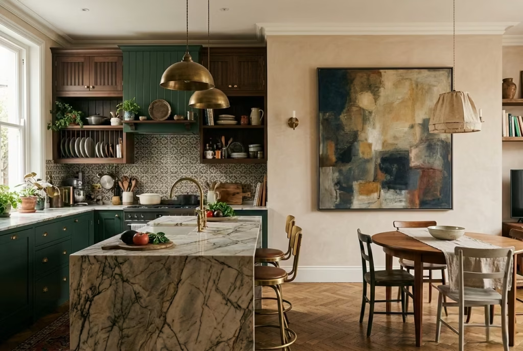
Art in a kitchen often feels like a risky move on paper, as though the space is too functional to accommodate anything expressive. In reality, it is often the absence of art that leaves kitchens feeling slightly incomplete, particularly in maximalist schemes where every other surface is already carrying texture, colour, and material depth.
When art is scaled and positioned correctly, it does not compete with the kitchen. It settles into it, almost like the final layer that gives the room emotional weight and a sense of human presence.
Spatial Context
The placement of art in a kitchen is far more important than the subject matter itself. Kitchens are dynamic environments, full of movement, heat, and constant visual shifts, so art needs to sit in zones where it can be appreciated without being overwhelmed by activity. Dining corners, end walls, recessed niches, and transitional areas between kitchen and living space tend to work best. These are the moments where the eye naturally slows down, even if only briefly.
In open-plan layouts, art becomes particularly useful as a soft divider. A well-positioned piece can subtly signal a shift from cooking to dining or social space without the need for physical barriers. It is a quiet architectural trick, almost like drawing an invisible line that the room instinctively understands.
The scale of the wall matters just as much as the subject. A small piece on a large wall will disappear into the background, while an oversized piece in a tight kitchen can feel overpowering. The aim is to strike a balance where the artwork feels anchored rather than floating, present but not intrusive.
Real-Life Application
In one project, the kitchen was visually strong but emotionally neutral. The cabinetry, stone, and lighting all worked together seamlessly, yet the room felt slightly too controlled, almost as if it had been designed to be admired rather than lived in. The client initially hesitated about introducing art, concerned it might disrupt the clean architectural lines.
We introduced a large abstract piece in muted tones above a small breakfast seating area, positioned deliberately away from the main cooking zone.
The change was subtle at first, but over time it became one of the most important elements in the room. It softened the transition between kitchen and dining space and gave the client a visual anchor during everyday routines.
What stood out was how naturally the piece absorbed the rhythm of daily life. Morning light would shift across it, evening shadows would deepen its tones, and it slowly became part of the kitchen’s atmosphere rather than an addition to it. It was no longer just a framed object on a wall. It became part of how the room felt.
Measurements and Proportions
Art in kitchens does not follow strict rules, but proportion still governs its success. As a general guide, artwork should occupy roughly two thirds to three quarters of the available wall width in its immediate context. This ensures it feels intentional rather than incidental.
In dining or seating zones, hanging height is critical. The centre of the artwork typically sits around 1450 to 1500 mm, or 57 to 59 inches, from floor level, which aligns comfortably with eye level in seated and standing positions.
If placed above furniture such as benches or sideboards, leaving at least 150 to 200 mm, or 6 to 8 inches, of clearance helps maintain visual breathing space.
Scale is equally important. In larger kitchens, pieces measuring 800 x 1200 mm or larger, roughly 32 x 48 inches, tend to hold their own against cabinetry and stone. In smaller spaces, a pair of coordinated pieces or a vertical composition can help maintain presence without overwhelming the wall.
Material Reasoning
The material of the artwork itself plays a subtle but important role in how it interacts with the kitchen environment. Canvas prints, for example, absorb light and feel softer, which works well in already texturally rich spaces. Framed works under glass introduce reflection, which can either enhance depth or create distraction depending on nearby lighting conditions.
In maximalist kitchens, works with muted palettes or layered textures tend to integrate more naturally. Highly glossy or visually aggressive pieces can easily clash with patterned backsplashes, statement stone, or bold cabinetry. The goal is not to match the kitchen, but to sit comfortably within its visual rhythm.
Framing also matters. Slim, understated frames in timber or metal often work better than heavy ornate options, which can compete with surrounding materials. In some cases, frameless canvases or floating mounts allow the artwork to feel more embedded within the space rather than layered on top of it.
Durability is worth considering too. Kitchens introduce humidity and occasional temperature fluctuations, so materials need to be stable over time. Works placed away from direct cooking zones tend to age better and maintain their finish without warping or fading.
Pros
- Introduces emotional depth and personality into highly functional spaces
- Softens the visual intensity of maximalist materials and finishes
- Helps define zones within open-plan kitchen layouts
- Provides a focal point that changes the rhythm of the room
- Enhances atmosphere through colour, texture, and narrative presence
Cons
- Poor scaling can make artwork feel either lost or overpowering
- Humidity and heat exposure can affect certain materials over time
- Placement mistakes can disrupt circulation or visual balance
- Highly expressive pieces may clash with already bold kitchen schemes
- Requires thoughtful curation to avoid feeling like an afterthought
Art in the kitchen is not about decoration for its own sake. It is about introducing a layer of humanity into a space that is otherwise defined by function and performance. When it is scaled correctly and placed with intent, it stops behaving like an object on the wall and starts acting like part of the room’s emotional structure, quietly shaping how the space is experienced from day to day.
Layered Textiles (Yes, Even in Kitchens)
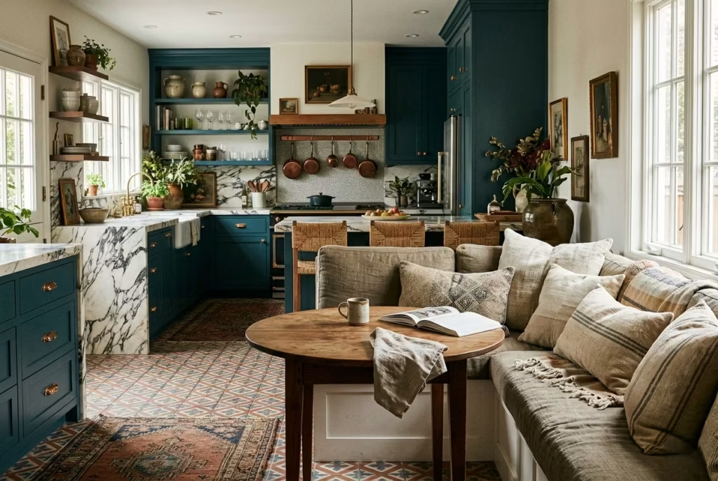
Textiles in a kitchen are often underestimated, almost dismissed as something that belongs elsewhere in the home. Yet when they are introduced with restraint and intention, they can completely shift the emotional temperature of the space.
In a maximalist kitchen, where hard surfaces dominate by necessity, textiles bring a necessary counterbalance. They soften acoustics, temper visual intensity, and introduce a lived-in quality that prevents the room from feeling overly engineered. When layered properly, they do not make the kitchen feel decorative. They make it feel inhabited.
Spatial Context
The success of textiles in kitchens depends entirely on placement and restraint. Unlike living rooms or bedrooms, where fabric can be used broadly, kitchens demand precision. The most effective applications tend to sit away from direct cooking zones, in areas where moisture, grease, and heat are less aggressive.
Breakfast seating corners, banquette seating, window benches, and adjacent dining spaces offer the safest and most rewarding opportunities. In open-plan kitchens, textiles can also help define soft boundaries between cooking and living areas, subtly signalling a shift in function without introducing physical barriers.
Even something as simple as a linen cushion on a built-in bench can change how a space is perceived. It breaks the dominance of stone, metal, and tile, allowing the eye and body to relax. The key is not saturation but selectivity. Too much fabric in a kitchen and the balance tips quickly. Too little, and the space can feel acoustically sharp and visually rigid.
Real-Life Application
In one project, the kitchen was visually striking but acoustically harsh. The combination of polished stone, flat cabinetry, and reflective surfaces created a slight echo that made the space feel more formal than intended. It looked impressive, but it did not invite lingering.
We introduced layered textiles in a small but deliberate way. A heavy linen bench cushion in a muted earthy tone was added to the breakfast nook, along with loosely structured throw cushions in natural cotton and wool blends. Nothing overly styled or coordinated. Just materials that felt honest and tactile.
The change was immediate, though subtle in appearance. Conversations softened. The space felt warmer, less like a gallery and more like a place where daily life could unfold without effort. Over time, the textiles naturally evolved. Cushions were moved, replaced, slightly worn in, and the space began to feel less staged and more intuitive.
That is the quiet power of textiles in a kitchen. They do not announce themselves. They settle in slowly, almost unnoticed at first, until one day you realise the room feels incomplete without them.
Measurements and Proportions
Textile scale in kitchens should always be guided by proportion rather than abundance. For seating areas, bench cushions typically range between 400 and 500 mm in depth, or 16 to 20 inches, depending on the seat structure. Thickness around 50 to 100 mm, or 2 to 4 inches, provides comfort without overwhelming the seating line.
For loose cushions, standard sizes such as 450 x 450 mm or 18 x 18 inches and 500 x 500 mm or 20 x 20 inches tend to work well in kitchen-adjacent seating zones. Larger cushions can be used sparingly to create variation, but too many oversized pieces can quickly dominate the space.
Window seating or built-in benches benefit from continuous cushioning that runs the full length of the seat, often between 1200 and 2000 mm or 4 to 6.5 feet, depending on the layout. This helps maintain visual continuity while also improving comfort in daily use.
Drapery, if used at all, should remain light and controlled. Floor-length curtains are rarely practical in kitchens, so shorter treatments that sit just below window height tend to perform better, especially in spaces where airflow and light control are important.
Material Reasoning
Material selection is where textiles either succeed quietly or fail quickly in a kitchen environment. Natural fibres such as linen, cotton, and wool blends tend to work best because they age gracefully and respond well to frequent use. They develop softness over time, which aligns beautifully with the lived-in nature of maximalist interiors.
Linen, in particular, brings an understated elegance. It wrinkles naturally, which in a kitchen context feels relaxed rather than messy. Cotton offers durability and ease of cleaning, making it suitable for more active seating areas. Wool blends introduce warmth and texture, particularly in cooler-toned kitchens where a softer counterbalance is needed.
Synthetic fabrics can be useful for practicality, especially in high-use homes, but they need careful selection. The goal is to avoid anything that feels overly shiny or artificial, as this can disrupt the natural rhythm of the space.
Colour and pattern should be approached with the same discipline as other maximalist elements. Textiles are most effective when they echo or soften existing tones rather than introducing entirely new visual directions. A cushion that picks up a subtle hue from cabinetry or stone can quietly tie the room together without drawing unnecessary attention.
Pros
- Introduces warmth and softness into a hard, material-driven environment
- Improves acoustics, reducing echo and creating a calmer atmosphere
- Enhances comfort in seating and social zones within the kitchen
- Adds a subtle layer of personality without structural changes
- Evolves naturally over time, allowing the space to feel more lived in
Cons
- Not suitable for all kitchen zones, particularly near cooking or splash areas
- Requires regular cleaning and maintenance to stay fresh
- Can feel visually cluttered if overused or poorly coordinated
- Natural fibres may stain more easily in high-traffic environments
- Needs careful restraint to avoid disrupting the architectural clarity of the space
Layered textiles in a kitchen are not about decoration for its own sake. They are about introducing a human scale into a space that can easily become dominated by hard edges and functional surfaces. When used sparingly and thoughtfully, they soften the room in a way that feels almost imperceptible at first, yet deeply impactful over time.
Glass Cabinets with Internal Colour
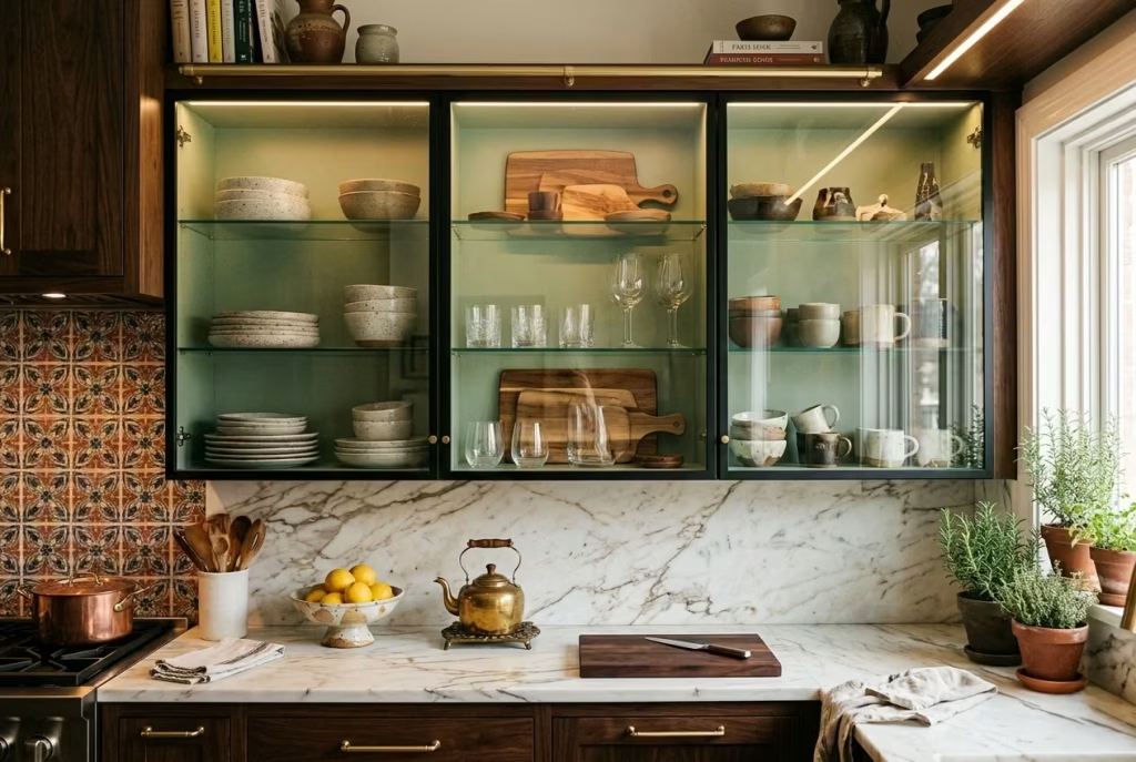
Glass cabinetry already introduces a sense of lightness into a kitchen, but when you introduce internal colour, the entire idea shifts from simple storage to something far more expressive. It is no longer just about what is inside the cabinet, but how the cabinet itself frames that world.
In a maximalist kitchen, this becomes particularly powerful because it allows colour to sit in layers, not just on surfaces, but behind them, almost like a quiet reveal that unfolds every time the doors open.
Spatial Context
Glass cabinets work best when they are positioned at eye level or slightly above, where their contents can be appreciated without strain. In kitchens where wall cabinetry is already visually heavy, replacing a few solid fronts with glass can instantly relieve that pressure and introduce rhythm across the elevation.
Internal colour becomes most effective when it is treated as a background layer rather than the main event. A painted interior, whether in soft muted tones or deeper saturated shades, creates depth behind objects such as ceramics, glassware, or collected pieces. In open-plan kitchens, this technique can also help transition between functional and social zones, particularly when cabinets face dining or living areas.
The key is restraint in placement. Not every cabinet needs to be glazed. A scattered approach, where glass units appear like intentional pauses within a run of solid cabinetry, tends to feel far more considered than full-scale transparency.
Real-Life Application
In one project, the kitchen originally featured entirely solid wall cabinetry, which made the upper half of the room feel visually dense. It was well designed, but slightly closed in, almost like the room was holding its breath. We replaced a central section of cabinets with glass fronts and introduced a soft sage green interior finish.
At first, the change was subtle. But once the cabinets were filled with everyday items, glassware, simple ceramics, a few wooden pieces, the colour behind them began to shift the entire perception of the kitchen. It was no longer just storage. It became a layered display that changed depending on what was placed inside.
What surprised me most was how the client began to interact with those cabinets differently. Instead of hiding everything away, they started arranging objects with a bit more care, not in a staged way, but in a natural rhythm that reflected daily use. The kitchen gained a sense of depth that did not exist before, as if it had quietly expanded without changing its footprint.
Measurements and Proportions
Glass cabinets typically follow standard wall unit heights, which range between 600 mm and 900 mm, or approximately 24 to 36 inches. In maximalist kitchens, taller units around 900 mm or more tend to work better for glazed sections, as they allow enough vertical space for the internal colour to be properly visible.
Shelf spacing inside glass cabinets is usually between 250 mm and 350 mm, or 10 to 14 inches, depending on what is being stored. Tight spacing can create a more layered, curated look, while wider spacing allows objects to breathe and the internal colour to become more visible.
Depth is another important factor. Standard cabinet depths of around 300 mm to 350 mm, or 12 to 14 inches, are generally ideal. Anything deeper risks pushing objects too far back, which reduces the impact of both the contents and the coloured backdrop.
Material Reasoning
The choice of glass type significantly affects how internal colour behaves. Clear glass offers the most direct relationship between interior and exterior, allowing the colour to read clearly. It works best when the interior finish is subtle and the contents are visually interesting.
Frosted or reeded glass introduces diffusion, softening both the colour and the objects inside. This can be useful in kitchens where a more atmospheric, less defined look is desired. However, it also reduces the impact of the internal colour, so it needs to be chosen carefully.
The internal finish itself becomes just as important as the exterior cabinetry. Painted interiors in matte or satin finishes tend to absorb light more evenly, creating a soft backdrop that does not compete with the contents. Deeper tones such as forest green, muted blue, or warm clay shades can add richness, while lighter tones can help lift darker cabinetry schemes.
Hardware and framing also contribute to the overall effect. Slimmer frames tend to feel more contemporary and allow the internal colour to take centre stage, while thicker framing can introduce a more traditional, structured feel. The balance between transparency and structure is what ultimately defines the success of the design.
Pros
- Adds depth and layered visual interest without increasing clutter
- Introduces colour in a controlled, architectural way
- Breaks up solid cabinetry runs and reduces visual heaviness
- Encourages more thoughtful organisation of everyday objects
- Creates subtle focal points that evolve with use over time
Cons
- Requires ongoing organisation, as contents are always visible
- Can appear cluttered if not curated with some discipline
- Internal colour choices are permanent or difficult to change later
- Not suitable for all storage types, especially purely functional or messy items
- Glass surfaces require regular cleaning to maintain clarity
Glass cabinets with internal colour sit in that interesting space between storage and display. They do not demand attention in a loud way, but they quietly reshape how a kitchen is experienced. Over time, they become less about the cabinet itself and more about the life that passes through it, which is often where the real character of a kitchen begins to show.
Oversized Hardware That Reads as Detail, Not Utility
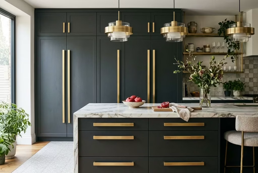
Hardware is often treated as the quiet background of a kitchen, something purely functional that disappears into the cabinetry. Yet when it is scaled up and chosen with intention, it becomes one of the most expressive elements in a maximalist kitchen.
Oversized handles, pulls, and knobs shift from being simple touchpoints to becoming architectural accents in their own right. They catch light, define rhythm, and add a tactile confidence that smaller hardware often lacks. When done well, they do not shout for attention, but they refuse to be ignored.
Spatial Context
Oversized hardware works best in kitchens where cabinetry has enough visual weight to support it. On tall pantry doors, full-height units, or long runs of drawers, larger pulls create a sense of proportion that feels intentional rather than exaggerated. In open-plan kitchens, they also help anchor large surfaces, breaking up expanses of cabinetry that might otherwise feel too flat or uniform.
In smaller kitchens, restraint becomes more important. Oversized does not always mean excessive. Even a single large handle on a key focal point, such as an island or a pantry door, can shift the entire reading of the space. It becomes a visual punctuation mark, guiding the eye without overwhelming the composition.
The placement also matters. Vertical pulls on tall doors tend to emphasise height, while horizontal handles across drawers reinforce width and structure. When mixed thoughtfully, they begin to create a rhythm across the kitchen, almost like a quiet architectural language running through the cabinetry.
Real-Life Application
In one kitchen I worked on, the cabinetry was beautifully executed but felt slightly too refined, almost hesitant in its expression. Everything was proportioned perfectly, yet the room lacked a certain presence. The handles were small, understated, and barely noticeable unless you were standing right in front of them.
We introduced oversized brass pulls on the main island drawers and tall pantry units. Nothing else in the kitchen changed at that moment, but the transformation was immediate. The cabinetry suddenly felt more grounded, more confident, as if the room had found its voice.
What stayed with me most was how the client responded to them over time. At first, they noticed the scale. Then, gradually, they began to appreciate how the handles changed the way they interacted with the kitchen. Opening a drawer or a door felt more deliberate, almost ceremonial in a subtle way. It is interesting how something so simple can shift the emotional relationship between a person and a space.
Measurements and Proportions
Standard kitchen handles typically range between 96 mm and 192 mm in length, or roughly 4 to 8 inches. Oversized hardware begins around 300 mm, or 12 inches, and can extend well beyond 400 mm, or 16 inches, depending on the scale of the cabinetry.
On full-height pantry doors, vertical handles often work best at lengths between 600 mm and 1200 mm, or 24 to 48 inches. This allows the hardware to echo the height of the door, reinforcing proportion rather than sitting awkwardly within it.
For drawer fronts, longer horizontal pulls of 300 to 600 mm, or 12 to 24 inches, tend to feel balanced in larger kitchens. The key is not uniformity, but consistency in visual logic. Once a scale is chosen, it should repeat across the kitchen so that the hardware feels like part of a system rather than isolated decorative pieces.
Spacing from the edge of cabinetry is also important. Handles typically sit 50 to 75 mm, or 2 to 3 inches, from the edge, which helps maintain clean lines and prevents visual crowding.
Material Reasoning
Material choice determines whether oversized hardware feels refined or overpowering. Brass, particularly in brushed or aged finishes, tends to soften larger scales and introduces warmth that sits comfortably within maximalist schemes. It develops a natural patina over time, which adds character rather than diminishing its appeal.
Blackened metal offers a more architectural presence, often used in kitchens with stronger contrasts or darker cabinetry. It can feel sharp and deliberate, especially when paired with lighter surfaces that allow it to stand out.
Stainless steel and nickel finishes bring a cooler, more contemporary feel. When scaled up, they can feel highly precise, almost technical, which works well in kitchens leaning towards modern minimalism within a maximalist framework.
The tactile experience also matters more than people expect. Oversized hardware needs to feel comfortable in the hand. Sharp edges or poorly finished surfaces quickly reveal themselves in daily use, which is why weight, grip, and finish quality are just as important as visual impact.
Pros
- Adds architectural presence to cabinetry without changing the layout
- Creates strong visual rhythm across large kitchen surfaces
- Enhances tactile experience and everyday interaction with the space
- Helps balance oversized cabinetry or tall storage units
- Introduces detail that feels intentional rather than decorative clutter
Cons
- Can overwhelm smaller kitchens if scaled without restraint
- Requires consistency across the design to avoid visual imbalance
- Poor quality finishes become more noticeable at larger scales
- Not suitable for every style of cabinetry, especially very delicate designs
- Can feel visually heavy if combined with too many other bold elements
Oversized hardware works best when it feels like it belongs to the architecture of the kitchen rather than being added onto it. It is one of those details that quietly shifts the entire tone of a space. Not by changing what the kitchen does, but by changing how it feels every time you reach for a handle.
Deep, Saturated Paint Finishes
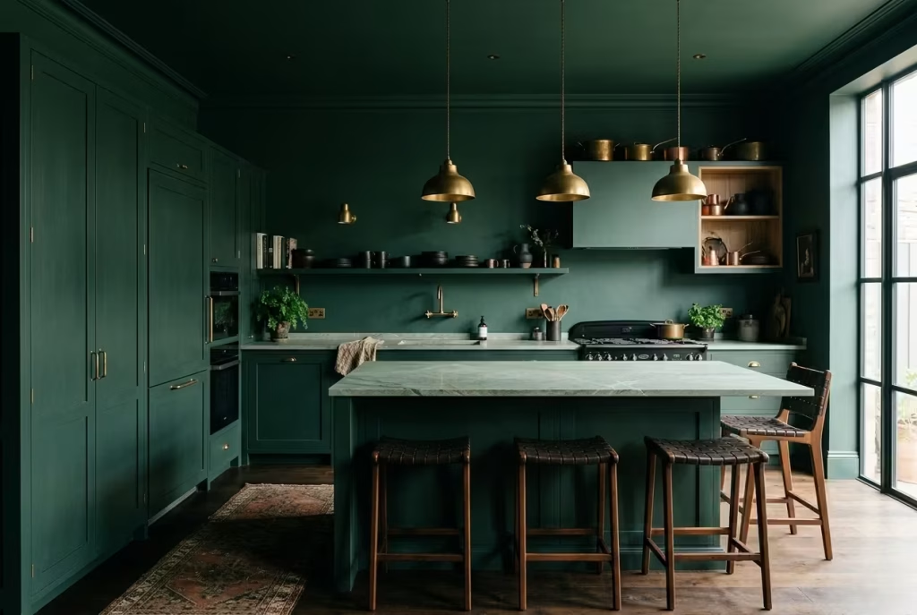
Deep, saturated paint in a kitchen is often misunderstood as a bold stylistic gamble, when in reality it is one of the most controlled ways to introduce depth and atmosphere. In a maximalist setting, it does something quite specific.
It holds everything together. Where lighter schemes rely on contrast and brightness, saturated tones absorb visual noise and allow other layers, cabinetry, stone, metal, and pattern, to sit more comfortably within the frame.
The result is a kitchen that feels intentional, grounded, and quietly immersive rather than visually scattered.
Spatial Context
Saturated paint works best when it is allowed to define volume rather than simply decorate surfaces. Full wall applications, especially in kitchens with strong architectural bones, can completely shift how a space is perceived. Instead of reading individual elements, the eye begins to register the room as a unified field, where edges soften and transitions feel more fluid.
In smaller kitchens, deeper tones can be used to visually compress boundaries in a positive way, making the space feel more intimate rather than confined. In larger or open-plan layouts, they help reduce visual fragmentation, especially where multiple materials and zones are already competing for attention.
The most effective applications are often unexpected. A deep tone on cabinetry, a saturated colour wrapping around a dining nook, or even a dark painted ceiling can quietly reframe the entire spatial experience. The kitchen stops feeling like a collection of parts and starts behaving like a single, cohesive environment.
Real-Life Application
In one renovation, the kitchen originally relied on a very safe, neutral palette. It was clean, functional, and technically well resolved, but it lacked emotional weight. The client described it as “pleasant but forgettable,” which is often the moment where colour starts to matter more than layout.
We introduced a deep, inky green across the cabinetry, paired with a slightly darker tone on the walls to reduce contrast between surfaces. The change was not about drama for its own sake, but about depth. Once the paint was applied, the kitchen immediately felt more grounded. The materials that were already there, brass handles, stone worktops, timber accents, began to read more clearly because the background was no longer competing for attention.
What was most noticeable over time was how the room behaved differently throughout the day. Morning light softened the saturation, giving it a muted calmness, while evening light made it feel richer and more enveloping. It was no longer a static backdrop. It became a living surface that responded to its environment.
Measurements and Proportions
Paint itself does not rely on strict measurements, but its effectiveness is closely tied to proportion. In kitchens with standard ceiling heights of around 2400 mm or 8 feet, full saturation works best when balanced with lighter reflective elements such as stone or glass to prevent the space from feeling too heavy.
In taller spaces, around 2700 to 3000 mm or 9 to 10 feet, deeper colours can be used more freely across multiple surfaces, including cabinetry, walls, and even ceilings, without overwhelming the room. The increased vertical volume allows the colour to breathe rather than compress the space.
Where cabinetry is involved, door and panel proportions become important. Large flat surfaces, such as full-height pantry doors or long runs of wall units, tend to hold saturated colour more successfully than heavily segmented cabinetry, where too many breaks can fragment the visual impact.
Even small adjustments, such as extending colour around 50 to 75 mm, or 2 to 3 inches, onto adjacent surfaces like returns or reveals, can help the paint feel more integrated rather than abruptly contained.
Material Reasoning
The success of saturated paint depends heavily on finish as much as colour. Matte finishes tend to absorb light and create a velvety depth that works beautifully in maximalist kitchens. They reduce glare and allow surrounding materials to sit more comfortably within the space. However, they can mark more easily, which makes placement important.
Eggshell and soft satin finishes offer a slightly more durable option while still maintaining a refined appearance. They introduce a subtle reflectivity that can enhance depth without becoming overly glossy or distracting.
Colour selection is where restraint becomes critical. Deep greens, oxblood reds, charcoal blues, and warm earthy browns tend to perform well because they carry natural complexity. They do not read as flat blocks of colour, but as layered tones that shift subtly with light.
Equally important is how these paints interact with adjacent materials. Saturated finishes work best when paired with natural stone, aged metals, or timber elements that bring variation in texture. If everything is too smooth or uniform, the depth of the paint is diminished.
Pros
- Creates strong atmospheric depth and visual cohesion in the kitchen
- Helps unify multiple materials into a single composed environment
- Enhances the perception of architectural structure and volume
- Responds beautifully to changing light throughout the day
- Supports maximalist layering without visual fragmentation
Cons
- Can feel heavy or enclosed if overused in small or poorly lit spaces
- Requires careful balancing with lighter or reflective materials
- Matte finishes may require more maintenance in high-traffic areas
- Colour choices are difficult to change once fully implemented
- Poor lighting can flatten the richness of the tone
Deep, saturated paint finishes are not about making a kitchen darker or more dramatic for effect. They are about creating depth that allows everything else to settle more comfortably within the space. When used with confidence and restraint, they transform the kitchen from a collection of surfaces into something far more cohesive, where every material feels like it belongs to the same quiet, deliberate story.
Mixing Timber Tones Without Conflict
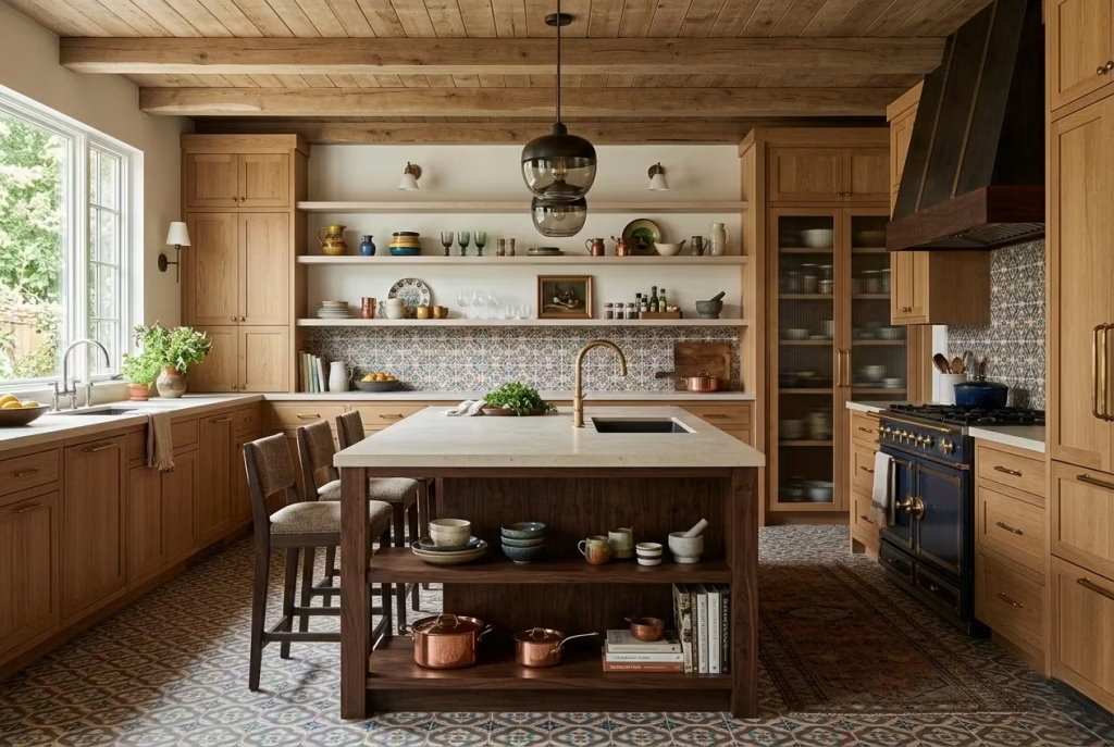
Timber is one of those materials that carries warmth almost instinctively, but it is also one of the easiest to get wrong when multiple tones are introduced without a clear hierarchy. In a maximalist kitchen, mixing timber is not about matching finishes, it is about allowing variation to feel deliberate rather than accidental.
When handled with a trained eye, different wood tones can sit together like a well-rehearsed ensemble, each one distinct yet still part of the same composition. The result is a kitchen that feels layered, grounded, and quietly sophisticated, rather than overly coordinated or flat.
Spatial Context
Timber variation works best when it is distributed across different functional zones rather than clustered in one area. For example, cabinetry might carry a darker walnut tone, while shelving introduces a lighter oak, and furniture elements such as a dining table or bench bring in a mid-tone variation. This spatial separation allows each timber to read clearly without competing directly.
In open-plan kitchens, this becomes even more important. Timber often connects kitchen, dining, and living areas, so variation can actually help define zones without physical barriers. A darker timber kitchen island can anchor the cooking space, while lighter tones in adjacent furniture soften the transition into more social areas.
The key is rhythm rather than repetition. If every timber surface sits at the same visual weight, the space can feel monotonous despite the use of natural material. But when tones are staggered across the room, the eye begins to move more naturally through the space, almost like following a quiet visual trail.
Real-Life Application
In one project, the original brief called for a single oak finish throughout the kitchen. It was safe, cohesive, and predictable. But once the layout was developed, it became clear that the space had enough complexity to support more variation. The risk of uniformity was that it would flatten the architecture and remove opportunities for contrast.
We introduced a deeper walnut tone for the island base, retained a natural oak for wall cabinetry, and added a slightly bleached timber for open shelving. At first glance, it sounded like too many directions, but once installed, the combination felt remarkably natural.
What made it work was the way each tone was assigned a role. The darker timber grounded the centre of the room, the mid-tone carried the main visual structure, and the lighter finish lifted the upper portion of the space. Over time, the client stopped noticing the variation as separate choices and began to experience it as a single, cohesive environment.
It is often in these layered timber schemes that a kitchen starts to feel less designed and more composed, as if it has evolved rather than been installed in one moment.
Measurements and Proportions
Timber itself does not follow strict measurement rules, but proportion and distribution matter greatly. Cabinet door widths typically range from 300 mm to 600 mm or 12 to 24 inches, and consistency in these modules helps maintain visual order even when finishes vary.
In kitchens where multiple timber tones are used, it is important to avoid abrupt transitions on very small surfaces. Larger uninterrupted panels tend to carry variation more successfully, as they allow the grain and tone to read clearly.
Shelf thickness also plays a subtle role. Standard shelving around 20 to 30 mm or ¾ to 1¼ inches thick provides enough presence to register visually without overwhelming the composition. When different timber tones are used across shelving, maintaining consistent thickness helps preserve cohesion even when colour shifts.
Flooring, if timber, should be treated as the foundational tone. It often sits within the mid-range of the palette, allowing cabinetry above to either deepen or lighten without clashing. This vertical layering is what keeps the room visually balanced.
Material Reasoning
The success of mixed timber tones depends heavily on undertones rather than surface colour alone. Warm undertones tend to sit more comfortably together, even when the overall shades differ. A warm oak and a slightly reddish walnut, for example, often feel more harmonious than two woods that share similar lightness but conflicting undertones.
Finish consistency is equally important. Mixing highly glossy timber with very matte surfaces can create unintended visual tension. In most maximalist kitchens, a soft matte or satin finish across all timber elements helps unify the variation and keep the focus on tone rather than reflectivity.
Grain direction and pattern density also influence how tones interact. Busy grains paired with other busy grains can feel overwhelming, so balancing a strong grain timber with a quieter, more restrained one helps maintain visual clarity.
Finally, ageing should be considered. Timber naturally deepens over time, especially in kitchens where light, heat, and use are constant factors. Choosing woods that age in a complementary way ensures the palette remains coherent even as it evolves.
Pros
- Adds depth and natural variation without relying on synthetic contrast
- Helps define different zones in open-plan kitchen layouts
- Creates a layered, collected feel that avoids uniformity
- Allows timber to be used more expressively across multiple elements
- Ages beautifully, gaining character over time rather than losing it
Cons
- Poor coordination of undertones can lead to visual discord
- Requires careful planning to avoid accidental mismatch
- Can feel busy if too many tones are introduced without hierarchy
- Harder to adjust later compared to single timber schemes
- Needs consistent finishing to maintain cohesion across different suppliers or sources
Mixing timber tones is ultimately about confidence and restraint working side by side. When done thoughtfully, it brings a quiet richness to a kitchen that feels impossible to replicate with a single finish.
It is less about control and more about allowing natural variation to do its work, subtly shaping a space that feels layered, lived in, and entirely its own.
Freestanding Pieces Within Fitted Kitchens
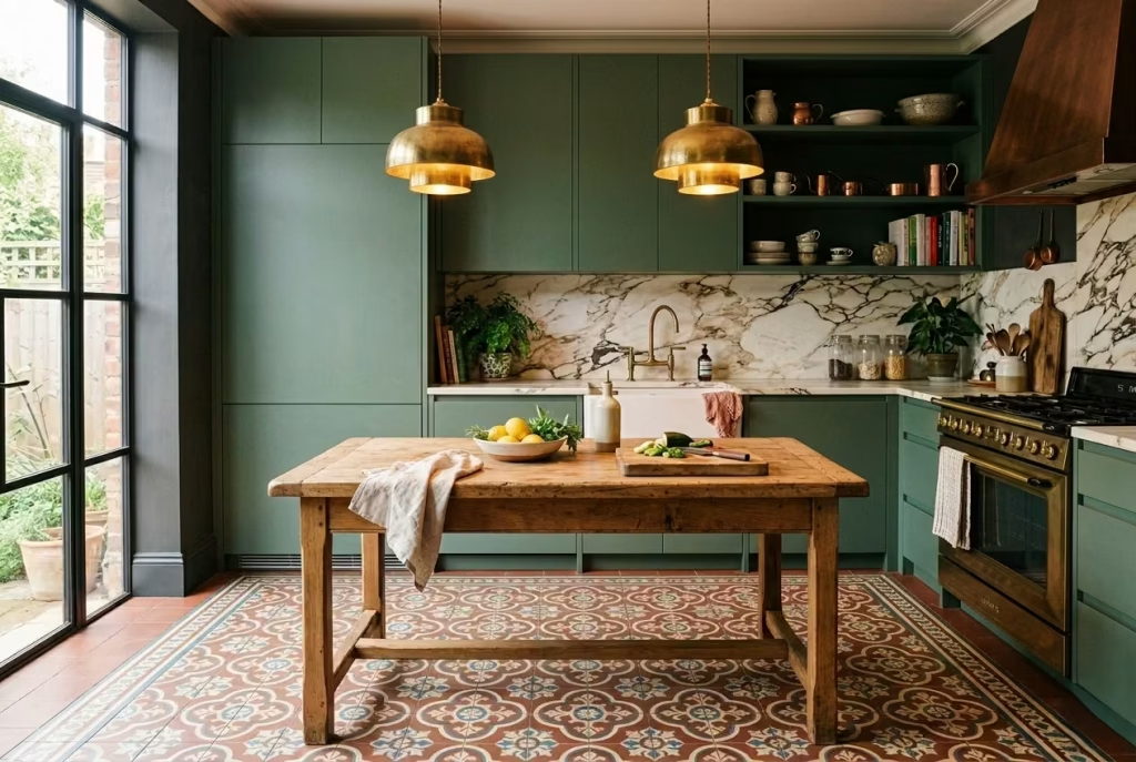
Freestanding furniture inside a fitted kitchen introduces a kind of controlled disruption that maximalist spaces often benefit from. It breaks the strict language of cabinetry and replaces it with something more human, slightly imperfect, and far more adaptable.
In a room that is typically measured to the millimetre, a freestanding piece feels almost like a breath being let out. It brings looseness into precision, and in doing so, it stops the kitchen from feeling overly engineered.
Spatial Context
Freestanding elements work best when they are positioned as intentional interruptions rather than afterthoughts. A freestanding island, butcher’s block, dresser, or prep table can sit within a run of fitted cabinetry and immediately soften the rigidity of the layout. The key is to let it occupy its own spatial identity without being swallowed by the surrounding joinery.
In larger kitchens, freestanding pieces help break down scale. Long runs of cabinetry can sometimes feel monolithic, even when beautifully designed. Introducing a freestanding element creates a pause, almost like a punctuation mark within a sentence, allowing the eye to rest before continuing through the space.
In smaller kitchens, restraint is more important. One well-chosen freestanding piece can do more than several competing elements. It should feel like a deliberate focal point, not an obstruction. Placed correctly, it can even improve circulation by subtly guiding movement through the room rather than blocking it.
The most successful arrangements often happen when fitted and freestanding elements are allowed to contrast rather than compete. One provides structure, the other provides character. Together, they create rhythm.
Real-Life Application
In one project, the kitchen was entirely fitted, highly functional, and technically flawless, yet it lacked a sense of ease. Everything was built in, flush, and perfectly aligned, which initially felt impressive but gradually became slightly rigid in atmosphere. The client described it as “too composed to relax in,” which is often a telling observation.
We introduced a freestanding oak prep table into the centre of the kitchen, positioned slightly off-axis from the main run of cabinetry. It was not oversized, but it carried enough presence to shift the spatial balance. Over time, it became the most used surface in the room, not because it offered more functionality, but because it felt more approachable.
What was interesting was how the kitchen behaviour changed. The fitted areas remained for storage and structured tasks, while the freestanding piece became the informal working hub. It absorbed daily activity in a way that softened the entire environment. The kitchen stopped feeling like a display of precision and started feeling like a place where things naturally happened.
It is often these moments, small spatial interruptions, that quietly transform how a kitchen is lived in.
Measurements and Proportions
Freestanding kitchen pieces need careful proportioning to sit comfortably within fitted environments. Standard kitchen counter height is around 900 mm or 36 inches, so freestanding pieces intended for preparation should generally align closely with this to maintain ergonomic consistency.
Depth is another important factor. Freestanding islands or tables typically range between 600 mm and 900 mm, or 24 to 36 inches. Narrower pieces feel lighter and more mobile, while deeper ones introduce more presence but require generous circulation space around them.
Circulation should never be overlooked. A minimum clearance of 900 mm or 36 inches around freestanding elements is generally recommended, while 1000 to 1200 mm or 39 to 48 inches feels more comfortable in open-plan kitchens where multiple people move through the space.
Length varies depending on function, but anything between 1200 mm and 2400 mm or 4 to 8 feet tends to sit well in most domestic kitchens. Anything beyond that risks overwhelming the fitted elements unless the space is particularly large.
Material Reasoning
Material contrast is what allows freestanding pieces to stand apart from fitted kitchens without feeling disconnected. If the cabinetry is highly polished or uniform, a freestanding piece in natural timber or aged wood can introduce warmth and tactility. It immediately breaks the visual monotony and adds a sense of history, even if newly introduced.
Conversely, in kitchens rich with natural materials, a freestanding piece in painted wood or lighter finishes can lift the visual weight and prevent the space from becoming too dense. The aim is not opposition, but balance.
Timber is often the most successful material for freestanding elements because it carries inherent variation and warmth. It also ages well, developing character over time that reinforces its independence from the fitted structure.
Metal frames or stone-topped freestanding units can introduce a more architectural reading, but they need careful handling to avoid feeling too industrial or detached from the rest of the kitchen.
The real strength of freestanding pieces lies in their imperfection. Slight variations, visible joints, or softened edges make them feel lived in, which contrasts beautifully with the precision of fitted joinery.
Pros
- Breaks up rigid fitted layouts and introduces visual rhythm
- Adds flexibility and adaptability to kitchen use over time
- Creates informal, approachable working or gathering zones
- Softens the overall architectural precision of fitted cabinetry
- Allows material contrast that enhances depth and character
Cons
- Requires careful spacing to avoid disrupting circulation flow
- Can feel visually disconnected if materials are not thoughtfully coordinated
- May reduce storage efficiency compared to fully fitted solutions
- Poor placement can make the kitchen feel fragmented rather than layered
- Needs intentional design integration to avoid appearing like an afterthought
Freestanding pieces inside fitted kitchens bring something quietly essential into maximalist design. They loosen the edges, soften the structure, and introduce a sense of lived reality that fully integrated schemes sometimes miss. When placed with intention, they do not compete with fitted elements. They complete them, giving the kitchen a sense of rhythm that feels both designed and naturally evolved at the same time.
You May also Like: 25 French Country Kitchen Ideas for Renovators Who Want Something That Actually Lasts
Bold Appliances That Act as Anchors
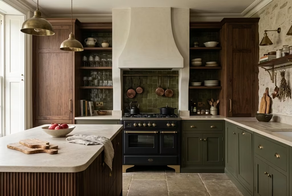
Appliances are usually treated as something to conceal, tuck away, or visually neutralise. In a maximalist kitchen, that instinct gets reconsidered. Instead of disappearing into the background, bold appliances can be allowed to hold their own presence, acting as anchors that stabilise everything around them. When chosen with intent, they stop being purely functional objects and start behaving like architectural punctuation within the room. They give the kitchen weight, rhythm, and a sense of grounded confidence that lighter schemes often struggle to achieve.
Spatial Context
Bold appliances work best when the kitchen already has enough visual activity to support them. In a highly layered space, they do not introduce chaos, they introduce clarity. A statement range cooker, a coloured refrigerator, or a sculptural extractor can sit within a busy material palette and surprisingly bring order rather than disruption.
In open-plan kitchens, appliances often become natural focal points. A range cooker set into a deep alcove can define the cooking zone, while a freestanding fridge in a contrasting finish can act as a visual stop between kitchen and dining areas. These elements help the eye understand where one function ends and another begins, even in the absence of walls.
The placement is critical. Bold appliances should never feel randomly inserted. They work best when they are framed by cabinetry, flanked by shelving, or positioned on a strong axis within the room. This gives them architectural legitimacy, rather than making them feel like standalone objects dropped into the space.
Real-Life Application
In one kitchen project, the initial design leaned heavily toward full integration. Everything was concealed behind matching cabinetry, from refrigeration to extraction. While the result was clean, it also felt slightly too restrained for the personality of the space, almost as if the kitchen was holding itself back.
We introduced a deep, matte black range cooker with brass detailing as the central focal point of the cooking wall. It was not oversized, but its presence was unmistakable. Suddenly, the entire kitchen recalibrated around it. The surrounding cabinetry felt more intentional, the stone more grounded, and even the lighting started to feel more purposeful.
What became clear over time was how naturally the appliance drew people in. It became the point where conversations started while cooking, where guests naturally gathered, and where the rhythm of the kitchen quietly centred itself. It did not overpower the room. It gave it direction.
Measurements and Proportions
Appliance scale needs to align with cabinetry and room volume to avoid imbalance. Standard range cookers typically measure between 900 mm and 1100 mm in width, or roughly 36 to 43 inches, which makes them suitable as central focal points in most medium to large kitchens.
Freestanding refrigerators generally range from 600 mm to 900 mm wide, or 24 to 36 inches, with taller models reaching up to 2000 mm or 79 inches in height. When used as statement pieces, their vertical presence should be balanced with surrounding cabinetry to prevent them from feeling isolated.
Clearances are essential for both visual and functional reasons. A minimum of 100 mm to 150 mm, or 4 to 6 inches, of space on either side of a bold appliance helps it breathe within the layout. In more dramatic compositions, slightly wider framing through cabinetry or open shelving can enhance its presence.
In open-plan spaces, maintaining at least 1000 mm, or 39 inches, of circulation space in front of major appliances ensures they remain practical while still functioning as visual anchors.
Material Reasoning
Material finish is what determines whether a bold appliance feels integrated or disruptive. Matte finishes tend to work particularly well in maximalist kitchens because they reduce glare and allow the appliance to sit more comfortably within layered materials such as stone, timber, and textured cabinetry.
Colour choice plays a defining role. Deep tones such as black, forest green, navy, or muted metallics tend to behave as anchors, while brighter colours introduce more energy and should be used with greater restraint. The goal is not novelty, but permanence, something that feels like it belongs to the architecture of the room.
Metal detailing, particularly in brass, bronze, or brushed steel, can help tie appliances back into hardware and lighting schemes. This subtle repetition creates cohesion, even when the appliance itself is visually strong.
Built quality also matters more than people expect. Bold appliances are more exposed to daily use and visual scrutiny, so imperfections in finish or detailing become more noticeable. A well-executed appliance will age into the space gracefully, while a poorly chosen one can quickly feel out of place.
Pros
- Creates strong focal points that help organise complex kitchen layouts
- Adds architectural weight and visual stability to the space
- Enhances the identity and character of the kitchen
- Encourages natural gathering points within open-plan designs
- Reduces reliance on full integration, allowing more expressive design choices
Cons
- Can dominate smaller kitchens if scale is not carefully considered
- Requires coordination with cabinetry and finishes to avoid visual conflict
- Bold colours or finishes may limit flexibility in future updates
- Poor placement can disrupt flow rather than enhance it
- Higher visual exposure means imperfections are more noticeable over time
Bold appliances, when treated as anchors rather than background necessities, bring a quiet confidence to a kitchen. They do not ask to be hidden or softened. Instead, they hold their position within the space, giving structure to everything around them. In a maximalist setting, that sense of grounded presence is often what allows the rest of the design to feel expressive without tipping into disorder.
Architectural Mouldings in Contemporary Kitchens
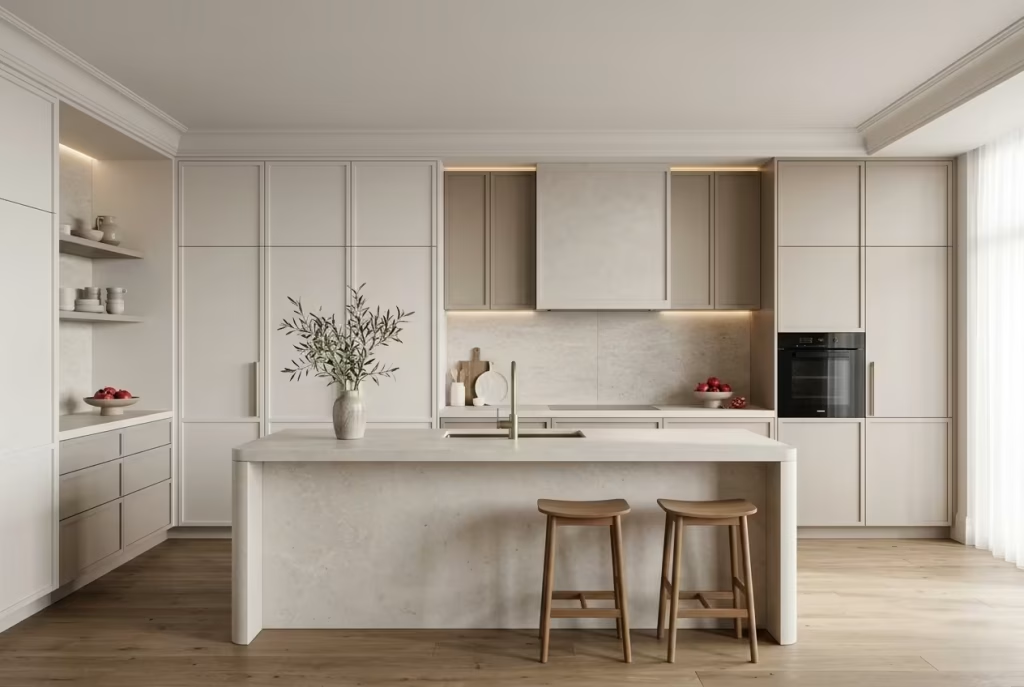
Architectural mouldings bring a surprising amount of depth to a contemporary kitchen, especially when the rest of the room is leaning into clean lines and hard-working materials. They introduce a sense of framing, proportion, and quiet refinement that can stop a modern scheme from feeling too flat or visually abrupt. In a maximalist kitchen, that extra layer matters. It gives the room something to catch on to, something that softens the transitions between cabinetry, walls, and ceiling, while still keeping the overall feel crisp and current.
Spatial Context
Mouldings work best when they are used to define edges rather than overwhelm them. In a contemporary kitchen, that often means applying them selectively across ceiling perimeters, cabinet fronts, island panels, or the junction between walls and joinery. They help the room feel composed, especially in schemes where bold colour, patterned stone, or mixed materials are already doing a lot of talking.
In open-plan spaces, mouldings can quietly bring order to the architecture. A simple cornice line or panel surround can distinguish the kitchen zone from adjoining dining or living areas without the need for walls or obvious dividers. That is where they really earn their keep. They draw a line in the sand, visually speaking, and make the kitchen feel anchored within the wider plan.
Mouldings also have a useful way of tempering large expanses. Tall cabinetry and long runs of joinery can start to feel a little stern if left completely plain. A framed panel or shallow trim introduces rhythm, and rhythm, in a busy kitchen, is worth its weight in gold. It gives the eye a place to pause before moving on.
Real-Life Application
I worked on a kitchen where the cabinetry was beautifully minimal, handleless, and technically immaculate, but the room kept feeling slightly cold. Everything was precise, yet the space lacked a point of arrival. It had all the ingredients of a good contemporary kitchen, but none of the warmth that makes a room feel memorable.
We introduced very restrained mouldings on the wall cabinetry and a subtle perimeter trim around the ceiling line. Nothing ornate, nothing trying to dress the room up beyond recognition. The effect was immediate, though quiet. The cabinetry began to read as more architectural, the ceiling felt lower in a good way, and the room gained a sense of finish that had been missing.
What stayed with me was how the client responded weeks later. They said the kitchen no longer felt like it was waiting to be completed. That is often the difference mouldings make. They do not shout for attention, but they change the emotional temperature of the space. The room starts to feel settled in its own skin.
Measurements and Proportions
The scale of moulding needs to be calibrated carefully. In contemporary kitchens, shallow profiles usually work better than heavy classical detailing. A cornice depth of around 25 to 50 mm, or 1 to 2 inches, is often enough to create definition without making the room feel traditional or overly ornate.
For panel mouldings on cabinetry, the proportions should align with the size of the door fronts. Narrow frames, often between 30 and 60 mm, or roughly 1.25 to 2.5 inches, tend to work well on larger cabinet doors or island panels. Anything too wide can quickly tip the balance and make the kitchen feel formal in a way that may not suit the rest of the scheme.
In rooms with ceiling heights of around 2400 to 2700 mm, or 8 to 9 feet, mouldings should stay restrained so they do not visually press down on the space. Taller rooms can carry a little more presence, but even then, the detail should feel deliberate rather than decorative for its own sake.
Material Reasoning
The material finish of mouldings plays a big role in how they sit within a modern kitchen. Painted timber or MDF mouldings are often the most practical choice, particularly when they are colour-matched to cabinetry or walls. This allows them to blend into the architecture while still adding depth through shadow and form.
In some kitchens, plaster mouldings can provide a cleaner, more built-in quality, especially where the intention is to make the detail feel part of the structure rather than an applied finish. They can be particularly effective at ceiling level, where subtle shadow lines do much of the work.
Wood mouldings bring warmth, but they need care. Left too visible or too ornate, they can pull the scheme into a more traditional territory than intended. Used with restraint, though, they can soften hard materials and bring a tactile richness that feels well judged.
Paint finish matters too. A matte or eggshell finish usually works best because it keeps the detail understated and avoids glare. In a maximalist kitchen, where there may already be plenty of surface variation, a quieter finish helps the mouldings support the room rather than compete with it.
Pros
- Adds architectural depth without requiring major structural change
- Helps frame cabinetry and define zones within open-plan layouts
- Softens hard lines and reduces the starkness of contemporary joinery
- Introduces a sense of craftsmanship and permanence
- Works well alongside bold colour, stone, and other layered finishes
Cons
- Can feel too traditional if the scale or profile is overdone
- Requires precise installation to avoid looking forced or imbalanced
- In very small kitchens, heavy mouldings can make the room feel crowded
- Needs careful coordination with lighting and cabinetry lines
- Poorly chosen finishes can clash with the contemporary tone of the kitchen
Architectural mouldings in a contemporary kitchen are a bit like good tailoring. You do not always notice them first, but you feel their effect the moment the room settles around them. They bring form, rhythm, and a sense of finish that can quietly transform a space from merely sleek to genuinely composed. In a maximalist kitchen, that kind of detail is often what keeps the whole thing from drifting off course.
You May also Like: 25 Organic Kitchen Design Ideas for a Natural Home
Colour-Blocked Zones Within Open-Plan Layouts
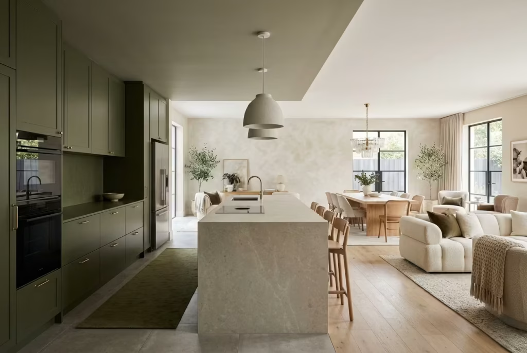
Colour-blocking in open-plan kitchens is often mistaken for a purely decorative gesture, but when it is used with architectural intent, it becomes a powerful way of structuring space. In maximalist design, where layers already coexist, colour-blocking introduces order without stripping away personality. It works almost like invisible zoning, where colour quietly dictates function, mood, and movement without the need for walls or physical dividers.
Spatial Context
Open-plan kitchens tend to suffer from one common challenge, visual sprawl. When cooking, dining, and living areas merge into a single volume, the space can start to feel undefined, even if each element is well designed individually. Colour-blocking helps resolve that by assigning identity to each zone.
A deep tone around the cooking area can anchor the kitchen, making it feel grounded and purposeful. A softer, lighter palette in the dining zone can encourage calm and lingering. Meanwhile, a mid-tone transition area, often used in circulation paths or island surrounds, helps bridge the two without harsh breaks.
The most effective schemes are not abrupt but layered. A wall that shifts tone at a natural break, cabinetry that changes colour at an island, or even a ceiling that subtly differentiates one zone from another can all help guide the eye and shape movement. It is less about dividing space and more about teaching the room how to behave.
Real-Life Application
In one project, the brief was an open-plan kitchen that felt connected but not chaotic. Initially, everything was planned in a single neutral palette, which looked cohesive on paper but lacked direction in reality. The kitchen, dining, and living areas merged into one continuous visual field, and the client described it as “beautiful but directionless.”
We introduced a deep, muted olive tone in the cooking zone, wrapping cabinetry and part of the wall. The island sat at the transition point in a softer stone-inspired neutral, while the dining area was kept lighter and more open with warm off-white tones. The shift was subtle in structure but transformative in experience.
What changed most was how people moved through the space. The kitchen felt like a place to work, the island became a natural gathering point, and the dining area finally had its own identity. Nothing was physically separated, yet everything felt clearly defined. It is one of those rare design moves that quietly corrects behaviour without demanding attention.
Measurements and Proportions
Colour-blocking relies less on strict dimensions and more on logical spatial breaks. However, natural transition points should always guide where colour shifts occur. Islands typically range from 1800 mm to 2400 mm in length, or 6 to 8 feet, making them ideal anchor points for colour changes.
Wall divisions often align with cabinetry runs or architectural breaks such as doorways, ceiling beams, or changes in flooring direction. Shifting colour at these points avoids visual interruption and keeps the scheme feeling intentional rather than arbitrary.
Ceiling heights, commonly around 2400 mm to 2700 mm or 8 to 9 feet, allow for subtle vertical zoning. A colour shift above cabinetry or at a cornice line can reinforce spatial separation without lowering the perceived height of the room.
The key principle is proportion rather than strict measurement. Each colour zone should feel like it belongs to a clear spatial function, not a random visual block.
Material Reasoning
Colour-blocking works best when it is supported by material variation, not just paint alone. Matte finishes tend to absorb light and create a sense of depth, making them ideal for cooking zones where grounding is important. Satin finishes, with their slight reflectivity, can be used in transitional areas to gently bridge tones.
In dining zones, softer textures such as limewash paint or subtly reflective plaster finishes can prevent the colour from feeling too flat. These finishes respond to light in a more atmospheric way, which suits spaces designed for lingering rather than task-driven activity.
Cabinetry materials also play a role. Painted MDF or timber allows for clean colour transitions, while natural stone and timber can soften the boundary between zones when used carefully. The goal is not to isolate colours but to let them flow into one another with intention.
Durability should also be considered, especially in high-use areas. Cooking zones benefit from finishes that can withstand moisture and frequent cleaning, while dining and living zones can afford slightly more delicate or decorative surfaces.
Pros
- Clearly defines functional zones within open-plan layouts without physical barriers
- Adds depth and architectural logic to large, continuous spaces
- Helps guide movement and behaviour naturally through colour hierarchy
- Enhances the emotional identity of each area within the home
- Works particularly well in maximalist interiors where layering already exists
Cons
- Poorly planned transitions can feel abrupt or visually fragmented
- Requires careful coordination with lighting and materials to avoid imbalance
- Colour choices are difficult to change once applied across large surfaces
- Can overwhelm smaller open-plan spaces if contrast is too strong
- Needs architectural awareness to avoid feeling like surface decoration rather than design strategy
Colour-blocking in open-plan kitchens is ultimately about subtle control. It is not there to divide a space into rigid sections, but to give it structure that feels almost instinctive. When done well, it creates a rhythm that the eye follows naturally, allowing the kitchen to feel both expansive and clearly understood at the same time.
Reflective Surfaces to Multiply Visual Layers
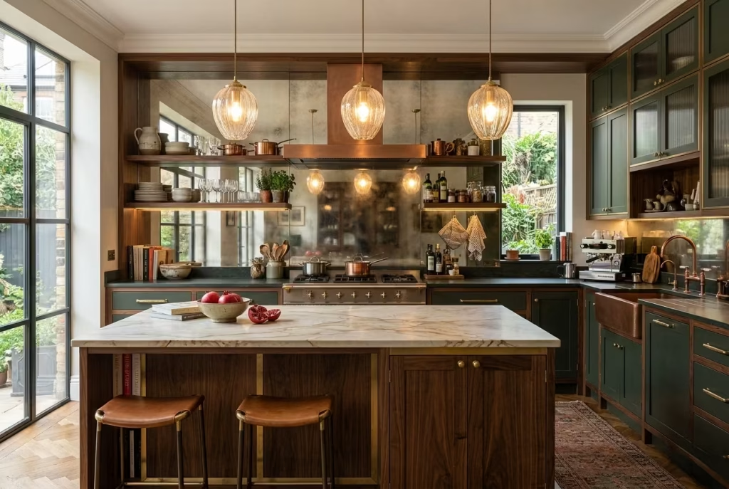
Reflective surfaces in a maximalist kitchen are often misunderstood as purely decorative gloss, yet their real value lies in how they manipulate perception. They do not simply add shine, they multiply depth. A well-placed reflective finish can double the sense of space, extend visual lines, and subtly stitch together otherwise competing materials.
In a kitchen already rich with texture and colour, reflection becomes less about brightness and more about orchestration, quietly holding complexity together so it does not tip into chaos.
Spatial Context
Reflective surfaces work most effectively when they are used to extend sightlines rather than dominate them. A mirrored splashback behind a hob, high-gloss cabinetry on upper runs, or polished stone worktops can all create a sense of layered depth that draws the eye further into the room. The goal is not to make everything shiny, but to position reflection like a carefully placed echo within the space.
In smaller kitchens, reflective elements can visually push boundaries outward, making walls feel more distant than they physically are. In larger open-plan layouts, they help connect zones by bouncing light between kitchen, dining, and living areas, creating a continuous visual rhythm.
Placement is everything. A reflective surface directly opposite a strong focal point, such as a window, pendant light, or statement cabinetry, can create a dynamic interplay of movement throughout the day. However, when overused or poorly positioned, reflection can become disorienting, scattering attention rather than guiding it.
Real-Life Application
In one kitchen project, the space had strong material foundations but felt slightly heavy in the evening. The combination of deep cabinetry, textured stone, and layered shelving created richness, but also absorbed light more than intended. The room looked beautiful in daylight but lost a degree of energy after sunset.
We introduced a softly reflective antiqued mirror splashback behind the main preparation area. It was not highly polished, which would have felt too sharp, but gently aged so that reflections were softened and fragmented. The effect was immediate once the evening lighting came on.
Instead of a flat, static wall, the kitchen began to respond to movement and light. Shadows from people passing through the space, the glow of pendant lighting, even the subtle flicker from appliances, all became part of the visual composition. It gave the kitchen a sense of life that had been missing, almost like the room had started to breathe differently.
What was particularly interesting was how it changed perception rather than layout. Nothing in the footprint shifted, yet the room felt wider, deeper, and more connected. That is the quiet strength of reflective surfaces when they are used with restraint.
Measurements and Proportions
Reflective surfaces do not rely on strict dimensional rules, but their scale relative to surrounding elements is critical. Splashbacks typically range from 500 mm to 600 mm in height, or 20 to 24 inches, but extending them full height, often up to 2400 mm or 8 feet, can dramatically increase their impact in maximalist kitchens.
Cabinetry with reflective finishes tends to work best on larger, uninterrupted panels. Door widths between 400 mm and 600 mm, or 16 to 24 inches, allow reflections to read clearly without excessive fragmentation. Too many small reflective surfaces can create visual noise rather than depth.
In terms of spacing, reflective elements should always have breathing room. A minimum of 100 mm to 150 mm, or 4 to 6 inches, between reflective surfaces and strong contrasting materials helps prevent visual overload and maintains clarity.
Ceiling height also plays a role. In spaces above 2700 mm or 9 feet, reflective finishes can be used more liberally, as the increased vertical volume naturally absorbs visual activity. In lower ceilings, more selective application is often necessary to avoid compressing the space visually.
Material Reasoning
The type of reflective material chosen determines how the kitchen behaves visually. High-gloss lacquer offers a controlled, contemporary reflection that works well on cabinetry, particularly in maximalist schemes where colour and form are already active. It reflects light cleanly but can feel quite sharp if overused.
Polished stone introduces a more organic reflection, often slightly uneven due to natural veining and mineral variation. This creates depth without sterility, making it ideal for worktops where durability and visual richness need to coexist.
Mirrored finishes, especially antiqued or smoked variations, introduce softness and fragmentation. Rather than showing a perfect reflection, they break it up, which is often more suitable for layered interiors. They allow movement and light to register without becoming visually dominant.
Metallic finishes, such as brushed brass, stainless steel, or bronze, offer a subtler form of reflection. They catch light rather than mirror it directly, which makes them easier to integrate into complex material palettes.
The key is balance. Too much clarity in reflection can expose every detail, which becomes overwhelming in a maximalist environment. Slight diffusion or variation often produces a more forgiving and atmospheric result.
Pros
- Enhances depth and visual layering without adding physical elements
- Amplifies natural and artificial light throughout the kitchen
- Helps connect multiple zones in open-plan layouts
- Makes compact kitchens feel more expansive and fluid
- Adds subtle movement and atmosphere as light changes throughout the day
Cons
- Can become visually distracting if overused or poorly positioned
- High-gloss finishes may show fingerprints and require frequent maintenance
- Strong reflections can feel overwhelming in already busy maximalist schemes
- Requires careful lighting coordination to avoid glare or hotspots
- Poor quality materials can distort reflections and reduce design clarity
Reflective surfaces, when used with restraint and intention, act like quiet amplifiers within a kitchen. They do not add more objects or colour, yet they expand what is already there. In a maximalist setting, that ability to multiply depth without increasing clutter is what makes them so valuable. They bring movement, light, and a sense of quiet complexity that shifts the entire room from static to responsive.
Unexpected Material Pairings (Stone + Lacquer + Wood)
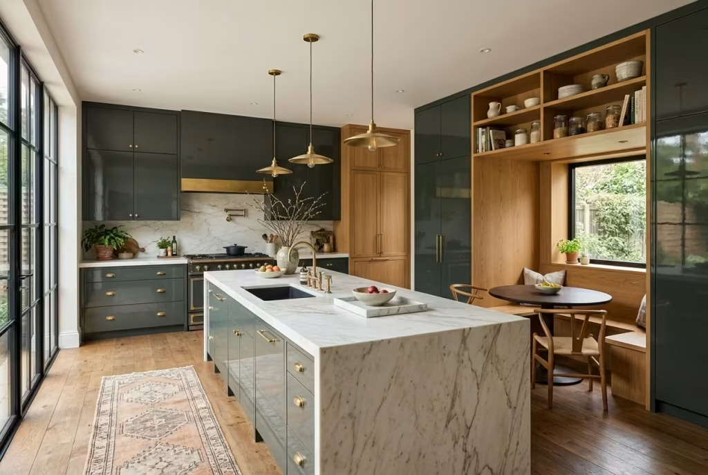
Material contrast is where maximalist kitchens either come alive or fall apart. Stone, lacquer, and wood each carry their own visual language, one grounded and geological, one smooth and reflective, the other warm and organic. When they are combined with intention, they stop competing and start conversing.
The result is a kitchen that feels layered in a very real, almost architectural sense, where each material holds its own identity but still belongs to the same story. It is not about harmony through similarity, but cohesion through contrast that has been carefully judged.
Spatial Context
These material pairings work best when each surface is given a clear spatial role. Stone often anchors horizontal planes such as worktops or islands, where its weight and permanence feel most natural. Lacquer tends to perform well on vertical cabinetry, where its reflective quality can lift the space and bounce light across the room. Wood sits comfortably in transitional or human-touch areas, such as open shelving, breakfast zones, or freestanding elements.
In open-plan kitchens, this separation becomes even more important. When stone, lacquer, and wood are used without spatial logic, the result can feel fragmented. But when each material is assigned a purpose within the layout, the kitchen begins to read like a composed sequence rather than a collection of finishes.
The strongest schemes often rely on repetition rather than isolation. For example, a stone island might be echoed by a smaller stone detail in a backsplash or shelf support. Lacquer cabinetry might reappear in a secondary run of units. Wood might extend beyond the kitchen into adjacent furniture, subtly tying zones together without forcing uniformity.
Real-Life Application
In one project, the initial design was based on a single material direction, predominantly timber with stone surfaces. It felt safe and cohesive, but slightly predictable. The client wanted something richer, something with more depth that would evolve visually over time rather than settling into a flat, single-note scheme.
We introduced high-gloss lacquer cabinetry in a deep, muted tone for the wall units, a honed marble for the island, and warm oak for the open shelving and seating areas. At first glance, it felt like a bold shift, almost too varied. But once installed, the relationship between the materials became clearer.
The stone provided grounding, the lacquer lifted the light and added rhythm, and the wood softened everything just enough to prevent the space from feeling overly polished. What surprised me most was how naturally the kitchen adapted to daily use. The lacquer reflected movement and light throughout the day, the stone aged gracefully with activity, and the wood developed character as it was touched and lived with.
It felt less like three materials competing for attention and more like three voices in the same conversation, each stepping forward at the right moment.
Measurements and Proportions
While material pairing is primarily a design decision, proportion still plays a quiet but important role. Stone worktops typically sit at a standard thickness of 20 to 30 mm, or roughly ¾ to 1¼ inches, although mitred edges can increase visual depth significantly when a more substantial presence is desired.
Lacquer cabinetry panels generally follow standard door widths between 400 mm and 600 mm, or 16 to 24 inches. Larger uninterrupted panels tend to work better with reflective finishes, as they allow light and reflection to behave more fluidly without visual interruption.
Wood elements, such as shelving or cladding, often work best in controlled thicknesses around 20 to 40 mm, or ¾ to 1½ inches. This keeps them visually present without overpowering adjacent materials.
Spacing between different material zones is less about strict measurement and more about transition logic. A small reveal of 5 to 10 mm, or 0.2 to 0.4 inches, between materials can be enough to signal separation while still maintaining visual continuity.
Material Reasoning
Stone brings permanence and weight. It is tactile, cool, and grounded, and it naturally becomes the anchor point in any composition. In maximalist kitchens, it prevents the space from feeling overly decorative or light.
Lacquer introduces reflectivity and control. It smooths out visual density and reflects surrounding materials, which helps unify complex palettes. However, its success depends heavily on finish quality. Matte lacquer feels more contemporary and forgiving, while high gloss introduces stronger reflection and sharper contrast.
Wood introduces warmth and variation. It softens transitions between harder materials and brings a human scale to the space. The grain, tone variation, and natural ageing process all contribute to a sense of lived experience that stone and lacquer alone cannot achieve.
The key to combining these materials is not blending them, but allowing each one to retain its character while still contributing to a larger composition. When one material tries to imitate another, the entire scheme loses clarity. When each remains honest, the contrast becomes the strength.
Pros
- Creates rich visual depth through controlled contrast of texture and finish
- Allows each material to perform a distinct spatial and functional role
- Enhances the sense of layering in maximalist kitchen design
- Improves light interaction through varied surface reflection and absorption
- Develops character over time as materials age differently
Cons
- Requires careful planning to avoid visual fragmentation
- Poor proportioning can make the kitchen feel disjointed rather than cohesive
- Higher design complexity increases risk of mismatch in tone or finish
- More materials can lead to higher maintenance and sourcing challenges
- Demands consistent detailing to prevent clashes at junction points
Unexpected material pairings work best when they are not treated as a visual experiment, but as a structured composition. Stone, lacquer, and wood each bring something fundamentally different to the table, and when their differences are respected rather than smoothed over, the kitchen gains a depth that feels both intentional and quietly effortless.
Personal Collections Integrated into the Design
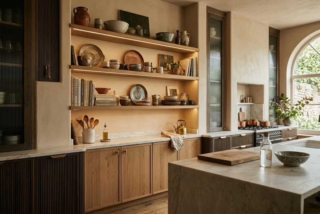
A maximalist kitchen reaches its most authentic expression when it stops relying solely on curated finishes and begins to reflect the life lived within it. Personal collections, whether ceramics, cookbooks, vintage utensils, or objects gathered over time, bring a layer that no material specification can replicate. They shift the kitchen from being a designed environment into something far more intimate, where memory, habit, and personality quietly settle into the architecture. When integrated with care, these collections do not create clutter. They create continuity between the space and the people who use it.
Spatial Context
Personal collections work best when they are given defined spatial homes rather than scattered randomly across the kitchen. Open shelving, glazed cabinets, recessed niches, and even carefully planned countertop corners can act as quiet stages where objects are allowed to breathe.
In kitchens with strong architectural structure, collections can be used to soften rigid geometry. A row of handmade ceramics on an open shelf can interrupt long cabinetry runs, while framed cookbooks or curated objects in glass cabinets can break up heavier wall elevations.
In open-plan spaces, collections often become subtle connectors between zones. A series of collected objects placed near the dining transition, for example, can help bridge the shift from functional cooking space to more relaxed social areas. The key is restraint in placement. When everything is displayed, nothing feels intentional. But when objects are given space and hierarchy, they begin to tell a story rather than compete for attention.
Real-Life Application
In one kitchen project, the client had a growing collection of handmade pottery gathered over many years of travel. Initially, these pieces were stored away in cupboards, rarely seen, despite being deeply meaningful to them. The kitchen itself was beautifully designed, but it lacked a personal thread that tied it to the client’s story.
We introduced a dedicated shelving run within the main cooking wall, carefully proportioned to display selected pieces rather than the entire collection. The shelving was kept shallow and evenly spaced so that each object could be seen clearly without visual crowding.
Once installed, the effect was immediate but subtle. The kitchen began to feel more lived in, not in a messy sense, but in a way that suggested history and continuity. The client later mentioned that they found themselves reaching for specific pieces more often, not just for use, but because they had become part of the daily rhythm of the space.
What stood out most was how the kitchen shifted emotionally. It was no longer just a place for preparation. It had become a backdrop for memory and routine, which is often where design becomes truly successful.
Measurements and Proportions
When integrating personal collections, shelf depth and spacing become critical. Open shelves typically work best at depths between 200 mm and 300 mm, or 8 to 12 inches, allowing objects to sit comfortably without being pushed too far back or appearing lost.
Vertical spacing between shelves often ranges from 250 mm to 350 mm, or 10 to 14 inches, depending on the scale of the items being displayed. Smaller objects benefit from tighter spacing, which creates a more curated, gallery-like effect, while larger pieces require more breathing room to avoid visual compression.
For countertop displays, leaving at least 300 mm to 600 mm, or 12 to 24 inches, of clear surrounding space helps ensure that collections feel intentional rather than accidental. This negative space is what allows the objects to carry visual weight.
In glazed cabinetry, shelf alignment should remain consistent, typically matching standard cabinet modules, so that collections appear structured rather than fragmented.
Material Reasoning
The materials surrounding personal collections play a major role in how they are perceived. Neutral or softly textured backgrounds tend to allow objects to stand forward more clearly. Painted cabinetry in muted tones, natural timber shelving, or lightly textured plaster walls all provide a calm backdrop that supports rather than competes.
Glass, whether clear or lightly textured, introduces a layer of separation while still maintaining visibility. It protects collections from everyday kitchen activity while still allowing them to remain visually present.
Lighting is equally important. Warm, diffused lighting tends to flatter handmade or natural objects, enhancing their imperfections and textures. Harsh or overly cool lighting can flatten detail and reduce the emotional impact of the collection.
Durability should also be considered. Kitchens are active environments, so positioning collections away from direct cooking zones helps preserve both the objects and the clarity of the display.
Pros
- Introduces genuine personality and emotional depth into the kitchen
- Creates a strong sense of narrative and lived experience
- Softens highly designed or rigid kitchen layouts
- Encourages daily interaction with meaningful objects
- Evolves naturally over time, reflecting changes in lifestyle and taste
Cons
- Requires careful curation to avoid visual clutter
- Can feel disorganised if spatial hierarchy is not maintained
- Sensitive objects may need protection from heat, moisture, and use
- Easy to overfill display areas, reducing impact of individual pieces
- Demands ongoing attention to maintain balance and clarity
Personal collections are what ultimately shift a maximalist kitchen from being a designed space into something far more grounded and human. They carry memory into structure, turning shelves and surfaces into quiet archives of everyday life. When placed with intention, they do not compete with the architecture. They complete it, giving the kitchen a sense of depth that no material alone can fully achieve.
How to Keep a Maximalist Kitchen from Feeling Overwhelming
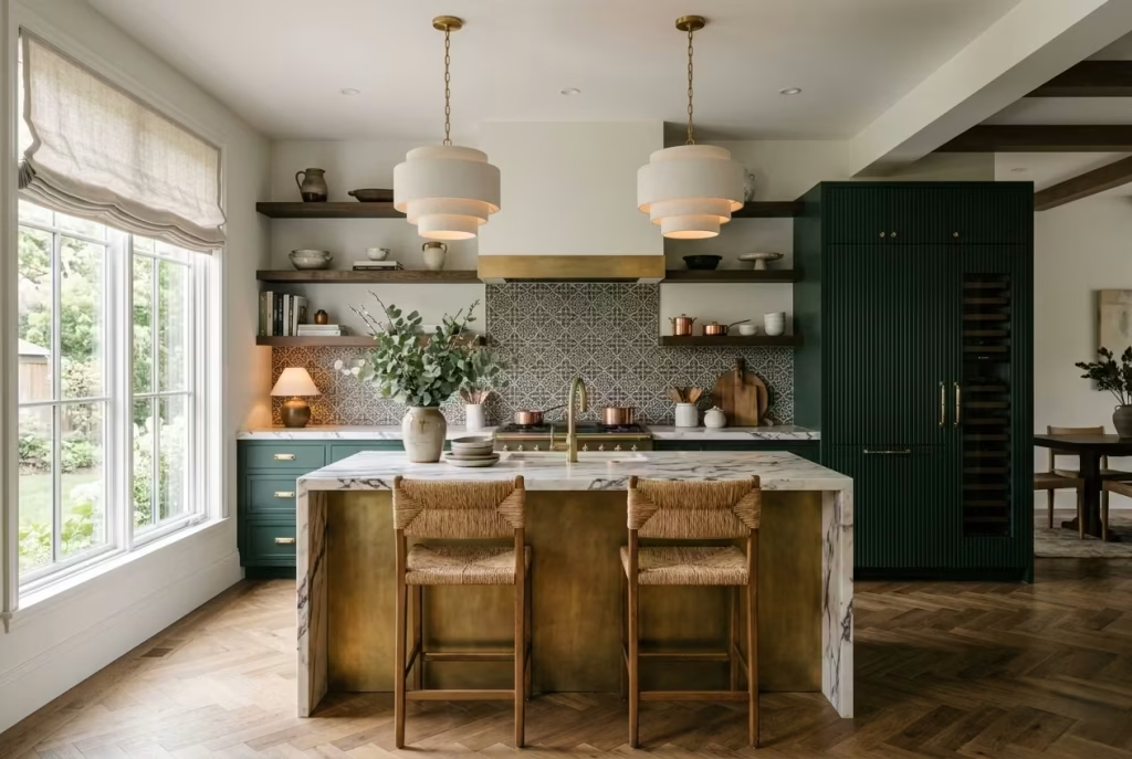
Maximalism, when it slips out of control, does not fail because there is too much in the room, it fails because nothing knows where it belongs.
The difference between a richly layered kitchen and one that feels chaotic often comes down to quiet structure beneath the surface. In the projects I have worked on, the most successful maximalist kitchens always carry an underlying discipline, one that is not immediately visible but is felt the moment you step into the space.
It is about giving bold elements room to breathe, allowing contrast to settle rather than collide, and knowing when to hold back so the room does not start speaking all at once.
When that balance is right, even the most expressive kitchen feels composed, almost effortless, as if everything has found its place without needing to announce it.
Visual Rest Points and Why They Matter
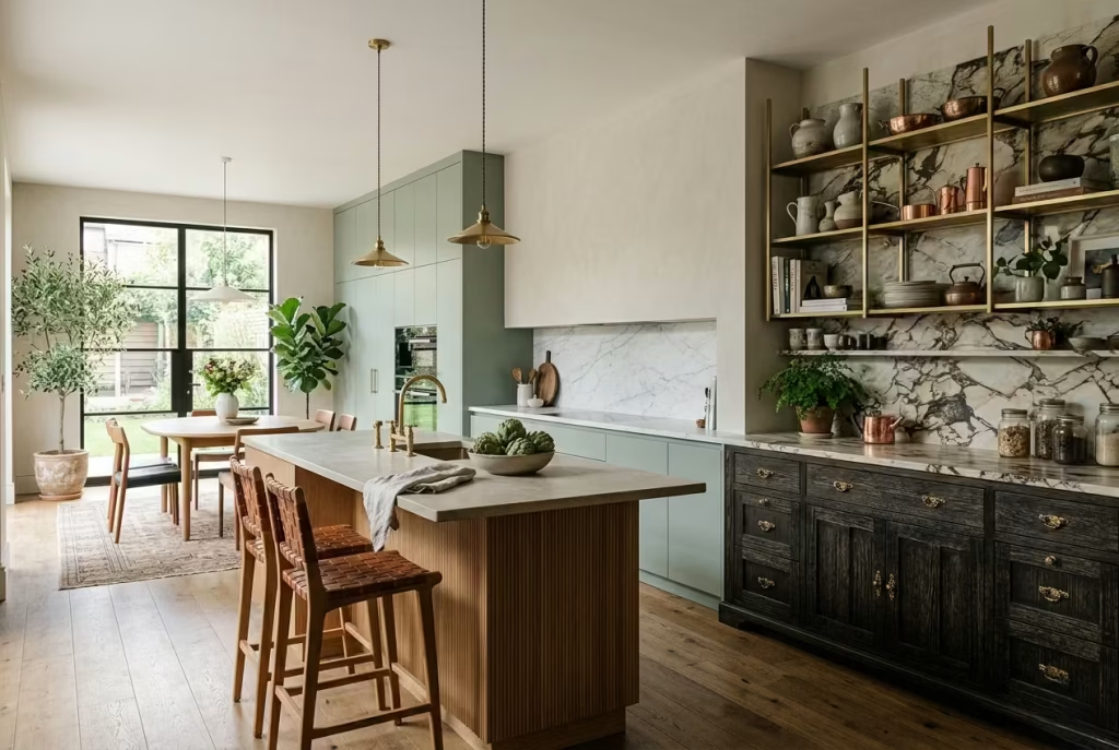
In a maximalist kitchen, the eye is constantly moving, scanning layers of colour, material, and detail. Without somewhere to pause, that movement becomes tiring rather than engaging. Visual rest points act as anchors within the composition, giving the eye a moment to settle before continuing its journey across the space.
These rest points are not empty by accident. They are deliberate areas of calm, often created through simpler cabinetry, uninterrupted surfaces, or quieter materials. A section of plain painted cabinetry, a softly toned wall, or even a clear stretch of stone worktop can serve this purpose. They allow the more expressive elements nearby to stand out without competing for attention.
I have seen kitchens where every surface was treated as an opportunity to add something more. Pattern on the splashback, texture on the cabinets, bold stone, decorative lighting, open shelving filled to the brim. Individually, each element worked, but together, they created a kind of visual noise that made the room feel restless.
Once we introduced a few intentional pauses, areas where nothing was trying to perform, the entire kitchen began to breathe again. It is often not about adding less, but about knowing where not to add at all.
The Role of Negative Space in a “Full” Room
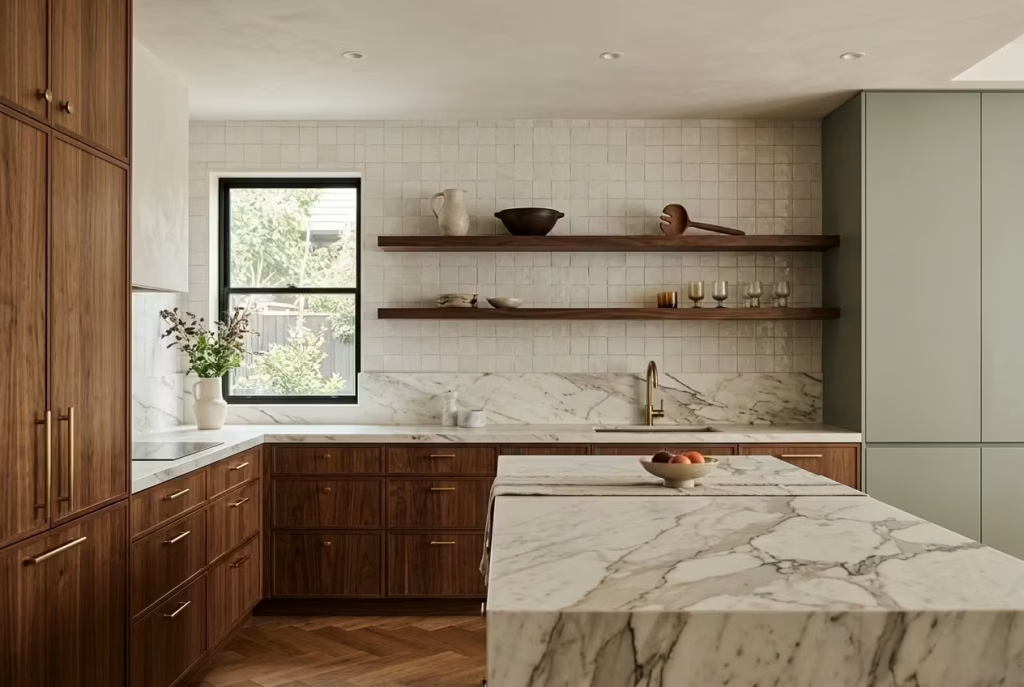
Negative space is often misunderstood as emptiness, when in reality it is what allows everything else to be seen clearly. In a maximalist kitchen, it acts like the quiet between notes in music. Without it, the rhythm collapses into a continuous, indistinct sound.
This can take many forms. Clear sections of countertop, open wall space between shelving, or even the careful spacing between objects on display.
The instinct is often to fill these gaps, especially when embracing a more expressive design language. But holding back, resisting that urge, is what keeps the room from tipping into clutter.
In one project, the client had a beautiful collection of objects and naturally wanted to display as many as possible. Initially, every shelf was filled, every corner occupied. The result felt heavy, despite the quality of the pieces.
We reduced the display by almost a third, not by removing character, but by giving each object more space around it. The transformation was immediate. Each piece gained presence, and the room as a whole felt lighter, even though nothing of value had been lost.
Negative space, when used well, does not feel empty. It feels intentional, like a breath held just long enough to bring everything else into focus.
Lighting as a Control Mechanism
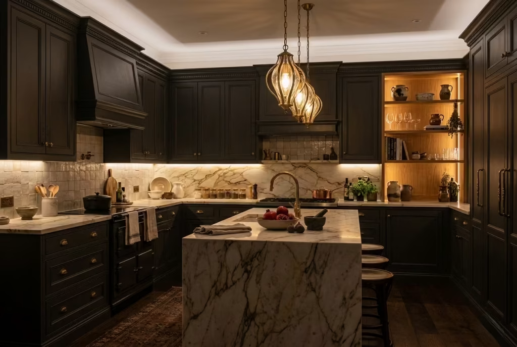
Lighting in a maximalist kitchen is not just functional. It is one of the most effective tools for controlling how the space is perceived. It can highlight certain layers, soften others, and guide attention in a way that feels almost subconscious.
Layered lighting works best. Ambient lighting provides overall clarity, task lighting ensures functionality, and accent lighting introduces depth. Under-cabinet lighting can wash surfaces gently, revealing texture without overwhelming it. Pendant lighting can draw focus to key areas such as islands or dining zones, creating hierarchy within the room.
What often makes the difference is adjustability. Dimmable lighting allows the kitchen to shift character throughout the day. Bright and energetic in the morning, softer and more atmospheric in the evening. This flexibility prevents the space from feeling static or overly intense at any one time.
I have worked on kitchens where the design felt perfectly balanced during the day but became visually overwhelming at night due to harsh, uniform lighting. By introducing layered and adjustable lighting, the same materials and colours began to read differently. Shadows softened edges, highlights added depth, and the overall atmosphere became far more controlled.
Lighting, when treated carefully, does not just illuminate the kitchen. It edits it in real time.
Editing Without Losing Character
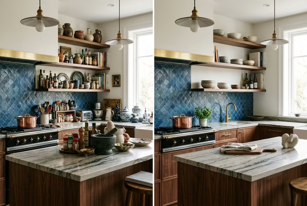
Editing a maximalist kitchen is often where hesitation sets in. There is a fear that removing elements will dilute the personality of the space. In reality, the opposite is usually true. Editing does not strip character away. It sharpens it.
The process is less about removal and more about refinement. Asking simple questions can guide decisions. Does this element contribute to the overall composition, or is it simply filling space. Does it relate to other materials or colours in the room, or does it sit in isolation. These small considerations help distinguish between meaningful layers and visual excess.
In practice, editing often happens in stages. First, stepping back and observing how the room feels rather than focusing on individual items. Then, making small adjustments. Removing a few objects, simplifying a surface, or even just rearranging elements to create better spacing. Over time, the kitchen begins to reveal its natural balance.
In one project, we did not remove a single major element. Instead, we restructured how they were presented. Shelves were simplified, colours were allowed to repeat more clearly, and certain details were given more prominence while others stepped back. The room retained its richness, but it no longer felt crowded.
Editing in maximalism is not about restraint for its own sake. It is about clarity. It ensures that every layer has a purpose and that the kitchen, no matter how expressive, still feels composed and easy to live with day after day.
Common Mistakes I See in Maximalist Kitchen Projects
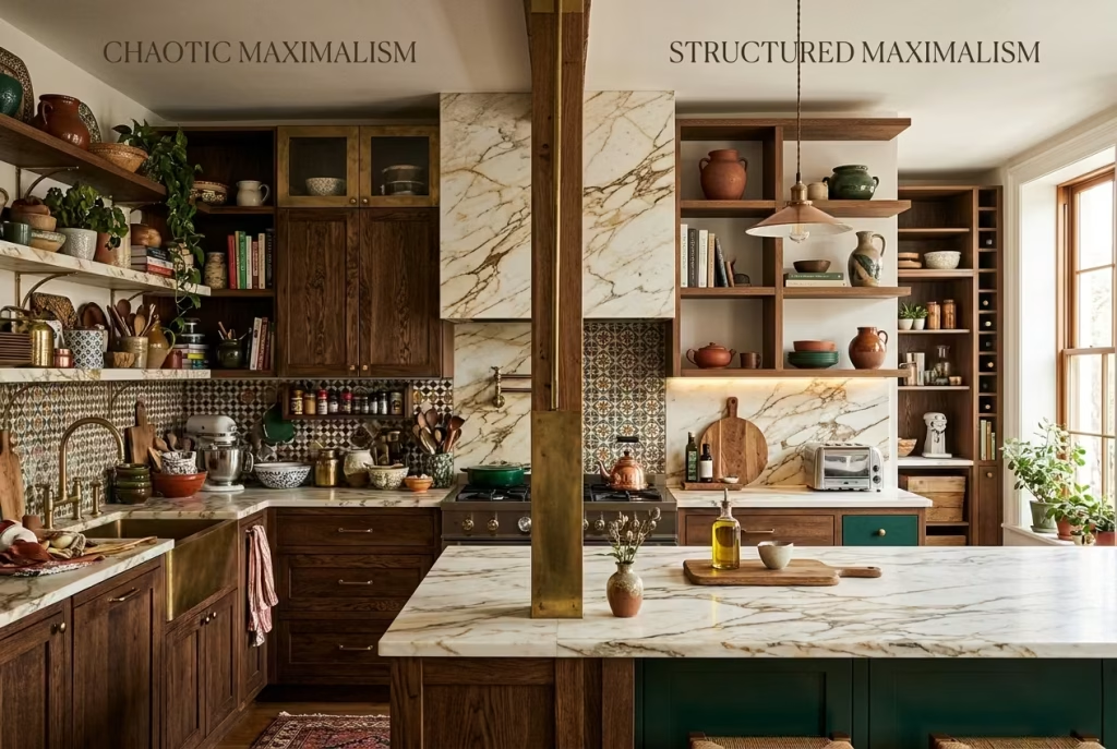
Maximalist kitchens invite expression, but they also expose every weak decision. When something is slightly off in a minimal scheme, it can hide in the background. In a layered kitchen, it stands front and centre. Most issues I encounter are not about having too much, but about lacking structure beneath the surface. Once that structure is corrected, the same materials and ideas often begin to work together rather than against each other.
Over-Layering Without Hierarchy
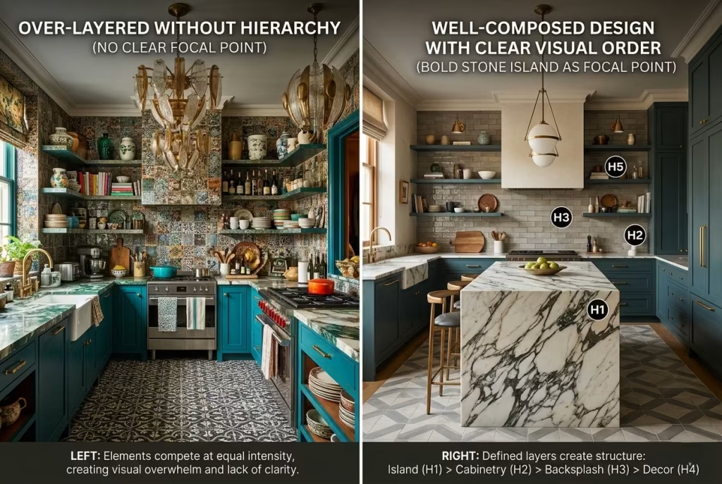
One of the most frequent pitfalls is adding layers without deciding which ones should lead and which should support. When every element is trying to be the focal point, the kitchen begins to feel like a conversation where everyone is speaking at once and no one is listening.
A successful maximalist kitchen always has a clear hierarchy. One or two dominant features take centre stage, perhaps a bold stone island or a colour-drenched cabinetry run, while secondary elements step back and play a supporting role. Tertiary details then fill in the gaps, adding richness without disrupting the overall reading.
I have walked into kitchens where patterned flooring, dramatic splashbacks, statement lighting, and bold cabinetry were all introduced at equal intensity. Individually, each choice was strong. Together, they cancelled each other out. The fix was not to remove everything, but to decide what mattered most. Once a primary layer was established and the others were toned down or repositioned, the space began to feel composed almost instantly.
Hierarchy is what turns layering into composition. Without it, even the best materials can feel misplaced.
Ignoring Circulation Space
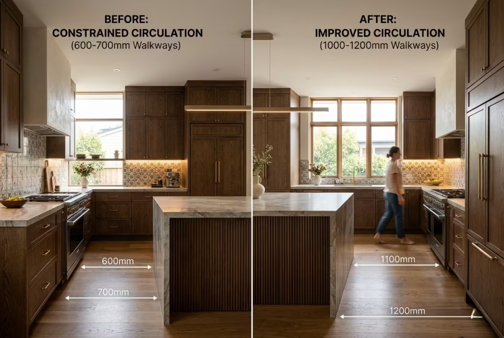
A maximalist kitchen can quickly lose its usability if movement is not carefully considered. It is easy to become absorbed in materials, colour, and detail, but if the space does not function comfortably, the design begins to work against daily life.
Clear circulation is essential. A minimum of 900 mm or 36 inches between cabinetry runs, islands, and key work zones is not just a guideline, it is what allows the kitchen to breathe and function without friction. In busier households or open-plan layouts, increasing that to 1000 to 1200 mm, or 39 to 48 inches, often makes a noticeable difference.
In one project, the layout initially prioritised visual symmetry over movement. The island was positioned perfectly in line with surrounding cabinetry, but the clearance around it felt tight in practice. People had to adjust their movement constantly, which disrupted the natural flow of the space. By shifting the island slightly and increasing circulation space, the kitchen immediately became more comfortable, even though visually the change was subtle.
Maximalism should never come at the expense of ease. If a space feels awkward to move through, no amount of visual richness will compensate for it.
Treating Every Surface as Equal
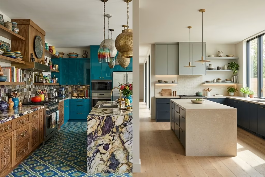
Not every surface in a kitchen needs the same level of attention. When they are all treated equally, the room loses depth and begins to feel visually flat, even when it is filled with detail.
Certain areas naturally carry more weight. Worktops, splashbacks, and eye-level cabinetry tend to draw attention first. These are where stronger materials or colours can sit comfortably. Other areas, such as lower cabinetry or secondary walls, can afford to be quieter, allowing the focal points to stand out more clearly.
I often see kitchens where every surface has been given equal importance. Patterned floors, textured cabinets, bold walls, detailed shelving. The result is not richness, but fatigue. The eye does not know where to land.
In contrast, when some surfaces are allowed to recede, the more expressive elements gain clarity. It is a bit like stage lighting. Not every actor stands in the spotlight at the same time. When the light is focused, the story becomes easier to follow.
Choosing Statement Pieces That Compete Rather Than Complement
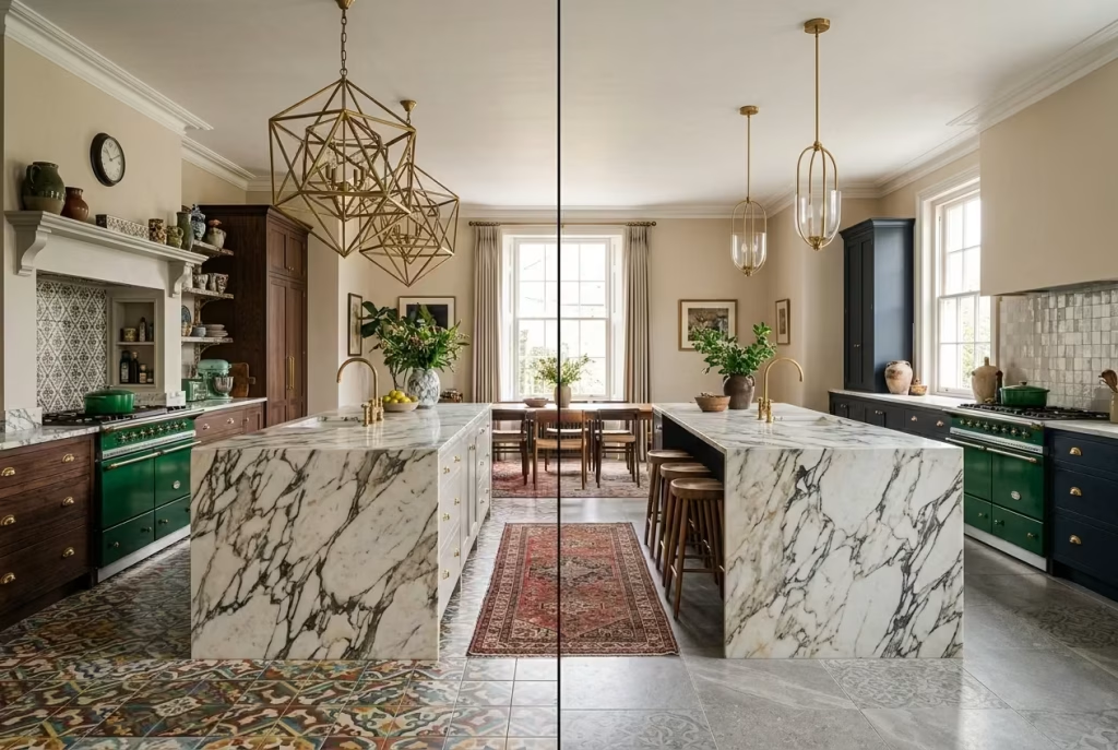
Statement pieces are essential in maximalist kitchens, but they need to relate to each other. When they are chosen in isolation, without considering how they interact, the space can quickly feel disjointed.
A bold range cooker, a heavily veined stone, and oversized lighting can all work beautifully together, but only if they share some common ground. This might be a repeated tone, a similar material finish, or a consistent level of visual intensity. Without that connection, each piece pulls the room in a different direction.
In one kitchen, the client had selected a dramatic marble with strong veining and paired it with equally bold patterned tiles and highly decorative lighting. Each element was striking, but together they created tension rather than cohesion. By simplifying the tiles and allowing the marble to take the lead, the lighting suddenly felt more intentional rather than competitive.
Statement pieces should feel like they belong to the same conversation, even if they speak in different tones. When they start competing for attention, the room loses its sense of direction.
Maximalist kitchens succeed when they are guided by intention rather than impulse. Every layer, every material, every object needs to understand its role within the larger composition. When that happens, the space does not feel crowded or overwhelming. It feels rich, balanced, and quietly confident, the kind of kitchen that reveals more the longer you spend in it.
Material Pairing Guide for Long-Term Durability
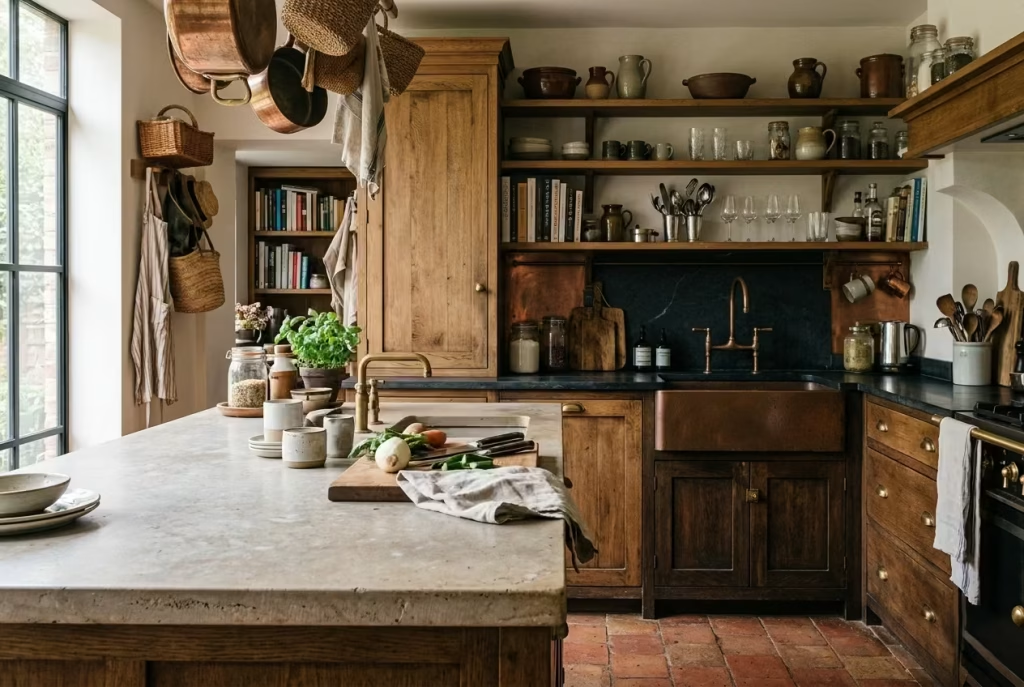
A maximalist kitchen may be driven by visual richness, but its long-term success is always decided by how well its materials perform together over time. It is easy to focus on how combinations look on day one, yet the real test begins once heat, moisture, daily use, and constant contact start to leave their mark. This is where thoughtful pairing moves from being a design choice to a practical necessity.
In my experience, the most resilient kitchens are not the ones that use the most expensive materials, but the ones where each surface understands its role. Hard-wearing materials sit where impact is highest, softer finishes are protected or placed more strategically, and transitions between them are handled with precision. When this balance is right, the kitchen does not just age, it matures, gaining character without losing performance.
Material pairing, at its core, is about foresight. It is about knowing how stone reacts next to metal, how timber behaves near moisture, how finishes wear when touched every day. Get this right, and the kitchen continues to feel intentional years down the line, not something that looked impressive once but struggled to keep up with real life.
Stone vs Quartz in High-Use Kitchens
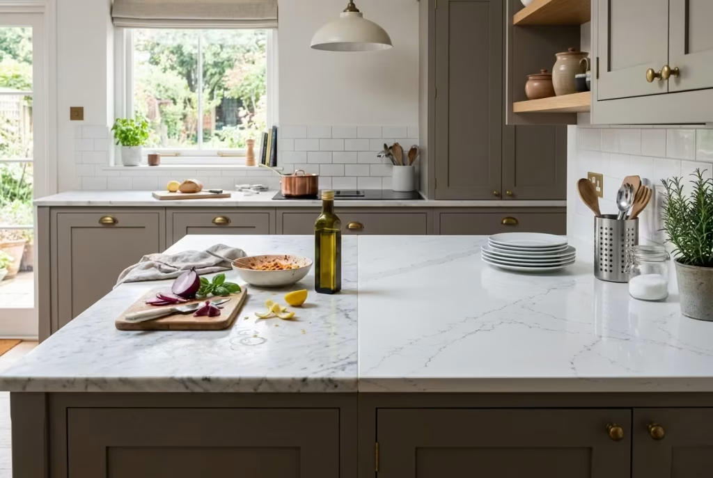
At first glance, stone and quartz can appear to serve the same purpose, but their behaviour over time tells a very different story. Natural stone, especially marble or softer limestones, carries a depth and character that is difficult to replicate. It develops a patina through use, subtle etching, soft marks, and tonal shifts that gradually become part of its identity. For some homeowners, this ageing process feels like a kitchen settling into its own skin. For others, it can feel like wear that arrived too soon.
Quartz, by contrast, is engineered for consistency and resilience. It resists staining, handles daily impact more predictably, and requires far less ongoing attention. In high-use kitchens, particularly where cooking is frequent and surfaces are constantly in play, quartz often proves to be the steadier companion. It does not react dramatically to spills or acids, which makes it more forgiving in busy households.
I often guide clients through a simple question. Do you want a surface that evolves with time, or one that holds its ground and looks almost the same years later. In one project, a client initially insisted on marble for its visual depth. After discussing how they actually used their kitchen, daily cooking, children, constant activity, they chose quartz for the main work surfaces and reserved marble for a lower-use island. That balance allowed them to enjoy both beauty and practicality without compromise.
Painted Cabinetry vs Veneer Longevity
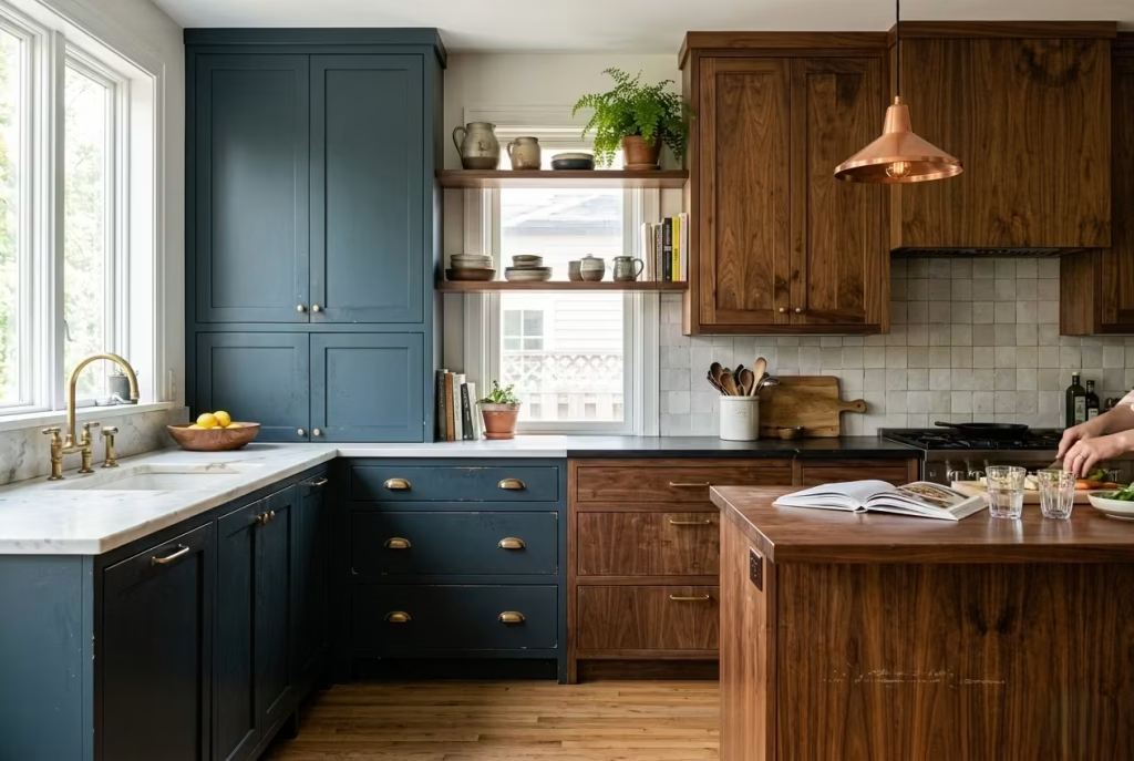
Cabinet finishes are where daily interaction leaves its most visible trace. Painted cabinetry offers a refined, tailored look, especially in deeper or more complex tones. It can be colour-matched precisely, which gives a kitchen a cohesive, intentional feel. Over time, however, painted surfaces can show wear in high-contact areas. Edges soften, corners pick up marks, and frequent handling begins to reveal the life being lived around them.
Veneer, on the other hand, carries the natural resilience of wood while still offering a controlled finish. It tends to handle daily use with a bit more grace, especially when the grain helps disguise minor wear. Where painted cabinetry may show a mark clearly, veneer often absorbs it into its texture, making ageing feel less abrupt.
In one kitchen I worked on, we combined both. Painted cabinetry was used for upper units and areas with lighter use, while veneer was introduced on base cabinets and the island, where contact was constant. Years later, the difference in wear was noticeable, but in a way that felt intentional. The veneer had developed warmth and depth, while the painted surfaces retained their clarity where it mattered most.
Choosing between the two is less about preference and more about placement. Each has its strengths, but they perform very differently once the kitchen becomes part of daily life.
Metal Finishes and Patina Over Time
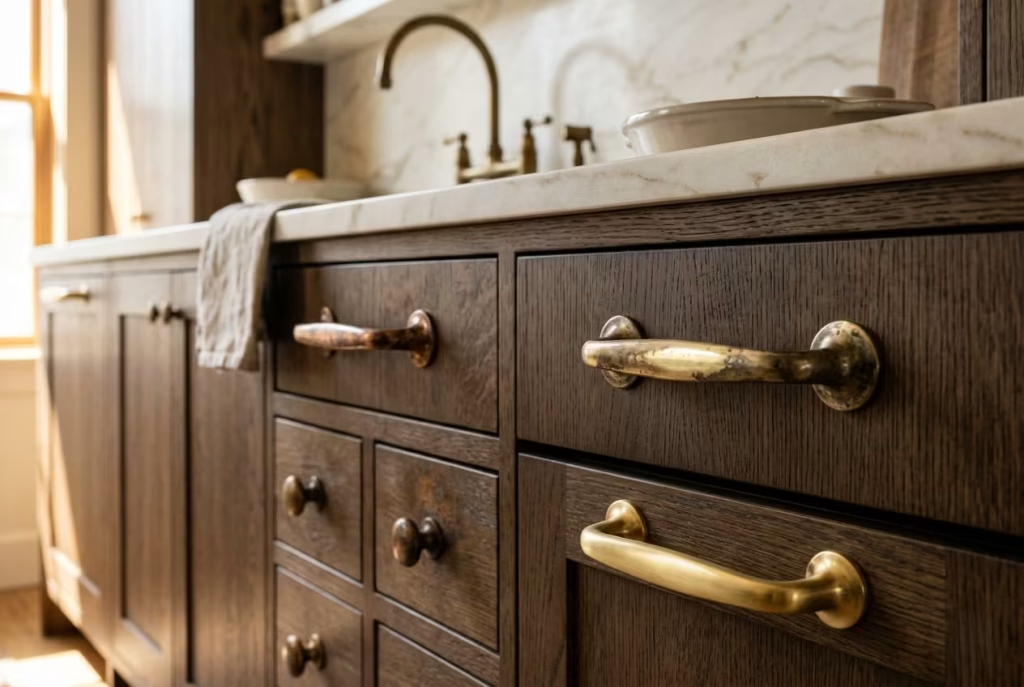
Metal finishes rarely stay as they are on installation day. This is something many people underestimate. Brass, copper, and even certain stainless finishes begin to shift almost immediately once exposed to touch, moisture, and air. That change is not a flaw. It is a natural process that can either enhance the kitchen or create frustration, depending on expectations.
Unlacquered brass, for example, develops a soft patina that deepens in tone and highlights areas of frequent use. Handles become subtly polished where hands touch them most, while less-used areas darken slightly. The result is a finish that tells a story of interaction, almost like a record of how the kitchen is used.
For those who prefer consistency, sealed or brushed finishes offer more stability. They resist change and maintain their original appearance for longer, though they can sometimes lack the depth that natural ageing brings.
I once worked with a client who was initially concerned about brass ageing unevenly. We agreed to embrace that variation rather than fight it. Over time, the hardware became one of the most appreciated elements in the kitchen. It no longer felt like a static detail, but something that responded to daily life in a quiet, evolving way.
Understanding how metals behave allows you to choose between controlled uniformity and natural transformation, both valid, but very different experiences.
Maintenance Realities Most Homeowners Underestimate
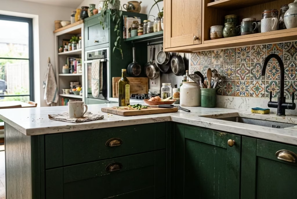
Maintenance is where design meets reality, and it is often where assumptions fall short. A kitchen may look flawless on completion, but how it performs day to day is what defines long-term satisfaction.
One of the most common underestimations is how frequently surfaces are touched. Cabinet handles, drawer fronts, and worktop edges see constant contact, and finishes in these areas need to withstand repeated use without becoming high-maintenance burdens.
Another overlooked factor is cleaning practicality. Highly textured surfaces, while visually appealing, can trap grease and dust in ways that smooth finishes do not. Similarly, very dark or very light finishes can show marks more readily, requiring more frequent upkeep to maintain their appearance.
I often remind clients that a kitchen should not feel like it needs constant attention to stay presentable. In one project, we replaced a heavily textured splashback with a simpler surface that was easier to clean. The visual change was minimal, but the day-to-day experience improved significantly. The kitchen became easier to live with, which ultimately made it more enjoyable.
Durability is not just about how materials resist damage. It is about how they support daily routines without adding friction. When material pairing is approached with this in mind, the kitchen does not just look considered, it feels effortless to use, which is often the real measure of good design.
Budgeting for a Maximalist Kitchen Without Losing Impact
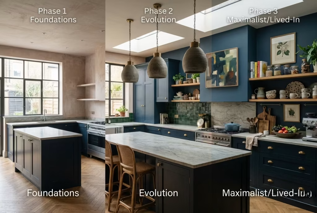
A maximalist kitchen does not demand an unlimited budget, but it does demand clarity. The difference between a space that feels rich and one that feels overworked often comes down to where money is placed early on. In my experience, the strongest kitchens are not built in one sweep. They are shaped in layers, with key decisions made upfront and secondary elements allowed to evolve over time. That approach not only protects the budget, it also produces a kitchen that feels more natural, less like it arrived fully formed in a single day.
Where to Invest (Stone, Cabinetry, Lighting)
There are certain elements in a kitchen that carry the entire composition. These are the pieces you interact with daily, the ones that define both function and visual weight. This is where investment matters most.
Stone surfaces, particularly worktops and islands, sit at the heart of the kitchen. They take constant impact, both physically and visually. A well-chosen stone, whether natural or engineered, anchors the room and sets the tone for everything around it. I have seen modest kitchens feel elevated simply because the stone was chosen with care, while more expensive schemes fell flat due to poor surface selection.
Cabinetry is another cornerstone. It dictates not only storage and layout but also how the kitchen ages over time. Solid construction, quality finishes, and precise detailing make a noticeable difference years down the line. It is often better to simplify door styles or reduce the number of custom features rather than compromise on build quality.
Lighting is where many budgets fall short, yet it quietly shapes how every other element is perceived. Layered lighting, ambient, task, and accent, allows the kitchen to adapt throughout the day. A well-lit space feels considered, even when other elements are restrained. Poor lighting, on the other hand, can flatten even the most carefully designed interiors.
If the budget needs to stretch, these are the areas to protect. They form the backbone of the kitchen. Get them right, and the rest can follow.
Where to Layer Gradually (Decor, Shelving, Art)
Not everything needs to be resolved on day one. In fact, some of the most engaging kitchens I have worked on gained their character slowly, as layers were added over time.
Decorative elements such as open shelving, artwork, ceramics, and smaller styling details are ideal for gradual layering. These pieces often benefit from time because they reflect how the space is actually used. What looks right in a showroom setting can feel forced in real life. Allowing these elements to build organically leads to a more authentic result.
Open shelving, for example, does not need to be fully styled from the start. A few well-placed items can set the tone, and the rest can evolve as the kitchen becomes part of daily routine. The same applies to artwork. It is often better to live in the space first, understand sightlines and natural focal points, and then introduce pieces that feel connected to the room rather than imposed on it.
I have seen clients rush to fill every surface immediately, only to find themselves replacing items months later. Taking a slower approach not only reduces unnecessary spending, it also results in a kitchen that feels collected rather than assembled.
Phased Design Approach from Real Projects
A phased approach allows a maximalist kitchen to develop with intention rather than pressure. It also spreads the financial commitment in a way that feels more manageable.
In one project, we structured the design in three clear stages. The first phase focused entirely on layout, cabinetry, and primary surfaces. The kitchen was fully functional at this point, clean, composed, but intentionally restrained.
The second phase introduced lighting and key focal elements. Pendant lights were installed, a statement splashback was added, and hardware was upgraded. The kitchen began to take on more personality, but still left room for adjustment.
The final phase happened gradually over several months. Open shelving was styled, artwork was introduced, and smaller details began to fill in the gaps. What made this approach successful was that each decision was informed by how the space was actually being used. Nothing felt rushed, and nothing felt unnecessary.
By the end, the kitchen carried all the richness of a maximalist design, but it did not feel overwhelming or forced. It felt lived in, as if it had arrived there naturally over time.
Budgeting for a maximalist kitchen is less about cutting back and more about sequencing decisions. Invest where it matters most, allow the rest to unfold, and resist the urge to complete everything in one go. When handled this way, the kitchen does not just look layered, it becomes layered in a way that reflects real life, which is often where the most meaningful design emerges.
Conclusion: A Kitchen That Reflects Life, Not Just Design
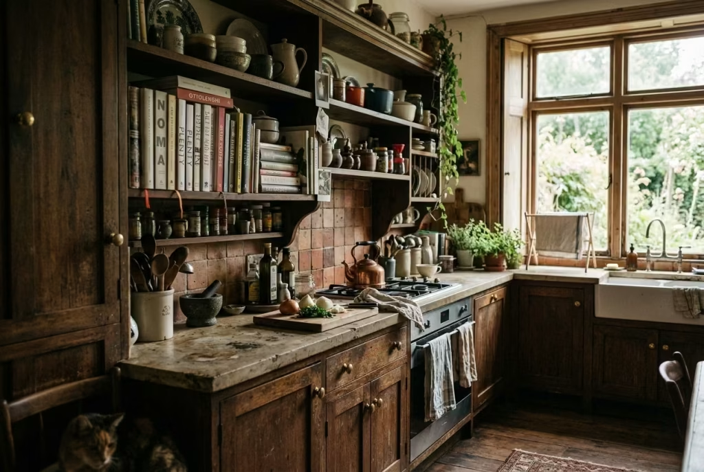
Maximalism, at its core, is not about how much a kitchen can hold, but how much of life it is willing to carry without losing its balance. It is not a fixed aesthetic or a checklist of bold choices. It behaves more like a living system, one that adapts, shifts, and deepens as time moves through it. When approached this way, the kitchen stops feeling like a finished product and begins to feel like an ongoing conversation between space, material, and the people who use it every day.
The idea that a kitchen must reach a final, perfected state is often what limits it. In reality, the most compelling spaces are rarely resolved in one moment. They evolve. Surfaces pick up marks, collections grow and change, colours settle into their surroundings, and layouts begin to reflect real patterns of use rather than initial intention. What might feel incomplete at the beginning often becomes the very thing that gives the kitchen its character later on.
In the projects I have worked on, the kitchens that stayed with me were never the most polished or the most tightly controlled. They were the ones that allowed a certain looseness, a willingness to let contrast exist, to let materials age, to let personal habits shape the space over time. There is something quietly powerful about a kitchen that does not try to hold everything in place, but instead allows life to leave its imprint, gradually, naturally, without resistance.
Maximalism, when it is understood in this way, becomes less about design and more about acceptance. It accepts that a home is never static, that beauty can come from variation, and that the most meaningful spaces are the ones that continue to change long after the initial design is complete.
Frequently asked questions while Achieving Minimalist Kitchen designs
What is a maximalist kitchen design?
A maximalist kitchen design is a bold, layered style that uses colour, pattern, texture, art, lighting, and decorative details to create a kitchen with personality. It is not about making the space messy or overloaded. A good maximalist kitchen still feels intentional, functional, and visually balanced.
How do you make a maximalist kitchen look stylish instead of cluttered?
The easiest way to keep a maximalist kitchen stylish is to create a clear visual hierarchy. Let one or two features lead the design, such as bold cabinets, a patterned backsplash, or dramatic stone countertops. Then use quieter supporting elements around them so the room feels layered rather than chaotic.
Can maximalist kitchen ideas work in a small kitchen?
Yes, maximalist ideas can work beautifully in a small kitchen when they are applied with control. Instead of filling every surface, focus on high-impact choices like colourful cabinets, statement hardware, patterned tiles, open shelving, or bold lighting. In smaller spaces, repetition and a consistent colour palette help the design feel deliberate.
What colours work best in a maximalist kitchen?
Rich and expressive colours work especially well in maximalist kitchens. Deep green, burgundy, navy, mustard, terracotta, plum, teal, and warm pink can all create a strong visual mood. The key is to balance strong colours with grounding materials like wood, stone, brass, black metal, or neutral walls.
Are patterned tiles a good choice for a maximalist kitchen?
Patterned tiles are one of the strongest ways to introduce maximalist character into a kitchen. They can be used on the backsplash, floor, island face, or even a small feature wall. To avoid overwhelming the room, pair bold tiles with simpler cabinetry or repeat one colour from the tile elsewhere in the space.
How can I add maximalist style without renovating the whole kitchen?
You can add maximalist style through smaller updates like colourful stools, artwork, patterned rugs, decorative lighting, open-shelf styling, bold curtains, painted walls, or statement hardware. These changes are easier to adjust over time and can still make the kitchen feel much more expressive.
What materials are best for a maximalist kitchen?
Maximalist kitchens look strongest when they mix materials with contrast. Stone, marble, quartz, lacquered cabinetry, natural wood, brass, ceramic tile, glass, wallpaper, and painted finishes can all work together if the palette is controlled. The goal is to create richness without making every surface compete for attention.
How do you use open shelving in a maximalist kitchen?
Open shelving works best when it feels curated rather than random. Use it to display everyday items like ceramics, glassware, cookbooks, bowls, plants, or collected objects. For a more polished look, group items by colour, material, height, or shape so the shelves feel styled but still practical.
Is maximalist kitchen design expensive?
A maximalist kitchen can be expensive if you use custom cabinetry, luxury stone, designer lighting, or handmade tiles. However, it can also be created on a smaller budget by focusing on paint, vintage furniture, second-hand decor, art, hardware, textiles, and lighting. Maximalism is more about strong choices than simply spending more money.
How do you keep a maximalist kitchen timeless?
To make a maximalist kitchen feel timeless, build the design around quality materials, good proportions, and a strong layout. Trendy colours and decorative pieces can be changed later, but cabinetry, countertops, flooring, and lighting should feel durable and well-considered. A timeless maximalist kitchen feels personal, layered, and confident rather than randomly decorated.