25 Low-Maintenance, Long-Lasting Minimalist Garden Ideas for Budget-Friendly Outdoor Spaces in 2026
Minimalism in garden design is often misunderstood as restraint for its own sake, a kind of aesthetic austerity where elements are stripped back until very little remains. In practice, it is something far more deliberate. I approach minimalism as a process of intentional editing, where every material, every plant, and every line earns its place. It is not about creating emptiness, but about removing noise so that what remains can breathe, settle, and ultimately matter.
Most gardens struggle not because of a lack of ideas, but because of too many competing ones. I have walked through countless outdoor spaces where planting beds overflow with species that fight for attention, where paving changes direction without purpose, and where focal points multiply to the point that none of them hold any real weight. The result is visual clutter, but more importantly, a lack of spatial hierarchy. Without a clear sense of order, the eye has nowhere to rest. The space feels unsettled, even if every individual element is, in isolation, well chosen.
In my own projects, the gardens that resonate most deeply are almost always the quietest ones. Not silent in a literal sense, but composed in a way that feels grounded and assured. A single tree positioned with intent will often carry more presence than an entire border of mixed planting. A continuous run of stone, uninterrupted and confident, can anchor a space far more effectively than intricate patterns. These are not reductive decisions. They are precise ones, shaped by how people actually move through a garden, how light shifts across surfaces, and how materials weather over time.
There is also a longer view to consider. A minimalist garden is not designed for a single season or a staged photograph. It is built to evolve. Timber softens, stone gathers patina, planting fills out and settles into its rhythm. When the structure is clear and the palette restrained, these changes enhance the space rather than overwhelm it. The garden grows into itself, rather than out of control.
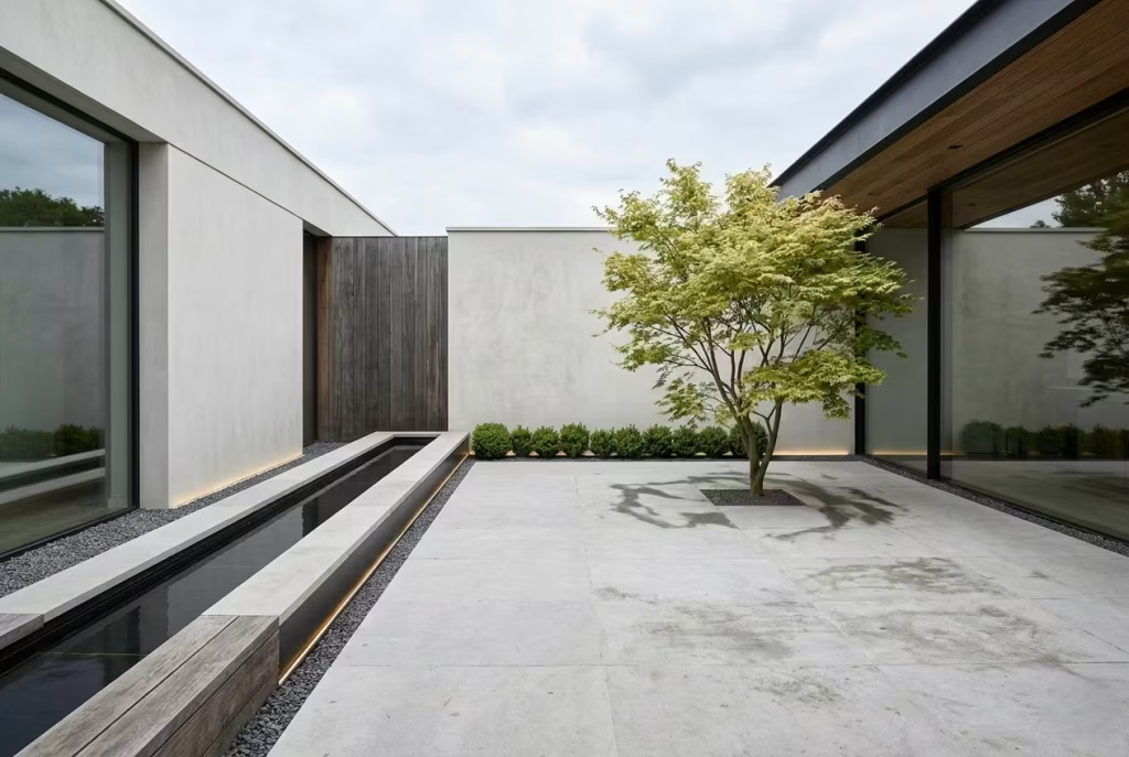
The real promise of a minimalist garden, then, is not just visual clarity. It is a kind of calm that you feel almost immediately, a space that allows you to slow down without asking for attention. It feels breathable, balanced, and quietly resolved. And perhaps most importantly, it is a garden that holds its integrity over time, aging with a quiet confidence that more elaborate designs rarely sustain.
Understanding Minimalism Outdoors (Before the Ideas)
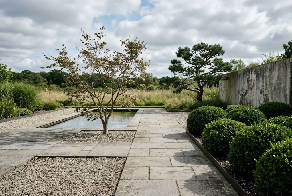
Before moving into specific ideas, it is worth grounding what minimalist design actually means in an outdoor context, because a garden is never a static composition. It shifts with light, weather, and growth, often in ways interiors do not. I tend to think of it as a balance between control and allowance, where structure is deliberate but nature is given just enough freedom to soften the edges. Get that balance right, and the space begins to feel effortless, even though every decision behind it has been carefully resolved.
The Difference Between Empty and Intentional
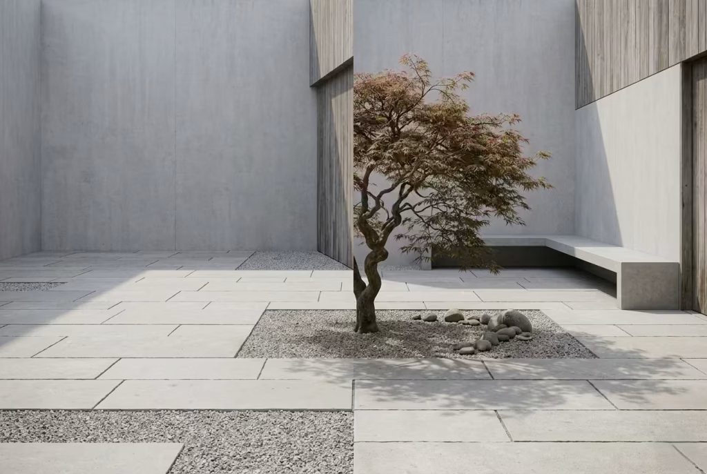
There is a fine line between a garden that feels calm and one that feels unfinished, and I have seen projects fall on both sides of that divide. Visual restraint, when handled with precision, creates a sense of quiet confidence. Lifelessness, on the other hand, tends to creep in when elements are removed without a clear spatial strategy to hold the composition together. In one courtyard I redesigned, the previous layout had been stripped back to little more than paving and a perimeter fence. It looked clean at first glance, but linger for a moment and it felt hollow, like a room with the furniture taken out but no thought given to how it should function.
What transformed that space was not adding more, but adding with intent. A single, well-positioned tree, offset rather than centred, anchored the entire garden. A built-in bench, running along one edge at approximately 450 mm (18 inches) high and 500 mm (20 inches) deep, introduced human scale. Suddenly, the emptiness read as negative space rather than absence. That distinction matters. Negative space, when used well, allows the eye to pause, to recalibrate, to appreciate proportion and light. It is the breathing room between elements, the quiet pause in a conversation that gives meaning to what comes next.
In outdoor environments, negative space carries even more weight because it interacts with light and shadow throughout the day. A clear stretch of gravel or a continuous plane of stone does more than simplify the palette. It becomes a canvas for shifting patterns of sunlight, fallen leaves, and seasonal change. That is where restraint begins to feel alive rather than static. The goal is not to leave areas empty, but to ensure that what is left unfilled still has presence, still contributes to the rhythm of the garden as a whole.
Material Honesty and Longevity
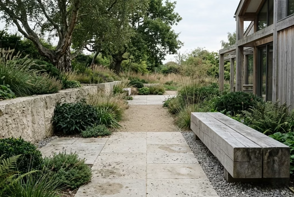
If there is one principle I return to time and again, it is this: materials should be allowed to be what they are. Stone should feel like stone, timber should age like timber, and concrete should carry its subtle imperfections without apology. Minimalist gardens rely heavily on this kind of material honesty because there is nowhere for poor choices to hide. When the palette is restrained, every surface is under quiet scrutiny.
I once worked on a garden where the client initially leaned toward highly polished finishes, chasing that pristine, just-installed look. It felt impressive on day one, but I knew it would not hold up. Instead, we shifted to a more grounded palette: sawn limestone with a slightly open texture, untreated timber that would silver over time, and compacted gravel that would settle naturally underfoot. Within six months, the space had already begun to soften. After a year, it looked as though it had always belonged there.
This is the thing about outdoor materials, they are never static. Timber expands and contracts, stone develops patina, metal oxidises. Rather than fighting that process, a well-designed minimalist garden leans into it. A gravel surface, laid at a depth of around 50–75 mm (2–3 inches), will compact and shift in a way that feels organic, not messy. A concrete slab, poured in large continuous sections, will develop subtle tonal variation that adds depth over time.
The mistake I often see is designing for the photograph rather than for the years that follow. Day-one aesthetics can be seductive, but they are fleeting. Longevity, on the other hand, is where minimalist design truly proves its worth. When materials age gracefully, the garden gains character rather than losing clarity. It settles, slowly and quietly, into something far more compelling than its initial form.
Movement, Flow, and Sightlines
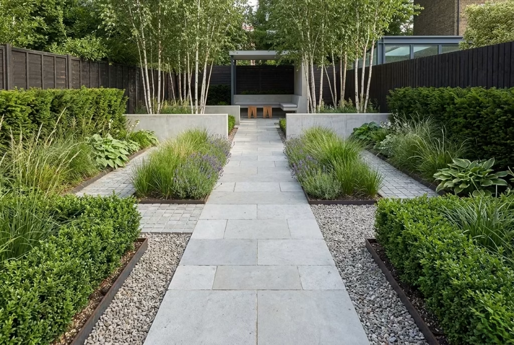
A garden should never feel like a static composition, something to be admired from a distance and left untouched. The most successful spaces are the ones that invite movement, almost subconsciously, guiding you from one moment to the next. I often say that if a garden does not tell you where to walk, it has not quite resolved itself.
Movement begins with proportion. A pathway that is too wide can feel exposed, while one that is too narrow becomes awkward to navigate. In most residential settings, I find a width of 900–1200 mm (36–48 inches) strikes the right balance for primary circulation, while secondary paths can narrow to around 600 mm (24 inches) to create a more intimate rhythm. But it is not just about width. It is about alignment, direction, and what lies just beyond the next step.
In a compact urban garden I worked on, the original layout forced people to cut diagonally across the space, simply because the path did not align with natural movement. It was a small detail, but it disrupted the entire experience. We reconfigured the layout so that the main pathway followed a clean, linear axis, leading directly to a seating area framed by planting. The change was subtle on paper, but in reality, it felt like night and day. The garden finally made sense underfoot.
Sightlines play an equally critical role. A well-placed opening, a framed view, or even a deliberate obstruction can shape how a space is perceived. I often use planting or low walls, typically around 600–800 mm (24–31 inches) high, to partially conceal what lies beyond, creating a sense of progression. You are not presented with everything at once. Instead, the garden unfolds gradually, revealing itself in layers.
When movement and sightlines are resolved with care, the garden begins to feel intuitive. You are not thinking about where to go or how to use the space. You simply move through it, naturally and without friction. And that, in many ways, is the hallmark of good minimalist design. It works quietly in the background, guiding experience without ever announcing itself.
25 Minimalist Garden Ideas (Design-Led + Practical)
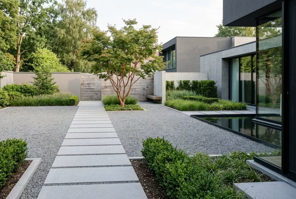
With the foundations set, the ideas that follow are not decorative add-ons, but considered interventions, each one shaping how a garden feels, functions, and evolves over time. In my experience, the difference lies in how these decisions are applied on the ground, scaled correctly, positioned with intent, and allowed to breathe within the wider composition. Taken together, they form a language of restraint that, when handled well, turns even the simplest outdoor space into something quietly compelling.
Layout & Spatial Planning
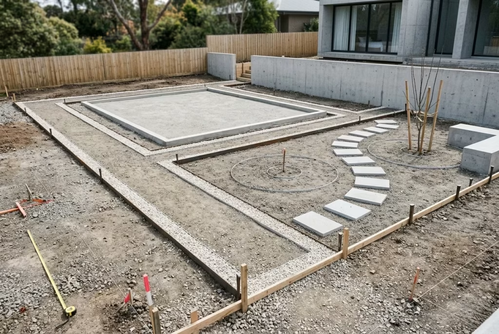
Before planting schemes or material palettes come into play, it is the layout that quietly does the heavy lifting, setting the tone for how a garden is experienced day in, day out. I often treat this stage as the backbone of the entire design, where proportions are tested, circulation is resolved, and space is either clarified or compromised. Get the planning right and everything else begins to fall into place, almost as if the garden is working with you rather than against you.
Structured Grid Layouts for Calm Order
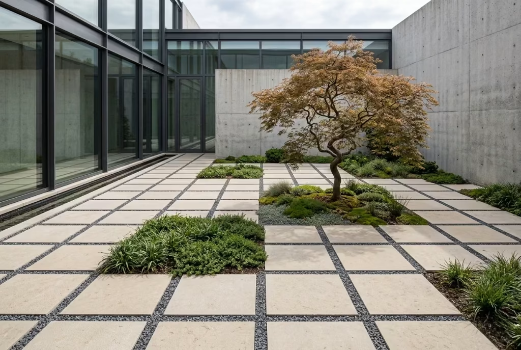
There is something inherently reassuring about a grid, a quiet, underlying order that holds everything together without needing to shout about it. In minimalist garden design, a structured grid acts as a kind of visual anchor, bringing clarity to spaces that might otherwise feel scattered or unresolved. It is not about forcing rigidity onto a garden, but about introducing a rhythm that the eye can follow, almost instinctively, like stepping stones that guide you forward without a second thought.
At its core, the concept is disarmingly simple: divide the garden into evenly proportioned sections and let that framework dictate where paving, planting, and movement sit. But the nuance lies in how that grid is interpreted. I rarely treat it as a strict blueprint. Instead, I use it as a quiet guide, allowing certain sections to remain open, others to hold planting, and a few to become moments of pause. When handled well, it creates a sense of balance that feels effortless, even though every line has been carefully considered.
I worked on a compact courtyard where the existing layout felt, for lack of a better phrase, all over the place. Paving slabs were laid without alignment, planting beds pushed awkwardly into corners, and nothing quite lined up. Rather than introducing more elements, I stripped it back and imposed a simple limestone grid, each slab set within a consistent rhythm of approximately 750 mm (30 inches). The difference was immediate, almost like the space had finally found its footing. We left a few grid sections open for low planting, added a single tree slightly off-centre to break the symmetry, and allowed narrow gravel joints to soften the transitions. It went from chaotic to composed, not by adding complexity, but by editing with intent.
In practical terms, I find a grid spacing of 600–900 mm (24–36 inches) works well for most residential gardens. At the tighter end, around 600 mm (24 inches), the layout feels more intimate and detailed, ideal for smaller courtyards or urban plots. Stretch it toward 900 mm (36 inches), and the space begins to feel more expansive, with broader gestures and fewer interruptions. Joint gaps, if using stone or concrete slabs, typically sit around 10–20 mm (0.4–0.8 inches), depending on whether you want a sharper or softer finish. These small decisions, often overlooked, are what separate a grid that feels refined from one that feels merely functional.
Pros
- Creates immediate visual clarity, especially in awkward or compact spaces
- Establishes a timeless framework that does not date easily
- Simplifies decision-making, as every element has a defined place within the grid
Cons
- Can feel overly rigid if not softened with planting or material variation
- Requires precise installation, as misalignment becomes immediately noticeable
- May lack spontaneity if applied too strictly without moments of deviation
The key, as always, is knowing when to hold the line and when to loosen it. A grid should guide the garden, not confine it. Introduce just enough imperfection, a planted square here, a shifted focal point there, and the whole composition begins to feel less like a diagram and more like a space you actually want to inhabit.
Single Material Ground Planes
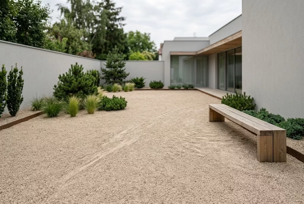
There is a quiet confidence in committing to one material underfoot, a decision that, at first glance, might seem overly simple but, in reality, does the heavy lifting of the entire garden. A single ground plane removes visual interruptions, allowing the eye to move uninterrupted from one end of the space to the other. It is the design equivalent of clearing the table before setting a meal, suddenly, everything feels more considered, more deliberate. Instead of competing finishes pulling attention in different directions, the garden settles into a calm, unified whole.
The concept hinges on continuity. Whether it is poured concrete, compacted gravel, or even a continuous run of stone, the idea is to create a seamless base layer that supports everything else without drawing attention to itself. In minimalist gardens, this becomes the canvas on which light, shadow, planting, and structure play out. And much like a well-composed backdrop, its strength lies in what it allows rather than what it demands.
I recall a project where the client initially had a patchwork of materials, decking near the house, paving in the centre, and gravel pushed awkwardly into the corners. Each area felt disconnected, like separate thoughts that never quite formed a sentence. We stripped it back and introduced a single compacted gravel plane across the entire garden. The transformation was immediate. The space felt larger, more grounded, almost as if it had exhaled. We then placed a simple timber bench and a restrained planting scheme on top of that surface, and suddenly those elements carried far more weight. It proved, yet again, that when the base is resolved, everything above it begins to sing.
From a practical standpoint, the success of a single material ground plane often comes down to depth, edging, and preparation. For compacted gravel, I typically specify a total build-up of 100–150 mm (4–6 inches), including a sub-base layer for stability and a top layer of 40–50 mm (1.5–2 inches) of decorative gravel. Without that structure, it quickly becomes messy underfoot. For poured concrete, slab thickness generally sits around 100 mm (4 inches) for residential use, with expansion joints introduced at intervals of roughly 3–4 metres (10–13 feet) to control cracking. These are the details that rarely make it into mood boards but define how the space performs over time.
Pros
- Creates a strong sense of visual unity, making even small gardens feel more expansive
- Reduces material clutter, allowing key features to stand out with greater clarity
- Simplifies maintenance and long-term upkeep when executed correctly
Cons
- Can feel flat or monotonous if not balanced with texture, planting, or level changes
- Requires careful installation, as inconsistencies become more noticeable across a continuous surface
- Limits flexibility for future changes without disrupting the overall composition
The nuance lies in how you bring that single material to life. A gravel surface, gently shifting underfoot, introduces sound and movement. Concrete, when detailed with subtle variation or soft edges, captures light in ways that change throughout the day. What might seem like a restrained choice on paper often becomes the very thing that gives the garden its depth. It is a reminder that, sometimes, less really does carry more weight, provided it is done with intent.
Defined Outdoor “Rooms” Without Walls
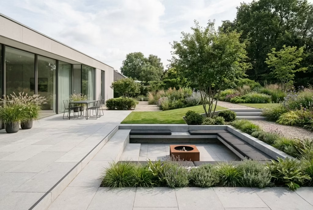
Not every boundary needs to be built. In fact, some of the most compelling gardens I have designed are the ones where space is shaped rather than enclosed, where a subtle shift underfoot does the work a wall never could. Creating outdoor “rooms” without physical barriers relies on suggestion rather than separation, using level changes to gently signal that one area has given way to another. It is a quiet cue, almost subconscious, but once you notice it, the garden begins to read as a sequence of spaces rather than a single flat expanse.
The concept is rooted in spatial hierarchy. Instead of dividing the garden with fences, screens, or heavy planting, you allow the ground plane itself to define how each area is used. A slightly raised terrace might become a dining zone, while a sunken section, tucked just below, naturally lends itself to lounging. These shifts, often no more than a step or two, create a sense of progression, like moving through chapters rather than scanning a single page.
I remember working on a long, narrow garden that felt, quite frankly, like a corridor, one of those spaces where you walk straight through without ever wanting to linger. Rather than filling it with features, I introduced a series of level changes. The area closest to the house remained flush for ease of access, then stepped down by around 200 mm (8 inches) into a more intimate seating zone, before rising slightly again toward the rear planting area. The effect was transformative. What had once felt like a passage became a sequence of destinations. Clients often describe this moment as the garden “opening up,” even though, technically, nothing has been added in terms of square footage.
From a technical perspective, these level changes need to be carefully judged. A shift of 150–300 mm (6–12 inches) is typically enough to create distinction without becoming intrusive. Anything less risks going unnoticed, while anything more begins to feel like a structural intervention rather than a subtle transition. Steps should ideally be 300–450 mm (12–18 inches) deep with a riser height of 150–170 mm (6–7 inches) for comfortable movement. And then there is the matter of edges, whether you soften them with planting or define them with crisp materials, that choice alone can tilt the space toward either warmth or precision.
Pros
- Creates clear zoning without interrupting sightlines or flow
- Makes gardens feel larger and more dynamic by introducing vertical variation
- Encourages natural movement and defines how each space is used
Cons
- Requires careful planning to avoid awkward transitions or trip hazards
- Can increase construction complexity and cost due to groundwork
- Needs thoughtful drainage design to prevent water pooling in lower areas
What I find most compelling about this approach is how it works almost under the radar. There are no obvious dividers, no heavy-handed gestures, just a series of gentle shifts that guide how the space is experienced. It is a bit like reading between the lines, the structure is there, quietly doing its job, but the overall feeling remains open, fluid, and entirely unforced.
Linear Pathways That Guide the Eye
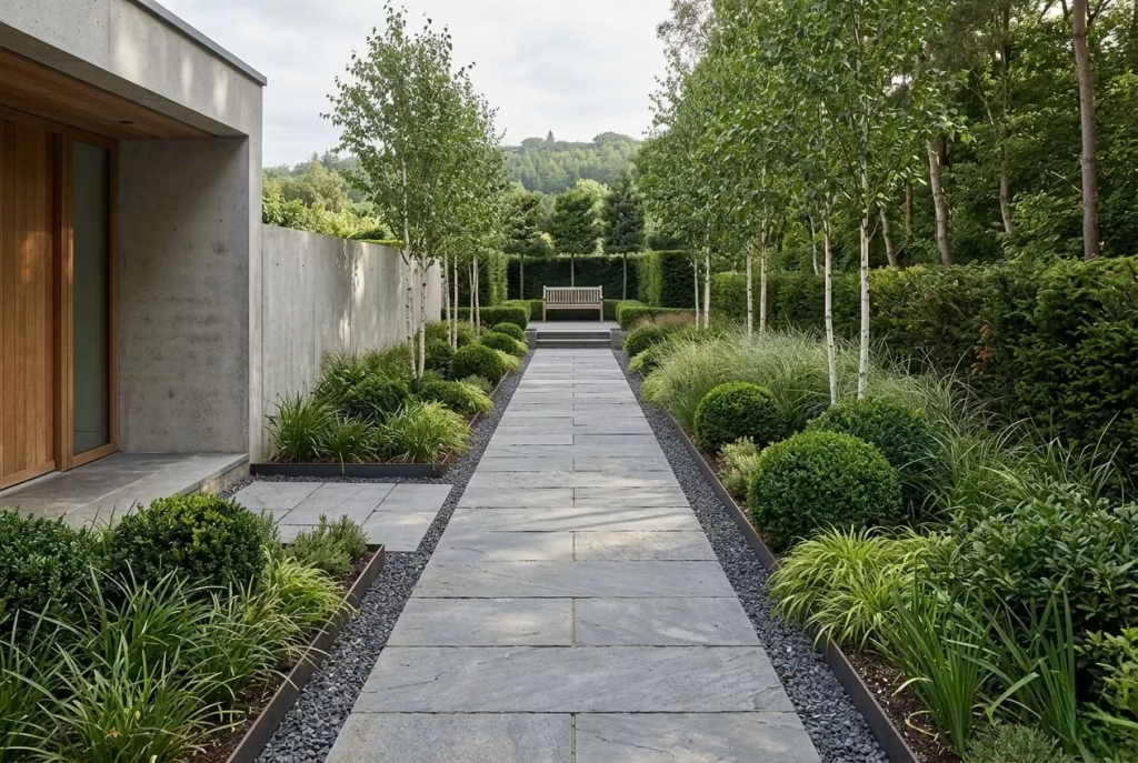
A pathway is never just a means of getting from A to B. In well-resolved minimalist gardens, it becomes a quiet director of movement and attention, subtly shaping how the space is understood as you move through it. Linear pathways, in particular, have a way of sharpening focus, drawing the eye forward as if the garden itself is gently saying, “this way, and no distractions.” When handled with restraint, they create a sense of calm inevitability, where every step feels considered rather than incidental.
The strength of a linear path lies in its clarity. There is no ambiguity in direction, no unnecessary deviation, just a clean visual thread that ties the garden together. I often use this approach in spaces where clients initially feel unsure how to “read” their garden. Once a strong linear gesture is introduced, everything else starts to fall into place, planting, seating, and focal points begin to align naturally, almost like iron filings responding to a magnet.
I worked on a compact urban garden where the original circulation felt fractured. Paths twisted awkwardly around planting beds, forcing movement rather than guiding it. We simplified everything into a single linear route that ran the full length of the garden, connecting the back door to a small seating area at the far end. At its narrowest, the path measured around 600 mm (24 inches), creating a more intimate, almost corridor-like feeling near the house. As it extended outward, it widened to 900–1200 mm (36–48 inches), allowing the space to open up where people naturally lingered. That shift in proportion completely changed the emotional reading of the garden. What once felt hesitant now felt deliberate, almost cinematic in its progression.
From a practical standpoint, path width is not just about aesthetics but about behaviour. A 600 mm (24-inch) pathway encourages single-file movement, which works beautifully in narrow side returns or contemplative garden sections where slowing down is part of the experience. Wider paths, around 900 mm (36 inches), allow comfortable two-person movement, while 1200 mm (48 inches) becomes more social, accommodating passing and pause without congestion. Material choice also plays a role in how these widths are perceived; tight gravel edges feel more intimate, whereas large-format stone tends to visually expand the space, even when dimensions remain the same.
Pros
- Creates strong directional flow that naturally organizes the garden
- Enhances perception of depth, making even small gardens feel longer and more structured
- Helps align key focal points, improving overall spatial coherence
Cons
- Can feel overly formal if not softened with planting or texture variation
- Requires precise alignment, as even small deviations become visually obvious
- Narrow sections may feel restrictive if not balanced with occasional widening or pauses
The real craft lies in pacing. A linear pathway should never feel like a rigid track, but rather a guided experience that unfolds gradually. When proportions shift subtly along its length, the garden begins to feel less like a layout and more like a journey, where every step forward reveals just enough to keep you moving, without ever giving everything away at once.
Sunken Seating Areas
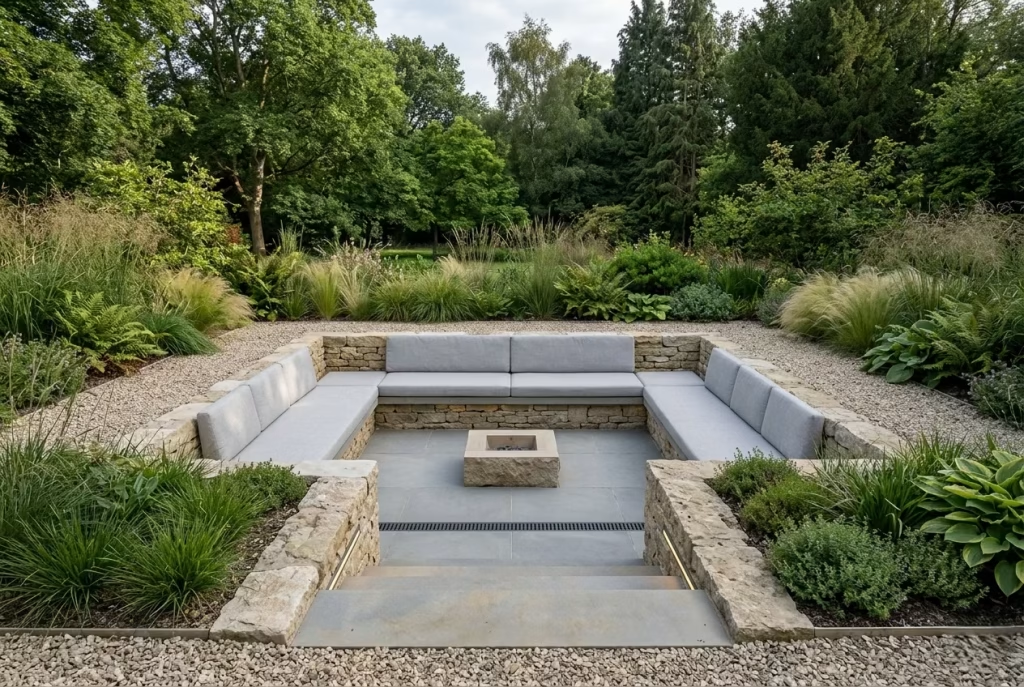
A sunken seating area has a way of changing the emotional temperature of a garden almost instantly. It is not just a design feature, but a shift in experience, pulling you slightly below ground level where the world feels quieter, more contained, and gently removed from surrounding distractions. Instead of sitting on the landscape, you feel held by it. That subtle change in elevation creates both shelter and intimacy, as if the garden has leaned in closer to listen.
The concept works because of enclosure without obstruction. By lowering the seating zone, even by a modest amount, you introduce natural wind protection and visual depth without adding walls or heavy screening. The surrounding edges act as a soft perimeter, framing the space in a way that feels deliberate yet unforced. I often think of it as carving a room out of the earth itself, rather than placing one on top of it.
I’ve used sunken seating particularly in exposed plots where wind tends to cut across the garden and disrupt any sense of comfort. One project stands out clearly, a coastal property where the upper terrace felt constantly swept and unsettled. Rather than fighting the conditions with taller fences or dense planting, I lowered the main seating zone by around 300 mm (12 inches) and wrapped it with a low retaining edge in natural stone. The difference was immediate. The wind lost its sharpness, conversation became easier, and the space suddenly felt like a destination rather than a pass-through. It was one of those rare moments where a relatively simple shift in level did more than any decorative addition ever could.
From a practical standpoint, sunken areas need careful calibration. A drop of 150–300 mm (6–12 inches) is typically enough to create perceptible intimacy without making access awkward or visually heavy. Seating heights generally sit around 450 mm (18 inches), with seat depths ranging between 500–600 mm (20–24 inches) to maintain comfort over longer periods. Steps or access points should remain generous, ideally 300 mm (12 inches) tread depth with a 150–170 mm (6–7 inches) riser, ensuring the transition feels natural rather than abrupt. Drainage, of course, becomes critical here; even the most elegant design will falter if water is allowed to collect at the lowest point.
Pros
- Creates immediate sense of intimacy and shelter without visual barriers
- Reduces wind exposure, making outdoor seating more comfortable in open or coastal sites
- Adds architectural depth, making the garden feel layered and more immersive
Cons
- Requires more complex groundwork and careful drainage planning
- Can feel restrictive if over-lowered or poorly proportioned
- Accessibility must be considered to avoid creating awkward or underused spaces
What makes sunken seating so effective is its ability to shift perception without demanding attention. It does not announce itself loudly, yet once you step into it, the change is unmistakable. The world outside feels slightly farther away, the proportions feel more grounded, and suddenly, the garden is no longer just something you stand beside, but something you are gently held within.
Planting Simplicity
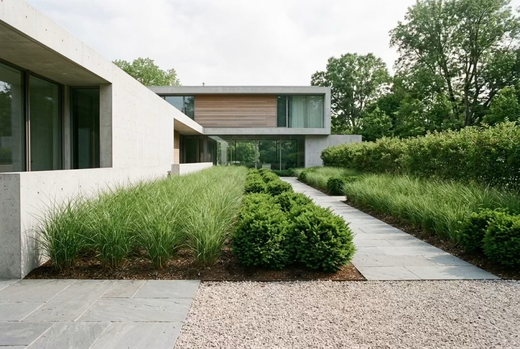
Once the structural bones of a minimalist garden are in place, planting becomes less about decoration and more about restraint, rhythm, and repetition. It is the final layer that softens the architecture without disrupting its clarity, and when handled well, it feels almost inevitable rather than added on. I often approach planting as a quiet supporting act, where less variation, more discipline, and a strong sense of cohesion allow the entire composition to settle into itself with ease.
Monochromatic Planting Schemes
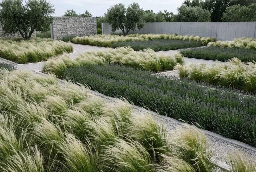
A monochromatic planting scheme is where restraint truly reveals its intelligence. Instead of a garden competing with colour, texture, and seasonal variety all at once, the composition is narrowed down to one or two species repeated with quiet discipline. The result is not limitation, but clarity, where repetition becomes rhythm and rhythm becomes atmosphere. In many ways, it is less about planting and more about editing nature until it feels composed, almost like a carefully written paragraph with no unnecessary words.
At its best, this approach creates a sense of calm continuity that holds the garden together even when everything else is changing. Ornamental grasses swaying in unison, or rows of lavender catching light in a soft, muted wave, can feel far more powerful than a mixed border ever could. The eye stops jumping from one element to another and instead settles into a steady visual flow, almost like a quiet hum running through the space.
I once worked on a residential garden where the planting had become, quite frankly, visually exhausting. There were too many species fighting for attention, each season bringing a different colour story that never quite resolved into a coherent whole. We simplified the scheme dramatically, reducing it to a repetition of Stipa tenuissima and Lavandula angustifolia. It felt almost radical at the time, stripping back so much variety. But within a single growing season, the space transformed. The grasses moved like soft brushstrokes across the garden, while the lavender provided a stable, grounding line. Clients often told me the garden finally felt “quiet enough to think in,” which, in my experience, is one of the highest compliments a planting scheme can receive.
From a practical standpoint, repetition needs structure to work effectively. For ornamental grasses like Stipa tenuissima, I typically plant at 400–500 mm (16–20 inches) centres, allowing enough space for movement without losing density. Lavender performs best at around 450–600 mm (18–24 inches) spacing, depending on variety and eventual spread. Too tight, and the planting becomes congested; too loose, and the rhythm breaks apart. Soil preparation also plays a crucial role here, especially with drought-tolerant schemes, where sharp drainage is essential for long-term success.
Pros
- Creates strong visual cohesion, making the garden feel calm and resolved
- Enhances rhythm and movement, especially with grasses and linear planting forms
- Easier to maintain over time, with predictable growth patterns and seasonal behaviour
Cons
- Can feel repetitive if not balanced with structural elements or subtle variation in form
- Less seasonal diversity compared to mixed planting schemes
- Requires confidence in restraint, as overcomplication is often tempting
What makes monochromatic planting so effective is its ability to let space and movement take precedence over spectacle. It does not rely on constant change to stay interesting. Instead, it builds a slow, steady presence that deepens over time, like a piece of music that becomes more compelling the longer you listen.
Sculptural Trees as Focal Points
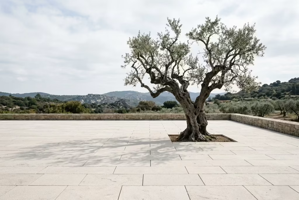
A sculptural tree does something few other garden elements can achieve, it holds attention without demanding it. Instead of relying on colour or seasonal display alone, it introduces form, structure, and silhouette as the primary language of interest. In a minimalist garden, this becomes especially powerful, because when everything else is restrained, the tree is allowed to speak clearly, almost like a single, well-placed punctuation mark in an otherwise calm sentence.
The idea is not about filling space, but about anchoring it. Olive trees with their gnarled, weathered trunks or Japanese maples with their finely cut, architectural canopies bring an almost effortless sense of presence. They do not need companions to justify their position. In fact, they often work best when given breathing room, allowing their form to be read from multiple angles as light moves through them throughout the day.
I’ve placed sculptural trees in countless projects where the brief was essentially “make it feel finished, but not busy.” One garden that stands out had a large open terrace that felt a little too exposed, almost like furniture placed in a blank room. Rather than introducing screens or additional planting layers, I positioned a mature olive tree slightly off-centre, giving it a generous clearance of around 2.5 metres (8.2 feet) on all sides. That single decision changed the entire reading of the space. It softened the hard edges of the paving, introduced shifting shadows that moved across the surface during the day, and gave the terrace a quiet focal point that felt natural rather than staged. It was one of those moments where less genuinely became more, without any need for overthinking.
From a spatial standpoint, clearance is critical. A minimum of 2–3 metres (6.5–10 feet) around a sculptural tree ensures that its form can be appreciated without visual crowding. This spacing also allows light to penetrate its canopy properly, which is essential for maintaining that delicate balance between presence and openness. Planting depth varies depending on species, but ensuring a well-structured pit of at least 600–900 mm (24–36 inches) in prepared soil helps establish long-term health and stability, especially for mature specimens.
Pros
- Provides a strong focal point without relying on decoration or clutter
- Adds vertical structure and seasonal shadow play, enriching spatial depth
- Ages beautifully, often improving in character over time rather than declining
Cons
- Requires careful positioning, as poor placement can unbalance the entire composition
- Mature specimens can be costly and need proper establishment planning
- Limited seasonal variation compared to mixed planting schemes
What makes sculptural trees so compelling is their ability to hold a space together with very little effort. They do not compete; they settle. And in a well-composed minimalist garden, that quiet authority is often what gives the entire design its sense of calm resolution.
Low-Maintenance Evergreen Borders
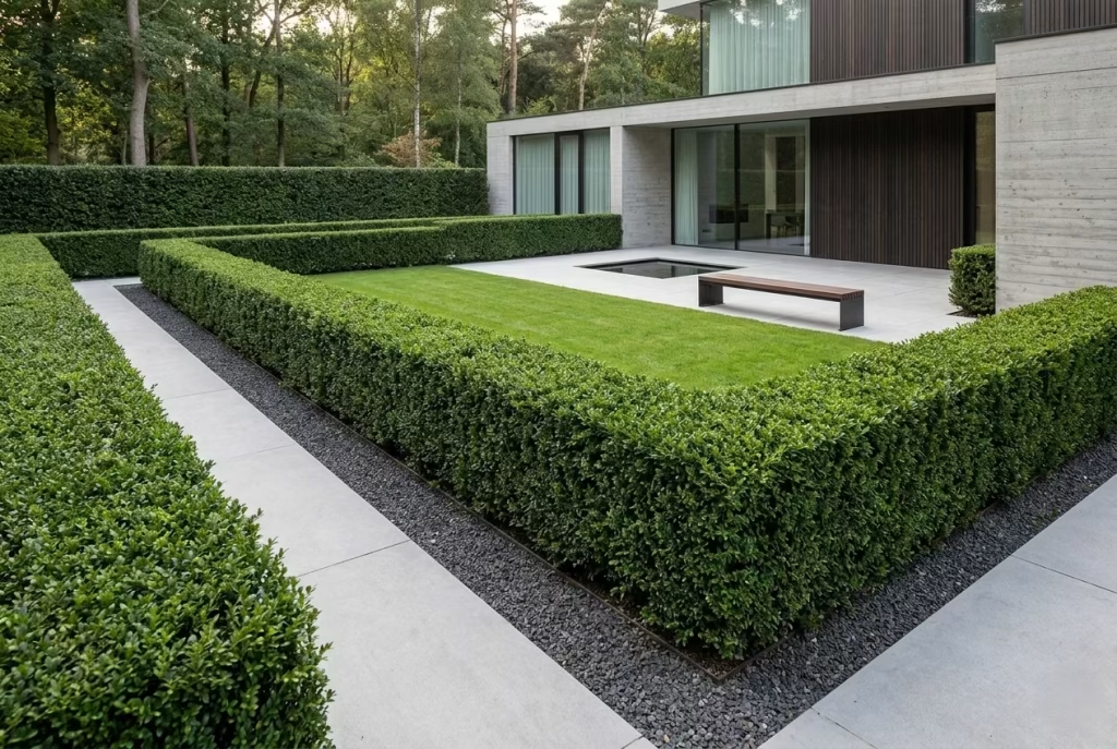
Evergreen borders are the quiet workhorses of minimalist garden design. They do not ask for attention, yet they hold the entire composition together with a kind of understated discipline that only reveals itself over time. Instead of a constantly shifting mix of seasonal planting, structured evergreen hedging offers continuity, a steady visual rhythm that remains intact through every season. In many ways, it is the architectural frame that allows everything else in the garden to breathe without slipping into chaos.
The concept is rooted in control through repetition. Rather than layering multiple plant species with competing textures and bloom cycles, the border is built from a single, reliable framework that defines edges, softens boundaries, and reinforces geometry. It is not about reducing interest, but about refining it, allowing form and mass to carry more weight than fleeting colour. When done well, evergreen structure becomes the backbone of the garden, quietly anchoring shifting elements like planting accents, seasonal containers, or sculptural features.
I’ve often relied on evergreen borders in projects where the brief calls for “effortless maintenance but high impact,” which, as it turns out, is one of the most common contradictions in residential gardens. One particular project comes to mind, a suburban plot where the original planting scheme was visually rich but exhausting to maintain. It looked impressive in peak season, yet six months of the year it felt inconsistent and patchy. We replaced the mixed beds with a structured hedge of Ilex crenata, kept at a consistent height of around 900–1200 mm (36–48 inches), running cleanly along the perimeter. The transformation was immediate. The garden gained definition, almost like a blurred photograph suddenly snapping into focus. Everything else, the seating, the pathway, even the lighting, felt more intentional against that stable green backdrop.
From a technical standpoint, evergreen borders perform best when proportions are carefully controlled. For low hedging, heights of 600–900 mm (24–36 inches) work well in smaller gardens where softness is still required. For more defined boundary structure, 900–1500 mm (36–60 inches) creates a stronger architectural edge without feeling overly dominant. Plant spacing typically sits between 300–500 mm (12–20 inches) depending on species and desired density, with tighter spacing producing a more formal, clipped finish over time. Soil preparation and consistent pruning schedules are essential here; neglect either, and the structure quickly loses its crispness.
Pros
- Provides year-round structure, ensuring the garden never feels visually “unfinished”
- Reduces seasonal maintenance demands compared to mixed planting schemes
- Creates strong architectural definition that supports minimalist design principles
Cons
- Requires regular pruning to maintain clean lines and prevent overgrowth
- Can feel static or overly formal if not balanced with softer planting or texture variation
- Establishment phase may take time before achieving full visual density
What makes evergreen borders so effective is their reliability. They do not rely on seasonal performance or fleeting bursts of interest. Instead, they hold their ground quietly, season after season, allowing the rest of the garden to evolve around them. In a well-composed minimalist space, that kind of consistency is not just useful, it is quietly indispensable.
Wild Grasses for Soft Movement
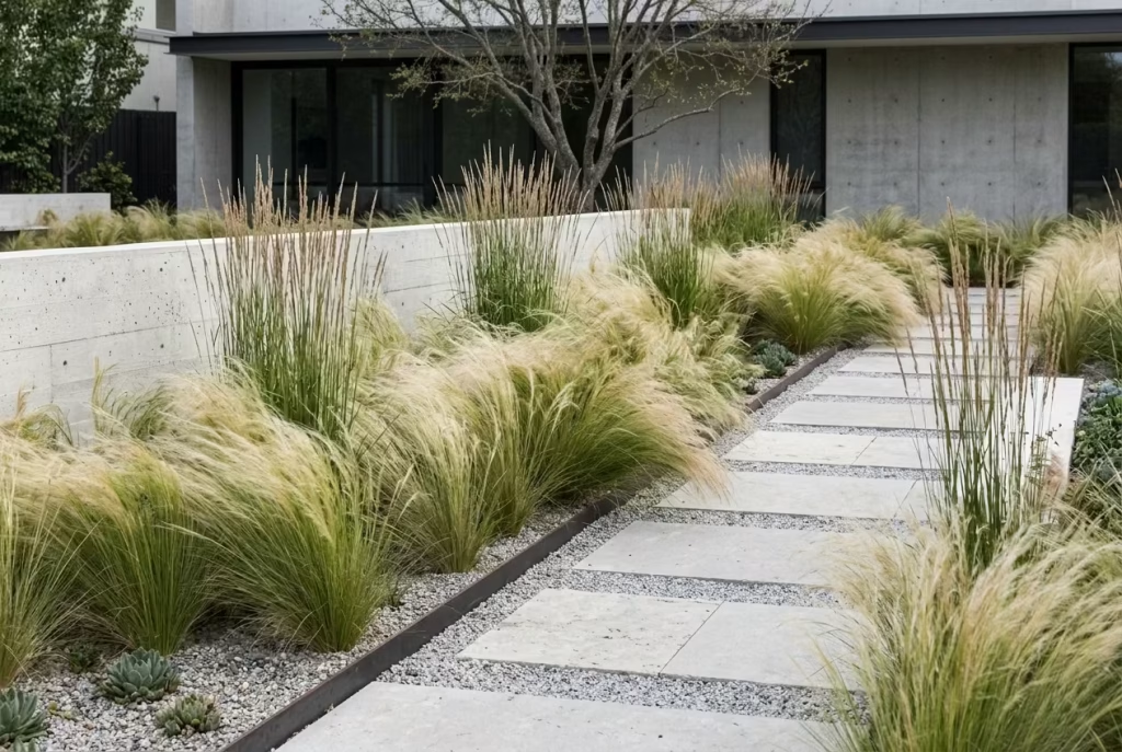
Wild grasses bring a kind of quiet choreography to a garden that hard materials simply cannot replicate. They do not sit still in the composition; they respond, shift, and ripple with even the slightest change in air. In a minimalist setting, this movement becomes essential, because it breaks up rigidity without introducing visual noise. It is the difference between a space that feels static and one that feels gently alive, as if it is breathing in real time.
The concept is about contrast, but a controlled one. Where paving, concrete, and structural planting establish order, grasses soften the edges and introduce a natural looseness that keeps the garden from feeling over-engineered. I often think of them as the mediator between architecture and landscape, translating hard geometry into something more forgiving. Left unchecked, they can feel chaotic, but when placed with intention, they act like a soft current running through an otherwise still composition.
I remember a project where the garden felt overly “locked in,” dominated by clean lines, rendered walls, and precise paving joints. It looked immaculate, but it lacked atmosphere. The turning point came when we introduced sweeps of Stipa tenuissima and Calamagrostis × acutiflora ‘Karl Foerster’, positioned in deliberate drifts rather than scattered clusters. Within a single season, the space changed character entirely. The grasses caught light differently throughout the day, casting shifting shadows across the hard surfaces and breaking up the rigidity that had previously made the garden feel almost too controlled. It was one of those subtle interventions that, frankly, did more heavy lifting than any structural change we made.
From a practical standpoint, spacing and massing are what give grasses their impact. For finer species like Stipa tenuissima, I typically plant at 400–500 mm (16–20 inches) centres to create a light, flowing texture without losing cohesion. Taller structural grasses like Calamagrostis perform best at around 500–700 mm (20–28 inches) spacing, allowing enough room for their vertical form to develop while still reading as a unified sweep. In larger gardens, planting in drifts of at least 5–7 plants per group ensures the movement registers visually rather than disappearing into the background.
Pros
- Introduces natural movement, softening hard architectural elements
- Enhances light play and shadow dynamics throughout the day
- Low maintenance once established, with strong seasonal structure
Cons
- Can appear untidy if not cut back annually or positioned carefully
- Less effective in very shaded or overly wet conditions
- Requires grouping and repetition to avoid a scattered, incoherent look
What makes wild grasses so effective in minimalist gardens is their ability to shift the atmosphere without changing the structure. They do not compete with hard materials; they respond to them. And in that gentle tension between stillness and motion, the garden finds a rhythm that feels both composed and effortlessly natural.
Seasonal Restraint
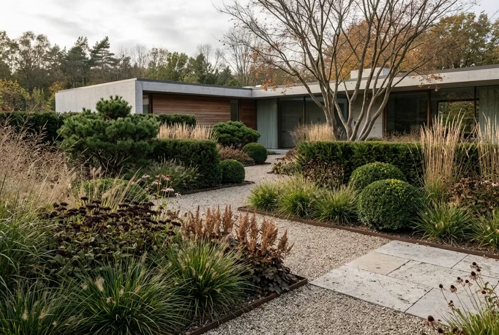
Seasonal restraint is where minimalist garden design truly shows its maturity. It is the discipline of stepping away from the idea of peak performance, where everything bursts into colour for a fleeting moment, and instead designing for continuity, atmosphere, and year-round coherence. In practice, it is about resisting the temptation to chase constant change, and instead allowing the garden to hold its character steadily, even when nothing is in full bloom. There is a quiet confidence in this approach, almost like a well-tailored room that never relies on seasonal decoration to feel complete.
The concept challenges a common instinct in garden design: the desire for constant visual excitement. Many gardens are built to “perform” in spring or early summer, only to fall into disjointed patches of interest for the rest of the year. Seasonal restraint flips that logic. It prioritises structure, foliage form, seed heads, bark texture, and evergreen rhythm over short-lived floral displays. The result is a garden that feels consistent, grounded, and quietly composed, no matter the month. It is less about spectacle, more about atmosphere that never drops the thread.
I worked on a residential garden where the planting palette had originally been heavily focused on spring flowering bulbs and summer perennials. For a few weeks, it was spectacular, almost overwhelming in its colour and energy. But by late summer, the structure collapsed visually, leaving gaps that felt unresolved. We reworked the entire scheme around seasonal continuity instead. Flowering plants were reduced, and in their place we introduced structural evergreens, seed heads that persisted into winter, and foliage-driven plants like Helleborus, Sedum, and ornamental grasses that held form long after flowering ended. The shift was subtle but transformative. The garden no longer had a “peak moment.” Instead, it maintained a steady presence that felt reliable, almost like a space you could return to at any time of year and still find it composed and intact.
From a practical perspective, seasonal restraint relies on proportion and planning rather than abundance. In most schemes, I aim for a balance where roughly 60–70% of planting is structural or evergreen, 20–30% provides seasonal variation, and only 10–15% is reserved for high-impact flowering moments. This ensures that no single season dominates the experience. Plant spacing also plays a role in maintaining continuity; for structural perennials, spacing typically sits between 400–600 mm (16–24 inches), while evergreen anchors may require 600–1000 mm (24–40 inches) depending on mature spread. The goal is not density for its own sake, but clarity that holds together even when growth cycles shift.
Pros
- Ensures year-round visual consistency, avoiding seasonal “drop-off”
- Reduces reliance on high-maintenance, short-lived flowering displays
- Strengthens overall structure, making gardens feel more composed and enduring
Cons
- May feel less dramatic during peak flowering seasons compared to traditional schemes
- Requires disciplined plant selection to avoid monotony
- Can feel understated if not balanced with texture, form, and subtle seasonal highlights
What makes seasonal restraint so powerful is its patience. It does not chase fleeting impact or rely on short-lived bursts of colour to carry the design. Instead, it builds a quiet resilience into the garden, allowing it to hold its shape, mood, and identity through every shift in the year. In many ways, it is the design equivalent of steady breathing, calm, measured, and consistently present, even when nothing is trying to impress.
You May also Like: 16 Stunning Japandi Front Doors That Perfectly Blend Warmth and Minimalism
Materials & Texture
Once planting and spatial structure are resolved, materials become the quiet language that defines how a garden is ultimately experienced underfoot, at touch, and through changing light. This is where the design shifts from concept to reality, where every surface begins to carry weight and meaning. In practice, I treat materials not as decoration, but as long-term decisions that shape mood, durability, and how the space settles into itself over time.
Raw Concrete for Architectural Presence
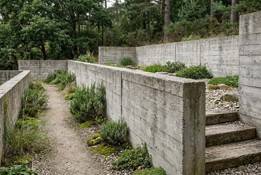
Raw concrete is one of those materials that quietly commands respect. It does not rely on ornament or seasonal interest; instead, it builds its presence through scale, texture, and light. In minimalist gardens, it acts almost like a grounding force, a material that holds everything together without ever trying to steal the spotlight. When used with intention, it brings a sense of permanence that feels both architectural and deeply calming, like the garden has finally found its footing.
The real conversation with concrete is not whether to use it, but how to finish it. A polished surface reflects light cleanly and feels more refined, almost interior-like in its precision. It works well in tightly controlled courtyards where every line matters. Board-formed concrete, on the other hand, carries the memory of its making. You can still read the grain of timber in its surface, which introduces a subtle texture that softens its otherwise rigid character. In many of my projects, I tend to lean toward board-formed finishes outdoors because they age more gracefully, catching shadow and weather in a way that polished surfaces often struggle to do.
I remember a garden where the original brief called for “something modern but not cold.” It was a delicate balance. We introduced a series of board-formed concrete retaining walls, each poured in sections with careful attention to joint alignment. The moment the formwork came off, the surface already had a quiet depth to it. Over the first year, as the concrete softened slightly with exposure and planting crept around its base, it stopped feeling like a new installation and started feeling like part of the landscape itself. That shift, from constructed to embedded, is where concrete really earns its place.
From a practical standpoint, thickness and proportion are critical. For garden walls, I typically work with a minimum thickness of 150–200 mm (6–8 inches) to ensure structural stability and a clean visual weight. For paving slabs or cast panels, 80–120 mm (3–5 inches) is often sufficient in residential settings, depending on load requirements. Expansion joints should be placed every 3–4 metres (10–13 feet) to control natural movement and prevent uncontrolled cracking. These details are rarely noticed when done well, but they are exactly what allows the material to age with dignity rather than deterioration.
Pros
- Creates strong architectural presence with minimal visual noise
- Ages beautifully, developing subtle tonal variation over time
- Highly durable and suitable for long-term structural use
Cons
- Can feel heavy or cold if not balanced with planting or softer materials
- Requires precise execution, as imperfections become highly visible
- Limited flexibility once installed, making future changes more complex
What makes raw concrete so compelling is its honesty. It does not pretend to be anything other than what it is. And in a minimalist garden, that kind of straightforwardness becomes its own form of luxury, quiet, grounded, and completely unapologetic in its presence.
Natural Stone with Visible Imperfections
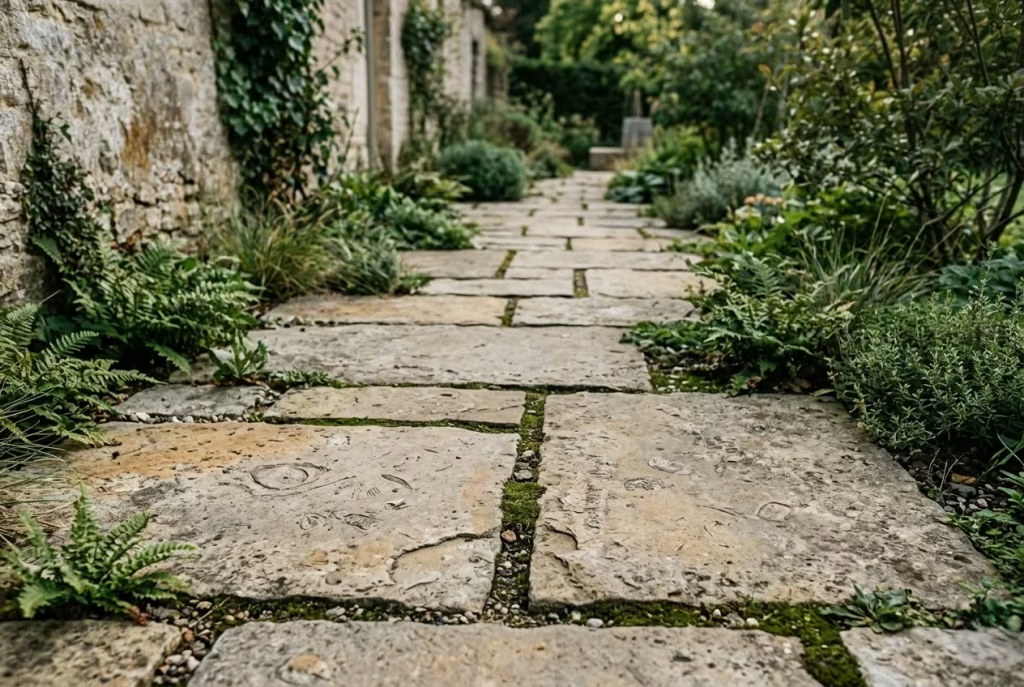
Natural stone, when left honest and slightly imperfect, has a way of grounding a minimalist garden in something far more enduring than precision alone. It carries weight not just physically, but visually, as if the landscape itself has been gently pressed into place over time. In a world where so many materials are overly refined or mechanically uniform, stone with visible variation brings back a sense of authenticity that feels almost instinctive, like the garden has always been there, quietly settling into the ground rather than being imposed upon it.
The idea is not about celebrating flaws for the sake of it, but about recognising that perfection can sometimes feel sterile outdoors. Slight variations in tone, irregular edges, subtle fossil marks, or uneven surface textures all contribute to a layered visual language that minimalist spaces actually benefit from. When everything is too polished, the garden risks feeling disconnected from its natural context. But when stone is allowed to retain its character, it softens the architecture in a way that feels grounded and unforced, almost like the material is speaking in its own quiet dialect.
I often choose irregular stone for projects where the brief leans toward restraint but still needs emotional depth. One garden comes to mind where we replaced perfectly cut porcelain paving with hand-split limestone. At first glance, the change seemed minor, but once installed, the difference in atmosphere was undeniable. The edges were slightly uneven, the surface caught water differently after rain, and the tonal variation created subtle shifts as the light moved across it. Over time, moss began to settle into the joints, and instead of looking untidy, it added a sense of age that the previous material could never achieve. It was one of those rare moments where imperfection became the defining strength of the space.
From a practical standpoint, stone selection and sizing play a crucial role in how the garden feels underfoot and visually. For paving, I typically work with slabs ranging from 400–900 mm (16–36 inches) in length, with irregular thicknesses between 25–50 mm (1–2 inches) depending on the finish and application. Joint widths are usually kept between 10–20 mm (0.4–0.8 inches), slightly wider than precision-cut materials, to allow the natural variation to breathe rather than feel forced into alignment. The key is consistency in intention, not uniformity in shape.
Pros
- Adds authenticity and depth through natural variation and texture
- Ages beautifully, often improving in character over time
- Softens minimalist compositions by introducing organic irregularity
Cons
- Requires careful laying to avoid a chaotic or unbalanced appearance
- Can be more challenging to install due to irregular sizing and edges
- Needs thoughtful sourcing to ensure quality and long-term durability
What makes natural stone with imperfections so compelling is that it resists being overly controlled. It introduces just enough unpredictability to keep a minimalist garden from feeling too rigid or engineered. And in that balance between order and natural variation, the space begins to feel less constructed and more discovered, as if it has quietly revealed itself rather than been built from scratch.
Timber Decking with Tight Gaps (5–8 mm / 0.2–0.3 inches)
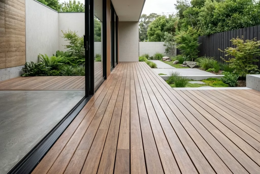
Timber decking, when handled with restraint, can feel almost architectural in its calmness. The key lies not in the material itself, but in the precision of its detailing, particularly the spacing between boards. Tight gaps create a continuous visual field, where the surface reads as one cohesive plane rather than a series of fragmented strips. In minimalist gardens, that subtle continuity is what allows timber to feel refined rather than casual, like a space that has been carefully edited down to its essential rhythm.
The concept is about visual flow. Wider gaps tend to break the surface into repetitive lines that draw unnecessary attention, while tighter joints allow the eye to glide across the decking almost uninterrupted. It becomes less about individual boards and more about the overall surface quality. When light hits timber laid this way, it behaves differently too, casting softer, more unified shadows that shift gently throughout the day rather than creating harsh, segmented patterns.
I’ve used this approach in projects where the brief called for warmth without visual clutter. One particular garden had a raised terrace that originally felt slightly disjointed due to inconsistent board spacing and mixed timber tones. We re-laid the decking using uniform hardwood boards with consistent 5–8 mm (0.2–0.3 inches) gaps, aligned carefully along the primary sightline of the house. The transformation was immediate. The surface suddenly felt calmer, more deliberate, almost like a piece of interior flooring extended outdoors. What was once visually noisy became quietly composed, and the transition from indoor to outdoor space felt far more seamless.
From a practical perspective, tight gaps require precision both in installation and long-term maintenance. The 5–8 mm (0.2–0.3 inches) spacing allows for natural timber expansion and drainage without compromising visual continuity. Board widths typically sit between 90–150 mm (3.5–6 inches) for a balanced proportion, while subframe alignment must be exact to prevent subtle warping over time. Joist spacing, usually around 400–600 mm (16–24 inches) centres depending on timber type, plays a crucial role in maintaining structural stability and preventing surface deflection.
Pros
- Creates a clean, continuous surface that enhances minimalist aesthetics
- Improves visual flow between indoor and outdoor spaces
- Reduces visual fragmentation caused by wider, distracting gaps
Cons
- Requires precise installation, as small misalignments become noticeable
- Needs regular maintenance to manage natural timber movement over time
- Can trap debris more easily if drainage and cleaning are not considered
What makes tight-gap decking so effective is its discipline. It does not rely on decoration or complexity to feel resolved. Instead, it leans on precision, proportion, and restraint, resulting in a surface that feels calm, intentional, and quietly confident underfoot.
Gravel Gardens for Texture and Sound
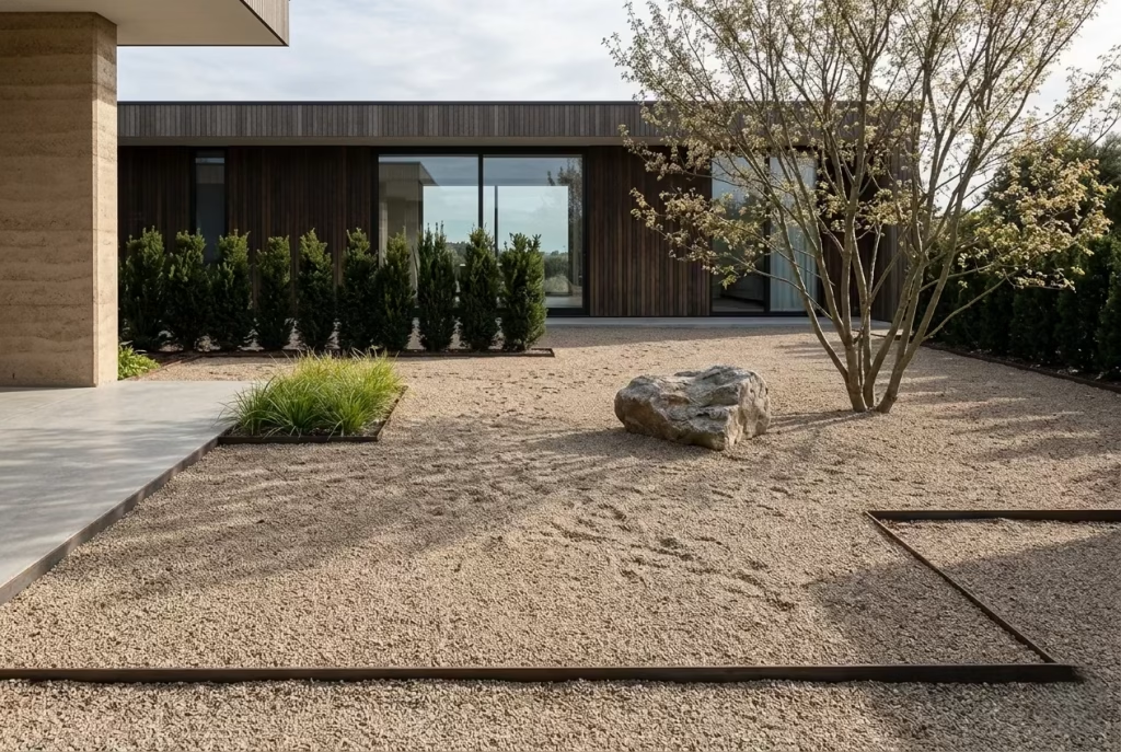
Gravel gardens introduce something that many minimalist landscapes quietly rely on but rarely articulate, sensory presence. Unlike smooth paving or silent concrete surfaces, gravel engages you the moment you step onto it. That subtle crunch underfoot becomes part of the experience, almost like the garden is acknowledging your movement. In a well-composed minimalist setting, this sound is not noise, but rhythm, a soft, grounding layer that connects body, space, and material in real time.
The concept works because gravel operates on two levels at once: visual restraint and sensory richness. Visually, it reads as a continuous, low-profile surface that supports planting and structure without competing for attention. But experientially, it shifts with every step, every shift in weight, every change in weather. It is one of the few materials that feels different in dry heat, damp mornings, and cold winter light, yet still holds its composure. In that sense, it becomes a living surface, constantly responsive but never chaotic.
I’ve used gravel extensively in projects where hard landscaping needed to feel lighter, less imposed. One garden in particular had a very rigid layout of stone paving that made the space feel overly formal, almost tense. We replaced large sections with compacted gravel in a warm neutral tone, carefully contained with discreet steel edging so the lines remained crisp. The transformation was immediate. The garden suddenly felt more relaxed, more forgiving. Footsteps became part of the atmosphere, and even simple movement through the space started to feel slower, more deliberate, almost like the garden was encouraging you to take your time rather than rush through it.
From a technical standpoint, gravel performance depends heavily on depth, grading, and containment. I typically specify a total depth of 50–75 mm (2–3 inches) for the decorative layer, laid over a compacted sub-base of around 100–150 mm (4–6 inches) for stability. The choice of aggregate size is equally important; a grading of 6–10 mm (0.25–0.4 inches) tends to strike the best balance between comfort underfoot and visual refinement. Anything too fine risks compacting into dust, while overly large gravel can feel unstable and visually harsh. Edging, whether steel, stone, or hidden concrete haunching, is essential to prevent migration and maintain those clean, controlled boundaries that minimalist design relies on.
Pros
- Adds rich sensory experience through sound and texture underfoot
- Visually softens hard landscaping, making spaces feel more natural and relaxed
- Permeable surface, improving drainage and reducing surface water issues
Cons
- Requires proper edging to prevent spreading and loss of definition
- Can be difficult to walk on in formal footwear or for accessibility needs
- Needs periodic raking to maintain an even, composed appearance
What makes gravel so compelling is its ability to introduce life without visual excess. It does not demand attention, yet it is never passive. Every step leaves a trace, every movement contributes to its character. And in a minimalist garden, where restraint is everything, that quiet interaction between material and motion becomes one of its most understated strengths.
Steel Edging for Clean Lines
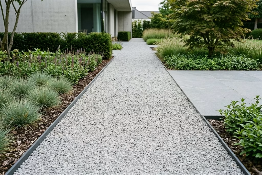
Steel edging is one of those quiet interventions that rarely gets noticed at first glance, yet it fundamentally changes how a garden is read. It does not compete with planting, paving, or structure; instead, it sits almost invisibly in the background, sharpening every transition it touches. In minimalist garden design, it becomes the difference between something that feels loosely defined and something that feels deliberately composed, almost like drawing a fine pen line around a sketch that was already working but needed precision to hold its form.
The concept is rooted in control through restraint. Where materials like gravel, soil, and planting naturally want to blur and expand, steel edging holds them in check without visual interruption. It creates a crisp boundary that feels intentional rather than imposed. That clarity is what allows minimalist gardens to maintain their discipline over time, especially as planting matures and soft edges begin to creep outward. In many ways, it is the unsung framework that keeps the entire composition from slowly drifting out of shape.
I’ve used steel edging in countless projects where the brief was “clean but not cold,” which is often where things can easily tip in the wrong direction. One garden that stands out had a mix of gravel paths and planted borders that kept bleeding into each other, making the layout feel blurred and unresolved. We introduced a continuous line of powder-coated steel edging, set flush with the surrounding materials, running along every key transition.
The effect was immediate but subtle. Suddenly, the gravel felt contained, the planting beds regained their shape, and the geometry of the garden became readable again. It was not a dramatic transformation, but one of those quiet corrections that makes everything else feel more intentional, almost like tightening a frame around a painting that was already strong but slightly unruly.
From a technical perspective, steel edging performs best when specified with precision. I typically work with heights of 75–150 mm (3–6 inches) above the sub-base, depending on whether the edge needs to retain gravel, soil, or simply define a boundary. Thickness usually sits around 3–6 mm (0.12–0.24 inches), which provides enough rigidity without becoming visually heavy. Installation depth is critical; setting at least 50–75 mm (2–3 inches) into a compacted base ensures long-term stability and prevents shifting over time. For curved layouts, flexible steel is preferred, while straight runs benefit from rigid sections to maintain that crisp, architectural edge.
Pros
- Creates exceptionally clean transitions between materials, enhancing visual clarity
- Virtually invisible once installed, preserving minimalist aesthetics
- Long-lasting and structurally reliable when properly anchored
Cons
- Requires precise installation to avoid visible misalignment or waviness
- Can be more expensive than alternative edging materials
- May heat up in direct sun exposure depending on finish and placement
What makes steel edging so effective is its restraint. It never tries to be the focal point, yet without it, the entire composition risks slipping into visual ambiguity. It is the kind of detail that works quietly behind the scenes, ensuring that every line, every material, and every transition holds its place with quiet confidence, like a well-tailored seam that keeps the entire garment perfectly structured.
Water & Reflection
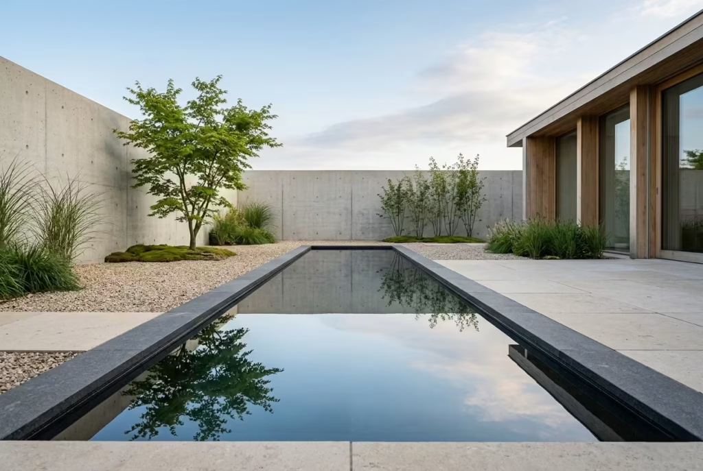
Water introduces a different kind of stillness to minimalist garden design, one that is less about structure and more about perception. It reflects light, absorbs movement, and slows the visual rhythm of a space in a way few other elements can achieve. In practice, I often treat water as a quiet counterbalance to harder materials, allowing reflection and surface calm to soften geometry and bring a sense of depth that feels almost atmospheric rather than constructed.
Still Water Features (Reflecting Pools)
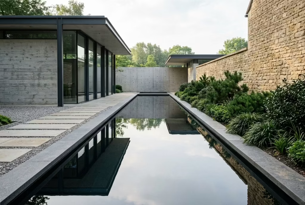
A still water feature is less about decoration and more about perception. It is one of the few elements in a minimalist garden that does not compete for attention, yet it quietly reshapes everything around it. When the surface is calm, it becomes a mirror for the sky, surrounding architecture, and shifting light, effectively doubling the sense of space without physically expanding it. In many ways, it is the closest a garden gets to creating an illusion of depth that feels completely natural, almost like the landscape has been gently stretched and softened at the edges.
The concept relies on stillness rather than movement. Unlike fountains or rills, a reflecting pool works best when the surface is undisturbed, allowing reflections to form clearly and consistently. That sense of calm becomes the focal point. I often think of it as a pause within the garden, a moment where everything slows down just enough for you to notice light, shadow, and proportion in a different way. When placed correctly, it does not interrupt the design, it enhances it, like a quiet pause in an otherwise continuous conversation.
I’ve used still water features in projects where the brief called for “space without expansion,” which is always an interesting challenge. One garden in particular had a very enclosed feel due to surrounding walls and limited sightlines. Rather than trying to open the space physically, we introduced a long, shallow reflecting pool running parallel to the main axis of the garden. The moment it was filled, the entire perception of the space shifted. The walls no longer felt enclosing; instead, they appeared doubled in the water’s surface, creating an illusion of breadth that wasn’t actually there. It became the emotional centre of the garden, not because it was loud, but because it was still.
From a technical standpoint, proportions are critical to achieving that sense of calm. I typically specify a depth of 150–300 mm (6–12 inches) for residential reflecting pools, shallow enough to maintain clarity while deep enough to avoid surface distortion from wind or debris. Edges should be kept razor clean, often in concrete, stone, or steel, with tolerances carefully controlled so the water line remains visually sharp. In longer pools, widths of 600–1200 mm (24–48 inches) can work well for narrow courtyard settings, while broader compositions may extend beyond 2–3 metres (6.5–10 feet) to fully capture sky reflection and architectural symmetry.
Pros
- Visually expands space by reflecting sky, light, and surrounding structures
- Introduces a strong sense of calm and stillness into the garden composition
- Enhances architectural clarity through mirrored symmetry
Cons
- Requires regular maintenance to keep water clean and visually still
- Can be sensitive to wind, debris, and algae if not properly managed
- Installation demands precise detailing and level accuracy to achieve clean reflections
What makes still water so compelling is its quiet confidence. It does not need movement to feel alive, nor does it rely on embellishment to hold attention. Instead, it reflects everything around it with honesty, revealing the garden in a slightly altered, more contemplative form. And in that reflection, the space often feels larger, calmer, and more resolved than it did before.
Minimalist Fountains with Soft Sound
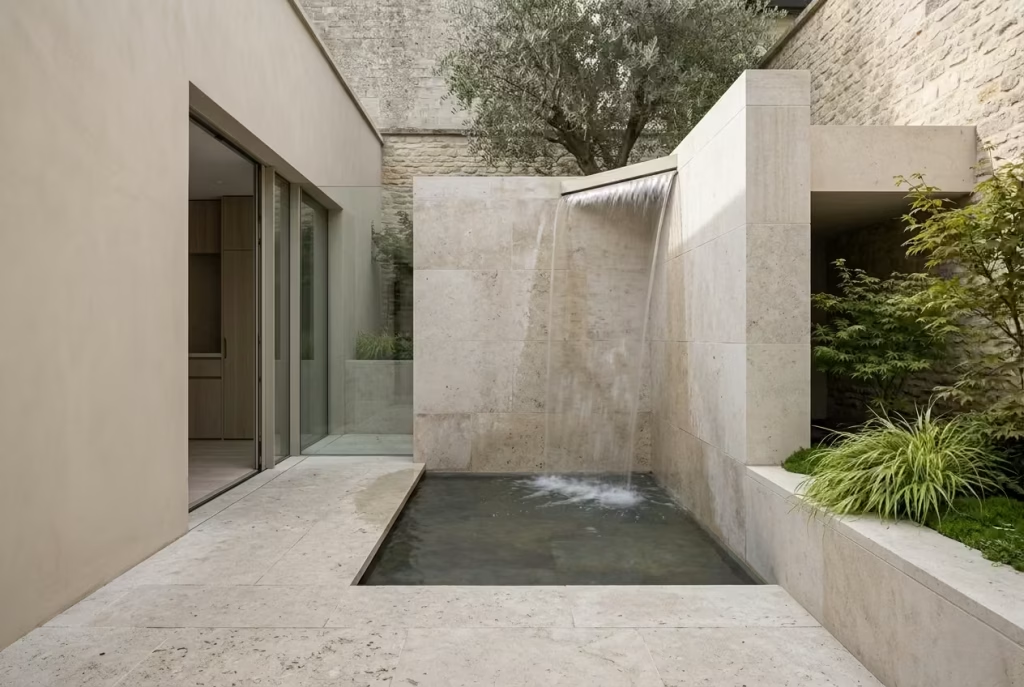
A minimalist fountain is not about spectacle or ornamentation; it is about atmosphere shaped through sound rather than form. In contrast to highly decorative water features, these installations strip everything back until only movement, rhythm, and acoustics remain. The effect is subtle but deeply influential. A soft, continuous trickle can shift the entire emotional tone of a garden, masking urban noise, slowing perception, and introducing a sense of calm that feels almost instinctive. It is less about what you see and more about what you unconsciously feel as you move through the space.
The concept relies on restraint in both design and output. There is no dramatic spray or sculptural flourish competing for attention, just controlled water movement over stone, metal, or concrete surfaces. I often think of these fountains as acoustic layering rather than visual features. They sit quietly in the background, like a steady breath running through the garden, subtly smoothing out the harsher edges of surrounding sound. When done well, they never announce themselves; instead, they become something you only fully appreciate when they are absent.
I’ve used minimalist fountains in projects where clients wanted “life in the garden without distraction.” One courtyard in particular comes to mind, where surrounding roads created a constant low-level noise that made the space feel unsettled. Rather than trying to block it entirely, we introduced a wall-integrated fountain with water gently cascading over a honed limestone face. The sound was carefully calibrated, not too sharp, not too heavy, just a consistent, soft flow that blended into the background. Within days, the perception of the space changed completely. Conversations felt easier, the courtyard felt more enclosed in a comforting way, and the external noise no longer dominated the experience. It was a quiet intervention, but one that fundamentally changed how the garden was used.
From a practical standpoint, proportions and flow rates are what define success. For residential settings, a flow rate of around 2–6 litres per minute is typically enough to create a gentle, audible presence without overwhelming the space. Fountain heights are usually kept low, often within 300–900 mm (12–36 inches) depending on design intent, with water falling in controlled sheets or narrow channels rather than open sprays. Basin depths of 150–300 mm (6–12 inches) are common, ensuring sufficient volume for recirculation while maintaining a clean visual profile. Pump selection also plays a critical role, as adjustable flow control allows fine-tuning once the system is installed.
Pros
- Introduces calming ambient sound that masks external noise pollution
- Enhances atmosphere without relying on visual complexity or decoration
- Works as a subtle focal point that integrates seamlessly into minimalist design
Cons
- Requires ongoing maintenance to prevent pump issues and water quality problems
- Can become disruptive if flow is too strong or poorly calibrated
- Installation demands careful waterproofing and technical planning
What makes minimalist fountains so effective is their restraint. They do not compete with the garden, nor do they try to dominate it. Instead, they sit quietly within it, shaping experience through sound rather than spectacle. And in that softness, the entire space often feels more grounded, more composed, and far more human than silence alone could achieve.
Furniture & Styling
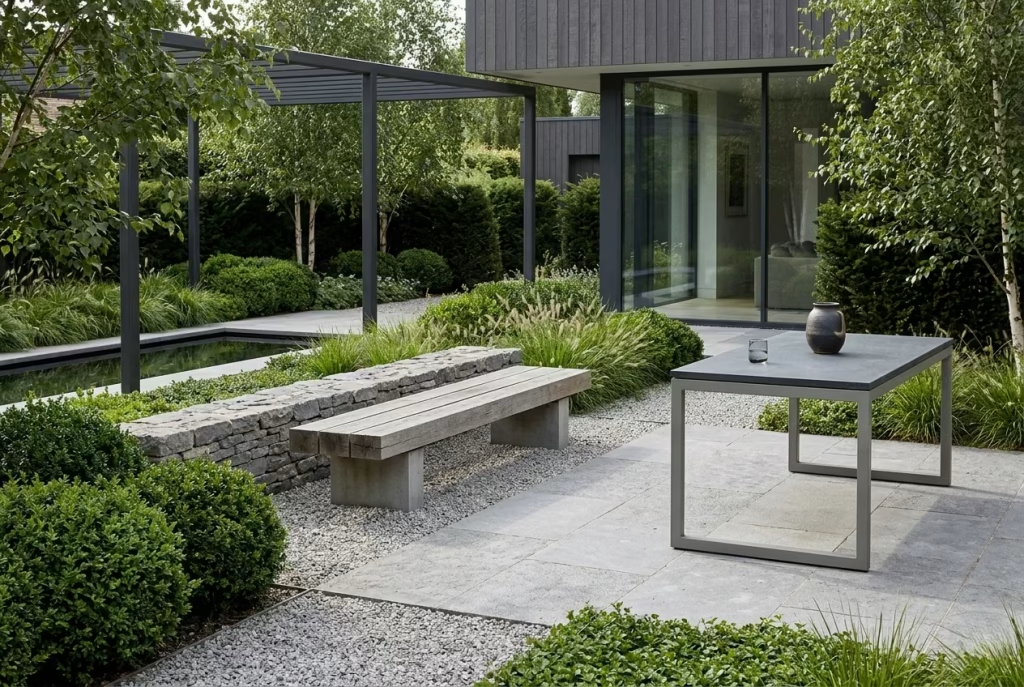
Once structure, materials, and planting are resolved, furniture and styling become the final layer that quietly defines how a garden is actually lived in. This is where restraint matters most, because every object introduced begins to speak against the backdrop of the space. In practice, I treat this stage as careful editing rather than decoration, ensuring each piece earns its place and reinforces the overall calm, rather than disrupting it.
Built-In Seating Instead of Loose Furniture
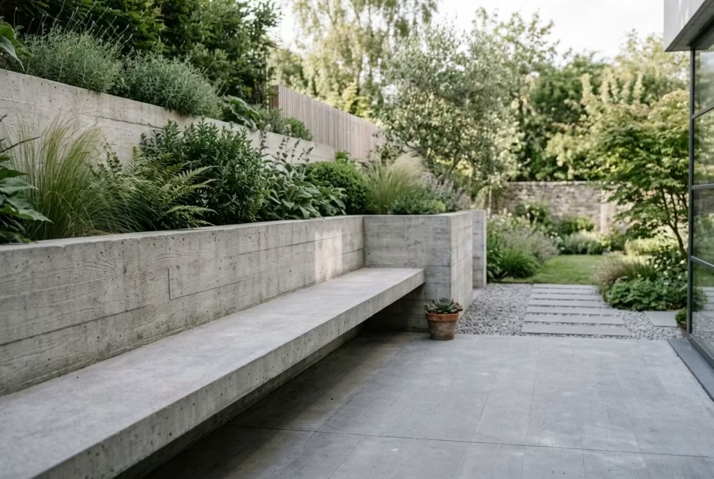
Built-in seating is one of those decisions that quietly shifts a garden from being furnished to being designed. Instead of scattering movable pieces that come and go with seasons, the seating becomes part of the architecture itself, anchored into walls, levels, or planters in a way that feels intentional and permanent. It removes the visual noise of mismatched chairs and tables, replacing it with something far more composed, almost as if the garden has been carefully carved to accommodate rest rather than simply equipped for it.
The strength of this approach lies in its permanence and clarity. Loose furniture often introduces visual fragmentation, especially in minimalist settings where every object is under quiet scrutiny. Built-in seating, on the other hand, holds its position without competing for attention. It sits within the design language of the garden rather than on top of it. I often think of it as the difference between placing furniture in a room and shaping the room itself around how people will use it. When done well, it feels inevitable, like it was always meant to be there.
I’ve used built-in seating in projects where the goal was to reduce visual clutter while increasing usability. One garden that stands out had a narrow terrace that constantly felt overcrowded whenever chairs were brought out. The space worked physically, but visually it always felt temporary, like it was waiting to be reset.
We introduced a continuous bench formed in board-marked concrete along one edge, with a depth of around 550 mm (22 inches) and a seating height of 450 mm (18 inches). Once installed, the change was immediate. The terrace no longer felt like it was being furnished each time it was used; instead, it felt complete from the outset. Clients often remarked that they started using the space more frequently simply because it no longer required effort to “set up.”
From a practical standpoint, proportions are critical to comfort and longevity. A standard seating height of 430–460 mm (17–18 inches) works best for most users, while seat depths between 500–600 mm (20–24 inches) allow for relaxed posture without feeling overly bulky. Backrests, if included, typically sit at around 300–450 mm (12–18 inches) above the seat, often slightly reclined to improve comfort over longer periods. Materials vary depending on design intent, but concrete, stone, and hardwood are the most reliable choices for long-term outdoor exposure, especially when integrated into structural elements like retaining walls or raised platforms.
Pros
- Eliminates visual clutter caused by loose or mismatched furniture
- Improves durability and long-term weather resistance
- Creates a cohesive, architectural feel that strengthens minimalist design
Cons
- Lack of flexibility, as seating cannot be easily rearranged
- Requires careful ergonomic planning to ensure comfort
- Higher upfront construction cost compared to movable furniture
What makes built-in seating so effective is its sense of permanence. It does not shift with trends or seasons, and it does not rely on styling to feel complete. Instead, it becomes part of the garden’s structure, quietly reinforcing the idea that good design is not about adding more, but about shaping what is already there with clarity and intent.
Neutral Outdoor Furniture Palettes
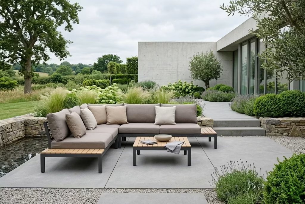
Neutral outdoor furniture palettes are the quiet discipline that holds a minimalist garden together without ever stepping into the spotlight. Instead of competing with planting, paving, or architectural forms, tones like stone, taupe, sand, and charcoal act as a visual “soft landing,” allowing the eye to rest rather than constantly recalibrate. In many ways, it is the art of stepping back so the space itself can take centre stage, like a well-edited frame that never distracts from the picture it holds.
The concept is rooted in visual continuity. Outdoor spaces, especially minimalist ones, already rely heavily on restraint, so introducing strong colours or high-contrast furniture can quickly disrupt that balance. Neutral palettes, on the other hand, blur the boundary between structure and styling. They sit quietly within the composition, almost dissolving into the background when not in use, yet still providing enough definition to support function and comfort. It is not about making furniture disappear, but about ensuring it never feels louder than the garden itself.
I’ve seen the impact of this approach most clearly in projects where furniture was initially treated as an afterthought. One garden had a beautifully resolved layout, but the introduction of bright, mismatched outdoor seating completely shifted the tone. It suddenly felt fragmented, as if different design languages were competing for attention. We replaced everything with a tightly controlled palette of charcoal aluminium frames, taupe-toned cushions, and natural stone accents. The effect was immediate. The furniture no longer interrupted the space; instead, it settled into it. Clients often described it as the moment the garden “finally felt finished,” even though nothing structural had changed.
From a practical perspective, neutral palettes work best when they are consistent across materials and finishes. Seating heights typically remain around 430–460 mm (17–18 inches), while table heights sit at approximately 720–750 mm (28–30 inches) for dining configurations. Cushion depths of 50–100 mm (2–4 inches) are generally sufficient for comfort without creating bulky visual mass. Materials such as powder-coated aluminium, teak, and weathered steel perform particularly well in these tonal ranges, as they naturally age into softer variations of their original hues rather than deteriorating visually over time.
Pros
- Creates seamless visual integration with minimalist garden settings
- Reduces visual distraction, allowing architecture and planting to stand out
- Ages gracefully, with tones that soften rather than clash over time
Cons
- Can feel understated if not balanced with texture or material variation
- Requires careful selection to avoid flat or monotonous compositions
- Limited opportunity for expressive colour accents without disrupting harmony
What makes neutral palettes so effective is their quiet adaptability. They do not demand attention, yet they never feel absent. Instead, they allow the garden to breathe, supporting everything around them while remaining comfortably in the background, like a steady hand that holds the composition together without ever needing to be seen.
You May also Like: 25 Fall Garden Tricks to Make Your Yard Look Like a Magazine Cover
One Statement Piece Only
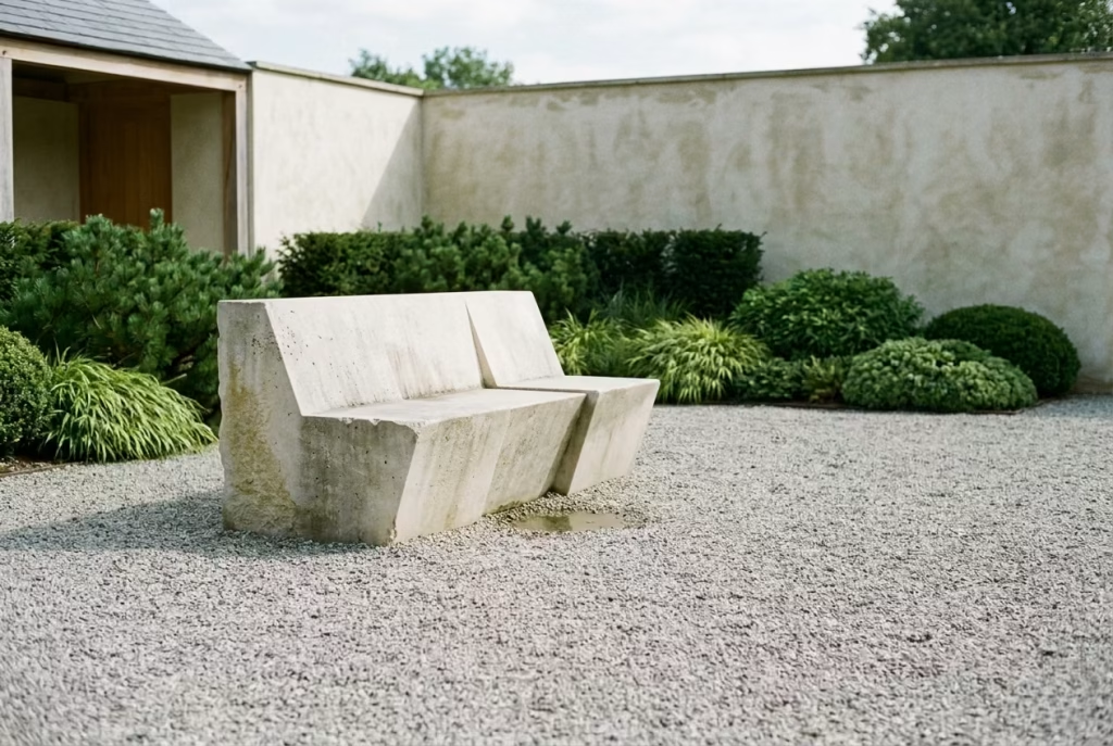
A minimalist garden rarely benefits from multiple focal points competing for attention. In fact, the more you introduce, the more the narrative starts to fracture. That is where the discipline of a single statement piece becomes so powerful. Instead of scattering interest across the space, you allow one carefully chosen object to carry the emotional and visual weight of the entire garden. It is a “less is more” principle in its purest form, but applied with intention rather than hesitation.
The concept is not about emptiness, but about hierarchy. A statement piece works because everything else is deliberately subdued, creating the conditions for contrast to feel meaningful rather than decorative. Whether it is a sculptural bench, an oversized stone plinth, a fire bowl, or a singular water feature, the key is that it feels anchored, not inserted. In a well-composed garden, this object should feel like it belongs there by right, not because it was placed to fill a gap.
I’ve learned over time that restraint here often produces stronger emotional impact than abundance ever could. I remember a project where the client initially wanted multiple focal points, a fire feature, a sculpture, and a decorative water bowl all within a relatively small courtyard. It felt like too many voices speaking at once. We stripped it back to a single monolithic stone bench carved from limestone, positioned slightly off-axis within a gravel plane.
That was it. Nothing else competed with it. The moment the planting matured and the light began to move across its surface, the entire space changed character. It no longer felt like a collection of features, but a composed experience. Visitors often gravitated toward that one element without being prompted, almost as if the garden had quietly directed them there.
From a spatial standpoint, scale and clearance are everything. A statement piece needs breathing room to read correctly. I typically allow a clearance of at least 2–3 metres (6.5–10 feet) around the object in medium-sized gardens, more in larger landscapes where scale demands greater visual distance. Height or mass depends entirely on context, but even a low feature benefits from isolation within a simplified ground plane. For sculptural seating or plinth-style elements, proportions often sit within 400–600 mm (16–24 inches) in height for seating or 800–1200 mm (32–48 inches) for sculptural presence, depending on material weight and intended viewing distance.
Pros
- Creates a strong focal point that anchors the entire garden composition
- Enhances visual clarity by reducing competing elements
- Increases emotional impact through simplicity and scale
Cons
- Requires careful selection, as poor choice becomes highly dominant
- Can feel sparse if surrounding design lacks sufficient structure or texture
- Offers little flexibility once installed, as it defines the entire spatial hierarchy
What makes this approach so effective is its confidence. It does not try to impress through accumulation, but through precision. When everything else steps back, the single statement piece begins to carry the full narrative of the space, and in that quiet spotlight, the garden often feels more resolved, more intentional, and far more memorable than one filled with competing gestures.
Lighting Design
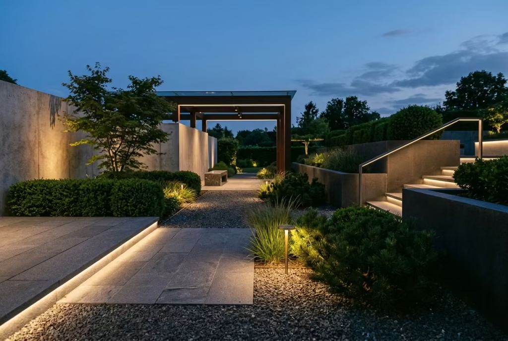
Lighting in a minimalist garden is never an afterthought, it is the quiet final layer that reveals structure once daylight fades. It shapes mood, guides movement, and gently redraws the boundaries of space when natural light is gone. In practice, I see lighting as a way of extending the garden’s composition into the evening, where restraint becomes even more important, and every beam, glow, or shadow carries intention rather than excess.
Concealed LED Strip Lighting
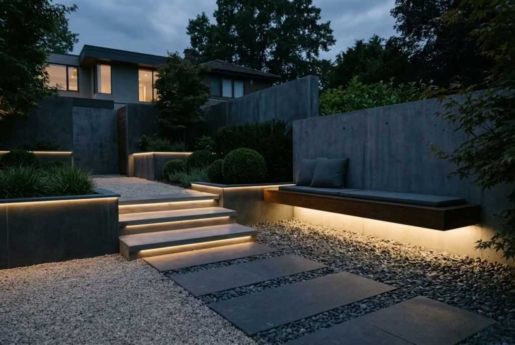
Concealed LED strip lighting is where minimalist garden design quietly shifts from visible structure to atmospheric experience. Instead of drawing attention to itself, it works in the background, tucked beneath benches, steps, coping edges, or retaining lines, allowing light to spill gently into the space rather than dominate it. The effect is subtle but powerful: surfaces begin to float, edges soften, and the garden takes on a layered depth that only reveals itself as daylight fades. It is lighting that whispers rather than speaks, yet still manages to define the entire composition.
The concept is built on restraint and precision. Unlike decorative fittings that announce their presence, concealed LEDs are designed to disappear into the architecture. What remains visible is only the effect, a soft wash of light that traces geometry, guides movement, and enhances material texture without ever overwhelming it. I often describe it as “drawing with absence,” where the light is not the object, but the tool that reveals everything else more clearly. In minimalist settings, this approach becomes especially effective because it preserves the calmness of the space while still allowing it to function after dark.
I’ve used concealed strip lighting in projects where the goal was to create atmosphere without visual clutter. One garden that stands out had a raised seating platform that felt completely flat and uninviting once the sun went down. We integrated warm-white LED strips beneath the bench overhang and along the step nosings, carefully recessed so no fixture was directly visible. The transformation was immediate. The seating area appeared to float slightly above the gravel base, and the steps became legible without feeling harsh or over-lit. It turned a previously unused evening space into somewhere people naturally gravitated towards, almost without thinking about it.
From a technical standpoint, precision is everything. I typically specify LED strips with a colour temperature of around 2700K–3000K for outdoor residential gardens, as this range maintains warmth without feeling clinical. Strip placement is usually recessed within channels of 20–30 mm (0.8–1.2 inches) depth, depending on material thickness and concealment requirements. For step lighting, a consistent reveal of around 10–15 mm (0.4–0.6 inches) ensures visibility without glare. Under-bench installations often sit flush within shadow gaps of 25–40 mm (1–1.5 inches), allowing the light to wash downwards rather than spill outward. Waterproofing is non-negotiable here, with a minimum IP65 rating for exposed zones and higher protection where water exposure is more direct.
Pros
- Enhances architectural definition without visual clutter
- Improves safety by subtly illuminating edges and transitions
- Creates atmospheric depth, making gardens feel larger and more immersive at night
Cons
- Requires precise installation to avoid visible glare or uneven lighting
- Needs careful planning for maintenance and potential replacement access
- Can feel over-designed if brightness levels are not properly controlled
What makes concealed LED lighting so effective is its discretion. It does not compete with the garden’s design language; it simply reveals it. And when darkness falls, that quiet illumination begins to reshape the space, turning structure into atmosphere and clarity into mood, all without ever asking for attention.
Low-Level Path Lighting
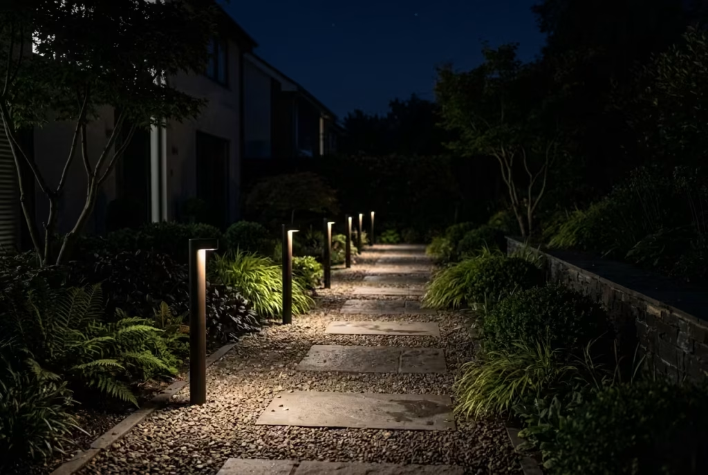
Low-level path lighting is one of those quiet interventions that changes how a garden is experienced after dark without ever demanding attention. Unlike overhead or decorative lighting, it works close to the ground, guiding movement in a calm, almost instinctive way. The effect is subtle but highly effective: paths become legible, edges gain definition, and the garden feels safer and more composed, all while preserving the stillness that defines minimalist design.
The concept is rooted in gentle guidance rather than visual dominance. Instead of flooding a space with light, low-level fixtures create a soft rhythm along circulation routes, almost like a quiet thread stitching the garden together. I often think of it as “lighting the journey, not the destination.” It allows the eye and body to move comfortably through space without ever breaking the atmosphere or flattening the sense of depth that darkness naturally brings. In minimalist gardens, this restraint is what keeps the night-time composition feeling intentional rather than overexposed.
I’ve used low-level path lighting in projects where clients wanted usability without losing mood. One garden in particular had a long, linear walkway connecting the house to a rear seating area. During the day it worked perfectly, but at night it disappeared into darkness, making the space feel disconnected. We introduced slim, low-glare bollard lights positioned at regular intervals along the path, each set around 400 mm (16 inches) high, with a carefully controlled beam angled downward to avoid spill light. The transformation was immediate. The path no longer felt like a forgotten corridor but a gently illuminated route that guided movement with confidence. It didn’t overpower the garden; it simply gave it structure after sunset.
From a technical perspective, consistency and spacing are critical. I typically position fixtures between 300–600 mm (12–24 inches) in height, depending on planting density and surrounding surfaces. Spacing between lights usually ranges from 2–4 metres (6.5–13 feet), adjusted based on beam spread and desired rhythm. For narrower paths around 600–900 mm (24–36 inches) wide, tighter spacing helps maintain continuity, while wider walkways can tolerate more distance between fittings. Colour temperature remains crucial here as well; a warm range of 2700K–3000K ensures the light feels integrated rather than clinical, especially when paired with natural materials like stone, gravel, or timber.
Pros
- Provides safe, intuitive navigation without overwhelming the garden atmosphere
- Enhances depth and structure during evening hours through subtle repetition
- Works well with minimalist design by maintaining visual restraint
Cons
- Requires careful spacing to avoid uneven lighting or visual gaps
- Can become visually repetitive if overused or poorly positioned
- Needs regular maintenance to ensure consistent output and alignment
What makes low-level path lighting so effective is its discipline. It does not try to transform the garden into something artificial at night. Instead, it simply extends what is already there, allowing movement, structure, and materiality to remain legible long after daylight fades, like a quiet guide that never interrupts the experience but gently keeps it on course.
Uplighting Trees for Drama
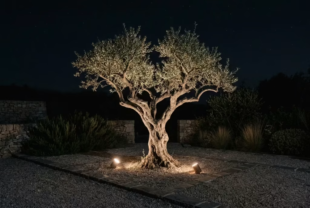
Uplighting trees is one of those lighting strategies where restraint does most of the heavy lifting. Instead of flooding the garden with brightness, a few carefully positioned beams are used to lift form out of darkness, revealing structure, texture, and silhouette in a way that feels almost cinematic. The tree becomes less of a planting element and more of a sculptural presence, its canopy suspended above the ground like a quiet architectural gesture. In minimalist gardens, this technique is especially powerful because it does not add new information, it simply reveals what is already there, but in a completely different light.
The concept is built on contrast and control. By placing light at the base of a tree and directing it upward, you create a visual dialogue between shadow and illumination. Leaves catch the light unevenly, trunks gain depth, and branching structures begin to read more clearly against the night sky. I often treat uplighting as a way of “editing darkness,” where you decide exactly what should be seen and what should remain in shadow. Too much light and the effect is lost; too little and the gesture disappears entirely. The balance sits somewhere in between, where just enough is revealed to hold attention without breaking the calm of the wider composition.
I’ve used uplighting in gardens where the brief was to create evening atmosphere without introducing visual clutter. One project that stands out involved a mature olive tree positioned within a gravel courtyard. During the day it held presence, but at night it vanished completely into the surrounding darkness. We introduced two low-output, warm-white uplights positioned at opposing angles, each carefully shielded to prevent glare. The effect was immediate but understated. The twisted trunk began to read like a sculpture, and the canopy floated above the ground in a soft halo of light. Nothing else in the garden was changed, yet the entire mood shifted. It felt quieter, more intentional, almost like the space had been gently reframed rather than redesigned.
From a technical standpoint, precision in placement and beam control is essential. I typically position uplights at a distance of around 300–1000 mm (12–40 inches) from the base of the tree, depending on trunk size and canopy spread. Beam angles are usually kept between 15° and 40°, allowing for focused projection without excessive spill. For smaller ornamental trees, a single fixture may be sufficient, while larger specimens often require two or more to avoid flat or uneven lighting. Fixture wattage is generally low, around 3–10 watts per light, ensuring a soft output rather than a dramatic flood. Colour temperature remains consistent with the rest of the garden lighting scheme, typically 2700K–3000K, to maintain warmth and cohesion across the entire space.
Pros
- Creates strong focal points using existing natural features
- Adds depth, drama, and sculptural quality to trees at night
- Enhances vertical dimension without introducing visual clutter
Cons
- Requires careful aiming to avoid glare or overexposure
- Can look artificial if intensity is too high or poorly balanced
- Needs thoughtful tree selection to ensure strong structural form
What makes uplighting so compelling is its subtle theatricality. It does not try to compete with the garden or overpower it. Instead, it reveals a different version of it, one that feels quieter, more sculpted, and slightly more mysterious, like the landscape has stepped into a softer, more contemplative version of itself after dark.
Boundaries & Privacy
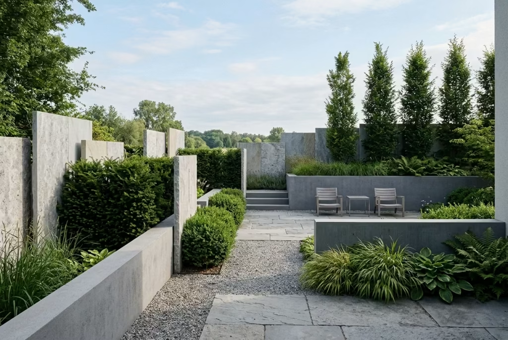
Boundaries in a minimalist garden are never just about separation, they are about framing space with quiet authority while maintaining a sense of openness. Instead of relying on heavy visual barriers, the focus shifts to subtle layering and material restraint that protects privacy without closing the garden in. In practice, I treat boundaries as the final architectural gesture, the element that holds everything together while still allowing light, air, and perspective to move freely through the space.
Seamless Fencing That Blends with Architecture
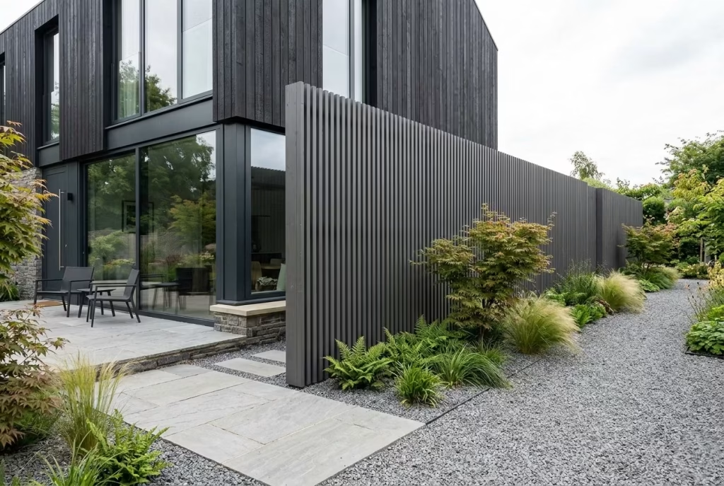
Seamless fencing is less about marking a boundary and more about dissolving it into the architectural language of the home. In minimalist garden design, the fence should never feel like an afterthought or a visual interruption. Instead, it should behave like a continuation of the building itself, extending materials, proportions, and rhythm outward until the transition between house and garden feels almost imperceptible. When done well, the boundary stops reading as a “limit” and starts reading as part of a composed whole, like a frame that quietly belongs to the picture it holds.
The concept relies heavily on continuity and restraint. Rather than introducing a contrasting material that draws attention, the fence is designed to echo the home’s palette, whether that is rendered masonry, vertical timber slats, or dark-stained panels aligned with window proportions. The goal is not to hide the boundary entirely, but to soften its presence so it recedes into the background. I often think of it as architectural camouflage, where the fence stops behaving like a garden feature and starts behaving like an extension of the built form.
I’ve worked on projects where the original fencing was visually loud, mismatched panels, inconsistent heights, and materials that bore no relationship to the house. It fractured the entire perception of the garden, no matter how well the planting or layout was handled. In one redesign, we replaced it with a continuous run of vertical timber battens, stained in a muted charcoal tone that matched the window frames of the house. The spacing between battens was carefully controlled to around 10–15 mm (0.4–0.6 inches), enough to allow airflow while maintaining privacy. The result was immediate. The garden suddenly felt anchored to the architecture rather than detached from it. Even simple elements like seating and planting began to feel more intentional against that consistent backdrop.
From a practical standpoint, proportion and alignment are everything. Fence heights typically sit between 1.8–2.4 metres (6–8 feet) for effective privacy, though even within that range, visual impact can vary dramatically depending on material density and rhythm. Vertical slats often perform best when spaced at 50–100 mm (2–4 inches) centres overall, with tighter spacing increasing privacy but also visual weight. Material thicknesses usually range from 18–38 mm (0.7–1.5 inches) for timber, while steel or composite systems may allow for slimmer profiles. Crucially, alignment with architectural features such as window heads, door lines, and roof eaves creates a sense of intentional continuity that elevates the entire composition.
Pros
- Creates strong visual continuity between house and garden
- Provides privacy without introducing heavy or visually intrusive barriers
- Strengthens architectural cohesion, making the entire site feel unified
Cons
- Requires careful detailing to avoid looking overly rigid or repetitive
- Can feel visually heavy if materials or spacing are not balanced correctly
- Needs precise alignment with the building to achieve full effect
What makes seamless fencing so effective is its quiet discipline. It does not announce itself as a boundary, yet it holds the space with confidence. And in that subtle blending of architecture and landscape, the garden begins to feel less like an enclosed plot and more like a naturally extended living environment, shaped with intent but experienced without interruption.
Layered Privacy Through Planting
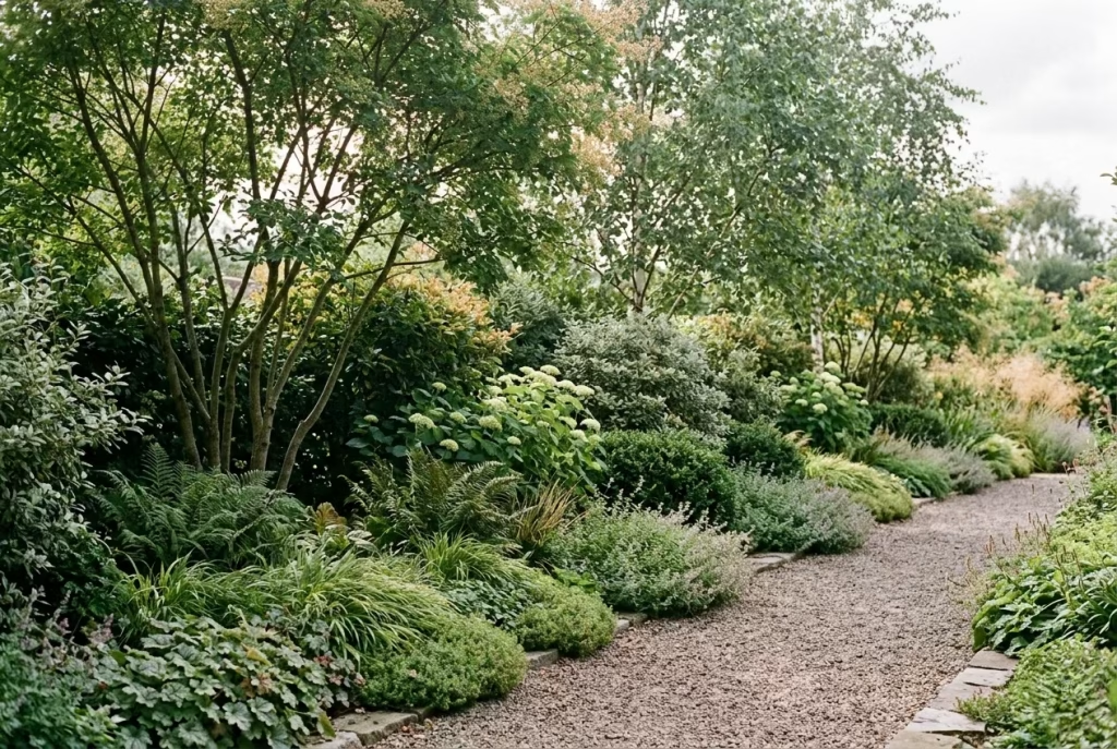
Layered privacy through planting is the final, and arguably most nuanced, expression of boundary design in a minimalist garden. Instead of relying on a single solid barrier to block views, it builds privacy gradually through overlapping planes of vegetation, each one doing a quiet share of the work. The result is not obstruction, but soft concealment, where sightlines are filtered rather than shut down. In effect, the garden feels protected without ever feeling enclosed, as if privacy has been woven into the landscape rather than imposed upon it.
The concept is rooted in depth rather than density. Rather than planting a single hedge line and calling it complete, you create staggered layers, low ground cover in the foreground, structured shrubs in the mid-layer, and taller screening elements behind. Each layer contributes differently: the lower planting softens hard edges, the middle layer disrupts direct sightlines, and the upper layer controls long-range visibility. Together, they create a sense of visual ambiguity that feels natural and unforced. I often describe it as “privacy with air in it,” where you are concealed without ever feeling boxed in.
I’ve used this approach in gardens where solid fencing would have felt too abrupt or visually heavy. One project that stands out involved a rear garden overlooked by neighbouring properties on two sides. Instead of installing tall panels, we built up privacy gradually. Near the seating area, we introduced low mounding planting of around 300–450 mm (12–18 inches) in height, followed by structural shrubs reaching 900–1500 mm (3–5 feet), and finally a loose screen of multi-stemmed trees at approximately 2–3 metres (6.5–10 feet). The arrangement was not symmetrical or rigid; it was staggered just enough to break direct sightlines while still allowing filtered light and movement. Over time, as the planting matured, the garden gained a sense of enclosure that felt organic rather than engineered, like it had grown into its privacy rather than been fenced into it.
From a practical perspective, spacing and plant selection are critical to maintaining balance. Shrubs are typically planted at 600–900 mm (24–36 inches) centres depending on mature spread, while small trees or multi-stem specimens require clearance of 2–3 metres (6.5–10 feet) to develop properly without crowding. Layering depth is just as important as height; I usually work with a minimum planting depth of 1.5–3 metres (5–10 feet) across the full boundary zone to allow each layer to function without competing. Evergreen structure is often combined with seasonal planting to maintain year-round privacy, ensuring the garden never visually collapses in winter.
Pros
- Creates natural-looking privacy without harsh structural barriers
- Softens boundaries while maintaining light and airflow
- Evolves over time, improving in depth and character as planting matures
Cons
- Requires patience, as full privacy develops gradually over seasons
- Needs ongoing maintenance and selective pruning to maintain balance
- Demands careful planning to avoid overcrowding or visual clutter
What makes layered planting so effective is its quiet complexity. It does not rely on force or finality. Instead, it builds privacy the way nature would, slowly, softly, and in overlapping stages. And in that gradual unfolding, the garden gains a sense of depth and calm that solid barriers rarely achieve, like a boundary that has been felt rather than seen.
Real-World Design Considerations (What Clients Often Overlook)
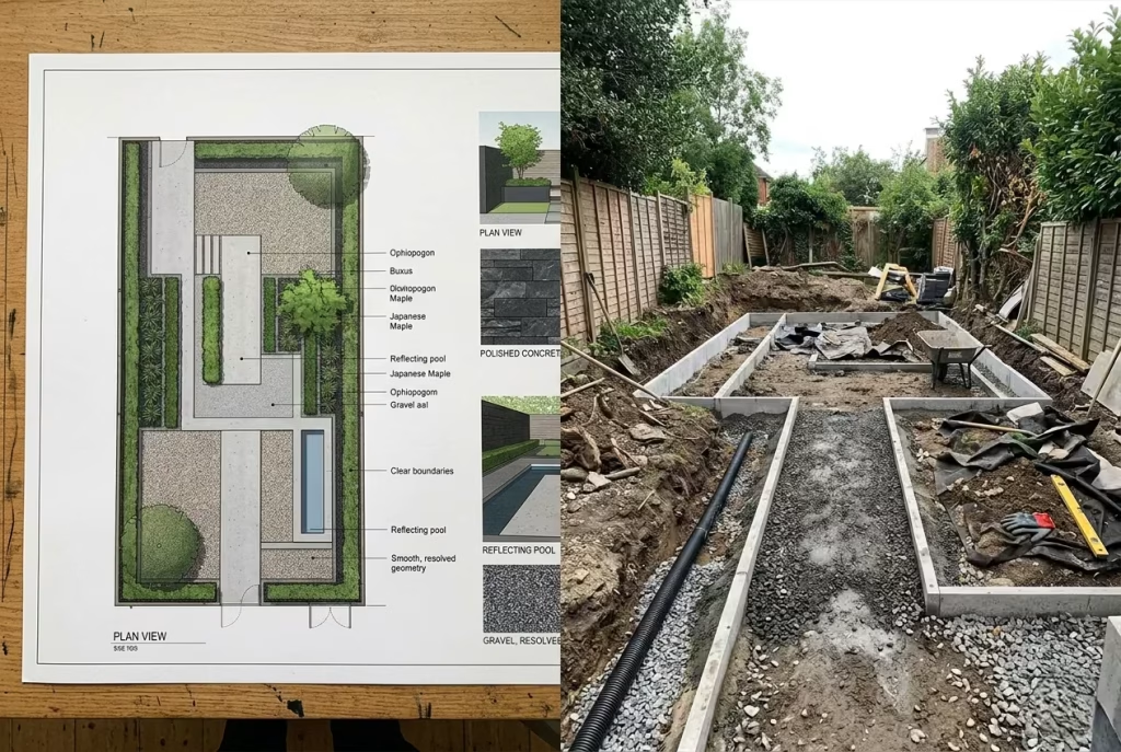
In practice, this is the point where many minimalist garden concepts either come alive or quietly fall apart. On paper, the ideas feel clean, controlled, and almost effortless. But once you step into real sites, with their awkward levels, neighbouring sightlines, drainage constraints, and daily use patterns, the picture changes. I often tell clients this is where design stops being aesthetic and starts becoming lived reality. It is also where small oversights tend to snowball, turning what looked refined into something that feels slightly off-key, even if they cannot immediately say why.
Maintenance Is Design, Not Afterthought
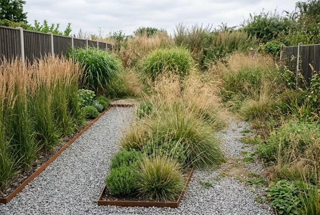
One of the most common blind spots is treating maintenance as something external to the design process. In reality, it is baked into the success of every decision. A minimalist garden is not “low effort,” it is pre-planned effort, carefully distributed so that it never overwhelms the space or the user.
I’ve seen beautifully composed gardens lose their clarity within a single season simply because growth rates were underestimated. Grasses spill into paths, gravel edges blur, and suddenly the crisp geometry starts to feel soft and unresolved. It is not neglect, it is miscalculation. The most successful projects I’ve worked on are the ones where maintenance rhythms were considered from day one, not as an add-on, but as part of the design language itself.
A good rule I follow is this: if a detail cannot tolerate a bit of seasonal change without collapsing visually, it needs revisiting. Because in real life, gardens are never static, they are constantly negotiating between intention and nature.
Budget Allocation: Spend Where It Actually Matters
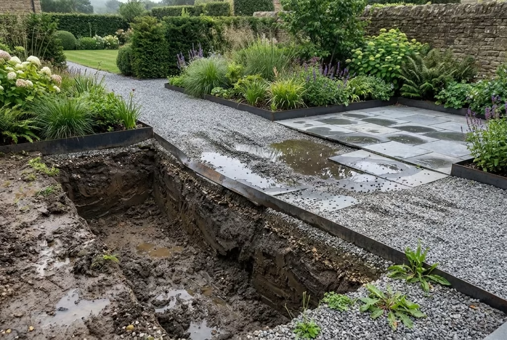
Clients often assume the “wow factor” comes from planting or furniture, but in practice, it is the groundwork that carries the entire composition. Drainage, sub-bases, levels, edging, and structural elements are where the long-term success is decided. Yet these are exactly the areas where budgets are most often trimmed.
I’ve walked onto sites where the surface finish looked impressive on day one, only to find subsidence, uneven settlement, or water pooling within months. It is a classic case of putting polish before structure. In well-resolved minimalist gardens, I always advise allocating a disproportionate share of budget to what you do not immediately see. Because ironically, that is what you feel every single day.
It is a bit like building a house on sand and wondering why the walls never quite feel straight, no matter how carefully you decorate them.
Climate Is Not a Footnote, It Is the Framework
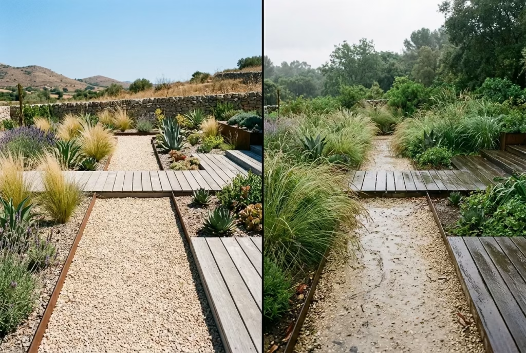
Another overlooked layer is climate responsiveness. A minimalist scheme that works in a dry, Mediterranean context can behave very differently in a damp, temperate one. Materials, planting choices, and even spacing decisions need to respond to moisture, wind, and seasonal light shifts.
I’ve worked on projects where identical design intentions produced completely different outcomes simply because rainfall patterns and soil conditions were not factored in early enough. Gravel that compacts beautifully in one region can become unstable in another. Timber that ages gracefully in dry air can distort when exposed to constant humidity. These are not minor details, they are structural influences on how the garden will live and evolve.
Designing without climate awareness is like writing a sentence without understanding the language, it may look right for a moment, but it rarely holds meaning over time.
Small Gardens Demand Sharper Decisions, Not Smaller Ideas
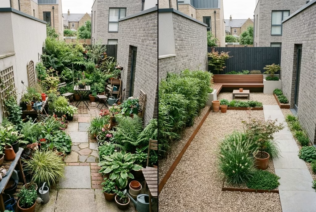
There is a persistent misconception that small gardens require “less design.” In reality, they require more precision. Every line, every material, every plant is amplified in a compact space, which means mistakes are far more visible and forgiveness is far lower.
I often find that in small urban gardens, restraint is not just a stylistic choice, it is a survival strategy. Overloading the space, even slightly, can tip it from calm to chaotic in an instant. That is why decisions around proportion, circulation, and material continuity become so critical. There is nowhere for ambiguity to hide.
The irony is that the smaller the garden, the more important it becomes to think like an architect rather than a decorator.
The Hidden Cost of “Flexibility”
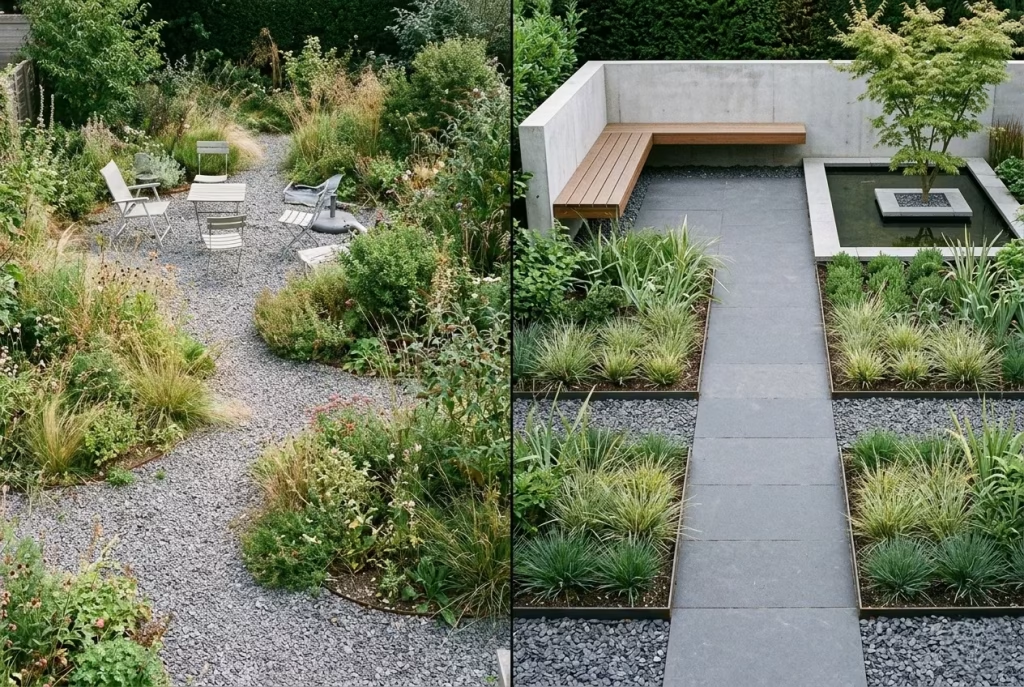
Clients often ask for flexibility, the ability to change furniture layouts, replant beds, or adjust zones over time. While understandable, too much flexibility can quietly undermine the integrity of a minimalist design.
I’ve seen gardens designed to be “adaptable” end up feeling directionless, because nothing was ever fully committed to. Edges were left vague, planting zones were too loose, and the result was a space that never quite settled into itself. In contrast, the most successful gardens are the ones with a clear backbone, even if certain surface elements evolve over time.
There is a fine line between adaptability and indecision, and in design, indecision tends to leave a longer shadow than most people expect.
Final Reflection: Design Lives in the Details You Don’t Notice First
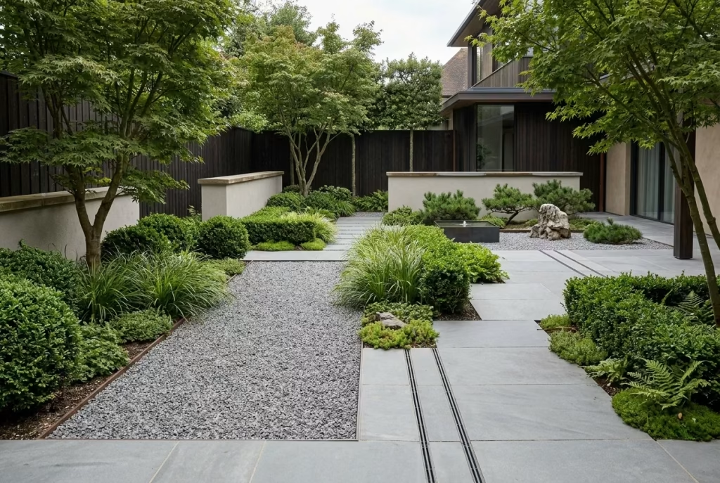
What ties all of these considerations together is simple: the most important parts of a minimalist garden are rarely the ones that draw immediate attention. They are the ones that support everything else quietly, consistently, and without interruption.
When maintenance, budget, climate, scale, and commitment are properly aligned, the garden stops feeling like a composition and starts feeling like a natural extension of its environment. And that is when minimalist design truly holds its ground, not as an aesthetic idea, but as a lived experience that continues to make sense long after the initial installation has settled.
Common Mistakes That Break Minimalism
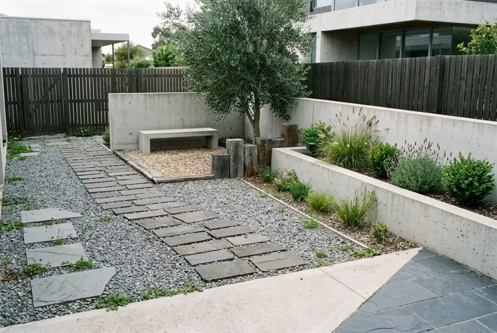
Minimalist gardens rarely fail because of a lack of ideas. They fail because of overcorrection, when restraint tips into rigidity, or when clarity is replaced with hesitation dressed up as simplicity. In real projects, I’ve found that most issues don’t come from big conceptual errors, but from small decisions accumulating in the wrong direction. And once minimalism loses its balance, it rarely feels “almost right.” It simply feels off, even if everything is technically correct.
Over-Editing to the Point of Sterility
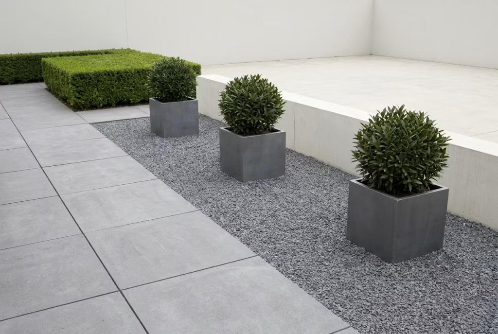
One of the most frequent missteps is stripping a space so aggressively that it loses emotional texture. Minimalism is often misunderstood as removal, when in reality it is selection. When everything is removed without discrimination, the garden stops feeling intentional and starts feeling vacant.
I’ve walked into spaces where every imperfection was “cleaned out,” every variation flattened, every planting choice reduced to safe repetition. On paper, it looked controlled. In reality, it felt emotionally absent, like a sentence with all its punctuation removed. The garden had structure, but no breath.
True minimalism always allows for a degree of imperfection, a softened edge, a material variation, a moment where light behaves differently across surfaces. Without that, the space becomes visually correct but experientially hollow.
Mixing Too Many Materials
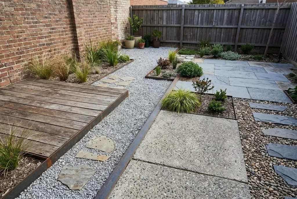
Material restraint is where many minimalist gardens quietly unravel. The temptation to introduce “just one more texture” is often where cohesion starts to dissolve. Stone, timber, gravel, concrete, steel, all can work beautifully, but only when they are curated with discipline.
I’ve seen gardens where each zone had a different material language, not necessarily bad on its own, but collectively exhausting. The eye never settled. Instead of reading as one continuous composition, the space felt like a series of disconnected scenes stitched together too loosely.
A strong minimalist scheme behaves like a limited vocabulary used fluently. The fewer the materials, the more expressive they become, provided they are consistent in tone, proportion, and application. Once that discipline slips, the design starts to lose its voice.
Ignoring Proportion and Scale
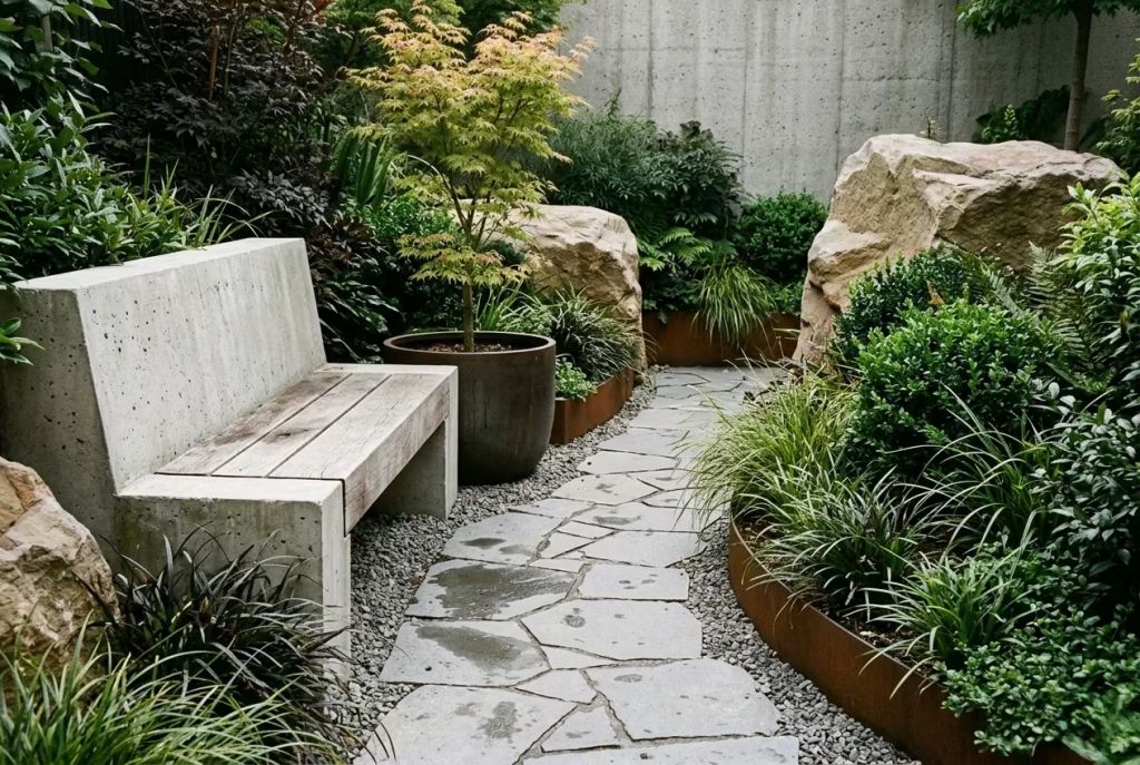
If minimalism has a silent backbone, it is proportion. Without it, even the best materials and planting schemes will feel slightly “off,” though often people cannot immediately explain why.
I’ve worked on gardens where every element was individually well-chosen, yet the overall composition felt unsettled. Paths were too narrow for the visual weight around them. Seating felt oversized against planting. Trees were planted either too close or too far, breaking spatial rhythm. Nothing was technically wrong, yet nothing quite resolved either.
Scale is what allows minimalism to feel calm rather than empty. When it is ignored, the eye begins to question everything, even if the individual components are strong. In design terms, proportion is not decoration, it is structure.
Adding Decor Too Early
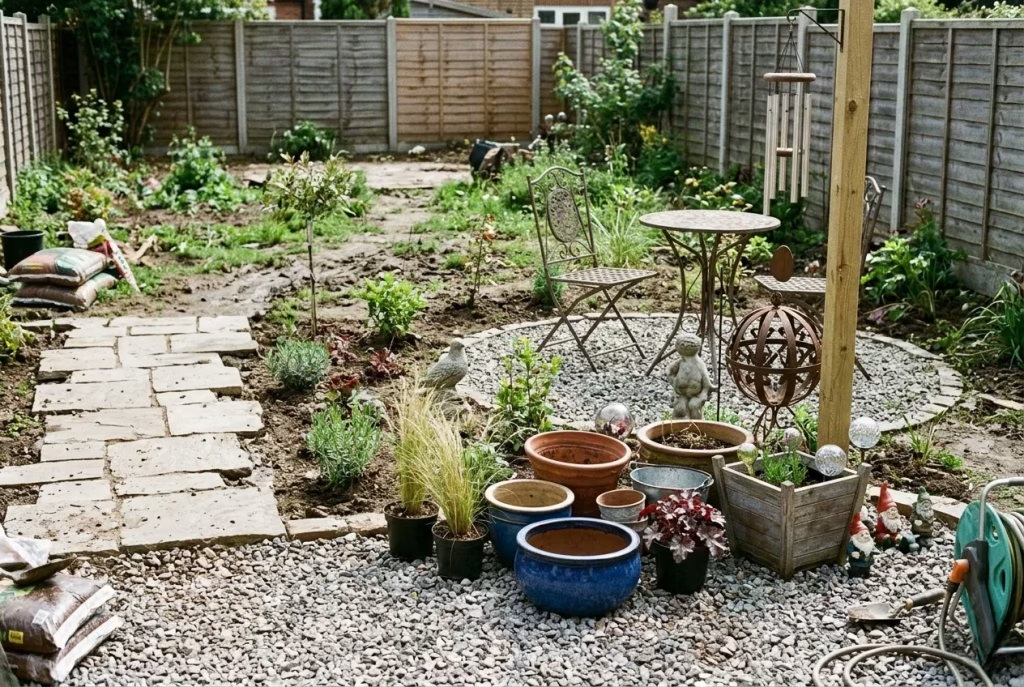
Another common mistake is rushing into styling before the spatial logic has fully settled. Decorative elements, pots, sculptures, outdoor objects, are often introduced too early in the process, before the garden has had a chance to establish its own identity.
I’ve seen spaces where styling was used as a substitute for design clarity. Instead of letting the architecture and planting define the mood, decorative layers were added to “finish” the space prematurely. The result was predictable: visual clutter masking unresolved structure.
In well-resolved gardens, decor should feel like a final note, not a supporting instrument. When introduced too early, it tends to disguise gaps rather than enhance composition, and once those gaps are filled incorrectly, they are surprisingly difficult to undo.
Poor Lighting Decisions
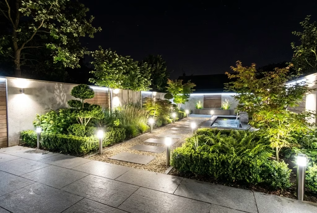
Lighting is often the final stage where minimalism either becomes elevated or quietly unravels. The most common issue is over-lighting, too many fittings, too much intensity, too many competing focal points.
I’ve worked on projects where daytime restraint was beautifully executed, only for the evening lighting to completely flatten the atmosphere. Instead of subtle guidance and depth, the garden became uniformly bright, losing all sense of shadow and hierarchy. It felt less like a composed night scene and more like a commercial display.
Good minimalist lighting is about control, not coverage. It should reveal structure, not erase darkness. When lighting is overdone, the garden loses its rhythm. And without rhythm, even the most carefully designed space begins to feel static.
How Minimalist Gardens Evolve Over Time
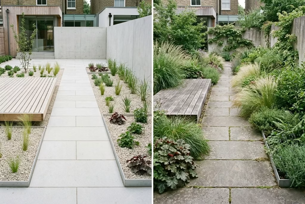
Minimalist gardens rarely reveal their full character on day one. That is part of their strength, not a weakness. They are designed to settle, soften, and mature into themselves, and that process is where their real beauty begins to show. Unlike overly ornate spaces, which can sometimes feel front-loaded with impact, minimalist gardens often improve quietly and steadily, gaining depth as materials weather and planting begins to find its stride. It is a slow burn, but when it works, it works beautifully.
Patina, Weathering, and Plant Maturity
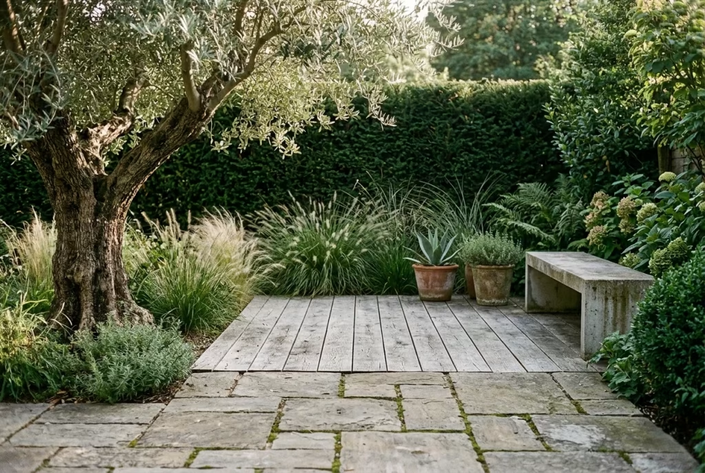
The passage of time is not something minimalist gardens fight against. In fact, the best ones lean into it. Stone develops a softer tone, timber silvers and quietens, concrete gathers a subtle richness, and metal takes on a lived-in honesty that can be far more compelling than a pristine finish ever was. These changes are not flaws to be corrected. They are part of the design’s long-term vocabulary.
Planting follows the same arc. A young olive tree can look spare and almost severe at first, but a few seasons later its trunk gains presence, its canopy spreads more generously, and the space begins to feel grounded. Ornamental grasses move from tentative tufts to generous drifts. Even evergreen hedging, which may look a little blunt in its early stages, eventually knits together into a calm, steady backdrop. This is where patience becomes a design tool in its own right. The garden is not frozen in its first impression. It is allowed to keep becoming.
Why Minimalist Spaces Often Improve with Age
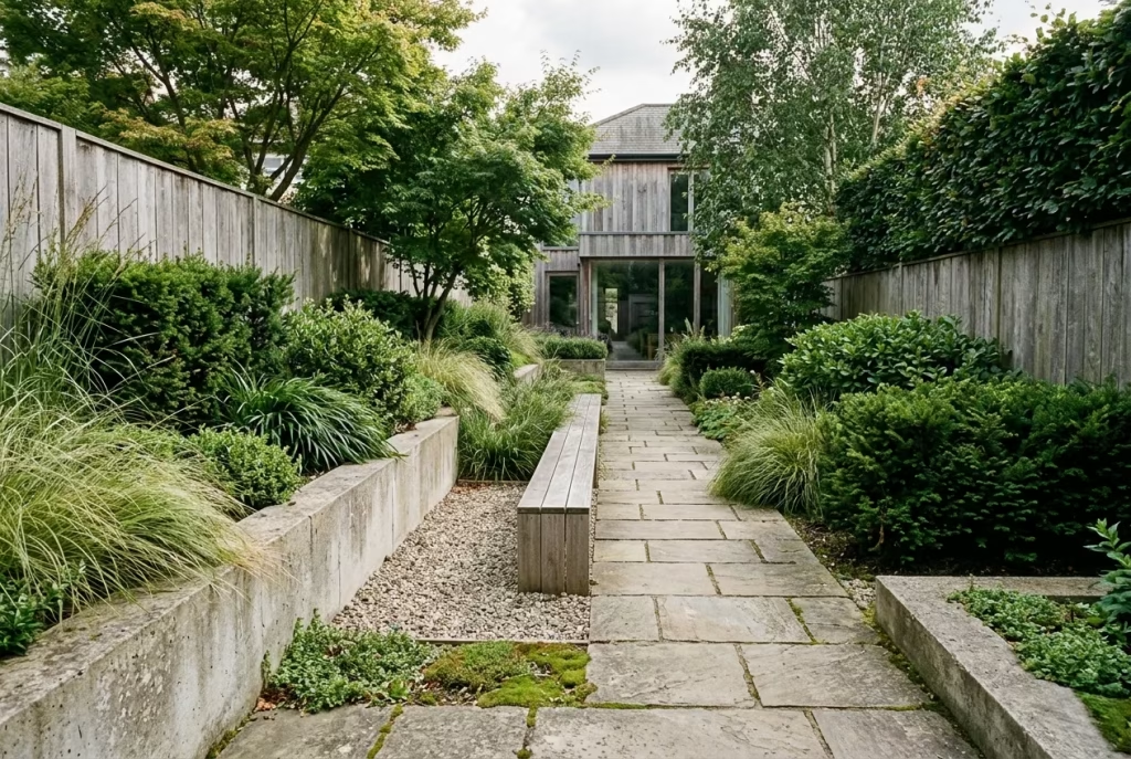
There is a kind of irony in minimalist design: the less it tries to do immediately, the more it can give back over time. That happens because the structure is clear from the start. Once the garden has a strong framework, the effects of weathering and growth do not create confusion, they add character. A well-edited layout does not collapse as it matures. It deepens.
I have found that restrained gardens often gain confidence as they age because nothing is working too hard. There is room for light to shift across surfaces. There is room for planting to expand without crowding the composition. There is room for the occasional imperfection, which, frankly, is where a garden starts to feel human rather than staged. The initial sparseness that some clients worry about is often exactly what gives the space its future strength. Once the materials settle and the planting begins to fill in, the whole thing starts to feel less designed in the obvious sense and more inevitable, which is usually the highest compliment.
Personal Insight: Projects That Looked Too Bare at First, Then Found Their Rhythm
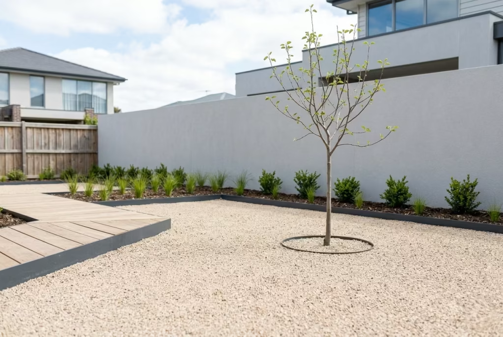
I have had more than a few projects where the first reaction was, “It feels a little empty.” And to be fair, I understood why. Minimalist gardens can look underplayed in the early stages because they rely so heavily on proportion, restraint, and long-term composition. One garden in particular stands out. At completion, it had a wide gravel plane, a single sculptural tree, and a sparse band of planting along one boundary. The client was polite, but I could tell they were unconvinced. It felt, in their words, “a bit too restrained.”
But six months later, the whole mood had shifted. The tree had begun to leaf out properly, the grasses had softened the hard edges, and the gravel had picked up just enough natural variation to lose its newness. By the following season, the garden had settled into itself completely. What once looked bare now looked composed. What once felt undecided now felt calm and assured. That is the beauty of a well-judged minimalist scheme, it does not need to win people over immediately. It just needs to hold its nerve.
I have seen the same thing happen with board-formed concrete walls, timber decking, and even apparently simple planting schemes that seemed too sparse in spring but came alive by late summer. The lesson is consistent: a minimalist garden should be given time before it is judged. It often needs a full cycle, sometimes more, before its real shape becomes visible.
The Long View Matters Most
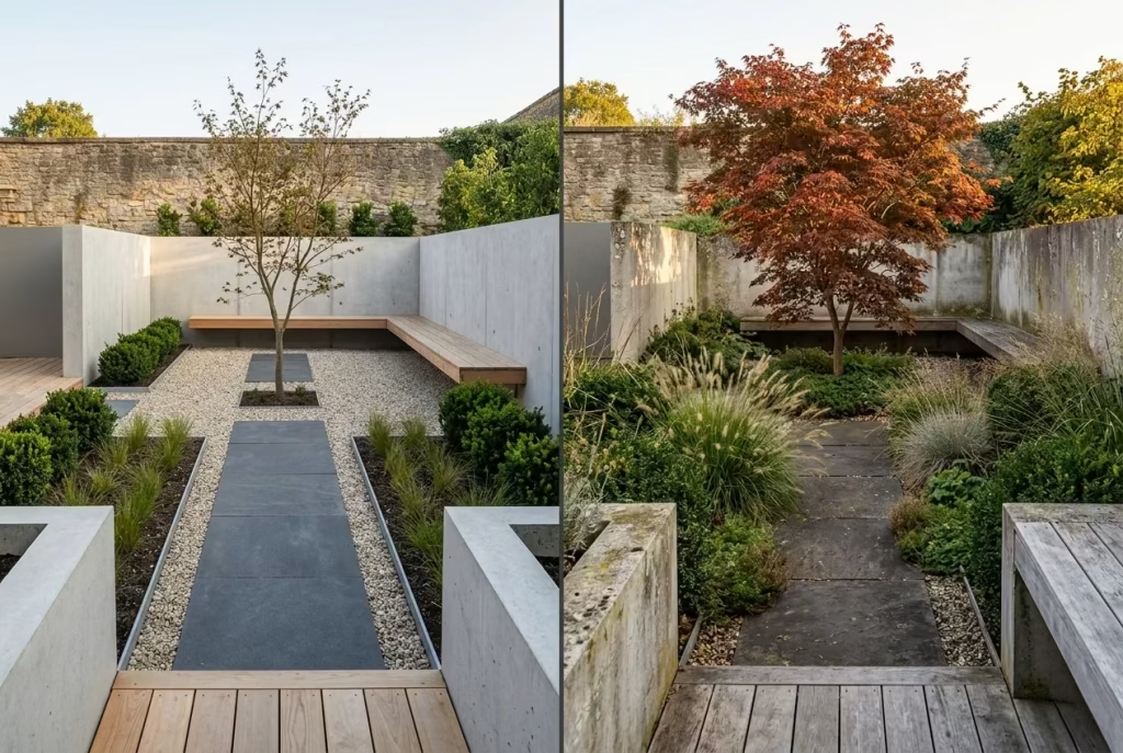
When a minimalist garden is designed properly, age does not dilute it. Age completes it. The patina, the softened edges, the fuller planting, the subtle changes in light and texture, all of these become part of the space’s quiet authority. It stops looking newly installed and starts looking settled, which is where the real confidence lies.
That is why I always encourage people to think beyond the first season. The early stage matters, of course, but it is not the final word. A minimalist garden that feels slightly spare at first can, with a little patience, become one of the most graceful spaces on the property. It is a bit like a well-cut coat or a good pair of shoes. The longer it is lived with, the better it seems to understand the person using it.
Conclusion The Quiet Luxury of Restraint
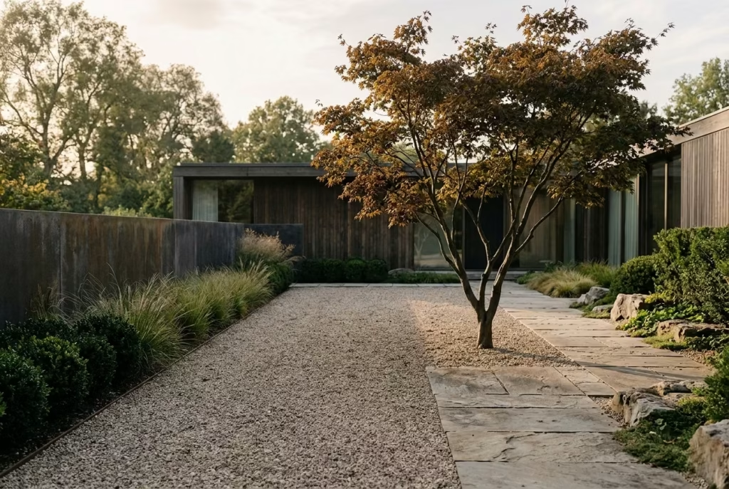
Minimalist garden design, at its core, is not about doing less for the sake of simplicity. It is about doing less so that what remains can finally be seen, felt, and experienced without interruption. Across structure, materials, planting, lighting, and boundaries, the underlying principle is consistent: clarity through reduction, and atmosphere through control. When every element earns its place, the garden stops competing for attention and starts holding it effortlessly.
What often surprises people is how emotionally rich restraint can be. A carefully composed gravel plane, a single sculptural tree, or a softly lit path does not read as empty when it is properly resolved. Instead, it feels composed, grounded, and unusually calm, like the visual equivalent of taking a slow breath after noise. That is the real luxury here, not excess, but space to think, to pause, and to move through a landscape that never overwhelms the senses.
In practice, I’ve found that the strongest minimalist gardens are not the ones that impress immediately, but the ones that grow quieter and more confident with time. Materials soften, planting matures, and edges blur just enough to feel natural without losing structure. What begins as a precise composition gradually becomes something more atmospheric, almost inevitable in the way it sits within its setting.
Restraint, when done properly, is never absence. It is discipline shaped into atmosphere. And in that discipline lies its quiet power, a kind of design maturity that does not shout to be noticed, but instead stays with you long after you have left the space.
Frequently asked question about Designing Minimalist Garden
What makes a garden truly minimalist?
A minimalist garden is defined by clarity, restraint, and strong spatial order. It is not simply a garden with fewer plants or fewer objects. It is a space where every material, line, and planting choice has a purpose, and where visual noise has been edited out so the composition can breathe.
Does minimalist mean cold or empty?
Not at all. A well-designed minimalist garden should feel calm, grounded, and intentional, not sterile. The warmth usually comes from natural materials, subtle planting, and thoughtful proportions rather than decoration. When the balance is right, the space feels quietly welcoming rather than bare.
What are the best materials for a minimalist garden?
Natural stone, gravel, timber, concrete, and steel tend to work especially well because they have a strong sense of honesty and age gracefully over time. The key is not just the material itself, but how consistently it is used. A restrained palette usually creates the strongest result.
How do you make a minimalist garden feel personal?
Personal character comes from careful detail, not clutter. A single sculptural tree, a bench with presence, a favourite material, or a planting palette that reflects the light and mood of the site can make the space feel deeply individual. The trick is to let personality come through in quiet ways.
Can a small garden still feel minimalist?
Yes, and in many cases small gardens benefit even more from minimalist thinking. Limited space rewards clear structure, disciplined material choices, and strong sightlines. Overfilling a small garden is usually what makes it feel cramped, while restraint can make it feel far more spacious.
How do minimalist gardens age over time?
They often improve with age. Materials develop patina, planting matures, and the overall composition becomes softer and more settled. A good minimalist garden is designed with that evolution in mind, so the space gains character instead of losing it.
What is the biggest mistake to avoid?
The most common mistake is stripping a garden back so much that it loses atmosphere. Minimalism should never feel unfinished. It needs structure, balance, and enough texture to stay emotionally engaging.