15 Overlooked ’70s Home Exterior Ideas Worth Rediscovering
For many homeowners, the phrase “1970s Home Exterior design” immediately conjures images of avocado-green kitchens, shag carpets, and heavy décor that feels firmly rooted in another era. Yet that stereotype has quietly overshadowed one of the decade’s most interesting contributions: its exterior architecture. Long before sustainability became a buzzword, many 1970s homes embraced deep roof overhangs for shade, natural timber cladding that weathered beautifully, generous picture windows that connected interiors to gardens, and landscaping that worked with the site rather than against it.
Over the past few decades, countless original features were removed in the pursuit of “modernization.” Cedar was covered with vinyl siding, carports were enclosed, textured brickwork was painted over, and carefully proportioned façades were simplified into something trendier but often less distinctive. Ironically, many of the elements that were discarded are now being rediscovered by architects and designers who value authenticity, craftsmanship, and a closer relationship with nature.
What has changed is not the architecture itself, but the way we see it. Today’s appreciation for natural materials, warm earthy palettes, and climate-responsive design has given 1970s exteriors a fresh relevance. The challenge is not to preserve every detail exactly as it was, but to balance the character of the original home with the expectations of contemporary living. When approached thoughtfully, these houses can feel remarkably current while retaining the qualities that made them special in the first place.
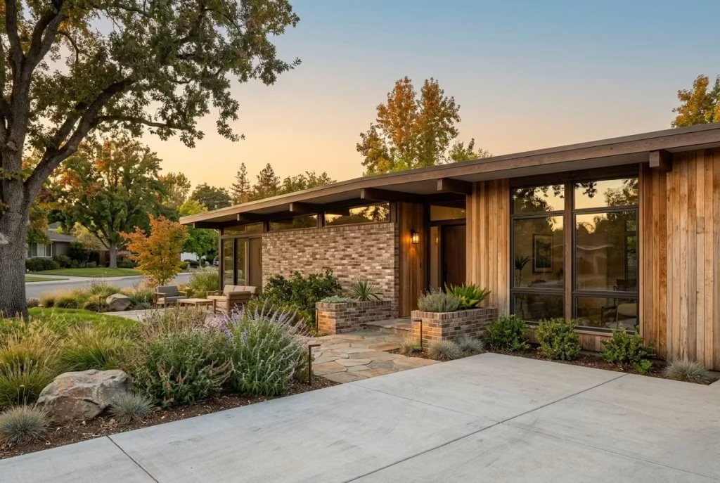
The following ideas explore the overlooked exterior features from the 1970s that are worth another look, not as nostalgic curiosities, but as enduring design lessons that still have something valuable to teach us.
Vertical Cedar Cladding That Ages Gracefully
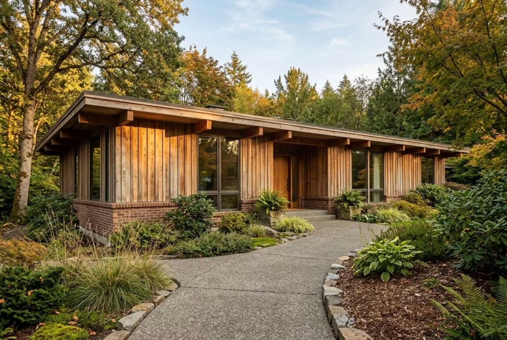
Vertical cedar cladding became one of the quiet signatures of many well-designed 1970s homes, not because it chased fashion, but because it offered something far more enduring: warmth, texture, and an honest connection to the surrounding landscape.
While brick and stone provided permanence, cedar introduced softness, allowing homes to sit naturally within gardens instead of feeling imposed upon them. Even today, I often find that original cedar façades possess a richness that newly manufactured cladding struggles to replicate. They tell a story through subtle variations in colour and grain, proving that some materials only become more compelling with time.
Unlike synthetic alternatives that strive to look flawless year after year, cedar embraces change. Freshly installed boards begin with warm honey or reddish tones before gradually mellowing into a soft silver-grey when left untreated. That natural patina is not a flaw but part of the material’s charm.
Of course, homeowners who prefer to preserve the original colour can apply high-quality UV-resistant stains every few years, though this requires an ongoing commitment to maintenance. In my experience, trying to fight cedar’s natural ageing process often becomes an uphill battle, while allowing it to weather gracefully usually results in a more authentic and sophisticated exterior.
Vertical boards also have a remarkable ability to influence how a home feels. Their uninterrupted lines draw the eye upward, subtly making single-storey ranch houses appear taller and giving broad façades a sense of elegance without adding unnecessary ornamentation.
They work particularly well on homes with clean rooflines, recessed entrances, and expansive glazing, where the timber acts as a visual bridge between architecture and landscape. Even on larger properties, vertical cladding can soften bulky elevations, ensuring they feel balanced rather than overpowering.
One renovation that stands out in my own work involved a late-1970s cedar-clad home whose owners were convinced the ageing timber had reached the end of its life. Their initial plan was to replace everything with fibre cement panels for a more contemporary appearance. Before any demolition began, we commissioned a detailed inspection, which revealed that nearly eighty percent of the cedar remained structurally sound.
After careful cleaning, selective board replacement, and refinishing, the transformation was remarkable. Instead of erasing the home’s identity, we revealed it. Visitors frequently assumed the cedar was newly installed, when in reality much of it had quietly served the house for decades. Sometimes the greatest design improvement comes from recognising hidden potential rather than starting from scratch.
One reason cedar continues to complement contemporary architecture is its versatility. It pairs effortlessly with charcoal aluminium window frames, smooth render, natural stone, corten steel accents, and matte black detailing. These combinations create contrast without visual conflict, allowing traditional materials to coexist comfortably with modern additions. The result feels collected over time rather than assembled from a catalogue, which often gives renovations a far more convincing sense of permanence.
Choosing the right installer is just as important as selecting the material itself. Proper ventilation behind the boards allows moisture to escape, reducing the likelihood of rot and extending the lifespan of the cladding. Stainless steel fasteners help prevent staining, while careful detailing around windows, doors, and roof junctions protects vulnerable areas from water ingress.
I always encourage homeowners to ask contractors about rainscreen systems, timber grading, moisture content, and long-term maintenance schedules before signing a contract. Those conversations may not be the most exciting part of a renovation, but they often separate projects that age beautifully from those that become costly headaches.
Like any natural material, cedar comes with both strengths and compromises.
Pros
- Develops a rich, characterful patina that enhances with age.
- Adds warmth and texture that synthetic products rarely achieve.
- Complements both original 1970s architecture and contemporary renovations.
- Offers excellent durability when properly detailed and maintained.
- Creates a timeless appearance that resists short-lived design trends.
Cons
- Requires periodic maintenance if the original colour is to be preserved.
- Initial installation costs are typically higher than many manufactured cladding products.
- Poor installation can lead to moisture problems and premature deterioration.
- Exposure to harsh climates may accelerate weathering if not properly protected.
Deep Roof Overhangs That Create Shade and Character
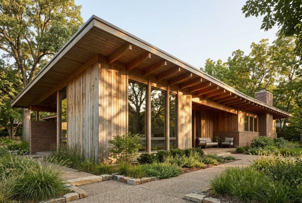
Some architectural features quietly perform their role without demanding attention, and deep roof overhangs are a perfect example. They rarely become the focal point of a home, yet they shape everything from comfort and durability to the way a façade is perceived from the street.
During the 1970s, architects frequently extended rooflines beyond the walls, not simply as a stylistic gesture but as a thoughtful response to climate and everyday living. Long before energy-efficient glazing, smart home technology, or sophisticated insulation systems entered the conversation, these generous overhangs were already helping homes stay cooler, drier, and more comfortable. It is a classic case of working smarter, not harder.
Looking back, it becomes clear that many of these homes embraced passive design principles almost instinctively. Wide eaves intercepted the intense summer sun before it could flood interior spaces with unwanted heat, while still allowing lower winter sunlight to reach deeper into the home when temperatures dropped.
It was a remarkably practical solution that relied on geometry rather than machinery. Decades later, architects continue to apply the same principle because good design rarely goes out of fashion.
I have seen this first hand while renovating a low-slung ranch house that originally featured broad timber overhangs. The homeowners initially viewed them as dated and considered shortening the roofline to achieve what they described as a cleaner appearance. Before moving forward, we spent an afternoon observing how sunlight travelled across the property at different times of the day.
By late afternoon, neighbouring houses without substantial eaves had become noticeably warmer inside, while our project remained naturally shaded. That simple observation changed the entire conversation. Instead of removing the overhangs, we restored and refinished them, allowing the home to retain one of its most valuable architectural assets. Sometimes the best design decisions reveal themselves when you slow down long enough to let the house teach you.
Deep roof overhangs also play a subtle but important role in shaping architectural proportions. They cast soft shadows that add depth and dimension to otherwise flat façades, making even straightforward homes appear richer and more layered.
Without these shadow lines, walls can feel visually exposed, almost as though something important has been stripped away. A carefully proportioned overhang frames the architecture much like a well-chosen border enhances a painting. It gives the eye a place to pause, creating balance without relying on decorative excess.
Their influence extends well beyond appearance. During the warmer months, shaded windows reduce glare and help interiors maintain a more consistent temperature throughout the day. Outdoor living areas beneath extended rooflines become far more enjoyable, offering protection from harsh sunlight while remaining open to fresh air.
Whether it is a morning coffee on the porch or an evening gathering with family, these sheltered spaces naturally encourage people to spend more time outdoors without feeling exposed to the elements.
The practical benefits continue every time it rains. Roof overhangs direct water farther away from walls, windows, and foundations, reducing splashback that can stain brickwork, damage timber, or encourage moisture problems over time. Exterior paint generally lasts longer because it is not subjected to constant exposure, while timber cladding and window frames experience less weather-related wear.
In many renovation projects, I have found that homes with generous eaves often require fewer exterior repairs over the decades simply because the building envelope has been better protected from the beginning.
Modern architects continue to reinterpret this classic feature in fresh and understated ways. Slim steel fascias, concealed gutters, natural timber soffits, and crisp contemporary rooflines all borrow from the same design philosophy while adapting it for today’s homes.
Even minimalist architecture, often associated with clean lines and simplicity, frequently relies on pronounced overhangs to create visual depth and improve environmental performance. The materials may have evolved, but the underlying principle remains unchanged.
For homeowners considering an exterior renovation, preserving or thoughtfully extending existing overhangs can deliver benefits that reach far beyond appearance. Before making alterations, it is worth discussing several important considerations with your architect or contractor:
- How the roof extension will influence seasonal sun angles.
- Whether additional structural support is required.
- Opportunities to improve ventilation within the roof assembly.
- Integration of concealed drainage systems.
- Exterior lighting placement beneath the soffits.
- Compatibility with future window or insulation upgrades.
These details may seem small on paper, yet together they shape how the home performs year after year.
Pros
- Naturally reduces solar heat gain during summer.
- Improves outdoor comfort by creating shaded living areas.
- Protects walls, windows, and cladding from weather exposure.
- Enhances architectural depth through light and shadow.
- Supports lower long-term maintenance for exterior finishes.
- Complements both original 1970s homes and modern renovations.
Cons
- Extending rooflines can increase renovation costs.
- Larger overhangs require careful structural engineering.
- Poorly designed proportions may reduce natural daylight if taken too far.
- Older soffits may require repairs or upgrades before restoration.
Split-Level Landscaping That Works With the Site
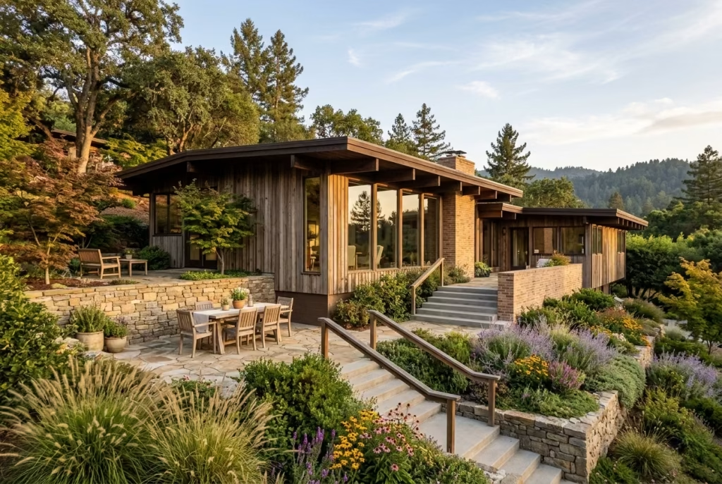
One of the most overlooked strengths of 1970s home design lies beyond the walls themselves. It is found in the way many homes embraced the land beneath them instead of trying to reshape it. During this period, architects and landscape designers often treated sloping sites as opportunities rather than obstacles, creating gardens that unfolded naturally with the terrain.
Instead of flattening every inch into a single level, they designed outdoor spaces that stepped gently across the landscape, giving each elevation its own purpose and personality. In many ways, they let the land lead the conversation, and the results still feel remarkably relevant today.
Modern renovations sometimes fall into the trap of forcing a site to conform to a predetermined vision. Large excavation projects, oversized retaining structures, and expansive concrete pads may create uniformity, but they often strip away the very character that makes a property unique. A split-level landscape, thoughtfully planned, allows a home to feel rooted in its surroundings rather than sitting awkwardly on top of them. It creates a sense of belonging that no amount of decorative planting can imitate.
One renovation I remember particularly well involved a 1974 hillside property where the owners initially wanted to level the entire garden to create one continuous lawn. On paper, the idea seemed straightforward. Once we walked the site together, however, a different picture emerged. The gentle slope revealed opportunities for distinct outdoor experiences that would have disappeared with extensive earthworks. Instead of one large, featureless garden, we designed three interconnected terraces.
The upper level became a quiet seating area overlooking mature trees, the middle terrace housed a dining space, and the lower section transformed into a relaxed garden with native planting. By working with the existing contours instead of fighting them, the property gained far more usable space while retaining its natural rhythm. Sometimes the shortest path is not always the wisest one.
Terraced planting remains one of the most effective techniques for managing sloping gardens while adding visual richness throughout the seasons. Each level introduces another layer of texture, colour, and height, encouraging the eye to travel gradually across the landscape. Rather than presenting everything at once, the garden reveals itself piece by piece, almost like turning the pages of a favourite book.
Taller shrubs can anchor the upper levels, medium-sized perennials soften transitions, while cascading groundcovers gently spill over edges, reducing harsh lines and helping terraces blend into one another.
These layered planting schemes also improve practical performance. Deep-rooted plants help stabilise soil, reducing erosion after heavy rainfall, while varied planting densities support healthier ecosystems by attracting birds, bees, and beneficial insects. The result is not simply a more beautiful garden but one that becomes increasingly resilient over time.
Retaining walls play an equally important role, though their greatest success often comes from restraint. During the 1970s, many homes incorporated low brick, natural stone, or exposed concrete retaining walls that complemented the architecture rather than competing with it. These structures quietly defined outdoor rooms, framed planting beds, and created level surfaces for patios without overwhelming the landscape. Today, natural stone, textured concrete, weathering steel, and architectural blockwork continue that tradition while offering improved durability and drainage performance.
Material selection deserves careful consideration because retaining walls are among the hardest working elements in any landscape. Beyond supporting soil, they manage water pressure, guide circulation, and influence the overall visual weight of the garden. I always encourage homeowners to discuss proper drainage systems with their landscape contractor, including gravel backfill, drainage pipes, and waterproof membranes where appropriate. A beautifully constructed wall means very little if hidden water problems begin to emerge a few years later.
Layered entrances represent another hallmark of split-level design that often goes unnoticed until it is removed. Rather than approaching the front door across one uninterrupted path, visitors gradually ascend or descend through a sequence of spaces.
Wide steps, generous landings, carefully positioned planting, and changes in elevation create a journey that feels welcoming instead of abrupt. Each transition offers a new perspective of the house, allowing architectural details to unfold naturally rather than revealing everything in a single glance.
This gradual approach also creates opportunities for thoughtful lighting, seasonal planting, sculptural containers, and seating areas that enrich everyday living. Arriving home becomes less about reaching the front door and more about enjoying the experience along the way. As the saying goes, good things come to those who wait, and a layered entrance rewards that slower pace with moments of discovery.
Working with a sloping site instead of resisting it often proves to be both financially and environmentally sensible. Reducing major excavation helps preserve existing tree roots, minimises soil disturbance, and lowers construction costs associated with heavy machinery. Existing drainage patterns remain more stable, while mature vegetation is far more likely to survive the renovation. In many cases, preserving the landscape’s natural form results in a garden that feels established from day one rather than newly manufactured.
Of course, no landscape succeeds without considering how it will mature. Long-term maintenance should shape every early design decision. Choosing slow-growing shrubs where pruning access is limited, installing efficient drainage before planting begins, selecting drought-tolerant species suited to the local climate, and allowing enough space for plants to reach their mature size all reduce future maintenance demands. I often remind clients that gardens are living systems, not static displays. Planning for the next twenty years usually delivers better results than designing solely for the first summer after completion.
Pros
- Creates outdoor spaces that feel naturally connected to the site.
- Reduces extensive excavation and preserves existing landforms.
- Improves drainage and helps minimise soil erosion.
- Provides multiple functional garden zones for relaxation and entertaining.
- Enhances visual depth through changing levels and layered planting.
- Supports healthier biodiversity with varied planting conditions.
Cons
- Initial planning requires experienced landscape and drainage professionals.
- Retaining walls can increase construction costs.
- Poor drainage design may lead to structural issues over time.
- Multi-level gardens may require accessibility solutions for some households.
- Ongoing planting maintenance varies across different terrace levels.
You May also Like: From City to Sand: 25 Easy Ways to Get the Montauk Beach House Look Anywhere
Large Picture Windows Framed by Natural Materials
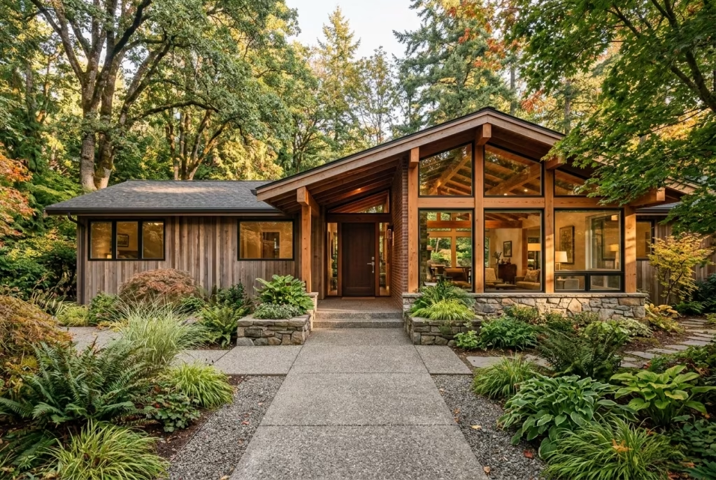
Some exterior features do far more than shape a home’s appearance. They influence how every room feels from the inside, changing the quality of light, the connection to nature, and even the rhythm of everyday life. Large picture windows became one of the defining characteristics of thoughtfully designed 1970s homes because they challenged the traditional idea that windows should simply provide light and ventilation.
Instead, they transformed walls into carefully composed views, inviting gardens, mature trees, and changing seasons to become part of the home’s interior experience. In many respects, these windows blurred the boundary between architecture and landscape long before biophilic design became a familiar term.
What made these windows especially successful was not their size alone, but the materials surrounding them. Cedar cladding, textured brick, natural stone, and exposed timber beams softened the transition between glass and solid walls, preventing large glazed openings from feeling cold or overly commercial.
The warmth of these natural finishes created balance, allowing expansive glass to feel welcoming rather than overwhelming. It is often the supporting cast that steals the show, and the surrounding materials played an essential role in making these dramatic openings feel timeless.
One renovation I worked on involved a 1976 family home overlooking a mature woodland. Previous owners had gradually reduced the original picture windows, replacing much of the glazing with smaller units in an attempt to improve energy efficiency. While their intentions were understandable, the interior had become noticeably darker and disconnected from the landscape.
During the renovation, we carefully reinstated larger glazed openings using modern high-performance glass while preserving the original timber proportions. The difference was immediate. Morning sunlight reached deep into the living spaces, the woodland once again became a living backdrop throughout the seasons, and the entire home felt more spacious without adding a single square metre. It was a reminder that sometimes the greatest luxury is not more space, but a stronger relationship with the world outside.
One of the greatest strengths of large picture windows is their ability to connect daily life with nature in subtle yet meaningful ways. A carefully positioned window frames changing weather, shifting shadows, flowering gardens, and autumn colours almost like an ever-changing artwork. Instead of relying solely on decorative accessories to create atmosphere, the landscape itself becomes the focal point. Even familiar routines such as enjoying breakfast, reading a book, or gathering with family feel richer when accompanied by natural views that evolve throughout the day.
This visual connection also carries psychological benefits. Numerous studies have shown that access to daylight and views of nature can improve wellbeing, reduce stress, and support better mental focus. While good architecture cannot solve every challenge, it certainly has the power to shape how people experience their homes on an ordinary Tuesday afternoon just as much as during special occasions.
Of course, expansive glazing often raises understandable concerns about privacy. Fortunately, achieving openness does not require sacrificing comfort. Rather than reducing window sizes, thoughtful landscape design frequently provides a far more elegant solution.
Layered planting, ornamental grasses, multi-stem trees, hedging, and strategically positioned garden walls can gently screen views without blocking natural light. The result feels private yet open, allowing homeowners to enjoy generous glazing while maintaining a sense of retreat.
Window placement also deserves careful consideration. In my experience, privacy challenges are often solved through orientation rather than additional coverings. Positioning picture windows toward gardens, courtyards, mature planting, or carefully designed outdoor rooms creates beautiful outlooks while avoiding direct sightlines from neighbouring properties. When curtains remain open throughout the day because privacy has been designed into the architecture itself, the entire home benefits from greater natural light.
Fortunately, homeowners no longer have to choose between beautiful views and energy efficiency. Advances in glazing technology have transformed the performance of large windows over the past several decades.
Double and triple glazing, low-emissivity coatings, thermally broken frames, inert gas-filled units, and improved weather seals significantly reduce heat transfer while maintaining crystal-clear views. Many modern glazing systems now outperform much smaller windows from previous generations, making generous glass areas a realistic option even in regions with challenging climates.
Solar control should also form part of the conversation. South and west-facing elevations often benefit from external shading, roof overhangs, pergolas, deciduous trees, or adjustable screens that reduce overheating during summer while still allowing welcome winter sunlight to enter the home. It is another reminder that successful design rarely depends on one element alone. The most comfortable homes combine architecture, landscape, and environmental performance into a cohesive whole.
Window proportions are perhaps the least discussed yet most influential aspect of this design approach. Oversized glazing can easily lose its elegance if the surrounding framing lacks balance. During the 1970s, many architects achieved harmony by using generous timber mullions, carefully aligned rooflines, and consistent horizontal or vertical rhythms that reflected the home’s structural framework. Those subtle proportions created order, allowing large expanses of glass to feel integrated rather than oversized.
Whenever I review renovation plans, I encourage homeowners to resist the temptation to enlarge every opening indiscriminately. Bigger is not always better. A thoughtfully proportioned picture window that frames a mature oak tree or landscaped courtyard often creates a stronger emotional impact than a full glass wall overlooking an ordinary boundary fence. Like a skilled photographer choosing the perfect composition, successful architecture carefully edits what deserves attention.
Natural framing materials continue to elevate these windows in ways synthetic alternatives rarely achieve. Cedar, oak, limestone, textured brick, and architectural concrete all introduce depth and tactile contrast, helping expansive glazing sit comfortably within the building’s overall composition. As these materials mature, they develop character that enhances rather than diminishes the architecture, allowing the façade to age with quiet confidence instead of chasing temporary fashions.
Before replacing or enlarging existing picture windows, homeowners should discuss several important factors with their architect or glazing specialist:
- Structural support requirements for larger openings.
- Solar orientation and seasonal daylight patterns.
- Appropriate glazing specifications for the local climate.
- Ventilation strategies to complement fixed picture windows.
- Privacy planning through landscaping rather than excessive window coverings.
- Integration with roof overhangs and exterior shading elements.
These early decisions often determine whether the finished result feels comfortable for decades or requires constant adjustment after the project is complete.
Pros
- Maximises natural daylight throughout the home.
- Creates a stronger visual connection between interior spaces and gardens.
- Makes living areas feel larger and more open.
- Enhances property value through timeless architectural appeal.
- Modern glazing significantly improves thermal and acoustic performance.
- Complements both original 1970s homes and contemporary renovations.
Cons
- Premium glazing systems require a higher initial investment.
- Poor orientation can increase unwanted summer heat gain.
- Larger glass panels may require more frequent cleaning.
- Structural modifications may be necessary when enlarging openings.
- Privacy requires thoughtful planning through architecture and landscaping.
Mixed Brick and Timber Facades
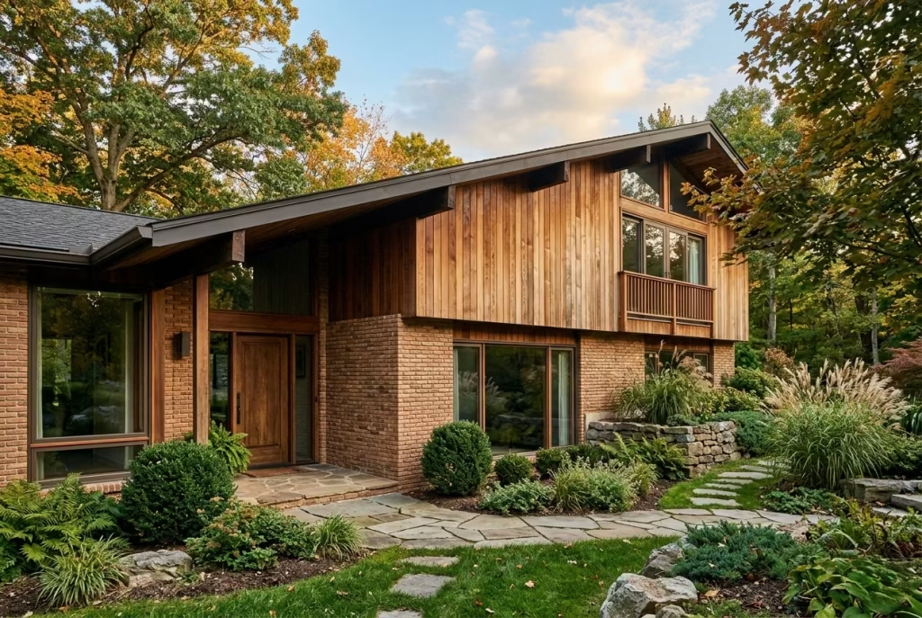
Some of the most memorable 1970s homes did not rely on extravagant architectural flourishes or eye-catching ornamentation to create curb appeal. Instead, they embraced a quieter philosophy where the beauty of the home came from the conversation between materials themselves. Mixed brick and timber façades became a defining feature of the era because they celebrated contrast without creating conflict.
Solid masonry grounded the building with a sense of permanence, while natural timber introduced warmth, texture, and an unmistakable connection to the landscape. Together, they created exteriors that felt balanced, welcoming, and surprisingly timeless. As the old saying goes, less is more, and these homes proved that thoughtful restraint often leaves the strongest impression.
Unlike many contemporary exteriors that depend on combining multiple finishes simply for visual variety, successful 1970s façades followed a clear hierarchy. Every material had a purpose. Brick often formed the structural base or anchored the lower portions of the home, helping it feel secure and settled within the site.
Timber softened upper levels, framed entrances, highlighted projecting volumes, or added rhythm between expansive windows. Rather than competing for attention, each material complemented the other, allowing the architecture to speak with one confident voice.
I remember working on the renovation of a split-level family home where previous owners had gradually covered much of the original brick with painted render while replacing weathered cedar panels with composite boards. Their goal had been to modernise the property, yet the renovation unintentionally erased much of its architectural identity.
After carefully stripping away later additions and restoring the original brickwork, we introduced new cedar cladding that respected the home’s original proportions while improving durability through modern installation methods. The transformation was remarkable. The house no longer looked caught between decades. Instead, it regained a quiet confidence that felt both authentic and contemporary. It reminded me that good architecture rarely needs to shout to be noticed.
One reason this combination continues to resonate today is the natural balance it creates. Brick brings visual weight, durability, and permanence, while timber introduces movement through its grain, colour variation, and gradual ageing. Together, they prevent a façade from feeling either too heavy or too sterile.
This interplay becomes even more striking as daylight shifts throughout the day. Morning light highlights the subtle texture of brick joints, while afternoon sunlight catches the grain of timber, creating changing layers of depth that synthetic materials often struggle to replicate.
Texture has always been one of the defining strengths of mixed-material façades. Before decorative mouldings, oversized trims, or bold colour schemes became common, architects understood that authentic materials could create visual interest all on their own.
Rough-sawn cedar, wire-cut brick, natural stone, exposed concrete, and carefully detailed mortar joints each contributed their own personality. Together they produced façades that invited closer inspection rather than demanding immediate attention.
This approach remains particularly relevant for modern renovations. Instead of adding decorative features that may quickly fall out of favour, investing in high-quality materials with genuine tactile qualities often delivers far greater long-term value.
Visitors may not consciously identify every detail, yet they instinctively recognise the difference between a home built around authentic craftsmanship and one relying primarily on cosmetic finishes.
Choosing complementary brick colours plays an equally important role in achieving this sense of harmony. During the 1970s, warm earthy tones dominated residential architecture. Soft browns, muted reds, sandy buffs, cinnamon hues, and deep terracotta bricks paired naturally with cedar’s rich golden and reddish tones. These colour relationships reflected the surrounding landscape, helping homes feel connected to gardens rather than standing apart from them.
For homeowners planning renovations today, it is worth considering how brick colour interacts not only with timber but also with roofing materials, window frames, paving, and planting. Charcoal aluminium windows, bronze metalwork, weathered steel accents, limestone paving, and native greenery often create beautiful partnerships with traditional brick and timber combinations. The objective is not to copy the past exactly, but to create a composition where every element feels as though it belongs together.
One lesson I have learned repeatedly is that brick should rarely be painted simply because it appears dated. While painted brick certainly has its place in some architectural styles, original masonry often possesses a depth and variation that becomes impossible to recreate once covered.
Cleaning, repointing damaged mortar, or replacing isolated bricks usually preserves far more character than applying an opaque coating across the entire façade. Once natural brick is painted, reversing that decision can become expensive, time-consuming, and sometimes impossible without damaging the surface beneath.
Timber, meanwhile, continues to evolve gracefully throughout its life. Depending on the species and finish, cedar, redwood, or thermally modified timber gradually develop richer character as they respond to changing weather conditions.
Small imperfections, gentle colour variation, and subtle weathering all contribute to a façade that feels lived in rather than manufactured. Much like a well-loved leather chair that gains personality over the years, quality timber becomes more interesting with age when properly maintained.
Modern building science has also made this material combination more durable than ever before. Ventilated rainscreen systems improve airflow behind timber cladding, reducing moisture accumulation while extending service life.
High-performance insulation enhances thermal efficiency without altering the original appearance, and advanced weather barriers provide additional protection against wind-driven rain. These hidden improvements allow homeowners to preserve the visual qualities of traditional materials while meeting today’s performance expectations.
That said, successful renovations require careful attention to detail. I always encourage homeowners to have conversations with their architect or contractor about several important considerations before work begins:
- Assess whether the existing brickwork can be repaired rather than replaced.
- Match new timber species with the home’s architectural character.
- Ensure proper ventilation behind timber cladding.
- Select mortar colours that complement the original masonry.
- Coordinate brick, timber, roofing, and window finishes as one unified palette.
- Plan maintenance schedules that protect natural materials over time.
These early decisions often make the difference between a renovation that feels thoughtfully integrated and one that appears pieced together.
Unfortunately, certain renovation mistakes continue to appear with surprising frequency. Covering original brick with synthetic cladding, mixing too many competing materials, choosing timber stains that clash with existing masonry, or introducing oversized decorative trim can quickly undermine the home’s architectural integrity. Likewise, replacing natural timber with imitation products that lack authentic grain and depth often results in façades that feel visually flat despite their higher initial cost.
Another common mistake is overlooking proportion. Brick and timber should support the architecture rather than divide it into disconnected sections. When materials are applied without considering rooflines, window alignments, or structural rhythm, even premium products can produce an awkward composition. Good design is rarely about adding more. More often, it is about knowing when to stop.
Pros
- Creates timeless visual contrast through authentic natural materials.
- Balances warmth with structural solidity.
- Ages gracefully as both brick and timber develop character.
- Complements a wide range of architectural styles and contemporary updates.
- Adds depth and texture without relying on decorative embellishments.
- Supports long-term property value through enduring material quality.
Cons
- Natural timber requires periodic inspection and maintenance.
- Premium brick restoration can increase renovation costs.
- Poor material combinations may create visual imbalance.
- Incorrect installation details can shorten the lifespan of timber cladding.
- Colour matching between existing and new materials requires careful planning.
Sunken Entry Courtyards That Create Arrival Moments
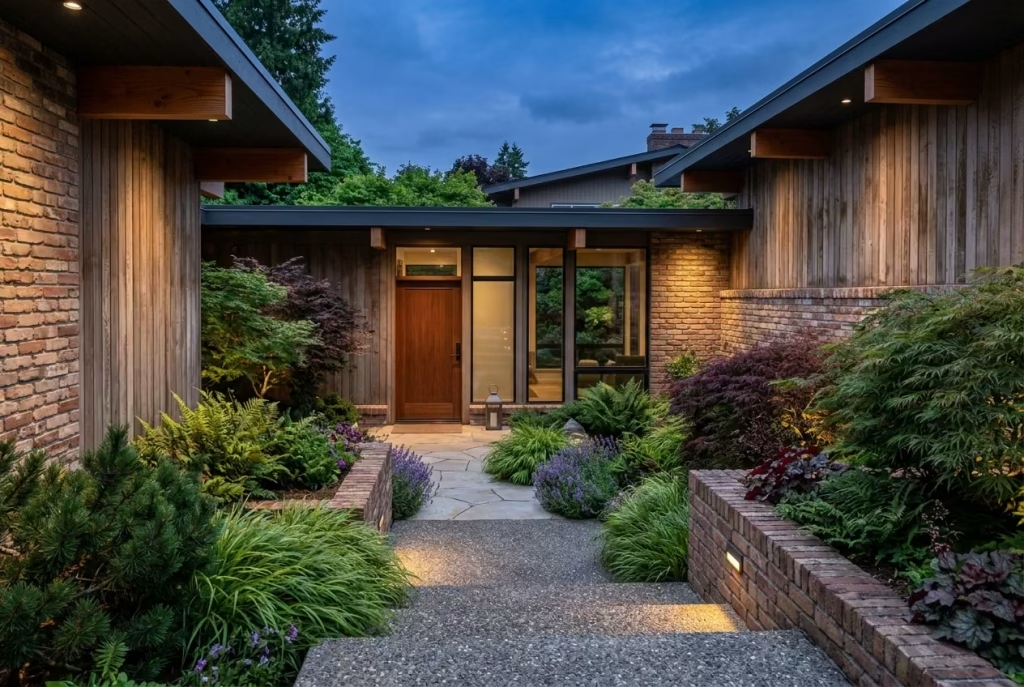
In many contemporary homes, the journey from the street to the front door is often little more than a straight path ending with a doorbell. It is practical, certainly, but it rarely stirs any emotion. Many thoughtfully designed homes from the 1970s took a different approach. Rather than revealing everything at once, they created a gradual sense of arrival through sunken entry courtyards that gently separated the public world from the private sanctuary beyond.
These spaces invited people to slow their pace, notice the surrounding landscape, and experience the architecture one carefully considered step at a time. After all, first impressions last, and these courtyards understood that arriving home should feel every bit as meaningful as leaving it.
Unlike a traditional front porch that projects outward, a sunken courtyard creates a subtle sense of enclosure. Stepping a few levels below the surrounding ground immediately changes the atmosphere.
Street noise softens, neighbouring views begin to disappear, and the home feels increasingly sheltered without relying on tall fences or imposing walls. It is a simple shift in level, yet it completely transforms how the entrance is experienced.
One project I worked on involved a late 1970s home where the original courtyard had gradually lost its purpose. Over several decades, raised flower beds were removed, mature planting disappeared, and the once-defined entry sequence became little more than an exposed concrete walkway leading directly to the front door.
The homeowners initially wanted to replace the entire entrance with a wider staircase and decorative paving. Instead, we studied the original architectural drawings and discovered how intentionally the courtyard had been designed. By restoring the gentle level changes, introducing layered planting, and adding subtle architectural lighting, the entrance regained its quiet sense of theatre without becoming overly dramatic.
Guests often commented that the house somehow felt more welcoming, even before stepping inside. Sometimes the smallest changes in sequence can create the biggest emotional impact.
One of the greatest strengths of a sunken courtyard is its role as a transitional space. It acts as a bridge between the outside world and the calm of the interior, allowing the mind to adjust gradually rather than abruptly.
This subtle pause may seem insignificant at first glance, yet it contributes enormously to how a home feels on a daily basis. Returning after a busy day becomes less of a sudden arrival and more of a gentle transition into a place of comfort and retreat.
Architecturally, transitional spaces also enrich the experience of movement. Instead of presenting the entire façade in one view, they reveal the home gradually through changing perspectives.
As visitors descend a few steps, pass textured walls, move alongside planting, and approach the entrance, new architectural details emerge naturally. This sense of discovery creates anticipation, much like following a winding garden path where each turn reveals something unexpected.
Privacy is another reason these courtyards remain surprisingly relevant today. As residential neighbourhoods become increasingly dense, homeowners often search for ways to create seclusion without making their homes feel defensive or unwelcoming. A sunken entry naturally achieves this balance through changes in elevation rather than physical barriers alone.
Lowering the entrance slightly reduces direct sightlines from the street, allowing homeowners to enjoy greater privacy while maintaining an open relationship with the surrounding neighbourhood. Combined with carefully positioned planting, low masonry walls, timber screens, or decorative grasses, these level changes create a welcoming entrance that feels intimate rather than isolated.
I often recommend using landscape design as the first layer of privacy before introducing larger built elements. Multi-stem trees, evergreen shrubs, ornamental grasses, and layered planting soften boundaries while preserving natural light and airflow. The result feels considerably more relaxed than relying solely on high fences or solid walls, which can sometimes make smaller front gardens appear confined.
Landscape integration has always been central to the success of these entry spaces. During the 1970s, architects frequently blurred the distinction between architecture and planting by allowing gardens to flow directly into courtyards. Brick planters, exposed aggregate paving, natural stone, and timber elements all worked together to create cohesive outdoor rooms that felt like extensions of the home itself.
Today, this philosophy remains just as effective. Drought-tolerant planting, native grasses, sculptural shrubs, textured groundcovers, and specimen trees introduce seasonal interest while requiring relatively modest maintenance. Carefully selected materials such as limestone, weathered steel, corten edging, or sustainably sourced timber continue the tradition of using authentic materials that age gracefully alongside the landscape.
Lighting deserves equal attention because these spaces undergo their greatest transformation after sunset. A well-designed lighting scheme should gently guide visitors rather than overwhelm them with excessive brightness. Warm recessed step lights improve safety, concealed uplighting highlights architectural planting, and softly illuminated walls reveal texture without creating harsh glare.
One lesson I have learned over many years is that exterior lighting succeeds when people barely notice the fixtures themselves. Instead, they notice the atmosphere. Light should quietly shape the experience of arrival, allowing shadows and architectural forms to work together in harmony. When every fitting competes for attention, the magic quickly disappears.
Accessibility is another area where modern updates can strengthen rather than compromise original designs. Many sunken courtyards were built before today’s accessibility standards became widely recognised, yet thoughtful adaptations can improve usability while respecting architectural intent.
Where space permits, gently sloping pathways can be integrated alongside existing steps using complementary paving materials. Wider landings, continuous handrails, slip-resistant surfaces, and subtle level transitions all improve safety without altering the overall character of the entrance. In some projects, integrated seating walls can also provide comfortable resting points while enhancing the courtyard’s architectural composition.
Whenever homeowners consider restoring or redesigning a sunken entry courtyard, I encourage discussing several practical issues with their architect or landscape contractor:
- Evaluate drainage carefully before altering ground levels.
- Ensure retaining walls include appropriate waterproofing and drainage systems.
- Select paving materials with reliable slip resistance in wet conditions.
- Coordinate planting with seasonal maintenance requirements.
- Incorporate low-voltage lighting during the initial construction phase.
- Balance accessibility improvements with the original architectural proportions.
These early decisions often determine whether the courtyard remains functional and welcoming for decades to come.
Pros
- Creates a memorable and welcoming arrival sequence.
- Enhances privacy without relying on large boundary structures.
- Strengthens the connection between architecture and landscape.
- Provides opportunities for layered planting and architectural lighting.
- Adds visual depth and spatial interest to relatively modest homes.
- Encourages a calmer transition between public and private spaces.
Cons
- Requires careful drainage planning due to the lower ground level.
- Construction costs may increase because of excavation and retaining structures.
- Existing courtyards may need accessibility improvements.
- Ongoing landscape maintenance is essential to preserve the original design intent.
- Poor lighting design can reduce both safety and visual impact.
Earth-Toned Exterior Colour Palettes
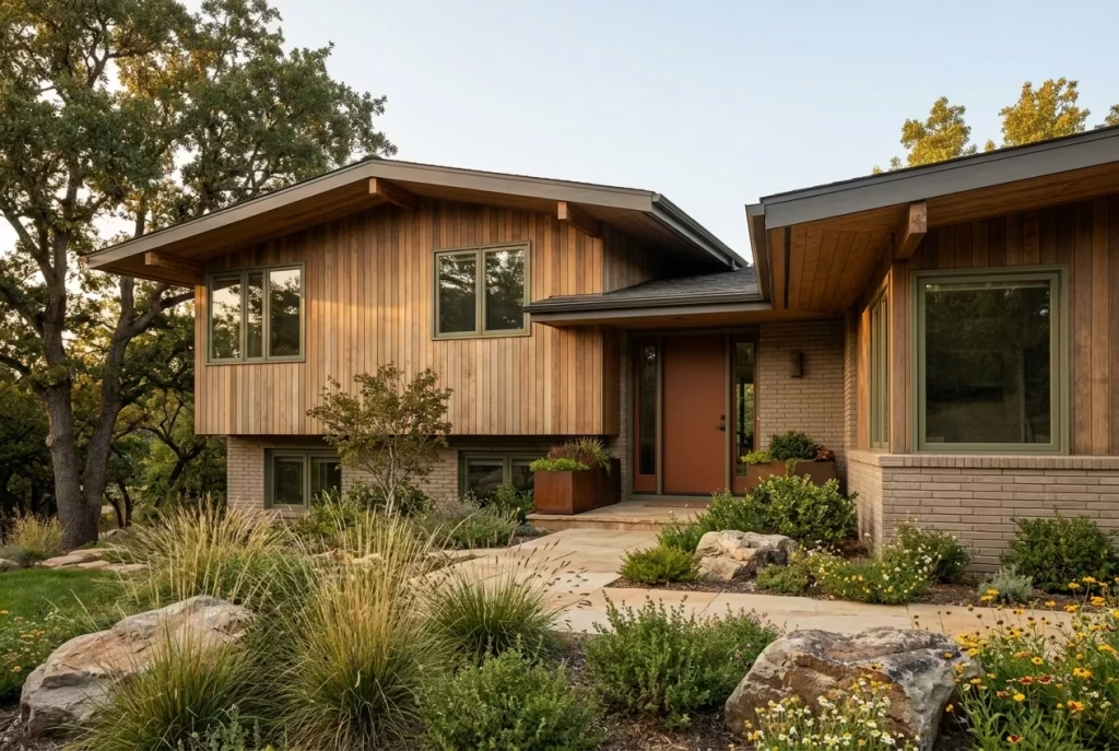
Colour has the remarkable ability to shape first impressions long before anyone notices the finer architectural details of a home. It influences mood, highlights proportions, and determines whether a property feels comfortably settled within its surroundings or visually disconnected from them.
During the 1970s, exterior colour palettes moved away from bright contrasts and decorative excess, embracing instead the rich, muted tones found in forests, deserts, mountains, and changing seasons. Warm browns, olive greens, soft ochres, clay-inspired neutrals, and rust-coloured accents reflected the natural world with quiet confidence, giving homes a timeless quality that still feels remarkably relevant today. Nature, after all, rarely gets its colour combinations wrong.
Unlike many modern palettes that rely on sharp black-and-white contrasts, earth-toned exteriors create harmony through subtle variation. They do not compete with surrounding landscapes but instead become part of them, allowing architecture and nature to work together as one cohesive composition. This restrained approach explains why many original 1970s homes continue to feel welcoming decades later, even if other design trends from the era have faded into history.
One renovation I completed involved a cedar-clad hillside property where previous owners had painted every exterior surface brilliant white with jet-black trim in an attempt to achieve a more contemporary appearance. Although fashionable at the time, the house seemed disconnected from its woodland setting, standing out for all the wrong reasons.
During the renovation, we introduced a palette inspired by the surrounding landscape. Soft mushroom-toned brick, naturally weathered cedar, muted olive window frames, and subtle rust-coloured planters transformed the home’s character completely. Rather than dominating the site, the architecture began to sit comfortably within it. Neighbours frequently commented that the house looked as though it had always belonged there, which, to me, is one of the highest compliments a renovation can receive.
Warm Browns That Add Comfort and Permanence
Warm brown tones formed the backbone of many successful 1970s exterior schemes because they complemented the natural materials widely used during the period. Cedar cladding, exposed timber beams, brickwork, and stone all benefited from shades ranging from soft caramel and chestnut to deeper walnut and cocoa.
These colours create a reassuring sense of permanence while softening the visual scale of larger homes. They also respond beautifully to changing daylight. Early morning sun enhances their golden warmth, while evening light reveals richer, deeper undertones that make façades appear layered and inviting.
For homeowners updating older properties, warm browns remain an excellent choice for timber cladding, garage doors, soffits, pergolas, and entrance features. Rather than chasing the latest paint trend, they provide a dependable foundation that continues to feel elegant year after year.
Olive Greens That Blur the Boundary Between Home and Garden
Olive green may be one of the most underrated exterior colours available today. It carries enough depth to introduce character without overwhelming the architecture, while naturally complementing surrounding planting throughout every season.
During the 1970s, olive tones frequently appeared on window frames, front doors, fascia boards, and architectural metalwork. Today, these muted greens pair beautifully with cedar, limestone, brick, charcoal roofing, and weathering steel, creating a sophisticated palette that feels rooted in nature rather than fashion.
One lesson I have learned over many years is that green performs best when it supports the landscape instead of competing with it. Homes surrounded by mature trees, native planting, or expansive gardens often benefit enormously from subtle green accents that visually dissolve into their environment.
Ochres That Introduce Gentle Warmth
Soft ochre occupies the space between beige, sandstone, and muted yellow, offering warmth without excessive brightness. It reflects sunlight beautifully, making façades appear welcoming while avoiding the starkness associated with brilliant whites.
This versatile colour works particularly well on rendered surfaces, masonry details, boundary walls, and architectural features that benefit from a little additional warmth. Combined with natural timber and earthy planting, ochre creates homes that feel sunlit even on overcast days.
The beauty of ochre lies in its restraint. It quietly enhances surrounding materials rather than demanding attention for itself, allowing texture and proportion to remain the true focus of the design.
Rust Accents That Celebrate Natural Ageing
Among the most distinctive colours associated with 1970s architecture, rust continues to offer surprising versatility when applied thoughtfully. Inspired by weathered steel, autumn leaves, and mineral-rich landscapes, rust introduces richness without becoming overpowering.
Rather than coating entire façades in bold terracotta shades, I prefer using rust selectively through front doors, steel planters, outdoor furniture, decorative screens, sculptural lighting, or corten steel landscape edging. These carefully placed accents create visual rhythm while maintaining the calm character of the overall palette.
Like a well-chosen piece of jewellery completing an outfit, restrained accents often achieve far greater impact than overwhelming colour schemes.
Updating Earth-Toned Palettes Without Losing Authenticity
Refreshing a 1970s exterior does not require abandoning its original identity. In fact, the most successful renovations usually respect the home’s architectural character while refining its material palette for contemporary living.
Instead of copying historical colour charts exactly, look for inspiration in the surrounding landscape. Observe the colours of mature tree bark, dry grasses, local stone, forest floors, coastal dunes, or nearby hillsides. These natural references often produce combinations that feel more authentic than following seasonal paint trends.
Contemporary finishes can also introduce subtle sophistication without disrupting the home’s original spirit. Warm greige render, bronze aluminium windows, weathered timber, charcoal roofing, textured stone paving, and muted metalwork all sit comfortably alongside traditional earth tones while improving long-term durability.
Whenever I develop an exterior colour scheme, I encourage homeowners to evaluate the entire composition rather than selecting colours individually. Consider how brick, roofing, paving, planting, gutters, lighting, fencing, and architectural details will interact once completed. A beautiful home rarely depends on one outstanding colour. Instead, it emerges from the quiet harmony between every element.
Before finalising your palette, discuss several important factors with your architect, designer, or painting contractor:
- Test large paint samples under morning, afternoon, and evening light.
- Consider how colours change throughout different seasons.
- Coordinate finishes with existing brick, stone, and timber.
- Choose durable coatings appropriate for local weather conditions.
- Balance warm and cool tones across the entire façade.
- Avoid selecting colours based solely on small paint swatches viewed indoors.
These simple steps often prevent costly mistakes while producing results that remain satisfying for many years.
Pros
- Creates a timeless exterior inspired by natural landscapes.
- Enhances the warmth and texture of brick, timber, and stone.
- Ages gracefully without feeling tied to short-lived trends.
- Blends harmoniously with gardens and mature planting.
- Offers excellent flexibility for both traditional and contemporary renovations.
- Helps create a calm, welcoming first impression.
Cons
- Poor colour coordination can make the façade appear flat or heavy.
- Earth tones vary significantly under changing daylight conditions.
- Some darker shades may absorb more solar heat in warmer climates.
- Finding the perfect balance between multiple natural tones requires careful planning.
- Trend-driven accent colours may quickly undermine an otherwise timeless palette.
You May also Like: 25 Modern Wooden Garden Fence Ideas for 2026: DIY Builds, Design Trends & Outdoor Decor Inspiration
Exposed Structural Beams That Add Architectural Rhythm
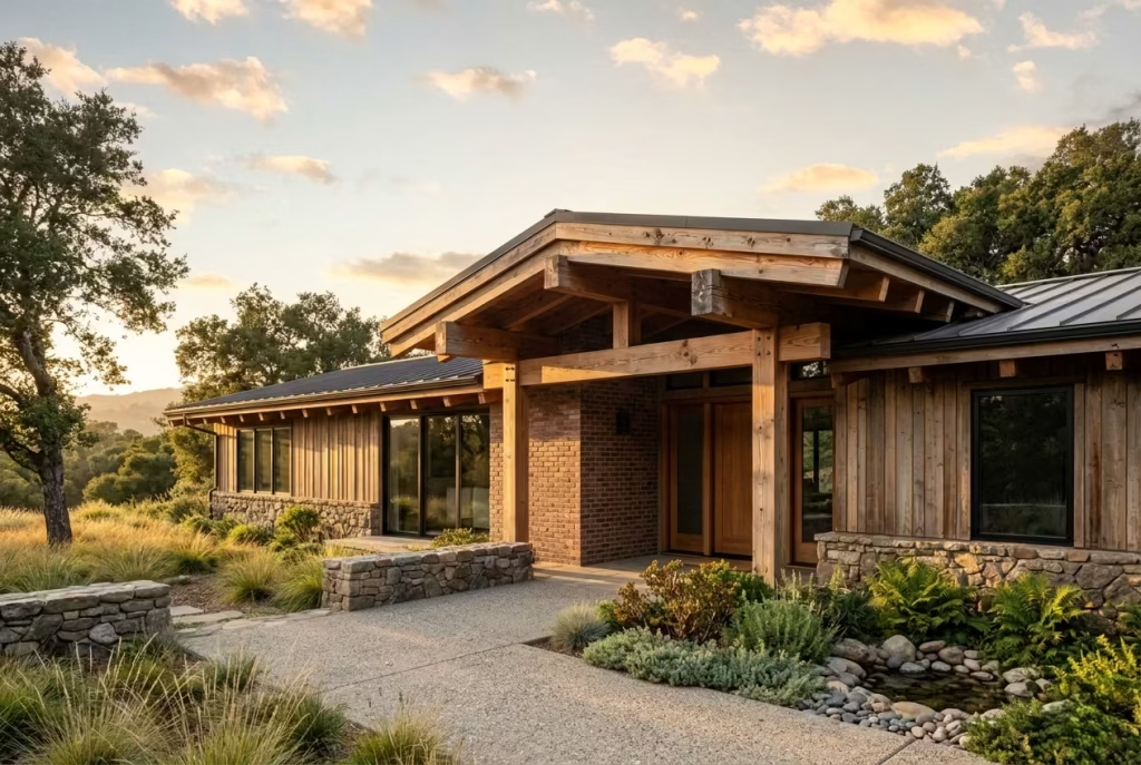
Some architectural elements earn admiration because they are decorative. Others become unforgettable because they reveal how a home is actually built. Exposed structural beams belong firmly in the second category. Throughout the 1970s, architects increasingly celebrated the framework of a house instead of concealing it behind layers of finishes.
Roof beams projected beyond eaves, timber posts framed entrances, and exposed structural members became an integral part of the home’s identity. Rather than hiding craftsmanship, these homes wore it with quiet confidence. There is an old saying that beauty is more than skin deep, and exposed beams embody that philosophy better than almost any other exterior feature.
What makes this design approach so enduring is its honesty. Every beam tells a story of support, balance, and proportion. Instead of adding decoration after construction, the structure itself becomes part of the architectural composition. This creates homes that feel purposeful and authentic, qualities that continue to resonate in an era where homeowners increasingly value craftsmanship over cosmetic finishes.
I once renovated a 1978 hillside property where the original Douglas fir roof beams had been boxed in with plain cladding during an earlier remodel. The owners believed exposing them again would make the house feel dated. After removing the coverings and carefully restoring the timber, the transformation completely changed the home’s character.
Suddenly, the roofline appeared lighter, the entrance gained definition, and the entire façade developed a rhythm that had been hidden for decades. Visitors often assumed we had added expensive new architectural features, when in reality we had simply uncovered what was already there. Sometimes the best design decision is not to add another layer, but to peel one back.
Creating Visual Depth Through Structural Expression
One of the greatest strengths of exposed beams is the way they introduce depth and shadow across a façade. Flat elevations can sometimes appear one-dimensional, particularly when finished with smooth render or uniform cladding. Beams project outward, creating subtle horizontal or vertical lines that catch changing sunlight throughout the day.
Morning light gently highlights timber grain, while late afternoon shadows deepen the architectural composition, giving the building a richer sense of scale. These shifting patterns ensure the exterior never feels static. Instead, it evolves hour by hour as natural light moves across the structure.
Architectural rhythm also benefits from repeated structural elements. Evenly spaced beams establish visual order without becoming repetitive, guiding the eye naturally across entrances, rooflines, verandas, or covered walkways. Much like a piece of music relies on rhythm rather than constant volume, successful architecture often depends on carefully repeated forms that quietly organise the whole composition.
Choosing the Right Timber Species
Not every timber performs equally well when exposed to the elements. During the 1970s, cedar, Douglas fir, redwood, and hardwood species such as oak were commonly selected because of their strength, attractive grain, and natural durability.
Today, homeowners have an even wider selection of responsibly sourced materials available. Western red cedar remains a favourite for its excellent weather resistance and dimensional stability. Douglas fir offers impressive structural strength with distinctive grain patterns, while oak introduces exceptional longevity and a beautifully textured appearance that matures gracefully over time.
The right timber should always be selected with the local climate in mind. Homes in humid coastal regions require different performance characteristics than properties located in dry inland environments. This is why I always recommend discussing species selection with both the architect and structural engineer before construction begins. A beautiful beam still needs to perform its structural role year after year.
Preserving Character Through Sensible Maintenance
Natural timber rewards regular care, but maintaining exposed beams is often less demanding than many homeowners expect. Periodic inspections, gentle cleaning, and timely refinishing help preserve both appearance and structural integrity without requiring constant attention.
I encourage clients to inspect exposed beams annually, paying particular attention to joints, end grain, and areas where water may collect. Small cracks caused by seasonal movement are perfectly normal and often contribute to the timber’s natural character. However, signs of trapped moisture, fungal growth, or insect activity should always be addressed promptly before they develop into larger structural concerns.
Quality breathable stains generally outperform heavy film-forming paints because they allow timber to respond naturally to seasonal moisture changes while highlighting its grain. Allowing wood to breathe is often the key to helping it age gracefully.
Modern Engineered Alternatives That Respect the Original Design
Advances in engineered timber technology have expanded the possibilities for homeowners who appreciate the appearance of exposed beams but require greater structural performance.
Glulam beams, laminated veneer lumber, and other engineered wood products offer impressive strength while maintaining the warmth and authenticity associated with natural timber. These products are manufactured for dimensional stability, making them particularly useful for longer roof spans or challenging structural conditions where solid timber alone may not be sufficient.
Many modern engineered beams are carefully finished with real timber veneers, preserving the natural grain while delivering improved structural consistency. For larger renovation projects, this combination often provides the best balance between appearance, durability, and engineering performance.
Understanding the Structural Role of Exposed Beams
Perhaps the most important lesson homeowners should remember is that structural beams are not simply decorative features. Every exposed member plays a specific role within the building’s load-bearing system, and altering or removing them without professional guidance can create serious structural problems.
Whenever I encounter renovation projects involving exposed framing, I insist on a detailed structural assessment before any work begins. Engineers evaluate load paths, timber condition, connection details, and overall roof performance before recommending restoration or replacement.
During planning, homeowners should discuss several key considerations with their design and construction team:
- Confirm whether existing beams remain structurally sound.
- Evaluate moisture content before refinishing older timber.
- Inspect all steel brackets, bolts, and concealed connections.
- Select protective finishes suitable for the local climate.
- Ensure roof drainage prevents prolonged water exposure.
- Consider engineered timber where longer spans or additional strength are required.
These conversations may take place behind the scenes, yet they determine whether exposed beams continue performing beautifully for decades to come.
Pros
- Reveals authentic structural craftsmanship.
- Creates architectural rhythm through repeated forms.
- Adds visual depth with natural light and shadow.
- Complements brick, stone, glass, and timber cladding.
- Can increase perceived property character and value.
- Modern engineered timber expands design flexibility.
Cons
- Natural timber requires periodic inspection and maintenance.
- Structural repairs can become expensive if deterioration is ignored.
- Poor detailing may allow moisture to penetrate vulnerable joints.
- Beam replacement often requires specialist engineering expertise.
- Unsympathetic alterations can disrupt the original architectural balance.
Low Horizontal Garden Walls That Define Outdoor Rooms
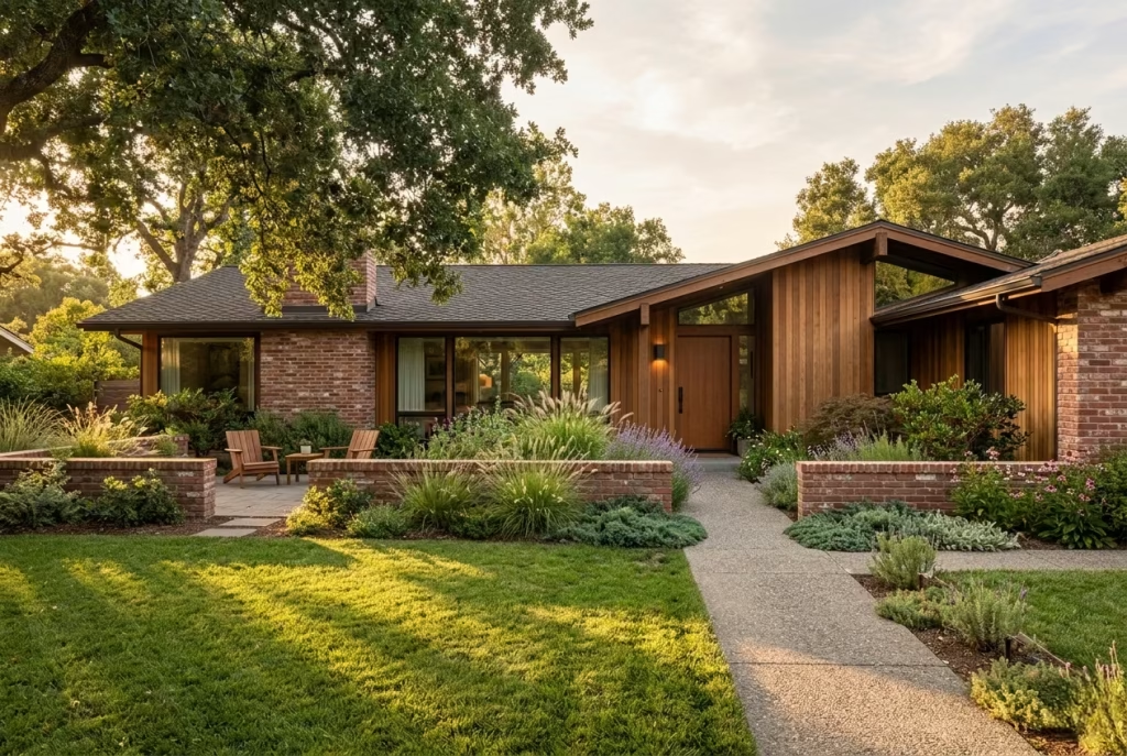
Not every garden needs towering fences or dense hedges to feel private and inviting. In fact, some of the most thoughtfully designed 1970s landscapes achieved exactly the opposite. They relied on low horizontal garden walls that gently organised outdoor spaces without closing them off from the surrounding environment.
These modest structures did far more than mark property lines. They shaped movement, framed views, supported planting, and transformed ordinary gardens into a series of comfortable outdoor rooms, each with its own purpose and atmosphere. It is a reminder that good design often speaks in a quiet voice, proving that you do not have to build high to create a lasting impression.
The popularity of these walls reflected a broader architectural philosophy of the era. Homes were increasingly designed to encourage interaction between indoor and outdoor living. Instead of treating gardens as leftover spaces surrounding a building, designers considered them extensions of the home itself.
Low walls became subtle architectural tools that linked patios, pathways, lawns, and planting beds into one cohesive composition. Even decades later, this approach continues to feel refreshingly modern because it prioritises experience over unnecessary decoration.
I once worked on the renovation of a sprawling ranch home where the owners believed their front garden lacked structure. Their first instinct was to install a tall privacy fence along the street, hoping it would create a stronger sense of enclosure.
Before committing to that idea, we explored another option. We introduced a series of low brick garden walls, each no higher than approximately 450 to 600 millimetres, or 18 to 24 inches, combined with layered planting and ornamental grasses.
The result completely changed how the garden functioned. Instead of feeling isolated from the neighbourhood, the property felt welcoming yet comfortably defined. Visitors could appreciate glimpses of the landscape without seeing every detail at once, creating curiosity rather than exposure. It was a perfect example of how subtle interventions often produce the richest results.
Creating Enclosure Without Blocking Views
One of the greatest strengths of low horizontal walls is their ability to define space while preserving openness. Unlike tall barriers that interrupt sightlines, these walls create gentle boundaries that guide movement without making gardens feel confined.
This becomes especially valuable on larger properties where expansive lawns can sometimes lack focus. A low wall can separate an outdoor dining terrace from a lawn, distinguish a quiet seating area from a children’s play space, or frame a courtyard without creating visual isolation. Each area retains its own identity while remaining connected to the wider landscape.
Psychologically, these subtle divisions also influence how people use a garden. We naturally gravitate towards spaces that feel sheltered without becoming enclosed. A low wall provides just enough definition to make an outdoor area feel intentional, encouraging people to linger, relax, and spend more time outdoors.
From the house itself, uninterrupted views remain intact. Looking through large picture windows, the eye continues to travel across planting, lawns, and mature trees, allowing the garden to feel larger than its actual footprint. This seamless relationship between architecture and landscape was one of the defining achievements of many well-designed 1970s homes.
Choosing Between Brick and Stone
Material selection plays a significant role in determining the character and longevity of garden walls. During the 1970s, brick was often the preferred choice because it echoed the materials used on the home itself, creating visual continuity between architecture and landscape.
Warm clay bricks, textured masonry, and carefully detailed mortar joints gave walls a sense of permanence while ageing gracefully alongside surrounding planting. Even after decades of weather exposure, quality brick frequently develops greater richness as moss, lichens, and subtle colour variation soften its appearance.
Natural stone offers a different but equally compelling character. Limestone, sandstone, granite, and locally sourced fieldstone introduce organic textures that blend beautifully into informal gardens. Rather than appearing manufactured, stone walls often feel as though they have always belonged to the landscape.
In my own projects, I usually recommend matching the dominant material to the architecture rather than selecting contrasting finishes simply for visual impact. Brick homes often benefit from complementary masonry walls, while timber-clad houses frequently pair beautifully with natural stone that introduces additional texture without overwhelming the composition.
Turning Garden Walls Into Comfortable Seating
One of the most practical qualities of low walls is their ability to perform more than one function. Beyond defining space, they naturally become informal seating, eliminating the need for excessive outdoor furniture while making gardens feel more flexible during gatherings.
Walls measuring approximately 450 millimetres, or 18 inches, in height generally provide comfortable casual seating for adults. Adding smooth stone coping or timber caps further improves comfort while protecting masonry from long-term weathering.
I have seen these seating walls become some of the most frequently used features in family gardens. During celebrations, children gather along them while adults enjoy conversations overlooking planting beds or fire pits. On quieter evenings, they become the perfect place to pause with a morning coffee or watch the changing colours of the garden at sunset. Good design often earns its place through everyday usefulness rather than dramatic visual impact.
Building Richer Landscapes Through Layering
Perhaps the greatest contribution of low horizontal walls is the way they encourage layered landscape design. Instead of presenting every plant at ground level, walls introduce gentle changes in height that create visual richness throughout the year.
Shrubs can rise behind the wall, ornamental grasses soften its edges, trailing groundcovers spill gently over masonry, and seasonal perennials introduce changing colour as the months progress. This layered composition creates depth that continues to evolve as planting matures.
One principle I consistently apply is to avoid placing tall shrubs directly against the wall. Allowing lower planting to occupy the foreground while gradually increasing height further back preserves the wall’s architectural role instead of hiding it completely. Like a well-composed piece of music, every element should contribute without overwhelming the others.
Layering also benefits biodiversity. Different planting heights provide habitats for birds, pollinators, and beneficial insects while improving drainage, reducing soil erosion, and moderating ground temperatures. The garden becomes healthier as well as more visually engaging.
Planning for Long-Term Success
Although low walls appear deceptively simple, careful construction determines whether they remain beautiful for decades or begin showing signs of deterioration within a few years.
Whenever I discuss these features with clients, I recommend covering several essential topics with their landscape contractor before construction begins:
- Install proper concrete footings suited to local soil conditions.
- Include drainage behind retaining sections to prevent water pressure.
- Select frost-resistant masonry where winters are severe.
- Use mortar colours that complement existing architecture.
- Consider integrated lighting before the wall is built.
- Leave sufficient planting space to accommodate mature growth.
Addressing these details early usually prevents costly repairs while ensuring the wall continues performing as intended long after the landscaping is complete.
Pros
- Defines outdoor rooms while maintaining open views.
- Strengthens the connection between house and landscape.
- Provides informal seating without additional furniture.
- Supports layered planting and richer garden compositions.
- Ages beautifully when constructed with quality natural materials.
- Enhances both functionality and architectural character.
Cons
- Requires skilled construction to ensure long-term durability.
- Poor drainage can lead to cracking or movement over time.
- Premium stone materials may increase project costs.
- Inappropriate proportions can make smaller gardens feel fragmented.
- Periodic repointing may be necessary as masonry ages.
You May also Like: 52 Beautiful Fall Exterior Decor Ideas to Make Your Home Cozy & Welcoming
Integrated Planters Built Into the Architecture
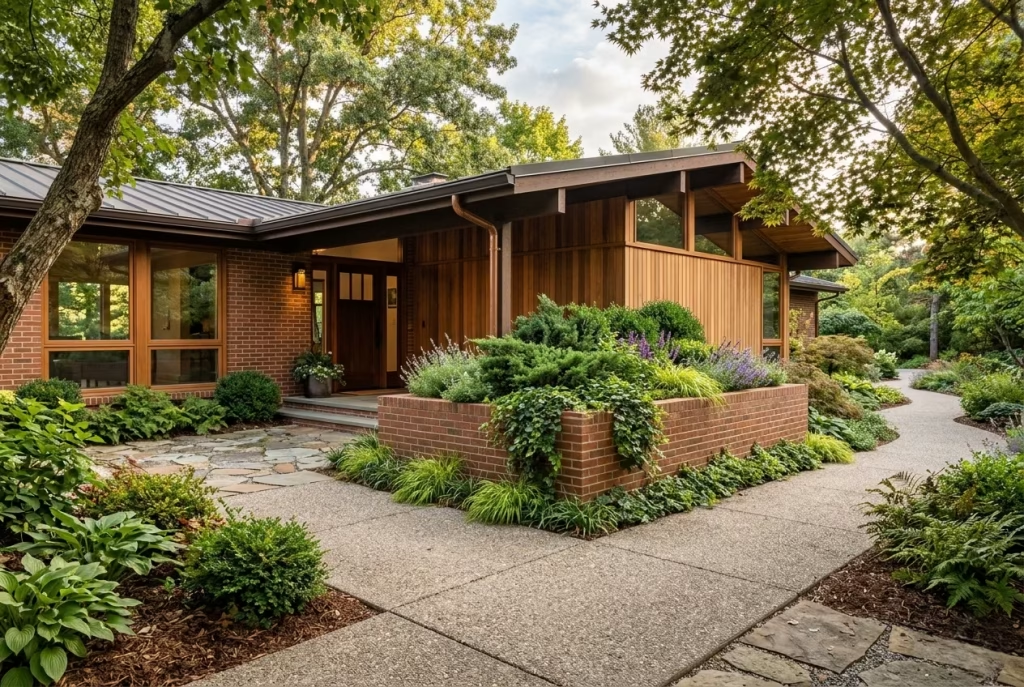
One of the most distinctive qualities of many well-designed 1970s homes was the way architecture and landscape seemed to grow together instead of existing as separate elements. Rather than placing decorative pots near the entrance as an afterthought, architects often designed planters directly into the structure itself.
Brick planters framed front doors, concrete planting beds softened terraces, and raised garden boxes extended naturally from retaining walls or patios. These built-in features blurred the line between building and garden, making planting feel like an essential part of the home’s identity rather than seasonal decoration. It was a design philosophy that understood one simple truth: when architecture and nature work hand in hand, both become stronger.
Today, integrated planters deserve far more attention than they usually receive. In an age of portable containers and constantly changing garden trends, permanent planters offer something refreshingly enduring.
They introduce greenery exactly where it has the greatest visual impact while creating a sense of permanence that movable pots rarely achieve. More importantly, they encourage homeowners to think about landscaping as part of the architecture itself instead of treating it as the final item on a renovation checklist. As the saying goes, put down roots, and these planters do exactly that.
I remember restoring a 1975 courtyard home where two original brick planters stood empty beside the entrance. Years earlier, the owners had removed the planting because maintaining it felt inconvenient. The empty structures remained, yet without greenery the entrance felt strangely lifeless, almost as though an important chapter had been torn from the story.
Instead of demolishing them, we repaired damaged brickwork, improved the drainage system, refreshed the soil, and planted evergreen shrubs layered with trailing groundcovers and seasonal perennials. Within a single growing season, the entrance regained warmth, depth, and a welcoming sense of life. Visitors naturally slowed as they approached the front door because the planting softened every hard architectural edge. Sometimes the smallest details quietly become the heart of a home.
Concrete Planters That Strengthen Architectural Form
Concrete planters became increasingly popular throughout the 1970s because they complemented the clean geometric forms that defined much of the era’s residential architecture. Cast in place or constructed from precast sections, these planters often extended directly from retaining walls, terraces, entrance steps, or courtyard boundaries.
Their greatest strength lies in their ability to reinforce architectural lines without competing for attention. Smooth concrete introduces visual weight that anchors surrounding planting while providing a durable framework capable of lasting for decades when properly detailed.
Modern concrete finishes offer even greater versatility. Board-formed textures, exposed aggregate, polished surfaces, and lightly sandblasted finishes can all introduce subtle variation while maintaining the understated appearance that makes integrated planters so successful.
Whenever I specify concrete planters, I encourage clients to view them as permanent architectural elements rather than oversized flowerpots. Their proportions, placement, and relationship to surrounding walls deserve the same level of design consideration as windows or entrances.
Brick Planters That Add Warmth and Continuity
Where concrete contributes crisp definition, brick introduces warmth and familiarity. Brick planters naturally echo masonry façades, creating continuity that helps architecture and landscaping feel united rather than assembled from unrelated pieces.
One reason brick remains such an effective choice is its ability to mature gracefully. Exposure to weather gently softens mortar joints, subtle colour variations emerge over time, and climbing plants gradually weave themselves into the composition without overwhelming it.
Brick also works beautifully across a wide variety of architectural styles. Whether framing a ranch-style entrance, defining a courtyard, or surrounding an outdoor seating area, its rich texture creates a welcoming atmosphere that synthetic materials often struggle to replicate.
For renovation projects, I usually recommend preserving original brick planters whenever possible. Cleaning, repointing damaged joints, and replacing isolated bricks often restores far more character than complete demolition. Once original masonry disappears, recreating the same sense of authenticity can be surprisingly difficult.
Good Drainage Is the Foundation of Healthy Planting
No matter how attractive an integrated planter appears on the day it is completed, poor drainage will eventually undermine both the planting and the surrounding structure. Water trapped within built-in planters creates problems that extend well beyond unhealthy plants. Saturated soil can damage roots, encourage mould, stain masonry, and gradually weaken nearby foundations through repeated moisture exposure.
This is why drainage should never become an afterthought. In every integrated planter I have designed, the drainage strategy receives as much attention as the planting scheme itself. Proper drainage holes, free-draining growing media, gravel layers where appropriate, waterproof membranes separating soil from structural walls, and carefully positioned outlet pipes all contribute to long-term performance.
Homeowners should discuss these details with both the architect and landscape contractor before construction begins. Hidden infrastructure may never be seen, yet it often determines whether a planter remains successful twenty years from now or requires expensive repairs after only a few seasons.
Selecting Plants That Grow With the Architecture
Perhaps the greatest mistake people make with integrated planters is choosing plants based solely on how they look at the garden centre. Successful planting begins by understanding how each species will mature over time.
Because built-in planters have defined soil volumes, plant selection must account for root growth, water requirements, sunlight exposure, and long-term maintenance. Slow-growing evergreen shrubs, ornamental grasses, compact flowering perennials, climbing vines, and cascading groundcovers often perform exceptionally well because they provide year-round structure without quickly overwhelming the available space.
I encourage clients to think in layers rather than individual specimens. Upright shrubs establish the architectural framework, medium-height perennials introduce seasonal colour, while trailing plants soften edges and reduce the visual hardness of masonry. This layered composition creates movement and depth throughout the year, ensuring the planter remains attractive long after the initial planting has matured.
Native species also deserve careful consideration. They typically require less irrigation, adapt more successfully to local climates, support pollinators, and reduce long-term maintenance demands. Choosing plants that naturally thrive in your region often proves to be the smartest investment over the life of the landscape.
Maintenance Lessons That Protect Long-Term Beauty
Integrated planters reward consistent, thoughtful care rather than intensive seasonal overhauls. Fortunately, maintaining them rarely becomes burdensome when the original design has been properly planned.
Annual inspections should include checking drainage outlets, removing accumulated debris, monitoring irrigation performance, replenishing mulch where necessary, and pruning plants before they begin obstructing windows, pathways, or architectural features.
One lesson I have learned repeatedly is that restraint produces better results than constant replacement. Homeowners sometimes feel tempted to redesign built-in planters every year with entirely new planting schemes. More often than not, allowing carefully chosen plants to mature gradually creates a richer and more authentic landscape than continually chasing seasonal fashions.
Gardens, much like homes themselves, develop their greatest character over time. Patience frequently becomes the most valuable gardening tool of all.
Before beginning an integrated planter project, I recommend discussing these practical points with your contractor or landscape designer:
- Confirm waterproofing details wherever planters meet structural walls.
- Include accessible drainage inspection points.
- Select soil blends appropriate for long-term root development.
- Match plant choices to available sunlight and local climate.
- Install efficient irrigation where ongoing watering may be difficult.
- Allow sufficient space for mature plant growth before installation.
Planning these details from the outset usually prevents expensive alterations later while creating healthier landscapes that continue improving year after year.
Pros
- Creates a seamless relationship between architecture and landscaping.
- Strengthens entrances, courtyards, and outdoor living spaces.
- Introduces permanent greenery with lasting visual impact.
- Enhances property character through thoughtful architectural integration.
- Supports layered planting that matures beautifully over time.
- Reduces visual clutter compared with multiple movable containers.
Cons
- Requires careful waterproofing and drainage design.
- Construction costs are higher than freestanding planters.
- Plant replacement may be more challenging due to fixed soil volumes.
- Poor plant selection can quickly overwhelm architectural proportions.
- Repairs become more complex once integrated into the building structure.
Wide Concrete Walkways With Organic Edges
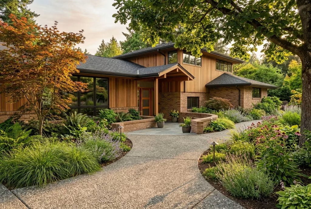
The path leading to a home often receives far less attention than the house itself, yet it quietly shapes every arrival and departure. It is the first physical connection visitors have with the property and the route homeowners use countless times throughout the year. During the 1970s, many architects understood that a walkway should do more than move people from one point to another.
It should slow the pace, reveal the landscape gradually, and create a natural transition between the street and the front door. Wide concrete walkways with softly curved edges became a defining feature of this philosophy, replacing rigid straight paths with routes that felt more relaxed, more welcoming, and more connected to the surrounding garden. Sometimes the journey truly is as important as the destination.
Unlike the narrow, perfectly symmetrical paths commonly found in later suburban developments, these generous walkways acknowledged how people naturally move through outdoor spaces. Instead of forcing movement into strict lines, they gently guided visitors through changing views, carefully positioned planting, and subtle shifts in elevation. The experience felt less like following a pavement and more like taking a quiet stroll through a thoughtfully composed landscape.
One renovation I completed involved a classic split-level home where the original entrance path had been replaced years earlier with a narrow run of decorative pavers. Although the materials were relatively new, the approach felt cramped and disconnected from the architecture. We removed the pavers and restored a wider exposed aggregate concrete walkway inspired by the home’s original design.
The new path curved gently through layered planting before arriving at the entrance courtyard. What surprised the homeowners most was not the change in appearance, but the way the entire property suddenly felt more spacious and inviting. Guests naturally slowed their pace, noticed the garden, and appreciated the architecture from multiple viewpoints. It proved once again that thoughtful circulation shapes experience just as much as beautiful materials.
Gentle Curves That Encourage Natural Movement
One of the defining characteristics of these walkways is their use of soft, flowing curves rather than rigid geometry. These curves were never random. They responded to existing trees, garden beds, changes in level, and the architecture itself, allowing each path to feel as though it had grown naturally from the site.
Gentle curves create anticipation by revealing the entrance gradually instead of exposing everything at once. As visitors move along the path, new perspectives unfold with every few steps. A mature tree frames one view, a brick wall appears around the next bend, and carefully layered planting gradually directs attention toward the front entrance. This subtle choreography transforms an ordinary approach into a memorable experience.
Curved pathways also soften homes dominated by strong horizontal rooflines and geometric façades. The contrast between straight architectural forms and flowing landscape elements creates balance, preventing the exterior from feeling overly formal or rigid.
Whenever possible, I avoid introducing unnecessary bends simply for decoration. Every curve should have a purpose, whether responding to the land, preserving mature trees, or improving the overall experience of moving through the garden. Purposeful design always outlasts novelty.
Aggregate Finishes That Add Texture and Character
While the overall shape of the walkway plays an important role, its surface finish contributes just as much to the final appearance. During the 1970s, exposed aggregate concrete became particularly popular because it introduced texture, durability, and visual warmth without relying on elaborate patterns.
Unlike plain concrete, exposed aggregate reveals carefully selected natural stones embedded within the surface. Depending on the local materials used, finishes may feature river pebbles, granite chips, quartz, or crushed stone, each creating a unique appearance that complements surrounding brick, timber, and natural planting.
One reason I continue recommending exposed aggregate is its ability to age gracefully. Small marks, subtle weathering, and seasonal changes generally blend into the textured finish rather than becoming immediately noticeable. Even after many years of use, quality aggregate surfaces often retain their character far better than decorative stamped concrete, which can sometimes appear dated as trends evolve.
Modern homeowners can also explore washed concrete, honed finishes, lightly brushed surfaces, or architectural mixes that incorporate locally sourced stone. These updated options respect the spirit of original designs while offering greater flexibility for contemporary projects.
Accessibility That Improves Everyday Living
A well-designed walkway should welcome everyone, regardless of age or mobility. Fortunately, many of the generous proportions seen in 1970s pathways naturally support better accessibility than narrower alternatives.
Whenever I design exterior circulation, I encourage clients to think beyond minimum building regulations. A comfortable walkway should allow two people to walk side by side, accommodate prams, wheelchairs, bicycles, or garden equipment without feeling restrictive, and provide enough space for everyday life to unfold comfortably.
As a general guide, I often recommend primary walkways measuring approximately 1.5 to 1.8 metres, or 5 to 6 feet, in width where site conditions allow. This additional space significantly improves usability while creating a stronger sense of generosity throughout the landscape.
Changes in level should also be approached thoughtfully. Gentle gradients, generous landings, integrated handrails where necessary, and subtle lighting all contribute to safer, more comfortable movement without compromising the architectural character of the home.
Modern Replacements That Respect the Original Design
Many older walkways eventually require replacement because of cracking, tree root movement, or decades of weather exposure. The challenge is updating these surfaces without losing the qualities that made them successful in the first place.
Fortunately, modern construction techniques offer several excellent alternatives. Reinforced concrete, permeable paving systems, architectural concrete mixes, resin-bound aggregates, and high-performance expansion joints all improve durability while preserving the broad, flowing appearance associated with original designs.
In some projects, I intentionally retain portions of the existing path wherever practical. Preserving original alignments, mature edging, or historic planting often maintains the landscape’s character while reducing unnecessary demolition. It is another reminder that successful renovation is not always about starting over. More often, it is about recognising what already works and allowing it to shine once again.
Slip Resistance That Should Never Be Overlooked
Safety is one area where modern technology can meaningfully improve traditional designs. Exterior pathways are constantly exposed to rain, fallen leaves, frost, and seasonal debris, making slip resistance an essential consideration rather than an optional upgrade.
Textured concrete finishes generally provide excellent traction, particularly when compared with highly polished paving materials. Exposed aggregate, broom-finished concrete, and lightly textured stone all maintain grip even in wet conditions while preserving the understated appearance that suits 1970s architecture so well.
Drainage also plays an equally important role. Walkways should include subtle cross-falls that direct water away efficiently without creating noticeable slopes. Proper grading helps prevent standing water, algae growth, and long-term deterioration while improving year-round safety.
Whenever I discuss new walkway construction with homeowners, I recommend covering several practical details before work begins:
- Confirm appropriate walkway width for current and future accessibility needs.
- Select finishes with reliable slip resistance in all weather conditions.
- Design curves that respond naturally to the landscape rather than forcing unnecessary shapes.
- Ensure drainage directs water away from foundations and planting beds.
- Protect existing mature tree roots wherever possible during excavation.
- Coordinate pathway materials with brickwork, planting, and the overall architectural palette.
These conversations may seem technical, yet they have a lasting influence on how comfortably and safely the landscape functions for decades.
Pros
- Creates a welcoming and generous approach to the home.
- Encourages natural movement through the landscape.
- Enhances accessibility for people of all ages.
- Exposed aggregate offers durability and timeless texture.
- Curved layouts integrate beautifully with planting and architecture.
- Improves overall curb appeal while strengthening the garden’s composition.
Cons
- Wider paths require a larger construction budget.
- Poor drainage can shorten the lifespan of concrete surfaces.
- Curved formwork increases construction complexity.
- Tree roots may require careful planning during installation.
- Some exposed aggregate finishes require occasional cleaning to maintain their appearance.
You May also Like: 25 Outdoor Area Ideas for Kids That Encourage Adventure, Creativity, and Outdoor Play
Oversized House Numbers and Minimal Exterior Signage
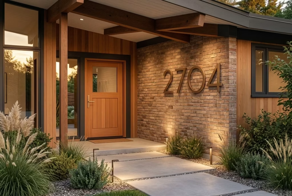
It is often the smallest architectural details that quietly shape the overall impression of a home. While rooflines, materials, and landscaping naturally attract most of the attention, subtle elements such as house numbers can either strengthen the architecture or unintentionally distract from it.
During the 1970s, many architects treated exterior signage as an extension of the home’s design rather than a purely practical necessity. Oversized house numbers, thoughtfully positioned and carefully proportioned, became sculptural features that enhanced the façade while remaining remarkably functional. Combined with restrained exterior signage, they demonstrated an important design principle that still holds true today: simplicity, when executed well, rarely goes unnoticed.
Unlike today’s tendency to mix decorative plaques, ornate lettering, multiple fonts, and excessive embellishment, 1970s homes often embraced visual restraint. A single set of well-crafted numerals mounted against brick, timber, or concrete could communicate the home’s identity more confidently than an elaborate collection of decorative accessories. The result was clean, timeless, and surprisingly memorable.
I remember renovating a contemporary ranch home where the entrance had gradually accumulated years of additions. Decorative welcome signs, seasonal plaques, oversized wall ornaments, and small metallic house numbers competed for attention around the front door. Although each item had been added with good intentions, together they created visual clutter that distracted from the home’s beautiful cedar façade.
We removed nearly everything, replacing it with a single set of large brushed bronze house numbers mounted directly onto textured brick. The transformation was immediate. Without introducing expensive architectural features, the entrance suddenly appeared calmer, more sophisticated, and considerably easier to navigate. Sometimes clearing away unnecessary distractions allows the strongest ideas to speak for themselves.
Typography That Complements the Architecture
Typography may seem like a surprisingly technical subject within residential design, yet it has a remarkable influence on how a home is perceived. Every numeral carries its own personality. Some fonts feel formal and traditional, while others communicate precision, warmth, or modern simplicity.
During the 1970s, clean sans-serif typefaces became particularly popular because they reflected the architectural language of the period. Their simple geometric forms complemented horizontal rooflines, exposed timber, and minimalist detailing without introducing unnecessary decoration.
Today, these same principles remain highly effective. Choosing house numbers with balanced proportions, consistent stroke widths, and generous spacing allows them to become part of the architectural composition rather than appearing as an afterthought.
One lesson I have learned repeatedly is that typography should always echo the character of the house. A low-slung ranch home benefits from understated contemporary numerals, while a rustic timber property may suit subtly softer forms. When typography feels connected to the architecture, even the smallest detail contributes to the overall harmony.
Visibility That Serves Everyday Life
Beautiful design should never compromise functionality. House numbers exist first and foremost to help visitors, neighbours, emergency services, and delivery drivers identify a property quickly and accurately.
Oversized numerals improve visibility considerably, particularly when viewed from the street or during evening hours. Instead of forcing visitors to search for tiny decorative plaques hidden among planting, large well-positioned numbers communicate clearly without overwhelming the façade.
Placement deserves just as much attention as size. I usually recommend locating house numbers near the primary entrance, integrated within feature walls, mounted beside garage doors where appropriate, or positioned close to the main approach so they remain visible from multiple angles.
Lighting also plays a vital role. Soft architectural lighting positioned above or below the numerals ensures they remain legible after sunset while contributing to the home’s welcoming evening appearance. A beautifully illuminated entrance serves practical needs while quietly enhancing curb appeal every night of the year.
Material Choices That Age With Character
The materials used for exterior signage influence far more than appearance alone. They determine how gracefully the details weather, how much maintenance they require, and how successfully they complement surrounding architecture.
Natural metals such as bronze, brass, stainless steel, weathering steel, and anodised aluminium continue to perform exceptionally well because they develop character over time rather than appearing worn. Their subtle patinas often enrich the façade, particularly when paired with cedar cladding, textured brick, natural stone, or architectural concrete.
Timber house numbers also offer warmth, especially when carved from durable hardwoods such as oak or iroko. However, they generally require more regular maintenance to preserve their appearance in exposed locations.
One material I often avoid is inexpensive plastic. While initially attractive because of its lower cost, it frequently fades, becomes brittle, or loses its finish after prolonged exposure to sunlight and changing weather conditions. Investing in durable materials usually proves more economical over the life of the home.
Contemporary Updates That Respect Timeless Design
Modern technology has introduced several thoughtful improvements without changing the underlying philosophy of restrained exterior signage.
Backlit LED house numbers now provide excellent visibility while consuming very little energy. Laser-cut metal numerals offer crisp precision, concealed fixings create cleaner installations, and weather-resistant finishes extend the lifespan of architectural metals in demanding climates.
At the same time, restraint remains the guiding principle. The goal is not to create illuminated features that dominate the façade but to introduce subtle enhancements that improve both appearance and usability.
Whenever I specify contemporary house numbers, I encourage homeowners to focus on quality rather than novelty. Elegant proportions, premium materials, and careful placement almost always deliver longer-lasting satisfaction than decorative trends that quickly lose their appeal.
Balancing Function With Architectural Beauty
Perhaps the greatest lesson oversized house numbers teach us is that practical elements can also become beautiful design features. Instead of treating signage as something that must simply meet regulations, thoughtful homeowners use it to reinforce the overall architectural language of the property.
Achieving this balance requires considering every surrounding element. Brick textures, timber grain, exterior lighting, landscaping, front doors, and even the shadow lines created throughout the day all influence how house numbers are perceived.
Whenever I work with clients on exterior renovations, I encourage them to ask a simple question before selecting any architectural detail: does this contribute to the overall story of the home, or does it simply demand attention for itself?
That single question often leads to stronger design decisions throughout the entire project.
Before installing new house numbers, I recommend discussing several practical considerations with your architect, designer, or contractor:
- Confirm local visibility requirements where applicable.
- Select durable materials appropriate for the regional climate.
- Coordinate finishes with existing exterior hardware and lighting.
- Ensure mounting positions remain visible from approaching vehicles.
- Integrate lighting during the initial electrical planning stage.
- Maintain consistent proportions with surrounding architectural features.
These relatively modest decisions often have a surprisingly significant impact on both daily functionality and long-term curb appeal.
Pros
- Improves property identification for visitors and emergency services.
- Strengthens the home’s architectural identity through thoughtful detailing.
- Requires relatively modest investment compared with larger exterior upgrades.
- Durable materials develop attractive character over time.
- Enhances evening appearance when paired with subtle lighting.
- Supports a cleaner, more refined entrance composition.
Cons
- Poor font selection can clash with the home’s architectural style.
- Low-quality materials may fade or deteriorate prematurely.
- Oversized numerals require careful proportioning to avoid dominating the façade.
- Improper placement can reduce visibility despite larger sizing.
- Integrated lighting requires additional planning during installation.
Carports That Feel Like Architectural Features
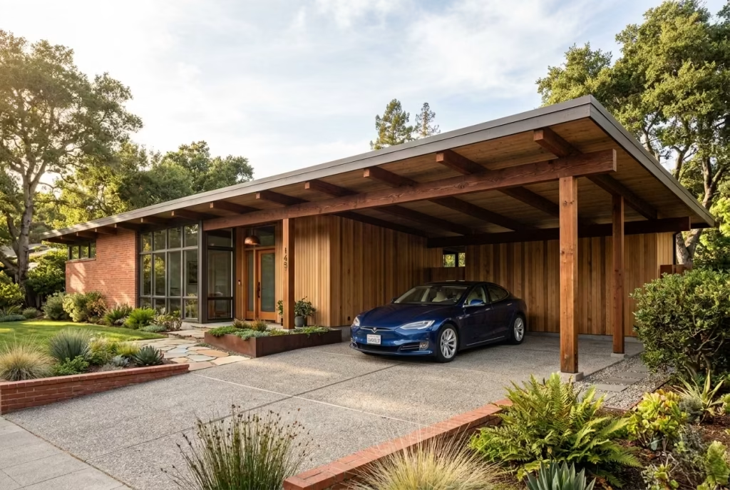
Few exterior features have been misunderstood quite as much as the humble carport. Over the years, countless original carports have been enclosed, demolished, or replaced with oversized garages in the name of modernization. While those decisions often increased enclosed storage, they also removed one of the defining architectural characteristics of many thoughtfully designed 1970s homes. What was once an elegant extension of the roofline frequently became a bulky addition that interrupted the home’s proportions and weakened its connection to the landscape.
The irony is that the original carport was never intended to be a temporary compromise or a budget alternative to a garage. It was carefully integrated into the architecture from the very beginning. The roof flowed seamlessly across the structure, exposed timber beams established rhythm, and open sides preserved views of gardens while allowing fresh air and natural light to circulate freely. The carport became another outdoor room, quietly serving both practical and aesthetic purposes. Looking back with fresh eyes, it becomes clear that these spaces were well ahead of their time.
As lifestyles evolve, homeowners are beginning to rediscover the advantages of this understated feature. A well-designed carport offers flexibility, architectural elegance, and environmental benefits that many enclosed garages struggle to match. Sometimes, what seems old-fashioned at first glance turns out to have been quietly innovative all along.
I worked on the renovation of a 1973 ranch house where the original timber carport had been enclosed during the early 1990s. Although the conversion created additional storage, it also disrupted the long horizontal roofline that gave the house much of its visual balance. The enclosed garage projected awkwardly from the façade, making the entrance appear smaller and the architecture noticeably heavier.
After carefully evaluating the property’s layout, we removed the front enclosure while retaining enclosed storage further behind the building. We restored the original timber posts, refinished the exposed beams, and re-established the continuous roofline. The difference was remarkable. The house immediately felt lighter, more welcoming, and considerably more authentic. Neighbours who had lived nearby for years commented that the renovation looked as though the home had simply rediscovered its original identity rather than undergone a dramatic transformation.
Why So Many Original Carports Disappeared
The gradual disappearance of carports was influenced by changing lifestyles as much as changing design trends. During the late twentieth century, larger vehicles, growing storage needs, and increasing concerns about security encouraged many homeowners to convert open structures into fully enclosed garages.
At the same time, popular renovation styles favoured symmetrical façades with oversized garage doors becoming dominant architectural features. Unfortunately, these alterations often overlooked the original design logic of the home.
Many 1970s houses relied on carefully balanced horizontal compositions where the carport formed an essential visual counterweight to the main living spaces. Removing or enclosing that open structure frequently altered the proportions far more than homeowners anticipated.
Another factor was maintenance. Timber posts and exposed roof structures required occasional care, leading some owners to replace them with more enclosed alternatives that appeared easier to maintain. Yet in solving one perceived problem, they often sacrificed much of the home’s architectural character.
Today, with renewed interest in mid-century and modernist design principles, many architects are recognising the value these original carports continue to offer.
Timber Detailing That Adds Warmth and Craftsmanship
One reason original carports remain so visually appealing is the quality of their timber detailing. Rather than concealing structural elements behind decorative finishes, architects allowed beams, rafters, posts, and joinery to become visible parts of the design.
Cedar, Douglas fir, redwood, and hardwood species were commonly selected for their durability and beautiful grain patterns. As sunlight moved across the structure throughout the day, shadows created by exposed framing added texture and depth that constantly changed with the seasons.
Whenever I restore an original carport, I encourage homeowners to preserve as much of the existing timber as possible. Weathered beams often possess remarkable character that cannot easily be recreated with new materials. Careful cleaning, selective repairs, sanding, and breathable protective finishes usually reveal craftsmanship that has quietly endured for decades.
Even where replacement becomes necessary, matching the original timber dimensions and detailing helps maintain the architectural rhythm that defines these structures.
Roof Continuity Creates Visual Harmony
Perhaps the greatest architectural strength of the traditional carport is the uninterrupted flow of the roof. Rather than treating vehicle storage as a separate building, architects integrated it beneath the same roofline that sheltered the rest of the home.
This continuity creates visual calm. The eye moves naturally across the façade without interruption, making even modest homes appear more spacious and balanced. Long horizontal rooflines also strengthen the connection between architecture and landscape, particularly on ranch houses, split-level homes, and low-slung contemporary designs.
In contrast, oversized garages often dominate the front elevation, shifting attention away from entrances, living spaces, and carefully composed architectural details.
One design principle I return to repeatedly is that secondary functions should support the architecture rather than compete with it. A carport achieves exactly that by providing practical shelter without becoming the centre of attention.
Roof continuity also offers environmental advantages. Extended overhangs protect vehicles from harsh sunlight and rainfall while creating shaded outdoor areas that naturally improve thermal comfort around the home. Combined with generous planting and thoughtful drainage, these spaces contribute to a more comfortable microclimate throughout the property.
Converting Without Losing Character
There are, of course, situations where additional enclosed space becomes genuinely necessary. Families may require secure storage, workshops, or enclosed parking for valuable vehicles. The challenge lies in meeting these needs without compromising the home’s architectural integrity.
Successful conversions begin by respecting the original proportions. Instead of enclosing the entire front opening, consider positioning enclosed spaces further back, allowing the primary roof structure and supporting posts to remain visually prominent. This approach preserves depth while providing practical functionality behind the original framework.
Glass walls, timber screening, perforated metal panels, and carefully detailed sliding doors can also introduce greater enclosure without making the structure feel heavy or disconnected from the rest of the home.
Whenever I discuss conversions with clients, I recommend treating the carport as an architectural asset rather than an empty space waiting to be filled. That subtle shift in thinking often leads to far more thoughtful renovation outcomes.
Before altering an original carport, it is worth discussing several key issues with your architect or contractor:
- Assess whether existing structural timber can be restored rather than replaced.
- Preserve the original roofline wherever possible.
- Ensure any new enclosure remains visually recessed.
- Match timber species and beam dimensions to existing construction.
- Upgrade lighting without introducing visually intrusive fittings.
- Consider future flexibility before committing to permanent walls.
These conversations frequently prevent costly design compromises while protecting the qualities that make older homes unique.
Pros
- Preserves the original architectural character of the home.
- Creates a lighter, more open street presence.
- Improves natural ventilation around parked vehicles.
- Extends rooflines that strengthen visual proportion.
- Offers flexible outdoor space beyond vehicle storage.
- Restoring original features can enhance long-term property value.
Cons
- Provides less security than a fully enclosed garage.
- Timber components require periodic inspection and maintenance.
- Exposure to wind-driven rain varies depending on orientation.
- Some homeowners may require additional enclosed storage elsewhere.
- Structural modifications should always be professionally assessed before renovation.
Warm Exterior Lighting That Highlights Architecture
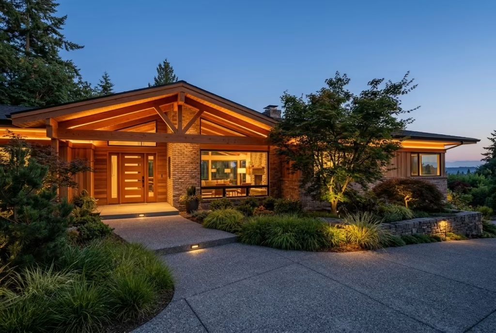
A beautifully designed home should never disappear after sunset. Yet surprisingly often, homeowners invest significant time and resources into architectural renovations, landscaping, and premium materials only to illuminate everything with harsh floodlights that flatten textures and wash away the very details they hoped to celebrate.
Many thoughtfully designed homes from the 1970s approached exterior lighting quite differently. Instead of treating it as an afterthought, architects considered light another building material, one capable of shaping mood, revealing craftsmanship, and extending the experience of architecture well into the evening.
Rather than overwhelming the façade with brightness, these homes relied on warm, carefully layered illumination that guided movement while allowing shadows to remain part of the composition. Timber beams glowed softly beneath roof overhangs, textured brickwork revealed subtle variations, mature trees cast gentle silhouettes across pathways, and entrance courtyards welcomed visitors without dazzling them. Less, in this case, truly became more.
Today, this philosophy feels more relevant than ever. Modern LED technology allows homeowners to achieve exceptional energy efficiency while preserving the quiet atmosphere that defined many original 1970s landscapes. Good lighting does not compete with architecture. It helps architecture tell its story after dark.
One project that remains particularly memorable involved a cedar-clad hillside home overlooking a wooded valley. The owners had installed several high-output security floodlights around the property, believing brighter automatically meant safer. While the house certainly stood out at night, every beautiful material disappeared beneath harsh white light. The cedar lost its warmth, stone walls appeared flat, and the surrounding landscape vanished into darkness beyond the glare.
We replaced the floodlights with discreet warm LED fittings hidden beneath roof overhangs, recessed step lights along the entrance path, and soft uplighting positioned beneath carefully selected trees. The transformation was immediate. The house felt calmer, considerably more elegant, and surprisingly more secure because pathways, entrances, and key architectural features became easier to read without excessive brightness. It was another reminder that lighting should reveal rather than overpower.
Indirect Lighting Creates Atmosphere Instead of Harshness
Perhaps the defining characteristic of successful 1970s exterior lighting was its reliance on indirect illumination. Instead of pointing fixtures directly toward people, designers allowed light to reflect gently across walls, ceilings, pathways, and planting.
This approach produces a softer visual experience while reducing glare and creating greater depth throughout the landscape. Light becomes something people notice almost subconsciously. Visitors rarely comment on individual fittings because their attention naturally shifts toward the architecture itself.
Concealed LED strips beneath roof overhangs, recessed wall lights, hidden uplights within planting beds, and integrated step lighting all continue this tradition exceptionally well.
Whenever I develop an exterior lighting plan, I begin by identifying what deserves attention after sunset. Every illuminated surface should have a reason for being highlighted. If every corner receives equal brightness, nothing truly stands out.
Darkness also plays an important role. Allowing selected areas to remain gently shadowed creates contrast that makes illuminated features feel richer and more inviting.
Beam Spread Shapes the Character of Light
Brightness alone never determines whether exterior lighting succeeds. Equally important is the beam spread produced by each fixture.
Narrow beam angles concentrate attention on individual architectural elements such as timber posts, sculptural trees, stone columns, or entrance doors. Wider beam spreads softly wash larger surfaces, revealing brick textures, rendered walls, or extended rooflines without creating distracting hotspots.
Understanding this balance allows lighting to feel natural rather than theatrical.
One mistake I frequently encounter is using a single fixture type throughout the entire property. In reality, different architectural features require different beam angles. A mature oak tree demands a completely different lighting strategy than a wide retaining wall or a textured cedar façade.
Taking time to match each beam spread to its intended purpose results in lighting schemes that appear effortless because every surface receives precisely the amount of illumination it needs.
Layered Illumination Creates Depth Throughout the Landscape
Exceptional exterior lighting rarely depends on one dramatic feature. Instead, it combines several subtle layers that work together to create a comfortable and visually balanced environment.
The first layer generally establishes safe circulation through pathway lighting, entrance illumination, and step lights. The second layer highlights architectural elements such as walls, roof structures, timber beams, and columns. Finally, landscape lighting introduces depth through carefully positioned tree uplights, softly illuminated planting, water features, or garden walls.
These overlapping layers create outdoor environments that feel comfortable rather than overly bright. As people move through the property, their eyes adjust naturally between different levels of illumination without experiencing sudden changes in brightness.
I often compare lighting design to composing music. Every instrument contributes to the final performance, yet none should dominate the entire composition. The same principle applies outdoors. When each lighting layer performs its role quietly, the overall atmosphere feels balanced and inviting.
Improving Safety Without Creating Glare
Exterior lighting should always improve safety, but that objective does not require excessive brightness.
In fact, glare often reduces visibility by creating sharp contrasts between illuminated and dark areas. Visitors stepping from intensely lit spaces into darker surroundings may temporarily lose visual adaptation, making pathways more difficult to navigate rather than easier.
Soft, evenly distributed lighting generally performs far better than isolated high-output fittings.
Recessed step lights, low bollard lighting, shielded wall fixtures, and concealed pathway illumination provide clear guidance while preserving comfortable night vision. Motion sensors can also improve security without leaving every fixture operating continuously throughout the evening.
Whenever I discuss lighting with homeowners, I remind them that successful exterior illumination should help people feel comfortable rather than exposed. Calm, balanced lighting creates confidence in ways that glaring floodlights rarely achieve.
Highlighting Natural Textures Brings Architecture to Life
One of the greatest pleasures of warm exterior lighting is its ability to reveal materials in entirely new ways after sunset.
Timber grain becomes richer beneath soft amber light. Brickwork develops remarkable depth as shadows settle into mortar joints. Natural stone catches subtle highlights across uneven surfaces, while ornamental grasses and mature trees create constantly changing silhouettes as evening breezes move through the landscape.
Warm colour temperatures between approximately 2700K and 3000K generally produce the most welcoming appearance for residential architecture. These tones complement natural materials beautifully while avoiding the cold, bluish appearance associated with higher colour temperatures.
I always encourage homeowners to observe their house after dark before selecting lighting positions. During daylight, architectural details often reveal themselves naturally. At night, thoughtful lighting becomes responsible for telling the same story in an entirely different language.
Before beginning an exterior lighting project, discuss these practical considerations with your lighting designer or electrician:
- Select warm colour temperatures between approximately 2700K and 3000K.
- Use multiple lighting layers instead of relying on one powerful fixture.
- Shield fittings to minimise glare and light pollution.
- Match beam angles to each architectural feature.
- Integrate lighting with planting and hard landscaping early in the design process.
- Choose weather-resistant fittings designed for long-term exterior performance.
Careful planning almost always produces more elegant results than adding fixtures after the landscaping has already been completed.
Pros
- Enhances architectural character after sunset.
- Creates welcoming outdoor spaces with improved atmosphere.
- Improves safety along pathways, entrances, and steps.
- Highlights natural materials such as timber, brick, and stone.
- Modern LED systems provide excellent energy efficiency.
- Extends the enjoyment of gardens and outdoor living areas into the evening.
Cons
- Poorly positioned lighting can create unwanted glare.
- High-quality fixtures require greater initial investment.
- Incorrect beam angles may flatten architectural details.
- Exterior fittings require periodic cleaning and maintenance.
- Over-lighting can reduce the calm atmosphere that makes these homes so appealing.
Why So Many Great ’70s Exterior Details Were Lost
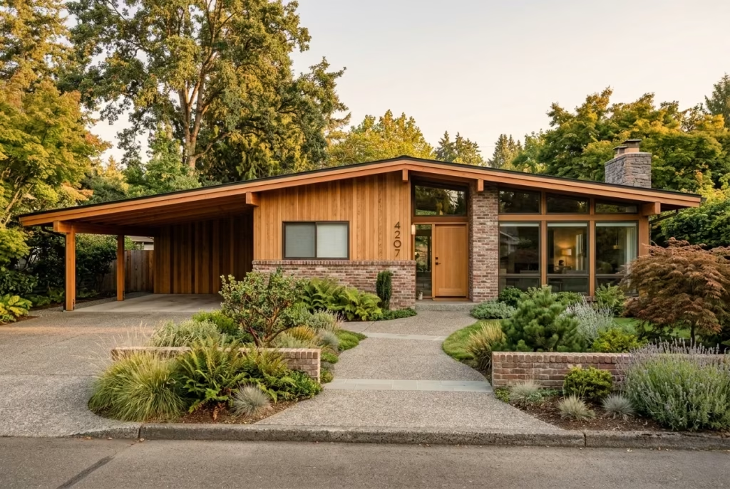
Walk through almost any neighbourhood filled with homes built during the 1970s, and you will notice an interesting pattern. While the basic forms often remain intact, many of the features that originally gave these houses their character have quietly disappeared. Warm cedar cladding has been covered with synthetic panels. Brick planters have been removed to create larger driveways. Exposed beams have been boxed in, generous roof overhangs have been trimmed back, and carefully layered landscapes have been replaced with expansive lawns or decorative paving.
At first glance, these changes may appear to be improvements. After all, each renovation was usually carried out with good intentions. Homeowners wanted lower maintenance, higher resale value, or an appearance that reflected the design fashions of the day. Yet taken together, many of these alterations slowly erased the thoughtful architectural ideas that made these homes distinctive in the first place.
What is especially fascinating is that many of the qualities people now admire in contemporary residential design were already present in well-designed 1970s homes. Honest materials, strong indoor and outdoor connections, passive climate strategies, restrained colour palettes, and architecture that respected the landscape were not recent inventions. They were simply overlooked for a period of time.
Having restored a number of homes from this era, I have often found that the most rewarding discoveries are not what we add during renovation, but what we uncover. Beneath later alterations, original craftsmanship frequently survives, waiting patiently to be appreciated again. It is rather like finding an old photograph tucked inside a forgotten book. The value was always there. It simply needed someone willing to look a little closer.
The Rise of Vinyl Siding Renovations
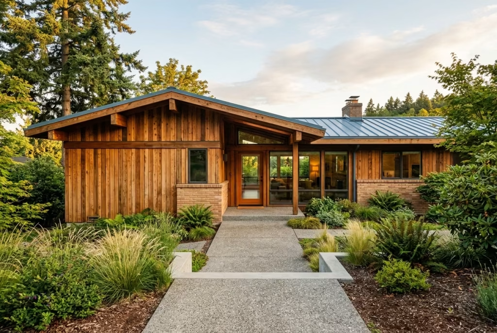
Few materials transformed residential streetscapes more dramatically than vinyl siding. During the 1980s, 1990s, and early 2000s, it became one of the most popular renovation products available. It promised lower maintenance, fresh colours, improved weather protection, and relatively affordable installation. For many homeowners, it seemed like the obvious choice. Unfortunately, vinyl siding often concealed rather than improved the original architecture.
Natural cedar boards, carefully detailed timber joints, brick accents, and subtle shadow lines disappeared beneath uniform plastic panels. The visual richness created by authentic materials gave way to flat, repetitive surfaces that made many homes look remarkably similar regardless of their original design.
One renovation I completed revealed beautifully preserved vertical cedar cladding hidden beneath vinyl that had remained untouched for nearly thirty years. Once restored, the house regained warmth, texture, and proportion that no manufactured product could realistically imitate.
This experience reinforced an important lesson. Maintenance-free materials are not always character-free, but they often simplify architecture in ways that reduce its individuality.
The Pursuit of Modernization During the 1990s and 2000s
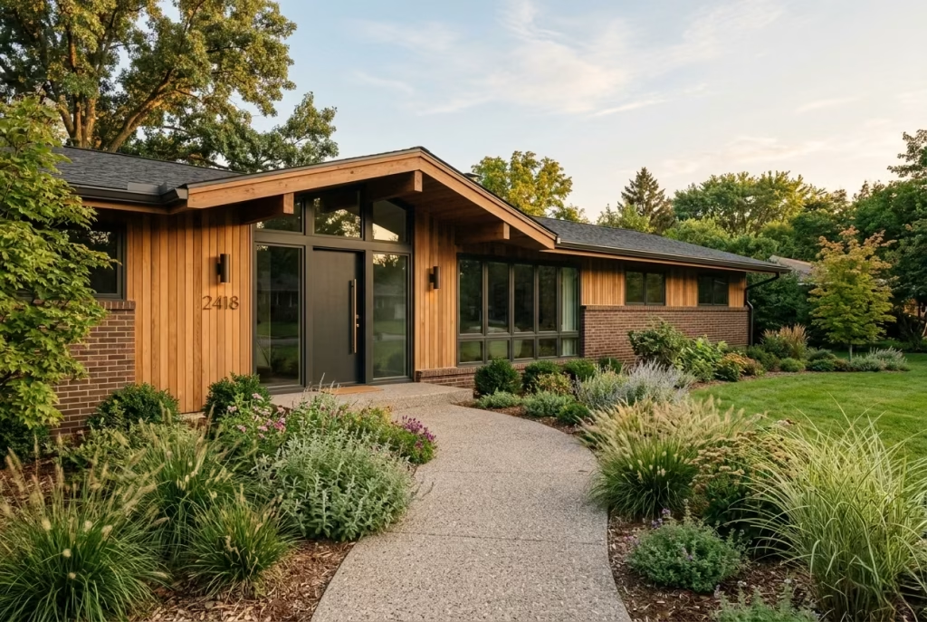
Every generation naturally wants its home to feel current. During the closing decades of the twentieth century, modernization often meant replacing what looked “old” with whatever appeared fashionable at the time.
Large decorative columns replaced simple timber posts. Oversized garages dominated carefully balanced façades. Bright white finishes covered weathered timber, while ornate lighting and decorative stone veneers became increasingly common. Ironically, many of these updates have themselves begun to look dated.
The lesson is not that modernization is undesirable. Quite the opposite. Homes should absolutely evolve to support changing lifestyles, improve energy performance, and meet contemporary expectations. The challenge lies in distinguishing between thoughtful evolution and cosmetic reinvention.
Whenever I approach an older property, I ask one question before suggesting any alteration. Was this original feature solving a problem in an intelligent way? If the answer is yes, preserving or adapting it often produces better long-term results than replacing it simply because fashions have changed.
Architecture that grows naturally tends to age far more gracefully than architecture that constantly chases the latest trend.
Original Craftsmanship Hidden Beneath Newer Materials
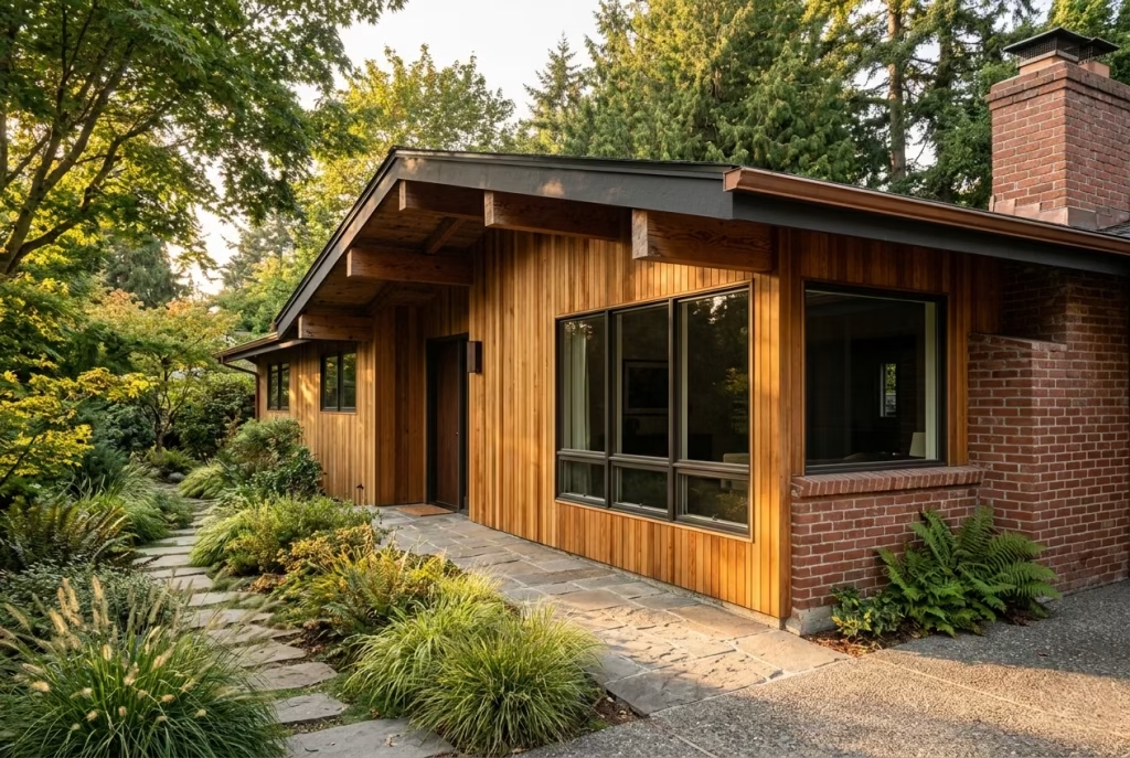
Perhaps the greatest surprise hidden within many 1970s homes is the remarkable quality of craftsmanship that still exists beneath later renovations.
It is not unusual to uncover hand-laid brickwork concealed behind render, solid timber beams enclosed within plasterboard, original stone paving beneath newer concrete overlays, or beautifully proportioned windows hidden by decorative trim added years later. These discoveries reveal a level of care that was often overlooked rather than lost.
I once worked on a house where the owners planned to replace every exterior beam because they assumed the timber had reached the end of its life. After removing several decorative coverings, we discovered dense old-growth Douglas fir that required only minor repairs and refinishing. Once restored, those original beams became one of the home’s strongest architectural features.
Experiences like this have taught me to investigate before replacing. Older homes frequently contain materials that would be difficult or prohibitively expensive to source today.
Preservation, when approached thoughtfully, often delivers greater authenticity than complete reconstruction.
Learning to See Character Instead of Age
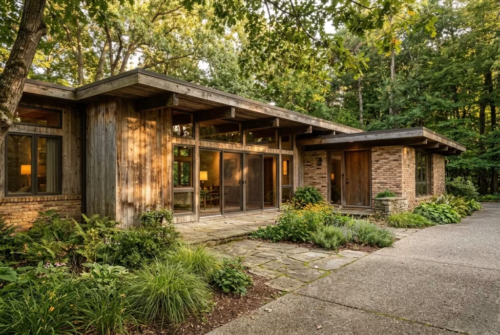
One of the biggest shifts occurring in residential design today is a growing appreciation for patina, craftsmanship, and material honesty.
For many years, weathering was viewed as something to eliminate. Slightly silvered cedar, softened brickwork, naturally aged stone, and mature planting were often interpreted as signs that a property needed updating. Today, those same qualities are increasingly recognised as evidence of authenticity.
Of course, genuine deterioration should never be confused with desirable ageing. Rot, structural damage, failing mortar, or unsafe construction require professional attention. However, there is an important difference between repairing materials and replacing their character.
Whenever I guide homeowners through renovation planning, I encourage them to spend time observing the existing house before making major decisions. Notice how sunlight falls across timber grain, how brick changes colour after rainfall, or how mature trees frame the architecture. These subtle qualities cannot be purchased at a showroom. They develop slowly through decades of interaction between building, climate, and landscape.Character is rarely created overnight. More often, it is revealed through careful observation.
You May also Like: 25 Outdoor Kitchen and Bar Ideas That Elevate Backyard Entertaining: Inspiring, Practical Designs to Transform Your Garden
Why Restraint Often Creates Better Curb Appeal
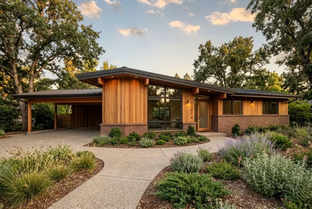
Perhaps the most valuable lesson 1970s architecture continues to teach is that exceptional curb appeal rarely depends on doing more. It usually comes from doing the right things with greater clarity.
Many successful homes from this period relied on only a handful of carefully considered materials. Brick complemented timber. Glass reflected surrounding trees. Rooflines extended naturally over sheltered entrances. Landscaping softened the architecture without overwhelming it. Nothing fought for attention because every element understood its role.
In contrast, some contemporary renovations unintentionally weaken architectural identity by introducing too many competing materials, colours, decorative details, and stylistic influences all at once. Stone veneer sits beside composite cladding. Black windows compete with bright white render. Ornamental lighting, decorative shutters, and oversized garage doors each demand equal attention. The result can feel visually busy despite the significant investment.
One principle I return to throughout every exterior renovation is this: remove distractions before adding new features. More often than not, simplifying the composition reveals strengths that were hidden all along.
Before beginning any renovation, I encourage homeowners to discuss these questions with their architect or contractor:
- Which original materials remain structurally sound?
- Can existing timber, brick, or stone be restored rather than replaced?
- Which later additions interrupt the original architectural proportions?
- Will new materials complement or compete with the existing façade?
- How will landscaping support the architecture instead of hiding it?
- Does every proposed change improve both function and long-term character?
Those conversations frequently become the difference between a renovation that follows passing fashions and one that respects the home’s architectural story.
The renewed appreciation for 1970s home exteriors is not driven by nostalgia alone. It reflects a broader understanding that thoughtful design rarely becomes obsolete. While styles inevitably evolve, qualities such as craftsmanship, honest materials, balanced proportions, and a meaningful relationship with the landscape continue to resonate across generations. Looking back at these homes reminds us that the finest renovations are not about erasing the past. They are about recognising the enduring value already present and allowing it to shine with renewed confidence for decades to come.
Bringing ’70s Exterior Ideas Into Today’s Homes
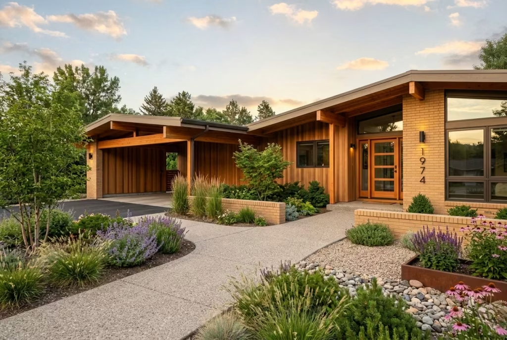
The goal of renovating a 1970s home should not be to freeze it in time like a museum piece. The most successful projects are the ones that respect the original architectural character while quietly improving comfort, durability, and performance for modern living. These homes were often designed with thoughtful proportions, natural materials, and a strong connection to the landscape. When those qualities are preserved and carefully updated, the result can feel remarkably current without losing its sense of history.
I often tell homeowners that a good renovation is less about recreating the past and more about continuing the story. The house should still feel like itself, just a wiser, more capable version of what it was originally intended to be.
Mixing Vintage Character With Contemporary Materials
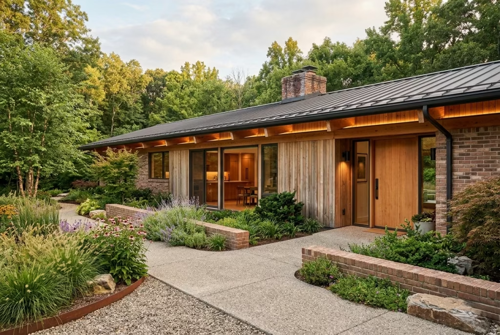
One of the easiest ways to modernise a 1970s exterior is to keep the architectural framework while updating selected materials for durability and performance. For example:
- Original cedar cladding can be restored and paired with slim aluminium window frames.
- Textured brick can sit beautifully beside modern metal detailing in bronze, charcoal, or weathered steel.
- Exposed timber beams can be combined with contemporary lighting and concealed drainage systems.
- Natural stone landscaping can complement modern paving with cleaner edges and improved accessibility.
The key is contrast with restraint. Contemporary materials should support the original architecture, not compete with it.
In one renovation, we preserved the home’s cedar façade and low roofline but introduced dark bronze aluminium windows, hidden gutters, and a new standing-seam metal roof. The house felt unmistakably modern, yet it still retained the warmth and proportions that made it special in the first place.
Improving Insulation Discreetly
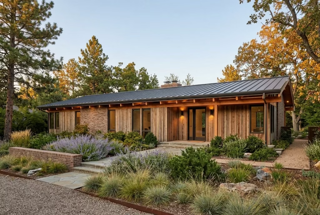
Many 1970s homes were built before today’s energy-efficiency standards, but upgrading insulation does not have to mean altering the exterior appearance. Thoughtful improvements can include:
- Adding insulation within wall cavities where possible.
- Installing high-performance roof insulation during reroofing projects.
- Improving air sealing around windows, doors, and roof junctions.
- Using ventilated rainscreen systems behind timber cladding to enhance moisture management and thermal performance.
These upgrades often deliver significant comfort improvements without changing the home’s outward character.
I have worked on several projects where homeowners were surprised by how much warmer and quieter their houses became after insulation and air-sealing upgrades, even though the exterior looked almost unchanged from the street. Sometimes the most valuable renovations are the ones nobody notices immediately.
Updating Windows Without Changing Proportions
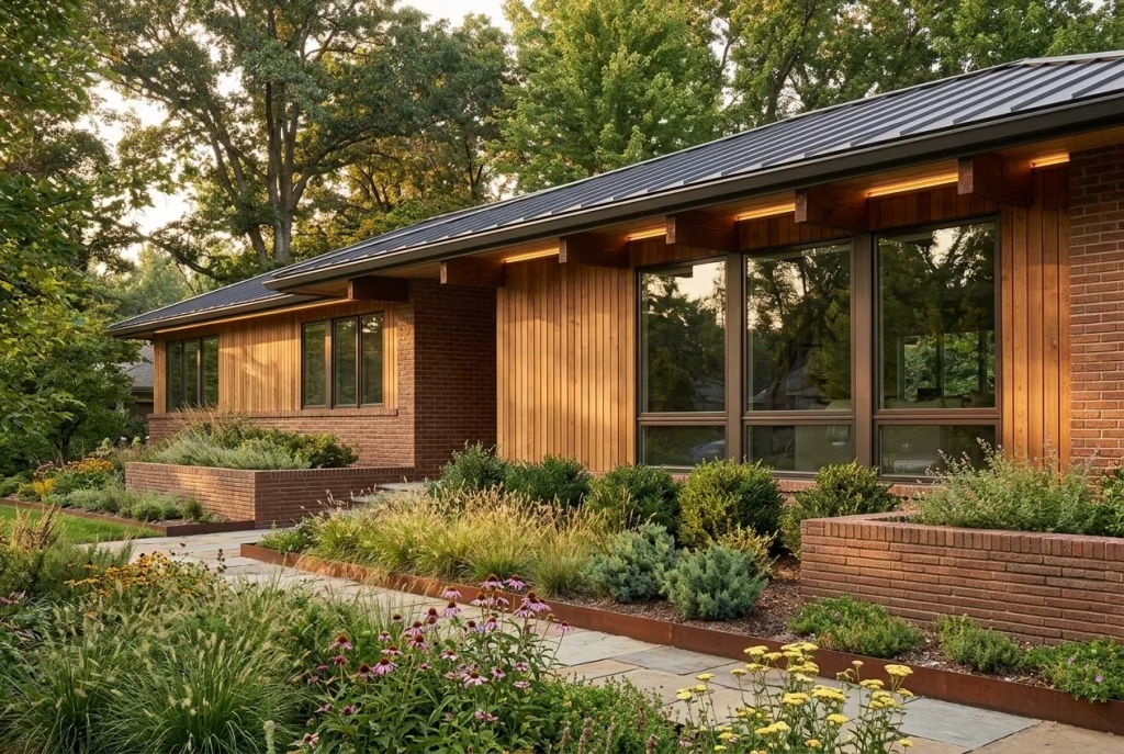
Large picture windows and carefully proportioned glazing are among the strongest features of many 1970s homes. Unfortunately, some renovations replace them with smaller, more conventional windows that disrupt the original façade.
A better approach is to maintain the original openings while upgrading the glazing itself. Modern options include:
- Double or triple glazing for improved thermal performance.
- Low-emissivity coatings that reduce heat transfer.
- Thermally broken frames that minimise condensation.
- Slim-profile aluminium, timber, or composite frames that preserve the original sightlines.
By keeping the original window proportions, the home retains its architectural rhythm while benefiting from contemporary comfort and energy efficiency.
Whenever possible, I encourage homeowners to think of windows as part of the composition of the façade, not just openings in the wall. Changing their size or shape can have a much bigger visual impact than people expect.
Modern Roofing Options
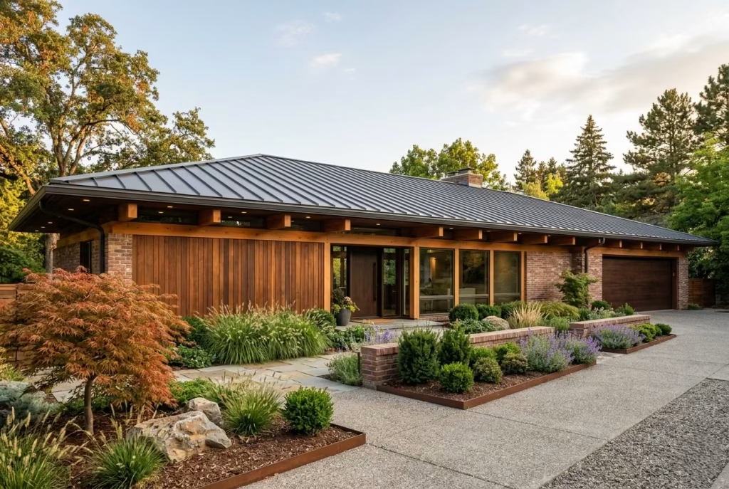
The roof plays a huge role in defining the character of a 1970s home. Broad overhangs, low pitches, and strong horizontal lines are often essential to the architecture. When reroofing, it is worth preserving these proportions even if the material itself changes. Contemporary roofing options include:
| Why it works on a 1970s home | |
|---|---|
| Standing-seam metal roofing | Clean lines, long lifespan, excellent weather resistance |
| Architectural asphalt shingles | Improved durability while maintaining a traditional appearance |
| Concrete or clay tiles | Suitable for certain regional styles and low-slung roof forms |
| Composite roofing products | Lighter weight with enhanced performance and longevity |
The most important consideration is often not the roofing material itself, but preserving the depth of the eaves and the overall roof profile that gives the house its distinctive silhouette.
Choosing Sustainable Materials That Age Well
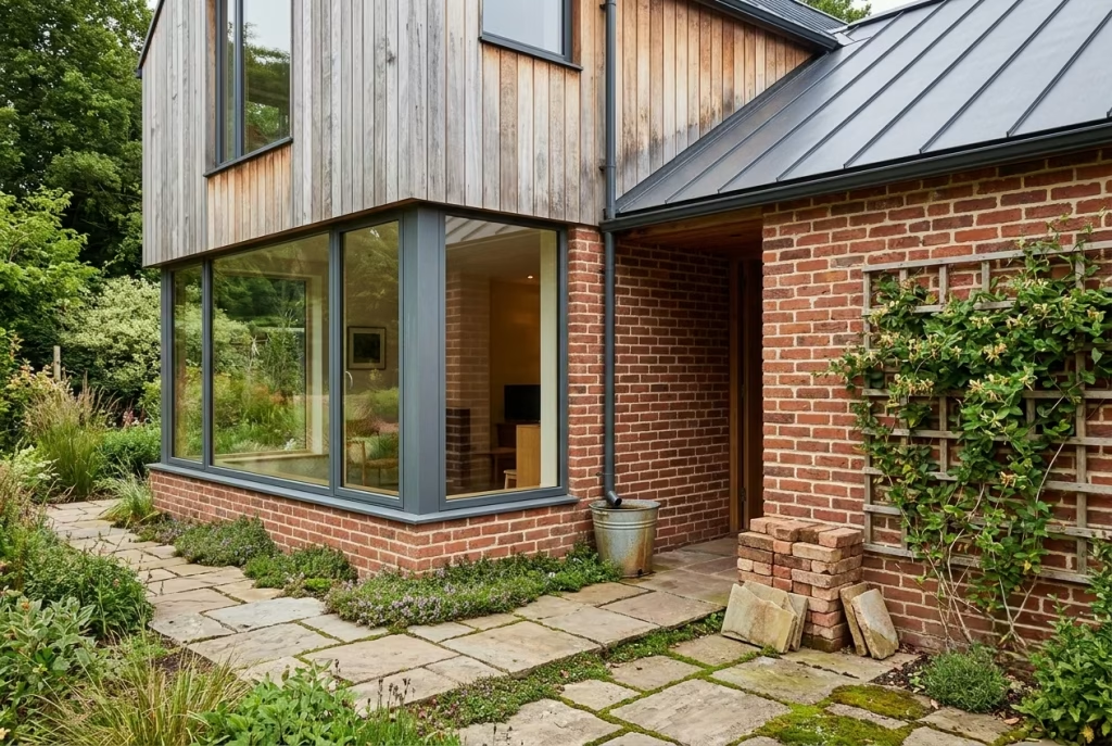
One reason many original 1970s homes continue to feel appealing is their use of honest, natural materials. Today’s sustainability goals often align surprisingly well with that approach.
When selecting new materials, consider options that:
- Have a long service life.
- Can be repaired rather than completely replaced.
- Develop attractive patina over time.
- Require fewer chemical treatments.
- Come from responsibly managed sources.
- Support energy efficiency and moisture control.
Materials such as sustainably sourced cedar, thermally modified timber, natural stone, high-quality brick, recycled metal roofing, and durable aluminium window systems often provide both environmental benefits and lasting visual appeal.
I generally encourage homeowners to invest in fewer, better materials rather than many cheaper finishes that may need replacement within a decade. Longevity is one of the most sustainable choices a renovation can make.
Balancing Nostalgia With Longevity
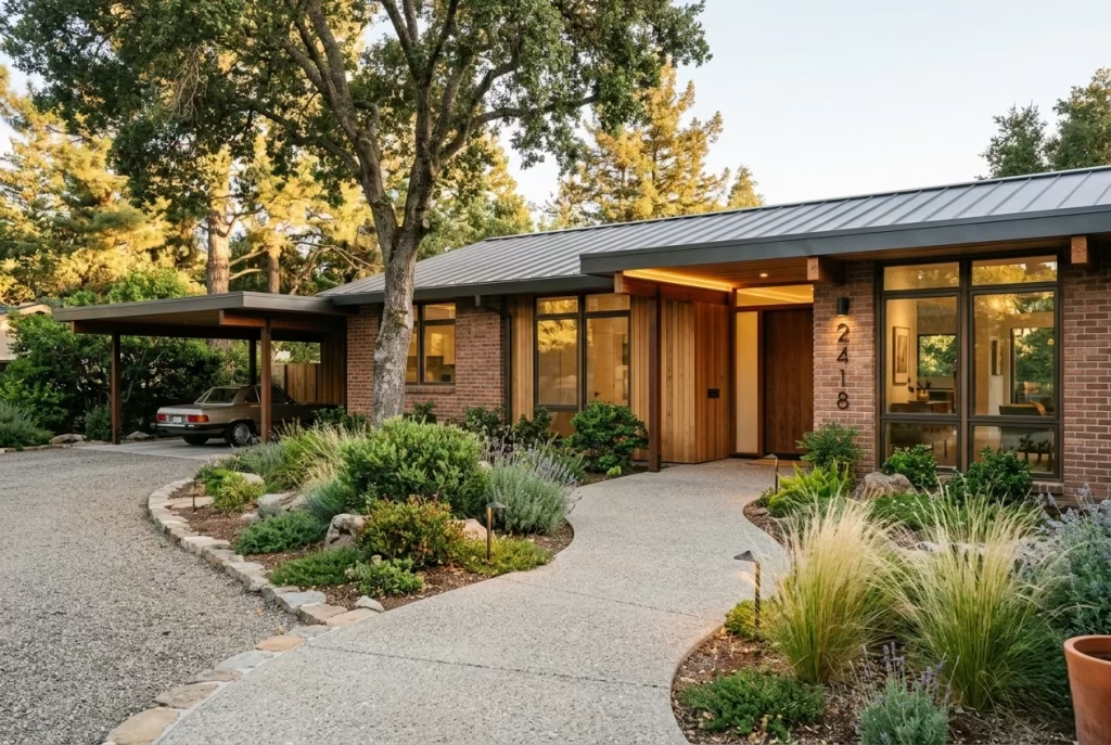
Perhaps the biggest challenge is knowing how much of the past to preserve. It is easy to swing too far in either direction. Some renovations erase all original character, while others recreate vintage details so literally that the home begins to feel like a period set rather than a place to live.
The most successful projects usually follow a simpler principle: Preserve the ideas that made the house special, and update the elements that improve everyday life.
That might mean keeping the cedar cladding, deep roof overhangs, picture windows, and layered landscaping while upgrading insulation, glazing, roofing, lighting, and drainage. The house retains its architectural soul while becoming more comfortable, efficient, and durable for the decades ahead.
Before starting any renovation, I often ask homeowners three questions:
- Which original features still make the house feel unique?
- Which upgrades will genuinely improve how you live in the home every day?
- Which changes are being made because they are truly needed, and which are simply following current trends?
The answers usually reveal a clear path forward. Bringing 1970s exterior ideas into today’s homes is not about chasing nostalgia. It is about recognising that many of the era’s best architectural lessons were rooted in practicality, craftsmanship, and a close relationship with the landscape.
When those qualities are combined with modern building performance and thoughtful material choices, the result is often a home that feels both timeless and completely at ease in the present day. In a world where trends come and go with the seasons, that kind of lasting confidence is becoming increasingly rare and increasingly valuable.
Design Mistakes That Make a ’70s Exterior Feel Like a Theme Park
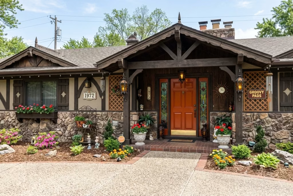
There is an important difference between honouring an architectural era and imitating it. The most successful 1970s-inspired homes capture the principles that made the decade’s best architecture so enduring, while the least successful renovations simply copy its visual clichés. Before long, the result feels more like a movie set than a thoughtfully evolved home.
This is where many well-intentioned renovations lose their way. Homeowners become so focused on recreating the appearance of the decade that they overlook the design philosophy beneath it. The strongest 1970s exteriors were never about avocado green paint, dramatic geometric forms, or decorative timber accents for their own sake. They were rooted in proportion, material honesty, climate-responsive design, and a close relationship with the landscape.
I often remind clients that good architecture ages with dignity because it is based on sound design decisions, not fashionable decoration. If you only recreate the surface details, the result may briefly look authentic, but it rarely feels authentic.
One project still stands out in my mind. The owners had spent a considerable budget transforming their home into what they believed was a faithful 1970s restoration. They installed exaggerated timber trim, oversized stone veneer, bright orange front doors, decorative stained-glass panels, and reproduction light fittings throughout the exterior. Individually, none of those choices were necessarily poor.
Together, however, they overwhelmed the house. The original architecture almost disappeared beneath layers of nostalgic references. During the redesign, we removed nearly half of those additions, restored the original cedar cladding, simplified the entrance, reduced the colour palette, and allowed the landscaping to take a more prominent role. Ironically, the finished house looked considerably more authentic after removing many of the elements that had been added to make it feel “more seventies.”
That experience reinforced a lesson I return to repeatedly. Authenticity rarely comes from adding more. More often, it comes from understanding when to stop.
Copying Colours Without Understanding Proportion
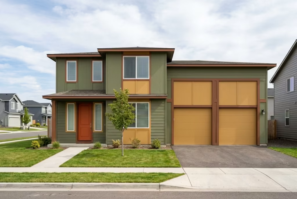
Earthy browns, muted greens, ochres, rust accents, and natural timber tones remain some of the most recognisable colours associated with 1970s architecture. Yet colour alone never defined these homes.
Those palettes succeeded because they were carefully balanced against generous roof overhangs, horizontal rooflines, textured materials, and surrounding planting. Remove those architectural foundations and simply repaint the exterior in vintage colours, and the result often feels forced.
Colour should support proportion, not replace it. Whenever I develop an exterior colour scheme, I begin by studying the architecture rather than the paint chart. Roof forms, window spacing, masonry, timber detailing, and landscape all influence which colours will feel appropriate.
A beautiful palette cannot compensate for poor architectural balance, just as an expensive suit cannot improve an ill-fitting silhouette.
Over-Restoring Original Details
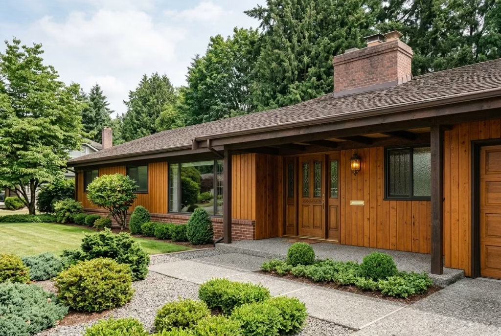
Preservation is valuable, but there is a point where restoration becomes reconstruction. Some homeowners attempt to recreate every original feature exactly as it appeared decades ago, even when modern materials or improved building methods could enhance performance without changing the visual character.
Original timber should certainly be preserved whenever practical, but replacing structurally unsound components with carefully matched materials is often the wiser decision. Likewise, upgrading insulation, drainage, flashing, and glazing can dramatically improve comfort while remaining virtually invisible from the outside.
One principle has guided many of my renovation projects. Protect the spirit of the architecture, not every nail that was originally used to build it. Homes are meant to support contemporary living. Respecting history should never prevent sensible improvements that increase longevity and everyday comfort.
Ignoring the Surrounding Landscape
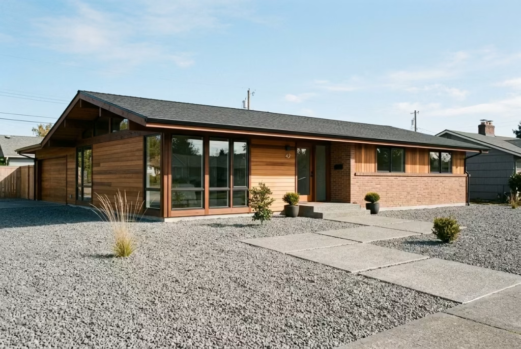
Many of the finest 1970s homes feel inseparable from their sites. Architecture, planting, topography, and outdoor spaces work together as one complete composition.
Unfortunately, this relationship is sometimes forgotten during renovation. Replacing mature planting with decorative gravel, paving over front gardens, or introducing highly formal landscaping often removes the very context that made the architecture feel successful.
I have visited beautifully restored houses where every architectural detail was carefully preserved, yet the surrounding landscape had been stripped of trees, shrubs, and layered planting. The buildings looked strangely exposed, almost as though an important supporting character had disappeared from the story.
Whenever I redesign an exterior, I devote as much attention to the landscape as I do to the building itself. Native planting, natural stone, generous canopy trees, and layered gardens soften strong architectural lines while helping the home settle naturally into its environment. Architecture rarely reaches its full potential without the landscape beside it.
Mixing Conflicting Architectural Eras
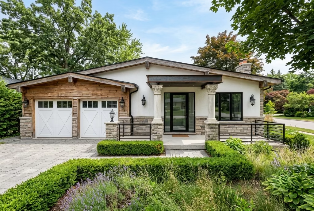
One of the quickest ways to undermine an authentic renovation is by combining design languages that were never intended to coexist. For example, a low-slung ranch house with exposed cedar beams may struggle visually when paired with farmhouse crossbuck garage doors, Mediterranean columns, Victorian lanterns, industrial steel canopies, and ultra-minimal frameless glazing all within the same façade.
Each of these elements may be attractive individually. Together, however, they create visual confusion because they speak completely different architectural languages.
Consistency does not mean every material must match perfectly. It simply means every decision should feel as though it belongs to the same conversation.
Before introducing a new feature, I often ask whether the original architect would recognise it as a natural evolution of the house. That question alone prevents many unnecessary design compromises.
Overusing Faux Vintage Materials
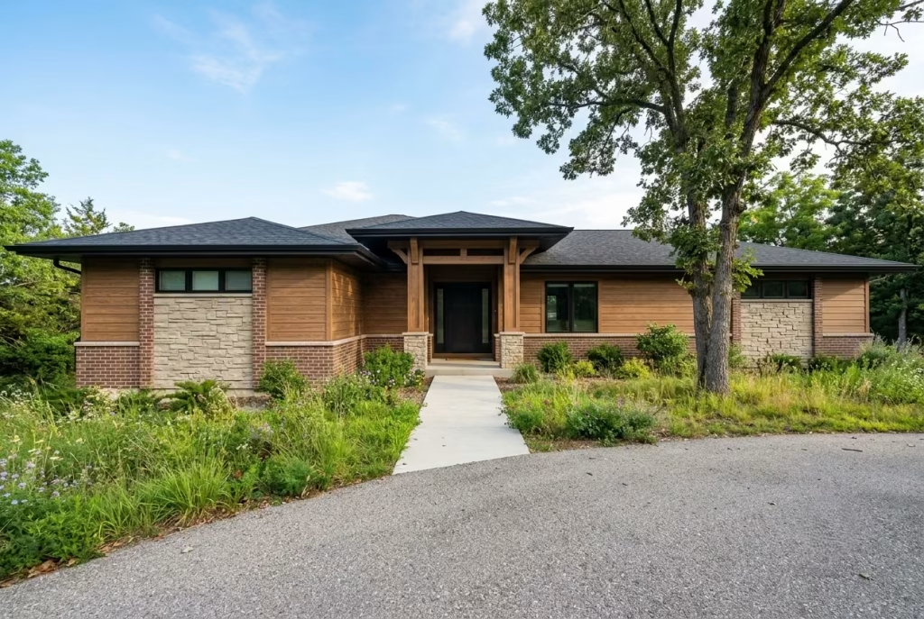
As interest in mid-century and 1970s architecture has grown, manufacturers have responded with countless products designed to imitate natural materials.
Artificial timber cladding, printed stone panels, imitation brick veneers, and synthetic weathering finishes promise vintage character with minimal maintenance. While some perform reasonably well, many lack the depth, texture, and subtle imperfections that make authentic materials so appealing.
Real timber changes gently as sunlight, rainfall, and time influence its appearance. Natural stone carries unique variations formed over thousands of years. Brick develops richness through weathering that cannot easily be manufactured.
Whenever budgets allow, I encourage homeowners to prioritise authentic materials in the areas people see and touch most frequently. Even limited use of genuine timber or masonry often produces a more convincing result than covering the entire façade with imitation products.Craftsmanship almost always leaves a stronger impression than simulation.
Why Simplicity Almost Always Wins
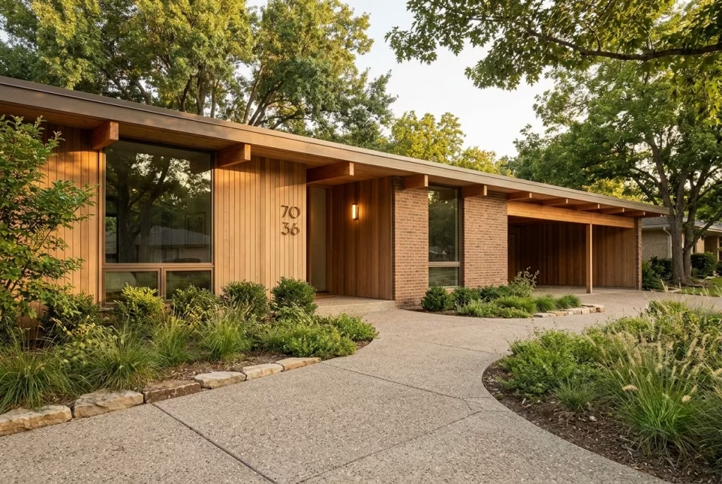
If there is one lesson repeated throughout the very best 1970s homes, it is that restraint creates confidence. These houses rarely depended on elaborate ornamentation or dramatic architectural gestures. Instead, they relied on balanced proportions, carefully selected materials, generous rooflines, natural light, and thoughtful landscaping. Every element had a purpose.
When renovations introduce too many competing materials, excessive decorative features, multiple colour palettes, oversized lighting, or unnecessary architectural additions, the eye no longer knows where to rest. Instead of appreciating the composition, it becomes distracted by individual details competing for attention.
One exercise I often recommend during renovation planning is surprisingly simple. Stand across the street and ask yourself which feature your eye notices first. If the answer changes every few seconds because too many elements are demanding attention, the design may benefit more from subtraction than addition.
As the saying goes, less is more. Few architectural styles prove that idea more convincingly than the finest homes of the 1970s. efore committing to a renovation, discuss these questions with your architect or designer:
- Does every new element support the original proportions?
- Are authentic materials being used where they will have the greatest impact?
- Does the landscaping strengthen the architecture rather than compete with it?
- Are modern upgrades improving performance without overwhelming the home’s character?
- Have decorative additions been carefully edited rather than accumulated?
- Will the design still feel balanced and relevant twenty years from now?
Answering these questions honestly often leads to quieter, more confident design decisions. The enduring appeal of 1970s architecture has never depended on nostalgia alone. It comes from a thoughtful balance of proportion, material honesty, and respect for place. When those principles guide a renovation, the result feels timeless rather than theatrical. Instead of resembling a carefully staged tribute to another era, the home becomes something far more valuable: an authentic expression of architecture that has evolved gracefully while remaining true to its original character.
Final Thoughts: Great Exterior Design Never Really Goes Out of Style
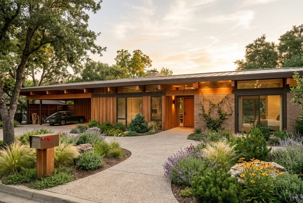
The best 1970s home exteriors were never successful simply because they reflected the style of their time. Their lasting appeal comes from something far more meaningful: balanced proportions, authentic materials, thoughtful responses to climate, and a genuine connection to the landscape. Those principles remain just as relevant today as they were decades ago.
Rather than viewing these homes through the lens of nostalgia, it is worth appreciating the practical design lessons they continue to offer. Whether it is preserving natural timber, respecting original rooflines, embracing layered planting, or allowing simplicity to guide every decision, these ideas create homes that feel comfortable, enduring, and full of character.
Trends will inevitably come and go, but thoughtful architecture has a way of standing the test of time. By rediscovering these often-overlooked 1970s exterior ideas and adapting them with care, you can create a home that feels authentic, beautifully grounded, and quietly distinctive for many years to come.
Frequently Asked Questions
Are ’70s home exteriors coming back in style?
Yes, but not in the way many people expect. Today’s interest in 1970s home exteriors is driven less by nostalgia and more by an appreciation for timeless architectural principles. Features such as natural timber cladding, deep roof overhangs, large picture windows, earthy colour palettes, and landscape-focused design align well with current preferences for sustainable, functional, and authentic homes. Rather than recreating every period detail, most successful renovations reinterpret these ideas using modern materials and improved building performance.
How can I modernise a 1970s exterior without losing its character?
Start by preserving the home’s defining architectural elements. Maintain the original roofline, window proportions, and structural rhythm while upgrading insulation, glazing, roofing, lighting, and weatherproofing. Refinish natural materials where possible instead of replacing them, and introduce contemporary details with restraint. In my experience, the best renovations improve comfort and durability while allowing the original architecture to remain the focal point.
Which original ’70s exterior materials are worth preserving?
If they are structurally sound, original cedar cladding, brickwork, natural stone, exposed timber beams, architectural concrete, and quality masonry are usually worth restoring. These materials often age beautifully and contribute significantly to the home’s identity. Before replacing anything, ask a contractor to assess whether cleaning, repairs, or refinishing can extend the material’s life. Restoration is frequently more rewarding than complete replacement.
What colours work best for a renovated 1970s house?
Earth-inspired colours generally complement 1970s architecture best. Warm browns, muted olive greens, soft taupes, ochres, clay tones, charcoal, and natural timber finishes all work well because they reinforce the home’s connection to the landscape. Instead of using several bold colours, focus on a restrained palette that highlights the architecture rather than competing with it. Natural materials should remain the star of the composition.
How much does it cost to restore a 1970s home exterior?
The overall cost depends on the home’s size, location, condition, and the extent of the renovation. Cosmetic improvements such as repainting, restoring timber, upgrading lighting, and refreshing landscaping are generally far less expensive than replacing roofing, windows, or structural elements. One area where I encourage homeowners not to cut corners is material quality. Investing in durable products and skilled craftsmanship usually reduces maintenance costs and extends the life of the renovation.
Can a 1970s ranch house increase in value after an exterior renovation?
Yes. A carefully planned exterior renovation can significantly improve both curb appeal and market value. Buyers are increasingly drawn to homes that combine architectural character with modern energy efficiency and low-maintenance materials. Restoring original features while improving performance often makes a property stand out in a market filled with more generic renovations. The greatest return usually comes from renovations that respect the home’s original proportions rather than completely changing its architectural identity.
Which landscaping ideas suit 1970s architecture best?
Layered native planting, ornamental grasses, mature trees, integrated planters, natural stone pathways, terraced gardens, and low horizontal garden walls all complement 1970s homes beautifully. These landscapes soften strong architectural lines while creating a natural transition between the house and its surroundings. Instead of relying on large formal lawns, aim for planting schemes that provide seasonal texture, biodiversity, and long-term resilience.
What exterior features should I avoid removing during renovation?
Before removing original features, consider whether they contribute to the home’s architectural balance. Deep roof overhangs, large picture windows, exposed structural beams, vertical timber cladding, integrated planters, low horizontal walls, original brickwork, and thoughtfully designed carports often define the character of a 1970s home. Eliminating these elements can unintentionally weaken the architecture. Whenever possible, preserve and restore them while upgrading performance behind the scenes to meet today’s standards.