15 Dreamy Farmhouse Reading Corner Ideas for the Ultimate Cozy Escape
A truly memorable reading corner is never the result of simply placing a comfortable chair in an empty corner and calling the space complete. The ones that linger in your memory, inviting you back day after day, are shaped by something far more intentional.
They are carefully composed around the way natural light moves across a room, how proportions create a sense of shelter without feeling confined, and how layers of texture soften the experience of everyday living. When these elements come together, a quiet corner becomes more than a place to read. it becomes a personal retreat where time seems to slow and the outside world gently fades into the background.
That quiet sense of retreat is one of the reasons farmhouse interiors continue to endure long after passing trends have come and gone. Honest materials like weathered oak, linen, wool, natural stone, and handcrafted finishes bring warmth that feels authentic rather than staged.
Combined with generous daylight, tactile fabrics, and timeless craftsmanship, they create spaces that encourage slower mornings, peaceful afternoons, and unhurried evenings spent with a favourite book in hand.
I saw this transformation firsthand during the renovation of a country home where an overlooked bedroom alcove had become little more than wasted square footage. Instead of treating it as leftover space, we embraced its beautiful window, softened the architecture with layered textiles, added a deeply comfortable armchair, and introduced bespoke shelving crafted from reclaimed timber. Within weeks of the project being completed, the homeowners told me it had quietly become the most cherished corner in the entire house.
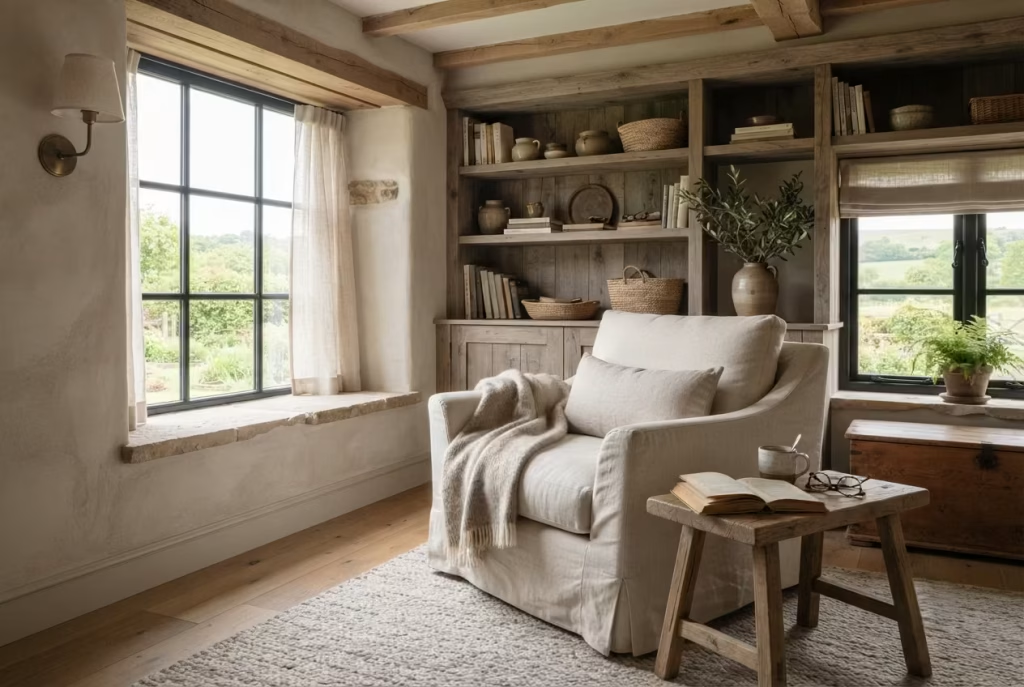
The ideas that follow explore how thoughtful design decisions not expensive decoration alone—can help create a farmhouse reading corner that feels timeless, restorative, and beautifully lived in for years to come.
Create a Reading Alcove Beside a Large Farmhouse Window
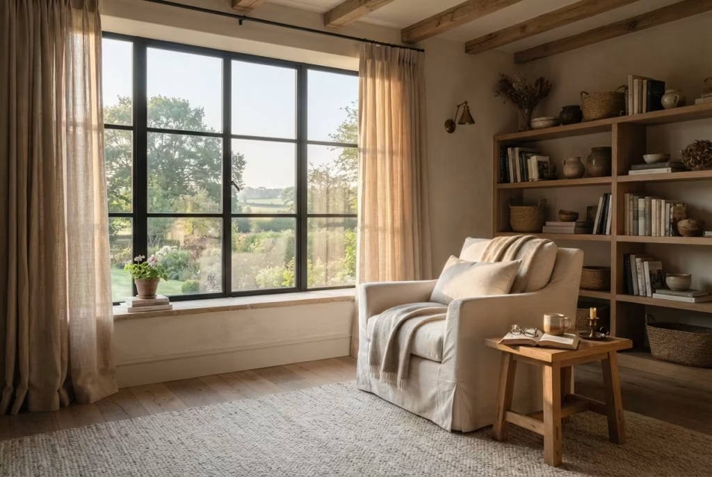
There is a reason the most inviting reading corners often settle naturally beside a generous window rather than in the middle of a room. Long before a cushion, throw, or decorative accessory enters the picture, daylight shapes the experience. As every seasoned designer eventually discovers, you cannot fake the calming effect of soft morning sunshine filtering through natural fabric. It changes the mood of the room, reduces visual fatigue, and creates an atmosphere that encourages you to linger for another chapter instead of checking the time.
In many farmhouse homes I have renovated, the most successful reading retreats were hiding in plain sight. An underused bedroom bay, a quiet dormer, or a recessed wall beside a window often became the heart of the home once the furniture layout respected the architecture instead of competing with it. Sometimes the perfect escape has been there all along, simply waiting for someone to connect the dots.
Let Natural Light Do Most of the Work
Natural daylight remains one of the most valuable design elements because it constantly evolves throughout the day. Gentle morning light offers crisp visibility for reading without feeling harsh, while the warmer glow of late afternoon creates a softer, more relaxed atmosphere. Unlike artificial lighting, daylight reveals the true character of timber grain, woven fabrics, and painted finishes, allowing every material to feel richer and more authentic.
When evaluating a window, I pay close attention not only to its size but also to its orientation. East-facing windows often provide comfortable morning light, making them ideal for early readers, while north-facing rooms usually deliver balanced illumination throughout the day without excessive glare. South-facing spaces may require thoughtful window treatments to soften stronger sunlight during summer months.
Rather than relying solely on decorative lighting during the day, allow the window to become the focal point. The room instantly feels calmer, more spacious, and effortlessly welcoming.
Position the Chair to Feel Connected Rather Than Exposed
Chair placement can make or break a reading corner. Pushing furniture directly against the glass may seem like the obvious solution, yet it often creates discomfort from temperature changes and limits flexibility within the room. Equally, placing the chair too far away disconnects it from the very feature that gives the corner its charm.
I typically position the reading chair approximately 45 to 75 centimetres (18 to 30 inches) away from the window. This distance allows daylight to fall naturally across the pages while maintaining enough clearance for curtains to move freely and for air to circulate around the seating area.
Turning the chair slightly toward the view, rather than facing the glass head-on, creates a far more relaxed posture. It also provides visual variety, allowing your eyes to rest on the landscape between chapters instead of staring at a single focal point. It is one of those subtle decisions that quietly punches above its weight.
If space allows, pair the chair with a compact side table positioned within 30 centimetres (12 inches) of the armrest, making it easy to reach a cup of tea, reading glasses, or a favourite novel without disrupting your comfort.
Give the Reading Corner Enough Room to Breathe
A beautifully designed nook should never feel squeezed into the leftover space. Even the coziest retreat benefits from generous circulation that makes movement feel effortless.
For most bedrooms, I recommend allowing a minimum footprint of approximately 150 × 150 centimetres (5 × 5 feet) for the seating area. This comfortably accommodates an upholstered chair, a side table, and a floor lamp while maintaining pleasant circulation around the furniture.
Where additional space is available, increasing the footprint to around 180 × 180 centimetres (6 × 6 feet) creates an even more luxurious experience. The reading corner feels intentionally designed instead of simply filling an empty corner.
These proportions also prevent the furniture from overwhelming the room, helping the entire bedroom maintain a balanced composition.
Soften Daylight with Relaxed Linen Curtains
Window treatments should never compete with natural light. Their role is to shape it gently, allowing brightness to remain while reducing glare during different times of the day.
Relaxed linen curtains remain one of my favourite choices because they diffuse sunlight beautifully without making the room feel closed in. Their slightly irregular weave creates a soft glow that flatters both the interior finishes and the people enjoying the space.
Floor-length curtains mounted higher than the window frame also encourage the eye to travel upward, subtly increasing the perceived ceiling height. This simple adjustment often makes modest bedrooms feel noticeably more spacious.
Neutral shades such as warm ivory, oatmeal, flax, soft greige, or muted stone blend naturally with farmhouse interiors and continue looking elegant even as decorating trends evolve.
Layer Throws with Intention Instead of Excess
One carefully chosen throw can transform a chair from attractive to irresistible. Five throws casually piled together usually achieve the opposite.
Layering works best when each textile introduces a different tactile quality without competing for attention. A lightweight washed linen throw paired with a chunky wool knit or brushed cotton blanket creates inviting depth while keeping the palette restrained.
During several countryside renovation projects, I found that homeowners actually used reading corners more often when styling remained simple. Fewer layers meant less rearranging, easier maintenance, and seating that always felt ready to enjoy. Sometimes less really is more, particularly when comfort takes centre stage.
Seasonal rotation also keeps the space feeling fresh. Lightweight linen performs beautifully through warmer months, while wool and cashmere blends introduce welcome warmth during autumn and winter without requiring a complete redesign.
A Project That Completely Changed How One Family Used Their Bedroom
One project still stands out in my memory because the transformation came from changing the layout rather than purchasing expensive furniture.
The bedroom featured a beautiful east-facing window overlooking mature trees, yet the bed had been positioned directly in front of it while the reading chair sat in a dim corner across the room. The layout ignored the home’s greatest asset.
We repositioned the furniture so the bed framed the room instead of blocking the light and relocated the reading chair into the alcove beside the window. A reclaimed oak side table, bespoke shelving, a linen-upholstered chair, and a woven wool rug completed the composition without overwhelming the architecture.
When I visited several months later, the homeowners laughed as they admitted the reading corner had quietly become their favourite place for morning coffee, weekend reading, and even evening conversations. What had once been overlooked square footage had become the emotional heart of the bedroom, proving that thoughtful planning almost always delivers greater rewards than simply adding more furniture.
Add a Slipcovered Armchair That Ages Beautifully
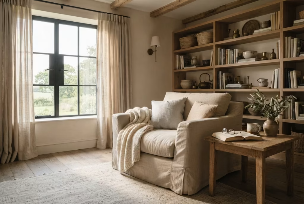
Few pieces of furniture influence the comfort of a reading corner as profoundly as the armchair itself. While decorative accessories can add personality, it is the chair that determines whether you settle in for ten minutes or lose yourself in a novel for an entire afternoon. In farmhouse interiors, I have found that the most enduring choices are rarely the most ornate. Instead, they embrace simplicity, generous proportions, and materials that become more beautiful through everyday use.
A slipcovered armchair embodies this philosophy perfectly. Rather than striving for pristine perfection, it welcomes the gentle signs of daily life. The soft folds, relaxed tailoring, and naturally lived-in appearance create a sense of ease that feels entirely at home within a farmhouse setting. Like a well-loved book whose worn pages tell their own story, a thoughtfully chosen slipcovered chair develops character over time instead of appearing tired.
Relaxed Upholstery Brings Effortless Warmth
Farmhouse design has always celebrated authenticity over formality. Every material is chosen not only for its appearance but also for how comfortably it supports everyday living. Slipcovered upholstery reflects this mindset beautifully by introducing softness without sacrificing sophistication.
Unlike tightly tailored furniture that can sometimes feel rigid or overly formal, a relaxed slipcover introduces gentle movement through natural folds and draping. This subtle imperfection softens the room, balancing the clean lines of timber furniture, painted walls, and architectural details. The result feels welcoming rather than carefully staged.
Throughout my residential projects, I have noticed that homeowners spend significantly more time using rooms that feel approachable instead of overly precious. When furniture looks as though it can actually be lived in, people instinctively relax. It is one of those design principles that quietly works its magic without drawing attention to itself.
Invest in Performance Fabrics That Stand the Test of Time
A reading chair quickly becomes one of the hardest-working pieces of furniture in the home. It supports daily routines, weekend relaxation, children’s story time, and countless quiet moments throughout the year. Choosing the right upholstery therefore becomes just as important as selecting the chair itself.
Performance fabrics have transformed residential interiors by combining the natural appearance of traditional textiles with modern durability. High-quality performance linen, cotton blends, and textured woven fabrics resist everyday wear more effectively than standard upholstery while remaining breathable and comfortable in every season.
When specifying upholstery for clients, I generally recommend fabrics with a durability rating of at least 30,000 to 50,000 double rubs for residential use. This level of performance provides excellent longevity without compromising comfort or appearance.
Natural-looking textures remain particularly effective because they disguise minor creases and everyday use more gracefully than perfectly smooth fabrics. In a farmhouse interior, this relaxed finish feels intentional rather than worn.
Prioritise Cushion Depth and Ergonomic Comfort
A beautiful chair loses much of its appeal if it becomes uncomfortable after twenty minutes. True comfort comes from proportions that support the body naturally, allowing readers to remain relaxed through long periods without constantly shifting position.
For most adults, I recommend looking for a seat depth between 55 and 65 centimetres (22 to 26 inches). This provides ample support while allowing users to sit comfortably with a lumbar cushion if desired. Seat heights around 43 to 48 centimetres (17 to 19 inches) generally offer an easy transition between sitting and standing without placing unnecessary strain on the knees.
The backrest should gently support the shoulders, while broad armrests provide a comfortable place to rest the forearms or balance an open book. These seemingly modest details often make the difference between a chair that is admired and one that is genuinely enjoyed every day.
Whenever I source furniture for reading corners, I encourage clients to sit in the chair for several minutes rather than making a quick decision based solely on appearance. Comfort cannot be judged at first glance, and this is certainly not a purchase where you should judge a book by its cover.
Choose Neutral Colours That Continue to Feel Relevant
Colour has a remarkable influence on how restful a reading corner feels, yet the strongest farmhouse interiors rarely rely on bold statements. Instead, they embrace layered neutrals that allow texture, craftsmanship, and natural light to take centre stage.
Soft shades of warm white, oatmeal, flax, stone, mushroom, muted taupe, and gentle greige provide remarkable flexibility as surrounding décor evolves over time. These colours reflect daylight beautifully, creating a brighter atmosphere while pairing effortlessly with reclaimed timber, antique brass, woven baskets, and natural fibre rugs.
One lesson I have learned across numerous renovations is that neutral upholstery gives homeowners greater freedom to refresh a room through cushions, artwork, seasonal throws, or decorative accessories without replacing the chair itself. Years later, the foundation still feels current because it was never chasing short-lived trends in the first place.
Simple Maintenance Protects Long-Term Beauty
One of the greatest advantages of slipcovered furniture is that it encourages practical living rather than constant worry. Many high-quality slipcovers can be removed for professional cleaning or, depending on the fabric manufacturer’s guidance, carefully machine washed. This flexibility proves invaluable in homes with children, pets, or frequent guests.
Routine maintenance remains refreshingly straightforward. Vacuuming the upholstery regularly prevents dust from settling into woven fibres, while rotating seat cushions every few weeks promotes even wear and helps maintain their shape. Addressing spills promptly also reduces the likelihood of permanent staining, particularly on lighter fabrics.
I also recommend positioning the chair away from prolonged direct afternoon sunlight whenever possible. Although many modern fabrics offer improved fade resistance, continuous UV exposure can gradually soften even the richest natural tones over the years.
Like most well-crafted furniture, a slipcovered armchair rewards consistent care with decades of reliable comfort rather than demanding constant attention.
Build Around Reclaimed Wood for Instant Character
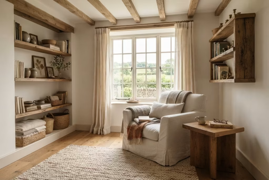
Some design elements impress at first glance but slowly lose their appeal as trends shift. Reclaimed wood follows a very different path. It does not depend on fashionable colours or decorative styling to make an impact. Instead, it brings depth, history, and quiet authenticity that continue to grow richer with time. In a farmhouse reading corner, reclaimed timber creates an emotional connection that freshly manufactured materials often struggle to replicate.
Every weathered board carries subtle reminders of its previous life. Fine saw marks, gently rounded edges, faded grain, and naturally aged tones become part of the room’s story. These details cannot be reproduced perfectly in a factory because they have been shaped by decades of use, changing seasons, and patient craftsmanship. In many ways, reclaimed wood reminds us that the best interiors are not built overnight. They evolve one thoughtful decision at a time.
Across my renovation projects, reclaimed timber has consistently transformed even modest reading corners into spaces with remarkable presence. It becomes the quiet anchor that allows soft textiles, comfortable seating, and natural light to work together without the room ever feeling overdesigned.
Weathered Oak Creates Warmth That Never Feels Forced
If I had to choose one timber species for a timeless farmhouse reading corner, weathered oak would sit comfortably at the top of the list. Its grain possesses a quiet confidence that complements both traditional farmhouses and contemporary country homes without overwhelming the surrounding décor.
Unlike newly milled oak with its brighter appearance, reclaimed oak develops softer honey, ash, mushroom, and smoky brown undertones after years of natural ageing. These muted colours create visual warmth while allowing linen upholstery, wool blankets, woven baskets, and handcrafted ceramics to stand out naturally.
I often specify reclaimed oak for side tables, window seats, floating shelves, and bespoke cabinetry because it introduces texture without relying on excessive ornamentation. Even a single oak element can become the thread that ties the entire reading corner together.
Whenever possible, choose solid reclaimed oak rather than veneer. Solid timber not only feels more substantial but also allows for refinishing many years down the road, extending its lifespan considerably.
Exposed Reclaimed Beams Give the Reading Corner Architectural Presence
Few architectural features influence the atmosphere of a farmhouse interior quite like reclaimed timber beams. They naturally guide the eye upward, framing the room while introducing a sense of permanence that cannot be achieved through decorative accessories alone.
In period homes, restoring original beams often preserves the property’s architectural identity. In newer homes, carefully sourced reclaimed beams can recreate that same feeling without appearing artificial when installed thoughtfully.
One project immediately comes to mind where a newly built farmhouse bedroom lacked warmth despite high-quality finishes throughout. The architecture felt clean but somewhat anonymous. By introducing two reclaimed oak ceiling beams above the reading alcove, the entire room gained rhythm and visual balance. Visitors frequently assumed the beams had been part of the house for generations, which speaks volumes about the power of authentic materials.
Decorative beams should always remain proportional to the room. Oversized sections can dominate smaller bedrooms, while beams that are too slender may lose their visual impact. Striking the right balance is where thoughtful design quietly earns its keep.
Salvaged Shelving Adds Storage with Genuine Personality
Books deserve shelving that feels as timeless as the stories they hold. Salvaged timber shelving introduces depth that painted MDF or manufactured laminate rarely achieves. Every shelf carries subtle variations in colour, grain direction, nail holes, and surface texture that make even simple book displays feel curated rather than staged.
Floating shelves crafted from reclaimed timber work particularly well above a reading chair or beside a window alcove. For most reading corners, shelves between 20 and 30 centimetres (8 to 12 inches) deep comfortably accommodate books, framed artwork, and carefully selected decorative objects without protruding excessively into the room.
Rather than filling every shelf from edge to edge, allow breathing room between objects. Empty space is not wasted space. It gives treasured books, pottery, and collected pieces the opportunity to stand out while maintaining the calm atmosphere every reading retreat deserves.
I often remind clients that successful shelving should tell a personal story instead of resembling a showroom display. A handful of meaningful objects almost always leaves a stronger impression than an overcrowded arrangement.
Source Reclaimed Timber Responsibly for Lasting Quality
The growing popularity of reclaimed materials has made sourcing easier than ever, but not every supplier follows the same standards. Choosing timber simply because it appears old can become a costly mistake if quality and structural integrity are overlooked.
Whenever I specify reclaimed wood, I look for suppliers who clearly document the material’s origin, previous use, and preparation process. Properly reclaimed timber should be carefully cleaned, kiln dried where appropriate, and inspected for pests, excessive movement, and structural weaknesses before installation.
Materials recovered from old barns, mills, agricultural buildings, churches, and traditional cottages often possess exceptional quality because they were originally cut from slow-grown trees with dense, durable grain.
Beyond aesthetics, reclaimed wood also represents a thoughtful environmental choice. Giving existing timber a second life reduces demand for newly harvested hardwoods while preserving craftsmanship that might otherwise disappear. It is a classic example of turning over a new leaf without sacrificing beauty or performance.
Celebrate Natural Imperfections Instead of Hiding Them
One of the greatest mistakes I see is treating reclaimed timber as though every mark should be sanded away.
The tiny cracks, filled nail holes, colour variation, knots, and gently worn edges are precisely what give reclaimed wood its remarkable character. These imperfections tell a story that freshly manufactured materials simply cannot imitate.
Of course, imperfections should never compromise safety or durability. Structural cracks, loose joints, or unstable boards require professional attention. However, purely cosmetic irregularities deserve to remain because they contribute to the authenticity that makes farmhouse interiors feel genuinely lived in.
In one countryside renovation, a client initially asked whether we should replace a reclaimed oak window seat because of several visible peg holes from its previous life. Instead, we carefully restored the timber while preserving those details. Several months later, she admitted those tiny imperfections had become her favourite feature because they reminded her that beautiful homes are shaped by history rather than perfection.
Like the pages of a treasured novel that have softened with time, reclaimed timber grows more compelling precisely because it bears the marks of a life well lived.
Work Closely with Your Contractor Before Installation
Reclaimed wood often requires more preparation than newly manufactured materials, making early communication with your contractor essential.
Before any installation begins, ask whether the timber has been properly acclimatised to the home’s indoor environment. This allows moisture levels to stabilise, reducing the likelihood of future movement as temperatures and humidity change.
If reclaimed beams are being installed decoratively, confirm that suitable structural support has been planned. Even non-load-bearing beams carry considerable weight and must be fixed securely using appropriate hardware.
For shelving and built-in furniture, discuss how concealed fixings, wall construction, and expected weight loads will influence installation. A beautifully crafted shelf quickly loses its charm if it begins to sag under the weight of a growing book collection.
I also encourage clients to request sample boards before committing to large quantities. Reclaimed timber naturally varies from one batch to another, and seeing the actual colour, texture, and finish within the room’s lighting conditions often prevents expensive surprises later.
Thoughtful collaboration between designer, supplier, and contractor ensures the finished reading corner feels intentional from every angle, allowing the beauty of the reclaimed timber to shine without compromise.
Frame the Reading Corner with Built-In Shelving
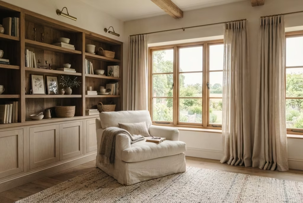
A farmhouse reading corner may begin with a comfortable chair and beautiful natural light, but it rarely feels complete until the surrounding architecture supports the experience. That is where built in shelving quietly transforms the space. Instead of treating books, decorative objects, and storage as separate elements, integrated shelving brings everything together into a composition that feels purposeful from the very beginning.
Unlike freestanding bookcases that can sometimes appear as though they were added long after the room was finished, bespoke shelving becomes part of the architecture itself. It frames the seating area, gives the eye a natural place to rest, and creates a sense of permanence that elevates even a modest bedroom corner. The result is not simply more storage. It is a reading retreat that feels thoughtfully crafted around daily life.
I have found that homeowners often underestimate the emotional impact of custom joinery. More often than not, it is the feature that turns an ordinary reading nook into the place everyone instinctively gravitates toward. When books, lighting, treasured keepsakes, and practical storage all live in harmony, the room begins to feel complete rather than pieced together.
Integrated Storage Creates a Space That Feels Intentionally Designed
One of the biggest differences between professionally designed interiors and rooms that feel unfinished is intentionality. Every element should appear to belong exactly where it is, supporting the way the space is used rather than competing for attention.
Built in shelving achieves this beautifully because it wraps naturally around the reading corner instead of occupying valuable floor space. Books remain within easy reach, decorative objects feel curated rather than scattered, and the overall composition gains a sense of rhythm that loose furniture often struggles to achieve.
In one farmhouse renovation, we replaced two mismatched bookcases with bespoke shelving that extended from wall to wall around an existing window seat. Although the room’s dimensions remained exactly the same, the entire bedroom felt noticeably larger because visual clutter disappeared and every item finally had a dedicated home. It was proof that thoughtful storage often improves both function and perception at the same time.
Another advantage is longevity. While furniture trends come and go, carefully designed joinery continues to feel relevant because it becomes part of the home’s architecture rather than simply another furnishing.
Get Shelf Proportions Right for Both Beauty and Function
Beautiful shelving begins long before the first book is placed on display. Proportion determines whether the finished installation feels balanced or awkward, regardless of how expensive the materials may be.
For most residential reading corners, I recommend shelf depths between 25 and 30 centimetres (10 to 12 inches). This comfortably accommodates hardback books, framed artwork, storage baskets, and decorative ceramics without making the shelves feel unnecessarily bulky.
Vertical spacing deserves equal attention. Adjustable shelves provide flexibility, but fixed shelves designed around the intended contents often create a cleaner appearance. Allow approximately 30 to 35 centimetres (12 to 14 inches) between shelves for larger books and decorative objects, while 22 to 28 centimetres (9 to 11 inches) usually works well for standard book collections.
Where shelving extends from floor to ceiling, introducing occasional wider openings helps break up repetition and provides space for statement pieces such as pottery, woven baskets, or larger framed artwork. These visual pauses prevent the installation from feeling monotonous while encouraging the eye to travel comfortably across the entire wall.
Like a well composed symphony, successful shelving depends on rhythm as much as individual elements.
Balance Display and Practical Storage
One mistake I encounter regularly is treating every shelf as an opportunity to display something. Before long, the reading corner begins to resemble a crowded showroom instead of the peaceful retreat it was meant to become.
The strongest farmhouse interiors embrace restraint. Books should naturally remain the primary focus, supported by carefully chosen decorative objects that introduce warmth without creating distraction.
I often follow what I call the “breathing space principle.” For every group of displayed books or accessories, leave an area of open shelf that allows surrounding pieces to stand out. This negative space gives the arrangement a lighter, calmer appearance while making treasured objects feel more meaningful.
Mix horizontal and vertical book stacks sparingly, introduce a handcrafted ceramic vase, perhaps a small framed landscape, and a woven basket, then step back before adding anything else. More often than not, the composition is already complete.
During one project, a client insisted every shelf should be filled. After styling only around seventy percent of the available space, she admitted the room finally felt peaceful instead of busy. Sometimes knowing when to stop is every bit as valuable as knowing where to begin.
Integrate Lighting That Extends the Reading Experience
Even the most beautiful reading corner loses much of its charm once daylight fades if thoughtful lighting has been overlooked.
Built in shelving offers an excellent opportunity to introduce discreet lighting that enhances both function and atmosphere. Rather than relying solely on a ceiling fixture, consider layering multiple light sources that gently illuminate the shelving while maintaining a relaxed mood.
Warm LED strip lighting concealed beneath selected shelves can softly highlight books and decorative objects without creating glare. Small integrated downlights positioned above feature shelves also introduce subtle depth, particularly during the evening.
For reading itself, combine the shelving lighting with a dedicated floor lamp or adjustable wall sconce positioned beside the chair. Aim for a warm colour temperature between 2700K and 3000K, which creates a gentle glow that feels comfortable for extended reading sessions while complementing natural timber finishes.
One renovation still comes to mind where concealed shelf lighting completely transformed the room after sunset. During the day, the shelving blended quietly into the architecture. By evening, however, the softly illuminated books created an inviting focal point that made the reading corner feel every bit as welcoming as it had beneath the morning sun.
Hide Everyday Clutter with Cabinet Storage Below
Open shelving is wonderful for displaying beautiful objects, but not everything deserves a permanent place on show.
Cabinet storage beneath the lower shelves introduces practical organisation while preserving the calm atmosphere essential to a reading retreat. Extra blankets, seasonal cushions, board games, charging cables, family photographs, and less attractive everyday items can all disappear neatly behind closed doors.
For maximum comfort, lower cabinets generally work well at a height of 45 to 60 centimetres (18 to 24 inches), creating a solid visual base while leaving the upper shelving within comfortable reach.
Where space allows, incorporating deep drawers instead of fixed cupboards often improves accessibility, particularly for heavier items such as photo albums or additional bedding.
One lesson I have learned repeatedly is that beautiful rooms remain beautiful because they make organisation easy. If daily essentials have no obvious home, clutter gradually finds its own.
Plan Custom Joinery Carefully Before Construction Begins
Bespoke shelving represents a significant investment, which makes careful planning absolutely essential. The success of custom joinery depends as much on preparation as it does on craftsmanship.
Before finalising drawings, think carefully about how the reading corner will actually be used. Will the shelves primarily house books, display collections, concealed storage, or a combination of all three? Planning around daily routines almost always produces better results than designing around appearance alone.
I also encourage homeowners to discuss practical details with both the designer and joiner well before manufacturing begins. Cable management for reading lamps, concealed electrical outlets, ventilation around radiators, shelf adjustability, timber movement, and paint finishes should all be resolved during the design stage rather than after installation.
Material selection deserves equal consideration. Solid oak, ash, walnut, or painted hardwood joinery generally provides excellent durability, while high quality furniture grade plywood offers outstanding stability for painted shelving. Choosing premium materials may require a greater upfront investment, but it often saves considerable expense over the life of the home.
One family I worked with initially requested standard shelving dimensions copied from an online inspiration image. After discussing the height of their favourite art books, children’s story collections, and decorative pottery, we adjusted the layout specifically for their lifestyle. Several years later, they told me they had never once wished they had added another shelf or changed the proportions. That level of satisfaction rarely happens by accident. It begins with thoughtful planning and a willingness to design around real life rather than fleeting trends.
You May also Like: 15 Secret Earthy Reading Nook Ideas That Turn Any Corner Into a Cozy Escape
Introduce a Vintage Wooden Side Table with Storytelling Appeal
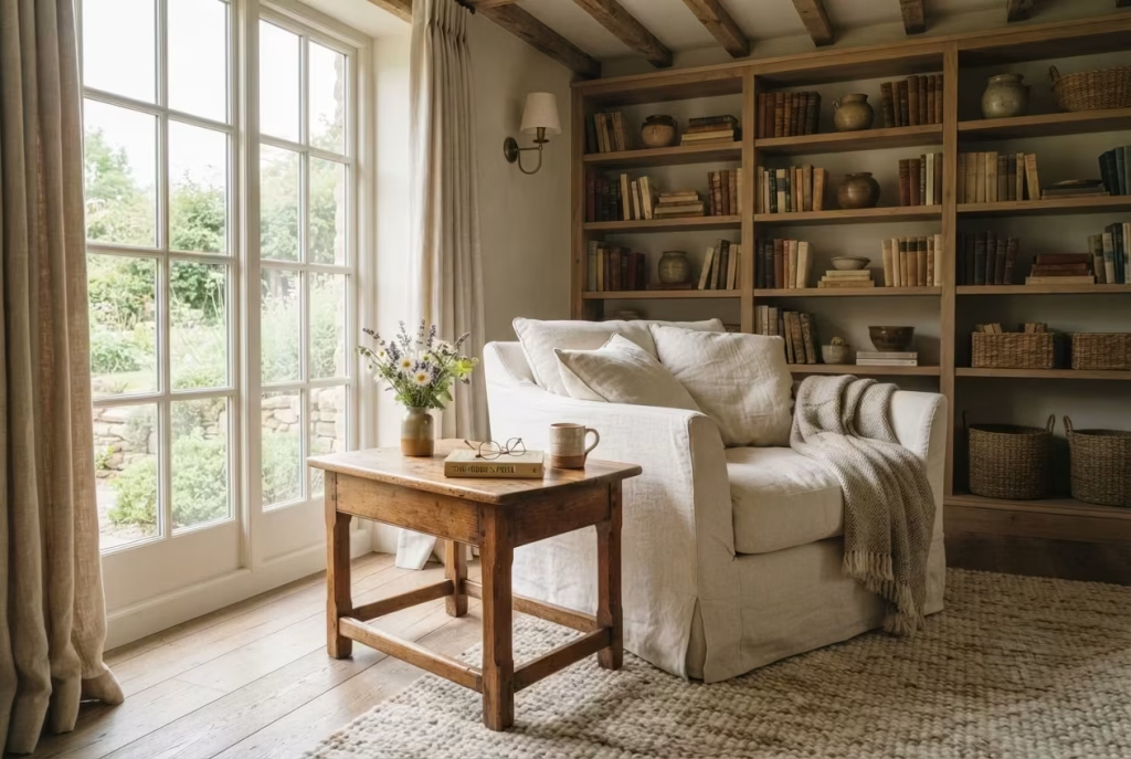
Some of the most memorable pieces in a farmhouse reading corner are not the largest or the most expensive. More often than not, they are the ones that quietly whisper stories from another era. A vintage wooden side table is one such piece. It may have once stood beside a family hearth, rested in a country cottage, or travelled through generations before finding a new purpose beside your favourite reading chair. That sense of history cannot be manufactured overnight, and it brings an authenticity that instantly enriches the room.
While many people focus on selecting the perfect armchair or lighting, the side table often becomes the unsung hero of the reading experience. It is where your book waits patiently while you refill your tea, where reading glasses remain within easy reach, and where a softly glowing lamp transforms the corner as daylight fades. A thoughtfully chosen vintage table quietly supports these everyday rituals without ever demanding the spotlight.
Throughout my design work, I have noticed that clients often develop the strongest emotional attachment to these smaller pieces. Long after major renovations are complete, it is the old oak table with its worn edges or the hand-built pine stand carrying decades of character that continues to spark conversation. Sometimes the smallest details leave the deepest impression.
Discover Hidden Gems in Antique Markets and Salvage Shops
One of the greatest pleasures of decorating with vintage furniture is the search itself. Unlike purchasing mass-produced pieces from a showroom, exploring antique markets, architectural salvage yards, and local auction houses often feels like embarking on a treasure hunt. Every visit offers the possibility of finding something entirely unique.
I encourage clients not to rush this process. The right table has a way of revealing itself when you least expect it. Whether it is a weathered oak cricket table, an old farmhouse stool repurposed as a side table, or a beautifully aged pine cabinet, these discoveries bring individuality that no catalogue can replicate.
Whenever I visit antique fairs, I pay close attention to construction rather than decoration. Traditional mortise-and-tenon joints, hand-cut dovetails, solid timber tops, and signs of genuine craftsmanship usually indicate that a piece was built to last. Cosmetic wear can often be embraced, but structural weakness is another matter entirely.
It is also worth asking sellers about the table’s provenance if known. Learning that a piece once came from a Victorian farmhouse or a converted barn adds another layer of meaning, turning furniture into a conversation rather than simply another purchase.
Let Patina Tell the Story Instead of Chasing Perfection
One of the defining characteristics of vintage furniture is its patina. This gentle ageing develops naturally through years of use, exposure to light, changing temperatures, and countless human interactions. It is something that cannot be convincingly replicated by artificial distressing techniques.
Softly worn corners, subtle colour variations, faded finishes, and tiny surface marks all contribute to the richness of the timber. Rather than viewing these details as flaws, they should be appreciated as evidence of craftsmanship standing the test of time.
I once worked with a homeowner who was determined to sand an antique oak side table until every scratch disappeared. Instead, we carefully cleaned the timber, stabilised its finish, and applied a nourishing wax while preserving its beautiful imperfections. Months later she admitted that the gentle marks had become her favourite feature because they reminded her that the home was filled with pieces that had lived a meaningful life long before arriving there.
As the old saying goes, time leaves its fingerprints on everything worth keeping. Vintage timber wears those fingerprints with quiet dignity.
Choose Dimensions That Support Everyday Comfort
A side table should make life easier, not force awkward movements every time you reach for a book or cup of coffee. Size matters far more than many homeowners realise.
For most reading corners, I recommend a tabletop height between 55 and 65 centimetres (22 to 26 inches). Ideally, the surface should sit level with, or slightly below, the armrest of the chair so items remain comfortably within reach.
A tabletop measuring approximately 40 to 55 centimetres (16 to 22 inches) in diameter for round designs, or 40 × 50 centimetres (16 × 20 inches) for rectangular tables, generally provides ample space for a reading lamp, a mug, spectacles, and one or two books without dominating the seating area.
Allow at least 10 to 15 centimetres (4 to 6 inches) of clearance between the chair and the table. This small gap ensures movement remains comfortable while keeping essentials close at hand.
During one bedroom redesign, replacing an oversized coffee table with a compact antique side table immediately improved circulation. The reading corner felt lighter, more functional, and considerably easier to enjoy because every element finally worked at a human scale rather than simply filling available space.
Style with Restraint and Let the Furniture Speak
One of the easiest mistakes to make is treating every tabletop as another opportunity to display decorative accessories. Before long, the practical purpose of the table begins to disappear beneath stacks of ornaments, candles, framed photographs, and artificial greenery.
A farmhouse reading corner thrives on simplicity. I generally recommend limiting the styling to just a few meaningful pieces that support both function and atmosphere.
A ceramic lamp with a linen shade, a favourite novel, a handmade pottery mug, and perhaps a small vase of freshly gathered wildflowers are often more than enough. These carefully chosen objects create warmth without overwhelming the beautiful timber beneath them.
Whenever I finish styling a room, I ask myself one simple question. Could someone comfortably place a cup of tea on this table without rearranging everything first? If the answer is no, the styling has gone too far.
The most successful interiors leave room for everyday life. They invite use rather than admiration from a distance.
Combine Materials That Feel Collected Over Time
The beauty of a vintage wooden table becomes even more apparent when it is paired with materials that complement its natural warmth instead of competing with it.
I often combine aged oak or pine with linen upholstery, woven wool throws, hand-thrown ceramics, antique brass lighting, forged iron hardware, natural stone, and woven baskets. Each material introduces its own texture while respecting the honest simplicity that defines farmhouse interiors.
Avoid matching every timber finish perfectly throughout the room. Nature rarely repeats itself with complete uniformity, and neither should a thoughtfully designed interior. Slight differences in grain, tone, and age create visual richness that feels collected gradually rather than purchased all at once.
One countryside renovation beautifully illustrated this principle. We paired a century-old elm side table with painted cabinetry, reclaimed oak shelving, a woven jute rug, and softly textured linen curtains. Although every material differed slightly in colour and finish, the room felt remarkably harmonious because each element shared the same sense of authenticity.
Good design rarely depends on perfect matching. Instead, it grows from thoughtful relationships between materials that quietly support one another.
Design a Quiet Corner Around a Stone Fireplace
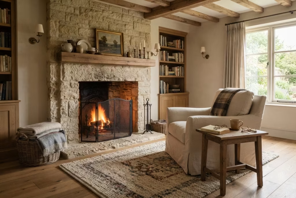
Few places invite you to curl up with a good book quite like a reading corner gathered around a stone fireplace. Long before central heating became commonplace, the hearth was the natural heart of the home. Families gathered there to read, share stories, and enjoy quiet evenings together, and that timeless appeal has never truly faded. Even today, a fireplace offers something that extends far beyond warmth. It creates an atmosphere that encourages you to pause, settle in, and let the pace of the day gently drift away.
In farmhouse interiors, stone fireplaces possess a quiet honesty that feels deeply rooted in the surrounding landscape. Whether crafted from rugged fieldstone, limestone, sandstone, or reclaimed brick with a stone mantel, they bring permanence, texture, and architectural weight to the room. When paired with comfortable seating, layered textiles, and carefully considered lighting, the fireplace naturally becomes the focal point of a reading retreat that feels welcoming in every season.
One renovation remains especially memorable. The homeowners had originally arranged every piece of furniture around a television mounted on the opposite wall, leaving a beautiful limestone fireplace almost forgotten. We completely reoriented the room so the reading chair faced the hearth instead. The television became secondary, conversations became longer, and the family soon admitted they spent far more evenings reading beside the fire than watching it. Sometimes the simplest changes quietly tip the scales in favour of a richer daily life.
Create a Reading Corner That Feels Comfortable Throughout the Year
Many people assume a fireplace only earns its place during winter, yet the best farmhouse reading corners remain inviting every month of the year. The secret lies in designing for flexibility rather than focusing on a single season.
During colder months, the fireplace naturally provides warmth that encourages long reading sessions beneath wool blankets with a favourite novel close at hand. Thick woven rugs soften the floor underfoot, while heavier textiles such as lambswool, mohair, or brushed cotton introduce an extra layer of comfort without overwhelming the room.
As spring and summer arrive, the atmosphere can shift effortlessly. Replace heavier throws with lightweight linen blankets, introduce fresh greenery, and allow the fireplace itself to become an architectural backdrop rather than an active heat source. Decorative lanterns, stacked books, or handcrafted pottery displayed within an unused firebox continue to create visual interest while preserving the fireplace’s presence.
I often tell clients that a successful fireplace should never feel seasonal. It should continue adding beauty and purpose whether flames are dancing across the logs or sunlight is quietly illuminating the stone.
Allow Enough Space for Comfortable Movement
No matter how beautiful the fireplace may be, the reading corner should always feel effortless to use. Furniture that is positioned too closely can make the room feel cramped, while seating placed too far away weakens the intimate atmosphere that makes the space so appealing.
As a general guideline, I position the reading chair approximately 90 to 120 centimetres (36 to 48 inches) from the fireplace opening. This distance provides comfortable warmth while maintaining safe circulation around the hearth.
Where two chairs are included, allowing approximately 45 to 60 centimetres (18 to 24 inches) between them encourages easy conversation without making the arrangement feel crowded.
Maintain at least 75 centimetres (30 inches) of clear walking space behind seating whenever possible. Comfortable circulation allows family members to move naturally through the room without interrupting someone enjoying a quiet afternoon with a book.
One farmhouse sitting room I redesigned originally suffered from oversized furniture that almost touched the hearth. Simply adjusting the layout and introducing a more appropriately scaled armchair completely changed the experience. The room immediately felt calmer, more spacious, and significantly easier to enjoy.
Sometimes giving furniture a little breathing room allows the entire design to flourish.
Never Compromise on Fireplace Safety
Comfort and beauty should always work hand in hand with sensible planning. A reading corner positioned around a working fireplace deserves careful attention to safety from the very beginning.
Avoid placing upholstered furniture directly against the hearth or within close proximity to active flames. Soft furnishings, baskets filled with blankets, and decorative accessories should remain outside the manufacturer’s recommended clearance distances for the specific fireplace or stove.
If the fireplace burns solid fuel, a properly fitted fire screen provides valuable protection against sparks while preserving clear views of the fire. Chimneys should also be professionally inspected and cleaned on a regular basis to ensure safe operation throughout the heating season.
Flooring immediately surrounding the hearth should consist of non-combustible materials such as natural stone, slate, brick, or tile. These durable finishes not only improve safety but also reinforce the authentic farmhouse character of the room.
During every renovation involving fireplaces, I work closely with specialist installers to ensure building regulations, ventilation requirements, and hearth dimensions are fully addressed before the room is furnished. Good design should never cut corners where safety is concerned.
Balance the Weight of Stone with Softer Materials
Stone naturally introduces strength, permanence, and visual texture, but on its own it can sometimes feel cool or imposing. The real magic happens when its rugged character is balanced with softer materials that encourage comfort.
This contrast forms one of the defining principles of successful farmhouse interiors. Imagine a limestone fireplace framed by an upholstered linen armchair, a chunky wool throw casually folded across the seat, a reclaimed oak side table, woven baskets, and a soft jute rug beneath your feet. The stone provides structure, while the surrounding materials soften the experience and make the room feel wonderfully approachable.
I often combine rough and refined textures deliberately because they highlight one another. Smooth ceramics appear even more elegant beside weathered stone, while relaxed linen seems softer when placed against rugged masonry. It is the gentle dialogue between contrasting materials that creates visual richness without relying on excessive decoration.
Like two old friends with different personalities, these materials complement rather than compete with one another.
Layer Warmth Through Texture, Colour, and Light
Creating warmth is about far more than increasing the room’s temperature. Some of the most welcoming reading corners achieve their comforting atmosphere through thoughtful layering that appeals to every sense.
Begin with natural textiles such as wool, linen, cotton, and cashmere, allowing each layer to contribute subtle tactile richness. Introduce a generously sized area rug to soften footsteps, then incorporate timber furniture that echoes the warmth of the fireplace mantel.
Colour also plays a quiet but significant role. Warm whites, oatmeal, flax, mushroom, soft taupe, muted olive, and earthy clay tones sit comfortably alongside natural stone without drawing unnecessary attention. These restrained colours allow the fireplace to remain the visual anchor while encouraging the room to feel peaceful rather than busy.
Lighting completes the composition once daylight begins to fade. A linen shaded table lamp, a softly glowing wall sconce, or discreet picture lighting above the mantel introduces gentle illumination that complements the flicker of the fire instead of competing with it.
One project still makes me smile whenever I think about it. After completing a farmhouse library centred around a reclaimed stone fireplace, the homeowners admitted they had unintentionally stopped reading in bed altogether. The reading chair beside the hearth had become so inviting that it quietly claimed every spare evening. That is often the hallmark of truly successful design. It changes habits naturally without ever announcing itself.
Bring in Woven Baskets and Natural Storage
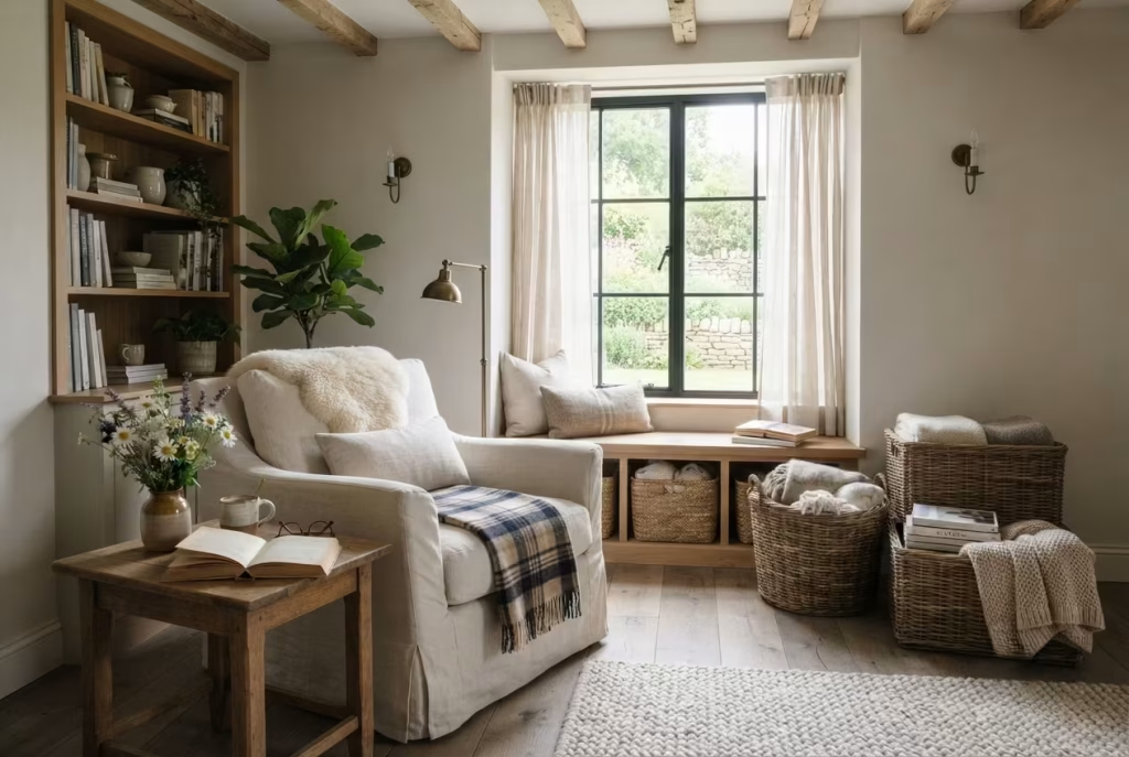
A farmhouse reading corner should invite you to slow down, not remind you of unfinished chores or scattered belongings. Yet even the most thoughtfully designed space can quickly lose its charm when blankets are draped over every chair, magazines begin piling up on the floor, or books quietly migrate onto nearby furniture. Comfort and organisation are not opposing ideas. In fact, they work hand in hand. The more effortlessly a space supports everyday routines, the more often you will find yourself returning to it.
This is where woven baskets become one of the quiet heroes of farmhouse design. They offer practical storage without introducing the coldness of plastic containers or the visual weight of bulky cabinets. Crafted from natural materials and rich in texture, they blend seamlessly into farmhouse interiors while helping maintain the peaceful atmosphere every reading retreat deserves.
Throughout my years of designing country homes, I have learned that beautiful rooms stay beautiful because they make tidying almost effortless. When storage is thoughtfully placed exactly where it is needed, organisation becomes part of the daily routine rather than another task waiting on tomorrow’s list.
Use Storage That Supports Everyday Living
Every item in a reading corner should earn its place, and storage is no exception. Rather than hiding practical necessities in another room, incorporate storage that naturally supports the activities taking place within the space.
A generously sized woven basket beside the reading chair provides an ideal home for books waiting to be read, notebooks, knitting projects, reading glasses, or children’s storybooks. Everything remains close at hand without creating visual distraction.
For larger reading corners, I often recommend using two or three baskets with clearly defined purposes. One may hold current reading materials, another extra blankets, while a third stores seasonal accessories that are used less frequently. This simple organisation prevents everything from becoming mixed together and makes daily routines feel smoother.
In one farmhouse bedroom renovation, we introduced a collection of handwoven willow baskets beneath a built in window seat. The homeowners later told me that keeping the reading corner tidy became almost second nature because every item had an obvious destination. Sometimes the simplest solutions are worth their weight in gold.
Organise Magazines Without Creating Clutter
Magazines have a habit of multiplying quietly. One issue becomes three, then six, and before long the reading corner begins to resemble a waiting room rather than a peaceful retreat.
Instead of stacking magazines in uneven piles, dedicate a shallow woven basket or upright magazine holder specifically for current editions. Limiting storage capacity also encourages regular editing, ensuring only publications that are genuinely enjoyed remain within easy reach.
I particularly like low rectangular baskets measuring approximately 35 to 45 centimetres (14 to 18 inches) wide because they comfortably accommodate most magazines while sliding neatly beneath a side table, window seat, or lower shelf.
For clients who enjoy collecting design magazines, I often recommend displaying only the latest few issues while archiving older favourites elsewhere in the home. This keeps the reading corner visually calm without sacrificing treasured collections.
As the saying goes, a place for everything and everything in its place. It may sound simple, but it remains one of the most valuable principles in interior design.
Store Blankets So Comfort Is Always Within Reach
Few things feel more inviting than reaching for a soft blanket on a cool evening without having to search through cupboards upstairs.
Blanket storage should be both practical and attractive. Deep woven baskets positioned beside the reading chair make this wonderfully easy while adding another layer of texture to the room.
For most reading corners, I recommend baskets measuring around 40 to 50 centimetres (16 to 20 inches) in diameter and at least 40 centimetres (16 inches) deep. These dimensions comfortably accommodate folded wool throws, cotton blankets, and seasonal quilts without appearing oversized.
Rather than filling the basket to overflowing, fold blankets loosely so their textures remain visible. A casually draped wool throw peeking over the basket’s edge immediately communicates warmth and comfort without feeling staged.
One countryside project still comes to mind where a family with young children struggled to keep blankets organised. Adding two large seagrass baskets beside the fireplace completely changed the routine. Instead of blankets being left across sofas every evening, everyone naturally returned them to the baskets before bedtime. The room stayed tidy with remarkably little effort.
Good design often succeeds because it gently encourages better habits rather than demanding them.
Choose Natural Fibres That Age Gracefully
Not every basket contributes equally to a farmhouse aesthetic. Materials matter just as much as shape or size. Natural fibres such as wicker, willow, rattan, seagrass, water hyacinth, and handwoven cane introduce warmth through subtle colour variation and beautifully imperfect texture. As these materials mature, they develop even greater character, making them particularly well suited to interiors that celebrate craftsmanship and authenticity.
I often choose baskets with visible handwoven details because they introduce another layer of artisanal quality without overwhelming the room. The slight irregularities found in handmade pieces create depth that machine manufactured alternatives rarely achieve.
When selecting baskets, consider how they will be used. Tightly woven willow offers excellent strength for heavier books, while lightweight seagrass works beautifully for storing blankets and cushions. Handles made from leather or wrapped rope also improve practicality when baskets need to be moved around the room.
Avoid overly glossy finishes or synthetic imitations whenever possible. Genuine natural fibres possess a richness that improves with time, quietly echoing the same qualities found in reclaimed timber, linen upholstery, and handcrafted pottery.
Preserve a Sense of Calm Through Thoughtful Styling
Storage should support the room rather than become its dominant feature. One mistake I occasionally encounter is introducing too many baskets of different shapes, colours, and weaving styles until the room begins to feel visually chaotic.
Instead, choose a small collection that shares similar tones and materials. Two or three well proportioned baskets often create a far stronger impression than half a dozen mismatched containers scattered throughout the room.
Position baskets where they feel naturally integrated into the furniture layout. Beneath floating shelves, beside an armchair, under a console table, or tucked beneath a window seat are all locations that maintain easy access without interrupting circulation.
I also encourage homeowners to leave a little empty space inside larger baskets rather than filling every inch. Just as open shelving benefits from breathing room, storage looks calmer when it is not packed to capacity.
One reading nook I redesigned originally featured decorative accessories in nearly every available corner. By replacing several small objects with two beautifully crafted willow baskets, the room immediately felt lighter, more organised, and considerably more sophisticated. It was a reminder that thoughtful restraint often creates the greatest sense of luxury.
You May also Like: 25 Fall Reading Nook Ideas: Create the Perfect Cozy Autumn Reading Space
Choose Warm Ambient Lighting That Mimics Candlelight
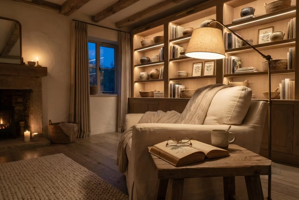
A farmhouse reading corner should feel just as inviting after sunset as it does beneath the gentle glow of morning light. Unfortunately, this is where many beautifully designed spaces lose their magic. During the day, sunlight highlights every natural texture, but once darkness falls, harsh ceiling lights often flatten the room, wash out carefully chosen materials, and erase the intimate atmosphere that made the space so appealing in the first place.
Exceptional lighting does far more than help you see the pages of a book. It shapes emotion, influences comfort, and gently signals to the mind that it is time to slow down. Warm, layered illumination softens timber grain, deepens the texture of linen and wool, and creates quiet pockets of light that naturally draw you toward your favourite chair.
I have redesigned many reading corners where changing the lighting completely transformed the room without replacing a single piece of furniture. Clients often expect dramatic renovations to create greater comfort, yet something as simple as replacing cool white bulbs with warmer tones can completely alter the mood. It is proof that lighting is not merely the finishing touch. More often than not, it is the invisible thread that ties the entire design together.
Build Layers of Light Instead of Depending on One Source
One overhead ceiling light rarely creates a comfortable reading environment. While it may brighten the room, it often produces flat illumination that lacks depth and makes the space feel more functional than relaxing.
The most successful reading corners rely on several carefully balanced layers of light that work together throughout the evening.
I typically divide lighting into three distinct categories. Ambient lighting establishes the overall glow within the room. Task lighting provides focused illumination for reading, while accent lighting highlights architectural details, shelving, artwork, or natural textures.
When these layers overlap, the room feels balanced rather than uniformly bright. Your eyes naturally move between softly illuminated surfaces instead of being overwhelmed by a single dominant light source.
One farmhouse bedroom I redesigned originally relied on a bright central pendant. After introducing a reading lamp, two discreet wall sconces, and concealed shelf lighting, the entire atmosphere changed. Although the total light output actually decreased, the room felt warmer, richer, and considerably more comfortable because every light now served a specific purpose.
Like building a beautiful melody, the magic comes from several notes working together rather than one playing louder than all the others.
Select a Reading Lamp That Combines Comfort and Function
A reading lamp should quietly support long hours with a favourite book without becoming visually intrusive.
For armchairs, I generally recommend floor lamps with adjustable heads or table lamps positioned so the light falls gently over the shoulder instead of shining directly into the eyes. This arrangement minimises glare while providing consistent illumination across the page.
The bottom of the lampshade should typically sit around 120 to 140 centimetres (47 to 55 inches) above the floor when positioned beside a standard reading chair. This height usually aligns comfortably with seated eye level while directing light precisely where it is needed.
If space is limited, a compact table lamp placed on a side table works equally well. Aim for the tabletop to remain uncluttered so the lamp can share the surface comfortably with a book, reading glasses, and a warm drink.
One detail I always pay attention to is the lampshade itself. Linen or cotton shades gently diffuse light, creating a softer atmosphere than exposed bulbs or glossy metal shades. This subtle difference becomes especially noticeable during long evening reading sessions.
Add Wall Sconces to Save Space and Create Balance
Wall sconces often become the unsung heroes of farmhouse reading corners, particularly in smaller bedrooms where every centimetre matters.
Unlike floor lamps, sconces free valuable floor space while introducing architectural rhythm to the wall. They also create a beautifully layered effect by drawing the eye upward, making compact reading corners feel taller and more thoughtfully composed.
I often install adjustable sconces approximately 150 to 170 centimetres (59 to 67 inches) above the finished floor, depending on ceiling height and chair position. This allows the light to be directed comfortably onto the pages without overwhelming the surrounding space.
Vintage inspired brass, aged bronze, wrought iron, or ceramic sconces pair especially well with farmhouse interiors because they complement natural materials rather than competing with them.
During one cottage renovation, replacing a bulky floor lamp with a pair of understated wall sconces immediately opened the room. The reading corner felt lighter, circulation improved, and the architecture became far more prominent. Sometimes removing visual clutter has just as much impact as adding beautiful furniture.
Choose the Right Colour Temperature for Relaxation
Not all white light feels the same, and colour temperature has an enormous influence on how comfortable a reading corner becomes after sunset.
For farmhouse interiors, I consistently recommend warm lighting between 2700K and 3000K. This gentle golden tone closely resembles candlelight or the soft glow of traditional incandescent bulbs, creating an atmosphere that feels naturally calming.
Cool white lighting above 4000K often introduces a bluish cast that can make timber appear lifeless and natural textiles feel sterile. While brighter light may suit kitchens or workspaces, it rarely complements rooms designed for relaxation.
Warm light also enhances the subtle colours found within reclaimed wood, limestone, woven baskets, linen upholstery, and wool blankets. Instead of flattening these beautiful materials, it reveals their texture and depth.
I often encourage clients to compare two identical lamps using different colour temperatures before making a decision. The difference is surprisingly dramatic. Once experienced side by side, there is usually no going back.
Shape an Evening Atmosphere That Encourages You to Stay Longer
Lighting should do more than illuminate the room. It should gently influence how you experience it. One of my favourite techniques involves creating small pools of warm light throughout the reading corner rather than flooding every surface equally. A softly glowing reading lamp beside the chair, gentle shelf lighting behind favourite books, and a subtle sconce washing light across a stone wall create visual depth that encourages relaxation.
Natural materials become even more expressive during the evening. The grain of reclaimed timber appears richer, woven textiles gain depth, and handmade ceramics cast beautiful shadows that simply do not exist beneath brighter daytime conditions.
I remember one farmhouse library where the homeowners confessed they had rarely entered the room after dark because it felt cold and uninviting. After redesigning the lighting, they began spending nearly every evening there. Nothing else in the room had changed. The furniture remained exactly where it was. Yet the atmosphere had been transformed completely because the lighting finally matched the way they wanted to live. Good lighting quietly invites people to linger without ever asking them to.
Avoid the Lighting Mistakes That Undermine Comfort
Even beautifully furnished reading corners can fall short when common lighting mistakes go unnoticed.
The first is relying entirely on a single overhead light. While practical for cleaning or general use, it rarely creates the layered atmosphere needed for comfortable reading.
Another frequent mistake is choosing bulbs solely by brightness without considering colour temperature. Excessively cool lighting strips warmth from natural materials and makes the room feel far less welcoming than intended.
Poor lamp positioning also creates unnecessary eye strain. Light should illuminate the pages rather than shine directly into the reader’s face or cast shadows across the book.
Oversized decorative fixtures present another challenge. Although visually striking, they sometimes dominate intimate reading corners that would benefit from smaller, more restrained lighting.
Finally, avoid introducing too many competing fixture styles within one compact space. Farmhouse interiors feel strongest when lighting shares a common design language through similar finishes, understated detailing, and harmonious materials.
One homeowner I worked with had invested heavily in expensive furniture but overlooked the lighting entirely. After replacing three cool white bulbs and introducing one carefully positioned reading lamp, she laughed and admitted the room finally felt like the sanctuary she had imagined from the beginning. It was a timely reminder that lighting often punches well above its weight.
You May also Like: 25 Cozy Reading Nooks That Make Quiet Moments Feel Special
Add Botanical Elements That Feel Collected Rather Than Styled
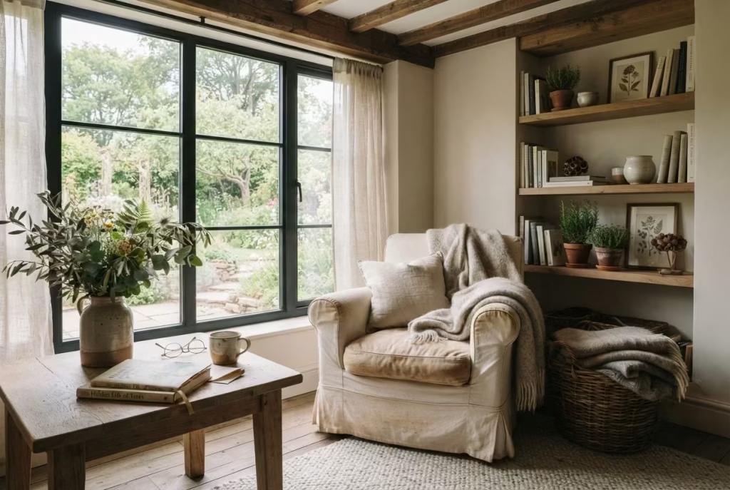
The most inviting farmhouse reading corners rarely feel frozen in time. Instead, they carry subtle reminders of the natural world just beyond the window. A vase of freshly gathered branches, a quietly thriving houseplant, or a handful of seasonal wildflowers can soften architectural lines and breathe gentle life into the space without demanding attention. These botanical touches are not there to decorate for decoration’s sake. They connect the room to the changing seasons and create an atmosphere that feels alive rather than staged.
One lesson I have learned after designing countless country homes is that nature should never feel like an afterthought. It deserves to become part of the room’s story. The goal is not to recreate a florist’s display or fill every empty corner with greenery. Instead, each botanical element should appear as though it has been collected naturally over time, reflecting the rhythm of everyday life.
I often tell clients that a reading corner should feel as though someone has just stepped away for a moment with a cup of tea, leaving behind an open book and a few freshly gathered stems from a morning walk. That quiet sense of authenticity is what transforms a beautiful room into one that genuinely feels lived in.
Let Seasonal Greenery Shape the Mood Throughout the Year
One of the simplest ways to keep a farmhouse reading corner feeling fresh is to allow nature to change with the seasons instead of relying on permanent decorative arrangements.
During spring, delicate blossom branches, flowering cherry stems, or fresh eucalyptus immediately introduce softness and optimism after winter. Summer invites leafy cuttings from the garden, freshly clipped herbs, and generous green foliage that reflects the abundance of the season.
As autumn arrives, dried hydrangeas, wheat stems, seed heads, and ornamental grasses introduce beautiful earthy tones without feeling overly decorative. Winter, meanwhile, offers evergreen branches, pine cuttings, cedar, holly, or simple bundles of eucalyptus that continue bringing life into the room even when the landscape outside becomes quieter.
One family I worked with adopted a lovely tradition after their renovation. Every Sunday morning, they collected a few seasonal branches from their own garden before settling into their reading corner. Over time, this simple ritual became just as meaningful as the design itself because the room quietly evolved alongside the landscape outside. Good interiors do not fight the seasons. They welcome them with open arms.
Olive Branches Bring Quiet Elegance That Never Feels Trend Driven
Few botanical elements suit farmhouse interiors quite as naturally as olive branches. Their graceful silhouette, muted green foliage, and understated movement create a calm presence that complements reclaimed timber, linen upholstery, natural stone, and handcrafted pottery beautifully. Unlike dramatic floral arrangements that often dominate a room, olive branches introduce texture while allowing the surrounding materials to remain the focus.
I often place several long olive stems inside a handmade ceramic vessel positioned beside a reading chair or on a nearby side table. The arrangement requires very little maintenance, yet it immediately introduces height, softness, and visual balance.
High quality preserved olive branches also offer an excellent alternative where fresh stems are difficult to source. Their subtle colouring blends effortlessly with neutral farmhouse palettes and continues looking elegant throughout the year.
One project still comes to mind where a client initially filled her shelves with colourful artificial flowers. Replacing them with a single ceramic vase holding a few olive branches completely changed the atmosphere. The room instantly felt calmer, more sophisticated, and considerably more authentic. Sometimes less really does say more.
Celebrate the Beauty of Wildflowers Instead of Formal Arrangements
Wildflowers possess a relaxed charm that perfectly reflects the spirit of farmhouse living. Rather than carefully structured bouquets, loosely gathered stems arranged in a simple glass bottle, antique stoneware jug, or earthenware pitcher create an effortless beauty that feels wonderfully approachable.
Daisies, Queen Anne’s lace, cosmos, lavender, yarrow, cornflowers, chamomile, and scabious all introduce delicate colour while maintaining the natural informality that defines country interiors.
I encourage clients to avoid perfectly symmetrical arrangements. A few stems leaning gently in different directions often appear far more believable than tightly organised bouquets. Nature itself rarely grows with perfect precision, and that quiet irregularity is part of its appeal.
One countryside renovation included a small cutting garden directly outside the bedroom window. Throughout spring and summer, the homeowners gathered whatever happened to be blooming that week. No two arrangements were ever the same, and that unpredictability became one of the room’s greatest pleasures. Like turning the page of a favourite novel, every season brought something quietly unexpected.
Choose Low Maintenance Plants That Suit Everyday Life
Houseplants should enhance a reading corner, not become another responsibility competing for your attention. For clients with busy lifestyles, I usually recommend varieties that remain attractive with minimal care while tolerating a range of indoor conditions.
The snake plant performs beautifully in lower light while requiring infrequent watering. ZZ plants thrive with remarkably little maintenance and introduce glossy foliage that contrasts beautifully with rustic timber. Pothos adds graceful trailing greenery to shelves, while peace lilies provide elegant foliage alongside occasional white blooms.
For brighter reading corners, rubber plants, olive trees, and parlour palms introduce sculptural form without overwhelming the room.
When selecting containers, I prefer handmade terracotta pots, aged stone planters, woven baskets with concealed liners, or handmade ceramic vessels. These materials echo the natural finishes already present within farmhouse interiors while avoiding the shiny appearance of plastic alternatives.
Over the years, I have noticed that homeowners enjoy their plants far more when they require only modest attention. After all, the purpose of a reading corner is relaxation, not adding another lengthy task to the weekly routine.
Think Carefully About Scale and Placement
Beautiful greenery can quickly lose its impact if every available surface becomes occupied by plants. One of the most common mistakes I encounter is using several small plants scattered throughout the room without considering their overall composition. Instead of creating calm, the space begins to feel visually fragmented.
I generally recommend allowing one larger botanical feature to become the focal point, supported by one or two smaller arrangements placed thoughtfully nearby.
A floor standing olive tree positioned beside the reading chair, a vase of seasonal greenery on the side table, and perhaps a trailing pothos resting on an upper shelf often provide all the botanical interest the room needs.
Maintain generous breathing space around each arrangement so every plant can be appreciated individually. Position larger specimens where they soften empty corners or frame architectural features without interrupting circulation or blocking natural light.
One farmhouse bedroom beautifully demonstrated this principle. Originally, nearly a dozen small potted plants were scattered across shelves, windowsills, and furniture. We replaced them with a single mature olive tree, one ceramic vase filled with seasonal branches, and a trailing pothos above the shelving. The room immediately felt lighter, more balanced, and considerably more refined. It reminded me once again that thoughtful editing is every bit as important as thoughtful decorating.
Create a Cozy Corner Beneath Exposed Ceiling Beams
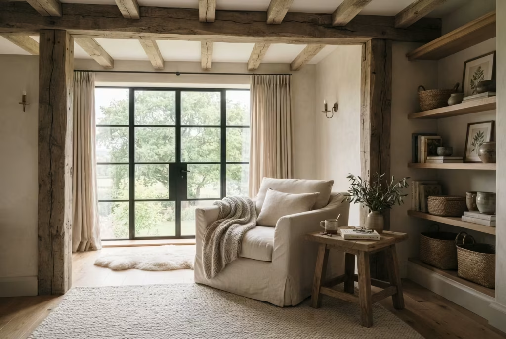
Some architectural features have an extraordinary ability to shape the feeling of a room before a single piece of furniture is introduced. Exposed ceiling beams belong firmly in that category. They quietly define space, celebrate craftsmanship, and draw the eye upward, all while making a farmhouse interior feel rooted in history. Whether they are centuries-old oak timbers or thoughtfully reclaimed beams incorporated into a newer home, they create an unmistakable sense of warmth that cannot be achieved through decoration alone.
Positioning a reading corner beneath these beams transforms what might otherwise be an overlooked area into a retreat that feels naturally sheltered. There is something deeply reassuring about sitting beneath substantial timber that has stood the test of time. It creates a subtle feeling of enclosure without making the room feel confined, encouraging you to settle into a comfortable chair and lose track of time with a favourite novel.
I have often found that homeowners initially focus on floor plans, furniture, and finishes while overlooking the powerful influence of the ceiling. Yet, time and again, the ceiling becomes the element that quietly steals the show. Once the architecture is allowed to lead, everything else begins to fall into place.
Let the Architecture Frame the Reading Corner Naturally
One of the greatest strengths of exposed beams is their ability to define a space without the need for additional walls or partitions. They create invisible boundaries that gently organise a room while preserving an open and airy atmosphere.
Rather than forcing a reading nook into an arbitrary corner, look for areas where the beams naturally frame a section of the room. A chair positioned between two parallel beams or beneath a central beam immediately feels intentional because the architecture itself provides visual structure.
In one farmhouse conversion, the original oak beams divided a large bedroom into subtle zones without altering the open layout. We positioned a linen armchair beneath the widest span, added a reclaimed oak side table, and introduced built in shelving nearby. Although no walls were added, the reading corner felt like its own destination within the room.
This approach works particularly well in loft conversions, converted barns, and cottages where exposed structural elements already tell part of the home’s story. Instead of fighting these features, allow them to become the foundation of the design.
Respect Ceiling Height When Planning the Layout
Ceiling height dramatically influences how a reading corner feels, yet it is often overlooked during furniture selection. In rooms with soaring vaulted ceilings, exposed beams can prevent the space from feeling cold or impersonal by introducing rhythm and visual warmth overhead. Here, slightly taller furniture, generous floor lamps, and substantial shelving help balance the vertical scale without overwhelming the room.
Lower ceilings require a different approach. Rather than competing with the beams, embrace their intimacy. Choose seating with a lower back profile, avoid oversized lighting fixtures, and allow plenty of open wall space so the room retains a sense of lightness.
For comfortable proportions, I generally recommend leaving at least 210 centimetres (7 feet) of clear headroom beneath exposed beams in primary circulation areas whenever structural conditions allow. Reading chairs positioned beneath sloping ceilings should also have sufficient clearance for comfortable movement when sitting down and standing up.
One attic bedroom renovation demonstrated this beautifully. Instead of treating the lower ceiling as a limitation, we embraced its character by creating a reading alcove beneath the exposed rafters. The result felt wonderfully intimate, almost like a private hideaway tucked beneath the roofline. Sometimes the room itself quietly tells you where the best seat belongs.
Create Visual Intimacy Without Closing the Room In
A successful reading corner should feel sheltered enough to encourage relaxation while remaining visually connected to the rest of the room. Exposed beams naturally help achieve this balance because they create definition overhead without restricting movement or blocking light.
I often think of these spaces as gentle refuges rather than enclosed rooms. The eye still travels comfortably across the bedroom, but the seating area feels wrapped in its own quiet atmosphere.
One technique I frequently use is placing a generously sized area rug beneath the chair and side table while allowing the ceiling beams to frame the space above. This combination subtly defines the reading corner from floor to ceiling without requiring physical barriers.
Furniture placement also contributes to this sense of intimacy. A comfortable armchair angled slightly toward the window or fireplace, accompanied by a small side table and softly glowing lamp, naturally creates an inviting composition that feels personal rather than isolated.
The beauty lies in striking a careful balance. You want the corner to feel like a peaceful retreat, not a forgotten corner hidden from the rest of the home.
Celebrate the Craftsmanship Found in Rustic Timber
Exposed beams are far more than structural elements. They are enduring examples of traditional craftsmanship that deserve to be appreciated rather than concealed.
Old growth oak, chestnut, elm, and Douglas fir beams often display remarkable grain patterns, hand cut tool marks, pegged joints, and subtle imperfections that reveal the skill of the craftspeople who shaped them decades or even centuries ago. These details add authenticity that no decorative treatment can imitate.
Whenever I work on period properties, I encourage homeowners to preserve these natural characteristics wherever possible. Gentle cleaning, careful restoration, and breathable finishes allow the timber to age gracefully without erasing its history.
One memorable project involved restoring heavily darkened oak beams that had been hidden beneath layers of paint for years. After carefully removing the coatings and nourishing the timber with a natural finish, the entire bedroom felt brighter while retaining every ounce of its rustic character. The beams immediately became the defining feature of the room, proving that sometimes the greatest design decisions involve revealing what is already there.
Like a well-loved novel passed from one generation to the next, beautifully crafted timber carries its own quiet legacy.
Integrate Lighting That Highlights the Beams After Sunset
The character of exposed beams should not disappear once daylight fades. Thoughtfully planned lighting allows their texture and craftsmanship to remain part of the room’s atmosphere throughout the evening. Rather than relying solely on a central ceiling fixture, introduce several softer light sources that gently illuminate both the reading area and the timber overhead.
Wall sconces positioned below beam level create beautiful upward shadows that reveal the grain and depth of the wood. Adjustable reading lamps provide focused illumination without overpowering the surrounding space, while discreet uplighting placed on shelving or cabinetry can subtly highlight the ceiling during darker evenings. Warm bulbs within the 2700K to 3000K colour temperature range work particularly well because they enhance the natural richness of aged timber instead of flattening its colour.
In one converted barn, concealed uplighting installed above bespoke shelving cast a gentle glow across the reclaimed oak beams every evening. The effect was remarkably understated, yet it transformed the ceiling into an architectural feature that continued to shape the room long after the sun had disappeared.
Good lighting should never compete with beautiful architecture. Its purpose is simply to reveal it.
Use Soft Neutral Layers That Never Go Out of Style
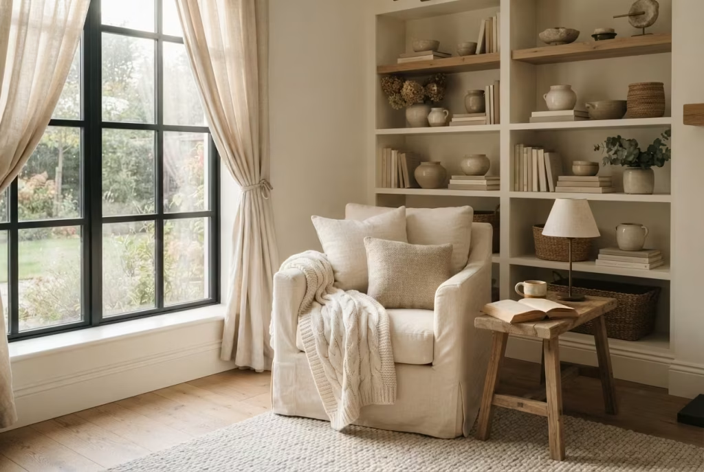
Some of the most captivating farmhouse reading corners are not the ones filled with bold colours or eye-catching patterns. Instead, they create their charm through quiet restraint. Soft neutrals allow natural light to become part of the design, encourage beautiful materials to take centre stage, and create an atmosphere that feels restful from the moment you step into the room. Rather than demanding attention, they gently invite you to slow your pace, settle into a comfortable chair, and enjoy the simple pleasure of getting lost in a good book.
Neutral interiors are sometimes misunderstood as plain or predictable, but that could not be further from the truth. When thoughtfully layered, they reveal remarkable depth through subtle shifts in tone, texture, and natural materials. Every woven blanket, linen cushion, reclaimed timber shelf, and handcrafted ceramic contributes another chapter to the room’s story. The result feels sophisticated without trying too hard, proving that quiet confidence often leaves the strongest impression.
Throughout my design career, I have rarely seen homeowners regret investing in a timeless neutral foundation. Decorative accessories, artwork, and seasonal accents naturally evolve over time, but a carefully composed palette continues to feel relevant year after year. It is a classic reminder that slow and steady wins the race, particularly when designing spaces intended to age gracefully.
Build the Palette Around Warm Cream Instead of Stark White
Cream remains one of the most dependable colours for farmhouse interiors because it introduces warmth without overwhelming the room. Unlike bright, clinical whites that can sometimes feel cold under artificial lighting, cream reflects daylight with a gentle softness that instantly makes a reading corner more welcoming.
I often recommend creamy shades for upholstered armchairs, linen curtains, painted shelving, and larger decorative pieces because they establish a calm visual foundation that allows surrounding textures to shine.
When morning light filters through a cream linen curtain, the room develops a warm glow that feels almost effortless. During the evening, the same colour responds beautifully to warm ambient lighting, creating an atmosphere that feels equally comfortable after sunset.
One countryside renovation beautifully demonstrated this effect. The homeowners originally selected a brilliant white paint throughout the bedroom, yet the room always felt slightly sterile. Replacing it with a warmer cream instantly softened every surface, making reclaimed oak shelving, woven baskets, and natural stone details appear richer without changing anything else. Sometimes the smallest colour adjustment quietly transforms the entire experience.
Introduce Oatmeal Tones for Gentle Warmth and Texture
Oatmeal occupies a wonderful middle ground between cream and taupe, offering subtle warmth while remaining exceptionally versatile.
Its quiet character makes it ideal for textiles that readers interact with every day. Linen cushions, woven throws, upholstered benches, and wool blankets in oatmeal shades create visual softness while allowing natural fibres to express their texture beautifully.
One reason I frequently use oatmeal is its remarkable ability to complement changing daylight. Early morning sunshine enhances its warmth, while overcast afternoons reveal cooler undertones that continue feeling balanced rather than dull.
Layering several oatmeal textiles with slightly different weaves also prevents the reading corner from appearing flat. A washed linen cushion beside a brushed cotton throw and a chunky wool blanket demonstrates how texture can create interest even when colours remain closely related.
As the old saying goes, the whole is greater than the sum of its parts. Together, these subtle variations create remarkable richness.
Ground the Space with Soft Taupe
Every successful neutral palette benefits from an anchor, and taupe performs this role exceptionally well.Soft taupe introduces quiet depth that prevents lighter shades from feeling washed out while remaining gentle enough to preserve the calm atmosphere essential to a reading retreat.
I often incorporate taupe through upholstered footstools, woven rugs, ceramic table lamps, painted cabinetry, or handcrafted pottery. These slightly deeper tones establish visual balance without creating sharp contrast.
For reading corners that receive abundant natural light, taupe also introduces welcome definition during brighter parts of the day. Instead of relying on dark furniture to create contrast, it gently grounds the room while maintaining harmony with surrounding materials.
One farmhouse bedroom featured pale cream walls, linen curtains, and reclaimed oak furniture. Introducing a large taupe wool rug beneath the reading chair immediately brought the entire composition together. The room retained its lightness, yet it suddenly possessed a stronger sense of depth and stability. Good design often whispers rather than shouts.
Let Warm Whites Enhance Natural Light
Warm white remains one of the most flexible colours available to interior designers because it responds beautifully to both daylight and carefully planned evening lighting.
Unlike cooler whites that sometimes appear blue or grey depending on the weather, warm whites carry subtle undertones of ivory or soft beige. These gentle nuances flatter natural timber, woven fibres, limestone, and handmade ceramics while helping the room feel bright without becoming stark.
I often recommend warm white for walls and ceilings because it creates an ideal backdrop for farmhouse materials. Rather than competing with architectural features or furniture, it quietly allows them to take centre stage.
Whenever possible, I encourage clients to test paint samples at different times of day before making a final decision. Morning light, afternoon sun, and evening lamplight can all influence how a colour is perceived. Spending a little extra time during this stage often prevents costly repainting later.
Prioritise Material Depth Over Strong Colour Contrast
One of the defining characteristics of refined farmhouse interiors is that they rely on texture far more than dramatic colour variation. Instead of introducing bold accent colours to create visual interest, allow natural materials to provide depth through their unique surfaces and craftsmanship.
Imagine reclaimed oak shelving beside linen upholstery, handwoven wool throws resting against washed cotton cushions, natural stone supporting handmade ceramics, and woven baskets sitting comfortably on a jute rug. Every element differs in texture, yet the restrained palette allows these beautiful materials to work together harmoniously.
This approach creates an environment that feels calm because the eye explores subtle details rather than being pulled constantly between competing colours.
One project illustrates this perfectly. A client initially planned to add several brightly coloured cushions in an effort to “bring the room to life.” Instead, we selected cushions in similar neutral tones but with distinctly different textures. Linen, boucle wool, washed cotton, and chunky knit each introduced their own personality. The reading corner became far more interesting because attention shifted from colour to craftsmanship.
There is more than one way to skin a cat, and in farmhouse interiors, texture often proves the more enduring choice.
Create a Foundation That Evolves Beautifully Over Time
One of the greatest strengths of a neutral palette is its remarkable adaptability. Trends come and go, yet soft neutrals continue providing a timeless foundation that welcomes change without demanding constant reinvention.
As seasons change, introducing different throws, botanical arrangements, artwork, or handmade accessories becomes wonderfully simple because the underlying palette remains balanced.
This flexibility also makes long term investment easier. High quality armchairs, bespoke shelving, handcrafted lighting, and reclaimed timber furniture continue looking relevant as surrounding accessories evolve naturally over the years.
I often advise homeowners to invest in permanent pieces using timeless neutral tones while expressing personality through smaller decorative elements that can easily change. This strategy not only reduces future decorating costs but also prevents the room from feeling tied to a particular trend or moment in time.
One family I worked with has refreshed their farmhouse reading corner several times over the past decade. New artwork has appeared, rugs have changed, and seasonal accessories have come and gone, yet the original cream armchair, warm white walls, reclaimed oak shelving, and oatmeal linen curtains remain exactly where they began. The room still feels every bit as welcoming because its foundation was designed for longevity rather than novelty.
You May also Like: Baja Earth House: How to Keep a Desert Home Cool Naturally
Incorporate Handmade Pieces That Add Soul

There is a noticeable difference between a reading corner that looks beautifully furnished and one that genuinely feels alive. The distinction rarely comes down to price or size. More often, it is found in the quiet presence of handmade objects. A hand-thrown ceramic mug resting beside an open novel, a woven wool throw carrying the subtle irregularities of traditional craftsmanship, or a rug created on a loom by skilled hands introduces something that factory production simply cannot replicate. These pieces carry patience, skill, and human touch, quietly enriching the room in ways that become more meaningful over time.
Farmhouse interiors have always celebrated honest craftsmanship. Long before furniture was mass produced, homes were filled with objects created by local artisans who understood their materials intimately. Every carved stool, woven basket, and stitched quilt reflected both necessity and pride. Bringing that same philosophy into a modern reading corner creates a space that feels deeply personal rather than perfectly staged.
Throughout my design career, I have noticed that the pieces homeowners treasure most are rarely those with the highest price tags. Instead, they are the ones connected to a memory, a maker, or a meaningful journey. A handcrafted object often becomes more than decoration. It quietly becomes part of the family’s story.
Decorate with Handmade Pottery That Feels Naturally Collected
Pottery introduces a grounded simplicity that perfectly complements the calm atmosphere of a farmhouse reading corner. Unlike glossy decorative accessories that often compete for attention, handmade ceramics possess a quiet confidence. Their soft curves, earthy glazes, and subtle variations invite closer appreciation without overwhelming the room.
I often use handcrafted pottery in practical ways rather than purely decorative ones. A stoneware mug for evening tea, a ceramic bowl holding reading glasses, a vase displaying freshly gathered branches, or a small dish for bookmarks allows everyday rituals to become part of the overall design.
When selecting pottery, look for natural finishes inspired by the landscape. Soft ivory, warm sand, muted olive, weathered grey, charcoal, and clay tones sit comfortably alongside reclaimed timber, linen, and woven fibres.
One farmhouse renovation remains especially memorable because the homeowner proudly displayed several ceramic vessels purchased directly from a local potter over many years. None of the pieces matched perfectly, yet together they created a wonderfully relaxed composition that felt authentic rather than carefully curated. Like chapters in a favourite novel, each vessel contributed something different while belonging to the same story.
Introduce Artisan Textiles That Celebrate Traditional Craft
Textiles shape much of the comfort within a reading corner, but handmade fabrics contribute something that extends well beyond softness. They celebrate centuries of weaving, embroidery, and traditional craftsmanship while adding subtle character through every stitch.
Rather than filling the chair with numerous decorative cushions, I usually recommend selecting a few exceptional pieces made from natural fibres. Handwoven linen cushions, embroidered wool throws, block printed cotton fabrics, or naturally dyed blankets all introduce richness that becomes more noticeable the longer you spend in the room.
One of the qualities I appreciate most about artisan textiles is their individuality. Tiny variations in weaving tension, hand stitching, or natural dye absorption remind us that every piece has passed through skilled hands instead of automated machinery.
I once worked with a family restoring an old country cottage. Instead of purchasing identical cushions from a large retailer, we sourced linen covers woven by independent artisans and paired them with hand stitched wool blankets. Years later, those textiles remain among the homeowners’ favourite possessions because they continue growing softer and more beautiful with everyday use.
Some things simply get better with age, and handcrafted fabrics belong firmly in that category.
Anchor the Space with a Handwoven Rug
A rug does far more than protect flooring. In a reading corner, it quietly defines the space, softens footsteps, improves acoustics, and creates a visual foundation that ties every element together.
Handwoven rugs offer a depth of texture and craftsmanship that machine woven alternatives often struggle to achieve. The slight irregularities in the weave, gentle colour variations, and tactile richness make the entire room feel warmer and more welcoming.
For farmhouse interiors, I often recommend rugs crafted from wool, jute, sisal, or cotton depending on the level of softness desired. Wool remains an outstanding choice because it naturally regulates temperature, withstands heavy use, and becomes even more comfortable over time.
Aim for a rug measuring approximately 160 × 230 centimetres (5 feet 3 inches × 7 feet 7 inches) or 200 × 300 centimetres (6 feet 7 inches × 9 feet 10 inches) where space allows. Ideally, the front legs of the reading chair and side table should rest comfortably on the rug to create a cohesive seating arrangement.
One reading nook originally felt disconnected from the rest of a spacious bedroom despite having beautiful furniture. Introducing a handwoven wool rug immediately grounded the entire composition, making the corner feel intentionally designed instead of temporarily assembled.
Support Local Craftsmanship Whenever Possible
One of the most rewarding aspects of farmhouse design is its close connection to local craftsmanship. Choosing pieces made by nearby artisans not only supports skilled makers but also creates interiors with genuine regional character.
Whether it is hand-thrown pottery from a village workshop, woven baskets crafted by local basket makers, carved timber furniture from an independent joiner, or naturally dyed textiles produced by traditional weavers, these pieces often carry a level of authenticity that mass-produced products simply cannot imitate.
Whenever I travel for design projects, I make time to visit independent workshops, artisan markets, and small craft studios. More often than not, I discover pieces with fascinating stories behind them. Sharing those stories with homeowners transforms an ordinary object into something far more meaningful.
One family proudly displayed a small oak stool crafted by a local furniture maker beside their reading chair. Visitors regularly commented on its beauty, yet what truly made it special was knowing exactly who had built it and how it had been made. That personal connection quietly enriched the entire room.
Investing in local craftsmanship also encourages slower, more thoughtful decorating. Rather than buying everything in one afternoon, the home evolves gradually through carefully considered additions that carry lasting significance.
Embrace Imperfections That Reveal Authenticity
Modern manufacturing often strives for flawless uniformity, yet some of the most beautiful handmade objects owe their appeal to subtle imperfections.
A slightly uneven glaze on a ceramic vase, gentle variations in woven fibres, visible hand stitching, or the natural knots within reclaimed timber all remind us that real craftsmanship is guided by people rather than machines.
These details introduce warmth because they feel honest. They reveal the maker’s hand without compromising quality.
I remember one client who initially questioned a beautifully handwoven rug because one edge appeared ever so slightly irregular. After learning how the rug had been woven on a traditional loom over several months, she began seeing that tiny variation very differently. Instead of viewing it as a flaw, she recognised it as evidence of genuine craftsmanship. It soon became her favourite feature.
There is an old saying that perfection is the enemy of good. In farmhouse interiors, chasing absolute perfection often strips away the very character that makes a space memorable.
The finest reading corners celebrate authenticity rather than uniformity. They welcome the small details that quietly remind us real people created the objects surrounding us.
Turn an Unused Bedroom Corner into a Peaceful Escape
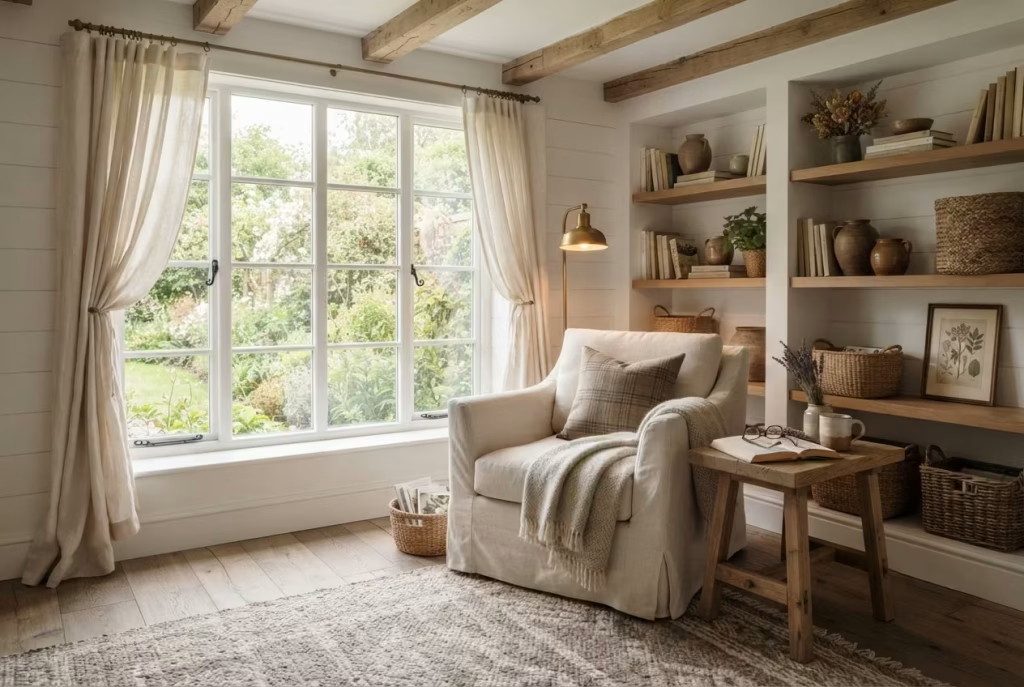
Every home has them. A forgotten corner beside a window, an awkward space beneath a sloping ceiling, or an empty area that quietly collects laundry baskets instead of fulfilling its true potential. These overlooked spaces rarely attract much attention during a renovation because they appear too small to make a meaningful difference. Yet, in my experience, they often hold the greatest opportunity.
Some of the most rewarding reading corners I have ever designed were not created by adding extra square footage or knocking down walls. They emerged from recognising the hidden value of spaces that homeowners had stopped noticing altogether. With thoughtful planning, even a modest corner can evolve into a retreat that supports quiet mornings, evening reading, and moments of calm throughout a busy day.
Farmhouse interiors naturally embrace this philosophy. They celebrate making the most of what already exists rather than constantly chasing something larger or newer. A peaceful reading nook tucked into an unused bedroom corner reflects that same sense of resourcefulness while bringing warmth and purpose to every square metre.
One client laughed during our first consultation and described an empty corner in her bedroom as “the place where clutter goes to retire.” A few months later, after introducing comfortable seating, layered lighting, and bespoke shelving, she admitted it had become the first place she visited every morning with coffee and the last place she sat before bed. It was a gentle reminder that overlooked spaces sometimes become the heart of the home once they are given the attention they deserve.
Learn to Recognise Hidden Potential in Forgotten Spaces
Many homeowners instinctively focus on the centre of a room, leaving the edges to become storage for temporary items or furniture that no longer serves a purpose. However, the perimeter often offers the greatest opportunities for creating intimate retreats.
Begin by looking beyond the room’s current arrangement. Corners beside large windows, areas between wardrobes, alcoves created by chimney breasts, spaces beneath exposed beams, and sections beside built in shelving all deserve a second look.
Natural light should always guide the decision wherever possible. Even a relatively compact corner can become remarkably inviting when positioned to capture soft morning sunshine or gentle afternoon light.
I often encourage homeowners to spend several days simply observing how light moves across the room. Notice where sunlight lingers, which areas remain comfortably shaded, and where you naturally feel drawn during quieter moments. The room often reveals the perfect location if you allow yourself time to notice its daily rhythm.
One farmhouse renovation involved a narrow alcove measuring barely 150 centimetres by 180 centimetres (5 by 6 feet). At first glance it appeared too restricted to serve any practical purpose. Yet once we removed an unused chest of drawers and introduced a compact armchair, wall lighting, and a small side table, it became one of the most cherished spaces in the entire house. Sometimes opportunity hides in plain sight.
Arrange Furniture Around Comfort Instead of Habit
One of the biggest reasons unused corners remain neglected is because furniture has been positioned according to habit rather than experience.
Bedrooms often place every major item against the walls without considering how the remaining space could better support daily routines. A reading corner requires a different mindset. Instead of asking where furniture traditionally belongs, ask how the room can encourage moments of rest.
I generally begin with the chair because it becomes the anchor of the entire composition. Position it to take advantage of natural light while maintaining a comfortable relationship with nearby storage and lighting.
Allow approximately 75 to 90 centimetres (30 to 36 inches) of circulation space around the chair whenever possible. This ensures movement remains comfortable without making the reading nook feel disconnected from the rest of the room.
A compact side table placed within 15 to 20 centimetres (6 to 8 inches) of the armrest keeps books, tea, and reading glasses close at hand without requiring awkward stretching.
During one bedroom redesign, we rotated an armchair by less than forty-five degrees so it faced both the garden and a nearby fireplace. The adjustment seemed almost insignificant on paper, yet the experience of sitting there changed completely. The view improved, daylight became softer, and the space immediately felt more inviting.
Good layouts rarely happen by accident. They grow from carefully considering how people actually live.
Ground the Space with a Carefully Chosen Rug
Without a visual anchor, a reading corner can sometimes feel as though it has been placed randomly within a much larger room. A thoughtfully sized rug quietly solves this problem by giving the seating arrangement its own sense of identity.
For compact bedroom reading nooks, I often recommend rugs measuring approximately 120 × 180 centimetres (4 × 6 feet) or 160 × 230 centimetres (5 feet 3 inches × 7 feet 7 inches) depending on the available floor area.
Ideally, the front legs of the chair and side table should sit comfortably on the rug. This simple detail visually connects the furniture while introducing another layer of softness beneath your feet.
Natural materials remain my first choice. Wool provides warmth and durability, jute introduces beautiful texture, while wool and jute blends combine comfort with rustic character that feels entirely at home in farmhouse interiors.
One project illustrates the importance of this beautifully. The reading chair originally floated awkwardly against timber flooring with no visual connection to the surrounding furniture. After adding a handwoven wool rug, the entire corner immediately felt settled, intentional, and welcoming. The room itself had not changed, yet the experience of using it improved enormously. It is often the quiet details beneath our feet that bring everything together.
Create Gentle Separation Without Closing the Room
A successful reading corner should feel distinct from the rest of the bedroom without becoming isolated. The goal is to create a subtle sense of retreat while preserving openness and natural flow. There are countless ways to achieve this without introducing physical partitions.
A tall woven basket filled with blankets, an open bookshelf, a large indoor olive tree, or a slim floor lamp can all gently define the reading area while allowing light and movement to continue uninterrupted.
Texture also plays an important role. Layering linen curtains, woven rugs, reclaimed timber shelving, and upholstered seating naturally distinguishes the corner from surrounding spaces without relying on bold colour changes or heavy dividers.
I often think of these subtle boundaries as visual whispers rather than loud statements. They quietly suggest where one activity ends and another begins without making the room feel smaller.
One countryside cottage featured a generous bedroom with no obvious architectural divisions. By positioning a low open bookcase behind the reading chair and introducing a softly textured rug beneath it, we created a wonderfully intimate retreat that still felt fully connected to the rest of the room. Visitors often assumed the reading nook had always been part of the original design. The strongest zoning often goes unnoticed because it feels completely natural.
A Renovation That Completely Changed How the Room Was Used
One of my favourite farmhouse bedroom projects began with what appeared to be an impossible brief. The homeowners wanted a peaceful reading retreat but believed there simply was not enough space.
The bedroom measured approximately 4 × 5 metres (13 × 16 feet), and one corner had gradually become home to an exercise bike, several storage boxes, and an outdated floor lamp. On paper, it hardly seemed promising.
Instead of expanding the room, we focused entirely on using what already existed. The exercise equipment was relocated, a linen slipcovered armchair was positioned beside the existing window, reclaimed oak shelving was installed above a compact cabinet, and a vintage side table was paired with an adjustable reading lamp.
A handwoven wool rug defined the seating area, while a large woven basket stored blankets beneath the shelving. Finally, we introduced a simple ceramic vase filled with seasonal greenery to soften the composition.
Several months after the project was completed, the homeowners shared something that stayed with me. They said the reading corner had quietly changed the rhythm of their evenings. Instead of immediately reaching for their phones after dinner, they now spent time reading together before bed.
Nothing about the room had become larger. What changed was how the space encouraged them to live. That experience continues to shape the way I approach forgotten corners. Every unused area holds the possibility of becoming something meaningful when thoughtful design meets everyday life.
You May also Like: 25 Creative Ways to Transform Your Spanish Reading Nook This Weekend
Complete the Space with Personal Objects That Tell Your Story
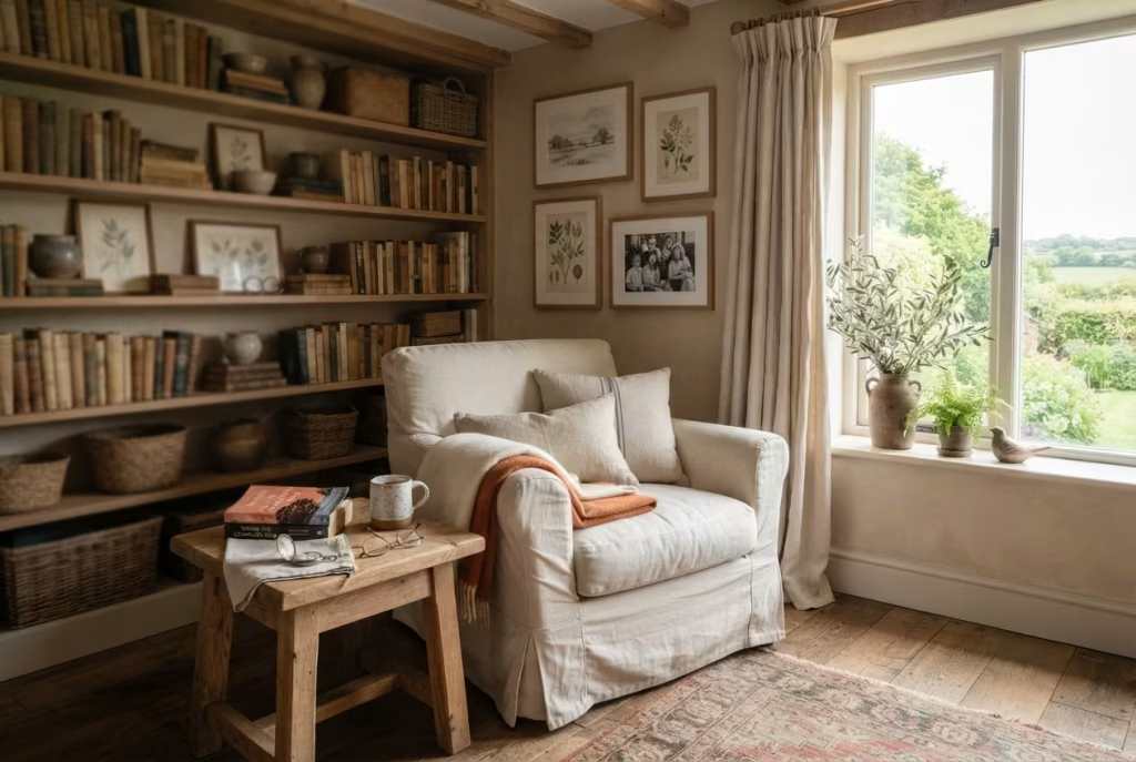
The most unforgettable farmhouse reading corners are rarely defined by expensive furniture or perfectly coordinated accessories. Instead, they are shaped by the objects that quietly reflect the lives of the people who use them every day. A favourite novel with worn pages, a hand carved keepsake passed down through generations, a framed sketch collected while travelling, or an old pocket watch resting beside a stack of books all contribute something no showroom can ever provide. They transform a beautifully designed corner into a place with genuine emotional depth.
This final layer of styling is where a reading retreat begins to feel truly personal. Up to this point, every design decision has focused on creating comfort, improving function, and establishing timeless character. Personal objects complete that journey by adding memory, identity, and quiet familiarity. They remind us that a home should never feel like a carefully assembled display. It should feel like an honest reflection of the people living within it.
Over the years, I have discovered that clients rarely remember every paint colour or fabric specification once a renovation is complete. What they remember are the moments connected to the objects surrounding them. A grandfather’s chair placed beside a window, a collection of novels read throughout childhood, or a ceramic bowl purchased during an anniversary trip often becomes the detail that means the most. Those pieces quietly anchor the room in lived experience rather than passing trends.
Display Favourite Books That Invite You to Read Again
Books naturally belong at the centre of any reading corner, but they deserve more thought than simply filling every available shelf. The books you choose to keep within arm’s reach often say as much about your personality as any decorative accessory.
I encourage homeowners to display books they genuinely return to rather than arranging shelves solely by colour or size. A collection of well-loved novels, gardening references, travel journals, poetry, architecture books, or treasured family cookbooks creates a far richer story than rows of untouched hardbacks selected only for appearance.
Organise books in a way that feels intuitive to you. Some people enjoy grouping titles by subject, while others naturally arrange them according to the memories they hold. Neither approach is right or wrong because the shelves should support your own reading habits rather than someone else’s styling formula.
During one countryside renovation, a client hesitated to display her grandfather’s collection of weathered gardening books because their faded spines looked “too worn.” We incorporated them into bespoke shelving beside newer editions, and they immediately became one of the room’s most admired features. Guests were drawn to them not because they looked perfect, but because they clearly carried years of use and personal history.
As the old saying goes, you cannot judge a book by its cover. In a reading corner, the stories behind the books often matter just as much as the stories inside them.
Let Family Heirlooms Become Everyday Companions
Family heirlooms possess a quiet emotional value that no newly purchased accessory can replace. Whether large or small, they introduce continuity between generations while giving the room a sense of permanence that grows stronger over time.
A vintage clock inherited from grandparents, an embroidered cushion stitched by a family member, an antique wooden box, or a hand carved stool can all become meaningful additions when thoughtfully placed within the reading corner.
I often encourage homeowners to use these heirlooms rather than hiding them away for special occasions. A beautifully crafted quilt deserves to provide warmth on winter evenings, and an old timber stool can happily support a stack of favourite books beside the chair.
One project remains especially close to my heart because the homeowner displayed a weathered rocking chair that had belonged to her mother. Although newer seating options were available, she insisted it remain part of the room. After careful restoration and new linen upholstery, it became the emotional centre of the reading corner. Every time she sat there, she felt connected to cherished family memories.
Some possessions are valuable because of what they are. Others are priceless because of what they represent.
Choose Framed Artwork That Reflects Your Journey
Artwork has the ability to quietly shape the atmosphere of a room without saying a single word. In a farmhouse reading corner, carefully chosen pieces create visual interest while offering moments of reflection between chapters.
Rather than filling walls with generic prints, select artwork that genuinely resonates with your experiences and interests. Landscape sketches, botanical studies, vintage maps, black and white photography, pressed botanical specimens, or locally created paintings often feel especially at home within farmhouse interiors.
Scale is equally important. Above a reading chair, artwork measuring approximately 60 to 90 centimetres (24 to 36 inches) wide usually creates balanced proportions without dominating the wall. Where several smaller pieces are displayed together, leave around 5 to 8 centimetres (2 to 3 inches) between frames to maintain a cohesive arrangement.
I generally favour timber frames with natural oak, walnut, or painted finishes because they complement reclaimed wood, woven textures, and neutral colour palettes beautifully.
One farmhouse bedroom featured a collection of pencil sketches completed by the homeowner’s father decades earlier. We framed them simply in natural oak and arranged them above the reading chair. The artwork immediately gave the room a sense of intimacy that no newly purchased print could have achieved.
Celebrate Travel Finds That Carry Meaning
Travel has a wonderful way of introducing unexpected treasures into our homes. A handwoven basket from a coastal village, a ceramic jug discovered in a small market, an antique brass compass, or a carved wooden figure collected during a memorable journey all bring layers of personality that cannot be replicated through ordinary shopping.
The key is choosing objects connected to meaningful experiences rather than collecting souvenirs simply for the sake of filling shelves.
I often advise clients to ask themselves a simple question before displaying a travel piece. Does this object remind you of a place, a conversation, or a moment that still makes you smile? If the answer is yes, it deserves a place within the reading corner.
One homeowner displayed a small hand carved olive wood bird purchased during a trip through southern Europe many years earlier. It occupied barely any space on the shelf, yet every visitor asked about it because it carried such quiet charm. Listening to the story behind that little sculpture became part of the experience of sitting in the room. The finest interiors tell stories without ever needing to explain themselves.
Style with Intention and Leave Space for the Room to Breathe
One of the final challenges when completing a reading corner is knowing when to stop. After carefully collecting books, heirlooms, artwork, pottery, and treasured keepsakes, it can be tempting to display everything at once. Yet too many meaningful objects gathered together often compete for attention, reducing the impact of each individual piece.
Instead, allow every object enough breathing room to be appreciated on its own. I often recommend following a simple principle. Display fewer pieces, but choose them thoughtfully. Rotate seasonal accessories occasionally rather than trying to showcase every treasured possession simultaneously.
Shelves should include moments of empty space between books and decorative objects. Side tables should remain practical enough to hold a cup of tea or an open novel. Walls benefit from areas of calm that allow artwork to command attention naturally.
During one renovation, a client proudly unpacked dozens of sentimental objects collected throughout her life. Rather than displaying them all, we carefully selected a small number that represented different chapters of her journey. The remaining items were stored safely and rotated throughout the year. The room felt calmer, each object carried greater significance, and every visit to the reading corner offered something quietly familiar without feeling crowded.
There is wisdom in the old phrase that less is more. In thoughtfully designed interiors, restraint allows meaningful objects to speak more clearly than abundance ever could.
Materials That Make Farmhouse Reading Corners Feel Better with Age
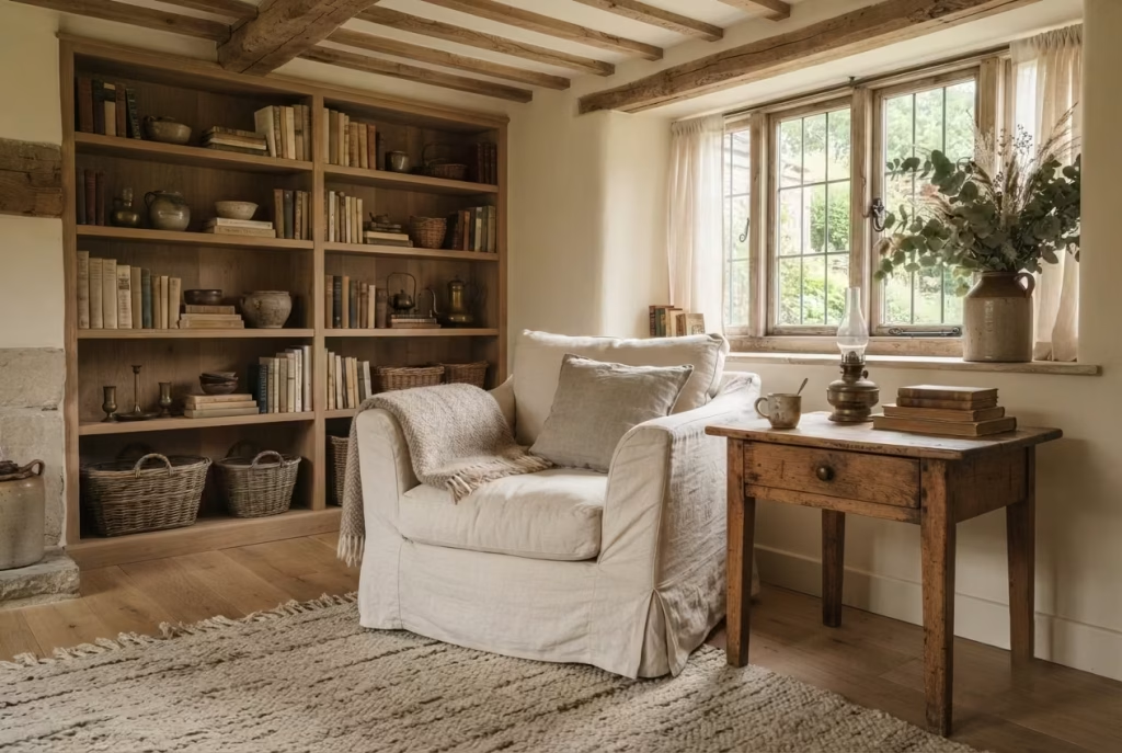
One of the defining qualities of an exceptional farmhouse reading corner is that it refuses to lose its charm as the years pass. Instead of looking tired or outdated, it develops greater richness through everyday use. The linen softens, timber deepens in colour, leather gains character, and handcrafted surfaces quietly record the story of family life. That is the beauty of choosing honest materials. They are not designed to remain untouched. They are meant to be lived with.
Modern interiors often chase flawless finishes that begin deteriorating the moment daily life catches up with them. Farmhouse design follows a very different philosophy. It embraces materials that welcome use rather than resist it. Small scratches become reminders of shared evenings, worn edges reveal craftsmanship, and subtle patina adds personality instead of reducing value.
Throughout my career, I have found that the most successful renovations are rarely those with the newest materials. They are the ones where every surface matures gracefully, becoming more beautiful with each passing season. When selecting finishes for a reading corner, I always ask one important question. Will this material still feel inviting ten or twenty years from now? If the answer is yes, it is usually worth the investment.
Solid Oak Creates a Foundation That Lasts for Generations
Few materials embody farmhouse design more naturally than solid oak. It possesses remarkable strength, beautiful grain patterns, and a warmth that immediately makes a room feel established.
Whether used for built in shelving, window seats, side tables, ceiling beams, or flooring, oak introduces quiet confidence without dominating the space. Freshly milled oak carries a soft golden tone, yet over time it gradually develops a richer honey coloured patina that gives older homes much of their unmistakable character.
I usually recommend lightly oiled or hardwax finished oak because these finishes protect the timber while allowing its natural texture to remain visible. Unlike thick varnishes, they can also be repaired locally if the surface becomes marked.
One farmhouse renovation included bespoke oak shelving crafted from locally sourced timber. Several years later, the shelving had darkened slightly through natural exposure to sunlight, blending even more beautifully with the surrounding limestone fireplace and linen upholstery. The timber had not aged despite daily use. It had matured. As the years roll by, good oak tells its own quiet story.
Walnut Introduces Depth Without Feeling Heavy
While oak often forms the backbone of farmhouse interiors, walnut provides an elegant contrast that adds richness and sophistication.
Its naturally darker tones create visual depth without relying on painted finishes or artificial stains. Walnut works particularly well for side tables, picture frames, cabinet details, or occasional accent furniture within otherwise lighter reading corners.
Because walnut already possesses strong natural character, I generally use it sparingly. A beautifully crafted walnut table paired with cream linen upholstery and reclaimed oak shelving often creates a more balanced composition than filling the room with dark timber.
The subtle variation between these two woods reflects nature itself. No forest contains only one species, and thoughtfully designed interiors benefit from the same quiet diversity.
Reclaimed Timber Brings History into the Room
There is something deeply satisfying about incorporating materials that have already lived a previous life.
Reclaimed timber may originate from old barns, traditional cottages, agricultural buildings, historic mills, or dismantled farm structures. Every knot, nail mark, weathered edge, and saw cut contributes another layer of history that cannot be recreated artificially.
I particularly enjoy using reclaimed timber for floating shelves, fireplace mantels, exposed ceiling beams, and custom window seats because these architectural elements naturally become focal points within a reading corner.
Whenever specifying reclaimed timber, I always recommend purchasing from reputable suppliers who properly clean, kiln dry, and prepare the wood for interior use. This helps minimise future movement while ensuring the material remains structurally sound.
One memorable project involved transforming old barn beams into floating bookshelves. The family loved knowing that the timber had once supported a working farm before becoming part of their home. Those shelves quickly became one of the most meaningful features in the entire renovation.
Natural Linen Brings Relaxed Comfort That Improves with Every Wash
Linen has earned its reputation over centuries because it combines beauty with remarkable practicality.
Unlike many synthetic fabrics, linen becomes softer through regular use and laundering while retaining its elegant drape and breathable qualities. Its slightly irregular weave also introduces subtle texture that complements rustic farmhouse interiors beautifully.
I often specify linen for curtains, slipcovered armchairs, cushions, and occasional upholstery because it responds wonderfully to changing daylight. Morning sunlight gently filters through linen curtains, creating a soft glow that immediately enhances a reading corner.
Performance linen blends are also worth considering for busy households. They retain the relaxed appearance of natural linen while offering improved stain resistance and durability.
Few materials feel quite as inviting as well-loved linen that has been enjoyed for years rather than weeks.
Cotton and Wool Layer Comfort Throughout Every Season
Comfort depends as much on touch as appearance, and few natural fibres perform better than cotton and wool.
Cotton provides softness, breathability, and everyday practicality. It works beautifully for cushion covers, lightweight throws, and quilted blankets that remain comfortable throughout warmer months.
Wool introduces insulation and tactile richness without feeling overly formal. Chunky knit blankets, woven rugs, and lambswool throws create comforting layers that make a reading corner especially inviting during colder seasons.
I often combine several different weaves rather than relying on matching fabrics. Smooth cotton beside loosely woven linen and textured wool creates visual depth that feels relaxed instead of predictable.
One client initially questioned why I recommended three different neutral throws rather than one matching blanket set. Once the room was complete, she admitted the layered textures gave the reading corner a warmth that photographs alone could never fully capture. Good design appeals not only to the eye but also to the hands.
Leather Accents Add Character Through Everyday Use
Leather is one of the few materials that genuinely rewards regular use. A leather handled basket, vintage footstool, reading chair, or handcrafted bookmark gradually develops a rich patina as it responds to natural oils, sunlight, and years of handling.
For farmhouse interiors, I generally recommend full grain or top grain leather because these retain their natural markings and continue improving over time. Rich cognac, chestnut, saddle brown, and warm tan tones complement reclaimed timber particularly well.
Unlike heavily corrected leather that often appears overly uniform, natural leather embraces gentle creases and subtle colour changes, allowing every piece to become increasingly individual.
A reading chair I specified more than a decade ago still looks remarkable today. The leather now carries gentle signs of use that make it far more beautiful than when it first arrived.
Antique Brass Offers Quiet Warmth Instead of Shiny Perfection
Hardware may seem like a relatively minor detail, yet it quietly influences how refined a reading corner feels.
Antique brass introduces warmth that polished chrome or bright stainless steel often struggles to achieve. Whether used for wall sconces, cabinet handles, picture lights, curtain poles, or small decorative accents, it complements natural materials with understated elegance.
One reason I continue specifying antique brass is its ability to develop a gentle patina over time rather than deteriorating. Tiny changes in colour only add to its authenticity.
Used sparingly, these warm metallic touches provide subtle highlights without distracting from the surrounding timber, linen, and stone.
Handmade Ceramics Bring Quiet Individuality
No two handmade ceramic pieces are exactly alike, and that individuality is precisely what makes them so appealing.
Hand-thrown mugs, stoneware vases, ceramic lamps, and decorative bowls introduce subtle variations in glaze, texture, and form that celebrate craftsmanship rather than machine precision.
I often recommend choosing pieces with soft matte finishes inspired by natural earth tones. Cream, clay, charcoal, sage, and warm grey ceramics blend beautifully into farmhouse interiors while allowing flowers, books, or greenery to remain the visual focus.
One pottery collection displayed on reclaimed oak shelving became an unexpected talking point during a renovation reveal. Visitors naturally reached out to touch the surfaces because every piece felt wonderfully tactile.
Limewash Walls Create Living Surfaces
Few wall finishes suit farmhouse interiors better than limewash. Unlike perfectly flat modern paint, limewash possesses remarkable depth and gentle movement that shifts throughout the day as natural light changes. The finish creates soft tonal variation that feels handcrafted rather than manufactured.
Limewash also remains breathable, making it particularly suitable for older properties built with traditional materials.
I have used limewash extensively in countryside homes because it creates an atmosphere that feels calm without relying on decorative patterns or bold colours. Even a simple reading corner becomes more interesting when surrounded by walls that subtly respond to changing daylight.
Natural Stone Grounds the Space
Stone introduces permanence that beautifully balances the softness of fabrics and timber. Whether incorporated through a fireplace, flooring, window sill, side table, or decorative object, limestone, sandstone, slate, and travertine each contribute quiet texture that strengthens the farmhouse aesthetic.
Natural stone also performs exceptionally well over decades because it withstands everyday wear while gradually developing even greater character.
I particularly enjoy pairing limestone with oak because the warm undertones of both materials create an effortlessly harmonious relationship.
Understand How These Materials Age and What They Need
One reason natural materials remain so rewarding is that they rarely demand perfection. They simply ask for thoughtful care.
Hardwood furniture benefits from occasional oiling or waxing depending on its finish. Linen and cotton should be washed according to the manufacturer’s recommendations, becoming softer with each cycle. Wool rugs appreciate regular vacuuming and prompt attention to spills. Leather responds well to periodic conditioning, while natural stone may require sealing depending on the specific variety and location.
Rather than viewing this maintenance as a burden, I see it as part of living with quality materials. Looking after them encourages homeowners to appreciate the craftsmanship behind every piece.
Unlike synthetic alternatives that often require complete replacement once damaged, many natural materials can be repaired, restored, refinished, or lovingly refreshed for another generation.
Choose Sustainably Sourced Materials That Respect the Future
Beautiful interiors should never come at the expense of the environment. Whenever possible, I encourage sourcing timber certified by responsible forestry organisations, purchasing reclaimed materials from reputable suppliers, supporting local artisans, and selecting natural fibres produced through ethical manufacturing practices.
Buying fewer, better pieces usually proves both more sustainable and more economical over the long term. A handcrafted oak side table that lasts fifty years creates far less environmental impact than replacing lower quality furniture every decade.
One project stands out because nearly every major material came from within the surrounding region. Local limestone, reclaimed oak beams, handwoven wool rugs, artisan ceramics, and linen woven nearby created a reading corner that felt deeply connected to its landscape while supporting skilled craftspeople along the way.
That experience reinforced something I have believed for years. Truly timeless design respects not only the past but also the future.
Pros and Cons of Natural Farmhouse Materials
| Pros | Cons |
|---|---|
| Develop beautiful patina and character with everyday use instead of looking worn out. | Premium natural materials generally require a higher initial investment. |
| Offer outstanding longevity when properly maintained. | Some finishes require periodic oiling, waxing, or sealing to remain in excellent condition. |
| Create richer texture and authenticity than many synthetic alternatives. | Natural variations in colour and grain may not appeal to those seeking complete uniformity. |
| Support healthier, more breathable interiors through natural fibres and traditional finishes. | Reclaimed and artisan materials may require longer lead times and specialist suppliers. |
| Encourage sustainable decorating by lasting for decades and often remaining repairable. | Careful sourcing is essential to ensure responsible environmental and ethical standards. |
Common Farmhouse Reading Corner Mistakes That Reduce Comfort
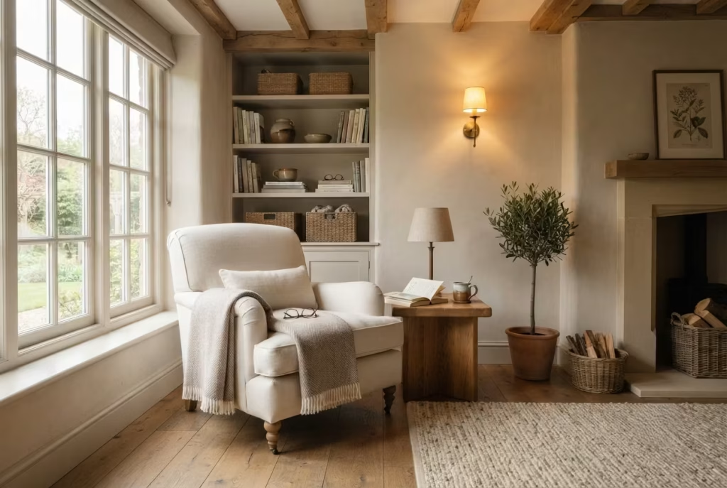
The most inviting farmhouse reading corners rarely succeed because they follow every design trend. They succeed because every decision supports comfort, function, and the quiet rituals that make reading enjoyable. A beautiful armchair becomes meaningless if it causes discomfort after twenty minutes. Rustic accessories lose their charm when they create visual clutter. Even the finest natural materials struggle to compensate for poor lighting or awkward furniture placement.
Over the years, I have walked into many homes where the intention was absolutely right, but a handful of small decisions prevented the space from reaching its full potential. The encouraging part is that these mistakes are rarely difficult or expensive to correct. More often than not, a few thoughtful adjustments completely transform how the room feels and how often it is used.
Whenever I begin designing a reading retreat, I spend just as much time identifying what should be avoided as deciding what should be included. Good design is often an exercise in thoughtful restraint. Sometimes improving a room is less about adding another decorative piece and more about removing the obstacles that quietly stand in the way of comfort.
As the old saying goes, the devil is in the details. Nowhere is that truer than in a reading corner designed for everyday living.
Allow Furniture to Fit the Room Instead of Dominating It
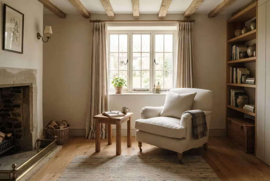
A generously proportioned armchair may look wonderfully inviting in a furniture showroom, yet once placed inside a modest farmhouse bedroom, it can quickly overwhelm the available space.
One of the most common mistakes I encounter is selecting seating based purely on appearance without considering scale. Oversized furniture often restricts circulation, blocks natural light, and makes even spacious rooms feel crowded.
Before purchasing a chair, carefully measure the available floor area. I generally recommend maintaining at least 75 to 90 centimetres (30 to 36 inches) of clear walking space around the primary seating area. This allows comfortable movement while preventing the room from feeling compressed.
Compact reading corners usually benefit from chairs measuring approximately 75 to 90 centimetres (30 to 36 inches) wide rather than oversized lounge seating exceeding 100 centimetres (39 inches).
During one cottage renovation, a client initially selected an exceptionally large wingback chair that dominated nearly an entire corner. Replacing it with a slightly slimmer linen armchair immediately improved circulation, allowed a side table to fit naturally beside it, and restored the room’s sense of openness without sacrificing comfort. The lesson was simple. Bigger does not always mean better.
Never Rely on General Room Lighting Alone
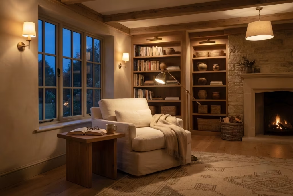
Reading places unique demands on lighting. While ceiling fixtures may illuminate an entire bedroom, they rarely provide the focused light necessary for extended reading sessions.
Insufficient task lighting causes unnecessary eye strain, reduces comfort, and often discourages people from using the space during the evening. Many homeowners only realise this after they have lived with the room for several weeks. I always recommend combining several layers of illumination.
A dedicated reading lamp positioned beside the chair provides focused light for books. Wall sconces contribute gentle ambient illumination, while ceiling lighting maintains overall brightness when needed.
For the most comfortable atmosphere, choose warm bulbs within the 2700K to 3000K colour temperature range. This creates a soft glow that feels welcoming while still providing excellent visibility.
One family confessed that they rarely used their beautifully designed reading corner after sunset. The reason was surprisingly simple. A single ceiling pendant left the chair sitting in shadow. Installing an adjustable reading lamp transformed the experience overnight, proving that effective lighting often has a greater impact than expensive furniture. Good lighting quietly supports every moment spent in the room.
Resist the Urge to Overdecorate with Rustic Accessories
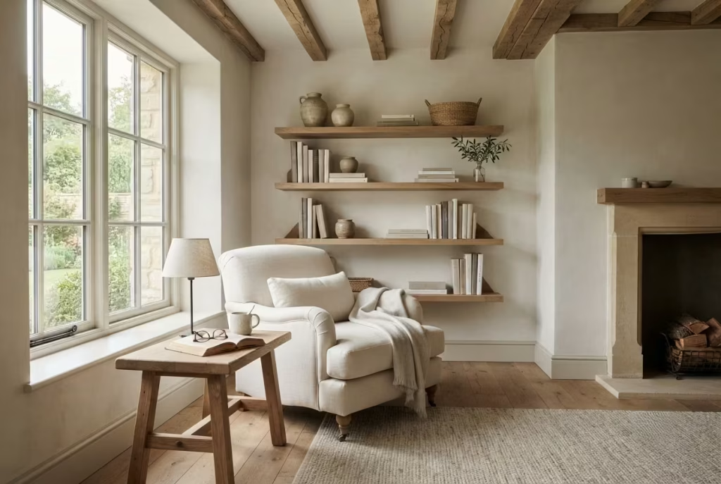
Farmhouse interiors celebrate authenticity, yet that should never be confused with filling every shelf, wall, and surface with decorative objects. Vintage lanterns, antique signs, woven baskets, ceramic jugs, wooden crates, dried flowers, and reclaimed accessories all have their place. The problem arises when too many compete for attention at once.
One of the easiest ways to reduce comfort is by allowing decoration to overwhelm functionality. Side tables become unusable because they are filled with ornaments. Shelves become visually chaotic instead of supporting books. The room begins feeling like a themed display rather than a peaceful retreat.
I encourage clients to edit their styling regularly. Every object should contribute something meaningful, whether practical, emotional, or aesthetic.
During one renovation, we removed nearly half of the decorative accessories from a reading corner without purchasing anything new. The homeowners were amazed by the transformation. The room suddenly felt larger, calmer, and considerably more sophisticated simply because each remaining piece finally had space to breathe. Sometimes less truly is more.
Never Ignore Ergonomic Comfort
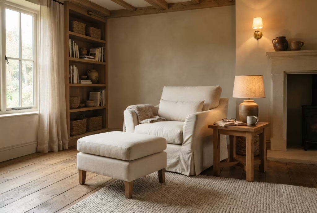
It is surprisingly common for homeowners to choose seating based almost entirely on appearance. While a beautifully shaped chair may photograph well, poor ergonomics quickly become obvious after an hour spent reading. Without proper support, shoulders tighten, lower backs become fatigued, and relaxation quietly disappears.
When selecting seating, pay close attention to seat depth, back support, armrest height, and cushion firmness. In most situations, I recommend seat heights between 43 and 48 centimetres (17 to 19 inches) because they allow most adults to sit and stand comfortably. Seat depths around 50 to 60 centimetres (20 to 24 inches) generally provide excellent support without forcing awkward posture.
Adding a lumbar cushion or supportive footstool can further improve comfort, particularly for longer reading sessions. I remember replacing a visually stunning vintage chair with a simpler slipcovered armchair during one project. Although the newer chair attracted less attention, the homeowners immediately began spending hours reading there every evening. Comfort quietly outperformed appearance.
After all, beauty means very little if the chair encourages you to stand up after fifteen minutes.
Prioritise Lasting Comfort Over Temporary Trends
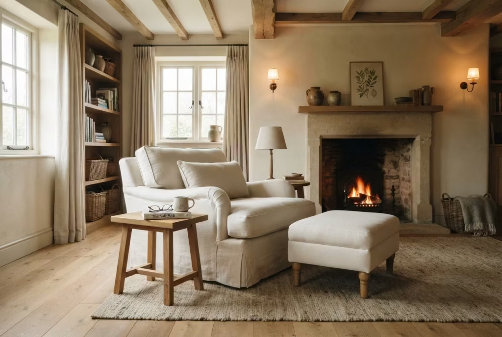
Interior trends come and go with remarkable speed, but reading habits often remain surprisingly consistent.One mistake I regularly encounter involves choosing fashionable furniture or decorative pieces that look impressive initially yet fail to support everyday life.
Boucle fabrics may dominate one season, sculptural chairs another, while unusual shapes frequently capture attention on social media. Yet many of these pieces prioritise visual novelty above practical comfort.
Whenever investing in larger furniture, I encourage clients to imagine themselves using it every evening for the next ten years rather than admiring it for five minutes online. Timeless proportions, durable natural materials, washable fabrics, and supportive construction consistently outperform short lived trends.
Good design is rarely about chasing the latest fashion. It is about creating spaces people genuinely enjoy using year after year.
You May also Like: 25 Japanese Reading Nook Secrets for a Perfectly Calm Home
Choose the Correct Rug Size from the Beginning
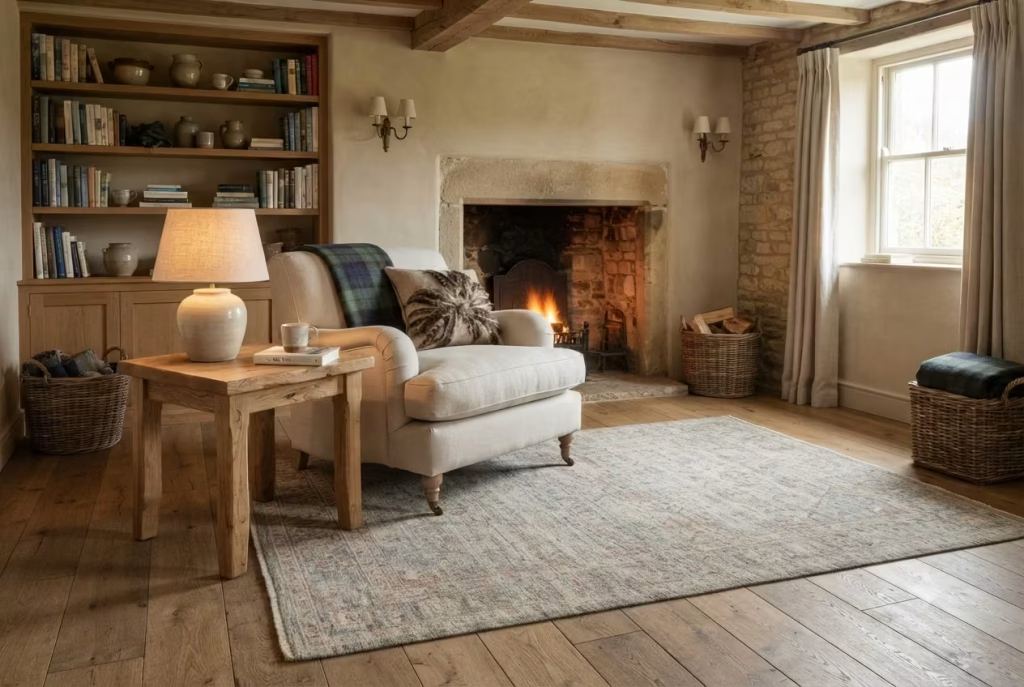
Few details influence the visual balance of a reading corner as dramatically as rug proportions. A rug that is too small often leaves furniture appearing disconnected, while one that is excessively large may dominate the room unnecessarily.
Ideally, the front legs of the reading chair and side table should rest comfortably on the rug. This visually anchors the arrangement while introducing warmth beneath your feet.
For many reading corners, rugs measuring 160 × 230 centimetres (5 feet 3 inches × 7 feet 7 inches) provide an excellent balance, although smaller spaces may suit 120 × 180 centimetres (4 × 6 feet) depending on furniture layout.
One farmhouse bedroom originally featured a tiny accent rug floating beneath the chair. Replacing it with a properly proportioned wool rug instantly connected the furniture and made the reading nook feel intentionally designed rather than temporarily assembled.
Forgetting Storage Creates Everyday Frustration
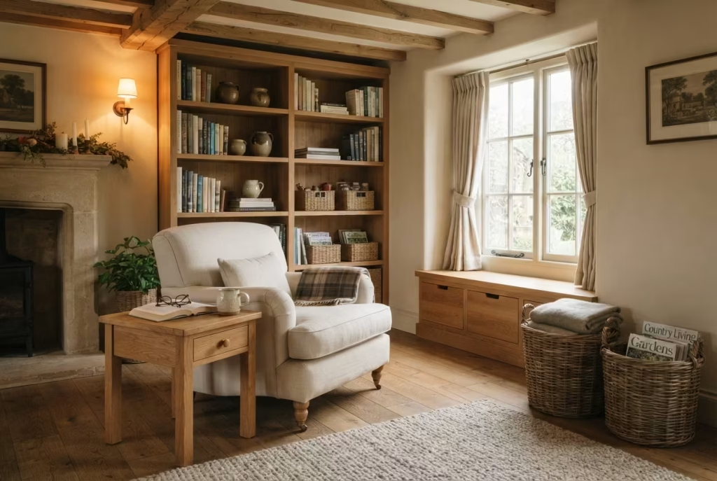
A reading corner without practical storage quickly becomes untidy. Books accumulate on the floor, blankets are draped over furniture, reading glasses disappear beneath cushions, and mugs begin occupying every available surface.
Thoughtful storage quietly solves these everyday challenges without compromising the relaxed farmhouse aesthetic.
Built in shelving, woven baskets, side tables with drawers, window seats incorporating concealed compartments, or compact cabinets all provide valuable storage while maintaining visual calm.
One homeowner admitted she stopped using her reading nook simply because there was nowhere convenient to keep her current books. Installing a narrow bookshelf beside the chair completely changed her daily routine.
Practical design often succeeds because it quietly removes small inconveniences before they become lasting frustrations.
Preserve Every Possible Source of Natural Light
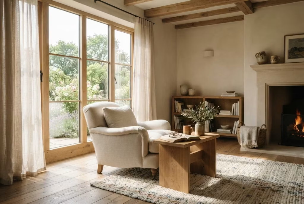
Natural light remains one of the greatest assets within any reading corner, yet it is surprisingly easy to reduce its effectiveness unintentionally.
Tall bookcases placed directly beside windows, oversized furniture positioned across glazing, or heavy curtains kept permanently closed can significantly diminish daylight.
Instead, position seating where it benefits from natural illumination without obstructing the window itself.
Choose lightweight linen curtains that soften harsh sunlight while still allowing daylight to enter the room. Lower furniture profiles generally perform better beneath windows because they preserve both light and outdoor views.
I often tell clients that windows deserve to breathe. Allowing daylight to move freely throughout the room immediately improves comfort while reducing reliance on artificial lighting during the day.
Avoid Mixing Too Many Competing Wood Finishes
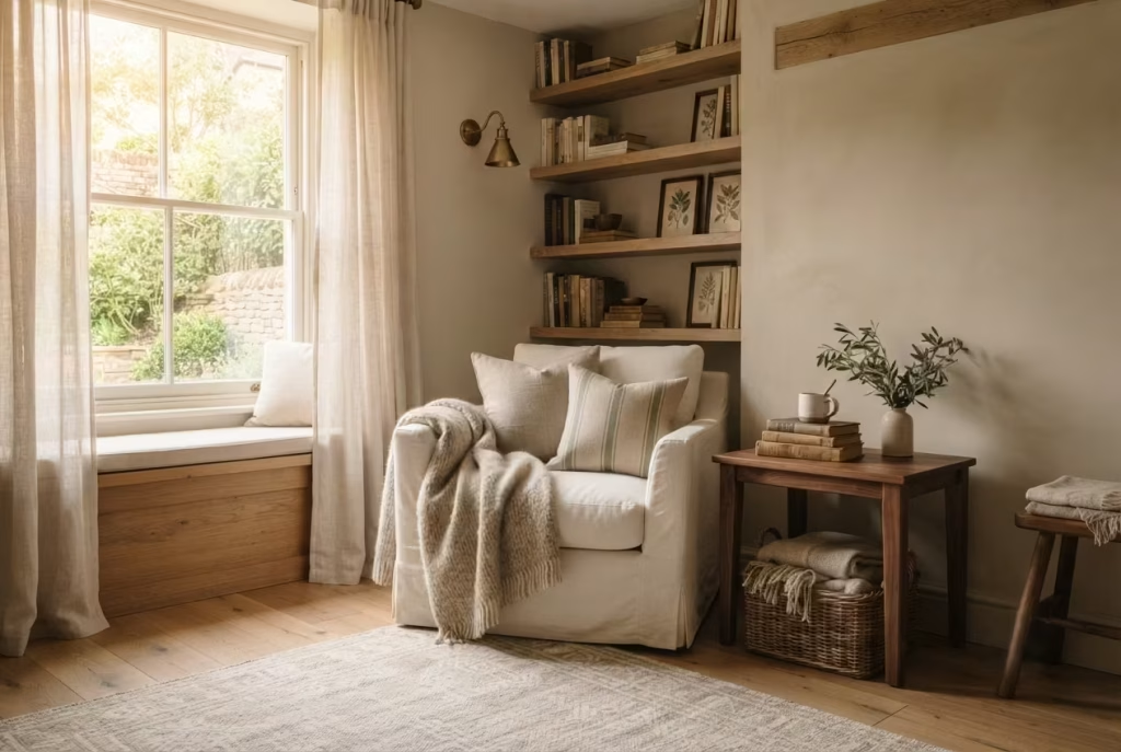
Farmhouse interiors celebrate timber, but introducing too many unrelated wood tones often creates visual confusion rather than warmth.
One room may contain reclaimed oak shelving, dark mahogany furniture, cherry side tables, pine flooring, walnut picture frames, and distressed painted cabinetry. Individually these pieces may be beautiful, yet together they compete for attention.
Instead, establish one dominant timber species supported by one or two complementary secondary finishes.
For example, reclaimed oak can comfortably pair with walnut accents and antique brass hardware while remaining cohesive throughout the room.
Consistency does not require every piece to match perfectly. Natural variation actually strengthens farmhouse interiors. The goal is creating harmony rather than uniformity.
During one renovation, replacing several mismatched side tables with reclaimed oak pieces immediately unified the room without changing any other furniture. The reading corner suddenly felt calmer because every material worked together instead of competing.
How a Reading Corner Evolves Beautifully Over Time
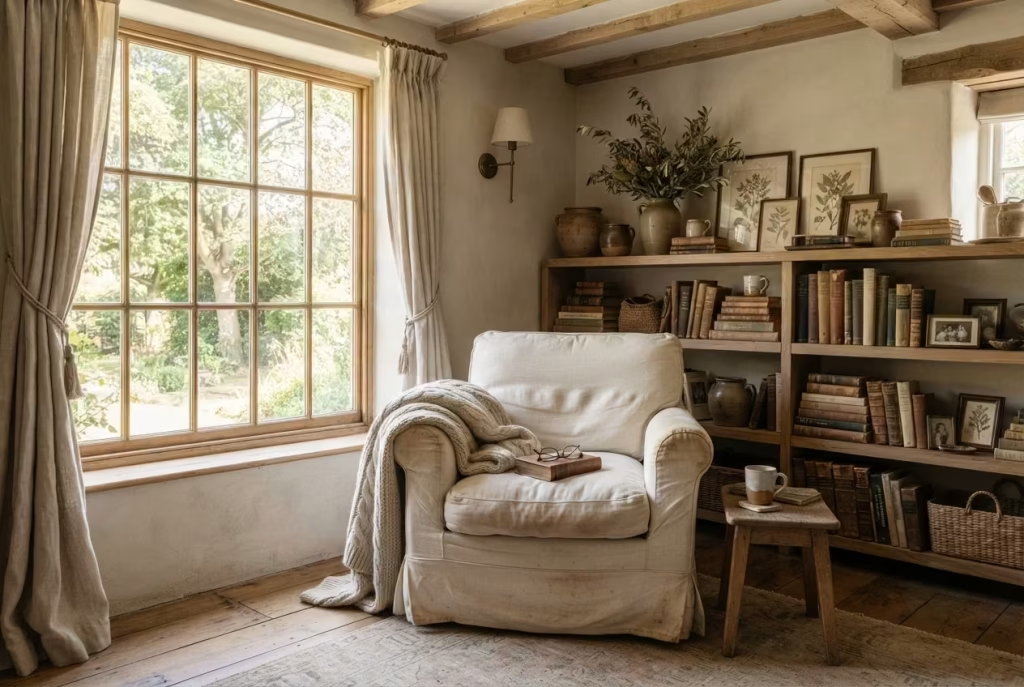
A well designed reading corner is never truly finished in the strictest sense. That is part of its charm. The most memorable spaces do not arrive fully polished and frozen in place, like a showroom display dressed for one perfect afternoon. They grow, settle, and deepen with use. A chair softens where it is most loved, a throw becomes a familiar companion on colder evenings, and the books on the shelf begin to reflect not only taste, but the changing shape of a life being lived indoors, day after day.
This quiet evolution is one of the reasons farmhouse reading corners feel so enduring. Their appeal does not depend on novelty. It depends on atmosphere, comfort, and the slow accumulation of meaningful detail. I have seen many spaces look beautiful on the day they were completed, yet only a handful became truly special a year later. The difference was not budget or square footage. It was the way the room was allowed to breathe, age, and gather character without being overmanaged at every turn.
Why lived-in spaces gain character
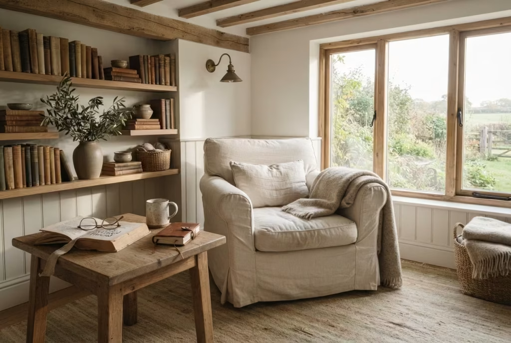
Some rooms improve the moment they are used properly. A reading corner is one of them. The first few weeks may be about testing a chair, adjusting a lamp, and deciding whether a basket belongs to the left or the right. After that, the space begins to reveal itself. A mug always settles on the same side table. A blanket is folded in the same loose way. A favourite book remains open to a bookmarked page for longer than expected. These small habits create a sense of belonging that no carefully staged photograph can capture.
Lived-in spaces gain character because they stop pretending to be perfect. Instead, they become responsive. That is where the magic lies. A slightly worn armrest, a softened rug pile, or the gentle unevenness of a linen cushion does not diminish the room. It gives the room a pulse. It says people are here, and they return often.
In many farmhouse homes, this is exactly what makes a reading corner feel so comforting. The room does not shout for attention. It quietly earns it.
Developing patina through daily use
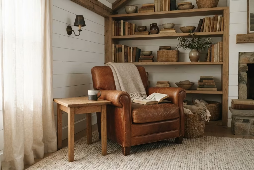
Patina is often described in relation to wood, leather, brass, and stone, but in truth it applies to the whole reading corner. It is the sheen of familiarity that emerges when materials are used, touched, and loved in the ordinary rhythm of daily life.
A leather chair develops a warmer tone where hands rest on the arms. A timber table gains subtle marks that speak of years of cups, books, and careful movement. Brass begins to deepen in colour rather than remain bright and untouched. Even a wool rug starts to feel more grounded as footsteps gently shape its surface. None of this happens overnight. It happens quietly, almost shyly, but the effect is unmistakable.
I often tell clients that the best interiors should not look as though nobody has ever sat in them. They should look as though someone has lived there with intention. A reading corner that gathers patina well begins to feel richer, not older. That distinction matters. It is the difference between tired and treasured, between neglected and beautifully seasoned.
Seasonal textile rotation keeps the space alive
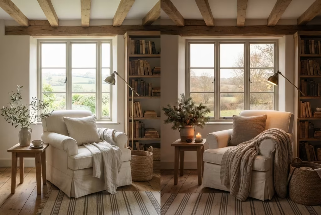
One of the simplest ways to let a reading corner evolve gracefully is through seasonal textile changes. This does not require a full redesign. Far from it. Often, a shift in one or two layers is enough to refresh the mood entirely.
In warmer months, lighter linen throws, breathable cotton cushions, and softer neutral textures keep the space feeling airy and open. As the weather turns, heavier wool blankets, brushed cotton covers, and deeper, more tactile fabrics bring the room inward, making it feel more protective and calm. The chair remains the same, the shelving stays put, yet the atmosphere changes with the season as naturally as daylight itself.
This is one of those details that punches above its weight. It prevents the space from feeling static while avoiding unnecessary waste or constant shopping. Instead of replacing everything, you simply rotate the layers that make the corner feel current. Over time, the reading corner develops a rhythm that mirrors the year outside the window. A room that can move with the seasons never feels stale for long.
Building a meaningful personal library
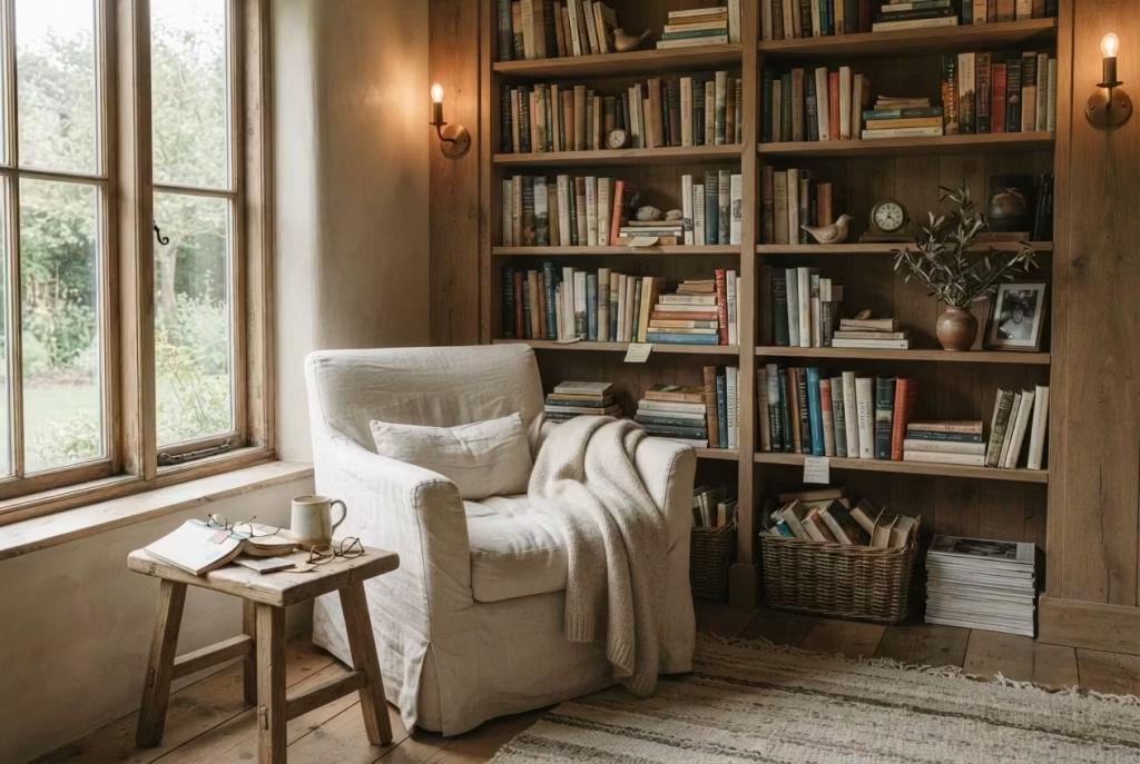
A reading corner becomes far more compelling when the books themselves tell a story. This is not about curating shelves for colour or symmetry alone. It is about letting the collection reflect genuine interests, lived experiences, and returning pleasures.
A meaningful personal library often grows gradually. It may begin with childhood favourites, a few well-thumbed novels, and some practical references. Over time, it expands to include books from significant trips, volumes shared by friends, or titles discovered during a life stage that left its mark. That kind of shelf tells the truth about a person in a way no decorative object ever could.
I have always found that the strongest reading corners are not packed with unread books chosen for effect. They contain a mix of old favourites and current discoveries, each one carrying a memory or an intention. Some books are there for comfort. Others are there for curiosity. A few are kept simply because they have become part of the room’s emotional landscape. That is what gives the corner depth. Not quantity, but meaning.
Adding collected objects gradually
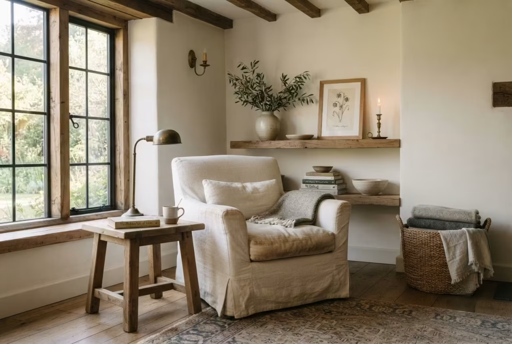
A reading corner should not be forced into completeness on day one. In fact, trying to finish it too quickly often robs it of character. The best pieces tend to arrive slowly, one by one, like old friends finding their way into the same room.
A ceramic vase picked up at a market. A framed sketch from a favourite trip. A small brass object inherited from a relative. A woven basket found at just the right moment. These items do not need to arrive as part of a grand scheme. Often, the most successful rooms are the ones that have been allowed to gather these details organically.
The key is restraint. Collected objects should feel like punctuation, not noise. A few carefully chosen pieces placed with breathing room will always make a stronger impression than a shelf crowded with things that have no relationship to one another. This is where the eye can rest, and where the room begins to feel quietly composed rather than overworked.
Over time, these objects become markers of memory. You do not simply look at them. You remember where they came from, and why they stayed.
How successful reading corners mature over years rather than months
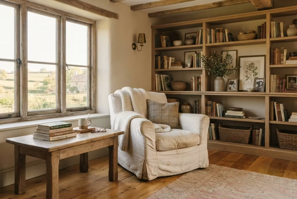
The reading corners that stay with me longest are rarely the ones that looked most impressive in their first week. They are the ones that settled into themselves with time. The armchair softened. The textiles were rotated with the seasons. The shelves held books that had actually been read. The side table gained a little patina. The objects were edited, then edited again. Nothing was rushed, and nothing was overdone.
That is how a reading corner matures beautifully. It becomes more personal, more useful, and more grounded. The room stops feeling decorated and starts feeling inhabited. It acquires a kind of quiet authority, the sort that comes only from being used well, year after year.
From my experience, the most successful spaces are those that leave room for change without losing their identity. They are built on strong materials, thoughtful proportions, and a clear design intention, but they are never so rigid that life cannot leave its mark. And that, in the end, is the whole point. A reading corner should not remain untouched. It should grow into the life around it, becoming warmer, richer, and more meaningful with every passing season.
The Most Memorable Reading Corners Invite You to Slow Down
The most successful farmhouse reading corners are never defined by flawless styling or picture perfect symmetry. They are remembered because they quietly become part of everyday life. Long after the excitement of a renovation has faded, these spaces continue earning their place within the home, welcoming early morning coffee, peaceful afternoon reading, thoughtful conversations, and those rare moments when the world finally feels as though it has slowed to a gentler pace.
Throughout this guide, one principle has remained constant. Exceptional design begins by understanding how a space should feel before deciding how it should look. Natural light, carefully considered proportions, supportive seating, handcrafted materials, layered textures, and meaningful personal objects all work together to create something far more valuable than a beautiful corner. They create an experience that encourages you to pause, breathe, and reconnect with the simple pleasures that are often overlooked in busy daily routines.
I have found that the reading corners homeowners treasure most are rarely the largest or the most expensive. More often, they begin with an unused alcove beside a window, a forgotten bedroom corner, or a quiet spot beneath exposed beams. Through thoughtful planning, honest materials, and patient curation, those overlooked spaces gradually become the heart of the home. They are the places where favourite books are revisited, where changing seasons are quietly observed through the window, and where family memories gather naturally over the years.
What makes farmhouse design so enduring is its respect for authenticity. Solid oak becomes richer with age. Linen grows softer after countless evenings spent reading. Leather develops a beautiful patina through everyday use. Handmade pottery, woven textiles, antique brass, reclaimed timber, and natural stone all mature gracefully, carrying visible reminders of the life unfolding around them. Rather than resisting the passage of time, these materials embrace it, proving that true quality reveals itself slowly.
Equally important is the understanding that a reading corner should never feel finished all at once. The most meaningful spaces evolve patiently. New books find their place on the shelves. Travel keepsakes are added after memorable journeys. Family heirlooms quietly become part of the room’s story. Seasonal textiles shift with the weather, while carefully chosen greenery reflects the changing landscape beyond the windows. Every thoughtful addition strengthens the emotional connection between the homeowner and the space, allowing the room to feel increasingly personal with every passing year.
If there is one lesson I continue returning to after years of designing homes, it is this. The finest interiors are not those that impress visitors for a few fleeting moments. They are the ones that improve everyday living in subtle yet lasting ways. They encourage healthier routines, create opportunities for rest, support meaningful rituals, and offer quiet refuge from the pace of modern life.
In the end, a farmhouse reading corner is not simply another beautifully decorated area within the home. It becomes a sanctuary shaped by craftsmanship, comfort, natural light, and personal history. It is a place where timeless materials, thoughtful design, and lived experience come together effortlessly, inviting you to slow down, turn another page, and discover that the greatest luxury any home can offer is the feeling of truly belonging within it.
Frequently Asked Questions
How much space do you need for a comfortable farmhouse reading corner?
You do not need a large room to create a reading corner that feels generous and inviting. In many homes, a comfortable setup can work in a space as small as 150 × 150 centimetres (5 × 5 feet), provided the furniture is carefully scaled. If you have a little more room, 180 × 180 centimetres (6 × 6 feet) gives the corner greater breathing space and allows the eye to rest more easily.
What matters most is not the footprint alone, but how the space functions. A reading corner should allow enough room for a chair, a side table, and clear circulation around the seat. If the layout feels cramped, the corner will never quite settle into itself. The best spaces feel composed, not squeezed.
What chair is best for long reading sessions?
The best chair is one that supports the body without demanding attention. For long reading sessions, I would always favour a chair with a supportive back, a seat depth of around 55 to 65 centimetres (22 to 26 inches), and armrests that allow the shoulders to relax naturally. A slipcovered armchair, a well-upholstered occasional chair, or a compact lounge chair can all work beautifully if the proportions are right.
Comfort should always come first. A chair may look stunning in a photograph, but if it leaves you shifting position every ten minutes, it has missed the point entirely. In a reading corner, the most valuable seat is the one that quietly disappears into the experience, letting the book take centre stage.
Which colours make a farmhouse reading nook feel cozier?
Warm neutrals tend to work best because they create softness without making the room feel heavy. Cream, oatmeal, taupe, soft white, mushroom, and muted greige all help a reading corner feel calm and lived in. These shades sit particularly well with natural materials such as oak, linen, wool, and stone.
If the room already receives strong natural light, slightly deeper neutral tones can add welcome depth. If the space is smaller or darker, lighter warm tones often help it feel more open. What really makes the room cozy, though, is not colour alone. It is the combination of colour, texture, and light working together in harmony.
Can you create a reading corner in a small bedroom?
Absolutely. In fact, some of the most memorable reading corners I have designed have been tucked into compact bedrooms where every inch had to work harder. A small alcove, the space beside a window, a corner near a wardrobe, or even the area beneath a sloping ceiling can all become a retreat with the right planning.
The key is restraint. Choose a chair with a slimmer profile, use wall-mounted lighting instead of a bulky floor lamp where possible, and keep storage streamlined. In a smaller room, a well-placed reading corner often feels more intimate and intentional than one in a larger space because it creates a clear sense of purpose without wasting floor area.
What lighting works best for evening reading?
Evening reading calls for layered lighting rather than one bright overhead fixture. A warm reading lamp, wall sconce, or softly shaded table lamp usually provides the most comfortable result. I recommend bulbs in the 2700K to 3000K range, which create a gentle glow that feels relaxing without straining the eyes.
The goal is to illuminate the page clearly while preserving the atmosphere of the room. Harsh white light can make a farmhouse reading corner feel clinical, while very dim lighting can become tiring over time. The sweet spot is warm, even light that supports reading and still leaves the corner feeling calm after sunset.
How do you decorate a farmhouse reading corner without making it feel cluttered?
Start with a few meaningful pieces rather than trying to fill every surface. A reading corner only needs a handful of well-chosen details to feel complete. A chair, a side table, a lamp, a basket for blankets, and perhaps one or two personal objects are often enough.
The mistake I see most often is overstyling. Too many rustic accessories, too many cushions, or too many decorative objects can make the corner feel busy instead of restful. Leave some visual breathing room. Allow the chair, the natural light, and the materials themselves to do most of the work. That is where the quiet strength of farmhouse design really comes through.
Which materials age best in farmhouse interiors?
The materials that age best are usually the ones that were designed to be lived with, not kept pristine. Solid oak, walnut, reclaimed timber, natural linen, wool, leather, antique brass, handmade ceramics, limewash, and natural stone all gain character over time.
These materials improve because they develop patina, softness, and a sense of familiarity through use. Linen becomes gentler, leather gains depth, wood darkens beautifully, and brass takes on a warmer finish. Rather than looking worn out, they begin to look established. That is one of the greatest pleasures of farmhouse interiors. The room becomes richer because life has happened there.
Is built-in shelving worth adding to a reading nook?
In most cases, yes. Built-in shelving can be one of the most worthwhile additions because it gives the reading corner both structure and purpose. It keeps books close at hand, reduces visual clutter, and makes the nook feel fully integrated into the room rather than added as an afterthought.
It is especially valuable if you want the corner to feel permanent and tailored. Shelving with lower cabinets can hide less attractive items, while open shelves allow books and meaningful objects to become part of the design. If the budget allows, custom joinery usually adds a level of polish that standalone furniture cannot quite match.
What type of rug works best beneath a reading chair?
A rug should anchor the reading corner without overwhelming it. In most cases, a wool rug or a wool blend works particularly well because it feels soft underfoot, provides natural warmth, and holds up well over time. Jute and sisal can also suit farmhouse interiors if you want a more textured, rustic feel, though they are a little firmer underfoot.
Size matters just as much as material. Ideally, the rug should extend beyond the chair and side table so the whole seating arrangement feels connected. A rug that is too small makes the corner look unfinished, while one that is too large can swallow the room. The right rug quietly brings everything into balance.
How can a reading corner remain comfortable throughout every season?
Seasonal comfort comes from flexibility. In summer, lighter linen throws, breathable cotton cushions, and less heavy styling keep the space feeling fresh. In autumn and winter, wool blankets, deeper textures, and warmer lighting make the corner feel cocooned and inviting.
It also helps to work with the room’s natural conditions. A reading corner beside a bright window may benefit from linen curtains in warmer months and thicker drapes in winter. A chair near a fireplace may feel especially welcome on colder evenings, while a corner that receives afternoon sun may need lighter fabrics to stay comfortable. When the materials and lighting are allowed to respond to the seasons, the space feels useful all year rather than only at certain times.