
The Ultimate Ranch Kitchen Guide: 15 Design Tips for a Cozy Country Home You’ll Never Want to Leave
There was a cast iron skillet sitting on the back burner the first time I walked into that kitchen outside Bozeman, still warm from breakfast, and nobody had bothered to move it. That told me more about the family than the walkthrough ever could.
The morning light came in low and gold through a window set right over the sink, the kind of window that was clearly built for someone to stand at and watch the horses before the coffee even finished dripping.
The cabinets were tired. The laminate counters had seen better decades. But the bones of the room, the way it faced the land, the way it seemed to hold onto the smell of woodsmoke and biscuits from meals long past, none of that needed fixing. It needed listening to.
That’s the thing nobody tells you about a good country kitchen. It isn’t a look you shop for. It’s a temperament you inherit, or build, or coax out of a room that’s been waiting for someone to notice it.
A ranch kitchen worth its name doesn’t announce itself with shiplap and mason jars stacked for effect. It reveals itself slowly, in the worn spot on the floor in front of the stove, in the way a mudroom door never quite latches all the way because three generations of boots have swung it open in a hurry.
When homeowners come to me asking for a cozy country kitchen, what they’re usually asking for, whether they know it or not, is permission. Permission to stop chasing the sterile, catalog-perfect version of a kitchen and instead build something that can survive a muddy dog, a Sunday roast, a kid doing homework at the island while dinner burns slightly on the back burner. That’s not a design failure. That’s the whole point.
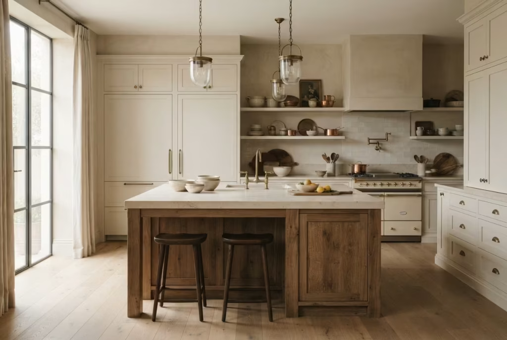
Restraint is the word I keep coming back to, and it’s a strange one to use for a style people associate with abundance, thick beams, deep basins, generous islands. But the ranch kitchens that actually work, the ones that feel lived in rather than staged, hold back just as much as they give.
They choose one hero material and let it breathe instead of piling on five competing textures. They pick warmth over clutter, character over accumulation. A cluttered kitchen dressed up with enough rustic trinkets can fool a photograph. It rarely fools a person standing in it for more than five minutes.
So before we get into layout logic or the right stain for reclaimed oak, it’s worth sitting with that distinction for a moment. A cozy country kitchen isn’t built by adding more. It’s built by choosing carefully, and then getting out of the room’s way.
What Actually Makes a Kitchen “Ranch” Beyond Pinterest Boards
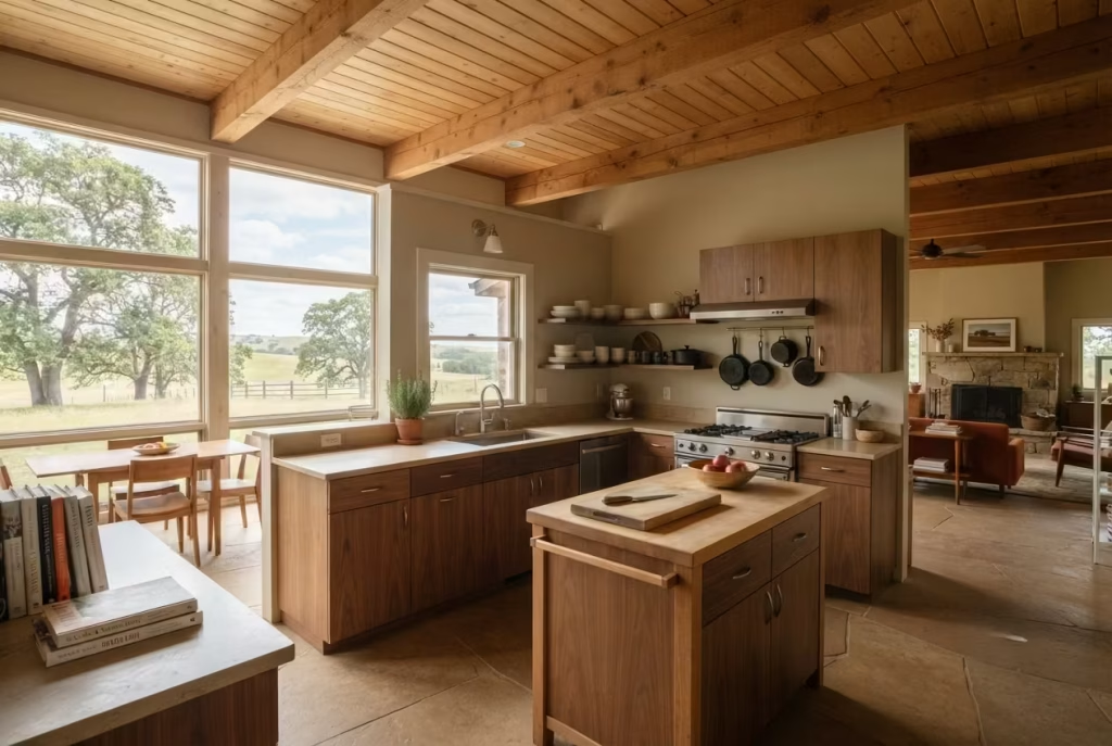
Here’s a confession that might ruffle a few feathers in the design world: most of what gets pinned under “ranch kitchen ideas” online has nothing to do with ranches at all. It’s farmhouse. Or it’s rustic.
Or it’s some catalog stylist’s fever dream involving too many woven baskets and not nearly enough thought given to how a family actually cooks. The terms get used interchangeably so often that the real distinctions have practically worn smooth, like a wooden spoon handle sanded down by years of stirring.
So let’s set the record straight, because knowing the difference isn’t academic hairsplitting. It changes what you buy, what you build, and what you’ll regret in five years.
Farmhouse design leans decorative first. It’s the aesthetic descendant of a working farm reinterpreted for people who’ve never actually milked anything, all shiplap and apron sinks and a certain performative simplicity. Rustic design is about material honesty taken to its rawest edge, exposed beams, unfinished wood, a deliberate roughness meant to read as authentic.
Ranch design, the real article, is something else entirely. It’s architectural before it’s aesthetic. It grew out of the sprawling single-story homes built across the American West and Midwest through the mid-20th century, houses designed around one unshakeable idea: keep everyone close to the land and close to each other.
That’s the logic hiding underneath every genuinely good ranch kitchen, and it’s the part Pinterest boards tend to skip right over.
The architecture tells on itself
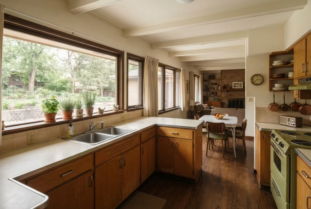
Walk into an original ranch-style home and the ceilings sit lower than you’d expect, often eight feet or so, which sounds unremarkable until you feel what it does to a room. It pulls the space down toward you, makes it intimate rather than cavernous.
The windows run wide and low, with deep sills, sometimes a full ten to twelve inches, generous enough to hold a row of potted herbs or a stack of mail nobody’s dealt with yet. And the kitchen itself rarely sits in isolation. It opens toward a dining area, a family room, sometimes straight out to a patio or yard, because these homes were built by people who didn’t believe in separating the act of cooking from the act of living.
This matters practically, not just poetically. If you’re renovating an actual 1960s or 1970s ranch home, you likely already have these bones in place, and the smartest move is usually to work with them rather than against them.
I’ve seen homeowners gut a genuine ranch kitchen and raise the ceiling, chasing the airy, vaulted look popular in new farmhouse builds, only to lose exactly the coziness they’d fallen in love with in the first place. It’s a classic case of throwing the baby out with the bathwater.
New construction trying to mimic the ranch aesthetic faces the opposite problem. Builders slap on the visual language, board and batten siding, a deep front porch, warm wood tones inside, but skip the spatial DNA that made the original style feel so grounded.
You end up with soaring nine or ten foot ceilings and a kitchen that looks the part in photographs but feels strangely formal in person, like wearing someone else’s broken-in boots. The proportions are off, and no amount of shiplap fixes that.
If there’s one takeaway worth underlining here, it’s this: a true ranch kitchen isn’t defined by a mood board. It’s defined by how the room breathes, how low it sits, how close it stays to the outdoors, and how naturally it invites people to gather rather than merely pass through. Get that foundation right, and the material choices we’ll get into next practically choose themselves.
Layout & Spatial Planning Where Cozy Actually Comes From
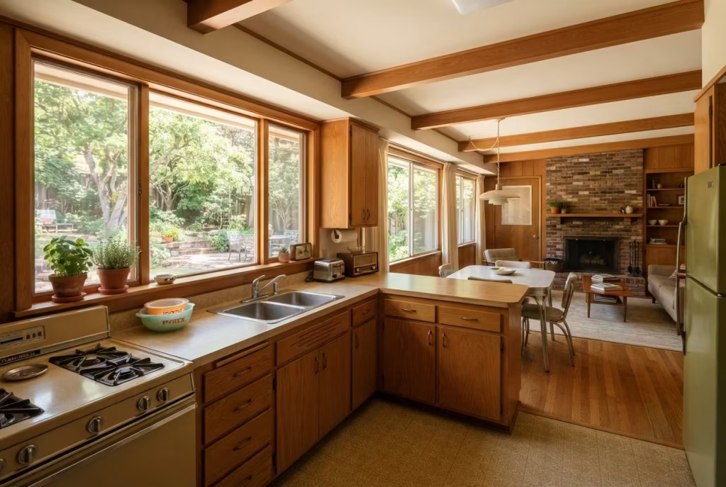
People tend to assume coziness gets bought at a furniture store. Wrong tree entirely. Coziness gets built into a floor plan long before anyone picks a paint swatch or a set of curtains, and it comes down to two things most homeowners never think to question: proportion and flow. Get those wrong and no amount of throw pillows or vintage enamelware will save the room. Get them right and the kitchen practically hugs you the moment you walk in.
Rethinking the working triangle for open sightlines
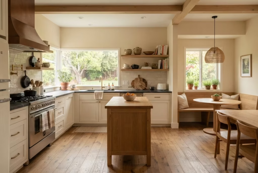
Every design student learns the classic kitchen work triangle early on, sink, stove, and refrigerator arranged so a cook can move between the three without covering unnecessary ground. It’s a solid rule of thumb, and it still holds water in a ranch kitchen.
But ranch homes throw a wrinkle into the equation that a lot of textbooks don’t account for, because these kitchens rarely exist as closed-off boxes. They open toward living rooms, dining nooks, sometimes straight through to a back porch, which means the triangle has to work double duty. It needs to keep the cook efficient while also keeping sightlines open to the rest of the house.
In practice, this usually means anchoring the sink toward the room’s open side, angled so whoever’s washing vegetables can still see a kid doing homework at the table or catch the tail end of whatever’s playing on the television in the next room over. It sounds like a small detail. It changes how a family actually uses the space day to day, and it’s the difference between a kitchen that isolates the cook and one that keeps them in the conversation.
You May also Like: 25 Open Kitchen Living Rooms ideas That Feel Stylish, Spacious, and Effortlessly Connected
Island sizing, and why bigger isn’t always better
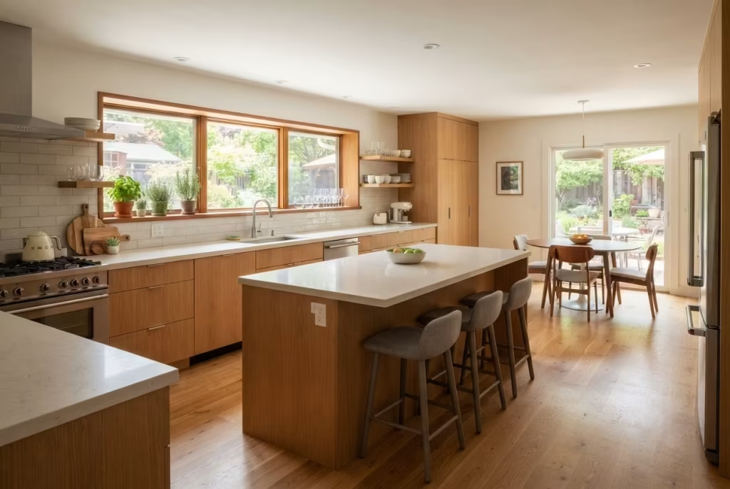
Islands have become something of a status symbol in kitchen renovations, and I understand the appeal. But an island sized wrong is one of the fastest ways to strangle a ranch kitchen’s natural flow, and I’ve watched it happen more times than I’d like to admit.
Here’s the practical guidance I give clients. You need a minimum of 42 inches of clearance on all sides of an island for comfortable walking room, and honestly, if you’ve got the square footage, pushing that to 48 inches near the main cooking zone makes a noticeable difference, especially if more than one person tends to be in the kitchen at once.
For a ranch kitchen in the 200 to 300 square foot range, which covers a good chunk of the mid-century homes I work in, an island footprint somewhere between 6 and 8 feet long by 3 to 4 feet wide tends to sit comfortably without eating the room alive.
I had a client a few years back who wanted what she called “the biggest island possible,” and technically, we could have fit one nearly ten feet long into her kitchen. On paper, it looked impressive. In practice, once we mocked it out with painter’s tape on the floor, it left barely 30 inches of clearance on the sink side, which meant two people literally couldn’t pass each other without doing an awkward little shuffle.
We scaled it back to 7 feet, added proper clearance on every side, and suddenly the room felt bigger, not smaller, despite the island technically taking up less space. It was a classic less is more moment, and it taught her something that no showroom display ever could: a kitchen island isn’t a trophy. It’s a tool, and tools need room to actually be used.
Open concept versus the enclosed, room-defined kitchen
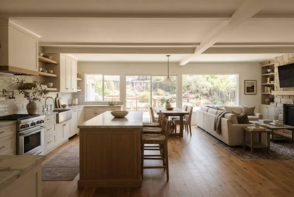
This is where I tend to get asked the same question on nearly every ranch renovation: should we knock the wall down or keep it standing? There’s no universal right answer, only trade-offs worth weighing honestly.
An open-concept ranch kitchen, blended into the living and dining areas, keeps the household connected and makes a modest square footage feel considerably more generous. It’s ideal for families who spend a lot of time together and want the cook included in whatever’s happening in the next room.
The downside is real, though. Cooking smells travel everywhere, clutter on the counter becomes visible from the couch, and noise from a blender or a dishwasher cuts straight through movie night.
A more enclosed, room-defined kitchen keeps mess and noise contained, gives you more usable wall space for cabinetry and pantry storage, and creates a sense of arrival when you step into the room to cook. But it can feel cut off from the rest of the house, particularly in a ranch home where the whole architectural point was togetherness in the first place.
My honest take, after sitting with this question across dozens of projects, is that a partial opening tends to split the difference best in true ranch homes. A wide doorway, a half wall with a wood cap, or a large pass-through window keeps the visual and emotional connection intact without turning the kitchen into a stage everyone can see mid-mess. It respects the original architectural intent of the ranch style while still giving the cook a little breathing room to work in peace.
Materials That Age Like They Mean It
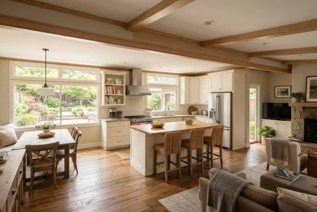
There’s a particular kind of kitchen that looks flawless the day it’s finished and somehow worse every year after. And there’s another kind that looks a little rough around the edges on installation day and only gets better with time, the way a good leather jacket softens instead of wearing out. That second kind is what we’re after in a ranch kitchen, because the whole point of this style is a room that ages like it means it, not one that’s fighting a losing battle against time from the moment the contractors pack up.
Material honesty is the phrase I keep coming back to with clients. It’s not about picking things that look rustic. It’s about picking things that are honest about what they are, and honest about how they’ll wear.
Wood: reclaimed versus new-cut, and what nobody tells you about maintenance
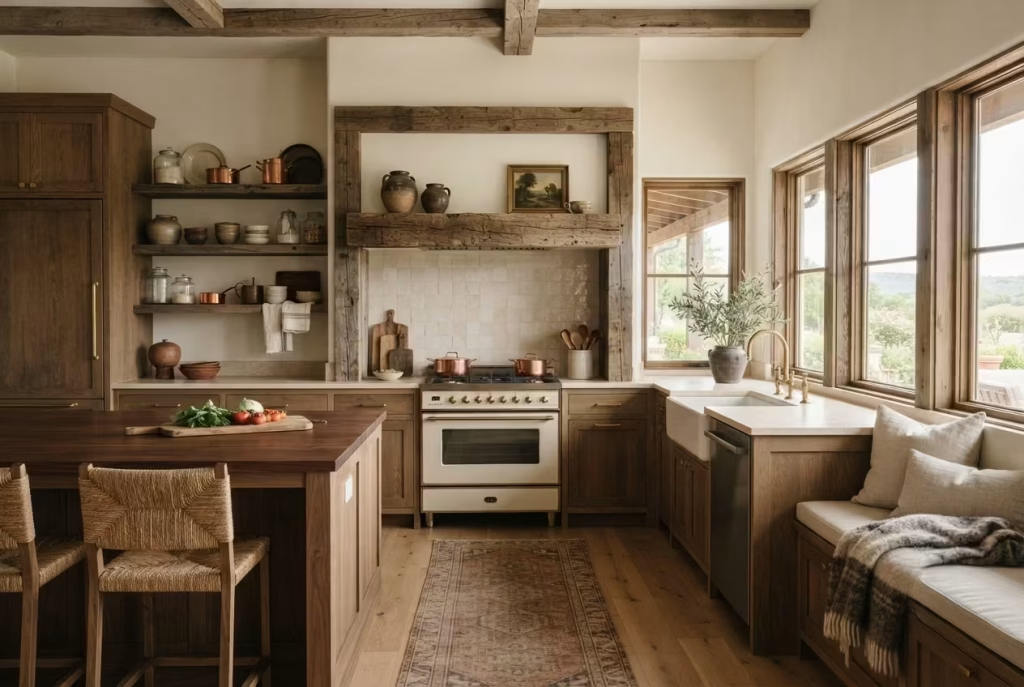
Reclaimed wood carries a certain romance, and deservedly so. Old barn beams, salvaged floorboards, timber pulled from a building that’s already lived a full life before it ever reaches your kitchen. The grain has character that new-cut lumber simply can’t fake, with nail holes, weathering, and color variation that would take decades to develop naturally in fresh timber. It photographs beautifully, and in person it has a warmth that’s genuinely hard to manufacture.
But here’s the part that gets glossed over in the glossy magazine spreads: reclaimed wood is unpredictable. It can carry old nails, warping, insect damage, and inconsistent moisture content, all of which need proper treatment before it goes anywhere near a kitchen. It typically costs more than new-cut lumber, sometimes considerably more, once you factor in the milling and treatment process. And it demands more attentive upkeep, particularly around heat and moisture zones near the stove and sink, where the wood’s history can work against its future.
New-cut wood, stained to mimic that same aged warmth, gives you predictability. Consistent grain, known moisture content, easier sourcing, and a more manageable price point. What you lose is the soul, that sense of a material that’s already survived something. My honest recommendation for most homeowners is a hybrid approach: reclaimed wood as an accent, an island top, open shelving, a mantle-style shelf above the stove, paired with new-cut cabinetry elsewhere. You get the character without betting the entire kitchen’s durability on a material with a mind of its own.
Stone and butcher block: where each one earns its keep
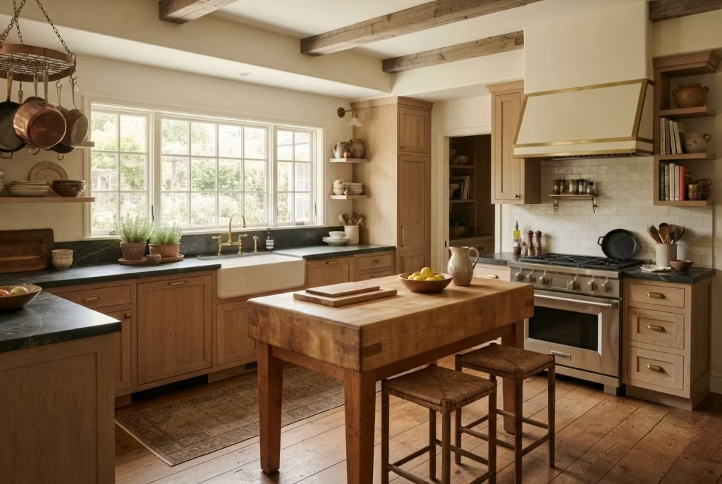
Countertops are where a lot of ranch kitchen dreams either take flight or crash straight into reality, and the honest answer is that neither stone nor butcher block wins outright. Each performs best in a different zone of the kitchen.
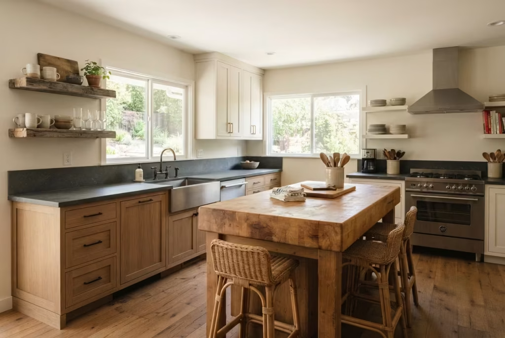
Butcher block brings warmth that stone simply cannot replicate, and it’s forgiving underfoot in the sense that it won’t chip a dropped glass the way stone sometimes will. It’s an excellent choice for an island top, especially in a kitchen leaning into that lived-in, hands-on cooking feel. The catch is maintenance. Butcher block needs regular oiling, roughly every month or so with normal use, and it’s genuinely vulnerable near a sink or stove, where standing water and heat can warp or stain it if you’re not diligent.
Stone, whether that’s granite, quartzite, or a soft soapstone, handles heat and moisture without complaint, which makes it the smarter choice for the primary work zone around the sink and cooktop. Soapstone in particular has become a favorite of mine for ranch kitchens because it darkens and develops a natural patina over years of use, which fits the whole “ages like it means it” philosophy better than a countertop engineered to look identical on day one and day one thousand.
My practical advice, drawn from more kitchens than I can count on two hands: use stone where water and heat live, and reserve butcher block for the island or a secondary prep zone, where its warmth can shine without constant exposure to its natural enemies.
Cabinetry finishes: shaker, stained wood, or a mix of both
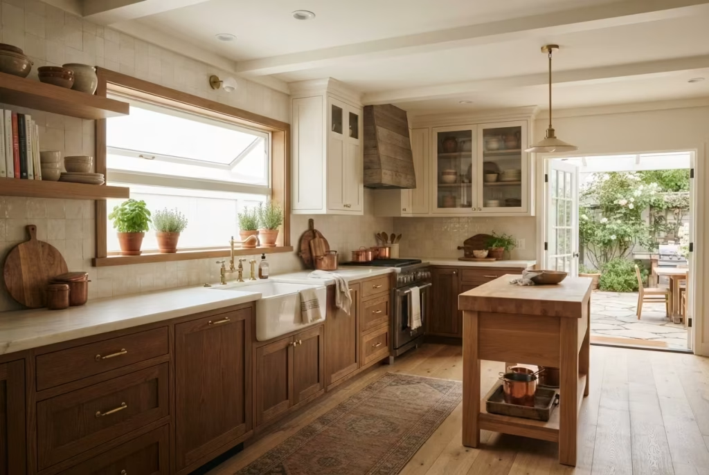
Painted shaker cabinetry has become something of a default in modern kitchen design, and there’s good reason for that. Clean lines, a timeless silhouette, and a finish that photographs well in nearly any light. In soft whites, sage greens, or deep charcoal tones, painted shaker cabinets bring a crisp, grounded feel that works beautifully against natural wood countertops or open shelving.
Stained wood cabinetry, on the other hand, leans harder into that architectural DNA we talked about earlier, the low ceilings and deep window sills that define a genuine ranch home. Stained wood tends to feel more rooted, more historically accurate to the style, though it can read as heavy or dated if it’s not balanced carefully with lighter elements elsewhere in the room.
The move I make most often these days is mixing the two. Stained wood lower cabinets grounding the room, paired with painted upper cabinets or open shelving to keep things from feeling cave-like. It’s a small compromise that delivers the best of both worlds, warmth below, lightness above, and it avoids the kitchen tipping too far in either direction.
Hardware: the punctuation mark, not the sentence
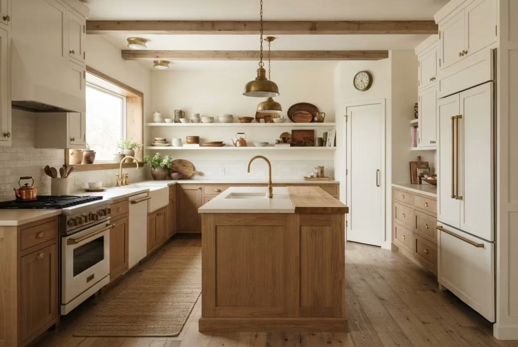
People underestimate hardware constantly, treating it as an afterthought once the cabinets are already installed. That’s backwards thinking. Hardware is punctuation in a kitchen’s visual sentence, and the wrong punctuation can make an otherwise well-written room feel confused.
Aged brass, oil-rubbed bronze, and matte black each carry a different emotional weight. Aged brass leans warm and traditional, oil-rubbed bronze splits the difference between rustic and refined, and matte black brings a more contemporary edge that can either sharpen a ranch kitchen nicely or clash with it if overused. My rule of thumb: choose one finish and commit to it throughout the room, cabinet pulls, faucet, light fixtures, even door hinges if they’re visible. Mixing metals can work in small doses, but in a kitchen already carrying a lot of natural texture through wood and stone, consistency in hardware gives the eye somewhere to rest.
You May also Like: 25 Desert Kitchen Designs That Beat the Heat and Look Incredible
A closer look: how three material paths actually compare
| Material Choice | Upfront Cost | Ongoing Upkeep | Overall Feel |
|---|---|---|---|
| Reclaimed wood accents | Higher, due to milling and treatment | Moderate to high, needs monitoring near heat and moisture | Rich, storied, unmistakably authentic |
| New-cut stained wood | Moderate, more predictable pricing | Low to moderate, standard sealing | Warm but slightly more uniform |
| Butcher block countertop | Moderate | High, regular oiling required | Tactile, welcoming, hands-on |
| Stone countertop (soapstone/granite) | Higher upfront | Low, occasional sealing depending on stone | Grounded, enduring, quietly elegant |
| Painted shaker cabinetry | Moderate | Low | Crisp, timeless, adaptable |
| Stained wood cabinetry | Moderate to higher | Low to moderate | Rooted, historically accurate to ranch style |
No single row on that table is the “correct” answer. The right combination depends on how the family actually lives in the kitchen, how much time they’re willing to spend on upkeep, and how much of that lived-in patina they genuinely want to embrace versus fight against. That’s the real decision hiding underneath every material swatch, and it’s worth more thought than most renovations give it.
Color Palette: Warmth Without Going Beige
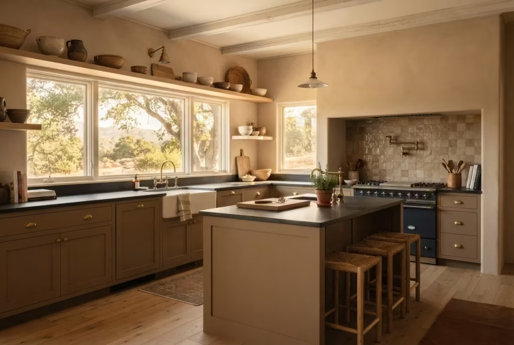
There’s a fatigue setting in across the design world right now, and if you’ve spent any time scrolling home renovation content lately, you’ve probably felt it yourself without quite naming it. Beige fatigue, some are calling it, that creeping sense that every “modern farmhouse” kitchen built in the last decade got poured from the same mold. Greige walls, white oak everything, a palette so safe it borders on forgettable. It’s not that neutral is wrong. It’s that neutral without depth becomes wallpaper for a life nobody’s actually living.
Ranch kitchens, done properly, sidestep this problem almost by accident, because the style was never built around trend-chasing safety in the first place. It was built around warmth, and warmth has never been beige’s strong suit.
Grounding neutrals need a partner in crime
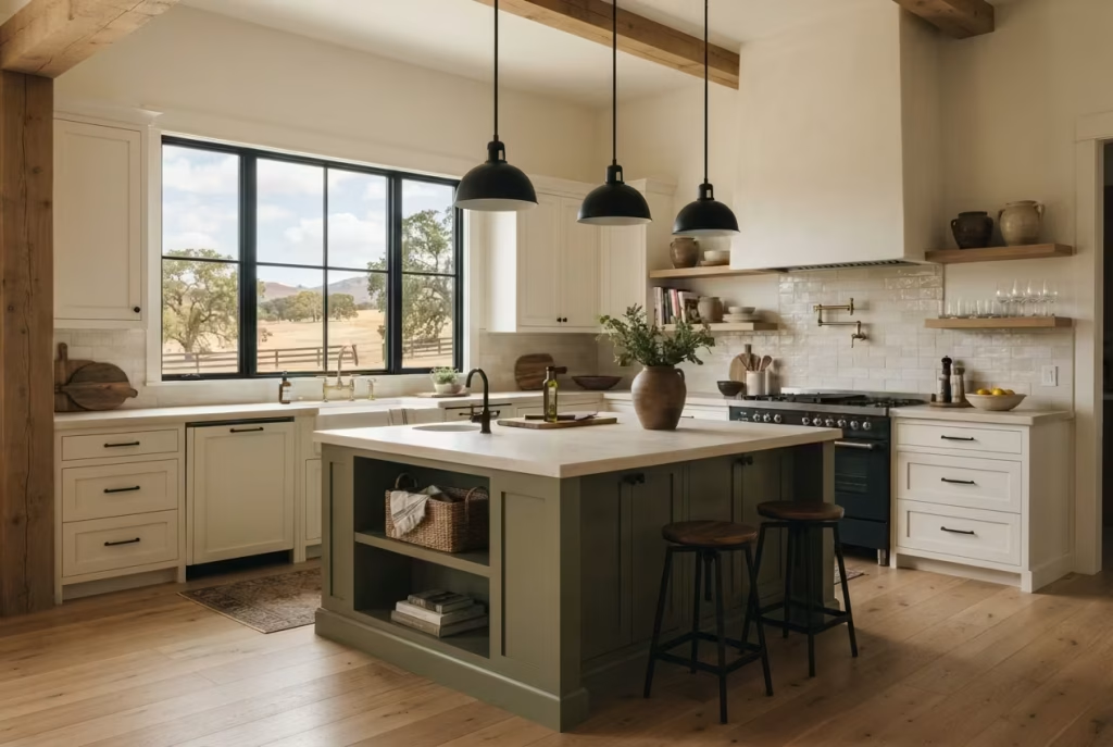
The trick isn’t abandoning neutrals altogether. It’s giving them something to lean against. A soft, warm white or a muted greige still has a place on the walls or the ceiling, functioning as breathing room in a kitchen already carrying plenty of visual texture through wood and stone. But that neutral needs a deeper tone somewhere in the room to keep it from flattening out entirely.
This is where rust, olive, and soot black earn their keep. A rust-toned tile backsplash or a deep olive island against warm white perimeter cabinets creates exactly the kind of tension a good room needs, contrast without chaos. Soot black, whether on window frames, a range hood, or even the lower half of a cabinet run, acts like the final stroke of eyeliner on an otherwise soft face. It defines the room’s edges and keeps everything else from blurring into sameness.
I tend to think of it in terms of a simple ratio: roughly 60 percent grounding neutral, 30 percent a warm secondary tone like rust or olive, and 10 percent a deep anchor color like soot black or a near-black bronze. It’s not a rigid formula, more a starting point, but it keeps a kitchen from tipping into either sterile whiteness or overwhelming darkness.
Why light exposure changes the entire conversation
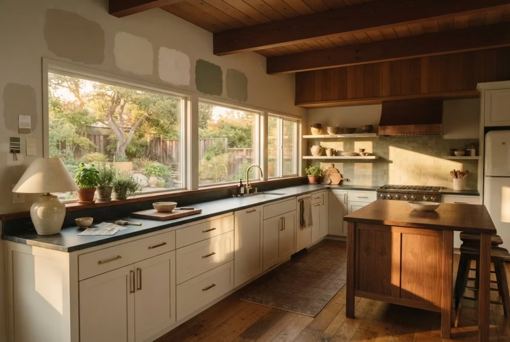
Here’s something that gets overlooked constantly in color planning, and it matters enormously in ranch homes specifically. These are, more often than not, single-story structures with wide, low windows, which means natural light behaves differently than it does in a two-story colonial or a narrow city townhouse. Light comes in low and horizontal for much of the day, raking across surfaces rather than pouring straight down, and it tends to linger longer in the late afternoon and early evening thanks to those generous window openings we talked about earlier.
That kind of light is incredibly forgiving to warm tones and can turn cool grays and blues muddy or lifeless by comparison. A color that reads crisp and sophisticated in a paint store’s fluorescent lighting might look flat and gray in a ranch kitchen bathed in golden hour sun.
This is exactly why I always insist on testing paint swatches directly on the walls of the actual room, at different times of day, before committing to a full gallon. What looks perfect at noon can shift entirely by six in the evening, and in a ranch home, that shift tends to be more dramatic than people expect.
A palette that actually worked, and why
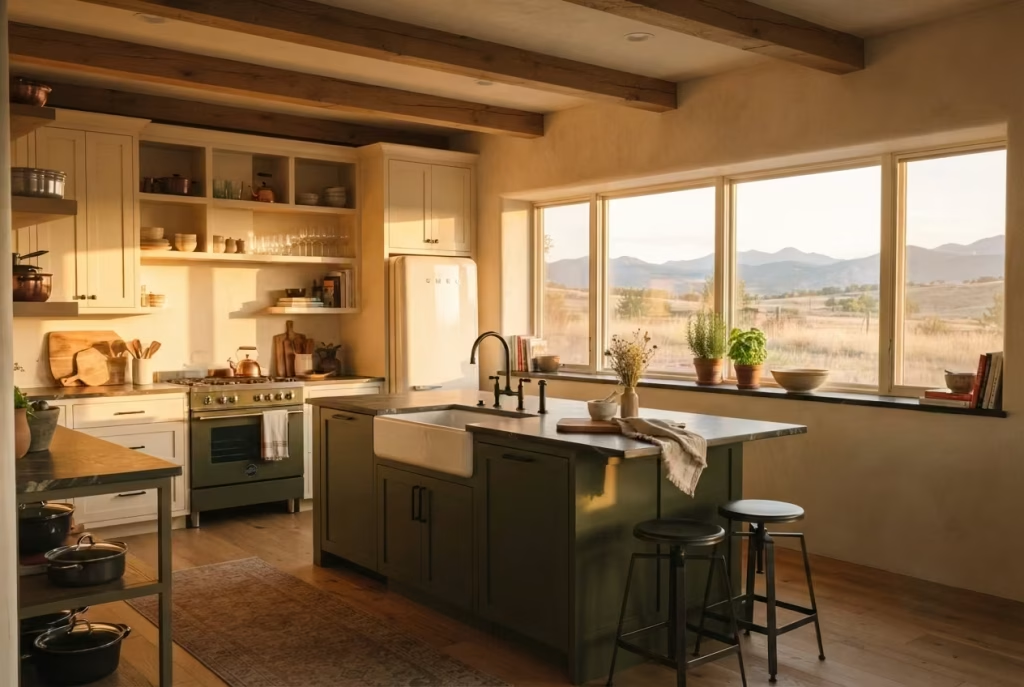
On a project in northern Colorado a couple of years back, we were working with a kitchen that had exactly this low, wide window situation facing west, meaning the room got flooded with warm amber light nearly every evening. The client initially wanted a cool, almost Scandinavian palette, crisp white cabinets, gray countertops, black hardware. On paper it looked clean. Tested against that western light, it turned the room strangely cold and clinical, fighting against the very thing that made the space special in the first place.
We pivoted to a warm cream on the upper cabinets, a deep olive green on the island, and soot black hardware and faucet fixtures throughout. The countertop ended up being a soapstone with warm gray veining, which picked up both the cream above and the olive below without competing with either.
When that late afternoon light hit the room, instead of clashing with cool tones, it actually amplified the warmth already built into the palette, making the olive glow slightly amber and the cream cabinets look almost sun-kissed.
The client, who’d been skeptical about abandoning her original cooler vision, admitted within a week of living with it that the kitchen finally felt like it belonged to the house it was sitting inside of, rather than a magazine clipping dropped in from somewhere else entirely.
That’s the real lesson buried in this section, and it’s worth sitting with. Color in a ranch kitchen isn’t chosen in a vacuum, and it certainly isn’t chosen from a swatch under store lighting. It’s chosen in conversation with the specific light that room receives, and when that conversation goes well, the palette stops looking like a trend and starts looking like it was simply always meant to be there.
Lighting the Ranch Kitchen Function First, Mood Second
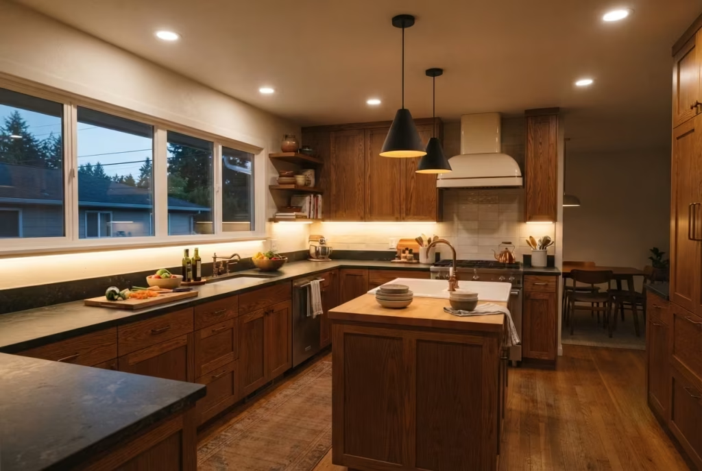
If I had to name the single most underestimated element in kitchen design, lighting would win without much competition. People pour their entire budget into cabinetry and countertops, treat lighting as an afterthought, and then wonder why the finished room feels flat, or worse, why the food prep area is dim enough to require a flashlight for chopping onions safely. Lighting isn’t decoration. It’s infrastructure wearing a nice outfit, and getting it wrong is the fastest way to sink an otherwise beautifully designed ranch kitchen.
Layering is non-negotiable, not optional
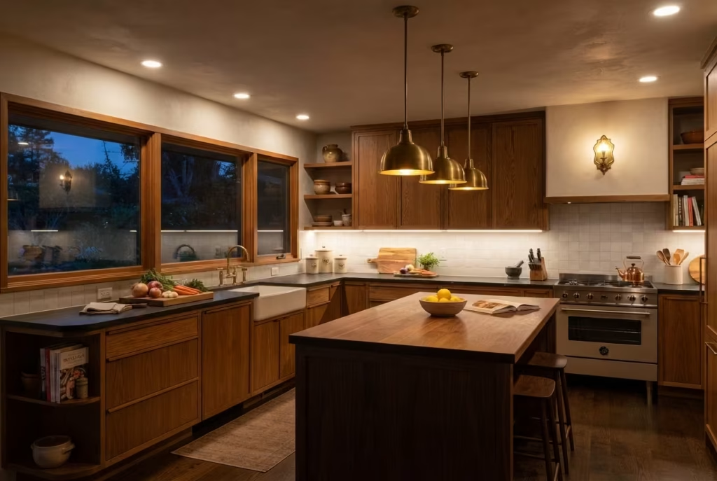
Every well-lit kitchen relies on three distinct layers working together, and skipping any one of them creates a room that feels either harsh or dim depending on which layer got neglected.
Task lighting handles the practical heavy lifting, illuminating the specific zones where actual work happens. Under-cabinet LED strips over the counter, a focused fixture above the sink, direct downlighting over the stove. This is the layer people notice most when it’s missing, usually in the form of squinting while trying to read a recipe or chop vegetables in your own shadow.
Ambient lighting fills the rest of the room with a general, even glow, usually achieved through recessed ceiling fixtures or a central flush mount, and its job is simply to keep the space from feeling cave-like once the sun goes down. In a ranch kitchen with those characteristically low ceilings we discussed earlier, ambient lighting needs particular care, because recessed cans set too closely together or too bright can flatten the room’s natural coziness into something closer to a dentist’s office.
Accent lighting is the layer that actually builds mood, and it’s the one most amateur plans skip entirely. Think pendant lights over an island, a warm sconce flanking a range hood, or even a small lamp on an open shelf. This layer does the emotional work, softening the room in the evening and giving it that lived-in, golden hour feeling long after the sun’s gone down.
Getting pendant sizing and height right, with actual numbers
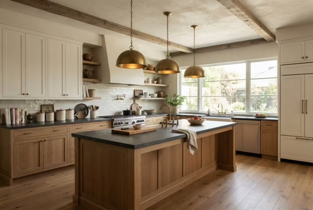
This is where I see the most consistent mistakes, and it’s entirely fixable with a few measurements committed to memory. Over a kitchen island, pendants should typically hang so the bottom of the fixture sits 28 to 34 inches above the counter surface, which keeps sightlines clear across the island while still casting usable light downward. For a standard 8-foot ceiling common in ranch homes, that usually translates to hanging the pendant roughly 30 to 36 inches below the ceiling itself, depending on the fixture’s own height.
Sizing matters just as much as placement. For a single pendant over a sink, something in the 8 to 12 inch diameter range typically looks proportionate without overwhelming the window above. For a pair or trio of pendants over an island, a common rule of thumb is spacing them so there’s roughly 24 to 30 inches between each fixture, with each pendant sized somewhere between 10 and 14 inches in diameter for a standard 7 to 8 foot island. Go smaller and the fixtures look like an afterthought, lost in the room. Go too large or hang them too low, and you’ll find yourself ducking to reach across the island, which gets old fast, believe me.
A fix that changed everything, and never touched a single cabinet
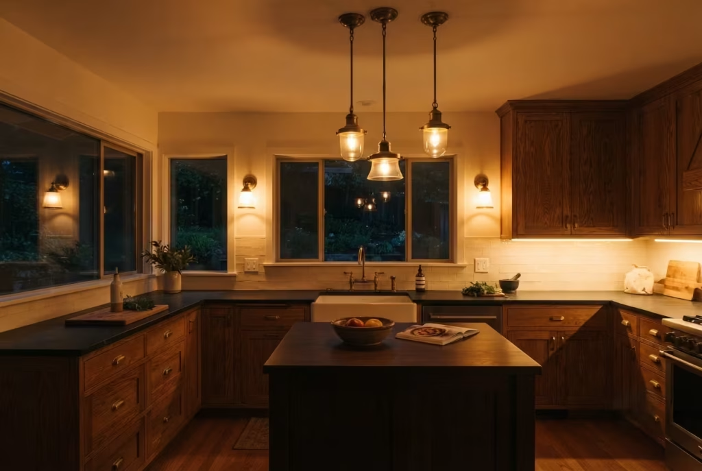
I worked on a kitchen a while back where the homeowners were convinced they needed a full cabinet replacement because the room felt dark and uninviting despite having decent bones and reasonably nice existing cabinetry. Before agreeing to that considerable expense, I asked to spend an evening in the space to see how it actually lived after dark, and the problem became obvious almost immediately.
The entire kitchen was running on a single, harsh ceiling-mounted fixture with a cool white bulb, no task lighting whatsoever, and no accent layer to speak of. It was the lighting equivalent of trying to have an intimate dinner conversation under a fluorescent office light.
We added under-cabinet LED strips along the main counter run, swapped the single ceiling fixture for three warm-toned pendants hung at proper height over the island, and installed a pair of small brass sconces flanking the window above the sink. Total project cost came in well under a tenth of what a full cabinet replacement would have run.
The transformation was, frankly, dramatic enough that the homeowners initially assumed we’d also refinished the existing cabinets, when in fact not a single door or drawer front had been touched. All we’d changed was how the room was lit, and suddenly the same cabinetry that had felt tired and outdated looked warm, intentional, and every bit as inviting as the rest of the house.
That project taught me something I’ve carried into every renovation since. Before spending a dollar on demolition, spend an evening in the room after dark. More often than people expect, the fix isn’t a sledgehammer. It’s a bulb, a fixture, and a little bit of layering done right.
You May also Like: Best Warm Neutral Paint Colours That Never Feel Flat
The Details That Make It Feel Lived-In
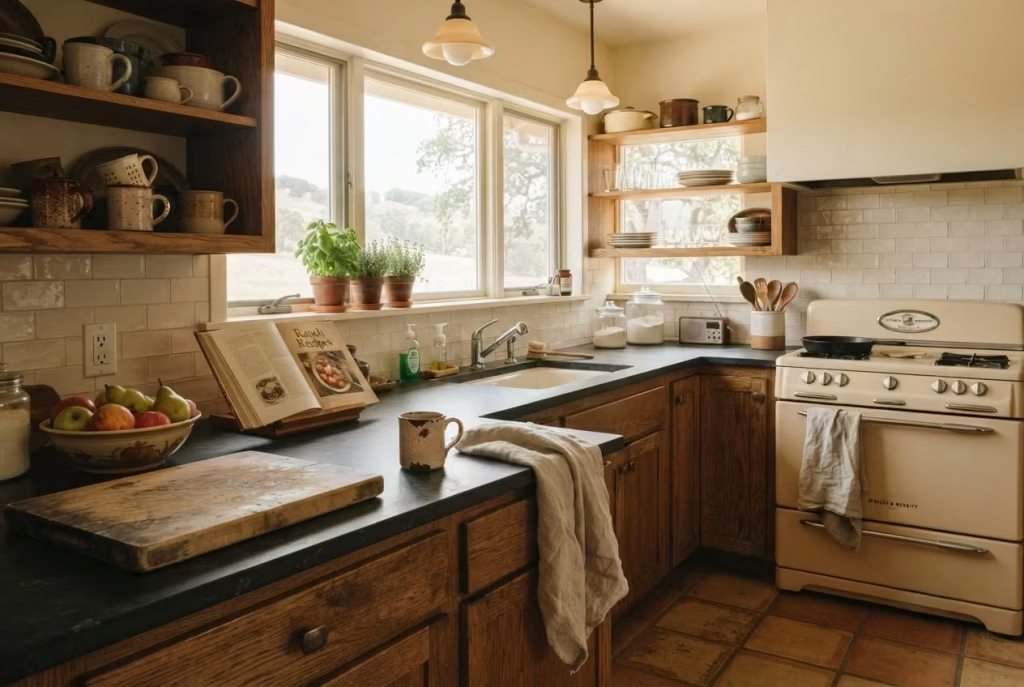
Every kitchen I’ve ever walked into that made me want to sit down and stay a while had one thing in common, and it had nothing to do with the price tag on the countertops. It was the small stuff. The chipped mug on the open shelf that clearly belonged to someone’s grandmother. The dish towel hanging slightly askew because someone actually uses it, daily, rather than displaying it for photographs.
This is the section where design stops being about proportion and material science and starts being about soul, and honestly, it’s the part most renovation guides rush through or skip entirely, which is a shame, because it’s often the difference between a kitchen that photographs well and one that people actually love.
Open shelving: a beautiful idea that’s often executed badly
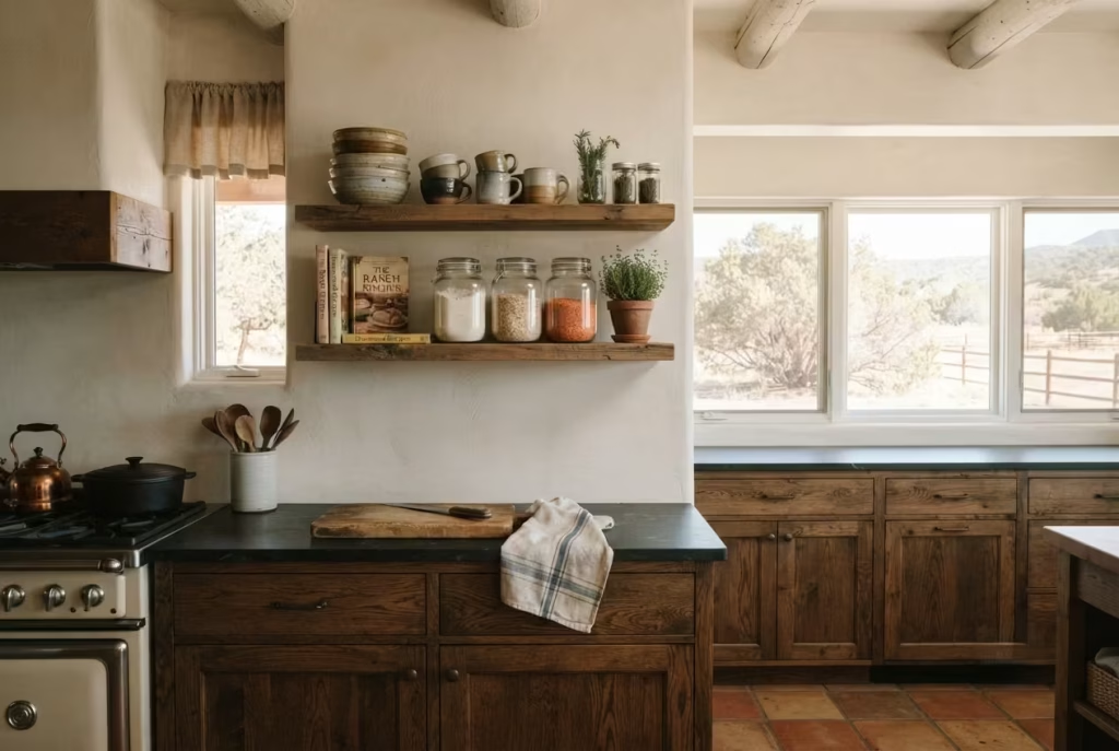
Open shelving gets recommended constantly in country kitchen design, and for good reason when it’s done thoughtfully. It breaks up a wall of closed cabinetry, gives a room breathing room, and offers a natural spot to display the kind of everyday objects that make a kitchen feel personal rather than showroom-perfect. A few sturdy wood shelves holding stoneware, a stack of well-loved cookbooks, or a row of glass jars filled with pantry staples can do more for a room’s warmth than an entire wall of expensive cabinetry.
But here’s the part that gets left out of the glossy inspiration photos: open shelving demands discipline, and it’s genuinely the wrong call for some households. If you’re not someone who keeps things reasonably tidy, or if your kitchen tends to accumulate clutter faster than you can curate it, open shelving will expose that daily reality to anyone who walks in, and not in a charming way. It also collects dust and grease faster than closed cabinets, particularly on shelves positioned near the stove, which means more frequent cleaning than most people budget for mentally.
My honest guidance after installing plenty of open shelving over the years: use it selectively, in one or two zones rather than throughout the entire kitchen, and reserve it for the objects you’d genuinely be happy to look at every single day. If your instinct is to fill it with matching, color-coordinated dishware bought specifically for display, that’s usually a sign you’re chasing the aesthetic rather than embracing the function, and the shelf will feel staged rather than lived-in no matter how nice it looks in a photo.
Letting inherited and vintage pieces do some heavy lifting
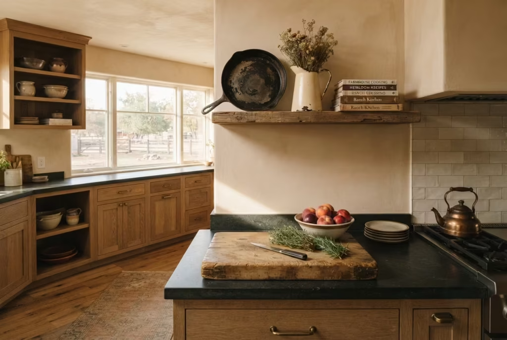
Nothing, and I mean nothing, gives a kitchen instant depth and history quite like an object that’s actually old and actually meant something before it landed in your renovation. A cast iron skillet passed down from a grandparent. An enamel pitcher found at an estate sale that’s clearly survived a few decades of use. A wooden cutting board with knife marks worn into its surface from years of chopping.
The key word here is intentional. Vintage pieces work beautifully when they’re placed with purpose, given a spot where they can actually be seen and appreciated, rather than crammed onto a shelf alongside a dozen other trinkets competing for attention.
I often tell clients to pick three or four pieces with genuine history or meaning and build a small moment around each one, a single shelf, a spot on the counter, a hook near the stove, rather than scattering fifteen “rustic-looking” objects throughout the room hoping the sheer volume reads as charm. Quality of story beats quantity of stuff, every single time.
Textiles: the cheapest transformation in the entire renovation
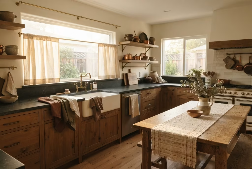
If there’s one category of this entire guide that offers the best return on a modest investment, it’s textiles, and yet they’re consistently the last thing homeowners think about, usually added as a rushed afterthought once the big-ticket items are already installed. A woven runner down the center of a farmhouse table, linen curtains hung at the window over the sink, a stack of well-worn dish towels in a complementary but not perfectly matched color.
These small textile choices soften every hard surface in the room, the stone counters, the wood floors, the metal hardware, and they’re remarkably inexpensive compared to literally everything else discussed in this guide.
Curtains in particular deserve more attention than they typically get. A simple linen or cotton panel, hung slightly above the window frame to create the illusion of height, adds softness to a kitchen that might otherwise feel dominated by hard materials. And dish towels, oddly enough, are one of the easiest ways to inject seasonal color or personality into a kitchen without committing to anything permanent. Swap them out, and the whole room shifts mood slightly, all for the cost of a few yards of fabric.
The client who fought “perfect,” and won
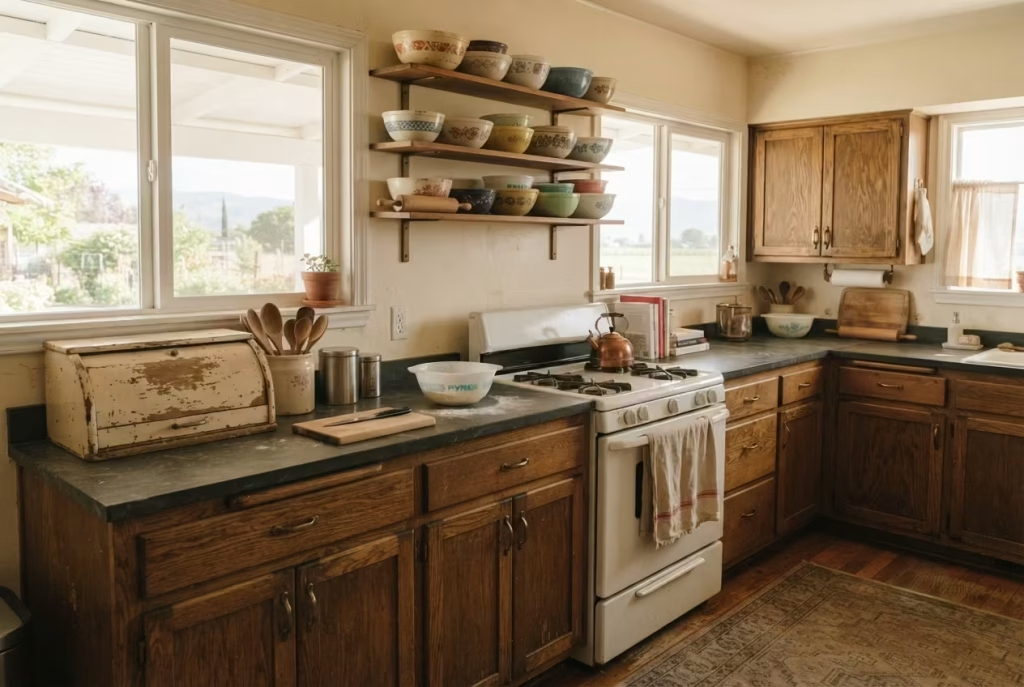
I worked with a couple a few years back who, understandably, wanted their new ranch kitchen to look flawless. Every surface pristine, every shelf styled with matching, curated objects, nothing out of place. About two weeks after the renovation wrapped, the wife called me, slightly embarrassed, admitting the kitchen felt beautiful but somehow cold, like a hotel rather than her own home.
We sat down and went through what was actually missing, and it came down almost entirely to the details in this section. She’d removed every inherited object because it “didn’t match,” stored her grandmother’s mismatched mixing bowls in a cabinet instead of displaying them, and bought brand new, color-coordinated towels rather than using the slightly faded ones she’d had for years but genuinely loved.
We brought the mismatched bowls back out onto the open shelf. We hung the faded towels back on the oven handle. We added her grandfather’s old wooden bread box to the counter, chipped paint and all, instead of the pristine new one she’d purchased to replace it.
Within a month, she told me the kitchen finally felt like theirs. The imperfections weren’t flaws to be corrected. They were the entire point, and once she stopped fighting them, the room stopped feeling like a photograph and started feeling like a home. That’s the lesson worth carrying forward from this section more than any specific product or measurement: a kitchen that’s too perfect is a kitchen that’s forgotten what it’s actually for.
Exterior & Threshold Connection Where Kitchen Meets Land
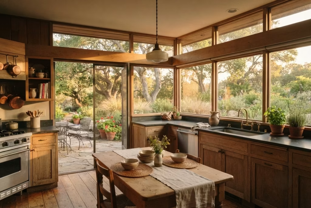
There’s a moment in nearly every ranch home walkthrough where I stop mid-conversation and just look out the kitchen window for a beat longer than necessary. Not out of distraction. Out of recognition, because a genuine ranch kitchen was never designed to exist as a sealed box facing inward on itself. It was built with one eye always on the land outside, and if you renovate that kitchen without honoring that outward-facing instinct, you’ve fixed the room but missed the point entirely.
Windows and nooks that do more than let light in
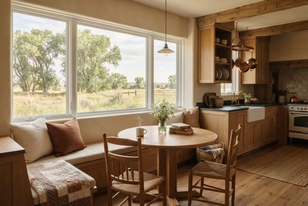
We’ve already talked about how ranch-style windows tend to run wide and low with generous sills, but it’s worth going a step further and talking about placement, because where a window sits matters just as much as its size. The best ranch kitchens I’ve worked on treat the window over the sink as a framed view, not just a light source, positioned deliberately to catch whatever’s most worth looking at outside, a stand of cottonwoods, a fence line, a garden bed, even just the changing sky over open pasture.
A breakfast nook tucked against a bank of windows does similar work on a smaller scale, creating a spot where morning coffee comes with an actual view rather than a blank wall. These nooks don’t need to be elaborate. A built-in bench, a simple table, and windows positioned at seated eye height turn an ordinary corner into the spot everyone in the house gravitates toward without quite knowing why. It’s a small architectural gesture that pays emotional dividends far beyond its square footage.
Mudrooms and the kitchen’s working relationship with the outdoors
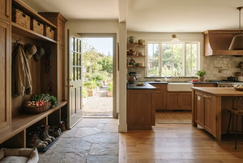
Ranch layouts have a long-standing habit of tucking a mudroom or back entry directly adjacent to the kitchen, and this isn’t accidental. These homes were built for people coming in from actual outdoor work, muddy boots, garden harvests, firewood, and the kitchen needed to be the first stop, not a destination three rooms deep into the house. That transition zone matters enormously in a renovation, because getting it wrong means tracked-in mess landing directly on your new floors, and getting it right means the kitchen continues to function the way it was always meant to.
A well-designed mudroom-to-kitchen transition includes a durable, easy-to-clean flooring change right at the threshold, hooks and a bench for boots and coats within arm’s reach, and ideally a door heavy enough to buffer temperature swings without feeling like a barrier between indoors and out. If your ranch home already has this layout, resist the urge to seal it off during renovation in favor of a more formal entry.
That connection between kitchen and land is part of what makes the style work in the first place, and severing it trades authenticity for a kind of generic polish the house was never asking for.
You May also Like: Transform Your Space: 15 Sage Green Kitchen Ideas That Feel Soft, Fresh, and Elegant
A sink that moved twelve inches, and changed everything
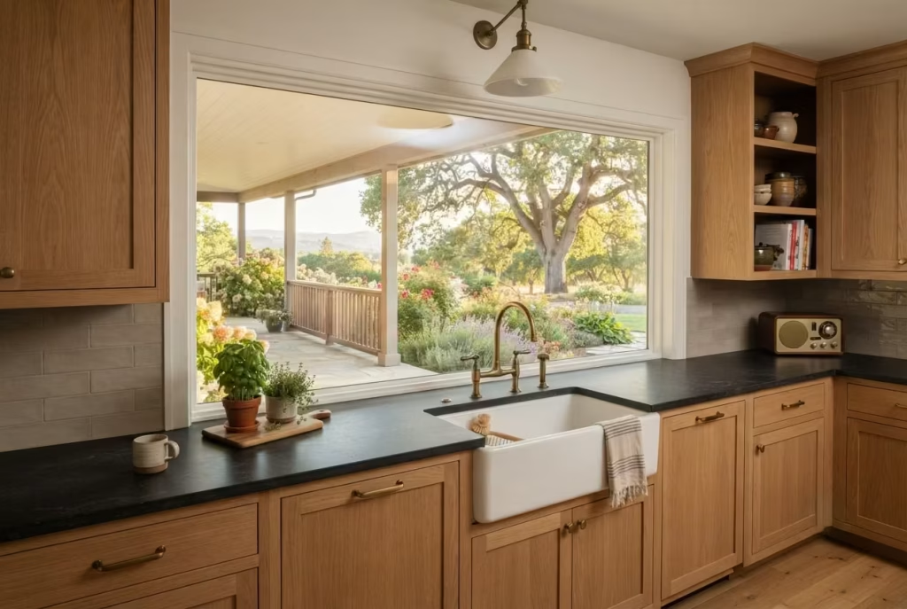
On a renovation in eastern Washington, the original kitchen sink sat against an interior wall, facing nothing but the pantry door, while the home’s best view, a wide porch overlooking a sloping garden and an old oak tree, sat completely unused just eight feet away along an exterior wall. The clients had lived there for years without questioning it, simply accepting that the sink lived where the sink lived.
We reworked the plumbing to relocate the sink roughly twelve inches over and centered it under a new window looking straight out at that porch and garden. It sounds like a minor adjustment on paper, a foot of pipe rerouting, hardly the stuff of dramatic renovation reveals. In practice, it transformed the most repetitive, least glamorous task in the entire kitchen, washing dishes, into something the wife genuinely told me she looked forward to, because now she could watch the light change over that oak tree while she worked. We also widened the window slightly and lowered the sill by about four inches to bring more of the porch railing into view from a standing position at the sink.
That project reinforced something I now bring into every consultation. Before finalizing a kitchen layout, walk the exterior of the property first. Note where the light falls best, where the most compelling view actually sits, where a porch or garden or tree line deserves to be framed rather than ignored. The kitchen and the land around it were never meant to be separate conversations in a true ranch home, and the renovations that honor that relationship tend to be the ones homeowners fall in love with all over again, years after the dust has settled.
Budgeting the Renovation Honestly
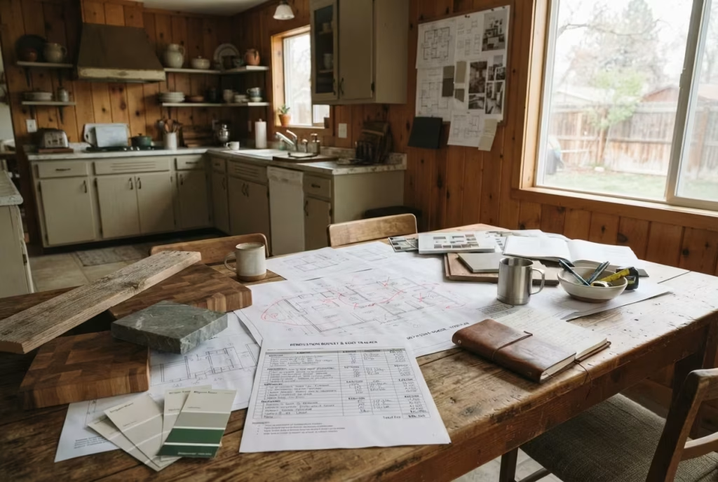
At some point, every design conversation has to come back down to earth, and that point is money. It’s easy to get swept up in soapstone counters and reclaimed beams and forget that renovations are, at the end of the day, financial decisions with real consequences for a household’s bottom line. So let’s talk numbers plainly, without the usual dance around the subject that so many design guides seem allergic to.
What things actually tend to cost
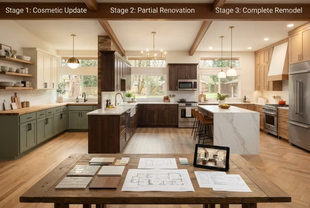
A full ranch kitchen renovation, meaning new cabinetry, countertops, flooring, lighting, appliances, and some layout changes, typically lands somewhere between $35,000 and $75,000 for a mid-range project, though this swings considerably depending on region, with coastal markets and major metro areas often running 20 to 40 percent higher than rural or Midwest pricing.
High-end renovations involving custom cabinetry, premium stone, and structural layout changes can easily climb past $100,000, while a more modest, cosmetic-focused update, new paint, hardware, lighting, and perhaps a countertop swap without touching cabinetry or layout, can often be accomplished in the $8,000 to $20,000 range.
A partial renovation, keeping the existing footprint and cabinet boxes while refreshing finishes, countertops, and fixtures, tends to fall somewhere in between, often $20,000 to $40,000 depending on material choices. These are broad bands, not gospel, and any reputable contractor should be able to give you a more precise figure once they’ve walked your specific space and understood your particular wish list.
Where spending pays off, and where it’s better held back
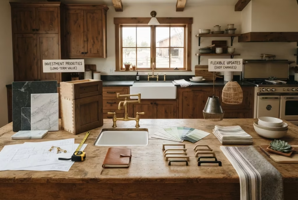
Here’s where experience really earns its keep, because the instinct to splurge everywhere or economize everywhere are both mistakes. Spend generously on the things you touch constantly and that are expensive to change later: countertops, cabinetry structure, and plumbing fixtures. These are the bones of daily use, and cutting corners here tends to show up as regret within a year or two, whether that’s a countertop that stains too easily or cabinet hardware that loosens with normal use.
Save where you can on things that are easy and affordable to update down the road: paint color, light fixtures, cabinet hardware, and decorative textiles. These are the elements you can swap out for a few hundred dollars whenever your taste shifts or a trend fades, so there’s little reason to spend top dollar on them upfront.
I also tell clients to be cautious about over-customizing structural elements for current trends, because a highly specific layout choice that feels perfect today might feel dated or impractical in a decade, while quality materials chosen with restraint tend to hold their appeal regardless of what’s trending.
One splurge worth every penny, one that wasn’t
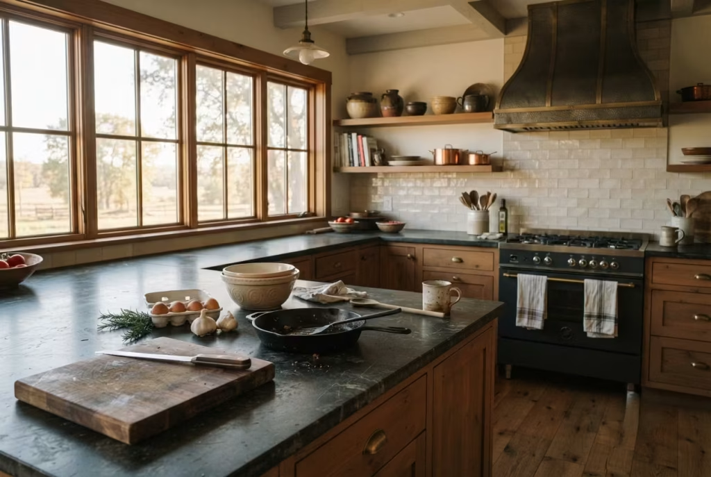
On a project in Idaho, the clients debated for weeks over whether to spend the extra money on solid soapstone counters throughout versus a quartz alternative that mimicked the look for roughly a third of the cost.
They eventually chose the real soapstone, and three years later, that countertop has developed exactly the kind of patina we discussed earlier, deepening and softening with use in a way the quartz simply never would have. It remains, by the client’s own admission, the single best decision of the entire renovation, and money well spent by any measure.
On the flip side, that same project included a fully custom range hood, hand-forged and shipped from out of state, at a cost that ran nearly four times what a quality off-the-shelf option would have cost. It looks lovely, no argument there, but functionally
it performs identically to options a fraction of the price, and the client herself later admitted the splurge was driven more by wanting something nobody else had rather than any genuine functional need. It’s a reminder worth sitting with: sometimes the most expensive choice isn’t the wrong choice, and sometimes it’s simply an expensive way of learning that function and price don’t always move in the same direction.
A Kitchen That Holds Its Own Story
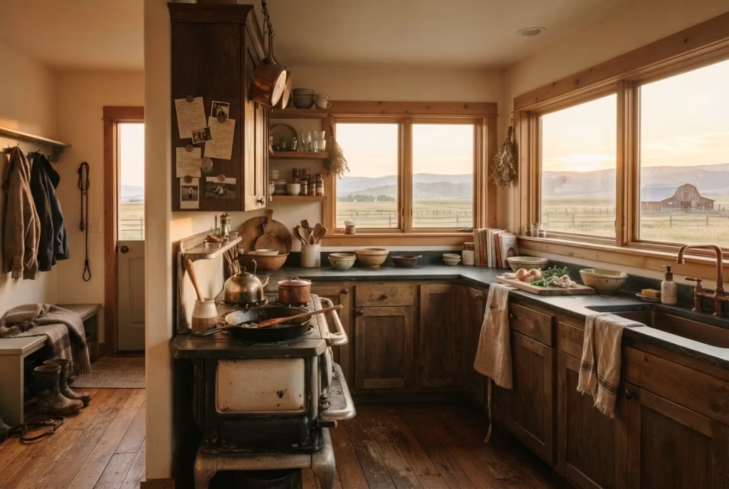
I still think about that cast iron skillet sitting warm on the back burner in Bozeman, and I probably always will, because it taught me something a design degree never quite manages to explain properly. A kitchen isn’t finished when the last cabinet door gets hung or the final coat of sealant dries on the countertop. It’s finished, in the truest sense, the day it stops looking like a renovation and starts looking like it was simply always there, waiting for the family that finally noticed it.
That’s the real thread running underneath everything in this guide, the layouts and the material breakdowns and the pendant heights measured down to the inch. None of it matters much on its own. What matters is whether all those decisions add up to a room that holds a family’s actual life, the burnt toast mornings, the muddy boots by the back door, the mismatched bowls that never quite got replaced because nobody wanted to let them go. A cozy country kitchen, done honestly, becomes less of a showcase and more of a witness, quietly present for whatever unfolds within its walls, year after year.
There’s an old saying about how a house isn’t a home until it’s lived in, and kitchens take that idea and run further with it than any other room. This is the space that absorbs the most life, the most noise, the most spilled flour and shared conversation, and it should look and feel like it can handle exactly that, rather than flinching at the first sign of actual use.
The families who get this right aren’t the ones with the biggest budgets or the rarest materials. They’re the ones willing to let a little imperfection sit alongside genuine craftsmanship, understanding that a slightly worn spot on the floor in front of the stove tells a better story than any flawless showroom finish ever could.
So if you take one thing forward from everything covered here, let it be this. Build the kitchen with good bones, honest materials, thoughtful light, and a floor plan that actually serves how your family moves through a day.
Then step back, and let it live. Let the mug collection grow a little mismatched. Let the dish towels fade exactly the way well-loved things do. A ranch kitchen was never meant to be a finished product, frozen in a single photograph. It was always meant to be a room that keeps writing its own story, one ordinary Tuesday dinner at a time, long after the contractors have driven off and the sawdust has finally settled.
Frequently Asked Questions
What defines a ranch-style kitchen?
A ranch-style kitchen is defined more by architecture than decor, typically featuring lower ceilings around eight feet, wide and low windows with deep sills, and an open connection to adjoining living or dining spaces. It grew out of mid-20th century single-story homes built for close-knit family living close to the land.
What colors work best in a ranch kitchen?
Warm grounding neutrals like soft cream or muted greige paired with deeper accent tones such as rust, olive, or soot black tend to work best, especially since ranch homes often receive warm, low-angled natural light that flatters these tones better than cool grays or blues.
Is an island necessary in a ranch kitchen layout?
Not necessarily, though many ranch kitchens benefit from one if there’s adequate square footage. A well-proportioned island, typically 6 to 8 feet long with at least 42 inches of clearance on all sides, can improve function, but an oversized island in a smaller room often does more harm than good to overall flow.
What’s the difference between ranch and farmhouse kitchen design?
Farmhouse design is primarily aesthetic, drawing on decorative elements like shiplap and apron sinks, while ranch design is rooted in specific architectural features, low ceilings, wide windows, and open sightlines, that originated from actual mid-century ranch home construction.
How much does a ranch kitchen renovation typically cost?
A full renovation typically ranges from $35,000 to $75,000 for mid-range finishes, though this varies by region and scope. Partial renovations that retain the existing cabinet structure often fall between $20,000 and $40,000, while cosmetic-only updates can sometimes be completed for $8,000 to $20,000.