




21 Black and Pink Interior Design Ideas That Make Bold Spaces Feel Warm and Inviting
Black and pink has a reputation problem. Mention it over dinner and half the table pictures a nightclub cloakroom, while the other half quietly wonders whether it could work at home but would never dare ask. Both camps are missing the point. Handled with a little care, this is one of the most companionable pairings on the colour wheel: black gives a room its spine, pink gives it a pulse, and together they manage something neither can do alone. They make a daring space feel like it is giving you a hug rather than a lecture.
Think about the moment you close the front door after a long day. Some rooms greet you with a polite nod, others fold you in. That difference rarely comes down to square footage or budget. It comes down to colour temperature, light and texture, and black and pink, used well, can deliver all three in generous measure. A dark wall framing a rose velvet sofa, a lamp throwing amber light along a plaster-pink hallway, a kitchen that smells of toast and looks like a boudoir: these are the scenes this guide is built around.
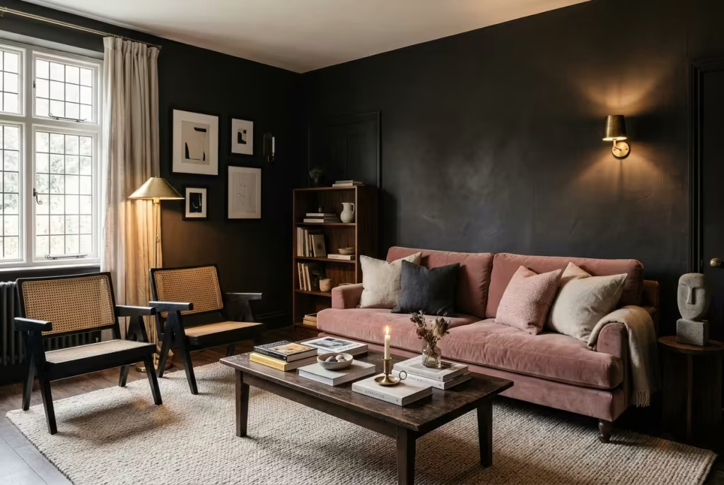
What follows is practical rather than precious. You will find 21 ideas, from living rooms and bedrooms to kitchens, bathrooms, halls and even the front door, alongside the tools that decide whether a scheme feels snug or stark: how to match undertones, split the colours by proportion, choose a finish that forgives scuffs, and light a dark room so it glows instead of sulking. There are UK costs, a maintenance cheat sheet, and advice for renters, couples with clashing tastes and parents of strong-willed teenagers, plus answers to the questions people tap into search boxes and forums at midnight.
Short on time? Read the quick answer and the formula section. With a cuppa and a free evening, settle in and read the lot.
Quick Answer: How Do You Make Black and Pink Feel Warm?
Black and pink feels warm when the undertones agree, one colour leads, the finish is kind to dark paint and the lighting is soft. In practice that means:
- Choose a muted, earthy pink with a warm undertone (think rose or plaster, not bubblegum or lilac).
- Pick a black with a hint of red or brown, such as Farrow & Ball Paean Black or Off-Black, rather than a cold, blue-leaning black.
- Let one colour lead. A pink-led room can follow a 60/30/10 split: 60% warm neutral, 30% pink, 10% black detail. Black-led rooms simply flip the weighting.
- Use eggshell or satin on dark walls so scuffs do not turn chalky and the surface catches a little light.
- Light it with layered 2700K bulbs, and bring in brass, wood and texture to carry the glow.
Pick Your Route
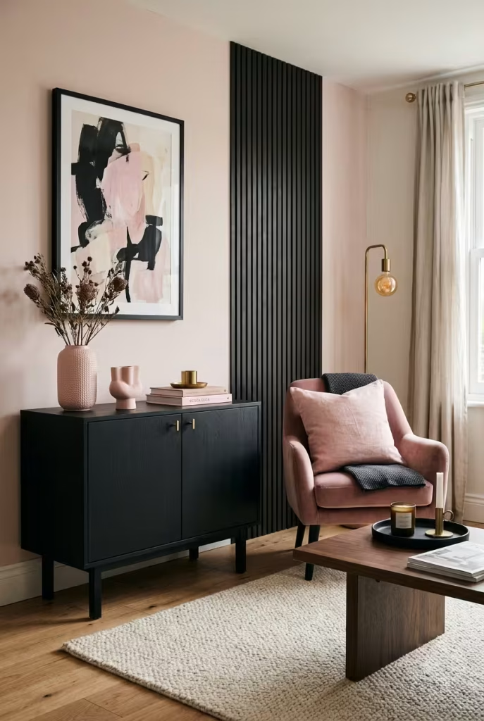
Not every home starts from the same place, so use this table to jump to the ideas that fit your situation.
| Your situation | Best starting point | Ideas to read first |
| Renting and cannot paint | Black furniture as the base, pink in textiles, lamps and art | 4, 6, 18, 19 |
| Own your home and love drama | One black wall with pink soft furnishings | 1, 5, 15 |
| Prefer calm over drama | Pink-led room with black as the fine detail | 2, 10, 16 |
| Sharing with a partner of different taste | Split by room and agree one accent each | 7, 20 |
| Small flat or studio | Black behind the bed, pink everywhere else, pale ceiling | 13, 20 |
| Family home with children | Black in frames and a chalkboard wall, shell pink walls | 8, 12 |
Why This Pairing Feels Warm Rather Than Harsh
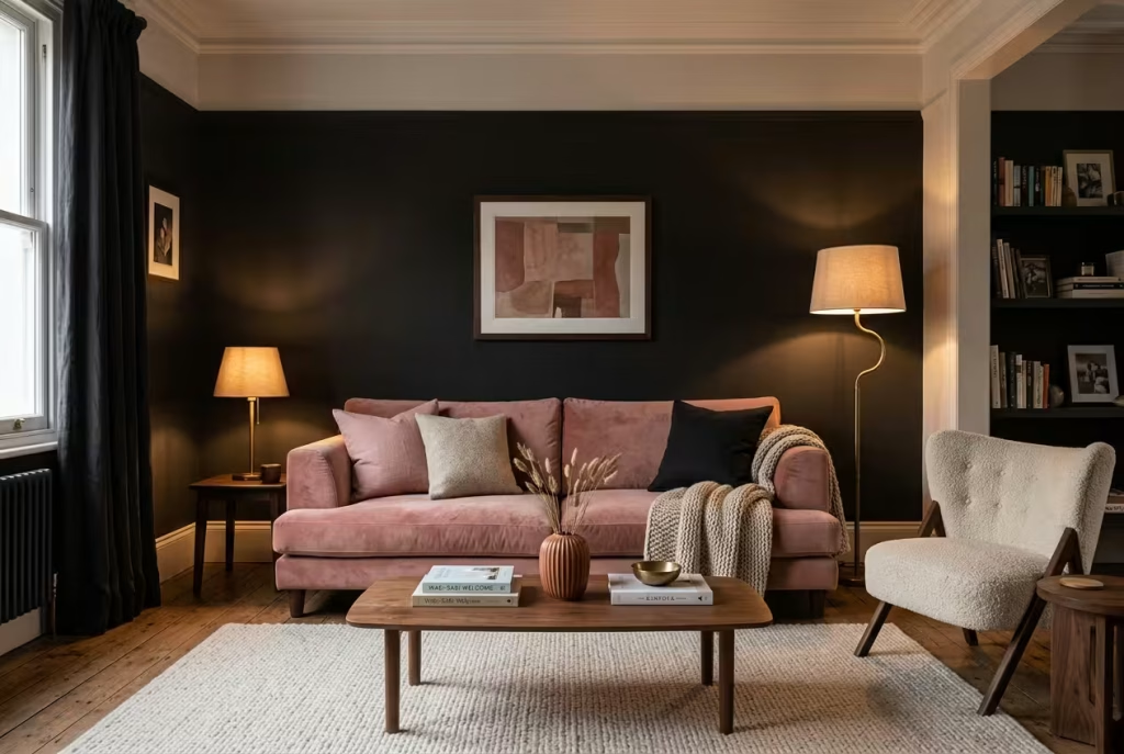
It sounds backwards, doesn’t it? Black is the darkest colour going, yet in the right hands it makes a room feel enveloping rather than cold. The secret lies in how these two colours behave in each other’s company.
Pink brings heat through its red and orange undertones, while a well-chosen black gives that heat something to lean against, much as a candle flame burns brightest in a dark window. Designers also note that dark walls recede. A black wall can seem to step back and let the furniture take centre stage, which is why a blush sofa against one looks lit from within.
Light does the rest. Black soaks up illumination, so it relies on lamps, candles and soft bulbs to carry the mood. That is a feature to exploit rather than a flaw to fix: a room lit mostly by low, golden pools feels like the inside of a jewellery box, intimate and a little secretive. Texture matters just as much. Velvet, bouclé, linen, ribbed ceramics and aged brass break up flat surfaces and give the eye somewhere to wander.
There is human evidence too. In one busy Reddit thread, a homeowner asked whether a pink or green accent chair suited their living room, and pink collected the most votes, with commenters repeatedly describing it as warmer, cosier and more welcoming. A small sample, certainly, but it chimes with what designers say about pink nudging the temperature of a room upwards.
There is a catch, and it pays to own up to it. Designer Juliette Byrne has pointed out that a high-contrast black and pink combination can look jarring and hard to balance. Her answer, seen in a Homes & Gardens kitchen, is to soften the clash with a nuanced black and a muted, earthy pink. Hold that advice close, because the rest of this guide builds on it.
Three principles follow from it:
- Contrast is a volume dial. Turn it down with muted pinks and soft blacks for a lived-in feel, or up with vivid pink and pure black when you want a showpiece.
- Undertones must agree. A red-leaning black flatters warm pinks, while a blue-leaning black sits better with cooler ones.
- Light and texture are half the colour. The same palette can feel tender or severe depending on the bulb and the fabric.
The Warm Black and Pink Formula (Before You Buy a Single Tin of Paint)
Step 1: Match the pink to the black
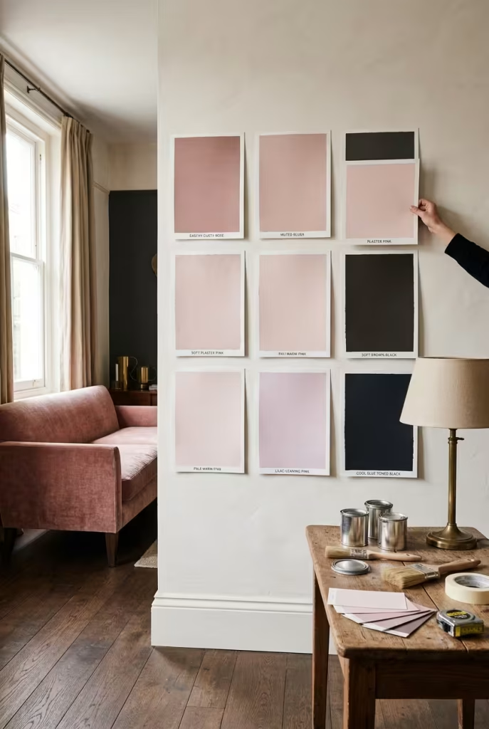
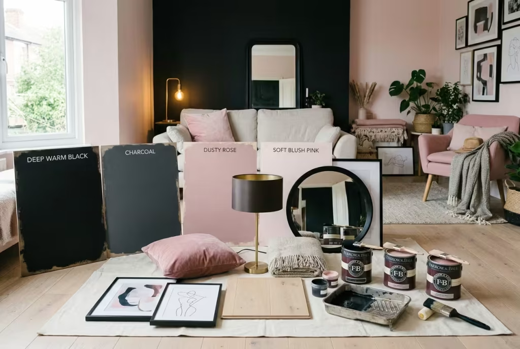
North-facing light cools pink and dulls its glow, while south-facing light warms and intensifies it, so a single tin can behave like two different colours in two different rooms. A tiny swatch from a shop cannot tell you that. Paint generous squares, roughly A3 size, on lining paper or sample boards, tape them up, and live with them for at least three days.
A sensible sampling routine looks like this:
- Paint two coats on each board, leaving a white border so you can judge the colour on its own.
- Move the boards between your darkest corner and your brightest wall.
- Check them around 8am, mid-afternoon and after dark with your usual lamps on.
- Hold them beside the sofa, flooring and curtains, because undertones reveal themselves against their neighbours.
- Ask the manufacturer which primer or undercoat suits a deep shade, since dark colours often cover better over a tinted base.
| Pink family | Mood it creates | Black to pair with | Sensible starting shades (Farrow & Ball) |
| Muted, earthy rose | Grown-up, snug, boudoir-like | Paean Black (red-based) or Off-Black | Sulking Room Pink No. 295, Dead Salmon No. 28 |
| Soft plaster or blush | Airy, calm | Off-Black for a gentle edge, Railings for a cooler, navy-tinged contrast | Setting Plaster No. 231, Pink Ground No. 202 |
| Vivid pink | Playful, high-energy | Pitch Black for a crisp, graphic punch | Rangwali No. 296 (use sparingly) |
| Cool, lilac-leaning pink | Chilly, can fight warm woods and brass | Use with care | Test before committing |
Step 2: Decide who leads
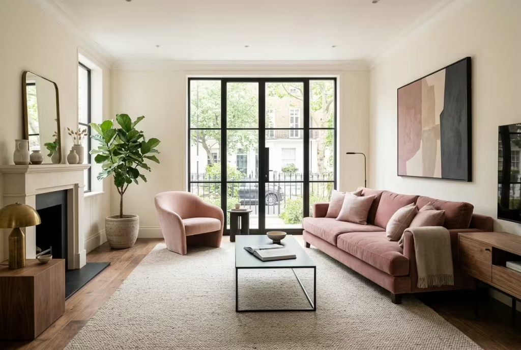
Think of the room as a band. Someone has to sing lead, and the other colour provides the harmony. When both fight for the microphone, the room feels noisy and tired. When one leads with confidence, the other can add richness without drama. These ratios are starting points, not laws, so nudge them to suit your light and your nerve.
| Style of room | Black | Pink | Everything else |
| Pink-led (the classic 60/30/10) | 10% | 30% | 60% warm neutral |
| Black-led and moody | About 50 to 60% | 10 to 15% | 25 to 40% warm neutral, wood, brass |
| Even-handed | About 30% | About 30% | About 40% neutral |
Step 3: Choose a finish and light source that flatter dark paint
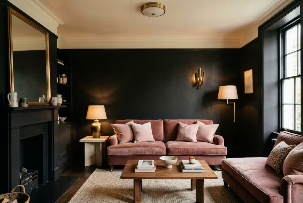
| Detail | What to do | Why it matters |
| Wall finish | Eggshell or satin in living rooms, halls, kitchens and bathrooms | Satin holds roughly 25 to 35% gloss against 5 to 10% for matt, and matt dark paint can leave chalky marks when scuffed |
| Paint depth | Off-Black and Paean Black sit at LRV 6, Pitch Black at LRV 4 | LRV (light reflectance value) tells you how much light a colour bounces back; the lower the number, the more the wall drinks light |
| Ceiling | Keep it pale | A light ceiling lifts the eye and stops a dark room feeling like a lid |
| Bulbs | 2700K warm white, ideally with high colour rendering (CRI 90+) | Cool 4000K bulbs flatten warm pinks and make black look dead |
| Light layers | At least three sources: ceiling, lamp, task or wall light | One bright overhead bulb is a blunt instrument |
Step 4: Plan the lighting room by room
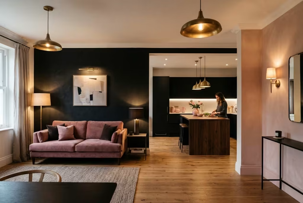
Black and pink live or die by the bulb. A cold bulb flattens the pink and turns black into a hole, while a warm one makes both glow. Aim for several light sources at different heights, with at least one on a dimmer.
| Room | Layers to include | Bulb guidance |
| Living room | Dimmable ceiling light, two table or floor lamps, picture light or wall washer | 2700K, dimmable |
| Bedroom | Wall lights or bedside lamps, soft ceiling light | 2700K; nothing cooler near the bed |
| Kitchen | Under-cabinet strip, pendants, ceiling spots | 2700K to 3000K with high CRI so food and pink look true |
| Bathroom | Mirror lights, downlights, optional wall washer | 2700K to 3000K; IP44 or above near bath and shower |
| Hall | Wall lights, mirror, lamp on a console | 2700K |
Step 5: Layer texture so black never reads flat
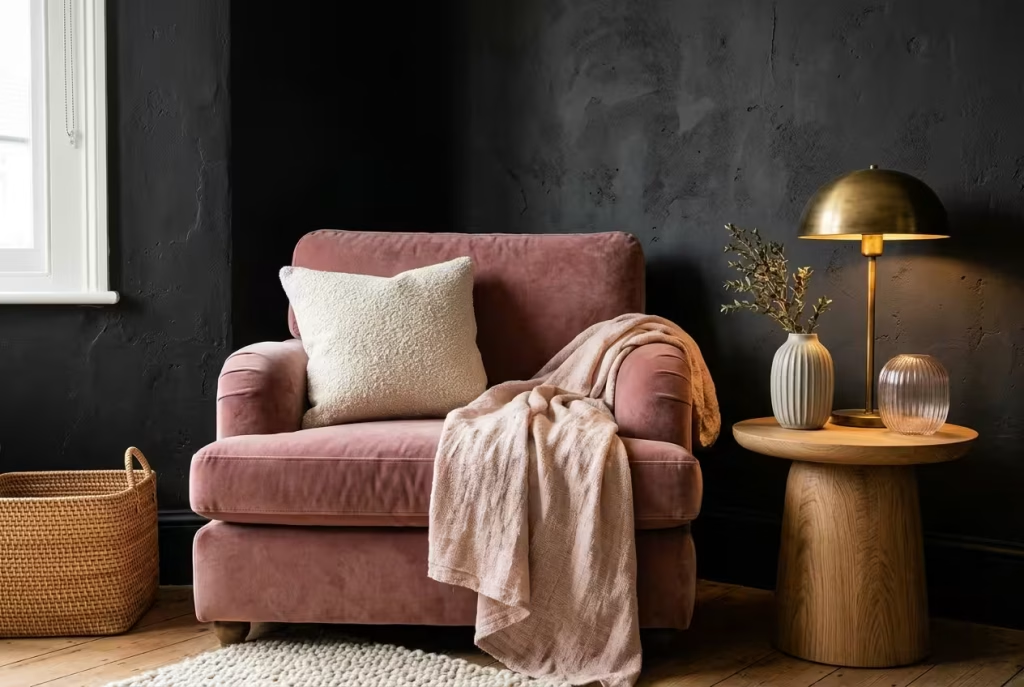
A matt black surface next to a smooth pink one can look stark. Texture fills the gap and adds the tactile comfort the eye hopes for.
- Velvet and bouclé hold light in their pile and soften hard edges.
- Linen relaxes a scheme and keeps pink from looking sugary.
- Brass, oak and rattan supply the warm, natural notes that bridge black and pink.
- Ribbed glass, ceramics and plaster add shadow play, which keeps dark corners lively.
You May also Like: 20 Pink and White Dining Room Ideas That Make Your Table the Star of the Show
Living Rooms Where the Drama Stays Friendly
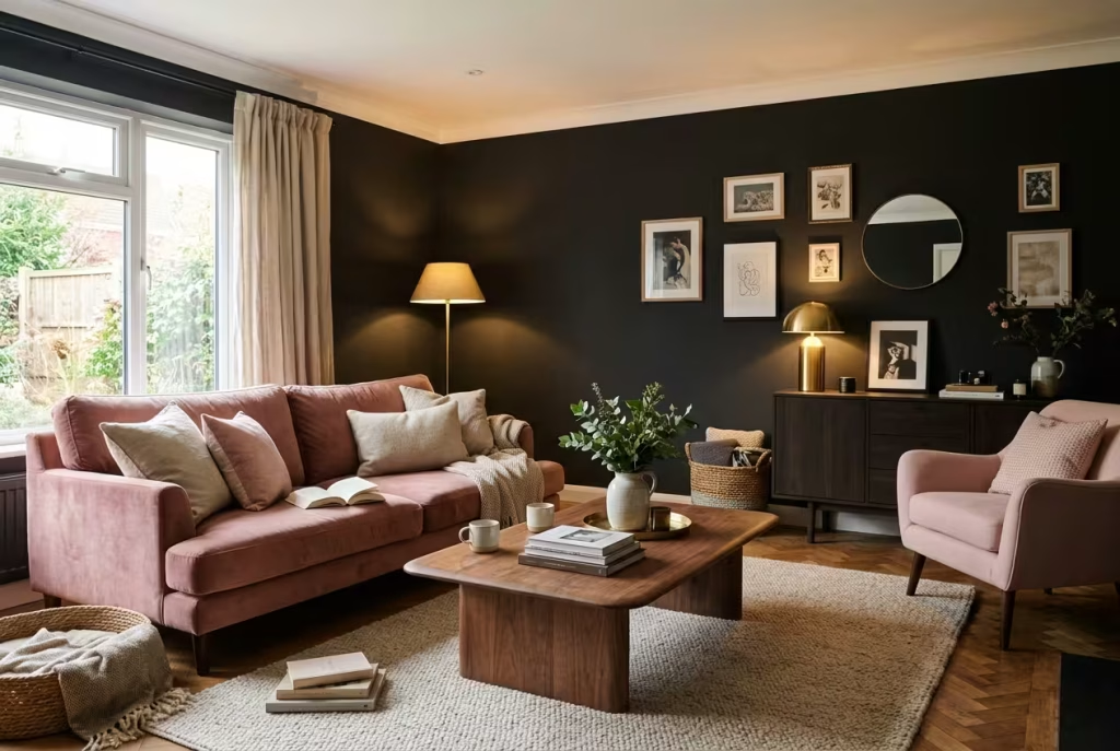
The living room is where a colour scheme gets cross-examined: morning coffee, evening telly, guests, children, the cat. Schemes that look thrilling on a mood board can feel exhausting by Thursday. These four ideas are built to survive real life, and each answers a different starting point, whether you are painting from scratch, working around black furniture you already own, or making peace with a landlord’s dark ceiling.
1. A blush sofa set against an inky, red-leaning wall
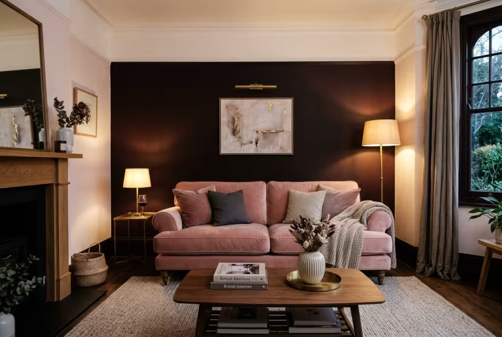
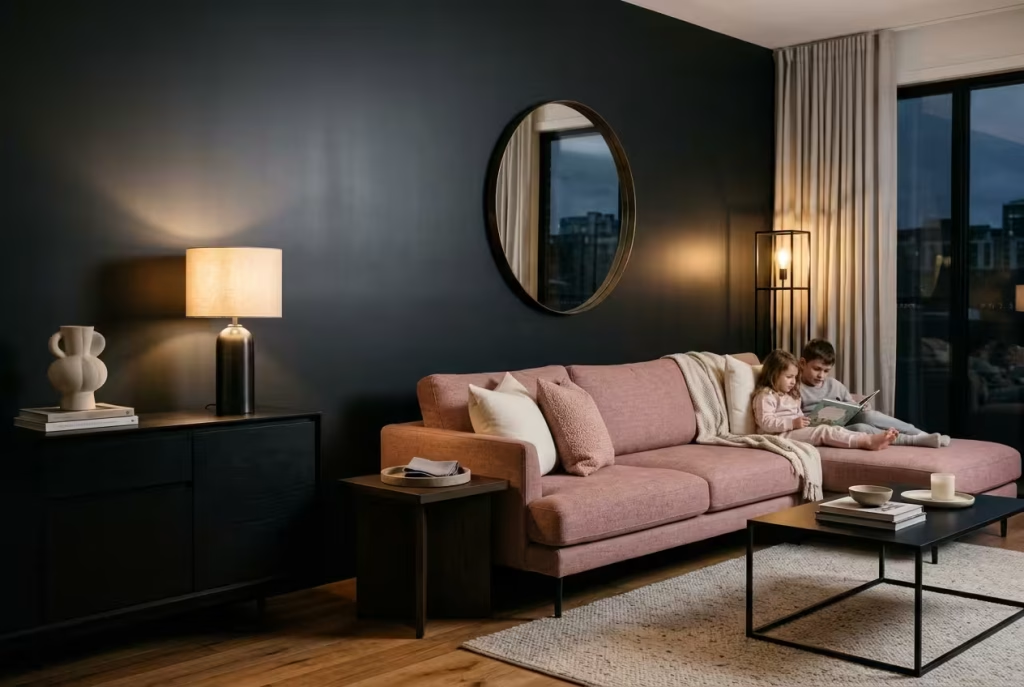
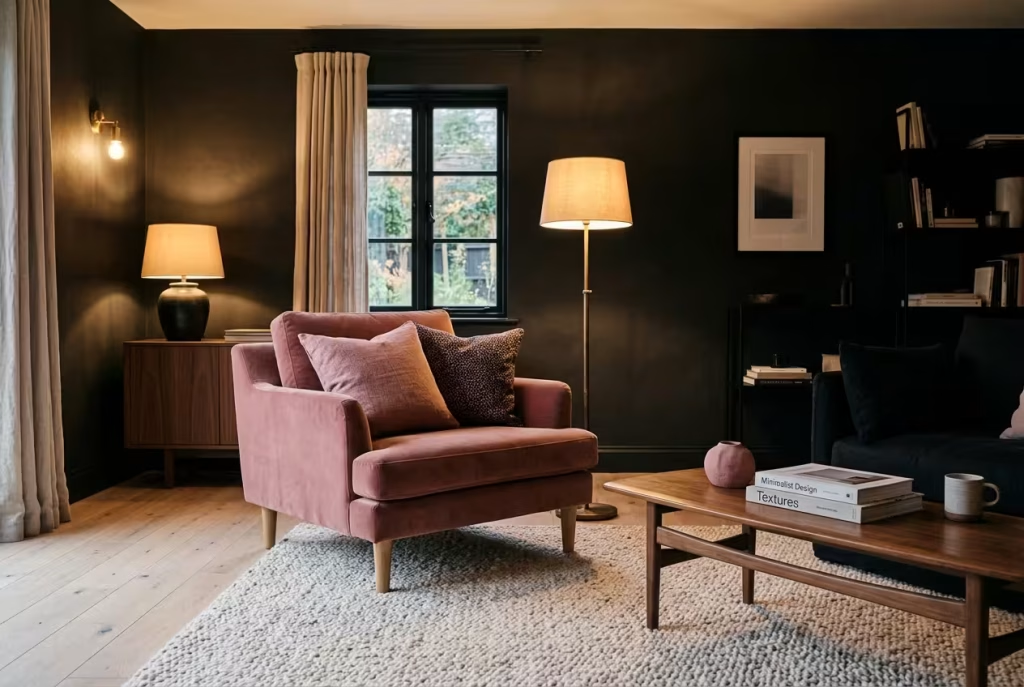
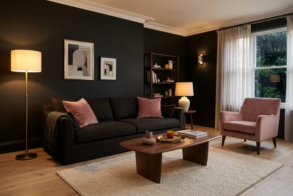
Picture a Friday evening, curtains drawn, one lamp on. A wall in Paean Black, a red-based black that sits comfortably beside pinks, turns the far end of the room into a velvet curtain, and a sofa upholstered in blush velvet in front of it glows as though somebody had left a light on inside it. With an LRV of around 6, the paint drinks daylight, which is exactly why the pink seems to float.
Keep the other three walls pale and pink-leaning so the room does not become a bunker, and pick a pale ceiling to lift the eye. Add two table lamps with 2700K bulbs at different heights, then a third source, such as a picture light or a candle, near the black wall. Choose eggshell rather than dead-flat matt if children or pets brush past, because fingerprints on black are as stubborn as a bad habit. Finish with texture: a chunky knit throw, a wool or sheepskin rug, and cushions in dusty rose and charcoal.
The recipe at a glance
| Element | Specification |
| Main wall | Paean Black No. 294 in eggshell |
| Other walls | Pale, pink-leaning off-white |
| Sofa | Blush velvet or bouclé |
| Lighting | Two 2700K lamps plus a picture light or candle |
| Rug | Ivory or oatmeal wool, big enough for the front sofa legs |
| Timing | Two coats with a day between, then a week of living with it before you judge |
2. Black furniture, dusty pink walls
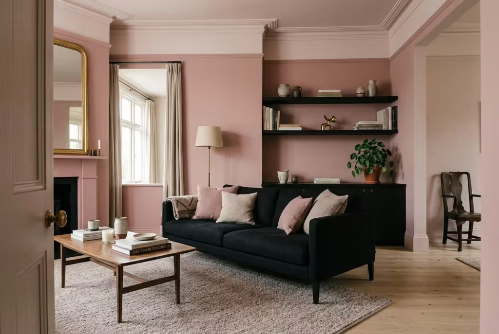
Many of us never get a blank slate. If your sofa, shelving and side tables are already black, the walls are your chance to soften the whole picture. A dusty rose such as Sulking Room Pink (No. 295), or a gentler plaster tone like Pink Ground (No. 202), takes the sting out of black furniture the way a woolly cardigan takes the chill off a cold morning.
One adviser on Reddit put the priority neatly: the floor is the deciding factor. Pale oak, warm greige or a pinkish rug stops black furniture reading like a cave, whereas black furniture on a dark floor needs more help from lighter walls. Avoid stark white trim, which can make pink look sugary, and choose a pink-leaning off-white instead. Designers also warn against yellow-based beiges and creams here, because their undertone sours the pink. Hang a mirror opposite the window to bounce daylight back onto black pieces, and break up large black surfaces with books, ceramics and a plant.
A ten-minute test. Tape a sample board in your chosen rose behind the black sideboard or sofa, switch on your evening lamps, and stand in the doorway. If the pink looks muddy, move towards a peachier tone; if it looks sugary, reach for something dustier. The doorway view matters most, because it is how everyone, you included, meets the room each day.
3. One pink armchair, repeated just enough
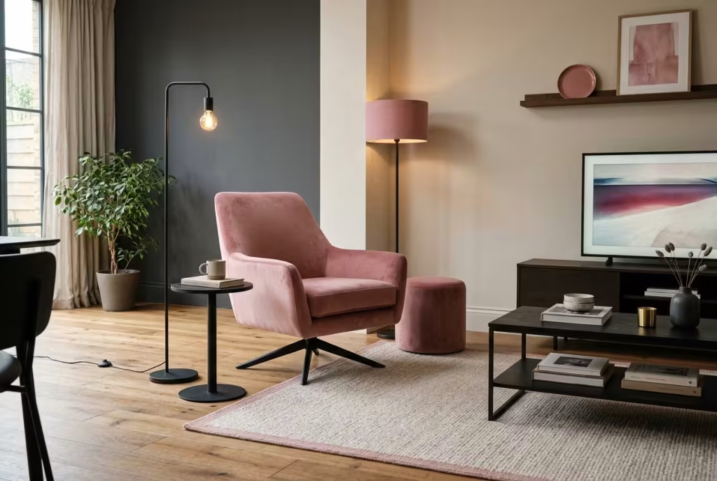
A single pink armchair in an otherwise quiet room is the plot twist everyone remembers. The danger, raised by dissenting voices in that Reddit chair debate, is that the eye lands on the chair and never wanders further, so the room feels like a stage with one actor. Repetition is the cure. Echo the pink two or three times elsewhere, say in a lampshade, a ceramic dish and a framed print, so the colour feels planned instead of stranded.
Think in odd numbers, which tend to look more natural than pairs, and give the chair a black side table or floor lamp as a frame. Mind the scale: leave at least 60cm of clear walkway beside it so the room still flows, a point that worried several readers in that thread about tight lounges. A swivel base helps when the telly sits at an awkward angle.
Three echo spots usually do the trick:
- Down low: a rug border, a pouffe or a velvet footstool in the same rose.
- At eye level: a lampshade, a vase or a print where pink appears beside black.
- Up high: a shelf-top ceramic or framed poster, so the colour climbs the wall and the chair no longer stands alone.
4. The dark wood ceiling puzzle (a renter-friendly fix)
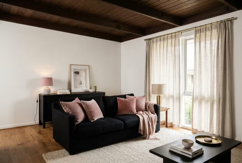
Renters know the particular ache of loving a colour scheme and being forbidden to paint. One new tenant on r/interiordecorating described black furniture, a dark timber ceiling and a nagging fear that baby pink would look out of place. Replies were reassuring: warm wood tends to flatter pink, and the real danger is heaviness, not clash.
Lighten the load from below. Hang pale linen curtains to bounce light around, lay a cream or off-white rug under the black furniture, and add brushed brass curtain poles to link wood, black and pink at a glance. Then keep the pink in portable things: cushions, a throw, a lamp, a print. Skip very pale baby pink here, because it can look disconnected beside dark timber, and choose a slightly dustier blush that sits more comfortably. Nothing needs a paintbrush, which keeps the landlord and the deposit both happy.
A renter’s shopping list that leaves no trace:
- Pale linen curtains on a tension rod, or a brass-finish pole fitted with the landlord’s blessing.
- A large off-white or cream rug to lift the black furniture.
- Plug-in wall lights with a long cable and cable cover instead of hard-wired fittings.
- Frames leant on shelves rather than hung, if you cannot drill.
Check your tenancy agreement before using adhesive hooks, since some landlords object even to those.
Bedrooms That Hold You Rather Than Swallow You
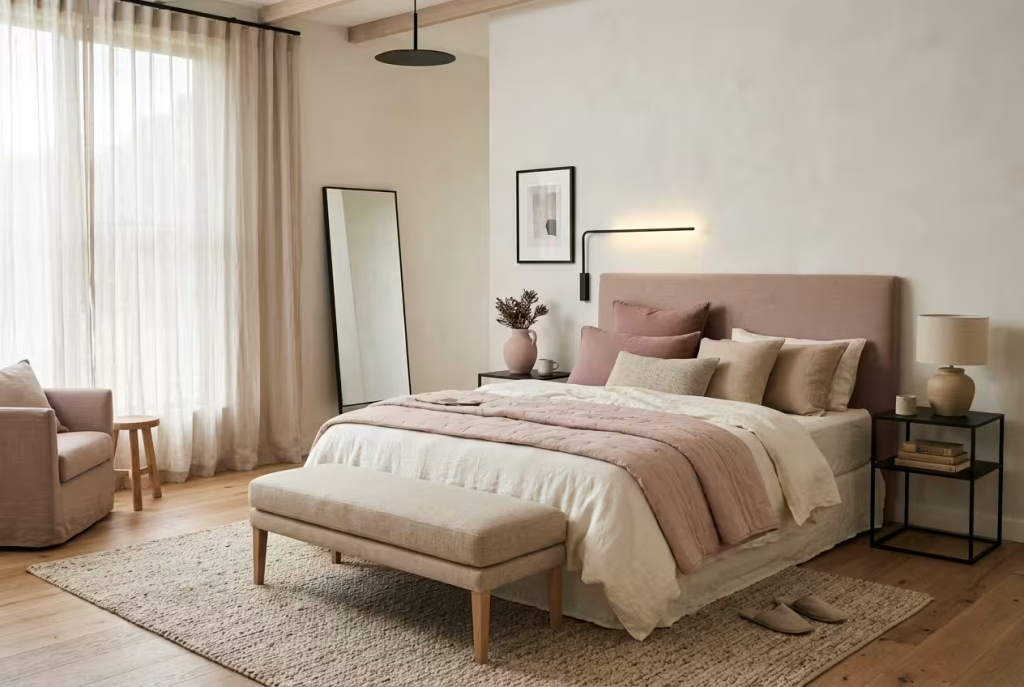
A bedroom sees you at your most unguarded: first thing in the morning, last thing at night, on good days and wretched ones. Colour here should lower your shoulders. These four ideas keep black in a supporting role, so the room feels like a slow exhale rather than a heavy blanket.
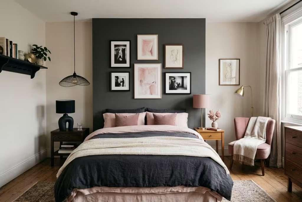
5. A black bedhead wall with pale pink bedding
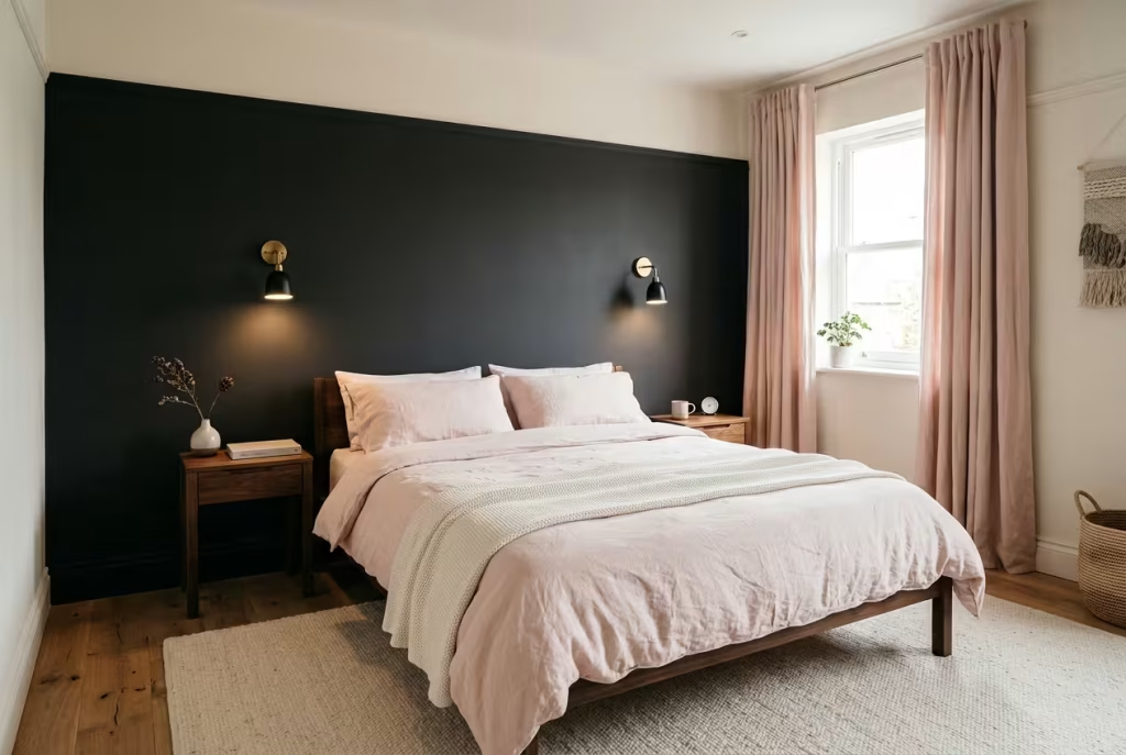
The cleverest way into a dark bedroom is to paint just the wall behind the bed. Off-Black (No. 57, LRV 6) is gentler than a jet black and lacks the cool blue cast of Railings, which makes it kinder beside pink linen. Think of the wall as a headboard that never ends: the bed seems to sink into it, and the rest of the room can stay pale and uncluttered.
Dress the bed in the lightest pink you can find, because bedding is the cheapest, quickest thing to swap and tells you how much contrast you can truly live with. Add wall lights or bedside lamps with 2700K bulbs, and put the ceiling light on a dimmer. Notice how morning sun treats the dark wall too: it warms the paint, which may nudge you towards Paean Black over Off-Black. Blush linen curtains, drawn at dusk, complete the cocoon.
Choosing between the blacks is easier with a cheat sheet:
| Shade | Character | Best partner |
| Off-Black No. 57 | Mild and soft, with less of the cool blue cast of Railings | Blush and dusty pinks |
| Paean Black No. 294 | A red-based black with a rich, faintly warm cast | Rose and warmer pinks |
| Railings No. 31 | Navy-leaning and cooler | Cooler pinks, pale grey walls |
| Pitch Black No. 256 | A true black with little undertone, LRV 4 | Vivid pinks that need a crisp frame |
6. A pink room with a black bed frame (and the dust question)
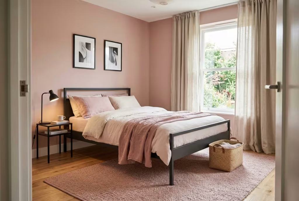
Black bed frames look wonderfully sharp, yet as one commenter on r/femalelivingspace warned, they show dust faster than anything else in the room, and in a small bedroom a very dark bed can swallow floor space visually. Another poster in that thread observed that pink, by contrast, can give the illusion of extra size.
A comfortable middle path is a charcoal or dark grey frame, pink bedding and a handful of black cushions or frames. Choose a frame raised on legs so floor and light show underneath, and keep a microfibre cloth close for a weekly wipe. One owner reported that her pink rug stayed cleaner than expected, so do not dismiss pink as impractical. In a tiny room, set the bed against the longest wall, pick pale curtains and limit black to two or three small pieces.
If dust is the enemy, three habits help. Choose a matt or lightly textured finish, which tends to hide fine dust better than high gloss. Keep surfaces clear so the cloth glides rather than dodges. And wipe in the morning, when side light shows what you missed. A pink linen throw draped over the foot of the frame also breaks up a long black line.
You May also Like: 15 Pink English Country Bedroom Ideas That Make Any Room Glow
7. The shared bedroom for two opposing tastes
Moving in together is delightful and delicate in equal measure. When one partner buys everything in black and the other reaches for pink, the living space can start to feel like a negotiating table. Advice from a popular aesthetics thread was wise and kind. Let whoever feels more strongly about the base colour have it, bring the other person’s palette in through lamps and accents, and agree one signature accent each, which acts as a mutual stake in the room.
Practical tools help: a gallery wall where you swap prints in turn, a shared mood board before anything is bought, and the freedom to split rooms, with a darker bedroom and a pinker kitchen. Named looks such as moody maximalism, whimsigoth or pastel goth can serve as a shared language. The goal is not a perfect compromise but a home where both of you recognise yourselves at a glance.
Before a single tin is opened, put four questions to each other:
- Which three things in the room could you not live without?
- Which colour would feel like a deal-breaker on a wall?
- Where are you each willing to be adventurous, and where do you need calm?
- Which room is yours to style alone?
The answers usually reveal that the gap is smaller than the argument felt.
8. Kids’ and teens’ rooms black in frames, not on walls
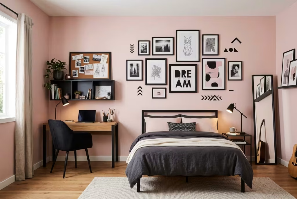
A young person who demands a black wall is rarely asking for gloom. They are asking for ownership, privacy and a room that says who they are becoming. An old Houzz thread on this exact dilemma offered tactful ways to say yes without regret: a chalkboard wall that reads black but doubles as a doodle board, a single wall papered in a black and white print, or decals scattered across a shell pink room.
Black bedding, picture frames and a painted headboard deliver the mood without a repaint when tastes change, which they will. Painting furniture black is hard graft, and a parent in that thread noted how quickly children’s fashions shift. Choose pale shell pink rather than baby pink so the room can mature with them, and involve them at the sampling stage: choosing between three sample boards gives a teenager real authority.
Ways to say yes, ranked by how easy they are to undo:
| Option | Commitment | Reversal |
| Black frames and bedding | Low | Instant |
| Wall decals over pink paint | Low to medium | Peel off |
| One papered black and white wall | Medium | Strip and repaint |
| Chalkboard paint wall | Medium | Prime and repaint |
| Fully black walls | High | Several coats to cover |
Kitchens With a Backbone and a Blush
Kitchens are the engine rooms of a home, lit, cooked in, splashed and photographed more than any other room. Black and pink here has to look good at 7am through bleary eyes and at 7pm with a glass of wine in hand. Durable finishes and honest materials matter as much as the colours themselves.
9. Black cabinets beneath pink walls
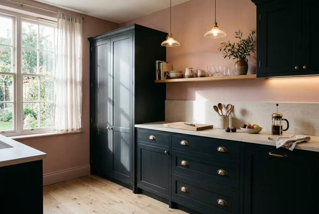
Farrow & Ball’s own colour experts have long favoured a kitchen with Sulking Room Pink on the walls and Railings on the cabinets. Railings carries a slight navy lean, so if you want a softer, warmer outcome, try Paean Black or Off-Black instead. Aged brass pulls bridge the two tones neatly, and a pale worktop, in honed stone or light oak, keeps the room bright.
Imagine a Sunday morning, the sun slanting across a rose wall and catching the edge of a black door. That single image is the whole appeal. Use eggshell or satin on the cabinets, since cupboards take more handling than any wall, and keep the splashback simple. Black doors show fingerprints, so choose handle styles that suit a busy household, such as cup pulls or edge pulls fitted low.
A fair worry is whether black cabinets will leave the kitchen feeling dim. Not if the rest of the room does the lifting. Pair them with a pale worktop and a light floor, fit an under-cabinet strip to wash the counter with light, and keep the window dressing sheer. Think of the cabinets as the dark frame around a bright picture, rather than the whole picture.
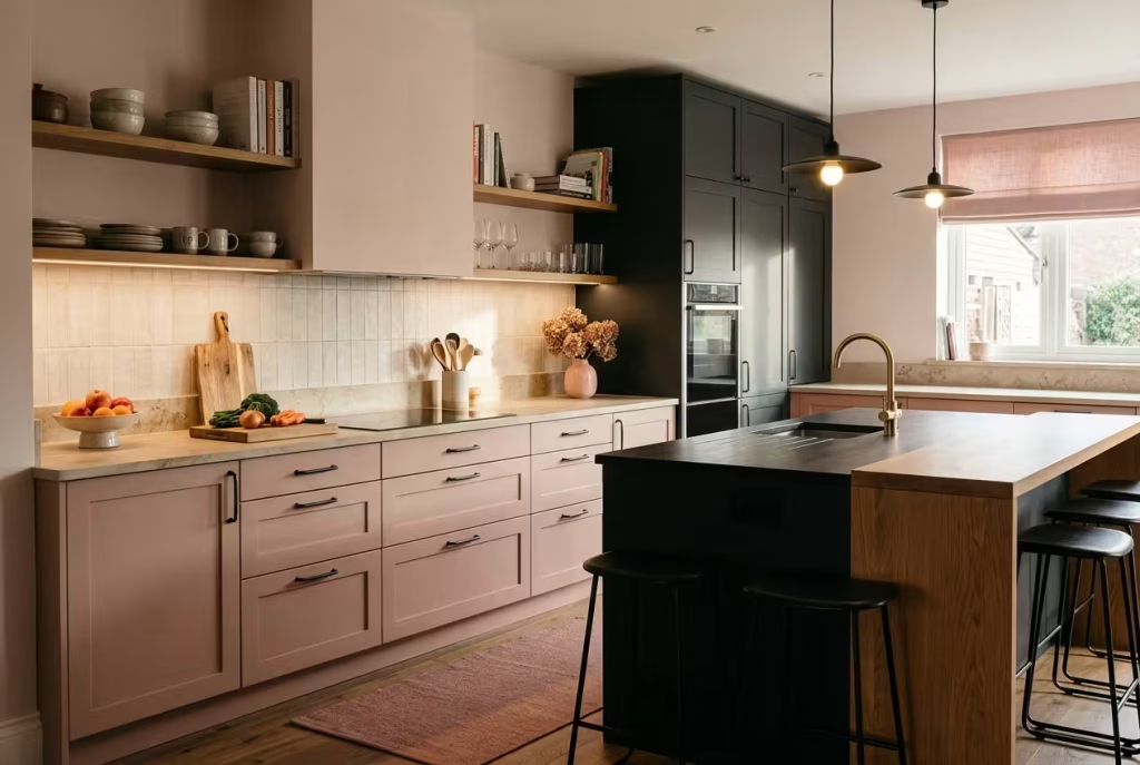
10. Rose cabinets with black handles and lighting
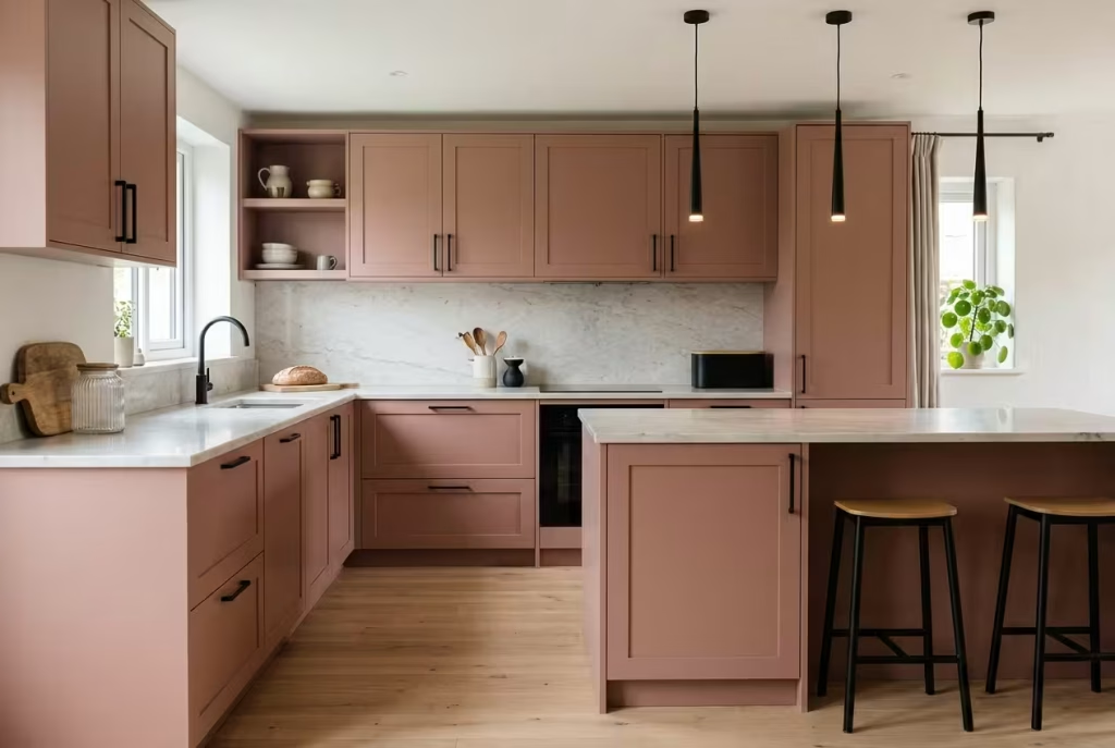
Flip the formula and you get a kitchen with the charm of a pastry shop and the manners of a grown-up. Cabinets in a muted rose, paired with black or black-bronze handles and slim black pendants, give definition without heaviness. Designers working with pink cabinetry often suggest carrying black through accessories and lighting rather than big surfaces, which keeps the look chic instead of cute.
Marble or a pale composite worktop provides a calm landing place for the eye, and a single plant, bread bin or ribbed glass jar adds life. Think about floors too: pale oak and charcoal vinyl will each shift the temperature. If you are nervous, start with one run of cabinets or an island, so the pink arrives as a gift rather than a drench.
Handle pairings that suit rose cabinets:
- Black-bronze or blackened brass for the gentlest contrast.
- Matte black bar handles for a modern, graphic line.
- Aged brass knobs if you would rather keep black in the lighting.
Whichever you choose, order one sample first and hold it against the cabinet colour in daylight, since metal finishes shift noticeably next to pink.
11. A pink splashback with matte black fittings
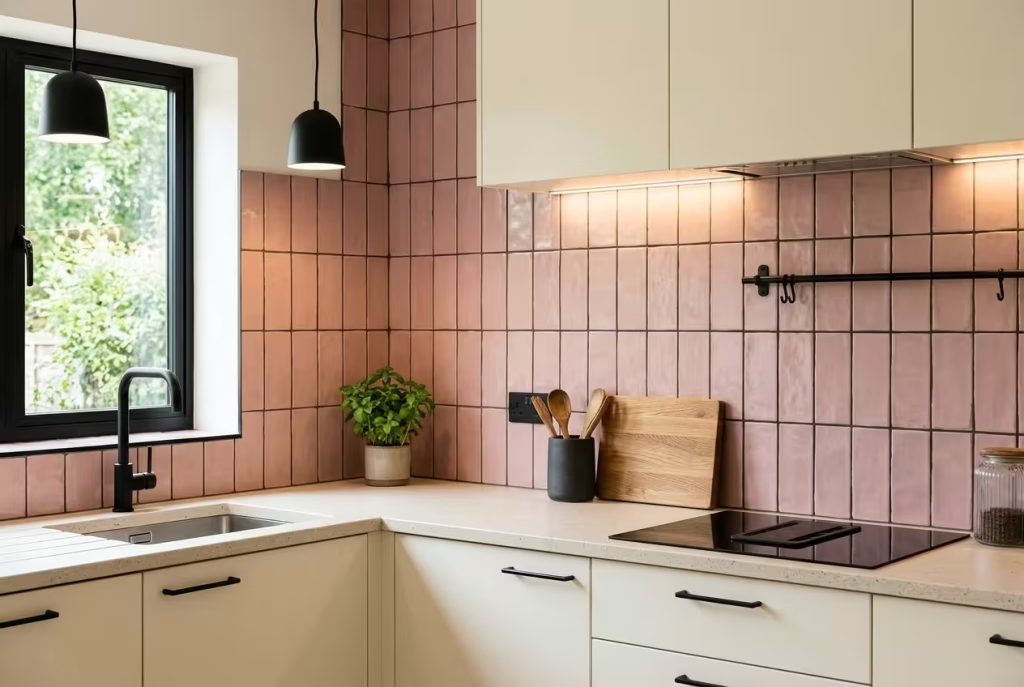
Not ready to paint cabinets? A pink splashback paired with a matte black tap, black-framed window and black pendant is a lower-commitment way in, and a tiler can often finish the job in a couple of days. Keep every black element in the same finish. Mixing glossy and matt black reads as two different colours and quietly undermines the scheme.
Hand-made, slightly uneven tiles catch light in a way flat ones cannot, so even a pale pink looks layered and expensive. Let the grout support your story: deep charcoal draws a graphic grid, while warm grey softens it. Grout beside a hob collects splashes, so a sealed finish makes wiping quick.
Tile layout changes the mood as much as colour. A brick-style offset feels relaxed and domestic, while a stacked grid reads sharper and more modern. Small tiles mean more grout lines, which suits a graphic charcoal grout but asks for more cleaning; larger tiles feel calmer. Order roughly 10% extra to cover cuts and breakages.
Bathrooms That Earn Their Keep Twice a Day
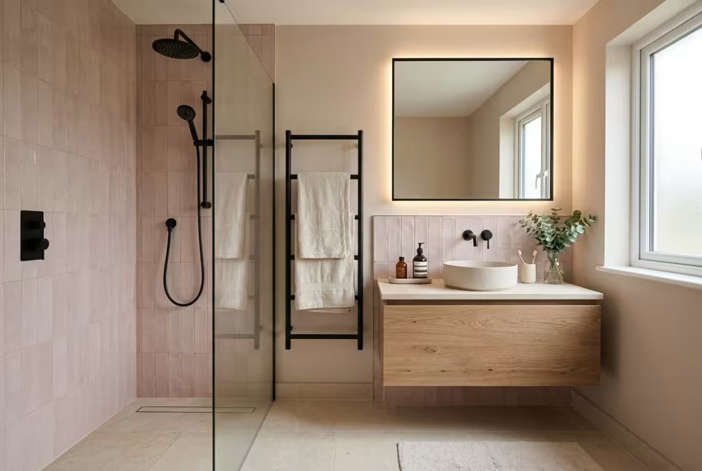
Bathrooms are where we begin and end the day, often without our glasses on, so colour has to be forgiving in poor light and honest about steam. Black and pink has history here, from 1950s tiled suites to boutique hotels, which means the pairing already feels at home between four wet walls.
12. Pink tiles, black taps and a pinch of black grout
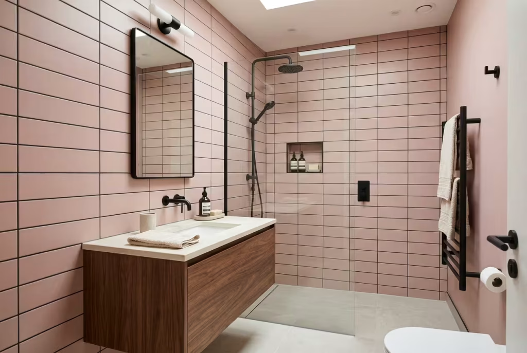
Combine pink wall tiles with matte black taps, a black towel rail and a slim black mirror frame, and the room feels designed rather than assembled. Order the fittings from the same range so the finish matches exactly. Black grout draws a crisp grid around pale tiles, giving the sharp outline you see in boutique hotel bathrooms.
Lighting needs thought. In the UK, fittings in the zones nearest the bath and shower need to meet at least IP44, and anything inside the bath enclosure needs a higher rating, so ask a qualified electrician to specify and fit them. Bulbs at 2700K to 3000K make skin and pink tiles look flattering rather than clinical. Matte black taps can show limescale in hard-water areas, so wipe them dry after use.
A fittings checklist before you order:
- Tap, shower head, towel rail, toilet roll holder and robe hook from a single range
- One finish throughout, never a mix of matt and gloss
- A black mirror frame that matches the taps
- Bulbs and fittings rated for their zone
- Black or clear silicone for a neat edge where tiles meet sanitaryware
13. A moody black cloakroom with a blush basin
Small rooms can carry far more darkness than people fear, and a cloakroom is the ideal place to be brave. You spend minutes here, not hours, so you can afford some theatre. Paint the walls in black eggshell or satin rather than matt, because matt struggles with moisture and scuffs.
Add a blush ceramic basin, a round brass mirror and two light sources so the room never turns gloomy: a wall light either side of the mirror gives even, flattering light on faces. A pale or pink ceiling lifts the height. Fold in tactile details, such as a hand towel in dusty rose, a small plant that tolerates low light, and a candle on a safe shelf. Guests tend to remember a room like this for weeks.
Windowless cloakrooms deserve one extra thought: air. Dark paint will not cause damp, but poor ventilation will, so check the extractor works and choose a paint suited to bathrooms and kitchens. Then comes the fun part, a statement mirror, a pink soap dish and a single stem in a black vase.
14. A matte black floating vanity against soft pink
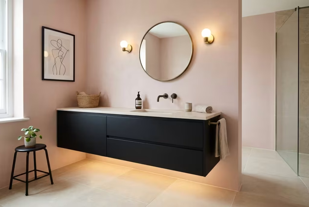
Lifting a vanity off the floor reveals a continuous strip of tile beneath it, which tricks the eye into reading the room as larger. A black unit hung against Pink Ground walls gives you a strong focal point without crowding the space. Leave a clear gap of around 15 to 20cm underneath so you can mop easily and light can travel across the floor.
Do not skimp on the fixings. Wall-hung units need a timber noggin or steel support behind plasterboard to carry the weight of a basin, taps and daily use, so check the manufacturer’s weight limits before you drill. Add a warm LED strip under the unit for a night-time glow that makes midnight visits gentler on the eyes.
A few numbers help with planning. Standard vanities tend to sit roughly 80 to 85cm from floor to rim, though comfort varies, so test the height against the tallest and shortest people in the household. Allow at least 60cm of clear floor in front of the unit so doors and drawers open without a shuffle.
Dining Rooms, Home Offices and Halls
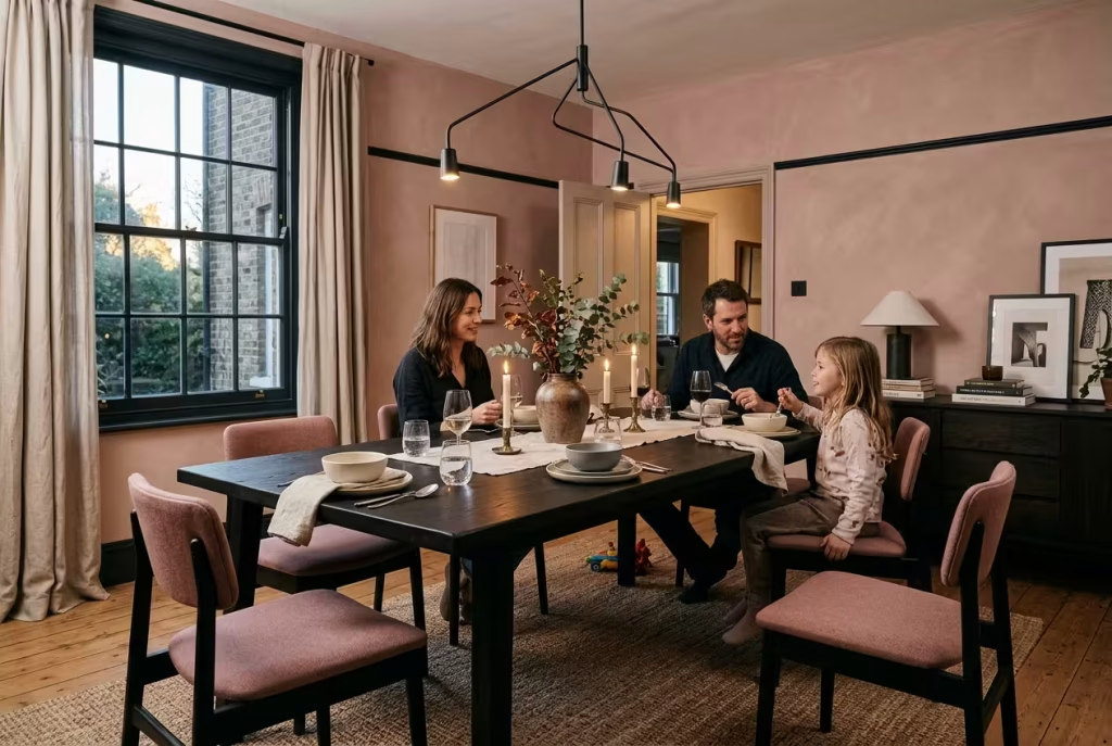
These are the rooms with jobs to do: feeding people, hosting arguments, answering emails, shedding wet coats. Colour here must work hard and still look good doing it.
15. Pink dining chairs under a statement chandelier
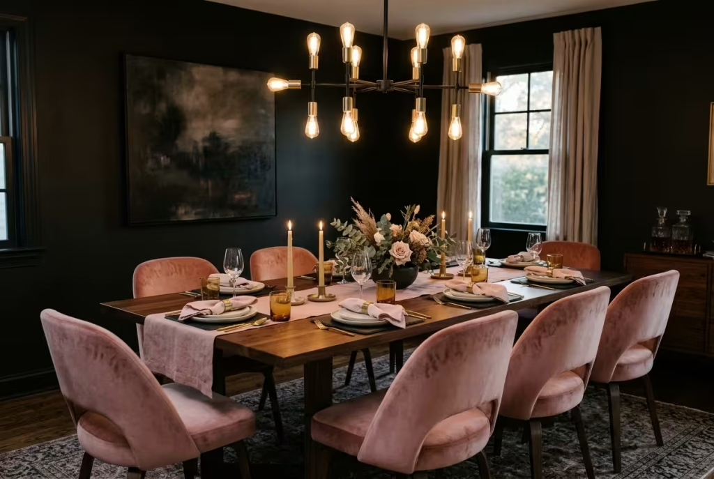
Deep black walls turn a dining room into an evening room, the kind where supper stretches towards midnight. Pink velvet chairs add a flush of warmth around the table, and a chandelier crowns the picture. As a rule of thumb, choose a chandelier roughly half to two-thirds the width of the table, and hang its lowest point around 75 to 90cm above the tabletop so guests can see each other across it.
Fit a dimmer so the room can slide from bright Sunday lunch to candlelit dinner. Brass arms against black metalwork tie both colours into a single fixture, and a blush table runner or napkins carry the pink to the plate. If the table doubles as a homework desk, choose a washable eggshell on the walls.
Lay the table in layers and let the colours do the talking:
- Slate or black linen placemats under pale plates
- Pink napkins folded loosely, not ironed into submission
- Brass candle holders with unscented tapers, so they never compete with the food
- One low centrepiece, so guests can see across the table
You May also Like: How Do You Use Hot Pink in Interior Design? 25 Bold Ideas for Every Room
16. A pink study with a black desk
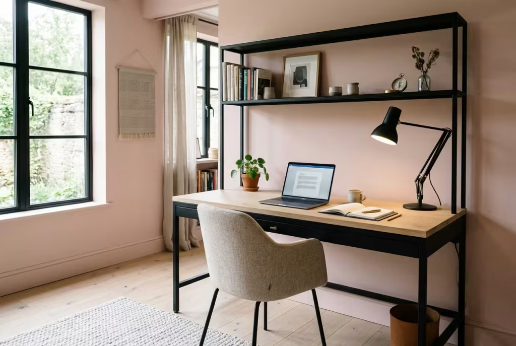
Pink walls in a study can act as a calm backdrop rather than a distraction, particularly in a muted tone such as Pink Ground. Set a matte black desk against them, keep the desktop in warm wood or pale oak so your eyes have somewhere neutral to rest, and add black steel shelving for structure. Choose a task lamp with a high CRI so colours look true on screen and on paper.
Think about glare: place the desk side-on to the window so daylight does not wash out the monitor. Add a pinboard or framed prints to personalise the wall, since people tend to settle more easily in rooms that reflect them. A pink study with black accents feels quietly authoritative, like a well-cut blazer.
If you take video calls, position the desk so the pink wall sits behind you. It gives colleagues a pleasant backdrop and keeps your face lit by a warm bounce. Place a lamp or light source in front of you, behind the screen, rather than behind your head, so you are not reduced to a silhouette against a pale wall.
17. A dark hall with a pink runner
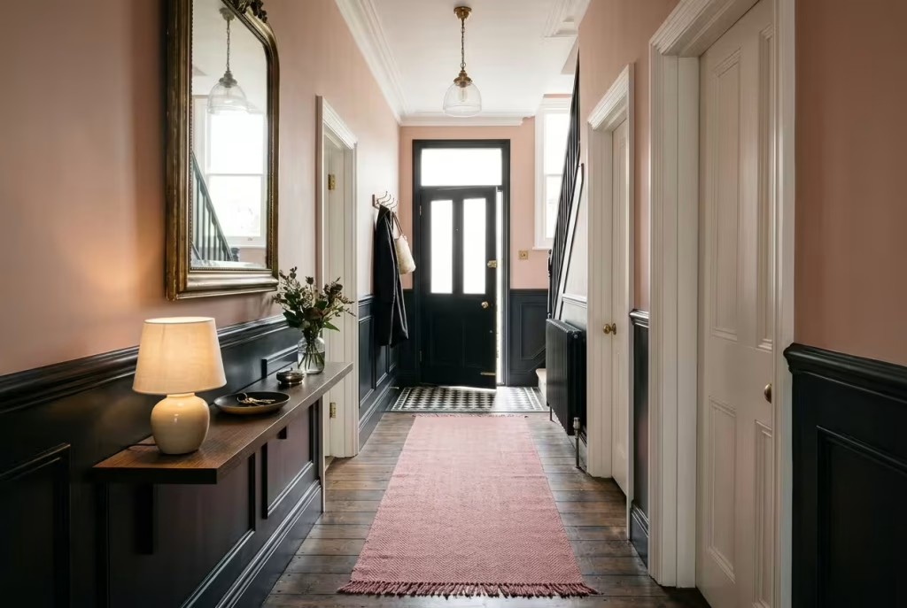
Halls rarely get much daylight, so lean into the shade rather than fight it. Black panelling below a dado line, with Dead Salmon above, gives a period feel that flatters narrow Victorian and Edwardian entrances. A runner in dusty pink brings warmth underfoot, and a large mirror bounces what light there is back along the passage.
Mind the practicalities: halls take the most knocks, so use durable eggshell or satin below the dado and keep the pink above eye level where it stays clean. Add a console with a lamp instead of relying on the ceiling light, which can look harsh at night. Keep shoes and coats tidy, since clutter reads louder against dark walls. Arriving home to this entrance feels like being greeted by a well-dressed host.
Sizing a runner properly makes the difference between fitted and stranded. Leave a few centimetres of bare floor on each side, stop it short of the front door’s swing, and use a non-slip underlay so nobody skids in socks. A narrow hall rarely has space for a bulky console, so choose a slim shelf or wall-hung table instead.
Bridges, Small Spaces and the Front Door
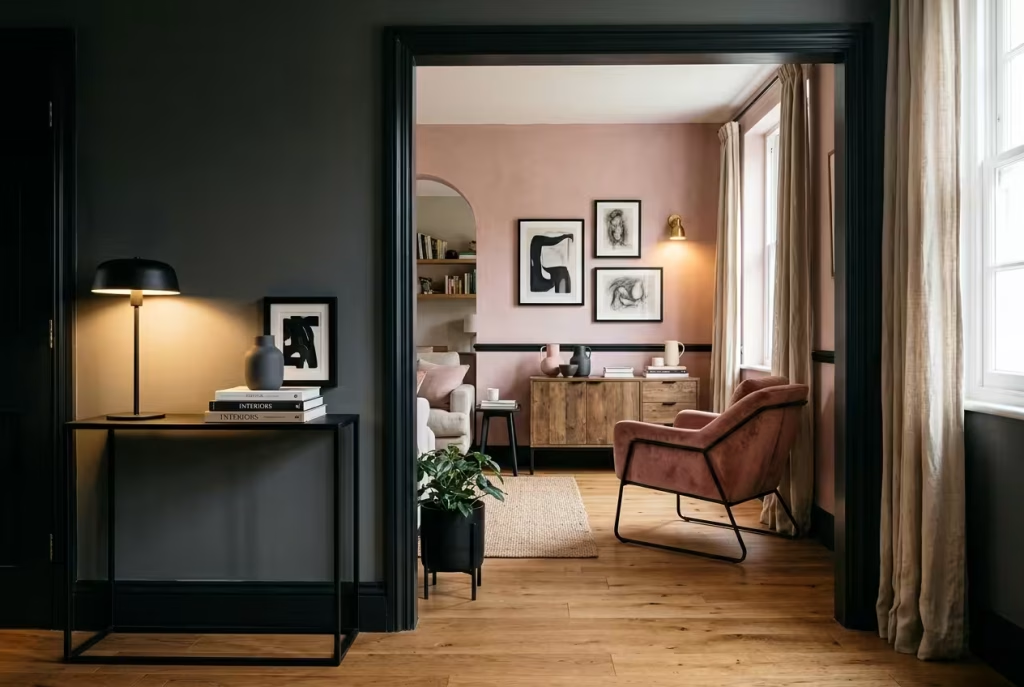
These final four ideas are the connective tissue: details and strategies that tie black and pink together when walls and furniture alone cannot.
18. Brass and gold as the go-between
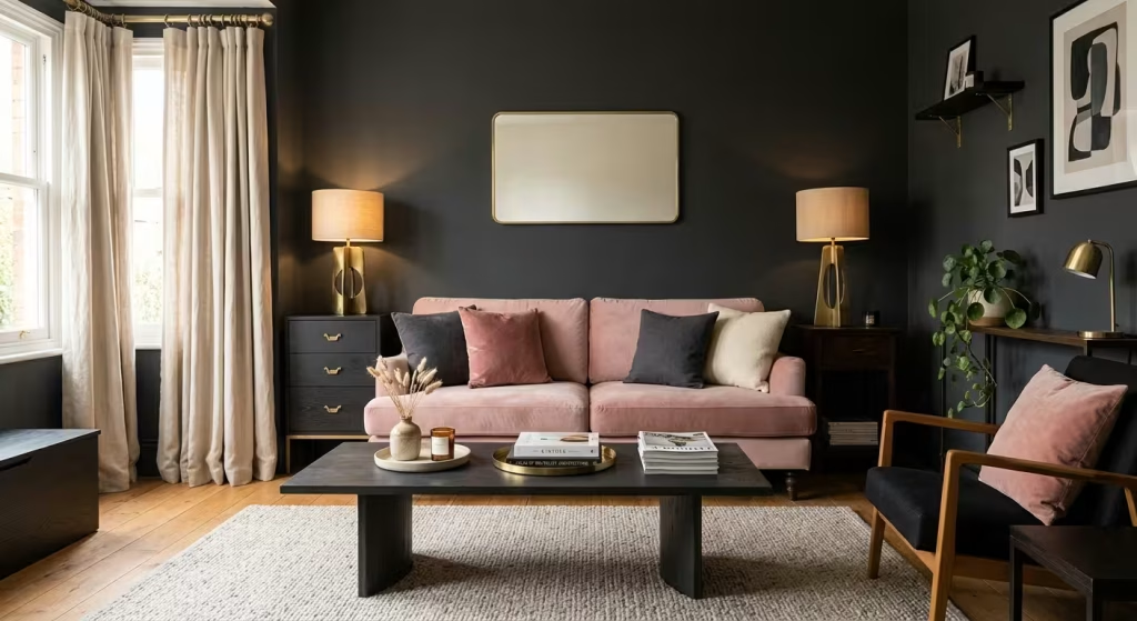
Metal is the diplomat of the scheme. Brushed or antique brass in lamps, curtain poles, mirror frames and cabinet handles sits halfway between black and pink, softening one and lifting the other. Readers in the forums kept returning to gold as the easy link between dark wood, black and pink.
Stick to one warm metal family, because mixing brass with chrome splits the warmth from the coolness and leaves the scheme looking undecided. A muted, brushed finish tends to look more refined than bright polished gold. Repeat the metal at least three times in a room, for instance a lamp base, a mirror frame and a drawer handle, so it reads as intentional. Aged brass develops a patina over time, which suits the lived-in mood of black and pink.
| Finish | Effect | Where to repeat it |
| Brushed brass | Soft, contemporary glow | Lamp bases, curtain poles |
| Antique brass | Weathered, period character | Mirror frames, handles |
| Black-bronze | Subtle, gentler than black | Cabinet pulls, taps |
| Polished gold | Glamorous, high-shine | One statement piece only |
| Chrome | Cool and clean | Keep apart from brass |
19. One leopard print, used like a neutral
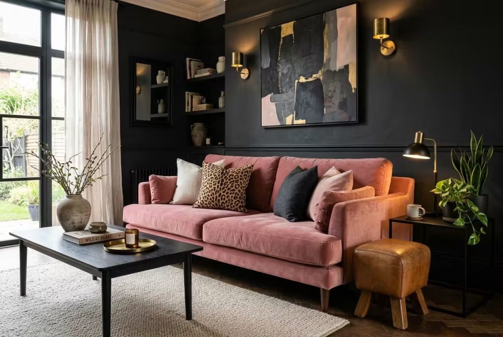
In the Reddit aesthetics thread, several commenters insisted that hot pink and leopard print are made for dark rooms, and one christened the result soft safari goth. They have a point. A single leopard cushion, throw or framed print links black and pink with a tawny, almost animal warmth.
The golden rule is restraint: one animal print per room, otherwise the pattern turns from a quiet nod into a loud shout. Pair it with plain textures so it has space to breathe, and echo its tan and black tones elsewhere with leather or rattan. It is the kind of detail that gives a room a wink.
Where the print goes changes how it feels:
- A cushion is a flirtation, easy to swap and low in commitment.
- A throw drapes the pattern across a sofa arm, giving softness and movement.
- Framed art treats the print as a picture, which suits a more formal room.
- A lampshade lets the pattern glow when the light is on and recede when it is off.
20. A studio flat zoned with colour
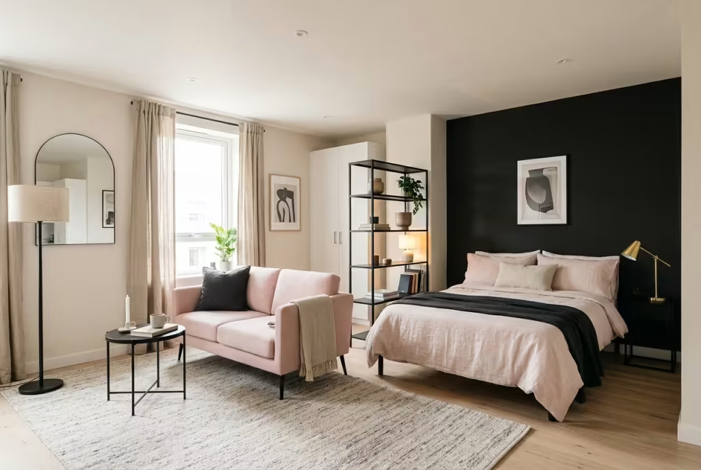
In a single room, colour can do the job of walls. Paint only the wall behind the bed black, let pink furnishings carry the living zone, and the space splits into two clear areas without a stud partition. Keep the ceiling pale, hang a mirror opposite the window to double the daylight, and rely on 2700K lamps at different heights rather than a single central bulb.
A pale pink sofa also opens up a small room because it keeps the eye moving, while black frames and a black floor lamp provide definition. Use a rug to mark the living zone and a slim shelving unit as a soft divider. For anyone in a first flat, this is often the trick that turns a cramped room into a home with intention.
A zoning toolkit for one-room living:
- A rug to mark the living area and anchor furniture.
- Different lamp heights so each zone has its own pool of light.
- A slim shelving unit as a soft divider that still lets light through.
- Clear paths of 60 to 90cm so the layout never feels like an obstacle course.
21. A pink front door on a dark facade
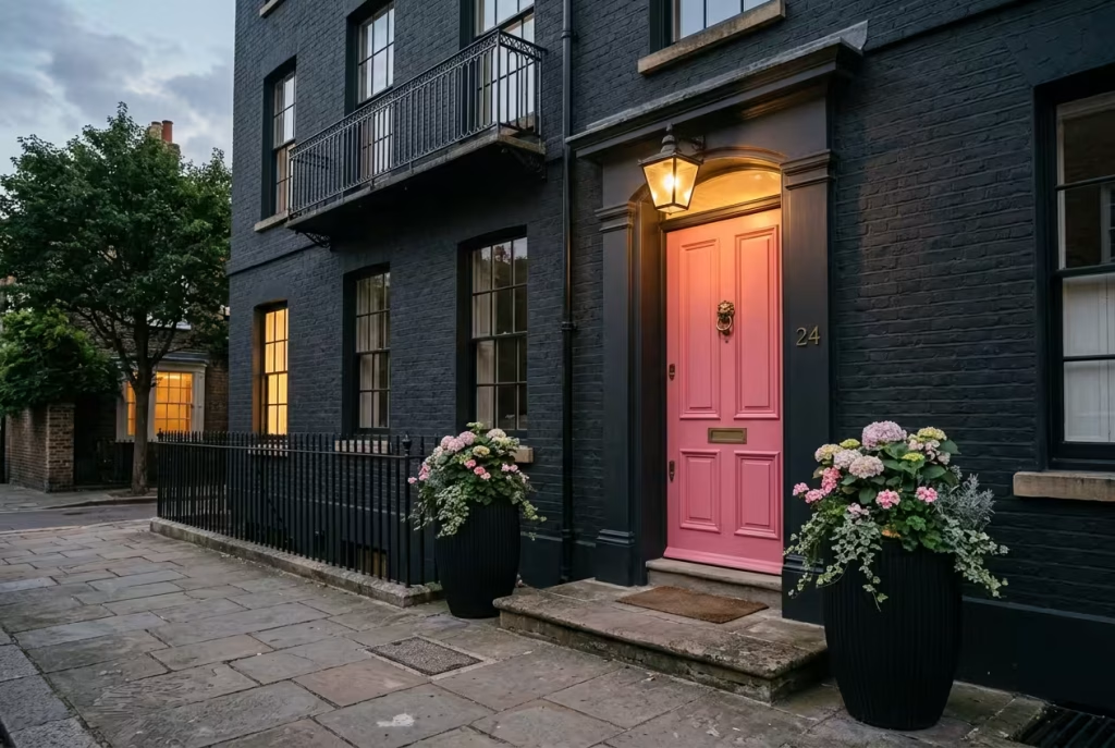
Carrying the colour story outside gives a house a smile before anyone has crossed the threshold. A black or charcoal front with a pink door, painted in a friendly shade such as Rangwali, is a real conversation-starter. Farrow & Ball’s own team has described Rangwali as a cheerful, positive colour that suits a front door.
Use exterior-grade paint on the door and check the manufacturer’s guidance on weather resistance, because exterior pigments face harder work than interior ones. Black planters filled with pale pink flowers and a brass knocker round it off. Think about evening light too: a porch lamp with a warm bulb makes a pink door glow like a lantern for homecomings.
Door prep, step by step:
- Remove the hardware, or mask it tightly.
- Sand lightly and wipe away dust so the new coat has something to grip.
- Apply a primer suited to the door’s material.
- Brush on two thin coats of exterior-grade paint rather than one thick one, allowing proper drying time between them.
- Refit the hardware once the paint has cured.
What It Costs in the UK
Prices vary by region and decorator, but these 2026 UK ballparks give you a feel for the numbers.
| Level of change | What you get | Typical outlay |
| Accent refresh | Cushions, throws, lamps, framed prints, a pink rug | Entirely your call; no decorator needed |
| DIY repaint with premium paint | Feature wall or full room in a designer brand | Roughly £50 to £80 per 2.5L tin, against about £20 to £30 for trade emulsion |
| Professional repaint | One room, labour plus trade paint | Commonly £350 to £600 per room; day rates sit around £325 |
| Premium paint on top | Farrow & Ball or similar | Adds roughly £40 to £90 per room in paint cost |
| Durable finish upgrade | Eggshell in busy rooms | Around £42 to £52 per 2.5L, which one UK guide says extends repaint cycles by three to four years |
| Full makeover | Paint plus new sofa, bed or kitchen | Varies enormously with what you choose |
Where to spend and where to save:
- Spend on a good primer or undercoat for dark shades, a durable eggshell for busy walls, dimmers and warm bulbs, and proper fixings for anything wall-hung.
- Save on cushions, throws, frames, lamps and mirrors, which charity shops and car boot sales often supply for pennies.
- Test before you buy by painting sample boards and trying a pink cushion or lamp for a week, which costs far less than repainting.
Keeping Black and Pink Looking Good
| Surface | Likely problem | Easy fix |
| Black painted walls | Scuffs and fingerprints that look chalky on matt | Use eggshell or satin and keep a small touch-up pot |
| Black furniture and bed frames | Dust shows quickly | Microfibre cloth weekly; choose frames with open legs |
| Matte black taps and hardware | Water marks in hard-water areas | Wipe dry after use |
| Pink fabrics | Marks on very pale shades | Choose a deeper dusty rose or performance fabrics |
| Dark rooms generally | Can feel flat at night | Layered 2700K lighting and a few pale, reflective accents |
Common Mistakes to Avoid
- Using a blue-leaning black with a warm pink, which makes the pairing feel icy.
- Letting black and pink share the stage equally across every surface, so neither leads.
- Reaching for dead-flat matt on high-traffic black walls.
- Lighting everything with a single cool-white ceiling bulb.
- Piling on three or four pink shades at once, which muddies the palette.
- Forgetting the floor, which sets the mood more than most people expect.
The Last Word
Black and pink is not a gamble reserved for the fearless. It is a partnership that rewards a little patience: a muted pink here, a softened black there, a lamp with the right bulb, a touch of brass to keep the peace. Start small if you must, with a cushion and a lamp, and let your nerve grow with the room.
The best homes are not the ones that follow every rule. They are the ones that make you exhale when you walk in. Give black and pink the chance to do that for you, and one evening, with the curtains drawn and a lamp glowing against a rose wall, you may find the bold look you once hesitated over is exactly the one you walk towards at the end of a long day.
Black and Pink Interior Design: Your Questions Answered
What shade of pink goes best with black?
Muted, earthy rose tones such as Sulking Room Pink or Dead Salmon work best because their warm undertones soften black. Test samples on two walls and view them morning and night before committing.
Does black and pink look childish?
Not if the pink is muted and the materials are grown-up. Linen, stone and aged brass, plus one or two patterns at most, keep it sophisticated. Black accents add the definition that stops pink looking sugary.
Can black and pink work in a small room?
Yes. Dark walls tend to recede rather than close in, provided the ceiling stays pale and lighting is layered. Limit black to one wall if you are nervous, and use pink for the rest.
What wall colour goes with black furniture?
Dusty blush, warm greige or a pink-leaning off-white. These soften black furniture without the starkness of pure white, and they stop the room feeling like a cave.
What paint finish suits black walls?
Eggshell or satin in most rooms. Matt dark paint can leave chalky marks when rubbed, and satin carries roughly 25 to 35% gloss against 5 to 10% for matt.
What lighting makes black and pink look warm?
Warm white bulbs at around 2700K, ideally with a high colour rendering index. Avoid cool 4000K bulbs, which flatten pink and make black look lifeless.
How much black versus pink should I use?
For a pink-led room, try 60% warm neutral, 30% pink and 10% black. For a moody scheme, flip it so black leads and pink appears in smaller, deliberate doses.
How do two people with different tastes combine black and pink?
Keep one colour as the base, bring the other in through lamps and accents, and agree one signature accent each. Splitting rooms, with a darker bedroom and a pinker kitchen, also works well.
Does black show dust and marks?
Yes, particularly on furniture and bed frames. A weekly wipe with a microfibre cloth solves most of it, and eggshell walls are easier to clean than matt.
Can renters do black and pink?
Absolutely. Curtains, rugs, lamps, bedding, cushions and framed art deliver the look without paint. Check your tenancy agreement before altering walls.
Which metals suit black and pink?
Brushed or antique brass and gold warm the combination. Stick to one metal family, because mixing brass with chrome splits the warmth.
How do I do black and pink in a child’s or teen’s room?
Bring black in through frames, bedding and a chalkboard wall rather than painting everything. Choose a pale shell pink instead of baby pink so the room grows with them.
Is black and pink dated?
The pairing has been fashionable since 1950s boudoirs and bathrooms, and it keeps returning. Muted pinks and nuanced blacks keep it feeling current rather than retro.
How much does it cost to paint a room black and pink in the UK?
Professional repainting typically costs £350 to £600 per room, with premium paint adding roughly £40 to £90. DIY with designer paint costs around £50 to £80 per 2.5L tin.