20 Pink and White Dining Room Ideas That Make Your Table the Star of the Show
Walk into enough dining rooms and you start noticing the same quiet return, again and again: pink on the walls, white doing the grounding work below the rail or across the trim. It’s not a fluke of the moment.
Pink and white keep finding their way back into this particular room because dining spaces ask for something living spaces don’t, a colour that flatters skin under candlelight, holds its nerve against a white tablecloth, and still feels considered by ten o’clock when the wine’s been poured and the conversation’s run long.
The word “pink” still makes some clients flinch, as though a blush wall is one bad decision away from a nursery. It rarely is. The rooms that get it wrong lean on one note and call it a day. The ones that get it right treat pink the way you’d treat a good stock, as a base to build layers on, not the whole dish.
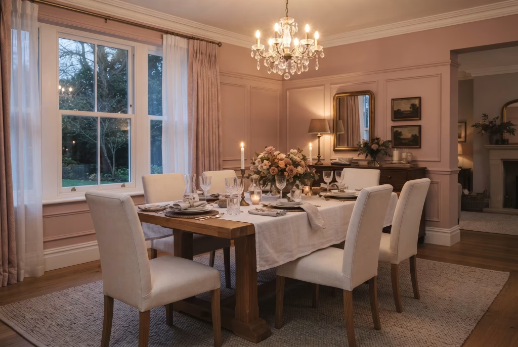
Twenty five years of sitting at other people’s tables has taught me where that line sits, and this guide walks it room by room.
Why Pink and White Works Here
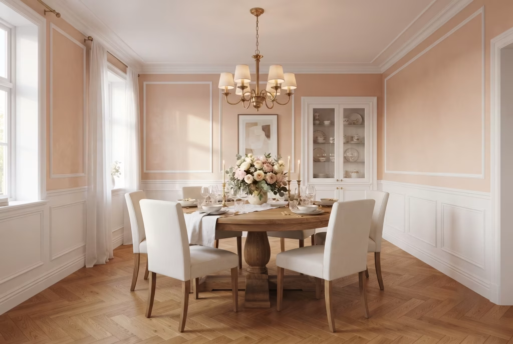
Every colour carries an undertone, and pink’s is the part most people skip past on their way to picking a swatch. Warm pinks lean toward peach or coral, the kind that glow rather than shout, while cool pinks drift toward mauve or lilac, holding themselves at arm’s length. Get the undertone wrong against your existing floors or trim and the whole room starts to feel slightly off, the way a meal tastes wrong when one ingredient’s been swapped without telling you. Get it right, and the colour settles in like it was always meant to be there.
White is the part doing the quiet heavy lifting. It’s not there to dilute pink so much as give it somewhere to rest, breaking up saturation before it tips into overwhelming, framing the colour the way a good mat frames a print. A dining room painted pink wall to wall, floor to ceiling, reads like a stage set. Bring white in through trim, ceiling, or a lower third of the wall, and pink stops performing and starts belonging.
Dining rooms also get away with more than living rooms ever could, and there’s a practical reason for it. Nobody’s parked in front of a dining room wall for six hours of Netflix, turning a bold colour into wallpaper for the eyes. Most dining happens under artificial light, at a table, for an hour or two at a stretch, which means the room can afford a colour with a bit more nerve, one that would feel exhausting in a space meant for lingering all day.
Blush Pink Walls with Crisp White Trim
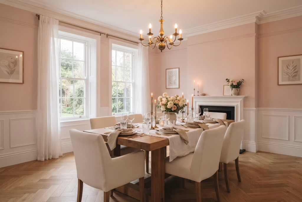
This is the pairing most people picture first, and there’s a reason it never quite goes out of style. Blush sits at the gentlest end of the pink spectrum, warm enough to flatter skin tones and candlelight, restrained enough that it never tips into “little girl’s bedroom” territory the way brighter bubblegum shades can. Paired with sharp white trim, skirting, and architrave, the whole room gets a kind of quiet structure, like a soft-spoken sentence with excellent punctuation.
What actually makes this work in practice:
- Undertone matching matters more than the swatch name. Two blush pinks can look identical on a paint chip and completely different on a wall, depending on whether they lean peachy-warm or dusty-cool. Test a sample against your existing floor and any wood furniture before committing a whole room to it.
- Trim colour shouldn’t be an afterthought. A true, cool white (something like a chalk or brilliant white rather than a warm off-white) is what gives blush its crispness. Pair blush with a creamy trim instead, and the whole room can start to feel washed out, one soft colour blurring into another with nothing to hold the line.
- Sheen does real work here. Walls in a matt or eggshell finish, trim in a satin or semi-gloss. That contrast in finish does almost as much visual heavy lifting as the contrast in colour, catching light differently and giving the eye something to travel along.
| Element | Recommended Approach | Why It Matters |
| Wall finish | Matt or eggshell | Softens the pink, avoids a nursery-adjacent sheen |
| Trim finish | Satin or semi-gloss | Adds definition and a lived-in polish |
| Trim colour | Cool, true white | Prevents the room from reading flat or muddy |
| Best rooms for this | North or east-facing dining rooms | Blush warms up cooler natural light beautifully |
One thing worth knowing before you pick up a brush: blush pink behaves very differently in a room that gets flooded with afternoon sun versus one that only sees soft morning light. In a south-facing room, the same shade can read almost coral by 3pm, so it’s worth testing your sample at three points in the day, not just once over a cup of coffee. A dining room I worked on years ago taught me this the hard way.
The client fell for a blush swatch under morning light, painted the whole room, and by evening it looked like a completely different colour under the pendant light over the table. We ended up glazing it back a shade cooler rather than repainting from scratch, and it’s stuck with me ever since as the reason I always test swatches after dark, not just by day.
The pros: timeless rather than trendy, forgiving of most wood tones, flatters food and faces alike under evening light, easy to soften further with white linens or brighten with brass.
The one thing to watch: blush can read a little flat under cool LED lighting. Warm up your bulbs (2700K rather than daylight-toned) if you want the colour to feel as inviting on a Tuesday night as it does in the photographs.
A Whisper-Pink Ceiling, White Walls Below
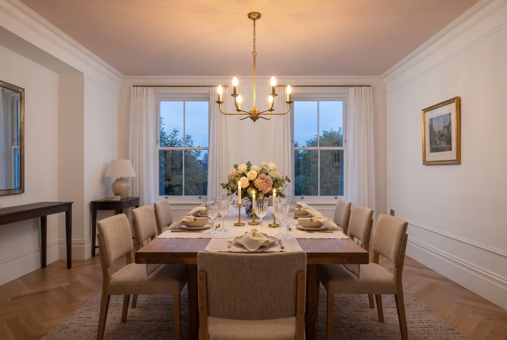
Painting the ceiling is the move most homeowners never think to make, and it’s often the one that transforms a dining room the most. A whisper-pink ceiling, something barely a shade off white, brings warmth down over a table without ever competing with what’s on it. This is the fifth-wall trick designers have leaned on for years, and dining rooms happen to be one of the best places to try it, since you’re rarely staring straight up at a ceiling the way you might in a bedroom.
Why this works when a full pink room might not:
- It’s committed without being loud. Because the ceiling sits above eye level, the colour reads as atmosphere rather than statement. Guests notice the room feels warmer, softer, more flattering, often without clocking exactly why.
- Walls stay white, so nothing fights for attention. Artwork, a mirror, a sideboard, all of it gets to breathe against a clean backdrop, while the ceiling quietly does the work of tying the room together.
- It plays beautifully with pendant lighting. A pink-toned ceiling catches and bounces warm light back down over the table, which is exactly the kind of glow that makes food, faces, and wine all look better at 8pm.
| Element | Recommended Approach | Why It Matters |
| Ceiling shade | Barely-there pink, close to white | Keeps the effect subtle rather than a dramatic pink cap |
| Wall colour | Crisp or soft white | Prevents visual competition with the ceiling |
| Ceiling finish | Flat or matt only | Gloss on a ceiling highlights every imperfection |
| Best paired with | Warm brass or gold fixtures | Echoes the ceiling’s warmth rather than clashing with it |
I painted a client’s dining room ceiling this way almost by accident, after we’d run out of the white she wanted and I mixed a tiny amount of leftover blush into the tin to stretch it. She nearly stopped me at the door.
Two coats later, standing under it at dusk with the pendant lights on, she went quiet for a second and then said the room finally felt finished. That’s the thing about a ceiling colour done well: nobody walks in and says “nice ceiling.” They just feel like they want to stay a while longer, and that’s the whole point.
A word of caution worth taking seriously: low ceilings and this trick don’t always get along. A pink ceiling can visually lower a room that’s already a touch snug, so in anything under roughly 2.4 metres, test a sample patch first and live with it for a few days before committing the whole surface.
The pros: subtle, sophisticated, endlessly flattering under warm lighting, works even for clients nervous about “too much pink,” easy to undo if it’s not to your taste since it’s a small surface relative to the room.
The trade-off: it’s a detail people feel rather than notice outright, so if you want pink to make an obvious statement, this is the quiet cousin of that idea, not the main event.
You May also Like: 21 Dining Room Renovation Ideas: From Modern Minimalism to Vintage Charm
Dusty Rose Panelling with White Millwork
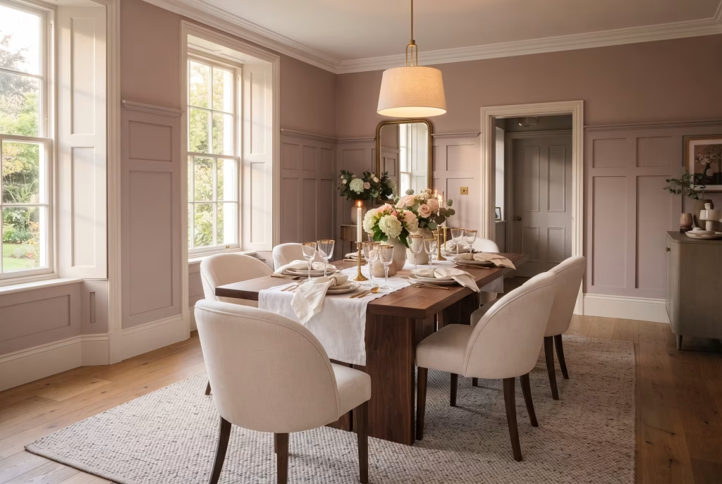
There’s a reason panelling has never really left the design conversation, and dusty rose gives it a softer, more grown-up edge than the classic white-on-white version everyone’s already seen a thousand times.
This is dusty rose, not blush, worth separating out clearly because the two get lumped together constantly and they behave quite differently on a wall. Dusty rose carries more grey in it, a muted, almost vintage warmth that reads as considered rather than sweet, and against white millwork it takes on an almost architectural quality, less “pink room” and more “room with excellent bones that happens to be pink.”
Panelling itself does something paint alone can’t. It adds shadow, rhythm, a sense that the wall has depth rather than sitting flat, and that texture is exactly what stops a pink dining room from feeling one-note.
Getting the proportions right matters more than the shade you pick:
- Full-height panelling suits rooms with generous ceiling height and reads as formal, the kind of dining room built for long dinners and better cutlery.
- Waist-height or two-thirds panelling, with plain dusty rose wall above, works in almost any room and tends to feel a touch more relaxed, less museum, more home.
- Shaker-style frames keep things clean and contemporary. Raised or fielded panels lean more traditional, closer to a period property’s original detailing.
| Panelling Height | Best Suited To | Overall Effect |
| Full height | Rooms with 2.7m+ ceilings | Formal, architectural, statement-making |
| Waist height (roughly 1m) | Most standard dining rooms | Balanced, versatile, easy to live with |
| Picture-rail height | Period properties | Traditional, in keeping with original features |
The white millwork carries just as much weight as the rose itself, and this is where people tend to cut corners they’ll regret. Cheap MDF panelling painted a flat white can look plasticky next to a nuanced colour like dusty rose, whereas properly primed and finished millwork, painted in a slightly warmer white rather than a stark cool one, sits alongside the rose like it grew there naturally rather than being bolted on as an afterthought.
I fitted waist-height panelling in a Victorian terrace dining room a few winters back, and the client had been dead set on full-height until we mocked it up with painter’s tape and stood back. The lower ceiling made full panelling feel like standing inside a pink box.
Dropping to waist height with dusty rose above the rail instead gave the room air to breathe, and it’s become one of those rooms clients photograph more than any other in the house. Sometimes the boldest choice is knowing when to hold back.
The pros: adds architectural interest that paint alone can’t fake, ages gracefully rather than looking dated in five years, pairs beautifully with both antique and contemporary furniture, dusty rose is forgiving of most lighting conditions since its muted undertone doesn’t swing wildly warm or cool.
Worth budgeting for properly: panelling is a bigger investment than a tin of paint, both in materials and installation time, so this is the idea to choose when you’re planning to stay put for a while and want the room to earn its keep over years, not just one season’s worth of admiration.
Pink and White Striped Wallpaper
Stripes have a job in a room that colour alone can’t do, and that job is height, rhythm, and a sense of movement that stops a dining room from feeling static. Pink and white striped wallpaper leans on one of the oldest tricks in the decorating book, drawing the eye upward or along a wall, and it does it while staying firmly on the elegant side of playful rather than tipping into anything twee.
The width and orientation of the stripe changes everything:
- Narrow stripes (roughly 2 to 5cm) read as classic, almost ticking-fabric in feel, and suit smaller dining rooms where a bold, wide stripe could overwhelm.
- Wide stripes (10cm plus) make more of a statement and work best in rooms with height to spare, since the eye has more room to travel before hitting the ceiling.
- Vertical stripes are the go-to for lifting a low ceiling, pulling the eye upward the way a well-cut dress does for a figure.
- Horizontal stripes, used less often but worth knowing, can widen a narrow room, though they’re a braver choice in a dining space and worth sampling before committing.
| Stripe Width | Best For | Visual Effect |
| Narrow (2 to 5cm) | Smaller or period dining rooms | Classic, refined, ticking-inspired |
| Medium (5 to 10cm) | Most standard rooms | Balanced, versatile, easy to style around |
| Wide (10cm+) | Larger rooms, higher ceilings | Bold, statement-making, contemporary |
Wallpaper also solves a problem paint can’t touch: texture. A lightly embossed or subtly textured striped paper catches light differently depending on where you’re standing, so the stripes shift ever so slightly through the day, something a flat painted stripe simply can’t replicate no matter how carefully it’s taped and painted.
One dining room I papered for a client had a chimney breast that had always felt like a slightly awkward, boxed-in afterthought. We ran a narrow pink and white stripe wallpaper up and over it, floor to ceiling, while leaving the rest of the room in plain white. The chimney breast went from apologising for itself to being the reason guests stop mid-conversation to ask where the paper came from. Sometimes it’s not about papering the whole room. It’s about picking the one wall that deserves the spotlight and letting everything else step back.
A practical note before you order rolls: striped wallpaper needs pattern matching at the seams, which means you’ll use more paper than a flat colour would suggest, roughly 10 to 15% extra depending on the repeat. Always order a touch more than the room’s square footage implies, since running short mid-hang and waiting on a reprint is not a Tuesday anyone enjoys.
The pros: adds pattern and texture without needing a single extra accessory, wildly effective at correcting proportion issues like low ceilings or narrow rooms, timeless in a way that trend-driven wallpapers rarely manage, easy to dial up or down in boldness through stripe width alone.
Where it asks more of you: hanging striped wallpaper well is a job for a patient hand or a professional decorator, since crooked stripes are far more noticeable than crooked plain paper. This is the idea to budget proper installation time and cost for, not a rushed weekend project.
Lacquered Pink Walls for High-Gloss Drama
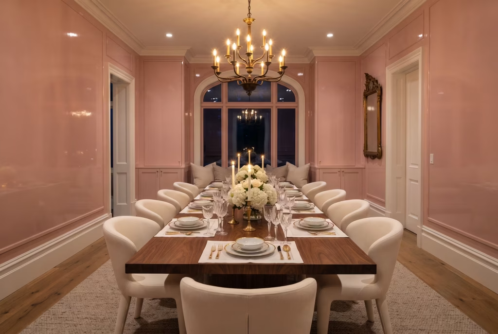
This is the idea for the client who’s already tired of being told pink has to be soft. Lacquer strips pink of any lingering softness and replaces it with sheer, glassy confidence, the kind of finish that bounces candlelight across the ceiling and makes a dining room feel like it’s dressed for the evening even at noon. Where blush and dusty rose ask a room to whisper, lacquer asks it to hold court.
What lacquer actually is, and why it behaves so differently from ordinary paint:
- It’s a high-build, high-sheen finish, traditionally oil-based though good water-based versions now exist, applied in multiple thin coats and sanded lightly between each one to build up a near-mirror depth.
- It reflects light rather than absorbing it, which is precisely why the same pink in lacquer can look two shades more saturated than the identical colour in matt.
- It shows every flaw in the wall beneath it. Lacquer is unforgiving of dents, filler patches, or uneven plaster, so this is not a finish to apply straight over a wall that’s seen better days.
| Preparation Step | Why It’s Non-Negotiable |
| Full skim or filling of imperfections | Lacquer magnifies every bump and dip |
| Multiple thin coats, not one thick one | Prevents drips and builds true depth |
| Light sanding between coats | Achieves that glass-smooth, mirror-like result |
| Professional application recommended | DIY lacquer jobs often show brush marks under light |
I lacquered a dining room for a client in a converted warehouse flat, all exposed brick on one wall and nothing but concrete floors underfoot, and she wanted pink but worried it would feel soft against such an industrial shell. Lacquer was the answer neither of us had considered until we were standing in the room with swatches. The gloss played off the steel window frames and the polished concrete in a way flat paint never could have, hard surfaces meeting hard shine, and the pink stopped reading as delicate altogether. It read as deliberate, almost architectural, a colour that had clearly been chosen on purpose rather than defaulted into.
Where this finish earns its keep, and where it doesn’t: lacquer thrives in dining rooms with strong artificial lighting, since the whole point of the finish is what it does with light, and it pairs unexpectedly well with masculine or industrial materials that soften pink’s usual associations. It struggles in rooms with poor natural light and no statement fixtures, since gloss with nothing to reflect just sits there, flat in spirit if not in finish.
The pros: genuinely showstopping, photographs beautifully under any lighting, elevates even a modest-sized room into something that feels considered and expensive, ages well since gloss wipes clean far more easily than matt.
What it demands in return: proper wall preparation, professional-grade application in most cases, and a willingness to commit to drama rather than talk yourself out of it halfway through. This is not the idea for anyone still on the fence about pink. It’s the idea for someone who’s already decided and simply needed permission to go further.
You May also Like: 25 70s Apartment Design Ideas That Bring Retro Vibes to Modern Homes
Pink Marble-Top Table, White Base
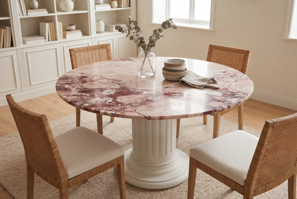
There’s a reason marble has outlasted almost every other material trend in dining rooms, and it comes down to something simple: no two slabs are ever quite the same. A pink marble top, whether that’s a genuine rosa Portogallo, a subtler pink-veined Carrara variant, or one of the newer dolomite blends, brings movement and depth to a room in a way flat paint or fabric never can. Set on a white base, be that turned wood legs, a pedestal, or a sleek painted plinth, the whole piece reads as considered rather than trend-chasing, the sort of table you’d still want in the room a decade from now.
Understanding what you’re actually buying matters more than most people realise:
- Genuine pink marble varies wildly in price and veining depending on quarry origin, with Portuguese and Italian sources generally commanding the highest cost but offering the most dramatic, one-of-a-kind veining.
- Marble-effect porcelain or sintered stone has come a long way and now fools most guests entirely, at a fraction of the cost and with none of marble’s porousness or staining worries, a genuinely sensible choice for a busy family dining table.
- Book-matched slabs, where two pieces of marble are cut from the same block and mirrored, create a symmetrical veining pattern that turns the tabletop into something closer to art than furniture, though this comes at a real premium.
| Material Option | Approximate Cost Level | Maintenance Needs |
| Genuine pink marble | High | Regular sealing, careful with acidic spills |
| Marble-effect sintered stone | Medium to high | Virtually maintenance-free, highly stain-resistant |
| Marble-effect laminate or veneer | Low to medium | Wipe clean, though less convincing up close |
I sourced a genuine pink marble top for a client’s dining room a couple of years back, and she asked, reasonably, whether she should baby it or simply live with it. My answer was to live with it, properly. Marble that’s too precious to actually use tends to look precious in the wrong sense, untouched, sterile, a museum piece rather than the heart of a home. A little honing over time, the odd faint water ring that catches the light differently, that’s the table earning its keep, not falling apart. Within a year hers had softened at the edges in a way that made it look like it belonged to the family, not just sitting in their dining room waiting to be admired.
Where the white base earns its place in this pairing: a white pedestal or turned-leg base keeps the eye from getting overwhelmed by pattern on pattern, letting the marble’s veining stay the star of the show rather than competing with a heavily grained wood base underneath it. It also, practically speaking, tends to be the more affordable half of the table, meaning your budget can stretch further toward a better slab up top.
The pros: genuinely unique since no two slabs veneer identically, ages with real character rather than wearing out, pairs effortlessly with almost any chair style from rattan to velvet, instantly elevates a room without needing anything else to work hard alongside it.
Worth knowing before you commit: genuine marble is porous and will mark from red wine or lemon juice if left unsealed and unattended, so this is a table for households willing to wipe up a spill promptly rather than let it sit overnight. If that sounds like more commitment than your dinner table deserves, a good sintered stone alternative gives you the look without the worry.
White Table with Pink Velvet Chairs
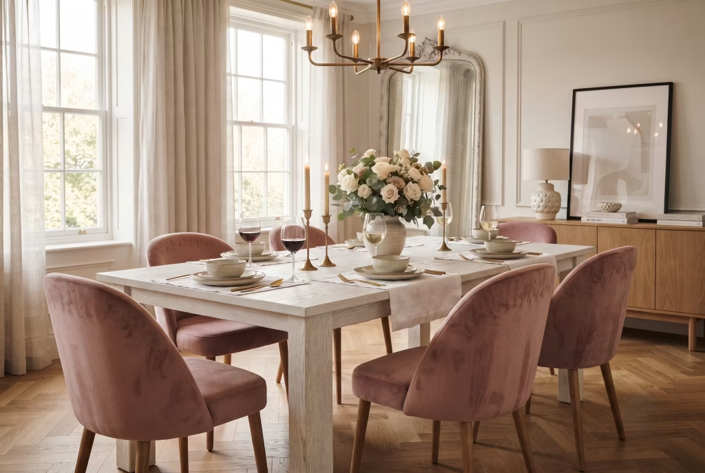
Flip the marble idea on its head and you land here, a crisp white table holding its ground while the chairs do all the talking. This is arguably the easiest entry point into pink and white dining for anyone nervous about permanence, since chairs are far easier to swap out than a wall or a worktop if your tastes shift down the line. But easy doesn’t mean lightweight in effect. Pink velvet chairs around a clean white table can feel just as considered as any full room redesign, sometimes more so, because the contrast does so much of the work on its own.
Velvet specifically, not just any pink fabric, is worth understanding before you buy:
- Pile direction changes how the colour reads. Run your hand one way and velvet looks darker, deeper, almost bruised in tone. Go the other way and it lightens, catching more light. This isn’t a flaw, it’s part of velvet’s character, though it’s worth knowing before six chairs arrive looking subtly mismatched simply because they were upholstered from different directions on the roll.
- Not all velvet wears the same. Cotton velvet is soft but crushes and marks more easily. Performance velvet, often a polyester or blended weave, resists spills and fading far better and has genuinely closed the gap on how luxurious it feels underhand.
- Dusty or muted pinks tend to age more gracefully than bright, saturated ones, which is worth factoring in if these chairs are going into a household with children, red wine enthusiasts, or both.
| Velvet Type | Feel | Best For |
| Cotton velvet | Soft, slightly duller sheen | Low-traffic formal dining rooms |
| Performance velvet | Slightly crisper, highly durable | Family homes, frequent entertaining |
| Silk-blend velvet | Luxurious, high sheen | Statement pieces, occasional-use rooms |
I reupholstered a set of six dining chairs in dusty pink performance velvet for a client with two young children and a golden retriever who, by her own admission, had no business owning white furniture. Eighteen months on, those chairs still look genuinely presentable, spot-cleaned a handful of times, nothing a damp cloth and a bit of patience couldn’t handle. Had we gone with the silk-blend she originally fell in love with, I suspect we’d be having a very different conversation by now. Choosing the right fabric for how a room actually gets lived in, not just how it photographs on day one, is half the job of doing this well.
Where the white table needs to hold up its end of the bargain: a table with visible grain, whether that’s whitewashed oak or a painted timber with texture showing through, keeps the pairing from feeling flat or clinical. A dead-flat lacquered white can occasionally read a touch cold against something as tactile as velvet, so a whitewash or lightly textured finish often softens that contrast rather beautifully.
The pros: flexible and low-commitment relative to wall or worktop changes, endlessly mixable with different table shapes and sizes, velvet’s texture adds warmth that flat pink paint alone can’t quite match, easy to refresh the whole room’s feel simply by reupholstering down the line.
What’s worth thinking through first: velvet, for all its charm, isn’t the most forgiving fabric for a heavy-spill household unless you go performance-grade, and six chairs’ worth of good upholstery is not a small line item. Budget for the fabric properly rather than cutting corners here, since it’s the one surface every guest ends up touching all evening.
Terracotta-Pink Plaster Walls, White Ceiling
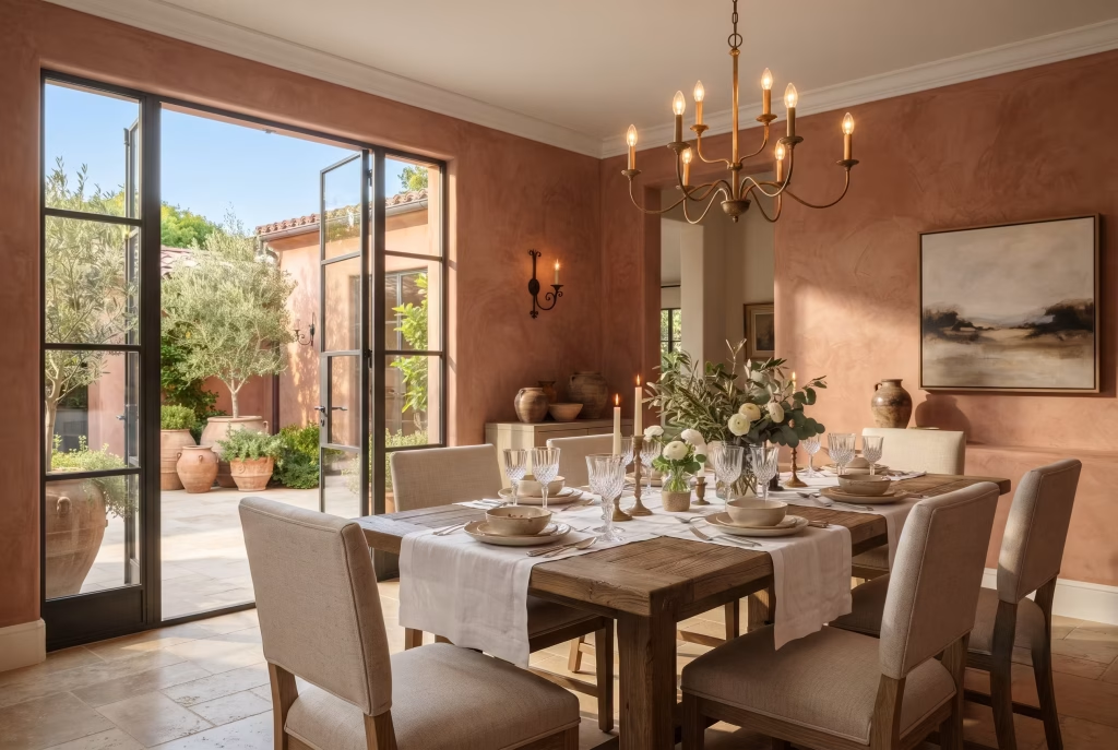
Plaster does something paint has never quite managed to fake convincingly, and it comes down to how it catches light. Where painted walls sit flat under a bulb or a shaft of afternoon sun, limewash and Venetian plaster hold tiny variations in texture that scatter light unevenly, so a terracotta-pink wall seems to shift in tone as you move through the room, deeper in the corners, warmer where the light lands directly.
This is the earthiest end of the pink spectrum covered here, closer to a sun-baked Mediterranean courtyard than anything remotely sugary, and it’s precisely that earthiness that makes it read as grown-up rather than girlish.
Not all “plaster pink” comes from the same process, and knowing the difference saves both money and disappointment:
- Traditional lime plaster is the real, breathable, slow-cured version, mixed with natural pigments to achieve that dusty terracotta warmth. It’s expensive, needs a skilled plasterer, and is genuinely worth it in a period property with the original walls to suit it.
- Microcement or polished plaster finishes offer a similar tactile, mottled look with a more contemporary application process, better suited to newer builds or anyone wanting the effect without a full lime plaster commitment.
- Textured paint effects exist as a budget entry point, using a plaster-effect paint or a limewash-style product over standard plaster, giving a hint of that variation without the true depth of the real thing.
| Application Type | Texture Depth | Best Suited To |
| Traditional lime plaster | Deep, highly varied | Period homes, statement rooms, long-term investment |
| Microcement or polished plaster | Moderate, consistent | Contemporary builds, budget-conscious statement walls |
| Limewash or plaster-effect paint | Subtle, more uniform | Renters, smaller budgets, trial runs before bigger commitment |
I plastered a dining room in terracotta pink for a client renovating a 1930s semi, and she’d originally asked for flat paint in a similar shade, worried that real plaster would be more trouble than it was worth. We did a small sample patch first, about a metre square, and stood in the room at three different times of day watching how the light moved across it. By the third viewing she’d changed her mind entirely.
Flat paint, she said, would have given her the colour. Plaster gave her the colour and the light both, and once you’ve seen a wall do that, it’s genuinely hard to go back to something that just sits there looking the same all day.
Why the white ceiling matters as much as the wall treatment: plaster walls with all this texture and tonal variation need somewhere for the eye to rest, and a clean, flat white ceiling gives exactly that, a pause between the wall’s movement and the room’s upper reaches. A coloured or textured ceiling on top of textured plaster walls tends to compete rather than complement, turning “rich and layered” into simply “busy.”
The pros: genuinely one-of-a-kind since no two plaster jobs finish identically, ages beautifully rather than needing repainting every few years, brings warmth and depth that flat colour alone can’t replicate, works particularly well in rooms with good natural light to show off the texture.
What it asks of you before you commit: proper lime plaster is a specialist job, not a weekend DIY project, and finding a plasterer experienced in decorative or pigmented finishes specifically, rather than standard skimming, is worth the extra time it takes to source. This is the idea for someone planning to stay in the house long enough to enjoy watching that wall change character through every season of light.
Pink Gingham or Ticking-Stripe Chair Fabric
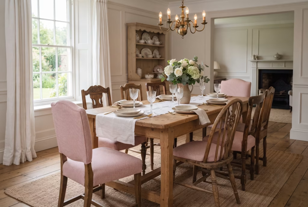
Some patterns never really leave, and gingham and ticking are proof of that staying power. Both trace back to utility fabrics, ticking from mattress covers and workwear, gingham from kitchen tablecloths and farmhouse curtains, and there’s something in that humble history that keeps them from ever tipping into precious or overdone.
Dressed in pink and white on a dining chair, either pattern brings a kind of unfussy charm that reads as collected over time rather than decorated in a single weekend.
Knowing which pattern suits which room saves a lot of second-guessing:
- Gingham, that classic checked pattern, tends to feel more playful and countryside in spirit, at home in a farmhouse kitchen-diner or a room already leaning into softer, more romantic decor.
- Ticking stripe, the narrower, more irregular striped pattern, reads as slightly more tailored and versatile, equally comfortable in a coastal cottage or a pared-back contemporary space.
- Scale matters more than most people expect. A small, tight gingham check can look almost solid from across the room, while a larger check demands more visual space and works best on generously proportioned chairs.
| Pattern | Character | Best Suited To |
| Small-scale gingham | Delicate, subtle | Compact dining rooms, understated schemes |
| Large-scale gingham | Bold, playful | Farmhouse or country-style rooms with space to spare |
| Ticking stripe | Tailored, versatile | Coastal, contemporary, or transitional schemes |
Fabric choice here matters just as much as pattern choice. A linen-cotton blend gingham has a slightly looser weave that softens the check, while a heavier cotton ticking holds its stripe crisply and wears well under daily use. Both are, thankfully, far more forgiving of the everyday spills and elbow marks that dining chairs inevitably collect than a delicate silk ever would be.
I recovered a set of mismatched dining chairs for a client in pink ticking stripe a while back, chairs she’d actually inherited rather than bought, each one a slightly different shape from a different decade. Rather than fight that inconsistency,
we leaned into it, using the same fabric across all of them to unify the set visually while letting each chair’s individual silhouette still show through. It’s become one of my favourite tricks for exactly this situation: when the furniture itself can’t match, let the fabric do the matching instead. Nobody who’s eaten dinner in that room has ever clocked that the chairs aren’t a set.
Where this pairing genuinely shines in daily life: gingham and ticking both hide the small marks of real use, a dropped fork here, a wine glass wobble there, far better than a solid block colour would, since the pattern itself breaks up the eye’s attention before it settles on any one mark.
The pros: budget-friendly relative to velvet or bespoke upholstery, endlessly easy to mix and match across different chair styles, pattern hides everyday wear better than solid fabric, timeless in a way that resists feeling dated even a decade on.
What’s worth considering before you commit: pattern-on-pattern needs a slightly steadier hand than solid colour does, so if your dining room already has a busy wallpaper or a heavily veined marble table, keep the chair fabric’s scale modest rather than adding two bold patterns competing for the same room.
You May also Like: 21 Earthy Cottage Home Decor Ideas for a Cozy, Soul-Calming Retreat
A Pink Banquette Against White Walls
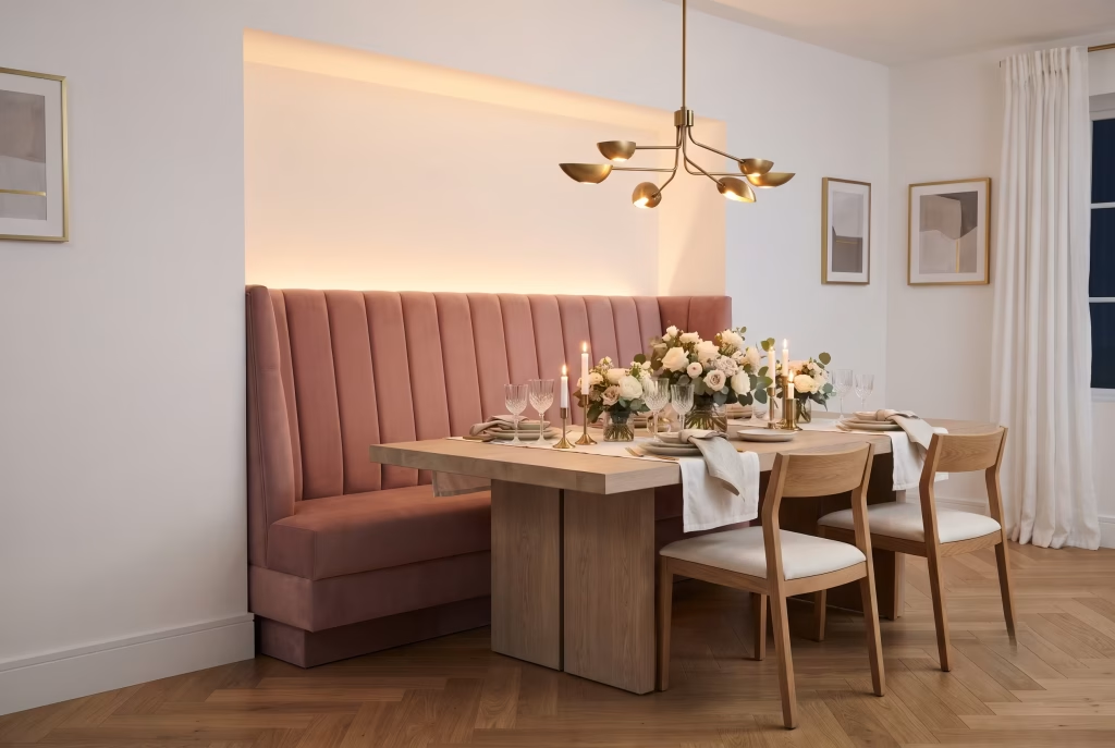
A banquette changes the whole physics of a dining room, and it’s worth understanding why before you fall for the look alone. Chairs give a room flexibility. A banquette gives it commitment, a fixed, upholstered bench that anchors one side of the table permanently, and that permanence is exactly what makes a pink one feel so intentional.
Set against white walls, a pink banquette stops being a piece of furniture and starts acting almost like architecture, a soft, colourful wall within a wall.
The practical mechanics of a banquette matter more than most people expect going in:
- Depth and height need real thought, not guesswork. A seat depth of roughly 45 to 55cm and a seat height around 45cm keeps the proportions comfortable for most adults, though it’s worth sitting in a mocked-up version before committing to bespoke joinery.
- Fixed seating changes how a table gets used day to day. One side becomes effortless for lingering over coffee long after plates are cleared, while the chair side stays easy for quick exits, a genuinely useful asymmetry for a household that both entertains and eats fast on a Tuesday.
- Upholstery choice needs to earn its keep. A banquette gets sat on, slid across, and leaned against far more than a standalone chair, so performance fabric or a well-treated velvet tends to outlast delicate silk-blends by years, not months.
| Banquette Element | Recommended Range | Why It Matters |
| Seat depth | 45 to 55cm | Comfortable for lingering without feeling cramped |
| Seat height | Around 45cm | Matches standard dining table height ergonomically |
| Backrest angle | Slight recline, 5 to 10 degrees | Prevents a too-upright, formal feel |
| Fabric type | Performance velvet or heavy cotton | Withstands daily contact and occasional spills |
I built a banquette into an awkward alcove for a client whose dining room had a chimney breast eating into one wall, a space too shallow for a proper run of chairs but perfectly suited to a fixed bench. We upholstered it in a dusty pink performance fabric against otherwise plain white walls, and what struck both of us once it was finished was how much bigger the room suddenly felt.
The banquette didn’t just fill dead space. It turned an awkward corner into the best seat in the house, the one guests gravitate toward without being told to. Sometimes the most useful thing a designer does is look at a room’s problem and realise the fix and the feature are the same piece of furniture.
Where white walls do their quietest, most essential work: because a banquette already commits so much colour and shape to one side of the room, plain white walls elsewhere give the eye somewhere uncluttered to land. Add a patterned wallpaper or a second bold colour into the mix, and the room can tip from “confidently layered” into “trying too hard” surprisingly fast.
The pros: maximises seating in tight or awkwardly shaped rooms, adds a soft architectural anchor that loose chairs can’t replicate, ages well since reupholstering a bench is often more cost-effective than replacing a full chair set, creates a genuinely inviting spot that gets used more than a standard dining chair ever does.
What’s worth weighing up first: a banquette is a fixed, often bespoke piece, meaning it’s not something you can easily swap out or take with you if you move house. This is the idea for a dining room you’re settled in, not a rental or a short-term fix, and it’s worth measuring the space properly before any joinery gets ordered.
Two-Tone Walls: Pink Below, White Above
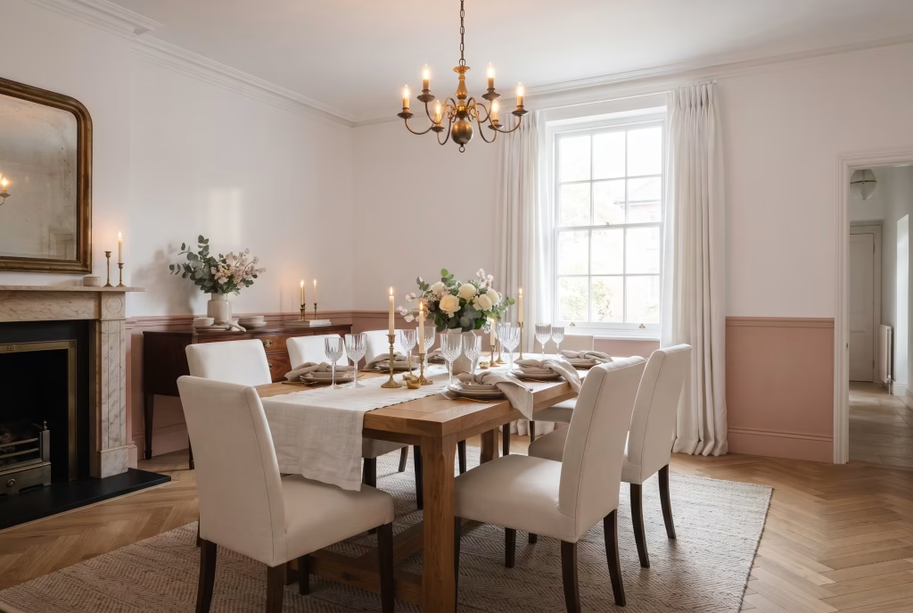
Split a wall in two and you’re not just choosing a colour scheme, you’re borrowing a trick that’s been quietly working in dining rooms since Georgian times, back when a dado rail existed purely to protect plaster from the daily scrape of chair backs. Pink below, white above, divided by a rail or simply a painted line, does something a single flat colour never quite manages. It gives the room a horizon, a sense that the walls have a floor and a sky of their own, and dining chairs pushed in against a coloured lower half feel grounded in a way they simply don’t against one uninterrupted colour running floor to ceiling.
Where you place that divide changes the whole personality of the room, and it’s worth thinking through before a single brush touches plaster. Set the line at classic dado height, somewhere around a third of the way up, and the room reads traditional, formal, almost period-correct even in a new build. Push it higher, closer to two-thirds, and the pink starts to dominate, giving a bolder, more contemporary feel that still keeps white doing enough work up top to stop things feeling heavy. There’s no single correct answer here so much as a decision about how much pink your particular room, your ceiling height, your furniture, actually wants to carry.
Chair rail or no chair rail is the next fork in the road, and it’s a bigger decision than it sounds. A physical rail, whether that’s a simple timber moulding or something more ornate, gives the divide a crisp, architectural edge and, practically speaking, protects the wall exactly the way it always has, taking the knock of a pushed-back dining chair instead of your paintwork. Skip the rail and paint a hard line freehand or with tape, and the effect softens into something more modern, less fussy, though it does mean the wall has nothing physically stopping a chair from eventually scuffing the pink below.
A dining room I two-toned in a Edwardian conversion had ceilings just shy of 2.5 metres, tight enough that the client worried a bold lower half would swallow the room whole. We kept the pink to just below a third and ran a slim, understated rail rather than anything chunky, and the effect lifted the ceiling rather than lowering it, the eye reading two distinct, taller-feeling zones instead of one squat box. She’d assumed two-tone walls needed height to spare. What that room taught both of us is that the right proportion can make even a modest ceiling feel generous, provided the split sits low enough to leave white doing most of the vertical lifting.
Practical considerations worth weighing before you commit: dado or chair rail height typically sits between 90cm and 1m from the floor, roughly level with the top of a standard dining chair back, which is precisely the point of the original design and still the most functional height today. Below that line, a slightly tougher, wipeable eggshell finish earns its keep against the daily contact of chairs and the occasional dropped fork, while the white above can stay in a softer matt since it rarely takes a knock.
This idea rewards patience over speed. Freehand lines demand a genuinely steady hand or good quality frog tape and several careful passes, and rushing the taping stage is where most DIY two-tone walls come slightly undone, a wobbly line being far more noticeable than a wobbly single colour ever could be. Budget an extra afternoon for prep that you’d never think to set aside for a plain painted room, and the finished line will thank you for it every time the evening light rakes across the wall.
Pink and White Checkerboard Flooring
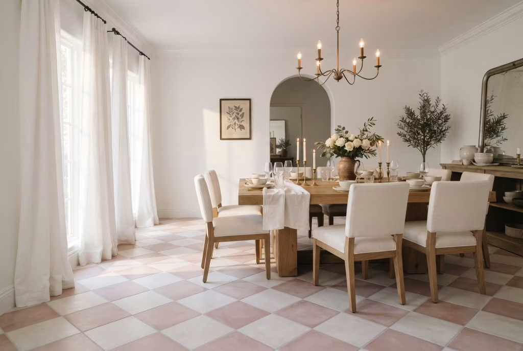
Floors rarely get the credit they deserve in a dining room, mostly because everyone’s eye lands on the table first. Checkerboard flooring flips that order entirely. Walk into a room with pink and white tiles laid diagonally underfoot and the floor becomes the opening line of the whole design story, everything else, the table, the chairs, the walls, arriving as supporting cast rather than the headline act.
What makes this pattern endure, decade after decade, is its sheer adaptability to scale. A small, tight checkerboard in soft dusty pink and off-white feels almost demure, at home in a period cottage where you don’t want the floor shouting over original coving and skirting. Blow the same pattern up to larger tiles, say 30cm squares rather than 15cm, in a bolder bubblegum pink against sharp white, and suddenly you’re in confident, contemporary territory, the kind of floor that makes a design statement before dessert’s even been served.
Material choice here genuinely changes the whole character underfoot, not just the look:
- Encaustic cement tiles carry the richest, most saturated colour and a slightly matte, chalky finish, but they’re porous and need sealing, plus they’re heavy enough that not every subfloor can take them without reinforcement.
- Porcelain tiles in a checkerboard pattern give you the same visual punch with far easier upkeep, genuinely practical for a family dining room that sees daily wear.
- Vinyl or linoleum checkerboard, often overlooked as somehow lesser, has come a long way and offers a softer underfoot feel along with a considerably gentler price tag, a smart route for anyone testing the look before committing to something permanent.
I laid a small-format pink and white checkerboard in a narrow galley-style dining room a client had always found slightly claustrophobic, hemmed in by a low ceiling and one blank wall with nowhere for the eye to travel.
Running the tiles on the diagonal rather than square to the walls did something almost sleight-of-hand, the room read wider the moment you stepped in, the eye following the diagonal line rather than stopping short at the nearest wall. She’d spent years assuming the room was simply the wrong shape. Turns out the floor had been the missing piece the whole time, not the walls.
Grout colour is the detail most people forget until it’s too late to change cheaply. White grout against a pink and white pattern keeps everything crisp and graphic, though it shows dirt faster in a high-traffic dining room.
A soft grey or dusty pink-toned grout instead disguises everyday marks far better while still letting the checkerboard read clearly from across the room, and it’s a five-minute conversation with your tiler that saves years of looking slightly grubby underfoot.
One thing worth knowing before tiles arrive on site: a diagonal checkerboard lay uses noticeably more cut tiles at the room’s edges than a square lay does, which means more wastage and a higher material order. Ask your tiler for an honest wastage estimate before ordering, typically an extra 10 to 15% over a straight lay, so you’re not caught short waiting on a reorder halfway through the job.
You May also Like: 20 Luxurious Italian Dining Room Ideas for an Elegant, Timeless Home
White Wainscoting with Soft Pink Above
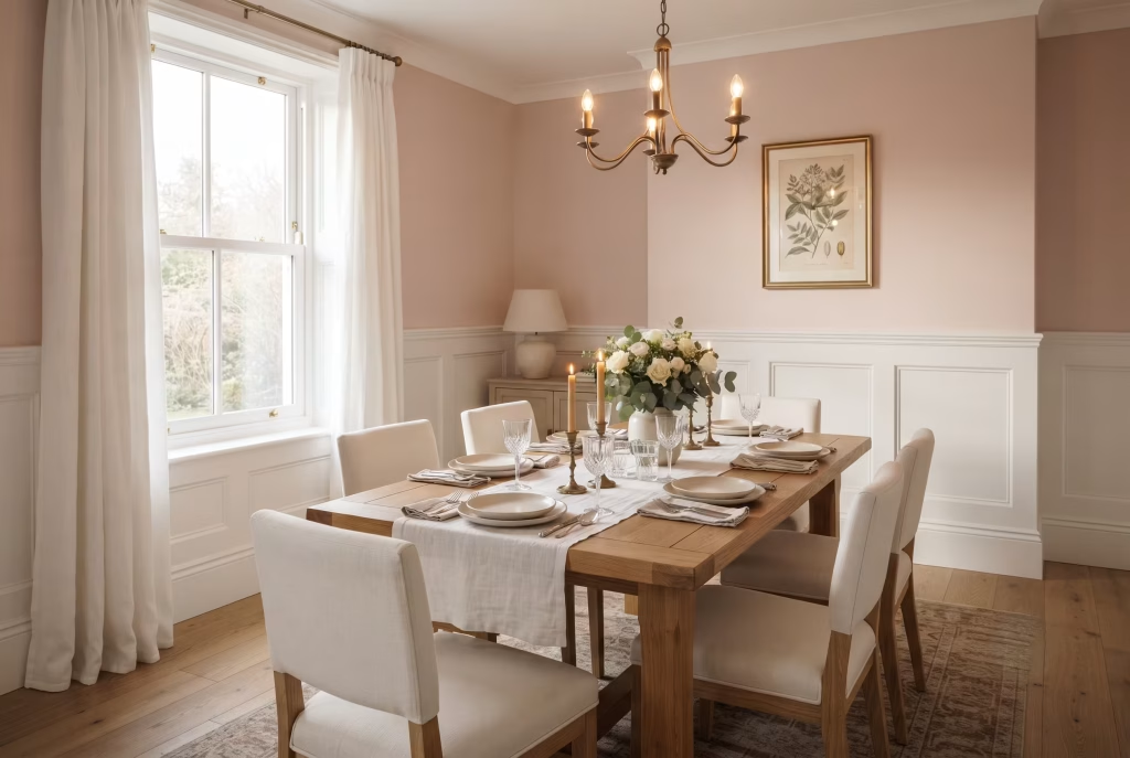
Wainscoting is the quiet workhorse of dining room design, the panelled lower wall treatment that’s outlasted more fashionable trends than most designers care to count, and there’s a simple reason it keeps earning its place. It gives a room a waistline. Everything above that line, in this case a soft, barely-there pink, gets to feel lighter and more atmospheric precisely because the white panelling below has already done the grounding work, holding the room steady the way a good pair of trousers holds a silhouette together.
The pink you choose above matters more here than in almost any other pairing on this list, simply because wainscoting takes up so much visual real estate on its own. Go too saturated above white panelling and you end up with a room that feels top-heavy, the eye drawn upward and never quite settling. The softer, chalkier pinks, the ones that read almost as a warm off-white in certain light, tend to work best here, letting the panelling’s shadow lines and grooves stay the star while the colour above simply warms the atmosphere rather than announcing itself.
Height is the decision that shapes everything else. Traditional wainscoting sits around a third of the wall’s total height, typically 90cm to 1.1m depending on your ceiling, and that proportion has survived centuries of changing taste because it genuinely works for the human eye, roughly aligning with where a chair back naturally meets the wall. Push the panelling taller, toward half the wall’s height, and the room takes on a more formal, almost clubhouse character, better suited to a proper dining room than an open-plan kitchen-diner where you want things to feel a touch more relaxed.
Panel style is where personal taste gets to have its say. Beadboard, those narrow vertical grooves running side by side, feels cottage-adjacent and slightly informal, at home in a coastal or countryside property. Raised or fielded panels, the kind with a visible border and a subtly domed centre, lean more traditional and grand, the sort of detailing you’d expect in a Georgian townhouse. Flat, recessed Shaker-style panels split the difference nicely, clean enough for a contemporary room, detailed enough not to read as an afterthought.
I fitted wainscoting for a client whose dining room backed onto a busy family kitchen, and she was nervous that pink above white panelling would feel too delicate for a room that saw sticky fingers and dropped crayons on a near-daily basis.
We went with tall Shaker panelling, a full 1.1 metres up the wall, leaving only a modest band of soft blush above before it met the ceiling. Turned out to be exactly the right call. The panelling took the daily wear entirely, wipeable, sturdy, forgiving of a toy truck driven straight into the skirting, while the pink above stayed pristine simply because nothing ever touched it. She later told me it was the first wall treatment in the house that looked as good eighteen months in as it had on installation day.
Cost is worth being upfront about before anyone falls too hard for this idea. MDF panelling, primed and painted on site, sits at the more accessible end, while solid timber or bespoke joinery climbs considerably higher, though it also tends to last a lifetime rather than a decade. For anyone renting or simply not ready for a permanent structural change, peel-and-stick or lightweight panel kits have improved enormously and offer a genuinely convincing stopgap, provided you’re realistic about the fact they won’t quite match custom joinery up close.
One detail that trips people up: the paint colour above the panelling and the white of the panelling itself need to be tested together, not separately. A pink that looks perfectly soft on its own swatch can suddenly read pinker, almost neon by comparison, once it’s sitting directly against a crisp white panel edge. Always sample both together on the actual wall before ordering enough paint for the whole room.
Pink Fluted or Reeded Cabinetry Detail
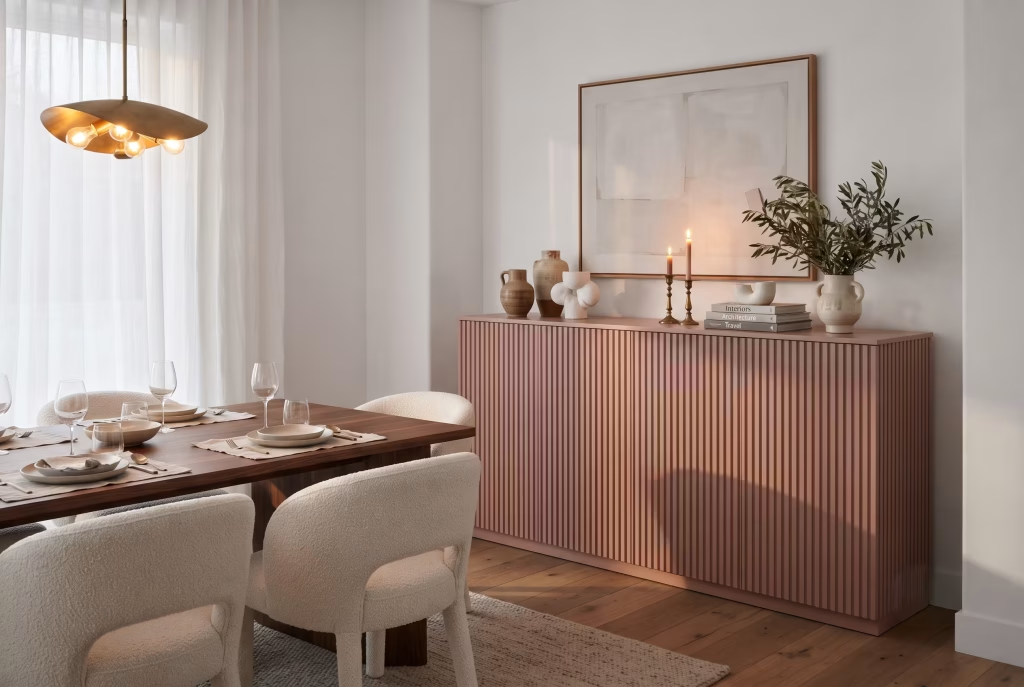
Fluting brings a dining room its shadow line, that soft ripple of light and dark running down a sideboard or serving cabinet that flat panelling never quite delivers. Painted in a muted pink, the grooves catch light differently through the day, deepening at dusk, softening under morning sun, so the cabinet feels alive rather than static.
Solid timber fluting holds its detail longest and takes paint beautifully, though it costs more and needs a proper joiner. MDF fluted panels, now widely available pre-cut, offer nearly the same visual result at a friendlier price, a smart route for anyone dressing up a plain flat-front cabinet rather than building from scratch.
I added fluted MDF panelling to a client’s flat-front sideboard, painted it dusty rose, and left the walls white around it. That one piece became the room’s whole personality, no other colour needed. Sometimes restraint elsewhere is what lets one detail properly sing.
Keep fluting to a single piece rather than every surface in the room. Overdo it and the ripple effect starts to feel busy rather than considered.
You May also Like: 15 Small Living Room Dining Room Combo Ideas for a Stylish, Space-Saving Home
A Single Statement Pink Accent Wall
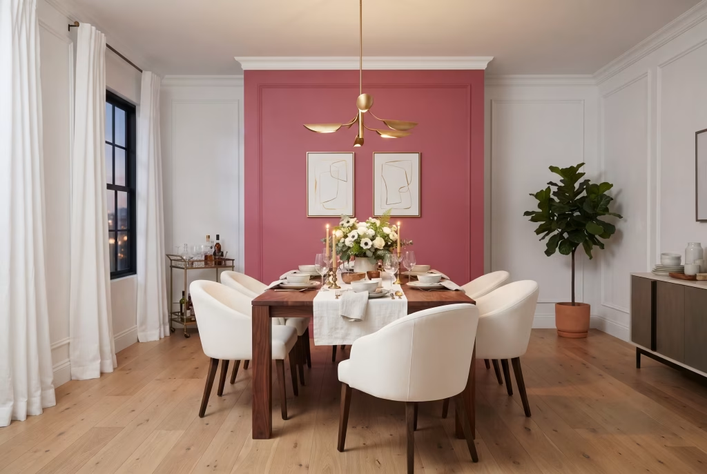
One wall does the heavy lifting here, everything else stays quiet. Pick the wall behind the table, the one everyone faces while eating, and let it carry a bold, saturated pink while the rest of the room stays white or off-white.
This is the lowest-commitment entry on this list and often the highest-impact. One tin of paint, one afternoon, and the room transforms without touching furniture, floors, or flow.
Choosing the right wall matters more than the shade itself. The wall behind the table, facing the room’s main sightline from the door, earns the colour. A side wall or the one behind the sideboard tends to get lost, doing all the commitment with none of the payoff.
I painted a single bold pink wall behind a client’s banquette in an otherwise all-white kitchen-diner, and it became the backdrop for every dinner party photo she’s taken since. One wall, and the whole room finally had a personality worth mentioning.
Go bolder than you think here. A single wall forgives saturation that four walls never would.
Pink and White Toile Wallpaper
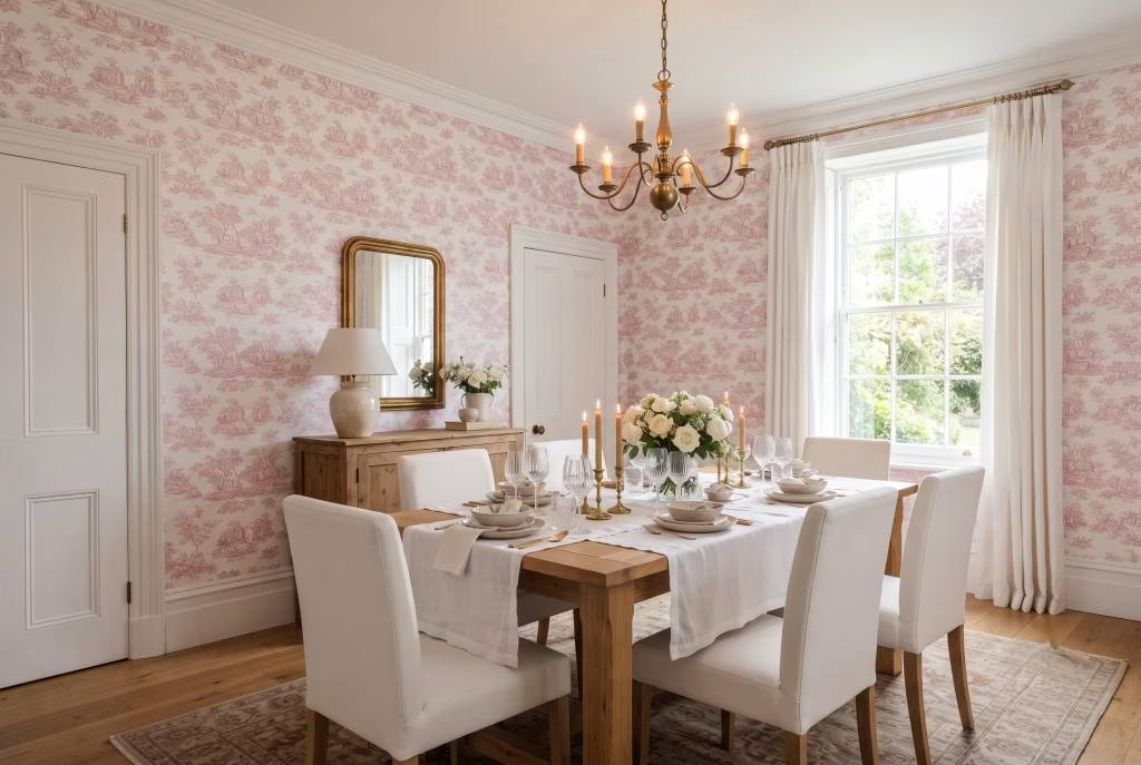
Toile brings a storybook quality no plain colour can touch, tiny pastoral scenes, figures, florals, all printed in a single tone against white. In pink, it softens the whole print into something romantic rather than fussy, the sort of paper that rewards a second look.
Scale is everything with toile. Small-repeat patterns read as texture from across the room, almost solid. Large-repeat toile demands space, a bigger wall, a bigger room, or the scenes start feeling cramped rather than charming.
I papered a small dining alcove in pink toile for a client who worried it would feel dated. It didn’t. Against plain white trim and simple chairs, it read fresh, almost like a piece of art papered wall to wall, not a print from her grandmother’s dining room.
Keep furniture and fabric simple wherever toile appears. The wallpaper is the pattern. Everything else should let it lead.
Brass Fixtures Against Pink and White
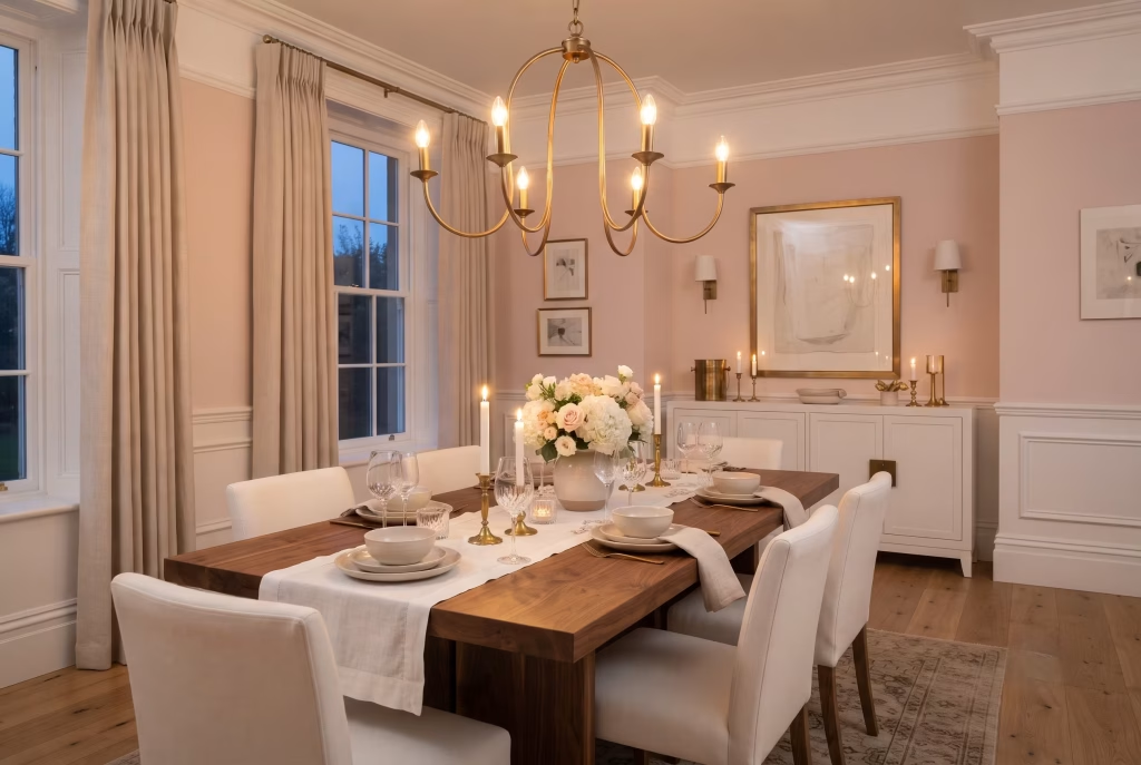
Brass warms everything it touches, and against pink and white it does something almost alchemical, pulling the warmth already sitting in the pink and giving it a metallic echo overhead or on the walls. Chrome or nickel would cool the same room down. Brass leans in the opposite direction entirely.
Aged or unlacquered brass earns character over time, developing a soft patina that only deepens against a pink backdrop. Polished brass stays sharp and reflective, better suited to a room already leaning glossy or contemporary rather than soft and matte.
I hung an aged brass pendant over a client’s blush pink dining table, replacing a cold chrome fixture that had been fighting the wall colour for years. The room warmed instantly, no paint touched, just one fixture swapped for one that actually belonged there.
Don’t stop at the light fitting. Door handles, drawer pulls, even a picture frame or two in brass tie the whole room together without adding a single new colour.
You May also Like: Terracotta Interior Design: 51 Warm & Stylish Ideas for Every Room
Black Accents to Ground a Pink Palette
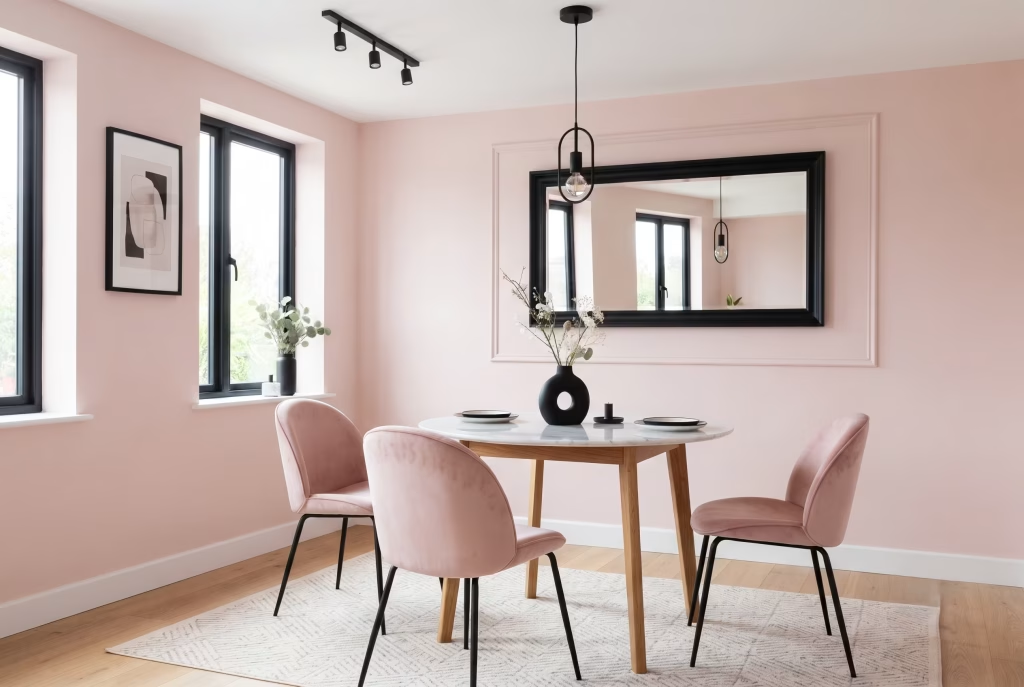
Pink and white together can drift, gorgeous but occasionally weightless, like a room dressed up with nowhere to land. Black fixes that instantly. A single black element, a light fitting, a picture frame, a chair leg, gives the eye somewhere firm to settle, an anchor the softer tones can rest against.
Small doses work best here. Black window frames, a black-framed mirror, or dining chairs in black metal against pink walls read as confident rather than heavy, since black in a supporting role sharpens a room rather than darkening it.
I added black metal legs to a set of otherwise soft pink chairs for a client whose all-pastel dining room had started to feel a little too sweet. That one change gave the whole room definition, structure the pink alone had never quite managed to provide.
Use black sparingly and repeat it. One black touch can look accidental. Three or four, echoed across the room, read as a deliberate decision.
Natural Wood Table Warming a Pink Room
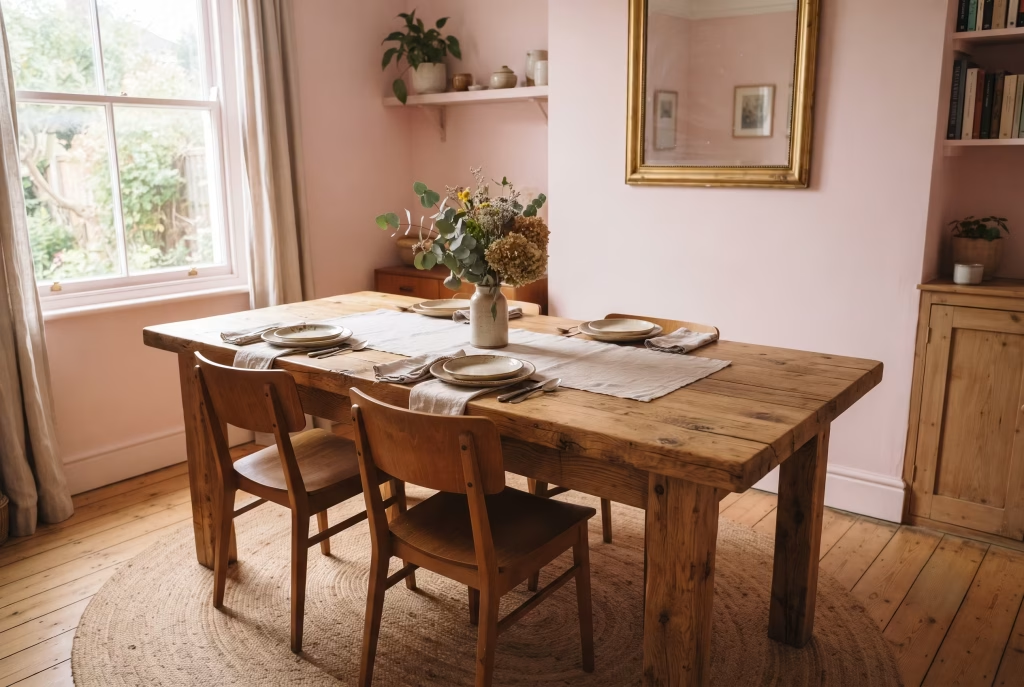
Pink can turn cold faster than people expect, especially cooler-toned pinks under artificial light. A natural wood table fixes that instantly, bringing grain, warmth, and a bit of organic imperfection into a room that might otherwise feel too polished, too uniform, too much like a paint chip come to life.
Oak reads warm and golden, softening even a cooler pink. Walnut goes darker and richer, grounding a room the way black accents do but with more warmth in the mix. Both outperform painted or lacquered tables here, since it’s texture and grain doing the work, not colour alone.
I placed a reclaimed oak table into a client’s pale pink dining room that had started to feel a touch clinical, all soft surfaces and no texture to hold onto. The table’s knots and saw marks gave the room something to look at up close, not just admire from the doorway. Pink stopped being the whole story and became the backdrop to a table with actual history.
Let the wood stay honest. A light oil or wax finish that shows grain beats a heavy varnish that flattens it into something closer to laminate.
Rattan or Cane Chairs in a Pink Setting
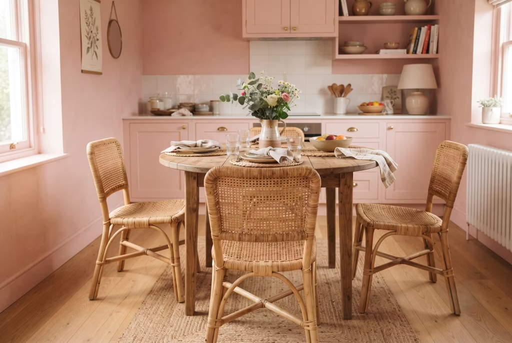
Rattan brings texture pink can’t manufacture on its own, that woven, handmade quality that instantly loosens up a room, keeping it from feeling too polished or too precious. Against soft pink walls, cane chairs read relaxed, almost holiday-house in spirit, the opposite of a formal, upholstered dining set.
Natural, unstained rattan pairs best with warmer pinks, echoing the same golden undertone. Darker stained or ebonised rattan works closer to how black accents do, grounding a paler, cooler pink instead of matching its warmth.
I brought cane-backed dining chairs into a client’s blush pink kitchen-diner that had felt slightly too formal for a family that actually wanted casual Sunday lunches around it. The chairs alone shifted the whole mood, pink stopped reading as a colour scheme and started reading as a place people actually wanted to sit for hours.
Rattan needs a little care, kept away from direct radiator heat and damp, but rewards it with years of use and a texture no painted chair can replicate.
Practical Considerations Before You Commit
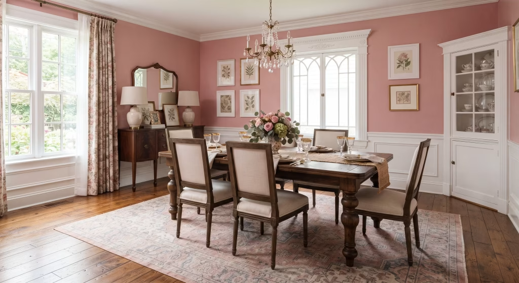
A few things worth sorting before any paint goes on a wall or a table gets ordered.
Test undertones in real light, not showroom light. Pink shifts more than most colours depending on the hour. Paint a sample patch and check it in morning daylight, midday sun, and under your actual evening bulbs, since dining rooms live mostly by artificial light after dark. A shade that reads perfect at 2pm can turn surprisingly cool or candy-bright by 8pm.
Keep white doing at least a third of the room’s work. Pink overwhelms fast when it covers every surface with nothing to balance it. A rough rule that holds up across most of the ideas above: let white or a neutral handle ceiling, trim, or one major surface, so pink reads as a considered choice rather than a wall-to-wall commitment nobody asked the room to make.
Match pink’s undertone to your existing wood and flooring, not the other way around. Warm oak floors want warm, peachy pinks. Cooler grey-toned floors sit better with dustier, mauve-leaning shades. Fighting that pairing is how a beautiful colour ends up looking slightly wrong without anyone quite knowing why.
Think about resale before you commit to anything structural. Paint and fabric are easy to undo. Panelling, plaster, and fixed banquettes are not. Bolder, more permanent choices suit a forever home far better than a house you’re planning to sell within a few years.
Choose sheen with a dining table in mind. Walls near a table take knocks, splashes, and the occasional dropped fork. Eggshell or satin wipes clean far more easily than flat matt, particularly on any lower wall or panelling within reach of a pushed-back chair.
You May also Like: 25 Dark Cottagecore Dining Room Ideas That Feel Intimate, Layered, and Lived-In
Final thoughts about Pink and White Dining Room
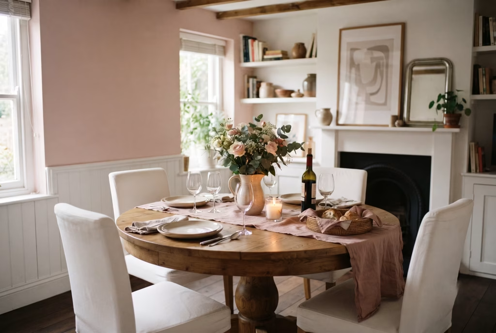
Twenty five ideas is a lot to hold in your head at once, so it’s worth remembering why this room exists in the first place. Not the paint, not the plaster, not the marble veining you’ll spend an hour deciding on. The meals eaten late, the arguments settled over pudding, the birthdays that always somehow end up around this one table. Pink and white are simply the frame. The room’s real job is holding the people who sit in it.
If nothing here has fully sold you yet, that’s fine. Start smaller than a full renovation demands. One wall in blush. One linen runner in dusty rose. Live with it a fortnight before you commit further. The best dining rooms are rarely decided in a single weekend, they’re built the way good taste always is, one considered choice at a time, until one day you look up mid-dinner and realise the room finally feels like yours.
FAQ (Frequently Asked Questions)
Does pink and white work in a small dining room?
Genuinely, yes, and often better than in a large one. A small room forgives a bolder pink far more than an open-plan space does, since less wall area means less chance of the colour overwhelming the eye. Stick to lighter or dustier shades if the room gets limited natural light, and let white handle the ceiling to keep things feeling airy rather than boxed in.
What shade of pink won’t feel too feminine?
Anything with grey or terracotta running through it. Dusty rose, muted clay pinks, and warm blush tones read as sophisticated rather than sweet, largely because they avoid the bubblegum brightness people associate with a nursery. A quick test: hold the swatch against a wood or black element. If it still looks considered next to something masculine, you’ve found your shade.
How do I stop a pink dining room feeling dated?
Keep the pink itself timeless and let the trend-chasing happen elsewhere, in linens, in a light fixture, in artwork you can swap out in five years without repainting a thing. Rooms date fastest when every single element, wall colour included, was picked to match one specific moment. Anchor the big, expensive choices in something classic and you’ll thank yourself later.
What white pairs best with pink walls?
Warm pinks want a slightly warm white in return, something with a touch of cream rather than a stark, cool white that can fight the pink’s undertone. Cooler pinks, the mauve-leaning ones, actually sit better against a crisper, truer white. When in doubt, test trim and wall colour side by side on the actual wall, not two separate swatches held apart, since undertones only reveal themselves properly once they’re touching.
Is pink too bold a choice for a dining room, realistically?
Less than people assume going in. Dining rooms get used for a few hours at a stretch, mostly under artificial light, which is exactly the kind of room that can carry more colour than a space you sit in all day. Start with one wall or one set of chairs if you’re still unsure, live with it a while, and let the rest of the room follow once you’ve seen how it actually feels at dinner.