25 Mid-Century Modern House Exteriors That Prove This Timeless Style Is Here to Stay
Mid-century modern architecture has a way of feeling both grounded and quietly progressive, even decades after its emergence. What draws people in today is not nostalgia, but clarity. When you begin exploring 25 Mid-Century Modern House Exteriors, it becomes evident that this approach is less about a visual style and more about a disciplined design philosophy, one that continues to shape some of the most considered residential projects I work on.
At its core, mid-century design prioritises horizontal emphasis, allowing buildings to sit low and comfortably within their surroundings rather than dominate them. There is a deliberate connection to the landscape, where gardens, courtyards, and open views are treated as extensions of the architecture itself. Materials are used with restraint and honesty, timber, stone, concrete, each expressed for what it is rather than disguised. The result is a simplicity of form that feels resolved rather than minimal for the sake of aesthetics.
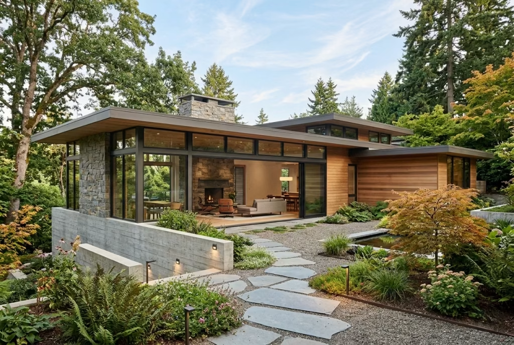
In my own renovation projects, particularly when reworking dated suburban homes or designing contemporary new builds, these principles consistently prove their value. I have seen how rebalancing proportions, opening up glazing toward the garden, or introducing clean material transitions can completely transform how a home feels and functions. It is not about recreating the past, but about applying a set of architectural ideas that still respond intelligently to how we live today.
What Defines a Mid-Century Modern Exterior? (Before You Start Designing)
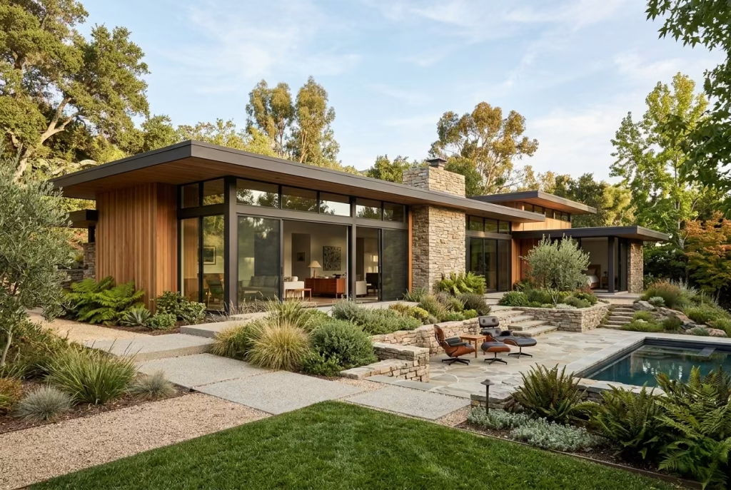
Before looking at specific ideas, it’s important to understand that a mid-century modern exterior is not assembled through decorative choices. It is resolved through proportion, structure, and how the building engages with its surroundings. When these fundamentals are right, the architecture feels calm and intentional. When they are not, even the correct materials can feel superficial.
The first defining characteristic is the roofline. Mid-century homes typically favour low-pitched or flat roofs, often extended with deep overhangs. In practical terms, I usually work within a projection range of 600–1200 mm (24–48 inches). This is not just a visual gesture. It creates shadow lines, protects glazing, and reinforces the horizontal profile that defines the style.
That sense of horizontality carries through the entire composition. Strong horizontal planes are expressed through continuous roof edges, linear cladding, and elongated façades. In one renovation I worked on, simply re-aligning window heads and extending the fascia line visually lowered the house, making it feel more grounded without altering the footprint.
Equally critical is expansive glazing. Mid-century exteriors are designed to open outward, often with floor-to-ceiling glass panels around 2.4–3 metres (8–10 feet) high. This is less about transparency for its own sake and more about creating a visual and spatial dialogue between interior and landscape.
That leads directly to another principle: integration with the site. A mid-century home should feel placed, not imposed. Whether it’s a flat suburban plot or a sloped site, the architecture responds through terraces, courtyards, or subtle level changes rather than resisting the natural conditions.
Finally, there is minimal ornamentation. Every line, joint, and material transition serves a purpose. In my experience, this is where many projects go off track. Clients often approach mid-century design as a visual language to replicate, when in reality it’s a system built on restraint. I’ve seen projects where budgets were spent on feature cladding or statement doors, yet the proportions were unresolved, and the result never felt cohesive.
When approached correctly, a mid-century modern exterior is less about adding elements and more about refining what is already there. It’s a process of editing, aligning, and allowing the architecture to sit comfortably within its environment.
How to Translate Mid-Century Principles into Modern Homes
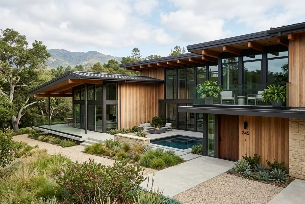
Translating mid-century modern principles into today’s homes requires a shift in mindset. It is not about replicating iconic houses detail for detail, but about applying a clear architectural logic to contemporary conditions. Whether I’m working on a renovation or a new build, the process always begins with understanding what can be retained, what needs to be corrected, and where modern performance standards must take priority.
Working with Existing Structures vs New Builds
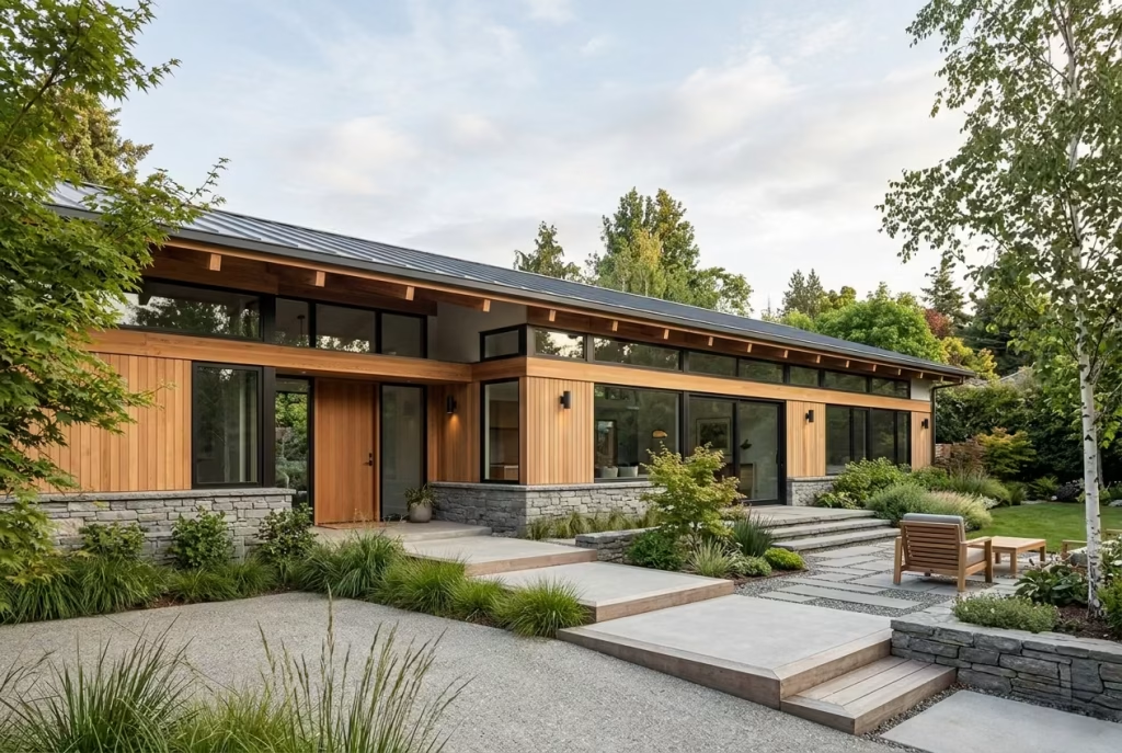
In renovations, the challenge is rarely style. It is proportion. Most existing homes were not designed with mid-century principles in mind, so I focus first on rebalancing the façade. This might involve lowering visual roof lines, extending eaves, or simplifying window compositions. In one suburban project, we retained the original structure but introduced a continuous horizontal datum at 2.4 metres (8 feet) across the façade, instantly bringing cohesion to an otherwise fragmented exterior.
With new builds, the opportunity is more controlled but requires discipline. I typically establish a clear structural grid, often in the range of 3–4 metres (10–13 feet), which allows for consistent spacing of columns, glazing, and roof spans. This creates the quiet rhythm that defines mid-century architecture without relying on decorative elements.
Climate Responsiveness: Designing for Heat, Light, and Ventilation
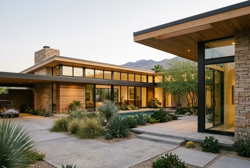
Mid-century design has always been climate-aware, and this is where it feels especially relevant today. Deep overhangs, usually between 600–1200 mm (24–48 inches), are not stylistic gestures. They are essential for controlling solar gain, particularly on south- and west-facing elevations.
In warmer climates, I prioritise cross-ventilation, aligning openings to allow air to move naturally through the home. High-level clerestory windows, positioned around 2.1–2.4 metres (7–8 feet), can release heat while maintaining privacy. When done well, this reduces reliance on mechanical cooling and makes the house feel more responsive to its environment.
Material Substitutions: Updating Without Losing Integrity
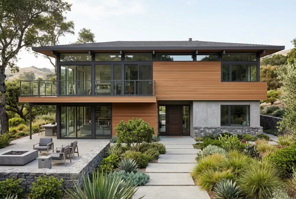
Original mid-century homes often used materials that are either difficult to source today or no longer meet modern performance standards. The key is to substitute thoughtfully without losing the integrity of the design.
For example, I often replace traditional timber cladding with engineered timber or high-quality composite boards, maintaining board widths of 150–200 mm (6–8 inches) to preserve the horizontal emphasis. Similarly, single glazing is upgraded to thermally broken aluminium or steel systems with double or triple glazing, which retain slim sightlines while significantly improving insulation.
Concrete and stone elements can also be refined using modern finishes that offer better durability and lower maintenance, without appearing overly processed.
Budget Hierarchy: Where to Invest for Maximum Impact
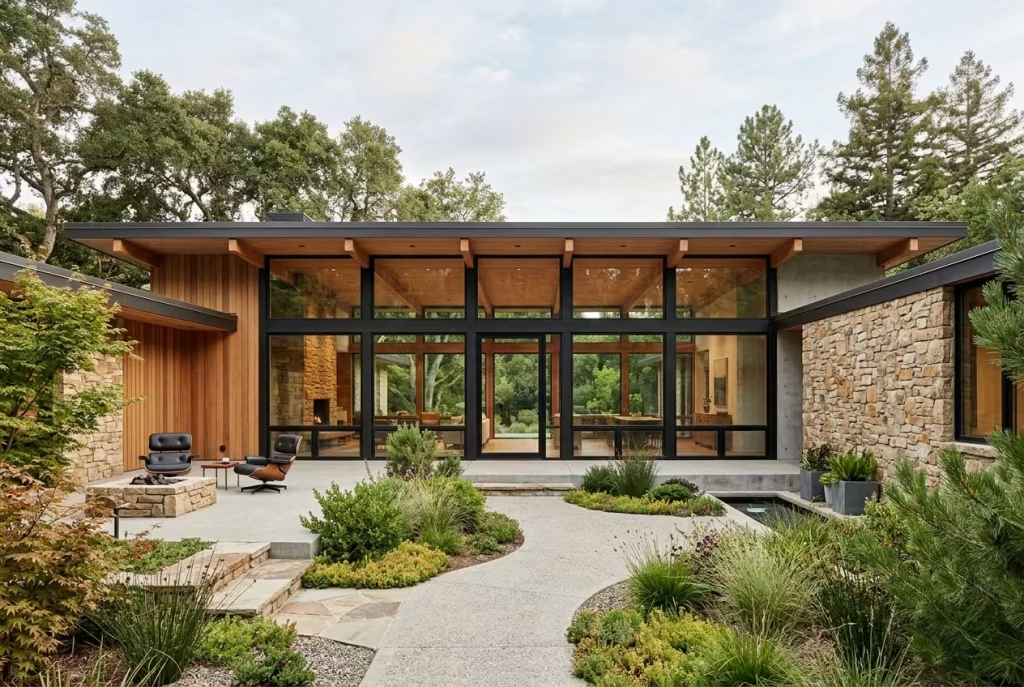
One of the most common mistakes I see is allocating budget toward surface-level features rather than structural clarity. In mid-century design, the hierarchy is quite clear.
First, invest in glazing systems. Large-format glass defines the relationship between inside and outside, and poor-quality systems will undermine both performance and appearance.
Second, prioritise the structural expression. Whether it is exposed beams, clean rooflines, or carefully aligned openings, these elements shape the architecture far more than decorative finishes.
Finally, consider cladding and material finishes. These should support the overall composition rather than compete with it. I often advise clients to simplify the material palette and invest in fewer, higher-quality surfaces rather than introducing unnecessary variety.
When these decisions are made with clarity, mid-century principles translate naturally into modern homes. The result is not a pastiche of a historical style, but a considered, contemporary architecture that feels both timeless and highly liveable.
25 Mid-Century Modern House Exterior Ideas
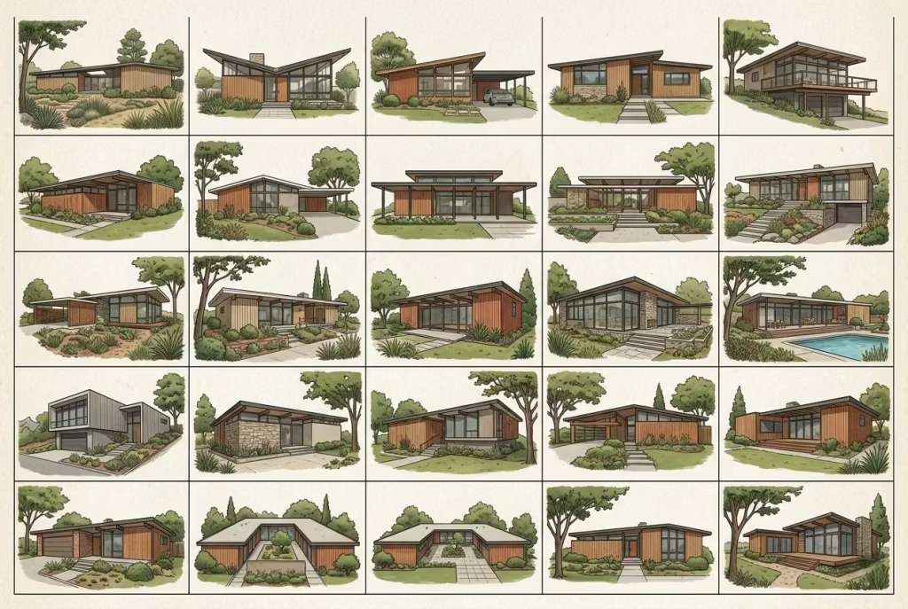
Once the underlying principles are clear, the real value lies in how they are interpreted in built form. The following ideas are not trends to replicate, but architectural moves I’ve seen work consistently across different sites, budgets, and house types. Each one reflects a way of resolving proportion, material, and landscape in a manner that feels both restrained and highly intentional. So, let’s explore these ideas further and decide what we can choose for our next handles project.
Low-Slung Rooflines with Deep Overhangs
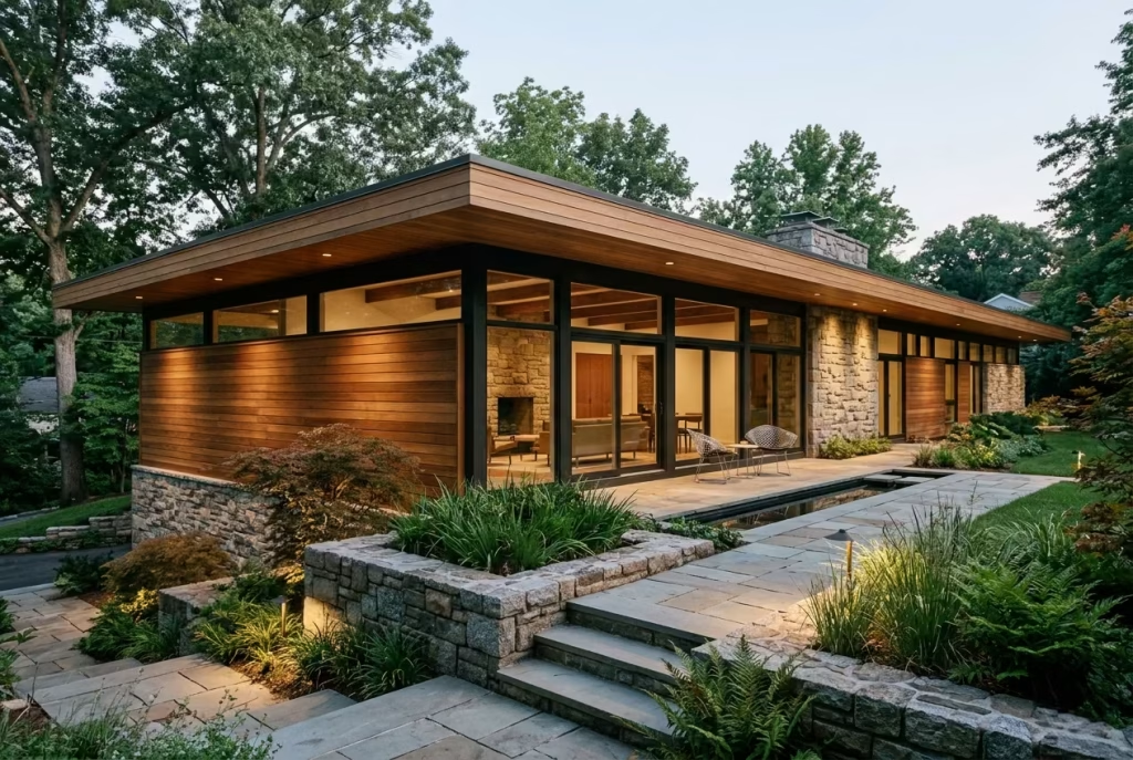
A low-slung roofline is often the first thing you notice in a well-composed mid-century exterior. It carries a quiet confidence, sitting close to the ground and stretching outward rather than reaching upward. When paired with deep overhangs, the effect is both architectural and atmospheric, creating a sense of shelter that feels deliberate rather than imposed.
From a spatial standpoint, this move does a lot of heavy lifting. By extending the roof horizontally, typically within the range of 600–1200 mm (24–48 inches), the building establishes a strong visual datum that anchors it to the site. It softens the transition between interior and exterior, casting controlled shadow lines across glazing and walls. In practice, this reduces glare, improves thermal comfort, and gives the façade a layered depth that flat elevations often lack. It is one of those details that, when resolved properly, quietly ties everything together without drawing attention to itself.
I’ve applied this principle in several renovation projects where the original house felt visually top-heavy. In one case, instead of altering the entire structure, we extended the eaves and refined the fascia line to run continuously across the front elevation. It was a subtle intervention, but it changed the perception entirely. The house stopped feeling like it was sitting awkwardly on the plot and began to feel grounded, as if it had always belonged there. Sometimes, it’s not about reinventing the wheel but about nudging the proportions until they fall into place.
From a practical standpoint, these overhangs are doing more than just looking good. They provide effective solar shading, particularly on south- and west-facing elevations, reducing heat gain during peak hours. At the same time, they protect window frames and external finishes from weather exposure, which, over time, can make a noticeable difference in maintenance cycles.
Pros
- Enhances horizontal emphasis, a defining mid-century trait
- Improves thermal performance through passive shading
- Adds depth and shadow, enriching the façade visually
- Protects glazing and external materials from weathering
Cons
- Requires careful structural detailing, especially in retrofit projects
- Overly deep projections can reduce daylight if not balanced correctly
- May increase construction cost due to extended roof structure
You May also Like: Mid-Century Modern Living Room: The Complete Guide to Getting the Look Right
Post-and-Beam Structural Expression
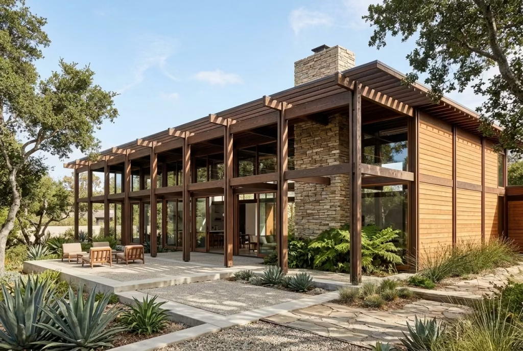
Post-and-beam construction sits at the heart of mid-century architecture, not as a stylistic flourish, but as a way of thinking about structure with clarity. Instead of hiding how a building stands, it puts the framework on display. Vertical posts carry the load, horizontal beams span across, and everything in between is freed up. The result is a façade that feels ordered, almost rhythmic, where structure and design speak the same language.
What makes this approach particularly compelling is the discipline of the grid. In most of my projects, I work within spans of 3–4 metres (10–13 feet), which creates a steady, legible framework across the elevation. This spacing is not arbitrary. It dictates window proportions, door placements, and even how cladding panels align. When done well, nothing feels forced. The eye moves naturally across the façade, picking up on repetition and alignment without quite realising why it feels so composed. It’s a bit like a well-tailored suit, everything sits exactly where it should.
Exposed beams play a crucial role here. Rather than concealing them behind plasterboard, they are expressed externally, often extending slightly beyond the façade line. This creates a subtle shadow rhythm that adds depth without relying on decoration. It is one of those moves that, quietly but effectively, elevates the entire composition.
I remember working on a new-build where the client initially wanted a more conventional exterior, layered finishes, feature panels, the usual mix. Instead, we simplified the approach and committed to a clear post-and-beam structure. Once the frame went up, everything else became easier. Glazing slotted neatly between structural bays, cladding aligned without awkward cuts, and the house began to feel coherent long before the finishes were complete. It reinforced something I often tell clients: get the structure right, and the rest will follow.
From a practical perspective, this system also allows for flexibility in planning. Because the load is carried by the frame, internal walls can be positioned more freely, which is invaluable in both new builds and major renovations. It also supports larger areas of glazing without compromising structural integrity, something that aligns perfectly with mid-century principles.
Pros
- Creates a clear architectural rhythm and visual order
- Allows for larger, uninterrupted glazing between structural bays
- Offers flexibility in internal layouts due to load-bearing frame
- Reduces reliance on decorative elements for visual interest
Cons
- Requires precise structural coordination and detailing
- Exposed elements must be finished to a high standard
- Can increase costs depending on material choice (especially steel or engineered timber)
Floor-to-Ceiling Glazing Facing the Garden
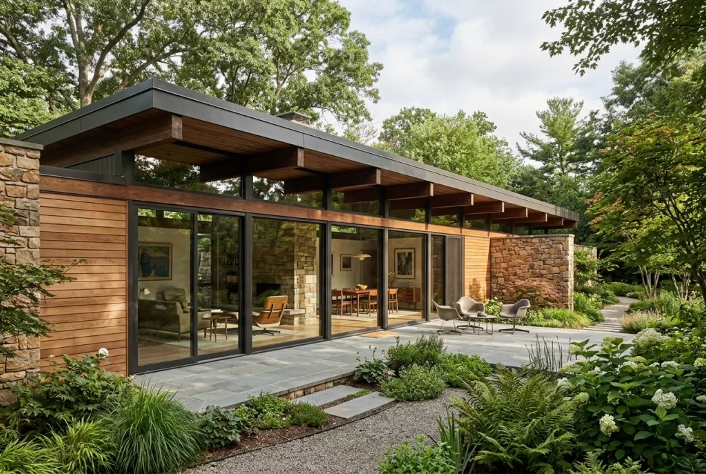
There’s a quiet turning point in most mid-century homes, the moment where the interior stops feeling enclosed and begins to borrow from the landscape. Floor-to-ceiling glazing is often what makes that shift possible. It is not about maximising glass for the sake of openness, but about framing the garden as part of the architecture, almost as if the house exhales outward.
From an architectural standpoint, glazing at 2.4–3 metres (8–10 feet) in height establishes a strong vertical clarity within an otherwise horizontal composition. It creates a measured contrast. The roofline stretches low and long, while the glass panels rise cleanly between structural elements, allowing light to travel deep into the plan. More importantly, it dissolves the boundary between inside and outside, turning a garden view into a lived experience rather than a distant backdrop.
In practice, I often position these glazed elevations along the most private and controlled side of the plot, typically facing a rear garden or courtyard. One project comes to mind where we replaced a series of small, fragmented windows with full-height sliding panels across a 6-metre (20-foot) span. The transformation was immediate. The living space gained not just light, but a sense of calm and generosity. The garden, which had previously felt disconnected, became the focal point of daily life. It’s one of those changes that shifts how a home is used, not just how it looks.
There is also a technical layer to get right. Large-format glazing requires careful detailing, slim sightlines, well-insulated frames, and precise alignment with floor and ceiling levels. Even a slight misalignment can disrupt the visual continuity. When executed properly, however, the effect is seamless, almost effortless.
Pros
- Strengthens the connection between interior and landscape
- Brings in abundant natural light, reducing reliance on artificial lighting
- Enhances spatial perception, making rooms feel larger and more open
- Creates a clean, modern aesthetic aligned with mid-century principles
Cons
- Requires high-performance glazing to manage heat gain and loss
- Can reduce privacy if not carefully positioned
- Higher upfront cost compared to standard window systems
- Demands precise installation and structural coordination
Mixed Material Facades (Timber + Stone + Concrete)
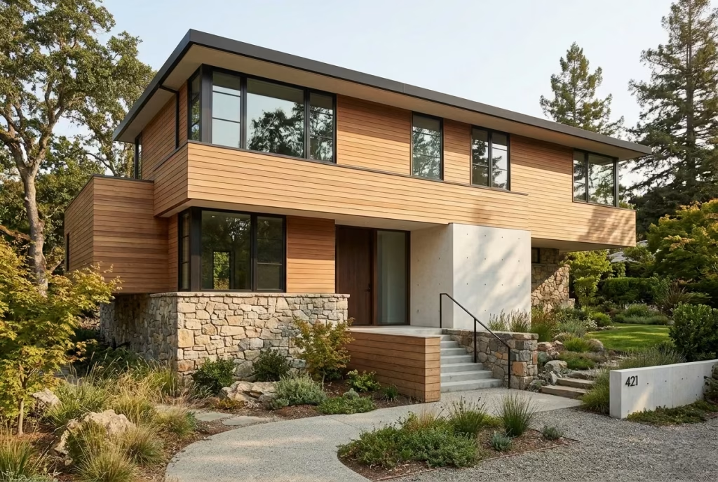
A mixed-material façade can be one of the most convincing ways to bring mid-century character into a modern home, provided the balance is handled with restraint. Timber brings warmth, stone adds weight and permanence, and concrete introduces a calm, architectural honesty. Used together, they create contrast without chaos, which is exactly where the strength lies. The aim is not to show every material at once, but to let each one do a specific job, much like a well-composed room where every element earns its place.
From an architectural point of view, this approach works because it plays on texture, tone, and scale rather than ornament. Timber softens the hard edges of concrete. Stone gives the house visual grounding at the base. Concrete, especially when expressed in clean planes or plinths, creates a sense of structure and composure. In practice, I often find this combination works best when the materials are assigned a clear hierarchy. For example, timber might wrap the upper volumes, stone might anchor the lower portion of the façade, and concrete might define thresholds, walls, or recessed entry zones. That way, the house feels deliberate rather than overworked. It is a bit like layering a tailored outfit, subtle at first glance, but full of depth once you look properly.
I have seen this approach rescue several projects that were previously too flat or overly uniform. In one renovation, the original exterior was a mix of tired render and mismatched brick. We introduced horizontal timber battens at around 150–200 mm (6–8 inches) wide, retained a natural stone base to visually settle the building into the garden, and used a smooth concrete finish around the entrance to sharpen the composition. The result was not flashy, but it was transformative. The house suddenly had rhythm, texture, and a far stronger relationship with the surrounding planting.
The real trick is keeping the palette controlled. Too many finishes and the whole thing starts to fray at the edges. A successful mixed-material façade usually relies on two or three materials at most, with consistent tones that sit comfortably together. Warm cedar, pale limestone, and soft grey concrete can work beautifully, particularly when the surfaces are allowed to weather naturally. That weathering is not a flaw. It is part of the story. Materials that age well tend to give a house more character over time, rather than less.
Pros
- Creates depth and visual richness without relying on decoration
- Balances warmth, texture, and permanence in a natural way
- Helps define architectural elements such as bases, volumes, and entry points
- Ages well when materials are chosen carefully and detailed properly
Cons
- Can become visually fragmented if too many materials are introduced
- Requires disciplined coordination of tones, textures, and junctions
- Higher detailing costs, especially at material transitions
- Maintenance varies between materials, so long-term care needs planning
Carports Instead of Enclosed Garages
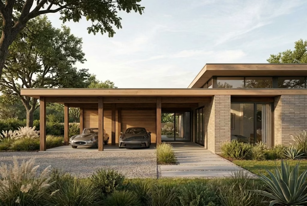
Carports are one of those understated moves that can completely change how a mid-century home is perceived. They don’t shout for attention, but they quietly reinforce the proportions, horizontality, and openness that define the style. Unlike enclosed garages, which often feel bulky and self-contained, carports allow the architecture to breathe, maintaining a sense of visual flow from façade to garden. It’s the difference between a house that feels like it sits on the land and one that feels walled off from it.
From a spatial and architectural standpoint, carports work beautifully because they preserve the strong horizontal lines central to mid-century design. Typically, a carport spans 3–3.5 metres (10–11.5 feet) per vehicle width and mirrors the roofline of the main house, often with subtle overhangs of 600–900 mm (24–36 inches) to tie the structure into the rest of the façade. This continuity helps the carport read as an extension of the home, rather than an afterthought, keeping the composition cohesive. The openness also allows light and sightlines to flow naturally around the front of the house, enhancing both aesthetics and security by keeping the area visible.
I’ve often recommended carports in suburban renovations where the original garage dominated the frontage and felt oppressive. In one project, we replaced a cramped double garage with a timber-framed carport, aligned with the roofline and using the same cladding as the main house. The transformation was subtle yet profound the front façade now felt lighter, more proportionate, and harmonised with the surrounding landscape. Not only did it improve curb appeal, but it also created a more inviting approach to the entrance, which in mid-century design is meant to feel understated, not monumental.
Pros
- Keeps the façade visually light and maintains horizontal emphasis
- Provides functional shelter without enclosing space unnecessarily
- Encourages integration with landscape and exterior circulation
- Can be executed with minimal cost compared to a full garage
Cons
- Offers less security than an enclosed garage
- Exposed vehicles may require additional protection from weather
- Limited storage potential compared to a traditional garage
Horizontal Timber Cladding
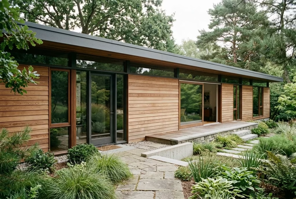
Horizontal timber cladding is one of those deceptively simple moves that can completely define a mid-century modern exterior. It’s not just a surface treatment it’s a visual tool that reinforces line, rhythm, and proportion. When done thoughtfully, it can stretch the façade visually, creating a sense of length and calm that mirrors the low-slung rooflines and expansive glazing central to the style.
From a spatial perspective, the board widths of 150–200 mm (6–8 inches) strike a careful balance. Narrower boards can feel fussy or overly busy, while wider panels risk looking heavy or imposing. In practice, these mid-range widths allow the eye to move smoothly across the façade, enhancing the sense of horizontality without overwhelming the composition. It’s a bit like the framing of a painting: the material itself is modest, but it shapes the way you perceive the space around it.
In my experience, the way timber is detailed at junctions and corners matters as much as the boards themselves. Aligning cladding lines with window sills or roof edges can create a seamless flow that unifies the entire exterior. On one project, we retained a timber-clad façade but refreshed it with a durable, thermally modified cedar, keeping the boards at 180 mm (7 inches) and maintaining consistent spacing. The result was a house that felt both contemporary and timeless, its horizontal emphasis stretching naturally into the surrounding garden.
Beyond aesthetics, timber cladding provides practical benefits. Properly selected and treated, it is low-maintenance, durable, and weather-resistant, particularly when combined with protective overhangs. It also allows for flexibility in renovation: existing facades can be overlaid or repaired without requiring full demolition, making it a cost-effective way to inject mid-century character.
Pros
- Strengthens horizontal composition and visual flow
- Adds natural warmth and texture to the façade
- Works well in both new builds and renovations
- Can be paired with stone, concrete, or glazing for material contrast
Cons
- Requires consistent detailing to avoid visual disruption
- Timber selection and finish are critical for long-term durability
- Boards can expand or contract with moisture if not installed correctly
- Needs occasional maintenance to preserve colour and performance
You May also Like: 25 Stylish Modern Small House Exterior Ideas You’ll Love
Flat Roof with Clerestory Windows
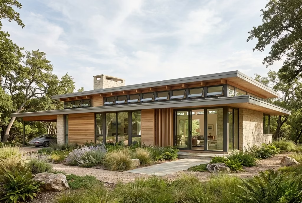
A flat roof paired with clerestory windows is one of those clever mid-century devices that quietly transforms both light and spatial experience. At first glance, it’s a subtle detail thin strips of glazing tucked just beneath the roofline but its impact is profound. It allows sunlight to penetrate deep into the plan, illuminating interior spaces without sacrificing privacy or wall space, a balance that many contemporary homes struggle to achieve.
From an architectural perspective, clerestory windows complement the flat roof’s horizontal emphasis while creating vertical relief. Typically positioned 2.1–2.4 metres (7–8 feet) above floor level, they introduce daylight that washes across walls and ceilings, softening shadows and enhancing material textures. The beauty is in the layering: the flat roof keeps the silhouette low and unobtrusive, while the clerestory draws the eye upward subtly, giving interiors a sense of height without disrupting the façade’s horizontal rhythm.
I’ve often incorporated this detail in both new builds and retrofits. On one renovation, a narrow, deep living room felt dark and constrained. By introducing clerestory windows along the long wall facing the garden, we not only flooded the space with light, but preserved privacy from neighbouring properties. It was a simple intervention with an outsized effect: the room now felt expansive, serene, and connected to the exterior without revealing itself too openly.
Clerestories also help with ventilation, particularly when operable panels are included. Warm air naturally rises and escapes through high-level openings, promoting passive cooling a feature perfectly aligned with mid-century design’s climate-responsive ethos.
Pros
- Introduces natural light deep into interior spaces
- Maintains privacy while enhancing openness
- Reinforces horizontal façade lines without visual interruption
- Supports passive ventilation and energy efficiency
Cons
- Requires precise placement and sizing to avoid glare or heat gain
- Installation can be more complex than standard windows
- Cleaning and maintenance may be less accessible due to height
- Limited views to the outside; works best as a light-focused strategy
Integrated Landscaping as Architecture
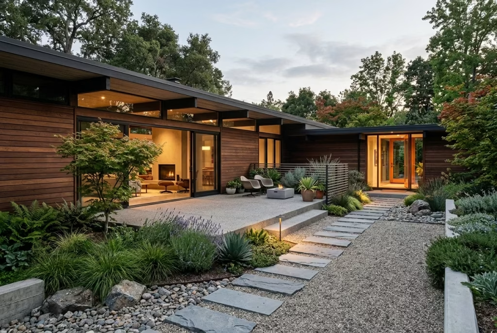
In mid-century modern design, landscaping isn’t an afterthought it’s an extension of the architecture itself. The boundary between building and garden is deliberately blurred, so the exterior feels like a series of outdoor rooms rather than isolated plots of planting. By thinking of gardens, paths, and terraces as integral elements of the composition, the home achieves a cohesion that elevates both aesthetics and daily experience.
From a design perspective, the key is layered integration. Gravel courts, stepping stones, and native planting work in harmony with the building’s proportions and materials. Gravel courts, for example, create subtle, textural surfaces that echo the horizontal planes of rooflines or cladding. Stepping stones provide rhythm, guiding movement while emphasizing sightlines to key architectural features. Meanwhile, native planting softens hard edges, enhances seasonal interest, and improves sustainability by requiring less irrigation and maintenance. In short, every element of the landscape should reinforce the house’s form and feel deliberate rather than decorative.
I often see clients underestimate how much landscaping can shape perception. In one project, a simple row of low-native grasses, aligned with the façade’s structural rhythm, immediately connected the house to the garden. Gravel paths echoed the horizontal timber cladding, while large stone slabs created purposeful pauses along the route. The result was not a ‘designed’ garden in the conventional sense, but a calm, living frame that made the architecture feel grounded and intentional.
Measurements and scale are essential: stepping stones are typically 600–900 mm (24–36 inches) in length, spaced to encourage natural walking cadence, while gravel areas can extend 2–3 metres (6–10 feet) wide to provide both circulation and visual breathing space. Proportion ensures the landscape reads as part of the home rather than as an afterthought.
Pros
- Strengthens the dialogue between house and site
- Encourages sustainable planting choices and low-maintenance design
- Creates visual rhythm and continuity that complements architecture
- Improves outdoor usability, making paths and terraces feel like intentional spaces
Cons
- Requires careful planning to avoid visual clutter
- Incorrect scale or alignment can disrupt the architectural rhythm
- Some materials may need ongoing upkeep, like gravel topping or trimming native grasses
- Can be costlier initially if integrating hardscape and planting cohesively
Minimalist Entry Sequences
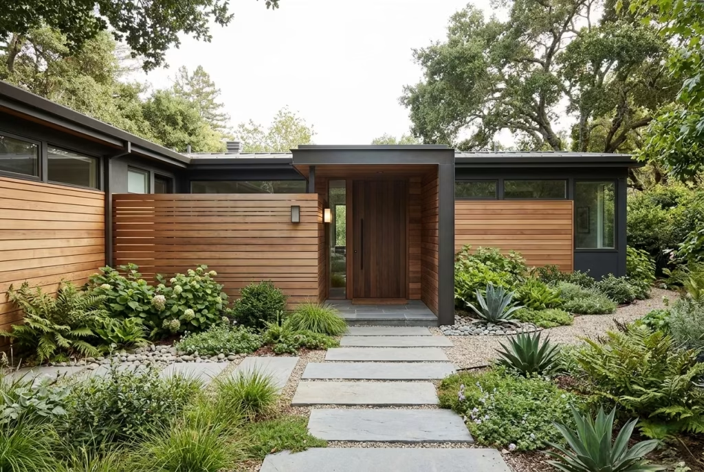
In mid-century modern homes, the front door rarely seeks to dominate. Instead of grandiose porticos or imposing gates, the entry is calm, understated, and deliberately measured. This is what I call a minimalist entry sequence: a series of subtle transitions that guide visitors from the outside world into the home without theatrics. It’s an exercise in restraint, where proportion, material, and rhythm do the heavy lifting rather than ornament or scale.
From a design perspective, the key is creating a gentle journey. Pathways, modest thresholds, and small architectural cues like a recessed doorway, overhanging eaves, or a change in paving material signal arrival without shouting. Often, the entry is framed by landscaping or subtle structural elements, encouraging a slow reveal of the interior. In practical terms, this ensures privacy while maintaining a sense of openness; you can feel invited without being exposed.
I’ve applied this principle in several projects where the original entry felt rigid or forced. In one suburban renovation, the house had a bulky garage-dominated façade, and the front door was lost in the composition. By replacing concrete steps with a narrow stepping-stone sequence, adding a low timber screen to suggest the boundary, and aligning the door flush with the horizontal timber cladding, the approach became intuitive. Visitors felt guided toward the entrance without the need for a showy feature. The house suddenly exuded calm confidence, a hallmark of mid-century restraint.
Measurements matter here. Path widths of 1–1.2 metres (3–4 feet) allow for comfortable circulation without overwhelming the façade, while recessed entries of 300–450 mm (12–18 inches) create shadow and depth, subtly signalling a pause before entering the home. Even small details, like a narrow canopy overhang, can reinforce proportion and rhythm while protecting the doorway from weather.
Pros
- Creates a calm, inviting approach aligned with mid-century principles
- Preserves privacy without resorting to heavy gates or fences
- Reinforces proportion, rhythm, and material continuity
- Offers a subtle layering effect between landscape and architecture
Cons
- Requires careful planning to ensure the entry reads clearly
- Over-simplification can make the entrance feel lost if the façade is wide
- Minor construction adjustments may be needed to integrate pathways and recesses
- Materials and textures must be coordinated to prevent visual confusion
Breeze Block Screening Walls
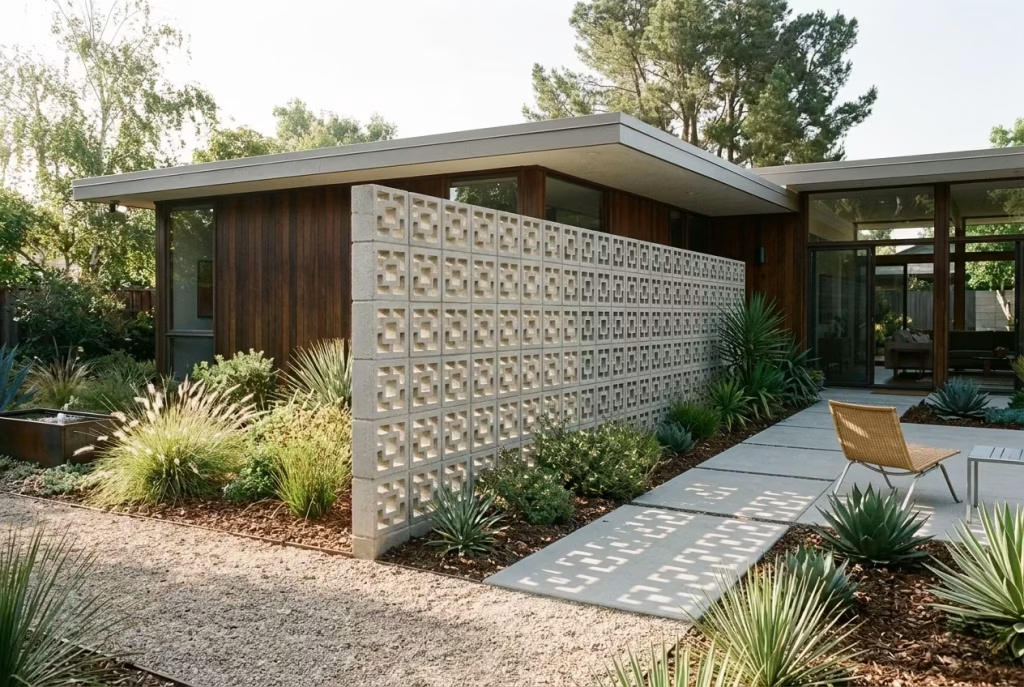
Breeze block screens are one of those mid-century modern features that perfectly straddle function and form. At first glance, they appear decorative geometric patterns casting intriguing shadows but their real genius lies in how they mediate light, air, and privacy. Unlike solid walls, they allow breezes to pass through, creating a naturally ventilated microclimate while softening views both into and out of the home.
From an architectural perspective, these screens are about modulation and rhythm. The perforated geometry breaks up façades or garden boundaries without fragmenting them. Typical panel sizes range from 600–800 mm (24–32 inches) square, with openings proportioned to balance visibility and privacy. When aligned with rooflines, pathways, or structural grids, they reinforce the home’s horizontal emphasis while adding texture and shadow that shifts throughout the day.
I often recommend breeze block walls in both renovations and new builds. In one project, we replaced a solid boundary wall facing a neighbour with a breeze block screen of roughly 75% solid, 25% open. The effect was immediate: the courtyard felt lighter, more breathable, and visually connected to the garden beyond, while maintaining enough privacy for comfortable outdoor living. It was a small intervention with outsized impact proof that thoughtful patterning can transform how a space is experienced.
Beyond aesthetics, they contribute to passive cooling strategies. When oriented to prevailing winds, air passes freely through the perforations, keeping outdoor rooms more comfortable without mechanical assistance. They can also help filter sunlight, reducing glare inside adjacent interiors and producing dappled light patterns that evolve over the day.
Pros
- Adds visual interest and texture to façades or garden boundaries
- Enhances natural ventilation and contributes to passive cooling
- Balances privacy with openness, particularly in tight plots
- Complements mid-century architecture’s emphasis on geometry and proportion
Cons
- Requires precise construction and careful alignment with existing structures
- Not suitable for areas requiring complete privacy or security
- May need occasional cleaning to prevent debris accumulation in openings
- Limited structural function; often requires secondary support for stability
Asymmetrical Facade Composition
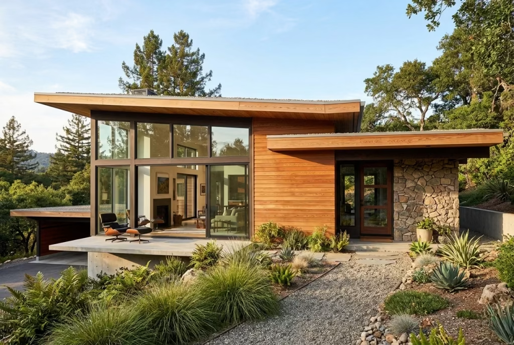
Asymmetry is at the heart of mid-century modern design’s quiet sophistication. Unlike traditional façades that rely on mirror-like balance, asymmetrical compositions create controlled tension, guiding the eye across volumes, planes, and materials. The trick is not randomness it’s deliberate imbalance that feels natural and harmonious, like a carefully arranged still life.
From an architectural standpoint, asymmetry allows designers to prioritise function while maintaining aesthetic balance. Window placements, entry points, and material changes can all respond to internal program or site conditions without being forced into a rigid, symmetrical grid. For instance, a larger window may be balanced by a heavier stone-clad wall on the opposite side, or a projecting roofline may counter a recessed entry. In practice, this ensures that the home feels dynamic and layered, rather than static or predictable.
I’ve applied this principle in several projects, particularly where the site presented unusual constraints. On one hillside renovation, a traditional symmetrical façade would have felt rigid and bulky against the sloping land. By offsetting the glazing and introducing a timber-clad projection on one side, the façade began to “dance” with the terrain, creating a rhythm that felt responsive and intentional. Visitors often comment on how naturally the volumes feel sited yet few realise how much thought went into the asymmetry. That’s the hallmark of effective mid-century design: it looks effortless, even when it’s been meticulously resolved.
Measurements and proportionality matter. Typically, primary elements roof overhangs, structural bays, or window widths should relate to each other through ratios rather than exact mirroring. For example, a 3 m (10 ft) wide window may be visually counterbalanced by a 1.8–2 m (6–7 ft) timber panel or stone wall, ensuring the façade retains coherence despite the imbalance.
Pros
- Adds visual interest and dynamism to façades
- Allows flexibility in interior layouts and site responsiveness
- Creates rhythm and depth without relying on decorative elements
- Enhances architectural storytelling, making homes feel unique
Cons
- Requires careful planning to prevent the façade from feeling disjointed
- Misjudged proportions can make the house appear lopsided
- More complex to communicate in drawings and to execute in construction
- Material choices must be consistent to maintain visual harmony
Sunken Courtyard Entrances
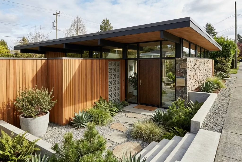
Sunken courtyard entrances are a masterstroke of mid-century design, offering a sense of arrival without shouting for attention. Unlike grand staircases or monumental porticos, a sunken entry subtly guides visitors into the home, creating a private, framed threshold that feels intentional and composed. It’s about orchestrating movement and perception rather than imposing scale.
From an architectural perspective, a sunken entrance works by modulating levels to create depth and privacy. Typically, a drop of 300–450 mm (12–18 inches) below the surrounding grade is enough to delineate the entry space, while still remaining accessible. The surrounding walls often timber-clad, stone-faced, or incorporating breeze blocks act as soft frames, subtly drawing the eye to the doorway. This controlled descent enhances the rhythm of approach, turning what could be a functional passage into an experiential prelude to the interior.
I often deploy this strategy in tight urban sites or on sloping plots. In one project, the street-facing façade was narrow and exposed. By recessing the entry into a sunken courtyard, we created a private arrival space shielded from passersby, yet open enough to connect visually with the garden. The entry sequence felt calm and deliberate, encouraging a slow, measured approach that emphasised the architecture rather than a flashy door handle or oversized canopy.
There’s also a practical benefit: sunken courtyards can act as a microclimatic buffer, providing shelter from wind and sun, and helping to moderate the temperature immediately adjacent to the front door. Paired with materials that age gracefully stone, timber, or concrete they become features that gain character over time rather than needing constant intervention.
Pros
- Creates a subtle, measured sense of arrival
- Enhances privacy without heavy gates or fences
- Reinforces mid-century principles of proportion, restraint, and integration with the site
- Adds depth and shadow for visual interest
Cons
- Requires careful drainage planning to avoid water accumulation
- Access may be slightly less straightforward than level entrances
- Construction costs can be higher due to excavation and retaining elements
- Overuse or exaggerated depths can feel claustrophobic if poorly proportioned
Long Horizontal Windows
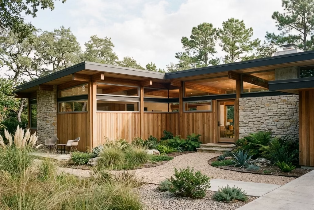
Long horizontal windows are a signature element of mid-century modern exteriors, combining elegance, function, and subtle drama. They are not just a stylistic flourish; they are a tool to control light, frame views, and maintain privacy. Unlike traditional full-height windows, these narrow bands allow daylight to penetrate deep into interior spaces while preserving the home’s sense of enclosure and intimacy.
From an architectural perspective, horizontal windows emphasise the linear geometry central to mid-century design. Typical heights range from 300–600 mm (12–24 inches), while lengths often span structural bays or wall segments of 2–6 metres (6–20 feet). This proportion reinforces the façade’s horizontal flow, creating a visual counterpoint to vertical elements like posts, chimneys, or clerestory panels. Light entering through these strips washes across walls, accentuating textures, materials, and spatial depth rather than flooding the space indiscriminately.
I’ve used horizontal windows extensively in both new builds and renovations. In one house, a rear living room faced a neighbouring property at close quarters. By installing a 450 mm (18-inch) tall horizontal window, we introduced daylight without compromising privacy. The result was transformative: the space felt open, the view was carefully framed, and the interior rhythm aligned perfectly with the low, linear roofline. It’s subtle, but it dramatically alters the perception of space.
These windows also offer practical advantages. Their high sill positions make them ideal for integrating built-in furniture or storage beneath, while still maintaining the wall’s visual flow. They can be paired with other glazing types sliding panels, clerestories, or floor-to-ceiling glazing to layer light strategies across the home.
Pros
- Preserves privacy while allowing controlled daylight
- Reinforces horizontal emphasis in façade composition
- Frames selective views of garden or landscape
- Works well with built-in furniture and interior planning
Cons
- Limited outward views; may feel constraining if overused
- Requires precise installation to maintain clean lines and alignment
- May need higher-performance glazing to manage heat and glare
- Too many horizontal strips can dilute impact and rhythm
Exposed Concrete Planes
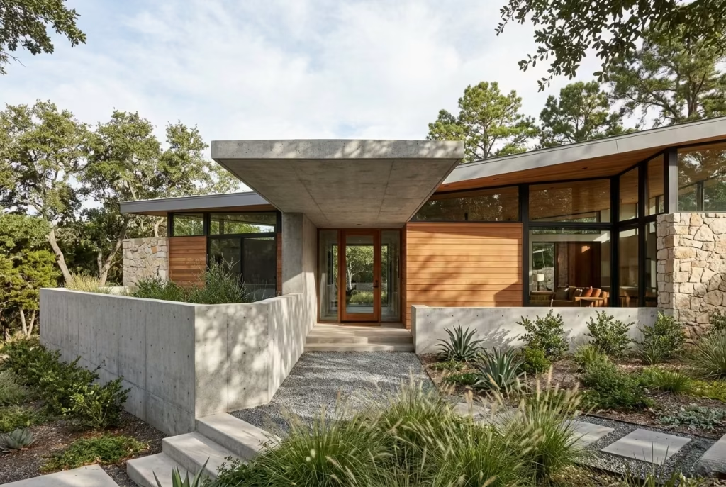
Exposed concrete is one of those mid-century materials that can speak volumes without uttering a word. When applied thoughtfully, it conveys honesty, permanence, and architectural precision, but it’s also easy to overdo. The key is restraint using concrete planes sparingly to anchor the design while allowing lighter materials, like timber or glass, to soften the composition.
From a spatial standpoint, exposed concrete works best on plinths, retaining walls, structural elements, or recessed façades. Planes should be proportioned carefully, often between 2–4 metres (6–13 feet) in length and 200–400 mm (8–16 inches) in thickness for visual grounding, so they feel solid without dominating the façade.
The subtle texture of board-formed or smooth cast concrete provides tactile interest, especially when contrasted with natural timber, stone, or glazing. The interplay of light and shadow on these surfaces changes throughout the day, lending a dynamic quality to an otherwise static material.
I often reserve exposed concrete for moments that need architectural emphasis. On a recent renovation, a low, cantilevered entry canopy and supporting plinth were cast in concrete, while the rest of the façade featured horizontal timber cladding and stone accents. The concrete didn’t compete; it grounded the composition, giving weight where it was needed and letting other materials convey warmth and rhythm. The subtlety ensured the home maintained the lightness and horizontality central to mid-century aesthetics.
Pros
- Provides visual weight and structural honesty
- Works well as a backdrop to warmer, softer materials
- Ages gracefully with minimal maintenance
- Creates strong shadow lines, enhancing façade depth and rhythm
Cons
- Can feel heavy or oppressive if overused
- Requires careful detailing to avoid cracks and water penetration
- Surface finishing must be precise for a premium look
- Limited flexibility once cast, so planning is critical
Floating Roof Effect
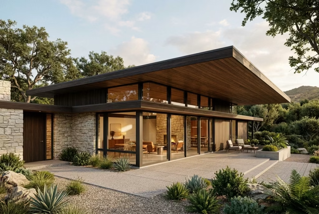
The floating roof is one of mid-century modern architecture’s most elegant illusions, creating a sense of lightness and visual suspension that contrasts beautifully with solid walls or structural elements below. Achieved primarily through recessed glazing lines, overhangs, and careful alignment, it gives the impression that the roof is hovering above the home rather than pressing down on it, reinforcing horizontality while emphasizing openness and flow.
From an architectural standpoint, the effect relies on precision in proportion and detailing. Recessed glazing often set 50–150 mm (2–6 inches) back from the roofline allows shadows to play across the eaves, masking structural supports and visually separating the roof from walls. Combined with wide overhangs (600–900 mm / 24–36 inches) and consistent materiality, the roof appears weightless, almost floating above the living spaces, while still performing essential functions like shading and weather protection.
I’ve employed this strategy in both renovations and new builds to great effect. In one suburban project, we replaced an original bulky roof with a timber-clad overhang and recessed glazing, aligning the panels with the structural beams beneath. The transformation was remarkable: the home immediately felt airy, expansive, and connected to the surrounding garden, even though the footprint remained unchanged. It’s a subtle trick, but one that dramatically enhances perception and elegance.
The floating roof effect also has practical benefits. By extending the overhangs beyond glazing lines, it helps control solar gain, protecting interiors in summer while allowing low winter sun to filter in. Recessed glazing also encourages natural ventilation and creates shaded outdoor zones, making terraces or patios more comfortable.
Pros
- Creates a visually light and expansive façade
- Enhances horizontal emphasis and mid-century aesthetic
- Offers passive shading and improved thermal performance
- Strengthens the perception of indoor-outdoor continuity
Cons
- Requires meticulous detailing to achieve seamless effect
- Higher construction precision needed, particularly at roof-glass junctions
- Recessed glazing can be harder to maintain and clean
- Overhangs must be proportioned carefully to avoid visual awkwardness
Indoor-Outdoor Living Zones
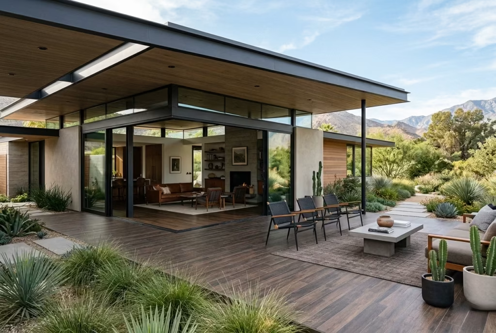
Covered patios aligned with interior flooring are one of the most effective ways to extend a mid-century modern home beyond its walls. Done properly, the transition feels almost invisible, as though the house simply continues outward into the garden. That sense of continuity is the point. It is not about creating a separate outdoor feature bolted on at the end, but about making the patio feel like a genuine living zone, shaped by the same architectural language as the interior.
The strength of this idea lies in its ability to blur boundaries without losing clarity. When flooring materials are carried through from inside to outside, or when surfaces are closely matched in tone and scale, the eye reads the two spaces as one extended composition. A covered patio of around 2.5–4 metres (8–13 feet) deep usually provides enough shelter to feel usable throughout the day, while still maintaining a strong connection to the garden. That depth matters. Too shallow, and it becomes little more than a threshold. Too generous, and it starts to feel disconnected from the plan. The sweet spot is where furniture can sit comfortably, circulation remains easy, and the roofline still feels light.
I have seen this approach transform homes that previously felt boxed in by their own boundaries. In one renovation, we aligned the interior oak flooring with large-format exterior porcelain tiles set on the same axis. The patio immediately began to feel like an outdoor sitting room rather than a separate terrace. There was no need for decorative tricks. The continuity did the work. It made the living space feel larger, calmer, and far more considered. That is often the quiet power of good design. It does not announce itself. It just makes life easier and better without much fuss.
Covered patios also perform beautifully in practical terms. They offer shade in warmer months, shelter in wet weather, and a place to sit that feels usable for far more of the year. In climates where sun and rain both need to be managed, this kind of transitional space becomes invaluable. It encourages people to move between inside and outside naturally, which is precisely why it sits so comfortably within mid-century thinking. The house should not end at the glass line. It should continue, gently and with purpose, into the landscape.
Pros
- Extends the living space in a way that feels natural and cohesive
- Strengthens the indoor-outdoor connection central to mid-century design
- Improves usability across seasons through shade and shelter
- Makes smaller homes feel more generous without increasing footprint
Cons
- Requires careful detailing to ensure flooring transitions work properly
- Poor drainage can undermine the whole effect if not considered early
- Material selection must balance appearance with weather resistance
- Overly enclosed patios can lose the sense of openness that makes the idea work
Neutral, Earth-Toned Colour Palettes
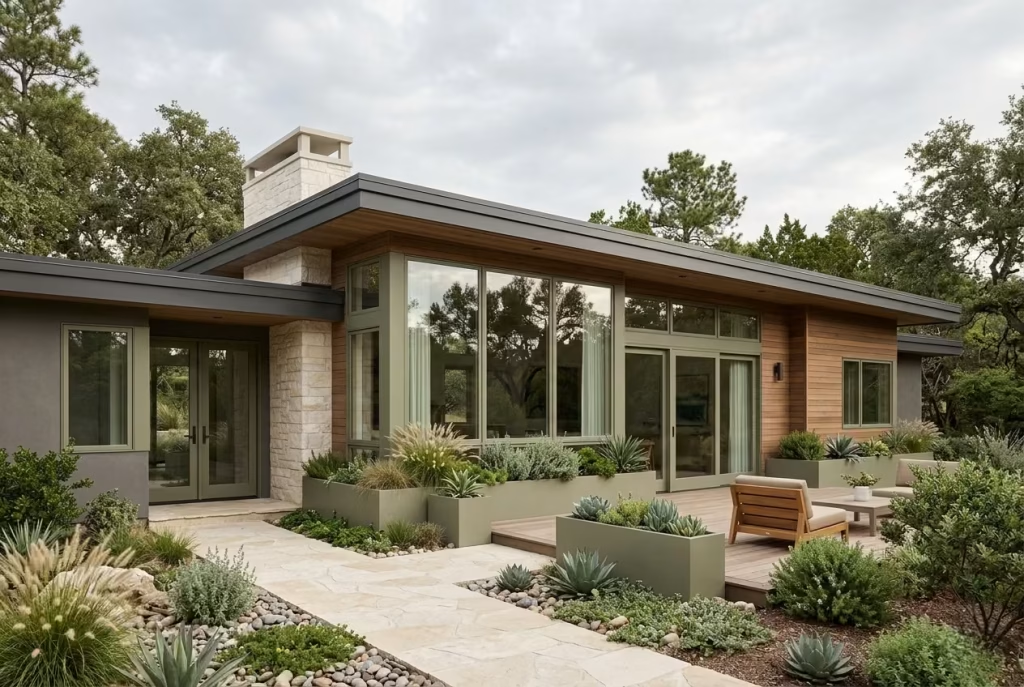
Colour in mid-century modern design is never accidental it’s a carefully considered layer that reinforces materiality, proportion, and the home’s connection to its surroundings. Neutral, earth-toned palettes think warm browns, deep charcoals, and muted greens ground the architecture, complement natural materials, and allow structural lines and volumetric forms to take centre stage. These tones do more than just look good; they quietly harmonize the house with the landscape, creating a sense of timeless calm that a more vibrant or faddish palette can rarely achieve.
From an architectural perspective, these hues work in tandem with other elements like horizontal timber cladding, stone planes, and exposed concrete. Browns and ochres complement timber textures, charcoals define edges and planes, and muted greens echo surrounding vegetation, reinforcing a visual dialogue between building and site. I often see clients get caught up in matching trends, but in my experience, restraint pays off: subtle earth tones age gracefully, contrast naturally with seasonal light, and offer flexibility for furniture, landscaping, and soft furnishings over time.
In practice, I’ve applied these palettes across both new builds and renovations. On one modern mid-century renovation, the façade combined horizontal timber, pale stone, and a charcoal roofline. Using muted olive for window frames and planters created a quiet cohesion that made the volumes feel deliberately composed rather than decorative. Even passersby commented on the sense of balance without realizing that colour, more than form, was anchoring the architecture in its setting.
Pros
- Enhances architectural forms without overwhelming them
- Creates a timeless, grounded aesthetic that ages well
- Integrates buildings naturally with landscape and surroundings
- Provides flexibility for interior furnishings and exterior landscaping
Cons
- Can feel bland or understated if materials and textures are not varied
- Requires careful coordination to prevent monotony across façades
- Overly muted palettes may appear flat under certain lighting conditions
- Needs attention to long-term maintenance to avoid fading or staining
Steel-Framed Glass Panels
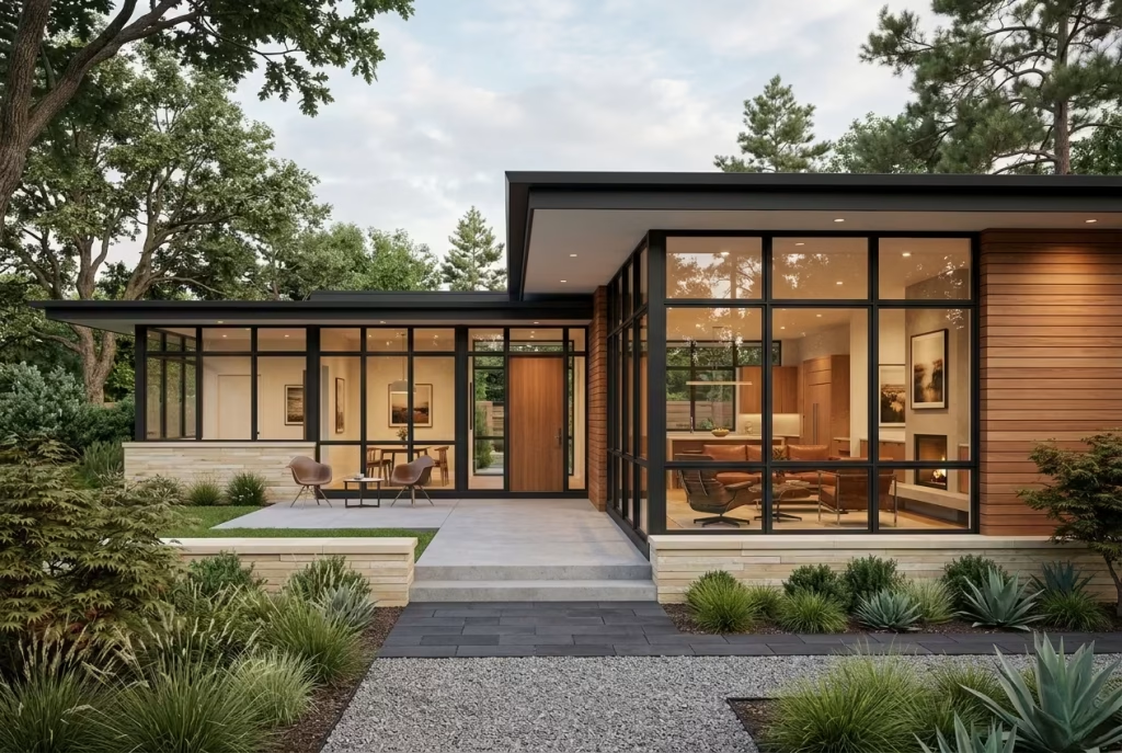
Steel-framed glass panels are a hallmark of refined mid-century modern exteriors, offering a sleek, precise counterpoint to heavier materials like timber, stone, or concrete. Their slim profiles create clean, uninterrupted lines that emphasise the home’s horizontal and geometric composition, while still delivering the transparency and indoor-outdoor connection central to the style.
From a design perspective, steel is ideal because it allows larger panes of glazing without bulky frames, maintaining a minimal aesthetic and reinforcing structural rhythm. Typical panel heights can range from 2.4–3 metres (8–10 feet) with widths of 1–3 metres (3–10 feet) depending on structural support. The strength of steel enables extended spans while retaining crisp edges, which not only looks elegant but also maximises natural light penetration and framing of exterior views.
In my projects, I often combine steel-framed panels with recessed mullions or floor-to-ceiling alignment to create the impression that the glass is floating within the wall, a subtle trick that heightens the sense of openness. On one renovation, replacing bulky timber-framed windows with slim steel profiles immediately opened the living space visually, connecting the interior with the garden while maintaining a sense of enclosure and proportion. It’s a detail that elevates both perception and experience, making a home feel contemporary while honouring its mid-century roots.
Steel-framed glazing also supports practical performance. With powder-coated finishes or thermally broken profiles, it can manage condensation, reduce heat transfer, and endure exposure without significant maintenance. When paired with operable panels, it can facilitate natural ventilation while maintaining the clean, uninterrupted planes that define mid-century style.
Pros
- Creates crisp, elegant lines that enhance façade geometry
- Allows larger glazing spans for maximum light and views
- Supports indoor-outdoor continuity and spatial transparency
- Durable and adaptable with modern thermal performance options
Cons
- Requires precise fabrication and installation to maintain minimal profiles
- Can be costlier than timber or aluminium alternatives
- Needs careful detailing to manage condensation and thermal bridging
- Overuse without contrast may feel cold or industrial if not balanced with warmer materials
Raised Platforms or Split-Level Exteriors
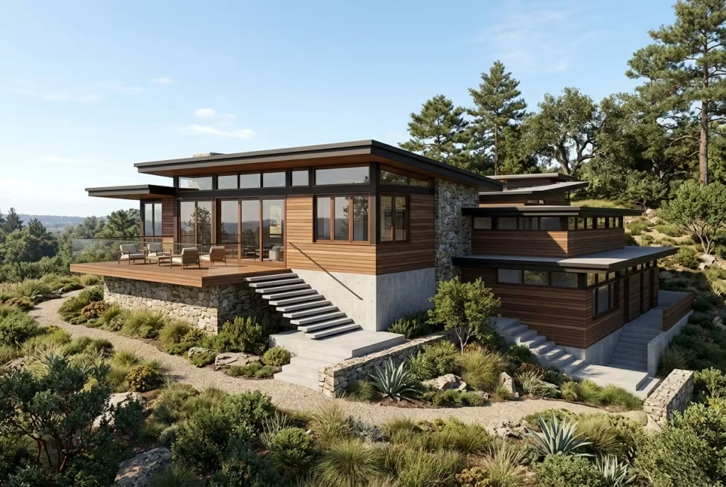
Raised platforms and split-level compositions are among the most intelligent ways to handle a sloped site without fighting it. Rather than flattening the land or forcing a rigid box onto an awkward gradient, this approach works with the terrain, allowing the house to step gently with the site. That single decision often gives the architecture a sense of ease. It feels less imposed, more settled, almost as though the building has found its place rather than been dropped onto it.
From an architectural standpoint, this is where mid-century thinking really earns its keep. Split levels allow the house to respond to changes in ground height while preserving the clean, horizontal language that defines the style. A raised platform of around 450–900 mm (18–36 inches) can lift the main living zone just enough to improve outlook, enhance privacy, and create a stronger relationship with the surrounding landscape. On more pronounced slopes, stepped floor levels can follow the natural grade in increments of 300–450 mm (12–18 inches), allowing each zone to feel distinct without breaking the overall flow. The result is a house that moves with the land, rather than standing awkwardly against it.
I have always found this approach particularly effective in renovation work where the site itself becomes part of the solution. On one project set into a gently falling plot, a conventional flat arrangement would have required too much excavation and would have left the rear rooms sitting uncomfortably low against the garden. Instead, we lifted the main living zone onto a slightly raised platform and dropped the sleeping wing by half a level. That small shift changed everything. The house gained better sightlines, the rear terrace felt more connected to the interior, and the exterior composition suddenly had a natural rhythm. It is the kind of move that does not shout for attention, but quietly transforms how the home is experienced day to day.
There is also a practical beauty to split-level planning. It can help separate public and private areas without resorting to heavy partitions, and it often improves the way daylight enters the house. On a sloped site, a lower level may open directly into the garden while a higher level captures more distant views or better airflow. This creates a layered sense of living that feels richer than a single flat plane. It is, in many ways, architecture doing what it should do best: adapting to context with grace.
That said, this is not a detail to approach casually. Split levels demand careful coordination between structure, drainage, accessibility, and circulation. Stairs need to feel intentional, not like an afterthought. Thresholds must be handled cleanly so the house does not become a series of awkward transitions. When these details are resolved properly, the architecture feels composed and assured. When they are not, the whole scheme can end up feeling fragmented.
Pros
- Responds naturally to sloped sites instead of resisting them
- Creates visual interest and spatial variation without decorative excess
- Can improve views, privacy, and daylight access
- Helps separate living zones in a subtle, architectural way
Cons
- Requires careful structural planning and more complex construction
- Accessibility can become a concern if levels are not handled thoughtfully
- Drainage and retaining details must be resolved early
- Can increase cost compared with a simple single-level plan
Integrated Carport + Entry Axis
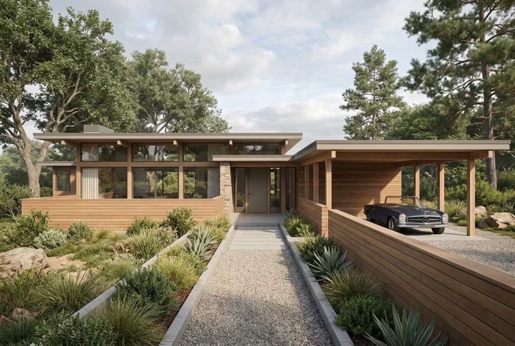
An integrated carport aligned with the home’s entry axis is one of those mid-century modern gestures that feels obvious once done right, but is surprisingly rare in practice. It merges utility with compositional elegance, ensuring that parking, arrival, and circulation are resolved without compromising the home’s visual rhythm. Instead of treating the car as an afterthought or tucking it behind walls and gates, this strategy makes it part of the architectural choreography.
From a spatial perspective, the alignment of carport and entry reinforces the home’s primary axis, guiding the eye naturally from street to front door while maintaining clean lines and a sense of order. Typically, a carport width of 3–3.5 metres (10–12 feet) per vehicle works well, with a depth of 5–6 metres (16–20 feet) to accommodate most cars and allow comfortable circulation. By keeping the carport visually open supported by posts rather than full walls the façade maintains its horizontality and lightness, allowing the landscape and architectural planes to continue uninterrupted.
I’ve employed this approach on several modern mid-century renovations, often where street-facing façades risked appearing closed or overbearing. In one project, we recessed the carport slightly behind a low timber-clad wall and aligned it directly with the front entry. The result was immediate: the carport felt like part of the sequence rather than a standalone utilitarian object, and visitors experienced a calm, intuitive approach from street to home. This alignment also created a subtle covered transition zone, bridging public and private space while maintaining compositional clarity.
Beyond aesthetics, integrated carports offer practical advantages. They protect vehicles from sun and rain, improve circulation, and reduce the need for large garage doors that disrupt the façade. When combined with thoughtful landscaping gravel paths, low planters, or stepping stones the transition from car to door can feel like a choreographed procession rather than a mundane errand.
Pros
- Resolves parking and entry in a visually elegant, cohesive way
- Maintains horizontality and architectural rhythm of the façade
- Provides shelter for vehicles and a subtle transitional zone
- Reinforces intuitive circulation and functional planning
Cons
- Requires precise alignment to avoid visual awkwardness
- Limited privacy compared with enclosed garages
- Must consider drainage and structural support for exposed posts
- Overly generous dimensions can dominate the façade if not proportioned
Large Pivot or Flush Entry Doors
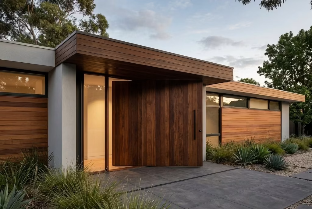
A statement entry door in a mid-century modern home does more than mark the threshold; it sets the tone for the entire architectural experience. Large pivot or flush doors are particularly effective, offering a sense of arrival that is simultaneously understated and commanding. Unlike traditional panelled doors, these clean, uninterrupted planes emphasise horizontality or verticality, depending on proportion, and act as an extension of the façade rather than an afterthought.
From a spatial and design perspective, a width of 1000–1200 mm (39–47 inches) strikes a balance between impact and practicality. Pivot mechanisms allow the door to rotate smoothly, enabling larger panels without the structural limitations of standard hinged doors. Flush doors, with concealed frames and minimal hardware, maintain the linear, disciplined aesthetic characteristic of mid-century design. Both strategies reinforce simplicity, proportion, and the notion that every element is part of a considered architectural composition.
I’ve specified large pivot or flush doors on several projects, often where the entrance sequence needed subtle emphasis without resorting to ornamentation. In one suburban build, a pivot door in deep timber aligned with the entry axis and recessed slightly behind a horizontal canopy immediately created a pause, a moment of arrival. Visitors intuitively slowed their approach, appreciating the calm clarity of the threshold. The door became an experiential device as much as a functional one.
There are also practical benefits. Wider doors facilitate the movement of furniture and large objects, improve accessibility, and when pivoted correctly, create controlled ventilation and sightlines. Paired with recessed or sidelight glazing, they can maintain light flow while preserving privacy. Material choices from natural timber to engineered laminates also allow the door to age gracefully and integrate with surrounding cladding.
Pros
- Creates a strong, elegant entry without overwhelming the façade
- Supports mid-century principles of proportion, simplicity, and horizontality
- Improves accessibility and movement for daily use
- Can enhance natural light and ventilation when paired with sidelights
Cons
- Pivot doors require precise installation and structural reinforcement
- Larger panels can be heavier and may need quality hardware
- Flush doors demand careful detailing to avoid warping or misalignment
- Can appear monolithic if not balanced with surrounding elements
Brickwork with Horizontal Emphasis
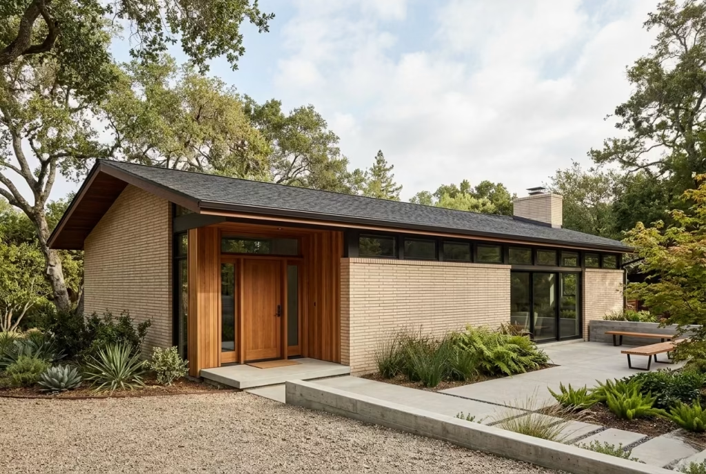
Brickwork can be deceptively powerful in a mid-century modern exterior. It is often thought of as traditional, even familiar, but when it is handled with a horizontal bias, it becomes something altogether more contemporary and disciplined. Long-format bricks, or a running bond laid with clear horizontal intent, help the façade read as low, grounded, and measured. That is exactly the kind of quiet strength mid-century architecture relies on. It does not need to put on a show. It just needs to sit well.
From an architectural point of view, the value of horizontal brickwork lies in how it stretches the elevation visually. Long-format bricks typically measure around 290–490 mm (11.5–19.5 inches) in length, with heights around 50–90 mm (2–3.5 inches) depending on the product. Those proportions naturally reinforce the linear quality of the design, particularly when used in tandem with flat or low-pitched roofs, ribbon windows, and extended eaves. The eye moves across the wall rather than up and down it, which gives the building a calmer, more settled presence. It is a subtle trick, but a very effective one.
I have used this approach on projects where the client wanted warmth without losing architectural crispness. In one renovation, the original house had a patchwork exterior that felt a bit stop-start, with no clear visual rhythm. We replaced the front elevation in a pale, elongated brick and matched the mortar colour closely to the brick tone so the joints would not dominate. The transformation was immediate. The façade felt longer, lower, and far more composed. More importantly, it began to relate better to the planting and boundary walls, which made the whole site feel more resolved. That is the real test of a good material choice. It should do more than look nice on its own. It should help the entire composition make sense.
Brickwork also has a practical strength that suits real homes, not just beautiful photographs. It is durable, relatively low maintenance, and weathered surfaces can gain depth over time rather than looking tired. In climates with strong sun or seasonal variation, brick can hold its own extremely well, provided the detailing is right. The key is to avoid overly busy patterns, heavy soldier courses, or decorative gimmicks that fight against the simplicity of the form. Mid-century design usually works best when the brick is allowed to do its job without too much theatre.
Pros
- Reinforces horizontal lines and mid-century proportions
- Offers durability and low-maintenance performance
- Adds warmth and texture without overwhelming the façade
- Works well with timber, concrete, and glazing
Cons
- Can feel heavy if the colour or bond pattern is too dark or busy
- Requires careful mortar selection to avoid visual clutter
- Less forgiving if detailing at openings and corners is poor
- May look overly traditional if used without strong contemporary proportions
Shaded Outdoor Terraces
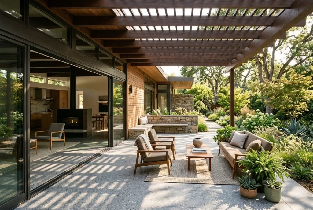
Shaded outdoor terraces are a hallmark of thoughtful mid-century modern design, especially in warmer climates where unprotected outdoor areas can quickly become uncomfortable. These spaces extend living areas into the landscape, creating functional zones that are usable throughout the day while maintaining a strong connection to the surrounding garden.
From a design perspective, shading can be achieved through wide overhangs, pergolas with timber slats, or integrated roof projections. Depths of around 2.5–3.5 metres (8–12 feet) provide sufficient coverage for seating or dining areas without feeling enclosed. The key is balance: the terrace should feel protected yet open, allowing air to circulate and natural light to filter in softly. Proper orientation also matters, with south or west-facing terraces benefiting most from extended shading to mitigate harsh sunlight.
In my experience, aligning terrace floors with interior flooring or continuing materials such as timber decking or large-format tiles enhances the feeling of continuity between inside and outside. On one recent project, we positioned a shaded terrace adjacent to the living room with a timber pergola that allowed dappled sunlight while still offering comfort during peak heat. The result was a space that felt like a natural extension of the home, encouraging daily use rather than being a decorative afterthought.
Shaded terraces also have practical advantages. They reduce solar gain inside the house, protect furniture from sun damage, and create outdoor zones that can be furnished and accessorised without concern for weather extremes. When thoughtfully integrated, they become both a design statement and a lifestyle enhancement, allowing homeowners to enjoy the outdoors comfortably while reinforcing the home’s mid-century proportions and horizontality.
Pros
- Provides comfortable, usable outdoor spaces in hot climates
- Reinforces indoor-outdoor continuity
- Protects interiors and outdoor furniture from sun and heat
- Can enhance visual and architectural composition of the façade
Cons
- Requires careful planning for orientation and shading depth
- Structural elements such as pergolas need ongoing maintenance
- Poor drainage or roof alignment can compromise usability
- Overly heavy shading can reduce natural light into interior spaces
Minimal Boundary Walls or Open Frontages
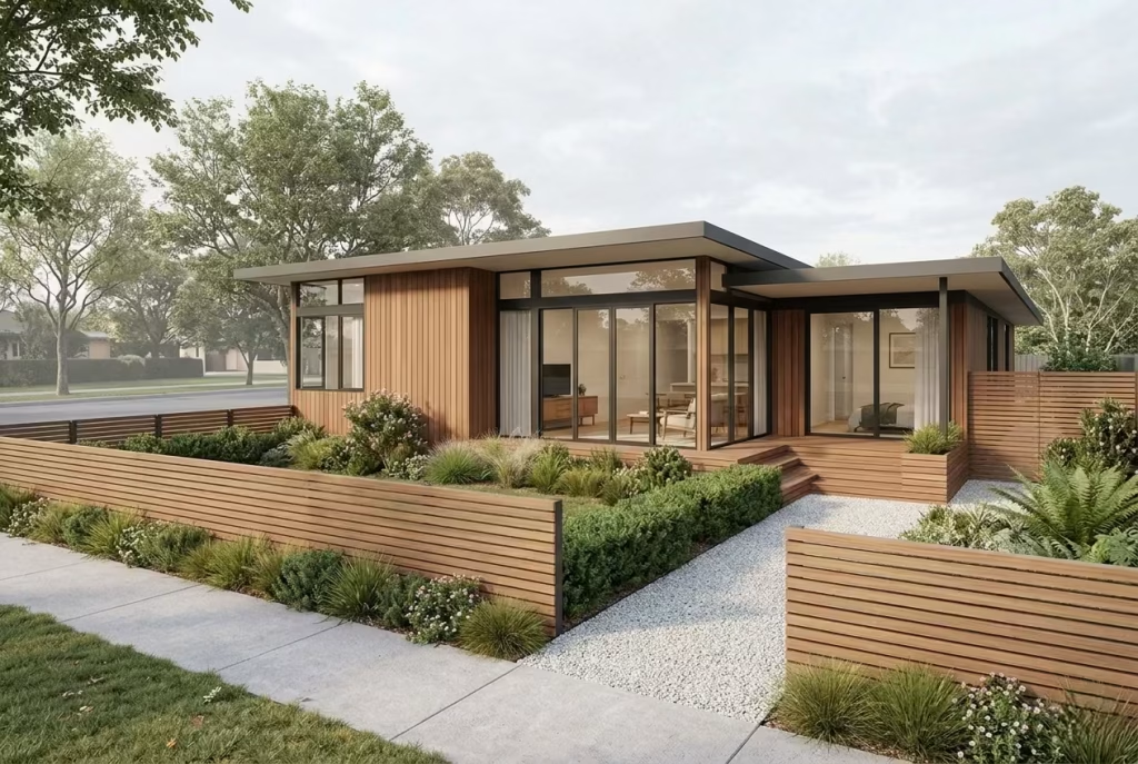
Minimal boundary walls or open frontages are a subtle but powerful way to reinforce the connection between a mid-century modern home and its surroundings. Rather than boxing the house in with high fences or opaque walls, keeping frontages low or open allows the architecture to breathe, visually extending the living space into the landscape and inviting the outdoors in.
From a design perspective, these boundaries often consist of low timber screens, horizontal stone walls, or recessed hedging, typically around 600–900 mm (24–36 inches) in height. They act as markers of threshold without creating a fortress-like presence, preserving sightlines and the sense of horizontality that defines mid-century proportions. Open frontages also support a coherent entry sequence, allowing the approach to the house to unfold gradually, with landscaping and architectural features guiding movement rather than hard barriers.
In my projects, I frequently use minimal front boundaries to enhance the perceived scale and generosity of the plot. On one renovation, replacing a solid masonry wall with a horizontal timber slat screen instantly opened the street-facing façade, making the home feel lighter and more inviting. Residents reported feeling more connected to their surroundings while retaining a subtle sense of privacy, proving that openness and security can coexist with careful planning.
Practical benefits are equally significant. Open or minimal boundaries improve visibility for vehicles and pedestrians, allow natural airflow, and integrate planting seamlessly into the home’s composition. They also encourage a sense of community by visually connecting private spaces with the public realm without sacrificing the compositional clarity that mid-century design demands.
Pros
- Enhances visual and spatial connection with the landscape
- Maintains a sense of openness while guiding movement and access
- Reinforces horizontal and minimalist architectural lines
- Improves natural airflow and daylight penetration
Cons
- Offers less privacy compared with traditional boundary walls
- Requires thoughtful landscaping to define space without hard barriers
- May need additional security measures in certain locations
- Can feel exposed if not balanced with architectural or planting features
Lighting That Emphasises Structure, Not Decoration
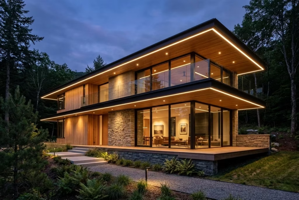
Lighting in mid-century modern exteriors is not about flashy fixtures or decorative flair. The most effective approach is to highlight architecture rather than overshadow it, using illumination to accentuate planes, structural rhythms, and materiality. Low-level and linear lighting strategies allow the house to speak for itself after dark, reinforcing proportions and guiding the eye along key lines without interrupting the calm geometry of the façade.
From a design standpoint, I often specify recessed linear LEDs along rooflines, terraces, or planter edges, and low-level bollards to softly define paths. The key is subtlety: a fixture should never call attention to itself. A typical linear strip of 8–12 mm (0.3–0.5 inches) recessed along a canopy or step edge can create a gentle wash that makes the structure readable without glare, while downlights embedded into soffits can illuminate façades and patios in a similarly understated way.
In practice, I’ve seen how carefully integrated lighting transforms the perception of a home. On a recent project, low-level LEDs were aligned along a horizontal timber fascia, subtly highlighting overhangs and framing a glazed living wall. At night, the house felt calm, confident, and composed, as if it had an internal rhythm that continued even after the sun had set. It allowed the materials timber, stone, and concrete to remain the star, while shadows and light reinforced depth and horizontality.
There are practical benefits too. Well-placed structural lighting improves safety and circulation, subtly illuminates entrances, and supports outdoor living areas without requiring high wattage or visually intrusive fixtures. Linear and low-level strategies also reduce energy use, minimise light pollution, and ensure that illumination feels intentional rather than decorative.
Pros
- Highlights architecture and materiality without adding visual clutter
- Improves safety and usability of outdoor spaces
- Enhances depth, proportion, and structure at night
- Energy-efficient and low-maintenance when using LED solutions
Cons
- Requires careful planning to ensure light falls where needed
- Poor placement can create uneven shadows or glare
- Retrofitting existing homes may require structural adjustments
- Overuse can dilute the subtle, architectural effect
Common Mistakes I See in Mid-Century Exterior Renovations
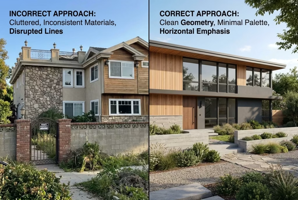
Mid-century renovations often go off course for one simple reason: the work begins with finishes rather than form. I have seen otherwise well-funded projects lose their way because the architecture was never properly resolved. A good exterior is not built from a mood board. It comes from proportion, restraint, and a clear understanding of how the house sits in its setting.
Overcomplicating the Façade
One of the most common missteps is adding too many elements in the hope of creating character. Extra cladding types, decorative battens, oversized feature walls, and unnecessary projections can quickly muddy the composition. Mid-century architecture has strength because it knows when to stop. The façade should feel edited, not embellished. When every surface is trying to speak, the building loses its voice.
Using Incorrect Proportions
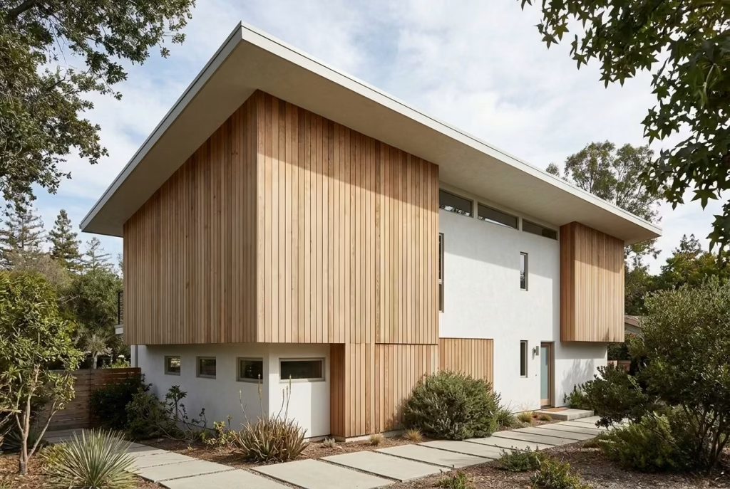
Even the right materials can fail if the proportions are off. A roofline that sits too high, windows that are too small, or cladding that is broken into awkward sections can make the whole house feel top-heavy or disjointed. In several projects, I have found that correcting proportions does more for the exterior than replacing the materials ever could. A shift of just a few hundred millimetres, or a better relationship between glazing and wall mass, can restore balance almost immediately.
Ignoring Landscape Integration
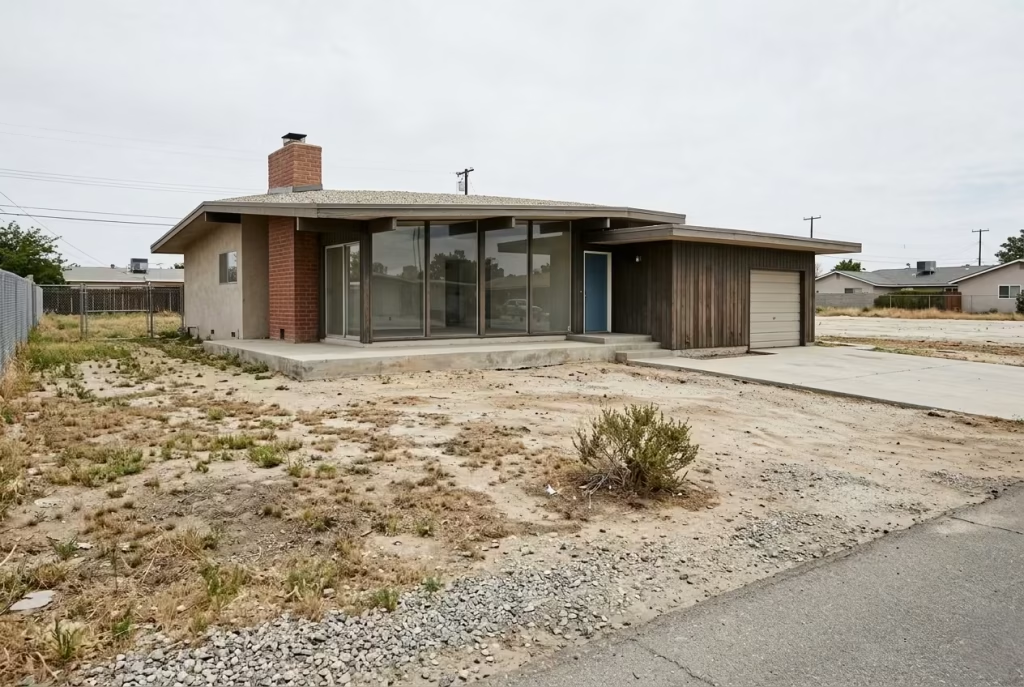
Mid-century homes are meant to engage with the land, not sit apart from it. When the garden, approach, and surrounding planting are treated as an afterthought, the house feels stranded. I always look at how the front path arrives, how the rear terrace connects, and how planting softens the hard edges of the architecture. Without that dialogue, the exterior can feel like a set piece rather than a lived-in home.
Mixing Incompatible Material
A timber board, a stone plinth, and a concrete wall can work beautifully together. But only when the palette is disciplined. I have seen projects where too many tones, textures, and finishes were introduced in the name of warmth or interest, and the result felt fragmented. The strongest exteriors usually rely on a restrained material language, where each element supports the next instead of competing for attention.
Treating Mid-Century as a Style Rather Than a System
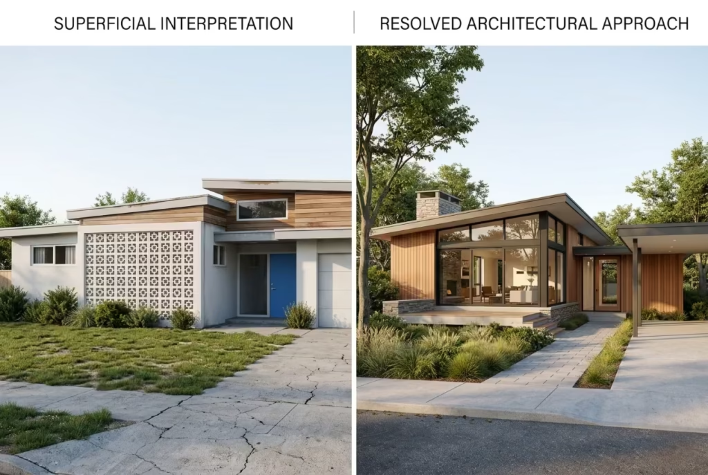
This is the deepest mistake of all. Mid-century design is not just about flat roofs, breeze blocks, or horizontal lines. It is a system built around structure, light, landscape, and everyday usability. When it is treated as a decorative style, it becomes hollow very quickly. When it is approached as an architectural logic, it holds together, and it ages well.
In several renovation projects, I have seen budgets wasted on finishes while the underlying architectural proportions were never resolved. That is where the real value lies. Get the bones right, and the house starts to carry itself with confidence. Miss that step, and even expensive materials will only paper over the cracks.
Material Selection Guide: What Actually Works Long-Term
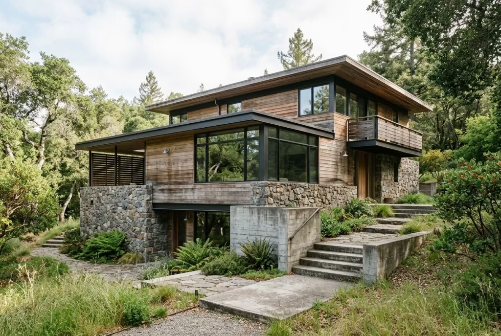
Material choice is where a mid-century exterior either settles into itself or starts to unravel. The most convincing projects are rarely the ones with the most expensive finishes. They are the ones where the materials make sense in relation to climate, maintenance, and the way the house is actually used. I always treat this stage as a long-game decision, because what looks sharp on day one can become a liability if it is chosen for appearance alone.
Timber vs Composite Cladding
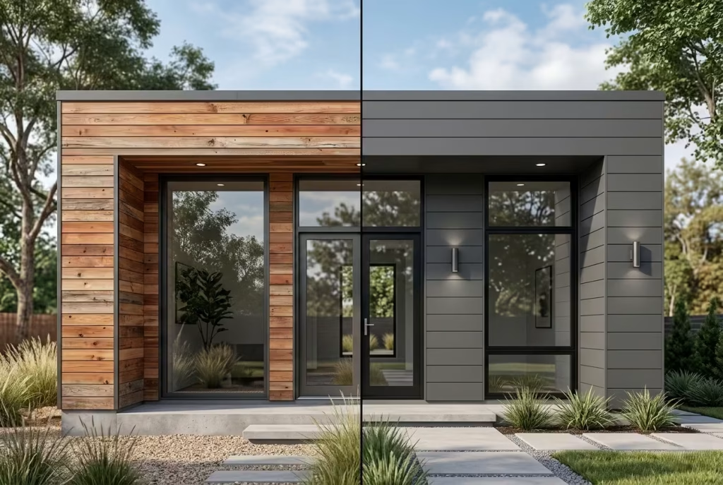
Timber remains one of the most authentic materials for mid-century exteriors. It brings warmth, texture, and a natural softness that sits beautifully against glass, concrete, and stone. In practical terms, it works best when the boards are detailed with clear horizontal runs, often between 150–200 mm (6–8 inches) wide, so the façade keeps its linear discipline. The challenge is maintenance. Timber weathers, and depending on species and finish, it may silver unevenly or require periodic treatment.
Composite cladding solves some of that upkeep, which is why it has become popular in contemporary renovations. It offers more predictable performance, especially in exposed locations, and can reduce long-term maintenance costs. The trade-off is that it rarely has the same depth or honesty as real timber. In a close-up view, the difference matters. For a client who wants the exterior to feel tactile and lived-in, I still lean toward timber where the budget and maintenance plan allow it.
Natural Stone vs Engineered Alternatives
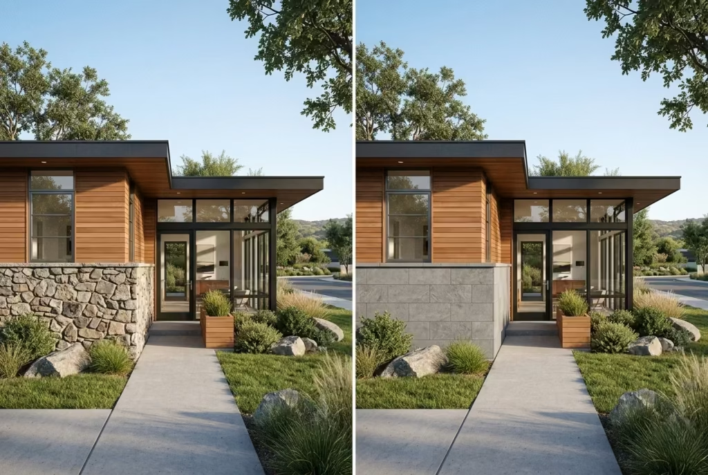
Natural stone has a weight and permanence that suits mid-century architecture extremely well, particularly when used as a plinth or landscape-adjacent base. It grounds the house visually and gives the façade a sense of belonging. The variation in tone and surface is often what makes it compelling. No two pieces are identical, and that irregularity can be a real strength.
Engineered stone or stone-look alternatives can work in the right context, especially where budget or structural constraints are tighter. They are often easier to install and more consistent in appearance, which can be useful in large surfaces. The risk is that they can feel too uniform, too polished, or simply too manufactured if they are not selected carefully. I tend to use them only when the detailing around them is strong enough to carry the composition. Otherwise, they can flatten the entire scheme.
Aluminium vs Steel Framing
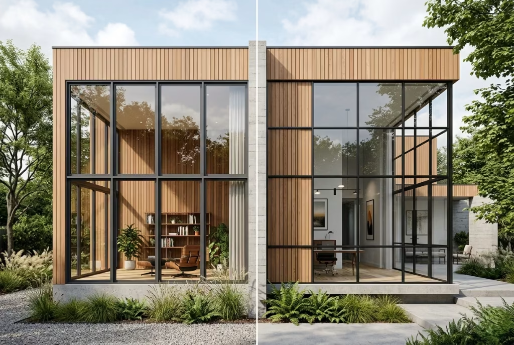
For glazing, aluminium is usually the more practical long-term choice. It is lighter, more affordable, and easier to thermally break for better performance. Slim aluminium frames can still look elegant, provided the profiles are kept disciplined and the colour is chosen with care. In many contemporary homes, this is the sweet spot between performance and appearance.
Steel has a sharper visual quality. The profiles can be finer, the lines crisper, and the result more faithful to classic mid-century precedents. It is particularly effective where the glazing is meant to read as a precise architectural element rather than a default building component. The downside is cost, fabrication complexity, and the need for careful thermal detailing. In my experience, steel is best reserved for focal moments, while aluminium often makes more sense across the wider envelope.
Maintenance Considerations
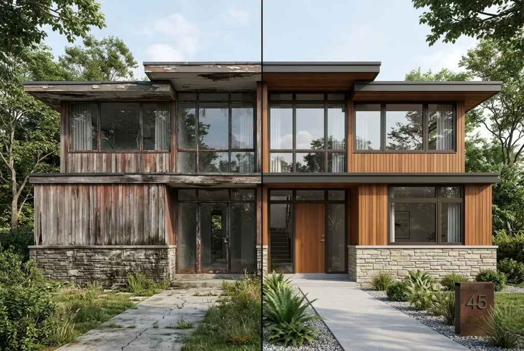
Long-term success depends less on the initial finish and more on how the building will age. Timber needs exposure and upkeep managed from the outset. Stone needs proper sealing and detailing at the base to avoid staining. Aluminium framing needs good powder coating and quality installation to prevent future issues. Steel requires even more care, particularly around corrosion and thermal bridging.
What I always look for is not just beauty, but resilience. A material that performs well in the first year but becomes high-maintenance by year five is not truly successful. The right palette should be able to weather, settle, and hold its character without constant correction. That is the difference between a façade that looks designed and one that actually lasts.
The best material combinations usually come back to the same principle: use fewer things, but use them well. A restrained palette, carefully detailed, almost always outlasts a busy one. That is where the quiet confidence of mid-century design really comes through.
Cost Considerations and Where to Invest
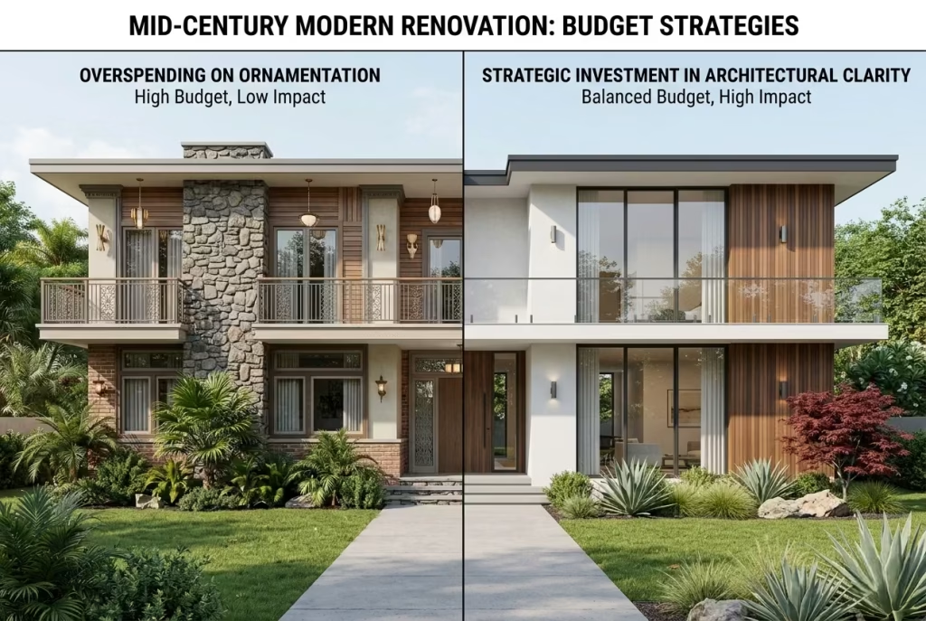
Mid-century exterior renovations can look deceptively simple from the street, but the budgets behind them often tell a different story. The clean lines, the crisp transitions, and the quiet confidence of the finished result usually depend on a few carefully chosen investments rather than a long list of decorative extras. In my experience, the strongest projects are rarely the ones that spend most heavily everywhere. They are the ones that know exactly where money changes the outcome.
High-impact areas: where the budget really matters
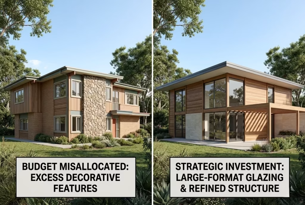
Glazing systems
This is usually the first place I push clients to spend properly. Mid-century architecture depends on light, transparency, and proportion, so glazing is not just a technical component. It is a defining part of the design. Poor-quality frames or underperforming glass can make even a beautifully composed façade feel cheap and compromised.
For a typical residential project, high-performance glazing can range widely depending on size, specification, and frame material. As a rough guide, large-format aluminium or steel-look systems often start around £600 to £1,200 per square metre for standard performance, and can rise to £1,500 to £2,500+ per square metre for premium thermally broken systems, slim profiles, or bespoke detailing. In dollar terms, a comparable range is often $750 to $1,500 per square metre at the lower end and $1,800 to $3,000+ per square metre at the higher end.
I have seen projects where clients tried to save on glazing, only to discover that the house lost its calmness immediately. The frames became visually heavy, the proportions felt clumsy, and the light quality inside was nowhere near what the drawings had promised. In one renovation, upgrading from standard off-the-shelf sliders to properly detailed slimline glazing changed the entire mood of the rear elevation. The house went from looking functional to feeling composed.
Structural expression
Structure is another place where cutting corners tends to show. Mid-century homes rely on legible forms, so rooflines, beams, posts, and canopies need to look deliberate. If the structure is awkward, the whole house starts to lose its poise. It is a bit like tailoring. Once the shoulders are wrong, everything else struggles to sit properly.
Costs here vary depending on whether you are working with timber, steel, or engineered solutions. A visible structural intervention, such as a refined canopy, extended eaves, or a post-and-beam frame, can add 10 to 25 percent to the cost of the relevant portion of the build, sometimes more if custom fabrication is involved. In many cases, that is money well spent because it changes how the house reads before anyone notices the finishes.
On one project, we kept the material palette very modest but invested in a sharper roofline and a cleaner structural rhythm across the façade. The result felt far more expensive than the budget suggested. That is the irony of good design. The things people assume are “decorative” are often the least important. The structure is what gives the design its backbone.
Exterior materials
Materials are where the visual payoff becomes tangible. Timber, stone, render, and brick all contribute to the character of the house, but they need to be chosen with discipline. Better-quality cladding, properly detailed joints, and durable finishes may cost more upfront, but they usually save money over time by reducing maintenance and replacement cycles.
As a guide, exterior cladding can range from around £80 to £180 per square metre for simpler systems and rise to £200 to £400+ per square metre for premium timber, stone, or highly detailed rainscreen solutions. Natural stone can push beyond that depending on sourcing and installation complexity. In the US, that often translates to roughly $100 to $220 per square metre for basic systems and $250 to $500+ per square metre for higher-end finishes.
I tend to favour spending on one or two materials that age well rather than trying to do too much at once. A restrained palette always carries itself better. In practice, I have seen a modest timber and stone combination outperform a more expensive but fragmented façade because the simpler palette held together visually and weathered more gracefully.
Where to simplify
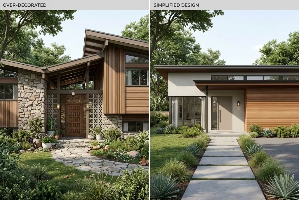
Decorative elements
This is where budgets often leak away without improving the architecture. Extra feature walls, decorative screens, unnecessary cladding transitions, and overly styled entry details can all consume money while adding very little value. Mid-century design is strongest when it is edited with a firm hand. If a detail does not support the form, the light, or the relationship to the site, it probably does not deserve a place.
In one renovation, the client initially wanted multiple decorative inserts and accent finishes around the entrance. Once we stripped that back and put the money into a cleaner canopy and better glazing, the house immediately felt more coherent. That is often the real lesson. The less you ask the exterior to do stylistically, the more room it has to breathe.
Secondary facades
Not every side of the house needs to carry the same level of investment. The street-facing elevation and the main garden-facing side usually deserve the strongest detailing, while secondary elevations can be simplified without weakening the overall design. This is especially useful when budgets are tight.
A practical way to approach this is to reserve premium finishes for the most visible or most lived-in areas, then simplify back-of-house sides with durable but less costly materials. For example, you might use engineered timber or a simpler render on a side elevation, while spending more on the front glazing and entry composition. That kind of hierarchy keeps the project grounded.
Real-world budgeting insight
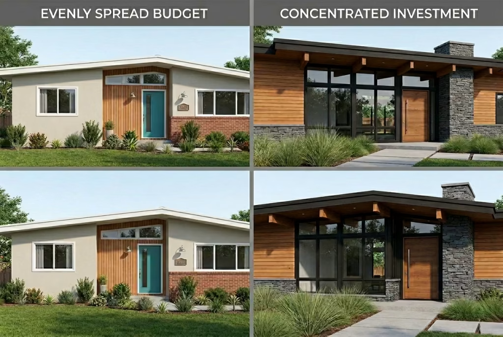
The biggest mistake I see is spreading the budget too thinly. A project with average glazing, average materials, and a few decorative gestures rarely delivers much impact. It tends to look like a compromise, because it is one. By contrast, a renovation that concentrates money in the right places usually feels far more resolved.
As a rule of thumb, I would rather see a client spend carefully on:
- glazing that performs well and looks refined
- a clear structural language
- one or two durable exterior materials
than spread the same budget across lots of small visual touches that age quickly. In real terms, that might mean putting 35 to 45 percent of the exterior budget into glazing and structural work, 25 to 35 percent into primary cladding and finish materials, and keeping the remainder for detailing, drainage, lighting, and landscape transitions.
That is where the long-term value lives. Not in the little flourishes, but in the bones of the house. When those are right, everything else has a way of falling into place.
Conclusion: Why Mid-Century Modern Still Works Today
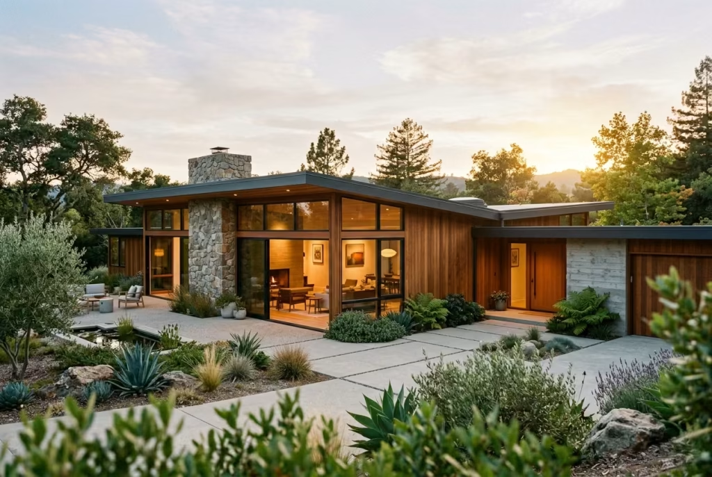
Mid-century modern endures because it was never really about fashion in the first place. Its strength lies in how intelligently it responds to the realities of living: climate, human scale, and landscape. That is why it still feels so relevant in contemporary residential design. A low roofline, generous glazing, honest materials, and a clear structural rhythm are not decorative gestures. They are architectural decisions that shape comfort, light, and the way a house sits within its setting.
What gives the style its lasting appeal is not nostalgia, but discipline. Mid-century exteriors work when every element earns its place. The proportions are considered. The material palette is restrained. The connection between inside and outside is deliberate rather than forced. Nothing feels overcooked. Nothing is trying too hard. That is often where the real sophistication lies.
In renovation work, I have seen this again and again. The homes that feel most successful are rarely the ones with the most features or the boldest finishes. They are the ones where the structure, the site, and the daily experience of the people living there have all been thought through properly. When that happens, the architecture settles into itself. It feels calm, grounded, and quietly assured.
That is why mid-century modern still holds its ground. Not because it is easy to recognise, but because it continues to make sense. It responds to the way homes are actually used, and it does so with a level of clarity that never really goes out of date.
Frequently Asked Questions About Mid-Century Modern House Exteriors
Can mid-century principles be applied to new builds as well as renovations?
Absolutely. The principles translate to both. For new builds, you can fully control structure, orientation, and materiality. In renovations, it’s about respecting existing proportions, improving connections to the landscape, and selectively upgrading glazing, cladding, or structural elements without losing the original architectural rhythm.
What exactly defines a mid-century modern exterior?
A mid-century modern exterior is defined by simplicity, horizontal emphasis, integration with the landscape, and honest use of materials. Low-pitched roofs, large glazing panels, minimal ornamentation, and clear structural expression are hallmarks. It’s about proportion and spatial clarity rather than decoration alone.
What materials work best for longevity in mid-century exteriors?
Timber, natural stone, aluminium, and steel are the core materials. Timber brings warmth but requires maintenance, whereas composite alternatives reduce upkeep. Stone and engineered stone provide permanence and texture. Aluminium frames are lightweight and durable for glazing; steel can create sharper lines but requires more care. The key is choosing materials that age gracefully and complement each other.
How important is glazing in a mid-century exterior?
Glazing is critical. Floor-to-ceiling windows, long horizontal strips, and glazed sliding doors create connection between interior and exterior, bring in natural light, and reinforce horizontal lines. Skimping on glazing or using poor-quality frames can disrupt proportions and make the house feel heavy or disconnected.
Are decorative elements necessary to achieve a mid-century look?
Not at all. Mid-century modern is strongest when it is disciplined and edited. Excessive decoration or unrelated features often detract from the architecture. Success comes from clarity in structure, materiality, and spatial relationships, not ornament.
How do I handle outdoor areas and landscaping?
Integration with the landscape is key. Patios, terraces, and shaded outdoor zones should feel like extensions of the interior, while planting and pathways complement the horizontal and open composition of the home. Minimal boundary walls or open frontages help maintain a visual connection to surroundings.
How much should I invest in high-impact areas versus decorative features?
Focus your budget on glazing systems, structural expression, and primary exterior materials, as these define the house. Decorative elements and secondary facades can be simplified without compromising the design. In practice, concentrating spend on the “bones” of the exterior yields long-term value and a timeless appearance.
Can mid-century modern exteriors work in different climates?
Yes. The principles are adaptable. Deep overhangs, orientation of glazing, and material selection can manage sun, wind, and rain. Shaded terraces, proper roof projections, and site-specific planting ensure comfort while retaining the architectural integrity.
How do I avoid common renovation mistakes?
Avoid overcomplicating facades, ignoring proportions, mixing incompatible materials, or treating mid-century as a style rather than a system. Start with the structure, site, and spatial logic before spending on finishes. Editing, restraint, and respect for original architectural intent always deliver a more successful outcome.
Why is mid-century modern still relevant today?
Because it responds to human scale, climate, and landscape in a disciplined, thoughtful way. Its clarity, simplicity, and proportion make it timeless. Well-executed mid-century exteriors continue to feel relevant because they solve practical design challenges while remaining aesthetically confident and understated.