25 Dark Cottagecore Living Room Ideas That Feel Moody and Magical
There has been a subtle but meaningful shift in how cottagecore is being interpreted in living spaces. Where it once leaned towards pale woods, chalky whites, and a kind of sun-drenched innocence, I now see a deeper, more grounded direction taking hold. Dark cottagecore does not abandon softness or nostalgia. It refines them. It trades brightness for atmosphere, replacing the lightness of touch with something slower, richer, and far more immersive.
This evolution feels less like a trend and more like a correction. Light cottage interiors can sometimes skim the surface, charming at first glance but lacking the depth that makes a room hold your attention. Darker schemes, handled with care, draw you in and keep you there. They create a sense of enclosure that feels intentional rather than restrictive, like stepping into a space that knows exactly what it wants to be.
The misconception, of course, is that dark interiors automatically feel heavy. In practice, the opposite is often true. When proportion, material, and light are properly resolved, darkness becomes a tool for intimacy. Walls recede rather than close in. Edges soften. Corners blur gently into shadow. Instead of everything being on display, the room reveals itself gradually, detail by detail, as your eyes adjust. It is a quieter experience, but also a more rewarding one.
I often describe it to clients as the difference between a brightly lit café and a dimly lit library. One encourages movement and noise. The other invites you to settle, to stay a while, to let time stretch out a little. In a living room, that distinction matters. This is not a space designed for passing through. It is where evenings gather, where conversations linger, where the outside world is, at least for a moment, kept at arm’s length.
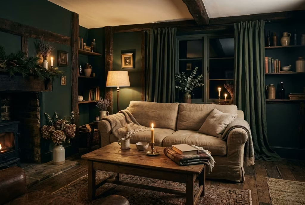
Seasonality plays a role here as well. In slower months, when daylight shortens and routines become more inward, a darker living room begins to feel less like a design choice and more like a natural extension of the way we live. The room holds warmth more convincingly. Lamplight feels purposeful rather than supplementary. Textures become more pronounced, from the weight of a wool throw to the grain of aged timber catching a low, amber glow.
From a spatial perspective, darker palettes also allow for a kind of visual editing that lighter schemes struggle to achieve. Not everything needs to compete for attention. Certain elements can sit back, others can come forward, creating a hierarchy that feels composed rather than crowded. When done well, the room does not feel styled. It feels settled, as though it has quietly evolved over time.
I have found, across multiple residential projects, that introducing darker tones often changes not just how a room looks, but how it is used. People gravitate towards it differently. They sit longer. They read more. Conversations tend to stretch, almost without noticing. There is a sense of ease that emerges, as if the room itself is doing some of the work, taking the edge off the day.
Personally, I’ve found that darker palettes tend to soften a space emotionally, almost like lowering the volume in a room. The visual noise reduces. The atmosphere steadies. What remains is something far more considered, far more human. And in a living room, that shift, quiet but unmistakable, is what turns a designed space into one that truly supports everyday life.
Understanding the Dark Cottagecore Palette
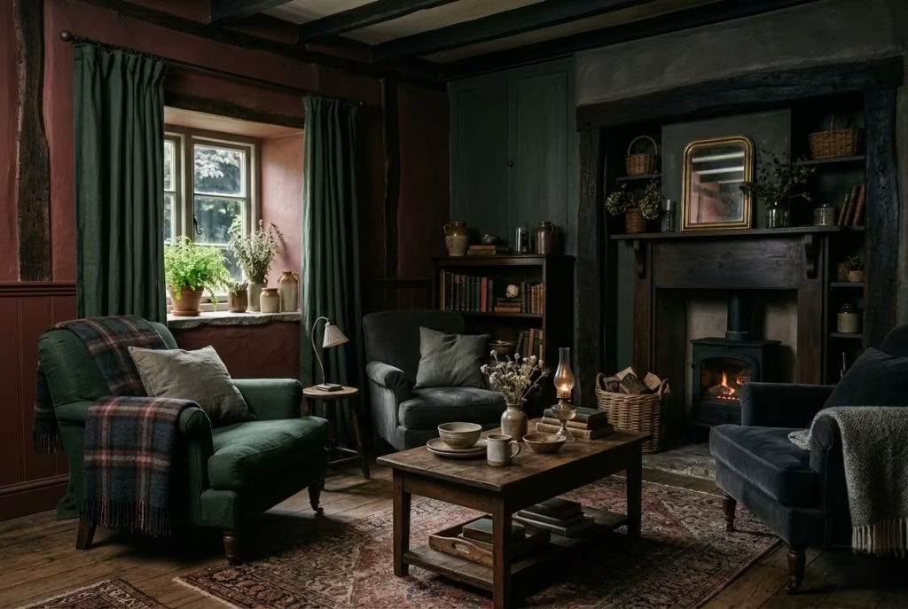
Dark cottagecore is not simply about choosing darker paint. It is about constructing a palette that feels layered, grounded, and quietly expressive, where each tone carries weight and each material earns its place. Done well, it reads less like a colour scheme and more like an atmosphere that has settled into the room over time.
What I often tell clients, especially those hesitant about going darker, is this: the success of these interiors rarely hinges on how dark you go, but on how thoughtfully you build depth. A flat, one-note approach can feel lifeless, almost like a curtain drawn too tightly. But introduce nuance, and the space begins to breathe.
Beyond Black: Building Depth Through Tone
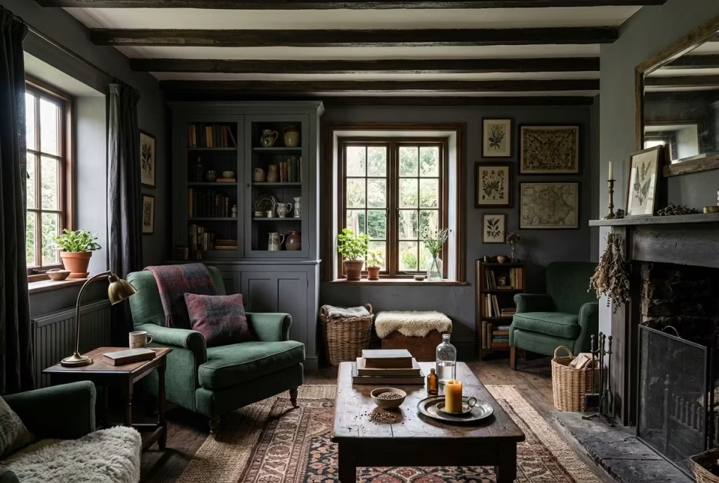
One of the most common missteps is defaulting straight to black, assuming it delivers instant drama. In reality, black can feel abrupt if it is not carefully moderated. Dark cottagecore, at its best, leans into complexity rather than stark contrast. It prefers tones that feel lived-in, slightly softened, as though they have been shaped by time rather than applied in a single stroke.
Deep forest greens, for instance, carry a natural familiarity. They echo the landscape, grounding the room without making it feel enclosed. Umber, with its earthy undertones, introduces warmth that stops the palette from tipping into coldness. Charcoal sits somewhere in between, offering depth without the severity of pure black. Then there are richer accents like oxblood or aged navy, colours that feel almost storied, adding a quiet sense of drama without shouting for attention.
The key lies in tonal layering. Instead of relying on a single dark shade across walls, joinery, and furnishings, I prefer to work within a narrow tonal range, shifting subtly from one surface to another. A wall might sit in a softened charcoal, while cabinetry leans towards a deeper, cooler grey. Upholstery could introduce a muted green, catching the light differently depending on the time of day.
This kind of layering does something quite remarkable. It prevents the room from feeling static. As natural light shifts, the palette reveals different facets of itself, almost like a landscape changing under passing clouds. It keeps the eye moving, gently but deliberately, so the space never feels flat or predictable.
In one project, I worked with three variations of deep green within the same living room. On paper, the difference looked negligible. In reality, it created a richness that a single tone simply could not achieve. The room felt cohesive, but never monotonous, like a well-composed piece of music where no single note dominates.
Materiality Over Colour
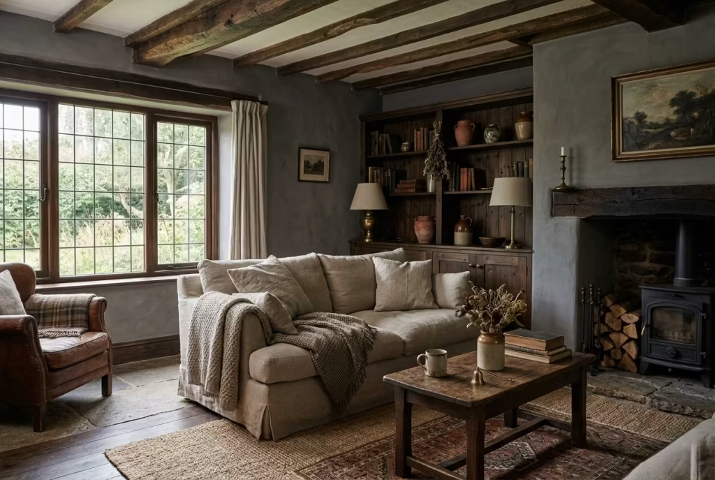
If tone sets the foundation, materiality is what gives the space its soul. In dark cottagecore interiors, colour alone cannot carry the scheme. Without texture, darker palettes risk feeling heavy-handed, as though the room is trying too hard to make a point. It is the interplay of materials that softens that effect, introducing variation, tactility, and a sense of quiet authenticity.
Timber is often where I begin. Not the polished, uniform finishes you might associate with newer builds, but something with grain, knots, and a bit of irregularity. A slightly aged oak or a deeper-stained pine brings warmth that cuts through the density of darker walls. It acts as a visual anchor, steady and reassuring.
Then come the softer layers. Linen, particularly when slightly rumpled rather than crisply pressed, has a way of catching light that feels almost effortless. It diffuses rather than reflects, softening edges and adding a relaxed quality to the space. Wool, whether in throws or upholstery, introduces depth through its density. It absorbs light in a way that makes colours appear richer, more grounded.
Aged metals, such as brass or bronze, add another dimension entirely. Their muted sheen, neither too reflective nor too dull, creates small moments of contrast that keep the palette from feeling too matte. Used sparingly, perhaps in a lamp base or hardware detail, they act like punctuation marks within the room, subtle but essential.
What becomes clear, the longer you sit with these spaces, is that texture does the heavy lifting. It creates interest where colour remains restrained. It invites touch, not just observation. And perhaps most importantly, it allows darker interiors to feel layered rather than loaded.
I’ve seen rooms where the colour palette was technically sound, but the materials were too uniform, too smooth, too controlled. The result felt flat, almost like a photograph rather than a lived space. By contrast, when materials vary in texture and finish, even a limited palette begins to feel expansive.
In practical terms, this means resisting the urge to match everything too closely. Let the timber feel slightly warmer than the floor. Allow fabrics to sit in different weights and weaves. Introduce metals that have aged, just enough to take the edge off their shine. It is in these small deviations, almost unnoticed at first glance, that the room finds its rhythm.
And that, ultimately, is what defines a successful dark cottagecore palette. Not darkness for its own sake, but a careful orchestration of tone and texture, working together to create a space that feels composed, grounded, and quietly alive.
Spatial Planning Before Styling
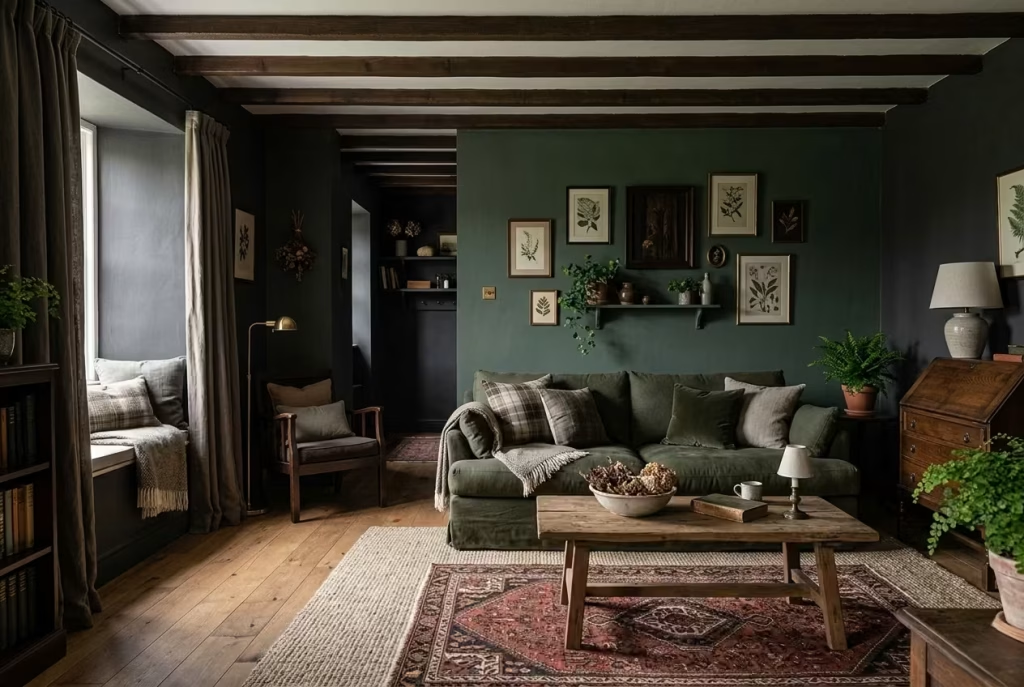
Before a single cushion is placed or a colour is committed to the walls, the success of a dark cottagecore living room is decided quietly, almost invisibly, through spatial planning. Styling can enhance a room, certainly, but it cannot rescue a layout that feels unresolved. In darker interiors, this becomes even more pronounced. Every misalignment, every awkward gap, every congested corner carries more visual weight, as though the room is holding onto it rather than letting it pass.
What I have learned over time is that darkness does not forgive poor planning. It amplifies it. But when the layout is considered, measured, and allowed to breathe, darker palettes begin to feel effortless, almost inevitable.
Why Layout Matters More in Dark Interiors
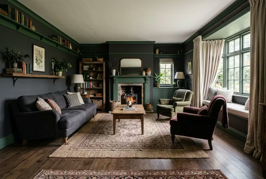
In lighter schemes, there is often a margin for error. Light reflects, edges blur, and the eye tends to skim rather than settle. Dark interiors behave differently. They slow everything down. The eye lingers longer, picking up on proportion, spacing, and alignment in a way that is difficult to ignore.
A poorly arranged room, when wrapped in darker tones, can feel immediately heavier, almost as if the walls have edged closer overnight. Furniture pushed too tightly together creates pockets of visual congestion. Circulation routes that are unclear or obstructed disrupt the flow, making the space feel smaller than it is. It is the difference between a room that invites you in and one that quietly asks you to move along.
Keeping circulation clear is not just a technical exercise; it is what allows the room to function intuitively. I typically aim for walkways of at least 750 mm to 900 mm (30 to 36 inches), enough to move comfortably without brushing past furniture. In smaller living rooms, this might tighten slightly, but the principle remains the same: movement should feel natural, not negotiated.
Equally important is the positioning of key pieces. In darker settings, furniture benefits from being arranged with intention rather than defaulting to perimeter placement. The instinct to push everything against the walls, in an attempt to create space, often backfires. It leaves the centre underdefined and the edges overly burdened, creating a kind of visual imbalance that feels difficult to settle into.
Zoning for Comfort
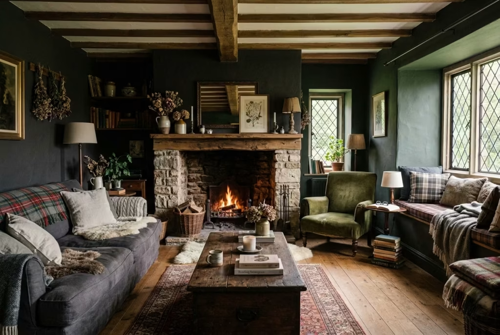
A well-planned dark cottagecore living room does not function as a single, undifferentiated space. Instead, it unfolds in layers, each area serving a distinct purpose while remaining visually connected. This is where zoning becomes essential, not in a rigid or overly structured way, but as a gentle organisation of how the room is used.
Reading corners are often the most natural starting point. Tucked slightly away from the main seating area, they offer a sense of retreat within the room itself. A comfortable chair, positioned near a window or a secondary light source, paired with a small side table, is often enough. The key is proportion. Allowing around 800 mm to 1 metre (31 to 39 inches) of clearance around the chair ensures it feels intentional rather than squeezed in as an afterthought.
The hearth, whether functional or purely decorative, typically becomes the emotional anchor of the space. In darker interiors, this focal point carries even more significance. Seating arranged to acknowledge it, rather than turning away, creates a sense of cohesion. The room begins to orient itself naturally, almost as though everything is quietly drawn towards that central point.
Window seating introduces another layer entirely. In cottage-inspired interiors, it brings a softness that balances the depth of the palette. A built-in bench with a depth of around 450 to 500 mm (18 to 20 inches) allows for comfortable seating without encroaching too far into the room. When paired with layered textiles, it becomes a place that invites pause, whether for reading, conversation, or simply watching the light shift outside.
What ties these zones together is not strict separation, but a sense of flow. Each area should feel connected, with transitions that are subtle rather than abrupt. Rugs, lighting, and furniture placement can all help define these spaces without resorting to obvious division. It is a bit like threading a needle. Done carefully, everything aligns. Done hastily, the whole composition begins to unravel.
Real-World Insight
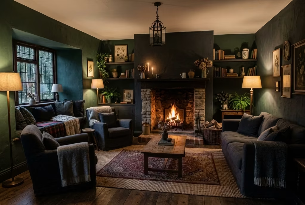
In one project, I was working with a living room that felt unexpectedly heavy, despite having good proportions and generous natural light. The palette was not the issue. The materials were well chosen. But something about the space felt static, as though it was holding its breath.
The solution, as it turned out, was deceptively simple. We pulled the main furniture pieces just 150 mm (6 inches) away from the walls. It was a small adjustment on paper, barely noticeable in plan. But in reality, it changed the entire atmosphere of the room.
By introducing that slight gap, shadows were allowed to sit behind the furniture rather than being compressed around it. The walls felt less burdened. The room gained a sense of depth that had been missing, almost as if it had exhaled. It is a reminder that sometimes, the difference between a room that feels heavy and one that feels composed lies in the smallest of shifts.
Spatial planning, in this context, is not about rigid rules or perfect symmetry. It is about reading the room carefully, understanding how it wants to function, and making adjustments that allow it to do so with ease. When that foundation is right, everything that follows, colour, texture, styling, falls into place with far less effort.
You May also Like: Why Modern Organic Living Rooms Feel So Warm, Calm, and Inviting
25 Dark Cottagecore Living Room Ideas
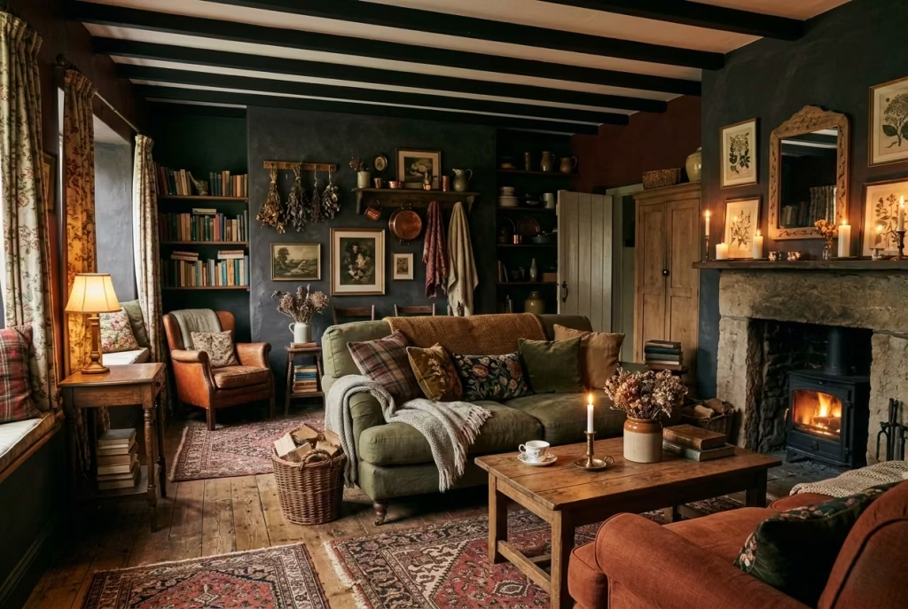
Once the spatial groundwork is resolved and the palette feels anchored, the room begins to open up creatively. This is where dark cottagecore truly comes into its own, not through grand gestures, but through a series of considered moves that quietly build character over time. Each idea that follows is not meant to be applied in isolation, but rather layered, adjusted, and interpreted to suit the nuances of a real home. Think of them less as a checklist and more as a collection of cues, each one offering a way to deepen the atmosphere, refine comfort, and bring a sense of lived-in richness to the space.
Deep Forest Green Walls with Aged Timber Contrast
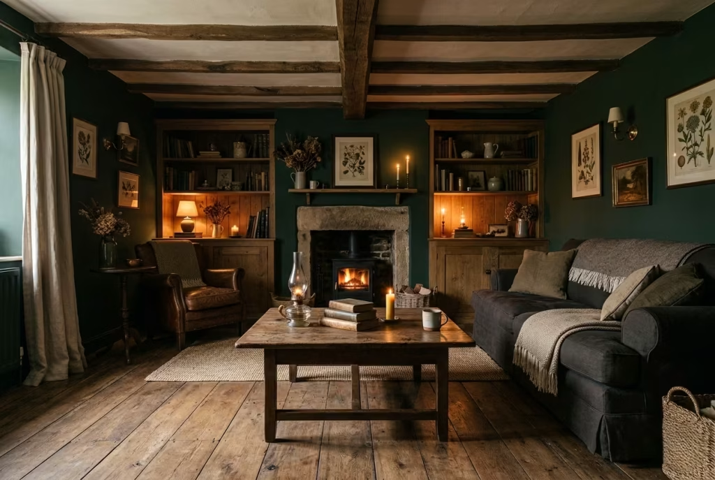
Deep forest green has a way of settling into a room rather than sitting on top of it. It feels anchored, almost as if it belongs to the structure itself, which is precisely why it works so well in cottagecore interiors that lean towards authenticity rather than decoration. Unlike harsher dark tones, green carries a natural softness. It absorbs light gently, softening edges and allowing the room to feel enclosed without tipping into heaviness.
What makes this approach particularly effective is the contrast with aged timber. Left on its own, a dark wall can feel a touch too composed, almost overly controlled. Introduce timber with visible grain, slight tonal variation, and a hint of wear, and suddenly the space loosens up. The two elements begin to play off each other, one grounding the room, the other lifting it just enough to keep things from feeling weighed down.
It is a bit like walking into an old countryside home where the walls have deepened over time, while the wooden elements, beams, floors, furniture, carry the quiet story of daily use. Nothing feels staged. Everything feels settled.
Real-Life Application: Letting the Room Find Its Balance
In one living room I worked on, the ceiling height was just over 2.5 metres (around 8.2 feet), which gave us enough vertical breathing room to go darker without compressing the space. We used a deep, slightly muted forest green across all four walls, avoiding feature walls altogether. That decision alone made the room feel more cohesive, almost wrapped in a single, continuous tone.
The initial concern from the homeowner was that it might feel too enclosed, especially during winter months. But once we introduced aged oak elements, a reclaimed coffee table, lightly weathered shelving, and a floor with visible knots and tonal shifts, the atmosphere changed entirely. The timber caught what little light entered the room and reflected it back in a softer, warmer way.
What stood out most was how the room behaved in the evening. Under lamplight, the green receded just enough, while the timber came forward, creating a layered effect that felt calm but not flat. It is that push and pull, almost like a quiet conversation between materials, that makes this pairing so enduring.
Measurements and Proportion: Getting the Balance Right
For this approach to work comfortably, ceiling height plays a quiet but important role. Rooms with a height of at least 2.4 metres (8 feet) tend to handle darker wall colours more gracefully, as there is enough vertical space for the eye to move without feeling compressed.
When introducing timber elements, proportion matters just as much as material choice. For example:
- A coffee table in aged timber typically works well at around 400–450 mm (16–18 inches) in height, keeping it visually grounded without interrupting sightlines
- Shelving units or cabinetry should avoid full-height uniformity. Breaking them at around 1.8–2 metres (6–6.5 feet) can prevent the timber from feeling too dominant against the darker walls
Flooring, if in timber, benefits from wider planks, ideally 150–200 mm (6–8 inches), as they allow the grain to read more clearly, adding to the layered effect rather than appearing busy.
Pros and Cons: A Measured Perspective
One of the most compelling advantages of this combination is its ability to feel both intimate and expansive at the same time. The dark green creates a cocooning effect, while the timber introduces enough variation to keep the space from closing in. It is a delicate balance, but when struck correctly, it feels effortless, as though the room has always existed this way.
There is also a longevity to this palette. Unlike trend-driven colour choices, deep greens and natural timber tend to age well, both visually and materially. They gather character rather than losing relevance, which is something I always consider in living spaces designed for long-term use.
That said, it is not without its considerations. In rooms with limited natural light or lower ceilings, this combination can feel a touch too dense if not carefully moderated. In such cases, introducing lighter textiles, or even softening the green slightly towards an olive or moss tone, can help ease the intensity.
Another point worth noting is maintenance. Dark walls, particularly in matte finishes, can show marks more readily, while aged timber, depending on its finish, may require occasional care to retain its character without looking neglected.
When approached with a steady hand, deep forest green paired with aged timber does more than define a colour scheme. It sets a tone for the entire room, one that feels grounded, quietly confident, and, above all, deeply liveable. It is not the kind of space that demands attention the moment you walk in. Instead, it reveals itself slowly, rewarding those who take the time to sit, to look, and to stay a little longer.
You May also Like: Living Room Furniture Essentials: Designing for Comfort, Character, and Everyday Living
Layered Antique Rugs Over Dark Floorboards
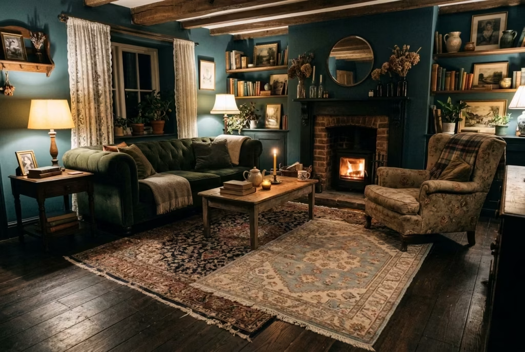
Dark floorboards, whether stained oak, smoked timber, or aged pine, provide a strong visual base. They ground the room, yes, but on their own they can feel a touch austere, almost too composed underfoot. This is where layered antique rugs come in, not as decoration, but as a necessary counterbalance.
The idea is not to cover the floor entirely, but to break it deliberately. A single rug can define a zone, but layering introduces a sense of time and tactility, as though the room has evolved rather than been assembled in one go. Slight overlaps, edges that do not align perfectly, and variations in pattern all contribute to a space that feels collected, not curated to the point of sterility.
Antique rugs, in particular, bring a kind of visual softness that newer pieces often lack. Their faded dyes, irregular wear, and slightly muted palettes sit comfortably against darker floors. They do not fight for attention. Instead, they settle in, like they have found their place after a long journey.
Real-Life Application: Letting Imperfection Do the Work
In a townhouse project with dark-stained oak floors, the initial instinct was to introduce one large statement rug. It did the job functionally, anchoring the seating area, but the room still felt a little too “finished,” almost as if it had been paused mid-thought.
We shifted approach and introduced a second, smaller antique rug, slightly offset rather than centred. The overlap was subtle, no more than 200–300 mm (8–12 inches), but the effect was immediate. The space loosened. It began to feel more relaxed, less rigid, as though it had been lived in for years rather than recently completed.
What I noticed most was how people interacted with the room afterwards. Shoes came off without hesitation. People instinctively gravitated towards the softer zones, settling in rather than perching. It is one of those quiet shifts that is easy to overlook but makes all the difference in daily use.
Measurements and Placement: Anchoring Without Overcrowding
Scale is everything here. For the main seating area, a rug should ideally be no smaller than 240 x 300 cm (8 x 10 ft). This allows at least the front legs of sofas and chairs to sit comfortably on the rug, anchoring the arrangement without making it feel disconnected.
When layering, the secondary rug should be smaller, typically in the range of 120 x 180 cm to 160 x 230 cm (4 x 6 ft to 5 x 7.5 ft). The key is proportion rather than symmetry. Allowing the top rug to sit slightly off-centre creates a more relaxed composition, avoiding the sense that everything has been too carefully aligned.
Spacing around the rug also matters. Ideally, leave a border of 300–500 mm (12–20 inches) of visible floor around the main rug. This ensures the dark floorboards still play a role, acting as a frame rather than disappearing entirely.
Underfoot, layering works best when there is a subtle variation in pile height or texture. A flatter base rug paired with a slightly thicker or more worn top layer creates depth without becoming cumbersome.
Pros and Cons: A Balanced Perspective
The strength of this approach lies in its ability to introduce warmth without diluting the depth of the room. Dark floorboards can sometimes feel a little too crisp, especially in newly finished spaces. Layered rugs soften that edge, both visually and physically, making the room feel more approachable, more human.
There is also a narrative quality to antique rugs that is difficult to replicate. Their imperfections, faded areas, slight irregularities, add character in a way that feels genuine rather than applied. It is the difference between something that looks aged and something that is aged.
However, layering does require a careful hand. Too many rugs, or overly bold patterns competing for attention, can tip the balance into visual clutter. The room can start to feel busy, almost restless, which works against the calm, cocooned atmosphere that dark cottagecore aims to achieve.
Practicality is another consideration. Multiple rugs mean more maintenance, particularly in high-traffic areas. Edges need to be secured properly to avoid movement, especially when layering over smooth timber floors.
When done with restraint, layered antique rugs transform dark flooring from a static base into something far more dynamic. They introduce warmth, soften acoustics, and add a sense of history that cannot be manufactured overnight. It is a quiet layering, almost like adding depth to a story, one piece at a time, until the room feels complete without ever feeling overworked.
Low, Overstuffed Sofas in Washed Linen
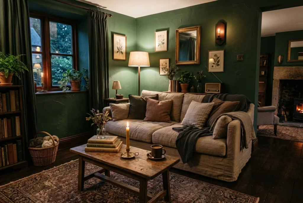
In dark cottagecore living rooms, comfort is never a mere afterthought, it is the pulse that keeps the space alive. Low, overstuffed sofas in washed linen epitomize this ethos. Their unhurried proportions invite sinking in, stretching out, and settling without ceremony. Unlike formal seating that demands posture, these sofas encourage life as it naturally unfolds: a Sunday morning with coffee in hand, a quiet evening reading by lamplight, or long conversations that seem to ripple through the room without any effort.
Washed linen, slightly textured and softly faded, adds a lived-in quality that complements darker palettes beautifully. The material absorbs light in subtle ways, creating a gentle contrast against deep wall tones without starkness. It feels tactile under the fingertips, not stiff or polished, reinforcing that sense of quiet, approachable luxury that dark cottagecore interiors excel at.
Real-Life Application: Designing for Everyday Use
In a project for a client seeking a retreat-like living room, we selected a low-profile sofa with a seat height of 40–45 cm (16–18 inches). The goal was simple: to slow down the body and mind the moment you sat down. Paired with overstuffed cushions in complementary muted tones, the seating became an invitation to linger.
We arranged the sofa slightly away from the wall, allowing shadows to play behind it, enhancing depth and preventing the room from feeling constricted. The effect was almost cinematic: each time you entered, the room seemed to exhale, welcoming you in. Over the months, the client reported a noticeable shift in how the living room was used. Weeknights became more relaxed, weekend mornings were spent sprawled with books and blankets, and the sofa quickly became the nucleus of daily life.
Measurements and Proportion: Getting Comfort Right
Proportion is key to achieving both comfort and visual harmony. Low seating works best when the sofa’s depth is generous, ideally 90–100 cm (35–39 inches), allowing for comfortable lounging without spilling into circulation paths. Overstuffed back cushions should support the spine while still maintaining softness, and arm heights around 60–65 cm (24–26 inches) keep the overall silhouette grounded and approachable rather than looming.
Pairing the sofa with a slightly lower coffee table, around 35–40 cm (14–16 inches) high, preserves the sense of ease and encourages items like mugs, books, or candles to remain within effortless reach, reinforcing the lived-in, leisurely quality of the space.
Pros and Cons: Comfort Meets Character
The biggest advantage of low, overstuffed linen sofas is their ability to make a room feel human rather than styled. They bring softness and tactility to a space that can otherwise feel heavy with dark walls, timber, and layered textures. Linen ages beautifully, acquiring subtle creases and faded edges that enhance the cottagecore narrative over time.
On the flip side, low seating may not suit every body type or household. Taller individuals may find the seat slightly lower than typical sofas, and while linen is durable, it does show wear, spills, or stains more readily than heavier fabrics. Strategic cushion placement and thoughtful maintenance, however, can mitigate these concerns without compromising aesthetic or comfort.
Low, overstuffed sofas in washed linen do more than provide a place to sit; they orchestrate how the room is inhabited. They make lounging feel natural, slow the pace, and reinforce the quietly luxurious yet approachable character of a dark cottagecore living room. It is the kind of seating that encourages presence, where every stretch, slump, or sprawl is part of the room’s evolving story.
Candlelight as a Primary Evening Layer
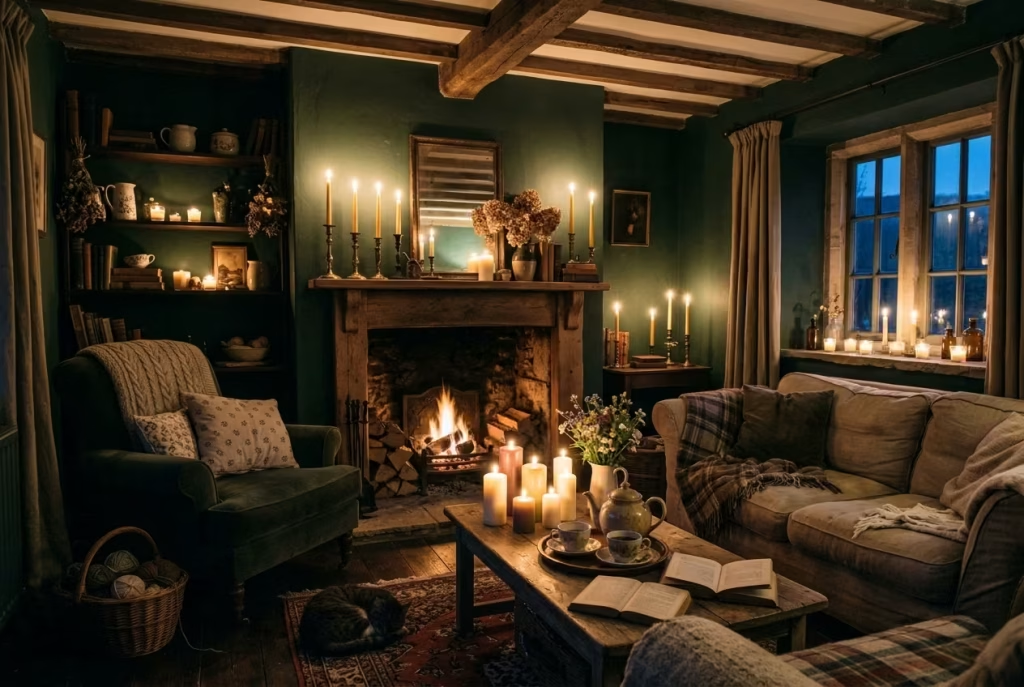
In a dark cottagecore living room, light is not merely functional; it is a character in its own right. Candlelight, when positioned thoughtfully, transforms a space from static to alive. Unlike overhead fixtures that can flatten textures and mute depth, the flicker of flames introduces subtle movement, shifting shadows, and a warmth that is difficult to replicate with electricity alone.
The key is grouping rather than scattering. A few well-chosen clusters of candles at varying heights create rhythm and hierarchy. Think of it as orchestrating a miniature skyline within your room: taller taper candles on mantels, medium-sized pillar candles on side tables, and a few low votives to fill in shadows. The eye is drawn naturally across these layers, creating visual interest while softening the darker tones of walls, textiles, and timber.
Candlelight also invites a kind of intimacy that overhead lighting struggles to achieve. In this light, a room does not merely look dark; it feels contained, private, and slow, encouraging presence rather than activity. It encourages the room’s inhabitants to lean back, stretch out, or settle into corners previously overlooked.
Real-Life Application: How Shadow Shapes Experience
In a project set in a converted country cottage, the clients initially relied on wall sconces and a central chandelier. The room, rich with deep green walls and dark oak floors, felt static in the evening; shadows pooled awkwardly in corners and timber surfaces looked flat under uniform lighting.
We introduced candle clusters in three heights around the room: tall taper candles on the mantelpiece, medium-sized pillar candles on a coffee table, and low votives along a window ledge. Even a few candles on the open shelves brought unexpected movement. Almost immediately, the atmosphere shifted. The walls softened, timber glimmered in flickers, and corners seemed to breathe instead of recede. The living room became more than a space; it became a stage for evening rituals, whether reading, sipping tea, or enjoying quiet conversation.
Measurements and Placement: The Subtle Rules
While candlelight is forgiving in terms of placement, a few guiding principles make all the difference:
- Group heights intentionally: Aim for three distinct levels within a cluster to avoid monotony. For instance, tall tapers around 300 mm (12 inches), medium pillars around 150–200 mm (6–8 inches), and votives around 50–75 mm (2–3 inches).
- Avoid scattering too widely: Instead of placing single candles haphazardly, focus on strategic points like a hearth, side tables, or shelving nooks. This keeps the light anchored and the room’s rhythm coherent.
- Distance from flammable materials: Ensure at least 150 mm (6 inches) from fabrics, papers, or low-hanging shelves for safety, without isolating the candle visually from the furniture or wall it complements.
Layering multiple clusters rather than relying on a single centerpiece ensures the room feels lived-in rather than staged. Each candle’s subtle shadow interacts with the others, giving the room a constantly shifting personality.
Pros and Cons: The Art of Subtle Illumination
The primary advantage of using candlelight as an evening layer is how it animates the space. Dark walls, rich textiles, and timber surfaces all become more dimensional, nuanced, and inviting. It also fosters psychological ease: the flicker encourages slower movement, gentler conversation, and a deeper appreciation of textures and finishes.
However, there are practical considerations. Candles require supervision and maintenance, from trimming wicks to replacing burned-down pillars. Some homeowners may worry about soot or wax marks, especially on lighter fabrics. Yet these minor inconveniences are often outweighed by the emotional and sensory payoff: a room that feels alive after sunset, a space that seems to breathe with you rather than merely hold you.
Used judiciously, candlelight in a dark cottagecore living room does more than illuminate. It choreographs the evening, giving the space rhythm, intimacy, and a living quality that invites the body and mind to settle. It is the subtle heartbeat of the room, quietly asserting that darkness, when treated with care, can be not just comfortable, but profoundly alive.
Built-In Bookcases Painted in Off-Black
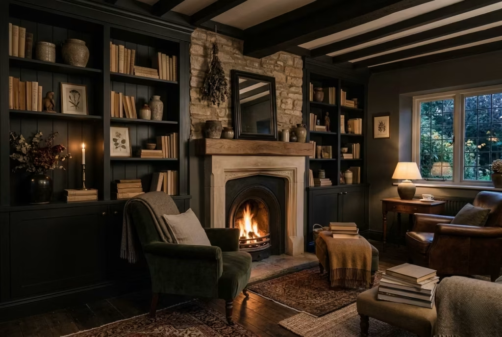
In dark cottagecore interiors, built-in bookcases do more than store books; they frame moments and add architectural texture. Painting them in an off-black tone, slightly softened from true black, allows these structures to recede just enough to feel cohesive rather than confrontational. The effect is subtle: walls, furniture, and décor blend together, while shelves gain a quiet prominence through shadow and materiality rather than colour contrast.
This approach works particularly well in alcoves, chimney breasts, or recessed nooks, turning what might otherwise be awkward spaces into focal points that feel intentional. Off-black shelves absorb light in a measured way, highlighting books, ceramics, or textiles placed upon them, and adding depth without the starkness that pure black can introduce.
Real-Life Application: Architectural Shelving That Feels Natural
In a project set within a 1920s cottage, the living room featured a deep chimney breast flanked by recessed alcoves. Initially, these areas were left white to match the walls, but the shelving felt “tacked on” and lacked character. Painting the built-ins in a soft, matte off-black immediately resolved this.
Not only did the shelves visually recede to create a sense of depth, but objects placed upon them aged ceramics, stacked linen-bound books, and small timber accents began to read as carefully curated without feeling staged. The room gained a rhythm: the eye travelled naturally from seating to shelves, to the fireplace, rather than being interrupted by stark contrasts.
Measurements and Proportion: Making It Work in Real Spaces
Built-in bookcases should respect both scale and circulation:
- Height: Typically, full-height shelving works well when ceilings exceed 2.4 metres (8 ft), giving a sense of grandeur without overwhelming the room. For lower ceilings, consider stopping 200–300 mm (8–12 inches) below the ceiling to maintain proportion.
- Depth: A standard 250–300 mm (10–12 inches) allows for books to sit comfortably without protruding, while decorative items can layer in front without cluttering.
- Spacing: Shelves spaced around 300 mm (12 inches) vertically accommodate most book sizes while keeping rhythm consistent; taller shelves can be reserved for display pieces to add variety.
Placement in alcoves or flanking a chimney breast ensures these structures act as subtle anchors, balancing seating arrangements without competing with the room’s main focal points.
Pros and Cons: Sophistication With Subtlety
The major advantage of off-black built-ins is the ability to introduce depth without visual aggression. They create quiet pockets of interest, making objects and textures stand out more vividly while keeping the overall palette harmonious. Off-black is forgiving, pairing seamlessly with both dark walls and lighter furnishings.
The potential drawback is that, in rooms with minimal natural light, off-black can feel too heavy if not balanced with reflective or lighter surfaces elsewhere, think linen cushions, aged timber, or soft rugs. Careful styling and layering of materials mitigate this, allowing the bookcases to feel integrated rather than oppressive.
When executed thoughtfully, off-black built-in bookcases become an understated hero of dark cottagecore interiors. They provide structure, texture, and visual depth, while giving the room a sense of permanence and quiet sophistication that feels entirely natural rather than orchestrated.
Heavy Linen Drapery That Pools Slightly
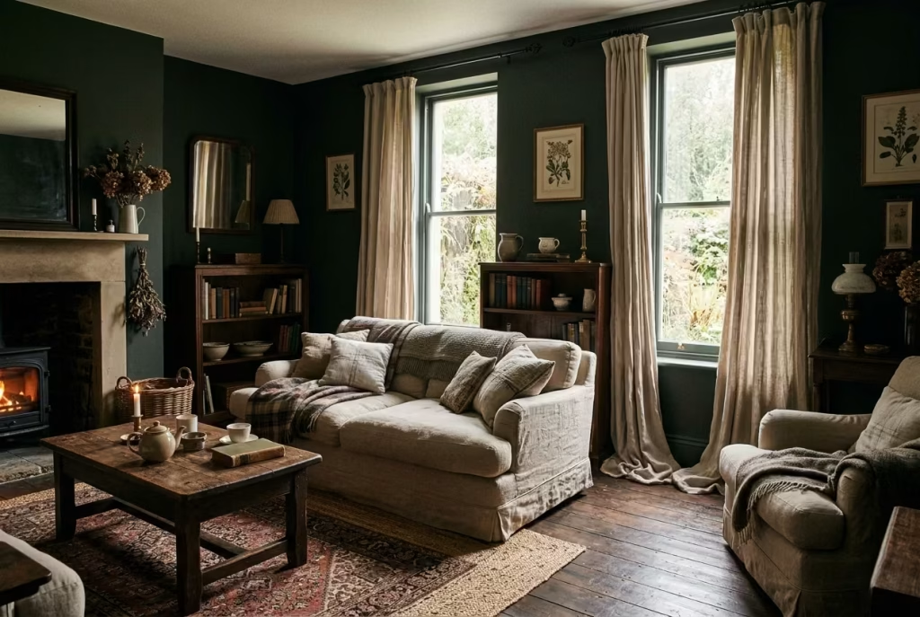
In dark cottagecore interiors, windows can easily become hard edges, breaking the cocooned, intimate atmosphere that the palette and textures strive to create. Heavy linen drapery that pools slightly at the floor is a subtle yet transformative tool. Unlike crisp, tailored curtains, the extra length allows fabric to fold naturally, softening the line between wall and floor, and introducing a sense of ease into the space.
Linen is particularly suited for this treatment. Its natural weave catches light differently throughout the day, producing gentle tonal shifts against deep wall colours. It absorbs and diffuses sunlight rather than reflecting it harshly, creating a warm, understated glow that plays beautifully with timber floors and darker palettes. The pooling effect also adds a touch of informality, reinforcing the lived-in, human quality that dark cottagecore spaces aim to achieve.
Real-Life Application: Letting Windows Breathe
In one project, the living room had high ceilings and deep, narrow windows. Initially, standard-length curtains were installed, but the space felt rigid, almost stilted, and the windows looked oddly truncated. By extending the linen panels by an extra 5–8 cm (2–3 inches) beyond the floor, the drapery began to “spill” gently, creating small, natural folds that softened the edges and visually lengthened the room.
This small adjustment had an outsized impact. The windows no longer felt like interruptions in the wall; instead, they became portals that blended with the surrounding textures. The linen, slightly textured and muted in tone, also helped modulate incoming light, preventing the dark walls from absorbing too much and leaving the room feeling oppressive. It was a quiet change that made the living room feel warmer, more inviting, and far more relaxed.
Measurements and Proportion: Ensuring a Relaxed Fall
To achieve this effect without looking careless, a few measurements are worth observing:
- Length: Add 5–8 cm (2–3 inches) beyond the floor for a natural pool. Taller extensions are possible in grand rooms, but should remain proportional to the window height to avoid overwhelming the frame.
- Width: Curtains should extend 15–20 cm (6–8 inches) beyond the window frame on each side to ensure full coverage when drawn, while leaving room for natural folds.
- Fabric Weight: Heavier linen, roughly 220–300 g/m², ensures that the panels drape elegantly without flaring or sticking to the floor unevenly.
Spacing between folds should be gentle rather than rigid. Too tight, and the effect loses its relaxed charm; too loose, and the fabric risks looking saggy or messy.
Pros and Cons: The Balance of Softness and Practicality
The main advantage of pooling linen drapery is its ability to humanise and soften a space. In rooms with dark walls, hard floor edges, and heavier furnishings, it introduces movement, texture, and tactility, making the living room feel approachable rather than solemn. It also subtly absorbs sound, reducing echo in rooms with timber or stone floors.
On the flip side, heavy linen does require care. Pools can gather dust and may need occasional shaking or laundering. In high-traffic areas, careful placement is important to prevent snagging or trailing into pathways. Despite these minor considerations, the payoff in atmosphere is substantial: windows feel like natural, relaxed extensions of the room rather than interruptions, reinforcing the layered, lived-in character that defines dark cottagecore interiors.
Heavy, pooling linen drapery is one of those understated gestures that quietly elevates a room. It frames the view, softens the architecture, and interacts with light in ways that feel entirely organic adding elegance without ceremony, depth without heaviness, and a touch of human warmth that invites lingering.
Vintage Artwork in Gilded Frames
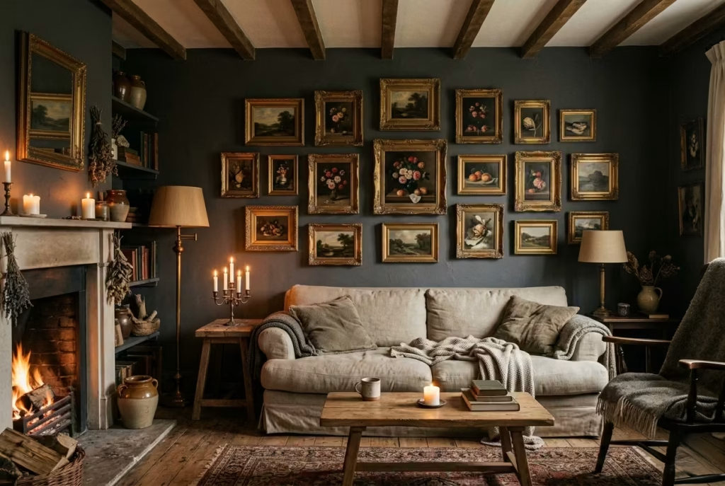
In a dark cottagecore living room, walls are more than a backdrop; they are a canvas for narrative, texture, and memory. Vintage artwork in gilded frames offers a sophisticated way to punctuate deep-hued walls while reinforcing intimacy. The subtle shimmer of gold catches light from candles or side lamps, adding dimension without overwhelming the dark palette.
Smaller pieces grouped together often create a more personal and layered effect than a single large painting. This arrangement draws the eye in, encouraging closer inspection, and fosters a sense of discovery. Each frame, with its own patina and carved detail, becomes part of the conversation, layering the room with history and personality. When combined thoughtfully, the collection acts like a mini gallery that feels curated over time rather than staged overnight.
Real-Life Application: Curating Without Overcrowding
In a 1930s cottage project, I installed a series of 5–6 smaller landscapes and still-life paintings along a chimney breast wall painted in muted charcoal. Each piece varied slightly in frame depth, gilding, and finish, but the cohesion came from spacing and thematic resonance.
By staggering the artwork in a loose cluster, the eye moved naturally across the arrangement, pausing at each detail. Guests reported feeling drawn to linger, examining textures, brushstrokes, and the subtle wear of the frames. The room became a conversation starter without the need for bold colour contrasts or large, imposing pieces. It was a lesson in restraint: intimacy comes from proximity, not size.
Measurements and Placement: Subtle Proportion Matters
- Frame Size: Smaller works typically range 30 x 40 cm (12 x 16 inches), allowing for grouping without overpowering the wall.
- Spacing: Maintain 50–75 mm (2–3 inches) between frames to ensure visual connection while preventing the cluster from feeling crowded.
- Height: Hang so the centre of the grouping sits around 145–150 cm (57–59 inches) from the floor, roughly at eye level, for a natural gaze that encourages interaction rather than passive observation.
Clusters should complement the wall scale and architectural features. For taller chimney breasts, layering frames in vertical tiers adds rhythm, whereas horizontal arrangements suit lower walls or furniture-backed surfaces.
Pros and Cons: Bringing Personality to Depth
The strength of vintage artwork lies in its ability to humanize a room steeped in dark tones. Gilded frames catch light, vintage wear adds texture, and small groupings foster intimacy rather than formality. This approach aligns perfectly with dark cottagecore’s ethos: understated luxury that feels accumulated rather than applied.
Potential challenges include ensuring that frames do not compete with each other or the surrounding décor. Overly ornate gilding against textured walls can feel fussy if not balanced with the room’s other materials. Additionally, smaller pieces require careful curation: too many, and the wall feels busy; too few, and the effect is lost.
Vintage artwork in gilded frames is a quiet storyteller. Each piece offers a whisper of history, each frame reflects light like a memory caught in time, and together they create a living dialogue with the room. When grouped thoughtfully, they invite engagement, reward close observation, and layer warmth and personality over the dark, textural foundation of a cottagecore living room.
You May also Like: 21 Minimalist Living Room Ideas That Make Your Home Feel Calm and Chic
A Central Fireplace as Emotional Anchor
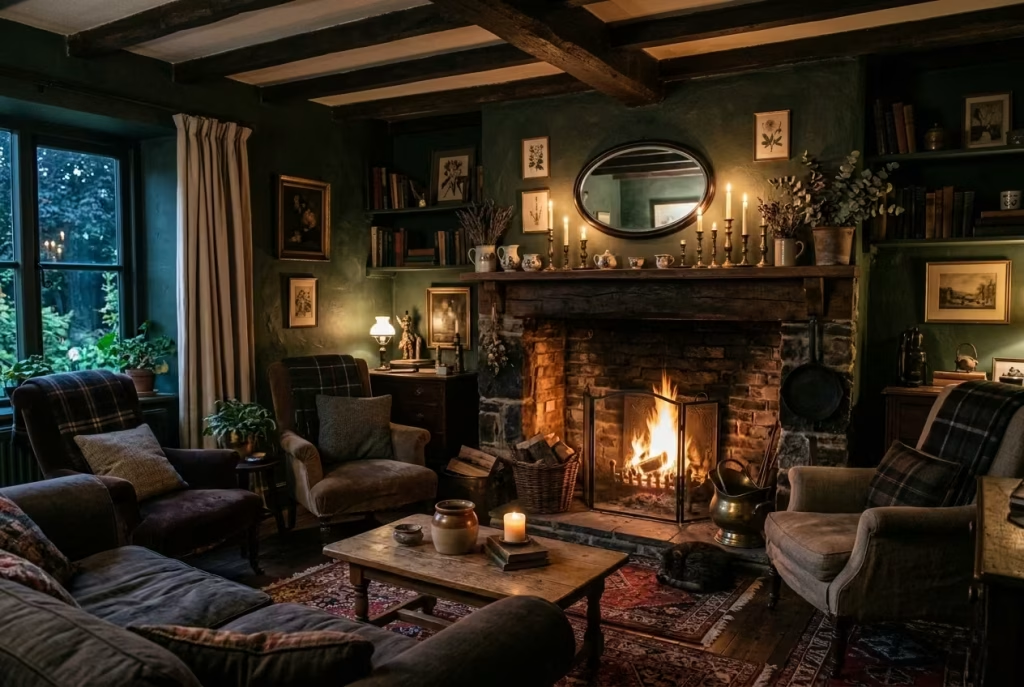
In a dark cottagecore living room, a central fireplace does more than provide warmth; it sets the emotional rhythm of the space. Even a non-working fireplace can serve as an anchor, giving the room a natural focal point around which furniture, lighting, and décor flow. It signals a place to gather, a pause in movement, and a spot where rituals reading, sipping tea, or evening conversations naturally unfold.
Fireplaces bring a tactile and visual weight that balances darker walls, rich textiles, and layered textures. The mantel itself becomes a stage for personal objects: small vintage ceramics, candles, or framed artworks. By emphasizing proportion, material, and placement, the fireplace can read as intentional rather than decorative, reinforcing the sense that the room has evolved over time rather than being constructed all at once.
Real-Life Application: Positioning for Presence
In one of my projects, the client had a charming 18th-century chimney breast but no functional hearth. Rather than remove it or leave it as filler, we treated it as the central emotional anchor. The mantel was styled with a combination of small potted plants, antique candlesticks, and a low-profile mirror to reflect light, while seating was arranged to create an embrace around the space.
The difference was remarkable. Despite the absence of fire, the room felt grounded, intentional, and welcoming. Guests naturally gravitated toward the seating in front of the fireplace, and the space quickly became the living room’s most used zone proof that a fireplace’s influence goes beyond heat and flame.
Measurements and Placement: Proportion and Balance
- Mantel Height: Ideally 120–130 cm (47–51 inches) from floor to mantel shelf. This provides visual prominence without overwhelming the room or obstructing sightlines.
- Hearth Depth: A depth of 30–40 cm (12–16 inches) is sufficient for placing decorative elements while keeping circulation clear.
- Surround Width: The mantle should extend slightly beyond the hearth, roughly 10–15 cm (4–6 inches) on either side, to give balance and allow for symmetrical styling.
Furniture placement should respect the fireplace as the anchor. Sofas and chairs are best arranged within 2–3 metres (6–10 feet) to foster conversation and intimacy without crowding the room. A coffee table placed at 40–45 cm (16–18 inches) height complements the low seating and maintains a visual flow toward the hearth.
Pros and Cons: Emotional Gravity Versus Flexibility
The strength of a central fireplace lies in its ability to create cohesion, rhythm, and emotional resonance. It provides a grounding point for design, encourages thoughtful furniture placement, and adds narrative depth even in rooms where it does not function as a heat source.
However, there are practical considerations. Non-working fireplaces may require styling to avoid looking hollow or underutilized. Proportion is critical; an overly tall or wide mantel can dominate a smaller room, while too small a fireplace risks disappearing against dark walls. Thoughtful material choices and careful styling ensure the fireplace reads as intentional, a quietly commanding presence without competing with the room’s layered textures or furnishings.
A central fireplace in a dark cottagecore living room acts as more than architecture; it is emotional gravity. It organizes the space, gives purpose to circulation, and quietly dictates the rhythm of daily life, turning the room from merely dark and cozy into a space with heart, memory, and presence.
Dark Botanical Prints and Pressed Florals
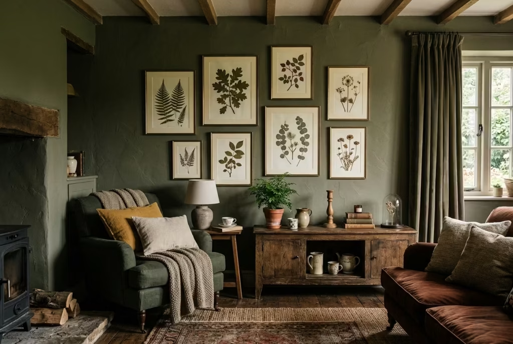
Dark botanical prints and pressed florals are one of those details that can quietly transform a living room without ever stealing the show. In a dark cottagecore scheme, they work because they keep the room tethered to nature. That matters. Without something organic in the mix, a darker palette can drift into looking overly composed, almost too polished for its own good. Botanicals bring the scheme back down to earth.
What makes this approach so effective is its restraint. You are not trying to create a themed room with vines at every turn or florals shouting from every surface. Instead, the idea is to nod to the garden, the hedgerow, the woodland floor, and let those references sit gently within the room. A dark background, whether that is charcoal paper, deep green walls, or an off-black frame, gives botanical imagery more presence. The plants and flowers do not look decorative for the sake of it. They look considered, almost collected.
Pressed florals, in particular, carry a quiet poetry. Their flattened forms, delicate stems, and softened colours feel like something preserved from another season. They have a slightly timeworn quality that sits beautifully beside aged timber, linen, and worn leather. It is a bit like finding a page in an old notebook and discovering a memory tucked between the lines.
Real-Life Application: Using Botany as Mood, Not Ornament
In one country house living room, I introduced a small series of framed pressed ferns and dried seed heads above a low sideboard. The room already had deep olive walls and a dark oak floor, so the botanical pieces needed to support the atmosphere rather than interrupt it. We kept the frames simple, with slightly aged brass edges and warm ivory mounts, allowing the specimens themselves to do the talking.
That decision changed the room in a subtle but important way. It stopped the space from feeling too dependent on furniture and textiles alone. The wall gained a sense of story. Guests noticed the pieces, but only after settling in, which is exactly how these details should behave. They should reward a second look, not demand the first.
I have also found that botanical prints work especially well in rooms that have little in the way of actual greenery. In winter, when gardens are stripped back and windows show more grey than green, those botanical references keep the room feeling alive. They act almost like an echo of the landscape outside, which can be surprisingly grounding.
Measurements and Placement: Keeping It Light, Not Overworked
Botanical artwork tends to work best when it is scaled to the furniture below it, rather than trying to dominate the wall.
For framed prints above a sideboard or console, a good rule is to keep the artwork width to around two-thirds to three-quarters of the furniture below. For example, if a sideboard is 180 cm wide (71 inches), artwork spanning roughly 120 to 140 cm (47 to 55 inches) often feels balanced.
For grouped pressed florals, smaller frames around 30 x 40 cm to 40 x 50 cm (12 x 16 inches to 16 x 20 inches) tend to work well. Leave 5 to 8 cm (2 to 3 inches) between frames in a cluster so the arrangement feels connected but not cramped.
Hang the centre of the grouping at around 145 cm (57 inches) from the floor, or slightly lower if it is positioned above furniture. In darker rooms, hanging artwork a little lower than expected can make the space feel more intimate and rooted, rather than floating away from the rest of the scheme.
If you are using actual pressed florals rather than prints, it helps to choose specimens with some structural clarity. Ferns, seed heads, sprigs, and leafy stems usually read best because their forms remain legible even in low light. Overly delicate blooms can disappear into the background if the room is quite dark.
Pros and Cons: A Quietly Grounding Gesture
The biggest strength of dark botanical prints and pressed florals is their ability to keep a room from feeling sealed off from the natural world. They introduce softness, movement, and memory without disturbing the deeper tones of the palette. They also have a timeless quality. A good botanical print does not age out easily. It tends to settle in and become part of the room’s fabric.
Another advantage is versatility. These pieces can be classical or contemporary, formal or relaxed, depending on the frame, paper tone, and subject matter. That makes them easy to layer into spaces that are already carrying a lot of texture.
The main caution is overuse. Too many botanical motifs can tip the room into looking overly literal, as though the nature reference has been laid on a bit too thick. The trick is to treat them like seasoning rather than the main dish. A few well-placed pieces usually carry more weight than a wall full of busy imagery.
There is also the question of light. In very dark rooms, botanical details can get lost if the contrast is too low. That is where mount colour, frame finish, and placement become important. A slightly lighter mount or a frame with a subtle metallic edge can help the artwork hold its own without becoming flashy.
Dark botanical prints and pressed florals work because they bring a room back to its roots, quite literally. They give dark cottages a sense of place, adding a note of quiet life to all that depth and shadow. Done well, they feel neither trendy nor contrived. They feel like they belong, which is often the whole game in a room like this.
Exposed Wooden Beams Left Untreated or Oiled
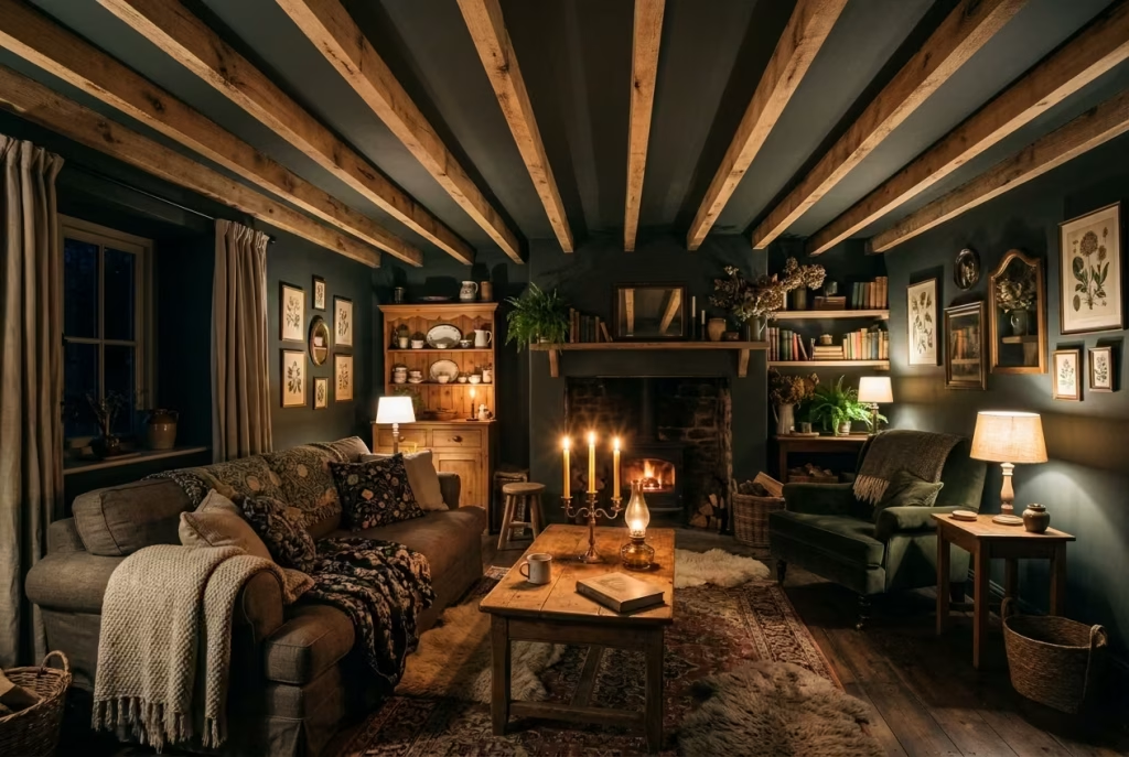
In dark cottagecore interiors, exposed wooden beams do more than support a ceiling; they anchor a room in history and material truth. Leaving beams untreated or simply oiled allows their natural grain, knots, and imperfections to speak, adding weight and authenticity to the space. This approach aligns perfectly with cottagecore’s celebration of the imperfect, the tactile, and the lived-in.
Untreated or lightly oiled beams interact beautifully with deep wall colours and layered textures. They catch candlelight and lamp glow differently throughout the day, creating subtle shadow play that enhances spatial depth. A dark ceiling without architectural variation can feel heavy or oppressive; beams break that uniformity, adding rhythm and scale while reinforcing the intimacy of a low-lit, cosy interior.
Real-Life Application: Letting Beams Speak for Themselves
In one project, a 17th-century converted barn had beams originally painted white during a previous renovation. The room felt bright but flattened the timber’s texture and natural colour were lost. We stripped the paint and applied a light coat of natural oil, leaving the surface raw yet protected.
The difference was immediate. The beams no longer competed with the dark walls; instead, they framed the ceiling, drawing the eye upward while adding tactile richness. The room gained an almost cinematic quality: shadows shifted across timber ridges as sunlight passed through the windows, and candlelight accentuated the natural grain in a way artificial finishes could never replicate. The beams became a quiet storyteller, connecting the living space to its history and material essence.
Measurements and Placement: Proportion and Scale
- Beam Size: Beams should feel proportionate to ceiling height. For ceilings around 2.4 — 2.7 m (8–9 ft), beams 150–200 mm (6–8 inches) wide maintain visual weight without overwhelming the room. Wider beams work beautifully in vaulted or double-height spaces.
- Spacing: Maintain consistent spacing along the ceiling for rhythm. 400–600 mm (16–24 inches) between beams works in standard rooms, but spacing can vary slightly to suit the structural logic of the space.
- Height Considerations: In rooms with lower ceilings, keeping beams slightly darker than walls can visually lower the ceiling subtly, adding intimacy without causing the space to feel cramped.
Pros and Cons: Authenticity Versus Practicality
The primary advantage of untreated or oiled beams is authenticity. They give a room history, texture, and an unmistakable cottagecore character. They also interact dynamically with light, supporting layered atmospheres created by textiles, candles, and dark walls.
Potential drawbacks include maintenance and dusting untreated wood can attract dust more easily than sealed finishes, and lighter oils may require reapplication over time. There’s also a structural consideration: beams must be sound and properly treated for longevity before leaving them exposed.
Exposed, untreated or oiled beams do more than mark a ceiling; they anchor the room’s narrative. They lend weight, texture, and historical resonance to dark cottagecore interiors, allowing shadows, light, and tactile surfaces to perform together. In a space defined by depth, warmth, and atmosphere, these beams quietly declare that authenticity matters more than perfection.
Layered Lighting Instead of Overhead Dominance
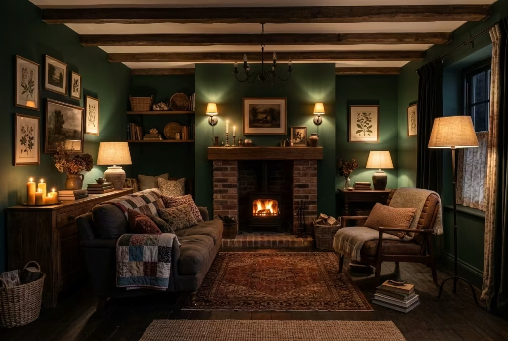
In a dark cottagecore living room, lighting should never feel like a blunt instrument. One ceiling fixture throwing light from above can flatten everything in its path, wiping out the subtle depth that makes this style feel so compelling. Layered lighting, by contrast, allows the room to breathe. It creates pockets of warmth, areas of softness, and a sense that the space is gently unfolding rather than being exposed all at once.
This is where the room really comes into its own. Wall lights, table lamps, floor lamps, and candlelight each serve a different purpose, but together they create a far richer atmosphere than any single overhead source ever could. The aim is not to flood the room with brightness. It is to build a glow that feels lived-in, calm, and slightly cinematic, the sort of light that flatters timber, softens dark walls, and makes textiles look more inviting than they ever could under a harsh ceiling fitting.
Wall lights placed at the right height help to draw the eye across the room, while table lamps add that lower, intimate layer of illumination that makes a space feel settled. It is a bit like tuning an instrument. Get one note right and the room begins to hum. Get the whole composition right and the atmosphere clicks into place.
Real-Life Application: Light as Atmosphere, Not Just Utility
In one cottage living room I worked on, the original lighting scheme relied heavily on a central pendant, which looked fine in the daytime but felt oddly relentless once the light faded. The room had deep green walls, dark stained floorboards, and heavy linen curtains, so the single overhead source only emphasised the flatness of the scheme. Every surface looked the same. There was no variation, no softness, no real sense of mood.
We reworked the room around layered light sources. A pair of wall lights flanked the fireplace, while a table lamp sat beside the reading chair and another smaller lamp was placed on a sideboard. The ceiling fixture stayed, but it became background support rather than the main event. That shift changed everything. The room immediately felt more relaxed, more dimensional, and far less formal.
What struck me most was how the homeowners began using the room differently. They started switching on the table lamps earlier in the evening, long before full darkness had set in, which made the room feel warmer throughout the transition from day to night. The living room no longer felt like a space that was simply lit. It felt inhabited.
Measurements and Placement: Getting the Levels Right
For wall lights, height makes all the difference. A fitting placed too high can feel detached, while one placed too low may interrupt sightlines or create glare. As a general rule, wall lights work well when positioned at around 150–170 cm (59–67 inches) from the floor to the centre of the fitting. In rooms with higher ceilings, leaning toward the upper end of that range can help maintain proportion.
Table lamps should sit comfortably within reach, ideally with the bottom of the lampshade around 40–55 cm (16–22 inches) above the surface of the table, depending on the height of the seating nearby. The aim is to keep the light source just above eye level when seated, so the glow is gentle rather than intrusive.
A few useful guidelines help the scheme stay balanced:
- Wall lights should be spaced to complement architectural features such as fireplaces, alcoves, or bookcases rather than floating without purpose.
- Table lamps are often best used in pairs or asymmetrical groupings, especially in rooms where a relaxed, collected look is the goal.
- Lamp shades in linen, parchment, or softly textured fabric tend to diffuse light more effectively than glossy finishes, which can feel too sharp in darker rooms.
The real trick is to think in layers rather than individual fittings. The room should have a low light source, a mid-level light source, and, where needed, a gentle ambient source. That combination creates depth, which is what darker interiors depend on.
Pros and Cons: The Difference Between Mood and Maintenance
The biggest strength of layered lighting is obvious once you experience it. The room gains dimension, warmth, and versatility. Different moods become possible without rearranging a single piece of furniture. Evening reading feels more intimate. Conversation feels easier. Even the darkest corners start to contribute to the atmosphere rather than disappearing into it.
There is also a practical benefit. Layered lighting allows you to use lower wattage sources where they make the most difference, which means you are not relying on one overly bright fitting to do all the heavy lifting. In dark cottagecore rooms, that matters because too much direct light can strip away the very qualities that make the room special.
The challenge, of course, is that layered lighting requires a little more planning. It is not a case of plugging in one lamp and calling it a day. You need to consider cable routes, switch placement, furniture position, and how the room changes from morning to evening. But that effort pays off. Quite frankly, it is worth every ounce of attention.
Another consideration is balance. Too many small light sources, scattered without intention, can make the room feel fussy rather than restful. The goal is not to pepper the space with brightness. It is to guide the eye gently, almost imperceptibly, from one glowing point to another.
Layered lighting is one of those things that quietly transforms a room without shouting about it. It does not compete with the architecture or the furnishings. It supports them. In a dark cottagecore living room, that support is everything. It gives the room rhythm, softness, and a kind of evening grace that makes the whole space feel more lived in, more inviting, and more complete.
You May also Like: 25 Dark Cottagecore Dining Room Ideas That Feel Intimate, Layered, and Lived-In
Worn Leather Accent Chairs
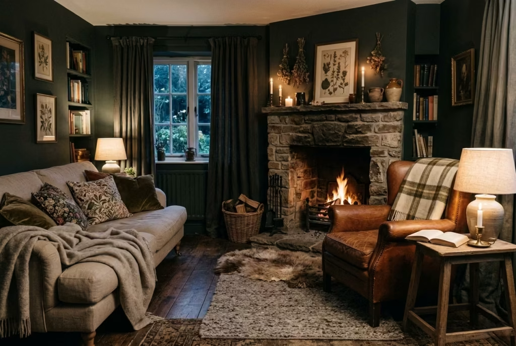
Worn leather has a way of grounding a room without ever feeling overbearing. In a dark cottagecore living room, that matters. Where linen, wool, and aged timber introduce softness and tactility, leather brings a firmer note, a little backbone, if you like, so the whole scheme does not slip into sweetness. It adds contrast, but not the brittle kind. Instead, it gives the room a sense of lived experience, the sort that cannot be faked with something freshly unwrapped and still half-smelling of the showroom.
What makes worn leather so effective is its honesty. It ages in front of you, developing creases, tonal shifts, and a soft patina that tells its own story. That is exactly why it sits so well in cottagecore interiors. The style depends on materials that feel touched by time. Leather, especially when slightly scuffed or mellowed, brings a reassuring depth that soft textiles need beside them. It is the design equivalent of a steady hand on the shoulder, calm, practical, and quietly assured.
Colour plays a role too. Cognac, tobacco, saddle brown, and deep oxblood all work beautifully in dark schemes because they warm the room from within. They stop the palette from becoming too cool or too uniform. Against forest green walls or charcoal panelling, leather reads almost like an ember glow, subtle but impossible to ignore once it is there.
Real-Life Application: Letting One Piece Carry Some Weight
In one living room I worked on, the homeowners had surrounded a soft linen sofa with similarly soft pieces: upholstered ottomans, cotton cushions, a wool rug, and layered drapery. The room was comfortable, certainly, but it lacked a little tension. Everything was playing the same note. It needed a shape with more edge, something that could hold the composition together.
We introduced a worn leather club chair with a slightly lower, more generous seat than the sofa, positioned near the fireplace and angled just enough to create an easy conversational zone. The effect was immediate. The chair became the room’s anchor point without turning into a showpiece. The leather’s slightly burnished surface caught the light in a way the fabrics did not, adding just enough variation to keep the eye moving.
What I noticed afterwards was that people instinctively gravitated to that chair. It became the place where someone would sit with tea, or pull it closer with a book, or simply occupy the room in a quieter way. That is the power of a well-chosen accent chair. It does not need to shout to be noticed. It simply earns its place.
Measurements and Proportion: Choosing the Right Scale
For a leather accent chair to sit comfortably in a dark cottagecore living room, scale is everything. Too large, and it begins to bully the softer pieces around it. Too small, and it loses its grounding presence.
A useful guide is a seat height of around 43–47 cm (17 — 18.5 inches), which tends to work well alongside low sofas and relaxed seating arrangements. Seat depth in the region of 50–58 cm (20–23 inches) gives the chair a loungy feel without becoming too sprawling. Arm height should be considered too, especially if the chair is being placed beside a sofa or under a window. A range of 60–66 cm (24–26 inches) usually keeps the proportions balanced.
In a typical living room, allow at least 75–90 cm (30–36 inches) around the chair so it does not feel pinned into position. If it is being used as a reading chair, placing it near a side table at around 45–55 cm (18–22 inches) high keeps essentials within reach without cluttering the space.
The finish also deserves attention. A matte or softly aged leather usually sits better in this context than a glossy one. Shiny leather can feel too polished and break the understated, timeworn character that makes the room work in the first place.
Pros and Cons: Character With a Bit of Backbone
The most obvious strength of worn leather is how gracefully it matures. Over time, it picks up character rather than losing it, which makes it a natural fit for interiors that value atmosphere over perfection. It also introduces a tactile contrast that prevents the room from becoming too soft, too hazy, or too uniform. In a scheme full of wool, linen, and antique wood, that contrast is worth its weight in gold.
There is also a practical advantage. Leather tends to be hard-wearing, especially in family homes where furniture needs to cope with real use rather than just looking pretty for a photograph. Spills are generally easier to manage than with many fabrics, and the chair can handle daily wear without losing its presence.
The downside is that leather can feel too firm or too formal if the shape is wrong. A chair with sharp lines or stiff upholstery may interrupt the relaxed mood rather than support it. Likewise, leather that is overly polished or artificially distressed can look contrived, which rather defeats the point. In dark cottagecore interiors, authenticity carries the day. The more naturally the leather ages, the better it behaves.
Why It Works So Well in Dark Cottagecore
Worn leather succeeds because it sits neatly between comfort and structure. It softens with use, but it still holds its form. It adds a darker, richer note to the room without disappearing into the background. And perhaps most importantly, it helps the living room feel inhabited rather than merely arranged.
That is the sweet spot, really. Not too precious, not too rustic, not too polished. Just enough wear to suggest a life well lived, and just enough presence to hold the room together.
Muted Floral Upholstery Used Sparingly
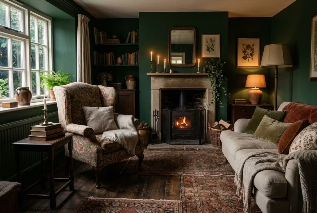
Muted floral upholstery has a delicate role in a dark cottagecore living room; it suggests nature and narrative without overwhelming the senses. The key is restraint. One statement piece such as an armchair, ottoman, or even a small loveseat can provide visual interest while keeping the palette grounded in deeper, moodier tones. Used too broadly, florals risk tipping the room from atmospheric to fussy, but when treated like a quiet punctuation mark, they feel timeless, collected, and intentionally layered.
Floral patterns in subdued shades think dusty rose, moss green, muted ochre, or soft navy play beautifully against rich walls or textured timber. They allow the eye to wander across the space, discovering patterns in unexpected corners, without ever feeling like the room is “dressed up” for effect. In essence, they provide a gentle dialogue between texture, tone, and form, giving the room personality without breaking the immersive, enveloping mood of a dark cottagecore scheme.
Real-Life Application: One Piece, Maximum Impact
In a project for a lakeside cottage, the living room had walls painted in a deep forest green and oak floorboards stained almost black. Rather than upholstering all seating in florals, I selected a single wingback armchair with muted botanical fabric in shades of clay and moss. Positioned near the fireplace and angled toward the sofa, it became the room’s conversational punctuation, visually anchoring the space without competing with the darker surrounding elements.
The homeowners reported that this approach felt far more considered than a fully patterned seating arrangement. Guests were drawn to the armchair’s gentle curves and soft colours, while the surrounding textiles linen throws, wool cushions, and layered rugs remained cohesive. The piece acted as a nod to the garden outside without trying to recreate it indoors, which in my experience is where muted florals succeed: they hint at nature rather than imitate it.
Measurements and Placement: Proportion Is Everything
- Armchair Width: Between 75–90 cm (30–36 inches) for a statement piece, allowing it to feel substantial without overwhelming circulation.
- Seat Height: Around 43–46 cm (17–18 inches) to match adjacent seating and maintain a relaxed, low-profile posture.
- Positioning: Place the floral piece as a focal accent, ideally within 1–2 metres (3–6 feet) of the primary seating cluster, or near a source of natural light to enhance the subtleties of the pattern.
Spacing matters as much as scale. Too close to other patterned or textured elements, and the upholstery can feel cluttered. Too far, and it loses the sense of being part of the room’s story. I often advise leaving a breathing zone around the piece at least 60 cm (24 inches) so it can assert its presence without crowding the room.
Pros:
- Introduces subtle narrative and personality without dominating the room.
- Acts as a visual counterpoint to solid, dark tones, breaking monotony in a sophisticated way.
- Encourages layering and collection-building an important cottagecore principle without appearing contrived.
Cons:
- Overuse can tip the balance toward a busy, almost kitsch aesthetic.
- Pattern needs careful coordination with other textures, or it risks clashing with woven rugs, heavy drapery, or other textiles.
- Light exposure matters: muted florals can lose depth in poorly lit corners, so positioning near natural or layered artificial light is key.
Muted floral upholstery, when used sparingly, becomes a quiet hero in a dark cottagecore living room. It adds depth, visual rhythm, and a connection to the natural world, without overpowering the immersive atmosphere. One carefully chosen piece is often all it takes to provide balance, warmth, and character, letting the room feel curated, lived-in, and quietly enchanting.
Dark Painted Panelling for Structure
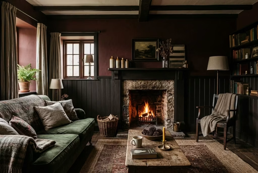
Dark painted panelling is more than decoration; it is the backbone of a well-composed dark cottagecore living room. By introducing structure at a half-height (approximately 900 mm / 35 inches), you create visual grounding without making the walls feel heavy or oppressive. Panelling breaks up large expanses of dark colour, offering rhythm and scale while subtly guiding the eye. It is a quiet way of saying the room has form, discipline, and personality, rather than leaving dark walls to drift aimlessly.
This approach works especially well in rooms where light is limited. The panelling’s horizontal line provides a sense of proportion and tactile interest, which is essential when darker tones risk flattening a space. Layering deep colour with the textural depth of timber or MDF panels allows shadows to fall naturally, enriching the room’s atmosphere without heavy-handedness. The technique elevates a dark scheme from moody to consider a distinction that often gets overlooked in residential interiors.
Real-Life Application: Structure That Feels Effortless
In a Victorian cottage project I recently completed, the living room had ceilings at 2.7 m (9 ft) and walls in an oxblood shade. Without any visual interruption, the deep colour made the room feel almost cave-like, despite the generous windows. We introduced half-height panelling in a matte black-brown finish, topped with a narrow dado rail.
The effect was immediate. The lower panels absorbed shadows and added tactility under soft lighting, while the upper walls retained the richness of the oxblood without overwhelming the space. Guests instinctively gravitated toward the corners and seating areas; the room now felt cohesive, intentional, and far more structured. Notably, the homeowners commented on how the panelling “gave the room a spine” , an instinctive but accurate way of describing the balance it brought.
Measurements and Placement: Subtle Yet Impactful
- Height: Standard half-height panelling around 900 mm (35 inches) works in most rooms with ceilings between 2.4–2.7 m (8–9 ft). For higher ceilings, 1–1.1 m (39–43 inches) may be proportionally better.
- Panel Width: Varies depending on room size; for cozy living rooms, 300–450 mm (12–18 inches) wide panels create rhythm without dominating the wall. Larger panels suit more expansive walls but should maintain consistent spacing.
- Top Rail: A simple dado rail or moulded trim subtly finishes the panel without adding unnecessary weight. Keep it in proportion to the panels: about 50–70 mm (2–2.75 inches) works well in most interiors.
Pros:
- Provides visual grounding in dark interiors, preventing walls from appearing formless.
- Adds texture and shadow interplay that enrich the atmosphere.
- Gives the room a considered, architectural feel without resorting to heavy décor.
Cons:
- Requires careful execution; poorly proportioned panels can feel cramped or overly fussy.
- Painting dark panelling demands precise finishing, as brush strokes or uneven sheen are more noticeable on deep tones.
- If the top wall colour clashes with the panelling, it can break the subtle cohesion that makes dark cottagecore work.
Dark painted panelling is one of those techniques that quietly elevates a room. It lends weight without clutter, rhythm without distraction, and definition without rigidity. In a dark cottagecore living room, it is a structural whisper, framing furnishings, guiding light, and making shadows perform their magic. Done well, it tells the eye exactly where to rest, and the space feels poised, curated, and fully inhabited.
Stacked Firewood as a Textural Feature
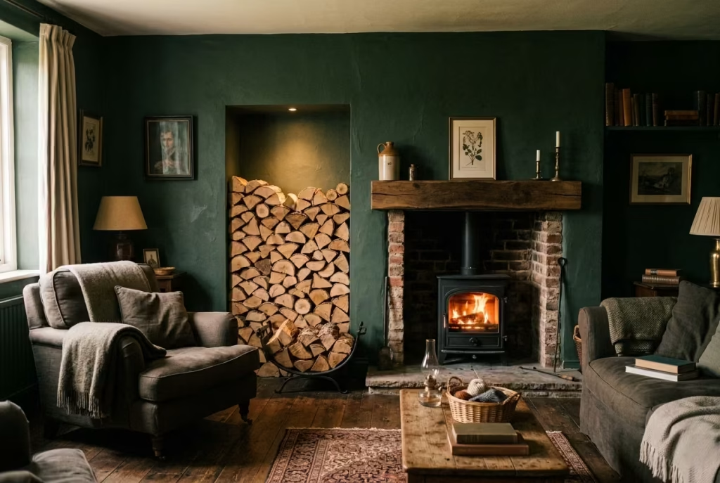
Stacked firewood is one of those details that does a great deal of work without ever looking as though it is trying. In a dark cottagecore living room, it brings both function and atmosphere, which is rather a rare combination. It grounds the room visually, introduces a raw natural texture, and quietly reinforces the sense that the space is not just styled, but lived in.
What makes it particularly effective is its honesty. Firewood is not decorative in the flimsy sense. It is practical, elemental, and slightly untamed, which gives a room a bit of backbone. Against dark walls, soft textiles, and aged timber, a stack of logs adds another layer of tactility. The cut ends, bark, and tonal shifts in the wood catch the light differently, creating a subtle mosaic of warm browns, pale rings, and weathered edges. It is the sort of detail that makes a room feel settled, as though everything has landed exactly where it should.
When placed well, firewood can also act as a visual pause. A stack near the hearth or tucked into a niche offers the eye a place to rest. It is one of those small moves that can stop a room from feeling overly polished. In cottagecore, that little bit of roughness is often the very thing that gives the room its charm.
Real-Life Application: Letting the Material Do the Talking
In one living room I worked on, the fireplace was beautiful enough on its own, but the surrounding space felt oddly bare. The room had deep green walls, a worn rug, and soft linen seating, yet it lacked a sense of weight at the hearth. We introduced a neatly stacked pile of split logs in a recessed alcove beside the fireplace, and the room immediately felt more complete.
The effect was not dramatic in the obvious sense. It was quieter than that, but far more persuasive. The wood added rhythm to the lower half of the room and created a sense of readiness, as if the space understood the season and was prepared for it. That is a powerful thing in a living room. You are not just looking at a design choice. You are looking at a room that feels prepared to be used.
I have also found that clients often underestimate how much stacked firewood can soften a room emotionally. Even when the fireplace is not in use, the presence of the logs suggests warmth, routine, and continuity. It gives the room a lived-in pulse. The space no longer feels staged for a photograph. It feels like someone has actually thought about how winter evenings unfold there.
Measurements and Placement: Getting the Stack Right
For firewood to feel intentional rather than cluttered, scale matters. A useful guide is to keep the stack depth around 300–400 mm (12–16 inches) if it is being placed in a narrow alcove or beside a hearth. This creates enough visual presence without allowing the pile to bulge into the room. For more generous recesses, a depth of 450–500 mm (18–20 inches) can work well, especially if the logs are neatly graded in size.
Height should be kept in proportion to the fireplace or adjacent furniture. A stack of roughly 600–900 mm (24–35 inches) often feels balanced in a standard living room, though taller stacks can work in larger hearths or double-height spaces. The key is to avoid making it look like storage that has simply been left where it fell. It should feel composed, almost architectural.
If you are stacking logs in a visible niche, try to keep the front edge straight and the log ends facing outward. That little detail creates order. Logs cut to similar lengths also tend to read more cleanly, usually around 250–400 mm (10–16 inches) in length depending on the fireplace size and local supply.
A base tray, low basket, or simple timber cradle can help contain the stack and prevent the arrangement from looking untidy. If the wood is purely decorative, keeping the lower line level is especially important, because unevenness is much more noticeable against dark walls.
Pros and Cons: Rustic Charm With Practical Boundaries
The biggest strength of stacked firewood is that it does two jobs at once. It looks good, and it serves a purpose. That combination gives it real staying power. It also adds natural variation to a scheme that might otherwise lean too heavily on fabric and paint. The contrast between rough bark and soft textiles is especially effective in dark cottagecore rooms, where texture often carries the atmosphere more than colour alone.
There is also a seasonal benefit. Firewood naturally suggests warmth and comfort, which suits a room intended for slower evenings and colder months. It brings the outside world into the scheme in a very grounded way, almost like a reminder of the landscape beyond the window.
The drawback is that firewood only works if it is tidy and dry. A sloppy pile can drag the whole room down. Dust, debris, or damp logs will undo the charm quickly. It is one of those details that needs a bit of upkeep, or it can cross the line from rustic to neglected. In a refined interior, that distinction matters.
There is also a practical consideration around insects or debris if logs are stored inside for long periods. For that reason, I tend to recommend using a smaller visible stack for aesthetic effect, with bulk storage kept elsewhere if possible.
Why It Works So Well in Dark Cottagecore
Stacked firewood succeeds because it feels rooted in real life. It is simple, useful, and quietly beautiful in the right setting. In a dark cottagecore living room, where the atmosphere is built through depth, texture, and memory, that kind of detail carries real weight.
It is not trying to be clever. It is just doing its job with a bit of dignity, and that is often exactly what a room like this needs.
You May also Like: Transform Your Space with These 25 Desert Living Room Inspirations
Handcrafted Ceramics and Imperfect Objects
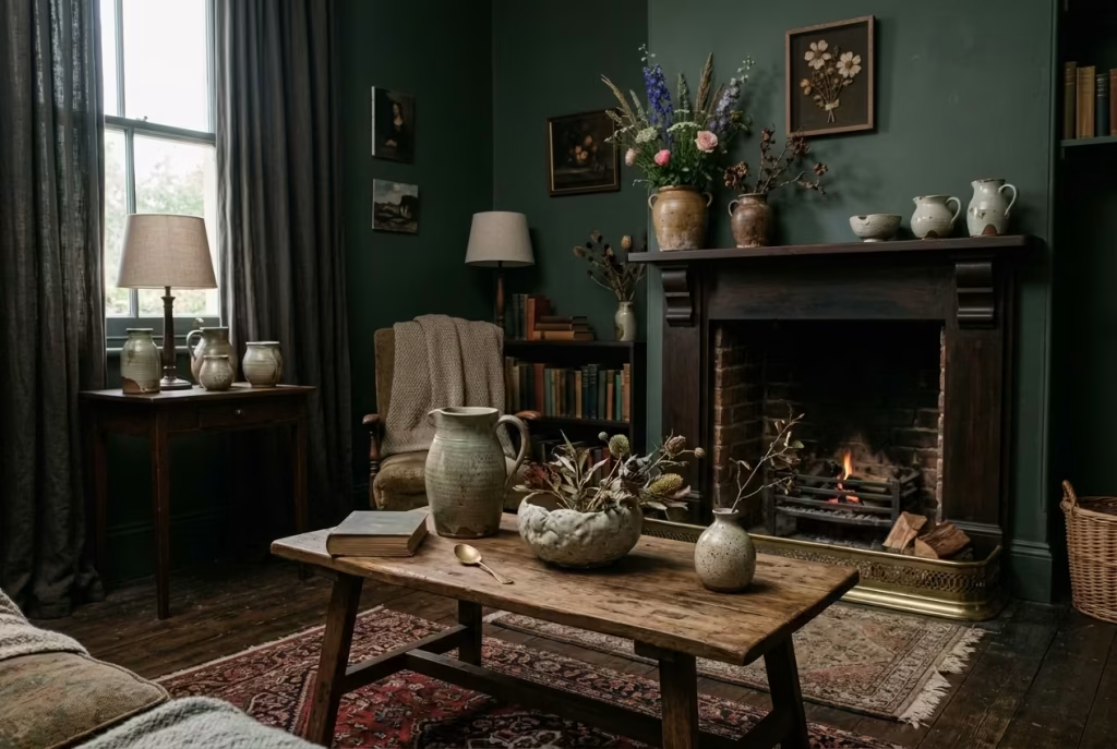
Handcrafted ceramics and imperfect objects are the quiet heroes of a dark cottagecore living room. They remind the eye and the soul that the space is inhabited, not just styled. A slightly misshapen vase, a lopsided bowl, or a hand-thrown jug carries the human touch, introducing subtle irregularities that contrast beautifully with the more deliberate lines of furniture, panelling, and structural elements. These small flaws are not mistakes, they are character. In a room dominated by deep tones, layered textures, and carefully curated antiques, imperfect objects prevent the space from feeling too rigid or museum-like.
What makes these pieces effective is their storytelling quality. Each item implies a maker, a process, and a history, reinforcing the sense that the home is lived-in and collected over time. In dark interiors, where colour and texture can feel heavy, these objects act as visual pauses, catching the eye with understated charm and creating micro-moments of delight. They also encourage a tactile engagement; you want to reach out, hold them, and feel the subtle grooves, the weight of clay, the warmth of a glaze.
Real-Life Application: Layering Imperfections for Authenticity
In a recent dark cottagecore project, I selected a series of small ceramics for the mantel, side tables, and window sills. Rather than buying matching sets, I sourced pieces with varying heights, glazes, and shapes, some with tiny chips or uneven rims, others with faint hairline patterns in the glaze.
The effect was unexpectedly powerful. Visitors were drawn into the details, lingering to inspect the glaze variations, the hand-carved marks, or the subtle asymmetry. Each piece told a story, yet together they formed a cohesive dialogue with the room’s dark timber floors, heavy linen drapes, and deep-coloured walls. The room felt curated without being precious, collected without looking contrived.
The tactile quality of these ceramics also influenced how the furniture was arranged. A low coffee table with grouped vessels encouraged conversation and movement around the objects, rather than against them. The room felt alive, intimate, and gently layered a lesson in how small, imperfect objects can guide human behaviour as much as they guide the eye.
Measurements and Placement: Intentional Positioning
- Vases and Small Sculptures: Typically between 15–30 cm (6–12 inches) in height works well on mantels, shelves, or side tables.
- Bowls or Trays: 20–35 cm (8–14 inches) in diameter, ideal for grouping in threes to five pieces for visual rhythm.
- Spacing: Leave breathing room of at least 10–15 cm (4–6 inches) around each object to allow shadow play and prevent visual clutter.
The principle is less about rigid measurement and more about proportionality. In dark interiors, even small pieces can feel heavy if placed too closely or too symmetrically. Grouping pieces in odd numbers three or five is often the most natural and visually pleasing arrangement. Layer objects in height and scale to mimic the irregularity of nature: low and high, wide and narrow, glazed and matte.
Pros:
- Infuses a human, tactile element into dark, heavily layered interiors.
- Prevents over-styling and stiffness, keeping the room approachable and warm.
- Works with any colour palette; imperfect textures and glazes soften even the darkest walls.
- Encourages interaction and can serve functional purposes (vases, bowls, storage).
Cons:
- Handcrafted pieces can be fragile, so placement must balance aesthetics with safety.
- Overcrowding diminishes impact; each object needs space to be appreciated.
- Sourcing truly authentic, irregular ceramics requires careful curation; mass-produced “imperfections” rarely convey the same warmth.
Why It Works So Well in Dark Cottagecore
Handcrafted ceramics and imperfect objects succeed because they add soul to structure. They are the punctuation marks in a room layered with dark tones, textured fabrics, and antique elements. They humanize interiors that could otherwise feel heavy or overly curated, creating subtle pockets of intimacy and visual interest. In the end, they whisper the message every dark cottagecore living room should convey: this space is lived in, loved, and considered down to the tiniest curve. These small imperfections are, paradoxically, what make the room feel perfect.
Soft, Layered Throws in Earthy Tones
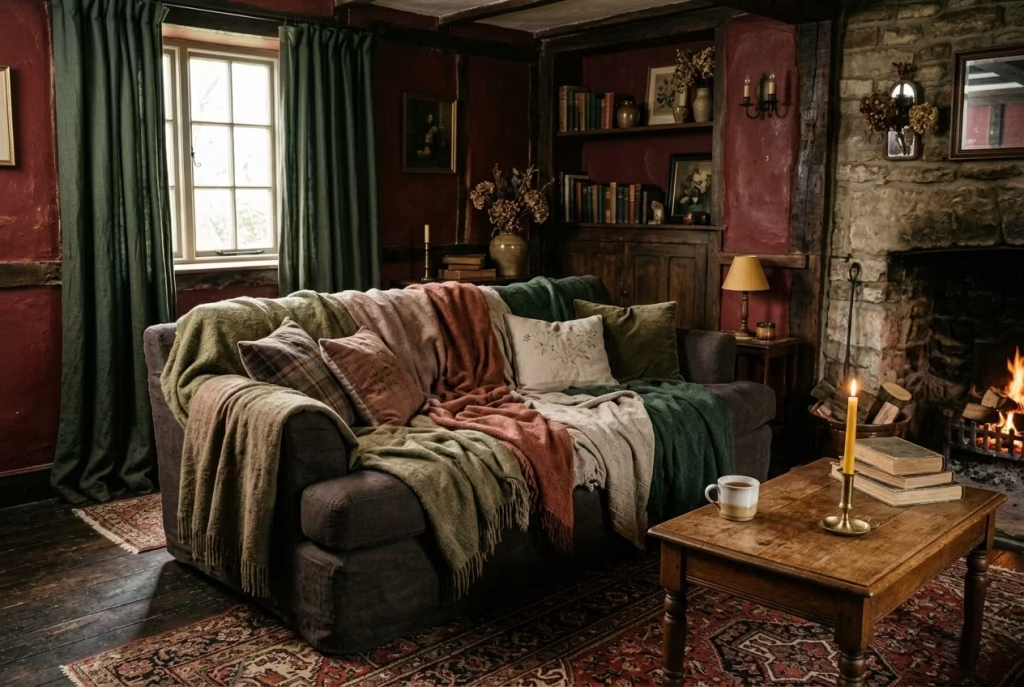
Soft, layered throws are an essential ingredient in a dark cottagecore living room, functioning as much more than simple accessories. In spaces dominated by deep greens, umber, or charcoal, throws in earthy tones, warm taupes, muted ochres, mossy greens, or rusted terracotta provide tactile and visual contrast. They are the finishing touch that invites touch, encourages lounging, and softens the room’s heavier elements, from overstuffed sofas to dark timber floors.
Layering is key. One throw draped casually across the back of a sofa offers warmth, but stacking two or three in varying textures wool, cashmere blends, or handwoven linen introduces depth, movement, and subtle pattern without adding visual clutter. The irregular folds and slight creases of natural fabrics echo the imperfect, lived-in ethos of cottagecore. In a dark palette, these layers prevent the space from feeling austere, creating pockets of comfort and intimacy where shadows and light can play.
Real-Life Application: Weaving Texture and Mood
In a lakeside cottage project, I introduced a trio of wool-cashmere throws on a low, overstuffed sofa against deep oxblood walls. One throw in moss green lay over the seat, another in a muted clay tone was folded at the armrest, and a lighter oatmeal piece was casually draped across the back. The result was immediate: the sofa felt inviting rather than formal, and the room’s dark palette was gently punctuated by warmth and softness.
Guests instinctively gravitated toward the sofa, sinking into the layered textiles. The throws not only provided comfort, but also acted as a subtle design lever: they broke up solid colours, softened harsh shadow lines, and made the seating feel sculpted yet approachable. Layering in this way allowed each throw to earn its place, rather than appearing like a decorative afterthought, a principle I always advocate for when working with dark interiors.
Measurements and Placement: Practical Proportions
- Length: Around 150–180 cm (59–71 inches) to allow full drape over sofas or armchairs.
- Width: 120–140 cm (47–55 inches) works for a sofa seat; smaller throws 90–110 cm (35–43 inches) suit chairs or ottomans.
- Layering Tips: Fold throws once or twice lengthwise to create depth; drape casually over corners or along the back of seating. Alternate textures and weave types to add tactile complexity.
Proportion matters in dark rooms, as oversized throws can overwhelm smaller furniture, while tiny ones risk feeling insubstantial. I often recommend leaving 10–15 cm (4–6 inches) of sofa seat exposed, so the throws read as an inviting accent rather than a visual barrier.
Pros:
- Adds tactile warmth and visual softness to dark interiors.
- Supports the cottagecore ethos of layering and collected textures.
- Can be seasonal: switch lighter linen blends for summer, heavier wool/cashmere for winter.
- Encourages a relaxed, informal posture, making living rooms feel truly lived-in.
Cons:
- Requires care: natural fibres like wool and cashmere need gentle cleaning.
- Over-layering can create cluttered visual weight if not carefully balanced with furniture scale.
- Throw colours must harmonize with surrounding textiles; otherwise, they can break the cohesion of the dark palette.
Soft, layered throws in earthy tones are deceptively simple, yet they transform a dark cottagecore living room from dramatic to deeply inhabitable. They soften, warm, and humanize the space, allowing it to feel simultaneously structured, tactile, and inviting a perfect example of design that looks effortless but is carefully considered.
Window Seating with Hidden Storage
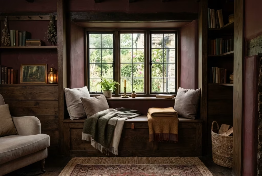
Window seating in a dark cottagecore living room is more than a cozy perch; it is both a design statement and a practical solution. By integrating hidden storage beneath the seat, you address functionality without compromising aesthetics. A well-proportioned window seat provides a nook for reading, reflection, or simply enjoying the play of natural light on dark walls, while the concealed storage keeps the room uncluttered, preserving the calm, curated atmosphere that cottagecore thrives on.
The magic lies in proportion and scale. A depth of 45–50 cm (18–20 inches) ensures comfort for lounging without the seating feeling too bulky or awkward in a room with deep tones and layered textures. Pair the bench with soft cushions in muted earthy colours, a wool throw, or even a few handcrafted ceramics on the sill, and the window seat becomes a microcosm of the larger interior philosophy: intimacy, warmth, and subtle utility.
Real-Life Application: Comfort That Conceals Utility
In a project set within a converted barn, the living room featured a deep bay window with expansive views of surrounding woodland. I designed a bespoke window seat using oak with a rich, dark stain, integrating storage for blankets, books, and small decorative items. The seat depth was 48 cm (19 inches), allowing the homeowners to curl up with a cup of tea or a book comfortably.
The seating became one of the room’s most-used elements. Beyond its practical storage, the window seat also helped break up the expanse of deep-painted walls, creating a human-scaled focal point. Cushions in washed linen and a single handwoven throw added softness without compromising the weighty, atmospheric palette. Guests often found themselves naturally drawn to this spot proof that a small architectural intervention can anchor both use and emotion in a dark interior.
Measurements and Placement: Comfort Meets Practicality
- Depth: 45–50 cm (18–20 inches) for comfortable lounging.
- Height: Seat height around 43–46 cm (17–18 inches) aligns with standard sofa seating for ease of use.
- Length: Customized to window dimensions; aim for a seat that spans 2/3 to full width of the window recess for proportional balance.
- Storage: Use lift-up lids, drawers, or sliding panels to keep contents hidden while maintaining a clean façade.
Cushion placement is crucial: two to three soft cushions provide lumbar support, while a folded throw adds warmth. The goal is a seamless blend of utility and comfort that reads effortlessly against dark walls and textured finishes.
Pros:
- Maximizes use of natural light for comfort and mood.
- Concealed storage keeps clutter at bay, enhancing the room’s calm, curated feel.
- Introduces a human scale and tactile focus in larger, darker rooms.
- Complements layered textiles and other cottagecore details for a lived-in aesthetic.
Cons:
- Requires precise carpentry to maintain proportions and avoid a heavy, boxy look.
- Cushions and throws must be chosen carefully; too many patterns or bright tones can disrupt the dark palette.
- Window seats in poorly insulated areas may feel chilly without proper padding or layered textiles.
Window seating with hidden storage is one of those understated moves that elevate a dark cottagecore living room from decorative to indispensable. It offers warmth, practicality, and intimacy, reinforcing the philosophy that every element in the room should earn its keep functional, beautiful, and quietly inviting.
Aged Brass or Bronze Hardware
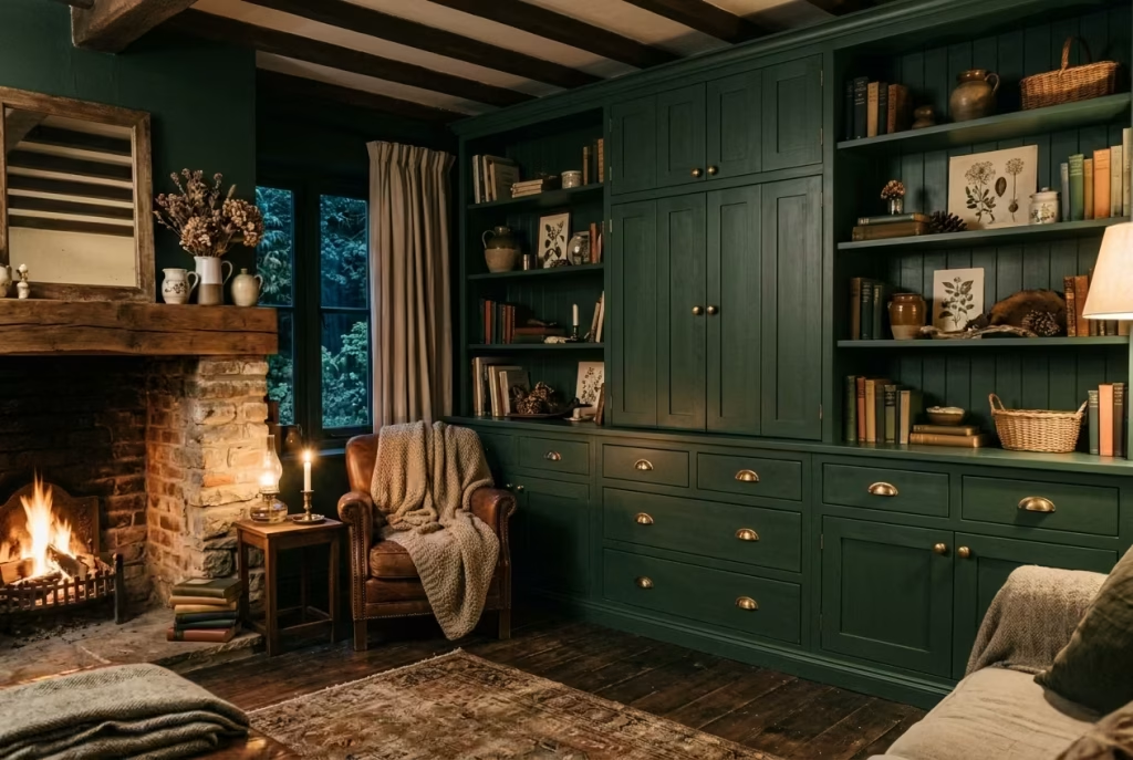
In a dark cottagecore living room, the smallest details can dramatically influence the atmosphere, and hardware is one of the most underrated elements. Aged brass or bronze pulls, knobs, and hinges introduce warmth and tactility that complement deep-toned walls and rich timbers, creating continuity without overwhelming the scheme. Unlike polished chrome or nickel, which can feel cold and modern, these metals carry a muted glow that catches candlelight and soft wall lighting, contributing to the room’s overall intimacy.
Hardware is not just functional, it is part of the narrative. It subtly reinforces the lived-in, handcrafted ethos of cottagecore while anchoring cabinetry, shelving, and storage units visually within the palette. When placed thoughtfully, it punctuates the space without shouting, much like punctuation in a well-written sentence.
Real-Life Application: Mood in the Details
In a dark-paneled Victorian sitting room I recently completed, the addition of aged brass cabinet handles transformed the experience of the space. The walls were a deep forest green, with built-in shelving on either side of the fireplace. Previously, the shelves felt heavy and monolithic; once the brass hardware was installed, the cabinetry gained a soft, tactile quality.
The homeowners noted how the warm metallic accents “glowed” in the evening light, giving the room a sense of movement and depth. Even when the overhead lights were off and only candlelight played across the walls, the aged brass caught the eye subtly, providing visual punctuation and a sense of intentionality. Small details like this prevent a dark room from feeling static or flat.
Measurements and Placement: Balanced Proportions
- Cabinet Pulls: Standard lengths 96–128 mm (3.75–5 inches) work well for drawers, depending on size. Larger units may require 160 mm (6.25 inches) for proportion.
- Knobs: Around 30–35 mm (1.2–1.4 inches) in diameter for cupboards, keeping tactile comfort in mind.
- Spacing: Evenly spaced, typically two knobs per cabinet door or one centered pull per drawer, ensures symmetry without rigidity.
The key is proportionality hardware should read as intentional punctuation, not decoration that fights with the room’s deeper elements. Aged brass and bronze offer enough presence to catch the eye without becoming overbearing, especially in a layered dark cottagecore setting.
Pros:
- Adds subtle warmth and depth to deep-toned interiors.
- Feels handcrafted and timeless, aligning perfectly with cottagecore’s ethos.
- Softly interacts with candlelight and textured surfaces for dynamic effect.
- Enhances perceived quality of cabinetry, doors, and furniture without high cost.
Cons:
- Requires occasional polishing to maintain patina and prevent dullness.
- Overuse or pairing with modern metals can disrupt cohesion in a dark, historic-inspired palette.
- Needs to be proportioned carefully; too large or small hardware can feel awkward against built-in or bespoke cabinetry.
Aged brass or bronze hardware is one of those details that quietly elevates a dark cottagecore living room, bridging function and beauty. It carries the story of the space through its warmth, texture, and understated presence, showing that even the smallest elements can anchor a room in character and intimacy.
Dark Ceilings for Full Immersion
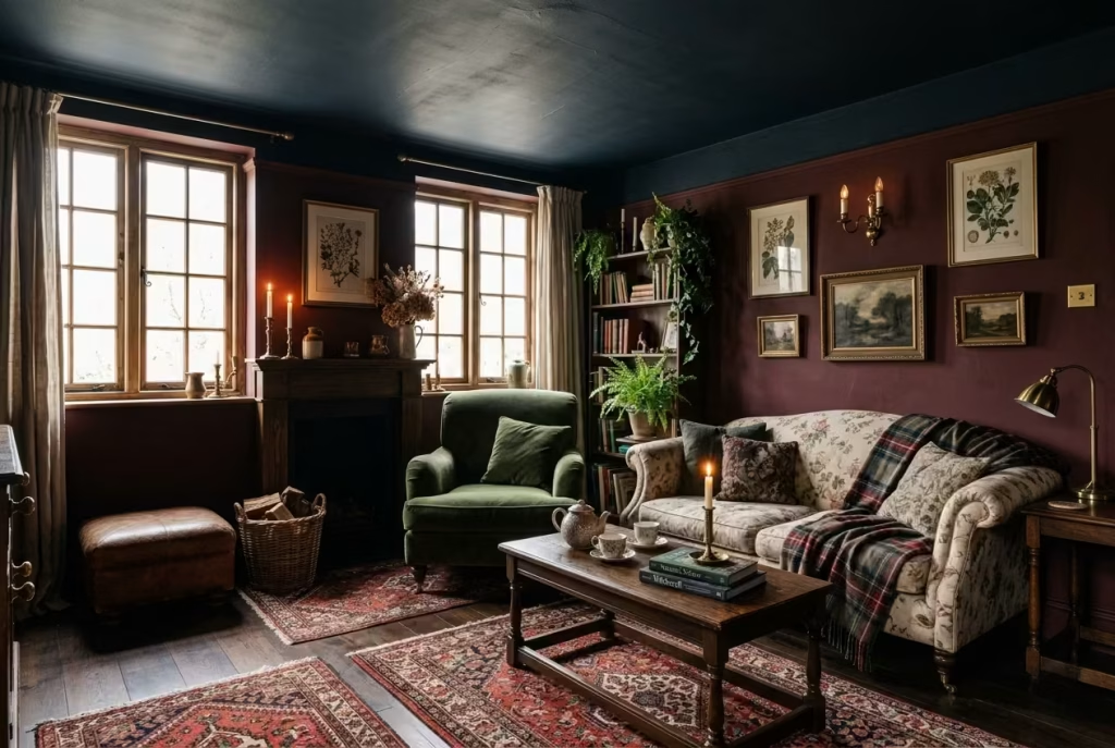
Painting ceilings in a deep, rich tone charcoal, oxblood, or midnight navy can transform a dark cottagecore living room from merely moody to fully immersive. The technique works by lowering the perceived height subtly, creating a cocoon-like effect that encourages relaxation and intimacy. When done thoughtfully, a dark ceiling does not oppress; instead, it draws the eye upward and envelops the room in a sense of quiet drama, completing the palette from floor to ceiling.
The magic of dark ceilings is their ability to unify the space. They make walls, furnishings, and lighting feel cohesive, giving the room a deliberate, designed depth. Paired with layered textiles, natural wood, and carefully curated décor, a dark ceiling frames the experience of the room rather than dominating it.
Real-Life Application: Intimacy Through Height
In a compact city townhouse, I experimented with a deep forest green ceiling over a 3 x 4 m (10 x 13 ft) living room with large south-facing windows. The ceiling visually drew the room in, enhancing the warmth of dark timber floors and moss-toned walls, while natural light prevented it from feeling oppressive.
The effect was immediate: the space felt enveloping, almost like the walls and ceiling were participating in a quiet conversation with the furnishings. Visitors noted the unexpected intimacy; even with modern seating and a fireplace, the room felt “older, wiser, and infinitely cozier,” without a hint of heaviness.
Measurements and Placement: Proportional Balance
- Ceiling Height: Works best when the room is under 3 m (10 ft) or has generous natural light to balance the darkness.
- Colour Choice: Slightly lighter tones than walls can reduce visual compression if ceiling height is very low; otherwise, matching the wall tone offers full immersion.
- Finish: Matte or low-sheen paints prevent glare, enhance depth, and hide minor imperfections.
Pairing dark ceilings with lighter trim, soft layered textiles, or reflective surfaces like brass accents or polished timber helps anchor the space visually and prevents the ceiling from feeling “closed in.”
Pros:
- Creates a cocoon-like, intimate atmosphere that enhances the cottagecore ethos.
- Unifies the room’s palette for a sophisticated, design-led effect.
- Works especially well in rooms with ample daylight, allowing the darkness to feel deliberate rather than oppressive.
- Offers a dramatic backdrop for layered lighting, highlighting texture and materiality.
Cons:
- Can make small or poorly lit rooms feel claustrophobic if not balanced with natural or layered lighting.
- Requires careful consideration of furniture scale and wall treatments to avoid overwhelming the space.
- Dark matte finishes can show dust or imperfections if poorly prepared.
Dark ceilings, when executed with thought and proportion, immerse the room in atmosphere and emotion, completing the dark cottagecore living room’s sensory story. They encourage stillness, reflection, and comfort, turning even the smallest spaces into fully realized retreats.
Gallery Walls That Feel Collected, Not Styled
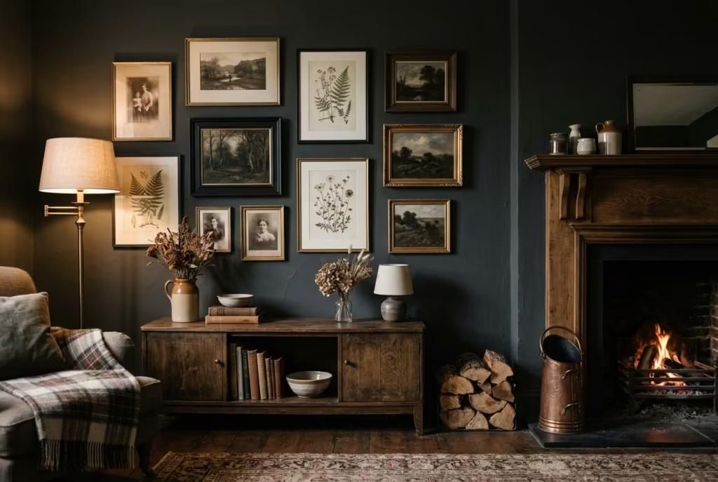
A good gallery wall should never look like it arrived in one delivery. In a dark cottagecore living room, the strongest versions feel gathered slowly, one piece at a time, as though each frame has earned its place through use, memory, or affection. That is what gives the arrangement its charm. It is not the polish that makes it compelling. It is the sense that the wall has lived a little.
Slight asymmetry is what keeps the whole thing from becoming too neat, too rehearsed, too obviously choreographed. When frames are perfectly aligned, evenly spaced, and identical in scale, the result can lose its warmth rather quickly. A collected wall allows for small irregularities: a lower frame beside a taller one, a narrow gap where another piece might have been, a mixture of portrait and landscape orientations that feels intuitive rather than forced. Those small shifts create a rhythm that is less like a display and more like a memory board.
In a dark interior, this matters even more. Deep walls can make a gallery wall feel precious if it is too formal, but when the arrangement is relaxed and slightly off-centre, it feels human. The eye does not skim past it. It lingers. It reads the wall like a story, not a catalogue.
Real-Life Application: Letting the Arrangement Breathe
In one project, I worked with a living room painted in a soft charcoal with a dark oak fireplace surround. The owners had inherited a mix of family photographs, small botanical prints, and one or two travel sketches, all of which held personal value but looked awkward when grouped in a rigid grid. Rather than forcing order onto them, I arranged the collection as a loose gallery wall running up one side of the chimney breast and slightly across the adjacent wall.
The result had a far better pulse. A small sepia portrait sat just above a framed fern study, while a wider landscape print was offset slightly lower, creating a gentle sense of movement. Nothing matched perfectly, and that was exactly the point. The wall felt curated, but not contrived. Guests noticed the individual pieces, then the composition as a whole, which is usually the sign that the arrangement is working.
What I find most useful in rooms like this is that the gallery wall becomes part of the room’s architecture rather than a decorative afterthought. It can soften a tall wall, visually widen a narrow one, or bring focus to a corner that otherwise feels empty. That makes it practical as well as atmospheric, which is the sweet spot in a dark cottagecore scheme.
Measurements and Placement: Keeping It Natural
A gallery wall benefits from a few simple rules, but they should act as guardrails rather than straightjackets.
A useful starting point is to hang the centre of the grouping at around 145–155 cm (57–61 inches) from the floor, depending on the furniture below and the height of the room. That keeps the arrangement comfortably within eye level without making it feel like it is floating too high above the rest of the space.
For spacing, 5–8 cm (2–3 inches) between frames usually creates enough breathing room for the pieces to read individually while still feeling connected. In darker rooms, slightly tighter spacing can work well, but only if the wall is not already busy with texture or panelling.
A mixed-scale arrangement often works best when the largest piece is no more than about two-thirds the size of the wall section it occupies. For example, above a sideboard measuring 150–180 cm (59–71 inches) wide, the gallery area might span roughly 100–130 cm (39–51 inches) across. That keeps the composition intimate rather than sprawling.
A few other useful proportions:
- Frames between 20 x 25 cm and 40 x 50 cm (8 x 10 inches to 16 x 20 inches) usually work well together.
- Leave at least 15–20 cm (6–8 inches) between the lowest frame and the top of furniture below it.
- If the arrangement climbs upward, vary the vertical offsets by a small amount so it feels accumulated rather than diagrammed.
The key is to let the wall breathe. A gallery wall should feel composed, yes, but it should not look over-managed. That is where life goes out of it.
Pros and Cons: Character With a Little Freedom
The main strength of a collected gallery wall is its ability to bring personality into a room without demanding symmetry or perfection. It gives the space warmth, memory, and visual depth. In dark cottagecore interiors, that is especially valuable because the palette already leans into mood. The gallery wall adds narrative, which keeps the room from feeling like a beautiful but silent set piece.
It is also a very forgiving approach for homes where artwork has been gathered over time rather than purchased as a matching set. Family photographs, vintage prints, pressed florals, and sketches can sit together surprisingly well when the spacing and tonal balance are considered carefully.
The drawback is that a gallery wall can turn cluttered in a hurry. Too many frame styles, too much visual noise, or a lack of any linking thread can make the arrangement feel muddled. This is why a slightly restricted palette helps. A warm oak frame, a blackened frame, and one or two aged brass or gilt details usually give enough variation without losing cohesion.
Lighting matters too. In a dark room, a gallery wall that is not properly lit can disappear into the background, so a nearby wall light, picture light, or a gentle lamp in the same zone often helps the composition hold its ground.
A gallery wall that feels collected rather than styled gives a room a pulse. It makes the living space feel inhabited, personal, and quietly layered, as though the walls have been listening for years. In a dark cottagecore setting, that sense of accumulated life is worth far more than perfect alignment ever could be.
Natural Stone Elements (Side Tables or Hearths)
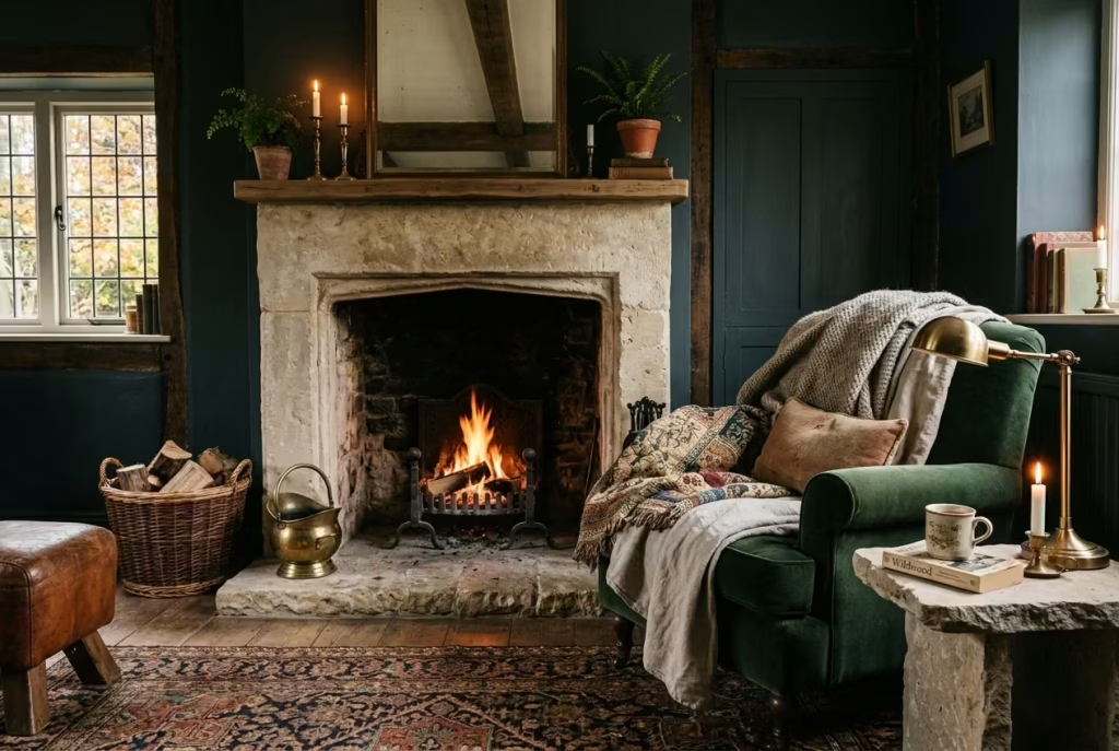
In a dark cottagecore living room, natural stone acts as an anchor, both physically and visually. Materials like slate, marble with muted veining, or locally quarried limestone bring solidity to a space dominated by soft textiles, deep-painted walls, and layered lighting. Stone elements, whether as side tables, hearths, or fireplace surrounds, introduce a grounded, tactile contrast to the ephemeral textures of wool throws, linen cushions, and antique fabrics.
The appeal of stone lies not in its perfection, but in its quiet imperfections. Natural fissures, irregular veining, and subtle tonal shifts make each piece unique, contributing to the “lived-in” narrative essential to cottagecore interiors. Unlike manufactured materials, stone communicates permanence and craft, giving darker rooms a weight and authenticity that enhances the overall atmosphere.
Real-Life Application: Layering Weight and Warmth
In a woodland-inspired living room I recently completed, I selected a local slate for a small hearth and paired it with a single, low, circular marble side table beside an overstuffed sofa. The stone surfaces absorbed the room’s ambient light in a soft, diffuse way, highlighting texture without reflecting harshly.
The hearth became a natural focal point, while the side table’s heavy presence counterbalanced the darker tones of the wall and furnishings. Guests were drawn to the tactile contrast of the smooth coolness of stone against the warmth of wool and linen creating a layered sensory experience. By carefully placing stone elements where touch and proximity mattered, the room gained structure and purpose without feeling rigid or cold.
Measurements and Placement: Balancing Scale
- Side Tables: Diameter or width around 45–50 cm (18–20 inches); height 50–55 cm (20–22 inches) to match adjacent seating.
- Hearths or Fire Surrounds: Depth around 30–40 cm (12–16 inches); width proportional to fireplace or chimney breast.
- Proportion Tips: A single stone element per seating cluster avoids overcrowding; multiple smaller stone pieces can work if paired with softer textures and textiles to prevent visual heaviness.
Placement should consider circulation: side tables should not impede foot traffic, and hearths should respect both functional and aesthetic balance. Layering with rugs, throws, or a warm timber accent can soften edges without compromising the grounding effect.
Pros:
- Adds physical and visual weight, anchoring deep, dark interiors.
- Offers tactile contrast to softer fabrics and warm metals.
- Communicates craftsmanship and permanence, reinforcing cottagecore ethos.
- Natural variations create subtle visual interest and uniqueness.
Cons:
- Heavy material requires careful structural consideration, especially for side tables or raised hearths.
- A cold surface may feel uninviting if not softened with textiles or ambient lighting.
- Can dominate smaller rooms if scale is misjudged; oversized stone risks overpowering the delicate layering of textures.
Natural stone is one of those details that makes a dark cottagecore living room feel intentional and enduring. It grounds the space in material reality, creating a tactile counterpoint to the lighter, softer layers, and reminds us that even in moody interiors, weight and texture are as vital as colour and pattern.
Subtle Patterns Through Weaves, Not Prints
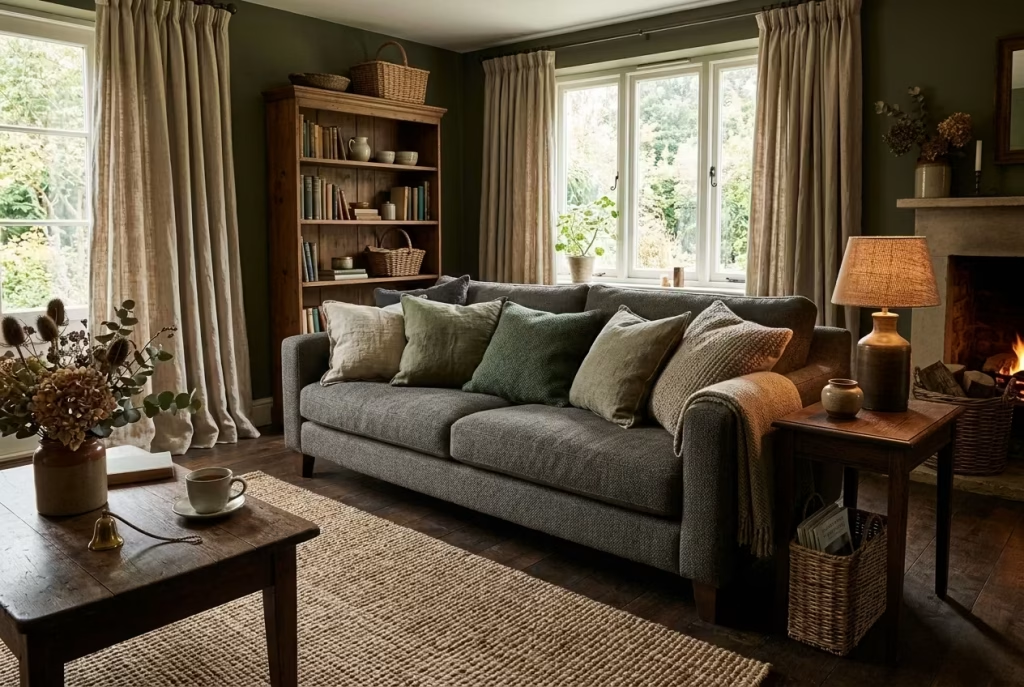
In a dark cottagecore living room, pattern does not need to arrive in a loud or obvious form to make an impression. In fact, some of the most successful rooms use patterns in a far more restrained way, through weave, structure, and surface movement rather than through print. That distinction matters. Prints can quickly set a tone, but they can also dominate it. Weaves, by contrast, work under the skin of the scheme, adding richness without stealing the scene.
This is where the room starts to feel quietly layered rather than dressed up. A herringbone wool throw, a slubby linen cushion, a ribbed upholstery fabric, or a faintly slubbed curtain weave can introduce pattern in a way that feels almost second nature. Nothing is shouting. Nothing is trying too hard. Yet the room still has rhythm, depth, and enough variation to keep the eye engaged.
That subtlety is a gift in darker interiors. When the palette is already saturated with forest greens, browns, charcoals, or oxblood tones, a printed fabric can sometimes feel like a step too far. A woven texture, on the other hand, catches light and shadow in a far more nuanced way. It gives the surface a bit of movement, almost like a whisper where another room might use a speech. The result is a scheme that feels considered, but never overworked.
Real-Life Application: When Texture Carries the Mood
In one cottage living room, the client wanted a pattern but was wary of anything too florid or obvious. The walls were a deep olive, the floorboards dark-stained oak, and the seating was already low and generous. Rather than introducing floral cushions or a patterned rug, I built the sense of pattern through materials with visible weave and quiet irregularity.
A wool rug with a soft basket weave anchored the seating area. Linen curtains with a slightly open weave softened the windows. The sofa cushions mixed brushed wool and raw linen in adjoining tones, and a small accent chair in a lightly textured fabric sat beside the fireplace. None of these pieces announced themselves individually, but together they created a room that felt richly layered, almost like fabric had been woven into the bones of the space.
What stood out most was how the room changed with the light. In the afternoon, the textures looked airy and lifted. At dusk, they deepened and became more tactile. That kind of shift gives a room staying power. It does not exhaust itself in a single glance. It keeps revealing new details, which is exactly what makes a living room worth lingering in.
Measurements and Placement: Let the Texture Breathe
Subtle pattern through weave works best when there is enough surface area for the texture to register, but not so much that it begins to feel fussy.
For upholstery, fabrics with a visible weave often read best when used on larger pieces such as sofas, armchairs, or ottomans. On a sofa, a textured fabric should ideally be allowed to breathe with plain cushions or quieter throws so the surface does not become too busy. A useful balance is to keep around 60 to 70 percent of the seating in a textured fabric and let the remaining elements stay calmer.
For rugs, a woven design with restrained pattern often works well at a size of 240 x 300 cm (8 x 10 ft) or larger in a standard living room, since smaller rugs can make subtle texture disappear. The larger the surface, the more the weave has room to show its character.
A few practical guides:
- Curtains: Choose fabrics with a visible slub or weave, ideally with a fullness of around 2 to 2.5 times the window width. This allows the texture to gather softly and read properly when drawn.
- Cushions: Mix sizes, such as 45 x 45 cm (18 x 18 inches) and 50 x 50 cm (20 x 20 inches), to make woven textures feel varied rather than repetitive.
- Throws: A woven throw around 130 x 180 cm (51 x 71 inches) can add enough surface interest without overwhelming a smaller sofa or armchair.
The real trick is not to layer too many competing textures in the same plane. Give the weave some space to speak. If everything is textured at once, the room can lose focus. A little restraint goes a long way.
Pros and Cons: Richness Without Noise
The great strength of woven patterns is that it gives you depth without drama. It adds quiet complexity, which is often exactly what a dark cottagecore living room needs. The room feels lived in, tactile, and warm, but never visually crowded. That makes it a particularly useful approach in smaller rooms or in homes where you want the atmosphere to build gradually rather than arrive with a bang.
It also tends to age well. Unlike a bold printed motif, which can feel very much of its moment, woven texture is more enduring. It slips into the background when needed and comes forward when light or touch brings it to life. That kind of flexibility is worth its weight in gold.
The downside is that subtleness can be overlooked if the room is not lit well. In a very dark space, low-contrast weave can disappear if there is not enough light to pick up its surface detail. That is where good layering comes in. A table lamp, a window source, or a wall light can help the texture register properly.
There is also the risk of going too far in the opposite direction and using too many similar weaves together. If every textile is quietly patterned in exactly the same way, the room can become bland rather than layered. Variation matters. A tighter weave beside a looser one, a matte surface beside a slightly nubbier one, often creates the most pleasing result.
Subtle patterns through weaves, not prints, give a dark cottagecore living room its quiet richness. They let the palette stay restrained while still feeling alive, textured, and deeply composed. It is one of those small design decisions that pays dividends every day, because the room never feels flat, but it never loses its calm either.
Oversized Floor Lamps with Fabric Shades
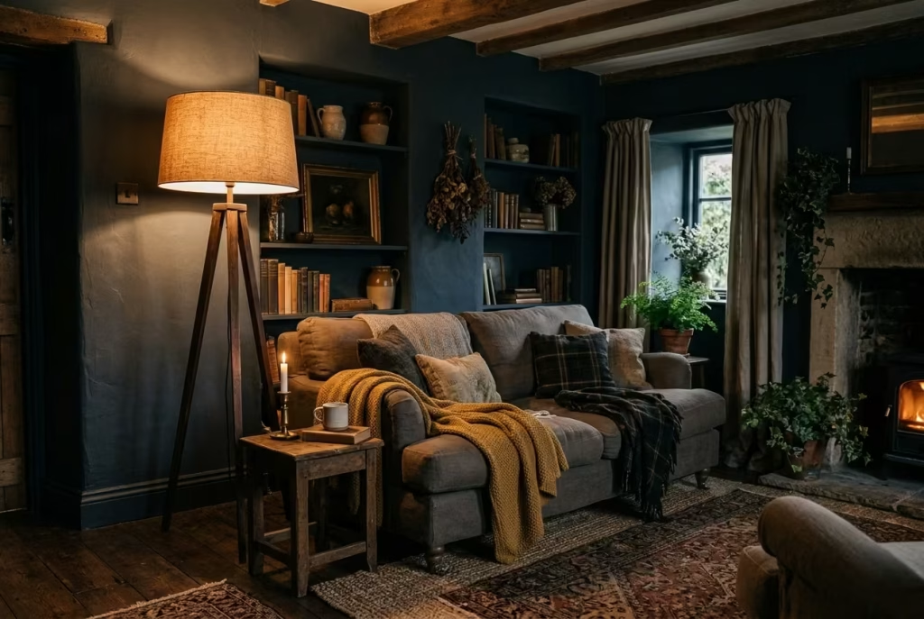
In a dark cottagecore living room, light becomes as important as colour, texture, or furniture placement. Oversized floor lamps with fabric shades offer a way to sculpt the room’s mood while complementing the deep, enveloping palette. Unlike overhead fixtures, which can feel harsh and flatten dark walls, these lamps diffuse light softly across surfaces, creating pockets of glow that invite lingering, reading, or quiet conversation.
Fabric shades, especially in natural fibres like linen, cotton, or silk blends, filter light gently, avoiding glare while highlighting textures in rugs, upholstery, and timber. The lamp itself can act as a sculptural object, giving scale and presence without demanding attention. In darker interiors, where shadows are already part of the design, a single well-placed floor lamp can balance the drama, offering both function and intimacy.
Real-Life Application: Layered Lighting in Action
In one project, a deep navy living room with dark oak flooring and charcoal walls felt almost too introspective in the evenings. Introducing two oversized floor lamps, one near a reading corner and the other beside a low, overstuffed sofa, transformed the space. The lamps’ fabric shades diffused a warm amber light, bouncing gently off the walls and illuminating natural textures.
The lamps also provided vertical interest. With shades around 50–60 cm (20–24 inches) in diameter and lamp heights of 160–180 cm (63–71 inches), the fixtures created a rhythm in the room, breaking up the visual weight of heavy furnishings and dark surfaces. The result was a living room that felt enveloping but not oppressive, dramatic but not dim. Guests commented on how the room felt “alive in the dark,” a perfect description of what subtle lighting can achieve.
Measurements and Placement: Proportion and Comfort
- Height: Ideally 160–180 cm (63–71 inches) for most standard ceiling heights, providing a balance between function and scale.
- Shade Diameter: 50–60 cm (20–24 inches) for a generous diffusion area without overwhelming surrounding furniture.
- Placement: Near seating areas, reading nooks, or corners that need depth. Leave 60–90 cm (24–36 inches) clearance from walls to allow light to disperse evenly.
Pairing floor lamps with layered lighting table lamps, candles, or subtle wall lights ensures the room remains flexible for mood and function. A fabric shade in a neutral tone works best against dark walls, while a slightly textured or pleated shade adds a whisper of pattern that complements woven textiles.
Pros:
- Diffuses light evenly, softening dark interiors and highlighting textures.
- Adds sculptural interest and vertical scale without cluttering the floor.
- Supports layered lighting, creating zones for reading, conversation, or reflection.
- Complements natural and tactile materials without competing with them.
Cons:
- Oversized lamps require careful proportioning; too large for a small room can overwhelm.
- Fabric shades can collect dust and require maintenance to keep the diffusion gentle.
- Concentrated in one area, they may create uneven illumination if not paired with other sources.
Oversized floor lamps with fabric shades are more than just practical fixtures; they are storytellers in a dark cottagecore living room. They encourage slowing down, create intimate pockets of warmth, and let textures and colours speak in low, enveloping light. When chosen with care, they are a subtle, essential way to make a room feel both lived-in and luxuriously atmospheric.
Bringing the Outdoors In with Foraged Greenery
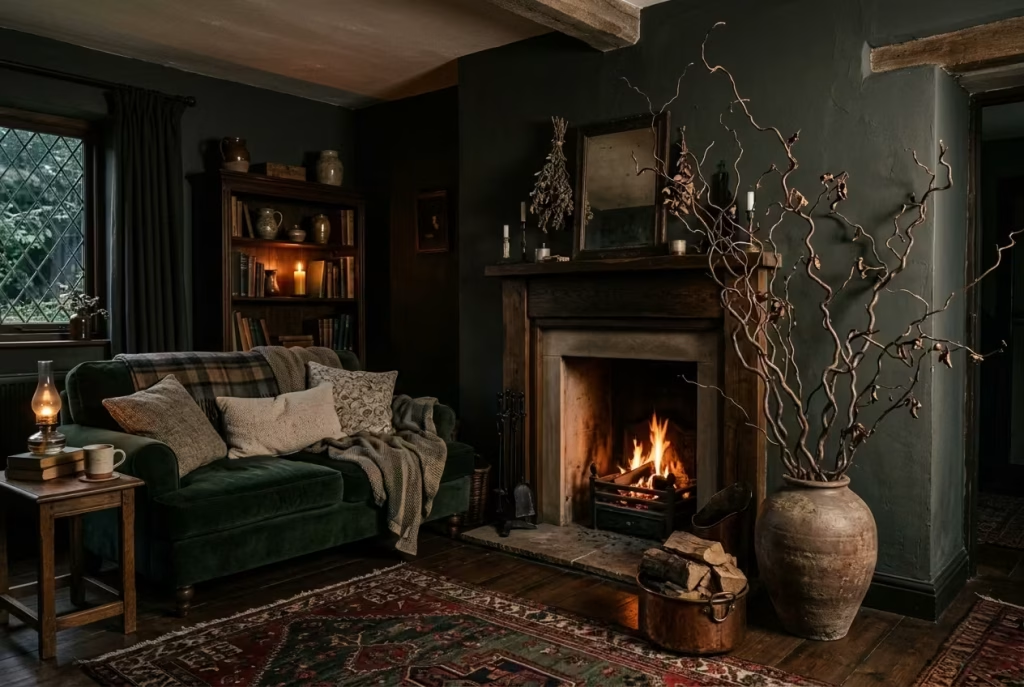
No dark cottagecore living room feels complete without a whisper of the outdoors. Foraged greenery, seasonal branches, dried florals, mosses, or wild grasses anchor the scheme in the natural world, softening deep walls and heavy textures while introducing a sense of impermanence and rhythm. Unlike polished, store-bought bouquets, these elements carry texture, irregularity, and life, creating a dialogue between the interior and the surrounding landscape.
By using natural forms, you allow the eye to travel and rest, giving the room movement even within a restrained palette. A twisted willow branch, a spray of dried hydrangea, or a bundle of seed heads can become sculptural focal points. They complement dark woods, aged metals, and woven fabrics while reinforcing the tactile, collected nature of cottagecore design.
Real-Life Application: Seasonal Foraging as Decoration
In one home I styled, the living room was anchored with deep green walls, low overstuffed sofas, and layered rugs. To counter the weight of the palette, we introduced tall, foraged branches in a rustic earthenware vase beside the fireplace and dried wildflowers in smaller vessels on side tables. The effect was subtle yet transformative.
Even as the seasons changed, the arrangements could evolve: bare branches in winter, budding twigs in early spring, and dried florals through autumn. This allowed the room to feel alive and responsive, rather than static. Guests often remarked that the greenery made the interior feel “breathable,” a striking contrast to the dark, moody finishes, demonstrating that natural forms can refresh a room without needing bright colours or dramatic patterns.
Measurements and Placement: Proportion and Balance
- Tall Branches: Height of 120–150 cm (47–59 inches) works well for floor-standing arrangements beside fireplaces, sideboards, or window seats.
- Medium Arrangements: 50–70 cm (20–28 inches) for side tables or mantels, ensuring they don’t obstruct sightlines.
- Vases and Containers: Choose pieces with enough weight to avoid tipping; natural textures like earthenware, glass with subtle imperfections, or aged metal reinforce the aesthetic.
Placement is key. Avoid crowding corners or high-traffic zones. Keep arrangements in visual clusters, one taller piece on the floor, smaller vessels grouped nearby to maintain coherence and prevent the room from feeling fussy.
Pros:
- Adds life, texture, and seasonal variation to a dark interior.
- Connects the room to the natural world, reinforcing cottagecore philosophy.
- Softens heavy furnishings and deep palettes, creating visual and emotional contrast.
- Highly adaptable: can change with seasons or moods.
Cons:
- Natural materials require care; dried florals can shed, branches can shift, and seasonal elements must be refreshed periodically.
- Overuse may create clutter or compete with existing textures.
- Placement must consider circulation; tall arrangements can obstruct movement if not planned carefully.
Foraged greenery is the subtle flourish that completes a dark cottagecore living room. It reminds us that interiors are not static; they can echo the rhythms of nature, evolve with the seasons, and breathe quietly alongside the textures, colours, and stories embedded in the space. It is a way of bringing life, imperfection, and authenticity into a room that is otherwise carefully composed and deeply atmospheric.
Common Mistakes in Dark Cottagecore Living Rooms
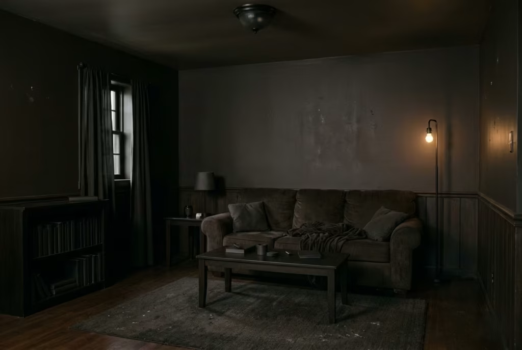
Dark cottagecore can be quietly magnificent, but it is also a style that punishes shortcuts. When the balance is right, the room feels layered, intimate, and full of character. When it is off, even by a little, the whole scheme can go south rather quickly. The good news is that most mistakes are easy to avoid once you understand what the room is asking for: texture, restraint, proportion, and enough light to let the darker palette breathe.
Overloading with Dark Paint Without Balancing Texture
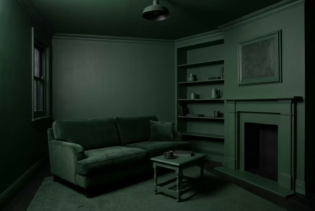
One of the most common missteps is assuming that dark cottagecore begins and ends with paint. A room can be drenched in beautiful forest green, charcoal, or oxblood and still fall flat if the surfaces all behave the same way. That is where many schemes come unstuck. The colour may be strong, but without contrast in texture, the room loses its depth and starts to feel a little one-note.
Dark interiors need something for the eye to hold onto. A matte wall beside a slightly worn timber table. A linen curtain against a brushed wool sofa. A rough ceramic vase beside a polished brass lamp. These small differences are what stop the room from looking painted from top to toe and little else. Texture is the thing that gives darkness its shape. Without it, the room can feel like it has been swallowed whole by the colour.
I have seen rooms where every surface was painted in the same deep tone, right down to the trim and shelving, but the result felt oddly thin. It looked deliberate, certainly, but not especially alive. The fix was rarely to lighten the scheme dramatically. More often, it was to introduce tactile variation: a nubby rug, aged wood, a woven throw, or a glazed ceramic with a bit of sheen. Once those layers were in place, the room began to read properly. It stopped feeling like a flat colour exercise and started feeling like a place with depth, memory, and presence.
The takeaway is simple enough. Dark paint is the foundation, not the whole story. Without a mix of finishes, the room can lose its pulse.
Poor Lighting Strategy Leading to Flatness
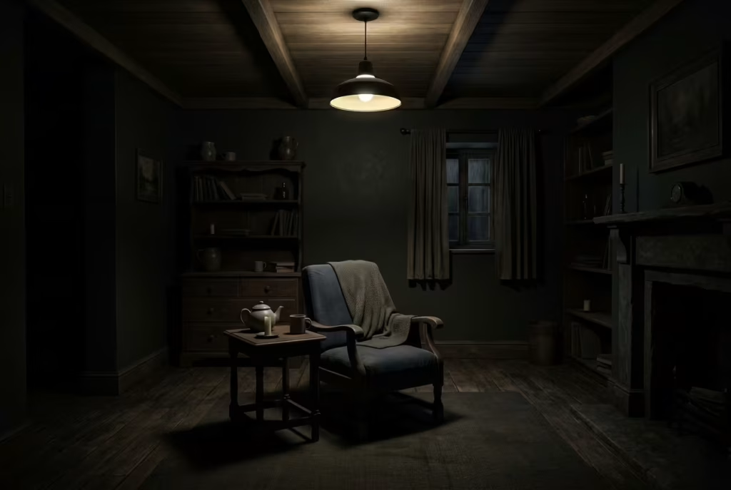
Lighting is where many dark cottagecore rooms either come alive or quietly fall apart. A single overhead fitting can be the death knell of atmosphere. It flattens shadow, strips away nuance, and makes every material look more or less the same. In a room that depends on mood and texture, that is a heavy price to pay.
The mistake is not always that there is too little light. More often, it is that the light is in the wrong place, or at the wrong level. Dark interiors need layers of illumination so the room can shift with the time of day. You want a soft wash across the walls, a lower glow near seating, and small points of brightness that draw the eye gently through the space. When everything comes from above, the room loses its intimacy and starts to feel a bit schoolhall-like, which is the last thing this style needs.
What works better is a combination of wall lights, table lamps, floor lamps, and candlelight. Not all at once, and not necessarily in equal measure, but enough to create variation. Light should skim, not blast. It should sit low enough to flatter fabrics and timber, and soft enough to let shadow do its job. In dark cottagecore, shadow is not a problem to solve. It is part of the design language.
A room without a considered lighting plan may still look acceptable in daylight, but once evening arrives, the weakness becomes obvious. Corners disappear in the wrong way. Surfaces look dull. Even lovely materials lose their warmth. That is why lighting deserves far more attention than it often gets. It is the difference between a room that merely functions and one that feels quietly magical after sunset.
Ignoring Scale and Proportion
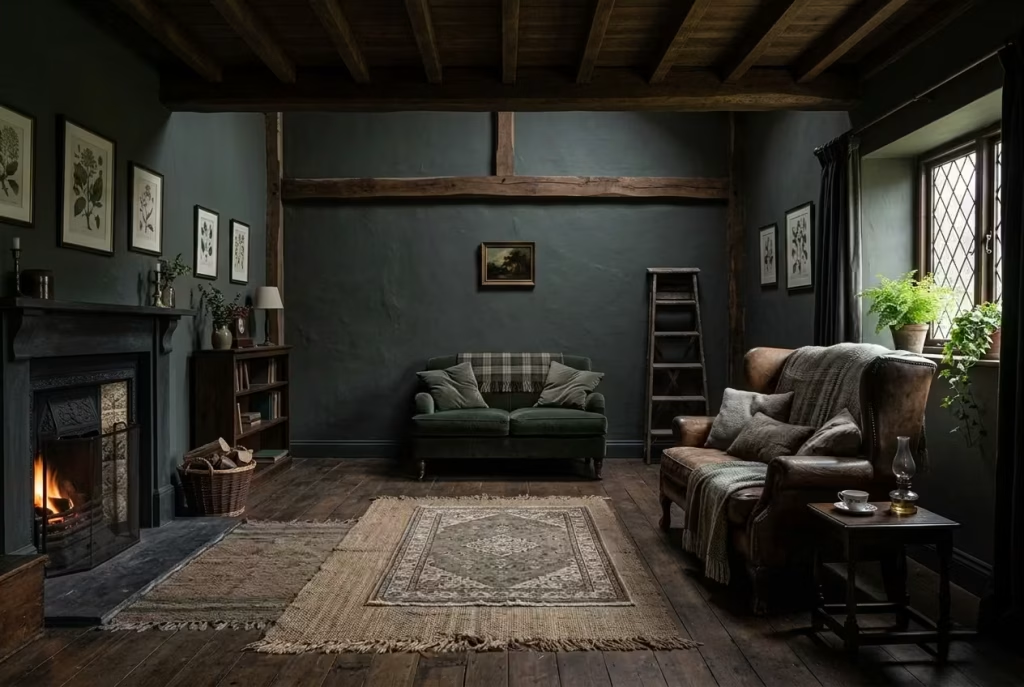
Scale is one of those things people often feel rather than consciously see, but when it is wrong, the room gives itself away immediately. A sofa that is too small under a high ceiling. A rug that floats in the middle of the floor like it has lost its way. A side table that looks swallowed by a large chair. These things may seem minor, but together they can unravel the atmosphere completely.
Dark cottagecore is especially sensitive to proportion because darker tones visually compress space. That is not a bad thing, but it does mean the furniture and accessories need to be measured with care. If the pieces are underscaled, the room can feel sparse and oddly unrooted. If they are oversized without enough breathing room, the space can become oppressive. The sweet spot lies somewhere in between, where the furniture feels generous but not domineering, and the room retains enough flow to avoid feeling boxed in.
I often find that smaller rooms suffer most when scale is ignored. People tend to choose furniture that is either too dainty, in an attempt to keep the room feeling open, or too bulky, in the hope of making the space feel luxurious. Both can backfire. What the room usually needs is a balanced middle ground: a sofa with presence, a rug large enough to anchor the seating, a lamp tall enough to hold its own, and enough space around each piece for the eye to travel comfortably.
A room that respects proportion feels calm without trying too hard. Everything has a reason for being where it is. Nothing appears squeezed in or left adrift. That sense of ease is what gives a dark cottagecore living room its poise.
Over-Styling with Themed Décor
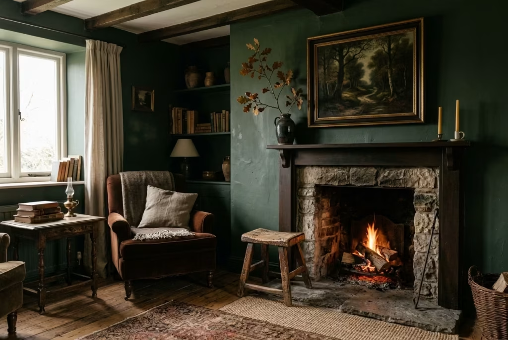
This is where the whole thing can go pear-shaped very quickly. Cottagecore has a strong visual identity, and that makes it tempting to lean into the theme a little too hard. A few too many florals. Too many vintage props. Too much intentionally “rustic” décor. Before long, the room stops feeling atmospheric and starts feeling like a set that has been dressed for a performance.
The trouble with over-styling is that it removes the room’s ability to breathe. Instead of allowing the materials, architecture, and natural light to shape the mood, the design begins to rely on obvious symbols. Birds on the wallpaper, baskets in every corner, dried flowers on every surface, a proliferation of trinkets, all working overtime to say “cottagecore” with a capital C. It can become a bit much, and the charm begins to wear thin.
A stronger approach is to edit ruthlessly. One or two well-chosen references carry more weight than a dozen obvious ones. A vintage oil painting says more than a wall full of novelty prints. A single foraged branch in a ceramic vessel feels more grounded than a dozen jars of dried stems. A worn wooden stool beside the hearth does the job better than a room cluttered with unnecessary rustic props. The room does not need to spell out its character. It only needs to be suggested.
The most successful dark cottagecore rooms feel gathered, not staged. They have the sense of having evolved over time, with each piece chosen for its use, weight, or beauty rather than for the theme it represents. That distinction matters. When the room feels too self-conscious, it loses the very thing that makes the style compelling in the first place.
What Makes These Mistakes Easy to Miss
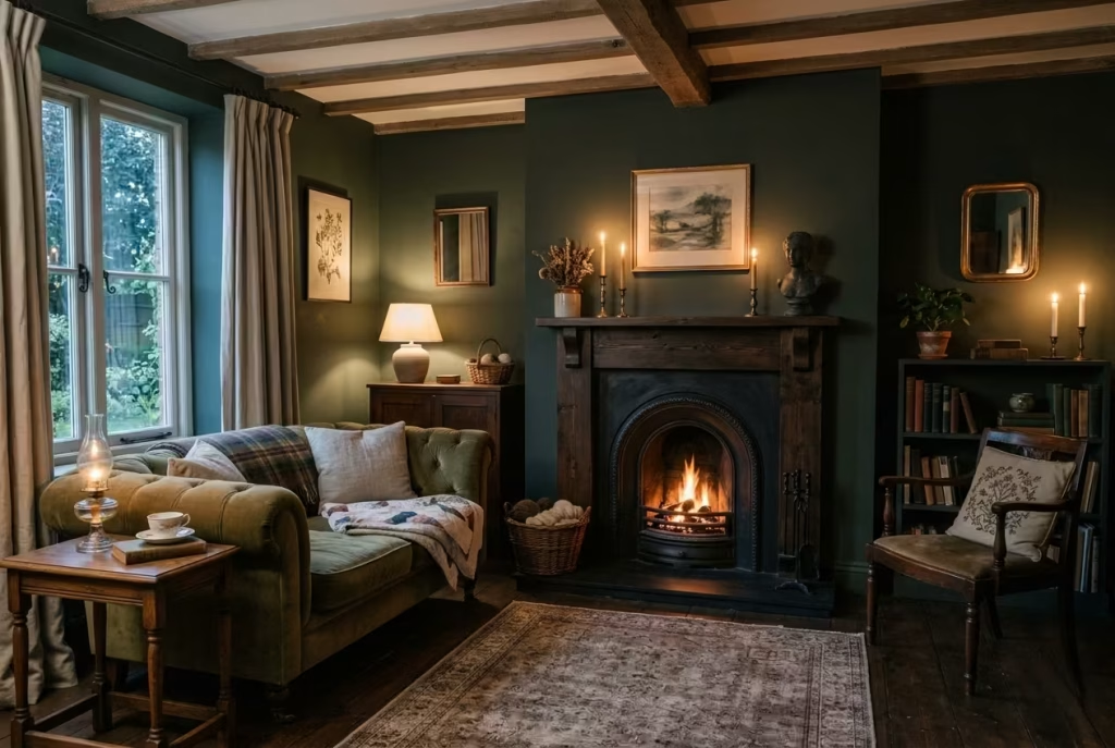
These missteps are so common because they often start from a good instinct. I want more atmosphere, more warmth, more character, more charm. The trouble begins when those instincts are pushed without enough restraint. Darkness without texture becomes flat. Lighting without layering becomes harsh. Scale without balance becomes awkward. Styling without editing becomes clutter.
The best dark cottagecore rooms do not shout their intentions. They have a quieter kind of confidence. They feel considered, not forced. They know when to stop. That is the part worth holding onto, because once you learn to avoid these pitfalls, the room begins to work with you rather than against you.
How to Make It Work in Real Homes
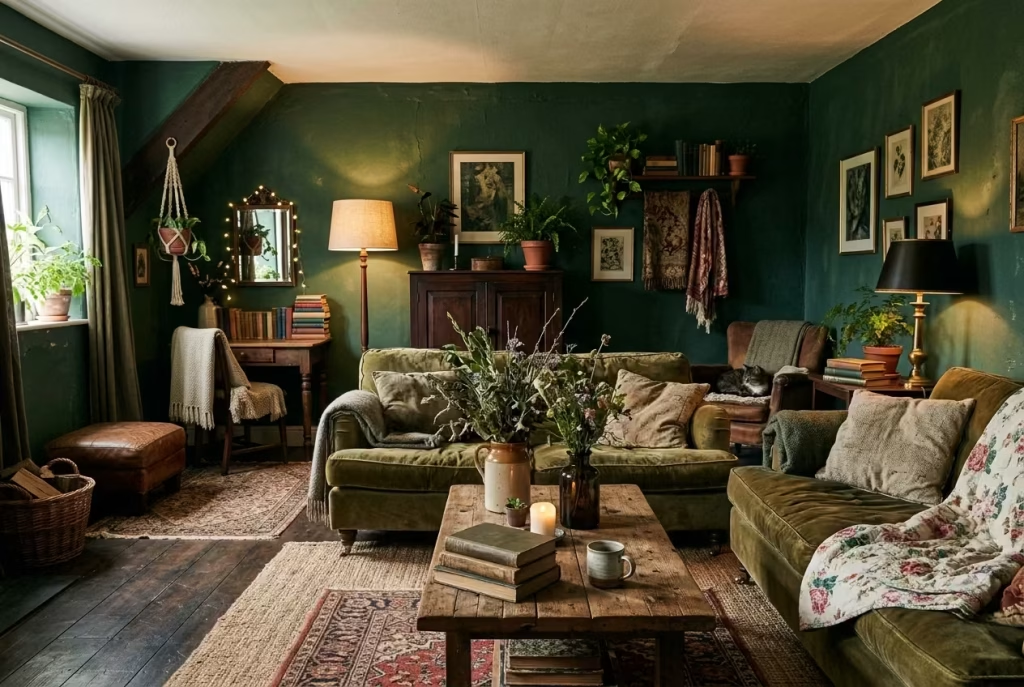
Dark cottagecore looks especially compelling in magazine spreads, but the real test is always how it performs in an actual home, with awkward corners, modest proportions, and everyday life tugging at the edges. That is where the style proves its worth. It is not about recreating a perfect scene. It is about making the atmosphere work with the architecture you already have, so the room feels natural rather than forced. The trick is to scale the idea to the house, not the other way round.
Small Living Rooms
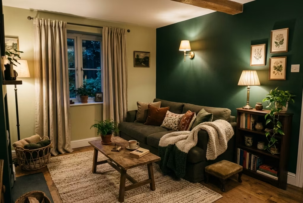
Selective Darkness Rather Than Full Immersion
In a small living room, the temptation is either to go all in or back away completely. Both can miss the mark. Full immersion in a dark palette can be beautiful, but in compact rooms it needs a careful hand. Selective darkness is usually the smarter route. It gives you the mood and depth of the style without making the room feel hemmed in. In practice, that might mean painting one or two key surfaces in a deep tone while keeping other elements softer, or concentrating darker shades around architectural features such as a fireplace, alcove, or built-in shelving.
This approach works because it allows the room to keep a sense of air around it. The eye has somewhere to rest. Not every surface is competing for attention. A dark wall behind a sofa, for example, can make the seating area feel anchored and intimate, while a lighter adjoining wall keeps the room from feeling shut down. Likewise, darker upholstery paired with lighter rugs or linen curtains can create that same balance. It is a bit like seasoning a dish properly. You do not need to drown everything in the same note for it to taste complete.
I have often found that small rooms benefit most from contrast in texture rather than contrast in colour. A deep green wall beside a pale woven rug. A timber coffee table against a softer fabric chair. A dark bookshelf held up by a slightly brighter window treatment. These combinations give the room depth without pushing it over the edge. The result is calmer, kinder, and easier to live with day after day.
What Helps Small Rooms Feel Generous
In a compact room, furniture scale becomes crucial. Low-profile seating can help keep sightlines open, and pieces with legs rather than heavy bases tend to feel lighter. A single rug large enough to anchor the main seating group will usually do more good than multiple small ones, which can make the room look fussy and fragmented. Keep pathways clear. Let the room breathe. That small bit of restraint often goes a long way.
Lighting matters just as much. Darker rooms need glow, not glare, especially when the floor plan is tight. A wall light, one table lamp, and perhaps a floor lamp in the corner can create enough variation to keep the room feeling layered rather than closed in. Think of light as a way of drawing the room outward, not flattening it down.
A small living room does not need to look larger in the literal sense. It needs to feel resolved. When the darker elements are placed with care, the room reads as intimate rather than cramped, which is exactly where dark cottagecore becomes most persuasive.
Low Ceiling Spaces
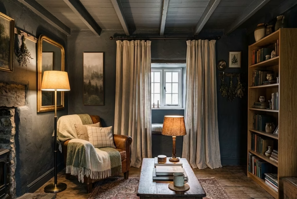
Keep Ceilings Lighter or Introduce Vertical Elements
Low ceilings can make people wary of darker interiors, and with good reason. If every surface is treated the same, the room can begin to press in from above. But that is not a reason to abandon the style. It is a reason to adapt it with precision. One of the simplest ways to do this is to keep the ceiling lighter than the walls, even if only slightly. That small shift can make a real difference, allowing the room to feel taller and less compressed.
Another useful move is to introduce vertical elements that gently pull the eye upward. Tall bookcases, elongated artwork, narrow mirrors, or slim floor lamps all help create that sense of lift. Even curtain placement can matter. Hanging drapery close to the ceiling and allowing it to fall all the way down can make the wall appear taller than it is. It is one of those classic design tricks that continues to earn its keep because it simply works.
I have seen low-ceiling rooms transformed by something as modest as a vertical gallery wall or a pair of long linen curtains. The eye starts moving up and down rather than stopping abruptly at the top of the wall. The space gains rhythm. It feels less squat, less weighed down. That does not mean the room has to lose its dark cottagecore character. It just means the darkness needs to be distributed intelligently.
Using Structure to Create Lift
Painted panelling can be especially useful in low-ceiling rooms if it is handled with care. A lower panel line, paired with a slightly lighter upper wall, can help the room feel balanced. If the room is already dark, a narrow band of lighter tone above the panelling may be enough to stop the walls from closing in too tightly. The goal is not visual trickery for its own sake. It is to keep the composition feeling open and deliberate.
Furniture placement helps too. Avoid piling tall pieces all in one corner. Spread height across the room so the eye can move naturally. A floor lamp on one side, a taller vase on the other, a mirror slightly above eye level, these little shifts build vertical energy without making the room feel overworked. It is often the quieter moves that carry the most weight.
Low ceilings do not rule out dark cottagecore. They simply ask for more finesse. When the ceiling is handled as part of the whole rather than an afterthought, the room can feel atmospheric, grounded, and unexpectedly elegant.
‘Modern Homes Adapting Cottagecore
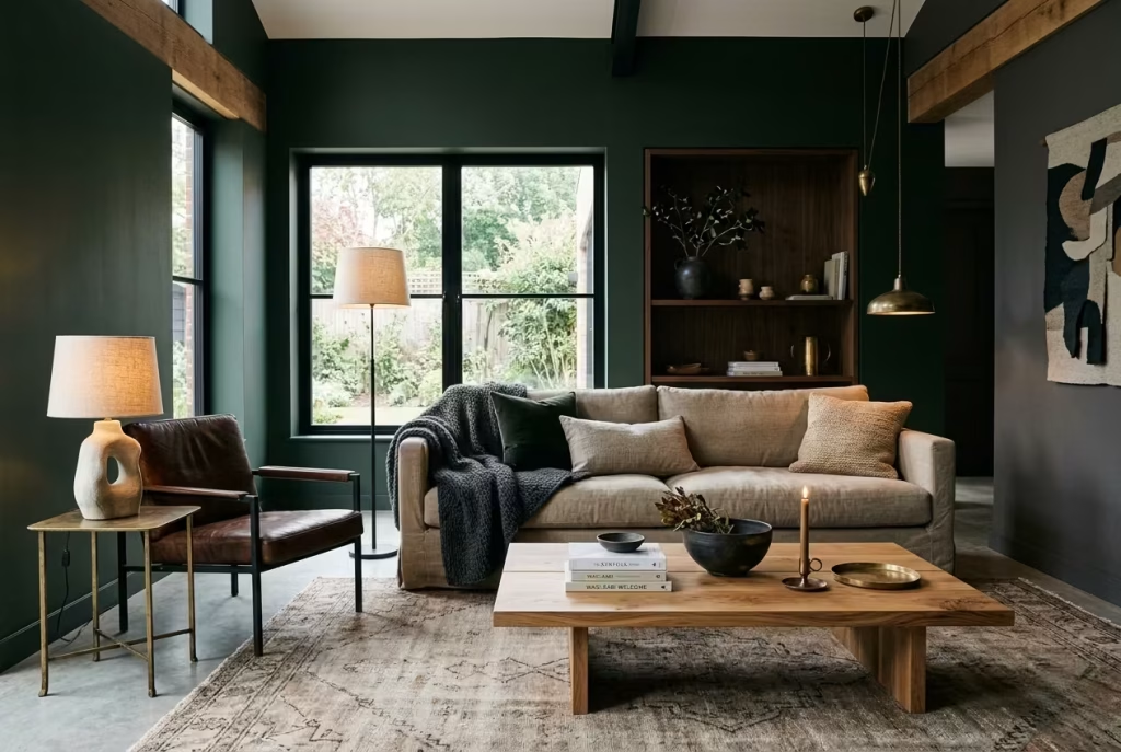
Blend Clean Architecture with Rustic Layering
Modern homes bring a different kind of challenge. Their lines are often cleaner, the architecture more open, and the detailing less forgiving of anything too sentimental or overloaded. But that does not mean dark cottagecore has no place there. In fact, the contrast can be rather compelling. The key is to let the architecture stay calm while layering in warmth, texture, and a sense of age through furnishings and materials.
A modern room with sharp edges and simple forms gives you a strong backdrop. Into that, you can introduce softer, more tactile elements. A linen sofa with a relaxed silhouette. A vintage rug with a faded pattern. Timber with visible grain. A few handcrafted objects, some dark botanical artwork, maybe a worn leather chair if the room needs a bit more backbone. The contrast between crisp architecture and timeworn surface creates a room with real depth. It feels edited rather than themed, which is usually where the best results lie.
I find that modern homes often benefit from keeping the larger structural elements disciplined. Clean wall finishes, minimal joinery, uncluttered sightlines. Then the atmosphere comes from the layers you add on top. This keeps the room from drifting into pastiche. It also lets each piece do its job properly. The room ends up feeling thoughtful, not costume-like.
Let the Materials Do the Heavy Lifting
In a modern setting, materiality often matters more than ornament. A richly grained timber table will do more for the mood than a room full of decorative references. A deep wool rug or a heavy linen curtain can soften a hard-lined space beautifully. Even stone, brass, or aged bronze can help bridge the gap between contemporary architecture and cottagecore warmth.
This is where the style becomes more adaptable than people expect. You do not need exposed beams or a country cottage shell for the idea to work. You need a sense of gathered comfort, a respect for texture, and a willingness to let the room feel a little less polished. That is usually enough. In fact, over-committing to the theme in a modern home can be a false move. Better to whisper it through materials and mood than to spell it out too bluntly.
The best modern cottagecore rooms often feel like they were assembled over time, even if they were planned in one careful sweep. That sense of ease is what makes them convincing. Nothing looks too fresh. Nothing looks too clever. The room feels as though it has settled in properly, which is usually the real test.
What Makes These Adaptations Succeed
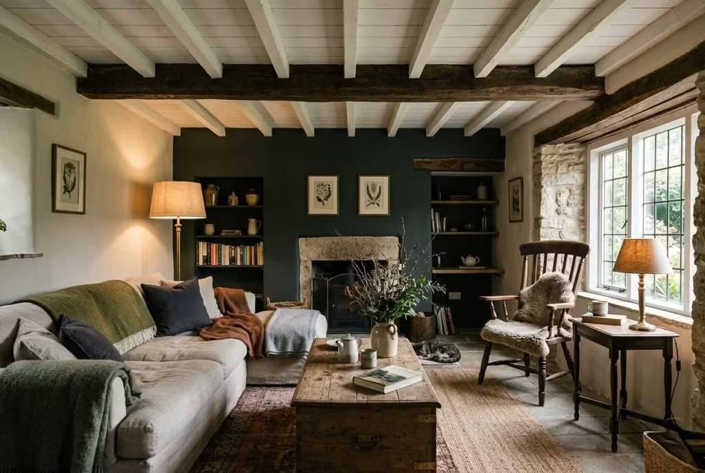
The common thread across small rooms, low ceilings, and modern homes is not a specific paint colour or a fixed formula. It is judgment. Dark cottagecore works when it respects the bones of the house and responds to them rather than fighting against them. That is what gives the room its credibility.
A smaller room asks for selectivity. A low ceiling asks for lift. A modern home asks for restraint and texture. In each case, the principle is the same: use darkness as atmosphere, not as a blunt instrument. Let the room keep its own voice. Then build around it with materials and details that support the mood without overwhelming the architecture.
That is how the style earns its place in real homes. Not by pretending every room is a period cottage, but by finding the right balance of mood, practicality, and lived-in charm.
Final thoughts About Dark Cottagecore Living Rooms
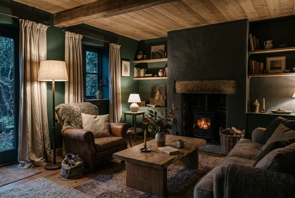
Dark cottagecore is not merely a visual statement; it is an embrace. It asks less of your eyes and more of your senses. When executed thoughtfully, it transforms a living room from a functional space into a retreat, a place where light, shadow, texture, and material all come together in quiet harmony. The richness of deep greens, charcoals, and oxbloods becomes more than colour. It becomes mood, memory, and invitation.
The most compelling dark cottagecore rooms feel as though they have grown rather than been assembled. Linen drapes gather softly by the window, timber beams whisper of age, and a worn rug underfoot holds the warmth of repeated steps. These are rooms that welcome you without ceremony, that reward pause and reflection, that make you linger longer than you intended.
In my experience, the rooms that succeed are never over-styled. They are patient, calm, and quietly confident. They hold you in their embrace without pressing, like a favourite book you return to in winter. They invite you to slow down, settle in, and take a breath proof that design, at its best, is not just about surfaces, but about the life that flows through them.
A dark cottagecore living room, when done right, becomes a sanctuary. Not a showcase. Not a statement. Simply a space that holds you, gently, completely, and with a quiet sense of ease that feels like coming home.
Frequently Asked Questions About Dark Cottagecore Living Rooms
What is a dark cottagecore living room?
A dark cottagecore living room takes the softness, romance, and nature-led spirit of cottagecore and gives it a deeper, moodier edge. Instead of pale florals and airy neutrals, it leans into forest greens, charcoal, umber, oxblood, aged timber, worn linen, and antique details. The result feels more cocooned, more atmospheric, and often more liveable day to day. It is less about decoration for its own sake and more about creating a room that feels settled, intimate, and quietly storied.
Will a dark cottagecore living room make a small room feel smaller?
Not necessarily. A small room can handle dark cottagecore beautifully if the darkness is used with restraint. The trick is selective application rather than total immersion. Darker paint on one or two walls, a deep rug, or a single statement chair can add depth without closing the room in. Texture, layered lighting, and a little breathing space around furniture are what keep the room feeling composed rather than cramped.
What colours work best in a dark cottagecore palette?
The strongest colours are those with natural depth and softness. Deep forest green, moss, charcoal, umber, warm brown, aged navy, and oxblood all work well because they feel grounded rather than harsh. I usually recommend avoiding anything too flat or synthetic in tone. The most successful palettes have nuance. A room should feel like it has been shaped by light, timber, and time, not just painted in a single heavy colour.
How do I stop a dark room from feeling flat?
Texture is doing the heavy lifting here. A dark room needs contrast in surface as much as in colour. Think matte paint beside aged wood, linen beside wool, brass beside ceramic, or smooth stone beside a woven rug. Lighting matters too. A layered lighting scheme will keep the room alive after sunset, while shadows create depth instead of deadening the scheme. A room with variation will always feel richer than one that is dark all over and smooth everywhere.
Can dark cottagecore work in a modern home?
Yes, and often very well. Modern homes tend to have clean lines and simple architecture, which makes them a strong backdrop for rustic layering. The key is not to overdo the themed elements. Let the structure stay calm, then bring in warmth through natural materials, vintage pieces, textured fabrics, and a few carefully chosen objects with age or patina. That contrast between crisp architecture and softer, timeworn layers can be particularly compelling.
What kind of furniture suits this style?
Furniture should feel comfortable, grounded, and slightly relaxed in profile. Low, overstuffed sofas, worn leather chairs, timber coffee tables, and window seats all suit the mood well. Pieces that have a bit of age or softness work especially nicely because they support the lived-in feeling that cottagecore depends on. I would avoid anything too glossy, too angular, or too minimal unless it is being deliberately softened by the rest of the scheme.
Do I need antique pieces for dark cottagecore to work?
Not strictly, but a few aged or vintage-looking pieces help give the room its character. Dark cottagecore is strongest when it feels collected rather than newly bought in one sweep. That does not mean every item has to be genuinely old. It does mean the room benefits from materials and forms that suggest patina, use, and time. A new piece with a handcrafted feel can sit comfortably alongside antique artwork, old frames, or worn textiles.
How can I make dark cottagecore feel cozy rather than heavy?
Keep the balance right. A room feels cozy when darkness is softened by texture, warmth, and light. Use linen drapery, layered rugs, throws in earthy tones, and lamps that cast a gentle glow rather than a hard beam. Keep circulation clear, avoid overfilling the room, and allow natural materials to break up the depth of the palette. The best dark cottagecore rooms feel like they are wrapping around you, not pressing in on you.
Is dark cottagecore just a trend?
The mood may be having a moment, but the ingredients behind it are timeless. Natural materials, layered comfort, aged finishes, soft lighting, and a connection to the outdoors have lasting appeal because they support how people actually live. That is why this style can outlast trend cycles when it is done with restraint. It is not about chasing a look. It is about building a room that feels enduring.
What is the biggest mistake to avoid?
The biggest mistake is treating the style as a checklist of obvious cottagecore symbols. Too many themed objects, too much dark paint without texture, or lighting that is too flat can all undo the atmosphere very quickly. The stronger approach is quieter. Let the room feel gathered, not forced. Let the materials speak. Let the room breathe. That is usually where the magic is.